プレビュー準備中デザインリファレンスを見る
DESIGN REFERENCE
Raywarp|株式会社レイワープ
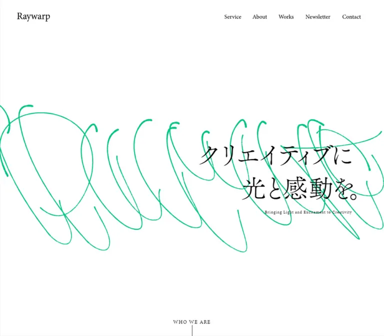
緑の手描きラインと繊細な明朝・セリフ体が印象的なデザイン会社のサイト。広い余白、白黒の背景変化、段違いの実績配置で創造性を伝えています。
Raywarp — Style Reference
An open editorial canvas crossed by a vivid green gesture, with expressive Japanese type and a quietly structured portfolio.
Website: raywarp.com Original URL: https://raywarp.com/ Final URL: https://raywarp.com/ Theme: white opening and closing views, with a near-black state visible around the service-to-works transition Inspected: September 23, 2026, 06:26 JST; supplied capture timestamp: September 22, 2026, 21:26:00.773 UTC Viewports: 1440 × 1000 desktop and 390 × 844 mobile, in CSS pixels Scope: the current corporate and portfolio homepage: persistent header, opening composition, company introduction, three services, eight project links, contact invitation, and footer. Menu content is present in the DOM, but its open state was not captured. Linked pages were not inspected.
Raywarp pairs a restrained typographic framework with a large, irregular green drawing. The opening screen contains little conventional interface chrome: a serif wordmark, small navigation links, a two-line Japanese statement, a tiny English translation, and a bottom-centered introduction cue. The drawing crosses the composition rather than occupying a separate illustration card.
The rest of the homepage expands into service presentations and a substantial project portfolio. Colorful entertainment artwork and product imagery sit inside a largely monochrome interface. Desktop projects form two staggered columns; mobile projects form a single reading sequence. The closing contact area returns to white, with a much paler green line behind a large serif heading and one black capsule-shaped link.
The homepage identifies the company as 株式会社レイワープ. Its content positions the business as a design partner for entertainment, pop culture, UI/UX, and new ventures. This reference describes that corporate and portfolio experience, including its restrained contact conversion area.
閉じる
Raywarp — Style Reference
An open editorial canvas crossed by a vivid green gesture, with expressive Japanese type and a quietly structured portfolio.
Website: raywarp.com Original URL: https://raywarp.com/ Final URL: https://raywarp.com/ Theme: white opening and closing views, with a near-black state visible around the service-to-works transition Inspected: September 23, 2026, 06:26 JST; supplied capture timestamp: September 22, 2026, 21:26:00.773 UTC Viewports: 1440 × 1000 desktop and 390 × 844 mobile, in CSS pixels Scope: the current corporate and portfolio homepage: persistent header, opening composition, company introduction, three services, eight project links, contact invitation, and footer. Menu content is present in the DOM, but its open state was not captured. Linked pages were not inspected.
Raywarp pairs a restrained typographic framework with a large, irregular green drawing. The opening screen contains little conventional interface chrome: a serif wordmark, small navigation links, a two-line Japanese statement, a tiny English translation, and a bottom-centered introduction cue. The drawing crosses the composition rather than occupying a separate illustration card.
The rest of the homepage expands into service presentations and a substantial project portfolio. Colorful entertainment artwork and product imagery sit inside a largely monochrome interface. Desktop projects form two staggered columns; mobile projects form a single reading sequence. The closing contact area returns to white, with a much paler green line behind a large serif heading and one black capsule-shaped link.
The homepage identifies the company as 株式会社レイワープ. Its content positions the business as a design partner for entertainment, pop culture, UI/UX, and new ventures. This reference describes that corporate and portfolio experience, including its restrained contact conversion area.
How to Read This Reference
- Measured values come from the supplied rendered DOM, computed styles, custom properties, and element rectangles. They are measurements of the captured states, not a complete recovered stylesheet.
- Visually observed descriptions come from the five current-page screenshots: three desktop views and two mobile views.
- Estimated values describe visible elements whose relevant computed styles were not supplied, including the main hero lettering and decorative stroke geometry.
- Calculated values are arithmetic derived from supplied measurements, such as column gaps or normalized design units.
- Recommended values belong to the reusable implementation below. They are not claims about the site's original code.
- Font-family declarations are known for several elements; successful loading of every declared font was not independently verified.
- Some document coordinates differ from the corresponding scroll captures. Preserve the confirmed composition, but do not treat every sampled vertical offset as a permanent layout rule.
Tokens — Colors
Default Palette
| Name | Value | Evidence / token | Role |
|---|---|---|---|
| White Canvas | #ffffff |
Source --c-white: #fff; visible opening and closing canvas |
Main light surface and reversed text |
| Black Ink | #000000 |
Computed text and contact-link fill | Main typography, rules, social symbols, and primary contact action |
| Near Black | #141414 |
Source --c-black |
Matches the visual character of the dark middle capture; also appears in menu text measurements |
| Signature Green | #00c389 |
Source --c-green; computed color of About Us and View More |
Brand accent, secondary links, and the green drawing's color family |
| Mobile Body Ink | #292929 |
Computed introduction/contact paragraphs on mobile | Slightly softened body text |
| Gray | #333333 |
Source --c-gray |
Available supporting color; a distinct screenshot role was not established |
| Background Stroke Green | #1e6a56 |
Source --c-background-stroke |
Declared background-graphic color; its exact compositing role was not exposed |
| Image Placeholder | #eeeeee |
Source --image-preload-color |
Declared image-loading color; no visible loading sequence was supplied |
| Pale Footer Green | Approximately 30–40% green over white | Visual estimate; adaptation token | Low-emphasis decorative line behind the contact/footer region |
The pale footer line should not compete with the text. A useful recommended approximation is rgba(0, 195, 137, 0.35). This is not a measured source opacity.
The source also exposes gray values under --c-off-white and --c-off-white-alpha: rgba(128,128,128,1) and rgba(128,128,128,0.5). Despite their names, these are neutral gray definitions, not evidence of a warm off-white page background.
Color Behavior
The opening capture is white with black text. The middle desktop capture shows a near-black field, white navigation and section lettering, and saturated project artwork. The lower portfolio/contact capture is white again. These establish multiple rendered color states within the homepage; they do not establish a user-selectable theme system or the exact scroll positions that trigger changes.
Raw styles are not sufficient to reconstruct every final pixel. For example, desktop navigation links report white text while the opening screenshot visibly presents dark navigation. Most sampled structural elements also have transparent backgrounds. The supplied evidence does not expose the complete layering, compositing, or state logic. Reproduce the visible contrast relationships and verify state changes separately.
Tokens — Typography
English Editorial Serif
- Measured family:
minion-pro, serif. - Measured weight:
400. - Roles: desktop navigation,
Service,Works,Contact, secondary links, the contact action, footer navigation, and menu primary links. - Character: restrained, literary, and relatively delicate. Large headings gain presence through scale and surrounding space rather than bold weight.
- Implementation alias:
--rw-font-en.
The Raywarp wordmark has a similar serif character, but its font or asset construction was not exposed. Its empty-text home anchor does not establish that the mark is ordinary live text. Preserve an authorized brand asset when available.
Japanese Display Typography
- Measured family:
fot-tsukuaoldmin-pr6n, sans-serif. - Measured weight:
300. - Verified roles: company-introduction heading and service titles.
- Introduction tracking:
-0.05em, measured as approximately-2.214pxdesktop and-1.508pxmobile. - Character: light Mincho-style strokes, pronounced contrast, and a more expressive texture than the body type.
The hero also has a Mincho-style appearance, but its own computed family was not included. Using the measured Japanese display family there is a reconstruction recommendation, not a verified hero declaration.
The source declaration falls back to sans-serif. The Quick Start deliberately uses a generic serif fallback for display text to retain the visual category if the licensed font is unavailable; that fallback change is an adaptation.
Japanese Body Typography
- Measured stack:
'Hiragino Kaku Gothic ProN', 'Noto Sans JP', sans-serif. - Measured weight:
400for inspected paragraphs. - Roles: explanatory copy, service descriptions, project metadata, and service subnavigation.
- Character: quiet, compact, and functional, balancing the more expressive display type.
- Line spacing: generous in introduction and contact paragraphs, substantially tighter in footer subnavigation.
Type Scale
Values below are measured unless explicitly marked as estimates. Sizes are CSS pixels at the supplied viewports.
| Role | Desktop 1440 × 1000 | Mobile 390 × 844 | Line height / tracking |
|---|---|---|---|
| Root size | 16.8668px |
16.64px |
Viewport-related scaling is evident |
| Desktop navigation | 16.8668px |
Hidden in the visible header | 28.1675px; normal tracking |
| Main hero statement | Approximately 80–90px |
Approximately 36–40px |
Visual estimates; two explicit lines |
| Hero English translation | Approximately 13–14px |
Approximately 12px |
Visual estimates; lightly tracked |
| Introduction heading | 44.2753px |
30.16px |
67.2984px / 42.8272px; -0.05em |
| Introduction body | 14.7584px |
14.56px |
35.4202px / 29.12px |
| Service / Works heading | 84.3338px |
62.4px |
140.837px / 104.208px |
| Contact heading | 84.3338px |
52px |
140.837px / 86.84px |
| Service title | 25.3001px |
22.88px |
42.2512px / 38.2096px |
| Service description | 12.6501px |
12.48px |
23.7821px / 23.4624px |
| About Us / View More | 21.0835px |
20.8px |
Approximately 1.63; 0.03em tracking |
| Contact paragraph | 14.7584px |
14.56px |
31.7306px / 31.304px |
| Contact form label | 18.9751px |
15.6px |
Approximately 1.67 |
| Footer primary links | 15.8126px |
15.6px |
Approximately 1.67 |
| Footer service sublinks | 12.6501px |
12.48px |
Approximately 1.28 |
| Menu primary links, DOM only | 42.1669px |
41.6px |
Approximately 1.2; open state unverified |
Do not use the root font size as the assumed size of every descendant. For example, the WHO WE ARE button reports the inherited root font, but its visible caption is smaller; the caption's own computed style was not supplied.
Tokens — Spacing & Shapes
Density: sparse at the page level, compact inside navigation and project metadata.
Shape language: square artwork, unboxed text links, thin rules, and one strongly rounded contact action. No general shadow or rounded-card system is visible.
Responsive Unit
The source reports --base-vw: 1366 on desktop and --base-vw: 375 on mobile. The two measured root sizes are consistent with:
/* Inferred from the two captured sizes, not a recovered global rule. */
font-size: calc(16 * 100vw / var(--base-vw));
For a reusable implementation, define 1u as one normalized design pixel:
- Desktop:
1440 / 1366 ≈ 1.05417px. - Mobile:
390 / 375 = 1.04px.
For example, the section heading measures 80u desktop and 60u mobile. Body paragraphs measure 14u at both sizes. The source header variable is explicitly calc(120rem / 16) desktop and calc(76rem / 16) mobile.
The precise breakpoint, minimum scale, and maximum scale were not supplied. Quick Start uses a recommended breakpoint and caps the unit; those limits are additions.
Spacing Scale
| Use | Measured or calculated value | Interpretation |
|---|---|---|
| Desktop header side inset | 63.25px |
Approximately 60u |
| Desktop main portfolio inset | 126.5px |
Approximately 120u |
| Mobile header side inset | 20px |
Direct measurement; distinct from the content gutter |
| Mobile main content inset | 25px |
Produces a 340px content column |
| Desktop navigation link side padding | 21.0835px |
20u per side |
| Desktop project column gap | 59.0625px |
Calculated from card rectangles; approximately 56u |
| Desktop project row advance | 552.5px |
Includes the card and space to the next card in that column |
| Desktop project inter-card gap | Approximately 61.14px |
Calculated from sampled equal-height cards |
| Mobile service gap | Approximately 60.31px |
Space between sampled service link boxes |
| Mobile introduction title-to-body gap | Approximately 35.36px |
Calculated from the measured boxes |
| Mobile contact heading-to-copy gap | Approximately 23.91px |
Calculated from the measured boxes |
| Mobile contact copy-to-action gap | 26px |
Calculated from the measured boxes |
| Mobile action-to-footer-navigation gap | Approximately 87.36px |
Maintains a substantial pause before utility links |
These measurements do not imply a universal eight-pixel spacing grid. Several values reflect the viewport-scaled design unit; others are fixed gutters or captured transforms.
Border Radius
| Element | Observed treatment |
|---|---|
| Project link containers | 0px measured radius |
| Service link containers | 0px measured radius |
| Artwork | Visually square corners |
| Ordinary links and navigation | Unboxed |
| Contact form link | Fully rounded capsule: reported radius 1000px desktop and 844px mobile |
| Hamburger control | Transparent square hit area; no visible enclosing shape |
For the contact action, border-radius: 999px is a sufficient implementation alias. Its rendered height, not the unusually large source radius, determines the visible curve.
Layout Measurements
| Element | Desktop | Mobile |
|---|---|---|
| Document height | Approximately 6427.34px |
Approximately 7707.92px |
| Header | 1440 × 126.5px |
390 × 79.03px |
| Wordmark anchor | 147.58 × 40.38px, at 63.25, 43.06 |
98.80 × 27.03px, at 20, 26 |
| Menu button | Not visible | 52 × 52px, at 318, 13.52 |
| Introduction cue | 108.36 × 63.25px, bottom-aligned |
91.67 × 69.67px, bottom-aligned |
| Portfolio content width | 1187px |
340px |
| Project link width | 563.97px |
340px |
| Sampled project link height | 491.36px |
Approximately 319.36–345.39px |
| Contact paragraph width | 397.67px |
340px |
| Contact action | 379.5 × 50.59px |
340 × 49.91px |
| Entire footer | Approximately 514.77px high |
Approximately 759.39px high |
| Social link boxes | Approximately 23.19px square |
Approximately 22.88px square |
Project heights include metadata, not just images. Do not apply those dimensions directly to thumbnail elements.
Components
Persistent Header
Role: carries the brand and provides access to the broader company site while the portfolio scrolls.
The desktop wordmark sits about 63px from the left edge. Five small serif links occupy the right side: Service, About, Works, Note, and Contact. There is no visible header border, filled navigation capsule, or shadow.
The header remains at the top of all supplied scroll captures. Its visual persistence is established; the supplied style fields do not distinguish a fixed implementation from other positioning mechanisms. The Quick Start recommends a fixed header.
On mobile, the wordmark moves to a 20px inset and shrinks to approximately 99px wide. A 52px transparent button replaces the link row. Its three thin horizontal strokes become progressively shorter, with approximate visible lengths of 46px, 31px, and 21px. This asymmetric mark is more specific than a conventional three-equal-line hamburger.
The header's foreground must remain legible against both light and dark page states. The evidence does not establish how the original accomplishes that change.
Opening Composition
Role: expresses the studio's identity before presenting services or projects.
Use a viewport-height white canvas with a large field of empty space below the header. A vivid green drawing spans the middle of the desktop viewport, extending beyond both horizontal edges. Its irregular loops vary in pressure, curvature, and direction. The line is not contained in an illustration panel.
The Japanese statement appears toward the right:
クリエイティブに光と感動を。
A small English translation, Bringing Light and Excitement to Creativity, sits below it. The statement is an expressive display element rather than a dense paragraph. Preserve its two-line composition and the substantial size contrast between Japanese and English.
On desktop, the drawing occupies approximately the vertical band from 270px to 820px in the supplied opening capture. On mobile, its visible strokes cluster around 250px to 620px, with a narrower, more vertical composition. The Japanese copy becomes centered around the middle of the screen, with the English translation underneath.
The mobile composition should be art-directed independently. Uniformly shrinking the wide desktop drawing would not reproduce the observed placement and stroke distribution.
The DOM contains both individually separated Japanese characters and complete copies of the two lines. This suggests layered text presentation, but does not establish a specific animation sequence or its accessible reading order.
WHO WE ARE Cue
Role: indicates that the opening screen continues into the company introduction.
A small uppercase caption sits on the horizontal centerline at the bottom of the first viewport. A one-pixel vertical rule extends downward toward the viewport edge. The control is a button in the supplied DOM.
Its desktop box starts at y = 936.75px and ends at 1000px; the mobile box starts at approximately 774.33px and ends at 844px. This confirms its relationship to the first viewport rather than a loosely spaced position below the hero copy.
The click result, scrolling duration, and keyboard behavior were not exercised. A button that scrolls to the introduction is a reasonable implementation recommendation, but is not a verified interaction result.
Company Introduction
Role: explains the design partnership behind the visual identity.
The introduction presents the statement エンタメ領域に強い / 事業を共に考える / デザインパートナー, supporting Japanese prose, and an About Us link.
Desktop DOM measurements place the heading group near x = 253px and the prose near x = 754.8px. The prose is about 432px wide, creating a narrower inner composition than the later portfolio grid. Its measured line height is about 35.42px for 14.76px text, allowing the message to breathe.
The desktop heading rectangle is considerably taller than three ordinary line boxes. Its detailed internal arrangement is not visible in the supplied screenshots, so a precise writing direction or transformed-child arrangement cannot be established from that rectangle alone.
Mobile is clearer geometrically: the heading occupies a 340px-wide, approximately 128px-high box, consistent with three lines at 42.83px line height. The prose follows below, using approximately 14.56px text and 29.12px line height. The section is contained within 25px side gutters.
Rule-and-Label Link
Role: offers secondary navigation without introducing another filled button style.
About Us and View More use signature green serif lettering at approximately 21px, with 0.03em tracking. The visible View More treatment includes a long, thin horizontal rule before the label. In the desktop lower capture, that rule is approximately 105px long.
The desktop View More group aligns with the right edge of the portfolio at approximately x = 1313.5px. Mobile DOM boxes span the content column, although their precise internal alignment is not visually shown.
Use a pseudo-element or inline decorative span for the rule. Keep it separate from the accessible link name.
Service Presentation
Role: organizes the studio's offer into three linked practices.
Each entry contains a prominent image area, a Japanese display title, and a short sans-serif description:
| Source label | Meaning | Supporting content |
|---|---|---|
エンタメデザイン |
Entertainment design | Games, anime, and manga |
UIUXデザイン |
UI/UX design | Web and application services |
スタートアップサポート |
Startup support | Creative support for a business |
Desktop presents three entries across the page. Measured inner widths are approximately 422px, and the final entry extends close to the right viewport edge. Titles and descriptions are centered in the supplied middle screenshot. The image content is only partially visible at that capture's upper edge; its complete composition and native ratios were not supplied.
Mobile DOM measurements establish a vertical sequence. Each service link box is about 365px wide and 532px high, starting at a 25px left inset. These boxes reach the right viewport edge, unlike the symmetric 340px-wide portfolio cards. That is evidence of a broader service composition, not proof of a carousel or horizontal scrolling interaction.
Sampled desktop service offsets vary, while the visible scrolled labels are closer to a common baseline. Do not turn those isolated coordinates into a rigid staircase without additional motion inspection.
Works Heading and Portfolio Grid
Role: gives project imagery the main visual weight after the studio introduction.
The desktop Works heading is centered, regular-weight serif, and approximately 84px. There is a substantial visual pause before the first large project image. The dark middle capture makes the white heading and colorful artwork particularly prominent.
Projects form two desktop columns with approximately 564px-wide links and a 59px gutter. The right column starts lower than the left. The stagger is confirmed visually, but its magnitude is not a single reliable constant: the DOM sample gives approximately 125px, while the supplied screenshot shows a larger visible separation. Treat the offset as state-dependent or adjustable until the movement is independently inspected.
Mobile project links form a single 340px-wide sequence. Longer titles increase some link heights by about 26px. Use content-driven heights rather than forcing every card to be identical.
Project Link
Role: combines visual proof, service category, project title, and client context in one destination.
The anatomy is:
- A large, square-cornered project image.
- A small green category label.
- A Japanese or mixed-language project title.
- A smaller client or organization line.
The entire grouping is represented by an anchor in the supplied DOM. It has no separate raised panel, enclosing border, rounded background, or secondary button.
The homepage contains eight project links: WarpDrive, Pokémon Sleep design support, Pastela, World Maker, a STYLY UI renewal, Cytus II, the Nerima City Wizard project, and the digital community service いちのいち. Their linked detail pages were not opened during this analysis.
The visible imagery includes the blue-and-purple WarpDrive composition, a nighttime phone presentation for Pokémon Sleep, and a blue-backed mobile-interface presentation for いちのいち. These are project-specific visuals. Their colors should remain independent of the site's green accent system.
Contact Invitation
Role: offers a clear next step after the portfolio without becoming a visually dense form section.
Desktop uses a two-part composition: the large Contact heading near x = 314px, and a short paragraph with a filled action near x = 728px. The paragraph invites project discussion and shared planning. The black Contact form link below it measures approximately 380 × 51px.
A pale green line sweeps behind the content, forming broad arcs and angular reversals. Its much lighter appearance distinguishes it from the hero drawing. It remains decorative rather than becoming an underlined callout or a container border.
Mobile stacks the heading, paragraph, and action. The heading is 52px, smaller than the 62.4px mobile Service/Works headings. The action fills the 340px content column and remains approximately 50px high. The paragraph wraps into three measured lines at approximately 31.3px line height.
This is a link to /contact/, not an embedded form. No form fields, validation, or submission behavior were inspected.
Footer Navigation and Social Links
Role: provides a compact final directory and company channels.
Desktop places the service group at the left, with its three Japanese sublinks in a neighboring column. About, Works, and Note form a second vertical group. Primary footer links have short horizontal rules before their labels.
Facebook, X, and Instagram symbols sit at the lower right, with © 2023 Raywarp beneath. The social anchors are approximately 23px square, and their horizontal spacing is approximately 21px. The copyright year is page content, not the inspection date.
Mobile reorganizes the footer into a vertical service group, a horizontal row of About, Works, and Note, then centered social symbols and copyright. Service sublinks are indented approximately 31px relative to the main 25px gutter. The pale green drawing continues behind this area.
Menu Content — DOM Evidence Only
The DOM contains a menu region labeled モーダルメニュー, with Service and its three sublinks, followed by About, Works, Note, and Contact. Mobile primary menu links measure approximately 41.6px in the English serif family; sublinks remain approximately 12.48px.
No open-menu screenshot or activation result was supplied. Its backdrop, entrance direction, close state, focus behavior, and interaction with scrolling remain unverified. Do not present a fully specified menu animation as an observed feature.
Tokens — Motion & Interaction
| Treatment | Supplied evidence | What can be concluded |
|---|---|---|
| Desktop logo and many text links | opacity 0.64s cubic-bezier(0.23, 1, 0.32, 1) |
A gradual opacity transition is declared; its trigger and target opacity were not supplied |
| Introduction heading movement | transform 1s cubic-bezier(0.165, 0.84, 0.44, 1) |
Transform changes are configured to ease over one second |
| Introduction heading visibility | opacity 0.6s cubic-bezier(0.39, 0.575, 0.565, 1) |
Opacity has a separate transition from geometric movement |
| Introduction/contact body color | color 0.32s cubic-bezier(0.39, 0.575, 0.565, 1) |
Text color changes can transition independently |
| Mobile ordinary links | Often serialized as transition: all |
No nonzero duration is established by that value alone |
| Sampled element animations | animation: none |
No keyframe animation was reported for those sampled elements at that moment |
| Hero character layers | Separated characters plus complete text in the DOM | Layered presentation exists; timing and sequence are unknown |
| Middle-page dark state | Black field and reversed text in a scroll capture | A dark visual state exists; trigger and interpolation are unknown |
| Portfolio/service offsets | Different positions across supplied states | Exact static offsets cannot be reliably recovered |
| Mobile menu | Visible closed-state button plus menu DOM | Opening behavior was not tested |
The supplied capture process waited for document loading, visible image decoding, finite motion, and sampled layout stability. Perpetual animation was temporarily paused during readiness checks and then resumed. These procedures do not constitute a motion recording, and they do not prove the absence of JavaScript-driven movement.
No pointer hover, menu activation, introduction-cue click, keyboard navigation, or contact-page visit is documented. The presence of --z-mouse or other suggestive variable names alone is not evidence of a particular cursor interaction.
For an adaptation, use the measured easing curves where appropriate, keep the default content visible, and implement any scroll choreography as a separate, testable layer.
Surfaces
| Layer | Appearance | Purpose |
|---|---|---|
| Opening canvas | White, broad empty areas | Gives the green gesture and headline room |
| Header | Visually transparent, without border or shadow | Keeps navigation light over changing content |
| Middle captured state | Near black with white typography | Creates contrast around service and project imagery |
| Portfolio item | Artwork plus metadata directly on the page | Avoids competing with project visuals |
| Closing canvas | White with pale green linework | Returns to a calm contact invitation |
| Primary contact action | Solid black capsule with white serif text | Provides the clearest filled control |
| Menu surface | Not visually supplied | Cannot be specified as an observed surface |
Source layer variables include base 100, background 101, footer contact 102, menu 103, and header 104. These establish named stacking levels in the source, but do not expose all positioning or stacking-context rules. The reusable implementation can use a simpler equivalent hierarchy.
Imagery
Two image systems coexist: the studio's abstract linework and the projects' own visual identities.
The hero drawing is a loose green gesture with large loops, overlapping sweeps, and changing stroke character. It crosses behind the headline and leaves generous white gaps. The footer drawing is lighter and more linear, with broad arcs and sharp reversals. Preserve these as distinct compositions rather than reusing one identical path at different opacities.
Project imagery is colorful and specific. The WarpDrive example uses saturated blue and violet, illustrated characters, and circular technical graphics. The Pokémon Sleep example combines a phone with a dark blue environment. The final visible community-service example uses mobile UI imagery against blue. The surrounding page provides restraint so these assets can retain their own branding.
Keep project images crisp, square-cornered, and proportional. There is no evidence for applying a universal duotone, grayscale filter, heavy vignette, or green overlay to them.
Observed Asset References
The supplied evidence does not include image src values, SVG paths, or a downloadable asset manifest. No asset filename is asserted here.
| Visual | Evidence available | Reuse guidance |
|---|---|---|
| Raywarp wordmark | Visible in desktop/mobile headers; anchor dimensions measured | Use an authorized mark; do not infer its exact font from the anchor |
| Hero green drawing | Desktop and mobile opening captures | Prepare separate responsive compositions or carefully controlled SVG viewBoxes |
| Footer pale drawing | Desktop and mobile closing captures | Use a separate low-emphasis decorative asset |
| Service imagery | Partly visible at the top of the middle desktop capture | Obtain original assets before specifying complete image layouts |
| WarpDrive project image | Clearly visible in the middle capture | Preserve its blue/violet illustration and embedded lettering |
| Pokémon Sleep project image | Partially visible in the middle capture | Preserve its original composition and product branding |
いちのいち project image |
Partially visible in the lower desktop capture | Preserve mobile-interface detail and original proportions |
| Social symbols | Facebook, X, Instagram visible in footer | Use appropriate authorized symbols with accessible link names |
The homepage's project links provide content context, not evidence that those linked pages or their assets were inspected.
Layout & Responsive Behavior
Desktop Composition
The header uses approximately half the horizontal inset of the portfolio: 63.25px versus 126.5px. This lets the identity sit closer to the screen edge while the project grid remains more contained.
The opening is asymmetrical: linework spans the viewport and the statement is weighted toward the right. The Works heading is centered, while the project grid beneath it uses staggered columns. The closing Contact heading and copy return to a deliberately separated two-part layout.
The portfolio grid's measured width is 1187px, comprising two approximately 564px columns and a 59px gap. Preserve that relationship before fine-tuning vertical offsets.
Mobile Composition
At 390px wide, the header uses 20px side insets and the main content typically uses 25px, producing a 340px reading column. Body text remains approximately the same size as desktop; display headings and layout change more substantially.
The hero becomes centered and uses a narrower drawing. Services and projects become vertical sequences. Contact stacks heading, paragraph, and a full-column capsule action. Footer navigation changes from side-by-side desktop groups to a service stack, a horizontal secondary row, and centered social links.
The mobile document is approximately 1281px taller than desktop, consistent with the stacked service and project content. This is not a uniformly scaled-down desktop page.
Limits of Responsive Evidence
Only the two supplied viewport sizes were inspected. Tablet layouts, landscape phones, breakpoint thresholds, safe-area handling, browser zoom, and very wide desktop behavior remain unverified.
The service boxes reach the mobile right edge, but that does not establish a swipe interaction. The Works heading's mobile rectangle spans the content width, but its exact alignment was not shown in a mobile screenshot. The Quick Start selects practical behavior for these gaps and labels it as an adaptation.
Do’s and Don’ts
Do
- Keep white, black, near black, and signature green as the interface's core colors.
- Preserve the contrast between regular English serif headings, light Japanese display type, and small sans-serif explanations.
- Give the hero drawing enough scale to cross the composition and leave the viewport edges.
- Art-direct the mobile hero separately from desktop.
- Keep the first-screen introduction cue anchored to the bottom center.
- Use large, square-cornered project imagery with simple category/title/client metadata.
- Retain two staggered project columns on spacious desktop layouts and one content-driven sequence on mobile.
- Preserve generous pauses between major sections.
- Use green rule-and-label links for secondary navigation and a black capsule for the closing contact action.
- Keep footer linework pale enough to remain behind the content.
- Treat dark/light choreography as a behavior requiring separate verification.
Don’t
- Do not turn every service or project into a rounded, shadowed UI card.
- Do not replace the delicate display typography with bold sans-serif headings throughout.
- Do not recolor project artwork into the studio's green palette.
- Do not add multiple bright conversion buttons to the sparse opening screen.
- Do not reuse the desktop drawing as an unmodified miniature on mobile.
- Do not freeze all Works content on black: the lower portfolio is visibly white in another supplied capture.
- Do not copy transient DOM offsets as exact permanent layout positions.
- Do not invent asset paths, animation sequences, menu transitions, or hover outcomes.
- Do not interpret a declared font stack as proof that every font loaded successfully.
- Do not let decorative drawings create horizontal document scrolling or intercept input.
Recommended Implementation Additions
These are recommendations for a new implementation, not verified properties of the original site:
- Provide an accessible name,
aria-expanded, andaria-controlsfor the mobile menu button. If the opened menu is modal, support focus containment, Escape, and focus restoration. - Expose one meaningful hero heading to assistive technology. Mark duplicated animation lettering and decorative strokes as hidden from the accessibility tree.
- Give the home mark and social links explicit accessible names. Empty extracted link text alone does not establish whether the original already provides these names.
- Retain a visible focus indicator on text links, project links, the introduction cue, and the contact action.
- Check small green text for contrast. Keep
#00c389for decorative identity while considering a darker related green, such as#007a56, for small text on white after contrast verification. - Coordinate header foreground and page surface changes so navigation remains legible throughout transitions.
- Respect reduced-motion preferences and render complete content when animation is disabled or JavaScript fails.
- Preserve image dimensions or aspect ratios during loading to avoid layout shifts. Keep project metadata as real text even when image artwork contains lettering.
- Expand social-link hit areas beyond their approximately 23px visual symbols without enlarging the icons themselves.
- Test intermediate widths and 200% text zoom before committing to a breakpoint or fluid scaling cap.
Agent Prompt Guide
Quick Color Reference
- Light canvas:
#ffffff. - Main light-state ink and contact action:
#000000. - Dark captured state: near
#141414, with white foregrounds. - Signature accent: source
#00c389. - Mobile paragraph ink: measured
#292929. - Pale footer stroke: recommended
rgba(0, 195, 137, 0.35). - Project imagery: retain original colors; do not apply a global brand tint.
Overall Prompt
“Create a Japanese creative-company homepage with the editorial restraint of Raywarp. Use a white canvas, black text, regular English serif headings, light Mincho-style Japanese display copy, and compact Japanese sans-serif body text. Place a large irregular green drawing across a viewport-height opening composition, with a two-line Japanese statement weighted to the right on desktop and centered on mobile. Keep the header transparent and persistent, with a serif brand mark and small desktop links. Follow with a company introduction, three image-led services, and eight project links in staggered desktop columns that stack on mobile. End with a pale green drawing behind a large Contact heading, a short paragraph, and a black capsule action. Preserve square imagery, broad whitespace, and understated rule-and-label links. Treat any dark/light scroll choreography as a separate implementation requirement rather than inventing its timing.”
Example Component Prompts
- Hero: “Build a white viewport-height hero with a small serif wordmark, five quiet navigation links, a wide green freehand drawing, and the two-line statement
クリエイティブに / 光と感動を。. Add a tiny English translation and a bottom-centered WHO WE ARE cue with a vertical rule. On mobile, replace navigation with three unequal thin strokes and use a separately composed drawing.” - Project grid: “Use two approximately 564px desktop columns inside an approximately 1187px content area, with about 59px between columns. Offset the right column downward by an adjustable amount. Each linked item contains a square-cornered landscape visual, a small green category, a project title, and a client line. Stack items in one 340px-wide column at a 390px viewport.”
- Contact section: “Place a large regular serif Contact heading beside a short Japanese paragraph and a 380px-wide black pill link. Draw a very pale green sweep behind the section. At mobile width, stack the elements within 25px gutters and make the approximately 50px-high action fill the column.”
- Footer: “Create a sparse footer with short rules before English navigation labels, a nested Japanese service list, and small Facebook, X, and Instagram symbols. On mobile, place the service list first, then a horizontal About/Works/Note row, then centered social links and copyright.”
- Motion adaptation: “Use the supplied 640ms opacity easing for desktop link feedback and separate 1000ms transform/600ms opacity easing for optional introduction reveals. Keep content visible by default, support reduced motion, and do not assume a particular hero animation or scroll threshold without additional evidence.”
Quick Start
CSS Custom Properties
This is a recommended implementation scaffold, not copied source CSS. It reproduces measured typography and major widths at the supplied sizes while keeping the document root conventional. The 48rem breakpoint, unit caps, hero sizes, fallback display font, and project stagger are adaptation choices.
Use .rw-page as the page root. The hero expects a separate .rw-hero-art SVG or picture, a .rw-hero-copy block, and a .rw-cue button. The footer expects its own decorative SVG. Brand and illustration assets are not bundled here. Font declarations require the corresponding fonts to be available through an authorized loading setup.
The optional data-tone='dark' attribute exposes a color state. Application logic must decide when to apply it; no scroll threshold is inferred by this CSS.
:root {
  /* Adaptation unit: matches both measured viewport samples. */
  --rw-u: clamp(1px, calc(100vw / 1366), 1.2px);
  --rw-white: #fff;
  --rw-black: #000;
  --rw-dark: #141414;
  --rw-green: #00c389;
  --rw-body: #292929;
  --rw-pale-line: rgba(0, 195, 137, 0.35);

  --rw-font-en: 'minion-pro', serif;
  --rw-font-display: 'fot-tsukuaoldmin-pr6n', serif;
  --rw-font-body: 'Hiragino Kaku Gothic ProN', 'Noto Sans JP', sans-serif;

  --rw-gutter: calc(120 * var(--rw-u));
  --rw-header-height: calc(120 * var(--rw-u));
  --rw-title-size: calc(80 * var(--rw-u));
  --rw-body-size: calc(14 * var(--rw-u));
  --rw-small-size: calc(12 * var(--rw-u));
  --rw-work-gap: calc(56 * var(--rw-u));
  --rw-work-stagger: calc(120 * var(--rw-u));
  --rw-ease-link: cubic-bezier(0.23, 1, 0.32, 1);
  --rw-ease-move: cubic-bezier(0.165, 0.84, 0.44, 1);
  --rw-ease-fade: cubic-bezier(0.39, 0.575, 0.565, 1);
}

* { box-sizing: border-box; }
body { margin: 0; }
button, input, textarea { font: inherit; }

.rw-page {
  --rw-surface: var(--rw-white);
  --rw-foreground: var(--rw-black);
  overflow-x: clip;
  color: var(--rw-foreground);
  background: var(--rw-surface);
  font-family: var(--rw-font-body);
  font-weight: 400;
}

.rw-page[data-tone='dark'] {
  --rw-surface: var(--rw-dark);
  --rw-foreground: var(--rw-white);
}

.rw-container {
  width: calc(100% - 2 * var(--rw-gutter));
  margin-inline: auto;
}

.rw-page a { color: inherit; text-decoration: none; }
.rw-page :focus-visible {
  outline: 2px solid currentColor;
  outline-offset: 5px;
}

.rw-header {
  position: fixed;
  z-index: 104;
  inset: 0 0 auto;
  height: var(--rw-header-height);
  display: flex;
  align-items: center;
  justify-content: space-between;
  padding-inline: calc(60 * var(--rw-u));
  color: var(--rw-foreground);
  background: transparent;
}

.rw-brand { display: block; width: calc(140 * var(--rw-u)); }
.rw-brand img, .rw-brand svg { display: block; width: 100%; height: auto; }
.rw-primary-nav { display: flex; align-items: center; }
.rw-primary-nav a {
  padding-inline: calc(20 * var(--rw-u));
  font: 400 calc(16 * var(--rw-u)) / 1.67 var(--rw-font-en);
}
.rw-menu-toggle { display: none; }

.rw-hero {
  position: relative;
  min-height: 560px;
  height: 100svh;
  overflow: clip;
}
.rw-hero-art {
  position: absolute;
  top: 26%;
  left: 0;
  width: 100%;
  height: 57%;
  pointer-events: none;
}
.rw-hero-art svg, .rw-hero-art img {
  display: block;
  width: 100%;
  height: 100%;
  object-fit: contain;
}
.rw-hero-copy {
  position: absolute;
  top: 40%;
  right: calc(90 * var(--rw-u));
  text-align: right;
}
.rw-hero-title {
  margin: 0;
  font: 300 calc(76 * var(--rw-u)) / 1.5 var(--rw-font-display);
  letter-spacing: -0.06em;
}
.rw-hero-title > span { display: block; }
.rw-hero-translation {
  margin: calc(20 * var(--rw-u)) 0 0;
  font: 400 calc(13 * var(--rw-u)) / 1.4 var(--rw-font-en);
  letter-spacing: 0.08em;
}
.rw-cue {
  position: absolute;
  bottom: 0;
  left: 50%;
  transform: translateX(-50%);
  display: flex;
  flex-direction: column;
  align-items: center;
  gap: 5px;
  height: calc(60 * var(--rw-u));
  padding: 0;
  border: 0;
  background: transparent;
  color: inherit;
  font: 400 calc(13 * var(--rw-u)) / 1.3 var(--rw-font-en);
  letter-spacing: 0.1em;
  cursor: pointer;
}
.rw-cue::after { content: ''; width: 1px; flex: 1; background: currentColor; }

.rw-intro {
  width: calc(100% - 480 * var(--rw-u));
  margin: calc(220 * var(--rw-u)) auto calc(185 * var(--rw-u));
  display: grid;
  grid-template-columns: calc(314 * var(--rw-u)) calc(410 * var(--rw-u));
  justify-content: space-between;
  align-items: start;
}
.rw-intro-title {
  margin: 0;
  font: 300 calc(42 * var(--rw-u)) / 1.52 var(--rw-font-display);
  letter-spacing: -0.05em;
  transition: transform 1s var(--rw-ease-move), opacity 0.6s var(--rw-ease-fade);
}
.rw-intro-copy {
  font-size: var(--rw-body-size);
  line-height: 2.4;
}
.rw-intro-copy p { margin: 0 0 calc(28 * var(--rw-u)); }

.rw-section-title {
  margin: 0;
  font: 400 var(--rw-title-size) / 1.67 var(--rw-font-en);
}
.rw-service {
  width: calc(100% - var(--rw-gutter));
  margin-left: var(--rw-gutter);
}
.rw-service-grid {
  display: grid;
  grid-template-columns: repeat(3, minmax(0, 1fr));
  gap: calc(22 * var(--rw-u));
  margin-top: calc(100 * var(--rw-u));
}
.rw-service-card { min-width: 0; text-align: center; }
.rw-service-card img { display: block; width: 100%; height: auto; }
.rw-service-title {
  margin: calc(32 * var(--rw-u)) 0 0;
  font: 300 calc(24 * var(--rw-u)) / 1.67 var(--rw-font-display);
}
.rw-service-description {
  margin: calc(5 * var(--rw-u)) 0 0;
  font-size: var(--rw-small-size);
  line-height: 1.88;
}

.rw-works { margin-top: calc(200 * var(--rw-u)); }
.rw-works > .rw-section-title {
  margin-bottom: calc(130 * var(--rw-u));
  text-align: center;
}
.rw-work-grid {
  display: grid;
  grid-template-columns: repeat(2, minmax(0, 1fr));
  gap: calc(58 * var(--rw-u)) var(--rw-work-gap);
  padding-bottom: var(--rw-work-stagger);
}
.rw-work-card { display: block; min-width: 0; }
.rw-work-card:nth-child(even) { transform: translateY(var(--rw-work-stagger)); }
.rw-work-card img { display: block; width: 100%; height: auto; border-radius: 0; }
.rw-work-category {
  margin: calc(20 * var(--rw-u)) 0 calc(12 * var(--rw-u));
  color: var(--rw-green);
  font-size: var(--rw-small-size);
}
.rw-work-title {
  margin: 0;
  font-size: calc(16 * var(--rw-u));
  font-weight: 400;
  line-height: 1.65;
}
.rw-work-client {
  margin: calc(10 * var(--rw-u)) 0 0;
  font-size: var(--rw-small-size);
  line-height: 1.6;
}
.rw-more { display: flex; justify-content: flex-end; margin-top: calc(50 * var(--rw-u)); }
.rw-page .rw-rule-link {
  display: inline-flex;
  align-items: center;
  gap: calc(12 * var(--rw-u));
  padding-block: calc(5 * var(--rw-u));
  color: var(--rw-green);
  font: 400 calc(20 * var(--rw-u)) / 1.63 var(--rw-font-en);
  letter-spacing: 0.03em;
}
.rw-rule-link::before {
  content: '';
  width: calc(100 * var(--rw-u));
  height: 1px;
  background: currentColor;
}

.rw-footer {
  position: relative;
  isolation: isolate;
  margin-top: calc(150 * var(--rw-u));
  overflow: clip;
  color: var(--rw-black);
  background: var(--rw-white);
}
.rw-footer-art {
  position: absolute;
  z-index: -1;
  inset: 0;
  width: 100%;
  height: 100%;
  fill: none;
  stroke: var(--rw-pale-line);
  stroke-width: 2;
  pointer-events: none;
}
.rw-contact-grid {
  display: grid;
  grid-template-columns: calc(255 * var(--rw-u)) calc(377 * var(--rw-u));
  gap: calc(138 * var(--rw-u));
  justify-content: center;
}
.rw-contact-copy p {
  margin: 0;
  font-size: var(--rw-body-size);
  line-height: 2.15;
}
.rw-page .rw-contact-button {
  display: flex;
  align-items: center;
  justify-content: center;
  width: min(100%, calc(360 * var(--rw-u)));
  min-height: calc(48 * var(--rw-u));
  margin-top: calc(33 * var(--rw-u));
  padding-inline: 20px;
  border-radius: 999px;
  color: var(--rw-white);
  background: var(--rw-black);
  font: 400 calc(18 * var(--rw-u)) / 1.67 var(--rw-font-en);
}
.rw-footer-bottom {
  display: flex;
  justify-content: space-between;
  align-items: flex-end;
  margin-top: calc(210 * var(--rw-u));
  padding-bottom: calc(50 * var(--rw-u));
}
.rw-footer-links { display: flex; gap: calc(80 * var(--rw-u)); }
.rw-footer-service { display: flex; align-items: flex-start; gap: calc(25 * var(--rw-u)); }
.rw-service-links { display: grid; gap: calc(14 * var(--rw-u)); }
.rw-service-links a { font-size: var(--rw-small-size); line-height: 1.28; }
.rw-footer-secondary { display: grid; gap: calc(6 * var(--rw-u)); }
.rw-footer-label {
  display: inline-flex;
  align-items: center;
  gap: calc(10 * var(--rw-u));
  font: 400 calc(15 * var(--rw-u)) / 1.67 var(--rw-font-en);
}
.rw-footer-label::before { content: ''; width: calc(20 * var(--rw-u)); height: 1px; background: currentColor; }
.rw-social-links { display: flex; justify-content: center; gap: calc(20 * var(--rw-u)); }
.rw-social-links svg { display: block; width: calc(22 * var(--rw-u)); height: calc(22 * var(--rw-u)); }
.rw-copyright { margin: 16px 0 0; font: 400 calc(13 * var(--rw-u)) / 1.5 var(--rw-font-en); letter-spacing: 0.08em; }

@media (hover: hover) {
  .rw-primary-nav a, .rw-brand, .rw-rule-link, .rw-contact-button, .rw-footer-links a {
    transition: opacity 0.64s var(--rw-ease-link);
  }
  /* Recommended feedback; the original target opacity was not supplied. */
  .rw-primary-nav a:hover, .rw-brand:hover, .rw-rule-link:hover,
  .rw-contact-button:hover, .rw-footer-links a:hover { opacity: 0.65; }
}

@media (max-width: 48rem) {
  :root {
    --rw-u: clamp(0.96px, calc(100vw / 375), 1.1px);
    --rw-gutter: 25px;
    --rw-header-height: calc(76 * var(--rw-u));
    --rw-title-size: calc(60 * var(--rw-u));
  }
  .rw-header { padding-inline: 20px; }
  .rw-brand { width: calc(95 * var(--rw-u)); }
  .rw-primary-nav { display: none; }
  .rw-menu-toggle {
    position: relative;
    display: block;
    width: calc(50 * var(--rw-u));
    height: calc(50 * var(--rw-u));
    padding: 0;
    border: 0;
    background: transparent;
    color: inherit;
  }
  .rw-menu-toggle span { position: absolute; height: 1px; background: currentColor; }
  .rw-menu-toggle span:nth-child(1) { top: calc(14 * var(--rw-u)); left: 0; width: calc(44 * var(--rw-u)); }
  .rw-menu-toggle span:nth-child(2) { top: calc(25 * var(--rw-u)); right: calc(3 * var(--rw-u)); width: calc(30 * var(--rw-u)); }
  .rw-menu-toggle span:nth-child(3) { top: calc(36 * var(--rw-u)); right: 0; width: calc(20 * var(--rw-u)); }
  .rw-hero-art { top: 29%; height: 45%; }
  .rw-hero-copy { top: 46.8%; inset-inline: 25px; text-align: center; }
  .rw-hero-title { font-size: calc(36 * var(--rw-u)); line-height: 1.5; }
  .rw-hero-translation { margin-top: calc(8 * var(--rw-u)); font-size: calc(11.5 * var(--rw-u)); }
  .rw-cue { height: calc(67 * var(--rw-u)); font-size: calc(11.5 * var(--rw-u)); }
  .rw-intro {
    width: calc(100% - 50px);
    margin-block: calc(100 * var(--rw-u)) calc(110 * var(--rw-u));
    grid-template-columns: minmax(0, 1fr);
    gap: calc(34 * var(--rw-u));
  }
  .rw-intro-title { font-size: calc(29 * var(--rw-u)); line-height: 1.42; }
  .rw-intro-copy { color: var(--rw-body); line-height: 2; }
  .rw-service { width: calc(100% - 25px); margin-left: 25px; }
  .rw-service-grid { grid-template-columns: minmax(0, 1fr); gap: calc(58 * var(--rw-u)); margin-top: calc(75 * var(--rw-u)); }
  .rw-service-title { font-size: calc(22 * var(--rw-u)); }
  .rw-works { margin-top: calc(150 * var(--rw-u)); }
  .rw-works > .rw-section-title { margin-bottom: calc(70 * var(--rw-u)); text-align: left; }
  .rw-work-grid { grid-template-columns: minmax(0, 1fr); padding-bottom: 0; }
  .rw-work-card:nth-child(even) { transform: none; }
  .rw-footer { margin-top: calc(100 * var(--rw-u)); padding-top: calc(62 * var(--rw-u)); }
  .rw-contact-grid { width: calc(100% - 50px); margin-inline: auto; grid-template-columns: minmax(0, 1fr); gap: calc(23 * var(--rw-u)); }
  .rw-contact-grid .rw-section-title { font-size: calc(50 * var(--rw-u)); }
  .rw-contact-copy p { color: var(--rw-body); }
  .rw-page .rw-contact-button { width: 100%; margin-top: calc(25 * var(--rw-u)); font-size: calc(15 * var(--rw-u)); }
  .rw-footer-bottom { display: block; margin-top: calc(84 * var(--rw-u)); padding-bottom: calc(32 * var(--rw-u)); }
  .rw-footer-links { flex-direction: column; gap: calc(34 * var(--rw-u)); }
  .rw-footer-service { display: block; }
  .rw-service-links { margin-top: calc(18 * var(--rw-u)); margin-left: calc(30 * var(--rw-u)); gap: calc(17 * var(--rw-u)); }
  .rw-footer-secondary { display: flex; flex-wrap: wrap; gap: calc(30 * var(--rw-u)); }
  .rw-social { margin-top: calc(45 * var(--rw-u)); text-align: center; }
}

@media (prefers-reduced-motion: reduce) {
  .rw-page *, .rw-page *::before, .rw-page *::after {
    animation: none !important;
    transition: none !important;
    scroll-behavior: auto !important;
  }
}
Natural image dimensions are retained intentionally: the evidence does not supply reliable source image ratios. Load the actual assets before tuning service-image heights or portfolio spacing. The CSS also keeps introduction content visible and does not attempt to reproduce unverified text reveals or menu behavior.
Tailwind v4 Token Mapping
Optional aliases for a project already using Tailwind v4. This is not evidence that the original website uses Tailwind. Define the custom properties above first.
@theme inline {
  --color-raywarp-paper: var(--rw-white);
  --color-raywarp-ink: var(--rw-black);
  --color-raywarp-dark: var(--rw-dark);
  --color-raywarp-green: var(--rw-green);
  --color-raywarp-body: var(--rw-body);

  --font-editorial: var(--rw-font-en);
  --font-japanese-display: var(--rw-font-display);
  --font-japanese-body: var(--rw-font-body);

  --text-section: var(--rw-title-size);
  --text-copy: var(--rw-body-size);
  --text-meta: var(--rw-small-size);

  --spacing-unit: var(--rw-u);
  --spacing-page-gutter: var(--rw-gutter);
  --spacing-work-gap: var(--rw-work-gap);

  --radius-contact: 999px;
}
Sources & Evidence
- Inspected original and final page: https://raywarp.com/. The supplied browser record reports HTTP
200, with no change between original and final URL. - Capture timestamp:
2026-09-22T21:26:00.773Z, corresponding to September 23, 2026, 06:26 JST. - Desktop evidence: 1440 × 1000 viewport; opening, middle service/works, and lower portfolio/contact screenshots; rendered DOM and computed style sample; document height approximately 6427.34px.
- Mobile evidence: 390 × 844 viewport; opening and contact/footer screenshots; rendered DOM and computed style sample; document height approximately 7707.92px.
- Style evidence: supplied font-family stacks, sizes, line heights, letter spacing, custom properties, link targets, transition declarations, radii, and element rectangles. No complete stylesheet, image manifest, or font-loading verification was supplied.
- Navigation evidence: homepage anchors expose company, service, project, contact, publishing, and social destinations. These links were read as page data; their destination pages were not inspected.
- Interaction limits: no documented menu opening, pointer hover, keyboard test, cue activation, form interaction, or continuous motion recording. Capture readiness checks cannot establish the full animation lifecycle or explain every difference between sampled geometry and screenshots.
This reference is based on the supplied current homepage evidence. The CSS, responsive breakpoint, accessibility additions, fallback choices, and suggested interaction implementations are explicitly reusable recommendations rather than a recovered production implementation.
# Raywarp — Style Reference

> An open editorial canvas crossed by a vivid green gesture, with expressive Japanese type and a quietly structured portfolio.

**Website:** [raywarp.com](https://raywarp.com/)
**Original URL:** https://raywarp.com/
**Final URL:** https://raywarp.com/
**Theme:** white opening and closing views, with a near-black state visible around the service-to-works transition
**Inspected:** September 23, 2026, 06:26 JST; supplied capture timestamp: September 22, 2026, 21:26:00.773 UTC
**Viewports:** 1440 × 1000 desktop and 390 × 844 mobile, in CSS pixels
**Scope:** the current corporate and portfolio homepage: persistent header, opening composition, company introduction, three services, eight project links, contact invitation, and footer. Menu content is present in the DOM, but its open state was not captured. Linked pages were not inspected.

Raywarp pairs a restrained typographic framework with a large, irregular green drawing. The opening screen contains little conventional interface chrome: a serif wordmark, small navigation links, a two-line Japanese statement, a tiny English translation, and a bottom-centered introduction cue. The drawing crosses the composition rather than occupying a separate illustration card.

The rest of the homepage expands into service presentations and a substantial project portfolio. Colorful entertainment artwork and product imagery sit inside a largely monochrome interface. Desktop projects form two staggered columns; mobile projects form a single reading sequence. The closing contact area returns to white, with a much paler green line behind a large serif heading and one black capsule-shaped link.

The homepage identifies the company as 株式会社レイワープ. Its content positions the business as a design partner for entertainment, pop culture, UI/UX, and new ventures. This reference describes that corporate and portfolio experience, including its restrained contact conversion area.
閉じる
# Raywarp — Style Reference

> An open editorial canvas crossed by a vivid green gesture, with expressive Japanese type and a quietly structured portfolio.

**Website:** [raywarp.com](https://raywarp.com/)
**Original URL:** https://raywarp.com/
**Final URL:** https://raywarp.com/
**Theme:** white opening and closing views, with a near-black state visible around the service-to-works transition
**Inspected:** September 23, 2026, 06:26 JST; supplied capture timestamp: September 22, 2026, 21:26:00.773 UTC
**Viewports:** 1440 × 1000 desktop and 390 × 844 mobile, in CSS pixels
**Scope:** the current corporate and portfolio homepage: persistent header, opening composition, company introduction, three services, eight project links, contact invitation, and footer. Menu content is present in the DOM, but its open state was not captured. Linked pages were not inspected.

Raywarp pairs a restrained typographic framework with a large, irregular green drawing. The opening screen contains little conventional interface chrome: a serif wordmark, small navigation links, a two-line Japanese statement, a tiny English translation, and a bottom-centered introduction cue. The drawing crosses the composition rather than occupying a separate illustration card.

The rest of the homepage expands into service presentations and a substantial project portfolio. Colorful entertainment artwork and product imagery sit inside a largely monochrome interface. Desktop projects form two staggered columns; mobile projects form a single reading sequence. The closing contact area returns to white, with a much paler green line behind a large serif heading and one black capsule-shaped link.

The homepage identifies the company as 株式会社レイワープ. Its content positions the business as a design partner for entertainment, pop culture, UI/UX, and new ventures. This reference describes that corporate and portfolio experience, including its restrained contact conversion area.

## How to Read This Reference

- **Measured** values come from the supplied rendered DOM, computed styles, custom properties, and element rectangles. They are measurements of the captured states, not a complete recovered stylesheet.
- **Visually observed** descriptions come from the five current-page screenshots: three desktop views and two mobile views.
- **Estimated** values describe visible elements whose relevant computed styles were not supplied, including the main hero lettering and decorative stroke geometry.
- **Calculated** values are arithmetic derived from supplied measurements, such as column gaps or normalized design units.
- **Recommended** values belong to the reusable implementation below. They are not claims about the site's original code.
- Font-family declarations are known for several elements; successful loading of every declared font was not independently verified.
- Some document coordinates differ from the corresponding scroll captures. Preserve the confirmed composition, but do not treat every sampled vertical offset as a permanent layout rule.

## Tokens — Colors

### Default Palette

| Name | Value | Evidence / token | Role |
| --- | --- | --- | --- |
| White Canvas | `#ffffff` | Source `--c-white: #fff`; visible opening and closing canvas | Main light surface and reversed text |
| Black Ink | `#000000` | Computed text and contact-link fill | Main typography, rules, social symbols, and primary contact action |
| Near Black | `#141414` | Source `--c-black` | Matches the visual character of the dark middle capture; also appears in menu text measurements |
| Signature Green | `#00c389` | Source `--c-green`; computed color of `About Us` and `View More` | Brand accent, secondary links, and the green drawing's color family |
| Mobile Body Ink | `#292929` | Computed introduction/contact paragraphs on mobile | Slightly softened body text |
| Gray | `#333333` | Source `--c-gray` | Available supporting color; a distinct screenshot role was not established |
| Background Stroke Green | `#1e6a56` | Source `--c-background-stroke` | Declared background-graphic color; its exact compositing role was not exposed |
| Image Placeholder | `#eeeeee` | Source `--image-preload-color` | Declared image-loading color; no visible loading sequence was supplied |
| Pale Footer Green | Approximately 30–40% green over white | Visual estimate; adaptation token | Low-emphasis decorative line behind the contact/footer region |

The pale footer line should not compete with the text. A useful **recommended approximation** is `rgba(0, 195, 137, 0.35)`. This is not a measured source opacity.

The source also exposes gray values under `--c-off-white` and `--c-off-white-alpha`: `rgba(128,128,128,1)` and `rgba(128,128,128,0.5)`. Despite their names, these are neutral gray definitions, not evidence of a warm off-white page background.

### Color Behavior

The opening capture is white with black text. The middle desktop capture shows a near-black field, white navigation and section lettering, and saturated project artwork. The lower portfolio/contact capture is white again. These establish multiple rendered color states within the homepage; they do not establish a user-selectable theme system or the exact scroll positions that trigger changes.

Raw styles are not sufficient to reconstruct every final pixel. For example, desktop navigation links report white text while the opening screenshot visibly presents dark navigation. Most sampled structural elements also have transparent backgrounds. The supplied evidence does not expose the complete layering, compositing, or state logic. Reproduce the visible contrast relationships and verify state changes separately.

## Tokens — Typography

### English Editorial Serif

- **Measured family:** `minion-pro, serif`.
- **Measured weight:** `400`.
- **Roles:** desktop navigation, `Service`, `Works`, `Contact`, secondary links, the contact action, footer navigation, and menu primary links.
- **Character:** restrained, literary, and relatively delicate. Large headings gain presence through scale and surrounding space rather than bold weight.
- **Implementation alias:** `--rw-font-en`.

The Raywarp wordmark has a similar serif character, but its font or asset construction was not exposed. Its empty-text home anchor does not establish that the mark is ordinary live text. Preserve an authorized brand asset when available.

### Japanese Display Typography

- **Measured family:** `fot-tsukuaoldmin-pr6n, sans-serif`.
- **Measured weight:** `300`.
- **Verified roles:** company-introduction heading and service titles.
- **Introduction tracking:** `-0.05em`, measured as approximately `-2.214px` desktop and `-1.508px` mobile.
- **Character:** light Mincho-style strokes, pronounced contrast, and a more expressive texture than the body type.

The hero also has a Mincho-style appearance, but its own computed family was not included. Using the measured Japanese display family there is a reconstruction recommendation, not a verified hero declaration.

The source declaration falls back to `sans-serif`. The Quick Start deliberately uses a generic `serif` fallback for display text to retain the visual category if the licensed font is unavailable; that fallback change is an adaptation.

### Japanese Body Typography

- **Measured stack:** `'Hiragino Kaku Gothic ProN', 'Noto Sans JP', sans-serif`.
- **Measured weight:** `400` for inspected paragraphs.
- **Roles:** explanatory copy, service descriptions, project metadata, and service subnavigation.
- **Character:** quiet, compact, and functional, balancing the more expressive display type.
- **Line spacing:** generous in introduction and contact paragraphs, substantially tighter in footer subnavigation.

### Type Scale

Values below are measured unless explicitly marked as estimates. Sizes are CSS pixels at the supplied viewports.

| Role | Desktop 1440 × 1000 | Mobile 390 × 844 | Line height / tracking |
| --- | --- | --- | --- |
| Root size | `16.8668px` | `16.64px` | Viewport-related scaling is evident |
| Desktop navigation | `16.8668px` | Hidden in the visible header | `28.1675px`; normal tracking |
| Main hero statement | Approximately `80–90px` | Approximately `36–40px` | Visual estimates; two explicit lines |
| Hero English translation | Approximately `13–14px` | Approximately `12px` | Visual estimates; lightly tracked |
| Introduction heading | `44.2753px` | `30.16px` | `67.2984px` / `42.8272px`; `-0.05em` |
| Introduction body | `14.7584px` | `14.56px` | `35.4202px` / `29.12px` |
| Service / Works heading | `84.3338px` | `62.4px` | `140.837px` / `104.208px` |
| Contact heading | `84.3338px` | `52px` | `140.837px` / `86.84px` |
| Service title | `25.3001px` | `22.88px` | `42.2512px` / `38.2096px` |
| Service description | `12.6501px` | `12.48px` | `23.7821px` / `23.4624px` |
| About Us / View More | `21.0835px` | `20.8px` | Approximately `1.63`; `0.03em` tracking |
| Contact paragraph | `14.7584px` | `14.56px` | `31.7306px` / `31.304px` |
| Contact form label | `18.9751px` | `15.6px` | Approximately `1.67` |
| Footer primary links | `15.8126px` | `15.6px` | Approximately `1.67` |
| Footer service sublinks | `12.6501px` | `12.48px` | Approximately `1.28` |
| Menu primary links, DOM only | `42.1669px` | `41.6px` | Approximately `1.2`; open state unverified |

Do not use the root font size as the assumed size of every descendant. For example, the `WHO WE ARE` button reports the inherited root font, but its visible caption is smaller; the caption's own computed style was not supplied.

## Tokens — Spacing & Shapes

**Density:** sparse at the page level, compact inside navigation and project metadata.

**Shape language:** square artwork, unboxed text links, thin rules, and one strongly rounded contact action. No general shadow or rounded-card system is visible.

### Responsive Unit

The source reports `--base-vw: 1366` on desktop and `--base-vw: 375` on mobile. The two measured root sizes are consistent with:

```css
/* Inferred from the two captured sizes, not a recovered global rule. */
font-size: calc(16 * 100vw / var(--base-vw));
```

For a reusable implementation, define **1u** as one normalized design pixel:

- Desktop: `1440 / 1366 ≈ 1.05417px`.
- Mobile: `390 / 375 = 1.04px`.

For example, the section heading measures `80u` desktop and `60u` mobile. Body paragraphs measure `14u` at both sizes. The source header variable is explicitly `calc(120rem / 16)` desktop and `calc(76rem / 16)` mobile.

The precise breakpoint, minimum scale, and maximum scale were not supplied. Quick Start uses a recommended breakpoint and caps the unit; those limits are additions.

### Spacing Scale

| Use | Measured or calculated value | Interpretation |
| --- | --- | --- |
| Desktop header side inset | `63.25px` | Approximately `60u` |
| Desktop main portfolio inset | `126.5px` | Approximately `120u` |
| Mobile header side inset | `20px` | Direct measurement; distinct from the content gutter |
| Mobile main content inset | `25px` | Produces a `340px` content column |
| Desktop navigation link side padding | `21.0835px` | `20u` per side |
| Desktop project column gap | `59.0625px` | Calculated from card rectangles; approximately `56u` |
| Desktop project row advance | `552.5px` | Includes the card and space to the next card in that column |
| Desktop project inter-card gap | Approximately `61.14px` | Calculated from sampled equal-height cards |
| Mobile service gap | Approximately `60.31px` | Space between sampled service link boxes |
| Mobile introduction title-to-body gap | Approximately `35.36px` | Calculated from the measured boxes |
| Mobile contact heading-to-copy gap | Approximately `23.91px` | Calculated from the measured boxes |
| Mobile contact copy-to-action gap | `26px` | Calculated from the measured boxes |
| Mobile action-to-footer-navigation gap | Approximately `87.36px` | Maintains a substantial pause before utility links |

These measurements do not imply a universal eight-pixel spacing grid. Several values reflect the viewport-scaled design unit; others are fixed gutters or captured transforms.

### Border Radius

| Element | Observed treatment |
| --- | --- |
| Project link containers | `0px` measured radius |
| Service link containers | `0px` measured radius |
| Artwork | Visually square corners |
| Ordinary links and navigation | Unboxed |
| Contact form link | Fully rounded capsule: reported radius `1000px` desktop and `844px` mobile |
| Hamburger control | Transparent square hit area; no visible enclosing shape |

For the contact action, `border-radius: 999px` is a sufficient implementation alias. Its rendered height, not the unusually large source radius, determines the visible curve.

### Layout Measurements

| Element | Desktop | Mobile |
| --- | --- | --- |
| Document height | Approximately `6427.34px` | Approximately `7707.92px` |
| Header | `1440 × 126.5px` | `390 × 79.03px` |
| Wordmark anchor | `147.58 × 40.38px`, at `63.25, 43.06` | `98.80 × 27.03px`, at `20, 26` |
| Menu button | Not visible | `52 × 52px`, at `318, 13.52` |
| Introduction cue | `108.36 × 63.25px`, bottom-aligned | `91.67 × 69.67px`, bottom-aligned |
| Portfolio content width | `1187px` | `340px` |
| Project link width | `563.97px` | `340px` |
| Sampled project link height | `491.36px` | Approximately `319.36–345.39px` |
| Contact paragraph width | `397.67px` | `340px` |
| Contact action | `379.5 × 50.59px` | `340 × 49.91px` |
| Entire footer | Approximately `514.77px` high | Approximately `759.39px` high |
| Social link boxes | Approximately `23.19px` square | Approximately `22.88px` square |

Project heights include metadata, not just images. Do not apply those dimensions directly to thumbnail elements.

## Components

### Persistent Header

**Role:** carries the brand and provides access to the broader company site while the portfolio scrolls.

The desktop wordmark sits about 63px from the left edge. Five small serif links occupy the right side: `Service`, `About`, `Works`, `Note`, and `Contact`. There is no visible header border, filled navigation capsule, or shadow.

The header remains at the top of all supplied scroll captures. Its visual persistence is established; the supplied style fields do not distinguish a fixed implementation from other positioning mechanisms. The Quick Start recommends a fixed header.

On mobile, the wordmark moves to a 20px inset and shrinks to approximately 99px wide. A 52px transparent button replaces the link row. Its three thin horizontal strokes become progressively shorter, with approximate visible lengths of 46px, 31px, and 21px. This asymmetric mark is more specific than a conventional three-equal-line hamburger.

The header's foreground must remain legible against both light and dark page states. The evidence does not establish how the original accomplishes that change.

### Opening Composition

**Role:** expresses the studio's identity before presenting services or projects.

Use a viewport-height white canvas with a large field of empty space below the header. A vivid green drawing spans the middle of the desktop viewport, extending beyond both horizontal edges. Its irregular loops vary in pressure, curvature, and direction. The line is not contained in an illustration panel.

The Japanese statement appears toward the right:

- `クリエイティブに`
- `光と感動を。`

A small English translation, `Bringing Light and Excitement to Creativity`, sits below it. The statement is an expressive display element rather than a dense paragraph. Preserve its two-line composition and the substantial size contrast between Japanese and English.

On desktop, the drawing occupies approximately the vertical band from 270px to 820px in the supplied opening capture. On mobile, its visible strokes cluster around 250px to 620px, with a narrower, more vertical composition. The Japanese copy becomes centered around the middle of the screen, with the English translation underneath.

The mobile composition should be art-directed independently. Uniformly shrinking the wide desktop drawing would not reproduce the observed placement and stroke distribution.

The DOM contains both individually separated Japanese characters and complete copies of the two lines. This suggests layered text presentation, but does not establish a specific animation sequence or its accessible reading order.

### WHO WE ARE Cue

**Role:** indicates that the opening screen continues into the company introduction.

A small uppercase caption sits on the horizontal centerline at the bottom of the first viewport. A one-pixel vertical rule extends downward toward the viewport edge. The control is a `button` in the supplied DOM.

Its desktop box starts at `y = 936.75px` and ends at `1000px`; the mobile box starts at approximately `774.33px` and ends at `844px`. This confirms its relationship to the first viewport rather than a loosely spaced position below the hero copy.

The click result, scrolling duration, and keyboard behavior were not exercised. A button that scrolls to the introduction is a reasonable implementation recommendation, but is not a verified interaction result.

### Company Introduction

**Role:** explains the design partnership behind the visual identity.

The introduction presents the statement `エンタメ領域に強い / 事業を共に考える / デザインパートナー`, supporting Japanese prose, and an `About Us` link.

Desktop DOM measurements place the heading group near `x = 253px` and the prose near `x = 754.8px`. The prose is about 432px wide, creating a narrower inner composition than the later portfolio grid. Its measured line height is about 35.42px for 14.76px text, allowing the message to breathe.

The desktop heading rectangle is considerably taller than three ordinary line boxes. Its detailed internal arrangement is not visible in the supplied screenshots, so a precise writing direction or transformed-child arrangement cannot be established from that rectangle alone.

Mobile is clearer geometrically: the heading occupies a 340px-wide, approximately 128px-high box, consistent with three lines at 42.83px line height. The prose follows below, using approximately 14.56px text and 29.12px line height. The section is contained within 25px side gutters.

### Rule-and-Label Link

**Role:** offers secondary navigation without introducing another filled button style.

`About Us` and `View More` use signature green serif lettering at approximately 21px, with `0.03em` tracking. The visible `View More` treatment includes a long, thin horizontal rule before the label. In the desktop lower capture, that rule is approximately 105px long.

The desktop `View More` group aligns with the right edge of the portfolio at approximately `x = 1313.5px`. Mobile DOM boxes span the content column, although their precise internal alignment is not visually shown.

Use a pseudo-element or inline decorative span for the rule. Keep it separate from the accessible link name.

### Service Presentation

**Role:** organizes the studio's offer into three linked practices.

Each entry contains a prominent image area, a Japanese display title, and a short sans-serif description:

| Source label | Meaning | Supporting content |
| --- | --- | --- |
| `エンタメデザイン` | Entertainment design | Games, anime, and manga |
| `UIUXデザイン` | UI/UX design | Web and application services |
| `スタートアップサポート` | Startup support | Creative support for a business |

Desktop presents three entries across the page. Measured inner widths are approximately 422px, and the final entry extends close to the right viewport edge. Titles and descriptions are centered in the supplied middle screenshot. The image content is only partially visible at that capture's upper edge; its complete composition and native ratios were not supplied.

Mobile DOM measurements establish a vertical sequence. Each service link box is about 365px wide and 532px high, starting at a 25px left inset. These boxes reach the right viewport edge, unlike the symmetric 340px-wide portfolio cards. That is evidence of a broader service composition, not proof of a carousel or horizontal scrolling interaction.

Sampled desktop service offsets vary, while the visible scrolled labels are closer to a common baseline. Do not turn those isolated coordinates into a rigid staircase without additional motion inspection.

### Works Heading and Portfolio Grid

**Role:** gives project imagery the main visual weight after the studio introduction.

The desktop `Works` heading is centered, regular-weight serif, and approximately 84px. There is a substantial visual pause before the first large project image. The dark middle capture makes the white heading and colorful artwork particularly prominent.

Projects form two desktop columns with approximately 564px-wide links and a 59px gutter. The right column starts lower than the left. The stagger is confirmed visually, but its magnitude is not a single reliable constant: the DOM sample gives approximately 125px, while the supplied screenshot shows a larger visible separation. Treat the offset as state-dependent or adjustable until the movement is independently inspected.

Mobile project links form a single 340px-wide sequence. Longer titles increase some link heights by about 26px. Use content-driven heights rather than forcing every card to be identical.

### Project Link

**Role:** combines visual proof, service category, project title, and client context in one destination.

The anatomy is:

1. A large, square-cornered project image.
2. A small green category label.
3. A Japanese or mixed-language project title.
4. A smaller client or organization line.

The entire grouping is represented by an anchor in the supplied DOM. It has no separate raised panel, enclosing border, rounded background, or secondary button.

The homepage contains eight project links: WarpDrive, Pokémon Sleep design support, Pastela, World Maker, a STYLY UI renewal, Cytus II, the Nerima City Wizard project, and the digital community service `いちのいち`. Their linked detail pages were not opened during this analysis.

The visible imagery includes the blue-and-purple WarpDrive composition, a nighttime phone presentation for Pokémon Sleep, and a blue-backed mobile-interface presentation for `いちのいち`. These are project-specific visuals. Their colors should remain independent of the site's green accent system.

### Contact Invitation

**Role:** offers a clear next step after the portfolio without becoming a visually dense form section.

Desktop uses a two-part composition: the large `Contact` heading near `x = 314px`, and a short paragraph with a filled action near `x = 728px`. The paragraph invites project discussion and shared planning. The black `Contact form` link below it measures approximately 380 × 51px.

A pale green line sweeps behind the content, forming broad arcs and angular reversals. Its much lighter appearance distinguishes it from the hero drawing. It remains decorative rather than becoming an underlined callout or a container border.

Mobile stacks the heading, paragraph, and action. The heading is 52px, smaller than the 62.4px mobile Service/Works headings. The action fills the 340px content column and remains approximately 50px high. The paragraph wraps into three measured lines at approximately 31.3px line height.

This is a link to `/contact/`, not an embedded form. No form fields, validation, or submission behavior were inspected.

### Footer Navigation and Social Links

**Role:** provides a compact final directory and company channels.

Desktop places the service group at the left, with its three Japanese sublinks in a neighboring column. `About`, `Works`, and `Note` form a second vertical group. Primary footer links have short horizontal rules before their labels.

Facebook, X, and Instagram symbols sit at the lower right, with `© 2023 Raywarp` beneath. The social anchors are approximately 23px square, and their horizontal spacing is approximately 21px. The copyright year is page content, not the inspection date.

Mobile reorganizes the footer into a vertical service group, a horizontal row of `About`, `Works`, and `Note`, then centered social symbols and copyright. Service sublinks are indented approximately 31px relative to the main 25px gutter. The pale green drawing continues behind this area.

### Menu Content — DOM Evidence Only

The DOM contains a menu region labeled `モーダルメニュー`, with Service and its three sublinks, followed by About, Works, Note, and Contact. Mobile primary menu links measure approximately 41.6px in the English serif family; sublinks remain approximately 12.48px.

No open-menu screenshot or activation result was supplied. Its backdrop, entrance direction, close state, focus behavior, and interaction with scrolling remain unverified. Do not present a fully specified menu animation as an observed feature.

## Tokens — Motion & Interaction

| Treatment | Supplied evidence | What can be concluded |
| --- | --- | --- |
| Desktop logo and many text links | `opacity 0.64s cubic-bezier(0.23, 1, 0.32, 1)` | A gradual opacity transition is declared; its trigger and target opacity were not supplied |
| Introduction heading movement | `transform 1s cubic-bezier(0.165, 0.84, 0.44, 1)` | Transform changes are configured to ease over one second |
| Introduction heading visibility | `opacity 0.6s cubic-bezier(0.39, 0.575, 0.565, 1)` | Opacity has a separate transition from geometric movement |
| Introduction/contact body color | `color 0.32s cubic-bezier(0.39, 0.575, 0.565, 1)` | Text color changes can transition independently |
| Mobile ordinary links | Often serialized as `transition: all` | No nonzero duration is established by that value alone |
| Sampled element animations | `animation: none` | No keyframe animation was reported for those sampled elements at that moment |
| Hero character layers | Separated characters plus complete text in the DOM | Layered presentation exists; timing and sequence are unknown |
| Middle-page dark state | Black field and reversed text in a scroll capture | A dark visual state exists; trigger and interpolation are unknown |
| Portfolio/service offsets | Different positions across supplied states | Exact static offsets cannot be reliably recovered |
| Mobile menu | Visible closed-state button plus menu DOM | Opening behavior was not tested |

The supplied capture process waited for document loading, visible image decoding, finite motion, and sampled layout stability. Perpetual animation was temporarily paused during readiness checks and then resumed. These procedures do not constitute a motion recording, and they do not prove the absence of JavaScript-driven movement.

No pointer hover, menu activation, introduction-cue click, keyboard navigation, or contact-page visit is documented. The presence of `--z-mouse` or other suggestive variable names alone is not evidence of a particular cursor interaction.

For an adaptation, use the measured easing curves where appropriate, keep the default content visible, and implement any scroll choreography as a separate, testable layer.

## Surfaces

| Layer | Appearance | Purpose |
| --- | --- | --- |
| Opening canvas | White, broad empty areas | Gives the green gesture and headline room |
| Header | Visually transparent, without border or shadow | Keeps navigation light over changing content |
| Middle captured state | Near black with white typography | Creates contrast around service and project imagery |
| Portfolio item | Artwork plus metadata directly on the page | Avoids competing with project visuals |
| Closing canvas | White with pale green linework | Returns to a calm contact invitation |
| Primary contact action | Solid black capsule with white serif text | Provides the clearest filled control |
| Menu surface | Not visually supplied | Cannot be specified as an observed surface |

Source layer variables include base `100`, background `101`, footer contact `102`, menu `103`, and header `104`. These establish named stacking levels in the source, but do not expose all positioning or stacking-context rules. The reusable implementation can use a simpler equivalent hierarchy.

## Imagery

Two image systems coexist: the studio's abstract linework and the projects' own visual identities.

The hero drawing is a loose green gesture with large loops, overlapping sweeps, and changing stroke character. It crosses behind the headline and leaves generous white gaps. The footer drawing is lighter and more linear, with broad arcs and sharp reversals. Preserve these as distinct compositions rather than reusing one identical path at different opacities.

Project imagery is colorful and specific. The WarpDrive example uses saturated blue and violet, illustrated characters, and circular technical graphics. The Pokémon Sleep example combines a phone with a dark blue environment. The final visible community-service example uses mobile UI imagery against blue. The surrounding page provides restraint so these assets can retain their own branding.

Keep project images crisp, square-cornered, and proportional. There is no evidence for applying a universal duotone, grayscale filter, heavy vignette, or green overlay to them.

### Observed Asset References

The supplied evidence does not include image `src` values, SVG paths, or a downloadable asset manifest. No asset filename is asserted here.

| Visual | Evidence available | Reuse guidance |
| --- | --- | --- |
| Raywarp wordmark | Visible in desktop/mobile headers; anchor dimensions measured | Use an authorized mark; do not infer its exact font from the anchor |
| Hero green drawing | Desktop and mobile opening captures | Prepare separate responsive compositions or carefully controlled SVG viewBoxes |
| Footer pale drawing | Desktop and mobile closing captures | Use a separate low-emphasis decorative asset |
| Service imagery | Partly visible at the top of the middle desktop capture | Obtain original assets before specifying complete image layouts |
| WarpDrive project image | Clearly visible in the middle capture | Preserve its blue/violet illustration and embedded lettering |
| Pokémon Sleep project image | Partially visible in the middle capture | Preserve its original composition and product branding |
| `いちのいち` project image | Partially visible in the lower desktop capture | Preserve mobile-interface detail and original proportions |
| Social symbols | Facebook, X, Instagram visible in footer | Use appropriate authorized symbols with accessible link names |

The homepage's project links provide content context, not evidence that those linked pages or their assets were inspected.

## Layout & Responsive Behavior

### Desktop Composition

The header uses approximately half the horizontal inset of the portfolio: 63.25px versus 126.5px. This lets the identity sit closer to the screen edge while the project grid remains more contained.

The opening is asymmetrical: linework spans the viewport and the statement is weighted toward the right. The Works heading is centered, while the project grid beneath it uses staggered columns. The closing Contact heading and copy return to a deliberately separated two-part layout.

The portfolio grid's measured width is 1187px, comprising two approximately 564px columns and a 59px gap. Preserve that relationship before fine-tuning vertical offsets.

### Mobile Composition

At 390px wide, the header uses 20px side insets and the main content typically uses 25px, producing a 340px reading column. Body text remains approximately the same size as desktop; display headings and layout change more substantially.

The hero becomes centered and uses a narrower drawing. Services and projects become vertical sequences. Contact stacks heading, paragraph, and a full-column capsule action. Footer navigation changes from side-by-side desktop groups to a service stack, a horizontal secondary row, and centered social links.

The mobile document is approximately 1281px taller than desktop, consistent with the stacked service and project content. This is not a uniformly scaled-down desktop page.

### Limits of Responsive Evidence

Only the two supplied viewport sizes were inspected. Tablet layouts, landscape phones, breakpoint thresholds, safe-area handling, browser zoom, and very wide desktop behavior remain unverified.

The service boxes reach the mobile right edge, but that does not establish a swipe interaction. The Works heading's mobile rectangle spans the content width, but its exact alignment was not shown in a mobile screenshot. The Quick Start selects practical behavior for these gaps and labels it as an adaptation.

## Do’s and Don’ts

### Do

- Keep white, black, near black, and signature green as the interface's core colors.
- Preserve the contrast between regular English serif headings, light Japanese display type, and small sans-serif explanations.
- Give the hero drawing enough scale to cross the composition and leave the viewport edges.
- Art-direct the mobile hero separately from desktop.
- Keep the first-screen introduction cue anchored to the bottom center.
- Use large, square-cornered project imagery with simple category/title/client metadata.
- Retain two staggered project columns on spacious desktop layouts and one content-driven sequence on mobile.
- Preserve generous pauses between major sections.
- Use green rule-and-label links for secondary navigation and a black capsule for the closing contact action.
- Keep footer linework pale enough to remain behind the content.
- Treat dark/light choreography as a behavior requiring separate verification.

### Don’t

- Do not turn every service or project into a rounded, shadowed UI card.
- Do not replace the delicate display typography with bold sans-serif headings throughout.
- Do not recolor project artwork into the studio's green palette.
- Do not add multiple bright conversion buttons to the sparse opening screen.
- Do not reuse the desktop drawing as an unmodified miniature on mobile.
- Do not freeze all Works content on black: the lower portfolio is visibly white in another supplied capture.
- Do not copy transient DOM offsets as exact permanent layout positions.
- Do not invent asset paths, animation sequences, menu transitions, or hover outcomes.
- Do not interpret a declared font stack as proof that every font loaded successfully.
- Do not let decorative drawings create horizontal document scrolling or intercept input.

## Recommended Implementation Additions

These are recommendations for a new implementation, not verified properties of the original site:

- Provide an accessible name, `aria-expanded`, and `aria-controls` for the mobile menu button. If the opened menu is modal, support focus containment, Escape, and focus restoration.
- Expose one meaningful hero heading to assistive technology. Mark duplicated animation lettering and decorative strokes as hidden from the accessibility tree.
- Give the home mark and social links explicit accessible names. Empty extracted link text alone does not establish whether the original already provides these names.
- Retain a visible focus indicator on text links, project links, the introduction cue, and the contact action.
- Check small green text for contrast. Keep `#00c389` for decorative identity while considering a darker related green, such as `#007a56`, for small text on white after contrast verification.
- Coordinate header foreground and page surface changes so navigation remains legible throughout transitions.
- Respect reduced-motion preferences and render complete content when animation is disabled or JavaScript fails.
- Preserve image dimensions or aspect ratios during loading to avoid layout shifts. Keep project metadata as real text even when image artwork contains lettering.
- Expand social-link hit areas beyond their approximately 23px visual symbols without enlarging the icons themselves.
- Test intermediate widths and 200% text zoom before committing to a breakpoint or fluid scaling cap.

## Agent Prompt Guide

### Quick Color Reference

- Light canvas: `#ffffff`.
- Main light-state ink and contact action: `#000000`.
- Dark captured state: near `#141414`, with white foregrounds.
- Signature accent: source `#00c389`.
- Mobile paragraph ink: measured `#292929`.
- Pale footer stroke: recommended `rgba(0, 195, 137, 0.35)`.
- Project imagery: retain original colors; do not apply a global brand tint.

### Overall Prompt

“Create a Japanese creative-company homepage with the editorial restraint of Raywarp. Use a white canvas, black text, regular English serif headings, light Mincho-style Japanese display copy, and compact Japanese sans-serif body text. Place a large irregular green drawing across a viewport-height opening composition, with a two-line Japanese statement weighted to the right on desktop and centered on mobile. Keep the header transparent and persistent, with a serif brand mark and small desktop links. Follow with a company introduction, three image-led services, and eight project links in staggered desktop columns that stack on mobile. End with a pale green drawing behind a large Contact heading, a short paragraph, and a black capsule action. Preserve square imagery, broad whitespace, and understated rule-and-label links. Treat any dark/light scroll choreography as a separate implementation requirement rather than inventing its timing.”

### Example Component Prompts

1. **Hero:** “Build a white viewport-height hero with a small serif wordmark, five quiet navigation links, a wide green freehand drawing, and the two-line statement `クリエイティブに / 光と感動を。`. Add a tiny English translation and a bottom-centered WHO WE ARE cue with a vertical rule. On mobile, replace navigation with three unequal thin strokes and use a separately composed drawing.”
2. **Project grid:** “Use two approximately 564px desktop columns inside an approximately 1187px content area, with about 59px between columns. Offset the right column downward by an adjustable amount. Each linked item contains a square-cornered landscape visual, a small green category, a project title, and a client line. Stack items in one 340px-wide column at a 390px viewport.”
3. **Contact section:** “Place a large regular serif Contact heading beside a short Japanese paragraph and a 380px-wide black pill link. Draw a very pale green sweep behind the section. At mobile width, stack the elements within 25px gutters and make the approximately 50px-high action fill the column.”
4. **Footer:** “Create a sparse footer with short rules before English navigation labels, a nested Japanese service list, and small Facebook, X, and Instagram symbols. On mobile, place the service list first, then a horizontal About/Works/Note row, then centered social links and copyright.”
5. **Motion adaptation:** “Use the supplied 640ms opacity easing for desktop link feedback and separate 1000ms transform/600ms opacity easing for optional introduction reveals. Keep content visible by default, support reduced motion, and do not assume a particular hero animation or scroll threshold without additional evidence.”

## Quick Start

### CSS Custom Properties

This is a recommended implementation scaffold, not copied source CSS. It reproduces measured typography and major widths at the supplied sizes while keeping the document root conventional. The `48rem` breakpoint, unit caps, hero sizes, fallback display font, and project stagger are adaptation choices.

Use `.rw-page` as the page root. The hero expects a separate `.rw-hero-art` SVG or picture, a `.rw-hero-copy` block, and a `.rw-cue` button. The footer expects its own decorative SVG. Brand and illustration assets are not bundled here. Font declarations require the corresponding fonts to be available through an authorized loading setup.

The optional `data-tone='dark'` attribute exposes a color state. Application logic must decide when to apply it; no scroll threshold is inferred by this CSS.

```css
:root {
  /* Adaptation unit: matches both measured viewport samples. */
  --rw-u: clamp(1px, calc(100vw / 1366), 1.2px);
  --rw-white: #fff;
  --rw-black: #000;
  --rw-dark: #141414;
  --rw-green: #00c389;
  --rw-body: #292929;
  --rw-pale-line: rgba(0, 195, 137, 0.35);

  --rw-font-en: 'minion-pro', serif;
  --rw-font-display: 'fot-tsukuaoldmin-pr6n', serif;
  --rw-font-body: 'Hiragino Kaku Gothic ProN', 'Noto Sans JP', sans-serif;

  --rw-gutter: calc(120 * var(--rw-u));
  --rw-header-height: calc(120 * var(--rw-u));
  --rw-title-size: calc(80 * var(--rw-u));
  --rw-body-size: calc(14 * var(--rw-u));
  --rw-small-size: calc(12 * var(--rw-u));
  --rw-work-gap: calc(56 * var(--rw-u));
  --rw-work-stagger: calc(120 * var(--rw-u));
  --rw-ease-link: cubic-bezier(0.23, 1, 0.32, 1);
  --rw-ease-move: cubic-bezier(0.165, 0.84, 0.44, 1);
  --rw-ease-fade: cubic-bezier(0.39, 0.575, 0.565, 1);
}

* { box-sizing: border-box; }
body { margin: 0; }
button, input, textarea { font: inherit; }

.rw-page {
  --rw-surface: var(--rw-white);
  --rw-foreground: var(--rw-black);
  overflow-x: clip;
  color: var(--rw-foreground);
  background: var(--rw-surface);
  font-family: var(--rw-font-body);
  font-weight: 400;
}

.rw-page[data-tone='dark'] {
  --rw-surface: var(--rw-dark);
  --rw-foreground: var(--rw-white);
}

.rw-container {
  width: calc(100% - 2 * var(--rw-gutter));
  margin-inline: auto;
}

.rw-page a { color: inherit; text-decoration: none; }
.rw-page :focus-visible {
  outline: 2px solid currentColor;
  outline-offset: 5px;
}

.rw-header {
  position: fixed;
  z-index: 104;
  inset: 0 0 auto;
  height: var(--rw-header-height);
  display: flex;
  align-items: center;
  justify-content: space-between;
  padding-inline: calc(60 * var(--rw-u));
  color: var(--rw-foreground);
  background: transparent;
}

.rw-brand { display: block; width: calc(140 * var(--rw-u)); }
.rw-brand img, .rw-brand svg { display: block; width: 100%; height: auto; }
.rw-primary-nav { display: flex; align-items: center; }
.rw-primary-nav a {
  padding-inline: calc(20 * var(--rw-u));
  font: 400 calc(16 * var(--rw-u)) / 1.67 var(--rw-font-en);
}
.rw-menu-toggle { display: none; }

.rw-hero {
  position: relative;
  min-height: 560px;
  height: 100svh;
  overflow: clip;
}
.rw-hero-art {
  position: absolute;
  top: 26%;
  left: 0;
  width: 100%;
  height: 57%;
  pointer-events: none;
}
.rw-hero-art svg, .rw-hero-art img {
  display: block;
  width: 100%;
  height: 100%;
  object-fit: contain;
}
.rw-hero-copy {
  position: absolute;
  top: 40%;
  right: calc(90 * var(--rw-u));
  text-align: right;
}
.rw-hero-title {
  margin: 0;
  font: 300 calc(76 * var(--rw-u)) / 1.5 var(--rw-font-display);
  letter-spacing: -0.06em;
}
.rw-hero-title > span { display: block; }
.rw-hero-translation {
  margin: calc(20 * var(--rw-u)) 0 0;
  font: 400 calc(13 * var(--rw-u)) / 1.4 var(--rw-font-en);
  letter-spacing: 0.08em;
}
.rw-cue {
  position: absolute;
  bottom: 0;
  left: 50%;
  transform: translateX(-50%);
  display: flex;
  flex-direction: column;
  align-items: center;
  gap: 5px;
  height: calc(60 * var(--rw-u));
  padding: 0;
  border: 0;
  background: transparent;
  color: inherit;
  font: 400 calc(13 * var(--rw-u)) / 1.3 var(--rw-font-en);
  letter-spacing: 0.1em;
  cursor: pointer;
}
.rw-cue::after { content: ''; width: 1px; flex: 1; background: currentColor; }

.rw-intro {
  width: calc(100% - 480 * var(--rw-u));
  margin: calc(220 * var(--rw-u)) auto calc(185 * var(--rw-u));
  display: grid;
  grid-template-columns: calc(314 * var(--rw-u)) calc(410 * var(--rw-u));
  justify-content: space-between;
  align-items: start;
}
.rw-intro-title {
  margin: 0;
  font: 300 calc(42 * var(--rw-u)) / 1.52 var(--rw-font-display);
  letter-spacing: -0.05em;
  transition: transform 1s var(--rw-ease-move), opacity 0.6s var(--rw-ease-fade);
}
.rw-intro-copy {
  font-size: var(--rw-body-size);
  line-height: 2.4;
}
.rw-intro-copy p { margin: 0 0 calc(28 * var(--rw-u)); }

.rw-section-title {
  margin: 0;
  font: 400 var(--rw-title-size) / 1.67 var(--rw-font-en);
}
.rw-service {
  width: calc(100% - var(--rw-gutter));
  margin-left: var(--rw-gutter);
}
.rw-service-grid {
  display: grid;
  grid-template-columns: repeat(3, minmax(0, 1fr));
  gap: calc(22 * var(--rw-u));
  margin-top: calc(100 * var(--rw-u));
}
.rw-service-card { min-width: 0; text-align: center; }
.rw-service-card img { display: block; width: 100%; height: auto; }
.rw-service-title {
  margin: calc(32 * var(--rw-u)) 0 0;
  font: 300 calc(24 * var(--rw-u)) / 1.67 var(--rw-font-display);
}
.rw-service-description {
  margin: calc(5 * var(--rw-u)) 0 0;
  font-size: var(--rw-small-size);
  line-height: 1.88;
}

.rw-works { margin-top: calc(200 * var(--rw-u)); }
.rw-works > .rw-section-title {
  margin-bottom: calc(130 * var(--rw-u));
  text-align: center;
}
.rw-work-grid {
  display: grid;
  grid-template-columns: repeat(2, minmax(0, 1fr));
  gap: calc(58 * var(--rw-u)) var(--rw-work-gap);
  padding-bottom: var(--rw-work-stagger);
}
.rw-work-card { display: block; min-width: 0; }
.rw-work-card:nth-child(even) { transform: translateY(var(--rw-work-stagger)); }
.rw-work-card img { display: block; width: 100%; height: auto; border-radius: 0; }
.rw-work-category {
  margin: calc(20 * var(--rw-u)) 0 calc(12 * var(--rw-u));
  color: var(--rw-green);
  font-size: var(--rw-small-size);
}
.rw-work-title {
  margin: 0;
  font-size: calc(16 * var(--rw-u));
  font-weight: 400;
  line-height: 1.65;
}
.rw-work-client {
  margin: calc(10 * var(--rw-u)) 0 0;
  font-size: var(--rw-small-size);
  line-height: 1.6;
}
.rw-more { display: flex; justify-content: flex-end; margin-top: calc(50 * var(--rw-u)); }
.rw-page .rw-rule-link {
  display: inline-flex;
  align-items: center;
  gap: calc(12 * var(--rw-u));
  padding-block: calc(5 * var(--rw-u));
  color: var(--rw-green);
  font: 400 calc(20 * var(--rw-u)) / 1.63 var(--rw-font-en);
  letter-spacing: 0.03em;
}
.rw-rule-link::before {
  content: '';
  width: calc(100 * var(--rw-u));
  height: 1px;
  background: currentColor;
}

.rw-footer {
  position: relative;
  isolation: isolate;
  margin-top: calc(150 * var(--rw-u));
  overflow: clip;
  color: var(--rw-black);
  background: var(--rw-white);
}
.rw-footer-art {
  position: absolute;
  z-index: -1;
  inset: 0;
  width: 100%;
  height: 100%;
  fill: none;
  stroke: var(--rw-pale-line);
  stroke-width: 2;
  pointer-events: none;
}
.rw-contact-grid {
  display: grid;
  grid-template-columns: calc(255 * var(--rw-u)) calc(377 * var(--rw-u));
  gap: calc(138 * var(--rw-u));
  justify-content: center;
}
.rw-contact-copy p {
  margin: 0;
  font-size: var(--rw-body-size);
  line-height: 2.15;
}
.rw-page .rw-contact-button {
  display: flex;
  align-items: center;
  justify-content: center;
  width: min(100%, calc(360 * var(--rw-u)));
  min-height: calc(48 * var(--rw-u));
  margin-top: calc(33 * var(--rw-u));
  padding-inline: 20px;
  border-radius: 999px;
  color: var(--rw-white);
  background: var(--rw-black);
  font: 400 calc(18 * var(--rw-u)) / 1.67 var(--rw-font-en);
}
.rw-footer-bottom {
  display: flex;
  justify-content: space-between;
  align-items: flex-end;
  margin-top: calc(210 * var(--rw-u));
  padding-bottom: calc(50 * var(--rw-u));
}
.rw-footer-links { display: flex; gap: calc(80 * var(--rw-u)); }
.rw-footer-service { display: flex; align-items: flex-start; gap: calc(25 * var(--rw-u)); }
.rw-service-links { display: grid; gap: calc(14 * var(--rw-u)); }
.rw-service-links a { font-size: var(--rw-small-size); line-height: 1.28; }
.rw-footer-secondary { display: grid; gap: calc(6 * var(--rw-u)); }
.rw-footer-label {
  display: inline-flex;
  align-items: center;
  gap: calc(10 * var(--rw-u));
  font: 400 calc(15 * var(--rw-u)) / 1.67 var(--rw-font-en);
}
.rw-footer-label::before { content: ''; width: calc(20 * var(--rw-u)); height: 1px; background: currentColor; }
.rw-social-links { display: flex; justify-content: center; gap: calc(20 * var(--rw-u)); }
.rw-social-links svg { display: block; width: calc(22 * var(--rw-u)); height: calc(22 * var(--rw-u)); }
.rw-copyright { margin: 16px 0 0; font: 400 calc(13 * var(--rw-u)) / 1.5 var(--rw-font-en); letter-spacing: 0.08em; }

@media (hover: hover) {
  .rw-primary-nav a, .rw-brand, .rw-rule-link, .rw-contact-button, .rw-footer-links a {
    transition: opacity 0.64s var(--rw-ease-link);
  }
  /* Recommended feedback; the original target opacity was not supplied. */
  .rw-primary-nav a:hover, .rw-brand:hover, .rw-rule-link:hover,
  .rw-contact-button:hover, .rw-footer-links a:hover { opacity: 0.65; }
}

@media (max-width: 48rem) {
  :root {
    --rw-u: clamp(0.96px, calc(100vw / 375), 1.1px);
    --rw-gutter: 25px;
    --rw-header-height: calc(76 * var(--rw-u));
    --rw-title-size: calc(60 * var(--rw-u));
  }
  .rw-header { padding-inline: 20px; }
  .rw-brand { width: calc(95 * var(--rw-u)); }
  .rw-primary-nav { display: none; }
  .rw-menu-toggle {
    position: relative;
    display: block;
    width: calc(50 * var(--rw-u));
    height: calc(50 * var(--rw-u));
    padding: 0;
    border: 0;
    background: transparent;
    color: inherit;
  }
  .rw-menu-toggle span { position: absolute; height: 1px; background: currentColor; }
  .rw-menu-toggle span:nth-child(1) { top: calc(14 * var(--rw-u)); left: 0; width: calc(44 * var(--rw-u)); }
  .rw-menu-toggle span:nth-child(2) { top: calc(25 * var(--rw-u)); right: calc(3 * var(--rw-u)); width: calc(30 * var(--rw-u)); }
  .rw-menu-toggle span:nth-child(3) { top: calc(36 * var(--rw-u)); right: 0; width: calc(20 * var(--rw-u)); }
  .rw-hero-art { top: 29%; height: 45%; }
  .rw-hero-copy { top: 46.8%; inset-inline: 25px; text-align: center; }
  .rw-hero-title { font-size: calc(36 * var(--rw-u)); line-height: 1.5; }
  .rw-hero-translation { margin-top: calc(8 * var(--rw-u)); font-size: calc(11.5 * var(--rw-u)); }
  .rw-cue { height: calc(67 * var(--rw-u)); font-size: calc(11.5 * var(--rw-u)); }
  .rw-intro {
    width: calc(100% - 50px);
    margin-block: calc(100 * var(--rw-u)) calc(110 * var(--rw-u));
    grid-template-columns: minmax(0, 1fr);
    gap: calc(34 * var(--rw-u));
  }
  .rw-intro-title { font-size: calc(29 * var(--rw-u)); line-height: 1.42; }
  .rw-intro-copy { color: var(--rw-body); line-height: 2; }
  .rw-service { width: calc(100% - 25px); margin-left: 25px; }
  .rw-service-grid { grid-template-columns: minmax(0, 1fr); gap: calc(58 * var(--rw-u)); margin-top: calc(75 * var(--rw-u)); }
  .rw-service-title { font-size: calc(22 * var(--rw-u)); }
  .rw-works { margin-top: calc(150 * var(--rw-u)); }
  .rw-works > .rw-section-title { margin-bottom: calc(70 * var(--rw-u)); text-align: left; }
  .rw-work-grid { grid-template-columns: minmax(0, 1fr); padding-bottom: 0; }
  .rw-work-card:nth-child(even) { transform: none; }
  .rw-footer { margin-top: calc(100 * var(--rw-u)); padding-top: calc(62 * var(--rw-u)); }
  .rw-contact-grid { width: calc(100% - 50px); margin-inline: auto; grid-template-columns: minmax(0, 1fr); gap: calc(23 * var(--rw-u)); }
  .rw-contact-grid .rw-section-title { font-size: calc(50 * var(--rw-u)); }
  .rw-contact-copy p { color: var(--rw-body); }
  .rw-page .rw-contact-button { width: 100%; margin-top: calc(25 * var(--rw-u)); font-size: calc(15 * var(--rw-u)); }
  .rw-footer-bottom { display: block; margin-top: calc(84 * var(--rw-u)); padding-bottom: calc(32 * var(--rw-u)); }
  .rw-footer-links { flex-direction: column; gap: calc(34 * var(--rw-u)); }
  .rw-footer-service { display: block; }
  .rw-service-links { margin-top: calc(18 * var(--rw-u)); margin-left: calc(30 * var(--rw-u)); gap: calc(17 * var(--rw-u)); }
  .rw-footer-secondary { display: flex; flex-wrap: wrap; gap: calc(30 * var(--rw-u)); }
  .rw-social { margin-top: calc(45 * var(--rw-u)); text-align: center; }
}

@media (prefers-reduced-motion: reduce) {
  .rw-page *, .rw-page *::before, .rw-page *::after {
    animation: none !important;
    transition: none !important;
    scroll-behavior: auto !important;
  }
}
```

Natural image dimensions are retained intentionally: the evidence does not supply reliable source image ratios. Load the actual assets before tuning service-image heights or portfolio spacing. The CSS also keeps introduction content visible and does not attempt to reproduce unverified text reveals or menu behavior.

### Tailwind v4 Token Mapping

Optional aliases for a project already using Tailwind v4. This is not evidence that the original website uses Tailwind. Define the custom properties above first.

```css
@theme inline {
  --color-raywarp-paper: var(--rw-white);
  --color-raywarp-ink: var(--rw-black);
  --color-raywarp-dark: var(--rw-dark);
  --color-raywarp-green: var(--rw-green);
  --color-raywarp-body: var(--rw-body);

  --font-editorial: var(--rw-font-en);
  --font-japanese-display: var(--rw-font-display);
  --font-japanese-body: var(--rw-font-body);

  --text-section: var(--rw-title-size);
  --text-copy: var(--rw-body-size);
  --text-meta: var(--rw-small-size);

  --spacing-unit: var(--rw-u);
  --spacing-page-gutter: var(--rw-gutter);
  --spacing-work-gap: var(--rw-work-gap);

  --radius-contact: 999px;
}
```

## Sources & Evidence

- **Inspected original and final page:** [https://raywarp.com/](https://raywarp.com/). The supplied browser record reports HTTP `200`, with no change between original and final URL.
- **Capture timestamp:** `2026-09-22T21:26:00.773Z`, corresponding to September 23, 2026, 06:26 JST.
- **Desktop evidence:** 1440 × 1000 viewport; opening, middle service/works, and lower portfolio/contact screenshots; rendered DOM and computed style sample; document height approximately 6427.34px.
- **Mobile evidence:** 390 × 844 viewport; opening and contact/footer screenshots; rendered DOM and computed style sample; document height approximately 7707.92px.
- **Style evidence:** supplied font-family stacks, sizes, line heights, letter spacing, custom properties, link targets, transition declarations, radii, and element rectangles. No complete stylesheet, image manifest, or font-loading verification was supplied.
- **Navigation evidence:** homepage anchors expose company, service, project, contact, publishing, and social destinations. These links were read as page data; their destination pages were not inspected.
- **Interaction limits:** no documented menu opening, pointer hover, keyboard test, cue activation, form interaction, or continuous motion recording. Capture readiness checks cannot establish the full animation lifecycle or explain every difference between sampled geometry and screenshots.

This reference is based on the supplied current homepage evidence. The CSS, responsive breakpoint, accessibility additions, fallback choices, and suggested interaction implementations are explicitly reusable recommendations rather than a recovered production implementation.関連するデザイン
スタイルやページの種類、ジャンルが近いデザインを集めました。