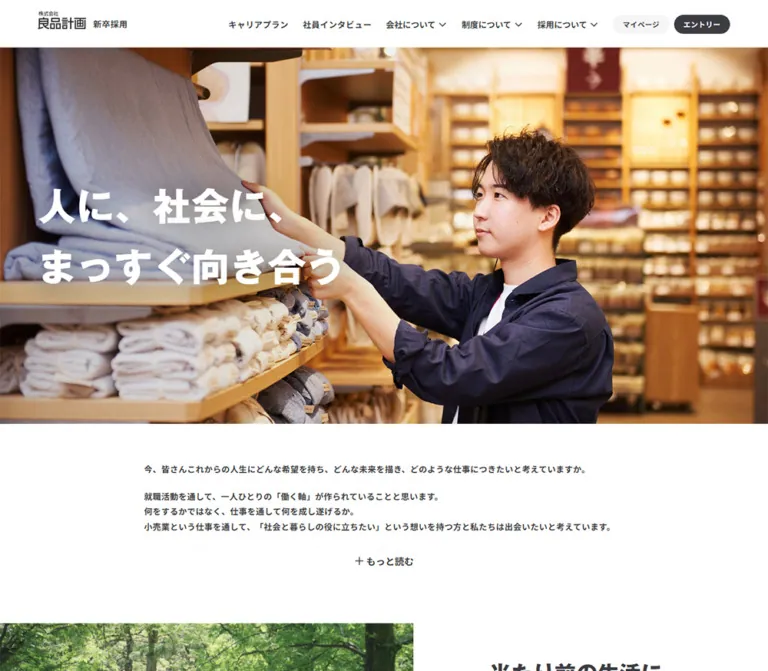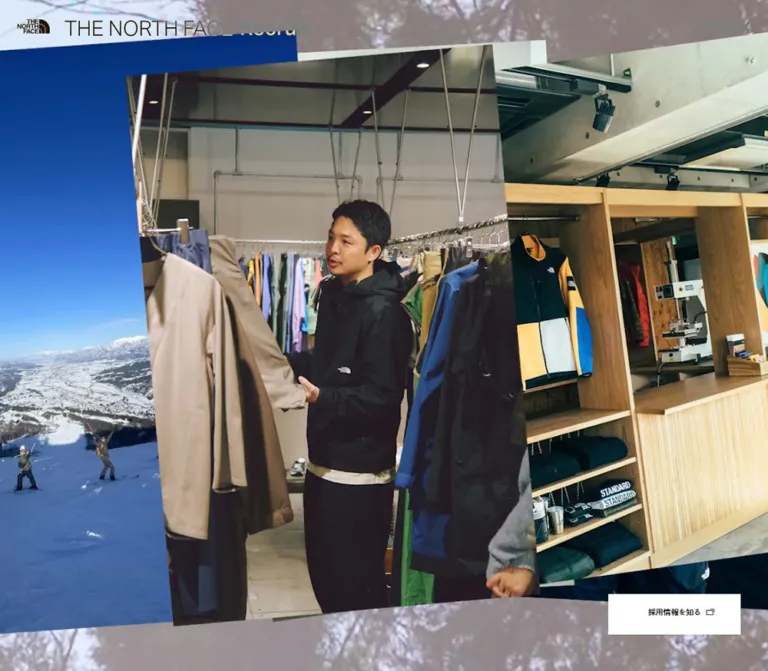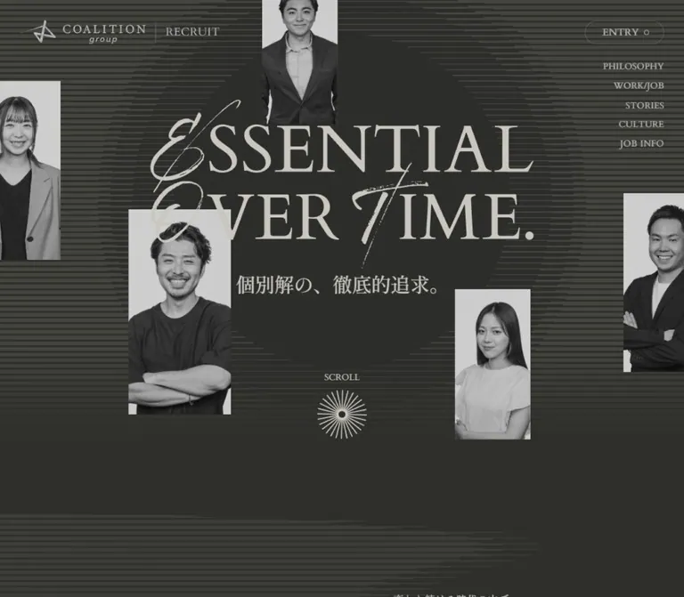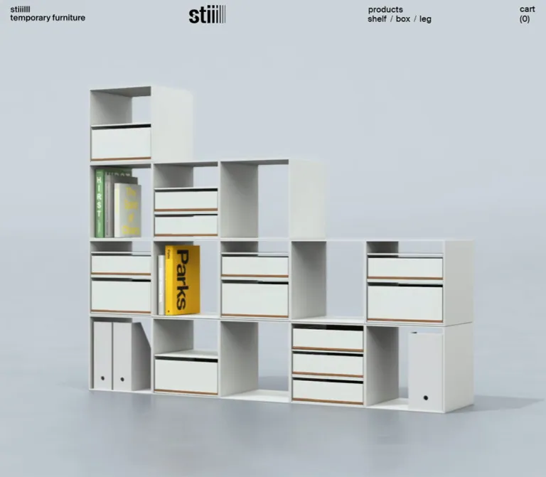
プレビュー準備中デザインリファレンスを見る
DESIGN REFERENCE
デジタルガレージ 採用サイト
大胆な日本語のグラフィック見出しと社員・オフィス写真が印象的な採用サイト。白黒を基調に、事業別の鮮やかなカードと明快な応募導線を組み合わせています。
Digital Garage Recruitment — Style Reference
Bold black lettering, bright workplace photography, and a restrained recruitment interface punctuated by four business colors.
Website: recruit.garage.co.jp Original URL: https://recruit.garage.co.jp/ Final URL: https://recruit.garage.co.jp/ Theme: predominantly white and black, with textured charcoal sections and business-category colors; no theme switch was observed. Inspected: supplied browser evidence retrieved September 24, 2026, at 05:46:57 JST — September 23, 2026, at 20:46:57.366 UTC. Viewports: desktop 1440 × 1000 CSS pixels; mobile 390 × 844 CSS pixels. Scope: the current recruitment homepage, including navigation, opening composition, company introduction, summary links, job categories, employee stories, working environment, selection information, news, recruitment links, footer, and persistent utilities. Visual evidence consists of three desktop captures and two mobile captures, supported by rendered DOM measurements across the page. Linked pages and application services were not inspected.
This is the entrance to a recruitment website with a substantial information hierarchy. Company information, business areas, job families, employee stories, working conditions, and selection guidance support several routes into recruitment. The page should retain that depth when reused as a design reference.
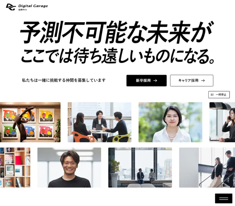
The opening desktop composition places an oversized, slanted Japanese headline above compact recruitment links and two staggered rows of photographs. Most interface elements remain monochrome. Color becomes concentrated in four job cards, while employees and office interiors provide a more varied photographic palette. Broad section spacing, bold Japanese headings, small English labels, and modest corner radii keep the long page coherent.
The strongest contrast is between expressive content and simple controls: the headline is forceful, the photographs are numerous, and the navigation remains small and orderly. Preserve that balance rather than enlarging every button or coloring every section.
閉じる
Digital Garage Recruitment — Style Reference
Bold black lettering, bright workplace photography, and a restrained recruitment interface punctuated by four business colors.
Website: recruit.garage.co.jp Original URL: https://recruit.garage.co.jp/ Final URL: https://recruit.garage.co.jp/ Theme: predominantly white and black, with textured charcoal sections and business-category colors; no theme switch was observed. Inspected: supplied browser evidence retrieved September 24, 2026, at 05:46:57 JST — September 23, 2026, at 20:46:57.366 UTC. Viewports: desktop 1440 × 1000 CSS pixels; mobile 390 × 844 CSS pixels. Scope: the current recruitment homepage, including navigation, opening composition, company introduction, summary links, job categories, employee stories, working environment, selection information, news, recruitment links, footer, and persistent utilities. Visual evidence consists of three desktop captures and two mobile captures, supported by rendered DOM measurements across the page. Linked pages and application services were not inspected.
This is the entrance to a recruitment website with a substantial information hierarchy. Company information, business areas, job families, employee stories, working conditions, and selection guidance support several routes into recruitment. The page should retain that depth when reused as a design reference.
The opening desktop composition places an oversized, slanted Japanese headline above compact recruitment links and two staggered rows of photographs. Most interface elements remain monochrome. Color becomes concentrated in four job cards, while employees and office interiors provide a more varied photographic palette. Broad section spacing, bold Japanese headings, small English labels, and modest corner radii keep the long page coherent.
The strongest contrast is between expressive content and simple controls: the headline is forceful, the photographs are numerous, and the navigation remains small and orderly. Preserve that balance rather than enlarging every button or coloring every section.
How to Read This Reference
- Measured means a value appears in the supplied computed styles, custom properties, or rendered element rectangles. Decimal dimensions are rounded for readability where appropriate.
- Calculated means a relationship is derived from those measurements, such as a grid gap or remaining content width.
- Estimated means a visual approximation from an original-page screenshot, not a recovered CSS declaration.
- Recommended identifies an implementation choice for an adaptation. The CSS below is an adaptation kit, not the site's original stylesheet.
- Source custom-property names are identified explicitly. Other token and component names are descriptive aliases.
- A nonzero DOM rectangle does not prove that an element was visible. Several navigation descendants have measurable boxes while their panels are absent from the screenshots.
- The mobile opening capture shows a large white region where the DOM reports hero content. Its cause is unresolved. This document does not treat that blank region as an intentional design feature.
Tokens — Colors
Default Palette
| Name | Value | Source or implementation token | Role and evidence |
|---|---|---|---|
| White | #ffffff |
Source --clr-white; alias --color-paper |
Header, main reading surfaces, outlined buttons, reversed text |
| Black | #000000 |
Source --clr-black; alias --color-ink |
Main typography, graphic headline, filled recruitment buttons, utility icons |
| Charcoal | #292930 |
Source --clr-bg-black; alias --color-charcoal |
Matches the dark family used behind the job section and footer; visible surfaces also contain fine texture |
| Light gray | #f5f5f5 |
Source --clr-light-gray |
Measured mobile selection-link backgrounds |
| Rule gray | #d6d6d6 |
Source --clr-gray |
Available neutral for light outlines and separators; individual border colors were not included in the extract |
| Muted gray | #969696 |
Source --clr-dark-gray |
Available secondary-label color; visually consistent with the small gray member-section label |
| Deep gray | #424242 |
Source --clr-ultra-dark-gray |
Declared supporting neutral; no distinct use was established in the supplied screenshots |
White and black carry navigation and recruitment priority. The four saturated fills below classify work; they are not interchangeable CTA colors.
Business Colors
| Category | Measured card fill | Source token | Observed use |
|---|---|---|---|
| Fintech | #20992b |
--clr-ft-green |
Payment-solutions card |
| Digital Business | #109c9e |
No matching named property supplied | Integrated digital-business support card; converted from measured rgb(16, 156, 158) |
| Marketing | #d96111 |
--clr-mt-orange |
Digital-marketing card |
| Incubation | #5132c7 |
--clr-it-purple |
Venture-capital card |
Each card uses white copy and a white circular arrow holder. The arrow itself visually returns to the category color. The cards appear in the same green, teal, orange, purple order in desktop and mobile DOM evidence.
Supporting Source Palette
These properties are declared by the inspected page. Their presence does not establish that every color is visibly used on this homepage.
| Family | Strong color | Pale companion | Source variables |
|---|---|---|---|
| General blue | #1b65b1 |
#DCEBFA |
--clr-blue, --clr-blue-bg |
| Fintech | #20992b |
#E1F7E2 |
--clr-ft-green, --clr-ft-green-bg |
| Marketing | #d96111 |
#FBECE2 |
--clr-mt-orange, --clr-mt-orange-bg |
| Incubation | #5132c7 |
#EFEBFF |
--clr-it-purple, --clr-it-purple-bg |
| Business development | #c9206a |
#FFEBF4 |
--clr-biz-dev-pink, --clr-biz-dev-pink-bg |
| Technology development | #2287bd |
#EDF7FC |
--clr-tech-dev-blue, --clr-tech-dev-blue-bg |
The supplied values for --clr-base and --clr-accent are empty. Do not assign either an invented brand color.
Tokens — Typography
Japanese Interface — Desktop
The measured body stack is:
'游ゴシック体', YuGothic, '游ゴシック', 'Yu Gothic',
'Hiragino Kaku Gothic Pro', 'ヒラギノ角ゴ Pro W3', sans-serif
The desktop body uses 16px, weight 500, and 0.16px letter spacing. Most headings, navigation labels, and recruitment links use weight 700. The root size is a conventional 16px; source rem values can therefore be converted directly.
Japanese Interface — Mobile
The mobile source changes the base stack to:
'Hiragino Kaku Gothic Pro', 'ヒラギノ角ゴ Pro W3',
'Hiragino Kaku Gothic Pro', メイリオ, Meiryo, arial
The duplicated family above is present in the supplied declaration. Mobile body weight changes to 400, while headings remain 700. This is a real responsive typography change, not merely a reduction in size.
The declared --font-setting value is 'palt'. That establishes an available proportional-alternate setting, but the evidence does not include the computed font-feature-settings property for every element.
English Labels
The source declares --eng-font: 'lemonde-sans', sans-serif. Labels such as Our Member, How we work, and News create a quieter secondary hierarchy above the Japanese headings.
The supplied element samples do not establish which font file rendered those labels or whether the named web font loaded. Treat the family name as a source declaration, not a verified font-delivery result.
Graphic Headline and Wordmark
The visible opening headline reads:
予測不可能な未来が ここでは待ち遠しいものになる。
Its black, forward-slanted lettering has a much larger visual scale than the ordinary interface typography. The first line is taller than the second. The desktop H1 wrapper measures 880 × 212.41px, positioned at x = 280, y = 140.
The extracted H1 text is empty, and its inherited font size is only 16px. That inherited value does not describe the visible lettering. The headline appears to be graphically rendered; the asset format, internal lettering construction, and font are not supplied. Preserve its proportions using an authorized graphic when available. A live-text approximation should be identified as an approximation.
The Digital Garage wordmark is also a branded graphic. Its italic appearance does not establish a reusable text font.
Type Scale
| Role | Desktop | Mobile | Weight / tracking | Evidence |
|---|---|---|---|---|
| Base interface | 16px, normal line height |
16px, normal line height |
500 desktop; 400 mobile; 0.01em |
Measured |
| Main navigation | 15px |
16px in menu DOM |
700, 0.025em |
Measured; open mobile menu not visually tested |
| Hero supporting sentence | 18px / 28.8px |
14px / 22.4px |
700, normal tracking |
Measured; mobile painting unresolved |
| Introductory heading | 48px / 60px |
32px / 44.8px |
700 |
Measured |
| Introductory paragraph | 18px / 36px |
16px / 32px |
Body weight | Measured |
| Standard section heading | 44px / 55px |
32px / 40px |
700, 0.01em |
Measured |
| Section supporting sentence | 20px / 32px |
18px / 28.8px |
700 |
Measured |
| Employee-story title | 22px / 30.8px |
22px / 30.8px |
700, 0.025em |
Measured |
| Standard recruitment link | 16px / 22.4px |
16px / 22.4px |
700, 0.05em |
Measured |
| Selection link | 20px, normal line height |
18px, normal line height |
700 |
Measured |
| Closing recruitment heading | 56px / 70px |
32px / 40px |
700, -0.01em |
Measured |
| Closing recruitment link | 20px / 28px |
16px / 22.4px |
700, 0.05em |
Measured |
| Photo pause label | 12px |
10px |
700 |
Measured; mobile visibility unresolved |
| Corporate-site footer link | 12px / 16.8px |
Same | 700, 0.05em |
Measured |
| Cookie notice | Approximately 14px / 21px |
Approximately 10px / 15px |
Visually regular | Screenshot estimate |
Employee-story titles stay at 22px on mobile. Their narrower measure produces more lines instead of a smaller headline.
The source also changes named size tokens: --font-size-3 from 18px to 16px, --font-size-4 from 20px to 18px, --font-size-6 from 26px to 20px, and --font-size-7 from 36px to 24px. These are available tokens, not proof that every similarly sized component uses them.
Tokens — Spacing & Shapes
Base geometry: conventional rem units with a 16px root, mixed with percentage-based mobile gutters. Density: generous section spacing, compact navigation, narrowly separated job cards, and larger gaps between editorial stories.
Spacing Scale
| Value | Observed or calculated use |
|---|---|
8px |
Calculated desktop gap between the four job cards |
12px |
Mobile recruitment-button gaps; mobile selection-link gaps; desktop story-text inset |
16px |
Desktop hero-button gap; mobile job-card gaps; summary-card gap |
24px |
Selection-link vertical padding; estimated vertical gap between desktop photo rows |
32px |
Desktop environment-card gaps; estimated horizontal photo gaps and job-card inner inset |
40px |
Desktop member-card gaps; hero graphic-to-action gap |
48px |
Desktop member-heading-to-card gap |
80px |
Desktop job-grid-to-all-jobs-button gap; mobile job-section bottom clearance |
120px |
Desktop standard content inset; repeated major section clearance |
140px |
Desktop introduction top and bottom padding |
160px |
Desktop closing-section horizontal inset; jobs section clearance below the all-jobs button |
The table mixes measured spacing with calculations from element edges; the explicitly estimated entries should be checked against assets in a new build.
Border Radius
| Shape | Value | Evidence |
|---|---|---|
| Text links and ordinary layout boxes | 0 |
Measured |
| Small mobile menu control | 2px |
Measured; source --radius-xs is 0.125rem |
| Job cards, summary links, major buttons | 4px |
Measured; source --radius-s is 0.25rem |
| Additional declared radius | 6px |
Source --radius-m; visible use not established |
| Additional declared radius | 8px |
Source --radius-l; visible use not established |
| Member-navigation controls | 50% |
Measured circles, 64px diameter |
| Job-card arrow holder | Approximately 32px circle |
Screenshot estimate |
The prevailing rectangular silhouette is nearly square. Large pill buttons and heavily rounded containers would change the character.
Layout Measurements
| Element | Desktop 1440 × 1000 | Mobile 390 × 844 |
|---|---|---|
| Header height | 120px |
64px |
| Header logo | 270 × 45.66px |
190 × 32.13px |
| Standard horizontal inset | 120px |
20.78px |
| Standard available content width | 1200px |
348.44px |
| Hero headline wrapper | 880 × 212.41px |
390 × 84.08px, including horizontal padding |
| Introductory text column | 496px |
348.44px |
| Job card | 294 × 357.69px |
348.44px wide; approximately 306.80–334.80px tall |
| Employee-story card | 352 × 516.73px |
288.59 × 480.66px |
| Environment card | Approximately 378.67 × 235.59px |
348.44 × 214.80px |
| Closing recruitment button | 400 × 80px |
348.44 × 64px |
| Footer height | Approximately 246.19px |
Approximately 401.44px |
| Document height | Reported 7615px |
Reported 8133px |
The desktop content width follows 1440 − 2 × 120 = 1200px. The mobile source uses --px-content: 5.33%, producing approximately 20.78px per side after browser rounding.
Components
Site Header
Role: identify the employer and expose the recruitment site's main information architecture.
The opening desktop header is a 120px white band. A black logo sits at approximately (26, 37). The navigation follows in one horizontal line: home, company, business, jobs, people, environment, and selection. Grouped navigation controls use small plus marks. A black 募集要項・エントリー control sits at the far right.
Main navigation labels use 15px bold type. The entry control measures 260 × 52px, with 36px horizontal padding, a 4px radius, and white text. Its measured right edge extends approximately 14px beyond the 1440px viewport; avoid reproducing that crowding in an adaptation.
Desktop submenu links exist in the DOM, including company history, business areas, job families, workplace information, and selection FAQs. Their expanded appearance and opening trigger were not tested. Do not infer a hover-only interaction from the presence of those links.
On mobile, the top band becomes 64px high and contains a 190px logo. A separate black menu control appears near the lower-right corner. The lower desktop captures do not show the opening header; its scroll-direction or sticky behavior is unverified.
Opening Headline and Recruitment Links
Role: establish a future-oriented message and provide immediate graduate and experienced-hire routes.
The graphic headline is centered in an 880px-wide desktop block, with its top 20px below the header. Beneath it, the bold supporting sentence sits left while two links sit right. The actions align at y ≈ 392.41px and are 52px high.
The first action, 新卒採用, is black with white text and a right arrow. It measures 182px wide. The second, キャリア採用, is white with a thin black outline and an external-destination symbol, measuring approximately 196.75px wide. Their gap is 16px.
The graduate destination is /hiring-graduate/. The career destination is the supplied HRMOS jobs URL. A destination icon does not by itself prove that a link opens a new tab.
Mobile DOM measurements place the hero media controls before the supporting sentence and two stacked 64px-high actions. Those elements were not painted in the supplied opening mobile screenshot. Preserve the measured responsive intent while marking the rendered result as unresolved.
Two-Row Photo Ribbon
Role: introduce the people, spaces, and cultural details behind the employer brand.
The desktop opening shows two rows of landscape photographs extending beyond the viewport edges. Individual visible tiles are approximately 288 × 180px, an 8:5 ratio, with approximately 32px horizontal gaps and a 24px row gap. These dimensions are screenshot estimates.
The two rows have different horizontal offsets. At the captured moment, the upper row includes a blue-lit figure, framed artwork and sculpture, a meeting, a woman facing the camera, and a woman using a phone. The lower row includes a bookshelf, a smiling employee, a window-side conversation, colleagues on stairs, and colorful office seating.
Use consistent crop geometry while preserving subject variety. Do not force the two rows into vertically aligned columns; their staggered positions are part of the composition.
A small outlined 一時停止 control with a pause symbol sits above the right edge of the photographs. This establishes a playback affordance. The evidence does not establish travel speed, direction, looping implementation, or the result of pressing pause.
Company Introduction and Summary Links
Role: move from the opening statement into an explanation of the company and its businesses.
The introductory heading 最先端テクノロジーへ 知的好奇心を uses 48px bold type on desktop, followed by an 18px paragraph with a spacious 36px line height. The measured text column is 496px wide. The section has 140px top and bottom padding, giving the narrative considerably more breathing room than the navigation.
On mobile, the heading becomes 32px with a 44.8px line height, and the paragraph becomes 16px with a 32px line height. The section uses approximately 20.78px side insets, 80px top padding, and 120px bottom padding.
Two subsequent white summary links are labeled Summary 01 and Summary 02. Their content hierarchy is a small numbered label, Japanese title, explanatory sentence, and 詳しく見る link treatment. They lead to company data and the business overview.
Both links occupy the same 496px desktop column and are stacked with a 16px gap. On mobile, both use the 348.44px content width and their heights vary with wrapping. The surrounding imagery or background of this region is not established by the supplied screenshots.
Job Category Card
Role: make the company's main work areas legible as distinct entry points.
The job section introduces How we work, a 44px Japanese heading, and a 20px supporting sentence above four colored cards. It appears on a subtly textured charcoal field in the desktop capture.
Each card is an entire anchor containing an English category label, a bold Japanese role title, a short description, and a bottom-right 詳しく見る treatment. The small white arrow circle reinforces the link without becoming a separate nested button.
Desktop geometry is exact: four 294px cards and three 8px gaps fill the 1200px content width. Cards have a 4px radius and a shared measured height of 357.69px. Screenshot evidence suggests an inner inset of approximately 32px; the outer anchor itself reports zero padding, so that inset belongs to descendants.
On mobile, the cards become a single column with 16px gaps. Heights vary between approximately 306.80px and 334.80px. Keep height content-driven rather than forcing every narrow card to match the desktop height.
A centered white すべて見る link follows the grid. It measures 256 × 64px on desktop, 80px below the cards, and expands to the full mobile content width. The mobile gap above it is 40px.
Employee-Story Rail
Role: let candidates browse individual careers and group conversations without expanding every story into the vertical page.
The section returns to white. A small gray Our Member label precedes the two-line heading デジタルガレージを 作る仲間たち. On desktop, two 64px circular arrow controls align to the lower-right edge of the heading area, separated by 16px.
Cards begin 48px below the heading and form a horizontal rail. Their measured width is 352px, with 40px gaps. Three complete cards and part of the next are available across the captured desktop composition. The visible card tops contain photographs; the DOM establishes a story title, department or role, employee initials, recruitment details where applicable, and business/content-type labels beneath.
Story titles use 22px / 30.8px bold text with 0.025em tracking. Their text width is approximately 328px inside the 352px card, implying 12px horizontal insets. The card is visually open on the white canvas rather than framed by a heavy border or shadow.
On mobile, the initial card is approximately 288.59px wide and centered at x ≈ 50.70px. Cards have 20px gaps, and the next card starts at x ≈ 359.30px. This preserves a neighboring-card preview. The title size remains 22px, while text insets reduce to approximately 8px.
The rail layout is established. Dragging, swiping, autoplay, looping, and arrow-click results are not established.
Working Environment Links
Role: provide routes into culture, working style, and offices.
The DOM contains three entire-card links under Working Environment and 働く環境. On desktop, their widths are approximately 378.67px with 32px gaps. On mobile, they stack at 348.44px wide with 16px gaps.
Their anatomy follows the summary-card pattern: title, short explanation, and 詳しく見る. The measured section heading is 44px on desktop and 32px on mobile.
The extract reports white text together with white background colors on several elements. Those values do not account for background images, pseudo-elements, or other painted layers. This region is not visible in the supplied screenshots, so its complete surface treatment cannot be reconstructed reliably. Retain the measured grouping and hierarchy without inventing a particular background photograph.
Selection Links and News
Role: answer practical candidate questions and surface current recruitment announcements.
The selection section uses Work with us above its Japanese heading. Its three links cover desired candidates, reasons to work at the company, and the selection process.
On desktop, these links form a 480px-wide column. Each measured row is 79px high with 24px vertical padding and 20px bold text. On mobile, the presentation changes more substantially: each link becomes a separate light-gray rectangle, 348.44px wide and 75px high, with 30px horizontal padding, 4px corners, 18px text, and 12px gaps.
News follows with a heading and two date/title links in the supplied content. Desktop measurements place the heading to the left and the approximately 782.5px-wide news list to the right. Mobile places the heading above the full-width list. Rows use 24px vertical padding and grow when a title wraps; the second mobile item is approximately 133.59px high rather than the first item's 104.80px.
Use content-driven row height. The supplied dates and announcements describe this capture and should not become permanent design tokens.
Closing Recruitment Panel
Role: collect the main application routes after the informational sections.
The desktop closing panel is approximately 739.59px tall. A full-width photograph shows two colleagues descending a bright office staircase. The pale wall on the left creates space for black copy; the people occupy the right half. It is a photographic composition with usable negative space, not a generic darkened image behind centered text.
The copy begins at a 160px left inset. A small introductory line precedes the 56px, two-line heading 一緒に未来を つくりませんか?. Three links stack below at 400 × 80px, with 16px gaps:
新卒採用: black fill and right arrow.キャリア採用: black fill and external-destination symbol.テック人財採用サイト: white fill, black outline, and external-destination symbol.
On mobile, the supplied closing capture shows a white copy-and-action region with centered text. The heading becomes 32px / 40px, and links expand to approximately 348.44 × 64px, with 12px gaps.
The mobile screenshot begins partway into this section. Its complete measured height is 643px, and its heading starts 275px below the section's top. Consequently, the capture does not prove that the desktop photograph disappears entirely on mobile; a leading image region could be above the visible crop. Only the white background behind the visible copy and buttons is confirmed.
Footer
Role: retain corporate identity, site navigation, and legal destinations at the end of the page.
The footer uses a dark, finely textured field with a reversed white logo. On desktop, the logo measures approximately 287 × 48px at an 80px left inset. A small white corporate-site link sits beneath it, while the main site links form a horizontal group to the right.
On mobile, the footer uses a 39px left inset, equivalent to 10% of the viewport. Its logo becomes 200px wide. The corporate-site link becomes 256 × 34px. Navigation wraps into several rows, with visible vertical separators between neighboring links.
Desktop footer navigation uses 16px bold text; mobile uses 15px. The supplied page text also contains contact, compliance, disclaimer, privacy, and copyright information. The copyright identifies Digital Garage, Inc. No production-credit claim is established by the inspected original-page evidence.
Preserve the actual label distinction: the header uses ビジネスを知る, while the footer uses 事業を知る.
Cookie Notice and Floating Utilities
Role: keep the cookie notice and compact navigation utilities available while the page scrolls.
A white cookie bar occupies the bottom of every supplied original-page capture. Desktop visual estimates give it approximately 66px of height, a centered content group about 868px wide, two lines of explanation, and a black agreement button around 130 × 36px.
On mobile, the notice is approximately 100px high. The explanation occupies the left column and a roughly 110 × 35px agreement button sits on the right. The label is 同意する; the privacy link is visibly underlined. Dismissal and persistence were not tested.
The mobile menu control measures 78 × 44px, has a 2px radius, and appears at (300, 680) in the 390 × 844 viewport. Two white horizontal strokes sit within its black rectangle. Its lower edge is 120px above the viewport bottom, leaving approximately 20px above the visible cookie bar.
Desktop lower-page captures include a white square upward-arrow control, approximately 64px wide. The DOM supplies a #top destination. Its vertical position varies between captures, so a simple fixed-bottom placement is not established.
Tokens — Motion & Interaction
The supplied evidence contains transition declarations and visible controls, but no recorded click-through tests. Separate available motion from verified behavior.
| Element or treatment | Supplied value or evidence | What can be concluded |
|---|---|---|
| Header | 0.15s ease-in-out |
A short transition is declared; the changing property and triggering state are not established |
| H1 wrapper | filter 0.15s |
A filter transition is declared; its endpoints are unknown |
| Main and footer | filter 0.6s |
A longer filter transition is available; a specific blur or menu effect was not observed |
| Card surfaces | background-color 0.2s ease-in-out, opacity 0.3s ease-in-out, border-color 0.3s ease-in-out |
Color, opacity, and border changes are declared; exact hover states are not supplied |
| Supporting and story text | color 0.2s ease-in-out |
Short text-color transitions are declared |
| Several outlined links | color 0.2s 0.1s |
Text color has a 200ms transition with a 100ms delay |
| Member arrow controls | 0.2s ease-in-out |
Short control-state transition; slide movement timing is not established |
| Photo ribbon | Visible pause control | Playback control is offered; speed, direction, and pause results are unverified |
| Mobile navigation | Floating menu button and menu descendants | A menu structure exists; open state, focus handling, and dismissal are unverified |
| Return to top | Anchor to #top |
Destination is established; smooth-scrolling behavior is not |
| Cookie notice | Persistent visible bar and agreement control | Initial state is established; post-agreement behavior is not |
Many sampled elements report animation: none. That does not exclude JavaScript motion, animations on unsampled descendants, or pseudo-element effects.
The collection process awaited finite animation and layout stability, temporarily paused perpetual animations during readiness checks, and resumed them afterward. Static captures still cannot establish a complete motion sequence.
Recommended adaptation: keep ordinary feedback within the observed 150–300ms range, provide a working pause control for any moving photo ribbon, and retain a readable static composition under reduced motion. Do not invent elaborate parallax or dramatic section entrances as an observed feature.
Surfaces
| Surface | Appearance | Structural purpose |
|---|---|---|
| Main canvas | White with black typography | Quiet reading space around photographs and headings |
| Job section | Textured charcoal with reversed heading text | Creates a distinct stage for the four business colors |
| Job card | Flat saturated fill, white content, 4px radius | Category recognition and whole-card navigation |
| Employee story | Photography and black text directly on white | Editorial browsing without heavy card chrome |
| Mobile selection link | #f5f5f5, 4px radius |
Makes each practical-information link a separate touch target |
| Closing panel | Desktop staircase photograph with pale negative space | Connects the final recruitment invitation to real people |
| Footer | Textured charcoal and reversed identity | Establishes a strong page ending |
| Cookie notice | White strip with faint top separation | Keeps the notice distinct from the content underneath |
No general shadow-based elevation system is visible. Separation comes from spacing, fill changes, outlines, and image boundaries. The dark texture is subtle; its source asset and construction are unknown.
Imagery
Photography is central to the identity. The opening combines candid work, direct portraits, meeting scenes, shelves, artwork, architecture, and office furniture. Most images have natural daylight, neutral whites and grays, and selective color from clothing, art, and interiors. One blue-lit image adds variety without becoming an overall neon theme.
Keep the mix human and specific. A row of interchangeable headshots would lose the contrast between people and place. Likewise, using only empty office interiors would remove the recruitment focus.
Landscape crops should preserve faces, gestures, and context. The closing staircase image needs deliberate art direction: people on the right and quiet pale space on the left. A randomly centered crop would compete with the text.
Observed Asset References
The evidence does not provide image URLs, filenames, intrinsic image sizes, or licensing information. The references below describe visible assets without inventing paths.
| Asset | Established appearance | Implementation implication |
|---|---|---|
| Header identity | Black Digital Garage symbol, italic wordmark, small recruitment label | Use an authorized logo asset; do not approximate the mark with ordinary text |
| Opening headline | Two-line slanted black Japanese lettering | Preserve the approximately 4.14:1 graphic footprint on desktop |
| Opening photo collection | Two staggered rows of employees, meetings, interiors, and artwork | Use consistent landscape tiles and varied subjects |
| Employee-story photographs | Individual and group imagery at the tops of editorial cards | Pair each image with the correct story; exact crop ratios are unverified |
| Closing photograph | Two colleagues on a staircase, with pale left-side space | Preserve the desktop text-safe area |
| Footer identity | White reversed logo | Use a clean reversed asset against charcoal |
| Dark texture | Fine low-contrast grain | Optional approximation should remain subtle; no source texture path is available |
No image-generation style is required to explain the interface. Authentic workplace photography and the original identity graphics carry more of its character than decorative effects.
Layout & Responsive Behavior
The page alternates constrained editorial content with full-width visual regions. Standard desktop sections use a 1200px content span at the inspected viewport. The headline is narrower at 880px, introductory copy narrows to 496px, and the closing buttons narrow to 400px. These different widths serve distinct reading and action roles.
Observed Responsive Changes
| System | Desktop | Mobile |
|---|---|---|
| Main navigation | Horizontal header navigation and entry control | Small top logo plus separate floating menu control |
| Base font | Yu Gothic-led stack, weight 500 | Hiragino-led stack, weight 400 |
| Standard headings | 44px / 55px |
32px / 40px |
| Job categories | Four equal columns, 8px gaps | One column, 16px gaps, content-driven heights |
| Employee stories | 352px cards, 40px gaps | 288.59px cards, 20px gaps, initial card centered |
| Environment links | Three columns, 32px gaps | One column, 16px gaps |
| Selection links | 480px-wide text rows | Full-width gray blocks with 12px gaps |
| News | Heading beside the list | Heading above the list |
| Closing recruitment | Left-aligned over a wide photograph; 80px buttons | Centered visible copy on white; 64px buttons |
| Footer | Horizontal identity/navigation composition | Stacked identity and wrapping navigation |
| Cookie notice | Low horizontal strip | Taller two-column strip with much smaller explanatory text |
Mobile Opening Limitation
The mobile opening screenshot shows the logo, a large white area, part of the introductory heading near the bottom, the floating menu control, and the cookie notice. It does not visibly show the graphic headline, photo ribbon, supporting sentence, or opening recruitment buttons.
However, the DOM still reports an H1 at y = 88px, a media pause control at y ≈ 377px, supporting copy at y ≈ 436px, and recruitment links at y ≈ 474px and 550px. These rectangles establish layout allocation, not successful painting.
Possible causes cannot be distinguished from this evidence. Do not call the area an intentional blank hero, a confirmed loading screen, or a verified mobile removal. For a new implementation, essential heading and recruitment links should remain visible if an animation or graphic fails to initialize.
Breakpoints and Viewport Limits
Only 1440px and 390px widths were supplied. Exact media-query thresholds, tablet layouts, landscape behavior, and extreme desktop widths are unknown. The Quick Start uses explicit recommended breakpoints and should be tested at intermediate widths.
Preserve horizontal overflow only within the photo and story regions. Ensure the whole document does not become horizontally scrollable, and account for the cookie bar when positioning floating controls and keyboard focus targets.
Do’s and Don’ts
Do
- Keep recruitment actions monochrome and reserve saturated fills for business categories.
- Preserve the difference between the oversized graphic headline and the quieter text system below it.
- Use real workplace scenes alongside portraits, interiors, and cultural details.
- Retain two staggered photo rows on the desktop opening composition.
- Keep job cards tightly grouped on desktop and comfortably stacked on mobile.
- Preserve employee stories as a horizontal browsing rail with a neighboring-card preview.
- Use the measured 44px desktop and 32px mobile section-heading scale.
- Keep ordinary radii close to 4px and use circles for small directional controls.
- Repeat the graduate, experienced-hire, and technical-recruitment routes near the page end.
- Make uncertainties in mobile painting, asset rendering, and interaction behavior explicit.
Don’t
- Don’t reduce the recruitment website to a single application form or generic campaign layout.
- Don’t interpret the H1's inherited 16px font size as the visible headline size.
- Don’t identify a headline font from its appearance alone.
- Don’t replace category colors with an unrelated global accent system.
- Don’t add oversized pill buttons, glossy gradients, glass panels, or heavy card shadows.
- Don’t turn the mobile story rail into a four-column grid or shrink its titles indiscriminately.
- Don’t reproduce the blank mobile hero as a deliberate visual requirement.
- Don’t claim a submenu, carousel, or consent interaction was tested when only its control is visible.
- Don’t interpret a transparent or white computed background as the complete painted surface.
- Don’t hardcode the observed header overflow or let persistent controls obscure essential links.
Recommended Implementation Additions
These are recommendations for an adaptation, not verified features of the original site.
- Give the graphical H1 an accessible text equivalent and a visible fallback that does not depend on an animation completing. Verify its accessibility separately from text extraction.
- Provide named menu and carousel controls, keyboard operation, and appropriate expanded states. Remove closed-menu descendants from keyboard navigation.
- Implement an actual pause/resume state for moving photographs. Respect reduced-motion preferences and keep the stopped composition visually complete.
- Check small white text against every category fill. Adjust the text treatment or introduce a darker reading surface if needed while preserving category recognition.
- Keep member-card heights content-driven at larger text sizes. Avoid clipping longer Japanese story titles or recruitment details.
- Preserve a usable focus indicator on both white and charcoal surfaces, and ensure focus targets are not hidden behind the cookie bar.
- Recalculate floating-control clearance when the cookie notice wraps, is dismissed, or the viewport changes. The initial 100px mobile notice height is not a universal constant.
- Use responsive image sources and explicit dimensions. Prioritize the opening identity and visible photographs; defer distant editorial images while reserving their layout space.
- Test the navigation around the width where the horizontal header becomes crowded. Choose the collapse point from available space rather than reproducing the measured overflow.
Agent Prompt Guide
Quick Color Reference
- Canvas, header, and most editorial surfaces:
#ffffff. - Main text and recruitment actions:
#000000. - Dark section and footer family:
#292930, with restrained texture. - Fintech card:
#20992b. - Digital Business card:
#109c9e. - Marketing card:
#d96111. - Incubation card:
#5132c7. - Mobile selection links:
#f5f5f5. - Standard shape: approximately 4px corners, thin outlines, no general shadow system.
Overall Prompt
“Create a Japanese recruitment homepage inspired by the supplied Digital Garage reference. Use a white canvas, black recruitment buttons, bold Japanese sans-serif headings, small English section labels, and broad editorial spacing. Lead with a two-line slanted graphic headline and two offset rows of authentic employee and office photographs. Build a complete recruitment information hierarchy: company introduction, summary links, four business-category job cards, a horizontal employee-story rail, working-environment links, selection guidance, news, and a final recruitment panel. Use green, teal, orange, and purple only to distinguish the job categories. Finish with a staircase photograph whose pale left side supports text and stacked application links, followed by a charcoal footer. On mobile, stack category cards and buttons, retain a horizontal story rail, and keep essential hero content visible. Use the measured tokens where supplied; label inferred image crops and motion behavior as implementation choices.”
Example Component Prompts
- Opening composition: “Place an authorized two-line Japanese headline graphic in an 880px-wide desktop block. Beneath it, align an 18px bold supporting sentence left and black/outlined 52px recruitment links right. Follow with two staggered rows of approximately 288 × 180px workplace photographs. Include a functional pause control if the rows move. Do not infer the headline font from its inherited DOM size.”
- Job grid: “Create four whole-card links across a 1200px desktop span: 294px each with 8px gaps and 4px corners. Use the measured green, teal, orange, and purple fills. Inside each, stack an English category, bold Japanese title, short explanation, and a lower-right detail label with a white circular arrow. Stack them with 16px gaps on mobile.”
- Employee stories: “Create a white editorial section with a small gray English label, a two-line Japanese heading, and two 64px circular navigation controls. Use 352px desktop story cards with 40px gaps, photography above 22px bold titles, and compact role metadata. On mobile, use approximately 289px cards with 20px gaps and a centered initial card.”
- Closing recruitment: “Compose a wide office-staircase photograph with people on the right and pale negative space on the left. Add a 56px two-line invitation and three 400 × 80px stacked links: two black, one outlined. At phone widths, show centered 32px copy on white and full-width 64px links. Treat any leading mobile image region as a deliberate adaptation because its source placement is not fully captured.”
- Persistent utilities: “Build a restrained white cookie notice with an underlined privacy link and black agreement button. Keep the mobile menu control above it with clear spacing. Measure the notice height dynamically and preserve access to all footer links.”
Quick Start
CSS Custom Properties
This kit reproduces the main measured colors, type sizes, and desktop proportions. It uses a conventional 16px root. Class names are implementation aliases.
The 64rem and 88rem breakpoints, mobile photo-tile dimensions, story-image aspect ratio, hover treatment, and mobile placement of a closing image are recommendations, not recovered source rules. No image URLs were supplied; insert authorized assets in the corresponding image elements. The named English font requires a separately available font resource or falls back to sans-serif.
:root {
  /* Measured source colors */
  --color-paper: #ffffff;
  --color-ink: #000000;
  --color-charcoal: #292930;
  --color-soft: #f5f5f5;
  --color-rule: #d6d6d6;
  --color-muted: #969696;
  --color-fintech: #20992b;
  --color-digital: #109c9e;
  --color-marketing: #d96111;
  --color-incubation: #5132c7;

  /* Measured font declarations */
  --font-jp: '游ゴシック体', YuGothic, '游ゴシック',
    'Yu Gothic', 'Hiragino Kaku Gothic Pro',
    'ヒラギノ角ゴ Pro W3', sans-serif;
  --font-en: 'lemonde-sans', sans-serif;
  --body-weight: 500;

  /* Measured desktop scale */
  --text-body: 1rem;
  --text-intro: 1.125rem;
  --text-section: 2.75rem;
  --text-story: 1.375rem;
  --text-closing: 3.5rem;
  --header-height: 7.5rem;
  --gutter: 7.5rem;
  --section-space: 7.5rem;
  --radius-small: 0.25rem;
  --radius-tiny: 0.125rem;
  --story-width: 22rem;
  --story-gap: 2.5rem;

  /* Initial screenshot approximation; update after measurement */
  --notice-height: 4.125rem;
  --safe-bottom: env(safe-area-inset-bottom, 0px);
  --feedback: 200ms ease-in-out;
}

* { box-sizing: border-box; }
html { font-size: 16px; }
body {
  margin: 0;
  color: var(--color-ink);
  background: var(--color-paper);
  font-family: var(--font-jp);
  font-size: var(--text-body);
  font-weight: var(--body-weight);
  letter-spacing: 0.01em;
  font-feature-settings: 'palt';
}
button, input { font: inherit; }
a { color: inherit; }
img { display: block; max-width: 100%; }
button, a { -webkit-tap-highlight-color: transparent; }
[hidden] { display: none !important; }

.container { padding-inline: var(--gutter); }
.section { padding-block: var(--section-space); }
.eyebrow {
  margin: 0 0 1rem;
  font-family: var(--font-en);
  font-size: 0.875rem; /* Visual approximation */
  letter-spacing: 0.04em;
}
.section-title {
  margin: 0;
  font-size: var(--text-section);
  font-weight: 700;
  line-height: 1.25;
  letter-spacing: 0.01em;
}
.section-lead {
  margin: 0.75rem 0 3rem;
  font-size: 1.25rem;
  font-weight: 700;
  line-height: 1.6;
}

/* Normal-flow header is an adaptation; scroll behavior is unverified. */
.site-header {
  min-height: var(--header-height);
  display: flex;
  align-items: center;
  gap: 1.25rem;
  padding-inline: 1.625rem;
  background: var(--color-paper);
}
.site-logo { flex: 0 0 16.875rem; }
.desktop-nav {
  display: flex;
  align-items: center;
  justify-content: space-between;
  gap: 1.5rem;
  flex: 1;
  min-width: 0;
}
.desktop-nav a,
.desktop-nav button {
  border: 0;
  padding: 0.75rem 0;
  color: inherit;
  background: transparent;
  text-decoration: none;
  white-space: nowrap;
  font-size: 0.9375rem;
  font-weight: 700;
  letter-spacing: 0.025em;
}
.mobile-menu-toggle { display: none; }

.btn {
  display: inline-flex;
  align-items: center;
  justify-content: center;
  gap: 0.75rem;
  min-height: 3.25rem;
  padding: 0.75rem 2.25rem;
  border: 1px solid var(--color-ink);
  border-radius: var(--radius-small);
  color: var(--color-paper);
  background: var(--color-ink);
  font-size: 1rem;
  font-weight: 700;
  line-height: 1.4;
  letter-spacing: 0.05em;
  text-align: center;
  text-decoration: none;
  cursor: pointer;
  transition: color var(--feedback), background-color var(--feedback);
}
.btn--outline {
  color: var(--color-ink);
  background: var(--color-paper);
}
.btn--wide { width: 16rem; min-height: 4rem; }

.hero { padding-block: 1.25rem 4.5rem; }
.hero-inner {
  width: min(55rem, calc(100% - 2 * var(--gutter)));
  margin-inline: auto;
}
.hero-title { margin: 0; }
.hero-title img,
.hero-title svg { display: block; width: 100%; height: auto; }
.hero-actions {
  display: flex;
  align-items: center;
  justify-content: space-between;
  gap: 1.5rem;
  margin: 2.5rem 0.5rem 0;
}
.hero-actions p {
  margin: 0;
  font-size: 1.125rem;
  font-weight: 700;
  line-height: 1.6;
}
.hero-action-links { display: flex; gap: 1rem; }
.hero-ribbons { position: relative; margin-top: 4.5rem; }
.ribbon-window { overflow: hidden; }
.ribbon-row {
  display: flex;
  gap: 2rem;
  width: max-content;
}
.ribbon-row + .ribbon-row {
  margin-top: 1.5rem;
  margin-left: 1.75rem; /* Static stagger approximation */
}
.ribbon-row img {
  flex: 0 0 18rem;
  width: 18rem;
  height: 11.25rem;
  object-fit: cover;
  border-radius: var(--radius-small);
}
.ribbon-control {
  position: absolute;
  right: 1.5rem;
  bottom: calc(100% + 1rem);
  padding: 0.375rem 0.625rem;
  border: 1px solid currentColor;
  background: var(--color-paper);
  font-size: 0.75rem;
  font-weight: 700;
}

.intro { padding-block: 8.75rem; }
.intro-copy { max-width: 31rem; }
.intro h2 { margin: 0 0 2.5rem; font-size: 3rem; line-height: 1.25; }
.intro p { margin: 0; font-size: var(--text-intro); line-height: 2; }

.jobs {
  color: var(--color-paper);
  background: var(--color-charcoal);
}
.job-grid {
  display: grid;
  grid-template-columns: repeat(4, minmax(0, 1fr));
  gap: 0.5rem;
}
.job-card {
  display: flex;
  flex-direction: column;
  min-width: 0;
  min-height: 22.355rem;
  padding: 2rem; /* Estimated inner inset */
  border-radius: var(--radius-small);
  color: var(--color-paper);
  background: var(--job-color);
  text-decoration: none;
}
.job-card--fintech { --job-color: var(--color-fintech); }
.job-card--digital { --job-color: var(--color-digital); }
.job-card--marketing { --job-color: var(--color-marketing); }
.job-card--incubation { --job-color: var(--color-incubation); }
.job-card h3 {
  margin: 0 0 1.5rem;
  font-size: 1.625rem; /* Recommended use of a declared size token */
  line-height: 1.4;
}
.job-card p {
  margin: 0 0 2rem;
  font-size: 0.875rem; /* Screenshot approximation */
  font-weight: 700;
  line-height: 1.75;
}
.card-link {
  display: flex;
  align-items: center;
  justify-content: flex-end;
  gap: 0.75rem;
  margin-top: auto;
  font-size: 0.875rem;
  font-weight: 700;
}
.arrow-disc {
  display: grid;
  place-items: center;
  width: 2rem;
  height: 2rem;
  border-radius: 50%;
  color: var(--job-color);
  background: var(--color-paper);
}
.jobs-more { margin-top: 5rem; text-align: center; }

.member-heading {
  display: flex;
  align-items: flex-end;
  justify-content: space-between;
  gap: 2rem;
}
.member-heading .eyebrow { color: var(--color-muted); }
.rail-controls { display: flex; gap: 1rem; }
.circle-control {
  width: 4rem;
  height: 4rem;
  border: 1px solid var(--color-rule);
  border-radius: 50%;
  color: var(--color-ink);
  background: var(--color-paper);
  cursor: pointer;
}
.member-rail {
  display: flex;
  gap: var(--story-gap);
  overflow-x: auto;
  margin-top: 3rem;
  padding: 0 var(--gutter) 1rem;
  scroll-snap-type: x proximity; /* Recommended interaction */
}
.member-card {
  flex: 0 0 var(--story-width);
  min-width: 0;
  color: inherit;
  text-decoration: none;
  scroll-snap-align: start;
}
.member-card img {
  width: 100%;
  aspect-ratio: 3 / 2; /* Recommended crop; source ratio unverified */
  object-fit: cover;
  border-radius: var(--radius-small);
}
.member-card-body { padding: 1.5rem 0.75rem 0; }
.member-card h3 {
  margin: 0 0 1rem;
  font-size: var(--text-story);
  font-weight: 700;
  line-height: 1.4;
  letter-spacing: 0.025em;
}

.selection-links { width: min(30rem, 100%); }
.selection-link {
  display: block;
  padding: 1.5rem 0;
  font-size: 1.25rem;
  font-weight: 700;
  text-decoration: none;
}
.news-layout {
  display: grid;
  grid-template-columns: auto minmax(0, 1fr);
  gap: 7.5rem;
}
.news-link { display: block; padding-block: 1.5rem; text-decoration: none; }
.news-link + .news-link { border-top: 1px solid var(--color-rule); }

.apply {
  position: relative;
  min-height: 46.225rem;
  padding: 7.5rem 10rem;
  background: var(--color-paper);
}
.apply-image {
  position: absolute;
  inset: 0;
  width: 100%;
  height: 100%;
  object-fit: cover;
}
.apply-content { position: relative; width: min(25rem, 100%); }
.apply h2 {
  margin: 1rem 0 2.25rem;
  font-size: var(--text-closing);
  line-height: 1.25;
  letter-spacing: -0.01em;
}
.apply-links { display: grid; gap: 1rem; }
.apply-links .btn { min-height: 5rem; font-size: 1.25rem; }

.site-footer {
  padding: 3.375rem 5rem;
  color: var(--color-paper);
  background: var(--color-charcoal);
}
.footer-main { display: flex; align-items: center; justify-content: space-between; gap: 3rem; }
.footer-logo { width: 17.9375rem; }
.footer-nav { display: flex; flex-wrap: wrap; gap: 1rem 3rem; }
.footer-nav a { font-weight: 700; text-decoration: none; }

/* Add this class only while the fixed notice is present. */
.has-cookie-notice {
  padding-bottom: calc(var(--notice-height) + var(--safe-bottom));
}
.cookie-notice {
  position: fixed;
  z-index: 50;
  inset: auto 0 0;
  padding: 0.75rem 1rem calc(0.75rem + var(--safe-bottom));
  border-top: 1px solid var(--color-soft);
  color: var(--color-ink);
  background: var(--color-paper);
}
.cookie-inner {
  display: grid;
  grid-template-columns: minmax(0, 1fr) 8.125rem;
  align-items: center;
  gap: 2rem;
  max-width: 54.25rem;
  margin-inline: auto;
}
.cookie-inner p { margin: 0; font-size: 0.875rem; line-height: 1.5; }
.cookie-inner .btn { min-height: 2.25rem; padding: 0.375rem; font-size: 0.875rem; }

/* Recommended focus treatment, distinct on light and dark surfaces. */
:where(a, button):focus-visible {
  outline: 2px solid var(--color-ink);
  outline-offset: 3px;
  box-shadow: 0 0 0 5px var(--color-paper);
}
@media (hover: hover) {
  .btn:hover { color: var(--color-ink); background: var(--color-paper); }
  .btn--outline:hover { color: var(--color-paper); background: var(--color-ink); }
}

/* Recommended early navigation collapse to prevent crowding. */
@media (max-width: 88rem) {
  .desktop-nav { display: none; }
  .mobile-menu-toggle {
    position: fixed;
    z-index: 40;
    right: 0.75rem;
    bottom: calc(var(--notice-height) + 1.25rem + var(--safe-bottom));
    display: grid;
    place-content: center;
    gap: 0.375rem;
    width: 4.875rem;
    height: 2.75rem;
    border: 0;
    border-radius: var(--radius-tiny);
    background: var(--color-ink);
    cursor: pointer;
  }
  .mobile-menu-toggle span { width: 2.5rem; height: 2px; background: white; }
}

@media (max-width: 64rem) {
  :root {
    --font-jp: 'Hiragino Kaku Gothic Pro', 'ヒラギノ角ゴ Pro W3',
      メイリオ, Meiryo, Arial, sans-serif;
    --body-weight: 400;
    --header-height: 4rem;
    --gutter: 5.33vw;
    --section-space: 5rem;
    --text-intro: 1rem;
    --text-section: 2rem;
    --text-closing: 2rem;
    --story-width: 74vw;
    --story-gap: 1.25rem;
    --notice-height: 6.25rem;
  }
  .site-header { padding-inline: var(--gutter); }
  .site-logo { flex-basis: 11.875rem; }
  .section-lead { font-size: 1.125rem; margin-bottom: 2rem; }
  .hero { display: flex; flex-direction: column; padding-top: 1.5rem; }
  .hero-inner { display: contents; }
  .hero-title { order: 1; margin-inline: var(--gutter); }
  .hero-ribbons { order: 2; margin-top: 2.5rem; }
  .hero-actions {
    order: 3;
    display: block;
    margin: 2rem var(--gutter) 0;
  }
  .hero-actions p { font-size: 0.875rem; }
  .hero-action-links { display: grid; gap: 0.75rem; margin-top: 1rem; }
  .hero-action-links .btn { min-height: 4rem; }
  .ribbon-row { gap: 1rem; }
  .ribbon-row + .ribbon-row { margin-top: 0.75rem; }
  .ribbon-row img { flex-basis: 10rem; width: 10rem; height: 6.25rem; }
  .intro { padding-block: 5rem 7.5rem; }
  .intro-copy { max-width: none; }
  .intro h2 { font-size: 2rem; line-height: 1.4; margin-bottom: 2rem; }
  .job-grid { grid-template-columns: 1fr; gap: 1rem; }
  .job-card { min-height: 0; }
  .jobs-more { margin-top: 2.5rem; }
  .jobs-more .btn { width: 100%; }
  .rail-controls { display: none; }
  .member-rail { margin-top: 2.5rem; padding-inline: 13vw; }
  .member-card { scroll-snap-align: center; }
  .member-card-body { padding-inline: 0.5rem; }
  .selection-links { width: 100%; display: grid; gap: 0.75rem; }
  .selection-link {
    padding: 1.5rem 1.875rem;
    border-radius: var(--radius-small);
    background: var(--color-soft);
    font-size: 1.125rem;
  }
  .news-layout { grid-template-columns: 1fr; gap: 1.5rem; }
  .apply { min-height: 0; padding: 0 0 2.5rem; }
  /* Optional in-flow image; its source mobile placement is unverified. */
  .apply-image { position: static; height: auto; }
  .apply-content {
    width: auto;
    margin-inline: var(--gutter);
    padding-top: 2.5rem;
    text-align: center;
  }
  .apply h2 { margin-bottom: 2rem; }
  .apply-links { gap: 0.75rem; }
  .apply-links .btn { min-height: 4rem; font-size: 1rem; }
  .site-footer { padding: 2.5rem 10%; }
  .footer-main { display: block; }
  .footer-logo { width: 12.5rem; }
  .footer-nav { margin-top: 2rem; gap: 1rem 2.5rem; font-size: 0.9375rem; }
  .cookie-notice { padding-inline: 0.625rem; }
  .cookie-inner { grid-template-columns: minmax(0, 1fr) 6.875rem; gap: 1.25rem; }
  .cookie-inner p { font-size: 0.625rem; }
}

@media (prefers-reduced-motion: reduce) {
  .ribbon-row { animation: none !important; transform: none !important; }
  .member-rail { scroll-behavior: auto; }
  .btn, .job-card, .circle-control { transition: none; }
}
The photo rows are static in this kit. If motion is added, connect the pause control to the actual animation state and handle JavaScript motion under reduced-motion preferences. Wire member controls to the rail, connect the menu button to an accessible panel, and implement the cookie action separately. Update --notice-height from the notice's rendered height, setting it to zero when the notice is absent.
Example Component Markup
This example uses an observed destination and an excerpt of the observed Japanese copy. The arrow is decorative because the link already has a textual label.
<a class='job-card job-card--fintech'
   href='https://recruit.garage.co.jp/jobs/payment-solution/'>
  <span class='eyebrow'>Fintech</span>
  <h3>ペイメントソリューション</h3>
  <p>あらゆる業界・業種の企業へ決済サービスの提案を行います。</p>
  <span class='card-link'>
    詳しく見る
    <span class='arrow-disc' aria-hidden='true'>→</span>
  </span>
</a>
Tailwind v4 Token Mapping
Optional mapping for a project already using Tailwind v4. Define the custom properties above first. This does not imply that the inspected website uses Tailwind.
@theme inline {
  --color-paper: var(--color-paper);
  --color-ink: var(--color-ink);
  --color-fintech-card: var(--color-fintech);
  --color-digital-card: var(--color-digital);
  --color-marketing-card: var(--color-marketing);
  --color-incubation-card: var(--color-incubation);
  --color-section-dark: var(--color-charcoal);
  --color-selection-surface: var(--color-soft);
  --font-japanese: var(--font-jp);
  --font-english-label: var(--font-en);
  --text-section-heading: var(--text-section);
  --text-story-heading: var(--text-story);
  --text-recruitment-heading: var(--text-closing);
  --spacing-page-gutter: var(--gutter);
  --spacing-section-block: var(--section-space);
  --spacing-story-card: var(--story-width);
  --radius-card: var(--radius-small);
}
Sources & Evidence
- Original and final page: Digital Garage recruitment homepage. The supplied observation reports HTTP 200, identical original and final URLs, and the title
採用情報|デジタルガレージ. - Capture timestamp: September 23, 2026, at 20:46:57.366 UTC, equivalent to September 24 at 05:46:57.366 JST. This is the supplied retrieval timestamp; individual screenshot timestamps were not provided.
- Desktop evidence: 1440 × 1000 viewport, reported document height 7615px; original-page captures of the opening, job/member transition, and closing recruitment/footer region.
- Mobile evidence: 390 × 844 viewport, reported document height 8133px; original-page captures of the opening state and closing recruitment/footer region.
- Rendered DOM and styles: both viewport extracts include page text, link destinations, custom properties, element rectangles, typography, fill colors, radii, layout modes, and selected transition declarations. These are the authority for values marked measured.
- Observed traversal: the supplied collection process scrolled through intermediate positions and waited for settled layout and visible image decoding. No menu opening, carousel activation, pause/resume test, consent dismissal, or application submission was recorded.
- Inspection limits: the mobile hero's visible result is incomplete relative to its DOM geometry. Several middle-page surfaces are represented by DOM evidence without a corresponding supplied screenshot. Background-image layers, asset URLs, full animation sequences, accessibility-tree details, exact breakpoints, and linked-page behavior remain unverified. SharedWorkers and service workers were disabled during collection.
This reference describes the current page represented by the supplied evidence. The reusable CSS and prompts preserve supported visual relationships while identifying estimates and implementation recommendations explicitly.
# Digital Garage Recruitment — Style Reference

> Bold black lettering, bright workplace photography, and a restrained recruitment interface punctuated by four business colors.

**Website:** [recruit.garage.co.jp](https://recruit.garage.co.jp/)
**Original URL:** https://recruit.garage.co.jp/
**Final URL:** https://recruit.garage.co.jp/
**Theme:** predominantly white and black, with textured charcoal sections and business-category colors; no theme switch was observed.
**Inspected:** supplied browser evidence retrieved September 24, 2026, at 05:46:57 JST — September 23, 2026, at 20:46:57.366 UTC.
**Viewports:** desktop 1440 × 1000 CSS pixels; mobile 390 × 844 CSS pixels.
**Scope:** the current recruitment homepage, including navigation, opening composition, company introduction, summary links, job categories, employee stories, working environment, selection information, news, recruitment links, footer, and persistent utilities. Visual evidence consists of three desktop captures and two mobile captures, supported by rendered DOM measurements across the page. Linked pages and application services were not inspected.

This is the entrance to a recruitment website with a substantial information hierarchy. Company information, business areas, job families, employee stories, working conditions, and selection guidance support several routes into recruitment. The page should retain that depth when reused as a design reference.

The opening desktop composition places an oversized, slanted Japanese headline above compact recruitment links and two staggered rows of photographs. Most interface elements remain monochrome. Color becomes concentrated in four job cards, while employees and office interiors provide a more varied photographic palette. Broad section spacing, bold Japanese headings, small English labels, and modest corner radii keep the long page coherent.

The strongest contrast is between expressive content and simple controls: the headline is forceful, the photographs are numerous, and the navigation remains small and orderly. Preserve that balance rather than enlarging every button or coloring every section.
閉じる
# Digital Garage Recruitment — Style Reference

> Bold black lettering, bright workplace photography, and a restrained recruitment interface punctuated by four business colors.

**Website:** [recruit.garage.co.jp](https://recruit.garage.co.jp/)
**Original URL:** https://recruit.garage.co.jp/
**Final URL:** https://recruit.garage.co.jp/
**Theme:** predominantly white and black, with textured charcoal sections and business-category colors; no theme switch was observed.
**Inspected:** supplied browser evidence retrieved September 24, 2026, at 05:46:57 JST — September 23, 2026, at 20:46:57.366 UTC.
**Viewports:** desktop 1440 × 1000 CSS pixels; mobile 390 × 844 CSS pixels.
**Scope:** the current recruitment homepage, including navigation, opening composition, company introduction, summary links, job categories, employee stories, working environment, selection information, news, recruitment links, footer, and persistent utilities. Visual evidence consists of three desktop captures and two mobile captures, supported by rendered DOM measurements across the page. Linked pages and application services were not inspected.

This is the entrance to a recruitment website with a substantial information hierarchy. Company information, business areas, job families, employee stories, working conditions, and selection guidance support several routes into recruitment. The page should retain that depth when reused as a design reference.

The opening desktop composition places an oversized, slanted Japanese headline above compact recruitment links and two staggered rows of photographs. Most interface elements remain monochrome. Color becomes concentrated in four job cards, while employees and office interiors provide a more varied photographic palette. Broad section spacing, bold Japanese headings, small English labels, and modest corner radii keep the long page coherent.

The strongest contrast is between expressive content and simple controls: the headline is forceful, the photographs are numerous, and the navigation remains small and orderly. Preserve that balance rather than enlarging every button or coloring every section.

## How to Read This Reference

- **Measured** means a value appears in the supplied computed styles, custom properties, or rendered element rectangles. Decimal dimensions are rounded for readability where appropriate.
- **Calculated** means a relationship is derived from those measurements, such as a grid gap or remaining content width.
- **Estimated** means a visual approximation from an original-page screenshot, not a recovered CSS declaration.
- **Recommended** identifies an implementation choice for an adaptation. The CSS below is an adaptation kit, not the site's original stylesheet.
- Source custom-property names are identified explicitly. Other token and component names are descriptive aliases.
- A nonzero DOM rectangle does not prove that an element was visible. Several navigation descendants have measurable boxes while their panels are absent from the screenshots.
- The mobile opening capture shows a large white region where the DOM reports hero content. Its cause is unresolved. This document does not treat that blank region as an intentional design feature.

## Tokens — Colors

### Default Palette

| Name | Value | Source or implementation token | Role and evidence |
| --- | --- | --- | --- |
| White | `#ffffff` | Source `--clr-white`; alias `--color-paper` | Header, main reading surfaces, outlined buttons, reversed text |
| Black | `#000000` | Source `--clr-black`; alias `--color-ink` | Main typography, graphic headline, filled recruitment buttons, utility icons |
| Charcoal | `#292930` | Source `--clr-bg-black`; alias `--color-charcoal` | Matches the dark family used behind the job section and footer; visible surfaces also contain fine texture |
| Light gray | `#f5f5f5` | Source `--clr-light-gray` | Measured mobile selection-link backgrounds |
| Rule gray | `#d6d6d6` | Source `--clr-gray` | Available neutral for light outlines and separators; individual border colors were not included in the extract |
| Muted gray | `#969696` | Source `--clr-dark-gray` | Available secondary-label color; visually consistent with the small gray member-section label |
| Deep gray | `#424242` | Source `--clr-ultra-dark-gray` | Declared supporting neutral; no distinct use was established in the supplied screenshots |

White and black carry navigation and recruitment priority. The four saturated fills below classify work; they are not interchangeable CTA colors.

### Business Colors

| Category | Measured card fill | Source token | Observed use |
| --- | --- | --- | --- |
| Fintech | `#20992b` | `--clr-ft-green` | Payment-solutions card |
| Digital Business | `#109c9e` | No matching named property supplied | Integrated digital-business support card; converted from measured `rgb(16, 156, 158)` |
| Marketing | `#d96111` | `--clr-mt-orange` | Digital-marketing card |
| Incubation | `#5132c7` | `--clr-it-purple` | Venture-capital card |

Each card uses white copy and a white circular arrow holder. The arrow itself visually returns to the category color. The cards appear in the same green, teal, orange, purple order in desktop and mobile DOM evidence.

### Supporting Source Palette

These properties are declared by the inspected page. Their presence does not establish that every color is visibly used on this homepage.

| Family | Strong color | Pale companion | Source variables |
| --- | --- | --- | --- |
| General blue | `#1b65b1` | `#DCEBFA` | `--clr-blue`, `--clr-blue-bg` |
| Fintech | `#20992b` | `#E1F7E2` | `--clr-ft-green`, `--clr-ft-green-bg` |
| Marketing | `#d96111` | `#FBECE2` | `--clr-mt-orange`, `--clr-mt-orange-bg` |
| Incubation | `#5132c7` | `#EFEBFF` | `--clr-it-purple`, `--clr-it-purple-bg` |
| Business development | `#c9206a` | `#FFEBF4` | `--clr-biz-dev-pink`, `--clr-biz-dev-pink-bg` |
| Technology development | `#2287bd` | `#EDF7FC` | `--clr-tech-dev-blue`, `--clr-tech-dev-blue-bg` |

The supplied values for `--clr-base` and `--clr-accent` are empty. Do not assign either an invented brand color.

## Tokens — Typography

### Japanese Interface — Desktop

The measured body stack is:

```css
'游ゴシック体', YuGothic, '游ゴシック', 'Yu Gothic',
'Hiragino Kaku Gothic Pro', 'ヒラギノ角ゴ Pro W3', sans-serif
```

The desktop body uses `16px`, weight `500`, and `0.16px` letter spacing. Most headings, navigation labels, and recruitment links use weight `700`. The root size is a conventional `16px`; source rem values can therefore be converted directly.

### Japanese Interface — Mobile

The mobile source changes the base stack to:

```css
'Hiragino Kaku Gothic Pro', 'ヒラギノ角ゴ Pro W3',
'Hiragino Kaku Gothic Pro', メイリオ, Meiryo, arial
```

The duplicated family above is present in the supplied declaration. Mobile body weight changes to `400`, while headings remain `700`. This is a real responsive typography change, not merely a reduction in size.

The declared `--font-setting` value is `'palt'`. That establishes an available proportional-alternate setting, but the evidence does not include the computed `font-feature-settings` property for every element.

### English Labels

The source declares `--eng-font: 'lemonde-sans', sans-serif`. Labels such as `Our Member`, `How we work`, and `News` create a quieter secondary hierarchy above the Japanese headings.

The supplied element samples do not establish which font file rendered those labels or whether the named web font loaded. Treat the family name as a source declaration, not a verified font-delivery result.

### Graphic Headline and Wordmark

The visible opening headline reads:

> 予測不可能な未来が
> ここでは待ち遠しいものになる。

Its black, forward-slanted lettering has a much larger visual scale than the ordinary interface typography. The first line is taller than the second. The desktop H1 wrapper measures `880 × 212.41px`, positioned at `x = 280`, `y = 140`.

The extracted H1 text is empty, and its inherited font size is only `16px`. That inherited value does **not** describe the visible lettering. The headline appears to be graphically rendered; the asset format, internal lettering construction, and font are not supplied. Preserve its proportions using an authorized graphic when available. A live-text approximation should be identified as an approximation.

The Digital Garage wordmark is also a branded graphic. Its italic appearance does not establish a reusable text font.

### Type Scale

| Role | Desktop | Mobile | Weight / tracking | Evidence |
| --- | --- | --- | --- | --- |
| Base interface | `16px`, normal line height | `16px`, normal line height | `500` desktop; `400` mobile; `0.01em` | Measured |
| Main navigation | `15px` | `16px` in menu DOM | `700`, `0.025em` | Measured; open mobile menu not visually tested |
| Hero supporting sentence | `18px / 28.8px` | `14px / 22.4px` | `700`, normal tracking | Measured; mobile painting unresolved |
| Introductory heading | `48px / 60px` | `32px / 44.8px` | `700` | Measured |
| Introductory paragraph | `18px / 36px` | `16px / 32px` | Body weight | Measured |
| Standard section heading | `44px / 55px` | `32px / 40px` | `700`, `0.01em` | Measured |
| Section supporting sentence | `20px / 32px` | `18px / 28.8px` | `700` | Measured |
| Employee-story title | `22px / 30.8px` | `22px / 30.8px` | `700`, `0.025em` | Measured |
| Standard recruitment link | `16px / 22.4px` | `16px / 22.4px` | `700`, `0.05em` | Measured |
| Selection link | `20px`, normal line height | `18px`, normal line height | `700` | Measured |
| Closing recruitment heading | `56px / 70px` | `32px / 40px` | `700`, `-0.01em` | Measured |
| Closing recruitment link | `20px / 28px` | `16px / 22.4px` | `700`, `0.05em` | Measured |
| Photo pause label | `12px` | `10px` | `700` | Measured; mobile visibility unresolved |
| Corporate-site footer link | `12px / 16.8px` | Same | `700`, `0.05em` | Measured |
| Cookie notice | Approximately `14px / 21px` | Approximately `10px / 15px` | Visually regular | Screenshot estimate |

Employee-story titles stay at 22px on mobile. Their narrower measure produces more lines instead of a smaller headline.

The source also changes named size tokens: `--font-size-3` from 18px to 16px, `--font-size-4` from 20px to 18px, `--font-size-6` from 26px to 20px, and `--font-size-7` from 36px to 24px. These are available tokens, not proof that every similarly sized component uses them.

## Tokens — Spacing & Shapes

**Base geometry:** conventional rem units with a 16px root, mixed with percentage-based mobile gutters.
**Density:** generous section spacing, compact navigation, narrowly separated job cards, and larger gaps between editorial stories.

### Spacing Scale

| Value | Observed or calculated use |
| --- | --- |
| `8px` | Calculated desktop gap between the four job cards |
| `12px` | Mobile recruitment-button gaps; mobile selection-link gaps; desktop story-text inset |
| `16px` | Desktop hero-button gap; mobile job-card gaps; summary-card gap |
| `24px` | Selection-link vertical padding; estimated vertical gap between desktop photo rows |
| `32px` | Desktop environment-card gaps; estimated horizontal photo gaps and job-card inner inset |
| `40px` | Desktop member-card gaps; hero graphic-to-action gap |
| `48px` | Desktop member-heading-to-card gap |
| `80px` | Desktop job-grid-to-all-jobs-button gap; mobile job-section bottom clearance |
| `120px` | Desktop standard content inset; repeated major section clearance |
| `140px` | Desktop introduction top and bottom padding |
| `160px` | Desktop closing-section horizontal inset; jobs section clearance below the all-jobs button |

The table mixes measured spacing with calculations from element edges; the explicitly estimated entries should be checked against assets in a new build.

### Border Radius

| Shape | Value | Evidence |
| --- | --- | --- |
| Text links and ordinary layout boxes | `0` | Measured |
| Small mobile menu control | `2px` | Measured; source `--radius-xs` is `0.125rem` |
| Job cards, summary links, major buttons | `4px` | Measured; source `--radius-s` is `0.25rem` |
| Additional declared radius | `6px` | Source `--radius-m`; visible use not established |
| Additional declared radius | `8px` | Source `--radius-l`; visible use not established |
| Member-navigation controls | `50%` | Measured circles, 64px diameter |
| Job-card arrow holder | Approximately `32px` circle | Screenshot estimate |

The prevailing rectangular silhouette is nearly square. Large pill buttons and heavily rounded containers would change the character.

### Layout Measurements

| Element | Desktop 1440 × 1000 | Mobile 390 × 844 |
| --- | --- | --- |
| Header height | `120px` | `64px` |
| Header logo | `270 × 45.66px` | `190 × 32.13px` |
| Standard horizontal inset | `120px` | `20.78px` |
| Standard available content width | `1200px` | `348.44px` |
| Hero headline wrapper | `880 × 212.41px` | `390 × 84.08px`, including horizontal padding |
| Introductory text column | `496px` | `348.44px` |
| Job card | `294 × 357.69px` | `348.44px` wide; approximately `306.80–334.80px` tall |
| Employee-story card | `352 × 516.73px` | `288.59 × 480.66px` |
| Environment card | Approximately `378.67 × 235.59px` | `348.44 × 214.80px` |
| Closing recruitment button | `400 × 80px` | `348.44 × 64px` |
| Footer height | Approximately `246.19px` | Approximately `401.44px` |
| Document height | Reported `7615px` | Reported `8133px` |

The desktop content width follows `1440 − 2 × 120 = 1200px`. The mobile source uses `--px-content: 5.33%`, producing approximately 20.78px per side after browser rounding.

## Components

### Site Header

**Role:** identify the employer and expose the recruitment site's main information architecture.

The opening desktop header is a 120px white band. A black logo sits at approximately `(26, 37)`. The navigation follows in one horizontal line: home, company, business, jobs, people, environment, and selection. Grouped navigation controls use small plus marks. A black `募集要項・エントリー` control sits at the far right.

Main navigation labels use 15px bold type. The entry control measures `260 × 52px`, with 36px horizontal padding, a 4px radius, and white text. Its measured right edge extends approximately 14px beyond the 1440px viewport; avoid reproducing that crowding in an adaptation.

Desktop submenu links exist in the DOM, including company history, business areas, job families, workplace information, and selection FAQs. Their expanded appearance and opening trigger were not tested. Do not infer a hover-only interaction from the presence of those links.

On mobile, the top band becomes 64px high and contains a 190px logo. A separate black menu control appears near the lower-right corner. The lower desktop captures do not show the opening header; its scroll-direction or sticky behavior is unverified.

### Opening Headline and Recruitment Links

**Role:** establish a future-oriented message and provide immediate graduate and experienced-hire routes.

The graphic headline is centered in an 880px-wide desktop block, with its top 20px below the header. Beneath it, the bold supporting sentence sits left while two links sit right. The actions align at `y ≈ 392.41px` and are 52px high.

The first action, `新卒採用`, is black with white text and a right arrow. It measures 182px wide. The second, `キャリア採用`, is white with a thin black outline and an external-destination symbol, measuring approximately 196.75px wide. Their gap is 16px.

The graduate destination is `/hiring-graduate/`. The career destination is the supplied HRMOS jobs URL. A destination icon does not by itself prove that a link opens a new tab.

Mobile DOM measurements place the hero media controls before the supporting sentence and two stacked 64px-high actions. Those elements were not painted in the supplied opening mobile screenshot. Preserve the measured responsive intent while marking the rendered result as unresolved.

### Two-Row Photo Ribbon

**Role:** introduce the people, spaces, and cultural details behind the employer brand.

The desktop opening shows two rows of landscape photographs extending beyond the viewport edges. Individual visible tiles are approximately `288 × 180px`, an 8:5 ratio, with approximately 32px horizontal gaps and a 24px row gap. These dimensions are screenshot estimates.

The two rows have different horizontal offsets. At the captured moment, the upper row includes a blue-lit figure, framed artwork and sculpture, a meeting, a woman facing the camera, and a woman using a phone. The lower row includes a bookshelf, a smiling employee, a window-side conversation, colleagues on stairs, and colorful office seating.

Use consistent crop geometry while preserving subject variety. Do not force the two rows into vertically aligned columns; their staggered positions are part of the composition.

A small outlined `一時停止` control with a pause symbol sits above the right edge of the photographs. This establishes a playback affordance. The evidence does not establish travel speed, direction, looping implementation, or the result of pressing pause.

### Company Introduction and Summary Links

**Role:** move from the opening statement into an explanation of the company and its businesses.

The introductory heading `最先端テクノロジーへ 知的好奇心を` uses 48px bold type on desktop, followed by an 18px paragraph with a spacious 36px line height. The measured text column is 496px wide. The section has 140px top and bottom padding, giving the narrative considerably more breathing room than the navigation.

On mobile, the heading becomes 32px with a 44.8px line height, and the paragraph becomes 16px with a 32px line height. The section uses approximately 20.78px side insets, 80px top padding, and 120px bottom padding.

Two subsequent white summary links are labeled `Summary 01` and `Summary 02`. Their content hierarchy is a small numbered label, Japanese title, explanatory sentence, and `詳しく見る` link treatment. They lead to company data and the business overview.

Both links occupy the same 496px desktop column and are stacked with a 16px gap. On mobile, both use the 348.44px content width and their heights vary with wrapping. The surrounding imagery or background of this region is not established by the supplied screenshots.

### Job Category Card

**Role:** make the company's main work areas legible as distinct entry points.

The job section introduces `How we work`, a 44px Japanese heading, and a 20px supporting sentence above four colored cards. It appears on a subtly textured charcoal field in the desktop capture.

Each card is an entire anchor containing an English category label, a bold Japanese role title, a short description, and a bottom-right `詳しく見る` treatment. The small white arrow circle reinforces the link without becoming a separate nested button.

Desktop geometry is exact: four 294px cards and three 8px gaps fill the 1200px content width. Cards have a 4px radius and a shared measured height of 357.69px. Screenshot evidence suggests an inner inset of approximately 32px; the outer anchor itself reports zero padding, so that inset belongs to descendants.

On mobile, the cards become a single column with 16px gaps. Heights vary between approximately 306.80px and 334.80px. Keep height content-driven rather than forcing every narrow card to match the desktop height.

A centered white `すべて見る` link follows the grid. It measures `256 × 64px` on desktop, 80px below the cards, and expands to the full mobile content width. The mobile gap above it is 40px.

### Employee-Story Rail

**Role:** let candidates browse individual careers and group conversations without expanding every story into the vertical page.

The section returns to white. A small gray `Our Member` label precedes the two-line heading `デジタルガレージを 作る仲間たち`. On desktop, two 64px circular arrow controls align to the lower-right edge of the heading area, separated by 16px.

Cards begin 48px below the heading and form a horizontal rail. Their measured width is 352px, with 40px gaps. Three complete cards and part of the next are available across the captured desktop composition. The visible card tops contain photographs; the DOM establishes a story title, department or role, employee initials, recruitment details where applicable, and business/content-type labels beneath.

Story titles use `22px / 30.8px` bold text with 0.025em tracking. Their text width is approximately 328px inside the 352px card, implying 12px horizontal insets. The card is visually open on the white canvas rather than framed by a heavy border or shadow.

On mobile, the initial card is approximately 288.59px wide and centered at `x ≈ 50.70px`. Cards have 20px gaps, and the next card starts at `x ≈ 359.30px`. This preserves a neighboring-card preview. The title size remains 22px, while text insets reduce to approximately 8px.

The rail layout is established. Dragging, swiping, autoplay, looping, and arrow-click results are not established.

### Working Environment Links

**Role:** provide routes into culture, working style, and offices.

The DOM contains three entire-card links under `Working Environment` and `働く環境`. On desktop, their widths are approximately 378.67px with 32px gaps. On mobile, they stack at 348.44px wide with 16px gaps.

Their anatomy follows the summary-card pattern: title, short explanation, and `詳しく見る`. The measured section heading is 44px on desktop and 32px on mobile.

The extract reports white text together with white background colors on several elements. Those values do not account for background images, pseudo-elements, or other painted layers. This region is not visible in the supplied screenshots, so its complete surface treatment cannot be reconstructed reliably. Retain the measured grouping and hierarchy without inventing a particular background photograph.

### Selection Links and News

**Role:** answer practical candidate questions and surface current recruitment announcements.

The selection section uses `Work with us` above its Japanese heading. Its three links cover desired candidates, reasons to work at the company, and the selection process.

On desktop, these links form a 480px-wide column. Each measured row is 79px high with 24px vertical padding and 20px bold text. On mobile, the presentation changes more substantially: each link becomes a separate light-gray rectangle, 348.44px wide and 75px high, with 30px horizontal padding, 4px corners, 18px text, and 12px gaps.

News follows with a heading and two date/title links in the supplied content. Desktop measurements place the heading to the left and the approximately 782.5px-wide news list to the right. Mobile places the heading above the full-width list. Rows use 24px vertical padding and grow when a title wraps; the second mobile item is approximately 133.59px high rather than the first item's 104.80px.

Use content-driven row height. The supplied dates and announcements describe this capture and should not become permanent design tokens.

### Closing Recruitment Panel

**Role:** collect the main application routes after the informational sections.

The desktop closing panel is approximately 739.59px tall. A full-width photograph shows two colleagues descending a bright office staircase. The pale wall on the left creates space for black copy; the people occupy the right half. It is a photographic composition with usable negative space, not a generic darkened image behind centered text.

The copy begins at a 160px left inset. A small introductory line precedes the 56px, two-line heading `一緒に未来を つくりませんか?`. Three links stack below at `400 × 80px`, with 16px gaps:

- `新卒採用`: black fill and right arrow.
- `キャリア採用`: black fill and external-destination symbol.
- `テック人財採用サイト`: white fill, black outline, and external-destination symbol.

On mobile, the supplied closing capture shows a white copy-and-action region with centered text. The heading becomes `32px / 40px`, and links expand to approximately `348.44 × 64px`, with 12px gaps.

The mobile screenshot begins partway into this section. Its complete measured height is 643px, and its heading starts 275px below the section's top. Consequently, the capture does not prove that the desktop photograph disappears entirely on mobile; a leading image region could be above the visible crop. Only the white background behind the visible copy and buttons is confirmed.

### Footer

**Role:** retain corporate identity, site navigation, and legal destinations at the end of the page.

The footer uses a dark, finely textured field with a reversed white logo. On desktop, the logo measures approximately `287 × 48px` at an 80px left inset. A small white corporate-site link sits beneath it, while the main site links form a horizontal group to the right.

On mobile, the footer uses a 39px left inset, equivalent to 10% of the viewport. Its logo becomes 200px wide. The corporate-site link becomes `256 × 34px`. Navigation wraps into several rows, with visible vertical separators between neighboring links.

Desktop footer navigation uses 16px bold text; mobile uses 15px. The supplied page text also contains contact, compliance, disclaimer, privacy, and copyright information. The copyright identifies Digital Garage, Inc. No production-credit claim is established by the inspected original-page evidence.

Preserve the actual label distinction: the header uses `ビジネスを知る`, while the footer uses `事業を知る`.

### Cookie Notice and Floating Utilities

**Role:** keep the cookie notice and compact navigation utilities available while the page scrolls.

A white cookie bar occupies the bottom of every supplied original-page capture. Desktop visual estimates give it approximately 66px of height, a centered content group about 868px wide, two lines of explanation, and a black agreement button around `130 × 36px`.

On mobile, the notice is approximately 100px high. The explanation occupies the left column and a roughly `110 × 35px` agreement button sits on the right. The label is `同意する`; the privacy link is visibly underlined. Dismissal and persistence were not tested.

The mobile menu control measures `78 × 44px`, has a 2px radius, and appears at `(300, 680)` in the 390 × 844 viewport. Two white horizontal strokes sit within its black rectangle. Its lower edge is 120px above the viewport bottom, leaving approximately 20px above the visible cookie bar.

Desktop lower-page captures include a white square upward-arrow control, approximately 64px wide. The DOM supplies a `#top` destination. Its vertical position varies between captures, so a simple fixed-bottom placement is not established.

## Tokens — Motion & Interaction

The supplied evidence contains transition declarations and visible controls, but no recorded click-through tests. Separate available motion from verified behavior.

| Element or treatment | Supplied value or evidence | What can be concluded |
| --- | --- | --- |
| Header | `0.15s ease-in-out` | A short transition is declared; the changing property and triggering state are not established |
| H1 wrapper | `filter 0.15s` | A filter transition is declared; its endpoints are unknown |
| Main and footer | `filter 0.6s` | A longer filter transition is available; a specific blur or menu effect was not observed |
| Card surfaces | `background-color 0.2s ease-in-out`, `opacity 0.3s ease-in-out`, `border-color 0.3s ease-in-out` | Color, opacity, and border changes are declared; exact hover states are not supplied |
| Supporting and story text | `color 0.2s ease-in-out` | Short text-color transitions are declared |
| Several outlined links | `color 0.2s 0.1s` | Text color has a 200ms transition with a 100ms delay |
| Member arrow controls | `0.2s ease-in-out` | Short control-state transition; slide movement timing is not established |
| Photo ribbon | Visible pause control | Playback control is offered; speed, direction, and pause results are unverified |
| Mobile navigation | Floating menu button and menu descendants | A menu structure exists; open state, focus handling, and dismissal are unverified |
| Return to top | Anchor to `#top` | Destination is established; smooth-scrolling behavior is not |
| Cookie notice | Persistent visible bar and agreement control | Initial state is established; post-agreement behavior is not |

Many sampled elements report `animation: none`. That does not exclude JavaScript motion, animations on unsampled descendants, or pseudo-element effects.

The collection process awaited finite animation and layout stability, temporarily paused perpetual animations during readiness checks, and resumed them afterward. Static captures still cannot establish a complete motion sequence.

**Recommended adaptation:** keep ordinary feedback within the observed 150–300ms range, provide a working pause control for any moving photo ribbon, and retain a readable static composition under reduced motion. Do not invent elaborate parallax or dramatic section entrances as an observed feature.

## Surfaces

| Surface | Appearance | Structural purpose |
| --- | --- | --- |
| Main canvas | White with black typography | Quiet reading space around photographs and headings |
| Job section | Textured charcoal with reversed heading text | Creates a distinct stage for the four business colors |
| Job card | Flat saturated fill, white content, 4px radius | Category recognition and whole-card navigation |
| Employee story | Photography and black text directly on white | Editorial browsing without heavy card chrome |
| Mobile selection link | `#f5f5f5`, 4px radius | Makes each practical-information link a separate touch target |
| Closing panel | Desktop staircase photograph with pale negative space | Connects the final recruitment invitation to real people |
| Footer | Textured charcoal and reversed identity | Establishes a strong page ending |
| Cookie notice | White strip with faint top separation | Keeps the notice distinct from the content underneath |

No general shadow-based elevation system is visible. Separation comes from spacing, fill changes, outlines, and image boundaries. The dark texture is subtle; its source asset and construction are unknown.

## Imagery

Photography is central to the identity. The opening combines candid work, direct portraits, meeting scenes, shelves, artwork, architecture, and office furniture. Most images have natural daylight, neutral whites and grays, and selective color from clothing, art, and interiors. One blue-lit image adds variety without becoming an overall neon theme.

Keep the mix human and specific. A row of interchangeable headshots would lose the contrast between people and place. Likewise, using only empty office interiors would remove the recruitment focus.

Landscape crops should preserve faces, gestures, and context. The closing staircase image needs deliberate art direction: people on the right and quiet pale space on the left. A randomly centered crop would compete with the text.

### Observed Asset References

The evidence does not provide image URLs, filenames, intrinsic image sizes, or licensing information. The references below describe visible assets without inventing paths.

| Asset | Established appearance | Implementation implication |
| --- | --- | --- |
| Header identity | Black Digital Garage symbol, italic wordmark, small recruitment label | Use an authorized logo asset; do not approximate the mark with ordinary text |
| Opening headline | Two-line slanted black Japanese lettering | Preserve the approximately 4.14:1 graphic footprint on desktop |
| Opening photo collection | Two staggered rows of employees, meetings, interiors, and artwork | Use consistent landscape tiles and varied subjects |
| Employee-story photographs | Individual and group imagery at the tops of editorial cards | Pair each image with the correct story; exact crop ratios are unverified |
| Closing photograph | Two colleagues on a staircase, with pale left-side space | Preserve the desktop text-safe area |
| Footer identity | White reversed logo | Use a clean reversed asset against charcoal |
| Dark texture | Fine low-contrast grain | Optional approximation should remain subtle; no source texture path is available |

No image-generation style is required to explain the interface. Authentic workplace photography and the original identity graphics carry more of its character than decorative effects.

## Layout & Responsive Behavior

The page alternates constrained editorial content with full-width visual regions. Standard desktop sections use a 1200px content span at the inspected viewport. The headline is narrower at 880px, introductory copy narrows to 496px, and the closing buttons narrow to 400px. These different widths serve distinct reading and action roles.

### Observed Responsive Changes

| System | Desktop | Mobile |
| --- | --- | --- |
| Main navigation | Horizontal header navigation and entry control | Small top logo plus separate floating menu control |
| Base font | Yu Gothic-led stack, weight 500 | Hiragino-led stack, weight 400 |
| Standard headings | `44px / 55px` | `32px / 40px` |
| Job categories | Four equal columns, 8px gaps | One column, 16px gaps, content-driven heights |
| Employee stories | 352px cards, 40px gaps | 288.59px cards, 20px gaps, initial card centered |
| Environment links | Three columns, 32px gaps | One column, 16px gaps |
| Selection links | 480px-wide text rows | Full-width gray blocks with 12px gaps |
| News | Heading beside the list | Heading above the list |
| Closing recruitment | Left-aligned over a wide photograph; 80px buttons | Centered visible copy on white; 64px buttons |
| Footer | Horizontal identity/navigation composition | Stacked identity and wrapping navigation |
| Cookie notice | Low horizontal strip | Taller two-column strip with much smaller explanatory text |

### Mobile Opening Limitation

The mobile opening screenshot shows the logo, a large white area, part of the introductory heading near the bottom, the floating menu control, and the cookie notice. It does not visibly show the graphic headline, photo ribbon, supporting sentence, or opening recruitment buttons.

However, the DOM still reports an H1 at `y = 88px`, a media pause control at `y ≈ 377px`, supporting copy at `y ≈ 436px`, and recruitment links at `y ≈ 474px` and `550px`. These rectangles establish layout allocation, not successful painting.

Possible causes cannot be distinguished from this evidence. Do not call the area an intentional blank hero, a confirmed loading screen, or a verified mobile removal. For a new implementation, essential heading and recruitment links should remain visible if an animation or graphic fails to initialize.

### Breakpoints and Viewport Limits

Only 1440px and 390px widths were supplied. Exact media-query thresholds, tablet layouts, landscape behavior, and extreme desktop widths are unknown. The Quick Start uses explicit recommended breakpoints and should be tested at intermediate widths.

Preserve horizontal overflow only within the photo and story regions. Ensure the whole document does not become horizontally scrollable, and account for the cookie bar when positioning floating controls and keyboard focus targets.

## Do’s and Don’ts

### Do

- Keep recruitment actions monochrome and reserve saturated fills for business categories.
- Preserve the difference between the oversized graphic headline and the quieter text system below it.
- Use real workplace scenes alongside portraits, interiors, and cultural details.
- Retain two staggered photo rows on the desktop opening composition.
- Keep job cards tightly grouped on desktop and comfortably stacked on mobile.
- Preserve employee stories as a horizontal browsing rail with a neighboring-card preview.
- Use the measured 44px desktop and 32px mobile section-heading scale.
- Keep ordinary radii close to 4px and use circles for small directional controls.
- Repeat the graduate, experienced-hire, and technical-recruitment routes near the page end.
- Make uncertainties in mobile painting, asset rendering, and interaction behavior explicit.

### Don’t

- Don’t reduce the recruitment website to a single application form or generic campaign layout.
- Don’t interpret the H1's inherited 16px font size as the visible headline size.
- Don’t identify a headline font from its appearance alone.
- Don’t replace category colors with an unrelated global accent system.
- Don’t add oversized pill buttons, glossy gradients, glass panels, or heavy card shadows.
- Don’t turn the mobile story rail into a four-column grid or shrink its titles indiscriminately.
- Don’t reproduce the blank mobile hero as a deliberate visual requirement.
- Don’t claim a submenu, carousel, or consent interaction was tested when only its control is visible.
- Don’t interpret a transparent or white computed background as the complete painted surface.
- Don’t hardcode the observed header overflow or let persistent controls obscure essential links.

## Recommended Implementation Additions

These are recommendations for an adaptation, not verified features of the original site.

- Give the graphical H1 an accessible text equivalent and a visible fallback that does not depend on an animation completing. Verify its accessibility separately from text extraction.
- Provide named menu and carousel controls, keyboard operation, and appropriate expanded states. Remove closed-menu descendants from keyboard navigation.
- Implement an actual pause/resume state for moving photographs. Respect reduced-motion preferences and keep the stopped composition visually complete.
- Check small white text against every category fill. Adjust the text treatment or introduce a darker reading surface if needed while preserving category recognition.
- Keep member-card heights content-driven at larger text sizes. Avoid clipping longer Japanese story titles or recruitment details.
- Preserve a usable focus indicator on both white and charcoal surfaces, and ensure focus targets are not hidden behind the cookie bar.
- Recalculate floating-control clearance when the cookie notice wraps, is dismissed, or the viewport changes. The initial 100px mobile notice height is not a universal constant.
- Use responsive image sources and explicit dimensions. Prioritize the opening identity and visible photographs; defer distant editorial images while reserving their layout space.
- Test the navigation around the width where the horizontal header becomes crowded. Choose the collapse point from available space rather than reproducing the measured overflow.

## Agent Prompt Guide

### Quick Color Reference

- Canvas, header, and most editorial surfaces: `#ffffff`.
- Main text and recruitment actions: `#000000`.
- Dark section and footer family: `#292930`, with restrained texture.
- Fintech card: `#20992b`.
- Digital Business card: `#109c9e`.
- Marketing card: `#d96111`.
- Incubation card: `#5132c7`.
- Mobile selection links: `#f5f5f5`.
- Standard shape: approximately 4px corners, thin outlines, no general shadow system.

### Overall Prompt

“Create a Japanese recruitment homepage inspired by the supplied Digital Garage reference. Use a white canvas, black recruitment buttons, bold Japanese sans-serif headings, small English section labels, and broad editorial spacing. Lead with a two-line slanted graphic headline and two offset rows of authentic employee and office photographs. Build a complete recruitment information hierarchy: company introduction, summary links, four business-category job cards, a horizontal employee-story rail, working-environment links, selection guidance, news, and a final recruitment panel. Use green, teal, orange, and purple only to distinguish the job categories. Finish with a staircase photograph whose pale left side supports text and stacked application links, followed by a charcoal footer. On mobile, stack category cards and buttons, retain a horizontal story rail, and keep essential hero content visible. Use the measured tokens where supplied; label inferred image crops and motion behavior as implementation choices.”

### Example Component Prompts

1. **Opening composition:** “Place an authorized two-line Japanese headline graphic in an 880px-wide desktop block. Beneath it, align an 18px bold supporting sentence left and black/outlined 52px recruitment links right. Follow with two staggered rows of approximately 288 × 180px workplace photographs. Include a functional pause control if the rows move. Do not infer the headline font from its inherited DOM size.”
2. **Job grid:** “Create four whole-card links across a 1200px desktop span: 294px each with 8px gaps and 4px corners. Use the measured green, teal, orange, and purple fills. Inside each, stack an English category, bold Japanese title, short explanation, and a lower-right detail label with a white circular arrow. Stack them with 16px gaps on mobile.”
3. **Employee stories:** “Create a white editorial section with a small gray English label, a two-line Japanese heading, and two 64px circular navigation controls. Use 352px desktop story cards with 40px gaps, photography above 22px bold titles, and compact role metadata. On mobile, use approximately 289px cards with 20px gaps and a centered initial card.”
4. **Closing recruitment:** “Compose a wide office-staircase photograph with people on the right and pale negative space on the left. Add a 56px two-line invitation and three 400 × 80px stacked links: two black, one outlined. At phone widths, show centered 32px copy on white and full-width 64px links. Treat any leading mobile image region as a deliberate adaptation because its source placement is not fully captured.”
5. **Persistent utilities:** “Build a restrained white cookie notice with an underlined privacy link and black agreement button. Keep the mobile menu control above it with clear spacing. Measure the notice height dynamically and preserve access to all footer links.”

## Quick Start

### CSS Custom Properties

This kit reproduces the main measured colors, type sizes, and desktop proportions. It uses a conventional 16px root. Class names are implementation aliases.

The 64rem and 88rem breakpoints, mobile photo-tile dimensions, story-image aspect ratio, hover treatment, and mobile placement of a closing image are **recommendations**, not recovered source rules. No image URLs were supplied; insert authorized assets in the corresponding image elements. The named English font requires a separately available font resource or falls back to sans-serif.

```css
:root {
  /* Measured source colors */
  --color-paper: #ffffff;
  --color-ink: #000000;
  --color-charcoal: #292930;
  --color-soft: #f5f5f5;
  --color-rule: #d6d6d6;
  --color-muted: #969696;
  --color-fintech: #20992b;
  --color-digital: #109c9e;
  --color-marketing: #d96111;
  --color-incubation: #5132c7;

  /* Measured font declarations */
  --font-jp: '游ゴシック体', YuGothic, '游ゴシック',
    'Yu Gothic', 'Hiragino Kaku Gothic Pro',
    'ヒラギノ角ゴ Pro W3', sans-serif;
  --font-en: 'lemonde-sans', sans-serif;
  --body-weight: 500;

  /* Measured desktop scale */
  --text-body: 1rem;
  --text-intro: 1.125rem;
  --text-section: 2.75rem;
  --text-story: 1.375rem;
  --text-closing: 3.5rem;
  --header-height: 7.5rem;
  --gutter: 7.5rem;
  --section-space: 7.5rem;
  --radius-small: 0.25rem;
  --radius-tiny: 0.125rem;
  --story-width: 22rem;
  --story-gap: 2.5rem;

  /* Initial screenshot approximation; update after measurement */
  --notice-height: 4.125rem;
  --safe-bottom: env(safe-area-inset-bottom, 0px);
  --feedback: 200ms ease-in-out;
}

* { box-sizing: border-box; }
html { font-size: 16px; }
body {
  margin: 0;
  color: var(--color-ink);
  background: var(--color-paper);
  font-family: var(--font-jp);
  font-size: var(--text-body);
  font-weight: var(--body-weight);
  letter-spacing: 0.01em;
  font-feature-settings: 'palt';
}
button, input { font: inherit; }
a { color: inherit; }
img { display: block; max-width: 100%; }
button, a { -webkit-tap-highlight-color: transparent; }
[hidden] { display: none !important; }

.container { padding-inline: var(--gutter); }
.section { padding-block: var(--section-space); }
.eyebrow {
  margin: 0 0 1rem;
  font-family: var(--font-en);
  font-size: 0.875rem; /* Visual approximation */
  letter-spacing: 0.04em;
}
.section-title {
  margin: 0;
  font-size: var(--text-section);
  font-weight: 700;
  line-height: 1.25;
  letter-spacing: 0.01em;
}
.section-lead {
  margin: 0.75rem 0 3rem;
  font-size: 1.25rem;
  font-weight: 700;
  line-height: 1.6;
}

/* Normal-flow header is an adaptation; scroll behavior is unverified. */
.site-header {
  min-height: var(--header-height);
  display: flex;
  align-items: center;
  gap: 1.25rem;
  padding-inline: 1.625rem;
  background: var(--color-paper);
}
.site-logo { flex: 0 0 16.875rem; }
.desktop-nav {
  display: flex;
  align-items: center;
  justify-content: space-between;
  gap: 1.5rem;
  flex: 1;
  min-width: 0;
}
.desktop-nav a,
.desktop-nav button {
  border: 0;
  padding: 0.75rem 0;
  color: inherit;
  background: transparent;
  text-decoration: none;
  white-space: nowrap;
  font-size: 0.9375rem;
  font-weight: 700;
  letter-spacing: 0.025em;
}
.mobile-menu-toggle { display: none; }

.btn {
  display: inline-flex;
  align-items: center;
  justify-content: center;
  gap: 0.75rem;
  min-height: 3.25rem;
  padding: 0.75rem 2.25rem;
  border: 1px solid var(--color-ink);
  border-radius: var(--radius-small);
  color: var(--color-paper);
  background: var(--color-ink);
  font-size: 1rem;
  font-weight: 700;
  line-height: 1.4;
  letter-spacing: 0.05em;
  text-align: center;
  text-decoration: none;
  cursor: pointer;
  transition: color var(--feedback), background-color var(--feedback);
}
.btn--outline {
  color: var(--color-ink);
  background: var(--color-paper);
}
.btn--wide { width: 16rem; min-height: 4rem; }

.hero { padding-block: 1.25rem 4.5rem; }
.hero-inner {
  width: min(55rem, calc(100% - 2 * var(--gutter)));
  margin-inline: auto;
}
.hero-title { margin: 0; }
.hero-title img,
.hero-title svg { display: block; width: 100%; height: auto; }
.hero-actions {
  display: flex;
  align-items: center;
  justify-content: space-between;
  gap: 1.5rem;
  margin: 2.5rem 0.5rem 0;
}
.hero-actions p {
  margin: 0;
  font-size: 1.125rem;
  font-weight: 700;
  line-height: 1.6;
}
.hero-action-links { display: flex; gap: 1rem; }
.hero-ribbons { position: relative; margin-top: 4.5rem; }
.ribbon-window { overflow: hidden; }
.ribbon-row {
  display: flex;
  gap: 2rem;
  width: max-content;
}
.ribbon-row + .ribbon-row {
  margin-top: 1.5rem;
  margin-left: 1.75rem; /* Static stagger approximation */
}
.ribbon-row img {
  flex: 0 0 18rem;
  width: 18rem;
  height: 11.25rem;
  object-fit: cover;
  border-radius: var(--radius-small);
}
.ribbon-control {
  position: absolute;
  right: 1.5rem;
  bottom: calc(100% + 1rem);
  padding: 0.375rem 0.625rem;
  border: 1px solid currentColor;
  background: var(--color-paper);
  font-size: 0.75rem;
  font-weight: 700;
}

.intro { padding-block: 8.75rem; }
.intro-copy { max-width: 31rem; }
.intro h2 { margin: 0 0 2.5rem; font-size: 3rem; line-height: 1.25; }
.intro p { margin: 0; font-size: var(--text-intro); line-height: 2; }

.jobs {
  color: var(--color-paper);
  background: var(--color-charcoal);
}
.job-grid {
  display: grid;
  grid-template-columns: repeat(4, minmax(0, 1fr));
  gap: 0.5rem;
}
.job-card {
  display: flex;
  flex-direction: column;
  min-width: 0;
  min-height: 22.355rem;
  padding: 2rem; /* Estimated inner inset */
  border-radius: var(--radius-small);
  color: var(--color-paper);
  background: var(--job-color);
  text-decoration: none;
}
.job-card--fintech { --job-color: var(--color-fintech); }
.job-card--digital { --job-color: var(--color-digital); }
.job-card--marketing { --job-color: var(--color-marketing); }
.job-card--incubation { --job-color: var(--color-incubation); }
.job-card h3 {
  margin: 0 0 1.5rem;
  font-size: 1.625rem; /* Recommended use of a declared size token */
  line-height: 1.4;
}
.job-card p {
  margin: 0 0 2rem;
  font-size: 0.875rem; /* Screenshot approximation */
  font-weight: 700;
  line-height: 1.75;
}
.card-link {
  display: flex;
  align-items: center;
  justify-content: flex-end;
  gap: 0.75rem;
  margin-top: auto;
  font-size: 0.875rem;
  font-weight: 700;
}
.arrow-disc {
  display: grid;
  place-items: center;
  width: 2rem;
  height: 2rem;
  border-radius: 50%;
  color: var(--job-color);
  background: var(--color-paper);
}
.jobs-more { margin-top: 5rem; text-align: center; }

.member-heading {
  display: flex;
  align-items: flex-end;
  justify-content: space-between;
  gap: 2rem;
}
.member-heading .eyebrow { color: var(--color-muted); }
.rail-controls { display: flex; gap: 1rem; }
.circle-control {
  width: 4rem;
  height: 4rem;
  border: 1px solid var(--color-rule);
  border-radius: 50%;
  color: var(--color-ink);
  background: var(--color-paper);
  cursor: pointer;
}
.member-rail {
  display: flex;
  gap: var(--story-gap);
  overflow-x: auto;
  margin-top: 3rem;
  padding: 0 var(--gutter) 1rem;
  scroll-snap-type: x proximity; /* Recommended interaction */
}
.member-card {
  flex: 0 0 var(--story-width);
  min-width: 0;
  color: inherit;
  text-decoration: none;
  scroll-snap-align: start;
}
.member-card img {
  width: 100%;
  aspect-ratio: 3 / 2; /* Recommended crop; source ratio unverified */
  object-fit: cover;
  border-radius: var(--radius-small);
}
.member-card-body { padding: 1.5rem 0.75rem 0; }
.member-card h3 {
  margin: 0 0 1rem;
  font-size: var(--text-story);
  font-weight: 700;
  line-height: 1.4;
  letter-spacing: 0.025em;
}

.selection-links { width: min(30rem, 100%); }
.selection-link {
  display: block;
  padding: 1.5rem 0;
  font-size: 1.25rem;
  font-weight: 700;
  text-decoration: none;
}
.news-layout {
  display: grid;
  grid-template-columns: auto minmax(0, 1fr);
  gap: 7.5rem;
}
.news-link { display: block; padding-block: 1.5rem; text-decoration: none; }
.news-link + .news-link { border-top: 1px solid var(--color-rule); }

.apply {
  position: relative;
  min-height: 46.225rem;
  padding: 7.5rem 10rem;
  background: var(--color-paper);
}
.apply-image {
  position: absolute;
  inset: 0;
  width: 100%;
  height: 100%;
  object-fit: cover;
}
.apply-content { position: relative; width: min(25rem, 100%); }
.apply h2 {
  margin: 1rem 0 2.25rem;
  font-size: var(--text-closing);
  line-height: 1.25;
  letter-spacing: -0.01em;
}
.apply-links { display: grid; gap: 1rem; }
.apply-links .btn { min-height: 5rem; font-size: 1.25rem; }

.site-footer {
  padding: 3.375rem 5rem;
  color: var(--color-paper);
  background: var(--color-charcoal);
}
.footer-main { display: flex; align-items: center; justify-content: space-between; gap: 3rem; }
.footer-logo { width: 17.9375rem; }
.footer-nav { display: flex; flex-wrap: wrap; gap: 1rem 3rem; }
.footer-nav a { font-weight: 700; text-decoration: none; }

/* Add this class only while the fixed notice is present. */
.has-cookie-notice {
  padding-bottom: calc(var(--notice-height) + var(--safe-bottom));
}
.cookie-notice {
  position: fixed;
  z-index: 50;
  inset: auto 0 0;
  padding: 0.75rem 1rem calc(0.75rem + var(--safe-bottom));
  border-top: 1px solid var(--color-soft);
  color: var(--color-ink);
  background: var(--color-paper);
}
.cookie-inner {
  display: grid;
  grid-template-columns: minmax(0, 1fr) 8.125rem;
  align-items: center;
  gap: 2rem;
  max-width: 54.25rem;
  margin-inline: auto;
}
.cookie-inner p { margin: 0; font-size: 0.875rem; line-height: 1.5; }
.cookie-inner .btn { min-height: 2.25rem; padding: 0.375rem; font-size: 0.875rem; }

/* Recommended focus treatment, distinct on light and dark surfaces. */
:where(a, button):focus-visible {
  outline: 2px solid var(--color-ink);
  outline-offset: 3px;
  box-shadow: 0 0 0 5px var(--color-paper);
}
@media (hover: hover) {
  .btn:hover { color: var(--color-ink); background: var(--color-paper); }
  .btn--outline:hover { color: var(--color-paper); background: var(--color-ink); }
}

/* Recommended early navigation collapse to prevent crowding. */
@media (max-width: 88rem) {
  .desktop-nav { display: none; }
  .mobile-menu-toggle {
    position: fixed;
    z-index: 40;
    right: 0.75rem;
    bottom: calc(var(--notice-height) + 1.25rem + var(--safe-bottom));
    display: grid;
    place-content: center;
    gap: 0.375rem;
    width: 4.875rem;
    height: 2.75rem;
    border: 0;
    border-radius: var(--radius-tiny);
    background: var(--color-ink);
    cursor: pointer;
  }
  .mobile-menu-toggle span { width: 2.5rem; height: 2px; background: white; }
}

@media (max-width: 64rem) {
  :root {
    --font-jp: 'Hiragino Kaku Gothic Pro', 'ヒラギノ角ゴ Pro W3',
      メイリオ, Meiryo, Arial, sans-serif;
    --body-weight: 400;
    --header-height: 4rem;
    --gutter: 5.33vw;
    --section-space: 5rem;
    --text-intro: 1rem;
    --text-section: 2rem;
    --text-closing: 2rem;
    --story-width: 74vw;
    --story-gap: 1.25rem;
    --notice-height: 6.25rem;
  }
  .site-header { padding-inline: var(--gutter); }
  .site-logo { flex-basis: 11.875rem; }
  .section-lead { font-size: 1.125rem; margin-bottom: 2rem; }
  .hero { display: flex; flex-direction: column; padding-top: 1.5rem; }
  .hero-inner { display: contents; }
  .hero-title { order: 1; margin-inline: var(--gutter); }
  .hero-ribbons { order: 2; margin-top: 2.5rem; }
  .hero-actions {
    order: 3;
    display: block;
    margin: 2rem var(--gutter) 0;
  }
  .hero-actions p { font-size: 0.875rem; }
  .hero-action-links { display: grid; gap: 0.75rem; margin-top: 1rem; }
  .hero-action-links .btn { min-height: 4rem; }
  .ribbon-row { gap: 1rem; }
  .ribbon-row + .ribbon-row { margin-top: 0.75rem; }
  .ribbon-row img { flex-basis: 10rem; width: 10rem; height: 6.25rem; }
  .intro { padding-block: 5rem 7.5rem; }
  .intro-copy { max-width: none; }
  .intro h2 { font-size: 2rem; line-height: 1.4; margin-bottom: 2rem; }
  .job-grid { grid-template-columns: 1fr; gap: 1rem; }
  .job-card { min-height: 0; }
  .jobs-more { margin-top: 2.5rem; }
  .jobs-more .btn { width: 100%; }
  .rail-controls { display: none; }
  .member-rail { margin-top: 2.5rem; padding-inline: 13vw; }
  .member-card { scroll-snap-align: center; }
  .member-card-body { padding-inline: 0.5rem; }
  .selection-links { width: 100%; display: grid; gap: 0.75rem; }
  .selection-link {
    padding: 1.5rem 1.875rem;
    border-radius: var(--radius-small);
    background: var(--color-soft);
    font-size: 1.125rem;
  }
  .news-layout { grid-template-columns: 1fr; gap: 1.5rem; }
  .apply { min-height: 0; padding: 0 0 2.5rem; }
  /* Optional in-flow image; its source mobile placement is unverified. */
  .apply-image { position: static; height: auto; }
  .apply-content {
    width: auto;
    margin-inline: var(--gutter);
    padding-top: 2.5rem;
    text-align: center;
  }
  .apply h2 { margin-bottom: 2rem; }
  .apply-links { gap: 0.75rem; }
  .apply-links .btn { min-height: 4rem; font-size: 1rem; }
  .site-footer { padding: 2.5rem 10%; }
  .footer-main { display: block; }
  .footer-logo { width: 12.5rem; }
  .footer-nav { margin-top: 2rem; gap: 1rem 2.5rem; font-size: 0.9375rem; }
  .cookie-notice { padding-inline: 0.625rem; }
  .cookie-inner { grid-template-columns: minmax(0, 1fr) 6.875rem; gap: 1.25rem; }
  .cookie-inner p { font-size: 0.625rem; }
}

@media (prefers-reduced-motion: reduce) {
  .ribbon-row { animation: none !important; transform: none !important; }
  .member-rail { scroll-behavior: auto; }
  .btn, .job-card, .circle-control { transition: none; }
}
```

The photo rows are static in this kit. If motion is added, connect the pause control to the actual animation state and handle JavaScript motion under reduced-motion preferences. Wire member controls to the rail, connect the menu button to an accessible panel, and implement the cookie action separately. Update `--notice-height` from the notice's rendered height, setting it to zero when the notice is absent.

### Example Component Markup

This example uses an observed destination and an excerpt of the observed Japanese copy. The arrow is decorative because the link already has a textual label.

```html
<a class='job-card job-card--fintech'
   href='https://recruit.garage.co.jp/jobs/payment-solution/'>
  <span class='eyebrow'>Fintech</span>
  <h3>ペイメントソリューション</h3>
  <p>あらゆる業界・業種の企業へ決済サービスの提案を行います。</p>
  <span class='card-link'>
    詳しく見る
    <span class='arrow-disc' aria-hidden='true'>→</span>
  </span>
</a>
```

### Tailwind v4 Token Mapping

Optional mapping for a project already using Tailwind v4. Define the custom properties above first. This does not imply that the inspected website uses Tailwind.

```css
@theme inline {
  --color-paper: var(--color-paper);
  --color-ink: var(--color-ink);
  --color-fintech-card: var(--color-fintech);
  --color-digital-card: var(--color-digital);
  --color-marketing-card: var(--color-marketing);
  --color-incubation-card: var(--color-incubation);
  --color-section-dark: var(--color-charcoal);
  --color-selection-surface: var(--color-soft);
  --font-japanese: var(--font-jp);
  --font-english-label: var(--font-en);
  --text-section-heading: var(--text-section);
  --text-story-heading: var(--text-story);
  --text-recruitment-heading: var(--text-closing);
  --spacing-page-gutter: var(--gutter);
  --spacing-section-block: var(--section-space);
  --spacing-story-card: var(--story-width);
  --radius-card: var(--radius-small);
}
```

## Sources & Evidence

- **Original and final page:** [Digital Garage recruitment homepage](https://recruit.garage.co.jp/). The supplied observation reports HTTP 200, identical original and final URLs, and the title `採用情報|デジタルガレージ`.
- **Capture timestamp:** September 23, 2026, at 20:46:57.366 UTC, equivalent to September 24 at 05:46:57.366 JST. This is the supplied retrieval timestamp; individual screenshot timestamps were not provided.
- **Desktop evidence:** 1440 × 1000 viewport, reported document height 7615px; original-page captures of the opening, job/member transition, and closing recruitment/footer region.
- **Mobile evidence:** 390 × 844 viewport, reported document height 8133px; original-page captures of the opening state and closing recruitment/footer region.
- **Rendered DOM and styles:** both viewport extracts include page text, link destinations, custom properties, element rectangles, typography, fill colors, radii, layout modes, and selected transition declarations. These are the authority for values marked measured.
- **Observed traversal:** the supplied collection process scrolled through intermediate positions and waited for settled layout and visible image decoding. No menu opening, carousel activation, pause/resume test, consent dismissal, or application submission was recorded.
- **Inspection limits:** the mobile hero's visible result is incomplete relative to its DOM geometry. Several middle-page surfaces are represented by DOM evidence without a corresponding supplied screenshot. Background-image layers, asset URLs, full animation sequences, accessibility-tree details, exact breakpoints, and linked-page behavior remain unverified. SharedWorkers and service workers were disabled during collection.

This reference describes the current page represented by the supplied evidence. The reusable CSS and prompts preserve supported visual relationships while identifying estimates and implementation recommendations explicitly.関連するデザイン
スタイルやページの種類、ジャンルが近いデザインを集めました。