プレビュー準備中デザインリファレンスを見る
DESIGN REFERENCE
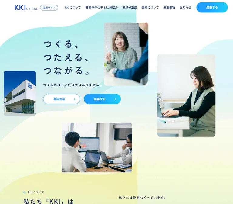
株式会社KKI 採用サイト — パステルの波と社員写真
淡い水色と黄色の波形背景に、社員の自然な仕事風景を配置した採用サイト。紺色のゴシック体、青いグラデーションのボタン、余白を活かした職種紹介が特徴。
KKI Recruitment — Style Reference
Everyday working scenes arranged over airy, softly textured waves.
Website: recruit.v-kki.co.jp
Original URL: https://recruit.v-kki.co.jp/
Final URL: https://recruit.v-kki.co.jp/
Theme: light, with white surfaces, navy typography, pastel background artwork, and blue-to-cyan actions.
Inspected: September 24, 2026, at 06:01 JST. Supplied observation timestamp: 2026-09-23T21:01:39.124Z.
Viewports: desktop 1440 × 1000; mobile 390 × 844, in CSS pixels.
Scope: the current recruitment homepage: persistent header, photographic hero, company introduction, news, six staff/profile links, culture and application information, entry section, footer, and mobile Instagram strip. Linked pages and application forms were not inspected.
KKI presents recruitment through the people and settings of everyday work. Its company introduction describes a business specializing in bread bags, with related design and machinery activities. The visual treatment makes that industrial context approachable: bright office photographs, generous white space, compact rounded image corners, and broad mint, blue, and pale-yellow waves.
The page is a recruitment information hub with multiple routes into company information, staff stories, benefits, job requirements, and applications. Its opening composition is deliberately asymmetric, while the information below becomes more regular. Navy Japanese typography supplies continuity between the free arrangement of hero photographs, the three-column staff grid, and the extensive desktop footer.
閉じる
KKI Recruitment — Style Reference
Everyday working scenes arranged over airy, softly textured waves.
Website: recruit.v-kki.co.jp
Original URL: https://recruit.v-kki.co.jp/
Final URL: https://recruit.v-kki.co.jp/
Theme: light, with white surfaces, navy typography, pastel background artwork, and blue-to-cyan actions.
Inspected: September 24, 2026, at 06:01 JST. Supplied observation timestamp: 2026-09-23T21:01:39.124Z.
Viewports: desktop 1440 × 1000; mobile 390 × 844, in CSS pixels.
Scope: the current recruitment homepage: persistent header, photographic hero, company introduction, news, six staff/profile links, culture and application information, entry section, footer, and mobile Instagram strip. Linked pages and application forms were not inspected.
KKI presents recruitment through the people and settings of everyday work. Its company introduction describes a business specializing in bread bags, with related design and machinery activities. The visual treatment makes that industrial context approachable: bright office photographs, generous white space, compact rounded image corners, and broad mint, blue, and pale-yellow waves.
The page is a recruitment information hub with multiple routes into company information, staff stories, benefits, job requirements, and applications. Its opening composition is deliberately asymmetric, while the information below becomes more regular. Navy Japanese typography supplies continuity between the free arrangement of hero photographs, the three-column staff grid, and the extensive desktop footer.
How to Read This Reference
- Measured means a value appears in the supplied rendered DOM, computed styles, or element rectangles. Derived distances are identified as calculations.
- Visual estimate means an approximate reading of the current-page screenshots. Image corners, decorative wave geometry, and some photograph dimensions fall into this category.
- Recommendation means an implementation choice for a new site. Breakpoints, accessible enhancements, and the Quick Start architecture are recommendations unless explicitly described as measured.
- Named tokens are descriptive aliases. Original custom-property names are shown where available.
- The supplied images show three desktop positions and two mobile positions. DOM measurements extend across the homepage, including sections without a corresponding screenshot.
- Hidden navigation descendants occur in the desktop evidence with zero-height rectangles. Their labels and declared typography are available; their expanded appearance and activation behavior are unverified.
Tokens — Colors
Default Palette
| Name | Value | Suggested token / source | Role and evidence |
|---|---|---|---|
| White | #ffffff |
--color-paper |
Measured body background; visible page surface, image-label tabs, and reversed action text |
| Main Navy | #192c55 |
--color-ink; source --s-color-09b70815: #192c55ff |
Measured hero, navigation, headings, body text, and profile metadata |
| Brand Blue | #003595 |
--color-brand |
Measured recruitment badge text; the wordmark appears in a closely corresponding blue |
| Action Blue | #1f9cf6 |
--color-action; source --s-color-82af80e1 |
Measured staff role labels and declared action palette |
| Gradient Midpoint | #22a2ff |
--color-action-mid |
Exact middle stop in the source action-gradient token |
| Action Cyan | #1fd0f6 |
--color-cyan |
Exact final stop in the source action-gradient token |
| Career Mint | #1ccfa4 |
--color-career |
Measured career-button text; visible outline and arrow treatment |
| Muted Slate | #9eadbe |
--color-muted |
Measured mobile footer address and telephone text |
| Deep Label Navy | #081236 |
--color-label |
Measured small labels for staff, culture, and application-information sections |
| Social Black | #000000 |
--color-social |
Measured footer Instagram text; visually black Instagram marks |
The exact declared action gradient is:
/* Observed source custom property */
--s-color-32aae269: linear-gradient(
  90deg,
  #1f9cf6 0%,
  #22a2ff 38%,
  #1fd0f6 100%
);
Use this vivid gradient for compact action surfaces. The large background waves have a softer, textured appearance and should be treated as a separate visual system.
Decorative Color Approximations
These are visual estimates for fallback artwork, not sampled colors or recovered source declarations.
| Name | Approximate value | Use |
|---|---|---|
| Pale Aqua | #bceff0 |
Broad upper hero ribbon and translucent-looking wave overlaps |
| Pale Lemon | #f8fbdf |
Lower hero field and warm portions of decorative waves |
| Soft Sky | #a6cff4 |
Staff-section wave and footer color bloom |
The page retains large areas of white. Decorative color usually appears as a passing ribbon, a softly fading field, or the entry section's wider colored surface. Avoid applying the pastel palette as a solid background to every content section.
Composite appearance: many sampled anchors have transparent backgrounds and inherited gray text, while their descendants supply the visible navy, white, or mint labels. The mobile career-entry anchor reports a mint background and mint child text, but its complete layered face is not shown in a mobile screenshot. Do not infer a final green-on-green button from those two declarations alone. The desktop entry capture visibly shows a white face with mint text and outline.
Tokens — Typography
Japanese Text — Koburina Gothic
Two explicit Japanese font families appear in computed styles:
- Regular family:
'こぶりなゴシック W3 JIS2004', source--s-font-e1870120. - Strong family:
'こぶりなゴシック W6 JIS2004', source--s-font-8aadd017.
W3 handles section labels, ordinary explanatory text, the recruitment badge, and joining-year captions. W6 handles the hero, main headings, navigation, role names, numbered-link titles, and button labels. The introductory company statement also uses W6, giving that passage more presence than ordinary body copy.
The W6 family frequently has computed font-weight: 400. Its stronger appearance is carried by the selected font face. Do not translate every W6 occurrence into an additional synthetic bold weight. Main section headings report 500; news titles report W3 with 900. These are distinct observed declarations, not a universal weight system.
Latin Text and Numbers — Montserrat
Observed family: Montserrat, source --s-font-18a86e10.
Confirmed uses include numbered links, news dates, staff initials, PAGE TOP, ENTRY, Instagram lettering, and mobile copyright text. Weights vary from 400 to 600.
The source also declares Figtree through --s-font-a58d37fd, but none of the supplied sampled elements establish its rendered role. Do not assign it to the logo or body text without further evidence.
Not every English label uses Montserrat: the measured NEWS eyebrow uses the W3 Japanese family.
Type Scale
All values below are measured. Size and line height are given as size / line-height.
| Role | Desktop | Mobile | Tracking | Family / weight |
|---|---|---|---|---|
| Hero headline | 48 / 72px |
32 / 54.4px |
0.3em on both |
W6 / 400 |
| Hero supporting line | 18 / 36px |
16 / 28.8px |
Desktop 0.08em; mobile 0.15em |
W6 / 400 |
| Main section heading | 32 / 54.4px |
24 / 40.8px |
0.1em |
W6 / 500 |
| News section heading | 32 / 64px |
24 / 40.8px |
0.1em |
W6 / 500 |
| Small section label | 16 / 22.4–32px |
14 / 28px |
Normal | W3 / 400 |
| Company introduction | 18 / 45px |
16 / 32px |
Desktop 0.08em; mobile 0.04em |
W6 / 400 |
| Culture/application body | 16 / 32px |
14 / 23.8px |
Normal | W3 / 400 |
| Numbered-link title | 24 / 38.4px |
18 / 28.8px |
Normal | W6 / 400 |
| Numbered-link numeral | 14 / 16.8px |
12 / 14.4px |
Normal | Montserrat / 500 |
| Staff role name | 24 / 24–28.8px |
22 / 22–26.4px |
Normal | W6 / 400 |
| Staff initials | 16 / 16px |
16 / 16px |
Normal | Montserrat / 400 |
| Joining year | 13 / 13px |
13 / 13px |
Normal | W3 / 400 |
| News date | 14 / 21px |
12 / 18px |
Normal | Montserrat / 500 |
| News title | 16 / 32px |
14 / 23.8px |
Normal | W3 / 900 |
| Hero button label | 16 / 32px |
16 / 32px |
Normal | W6 / 400 |
| Recruitment badge | 14 / 19.6px |
12 / 16.8px |
Normal | W3 / 400 |
| Entry eyebrow | 24 / 33.6px |
18 / 25.2px |
0.1em |
Montserrat / 400 |
| Mobile entry heading | Not included in sampled desktop elements | 24 / 38.4px |
-0.01em |
W6 / 400 |
| Mobile entry button label | Not included in sampled desktop elements | 18 / 36px |
Normal | W6 / 400 |
| Mobile contact details | Not included in sampled desktop elements | 12 / 16.8px |
Normal | W3 / 400 |
| Mobile social-strip Latin | Not visible on desktop | 20 / 20px |
0.08em |
Montserrat / 600 |
| Mobile social-strip Japanese | Not visible on desktop | 18 / 18px |
0.08em |
W6 / 400 |
Typesetting Character
The hero's three lines are actual short phrases: つくる, つつむ, and つたえる. Their generous 0.3em tracking creates the visual rhythm. Preserve the deliberate line breaks rather than allowing a single text string to wrap unpredictably.
Section headings have smaller tracking and relaxed line height. Body passages rely on vertical openness rather than very large type. The measured desktop company introduction uses an especially spacious 2.5 line-height ratio; ordinary desktop paragraphs use 2.
For a new implementation, load the named families through an authorized font setup. System Japanese sans-serif fallbacks are practical recommendations, not confirmed source fallbacks. The custom KKI wordmark should remain an image or approved brand asset; its lettering is not evidence of a UI font family.
Tokens — Spacing & Shapes
Unit system: the measured root size is 16px; no special fluid root formula is evidenced.
Density: spacious sections, compact navigation, and clearly bounded photographic content.
Spacing Scale
| Use | Desktop | Mobile | Evidence |
|---|---|---|---|
| Header horizontal padding | 80px |
24px |
Computed padding |
| Hero headline to supporting line | 30px |
6px |
Calculated from text rectangles |
| Supporting line to hero buttons | 35px |
31px |
Calculated from rectangles |
| Gap between hero buttons | 20px horizontally |
16px vertically |
Calculated from rectangles |
| Number to numbered-link title | 12px |
12px |
Calculated from rectangles |
| News-row vertical padding | 20px |
20px |
Computed padding |
| News date-column to title | 24px |
8px vertically |
Calculated from rectangles |
| Staff column gap | 40px |
Single column | Calculated from anchor rectangles |
| Staff row gap | 56px after the first row |
32px |
Calculated from anchor rectangles |
| Staff heading to first card | 64px |
40px |
Calculated from rectangles |
| Body copy to numbered links | 40px in sampled sections |
40px |
Calculated from rectangles |
| Culture heading to body | 48px |
40px |
Calculated from rectangles |
These recurring values support a reusable 8, 12, 16, 20, 24, 32, 40, 48, 56, 64, 80 spacing set. This set is an implementation abstraction, not a recovered source scale.
Border Radius
| Element | Value | Status |
|---|---|---|
| Recruitment badge | 64px |
Measured |
| Hero recruitment buttons | 64px |
Measured |
| Mobile entry buttons | 64px |
Measured |
| Mobile menu control | 50% on a 48px square |
Measured |
| Hero and staff photographs | Approximately 12px |
Visual estimate |
| White staff-title tab | Approximately 12px at its exposed upper-right corner |
Visual estimate |
| Outer staff anchor | 0px |
Measured; image and tab carry their own rounding |
| Numbered navigation rows | 0px |
Measured |
Layout Measurements
| Element | Desktop 1440 × 1000 |
Mobile 390 × 844 |
|---|---|---|
| Document height | 6145.8px |
8097.1px |
| Header height | 80px |
64px |
| Brand-link rectangle | 234 × 31px |
182 × 24px |
| Recruitment badge | 97 × 25px |
77 × 21px |
| Header Instagram link | 29 × 29px |
29 × 29px |
| Menu button | Not visible | 48 × 48px |
| Hero headline origin | x: 241.4, y: 201px |
x: 21, y: 309.3px |
| Hero headline bounds | 244.3 × 216px |
162.9 × 163.2px |
| Hero supporting text width | 484.6px |
348px |
| Hero recruitment button | 200 × 56px |
200 × 56px |
| Company introduction width | 575.3px |
342px |
| About numbered-link row | 401 × 90px |
342 × 72px |
| Culture numbered-link row | 398 × 90px |
342 × 80px |
| Application-information row | 400 × 90px |
342 × 80px |
| News list width | 700px |
342px |
| First staff anchor | 336.2 × 279px |
334 × 236px |
| Mobile entry button | — | 260 × 64px |
| Mobile Instagram strip | Not visible | 390 × 50px, at viewport y: 794px |
The desktop staff cards start at x: 170, 546.2, and 922.4px, occupying approximately 1088.6px including gaps. A nominal 1100px content wrapper is a useful approximation, but its exact source declaration was not provided.
Components
Persistent Site Header
Role: maintain identity and provide routes through the recruitment site.
The desktop header places the horizontal KKI wordmark and outlined 採用サイト badge at the left. Six Japanese navigation categories occupy the right half, followed by the black Instagram mark and a blue-to-cyan 応募する pill with a small right arrow. The action is approximately 160 × 56px in the screenshot; its outer rectangle was not included in the sampled elements.
Measured navigation labels use W6 at 16 / 32px. The header is 80px high with 80px side padding. The sampled background color is transparent; the composition behind it makes the initial view read mostly white. Subsequent captures retain the header at the top, including over the entry artwork. Its persistent behavior is visible, although the exact fixed/sticky declaration was not exported.
On mobile, the header becomes 64px high with 24px side padding. The full navigation and desktop entry pill disappear from the visible state. The Instagram icon remains, and a 48px circular blue/cyan menu button appears at x: 318, y: 8px. Three fine white horizontal strokes form the menu symbol.
The desktop DOM contains additional navigation groups with English headings such as ABOUT US, but their rectangles have zero height. Expanded menus, hover triggers, mobile menu contents, and focus handling were not exercised.
Photographic Hero
Role: introduce the company through working people and establish the page's visual identity.
The hero combines three independent layers:
- Large pale wave artwork crossing a white canvas.
- Four photographs with rounded corners and deliberately unequal sizes.
- A navy three-line headline, supporting statement, and two recruitment links.
The desktop headline sits left of center, leaving substantial space for a vertical conversation portrait above and to the right. A larger desk scene enters from the right edge, a building photograph enters from the left edge, and a horizontal collaboration scene sits below the copy.
Approximate screenshot geometry follows. Dimensions marked as visible portions must not be interpreted as complete image-element bounds.
| Photograph | Desktop visual estimate | Mobile visual estimate |
|---|---|---|
| Conversation portrait | x: 763, y: 123, about 269 × 382px |
x: 73, y: 82, about 137 × 195px |
| Woman at a laptop | x: 1081, y: 294; visible portion about 359 × 530px |
x: 227, y: 130; visible portion about 163 × 270px |
| Company building | Enters from left at y: 382; visible portion about 167 × 331px |
Enters from right at x: 321, y: 577; visible portion about 69 × 195px |
| Colleagues at a screen | x: 406, y: 674, about 380 × 269px |
Enters from left around y: 697; about 225px visible width before the lower overlay |
Mobile is a separate composition. The conversation portrait moves above the headline, the laptop portrait remains against the right edge, and the building moves to the lower right. The headline begins around 309px from the top. The supporting sentence spans almost the full mobile width below it.
Keep the imagery independent from the text so photographs can be repositioned without rasterizing the headline. The captures establish arrangement, not a slideshow, parallax effect, or continuous floating animation.
Paired Recruitment Buttons
Role: distinguish job requirements for new graduates and experienced applicants.
Each hero link has a measured 200 × 56px outer rectangle, 64px radius, W6 16 / 32px label, and a right-pointing arrow.
新卒募集要項uses a blue-to-cyan face with white text and links to/newgraduate.中途募集要項visibly uses a white face, mint outline, mint label, and matching arrow; it links to/career.
On desktop, the new-graduate button appears first visually, then the career button, separated by 20px. On mobile, career appears above new graduate, separated by 16px. Their dimensions remain unchanged. The mobile pair starts at x: 88px, placing its center approximately 7px left of the viewport center.
The source DOM lists career before new graduate at both sizes. A new implementation should account for keyboard order when reproducing desktop visual reordering.
Section Label and Heading
Role: provide a consistent entrance into each content section.
A small Japanese label sits beside a tiny circular gradient marker. Below it is a navy W6 heading with 0.1em tracking. The desktop marker appears roughly 16px in diameter in the culture capture; this is a visual estimate.
Measured label-to-heading spacing is commonly 8px. Main headings use 32 / 54.4px on desktop and 24 / 40.8px on mobile. Preserve the source's short, intentional heading lines where shown, such as 働くあなたを above the remainder of the culture heading.
In a new semantic implementation, the small label can be a paragraph preceding a single section heading. The source evidence contains separate H2 elements for both label and main heading.
Company Introduction and Numbered Navigation
Role: explain the business and offer routes into its values, desired applicants, and activities.
Desktop separates a short heading at the left from a substantial statement beginning around x: 720px on the right. That statement uses W6 at 18 / 45px, with 1.44px tracking. Beneath it, three numbered links occupy a narrower 401px column.
Each link pairs a small Montserrat number, such as 01., with a larger Japanese title. The measured title starts 12px after the numeral. Desktop rows are 90px high; mobile About rows are 72px high, with 18px titles and 12px numerals.
On mobile, heading, statement, and navigation share a 342px text column with 24px side margins. The introduction uses 16 / 32px, preserving a deliberate reading rhythm while reducing its desktop line spacing.
The text and rectangles establish this anatomy. Border styling and any trailing artwork for these numbered rows were not included in the evidence; the Quick Start uses a thin divider as a recommendation.
News List
Role: surface current recruitment updates without competing with staff photography.
Desktop places the section heading near x: 220px and a 700px list at x: 520px. Each news link includes a date column of 102px, a calculated 24px gap, and a flexible title region of 574px. Vertical padding is 20px.
The sampled rows measure 73px or 105px high depending on title wrapping. Dates use Montserrat 14 / 21px; titles use W3 16 / 32px with computed weight 900.
Mobile places the date above the title with an 8px gap. The list becomes 342px wide. Dates reduce to 12 / 18px and titles to 14 / 23.8px. All three news links remain present. The supplied screenshots do not show this section directly, so its description relies on DOM layout rather than inferred decorative styling.
Staff Role Card
Role: connect a job category with a person who performs it.
Six whole-card links form a desktop three-column, two-row arrangement. Each combines a workplace portrait, a white role-title tab overlapping the lower-left edge, a small arrow, and a separate metadata line beneath.
The photographs are approximately 336 × 240px in the desktop capture. Their rounded corners are visually about 12px. The title tab starts roughly 40px above the image bottom and extends slightly below it, creating a white cutout effect. The outer card has no visible raised surface or shadow.
Measured details:
- Role text begins
10pxinside the card's left edge. - Role names use Action Blue at
24pxdesktop and22pxmobile. - Metadata begins
18pxinside the card edge. - Initials use Montserrat
16px; the slash and joining year use13px. - The first metadata row places approximately
7pxbetween its text pieces. - Desktop card heights vary slightly from
279pxto284px; avoid forcing every caption into an identical line box.
The current visible role order is:
| Role label | Profile | Joining year | Destination |
|---|---|---|---|
営業 |
K.A. |
2020年入社 |
/job-001 |
企画・開発 |
I.T. |
2013年入社 |
/job-002 |
プログラマー |
K.K. |
2018年入社 |
/job-003 |
デザイナー |
T.Y. |
2020年入社 |
/job-004 |
製造設備エンジニア |
S.S. |
2023年入社 |
/job-005 |
物流 |
K.S. |
2022年入社 |
/job-006 |
Mobile DOM rectangles establish a single vertical list: all six anchors start at x: 28px, are 334px wide, and have 32px gaps. Their heights range from 236px to 251px. The photographs' exact mobile rectangles were not supplied; a roughly 200px image height is an implementation estimate, not a measured value.
Culture and Application Information
Role: explain working conditions and help applicants find practical information.
The culture block places text at the left on desktop, with a workplace/group photograph visible to the right. Its measured text column is 398px wide. A two-line heading leads into W3 16 / 32px body copy and three numbered routes to environment, education, and benefits.
The next application-information block moves its measured text column to the right, around x: 868px, and provides links to new-graduate requirements, career requirements, and FAQs. Its complementary imagery is not shown in the supplied captures, so no image subject is assigned here.
Mobile places both text blocks at x: 24px with 342px width. Paragraphs become 14 / 23.8px; numbered rows are 80px high. The measured document positions leave additional space around these blocks, but the evidence does not identify every intervening image or decorative layer.
Entry Section
Role: provide the final application routes after the informational content.
The desktop bottom capture shows a broad textured gradient field moving from blue at the left toward pale green/yellow at the right. White recruitment copy sits on the colored region. A wide, smooth white wave forms its lower edge and transitions into the footer.
The ENTRY eyebrow is Montserrat with 0.1em tracking: 24px on desktop and 18px on mobile. The mobile main statement is measured at 24 / 38.4px, and the following paragraph at 14 / 25.2px.
Mobile entry links measure 260 × 64px and are centered at x: 65px. New graduate appears above career with a calculated 24px gap. They lead to /newgraduate-entry and /career-entry, respectively. The full mobile entry surface is not captured visually; its exact layered button fills should remain unverified.
A PAGE TOP link precedes the section and targets /#top. Its label is Montserrat 14 / 19.6px. Smooth scrolling was not tested.
Footer
Role: close the page with company identity, contact information, and secondary navigation.
Desktop uses a large stacked KKI wordmark at the left, contact details beneath it, and a black Instagram icon/label. Three navigation columns sit to the right. Section names are navy; subordinate links are pale slate and visually preceded by small horizontal dashes. Corporate and privacy links use small outlined destination icons.
A fine horizontal rule separates the copyright line from the main footer. A soft blue bloom rises from the bottom, fading through white behind the content. There is no visible boxed footer panel or shadow.
Mobile substantially changes the composition. A compact two-column group of high-level links appears first, with corporate and privacy links below. The large stacked wordmark is centered farther down, followed by centered contact details and Instagram. Nested desktop link lists are absent from the mobile visible-text evidence; no accordion behavior is established.
The mobile footer is measured at about 836.7px tall. Contact text is 12px in #9eadbe; high-level links are W6 14px. The copyright is Montserrat 14px, aligned near the left content margin above the fixed social strip.
The page title and copyright identify KKI. The footer's corporate-site link points to https://www.v-kki.co.jp/.
Mobile Instagram Strip
Role: maintain a visible route to everyday company updates.
A full-width blue-to-cyan strip occupies the bottom 50px of both mobile captures. The measured initial rectangle is x: 0, y: 794, width: 390, height: 50px. Its repeated viewport position supports a fixed presentation.
The text reads InstagramでKKIの日常を発信中, ending with a small external-link glyph. Montserrat handles Instagram and KKI at 20px; the Japanese text uses W6 at 18px. Both have 0.08em tracking and white color.
The strip links to the recruitment Instagram account. It is not visible in the desktop captures. Keep enough lower-page clearance for content and focused controls to remain reachable above it.
Tokens — Motion & Interaction
| Treatment | Recorded evidence | What can be concluded |
|---|---|---|
| General element transitions | 0.3s cubic-bezier(0.4, 0.4, 0, 1) on many sampled elements |
A common transition timing is declared; actual hover changes are not established |
| Gradient-related transitions | The same 0.3s easing on --g-angle, color stops, and positions |
Gradient interpolation is supported by the declarations; an animated gradient sequence was not observed |
| Body background transition | background 0.5s cubic-bezier(0.4, 0.4, 0, 1) |
Background changes can transition; their trigger is unknown |
| Sampled animation property | none |
No named CSS animation is active on those sampled elements at capture time |
| Header persistence | Header remains at the top in desktop and mobile scrolled captures | Persistent positioning is visually supported |
| Mobile social-strip persistence | Same bottom placement in both mobile captures | Fixed bottom placement is visually supported |
| Navigation and profile routes | Actual anchor destinations are supplied | Link destinations are known; destination-page behavior is untested |
| Desktop hidden navigation | Zero-height descendants with labels and type declarations | Closed content exists; opening method and expanded layout are unverified |
| Mobile menu | Visible circular button | Menu-open state and animation are unverified |
The inspection waited for document loading, image decoding, and sampled layout/text stability, with finite readiness limits. Perpetual animations were paused during readiness checks and then resumed. These procedures do not establish the full entrance sequence or rule out JavaScript, offscreen, or delayed motion.
For a new implementation, use the observed 300ms easing for restrained color or arrow feedback. A small arrow translation is a recommendation. Do not invent floating-photo loops, scroll-linked parallax, or animated wave morphing as source features.
Surfaces
| Layer | Appearance | Purpose |
|---|---|---|
| Page canvas | White | Gives the photographs and navy type room to breathe |
| Hero decoration | Pale aqua and lemon waves with subtle grain | Connects the separated hero elements |
| Staff-section decoration | Broad blue wave behind an otherwise white grid | Adds continuity across multiple cards |
| Photographic surface | Full-color image, modest rounding | Communicates people, workplace, and activity |
| Staff-title tab | White, partially overlapping the image | Makes a blue role label readable without covering the whole photograph |
| Primary action | Saturated blue-to-cyan pill | Marks new-graduate and general application routes |
| Career action | White face with mint outline and label in visible captures | Differentiates the career route |
| Entry field | Textured blue-to-pale-green gradient with white type | Creates a stronger closing application moment |
| Footer | White with a soft blue bloom and fine rule | Returns the page to a calm informational surface |
No general shadow-based elevation system is visible. Hierarchy comes from whitespace, typography, image proportions, overlap, and controlled color intensity.
Imagery
Use natural workplace photography with bright interiors, neutral furnishings, subdued clothing, and occasional plants or equipment. The current hero shows a conversation, laptop work, collaboration around a screen, and the company building. Staff cards alternate working scenes and portraits within the workplace. The logistics card includes equipment and protective headwear, retaining the specific character of that role.
The photographs remain full color. Their cool, airy appearance comes from the scenes and photographic treatment; the evidence does not establish a global blue filter. Preserve natural skin tones and useful workplace context.
There are two distinct image-layout systems:
- Hero: unequal portrait and landscape frames, staggered positions, and deliberate clipping at viewport edges.
- Staff section: consistent desktop image widths, repeated white title tabs, and stable metadata placement.
For reproduction, select per-image focal points so faces and relevant equipment survive the mobile crops. Use object-fit: cover only with deliberate framing. Do not apply the hero's irregular placements to the staff grid.
Decorative Artwork
The large waves combine clear curved boundaries with soft fades and fine grain. They pass behind content without becoming borders around individual cards. The entry section's white lower wave is particularly broad, spanning the page with a rise toward the left-center and a lower trough toward the right.
A procedural gradient can approximate the colors, but accurate reproduction needs separate wave geometry and texture. Avoid substituting a dense field of small blobs or highly glossy gradients.
Observed Asset References
Only one complete image URL appears in the supplied MAIN excerpt. Its exact displayed role is not established.
| Reference | URL | Evidence limit |
|---|---|---|
| Recorded WebP image | Image reference | Present in the supplied markup excerpt; not independently mapped to a particular photograph or wave layer |
Photograph, logo, and icon asset URLs were otherwise not supplied. Do not fabricate original filenames or infer production authorship from an asset-host domain.
Layout & Responsive Behavior
Page Sequence
The current homepage follows this order: hero, company introduction, news, staff roles, culture, application information, page-top link, entry section, and footer. Its measured document height grows from about 6146px on desktop to 8097px on mobile.
Desktop Structure
The header spans the viewport with 80px side padding. Informational content generally sits farther inward, around x: 164–170px, while the news block uses its own narrower composition. The hero copy begins around x: 241px, so it should not be forced onto exactly the same left edge as every later heading.
The introduction separates its heading and body into two distant columns. Staff profiles form three columns with 40px gutters. Culture returns to a two-part text/image composition, and application information moves the text to the right. These changes create rhythm without abandoning a consistent type and color system.
Mobile Changes
| Area | Observed mobile behavior |
|---|---|
| Header | Full navigation becomes a circular menu control; logo/badge shrink; Instagram remains |
| Hero imagery | Photographs are repositioned; the building moves from the left edge to the lower right |
| Hero copy | Headline becomes 32px, stays on three lines, and moves below the upper portrait |
| Hero supporting line | Wraps into two lines across 348px; tracking increases to 0.15em |
| Hero actions | Stack vertically; career appears before new graduate; both remain 200 × 56px |
| Introduction | Heading and body share a single 342px column |
| News | Date moves above title |
| Staff | Six single-column cards, each 334px wide, with 32px vertical gaps |
| Culture/application text | Shared 24px side margins and smaller body type |
| Entry actions | Centered 260 × 64px buttons; new graduate appears above career |
| Footer | Compact high-level navigation precedes centered brand/contact information |
| Social route | A fixed 50px Instagram strip is added at the bottom |
Only the two supplied viewport sizes are verified. Exact media-query thresholds and tablet layouts were not provided. Any intermediate two-column grid or breakpoint in the Quick Start is a recommendation.
Practical Responsive Rules
Retain mobile body text in normal flow and isolate decorative clipping in a separate image layer. The visible hero overlaps are intentional, but longer translated copy and text zoom should not be forced into fixed-height text boxes.
Use the measured 24px mobile content margin as a default and preserve the staff section's slightly larger 28px inset where matching the capture. Reserve bottom clearance for the social strip and account for device safe areas in a new implementation. Safe-area handling was not established by the supplied styles.
Do’s and Don’ts
Do
- Keep navy
#192c55as the primary text color and white as the main canvas. - Preserve the distinction between vivid action gradients and softly textured background waves.
- Use W3/W6 family selection to reproduce the Japanese hierarchy accurately.
- Keep the hero's three short lines and
0.3emtracking. - Recompose the hero photographs for mobile, including the building's change of side.
- Preserve the two recruitment routes and their blue/mint distinction.
- Use the staff cards' white overlapping title tabs as a recognizable recurring detail.
- Keep initials and joining years visibly subordinate to role names.
- Allow large pauses between major sections.
- Simplify the mobile footer while retaining useful navigation and company identity.
Don't
- Don't reduce this recruitment hub to a single application-focused promotional page.
- Don't replace the current hero wording or navigation with material from another version.
- Don't turn every section into a rounded, shadowed card.
- Don't replace the hero collage with one full-width background photograph.
- Don't treat zero-height navigation descendants as an inspected expanded menu.
- Don't infer the final button face from a transparent or colored parent alone.
- Don't assign Figtree to visible elements merely because a font variable exists.
- Don't apply the headline's wide tracking to paragraphs or staff metadata.
- Don't scale the complete desktop composition down to fit a phone.
- Don't describe parallax, automatic slideshows, hover zoom, or wave animation as verified behavior.
Recommended Implementation Additions
These are recommendations for a new implementation, not confirmed features of the original site:
- Give the menu button and icon-only social link accessible names. Manage
aria-expanded, keyboard focus, and Escape behavior if an overlay menu is implemented. - Increase the Instagram icon's interactive area to at least
44 × 44pxwhile retaining its observed29pxvisual mark. - Add a clearly visible navy focus outline to links and buttons.
- Check mint-on-white, muted footer text, and white-on-cyan combinations against the required text-contrast level. Keep darker accessible variants available.
- Preserve a meaningful keyboard and reading order when visual button order changes between layouts.
- Keep decorative waves out of the accessibility tree. Provide useful alternatives for informative workplace photographs without repeating adjacent link labels unnecessarily.
- Use intrinsic image dimensions and responsive image sources to stabilize the collage and staff grid while assets load.
- Reserve space for the fixed mobile strip, including safe-area padding, and verify focused footer links remain visible.
- Scope transitions to specific properties and respect reduced-motion preferences.
- Test longer Japanese role names, text zoom, and intermediate widths. The longest current role label is a useful wrapping test.
Agent Prompt Guide
Quick Color Reference
- Main canvas and title-tab faces:
#ffffff. - Main text:
#192c55. - Brand/recruitment-badge blue:
#003595. - Role labels:
#1f9cf6. - Primary gradient:
linear-gradient(90deg, #1f9cf6 0%, #22a2ff 38%, #1fd0f6 100%). - Career-route accent:
#1ccfa4. - Observed muted contact text:
#9eadbe. - Decorative approximations: aqua
#bceff0, lemon#f8fbdf, sky#a6cff4.
Overall Prompt
“Create a Japanese recruitment homepage inspired by the current KKI site. Use a white canvas, navy #192c55 Japanese typography, softly textured aqua and pale-yellow waves, and bright natural workplace photography. Build an asymmetric hero with four separately positioned rounded photographs and the three-line copy つくる / つつむ / つたえる. Use 48px desktop and 32px mobile headline type with 0.3em tracking. Provide separate blue-gradient new-graduate and mint-outline career links. Continue with company information, a compact dated news list, six staff profiles, working-culture information, application guidance, a wave-edged entry section, and a substantial footer. On mobile, recompose the collage, use a single staff column, simplify footer navigation, and add a fixed Instagram strip. Distinguish source measurements from implementation choices.”
Example Component Prompts
- Hero: “Arrange a conversation portrait high on the right of a navy three-line Japanese headline, a larger laptop-work portrait entering from the far right, a building image clipped at the left edge, and a landscape collaboration photo below. Set these over broad pale aqua and lemon waves. Keep each photograph independent and avoid drop shadows.”
- Staff card: “Build a workplace portrait link about
336pxwide. Overlap its lower-left image edge with a white tab containing a24pxblue role label and a small muted arrow. Place Montserrat initials and a smaller Japanese joining-year caption below. Use modest image rounding and no elevated card background.” - News list: “Create a restrained navy recruitment-news list. On desktop, use a
102pxdate column,24pxgap, and flexible Japanese title. Apply20pxvertical padding. On mobile, stack a12pxdate above a14pxtitle with an8pxgap.” - Mobile header: “Use a
64pxpersistent header with24pxhorizontal padding, a compact KKI brand asset and outlined recruitment badge, a black Instagram mark, and a48pxblue/cyan circular menu button. Implement accessible menu behavior separately; the original open state is unverified.” - Entry and footer: “End with a textured blue-to-pale-green field containing white recruitment copy and separate application routes. Cut its lower edge with a broad white wave. Follow with a spacious white footer, large blue brand asset, compact navigation, and a blue color bloom rising from the bottom.”
Quick Start
CSS Custom Properties
This is a reusable adaptation, not extracted production CSS. Measured colors and type values are retained. The desktop wrapper, image-frame approximations, breakpoints, dividers, and hover feedback are implementation choices. Font files, brand assets, photographs, and menu behavior must be supplied separately.
:root {
  /* Measured interface colors */
  --color-paper: #ffffff;
  --color-ink: #192c55;
  --color-brand: #003595;
  --color-action: #1f9cf6;
  --color-action-mid: #22a2ff;
  --color-cyan: #1fd0f6;
  --color-career: #1ccfa4;
  --color-muted: #9eadbe;
  --color-label: #081236;
  --gradient-action: linear-gradient(
    90deg, #1f9cf6 0%, #22a2ff 38%, #1fd0f6 100%
  );

  /* Decorative approximations */
  --wash-aqua: #bceff0;
  --wash-lemon: #f8fbdf;
  --wash-sky: #a6cff4;
  --color-rule: #b5c2d1;

  /* Observed families; fallback is recommended */
  --font-jp: 'こぶりなゴシック W3 JIS2004', sans-serif;
  --font-strong: 'こぶりなゴシック W6 JIS2004', sans-serif;
  --font-latin: Montserrat, sans-serif;

  --text-hero: 48px;
  --leading-hero: 1.5;
  --text-heading: 32px;
  --text-body: 16px;
  --leading-body: 2;
  --text-role: 24px;
  --text-link: 24px;
  --text-number: 14px;
  --text-caption: 13px;

  /* Geometry combines measurements and stated approximations */
  --content-width: 1100px;
  --page-gutter: 24px;
  --header-height: 80px;
  --radius-image: 12px;
  --radius-pill: 64px;
  --button-height: 56px;
  --social-height: 50px;
  --ease-site: cubic-bezier(0.4, 0.4, 0, 1);
  --duration-ui: 300ms;
}

* { box-sizing: border-box; }

body {
  margin: 0;
  color: var(--color-ink);
  background: var(--color-paper);
  font-family: var(--font-jp);
  font-size: var(--text-body);
  line-height: var(--leading-body);
}

img { display: block; max-width: 100%; }
a { color: inherit; }
button { font: inherit; }

.container {
  width: min(var(--content-width), calc(100% - 48px));
  margin-inline: auto;
}

/* Recommended focus and anchor-offset handling */
:where(a, button):focus-visible {
  outline: 3px solid var(--color-ink);
  outline-offset: 5px;
}

[id] { scroll-margin-top: calc(var(--header-height) + 24px); }

.site-header {
  position: fixed;
  inset: 0 0 auto;
  z-index: 50;
  min-height: var(--header-height);
  padding-inline: 80px;
  display: flex;
  align-items: center;
  justify-content: space-between;
  gap: 24px;
  /* Recommended legible surface for a new implementation */
  background: rgb(255 255 255 / 96%);
}

.brand {
  display: inline-flex;
  align-items: center;
  gap: 8px;
  flex-shrink: 0;
  text-decoration: none;
}

.brand__logo { width: 129px; height: auto; }

.brand__badge {
  display: grid;
  place-items: center;
  width: 97px;
  height: 25px;
  padding-top: 2px;
  border: 1px solid var(--color-brand);
  border-radius: var(--radius-pill);
  color: var(--color-brand);
  font-size: 14px;
  line-height: 1.4;
}

.header-links,
.header-tools {
  display: flex;
  align-items: center;
}

.header-links a {
  padding-inline: 12px;
  font-family: var(--font-strong);
  font-weight: 400;
  text-decoration: none;
  white-space: nowrap;
}

.header-tools { gap: 24px; }

.social-icon {
  display: grid;
  place-items: center;
  width: 44px;
  height: 44px;
}

.social-icon svg { width: 29px; height: 29px; }

.menu-button {
  display: none;
  width: 48px;
  height: 48px;
  padding: 0;
  border: 0;
  border-radius: 50%;
  color: white;
  background: var(--gradient-action);
  cursor: pointer;
}

.hero {
  position: relative;
  isolation: isolate;
  min-height: 1000px;
}

/* Clip decorative imagery separately from readable content */
.hero-art {
  position: absolute;
  inset: 0;
  z-index: -1;
  overflow: hidden;
  pointer-events: none;
  background: linear-gradient(
    180deg, white 0%, #e8f7f0 48%, var(--wash-lemon) 100%
  );
}

/* Approximate wave geometry; replace with finished artwork */
.hero-art::before {
  content: '';
  position: absolute;
  width: 90%;
  height: 62%;
  left: -24%;
  top: 5%;
  border-radius: 48% 42% 55% 35%;
  transform: rotate(-17deg);
  background: linear-gradient(145deg, var(--wash-aqua), #dff5ee);
}

.hero-copy {
  position: relative;
  width: min(1100px, calc(100% - 48px));
  margin-inline: auto;
  padding: 201px 0 0 71px;
}

.hero-title {
  margin: 0;
  font-family: var(--font-strong);
  font-size: var(--text-hero);
  font-weight: 400;
  line-height: var(--leading-hero);
  letter-spacing: 0.3em;
}

.hero-title span { display: block; }

.hero-lead {
  max-width: 485px;
  margin: 30px 0 0;
  font-family: var(--font-strong);
  font-size: 18px;
  line-height: 2;
  letter-spacing: 0.08em;
}

.hero-actions {
  display: flex;
  flex-direction: row-reverse;
  gap: 20px;
  width: max-content;
  max-width: 100%;
  margin: 35px 0 0 -3px;
}

.pill {
  display: inline-flex;
  align-items: center;
  justify-content: space-between;
  gap: 16px;
  width: 200px;
  max-width: 100%;
  min-height: var(--button-height);
  padding: 10px 24px 10px 36px;
  border: 1px solid transparent;
  border-radius: var(--radius-pill);
  font-family: var(--font-strong);
  font-size: 16px;
  font-weight: 400;
  line-height: 2;
  text-decoration: none;
}

.pill--graduate {
  color: white;
  background: var(--gradient-action);
}

.pill--career {
  color: var(--color-career);
  background: white;
  border-color: currentColor;
}

.pill--header { width: 160px; padding-left: 36px; }

.pill__arrow {
  flex: 0 0 auto;
  transition: transform var(--duration-ui) var(--ease-site);
}

.hero-photo {
  position: absolute;
  max-width: none;
  border-radius: var(--radius-image);
  object-fit: cover;
  object-position: var(--focal-point, center);
}

/* Screenshot-based frame estimates, not source declarations */
.hero-photo--conversation {
  left: 53%; top: 123px; width: 269px; height: 382px;
}
.hero-photo--desk {
  left: 75.07%; top: 294px; width: 380px; height: 530px;
}
.hero-photo--building {
  left: -65px; top: 382px; width: 232px; height: 331px;
}
.hero-photo--team {
  left: 28.2%; top: 674px; width: 380px; height: 269px;
}

.content-section { padding-block: 96px; }
.about-section { padding-top: 32px; }

.eyebrow {
  display: flex;
  align-items: center;
  gap: 8px;
  margin: 0 0 8px;
  font-size: 16px;
  line-height: 2;
}

.eyebrow::before {
  content: '';
  width: 16px;
  height: 16px;
  flex: 0 0 auto;
  border-radius: 50%;
  background: linear-gradient(110deg, #70c6ef, #f2f5b9);
}

.section-title {
  margin: 0;
  font-family: var(--font-strong);
  font-size: var(--text-heading);
  font-weight: 500;
  line-height: 1.7;
  letter-spacing: 0.1em;
}

.editorial-columns {
  display: grid;
  grid-template-columns: minmax(0, 1fr) minmax(0, 1fr);
  gap: 80px;
}

.about-statement {
  margin: 30px 0 40px;
  font-family: var(--font-strong);
  font-size: 18px;
  line-height: 2.5;
  letter-spacing: 0.08em;
}

.numbered-links { width: min(100%, 401px); }

.numbered-link {
  display: grid;
  grid-template-columns: auto minmax(0, 1fr);
  align-items: center;
  gap: 12px;
  min-height: 90px;
  border-bottom: 1px solid var(--color-rule);
  text-decoration: none;
}

.numbered-link__number {
  font-family: var(--font-latin);
  font-size: var(--text-number);
  font-weight: 500;
  line-height: 1.2;
}

.numbered-link__title {
  font-family: var(--font-strong);
  font-size: var(--text-link);
  line-height: 1.6;
}

.news-row {
  display: grid;
  grid-template-columns: 102px minmax(0, 1fr);
  align-items: center;
  gap: 24px;
  padding-block: 20px;
  border-bottom: 1px solid var(--color-rule);
  text-decoration: none;
}

.news-date {
  font-family: var(--font-latin);
  font-size: 14px;
  font-weight: 500;
  line-height: 1.5;
}

.news-title { margin: 0; font-size: 16px; font-weight: 900; }

.staff-grid {
  display: grid;
  grid-template-columns: repeat(3, minmax(0, 1fr));
  gap: 56px 40px;
  margin-top: 64px;
}

.staff-card { display: block; min-width: 0; text-decoration: none; }
.staff-card__visual { position: relative; }

.staff-card__image {
  width: 100%;
  height: 240px;
  object-fit: cover;
  object-position: var(--focal-point, center);
  border-radius: var(--radius-image);
}

.staff-card__tab {
  position: absolute;
  left: 0;
  bottom: -10px;
  display: inline-flex;
  align-items: center;
  gap: 12px;
  max-width: 100%;
  min-height: 50px;
  padding: 12px 20px 12px 10px;
  border-radius: 0 var(--radius-image) 0 0;
  color: var(--color-action);
  background: white;
  font-family: var(--font-strong);
  font-size: var(--text-role);
  line-height: 1.2;
}

.staff-card__arrow { color: var(--color-muted); flex-shrink: 0; }

.staff-card__meta {
  display: flex;
  align-items: baseline;
  gap: 7px;
  margin: 23px 0 0 18px;
  font-size: 13px;
  line-height: 1;
}

.staff-card__initials { font: 400 16px/1 var(--font-latin); }
.staff-card__slash { font-family: var(--font-latin); }

.entry {
  position: relative;
  overflow: hidden;
  padding: 96px 0 150px;
  color: white;
  background: linear-gradient(105deg, #69b1f0, #c6e4d8 70%, #f4f8cd);
}

.entry__inner {
  display: grid;
  grid-template-columns: minmax(0, 1fr) auto;
  align-items: center;
  gap: 64px;
}

.entry__label {
  margin: 0 0 8px;
  font: 400 24px/1.4 var(--font-latin);
  letter-spacing: 0.1em;
}

.entry__actions { display: grid; gap: 24px; }
.entry__actions .pill { width: 314px; min-height: 80px; font-size: 24px; }

/* Illustrative wave; replace with approved decorative artwork */
.entry::after {
  content: '';
  position: absolute;
  inset: auto 0 -1px;
  height: 130px;
  pointer-events: none;
  background: url('data:image/svg+xml,%3Csvg xmlns=%22http://www.w3.org/2000/svg%22 viewBox=%220 0 1440 130%22 preserveAspectRatio=%22none%22%3E%3Cpath fill=%22white%22 d=%22M0 80C260-20 420-20 650 40S1130 210 1440 30V130H0Z%22/%3E%3C/svg%3E') center / 100% 100% no-repeat;
}

.site-footer {
  padding-top: 64px;
  background: radial-gradient(
    ellipse at 50% 115%, var(--wash-sky), transparent 58%
  ), white;
}

.footer-main {
  display: grid;
  grid-template-columns: minmax(260px, 1fr) minmax(0, 1.5fr);
  gap: 80px;
}

.footer-nav { display: grid; grid-template-columns: repeat(3, 1fr); gap: 40px; }
.footer-contact { color: var(--color-muted); font-style: normal; }
.footer-logo { width: 225px; height: auto; margin-bottom: 40px; }

.footer-bottom {
  margin-top: 64px;
  padding-block: 24px;
  border-top: 1px solid var(--color-rule);
  font: 500 14px/1.4 var(--font-latin);
}

.mobile-social { display: none; }

/* Recommended hover feedback; not a verified source state */
@media (hover: hover) {
  .pill:hover .pill__arrow { transform: translateX(3px); }
  .staff-card:hover .staff-card__tab { text-decoration: underline; }
}

/* Chosen compact-header and hero breakpoint */
@media (max-width: 1199px) {
  :root { --header-height: 64px; }
  .site-header { padding-inline: 24px; gap: 12px; }
  .brand__logo { width: 97px; }
  .brand__badge { width: 77px; height: 21px; font-size: 12px; }
  .header-links, .pill--header { display: none; }
  .header-tools { gap: 8px; }
  .menu-button { display: grid; place-items: center; }

  .hero { min-height: 890px; }
  .hero-art { width: min(100%, 390px); left: 50%; right: auto; transform: translateX(-50%); }
  .hero-copy {
    width: min(348px, calc(100% - 42px));
    padding: 309.3px 0 0;
  }
  .hero-title { font-size: 32px; line-height: 1.7; }
  .hero-lead { margin-top: 6px; font-size: 16px; line-height: 1.8; letter-spacing: 0.15em; }
  .hero-actions {
    width: 100%;
    flex-direction: column;
    align-items: center;
    gap: 16px;
    margin: 31px 0 0;
    transform: translateX(-7px);
  }
  .hero-photo--conversation { left: 18.72%; top: 82px; width: 137px; height: 195px; }
  .hero-photo--desk { left: 58.21%; top: 130px; width: 191px; height: 270px; }
  .hero-photo--building { left: 82.31%; top: 577px; width: 137px; height: 195px; }
  .hero-photo--team { left: 0; top: 697px; width: 225px; height: 160px; }
}

/* Recommended intermediate layout, not an inspected viewport */
@media (min-width: 768px) and (max-width: 1199px) {
  .staff-grid { grid-template-columns: repeat(2, minmax(0, 1fr)); }
  .editorial-columns, .footer-main { gap: 40px; }
}

/* Chosen mobile content breakpoint */
@media (max-width: 767px) {
  :root {
    --text-heading: 24px;
    --text-body: 14px;
    --leading-body: 1.7;
    --text-role: 22px;
    --text-link: 18px;
    --text-number: 12px;
  }

  body { padding-bottom: calc(50px + env(safe-area-inset-bottom, 0px)); }
  .content-section { padding-block: 64px; }
  .about-section { padding-top: 32px; }
  .editorial-columns, .entry__inner, .footer-main { grid-template-columns: 1fr; gap: 32px; }
  .eyebrow { font-size: 14px; }
  .eyebrow::before { width: 8px; height: 8px; }
  .about-statement { font-size: 16px; line-height: 2; letter-spacing: 0.04em; }
  .numbered-links { width: 100%; }
  .numbered-link { min-height: 80px; }
  .about-section .numbered-link { min-height: 72px; }

  .news-row { grid-template-columns: 1fr; gap: 8px; }
  .news-date { font-size: 12px; }
  .news-title { font-size: 14px; line-height: 1.7; }

  .staff-section.container { width: calc(100% - 56px); }
  .staff-grid { grid-template-columns: 1fr; gap: 32px; margin-top: 40px; }
  .staff-card__image { height: 200px; }
  .staff-card__tab { min-height: 48px; }
  .staff-card__meta { margin-top: 20px; }

  .entry { padding-block: 80px 120px; }
  .entry__label { font-size: 18px; }
  .entry__actions { justify-items: center; }
  .entry__actions .pill { width: 260px; min-height: 64px; font-size: 18px; }

  .footer-nav { grid-template-columns: repeat(2, 1fr); gap: 32px; }
  .footer-brand { text-align: center; }
  .footer-logo { width: 155px; margin-inline: auto; }
  .footer-contact { font-size: 12px; line-height: 1.4; }

  .mobile-social {
    position: fixed;
    inset: auto 0 0;
    z-index: 60;
    display: flex;
    justify-content: center;
    align-items: center;
    min-height: calc(50px + env(safe-area-inset-bottom, 0px));
    padding: 12px 16px calc(12px + env(safe-area-inset-bottom, 0px));
    color: white;
    background: var(--gradient-action);
    font-family: var(--font-strong);
    font-size: clamp(14px, 4.6vw, 18px);
    line-height: 1.3;
    letter-spacing: 0.08em;
    text-decoration: none;
  }
  .mobile-social__latin { font-family: var(--font-latin); font-size: 1.11em; font-weight: 600; }
}

@media (prefers-reduced-motion: reduce) {
  .pill__arrow { transition: none; }
  .pill:hover .pill__arrow { transform: none; }
  html { scroll-behavior: auto; }
}
Component Markup
The image path below is a suggested local placeholder, not an observed original asset. Use real authorized photographs and adjust each focal point. The arrow is an inline SVG so no unverified icon-font dependency is required.
<a class='staff-card' href='/job-001'>
  <div class='staff-card__visual'>
    <img
      class='staff-card__image'
      src='/assets/staff-sales.webp'
      width='672'
      height='480'
      alt=''
      loading='lazy'
      style='--focal-point: 50% 40%'
    >
    <span class='staff-card__tab'>
      <span lang='ja'>営業</span>
      <svg class='staff-card__arrow' width='18' height='18'
        viewBox='0 0 24 24' fill='none' stroke='currentColor'
        stroke-width='1.5' aria-hidden='true'>
        <path d='M4 12h15M13 6l6 6-6 6'/>
      </svg>
    </span>
  </div>
  <span class='staff-card__meta'>
    <span class='staff-card__initials'>K.A.</span>
    <span class='staff-card__slash' aria-hidden='true'>/</span>
    <span lang='ja'>2020年入社</span>
  </span>
</a>
For the hero, place the four .hero-photo images inside .hero-art, and place .hero-title, .hero-lead, and .hero-actions inside .hero-copy. Keep career before new graduate in this example's action markup to match its responsive flex rules. Review the resulting keyboard order before production use.
The CSS provides a starting shell. It does not implement navigation disclosure, reproduce the original grain, establish exact tablet behavior, or recreate unobserved animation.
Tailwind v4 Token Mapping
Optional aliases for projects already using Tailwind v4. This does not imply the original website uses Tailwind. Define the custom properties above first.
@theme inline {
  --color-paper: var(--color-paper);
  --color-kki-ink: var(--color-ink);
  --color-kki-brand: var(--color-brand);
  --color-kki-action: var(--color-action);
  --color-kki-career: var(--color-career);
  --color-kki-muted: var(--color-muted);

  --font-kki-body: var(--font-jp);
  --font-kki-strong: var(--font-strong);
  --font-kki-latin: var(--font-latin);

  --text-kki-hero: var(--text-hero);
  --text-kki-heading: var(--text-heading);
  --text-kki-role: var(--text-role);
  --text-kki-caption: var(--text-caption);

  --radius-kki-image: var(--radius-image);
  --radius-kki-pill: var(--radius-pill);
  --spacing-kki-gutter: 24px;
}
Sources & Evidence
- Current KKI recruitment homepage: original and final URL, with supplied HTTP status
200. Authority for the current page identity, content, links, screenshots, and rendered measurements. - Observation timestamp:
2026-09-23T21:01:39.124Z, equivalent to September 24, 2026 at 06:01:39 JST. Individual screenshot timestamps were not supplied separately. - Desktop evidence:
1440 × 1000viewport; top, staff-section, and bottom captures; rendered document height approximately6145.8px. - Mobile evidence:
390 × 844viewport; top and bottom captures; rendered document height approximately8097.1px. Intermediate section layouts are supported by DOM rectangles rather than separate mobile screenshots. - Computed-style evidence: original color/font custom properties, typography, element bounds, padding, radii, transition declarations, and sampled animation properties. Full stylesheet rules, image-element measurements, and breakpoint declarations were not supplied.
- Interaction evidence: settled page positions during scrolling and persistent header/social-strip placement. Link targets are recorded, but menu activation, hover/focus states, application forms, destination pages, and page-top scrolling behavior were not tested.
- Capture limits: readiness checks used finite waits for loading, motion, layout stability, and image decoding. SharedWorkers and service workers were disabled. Delayed content and unexercised interactions remain unverified.
This reference analyzes only the supplied current-page evidence. Screenshot estimates, implementation additions, and reusable CSS are explicitly distinguished from measured source values.
# KKI Recruitment — Style Reference

> Everyday working scenes arranged over airy, softly textured waves.

**Website:** [recruit.v-kki.co.jp](https://recruit.v-kki.co.jp/)
**Original URL:** https://recruit.v-kki.co.jp/
**Final URL:** https://recruit.v-kki.co.jp/
**Theme:** light, with white surfaces, navy typography, pastel background artwork, and blue-to-cyan actions.
**Inspected:** September 24, 2026, at 06:01 JST. Supplied observation timestamp: `2026-09-23T21:01:39.124Z`.
**Viewports:** desktop `1440 × 1000`; mobile `390 × 844`, in CSS pixels.
**Scope:** the current recruitment homepage: persistent header, photographic hero, company introduction, news, six staff/profile links, culture and application information, entry section, footer, and mobile Instagram strip. Linked pages and application forms were not inspected.

KKI presents recruitment through the people and settings of everyday work. Its company introduction describes a business specializing in bread bags, with related design and machinery activities. The visual treatment makes that industrial context approachable: bright office photographs, generous white space, compact rounded image corners, and broad mint, blue, and pale-yellow waves.

The page is a recruitment information hub with multiple routes into company information, staff stories, benefits, job requirements, and applications. Its opening composition is deliberately asymmetric, while the information below becomes more regular. Navy Japanese typography supplies continuity between the free arrangement of hero photographs, the three-column staff grid, and the extensive desktop footer.
閉じる
# KKI Recruitment — Style Reference

> Everyday working scenes arranged over airy, softly textured waves.

**Website:** [recruit.v-kki.co.jp](https://recruit.v-kki.co.jp/)
**Original URL:** https://recruit.v-kki.co.jp/
**Final URL:** https://recruit.v-kki.co.jp/
**Theme:** light, with white surfaces, navy typography, pastel background artwork, and blue-to-cyan actions.
**Inspected:** September 24, 2026, at 06:01 JST. Supplied observation timestamp: `2026-09-23T21:01:39.124Z`.
**Viewports:** desktop `1440 × 1000`; mobile `390 × 844`, in CSS pixels.
**Scope:** the current recruitment homepage: persistent header, photographic hero, company introduction, news, six staff/profile links, culture and application information, entry section, footer, and mobile Instagram strip. Linked pages and application forms were not inspected.

KKI presents recruitment through the people and settings of everyday work. Its company introduction describes a business specializing in bread bags, with related design and machinery activities. The visual treatment makes that industrial context approachable: bright office photographs, generous white space, compact rounded image corners, and broad mint, blue, and pale-yellow waves.

The page is a recruitment information hub with multiple routes into company information, staff stories, benefits, job requirements, and applications. Its opening composition is deliberately asymmetric, while the information below becomes more regular. Navy Japanese typography supplies continuity between the free arrangement of hero photographs, the three-column staff grid, and the extensive desktop footer.

## How to Read This Reference

- **Measured** means a value appears in the supplied rendered DOM, computed styles, or element rectangles. Derived distances are identified as calculations.
- **Visual estimate** means an approximate reading of the current-page screenshots. Image corners, decorative wave geometry, and some photograph dimensions fall into this category.
- **Recommendation** means an implementation choice for a new site. Breakpoints, accessible enhancements, and the Quick Start architecture are recommendations unless explicitly described as measured.
- **Named tokens** are descriptive aliases. Original custom-property names are shown where available.
- The supplied images show three desktop positions and two mobile positions. DOM measurements extend across the homepage, including sections without a corresponding screenshot.
- Hidden navigation descendants occur in the desktop evidence with zero-height rectangles. Their labels and declared typography are available; their expanded appearance and activation behavior are unverified.

## Tokens — Colors

### Default Palette

| Name | Value | Suggested token / source | Role and evidence |
| --- | --- | --- | --- |
| White | `#ffffff` | `--color-paper` | Measured body background; visible page surface, image-label tabs, and reversed action text |
| Main Navy | `#192c55` | `--color-ink`; source `--s-color-09b70815: #192c55ff` | Measured hero, navigation, headings, body text, and profile metadata |
| Brand Blue | `#003595` | `--color-brand` | Measured recruitment badge text; the wordmark appears in a closely corresponding blue |
| Action Blue | `#1f9cf6` | `--color-action`; source `--s-color-82af80e1` | Measured staff role labels and declared action palette |
| Gradient Midpoint | `#22a2ff` | `--color-action-mid` | Exact middle stop in the source action-gradient token |
| Action Cyan | `#1fd0f6` | `--color-cyan` | Exact final stop in the source action-gradient token |
| Career Mint | `#1ccfa4` | `--color-career` | Measured career-button text; visible outline and arrow treatment |
| Muted Slate | `#9eadbe` | `--color-muted` | Measured mobile footer address and telephone text |
| Deep Label Navy | `#081236` | `--color-label` | Measured small labels for staff, culture, and application-information sections |
| Social Black | `#000000` | `--color-social` | Measured footer Instagram text; visually black Instagram marks |

The exact declared action gradient is:

```css
/* Observed source custom property */
--s-color-32aae269: linear-gradient(
  90deg,
  #1f9cf6 0%,
  #22a2ff 38%,
  #1fd0f6 100%
);
```

Use this vivid gradient for compact action surfaces. The large background waves have a softer, textured appearance and should be treated as a separate visual system.

### Decorative Color Approximations

These are visual estimates for fallback artwork, not sampled colors or recovered source declarations.

| Name | Approximate value | Use |
| --- | --- | --- |
| Pale Aqua | `#bceff0` | Broad upper hero ribbon and translucent-looking wave overlaps |
| Pale Lemon | `#f8fbdf` | Lower hero field and warm portions of decorative waves |
| Soft Sky | `#a6cff4` | Staff-section wave and footer color bloom |

The page retains large areas of white. Decorative color usually appears as a passing ribbon, a softly fading field, or the entry section's wider colored surface. Avoid applying the pastel palette as a solid background to every content section.

**Composite appearance:** many sampled anchors have transparent backgrounds and inherited gray text, while their descendants supply the visible navy, white, or mint labels. The mobile career-entry anchor reports a mint background and mint child text, but its complete layered face is not shown in a mobile screenshot. Do not infer a final green-on-green button from those two declarations alone. The desktop entry capture visibly shows a white face with mint text and outline.

## Tokens — Typography

### Japanese Text — Koburina Gothic

Two explicit Japanese font families appear in computed styles:

- **Regular family:** `'こぶりなゴシック W3 JIS2004'`, source `--s-font-e1870120`.
- **Strong family:** `'こぶりなゴシック W6 JIS2004'`, source `--s-font-8aadd017`.

W3 handles section labels, ordinary explanatory text, the recruitment badge, and joining-year captions. W6 handles the hero, main headings, navigation, role names, numbered-link titles, and button labels. The introductory company statement also uses W6, giving that passage more presence than ordinary body copy.

The W6 family frequently has computed `font-weight: 400`. Its stronger appearance is carried by the selected font face. Do not translate every W6 occurrence into an additional synthetic bold weight. Main section headings report `500`; news titles report W3 with `900`. These are distinct observed declarations, not a universal weight system.

### Latin Text and Numbers — Montserrat

**Observed family:** `Montserrat`, source `--s-font-18a86e10`.

Confirmed uses include numbered links, news dates, staff initials, `PAGE TOP`, `ENTRY`, Instagram lettering, and mobile copyright text. Weights vary from `400` to `600`.

The source also declares `Figtree` through `--s-font-a58d37fd`, but none of the supplied sampled elements establish its rendered role. Do not assign it to the logo or body text without further evidence.

Not every English label uses Montserrat: the measured `NEWS` eyebrow uses the W3 Japanese family.

### Type Scale

All values below are measured. Size and line height are given as `size / line-height`.

| Role | Desktop | Mobile | Tracking | Family / weight |
| --- | --- | --- | --- | --- |
| Hero headline | `48 / 72px` | `32 / 54.4px` | `0.3em` on both | W6 / `400` |
| Hero supporting line | `18 / 36px` | `16 / 28.8px` | Desktop `0.08em`; mobile `0.15em` | W6 / `400` |
| Main section heading | `32 / 54.4px` | `24 / 40.8px` | `0.1em` | W6 / `500` |
| News section heading | `32 / 64px` | `24 / 40.8px` | `0.1em` | W6 / `500` |
| Small section label | `16 / 22.4–32px` | `14 / 28px` | Normal | W3 / `400` |
| Company introduction | `18 / 45px` | `16 / 32px` | Desktop `0.08em`; mobile `0.04em` | W6 / `400` |
| Culture/application body | `16 / 32px` | `14 / 23.8px` | Normal | W3 / `400` |
| Numbered-link title | `24 / 38.4px` | `18 / 28.8px` | Normal | W6 / `400` |
| Numbered-link numeral | `14 / 16.8px` | `12 / 14.4px` | Normal | Montserrat / `500` |
| Staff role name | `24 / 24–28.8px` | `22 / 22–26.4px` | Normal | W6 / `400` |
| Staff initials | `16 / 16px` | `16 / 16px` | Normal | Montserrat / `400` |
| Joining year | `13 / 13px` | `13 / 13px` | Normal | W3 / `400` |
| News date | `14 / 21px` | `12 / 18px` | Normal | Montserrat / `500` |
| News title | `16 / 32px` | `14 / 23.8px` | Normal | W3 / `900` |
| Hero button label | `16 / 32px` | `16 / 32px` | Normal | W6 / `400` |
| Recruitment badge | `14 / 19.6px` | `12 / 16.8px` | Normal | W3 / `400` |
| Entry eyebrow | `24 / 33.6px` | `18 / 25.2px` | `0.1em` | Montserrat / `400` |
| Mobile entry heading | Not included in sampled desktop elements | `24 / 38.4px` | `-0.01em` | W6 / `400` |
| Mobile entry button label | Not included in sampled desktop elements | `18 / 36px` | Normal | W6 / `400` |
| Mobile contact details | Not included in sampled desktop elements | `12 / 16.8px` | Normal | W3 / `400` |
| Mobile social-strip Latin | Not visible on desktop | `20 / 20px` | `0.08em` | Montserrat / `600` |
| Mobile social-strip Japanese | Not visible on desktop | `18 / 18px` | `0.08em` | W6 / `400` |

### Typesetting Character

The hero's three lines are actual short phrases: `つくる`, `つつむ`, and `つたえる`. Their generous `0.3em` tracking creates the visual rhythm. Preserve the deliberate line breaks rather than allowing a single text string to wrap unpredictably.

Section headings have smaller tracking and relaxed line height. Body passages rely on vertical openness rather than very large type. The measured desktop company introduction uses an especially spacious `2.5` line-height ratio; ordinary desktop paragraphs use `2`.

For a new implementation, load the named families through an authorized font setup. System Japanese sans-serif fallbacks are practical recommendations, not confirmed source fallbacks. The custom KKI wordmark should remain an image or approved brand asset; its lettering is not evidence of a UI font family.

## Tokens — Spacing & Shapes

**Unit system:** the measured root size is `16px`; no special fluid root formula is evidenced.
**Density:** spacious sections, compact navigation, and clearly bounded photographic content.

### Spacing Scale

| Use | Desktop | Mobile | Evidence |
| --- | --- | --- | --- |
| Header horizontal padding | `80px` | `24px` | Computed padding |
| Hero headline to supporting line | `30px` | `6px` | Calculated from text rectangles |
| Supporting line to hero buttons | `35px` | `31px` | Calculated from rectangles |
| Gap between hero buttons | `20px` horizontally | `16px` vertically | Calculated from rectangles |
| Number to numbered-link title | `12px` | `12px` | Calculated from rectangles |
| News-row vertical padding | `20px` | `20px` | Computed padding |
| News date-column to title | `24px` | `8px` vertically | Calculated from rectangles |
| Staff column gap | `40px` | Single column | Calculated from anchor rectangles |
| Staff row gap | `56px` after the first row | `32px` | Calculated from anchor rectangles |
| Staff heading to first card | `64px` | `40px` | Calculated from rectangles |
| Body copy to numbered links | `40px` in sampled sections | `40px` | Calculated from rectangles |
| Culture heading to body | `48px` | `40px` | Calculated from rectangles |

These recurring values support a reusable `8, 12, 16, 20, 24, 32, 40, 48, 56, 64, 80` spacing set. This set is an implementation abstraction, not a recovered source scale.

### Border Radius

| Element | Value | Status |
| --- | --- | --- |
| Recruitment badge | `64px` | Measured |
| Hero recruitment buttons | `64px` | Measured |
| Mobile entry buttons | `64px` | Measured |
| Mobile menu control | `50%` on a `48px` square | Measured |
| Hero and staff photographs | Approximately `12px` | Visual estimate |
| White staff-title tab | Approximately `12px` at its exposed upper-right corner | Visual estimate |
| Outer staff anchor | `0px` | Measured; image and tab carry their own rounding |
| Numbered navigation rows | `0px` | Measured |

### Layout Measurements

| Element | Desktop `1440 × 1000` | Mobile `390 × 844` |
| --- | --- | --- |
| Document height | `6145.8px` | `8097.1px` |
| Header height | `80px` | `64px` |
| Brand-link rectangle | `234 × 31px` | `182 × 24px` |
| Recruitment badge | `97 × 25px` | `77 × 21px` |
| Header Instagram link | `29 × 29px` | `29 × 29px` |
| Menu button | Not visible | `48 × 48px` |
| Hero headline origin | `x: 241.4, y: 201px` | `x: 21, y: 309.3px` |
| Hero headline bounds | `244.3 × 216px` | `162.9 × 163.2px` |
| Hero supporting text width | `484.6px` | `348px` |
| Hero recruitment button | `200 × 56px` | `200 × 56px` |
| Company introduction width | `575.3px` | `342px` |
| About numbered-link row | `401 × 90px` | `342 × 72px` |
| Culture numbered-link row | `398 × 90px` | `342 × 80px` |
| Application-information row | `400 × 90px` | `342 × 80px` |
| News list width | `700px` | `342px` |
| First staff anchor | `336.2 × 279px` | `334 × 236px` |
| Mobile entry button | — | `260 × 64px` |
| Mobile Instagram strip | Not visible | `390 × 50px`, at viewport `y: 794px` |

The desktop staff cards start at `x: 170`, `546.2`, and `922.4px`, occupying approximately `1088.6px` including gaps. A nominal `1100px` content wrapper is a useful approximation, but its exact source declaration was not provided.

## Components

### Persistent Site Header

**Role:** maintain identity and provide routes through the recruitment site.

The desktop header places the horizontal KKI wordmark and outlined `採用サイト` badge at the left. Six Japanese navigation categories occupy the right half, followed by the black Instagram mark and a blue-to-cyan `応募する` pill with a small right arrow. The action is approximately `160 × 56px` in the screenshot; its outer rectangle was not included in the sampled elements.

Measured navigation labels use W6 at `16 / 32px`. The header is `80px` high with `80px` side padding. The sampled background color is transparent; the composition behind it makes the initial view read mostly white. Subsequent captures retain the header at the top, including over the entry artwork. Its persistent behavior is visible, although the exact fixed/sticky declaration was not exported.

On mobile, the header becomes `64px` high with `24px` side padding. The full navigation and desktop entry pill disappear from the visible state. The Instagram icon remains, and a `48px` circular blue/cyan menu button appears at `x: 318, y: 8px`. Three fine white horizontal strokes form the menu symbol.

The desktop DOM contains additional navigation groups with English headings such as `ABOUT US`, but their rectangles have zero height. Expanded menus, hover triggers, mobile menu contents, and focus handling were not exercised.

### Photographic Hero

**Role:** introduce the company through working people and establish the page's visual identity.

The hero combines three independent layers:

1. Large pale wave artwork crossing a white canvas.
2. Four photographs with rounded corners and deliberately unequal sizes.
3. A navy three-line headline, supporting statement, and two recruitment links.

The desktop headline sits left of center, leaving substantial space for a vertical conversation portrait above and to the right. A larger desk scene enters from the right edge, a building photograph enters from the left edge, and a horizontal collaboration scene sits below the copy.

Approximate screenshot geometry follows. Dimensions marked as visible portions must not be interpreted as complete image-element bounds.

| Photograph | Desktop visual estimate | Mobile visual estimate |
| --- | --- | --- |
| Conversation portrait | `x: 763, y: 123`, about `269 × 382px` | `x: 73, y: 82`, about `137 × 195px` |
| Woman at a laptop | `x: 1081, y: 294`; visible portion about `359 × 530px` | `x: 227, y: 130`; visible portion about `163 × 270px` |
| Company building | Enters from left at `y: 382`; visible portion about `167 × 331px` | Enters from right at `x: 321, y: 577`; visible portion about `69 × 195px` |
| Colleagues at a screen | `x: 406, y: 674`, about `380 × 269px` | Enters from left around `y: 697`; about `225px` visible width before the lower overlay |

Mobile is a separate composition. The conversation portrait moves above the headline, the laptop portrait remains against the right edge, and the building moves to the lower right. The headline begins around `309px` from the top. The supporting sentence spans almost the full mobile width below it.

Keep the imagery independent from the text so photographs can be repositioned without rasterizing the headline. The captures establish arrangement, not a slideshow, parallax effect, or continuous floating animation.

### Paired Recruitment Buttons

**Role:** distinguish job requirements for new graduates and experienced applicants.

Each hero link has a measured `200 × 56px` outer rectangle, `64px` radius, W6 `16 / 32px` label, and a right-pointing arrow.

- `新卒募集要項` uses a blue-to-cyan face with white text and links to `/newgraduate`.
- `中途募集要項` visibly uses a white face, mint outline, mint label, and matching arrow; it links to `/career`.

On desktop, the new-graduate button appears first visually, then the career button, separated by `20px`. On mobile, career appears above new graduate, separated by `16px`. Their dimensions remain unchanged. The mobile pair starts at `x: 88px`, placing its center approximately `7px` left of the viewport center.

The source DOM lists career before new graduate at both sizes. A new implementation should account for keyboard order when reproducing desktop visual reordering.

### Section Label and Heading

**Role:** provide a consistent entrance into each content section.

A small Japanese label sits beside a tiny circular gradient marker. Below it is a navy W6 heading with `0.1em` tracking. The desktop marker appears roughly `16px` in diameter in the culture capture; this is a visual estimate.

Measured label-to-heading spacing is commonly `8px`. Main headings use `32 / 54.4px` on desktop and `24 / 40.8px` on mobile. Preserve the source's short, intentional heading lines where shown, such as `働くあなたを` above the remainder of the culture heading.

In a new semantic implementation, the small label can be a paragraph preceding a single section heading. The source evidence contains separate H2 elements for both label and main heading.

### Company Introduction and Numbered Navigation

**Role:** explain the business and offer routes into its values, desired applicants, and activities.

Desktop separates a short heading at the left from a substantial statement beginning around `x: 720px` on the right. That statement uses W6 at `18 / 45px`, with `1.44px` tracking. Beneath it, three numbered links occupy a narrower `401px` column.

Each link pairs a small Montserrat number, such as `01.`, with a larger Japanese title. The measured title starts `12px` after the numeral. Desktop rows are `90px` high; mobile About rows are `72px` high, with `18px` titles and `12px` numerals.

On mobile, heading, statement, and navigation share a `342px` text column with `24px` side margins. The introduction uses `16 / 32px`, preserving a deliberate reading rhythm while reducing its desktop line spacing.

The text and rectangles establish this anatomy. Border styling and any trailing artwork for these numbered rows were not included in the evidence; the Quick Start uses a thin divider as a recommendation.

### News List

**Role:** surface current recruitment updates without competing with staff photography.

Desktop places the section heading near `x: 220px` and a `700px` list at `x: 520px`. Each news link includes a date column of `102px`, a calculated `24px` gap, and a flexible title region of `574px`. Vertical padding is `20px`.

The sampled rows measure `73px` or `105px` high depending on title wrapping. Dates use Montserrat `14 / 21px`; titles use W3 `16 / 32px` with computed weight `900`.

Mobile places the date above the title with an `8px` gap. The list becomes `342px` wide. Dates reduce to `12 / 18px` and titles to `14 / 23.8px`. All three news links remain present. The supplied screenshots do not show this section directly, so its description relies on DOM layout rather than inferred decorative styling.

### Staff Role Card

**Role:** connect a job category with a person who performs it.

Six whole-card links form a desktop three-column, two-row arrangement. Each combines a workplace portrait, a white role-title tab overlapping the lower-left edge, a small arrow, and a separate metadata line beneath.

The photographs are approximately `336 × 240px` in the desktop capture. Their rounded corners are visually about `12px`. The title tab starts roughly `40px` above the image bottom and extends slightly below it, creating a white cutout effect. The outer card has no visible raised surface or shadow.

Measured details:

- Role text begins `10px` inside the card's left edge.
- Role names use Action Blue at `24px` desktop and `22px` mobile.
- Metadata begins `18px` inside the card edge.
- Initials use Montserrat `16px`; the slash and joining year use `13px`.
- The first metadata row places approximately `7px` between its text pieces.
- Desktop card heights vary slightly from `279px` to `284px`; avoid forcing every caption into an identical line box.

The current visible role order is:

| Role label | Profile | Joining year | Destination |
| --- | --- | --- | --- |
| `営業` | `K.A.` | `2020年入社` | `/job-001` |
| `企画・開発` | `I.T.` | `2013年入社` | `/job-002` |
| `プログラマー` | `K.K.` | `2018年入社` | `/job-003` |
| `デザイナー` | `T.Y.` | `2020年入社` | `/job-004` |
| `製造設備エンジニア` | `S.S.` | `2023年入社` | `/job-005` |
| `物流` | `K.S.` | `2022年入社` | `/job-006` |

Mobile DOM rectangles establish a single vertical list: all six anchors start at `x: 28px`, are `334px` wide, and have `32px` gaps. Their heights range from `236px` to `251px`. The photographs' exact mobile rectangles were not supplied; a roughly `200px` image height is an implementation estimate, not a measured value.

### Culture and Application Information

**Role:** explain working conditions and help applicants find practical information.

The culture block places text at the left on desktop, with a workplace/group photograph visible to the right. Its measured text column is `398px` wide. A two-line heading leads into W3 `16 / 32px` body copy and three numbered routes to environment, education, and benefits.

The next application-information block moves its measured text column to the right, around `x: 868px`, and provides links to new-graduate requirements, career requirements, and FAQs. Its complementary imagery is not shown in the supplied captures, so no image subject is assigned here.

Mobile places both text blocks at `x: 24px` with `342px` width. Paragraphs become `14 / 23.8px`; numbered rows are `80px` high. The measured document positions leave additional space around these blocks, but the evidence does not identify every intervening image or decorative layer.

### Entry Section

**Role:** provide the final application routes after the informational content.

The desktop bottom capture shows a broad textured gradient field moving from blue at the left toward pale green/yellow at the right. White recruitment copy sits on the colored region. A wide, smooth white wave forms its lower edge and transitions into the footer.

The `ENTRY` eyebrow is Montserrat with `0.1em` tracking: `24px` on desktop and `18px` on mobile. The mobile main statement is measured at `24 / 38.4px`, and the following paragraph at `14 / 25.2px`.

Mobile entry links measure `260 × 64px` and are centered at `x: 65px`. New graduate appears above career with a calculated `24px` gap. They lead to `/newgraduate-entry` and `/career-entry`, respectively. The full mobile entry surface is not captured visually; its exact layered button fills should remain unverified.

A `PAGE TOP` link precedes the section and targets `/#top`. Its label is Montserrat `14 / 19.6px`. Smooth scrolling was not tested.

### Footer

**Role:** close the page with company identity, contact information, and secondary navigation.

Desktop uses a large stacked KKI wordmark at the left, contact details beneath it, and a black Instagram icon/label. Three navigation columns sit to the right. Section names are navy; subordinate links are pale slate and visually preceded by small horizontal dashes. Corporate and privacy links use small outlined destination icons.

A fine horizontal rule separates the copyright line from the main footer. A soft blue bloom rises from the bottom, fading through white behind the content. There is no visible boxed footer panel or shadow.

Mobile substantially changes the composition. A compact two-column group of high-level links appears first, with corporate and privacy links below. The large stacked wordmark is centered farther down, followed by centered contact details and Instagram. Nested desktop link lists are absent from the mobile visible-text evidence; no accordion behavior is established.

The mobile footer is measured at about `836.7px` tall. Contact text is `12px` in `#9eadbe`; high-level links are W6 `14px`. The copyright is Montserrat `14px`, aligned near the left content margin above the fixed social strip.

The page title and copyright identify KKI. The footer's corporate-site link points to `https://www.v-kki.co.jp/`.

### Mobile Instagram Strip

**Role:** maintain a visible route to everyday company updates.

A full-width blue-to-cyan strip occupies the bottom `50px` of both mobile captures. The measured initial rectangle is `x: 0, y: 794, width: 390, height: 50px`. Its repeated viewport position supports a fixed presentation.

The text reads `InstagramでKKIの日常を発信中`, ending with a small external-link glyph. Montserrat handles `Instagram` and `KKI` at `20px`; the Japanese text uses W6 at `18px`. Both have `0.08em` tracking and white color.

The strip links to the recruitment Instagram account. It is not visible in the desktop captures. Keep enough lower-page clearance for content and focused controls to remain reachable above it.

## Tokens — Motion & Interaction

| Treatment | Recorded evidence | What can be concluded |
| --- | --- | --- |
| General element transitions | `0.3s cubic-bezier(0.4, 0.4, 0, 1)` on many sampled elements | A common transition timing is declared; actual hover changes are not established |
| Gradient-related transitions | The same `0.3s` easing on `--g-angle`, color stops, and positions | Gradient interpolation is supported by the declarations; an animated gradient sequence was not observed |
| Body background transition | `background 0.5s cubic-bezier(0.4, 0.4, 0, 1)` | Background changes can transition; their trigger is unknown |
| Sampled animation property | `none` | No named CSS animation is active on those sampled elements at capture time |
| Header persistence | Header remains at the top in desktop and mobile scrolled captures | Persistent positioning is visually supported |
| Mobile social-strip persistence | Same bottom placement in both mobile captures | Fixed bottom placement is visually supported |
| Navigation and profile routes | Actual anchor destinations are supplied | Link destinations are known; destination-page behavior is untested |
| Desktop hidden navigation | Zero-height descendants with labels and type declarations | Closed content exists; opening method and expanded layout are unverified |
| Mobile menu | Visible circular button | Menu-open state and animation are unverified |

The inspection waited for document loading, image decoding, and sampled layout/text stability, with finite readiness limits. Perpetual animations were paused during readiness checks and then resumed. These procedures do not establish the full entrance sequence or rule out JavaScript, offscreen, or delayed motion.

For a new implementation, use the observed `300ms` easing for restrained color or arrow feedback. A small arrow translation is a recommendation. Do not invent floating-photo loops, scroll-linked parallax, or animated wave morphing as source features.

## Surfaces

| Layer | Appearance | Purpose |
| --- | --- | --- |
| Page canvas | White | Gives the photographs and navy type room to breathe |
| Hero decoration | Pale aqua and lemon waves with subtle grain | Connects the separated hero elements |
| Staff-section decoration | Broad blue wave behind an otherwise white grid | Adds continuity across multiple cards |
| Photographic surface | Full-color image, modest rounding | Communicates people, workplace, and activity |
| Staff-title tab | White, partially overlapping the image | Makes a blue role label readable without covering the whole photograph |
| Primary action | Saturated blue-to-cyan pill | Marks new-graduate and general application routes |
| Career action | White face with mint outline and label in visible captures | Differentiates the career route |
| Entry field | Textured blue-to-pale-green gradient with white type | Creates a stronger closing application moment |
| Footer | White with a soft blue bloom and fine rule | Returns the page to a calm informational surface |

No general shadow-based elevation system is visible. Hierarchy comes from whitespace, typography, image proportions, overlap, and controlled color intensity.

## Imagery

Use natural workplace photography with bright interiors, neutral furnishings, subdued clothing, and occasional plants or equipment. The current hero shows a conversation, laptop work, collaboration around a screen, and the company building. Staff cards alternate working scenes and portraits within the workplace. The logistics card includes equipment and protective headwear, retaining the specific character of that role.

The photographs remain full color. Their cool, airy appearance comes from the scenes and photographic treatment; the evidence does not establish a global blue filter. Preserve natural skin tones and useful workplace context.

There are two distinct image-layout systems:

- **Hero:** unequal portrait and landscape frames, staggered positions, and deliberate clipping at viewport edges.
- **Staff section:** consistent desktop image widths, repeated white title tabs, and stable metadata placement.

For reproduction, select per-image focal points so faces and relevant equipment survive the mobile crops. Use `object-fit: cover` only with deliberate framing. Do not apply the hero's irregular placements to the staff grid.

### Decorative Artwork

The large waves combine clear curved boundaries with soft fades and fine grain. They pass behind content without becoming borders around individual cards. The entry section's white lower wave is particularly broad, spanning the page with a rise toward the left-center and a lower trough toward the right.

A procedural gradient can approximate the colors, but accurate reproduction needs separate wave geometry and texture. Avoid substituting a dense field of small blobs or highly glossy gradients.

### Observed Asset References

Only one complete image URL appears in the supplied MAIN excerpt. Its exact displayed role is not established.

| Reference | URL | Evidence limit |
| --- | --- | --- |
| Recorded WebP image | [Image reference](https://storage.googleapis.com/studio-design-asset-files/projects/V5a7l4LnWR/s-1584x2400_v-frms_webp_dc811a21-deda-403e-a613-d07ed5f85a97_small.webp) | Present in the supplied markup excerpt; not independently mapped to a particular photograph or wave layer |

Photograph, logo, and icon asset URLs were otherwise not supplied. Do not fabricate original filenames or infer production authorship from an asset-host domain.

## Layout & Responsive Behavior

### Page Sequence

The current homepage follows this order: hero, company introduction, news, staff roles, culture, application information, page-top link, entry section, and footer. Its measured document height grows from about `6146px` on desktop to `8097px` on mobile.

### Desktop Structure

The header spans the viewport with `80px` side padding. Informational content generally sits farther inward, around `x: 164–170px`, while the news block uses its own narrower composition. The hero copy begins around `x: 241px`, so it should not be forced onto exactly the same left edge as every later heading.

The introduction separates its heading and body into two distant columns. Staff profiles form three columns with `40px` gutters. Culture returns to a two-part text/image composition, and application information moves the text to the right. These changes create rhythm without abandoning a consistent type and color system.

### Mobile Changes

| Area | Observed mobile behavior |
| --- | --- |
| Header | Full navigation becomes a circular menu control; logo/badge shrink; Instagram remains |
| Hero imagery | Photographs are repositioned; the building moves from the left edge to the lower right |
| Hero copy | Headline becomes `32px`, stays on three lines, and moves below the upper portrait |
| Hero supporting line | Wraps into two lines across `348px`; tracking increases to `0.15em` |
| Hero actions | Stack vertically; career appears before new graduate; both remain `200 × 56px` |
| Introduction | Heading and body share a single `342px` column |
| News | Date moves above title |
| Staff | Six single-column cards, each `334px` wide, with `32px` vertical gaps |
| Culture/application text | Shared `24px` side margins and smaller body type |
| Entry actions | Centered `260 × 64px` buttons; new graduate appears above career |
| Footer | Compact high-level navigation precedes centered brand/contact information |
| Social route | A fixed `50px` Instagram strip is added at the bottom |

Only the two supplied viewport sizes are verified. Exact media-query thresholds and tablet layouts were not provided. Any intermediate two-column grid or breakpoint in the Quick Start is a recommendation.

### Practical Responsive Rules

Retain mobile body text in normal flow and isolate decorative clipping in a separate image layer. The visible hero overlaps are intentional, but longer translated copy and text zoom should not be forced into fixed-height text boxes.

Use the measured `24px` mobile content margin as a default and preserve the staff section's slightly larger `28px` inset where matching the capture. Reserve bottom clearance for the social strip and account for device safe areas in a new implementation. Safe-area handling was not established by the supplied styles.

## Do’s and Don’ts

### Do

- Keep navy `#192c55` as the primary text color and white as the main canvas.
- Preserve the distinction between vivid action gradients and softly textured background waves.
- Use W3/W6 family selection to reproduce the Japanese hierarchy accurately.
- Keep the hero's three short lines and `0.3em` tracking.
- Recompose the hero photographs for mobile, including the building's change of side.
- Preserve the two recruitment routes and their blue/mint distinction.
- Use the staff cards' white overlapping title tabs as a recognizable recurring detail.
- Keep initials and joining years visibly subordinate to role names.
- Allow large pauses between major sections.
- Simplify the mobile footer while retaining useful navigation and company identity.

### Don't

- Don't reduce this recruitment hub to a single application-focused promotional page.
- Don't replace the current hero wording or navigation with material from another version.
- Don't turn every section into a rounded, shadowed card.
- Don't replace the hero collage with one full-width background photograph.
- Don't treat zero-height navigation descendants as an inspected expanded menu.
- Don't infer the final button face from a transparent or colored parent alone.
- Don't assign Figtree to visible elements merely because a font variable exists.
- Don't apply the headline's wide tracking to paragraphs or staff metadata.
- Don't scale the complete desktop composition down to fit a phone.
- Don't describe parallax, automatic slideshows, hover zoom, or wave animation as verified behavior.

## Recommended Implementation Additions

These are recommendations for a new implementation, not confirmed features of the original site:

- Give the menu button and icon-only social link accessible names. Manage `aria-expanded`, keyboard focus, and Escape behavior if an overlay menu is implemented.
- Increase the Instagram icon's interactive area to at least `44 × 44px` while retaining its observed `29px` visual mark.
- Add a clearly visible navy focus outline to links and buttons.
- Check mint-on-white, muted footer text, and white-on-cyan combinations against the required text-contrast level. Keep darker accessible variants available.
- Preserve a meaningful keyboard and reading order when visual button order changes between layouts.
- Keep decorative waves out of the accessibility tree. Provide useful alternatives for informative workplace photographs without repeating adjacent link labels unnecessarily.
- Use intrinsic image dimensions and responsive image sources to stabilize the collage and staff grid while assets load.
- Reserve space for the fixed mobile strip, including safe-area padding, and verify focused footer links remain visible.
- Scope transitions to specific properties and respect reduced-motion preferences.
- Test longer Japanese role names, text zoom, and intermediate widths. The longest current role label is a useful wrapping test.

## Agent Prompt Guide

### Quick Color Reference

- Main canvas and title-tab faces: `#ffffff`.
- Main text: `#192c55`.
- Brand/recruitment-badge blue: `#003595`.
- Role labels: `#1f9cf6`.
- Primary gradient: `linear-gradient(90deg, #1f9cf6 0%, #22a2ff 38%, #1fd0f6 100%)`.
- Career-route accent: `#1ccfa4`.
- Observed muted contact text: `#9eadbe`.
- Decorative approximations: aqua `#bceff0`, lemon `#f8fbdf`, sky `#a6cff4`.

### Overall Prompt

“Create a Japanese recruitment homepage inspired by the current KKI site. Use a white canvas, navy `#192c55` Japanese typography, softly textured aqua and pale-yellow waves, and bright natural workplace photography. Build an asymmetric hero with four separately positioned rounded photographs and the three-line copy `つくる / つつむ / つたえる`. Use `48px` desktop and `32px` mobile headline type with `0.3em` tracking. Provide separate blue-gradient new-graduate and mint-outline career links. Continue with company information, a compact dated news list, six staff profiles, working-culture information, application guidance, a wave-edged entry section, and a substantial footer. On mobile, recompose the collage, use a single staff column, simplify footer navigation, and add a fixed Instagram strip. Distinguish source measurements from implementation choices.”

### Example Component Prompts

1. **Hero:** “Arrange a conversation portrait high on the right of a navy three-line Japanese headline, a larger laptop-work portrait entering from the far right, a building image clipped at the left edge, and a landscape collaboration photo below. Set these over broad pale aqua and lemon waves. Keep each photograph independent and avoid drop shadows.”
2. **Staff card:** “Build a workplace portrait link about `336px` wide. Overlap its lower-left image edge with a white tab containing a `24px` blue role label and a small muted arrow. Place Montserrat initials and a smaller Japanese joining-year caption below. Use modest image rounding and no elevated card background.”
3. **News list:** “Create a restrained navy recruitment-news list. On desktop, use a `102px` date column, `24px` gap, and flexible Japanese title. Apply `20px` vertical padding. On mobile, stack a `12px` date above a `14px` title with an `8px` gap.”
4. **Mobile header:** “Use a `64px` persistent header with `24px` horizontal padding, a compact KKI brand asset and outlined recruitment badge, a black Instagram mark, and a `48px` blue/cyan circular menu button. Implement accessible menu behavior separately; the original open state is unverified.”
5. **Entry and footer:** “End with a textured blue-to-pale-green field containing white recruitment copy and separate application routes. Cut its lower edge with a broad white wave. Follow with a spacious white footer, large blue brand asset, compact navigation, and a blue color bloom rising from the bottom.”

## Quick Start

### CSS Custom Properties

This is a reusable adaptation, not extracted production CSS. Measured colors and type values are retained. The desktop wrapper, image-frame approximations, breakpoints, dividers, and hover feedback are implementation choices. Font files, brand assets, photographs, and menu behavior must be supplied separately.

```css
:root {
  /* Measured interface colors */
  --color-paper: #ffffff;
  --color-ink: #192c55;
  --color-brand: #003595;
  --color-action: #1f9cf6;
  --color-action-mid: #22a2ff;
  --color-cyan: #1fd0f6;
  --color-career: #1ccfa4;
  --color-muted: #9eadbe;
  --color-label: #081236;
  --gradient-action: linear-gradient(
    90deg, #1f9cf6 0%, #22a2ff 38%, #1fd0f6 100%
  );

  /* Decorative approximations */
  --wash-aqua: #bceff0;
  --wash-lemon: #f8fbdf;
  --wash-sky: #a6cff4;
  --color-rule: #b5c2d1;

  /* Observed families; fallback is recommended */
  --font-jp: 'こぶりなゴシック W3 JIS2004', sans-serif;
  --font-strong: 'こぶりなゴシック W6 JIS2004', sans-serif;
  --font-latin: Montserrat, sans-serif;

  --text-hero: 48px;
  --leading-hero: 1.5;
  --text-heading: 32px;
  --text-body: 16px;
  --leading-body: 2;
  --text-role: 24px;
  --text-link: 24px;
  --text-number: 14px;
  --text-caption: 13px;

  /* Geometry combines measurements and stated approximations */
  --content-width: 1100px;
  --page-gutter: 24px;
  --header-height: 80px;
  --radius-image: 12px;
  --radius-pill: 64px;
  --button-height: 56px;
  --social-height: 50px;
  --ease-site: cubic-bezier(0.4, 0.4, 0, 1);
  --duration-ui: 300ms;
}

* { box-sizing: border-box; }

body {
  margin: 0;
  color: var(--color-ink);
  background: var(--color-paper);
  font-family: var(--font-jp);
  font-size: var(--text-body);
  line-height: var(--leading-body);
}

img { display: block; max-width: 100%; }
a { color: inherit; }
button { font: inherit; }

.container {
  width: min(var(--content-width), calc(100% - 48px));
  margin-inline: auto;
}

/* Recommended focus and anchor-offset handling */
:where(a, button):focus-visible {
  outline: 3px solid var(--color-ink);
  outline-offset: 5px;
}

[id] { scroll-margin-top: calc(var(--header-height) + 24px); }

.site-header {
  position: fixed;
  inset: 0 0 auto;
  z-index: 50;
  min-height: var(--header-height);
  padding-inline: 80px;
  display: flex;
  align-items: center;
  justify-content: space-between;
  gap: 24px;
  /* Recommended legible surface for a new implementation */
  background: rgb(255 255 255 / 96%);
}

.brand {
  display: inline-flex;
  align-items: center;
  gap: 8px;
  flex-shrink: 0;
  text-decoration: none;
}

.brand__logo { width: 129px; height: auto; }

.brand__badge {
  display: grid;
  place-items: center;
  width: 97px;
  height: 25px;
  padding-top: 2px;
  border: 1px solid var(--color-brand);
  border-radius: var(--radius-pill);
  color: var(--color-brand);
  font-size: 14px;
  line-height: 1.4;
}

.header-links,
.header-tools {
  display: flex;
  align-items: center;
}

.header-links a {
  padding-inline: 12px;
  font-family: var(--font-strong);
  font-weight: 400;
  text-decoration: none;
  white-space: nowrap;
}

.header-tools { gap: 24px; }

.social-icon {
  display: grid;
  place-items: center;
  width: 44px;
  height: 44px;
}

.social-icon svg { width: 29px; height: 29px; }

.menu-button {
  display: none;
  width: 48px;
  height: 48px;
  padding: 0;
  border: 0;
  border-radius: 50%;
  color: white;
  background: var(--gradient-action);
  cursor: pointer;
}

.hero {
  position: relative;
  isolation: isolate;
  min-height: 1000px;
}

/* Clip decorative imagery separately from readable content */
.hero-art {
  position: absolute;
  inset: 0;
  z-index: -1;
  overflow: hidden;
  pointer-events: none;
  background: linear-gradient(
    180deg, white 0%, #e8f7f0 48%, var(--wash-lemon) 100%
  );
}

/* Approximate wave geometry; replace with finished artwork */
.hero-art::before {
  content: '';
  position: absolute;
  width: 90%;
  height: 62%;
  left: -24%;
  top: 5%;
  border-radius: 48% 42% 55% 35%;
  transform: rotate(-17deg);
  background: linear-gradient(145deg, var(--wash-aqua), #dff5ee);
}

.hero-copy {
  position: relative;
  width: min(1100px, calc(100% - 48px));
  margin-inline: auto;
  padding: 201px 0 0 71px;
}

.hero-title {
  margin: 0;
  font-family: var(--font-strong);
  font-size: var(--text-hero);
  font-weight: 400;
  line-height: var(--leading-hero);
  letter-spacing: 0.3em;
}

.hero-title span { display: block; }

.hero-lead {
  max-width: 485px;
  margin: 30px 0 0;
  font-family: var(--font-strong);
  font-size: 18px;
  line-height: 2;
  letter-spacing: 0.08em;
}

.hero-actions {
  display: flex;
  flex-direction: row-reverse;
  gap: 20px;
  width: max-content;
  max-width: 100%;
  margin: 35px 0 0 -3px;
}

.pill {
  display: inline-flex;
  align-items: center;
  justify-content: space-between;
  gap: 16px;
  width: 200px;
  max-width: 100%;
  min-height: var(--button-height);
  padding: 10px 24px 10px 36px;
  border: 1px solid transparent;
  border-radius: var(--radius-pill);
  font-family: var(--font-strong);
  font-size: 16px;
  font-weight: 400;
  line-height: 2;
  text-decoration: none;
}

.pill--graduate {
  color: white;
  background: var(--gradient-action);
}

.pill--career {
  color: var(--color-career);
  background: white;
  border-color: currentColor;
}

.pill--header { width: 160px; padding-left: 36px; }

.pill__arrow {
  flex: 0 0 auto;
  transition: transform var(--duration-ui) var(--ease-site);
}

.hero-photo {
  position: absolute;
  max-width: none;
  border-radius: var(--radius-image);
  object-fit: cover;
  object-position: var(--focal-point, center);
}

/* Screenshot-based frame estimates, not source declarations */
.hero-photo--conversation {
  left: 53%; top: 123px; width: 269px; height: 382px;
}
.hero-photo--desk {
  left: 75.07%; top: 294px; width: 380px; height: 530px;
}
.hero-photo--building {
  left: -65px; top: 382px; width: 232px; height: 331px;
}
.hero-photo--team {
  left: 28.2%; top: 674px; width: 380px; height: 269px;
}

.content-section { padding-block: 96px; }
.about-section { padding-top: 32px; }

.eyebrow {
  display: flex;
  align-items: center;
  gap: 8px;
  margin: 0 0 8px;
  font-size: 16px;
  line-height: 2;
}

.eyebrow::before {
  content: '';
  width: 16px;
  height: 16px;
  flex: 0 0 auto;
  border-radius: 50%;
  background: linear-gradient(110deg, #70c6ef, #f2f5b9);
}

.section-title {
  margin: 0;
  font-family: var(--font-strong);
  font-size: var(--text-heading);
  font-weight: 500;
  line-height: 1.7;
  letter-spacing: 0.1em;
}

.editorial-columns {
  display: grid;
  grid-template-columns: minmax(0, 1fr) minmax(0, 1fr);
  gap: 80px;
}

.about-statement {
  margin: 30px 0 40px;
  font-family: var(--font-strong);
  font-size: 18px;
  line-height: 2.5;
  letter-spacing: 0.08em;
}

.numbered-links { width: min(100%, 401px); }

.numbered-link {
  display: grid;
  grid-template-columns: auto minmax(0, 1fr);
  align-items: center;
  gap: 12px;
  min-height: 90px;
  border-bottom: 1px solid var(--color-rule);
  text-decoration: none;
}

.numbered-link__number {
  font-family: var(--font-latin);
  font-size: var(--text-number);
  font-weight: 500;
  line-height: 1.2;
}

.numbered-link__title {
  font-family: var(--font-strong);
  font-size: var(--text-link);
  line-height: 1.6;
}

.news-row {
  display: grid;
  grid-template-columns: 102px minmax(0, 1fr);
  align-items: center;
  gap: 24px;
  padding-block: 20px;
  border-bottom: 1px solid var(--color-rule);
  text-decoration: none;
}

.news-date {
  font-family: var(--font-latin);
  font-size: 14px;
  font-weight: 500;
  line-height: 1.5;
}

.news-title { margin: 0; font-size: 16px; font-weight: 900; }

.staff-grid {
  display: grid;
  grid-template-columns: repeat(3, minmax(0, 1fr));
  gap: 56px 40px;
  margin-top: 64px;
}

.staff-card { display: block; min-width: 0; text-decoration: none; }
.staff-card__visual { position: relative; }

.staff-card__image {
  width: 100%;
  height: 240px;
  object-fit: cover;
  object-position: var(--focal-point, center);
  border-radius: var(--radius-image);
}

.staff-card__tab {
  position: absolute;
  left: 0;
  bottom: -10px;
  display: inline-flex;
  align-items: center;
  gap: 12px;
  max-width: 100%;
  min-height: 50px;
  padding: 12px 20px 12px 10px;
  border-radius: 0 var(--radius-image) 0 0;
  color: var(--color-action);
  background: white;
  font-family: var(--font-strong);
  font-size: var(--text-role);
  line-height: 1.2;
}

.staff-card__arrow { color: var(--color-muted); flex-shrink: 0; }

.staff-card__meta {
  display: flex;
  align-items: baseline;
  gap: 7px;
  margin: 23px 0 0 18px;
  font-size: 13px;
  line-height: 1;
}

.staff-card__initials { font: 400 16px/1 var(--font-latin); }
.staff-card__slash { font-family: var(--font-latin); }

.entry {
  position: relative;
  overflow: hidden;
  padding: 96px 0 150px;
  color: white;
  background: linear-gradient(105deg, #69b1f0, #c6e4d8 70%, #f4f8cd);
}

.entry__inner {
  display: grid;
  grid-template-columns: minmax(0, 1fr) auto;
  align-items: center;
  gap: 64px;
}

.entry__label {
  margin: 0 0 8px;
  font: 400 24px/1.4 var(--font-latin);
  letter-spacing: 0.1em;
}

.entry__actions { display: grid; gap: 24px; }
.entry__actions .pill { width: 314px; min-height: 80px; font-size: 24px; }

/* Illustrative wave; replace with approved decorative artwork */
.entry::after {
  content: '';
  position: absolute;
  inset: auto 0 -1px;
  height: 130px;
  pointer-events: none;
  background: url('data:image/svg+xml,%3Csvg xmlns=%22http://www.w3.org/2000/svg%22 viewBox=%220 0 1440 130%22 preserveAspectRatio=%22none%22%3E%3Cpath fill=%22white%22 d=%22M0 80C260-20 420-20 650 40S1130 210 1440 30V130H0Z%22/%3E%3C/svg%3E') center / 100% 100% no-repeat;
}

.site-footer {
  padding-top: 64px;
  background: radial-gradient(
    ellipse at 50% 115%, var(--wash-sky), transparent 58%
  ), white;
}

.footer-main {
  display: grid;
  grid-template-columns: minmax(260px, 1fr) minmax(0, 1.5fr);
  gap: 80px;
}

.footer-nav { display: grid; grid-template-columns: repeat(3, 1fr); gap: 40px; }
.footer-contact { color: var(--color-muted); font-style: normal; }
.footer-logo { width: 225px; height: auto; margin-bottom: 40px; }

.footer-bottom {
  margin-top: 64px;
  padding-block: 24px;
  border-top: 1px solid var(--color-rule);
  font: 500 14px/1.4 var(--font-latin);
}

.mobile-social { display: none; }

/* Recommended hover feedback; not a verified source state */
@media (hover: hover) {
  .pill:hover .pill__arrow { transform: translateX(3px); }
  .staff-card:hover .staff-card__tab { text-decoration: underline; }
}

/* Chosen compact-header and hero breakpoint */
@media (max-width: 1199px) {
  :root { --header-height: 64px; }
  .site-header { padding-inline: 24px; gap: 12px; }
  .brand__logo { width: 97px; }
  .brand__badge { width: 77px; height: 21px; font-size: 12px; }
  .header-links, .pill--header { display: none; }
  .header-tools { gap: 8px; }
  .menu-button { display: grid; place-items: center; }

  .hero { min-height: 890px; }
  .hero-art { width: min(100%, 390px); left: 50%; right: auto; transform: translateX(-50%); }
  .hero-copy {
    width: min(348px, calc(100% - 42px));
    padding: 309.3px 0 0;
  }
  .hero-title { font-size: 32px; line-height: 1.7; }
  .hero-lead { margin-top: 6px; font-size: 16px; line-height: 1.8; letter-spacing: 0.15em; }
  .hero-actions {
    width: 100%;
    flex-direction: column;
    align-items: center;
    gap: 16px;
    margin: 31px 0 0;
    transform: translateX(-7px);
  }
  .hero-photo--conversation { left: 18.72%; top: 82px; width: 137px; height: 195px; }
  .hero-photo--desk { left: 58.21%; top: 130px; width: 191px; height: 270px; }
  .hero-photo--building { left: 82.31%; top: 577px; width: 137px; height: 195px; }
  .hero-photo--team { left: 0; top: 697px; width: 225px; height: 160px; }
}

/* Recommended intermediate layout, not an inspected viewport */
@media (min-width: 768px) and (max-width: 1199px) {
  .staff-grid { grid-template-columns: repeat(2, minmax(0, 1fr)); }
  .editorial-columns, .footer-main { gap: 40px; }
}

/* Chosen mobile content breakpoint */
@media (max-width: 767px) {
  :root {
    --text-heading: 24px;
    --text-body: 14px;
    --leading-body: 1.7;
    --text-role: 22px;
    --text-link: 18px;
    --text-number: 12px;
  }

  body { padding-bottom: calc(50px + env(safe-area-inset-bottom, 0px)); }
  .content-section { padding-block: 64px; }
  .about-section { padding-top: 32px; }
  .editorial-columns, .entry__inner, .footer-main { grid-template-columns: 1fr; gap: 32px; }
  .eyebrow { font-size: 14px; }
  .eyebrow::before { width: 8px; height: 8px; }
  .about-statement { font-size: 16px; line-height: 2; letter-spacing: 0.04em; }
  .numbered-links { width: 100%; }
  .numbered-link { min-height: 80px; }
  .about-section .numbered-link { min-height: 72px; }

  .news-row { grid-template-columns: 1fr; gap: 8px; }
  .news-date { font-size: 12px; }
  .news-title { font-size: 14px; line-height: 1.7; }

  .staff-section.container { width: calc(100% - 56px); }
  .staff-grid { grid-template-columns: 1fr; gap: 32px; margin-top: 40px; }
  .staff-card__image { height: 200px; }
  .staff-card__tab { min-height: 48px; }
  .staff-card__meta { margin-top: 20px; }

  .entry { padding-block: 80px 120px; }
  .entry__label { font-size: 18px; }
  .entry__actions { justify-items: center; }
  .entry__actions .pill { width: 260px; min-height: 64px; font-size: 18px; }

  .footer-nav { grid-template-columns: repeat(2, 1fr); gap: 32px; }
  .footer-brand { text-align: center; }
  .footer-logo { width: 155px; margin-inline: auto; }
  .footer-contact { font-size: 12px; line-height: 1.4; }

  .mobile-social {
    position: fixed;
    inset: auto 0 0;
    z-index: 60;
    display: flex;
    justify-content: center;
    align-items: center;
    min-height: calc(50px + env(safe-area-inset-bottom, 0px));
    padding: 12px 16px calc(12px + env(safe-area-inset-bottom, 0px));
    color: white;
    background: var(--gradient-action);
    font-family: var(--font-strong);
    font-size: clamp(14px, 4.6vw, 18px);
    line-height: 1.3;
    letter-spacing: 0.08em;
    text-decoration: none;
  }
  .mobile-social__latin { font-family: var(--font-latin); font-size: 1.11em; font-weight: 600; }
}

@media (prefers-reduced-motion: reduce) {
  .pill__arrow { transition: none; }
  .pill:hover .pill__arrow { transform: none; }
  html { scroll-behavior: auto; }
}
```

### Component Markup

The image path below is a suggested local placeholder, not an observed original asset. Use real authorized photographs and adjust each focal point. The arrow is an inline SVG so no unverified icon-font dependency is required.

```html
<a class='staff-card' href='/job-001'>
  <div class='staff-card__visual'>
    <img
      class='staff-card__image'
      src='/assets/staff-sales.webp'
      width='672'
      height='480'
      alt=''
      loading='lazy'
      style='--focal-point: 50% 40%'
    >
    <span class='staff-card__tab'>
      <span lang='ja'>営業</span>
      <svg class='staff-card__arrow' width='18' height='18'
        viewBox='0 0 24 24' fill='none' stroke='currentColor'
        stroke-width='1.5' aria-hidden='true'>
        <path d='M4 12h15M13 6l6 6-6 6'/>
      </svg>
    </span>
  </div>
  <span class='staff-card__meta'>
    <span class='staff-card__initials'>K.A.</span>
    <span class='staff-card__slash' aria-hidden='true'>/</span>
    <span lang='ja'>2020年入社</span>
  </span>
</a>
```

For the hero, place the four `.hero-photo` images inside `.hero-art`, and place `.hero-title`, `.hero-lead`, and `.hero-actions` inside `.hero-copy`. Keep career before new graduate in this example's action markup to match its responsive flex rules. Review the resulting keyboard order before production use.

The CSS provides a starting shell. It does not implement navigation disclosure, reproduce the original grain, establish exact tablet behavior, or recreate unobserved animation.

### Tailwind v4 Token Mapping

Optional aliases for projects already using Tailwind v4. This does not imply the original website uses Tailwind. Define the custom properties above first.

```css
@theme inline {
  --color-paper: var(--color-paper);
  --color-kki-ink: var(--color-ink);
  --color-kki-brand: var(--color-brand);
  --color-kki-action: var(--color-action);
  --color-kki-career: var(--color-career);
  --color-kki-muted: var(--color-muted);

  --font-kki-body: var(--font-jp);
  --font-kki-strong: var(--font-strong);
  --font-kki-latin: var(--font-latin);

  --text-kki-hero: var(--text-hero);
  --text-kki-heading: var(--text-heading);
  --text-kki-role: var(--text-role);
  --text-kki-caption: var(--text-caption);

  --radius-kki-image: var(--radius-image);
  --radius-kki-pill: var(--radius-pill);
  --spacing-kki-gutter: 24px;
}
```

## Sources & Evidence

- [Current KKI recruitment homepage](https://recruit.v-kki.co.jp/): original and final URL, with supplied HTTP status `200`. Authority for the current page identity, content, links, screenshots, and rendered measurements.
- **Observation timestamp:** `2026-09-23T21:01:39.124Z`, equivalent to September 24, 2026 at 06:01:39 JST. Individual screenshot timestamps were not supplied separately.
- **Desktop evidence:** `1440 × 1000` viewport; top, staff-section, and bottom captures; rendered document height approximately `6145.8px`.
- **Mobile evidence:** `390 × 844` viewport; top and bottom captures; rendered document height approximately `8097.1px`. Intermediate section layouts are supported by DOM rectangles rather than separate mobile screenshots.
- **Computed-style evidence:** original color/font custom properties, typography, element bounds, padding, radii, transition declarations, and sampled animation properties. Full stylesheet rules, image-element measurements, and breakpoint declarations were not supplied.
- **Interaction evidence:** settled page positions during scrolling and persistent header/social-strip placement. Link targets are recorded, but menu activation, hover/focus states, application forms, destination pages, and page-top scrolling behavior were not tested.
- **Capture limits:** readiness checks used finite waits for loading, motion, layout stability, and image decoding. SharedWorkers and service workers were disabled. Delayed content and unexercised interactions remain unverified.

This reference analyzes only the supplied current-page evidence. Screenshot estimates, implementation additions, and reusable CSS are explicitly distinguished from measured source values.関連するデザイン
スタイルやページの種類、ジャンルが近いデザインを集めました。