プレビュー準備中デザインリファレンスを見る
DESIGN REFERENCE
三和交通|街をカラフルにするタクシー
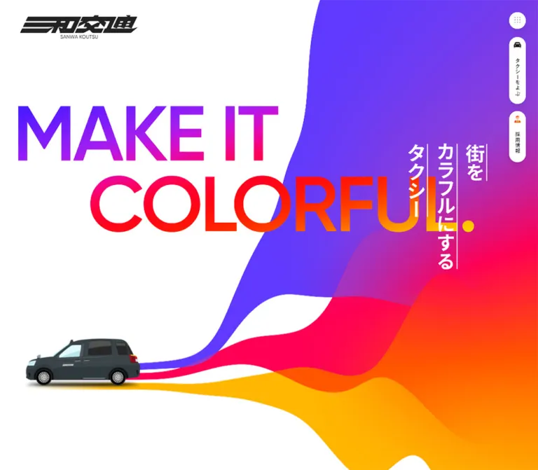
白い余白と鮮やかな波形グラフィック、大きな英文と縦書きコピーが特徴の企業サイト。スマートフォンではヒーローの構図を組み替え、配車・採用への導線を画面下部に配置。
SANWA KOUTSU — Style Reference
A white city canvas opened up by streams of violet, pink, orange, and yellow.
Website: SANWA KOUTSU
Original URL: https://www.sanwakoutsu.co.jp/
Final URL: https://www.sanwakoutsu.co.jp/
Theme: a light corporate homepage with vivid color fields and white floating controls.
Inspected: September 24, 2026, Japan Standard Time. The supplied capture set was retrieved at 2026-09-23T21:00:04.938Z, equivalent to September 24 at 06:00:04.938 JST.
Viewports: desktop 1440 × 1000 and mobile 390 × 844 CSS pixels.
Scope: the current homepage, using three desktop screenshots, two mobile screenshots, and rendered DOM/computed-style evidence for the full page. Visual coverage includes the opening hero, the desktop hire/app section and ABOUT transition, and the social/banner/footer area. Other middle-page sections are documented from DOM evidence where screenshots are unavailable. Linked destination pages and opened navigation panels were not independently inspected.
Sanwa Koutsu presents a broad corporate and service website: taxi services, tours, company information, recruitment, news, editorial articles, and social channels share one long homepage. Its identity comes from the relationship between restrained information and exuberant color. Broad white space, dark Japanese text, light English subheadings, and small circular arrows sit alongside large flowing bands of saturated color.
The opening composition makes this relationship explicit. Desktop uses enormous gradient English lettering across a white field, with a white vertical Japanese message on the colored right side. Mobile rearranges the same ingredients: the Japanese message moves into the upper color field, a small taxi sits beside narrow color trails, and the English slogan becomes dark text on white below. The right-side desktop controls become a floating bottom dock on mobile.
閉じる
SANWA KOUTSU — Style Reference
A white city canvas opened up by streams of violet, pink, orange, and yellow.
Website: SANWA KOUTSU
Original URL: https://www.sanwakoutsu.co.jp/
Final URL: https://www.sanwakoutsu.co.jp/
Theme: a light corporate homepage with vivid color fields and white floating controls.
Inspected: September 24, 2026, Japan Standard Time. The supplied capture set was retrieved at 2026-09-23T21:00:04.938Z, equivalent to September 24 at 06:00:04.938 JST.
Viewports: desktop 1440 × 1000 and mobile 390 × 844 CSS pixels.
Scope: the current homepage, using three desktop screenshots, two mobile screenshots, and rendered DOM/computed-style evidence for the full page. Visual coverage includes the opening hero, the desktop hire/app section and ABOUT transition, and the social/banner/footer area. Other middle-page sections are documented from DOM evidence where screenshots are unavailable. Linked destination pages and opened navigation panels were not independently inspected.
Sanwa Koutsu presents a broad corporate and service website: taxi services, tours, company information, recruitment, news, editorial articles, and social channels share one long homepage. Its identity comes from the relationship between restrained information and exuberant color. Broad white space, dark Japanese text, light English subheadings, and small circular arrows sit alongside large flowing bands of saturated color.
The opening composition makes this relationship explicit. Desktop uses enormous gradient English lettering across a white field, with a white vertical Japanese message on the colored right side. Mobile rearranges the same ingredients: the Japanese message moves into the upper color field, a small taxi sits beside narrow color trails, and the English slogan becomes dark text on white below. The right-side desktop controls become a floating bottom dock on mobile.
How to Read This Reference
- Measured — M: values reported in the supplied rendered DOM or computed styles. Tables round long decimals when useful; these remain measurements at the two inspected viewports.
- Visual estimate — V: approximate colors, sizes, or shapes judged from the current-page screenshots. These were not sampled with a pixel tool.
- Derived — D: arithmetic based on measured dimensions, such as card gaps and banner aspect ratios.
- Recommended — R: implementation choices for a reusable adaptation. These are not claims about the original code.
- Token names: all semantic names introduced here are reference aliases. The supplied custom properties do not expose a semantic brand palette.
- Visibility matters: the DOM contains loading text, duplicate controls, navigation content, and call/recruitment panels that are not visibly open in the screenshots. Their presence establishes structure, not an observed interaction state.
- Parent styles are not artwork measurements: the hero H1 and several section-heading wrappers inherit small font sizes even though their visible lettering is large. Child styles and artwork details were not included for every element.
- Responsive limits: two layouts were inspected. Intermediate breakpoints, maximum-width rules, and continuous scaling formulas were not supplied.
Tokens — Colors
Default Palette
| Name | Value | Suggested token | Evidence | Role |
|---|---|---|---|---|
| Canvas White | #ffffff |
--sw-canvas |
M | Body background; visible white control surfaces and footer |
| Text Charcoal | #222222 |
--sw-ink |
M | Body text, ordinary links, and control foregrounds |
| Electric Violet | approximately #6338ff |
--sw-violet |
V | Broad upper wave, hero field, and cool end of the headline gradient |
| Bridge Purple | approximately #963bcc |
--sw-purple |
V | Intermediate band between violet and pink |
| Vivid Pink | approximately #ff005b |
--sw-pink |
V | Central ribbon, hero gradient, and mobile social-link badges |
| Hot Orange | approximately #ff5900 |
--sw-orange |
V | Lower ribbon and small recruitment pictogram accent |
| Amber Yellow | approximately #ffb900 |
--sw-amber |
V | Bottom wave and the large social-content field |
| Warm Neutral | approximately #f4f2ec |
--sw-neutral |
V | Quiet background behind the hire/app pair |
The saturated hex values are practical approximations, not recovered source constants. The screenshots establish their sequence and visual relationships more reliably than their exact channels.
Supporting Colors
| Name | Value | Evidence | Scope |
|---|---|---|---|
| Call Green | #39e395 |
M | Circular telephone links inside the DOM-resident taxi panel; not visible in the supplied open-page screenshots |
| Policy Slate | #2b3036 |
M | Background of the policy link in the navigation DOM |
| Headline Red | approximately #ff1600 |
V | Warm middle of the desktop COLORFUL. lettering |
| Dock Frame | approximately #f2f2f2 |
V | Pale outer surround of the mobile bottom controls |
Keep Call Green local to telephone actions if implementing the observed panel structure. It is not the main homepage accent.
Color Placement
The page does not distribute equal amounts of every color across every component. Large fields carry most of the saturation. Small controls remain white, text remains charcoal, and the hire/app section pauses the color sequence with a warm neutral surface.
The hero combines gradient color with distinct ribbons. The section transition in the second desktop capture reads as five stacked, uneven bands: violet, purple, pink, orange, then yellow. Preserve the white gaps and varying band thicknesses in the hero; an evenly divided rectangular rainbow would lose the composition.
The social section is predominantly amber with white logo tiles. Social logos retain their own brand colors. These colors belong to the supplied logos and should not become additional interface tokens.
Tokens — Typography
Source Font Stack
The computed body stack is:
Gilroy, 'Hiragino Kaku Gothic ProN', 'Hiragino Sans',
YuGothic, '游ゴシック', Meiryo, sans-serif
Gilroy is explicitly named in the supplied computed styles. The evidence does not include font-file URLs or a font-loading report, so it does not establish which face rendered every glyph. The Japanese fallbacks are part of the declared stack, not newly proposed font choices.
English headings provide the geometric, open character. Japanese text supplies the practical information layer. The page uses a substantial contrast between thin service headings, widely tracked section titles, bold introductory copy, and compact utility labels.
Type Scale
| Role | Desktop | Mobile | Weight / tracking | Evidence |
|---|---|---|---|---|
| Body default | 12.6px / 18.9px |
14.56px / 21.84px |
400, normal tracking |
M; descendants may override it |
| HOME navigation link | 14.4px / 21.6px |
16.64px / 24.96px |
400; 0.06em tracking |
M; navigation DOM |
| Language links | 14.4px / 21.6px |
14.56px / 21.84px |
400; 0.06em tracking |
M; navigation DOM |
| Introductory paragraphs | 20.16px / 100.8px |
14.56px / 45.76px |
700; desktop 0.05em, mobile 0.01em |
M |
| English hero slogan | approximately 144–156px |
40.56px / 44.72px |
Mobile 600, 0.04em tracking |
Desktop V; mobile M |
| Visible Japanese hero lettering | approximately 48–52px |
approximately 32–35px |
Visually bold | V; H1 wrapper styles do not measure these glyphs |
| HIRE & DRIVER / APP lettering | approximately 28px |
Not directly captured | Light appearance; wrapper weight 200 |
V for visible size, M for wrapper weight |
| ABOUT display lettering | approximately 104–110px |
Not directly captured | Broad tracking, white | V |
| RECRUITING heading | 108px / 144px |
41.6px / 62.4px |
500; tracking 0.2em desktop, 0.08em mobile |
M |
| Recruitment statement | 33.3px / 54px |
28.08px / 44.72px |
400; 0.06em tracking |
M |
| NEWS / COLUMN headings | 36px / 72px |
24.96px / 37.44px |
500; 0.2em tracking |
M |
| Call/recruitment panel headings | 23.4px / 35.1px |
16.64px / 24.96px |
700; 0.07em tracking |
M; panels not visually opened |
| Footer links | 12.6px / 18.9px |
12.48px / 18.72px |
700; 0.04em tracking |
M |
The screenshot’s hire/app descriptions appear around 16px, larger than the link container’s inherited 12.6px. Treat that visible size as an estimate until the actual text child is measured.
Display Text and Ordinary Text
The desktop English slogan is a visual centerpiece, with MAKE IT above an indented COLORFUL. The first line moves through cool violet and pink; the second passes through pink/red, orange, and yellow. The mobile slogan is ordinary dark text with a deliberate two-line break.
The Japanese hero message reads vertically in three columns, from right to left: 街を, カラフルにする, タクシー. Thin white vertical rules accompany the desktop lettering. The mobile capture simplifies this treatment and centers the columns over the colored area.
Do not reproduce the inherited H1 font size of 12.6px or 14.56px as the visible Japanese display size. The supplied wrapper measurements and screenshot lettering describe different layers of the component.
Root Font Size Caution
The HTML element reports 14.4px on desktop and 33.28px on mobile, while the body reports 12.6px and 14.56px. This is not a conventional fixed-root type system. A single proportional formula cannot be established from these two samples.
The Quick Start keeps a conventional root and uses explicit component values. It does not attempt to reconstruct the source rem system.
Tokens — Spacing & Shapes
Spacing Scale
| Use | Desktop | Mobile | Evidence |
|---|---|---|---|
| Main content side inset | 144px |
approximately 16.64px |
M |
| Main content width | 1152px |
approximately 356.72px |
M |
| Main content width as viewport share | 80% |
approximately 91.47% |
D; not a proven CSS formula |
| Introductory text width | 633.59px |
282.88px |
M |
| Introductory section top/bottom padding | 441px / 423px |
93.6px / 116.48px |
M |
| Desktop collection item gap | 90px |
— | D from 378px item pitch and 288px width |
| Mobile collection column gap | — | approximately 31.19px |
D |
| Mobile collection row gap | — | approximately 27.56px after the tallest item |
D |
| Hire/app panel right padding | 27px |
0 |
M |
| News row vertical padding | 36px |
20.8px |
M |
| Social item horizontal gap | 120px |
approximately 33px |
D; mobile final row is centered separately |
| Social row gap | 54px |
20px |
D from measured link boxes |
| Bottom banner gap | 40px |
20px |
D |
For a new implementation, a supporting spacing scale of 4, 8, 12, 16, 24, 32, 48, 72, 96px is reasonable, but it is a recommendation. The distinctive measured dimensions above should take priority when matching the inspected layouts.
Border Radius
| Element | Value / treatment | Evidence |
|---|---|---|
| Menu button | 50% |
M |
| Desktop vertical action pills | 21.6px |
M |
| Mobile action pills | 24.96px |
M |
| Navigation feature links | 9px desktop; 10.4px mobile |
M; navigation DOM |
| Desktop call/recruitment panel wrapper | 36px |
M; inactive panel geometry |
| Mobile call/recruitment panel wrapper | 0 |
M; inactive panel geometry |
| Hire/app image masks | Soft, irregular rounded squares; roughly a 25–35% corner treatment |
V; exact path or radius unknown |
| Social logo tiles | Soft rounded squares; roughly a 30% corner treatment |
V |
| Campaign banners | Small rounded corners, approximately 8–10px |
V; link wrapper radius does not describe the image artwork |
The page uses several kinds of roundness: true circles for arrows and menu controls, long capsules for actions, and softer square silhouettes for images. Avoid assigning the same radius to every object.
Layout Measurements
| Element | Desktop 1440 × 1000 |
Mobile 390 × 844 |
Evidence |
|---|---|---|---|
| Document height | 10384.06px |
10457.06px |
M |
| Hero section | 1440 × 1000px |
390 × 844px |
M |
| Brand link box | 190 × 45.5px at (52.19, 40.5) |
151 × 39.5px at (16.63, 27.03) |
M |
| Top menu button | 43.19 × 43.19px at (1364.42, 32.39) |
49.91 × 49.91px at (322.42, 17.67) |
M |
| Taxi action | 43.19 × 176.39px |
187.81 × 49.91px in initial dock |
M |
| Recruitment action | 43.19 × 135px |
146.05 × 49.91px in initial dock |
M |
| Hero Japanese wrapper | 211 × 347px at (1085.41, 298.88) |
390 × 246.23px at (0, 124) |
M |
| Mobile English slogan | Not separately measured | 229.94 × 89.44px at (16.63, 637.70) |
M |
| Service collection link width | 288px |
162.77px |
M |
| Hire/app content-link height | 162px |
124.8px |
M |
| ABOUT link footprint | 288 × 288px |
356.72 × 187.19px |
M; inner artwork not measured |
| Main recruitment link footprint | 1152 × 504px |
356.72 × 526.23px |
M |
| Social link box | 140 × 188px |
approximately 80 × 109px |
M |
| Footer | 224.98px high |
262.33px high |
M |
The supplied --vh custom property is 10px on desktop and 8.44px on mobile, exactly one percent of each inspected viewport height. This supports a viewport-height sizing mechanism at capture time, but does not establish how it updates when mobile browser chrome changes.
Components
Brand and Header Shell
Role: establish identity while leaving the hero almost entirely available to the artwork.
The upper-left logo is a compact graphic wordmark with a small SANWA KOUTSU line beneath it. It appears dark on the desktop white field and white over the mobile color field. Use the actual logo artwork for a faithful implementation; the slanted Japanese lettering is not ordinary typeset text.
There is no visible full-width navigation bar in the supplied default screenshots. The measured outer header has zero height while its child brand and controls have positioned boxes. Do not interpret the zero-height wrapper as an absent header.
The logo does not appear in the supplied lower-page screenshots. Persistent brand-logo behavior is therefore not established, while persistent action controls are visually supported.
Desktop Action Rail
Role: keep menu, taxi calling, and recruitment access visible during a long page visit.
The rail sits approximately 32.4px from the right edge. Its anatomy is:
- A white circular menu button containing a small nine-dot symbol.
- A white vertical taxi capsule, with a dark car pictogram above
タクシーをよぶ. - A shorter white recruitment capsule, with an orange person pictogram above
採用情報.
The menu starts at y ≈ 32.4px, the taxi pill at 97.2px, and recruitment at 291.6px. The pill width is approximately 43.2px. Vertical Japanese labels keep this persistent navigation narrow.
The controls remain at corresponding viewport positions in the desktop hero, middle, and footer captures. A soft shadow is visible against pale sections. Its exact blur and opacity were not supplied.
Mobile Action Dock
Role: move the two primary practical tasks into thumb reach.
In the opening mobile capture, a pale rounded surround contains two white pills: recruitment on the left and taxi calling on the right. Their measured inner heights are 49.91px; the recruitment pill is 146.05px wide and the taxi pill 187.81px. Icons precede horizontal Japanese labels.
In the lower-page mobile capture, the dock is compact and aligned toward the right. It contains a short recruitment control, a taxi icon control, and a circular nine-dot menu control. This is evidence of two visible dock presentations at different page positions. The exact transition trigger, scroll threshold, and animation are unverified.
A reconstruction should implement expanded and compact states explicitly. Reserve space below content and preserve accessible names when visible labels collapse. The footer screenshot shows the dock overlapping part of the copyright area; avoiding that overlap is a recommended improvement.
Opening Hero
Role: express the brand message before the detailed service directory.
The desktop hero fills the inspected 1000px viewport height. Its white left side carries MAKE IT on the first line and an indented COLORFUL. below. The lettering crosses toward the colored right field rather than sitting inside a conventional centered text column.
Thin colored trails begin near the lower-left portion of the composition, then widen into large organic shapes. The violet field climbs toward the upper-right corner. Pink, orange, and amber occupy progressively lower areas, with white openings separating parts of the curves. The vertical Japanese headline sits on the right in white.
On mobile, the upper half is dominated by color. The white logo and vertical headline occupy that field. A white opening cuts across the lower edge; a small side-view taxi is visible around y ≈ 548–594px, with three narrow trails extending rightward and expanding into color. The dark English slogan begins around y ≈ 638px.
The taxi is clearly visible in the current mobile capture but not in the supplied desktop hero frame. This does not establish that the desktop design omits the vehicle. Its desktop visibility, timing, and trajectory were not verified.
Use separate desktop and mobile art direction. Scaling the desktop canvas into a phone would place the headline, vehicle, and controls incorrectly.
Introductory Statement
Role: connect the exuberant hero to the company’s service promise.
The DOM records three bold Japanese paragraphs about comfortable travel, energizing the city through ideas and services, and making customers smile. Desktop places them in a 633.59px text region starting at the main 144px inset. The section is approximately 1468.69px high, including unusually generous top and bottom padding.
The measured desktop line height is 100.8px for 20.16px text. This is a deliberate spatial rhythm in the inspected layout, not a sensible default for every paragraph on the site.
Mobile narrows the text to 282.88px, centers that block horizontally, and uses 45.76px line height at 14.56px. Its section height falls to approximately 667.69px. Keep this statement visually distinct from compact service descriptions.
Wave Section Heading
Role: divide major chapters while continuing the hero’s visual identity.
The desktop ABOUT transition visibly layers five full-width waves. Large centered white English lettering sits across the lower bands, followed by a smaller Japanese subtitle. The transition starts with violet at the top and finishes with yellow at the bottom.
The measured SERVICE and ABOUT heading wrappers are approximately 362.69px high on desktop and 304.69px on mobile. These are wrapper dimensions, not font sizes. The supplied ABOUT screenshot supports the visible wave treatment; equivalent exact artwork for every other heading is not available in the screenshots.
Within the quieter hire/app section, headings use a related miniature signature: three vertically stacked dots in violet, pink, and yellow, followed by a light English title and a Japanese subtitle below.
Taxi Service and Event Collections
Role: expose the range of ordinary services and more unusual experiences.
The taxi collection contains six service links. The event/tour collection contains ten, including an AI company orientation, robot taxi, seasonal ghost tour, rideshare recruitment, and sightseeing experiences. These are current content entries, not a fixed design requirement for every reuse.
On desktop, link boxes are 288px wide and repeat every 378px. Several extend beyond the viewport. Two circular buttons, each approximately 61.19px square, occur above each collection. Together these measurements support a horizontal collection structure with navigation controls. Button results, dragging, autoplay, looping, and scroll snapping were not exercised.
On mobile, the same collections become two-column grids. Each item is approximately 162.77px wide, with a 31.19px column gap. A すべて見る entry follows the collection. Desktop event summaries appear in the rendered text; mobile visible text primarily exposes titles, although summary text remains in the element records.
The link wrappers are unboxed and report zero border radius. Image-child masks were not sampled, so that value should not be used to assert square image corners. Retain the distinction between the overall link footprint and its media treatment.
Hire & Driver / App Pair
Role: provide two quieter, practical service routes between larger colored chapters.
The supplied desktop screenshot shows a warm neutral section with two equal-width columns. Each column contains:
- A vertical three-dot accent.
- A light uppercase English heading.
- A smaller Japanese subtitle.
- A soft-square image below.
- A short description to the image’s right.
- A white circular arrow overlapping the image’s lower-right edge.
The left image shows a suited passenger using a phone inside a vehicle. The right shows a smartphone with the dispatch application over a muted cool-gray background. Both visible media regions are approximately 162px square.
The two section boxes are 576px wide on desktop. Their linked content areas are 522 × 162px. On mobile, the sections stack and the content-link height reduces to 124.8px; the overall link uses a horizontal flex layout rather than becoming an enormous full-width image card.
The screenshot is the authority for the balanced visible alignment. Some sampled DOM heading positions differ vertically; do not infer a deliberate animated stagger from those records alone.
Company Information and Recruitment Feature
Role: lead from services into institutional trust and employment information.
The ABOUT region contains three links labeled FOR SAFETY, FOR HOSPITALITY, and MESSAGE, followed by a company-outline link. Desktop footprints are 288 × 288px in one row. Mobile footprints become approximately 356.72 × 187.19px and stack vertically. The supplied screenshots do not show their inner imagery, so its content and exact cropping remain unverified.
The recruitment section uses a very large tracked RECRUITING heading. Its main linked region changes from a wide 1152 × 504px desktop area to a tall 356.72 × 526.23px mobile area. The statement DELIGHTFUL,FAITHFUL,& HOPEFUL. is charcoal in the desktop computed style and white on mobile. That foreground change is measured; the corresponding underlying mobile image or field is not shown in the supplied captures.
A narrow freshers campaign banner follows this feature. Keep the main recruitment feature and the separate banner as distinct content objects.
News and Column Lists
Role: present timely updates and ongoing editorial content without adding a new card system.
Each section contains a tracked English heading, three dated article links, and a smaller link to the complete archive.
Desktop places the heading in a left region approximately 440.11px wide and the article list in a 711.89px region to its right. Each article link is a grid with measured columns of approximately 119.69px 491.41px 28.80px, separated by 36px gaps: date, title, and an end affordance. Rows are approximately 153px high with 36px vertical padding.
Mobile moves the heading above the list and changes each article link to block layout. Rows span the 356.72px content width and use 20.8px vertical padding. The measured foreground is white at both viewports. The actual underlying field color is not established by the supplied screenshots or transparent wrapper backgrounds.
For reuse, retain dated text rows and a clear archive route. Do not invent image thumbnails or category chips absent from this evidence.
Social Content Grid
Role: turn external channels into recognizable, friendly destinations.
The social area uses a large amber field. Each link consists of a white soft-square tile, a centered platform logo, a small diagonal-arrow badge overlapping the lower-right corner, and a dark label underneath.
Desktop uses four columns and two rows. Tile/link starts are measured at x = 240, 500, 760, 1020px; each link is 140px wide and 188px high. The first row contains TikTok, YouTube, X, and Instagram; the second contains LINE, Facebook, the video channel, and the blog.
Mobile uses three columns with approximately 80px tiles. The eight entries form rows of three, three, and two, with the last pair centered. The desktop arrow badges are dark; the mobile badges visible in the supplied footer capture are pink. Their approximate visual diameters are 34px and 20px, respectively.
Preserve the platform artwork and its internal clear space. A generic icon font would not reproduce these logo tiles.
Campaign Banners
Role: surface two recruitment-related destinations beneath the social links.
The first banner promotes the taxi-work information site. Its desktop link measures 728 × 89.78px, approximately 8.11:1. On mobile it measures 358 × 137.77px, approximately 2.60:1. The mobile artwork visibly recomposes the text and adds a prominent taxi at the right, so a simple proportional resize is insufficient.
The second, red freshers banner includes people and expressive Japanese lettering. It stays close to 8:1: 728 × 90.92px on desktop and 358 × 44.70px on mobile.
Use responsive art direction for the first banner and preserve the second banner’s narrow proportions. Keep text that belongs to campaign artwork within that asset rather than approximating its decorative lettering with unrelated interface fonts.
Footer and Page Top
Role: provide compact service utilities after the expressive content area.
A shallow wave ends the amber section and reveals a white footer. A circular upward-arrow control overlaps this boundary near the right side, with PAGE TOP beneath it. Its complete button box is approximately 42.30 × 55.80px on desktop and 48.88 × 62.41px on mobile.
Desktop distributes seven utility links across one horizontal row. Mobile wraps them into centered rows of two, two, and three. The measured mobile footer links are 12.48px, bold, with 0.04em tracking. A fine horizontal divider precedes the centered copyright line.
The page-top label establishes an intended return-to-top affordance; the actual scroll behavior and timing were not tested.
Navigation and Task Panels — DOM Evidence Only
Role: organize the routes behind the persistent controls.
The supplied DOM contains a navigation structure with HOME, language links, three major feature links, company/service utilities, banners, and a policy link. Desktop records suggest a broad multi-column arrangement, while mobile records stack the feature links and utility rows.
A taxi panel contains four regional telephone destinations, two service shortcuts, and application-store links. Its desktop wrapper measures 1152 × 602.09px with a 36px radius. Telephone controls have a measured green fill and circular shapes, approximately 39.59px desktop and 45.75px mobile.
A recruitment panel contains regional information, job/briefing links, a telephone route, an entry form, and campaign media. Its desktop wrapper measures 1152 × 898.52px. On mobile, both task-panel wrappers measure 390 × 760.81px, starting around y = 83.19px.
These dimensions describe DOM-resident structures. Opening behavior, backdrop appearance, focus management, dismissal, and internal scrolling were not visually tested. They must not be presented as verified modal interactions.
Tokens — Motion & Interaction
| Treatment | Supplied evidence | What can be concluded |
|---|---|---|
| Desktop menu button | 0.6s cubic-bezier(0.23, 1, 0.32, 1) |
A nonzero transition is defined; the changed visual properties were not exercised |
| Logo and several navigation links | 0.6s cubic-bezier(0.23, 1, 0.32, 1) |
Shared smooth, strongly easing transition timing |
| Desktop taxi/recruitment pills | 0.75s cubic-bezier(0.23, 1, 0.32, 1) |
Longer control transition defined in desktop styles |
| Desktop recruitment contact links | 0.4s cubic-bezier(0.4, 0, 0.2, 1) |
A separate shorter transition is defined |
| Mobile top menu and main dock buttons | Computed transition reported as all without a nonzero duration |
No timed motion can be established from this record |
| Wave graphics and taxi | Static screenshots show scene geometry and a mobile vehicle | No verified duration, path, morphing method, or synchronization |
| Mobile dock | Expanded at the opening; compact in the lower capture | Two visual states are supported; exact trigger and transition are unknown |
| Desktop collection controls | Two buttons and horizontally extending items in the DOM | Collection navigation is suggested; interaction results remain unverified |
| PAGE TOP | A labeled button is present | Intended function is apparent; scrolling implementation is unverified |
| Loading | Loading text exists in the DOM | No visible loading sequence is established by the supplied settled captures |
The sampled elements generally report animation: none. This does not prove that the complete page is static: graphic descendants, pseudo-elements, script-driven transforms, and other unsampled layers may behave differently.
The capture process waited for document readiness, visible image decoding, and finite motion, and temporarily paused perpetual animations during stability checks. Those procedures improve screenshot consistency but do not supply an animation timeline.
For an adaptation, reuse the measured easing for small control transitions. Animate specific properties such as transform and opacity instead of applying unrestricted transition: all. Keep the hero readable in a static state and add reduced-motion behavior. These are recommendations.
Surfaces
| Layer | Appearance | Evidence and purpose |
|---|---|---|
| Base canvas | White | M; creates the large negative spaces around the hero and footer |
| Main hero color field | Violet-to-warm graphic with flowing boundaries | V; expressive identity rather than a boxed content surface |
| Hire/app region | Warm pale neutral | V; a quiet interval between saturated chapters |
| Wave chapter transition | Stacked colored bands with white title | V for ABOUT; separates major content groups |
| Social region | Solid amber field | V; unifies diverse platform logos and campaign artwork |
| Floating utilities | White circles and capsules with soft gray shadows | White is M; shadow appearance is V |
| Social/image containers | White or muted photographic backgrounds inside soft-square shapes | V; local image framing |
| Footer | White with a fine pale divider | V; compact utility information |
| Hidden task/navigation layers | Partial computed colors and dimensions only | M; complete surface treatment unverified |
There is no evidence for a universal elevated-card system. Most content links are unboxed. Shadows concentrate around floating navigation, arrows, and the mobile dock. A reasonable adaptation shadow is 0 8px 24px rgb(0 0 0 / 0.10), explicitly an estimate rather than a recovered value.
Imagery
The page combines abstract graphic scenery with ordinary real-world imagery. The hero’s flowing color carries the brand concept; a small realistic taxi gives that abstraction a concrete subject. The hire image shows a business passenger in a vehicle, while the app image shows a phone interface. Social marks and campaign banners form their own recognizable visual categories.
Use a crisp cutout treatment for the taxi, including its grounded shadow where visible. Keep photography localized to service content instead of replacing the opening color composition with a full-screen stock photograph.
The hire/app image frames and social tiles have soft-square silhouettes rather than true circular crops. Campaign banners use their own lettering, people, and promotional composition. Their visual density contrasts with the surrounding page’s generous space.
Observed Asset References
The supplied evidence does not include reliable image src URLs or an asset manifest. The links below are observed destinations, not downloadable image paths, and were not independently opened.
| Asset or image group | Visible content | Observed destination / evidence scope |
|---|---|---|
| Header wordmark | Stylized Japanese logo and SANWA KOUTSU line | Homepage link: https://www.sanwakoutsu.co.jp/ |
| Hero artwork | Flowing colored ribbons; small taxi visible on mobile | Current hero screenshots; source asset URL unavailable |
| Hire image | Suited passenger using a phone inside a vehicle | https://www.sanwakoutsu.co.jp/service/hire_taxi/ |
| App image | Smartphone showing the dispatch application | https://www.sanwakoutsu.co.jp/sanwa_app/ |
| Social marks | Eight distinct channel logos in white tiles | Current lower-page screenshots and corresponding external links in the homepage DOM |
| Taxi-work banner | Yellow/navy campaign lettering; mobile taxi detail | http://driver-recruit.sanwakoutsu.co.jp/?utm_source=CP&utm_medium=CP |
| Freshers banner | Red campaign composition with people | https://freshers.sanwakoutsu.co.jp/ |
No icon library, wave-rendering technology, asset filenames, or image-generation method can be established from these captures. Use supplied artwork when available; do not invent original asset paths.
Layout & Responsive Behavior
Page Sequence
The rendered homepage follows this broad order:
- Full-viewport hero.
- Three-paragraph company statement.
- SERVICE heading, taxi collection, and event/tour collection.
- Hire & Driver and App pair.
- ABOUT heading, company information, and recruitment feature.
- NEWS and COLUMN lists.
- CONTENTS/social area, campaign banners, and footer.
The measured document is approximately 10.4k CSS pixels tall at both inspected widths. Similar total height does not imply similar layout: mobile shortens the opening statement while expanding collections into multiple rows and stacking company links.
Desktop-to-Mobile Changes
| Pattern | Desktop observation | Mobile observation |
|---|---|---|
| Hero | Large gradient English slogan on the left; Japanese message at right | Japanese message centered high in the color field; dark English slogan below the taxi |
| Brand | Dark logo on white | White logo on color |
| Primary actions | Vertical rail at the right | Horizontal bottom dock; compact state in lower capture |
| Content width | 1152px with 144px side insets |
Approximately 356.72px with 16.64px side insets |
| Introductory copy | Wide left-aligned block and very large vertical spacing | Narrow centered text block with reduced spacing |
| Service/tour collections | Horizontal sequence with items beyond the viewport | Two-column grids |
| Hire/app | Two side-by-side sections | Two stacked sections retaining horizontal image/text links |
| Company links | Three square footprints in a row | Three wide footprints in a vertical stack |
| Recruitment | Wide main link | Tall main link; measured statement foreground changes to white |
| Article lists | Section heading left; date/title/end-affordance grid right | Heading above; block article rows |
| Social links | Four columns, two rows | Three columns, then a centered final pair |
| First bottom campaign banner | Approximately 8.11:1 |
Approximately 2.60:1, recomposed artwork |
| Footer links | One row | Three centered rows |
A breakpoint near 768px is a reasonable implementation starting point, but it is not a recovered source breakpoint. Test intermediate widths for the large English lettering, vertical Japanese copy, long service titles, and floating-control clearance.
The phone screenshots support intentional recomposition, not just fluid scaling. Treat hero placement, navigation form, collection layout, and banner art direction as separate responsive decisions.
Do’s and Don’ts
Do
- Preserve the contrast between large white spaces and concentrated saturated color.
- Keep the ribbon order recognizable: violet, purple, pink, orange, yellow.
- Draw organic curves with changing thickness and deliberate white openings.
- Use the actual logo graphic and retain its desktop/mobile contrast change.
- Pair oversized English display text with carefully positioned vertical Japanese copy.
- Give the mobile hero its own composition and keep the English slogan dark on white.
- Maintain the narrow desktop action rail and horizontal mobile action dock.
- Use circular arrow affordances and soft-square image frames for their observed roles.
- Convert service collections to two columns on mobile while keeping all entries reachable.
- Keep the hire/app pair visually quiet and the social area predominantly amber.
- Use a separately composed mobile version of the first recruitment banner.
- Distinguish DOM-resident panels from visually verified open states.
Don’t
- Don’t turn the whole corporate homepage into a single-purpose campaign page.
- Don’t replace the flowing artwork with an evenly spaced rainbow rectangle.
- Don’t fill every link with a different bright color or add a card shadow to every section.
- Don’t scale the desktop hero down unchanged for phones.
- Don’t use the parent H1’s inherited font size as the Japanese display size.
- Don’t assume a zero-radius link wrapper means its image mask is square.
- Don’t reproduce the mobile root font size as a general application default.
- Don’t assign an unobserved autoplay, wave-morph, or vehicle-travel animation.
- Don’t infer the unseen NEWS background from its white text alone.
- Don’t fabricate image paths, icon packages, or production credits.
- Don’t let collapsed mobile labels remove the controls’ accessible names.
Recommended Implementation Additions
These are recommendations for a new implementation, not verified features of the original:
- Give the nine-dot menu, car icon, recruitment icon, and small arrow links explicit accessible names.
- Use links for navigation and buttons for state changes. If task panels are implemented as dialogs, add appropriate focus handling, Escape dismissal, and focus restoration.
- Make inactive panels inert or otherwise remove them from keyboard navigation and the accessibility tree.
- Increase desktop controls from their measured
43.19pxto at least44pxwhere possible. Small arrow badges can remain decorative inside a larger clickable link. - Maintain a clear focus ring on both white and saturated backgrounds. Test the actual final palette for text contrast rather than relying on approximate reference colors.
- Preserve the Japanese headline as accessible text even if the visual treatment uses artwork. Avoid announcing decorative duplicate copies.
- Provide a useful static hero and honor reduced-motion preferences. Add moving vehicles or animated wave paths only with a defined, tested behavior.
- Reserve safe-area and footer clearance for the mobile dock so utility links and copyright remain reachable.
- Use responsive image sources for banners and the hero, explicit image dimensions, and deferred loading for lower-page imagery.
- Give desktop collections a keyboard-accessible navigation route or native scrolling fallback. Do not require dragging as the only way to reach later entries.
- Keep general prose comfortably readable. The measured compact body default should not force all new descriptive text below an appropriate reading size.
Agent Prompt Guide
Quick Color Reference
- Canvas and ordinary control surfaces: measured
#ffffff. - Main text: measured
#222222. - Wave sequence, approximate:
#6338ff,#963bcc,#ff005b,#ff5900,#ffb900. - Quiet hire/app surface, approximate:
#f4f2ec. - Desktop slogan: cool violet/pink first line, warm pink/red/orange/yellow second line.
- Mobile slogan: charcoal on white.
- Social field: amber, with white logo tiles and original platform colors.
- Floating controls: white, subtle gray shadow, dark icons; recruitment pictogram accented orange.
Overall Prompt
“Create a long Japanese mobility-company homepage inspired by the current Sanwa Koutsu composition. Use a white canvas, charcoal text, and broad flowing ribbons in violet, purple, vivid pink, orange, and amber. On desktop, place a very large two-line gradient English slogan across the left of a full-height hero and a white vertical Japanese message on the colored right side. Use a compact upper-left logo and a persistent right rail of white circular and vertical capsule controls. Continue into service collections, a quiet neutral hire/app pair, wave-shaped chapter dividers, company information, recruitment, dated article lists, an amber social area, campaign banners, and a white footer. Recompose the mobile hero with vertical Japanese copy above a small taxi and dark English text below; move practical actions into a bottom dock. Use the supplied measurements as viewport-specific references and label any invented interactions.”
Example Component Prompts
- Desktop hero: “At 1440 × 1000, create a mostly white opening composition with huge MAKE IT and an indented COLORFUL. Colored trails begin narrowly near the lower left and expand into organic violet, pink, orange, and yellow fields toward the right. Place three white vertical Japanese text columns near the right side. Keep action controls in a narrow white rail at the far right. Use custom curves, not a rectangular rainbow background.”
- Mobile hero: “At 390 × 844, place a white wordmark near the upper-left and a white circular nine-dot menu at the upper-right. Center vertical Japanese copy in the upper colored field. Leave a white opening below it, position a small taxi beside narrow color trails, then place MAKE IT / COLORFUL. in dark 40.56px text near the lower-left. Reserve space for a two-button bottom dock.”
- Hire/app pair: “Create two desktop columns on a warm off-white surface. Each has three colored vertical dots, a light uppercase English heading, a Japanese subtitle, a 162px soft-square image, a short description beside it, and a white circular arrow overlapping the image corner. Stack the two sections on mobile while retaining a compact horizontal image/text arrangement.”
- Service collection: “Use unboxed 288px-wide desktop links with 90px gaps in a horizontal collection. On mobile, show all entries in two 162.77px columns with about 31px between them. Separate image treatment from the link wrapper. Keep a clear route to the complete service index.”
- Social area: “Build an amber section with eight white soft-square platform tiles. Use four columns on desktop, three columns on mobile, and center the final pair. Put labels below and small diagonal-arrow badges at the lower-right of each tile. Use dark badges on desktop and pink badges on mobile.”
- Footer: “End the amber content with a shallow organic wave into white. Place a circular upward-arrow control near the right edge of the transition. Arrange seven bold small utility links in one desktop row and three centered mobile rows. Add a pale divider and centered copyright, with enough clearance for the mobile dock.”
Quick Start
CSS Custom Properties
This is a recommended implementation scaffold, not recovered source CSS. It preserves important dimensions at the inspected viewports while keeping a conventional root font size. Approximate colors, a 768px breakpoint, shadows, and interpolated display sizes are adaptation choices. Gilroy and the actual logo, taxi, campaign, and hero artwork must be supplied separately.
The hero expects an art-directed image or SVG in .sw-hero__art, a three-span Japanese heading in source reading order, and a two-span English slogan. The dock’s .is-compact state is explicit; this CSS does not invent a scroll threshold.
:root {
  /* Measured interface colors */
  --sw-canvas: #fff;
  --sw-ink: #222;
  --sw-call: #39e395;
  --sw-policy: #2b3036;

  /* Visual approximations, not recovered source constants */
  --sw-violet: #6338ff;
  --sw-purple: #963bcc;
  --sw-pink: #ff005b;
  --sw-red: #ff1600;
  --sw-orange: #ff5900;
  --sw-amber: #ffb900;
  --sw-neutral: #f4f2ec;
  --sw-dock-frame: #f2f2f2;

  --sw-font: Gilroy, 'Hiragino Kaku Gothic ProN',
    'Hiragino Sans', YuGothic, '游ゴシック', Meiryo, sans-serif;
  --sw-body-size: 14.56px;
  --sw-gutter: 16.64px;
  --sw-content-max: 1280px;
  --sw-control: 49.92px;
  --sw-pill: 999px;
  --sw-soft-square: 30%;
  --sw-shadow: 0 8px 24px rgb(0 0 0 / 0.10);
  --sw-ease: cubic-bezier(0.23, 1, 0.32, 1);
  --sw-motion-link: 600ms;
  --sw-motion-action: 750ms;
  --sw-safe-bottom: env(safe-area-inset-bottom, 0px);
}

* { box-sizing: border-box; }
html { font-size: 16px; }
body {
  margin: 0;
  color: var(--sw-ink);
  background: var(--sw-canvas);
  font-family: var(--sw-font);
  font-size: var(--sw-body-size);
  line-height: 1.5;
}
button, input { font: inherit; }
button, a { -webkit-tap-highlight-color: transparent; }
button { cursor: pointer; }
img { display: block; max-width: 100%; }
a { color: inherit; }

.sw-container {
  width: calc(100% - var(--sw-gutter) - var(--sw-gutter));
  max-width: var(--sw-content-max);
  margin-inline: auto;
}

.sw-hero {
  position: relative;
  min-height: 100svh;
  isolation: isolate;
  overflow: clip;
}
.sw-hero__art {
  position: absolute;
  inset: 0;
  z-index: -1;
  width: 100%;
  height: 100%;
  object-fit: fill;
  pointer-events: none;
}
.sw-logo {
  position: absolute;
  top: 27.03px;
  left: var(--sw-gutter);
  width: 151px;
  z-index: 2;
}
.sw-menu {
  position: fixed;
  top: 17.68px;
  right: 17.68px;
  z-index: 30;
}
.sw-circle {
  display: inline-grid;
  place-items: center;
  width: var(--sw-control);
  height: var(--sw-control);
  flex: 0 0 auto;
  padding: 0;
  border: 0;
  border-radius: 50%;
  color: var(--sw-ink);
  background: #fff;
  box-shadow: var(--sw-shadow);
}

/* Live-text approximation of the visible vertical headline */
.sw-hero__jp {
  position: absolute;
  top: 124px;
  left: 0;
  right: 0;
  display: flex;
  flex-direction: row-reverse;
  justify-content: center;
  align-items: flex-start;
  gap: 8px;
  margin: 0;
  color: #fff;
  font-size: 34px;
  font-weight: 700;
  line-height: 1.25;
}
.sw-hero__jp span {
  writing-mode: vertical-rl;
  text-orientation: upright;
}
.sw-hero__slogan {
  position: absolute;
  left: var(--sw-gutter);
  bottom: 116.86px;
  margin: 0;
  color: var(--sw-ink);
  font-size: 40.56px;
  font-weight: 600;
  line-height: 44.72px;
  letter-spacing: 0.04em;
}
.sw-hero__slogan span { display: block; }

.sw-rail { display: none; }
.sw-dock {
  position: fixed;
  z-index: 40;
  left: var(--sw-gutter);
  right: var(--sw-gutter);
  bottom: calc(20.8px + var(--sw-safe-bottom));
  display: grid;
  grid-template-columns: 146.05px minmax(0, 1fr);
  gap: 10.4px;
  padding: 6.24px;
  border-radius: var(--sw-pill);
  background: var(--sw-dock-frame);
  box-shadow: var(--sw-shadow);
}
.sw-dock button {
  display: flex;
  align-items: center;
  justify-content: center;
  gap: 14px;
  min-width: 0;
  min-height: 49.92px;
  border: 0;
  border-radius: var(--sw-pill);
  color: var(--sw-ink);
  background: #fff;
  font-weight: 700;
}
.sw-dock .sw-dock__menu { display: none; }
.sw-dock.is-compact {
  left: auto;
  width: 254px;
  grid-template-columns: 1fr 1fr 49.92px;
}
.sw-dock.is-compact .sw-dock__menu { display: flex; }
.sw-dock.is-compact .sw-dock__taxi-label { display: none; }

.sw-intro {
  padding-block: 93.6px 116.48px;
}
.sw-intro__copy {
  width: min(282.88px, calc(100% - 48px));
  margin-inline: auto;
  font-size: 14.56px;
  font-weight: 700;
  line-height: 45.76px;
  letter-spacing: 0.01em;
}
.sw-intro__copy p { margin: 0 0 45.76px; }
.sw-intro__copy p:last-child { margin-bottom: 0; }

.sw-band {
  position: relative;
  isolation: isolate;
  display: grid;
  place-content: center;
  min-height: 304.69px;
  padding: 72px 16px;
  color: #fff;
  text-align: center;
}
.sw-wave {
  position: absolute;
  inset: 0;
  z-index: -1;
  width: 100%;
  height: 100%;
  pointer-events: none;
}
.sw-band h2 {
  margin: 0;
  font-size: clamp(44px, 7.5vw, 108px);
  font-weight: 500;
  line-height: 1.2;
  letter-spacing: 0.2em;
}
.sw-band p { margin: 12px 0 0; font-weight: 700; }

/* Unboxed collection links; preserve each supplied image's ratio */
.sw-collection {
  display: grid;
  grid-template-columns: repeat(2, minmax(0, 1fr));
  gap: 27.56px 31.19px;
}
.sw-card {
  min-width: 0;
  color: inherit;
  text-decoration: none;
}
.sw-card img { width: 100%; height: auto; }
.sw-card__title { margin: 12px 0 0; }

.sw-pair-surface { background: var(--sw-neutral); }
.sw-pair { display: grid; gap: 66.6px; }
.sw-feature__heading {
  position: relative;
  padding-left: 27.04px;
}
.sw-feature__heading::before {
  content: '';
  position: absolute;
  top: 5px;
  left: 0;
  width: 7px;
  height: 7px;
  border-radius: 50%;
  background: var(--sw-violet);
  box-shadow: 0 12px var(--sw-pink), 0 24px var(--sw-amber);
}
.sw-feature__heading h3 {
  margin: 0;
  font-size: 28px;
  font-weight: 200;
  line-height: 1.3;
}
.sw-feature__heading p { margin: 16px 0 0; }
.sw-feature__link {
  display: flex;
  align-items: center;
  gap: 20px;
  margin-top: 28px;
  color: inherit;
  text-decoration: none;
}
.sw-feature__media {
  position: relative;
  flex: 0 0 124.8px;
  width: 124.8px;
}
.sw-feature__media img {
  width: 100%;
  aspect-ratio: 1;
  object-fit: cover;
  border-radius: var(--sw-soft-square);
}
.sw-feature__arrow {
  position: absolute;
  right: -10px;
  bottom: 0;
  width: 48px;
  height: 48px;
}
.sw-feature__copy { margin: 0; line-height: 2; }

.sw-social-section { background: var(--sw-amber); }
.sw-social {
  display: flex;
  flex-wrap: wrap;
  justify-content: center;
  gap: 20px 33px;
  max-width: 306px;
  margin-inline: auto;
}
.sw-social__link {
  width: 80px;
  color: var(--sw-ink);
  text-align: center;
  text-decoration: none;
}
.sw-social__tile {
  position: relative;
  display: grid;
  place-items: center;
  width: 80px;
  aspect-ratio: 1;
  border-radius: var(--sw-soft-square);
  background: #fff;
}
.sw-social__tile img {
  width: 62%;
  height: 62%;
  object-fit: contain;
}
.sw-social__badge {
  position: absolute;
  right: 0;
  bottom: 0;
  display: grid;
  place-items: center;
  width: 20px;
  height: 20px;
  border-radius: 50%;
  color: #fff;
  background: var(--sw-pink);
}
.sw-social__label { display: block; margin-top: 10px; }
.sw-banners {
  display: grid;
  gap: 20px;
  width: min(728px, calc(100% - 32px));
  margin: 40px auto 0;
}
.sw-banners img { width: 100%; height: auto; }

.sw-footer {
  padding: 64px 16px calc(104px + var(--sw-safe-bottom));
  background: #fff;
}
.sw-footer__links {
  display: flex;
  flex-wrap: wrap;
  justify-content: center;
  gap: 24px;
  margin: 0 auto;
  padding: 0;
  list-style: none;
}
.sw-footer__links a {
  font-size: 12.48px;
  font-weight: 700;
  letter-spacing: 0.04em;
  text-decoration: none;
}

/* Recommended focus treatment; not recovered from the source */
:where(a, button):focus-visible {
  outline: 3px solid var(--sw-ink);
  outline-offset: 4px;
}

@media (min-width: 768px) {
  :root {
    --sw-body-size: 12.6px;
    --sw-gutter: 10vw;
    --sw-control: 44px; /* Slightly enlarged from the measured 43.19px */
  }
  .sw-logo { top: 40.5px; left: 3.625%; width: 190px; }
  .sw-menu { top: 32.4px; right: 32.4px; }
  .sw-dock { display: none; }
  .sw-rail {
    position: fixed;
    top: 97.2px;
    right: 32.4px;
    z-index: 30;
    display: grid;
    gap: 18px;
  }
  .sw-rail__action {
    display: flex;
    flex-direction: column;
    align-items: center;
    gap: 22px;
    width: 44px;
    padding: 14px 8px 20px;
    border: 0;
    border-radius: 22px;
    color: var(--sw-ink);
    background: #fff;
    box-shadow: var(--sw-shadow);
    transition: transform var(--sw-motion-action) var(--sw-ease);
  }
  .sw-rail__action span { writing-mode: vertical-rl; }
  .sw-rail__action--taxi { min-height: 176.4px; }
  .sw-rail__action--recruit { min-height: 135px; }
  .sw-hero__jp {
    top: 29.9%;
    left: auto;
    right: 10%;
    gap: 12px;
    font-size: 50px;
  }
  .sw-hero__jp span { border-right: 1px solid currentColor; }
  .sw-hero__slogan {
    top: 21%;
    bottom: auto;
    left: 3.625%;
    font-size: clamp(96px, 10.5vw, 160px);
    line-height: 0.95;
    letter-spacing: -0.035em;
  }
  .sw-hero__slogan span:first-child {
    background-image: linear-gradient(135deg,
      var(--sw-violet), var(--sw-purple), var(--sw-pink));
  }
  .sw-hero__slogan span:last-child {
    margin-left: 10vw;
    background-image: linear-gradient(90deg,
      var(--sw-pink), var(--sw-red), var(--sw-orange), var(--sw-amber));
  }
  @supports ((background-clip: text) or (-webkit-background-clip: text)) {
    .sw-hero__slogan span {
      color: transparent;
      background-clip: text;
      -webkit-background-clip: text;
    }
  }
  .sw-intro { padding-block: 441px 423px; }
  .sw-intro__copy {
    width: min(633.59px, 80vw);
    margin-left: var(--sw-gutter);
    margin-right: 0;
    font-size: 20.16px;
    line-height: 100.8px;
    letter-spacing: 0.05em;
  }
  .sw-intro__copy p { margin: 0; }
  .sw-band { min-height: 362.69px; }
  .sw-collection {
    display: flex;
    gap: 90px;
    overflow-x: auto;
    padding-bottom: 16px;
  }
  .sw-card { flex: 0 0 288px; }
  .sw-pair { grid-template-columns: repeat(2, minmax(0, 1fr)); gap: 0; }
  .sw-feature { padding-right: 27px; }
  .sw-feature__heading { padding-left: 34.2px; }
  .sw-feature__link { margin-left: 27px; gap: 40px; }
  .sw-feature__media { flex-basis: 162px; width: 162px; }
  .sw-feature__copy { font-size: 16px; }
  .sw-social { max-width: 920px; gap: 54px 120px; }
  .sw-social__link, .sw-social__tile { width: 140px; }
  .sw-social__label { margin-top: 18px; font-size: 18px; }
  .sw-social__badge { width: 34px; height: 34px; background: var(--sw-ink); }
  .sw-banners { gap: 40px; }
  .sw-footer { padding-bottom: 32px; }
  .sw-footer__links { gap: 32px 64px; }
}

@media (prefers-reduced-motion: reduce) {
  .sw-rail__action { transition: none; }
  .sw-hero__art { animation: none; }
}
The collection’s native horizontal overflow is a recommended fallback, not a claim about the original carousel implementation. The scaffold also deliberately adds mobile footer clearance. It does not implement task panels, article-list markup, or a moving vehicle.
Static Wave Divider
This small inline SVG supplies a reusable five-band divider. Its paths are newly authored approximations of the visual language, not extracted original artwork. Use it inside .sw-band with an ordinary heading and subtitle above it in the DOM stacking order.
<section class='sw-band' aria-labelledby='about-title'>
  <svg class='sw-wave' viewBox='0 0 1440 360'
       preserveAspectRatio='none' aria-hidden='true' focusable='false'>
    <path fill='var(--sw-violet)'
      d='M0 22 C160 0 250 30 360 22 S550 65 680 38 S820 0 940 20 S1100 50 1230 36 S1370 42 1440 48 V360 H0 Z'/>
    <path fill='var(--sw-purple)'
      d='M0 142 C160 150 180 128 290 148 S420 176 530 156 S720 154 850 162 S1030 180 1140 164 S1330 174 1440 170 V360 H0 Z'/>
    <path fill='var(--sw-pink)'
      d='M0 210 C140 184 170 224 300 204 S480 180 590 192 S740 154 890 176 S1080 176 1210 206 S1350 218 1440 208 V360 H0 Z'/>
    <path fill='var(--sw-orange)'
      d='M0 290 C130 284 150 262 270 282 S450 270 550 244 S700 274 830 254 S1030 270 1170 264 S1340 248 1440 256 V360 H0 Z'/>
    <path fill='var(--sw-amber)'
      d='M0 314 C150 324 220 292 350 306 S540 326 690 310 S870 286 1000 298 S1190 316 1300 304 S1390 300 1440 300 V360 H0 Z'/>
  </svg>
  <h2 id='about-title'>ABOUT</h2>
  <p lang='ja'>三和交通について</p>
</section>
Tailwind v4 Token Mapping
Optional mapping for a project already using Tailwind v4. Define the custom properties above first. These names are adaptation aliases; the supplied utility custom properties do not establish an exact source framework version.
@theme inline {
  --color-canvas: var(--sw-canvas);
  --color-ink: var(--sw-ink);
  --color-wave-violet: var(--sw-violet);
  --color-wave-purple: var(--sw-purple);
  --color-wave-pink: var(--sw-pink);
  --color-wave-orange: var(--sw-orange);
  --color-wave-amber: var(--sw-amber);
  --color-warm-neutral: var(--sw-neutral);
  --color-call: var(--sw-call);

  --font-brand: var(--sw-font);
  --text-body: var(--sw-body-size);
  --text-hero-mobile: 40.56px;
  --text-recruit-desktop: 108px;

  --spacing-page-gutter: var(--sw-gutter);
  --spacing-control: var(--sw-control);
  --spacing-service-card: 288px;
  --spacing-service-gap: 90px;

  --radius-pill: 999px;
  --radius-soft-square: 30%;
  --shadow-floating: var(--sw-shadow);
  --ease-brand: var(--sw-ease);
}
Sources & Evidence
- Inspected original and final page: https://www.sanwakoutsu.co.jp/. The supplied browser record reports HTTP
200with no URL change. - Capture timestamp: the supplied observation was retrieved at
2026-09-23T21:00:04.938Z, or September 24, 2026 at 06:00:04.938 JST. Separate per-screenshot timestamps were not supplied. - Desktop evidence: three original-page captures at
1440 × 1000, covering the hero, hire/app area with ABOUT transition, and social/banner/footer region. Rendered DOM evidence records a document height of approximately10384.06px. - Mobile evidence: two original-page captures at
390 × 844, covering the hero and lower social/banner/footer region. Rendered DOM evidence records a document height of approximately10457.06px. - Computed evidence: element boxes, typography stacks, foreground/background colors, padding, radius, layout modes, selected transition values, and custom properties supplied with those viewport observations.
- Interaction evidence: the supplied record describes page loading, settling, image decoding, and traversal through scroll positions. Repeated screenshots support persistent desktop actions and different mobile dock presentations. No click, hover, keyboard, panel-opening, carousel-navigation, or page-top result was independently recorded.
- Inspection limits: inactive and duplicate DOM content is included in the evidence. Not every image child, pseudo-element, or graphic layer was measured. Transparent parent backgrounds do not identify the visible surface below them. Static captures do not establish animation behavior. Intermediate widths and linked destination pages were not inspected.
This reference describes the current homepage represented by the supplied captures. Exact interface measurements, visual approximations, and implementation recommendations are identified separately. The CSS and SVG examples are reusable adaptations and were not executed or validated in the supplied browser session.
# SANWA KOUTSU — Style Reference

> A white city canvas opened up by streams of violet, pink, orange, and yellow.

**Website:** [SANWA KOUTSU](https://www.sanwakoutsu.co.jp/)
**Original URL:** https://www.sanwakoutsu.co.jp/
**Final URL:** https://www.sanwakoutsu.co.jp/
**Theme:** a light corporate homepage with vivid color fields and white floating controls.
**Inspected:** September 24, 2026, Japan Standard Time. The supplied capture set was retrieved at `2026-09-23T21:00:04.938Z`, equivalent to September 24 at 06:00:04.938 JST.
**Viewports:** desktop `1440 × 1000` and mobile `390 × 844` CSS pixels.
**Scope:** the current homepage, using three desktop screenshots, two mobile screenshots, and rendered DOM/computed-style evidence for the full page. Visual coverage includes the opening hero, the desktop hire/app section and ABOUT transition, and the social/banner/footer area. Other middle-page sections are documented from DOM evidence where screenshots are unavailable. Linked destination pages and opened navigation panels were not independently inspected.

Sanwa Koutsu presents a broad corporate and service website: taxi services, tours, company information, recruitment, news, editorial articles, and social channels share one long homepage. Its identity comes from the relationship between restrained information and exuberant color. Broad white space, dark Japanese text, light English subheadings, and small circular arrows sit alongside large flowing bands of saturated color.

The opening composition makes this relationship explicit. Desktop uses enormous gradient English lettering across a white field, with a white vertical Japanese message on the colored right side. Mobile rearranges the same ingredients: the Japanese message moves into the upper color field, a small taxi sits beside narrow color trails, and the English slogan becomes dark text on white below. The right-side desktop controls become a floating bottom dock on mobile.
閉じる
# SANWA KOUTSU — Style Reference

> A white city canvas opened up by streams of violet, pink, orange, and yellow.

**Website:** [SANWA KOUTSU](https://www.sanwakoutsu.co.jp/)
**Original URL:** https://www.sanwakoutsu.co.jp/
**Final URL:** https://www.sanwakoutsu.co.jp/
**Theme:** a light corporate homepage with vivid color fields and white floating controls.
**Inspected:** September 24, 2026, Japan Standard Time. The supplied capture set was retrieved at `2026-09-23T21:00:04.938Z`, equivalent to September 24 at 06:00:04.938 JST.
**Viewports:** desktop `1440 × 1000` and mobile `390 × 844` CSS pixels.
**Scope:** the current homepage, using three desktop screenshots, two mobile screenshots, and rendered DOM/computed-style evidence for the full page. Visual coverage includes the opening hero, the desktop hire/app section and ABOUT transition, and the social/banner/footer area. Other middle-page sections are documented from DOM evidence where screenshots are unavailable. Linked destination pages and opened navigation panels were not independently inspected.

Sanwa Koutsu presents a broad corporate and service website: taxi services, tours, company information, recruitment, news, editorial articles, and social channels share one long homepage. Its identity comes from the relationship between restrained information and exuberant color. Broad white space, dark Japanese text, light English subheadings, and small circular arrows sit alongside large flowing bands of saturated color.

The opening composition makes this relationship explicit. Desktop uses enormous gradient English lettering across a white field, with a white vertical Japanese message on the colored right side. Mobile rearranges the same ingredients: the Japanese message moves into the upper color field, a small taxi sits beside narrow color trails, and the English slogan becomes dark text on white below. The right-side desktop controls become a floating bottom dock on mobile.

## How to Read This Reference

- **Measured — M:** values reported in the supplied rendered DOM or computed styles. Tables round long decimals when useful; these remain measurements at the two inspected viewports.
- **Visual estimate — V:** approximate colors, sizes, or shapes judged from the current-page screenshots. These were not sampled with a pixel tool.
- **Derived — D:** arithmetic based on measured dimensions, such as card gaps and banner aspect ratios.
- **Recommended — R:** implementation choices for a reusable adaptation. These are not claims about the original code.
- **Token names:** all semantic names introduced here are reference aliases. The supplied custom properties do not expose a semantic brand palette.
- **Visibility matters:** the DOM contains loading text, duplicate controls, navigation content, and call/recruitment panels that are not visibly open in the screenshots. Their presence establishes structure, not an observed interaction state.
- **Parent styles are not artwork measurements:** the hero H1 and several section-heading wrappers inherit small font sizes even though their visible lettering is large. Child styles and artwork details were not included for every element.
- **Responsive limits:** two layouts were inspected. Intermediate breakpoints, maximum-width rules, and continuous scaling formulas were not supplied.

## Tokens — Colors

### Default Palette

| Name | Value | Suggested token | Evidence | Role |
| --- | --- | --- | --- | --- |
| Canvas White | `#ffffff` | `--sw-canvas` | M | Body background; visible white control surfaces and footer |
| Text Charcoal | `#222222` | `--sw-ink` | M | Body text, ordinary links, and control foregrounds |
| Electric Violet | approximately `#6338ff` | `--sw-violet` | V | Broad upper wave, hero field, and cool end of the headline gradient |
| Bridge Purple | approximately `#963bcc` | `--sw-purple` | V | Intermediate band between violet and pink |
| Vivid Pink | approximately `#ff005b` | `--sw-pink` | V | Central ribbon, hero gradient, and mobile social-link badges |
| Hot Orange | approximately `#ff5900` | `--sw-orange` | V | Lower ribbon and small recruitment pictogram accent |
| Amber Yellow | approximately `#ffb900` | `--sw-amber` | V | Bottom wave and the large social-content field |
| Warm Neutral | approximately `#f4f2ec` | `--sw-neutral` | V | Quiet background behind the hire/app pair |

The saturated hex values are practical approximations, not recovered source constants. The screenshots establish their sequence and visual relationships more reliably than their exact channels.

### Supporting Colors

| Name | Value | Evidence | Scope |
| --- | --- | --- | --- |
| Call Green | `#39e395` | M | Circular telephone links inside the DOM-resident taxi panel; not visible in the supplied open-page screenshots |
| Policy Slate | `#2b3036` | M | Background of the policy link in the navigation DOM |
| Headline Red | approximately `#ff1600` | V | Warm middle of the desktop COLORFUL. lettering |
| Dock Frame | approximately `#f2f2f2` | V | Pale outer surround of the mobile bottom controls |

Keep Call Green local to telephone actions if implementing the observed panel structure. It is not the main homepage accent.

### Color Placement

The page does not distribute equal amounts of every color across every component. Large fields carry most of the saturation. Small controls remain white, text remains charcoal, and the hire/app section pauses the color sequence with a warm neutral surface.

The hero combines gradient color with distinct ribbons. The section transition in the second desktop capture reads as five stacked, uneven bands: violet, purple, pink, orange, then yellow. Preserve the white gaps and varying band thicknesses in the hero; an evenly divided rectangular rainbow would lose the composition.

The social section is predominantly amber with white logo tiles. Social logos retain their own brand colors. These colors belong to the supplied logos and should not become additional interface tokens.

## Tokens — Typography

### Source Font Stack

The computed body stack is:

```css
Gilroy, 'Hiragino Kaku Gothic ProN', 'Hiragino Sans',
YuGothic, '游ゴシック', Meiryo, sans-serif
```

Gilroy is explicitly named in the supplied computed styles. The evidence does not include font-file URLs or a font-loading report, so it does not establish which face rendered every glyph. The Japanese fallbacks are part of the declared stack, not newly proposed font choices.

English headings provide the geometric, open character. Japanese text supplies the practical information layer. The page uses a substantial contrast between thin service headings, widely tracked section titles, bold introductory copy, and compact utility labels.

### Type Scale

| Role | Desktop | Mobile | Weight / tracking | Evidence |
| --- | --- | --- | --- | --- |
| Body default | `12.6px / 18.9px` | `14.56px / 21.84px` | `400`, normal tracking | M; descendants may override it |
| HOME navigation link | `14.4px / 21.6px` | `16.64px / 24.96px` | `400`; `0.06em` tracking | M; navigation DOM |
| Language links | `14.4px / 21.6px` | `14.56px / 21.84px` | `400`; `0.06em` tracking | M; navigation DOM |
| Introductory paragraphs | `20.16px / 100.8px` | `14.56px / 45.76px` | `700`; desktop `0.05em`, mobile `0.01em` | M |
| English hero slogan | approximately `144–156px` | `40.56px / 44.72px` | Mobile `600`, `0.04em` tracking | Desktop V; mobile M |
| Visible Japanese hero lettering | approximately `48–52px` | approximately `32–35px` | Visually bold | V; H1 wrapper styles do not measure these glyphs |
| HIRE & DRIVER / APP lettering | approximately `28px` | Not directly captured | Light appearance; wrapper weight `200` | V for visible size, M for wrapper weight |
| ABOUT display lettering | approximately `104–110px` | Not directly captured | Broad tracking, white | V |
| RECRUITING heading | `108px / 144px` | `41.6px / 62.4px` | `500`; tracking `0.2em` desktop, `0.08em` mobile | M |
| Recruitment statement | `33.3px / 54px` | `28.08px / 44.72px` | `400`; `0.06em` tracking | M |
| NEWS / COLUMN headings | `36px / 72px` | `24.96px / 37.44px` | `500`; `0.2em` tracking | M |
| Call/recruitment panel headings | `23.4px / 35.1px` | `16.64px / 24.96px` | `700`; `0.07em` tracking | M; panels not visually opened |
| Footer links | `12.6px / 18.9px` | `12.48px / 18.72px` | `700`; `0.04em` tracking | M |

The screenshot’s hire/app descriptions appear around `16px`, larger than the link container’s inherited `12.6px`. Treat that visible size as an estimate until the actual text child is measured.

### Display Text and Ordinary Text

The desktop English slogan is a visual centerpiece, with MAKE IT above an indented COLORFUL. The first line moves through cool violet and pink; the second passes through pink/red, orange, and yellow. The mobile slogan is ordinary dark text with a deliberate two-line break.

The Japanese hero message reads vertically in three columns, from right to left: `街を`, `カラフルにする`, `タクシー`. Thin white vertical rules accompany the desktop lettering. The mobile capture simplifies this treatment and centers the columns over the colored area.

Do not reproduce the inherited H1 font size of `12.6px` or `14.56px` as the visible Japanese display size. The supplied wrapper measurements and screenshot lettering describe different layers of the component.

### Root Font Size Caution

The HTML element reports `14.4px` on desktop and `33.28px` on mobile, while the body reports `12.6px` and `14.56px`. This is not a conventional fixed-root type system. A single proportional formula cannot be established from these two samples.

The Quick Start keeps a conventional root and uses explicit component values. It does not attempt to reconstruct the source rem system.

## Tokens — Spacing & Shapes

### Spacing Scale

| Use | Desktop | Mobile | Evidence |
| --- | --- | --- | --- |
| Main content side inset | `144px` | approximately `16.64px` | M |
| Main content width | `1152px` | approximately `356.72px` | M |
| Main content width as viewport share | `80%` | approximately `91.47%` | D; not a proven CSS formula |
| Introductory text width | `633.59px` | `282.88px` | M |
| Introductory section top/bottom padding | `441px / 423px` | `93.6px / 116.48px` | M |
| Desktop collection item gap | `90px` | — | D from `378px` item pitch and `288px` width |
| Mobile collection column gap | — | approximately `31.19px` | D |
| Mobile collection row gap | — | approximately `27.56px` after the tallest item | D |
| Hire/app panel right padding | `27px` | `0` | M |
| News row vertical padding | `36px` | `20.8px` | M |
| Social item horizontal gap | `120px` | approximately `33px` | D; mobile final row is centered separately |
| Social row gap | `54px` | `20px` | D from measured link boxes |
| Bottom banner gap | `40px` | `20px` | D |

For a new implementation, a supporting spacing scale of `4, 8, 12, 16, 24, 32, 48, 72, 96px` is reasonable, but it is a recommendation. The distinctive measured dimensions above should take priority when matching the inspected layouts.

### Border Radius

| Element | Value / treatment | Evidence |
| --- | --- | --- |
| Menu button | `50%` | M |
| Desktop vertical action pills | `21.6px` | M |
| Mobile action pills | `24.96px` | M |
| Navigation feature links | `9px` desktop; `10.4px` mobile | M; navigation DOM |
| Desktop call/recruitment panel wrapper | `36px` | M; inactive panel geometry |
| Mobile call/recruitment panel wrapper | `0` | M; inactive panel geometry |
| Hire/app image masks | Soft, irregular rounded squares; roughly a `25–35%` corner treatment | V; exact path or radius unknown |
| Social logo tiles | Soft rounded squares; roughly a `30%` corner treatment | V |
| Campaign banners | Small rounded corners, approximately `8–10px` | V; link wrapper radius does not describe the image artwork |

The page uses several kinds of roundness: true circles for arrows and menu controls, long capsules for actions, and softer square silhouettes for images. Avoid assigning the same radius to every object.

### Layout Measurements

| Element | Desktop `1440 × 1000` | Mobile `390 × 844` | Evidence |
| --- | --- | --- | --- |
| Document height | `10384.06px` | `10457.06px` | M |
| Hero section | `1440 × 1000px` | `390 × 844px` | M |
| Brand link box | `190 × 45.5px` at `(52.19, 40.5)` | `151 × 39.5px` at `(16.63, 27.03)` | M |
| Top menu button | `43.19 × 43.19px` at `(1364.42, 32.39)` | `49.91 × 49.91px` at `(322.42, 17.67)` | M |
| Taxi action | `43.19 × 176.39px` | `187.81 × 49.91px` in initial dock | M |
| Recruitment action | `43.19 × 135px` | `146.05 × 49.91px` in initial dock | M |
| Hero Japanese wrapper | `211 × 347px` at `(1085.41, 298.88)` | `390 × 246.23px` at `(0, 124)` | M |
| Mobile English slogan | Not separately measured | `229.94 × 89.44px` at `(16.63, 637.70)` | M |
| Service collection link width | `288px` | `162.77px` | M |
| Hire/app content-link height | `162px` | `124.8px` | M |
| ABOUT link footprint | `288 × 288px` | `356.72 × 187.19px` | M; inner artwork not measured |
| Main recruitment link footprint | `1152 × 504px` | `356.72 × 526.23px` | M |
| Social link box | `140 × 188px` | approximately `80 × 109px` | M |
| Footer | `224.98px` high | `262.33px` high | M |

The supplied `--vh` custom property is `10px` on desktop and `8.44px` on mobile, exactly one percent of each inspected viewport height. This supports a viewport-height sizing mechanism at capture time, but does not establish how it updates when mobile browser chrome changes.

## Components

### Brand and Header Shell

**Role:** establish identity while leaving the hero almost entirely available to the artwork.

The upper-left logo is a compact graphic wordmark with a small SANWA KOUTSU line beneath it. It appears dark on the desktop white field and white over the mobile color field. Use the actual logo artwork for a faithful implementation; the slanted Japanese lettering is not ordinary typeset text.

There is no visible full-width navigation bar in the supplied default screenshots. The measured outer header has zero height while its child brand and controls have positioned boxes. Do not interpret the zero-height wrapper as an absent header.

The logo does not appear in the supplied lower-page screenshots. Persistent brand-logo behavior is therefore not established, while persistent action controls are visually supported.

### Desktop Action Rail

**Role:** keep menu, taxi calling, and recruitment access visible during a long page visit.

The rail sits approximately `32.4px` from the right edge. Its anatomy is:

1. A white circular menu button containing a small nine-dot symbol.
2. A white vertical taxi capsule, with a dark car pictogram above `タクシーをよぶ`.
3. A shorter white recruitment capsule, with an orange person pictogram above `採用情報`.

The menu starts at `y ≈ 32.4px`, the taxi pill at `97.2px`, and recruitment at `291.6px`. The pill width is approximately `43.2px`. Vertical Japanese labels keep this persistent navigation narrow.

The controls remain at corresponding viewport positions in the desktop hero, middle, and footer captures. A soft shadow is visible against pale sections. Its exact blur and opacity were not supplied.

### Mobile Action Dock

**Role:** move the two primary practical tasks into thumb reach.

In the opening mobile capture, a pale rounded surround contains two white pills: recruitment on the left and taxi calling on the right. Their measured inner heights are `49.91px`; the recruitment pill is `146.05px` wide and the taxi pill `187.81px`. Icons precede horizontal Japanese labels.

In the lower-page mobile capture, the dock is compact and aligned toward the right. It contains a short recruitment control, a taxi icon control, and a circular nine-dot menu control. This is evidence of two visible dock presentations at different page positions. The exact transition trigger, scroll threshold, and animation are unverified.

A reconstruction should implement expanded and compact states explicitly. Reserve space below content and preserve accessible names when visible labels collapse. The footer screenshot shows the dock overlapping part of the copyright area; avoiding that overlap is a recommended improvement.

### Opening Hero

**Role:** express the brand message before the detailed service directory.

The desktop hero fills the inspected `1000px` viewport height. Its white left side carries MAKE IT on the first line and an indented COLORFUL. below. The lettering crosses toward the colored right field rather than sitting inside a conventional centered text column.

Thin colored trails begin near the lower-left portion of the composition, then widen into large organic shapes. The violet field climbs toward the upper-right corner. Pink, orange, and amber occupy progressively lower areas, with white openings separating parts of the curves. The vertical Japanese headline sits on the right in white.

On mobile, the upper half is dominated by color. The white logo and vertical headline occupy that field. A white opening cuts across the lower edge; a small side-view taxi is visible around `y ≈ 548–594px`, with three narrow trails extending rightward and expanding into color. The dark English slogan begins around `y ≈ 638px`.

The taxi is clearly visible in the current mobile capture but not in the supplied desktop hero frame. This does not establish that the desktop design omits the vehicle. Its desktop visibility, timing, and trajectory were not verified.

Use separate desktop and mobile art direction. Scaling the desktop canvas into a phone would place the headline, vehicle, and controls incorrectly.

### Introductory Statement

**Role:** connect the exuberant hero to the company’s service promise.

The DOM records three bold Japanese paragraphs about comfortable travel, energizing the city through ideas and services, and making customers smile. Desktop places them in a `633.59px` text region starting at the main `144px` inset. The section is approximately `1468.69px` high, including unusually generous top and bottom padding.

The measured desktop line height is `100.8px` for `20.16px` text. This is a deliberate spatial rhythm in the inspected layout, not a sensible default for every paragraph on the site.

Mobile narrows the text to `282.88px`, centers that block horizontally, and uses `45.76px` line height at `14.56px`. Its section height falls to approximately `667.69px`. Keep this statement visually distinct from compact service descriptions.

### Wave Section Heading

**Role:** divide major chapters while continuing the hero’s visual identity.

The desktop ABOUT transition visibly layers five full-width waves. Large centered white English lettering sits across the lower bands, followed by a smaller Japanese subtitle. The transition starts with violet at the top and finishes with yellow at the bottom.

The measured SERVICE and ABOUT heading wrappers are approximately `362.69px` high on desktop and `304.69px` on mobile. These are wrapper dimensions, not font sizes. The supplied ABOUT screenshot supports the visible wave treatment; equivalent exact artwork for every other heading is not available in the screenshots.

Within the quieter hire/app section, headings use a related miniature signature: three vertically stacked dots in violet, pink, and yellow, followed by a light English title and a Japanese subtitle below.

### Taxi Service and Event Collections

**Role:** expose the range of ordinary services and more unusual experiences.

The taxi collection contains six service links. The event/tour collection contains ten, including an AI company orientation, robot taxi, seasonal ghost tour, rideshare recruitment, and sightseeing experiences. These are current content entries, not a fixed design requirement for every reuse.

On desktop, link boxes are `288px` wide and repeat every `378px`. Several extend beyond the viewport. Two circular buttons, each approximately `61.19px` square, occur above each collection. Together these measurements support a horizontal collection structure with navigation controls. Button results, dragging, autoplay, looping, and scroll snapping were not exercised.

On mobile, the same collections become two-column grids. Each item is approximately `162.77px` wide, with a `31.19px` column gap. A `すべて見る` entry follows the collection. Desktop event summaries appear in the rendered text; mobile visible text primarily exposes titles, although summary text remains in the element records.

The link wrappers are unboxed and report zero border radius. Image-child masks were not sampled, so that value should not be used to assert square image corners. Retain the distinction between the overall link footprint and its media treatment.

### Hire & Driver / App Pair

**Role:** provide two quieter, practical service routes between larger colored chapters.

The supplied desktop screenshot shows a warm neutral section with two equal-width columns. Each column contains:

- A vertical three-dot accent.
- A light uppercase English heading.
- A smaller Japanese subtitle.
- A soft-square image below.
- A short description to the image’s right.
- A white circular arrow overlapping the image’s lower-right edge.

The left image shows a suited passenger using a phone inside a vehicle. The right shows a smartphone with the dispatch application over a muted cool-gray background. Both visible media regions are approximately `162px` square.

The two section boxes are `576px` wide on desktop. Their linked content areas are `522 × 162px`. On mobile, the sections stack and the content-link height reduces to `124.8px`; the overall link uses a horizontal flex layout rather than becoming an enormous full-width image card.

The screenshot is the authority for the balanced visible alignment. Some sampled DOM heading positions differ vertically; do not infer a deliberate animated stagger from those records alone.

### Company Information and Recruitment Feature

**Role:** lead from services into institutional trust and employment information.

The ABOUT region contains three links labeled FOR SAFETY, FOR HOSPITALITY, and MESSAGE, followed by a company-outline link. Desktop footprints are `288 × 288px` in one row. Mobile footprints become approximately `356.72 × 187.19px` and stack vertically. The supplied screenshots do not show their inner imagery, so its content and exact cropping remain unverified.

The recruitment section uses a very large tracked RECRUITING heading. Its main linked region changes from a wide `1152 × 504px` desktop area to a tall `356.72 × 526.23px` mobile area. The statement DELIGHTFUL,FAITHFUL,& HOPEFUL. is charcoal in the desktop computed style and white on mobile. That foreground change is measured; the corresponding underlying mobile image or field is not shown in the supplied captures.

A narrow freshers campaign banner follows this feature. Keep the main recruitment feature and the separate banner as distinct content objects.

### News and Column Lists

**Role:** present timely updates and ongoing editorial content without adding a new card system.

Each section contains a tracked English heading, three dated article links, and a smaller link to the complete archive.

Desktop places the heading in a left region approximately `440.11px` wide and the article list in a `711.89px` region to its right. Each article link is a grid with measured columns of approximately `119.69px 491.41px 28.80px`, separated by `36px` gaps: date, title, and an end affordance. Rows are approximately `153px` high with `36px` vertical padding.

Mobile moves the heading above the list and changes each article link to block layout. Rows span the `356.72px` content width and use `20.8px` vertical padding. The measured foreground is white at both viewports. The actual underlying field color is not established by the supplied screenshots or transparent wrapper backgrounds.

For reuse, retain dated text rows and a clear archive route. Do not invent image thumbnails or category chips absent from this evidence.

### Social Content Grid

**Role:** turn external channels into recognizable, friendly destinations.

The social area uses a large amber field. Each link consists of a white soft-square tile, a centered platform logo, a small diagonal-arrow badge overlapping the lower-right corner, and a dark label underneath.

Desktop uses four columns and two rows. Tile/link starts are measured at `x = 240, 500, 760, 1020px`; each link is `140px` wide and `188px` high. The first row contains TikTok, YouTube, X, and Instagram; the second contains LINE, Facebook, the video channel, and the blog.

Mobile uses three columns with approximately `80px` tiles. The eight entries form rows of three, three, and two, with the last pair centered. The desktop arrow badges are dark; the mobile badges visible in the supplied footer capture are pink. Their approximate visual diameters are `34px` and `20px`, respectively.

Preserve the platform artwork and its internal clear space. A generic icon font would not reproduce these logo tiles.

### Campaign Banners

**Role:** surface two recruitment-related destinations beneath the social links.

The first banner promotes the taxi-work information site. Its desktop link measures `728 × 89.78px`, approximately `8.11:1`. On mobile it measures `358 × 137.77px`, approximately `2.60:1`. The mobile artwork visibly recomposes the text and adds a prominent taxi at the right, so a simple proportional resize is insufficient.

The second, red freshers banner includes people and expressive Japanese lettering. It stays close to `8:1`: `728 × 90.92px` on desktop and `358 × 44.70px` on mobile.

Use responsive art direction for the first banner and preserve the second banner’s narrow proportions. Keep text that belongs to campaign artwork within that asset rather than approximating its decorative lettering with unrelated interface fonts.

### Footer and Page Top

**Role:** provide compact service utilities after the expressive content area.

A shallow wave ends the amber section and reveals a white footer. A circular upward-arrow control overlaps this boundary near the right side, with PAGE TOP beneath it. Its complete button box is approximately `42.30 × 55.80px` on desktop and `48.88 × 62.41px` on mobile.

Desktop distributes seven utility links across one horizontal row. Mobile wraps them into centered rows of two, two, and three. The measured mobile footer links are `12.48px`, bold, with `0.04em` tracking. A fine horizontal divider precedes the centered copyright line.

The page-top label establishes an intended return-to-top affordance; the actual scroll behavior and timing were not tested.

### Navigation and Task Panels — DOM Evidence Only

**Role:** organize the routes behind the persistent controls.

The supplied DOM contains a navigation structure with HOME, language links, three major feature links, company/service utilities, banners, and a policy link. Desktop records suggest a broad multi-column arrangement, while mobile records stack the feature links and utility rows.

A taxi panel contains four regional telephone destinations, two service shortcuts, and application-store links. Its desktop wrapper measures `1152 × 602.09px` with a `36px` radius. Telephone controls have a measured green fill and circular shapes, approximately `39.59px` desktop and `45.75px` mobile.

A recruitment panel contains regional information, job/briefing links, a telephone route, an entry form, and campaign media. Its desktop wrapper measures `1152 × 898.52px`. On mobile, both task-panel wrappers measure `390 × 760.81px`, starting around `y = 83.19px`.

These dimensions describe DOM-resident structures. Opening behavior, backdrop appearance, focus management, dismissal, and internal scrolling were not visually tested. They must not be presented as verified modal interactions.

## Tokens — Motion & Interaction

| Treatment | Supplied evidence | What can be concluded |
| --- | --- | --- |
| Desktop menu button | `0.6s cubic-bezier(0.23, 1, 0.32, 1)` | A nonzero transition is defined; the changed visual properties were not exercised |
| Logo and several navigation links | `0.6s cubic-bezier(0.23, 1, 0.32, 1)` | Shared smooth, strongly easing transition timing |
| Desktop taxi/recruitment pills | `0.75s cubic-bezier(0.23, 1, 0.32, 1)` | Longer control transition defined in desktop styles |
| Desktop recruitment contact links | `0.4s cubic-bezier(0.4, 0, 0.2, 1)` | A separate shorter transition is defined |
| Mobile top menu and main dock buttons | Computed transition reported as `all` without a nonzero duration | No timed motion can be established from this record |
| Wave graphics and taxi | Static screenshots show scene geometry and a mobile vehicle | No verified duration, path, morphing method, or synchronization |
| Mobile dock | Expanded at the opening; compact in the lower capture | Two visual states are supported; exact trigger and transition are unknown |
| Desktop collection controls | Two buttons and horizontally extending items in the DOM | Collection navigation is suggested; interaction results remain unverified |
| PAGE TOP | A labeled button is present | Intended function is apparent; scrolling implementation is unverified |
| Loading | Loading text exists in the DOM | No visible loading sequence is established by the supplied settled captures |

The sampled elements generally report `animation: none`. This does not prove that the complete page is static: graphic descendants, pseudo-elements, script-driven transforms, and other unsampled layers may behave differently.

The capture process waited for document readiness, visible image decoding, and finite motion, and temporarily paused perpetual animations during stability checks. Those procedures improve screenshot consistency but do not supply an animation timeline.

For an adaptation, reuse the measured easing for small control transitions. Animate specific properties such as transform and opacity instead of applying unrestricted `transition: all`. Keep the hero readable in a static state and add reduced-motion behavior. These are recommendations.

## Surfaces

| Layer | Appearance | Evidence and purpose |
| --- | --- | --- |
| Base canvas | White | M; creates the large negative spaces around the hero and footer |
| Main hero color field | Violet-to-warm graphic with flowing boundaries | V; expressive identity rather than a boxed content surface |
| Hire/app region | Warm pale neutral | V; a quiet interval between saturated chapters |
| Wave chapter transition | Stacked colored bands with white title | V for ABOUT; separates major content groups |
| Social region | Solid amber field | V; unifies diverse platform logos and campaign artwork |
| Floating utilities | White circles and capsules with soft gray shadows | White is M; shadow appearance is V |
| Social/image containers | White or muted photographic backgrounds inside soft-square shapes | V; local image framing |
| Footer | White with a fine pale divider | V; compact utility information |
| Hidden task/navigation layers | Partial computed colors and dimensions only | M; complete surface treatment unverified |

There is no evidence for a universal elevated-card system. Most content links are unboxed. Shadows concentrate around floating navigation, arrows, and the mobile dock. A reasonable adaptation shadow is `0 8px 24px rgb(0 0 0 / 0.10)`, explicitly an estimate rather than a recovered value.

## Imagery

The page combines abstract graphic scenery with ordinary real-world imagery. The hero’s flowing color carries the brand concept; a small realistic taxi gives that abstraction a concrete subject. The hire image shows a business passenger in a vehicle, while the app image shows a phone interface. Social marks and campaign banners form their own recognizable visual categories.

Use a crisp cutout treatment for the taxi, including its grounded shadow where visible. Keep photography localized to service content instead of replacing the opening color composition with a full-screen stock photograph.

The hire/app image frames and social tiles have soft-square silhouettes rather than true circular crops. Campaign banners use their own lettering, people, and promotional composition. Their visual density contrasts with the surrounding page’s generous space.

### Observed Asset References

The supplied evidence does not include reliable image `src` URLs or an asset manifest. The links below are observed destinations, not downloadable image paths, and were not independently opened.

| Asset or image group | Visible content | Observed destination / evidence scope |
| --- | --- | --- |
| Header wordmark | Stylized Japanese logo and SANWA KOUTSU line | Homepage link: `https://www.sanwakoutsu.co.jp/` |
| Hero artwork | Flowing colored ribbons; small taxi visible on mobile | Current hero screenshots; source asset URL unavailable |
| Hire image | Suited passenger using a phone inside a vehicle | `https://www.sanwakoutsu.co.jp/service/hire_taxi/` |
| App image | Smartphone showing the dispatch application | `https://www.sanwakoutsu.co.jp/sanwa_app/` |
| Social marks | Eight distinct channel logos in white tiles | Current lower-page screenshots and corresponding external links in the homepage DOM |
| Taxi-work banner | Yellow/navy campaign lettering; mobile taxi detail | `http://driver-recruit.sanwakoutsu.co.jp/?utm_source=CP&utm_medium=CP` |
| Freshers banner | Red campaign composition with people | `https://freshers.sanwakoutsu.co.jp/` |

No icon library, wave-rendering technology, asset filenames, or image-generation method can be established from these captures. Use supplied artwork when available; do not invent original asset paths.

## Layout & Responsive Behavior

### Page Sequence

The rendered homepage follows this broad order:

1. Full-viewport hero.
2. Three-paragraph company statement.
3. SERVICE heading, taxi collection, and event/tour collection.
4. Hire & Driver and App pair.
5. ABOUT heading, company information, and recruitment feature.
6. NEWS and COLUMN lists.
7. CONTENTS/social area, campaign banners, and footer.

The measured document is approximately `10.4k CSS pixels` tall at both inspected widths. Similar total height does not imply similar layout: mobile shortens the opening statement while expanding collections into multiple rows and stacking company links.

### Desktop-to-Mobile Changes

| Pattern | Desktop observation | Mobile observation |
| --- | --- | --- |
| Hero | Large gradient English slogan on the left; Japanese message at right | Japanese message centered high in the color field; dark English slogan below the taxi |
| Brand | Dark logo on white | White logo on color |
| Primary actions | Vertical rail at the right | Horizontal bottom dock; compact state in lower capture |
| Content width | `1152px` with `144px` side insets | Approximately `356.72px` with `16.64px` side insets |
| Introductory copy | Wide left-aligned block and very large vertical spacing | Narrow centered text block with reduced spacing |
| Service/tour collections | Horizontal sequence with items beyond the viewport | Two-column grids |
| Hire/app | Two side-by-side sections | Two stacked sections retaining horizontal image/text links |
| Company links | Three square footprints in a row | Three wide footprints in a vertical stack |
| Recruitment | Wide main link | Tall main link; measured statement foreground changes to white |
| Article lists | Section heading left; date/title/end-affordance grid right | Heading above; block article rows |
| Social links | Four columns, two rows | Three columns, then a centered final pair |
| First bottom campaign banner | Approximately `8.11:1` | Approximately `2.60:1`, recomposed artwork |
| Footer links | One row | Three centered rows |

A breakpoint near `768px` is a reasonable implementation starting point, but it is not a recovered source breakpoint. Test intermediate widths for the large English lettering, vertical Japanese copy, long service titles, and floating-control clearance.

The phone screenshots support intentional recomposition, not just fluid scaling. Treat hero placement, navigation form, collection layout, and banner art direction as separate responsive decisions.

## Do’s and Don’ts

### Do

- Preserve the contrast between large white spaces and concentrated saturated color.
- Keep the ribbon order recognizable: violet, purple, pink, orange, yellow.
- Draw organic curves with changing thickness and deliberate white openings.
- Use the actual logo graphic and retain its desktop/mobile contrast change.
- Pair oversized English display text with carefully positioned vertical Japanese copy.
- Give the mobile hero its own composition and keep the English slogan dark on white.
- Maintain the narrow desktop action rail and horizontal mobile action dock.
- Use circular arrow affordances and soft-square image frames for their observed roles.
- Convert service collections to two columns on mobile while keeping all entries reachable.
- Keep the hire/app pair visually quiet and the social area predominantly amber.
- Use a separately composed mobile version of the first recruitment banner.
- Distinguish DOM-resident panels from visually verified open states.

### Don’t

- Don’t turn the whole corporate homepage into a single-purpose campaign page.
- Don’t replace the flowing artwork with an evenly spaced rainbow rectangle.
- Don’t fill every link with a different bright color or add a card shadow to every section.
- Don’t scale the desktop hero down unchanged for phones.
- Don’t use the parent H1’s inherited font size as the Japanese display size.
- Don’t assume a zero-radius link wrapper means its image mask is square.
- Don’t reproduce the mobile root font size as a general application default.
- Don’t assign an unobserved autoplay, wave-morph, or vehicle-travel animation.
- Don’t infer the unseen NEWS background from its white text alone.
- Don’t fabricate image paths, icon packages, or production credits.
- Don’t let collapsed mobile labels remove the controls’ accessible names.

## Recommended Implementation Additions

These are recommendations for a new implementation, not verified features of the original:

- Give the nine-dot menu, car icon, recruitment icon, and small arrow links explicit accessible names.
- Use links for navigation and buttons for state changes. If task panels are implemented as dialogs, add appropriate focus handling, Escape dismissal, and focus restoration.
- Make inactive panels inert or otherwise remove them from keyboard navigation and the accessibility tree.
- Increase desktop controls from their measured `43.19px` to at least `44px` where possible. Small arrow badges can remain decorative inside a larger clickable link.
- Maintain a clear focus ring on both white and saturated backgrounds. Test the actual final palette for text contrast rather than relying on approximate reference colors.
- Preserve the Japanese headline as accessible text even if the visual treatment uses artwork. Avoid announcing decorative duplicate copies.
- Provide a useful static hero and honor reduced-motion preferences. Add moving vehicles or animated wave paths only with a defined, tested behavior.
- Reserve safe-area and footer clearance for the mobile dock so utility links and copyright remain reachable.
- Use responsive image sources for banners and the hero, explicit image dimensions, and deferred loading for lower-page imagery.
- Give desktop collections a keyboard-accessible navigation route or native scrolling fallback. Do not require dragging as the only way to reach later entries.
- Keep general prose comfortably readable. The measured compact body default should not force all new descriptive text below an appropriate reading size.

## Agent Prompt Guide

### Quick Color Reference

- Canvas and ordinary control surfaces: measured `#ffffff`.
- Main text: measured `#222222`.
- Wave sequence, approximate: `#6338ff`, `#963bcc`, `#ff005b`, `#ff5900`, `#ffb900`.
- Quiet hire/app surface, approximate: `#f4f2ec`.
- Desktop slogan: cool violet/pink first line, warm pink/red/orange/yellow second line.
- Mobile slogan: charcoal on white.
- Social field: amber, with white logo tiles and original platform colors.
- Floating controls: white, subtle gray shadow, dark icons; recruitment pictogram accented orange.

### Overall Prompt

“Create a long Japanese mobility-company homepage inspired by the current Sanwa Koutsu composition. Use a white canvas, charcoal text, and broad flowing ribbons in violet, purple, vivid pink, orange, and amber. On desktop, place a very large two-line gradient English slogan across the left of a full-height hero and a white vertical Japanese message on the colored right side. Use a compact upper-left logo and a persistent right rail of white circular and vertical capsule controls. Continue into service collections, a quiet neutral hire/app pair, wave-shaped chapter dividers, company information, recruitment, dated article lists, an amber social area, campaign banners, and a white footer. Recompose the mobile hero with vertical Japanese copy above a small taxi and dark English text below; move practical actions into a bottom dock. Use the supplied measurements as viewport-specific references and label any invented interactions.”

### Example Component Prompts

1. **Desktop hero:** “At 1440 × 1000, create a mostly white opening composition with huge MAKE IT and an indented COLORFUL. Colored trails begin narrowly near the lower left and expand into organic violet, pink, orange, and yellow fields toward the right. Place three white vertical Japanese text columns near the right side. Keep action controls in a narrow white rail at the far right. Use custom curves, not a rectangular rainbow background.”
2. **Mobile hero:** “At 390 × 844, place a white wordmark near the upper-left and a white circular nine-dot menu at the upper-right. Center vertical Japanese copy in the upper colored field. Leave a white opening below it, position a small taxi beside narrow color trails, then place MAKE IT / COLORFUL. in dark 40.56px text near the lower-left. Reserve space for a two-button bottom dock.”
3. **Hire/app pair:** “Create two desktop columns on a warm off-white surface. Each has three colored vertical dots, a light uppercase English heading, a Japanese subtitle, a 162px soft-square image, a short description beside it, and a white circular arrow overlapping the image corner. Stack the two sections on mobile while retaining a compact horizontal image/text arrangement.”
4. **Service collection:** “Use unboxed 288px-wide desktop links with 90px gaps in a horizontal collection. On mobile, show all entries in two 162.77px columns with about 31px between them. Separate image treatment from the link wrapper. Keep a clear route to the complete service index.”
5. **Social area:** “Build an amber section with eight white soft-square platform tiles. Use four columns on desktop, three columns on mobile, and center the final pair. Put labels below and small diagonal-arrow badges at the lower-right of each tile. Use dark badges on desktop and pink badges on mobile.”
6. **Footer:** “End the amber content with a shallow organic wave into white. Place a circular upward-arrow control near the right edge of the transition. Arrange seven bold small utility links in one desktop row and three centered mobile rows. Add a pale divider and centered copyright, with enough clearance for the mobile dock.”

## Quick Start

### CSS Custom Properties

This is a recommended implementation scaffold, not recovered source CSS. It preserves important dimensions at the inspected viewports while keeping a conventional root font size. Approximate colors, a `768px` breakpoint, shadows, and interpolated display sizes are adaptation choices. Gilroy and the actual logo, taxi, campaign, and hero artwork must be supplied separately.

The hero expects an art-directed image or SVG in `.sw-hero__art`, a three-span Japanese heading in source reading order, and a two-span English slogan. The dock’s `.is-compact` state is explicit; this CSS does not invent a scroll threshold.

```css
:root {
  /* Measured interface colors */
  --sw-canvas: #fff;
  --sw-ink: #222;
  --sw-call: #39e395;
  --sw-policy: #2b3036;

  /* Visual approximations, not recovered source constants */
  --sw-violet: #6338ff;
  --sw-purple: #963bcc;
  --sw-pink: #ff005b;
  --sw-red: #ff1600;
  --sw-orange: #ff5900;
  --sw-amber: #ffb900;
  --sw-neutral: #f4f2ec;
  --sw-dock-frame: #f2f2f2;

  --sw-font: Gilroy, 'Hiragino Kaku Gothic ProN',
    'Hiragino Sans', YuGothic, '游ゴシック', Meiryo, sans-serif;
  --sw-body-size: 14.56px;
  --sw-gutter: 16.64px;
  --sw-content-max: 1280px;
  --sw-control: 49.92px;
  --sw-pill: 999px;
  --sw-soft-square: 30%;
  --sw-shadow: 0 8px 24px rgb(0 0 0 / 0.10);
  --sw-ease: cubic-bezier(0.23, 1, 0.32, 1);
  --sw-motion-link: 600ms;
  --sw-motion-action: 750ms;
  --sw-safe-bottom: env(safe-area-inset-bottom, 0px);
}

* { box-sizing: border-box; }
html { font-size: 16px; }
body {
  margin: 0;
  color: var(--sw-ink);
  background: var(--sw-canvas);
  font-family: var(--sw-font);
  font-size: var(--sw-body-size);
  line-height: 1.5;
}
button, input { font: inherit; }
button, a { -webkit-tap-highlight-color: transparent; }
button { cursor: pointer; }
img { display: block; max-width: 100%; }
a { color: inherit; }

.sw-container {
  width: calc(100% - var(--sw-gutter) - var(--sw-gutter));
  max-width: var(--sw-content-max);
  margin-inline: auto;
}

.sw-hero {
  position: relative;
  min-height: 100svh;
  isolation: isolate;
  overflow: clip;
}
.sw-hero__art {
  position: absolute;
  inset: 0;
  z-index: -1;
  width: 100%;
  height: 100%;
  object-fit: fill;
  pointer-events: none;
}
.sw-logo {
  position: absolute;
  top: 27.03px;
  left: var(--sw-gutter);
  width: 151px;
  z-index: 2;
}
.sw-menu {
  position: fixed;
  top: 17.68px;
  right: 17.68px;
  z-index: 30;
}
.sw-circle {
  display: inline-grid;
  place-items: center;
  width: var(--sw-control);
  height: var(--sw-control);
  flex: 0 0 auto;
  padding: 0;
  border: 0;
  border-radius: 50%;
  color: var(--sw-ink);
  background: #fff;
  box-shadow: var(--sw-shadow);
}

/* Live-text approximation of the visible vertical headline */
.sw-hero__jp {
  position: absolute;
  top: 124px;
  left: 0;
  right: 0;
  display: flex;
  flex-direction: row-reverse;
  justify-content: center;
  align-items: flex-start;
  gap: 8px;
  margin: 0;
  color: #fff;
  font-size: 34px;
  font-weight: 700;
  line-height: 1.25;
}
.sw-hero__jp span {
  writing-mode: vertical-rl;
  text-orientation: upright;
}
.sw-hero__slogan {
  position: absolute;
  left: var(--sw-gutter);
  bottom: 116.86px;
  margin: 0;
  color: var(--sw-ink);
  font-size: 40.56px;
  font-weight: 600;
  line-height: 44.72px;
  letter-spacing: 0.04em;
}
.sw-hero__slogan span { display: block; }

.sw-rail { display: none; }
.sw-dock {
  position: fixed;
  z-index: 40;
  left: var(--sw-gutter);
  right: var(--sw-gutter);
  bottom: calc(20.8px + var(--sw-safe-bottom));
  display: grid;
  grid-template-columns: 146.05px minmax(0, 1fr);
  gap: 10.4px;
  padding: 6.24px;
  border-radius: var(--sw-pill);
  background: var(--sw-dock-frame);
  box-shadow: var(--sw-shadow);
}
.sw-dock button {
  display: flex;
  align-items: center;
  justify-content: center;
  gap: 14px;
  min-width: 0;
  min-height: 49.92px;
  border: 0;
  border-radius: var(--sw-pill);
  color: var(--sw-ink);
  background: #fff;
  font-weight: 700;
}
.sw-dock .sw-dock__menu { display: none; }
.sw-dock.is-compact {
  left: auto;
  width: 254px;
  grid-template-columns: 1fr 1fr 49.92px;
}
.sw-dock.is-compact .sw-dock__menu { display: flex; }
.sw-dock.is-compact .sw-dock__taxi-label { display: none; }

.sw-intro {
  padding-block: 93.6px 116.48px;
}
.sw-intro__copy {
  width: min(282.88px, calc(100% - 48px));
  margin-inline: auto;
  font-size: 14.56px;
  font-weight: 700;
  line-height: 45.76px;
  letter-spacing: 0.01em;
}
.sw-intro__copy p { margin: 0 0 45.76px; }
.sw-intro__copy p:last-child { margin-bottom: 0; }

.sw-band {
  position: relative;
  isolation: isolate;
  display: grid;
  place-content: center;
  min-height: 304.69px;
  padding: 72px 16px;
  color: #fff;
  text-align: center;
}
.sw-wave {
  position: absolute;
  inset: 0;
  z-index: -1;
  width: 100%;
  height: 100%;
  pointer-events: none;
}
.sw-band h2 {
  margin: 0;
  font-size: clamp(44px, 7.5vw, 108px);
  font-weight: 500;
  line-height: 1.2;
  letter-spacing: 0.2em;
}
.sw-band p { margin: 12px 0 0; font-weight: 700; }

/* Unboxed collection links; preserve each supplied image's ratio */
.sw-collection {
  display: grid;
  grid-template-columns: repeat(2, minmax(0, 1fr));
  gap: 27.56px 31.19px;
}
.sw-card {
  min-width: 0;
  color: inherit;
  text-decoration: none;
}
.sw-card img { width: 100%; height: auto; }
.sw-card__title { margin: 12px 0 0; }

.sw-pair-surface { background: var(--sw-neutral); }
.sw-pair { display: grid; gap: 66.6px; }
.sw-feature__heading {
  position: relative;
  padding-left: 27.04px;
}
.sw-feature__heading::before {
  content: '';
  position: absolute;
  top: 5px;
  left: 0;
  width: 7px;
  height: 7px;
  border-radius: 50%;
  background: var(--sw-violet);
  box-shadow: 0 12px var(--sw-pink), 0 24px var(--sw-amber);
}
.sw-feature__heading h3 {
  margin: 0;
  font-size: 28px;
  font-weight: 200;
  line-height: 1.3;
}
.sw-feature__heading p { margin: 16px 0 0; }
.sw-feature__link {
  display: flex;
  align-items: center;
  gap: 20px;
  margin-top: 28px;
  color: inherit;
  text-decoration: none;
}
.sw-feature__media {
  position: relative;
  flex: 0 0 124.8px;
  width: 124.8px;
}
.sw-feature__media img {
  width: 100%;
  aspect-ratio: 1;
  object-fit: cover;
  border-radius: var(--sw-soft-square);
}
.sw-feature__arrow {
  position: absolute;
  right: -10px;
  bottom: 0;
  width: 48px;
  height: 48px;
}
.sw-feature__copy { margin: 0; line-height: 2; }

.sw-social-section { background: var(--sw-amber); }
.sw-social {
  display: flex;
  flex-wrap: wrap;
  justify-content: center;
  gap: 20px 33px;
  max-width: 306px;
  margin-inline: auto;
}
.sw-social__link {
  width: 80px;
  color: var(--sw-ink);
  text-align: center;
  text-decoration: none;
}
.sw-social__tile {
  position: relative;
  display: grid;
  place-items: center;
  width: 80px;
  aspect-ratio: 1;
  border-radius: var(--sw-soft-square);
  background: #fff;
}
.sw-social__tile img {
  width: 62%;
  height: 62%;
  object-fit: contain;
}
.sw-social__badge {
  position: absolute;
  right: 0;
  bottom: 0;
  display: grid;
  place-items: center;
  width: 20px;
  height: 20px;
  border-radius: 50%;
  color: #fff;
  background: var(--sw-pink);
}
.sw-social__label { display: block; margin-top: 10px; }
.sw-banners {
  display: grid;
  gap: 20px;
  width: min(728px, calc(100% - 32px));
  margin: 40px auto 0;
}
.sw-banners img { width: 100%; height: auto; }

.sw-footer {
  padding: 64px 16px calc(104px + var(--sw-safe-bottom));
  background: #fff;
}
.sw-footer__links {
  display: flex;
  flex-wrap: wrap;
  justify-content: center;
  gap: 24px;
  margin: 0 auto;
  padding: 0;
  list-style: none;
}
.sw-footer__links a {
  font-size: 12.48px;
  font-weight: 700;
  letter-spacing: 0.04em;
  text-decoration: none;
}

/* Recommended focus treatment; not recovered from the source */
:where(a, button):focus-visible {
  outline: 3px solid var(--sw-ink);
  outline-offset: 4px;
}

@media (min-width: 768px) {
  :root {
    --sw-body-size: 12.6px;
    --sw-gutter: 10vw;
    --sw-control: 44px; /* Slightly enlarged from the measured 43.19px */
  }
  .sw-logo { top: 40.5px; left: 3.625%; width: 190px; }
  .sw-menu { top: 32.4px; right: 32.4px; }
  .sw-dock { display: none; }
  .sw-rail {
    position: fixed;
    top: 97.2px;
    right: 32.4px;
    z-index: 30;
    display: grid;
    gap: 18px;
  }
  .sw-rail__action {
    display: flex;
    flex-direction: column;
    align-items: center;
    gap: 22px;
    width: 44px;
    padding: 14px 8px 20px;
    border: 0;
    border-radius: 22px;
    color: var(--sw-ink);
    background: #fff;
    box-shadow: var(--sw-shadow);
    transition: transform var(--sw-motion-action) var(--sw-ease);
  }
  .sw-rail__action span { writing-mode: vertical-rl; }
  .sw-rail__action--taxi { min-height: 176.4px; }
  .sw-rail__action--recruit { min-height: 135px; }
  .sw-hero__jp {
    top: 29.9%;
    left: auto;
    right: 10%;
    gap: 12px;
    font-size: 50px;
  }
  .sw-hero__jp span { border-right: 1px solid currentColor; }
  .sw-hero__slogan {
    top: 21%;
    bottom: auto;
    left: 3.625%;
    font-size: clamp(96px, 10.5vw, 160px);
    line-height: 0.95;
    letter-spacing: -0.035em;
  }
  .sw-hero__slogan span:first-child {
    background-image: linear-gradient(135deg,
      var(--sw-violet), var(--sw-purple), var(--sw-pink));
  }
  .sw-hero__slogan span:last-child {
    margin-left: 10vw;
    background-image: linear-gradient(90deg,
      var(--sw-pink), var(--sw-red), var(--sw-orange), var(--sw-amber));
  }
  @supports ((background-clip: text) or (-webkit-background-clip: text)) {
    .sw-hero__slogan span {
      color: transparent;
      background-clip: text;
      -webkit-background-clip: text;
    }
  }
  .sw-intro { padding-block: 441px 423px; }
  .sw-intro__copy {
    width: min(633.59px, 80vw);
    margin-left: var(--sw-gutter);
    margin-right: 0;
    font-size: 20.16px;
    line-height: 100.8px;
    letter-spacing: 0.05em;
  }
  .sw-intro__copy p { margin: 0; }
  .sw-band { min-height: 362.69px; }
  .sw-collection {
    display: flex;
    gap: 90px;
    overflow-x: auto;
    padding-bottom: 16px;
  }
  .sw-card { flex: 0 0 288px; }
  .sw-pair { grid-template-columns: repeat(2, minmax(0, 1fr)); gap: 0; }
  .sw-feature { padding-right: 27px; }
  .sw-feature__heading { padding-left: 34.2px; }
  .sw-feature__link { margin-left: 27px; gap: 40px; }
  .sw-feature__media { flex-basis: 162px; width: 162px; }
  .sw-feature__copy { font-size: 16px; }
  .sw-social { max-width: 920px; gap: 54px 120px; }
  .sw-social__link, .sw-social__tile { width: 140px; }
  .sw-social__label { margin-top: 18px; font-size: 18px; }
  .sw-social__badge { width: 34px; height: 34px; background: var(--sw-ink); }
  .sw-banners { gap: 40px; }
  .sw-footer { padding-bottom: 32px; }
  .sw-footer__links { gap: 32px 64px; }
}

@media (prefers-reduced-motion: reduce) {
  .sw-rail__action { transition: none; }
  .sw-hero__art { animation: none; }
}
```

The collection’s native horizontal overflow is a recommended fallback, not a claim about the original carousel implementation. The scaffold also deliberately adds mobile footer clearance. It does not implement task panels, article-list markup, or a moving vehicle.

### Static Wave Divider

This small inline SVG supplies a reusable five-band divider. Its paths are newly authored approximations of the visual language, not extracted original artwork. Use it inside `.sw-band` with an ordinary heading and subtitle above it in the DOM stacking order.

```html
<section class='sw-band' aria-labelledby='about-title'>
  <svg class='sw-wave' viewBox='0 0 1440 360'
       preserveAspectRatio='none' aria-hidden='true' focusable='false'>
    <path fill='var(--sw-violet)'
      d='M0 22 C160 0 250 30 360 22 S550 65 680 38 S820 0 940 20 S1100 50 1230 36 S1370 42 1440 48 V360 H0 Z'/>
    <path fill='var(--sw-purple)'
      d='M0 142 C160 150 180 128 290 148 S420 176 530 156 S720 154 850 162 S1030 180 1140 164 S1330 174 1440 170 V360 H0 Z'/>
    <path fill='var(--sw-pink)'
      d='M0 210 C140 184 170 224 300 204 S480 180 590 192 S740 154 890 176 S1080 176 1210 206 S1350 218 1440 208 V360 H0 Z'/>
    <path fill='var(--sw-orange)'
      d='M0 290 C130 284 150 262 270 282 S450 270 550 244 S700 274 830 254 S1030 270 1170 264 S1340 248 1440 256 V360 H0 Z'/>
    <path fill='var(--sw-amber)'
      d='M0 314 C150 324 220 292 350 306 S540 326 690 310 S870 286 1000 298 S1190 316 1300 304 S1390 300 1440 300 V360 H0 Z'/>
  </svg>
  <h2 id='about-title'>ABOUT</h2>
  <p lang='ja'>三和交通について</p>
</section>
```

### Tailwind v4 Token Mapping

Optional mapping for a project already using Tailwind v4. Define the custom properties above first. These names are adaptation aliases; the supplied utility custom properties do not establish an exact source framework version.

```css
@theme inline {
  --color-canvas: var(--sw-canvas);
  --color-ink: var(--sw-ink);
  --color-wave-violet: var(--sw-violet);
  --color-wave-purple: var(--sw-purple);
  --color-wave-pink: var(--sw-pink);
  --color-wave-orange: var(--sw-orange);
  --color-wave-amber: var(--sw-amber);
  --color-warm-neutral: var(--sw-neutral);
  --color-call: var(--sw-call);

  --font-brand: var(--sw-font);
  --text-body: var(--sw-body-size);
  --text-hero-mobile: 40.56px;
  --text-recruit-desktop: 108px;

  --spacing-page-gutter: var(--sw-gutter);
  --spacing-control: var(--sw-control);
  --spacing-service-card: 288px;
  --spacing-service-gap: 90px;

  --radius-pill: 999px;
  --radius-soft-square: 30%;
  --shadow-floating: var(--sw-shadow);
  --ease-brand: var(--sw-ease);
}
```

## Sources & Evidence

- **Inspected original and final page:** [https://www.sanwakoutsu.co.jp/](https://www.sanwakoutsu.co.jp/). The supplied browser record reports HTTP `200` with no URL change.
- **Capture timestamp:** the supplied observation was retrieved at `2026-09-23T21:00:04.938Z`, or September 24, 2026 at 06:00:04.938 JST. Separate per-screenshot timestamps were not supplied.
- **Desktop evidence:** three original-page captures at `1440 × 1000`, covering the hero, hire/app area with ABOUT transition, and social/banner/footer region. Rendered DOM evidence records a document height of approximately `10384.06px`.
- **Mobile evidence:** two original-page captures at `390 × 844`, covering the hero and lower social/banner/footer region. Rendered DOM evidence records a document height of approximately `10457.06px`.
- **Computed evidence:** element boxes, typography stacks, foreground/background colors, padding, radius, layout modes, selected transition values, and custom properties supplied with those viewport observations.
- **Interaction evidence:** the supplied record describes page loading, settling, image decoding, and traversal through scroll positions. Repeated screenshots support persistent desktop actions and different mobile dock presentations. No click, hover, keyboard, panel-opening, carousel-navigation, or page-top result was independently recorded.
- **Inspection limits:** inactive and duplicate DOM content is included in the evidence. Not every image child, pseudo-element, or graphic layer was measured. Transparent parent backgrounds do not identify the visible surface below them. Static captures do not establish animation behavior. Intermediate widths and linked destination pages were not inspected.

This reference describes the current homepage represented by the supplied captures. Exact interface measurements, visual approximations, and implementation recommendations are identified separately. The CSS and SVG examples are reusable adaptations and were not executed or validated in the supplied browser session.関連するデザイン
スタイルやページの種類、ジャンルが近いデザインを集めました。