プレビュー準備中デザインリファレンスを見る
DESIGN REFERENCE
Mika Pikazo個展「REVENGE POP」
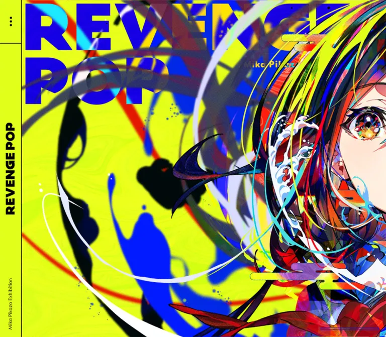
蛍光イエローと鮮烈な青、大胆なイラストが印象的な展覧会サイト。デスクトップの横方向の展示構成を、モバイルでは縦方向に再配置しています。
Mika Pikazo Exhibition “REVENGE POP” — Style Reference
An electric-yellow exhibition wall, stretched sideways on desktop and folded into a portrait poster on mobile.
Original URL: revenge-pop.mikapikazo.info Final URL: revenge-pop.mikapikazo.info Theme: fluorescent yellow, electric blue, black rules, and densely colored illustration; no selectable theme was evidenced. Inspected: October 2, 2026, at 01:54:27.926 JST; the supplied retrieval timestamp is October 1, 2026, at 16:54:27.926 UTC. Viewports: 1440 × 1000 desktop and 390 × 844 mobile, in CSS pixels. Scope: supplied opening-view captures, rendered text, links, custom properties, and element geometry for the exhibition introduction, artist profile, visitor information, artworks, goods, credits, and comments. Supporting sections are documented principally from offscreen DOM measurements. Menu-open states, media playback, and navigation outcomes were not supplied.
REVENGE POP gives almost the entire opening screen to the exhibition artwork. Fluorescent yellow supports enormous blue lettering, black silhouettes, overlapping ribbons, halftone textures, and two closely cropped illustrated faces. A narrow black-and-yellow interface frame supplies orientation without reducing the illustration's impact. On mobile, the faces occupy the full portrait composition below a compact horizontal header.
The larger structure resembles a sequence of exhibition walls. Desktop sections sit beside one another in a long horizontal arrangement, with different widths for editorial content, artwork, merchandise, and credits. Mobile rearranges the same material vertically. Small sans-serif utilities, Japanese serif prose, and a dense merchandise catalog provide a quieter informational layer around the opening image. The currently served page presents the 2022 exhibition; those dates are part of the current content.
閉じる
Mika Pikazo Exhibition “REVENGE POP” — Style Reference
An electric-yellow exhibition wall, stretched sideways on desktop and folded into a portrait poster on mobile.
Original URL: revenge-pop.mikapikazo.info Final URL: revenge-pop.mikapikazo.info Theme: fluorescent yellow, electric blue, black rules, and densely colored illustration; no selectable theme was evidenced. Inspected: October 2, 2026, at 01:54:27.926 JST; the supplied retrieval timestamp is October 1, 2026, at 16:54:27.926 UTC. Viewports: 1440 × 1000 desktop and 390 × 844 mobile, in CSS pixels. Scope: supplied opening-view captures, rendered text, links, custom properties, and element geometry for the exhibition introduction, artist profile, visitor information, artworks, goods, credits, and comments. Supporting sections are documented principally from offscreen DOM measurements. Menu-open states, media playback, and navigation outcomes were not supplied.
REVENGE POP gives almost the entire opening screen to the exhibition artwork. Fluorescent yellow supports enormous blue lettering, black silhouettes, overlapping ribbons, halftone textures, and two closely cropped illustrated faces. A narrow black-and-yellow interface frame supplies orientation without reducing the illustration's impact. On mobile, the faces occupy the full portrait composition below a compact horizontal header.
The larger structure resembles a sequence of exhibition walls. Desktop sections sit beside one another in a long horizontal arrangement, with different widths for editorial content, artwork, merchandise, and credits. Mobile rearranges the same material vertically. Small sans-serif utilities, Japanese serif prose, and a dense merchandise catalog provide a quieter informational layer around the opening image. The currently served page presents the 2022 exhibition; those dates are part of the current content.
How to Read This Reference
- Measured values come from the supplied rendered DOM, computed styles, and custom properties. Decimal measurements are rounded in explanatory tables.
- Visual estimates describe features visible in the opening screenshots whose CSS was not supplied, including rule thickness and the size of the large lettering.
- Derived values are calculations from measured rectangles. They help reproduce the layout but do not establish the original CSS formulas.
- Recommended values and behaviors belong to the implementation example. The original breakpoint, scrolling engine, asset layering, and menu behavior remain unverified.
- Named tokens are implementation aliases unless explicitly marked as source properties.
- The captures establish the opening composition directly. Offscreen text and rectangles establish content and layout, but do not establish every image treatment or interactive state in later sections.
Tokens — Colors
Core Palette
| Name | Value | Source / suggested token | Role and evidence |
|---|---|---|---|
| Fluorescent Yellow | #e0ff1b |
Source --c-yellow; alias --color-yellow |
Measured body and header background; also the solid background of Goods, Credit, and Comments |
| Electric Blue | #001df5 |
Source --c-blue; alias --color-blue |
Exact declared accent; blue dominates the opening lettering and directional mark |
| Signal Red | #e70000 |
Source --c-red; alias --color-red |
Exact declared accent; the illustration contains prominent red regions, but their individual pixels need not equal this UI token |
| Black | #000000 |
Measured text color; alias --color-ink |
Body text, header lettering, menu dots, and visible structural rules |
| Yellow Wash | rgba(224, 255, 27, 0.25) |
Measured section background; alias --color-wash |
About, Info, and Artworks section backgrounds |
| Pale Yellow | hsl(68deg, 100%, 75%) |
Source --c-bg |
Declared source variable; its application to a visible surface was not established |
The source also exposes RGB channel properties for yellow, blue, and red. Preserve the exact channel values when constructing transparent variants.
Color Roles and Layering
The fluorescent yellow is a structural surface color, occupying the header and large areas of the opening composition. Blue provides the strongest graphic counterweight. Black supplies readable information and precise boundaries.
Cyan, magenta, white, orange, and skin tones are visible within the artwork. Their variety belongs to the illustration; the evidence does not establish a corresponding collection of semantic UI colors.
A 25% yellow section background does not by itself describe the final visible section color. Its appearance depends on the layers behind it. Avoid substituting a sampled pale solid without checking the intended compositing context. Likewise, the declared --c-bg should not replace the measured yellow body background automatically.
Tokens — Typography
Utility Sans
Measured family: Supreme, sans-serif.
The body, header caption, social handles, venue links, contact text, and copyright use this declared stack. The sampled weight is generally 400, with compact line boxes. The font resource URL and actual glyph fallback were not supplied, so the declaration is the reliable reference.
The result is a compact informational voice beneath a much louder graphic identity. Preserve its modest scale rather than turning every label into display typography.
Japanese Editorial Text
Measured family: YuMincho, serif.
The exhibition statement, artist biography, visitor notes, and credit role labels use this stack at weight 500. Long prose uses 1.8 line height and approximately 0.02em tracking. Short visitor notes use 1.4 line height.
This serif layer creates a noticeable tonal change between the dense illustration and the personal exhibition statement. It also distinguishes editorial prose from product names and utility links.
Product and Contributor Text
Product headings use generic sans-serif, weight 700, and 1.1 line height. Contributor links commonly use generic sans-serif, weight 400, at 14px / 19.6px on both inspected viewports. Comment paragraphs use generic sans-serif with 1.8 line height and 0.02em tracking.
Display Lettering
The visible REVENGE POP lettering is extremely heavy, uppercase, and graphic. Some heading elements have empty extracted text and large boxes despite small inherited font sizes. The record does not identify the precise asset format or the typeface used to construct the lettering.
Treat the wordmark and large exhibition lettering as dedicated artwork where available. Do not infer their visible size or family from the 12px or 14px computed font on an enclosing heading.
Type Scale
| Role | Desktop | Mobile | Family / weight | Evidence |
|---|---|---|---|---|
| Body utility text | 14px / 14px |
12px / 12px |
Supreme, 400 |
Measured |
| Exhibition statement | 18px / 32.4px |
14px / 25.2px |
YuMincho, 500 |
Measured; tracking 0.36px / 0.28px |
| Artist biography | 14px / 25.2px |
12px / 21.6px |
YuMincho, 500 |
Measured; tracking 0.28px / 0.24px |
| Visitor notes and address | 14px / 19.6px |
12px / 16.8px |
YuMincho, 500 |
Measured |
| Social handles | 18px / 18px |
14px / 14px |
Supreme, 400 |
Measured; link box includes additional inline content |
| Product title | 14px / 15.4px |
12px / 13.2px |
Sans-serif, 700 |
Measured |
| Credit role | 14px / 14px |
12px / 12px |
YuMincho, 500 |
Measured |
| Standard credit name | 14px / 19.6px |
14px / 19.6px |
Sans-serif, 400 |
Measured |
| Lead organizer name | 36px / 36px |
36px / 36px |
Supreme, 400 |
Measured component override |
| Comment paragraph | 14px / 25.2px |
12px / 21.6px |
Sans-serif, 400 |
Measured |
| Copyright | 14px / 14px |
12px / 12px |
Supreme, 400 |
Measured |
The source properties are --fs-h1: 72px / 60px, --fs-h2: 36px / 24px, --fs-large-text: 18px / 14px, and --fs-text: 14px / 12px, listed desktop first. These are declared tokens, not proof that every heading uses them. In particular, the lead organizer remains 36px on mobile.
Tokens — Spacing & Shapes
Spacing Scale
| Use | Value | Status |
|---|---|---|
| Base margin token | 10px |
Source --margin, unchanged between viewports |
| Menu dot gap | 4px |
Measured flex row gap |
| Mobile header left inset | 10px |
Measured header padding and wordmark position |
| Content inset | 20px |
Explicit Credit padding; also consistent with mobile text positions |
| Heading-to-prose gap | 22px |
Derived from the 80px heading box and following paragraph position |
| Desktop About column separation | 100px |
Derived from two 500px-wide heading regions, 600px apart |
| Mobile statement-to-profile separation | 100px |
Derived from the statement bottom and next heading top |
| Social link inline gap | 10px |
Measured |
| Desktop goods caption pitch | About 323.33px |
Measured repetition along both axes |
| Mobile goods caption pitch | 177.5px |
Measured horizontal and row repetition for comparable entries |
The rhythm combines tight utility spacing with large editorial separations. The 100px break between statement and profile is especially important on mobile: it creates a chapter change without introducing a card container.
Border Radius
Sampled headers, buttons, sections, links, and headings all report border-radius: 0px. The visible shell is square and ruled. Menu dots are circular marks, rather than evidence of rounded control containers.
Black header rules appear approximately 2px thick in the supplied captures. Their CSS border widths were not included, so 2px is a visual estimate used in the starter below.
Layout Measurements
| Element | Desktop, 1440 × 1000 | Mobile, 390 × 844 |
|---|---|---|
| Main viewport box | 1440 × 1000px |
390 × 844px |
| Header | Left rail, 60 × 1000px |
Top bar, 390 × 50px |
| Menu button | 60 × 120px, upper left |
50 × 50px, at x = 340px |
| Header wordmark bounding box | 25 × 252.59px, vertically oriented |
202.08 × 20px, at (10, 15) |
| Header caption | 14 × 141.94px, ending 20px above bottom |
Not visible in the supplied mobile captures |
| Opening section | 2466.42 × 1000px, including 60px left padding |
390 × 844px, including 50px top padding |
| Following unlabeled section | 1000 × 1000px |
390 × 390px |
| Statement text column | 500px |
350px |
| Biography text column | 360px, right aligned within a 500px region |
240px, starting at x = 130px |
| Product title box | About 299.33px wide |
158.5px wide |
| Comment text column | 335px |
255px, starting at x = 115px |
The opening desktop section extends well beyond the visible viewport. Its measured width should not be replaced by a standard 100vw hero without considering the resulting crop and the position of the following panel.
Components
Desktop Identity Rail
Role: keeps a small, sharply defined identity strip beside the opening artwork.
The rail is 60px wide and fills the 1000px captured height. It has a fluorescent-yellow background and a black right edge. Its top 120px is a button area containing three vertically arranged black dots, with a horizontal divider below it.
The REVENGE POP wordmark is rotated to read along the rail, centered vertically. Its measured transformed box is 25px wide and approximately 252.59px tall. A smaller rotated Mika Pikazo Exhibition caption sits near the bottom, with a 20px bottom clearance.
The screenshots establish the rail's placement in the opening state. Persistence during navigation was not separately demonstrated. The starter implements it as viewport-fixed chrome.
Mobile Header
Role: preserves the identity and menu access while releasing the screen width for artwork.
At 390px wide, the rail becomes a 50px-high horizontal bar. The wordmark sits at x = 10px, y = 15px, within an approximately 202 × 20px box. The menu occupies the rightmost 50px square, separated by a black vertical rule. A horizontal rule separates the header from the image.
Keep the wordmark's proportions and the menu's square geometry. The mobile header does not contain the long exhibition caption visible at the bottom of the desktop rail.
Exhibition Opening
Role: establishes the exhibition's visual identity before detailed information appears.
On desktop, a large two-line REVENGE POP title starts about 10px inside the artwork region, immediately to the right of the rail. Its letters appear roughly 140px tall per line in this capture; this is a visual estimate, not a measured font size. The lettering is partially crossed by the illustration's ribbons and shapes.
The left portion contains a broad yellow field with blue and black forms. The illustrated faces occupy the right side; the vertical division between them is near x = 1220px in the 1440px-wide frame. White and colored curves connect the otherwise contrasting areas.
On mobile, the artwork starts immediately below the 50px header and fills the remaining 794px of the first section. The division between the faces is near the horizontal center. Both faces remain prominent, and the large title spans two lines near the upper edge. Small exhibition-year and support lettering sits near the upper right.
Use separate desktop and mobile compositions when the available artwork permits it. A centered crop of the desktop screenshot would not reproduce the observed mobile hierarchy.
Navigation and Direction Cue
Role: offers access to the exhibition's content sequence.
The rendered body contains the navigation labels About, Info, Artworks, Goods, Credit, and Comments, paired with numbers 1–6. The screenshots show the closed three-dot control, but do not establish the expanded menu's layout, colors, animation, or focus behavior.
A blue right arrow and thin horizontal line appear near the desktop opening's lower-right corner. The arrow becomes more visible across the supplied desktop frames while the main composition remains similar. Its trigger, timing, and action are unverified. No equivalent arrow is visible in the supplied mobile frames.
For an adaptation, connect the menu to real section targets and provide a clear accessible name for the dot button. Treat these behaviors as implementation requirements, rather than recovered original interactions.
About and Artist Profile
Role: pairs the exhibition statement with the artist's background.
The desktop About section is approximately 1142px wide. Two heading regions are each 500px wide, separated by 100px. Each measured heading box is 80px tall, starting at y = 20px. The statement starts at y = 122px, using 18px YuMincho text with 32.4px line height.
The biography occupies a 360px-wide column aligned to the right of its 500px region. A social link follows it after approximately 10px. This asymmetry leaves a substantial area to the biography's left; the record does not establish everything occupying that area.
Mobile stacks the statement and profile. The statement uses the full 350px content width and 14px type. After a 100px separation, the profile heading appears; its biography remains a narrower, right-aligned 240px column with 12px type. Preserve this deliberate offset rather than making every paragraph the same width.
Visit Information and Notices
Role: presents practical exhibition details and related announcements.
The supplied text includes the venue, year, dates, hours, admission information, early-closing notes, address, access instructions, venue and map links, five announcement topics, and contact information.
Desktop geometry separates the venue information from the announcements and contact region. The two principal heading regions measure about 403.94px and 443.16px wide. Mobile stacks these regions within 350px content columns.
Short Japanese notes use YuMincho with 1.4 line height. Venue and map links use Supreme at the base text size, while contact and social text use the larger utility size. The contact block retains label/value hierarchy instead of becoming a large filled action button.
The announcement text includes topics such as 祝花について and グッズ販売について. Related detail text exists in the rendered body, but the evidence does not establish whether visitors reveal it through a dialog, accordion, or another mechanism.
Artworks Panel
Role: introduces the named exhibition works and animation material.
The rendered labels include “REVENGE” Animation, “REVENGE”, “POP”, and “REVENGE POP”. The desktop section measures approximately 1957.31px wide and 1000px high. Mobile measures 390px wide and about 1098.5px high.
Its heading region is 80px tall and its section background is the measured yellow wash. The supplied record does not provide artwork element rectangles, media URLs, playback controls, or a screenshot of this panel. Reuse the measured section framework while leaving individual artwork sizing and playback behavior open for verification.
Goods Catalog
Role: presents exhibition merchandise and editions as a dense catalog.
The supplied DOM contains 54 product headings. On desktop, their positions form three rows extending through 18 columns. On mobile, the order becomes 27 rows of two columns. The initial sequence remains the exhibition book, animation book, T-shirt A, T-shirt B, and subsequent products.
Desktop title boxes are about 299.33px wide, with a 323.33px column pitch. Mobile title boxes are 158.5px wide, with a 177.5px pitch. Titles use bold sans-serif at 14px / 1.1 on desktop and 12px / 1.1 on mobile. Longer mobile titles wrap into two or three lines.
Derived grid model: square desktop cells of approximately 313.33px with 10px gaps and 7px inner insets reproduce the measured caption widths and pitch. At 390px, a 350px grid with two columns, a 5px gap, and 7px inner insets produces 172.5px cells and 158.5px caption widths. This is a reconstruction from geometry; the grid container's original CSS was not supplied.
Product text pairs names with prices where available, such as T-shirt A at 7,000 Yen. Some reproduction entries have no price in the supplied text. Preserve that distinction. No cart or checkout behavior was evidenced, and product-image frames and hover treatments remain unverified.
Credit Panel
Role: makes the exhibition's collaborators and production roles readable.
The desktop credit section is 1484px wide, with 20px padding and several adjacent role/name groups. Mobile becomes a 390px-wide section approximately 2192.94px tall. Role labels use YuMincho; standard linked names use 14px sans-serif on both viewports. The lead organizer name remains 36px on mobile as well as desktop.
The current original-page text names Mika Pikazo as organizer and illustrator, pixiv as co-organizer, and Keita Yamada for website production. The exhibition graphic-design credit names Minami Fuji (CARAVAN). Keep exhibition, book, and website roles distinct when reproducing the information.
The copyright sits near the lower edge of the desktop panel and follows the stacked credits on mobile.
Comments
Role: presents congratulatory messages from named contributors.
The section follows Credit in the supplied layout. Desktop paragraphs are 335px wide, with successive measured entries advancing 560px horizontally. Mobile paragraphs are 255px wide and aligned at x = 115px, leaving a substantial area on the left.
Use contributor name, role, and paragraph as a consistent content grouping. Paragraphs use 1.8 line height and 0.02em tracking. The supplied rectangles do not establish the appearance or dimensions of any accompanying portraits, so do not infer an avatar system from the empty horizontal space.
Tokens — Motion & Interaction
| Treatment | Evidence | Implementation consequence |
|---|---|---|
| Link color transition | Measured color 0.3s cubic-bezier(0.3, 0.1, 0.1, 1) |
Reuse the duration and easing; the destination color was not supplied |
| Three-dot menu | Button rectangle and closed visual state supplied | Opening behavior, overlay styling, and keyboard handling require implementation or further inspection |
| Desktop arrow | Visibility differs across opening captures | Do not infer an exact fade, loop, delay, or hover trigger |
| Desktop content arrangement | Sections share y = 0 and advance along x |
Horizontal layout is confirmed; wheel mapping, dragging, inertia, and snapping are unverified |
| Mobile content arrangement | Sections share x = 0 and advance along y |
Vertical layout is confirmed; the original scroll container mechanism is unverified |
| Animation content | “REVENGE” Animation appears as a work label | Playback, autoplay, sound, and looping were not demonstrated |
| Sampled CSS animation values | Sampled elements report animation: none |
This does not rule out animation on descendants, media, canvas, or JavaScript-driven layers |
The captures are still frames, not a recording. The inspection process waited for visible content and sampled stability, but that does not establish the complete animation sequence. Avoid inventing parallax, cursor distortion, timed panel reveals, or a specific animation library.
The reusable starter uses native overflow and a 300ms link-color transition. Its hover color, reduced-motion handling, and accessible focus treatment are recommendations.
Surfaces
| Surface | Treatment | Evidence and role |
|---|---|---|
| Main canvas | Solid fluorescent yellow | Measured body background |
| Header | Yellow with black lettering and approximately 2px rules | Color measured; rule width visually estimated |
| Opening media | Dense full-color illustration against yellow | Directly visible in desktop and mobile captures |
| About, Info, Artworks | 25% yellow background layer | Measured CSS; final compositing depends on the backdrop |
| Goods, Credit, Comments | Solid fluorescent yellow | Measured section backgrounds |
| Text and controls | Black, mostly unboxed | Sampled text colors and visible header controls |
| Expanded menu or announcement details | Unverified | No visual treatment should be asserted |
The visible interface establishes hierarchy through scale, placement, contrast, and straight rules. No shadow-based elevation system is evidenced in the supplied opening views.
Imagery
The opening artwork combines sharply drawn anime faces with a deliberately turbulent graphic field. Saturated hair strands, black silhouette shapes, white looping ribbons, blue masses, bright red bands, and halftone patches overlap across the frame. The division between the two faces is a strong vertical compositional seam.
Preserve the coexistence of crisp linework and intentionally soft or blurred shapes. A global blur would damage the faces; aggressive sharpening or pixelated scaling would alter the artwork's existing texture. Use normal image rendering and appropriately sized source assets.
The desktop composition allows yellow and abstract forms to dominate the left side while cropping the faces at the right. Mobile gives the faces the central role. This responsive change is a matter of art direction as well as layout.
Observed Asset References
| Visual material | Evidence | Asset-path status |
|---|---|---|
| REVENGE POP header wordmark | Desktop and mobile screenshots; heading rectangles | URL and file format not supplied |
| Opening exhibition composition | Desktop and mobile screenshots | URL, intrinsic dimensions, and layer structure not supplied |
| Large title and supporting microcopy | Visible within the opening composition | Independent asset boundaries not established |
| Section heading graphics | Large heading rectangles with empty extracted text | File format and URLs not supplied |
| Artwork and merchandise media | Named content exists in the DOM | Media URLs and individual image rectangles not supplied |
Use authorized artwork and wordmark assets when available. CSS can reproduce the shell and measured layout, but the illustration carries most of the site's identity. Do not substitute a generic gradient or a stock photograph for the opening composition.
Layout & Responsive Behavior
Section Arrangement
All desktop sections below share a 1000px height. Their different widths create an extended exhibition sequence. Mobile sections use the full 390px width and vary in height.
| Section | Desktop width | Mobile height |
|---|---|---|
| Opening | 2466.42px |
844px |
| Unlabeled following panel | 1000px |
390px |
| About and profile | 1142px |
1133.30px |
| Info | 989.09px |
987.17px |
| Artworks | 1957.31px |
1098.50px |
| Goods | 5976.83px |
4959.50px |
| Credit | 1484px |
2192.94px |
| Comments | 3912px |
1952.47px |
The final measured desktop section ends near x = 18927.66px. The final mobile section ends near y = 13557.88px. These are content-coordinate extents, not verified scroll distances.
Responsive Changes
- The 60px desktop identity rail becomes a 50px mobile header.
- The opening changes from a wide panorama extending beyond the viewport to a portrait composition contained within the first viewport.
- Desktop section adjacency becomes mobile vertical stacking.
- The two About regions stack, while the narrower right-aligned biography treatment remains.
- The goods catalog changes from three rows flowing across columns to two columns flowing down rows.
- Credits change from adjacent role groups to a long vertical sequence.
- Base text changes from 14px to 12px, and statement text from 18px to 14px. Standard credit names and the 36px organizer name retain their desktop size.
Viewport and Scroll Limits
The source exposes viewport properties matching one percent of the inspected dimensions: desktop --vw: 14.4px, --vh: 10px; mobile --vw: 3.9px, --vh: 8.44px. It also supplies the corresponding --vmin and --vmax values. These measurements do not reveal how or when the properties are updated.
The recorded document height equals the viewport height even though section rectangles extend far beyond it. HTML and body rectangles also report zero height. This indicates that ordinary document-height measurements do not describe the full content arrangement. The evidence does not identify whether a nested scroller, transformed track, or another mechanism controls navigation.
The exact breakpoint is unknown. The starter uses 767px as a recommended implementation choice and native scrolling so that all content remains reachable without recreating an unverified scrolling engine.
Do’s and Don’ts
Do
- Keep the measured fluorescent yellow
#e0ff1band electric blue#001df5central to the composition. - Give the exhibition artwork enough scale to crop dramatically at the viewport edges.
- Preserve the desktop rail and mobile top-bar relationship.
- Treat the display lettering as a dedicated graphic asset when possible.
- Keep the contrast between compact Supreme utilities and spacious YuMincho prose.
- Preserve the narrower, right-aligned biography and comment columns.
- Use the desktop horizontal section sequence and the mobile vertical sequence as distinct layouts.
- Retain the dense goods arrangement and its original item order.
- Distinguish observed geometry from inferred grid formulas.
- Keep artwork, exhibition, and website production credits attached to their actual roles.
Don’t
- Do not reduce the opening to a small illustration beside a conventional text-and-button block.
- Do not replace the desktop sequence with an unrelated centered content grid.
- Do not force the desktop artwork crop onto mobile without checking the faces and title.
- Do not assign the oversized wordmark to Supreme solely because an ancestor uses that font.
- Do not introduce rounded merchandise cards, pill controls, or soft shadows as the default visual language.
- Do not turn every color in the illustration into an application status color.
- Do not apply pixelated rendering to the detailed illustration.
- Do not infer a cart, lightbox, autoplay video, or fullscreen menu from the content labels alone.
- Do not reproduce the zero-height document measurements as an implementation requirement.
- Do not describe the 2022 event dates as evidence that the current URL is unavailable.
Recommended Implementation Additions
These recommendations are not verified features of the original page:
- Give the three-dot button a clear accessible name and expose its expanded state when a menu is implemented.
- Provide accessible text for graphical headings, with a coherent heading hierarchy and one identifiable page title.
- Make the content scroller keyboard reachable and provide direct links to the named sections. Offset anchor targets for the header or rail.
- Ensure the mobile 12px text remains readable with browser zoom and text enlargement. A reading-size option can increase prose without changing the artwork composition.
- Use a reduced-motion preference for any added transitions or animated artwork, and provide appropriate pause controls for persistent motion.
- Supply art-directed responsive images with explicit dimensions. Prioritize the opening image and defer offscreen catalog media where appropriate.
- Keep product titles and prices available as text rather than embedding them only in imagery.
- If announcement details use dialogs, implement focus return, Escape handling, and a visible close control.
- Keep the exhibition year explicit when reusing the information architecture for past events.
Agent Prompt Guide
Quick Color Reference
- Structural yellow:
#e0ff1b. - Main graphic accent:
#001df5. - Declared red accent:
#e70000. - Text, menu dots, and rules:
#000000. - Measured translucent section fill:
rgba(224, 255, 27, 0.25). - Additional colors belong to the artwork unless another semantic role is deliberately introduced.
Overall Prompt
“Create an exhibition website inspired by the current REVENGE POP composition. Use fluorescent yellow #e0ff1b, electric blue #001df5, black rules, and large authorized illustration assets with overlapping ribbons, halftone details, and close-cropped faces. On desktop, place a 60px identity rail beside a wide opening panorama and arrange the following exhibition sections horizontally. On mobile, convert the rail to a 50px top bar and stack the content vertically, using a separately art-directed portrait composition. Pair Supreme-style utility typography with YuMincho serif Japanese prose. Include About, Info, Artworks, Goods, Credit, and Comments. Keep product captions compact and square-edged, with three rows across desktop and two columns on mobile. Use accessible native navigation; do not invent original menu or media behavior.”
Example Component Prompts
- Identity frame: “Build a fluorescent-yellow 60px desktop rail with black rules, a 120px-high three-dot menu region, a vertically rotated exhibition wordmark centered in the rail, and a small rotated caption 20px above the bottom. At the chosen mobile breakpoint, replace it with a 50px top bar and a 50px-square menu control on the right.”
- Opening composition: “Fill the first screen with exhibition artwork. Keep broad yellow and blue graphic shapes on the desktop left and close-cropped faces on the right. On mobile, center the facial split and keep both faces visible beneath the header. Preserve the large two-line title and existing artwork textures.”
- Statement and profile: “Use two 500px editorial regions with a 100px gap on desktop. Set the statement in 18px YuMincho with 1.8 line height. Align the 360px biography column to the right. On mobile, stack the regions within 350px, use a 14px statement, and retain a right-aligned 240px biography.”
- Goods catalog: “Build a yellow catalog with square cells, no rounded cards, and compact bold product captions. Use three rows flowing horizontally on desktop and two columns flowing vertically on mobile. Fit long titles without truncation and show prices only where supplied.”
- Credits: “Arrange small serif role labels above plain sans-serif contributor names on yellow. Give the lead organizer a 36px name. Use adjacent groups on desktop and a vertical sequence on mobile. Preserve the distinction between exhibition, book, and website production roles.”
Quick Start
CSS Custom Properties
This is an implementation adaptation using native scrolling. Exact colors, font stacks, text sizes, header dimensions, and prose widths come from the supplied measurements. The breakpoint, border width, focus style, hover destination, and scrolling implementation are recommendations. The panorama ratio is fitted to the inspected desktop rectangle, and the catalog cell formulas are derived from caption geometry.
Markup contract: .rp-shell contains .rp-header and a keyboard-focusable .rp-viewport. The viewport contains .rp-track, whose children are .rp-hero, an optional .rp-visual, and content panels. The header contains a wordmark image with .rp-brand, a real .rp-menu button with three decorative spans, and .rp-caption. Use .rp-about for two editorial regions and .rp-goods-grid for product articles. Supply authorized image URLs in the markup; none were established by the evidence.
The .rp-hero-media picture element expects a desktop/mobile composition that already contains the large exhibition lettering. Avoid duplicating lettering already embedded in that image.
:root {
  /* Measured colors and declared font stacks */
  --color-yellow: #e0ff1b;
  --color-blue: #001df5;
  --color-red: #e70000;
  --color-ink: #000;
  --color-wash: rgb(224 255 27 / 25%);
  --font-utility: Supreme, sans-serif;
  --font-editorial: YuMincho, serif;
  --font-catalog: sans-serif;

  /* Measured desktop type tokens */
  --text-base: 14px;
  --text-large: 18px;
  --text-h1: 72px;
  --text-h2: 36px;
  --leading-prose: 1.8;
  --tracking-prose: 0.02em;

  /* Measured dimensions */
  --rail-width: 60px;
  --bar-height: 50px;
  --space-base: 10px;
  --panel-inset: 20px;
  --heading-gap: 22px;

  /* Visual estimate and derived panorama ratio */
  --rule-width: 2px;
  --panorama-ratio: 2.406421875;

  /* Measured link timing */
  --link-duration: 300ms;
  --link-easing: cubic-bezier(0.3, 0.1, 0.1, 1);
}

* { box-sizing: border-box; }
body { margin: 0; }

.rp-shell {
  --screen-height: 100vh;
  position: fixed;
  inset: 0;
  color: var(--color-ink);
  background: var(--color-yellow);
  font-family: var(--font-utility);
  font-size: var(--text-base);
  line-height: 1;
}

@supports (height: 100dvh) {
  .rp-shell { --screen-height: 100dvh; }
}

.rp-header {
  position: absolute;
  z-index: 20;
  inset: 0 auto 0 0;
  width: var(--rail-width);
  border-right: var(--rule-width) solid;
  background: var(--color-yellow);
}

.rp-brand {
  position: absolute;
  left: 50%;
  top: 50%;
  width: 252.59px;
  height: 25px;
  object-fit: contain;
  transform: translate(-50%, -50%) rotate(-90deg);
}

.rp-menu {
  position: absolute;
  inset: 0 0 auto;
  display: flex;
  flex-direction: column;
  align-items: center;
  justify-content: center;
  gap: 4px;
  width: 100%;
  height: 120px;
  padding: 0;
  border: 0;
  border-bottom: var(--rule-width) solid;
  border-radius: 0;
  color: inherit;
  background: transparent;
  cursor: pointer;
}

/* Dot diameters are visual approximations. */
.rp-menu span {
  width: 6px;
  height: 6px;
  border-radius: 50%;
  background: currentColor;
}

.rp-caption {
  position: absolute;
  left: 50%;
  bottom: 20px;
  margin: 0;
  writing-mode: vertical-rl;
  transform: translateX(-50%) rotate(180deg);
  white-space: nowrap;
}

.rp-viewport {
  position: absolute;
  inset: 0;
  overflow: auto;
  scroll-padding-inline-start: var(--rail-width);
}

.rp-track {
  display: flex;
  align-items: flex-start;
  width: max-content;
  min-height: 100%;
}

.rp-hero {
  flex: none;
  width: calc(var(--rail-width) + var(--screen-height) * var(--panorama-ratio));
  height: var(--screen-height);
  padding-left: var(--rail-width);
  overflow: hidden;
}

.rp-hero-media,
.rp-hero-media img {
  display: block;
  width: 100%;
  height: 100%;
}

.rp-hero-media img {
  object-fit: cover;
  image-rendering: auto;
}

.rp-visual {
  flex: none;
  width: var(--screen-height);
  height: var(--screen-height);
}

.rp-panel {
  flex: none;
  height: var(--screen-height);
  padding: var(--panel-inset);
  border-left: var(--rule-width) solid;
  overflow-y: auto;
  background: var(--color-wash);
}

.rp-section-title {
  min-height: 80px;
  margin: 0 0 var(--heading-gap);
  font-size: var(--text-h1);
  line-height: 1;
}

.rp-section-title img {
  display: block;
  max-width: 100%;
  height: 80px;
  object-fit: contain;
  object-position: left top;
}

.rp-about {
  display: grid;
  grid-template-columns: 500px 500px;
  gap: 100px;
  width: 1142px;
}

.rp-statement,
.rp-biography {
  margin: 0;
  font-family: var(--font-editorial);
  font-weight: 500;
  line-height: var(--leading-prose);
  letter-spacing: var(--tracking-prose);
}

.rp-statement { font-size: var(--text-large); }
.rp-biography { font-size: var(--text-base); }

.rp-profile-body {
  width: 360px;
  margin-left: auto;
}

.rp-social {
  display: inline-flex;
  align-items: center;
  gap: 10px;
  margin-top: 10px;
  font-size: var(--text-large);
}

.rp-shell a {
  color: inherit;
  text-underline-offset: 0.15em;
  transition: color var(--link-duration) var(--link-easing);
}

/* Blue hover and the focus outline are recommendations. */
@media (hover: hover) {
  .rp-shell a:hover { color: var(--color-blue); }
}

.rp-shell :focus-visible {
  outline: 3px solid var(--color-ink);
  outline-offset: 3px;
}

.rp-goods,
.rp-credit,
.rp-comments {
  background: var(--color-yellow);
}

.rp-goods {
  display: flex;
  gap: 50px;
  width: max-content;
}

.rp-goods > .rp-section-title {
  flex: 0 0 75px;
}

/* Derived model: 313.33px cells at 1000px viewport height. */
.rp-goods-grid {
  --tile-size: calc((var(--screen-height) - 60px) / 3);
  display: grid;
  grid-auto-flow: column;
  grid-template-rows: repeat(3, var(--tile-size));
  grid-auto-columns: var(--tile-size);
  gap: 10px;
}

.rp-product {
  display: flex;
  flex-direction: column;
  min-width: 0;
  padding: 7px;
}

/* Media fitting is recommended; original image boxes are unknown. */
.rp-product-media {
  flex: 1;
  min-height: 0;
  margin-bottom: 7px;
}

.rp-product-media img {
  display: block;
  width: 100%;
  height: 100%;
  object-fit: contain;
}

.rp-product h3 {
  margin: 0;
  font: 700 var(--text-base)/1.1 var(--font-catalog);
  overflow-wrap: anywhere;
}

.rp-product-price {
  margin: 4px 0 0;
  font-size: var(--text-base);
  line-height: 1;
}

.rp-credit-role {
  margin: 0 0 4px;
  font: 500 var(--text-base)/1 var(--font-editorial);
}

.rp-credit-name {
  font: 400 14px/1.4 var(--font-catalog);
}

.rp-credit-lead {
  font: 400 36px/1 var(--font-utility);
}

/* Recommended breakpoint; the original threshold is unknown. */
@media (max-width: 767px) {
  :root {
    --text-base: 12px;
    --text-large: 14px;
    --text-h1: 60px;
    --text-h2: 24px;
  }

  .rp-header {
    inset: 0 0 auto;
    width: 100%;
    height: var(--bar-height);
    border-right: 0;
    border-bottom: var(--rule-width) solid;
  }

  .rp-brand {
    left: 10px;
    top: 15px;
    width: 202.08px;
    max-width: calc(100% - 80px);
    height: 20px;
    transform: none;
  }

  .rp-menu {
    inset: 0 0 auto auto;
    width: 50px;
    height: 50px;
    border-bottom: 0;
    border-left: var(--rule-width) solid;
  }

  .rp-menu span { width: 4px; height: 4px; }
  .rp-caption { display: none; }

  .rp-viewport {
    overflow-x: hidden;
    scroll-padding-inline-start: 0;
    scroll-padding-top: var(--bar-height);
  }

  .rp-track { display: block; width: 100%; }

  .rp-hero {
    width: 100%;
    padding: var(--bar-height) 0 0;
  }

  .rp-visual {
    width: 100%;
    height: auto;
    aspect-ratio: 1;
  }

  .rp-panel {
    width: 100%;
    height: auto;
    overflow: visible;
    border-left: 0;
    border-top: var(--rule-width) solid;
  }

  .rp-about { display: block; }
  .rp-about > * + * { margin-top: 100px; }
  .rp-profile-body { width: min(240px, 100%); }

  .rp-goods { display: block; }

  .rp-goods-grid {
    grid-auto-flow: row;
    grid-template-columns: repeat(2, minmax(0, 1fr));
    grid-template-rows: none;
    grid-auto-columns: auto;
    gap: 5px;
  }

  .rp-product { aspect-ratio: 1; }
}

@media (prefers-reduced-motion: reduce) {
  .rp-shell a { transition: none; }
  .rp-viewport { scroll-behavior: auto; }
}
The starter covers the identity frame, native content sequence, editorial columns, and inferred catalog grid. Additional content panels need their own markup and responsive sizing. The dot button needs an implemented menu before it is presented as an active control. Art animation and media playback require separate decisions and controls.
Tailwind v4 Token Mapping
Optional aliases for a project already using Tailwind v4. These do not imply that the original site uses Tailwind. Define the custom properties above first.
@theme inline {
  --color-exhibition: var(--color-yellow);
  --color-electric: var(--color-blue);
  --color-signal: var(--color-red);
  --color-ink: #000;

  --font-utility: Supreme, sans-serif;
  --font-editorial: YuMincho, serif;
  --font-catalog: sans-serif;

  --text-copy: var(--text-base);
  --text-statement: var(--text-large);
  --text-display: var(--text-h1);

  --spacing-rail: 60px;
  --spacing-mobile-header: 50px;
  --spacing-panel: 20px;
  --spacing-editorial-gap: 100px;
  --radius-panel: 0px;
}
Sources & Evidence
- Mika Pikazo Exhibition “REVENGE POP”: the original and final URL in the supplied browser record; HTTP status 200. This is the source for the page identity, content, linked credits, and design observations.
- Capture record retrieved at
2026-10-01T16:54:27.926Z, corresponding to October 2, 2026, at 01:54:27.926 JST. Desktop evidence uses 1440 × 1000; mobile evidence uses 390 × 844. - Three supplied desktop opening captures and two mobile opening captures establish the visible composition, header change, artwork crop, and the changing visibility of the desktop arrow.
- Rendered DOM evidence supplies text, link destinations, custom properties, computed font declarations, colors, transitions, and element rectangles. Supporting-section geometry includes elements outside the captured viewport.
- The supplied capture process waited for document loading, image decoding, and sampled layout stability within its stated limits. Perpetual animations were paused during readiness checks and resumed afterward. SharedWorkers and service workers were disabled.
- No expanded menu, announcement interaction, product interaction, media playback, keyboard sequence, or scroll input result was supplied. Timing checks do not establish semantic completeness or all delayed content.
- This reference analyzes the supplied observations. No additional browsing, external asset retrieval, or interaction testing was performed. Original media paths, font files, the exact responsive breakpoint, and the scrolling implementation remain unknown.
# Mika Pikazo Exhibition “REVENGE POP” — Style Reference

> An electric-yellow exhibition wall, stretched sideways on desktop and folded into a portrait poster on mobile.

**Original URL:** [revenge-pop.mikapikazo.info](https://revenge-pop.mikapikazo.info/)
**Final URL:** [revenge-pop.mikapikazo.info](https://revenge-pop.mikapikazo.info/)
**Theme:** fluorescent yellow, electric blue, black rules, and densely colored illustration; no selectable theme was evidenced.
**Inspected:** October 2, 2026, at 01:54:27.926 JST; the supplied retrieval timestamp is October 1, 2026, at 16:54:27.926 UTC.
**Viewports:** 1440 × 1000 desktop and 390 × 844 mobile, in CSS pixels.
**Scope:** supplied opening-view captures, rendered text, links, custom properties, and element geometry for the exhibition introduction, artist profile, visitor information, artworks, goods, credits, and comments. Supporting sections are documented principally from offscreen DOM measurements. Menu-open states, media playback, and navigation outcomes were not supplied.

REVENGE POP gives almost the entire opening screen to the exhibition artwork. Fluorescent yellow supports enormous blue lettering, black silhouettes, overlapping ribbons, halftone textures, and two closely cropped illustrated faces. A narrow black-and-yellow interface frame supplies orientation without reducing the illustration's impact. On mobile, the faces occupy the full portrait composition below a compact horizontal header.

The larger structure resembles a sequence of exhibition walls. Desktop sections sit beside one another in a long horizontal arrangement, with different widths for editorial content, artwork, merchandise, and credits. Mobile rearranges the same material vertically. Small sans-serif utilities, Japanese serif prose, and a dense merchandise catalog provide a quieter informational layer around the opening image. The currently served page presents the 2022 exhibition; those dates are part of the current content.
閉じる
# Mika Pikazo Exhibition “REVENGE POP” — Style Reference

> An electric-yellow exhibition wall, stretched sideways on desktop and folded into a portrait poster on mobile.

**Original URL:** [revenge-pop.mikapikazo.info](https://revenge-pop.mikapikazo.info/)
**Final URL:** [revenge-pop.mikapikazo.info](https://revenge-pop.mikapikazo.info/)
**Theme:** fluorescent yellow, electric blue, black rules, and densely colored illustration; no selectable theme was evidenced.
**Inspected:** October 2, 2026, at 01:54:27.926 JST; the supplied retrieval timestamp is October 1, 2026, at 16:54:27.926 UTC.
**Viewports:** 1440 × 1000 desktop and 390 × 844 mobile, in CSS pixels.
**Scope:** supplied opening-view captures, rendered text, links, custom properties, and element geometry for the exhibition introduction, artist profile, visitor information, artworks, goods, credits, and comments. Supporting sections are documented principally from offscreen DOM measurements. Menu-open states, media playback, and navigation outcomes were not supplied.

REVENGE POP gives almost the entire opening screen to the exhibition artwork. Fluorescent yellow supports enormous blue lettering, black silhouettes, overlapping ribbons, halftone textures, and two closely cropped illustrated faces. A narrow black-and-yellow interface frame supplies orientation without reducing the illustration's impact. On mobile, the faces occupy the full portrait composition below a compact horizontal header.

The larger structure resembles a sequence of exhibition walls. Desktop sections sit beside one another in a long horizontal arrangement, with different widths for editorial content, artwork, merchandise, and credits. Mobile rearranges the same material vertically. Small sans-serif utilities, Japanese serif prose, and a dense merchandise catalog provide a quieter informational layer around the opening image. The currently served page presents the 2022 exhibition; those dates are part of the current content.

## How to Read This Reference

- **Measured** values come from the supplied rendered DOM, computed styles, and custom properties. Decimal measurements are rounded in explanatory tables.
- **Visual estimates** describe features visible in the opening screenshots whose CSS was not supplied, including rule thickness and the size of the large lettering.
- **Derived** values are calculations from measured rectangles. They help reproduce the layout but do not establish the original CSS formulas.
- **Recommended** values and behaviors belong to the implementation example. The original breakpoint, scrolling engine, asset layering, and menu behavior remain unverified.
- **Named tokens** are implementation aliases unless explicitly marked as source properties.
- The captures establish the opening composition directly. Offscreen text and rectangles establish content and layout, but do not establish every image treatment or interactive state in later sections.

## Tokens — Colors

### Core Palette

| Name | Value | Source / suggested token | Role and evidence |
| --- | --- | --- | --- |
| Fluorescent Yellow | `#e0ff1b` | Source `--c-yellow`; alias `--color-yellow` | Measured body and header background; also the solid background of Goods, Credit, and Comments |
| Electric Blue | `#001df5` | Source `--c-blue`; alias `--color-blue` | Exact declared accent; blue dominates the opening lettering and directional mark |
| Signal Red | `#e70000` | Source `--c-red`; alias `--color-red` | Exact declared accent; the illustration contains prominent red regions, but their individual pixels need not equal this UI token |
| Black | `#000000` | Measured text color; alias `--color-ink` | Body text, header lettering, menu dots, and visible structural rules |
| Yellow Wash | `rgba(224, 255, 27, 0.25)` | Measured section background; alias `--color-wash` | About, Info, and Artworks section backgrounds |
| Pale Yellow | `hsl(68deg, 100%, 75%)` | Source `--c-bg` | Declared source variable; its application to a visible surface was not established |

The source also exposes RGB channel properties for yellow, blue, and red. Preserve the exact channel values when constructing transparent variants.

### Color Roles and Layering

The fluorescent yellow is a structural surface color, occupying the header and large areas of the opening composition. Blue provides the strongest graphic counterweight. Black supplies readable information and precise boundaries.

Cyan, magenta, white, orange, and skin tones are visible within the artwork. Their variety belongs to the illustration; the evidence does not establish a corresponding collection of semantic UI colors.

A 25% yellow section background does not by itself describe the final visible section color. Its appearance depends on the layers behind it. Avoid substituting a sampled pale solid without checking the intended compositing context. Likewise, the declared `--c-bg` should not replace the measured yellow body background automatically.

## Tokens — Typography

### Utility Sans

**Measured family:** `Supreme, sans-serif`.

The body, header caption, social handles, venue links, contact text, and copyright use this declared stack. The sampled weight is generally `400`, with compact line boxes. The font resource URL and actual glyph fallback were not supplied, so the declaration is the reliable reference.

The result is a compact informational voice beneath a much louder graphic identity. Preserve its modest scale rather than turning every label into display typography.

### Japanese Editorial Text

**Measured family:** `YuMincho, serif`.

The exhibition statement, artist biography, visitor notes, and credit role labels use this stack at weight `500`. Long prose uses `1.8` line height and approximately `0.02em` tracking. Short visitor notes use `1.4` line height.

This serif layer creates a noticeable tonal change between the dense illustration and the personal exhibition statement. It also distinguishes editorial prose from product names and utility links.

### Product and Contributor Text

Product headings use generic `sans-serif`, weight `700`, and `1.1` line height. Contributor links commonly use generic `sans-serif`, weight `400`, at `14px / 19.6px` on both inspected viewports. Comment paragraphs use generic `sans-serif` with `1.8` line height and `0.02em` tracking.

### Display Lettering

The visible REVENGE POP lettering is extremely heavy, uppercase, and graphic. Some heading elements have empty extracted text and large boxes despite small inherited font sizes. The record does not identify the precise asset format or the typeface used to construct the lettering.

Treat the wordmark and large exhibition lettering as dedicated artwork where available. Do not infer their visible size or family from the `12px` or `14px` computed font on an enclosing heading.

### Type Scale

| Role | Desktop | Mobile | Family / weight | Evidence |
| --- | --- | --- | --- | --- |
| Body utility text | `14px / 14px` | `12px / 12px` | Supreme, `400` | Measured |
| Exhibition statement | `18px / 32.4px` | `14px / 25.2px` | YuMincho, `500` | Measured; tracking `0.36px` / `0.28px` |
| Artist biography | `14px / 25.2px` | `12px / 21.6px` | YuMincho, `500` | Measured; tracking `0.28px` / `0.24px` |
| Visitor notes and address | `14px / 19.6px` | `12px / 16.8px` | YuMincho, `500` | Measured |
| Social handles | `18px / 18px` | `14px / 14px` | Supreme, `400` | Measured; link box includes additional inline content |
| Product title | `14px / 15.4px` | `12px / 13.2px` | Sans-serif, `700` | Measured |
| Credit role | `14px / 14px` | `12px / 12px` | YuMincho, `500` | Measured |
| Standard credit name | `14px / 19.6px` | `14px / 19.6px` | Sans-serif, `400` | Measured |
| Lead organizer name | `36px / 36px` | `36px / 36px` | Supreme, `400` | Measured component override |
| Comment paragraph | `14px / 25.2px` | `12px / 21.6px` | Sans-serif, `400` | Measured |
| Copyright | `14px / 14px` | `12px / 12px` | Supreme, `400` | Measured |

The source properties are `--fs-h1: 72px / 60px`, `--fs-h2: 36px / 24px`, `--fs-large-text: 18px / 14px`, and `--fs-text: 14px / 12px`, listed desktop first. These are declared tokens, not proof that every heading uses them. In particular, the lead organizer remains 36px on mobile.

## Tokens — Spacing & Shapes

### Spacing Scale

| Use | Value | Status |
| --- | --- | --- |
| Base margin token | `10px` | Source `--margin`, unchanged between viewports |
| Menu dot gap | `4px` | Measured flex row gap |
| Mobile header left inset | `10px` | Measured header padding and wordmark position |
| Content inset | `20px` | Explicit Credit padding; also consistent with mobile text positions |
| Heading-to-prose gap | `22px` | Derived from the 80px heading box and following paragraph position |
| Desktop About column separation | `100px` | Derived from two 500px-wide heading regions, 600px apart |
| Mobile statement-to-profile separation | `100px` | Derived from the statement bottom and next heading top |
| Social link inline gap | `10px` | Measured |
| Desktop goods caption pitch | About `323.33px` | Measured repetition along both axes |
| Mobile goods caption pitch | `177.5px` | Measured horizontal and row repetition for comparable entries |

The rhythm combines tight utility spacing with large editorial separations. The 100px break between statement and profile is especially important on mobile: it creates a chapter change without introducing a card container.

### Border Radius

Sampled headers, buttons, sections, links, and headings all report `border-radius: 0px`. The visible shell is square and ruled. Menu dots are circular marks, rather than evidence of rounded control containers.

Black header rules appear approximately 2px thick in the supplied captures. Their CSS border widths were not included, so `2px` is a visual estimate used in the starter below.

### Layout Measurements

| Element | Desktop, 1440 × 1000 | Mobile, 390 × 844 |
| --- | --- | --- |
| Main viewport box | `1440 × 1000px` | `390 × 844px` |
| Header | Left rail, `60 × 1000px` | Top bar, `390 × 50px` |
| Menu button | `60 × 120px`, upper left | `50 × 50px`, at `x = 340px` |
| Header wordmark bounding box | `25 × 252.59px`, vertically oriented | `202.08 × 20px`, at `(10, 15)` |
| Header caption | `14 × 141.94px`, ending 20px above bottom | Not visible in the supplied mobile captures |
| Opening section | `2466.42 × 1000px`, including 60px left padding | `390 × 844px`, including 50px top padding |
| Following unlabeled section | `1000 × 1000px` | `390 × 390px` |
| Statement text column | `500px` | `350px` |
| Biography text column | `360px`, right aligned within a 500px region | `240px`, starting at `x = 130px` |
| Product title box | About `299.33px` wide | `158.5px` wide |
| Comment text column | `335px` | `255px`, starting at `x = 115px` |

The opening desktop section extends well beyond the visible viewport. Its measured width should not be replaced by a standard 100vw hero without considering the resulting crop and the position of the following panel.

## Components

### Desktop Identity Rail

**Role:** keeps a small, sharply defined identity strip beside the opening artwork.

The rail is 60px wide and fills the 1000px captured height. It has a fluorescent-yellow background and a black right edge. Its top 120px is a button area containing three vertically arranged black dots, with a horizontal divider below it.

The REVENGE POP wordmark is rotated to read along the rail, centered vertically. Its measured transformed box is 25px wide and approximately 252.59px tall. A smaller rotated Mika Pikazo Exhibition caption sits near the bottom, with a 20px bottom clearance.

The screenshots establish the rail's placement in the opening state. Persistence during navigation was not separately demonstrated. The starter implements it as viewport-fixed chrome.

### Mobile Header

**Role:** preserves the identity and menu access while releasing the screen width for artwork.

At 390px wide, the rail becomes a 50px-high horizontal bar. The wordmark sits at `x = 10px`, `y = 15px`, within an approximately 202 × 20px box. The menu occupies the rightmost 50px square, separated by a black vertical rule. A horizontal rule separates the header from the image.

Keep the wordmark's proportions and the menu's square geometry. The mobile header does not contain the long exhibition caption visible at the bottom of the desktop rail.

### Exhibition Opening

**Role:** establishes the exhibition's visual identity before detailed information appears.

On desktop, a large two-line REVENGE POP title starts about 10px inside the artwork region, immediately to the right of the rail. Its letters appear roughly 140px tall per line in this capture; this is a visual estimate, not a measured font size. The lettering is partially crossed by the illustration's ribbons and shapes.

The left portion contains a broad yellow field with blue and black forms. The illustrated faces occupy the right side; the vertical division between them is near `x = 1220px` in the 1440px-wide frame. White and colored curves connect the otherwise contrasting areas.

On mobile, the artwork starts immediately below the 50px header and fills the remaining 794px of the first section. The division between the faces is near the horizontal center. Both faces remain prominent, and the large title spans two lines near the upper edge. Small exhibition-year and support lettering sits near the upper right.

Use separate desktop and mobile compositions when the available artwork permits it. A centered crop of the desktop screenshot would not reproduce the observed mobile hierarchy.

### Navigation and Direction Cue

**Role:** offers access to the exhibition's content sequence.

The rendered body contains the navigation labels About, Info, Artworks, Goods, Credit, and Comments, paired with numbers 1–6. The screenshots show the closed three-dot control, but do not establish the expanded menu's layout, colors, animation, or focus behavior.

A blue right arrow and thin horizontal line appear near the desktop opening's lower-right corner. The arrow becomes more visible across the supplied desktop frames while the main composition remains similar. Its trigger, timing, and action are unverified. No equivalent arrow is visible in the supplied mobile frames.

For an adaptation, connect the menu to real section targets and provide a clear accessible name for the dot button. Treat these behaviors as implementation requirements, rather than recovered original interactions.

### About and Artist Profile

**Role:** pairs the exhibition statement with the artist's background.

The desktop About section is approximately 1142px wide. Two heading regions are each 500px wide, separated by 100px. Each measured heading box is 80px tall, starting at `y = 20px`. The statement starts at `y = 122px`, using 18px YuMincho text with 32.4px line height.

The biography occupies a 360px-wide column aligned to the right of its 500px region. A social link follows it after approximately 10px. This asymmetry leaves a substantial area to the biography's left; the record does not establish everything occupying that area.

Mobile stacks the statement and profile. The statement uses the full 350px content width and 14px type. After a 100px separation, the profile heading appears; its biography remains a narrower, right-aligned 240px column with 12px type. Preserve this deliberate offset rather than making every paragraph the same width.

### Visit Information and Notices

**Role:** presents practical exhibition details and related announcements.

The supplied text includes the venue, year, dates, hours, admission information, early-closing notes, address, access instructions, venue and map links, five announcement topics, and contact information.

Desktop geometry separates the venue information from the announcements and contact region. The two principal heading regions measure about 403.94px and 443.16px wide. Mobile stacks these regions within 350px content columns.

Short Japanese notes use YuMincho with `1.4` line height. Venue and map links use Supreme at the base text size, while contact and social text use the larger utility size. The contact block retains label/value hierarchy instead of becoming a large filled action button.

The announcement text includes topics such as `祝花について` and `グッズ販売について`. Related detail text exists in the rendered body, but the evidence does not establish whether visitors reveal it through a dialog, accordion, or another mechanism.

### Artworks Panel

**Role:** introduces the named exhibition works and animation material.

The rendered labels include “REVENGE” Animation, “REVENGE”, “POP”, and “REVENGE POP”. The desktop section measures approximately 1957.31px wide and 1000px high. Mobile measures 390px wide and about 1098.5px high.

Its heading region is 80px tall and its section background is the measured yellow wash. The supplied record does not provide artwork element rectangles, media URLs, playback controls, or a screenshot of this panel. Reuse the measured section framework while leaving individual artwork sizing and playback behavior open for verification.

### Goods Catalog

**Role:** presents exhibition merchandise and editions as a dense catalog.

The supplied DOM contains 54 product headings. On desktop, their positions form three rows extending through 18 columns. On mobile, the order becomes 27 rows of two columns. The initial sequence remains the exhibition book, animation book, T-shirt A, T-shirt B, and subsequent products.

Desktop title boxes are about 299.33px wide, with a 323.33px column pitch. Mobile title boxes are 158.5px wide, with a 177.5px pitch. Titles use bold sans-serif at `14px / 1.1` on desktop and `12px / 1.1` on mobile. Longer mobile titles wrap into two or three lines.

**Derived grid model:** square desktop cells of approximately 313.33px with 10px gaps and 7px inner insets reproduce the measured caption widths and pitch. At 390px, a 350px grid with two columns, a 5px gap, and 7px inner insets produces 172.5px cells and 158.5px caption widths. This is a reconstruction from geometry; the grid container's original CSS was not supplied.

Product text pairs names with prices where available, such as T-shirt A at 7,000 Yen. Some reproduction entries have no price in the supplied text. Preserve that distinction. No cart or checkout behavior was evidenced, and product-image frames and hover treatments remain unverified.

### Credit Panel

**Role:** makes the exhibition's collaborators and production roles readable.

The desktop credit section is 1484px wide, with 20px padding and several adjacent role/name groups. Mobile becomes a 390px-wide section approximately 2192.94px tall. Role labels use YuMincho; standard linked names use 14px sans-serif on both viewports. The lead organizer name remains 36px on mobile as well as desktop.

The current original-page text names Mika Pikazo as organizer and illustrator, pixiv as co-organizer, and Keita Yamada for website production. The exhibition graphic-design credit names Minami Fuji (CARAVAN). Keep exhibition, book, and website roles distinct when reproducing the information.

The copyright sits near the lower edge of the desktop panel and follows the stacked credits on mobile.

### Comments

**Role:** presents congratulatory messages from named contributors.

The section follows Credit in the supplied layout. Desktop paragraphs are 335px wide, with successive measured entries advancing 560px horizontally. Mobile paragraphs are 255px wide and aligned at `x = 115px`, leaving a substantial area on the left.

Use contributor name, role, and paragraph as a consistent content grouping. Paragraphs use `1.8` line height and `0.02em` tracking. The supplied rectangles do not establish the appearance or dimensions of any accompanying portraits, so do not infer an avatar system from the empty horizontal space.

## Tokens — Motion & Interaction

| Treatment | Evidence | Implementation consequence |
| --- | --- | --- |
| Link color transition | Measured `color 0.3s cubic-bezier(0.3, 0.1, 0.1, 1)` | Reuse the duration and easing; the destination color was not supplied |
| Three-dot menu | Button rectangle and closed visual state supplied | Opening behavior, overlay styling, and keyboard handling require implementation or further inspection |
| Desktop arrow | Visibility differs across opening captures | Do not infer an exact fade, loop, delay, or hover trigger |
| Desktop content arrangement | Sections share `y = 0` and advance along x | Horizontal layout is confirmed; wheel mapping, dragging, inertia, and snapping are unverified |
| Mobile content arrangement | Sections share `x = 0` and advance along y | Vertical layout is confirmed; the original scroll container mechanism is unverified |
| Animation content | “REVENGE” Animation appears as a work label | Playback, autoplay, sound, and looping were not demonstrated |
| Sampled CSS animation values | Sampled elements report `animation: none` | This does not rule out animation on descendants, media, canvas, or JavaScript-driven layers |

The captures are still frames, not a recording. The inspection process waited for visible content and sampled stability, but that does not establish the complete animation sequence. Avoid inventing parallax, cursor distortion, timed panel reveals, or a specific animation library.

The reusable starter uses native overflow and a 300ms link-color transition. Its hover color, reduced-motion handling, and accessible focus treatment are recommendations.

## Surfaces

| Surface | Treatment | Evidence and role |
| --- | --- | --- |
| Main canvas | Solid fluorescent yellow | Measured body background |
| Header | Yellow with black lettering and approximately 2px rules | Color measured; rule width visually estimated |
| Opening media | Dense full-color illustration against yellow | Directly visible in desktop and mobile captures |
| About, Info, Artworks | 25% yellow background layer | Measured CSS; final compositing depends on the backdrop |
| Goods, Credit, Comments | Solid fluorescent yellow | Measured section backgrounds |
| Text and controls | Black, mostly unboxed | Sampled text colors and visible header controls |
| Expanded menu or announcement details | Unverified | No visual treatment should be asserted |

The visible interface establishes hierarchy through scale, placement, contrast, and straight rules. No shadow-based elevation system is evidenced in the supplied opening views.

## Imagery

The opening artwork combines sharply drawn anime faces with a deliberately turbulent graphic field. Saturated hair strands, black silhouette shapes, white looping ribbons, blue masses, bright red bands, and halftone patches overlap across the frame. The division between the two faces is a strong vertical compositional seam.

Preserve the coexistence of crisp linework and intentionally soft or blurred shapes. A global blur would damage the faces; aggressive sharpening or pixelated scaling would alter the artwork's existing texture. Use normal image rendering and appropriately sized source assets.

The desktop composition allows yellow and abstract forms to dominate the left side while cropping the faces at the right. Mobile gives the faces the central role. This responsive change is a matter of art direction as well as layout.

### Observed Asset References

| Visual material | Evidence | Asset-path status |
| --- | --- | --- |
| REVENGE POP header wordmark | Desktop and mobile screenshots; heading rectangles | URL and file format not supplied |
| Opening exhibition composition | Desktop and mobile screenshots | URL, intrinsic dimensions, and layer structure not supplied |
| Large title and supporting microcopy | Visible within the opening composition | Independent asset boundaries not established |
| Section heading graphics | Large heading rectangles with empty extracted text | File format and URLs not supplied |
| Artwork and merchandise media | Named content exists in the DOM | Media URLs and individual image rectangles not supplied |

Use authorized artwork and wordmark assets when available. CSS can reproduce the shell and measured layout, but the illustration carries most of the site's identity. Do not substitute a generic gradient or a stock photograph for the opening composition.

## Layout & Responsive Behavior

### Section Arrangement

All desktop sections below share a 1000px height. Their different widths create an extended exhibition sequence. Mobile sections use the full 390px width and vary in height.

| Section | Desktop width | Mobile height |
| --- | --- | --- |
| Opening | `2466.42px` | `844px` |
| Unlabeled following panel | `1000px` | `390px` |
| About and profile | `1142px` | `1133.30px` |
| Info | `989.09px` | `987.17px` |
| Artworks | `1957.31px` | `1098.50px` |
| Goods | `5976.83px` | `4959.50px` |
| Credit | `1484px` | `2192.94px` |
| Comments | `3912px` | `1952.47px` |

The final measured desktop section ends near `x = 18927.66px`. The final mobile section ends near `y = 13557.88px`. These are content-coordinate extents, not verified scroll distances.

### Responsive Changes

- The 60px desktop identity rail becomes a 50px mobile header.
- The opening changes from a wide panorama extending beyond the viewport to a portrait composition contained within the first viewport.
- Desktop section adjacency becomes mobile vertical stacking.
- The two About regions stack, while the narrower right-aligned biography treatment remains.
- The goods catalog changes from three rows flowing across columns to two columns flowing down rows.
- Credits change from adjacent role groups to a long vertical sequence.
- Base text changes from 14px to 12px, and statement text from 18px to 14px. Standard credit names and the 36px organizer name retain their desktop size.

### Viewport and Scroll Limits

The source exposes viewport properties matching one percent of the inspected dimensions: desktop `--vw: 14.4px`, `--vh: 10px`; mobile `--vw: 3.9px`, `--vh: 8.44px`. It also supplies the corresponding `--vmin` and `--vmax` values. These measurements do not reveal how or when the properties are updated.

The recorded document height equals the viewport height even though section rectangles extend far beyond it. HTML and body rectangles also report zero height. This indicates that ordinary document-height measurements do not describe the full content arrangement. The evidence does not identify whether a nested scroller, transformed track, or another mechanism controls navigation.

The exact breakpoint is unknown. The starter uses 767px as a recommended implementation choice and native scrolling so that all content remains reachable without recreating an unverified scrolling engine.

## Do’s and Don’ts

### Do

- Keep the measured fluorescent yellow `#e0ff1b` and electric blue `#001df5` central to the composition.
- Give the exhibition artwork enough scale to crop dramatically at the viewport edges.
- Preserve the desktop rail and mobile top-bar relationship.
- Treat the display lettering as a dedicated graphic asset when possible.
- Keep the contrast between compact Supreme utilities and spacious YuMincho prose.
- Preserve the narrower, right-aligned biography and comment columns.
- Use the desktop horizontal section sequence and the mobile vertical sequence as distinct layouts.
- Retain the dense goods arrangement and its original item order.
- Distinguish observed geometry from inferred grid formulas.
- Keep artwork, exhibition, and website production credits attached to their actual roles.

### Don’t

- Do not reduce the opening to a small illustration beside a conventional text-and-button block.
- Do not replace the desktop sequence with an unrelated centered content grid.
- Do not force the desktop artwork crop onto mobile without checking the faces and title.
- Do not assign the oversized wordmark to Supreme solely because an ancestor uses that font.
- Do not introduce rounded merchandise cards, pill controls, or soft shadows as the default visual language.
- Do not turn every color in the illustration into an application status color.
- Do not apply pixelated rendering to the detailed illustration.
- Do not infer a cart, lightbox, autoplay video, or fullscreen menu from the content labels alone.
- Do not reproduce the zero-height document measurements as an implementation requirement.
- Do not describe the 2022 event dates as evidence that the current URL is unavailable.

## Recommended Implementation Additions

These recommendations are not verified features of the original page:

- Give the three-dot button a clear accessible name and expose its expanded state when a menu is implemented.
- Provide accessible text for graphical headings, with a coherent heading hierarchy and one identifiable page title.
- Make the content scroller keyboard reachable and provide direct links to the named sections. Offset anchor targets for the header or rail.
- Ensure the mobile 12px text remains readable with browser zoom and text enlargement. A reading-size option can increase prose without changing the artwork composition.
- Use a reduced-motion preference for any added transitions or animated artwork, and provide appropriate pause controls for persistent motion.
- Supply art-directed responsive images with explicit dimensions. Prioritize the opening image and defer offscreen catalog media where appropriate.
- Keep product titles and prices available as text rather than embedding them only in imagery.
- If announcement details use dialogs, implement focus return, Escape handling, and a visible close control.
- Keep the exhibition year explicit when reusing the information architecture for past events.

## Agent Prompt Guide

### Quick Color Reference

- Structural yellow: `#e0ff1b`.
- Main graphic accent: `#001df5`.
- Declared red accent: `#e70000`.
- Text, menu dots, and rules: `#000000`.
- Measured translucent section fill: `rgba(224, 255, 27, 0.25)`.
- Additional colors belong to the artwork unless another semantic role is deliberately introduced.

### Overall Prompt

“Create an exhibition website inspired by the current REVENGE POP composition. Use fluorescent yellow #e0ff1b, electric blue #001df5, black rules, and large authorized illustration assets with overlapping ribbons, halftone details, and close-cropped faces. On desktop, place a 60px identity rail beside a wide opening panorama and arrange the following exhibition sections horizontally. On mobile, convert the rail to a 50px top bar and stack the content vertically, using a separately art-directed portrait composition. Pair Supreme-style utility typography with YuMincho serif Japanese prose. Include About, Info, Artworks, Goods, Credit, and Comments. Keep product captions compact and square-edged, with three rows across desktop and two columns on mobile. Use accessible native navigation; do not invent original menu or media behavior.”

### Example Component Prompts

1. **Identity frame:** “Build a fluorescent-yellow 60px desktop rail with black rules, a 120px-high three-dot menu region, a vertically rotated exhibition wordmark centered in the rail, and a small rotated caption 20px above the bottom. At the chosen mobile breakpoint, replace it with a 50px top bar and a 50px-square menu control on the right.”
2. **Opening composition:** “Fill the first screen with exhibition artwork. Keep broad yellow and blue graphic shapes on the desktop left and close-cropped faces on the right. On mobile, center the facial split and keep both faces visible beneath the header. Preserve the large two-line title and existing artwork textures.”
3. **Statement and profile:** “Use two 500px editorial regions with a 100px gap on desktop. Set the statement in 18px YuMincho with 1.8 line height. Align the 360px biography column to the right. On mobile, stack the regions within 350px, use a 14px statement, and retain a right-aligned 240px biography.”
4. **Goods catalog:** “Build a yellow catalog with square cells, no rounded cards, and compact bold product captions. Use three rows flowing horizontally on desktop and two columns flowing vertically on mobile. Fit long titles without truncation and show prices only where supplied.”
5. **Credits:** “Arrange small serif role labels above plain sans-serif contributor names on yellow. Give the lead organizer a 36px name. Use adjacent groups on desktop and a vertical sequence on mobile. Preserve the distinction between exhibition, book, and website production roles.”

## Quick Start

### CSS Custom Properties

This is an implementation adaptation using native scrolling. Exact colors, font stacks, text sizes, header dimensions, and prose widths come from the supplied measurements. The breakpoint, border width, focus style, hover destination, and scrolling implementation are recommendations. The panorama ratio is fitted to the inspected desktop rectangle, and the catalog cell formulas are derived from caption geometry.

**Markup contract:** `.rp-shell` contains `.rp-header` and a keyboard-focusable `.rp-viewport`. The viewport contains `.rp-track`, whose children are `.rp-hero`, an optional `.rp-visual`, and content panels. The header contains a wordmark image with `.rp-brand`, a real `.rp-menu` button with three decorative spans, and `.rp-caption`. Use `.rp-about` for two editorial regions and `.rp-goods-grid` for product articles. Supply authorized image URLs in the markup; none were established by the evidence.

The `.rp-hero-media` picture element expects a desktop/mobile composition that already contains the large exhibition lettering. Avoid duplicating lettering already embedded in that image.

```css
:root {
  /* Measured colors and declared font stacks */
  --color-yellow: #e0ff1b;
  --color-blue: #001df5;
  --color-red: #e70000;
  --color-ink: #000;
  --color-wash: rgb(224 255 27 / 25%);
  --font-utility: Supreme, sans-serif;
  --font-editorial: YuMincho, serif;
  --font-catalog: sans-serif;

  /* Measured desktop type tokens */
  --text-base: 14px;
  --text-large: 18px;
  --text-h1: 72px;
  --text-h2: 36px;
  --leading-prose: 1.8;
  --tracking-prose: 0.02em;

  /* Measured dimensions */
  --rail-width: 60px;
  --bar-height: 50px;
  --space-base: 10px;
  --panel-inset: 20px;
  --heading-gap: 22px;

  /* Visual estimate and derived panorama ratio */
  --rule-width: 2px;
  --panorama-ratio: 2.406421875;

  /* Measured link timing */
  --link-duration: 300ms;
  --link-easing: cubic-bezier(0.3, 0.1, 0.1, 1);
}

* { box-sizing: border-box; }
body { margin: 0; }

.rp-shell {
  --screen-height: 100vh;
  position: fixed;
  inset: 0;
  color: var(--color-ink);
  background: var(--color-yellow);
  font-family: var(--font-utility);
  font-size: var(--text-base);
  line-height: 1;
}

@supports (height: 100dvh) {
  .rp-shell { --screen-height: 100dvh; }
}

.rp-header {
  position: absolute;
  z-index: 20;
  inset: 0 auto 0 0;
  width: var(--rail-width);
  border-right: var(--rule-width) solid;
  background: var(--color-yellow);
}

.rp-brand {
  position: absolute;
  left: 50%;
  top: 50%;
  width: 252.59px;
  height: 25px;
  object-fit: contain;
  transform: translate(-50%, -50%) rotate(-90deg);
}

.rp-menu {
  position: absolute;
  inset: 0 0 auto;
  display: flex;
  flex-direction: column;
  align-items: center;
  justify-content: center;
  gap: 4px;
  width: 100%;
  height: 120px;
  padding: 0;
  border: 0;
  border-bottom: var(--rule-width) solid;
  border-radius: 0;
  color: inherit;
  background: transparent;
  cursor: pointer;
}

/* Dot diameters are visual approximations. */
.rp-menu span {
  width: 6px;
  height: 6px;
  border-radius: 50%;
  background: currentColor;
}

.rp-caption {
  position: absolute;
  left: 50%;
  bottom: 20px;
  margin: 0;
  writing-mode: vertical-rl;
  transform: translateX(-50%) rotate(180deg);
  white-space: nowrap;
}

.rp-viewport {
  position: absolute;
  inset: 0;
  overflow: auto;
  scroll-padding-inline-start: var(--rail-width);
}

.rp-track {
  display: flex;
  align-items: flex-start;
  width: max-content;
  min-height: 100%;
}

.rp-hero {
  flex: none;
  width: calc(var(--rail-width) + var(--screen-height) * var(--panorama-ratio));
  height: var(--screen-height);
  padding-left: var(--rail-width);
  overflow: hidden;
}

.rp-hero-media,
.rp-hero-media img {
  display: block;
  width: 100%;
  height: 100%;
}

.rp-hero-media img {
  object-fit: cover;
  image-rendering: auto;
}

.rp-visual {
  flex: none;
  width: var(--screen-height);
  height: var(--screen-height);
}

.rp-panel {
  flex: none;
  height: var(--screen-height);
  padding: var(--panel-inset);
  border-left: var(--rule-width) solid;
  overflow-y: auto;
  background: var(--color-wash);
}

.rp-section-title {
  min-height: 80px;
  margin: 0 0 var(--heading-gap);
  font-size: var(--text-h1);
  line-height: 1;
}

.rp-section-title img {
  display: block;
  max-width: 100%;
  height: 80px;
  object-fit: contain;
  object-position: left top;
}

.rp-about {
  display: grid;
  grid-template-columns: 500px 500px;
  gap: 100px;
  width: 1142px;
}

.rp-statement,
.rp-biography {
  margin: 0;
  font-family: var(--font-editorial);
  font-weight: 500;
  line-height: var(--leading-prose);
  letter-spacing: var(--tracking-prose);
}

.rp-statement { font-size: var(--text-large); }
.rp-biography { font-size: var(--text-base); }

.rp-profile-body {
  width: 360px;
  margin-left: auto;
}

.rp-social {
  display: inline-flex;
  align-items: center;
  gap: 10px;
  margin-top: 10px;
  font-size: var(--text-large);
}

.rp-shell a {
  color: inherit;
  text-underline-offset: 0.15em;
  transition: color var(--link-duration) var(--link-easing);
}

/* Blue hover and the focus outline are recommendations. */
@media (hover: hover) {
  .rp-shell a:hover { color: var(--color-blue); }
}

.rp-shell :focus-visible {
  outline: 3px solid var(--color-ink);
  outline-offset: 3px;
}

.rp-goods,
.rp-credit,
.rp-comments {
  background: var(--color-yellow);
}

.rp-goods {
  display: flex;
  gap: 50px;
  width: max-content;
}

.rp-goods > .rp-section-title {
  flex: 0 0 75px;
}

/* Derived model: 313.33px cells at 1000px viewport height. */
.rp-goods-grid {
  --tile-size: calc((var(--screen-height) - 60px) / 3);
  display: grid;
  grid-auto-flow: column;
  grid-template-rows: repeat(3, var(--tile-size));
  grid-auto-columns: var(--tile-size);
  gap: 10px;
}

.rp-product {
  display: flex;
  flex-direction: column;
  min-width: 0;
  padding: 7px;
}

/* Media fitting is recommended; original image boxes are unknown. */
.rp-product-media {
  flex: 1;
  min-height: 0;
  margin-bottom: 7px;
}

.rp-product-media img {
  display: block;
  width: 100%;
  height: 100%;
  object-fit: contain;
}

.rp-product h3 {
  margin: 0;
  font: 700 var(--text-base)/1.1 var(--font-catalog);
  overflow-wrap: anywhere;
}

.rp-product-price {
  margin: 4px 0 0;
  font-size: var(--text-base);
  line-height: 1;
}

.rp-credit-role {
  margin: 0 0 4px;
  font: 500 var(--text-base)/1 var(--font-editorial);
}

.rp-credit-name {
  font: 400 14px/1.4 var(--font-catalog);
}

.rp-credit-lead {
  font: 400 36px/1 var(--font-utility);
}

/* Recommended breakpoint; the original threshold is unknown. */
@media (max-width: 767px) {
  :root {
    --text-base: 12px;
    --text-large: 14px;
    --text-h1: 60px;
    --text-h2: 24px;
  }

  .rp-header {
    inset: 0 0 auto;
    width: 100%;
    height: var(--bar-height);
    border-right: 0;
    border-bottom: var(--rule-width) solid;
  }

  .rp-brand {
    left: 10px;
    top: 15px;
    width: 202.08px;
    max-width: calc(100% - 80px);
    height: 20px;
    transform: none;
  }

  .rp-menu {
    inset: 0 0 auto auto;
    width: 50px;
    height: 50px;
    border-bottom: 0;
    border-left: var(--rule-width) solid;
  }

  .rp-menu span { width: 4px; height: 4px; }
  .rp-caption { display: none; }

  .rp-viewport {
    overflow-x: hidden;
    scroll-padding-inline-start: 0;
    scroll-padding-top: var(--bar-height);
  }

  .rp-track { display: block; width: 100%; }

  .rp-hero {
    width: 100%;
    padding: var(--bar-height) 0 0;
  }

  .rp-visual {
    width: 100%;
    height: auto;
    aspect-ratio: 1;
  }

  .rp-panel {
    width: 100%;
    height: auto;
    overflow: visible;
    border-left: 0;
    border-top: var(--rule-width) solid;
  }

  .rp-about { display: block; }
  .rp-about > * + * { margin-top: 100px; }
  .rp-profile-body { width: min(240px, 100%); }

  .rp-goods { display: block; }

  .rp-goods-grid {
    grid-auto-flow: row;
    grid-template-columns: repeat(2, minmax(0, 1fr));
    grid-template-rows: none;
    grid-auto-columns: auto;
    gap: 5px;
  }

  .rp-product { aspect-ratio: 1; }
}

@media (prefers-reduced-motion: reduce) {
  .rp-shell a { transition: none; }
  .rp-viewport { scroll-behavior: auto; }
}
```

The starter covers the identity frame, native content sequence, editorial columns, and inferred catalog grid. Additional content panels need their own markup and responsive sizing. The dot button needs an implemented menu before it is presented as an active control. Art animation and media playback require separate decisions and controls.

### Tailwind v4 Token Mapping

Optional aliases for a project already using Tailwind v4. These do not imply that the original site uses Tailwind. Define the custom properties above first.

```css
@theme inline {
  --color-exhibition: var(--color-yellow);
  --color-electric: var(--color-blue);
  --color-signal: var(--color-red);
  --color-ink: #000;

  --font-utility: Supreme, sans-serif;
  --font-editorial: YuMincho, serif;
  --font-catalog: sans-serif;

  --text-copy: var(--text-base);
  --text-statement: var(--text-large);
  --text-display: var(--text-h1);

  --spacing-rail: 60px;
  --spacing-mobile-header: 50px;
  --spacing-panel: 20px;
  --spacing-editorial-gap: 100px;
  --radius-panel: 0px;
}
```

## Sources & Evidence

- [Mika Pikazo Exhibition “REVENGE POP”](https://revenge-pop.mikapikazo.info/): the original and final URL in the supplied browser record; HTTP status 200. This is the source for the page identity, content, linked credits, and design observations.
- Capture record retrieved at `2026-10-01T16:54:27.926Z`, corresponding to October 2, 2026, at 01:54:27.926 JST. Desktop evidence uses 1440 × 1000; mobile evidence uses 390 × 844.
- Three supplied desktop opening captures and two mobile opening captures establish the visible composition, header change, artwork crop, and the changing visibility of the desktop arrow.
- Rendered DOM evidence supplies text, link destinations, custom properties, computed font declarations, colors, transitions, and element rectangles. Supporting-section geometry includes elements outside the captured viewport.
- The supplied capture process waited for document loading, image decoding, and sampled layout stability within its stated limits. Perpetual animations were paused during readiness checks and resumed afterward. SharedWorkers and service workers were disabled.
- No expanded menu, announcement interaction, product interaction, media playback, keyboard sequence, or scroll input result was supplied. Timing checks do not establish semantic completeness or all delayed content.
- This reference analyzes the supplied observations. No additional browsing, external asset retrieval, or interaction testing was performed. Original media paths, font files, the exact responsive breakpoint, and the scrolling implementation remain unknown.関連するデザイン
スタイルやページの種類、ジャンルが近いデザインを集めました。