プレビュー準備中デザインリファレンスを見る
DESIGN REFERENCE
redjuice×loundraw 特別展「花火と幽霊」
黒い余白に繊細な白い文字と鮮やかなオレンジを配し、大判イラストを主役にした展覧会サイト。縦書きの装飾、重なる見出し、固定チケット導線と端末別の大胆な構成変更が特徴。
redjuice × loundraw — “花火と幽霊” Style Reference
A cinematic exhibition poster unfolding across a black gallery wall, punctuated by white hairline lettering and spark orange.
Website: pjt.loundraw.jp/exhibition
Original URL: https://pjt.loundraw.jp/exhibition
Final URL: https://pjt.loundraw.jp/exhibition — HTTP 200; no redirect reported.
Theme: dark, with a black main canvas, white typography, and orange accents.
Inspected: October 5, 2026, at 06:03:32 JST; supplied retrieval timestamp 2026-10-04T21:03:32.818Z.
Viewports: desktop 1440 × 1000 and mobile 390 × 844 CSS pixels.
Scope: supplied desktop opening, profile/product transition, and closing-page captures; mobile opening and partner/footer captures; rendered DOM, element rectangles, selected computed styles, and link destinations covering the full exhibition page. Menu and interview content are present in the DOM, but their opened states were not visually demonstrated.
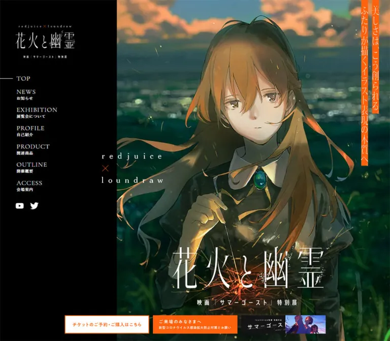
This is an exhibition microsite with editorial context, artist profiles, merchandise, venue information, and project connections. The illustration establishes the emotional setting: a young woman holding a sparkler, dark clothing and vegetation, distant water, and peach clouds against a muted blue sky. A large black field gives the image and delicate lettering room to dominate. Orange is concentrated in vertical promotional strips, section lettering, ticket information, and practical notices.
The defining composition changes with the viewport. Desktop begins with a black navigation rail beside a large illustrated field; the supplied current capture includes an exceptionally enlarged, cropped title at the right. Mobile becomes a single portrait poster, with the title near the bottom and artist names near the upper left. Below the opening, narrow body copy, generous vertical intervals, offset artwork, and an unboxed merchandise grid create an exhibition-catalog rhythm.
The served content retains a 2021 announcement and event information. This reference describes the page rendered in the supplied 2026 inspection; it does not establish current exhibition dates or ticket availability.
閉じる
redjuice × loundraw — “花火と幽霊” Style Reference
A cinematic exhibition poster unfolding across a black gallery wall, punctuated by white hairline lettering and spark orange.
Website: pjt.loundraw.jp/exhibition
Original URL: https://pjt.loundraw.jp/exhibition
Final URL: https://pjt.loundraw.jp/exhibition — HTTP 200; no redirect reported.
Theme: dark, with a black main canvas, white typography, and orange accents.
Inspected: October 5, 2026, at 06:03:32 JST; supplied retrieval timestamp 2026-10-04T21:03:32.818Z.
Viewports: desktop 1440 × 1000 and mobile 390 × 844 CSS pixels.
Scope: supplied desktop opening, profile/product transition, and closing-page captures; mobile opening and partner/footer captures; rendered DOM, element rectangles, selected computed styles, and link destinations covering the full exhibition page. Menu and interview content are present in the DOM, but their opened states were not visually demonstrated.
This is an exhibition microsite with editorial context, artist profiles, merchandise, venue information, and project connections. The illustration establishes the emotional setting: a young woman holding a sparkler, dark clothing and vegetation, distant water, and peach clouds against a muted blue sky. A large black field gives the image and delicate lettering room to dominate. Orange is concentrated in vertical promotional strips, section lettering, ticket information, and practical notices.
The defining composition changes with the viewport. Desktop begins with a black navigation rail beside a large illustrated field; the supplied current capture includes an exceptionally enlarged, cropped title at the right. Mobile becomes a single portrait poster, with the title near the bottom and artist names near the upper left. Below the opening, narrow body copy, generous vertical intervals, offset artwork, and an unboxed merchandise grid create an exhibition-catalog rhythm.
The served content retains a 2021 announcement and event information. This reference describes the page rendered in the supplied 2026 inspection; it does not establish current exhibition dates or ticket availability.
How to Read This Reference
- Measured means a value appears in the supplied computed styles or element rectangles. Measurements are CSS pixels unless stated otherwise.
- Calculated means arithmetic derived from those rectangles, such as a grid gap or centered margin. It is not a recovered CSS declaration.
- Visual estimate means a judgment from an original-page screenshot. Estimated values are explicitly identified.
- Recommended means an implementation choice for a new project. The Quick Start is an adaptation, not recovered source code.
- Named tokens are descriptive aliases created for this reference unless explicitly identified as source custom properties.
- The element inventory includes duplicate navigation and full-screen interview sections that were not visible in the supplied screenshots. A nonzero rectangle or
display: blockalone does not prove that an element was visible or interactive.
Tokens — Colors
Default Palette
| Name | Value | Suggested token | Evidence and role |
|---|---|---|---|
| Gallery Black | #000000 |
--exhi-black |
Measured body background; the dominant canvas surrounding artwork, copy, merchandise, and navigation |
| Lettering White | #FFFFFF |
--exhi-white |
Measured body text color; visually used for display lettering, rules, and icons |
| Spark Orange | #FF620D |
--exhi-orange |
Measured as rgb(255, 98, 13) on tax notes, venue notices, and the filled visitor-information link |
| Contact Charcoal | #101010 |
--exhi-contact |
Measured background of the desktop Contact Us region |
| Footer Blue Black | #0D1215 |
--exhi-footer |
Measured footer background on both viewports |
| Copyright Gray | #DCDDDD |
--exhi-muted |
Measured copyright text color |
The ticket artwork and vertical promotional strips visually belong to the same orange family. Their individual image pixels were not sampled, so #FF620D is the reliable interface accent rather than a claim that every orange asset uses precisely that value.
The illustration adds deep greens, blue-green water, muted sky blue, warm skin tones, and peach clouds. These are image colors, not additional interface tokens. Preserve them through the artwork rather than distributing them across buttons and section backgrounds.
Theme Behavior
Only the dark presentation is evidenced. No theme selector or alternate palette was demonstrated.
The custom-property inventory contains numerous WordPress color, gradient, and shadow presets, along with a blue Swiper theme value. Their presence does not establish visible use. The supplied page appearance is governed by black, white, orange, and the artwork; the generic preset palette should not become the reconstructed design system.
Tokens — Typography
Body and Utility Text
The measured body family declaration is:
Inter, YakuHanJP, "Noto Sans JP", "ヒラギノ角ゴ Pro W3",
"Hiragino Kaku Gothic Pro", メイリオ, Verdana,
"MS Pゴシック", sans-serif
Body text uses weight 300, with 13px type on desktop and 12px on mobile. Long line heights make the small Japanese text feel calm and editorial. Exhibition paragraphs use approximately 2.0833 line height; profile summaries are tighter at approximately 1.9091.
These are declared families, not proof that a particular font file supplied every rendered glyph. Button declarations omit Inter at the sampled parent level.
Display Lettering and Navigation
The screenshots show very fine, high-contrast display lettering: thin Roman capitals, delicate Japanese strokes, and widely tracked artist names. The main exhibition title, section headings, and artist wordmarks have empty text in the sampled heading wrappers, despite being clearly visible in the screenshots. Treat them as graphic lettering whose exact asset format and typeface are unverified.
For example, the desktop product heading wrapper computes to 13px, but its visible lettering is much larger. That inherited value is not the display font size. Similarly, the navigation anchors report the body family stack while their visible English labels have a serif appearance; descendant styles or graphic construction were not included in the evidence.
Implementation guidance: retain approved title and heading artwork when available. If replacement text is necessary, use a fine serif as an explicitly approximate fallback, then tune letter spacing and overlap visually. Do not assign an unsupported named display font to the original site.
Type Scale
| Role | Desktop | Mobile | Status and interpretation |
|---|---|---|---|
| Root font size | 10px |
10px |
Measured on HTML; this does not mean body text is 10px |
| Body | 13px / 28.1671px, weight 300 |
12px / 26.0004px, weight 300 |
Measured |
| Exhibition paragraphs | 13px / 27.0833px |
12px / 25px |
Measured |
| Profile summary | 13px / 24.8183px |
12px / 22.9092px |
Measured |
| Interview answer sections | 13px / 26.9997px |
12px / 24.9228px |
Measured in DOM-resident interview sections; opened presentation unverified |
| Hero-rail navigation anchor | 19px / 19px, tracking 1.14px |
Rail absent from the visible mobile opening | Measured parent; tracking equals 0.06em |
| Horizontal navigation anchor | 18px / 18px, tracking 1.08px |
Absent from the visible mobile opening | Measured parent; tracking equals 0.06em |
| Japanese navigation subtitle | Approximately 11–12px visually |
Menu-open subtitle unverified | Visual estimate; child styles unavailable |
| Venue details | 12px / 22.9092px |
11px / 21.0001px |
Measured |
| Venue caution | 11px / 21.0001px |
10px / 19.091px |
Measured; orange |
| Tax note | 12px / 12px |
11px / 11px |
Measured; orange |
| Filled visitor notice | 13px / 17.9998px, weight 500, tracking 0.26px |
Same | Measured |
| Copyright | 10px / 10px, tracking 0.6px |
Same | Measured; gray |
Contact Us lettering |
Approximately 28px visually |
Region not shown in the mobile closing layout | Visual estimate; sampled anchor inheritance is not its visible child size |
Graphic Heading Dimensions
Use these as artwork dimensions, not font-size tokens.
| Graphic wrapper | Desktop | Mobile |
|---|---|---|
| Opening exhibition title | 450 × 786.97px at x=990, y=0 |
340 × 137.69px at x=25, y=609.31 |
| Artist collaboration mark | 166.39 × 81.89px |
133.09 × 65.5px |
| Product section heading | 377 × 123.42px |
242.30 × 80.67px |
| Outline section heading | 326 × 128.47px |
212.16 × 81.45px |
| loundraw profile name | 308 × 55.20px |
221.52 × 39.70px |
The opening title changes proportions substantially between desktop and mobile. Uniformly scaling a single text block will not reproduce both supplied states.
Tokens — Spacing & Shapes
Density: small controls and compact copy inside large areas of black space. Shape language: square image edges and rectangular banners, with circles reserved for a few action symbols. Base rhythm: component-specific measurements; no single source spacing scale was established.
Layout Measurements
| Element | Desktop | Mobile | Evidence |
|---|---|---|---|
| Main content width | 940px |
340px |
Measured repeated content rectangles |
| Content left edge | 250px |
25px |
Measured; centered margins at each viewport |
| Opening height | 1000px |
844px |
Next section begins at the viewport height |
| Desktop opening rail | Approximately 432px, or 30% of viewport width |
Not present | Screenshot estimate |
| Header wrapper | 100px high |
80px high |
Measured |
| Menu button | 50 × 50px |
50 × 50px |
Measured |
| Exhibition text columns | 455px + 30px gap + 455px |
One 340px column |
Widths measured; desktop gap calculated |
| Profile text inset within container | 200px |
72.813px |
Measured padding |
| Profile summary width | 490px |
267.19px |
Measured |
| Product columns | Three at 260px |
Two at 157.5px |
Measured card rectangles |
| Product column gap | 80px |
25px |
Calculated from card positions |
| Typical product row gap | 65px |
34px |
Calculated between row boxes; card heights remain content-dependent |
| Product heading to first row | 129px |
40px |
Calculated from heading and card rectangles |
| Interview control height | 56px |
50px |
Measured |
| Small gallery/news controls | 40 × 40px |
40 × 40px |
Measured |
| Floating promotion tile | 228 × 49.56px |
230 × 50px |
Measured |
| Floating promotion gap | 4px |
10px |
Calculated |
| Floating promotion bottom clearance | 20px |
20px |
Calculated |
The measured width relationship can be reproduced with width: min(940px, calc(100% - 50px)). That is a useful adaptation matching both inspected viewports, not a verified source formula.
Section Spacing
| Section | Desktop top padding | Mobile top padding |
|---|---|---|
| News | 240px |
50px |
| Exhibition introduction | 126px |
64px |
| Profiles | 200px |
113px |
| Products | 237px |
107px |
| Outline/access group | 198px |
90px |
Exhibition paragraphs repeatedly have approximately 29px between their measured boxes. Preserve the distinction between paragraph rhythm and section rhythm: the latter is intentionally much larger.
Borders and Corners
| Treatment | Value or appearance | Status |
|---|---|---|
| General content corners | 0 |
Measured on sampled wrappers and links; visually square |
| News index control | 50% radius |
Measured |
| Interview plus surround | Circular, approximately 56px desktop and 50px mobile |
Screenshot shape and measured control height |
| Fine rules and menu strokes | Approximately 1px |
Visual estimate |
| Ticket outline | Approximately 2px orange |
Visual estimate |
| Card shadows | None visible | No visible elevation system in the supplied captures |
Components
Opening Exhibition Poster
Anatomy: illustrated field, desktop navigation rail, collaboration mark, vertical promotional copy, exhibition title, and persistent promotion controls.
On desktop, black occupies approximately the left 30% of the opening. Illustration starts near x=432 and fills the remaining visible height. The current capture includes another illustrated fragment beyond a black vertical interruption on the right. The enormous white title also extends into clipped portions of the composition. Preserve this as an observation of the current captured state; the evidence does not establish whether the fragmentation comes from a track, layered artwork, or another mechanism.
The collaboration mark crosses the rail/image boundary at approximately x=376, y=500. This deliberate seam-crossing is a key compositional detail. It prevents the rail and illustration from feeling like unrelated columns.
At the far right, a narrow promotional graphic occupies a measured 49 × 451.22px wrapper. Its white vertical lettering sits on orange strips. The large title and small vertical film subtitle create a second reading direction against the horizontal navigation.
Mobile removes the black rail and gives the portrait artwork the entire 390 × 844 opening. Artist names sit at x=33, y=63.25; the vertical orange graphic moves to x≈344.86, y=91.25. The title occupies a 340px width with 25px side margins and ends around y=747, above the promotion strip. The face and sparkler remain central compositional anchors.
Use separate responsive placement rules and, where available, separate title compositions. Treat the character artwork as artwork, with controlled cropping and preserved proportions.
Navigation System
Anatomy: an opening rail, a horizontal navigation state on scrolled desktop captures, a three-line menu button, and additional menu content present in the DOM.
The visible rail starts with an approximately 180 × 99.83px exhibition logo at x≈56.63, y=48. Navigation begins near x=60.95, y=190.83. English labels sit above much smaller Japanese descriptions. The first item has a fine horizontal indicator extending toward the left edge. White YouTube and Twitter icons sit beneath the navigation.
The seven destinations are TOP, NEWS, EXHIBITION, PROFILE, PRODUCT, OUTLINE, and ACCESS. Most point to section anchors on the exhibition page. NEWS points to /exhibition/news; it should not be implemented as a section anchor merely for consistency.
Scrolled desktop screenshots show a horizontal row across the upper page with the menu icon at the far right. The header remains visually light and transparent enough for underlying artwork or lettering to be visible behind it. The exact activation threshold and transition are unverified.
Mobile shows only the three-line menu button in the opening, measured at x=340, y=10.5, with a 50px square target. Although menu links have measured DOM rectangles, the open menu was not shown. Do not infer its entrance animation or focus behavior.
Persistent Ticket and Promotion Controls
Anatomy: ticket tile, visitor-information tile, and film tile.
Desktop arranges three 228 × 49.56px tiles as an asymmetric two-row group. The white ticket tile is above the orange visitor notice; the film banner sits to the right of the visitor notice. The group begins near x=56.63 and ends 20px above the viewport bottom. Gaps are 4px.
The ticket tile uses an orange outline and orange lettering on white. The visitor notice reverses to white lettering on orange. The film tile combines a black title region with illustrated characters. These are image-like banner links rather than rounded application buttons.
The ticket link points to the exhibition information page on art.parco.jp; the notice points to visitor guidance; the film banner points to summerghost.jp. Their destinations are established by the supplied link evidence, but destination-page contents were not inspected here.
Mobile displays a single horizontal row at y=774, with 230 × 50px tiles and 10px gaps. The visible ticket tile begins at x=80, with neighboring banners clipped at both edges. Repeated offscreen links support a loop-capable track interpretation, but autoplay, timing, and swipe behavior were not demonstrated. The row remains at the same viewport position in the mobile closing capture.
Section Heading System
Anatomy: fine English display lettering combined with larger Japanese lettering, often overlapping or positioned vertically near an outer edge.
The visible product heading places orange PRODUCT above and partly over white 商品情報. The combined desktop wrapper is 377 × 123.42px, centered on the page. A large black interval separates it from both the preceding profile and the first product row.
Exhibition and profile heading wrappers sit close to opposing viewport edges. The measured exhibition heading extends slightly beyond the right edge; the profile heading begins slightly beyond the left edge. Their vertical proportions reinforce the poster composition.
Keep the visual heading artwork distinct from its semantic heading. Provide the section name through text or a suitable text alternative without assuming that an empty extracted wrapper means the source has no accessible name.
News Group
Anatomy: graphic heading, two compact controls, circular index link, and an image-led dated announcement.
On desktop, the heading/control group begins at the 250px content edge. The visible announcement rectangle is approximately 260.45px wide and sits farther right. On mobile, the heading remains at x=25, while the two 40px controls and 50px circular index link share the heading region to its right. The announcement moves below them and measures approximately 219.27px wide.
The supplied article is dated 2021.07.30 and links to an external announcement. This establishes content and link structure, not a verified carousel interaction. Keep date, image, and title grouped into one clear target.
Exhibition Editorial Text
Anatomy: artwork and vertical heading treatment followed by long Japanese paragraphs in an open black layout.
Desktop paragraph positions establish two main text columns at x=250 and x=735, each 455px wide, separated by 30px. Some extracted paragraph geometry spans the broader container, so the record is insufficient to reconstruct the exact column implementation. The stable design relationship is two aligned reading areas inside a 940px composition.
Mobile stacks the text within 25px outer margins. The opening paragraph has an additional measured 67.587px right padding, leaving space beside the edge heading; later paragraphs use the full 340px width. Preserve this local exception rather than narrowing every paragraph.
Use light sans-serif text with a line height near twice the font size. There are no paragraph cards or contrasting text panels.
Artist Profiles
Anatomy: broad illustration, large name graphic, short biography, and circular-plus Interview control.
The visible loundraw profile overlaps a right-side illustration with text beginning at x=450. Its name graphic is thin, white, and much larger than the biography. The biography remains compact at 490px wide, with an approximately 24.82px line height.
Each profile sits in the 940px content container with a 200px left inset. Mobile preserves the offset relationship at a smaller scale: the inner inset is 72.813px, putting the text at x≈97.81 and leaving 267.19px for the biography. This is more distinctive than simply centering every element on a phone.
The Interview control combines a fine circular outline, a small plus, and a plain white label. Its measured total width is approximately 128.42px on desktop and 121.42px on mobile; heights are 56px and 50px respectively.
Interview Content — DOM Evidence Only
Two interview sections exist in the supplied DOM with black viewport-sized rectangles, longer biographies, work histories or examples, and question-and-answer text. Close-button boxes measure 75 × 75px at the desktop upper right and 46 × 46px on mobile. Section padding is 149px vertically on desktop and 90px on mobile.
These measurements suggest full-screen interview presentations. They do not verify opening, closing, scroll locking, focus trapping, or animation. Use the content structure as evidence and label any implemented dialog behavior as a new implementation choice.
Merchandise Grid
Anatomy: square-looking product photograph, Japanese item name, price in yen, and occasional extra detail, all on the shared black canvas.
Desktop uses three columns of 260px, with 80px horizontal gaps. Mobile uses two columns of 157.5px, with 25px gaps. White or pale photographic backdrops create strong rectangular islands without adding separate UI card surfaces.
Typical desktop card rectangles are 260 × 325.5px; typical mobile rectangles are 157.5 × 210.5px. Longer postcard details increase the measured card height. Let content determine the caption height rather than clipping it to a fixed template.
The first visible desktop row contains short-sleeved shirts, long-sleeved shirts, and a tote bag. The remaining DOM content includes sparklers, magnets, postcards, badges, keychains, a catalog, acrylic stands, and puzzles. Three final compact text links share the last grid position instead of using full-size photographic cards.
A small orange tax note spans the container beneath the grid. Product anchors resolve to the exhibition URL in the supplied evidence; no cart, product-detail route, or image-viewer behavior was demonstrated. This is evidence of a merchandise catalog, not a verified checkout flow.
Outline and Access
Anatomy: centered graphic heading, narrow left-side graphic, wider right-side event/media content, compact venue details, map link, and orange visitor notice.
The desktop right-hand information area begins at x=580 and measures 610px wide. A tall graphic at the left measures 150px wide. Mobile retains the asymmetric structure with a roughly 52px left graphic and a 267.22px information area beginning near x=97.77.
Two 40px controls and a 1 / 2 indicator occur in the DOM, supporting a two-item gallery structure. Slide changes were not demonstrated. Venue text uses smaller type than the main narrative, while caution text switches to orange.
The Google Map link is an inline action approximately 146.66 × 56px on desktop and 138.66 × 50px on mobile. The visitor notice is a square-cornered orange rectangle: 488 × 70px on desktop and nearly the entire 340px mobile container. It uses weight 500 and tighter line spacing than body copy.
The original page explicitly lists PARCO / FLAT STUDIO as exhibition organizers, planners, and producers, with avex pictures / THINKR as collaborators. These are exhibition credits; they do not identify the website designer or developer.
Contact and Related Projects
Desktop includes a full-width, 300px-high #101010 contact region. Contact Us is paired with a fine horizontal rule and links to the contact section of the studio website.
Below it, three wide project banners form a two-column grid. Each measured banner is 720 × 220.80px at the inspected desktop width. The first row contains two banners; the second contains one at the left, leaving black space to the right. The graphics combine project lettering with large illustration crops.
The visible mobile closing layout is different: three centered partner/project banners link to the project home, studio, and education partner. Each measures 340 × 95.625px, with 15px between successive boxes. The desktop contact region and project grid are not simply reproduced as a smaller version of the same closing composition.
Footer
Anatomy: blue-black background, optional visible sharing row, centered studio wordmark, and small copyright.
Desktop footer height is approximately 310.16px. The wordmark wrapper measures 240 × 26.16px, centered with 120px of space above it. The copyright follows in 10px tracked gray text.
Mobile footer height is approximately 330.09px. Three sharing icons are visible, each with a measured 23px square link box and centers spaced 46px apart. The studio wordmark becomes 157 × 17.09px. The floating promotion strip remains above the bottom edge of this footer view.
Keep the footer quiet. Its subtle shift from pure black to blue-black is enough to mark the end of the document.
Tokens — Motion & Interaction
| Treatment | Evidence | What can safely be concluded |
|---|---|---|
| Product link transition | opacity 0.2s, filter 1.5s cubic-bezier(0.2, 0, 0.2, 1) |
These properties and timings are declared; triggering state and filter endpoints are not supplied |
| Visitor-information link | opacity 0.3s |
An opacity transition is declared; the hover opacity value is unverified |
| Mobile sharing links | opacity 0.3s |
Same limitation; no activated sharing flow was inspected |
| Desktop navigation after scrolling | Horizontal navigation visible in middle and closing captures | A scrolled navigation presentation exists; threshold, timing, and implementation are unknown |
| Promotion strip | Fixed-looking position across captures; repeated mobile links extend offscreen | Persistent placement is evidenced; a loop-capable track is suggested, but movement is not demonstrated |
| News and venue controls | Paired buttons; venue counter appears in DOM | Navigation controls exist; changes between items were not demonstrated |
| Interview sections | Full-screen DOM rectangles with close controls | Overlay-like structure exists; opening and closing behavior remain unverified |
| Loading layer | Embedded style fragment defines .exhi-loading as a black fixed viewport layer at z-index: 500; .finish makes it transparent and disables pointer events |
A loading-cover mechanism is present; duration, artwork, and transition are unknown |
| Sampled CSS animations | Most sampled elements report animation: none |
This does not exclude animation on descendants, pseudo-elements, or through JavaScript |
A shorthand reported only as transition: all is not evidence of a meaningful animated duration. Do not turn it into an invented animation specification.
The supplied inspection traversed scroll positions and waited for layout and text stability. There is no interaction recording or before/after click sequence. In particular, the fragmented desktop opening cannot be confidently described as a moving carousel, parallax effect, or animated title sequence.
Recommended motion: retain the measured short opacity timings for feedback, keep artwork stable by default, and add motion only when its purpose and accessible alternative are defined. Do not invent a perpetual zoom, drifting particles, or automatic title animation to explain a static capture.
Surfaces
| Layer | Appearance | Purpose |
|---|---|---|
| Main canvas | Pure black | Unifies navigation, editorial text, and merchandise |
| Illustration | Full-color image with deep shadows | Supplies emotional tone, depth, and most color variation |
| Product imagery | Pale or white photographic rectangles | Separates individual objects through the image itself |
| Ticket tile | White with orange border and lettering | Distinct purchase-information affordance |
| Visitor notice | Orange with white lettering | Practical information and caution |
| Interview section | Black, based on computed DOM surface | Keeps long-form content within the exhibition palette |
| Contact region | Slightly lighter charcoal | Creates a broad, quiet closing action |
| Footer | Subtle blue-black | Separates final identity and sharing controls |
No general system of raised cards, glass panels, gradients, or soft shadows is visible. Separation comes from black space, image edges, thin rules, and isolated orange surfaces.
Imagery
The primary image is a detailed anime-style illustration with cinematic atmosphere. The character's warm hair, pale face, green pendant, and bright sparkler stand against dark clothing and vegetation. Peach clouds and distant water add depth while keeping the brightest color concentrated around the character and sky.
The design relies on the contrast between dense painted imagery and extremely spare interface construction. Avoid applying an overall monochrome treatment, artificial grain, or additional saturation: none is established by the evidence.
Product photographs have a different role. Their light backgrounds make garments and objects easy to inspect, and the rectangular boundaries provide the catalog structure. Related-project banners return to cropped illustration with integrated lettering.
Observed Asset References
Exact image URLs and native asset dimensions were not supplied. The following inventory identifies observed assets by role rather than inventing filenames.
| Asset role | Observed treatment | Implementation guidance |
|---|---|---|
| Opening key illustration | Large portrait subject, full-height crop, visible desktop image fragments | Use authorized artwork; tune desktop and mobile focal placement separately |
| Exhibition title | White, delicate Japanese display lettering; very different desktop/mobile proportions | Use suitable responsive artwork rather than assuming one live-text layout |
| Collaboration mark | Widely tracked redjuice × loundraw |
Preserve spacing, line arrangement, and orange multiplication mark |
| Promotional copy | Narrow vertical white lettering on orange strips | Keep separate from the main image when feasible |
| Section headings | Orange English and white Japanese lettering, often overlapping | Preserve the internal composition and transparent background |
| Profile artwork | Broad scene imagery behind or beside compact biography text | Maintain controlled overlap and open black areas |
| Merchandise photographs | Light-background object images | Preserve object proportions; avoid destructive cover crops |
| Project banners | Integrated project lettering and illustration | Keep their wide aspect ratios and square edges |
| Studio and partner marks | Distinct logo artwork | Preserve supplied identity assets; do not substitute ordinary text |
| Social/menu symbols | Small monochrome icons and fine strokes | Use accurate, simple silhouettes; avoid adding decorative icon containers |
CSS can reproduce the frame, spacing, and controls. It cannot reproduce the exhibition's identity without appropriate artwork and lettering assets.
Layout & Responsive Behavior
| Area | Desktop observation | Mobile observation |
|---|---|---|
| Opening | Black rail beside a large illustrated field; oversized right-side title | Full-width portrait artwork; title low in the image |
| Collaboration mark | Crosses the rail/image boundary near mid-height | Moves to the upper left |
| Promotional copy | Tall orange strips at the far right | Smaller strips below the menu region |
| Navigation | Rail at opening; horizontal row in scrolled captures | Menu icon; open menu not visually inspected |
| Main content | Centered 940px area |
340px area with 25px side margins |
| Introduction | Two primary text columns | One column with a special first-paragraph inset |
| Profiles | Text shifted 200px into the content container |
Offset retained at approximately 72.81px |
| Products | Three columns, 80px horizontal gaps |
Two columns, 25px gaps |
| Promotion controls | Three tiles in a two-row corner group | One clipped horizontal row with repeated DOM items |
| Closing links | Broad contact region and two-column project grid | Three inset partner/project banners |
| Footer | Large centered wordmark | Smaller wordmark plus visible sharing icons |
The mobile layout is art-directed, not uniformly scaled. Some sections shrink their top spacing substantially, while profile and access content retain intentional asymmetry. The product grid retains two columns at 390px; changing it to one column would alter the inspected density.
Measured document heights are approximately 9988.77px on desktop and 7917.94px on mobile. The shorter mobile document reflects changed spacing and closing-page structure, despite its longer wrapped paragraphs. These heights are observations, not values to hardcode.
The source custom property --vh is 10px on desktop and 8.44px on mobile, matching one hundredth of each inspected viewport height. The complete rule consuming it was not supplied. The Quick Start uses a modern viewport unit as a recommendation rather than claiming the exact source height implementation.
Only two viewport widths were inspected. The breakpoint, tablet behavior, landscape behavior, browser chrome changes, and safe-area handling remain unverified.
Do’s and Don’ts
Do
- Build the page around pure black, fine white lettering, and a restrained
#FF620Daccent. - Give the opening illustration enough scale to feel like a poster rather than a card.
- Preserve the seam-crossing artist mark on desktop and its separate mobile placement.
- Treat large headings as carefully composed graphics when their source fonts are unknown.
- Keep the overlap between orange English section lettering and white Japanese lettering.
- Preserve generous section intervals alongside compact, lightly weighted body text.
- Use the measured three-column desktop and two-column mobile product relationships.
- Keep product images square-edged and let their photographic backgrounds define the cards.
- Preserve offset profile and venue layouts on mobile.
- Keep practical ticket information persistently reachable with the original hierarchy of white, orange, and illustrated tiles.
Don’t
- Don’t replace the exhibition structure with generic feature cards, testimonials, or a standard sales-page sequence.
- Don’t treat the artwork title's inherited
12–13pxwrapper size as its visible type size. - Don’t invent a named display font from its visual appearance.
- Don’t use the site's generic WordPress gradients or blue slider preset as visible brand tokens.
- Don’t add rounded product cards, heavy shadows, glass effects, or decorative background gradients.
- Don’t stretch illustrations or product photographs to fit an arbitrary box.
- Don’t assume the mobile closing area is the desktop project grid stacked vertically.
- Don’t call product links a working shop or checkout without verifying their behavior.
- Don’t infer autoplay, parallax, modal transitions, or hover filter endpoints from static rectangles.
- Don’t make clipped decoration or duplicated promotion links the only way to reach essential information in a new implementation.
Recommended Implementation Additions
These are recommendations for a new implementation, not verified features of the original page:
- Give graphic headings equivalent semantic text and give meaningful image links accessible names. The supplied text extraction does not establish the original accessibility tree.
- Provide a visible focus indicator, and keep anchor targets below persistent navigation with appropriate scroll margins.
- If interviews become dialogs, support keyboard opening, Escape, focus containment, return focus, and independent content scrolling.
- Exclude decorative duplicate promotion tiles from keyboard and assistive-technology navigation. A native horizontal scroller with one copy of each link is a practical fallback.
- Reserve clearance for persistent controls and device safe areas so that final content remains reachable.
- Review the small text sizes and orange/white contrast before reuse. Increasing body text or adjusting small-label colors is an accessibility adaptation, not an observed source value.
- Keep the character's face and sparkler visible when choosing responsive image crops. Test short landscape viewports separately.
- Make important event status, prices, and ticket information live text where possible, especially when reusing a design whose served copy describes an earlier event.
- Supply reduced-motion behavior for any added carousel or reveal effects, and keep the page usable if those effects do not run.
Agent Prompt Guide
Quick Color Reference
- Main canvas:
#000000. - Primary text and fine linework:
#FFFFFF. - Interface accent:
#FF620D. - Desktop contact field:
#101010. - Footer field:
#0D1215. - Copyright text:
#DCDDDD. - Ticket hierarchy: white/orange ticket tile, orange/white notice tile, illustrated film banner.
Overall Prompt
“Create an illustrated exhibition website with a pure black canvas, white hairline display lettering, and a concentrated orange accent #FF620D. Use a large cinematic character illustration as the opening poster. On desktop, place a black navigation rail across roughly the left 30% and let a small, widely tracked artist collaboration mark cross the image boundary. Use separate responsive title artwork and narrow vertical orange promotional strips. Below the opening, arrange exhibition prose, offset artist profiles, circular-plus interview controls, merchandise, and venue information with generous black spacing. Use a 940px desktop content width, three 260px merchandise columns with 80px gaps, and a 340px mobile content width with two 157.5px columns and 25px gaps. Preserve square image edges, restrained controls, and a persistent ticket-information group. On mobile, recompose the opening as a full-width portrait poster and use the observed partner-banner closing structure. Use approved lettering assets; do not invent a source display font or unverified animation.”
Example Component Prompts
- Opening poster: “Compose a full-height illustrated exhibition opening. At 390 × 844, place the collaboration mark near x33/y63, the vertical orange promotional graphic near the upper right, and a 340px-wide white title around y609. Keep the face and sparkler visually clear. Add a 50px menu target at the upper right.”
- Section heading: “Create a centered exhibition section heading with fine orange Roman capitals and larger white Japanese lettering partially overlapping beneath them. Use approved lettering artwork. For the product section, target a combined 377 × 123px desktop footprint and 242 × 81px mobile footprint.”
- Artist profile: “Place a thin white artist wordmark, compact biography, and circular-plus Interview action over an open black composition with a broad illustration extending to the right. Inset the text 200px within a 940px desktop container. Retain a roughly 73px inset inside the 340px mobile container.”
- Merchandise grid: “Build unboxed product entries with pale photographic backgrounds, Japanese item names, and yen prices on black. Use three desktop columns and two phone columns. Keep square corners, generous column gaps, variable caption heights, and a small orange tax note beneath the grid.”
- Ticket group: “Create three sharp rectangular promotion tiles: white with orange ticket lettering, orange with white visitor guidance, and an illustrated film banner. Use 228 × 50px tiles in a two-row desktop corner arrangement. On mobile, use 230 × 50px tiles in an accessible horizontal strip, maintaining 20px bottom clearance.”
- Closing region: “For desktop, use a 300px charcoal Contact Us field, then wide project banners in two columns and a blue-black footer. For mobile, use three 340px-wide partner banners above a quiet footer with monochrome sharing icons and a smaller centered studio wordmark.”
Quick Start
CSS Custom Properties
This is a reusable implementation shell. Colors, principal dimensions, and declared transition timings come from the evidence. The 900px breakpoint, serif fallback, crop settings, hover opacity, state hook, and native mobile promotion scroller are recommendations.
Supply authorized image and lettering assets in the corresponding elements. Use a responsive picture for .exhi-hero-title if desktop and mobile title compositions differ. .exhi-section-title should contain the section graphic with a semantic equivalent. The hero CSS establishes the main image field; the captured desktop image fragments require asset-specific composition and are not explained here as a slideshow.
The class contract uses .exhibition-site as the page wrapper, .exhi-container for centered content, .exhi-product-grid for the merchandise list, and .exhi-dock for the three promotion links. If a scrolled header is implemented, application code should set data-scrolled='true' on the page wrapper at a deliberately chosen threshold.
:root {
  /* Measured palette */
  --exhi-black: #000000;
  --exhi-white: #ffffff;
  --exhi-orange: #ff620d;
  --exhi-contact: #101010;
  --exhi-footer: #0d1215;
  --exhi-muted: #dcdddd;

  /* Declared primary families with a shortened fallback stack */
  --exhi-font-body: Inter, YakuHanJP, 'Noto Sans JP',
    'Hiragino Kaku Gothic Pro', Verdana, sans-serif;
  --exhi-font-display-fallback: serif;
  --exhi-body-size: 13px;
  --exhi-body-leading: 2.1667;
  --exhi-copy-leading: 2.0833;
  --exhi-profile-leading: 1.9091;

  /* Measured layout anchors */
  --exhi-content: 940px;
  --exhi-gutter: 25px;
  --exhi-header-height: 100px;
  --exhi-round-control: 56px;
  --exhi-product-column-gap: 80px;
  --exhi-product-row-gap: 65px;
  --exhi-dock-width: 228px;
  --exhi-dock-height: 49.5625px;
  --exhi-safe-bottom: env(safe-area-inset-bottom, 0px);

  /* Measured transition declarations */
  --exhi-product-transition: opacity 0.2s,
    filter 1.5s cubic-bezier(0.2, 0, 0.2, 1);
  --exhi-link-transition: opacity 0.3s;
}

.exhibition-site,
.exhibition-site *,
.exhibition-site *::before,
.exhibition-site *::after {
  box-sizing: border-box;
}

.exhibition-site {
  margin: 0;
  color: var(--exhi-white);
  background: var(--exhi-black);
  font-family: var(--exhi-font-body);
  font-size: var(--exhi-body-size);
  font-weight: 300;
  line-height: var(--exhi-body-leading);
}

.exhibition-site img { display: block; max-width: 100%; }
.exhibition-site a { color: inherit; }
.exhibition-site button { font: inherit; }
.exhibition-site [id] {
  scroll-margin-top: calc(var(--exhi-header-height) + 24px);
}

.exhi-container {
  width: min(var(--exhi-content), calc(100% - 2 * var(--exhi-gutter)));
  margin-inline: auto;
}

/* Recommended state hook; its threshold is not source evidence. */
.exhi-header {
  position: fixed;
  z-index: 30;
  inset: 0 0 auto;
  height: var(--exhi-header-height);
  opacity: 0;
  pointer-events: none;
}

.exhibition-site[data-scrolled='true'] .exhi-header {
  opacity: 1;
  pointer-events: auto;
}

.exhi-topnav {
  display: flex;
  justify-content: center;
  align-items: flex-start;
  gap: 50px;
  padding-top: 34px;
}

.exhi-nav-link { display: block; text-decoration: none; }
.exhi-nav-en {
  display: block;
  font: 400 18px/1 var(--exhi-font-display-fallback);
  letter-spacing: 0.06em;
}
.exhi-nav-ja {
  display: block;
  margin-top: 3px;
  font-size: 11px;
  line-height: 1.08;
}

.exhi-menu {
  position: absolute;
  top: 20.42px;
  right: 50px;
  display: grid;
  align-content: center;
  gap: 7px;
  width: 50px;
  height: 50px;
  padding: 0;
  border: 0;
  color: var(--exhi-white);
  background: transparent;
  cursor: pointer;
}
.exhi-menu span { display: block; height: 1px; background: currentColor; }

.exhi-hero {
  position: relative;
  height: 100vh;
  height: 100svh;
  min-height: 650px;
  overflow: hidden;
  isolation: isolate;
}

.exhi-hero-art {
  position: absolute;
  inset: 0 0 0 30%;
  z-index: -1;
}
.exhi-hero-art img {
  width: 100%;
  height: 100%;
  object-fit: cover;
  object-position: center;
}

.exhi-rail {
  position: absolute;
  inset: 0 auto 0 0;
  width: 30%;
  padding: 48px 0 0 clamp(25px, 3.93vw, 64px);
  background: var(--exhi-black);
}
.exhi-rail-logo { width: 180px; }
.exhi-rail nav { margin-top: 43px; }
.exhi-rail ul { margin: 0; padding: 0; list-style: none; }
.exhi-rail li + li { margin-top: 18px; }
.exhi-rail .exhi-nav-en { font-size: 19px; }

.exhi-collaboration {
  position: absolute;
  top: 50%;
  left: calc(30% - 56px);
  width: 166.39px;
  margin: 0;
}
.exhi-hero-tagline {
  position: absolute;
  top: 0;
  right: 41.27px;
  width: 49px;
  margin: 0;
}
.exhi-hero-title {
  position: absolute;
  top: 0;
  right: 0;
  width: 450px;
  margin: 0;
}
.exhi-hero-title img { width: 100%; height: auto; }

.exhi-section { padding-top: var(--exhi-section-pad, 200px); }
.exhi-news { --exhi-section-pad: 240px; }
.exhi-about { --exhi-section-pad: 126px; }
.exhi-profiles { --exhi-section-pad: 200px; }
.exhi-products { --exhi-section-pad: 237px; }
.exhi-outline { --exhi-section-pad: 198px; }

.exhi-copy {
  display: grid;
  grid-template-columns: repeat(2, minmax(0, 1fr));
  gap: 30px;
  line-height: var(--exhi-copy-leading);
}
.exhi-copy p { margin: 0 0 29px; }

.exhi-profile { padding-left: 200px; }
.exhi-profile-name { width: 308px; margin: 0 0 24px; }
.exhi-profile-copy { max-width: 490px; line-height: var(--exhi-profile-leading); }
.exhi-profile-copy p { margin: 0; }

.exhi-circle-action {
  display: inline-flex;
  align-items: center;
  gap: 16px;
  min-height: var(--exhi-round-control);
  margin-top: 25px;
  padding: 0;
  border: 0;
  color: var(--exhi-white);
  background: transparent;
  text-decoration: none;
  cursor: pointer;
}
.exhi-plus {
  position: relative;
  flex: 0 0 var(--exhi-round-control);
  width: var(--exhi-round-control);
  height: var(--exhi-round-control);
  border: 1px solid currentColor;
  border-radius: 50%;
}
.exhi-plus::before,
.exhi-plus::after {
  content: '';
  position: absolute;
  top: 50%;
  left: 50%;
  width: 14px;
  height: 1px;
  background: currentColor;
  transform: translate(-50%, -50%);
}
.exhi-plus::after { transform: translate(-50%, -50%) rotate(90deg); }

.exhi-section-title { margin: 0 auto; }
.exhi-products .exhi-section-title { width: 377px; margin-bottom: 129px; }
.exhi-outline .exhi-section-title { width: 326px; }
.exhi-section-title img { width: 100%; height: auto; }

.exhi-product-grid {
  display: grid;
  grid-template-columns: repeat(3, minmax(0, 1fr));
  gap: var(--exhi-product-row-gap) var(--exhi-product-column-gap);
}
.exhi-product-card {
  display: block;
  min-width: 0;
  color: inherit;
  background: transparent;
  text-decoration: none;
  transition: var(--exhi-product-transition);
}
.exhi-product-card img {
  width: 100%;
  aspect-ratio: 1;
  object-fit: contain;
  border-radius: 0;
}
.exhi-product-caption { margin-top: 12px; line-height: 1.9; }
.exhi-product-caption p { margin: 0; }
.exhi-product-text-group { display: grid; align-content: start; gap: 16px; }
.exhi-tax-note { margin: 48px 0 0; color: var(--exhi-orange); font-size: 12px; line-height: 1; }

.exhi-visitor-notice {
  display: flex;
  align-items: center;
  width: min(100%, 488px);
  min-height: 70px;
  padding: 12px 25px;
  color: var(--exhi-white);
  background: var(--exhi-orange);
  font-size: 13px;
  font-weight: 500;
  line-height: 18px;
  letter-spacing: 0.02em;
  text-decoration: none;
  transition: var(--exhi-link-transition);
}

.exhi-dock {
  position: fixed;
  z-index: 40;
  left: clamp(25px, 3.93vw, 64px);
  bottom: calc(20px + var(--exhi-safe-bottom));
  display: grid;
  grid-template-columns: repeat(2, var(--exhi-dock-width));
  gap: 4px;
}
.exhi-dock a {
  display: flex;
  align-items: center;
  justify-content: center;
  width: var(--exhi-dock-width);
  height: var(--exhi-dock-height);
  border-radius: 0;
  text-decoration: none;
}
.exhi-dock-ticket {
  grid-area: 1 / 1;
  border: 2px solid var(--exhi-orange);
  color: var(--exhi-orange) !important;
  background: var(--exhi-white);
  font-size: 11px;
  font-weight: 500;
  letter-spacing: 0.06em;
}
.exhi-dock-notice { grid-area: 2 / 1; background: var(--exhi-orange); }
.exhi-dock-film { grid-area: 2 / 2; background: var(--exhi-black); }
.exhi-dock img { width: 100%; height: 100%; object-fit: contain; }

.exhi-contact {
  display: flex;
  align-items: center;
  justify-content: center;
  gap: 22px;
  min-height: 300px;
  background: var(--exhi-contact);
  font-size: 28px;
  text-decoration: none;
}
.exhi-contact::before { content: ''; width: 68px; height: 1px; background: currentColor; }
.exhi-project-grid { display: grid; grid-template-columns: repeat(2, minmax(0, 1fr)); }
.exhi-project-grid a { display: block; aspect-ratio: 720 / 220.8; }
.exhi-project-grid img { width: 100%; height: 100%; object-fit: cover; }
.exhi-mobile-partners { display: none; }

.exhi-footer {
  min-height: 310px;
  padding: 120px 25px calc(100px + var(--exhi-safe-bottom));
  background: var(--exhi-footer);
  text-align: center;
}
.exhi-footer-logo { width: 240px; margin-inline: auto; }
.exhi-copyright {
  margin: 32px 0 0;
  color: var(--exhi-muted);
  font-size: 10px;
  line-height: 1;
  letter-spacing: 0.06em;
}
.exhi-share { display: none; }

/* Recommended feedback endpoint; only the source timing is known. */
@media (hover: hover) {
  .exhi-product-card:hover,
  .exhi-visitor-notice:hover,
  .exhi-share a:hover { opacity: 0.78; }
}

.exhibition-site :focus-visible {
  outline: 2px solid var(--exhi-white);
  outline-offset: 4px;
}

/* Recommended breakpoint; only 1440px and 390px were inspected. */
@media (max-width: 900px) {
  .exhibition-site {
    --exhi-body-size: 12px;
    --exhi-header-height: 80px;
    --exhi-round-control: 50px;
    --exhi-product-column-gap: 25px;
    --exhi-product-row-gap: 34px;
    --exhi-dock-width: 230px;
    --exhi-dock-height: 50px;
  }

  .exhi-header { opacity: 1; pointer-events: none; }
  .exhi-menu { top: 10.5px; right: 0; pointer-events: auto; }
  .exhi-topnav, .exhi-rail { display: none; }
  .exhi-hero { min-height: 600px; }
  .exhi-hero-art { inset: 0; }
  .exhi-collaboration { top: 63.25px; left: 33px; width: 133.09px; }
  .exhi-hero-tagline { top: 91.25px; right: 15px; width: 30.14px; }
  .exhi-hero-title { top: auto; right: 25px; bottom: 97px; left: 25px; width: auto; }

  .exhi-news { --exhi-section-pad: 50px; }
  .exhi-about { --exhi-section-pad: 64px; }
  .exhi-profiles { --exhi-section-pad: 113px; }
  .exhi-products { --exhi-section-pad: 107px; }
  .exhi-outline { --exhi-section-pad: 90px; }
  .exhi-copy { display: block; }
  .exhi-copy-opening { padding-right: 19.88%; }
  .exhi-profile { padding-left: 21.4156%; }
  .exhi-profile-name { width: min(221.52px, 100%); }
  .exhi-circle-action { margin-top: 15px; }
  .exhi-products .exhi-section-title { width: 242.3px; margin-bottom: 40px; }
  .exhi-outline .exhi-section-title { width: 212.16px; }
  .exhi-product-grid { grid-template-columns: repeat(2, minmax(0, 1fr)); }
  .exhi-tax-note { font-size: 11px; }
  .exhi-visitor-notice { width: 100%; padding-inline: 15px; }

  /* Native scrolling fallback: one semantic copy of each link. */
  .exhi-dock {
    right: 0;
    left: 0;
    display: flex;
    gap: 10px;
    overflow-x: auto;
    padding: 4px max(16px, calc((100vw - 230px) / 2));
    scroll-snap-type: x mandatory;
  }
  .exhi-dock a { flex: 0 0 var(--exhi-dock-width); scroll-snap-align: center; }

  .exhi-contact, .exhi-project-grid { display: none; }
  .exhi-mobile-partners { display: grid; gap: 15px; padding-block: 85px 58px; }
  .exhi-mobile-partners a { display: block; aspect-ratio: 32 / 9; }
  .exhi-mobile-partners img { width: 100%; height: 100%; object-fit: contain; }
  .exhi-footer { min-height: 330px; padding-top: 70px; }
  .exhi-share { display: flex; justify-content: center; gap: 23px; }
  .exhi-share a { width: 23px; height: 23px; transition: var(--exhi-link-transition); }
  .exhi-footer-logo { width: 157px; margin-top: 60px; }
  .exhi-copyright { margin-top: 28px; }
}

@media (prefers-reduced-motion: reduce) {
  .exhibition-site *,
  .exhibition-site *::before,
  .exhibition-site *::after {
    animation: none !important;
    transition: none !important;
    scroll-behavior: auto !important;
  }
}
Use semantic buttons for menu and interview triggers, and anchors for destinations. The CSS does not implement a menu, dialog, slider, or scroll-state detector. Those behaviors require explicit application logic and testing. Keep only one accessible copy of repeated controls.
Tailwind v4 Token Mapping
Optional aliases for a project already using Tailwind v4. This does not imply that the original page uses Tailwind. Define the custom properties above first.
@theme inline {
  --color-gallery: var(--exhi-black);
  --color-lettering: var(--exhi-white);
  --color-spark: var(--exhi-orange);
  --color-contact: var(--exhi-contact);
  --color-footer: var(--exhi-footer);
  --color-copyright: var(--exhi-muted);

  --font-exhibition-body: var(--exhi-font-body);
  --font-display-fallback: var(--exhi-font-display-fallback);

  --text-exhibition-body: var(--exhi-body-size);
  --text-caption: 11px;
  --text-copyright: 10px;

  --spacing-exhibition-content: 940px;
  --spacing-exhibition-gutter: 25px;
  --spacing-product-gap: var(--exhi-product-column-gap);
  --spacing-round-control: var(--exhi-round-control);
  --radius-exhibition: 0px;
}
Sources & Evidence
- Original and final exhibition page: the supplied HTTP 200 record, original-page screenshots, rendered text, links, element rectangles, and selected computed styles are the authority for this reference.
- Capture time:
2026-10-04T21:03:32.818Z, equivalent to October 5, 2026, at 06:03:32.818 JST. This is the supplied browser retrieval time, not a claim of a separate live visit during writing. - Desktop evidence:
1440 × 1000; three original-page captures covering the opening, profile/product transition, and closing region. DOM document height approximately9988.77px. - Mobile evidence:
390 × 844; two original-page captures covering the opening and partner/footer region. DOM document height approximately7917.94px. - Inspection procedure: the supplied record reports at least five seconds of initial observation, waits for document/image readiness and finite animation/layout stability, and scrolling through intermediate viewports. Perpetual animations were temporarily paused during readiness checks and then resumed. These checks do not establish every interaction or delayed content state.
- Limitations: no additional browsing, commands, or file inspection was performed for this reference. Exact asset URLs, full stylesheets, resolved font files, JavaScript handlers, opened menu/interview screenshots, and click or hover recordings were not supplied. Linked destinations were identified from the rendered page, not independently inspected.
Measurements describe the supplied current rendering. Visual estimates, calculated gaps, and recommended CSS are labeled separately; no earlier design state is reconstructed.
# redjuice × loundraw — “花火と幽霊” Style Reference

> A cinematic exhibition poster unfolding across a black gallery wall, punctuated by white hairline lettering and spark orange.

**Website:** [pjt.loundraw.jp/exhibition](https://pjt.loundraw.jp/exhibition)
**Original URL:** https://pjt.loundraw.jp/exhibition
**Final URL:** https://pjt.loundraw.jp/exhibition — HTTP 200; no redirect reported.
**Theme:** dark, with a black main canvas, white typography, and orange accents.
**Inspected:** October 5, 2026, at 06:03:32 JST; supplied retrieval timestamp `2026-10-04T21:03:32.818Z`.
**Viewports:** desktop `1440 × 1000` and mobile `390 × 844` CSS pixels.
**Scope:** supplied desktop opening, profile/product transition, and closing-page captures; mobile opening and partner/footer captures; rendered DOM, element rectangles, selected computed styles, and link destinations covering the full exhibition page. Menu and interview content are present in the DOM, but their opened states were not visually demonstrated.

This is an exhibition microsite with editorial context, artist profiles, merchandise, venue information, and project connections. The illustration establishes the emotional setting: a young woman holding a sparkler, dark clothing and vegetation, distant water, and peach clouds against a muted blue sky. A large black field gives the image and delicate lettering room to dominate. Orange is concentrated in vertical promotional strips, section lettering, ticket information, and practical notices.

The defining composition changes with the viewport. Desktop begins with a black navigation rail beside a large illustrated field; the supplied current capture includes an exceptionally enlarged, cropped title at the right. Mobile becomes a single portrait poster, with the title near the bottom and artist names near the upper left. Below the opening, narrow body copy, generous vertical intervals, offset artwork, and an unboxed merchandise grid create an exhibition-catalog rhythm.

The served content retains a 2021 announcement and event information. This reference describes the page rendered in the supplied 2026 inspection; it does not establish current exhibition dates or ticket availability.
閉じる
# redjuice × loundraw — “花火と幽霊” Style Reference

> A cinematic exhibition poster unfolding across a black gallery wall, punctuated by white hairline lettering and spark orange.

**Website:** [pjt.loundraw.jp/exhibition](https://pjt.loundraw.jp/exhibition)
**Original URL:** https://pjt.loundraw.jp/exhibition
**Final URL:** https://pjt.loundraw.jp/exhibition — HTTP 200; no redirect reported.
**Theme:** dark, with a black main canvas, white typography, and orange accents.
**Inspected:** October 5, 2026, at 06:03:32 JST; supplied retrieval timestamp `2026-10-04T21:03:32.818Z`.
**Viewports:** desktop `1440 × 1000` and mobile `390 × 844` CSS pixels.
**Scope:** supplied desktop opening, profile/product transition, and closing-page captures; mobile opening and partner/footer captures; rendered DOM, element rectangles, selected computed styles, and link destinations covering the full exhibition page. Menu and interview content are present in the DOM, but their opened states were not visually demonstrated.

This is an exhibition microsite with editorial context, artist profiles, merchandise, venue information, and project connections. The illustration establishes the emotional setting: a young woman holding a sparkler, dark clothing and vegetation, distant water, and peach clouds against a muted blue sky. A large black field gives the image and delicate lettering room to dominate. Orange is concentrated in vertical promotional strips, section lettering, ticket information, and practical notices.

The defining composition changes with the viewport. Desktop begins with a black navigation rail beside a large illustrated field; the supplied current capture includes an exceptionally enlarged, cropped title at the right. Mobile becomes a single portrait poster, with the title near the bottom and artist names near the upper left. Below the opening, narrow body copy, generous vertical intervals, offset artwork, and an unboxed merchandise grid create an exhibition-catalog rhythm.

The served content retains a 2021 announcement and event information. This reference describes the page rendered in the supplied 2026 inspection; it does not establish current exhibition dates or ticket availability.

## How to Read This Reference

- **Measured** means a value appears in the supplied computed styles or element rectangles. Measurements are CSS pixels unless stated otherwise.
- **Calculated** means arithmetic derived from those rectangles, such as a grid gap or centered margin. It is not a recovered CSS declaration.
- **Visual estimate** means a judgment from an original-page screenshot. Estimated values are explicitly identified.
- **Recommended** means an implementation choice for a new project. The Quick Start is an adaptation, not recovered source code.
- **Named tokens** are descriptive aliases created for this reference unless explicitly identified as source custom properties.
- The element inventory includes duplicate navigation and full-screen interview sections that were not visible in the supplied screenshots. A nonzero rectangle or `display: block` alone does not prove that an element was visible or interactive.

## Tokens — Colors

### Default Palette

| Name | Value | Suggested token | Evidence and role |
| --- | --- | --- | --- |
| Gallery Black | `#000000` | `--exhi-black` | Measured body background; the dominant canvas surrounding artwork, copy, merchandise, and navigation |
| Lettering White | `#FFFFFF` | `--exhi-white` | Measured body text color; visually used for display lettering, rules, and icons |
| Spark Orange | `#FF620D` | `--exhi-orange` | Measured as `rgb(255, 98, 13)` on tax notes, venue notices, and the filled visitor-information link |
| Contact Charcoal | `#101010` | `--exhi-contact` | Measured background of the desktop `Contact Us` region |
| Footer Blue Black | `#0D1215` | `--exhi-footer` | Measured footer background on both viewports |
| Copyright Gray | `#DCDDDD` | `--exhi-muted` | Measured copyright text color |

The ticket artwork and vertical promotional strips visually belong to the same orange family. Their individual image pixels were not sampled, so `#FF620D` is the reliable interface accent rather than a claim that every orange asset uses precisely that value.

The illustration adds deep greens, blue-green water, muted sky blue, warm skin tones, and peach clouds. These are image colors, not additional interface tokens. Preserve them through the artwork rather than distributing them across buttons and section backgrounds.

### Theme Behavior

Only the dark presentation is evidenced. No theme selector or alternate palette was demonstrated.

The custom-property inventory contains numerous WordPress color, gradient, and shadow presets, along with a blue Swiper theme value. Their presence does not establish visible use. The supplied page appearance is governed by black, white, orange, and the artwork; the generic preset palette should not become the reconstructed design system.

## Tokens — Typography

### Body and Utility Text

The measured body family declaration is:

```css
Inter, YakuHanJP, "Noto Sans JP", "ヒラギノ角ゴ Pro W3",
"Hiragino Kaku Gothic Pro", メイリオ, Verdana,
"MS Pゴシック", sans-serif
```

Body text uses weight `300`, with `13px` type on desktop and `12px` on mobile. Long line heights make the small Japanese text feel calm and editorial. Exhibition paragraphs use approximately `2.0833` line height; profile summaries are tighter at approximately `1.9091`.

These are declared families, not proof that a particular font file supplied every rendered glyph. Button declarations omit Inter at the sampled parent level.

### Display Lettering and Navigation

The screenshots show very fine, high-contrast display lettering: thin Roman capitals, delicate Japanese strokes, and widely tracked artist names. The main exhibition title, section headings, and artist wordmarks have empty text in the sampled heading wrappers, despite being clearly visible in the screenshots. Treat them as graphic lettering whose exact asset format and typeface are unverified.

For example, the desktop product heading wrapper computes to `13px`, but its visible lettering is much larger. That inherited value is not the display font size. Similarly, the navigation anchors report the body family stack while their visible English labels have a serif appearance; descendant styles or graphic construction were not included in the evidence.

**Implementation guidance:** retain approved title and heading artwork when available. If replacement text is necessary, use a fine serif as an explicitly approximate fallback, then tune letter spacing and overlap visually. Do not assign an unsupported named display font to the original site.

### Type Scale

| Role | Desktop | Mobile | Status and interpretation |
| --- | --- | --- | --- |
| Root font size | `10px` | `10px` | Measured on `HTML`; this does not mean body text is 10px |
| Body | `13px / 28.1671px`, weight `300` | `12px / 26.0004px`, weight `300` | Measured |
| Exhibition paragraphs | `13px / 27.0833px` | `12px / 25px` | Measured |
| Profile summary | `13px / 24.8183px` | `12px / 22.9092px` | Measured |
| Interview answer sections | `13px / 26.9997px` | `12px / 24.9228px` | Measured in DOM-resident interview sections; opened presentation unverified |
| Hero-rail navigation anchor | `19px / 19px`, tracking `1.14px` | Rail absent from the visible mobile opening | Measured parent; tracking equals `0.06em` |
| Horizontal navigation anchor | `18px / 18px`, tracking `1.08px` | Absent from the visible mobile opening | Measured parent; tracking equals `0.06em` |
| Japanese navigation subtitle | Approximately `11–12px` visually | Menu-open subtitle unverified | Visual estimate; child styles unavailable |
| Venue details | `12px / 22.9092px` | `11px / 21.0001px` | Measured |
| Venue caution | `11px / 21.0001px` | `10px / 19.091px` | Measured; orange |
| Tax note | `12px / 12px` | `11px / 11px` | Measured; orange |
| Filled visitor notice | `13px / 17.9998px`, weight `500`, tracking `0.26px` | Same | Measured |
| Copyright | `10px / 10px`, tracking `0.6px` | Same | Measured; gray |
| `Contact Us` lettering | Approximately `28px` visually | Region not shown in the mobile closing layout | Visual estimate; sampled anchor inheritance is not its visible child size |

### Graphic Heading Dimensions

Use these as artwork dimensions, not font-size tokens.

| Graphic wrapper | Desktop | Mobile |
| --- | --- | --- |
| Opening exhibition title | `450 × 786.97px` at `x=990, y=0` | `340 × 137.69px` at `x=25, y=609.31` |
| Artist collaboration mark | `166.39 × 81.89px` | `133.09 × 65.5px` |
| Product section heading | `377 × 123.42px` | `242.30 × 80.67px` |
| Outline section heading | `326 × 128.47px` | `212.16 × 81.45px` |
| loundraw profile name | `308 × 55.20px` | `221.52 × 39.70px` |

The opening title changes proportions substantially between desktop and mobile. Uniformly scaling a single text block will not reproduce both supplied states.

## Tokens — Spacing & Shapes

**Density:** small controls and compact copy inside large areas of black space.
**Shape language:** square image edges and rectangular banners, with circles reserved for a few action symbols.
**Base rhythm:** component-specific measurements; no single source spacing scale was established.

### Layout Measurements

| Element | Desktop | Mobile | Evidence |
| --- | --- | --- | --- |
| Main content width | `940px` | `340px` | Measured repeated content rectangles |
| Content left edge | `250px` | `25px` | Measured; centered margins at each viewport |
| Opening height | `1000px` | `844px` | Next section begins at the viewport height |
| Desktop opening rail | Approximately `432px`, or 30% of viewport width | Not present | Screenshot estimate |
| Header wrapper | `100px` high | `80px` high | Measured |
| Menu button | `50 × 50px` | `50 × 50px` | Measured |
| Exhibition text columns | `455px + 30px gap + 455px` | One `340px` column | Widths measured; desktop gap calculated |
| Profile text inset within container | `200px` | `72.813px` | Measured padding |
| Profile summary width | `490px` | `267.19px` | Measured |
| Product columns | Three at `260px` | Two at `157.5px` | Measured card rectangles |
| Product column gap | `80px` | `25px` | Calculated from card positions |
| Typical product row gap | `65px` | `34px` | Calculated between row boxes; card heights remain content-dependent |
| Product heading to first row | `129px` | `40px` | Calculated from heading and card rectangles |
| Interview control height | `56px` | `50px` | Measured |
| Small gallery/news controls | `40 × 40px` | `40 × 40px` | Measured |
| Floating promotion tile | `228 × 49.56px` | `230 × 50px` | Measured |
| Floating promotion gap | `4px` | `10px` | Calculated |
| Floating promotion bottom clearance | `20px` | `20px` | Calculated |

The measured width relationship can be reproduced with `width: min(940px, calc(100% - 50px))`. That is a useful adaptation matching both inspected viewports, not a verified source formula.

### Section Spacing

| Section | Desktop top padding | Mobile top padding |
| --- | --- | --- |
| News | `240px` | `50px` |
| Exhibition introduction | `126px` | `64px` |
| Profiles | `200px` | `113px` |
| Products | `237px` | `107px` |
| Outline/access group | `198px` | `90px` |

Exhibition paragraphs repeatedly have approximately `29px` between their measured boxes. Preserve the distinction between paragraph rhythm and section rhythm: the latter is intentionally much larger.

### Borders and Corners

| Treatment | Value or appearance | Status |
| --- | --- | --- |
| General content corners | `0` | Measured on sampled wrappers and links; visually square |
| News index control | `50%` radius | Measured |
| Interview plus surround | Circular, approximately `56px` desktop and `50px` mobile | Screenshot shape and measured control height |
| Fine rules and menu strokes | Approximately `1px` | Visual estimate |
| Ticket outline | Approximately `2px` orange | Visual estimate |
| Card shadows | None visible | No visible elevation system in the supplied captures |

## Components

### Opening Exhibition Poster

**Anatomy:** illustrated field, desktop navigation rail, collaboration mark, vertical promotional copy, exhibition title, and persistent promotion controls.

On desktop, black occupies approximately the left 30% of the opening. Illustration starts near `x=432` and fills the remaining visible height. The current capture includes another illustrated fragment beyond a black vertical interruption on the right. The enormous white title also extends into clipped portions of the composition. Preserve this as an observation of the current captured state; the evidence does not establish whether the fragmentation comes from a track, layered artwork, or another mechanism.

The collaboration mark crosses the rail/image boundary at approximately `x=376, y=500`. This deliberate seam-crossing is a key compositional detail. It prevents the rail and illustration from feeling like unrelated columns.

At the far right, a narrow promotional graphic occupies a measured `49 × 451.22px` wrapper. Its white vertical lettering sits on orange strips. The large title and small vertical film subtitle create a second reading direction against the horizontal navigation.

Mobile removes the black rail and gives the portrait artwork the entire `390 × 844` opening. Artist names sit at `x=33, y=63.25`; the vertical orange graphic moves to `x≈344.86, y=91.25`. The title occupies a `340px` width with `25px` side margins and ends around `y=747`, above the promotion strip. The face and sparkler remain central compositional anchors.

Use separate responsive placement rules and, where available, separate title compositions. Treat the character artwork as artwork, with controlled cropping and preserved proportions.

### Navigation System

**Anatomy:** an opening rail, a horizontal navigation state on scrolled desktop captures, a three-line menu button, and additional menu content present in the DOM.

The visible rail starts with an approximately `180 × 99.83px` exhibition logo at `x≈56.63, y=48`. Navigation begins near `x=60.95, y=190.83`. English labels sit above much smaller Japanese descriptions. The first item has a fine horizontal indicator extending toward the left edge. White YouTube and Twitter icons sit beneath the navigation.

The seven destinations are `TOP`, `NEWS`, `EXHIBITION`, `PROFILE`, `PRODUCT`, `OUTLINE`, and `ACCESS`. Most point to section anchors on the exhibition page. `NEWS` points to `/exhibition/news`; it should not be implemented as a section anchor merely for consistency.

Scrolled desktop screenshots show a horizontal row across the upper page with the menu icon at the far right. The header remains visually light and transparent enough for underlying artwork or lettering to be visible behind it. The exact activation threshold and transition are unverified.

Mobile shows only the three-line menu button in the opening, measured at `x=340, y=10.5`, with a `50px` square target. Although menu links have measured DOM rectangles, the open menu was not shown. Do not infer its entrance animation or focus behavior.

### Persistent Ticket and Promotion Controls

**Anatomy:** ticket tile, visitor-information tile, and film tile.

Desktop arranges three `228 × 49.56px` tiles as an asymmetric two-row group. The white ticket tile is above the orange visitor notice; the film banner sits to the right of the visitor notice. The group begins near `x=56.63` and ends `20px` above the viewport bottom. Gaps are `4px`.

The ticket tile uses an orange outline and orange lettering on white. The visitor notice reverses to white lettering on orange. The film tile combines a black title region with illustrated characters. These are image-like banner links rather than rounded application buttons.

The ticket link points to the exhibition information page on `art.parco.jp`; the notice points to visitor guidance; the film banner points to `summerghost.jp`. Their destinations are established by the supplied link evidence, but destination-page contents were not inspected here.

Mobile displays a single horizontal row at `y=774`, with `230 × 50px` tiles and `10px` gaps. The visible ticket tile begins at `x=80`, with neighboring banners clipped at both edges. Repeated offscreen links support a loop-capable track interpretation, but autoplay, timing, and swipe behavior were not demonstrated. The row remains at the same viewport position in the mobile closing capture.

### Section Heading System

**Anatomy:** fine English display lettering combined with larger Japanese lettering, often overlapping or positioned vertically near an outer edge.

The visible product heading places orange `PRODUCT` above and partly over white `商品情報`. The combined desktop wrapper is `377 × 123.42px`, centered on the page. A large black interval separates it from both the preceding profile and the first product row.

Exhibition and profile heading wrappers sit close to opposing viewport edges. The measured exhibition heading extends slightly beyond the right edge; the profile heading begins slightly beyond the left edge. Their vertical proportions reinforce the poster composition.

Keep the visual heading artwork distinct from its semantic heading. Provide the section name through text or a suitable text alternative without assuming that an empty extracted wrapper means the source has no accessible name.

### News Group

**Anatomy:** graphic heading, two compact controls, circular index link, and an image-led dated announcement.

On desktop, the heading/control group begins at the `250px` content edge. The visible announcement rectangle is approximately `260.45px` wide and sits farther right. On mobile, the heading remains at `x=25`, while the two `40px` controls and `50px` circular index link share the heading region to its right. The announcement moves below them and measures approximately `219.27px` wide.

The supplied article is dated `2021.07.30` and links to an external announcement. This establishes content and link structure, not a verified carousel interaction. Keep date, image, and title grouped into one clear target.

### Exhibition Editorial Text

**Anatomy:** artwork and vertical heading treatment followed by long Japanese paragraphs in an open black layout.

Desktop paragraph positions establish two main text columns at `x=250` and `x=735`, each `455px` wide, separated by `30px`. Some extracted paragraph geometry spans the broader container, so the record is insufficient to reconstruct the exact column implementation. The stable design relationship is two aligned reading areas inside a `940px` composition.

Mobile stacks the text within `25px` outer margins. The opening paragraph has an additional measured `67.587px` right padding, leaving space beside the edge heading; later paragraphs use the full `340px` width. Preserve this local exception rather than narrowing every paragraph.

Use light sans-serif text with a line height near twice the font size. There are no paragraph cards or contrasting text panels.

### Artist Profiles

**Anatomy:** broad illustration, large name graphic, short biography, and circular-plus `Interview` control.

The visible loundraw profile overlaps a right-side illustration with text beginning at `x=450`. Its name graphic is thin, white, and much larger than the biography. The biography remains compact at `490px` wide, with an approximately `24.82px` line height.

Each profile sits in the `940px` content container with a `200px` left inset. Mobile preserves the offset relationship at a smaller scale: the inner inset is `72.813px`, putting the text at `x≈97.81` and leaving `267.19px` for the biography. This is more distinctive than simply centering every element on a phone.

The `Interview` control combines a fine circular outline, a small plus, and a plain white label. Its measured total width is approximately `128.42px` on desktop and `121.42px` on mobile; heights are `56px` and `50px` respectively.

### Interview Content — DOM Evidence Only

Two interview sections exist in the supplied DOM with black viewport-sized rectangles, longer biographies, work histories or examples, and question-and-answer text. Close-button boxes measure `75 × 75px` at the desktop upper right and `46 × 46px` on mobile. Section padding is `149px` vertically on desktop and `90px` on mobile.

These measurements suggest full-screen interview presentations. They do not verify opening, closing, scroll locking, focus trapping, or animation. Use the content structure as evidence and label any implemented dialog behavior as a new implementation choice.

### Merchandise Grid

**Anatomy:** square-looking product photograph, Japanese item name, price in yen, and occasional extra detail, all on the shared black canvas.

Desktop uses three columns of `260px`, with `80px` horizontal gaps. Mobile uses two columns of `157.5px`, with `25px` gaps. White or pale photographic backdrops create strong rectangular islands without adding separate UI card surfaces.

Typical desktop card rectangles are `260 × 325.5px`; typical mobile rectangles are `157.5 × 210.5px`. Longer postcard details increase the measured card height. Let content determine the caption height rather than clipping it to a fixed template.

The first visible desktop row contains short-sleeved shirts, long-sleeved shirts, and a tote bag. The remaining DOM content includes sparklers, magnets, postcards, badges, keychains, a catalog, acrylic stands, and puzzles. Three final compact text links share the last grid position instead of using full-size photographic cards.

A small orange tax note spans the container beneath the grid. Product anchors resolve to the exhibition URL in the supplied evidence; no cart, product-detail route, or image-viewer behavior was demonstrated. This is evidence of a merchandise catalog, not a verified checkout flow.

### Outline and Access

**Anatomy:** centered graphic heading, narrow left-side graphic, wider right-side event/media content, compact venue details, map link, and orange visitor notice.

The desktop right-hand information area begins at `x=580` and measures `610px` wide. A tall graphic at the left measures `150px` wide. Mobile retains the asymmetric structure with a roughly `52px` left graphic and a `267.22px` information area beginning near `x=97.77`.

Two `40px` controls and a `1 / 2` indicator occur in the DOM, supporting a two-item gallery structure. Slide changes were not demonstrated. Venue text uses smaller type than the main narrative, while caution text switches to orange.

The `Google Map` link is an inline action approximately `146.66 × 56px` on desktop and `138.66 × 50px` on mobile. The visitor notice is a square-cornered orange rectangle: `488 × 70px` on desktop and nearly the entire `340px` mobile container. It uses weight `500` and tighter line spacing than body copy.

The original page explicitly lists PARCO / FLAT STUDIO as exhibition organizers, planners, and producers, with avex pictures / THINKR as collaborators. These are exhibition credits; they do not identify the website designer or developer.

### Contact and Related Projects

Desktop includes a full-width, `300px`-high `#101010` contact region. `Contact Us` is paired with a fine horizontal rule and links to the contact section of the studio website.

Below it, three wide project banners form a two-column grid. Each measured banner is `720 × 220.80px` at the inspected desktop width. The first row contains two banners; the second contains one at the left, leaving black space to the right. The graphics combine project lettering with large illustration crops.

The visible mobile closing layout is different: three centered partner/project banners link to the project home, studio, and education partner. Each measures `340 × 95.625px`, with `15px` between successive boxes. The desktop contact region and project grid are not simply reproduced as a smaller version of the same closing composition.

### Footer

**Anatomy:** blue-black background, optional visible sharing row, centered studio wordmark, and small copyright.

Desktop footer height is approximately `310.16px`. The wordmark wrapper measures `240 × 26.16px`, centered with `120px` of space above it. The copyright follows in `10px` tracked gray text.

Mobile footer height is approximately `330.09px`. Three sharing icons are visible, each with a measured `23px` square link box and centers spaced `46px` apart. The studio wordmark becomes `157 × 17.09px`. The floating promotion strip remains above the bottom edge of this footer view.

Keep the footer quiet. Its subtle shift from pure black to blue-black is enough to mark the end of the document.

## Tokens — Motion & Interaction

| Treatment | Evidence | What can safely be concluded |
| --- | --- | --- |
| Product link transition | `opacity 0.2s, filter 1.5s cubic-bezier(0.2, 0, 0.2, 1)` | These properties and timings are declared; triggering state and filter endpoints are not supplied |
| Visitor-information link | `opacity 0.3s` | An opacity transition is declared; the hover opacity value is unverified |
| Mobile sharing links | `opacity 0.3s` | Same limitation; no activated sharing flow was inspected |
| Desktop navigation after scrolling | Horizontal navigation visible in middle and closing captures | A scrolled navigation presentation exists; threshold, timing, and implementation are unknown |
| Promotion strip | Fixed-looking position across captures; repeated mobile links extend offscreen | Persistent placement is evidenced; a loop-capable track is suggested, but movement is not demonstrated |
| News and venue controls | Paired buttons; venue counter appears in DOM | Navigation controls exist; changes between items were not demonstrated |
| Interview sections | Full-screen DOM rectangles with close controls | Overlay-like structure exists; opening and closing behavior remain unverified |
| Loading layer | Embedded style fragment defines `.exhi-loading` as a black fixed viewport layer at `z-index: 500`; `.finish` makes it transparent and disables pointer events | A loading-cover mechanism is present; duration, artwork, and transition are unknown |
| Sampled CSS animations | Most sampled elements report `animation: none` | This does not exclude animation on descendants, pseudo-elements, or through JavaScript |

A shorthand reported only as `transition: all` is not evidence of a meaningful animated duration. Do not turn it into an invented animation specification.

The supplied inspection traversed scroll positions and waited for layout and text stability. There is no interaction recording or before/after click sequence. In particular, the fragmented desktop opening cannot be confidently described as a moving carousel, parallax effect, or animated title sequence.

**Recommended motion:** retain the measured short opacity timings for feedback, keep artwork stable by default, and add motion only when its purpose and accessible alternative are defined. Do not invent a perpetual zoom, drifting particles, or automatic title animation to explain a static capture.

## Surfaces

| Layer | Appearance | Purpose |
| --- | --- | --- |
| Main canvas | Pure black | Unifies navigation, editorial text, and merchandise |
| Illustration | Full-color image with deep shadows | Supplies emotional tone, depth, and most color variation |
| Product imagery | Pale or white photographic rectangles | Separates individual objects through the image itself |
| Ticket tile | White with orange border and lettering | Distinct purchase-information affordance |
| Visitor notice | Orange with white lettering | Practical information and caution |
| Interview section | Black, based on computed DOM surface | Keeps long-form content within the exhibition palette |
| Contact region | Slightly lighter charcoal | Creates a broad, quiet closing action |
| Footer | Subtle blue-black | Separates final identity and sharing controls |

No general system of raised cards, glass panels, gradients, or soft shadows is visible. Separation comes from black space, image edges, thin rules, and isolated orange surfaces.

## Imagery

The primary image is a detailed anime-style illustration with cinematic atmosphere. The character's warm hair, pale face, green pendant, and bright sparkler stand against dark clothing and vegetation. Peach clouds and distant water add depth while keeping the brightest color concentrated around the character and sky.

The design relies on the contrast between dense painted imagery and extremely spare interface construction. Avoid applying an overall monochrome treatment, artificial grain, or additional saturation: none is established by the evidence.

Product photographs have a different role. Their light backgrounds make garments and objects easy to inspect, and the rectangular boundaries provide the catalog structure. Related-project banners return to cropped illustration with integrated lettering.

### Observed Asset References

Exact image URLs and native asset dimensions were not supplied. The following inventory identifies observed assets by role rather than inventing filenames.

| Asset role | Observed treatment | Implementation guidance |
| --- | --- | --- |
| Opening key illustration | Large portrait subject, full-height crop, visible desktop image fragments | Use authorized artwork; tune desktop and mobile focal placement separately |
| Exhibition title | White, delicate Japanese display lettering; very different desktop/mobile proportions | Use suitable responsive artwork rather than assuming one live-text layout |
| Collaboration mark | Widely tracked `redjuice × loundraw` | Preserve spacing, line arrangement, and orange multiplication mark |
| Promotional copy | Narrow vertical white lettering on orange strips | Keep separate from the main image when feasible |
| Section headings | Orange English and white Japanese lettering, often overlapping | Preserve the internal composition and transparent background |
| Profile artwork | Broad scene imagery behind or beside compact biography text | Maintain controlled overlap and open black areas |
| Merchandise photographs | Light-background object images | Preserve object proportions; avoid destructive cover crops |
| Project banners | Integrated project lettering and illustration | Keep their wide aspect ratios and square edges |
| Studio and partner marks | Distinct logo artwork | Preserve supplied identity assets; do not substitute ordinary text |
| Social/menu symbols | Small monochrome icons and fine strokes | Use accurate, simple silhouettes; avoid adding decorative icon containers |

CSS can reproduce the frame, spacing, and controls. It cannot reproduce the exhibition's identity without appropriate artwork and lettering assets.

## Layout & Responsive Behavior

| Area | Desktop observation | Mobile observation |
| --- | --- | --- |
| Opening | Black rail beside a large illustrated field; oversized right-side title | Full-width portrait artwork; title low in the image |
| Collaboration mark | Crosses the rail/image boundary near mid-height | Moves to the upper left |
| Promotional copy | Tall orange strips at the far right | Smaller strips below the menu region |
| Navigation | Rail at opening; horizontal row in scrolled captures | Menu icon; open menu not visually inspected |
| Main content | Centered `940px` area | `340px` area with `25px` side margins |
| Introduction | Two primary text columns | One column with a special first-paragraph inset |
| Profiles | Text shifted `200px` into the content container | Offset retained at approximately `72.81px` |
| Products | Three columns, `80px` horizontal gaps | Two columns, `25px` gaps |
| Promotion controls | Three tiles in a two-row corner group | One clipped horizontal row with repeated DOM items |
| Closing links | Broad contact region and two-column project grid | Three inset partner/project banners |
| Footer | Large centered wordmark | Smaller wordmark plus visible sharing icons |

The mobile layout is art-directed, not uniformly scaled. Some sections shrink their top spacing substantially, while profile and access content retain intentional asymmetry. The product grid retains two columns at `390px`; changing it to one column would alter the inspected density.

Measured document heights are approximately `9988.77px` on desktop and `7917.94px` on mobile. The shorter mobile document reflects changed spacing and closing-page structure, despite its longer wrapped paragraphs. These heights are observations, not values to hardcode.

The source custom property `--vh` is `10px` on desktop and `8.44px` on mobile, matching one hundredth of each inspected viewport height. The complete rule consuming it was not supplied. The Quick Start uses a modern viewport unit as a recommendation rather than claiming the exact source height implementation.

Only two viewport widths were inspected. The breakpoint, tablet behavior, landscape behavior, browser chrome changes, and safe-area handling remain unverified.

## Do’s and Don’ts

### Do

- Build the page around pure black, fine white lettering, and a restrained `#FF620D` accent.
- Give the opening illustration enough scale to feel like a poster rather than a card.
- Preserve the seam-crossing artist mark on desktop and its separate mobile placement.
- Treat large headings as carefully composed graphics when their source fonts are unknown.
- Keep the overlap between orange English section lettering and white Japanese lettering.
- Preserve generous section intervals alongside compact, lightly weighted body text.
- Use the measured three-column desktop and two-column mobile product relationships.
- Keep product images square-edged and let their photographic backgrounds define the cards.
- Preserve offset profile and venue layouts on mobile.
- Keep practical ticket information persistently reachable with the original hierarchy of white, orange, and illustrated tiles.

### Don’t

- Don’t replace the exhibition structure with generic feature cards, testimonials, or a standard sales-page sequence.
- Don’t treat the artwork title's inherited `12–13px` wrapper size as its visible type size.
- Don’t invent a named display font from its visual appearance.
- Don’t use the site's generic WordPress gradients or blue slider preset as visible brand tokens.
- Don’t add rounded product cards, heavy shadows, glass effects, or decorative background gradients.
- Don’t stretch illustrations or product photographs to fit an arbitrary box.
- Don’t assume the mobile closing area is the desktop project grid stacked vertically.
- Don’t call product links a working shop or checkout without verifying their behavior.
- Don’t infer autoplay, parallax, modal transitions, or hover filter endpoints from static rectangles.
- Don’t make clipped decoration or duplicated promotion links the only way to reach essential information in a new implementation.

## Recommended Implementation Additions

These are recommendations for a new implementation, not verified features of the original page:

- Give graphic headings equivalent semantic text and give meaningful image links accessible names. The supplied text extraction does not establish the original accessibility tree.
- Provide a visible focus indicator, and keep anchor targets below persistent navigation with appropriate scroll margins.
- If interviews become dialogs, support keyboard opening, Escape, focus containment, return focus, and independent content scrolling.
- Exclude decorative duplicate promotion tiles from keyboard and assistive-technology navigation. A native horizontal scroller with one copy of each link is a practical fallback.
- Reserve clearance for persistent controls and device safe areas so that final content remains reachable.
- Review the small text sizes and orange/white contrast before reuse. Increasing body text or adjusting small-label colors is an accessibility adaptation, not an observed source value.
- Keep the character's face and sparkler visible when choosing responsive image crops. Test short landscape viewports separately.
- Make important event status, prices, and ticket information live text where possible, especially when reusing a design whose served copy describes an earlier event.
- Supply reduced-motion behavior for any added carousel or reveal effects, and keep the page usable if those effects do not run.

## Agent Prompt Guide

### Quick Color Reference

- Main canvas: `#000000`.
- Primary text and fine linework: `#FFFFFF`.
- Interface accent: `#FF620D`.
- Desktop contact field: `#101010`.
- Footer field: `#0D1215`.
- Copyright text: `#DCDDDD`.
- Ticket hierarchy: white/orange ticket tile, orange/white notice tile, illustrated film banner.

### Overall Prompt

“Create an illustrated exhibition website with a pure black canvas, white hairline display lettering, and a concentrated orange accent `#FF620D`. Use a large cinematic character illustration as the opening poster. On desktop, place a black navigation rail across roughly the left 30% and let a small, widely tracked artist collaboration mark cross the image boundary. Use separate responsive title artwork and narrow vertical orange promotional strips. Below the opening, arrange exhibition prose, offset artist profiles, circular-plus interview controls, merchandise, and venue information with generous black spacing. Use a 940px desktop content width, three 260px merchandise columns with 80px gaps, and a 340px mobile content width with two 157.5px columns and 25px gaps. Preserve square image edges, restrained controls, and a persistent ticket-information group. On mobile, recompose the opening as a full-width portrait poster and use the observed partner-banner closing structure. Use approved lettering assets; do not invent a source display font or unverified animation.”

### Example Component Prompts

1. **Opening poster:** “Compose a full-height illustrated exhibition opening. At 390 × 844, place the collaboration mark near x33/y63, the vertical orange promotional graphic near the upper right, and a 340px-wide white title around y609. Keep the face and sparkler visually clear. Add a 50px menu target at the upper right.”
2. **Section heading:** “Create a centered exhibition section heading with fine orange Roman capitals and larger white Japanese lettering partially overlapping beneath them. Use approved lettering artwork. For the product section, target a combined 377 × 123px desktop footprint and 242 × 81px mobile footprint.”
3. **Artist profile:** “Place a thin white artist wordmark, compact biography, and circular-plus Interview action over an open black composition with a broad illustration extending to the right. Inset the text 200px within a 940px desktop container. Retain a roughly 73px inset inside the 340px mobile container.”
4. **Merchandise grid:** “Build unboxed product entries with pale photographic backgrounds, Japanese item names, and yen prices on black. Use three desktop columns and two phone columns. Keep square corners, generous column gaps, variable caption heights, and a small orange tax note beneath the grid.”
5. **Ticket group:** “Create three sharp rectangular promotion tiles: white with orange ticket lettering, orange with white visitor guidance, and an illustrated film banner. Use 228 × 50px tiles in a two-row desktop corner arrangement. On mobile, use 230 × 50px tiles in an accessible horizontal strip, maintaining 20px bottom clearance.”
6. **Closing region:** “For desktop, use a 300px charcoal Contact Us field, then wide project banners in two columns and a blue-black footer. For mobile, use three 340px-wide partner banners above a quiet footer with monochrome sharing icons and a smaller centered studio wordmark.”

## Quick Start

### CSS Custom Properties

This is a reusable implementation shell. Colors, principal dimensions, and declared transition timings come from the evidence. The `900px` breakpoint, serif fallback, crop settings, hover opacity, state hook, and native mobile promotion scroller are recommendations.

Supply authorized image and lettering assets in the corresponding elements. Use a responsive `picture` for `.exhi-hero-title` if desktop and mobile title compositions differ. `.exhi-section-title` should contain the section graphic with a semantic equivalent. The hero CSS establishes the main image field; the captured desktop image fragments require asset-specific composition and are not explained here as a slideshow.

The class contract uses `.exhibition-site` as the page wrapper, `.exhi-container` for centered content, `.exhi-product-grid` for the merchandise list, and `.exhi-dock` for the three promotion links. If a scrolled header is implemented, application code should set `data-scrolled='true'` on the page wrapper at a deliberately chosen threshold.

```css
:root {
  /* Measured palette */
  --exhi-black: #000000;
  --exhi-white: #ffffff;
  --exhi-orange: #ff620d;
  --exhi-contact: #101010;
  --exhi-footer: #0d1215;
  --exhi-muted: #dcdddd;

  /* Declared primary families with a shortened fallback stack */
  --exhi-font-body: Inter, YakuHanJP, 'Noto Sans JP',
    'Hiragino Kaku Gothic Pro', Verdana, sans-serif;
  --exhi-font-display-fallback: serif;
  --exhi-body-size: 13px;
  --exhi-body-leading: 2.1667;
  --exhi-copy-leading: 2.0833;
  --exhi-profile-leading: 1.9091;

  /* Measured layout anchors */
  --exhi-content: 940px;
  --exhi-gutter: 25px;
  --exhi-header-height: 100px;
  --exhi-round-control: 56px;
  --exhi-product-column-gap: 80px;
  --exhi-product-row-gap: 65px;
  --exhi-dock-width: 228px;
  --exhi-dock-height: 49.5625px;
  --exhi-safe-bottom: env(safe-area-inset-bottom, 0px);

  /* Measured transition declarations */
  --exhi-product-transition: opacity 0.2s,
    filter 1.5s cubic-bezier(0.2, 0, 0.2, 1);
  --exhi-link-transition: opacity 0.3s;
}

.exhibition-site,
.exhibition-site *,
.exhibition-site *::before,
.exhibition-site *::after {
  box-sizing: border-box;
}

.exhibition-site {
  margin: 0;
  color: var(--exhi-white);
  background: var(--exhi-black);
  font-family: var(--exhi-font-body);
  font-size: var(--exhi-body-size);
  font-weight: 300;
  line-height: var(--exhi-body-leading);
}

.exhibition-site img { display: block; max-width: 100%; }
.exhibition-site a { color: inherit; }
.exhibition-site button { font: inherit; }
.exhibition-site [id] {
  scroll-margin-top: calc(var(--exhi-header-height) + 24px);
}

.exhi-container {
  width: min(var(--exhi-content), calc(100% - 2 * var(--exhi-gutter)));
  margin-inline: auto;
}

/* Recommended state hook; its threshold is not source evidence. */
.exhi-header {
  position: fixed;
  z-index: 30;
  inset: 0 0 auto;
  height: var(--exhi-header-height);
  opacity: 0;
  pointer-events: none;
}

.exhibition-site[data-scrolled='true'] .exhi-header {
  opacity: 1;
  pointer-events: auto;
}

.exhi-topnav {
  display: flex;
  justify-content: center;
  align-items: flex-start;
  gap: 50px;
  padding-top: 34px;
}

.exhi-nav-link { display: block; text-decoration: none; }
.exhi-nav-en {
  display: block;
  font: 400 18px/1 var(--exhi-font-display-fallback);
  letter-spacing: 0.06em;
}
.exhi-nav-ja {
  display: block;
  margin-top: 3px;
  font-size: 11px;
  line-height: 1.08;
}

.exhi-menu {
  position: absolute;
  top: 20.42px;
  right: 50px;
  display: grid;
  align-content: center;
  gap: 7px;
  width: 50px;
  height: 50px;
  padding: 0;
  border: 0;
  color: var(--exhi-white);
  background: transparent;
  cursor: pointer;
}
.exhi-menu span { display: block; height: 1px; background: currentColor; }

.exhi-hero {
  position: relative;
  height: 100vh;
  height: 100svh;
  min-height: 650px;
  overflow: hidden;
  isolation: isolate;
}

.exhi-hero-art {
  position: absolute;
  inset: 0 0 0 30%;
  z-index: -1;
}
.exhi-hero-art img {
  width: 100%;
  height: 100%;
  object-fit: cover;
  object-position: center;
}

.exhi-rail {
  position: absolute;
  inset: 0 auto 0 0;
  width: 30%;
  padding: 48px 0 0 clamp(25px, 3.93vw, 64px);
  background: var(--exhi-black);
}
.exhi-rail-logo { width: 180px; }
.exhi-rail nav { margin-top: 43px; }
.exhi-rail ul { margin: 0; padding: 0; list-style: none; }
.exhi-rail li + li { margin-top: 18px; }
.exhi-rail .exhi-nav-en { font-size: 19px; }

.exhi-collaboration {
  position: absolute;
  top: 50%;
  left: calc(30% - 56px);
  width: 166.39px;
  margin: 0;
}
.exhi-hero-tagline {
  position: absolute;
  top: 0;
  right: 41.27px;
  width: 49px;
  margin: 0;
}
.exhi-hero-title {
  position: absolute;
  top: 0;
  right: 0;
  width: 450px;
  margin: 0;
}
.exhi-hero-title img { width: 100%; height: auto; }

.exhi-section { padding-top: var(--exhi-section-pad, 200px); }
.exhi-news { --exhi-section-pad: 240px; }
.exhi-about { --exhi-section-pad: 126px; }
.exhi-profiles { --exhi-section-pad: 200px; }
.exhi-products { --exhi-section-pad: 237px; }
.exhi-outline { --exhi-section-pad: 198px; }

.exhi-copy {
  display: grid;
  grid-template-columns: repeat(2, minmax(0, 1fr));
  gap: 30px;
  line-height: var(--exhi-copy-leading);
}
.exhi-copy p { margin: 0 0 29px; }

.exhi-profile { padding-left: 200px; }
.exhi-profile-name { width: 308px; margin: 0 0 24px; }
.exhi-profile-copy { max-width: 490px; line-height: var(--exhi-profile-leading); }
.exhi-profile-copy p { margin: 0; }

.exhi-circle-action {
  display: inline-flex;
  align-items: center;
  gap: 16px;
  min-height: var(--exhi-round-control);
  margin-top: 25px;
  padding: 0;
  border: 0;
  color: var(--exhi-white);
  background: transparent;
  text-decoration: none;
  cursor: pointer;
}
.exhi-plus {
  position: relative;
  flex: 0 0 var(--exhi-round-control);
  width: var(--exhi-round-control);
  height: var(--exhi-round-control);
  border: 1px solid currentColor;
  border-radius: 50%;
}
.exhi-plus::before,
.exhi-plus::after {
  content: '';
  position: absolute;
  top: 50%;
  left: 50%;
  width: 14px;
  height: 1px;
  background: currentColor;
  transform: translate(-50%, -50%);
}
.exhi-plus::after { transform: translate(-50%, -50%) rotate(90deg); }

.exhi-section-title { margin: 0 auto; }
.exhi-products .exhi-section-title { width: 377px; margin-bottom: 129px; }
.exhi-outline .exhi-section-title { width: 326px; }
.exhi-section-title img { width: 100%; height: auto; }

.exhi-product-grid {
  display: grid;
  grid-template-columns: repeat(3, minmax(0, 1fr));
  gap: var(--exhi-product-row-gap) var(--exhi-product-column-gap);
}
.exhi-product-card {
  display: block;
  min-width: 0;
  color: inherit;
  background: transparent;
  text-decoration: none;
  transition: var(--exhi-product-transition);
}
.exhi-product-card img {
  width: 100%;
  aspect-ratio: 1;
  object-fit: contain;
  border-radius: 0;
}
.exhi-product-caption { margin-top: 12px; line-height: 1.9; }
.exhi-product-caption p { margin: 0; }
.exhi-product-text-group { display: grid; align-content: start; gap: 16px; }
.exhi-tax-note { margin: 48px 0 0; color: var(--exhi-orange); font-size: 12px; line-height: 1; }

.exhi-visitor-notice {
  display: flex;
  align-items: center;
  width: min(100%, 488px);
  min-height: 70px;
  padding: 12px 25px;
  color: var(--exhi-white);
  background: var(--exhi-orange);
  font-size: 13px;
  font-weight: 500;
  line-height: 18px;
  letter-spacing: 0.02em;
  text-decoration: none;
  transition: var(--exhi-link-transition);
}

.exhi-dock {
  position: fixed;
  z-index: 40;
  left: clamp(25px, 3.93vw, 64px);
  bottom: calc(20px + var(--exhi-safe-bottom));
  display: grid;
  grid-template-columns: repeat(2, var(--exhi-dock-width));
  gap: 4px;
}
.exhi-dock a {
  display: flex;
  align-items: center;
  justify-content: center;
  width: var(--exhi-dock-width);
  height: var(--exhi-dock-height);
  border-radius: 0;
  text-decoration: none;
}
.exhi-dock-ticket {
  grid-area: 1 / 1;
  border: 2px solid var(--exhi-orange);
  color: var(--exhi-orange) !important;
  background: var(--exhi-white);
  font-size: 11px;
  font-weight: 500;
  letter-spacing: 0.06em;
}
.exhi-dock-notice { grid-area: 2 / 1; background: var(--exhi-orange); }
.exhi-dock-film { grid-area: 2 / 2; background: var(--exhi-black); }
.exhi-dock img { width: 100%; height: 100%; object-fit: contain; }

.exhi-contact {
  display: flex;
  align-items: center;
  justify-content: center;
  gap: 22px;
  min-height: 300px;
  background: var(--exhi-contact);
  font-size: 28px;
  text-decoration: none;
}
.exhi-contact::before { content: ''; width: 68px; height: 1px; background: currentColor; }
.exhi-project-grid { display: grid; grid-template-columns: repeat(2, minmax(0, 1fr)); }
.exhi-project-grid a { display: block; aspect-ratio: 720 / 220.8; }
.exhi-project-grid img { width: 100%; height: 100%; object-fit: cover; }
.exhi-mobile-partners { display: none; }

.exhi-footer {
  min-height: 310px;
  padding: 120px 25px calc(100px + var(--exhi-safe-bottom));
  background: var(--exhi-footer);
  text-align: center;
}
.exhi-footer-logo { width: 240px; margin-inline: auto; }
.exhi-copyright {
  margin: 32px 0 0;
  color: var(--exhi-muted);
  font-size: 10px;
  line-height: 1;
  letter-spacing: 0.06em;
}
.exhi-share { display: none; }

/* Recommended feedback endpoint; only the source timing is known. */
@media (hover: hover) {
  .exhi-product-card:hover,
  .exhi-visitor-notice:hover,
  .exhi-share a:hover { opacity: 0.78; }
}

.exhibition-site :focus-visible {
  outline: 2px solid var(--exhi-white);
  outline-offset: 4px;
}

/* Recommended breakpoint; only 1440px and 390px were inspected. */
@media (max-width: 900px) {
  .exhibition-site {
    --exhi-body-size: 12px;
    --exhi-header-height: 80px;
    --exhi-round-control: 50px;
    --exhi-product-column-gap: 25px;
    --exhi-product-row-gap: 34px;
    --exhi-dock-width: 230px;
    --exhi-dock-height: 50px;
  }

  .exhi-header { opacity: 1; pointer-events: none; }
  .exhi-menu { top: 10.5px; right: 0; pointer-events: auto; }
  .exhi-topnav, .exhi-rail { display: none; }
  .exhi-hero { min-height: 600px; }
  .exhi-hero-art { inset: 0; }
  .exhi-collaboration { top: 63.25px; left: 33px; width: 133.09px; }
  .exhi-hero-tagline { top: 91.25px; right: 15px; width: 30.14px; }
  .exhi-hero-title { top: auto; right: 25px; bottom: 97px; left: 25px; width: auto; }

  .exhi-news { --exhi-section-pad: 50px; }
  .exhi-about { --exhi-section-pad: 64px; }
  .exhi-profiles { --exhi-section-pad: 113px; }
  .exhi-products { --exhi-section-pad: 107px; }
  .exhi-outline { --exhi-section-pad: 90px; }
  .exhi-copy { display: block; }
  .exhi-copy-opening { padding-right: 19.88%; }
  .exhi-profile { padding-left: 21.4156%; }
  .exhi-profile-name { width: min(221.52px, 100%); }
  .exhi-circle-action { margin-top: 15px; }
  .exhi-products .exhi-section-title { width: 242.3px; margin-bottom: 40px; }
  .exhi-outline .exhi-section-title { width: 212.16px; }
  .exhi-product-grid { grid-template-columns: repeat(2, minmax(0, 1fr)); }
  .exhi-tax-note { font-size: 11px; }
  .exhi-visitor-notice { width: 100%; padding-inline: 15px; }

  /* Native scrolling fallback: one semantic copy of each link. */
  .exhi-dock {
    right: 0;
    left: 0;
    display: flex;
    gap: 10px;
    overflow-x: auto;
    padding: 4px max(16px, calc((100vw - 230px) / 2));
    scroll-snap-type: x mandatory;
  }
  .exhi-dock a { flex: 0 0 var(--exhi-dock-width); scroll-snap-align: center; }

  .exhi-contact, .exhi-project-grid { display: none; }
  .exhi-mobile-partners { display: grid; gap: 15px; padding-block: 85px 58px; }
  .exhi-mobile-partners a { display: block; aspect-ratio: 32 / 9; }
  .exhi-mobile-partners img { width: 100%; height: 100%; object-fit: contain; }
  .exhi-footer { min-height: 330px; padding-top: 70px; }
  .exhi-share { display: flex; justify-content: center; gap: 23px; }
  .exhi-share a { width: 23px; height: 23px; transition: var(--exhi-link-transition); }
  .exhi-footer-logo { width: 157px; margin-top: 60px; }
  .exhi-copyright { margin-top: 28px; }
}

@media (prefers-reduced-motion: reduce) {
  .exhibition-site *,
  .exhibition-site *::before,
  .exhibition-site *::after {
    animation: none !important;
    transition: none !important;
    scroll-behavior: auto !important;
  }
}
```

Use semantic buttons for menu and interview triggers, and anchors for destinations. The CSS does not implement a menu, dialog, slider, or scroll-state detector. Those behaviors require explicit application logic and testing. Keep only one accessible copy of repeated controls.

### Tailwind v4 Token Mapping

Optional aliases for a project already using Tailwind v4. This does not imply that the original page uses Tailwind. Define the custom properties above first.

```css
@theme inline {
  --color-gallery: var(--exhi-black);
  --color-lettering: var(--exhi-white);
  --color-spark: var(--exhi-orange);
  --color-contact: var(--exhi-contact);
  --color-footer: var(--exhi-footer);
  --color-copyright: var(--exhi-muted);

  --font-exhibition-body: var(--exhi-font-body);
  --font-display-fallback: var(--exhi-font-display-fallback);

  --text-exhibition-body: var(--exhi-body-size);
  --text-caption: 11px;
  --text-copyright: 10px;

  --spacing-exhibition-content: 940px;
  --spacing-exhibition-gutter: 25px;
  --spacing-product-gap: var(--exhi-product-column-gap);
  --spacing-round-control: var(--exhi-round-control);
  --radius-exhibition: 0px;
}
```

## Sources & Evidence

- [Original and final exhibition page](https://pjt.loundraw.jp/exhibition): the supplied HTTP 200 record, original-page screenshots, rendered text, links, element rectangles, and selected computed styles are the authority for this reference.
- **Capture time:** `2026-10-04T21:03:32.818Z`, equivalent to October 5, 2026, at 06:03:32.818 JST. This is the supplied browser retrieval time, not a claim of a separate live visit during writing.
- **Desktop evidence:** `1440 × 1000`; three original-page captures covering the opening, profile/product transition, and closing region. DOM document height approximately `9988.77px`.
- **Mobile evidence:** `390 × 844`; two original-page captures covering the opening and partner/footer region. DOM document height approximately `7917.94px`.
- **Inspection procedure:** the supplied record reports at least five seconds of initial observation, waits for document/image readiness and finite animation/layout stability, and scrolling through intermediate viewports. Perpetual animations were temporarily paused during readiness checks and then resumed. These checks do not establish every interaction or delayed content state.
- **Limitations:** no additional browsing, commands, or file inspection was performed for this reference. Exact asset URLs, full stylesheets, resolved font files, JavaScript handlers, opened menu/interview screenshots, and click or hover recordings were not supplied. Linked destinations were identified from the rendered page, not independently inspected.

Measurements describe the supplied current rendering. Visual estimates, calculated gaps, and recommended CSS are labeled separately; no earlier design state is reconstructed.関連するデザイン
スタイルやページの種類、ジャンルが近いデザインを集めました。