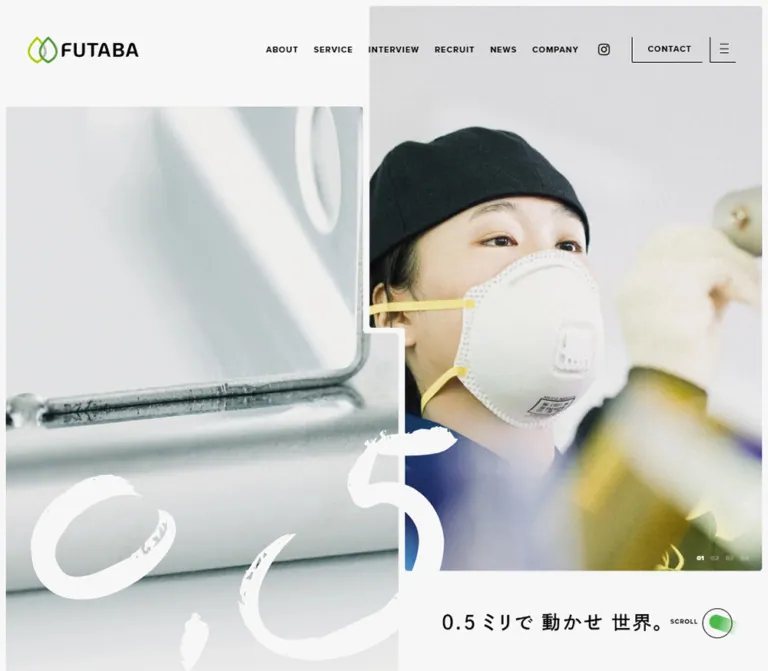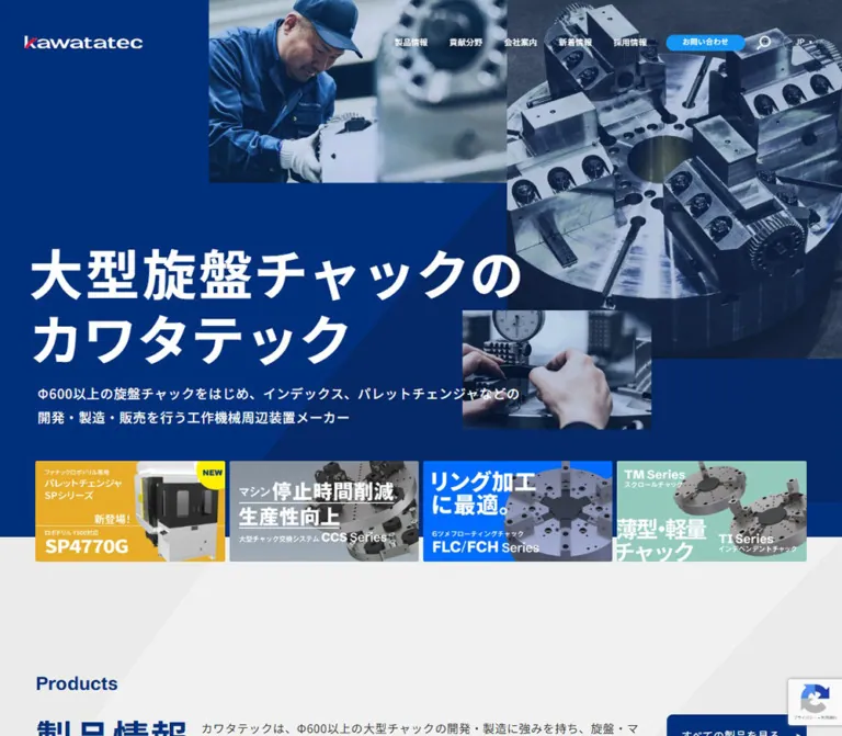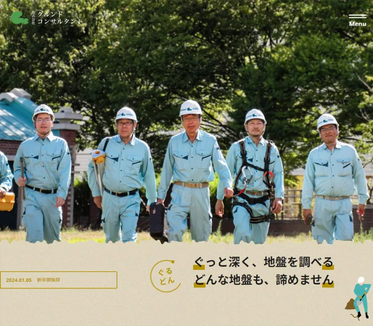
プレビュー準備中デザインリファレンスを見る
DESIGN REFERENCE
シナジーシステム株式会社|産業写真と根のイラストで伝える企業サイト
産業用ロボットや製造現場の写真に、根を思わせるアースカラーの背景と小さな人物イラストを組み合わせた企業サイト。日英の文字階層、大きな角丸パネル、ブログ告知モーダルの実測値とレスポンシブ構成を収録。
Synergy System — Style Reference
Industrial precision presented through cinematic photography, branching earth tones, and tiny illustrated people.
Original URL: https://www.synergy-s.co.jp/ Final URL: https://www.synergy-s.co.jp/ Theme: light information surfaces, photographic opening, and warm illustrated story panels; a dark blog announcement overlay is open in every supplied current capture. Inspected: October 5, 2026, at 05:50:45 JST; supplied retrieval timestamp: October 4, 2026, at 20:50:45.447 UTC. Viewports: desktop 1440 × 1000 CSS pixels; mobile 390 × 844 CSS pixels. Scope: the current corporate homepage, including its opening blog announcement, hero, navigation, company introduction, technology and staff features, business areas, recruitment, news, blog previews, video entry points, and footer. Three desktop and two mobile captures are supported by rendered DOM measurements across the document. Linked destination pages were not inspected.
Synergy System pairs an industrial subject with a warm, human visual language. Manufacturing photographs and an expansive photographic hero establish the scale of the work. Small, colorful figures perch on or hang from media corners. Further down, broad branching shapes and large rounded outlines turn the company's recurring root metaphor into a visual environment. White information sections, black text, and a precise green accent keep the corporate content legible and orderly.
The page is a multi-purpose corporate homepage. It introduces the company, explains three business areas, supports recruitment, and publishes news and workplace stories. Its hierarchy depends on several scales operating together: very large Japanese statements, narrow English section labels, compact outlined links, and photographic cards. The current opening announcement adds a dominant foreground layer without replacing the underlying homepage.
閉じる
Synergy System — Style Reference
Industrial precision presented through cinematic photography, branching earth tones, and tiny illustrated people.
Original URL: https://www.synergy-s.co.jp/ Final URL: https://www.synergy-s.co.jp/ Theme: light information surfaces, photographic opening, and warm illustrated story panels; a dark blog announcement overlay is open in every supplied current capture. Inspected: October 5, 2026, at 05:50:45 JST; supplied retrieval timestamp: October 4, 2026, at 20:50:45.447 UTC. Viewports: desktop 1440 × 1000 CSS pixels; mobile 390 × 844 CSS pixels. Scope: the current corporate homepage, including its opening blog announcement, hero, navigation, company introduction, technology and staff features, business areas, recruitment, news, blog previews, video entry points, and footer. Three desktop and two mobile captures are supported by rendered DOM measurements across the document. Linked destination pages were not inspected.
Synergy System pairs an industrial subject with a warm, human visual language. Manufacturing photographs and an expansive photographic hero establish the scale of the work. Small, colorful figures perch on or hang from media corners. Further down, broad branching shapes and large rounded outlines turn the company's recurring root metaphor into a visual environment. White information sections, black text, and a precise green accent keep the corporate content legible and orderly.
The page is a multi-purpose corporate homepage. It introduces the company, explains three business areas, supports recruitment, and publishes news and workplace stories. Its hierarchy depends on several scales operating together: very large Japanese statements, narrow English section labels, compact outlined links, and photographic cards. The current opening announcement adds a dominant foreground layer without replacing the underlying homepage.
How to Read This Reference
- Measured means a value appears in the supplied computed styles or element rectangles. Measurements below are rounded where appropriate.
- Visually observed means the feature is visible in the current screenshots. Every screenshot includes the announcement overlay, so underlying colors and imagery are partially obscured.
- Derived means arithmetic based on measured rectangles, such as a gutter percentage or the distance between two cards. It does not establish the original CSS formula.
- Estimated means a visual approximation, such as the radius of an illustrated panel whose border styles were not included.
- Recommended means implementation guidance for reuse. Suggested colors, breakpoints, accessibility behavior, and example CSS are not claims about the original implementation.
- Token names in this document are descriptive aliases. The supplied custom-property extraction was empty; no source token naming system was established.
- Computed font stacks identify declared families. Font-file loading and fallback selection were not separately tested.
- The announcement was not dismissed. Menu opening, video playback, hover states, keyboard behavior, and blog-track navigation were not exercised.
Tokens — Colors
Default Palette
| Name | Value | Suggested token | Evidence and role |
|---|---|---|---|
| Brand Green | #329902 |
--color-brand |
Measured as rgb(50, 153, 2) on the About, News, and Blog English labels. The logo also visibly contains green, but its asset color was not independently sampled. |
| Black | #000000 |
--color-ink |
Measured body and navigation text; also the backing color of photographic links and video buttons. |
| White | #ffffff |
--color-paper |
Measured announcement close-control fill and reversed text. The information canvas and navigation strip visually read as white. |
| Announcement Veil | rgba(0, 0, 0, 0.7) |
--color-veil |
Measured full-viewport announcement background at both viewports. |
| Quiet Category Fill | rgba(0, 0, 0, 0.05) |
--color-category |
Measured background of the news category label. |
| Transparent Section Surface | rgba(0, 0, 0, 0) |
— | Many section and body backgrounds compute as transparent. Their visible color comes from the underlying canvas, artwork, or surrounding layers. |
Do not sample the dimmed page as its base palette. A white surface under the measured 70% black veil would render near #4d4d4d. This is a calculated compositing result, not a gray theme token. The announcement's white typography and close pill remain foreground elements above that veil.
Illustrated Earth Palette
The middle desktop capture shows warm brown and ochre fields, broad branching bands, rounded golden outlines, and small scattered shapes. Exact artwork colors are unavailable because the artwork sits beneath the veil and no asset pixels or background-image declarations were supplied.
| Visual role | Evidence status | Recommended recreation value |
|---|---|---|
| Warm ground | Observed brown/ochre family; exact color unknown | #a96f32 / --color-soil |
| Dark branching forms and panel depth | Observed darker warm bands | #82501f / --color-root |
| Rounded panel outlines | Observed pale golden-brown edges | #e1b975 / --color-earth-edge |
| Small illustrated figures | Observed coral, yellow-green, blue, and lavender clothing | Preserve the colors of the chosen illustration assets; do not turn them into a general UI palette. |
The three earth-color hex values above are recommended starting points, not measured source colors. Match authorized artwork before finalizing them. The green accent belongs primarily to identity and information labels; the warm illustration field supplies the larger areas of color.
Tokens — Typography
Japanese Content — Noto Sans JP
- Computed stack:
'Noto Sans JP', sans-serif. - Weights:
300for blog excerpts and some footer utilities;400for ordinary descriptions;500for navigation and the main hero statement;700for section headings, business titles, and the announcement title. - Character: clear, substantial Japanese sans-serif typography with generous line spacing.
- Tracking: frequently
0.025emin supporting content and0.05emin headings. The About statement uses a much more open0.15em. - Hierarchy: the About statement is larger and heavier than the hero statement. Do not flatten both into a single display style.
English Labels and Dates — Rajdhani
- Computed stack:
Rajdhani, sans-serif. - Weights:
600for English headings, media labels, and the hero translation;300for news dates. - Character: narrow, technical lettering that contrasts with the broad Japanese headings.
- Presentation: labels such as
ABOUT US,OUR BUSINESS, andPICK UP BLOGappear uppercase. The extraction sometimes contains mixed-case text; the visible uppercase presentation should be preserved. - Tracking: most English labels have normal tracking. News dates use
1.4pxtracking at14px, equivalent to0.1em.
Logo and Source Root Size
The wordmark is visible as branded artwork. Its italic lettering should not be recreated by guessing a font. The page's root computes to 10px; the body overrides the root's Times family with Noto Sans JP. Times is therefore not an intentional visible heading family here.
The Quick Start uses explicit pixel tokens and a conventional application root instead of copying numeric source rem values.
Type Scale
Sizes, line heights, and tracking in this table are measured. Desktop and mobile refer to the two supplied viewports.
| Role | Desktop size / line height | Mobile size / line height | Weight | Tracking |
|---|---|---|---|---|
| Hero Japanese statement | 50px / 80px |
30px / 40px |
500 | 0.05em |
| Hero English translation | 20px / 28px |
12px / 16.8px |
600 | Normal |
| About statement | 60px / 80px |
40px / 60px |
700 | 0.15em |
| About body | 15px / 30px |
14px / 30px |
700 | 0.1em |
| Technology, staff, business heading | 30px / 50px |
25px / 40px |
700 | 0.05em |
| Technology and staff body | 14px / 30px |
13px / 25px |
400 | 0.025em |
| Business item title | 20px / 32px |
20px / 32px |
700 | 0.05em |
| Business item description | 13px / 25px |
13px / 25px |
400 | 0.025em |
| News and Blog Japanese heading | 24px / 40px |
18px / 28.8px |
700 | 0.05em |
| Announcement title | 26px / 41.08px |
17px / 26.86px |
700 | 0.05em |
| Announcement English label | 14px / 14px |
14px / 14px |
600 | Normal |
| Announcement detail link | 15px / 15px |
12px / 12px |
700 | Normal |
| Announcement close label | 13px / 13px |
12px / 12px |
500 | Normal |
| Compact media English label | 18px / 18px |
18px / 18px |
600 | Normal |
| Blog preview title | 16px / 25.6px |
16px / 25.6px |
700 | 0.05em |
| Blog excerpt | 13px / 30px |
13px / 30px |
300 | 0.05em |
| News date | 14px / 14px |
14px / 14px |
300 | 0.1em |
| News item title | 14px / 26.92px |
13px / 25px |
400 | Desktop 0.025em; mobile 0.05em |
| Footer address | 12px / 20px |
12px / 20px |
400 | 0.025em |
The hierarchy combines large, widely spaced statements with restrained body sizes. Long line heights create openness without making all text large.
Tokens — Spacing & Shapes
Spacing Scale
There is no verified global spacing scale. The recurring values below are useful implementation aliases drawn from measured component geometry.
| Use | Desktop | Mobile | Status |
|---|---|---|---|
| Main content outer gutter | 76.8px |
20.8px |
Measured; both correspond to about 5.3333vw |
| Main content width | 1286.39px |
348.39px |
Measured; approximately 89.3333% of viewport width |
| Announcement outside gutter | 359px |
15.61px |
Measured; mobile card occupies approximately 92vw |
| Announcement copy side inset | 40px |
40px |
Derived from card and text rectangles |
| Announcement title bottom inset | 45px |
45px |
Derived |
| Announcement label-to-title gap | 30px |
20px |
Derived from line boxes |
| Card-to-close-control gap | 50px |
27px |
Derived |
| Feature-panel copy inset | 60px |
30px |
Derived from section and text rectangles |
| Business-panel copy inset | 100px |
30px |
Derived |
| Mobile stacked feature gap | — | 40px |
Derived between technology and staff sections |
| Desktop business column gap | About 69.16px |
— | Derived |
| Blog card gap | About 33px |
About 36.06px |
Derived from adjacent card rectangles |
Border Radius
| Element | Value | Evidence |
|---|---|---|
| Announcement photo card | 5px |
Measured |
| Compact blog and video cards | 5px |
Measured |
| News category label | 3px |
Measured |
| Announcement close pill | 20px |
Measured |
| Outlined detail links | 100px |
Measured; effectively a pill at their rendered size |
| Large promotion-video panel | Desktop 50px; mobile 25px |
Measured |
| Illustrated feature and business panel outlines | Approximately 50px on desktop |
Visual estimate; not a measured border declaration |
| Business photo corners | Approximately 10px on desktop |
Visual estimate |
Small media cards are only slightly rounded. Large story panels use much broader curves. Applying one large radius to every element would erase this distinction.
Layout Measurements
| Element | Desktop 1440 × 1000 | Mobile 390 × 844 |
|---|---|---|
| Total document height | 6762.09px |
8514.14px |
| Announcement card | 722 × 480px, at (359, 240) |
358.80 × 245px, at (15.61, 279.5) |
| Announcement close pill | 160 × 40px, at (640, 770) |
120 × 35px, at (135, 551.5) |
| Primary header | 1440 × 81px, at document y 919 |
390 × 60px, at viewport top |
| Header logo box | About 175 × 28.69px |
140 × 22.94px |
| Compact blog card | 290 × 163px, near (1040, 443) |
290 × 163px, near (50, 804) |
| Compact video card | 290 × 163px, near (1040, 621) |
290 × 163px, near (50, 1009) |
| Technology feature | 593.72 × 786.14px |
348.39 × 692.83px |
| Staff feature | 593.72 × 726.14px |
348.39 × 642.83px |
| Business section | 1286.39 × 958.03px |
348.39 × 1901.17px |
| Recruitment panel | 791.63 × 460px |
348.39 × 359px |
| Adjacent large video panel | 435.39 × 460px |
348.39 × 322px |
| Bottom video banner | 1440 × 380px |
390 × 260px |
| Footer | 1440 × 353.98px |
390 × 461.80px |
These are snapshot bounds, not universal fixed-height requirements. Several text elements carry transforms, and individual line-box rectangles do not always describe normal-flow spacing cleanly. Use the dimensions to preserve proportions rather than copying every document coordinate.
Components
Opening Blog Announcement
Role: brings one current article into the foreground before visitors explore the homepage.
The component has five distinct layers:
- A viewport-sized black veil at 70% opacity.
- A centered photograph presented as one link to the featured article.
- A top-right
詳しく見るlabel with a right arrow. - A bottom-left caption group containing
PICK UP BLOG, a short horizontal rule, and a two-line Japanese article title. - Small illustrated figures outside the photo boundary, plus a separate white close pill beneath the card.
The linked article is the current robot-event blog entry, titled 2026ロボットアイデア甲子園熊本県大会予選会が始まりました♪.
At desktop size, the card is 722 × 480px; on mobile it becomes approximately 359 × 245px. Its center is exactly 20px above the viewport's vertical center in both measurements. This is a stronger observation than assuming that the whole card-and-button group is centered.
The caption keeps 40px horizontal padding and a 45px bottom inset at both sizes. The title reduces from 26px to 17px, while the English label remains 14px. The top detail label moves from approximately 35px inset on desktop to about 18px from the top and 15px from the right on mobile.
The close control is outside the card. It contains the left-aligned label 閉じる and a right-aligned cross. Its visible size reduces from 160 × 40px to 120 × 35px.
Keep the illustration wrapper separate from the clipped photo surface. The upper-left figure overlaps the photo edge; the lower-right figure extends beyond the bottom. Illustrations appear roughly half as large on the phone. Their exact asset dimensions and animation behavior were not supplied.
Behavior limitation: the overlay remains at the same screen position while the capture sequence moves the underlying document. This establishes persistence during capture scrolling. It does not verify ordinary wheel behavior, focus trapping, dismissal, Escape handling, or scroll locking. The extracted close-label element is a paragraph; its event wiring and accessibility semantics are unknown.
Photographic Hero
Role: introduces the company's ambition with people and a large-scale view of the world its technology supports.
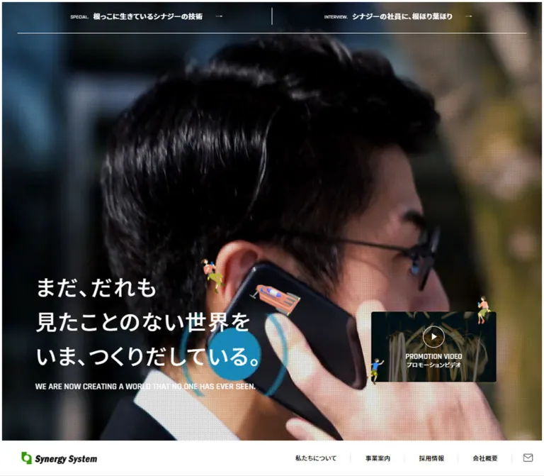
The desktop opening capture shows a city skyline. The mobile opening capture shows a close-up of a person holding a phone. These are current captured imagery states. They suggest changing or viewport-dependent imagery, but the evidence does not identify a background-video element, slideshow mechanism, sequence, or timing.
Place the Japanese statement low on the left in three deliberate lines:
まだ、だれも見たことのない世界をいま、つくりだしている。
The desktop statement starts around x 93.17px, uses 50px / 80px type, and has medium rather than bold weight. On mobile it starts at x 20.8px and uses 30px / 40px. A narrow uppercase English translation follows underneath.
A fine dotted or screen-like texture is visible over portions of the hero imagery. Its source, opacity, and compositing method are not established. Do not apply that treatment automatically to the documentary blog photograph, where the same texture is not clearly present.
Primary Navigation and Feature Links
Role: separates corporate navigation from editorial feature entry points.
On desktop, the primary navigation is a white horizontal strip below the photographic opening, occupying y 919–1000 in the initial viewport. A logo sits 50px from the left; the corporate links occupy the right. Labels use 13px medium-weight Japanese type with 0.025em tracking and approximately 33px padding. Thin separators and an envelope icon finish the strip.
Two editorial feature links sit across the top of the desktop hero, each occupying half the viewport. They combine a small English label, a Japanese feature title, and an arrow. A fine horizontal rule separates this band from the main photograph.
On mobile, a 60px header places the 140px-wide logo at the left and a 60 × 60px menu-button box at the right. The header remains at the screen top in both supplied phone captures. Its background appears transparent over the opening photograph and light at the footer capture; exact activation thresholds were not supplied.
The editorial links become two full-width, 59px-high rows near the bottom of the hero. The DOM also contains a mobile navigation structure with corporate links, editorial links, a video entry, access, and contact. Its visible open state was not captured; rectangles in the extraction alone do not prove that this menu was open.
Compact Blog and Video Cards
Role: provides secondary entry points next to the large hero message.
The desktop pair is a right-side vertical stack of 290 × 163px media cards with a 15px gap. Both use a black backing, white text, and 5px corners. The blog card repeats the article highlighted in the opening announcement; it is not a different campaign.
The video card combines a thin circular play outline with PROMOTION VIDEO and a small Japanese subtitle. The blog card uses a small top-right detail link and a lower caption group.
On mobile, both cards move below the photographic hero into the page flow, remain 290px wide, and center at x 50px. Their separation grows to approximately 42px. They do not shrink to tiny thumbnails beside the mobile headline.
About Introduction
Role: states the company's position as an unseen support for technological progress.
The section begins on a light information surface. A green Rajdhani label introduces a three-line Japanese statement in black. The headline is 60px / 80px with 9px tracking on desktop and 40px / 60px with 6px tracking on mobile.
The desktop text column is about 465px wide and aligned to the main 76.8px gutter. On mobile it uses the 348.4px content width. The accompanying body remains bold and spacious: 30px line height at both sizes. A restrained text-and-arrow link follows.
The DOM establishes the text layout and a tall section, but the supplied screenshots do not expose its full visual composition. Do not invent a specific right-side illustration, image arrangement, or animation for this section.
Technology and Staff Feature Panels
Role: offers a technical story and an employee story as parallel paths through the company.
On desktop, two approximately 594px-wide panels form a staggered pair. The staff panel starts 180px below the technology panel. Their shared copy anatomy is an English label, a two-line Japanese heading, explanatory text, and an outlined pill link.
Text has a 60px horizontal inset on desktop and 30px on mobile. The first English label starts about 361px below the desktop panel top and 245px below the mobile panel top, indicating a substantial upper visual region. The contents of that region are not independently visible in the provided screenshots.
The middle desktop capture shows broad curved outlines and warm branching artwork around these sections. White copy and white outlined links sit within that environment. A typical feature link measures 180 × 51px, with a 100px radius and 13px bold label.
On mobile, the panels become a single column with a 40px gap; the desktop vertical stagger disappears.
Three-Part Business Section
Role: explains industrial automation, mechanical parts processing, and industrial robot education.
A large rounded illustrated enclosure groups all three businesses. Its desktop width is approximately 1286px, with 100px horizontal content insets. An English label, Japanese heading, and short introduction occupy the upper area.
Each business item contains:
- A square photograph: manufacturing equipment, machined components, or an industrial robot arm.
- A small
BUSINESSlabel beside a large two-digit index that overlaps the photo's lower-right edge. - A 20px bold Japanese title.
- A 13px description with 25px line height.
- A
160 × 41pxoutlined detail link.
The desktop photographs appear approximately 316 × 316px; this is a visual estimate consistent with the measured column widths. The columns have roughly 69px gaps. They share the large background enclosure rather than floating as individually elevated cards.
On mobile, all three items stack inside a 348px-wide panel with 30px insets. The content width becomes approximately 288px. The business title remains 20px instead of shrinking with the main section heading. The desktop introductory sentence is absent from the mobile rendered-text summary.
The three links point to the corresponding anchors on /service/. Their destinations are known from the homepage links; the destination layouts were not inspected.
Recruitment and Large Video Pair
Role: transitions from business capability to working at the company and seeing it in motion.
Desktop uses an asymmetric pair: recruitment is about 792px wide and the adjacent video panel about 435px, with a 59px gap. Both are 460px tall. The recruitment block combines a section heading, a substantial visual region, supporting text, and an outlined link.
The video button uses a much larger radius than the compact hero cards: 50px on desktop and 25px on mobile. Its English label is 24px and its Japanese subtitle 13px.
On mobile, recruitment and video stack with 40px separation. Recruitment becomes 359px tall and the video panel 322px tall. The recruitment paragraph appears in the desktop evidence but has no corresponding visible mobile text rectangle. Keep this responsive content difference separate from assumptions about copy length.
News Rows
Role: presents dated corporate announcements in a compact, scannable format.
The section header pairs a green English label with a black Japanese heading and a small right-side detail link. Desktop rows are approximately 81px high, with the first about 83px. Each row groups a narrow date, an 80px-wide category chip, and the announcement title.
The category chip is deliberately quiet: 5% black fill, 3px radius, 12px text, and a height of 26px on desktop or 20px on mobile. It is not a bright badge.
On mobile, date and category occupy the first line, while the title begins below them at the left content edge. Row height becomes approximately 91–93px. The section's detail-link box contracts from 100 × 42px to approximately 35 × 17px; the rendered text summary no longer exposes its visible label. An icon-focused mobile treatment is plausible, but its complete appearance is not visible in the supplied captures.
Blog Preview Collection
Role: communicates company activity through editorial stories and excerpts.
Desktop uses four columns, each about 297px wide with 33px gaps. Cards contain an upper media region, a 16px bold Japanese title, and a light-weight excerpt with 30px line spacing. They do not have a separate filled card shell or an obvious elevation shadow.
Mobile retains a horizontal arrangement. Cards measure 312px wide, exactly 80% of the inspected viewport, and their x positions advance by approximately 348px. The first card begins at the standard 20.8px gutter; the next starts near x 368.86px, leaving a narrow preview at the right edge. This supports a horizontal-track layout. Swipe, drag, arrow navigation, snapping, and autoplay were not tested.
Observed defect: repeated PHP undefined-variable warnings appear in the rendered blog text. They are a runtime defect, not intended editorial content or a visual motif. Do not reproduce them. The supplied evidence is insufficient to establish the condition of every blog thumbnail.
Bottom Promotion Banner and Footer
Role: closes the page with a strong media entry point and practical company information.
A full-width factory photograph becomes a video button immediately above the footer. Its measured height changes from 380px on desktop to 260px on mobile. A thin circular play control and bilingual label sit over the image. Playback itself was not opened.
Desktop footer content forms four broad groups: brand/contact, primary navigation, editorial links, and access information. Fine vertical rules divide major areas. The wordmark is about 183px wide, and the address text uses 12px / 20px typography.
Mobile simplifies this into centered branding, two address groups, a contact link, and copyright. The desktop navigation columns are absent from the mobile visible-text summary. Address links retain an underline-like treatment. The result is a practical white footer rather than another large promotional panel.
Tokens — Motion & Interaction
The following values come from computed transition declarations. They establish timing, properties, and easing, but do not independently establish triggers or end states.
| Treatment | Measured declaration | Evidence limit |
|---|---|---|
| Shared links and media buttons | 0.2s cubic-bezier(0.39, 0.575, 0.565, 1) |
Hover or active appearance was not exercised. |
| Announcement layer | opacity 0.5s |
The closing transition was not observed. |
| Hero and section text | Opacity and transform over 0.7s cubic-bezier(0.215, 0.61, 0.355, 1) |
Exact transform distances and activation conditions are unknown. |
| Text sequence delays | 0.12s, 0.24s, 0.36s, 0.48s |
Assigned across labels, headings, body, and links; not a verified playback timeline. |
| Mobile header background | 0.3s cubic-bezier(0.23, 1, 0.32, 1) |
Top and lower-page appearances differ; threshold is unknown. |
| Mobile News, Blog, and footer transforms | 0.44s cubic-bezier(0.77, 0, 0.175, 1) |
Trigger is unknown; do not label this as parallax or carousel motion. |
| Address-link background size | 0.38s cubic-bezier(0.39, 0.575, 0.565, 1) |
Consistent with an animated underline implementation, but no hover result was captured. |
| Blog excerpt opacity | 0.2s cubic-bezier(0.39, 0.575, 0.565, 1) |
End state was not captured. |
The supplied sampled elements report animation: none. This does not rule out media playback, pseudo-element animation, script-driven motion, or animation inside artwork.
The collection waited for initial stability and traversed the page while the announcement remained open. Perpetual animations were temporarily paused during readiness checks and resumed afterward. These checks do not reveal a complete motion sequence.
For reuse, the measured 200ms control transitions and 700ms staggered opacity/transform declarations provide a reasonable starting rhythm. Any translation distance, image zoom, menu slide, figure movement, or video behavior must be specified as a new implementation decision.
Surfaces
| Layer | Appearance | Purpose |
|---|---|---|
| Information canvas | Visually white with black text and small green labels | About, news, blog, navigation, and practical company information |
| Photographic opening | Large image field, white statement, fine texture in visible areas | Emotional introduction and scale |
| Illustrated story field | Warm earth colors, branching bands, large rounded outlines | Connects the root metaphor to technology, people, and business |
| Compact media cards | Black backing, photograph, white caption, 5px corners | Blog and video entry points |
| Announcement veil | Uniform 70% black layer | Separates the featured article from the current page |
| Announcement foreground | Darkened photograph, white type, projecting figures | Combines news with the site's illustrative personality |
| Close control | Solid white pill with black label and cross | Clear escape affordance |
| News category | Very light neutral fill | Quiet metadata grouping |
No prominent shadow-based elevation system is visible. Image contrast, outlines, spacing, and the announcement veil do most of the separating work. A blurred glass effect would introduce a different material language.
Imagery
Photography grounds the site in real industrial activity: machinery, machined parts, a robot arm, workshop space, event participants, and the human-scale phone close-up. The city skyline broadens the opening beyond a single factory. Use real operational context and avoid replacing everything with abstract technology renders.
The small figures provide a second scale. They perch on media edges or hang upside down, making the interface feel inhabited. Their flat color and loose human poses soften the precision of the photographs. Preserve their small size and their relationship to the edge of a card; a large mascot in the center of every panel would change the composition.
The earth artwork is structural rather than a small decorative accent. Broad bands and rounded enclosures create a landscape behind related sections. Exact artwork geometry and file format were not supplied.
Observed Asset References
No original image-file URLs, video-file URLs, SVG paths, or illustration filenames were included in the evidence. The following are visual references and page associations, not downloadable asset paths.
| Asset family | Current evidence | Known page association |
|---|---|---|
| Robot-event photograph | Foreground announcement in all five current captures; people and industrial equipment in one documentary image | https://www.synergy-s.co.jp/blog/2076/ |
| City skyline | Desktop opening capture | https://www.synergy-s.co.jp/ |
| Person holding a phone | Mobile opening capture | https://www.synergy-s.co.jp/ |
| Three business photographs | Desktop middle capture: equipment, parts, robot arm | Homepage links to /service/#a-business-1, /service/#a-business-2, and /service/#a-business-3 |
| Factory panorama | Bottom media banner in desktop and mobile footer captures | https://www.synergy-s.co.jp/ |
| Small illustrated figures | Announcement corners and visible compact media edges | https://www.synergy-s.co.jp/ |
| Root-like landscape | Desktop middle capture | https://www.synergy-s.co.jp/ |
| Synergy System wordmark | Header and footer captures | https://www.synergy-s.co.jp/ |
Use authorized photographs and illustration assets. CSS can recreate the layout, veil, typography, and outlines; it cannot establish the missing artwork or media sequence.
Layout & Responsive Behavior
The desktop document moves from a near-viewport photographic opening into a spacious introduction, staggered feature panels, a three-column business enclosure, an asymmetric recruitment/video pair, editorial updates, and a practical footer.
At the inspected width, the main content gutter is 76.8px. At 390px it becomes 20.8px, making approximately 5.3333vw a useful derived adaptation. The announcement uses a separate, smaller mobile gutter of approximately 4vw.
| Area | Desktop observation | Mobile observation |
|---|---|---|
| Main navigation | White strip beneath the hero | Persistent 60px top header with menu button |
| Editorial feature links | Two equal-width links across hero top | Two stacked rows near hero bottom |
| Hero message | 50px / 80px, lower left |
30px / 40px, lower left |
| Compact media cards | Right-side stack over hero | Centered stack after hero |
| Announcement | 722 × 480px |
Approximately 92vw × 245px at 390px |
| Technology and staff | Two staggered columns | One column, 40px gap |
| Business items | Three columns | Three vertically stacked items |
| Recruitment and video | Unequal columns | Separate full-content-width panels |
| News row | Date, category, title in one horizontal grouping | Date/category above title |
| Blog cards | Four-column collection | Horizontal track of 80vw cards |
| Footer | Brand, navigation, features, access | Centered brand, access, contact, copyright |
Only these two viewport sizes were supplied. The original breakpoint thresholds, tablet behavior, landscape layouts, browser safe-area handling, and intermediate interpolation are unknown.
The mobile page is taller despite hiding some supporting text. This is consistent with stacked business and feature sections, not evidence that every desktop component simply scales down proportionally.
Recommended responsive strategy: preserve component order and relationships first, then adjust sizes. Keep the announcement caption inset stable at the inspected phone width, stack the large panels, retain a horizontal blog track, and allow text to determine height outside the specially composed media cards. Use an explicit intermediate-width design review instead of claiming that the two measurements establish every breakpoint.
Do’s and Don’ts
Do
- Keep the page's corporate, recruitment, and editorial purposes visible in its hierarchy.
- Pair Noto Sans JP Japanese content with Rajdhani English labels and dates.
- Preserve the distinction between the medium-weight hero statement and the bold, widely tracked About statement.
- Use the measured green
#329902sparingly on identity-related accents and English labels. - Combine industrial photography with small figures that interact with image boundaries.
- Give the warm illustrated field enough scale to organize several sections.
- Keep compact media corners at 5px while allowing much larger story-panel curves.
- Maintain outlined pill links and quiet category chips.
- Treat the announcement photograph, copy, figures, veil, and close control as separate layers.
- Preserve the mobile relocation of navigation and hero media cards.
- Distinguish known transition declarations from untested interaction behavior.
Don't
- Don't turn the homepage into a single conversion funnel or remove its news, business, and recruitment structure.
- Don't use the veil-darkened screenshot colors as the underlying page palette.
- Don't turn every surface green or every category into a colorful badge.
- Don't replace documentary machinery photographs with unrelated futuristic renders.
- Don't enlarge the corner figures into dominant mascots.
- Don't apply a heavy shadow, glass blur, or large radius to every card.
- Don't force the announcement photograph into 16:9; its measured foreground proportions differ from the compact media cards.
- Don't assume that the changing hero image proves a particular video or slideshow implementation.
- Don't describe the unseen mobile menu or video player as verified UI.
- Don't reproduce the rendered blog warnings or infer image filenames from them.
- Don't copy rigid desktop document coordinates into a mobile layout.
Recommended Implementation Additions
These are improvements for reuse, not verified original-site features:
- Implement the announcement as an accessible dialog with a semantic close button, deliberate focus entry, focus containment, Escape support, and focus restoration. Choose a clear background-scroll policy.
- Preserve the visible close-pill proportions while increasing its effective touch target to at least 44px high.
- Give the mobile menu button, envelope icon, compact section links, and video controls explicit accessible names and visible focus indicators.
- Keep decorative figures out of the accessibility tree. Give meaningful photographs concise alternatives appropriate to their content and link context.
- Check white text against the actual unmasked photography and earth artwork. The 70% page veil cannot provide contrast for content after the announcement closes.
- Respect reduced-motion preferences. Keep revealed content visible when scripts fail, and provide a still-image option if continuous hero motion is implemented.
- Make the mobile blog track keyboard reachable and usable without drag gestures. Scroll snapping is a possible addition, not an observed original behavior.
- Give video playback an explicit user action, captions where applicable, and a usable close/return path.
- Correct the blog rendering warnings before publishing an adaptation. Do not make warning text part of the component template.
- Test the announcement on short screens and with enlarged text; allow scrolling or content-driven expansion instead of clipping its title or close control.
Agent Prompt Guide
Quick Color Reference
- Measured accent: green
#329902. - Measured typography colors: black
#000000and white#ffffff. - Announcement separation:
rgba(0, 0, 0, 0.7). - News category fill:
rgba(0, 0, 0, 0.05). - Recommended earth approximation only: ground
#a96f32, darker roots#82501f, outline#e1b975. - Keep colorful character details inside the illustration assets rather than distributing those colors across controls.
Overall Prompt
“Create a Japanese industrial company's corporate homepage inspired by the current Synergy System composition. Combine large documentary photography with Noto Sans JP Japanese statements, Rajdhani English labels, a restrained green accent, and a warm illustrated landscape of branching forms. Use a photographic opening, a large About statement, staggered technology and staff panels, three numbered business items inside one rounded enclosure, recruitment and video panels, compact news rows, blog previews, and an access footer. Add tiny flat-color figures that perch on media edges. Preserve small 5px corners on compact photo cards and broad curves on large story panels. On mobile, move navigation to a 60px top header, stack the feature and business panels, and use a horizontal blog track. Treat all unprovided artwork and motion as new implementation choices.”
Example Component Prompts
- Announcement: “Build a featured-blog dialog with a 70% black viewport veil. At 1440 × 1000, place a 722 × 480px photo card at x 359, y 240. Use 5px corners, a white top-right detail link, and a bottom caption inset 40px horizontally and 45px vertically. Set the Japanese title to 26px/41.08px. Add a separate 160 × 40px white close pill 50px below the card. At 390 × 844, use a roughly 359 × 245px card, 17px/26.86px title, and 120 × 35px visible close pill. Keep small decorative figures outside the clipped image.”
- Technology and staff: “Create two warm illustrated panels with white copy, thin rounded outlines, narrow uppercase English labels, two-line Japanese headings, and outlined pill links. At desktop, use two approximately 594px columns with the second starting 180px lower. On phone, stack them with 40px separation and 30px copy insets. Do not invent the unseen upper artwork; provide an asset slot.”
- Business enclosure: “Place three square industrial photographs inside one large rounded earth-colored section. Overlay a small BUSINESS label and a large two-digit number at each photograph's lower-right edge. Follow with a 20px Japanese title, compact 13px/25px body, and a 160 × 41px outlined link. Stack the items on mobile while keeping the numbered-photo relationship.”
- News and blog: “Use a white canvas with small green Rajdhani section labels. Build neutral news rows with a narrow date, pale gray category chip, and black title. Below them, create four unboxed editorial cards with bold 16px titles and light excerpts. At 390px, arrange 312px-wide blog cards horizontally with a partial next-card preview; provide accessible navigation without inventing autoplay.”
- Navigation: “Place a white corporate navigation strip below the desktop hero, with a left wordmark and compact Japanese links at right. Keep two editorial feature links across the hero's top. On mobile, use a 60px top header with a 140px wordmark and menu button, and move the editorial links into two stacked hero-bottom rows.”
Quick Start
CSS Custom Properties
This is a reusable adaptation, not extracted source CSS. Measured values are retained where available. The earth palette, panel border, photo scrim, breakpoint, horizontal scrolling, and accessible hit-area extension are recommendations. Load the declared fonts separately when authorized; no font-file URLs were provided.
:root {
  /* Measured colors */
  --color-brand: #329902;
  --color-ink: #000;
  --color-paper: #fff;
  --color-veil: rgb(0 0 0 / 70%);
  --color-category: rgb(0 0 0 / 5%);

  /* Recommended artwork approximations, not sampled source colors */
  --color-soil: #a96f32;
  --color-root: #82501f;
  --color-earth-edge: #e1b975;
  --color-rule: rgb(0 0 0 / 12%);
  --photo-scrim: rgb(0 0 0 / 35%);

  --font-jp: 'Noto Sans JP', sans-serif;
  --font-en: Rajdhani, sans-serif;
  --page-gutter: 5.333333vw;
  --radius-media: 5px;
  --radius-category: 3px;
  --radius-panel: 50px;
  --radius-pill: 100px;

  --motion-control: 200ms cubic-bezier(.39, .575, .565, 1);
  --motion-reveal: 700ms cubic-bezier(.215, .61, .355, 1);
  --motion-overlay: 500ms;
}

* { box-sizing: border-box; }
body {
  margin: 0;
  color: var(--color-ink);
  background: var(--color-paper);
  font-family: var(--font-jp);
  font-size: 14px;
  line-height: 1.8;
}
button { font: inherit; }
img { display: block; max-width: 100%; }
[hidden] { display: none !important; }

.page-width {
  margin-inline: var(--page-gutter);
}
.eyebrow {
  display: flex;
  align-items: center;
  gap: 12px;
  margin: 0;
  color: var(--color-brand);
  font: 600 16px/1 var(--font-en);
  text-transform: uppercase;
}
.eyebrow::after {
  content: '';
  width: 30px;
  height: 1px;
  background: currentColor;
}
.hero-title {
  margin: 0;
  color: #fff;
  font-size: 50px;
  font-weight: 500;
  line-height: 1.6;
  letter-spacing: .05em;
}
.hero-translation {
  margin: 20px 0 0;
  color: #fff;
  font: 600 20px/1.4 var(--font-en);
  text-transform: uppercase;
}
.about-title {
  margin: 40px 0;
  font-size: 60px;
  font-weight: 700;
  line-height: 1.333333;
  letter-spacing: .15em;
}
.about-copy {
  max-width: 465px;
  font-size: 15px;
  font-weight: 700;
  line-height: 2;
  letter-spacing: .1em;
}

/* Supply authorized branching artwork through --root-art. */
.story-zone {
  background-color: var(--color-soil);
  background-image: var(--root-art, none);
  background-size: cover;
}
.feature-grid {
  display: grid;
  grid-template-columns: repeat(2, minmax(0, 1fr));
  gap: 6.8715vw;
  align-items: start;
}
.feature-panel,
.business-panel {
  color: #fff;
  background: var(--color-root);
  border: 5px solid var(--color-earth-edge);
  border-radius: var(--radius-panel);
}
.feature-panel { padding: 60px; }
.feature-panel:nth-child(2) { margin-top: 180px; }
.feature-panel .eyebrow,
.business-panel .eyebrow { color: inherit; font-size: 14px; }
.feature-title {
  margin: 14px 0 24px;
  font-size: 30px;
  line-height: 1.666667;
  letter-spacing: .05em;
}
.feature-copy {
  font-size: 14px;
  font-weight: 400;
  line-height: 2.142857;
  letter-spacing: .025em;
}
.detail-pill {
  display: inline-flex;
  align-items: center;
  justify-content: space-between;
  width: 180px;
  min-height: 51px;
  padding: 12px 18px 12px 28px;
  border: 2px solid currentColor;
  border-radius: var(--radius-pill);
  color: inherit;
  background: transparent;
  text-decoration: none;
  font-size: 13px;
  font-weight: 700;
  line-height: 1;
  transition: opacity var(--motion-control);
}
.detail-pill--small { width: 160px; min-height: 41px; padding: 10px 17px; }
.business-panel { padding: 65px 100px 80px; }
.business-grid {
  display: grid;
  grid-template-columns: repeat(3, minmax(0, 1fr));
  gap: 6.366%;
}
.business-photo {
  width: 100%;
  aspect-ratio: 1;
  object-fit: cover;
  border-radius: 10px;
}
.business-title {
  font-size: 20px;
  line-height: 1.6;
  letter-spacing: .05em;
}
.business-copy { font-size: 13px; line-height: 25px; }

.news-row {
  display: grid;
  grid-template-columns: max-content 80px minmax(0, 1fr);
  align-items: center;
  column-gap: 70px;
  padding-block: 26.5px;
  border-bottom: 1px solid var(--color-rule);
  color: inherit;
  text-decoration: none;
}
.news-date { font: 300 14px/1 var(--font-en); letter-spacing: .1em; }
.news-category {
  padding: 7px 5px;
  background: var(--color-category);
  border-radius: 3px;
  text-align: center;
  font-size: 12px;
  line-height: 1;
}
.news-title { margin: 0; font-size: 14px; font-weight: 400; line-height: 1.923; }
.blog-track {
  display: grid;
  grid-template-columns: repeat(4, minmax(0, 1fr));
  gap: 33px;
}
.blog-card { min-width: 0; color: inherit; text-decoration: none; }
.blog-title { font-size: 16px; line-height: 1.6; letter-spacing: .05em; }
.blog-excerpt { font-size: 13px; font-weight: 300; line-height: 30px; }

/* The photograph is clipped; decorative figures remain outside it. */
.pickup-layer {
  position: fixed;
  inset: 0;
  z-index: 1000;
  display: grid;
  place-items: center;
  background: var(--color-veil);
  transition: opacity var(--motion-overlay);
}
.pickup-frame {
  position: relative;
  width: min(722px, 92vw);
  transform: translateY(-20px);
}
.pickup-card {
  position: relative;
  display: block;
  height: 480px;
  overflow: hidden;
  border-radius: var(--radius-media);
  color: #fff;
  background: #000;
  text-decoration: none;
}
.pickup-photo,
.pickup-card::before {
  position: absolute;
  inset: 0;
  width: 100%;
  height: 100%;
}
.pickup-photo { object-fit: cover; }
.pickup-card::before {
  content: '';
  z-index: 1;
  background: var(--photo-scrim);
  pointer-events: none;
}
.pickup-detail {
  position: absolute;
  z-index: 2;
  top: 35px;
  right: 35px;
  font-size: 15px;
  font-weight: 700;
  line-height: 1;
}
.pickup-copy {
  position: absolute;
  z-index: 2;
  inset: auto 40px 45px;
}
.pickup-copy .eyebrow {
  color: inherit;
  gap: 28px;
  margin-bottom: 30px;
  font-size: 14px;
}
.pickup-copy .eyebrow::after { width: 60px; }
.pickup-title {
  margin: 0;
  font-size: 26px;
  font-weight: 700;
  line-height: 1.58;
  letter-spacing: .05em;
}
.pickup-close {
  position: absolute;
  top: calc(100% + 50px);
  left: 50%;
  display: flex;
  align-items: center;
  justify-content: space-between;
  width: 160px;
  height: 40px;
  padding: 0 16px 0 20px;
  border: 0;
  border-radius: 20px;
  color: #000;
  background: #fff;
  font-size: 13px;
  font-weight: 500;
  line-height: 1;
  transform: translateX(-50%);
  cursor: pointer;
}
.pickup-close::before {
  content: '';
  position: absolute;
  inset: -5px 0;
}
.pickup-decor { position: absolute; z-index: 3; pointer-events: none; }

:where(a, button):focus-visible {
  outline: 3px solid var(--color-brand);
  outline-offset: 4px;
}
.pickup-layer :focus-visible { outline-color: #fff; }
.pickup-close:focus-visible { outline-color: var(--color-brand); }

/* Recommended breakpoint; the original threshold was not supplied. */
@media (max-width: 767px) {
  :root { --radius-panel: 25px; }
  .hero-title { font-size: 30px; line-height: 1.333333; }
  .hero-translation { margin-top: 17px; font-size: 12px; }
  .about-title { font-size: 40px; line-height: 1.5; }
  .about-copy { font-size: 14px; line-height: 30px; }
  .eyebrow { font-size: 14px; }
  .feature-grid { grid-template-columns: 1fr; gap: 40px; }
  .feature-panel { padding: 30px; }
  .feature-panel:nth-child(2) { margin-top: 0; }
  .feature-title { font-size: 25px; line-height: 1.6; }
  .feature-copy { font-size: 13px; line-height: 25px; }
  .business-panel { padding: 40px 30px 60px; }
  .business-grid { grid-template-columns: 1fr; gap: 50px; }
  .news-row { grid-template-columns: max-content 80px; gap: 13px 15px; padding-block: 19px 22px; }
  .news-category { padding-block: 4px; }
  .news-title { grid-column: 1 / -1; font-size: 13px; line-height: 25px; }
  .blog-track {
    display: flex;
    gap: 36px;
    overflow-x: auto;
    scroll-snap-type: x proximity;
    padding-bottom: 16px;
  }
  .blog-card { flex: 0 0 80vw; scroll-snap-align: start; }
  .pickup-card { height: 245px; }
  .pickup-detail { top: 18px; right: 15px; font-size: 12px; }
  .pickup-copy .eyebrow { gap: 12px; margin-bottom: 20px; }
  .pickup-copy .eyebrow::after { width: 30px; }
  .pickup-title { font-size: 17px; }
  .pickup-close {
    top: calc(100% + 27px);
    width: 120px;
    height: 35px;
    padding-inline: 17px 12px;
    font-size: 12px;
  }
}

/* Recommended fallback for short viewports and enlarged content. */
@media (max-height: 600px) {
  .pickup-layer { display: block; overflow-y: auto; padding: 24px 0 100px; }
  .pickup-frame { margin-inline: auto; transform: none; }
  .pickup-copy { position: relative; inset: auto; padding: 110px 40px 45px; }
  .pickup-card { height: auto; min-height: 245px; }
}

@media (prefers-reduced-motion: reduce) {
  .pickup-layer,
  .detail-pill { transition: none; }
  .blog-track { scroll-behavior: auto; }
}
The feature panels still need their upper media/artwork regions, the hero needs an authorized image or media implementation, and the numbered business photos need their badge markup. Those assets and behaviors are intentionally not fabricated by the CSS.
A minimal announcement structure is shown below. pickup-photo.jpg is a replacement asset filename, not an observed source path. The layer starts hidden. Its controller must implement opening, closing, focus management, and background interaction policy before it functions as an accessible dialog.
<section class='pickup-layer' role='dialog' aria-modal='true'
  aria-labelledby='pickup-title' hidden>
  <div class='pickup-frame'>
    <a class='pickup-card' href='https://www.synergy-s.co.jp/blog/2076/'>
      <img class='pickup-photo' src='pickup-photo.jpg'
        alt='Participants watching an industrial robot demonstration.'>
      <span class='pickup-detail'>詳しく見る <span aria-hidden='true'>→</span></span>
      <div class='pickup-copy'>
        <p class='eyebrow'>Pick up blog</p>
        <h2 class='pickup-title' id='pickup-title'>2026ロボットアイデア甲子園熊本県大会予選会が始まりました♪</h2>
      </div>
    </a>
    <!-- Add authorized decorative figures here, outside the clipped card. -->
    <button class='pickup-close' type='button'>
      <span>閉じる</span><span aria-hidden='true'>×</span>
    </button>
  </div>
</section>
Tailwind v4 Token Mapping
Optional aliases for an existing Tailwind v4 project. This is not evidence that the original website uses Tailwind. The recommended soil colors retain their provisional status.
@theme inline {
  --color-brand: #329902;
  --color-ink: #000;
  --color-paper: #fff;
  --color-veil: rgb(0 0 0 / 70%);
  --color-category: rgb(0 0 0 / 5%);
  --color-soil: #a96f32;
  --color-root: #82501f;
  --color-earth-edge: #e1b975;

  --font-jp: 'Noto Sans JP', sans-serif;
  --font-en: Rajdhani, sans-serif;

  --text-hero: 50px;
  --text-about: 60px;
  --text-section: 30px;
  --text-pickup: 26px;
  --text-business: 20px;
  --text-caption: 14px;

  --spacing-page: 5.333333vw;
  --radius-media: 5px;
  --radius-category: 3px;
  --radius-panel: 50px;
  --radius-pill: 100px;
}
Sources & Evidence
- Original and final page: Synergy System homepage. The supplied observation records HTTP
200and the same original/final URL. The browser title identifies the company asシナジーシステム株式会社; the visible wordmark reads Synergy System. - Capture time: October 4, 2026,
20:50:45.447 UTC, equivalent to October 5, 2026,05:50:45.447 JST. - Desktop evidence: three 1440 × 1000 current-page captures showing the opening, middle business area, and footer with the same announcement open. Supplied DOM document height: approximately 6762px.
- Mobile evidence: two 390 × 844 current-page captures showing the opening and footer with the announcement open. Supplied DOM document height: approximately 8514px.
- Rendered DOM and computed styles: element rectangles, text, links, font stacks, font sizes, weights, line heights, tracking, selected colors, radii, and transition declarations. The extraction did not provide image-file URLs, source selectors, full stylesheet rules, or breakpoint definitions.
- Featured article association: the announcement and compact blog card both link to the robot-event article. That destination was not opened; its URL establishes the link target only.
- Observed interaction scope: initial rendering and capture scrolling. The announcement remained open. No confirmed menu opening, close action, video playback, hover interaction, keyboard sequence, or horizontal blog navigation was supplied.
- Collection limits: readiness checks waited for load, finite motion, sampled layout/text stability, and visible image decoding within bounded time limits. Perpetual animations were temporarily paused and resumed. Delayed content and unexercised interactions remain unverified; SharedWorkers and service workers were disabled during collection.
- Current rendering issue: blog excerpts are accompanied by repeated PHP warnings in the supplied rendered text. These are recorded as defects and excluded from the reusable design language.
This reference describes the currently supplied homepage evidence. Exact values are limited to the measurements provided; earth-color approximations, responsive thresholds, accessibility improvements, and implementation examples are explicitly recommended adaptations.
# Synergy System — Style Reference

> Industrial precision presented through cinematic photography, branching earth tones, and tiny illustrated people.

**Original URL:** [https://www.synergy-s.co.jp/](https://www.synergy-s.co.jp/)
**Final URL:** [https://www.synergy-s.co.jp/](https://www.synergy-s.co.jp/)
**Theme:** light information surfaces, photographic opening, and warm illustrated story panels; a dark blog announcement overlay is open in every supplied current capture.
**Inspected:** October 5, 2026, at 05:50:45 JST; supplied retrieval timestamp: October 4, 2026, at 20:50:45.447 UTC.
**Viewports:** desktop 1440 × 1000 CSS pixels; mobile 390 × 844 CSS pixels.
**Scope:** the current corporate homepage, including its opening blog announcement, hero, navigation, company introduction, technology and staff features, business areas, recruitment, news, blog previews, video entry points, and footer. Three desktop and two mobile captures are supported by rendered DOM measurements across the document. Linked destination pages were not inspected.

Synergy System pairs an industrial subject with a warm, human visual language. Manufacturing photographs and an expansive photographic hero establish the scale of the work. Small, colorful figures perch on or hang from media corners. Further down, broad branching shapes and large rounded outlines turn the company's recurring root metaphor into a visual environment. White information sections, black text, and a precise green accent keep the corporate content legible and orderly.

The page is a multi-purpose corporate homepage. It introduces the company, explains three business areas, supports recruitment, and publishes news and workplace stories. Its hierarchy depends on several scales operating together: very large Japanese statements, narrow English section labels, compact outlined links, and photographic cards. The current opening announcement adds a dominant foreground layer without replacing the underlying homepage.
閉じる
# Synergy System — Style Reference

> Industrial precision presented through cinematic photography, branching earth tones, and tiny illustrated people.

**Original URL:** [https://www.synergy-s.co.jp/](https://www.synergy-s.co.jp/)
**Final URL:** [https://www.synergy-s.co.jp/](https://www.synergy-s.co.jp/)
**Theme:** light information surfaces, photographic opening, and warm illustrated story panels; a dark blog announcement overlay is open in every supplied current capture.
**Inspected:** October 5, 2026, at 05:50:45 JST; supplied retrieval timestamp: October 4, 2026, at 20:50:45.447 UTC.
**Viewports:** desktop 1440 × 1000 CSS pixels; mobile 390 × 844 CSS pixels.
**Scope:** the current corporate homepage, including its opening blog announcement, hero, navigation, company introduction, technology and staff features, business areas, recruitment, news, blog previews, video entry points, and footer. Three desktop and two mobile captures are supported by rendered DOM measurements across the document. Linked destination pages were not inspected.

Synergy System pairs an industrial subject with a warm, human visual language. Manufacturing photographs and an expansive photographic hero establish the scale of the work. Small, colorful figures perch on or hang from media corners. Further down, broad branching shapes and large rounded outlines turn the company's recurring root metaphor into a visual environment. White information sections, black text, and a precise green accent keep the corporate content legible and orderly.

The page is a multi-purpose corporate homepage. It introduces the company, explains three business areas, supports recruitment, and publishes news and workplace stories. Its hierarchy depends on several scales operating together: very large Japanese statements, narrow English section labels, compact outlined links, and photographic cards. The current opening announcement adds a dominant foreground layer without replacing the underlying homepage.

## How to Read This Reference

- **Measured** means a value appears in the supplied computed styles or element rectangles. Measurements below are rounded where appropriate.
- **Visually observed** means the feature is visible in the current screenshots. Every screenshot includes the announcement overlay, so underlying colors and imagery are partially obscured.
- **Derived** means arithmetic based on measured rectangles, such as a gutter percentage or the distance between two cards. It does not establish the original CSS formula.
- **Estimated** means a visual approximation, such as the radius of an illustrated panel whose border styles were not included.
- **Recommended** means implementation guidance for reuse. Suggested colors, breakpoints, accessibility behavior, and example CSS are not claims about the original implementation.
- Token names in this document are descriptive aliases. The supplied custom-property extraction was empty; no source token naming system was established.
- Computed font stacks identify declared families. Font-file loading and fallback selection were not separately tested.
- The announcement was not dismissed. Menu opening, video playback, hover states, keyboard behavior, and blog-track navigation were not exercised.

## Tokens — Colors

### Default Palette

| Name | Value | Suggested token | Evidence and role |
| --- | --- | --- | --- |
| Brand Green | `#329902` | `--color-brand` | Measured as `rgb(50, 153, 2)` on the About, News, and Blog English labels. The logo also visibly contains green, but its asset color was not independently sampled. |
| Black | `#000000` | `--color-ink` | Measured body and navigation text; also the backing color of photographic links and video buttons. |
| White | `#ffffff` | `--color-paper` | Measured announcement close-control fill and reversed text. The information canvas and navigation strip visually read as white. |
| Announcement Veil | `rgba(0, 0, 0, 0.7)` | `--color-veil` | Measured full-viewport announcement background at both viewports. |
| Quiet Category Fill | `rgba(0, 0, 0, 0.05)` | `--color-category` | Measured background of the news category label. |
| Transparent Section Surface | `rgba(0, 0, 0, 0)` | — | Many section and body backgrounds compute as transparent. Their visible color comes from the underlying canvas, artwork, or surrounding layers. |

**Do not sample the dimmed page as its base palette.** A white surface under the measured 70% black veil would render near `#4d4d4d`. This is a calculated compositing result, not a gray theme token. The announcement's white typography and close pill remain foreground elements above that veil.

### Illustrated Earth Palette

The middle desktop capture shows warm brown and ochre fields, broad branching bands, rounded golden outlines, and small scattered shapes. Exact artwork colors are unavailable because the artwork sits beneath the veil and no asset pixels or background-image declarations were supplied.

| Visual role | Evidence status | Recommended recreation value |
| --- | --- | --- |
| Warm ground | Observed brown/ochre family; exact color unknown | `#a96f32` / `--color-soil` |
| Dark branching forms and panel depth | Observed darker warm bands | `#82501f` / `--color-root` |
| Rounded panel outlines | Observed pale golden-brown edges | `#e1b975` / `--color-earth-edge` |
| Small illustrated figures | Observed coral, yellow-green, blue, and lavender clothing | Preserve the colors of the chosen illustration assets; do not turn them into a general UI palette. |

The three earth-color hex values above are **recommended starting points**, not measured source colors. Match authorized artwork before finalizing them. The green accent belongs primarily to identity and information labels; the warm illustration field supplies the larger areas of color.

## Tokens — Typography

### Japanese Content — Noto Sans JP

- **Computed stack:** `'Noto Sans JP', sans-serif`.
- **Weights:** `300` for blog excerpts and some footer utilities; `400` for ordinary descriptions; `500` for navigation and the main hero statement; `700` for section headings, business titles, and the announcement title.
- **Character:** clear, substantial Japanese sans-serif typography with generous line spacing.
- **Tracking:** frequently `0.025em` in supporting content and `0.05em` in headings. The About statement uses a much more open `0.15em`.
- **Hierarchy:** the About statement is larger and heavier than the hero statement. Do not flatten both into a single display style.

### English Labels and Dates — Rajdhani

- **Computed stack:** `Rajdhani, sans-serif`.
- **Weights:** `600` for English headings, media labels, and the hero translation; `300` for news dates.
- **Character:** narrow, technical lettering that contrasts with the broad Japanese headings.
- **Presentation:** labels such as `ABOUT US`, `OUR BUSINESS`, and `PICK UP BLOG` appear uppercase. The extraction sometimes contains mixed-case text; the visible uppercase presentation should be preserved.
- **Tracking:** most English labels have normal tracking. News dates use `1.4px` tracking at `14px`, equivalent to `0.1em`.

### Logo and Source Root Size

The wordmark is visible as branded artwork. Its italic lettering should not be recreated by guessing a font. The page's root computes to `10px`; the body overrides the root's Times family with Noto Sans JP. Times is therefore not an intentional visible heading family here.

The Quick Start uses explicit pixel tokens and a conventional application root instead of copying numeric source rem values.

### Type Scale

Sizes, line heights, and tracking in this table are measured. Desktop and mobile refer to the two supplied viewports.

| Role | Desktop size / line height | Mobile size / line height | Weight | Tracking |
| --- | --- | --- | --- | --- |
| Hero Japanese statement | `50px / 80px` | `30px / 40px` | 500 | `0.05em` |
| Hero English translation | `20px / 28px` | `12px / 16.8px` | 600 | Normal |
| About statement | `60px / 80px` | `40px / 60px` | 700 | `0.15em` |
| About body | `15px / 30px` | `14px / 30px` | 700 | `0.1em` |
| Technology, staff, business heading | `30px / 50px` | `25px / 40px` | 700 | `0.05em` |
| Technology and staff body | `14px / 30px` | `13px / 25px` | 400 | `0.025em` |
| Business item title | `20px / 32px` | `20px / 32px` | 700 | `0.05em` |
| Business item description | `13px / 25px` | `13px / 25px` | 400 | `0.025em` |
| News and Blog Japanese heading | `24px / 40px` | `18px / 28.8px` | 700 | `0.05em` |
| Announcement title | `26px / 41.08px` | `17px / 26.86px` | 700 | `0.05em` |
| Announcement English label | `14px / 14px` | `14px / 14px` | 600 | Normal |
| Announcement detail link | `15px / 15px` | `12px / 12px` | 700 | Normal |
| Announcement close label | `13px / 13px` | `12px / 12px` | 500 | Normal |
| Compact media English label | `18px / 18px` | `18px / 18px` | 600 | Normal |
| Blog preview title | `16px / 25.6px` | `16px / 25.6px` | 700 | `0.05em` |
| Blog excerpt | `13px / 30px` | `13px / 30px` | 300 | `0.05em` |
| News date | `14px / 14px` | `14px / 14px` | 300 | `0.1em` |
| News item title | `14px / 26.92px` | `13px / 25px` | 400 | Desktop `0.025em`; mobile `0.05em` |
| Footer address | `12px / 20px` | `12px / 20px` | 400 | `0.025em` |

The hierarchy combines large, widely spaced statements with restrained body sizes. Long line heights create openness without making all text large.

## Tokens — Spacing & Shapes

### Spacing Scale

There is no verified global spacing scale. The recurring values below are useful implementation aliases drawn from measured component geometry.

| Use | Desktop | Mobile | Status |
| --- | --- | --- | --- |
| Main content outer gutter | `76.8px` | `20.8px` | Measured; both correspond to about `5.3333vw` |
| Main content width | `1286.39px` | `348.39px` | Measured; approximately `89.3333%` of viewport width |
| Announcement outside gutter | `359px` | `15.61px` | Measured; mobile card occupies approximately `92vw` |
| Announcement copy side inset | `40px` | `40px` | Derived from card and text rectangles |
| Announcement title bottom inset | `45px` | `45px` | Derived |
| Announcement label-to-title gap | `30px` | `20px` | Derived from line boxes |
| Card-to-close-control gap | `50px` | `27px` | Derived |
| Feature-panel copy inset | `60px` | `30px` | Derived from section and text rectangles |
| Business-panel copy inset | `100px` | `30px` | Derived |
| Mobile stacked feature gap | — | `40px` | Derived between technology and staff sections |
| Desktop business column gap | About `69.16px` | — | Derived |
| Blog card gap | About `33px` | About `36.06px` | Derived from adjacent card rectangles |

### Border Radius

| Element | Value | Evidence |
| --- | --- | --- |
| Announcement photo card | `5px` | Measured |
| Compact blog and video cards | `5px` | Measured |
| News category label | `3px` | Measured |
| Announcement close pill | `20px` | Measured |
| Outlined detail links | `100px` | Measured; effectively a pill at their rendered size |
| Large promotion-video panel | Desktop `50px`; mobile `25px` | Measured |
| Illustrated feature and business panel outlines | Approximately `50px` on desktop | Visual estimate; not a measured border declaration |
| Business photo corners | Approximately `10px` on desktop | Visual estimate |

Small media cards are only slightly rounded. Large story panels use much broader curves. Applying one large radius to every element would erase this distinction.

### Layout Measurements

| Element | Desktop 1440 × 1000 | Mobile 390 × 844 |
| --- | --- | --- |
| Total document height | `6762.09px` | `8514.14px` |
| Announcement card | `722 × 480px`, at `(359, 240)` | `358.80 × 245px`, at `(15.61, 279.5)` |
| Announcement close pill | `160 × 40px`, at `(640, 770)` | `120 × 35px`, at `(135, 551.5)` |
| Primary header | `1440 × 81px`, at document y `919` | `390 × 60px`, at viewport top |
| Header logo box | About `175 × 28.69px` | `140 × 22.94px` |
| Compact blog card | `290 × 163px`, near `(1040, 443)` | `290 × 163px`, near `(50, 804)` |
| Compact video card | `290 × 163px`, near `(1040, 621)` | `290 × 163px`, near `(50, 1009)` |
| Technology feature | `593.72 × 786.14px` | `348.39 × 692.83px` |
| Staff feature | `593.72 × 726.14px` | `348.39 × 642.83px` |
| Business section | `1286.39 × 958.03px` | `348.39 × 1901.17px` |
| Recruitment panel | `791.63 × 460px` | `348.39 × 359px` |
| Adjacent large video panel | `435.39 × 460px` | `348.39 × 322px` |
| Bottom video banner | `1440 × 380px` | `390 × 260px` |
| Footer | `1440 × 353.98px` | `390 × 461.80px` |

These are snapshot bounds, not universal fixed-height requirements. Several text elements carry transforms, and individual line-box rectangles do not always describe normal-flow spacing cleanly. Use the dimensions to preserve proportions rather than copying every document coordinate.

## Components

### Opening Blog Announcement

**Role:** brings one current article into the foreground before visitors explore the homepage.

The component has five distinct layers:

1. A viewport-sized black veil at 70% opacity.
2. A centered photograph presented as one link to the featured article.
3. A top-right `詳しく見る` label with a right arrow.
4. A bottom-left caption group containing `PICK UP BLOG`, a short horizontal rule, and a two-line Japanese article title.
5. Small illustrated figures outside the photo boundary, plus a separate white close pill beneath the card.

The linked article is [the current robot-event blog entry](https://www.synergy-s.co.jp/blog/2076/), titled `2026ロボットアイデア甲子園熊本県大会予選会が始まりました♪`.

At desktop size, the card is `722 × 480px`; on mobile it becomes approximately `359 × 245px`. Its center is exactly 20px above the viewport's vertical center in both measurements. This is a stronger observation than assuming that the whole card-and-button group is centered.

The caption keeps 40px horizontal padding and a 45px bottom inset at both sizes. The title reduces from 26px to 17px, while the English label remains 14px. The top detail label moves from approximately 35px inset on desktop to about 18px from the top and 15px from the right on mobile.

The close control is outside the card. It contains the left-aligned label `閉じる` and a right-aligned cross. Its visible size reduces from `160 × 40px` to `120 × 35px`.

Keep the illustration wrapper separate from the clipped photo surface. The upper-left figure overlaps the photo edge; the lower-right figure extends beyond the bottom. Illustrations appear roughly half as large on the phone. Their exact asset dimensions and animation behavior were not supplied.

**Behavior limitation:** the overlay remains at the same screen position while the capture sequence moves the underlying document. This establishes persistence during capture scrolling. It does not verify ordinary wheel behavior, focus trapping, dismissal, Escape handling, or scroll locking. The extracted close-label element is a paragraph; its event wiring and accessibility semantics are unknown.

### Photographic Hero

**Role:** introduces the company's ambition with people and a large-scale view of the world its technology supports.

The desktop opening capture shows a city skyline. The mobile opening capture shows a close-up of a person holding a phone. These are current captured imagery states. They suggest changing or viewport-dependent imagery, but the evidence does not identify a background-video element, slideshow mechanism, sequence, or timing.

Place the Japanese statement low on the left in three deliberate lines:

`まだ、だれも`
`見たことのない世界を`
`いま、つくりだしている。`

The desktop statement starts around x `93.17px`, uses `50px / 80px` type, and has medium rather than bold weight. On mobile it starts at x `20.8px` and uses `30px / 40px`. A narrow uppercase English translation follows underneath.

A fine dotted or screen-like texture is visible over portions of the hero imagery. Its source, opacity, and compositing method are not established. Do not apply that treatment automatically to the documentary blog photograph, where the same texture is not clearly present.

### Primary Navigation and Feature Links

**Role:** separates corporate navigation from editorial feature entry points.

On desktop, the primary navigation is a white horizontal strip below the photographic opening, occupying y `919–1000` in the initial viewport. A logo sits 50px from the left; the corporate links occupy the right. Labels use 13px medium-weight Japanese type with `0.025em` tracking and approximately 33px padding. Thin separators and an envelope icon finish the strip.

Two editorial feature links sit across the top of the desktop hero, each occupying half the viewport. They combine a small English label, a Japanese feature title, and an arrow. A fine horizontal rule separates this band from the main photograph.

On mobile, a 60px header places the 140px-wide logo at the left and a `60 × 60px` menu-button box at the right. The header remains at the screen top in both supplied phone captures. Its background appears transparent over the opening photograph and light at the footer capture; exact activation thresholds were not supplied.

The editorial links become two full-width, 59px-high rows near the bottom of the hero. The DOM also contains a mobile navigation structure with corporate links, editorial links, a video entry, access, and contact. Its visible open state was not captured; rectangles in the extraction alone do not prove that this menu was open.

### Compact Blog and Video Cards

**Role:** provides secondary entry points next to the large hero message.

The desktop pair is a right-side vertical stack of `290 × 163px` media cards with a 15px gap. Both use a black backing, white text, and 5px corners. The blog card repeats the article highlighted in the opening announcement; it is not a different campaign.

The video card combines a thin circular play outline with `PROMOTION VIDEO` and a small Japanese subtitle. The blog card uses a small top-right detail link and a lower caption group.

On mobile, both cards move below the photographic hero into the page flow, remain 290px wide, and center at x `50px`. Their separation grows to approximately 42px. They do not shrink to tiny thumbnails beside the mobile headline.

### About Introduction

**Role:** states the company's position as an unseen support for technological progress.

The section begins on a light information surface. A green Rajdhani label introduces a three-line Japanese statement in black. The headline is `60px / 80px` with 9px tracking on desktop and `40px / 60px` with 6px tracking on mobile.

The desktop text column is about 465px wide and aligned to the main 76.8px gutter. On mobile it uses the 348.4px content width. The accompanying body remains bold and spacious: 30px line height at both sizes. A restrained text-and-arrow link follows.

The DOM establishes the text layout and a tall section, but the supplied screenshots do not expose its full visual composition. Do not invent a specific right-side illustration, image arrangement, or animation for this section.

### Technology and Staff Feature Panels

**Role:** offers a technical story and an employee story as parallel paths through the company.

On desktop, two approximately 594px-wide panels form a staggered pair. The staff panel starts 180px below the technology panel. Their shared copy anatomy is an English label, a two-line Japanese heading, explanatory text, and an outlined pill link.

Text has a 60px horizontal inset on desktop and 30px on mobile. The first English label starts about 361px below the desktop panel top and 245px below the mobile panel top, indicating a substantial upper visual region. The contents of that region are not independently visible in the provided screenshots.

The middle desktop capture shows broad curved outlines and warm branching artwork around these sections. White copy and white outlined links sit within that environment. A typical feature link measures `180 × 51px`, with a 100px radius and 13px bold label.

On mobile, the panels become a single column with a 40px gap; the desktop vertical stagger disappears.

### Three-Part Business Section

**Role:** explains industrial automation, mechanical parts processing, and industrial robot education.

A large rounded illustrated enclosure groups all three businesses. Its desktop width is approximately 1286px, with 100px horizontal content insets. An English label, Japanese heading, and short introduction occupy the upper area.

Each business item contains:

- A square photograph: manufacturing equipment, machined components, or an industrial robot arm.
- A small `BUSINESS` label beside a large two-digit index that overlaps the photo's lower-right edge.
- A 20px bold Japanese title.
- A 13px description with 25px line height.
- A `160 × 41px` outlined detail link.

The desktop photographs appear approximately `316 × 316px`; this is a visual estimate consistent with the measured column widths. The columns have roughly 69px gaps. They share the large background enclosure rather than floating as individually elevated cards.

On mobile, all three items stack inside a 348px-wide panel with 30px insets. The content width becomes approximately 288px. The business title remains 20px instead of shrinking with the main section heading. The desktop introductory sentence is absent from the mobile rendered-text summary.

The three links point to the corresponding anchors on `/service/`. Their destinations are known from the homepage links; the destination layouts were not inspected.

### Recruitment and Large Video Pair

**Role:** transitions from business capability to working at the company and seeing it in motion.

Desktop uses an asymmetric pair: recruitment is about 792px wide and the adjacent video panel about 435px, with a 59px gap. Both are 460px tall. The recruitment block combines a section heading, a substantial visual region, supporting text, and an outlined link.

The video button uses a much larger radius than the compact hero cards: 50px on desktop and 25px on mobile. Its English label is 24px and its Japanese subtitle 13px.

On mobile, recruitment and video stack with 40px separation. Recruitment becomes 359px tall and the video panel 322px tall. The recruitment paragraph appears in the desktop evidence but has no corresponding visible mobile text rectangle. Keep this responsive content difference separate from assumptions about copy length.

### News Rows

**Role:** presents dated corporate announcements in a compact, scannable format.

The section header pairs a green English label with a black Japanese heading and a small right-side detail link. Desktop rows are approximately 81px high, with the first about 83px. Each row groups a narrow date, an 80px-wide category chip, and the announcement title.

The category chip is deliberately quiet: 5% black fill, 3px radius, 12px text, and a height of 26px on desktop or 20px on mobile. It is not a bright badge.

On mobile, date and category occupy the first line, while the title begins below them at the left content edge. Row height becomes approximately 91–93px. The section's detail-link box contracts from `100 × 42px` to approximately `35 × 17px`; the rendered text summary no longer exposes its visible label. An icon-focused mobile treatment is plausible, but its complete appearance is not visible in the supplied captures.

### Blog Preview Collection

**Role:** communicates company activity through editorial stories and excerpts.

Desktop uses four columns, each about 297px wide with 33px gaps. Cards contain an upper media region, a 16px bold Japanese title, and a light-weight excerpt with 30px line spacing. They do not have a separate filled card shell or an obvious elevation shadow.

Mobile retains a horizontal arrangement. Cards measure 312px wide, exactly 80% of the inspected viewport, and their x positions advance by approximately 348px. The first card begins at the standard 20.8px gutter; the next starts near x `368.86px`, leaving a narrow preview at the right edge. This supports a horizontal-track layout. Swipe, drag, arrow navigation, snapping, and autoplay were not tested.

**Observed defect:** repeated PHP undefined-variable warnings appear in the rendered blog text. They are a runtime defect, not intended editorial content or a visual motif. Do not reproduce them. The supplied evidence is insufficient to establish the condition of every blog thumbnail.

### Bottom Promotion Banner and Footer

**Role:** closes the page with a strong media entry point and practical company information.

A full-width factory photograph becomes a video button immediately above the footer. Its measured height changes from 380px on desktop to 260px on mobile. A thin circular play control and bilingual label sit over the image. Playback itself was not opened.

Desktop footer content forms four broad groups: brand/contact, primary navigation, editorial links, and access information. Fine vertical rules divide major areas. The wordmark is about 183px wide, and the address text uses `12px / 20px` typography.

Mobile simplifies this into centered branding, two address groups, a contact link, and copyright. The desktop navigation columns are absent from the mobile visible-text summary. Address links retain an underline-like treatment. The result is a practical white footer rather than another large promotional panel.

## Tokens — Motion & Interaction

The following values come from computed transition declarations. They establish timing, properties, and easing, but do not independently establish triggers or end states.

| Treatment | Measured declaration | Evidence limit |
| --- | --- | --- |
| Shared links and media buttons | `0.2s cubic-bezier(0.39, 0.575, 0.565, 1)` | Hover or active appearance was not exercised. |
| Announcement layer | `opacity 0.5s` | The closing transition was not observed. |
| Hero and section text | Opacity and transform over `0.7s cubic-bezier(0.215, 0.61, 0.355, 1)` | Exact transform distances and activation conditions are unknown. |
| Text sequence delays | `0.12s`, `0.24s`, `0.36s`, `0.48s` | Assigned across labels, headings, body, and links; not a verified playback timeline. |
| Mobile header background | `0.3s cubic-bezier(0.23, 1, 0.32, 1)` | Top and lower-page appearances differ; threshold is unknown. |
| Mobile News, Blog, and footer transforms | `0.44s cubic-bezier(0.77, 0, 0.175, 1)` | Trigger is unknown; do not label this as parallax or carousel motion. |
| Address-link background size | `0.38s cubic-bezier(0.39, 0.575, 0.565, 1)` | Consistent with an animated underline implementation, but no hover result was captured. |
| Blog excerpt opacity | `0.2s cubic-bezier(0.39, 0.575, 0.565, 1)` | End state was not captured. |

The supplied sampled elements report `animation: none`. This does not rule out media playback, pseudo-element animation, script-driven motion, or animation inside artwork.

The collection waited for initial stability and traversed the page while the announcement remained open. Perpetual animations were temporarily paused during readiness checks and resumed afterward. These checks do not reveal a complete motion sequence.

For reuse, the measured 200ms control transitions and 700ms staggered opacity/transform declarations provide a reasonable starting rhythm. Any translation distance, image zoom, menu slide, figure movement, or video behavior must be specified as a new implementation decision.

## Surfaces

| Layer | Appearance | Purpose |
| --- | --- | --- |
| Information canvas | Visually white with black text and small green labels | About, news, blog, navigation, and practical company information |
| Photographic opening | Large image field, white statement, fine texture in visible areas | Emotional introduction and scale |
| Illustrated story field | Warm earth colors, branching bands, large rounded outlines | Connects the root metaphor to technology, people, and business |
| Compact media cards | Black backing, photograph, white caption, 5px corners | Blog and video entry points |
| Announcement veil | Uniform 70% black layer | Separates the featured article from the current page |
| Announcement foreground | Darkened photograph, white type, projecting figures | Combines news with the site's illustrative personality |
| Close control | Solid white pill with black label and cross | Clear escape affordance |
| News category | Very light neutral fill | Quiet metadata grouping |

No prominent shadow-based elevation system is visible. Image contrast, outlines, spacing, and the announcement veil do most of the separating work. A blurred glass effect would introduce a different material language.

## Imagery

Photography grounds the site in real industrial activity: machinery, machined parts, a robot arm, workshop space, event participants, and the human-scale phone close-up. The city skyline broadens the opening beyond a single factory. Use real operational context and avoid replacing everything with abstract technology renders.

The small figures provide a second scale. They perch on media edges or hang upside down, making the interface feel inhabited. Their flat color and loose human poses soften the precision of the photographs. Preserve their small size and their relationship to the edge of a card; a large mascot in the center of every panel would change the composition.

The earth artwork is structural rather than a small decorative accent. Broad bands and rounded enclosures create a landscape behind related sections. Exact artwork geometry and file format were not supplied.

### Observed Asset References

No original image-file URLs, video-file URLs, SVG paths, or illustration filenames were included in the evidence. The following are visual references and page associations, not downloadable asset paths.

| Asset family | Current evidence | Known page association |
| --- | --- | --- |
| Robot-event photograph | Foreground announcement in all five current captures; people and industrial equipment in one documentary image | `https://www.synergy-s.co.jp/blog/2076/` |
| City skyline | Desktop opening capture | `https://www.synergy-s.co.jp/` |
| Person holding a phone | Mobile opening capture | `https://www.synergy-s.co.jp/` |
| Three business photographs | Desktop middle capture: equipment, parts, robot arm | Homepage links to `/service/#a-business-1`, `/service/#a-business-2`, and `/service/#a-business-3` |
| Factory panorama | Bottom media banner in desktop and mobile footer captures | `https://www.synergy-s.co.jp/` |
| Small illustrated figures | Announcement corners and visible compact media edges | `https://www.synergy-s.co.jp/` |
| Root-like landscape | Desktop middle capture | `https://www.synergy-s.co.jp/` |
| Synergy System wordmark | Header and footer captures | `https://www.synergy-s.co.jp/` |

Use authorized photographs and illustration assets. CSS can recreate the layout, veil, typography, and outlines; it cannot establish the missing artwork or media sequence.

## Layout & Responsive Behavior

The desktop document moves from a near-viewport photographic opening into a spacious introduction, staggered feature panels, a three-column business enclosure, an asymmetric recruitment/video pair, editorial updates, and a practical footer.

At the inspected width, the main content gutter is 76.8px. At 390px it becomes 20.8px, making approximately `5.3333vw` a useful derived adaptation. The announcement uses a separate, smaller mobile gutter of approximately `4vw`.

| Area | Desktop observation | Mobile observation |
| --- | --- | --- |
| Main navigation | White strip beneath the hero | Persistent 60px top header with menu button |
| Editorial feature links | Two equal-width links across hero top | Two stacked rows near hero bottom |
| Hero message | `50px / 80px`, lower left | `30px / 40px`, lower left |
| Compact media cards | Right-side stack over hero | Centered stack after hero |
| Announcement | `722 × 480px` | Approximately `92vw × 245px` at 390px |
| Technology and staff | Two staggered columns | One column, 40px gap |
| Business items | Three columns | Three vertically stacked items |
| Recruitment and video | Unequal columns | Separate full-content-width panels |
| News row | Date, category, title in one horizontal grouping | Date/category above title |
| Blog cards | Four-column collection | Horizontal track of 80vw cards |
| Footer | Brand, navigation, features, access | Centered brand, access, contact, copyright |

Only these two viewport sizes were supplied. The original breakpoint thresholds, tablet behavior, landscape layouts, browser safe-area handling, and intermediate interpolation are unknown.

The mobile page is taller despite hiding some supporting text. This is consistent with stacked business and feature sections, not evidence that every desktop component simply scales down proportionally.

**Recommended responsive strategy:** preserve component order and relationships first, then adjust sizes. Keep the announcement caption inset stable at the inspected phone width, stack the large panels, retain a horizontal blog track, and allow text to determine height outside the specially composed media cards. Use an explicit intermediate-width design review instead of claiming that the two measurements establish every breakpoint.

## Do’s and Don’ts

### Do

- Keep the page's corporate, recruitment, and editorial purposes visible in its hierarchy.
- Pair Noto Sans JP Japanese content with Rajdhani English labels and dates.
- Preserve the distinction between the medium-weight hero statement and the bold, widely tracked About statement.
- Use the measured green `#329902` sparingly on identity-related accents and English labels.
- Combine industrial photography with small figures that interact with image boundaries.
- Give the warm illustrated field enough scale to organize several sections.
- Keep compact media corners at 5px while allowing much larger story-panel curves.
- Maintain outlined pill links and quiet category chips.
- Treat the announcement photograph, copy, figures, veil, and close control as separate layers.
- Preserve the mobile relocation of navigation and hero media cards.
- Distinguish known transition declarations from untested interaction behavior.

### Don't

- Don't turn the homepage into a single conversion funnel or remove its news, business, and recruitment structure.
- Don't use the veil-darkened screenshot colors as the underlying page palette.
- Don't turn every surface green or every category into a colorful badge.
- Don't replace documentary machinery photographs with unrelated futuristic renders.
- Don't enlarge the corner figures into dominant mascots.
- Don't apply a heavy shadow, glass blur, or large radius to every card.
- Don't force the announcement photograph into 16:9; its measured foreground proportions differ from the compact media cards.
- Don't assume that the changing hero image proves a particular video or slideshow implementation.
- Don't describe the unseen mobile menu or video player as verified UI.
- Don't reproduce the rendered blog warnings or infer image filenames from them.
- Don't copy rigid desktop document coordinates into a mobile layout.

## Recommended Implementation Additions

These are improvements for reuse, not verified original-site features:

- Implement the announcement as an accessible dialog with a semantic close button, deliberate focus entry, focus containment, Escape support, and focus restoration. Choose a clear background-scroll policy.
- Preserve the visible close-pill proportions while increasing its effective touch target to at least 44px high.
- Give the mobile menu button, envelope icon, compact section links, and video controls explicit accessible names and visible focus indicators.
- Keep decorative figures out of the accessibility tree. Give meaningful photographs concise alternatives appropriate to their content and link context.
- Check white text against the actual unmasked photography and earth artwork. The 70% page veil cannot provide contrast for content after the announcement closes.
- Respect reduced-motion preferences. Keep revealed content visible when scripts fail, and provide a still-image option if continuous hero motion is implemented.
- Make the mobile blog track keyboard reachable and usable without drag gestures. Scroll snapping is a possible addition, not an observed original behavior.
- Give video playback an explicit user action, captions where applicable, and a usable close/return path.
- Correct the blog rendering warnings before publishing an adaptation. Do not make warning text part of the component template.
- Test the announcement on short screens and with enlarged text; allow scrolling or content-driven expansion instead of clipping its title or close control.

## Agent Prompt Guide

### Quick Color Reference

- Measured accent: green `#329902`.
- Measured typography colors: black `#000000` and white `#ffffff`.
- Announcement separation: `rgba(0, 0, 0, 0.7)`.
- News category fill: `rgba(0, 0, 0, 0.05)`.
- Recommended earth approximation only: ground `#a96f32`, darker roots `#82501f`, outline `#e1b975`.
- Keep colorful character details inside the illustration assets rather than distributing those colors across controls.

### Overall Prompt

“Create a Japanese industrial company's corporate homepage inspired by the current Synergy System composition. Combine large documentary photography with Noto Sans JP Japanese statements, Rajdhani English labels, a restrained green accent, and a warm illustrated landscape of branching forms. Use a photographic opening, a large About statement, staggered technology and staff panels, three numbered business items inside one rounded enclosure, recruitment and video panels, compact news rows, blog previews, and an access footer. Add tiny flat-color figures that perch on media edges. Preserve small 5px corners on compact photo cards and broad curves on large story panels. On mobile, move navigation to a 60px top header, stack the feature and business panels, and use a horizontal blog track. Treat all unprovided artwork and motion as new implementation choices.”

### Example Component Prompts

1. **Announcement:** “Build a featured-blog dialog with a 70% black viewport veil. At 1440 × 1000, place a 722 × 480px photo card at x 359, y 240. Use 5px corners, a white top-right detail link, and a bottom caption inset 40px horizontally and 45px vertically. Set the Japanese title to 26px/41.08px. Add a separate 160 × 40px white close pill 50px below the card. At 390 × 844, use a roughly 359 × 245px card, 17px/26.86px title, and 120 × 35px visible close pill. Keep small decorative figures outside the clipped image.”
2. **Technology and staff:** “Create two warm illustrated panels with white copy, thin rounded outlines, narrow uppercase English labels, two-line Japanese headings, and outlined pill links. At desktop, use two approximately 594px columns with the second starting 180px lower. On phone, stack them with 40px separation and 30px copy insets. Do not invent the unseen upper artwork; provide an asset slot.”
3. **Business enclosure:** “Place three square industrial photographs inside one large rounded earth-colored section. Overlay a small BUSINESS label and a large two-digit number at each photograph's lower-right edge. Follow with a 20px Japanese title, compact 13px/25px body, and a 160 × 41px outlined link. Stack the items on mobile while keeping the numbered-photo relationship.”
4. **News and blog:** “Use a white canvas with small green Rajdhani section labels. Build neutral news rows with a narrow date, pale gray category chip, and black title. Below them, create four unboxed editorial cards with bold 16px titles and light excerpts. At 390px, arrange 312px-wide blog cards horizontally with a partial next-card preview; provide accessible navigation without inventing autoplay.”
5. **Navigation:** “Place a white corporate navigation strip below the desktop hero, with a left wordmark and compact Japanese links at right. Keep two editorial feature links across the hero's top. On mobile, use a 60px top header with a 140px wordmark and menu button, and move the editorial links into two stacked hero-bottom rows.”

## Quick Start

### CSS Custom Properties

This is a reusable adaptation, not extracted source CSS. Measured values are retained where available. The earth palette, panel border, photo scrim, breakpoint, horizontal scrolling, and accessible hit-area extension are recommendations. Load the declared fonts separately when authorized; no font-file URLs were provided.

```css
:root {
  /* Measured colors */
  --color-brand: #329902;
  --color-ink: #000;
  --color-paper: #fff;
  --color-veil: rgb(0 0 0 / 70%);
  --color-category: rgb(0 0 0 / 5%);

  /* Recommended artwork approximations, not sampled source colors */
  --color-soil: #a96f32;
  --color-root: #82501f;
  --color-earth-edge: #e1b975;
  --color-rule: rgb(0 0 0 / 12%);
  --photo-scrim: rgb(0 0 0 / 35%);

  --font-jp: 'Noto Sans JP', sans-serif;
  --font-en: Rajdhani, sans-serif;
  --page-gutter: 5.333333vw;
  --radius-media: 5px;
  --radius-category: 3px;
  --radius-panel: 50px;
  --radius-pill: 100px;

  --motion-control: 200ms cubic-bezier(.39, .575, .565, 1);
  --motion-reveal: 700ms cubic-bezier(.215, .61, .355, 1);
  --motion-overlay: 500ms;
}

* { box-sizing: border-box; }
body {
  margin: 0;
  color: var(--color-ink);
  background: var(--color-paper);
  font-family: var(--font-jp);
  font-size: 14px;
  line-height: 1.8;
}
button { font: inherit; }
img { display: block; max-width: 100%; }
[hidden] { display: none !important; }

.page-width {
  margin-inline: var(--page-gutter);
}
.eyebrow {
  display: flex;
  align-items: center;
  gap: 12px;
  margin: 0;
  color: var(--color-brand);
  font: 600 16px/1 var(--font-en);
  text-transform: uppercase;
}
.eyebrow::after {
  content: '';
  width: 30px;
  height: 1px;
  background: currentColor;
}
.hero-title {
  margin: 0;
  color: #fff;
  font-size: 50px;
  font-weight: 500;
  line-height: 1.6;
  letter-spacing: .05em;
}
.hero-translation {
  margin: 20px 0 0;
  color: #fff;
  font: 600 20px/1.4 var(--font-en);
  text-transform: uppercase;
}
.about-title {
  margin: 40px 0;
  font-size: 60px;
  font-weight: 700;
  line-height: 1.333333;
  letter-spacing: .15em;
}
.about-copy {
  max-width: 465px;
  font-size: 15px;
  font-weight: 700;
  line-height: 2;
  letter-spacing: .1em;
}

/* Supply authorized branching artwork through --root-art. */
.story-zone {
  background-color: var(--color-soil);
  background-image: var(--root-art, none);
  background-size: cover;
}
.feature-grid {
  display: grid;
  grid-template-columns: repeat(2, minmax(0, 1fr));
  gap: 6.8715vw;
  align-items: start;
}
.feature-panel,
.business-panel {
  color: #fff;
  background: var(--color-root);
  border: 5px solid var(--color-earth-edge);
  border-radius: var(--radius-panel);
}
.feature-panel { padding: 60px; }
.feature-panel:nth-child(2) { margin-top: 180px; }
.feature-panel .eyebrow,
.business-panel .eyebrow { color: inherit; font-size: 14px; }
.feature-title {
  margin: 14px 0 24px;
  font-size: 30px;
  line-height: 1.666667;
  letter-spacing: .05em;
}
.feature-copy {
  font-size: 14px;
  font-weight: 400;
  line-height: 2.142857;
  letter-spacing: .025em;
}
.detail-pill {
  display: inline-flex;
  align-items: center;
  justify-content: space-between;
  width: 180px;
  min-height: 51px;
  padding: 12px 18px 12px 28px;
  border: 2px solid currentColor;
  border-radius: var(--radius-pill);
  color: inherit;
  background: transparent;
  text-decoration: none;
  font-size: 13px;
  font-weight: 700;
  line-height: 1;
  transition: opacity var(--motion-control);
}
.detail-pill--small { width: 160px; min-height: 41px; padding: 10px 17px; }
.business-panel { padding: 65px 100px 80px; }
.business-grid {
  display: grid;
  grid-template-columns: repeat(3, minmax(0, 1fr));
  gap: 6.366%;
}
.business-photo {
  width: 100%;
  aspect-ratio: 1;
  object-fit: cover;
  border-radius: 10px;
}
.business-title {
  font-size: 20px;
  line-height: 1.6;
  letter-spacing: .05em;
}
.business-copy { font-size: 13px; line-height: 25px; }

.news-row {
  display: grid;
  grid-template-columns: max-content 80px minmax(0, 1fr);
  align-items: center;
  column-gap: 70px;
  padding-block: 26.5px;
  border-bottom: 1px solid var(--color-rule);
  color: inherit;
  text-decoration: none;
}
.news-date { font: 300 14px/1 var(--font-en); letter-spacing: .1em; }
.news-category {
  padding: 7px 5px;
  background: var(--color-category);
  border-radius: 3px;
  text-align: center;
  font-size: 12px;
  line-height: 1;
}
.news-title { margin: 0; font-size: 14px; font-weight: 400; line-height: 1.923; }
.blog-track {
  display: grid;
  grid-template-columns: repeat(4, minmax(0, 1fr));
  gap: 33px;
}
.blog-card { min-width: 0; color: inherit; text-decoration: none; }
.blog-title { font-size: 16px; line-height: 1.6; letter-spacing: .05em; }
.blog-excerpt { font-size: 13px; font-weight: 300; line-height: 30px; }

/* The photograph is clipped; decorative figures remain outside it. */
.pickup-layer {
  position: fixed;
  inset: 0;
  z-index: 1000;
  display: grid;
  place-items: center;
  background: var(--color-veil);
  transition: opacity var(--motion-overlay);
}
.pickup-frame {
  position: relative;
  width: min(722px, 92vw);
  transform: translateY(-20px);
}
.pickup-card {
  position: relative;
  display: block;
  height: 480px;
  overflow: hidden;
  border-radius: var(--radius-media);
  color: #fff;
  background: #000;
  text-decoration: none;
}
.pickup-photo,
.pickup-card::before {
  position: absolute;
  inset: 0;
  width: 100%;
  height: 100%;
}
.pickup-photo { object-fit: cover; }
.pickup-card::before {
  content: '';
  z-index: 1;
  background: var(--photo-scrim);
  pointer-events: none;
}
.pickup-detail {
  position: absolute;
  z-index: 2;
  top: 35px;
  right: 35px;
  font-size: 15px;
  font-weight: 700;
  line-height: 1;
}
.pickup-copy {
  position: absolute;
  z-index: 2;
  inset: auto 40px 45px;
}
.pickup-copy .eyebrow {
  color: inherit;
  gap: 28px;
  margin-bottom: 30px;
  font-size: 14px;
}
.pickup-copy .eyebrow::after { width: 60px; }
.pickup-title {
  margin: 0;
  font-size: 26px;
  font-weight: 700;
  line-height: 1.58;
  letter-spacing: .05em;
}
.pickup-close {
  position: absolute;
  top: calc(100% + 50px);
  left: 50%;
  display: flex;
  align-items: center;
  justify-content: space-between;
  width: 160px;
  height: 40px;
  padding: 0 16px 0 20px;
  border: 0;
  border-radius: 20px;
  color: #000;
  background: #fff;
  font-size: 13px;
  font-weight: 500;
  line-height: 1;
  transform: translateX(-50%);
  cursor: pointer;
}
.pickup-close::before {
  content: '';
  position: absolute;
  inset: -5px 0;
}
.pickup-decor { position: absolute; z-index: 3; pointer-events: none; }

:where(a, button):focus-visible {
  outline: 3px solid var(--color-brand);
  outline-offset: 4px;
}
.pickup-layer :focus-visible { outline-color: #fff; }
.pickup-close:focus-visible { outline-color: var(--color-brand); }

/* Recommended breakpoint; the original threshold was not supplied. */
@media (max-width: 767px) {
  :root { --radius-panel: 25px; }
  .hero-title { font-size: 30px; line-height: 1.333333; }
  .hero-translation { margin-top: 17px; font-size: 12px; }
  .about-title { font-size: 40px; line-height: 1.5; }
  .about-copy { font-size: 14px; line-height: 30px; }
  .eyebrow { font-size: 14px; }
  .feature-grid { grid-template-columns: 1fr; gap: 40px; }
  .feature-panel { padding: 30px; }
  .feature-panel:nth-child(2) { margin-top: 0; }
  .feature-title { font-size: 25px; line-height: 1.6; }
  .feature-copy { font-size: 13px; line-height: 25px; }
  .business-panel { padding: 40px 30px 60px; }
  .business-grid { grid-template-columns: 1fr; gap: 50px; }
  .news-row { grid-template-columns: max-content 80px; gap: 13px 15px; padding-block: 19px 22px; }
  .news-category { padding-block: 4px; }
  .news-title { grid-column: 1 / -1; font-size: 13px; line-height: 25px; }
  .blog-track {
    display: flex;
    gap: 36px;
    overflow-x: auto;
    scroll-snap-type: x proximity;
    padding-bottom: 16px;
  }
  .blog-card { flex: 0 0 80vw; scroll-snap-align: start; }
  .pickup-card { height: 245px; }
  .pickup-detail { top: 18px; right: 15px; font-size: 12px; }
  .pickup-copy .eyebrow { gap: 12px; margin-bottom: 20px; }
  .pickup-copy .eyebrow::after { width: 30px; }
  .pickup-title { font-size: 17px; }
  .pickup-close {
    top: calc(100% + 27px);
    width: 120px;
    height: 35px;
    padding-inline: 17px 12px;
    font-size: 12px;
  }
}

/* Recommended fallback for short viewports and enlarged content. */
@media (max-height: 600px) {
  .pickup-layer { display: block; overflow-y: auto; padding: 24px 0 100px; }
  .pickup-frame { margin-inline: auto; transform: none; }
  .pickup-copy { position: relative; inset: auto; padding: 110px 40px 45px; }
  .pickup-card { height: auto; min-height: 245px; }
}

@media (prefers-reduced-motion: reduce) {
  .pickup-layer,
  .detail-pill { transition: none; }
  .blog-track { scroll-behavior: auto; }
}
```

The feature panels still need their upper media/artwork regions, the hero needs an authorized image or media implementation, and the numbered business photos need their badge markup. Those assets and behaviors are intentionally not fabricated by the CSS.

A minimal announcement structure is shown below. `pickup-photo.jpg` is a replacement asset filename, not an observed source path. The layer starts hidden. Its controller must implement opening, closing, focus management, and background interaction policy before it functions as an accessible dialog.

```html
<section class='pickup-layer' role='dialog' aria-modal='true'
  aria-labelledby='pickup-title' hidden>
  <div class='pickup-frame'>
    <a class='pickup-card' href='https://www.synergy-s.co.jp/blog/2076/'>
      <img class='pickup-photo' src='pickup-photo.jpg'
        alt='Participants watching an industrial robot demonstration.'>
      <span class='pickup-detail'>詳しく見る <span aria-hidden='true'>→</span></span>
      <div class='pickup-copy'>
        <p class='eyebrow'>Pick up blog</p>
        <h2 class='pickup-title' id='pickup-title'>2026ロボットアイデア甲子園熊本県大会予選会が始まりました♪</h2>
      </div>
    </a>
    <!-- Add authorized decorative figures here, outside the clipped card. -->
    <button class='pickup-close' type='button'>
      <span>閉じる</span><span aria-hidden='true'>×</span>
    </button>
  </div>
</section>
```

### Tailwind v4 Token Mapping

Optional aliases for an existing Tailwind v4 project. This is not evidence that the original website uses Tailwind. The recommended soil colors retain their provisional status.

```css
@theme inline {
  --color-brand: #329902;
  --color-ink: #000;
  --color-paper: #fff;
  --color-veil: rgb(0 0 0 / 70%);
  --color-category: rgb(0 0 0 / 5%);
  --color-soil: #a96f32;
  --color-root: #82501f;
  --color-earth-edge: #e1b975;

  --font-jp: 'Noto Sans JP', sans-serif;
  --font-en: Rajdhani, sans-serif;

  --text-hero: 50px;
  --text-about: 60px;
  --text-section: 30px;
  --text-pickup: 26px;
  --text-business: 20px;
  --text-caption: 14px;

  --spacing-page: 5.333333vw;
  --radius-media: 5px;
  --radius-category: 3px;
  --radius-panel: 50px;
  --radius-pill: 100px;
}
```

## Sources & Evidence

- **Original and final page:** [Synergy System homepage](https://www.synergy-s.co.jp/). The supplied observation records HTTP `200` and the same original/final URL. The browser title identifies the company as `シナジーシステム株式会社`; the visible wordmark reads Synergy System.
- **Capture time:** October 4, 2026, `20:50:45.447 UTC`, equivalent to October 5, 2026, `05:50:45.447 JST`.
- **Desktop evidence:** three 1440 × 1000 current-page captures showing the opening, middle business area, and footer with the same announcement open. Supplied DOM document height: approximately 6762px.
- **Mobile evidence:** two 390 × 844 current-page captures showing the opening and footer with the announcement open. Supplied DOM document height: approximately 8514px.
- **Rendered DOM and computed styles:** element rectangles, text, links, font stacks, font sizes, weights, line heights, tracking, selected colors, radii, and transition declarations. The extraction did not provide image-file URLs, source selectors, full stylesheet rules, or breakpoint definitions.
- **Featured article association:** the announcement and compact blog card both link to [the robot-event article](https://www.synergy-s.co.jp/blog/2076/). That destination was not opened; its URL establishes the link target only.
- **Observed interaction scope:** initial rendering and capture scrolling. The announcement remained open. No confirmed menu opening, close action, video playback, hover interaction, keyboard sequence, or horizontal blog navigation was supplied.
- **Collection limits:** readiness checks waited for load, finite motion, sampled layout/text stability, and visible image decoding within bounded time limits. Perpetual animations were temporarily paused and resumed. Delayed content and unexercised interactions remain unverified; SharedWorkers and service workers were disabled during collection.
- **Current rendering issue:** blog excerpts are accompanied by repeated PHP warnings in the supplied rendered text. These are recorded as defects and excluded from the reusable design language.

This reference describes the currently supplied homepage evidence. Exact values are limited to the measurements provided; earth-color approximations, responsive thresholds, accessibility improvements, and implementation examples are explicitly recommended adaptations.関連するデザイン
スタイルやページの種類、ジャンルが近いデザインを集めました。