プレビュー準備中デザインリファレンスを見る
DESIGN REFERENCE
岡野真也|アートディレクター・ビジュアルデザイナーのポートフォリオ
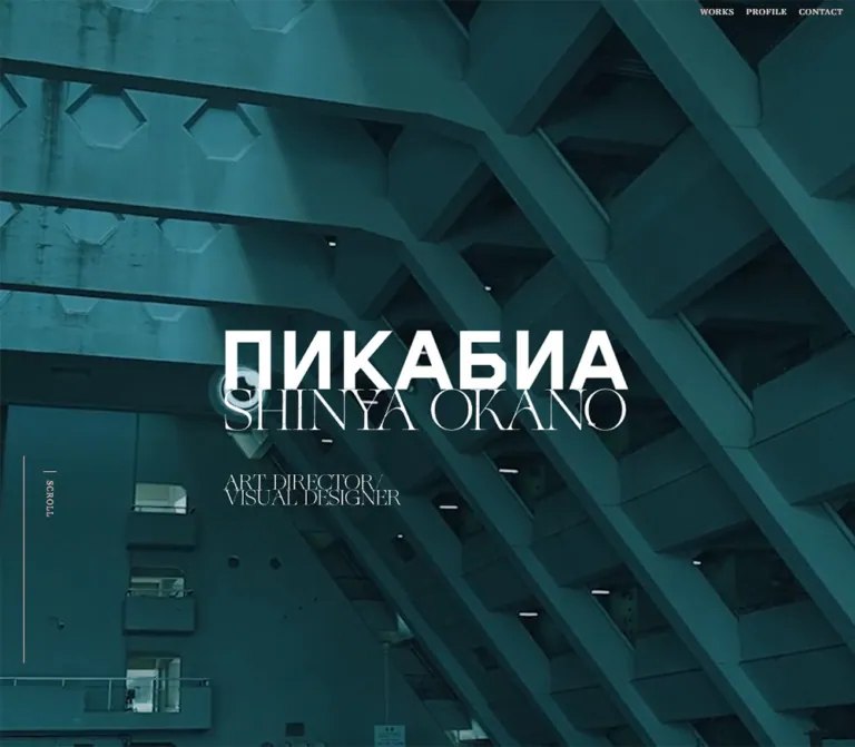
青緑の建築写真、大胆なロゴと繊細なセリフ体、黒とチャコールの余白が印象的なポートフォリオ。作品群を大きな画面構成と幾何学的な装飾で見せる。
SHINYA OKANO — Style Reference
Monumental architecture, delicate lettering, and white identity marks suspended in darkness.
Website: shinyaokano.jp Original URL: https://shinyaokano.jp/ Final URL: https://shinyaokano.jp/ Theme: dark, with a teal architectural opening, charcoal exhibition surfaces, and a visually black closing sequence. Inspected: September 23, 2026, at 06:15 JST; supplied retrieval timestamp: September 22, 2026, at 21:15:35.508 UTC. Viewports: 1440 × 1000 and 390 × 844 CSS pixels. Scope: the current homepage of Shinya Okano's personal portfolio. Visual evidence covers the desktop opening, a private-work category stage, and the footer, plus the mobile opening and footer. Rendered DOM evidence also covers the introduction, work gateways, private films, typography mosaic, profile, movie archive, skills, software, and acknowledgments. Destination pages and activated controls were not inspected.
This portfolio uses a cinematic sequence of images, artwork, and typography to introduce art director and visual designer Shinya Okano, identified on the page as 岡野真也. Its opening fills the viewport with a cool architectural scene. A heavy geometric upper mark meets a very thin serif name directly below it, creating a compact identity with unusually strong contrast between letterforms. The role descriptor sits farther down, while navigation remains small and peripheral.
The page continues as a long exhibition of work rather than a compact promotional layout. Large media fields, numbered project metadata, oversized lettering, broad intervals, and overlapping category imagery establish the rhythm. At the end, the identity returns on black, accompanied by a short navigation list, a small social row, and a solitary Back to top control. The essential relationship is between monumental imagery, fragile typography, and restrained interface furniture.
閉じる
SHINYA OKANO — Style Reference
Monumental architecture, delicate lettering, and white identity marks suspended in darkness.
Website: shinyaokano.jp Original URL: https://shinyaokano.jp/ Final URL: https://shinyaokano.jp/ Theme: dark, with a teal architectural opening, charcoal exhibition surfaces, and a visually black closing sequence. Inspected: September 23, 2026, at 06:15 JST; supplied retrieval timestamp: September 22, 2026, at 21:15:35.508 UTC. Viewports: 1440 × 1000 and 390 × 844 CSS pixels. Scope: the current homepage of Shinya Okano's personal portfolio. Visual evidence covers the desktop opening, a private-work category stage, and the footer, plus the mobile opening and footer. Rendered DOM evidence also covers the introduction, work gateways, private films, typography mosaic, profile, movie archive, skills, software, and acknowledgments. Destination pages and activated controls were not inspected.
This portfolio uses a cinematic sequence of images, artwork, and typography to introduce art director and visual designer Shinya Okano, identified on the page as 岡野真也. Its opening fills the viewport with a cool architectural scene. A heavy geometric upper mark meets a very thin serif name directly below it, creating a compact identity with unusually strong contrast between letterforms. The role descriptor sits farther down, while navigation remains small and peripheral.
The page continues as a long exhibition of work rather than a compact promotional layout. Large media fields, numbered project metadata, oversized lettering, broad intervals, and overlapping category imagery establish the rhythm. At the end, the identity returns on black, accompanied by a short navigation list, a small social row, and a solitary Back to top control. The essential relationship is between monumental imagery, fragile typography, and restrained interface furniture.
How to Read This Reference
- Measured means a value explicitly present in the supplied computed styles or element rectangles. Rectangle measurements can include transforms and do not always describe an element's ordinary layout box.
- Visual estimate means an approximate measurement or color match from an original-page capture. Estimated hex colors are implementation references, not pixel-sampled source values.
- Recommended means a proposed implementation choice. The CSS, breakpoint, accessibility additions, and simplified static layouts below are adaptations.
- Evidence scope matters: five original-page captures were supplied, but the rendered DOM covers considerably more of the page. Components without a corresponding screenshot are identified accordingly.
- Typography requires care: several sampled anchors inherit a Japanese sans-serif family and dark color while their visible labels appear white and serif. Inner lettering and compositing styles were not fully extracted. Parent styles must not be treated as a complete description of the visible label.
- All token names are reference aliases. The supplied custom-property extraction was empty; this does not establish that the complete site has no CSS variables.
Tokens — Colors
Default Palette
| Name | Value | Reference token | Evidence and role |
|---|---|---|---|
| Exhibition Charcoal | #313131 |
--surface-stage |
Measured body background, rgb(49, 49, 49); consistent with the category-stage canvas |
| Closing Black | approximately #000000 |
--surface-end |
Visual estimate from both footer captures; the sampled footer itself reports a transparent background |
| Primary White | #FFFFFF |
--text-primary |
Measured body and multiple text colors; visually dominant in identity artwork and navigation |
| Metadata Silver | #CECECE |
--text-secondary |
Measured film classifications and years |
| Intro Gray | #AFAFAF |
--text-muted |
Measured introductory Japanese paragraph |
| Notice Ink | #081517 |
--text-notice |
Measured COMING SOON text; a local content treatment |
| Deep Architectural Teal | approximately #123E43 |
--media-teal-dark |
Visual estimate for the darker architectural field; suitable as a media fallback |
| Architectural Teal | approximately #286E76 |
--media-teal |
Visual estimate for illuminated concrete surfaces in the opening image |
| Illustration Aqua | approximately #A4CBC7 |
--media-aqua |
Visual estimate for the pale, grainy architectural illustration in the category stage |
| Background Ring Gray | approximately #606060 |
--ornament-muted |
Visual estimate for the large subdued circular ornament behind the category artwork |
The interface palette is mostly neutral. Teal and aqua come principally from imagery, while text and controls remain white, silver, or dark ink. They are not evidence of a general teal button system.
The footer's black appearance and the white appearance of navigation labels cannot be explained fully by the sampled parent backgrounds and anchor colors. Descendant styling or compositing may contribute; no particular blend mode was established. A new implementation can use direct visible colors without claiming to reproduce the original rendering mechanism.
No selectable theme control was observed. The change from architectural teal to charcoal and black is part of the page's sequence.
Tokens — Typography
Editorial Serif
Measured family: aw-conqueror-didot, serif.
This family is explicitly reported for the SCROLL cue, project numbers, category metadata, years, COMING SOON, and the left side of the skills and software rows. It supplies thin strokes, sharp contrast, and an editorial tone.
The visible name lockup and navigation also have a delicate serif appearance. Their exact inner rendering was not included in the element sample, so the family above should not be asserted as the confirmed implementation of every visible serif glyph.
Technical Sans Serif
Measured family: din-2014, sans-serif.
The right-hand values in the skills, software, and acknowledgment rows use this family at weight 600. It contrasts with the serif labels through a firmer, more technical construction and wider tracking.
The VIEW MORE artwork looks like a bold condensed or compact sans serif. Its visible glyph family was not measured; using the technical family there is an adaptation.
Japanese Text
Measured body stack: yu-gothic-pr6n, followed by Hiragino Kaku Gothic Pro, Meiryo, MS PGothic, and sans-serif fallbacks.
Measured biography stack: YuGothic / Yu Gothic and sans-serif fallbacks, at weight 600.
The introduction uses a lighter weight and gray color. The biography is white and heavier, with tighter tracking. Both use a generous line height of approximately twice the font size.
Identity Artwork
The opening and footer repeat a two-level white identity: a heavy geometric upper mark and a tightly fitted, thin serif SHINYA OKANO below. Their near-contact is a defining part of the composition.
The semantic H1 is measured as a 1 × 1px box, despite having a computed 26px font size. That is not the size of the visible identity. The visible lockup should be handled as supplied artwork or carefully authored lettering; its asset type and source URL were not exposed.
Type Scale
| Role | Desktop measurement | Mobile measurement | Weight and tracking |
|---|---|---|---|
| Root sizing context | 10px |
10px |
Measured root value; not a visible text recommendation |
| Default body context | 13px / 13px |
13px / 13px |
400, 1.3px tracking |
| Introduction | 14px / 28px |
14.56px / 29.12px |
400, 0.1em tracking |
| Biography | 14px / 28px |
14.56px / 29.12px |
600, 0.05em tracking |
| SCROLL cue | 14px / 28px |
12.48px / 24.96px |
Serif 400, 0.1em tracking |
| Lead project numbers, 01–03 | 38px / 38px |
33.8px / 33.8px |
Serif 400, 1.3px tracking |
| Smaller project numbers, 04–06 | 38px / 38px |
28.08px / 28.08px |
Serif 400, 1.3px tracking |
| Lead project classification | 14px / 14px |
12.48px / 12.48px |
Serif 400, normal tracking |
| Smaller project classification | 14px / 14px |
10.4px / 10.4px |
Serif 400, normal tracking |
| Lead project year | 28px / 42px |
24.96px / 19.968px |
Serif 400, normal tracking |
| COMING SOON | 40px / 80px |
22.88px / 45.76px |
Serif 400, 0.1em tracking |
| Skills and software labels | 16px / 32px |
12.48px / 24.96px |
Serif 400, 0.05em tracking |
| Skills and software values | 16px / 32px |
12.48px / 24.96px |
DIN 600, 0.1em tracking |
Smaller mobile project years use additional variants: 20.8px / 16.64px for a compact film entry and 20.8px / 31.2px for the typography metadata. The page does not reduce all typography by one uniform factor.
Display Measurements and Limitations
| Element | Desktop | Mobile | Status |
|---|---|---|---|
| Opening identity artwork | About 680 × 170px |
About 310 × 78px |
Visual estimate of visible artwork |
| Role descriptor | About 36px type, two tightly spaced lines |
About 24px type, two lines |
Visual estimate; inner styles unavailable |
| WORKS heading container | 77px high |
43.5px high |
Measured outer box, not glyph size |
| PRIVATE WORKS heading container | 154px high |
82.33px high |
Measured outer box, not glyph size |
| First film title container | 147px high |
99.56px high |
Measured outer box containing layered lettering |
| Footer navigation link boxes | 16px high |
14.56px high |
Measured boxes; visible primary links are italic serif |
Repeated text such as WORKSWORKS and DRIFTER DRIFTER appears in the extraction. The screenshots show single readable navigation labels. These repetitions are consistent with layered lettering, but do not independently prove a particular hover or reveal animation.
Tokens — Spacing & Shapes
Density: sparse at the page scale, tightly composed within identity marks and metadata.
The spacing system alternates between small editorial details and very large scene intervals. The page should not be normalized into evenly padded cards.
Spacing Scale
| Use | Desktop | Mobile | Evidence |
|---|---|---|---|
| Main content left inset | 90px |
About 20.8px |
Measured across multiple sections |
| Main content right inset | 60px where sampled |
About 20.8px for text columns |
Measured |
| Header top / right offset | 13px / 20px |
Text header replaced visually | Measured desktop header |
| Header link gap | 20px |
Not applicable to visible mobile header | Calculated from adjacent link rectangles |
| VIEW MORE bottom padding | 15px |
7.8px |
Measured for work and category gateways |
| Footer link row pitch | 36px |
About 29.11px |
Calculated from consecutive link positions |
| Lottie-section top padding | 160px |
83.2px |
Measured |
| Private-film section top padding | 310px |
78px |
Measured |
| Profile top padding | 400px |
182px |
Measured |
| Archive top padding | 190px |
104px |
Measured |
| Skills-section top padding | 190px |
93.6px |
Measured |
Border Radius
| Element | Treatment | Evidence |
|---|---|---|
| Media panels and typography tiles | Square corners | Visible category image; sampled anchor radii are 0px |
| Ordinary navigation and metadata | Unboxed | Visible captures |
| VIEW MORE arrow surround | Circular | Desktop category capture |
| Mobile menu ornament | Circular envelope made from fine overlapping polygonal lines | Mobile captures |
| Desktop edge ornament | Small circular wire motif | Opening capture; function unverified |
No recurring rounded-card, pill, or shadow system is visible. The circular shapes operate as ornaments and control details against rectangular media.
Layout Measurements
| Element | Desktop | Mobile | Interpretation |
|---|---|---|---|
| Hero section | 1440 × 1000px |
390 × 844px |
Exactly one captured viewport |
| Total document height | 20,668.31px |
15,950.22px |
Snapshot values; not implementation targets |
| Introductory paragraph | About 457.25px bounding width |
348.39px width |
Desktop rectangle may include a transform |
| Biography column | 400px wide |
348.39px wide |
Right-side desktop column becomes mobile text width |
| Typography tile | 450 × 270px |
195 × 117px |
Same 5:3 ratio |
| VIEW MORE anchor | 132 × 58px |
About 90.47 × 36.91px |
Measured standard gateway variant |
| Mobile BLOG anchor | — | About 136.23 × 57.19px |
Larger than the mobile VIEW MORE variant |
| Category-stage section | 1440 × 1000px |
390 × 844px |
Viewport-sized stage |
| Footer | 965px high |
About 592.09px high |
Measured section boxes |
Components
Persistent Navigation
Role: keeps the main site destinations available around the visual sequence.
The desktop header contains WORKS, PROFILE, and CONTACT in a single line at the upper right. Its measured box begins at x ≈ 1178.86px, y = 13px, and is approximately 241.14 × 14px. Adjacent links have 20px gaps, and the group ends 20px from the right edge.
The captures show delicate white serif labels without a filled header bar. The same group remains visible in the desktop category and footer captures, supporting its visually persistent placement. Exact positioning declarations were not included.
On mobile, the visible text navigation is replaced by a circular menu affordance near the upper-right corner. Its outer motif is approximately 70px across, at x ≈ 315px, y ≈ 22px. Fine overlapping polygonal outlines surround short horizontal menu strokes. The closed appearance is visible in both mobile captures; the open state and activation behavior are unverified.
The DOM contains TOP, WORKS, work categories, PROFILE, CONTACT, and social destinations in an additional navigation structure. Its presence does not establish the appearance of the opened menu.
Architectural Opening and Identity
Role: introduces the designer through atmosphere and a strong identity composition.
The architectural field covers the entire viewport without a visible frame. The desktop capture includes horizontal concrete galleries at left and diagonal structural circulation at right. The image is dark, cool, and teal, with brighter concrete areas providing enough separation for the white lettering.
The identity artwork begins around x = 380px, y = 428px on desktop. Its roughly 680px width is centered, but the two-line role descriptor aligns with its left edge. The descriptor begins around y = 670px, leaving approximately 70–75px of breathing room below the main lockup.
At 390 × 844, the lockup begins around x = 39px, y = 387px and spans about 80% of the viewport width. The descriptor starts around y = 488px, with a much smaller gap of approximately 24px.
A vertical SCROLL label sits at the left. Its measured desktop box is x = 69px, y = 550px, with a small horizontal rule visible above it. Mobile moves it lower, to x ≈ 33.25px, y ≈ 645.34px. This is an independent compositional anchor, not a caption attached to the identity block.
A small wire circle appears near the desktop right edge at mid-height. No evidence establishes whether it follows the pointer, activates a control, or serves only as decoration.
Introduction and Work Gateways
Role: provides a short design-positioning statement and access to broader collections.
The introductory Japanese copy is measured in muted gray, at 14px / 28px on desktop and 14.56px / 29.12px on mobile. Its line spacing is substantially more relaxed than the default body context.
The WORKS section follows with a left-aligned heading and a VIEW MORE link to /works. A subsequent gateway links to /project-type/lottie. Desktop positions those gateways asymmetrically: the WORKS control ends near the right content edge, while the Lottie control starts at the left inset.
The DOM establishes these sections and their spacing, but the supplied screenshots do not expose their complete media contents. Do not invent a uniform project-card pattern for these regions.
VIEW MORE Link
Role: opens a collection without using a large filled call-to-action button.
The clearest visible example sits over the lower portion of the desktop category stage. Its anatomy is a stacked VIEW / MORE label on the left, a pale circular arrow surround on the right, and a fine horizontal rule beneath. PRIVATE WORKS appears as a smaller caption below.
The measured anchor is 132 × 58px, including 15px bottom padding. The visible circular element is approximately 43px across. The lettering looks bold and sans serif, contrasting with the surrounding delicate display type.
The standard mobile gateway is approximately 90.47 × 36.91px, with 7.8px bottom padding. This is a visual scale reduction; a new implementation should provide a larger invisible touch area where necessary.
The category gateway points to /project-type/private-work. Its triangular symbol indicates navigation in this context and is not evidence of media playback.
Numbered Private-Film Feature
Role: groups media, title lettering, catalog metadata, and a playback affordance.
The first three entries are DRIFTER, HELPLESS, and PRISTINE. Their metadata combines a serif number, the stacked classification PRIVATE / WORK / MOVIE, and the year 2020. Titles use separate letter elements and duplicated strings in the extraction.
On desktop, the metadata starts around the 90px content inset. The first title container begins around x = 203.56px, leaving about 50px between the metadata column and the title. A PLAY anchor sits toward the right edge.
On mobile, the title moves below the metadata at approximately the 20.8px inset. The lead PLAY anchor occupies about 87.36 × 118.55px toward the right, preserving a distinct control area alongside the metadata.
The later LIFE IN BRUTALISM and UNTITLED entries use a smaller mobile metadata scale. COMING SOON is explicitly present for the upcoming entry.
These details are supported by the DOM rather than a supplied full feature screenshot. The media's exact composition and the result of activating PLAY remain unverified. Several playback anchors target #, which is insufficient to determine player, dialog, audio, or fullscreen behavior.
Original Typography Mosaic
Role: displays multiple typographic experiments as a continuous sheet.
Six link boxes form a flush mosaic. Desktop has three columns and two rows, with 450 × 270px tiles after a 90px left inset. Mobile changes to two columns and three rows, with 195 × 117px tiles spanning the full viewport width.
The shared ratio is exactly 5:3. Tile boundaries meet without measured gaps. Number 06, ORIGINAL TYPOGRAPHY metadata, and the year 2020 accompany this group.
The box geometry is measured, but the artwork itself is not shown in the supplied viewport captures. Preserve this distinction when selecting replacement artwork or deciding whether a particular image should be cropped.
Private-Work Category Stage
Role: turns collection navigation into a large layered visual event.
The desktop capture shows a charcoal viewport with oversized black serif lettering extending beyond both horizontal edges. A subdued circular outline occupies the background. Fine intersecting outlines continue around the lower part of the composition.
A grainy aqua architectural illustration sits in front, approximately from x = 215px to 1225px and y = 335px to 815px: about 1010 × 480px, or 70% of viewport width. Its square corners, pale field, intricate linework, and wide ratio distinguish it from the darker photographic opening. Another image edge is visible behind it.
The VIEW MORE control is centered near the foreground image's lower edge. This overlap connects navigation with the artwork rather than placing a separate button row beneath a conventional card.
The DOM identifies three category destinations: photography, illustration, and graphic design, numbered 07–09. Their sampled desktop rectangles overlap at approximately 988 × 468px; the image shown in the capture is slightly larger. These are different sampled states, not contradictory fixed dimensions.
The mobile category rectangles are approximately 507 × 240.15px with negative horizontal positions in the supplied DOM state. No mobile screenshot of this stage was supplied. Those coordinates must not be treated as a verified resting layout or intentionally permanent crop.
Profile
Role: introduces the person behind the work and provides biography, recognition, and social access.
The content hierarchy is PROFILE, the designer's name and role, Japanese biography paragraphs, awards, and BLOG. The BLOG destination is the designer's external publication.
Desktop separates these elements across the page. The section heading begins at x = 90px; the biography is a 400px column at x = 980px; a vertical social rail uses 22 × 22px boxes at x = 850px.
On mobile, the biography becomes a 348.39px column at x ≈ 20.8px. The social boxes increase to approximately 26.52px and sit near the upper-right side of the profile region. The text appears later in the vertical sequence instead of sharing its desktop horizontal position.
Use white, medium-weight Japanese text with 2 line height. The available evidence does not justify specifying an unseen portrait crop or profile-image arrangement.
Movie Archive
Role: presents the additional numbered movie collection, labeled 10–20 and 2012–2020.
The mobile DOM gives a particularly clear structural reference: three full-width rows of approximately 390 × 109.77px, followed by four rows containing two 195 × 109.77px links each. The wide rows are approximately 32:9; the paired tiles are approximately 16:9.
Desktop rectangles are larger than the viewport in several places and overlap vertically. Their measured widths include 1755px for wide rows and 877.5px for half rows. Treat these as transformed bounds from the inspected state, not as a standard CSS grid width to copy.
The archive is another media-led section. The supplied evidence does not show its complete frames or activated playback state.
Skills, Software, and Acknowledgments
Role: closes the professional introduction with a compact roster.
Rows pair an editorial serif label with a more strongly tracked DIN value. Desktop uses 16px / 32px; mobile uses 12.48px / 24.96px. Mobile row cells divide the viewport into two measured 195px halves, with approximately 7.8px padding facing the central division.
The groups are SKILL, SOFTWARE, and SPECIAL THANKS. Skill labels include Art Direction, Web & Graphic Design, Lottie Animation, Photography, Motion Graphics, and illustration.
Under SPECIAL THANKS, the original page explicitly pairs Frontend Engineer with MASARU SEYA Snipe Inc. This wording is directly supported by the rendered homepage.
The desktop row rectangles show substantial transforms, while mobile rectangles are regular and evenly aligned. The source also supplies staggered transition delays for these rows; the exact visual transformation is not available.
Closing Statement and Footer
Role: ends the portfolio with a second identity moment and a restrained route back into the site.
The mobile capture shows LIFE IS / COMING / BACK above the footer identity. LIFE IS uses a delicate serif appearance; COMING and BACK use angular sans-serif lettering. The phrase is visible artwork, but its exact font or asset implementation was not exposed. The desktop footer capture includes only a clipped fragment of this preceding statement.
The footer repeats the opening identity on a visually black field. Desktop visible artwork is approximately 680px wide and centered. Mobile expands it to nearly the entire inner width, approximately 340–348px.
Beneath the identity, WORKS, PROFILE, BLOG, and CONTACT form an italic serif list at left. Vimeo, X, and Instagram sit in a short horizontal row at right. The mobile layout preserves this side-by-side relationship: the social row begins around x = 215px, rather than moving beneath the complete navigation list.
A large empty interval separates those links from Back to top. Desktop shows a fine vertical line approximately 76px long above the label. Only a short segment is visible in the mobile capture; its final length or animation phase cannot be determined from that frame.
The return link explicitly targets #hero. The DOM also contains SHINYA OKANO © 2023. That copyright text is page content and does not date the inspected design.
Opening Layer — DOM Evidence Only
A separate full-viewport section contains Yes, ...only when I design. It shares the hero's initial origin and has a delayed transition declaration. The supplied settled captures do not show it.
This supports the presence of an opening layer, but not a detailed reconstruction of its appearance, loading logic, or complete animation sequence. It should not be added as a second permanent full-height content section based solely on the extraction.
Tokens — Motion & Interaction
Measured Transition Declarations
| Element | Supplied computed transition | What is established |
|---|---|---|
| Opening layer | 1.7s cubic-bezier(0.785, 0.135, 0.15, 0.86) 3.8s |
A delayed transition is declared on the full-viewport opening section |
| SCROLL cue | 1.2s cubic-bezier(0.19, 1, 0.22, 1) 3.2s |
A delayed transition is declared on the cue |
| Profile social links | 0.7s cubic-bezier(0.19, 1, 0.22, 1) |
Transition timing is measured; changed properties and trigger are unspecified |
| Skills and software rows | 1.8s cubic-bezier(0.19, 1, 0.22, 1) |
Long eased transitions with staggered delays |
| Row stagger | 0.08s increments, reaching 1.28s for the acknowledgment row |
A measured sequence of per-row delays |
| Small closing element after roster | 1s cubic-bezier(0.39, 0.575, 0.565, 1) 1.36s |
Timing is measured; the element's visual content is not established |
These are computed declarations, not recordings of complete transitions. The easing favors a decisive initial movement followed by a long settling phase. A reusable adaptation can preserve that rhythm without reproducing the multi-second startup delay.
Observed Interaction Evidence and Limits
- The capture process traversed the page vertically and supplied later category and footer states.
- Header navigation remains visible in the supplied desktop states; the mobile circular menu affordance remains visible at the opening and footer.
- Collection links, social destinations, BLOG, and the
#heroreturn target are explicit in the rendered DOM. - No menu opening, hover sequence, PLAY activation, form submission, or destination-page visit was supplied.
- Overlapping category rectangles, split lettering, and transformed archive and roster bounds suggest a choreographed presentation. They do not establish a particular scrolling library, pinning implementation, or scrub timeline.
- The architectural opening could be a still or a frame of moving media. Its media type, autoplay behavior, sound, and loop duration are unverified.
- An
animation: noneentry on sampled elements does not rule out animation on descendants, other layers, or JavaScript-driven transforms. Baretransition: allentries provide no useful duration evidence.
Recommended adaptation: keep content visible by default, enhance it with optional eased reveals, and provide a reduced-motion path. If a new implementation uses background video, pause it through application logic when reduced motion is requested; CSS alone cannot stop video playback.
Surfaces
| Layer | Appearance | Purpose |
|---|---|---|
| Opening field | Full-viewport teal architectural imagery | Establishes atmosphere and structural scale |
| Identity overlay | White artwork and small white labels | Creates a clear focal point without a panel |
| Exhibition canvas | Flat charcoal | Supports artwork, oversized lettering, and scene transitions |
| Foreground category media | Pale aqua illustration with square edges | Introduces texture and brightness within the dark page |
| Background typography | Oversized dark serif lettering, visibly cropped | Adds scale and depth without a separate surface |
| Wire ornaments | Fine white or gray circular and polygonal lines | Connects controls and decorative geometry |
| Closing field | Visually black | Isolates the repeated identity and navigation |
Depth comes from overlap, contrast, scale, and linework. No visible card-elevation system is needed to explain the supplied captures.
Imagery
The opening architecture provides the dominant visual material: weathered concrete, repetitive openings, strong horizontal bands, diagonal circulation, shadowed voids, and cool teal coloration. The composition balances an almost documentary subject with a carefully controlled color mood.
The category illustration carries the same architectural interest into a different medium. Its dense line drawing, speculative building forms, grain, and pale aqua field contrast with the photographic opening while preserving thematic continuity.
Use meaningful architectural geometry when adapting this direction. The image should contain broad planes and clear structural lines that remain legible behind the identity. A random teal texture would retain the color but lose the composition.
The white identity requires its own artwork discipline. Heavy geometric lettering and extremely thin serif forms are fitted into one lockup; simply stacking a bold heading above ordinary body text will not reproduce it.
Observed Asset References
| Visual | Evidence | Asset information available |
|---|---|---|
| Architectural opening | Desktop and mobile hero captures | No source media URL or file type supplied |
| Two-level identity | Both hero and footer captures | No asset URL or rendering format supplied |
| Aqua architectural illustration | Desktop category-stage capture | No source image URL supplied |
| Wire circle and polygon motifs | Desktop hero, category stage, and mobile menu | No SVG paths or animation definitions supplied |
| LIFE IS COMING BACK artwork | Mobile closing capture; partial desktop fragment | No source font assignment or asset path supplied |
| Typography and movie collections | Rendered DOM structure | Full artwork not present in the supplied viewport captures |
Use authorized assets when available. Do not invent original asset filenames or assume the site's routes are direct media URLs. Image grain belongs to the illustrated artwork; no global pixelated rendering treatment was established.
Layout & Responsive Behavior
The page preserves its visual identity across viewports while changing composition substantially. It is not a desktop layout uniformly scaled to phone width.
| Area | Desktop observation | Mobile observation |
|---|---|---|
| Hero | Full viewport; centered identity about 680px wide |
Full viewport; identity about 80vw |
| Background crop | Horizontal galleries and diagonal structure both visible | Tighter crop dominated by horizontal facade bands |
| Navigation | Small upper-right text links | Circular wire menu affordance |
| SCROLL cue | Near 55% viewport height |
Near 76.5% viewport height |
| Main text inset | Mostly 90px left and 60px right |
About 20.8px on both sides |
| Film information | Metadata, title, and play affordance distributed horizontally | Title below metadata; playback area remains toward the right |
| Typography mosaic | Three columns | Two columns, edge to edge |
| Biography | 400px right-side column |
348.39px main text column |
| Skills roster | Transformed desktop bounds in supplied state | Two equal-width cells per row |
| Footer links | Navigation left, social row right within a 680px region |
Same relationship within approximately 348px |
Many mobile values are consistent with scaling a 375px reference width to 390px: for example, 20 → 20.8px and 14 → 14.56px. This is a numerical observation, not a verified source formula. Root and default body sizes remain unchanged, and other mobile values use different ratios.
The category-stage start and profile-section start are separated by exactly five viewport heights in both DOM snapshots: 5000px on desktop and 4220px on mobile. That establishes substantial scroll allocation around the category sequence. It does not prove five slides, a five-screen pin, or a particular scroll effect. A new implementation should map any extended scroll space to actual content or animation progress.
The only inspected widths are 1440px and 390px. Tablet composition, landscape behavior, exact breakpoints, safe-area handling, and behavior with expanded browser text were not established. The Quick Start uses a recommended 767px breakpoint and a simplified mobile category stage.
Do’s and Don’ts
Do
- Pair a heavy geometric identity mark with delicate serif lettering.
- Keep the opening architectural field large enough for its structural lines to remain part of the composition.
- Preserve charcoal and black as distinct visible stages.
- Let imagery provide teal and aqua while interface controls stay mostly neutral.
- Use small peripheral navigation and compact numbered metadata.
- Keep the role descriptor aligned with the identity's left edge.
- Retain square media boundaries and the flush typography mosaic.
- Use fine circular and polygonal linework sparingly.
- Preserve the mobile footer's navigation-left, socials-right relationship where content fits.
- Separate measured typography from transformed heading boxes and artwork dimensions.
Don't
- Don't replace the portfolio sequence with generic feature cards, pricing blocks, or repeated conversion banners.
- Don't infer the visible logo size from the clipped H1's
26pxcomputed font size. - Don't copy dark anchor parent colors when the visible label is white.
- Don't turn every collection link into a filled teal pill.
- Don't add soft shadows, glass panels, or large corner radii to the media system.
- Don't treat the desktop edge circle as a confirmed custom cursor.
- Don't infer video autoplay or a player modal from a PLAY label or an architectural frame.
- Don't reproduce negative mobile category coordinates as the default layout.
- Don't make every mobile text size a scaled version of the desktop size.
- Don't hardcode the full document height or add empty scroll distance without a working visual sequence.
Recommended Implementation Additions
These are recommendations for a new implementation, not verified features of the inspected site.
- Give the mobile menu button an accessible name, expose its expanded state, and manage keyboard focus when its panel opens.
- Keep one accessible label per navigation link and title. Mark duplicate visual lettering as decorative where appropriate.
- Provide one meaningful H1 and an accessible name for identity artwork.
- Increase invisible hit areas for small mobile VIEW MORE links and social icons to at least
44 × 44pxwithout enlarging every visible glyph. - Preserve visible keyboard focus across black, charcoal, and photographic surfaces.
- Supply a static media fallback and reduced-motion behavior. Essential content should remain available if animation code fails.
- Test thin white lettering against the brightest frames or crops of the hero asset. Use an image-specific contrast treatment if required.
- Give any implemented player a clear close or pause control, keyboard operation, and appropriate text alternatives or captions.
- Test roster labels and the footer social row with text enlargement; allow wrapping before content becomes clipped.
Agent Prompt Guide
Quick Color Reference
- Exhibition canvas: measured
#313131. - Closing field: visually black; adaptation
#000000. - Primary text and identity:
#FFFFFF. - Project metadata: measured
#CECECE. - Introductory copy: measured
#AFAFAF. - Architectural media: approximate dark teal
#123E43and teal#286E76. - Illustrated category media: approximate aqua
#A4CBC7. - Controls: restrained white or silver linework, with small circular details.
Overall Prompt
“Build an editorial portfolio for an art director and visual designer using a full-viewport architectural opening, charcoal exhibition sections, and a black closing scene. Center an authorized two-level identity artwork that combines a heavy geometric upper mark with a tightly fitted, very thin serif name. Align a two-line role descriptor beneath its left edge. Keep desktop navigation small at the upper right and use a fine polygonal circular menu affordance on mobile. Present work through large media, numbered serif metadata, a flush typography mosaic, and an overlapping architectural category stage. Use white, silver, and muted gray interface text; let the images carry teal and aqua. Preserve generous scene spacing, square media corners, and restrained controls. Implement responsive reflow and reduced motion without assuming unverified playback or scrolling behavior.”
Example Component Prompts
- Hero: “Create a full-viewport dark teal architectural hero with a centered white identity artwork approximately 680px wide at 1440px. Position it around 43% from the top. Place a tightly led serif role descriptor below its left edge and a small vertical SCROLL cue at the left. At 390px, use an approximately 80vw identity, reduce the descriptor gap, move the scroll cue lower, and art-direct the image crop.”
- Collection gateway: “Create a compact VIEW / MORE navigation link with stacked bold lettering, a pale circular surround containing a thin triangular arrow, and a fine rule beneath. Use a 132 × 58px desktop composition. Keep the mobile visual smaller while retaining a comfortable touch target.”
- Category stage: “Place a wide, grainy aqua architectural illustration over a charcoal viewport. Add oversized cropped black serif lettering and a subdued circular wire motif behind the image. Center a small collection gateway across the image's lower edge. Use a readable static mobile composition unless a complete scroll sequence is explicitly implemented.”
- Typography mosaic: “Create six square-cornered artwork tiles with a 5:3 aspect ratio and no gaps. Use three columns after a 90px desktop left inset, then two edge-to-edge columns on mobile. Keep project number and classification separate from the artwork.”
- Footer: “Build a black footer with a large repeated white identity. Place four italic serif navigation links at left and a short regular serif social row at right. Preserve that relationship on a 390px screen when space permits. Leave a substantial empty interval before a centered Back to top link marked by a fine vertical line.”
Quick Start
CSS Custom Properties
This is a static implementation foundation, not extracted source CSS. It keeps a conventional root font size and uses direct visible colors. Exact values are retained where supported; artwork placement, descriptor sizing, the breakpoint, and the mobile category layout are adaptations.
The family names below come from the supplied computed styles. Load appropriately licensed fonts separately. The CSS expects authorized media and identity artwork in the indicated elements; it does not fabricate their source URLs. The ring classes expect an inline SVG or supplied ornament asset.
:root {
  /* Measured neutral colors */
  --surface-stage: #313131;
  --text-primary: #ffffff;
  --text-secondary: #cecece;
  --text-muted: #afafaf;
  --text-notice: #081517;

  /* Visual estimates used for this adaptation */
  --surface-end: #000000;
  --media-fallback: #123e43;
  --ornament-muted: #606060;

  /* Families reported in the supplied evidence */
  --font-editorial: 'aw-conqueror-didot', serif;
  --font-technical: 'din-2014', sans-serif;
  --font-japanese: 'yu-gothic-pr6n',
    'Hiragino Kaku Gothic Pro', Meiryo, sans-serif;
  --font-biography: YuGothic, 'Yu Gothic', sans-serif;

  --inset-left: 90px;
  --inset-right: 60px;
  --body-size: 14px;
  --identity-width: 680px;
  --footer-width: 680px;
  --rule: 1px;

  /* Measured easing; optional reveal distance is an adaptation */
  --ease-out: cubic-bezier(0.19, 1, 0.22, 1);
  --reveal-duration: 1.8s;
}

* { box-sizing: border-box; }

body { margin: 0; }

.portfolio {
  color: var(--text-primary);
  background: var(--surface-stage);
  font: 400 13px/1 var(--font-japanese);
  letter-spacing: 0.1em;
}

.portfolio a {
  color: inherit;
  text-decoration: none;
}

.portfolio img,
.portfolio video {
  display: block;
  max-width: 100%;
}

.portfolio :focus-visible {
  outline: 2px solid currentColor;
  outline-offset: 5px;
}

.sr-only {
  position: absolute;
  width: 1px;
  height: 1px;
  padding: 0;
  margin: -1px;
  overflow: hidden;
  clip-path: inset(50%);
  white-space: nowrap;
  border: 0;
}

/* Visible navigation typography is an approximation. */
.site-nav {
  position: fixed;
  z-index: 20;
  top: 13px;
  right: 20px;
  display: flex;
  gap: 20px;
  font: 400 14px/1 var(--font-editorial);
}

.mobile-menu {
  display: none;
  position: fixed;
  z-index: 30;
  top: 22px;
  right: 5px;
  width: 70px;
  height: 70px;
  padding: 0;
  color: var(--text-primary);
  background: transparent;
  border: 0;
  cursor: pointer;
}

.wire-ring {
  width: 100%;
  height: 100%;
  fill: none;
  stroke: currentColor;
  stroke-width: 0.65;
}

.wire-ring * { vector-effect: non-scaling-stroke; }

.mobile-menu__bars,
.mobile-menu__bars::before,
.mobile-menu__bars::after {
  position: absolute;
  width: 20px;
  height: 1px;
  background: currentColor;
}

.mobile-menu__bars {
  top: 35px;
  left: 25px;
}

.mobile-menu__bars::before,
.mobile-menu__bars::after { content: ''; left: 0; }
.mobile-menu__bars::before { top: -7px; }
.mobile-menu__bars::after { top: 7px; }

.hero {
  position: relative;
  isolation: isolate;
  min-height: 100vh;
  min-height: 100svh;
  overflow: clip;
  background: var(--media-fallback);
}

.hero__media {
  position: absolute;
  z-index: -1;
  inset: 0;
  width: 100%;
  height: 100%;
  max-width: none;
  object-fit: cover;
  object-position: 50% 50%;
}

.hero__identity {
  position: absolute;
  top: 42.8%;
  left: 50%;
  width: min(var(--identity-width), 80vw);
  transform: translateX(-50%);
}

.identity-lockup { display: block; width: 100%; height: auto; }

/* Descriptor sizes and leading are visual approximations. */
.hero__role {
  margin: 72px 0 0;
  font: 400 36px/0.78 var(--font-editorial);
  letter-spacing: -0.03em;
}

.hero__scroll {
  position: absolute;
  top: 55%;
  left: 69px;
  margin: 0;
  writing-mode: vertical-rl;
  font: 400 14px/2 var(--font-editorial);
  letter-spacing: 0.1em;
}

.hero__scroll::before {
  content: '';
  position: absolute;
  top: -15px;
  left: 4px;
  width: 22px;
  height: var(--rule);
  background: currentColor;
}

.hero__ornament {
  position: absolute;
  top: 50%;
  right: 20px;
  width: 50px;
  height: 50px;
  transform: translateY(-50%);
  pointer-events: none;
}

.section-inset {
  padding-inline: var(--inset-left) var(--inset-right);
}

.intro-copy {
  max-width: 460px;
  color: var(--text-muted);
  font: 400 var(--body-size)/2 var(--font-japanese);
  letter-spacing: 0.1em;
}

.project-number {
  margin: 0;
  font: 400 38px/1 var(--font-editorial);
  letter-spacing: 1.3px;
}

.project-kind {
  margin: 5px 0 0;
  color: var(--text-secondary);
  font: 400 14px/1 var(--font-editorial);
  letter-spacing: normal;
}

.project-year {
  margin: 0;
  color: var(--text-secondary);
  font: 400 28px/1.5 var(--font-editorial);
  letter-spacing: normal;
}

.type-grid {
  display: grid;
  grid-template-columns: repeat(3, minmax(0, 1fr));
  gap: 0;
  padding-left: var(--inset-left);
}

.type-grid__tile {
  aspect-ratio: 5 / 3;
  overflow: hidden;
  border-radius: 0;
}

.type-grid__tile img {
  width: 100%;
  height: 100%;
  object-fit: contain;
}

/* Static composition based on the desktop category capture. */
.category-stage {
  position: relative;
  isolation: isolate;
  display: grid;
  place-items: center;
  min-height: 100vh;
  min-height: 100svh;
  overflow: clip;
  background: var(--surface-stage);
}

.category-stage__word {
  position: absolute;
  z-index: 1;
  top: 42%;
  left: 50%;
  margin: 0;
  transform: translateX(-50%);
  color: var(--surface-end);
  white-space: nowrap;
  font: 400 clamp(80px, 11.2vw, 170px)/1 var(--font-editorial);
  letter-spacing: 0;
  pointer-events: none;
}

.category-stage__ring {
  position: absolute;
  z-index: 0;
  top: 50%;
  left: 50%;
  width: min(660px, 80vw);
  aspect-ratio: 1;
  color: var(--ornament-muted);
  transform: translate(-50%, -50%);
  pointer-events: none;
}

.category-stage__image {
  position: relative;
  z-index: 2;
  width: min(1010px, 70.14vw);
  aspect-ratio: 101 / 48;
  object-fit: cover;
  transform: translateY(75px);
}

.view-more {
  display: grid;
  grid-template-columns: 1fr 43px;
  align-items: center;
  gap: 16px;
  width: 132px;
  min-height: 58px;
  padding-bottom: 15px;
  border-bottom: var(--rule) solid currentColor;
  font: 600 24px/0.9 var(--font-technical);
  letter-spacing: 0.02em;
}

.view-more__arrow {
  display: grid;
  place-items: center;
  width: 43px;
  height: 43px;
  border-radius: 50%;
  color: var(--text-notice);
  background: var(--text-secondary);
}

.view-more__arrow svg {
  width: 27px;
  height: 33px;
  fill: none;
  stroke: currentColor;
  stroke-width: 1;
}

.category-stage__gateway {
  position: absolute;
  z-index: 3;
  top: 74.7%;
  left: 50%;
  transform: translateX(-50%);
}

.category-stage__caption {
  margin: 10px 0 0;
  text-align: center;
  color: var(--text-secondary);
  font: 600 16px/1 var(--font-technical);
  letter-spacing: 0.03em;
}

.profile-layout {
  display: grid;
  grid-template-columns: minmax(0, 1fr) 22px 400px;
  column-gap: 108px;
}

.profile-copy {
  font: 600 var(--body-size)/2 var(--font-biography);
  letter-spacing: 0.05em;
}

.profile-social {
  display: grid;
  align-content: start;
  gap: 9px;
}

.site-footer {
  min-height: 965px;
  padding: 50px 0;
  background: var(--surface-end);
}

.site-footer__inner {
  width: min(var(--footer-width), calc(100% - 40px));
  margin-inline: auto;
  padding-top: 150px;
}

.site-footer__links {
  display: flex;
  justify-content: space-between;
  align-items: flex-start;
  gap: 20px;
  margin-top: 43px;
  font: 400 16px/1 var(--font-editorial);
}

.site-footer__nav {
  display: grid;
  gap: 20px;
  font-style: italic;
}

.site-footer__social {
  display: flex;
  flex-wrap: wrap;
  gap: 20px;
}

.back-top {
  display: flex;
  flex-direction: column;
  align-items: center;
  gap: 18px;
  width: max-content;
  margin: 224px auto 0;
  font: 400 14px/1 var(--font-editorial);
}

.back-top::before {
  content: '';
  width: var(--rule);
  height: 76px;
  background: currentColor;
}

/* Optional enhancement: content remains visible by default. */
.reveal {
  transition:
    opacity var(--reveal-duration) var(--ease-out),
    transform var(--reveal-duration) var(--ease-out);
  transition-delay: var(--reveal-delay, 0s);
}

.portfolio[data-motion-ready='true'] .reveal[data-pending='true'] {
  opacity: 0;
  transform: translateY(24px);
}

/* Recommended breakpoint; the original breakpoint is unknown. */
@media (max-width: 767px) {
  :root {
    --inset-left: 5.333333vw;
    --inset-right: 5.333333vw;
    --body-size: clamp(14px, 3.733333vw, 16px);
  }

  .site-nav { display: none; }
  .mobile-menu { display: block; }
  .hero__ornament { display: none; }

  .hero__identity { top: 45.85%; }

  /* Starting crop only; adjust to the supplied media asset. */
  .hero__media { object-position: 20% 50%; }

  .hero__role {
    margin-top: 24px;
    font-size: 24px;
  }

  .hero__scroll {
    top: 76.46%;
    left: 8.52564vw;
    font-size: 12.48px;
  }

  .project-number { font-size: 33.8px; }
  .project-kind { font-size: 12.48px; }
  .project-year { font-size: 24.96px; line-height: 0.8; }

  .type-grid {
    grid-template-columns: repeat(2, minmax(0, 1fr));
    padding-left: 0;
  }

  /* Recommended static fallback; no mobile stage capture exists. */
  .category-stage__image {
    width: calc(100% - var(--inset-left) - var(--inset-right));
    transform: none;
  }

  .category-stage__gateway { top: auto; bottom: 14%; }

  .profile-layout { display: block; }
  .profile-social { width: 27px; margin-left: auto; }

  .site-footer {
    min-height: 592px;
    padding: 67.6px 0 26px;
  }

  .site-footer__inner {
    width: calc(100% - var(--inset-left) - var(--inset-right));
    padding-top: 76px;
  }

  .site-footer__links {
    margin-top: 20px;
    gap: 16px;
    font-size: 14.56px;
  }

  .site-footer__nav { gap: 14.55px; }
  .site-footer__social { gap: 10.4px; }

  .back-top { margin-top: 140px; gap: 14px; }
  .back-top::before { height: 40px; }
}

@media (prefers-reduced-motion: reduce) {
  .portfolio .reveal {
    opacity: 1 !important;
    transform: none !important;
    transition: none !important;
  }
}
The mobile CSS deliberately retains the larger VIEW MORE control and uses a stable 40px return rule as recommendations. The smaller measured source link dimensions and the partial mobile rule remain documented above. Add explicit variants only when their touch areas and final visual state have been tested.
For the arrow, this small markup fragment supplies the geometry expected by the CSS. The URL is a collection destination observed in the rendered homepage; the SVG is an implementation approximation.
<a class="view-more" href="https://shinyaokano.jp/project-type/private-work">
  <span>VIEW<br>MORE</span>
  <span class="view-more__arrow" aria-hidden="true">
    <svg viewBox="0 0 27 33">
      <path d="M2 2 L25 16.5 L2 31 Z" />
    </svg>
  </span>
</a>
Menu activation, playback, the closing statement artwork, and any extended scroll choreography require separate implementation. The CSS does not establish those behaviors.
Tailwind v4 Token Mapping
Optional mapping for a project already using Tailwind v4. These are adaptation aliases, not evidence of the original site's framework.
@theme inline {
  --color-stage: var(--surface-stage);
  --color-ending: var(--surface-end);
  --color-foreground: var(--text-primary);
  --color-secondary: var(--text-secondary);
  --color-muted: var(--text-muted);

  --font-display: var(--font-editorial);
  --font-utility: var(--font-technical);
  --font-body: var(--font-japanese);

  --spacing-page-left: var(--inset-left);
  --spacing-page-right: var(--inset-right);
  --spacing-identity: var(--identity-width);

  --radius-media: 0px;
}
Sources & Evidence
- Inspected original and final website: SHINYA OKANO. The supplied response reports HTTP
200with an unchanged final URL. - Capture timestamp: September 22, 2026,
21:15:35.508 UTC, equivalent to September 23, 2026,06:15:35.508 JST. - Desktop evidence:
1440 × 1000CSS pixels; original-page captures of the architectural opening, private-work category stage, and footer. Supplied document height: approximately20,668.31px. - Mobile evidence:
390 × 844CSS pixels; original-page captures of the opening and closing/footer sequence. Supplied document height: approximately15,950.22px. - Rendered evidence: page text, link destinations, element rectangles, computed font families, sizes, weights, line heights, tracking, colors, padding, radii, and selected transition declarations.
- Readiness scope: the supplied browser process waited for document loading, sampled layout and text stability, relevant finite animations, and visible image decoding within bounded time limits. Perpetual animations were paused during readiness checks and resumed. Scrolling traversed intermediate positions.
- Inspection limits: no full stylesheet, asset manifest, media URLs, complete animation recordings, opened menu, activated player, hover test, keyboard test, or destination-page capture was supplied. Some rectangles reflect hidden or transformed layers and were not captured simultaneously with the visible screenshots.
This reference describes the current homepage evidenced by those captures. The CSS and prompts are reusable adaptations; uncertain motion, imagery implementation, and responsive states remain explicitly distinguished from measured observations.
# SHINYA OKANO — Style Reference

> Monumental architecture, delicate lettering, and white identity marks suspended in darkness.

**Website:** [shinyaokano.jp](https://shinyaokano.jp/)
**Original URL:** https://shinyaokano.jp/
**Final URL:** https://shinyaokano.jp/
**Theme:** dark, with a teal architectural opening, charcoal exhibition surfaces, and a visually black closing sequence.
**Inspected:** September 23, 2026, at 06:15 JST; supplied retrieval timestamp: September 22, 2026, at 21:15:35.508 UTC.
**Viewports:** 1440 × 1000 and 390 × 844 CSS pixels.
**Scope:** the current homepage of Shinya Okano's personal portfolio. Visual evidence covers the desktop opening, a private-work category stage, and the footer, plus the mobile opening and footer. Rendered DOM evidence also covers the introduction, work gateways, private films, typography mosaic, profile, movie archive, skills, software, and acknowledgments. Destination pages and activated controls were not inspected.

This portfolio uses a cinematic sequence of images, artwork, and typography to introduce art director and visual designer Shinya Okano, identified on the page as 岡野真也. Its opening fills the viewport with a cool architectural scene. A heavy geometric upper mark meets a very thin serif name directly below it, creating a compact identity with unusually strong contrast between letterforms. The role descriptor sits farther down, while navigation remains small and peripheral.

The page continues as a long exhibition of work rather than a compact promotional layout. Large media fields, numbered project metadata, oversized lettering, broad intervals, and overlapping category imagery establish the rhythm. At the end, the identity returns on black, accompanied by a short navigation list, a small social row, and a solitary Back to top control. The essential relationship is between monumental imagery, fragile typography, and restrained interface furniture.
閉じる
# SHINYA OKANO — Style Reference

> Monumental architecture, delicate lettering, and white identity marks suspended in darkness.

**Website:** [shinyaokano.jp](https://shinyaokano.jp/)
**Original URL:** https://shinyaokano.jp/
**Final URL:** https://shinyaokano.jp/
**Theme:** dark, with a teal architectural opening, charcoal exhibition surfaces, and a visually black closing sequence.
**Inspected:** September 23, 2026, at 06:15 JST; supplied retrieval timestamp: September 22, 2026, at 21:15:35.508 UTC.
**Viewports:** 1440 × 1000 and 390 × 844 CSS pixels.
**Scope:** the current homepage of Shinya Okano's personal portfolio. Visual evidence covers the desktop opening, a private-work category stage, and the footer, plus the mobile opening and footer. Rendered DOM evidence also covers the introduction, work gateways, private films, typography mosaic, profile, movie archive, skills, software, and acknowledgments. Destination pages and activated controls were not inspected.

This portfolio uses a cinematic sequence of images, artwork, and typography to introduce art director and visual designer Shinya Okano, identified on the page as 岡野真也. Its opening fills the viewport with a cool architectural scene. A heavy geometric upper mark meets a very thin serif name directly below it, creating a compact identity with unusually strong contrast between letterforms. The role descriptor sits farther down, while navigation remains small and peripheral.

The page continues as a long exhibition of work rather than a compact promotional layout. Large media fields, numbered project metadata, oversized lettering, broad intervals, and overlapping category imagery establish the rhythm. At the end, the identity returns on black, accompanied by a short navigation list, a small social row, and a solitary Back to top control. The essential relationship is between monumental imagery, fragile typography, and restrained interface furniture.

## How to Read This Reference

- **Measured** means a value explicitly present in the supplied computed styles or element rectangles. Rectangle measurements can include transforms and do not always describe an element's ordinary layout box.
- **Visual estimate** means an approximate measurement or color match from an original-page capture. Estimated hex colors are implementation references, not pixel-sampled source values.
- **Recommended** means a proposed implementation choice. The CSS, breakpoint, accessibility additions, and simplified static layouts below are adaptations.
- **Evidence scope matters:** five original-page captures were supplied, but the rendered DOM covers considerably more of the page. Components without a corresponding screenshot are identified accordingly.
- **Typography requires care:** several sampled anchors inherit a Japanese sans-serif family and dark color while their visible labels appear white and serif. Inner lettering and compositing styles were not fully extracted. Parent styles must not be treated as a complete description of the visible label.
- **All token names are reference aliases.** The supplied custom-property extraction was empty; this does not establish that the complete site has no CSS variables.

## Tokens — Colors

### Default Palette

| Name | Value | Reference token | Evidence and role |
| --- | --- | --- | --- |
| Exhibition Charcoal | `#313131` | `--surface-stage` | Measured body background, `rgb(49, 49, 49)`; consistent with the category-stage canvas |
| Closing Black | approximately `#000000` | `--surface-end` | Visual estimate from both footer captures; the sampled footer itself reports a transparent background |
| Primary White | `#FFFFFF` | `--text-primary` | Measured body and multiple text colors; visually dominant in identity artwork and navigation |
| Metadata Silver | `#CECECE` | `--text-secondary` | Measured film classifications and years |
| Intro Gray | `#AFAFAF` | `--text-muted` | Measured introductory Japanese paragraph |
| Notice Ink | `#081517` | `--text-notice` | Measured COMING SOON text; a local content treatment |
| Deep Architectural Teal | approximately `#123E43` | `--media-teal-dark` | Visual estimate for the darker architectural field; suitable as a media fallback |
| Architectural Teal | approximately `#286E76` | `--media-teal` | Visual estimate for illuminated concrete surfaces in the opening image |
| Illustration Aqua | approximately `#A4CBC7` | `--media-aqua` | Visual estimate for the pale, grainy architectural illustration in the category stage |
| Background Ring Gray | approximately `#606060` | `--ornament-muted` | Visual estimate for the large subdued circular ornament behind the category artwork |

The interface palette is mostly neutral. Teal and aqua come principally from imagery, while text and controls remain white, silver, or dark ink. They are not evidence of a general teal button system.

The footer's black appearance and the white appearance of navigation labels cannot be explained fully by the sampled parent backgrounds and anchor colors. Descendant styling or compositing may contribute; no particular blend mode was established. A new implementation can use direct visible colors without claiming to reproduce the original rendering mechanism.

No selectable theme control was observed. The change from architectural teal to charcoal and black is part of the page's sequence.

## Tokens — Typography

### Editorial Serif

**Measured family:** `aw-conqueror-didot, serif`.

This family is explicitly reported for the SCROLL cue, project numbers, category metadata, years, COMING SOON, and the left side of the skills and software rows. It supplies thin strokes, sharp contrast, and an editorial tone.

The visible name lockup and navigation also have a delicate serif appearance. Their exact inner rendering was not included in the element sample, so the family above should not be asserted as the confirmed implementation of every visible serif glyph.

### Technical Sans Serif

**Measured family:** `din-2014, sans-serif`.

The right-hand values in the skills, software, and acknowledgment rows use this family at weight `600`. It contrasts with the serif labels through a firmer, more technical construction and wider tracking.

The VIEW MORE artwork looks like a bold condensed or compact sans serif. Its visible glyph family was not measured; using the technical family there is an adaptation.

### Japanese Text

**Measured body stack:** `yu-gothic-pr6n`, followed by Hiragino Kaku Gothic Pro, Meiryo, MS PGothic, and sans-serif fallbacks.

**Measured biography stack:** YuGothic / Yu Gothic and sans-serif fallbacks, at weight `600`.

The introduction uses a lighter weight and gray color. The biography is white and heavier, with tighter tracking. Both use a generous line height of approximately twice the font size.

### Identity Artwork

The opening and footer repeat a two-level white identity: a heavy geometric upper mark and a tightly fitted, thin serif SHINYA OKANO below. Their near-contact is a defining part of the composition.

The semantic H1 is measured as a `1 × 1px` box, despite having a computed `26px` font size. That is not the size of the visible identity. The visible lockup should be handled as supplied artwork or carefully authored lettering; its asset type and source URL were not exposed.

### Type Scale

| Role | Desktop measurement | Mobile measurement | Weight and tracking |
| --- | --- | --- | --- |
| Root sizing context | `10px` | `10px` | Measured root value; not a visible text recommendation |
| Default body context | `13px / 13px` | `13px / 13px` | `400`, `1.3px` tracking |
| Introduction | `14px / 28px` | `14.56px / 29.12px` | `400`, `0.1em` tracking |
| Biography | `14px / 28px` | `14.56px / 29.12px` | `600`, `0.05em` tracking |
| SCROLL cue | `14px / 28px` | `12.48px / 24.96px` | Serif `400`, `0.1em` tracking |
| Lead project numbers, 01–03 | `38px / 38px` | `33.8px / 33.8px` | Serif `400`, `1.3px` tracking |
| Smaller project numbers, 04–06 | `38px / 38px` | `28.08px / 28.08px` | Serif `400`, `1.3px` tracking |
| Lead project classification | `14px / 14px` | `12.48px / 12.48px` | Serif `400`, normal tracking |
| Smaller project classification | `14px / 14px` | `10.4px / 10.4px` | Serif `400`, normal tracking |
| Lead project year | `28px / 42px` | `24.96px / 19.968px` | Serif `400`, normal tracking |
| COMING SOON | `40px / 80px` | `22.88px / 45.76px` | Serif `400`, `0.1em` tracking |
| Skills and software labels | `16px / 32px` | `12.48px / 24.96px` | Serif `400`, `0.05em` tracking |
| Skills and software values | `16px / 32px` | `12.48px / 24.96px` | DIN `600`, `0.1em` tracking |

Smaller mobile project years use additional variants: `20.8px / 16.64px` for a compact film entry and `20.8px / 31.2px` for the typography metadata. The page does not reduce all typography by one uniform factor.

### Display Measurements and Limitations

| Element | Desktop | Mobile | Status |
| --- | --- | --- | --- |
| Opening identity artwork | About `680 × 170px` | About `310 × 78px` | Visual estimate of visible artwork |
| Role descriptor | About `36px` type, two tightly spaced lines | About `24px` type, two lines | Visual estimate; inner styles unavailable |
| WORKS heading container | `77px` high | `43.5px` high | Measured outer box, not glyph size |
| PRIVATE WORKS heading container | `154px` high | `82.33px` high | Measured outer box, not glyph size |
| First film title container | `147px` high | `99.56px` high | Measured outer box containing layered lettering |
| Footer navigation link boxes | `16px` high | `14.56px` high | Measured boxes; visible primary links are italic serif |

Repeated text such as WORKSWORKS and DRIFTER DRIFTER appears in the extraction. The screenshots show single readable navigation labels. These repetitions are consistent with layered lettering, but do not independently prove a particular hover or reveal animation.

## Tokens — Spacing & Shapes

**Density:** sparse at the page scale, tightly composed within identity marks and metadata.

The spacing system alternates between small editorial details and very large scene intervals. The page should not be normalized into evenly padded cards.

### Spacing Scale

| Use | Desktop | Mobile | Evidence |
| --- | --- | --- | --- |
| Main content left inset | `90px` | About `20.8px` | Measured across multiple sections |
| Main content right inset | `60px` where sampled | About `20.8px` for text columns | Measured |
| Header top / right offset | `13px / 20px` | Text header replaced visually | Measured desktop header |
| Header link gap | `20px` | Not applicable to visible mobile header | Calculated from adjacent link rectangles |
| VIEW MORE bottom padding | `15px` | `7.8px` | Measured for work and category gateways |
| Footer link row pitch | `36px` | About `29.11px` | Calculated from consecutive link positions |
| Lottie-section top padding | `160px` | `83.2px` | Measured |
| Private-film section top padding | `310px` | `78px` | Measured |
| Profile top padding | `400px` | `182px` | Measured |
| Archive top padding | `190px` | `104px` | Measured |
| Skills-section top padding | `190px` | `93.6px` | Measured |

### Border Radius

| Element | Treatment | Evidence |
| --- | --- | --- |
| Media panels and typography tiles | Square corners | Visible category image; sampled anchor radii are `0px` |
| Ordinary navigation and metadata | Unboxed | Visible captures |
| VIEW MORE arrow surround | Circular | Desktop category capture |
| Mobile menu ornament | Circular envelope made from fine overlapping polygonal lines | Mobile captures |
| Desktop edge ornament | Small circular wire motif | Opening capture; function unverified |

No recurring rounded-card, pill, or shadow system is visible. The circular shapes operate as ornaments and control details against rectangular media.

### Layout Measurements

| Element | Desktop | Mobile | Interpretation |
| --- | --- | --- | --- |
| Hero section | `1440 × 1000px` | `390 × 844px` | Exactly one captured viewport |
| Total document height | `20,668.31px` | `15,950.22px` | Snapshot values; not implementation targets |
| Introductory paragraph | About `457.25px` bounding width | `348.39px` width | Desktop rectangle may include a transform |
| Biography column | `400px` wide | `348.39px` wide | Right-side desktop column becomes mobile text width |
| Typography tile | `450 × 270px` | `195 × 117px` | Same `5:3` ratio |
| VIEW MORE anchor | `132 × 58px` | About `90.47 × 36.91px` | Measured standard gateway variant |
| Mobile BLOG anchor | — | About `136.23 × 57.19px` | Larger than the mobile VIEW MORE variant |
| Category-stage section | `1440 × 1000px` | `390 × 844px` | Viewport-sized stage |
| Footer | `965px` high | About `592.09px` high | Measured section boxes |

## Components

### Persistent Navigation

**Role:** keeps the main site destinations available around the visual sequence.

The desktop header contains WORKS, PROFILE, and CONTACT in a single line at the upper right. Its measured box begins at `x ≈ 1178.86px`, `y = 13px`, and is approximately `241.14 × 14px`. Adjacent links have `20px` gaps, and the group ends `20px` from the right edge.

The captures show delicate white serif labels without a filled header bar. The same group remains visible in the desktop category and footer captures, supporting its visually persistent placement. Exact positioning declarations were not included.

On mobile, the visible text navigation is replaced by a circular menu affordance near the upper-right corner. Its outer motif is approximately `70px` across, at `x ≈ 315px`, `y ≈ 22px`. Fine overlapping polygonal outlines surround short horizontal menu strokes. The closed appearance is visible in both mobile captures; the open state and activation behavior are unverified.

The DOM contains TOP, WORKS, work categories, PROFILE, CONTACT, and social destinations in an additional navigation structure. Its presence does not establish the appearance of the opened menu.

### Architectural Opening and Identity

**Role:** introduces the designer through atmosphere and a strong identity composition.

The architectural field covers the entire viewport without a visible frame. The desktop capture includes horizontal concrete galleries at left and diagonal structural circulation at right. The image is dark, cool, and teal, with brighter concrete areas providing enough separation for the white lettering.

The identity artwork begins around `x = 380px`, `y = 428px` on desktop. Its roughly `680px` width is centered, but the two-line role descriptor aligns with its left edge. The descriptor begins around `y = 670px`, leaving approximately `70–75px` of breathing room below the main lockup.

At `390 × 844`, the lockup begins around `x = 39px`, `y = 387px` and spans about `80%` of the viewport width. The descriptor starts around `y = 488px`, with a much smaller gap of approximately `24px`.

A vertical SCROLL label sits at the left. Its measured desktop box is `x = 69px`, `y = 550px`, with a small horizontal rule visible above it. Mobile moves it lower, to `x ≈ 33.25px`, `y ≈ 645.34px`. This is an independent compositional anchor, not a caption attached to the identity block.

A small wire circle appears near the desktop right edge at mid-height. No evidence establishes whether it follows the pointer, activates a control, or serves only as decoration.

### Introduction and Work Gateways

**Role:** provides a short design-positioning statement and access to broader collections.

The introductory Japanese copy is measured in muted gray, at `14px / 28px` on desktop and `14.56px / 29.12px` on mobile. Its line spacing is substantially more relaxed than the default body context.

The WORKS section follows with a left-aligned heading and a VIEW MORE link to `/works`. A subsequent gateway links to `/project-type/lottie`. Desktop positions those gateways asymmetrically: the WORKS control ends near the right content edge, while the Lottie control starts at the left inset.

The DOM establishes these sections and their spacing, but the supplied screenshots do not expose their complete media contents. Do not invent a uniform project-card pattern for these regions.

### VIEW MORE Link

**Role:** opens a collection without using a large filled call-to-action button.

The clearest visible example sits over the lower portion of the desktop category stage. Its anatomy is a stacked VIEW / MORE label on the left, a pale circular arrow surround on the right, and a fine horizontal rule beneath. PRIVATE WORKS appears as a smaller caption below.

The measured anchor is `132 × 58px`, including `15px` bottom padding. The visible circular element is approximately `43px` across. The lettering looks bold and sans serif, contrasting with the surrounding delicate display type.

The standard mobile gateway is approximately `90.47 × 36.91px`, with `7.8px` bottom padding. This is a visual scale reduction; a new implementation should provide a larger invisible touch area where necessary.

The category gateway points to `/project-type/private-work`. Its triangular symbol indicates navigation in this context and is not evidence of media playback.

### Numbered Private-Film Feature

**Role:** groups media, title lettering, catalog metadata, and a playback affordance.

The first three entries are DRIFTER, HELPLESS, and PRISTINE. Their metadata combines a serif number, the stacked classification PRIVATE / WORK / MOVIE, and the year 2020. Titles use separate letter elements and duplicated strings in the extraction.

On desktop, the metadata starts around the `90px` content inset. The first title container begins around `x = 203.56px`, leaving about `50px` between the metadata column and the title. A PLAY anchor sits toward the right edge.

On mobile, the title moves below the metadata at approximately the `20.8px` inset. The lead PLAY anchor occupies about `87.36 × 118.55px` toward the right, preserving a distinct control area alongside the metadata.

The later LIFE IN BRUTALISM and UNTITLED entries use a smaller mobile metadata scale. COMING SOON is explicitly present for the upcoming entry.

These details are supported by the DOM rather than a supplied full feature screenshot. The media's exact composition and the result of activating PLAY remain unverified. Several playback anchors target `#`, which is insufficient to determine player, dialog, audio, or fullscreen behavior.

### Original Typography Mosaic

**Role:** displays multiple typographic experiments as a continuous sheet.

Six link boxes form a flush mosaic. Desktop has three columns and two rows, with `450 × 270px` tiles after a `90px` left inset. Mobile changes to two columns and three rows, with `195 × 117px` tiles spanning the full viewport width.

The shared ratio is exactly `5:3`. Tile boundaries meet without measured gaps. Number 06, ORIGINAL TYPOGRAPHY metadata, and the year 2020 accompany this group.

The box geometry is measured, but the artwork itself is not shown in the supplied viewport captures. Preserve this distinction when selecting replacement artwork or deciding whether a particular image should be cropped.

### Private-Work Category Stage

**Role:** turns collection navigation into a large layered visual event.

The desktop capture shows a charcoal viewport with oversized black serif lettering extending beyond both horizontal edges. A subdued circular outline occupies the background. Fine intersecting outlines continue around the lower part of the composition.

A grainy aqua architectural illustration sits in front, approximately from `x = 215px` to `1225px` and `y = 335px` to `815px`: about `1010 × 480px`, or `70%` of viewport width. Its square corners, pale field, intricate linework, and wide ratio distinguish it from the darker photographic opening. Another image edge is visible behind it.

The VIEW MORE control is centered near the foreground image's lower edge. This overlap connects navigation with the artwork rather than placing a separate button row beneath a conventional card.

The DOM identifies three category destinations: photography, illustration, and graphic design, numbered 07–09. Their sampled desktop rectangles overlap at approximately `988 × 468px`; the image shown in the capture is slightly larger. These are different sampled states, not contradictory fixed dimensions.

The mobile category rectangles are approximately `507 × 240.15px` with negative horizontal positions in the supplied DOM state. No mobile screenshot of this stage was supplied. Those coordinates must not be treated as a verified resting layout or intentionally permanent crop.

### Profile

**Role:** introduces the person behind the work and provides biography, recognition, and social access.

The content hierarchy is PROFILE, the designer's name and role, Japanese biography paragraphs, awards, and BLOG. The BLOG destination is the designer's external publication.

Desktop separates these elements across the page. The section heading begins at `x = 90px`; the biography is a `400px` column at `x = 980px`; a vertical social rail uses `22 × 22px` boxes at `x = 850px`.

On mobile, the biography becomes a `348.39px` column at `x ≈ 20.8px`. The social boxes increase to approximately `26.52px` and sit near the upper-right side of the profile region. The text appears later in the vertical sequence instead of sharing its desktop horizontal position.

Use white, medium-weight Japanese text with `2` line height. The available evidence does not justify specifying an unseen portrait crop or profile-image arrangement.

### Movie Archive

**Role:** presents the additional numbered movie collection, labeled 10–20 and 2012–2020.

The mobile DOM gives a particularly clear structural reference: three full-width rows of approximately `390 × 109.77px`, followed by four rows containing two `195 × 109.77px` links each. The wide rows are approximately `32:9`; the paired tiles are approximately `16:9`.

Desktop rectangles are larger than the viewport in several places and overlap vertically. Their measured widths include `1755px` for wide rows and `877.5px` for half rows. Treat these as transformed bounds from the inspected state, not as a standard CSS grid width to copy.

The archive is another media-led section. The supplied evidence does not show its complete frames or activated playback state.

### Skills, Software, and Acknowledgments

**Role:** closes the professional introduction with a compact roster.

Rows pair an editorial serif label with a more strongly tracked DIN value. Desktop uses `16px / 32px`; mobile uses `12.48px / 24.96px`. Mobile row cells divide the viewport into two measured `195px` halves, with approximately `7.8px` padding facing the central division.

The groups are SKILL, SOFTWARE, and SPECIAL THANKS. Skill labels include Art Direction, Web & Graphic Design, Lottie Animation, Photography, Motion Graphics, and illustration.

Under SPECIAL THANKS, the original page explicitly pairs Frontend Engineer with MASARU SEYA Snipe Inc. This wording is directly supported by the rendered homepage.

The desktop row rectangles show substantial transforms, while mobile rectangles are regular and evenly aligned. The source also supplies staggered transition delays for these rows; the exact visual transformation is not available.

### Closing Statement and Footer

**Role:** ends the portfolio with a second identity moment and a restrained route back into the site.

The mobile capture shows LIFE IS / COMING / BACK above the footer identity. LIFE IS uses a delicate serif appearance; COMING and BACK use angular sans-serif lettering. The phrase is visible artwork, but its exact font or asset implementation was not exposed. The desktop footer capture includes only a clipped fragment of this preceding statement.

The footer repeats the opening identity on a visually black field. Desktop visible artwork is approximately `680px` wide and centered. Mobile expands it to nearly the entire inner width, approximately `340–348px`.

Beneath the identity, WORKS, PROFILE, BLOG, and CONTACT form an italic serif list at left. Vimeo, X, and Instagram sit in a short horizontal row at right. The mobile layout preserves this side-by-side relationship: the social row begins around `x = 215px`, rather than moving beneath the complete navigation list.

A large empty interval separates those links from Back to top. Desktop shows a fine vertical line approximately `76px` long above the label. Only a short segment is visible in the mobile capture; its final length or animation phase cannot be determined from that frame.

The return link explicitly targets `#hero`. The DOM also contains SHINYA OKANO © 2023. That copyright text is page content and does not date the inspected design.

### Opening Layer — DOM Evidence Only

A separate full-viewport section contains Yes, ...only when I design. It shares the hero's initial origin and has a delayed transition declaration. The supplied settled captures do not show it.

This supports the presence of an opening layer, but not a detailed reconstruction of its appearance, loading logic, or complete animation sequence. It should not be added as a second permanent full-height content section based solely on the extraction.

## Tokens — Motion & Interaction

### Measured Transition Declarations

| Element | Supplied computed transition | What is established |
| --- | --- | --- |
| Opening layer | `1.7s cubic-bezier(0.785, 0.135, 0.15, 0.86) 3.8s` | A delayed transition is declared on the full-viewport opening section |
| SCROLL cue | `1.2s cubic-bezier(0.19, 1, 0.22, 1) 3.2s` | A delayed transition is declared on the cue |
| Profile social links | `0.7s cubic-bezier(0.19, 1, 0.22, 1)` | Transition timing is measured; changed properties and trigger are unspecified |
| Skills and software rows | `1.8s cubic-bezier(0.19, 1, 0.22, 1)` | Long eased transitions with staggered delays |
| Row stagger | `0.08s` increments, reaching `1.28s` for the acknowledgment row | A measured sequence of per-row delays |
| Small closing element after roster | `1s cubic-bezier(0.39, 0.575, 0.565, 1) 1.36s` | Timing is measured; the element's visual content is not established |

These are computed declarations, not recordings of complete transitions. The easing favors a decisive initial movement followed by a long settling phase. A reusable adaptation can preserve that rhythm without reproducing the multi-second startup delay.

### Observed Interaction Evidence and Limits

- The capture process traversed the page vertically and supplied later category and footer states.
- Header navigation remains visible in the supplied desktop states; the mobile circular menu affordance remains visible at the opening and footer.
- Collection links, social destinations, BLOG, and the `#hero` return target are explicit in the rendered DOM.
- No menu opening, hover sequence, PLAY activation, form submission, or destination-page visit was supplied.
- Overlapping category rectangles, split lettering, and transformed archive and roster bounds suggest a choreographed presentation. They do not establish a particular scrolling library, pinning implementation, or scrub timeline.
- The architectural opening could be a still or a frame of moving media. Its media type, autoplay behavior, sound, and loop duration are unverified.
- An `animation: none` entry on sampled elements does not rule out animation on descendants, other layers, or JavaScript-driven transforms. Bare `transition: all` entries provide no useful duration evidence.

**Recommended adaptation:** keep content visible by default, enhance it with optional eased reveals, and provide a reduced-motion path. If a new implementation uses background video, pause it through application logic when reduced motion is requested; CSS alone cannot stop video playback.

## Surfaces

| Layer | Appearance | Purpose |
| --- | --- | --- |
| Opening field | Full-viewport teal architectural imagery | Establishes atmosphere and structural scale |
| Identity overlay | White artwork and small white labels | Creates a clear focal point without a panel |
| Exhibition canvas | Flat charcoal | Supports artwork, oversized lettering, and scene transitions |
| Foreground category media | Pale aqua illustration with square edges | Introduces texture and brightness within the dark page |
| Background typography | Oversized dark serif lettering, visibly cropped | Adds scale and depth without a separate surface |
| Wire ornaments | Fine white or gray circular and polygonal lines | Connects controls and decorative geometry |
| Closing field | Visually black | Isolates the repeated identity and navigation |

Depth comes from overlap, contrast, scale, and linework. No visible card-elevation system is needed to explain the supplied captures.

## Imagery

The opening architecture provides the dominant visual material: weathered concrete, repetitive openings, strong horizontal bands, diagonal circulation, shadowed voids, and cool teal coloration. The composition balances an almost documentary subject with a carefully controlled color mood.

The category illustration carries the same architectural interest into a different medium. Its dense line drawing, speculative building forms, grain, and pale aqua field contrast with the photographic opening while preserving thematic continuity.

Use meaningful architectural geometry when adapting this direction. The image should contain broad planes and clear structural lines that remain legible behind the identity. A random teal texture would retain the color but lose the composition.

The white identity requires its own artwork discipline. Heavy geometric lettering and extremely thin serif forms are fitted into one lockup; simply stacking a bold heading above ordinary body text will not reproduce it.

### Observed Asset References

| Visual | Evidence | Asset information available |
| --- | --- | --- |
| Architectural opening | Desktop and mobile hero captures | No source media URL or file type supplied |
| Two-level identity | Both hero and footer captures | No asset URL or rendering format supplied |
| Aqua architectural illustration | Desktop category-stage capture | No source image URL supplied |
| Wire circle and polygon motifs | Desktop hero, category stage, and mobile menu | No SVG paths or animation definitions supplied |
| LIFE IS COMING BACK artwork | Mobile closing capture; partial desktop fragment | No source font assignment or asset path supplied |
| Typography and movie collections | Rendered DOM structure | Full artwork not present in the supplied viewport captures |

Use authorized assets when available. Do not invent original asset filenames or assume the site's routes are direct media URLs. Image grain belongs to the illustrated artwork; no global pixelated rendering treatment was established.

## Layout & Responsive Behavior

The page preserves its visual identity across viewports while changing composition substantially. It is not a desktop layout uniformly scaled to phone width.

| Area | Desktop observation | Mobile observation |
| --- | --- | --- |
| Hero | Full viewport; centered identity about `680px` wide | Full viewport; identity about `80vw` |
| Background crop | Horizontal galleries and diagonal structure both visible | Tighter crop dominated by horizontal facade bands |
| Navigation | Small upper-right text links | Circular wire menu affordance |
| SCROLL cue | Near `55%` viewport height | Near `76.5%` viewport height |
| Main text inset | Mostly `90px` left and `60px` right | About `20.8px` on both sides |
| Film information | Metadata, title, and play affordance distributed horizontally | Title below metadata; playback area remains toward the right |
| Typography mosaic | Three columns | Two columns, edge to edge |
| Biography | `400px` right-side column | `348.39px` main text column |
| Skills roster | Transformed desktop bounds in supplied state | Two equal-width cells per row |
| Footer links | Navigation left, social row right within a `680px` region | Same relationship within approximately `348px` |

Many mobile values are consistent with scaling a 375px reference width to 390px: for example, `20 → 20.8px` and `14 → 14.56px`. This is a numerical observation, not a verified source formula. Root and default body sizes remain unchanged, and other mobile values use different ratios.

The category-stage start and profile-section start are separated by exactly five viewport heights in both DOM snapshots: `5000px` on desktop and `4220px` on mobile. That establishes substantial scroll allocation around the category sequence. It does not prove five slides, a five-screen pin, or a particular scroll effect. A new implementation should map any extended scroll space to actual content or animation progress.

The only inspected widths are 1440px and 390px. Tablet composition, landscape behavior, exact breakpoints, safe-area handling, and behavior with expanded browser text were not established. The Quick Start uses a recommended `767px` breakpoint and a simplified mobile category stage.

## Do’s and Don’ts

### Do

- Pair a heavy geometric identity mark with delicate serif lettering.
- Keep the opening architectural field large enough for its structural lines to remain part of the composition.
- Preserve charcoal and black as distinct visible stages.
- Let imagery provide teal and aqua while interface controls stay mostly neutral.
- Use small peripheral navigation and compact numbered metadata.
- Keep the role descriptor aligned with the identity's left edge.
- Retain square media boundaries and the flush typography mosaic.
- Use fine circular and polygonal linework sparingly.
- Preserve the mobile footer's navigation-left, socials-right relationship where content fits.
- Separate measured typography from transformed heading boxes and artwork dimensions.

### Don't

- Don't replace the portfolio sequence with generic feature cards, pricing blocks, or repeated conversion banners.
- Don't infer the visible logo size from the clipped H1's `26px` computed font size.
- Don't copy dark anchor parent colors when the visible label is white.
- Don't turn every collection link into a filled teal pill.
- Don't add soft shadows, glass panels, or large corner radii to the media system.
- Don't treat the desktop edge circle as a confirmed custom cursor.
- Don't infer video autoplay or a player modal from a PLAY label or an architectural frame.
- Don't reproduce negative mobile category coordinates as the default layout.
- Don't make every mobile text size a scaled version of the desktop size.
- Don't hardcode the full document height or add empty scroll distance without a working visual sequence.

## Recommended Implementation Additions

These are recommendations for a new implementation, not verified features of the inspected site.

- Give the mobile menu button an accessible name, expose its expanded state, and manage keyboard focus when its panel opens.
- Keep one accessible label per navigation link and title. Mark duplicate visual lettering as decorative where appropriate.
- Provide one meaningful H1 and an accessible name for identity artwork.
- Increase invisible hit areas for small mobile VIEW MORE links and social icons to at least `44 × 44px` without enlarging every visible glyph.
- Preserve visible keyboard focus across black, charcoal, and photographic surfaces.
- Supply a static media fallback and reduced-motion behavior. Essential content should remain available if animation code fails.
- Test thin white lettering against the brightest frames or crops of the hero asset. Use an image-specific contrast treatment if required.
- Give any implemented player a clear close or pause control, keyboard operation, and appropriate text alternatives or captions.
- Test roster labels and the footer social row with text enlargement; allow wrapping before content becomes clipped.

## Agent Prompt Guide

### Quick Color Reference

- Exhibition canvas: measured `#313131`.
- Closing field: visually black; adaptation `#000000`.
- Primary text and identity: `#FFFFFF`.
- Project metadata: measured `#CECECE`.
- Introductory copy: measured `#AFAFAF`.
- Architectural media: approximate dark teal `#123E43` and teal `#286E76`.
- Illustrated category media: approximate aqua `#A4CBC7`.
- Controls: restrained white or silver linework, with small circular details.

### Overall Prompt

“Build an editorial portfolio for an art director and visual designer using a full-viewport architectural opening, charcoal exhibition sections, and a black closing scene. Center an authorized two-level identity artwork that combines a heavy geometric upper mark with a tightly fitted, very thin serif name. Align a two-line role descriptor beneath its left edge. Keep desktop navigation small at the upper right and use a fine polygonal circular menu affordance on mobile. Present work through large media, numbered serif metadata, a flush typography mosaic, and an overlapping architectural category stage. Use white, silver, and muted gray interface text; let the images carry teal and aqua. Preserve generous scene spacing, square media corners, and restrained controls. Implement responsive reflow and reduced motion without assuming unverified playback or scrolling behavior.”

### Example Component Prompts

1. **Hero:** “Create a full-viewport dark teal architectural hero with a centered white identity artwork approximately 680px wide at 1440px. Position it around 43% from the top. Place a tightly led serif role descriptor below its left edge and a small vertical SCROLL cue at the left. At 390px, use an approximately 80vw identity, reduce the descriptor gap, move the scroll cue lower, and art-direct the image crop.”
2. **Collection gateway:** “Create a compact VIEW / MORE navigation link with stacked bold lettering, a pale circular surround containing a thin triangular arrow, and a fine rule beneath. Use a 132 × 58px desktop composition. Keep the mobile visual smaller while retaining a comfortable touch target.”
3. **Category stage:** “Place a wide, grainy aqua architectural illustration over a charcoal viewport. Add oversized cropped black serif lettering and a subdued circular wire motif behind the image. Center a small collection gateway across the image's lower edge. Use a readable static mobile composition unless a complete scroll sequence is explicitly implemented.”
4. **Typography mosaic:** “Create six square-cornered artwork tiles with a 5:3 aspect ratio and no gaps. Use three columns after a 90px desktop left inset, then two edge-to-edge columns on mobile. Keep project number and classification separate from the artwork.”
5. **Footer:** “Build a black footer with a large repeated white identity. Place four italic serif navigation links at left and a short regular serif social row at right. Preserve that relationship on a 390px screen when space permits. Leave a substantial empty interval before a centered Back to top link marked by a fine vertical line.”

## Quick Start

### CSS Custom Properties

This is a static implementation foundation, not extracted source CSS. It keeps a conventional root font size and uses direct visible colors. Exact values are retained where supported; artwork placement, descriptor sizing, the breakpoint, and the mobile category layout are adaptations.

The family names below come from the supplied computed styles. Load appropriately licensed fonts separately. The CSS expects authorized media and identity artwork in the indicated elements; it does not fabricate their source URLs. The ring classes expect an inline SVG or supplied ornament asset.

```css
:root {
  /* Measured neutral colors */
  --surface-stage: #313131;
  --text-primary: #ffffff;
  --text-secondary: #cecece;
  --text-muted: #afafaf;
  --text-notice: #081517;

  /* Visual estimates used for this adaptation */
  --surface-end: #000000;
  --media-fallback: #123e43;
  --ornament-muted: #606060;

  /* Families reported in the supplied evidence */
  --font-editorial: 'aw-conqueror-didot', serif;
  --font-technical: 'din-2014', sans-serif;
  --font-japanese: 'yu-gothic-pr6n',
    'Hiragino Kaku Gothic Pro', Meiryo, sans-serif;
  --font-biography: YuGothic, 'Yu Gothic', sans-serif;

  --inset-left: 90px;
  --inset-right: 60px;
  --body-size: 14px;
  --identity-width: 680px;
  --footer-width: 680px;
  --rule: 1px;

  /* Measured easing; optional reveal distance is an adaptation */
  --ease-out: cubic-bezier(0.19, 1, 0.22, 1);
  --reveal-duration: 1.8s;
}

* { box-sizing: border-box; }

body { margin: 0; }

.portfolio {
  color: var(--text-primary);
  background: var(--surface-stage);
  font: 400 13px/1 var(--font-japanese);
  letter-spacing: 0.1em;
}

.portfolio a {
  color: inherit;
  text-decoration: none;
}

.portfolio img,
.portfolio video {
  display: block;
  max-width: 100%;
}

.portfolio :focus-visible {
  outline: 2px solid currentColor;
  outline-offset: 5px;
}

.sr-only {
  position: absolute;
  width: 1px;
  height: 1px;
  padding: 0;
  margin: -1px;
  overflow: hidden;
  clip-path: inset(50%);
  white-space: nowrap;
  border: 0;
}

/* Visible navigation typography is an approximation. */
.site-nav {
  position: fixed;
  z-index: 20;
  top: 13px;
  right: 20px;
  display: flex;
  gap: 20px;
  font: 400 14px/1 var(--font-editorial);
}

.mobile-menu {
  display: none;
  position: fixed;
  z-index: 30;
  top: 22px;
  right: 5px;
  width: 70px;
  height: 70px;
  padding: 0;
  color: var(--text-primary);
  background: transparent;
  border: 0;
  cursor: pointer;
}

.wire-ring {
  width: 100%;
  height: 100%;
  fill: none;
  stroke: currentColor;
  stroke-width: 0.65;
}

.wire-ring * { vector-effect: non-scaling-stroke; }

.mobile-menu__bars,
.mobile-menu__bars::before,
.mobile-menu__bars::after {
  position: absolute;
  width: 20px;
  height: 1px;
  background: currentColor;
}

.mobile-menu__bars {
  top: 35px;
  left: 25px;
}

.mobile-menu__bars::before,
.mobile-menu__bars::after { content: ''; left: 0; }
.mobile-menu__bars::before { top: -7px; }
.mobile-menu__bars::after { top: 7px; }

.hero {
  position: relative;
  isolation: isolate;
  min-height: 100vh;
  min-height: 100svh;
  overflow: clip;
  background: var(--media-fallback);
}

.hero__media {
  position: absolute;
  z-index: -1;
  inset: 0;
  width: 100%;
  height: 100%;
  max-width: none;
  object-fit: cover;
  object-position: 50% 50%;
}

.hero__identity {
  position: absolute;
  top: 42.8%;
  left: 50%;
  width: min(var(--identity-width), 80vw);
  transform: translateX(-50%);
}

.identity-lockup { display: block; width: 100%; height: auto; }

/* Descriptor sizes and leading are visual approximations. */
.hero__role {
  margin: 72px 0 0;
  font: 400 36px/0.78 var(--font-editorial);
  letter-spacing: -0.03em;
}

.hero__scroll {
  position: absolute;
  top: 55%;
  left: 69px;
  margin: 0;
  writing-mode: vertical-rl;
  font: 400 14px/2 var(--font-editorial);
  letter-spacing: 0.1em;
}

.hero__scroll::before {
  content: '';
  position: absolute;
  top: -15px;
  left: 4px;
  width: 22px;
  height: var(--rule);
  background: currentColor;
}

.hero__ornament {
  position: absolute;
  top: 50%;
  right: 20px;
  width: 50px;
  height: 50px;
  transform: translateY(-50%);
  pointer-events: none;
}

.section-inset {
  padding-inline: var(--inset-left) var(--inset-right);
}

.intro-copy {
  max-width: 460px;
  color: var(--text-muted);
  font: 400 var(--body-size)/2 var(--font-japanese);
  letter-spacing: 0.1em;
}

.project-number {
  margin: 0;
  font: 400 38px/1 var(--font-editorial);
  letter-spacing: 1.3px;
}

.project-kind {
  margin: 5px 0 0;
  color: var(--text-secondary);
  font: 400 14px/1 var(--font-editorial);
  letter-spacing: normal;
}

.project-year {
  margin: 0;
  color: var(--text-secondary);
  font: 400 28px/1.5 var(--font-editorial);
  letter-spacing: normal;
}

.type-grid {
  display: grid;
  grid-template-columns: repeat(3, minmax(0, 1fr));
  gap: 0;
  padding-left: var(--inset-left);
}

.type-grid__tile {
  aspect-ratio: 5 / 3;
  overflow: hidden;
  border-radius: 0;
}

.type-grid__tile img {
  width: 100%;
  height: 100%;
  object-fit: contain;
}

/* Static composition based on the desktop category capture. */
.category-stage {
  position: relative;
  isolation: isolate;
  display: grid;
  place-items: center;
  min-height: 100vh;
  min-height: 100svh;
  overflow: clip;
  background: var(--surface-stage);
}

.category-stage__word {
  position: absolute;
  z-index: 1;
  top: 42%;
  left: 50%;
  margin: 0;
  transform: translateX(-50%);
  color: var(--surface-end);
  white-space: nowrap;
  font: 400 clamp(80px, 11.2vw, 170px)/1 var(--font-editorial);
  letter-spacing: 0;
  pointer-events: none;
}

.category-stage__ring {
  position: absolute;
  z-index: 0;
  top: 50%;
  left: 50%;
  width: min(660px, 80vw);
  aspect-ratio: 1;
  color: var(--ornament-muted);
  transform: translate(-50%, -50%);
  pointer-events: none;
}

.category-stage__image {
  position: relative;
  z-index: 2;
  width: min(1010px, 70.14vw);
  aspect-ratio: 101 / 48;
  object-fit: cover;
  transform: translateY(75px);
}

.view-more {
  display: grid;
  grid-template-columns: 1fr 43px;
  align-items: center;
  gap: 16px;
  width: 132px;
  min-height: 58px;
  padding-bottom: 15px;
  border-bottom: var(--rule) solid currentColor;
  font: 600 24px/0.9 var(--font-technical);
  letter-spacing: 0.02em;
}

.view-more__arrow {
  display: grid;
  place-items: center;
  width: 43px;
  height: 43px;
  border-radius: 50%;
  color: var(--text-notice);
  background: var(--text-secondary);
}

.view-more__arrow svg {
  width: 27px;
  height: 33px;
  fill: none;
  stroke: currentColor;
  stroke-width: 1;
}

.category-stage__gateway {
  position: absolute;
  z-index: 3;
  top: 74.7%;
  left: 50%;
  transform: translateX(-50%);
}

.category-stage__caption {
  margin: 10px 0 0;
  text-align: center;
  color: var(--text-secondary);
  font: 600 16px/1 var(--font-technical);
  letter-spacing: 0.03em;
}

.profile-layout {
  display: grid;
  grid-template-columns: minmax(0, 1fr) 22px 400px;
  column-gap: 108px;
}

.profile-copy {
  font: 600 var(--body-size)/2 var(--font-biography);
  letter-spacing: 0.05em;
}

.profile-social {
  display: grid;
  align-content: start;
  gap: 9px;
}

.site-footer {
  min-height: 965px;
  padding: 50px 0;
  background: var(--surface-end);
}

.site-footer__inner {
  width: min(var(--footer-width), calc(100% - 40px));
  margin-inline: auto;
  padding-top: 150px;
}

.site-footer__links {
  display: flex;
  justify-content: space-between;
  align-items: flex-start;
  gap: 20px;
  margin-top: 43px;
  font: 400 16px/1 var(--font-editorial);
}

.site-footer__nav {
  display: grid;
  gap: 20px;
  font-style: italic;
}

.site-footer__social {
  display: flex;
  flex-wrap: wrap;
  gap: 20px;
}

.back-top {
  display: flex;
  flex-direction: column;
  align-items: center;
  gap: 18px;
  width: max-content;
  margin: 224px auto 0;
  font: 400 14px/1 var(--font-editorial);
}

.back-top::before {
  content: '';
  width: var(--rule);
  height: 76px;
  background: currentColor;
}

/* Optional enhancement: content remains visible by default. */
.reveal {
  transition:
    opacity var(--reveal-duration) var(--ease-out),
    transform var(--reveal-duration) var(--ease-out);
  transition-delay: var(--reveal-delay, 0s);
}

.portfolio[data-motion-ready='true'] .reveal[data-pending='true'] {
  opacity: 0;
  transform: translateY(24px);
}

/* Recommended breakpoint; the original breakpoint is unknown. */
@media (max-width: 767px) {
  :root {
    --inset-left: 5.333333vw;
    --inset-right: 5.333333vw;
    --body-size: clamp(14px, 3.733333vw, 16px);
  }

  .site-nav { display: none; }
  .mobile-menu { display: block; }
  .hero__ornament { display: none; }

  .hero__identity { top: 45.85%; }

  /* Starting crop only; adjust to the supplied media asset. */
  .hero__media { object-position: 20% 50%; }

  .hero__role {
    margin-top: 24px;
    font-size: 24px;
  }

  .hero__scroll {
    top: 76.46%;
    left: 8.52564vw;
    font-size: 12.48px;
  }

  .project-number { font-size: 33.8px; }
  .project-kind { font-size: 12.48px; }
  .project-year { font-size: 24.96px; line-height: 0.8; }

  .type-grid {
    grid-template-columns: repeat(2, minmax(0, 1fr));
    padding-left: 0;
  }

  /* Recommended static fallback; no mobile stage capture exists. */
  .category-stage__image {
    width: calc(100% - var(--inset-left) - var(--inset-right));
    transform: none;
  }

  .category-stage__gateway { top: auto; bottom: 14%; }

  .profile-layout { display: block; }
  .profile-social { width: 27px; margin-left: auto; }

  .site-footer {
    min-height: 592px;
    padding: 67.6px 0 26px;
  }

  .site-footer__inner {
    width: calc(100% - var(--inset-left) - var(--inset-right));
    padding-top: 76px;
  }

  .site-footer__links {
    margin-top: 20px;
    gap: 16px;
    font-size: 14.56px;
  }

  .site-footer__nav { gap: 14.55px; }
  .site-footer__social { gap: 10.4px; }

  .back-top { margin-top: 140px; gap: 14px; }
  .back-top::before { height: 40px; }
}

@media (prefers-reduced-motion: reduce) {
  .portfolio .reveal {
    opacity: 1 !important;
    transform: none !important;
    transition: none !important;
  }
}
```

The mobile CSS deliberately retains the larger VIEW MORE control and uses a stable `40px` return rule as recommendations. The smaller measured source link dimensions and the partial mobile rule remain documented above. Add explicit variants only when their touch areas and final visual state have been tested.

For the arrow, this small markup fragment supplies the geometry expected by the CSS. The URL is a collection destination observed in the rendered homepage; the SVG is an implementation approximation.

```html
<a class="view-more" href="https://shinyaokano.jp/project-type/private-work">
  <span>VIEW<br>MORE</span>
  <span class="view-more__arrow" aria-hidden="true">
    <svg viewBox="0 0 27 33">
      <path d="M2 2 L25 16.5 L2 31 Z" />
    </svg>
  </span>
</a>
```

Menu activation, playback, the closing statement artwork, and any extended scroll choreography require separate implementation. The CSS does not establish those behaviors.

### Tailwind v4 Token Mapping

Optional mapping for a project already using Tailwind v4. These are adaptation aliases, not evidence of the original site's framework.

```css
@theme inline {
  --color-stage: var(--surface-stage);
  --color-ending: var(--surface-end);
  --color-foreground: var(--text-primary);
  --color-secondary: var(--text-secondary);
  --color-muted: var(--text-muted);

  --font-display: var(--font-editorial);
  --font-utility: var(--font-technical);
  --font-body: var(--font-japanese);

  --spacing-page-left: var(--inset-left);
  --spacing-page-right: var(--inset-right);
  --spacing-identity: var(--identity-width);

  --radius-media: 0px;
}
```

## Sources & Evidence

- **Inspected original and final website:** [SHINYA OKANO](https://shinyaokano.jp/). The supplied response reports HTTP `200` with an unchanged final URL.
- **Capture timestamp:** September 22, 2026, `21:15:35.508 UTC`, equivalent to September 23, 2026, `06:15:35.508 JST`.
- **Desktop evidence:** `1440 × 1000` CSS pixels; original-page captures of the architectural opening, private-work category stage, and footer. Supplied document height: approximately `20,668.31px`.
- **Mobile evidence:** `390 × 844` CSS pixels; original-page captures of the opening and closing/footer sequence. Supplied document height: approximately `15,950.22px`.
- **Rendered evidence:** page text, link destinations, element rectangles, computed font families, sizes, weights, line heights, tracking, colors, padding, radii, and selected transition declarations.
- **Readiness scope:** the supplied browser process waited for document loading, sampled layout and text stability, relevant finite animations, and visible image decoding within bounded time limits. Perpetual animations were paused during readiness checks and resumed. Scrolling traversed intermediate positions.
- **Inspection limits:** no full stylesheet, asset manifest, media URLs, complete animation recordings, opened menu, activated player, hover test, keyboard test, or destination-page capture was supplied. Some rectangles reflect hidden or transformed layers and were not captured simultaneously with the visible screenshots.

This reference describes the current homepage evidenced by those captures. The CSS and prompts are reusable adaptations; uncertain motion, imagery implementation, and responsive states remain explicitly distinguished from measured observations.関連するデザイン
スタイルやページの種類、ジャンルが近いデザインを集めました。