プレビュー準備中デザインリファレンスを見る
DESIGN REFERENCE
スターバックス eGift ホリデー2021|想いを贈るサンタクロース。
深緑の余白に、版画のような質感のイラストを配したホリデー特設ページ。750px幅の縦長コンテンツ、白い見出し、コーラルとラベンダーの導線が特徴。現在はキャンペーン終了を案内。
Starbucks Japan / eGift Holiday 2021 — Style Reference
A long holiday picture book, printed in textured green and framed by a crisp white corporate interface.
Website: Starbucks Japan — eGift Holiday 2021 Original URL: https://www.starbucks.co.jp/egift_holiday2021/ Final URL: https://www.starbucks.co.jp/egift_holiday2021/ Theme: green illustrated campaign content with white corporate navigation and footer; no selectable theme was evidenced. Inspected: October 2, 2026, at 09:58:02.768 UTC / 18:58:02.768 JST, through the supplied browser observations. Viewports: 1440 × 1000 desktop and 390 × 844 mobile, in CSS pixels. Scope: the current retained campaign page, including the opening composition, an interior desktop story view, campaign navigation, ending notice, sharing area, and corporate footer. Additional content and typography are documented from supplied rendered text and computed-style samples. Menus, accordion expansion, sharing, and campaign navigation were not clicked in the supplied evidence.
The original URL returns HTTP 200. Its current content explicitly states “キャンペーンは終了しました。” The reference therefore describes an available page for a completed promotion, including that closure state.
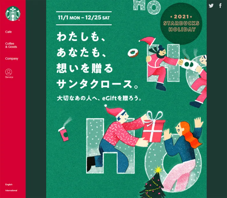
The central design is a narrow illustrated scroll. On desktop, a 750px-wide campaign canvas sits between substantial dark green gutters. On mobile, the composition fills the viewport and scales its drawings, graphic headlines, and much of its campaign typography together. Santas exchange coffee and gifts among oversized translucent “HO” letters, trees, ribbons, and ornaments. Grain, stippling, imperfect edges, and chalk-like outlines give the artwork a handmade character.
The surrounding website follows a different system. Its white header, dark utility icons, compact navigation, and spacious corporate footer retain ordinary interface sizing. The campaign and corporate shell should be treated as two related layout systems: proportional illustrated content inside responsive navigation and footer components.
閉じる
Starbucks Japan / eGift Holiday 2021 — Style Reference
A long holiday picture book, printed in textured green and framed by a crisp white corporate interface.
Website: Starbucks Japan — eGift Holiday 2021 Original URL: https://www.starbucks.co.jp/egift_holiday2021/ Final URL: https://www.starbucks.co.jp/egift_holiday2021/ Theme: green illustrated campaign content with white corporate navigation and footer; no selectable theme was evidenced. Inspected: October 2, 2026, at 09:58:02.768 UTC / 18:58:02.768 JST, through the supplied browser observations. Viewports: 1440 × 1000 desktop and 390 × 844 mobile, in CSS pixels. Scope: the current retained campaign page, including the opening composition, an interior desktop story view, campaign navigation, ending notice, sharing area, and corporate footer. Additional content and typography are documented from supplied rendered text and computed-style samples. Menus, accordion expansion, sharing, and campaign navigation were not clicked in the supplied evidence.
The original URL returns HTTP 200. Its current content explicitly states “キャンペーンは終了しました。” The reference therefore describes an available page for a completed promotion, including that closure state.
The central design is a narrow illustrated scroll. On desktop, a 750px-wide campaign canvas sits between substantial dark green gutters. On mobile, the composition fills the viewport and scales its drawings, graphic headlines, and much of its campaign typography together. Santas exchange coffee and gifts among oversized translucent “HO” letters, trees, ribbons, and ornaments. Grain, stippling, imperfect edges, and chalk-like outlines give the artwork a handmade character.
The surrounding website follows a different system. Its white header, dark utility icons, compact navigation, and spacious corporate footer retain ordinary interface sizing. The campaign and corporate shell should be treated as two related layout systems: proportional illustrated content inside responsive navigation and footer components.
How to Read This Reference
- Measured — D: supplied DOM rectangles and computed styles. These support exact font declarations, dimensions, positions, and transition strings for sampled elements.
- Estimated — V: visual estimates from the supplied original-page captures. Most campaign colors, illustration dimensions, border thicknesses, and decorative radii fall into this category. Hex estimates were not obtained through pixel sampling.
- Calculated — C: arithmetic using measured or visibly established geometry, such as the mobile campaign scale of
390 / 750 = 0.52. - Recommended — R: implementation choices for a reusable adaptation. Breakpoints, accessibility improvements, and unverified interaction details are explicitly recommendations.
- No source custom properties were included in the observation. All token names below are descriptive implementation aliases.
- A computed font on a heading wrapper does not necessarily describe its visible lettering. Several campaign headings have graphic-sized rectangles that disagree with their inherited text styles.
- The supplied captures establish two responsive states. They do not establish every intermediate breakpoint or the complete animation sequence.
Tokens — Colors
Default Palette
| Name | Value | Alias | Evidence | Role |
|---|---|---|---|---|
| Forest Surround | approximately #1e3932 |
--holiday-surround |
V | Broad desktop gutters around the campaign column |
| Illustrated Green | approximately #008d73 |
--holiday-field |
V | Representative base of the textured story background; the actual artwork contains substantial variation |
| Deep Brand Green | approximately #006241 |
--holiday-green |
V | Share circles, holiday seal, and darker illustrated details |
| White | #ffffff |
--holiday-white |
D for footer background and sampled white text; V elsewhere | Header, sharing panel, closure notice, reversed campaign lettering |
| Lavender | approximately #adadd5 |
--holiday-lavender |
V | Search-related destination panel and second campaign shortcut |
| Peach | approximately #efa17d |
--holiday-peach |
V | Gift-related shortcut fill |
| Rust | approximately #bd3d17 |
--holiday-rust |
V | Gift shortcut border, lettering, and chevron |
| Indigo | approximately #5057a1 |
--holiday-indigo |
V | Search shortcut border, lettering, and chevron |
| Closure Red | approximately #d93633 |
--holiday-closed |
V | Campaign-ended message inside its white notice |
| Illustration Pink | approximately #ff5272 |
--holiday-pink |
V | Santa clothing, ribbons, presents, and small holiday objects |
| Campaign Body Ink | #3d3935 |
--holiday-body-ink |
D | Inherited campaign body color; some graphic-heading wrappers also report this value |
| Corporate Ink | rgba(0, 0, 0, 0.87) |
--shell-ink |
D | Header navigation, footer headings, copyright |
| Link Black | #000000 |
--shell-link |
D | Sampled corporate footer links |
| Fine Rule | approximately #e3e3e3 |
--shell-rule |
V | Header subdivisions and footer separators |
Corporate Ink over white is approximately #212121, calculated from its alpha value. Keep the source alpha value when the background may change.
Color Relationships
The green canvas is visibly textured rather than a uniform CSS fill. Deep green plaques support white story text; pink and orange figures interrupt the field; pale mint lettering supplies broad translucent shapes. These colors belong to the illustration and should not become unrelated interface badges.
Peach and lavender identify the two campaign paths. Their darker borders, icons, text, and downward chevrons make them read as a coordinated pair. The red closure message has a separate informational role.
The white sharing panel ends the campaign before the full-width corporate footer begins. This creates a deliberate change from dense illustration to restrained information. No gradient or general shadow-based elevation system is evident.
Tokens — Typography
Campaign Text
The campaign body declares Hiragino Kaku Gothic Pro, Meiryo, and MS PGothic through English and localized family aliases. Its initial family alias identifies the W3 face. A sampled bold paragraph lower in the page uses the W6 alias and weight 700.
These declarations support the ordinary Japanese copy. They do not identify the large illustrated headline's display face. The visible opening title has heavy, irregular white glyphs, but its H1 wrapper reports 12px / 18px, weight 400, and dark inherited text. Reproducing the wrapper font would not reproduce the visible title.
Dates and Latin Campaign Labels
The opening date paragraph explicitly declares SODO Sans, weight 700. Its desktop size is 26px, with 26px line height and -0.52px tracking. At 390px viewport width, these become 13.52px, 13.52px, and -0.2704px, matching a 0.52 scale.
Corporate Navigation and Footer
The header and Japanese footer links declare Noto Sans JP, sans-serif. English footer headings, English links, and copyright declare SoDoSans, Helvetica Neue, Helvetica, Arial, sans-serif.
Preserve the distinction between the captured family names SODO Sans and SoDoSans; the evidence does not establish that these declarations resolve to the same loaded font resource. Font files and licensing were not supplied.
Type Scale
| Role | Desktop | Mobile | Weight / tracking | Evidence |
|---|---|---|---|---|
| Opening date | 26px / 26px |
13.52px / 13.52px |
700; -0.02em |
D |
| Header text navigation | 14px / 14px |
Text labels not shown | 700; 1.4px tracking |
D |
| Opening graphic title wrapper | 379 × 269px |
197.08 × 139.88px |
Wrapper style is 12px / 18px, weight 400 |
D; visible lettering differs |
| Apparent opening title glyph size | Roughly 48–54px |
Roughly 25–28px |
Heavy, irregular white lettering | V; not a recovered font size |
| Opening subtitle wrapper | 391 × 26px |
203.31 × 13.52px |
Wrapper reports 24px / 36px |
D; graphic dimensions differ from text metrics |
| Lower campaign statement | 29px / 46.4px |
15.08px / 24.128px |
700 |
D |
| Story passage lettering | Approximately 26px |
Approximately 13.5px |
Light-to-regular white text | V |
| Footer section heading | 20px / 35px |
18px / 24px |
600; tracking -0.32px / -0.288px |
D |
| Japanese footer link | 13px / 19.5px |
13px / 19.5px |
400 |
D |
| Desktop legal link | 13px / 13px |
13px / 19.5px |
400 |
D |
| English footer link | 15px / 22.5px |
Hidden in the captured collapsed groups | 400 |
D |
| Copyright | 13px / 22.75px |
13px / 22.75px |
400; -0.208px tracking |
D |
| SHARE heading | Approximately 26px |
Approximately 13.5px |
Bold uppercase | V |
| Closure notice | Approximately 32px |
Approximately 17px |
Bold red | V |
The FIND GIFT SANTA! H2 reports font-size: 0 and line-height: 0, while occupying a large visible box. This is further evidence of graphic heading treatment; it is not a recommendation to hide ordinary headings with zero-sized text.
The document root reports 10px. Keep a conventional root size in a new implementation and express campaign proportions explicitly. Do not shrink the corporate footer or all body copy to match the campaign's scaling system.
Tokens — Spacing & Shapes
Campaign basis: a 750px-wide illustrated composition, inferred from the desktop capture and confirmed by corresponding element ratios. Corporate basis: ordinary pixel spacing that changes through responsive layout. Density: dense artwork and compact graphic text inside the campaign; broad whitespace around corporate footer groups.
Proportional Campaign Unit
A useful reconstruction model is:
/* Recommended model inferred from the two captured widths. */
--art-unit: min(1px, 0.133333vw);
One art unit is 1px when the campaign reaches 750px wide, and approximately 0.52px at a 390px viewport. This is an implementation model, not a recovered source declaration.
Spacing Scale
| Use | Desktop basis | Mobile counterpart | Evidence |
|---|---|---|---|
| Campaign outer gutter | 345px each at 1440px |
0px |
V/C |
| Opening date left inset | 46px from campaign edge |
23.91px |
D/C |
| Opening date top inset | 53px below campaign start |
27.55px |
D/C |
| Opening title left inset | 48px |
24.95px |
D/C |
| Opening subtitle left inset | 51px |
26.52px |
D/C |
| Closure notice side inset | Approximately 60px |
Approximately 31px |
V |
| Corporate header logo left inset | 40px |
16px |
D, supported visually |
| Footer content left inset | 128px |
16px |
D |
| Desktop footer column gap | 32px |
Groups stack vertically | D/C |
| Mobile footer heading interval | Not applicable | 56px between heading starts |
D/C |
| Corporate social icon gap | Approximately 16px |
Approximately 8px |
D/C using 32px icon widths |
Border Radius and Shape
| Element | Appearance | Evidence |
|---|---|---|
| Campaign canvas | Square outer boundaries | V |
| Holiday seal | Dark green circle, roughly 196px across on desktop and 102px on mobile | V |
| Campaign shortcuts | Small rounded corners; approximately 8px desktop / 4px mobile | V |
| Shortcut border | Approximately 4px desktop / 2px mobile | V |
| Closure notice | White rectangle with approximately 10px desktop / 5px mobile corners | V |
| Campaign share controls | Circular visible symbols: 72px desktop / about 37.44px mobile | D/V |
| Corporate social controls | Approximately 32px circular symbols at both widths | V; anchor widths are D |
| Narrative plaques | Stepped, irregular rectangular outlines with chalk-like edges | V |
The artwork's irregular boundaries should remain artwork. A rounded rectangle with a clean CSS border does not reproduce the story plaques.
Layout Measurements
| Element | Desktop, 1440 × 1000 | Mobile, 390 × 844 | Evidence |
|---|---|---|---|
| Global header | 1440 × 96px |
390 × 64px |
D |
| Campaign column | 750px wide, from x≈345 to x≈1095 |
390px, edge to edge |
V/C |
| Opening title | x=393, y=243, 379 × 269px |
x=24.95, y=140.41, 197.08 × 139.88px |
D |
| Date block | x=391, y=149, 260 × 65px |
x=23.91, y=91.55, 135.19 × 33.78px |
D |
| Search heading graphic | 473 × 345px, y=4302 |
245.95 × 179.39px, y=2251.05 |
D |
| Lower bold statement width | 675px |
390px |
D |
| Closure notice width | Approximately 630px |
Approximately 328px |
V |
| Campaign share panel height | Approximately 213px |
Approximately 111px |
V |
| Corporate footer start | y=5667.97 |
y=2961.28 |
D |
| Corporate footer height | 590.75px |
527.75px |
D |
| Footer content width | 1184px |
358px |
D |
| Total document height | 6258.72px, reported rounded as 6259 |
3489.03px, reported rounded as 3489 |
D |
Inline logo and social-link anchors sometimes report a 15px or 19px line box. Those heights do not describe the visible logo or circular icon; use the captures and image geometry for those elements.
Components
Global Header
Role: persistent brand identity within the page's corporate navigation system.
The desktop header is a 96px-high white strip spanning the viewport. A roughly 48px brand mark sits 40px from the left edge. Three bold Japanese navigation buttons follow: “メニュー”, “サービス”, and “リワード”. Their measured starting positions are approximately x=128, 219.61, and 311.22.
The right side contains search, store location, account, and cart symbols. Two separate brand destinations occupy approximately 141px-wide blocks at the far right, divided by fine vertical rules. Their typography and logos are visually quieter than the campaign below.
At 390px, the header becomes 64px high. A roughly 40px logo sits at x=16. Search, cart, and a hamburger symbol occupy the right side. The desktop text navigation and secondary brand blocks are absent from the visible row.
The header is absent from the supplied interior and ending screenshots. A permanently visible fixed header would therefore not match these captured states. Its behavior when scrolling upward was not tested.
Opening Illustration and Headline
Role: establishes the holiday story, campaign identity, and gift proposition.
The opening has four distinct information layers:
- A date block between two white horizontal rules, positioned near the upper left.
- A four-line white Japanese title: “わたしも、あなたも、想いを贈るサンタクロース。”
- A short supporting line: “大切なあの人へ、eGiftを贈ろう。”
- A dark circular
2021 STARBUCKS HOLIDAYseal in the upper-right area.
These are embedded in an illustrated composition rather than a text column beside a separate photograph. At desktop size, the title begins 147px below the campaign's top edge and the subtitle begins 446px below it. At mobile size, those offsets scale to approximately 76.4px and 231.9px.
People in pink Santa clothing extend gifts and coffee across large outlined letters. A gift exchange fills the center; a decorated tree and additional figures continue below. The mobile opening reveals more of the vertical story within one viewport because the composition scales down in both dimensions.
Preserve the supplied artwork and its line breaks when available. If creating a new campaign, commission or author a coherent illustrated composition rather than assembling unrelated stock objects around a generic heading.
Illustrated Story Passages
Role: carries the campaign's emotional explanation through the long scroll.
Story copy appears on dark green plaques with stepped edges and rough pale outlines. Individual lines have different widths and offsets, creating a cut-paper silhouette. The plaques sit among ornaments, coffee beans, gift boxes, clothing, and character scenes.
The supplied desktop interior capture shows white text above a reindeer and a Santa-driven sleigh. Oversized outlined “HO” lettering recurs behind the figures, connecting separate scenes. The mobile opening shows an earlier passage below the main gift exchange and beside a Christmas tree.
These passages are not a repeated grid of identical cards. Their placement responds to the illustration. Text is available in the supplied rendered evidence, but the individual passage styles and the precise split between live text and graphic assets were not included.
For an adaptation, keep meaningful copy accessible as text while allowing decorative plaques and figures to retain their irregular artwork boundaries.
Two-Path Campaign Shortcuts
Role: exposes the two campaign destinations while the story is being viewed.
The pair contains:
- A peach control with a small gift illustration, the label “贈るともらえる”, a rust border, and a downward chevron.
- A lavender control with a small green illustrated object, the label “探すともらえる”, an indigo border, and a downward chevron.
Each label emphasizes its leading action more strongly than the remaining phrase. Icon, text, and chevron sit in one horizontal row. The treatment is flat and outlined, with small corner radii and no visible shadow.
In the desktop interior capture, the pair is approximately 695px wide and 84px high, with about a 9px gap. Its visible bounds are approximately x=433–1128. This puts the group's center about 60px to the right of the campaign column's center. That offset is an observed detail of the current capture, not evidence that the main content is wider than 750px.
On mobile, the pair spans approximately x=14–376 and is about 44px high. It sits roughly 14px above the viewport bottom. The desktop interior pair sits roughly 25px above the bottom.
The controls appear in the mobile opening and desktop interior captures, but not in the ending captures. This suggests context-dependent floating navigation. The actual fixed/sticky mechanism, visibility thresholds, destination behavior, and scroll animation were not supplied.
Recommended adaptation: center the pair on the campaign column, keep a minimum 44px target height, and remove it from view before it obstructs the closing notice or footer. This intentionally regularizes the observed desktop offset.
Campaign Destinations and Closure Notice
Role: presents the two promotion paths and their current availability.
Rendered text identifies the gift path with dates 11/1 - 12/25 and the search path with 11/22 - 12/26. The search destination includes the large graphic heading FIND GIFT SANTA! and a bold Japanese statement beneath it.
The search heading's measured dimensions scale from 473 × 345px to approximately 246 × 179px. Its typography is graphic treatment, as indicated by the zero-sized computed text style on its H2 wrapper.
The ending capture shows a lavender section with dark explanatory copy and a centered white notice. The notice reads “キャンペーンは終了しました。” in bold red. Its mobile width is about 328px, leaving approximately 31px on each side. The desktop counterpart is about 630px wide inside the 750px campaign column.
The rendered text includes an earlier closure message as well. Its exact visual placement is not sufficiently exposed in the supplied screenshots to specify another complete component layout.
Treat the closure notice as information, not a purchase button. The visible state does not support recreating an active game, gift claim, checkout flow, or live promotional countdown.
Campaign Sharing Area
Role: offers page sharing at the end of the campaign content.
A white panel spans the campaign column. Center a green uppercase SHARE heading above green circular social symbols. Desktop shows Facebook and the Twitter bird; mobile adds LINE.
The Facebook anchor measures 72 × 72px on desktop and approximately 37.44 × 37.44px on mobile. Subsequent anchors have wider rectangles because their boxes include spacing; the visible symbols remain circular. Do not turn those wider anchor boxes into stretched icons.
The social row has approximately 48px between desktop circles and 25px between mobile circles, consistent with campaign scaling. The panel uses generous top and bottom padding relative to its small heading.
Additional small Twitter and Facebook symbols appear in the upper-right desktop gutter. Their anchors use script placeholders in the supplied link evidence, so their click outcome is unverified.
The ending campaign symbols retain the Twitter bird while the current corporate footer uses the X symbol. Preserve this observed distinction when documenting the current page.
Corporate Footer
Role: returns the reader from campaign content to global company information.
The footer spans the entire viewport, extending beyond the campaign column. Its white background and thin gray top rule produce a clean boundary against the dark gutters.
Desktop content begins at x=128 within an approximately 1184px-wide inner region. Three groups start at x=128, 387.19, and 646.38: Company, Recruiting, and Social Impact. Each group occupies about 227.19px, with 32px between groups. The remaining width stays mostly empty.
Headings use 20px semibold Latin text with a 35px line height and 20px bottom padding. Japanese links use 13px text; English links use 15px. Link rows are comfortably spaced, with the recruiting list making the middle column tallest.
A lower horizontal separator introduces legal and support links. On desktop these form a row at the left, while four 32px social symbols sit at the right. Copyright is a separate line below.
On mobile, the three groups appear as collapsed rows with right-aligned downward chevrons. Headings are 18px and start at 56px vertical intervals. Their underlying links are absent from the visible link inventory for that state. Expansion was not tested, and the sampled heading nodes are paragraphs, so accessible accordion semantics cannot be assumed.
Legal links then stack vertically, followed by a left-aligned social row and the copyright line. Mobile text remains 13px rather than shrinking with the campaign illustration.
Tokens — Motion & Interaction
Recorded Transition Definitions
| Element | Supplied computed transition | Supported conclusion |
|---|---|---|
| Opening date | opacity 0.5s 1.5s |
A half-second opacity transition with a 1.5-second delay is configured |
| Opening H1 and subtitle | opacity 0.5s 1.3s, transform 0.5s cubic-bezier(0.1, 0.8, 0.2, 1) 1.3s |
Opacity and transform transitions share a delayed entrance configuration |
| Lower bold campaign statement | opacity 0.5s 0.9s, transform 0.5s cubic-bezier(0.1, 0.8, 0.2, 1) 0.9s |
A similar transition is configured with a shorter delay |
| Sampled share links | opacity 0.3s ease-out |
Opacity feedback is configured; its trigger and target value are not supplied |
| Many corporate elements | all without a nonzero duration in the sample |
Insufficient evidence for a visible animation |
| Sampled CSS animation properties | none |
Those sampled nodes have no named CSS animation in the captured state |
The transform distance, starting opacity, reveal trigger, and replay behavior are unknown. Do not invent a parallax system, animated sleigh path, character loop, or precise scroll-trigger threshold.
The capture procedure waited for document loading, visible image decoding, and sampled layout stability. It conservatively awaited finite geometric motion and temporarily paused perpetual animations during readiness checks. These procedures improve screenshot reliability but do not provide a motion recording or prove that every delayed effect was observed.
Interaction Evidence and Limits
| Interaction | Evidence | Limit |
|---|---|---|
| Vertical page navigation | Opening, interior, and ending captures; document heights | Exact scroll positions were not supplied for every image |
| Campaign shortcuts | Visible labels, chevrons, and bottom placement | Click outcome and visibility logic untested |
| Header navigation | Buttons and destination anchors in DOM | Menus and overlays untested |
| Campaign sharing | Facebook, Twitter, and mobile LINE URLs | Popups, external app handling, and sharing success untested |
| Mobile footer groups | Collapsed appearance and chevrons | Expansion and keyboard behavior untested |
| Closure notice | Explicit ended message in rendered text and screenshots | No current participation flow evidenced |
Recommended motion approach: preserve brief opacity/transform reveals where useful, keep essential content visible if scripting fails, and provide reduced-motion handling. Do not add decorative motion merely because the artwork contains moving subjects.
Surfaces
| Layer | Appearance | Purpose |
|---|---|---|
| Desktop surround | Flat dark forest green | Frames the narrow illustrated scroll |
| Story field | Grainy emerald illustration | Main emotional and visual environment |
| Narrative plaque | Darker green with rough pale outline | Supports white story copy within busy scenes |
| Gift shortcut | Peach fill with rust border and lettering | Identifies the gift path |
| Search shortcut and ending panel | Lavender, with indigo shortcut details | Identifies the search path and its ending content |
| Closure notice | White, gently rounded, red text | Communicates current campaign status |
| Share panel | White with green heading and circles | Provides a calm campaign ending |
| Corporate header/footer | White with dark typography and fine gray rules | Global navigation and company information |
There is no recurring elevated-card system. Separation comes from large color fields, illustration contours, whitespace, and thin rules.
Imagery
The visual language resembles printed collage and textured illustration. Figures have simple expressive faces, elongated gestures, and clothing filled with stipples, dashes, stripes, and grain. Pink Santa costumes sit against emerald backgrounds, while navy clothing, orange hair, yellow ornaments, and pale mint letterforms provide contrast.
Gifts and coffee are shown moving between people. Repeated “HO” letters act as scenery, framing figures and linking the vertical story. Their interiors are translucent mint with dotted decoration and uneven white outlines. The seal uses compact holiday lettering inside a dark circle.
Scale the artwork smoothly and preserve its grain. image-rendering: pixelated would introduce an unrelated hard pixel aesthetic. Avoid glossy 3D replacements, vector cleanup of every edge, or soft photographic Christmas backgrounds.
Observed Asset References
Original asset URLs, filenames, native dimensions, and formats were not supplied. The following are visual references within the original-page captures, not downloadable asset paths.
| Asset group | Observed location | Implementation guidance |
|---|---|---|
| Opening gift-exchange composition | Desktop and mobile opening captures | Preserve the relationships among headline, people, letters, coffee, and gifts |
| Holiday seal | Upper-right part of opening artwork | Keep circular geometry and compact internal lettering |
| Story plaques | Mobile opening continuation and desktop interior | Retain uneven outlines and line-specific widths |
| Reindeer and sleigh | Desktop interior capture | Treat as a coordinated scene within the vertical narrative |
| Gift/search shortcut illustrations | Floating two-control navigation | Use artwork consistent with the campaign, not unrelated generic icons |
| Search title graphic | Large H2 rectangle in DOM evidence | Obtain the actual graphic before claiming an exact type match |
| Brand and social marks | Header, campaign share panel, corporate footer | Preserve the different mark sets visible in each context |
Use authorized original assets when available. CSS can reproduce layout, spacing, surfaces, and control geometry; it cannot recreate the identity carried by the illustration alone.
Layout & Responsive Behavior
Campaign Column
At 1440px, the visible content column is 750px wide with 345px gutters. At 390px, it fills the viewport. Multiple independent measurements support proportional scaling by 0.52:
- Date type:
26px → 13.52px. - Date width:
260px → approximately 135.19px. - H1 width:
379px → approximately 197.08px. - Search heading width:
473px → approximately 245.95px. - Share circle:
72px → approximately 37.44px.
Subtracting the global header from the footer's document position gives approximately 5571.97px of campaign content on desktop and 2897.28px on mobile. Their ratio is almost exactly 0.52. This supports a predominantly scaled campaign composition.
There are local responsive differences. The lower bold statement measures 675px wide on desktop but spans the full 390px mobile width. Mobile sharing adds LINE. Floating shortcut placement also differs between captures.
A practical campaign width model is min(100%, 750px). The two observations do not reveal the original breakpoint declarations or prove identical behavior at every intermediate width.
Corporate Shell
The shell does not scale by 0.52. Header height changes from 96px to 64px, navigation collapses to utility symbols, and footer groups become compact collapsed rows. Footer links and copyright stay at 13px.
Do not apply one CSS transform to the entire page. It would make the header, footer, and touch targets too small and would fail to reproduce the independent shell reflow.
Floating Navigation
The shortcut pair visually scales with the campaign but attaches near the viewport bottom in the captures where it appears. It is absent at the page ending. Reproducing that behavior requires visibility logic in addition to layout CSS; the source logic is unavailable.
For a new implementation, use actual section anchors and an intersection-based visibility rule that keeps the ending notice and footer unobstructed. The Quick Start centers the controls and uses a 768px shell breakpoint as explicit recommendations.
Do’s and Don’ts
Do
- Preserve the narrow 750px desktop campaign column and broad dark green gutters.
- Scale the illustrated composition proportionally on mobile while letting corporate navigation reflow independently.
- Keep the four-line opening title and date block in their measured relationship to the artwork.
- Retain grain, stippling, uneven outlines, and varied illustration patterns.
- Use peach/rust and lavender/indigo consistently for the two campaign paths.
- Keep the ended message visible and informational.
- Preserve the white sharing panel before the full-width corporate footer.
- Distinguish graphic lettering from the computed fonts on its semantic wrappers.
- Keep corporate footer text readable at its observed ordinary interface sizes.
- Label inferred geometry, approximate colors, and proposed interaction behavior honestly.
Don’t
- Don't stretch the campaign artwork across a large desktop viewport.
- Don't turn the story into a generic feature-card grid.
- Don't crop the illustration into a short hero that removes the continuing narrative.
- Don't infer a display font from the H1's inherited 12px style.
- Don't smooth away the artwork's texture or replace it with glossy effects.
- Don't apply campaign scaling to all navigation and footer typography.
- Don't recreate a live gift or game flow from the completed promotion's labels.
- Don't assume the floating controls are permanently visible.
- Don't make the wider share anchor boxes into oval social symbols.
- Don't add unverified parallax, continuous character motion, or elaborate hover effects.
Recommended Implementation Additions
These are recommendations for a new implementation, not verified original-page features:
- Provide meaningful text alternatives for graphic headlines and narrative artwork. Avoid announcing the same headline twice through both hidden text and image alt text.
- Use semantic section anchors for the two campaign shortcuts and visible keyboard focus indicators.
- Give icon-only header and share controls accessible names.
- Enlarge mobile share hit areas to at least 44px without enlarging the visible 37px artwork if visual fidelity matters.
- Implement mobile footer groups with actual buttons and synchronized
aria-expandedstate, or native disclosure elements. - Ensure reduced-motion preferences remove entrance delays and leave essential text visible.
- Keep closure messaging as ordinary readable content, outside any delayed reveal dependency.
- Reserve image dimensions to prevent layout movement and load below-the-fold artwork progressively.
- Verify text contrast using production colors; the estimated palette here is not a contrast audit.
- Respect safe-area insets and hide floating navigation before it covers the campaign ending or corporate footer.
Agent Prompt Guide
Quick Color Reference
- Desktop surround: approximately
#1e3932. - Textured illustration base: approximately
#008d73. - Share and deep decorative green: approximately
#006241. - White shell, share panel, and closure notice:
#ffffff. - Gift shortcut: approximately
#efa17dwith#bd3d17border and text. - Search shortcut: approximately
#adadd5with#5057a1border and text. - Closure message: approximately
#d93633. - Corporate ink: measured
rgba(0, 0, 0, 0.87).
Overall Prompt
“Create a long illustrated holiday campaign page inspired by the currently available Starbucks Japan eGift Holiday 2021 page. Place a 750px-wide illustrated column inside dark forest-green desktop gutters. Let it fill a 390px mobile viewport through proportional composition scaling. Use emerald grain, pink Santa clothing, pale mint outlined letters, gift exchanges, coffee, ornaments, and rough white-edged story plaques. Place a four-line graphic Japanese heading at the upper left and a dark circular holiday seal at the upper right. Frame the campaign with a white corporate header and a full-width white footer that reflow independently. Include peach/rust and lavender/indigo section shortcuts, a clearly visible campaign-ended notice, and a green-on-white sharing panel. Keep artwork texture and restrained flat controls; do not invent an active promotional flow.”
Example Component Prompts
- Opening composition: “Build a 750px master composition with a date block at x=46, y=53; a 379×269 graphic title at x=48, y=147; and a 391×26 subtitle at x=51, y=446. These coordinates are relative to the campaign top. Surround them with coordinated textured holiday artwork and scale the composition to 390px wide on mobile.”
- Story passage: “Create white Japanese story text on a dark green plaque with uneven stepped edges and a rough pale outline. Vary each line's horizontal extent so the plaque follows the copy. Integrate it with a reindeer, sleigh, ornaments, and oversized translucent lettering rather than placing it inside a generic card.”
- Campaign shortcuts: “Create two adjacent flat outlined controls: peach with rust details for ‘贈るともらえる’, lavender with indigo details for ‘探すともらえる’. Each has a small illustration, mixed-weight label, and down chevron. Use about 343×84px per control on the desktop artboard and a minimum 44px mobile hit height.”
- Closure and sharing: “End a lavender campaign section with a centered white rounded notice reading ‘キャンペーンは終了しました。’ in bold red. Follow it with a white panel containing a centered green SHARE heading and circular green social symbols. Keep the message informational.”
- Responsive footer: “Use a full-width white corporate footer with a centered 1184px desktop inner region and three left-aligned information groups separated by 32px. On mobile, use 16px side insets, 18px disclosure headings, stacked 13px legal links, a social row, and a separate copyright line.”
Quick Start
CSS Custom Properties
This is a standalone adaptation, not extracted source CSS. It uses a conventional root font size and an explicit art unit inferred from the two captured widths. Colors marked approximate above remain approximate here.
The illustration and graphic headings must be supplied separately. The CSS assumes an opening scene authored on a 750px-wide coordinate system, with its image's intrinsic height determining the scene height. It does not invent asset filenames or recreate the artwork.
The 768px shell breakpoint, centered desktop shortcuts, 44px minimum targets, focus treatment, and hover opacity are recommendations. Application logic must control shortcut visibility and footer disclosure state.
:root {
  /* Measured interface colors and approximate artwork palette. */
  --holiday-surround: #1e3932;
  --holiday-field: #008d73;
  --holiday-green: #006241;
  --holiday-white: #ffffff;
  --holiday-lavender: #adadd5;
  --holiday-peach: #efa17d;
  --holiday-rust: #bd3d17;
  --holiday-indigo: #5057a1;
  --holiday-closed: #d93633;
  --holiday-body-ink: #3d3935;
  --shell-ink: rgb(0 0 0 / 87%);
  --shell-rule: #e3e3e3;

  /* Font declarations need authorized, available font resources. */
  --font-campaign: 'Hiragino Kaku Gothic Pro', Meiryo, sans-serif;
  --font-date: 'SODO Sans', Arial, sans-serif;
  --font-shell-jp: 'Noto Sans JP', sans-serif;
  --font-shell-latin: SoDoSans, 'Helvetica Neue', Helvetica, Arial, sans-serif;

  /* Inferred proportional model for a full-width page. */
  --campaign-max: 750px;
  --art-unit: min(1px, 0.133333vw);
  --header-height: 96px;
  --shell-inset: 40px;
  --footer-max: 1184px;

  /* Recorded transition durations and easing. */
  --reveal-duration: 500ms;
  --reveal-easing: cubic-bezier(0.1, 0.8, 0.2, 1);
  --share-transition: 300ms ease-out;
}

* { box-sizing: border-box; }

body {
  margin: 0;
  color: var(--holiday-body-ink);
  background: var(--holiday-surround);
  font-family: var(--font-campaign);
}

img { max-width: 100%; }
button, a { -webkit-tap-highlight-color: transparent; }
[hidden] { display: none !important; }

.site-header {
  min-height: var(--header-height);
  display: flex;
  align-items: center;
  gap: 40px;
  padding-inline: var(--shell-inset);
  background: var(--holiday-white);
  color: var(--shell-ink);
  font-family: var(--font-shell-jp);
}

.site-header__logo {
  display: block;
  width: 48px;
  height: 48px;
  flex: none;
}

.site-header__primary {
  display: flex;
  align-items: center;
  gap: 30px;
  font-size: 14px;
  font-weight: 700;
  line-height: 1;
  letter-spacing: 0.1em;
}

.site-header__utilities {
  margin-left: auto;
  display: flex;
  align-items: center;
  gap: 24px;
}

.site-header__mobile-menu { display: none; }

.campaign {
  width: min(100%, var(--campaign-max));
  margin-inline: auto;
  background: var(--holiday-field);
}

.story-scene { position: relative; }

.story-scene__art,
.story-scene__art img {
  display: block;
  width: 100%;
  height: auto;
  image-rendering: auto;
}

.hero-date {
  position: absolute;
  left: calc(46 * var(--art-unit));
  top: calc(53 * var(--art-unit));
  width: calc(260 * var(--art-unit));
  height: calc(65 * var(--art-unit));
  margin: 0;
  padding-block: calc(18 * var(--art-unit)) calc(21 * var(--art-unit));
  color: var(--holiday-white);
  font-family: var(--font-date);
  font-size: calc(26 * var(--art-unit));
  font-weight: 700;
  line-height: 1;
  letter-spacing: -0.02em;
  text-align: center;
  white-space: nowrap;
}

/* Approximate rule thickness; the date rectangle is measured. */
.hero-date::before,
.hero-date::after {
  content: '';
  position: absolute;
  inset-inline: 0;
  height: calc(4 * var(--art-unit));
  background: currentColor;
}
.hero-date::before { top: 0; }
.hero-date::after { bottom: 0; }

/* Use graphic headings with a single accessible text equivalent. */
.hero-title {
  position: absolute;
  left: calc(48 * var(--art-unit));
  top: calc(147 * var(--art-unit));
  width: calc(379 * var(--art-unit));
  margin: 0;
}

.hero-subtitle {
  position: absolute;
  left: calc(51 * var(--art-unit));
  top: calc(446 * var(--art-unit));
  width: calc(391 * var(--art-unit));
  margin: 0;
}

.hero-title img,
.hero-subtitle img {
  display: block;
  width: 100%;
  height: auto;
}

.campaign-panel {
  padding-block: calc(60 * var(--art-unit)) calc(90 * var(--art-unit));
  background: var(--holiday-lavender);
}

.campaign-panel__copy {
  margin: 0 calc(48 * var(--art-unit));
  font-size: max(13px, calc(26 * var(--art-unit)));
  line-height: 1.6;
}

.campaign-ended {
  width: 84%;
  margin: calc(50 * var(--art-unit)) auto 0;
  padding: calc(32 * var(--art-unit)) calc(12 * var(--art-unit));
  border-radius: calc(10 * var(--art-unit));
  color: var(--holiday-closed);
  background: var(--holiday-white);
  font-size: max(16px, calc(32 * var(--art-unit)));
  font-weight: 700;
  line-height: 1.6;
  text-align: center;
}

.campaign-shortcuts {
  position: fixed;
  z-index: 20;
  left: 50%;
  bottom: max(25px, env(safe-area-inset-bottom, 0px));
  transform: translateX(-50%);
  display: grid;
  grid-template-columns: repeat(2, minmax(0, 1fr));
  gap: calc(9 * var(--art-unit));
  width: calc(695 * var(--art-unit));
}

.campaign-shortcut {
  display: flex;
  align-items: center;
  justify-content: center;
  gap: calc(16 * var(--art-unit));
  min-height: max(44px, calc(84 * var(--art-unit)));
  padding-inline: calc(16 * var(--art-unit));
  border: calc(4 * var(--art-unit)) solid currentColor;
  border-radius: calc(8 * var(--art-unit));
  font-size: max(13px, calc(26 * var(--art-unit)));
  line-height: 1.2;
  white-space: nowrap;
  text-decoration: none;
}

.campaign-shortcut--gift {
  color: var(--holiday-rust);
  background: var(--holiday-peach);
}

.campaign-shortcut--find {
  color: var(--holiday-indigo);
  background: var(--holiday-lavender);
}

.campaign-shortcut__icon {
  width: calc(44 * var(--art-unit));
  height: calc(44 * var(--art-unit));
  object-fit: contain;
  flex: none;
}

.campaign-share {
  padding-block: calc(48 * var(--art-unit));
  color: var(--holiday-green);
  background: var(--holiday-white);
  text-align: center;
}

.campaign-share__title {
  margin: 0 0 calc(19 * var(--art-unit));
  font-family: var(--font-date);
  font-size: calc(26 * var(--art-unit));
  font-weight: 700;
  line-height: 1;
}

.campaign-share__links {
  display: flex;
  justify-content: center;
  gap: calc(48 * var(--art-unit));
}

.campaign-share__link {
  position: relative;
  display: grid;
  place-items: center;
  width: calc(72 * var(--art-unit));
  height: calc(72 * var(--art-unit));
  border-radius: 50%;
  color: var(--holiday-white);
  background: var(--holiday-green);
  transition: opacity var(--share-transition);
}

/* Recommended larger hit area without changing the visible circle. */
.campaign-share__link::after {
  content: '';
  position: absolute;
  left: 50%;
  top: 50%;
  width: max(100%, 44px);
  height: max(100%, 44px);
  transform: translate(-50%, -50%);
}

.campaign-share__link--line { display: none; }

.site-footer {
  border-top: 1px solid var(--shell-rule);
  color: var(--shell-ink);
  background: var(--holiday-white);
}

.site-footer__inner {
  width: min(calc(100% - 64px), var(--footer-max));
  margin-inline: auto;
}

.site-footer__groups {
  display: grid;
  grid-template-columns: repeat(3, minmax(0, 227.2px));
  gap: 32px;
  padding-block: 58px 48px;
}

.site-footer__heading {
  margin: 0 0 20px;
  font-family: var(--font-shell-latin);
  font-size: 20px;
  font-weight: 600;
  line-height: 35px;
  letter-spacing: -0.016em;
}

.site-footer__links {
  display: grid;
  gap: 16px;
  margin: 0;
  padding: 0;
  list-style: none;
}

.site-footer__links a,
.site-footer__legal a {
  color: #000;
  font-family: var(--font-shell-jp);
  font-size: 13px;
  line-height: 1.5;
  text-decoration: none;
}

.site-footer__legal {
  display: flex;
  flex-wrap: wrap;
  align-items: center;
  gap: 24px;
  padding-block: 32px;
  border-top: 1px solid var(--shell-rule);
}

.site-footer__copyright {
  margin: 0;
  padding-bottom: 56px;
  font-family: var(--font-shell-latin);
  font-size: 13px;
  line-height: 22.75px;
  letter-spacing: -0.016em;
}

/* Recommended focus treatment, not recovered source styling. */
a:focus-visible,
button:focus-visible,
summary:focus-visible {
  outline: 3px solid currentColor;
  outline-offset: 4px;
}

@media (hover: hover) {
  /* The source transition is known; this target opacity is recommended. */
  .campaign-share__link:hover { opacity: 0.8; }
}

/* Recommended shell breakpoint; the original breakpoint is unknown. */
@media (max-width: 767px) {
  :root {
    --header-height: 64px;
    --shell-inset: 16px;
  }

  .site-header { gap: 16px; }
  .site-header__logo { width: 40px; height: 40px; }
  .site-header__primary,
  .site-header__desktop-only { display: none; }
  .site-header__mobile-menu { display: inline-flex; }

  .campaign-shortcuts {
    bottom: max(14px, env(safe-area-inset-bottom, 0px));
  }

  .campaign-share__link--line { display: grid; }

  .site-footer__inner { width: calc(100% - 32px); }
  .site-footer__groups {
    display: block;
    padding-block: 40px 20px;
  }
  .site-footer__heading {
    margin: 0;
    font-size: 18px;
    line-height: 24px;
  }
  .site-footer__group { margin-bottom: 32px; }
  .site-footer__legal {
    flex-direction: column;
    align-items: flex-start;
    gap: 16px;
  }
  .site-footer__copyright { padding-bottom: 40px; }
}

@media (prefers-reduced-motion: reduce) {
  .campaign *,
  .campaign-shortcuts * {
    animation: none !important;
    transition: none !important;
  }
  html { scroll-behavior: auto; }
}
Use .hero-title and .hero-subtitle only for separate heading graphics. If supplied scene artwork already includes those words, do not overlay a duplicate. Likewise, use .hero-date only when the date is authored separately.
Footer link visibility should be controlled through actual disclosure state and the hidden attribute, with the desktop state expanded. The CSS alone does not implement that behavior. Floating shortcuts also require a visibility controller; their capture-specific appearance cannot be recovered from a fixed-position rule alone.
Tailwind v4 Token Mapping
Optional aliases for a project already using Tailwind v4. This does not imply that the original page uses Tailwind. Define the custom properties above first.
@theme inline {
  --color-campaign-surround: var(--holiday-surround);
  --color-campaign-field: var(--holiday-field);
  --color-campaign-green: var(--holiday-green);
  --color-campaign-lavender: var(--holiday-lavender);
  --color-campaign-peach: var(--holiday-peach);
  --color-campaign-rust: var(--holiday-rust);
  --color-campaign-indigo: var(--holiday-indigo);
  --color-campaign-closed: var(--holiday-closed);

  --font-campaign-copy: var(--font-campaign);
  --font-campaign-date: var(--font-date);
  --font-corporate-jp: var(--font-shell-jp);
  --font-corporate-latin: var(--font-shell-latin);

  --spacing-art: var(--art-unit);
  --spacing-campaign: 750px;
  --spacing-footer: 1184px;
  --radius-campaign-notice: calc(10 * var(--art-unit));
  --radius-campaign-shortcut: calc(8 * var(--art-unit));
}
Sources & Evidence
- Original and final page: Starbucks Japan — eGift Holiday 2021. Both URLs are identical; the supplied response status is HTTP 200.
- Capture timestamp: October 2, 2026, 09:58:02.768 UTC / 18:58:02.768 JST.
- Desktop evidence: 1440 × 1000 CSS-pixel viewport; opening, interior story, and ending screenshots; rendered text, links, element rectangles, and computed-style samples. Document height approximately 6258.72px.
- Mobile evidence: 390 × 844 CSS-pixel viewport; opening and ending screenshots; rendered text, links, element rectangles, and computed-style samples. Document height approximately 3489.03px.
- Current content evidence: visible campaign-ended messaging, the retained 2021 holiday artwork and dates, and the corporate footer displaying a 2026 copyright year.
- Style evidence: sampled font-family declarations, sizes, line heights, tracking, rectangles, colors, and transition strings. No source custom properties or complete stylesheets were supplied.
- Limitations: no original asset inventory, font files, full animation recording, menu interaction, campaign shortcut click, share action, footer expansion, or intermediate responsive viewport was supplied. Image-derived colors and decorative measurements are estimates.
This document describes the page currently served at the inspected URL. Its implementation examples are labeled adaptations of the supplied evidence, with artwork and untested behavior left explicitly dependent on suitable assets and implementation decisions.
# Starbucks Japan / eGift Holiday 2021 — Style Reference

> A long holiday picture book, printed in textured green and framed by a crisp white corporate interface.

**Website:** [Starbucks Japan — eGift Holiday 2021](https://www.starbucks.co.jp/egift_holiday2021/)
**Original URL:** https://www.starbucks.co.jp/egift_holiday2021/
**Final URL:** https://www.starbucks.co.jp/egift_holiday2021/
**Theme:** green illustrated campaign content with white corporate navigation and footer; no selectable theme was evidenced.
**Inspected:** October 2, 2026, at 09:58:02.768 UTC / 18:58:02.768 JST, through the supplied browser observations.
**Viewports:** 1440 × 1000 desktop and 390 × 844 mobile, in CSS pixels.
**Scope:** the current retained campaign page, including the opening composition, an interior desktop story view, campaign navigation, ending notice, sharing area, and corporate footer. Additional content and typography are documented from supplied rendered text and computed-style samples. Menus, accordion expansion, sharing, and campaign navigation were not clicked in the supplied evidence.

The original URL returns HTTP 200. Its current content explicitly states “キャンペーンは終了しました。” The reference therefore describes an available page for a completed promotion, including that closure state.

The central design is a narrow illustrated scroll. On desktop, a 750px-wide campaign canvas sits between substantial dark green gutters. On mobile, the composition fills the viewport and scales its drawings, graphic headlines, and much of its campaign typography together. Santas exchange coffee and gifts among oversized translucent “HO” letters, trees, ribbons, and ornaments. Grain, stippling, imperfect edges, and chalk-like outlines give the artwork a handmade character.

The surrounding website follows a different system. Its white header, dark utility icons, compact navigation, and spacious corporate footer retain ordinary interface sizing. The campaign and corporate shell should be treated as two related layout systems: proportional illustrated content inside responsive navigation and footer components.
閉じる
# Starbucks Japan / eGift Holiday 2021 — Style Reference

> A long holiday picture book, printed in textured green and framed by a crisp white corporate interface.

**Website:** [Starbucks Japan — eGift Holiday 2021](https://www.starbucks.co.jp/egift_holiday2021/)
**Original URL:** https://www.starbucks.co.jp/egift_holiday2021/
**Final URL:** https://www.starbucks.co.jp/egift_holiday2021/
**Theme:** green illustrated campaign content with white corporate navigation and footer; no selectable theme was evidenced.
**Inspected:** October 2, 2026, at 09:58:02.768 UTC / 18:58:02.768 JST, through the supplied browser observations.
**Viewports:** 1440 × 1000 desktop and 390 × 844 mobile, in CSS pixels.
**Scope:** the current retained campaign page, including the opening composition, an interior desktop story view, campaign navigation, ending notice, sharing area, and corporate footer. Additional content and typography are documented from supplied rendered text and computed-style samples. Menus, accordion expansion, sharing, and campaign navigation were not clicked in the supplied evidence.

The original URL returns HTTP 200. Its current content explicitly states “キャンペーンは終了しました。” The reference therefore describes an available page for a completed promotion, including that closure state.

The central design is a narrow illustrated scroll. On desktop, a 750px-wide campaign canvas sits between substantial dark green gutters. On mobile, the composition fills the viewport and scales its drawings, graphic headlines, and much of its campaign typography together. Santas exchange coffee and gifts among oversized translucent “HO” letters, trees, ribbons, and ornaments. Grain, stippling, imperfect edges, and chalk-like outlines give the artwork a handmade character.

The surrounding website follows a different system. Its white header, dark utility icons, compact navigation, and spacious corporate footer retain ordinary interface sizing. The campaign and corporate shell should be treated as two related layout systems: proportional illustrated content inside responsive navigation and footer components.

## How to Read This Reference

- **Measured — D:** supplied DOM rectangles and computed styles. These support exact font declarations, dimensions, positions, and transition strings for sampled elements.
- **Estimated — V:** visual estimates from the supplied original-page captures. Most campaign colors, illustration dimensions, border thicknesses, and decorative radii fall into this category. Hex estimates were not obtained through pixel sampling.
- **Calculated — C:** arithmetic using measured or visibly established geometry, such as the mobile campaign scale of `390 / 750 = 0.52`.
- **Recommended — R:** implementation choices for a reusable adaptation. Breakpoints, accessibility improvements, and unverified interaction details are explicitly recommendations.
- No source custom properties were included in the observation. All token names below are descriptive implementation aliases.
- A computed font on a heading wrapper does not necessarily describe its visible lettering. Several campaign headings have graphic-sized rectangles that disagree with their inherited text styles.
- The supplied captures establish two responsive states. They do not establish every intermediate breakpoint or the complete animation sequence.

## Tokens — Colors

### Default Palette

| Name | Value | Alias | Evidence | Role |
| --- | --- | --- | --- | --- |
| Forest Surround | approximately `#1e3932` | `--holiday-surround` | V | Broad desktop gutters around the campaign column |
| Illustrated Green | approximately `#008d73` | `--holiday-field` | V | Representative base of the textured story background; the actual artwork contains substantial variation |
| Deep Brand Green | approximately `#006241` | `--holiday-green` | V | Share circles, holiday seal, and darker illustrated details |
| White | `#ffffff` | `--holiday-white` | D for footer background and sampled white text; V elsewhere | Header, sharing panel, closure notice, reversed campaign lettering |
| Lavender | approximately `#adadd5` | `--holiday-lavender` | V | Search-related destination panel and second campaign shortcut |
| Peach | approximately `#efa17d` | `--holiday-peach` | V | Gift-related shortcut fill |
| Rust | approximately `#bd3d17` | `--holiday-rust` | V | Gift shortcut border, lettering, and chevron |
| Indigo | approximately `#5057a1` | `--holiday-indigo` | V | Search shortcut border, lettering, and chevron |
| Closure Red | approximately `#d93633` | `--holiday-closed` | V | Campaign-ended message inside its white notice |
| Illustration Pink | approximately `#ff5272` | `--holiday-pink` | V | Santa clothing, ribbons, presents, and small holiday objects |
| Campaign Body Ink | `#3d3935` | `--holiday-body-ink` | D | Inherited campaign body color; some graphic-heading wrappers also report this value |
| Corporate Ink | `rgba(0, 0, 0, 0.87)` | `--shell-ink` | D | Header navigation, footer headings, copyright |
| Link Black | `#000000` | `--shell-link` | D | Sampled corporate footer links |
| Fine Rule | approximately `#e3e3e3` | `--shell-rule` | V | Header subdivisions and footer separators |

Corporate Ink over white is approximately `#212121`, calculated from its alpha value. Keep the source alpha value when the background may change.

### Color Relationships

The green canvas is visibly textured rather than a uniform CSS fill. Deep green plaques support white story text; pink and orange figures interrupt the field; pale mint lettering supplies broad translucent shapes. These colors belong to the illustration and should not become unrelated interface badges.

Peach and lavender identify the two campaign paths. Their darker borders, icons, text, and downward chevrons make them read as a coordinated pair. The red closure message has a separate informational role.

The white sharing panel ends the campaign before the full-width corporate footer begins. This creates a deliberate change from dense illustration to restrained information. No gradient or general shadow-based elevation system is evident.

## Tokens — Typography

### Campaign Text

The campaign body declares Hiragino Kaku Gothic Pro, Meiryo, and MS PGothic through English and localized family aliases. Its initial family alias identifies the W3 face. A sampled bold paragraph lower in the page uses the W6 alias and weight `700`.

These declarations support the ordinary Japanese copy. They do not identify the large illustrated headline's display face. The visible opening title has heavy, irregular white glyphs, but its H1 wrapper reports `12px / 18px`, weight `400`, and dark inherited text. Reproducing the wrapper font would not reproduce the visible title.

### Dates and Latin Campaign Labels

The opening date paragraph explicitly declares `SODO Sans`, weight `700`. Its desktop size is `26px`, with `26px` line height and `-0.52px` tracking. At 390px viewport width, these become `13.52px`, `13.52px`, and `-0.2704px`, matching a 0.52 scale.

### Corporate Navigation and Footer

The header and Japanese footer links declare `Noto Sans JP, sans-serif`. English footer headings, English links, and copyright declare `SoDoSans, Helvetica Neue, Helvetica, Arial, sans-serif`.

Preserve the distinction between the captured family names `SODO Sans` and `SoDoSans`; the evidence does not establish that these declarations resolve to the same loaded font resource. Font files and licensing were not supplied.

### Type Scale

| Role | Desktop | Mobile | Weight / tracking | Evidence |
| --- | --- | --- | --- | --- |
| Opening date | `26px / 26px` | `13.52px / 13.52px` | `700`; `-0.02em` | D |
| Header text navigation | `14px / 14px` | Text labels not shown | `700`; `1.4px` tracking | D |
| Opening graphic title wrapper | `379 × 269px` | `197.08 × 139.88px` | Wrapper style is `12px / 18px`, weight `400` | D; visible lettering differs |
| Apparent opening title glyph size | Roughly `48–54px` | Roughly `25–28px` | Heavy, irregular white lettering | V; not a recovered font size |
| Opening subtitle wrapper | `391 × 26px` | `203.31 × 13.52px` | Wrapper reports `24px / 36px` | D; graphic dimensions differ from text metrics |
| Lower campaign statement | `29px / 46.4px` | `15.08px / 24.128px` | `700` | D |
| Story passage lettering | Approximately `26px` | Approximately `13.5px` | Light-to-regular white text | V |
| Footer section heading | `20px / 35px` | `18px / 24px` | `600`; tracking `-0.32px` / `-0.288px` | D |
| Japanese footer link | `13px / 19.5px` | `13px / 19.5px` | `400` | D |
| Desktop legal link | `13px / 13px` | `13px / 19.5px` | `400` | D |
| English footer link | `15px / 22.5px` | Hidden in the captured collapsed groups | `400` | D |
| Copyright | `13px / 22.75px` | `13px / 22.75px` | `400`; `-0.208px` tracking | D |
| SHARE heading | Approximately `26px` | Approximately `13.5px` | Bold uppercase | V |
| Closure notice | Approximately `32px` | Approximately `17px` | Bold red | V |

The `FIND GIFT SANTA!` H2 reports `font-size: 0` and `line-height: 0`, while occupying a large visible box. This is further evidence of graphic heading treatment; it is not a recommendation to hide ordinary headings with zero-sized text.

The document root reports `10px`. Keep a conventional root size in a new implementation and express campaign proportions explicitly. Do not shrink the corporate footer or all body copy to match the campaign's scaling system.

## Tokens — Spacing & Shapes

**Campaign basis:** a 750px-wide illustrated composition, inferred from the desktop capture and confirmed by corresponding element ratios.
**Corporate basis:** ordinary pixel spacing that changes through responsive layout.
**Density:** dense artwork and compact graphic text inside the campaign; broad whitespace around corporate footer groups.

### Proportional Campaign Unit

A useful reconstruction model is:

```css
/* Recommended model inferred from the two captured widths. */
--art-unit: min(1px, 0.133333vw);
```

One art unit is 1px when the campaign reaches 750px wide, and approximately 0.52px at a 390px viewport. This is an implementation model, not a recovered source declaration.

### Spacing Scale

| Use | Desktop basis | Mobile counterpart | Evidence |
| --- | --- | --- | --- |
| Campaign outer gutter | `345px` each at 1440px | `0px` | V/C |
| Opening date left inset | `46px` from campaign edge | `23.91px` | D/C |
| Opening date top inset | `53px` below campaign start | `27.55px` | D/C |
| Opening title left inset | `48px` | `24.95px` | D/C |
| Opening subtitle left inset | `51px` | `26.52px` | D/C |
| Closure notice side inset | Approximately `60px` | Approximately `31px` | V |
| Corporate header logo left inset | `40px` | `16px` | D, supported visually |
| Footer content left inset | `128px` | `16px` | D |
| Desktop footer column gap | `32px` | Groups stack vertically | D/C |
| Mobile footer heading interval | Not applicable | `56px` between heading starts | D/C |
| Corporate social icon gap | Approximately `16px` | Approximately `8px` | D/C using 32px icon widths |

### Border Radius and Shape

| Element | Appearance | Evidence |
| --- | --- | --- |
| Campaign canvas | Square outer boundaries | V |
| Holiday seal | Dark green circle, roughly 196px across on desktop and 102px on mobile | V |
| Campaign shortcuts | Small rounded corners; approximately 8px desktop / 4px mobile | V |
| Shortcut border | Approximately 4px desktop / 2px mobile | V |
| Closure notice | White rectangle with approximately 10px desktop / 5px mobile corners | V |
| Campaign share controls | Circular visible symbols: 72px desktop / about 37.44px mobile | D/V |
| Corporate social controls | Approximately 32px circular symbols at both widths | V; anchor widths are D |
| Narrative plaques | Stepped, irregular rectangular outlines with chalk-like edges | V |

The artwork's irregular boundaries should remain artwork. A rounded rectangle with a clean CSS border does not reproduce the story plaques.

### Layout Measurements

| Element | Desktop, 1440 × 1000 | Mobile, 390 × 844 | Evidence |
| --- | --- | --- | --- |
| Global header | `1440 × 96px` | `390 × 64px` | D |
| Campaign column | `750px` wide, from x≈345 to x≈1095 | `390px`, edge to edge | V/C |
| Opening title | x=`393`, y=`243`, `379 × 269px` | x=`24.95`, y=`140.41`, `197.08 × 139.88px` | D |
| Date block | x=`391`, y=`149`, `260 × 65px` | x=`23.91`, y=`91.55`, `135.19 × 33.78px` | D |
| Search heading graphic | `473 × 345px`, y=`4302` | `245.95 × 179.39px`, y=`2251.05` | D |
| Lower bold statement width | `675px` | `390px` | D |
| Closure notice width | Approximately `630px` | Approximately `328px` | V |
| Campaign share panel height | Approximately `213px` | Approximately `111px` | V |
| Corporate footer start | y=`5667.97` | y=`2961.28` | D |
| Corporate footer height | `590.75px` | `527.75px` | D |
| Footer content width | `1184px` | `358px` | D |
| Total document height | `6258.72px`, reported rounded as 6259 | `3489.03px`, reported rounded as 3489 | D |

Inline logo and social-link anchors sometimes report a 15px or 19px line box. Those heights do not describe the visible logo or circular icon; use the captures and image geometry for those elements.

## Components

### Global Header

**Role:** persistent brand identity within the page's corporate navigation system.

The desktop header is a 96px-high white strip spanning the viewport. A roughly 48px brand mark sits 40px from the left edge. Three bold Japanese navigation buttons follow: “メニュー”, “サービス”, and “リワード”. Their measured starting positions are approximately x=128, 219.61, and 311.22.

The right side contains search, store location, account, and cart symbols. Two separate brand destinations occupy approximately 141px-wide blocks at the far right, divided by fine vertical rules. Their typography and logos are visually quieter than the campaign below.

At 390px, the header becomes 64px high. A roughly 40px logo sits at x=16. Search, cart, and a hamburger symbol occupy the right side. The desktop text navigation and secondary brand blocks are absent from the visible row.

The header is absent from the supplied interior and ending screenshots. A permanently visible fixed header would therefore not match these captured states. Its behavior when scrolling upward was not tested.

### Opening Illustration and Headline

**Role:** establishes the holiday story, campaign identity, and gift proposition.

The opening has four distinct information layers:

1. A date block between two white horizontal rules, positioned near the upper left.
2. A four-line white Japanese title: “わたしも、あなたも、想いを贈るサンタクロース。”
3. A short supporting line: “大切なあの人へ、eGiftを贈ろう。”
4. A dark circular `2021 STARBUCKS HOLIDAY` seal in the upper-right area.

These are embedded in an illustrated composition rather than a text column beside a separate photograph. At desktop size, the title begins 147px below the campaign's top edge and the subtitle begins 446px below it. At mobile size, those offsets scale to approximately 76.4px and 231.9px.

People in pink Santa clothing extend gifts and coffee across large outlined letters. A gift exchange fills the center; a decorated tree and additional figures continue below. The mobile opening reveals more of the vertical story within one viewport because the composition scales down in both dimensions.

Preserve the supplied artwork and its line breaks when available. If creating a new campaign, commission or author a coherent illustrated composition rather than assembling unrelated stock objects around a generic heading.

### Illustrated Story Passages

**Role:** carries the campaign's emotional explanation through the long scroll.

Story copy appears on dark green plaques with stepped edges and rough pale outlines. Individual lines have different widths and offsets, creating a cut-paper silhouette. The plaques sit among ornaments, coffee beans, gift boxes, clothing, and character scenes.

The supplied desktop interior capture shows white text above a reindeer and a Santa-driven sleigh. Oversized outlined “HO” lettering recurs behind the figures, connecting separate scenes. The mobile opening shows an earlier passage below the main gift exchange and beside a Christmas tree.

These passages are not a repeated grid of identical cards. Their placement responds to the illustration. Text is available in the supplied rendered evidence, but the individual passage styles and the precise split between live text and graphic assets were not included.

For an adaptation, keep meaningful copy accessible as text while allowing decorative plaques and figures to retain their irregular artwork boundaries.

### Two-Path Campaign Shortcuts

**Role:** exposes the two campaign destinations while the story is being viewed.

The pair contains:

- A peach control with a small gift illustration, the label “贈るともらえる”, a rust border, and a downward chevron.
- A lavender control with a small green illustrated object, the label “探すともらえる”, an indigo border, and a downward chevron.

Each label emphasizes its leading action more strongly than the remaining phrase. Icon, text, and chevron sit in one horizontal row. The treatment is flat and outlined, with small corner radii and no visible shadow.

In the desktop interior capture, the pair is approximately 695px wide and 84px high, with about a 9px gap. Its visible bounds are approximately x=433–1128. This puts the group's center about 60px to the right of the campaign column's center. That offset is an observed detail of the current capture, not evidence that the main content is wider than 750px.

On mobile, the pair spans approximately x=14–376 and is about 44px high. It sits roughly 14px above the viewport bottom. The desktop interior pair sits roughly 25px above the bottom.

The controls appear in the mobile opening and desktop interior captures, but not in the ending captures. This suggests context-dependent floating navigation. The actual fixed/sticky mechanism, visibility thresholds, destination behavior, and scroll animation were not supplied.

**Recommended adaptation:** center the pair on the campaign column, keep a minimum 44px target height, and remove it from view before it obstructs the closing notice or footer. This intentionally regularizes the observed desktop offset.

### Campaign Destinations and Closure Notice

**Role:** presents the two promotion paths and their current availability.

Rendered text identifies the gift path with dates `11/1 - 12/25` and the search path with `11/22 - 12/26`. The search destination includes the large graphic heading `FIND GIFT SANTA!` and a bold Japanese statement beneath it.

The search heading's measured dimensions scale from `473 × 345px` to approximately `246 × 179px`. Its typography is graphic treatment, as indicated by the zero-sized computed text style on its H2 wrapper.

The ending capture shows a lavender section with dark explanatory copy and a centered white notice. The notice reads “キャンペーンは終了しました。” in bold red. Its mobile width is about 328px, leaving approximately 31px on each side. The desktop counterpart is about 630px wide inside the 750px campaign column.

The rendered text includes an earlier closure message as well. Its exact visual placement is not sufficiently exposed in the supplied screenshots to specify another complete component layout.

Treat the closure notice as information, not a purchase button. The visible state does not support recreating an active game, gift claim, checkout flow, or live promotional countdown.

### Campaign Sharing Area

**Role:** offers page sharing at the end of the campaign content.

A white panel spans the campaign column. Center a green uppercase `SHARE` heading above green circular social symbols. Desktop shows Facebook and the Twitter bird; mobile adds LINE.

The Facebook anchor measures `72 × 72px` on desktop and approximately `37.44 × 37.44px` on mobile. Subsequent anchors have wider rectangles because their boxes include spacing; the visible symbols remain circular. Do not turn those wider anchor boxes into stretched icons.

The social row has approximately 48px between desktop circles and 25px between mobile circles, consistent with campaign scaling. The panel uses generous top and bottom padding relative to its small heading.

Additional small Twitter and Facebook symbols appear in the upper-right desktop gutter. Their anchors use script placeholders in the supplied link evidence, so their click outcome is unverified.

The ending campaign symbols retain the Twitter bird while the current corporate footer uses the X symbol. Preserve this observed distinction when documenting the current page.

### Corporate Footer

**Role:** returns the reader from campaign content to global company information.

The footer spans the entire viewport, extending beyond the campaign column. Its white background and thin gray top rule produce a clean boundary against the dark gutters.

Desktop content begins at x=128 within an approximately 1184px-wide inner region. Three groups start at x=128, 387.19, and 646.38: `Company`, `Recruiting`, and `Social Impact`. Each group occupies about 227.19px, with 32px between groups. The remaining width stays mostly empty.

Headings use 20px semibold Latin text with a 35px line height and 20px bottom padding. Japanese links use 13px text; English links use 15px. Link rows are comfortably spaced, with the recruiting list making the middle column tallest.

A lower horizontal separator introduces legal and support links. On desktop these form a row at the left, while four 32px social symbols sit at the right. Copyright is a separate line below.

On mobile, the three groups appear as collapsed rows with right-aligned downward chevrons. Headings are 18px and start at 56px vertical intervals. Their underlying links are absent from the visible link inventory for that state. Expansion was not tested, and the sampled heading nodes are paragraphs, so accessible accordion semantics cannot be assumed.

Legal links then stack vertically, followed by a left-aligned social row and the copyright line. Mobile text remains 13px rather than shrinking with the campaign illustration.

## Tokens — Motion & Interaction

### Recorded Transition Definitions

| Element | Supplied computed transition | Supported conclusion |
| --- | --- | --- |
| Opening date | `opacity 0.5s 1.5s` | A half-second opacity transition with a 1.5-second delay is configured |
| Opening H1 and subtitle | `opacity 0.5s 1.3s, transform 0.5s cubic-bezier(0.1, 0.8, 0.2, 1) 1.3s` | Opacity and transform transitions share a delayed entrance configuration |
| Lower bold campaign statement | `opacity 0.5s 0.9s, transform 0.5s cubic-bezier(0.1, 0.8, 0.2, 1) 0.9s` | A similar transition is configured with a shorter delay |
| Sampled share links | `opacity 0.3s ease-out` | Opacity feedback is configured; its trigger and target value are not supplied |
| Many corporate elements | `all` without a nonzero duration in the sample | Insufficient evidence for a visible animation |
| Sampled CSS animation properties | `none` | Those sampled nodes have no named CSS animation in the captured state |

The transform distance, starting opacity, reveal trigger, and replay behavior are unknown. Do not invent a parallax system, animated sleigh path, character loop, or precise scroll-trigger threshold.

The capture procedure waited for document loading, visible image decoding, and sampled layout stability. It conservatively awaited finite geometric motion and temporarily paused perpetual animations during readiness checks. These procedures improve screenshot reliability but do not provide a motion recording or prove that every delayed effect was observed.

### Interaction Evidence and Limits

| Interaction | Evidence | Limit |
| --- | --- | --- |
| Vertical page navigation | Opening, interior, and ending captures; document heights | Exact scroll positions were not supplied for every image |
| Campaign shortcuts | Visible labels, chevrons, and bottom placement | Click outcome and visibility logic untested |
| Header navigation | Buttons and destination anchors in DOM | Menus and overlays untested |
| Campaign sharing | Facebook, Twitter, and mobile LINE URLs | Popups, external app handling, and sharing success untested |
| Mobile footer groups | Collapsed appearance and chevrons | Expansion and keyboard behavior untested |
| Closure notice | Explicit ended message in rendered text and screenshots | No current participation flow evidenced |

**Recommended motion approach:** preserve brief opacity/transform reveals where useful, keep essential content visible if scripting fails, and provide reduced-motion handling. Do not add decorative motion merely because the artwork contains moving subjects.

## Surfaces

| Layer | Appearance | Purpose |
| --- | --- | --- |
| Desktop surround | Flat dark forest green | Frames the narrow illustrated scroll |
| Story field | Grainy emerald illustration | Main emotional and visual environment |
| Narrative plaque | Darker green with rough pale outline | Supports white story copy within busy scenes |
| Gift shortcut | Peach fill with rust border and lettering | Identifies the gift path |
| Search shortcut and ending panel | Lavender, with indigo shortcut details | Identifies the search path and its ending content |
| Closure notice | White, gently rounded, red text | Communicates current campaign status |
| Share panel | White with green heading and circles | Provides a calm campaign ending |
| Corporate header/footer | White with dark typography and fine gray rules | Global navigation and company information |

There is no recurring elevated-card system. Separation comes from large color fields, illustration contours, whitespace, and thin rules.

## Imagery

The visual language resembles printed collage and textured illustration. Figures have simple expressive faces, elongated gestures, and clothing filled with stipples, dashes, stripes, and grain. Pink Santa costumes sit against emerald backgrounds, while navy clothing, orange hair, yellow ornaments, and pale mint letterforms provide contrast.

Gifts and coffee are shown moving between people. Repeated “HO” letters act as scenery, framing figures and linking the vertical story. Their interiors are translucent mint with dotted decoration and uneven white outlines. The seal uses compact holiday lettering inside a dark circle.

Scale the artwork smoothly and preserve its grain. `image-rendering: pixelated` would introduce an unrelated hard pixel aesthetic. Avoid glossy 3D replacements, vector cleanup of every edge, or soft photographic Christmas backgrounds.

### Observed Asset References

Original asset URLs, filenames, native dimensions, and formats were not supplied. The following are visual references within the original-page captures, not downloadable asset paths.

| Asset group | Observed location | Implementation guidance |
| --- | --- | --- |
| Opening gift-exchange composition | Desktop and mobile opening captures | Preserve the relationships among headline, people, letters, coffee, and gifts |
| Holiday seal | Upper-right part of opening artwork | Keep circular geometry and compact internal lettering |
| Story plaques | Mobile opening continuation and desktop interior | Retain uneven outlines and line-specific widths |
| Reindeer and sleigh | Desktop interior capture | Treat as a coordinated scene within the vertical narrative |
| Gift/search shortcut illustrations | Floating two-control navigation | Use artwork consistent with the campaign, not unrelated generic icons |
| Search title graphic | Large H2 rectangle in DOM evidence | Obtain the actual graphic before claiming an exact type match |
| Brand and social marks | Header, campaign share panel, corporate footer | Preserve the different mark sets visible in each context |

Use authorized original assets when available. CSS can reproduce layout, spacing, surfaces, and control geometry; it cannot recreate the identity carried by the illustration alone.

## Layout & Responsive Behavior

### Campaign Column

At 1440px, the visible content column is 750px wide with 345px gutters. At 390px, it fills the viewport. Multiple independent measurements support proportional scaling by 0.52:

- Date type: `26px → 13.52px`.
- Date width: `260px → approximately 135.19px`.
- H1 width: `379px → approximately 197.08px`.
- Search heading width: `473px → approximately 245.95px`.
- Share circle: `72px → approximately 37.44px`.

Subtracting the global header from the footer's document position gives approximately 5571.97px of campaign content on desktop and 2897.28px on mobile. Their ratio is almost exactly 0.52. This supports a predominantly scaled campaign composition.

There are local responsive differences. The lower bold statement measures 675px wide on desktop but spans the full 390px mobile width. Mobile sharing adds LINE. Floating shortcut placement also differs between captures.

A practical campaign width model is `min(100%, 750px)`. The two observations do not reveal the original breakpoint declarations or prove identical behavior at every intermediate width.

### Corporate Shell

The shell does not scale by 0.52. Header height changes from 96px to 64px, navigation collapses to utility symbols, and footer groups become compact collapsed rows. Footer links and copyright stay at 13px.

Do not apply one CSS transform to the entire page. It would make the header, footer, and touch targets too small and would fail to reproduce the independent shell reflow.

### Floating Navigation

The shortcut pair visually scales with the campaign but attaches near the viewport bottom in the captures where it appears. It is absent at the page ending. Reproducing that behavior requires visibility logic in addition to layout CSS; the source logic is unavailable.

For a new implementation, use actual section anchors and an intersection-based visibility rule that keeps the ending notice and footer unobstructed. The Quick Start centers the controls and uses a 768px shell breakpoint as explicit recommendations.

## Do’s and Don’ts

### Do

- Preserve the narrow 750px desktop campaign column and broad dark green gutters.
- Scale the illustrated composition proportionally on mobile while letting corporate navigation reflow independently.
- Keep the four-line opening title and date block in their measured relationship to the artwork.
- Retain grain, stippling, uneven outlines, and varied illustration patterns.
- Use peach/rust and lavender/indigo consistently for the two campaign paths.
- Keep the ended message visible and informational.
- Preserve the white sharing panel before the full-width corporate footer.
- Distinguish graphic lettering from the computed fonts on its semantic wrappers.
- Keep corporate footer text readable at its observed ordinary interface sizes.
- Label inferred geometry, approximate colors, and proposed interaction behavior honestly.

### Don’t

- Don't stretch the campaign artwork across a large desktop viewport.
- Don't turn the story into a generic feature-card grid.
- Don't crop the illustration into a short hero that removes the continuing narrative.
- Don't infer a display font from the H1's inherited 12px style.
- Don't smooth away the artwork's texture or replace it with glossy effects.
- Don't apply campaign scaling to all navigation and footer typography.
- Don't recreate a live gift or game flow from the completed promotion's labels.
- Don't assume the floating controls are permanently visible.
- Don't make the wider share anchor boxes into oval social symbols.
- Don't add unverified parallax, continuous character motion, or elaborate hover effects.

## Recommended Implementation Additions

These are recommendations for a new implementation, not verified original-page features:

- Provide meaningful text alternatives for graphic headlines and narrative artwork. Avoid announcing the same headline twice through both hidden text and image alt text.
- Use semantic section anchors for the two campaign shortcuts and visible keyboard focus indicators.
- Give icon-only header and share controls accessible names.
- Enlarge mobile share hit areas to at least 44px without enlarging the visible 37px artwork if visual fidelity matters.
- Implement mobile footer groups with actual buttons and synchronized `aria-expanded` state, or native disclosure elements.
- Ensure reduced-motion preferences remove entrance delays and leave essential text visible.
- Keep closure messaging as ordinary readable content, outside any delayed reveal dependency.
- Reserve image dimensions to prevent layout movement and load below-the-fold artwork progressively.
- Verify text contrast using production colors; the estimated palette here is not a contrast audit.
- Respect safe-area insets and hide floating navigation before it covers the campaign ending or corporate footer.

## Agent Prompt Guide

### Quick Color Reference

- Desktop surround: approximately `#1e3932`.
- Textured illustration base: approximately `#008d73`.
- Share and deep decorative green: approximately `#006241`.
- White shell, share panel, and closure notice: `#ffffff`.
- Gift shortcut: approximately `#efa17d` with `#bd3d17` border and text.
- Search shortcut: approximately `#adadd5` with `#5057a1` border and text.
- Closure message: approximately `#d93633`.
- Corporate ink: measured `rgba(0, 0, 0, 0.87)`.

### Overall Prompt

“Create a long illustrated holiday campaign page inspired by the currently available Starbucks Japan eGift Holiday 2021 page. Place a 750px-wide illustrated column inside dark forest-green desktop gutters. Let it fill a 390px mobile viewport through proportional composition scaling. Use emerald grain, pink Santa clothing, pale mint outlined letters, gift exchanges, coffee, ornaments, and rough white-edged story plaques. Place a four-line graphic Japanese heading at the upper left and a dark circular holiday seal at the upper right. Frame the campaign with a white corporate header and a full-width white footer that reflow independently. Include peach/rust and lavender/indigo section shortcuts, a clearly visible campaign-ended notice, and a green-on-white sharing panel. Keep artwork texture and restrained flat controls; do not invent an active promotional flow.”

### Example Component Prompts

1. **Opening composition:** “Build a 750px master composition with a date block at x=46, y=53; a 379×269 graphic title at x=48, y=147; and a 391×26 subtitle at x=51, y=446. These coordinates are relative to the campaign top. Surround them with coordinated textured holiday artwork and scale the composition to 390px wide on mobile.”
2. **Story passage:** “Create white Japanese story text on a dark green plaque with uneven stepped edges and a rough pale outline. Vary each line's horizontal extent so the plaque follows the copy. Integrate it with a reindeer, sleigh, ornaments, and oversized translucent lettering rather than placing it inside a generic card.”
3. **Campaign shortcuts:** “Create two adjacent flat outlined controls: peach with rust details for ‘贈るともらえる’, lavender with indigo details for ‘探すともらえる’. Each has a small illustration, mixed-weight label, and down chevron. Use about 343×84px per control on the desktop artboard and a minimum 44px mobile hit height.”
4. **Closure and sharing:** “End a lavender campaign section with a centered white rounded notice reading ‘キャンペーンは終了しました。’ in bold red. Follow it with a white panel containing a centered green SHARE heading and circular green social symbols. Keep the message informational.”
5. **Responsive footer:** “Use a full-width white corporate footer with a centered 1184px desktop inner region and three left-aligned information groups separated by 32px. On mobile, use 16px side insets, 18px disclosure headings, stacked 13px legal links, a social row, and a separate copyright line.”

## Quick Start

### CSS Custom Properties

This is a standalone adaptation, not extracted source CSS. It uses a conventional root font size and an explicit art unit inferred from the two captured widths. Colors marked approximate above remain approximate here.

The illustration and graphic headings must be supplied separately. The CSS assumes an opening scene authored on a 750px-wide coordinate system, with its image's intrinsic height determining the scene height. It does not invent asset filenames or recreate the artwork.

The 768px shell breakpoint, centered desktop shortcuts, 44px minimum targets, focus treatment, and hover opacity are recommendations. Application logic must control shortcut visibility and footer disclosure state.

```css
:root {
  /* Measured interface colors and approximate artwork palette. */
  --holiday-surround: #1e3932;
  --holiday-field: #008d73;
  --holiday-green: #006241;
  --holiday-white: #ffffff;
  --holiday-lavender: #adadd5;
  --holiday-peach: #efa17d;
  --holiday-rust: #bd3d17;
  --holiday-indigo: #5057a1;
  --holiday-closed: #d93633;
  --holiday-body-ink: #3d3935;
  --shell-ink: rgb(0 0 0 / 87%);
  --shell-rule: #e3e3e3;

  /* Font declarations need authorized, available font resources. */
  --font-campaign: 'Hiragino Kaku Gothic Pro', Meiryo, sans-serif;
  --font-date: 'SODO Sans', Arial, sans-serif;
  --font-shell-jp: 'Noto Sans JP', sans-serif;
  --font-shell-latin: SoDoSans, 'Helvetica Neue', Helvetica, Arial, sans-serif;

  /* Inferred proportional model for a full-width page. */
  --campaign-max: 750px;
  --art-unit: min(1px, 0.133333vw);
  --header-height: 96px;
  --shell-inset: 40px;
  --footer-max: 1184px;

  /* Recorded transition durations and easing. */
  --reveal-duration: 500ms;
  --reveal-easing: cubic-bezier(0.1, 0.8, 0.2, 1);
  --share-transition: 300ms ease-out;
}

* { box-sizing: border-box; }

body {
  margin: 0;
  color: var(--holiday-body-ink);
  background: var(--holiday-surround);
  font-family: var(--font-campaign);
}

img { max-width: 100%; }
button, a { -webkit-tap-highlight-color: transparent; }
[hidden] { display: none !important; }

.site-header {
  min-height: var(--header-height);
  display: flex;
  align-items: center;
  gap: 40px;
  padding-inline: var(--shell-inset);
  background: var(--holiday-white);
  color: var(--shell-ink);
  font-family: var(--font-shell-jp);
}

.site-header__logo {
  display: block;
  width: 48px;
  height: 48px;
  flex: none;
}

.site-header__primary {
  display: flex;
  align-items: center;
  gap: 30px;
  font-size: 14px;
  font-weight: 700;
  line-height: 1;
  letter-spacing: 0.1em;
}

.site-header__utilities {
  margin-left: auto;
  display: flex;
  align-items: center;
  gap: 24px;
}

.site-header__mobile-menu { display: none; }

.campaign {
  width: min(100%, var(--campaign-max));
  margin-inline: auto;
  background: var(--holiday-field);
}

.story-scene { position: relative; }

.story-scene__art,
.story-scene__art img {
  display: block;
  width: 100%;
  height: auto;
  image-rendering: auto;
}

.hero-date {
  position: absolute;
  left: calc(46 * var(--art-unit));
  top: calc(53 * var(--art-unit));
  width: calc(260 * var(--art-unit));
  height: calc(65 * var(--art-unit));
  margin: 0;
  padding-block: calc(18 * var(--art-unit)) calc(21 * var(--art-unit));
  color: var(--holiday-white);
  font-family: var(--font-date);
  font-size: calc(26 * var(--art-unit));
  font-weight: 700;
  line-height: 1;
  letter-spacing: -0.02em;
  text-align: center;
  white-space: nowrap;
}

/* Approximate rule thickness; the date rectangle is measured. */
.hero-date::before,
.hero-date::after {
  content: '';
  position: absolute;
  inset-inline: 0;
  height: calc(4 * var(--art-unit));
  background: currentColor;
}
.hero-date::before { top: 0; }
.hero-date::after { bottom: 0; }

/* Use graphic headings with a single accessible text equivalent. */
.hero-title {
  position: absolute;
  left: calc(48 * var(--art-unit));
  top: calc(147 * var(--art-unit));
  width: calc(379 * var(--art-unit));
  margin: 0;
}

.hero-subtitle {
  position: absolute;
  left: calc(51 * var(--art-unit));
  top: calc(446 * var(--art-unit));
  width: calc(391 * var(--art-unit));
  margin: 0;
}

.hero-title img,
.hero-subtitle img {
  display: block;
  width: 100%;
  height: auto;
}

.campaign-panel {
  padding-block: calc(60 * var(--art-unit)) calc(90 * var(--art-unit));
  background: var(--holiday-lavender);
}

.campaign-panel__copy {
  margin: 0 calc(48 * var(--art-unit));
  font-size: max(13px, calc(26 * var(--art-unit)));
  line-height: 1.6;
}

.campaign-ended {
  width: 84%;
  margin: calc(50 * var(--art-unit)) auto 0;
  padding: calc(32 * var(--art-unit)) calc(12 * var(--art-unit));
  border-radius: calc(10 * var(--art-unit));
  color: var(--holiday-closed);
  background: var(--holiday-white);
  font-size: max(16px, calc(32 * var(--art-unit)));
  font-weight: 700;
  line-height: 1.6;
  text-align: center;
}

.campaign-shortcuts {
  position: fixed;
  z-index: 20;
  left: 50%;
  bottom: max(25px, env(safe-area-inset-bottom, 0px));
  transform: translateX(-50%);
  display: grid;
  grid-template-columns: repeat(2, minmax(0, 1fr));
  gap: calc(9 * var(--art-unit));
  width: calc(695 * var(--art-unit));
}

.campaign-shortcut {
  display: flex;
  align-items: center;
  justify-content: center;
  gap: calc(16 * var(--art-unit));
  min-height: max(44px, calc(84 * var(--art-unit)));
  padding-inline: calc(16 * var(--art-unit));
  border: calc(4 * var(--art-unit)) solid currentColor;
  border-radius: calc(8 * var(--art-unit));
  font-size: max(13px, calc(26 * var(--art-unit)));
  line-height: 1.2;
  white-space: nowrap;
  text-decoration: none;
}

.campaign-shortcut--gift {
  color: var(--holiday-rust);
  background: var(--holiday-peach);
}

.campaign-shortcut--find {
  color: var(--holiday-indigo);
  background: var(--holiday-lavender);
}

.campaign-shortcut__icon {
  width: calc(44 * var(--art-unit));
  height: calc(44 * var(--art-unit));
  object-fit: contain;
  flex: none;
}

.campaign-share {
  padding-block: calc(48 * var(--art-unit));
  color: var(--holiday-green);
  background: var(--holiday-white);
  text-align: center;
}

.campaign-share__title {
  margin: 0 0 calc(19 * var(--art-unit));
  font-family: var(--font-date);
  font-size: calc(26 * var(--art-unit));
  font-weight: 700;
  line-height: 1;
}

.campaign-share__links {
  display: flex;
  justify-content: center;
  gap: calc(48 * var(--art-unit));
}

.campaign-share__link {
  position: relative;
  display: grid;
  place-items: center;
  width: calc(72 * var(--art-unit));
  height: calc(72 * var(--art-unit));
  border-radius: 50%;
  color: var(--holiday-white);
  background: var(--holiday-green);
  transition: opacity var(--share-transition);
}

/* Recommended larger hit area without changing the visible circle. */
.campaign-share__link::after {
  content: '';
  position: absolute;
  left: 50%;
  top: 50%;
  width: max(100%, 44px);
  height: max(100%, 44px);
  transform: translate(-50%, -50%);
}

.campaign-share__link--line { display: none; }

.site-footer {
  border-top: 1px solid var(--shell-rule);
  color: var(--shell-ink);
  background: var(--holiday-white);
}

.site-footer__inner {
  width: min(calc(100% - 64px), var(--footer-max));
  margin-inline: auto;
}

.site-footer__groups {
  display: grid;
  grid-template-columns: repeat(3, minmax(0, 227.2px));
  gap: 32px;
  padding-block: 58px 48px;
}

.site-footer__heading {
  margin: 0 0 20px;
  font-family: var(--font-shell-latin);
  font-size: 20px;
  font-weight: 600;
  line-height: 35px;
  letter-spacing: -0.016em;
}

.site-footer__links {
  display: grid;
  gap: 16px;
  margin: 0;
  padding: 0;
  list-style: none;
}

.site-footer__links a,
.site-footer__legal a {
  color: #000;
  font-family: var(--font-shell-jp);
  font-size: 13px;
  line-height: 1.5;
  text-decoration: none;
}

.site-footer__legal {
  display: flex;
  flex-wrap: wrap;
  align-items: center;
  gap: 24px;
  padding-block: 32px;
  border-top: 1px solid var(--shell-rule);
}

.site-footer__copyright {
  margin: 0;
  padding-bottom: 56px;
  font-family: var(--font-shell-latin);
  font-size: 13px;
  line-height: 22.75px;
  letter-spacing: -0.016em;
}

/* Recommended focus treatment, not recovered source styling. */
a:focus-visible,
button:focus-visible,
summary:focus-visible {
  outline: 3px solid currentColor;
  outline-offset: 4px;
}

@media (hover: hover) {
  /* The source transition is known; this target opacity is recommended. */
  .campaign-share__link:hover { opacity: 0.8; }
}

/* Recommended shell breakpoint; the original breakpoint is unknown. */
@media (max-width: 767px) {
  :root {
    --header-height: 64px;
    --shell-inset: 16px;
  }

  .site-header { gap: 16px; }
  .site-header__logo { width: 40px; height: 40px; }
  .site-header__primary,
  .site-header__desktop-only { display: none; }
  .site-header__mobile-menu { display: inline-flex; }

  .campaign-shortcuts {
    bottom: max(14px, env(safe-area-inset-bottom, 0px));
  }

  .campaign-share__link--line { display: grid; }

  .site-footer__inner { width: calc(100% - 32px); }
  .site-footer__groups {
    display: block;
    padding-block: 40px 20px;
  }
  .site-footer__heading {
    margin: 0;
    font-size: 18px;
    line-height: 24px;
  }
  .site-footer__group { margin-bottom: 32px; }
  .site-footer__legal {
    flex-direction: column;
    align-items: flex-start;
    gap: 16px;
  }
  .site-footer__copyright { padding-bottom: 40px; }
}

@media (prefers-reduced-motion: reduce) {
  .campaign *,
  .campaign-shortcuts * {
    animation: none !important;
    transition: none !important;
  }
  html { scroll-behavior: auto; }
}
```

Use `.hero-title` and `.hero-subtitle` only for separate heading graphics. If supplied scene artwork already includes those words, do not overlay a duplicate. Likewise, use `.hero-date` only when the date is authored separately.

Footer link visibility should be controlled through actual disclosure state and the `hidden` attribute, with the desktop state expanded. The CSS alone does not implement that behavior. Floating shortcuts also require a visibility controller; their capture-specific appearance cannot be recovered from a fixed-position rule alone.

### Tailwind v4 Token Mapping

Optional aliases for a project already using Tailwind v4. This does not imply that the original page uses Tailwind. Define the custom properties above first.

```css
@theme inline {
  --color-campaign-surround: var(--holiday-surround);
  --color-campaign-field: var(--holiday-field);
  --color-campaign-green: var(--holiday-green);
  --color-campaign-lavender: var(--holiday-lavender);
  --color-campaign-peach: var(--holiday-peach);
  --color-campaign-rust: var(--holiday-rust);
  --color-campaign-indigo: var(--holiday-indigo);
  --color-campaign-closed: var(--holiday-closed);

  --font-campaign-copy: var(--font-campaign);
  --font-campaign-date: var(--font-date);
  --font-corporate-jp: var(--font-shell-jp);
  --font-corporate-latin: var(--font-shell-latin);

  --spacing-art: var(--art-unit);
  --spacing-campaign: 750px;
  --spacing-footer: 1184px;
  --radius-campaign-notice: calc(10 * var(--art-unit));
  --radius-campaign-shortcut: calc(8 * var(--art-unit));
}
```

## Sources & Evidence

- **Original and final page:** [Starbucks Japan — eGift Holiday 2021](https://www.starbucks.co.jp/egift_holiday2021/). Both URLs are identical; the supplied response status is HTTP 200.
- **Capture timestamp:** October 2, 2026, 09:58:02.768 UTC / 18:58:02.768 JST.
- **Desktop evidence:** 1440 × 1000 CSS-pixel viewport; opening, interior story, and ending screenshots; rendered text, links, element rectangles, and computed-style samples. Document height approximately 6258.72px.
- **Mobile evidence:** 390 × 844 CSS-pixel viewport; opening and ending screenshots; rendered text, links, element rectangles, and computed-style samples. Document height approximately 3489.03px.
- **Current content evidence:** visible campaign-ended messaging, the retained 2021 holiday artwork and dates, and the corporate footer displaying a 2026 copyright year.
- **Style evidence:** sampled font-family declarations, sizes, line heights, tracking, rectangles, colors, and transition strings. No source custom properties or complete stylesheets were supplied.
- **Limitations:** no original asset inventory, font files, full animation recording, menu interaction, campaign shortcut click, share action, footer expansion, or intermediate responsive viewport was supplied. Image-derived colors and decorative measurements are estimates.

This document describes the page currently served at the inspected URL. Its implementation examples are labeled adaptations of the supplied evidence, with artwork and untested behavior left explicitly dependent on suitable assets and implementation decisions.関連するデザイン
スタイルやページの種類、ジャンルが近いデザインを集めました。