プレビュー準備中デザインリファレンスを見る
DESIGN REFERENCE
HugMug|簡単クリスマススイーツ
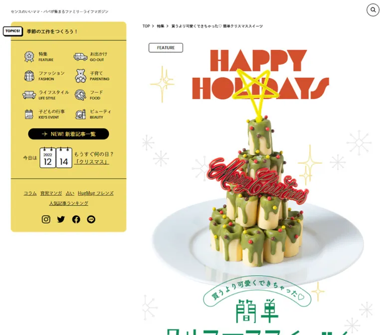
緑のサイドパネルに挟まれた縦長のレシピ特集。赤い幾何学文字、スイーツの切り抜き写真、ドット柄や雪の結晶を組み合わせた、親子で楽しめるクリスマスの編集デザイン。
HugMug / Easy Christmas Sweets — Style Reference
A playful holiday recipe feature framed by a mint-green family magazine.
Website: hugmug.jp/feature/137257 Original URL: https://hugmug.jp/feature/137257 Final URL: https://hugmug.jp/feature/137257 Theme: light; white canvas, mint magazine navigation, and a separate green-and-red holiday palette. Inspected: October 2, 2026, 00:42 JST. Supplied retrieval timestamp: October 1, 2026, 15:42:52.502 UTC. Viewports: desktop 1440 × 1000 CSS pixels; mobile 390 × 844 CSS pixels. Scope: the current editorial feature, its opening composition, six recipe sections, author and credit content, sharing and related-content modules, desktop side panels, mobile category navigation, footer, and floating follow tray. Visual coverage consists of desktop loading, ingredient, and lower-page captures, plus mobile opening and footer captures. The supplied DOM provides additional content and measurements throughout the document.
HugMug gives this Christmas feature two complementary identities. The magazine interface uses mint panels, black line drawings, compact Japanese navigation, bilingual labels, and small rounded controls. The article uses oversized red geometric lettering, thin green title artwork, isolated food photography, pale snowflakes, dotted surfaces, and festive green fields. The shared white canvas lets the article feel like a special insert without losing the surrounding magazine.
The desktop composition is particularly distinctive: a 490px reading column sits between two approximately 320px side panels. The left panel is a miniature magazine directory; the right presents family fashion portraits. On a phone, the feature fills the viewport width and the large opening artwork becomes the main visual event. The content remains a long recipe article, with navigation, instructions, credits, and further reading.
閉じる
HugMug / Easy Christmas Sweets — Style Reference
A playful holiday recipe feature framed by a mint-green family magazine.
Website: hugmug.jp/feature/137257 Original URL: https://hugmug.jp/feature/137257 Final URL: https://hugmug.jp/feature/137257 Theme: light; white canvas, mint magazine navigation, and a separate green-and-red holiday palette. Inspected: October 2, 2026, 00:42 JST. Supplied retrieval timestamp: October 1, 2026, 15:42:52.502 UTC. Viewports: desktop 1440 × 1000 CSS pixels; mobile 390 × 844 CSS pixels. Scope: the current editorial feature, its opening composition, six recipe sections, author and credit content, sharing and related-content modules, desktop side panels, mobile category navigation, footer, and floating follow tray. Visual coverage consists of desktop loading, ingredient, and lower-page captures, plus mobile opening and footer captures. The supplied DOM provides additional content and measurements throughout the document.
HugMug gives this Christmas feature two complementary identities. The magazine interface uses mint panels, black line drawings, compact Japanese navigation, bilingual labels, and small rounded controls. The article uses oversized red geometric lettering, thin green title artwork, isolated food photography, pale snowflakes, dotted surfaces, and festive green fields. The shared white canvas lets the article feel like a special insert without losing the surrounding magazine.
The desktop composition is particularly distinctive: a 490px reading column sits between two approximately 320px side panels. The left panel is a miniature magazine directory; the right presents family fashion portraits. On a phone, the feature fills the viewport width and the large opening artwork becomes the main visual event. The content remains a long recipe article, with navigation, instructions, credits, and further reading.
How to Read This Reference
- Measured means a value appears in the supplied rendered DOM or computed-style evidence. Measurements describe the captured state, not necessarily an invariant stylesheet rule.
- Derived means a proportion or relationship calculated from those measurements.
- Estimated means a visual approximation from the current-page screenshots. Estimated hexadecimal colors are implementation starting points, not sampled source values.
- Recommended means a proposed implementation choice. Breakpoints, accessible enhancements, and the Quick Start are adaptations unless explicitly identified otherwise.
- Token names in this document are descriptive aliases. The supplied custom-property list mostly contains generic WordPress presets; it does not establish a page-specific token system.
- The first desktop screenshot is still covered by
LOADING.... The mobile opening is the visual authority for the revealed hero. Later desktop captures establish the loaded shell and lower-page appearance. - Several image wrappers have inconsistent square dimensions, and some anchor wrappers report zero height. Use the visible composition and decoded image proportions; do not reproduce those suspicious dimensions as intentional layout rules.
Tokens — Colors
Default Palette
| Name | Value | Suggested token | Evidence and role |
|---|---|---|---|
| Canvas White | #ffffff |
--color-paper |
Measured body background and white text in recipe instructions; visually the main page and signup-card surface |
| Utility Black | #000000 |
--color-ink |
Measured navigation text and latest-article button fill; also visible in outlines and social icons |
| Magazine Mint | #6cc88a |
--color-mint |
Measured keyword-chip background and latest-article button text; the side panels and footer visibly belong to this green family, but their exact background declarations were not supplied |
| Holiday Green | #108b58 |
--color-holiday-green |
Measured closing-section background and profile/credit text; visually related to the green framing around the ingredient composition |
| Holiday Red | approximately #d64c2b |
--color-holiday-red |
Estimated from the revealed mobile display lettering and desktop ingredient text |
| Number Gold | #e4b600 |
--color-gold |
Measured recipe-index numbers and STEP parent text |
| Follow Lime | approximately #c0ffa0 |
--color-lime |
Estimated floating follow-tray fill and editorial-card caption surfaces |
| Snowflake Gray | approximately #e6e6e6 |
--color-snow |
Estimated fine snowflake decorations around the opening food image |
Keep the two greens separate. Mint belongs to the magazine's navigation and discovery modules. The deeper green belongs to the Christmas feature and its author area. The red is a display and recipe accent, while black supplies most utility contrast.
The bright yellow star on the dessert is part of the photographed composition. Its appearance should not be reduced to the measured gold used for recipe numbers.
The ingredient panel contains a very fine red dotted pattern over a near-white surface. Its exact dot size, spacing, and color were not measured. A low-opacity red pattern on white is a suitable adaptation.
Palette Boundaries
The inspected page is light throughout the supplied views. No theme switcher or dark appearance is evidenced. Generic WordPress gradients, blue admin tokens, and shadow presets appear in the custom-property export, but their presence does not show that they are used by this design.
Tokens — Typography
Japanese Body and Magazine Interface
- Measured family:
dnp-shuei-gothic-kin-std, sans-serif. - Observed weights:
400for ordinary text,500for the author name,600for the keyword heading, and700for article titles and selected navigation text. - Character: clean Japanese gothic text with a restrained, editorial tone. It leaves the stronger personality to the photographs, illustration, and display lettering.
- Implementation alias:
--font-body.
The computed family is a requested font stack. Individual font-file loading and glyph fallback were not independently verified.
Decorative Numbers and Punctuation
- Measured family:
flegrei, sans-serif. - Confirmed uses: recipe-index numbers,
STEPparent elements, and large quotation marks around recipe titles. - Measured weight:
400. - Implementation alias:
--font-display.
The red HAPPY HOLIDAYS lettering is geometric, heavy, and sharply cut, with circular and triangular forms. Its own computed family is not included in the supplied element sample. Do not present the family measured on recipe numbers as independently verified for this headline.
Social Handle
The author link @mekkoja_valo uses poppins, sans-serif, measured at 12px, weight 700, and 12px line height. This is a local accent; the evidence does not support making Poppins the general interface font.
Image-Based Lettering
The Japanese main title, curved introductory catchphrase, recipe-title graphics, and several section labels are supplied as images. Their shapes are part of the artwork rather than ordinary text styling. The Japanese title has narrow, airy strokes that contrast with the dense red English display lettering.
The red script on the dessert is a physical-looking Merry Christmas decoration within the food composition. It is not evidence of a script font used for interface text.
Type Scale
| Role | Size / line height | Weight | Tracking | Evidence |
|---|---|---|---|---|
| Breadcrumb | 10px / 15px |
700 |
Normal | Measured at both viewports |
| Production credits | 10px / 20px |
400 |
Normal | Measured at both viewports |
| Sidebar secondary links | 12px / 18px |
400 |
Normal | Measured desktop |
| Share controls and keyword chips | 12px / 18px |
400 |
Normal | Measured at both viewports |
| Author biography | 12px / 23px |
400 |
0.2px |
Measured at both viewports |
| Author social handle | 12px / 12px |
700 |
Normal | Measured Poppins stack |
| Recipe-index number | 13px / 13px |
400 |
Normal | Measured Flegrei stack |
| Sidebar topic link | 13px / 13px |
700 |
Normal | Measured desktop |
| Latest-article pill | 14px / 21px |
400 |
Normal | Measured desktop |
| Related-article title, desktop | 14px / 21px |
700 |
Normal | Measured |
| Related-article title, mobile | 13px / 19.5px |
700 |
Normal | Measured |
| Recipe instruction paragraph | 15px / 25.5px |
400 |
0.9px |
Measured at both viewports |
| Closing message | 15px / 25.5px |
700 |
0.15px |
Measured |
| Author name | 18px / 18px |
500 |
Normal | Measured |
| New-article heading parent | 19.5px / 29.25px |
700 |
Normal | Measured; child styling may differ |
| Recipe quotation marks | 40px / 40px |
400 |
Normal | Measured Flegrei stack |
| Family-snapshot heading | Approximately 24px |
Bold | Visually compact | Estimated from desktop capture |
| Mobile introductory paragraph | Approximately 16px / 26px |
Regular | Slightly open | Estimated from mobile capture |
Do not treat inherited wrapper sizes as visible type sizes. The HTML root is measured at 10px, and the body at 6.25px, while article paragraphs explicitly use 15px. Image-bearing headings and zero-font-size duration wrappers also appear in the export. Copy the actual content measurements instead of applying the body size to the entire interface.
Tokens — Spacing & Shapes
Layout Measurements
| Element | Desktop | Mobile | Status |
|---|---|---|---|
| Article column | 490px, from x = 475 to 965 |
390px, from x = 0 to 390 |
Measured section bounds |
| Left magazine panel | Approximately x = 110, y = 60, width 320px |
Absent from the supplied mobile view and visible-text extraction | Estimated geometry; observed responsive difference |
| Right snapshot panel | Approximately x = 1010, y = 60, width 320px |
Absent from supplied mobile content | Estimated geometry; observed responsive difference |
| Rail-to-article gutter | Approximately 45px on each side |
None | Derived from desktop capture |
| Entire three-column composition | Approximately 1220px wide |
Viewport width | Derived |
| Desktop outer margin | Approximately 110px per side |
None for article artwork | Derived |
| Mobile header | — | x = 13.64, y = 15.59, width 362.72px, height 49.13px |
Measured wrapper |
| Desktop search control | 35 × 35px, x = 1297, y = 10 |
Mobile capture shows a menu control instead | Measured desktop; mobile visual observation |
| Recipe instruction text | 372.39px wide |
296.39px wide |
Measured; approximately 76% of article width |
| Author text | 421.39px wide |
335.39px wide |
Measured; approximately 86% of article width |
| Author photo wrapper | 131.31px wide |
104.52px wide |
Measured; approximately 26.8% of article width |
| Japanese main-title graphic | 414.20px wide |
329.67 × 100.34px |
Measured; desktop wrapper height is unreliable |
| Curved catchphrase graphic | 240.42px wide |
191.36 × 55.11px |
Measured; desktop wrapper height is unreliable |
| Recipe-index item width | Approximately 149–150px |
Approximately 119px |
Measured horizontal bounds |
| Latest-article pill | 224 × 31px |
Not shown in mobile opening | Measured desktop |
| Share control | 217.34 × 30px |
169.05 × 30px |
Measured |
| Editorial carousel card | 250 × 330.5px |
250 × 330.5px |
Measured |
| Floating follow tray | Approximately 506 × 50px |
Approximately 350 × 52px |
Estimated |
Spacing Scale
The useful rhythm is a combination of small fixed utility spacing and proportional article insets.
| Use | Value | Evidence |
|---|---|---|
| Latest-article pill padding | 5px 10px |
Measured |
| Keyword-chip padding | 5px 20px |
Measured |
| Share area outside inset | 20px on both sides |
Measured |
| Share-row spacing | 10px between 30px-high rows |
Derived |
| Keyword-chip horizontal spacing | Approximately 5px |
Derived from coordinates |
| Related-section vertical padding | 30px |
Measured |
| Author-credit padding | 35px top, 40px bottom, approximately 6.67% horizontally |
Measured and derived |
| Recipe-index and related-grid outer inset | Approximately 4% of article width | Derived at both viewports |
| Recipe instruction side inset | Approximately 12% of article width | Derived at both viewports |
| Author text side inset | Approximately 7% of article width | Derived at both viewports |
| Floating follow tray bottom clearance | Approximately 20px |
Estimated from both lower-page captures |
The article contains substantial space for food images and decorative compositions. Some captured gaps may also reflect unrevealed or incompletely decoded content. Do not turn every empty region into a fixed-height spacer.
Border Radius and Rules
| Element | Value | Evidence |
|---|---|---|
| Latest-article pill | 100px radius |
Measured |
| Keyword chips | 500px radius |
Measured; effectively pill-shaped |
| Search control | 500px radius |
Measured; circular at its 35px size |
Share controls and READ MORE |
5px radius |
Measured |
| Side-panel corners | Approximately 10–12px |
Estimated |
| Signup card and follow tray | Approximately 4–6px |
Estimated |
| Card and utility outlines | Approximately 1px, black |
Estimated from screenshots |
| Follow-tray offset edge | Approximately 2px, hard black |
Estimated; not a soft shadow |
The ingredient frame uses a broad curved end rather than a standard rounded rectangle. Treat that curve as part of the feature artwork, separate from the small corner radii of magazine controls.
Components
Magazine Header and Breadcrumb
Role: establishes HugMug identity and places the article within the publication.
On mobile, the black HugMug wordmark appears at the upper left, with a black circular menu control at the upper right. Thin green horizontal strokes form the menu icon. A compact breadcrumb runs below the logo: TOP, 特集, and the article title.
The measured mobile header is inset about 3.5% from either edge. Breadcrumb links use 10px / 15px bold text. The logo's visible lettering is artwork; the font size of its surrounding heading does not describe the wordmark.
Desktop evidence includes a centered home-link box measuring 122 × 34.19px near y = 18, and a separate circular search control near the right rail. The initial desktop screenshot obscures the revealed header with the loader, so its complete opening arrangement is not visually verified.
The mobile footer capture still shows header elements over category content. This establishes persistence in that capture, but also exposes overlap. Menu-open behavior and the precise positioning mechanism were not tested. A new implementation should reserve space and use an opaque header surface when content passes underneath.
Left Magazine Navigation Panel
Role: persistent access to the publication's categories and current editorial links.
A mint panel approximately 320px wide starts around 60px below the desktop viewport top. Its anatomy is:
- A compact topic row with a small white, black-outlined tab protruding from the panel's left edge.
- A calendar illustration with separate month and day leaves, the year, and a nearby seasonal link.
- Eight category links in two columns and four rows.
- A centered black pill labeled
NEW! 新着記事一覧, with mint text and a small arrow motif. - A thin horizontal divider.
- Underlined secondary editorial links and a centered row of social icons.
Category links combine a small black-and-white illustration, a Japanese category label, and a smaller uppercase English caption. Visible illustrations include a rosette, van, jacket, teddy bear, sofa, food-related linework, calendar, and beauty mirror.
The sampled category-link boxes are 146 × 53px. They are unboxed links inside the larger panel, not separate cards. The two supplied desktop scrolled views retain the same panel position; fixed versus sticky CSS is not established by the exported properties.
Family Snapshot Panel
Role: keeps the publication's family-fashion content visible beside the recipe feature.
The right mint panel mirrors the left panel's width and rounded outer shape. A centered bold FAMILY SNAP heading sits above a smaller Japanese subtitle. Below it, a horizontally clipped portrait carousel shows a central family photograph and slivers of adjacent cards.
Each visible card has a thin black frame, a small image inset, a date tab near the upper right, and a bold multiline caption beneath the photo. Small outlined previous/next buttons overlap the portrait area. A right-aligned link to the snapshot index sits near the panel bottom.
The active portrait changes between the two desktop captures. This confirms different carousel states, but does not establish autoplay timing, swipe handling, or what caused the advance.
Opening Loading State
Role: indicates preparation of the feature.
The first desktop capture is a white viewport with a small, centered, red geometric LOADING... wordmark. A narrow green fragment is also visible beside the lettering. The apparent wordmark occupies roughly 130 × 20px; this is a visual estimate.
The supplied readiness checks did not prevent this state from appearing in the initial capture. Subsequent captures contain article content. Its dismissal trigger and total duration remain unknown. Do not reproduce the loading screenshot as the article's permanent opening layout.
Holiday Opening Composition
Role: introduces the feature through a memorable food-and-lettering arrangement.
The revealed mobile opening begins with a small outlined FEATURE badge, followed by the enormous two-line HAPPY HOLIDAYS display. The second line nearly spans the entire 390px viewport. Letterforms use bold geometric cutouts rather than a conventional condensed headline.
A stacked cake resembling a Christmas tree rises into the lettering. Its bright yellow star overlaps the display area. Green icing, tiny colored decorations, and a red script topper create the festive detail. The white plate and its soft photographic shading blend into the white page rather than sitting inside a rectangular card.
Fine pale snowflakes occupy the surrounding space. Beneath the plate, a green curved catchphrase overlaps the Japanese title artwork. The measured mobile catchphrase sits at approximately y = 496.47; the main-title graphic begins at y = 538.06. Their overlap is part of the composition.
A small green date and a green introductory paragraph follow. The visible article date is 2022.8.30; it is content metadata, not the inspection date. Preserve the relationship between massive English lettering, photographed dessert, and delicate Japanese title graphics.
Six-Recipe Index
Role: provides direct entry points into the long article.
The DOM contains six links targeting #recipe1 through #recipe6, each with a numbered label and a named image. Their horizontal positions establish a three-column, two-row arrangement at both inspected widths.
| Number | Recipe | Fragment | Displayed time |
|---|---|---|---|
| 01 | Baum-roll Christmas tree | #recipe1 |
30 min |
| 02 | Reindeer half cake | #recipe2 |
40 min |
| 03 | Mini polar-bear Santa | #recipe3 |
30 min |
| 04 | Snowman roll cake | #recipe4 |
30 min |
| 05 | Three-color Christmas jelly | #recipe5 |
60 min |
| 06 | Edible letter to Santa | #recipe6 |
30 min |
The index uses gold Flegrei numbers at 13px. Keep the image and number as one meaningful link. Although the exported anchor wrappers report zero height, their positioned contents occupy space; a reusable implementation should give the entire visible tile a proper hit area.
Recipe Chapter
Role: turns a playful finished dessert into an approachable set of instructions.
The repeated content sequence is a recipe-title graphic framed by quotation marks, a short descriptive introduction, ingredients, a preparation heading with duration, two exposed steps, and a continuation control.
The quotation marks are measured at 40px in Flegrei and white. Recipe titles use distinct image assets instead of one generic text heading. Their natural proportions vary substantially, so forcing every title into a square would distort the design.
The DOM confirms all six recipes and their introductory instructions. Only a portion of the fourth recipe's ingredient composition is visually captured on desktop; the complete visual styling of every chapter is not independently shown.
Ingredient Composition
Role: makes familiar packaged ingredients part of the visual story.
The desktop capture shows a collage of a Swiss-roll package, cream carton, small snacks, candy pieces, and a mixing bowl above a red ingredient list. Small gold star-like marks precede the list items.
The composition sits on a tall, pale surface filled with very fine red dots. Its broad rounded lower edge meets a solid deep-green surrounding field. The photography is isolated and arranged as an editorial collage, not laid out as purchasable product cards.
Only the first few ingredient lines are visible in the supplied screenshot, while the DOM contains the complete list. The large remaining patterned area should not be interpreted as proof that the list is intentionally truncated or that all recipes require that much blank padding.
Recipe Steps and Continuation
Role: explains the preparation while controlling the initial amount of content.
A graphic label reading つくり方 accompanies a duration such as 30 min. The preparation-heading artwork is measured at 144px wide; decoded examples on mobile are 34px high. Some other wrappers report 144 × 144px, which should not be used as the intrinsic asset ratio.
Instruction paragraphs occupy approximately 76% of the article width. Their typography stays fixed between desktop and mobile: 15px / 25.5px, with 0.9px tracking. This generous line spacing is an important part of the reading experience.
Each recipe exposes STEP 1 and STEP 2, followed by レシピの続きをみる. The continuation label is confirmed, but its activated state is not supplied. It could reveal content or invoke another presentation; do not document an accordion, modal, or navigation destination as observed behavior.
Seasonal Closing, Author, and Credits
Role: concludes the feature and identifies its contributors.
The closing section has a measured #108b58 background and a white, bold, three-line message at 15px / 25.5px. The DOM also contains MERRY CHRISTMAS!! and a Santa image reference.
The author area includes a graphic introduction, a portrait, the name valoさん, a biography, and an Instagram link. Profile and credit text use the same measured holiday green. The biography occupies about 86% of the column and uses 12px / 23px text.
The inspected page explicitly prints these credits:
| Role | Name printed on the page |
|---|---|
| Recipe and styling | valo |
| Photography | Masaharu Arisaka |
| Design and development | BONITO ( Rhino inc. ) |
These are credits for the feature. They do not independently identify the creators of every surrounding magazine module.
Sharing and Keywords
Role: supports sharing the article and discovering related recipes.
Four share controls form a two-column, two-row arrangement: LINE, posting, Facebook, and URL copying. Their measured height is 30px, with 5px corner radii and 12px / 18px text. The share region maintains 20px side insets at both viewports.
The repeated SNS SHARE text in the DOM may belong to a decorative repeating treatment, but its movement is not established. Clipboard success and external sharing flows were not exercised.
The keyword area follows with a small bold heading and mint pills. The observed labels are クリスマス, 簡単レシピ, アレンジレシピ, and おやつ・デザート. Desktop coordinates show three chips on the first row and one below; mobile coordinates show two per row. These are natural wrapping differences, not evidence of separate chip designs.
Related Articles and Hot Topics
Role: returns the reader to the magazine after the custom feature.
WHAT'S NEW contains four article cards in a two-column grid. The grid remains two columns on the inspected phone. Cards measure approximately 216.38px wide on desktop and 172.22px on mobile; titles use 14px / 21px and 13px / 19.5px, respectively.
EDITOR’S PICK UP is a separate horizontal carousel. Its cards remain 250px wide at both viewports, with approximately 20px between cards. The desktop lower-page capture shows pale-lime caption panels, black outlines, a date tab, and compact bold titles beneath images. Some cards carry a small PR marker.
HOT TOPICS begins with a thin black rule, a mint arrow tile, and a bold heading. Two text links sit below, each ending in a small black circle with a green arrow. Repeated copies of titles in the DOM should be treated as presentation duplication, not as separate editorial items.
Mobile Category Directory
Role: restores category access after the desktop left rail is removed.
The mobile DOM places a CATEGORY section after the discovery modules and before the footer. Its eight entries repeat the same Japanese/English category labels and illustrated vocabulary used in the desktop rail.
The supplied lower-page mobile capture shows this area in two columns on white. Several icons are visible, while others are not apparent in the captured state. Preserve the category structure without treating partially missing graphics or header overlap as intended decoration.
LINE Signup and Magazine Footer
Role: offers publication updates and access to institutional links.
The footer is mint and stays within the central article column on desktop. On mobile, it spans the screen. A white outlined signup card occupies roughly 84% of the column: approximately 412px wide on desktop and 328px on mobile.
Inside the card, a centered heading sits above two benefit columns. One uses a line drawing of a phone with a NEWS bubble; the other uses a gift illustration. A vertical black rule separates them. A black registration button overlaps the card's lower edge, using mint text for 登録する.
Below the card are two columns of small institutional links. In the mobile capture, a separate vertical stack of social icons occupies the right side. The footer displays ©FULMARK Co.Ltd All rights reserved. and includes a link labeled 運営会社 to the site's company page. That destination was not independently inspected.
Floating Follow Tray
Role: provides compact access to Instagram and official LINE updates.
A pale-lime tray sits about 20px above the viewport bottom in the scrolled captures. On desktop it is slightly wider than the 490px article. On mobile it leaves approximately 20px at each side.
Its anatomy is two white outlined social pills, a short follow message, and a black circular close control. The tray has a fine black outline, small corner radius, and a crisp offset black edge. The message becomes two lines on mobile.
The tray is absent from the opening mobile capture and present near the footer. Its visibility trigger, dismissal result, and persistence across visits were not tested.
Tokens — Motion & Interaction
| Element | Supplied declaration or observation | What is established |
|---|---|---|
| General navigation links | 0.3s transition |
Duration is recorded; hover properties and endpoints are not supplied |
| Desktop home/search links | opacity 1s |
Opacity transition is declared; triggering state is untested |
| Related-article links | 0.7s transition |
Duration is recorded; do not assume elevation or scaling |
| Mobile catchphrase and main-title wrappers | 0.5s 3s |
Half-second transition with a three-second delay is declared |
| Recipe-title graphic wrappers | transform 0.5s 0.9s, opacity 0.5s 0.3s |
Transform and opacity use different delays; movement direction and distance are not supplied |
| Mobile quotation marks | 1.3s linear 1s katakata |
A named animation is declared; keyframes and visual amplitude are unavailable |
| Mobile closing message | transform 0.7s cubic-bezier(0.06, 0.33, 0.25, 0.95), opacity 0.5s |
Specific easing and durations are measured |
| Family snapshot carousel | Different active portraits in desktop captures | State changes are visible; advance trigger and interval are unknown |
| Recipe-index links | #recipe1 through #recipe6 |
Fragment destinations are explicit; smooth-scroll behavior was not tested |
| Recipe continuation | Repeated visible label | Activation outcome is unverified |
| Share and copy controls | Labels and destinations in DOM | No successful share or clipboard result is demonstrated |
| Follow-tray close control | Visible circular close affordance | Dismissal behavior is unverified |
The declared transitions suggest staged feature reveals, but the evidence does not provide a complete animation sequence. Entries serialized only as transition: all do not establish a nonzero animation duration.
Repeated carousel nodes, repeated topic text, and GIF asset references indicate that the page contains dynamic presentation machinery. They do not establish the exact speed or behavior of every module.
For reuse, animate decorative artwork briefly while leaving recipe text available. Reduced-motion handling should remove delayed visibility and decorative movement. This is a recommendation, not a verified capability of the original page.
Surfaces
| Surface | Appearance | Purpose |
|---|---|---|
| Global canvas | Plain white | Connects the magazine shell with the custom article |
| Magazine rails | Mint with black text and small rounded outer corners | Stable navigation and related portrait content |
| Feature opening | White with pale snowflakes and unboxed photography | Makes the food and typography dominant |
| Ingredient field | Near-white microdots with a broad curved edge | Gives the ingredients a festive illustrated setting |
| Holiday section | Deep green with white content | Establishes the recipe feature's seasonal identity |
| Editorial caption | Pale lime with a black outline | Distinguishes related-content cards |
| Signup card | White, thin black border, small radius | Groups two benefits and registration |
| Primary utility action | Black with green text | Latest articles and registration |
| Follow tray | Pale lime, thin border, hard offset edge | Persistent social access without a large overlay |
There is no evidence of a general soft-shadow elevation system. Most separation comes from flat color, whitespace, outlines, and artwork boundaries.
Imagery
The feature's strongest visual device is recognizable supermarket food transformed into playful holiday objects. The opening cake is photographed as a small sculptural centerpiece. The ingredient image exposes familiar packages and individual candy pieces, making the recipes feel achievable rather than professionally inaccessible.
Use clean cutouts, intact silhouettes, natural food texture, and soft photographic shadows. Keep the plate visible in the hero. Avoid cropping the dessert into a generic banner or applying pixelated image rendering.
The magazine adds a different but compatible vocabulary: fine black line illustrations for categories and signup benefits, black social marks, and natural family portrait photography. The feature's thin snowflakes, curved catchphrase, and dotted background provide decoration without turning every utility component into a Christmas graphic.
Observed Asset References
These paths are present in the supplied original-page evidence. They are references, not files bundled with this document or newly downloaded assets.
| Asset | Observed path relative to https://hugmug.jp |
Use |
|---|---|---|
| Curved opening catchphrase | /uploads/images/feature/free11/main_catch.png?v1 |
Green caption beneath the food composition |
| Japanese main title | /uploads/images/feature/free11/main_title.png?v1 |
Feature-title artwork |
| Recipe-index images | /uploads/images/feature/free11/anchor_01.png?v1 through anchor_06.png?v1 |
Six recipe jump links |
| Recipe-title graphics | /uploads/images/feature/free11/01_head.png?v1 through 06_head.png?v1 |
Individual chapter identities |
| Preparation labels | /uploads/images/feature/free11/howto_head_red.png?v1 and howto_head_green.png?v1 |
Recipe instruction headings |
| Author heading | /uploads/images/feature/free11/profile_head.png?v1 |
Contributor introduction |
| Author photograph | /uploads/images/feature/free11/profile_ph.jpg?v1 |
Profile portrait |
| Santa artwork | /uploads/images/feature/free11/santa.png |
Closing-section image reference; query suffix was not supplied |
| Social SVGs | /themes/hugmug/common/images/icon_sns_instagram.svg, icon_sns_twitter.svg, icon_sns_facebook.svg, icon_sns_line.svg |
Magazine social links |
The supplied extract does not expose the complete opening dessert-image URL. Do not invent a filename for it. The social asset named icon_sns_twitter.svg is associated with a visible X-style mark in the current screenshots; filenames alone do not establish the artwork's current appearance.
Layout & Responsive Behavior
Desktop: A Narrow Feature Between Persistent Rails
At 1440px wide, the central article occupies x = 475–965. The approximate surrounding relationship is:
110px margin + 320px rail + 45px gutter + 490px article + 45px gutter + 320px rail + 110px margin.
The two scrolled desktop captures keep both rails near y = 60 while different article content occupies the center. This is strong visual evidence of persistent rails. A sticky implementation can reproduce that relationship without claiming the original uses position: sticky.
The footer and related-content modules remain inside the article column. They do not expand across all three columns. The follow tray is a deliberate exception: it slightly overhangs the article width.
Mobile: Full-Width Article, Relocated Navigation
At 390px, the article occupies the full viewport width. The desktop rails disappear from the supplied mobile content, while a compact brand/menu header and a lower-page category directory provide navigation.
Several article proportions remain stable:
- Recipe instructions use approximately 76% of the column width.
- Author text uses approximately 86%.
- The main Japanese title uses approximately 84.5%.
- The curved catchphrase uses approximately 49.1%.
- The author portrait uses approximately 26.8%.
These are derived relationships, not inspected CSS formulas. They explain why the article retains its composition as the width changes from 490px to 390px.
The six-recipe index stays three columns. The new-article grid stays two columns. The editorial carousel keeps 250px cards and reveals partial neighbors instead of squeezing every item to fit.
Unverified Intermediate Widths
Only two viewport sizes were supplied. The original breakpoint, tablet behavior, landscape layout, and response to text zoom are unknown. The Quick Start uses 1280px as a recommended threshold for the full rail layout because it can accommodate the approximately 1220px composition with outer clearance.
The recorded document heights are approximately 24,454px on desktop and 19,888px on mobile. These are capture-state measurements, not target heights. Image decoding differences and inconsistent wrappers make a direct height ratio unreliable.
Do’s and Don’ts
Do
- Preserve the distinction between the mint magazine shell and the deeper green holiday feature.
- Keep the desktop article narrow, with substantial separation from both side panels.
- Let the food photography and display lettering carry the opening composition.
- Preserve the plate, star, icing details, and layered overlap of the dessert hero.
- Use the supplied Japanese title graphics at their natural aspect ratios.
- Keep recipe instructions airy at
15px / 25.5pxwith generous side insets. - Retain the three-column recipe index and two-column related grid at the inspected phone width.
- Use black line illustrations, thin outlines, modest radii, and compact bilingual labels for magazine utilities.
- Treat carousel clones and repeated ticker text as implementation details, with one accessible representation of each item.
- Make the recipe navigation and continuation controls useful within a long editorial article.
Don’t
- Don't convert the article into a sales page with a large conversion button replacing the recipe index.
- Don't stretch the feature across the entire desktop viewport.
- Don't merge the two greens into one universal accent color.
- Don't treat generic WordPress preset gradients as the active visual palette.
- Don't apply soft card shadows, glass effects, or rounded containers to every element.
- Don't replace the thin Japanese title artwork with an arbitrary bold font.
- Don't crop the food into standard landscape thumbnails when it is meant to read as a cutout composition.
- Don't copy zero-height anchors or suspicious square image wrappers into a new implementation.
- Don't reproduce the mobile header overlap or incomplete-looking ingredient capture as intentional layout.
- Don't claim tested menu, carousel, continuation, or clipboard behavior from visible labels alone.
Recommended Implementation Additions
These are improvements for a new implementation, not verified features of the inspected page:
- Provide a semantic article heading alongside image-based title artwork. Preserve meaningful alternative text for recipe images, and mark purely decorative snowflakes as decorative.
- Give recipe sections stable IDs and apply scroll offsets so persistent headers do not cover their titles.
- Increase small interaction targets toward 44px while preserving the compact visual controls. The observed 30–35px controls should not be assumed to meet every touch-accessibility requirement.
- Give the mobile menu, carousel arrows, and follow-tray close button explicit accessible names and visible focus treatment.
- Keep the header background opaque when it overlaps scrolling content, and allow enough footer space for the follow tray.
- If recipe continuation is implemented as disclosure, use a real button or native disclosure element with a clear expanded state. Its content must remain available to keyboard and assistive-technology users.
- Keep carousels manually navigable, exclude duplicate slides from the accessibility tree, and provide pause behavior if autoplay is added.
- Remove reveal delays for reduced-motion users and avoid leaving essential recipe text hidden when JavaScript fails.
- Specify intrinsic image dimensions to reduce layout shifts. Validate the actual title-art aspect ratios instead of trusting inconsistent capture wrappers.
- Check contrast for small holiday-colored text and text over patterned fields; no accessibility conformance is established by these screenshots.
Agent Prompt Guide
Quick Color Reference
- Main canvas and signup card: measured
#ffffff. - Utility text, borders, icons, and filled buttons: measured
#000000. - Magazine mint: measured
#6cc88aon chips and button text; use as a shell approximation until panel CSS is available. - Feature green: measured
#108b58. - Red display and ingredient accent: estimated
#d64c2b. - Recipe-number gold: measured
#e4b600. - Follow tray and editorial captions: estimated
#c0ffa0. - Decoration: pale gray snowflakes and a very fine, low-opacity red dot pattern.
Overall Prompt
“Create a Japanese family-magazine recipe feature inspired by the current HugMug Christmas sweets page. On a wide desktop, center a 490px article between two 320px mint-green magazine panels with approximately 45px gutters. Use a white canvas, black line illustrations, small bilingual navigation labels, thin outlines, and restrained rounded corners. Give the article a separate holiday identity: enormous geometric red English lettering, an isolated tree-shaped dessert on a white plate, pale snowflakes, delicate green Japanese title artwork, and deep-green recipe fields. Include six image-based recipe anchors in three columns, ingredient collages, airy 15px instruction text, author credits, sharing, related articles, and a mint signup footer. On mobile, make the article full-width and move category navigation into the lower page. Distinguish documented measurements from proposed interactions.”
Example Component Prompts
- Opening feature: “Compose a 390px-wide white editorial opening with a small outlined FEATURE badge, oversized two-line red geometric lettering, and a tall decorated dessert overlapping it. Preserve the plate and yellow star. Add faint snowflakes at the edges, then a curved green catchphrase and a thin-stroked Japanese title graphic. Keep the introductory copy green and comfortably spaced.”
- Desktop navigation rail: “Build a 320px mint panel with a protruding outlined topic tab, illustrated calendar, two-column category directory with black line drawings, and a centered black latest-article pill. Separate the lower links and social row with a fine rule. Keep the panel visually anchored while the article scrolls.”
- Recipe chapter: “Use a deep-green field, a distinctive recipe-title image framed by white quotation marks, and a pale dotted ingredient surface with a broad curved end. Arrange recognizable packaged ingredients as a cutout collage. Set instruction paragraphs at 15px with 25.5px line height, 0.9px tracking, and a width of 76% of the reading column.”
- Family portrait module: “Create a mint sidebar with a bold FAMILY SNAP heading, a small Japanese subtitle, and a clipped portrait carousel. Show a framed central family photograph, a date tab, a bold caption, small outlined previous/next controls, and partial adjacent cards.”
- Signup and follow controls: “Place a white, thinly outlined signup card inside a mint footer. Use two black line illustrations, phone and gift, separated by a vertical rule. Let a black registration button overlap the card's bottom edge. Add a separate pale-lime follow tray with white social pills, a compact message, a circular close control, and a crisp black offset edge.”
Quick Start
CSS Custom Properties
This is a reusable adaptation, not extracted production CSS. It uses measured colors, widths, and paragraph typography, plus clearly identified visual estimates. It keeps a conventional root size and does not copy the source body's inherited 6.25px size.
Expected structure: .magazine-shell contains .left-rail, .article-column, and .right-rail. The article contains the feature, recipe index, chapters, discovery modules, and footer. Place .follow-tray outside the article's clipping containers. Use the original artwork only when authorized and available.
The 1280px breakpoint, sticky positioning, dot pattern, and fallback headline styling are recommendations. Flegrei is documented for decorative labels; using it for the demo headline is an approximation because that headline's own computed family was not supplied. Font files must be supplied separately.
:root {
  /* Measured colors */
  --color-paper: #ffffff;
  --color-ink: #000000;
  --color-mint: #6cc88a;
  --color-holiday-green: #108b58;
  --color-gold: #e4b600;

  /* Visual estimates */
  --color-holiday-red: #d64c2b;
  --color-lime: #c0ffa0;
  --color-snow: #e6e6e6;

  /* Families named in the computed-style evidence */
  --font-body: 'dnp-shuei-gothic-kin-std', sans-serif;
  --font-display: 'flegrei', sans-serif;
  --font-social: 'poppins', sans-serif;

  --text-small: 10px;
  --text-caption: 12px;
  --text-label: 13px;
  --text-card: 13px;
  --text-recipe: 15px;
  --leading-recipe: 25.5px;
  --tracking-recipe: 0.9px;

  /* Desktop measurements and screenshot-derived rail geometry */
  --article-width: 490px;
  --rail-width: 320px;
  --rail-gap: 45px;
  --shell-width: 1220px;
  --rail-top: 60px;

  --space-small: 5px;
  --space-inline: 10px;
  --space-control: 20px;
  --space-section: 30px;
  --rule: 1px;
  --radius-small: 5px;
  --radius-panel: 10px;
  --radius-pill: 999px;

  /* Recorded durations; activation must be implemented separately */
  --duration-link: 300ms;
  --duration-art: 500ms;
  --duration-closing: 700ms;
  --ease-closing: cubic-bezier(0.06, 0.33, 0.25, 0.95);
}

* {
  box-sizing: border-box;
}

body {
  margin: 0;
  color: var(--color-ink);
  background: var(--color-paper);
  font-family: var(--font-body);
  font-size: var(--text-recipe);
  line-height: 1.7;
}

button,
input {
  font: inherit;
}

img {
  display: block;
  max-width: 100%;
  height: auto;
}

button,
a {
  -webkit-tap-highlight-color: transparent;
}

.magazine-shell {
  width: min(100%, var(--article-width));
  margin-inline: auto;
}

.article-column {
  min-width: 0;
}

.left-rail,
.right-rail {
  display: none;
}

/* Opaque sticky header is an accessibility-oriented adaptation. */
.mobile-header {
  position: sticky;
  top: 0;
  z-index: 20;
  display: grid;
  grid-template-columns: 1fr auto;
  align-items: center;
  padding: 16px 3.5% 4px;
  background: var(--color-paper);
}

.mobile-header .brand {
  width: 109px;
}

.menu-button {
  display: grid;
  place-items: center;
  width: 35px;
  height: 35px;
  padding: 0;
  border: 0;
  border-radius: 50%;
  color: var(--color-mint);
  background: var(--color-ink);
  cursor: pointer;
}

.breadcrumb {
  grid-column: 1 / -1;
  font-size: var(--text-small);
  font-weight: 700;
  line-height: 15px;
  overflow-wrap: anywhere;
}

.feature-hero {
  position: relative;
  overflow: hidden;
  background: var(--color-paper);
}

.feature-badge {
  display: inline-block;
  margin: 10px;
  padding: 3px 22px;
  border: var(--rule) solid var(--color-ink);
  border-radius: var(--radius-small);
  background: var(--color-paper);
  font-size: var(--text-caption);
  line-height: 18px;
}

/* Recommended text approximation; use verified artwork when supplied. */
.holiday-heading {
  margin: 0;
  color: var(--color-holiday-red);
  font-family: var(--font-display);
  font-size: clamp(58px, 20vw, 100px);
  font-weight: 400;
  line-height: 0.95;
  text-align: center;
}

.hero-food {
  width: 100%;
  object-fit: contain;
}

.hero-catch {
  width: 49.1%;
  margin-inline: auto;
}

.hero-title-art {
  width: 84.5%;
  margin-inline: auto;
}

.feature-intro {
  width: 86%;
  margin: 24px auto 30px;
  color: var(--color-holiday-green);
  font-size: 16px;
  line-height: 1.6;
}

.recipe-index {
  display: grid;
  grid-template-columns: repeat(3, minmax(0, 1fr));
  gap: 12px 1px;
  width: 92%;
  margin: 30px auto;
}

.recipe-index a {
  position: relative;
  display: block;
  min-width: 0;
  color: var(--color-ink);
  text-decoration: none;
}

.recipe-index img {
  width: 100%;
}

.recipe-number {
  color: var(--color-gold);
  font-family: var(--font-display);
  font-size: 13px;
  line-height: 13px;
}

.recipe-section {
  padding-block: 50px;
  color: var(--color-paper);
  background: var(--color-holiday-green);
  scroll-margin-top: 90px;
}

.recipe-title-art {
  width: auto;
  max-width: 80%;
  margin-inline: auto;
}

.recipe-quote {
  font-family: var(--font-display);
  font-size: 40px;
  line-height: 40px;
}

/* Curvature and dot spacing are visual approximations. */
.ingredient-panel {
  margin-block: 30px;
  padding: 64px 10%;
  border-radius: 50% / 80px;
  color: var(--color-holiday-red);
  background-color: var(--color-paper);
  background-image: radial-gradient(
    color-mix(in srgb, var(--color-holiday-red) 25%, transparent) 0.5px,
    transparent 0.7px
  );
  background-size: 4px 4px;
}

.ingredient-photo {
  width: 100%;
  margin-bottom: 20px;
  object-fit: contain;
}

.ingredient-list {
  margin: 0;
  padding: 0;
  list-style: none;
}

.ingredient-list li {
  position: relative;
  padding-left: 22px;
  font-size: 15px;
  line-height: 1.8;
}

.ingredient-list li::before {
  position: absolute;
  left: 0;
  color: var(--color-gold);
  content: '✶';
}

.howto-art {
  width: 144px;
  height: auto;
}

.step-label {
  color: var(--color-gold);
  font-family: var(--font-display);
}

.step-copy {
  width: 76%;
  margin: 30px auto;
  font-size: var(--text-recipe);
  line-height: var(--leading-recipe);
  letter-spacing: var(--tracking-recipe);
}

/* Styling for a recommended disclosure, not a verified source behavior. */
.recipe-more {
  width: 76%;
  margin: 30px auto 0;
}

.recipe-more summary {
  padding: 12px;
  border: var(--rule) solid currentColor;
  border-radius: var(--radius-small);
  text-align: center;
  cursor: pointer;
}

.author-profile {
  width: 86%;
  margin: 40px auto;
  color: var(--color-holiday-green);
  font-size: 12px;
  line-height: 23px;
  letter-spacing: 0.2px;
}

.author-handle {
  font-family: var(--font-social);
  font-weight: 700;
}

.share-grid {
  display: grid;
  grid-template-columns: repeat(2, minmax(0, 1fr));
  gap: 10px 3.4%;
  margin-inline: 20px;
}

.share-grid a,
.share-grid button {
  min-height: 30px;
  padding: 5px 10px;
  border: var(--rule) solid var(--color-ink);
  border-radius: var(--radius-small);
  color: var(--color-ink);
  background: var(--color-paper);
  font-size: 12px;
  line-height: 18px;
  text-align: left;
  text-decoration: none;
}

.keyword-list {
  display: flex;
  flex-wrap: wrap;
  justify-content: center;
  gap: 10px 5px;
  padding: 0 8%;
  list-style: none;
}

.keyword-list a {
  display: block;
  padding: 5px 20px;
  border: var(--rule) solid var(--color-ink);
  border-radius: var(--radius-pill);
  color: var(--color-ink);
  background: var(--color-mint);
  font-size: 12px;
  line-height: 18px;
  text-decoration: none;
}

.related-grid {
  display: grid;
  grid-template-columns: repeat(2, minmax(0, 1fr));
  gap: 20px 4%;
  width: 92%;
  margin: 30px auto;
}

.article-card {
  min-width: 0;
  overflow: hidden;
  border: var(--rule) solid var(--color-ink);
  border-radius: var(--radius-small);
  color: var(--color-ink);
  text-decoration: none;
}

.article-card img {
  width: 100%;
  aspect-ratio: 1;
  object-fit: cover;
}

.article-card-caption {
  padding: 16px;
  background: var(--color-lime);
}

.article-card-title {
  margin: 0;
  font-size: var(--text-card);
  font-weight: 700;
  line-height: 1.5;
}

/* Native scrolling is a recommended baseline, not the source carousel. */
.editorial-track {
  display: flex;
  gap: 20px;
  overflow-x: auto;
  padding: 6px 20px;
  scroll-snap-type: x proximity;
}

.editorial-track .article-card {
  flex: 0 0 250px;
  scroll-snap-align: center;
}

.magazine-footer {
  padding: 35px 8% 100px;
  color: var(--color-ink);
  background: var(--color-mint);
}

.signup-card {
  position: relative;
  padding: 22px 18px 34px;
  border: var(--rule) solid var(--color-ink);
  border-radius: var(--radius-small);
  background: var(--color-paper);
  text-align: center;
}

.signup-card h2 {
  margin: 0 0 20px;
  font-size: 18px;
  line-height: 1.5;
}

.signup-benefits {
  display: grid;
  grid-template-columns: repeat(2, minmax(0, 1fr));
  font-size: 13px;
  line-height: 1.5;
}

.signup-benefits > :first-child {
  border-right: var(--rule) solid var(--color-ink);
}

.signup-benefits > * {
  padding-inline: 10px;
}

.signup-benefits img {
  width: 64px;
  margin: 0 auto 12px;
}

.signup-cta {
  position: relative;
  display: grid;
  place-items: center;
  width: 48%;
  min-height: 44px;
  margin: -20px auto 40px;
  border-radius: var(--radius-small);
  color: var(--color-mint);
  background: var(--color-ink);
  font-size: 13px;
  text-decoration: none;
}

.footer-links {
  display: grid;
  grid-template-columns: repeat(2, minmax(0, 1fr));
  gap: 10px 20px;
  font-size: 12px;
}

.follow-tray {
  position: fixed;
  z-index: 40;
  bottom: calc(20px + env(safe-area-inset-bottom, 0px));
  left: 50%;
  display: flex;
  align-items: center;
  gap: 10px;
  width: min(calc(100% - 40px), 506px);
  min-height: 50px;
  padding: 8px 12px;
  transform: translateX(-50%);
  border: var(--rule) solid var(--color-ink);
  border-radius: var(--radius-small);
  background: var(--color-lime);
  box-shadow: 2px 2px 0 var(--color-ink);
}

.follow-tray[hidden] {
  display: none;
}

.follow-pill {
  display: inline-flex;
  align-items: center;
  gap: 5px;
  padding: 3px 8px;
  border: var(--rule) solid var(--color-ink);
  border-radius: var(--radius-pill);
  color: var(--color-ink);
  background: var(--color-paper);
  font-size: 12px;
  line-height: 18px;
  text-decoration: none;
  white-space: nowrap;
}

.follow-message {
  flex: 1;
  min-width: 0;
  font-size: 10px;
  line-height: 1.25;
}

.follow-close {
  flex: 0 0 20px;
  width: 20px;
  height: 20px;
  padding: 0;
  border: 0;
  border-radius: 50%;
  color: var(--color-lime);
  background: var(--color-ink);
  line-height: 20px;
  cursor: pointer;
}

@media (min-width: 1280px) {
  :root {
    --text-card: 14px;
  }

  .magazine-shell {
    display: grid;
    grid-template-columns: var(--rail-width) minmax(0, var(--article-width)) var(--rail-width);
    align-items: start;
    gap: var(--rail-gap);
    width: var(--shell-width);
    padding-top: var(--rail-top);
  }

  .left-rail,
  .right-rail {
    position: sticky;
    top: var(--rail-top);
    display: block;
    min-width: 0;
    padding: 24px 20px;
    border-radius: var(--radius-panel);
    background: var(--color-mint);
  }

  .mobile-header {
    display: none;
  }

  .category-grid {
    display: grid;
    grid-template-columns: repeat(2, minmax(0, 1fr));
    gap: 0 10px;
  }

  .category-link {
    display: flex;
    align-items: center;
    gap: 10px;
    min-height: 53px;
    color: var(--color-ink);
    font-size: 13px;
    line-height: 1.4;
    text-decoration: none;
  }

  .category-link img {
    flex: 0 0 36px;
    width: 36px;
  }

  .category-link small {
    display: block;
    font-size: 10px;
  }
}

/* Recommended keyboard focus treatment. */
:where(a, button, summary, input):focus-visible {
  outline: 3px solid currentColor;
  outline-offset: 3px;
}

/* Content remains visible without a reveal script. */
@media (prefers-reduced-motion: reduce) {
  *,
  *::before,
  *::after {
    animation: none !important;
    transition: none !important;
    scroll-behavior: auto !important;
  }
}
The CSS establishes the shell and reusable surfaces. Asset-specific hero overlap, the desktop brand header, carousel controls, disclosure content, and follow-tray dismissal require matching markup and application logic. The follow tray should be mounted or unhidden deliberately; the code does not infer the original visibility trigger. Validate layout and keyboard behavior after integration.
Tailwind v4 Token Mapping
Optional aliases for a project already using Tailwind v4. This does not imply that the original website uses Tailwind. Define the variables above before this mapping.
@theme inline {
  --color-paper: var(--color-paper);
  --color-magazine-mint: var(--color-mint);
  --color-feature-green: var(--color-holiday-green);
  --color-feature-red: var(--color-holiday-red);
  --color-recipe-gold: var(--color-gold);
  --color-follow-lime: var(--color-lime);

  --font-editorial: var(--font-body);
  --font-decorative: var(--font-display);
  --font-handle: var(--font-social);

  --text-caption: 12px;
  --text-recipe: 15px;
  --text-recipe--line-height: 25.5px;
  --text-recipe--letter-spacing: 0.9px;

  --spacing-article: 490px;
  --spacing-rail: 320px;
  --spacing-rail-gap: 45px;
  --radius-control: 5px;
  --radius-panel: 10px;
}
Use a distinct utility alias if an existing project's variable has the same name as a theme token; for example, map --color-canvas to the previously defined --color-paper instead of redefining it. The measured article width and the recommended responsive breakpoint should remain separate decisions.
Sources & Evidence
- Inspected HugMug feature: original and final URL are identical; supplied HTTP status is
200. - Supplied retrieval timestamp:
2026-10-01T15:42:52.502Z, equivalent to October 2, 2026, 00:42:52.502 JST. - Current-page desktop captures at
1440 × 1000: initial loading state, a recipe ingredient composition with both magazine rails, and lower-page discovery/footer content. - Current-page mobile captures at
390 × 844: revealed opening composition and lower category/footer content. - Supplied rendered DOM and computed styles: font-family declarations, paragraph sizes, colors, element bounds, fragment destinations, asset references, transition declarations, article content, contributor credits, and footer copyright.
- The supplied capture process waited for document loading, sampled layout/text stability, relevant finite animations, and visible image decoding, within stated time limits. Perpetual animation was paused during readiness checks and resumed afterward. These checks do not establish semantic completeness.
The initial desktop loader, inconsistent image-wrapper heights, zero-height anchor wrappers, and partly visible ingredient content limit claims about the fully settled desktop opening and every recipe's visual arrangement. Click outcomes, hover states, animation keyframes, autoplay settings, menu behavior, and clipboard success were not independently exercised. Intermediate responsive widths were not supplied. This document describes the current evidence and labels implementation recommendations separately.
# HugMug / Easy Christmas Sweets — Style Reference

> A playful holiday recipe feature framed by a mint-green family magazine.

**Website:** [hugmug.jp/feature/137257](https://hugmug.jp/feature/137257)
**Original URL:** https://hugmug.jp/feature/137257
**Final URL:** https://hugmug.jp/feature/137257
**Theme:** light; white canvas, mint magazine navigation, and a separate green-and-red holiday palette.
**Inspected:** October 2, 2026, 00:42 JST. Supplied retrieval timestamp: October 1, 2026, 15:42:52.502 UTC.
**Viewports:** desktop 1440 × 1000 CSS pixels; mobile 390 × 844 CSS pixels.
**Scope:** the current editorial feature, its opening composition, six recipe sections, author and credit content, sharing and related-content modules, desktop side panels, mobile category navigation, footer, and floating follow tray. Visual coverage consists of desktop loading, ingredient, and lower-page captures, plus mobile opening and footer captures. The supplied DOM provides additional content and measurements throughout the document.

HugMug gives this Christmas feature two complementary identities. The magazine interface uses mint panels, black line drawings, compact Japanese navigation, bilingual labels, and small rounded controls. The article uses oversized red geometric lettering, thin green title artwork, isolated food photography, pale snowflakes, dotted surfaces, and festive green fields. The shared white canvas lets the article feel like a special insert without losing the surrounding magazine.

The desktop composition is particularly distinctive: a 490px reading column sits between two approximately 320px side panels. The left panel is a miniature magazine directory; the right presents family fashion portraits. On a phone, the feature fills the viewport width and the large opening artwork becomes the main visual event. The content remains a long recipe article, with navigation, instructions, credits, and further reading.
閉じる
# HugMug / Easy Christmas Sweets — Style Reference

> A playful holiday recipe feature framed by a mint-green family magazine.

**Website:** [hugmug.jp/feature/137257](https://hugmug.jp/feature/137257)
**Original URL:** https://hugmug.jp/feature/137257
**Final URL:** https://hugmug.jp/feature/137257
**Theme:** light; white canvas, mint magazine navigation, and a separate green-and-red holiday palette.
**Inspected:** October 2, 2026, 00:42 JST. Supplied retrieval timestamp: October 1, 2026, 15:42:52.502 UTC.
**Viewports:** desktop 1440 × 1000 CSS pixels; mobile 390 × 844 CSS pixels.
**Scope:** the current editorial feature, its opening composition, six recipe sections, author and credit content, sharing and related-content modules, desktop side panels, mobile category navigation, footer, and floating follow tray. Visual coverage consists of desktop loading, ingredient, and lower-page captures, plus mobile opening and footer captures. The supplied DOM provides additional content and measurements throughout the document.

HugMug gives this Christmas feature two complementary identities. The magazine interface uses mint panels, black line drawings, compact Japanese navigation, bilingual labels, and small rounded controls. The article uses oversized red geometric lettering, thin green title artwork, isolated food photography, pale snowflakes, dotted surfaces, and festive green fields. The shared white canvas lets the article feel like a special insert without losing the surrounding magazine.

The desktop composition is particularly distinctive: a 490px reading column sits between two approximately 320px side panels. The left panel is a miniature magazine directory; the right presents family fashion portraits. On a phone, the feature fills the viewport width and the large opening artwork becomes the main visual event. The content remains a long recipe article, with navigation, instructions, credits, and further reading.

## How to Read This Reference

- **Measured** means a value appears in the supplied rendered DOM or computed-style evidence. Measurements describe the captured state, not necessarily an invariant stylesheet rule.
- **Derived** means a proportion or relationship calculated from those measurements.
- **Estimated** means a visual approximation from the current-page screenshots. Estimated hexadecimal colors are implementation starting points, not sampled source values.
- **Recommended** means a proposed implementation choice. Breakpoints, accessible enhancements, and the Quick Start are adaptations unless explicitly identified otherwise.
- Token names in this document are descriptive aliases. The supplied custom-property list mostly contains generic WordPress presets; it does not establish a page-specific token system.
- The first desktop screenshot is still covered by `LOADING...`. The mobile opening is the visual authority for the revealed hero. Later desktop captures establish the loaded shell and lower-page appearance.
- Several image wrappers have inconsistent square dimensions, and some anchor wrappers report zero height. Use the visible composition and decoded image proportions; do not reproduce those suspicious dimensions as intentional layout rules.

## Tokens — Colors

### Default Palette

| Name | Value | Suggested token | Evidence and role |
| --- | --- | --- | --- |
| Canvas White | `#ffffff` | `--color-paper` | Measured body background and white text in recipe instructions; visually the main page and signup-card surface |
| Utility Black | `#000000` | `--color-ink` | Measured navigation text and latest-article button fill; also visible in outlines and social icons |
| Magazine Mint | `#6cc88a` | `--color-mint` | Measured keyword-chip background and latest-article button text; the side panels and footer visibly belong to this green family, but their exact background declarations were not supplied |
| Holiday Green | `#108b58` | `--color-holiday-green` | Measured closing-section background and profile/credit text; visually related to the green framing around the ingredient composition |
| Holiday Red | approximately `#d64c2b` | `--color-holiday-red` | Estimated from the revealed mobile display lettering and desktop ingredient text |
| Number Gold | `#e4b600` | `--color-gold` | Measured recipe-index numbers and `STEP` parent text |
| Follow Lime | approximately `#c0ffa0` | `--color-lime` | Estimated floating follow-tray fill and editorial-card caption surfaces |
| Snowflake Gray | approximately `#e6e6e6` | `--color-snow` | Estimated fine snowflake decorations around the opening food image |

Keep the two greens separate. Mint belongs to the magazine's navigation and discovery modules. The deeper green belongs to the Christmas feature and its author area. The red is a display and recipe accent, while black supplies most utility contrast.

The bright yellow star on the dessert is part of the photographed composition. Its appearance should not be reduced to the measured gold used for recipe numbers.

The ingredient panel contains a very fine red dotted pattern over a near-white surface. Its exact dot size, spacing, and color were not measured. A low-opacity red pattern on white is a suitable adaptation.

### Palette Boundaries

The inspected page is light throughout the supplied views. No theme switcher or dark appearance is evidenced. Generic WordPress gradients, blue admin tokens, and shadow presets appear in the custom-property export, but their presence does not show that they are used by this design.

## Tokens — Typography

### Japanese Body and Magazine Interface

- **Measured family:** `dnp-shuei-gothic-kin-std, sans-serif`.
- **Observed weights:** `400` for ordinary text, `500` for the author name, `600` for the keyword heading, and `700` for article titles and selected navigation text.
- **Character:** clean Japanese gothic text with a restrained, editorial tone. It leaves the stronger personality to the photographs, illustration, and display lettering.
- **Implementation alias:** `--font-body`.

The computed family is a requested font stack. Individual font-file loading and glyph fallback were not independently verified.

### Decorative Numbers and Punctuation

- **Measured family:** `flegrei, sans-serif`.
- **Confirmed uses:** recipe-index numbers, `STEP` parent elements, and large quotation marks around recipe titles.
- **Measured weight:** `400`.
- **Implementation alias:** `--font-display`.

The red `HAPPY HOLIDAYS` lettering is geometric, heavy, and sharply cut, with circular and triangular forms. Its own computed family is not included in the supplied element sample. Do not present the family measured on recipe numbers as independently verified for this headline.

### Social Handle

The author link `@mekkoja_valo` uses `poppins, sans-serif`, measured at `12px`, weight `700`, and `12px` line height. This is a local accent; the evidence does not support making Poppins the general interface font.

### Image-Based Lettering

The Japanese main title, curved introductory catchphrase, recipe-title graphics, and several section labels are supplied as images. Their shapes are part of the artwork rather than ordinary text styling. The Japanese title has narrow, airy strokes that contrast with the dense red English display lettering.

The red script on the dessert is a physical-looking `Merry Christmas` decoration within the food composition. It is not evidence of a script font used for interface text.

### Type Scale

| Role | Size / line height | Weight | Tracking | Evidence |
| --- | --- | --- | --- | --- |
| Breadcrumb | `10px / 15px` | `700` | Normal | Measured at both viewports |
| Production credits | `10px / 20px` | `400` | Normal | Measured at both viewports |
| Sidebar secondary links | `12px / 18px` | `400` | Normal | Measured desktop |
| Share controls and keyword chips | `12px / 18px` | `400` | Normal | Measured at both viewports |
| Author biography | `12px / 23px` | `400` | `0.2px` | Measured at both viewports |
| Author social handle | `12px / 12px` | `700` | Normal | Measured Poppins stack |
| Recipe-index number | `13px / 13px` | `400` | Normal | Measured Flegrei stack |
| Sidebar topic link | `13px / 13px` | `700` | Normal | Measured desktop |
| Latest-article pill | `14px / 21px` | `400` | Normal | Measured desktop |
| Related-article title, desktop | `14px / 21px` | `700` | Normal | Measured |
| Related-article title, mobile | `13px / 19.5px` | `700` | Normal | Measured |
| Recipe instruction paragraph | `15px / 25.5px` | `400` | `0.9px` | Measured at both viewports |
| Closing message | `15px / 25.5px` | `700` | `0.15px` | Measured |
| Author name | `18px / 18px` | `500` | Normal | Measured |
| New-article heading parent | `19.5px / 29.25px` | `700` | Normal | Measured; child styling may differ |
| Recipe quotation marks | `40px / 40px` | `400` | Normal | Measured Flegrei stack |
| Family-snapshot heading | Approximately `24px` | Bold | Visually compact | Estimated from desktop capture |
| Mobile introductory paragraph | Approximately `16px / 26px` | Regular | Slightly open | Estimated from mobile capture |

**Do not treat inherited wrapper sizes as visible type sizes.** The HTML root is measured at `10px`, and the body at `6.25px`, while article paragraphs explicitly use `15px`. Image-bearing headings and zero-font-size duration wrappers also appear in the export. Copy the actual content measurements instead of applying the body size to the entire interface.

## Tokens — Spacing & Shapes

### Layout Measurements

| Element | Desktop | Mobile | Status |
| --- | --- | --- | --- |
| Article column | `490px`, from x = `475` to `965` | `390px`, from x = `0` to `390` | Measured section bounds |
| Left magazine panel | Approximately x = `110`, y = `60`, width `320px` | Absent from the supplied mobile view and visible-text extraction | Estimated geometry; observed responsive difference |
| Right snapshot panel | Approximately x = `1010`, y = `60`, width `320px` | Absent from supplied mobile content | Estimated geometry; observed responsive difference |
| Rail-to-article gutter | Approximately `45px` on each side | None | Derived from desktop capture |
| Entire three-column composition | Approximately `1220px` wide | Viewport width | Derived |
| Desktop outer margin | Approximately `110px` per side | None for article artwork | Derived |
| Mobile header | — | x = `13.64`, y = `15.59`, width `362.72px`, height `49.13px` | Measured wrapper |
| Desktop search control | `35 × 35px`, x = `1297`, y = `10` | Mobile capture shows a menu control instead | Measured desktop; mobile visual observation |
| Recipe instruction text | `372.39px` wide | `296.39px` wide | Measured; approximately 76% of article width |
| Author text | `421.39px` wide | `335.39px` wide | Measured; approximately 86% of article width |
| Author photo wrapper | `131.31px` wide | `104.52px` wide | Measured; approximately 26.8% of article width |
| Japanese main-title graphic | `414.20px` wide | `329.67 × 100.34px` | Measured; desktop wrapper height is unreliable |
| Curved catchphrase graphic | `240.42px` wide | `191.36 × 55.11px` | Measured; desktop wrapper height is unreliable |
| Recipe-index item width | Approximately `149–150px` | Approximately `119px` | Measured horizontal bounds |
| Latest-article pill | `224 × 31px` | Not shown in mobile opening | Measured desktop |
| Share control | `217.34 × 30px` | `169.05 × 30px` | Measured |
| Editorial carousel card | `250 × 330.5px` | `250 × 330.5px` | Measured |
| Floating follow tray | Approximately `506 × 50px` | Approximately `350 × 52px` | Estimated |

### Spacing Scale

The useful rhythm is a combination of small fixed utility spacing and proportional article insets.

| Use | Value | Evidence |
| --- | --- | --- |
| Latest-article pill padding | `5px 10px` | Measured |
| Keyword-chip padding | `5px 20px` | Measured |
| Share area outside inset | `20px` on both sides | Measured |
| Share-row spacing | `10px` between 30px-high rows | Derived |
| Keyword-chip horizontal spacing | Approximately `5px` | Derived from coordinates |
| Related-section vertical padding | `30px` | Measured |
| Author-credit padding | `35px` top, `40px` bottom, approximately 6.67% horizontally | Measured and derived |
| Recipe-index and related-grid outer inset | Approximately 4% of article width | Derived at both viewports |
| Recipe instruction side inset | Approximately 12% of article width | Derived at both viewports |
| Author text side inset | Approximately 7% of article width | Derived at both viewports |
| Floating follow tray bottom clearance | Approximately `20px` | Estimated from both lower-page captures |

The article contains substantial space for food images and decorative compositions. Some captured gaps may also reflect unrevealed or incompletely decoded content. Do not turn every empty region into a fixed-height spacer.

### Border Radius and Rules

| Element | Value | Evidence |
| --- | --- | --- |
| Latest-article pill | `100px` radius | Measured |
| Keyword chips | `500px` radius | Measured; effectively pill-shaped |
| Search control | `500px` radius | Measured; circular at its 35px size |
| Share controls and `READ MORE` | `5px` radius | Measured |
| Side-panel corners | Approximately `10–12px` | Estimated |
| Signup card and follow tray | Approximately `4–6px` | Estimated |
| Card and utility outlines | Approximately `1px`, black | Estimated from screenshots |
| Follow-tray offset edge | Approximately `2px`, hard black | Estimated; not a soft shadow |

The ingredient frame uses a broad curved end rather than a standard rounded rectangle. Treat that curve as part of the feature artwork, separate from the small corner radii of magazine controls.

## Components

### Magazine Header and Breadcrumb

**Role:** establishes HugMug identity and places the article within the publication.

On mobile, the black HugMug wordmark appears at the upper left, with a black circular menu control at the upper right. Thin green horizontal strokes form the menu icon. A compact breadcrumb runs below the logo: `TOP`, `特集`, and the article title.

The measured mobile header is inset about 3.5% from either edge. Breadcrumb links use `10px / 15px` bold text. The logo's visible lettering is artwork; the font size of its surrounding heading does not describe the wordmark.

Desktop evidence includes a centered home-link box measuring `122 × 34.19px` near y = `18`, and a separate circular search control near the right rail. The initial desktop screenshot obscures the revealed header with the loader, so its complete opening arrangement is not visually verified.

The mobile footer capture still shows header elements over category content. This establishes persistence in that capture, but also exposes overlap. Menu-open behavior and the precise positioning mechanism were not tested. A new implementation should reserve space and use an opaque header surface when content passes underneath.

### Left Magazine Navigation Panel

**Role:** persistent access to the publication's categories and current editorial links.

A mint panel approximately `320px` wide starts around `60px` below the desktop viewport top. Its anatomy is:

1. A compact topic row with a small white, black-outlined tab protruding from the panel's left edge.
2. A calendar illustration with separate month and day leaves, the year, and a nearby seasonal link.
3. Eight category links in two columns and four rows.
4. A centered black pill labeled `NEW! 新着記事一覧`, with mint text and a small arrow motif.
5. A thin horizontal divider.
6. Underlined secondary editorial links and a centered row of social icons.

Category links combine a small black-and-white illustration, a Japanese category label, and a smaller uppercase English caption. Visible illustrations include a rosette, van, jacket, teddy bear, sofa, food-related linework, calendar, and beauty mirror.

The sampled category-link boxes are `146 × 53px`. They are unboxed links inside the larger panel, not separate cards. The two supplied desktop scrolled views retain the same panel position; fixed versus sticky CSS is not established by the exported properties.

### Family Snapshot Panel

**Role:** keeps the publication's family-fashion content visible beside the recipe feature.

The right mint panel mirrors the left panel's width and rounded outer shape. A centered bold `FAMILY SNAP` heading sits above a smaller Japanese subtitle. Below it, a horizontally clipped portrait carousel shows a central family photograph and slivers of adjacent cards.

Each visible card has a thin black frame, a small image inset, a date tab near the upper right, and a bold multiline caption beneath the photo. Small outlined previous/next buttons overlap the portrait area. A right-aligned link to the snapshot index sits near the panel bottom.

The active portrait changes between the two desktop captures. This confirms different carousel states, but does not establish autoplay timing, swipe handling, or what caused the advance.

### Opening Loading State

**Role:** indicates preparation of the feature.

The first desktop capture is a white viewport with a small, centered, red geometric `LOADING...` wordmark. A narrow green fragment is also visible beside the lettering. The apparent wordmark occupies roughly `130 × 20px`; this is a visual estimate.

The supplied readiness checks did not prevent this state from appearing in the initial capture. Subsequent captures contain article content. Its dismissal trigger and total duration remain unknown. Do not reproduce the loading screenshot as the article's permanent opening layout.

### Holiday Opening Composition

**Role:** introduces the feature through a memorable food-and-lettering arrangement.

The revealed mobile opening begins with a small outlined `FEATURE` badge, followed by the enormous two-line `HAPPY HOLIDAYS` display. The second line nearly spans the entire 390px viewport. Letterforms use bold geometric cutouts rather than a conventional condensed headline.

A stacked cake resembling a Christmas tree rises into the lettering. Its bright yellow star overlaps the display area. Green icing, tiny colored decorations, and a red script topper create the festive detail. The white plate and its soft photographic shading blend into the white page rather than sitting inside a rectangular card.

Fine pale snowflakes occupy the surrounding space. Beneath the plate, a green curved catchphrase overlaps the Japanese title artwork. The measured mobile catchphrase sits at approximately y = `496.47`; the main-title graphic begins at y = `538.06`. Their overlap is part of the composition.

A small green date and a green introductory paragraph follow. The visible article date is `2022.8.30`; it is content metadata, not the inspection date. Preserve the relationship between massive English lettering, photographed dessert, and delicate Japanese title graphics.

### Six-Recipe Index

**Role:** provides direct entry points into the long article.

The DOM contains six links targeting `#recipe1` through `#recipe6`, each with a numbered label and a named image. Their horizontal positions establish a three-column, two-row arrangement at both inspected widths.

| Number | Recipe | Fragment | Displayed time |
| --- | --- | --- | --- |
| 01 | Baum-roll Christmas tree | `#recipe1` | 30 min |
| 02 | Reindeer half cake | `#recipe2` | 40 min |
| 03 | Mini polar-bear Santa | `#recipe3` | 30 min |
| 04 | Snowman roll cake | `#recipe4` | 30 min |
| 05 | Three-color Christmas jelly | `#recipe5` | 60 min |
| 06 | Edible letter to Santa | `#recipe6` | 30 min |

The index uses gold Flegrei numbers at `13px`. Keep the image and number as one meaningful link. Although the exported anchor wrappers report zero height, their positioned contents occupy space; a reusable implementation should give the entire visible tile a proper hit area.

### Recipe Chapter

**Role:** turns a playful finished dessert into an approachable set of instructions.

The repeated content sequence is a recipe-title graphic framed by quotation marks, a short descriptive introduction, ingredients, a preparation heading with duration, two exposed steps, and a continuation control.

The quotation marks are measured at `40px` in Flegrei and white. Recipe titles use distinct image assets instead of one generic text heading. Their natural proportions vary substantially, so forcing every title into a square would distort the design.

The DOM confirms all six recipes and their introductory instructions. Only a portion of the fourth recipe's ingredient composition is visually captured on desktop; the complete visual styling of every chapter is not independently shown.

### Ingredient Composition

**Role:** makes familiar packaged ingredients part of the visual story.

The desktop capture shows a collage of a Swiss-roll package, cream carton, small snacks, candy pieces, and a mixing bowl above a red ingredient list. Small gold star-like marks precede the list items.

The composition sits on a tall, pale surface filled with very fine red dots. Its broad rounded lower edge meets a solid deep-green surrounding field. The photography is isolated and arranged as an editorial collage, not laid out as purchasable product cards.

Only the first few ingredient lines are visible in the supplied screenshot, while the DOM contains the complete list. The large remaining patterned area should not be interpreted as proof that the list is intentionally truncated or that all recipes require that much blank padding.

### Recipe Steps and Continuation

**Role:** explains the preparation while controlling the initial amount of content.

A graphic label reading `つくり方` accompanies a duration such as `30 min`. The preparation-heading artwork is measured at `144px` wide; decoded examples on mobile are `34px` high. Some other wrappers report `144 × 144px`, which should not be used as the intrinsic asset ratio.

Instruction paragraphs occupy approximately 76% of the article width. Their typography stays fixed between desktop and mobile: `15px / 25.5px`, with `0.9px` tracking. This generous line spacing is an important part of the reading experience.

Each recipe exposes `STEP 1` and `STEP 2`, followed by `レシピの続きをみる`. The continuation label is confirmed, but its activated state is not supplied. It could reveal content or invoke another presentation; do not document an accordion, modal, or navigation destination as observed behavior.

### Seasonal Closing, Author, and Credits

**Role:** concludes the feature and identifies its contributors.

The closing section has a measured `#108b58` background and a white, bold, three-line message at `15px / 25.5px`. The DOM also contains `MERRY CHRISTMAS!!` and a Santa image reference.

The author area includes a graphic introduction, a portrait, the name `valoさん`, a biography, and an Instagram link. Profile and credit text use the same measured holiday green. The biography occupies about 86% of the column and uses `12px / 23px` text.

The inspected page explicitly prints these credits:

| Role | Name printed on the page |
| --- | --- |
| Recipe and styling | valo |
| Photography | Masaharu Arisaka |
| Design and development | BONITO ( Rhino inc. ) |

These are credits for the feature. They do not independently identify the creators of every surrounding magazine module.

### Sharing and Keywords

**Role:** supports sharing the article and discovering related recipes.

Four share controls form a two-column, two-row arrangement: LINE, posting, Facebook, and URL copying. Their measured height is `30px`, with `5px` corner radii and `12px / 18px` text. The share region maintains `20px` side insets at both viewports.

The repeated `SNS SHARE` text in the DOM may belong to a decorative repeating treatment, but its movement is not established. Clipboard success and external sharing flows were not exercised.

The keyword area follows with a small bold heading and mint pills. The observed labels are `クリスマス`, `簡単レシピ`, `アレンジレシピ`, and `おやつ・デザート`. Desktop coordinates show three chips on the first row and one below; mobile coordinates show two per row. These are natural wrapping differences, not evidence of separate chip designs.

### Related Articles and Hot Topics

**Role:** returns the reader to the magazine after the custom feature.

`WHAT'S NEW` contains four article cards in a two-column grid. The grid remains two columns on the inspected phone. Cards measure approximately `216.38px` wide on desktop and `172.22px` on mobile; titles use `14px / 21px` and `13px / 19.5px`, respectively.

`EDITOR’S PICK UP` is a separate horizontal carousel. Its cards remain `250px` wide at both viewports, with approximately `20px` between cards. The desktop lower-page capture shows pale-lime caption panels, black outlines, a date tab, and compact bold titles beneath images. Some cards carry a small `PR` marker.

`HOT TOPICS` begins with a thin black rule, a mint arrow tile, and a bold heading. Two text links sit below, each ending in a small black circle with a green arrow. Repeated copies of titles in the DOM should be treated as presentation duplication, not as separate editorial items.

### Mobile Category Directory

**Role:** restores category access after the desktop left rail is removed.

The mobile DOM places a `CATEGORY` section after the discovery modules and before the footer. Its eight entries repeat the same Japanese/English category labels and illustrated vocabulary used in the desktop rail.

The supplied lower-page mobile capture shows this area in two columns on white. Several icons are visible, while others are not apparent in the captured state. Preserve the category structure without treating partially missing graphics or header overlap as intended decoration.

### LINE Signup and Magazine Footer

**Role:** offers publication updates and access to institutional links.

The footer is mint and stays within the central article column on desktop. On mobile, it spans the screen. A white outlined signup card occupies roughly 84% of the column: approximately `412px` wide on desktop and `328px` on mobile.

Inside the card, a centered heading sits above two benefit columns. One uses a line drawing of a phone with a `NEWS` bubble; the other uses a gift illustration. A vertical black rule separates them. A black registration button overlaps the card's lower edge, using mint text for `登録する`.

Below the card are two columns of small institutional links. In the mobile capture, a separate vertical stack of social icons occupies the right side. The footer displays `©FULMARK Co.Ltd All rights reserved.` and includes a link labeled `運営会社` to the site's company page. That destination was not independently inspected.

### Floating Follow Tray

**Role:** provides compact access to Instagram and official LINE updates.

A pale-lime tray sits about `20px` above the viewport bottom in the scrolled captures. On desktop it is slightly wider than the 490px article. On mobile it leaves approximately `20px` at each side.

Its anatomy is two white outlined social pills, a short follow message, and a black circular close control. The tray has a fine black outline, small corner radius, and a crisp offset black edge. The message becomes two lines on mobile.

The tray is absent from the opening mobile capture and present near the footer. Its visibility trigger, dismissal result, and persistence across visits were not tested.

## Tokens — Motion & Interaction

| Element | Supplied declaration or observation | What is established |
| --- | --- | --- |
| General navigation links | `0.3s` transition | Duration is recorded; hover properties and endpoints are not supplied |
| Desktop home/search links | `opacity 1s` | Opacity transition is declared; triggering state is untested |
| Related-article links | `0.7s` transition | Duration is recorded; do not assume elevation or scaling |
| Mobile catchphrase and main-title wrappers | `0.5s 3s` | Half-second transition with a three-second delay is declared |
| Recipe-title graphic wrappers | `transform 0.5s 0.9s, opacity 0.5s 0.3s` | Transform and opacity use different delays; movement direction and distance are not supplied |
| Mobile quotation marks | `1.3s linear 1s katakata` | A named animation is declared; keyframes and visual amplitude are unavailable |
| Mobile closing message | `transform 0.7s cubic-bezier(0.06, 0.33, 0.25, 0.95), opacity 0.5s` | Specific easing and durations are measured |
| Family snapshot carousel | Different active portraits in desktop captures | State changes are visible; advance trigger and interval are unknown |
| Recipe-index links | `#recipe1` through `#recipe6` | Fragment destinations are explicit; smooth-scroll behavior was not tested |
| Recipe continuation | Repeated visible label | Activation outcome is unverified |
| Share and copy controls | Labels and destinations in DOM | No successful share or clipboard result is demonstrated |
| Follow-tray close control | Visible circular close affordance | Dismissal behavior is unverified |

The declared transitions suggest staged feature reveals, but the evidence does not provide a complete animation sequence. Entries serialized only as `transition: all` do not establish a nonzero animation duration.

Repeated carousel nodes, repeated topic text, and GIF asset references indicate that the page contains dynamic presentation machinery. They do not establish the exact speed or behavior of every module.

For reuse, animate decorative artwork briefly while leaving recipe text available. Reduced-motion handling should remove delayed visibility and decorative movement. This is a recommendation, not a verified capability of the original page.

## Surfaces

| Surface | Appearance | Purpose |
| --- | --- | --- |
| Global canvas | Plain white | Connects the magazine shell with the custom article |
| Magazine rails | Mint with black text and small rounded outer corners | Stable navigation and related portrait content |
| Feature opening | White with pale snowflakes and unboxed photography | Makes the food and typography dominant |
| Ingredient field | Near-white microdots with a broad curved edge | Gives the ingredients a festive illustrated setting |
| Holiday section | Deep green with white content | Establishes the recipe feature's seasonal identity |
| Editorial caption | Pale lime with a black outline | Distinguishes related-content cards |
| Signup card | White, thin black border, small radius | Groups two benefits and registration |
| Primary utility action | Black with green text | Latest articles and registration |
| Follow tray | Pale lime, thin border, hard offset edge | Persistent social access without a large overlay |

There is no evidence of a general soft-shadow elevation system. Most separation comes from flat color, whitespace, outlines, and artwork boundaries.

## Imagery

The feature's strongest visual device is recognizable supermarket food transformed into playful holiday objects. The opening cake is photographed as a small sculptural centerpiece. The ingredient image exposes familiar packages and individual candy pieces, making the recipes feel achievable rather than professionally inaccessible.

Use clean cutouts, intact silhouettes, natural food texture, and soft photographic shadows. Keep the plate visible in the hero. Avoid cropping the dessert into a generic banner or applying pixelated image rendering.

The magazine adds a different but compatible vocabulary: fine black line illustrations for categories and signup benefits, black social marks, and natural family portrait photography. The feature's thin snowflakes, curved catchphrase, and dotted background provide decoration without turning every utility component into a Christmas graphic.

### Observed Asset References

These paths are present in the supplied original-page evidence. They are references, not files bundled with this document or newly downloaded assets.

| Asset | Observed path relative to `https://hugmug.jp` | Use |
| --- | --- | --- |
| Curved opening catchphrase | `/uploads/images/feature/free11/main_catch.png?v1` | Green caption beneath the food composition |
| Japanese main title | `/uploads/images/feature/free11/main_title.png?v1` | Feature-title artwork |
| Recipe-index images | `/uploads/images/feature/free11/anchor_01.png?v1` through `anchor_06.png?v1` | Six recipe jump links |
| Recipe-title graphics | `/uploads/images/feature/free11/01_head.png?v1` through `06_head.png?v1` | Individual chapter identities |
| Preparation labels | `/uploads/images/feature/free11/howto_head_red.png?v1` and `howto_head_green.png?v1` | Recipe instruction headings |
| Author heading | `/uploads/images/feature/free11/profile_head.png?v1` | Contributor introduction |
| Author photograph | `/uploads/images/feature/free11/profile_ph.jpg?v1` | Profile portrait |
| Santa artwork | `/uploads/images/feature/free11/santa.png` | Closing-section image reference; query suffix was not supplied |
| Social SVGs | `/themes/hugmug/common/images/icon_sns_instagram.svg`, `icon_sns_twitter.svg`, `icon_sns_facebook.svg`, `icon_sns_line.svg` | Magazine social links |

The supplied extract does not expose the complete opening dessert-image URL. Do not invent a filename for it. The social asset named `icon_sns_twitter.svg` is associated with a visible X-style mark in the current screenshots; filenames alone do not establish the artwork's current appearance.

## Layout & Responsive Behavior

### Desktop: A Narrow Feature Between Persistent Rails

At 1440px wide, the central article occupies x = `475–965`. The approximate surrounding relationship is:

`110px margin + 320px rail + 45px gutter + 490px article + 45px gutter + 320px rail + 110px margin`.

The two scrolled desktop captures keep both rails near y = `60` while different article content occupies the center. This is strong visual evidence of persistent rails. A sticky implementation can reproduce that relationship without claiming the original uses `position: sticky`.

The footer and related-content modules remain inside the article column. They do not expand across all three columns. The follow tray is a deliberate exception: it slightly overhangs the article width.

### Mobile: Full-Width Article, Relocated Navigation

At 390px, the article occupies the full viewport width. The desktop rails disappear from the supplied mobile content, while a compact brand/menu header and a lower-page category directory provide navigation.

Several article proportions remain stable:

- Recipe instructions use approximately 76% of the column width.
- Author text uses approximately 86%.
- The main Japanese title uses approximately 84.5%.
- The curved catchphrase uses approximately 49.1%.
- The author portrait uses approximately 26.8%.

These are derived relationships, not inspected CSS formulas. They explain why the article retains its composition as the width changes from 490px to 390px.

The six-recipe index stays three columns. The new-article grid stays two columns. The editorial carousel keeps 250px cards and reveals partial neighbors instead of squeezing every item to fit.

### Unverified Intermediate Widths

Only two viewport sizes were supplied. The original breakpoint, tablet behavior, landscape layout, and response to text zoom are unknown. The Quick Start uses `1280px` as a recommended threshold for the full rail layout because it can accommodate the approximately 1220px composition with outer clearance.

The recorded document heights are approximately `24,454px` on desktop and `19,888px` on mobile. These are capture-state measurements, not target heights. Image decoding differences and inconsistent wrappers make a direct height ratio unreliable.

## Do’s and Don’ts

### Do

- Preserve the distinction between the mint magazine shell and the deeper green holiday feature.
- Keep the desktop article narrow, with substantial separation from both side panels.
- Let the food photography and display lettering carry the opening composition.
- Preserve the plate, star, icing details, and layered overlap of the dessert hero.
- Use the supplied Japanese title graphics at their natural aspect ratios.
- Keep recipe instructions airy at `15px / 25.5px` with generous side insets.
- Retain the three-column recipe index and two-column related grid at the inspected phone width.
- Use black line illustrations, thin outlines, modest radii, and compact bilingual labels for magazine utilities.
- Treat carousel clones and repeated ticker text as implementation details, with one accessible representation of each item.
- Make the recipe navigation and continuation controls useful within a long editorial article.

### Don’t

- Don't convert the article into a sales page with a large conversion button replacing the recipe index.
- Don't stretch the feature across the entire desktop viewport.
- Don't merge the two greens into one universal accent color.
- Don't treat generic WordPress preset gradients as the active visual palette.
- Don't apply soft card shadows, glass effects, or rounded containers to every element.
- Don't replace the thin Japanese title artwork with an arbitrary bold font.
- Don't crop the food into standard landscape thumbnails when it is meant to read as a cutout composition.
- Don't copy zero-height anchors or suspicious square image wrappers into a new implementation.
- Don't reproduce the mobile header overlap or incomplete-looking ingredient capture as intentional layout.
- Don't claim tested menu, carousel, continuation, or clipboard behavior from visible labels alone.

## Recommended Implementation Additions

These are improvements for a new implementation, not verified features of the inspected page:

- Provide a semantic article heading alongside image-based title artwork. Preserve meaningful alternative text for recipe images, and mark purely decorative snowflakes as decorative.
- Give recipe sections stable IDs and apply scroll offsets so persistent headers do not cover their titles.
- Increase small interaction targets toward 44px while preserving the compact visual controls. The observed 30–35px controls should not be assumed to meet every touch-accessibility requirement.
- Give the mobile menu, carousel arrows, and follow-tray close button explicit accessible names and visible focus treatment.
- Keep the header background opaque when it overlaps scrolling content, and allow enough footer space for the follow tray.
- If recipe continuation is implemented as disclosure, use a real button or native disclosure element with a clear expanded state. Its content must remain available to keyboard and assistive-technology users.
- Keep carousels manually navigable, exclude duplicate slides from the accessibility tree, and provide pause behavior if autoplay is added.
- Remove reveal delays for reduced-motion users and avoid leaving essential recipe text hidden when JavaScript fails.
- Specify intrinsic image dimensions to reduce layout shifts. Validate the actual title-art aspect ratios instead of trusting inconsistent capture wrappers.
- Check contrast for small holiday-colored text and text over patterned fields; no accessibility conformance is established by these screenshots.

## Agent Prompt Guide

### Quick Color Reference

- Main canvas and signup card: measured `#ffffff`.
- Utility text, borders, icons, and filled buttons: measured `#000000`.
- Magazine mint: measured `#6cc88a` on chips and button text; use as a shell approximation until panel CSS is available.
- Feature green: measured `#108b58`.
- Red display and ingredient accent: estimated `#d64c2b`.
- Recipe-number gold: measured `#e4b600`.
- Follow tray and editorial captions: estimated `#c0ffa0`.
- Decoration: pale gray snowflakes and a very fine, low-opacity red dot pattern.

### Overall Prompt

“Create a Japanese family-magazine recipe feature inspired by the current HugMug Christmas sweets page. On a wide desktop, center a 490px article between two 320px mint-green magazine panels with approximately 45px gutters. Use a white canvas, black line illustrations, small bilingual navigation labels, thin outlines, and restrained rounded corners. Give the article a separate holiday identity: enormous geometric red English lettering, an isolated tree-shaped dessert on a white plate, pale snowflakes, delicate green Japanese title artwork, and deep-green recipe fields. Include six image-based recipe anchors in three columns, ingredient collages, airy 15px instruction text, author credits, sharing, related articles, and a mint signup footer. On mobile, make the article full-width and move category navigation into the lower page. Distinguish documented measurements from proposed interactions.”

### Example Component Prompts

1. **Opening feature:** “Compose a 390px-wide white editorial opening with a small outlined FEATURE badge, oversized two-line red geometric lettering, and a tall decorated dessert overlapping it. Preserve the plate and yellow star. Add faint snowflakes at the edges, then a curved green catchphrase and a thin-stroked Japanese title graphic. Keep the introductory copy green and comfortably spaced.”
2. **Desktop navigation rail:** “Build a 320px mint panel with a protruding outlined topic tab, illustrated calendar, two-column category directory with black line drawings, and a centered black latest-article pill. Separate the lower links and social row with a fine rule. Keep the panel visually anchored while the article scrolls.”
3. **Recipe chapter:** “Use a deep-green field, a distinctive recipe-title image framed by white quotation marks, and a pale dotted ingredient surface with a broad curved end. Arrange recognizable packaged ingredients as a cutout collage. Set instruction paragraphs at 15px with 25.5px line height, 0.9px tracking, and a width of 76% of the reading column.”
4. **Family portrait module:** “Create a mint sidebar with a bold FAMILY SNAP heading, a small Japanese subtitle, and a clipped portrait carousel. Show a framed central family photograph, a date tab, a bold caption, small outlined previous/next controls, and partial adjacent cards.”
5. **Signup and follow controls:** “Place a white, thinly outlined signup card inside a mint footer. Use two black line illustrations, phone and gift, separated by a vertical rule. Let a black registration button overlap the card's bottom edge. Add a separate pale-lime follow tray with white social pills, a compact message, a circular close control, and a crisp black offset edge.”

## Quick Start

### CSS Custom Properties

This is a reusable adaptation, not extracted production CSS. It uses measured colors, widths, and paragraph typography, plus clearly identified visual estimates. It keeps a conventional root size and does not copy the source body's inherited 6.25px size.

Expected structure: `.magazine-shell` contains `.left-rail`, `.article-column`, and `.right-rail`. The article contains the feature, recipe index, chapters, discovery modules, and footer. Place `.follow-tray` outside the article's clipping containers. Use the original artwork only when authorized and available.

The 1280px breakpoint, sticky positioning, dot pattern, and fallback headline styling are recommendations. Flegrei is documented for decorative labels; using it for the demo headline is an approximation because that headline's own computed family was not supplied. Font files must be supplied separately.

```css
:root {
  /* Measured colors */
  --color-paper: #ffffff;
  --color-ink: #000000;
  --color-mint: #6cc88a;
  --color-holiday-green: #108b58;
  --color-gold: #e4b600;

  /* Visual estimates */
  --color-holiday-red: #d64c2b;
  --color-lime: #c0ffa0;
  --color-snow: #e6e6e6;

  /* Families named in the computed-style evidence */
  --font-body: 'dnp-shuei-gothic-kin-std', sans-serif;
  --font-display: 'flegrei', sans-serif;
  --font-social: 'poppins', sans-serif;

  --text-small: 10px;
  --text-caption: 12px;
  --text-label: 13px;
  --text-card: 13px;
  --text-recipe: 15px;
  --leading-recipe: 25.5px;
  --tracking-recipe: 0.9px;

  /* Desktop measurements and screenshot-derived rail geometry */
  --article-width: 490px;
  --rail-width: 320px;
  --rail-gap: 45px;
  --shell-width: 1220px;
  --rail-top: 60px;

  --space-small: 5px;
  --space-inline: 10px;
  --space-control: 20px;
  --space-section: 30px;
  --rule: 1px;
  --radius-small: 5px;
  --radius-panel: 10px;
  --radius-pill: 999px;

  /* Recorded durations; activation must be implemented separately */
  --duration-link: 300ms;
  --duration-art: 500ms;
  --duration-closing: 700ms;
  --ease-closing: cubic-bezier(0.06, 0.33, 0.25, 0.95);
}

* {
  box-sizing: border-box;
}

body {
  margin: 0;
  color: var(--color-ink);
  background: var(--color-paper);
  font-family: var(--font-body);
  font-size: var(--text-recipe);
  line-height: 1.7;
}

button,
input {
  font: inherit;
}

img {
  display: block;
  max-width: 100%;
  height: auto;
}

button,
a {
  -webkit-tap-highlight-color: transparent;
}

.magazine-shell {
  width: min(100%, var(--article-width));
  margin-inline: auto;
}

.article-column {
  min-width: 0;
}

.left-rail,
.right-rail {
  display: none;
}

/* Opaque sticky header is an accessibility-oriented adaptation. */
.mobile-header {
  position: sticky;
  top: 0;
  z-index: 20;
  display: grid;
  grid-template-columns: 1fr auto;
  align-items: center;
  padding: 16px 3.5% 4px;
  background: var(--color-paper);
}

.mobile-header .brand {
  width: 109px;
}

.menu-button {
  display: grid;
  place-items: center;
  width: 35px;
  height: 35px;
  padding: 0;
  border: 0;
  border-radius: 50%;
  color: var(--color-mint);
  background: var(--color-ink);
  cursor: pointer;
}

.breadcrumb {
  grid-column: 1 / -1;
  font-size: var(--text-small);
  font-weight: 700;
  line-height: 15px;
  overflow-wrap: anywhere;
}

.feature-hero {
  position: relative;
  overflow: hidden;
  background: var(--color-paper);
}

.feature-badge {
  display: inline-block;
  margin: 10px;
  padding: 3px 22px;
  border: var(--rule) solid var(--color-ink);
  border-radius: var(--radius-small);
  background: var(--color-paper);
  font-size: var(--text-caption);
  line-height: 18px;
}

/* Recommended text approximation; use verified artwork when supplied. */
.holiday-heading {
  margin: 0;
  color: var(--color-holiday-red);
  font-family: var(--font-display);
  font-size: clamp(58px, 20vw, 100px);
  font-weight: 400;
  line-height: 0.95;
  text-align: center;
}

.hero-food {
  width: 100%;
  object-fit: contain;
}

.hero-catch {
  width: 49.1%;
  margin-inline: auto;
}

.hero-title-art {
  width: 84.5%;
  margin-inline: auto;
}

.feature-intro {
  width: 86%;
  margin: 24px auto 30px;
  color: var(--color-holiday-green);
  font-size: 16px;
  line-height: 1.6;
}

.recipe-index {
  display: grid;
  grid-template-columns: repeat(3, minmax(0, 1fr));
  gap: 12px 1px;
  width: 92%;
  margin: 30px auto;
}

.recipe-index a {
  position: relative;
  display: block;
  min-width: 0;
  color: var(--color-ink);
  text-decoration: none;
}

.recipe-index img {
  width: 100%;
}

.recipe-number {
  color: var(--color-gold);
  font-family: var(--font-display);
  font-size: 13px;
  line-height: 13px;
}

.recipe-section {
  padding-block: 50px;
  color: var(--color-paper);
  background: var(--color-holiday-green);
  scroll-margin-top: 90px;
}

.recipe-title-art {
  width: auto;
  max-width: 80%;
  margin-inline: auto;
}

.recipe-quote {
  font-family: var(--font-display);
  font-size: 40px;
  line-height: 40px;
}

/* Curvature and dot spacing are visual approximations. */
.ingredient-panel {
  margin-block: 30px;
  padding: 64px 10%;
  border-radius: 50% / 80px;
  color: var(--color-holiday-red);
  background-color: var(--color-paper);
  background-image: radial-gradient(
    color-mix(in srgb, var(--color-holiday-red) 25%, transparent) 0.5px,
    transparent 0.7px
  );
  background-size: 4px 4px;
}

.ingredient-photo {
  width: 100%;
  margin-bottom: 20px;
  object-fit: contain;
}

.ingredient-list {
  margin: 0;
  padding: 0;
  list-style: none;
}

.ingredient-list li {
  position: relative;
  padding-left: 22px;
  font-size: 15px;
  line-height: 1.8;
}

.ingredient-list li::before {
  position: absolute;
  left: 0;
  color: var(--color-gold);
  content: '✶';
}

.howto-art {
  width: 144px;
  height: auto;
}

.step-label {
  color: var(--color-gold);
  font-family: var(--font-display);
}

.step-copy {
  width: 76%;
  margin: 30px auto;
  font-size: var(--text-recipe);
  line-height: var(--leading-recipe);
  letter-spacing: var(--tracking-recipe);
}

/* Styling for a recommended disclosure, not a verified source behavior. */
.recipe-more {
  width: 76%;
  margin: 30px auto 0;
}

.recipe-more summary {
  padding: 12px;
  border: var(--rule) solid currentColor;
  border-radius: var(--radius-small);
  text-align: center;
  cursor: pointer;
}

.author-profile {
  width: 86%;
  margin: 40px auto;
  color: var(--color-holiday-green);
  font-size: 12px;
  line-height: 23px;
  letter-spacing: 0.2px;
}

.author-handle {
  font-family: var(--font-social);
  font-weight: 700;
}

.share-grid {
  display: grid;
  grid-template-columns: repeat(2, minmax(0, 1fr));
  gap: 10px 3.4%;
  margin-inline: 20px;
}

.share-grid a,
.share-grid button {
  min-height: 30px;
  padding: 5px 10px;
  border: var(--rule) solid var(--color-ink);
  border-radius: var(--radius-small);
  color: var(--color-ink);
  background: var(--color-paper);
  font-size: 12px;
  line-height: 18px;
  text-align: left;
  text-decoration: none;
}

.keyword-list {
  display: flex;
  flex-wrap: wrap;
  justify-content: center;
  gap: 10px 5px;
  padding: 0 8%;
  list-style: none;
}

.keyword-list a {
  display: block;
  padding: 5px 20px;
  border: var(--rule) solid var(--color-ink);
  border-radius: var(--radius-pill);
  color: var(--color-ink);
  background: var(--color-mint);
  font-size: 12px;
  line-height: 18px;
  text-decoration: none;
}

.related-grid {
  display: grid;
  grid-template-columns: repeat(2, minmax(0, 1fr));
  gap: 20px 4%;
  width: 92%;
  margin: 30px auto;
}

.article-card {
  min-width: 0;
  overflow: hidden;
  border: var(--rule) solid var(--color-ink);
  border-radius: var(--radius-small);
  color: var(--color-ink);
  text-decoration: none;
}

.article-card img {
  width: 100%;
  aspect-ratio: 1;
  object-fit: cover;
}

.article-card-caption {
  padding: 16px;
  background: var(--color-lime);
}

.article-card-title {
  margin: 0;
  font-size: var(--text-card);
  font-weight: 700;
  line-height: 1.5;
}

/* Native scrolling is a recommended baseline, not the source carousel. */
.editorial-track {
  display: flex;
  gap: 20px;
  overflow-x: auto;
  padding: 6px 20px;
  scroll-snap-type: x proximity;
}

.editorial-track .article-card {
  flex: 0 0 250px;
  scroll-snap-align: center;
}

.magazine-footer {
  padding: 35px 8% 100px;
  color: var(--color-ink);
  background: var(--color-mint);
}

.signup-card {
  position: relative;
  padding: 22px 18px 34px;
  border: var(--rule) solid var(--color-ink);
  border-radius: var(--radius-small);
  background: var(--color-paper);
  text-align: center;
}

.signup-card h2 {
  margin: 0 0 20px;
  font-size: 18px;
  line-height: 1.5;
}

.signup-benefits {
  display: grid;
  grid-template-columns: repeat(2, minmax(0, 1fr));
  font-size: 13px;
  line-height: 1.5;
}

.signup-benefits > :first-child {
  border-right: var(--rule) solid var(--color-ink);
}

.signup-benefits > * {
  padding-inline: 10px;
}

.signup-benefits img {
  width: 64px;
  margin: 0 auto 12px;
}

.signup-cta {
  position: relative;
  display: grid;
  place-items: center;
  width: 48%;
  min-height: 44px;
  margin: -20px auto 40px;
  border-radius: var(--radius-small);
  color: var(--color-mint);
  background: var(--color-ink);
  font-size: 13px;
  text-decoration: none;
}

.footer-links {
  display: grid;
  grid-template-columns: repeat(2, minmax(0, 1fr));
  gap: 10px 20px;
  font-size: 12px;
}

.follow-tray {
  position: fixed;
  z-index: 40;
  bottom: calc(20px + env(safe-area-inset-bottom, 0px));
  left: 50%;
  display: flex;
  align-items: center;
  gap: 10px;
  width: min(calc(100% - 40px), 506px);
  min-height: 50px;
  padding: 8px 12px;
  transform: translateX(-50%);
  border: var(--rule) solid var(--color-ink);
  border-radius: var(--radius-small);
  background: var(--color-lime);
  box-shadow: 2px 2px 0 var(--color-ink);
}

.follow-tray[hidden] {
  display: none;
}

.follow-pill {
  display: inline-flex;
  align-items: center;
  gap: 5px;
  padding: 3px 8px;
  border: var(--rule) solid var(--color-ink);
  border-radius: var(--radius-pill);
  color: var(--color-ink);
  background: var(--color-paper);
  font-size: 12px;
  line-height: 18px;
  text-decoration: none;
  white-space: nowrap;
}

.follow-message {
  flex: 1;
  min-width: 0;
  font-size: 10px;
  line-height: 1.25;
}

.follow-close {
  flex: 0 0 20px;
  width: 20px;
  height: 20px;
  padding: 0;
  border: 0;
  border-radius: 50%;
  color: var(--color-lime);
  background: var(--color-ink);
  line-height: 20px;
  cursor: pointer;
}

@media (min-width: 1280px) {
  :root {
    --text-card: 14px;
  }

  .magazine-shell {
    display: grid;
    grid-template-columns: var(--rail-width) minmax(0, var(--article-width)) var(--rail-width);
    align-items: start;
    gap: var(--rail-gap);
    width: var(--shell-width);
    padding-top: var(--rail-top);
  }

  .left-rail,
  .right-rail {
    position: sticky;
    top: var(--rail-top);
    display: block;
    min-width: 0;
    padding: 24px 20px;
    border-radius: var(--radius-panel);
    background: var(--color-mint);
  }

  .mobile-header {
    display: none;
  }

  .category-grid {
    display: grid;
    grid-template-columns: repeat(2, minmax(0, 1fr));
    gap: 0 10px;
  }

  .category-link {
    display: flex;
    align-items: center;
    gap: 10px;
    min-height: 53px;
    color: var(--color-ink);
    font-size: 13px;
    line-height: 1.4;
    text-decoration: none;
  }

  .category-link img {
    flex: 0 0 36px;
    width: 36px;
  }

  .category-link small {
    display: block;
    font-size: 10px;
  }
}

/* Recommended keyboard focus treatment. */
:where(a, button, summary, input):focus-visible {
  outline: 3px solid currentColor;
  outline-offset: 3px;
}

/* Content remains visible without a reveal script. */
@media (prefers-reduced-motion: reduce) {
  *,
  *::before,
  *::after {
    animation: none !important;
    transition: none !important;
    scroll-behavior: auto !important;
  }
}
```

The CSS establishes the shell and reusable surfaces. Asset-specific hero overlap, the desktop brand header, carousel controls, disclosure content, and follow-tray dismissal require matching markup and application logic. The follow tray should be mounted or unhidden deliberately; the code does not infer the original visibility trigger. Validate layout and keyboard behavior after integration.

### Tailwind v4 Token Mapping

Optional aliases for a project already using Tailwind v4. This does not imply that the original website uses Tailwind. Define the variables above before this mapping.

```css
@theme inline {
  --color-paper: var(--color-paper);
  --color-magazine-mint: var(--color-mint);
  --color-feature-green: var(--color-holiday-green);
  --color-feature-red: var(--color-holiday-red);
  --color-recipe-gold: var(--color-gold);
  --color-follow-lime: var(--color-lime);

  --font-editorial: var(--font-body);
  --font-decorative: var(--font-display);
  --font-handle: var(--font-social);

  --text-caption: 12px;
  --text-recipe: 15px;
  --text-recipe--line-height: 25.5px;
  --text-recipe--letter-spacing: 0.9px;

  --spacing-article: 490px;
  --spacing-rail: 320px;
  --spacing-rail-gap: 45px;
  --radius-control: 5px;
  --radius-panel: 10px;
}
```

Use a distinct utility alias if an existing project's variable has the same name as a theme token; for example, map `--color-canvas` to the previously defined `--color-paper` instead of redefining it. The measured article width and the recommended responsive breakpoint should remain separate decisions.

## Sources & Evidence

- [Inspected HugMug feature](https://hugmug.jp/feature/137257): original and final URL are identical; supplied HTTP status is `200`.
- Supplied retrieval timestamp: `2026-10-01T15:42:52.502Z`, equivalent to October 2, 2026, 00:42:52.502 JST.
- Current-page desktop captures at `1440 × 1000`: initial loading state, a recipe ingredient composition with both magazine rails, and lower-page discovery/footer content.
- Current-page mobile captures at `390 × 844`: revealed opening composition and lower category/footer content.
- Supplied rendered DOM and computed styles: font-family declarations, paragraph sizes, colors, element bounds, fragment destinations, asset references, transition declarations, article content, contributor credits, and footer copyright.
- The supplied capture process waited for document loading, sampled layout/text stability, relevant finite animations, and visible image decoding, within stated time limits. Perpetual animation was paused during readiness checks and resumed afterward. These checks do not establish semantic completeness.

The initial desktop loader, inconsistent image-wrapper heights, zero-height anchor wrappers, and partly visible ingredient content limit claims about the fully settled desktop opening and every recipe's visual arrangement. Click outcomes, hover states, animation keyframes, autoplay settings, menu behavior, and clipboard success were not independently exercised. Intermediate responsive widths were not supplied. This document describes the current evidence and labels implementation recommendations separately.関連するデザイン
スタイルやページの種類、ジャンルが近いデザインを集めました。