プレビュー準備中デザインリファレンスを見る
日本のWebデザインを、AIの制作リファレンスに。
DESIGN REFERENCE
白と温かなニュートラルカラーに、木の質感を伝える写真を大きく配置したオンラインショップ。細い余白の非対称グリッド、ゆっくり流れるセクション見出し、控えめなナビゲーションが特徴です。
オリジナルサイトを見るA quiet shop window where wood, everyday objects, and small human gestures carry the visual weight.
Original URL: commons-shop.karimoku.com Final URL: commons-shop.karimoku.com Theme: light, with a white interface and warm neutral secondary surfaces Inspected: September 17, 2026, at 04:45 JST; supplied retrieval timestamp: September 16, 2026, 19:45:02.436 UTC Viewports: desktop 1440 × 1000 CSS pixels; mobile 390 × 844 CSS pixels Scope: the current shop homepage, including its opening merchandise mosaic, Featured campaign structure, Gallery, Info, persistent header, and footer. Visual captures cover the desktop opening, Gallery, and footer, plus the mobile opening and lower footer. Additional section measurements and content come from the supplied rendered DOM. Product pages, checkout, account pages, open navigation, and activated gallery hotspots were not inspected.
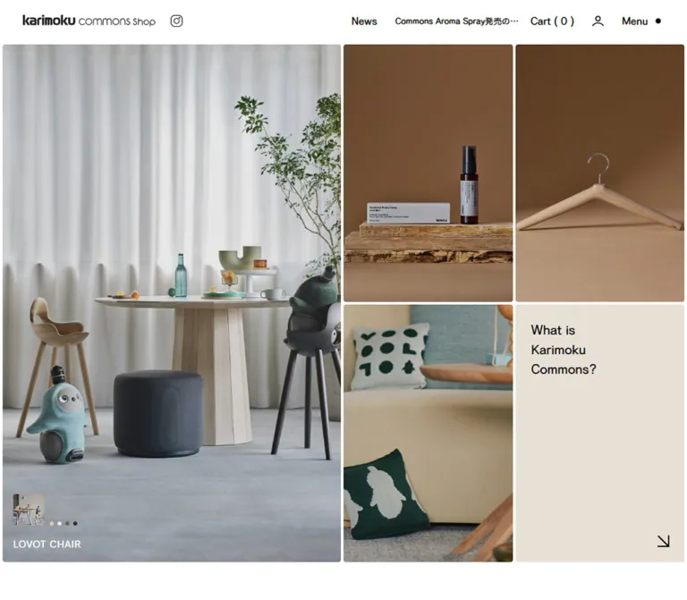
Karimoku Commons Shop gives merchandise the space normally reserved for an editorial photograph. The opening screen is almost entirely imagery: one large product scene beside four smaller tiles, separated by exceptionally narrow white gutters. Black utility text, thin outline icons, small image captions, and a single beige About tile provide just enough structure to navigate the photographs.
The page continues as a shop with curated campaigns, product discovery through images, dated announcements, and grouped service navigation. Its identity comes from the contrast between tightly assembled image fields and generous space around headings and links. Keep the commercial information available, but let material, scale, and use explain the objects before adding promotional copy.
A quiet shop window where wood, everyday objects, and small human gestures carry the visual weight.
Original URL: commons-shop.karimoku.com Final URL: commons-shop.karimoku.com Theme: light, with a white interface and warm neutral secondary surfaces Inspected: September 17, 2026, at 04:45 JST; supplied retrieval timestamp: September 16, 2026, 19:45:02.436 UTC Viewports: desktop 1440 × 1000 CSS pixels; mobile 390 × 844 CSS pixels Scope: the current shop homepage, including its opening merchandise mosaic, Featured campaign structure, Gallery, Info, persistent header, and footer. Visual captures cover the desktop opening, Gallery, and footer, plus the mobile opening and lower footer. Additional section measurements and content come from the supplied rendered DOM. Product pages, checkout, account pages, open navigation, and activated gallery hotspots were not inspected.
Karimoku Commons Shop gives merchandise the space normally reserved for an editorial photograph. The opening screen is almost entirely imagery: one large product scene beside four smaller tiles, separated by exceptionally narrow white gutters. Black utility text, thin outline icons, small image captions, and a single beige About tile provide just enough structure to navigate the photographs.
The page continues as a shop with curated campaigns, product discovery through images, dated announcements, and grouped service navigation. Its identity comes from the contrast between tightly assembled image fields and generous space around headings and links. Keep the commercial information available, but let material, scale, and use explain the objects before adding promotional copy.
| Name | Value | Suggested token | Evidence and role |
|---|---|---|---|
| Interface White | #ffffff |
--color-white |
Measured header background; visually also the main opening canvas and image gutters |
| Black Ink | #000000 |
--color-ink |
Measured main text color; visible navigation, arrows, and section rules |
| Warm Off-white | #fbf9f6 |
--color-warm |
Measured footer background; the Gallery screenshot has a visually similar warm surface, but its background-producing element was not sampled |
| About Beige | approximately #e7e1d7 |
--color-about |
Visual estimate for the solid About tile; not a measured source declaration |
| Footer Gray | #969696 |
--color-muted |
Measured footer link color |
| Navigation Charcoal | #484743 |
--color-nav-secondary |
Measured links in navigation positioned outside the viewport; the open panel was not visually inspected |
| Pale Label Gray | approximately #c4c4c4 |
--color-label |
Visual estimate for footer group labels |
| Divider Gray | approximately #c8c8c8 |
--color-divider |
Visual estimate for thin footer separators |
The warm character primarily comes from photography: honey-colored wood, gray-beige backgrounds, natural shadows, yellow fruit, and a red walking stick. These photographic colors are not evidence of a broader interface accent palette. Keep buttons and navigation neutral rather than turning the red or yellow objects into global UI colors.
There is no evidenced theme selector or alternate dark appearance. The About anchor itself reports a transparent background, so its beige appearance belongs to an unsampled surrounding or underlying layer. The suggested beige token reproduces that visible result without claiming the original layer structure.
The computed body family starts with fot-cezanne-pron, followed by Japanese and English aliases for Hiragino Kaku Gothic ProN, Meiryo, Osaka, and MS PGothic, then sans-serif.
This is evidence of the declared stack. The supplied data does not independently confirm font-file loading or which fallback rendered each glyph. Use the named first family only when it is available and appropriately licensed; otherwise retain a Japanese sans-serif fallback stack and check line wrapping.
Most sampled text uses weight 400 and normal letter spacing. The overall impression is regular, compact, and conversational. The bold karimoku portion of the wordmark belongs to the brand artwork, not evidence that a matching bold display face is used throughout the interface.
| Role | Desktop | Mobile | Evidence |
|---|---|---|---|
| Root font size | 10px |
10.4013px |
Measured; a sizing base, not the visible body-copy size throughout the page |
| News article link | 13px / 13px |
13.5217px / 13.5217px |
Measured, regular weight |
| Desktop cart label | 16px |
Replaced visually by a cart icon | Measured desktop size; its parent reports a zero-height line box |
| About tile copy | 20px / 30px |
20.8026px / 31.2039px |
Measured, weight 400 |
| Info article row | 16px / 28px |
14.5618px / 25.4832px |
Measured, weight 400 |
| Footer links | 13px / 23.4px |
13.5217px / 24.339px |
Measured, weight 400 |
| Legal links | 12px / 21px |
12.4816px / 21.8427px |
Measured, weight 400 |
| Visible section title | Approximately 40px |
Approximately 31px |
Visual estimate; the sampled H2 is a wrapper rather than the visible text-sized child |
| See All label | Approximately 24px |
Approximately 25px |
Visual estimate; its sampled anchor uses font-size: 0 around child content |
| Opening image caption | Approximately 14–16px |
Approximately 15px |
Visual estimate; white, visibly emphasized |
| Footer group label | Approximately 16px |
Approximately 16px |
Visual estimate |
The H2 wrappers report a 10px desktop font size while the visible heading is much larger. Likewise, See All anchors report font-size: 0 while their child content remains visible. Do not use those wrapper values as the displayed text size.
The mobile root is about 1.04013 times the desktop root. Numerous dimensions scale by that factor, including icon boxes, gutters, footer links, and About copy. Other roles change deliberately: Info text becomes smaller, and section titles have a smaller visual scale. A uniform zoom of the desktop page would miss these differences.
The system combines two spacing regimes: approximately four-pixel joins inside image groups, and much larger spacing around navigation, section banners, and footer groups.
| Use | Desktop | Mobile | Evidence |
|---|---|---|---|
| Opening mosaic outside inset | 4px |
Approximately 4.16px |
Measured from tile positions |
| Mosaic tile gap | 4px |
Approximately 4.16px |
Calculated from rectangles; small rounding differences occur |
| See All text-to-arrow gap | 8px |
8.32px |
Measured |
| About tile padding | 24px |
24.96px |
Measured |
| Header logo left position | 34px |
16.13px |
Measured |
| Header Instagram box | 24 × 24px |
24.95 × 24.95px |
Measured |
| Section start to H2 wrapper | 48px |
33.28px |
Calculated for Featured, Gallery, and Info |
| Footer vertical padding | 80px |
49.93px |
Measured |
| Footer outer horizontal padding | 20px |
33.28px |
Measured; desktop inner content adds further centering |
| Main-to-footer separation | 64px |
33.28px |
Calculated |
The screenshots show barely softened photograph corners, approximately 3–4px. Sampled tile anchors report border-radius: 0, so the rounding may be applied to a child or clipping wrapper. Treat 3px as a visual approximation for a new implementation, not an extracted source token.
The interface has no visible general shadow system. Rounded pills, floating cards, and thick framed panels would alter its character. Circular shapes are reserved for small pagination marks, gallery hotspots, and icon details.
Section positions below come from the supplied initial DOM coordinate system, rather than the coordinates of later scrolled screenshots.
| Element | Desktop 1440 × 1000 | Mobile 390 × 844 |
|---|---|---|
| Header | 64px high |
99.84px high |
| Opening section | y: 64, height 800px |
y: 99.84, height 665.66px |
| Lead tile | 712 × 792px at (4, 68) |
381.69 × 326.59px at (4.16, 104) |
| Each secondary tile | 356 × 394px |
188.75 × 161.22px |
| Featured section | y: 864, height 920px |
y: 765.50, height 1042.02px |
| Gallery section | y: 1784, height 1144px |
y: 1807.52, height 642.75px |
| Info section | y: 2928, height 574px |
y: 2450.27, height 555.80px |
| Footer | y: 3566, height 715.91px |
y: 3039.34, height 1027.13px |
| Document height | Approximately 4282px |
Approximately 4066px |
These heights describe the captured state and its current content. They should not become fixed heights for text-heavy sections in a reusable implementation.
Role: maintain identity and access to news, account, cart, and navigation.
On desktop, a white strip occupies 64px. The home-linked wordmark sits at x: 34px, measuring 204 × 20.39px. A 24px Instagram icon follows at x: 258px. A large area of white space separates the brand from the news group. The right side contains the cart count, account outline, and Menu label with a small filled dot.
On mobile, the header becomes two approximately 50px rows. The first contains the wordmark, Instagram, account, cart, and hamburger. The wordmark remains substantial at 197.61 × 19.75px; it does not collapse to a monogram. The second row contains the news strip and a close-shaped control.
The header remains visible in the supplied Gallery and footer captures, supporting persistent positioning. Its exact position declaration was not included. A sticky header is a suitable implementation choice.
Role: surface a current announcement without creating a large promotional banner.
The visible anatomy is a News label, a short black horizontal indicator with small gray marks, one clipped article title, and, on mobile, a close-shaped icon. The current visible article concerns the bidding flow for Behind the Archives.
The desktop title box measures approximately 287.08px wide; the mobile title box is 168.61px wide and visibly truncates. Its text stays on one line.
Three article links exist in the DOM at vertical intervals of 48px on desktop and approximately 50px on mobile. This supports a vertically arranged ticker structure. It does not establish the rotation interval, transition style, or whether a user can manually change the item. The mobile close action was not exercised.
Role: connect product discovery, information, account management, and help.
The DOM includes Search and grouped links for products, gallery browsing, About, announcements, member functions, help, and related sites. Desktop also includes Menu and Close labels.
These navigation links sit beyond the visible viewport in the sampled state: for example, the desktop product link starts at x: 1632px, and its mobile counterpart at approximately x: 686px. Their presence does not mean an open menu was captured. Panel size, entrance direction, overlay treatment, search behavior, and focus handling remain unverified.
Keep the visible opening header distinct from this hidden navigation inventory when building a reference implementation.
Role: provide direct entry into selected products and the shop's About page.
Desktop geometry is a three-column, two-row composition. The first column is twice the width of either remaining column, and the lead tile spans both rows. At the inspected width, a grid with 2fr 1fr 1fr, 4px gaps, and 4px outer padding reproduces the measured widths exactly.
The visible arrangement is:
| Position | Content | Confirmed destination |
|---|---|---|
| Large left tile | Stacking Tray scene | /products/stacking-tray |
| Upper middle | Aroma spray on a cut wooden surface | /products/karimoku-case-spray |
| Upper right | Wooden stool | /products/wk-bath-stool-l |
| Lower middle | Red walking stick detail | /products/up |
| Lower right | What is / Karimoku / Commons? | /pages/about |
On mobile, the lead tile occupies the full width above a two-column, two-row secondary grid. The lead tile becomes wider than it is tall; the desktop lead is taller than it is wide. This is a meaningful crop change, not merely a reduced desktop layout.
The tile gutters remain extremely narrow in both layouts. Avoid adding ordinary card padding, captions below every image, or borders around the photographs.
Role: make the selected product an immediately recognizable visual entry point.
The captured scene places a wooden tray beneath cut yellow fruit, sculptural wooden objects, and a hand holding a fork. The product title appears in white near the lower-left corner. A small square preview and tiny pagination marks sit above it.
The preview appears approximately 48px square on desktop and 50px square on mobile. The caption and preview begin roughly 16px inside the image edge. These are visual estimates, rather than individually sampled component measurements.
The tile is an evidenced product link. The preview and dots suggest multiple visual states, but slide changes, autoplay, and control actions were not tested. If adding real slide controls, place their buttons separately from the product anchor rather than nesting interactive buttons inside a link.
Role: introduce the broader shop identity within the product image field.
A warm beige rectangle contains three short lines of regular black copy: What is / Karimoku / Commons? The measured type is 20px / 30px on desktop and 20.80px / 31.20px on mobile, with approximately 24–25px padding. A simple diagonal arrow sits near the lower-right corner.
The mobile typography remains nearly the same physical size despite the much smaller tile. Preserve that relationship: reducing the words in proportion to the tile would weaken the design. Keep the arrow visually independent from the text block and retain the three-line composition.
Role: divide the page into Featured, Gallery, and Info without enclosing each section in a box.
Each banner combines long horizontal black rules, a large regular sans-serif title, and a downward outline arrow. The title-and-arrow cluster appears near the middle of the viewport, but its exact horizontal position changes because the banner is animated.
The DOM contains two viewport-width H2 wrappers for each section. Their measured heights are 72px on desktop and 56.16px on mobile. The wrappers have long-running slide1 and slide2 animations, described in the motion section below.
Do not treat a single screenshot's heading offset as a fixed alignment rule. For a static adaptation, center the title group between two rules. For a moving adaptation, preserve one semantic heading and hide decorative copies from assistive technology.
Role: group merchandise around exhibitions, collaborations, and product families.
The current DOM includes campaigns for Behind the Archives, Geckeler Michels, Commons Original, Original Aroma Spray, selected books, and WAKA WAKA × Karimoku. Commons Original appears again in the extracted content; the reason for the repetition was not verified.
Each group contains campaign copy, product links with names and yen prices, and, where present, a See All link. Status text includes オークション商品 and SOLD OUT. These statuses should remain associated with their products rather than becoming generic promotional badges.
Measured product-link positions form three columns on desktop, with 200px widths and 204px column pitch. Mobile positions form two columns with 176.27px widths and approximately 180.42px pitch. The six auction products occupy two desktop rows and three mobile rows.
Successive campaign groups are displaced horizontally by 1280px on desktop and 390px on mobile. This is strong evidence of a horizontal campaign arrangement, rather than seven long sections stacked down the page. Its navigation and transition behavior were not exercised.
Evidence boundary: the sampled product anchors themselves report zero height, and the supplied visual captures do not show their complete presentation. Product-image height, visible caption styling, hover overlays, and controls cannot be reconstructed reliably from those anchors. Do not reproduce zero-height links or assume that all extracted product descriptions are simultaneously visible.
Role: connect objects with scenes of use and encourage visual product discovery.
The desktop capture shows a large central photograph with smaller visible neighboring image areas. The central image begins around (361, 323) in that scrolled screenshot and is approximately 717px wide. The visible parts of its neighbors occupy about 357px at either side of the viewport and begin approximately 185px lower.
The center shows a hand arranging wooden pieces. Neighboring scenes include the tray and a hand drawing paper from a wooden holder. Thin white gaps and slightly softened corners preserve the visual connection to the opening mosaic.
The visible neighboring portions do not establish their complete offscreen dimensions. The central image also extends below the supplied viewport, so its full height was not directly measured from the screenshot.
White outlined circular hotspots sit over the photographs. They appear approximately 18–20px in diameter, with a relatively thick white ring. The DOM includes plus markers and text containing product names, prices, and Shop the Look. That supports a shoppable gallery structure, but the activation mechanism and revealed panel design remain unverified.
Role: move from a curated section to its corresponding collection or archive.
A regular black label and a thin right arrow form a centered, unboxed link. The measured anchor is 115.70 × 36px on desktop and 120.33 × 37.45px on mobile. The internal gap is 8px, scaling to 8.32px on mobile.
The visible text is approximately 24–25px. Preserve the surrounding empty space: the link works as a quiet section exit, not a filled conversion button.
Role: present recent shop announcements in a compact editorial format.
The desktop list has an 800px width, starting at x: 320px. Each sampled article link uses a flex layout and 16px / 28px text. The three row origins are 93px apart.
At mobile width, the list starts at x: 24.95px and measures 340.09px. Text becomes 14.56px / 25.48px. The first two links occupy approximately 50.97px in height as their titles wrap; the shorter third link occupies one 25.48px line. Preserve a stable date area and allow the title to wrap without shrinking it excessively.
The current entries cover a product release, the archive-sale bidding process, and a summer closure. Their dates use the YYYY.MM.DD format. Article destinations are present in the evidence, but the article pages were not opened.
Role: provide a calm, complete directory after the image-heavy shop content.
The footer has a measured #fbf9f6 background and #969696 link color. On desktop, the inner layout runs approximately from x: 80px to x: 1360px, giving a 1280px content width. The wordmark and Instagram sit on the left. The navigation occupies the right side, starting around x: 732px.
Five groups appear: Products, Ideas & info, Member, Help, and Related sites. Thin gray rules separate them. Group labels sit in a narrower left column, with links beginning at approximately x: 941px. Group starts are about 90px apart.
Mobile changes this to a single vertical stack with approximately 33.28px side padding. Each label sits above its links, and successive groups begin approximately 140px apart. The lower mobile screenshot shows this expanded vertical rhythm clearly; it is a scrolled footer, not evidence of an opened menu.
Legal links form a horizontal row at desktop size and a vertical list on mobile. Copyright moves from the desktop right edge to a separate left-aligned mobile line. The dark wordmark remains visually stronger than the surrounding muted footer text.
| Treatment | Supplied evidence | What can be concluded |
|---|---|---|
| Desktop section banners | 240s linear -120s infinite slide1 and 240s linear infinite slide2 |
Continuous, very slow linear heading-track animation is assigned |
| Mobile section banners | 120s linear -60s infinite slide1 and 120s linear infinite slide2 |
Mobile uses a shorter cycle; the exact keyframe travel distance was not supplied |
| Footer and secondary navigation links | Computed transition duration 0.3s |
A transition is defined; the changing property and triggered state were not demonstrated |
| General duration variables | --duration-short: .1s, --duration-default: .2s, --duration-long: .5s, --duration-extra-long: .6s, --duration-extended: 3s |
Available source timing tokens, not proof that every duration appears visibly on this homepage |
| Fade definition | fadeIn .6s cubic-bezier(0, 0, .3, 1) |
A source animation value exists; component usage is not established |
| Slide definition | slideIn .6s cubic-bezier(0, 0, .3, 1) forwards |
A source animation value exists; component usage is not established |
| Lead-image preview and dots | Visible in opening captures | Multiple-state affordance; autoplay, timing, and manual selection unverified |
| News indicator and stacked links | Visible indicator plus vertically offset link rectangles | Ticker structure; actual change sequence unverified |
| Gallery hotspots | Visible rings and related DOM content | Shoppable affordance; hover, click, and touch results unverified |
| Persistent header | Remains visible in scrolled captures | Persistence is observed; exact positioning implementation is unknown |
A computed animation assignment is stronger evidence than a static visual suggestion, but it does not mean a full two- or four-minute cycle was watched. Likewise, a supplied capture of a different product view does not establish its transition mechanism.
The appropriate motion character is restrained. Preserve the unusually slow section drift if implementing it, and avoid adding fast image zooms, spring movement, or continuous hotspot pulsing without a separate design decision.
| Surface | Appearance | Purpose |
|---|---|---|
| Header and main canvas | White, flat, no visible elevation shadow | Keep utility navigation crisp around the photography |
| Merchandise tiles | Photographs with very small corner softening | Let material and composition define the tile |
| About tile | Solid warm beige with black copy and arrow | Introduce a text entry point within the image field |
| Gallery field | Visually warm off-white | Separate lifestyle discovery from the white merchandise area |
| Footer | Measured warm off-white with muted text and thin rules | Create a quieter directory and service area |
| Gallery hotspots | White outlined circles over images | Locate shoppable objects without covering them with labels |
There is no evidenced glass effect, gradient panel system, or general card elevation hierarchy. Shadows within the photographs are part of the photography, not CSS decoration.
Photography is the principal design material. The current opening image combines wood grain, cut fruit, utensils, and a hand in use. The spray tile places a dark bottle against a rough wooden cross-section. The stool tile emphasizes pale timber, while the red walking stick adds a localized color contrast.
The Gallery continues this tactile approach through hands arranging or using everyday objects. Product discovery happens through scale, texture, and action, rather than through dense labels over every image. Backgrounds are usually quiet, warm, and low in visual clutter.
Use large, well-resolved photographs with intentional negative space. Choose crops independently for the tall desktop opening tile and the wider mobile version. Preserve recognizable product edges and hand gestures, and keep labels away from busy highlights.
The desktop stool tile shows an assembled stool on beige; the mobile capture shows separate wooden parts on white. This is a difference between captured states. The evidence does not establish whether it results from responsive art direction, timed changes, or another mechanism.
No image src, srcset, logo filename, or downloadable asset path was supplied. The following are confirmed page destinations associated with visible tiles, not image-file URLs.
| Visual | Confirmed destination | Boundary |
|---|---|---|
| Stacking Tray scene | Stacking Tray | Homepage tile association verified; destination page not inspected |
| Spray bottle on wood | KARIMOKU CASE Spray | Homepage tile association verified |
| Wooden stool tile | WK Bath Stool L | Same destination appears in desktop and mobile evidence |
| Red walking stick | UP | Homepage tile association verified |
| Beige introductory tile | About | Link destination verified; About page contents not inspected |
Use authorized original assets when available. Do not invent source filenames or expect CSS alone to recreate the material character of these photographs.
The opening mosaic nearly fills the first viewport below the header. Its 800px section height leaves the start of Featured visible near the bottom of the 1000px capture. The desktop layout can be described precisely as a lead column twice the width of either secondary column, with the lead spanning both image rows.
The calculated lead-image aspect ratio is approximately 0.899, while the smaller tiles are approximately 0.904. Their related portrait proportions help the opening read as one assembled surface.
Below the mosaic, the page alternates full-width section banners with more contained content. The Info list narrows to 800px; the footer uses a broader 1280px inner area. Do not impose one universal max-width on all sections.
The header adds a second row for news, increasing from 64px to approximately 100px. The opening mosaic reorders to one large tile followed by four smaller tiles in two columns. The lead aspect ratio becomes approximately 1.169, and the smaller tiles approximately 1.171.
The lead tile and the combined two-row secondary grid have almost equal heights, separated by a narrow gutter. The About text retains its visual scale, while the red walking stick is cropped much more tightly.
Featured product positions change from three columns to two. Campaign groups remain horizontally displaced in the DOM. The Gallery section becomes much shorter, but no mobile Gallery screenshot was supplied, so its exact visible image arrangement remains unknown.
The footer becomes taller as its side-by-side desktop groups become stacked label-and-link groups. This explains why the overall mobile document is not simply a scaled desktop page.
Only two viewport endpoints were supplied. The breakpoint, intermediate tablet behavior, full responsive sizing formula, safe-area rules, and landscape treatment are unknown.
The CSS below uses a recommended 60rem breakpoint and a small viewport-based unit to approximate the measured mobile endpoint. Those are adaptation choices. Test intermediate widths, text enlargement, and longer content before adopting them.
4px at the inspected desktop scale.These are recommendations for a new implementation, not verified features of the original page:
#ffffff.#000000.#fbf9f6.#e7e1d7.#969696; use a darker alternative when required for readability.“Create an editorial furniture and household-goods shop inspired by the current Karimoku Commons Shop homepage. Use a white persistent header, compact black navigation, regular Japanese sans-serif typography, and an opening image mosaic with approximately four-pixel gutters. On desktop, place one tall product photograph at left beside a two-by-two set of supporting tiles; make the lower-right tile warm beige with three lines of About copy and a diagonal arrow. On mobile, place the lead image above the two-column secondary grid and move news into a second header row. Continue with curated merchandise, a shoppable lifestyle gallery, dated announcements, and a warm off-white directory footer. Use thin arrows, unboxed See All links, generous section spacing, and tactile photography. Treat carousel mechanics and unseen panels as new implementation decisions.”
2fr 1fr 1fr desktop grid, two equal rows, four-pixel gutters, and a left tile spanning both rows. Use warm product photography, tiny corner softening, and one beige About tile. At mobile size, move the lead image above a two-by-two secondary grid and retain approximately 21px About copy.”This is an implementation adaptation, not recovered source CSS. It preserves measured desktop geometry and closely approximates the supplied mobile endpoint while retaining a conventional document root size.
The 60rem breakpoint, mobile unit formula, estimated colors, card rounding, static banner, and readable-footer option are recommendations. Header persistence is implemented with sticky. Actual image assets, open navigation, carousels, gallery popovers, and their behavior require separate implementation.
Use the five mosaic area classes on direct children. Supply brand artwork and SVG icons independently. The font stack below uses English fallback aliases for brevity.
:root {
  /* Measured colors unless marked as an approximation. */
  --color-white: #ffffff;
  --color-ink: #000000;
  --color-warm: #fbf9f6;
  --color-muted: #969696;
  --color-nav-secondary: #484743;
  --color-about: #e7e1d7; /* Visual approximation. */
  --color-label: #c4c4c4; /* Visual approximation. */
  --color-divider: #c8c8c8; /* Visual approximation. */

  --font-shop: fot-cezanne-pron, 'Hiragino Kaku Gothic ProN',
    Meiryo, Osaka, 'MS PGothic', sans-serif;
  --unit: 1px;
  --tile-gap: calc(4 * var(--unit));
  --tile-radius: 3px; /* Visible-result approximation. */
  --header-height: calc(64 * var(--unit));
  --mosaic-height: calc(800 * var(--unit));
  --text-section: calc(40 * var(--unit));
  --text-about: calc(20 * var(--unit));
  --text-link: calc(24 * var(--unit));
  --text-small: calc(13 * var(--unit));
  --text-legal: calc(12 * var(--unit));
  --footer-width: 1280px;
  --info-width: 800px;

  /* Observed timing values; use only for implemented behaviors. */
  --motion-link: 300ms;
  --motion-banner: 240s;
}

* { box-sizing: border-box; }
body { margin: 0; }

.shop {
  color: var(--color-ink);
  background: var(--color-white);
  font-family: var(--font-shop);
  font-size: 16px;
  font-weight: 400;
  line-height: 1.75;
}

.shop a { color: inherit; text-decoration: none; }
.shop button { font: inherit; }
.shop img { max-width: 100%; }

.shop :focus-visible {
  outline: 2px solid currentColor;
  outline-offset: 4px;
}

.site-header {
  position: sticky;
  top: 0;
  z-index: 20;
  display: grid;
  grid-template-columns: auto minmax(0, 1fr) auto;
  align-items: center;
  gap: calc(32 * var(--unit));
  height: var(--header-height);
  padding-inline: 34px;
  background: var(--color-white);
}

.brand-group,
.header-tools {
  display: flex;
  align-items: center;
}

.brand-group { gap: calc(20 * var(--unit)); }
.header-tools { gap: calc(24 * var(--unit)); }
.brand-logo { display: block; width: 204px; height: auto; }

.shop-icon {
  display: block;
  width: calc(24 * var(--unit));
  height: calc(24 * var(--unit));
  flex: none;
}

.header-tools button {
  border: 0;
  padding: 0;
  color: inherit;
  background: transparent;
  cursor: pointer;
}

.tool-cart { order: 1; }
.tool-account { order: 2; }
.tool-menu { order: 3; }
.cart-icon,
.menu-icon,
.news-close { display: none; }

.news-strip {
  justify-self: end;
  display: flex;
  align-items: center;
  gap: calc(16 * var(--unit));
  width: min(100%, 436px);
  min-width: 0;
}

.news-label,
.news-indicator { flex: none; }

.news-indicator {
  width: calc(44 * var(--unit));
  height: 3px;
  background: currentColor;
}

.news-title {
  flex: 1;
  min-width: 0;
  overflow: hidden;
  white-space: nowrap;
  text-overflow: ellipsis;
  font-size: var(--text-small);
  line-height: 1;
}

.shop-mosaic {
  display: grid;
  grid-template-columns: 2fr 1fr 1fr;
  grid-template-rows: repeat(2, minmax(0, 1fr));
  grid-template-areas:
    'lead spray stool'
    'lead up about';
  gap: var(--tile-gap);
  height: var(--mosaic-height);
  padding: var(--tile-gap);
}

.tile-lead { grid-area: lead; }
.tile-spray { grid-area: spray; }
.tile-stool { grid-area: stool; }
.tile-up { grid-area: up; }
.tile-about { grid-area: about; }

.mosaic-tile {
  position: relative;
  display: block;
  min-width: 0;
  min-height: 0;
  overflow: hidden;
  border-radius: var(--tile-radius);
}

.mosaic-tile > img {
  display: block;
  width: 100%;
  height: 100%;
  object-fit: cover;
  object-position: var(--image-focus, 50% 50%);
}

.mosaic-tile:focus-visible { outline-offset: -4px; }

.lead-caption {
  position: absolute;
  left: calc(16 * var(--unit));
  bottom: calc(16 * var(--unit));
  color: var(--color-white);
  font-size: calc(14 * var(--unit));
  font-weight: 600; /* Approximation of the emphasized caption. */
  line-height: 1.4;
}

.lead-preview {
  position: absolute;
  left: calc(16 * var(--unit));
  bottom: calc(56 * var(--unit));
  width: calc(48 * var(--unit));
  height: calc(48 * var(--unit));
  overflow: hidden;
  border-radius: var(--tile-radius);
}

.lead-preview img {
  display: block;
  width: 100%;
  height: 100%;
  object-fit: cover;
}

.tile-about {
  padding: calc(24 * var(--unit));
  color: var(--color-ink);
  background: var(--color-about);
  font-size: var(--text-about);
  line-height: 1.5;
}

.tile-about p { margin: 0; }

.tile-about .shop-icon {
  position: absolute;
  right: calc(24 * var(--unit));
  bottom: calc(24 * var(--unit));
}

/* Static adaptation of the observed moving section banner. */
.section-banner {
  display: flex;
  align-items: center;
  gap: calc(16 * var(--unit));
  min-height: calc(72 * var(--unit));
  margin: calc(48 * var(--unit)) 0 0;
  font-size: var(--text-section);
  font-weight: 400;
  line-height: 1.3;
}

.section-banner::before,
.section-banner::after {
  content: '';
  flex: 1;
  height: 1px;
  background: currentColor;
}

.section-banner__label {
  display: inline-flex;
  align-items: center;
  gap: calc(16 * var(--unit));
  white-space: nowrap;
}

.section-banner__label svg {
  width: calc(36 * var(--unit));
  height: calc(36 * var(--unit));
}

.see-all-wrap {
  display: flex;
  justify-content: center;
  padding-block: calc(40 * var(--unit));
}

.see-all {
  display: inline-flex;
  align-items: center;
  gap: calc(8 * var(--unit));
  min-height: calc(36 * var(--unit));
  font-size: var(--text-link);
  line-height: 1.5;
}

/* Product geometry adaptation; full original card styling is unverified. */
.product-grid {
  display: grid;
  grid-template-columns: repeat(3, minmax(0, 1fr));
  gap: var(--tile-gap);
  width: min(100%, 608px);
}

.product-card { min-width: 0; }
.product-card img {
  display: block;
  width: 100%;
  aspect-ratio: 1; /* Recommended placeholder geometry. */
  object-fit: cover;
}

.product-card__name,
.product-card__price {
  margin: 0;
  font-size: var(--text-small);
  line-height: 1.8;
}

.gallery-surface { background: var(--color-warm); }

/* Hotspot placement uses coordinates supplied for each actual image. */
.gallery-image { position: relative; }
.gallery-image > img { display: block; width: 100%; }

.gallery-hotspot {
  position: absolute;
  left: var(--hotspot-x, 50%);
  top: var(--hotspot-y, 50%);
  display: grid;
  place-items: center;
  width: 44px;
  height: 44px;
  padding: 0;
  border: 0;
  background: transparent;
  transform: translate(-50%, -50%);
  cursor: pointer;
}

.gallery-hotspot::before {
  content: '';
  width: 20px;
  height: 20px;
  border: 4px solid white;
  border-radius: 50%;
}

.gallery-hotspot:focus-visible {
  outline-color: white;
  box-shadow: 0 0 0 2px black;
}

.info-list {
  display: grid;
  gap: 65px;
  width: min(var(--info-width), calc(100% - 48px));
  margin: 92px auto 0;
  padding: 0;
  list-style: none;
}

.info-link {
  display: grid;
  grid-template-columns: max-content minmax(0, 1fr);
  gap: 24px; /* Recommended date-to-title spacing. */
  font-size: 16px;
  line-height: 28px;
}

.site-footer {
  margin-top: 64px;
  padding: 80px 20px;
  color: var(--color-muted);
  background: var(--color-warm);
}

.footer-inner {
  width: min(100%, var(--footer-width));
  margin-inline: auto;
}

.footer-grid {
  display: grid;
  grid-template-columns: repeat(2, minmax(0, 1fr));
  gap: 24px;
}

.footer-brand .social-link {
  display: block;
  width: max-content;
  margin-top: 24px;
}

.footer-group {
  display: grid;
  grid-template-columns: 1fr 2fr;
  border-top: 1px solid var(--color-divider);
  padding: 12px 0 28px;
}

.footer-group:last-child { padding-bottom: 0; }

.footer-group h3 {
  margin: 0;
  color: var(--color-label);
  font-size: 16px;
  font-weight: 400;
  line-height: 1.5;
}

.footer-links {
  display: grid;
  gap: calc(2 * var(--unit));
}

.footer-links a {
  font-size: var(--text-small);
  line-height: 1.8;
}

.footer-bottom {
  display: flex;
  justify-content: space-between;
  gap: 24px;
  margin-top: 110px;
  font-size: var(--text-legal);
  line-height: 1.75;
}

.footer-legal {
  display: flex;
  flex-wrap: wrap;
  gap: 12px;
}

/* Optional readability improvement, not the observed footer palette. */
.shop[data-readable='true'] .site-footer {
  --color-muted: #6e6b65;
  --color-label: #6e6b65;
}

@media (max-width: 60rem) {
  .shop {
    /* Recommended interpolation matching the 390px endpoint closely. */
    --unit: clamp(0.9px, 0.2667vw, 1.2px);
    --header-height: calc(96 * var(--unit));
    --mosaic-height: calc(640 * var(--unit));
    --text-section: calc(30 * var(--unit));
    --motion-banner: 120s;
  }

  .site-header {
    grid-template-columns: minmax(0, 1fr) auto;
    grid-template-rows: repeat(2, minmax(0, 1fr));
    gap: 0 calc(16 * var(--unit));
    padding-inline: calc(15.5 * var(--unit));
  }

  .brand-group { gap: calc(8 * var(--unit)); min-width: 0; }
  .brand-logo { width: calc(190 * var(--unit)); }
  .brand-group > a:first-child { min-width: 0; }
  .header-tools { gap: calc(16 * var(--unit)); }
  .tool-account { order: 1; }
  .tool-cart { order: 2; }
  .cart-label,
  .menu-label { display: none; }
  .cart-icon,
  .menu-icon,
  .news-close { display: block; }

  .news-strip {
    grid-column: 1 / -1;
    grid-row: 2;
    width: 100%;
  }

  .news-close { flex: none; }

  .shop-mosaic {
    grid-template-columns: repeat(2, minmax(0, 1fr));
    grid-template-rows:
      calc((100% - var(--tile-gap)) / 2)
      minmax(0, 1fr) minmax(0, 1fr);
    grid-template-areas:
      'lead lead'
      'spray stool'
      'up about';
  }

  .section-banner {
    min-height: calc(54 * var(--unit));
    margin-top: calc(32 * var(--unit));
  }

  .section-banner__label svg {
    width: calc(28 * var(--unit));
    height: calc(28 * var(--unit));
  }

  .product-grid {
    grid-template-columns: repeat(2, minmax(0, 1fr));
    width: calc(100% - 32 * var(--unit));
    margin-inline: auto;
  }

  .info-list {
    width: calc(100% - 48 * var(--unit));
    gap: calc(49 * var(--unit));
    margin-top: calc(80 * var(--unit));
  }

  .info-link {
    gap: calc(16 * var(--unit));
    font-size: calc(14 * var(--unit));
    line-height: 1.75;
  }

  .site-footer {
    margin-top: calc(32 * var(--unit));
    padding: calc(48 * var(--unit)) calc(32 * var(--unit));
  }

  .footer-grid {
    grid-template-columns: minmax(0, 1fr);
    gap: calc(40 * var(--unit));
  }

  .footer-group {
    display: block;
    padding: calc(12 * var(--unit)) 0 calc(24 * var(--unit));
  }

  .footer-group h3 {
    margin-bottom: calc(25 * var(--unit));
    font-size: calc(16 * var(--unit));
  }

  .footer-bottom {
    flex-direction: column;
    gap: calc(40 * var(--unit));
    margin-top: calc(28 * var(--unit));
  }

  .footer-legal {
    flex-direction: column;
    gap: calc(2 * var(--unit));
  }
}

@media (prefers-reduced-motion: reduce) {
  /* Apply these classes if the corresponding motion is implemented. */
  .shop .section-banner__track { animation: none; transform: none; }
  .shop .section-banner__copy { display: none; }
  .shop .carousel-track { scroll-behavior: auto; }
}
The product-grid rules are deliberately identified as an adaptation: the evidence supports column widths and placement, but not a complete visible product-card design. The gallery rules provide an accessible marker target without inventing the unobserved gallery panel or mobile image arrangement.
The section banner is static in this starter. To reproduce the observed drift, add a clipped track with decorative copies, use the measured duration tokens, and implement pause and reduced-motion behavior. The original keyframe paths were not supplied, so the animation names alone are insufficient to recover the exact travel geometry.
Optional aliases for a project that already uses Tailwind v4. These do not imply that the original site uses Tailwind. Load the custom properties above and use a .shop ancestor so the mobile unit overrides remain available.
@theme inline {
  --color-shop-white: var(--color-white);
  --color-shop-ink: var(--color-ink);
  --color-shop-warm: var(--color-warm);
  --color-shop-about: var(--color-about);
  --color-shop-muted: var(--color-muted);
  --color-shop-divider: var(--color-divider);

  --font-shop-ui: var(--font-shop);
  --text-shop-section: var(--text-section);
  --text-shop-about: var(--text-about);
  --text-shop-link: var(--text-link);
  --text-shop-small: var(--text-small);
  --text-shop-legal: var(--text-legal);

  --spacing-shop-gap: var(--tile-gap);
  --spacing-shop-inset: calc(24 * var(--unit));
  --radius-shop-tile: var(--tile-radius);
}
200 and no URL change.2026-09-16T19:45:02.436Z, equivalent to September 17, 2026, 04:45:02.436 JST.4282px.4066px.This reference analyzes the current original-page evidence supplied for these viewports. No additional browsing or interactive testing was performed. CSS adaptations and accessibility recommendations are explicitly separate from observed behavior.
# Karimoku Commons Shop — Style Reference

> A quiet shop window where wood, everyday objects, and small human gestures carry the visual weight.

**Original URL:** [commons-shop.karimoku.com](https://commons-shop.karimoku.com/)
**Final URL:** [commons-shop.karimoku.com](https://commons-shop.karimoku.com/)
**Theme:** light, with a white interface and warm neutral secondary surfaces
**Inspected:** September 17, 2026, at 04:45 JST; supplied retrieval timestamp: September 16, 2026, 19:45:02.436 UTC
**Viewports:** desktop 1440 × 1000 CSS pixels; mobile 390 × 844 CSS pixels
**Scope:** the current shop homepage, including its opening merchandise mosaic, Featured campaign structure, Gallery, Info, persistent header, and footer. Visual captures cover the desktop opening, Gallery, and footer, plus the mobile opening and lower footer. Additional section measurements and content come from the supplied rendered DOM. Product pages, checkout, account pages, open navigation, and activated gallery hotspots were not inspected.

Karimoku Commons Shop gives merchandise the space normally reserved for an editorial photograph. The opening screen is almost entirely imagery: one large product scene beside four smaller tiles, separated by exceptionally narrow white gutters. Black utility text, thin outline icons, small image captions, and a single beige About tile provide just enough structure to navigate the photographs.

The page continues as a shop with curated campaigns, product discovery through images, dated announcements, and grouped service navigation. Its identity comes from the contrast between tightly assembled image fields and generous space around headings and links. Keep the commercial information available, but let material, scale, and use explain the objects before adding promotional copy.
# Karimoku Commons Shop — Style Reference

> A quiet shop window where wood, everyday objects, and small human gestures carry the visual weight.

**Original URL:** [commons-shop.karimoku.com](https://commons-shop.karimoku.com/)
**Final URL:** [commons-shop.karimoku.com](https://commons-shop.karimoku.com/)
**Theme:** light, with a white interface and warm neutral secondary surfaces
**Inspected:** September 17, 2026, at 04:45 JST; supplied retrieval timestamp: September 16, 2026, 19:45:02.436 UTC
**Viewports:** desktop 1440 × 1000 CSS pixels; mobile 390 × 844 CSS pixels
**Scope:** the current shop homepage, including its opening merchandise mosaic, Featured campaign structure, Gallery, Info, persistent header, and footer. Visual captures cover the desktop opening, Gallery, and footer, plus the mobile opening and lower footer. Additional section measurements and content come from the supplied rendered DOM. Product pages, checkout, account pages, open navigation, and activated gallery hotspots were not inspected.

Karimoku Commons Shop gives merchandise the space normally reserved for an editorial photograph. The opening screen is almost entirely imagery: one large product scene beside four smaller tiles, separated by exceptionally narrow white gutters. Black utility text, thin outline icons, small image captions, and a single beige About tile provide just enough structure to navigate the photographs.

The page continues as a shop with curated campaigns, product discovery through images, dated announcements, and grouped service navigation. Its identity comes from the contrast between tightly assembled image fields and generous space around headings and links. Keep the commercial information available, but let material, scale, and use explain the objects before adding promotional copy.

## How to Read This Reference

- **Measured** means supplied DOM geometry or computed styles at one of the two inspected viewports. Measurements are rounded for readability unless precision explains a relationship.
- **Visual estimate** means an approximation from a current screenshot. Estimated colors were not obtained through pixel sampling.
- **Calculated** means arithmetic based on measured rectangles, such as a gutter or aspect ratio. It does not establish the original CSS formula.
- **Recommended** means a choice for a new implementation. Breakpoints, untested interactions, accessibility improvements, and the CSS adaptation are labeled accordingly.
- **Token names** are descriptive implementation aliases unless explicitly identified as source custom properties.
- **DOM presence is not visibility.** The evidence contains navigation outside the viewport, horizontally displaced campaign content, duplicate animated headings, and product links whose own rectangles have zero height. These require interpretation rather than literal reproduction.

## Tokens — Colors

### Default Palette

| Name | Value | Suggested token | Evidence and role |
| --- | --- | --- | --- |
| Interface White | `#ffffff` | `--color-white` | Measured header background; visually also the main opening canvas and image gutters |
| Black Ink | `#000000` | `--color-ink` | Measured main text color; visible navigation, arrows, and section rules |
| Warm Off-white | `#fbf9f6` | `--color-warm` | Measured footer background; the Gallery screenshot has a visually similar warm surface, but its background-producing element was not sampled |
| About Beige | approximately `#e7e1d7` | `--color-about` | Visual estimate for the solid About tile; not a measured source declaration |
| Footer Gray | `#969696` | `--color-muted` | Measured footer link color |
| Navigation Charcoal | `#484743` | `--color-nav-secondary` | Measured links in navigation positioned outside the viewport; the open panel was not visually inspected |
| Pale Label Gray | approximately `#c4c4c4` | `--color-label` | Visual estimate for footer group labels |
| Divider Gray | approximately `#c8c8c8` | `--color-divider` | Visual estimate for thin footer separators |

The warm character primarily comes from photography: honey-colored wood, gray-beige backgrounds, natural shadows, yellow fruit, and a red walking stick. These photographic colors are not evidence of a broader interface accent palette. Keep buttons and navigation neutral rather than turning the red or yellow objects into global UI colors.

There is no evidenced theme selector or alternate dark appearance. The About anchor itself reports a transparent background, so its beige appearance belongs to an unsampled surrounding or underlying layer. The suggested beige token reproduces that visible result without claiming the original layer structure.

## Tokens — Typography

### Observed Font Stack

The computed body family starts with `fot-cezanne-pron`, followed by Japanese and English aliases for Hiragino Kaku Gothic ProN, Meiryo, Osaka, and MS PGothic, then `sans-serif`.

This is evidence of the declared stack. The supplied data does not independently confirm font-file loading or which fallback rendered each glyph. Use the named first family only when it is available and appropriately licensed; otherwise retain a Japanese sans-serif fallback stack and check line wrapping.

Most sampled text uses weight `400` and normal letter spacing. The overall impression is regular, compact, and conversational. The bold `karimoku` portion of the wordmark belongs to the brand artwork, not evidence that a matching bold display face is used throughout the interface.

### Type Scale

| Role | Desktop | Mobile | Evidence |
| --- | --- | --- | --- |
| Root font size | `10px` | `10.4013px` | Measured; a sizing base, not the visible body-copy size throughout the page |
| News article link | `13px / 13px` | `13.5217px / 13.5217px` | Measured, regular weight |
| Desktop cart label | `16px` | Replaced visually by a cart icon | Measured desktop size; its parent reports a zero-height line box |
| About tile copy | `20px / 30px` | `20.8026px / 31.2039px` | Measured, weight `400` |
| Info article row | `16px / 28px` | `14.5618px / 25.4832px` | Measured, weight `400` |
| Footer links | `13px / 23.4px` | `13.5217px / 24.339px` | Measured, weight `400` |
| Legal links | `12px / 21px` | `12.4816px / 21.8427px` | Measured, weight `400` |
| Visible section title | Approximately `40px` | Approximately `31px` | Visual estimate; the sampled H2 is a wrapper rather than the visible text-sized child |
| See All label | Approximately `24px` | Approximately `25px` | Visual estimate; its sampled anchor uses `font-size: 0` around child content |
| Opening image caption | Approximately `14–16px` | Approximately `15px` | Visual estimate; white, visibly emphasized |
| Footer group label | Approximately `16px` | Approximately `16px` | Visual estimate |

### Measurement Caveats

The H2 wrappers report a `10px` desktop font size while the visible heading is much larger. Likewise, See All anchors report `font-size: 0` while their child content remains visible. Do not use those wrapper values as the displayed text size.

The mobile root is about `1.04013` times the desktop root. Numerous dimensions scale by that factor, including icon boxes, gutters, footer links, and About copy. Other roles change deliberately: Info text becomes smaller, and section titles have a smaller visual scale. A uniform zoom of the desktop page would miss these differences.

## Tokens — Spacing & Shapes

The system combines two spacing regimes: approximately four-pixel joins inside image groups, and much larger spacing around navigation, section banners, and footer groups.

### Spacing Scale

| Use | Desktop | Mobile | Evidence |
| --- | --- | --- | --- |
| Opening mosaic outside inset | `4px` | Approximately `4.16px` | Measured from tile positions |
| Mosaic tile gap | `4px` | Approximately `4.16px` | Calculated from rectangles; small rounding differences occur |
| See All text-to-arrow gap | `8px` | `8.32px` | Measured |
| About tile padding | `24px` | `24.96px` | Measured |
| Header logo left position | `34px` | `16.13px` | Measured |
| Header Instagram box | `24 × 24px` | `24.95 × 24.95px` | Measured |
| Section start to H2 wrapper | `48px` | `33.28px` | Calculated for Featured, Gallery, and Info |
| Footer vertical padding | `80px` | `49.93px` | Measured |
| Footer outer horizontal padding | `20px` | `33.28px` | Measured; desktop inner content adds further centering |
| Main-to-footer separation | `64px` | `33.28px` | Calculated |

### Border Radius

The screenshots show barely softened photograph corners, approximately `3–4px`. Sampled tile anchors report `border-radius: 0`, so the rounding may be applied to a child or clipping wrapper. Treat `3px` as a visual approximation for a new implementation, not an extracted source token.

The interface has no visible general shadow system. Rounded pills, floating cards, and thick framed panels would alter its character. Circular shapes are reserved for small pagination marks, gallery hotspots, and icon details.

### Layout Measurements

Section positions below come from the supplied initial DOM coordinate system, rather than the coordinates of later scrolled screenshots.

| Element | Desktop 1440 × 1000 | Mobile 390 × 844 |
| --- | --- | --- |
| Header | `64px` high | `99.84px` high |
| Opening section | `y: 64`, height `800px` | `y: 99.84`, height `665.66px` |
| Lead tile | `712 × 792px` at `(4, 68)` | `381.69 × 326.59px` at `(4.16, 104)` |
| Each secondary tile | `356 × 394px` | `188.75 × 161.22px` |
| Featured section | `y: 864`, height `920px` | `y: 765.50`, height `1042.02px` |
| Gallery section | `y: 1784`, height `1144px` | `y: 1807.52`, height `642.75px` |
| Info section | `y: 2928`, height `574px` | `y: 2450.27`, height `555.80px` |
| Footer | `y: 3566`, height `715.91px` | `y: 3039.34`, height `1027.13px` |
| Document height | Approximately `4282px` | Approximately `4066px` |

These heights describe the captured state and its current content. They should not become fixed heights for text-heavy sections in a reusable implementation.

## Components

### Persistent Shop Header

**Role:** maintain identity and access to news, account, cart, and navigation.

On desktop, a white strip occupies `64px`. The home-linked wordmark sits at `x: 34px`, measuring `204 × 20.39px`. A `24px` Instagram icon follows at `x: 258px`. A large area of white space separates the brand from the news group. The right side contains the cart count, account outline, and Menu label with a small filled dot.

On mobile, the header becomes two approximately `50px` rows. The first contains the wordmark, Instagram, account, cart, and hamburger. The wordmark remains substantial at `197.61 × 19.75px`; it does not collapse to a monogram. The second row contains the news strip and a close-shaped control.

The header remains visible in the supplied Gallery and footer captures, supporting persistent positioning. Its exact `position` declaration was not included. A sticky header is a suitable implementation choice.

### News Strip

**Role:** surface a current announcement without creating a large promotional banner.

The visible anatomy is a News label, a short black horizontal indicator with small gray marks, one clipped article title, and, on mobile, a close-shaped icon. The current visible article concerns the bidding flow for Behind the Archives.

The desktop title box measures approximately `287.08px` wide; the mobile title box is `168.61px` wide and visibly truncates. Its text stays on one line.

Three article links exist in the DOM at vertical intervals of `48px` on desktop and approximately `50px` on mobile. This supports a vertically arranged ticker structure. It does not establish the rotation interval, transition style, or whether a user can manually change the item. The mobile close action was not exercised.

### Navigation Inventory

**Role:** connect product discovery, information, account management, and help.

The DOM includes Search and grouped links for products, gallery browsing, About, announcements, member functions, help, and related sites. Desktop also includes Menu and Close labels.

These navigation links sit beyond the visible viewport in the sampled state: for example, the desktop product link starts at `x: 1632px`, and its mobile counterpart at approximately `x: 686px`. Their presence does not mean an open menu was captured. Panel size, entrance direction, overlay treatment, search behavior, and focus handling remain unverified.

Keep the visible opening header distinct from this hidden navigation inventory when building a reference implementation.

### Opening Merchandise Mosaic

**Role:** provide direct entry into selected products and the shop's About page.

Desktop geometry is a three-column, two-row composition. The first column is twice the width of either remaining column, and the lead tile spans both rows. At the inspected width, a grid with `2fr 1fr 1fr`, `4px` gaps, and `4px` outer padding reproduces the measured widths exactly.

The visible arrangement is:

| Position | Content | Confirmed destination |
| --- | --- | --- |
| Large left tile | Stacking Tray scene | `/products/stacking-tray` |
| Upper middle | Aroma spray on a cut wooden surface | `/products/karimoku-case-spray` |
| Upper right | Wooden stool | `/products/wk-bath-stool-l` |
| Lower middle | Red walking stick detail | `/products/up` |
| Lower right | What is / Karimoku / Commons? | `/pages/about` |

On mobile, the lead tile occupies the full width above a two-column, two-row secondary grid. The lead tile becomes wider than it is tall; the desktop lead is taller than it is wide. This is a meaningful crop change, not merely a reduced desktop layout.

The tile gutters remain extremely narrow in both layouts. Avoid adding ordinary card padding, captions below every image, or borders around the photographs.

### Lead Product Tile

**Role:** make the selected product an immediately recognizable visual entry point.

The captured scene places a wooden tray beneath cut yellow fruit, sculptural wooden objects, and a hand holding a fork. The product title appears in white near the lower-left corner. A small square preview and tiny pagination marks sit above it.

The preview appears approximately `48px` square on desktop and `50px` square on mobile. The caption and preview begin roughly `16px` inside the image edge. These are visual estimates, rather than individually sampled component measurements.

The tile is an evidenced product link. The preview and dots suggest multiple visual states, but slide changes, autoplay, and control actions were not tested. If adding real slide controls, place their buttons separately from the product anchor rather than nesting interactive buttons inside a link.

### About Tile

**Role:** introduce the broader shop identity within the product image field.

A warm beige rectangle contains three short lines of regular black copy: What is / Karimoku / Commons? The measured type is `20px / 30px` on desktop and `20.80px / 31.20px` on mobile, with approximately `24–25px` padding. A simple diagonal arrow sits near the lower-right corner.

The mobile typography remains nearly the same physical size despite the much smaller tile. Preserve that relationship: reducing the words in proportion to the tile would weaken the design. Keep the arrow visually independent from the text block and retain the three-line composition.

### Moving Section Banner

**Role:** divide the page into Featured, Gallery, and Info without enclosing each section in a box.

Each banner combines long horizontal black rules, a large regular sans-serif title, and a downward outline arrow. The title-and-arrow cluster appears near the middle of the viewport, but its exact horizontal position changes because the banner is animated.

The DOM contains two viewport-width H2 wrappers for each section. Their measured heights are `72px` on desktop and `56.16px` on mobile. The wrappers have long-running `slide1` and `slide2` animations, described in the motion section below.

Do not treat a single screenshot's heading offset as a fixed alignment rule. For a static adaptation, center the title group between two rules. For a moving adaptation, preserve one semantic heading and hide decorative copies from assistive technology.

### Featured Campaign Frame

**Role:** group merchandise around exhibitions, collaborations, and product families.

The current DOM includes campaigns for Behind the Archives, Geckeler Michels, Commons Original, Original Aroma Spray, selected books, and WAKA WAKA × Karimoku. Commons Original appears again in the extracted content; the reason for the repetition was not verified.

Each group contains campaign copy, product links with names and yen prices, and, where present, a See All link. Status text includes `オークション商品` and SOLD OUT. These statuses should remain associated with their products rather than becoming generic promotional badges.

Measured product-link positions form three columns on desktop, with `200px` widths and `204px` column pitch. Mobile positions form two columns with `176.27px` widths and approximately `180.42px` pitch. The six auction products occupy two desktop rows and three mobile rows.

Successive campaign groups are displaced horizontally by `1280px` on desktop and `390px` on mobile. This is strong evidence of a horizontal campaign arrangement, rather than seven long sections stacked down the page. Its navigation and transition behavior were not exercised.

**Evidence boundary:** the sampled product anchors themselves report zero height, and the supplied visual captures do not show their complete presentation. Product-image height, visible caption styling, hover overlays, and controls cannot be reconstructed reliably from those anchors. Do not reproduce zero-height links or assume that all extracted product descriptions are simultaneously visible.

### Gallery Image Group

**Role:** connect objects with scenes of use and encourage visual product discovery.

The desktop capture shows a large central photograph with smaller visible neighboring image areas. The central image begins around `(361, 323)` in that scrolled screenshot and is approximately `717px` wide. The visible parts of its neighbors occupy about `357px` at either side of the viewport and begin approximately `185px` lower.

The center shows a hand arranging wooden pieces. Neighboring scenes include the tray and a hand drawing paper from a wooden holder. Thin white gaps and slightly softened corners preserve the visual connection to the opening mosaic.

The visible neighboring portions do not establish their complete offscreen dimensions. The central image also extends below the supplied viewport, so its full height was not directly measured from the screenshot.

White outlined circular hotspots sit over the photographs. They appear approximately `18–20px` in diameter, with a relatively thick white ring. The DOM includes plus markers and text containing product names, prices, and Shop the Look. That supports a shoppable gallery structure, but the activation mechanism and revealed panel design remain unverified.

### See All Link

**Role:** move from a curated section to its corresponding collection or archive.

A regular black label and a thin right arrow form a centered, unboxed link. The measured anchor is `115.70 × 36px` on desktop and `120.33 × 37.45px` on mobile. The internal gap is `8px`, scaling to `8.32px` on mobile.

The visible text is approximately `24–25px`. Preserve the surrounding empty space: the link works as a quiet section exit, not a filled conversion button.

### Info List

**Role:** present recent shop announcements in a compact editorial format.

The desktop list has an `800px` width, starting at `x: 320px`. Each sampled article link uses a flex layout and `16px / 28px` text. The three row origins are `93px` apart.

At mobile width, the list starts at `x: 24.95px` and measures `340.09px`. Text becomes `14.56px / 25.48px`. The first two links occupy approximately `50.97px` in height as their titles wrap; the shorter third link occupies one `25.48px` line. Preserve a stable date area and allow the title to wrap without shrinking it excessively.

The current entries cover a product release, the archive-sale bidding process, and a summer closure. Their dates use the `YYYY.MM.DD` format. Article destinations are present in the evidence, but the article pages were not opened.

### Footer Navigation

**Role:** provide a calm, complete directory after the image-heavy shop content.

The footer has a measured `#fbf9f6` background and `#969696` link color. On desktop, the inner layout runs approximately from `x: 80px` to `x: 1360px`, giving a `1280px` content width. The wordmark and Instagram sit on the left. The navigation occupies the right side, starting around `x: 732px`.

Five groups appear: Products, Ideas & info, Member, Help, and Related sites. Thin gray rules separate them. Group labels sit in a narrower left column, with links beginning at approximately `x: 941px`. Group starts are about `90px` apart.

Mobile changes this to a single vertical stack with approximately `33.28px` side padding. Each label sits above its links, and successive groups begin approximately `140px` apart. The lower mobile screenshot shows this expanded vertical rhythm clearly; it is a scrolled footer, not evidence of an opened menu.

Legal links form a horizontal row at desktop size and a vertical list on mobile. Copyright moves from the desktop right edge to a separate left-aligned mobile line. The dark wordmark remains visually stronger than the surrounding muted footer text.

## Tokens — Motion & Interaction

| Treatment | Supplied evidence | What can be concluded |
| --- | --- | --- |
| Desktop section banners | `240s linear -120s infinite slide1` and `240s linear infinite slide2` | Continuous, very slow linear heading-track animation is assigned |
| Mobile section banners | `120s linear -60s infinite slide1` and `120s linear infinite slide2` | Mobile uses a shorter cycle; the exact keyframe travel distance was not supplied |
| Footer and secondary navigation links | Computed transition duration `0.3s` | A transition is defined; the changing property and triggered state were not demonstrated |
| General duration variables | `--duration-short: .1s`, `--duration-default: .2s`, `--duration-long: .5s`, `--duration-extra-long: .6s`, `--duration-extended: 3s` | Available source timing tokens, not proof that every duration appears visibly on this homepage |
| Fade definition | `fadeIn .6s cubic-bezier(0, 0, .3, 1)` | A source animation value exists; component usage is not established |
| Slide definition | `slideIn .6s cubic-bezier(0, 0, .3, 1) forwards` | A source animation value exists; component usage is not established |
| Lead-image preview and dots | Visible in opening captures | Multiple-state affordance; autoplay, timing, and manual selection unverified |
| News indicator and stacked links | Visible indicator plus vertically offset link rectangles | Ticker structure; actual change sequence unverified |
| Gallery hotspots | Visible rings and related DOM content | Shoppable affordance; hover, click, and touch results unverified |
| Persistent header | Remains visible in scrolled captures | Persistence is observed; exact positioning implementation is unknown |

A computed animation assignment is stronger evidence than a static visual suggestion, but it does not mean a full two- or four-minute cycle was watched. Likewise, a supplied capture of a different product view does not establish its transition mechanism.

The appropriate motion character is restrained. Preserve the unusually slow section drift if implementing it, and avoid adding fast image zooms, spring movement, or continuous hotspot pulsing without a separate design decision.

## Surfaces

| Surface | Appearance | Purpose |
| --- | --- | --- |
| Header and main canvas | White, flat, no visible elevation shadow | Keep utility navigation crisp around the photography |
| Merchandise tiles | Photographs with very small corner softening | Let material and composition define the tile |
| About tile | Solid warm beige with black copy and arrow | Introduce a text entry point within the image field |
| Gallery field | Visually warm off-white | Separate lifestyle discovery from the white merchandise area |
| Footer | Measured warm off-white with muted text and thin rules | Create a quieter directory and service area |
| Gallery hotspots | White outlined circles over images | Locate shoppable objects without covering them with labels |

There is no evidenced glass effect, gradient panel system, or general card elevation hierarchy. Shadows within the photographs are part of the photography, not CSS decoration.

## Imagery

Photography is the principal design material. The current opening image combines wood grain, cut fruit, utensils, and a hand in use. The spray tile places a dark bottle against a rough wooden cross-section. The stool tile emphasizes pale timber, while the red walking stick adds a localized color contrast.

The Gallery continues this tactile approach through hands arranging or using everyday objects. Product discovery happens through scale, texture, and action, rather than through dense labels over every image. Backgrounds are usually quiet, warm, and low in visual clutter.

Use large, well-resolved photographs with intentional negative space. Choose crops independently for the tall desktop opening tile and the wider mobile version. Preserve recognizable product edges and hand gestures, and keep labels away from busy highlights.

The desktop stool tile shows an assembled stool on beige; the mobile capture shows separate wooden parts on white. This is a difference between captured states. The evidence does not establish whether it results from responsive art direction, timed changes, or another mechanism.

### Observed Asset References

No image `src`, `srcset`, logo filename, or downloadable asset path was supplied. The following are confirmed page destinations associated with visible tiles, not image-file URLs.

| Visual | Confirmed destination | Boundary |
| --- | --- | --- |
| Stacking Tray scene | [Stacking Tray](https://commons-shop.karimoku.com/products/stacking-tray) | Homepage tile association verified; destination page not inspected |
| Spray bottle on wood | [KARIMOKU CASE Spray](https://commons-shop.karimoku.com/products/karimoku-case-spray) | Homepage tile association verified |
| Wooden stool tile | [WK Bath Stool L](https://commons-shop.karimoku.com/products/wk-bath-stool-l) | Same destination appears in desktop and mobile evidence |
| Red walking stick | [UP](https://commons-shop.karimoku.com/products/up) | Homepage tile association verified |
| Beige introductory tile | [About](https://commons-shop.karimoku.com/pages/about) | Link destination verified; About page contents not inspected |

Use authorized original assets when available. Do not invent source filenames or expect CSS alone to recreate the material character of these photographs.

## Layout & Responsive Behavior

### Desktop Composition

The opening mosaic nearly fills the first viewport below the header. Its `800px` section height leaves the start of Featured visible near the bottom of the `1000px` capture. The desktop layout can be described precisely as a lead column twice the width of either secondary column, with the lead spanning both image rows.

The calculated lead-image aspect ratio is approximately `0.899`, while the smaller tiles are approximately `0.904`. Their related portrait proportions help the opening read as one assembled surface.

Below the mosaic, the page alternates full-width section banners with more contained content. The Info list narrows to `800px`; the footer uses a broader `1280px` inner area. Do not impose one universal max-width on all sections.

### Mobile Composition

The header adds a second row for news, increasing from `64px` to approximately `100px`. The opening mosaic reorders to one large tile followed by four smaller tiles in two columns. The lead aspect ratio becomes approximately `1.169`, and the smaller tiles approximately `1.171`.

The lead tile and the combined two-row secondary grid have almost equal heights, separated by a narrow gutter. The About text retains its visual scale, while the red walking stick is cropped much more tightly.

Featured product positions change from three columns to two. Campaign groups remain horizontally displaced in the DOM. The Gallery section becomes much shorter, but no mobile Gallery screenshot was supplied, so its exact visible image arrangement remains unknown.

The footer becomes taller as its side-by-side desktop groups become stacked label-and-link groups. This explains why the overall mobile document is not simply a scaled desktop page.

### Implementation Boundaries

Only two viewport endpoints were supplied. The breakpoint, intermediate tablet behavior, full responsive sizing formula, safe-area rules, and landscape treatment are unknown.

The CSS below uses a recommended `60rem` breakpoint and a small viewport-based unit to approximate the measured mobile endpoint. Those are adaptation choices. Test intermediate widths, text enlargement, and longer content before adopting them.

## Do’s and Don’ts

### Do

- Build the opening around one dominant product scene and four supporting tiles.
- Keep the image gutters near `4px` at the inspected desktop scale.
- Use regular black sans-serif typography with restrained hierarchy.
- Preserve the large brand wordmark on mobile and move news into its own row.
- Let wood grain, hands, shadows, and small product details provide richness.
- Keep About copy large enough to retain its presence in the smaller mobile tile.
- Use thin arrows and unboxed See All links.
- Preserve the difference between the full-width mosaic, contained article list, and broad footer.
- Associate prices and availability states with their specific products.
- Treat visible crops and hidden DOM content as different kinds of evidence.

### Don’t

- Don’t replace the merchandise mosaic with a large text slogan and a filled CTA.
- Don’t add wide card gutters, deep shadows, heavy borders, or large corner radii.
- Don’t turn colors inside photographs into arbitrary interface accents.
- Don’t reduce every mobile dimension proportionally from desktop.
- Don’t interpret wrapper font sizes as the visible heading or See All text size.
- Don’t render every horizontally displaced campaign as a separate long vertical section.
- Don’t recreate the zero-height sampled product anchors as usable card geometry.
- Don’t claim an open menu, hotspot panel, hover zoom, or carousel timing that was not observed.
- Don’t assume a product-image difference proves responsive asset swapping.
- Don’t add constant motion to otherwise quiet photographs.

## Recommended Implementation Additions

These are recommendations for a new implementation, not verified features of the original page:

- Give account, cart, Instagram, hamburger, news-close, and image-only links explicit accessible names.
- Preserve the existing skip-link concept; verify that it becomes visible on focus and reaches the main content.
- Increase small icon hit areas where space permits. If larger targets crowd the mobile wordmark, adjust spacing or reflow controls instead of overlapping their hit regions.
- Keep focus indicators visible around image links, including elements inside clipped or scrolling regions.
- Give moving headings a reduced-motion mode and a way to stop persistent movement. Hide decorative duplicate headings from assistive technology.
- Make gallery hotspots available through keyboard and touch. Provide a nearby product list so discovery does not depend on locating small rings inside images.
- Review footer contrast. The observed pale text is a design observation, not an accessibility recommendation; a darker optional footer palette is included below.
- Use semantic links with complete product names and meaningful image alternatives. Keep auction and sold-out states available outside hover-only presentations.
- Reserve image dimensions to reduce layout shifts, and provide responsive image sources without guessing asset URLs.
- If campaign or image carousels are implemented, provide explicit controls and pause behavior rather than relying entirely on automatic changes.

## Agent Prompt Guide

### Quick Color Reference

- Header and opening canvas: measured white `#ffffff`.
- Primary text, arrows, and rules: measured black `#000000`.
- Footer surface: measured warm off-white `#fbf9f6`.
- About tile: approximate beige `#e7e1d7`.
- Footer links: measured `#969696`; use a darker alternative when required for readability.
- Footer rules and group labels: pale neutral grays, visually estimated.
- Stronger colors belong mainly to product photography.

### Overall Prompt

“Create an editorial furniture and household-goods shop inspired by the current Karimoku Commons Shop homepage. Use a white persistent header, compact black navigation, regular Japanese sans-serif typography, and an opening image mosaic with approximately four-pixel gutters. On desktop, place one tall product photograph at left beside a two-by-two set of supporting tiles; make the lower-right tile warm beige with three lines of About copy and a diagonal arrow. On mobile, place the lead image above the two-column secondary grid and move news into a second header row. Continue with curated merchandise, a shoppable lifestyle gallery, dated announcements, and a warm off-white directory footer. Use thin arrows, unboxed See All links, generous section spacing, and tactile photography. Treat carousel mechanics and unseen panels as new implementation decisions.”

### Example Component Prompts

1. **Opening mosaic:** “Build a nearly edge-to-edge merchandise mosaic with a `2fr 1fr 1fr` desktop grid, two equal rows, four-pixel gutters, and a left tile spanning both rows. Use warm product photography, tiny corner softening, and one beige About tile. At mobile size, move the lead image above a two-by-two secondary grid and retain approximately 21px About copy.”
2. **Header:** “Create a 64px white desktop shop header with a 204px wordmark, outline Instagram icon, compact news ticker, cart count, account icon, and Menu label. At phone width, keep the wordmark prominent, use icon utilities, and move news into a separate row. Do not invent an opened menu design.”
3. **Section banner:** “Place a regular sans-serif section title and thin downward arrow between long black rules. Use about 40px visible title text on desktop and 31px on mobile. If adding continuous drift, make it slow, optional, and compatible with reduced motion.”
4. **Gallery:** “Arrange tactile lifestyle photographs around a prominent central image with partially visible neighbors. Add small white ring markers over products. Keep the marker appearance separate from any product-popover design, which must be specified and tested independently.”
5. **Footer:** “Create a warm off-white footer with the wordmark at left and five ruled navigation groups at right. Use small gray links and larger pale group labels. Stack labels above their links on mobile with roughly 33px side padding and generous vertical separation. Offer a darker text variant for accessibility.”

## Quick Start

### CSS Custom Properties

This is an implementation adaptation, not recovered source CSS. It preserves measured desktop geometry and closely approximates the supplied mobile endpoint while retaining a conventional document root size.

The `60rem` breakpoint, mobile unit formula, estimated colors, card rounding, static banner, and readable-footer option are recommendations. Header persistence is implemented with `sticky`. Actual image assets, open navigation, carousels, gallery popovers, and their behavior require separate implementation.

Use the five mosaic area classes on direct children. Supply brand artwork and SVG icons independently. The font stack below uses English fallback aliases for brevity.

```css
:root {
  /* Measured colors unless marked as an approximation. */
  --color-white: #ffffff;
  --color-ink: #000000;
  --color-warm: #fbf9f6;
  --color-muted: #969696;
  --color-nav-secondary: #484743;
  --color-about: #e7e1d7; /* Visual approximation. */
  --color-label: #c4c4c4; /* Visual approximation. */
  --color-divider: #c8c8c8; /* Visual approximation. */

  --font-shop: fot-cezanne-pron, 'Hiragino Kaku Gothic ProN',
    Meiryo, Osaka, 'MS PGothic', sans-serif;
  --unit: 1px;
  --tile-gap: calc(4 * var(--unit));
  --tile-radius: 3px; /* Visible-result approximation. */
  --header-height: calc(64 * var(--unit));
  --mosaic-height: calc(800 * var(--unit));
  --text-section: calc(40 * var(--unit));
  --text-about: calc(20 * var(--unit));
  --text-link: calc(24 * var(--unit));
  --text-small: calc(13 * var(--unit));
  --text-legal: calc(12 * var(--unit));
  --footer-width: 1280px;
  --info-width: 800px;

  /* Observed timing values; use only for implemented behaviors. */
  --motion-link: 300ms;
  --motion-banner: 240s;
}

* { box-sizing: border-box; }
body { margin: 0; }

.shop {
  color: var(--color-ink);
  background: var(--color-white);
  font-family: var(--font-shop);
  font-size: 16px;
  font-weight: 400;
  line-height: 1.75;
}

.shop a { color: inherit; text-decoration: none; }
.shop button { font: inherit; }
.shop img { max-width: 100%; }

.shop :focus-visible {
  outline: 2px solid currentColor;
  outline-offset: 4px;
}

.site-header {
  position: sticky;
  top: 0;
  z-index: 20;
  display: grid;
  grid-template-columns: auto minmax(0, 1fr) auto;
  align-items: center;
  gap: calc(32 * var(--unit));
  height: var(--header-height);
  padding-inline: 34px;
  background: var(--color-white);
}

.brand-group,
.header-tools {
  display: flex;
  align-items: center;
}

.brand-group { gap: calc(20 * var(--unit)); }
.header-tools { gap: calc(24 * var(--unit)); }
.brand-logo { display: block; width: 204px; height: auto; }

.shop-icon {
  display: block;
  width: calc(24 * var(--unit));
  height: calc(24 * var(--unit));
  flex: none;
}

.header-tools button {
  border: 0;
  padding: 0;
  color: inherit;
  background: transparent;
  cursor: pointer;
}

.tool-cart { order: 1; }
.tool-account { order: 2; }
.tool-menu { order: 3; }
.cart-icon,
.menu-icon,
.news-close { display: none; }

.news-strip {
  justify-self: end;
  display: flex;
  align-items: center;
  gap: calc(16 * var(--unit));
  width: min(100%, 436px);
  min-width: 0;
}

.news-label,
.news-indicator { flex: none; }

.news-indicator {
  width: calc(44 * var(--unit));
  height: 3px;
  background: currentColor;
}

.news-title {
  flex: 1;
  min-width: 0;
  overflow: hidden;
  white-space: nowrap;
  text-overflow: ellipsis;
  font-size: var(--text-small);
  line-height: 1;
}

.shop-mosaic {
  display: grid;
  grid-template-columns: 2fr 1fr 1fr;
  grid-template-rows: repeat(2, minmax(0, 1fr));
  grid-template-areas:
    'lead spray stool'
    'lead up about';
  gap: var(--tile-gap);
  height: var(--mosaic-height);
  padding: var(--tile-gap);
}

.tile-lead { grid-area: lead; }
.tile-spray { grid-area: spray; }
.tile-stool { grid-area: stool; }
.tile-up { grid-area: up; }
.tile-about { grid-area: about; }

.mosaic-tile {
  position: relative;
  display: block;
  min-width: 0;
  min-height: 0;
  overflow: hidden;
  border-radius: var(--tile-radius);
}

.mosaic-tile > img {
  display: block;
  width: 100%;
  height: 100%;
  object-fit: cover;
  object-position: var(--image-focus, 50% 50%);
}

.mosaic-tile:focus-visible { outline-offset: -4px; }

.lead-caption {
  position: absolute;
  left: calc(16 * var(--unit));
  bottom: calc(16 * var(--unit));
  color: var(--color-white);
  font-size: calc(14 * var(--unit));
  font-weight: 600; /* Approximation of the emphasized caption. */
  line-height: 1.4;
}

.lead-preview {
  position: absolute;
  left: calc(16 * var(--unit));
  bottom: calc(56 * var(--unit));
  width: calc(48 * var(--unit));
  height: calc(48 * var(--unit));
  overflow: hidden;
  border-radius: var(--tile-radius);
}

.lead-preview img {
  display: block;
  width: 100%;
  height: 100%;
  object-fit: cover;
}

.tile-about {
  padding: calc(24 * var(--unit));
  color: var(--color-ink);
  background: var(--color-about);
  font-size: var(--text-about);
  line-height: 1.5;
}

.tile-about p { margin: 0; }

.tile-about .shop-icon {
  position: absolute;
  right: calc(24 * var(--unit));
  bottom: calc(24 * var(--unit));
}

/* Static adaptation of the observed moving section banner. */
.section-banner {
  display: flex;
  align-items: center;
  gap: calc(16 * var(--unit));
  min-height: calc(72 * var(--unit));
  margin: calc(48 * var(--unit)) 0 0;
  font-size: var(--text-section);
  font-weight: 400;
  line-height: 1.3;
}

.section-banner::before,
.section-banner::after {
  content: '';
  flex: 1;
  height: 1px;
  background: currentColor;
}

.section-banner__label {
  display: inline-flex;
  align-items: center;
  gap: calc(16 * var(--unit));
  white-space: nowrap;
}

.section-banner__label svg {
  width: calc(36 * var(--unit));
  height: calc(36 * var(--unit));
}

.see-all-wrap {
  display: flex;
  justify-content: center;
  padding-block: calc(40 * var(--unit));
}

.see-all {
  display: inline-flex;
  align-items: center;
  gap: calc(8 * var(--unit));
  min-height: calc(36 * var(--unit));
  font-size: var(--text-link);
  line-height: 1.5;
}

/* Product geometry adaptation; full original card styling is unverified. */
.product-grid {
  display: grid;
  grid-template-columns: repeat(3, minmax(0, 1fr));
  gap: var(--tile-gap);
  width: min(100%, 608px);
}

.product-card { min-width: 0; }
.product-card img {
  display: block;
  width: 100%;
  aspect-ratio: 1; /* Recommended placeholder geometry. */
  object-fit: cover;
}

.product-card__name,
.product-card__price {
  margin: 0;
  font-size: var(--text-small);
  line-height: 1.8;
}

.gallery-surface { background: var(--color-warm); }

/* Hotspot placement uses coordinates supplied for each actual image. */
.gallery-image { position: relative; }
.gallery-image > img { display: block; width: 100%; }

.gallery-hotspot {
  position: absolute;
  left: var(--hotspot-x, 50%);
  top: var(--hotspot-y, 50%);
  display: grid;
  place-items: center;
  width: 44px;
  height: 44px;
  padding: 0;
  border: 0;
  background: transparent;
  transform: translate(-50%, -50%);
  cursor: pointer;
}

.gallery-hotspot::before {
  content: '';
  width: 20px;
  height: 20px;
  border: 4px solid white;
  border-radius: 50%;
}

.gallery-hotspot:focus-visible {
  outline-color: white;
  box-shadow: 0 0 0 2px black;
}

.info-list {
  display: grid;
  gap: 65px;
  width: min(var(--info-width), calc(100% - 48px));
  margin: 92px auto 0;
  padding: 0;
  list-style: none;
}

.info-link {
  display: grid;
  grid-template-columns: max-content minmax(0, 1fr);
  gap: 24px; /* Recommended date-to-title spacing. */
  font-size: 16px;
  line-height: 28px;
}

.site-footer {
  margin-top: 64px;
  padding: 80px 20px;
  color: var(--color-muted);
  background: var(--color-warm);
}

.footer-inner {
  width: min(100%, var(--footer-width));
  margin-inline: auto;
}

.footer-grid {
  display: grid;
  grid-template-columns: repeat(2, minmax(0, 1fr));
  gap: 24px;
}

.footer-brand .social-link {
  display: block;
  width: max-content;
  margin-top: 24px;
}

.footer-group {
  display: grid;
  grid-template-columns: 1fr 2fr;
  border-top: 1px solid var(--color-divider);
  padding: 12px 0 28px;
}

.footer-group:last-child { padding-bottom: 0; }

.footer-group h3 {
  margin: 0;
  color: var(--color-label);
  font-size: 16px;
  font-weight: 400;
  line-height: 1.5;
}

.footer-links {
  display: grid;
  gap: calc(2 * var(--unit));
}

.footer-links a {
  font-size: var(--text-small);
  line-height: 1.8;
}

.footer-bottom {
  display: flex;
  justify-content: space-between;
  gap: 24px;
  margin-top: 110px;
  font-size: var(--text-legal);
  line-height: 1.75;
}

.footer-legal {
  display: flex;
  flex-wrap: wrap;
  gap: 12px;
}

/* Optional readability improvement, not the observed footer palette. */
.shop[data-readable='true'] .site-footer {
  --color-muted: #6e6b65;
  --color-label: #6e6b65;
}

@media (max-width: 60rem) {
  .shop {
    /* Recommended interpolation matching the 390px endpoint closely. */
    --unit: clamp(0.9px, 0.2667vw, 1.2px);
    --header-height: calc(96 * var(--unit));
    --mosaic-height: calc(640 * var(--unit));
    --text-section: calc(30 * var(--unit));
    --motion-banner: 120s;
  }

  .site-header {
    grid-template-columns: minmax(0, 1fr) auto;
    grid-template-rows: repeat(2, minmax(0, 1fr));
    gap: 0 calc(16 * var(--unit));
    padding-inline: calc(15.5 * var(--unit));
  }

  .brand-group { gap: calc(8 * var(--unit)); min-width: 0; }
  .brand-logo { width: calc(190 * var(--unit)); }
  .brand-group > a:first-child { min-width: 0; }
  .header-tools { gap: calc(16 * var(--unit)); }
  .tool-account { order: 1; }
  .tool-cart { order: 2; }
  .cart-label,
  .menu-label { display: none; }
  .cart-icon,
  .menu-icon,
  .news-close { display: block; }

  .news-strip {
    grid-column: 1 / -1;
    grid-row: 2;
    width: 100%;
  }

  .news-close { flex: none; }

  .shop-mosaic {
    grid-template-columns: repeat(2, minmax(0, 1fr));
    grid-template-rows:
      calc((100% - var(--tile-gap)) / 2)
      minmax(0, 1fr) minmax(0, 1fr);
    grid-template-areas:
      'lead lead'
      'spray stool'
      'up about';
  }

  .section-banner {
    min-height: calc(54 * var(--unit));
    margin-top: calc(32 * var(--unit));
  }

  .section-banner__label svg {
    width: calc(28 * var(--unit));
    height: calc(28 * var(--unit));
  }

  .product-grid {
    grid-template-columns: repeat(2, minmax(0, 1fr));
    width: calc(100% - 32 * var(--unit));
    margin-inline: auto;
  }

  .info-list {
    width: calc(100% - 48 * var(--unit));
    gap: calc(49 * var(--unit));
    margin-top: calc(80 * var(--unit));
  }

  .info-link {
    gap: calc(16 * var(--unit));
    font-size: calc(14 * var(--unit));
    line-height: 1.75;
  }

  .site-footer {
    margin-top: calc(32 * var(--unit));
    padding: calc(48 * var(--unit)) calc(32 * var(--unit));
  }

  .footer-grid {
    grid-template-columns: minmax(0, 1fr);
    gap: calc(40 * var(--unit));
  }

  .footer-group {
    display: block;
    padding: calc(12 * var(--unit)) 0 calc(24 * var(--unit));
  }

  .footer-group h3 {
    margin-bottom: calc(25 * var(--unit));
    font-size: calc(16 * var(--unit));
  }

  .footer-bottom {
    flex-direction: column;
    gap: calc(40 * var(--unit));
    margin-top: calc(28 * var(--unit));
  }

  .footer-legal {
    flex-direction: column;
    gap: calc(2 * var(--unit));
  }
}

@media (prefers-reduced-motion: reduce) {
  /* Apply these classes if the corresponding motion is implemented. */
  .shop .section-banner__track { animation: none; transform: none; }
  .shop .section-banner__copy { display: none; }
  .shop .carousel-track { scroll-behavior: auto; }
}
```

The product-grid rules are deliberately identified as an adaptation: the evidence supports column widths and placement, but not a complete visible product-card design. The gallery rules provide an accessible marker target without inventing the unobserved gallery panel or mobile image arrangement.

The section banner is static in this starter. To reproduce the observed drift, add a clipped track with decorative copies, use the measured duration tokens, and implement pause and reduced-motion behavior. The original keyframe paths were not supplied, so the animation names alone are insufficient to recover the exact travel geometry.

### Tailwind v4 Token Mapping

Optional aliases for a project that already uses Tailwind v4. These do not imply that the original site uses Tailwind. Load the custom properties above and use a `.shop` ancestor so the mobile unit overrides remain available.

```css
@theme inline {
  --color-shop-white: var(--color-white);
  --color-shop-ink: var(--color-ink);
  --color-shop-warm: var(--color-warm);
  --color-shop-about: var(--color-about);
  --color-shop-muted: var(--color-muted);
  --color-shop-divider: var(--color-divider);

  --font-shop-ui: var(--font-shop);
  --text-shop-section: var(--text-section);
  --text-shop-about: var(--text-about);
  --text-shop-link: var(--text-link);
  --text-shop-small: var(--text-small);
  --text-shop-legal: var(--text-legal);

  --spacing-shop-gap: var(--tile-gap);
  --spacing-shop-inset: calc(24 * var(--unit));
  --radius-shop-tile: var(--tile-radius);
}
```

## Sources & Evidence

- **Inspected original and final page:** [Karimoku Commons Shop](https://commons-shop.karimoku.com/). The supplied observation reports HTTP `200` and no URL change.
- **Capture time:** `2026-09-16T19:45:02.436Z`, equivalent to September 17, 2026, 04:45:02.436 JST.
- **Desktop evidence:** supplied 1440 × 1000 opening, Gallery, and footer captures, plus rendered text, links, computed declarations, animation values, and element rectangles. Reported document height: approximately `4282px`.
- **Mobile evidence:** supplied 390 × 844 opening and lower-footer captures, plus rendered text, links, computed declarations, animation values, and element rectangles. Reported document height: approximately `4066px`.
- **Observation method supplied with the evidence:** the initial observation lasted at least five seconds; capture preparation checked document load, finite animation completion, sampled layout and text stability, and image decoding within bounded waits. Perpetual animations were temporarily paused during readiness checks and then resumed. Scroll captures traversed intermediate positions. SharedWorkers and service workers were disabled.
- **Observed interactions:** scrolling is represented by the supplied captures. There is no supplied action-result evidence for menu opening, search, carousel controls, news dismissal, gallery hotspots, account access, or cart operations.
- **Limitations:** delayed content and unseen states may remain. Product-card anchors include zero-height rectangles; some campaign and navigation content is outside the visible viewport. Image asset URLs, font-file loading results, full stylesheets, animation keyframes, responsive breakpoints, and open-panel screenshots were not supplied.

This reference analyzes the current original-page evidence supplied for these viewports. No additional browsing or interactive testing was performed. CSS adaptations and accessibility recommendations are explicitly separate from observed behavior.スタイルやページの種類、ジャンルが近いデザインを集めました。