プレビュー準備中デザインリファレンスを見る
DESIGN REFERENCE
SWAG|スワッグオフィシャルサイト
オーラルケアをファッション写真と大胆な商品演出で見せる公式オンラインショップ。ミントグリーンの背景、セリフ体と力強いサンセリフ体、枠のない商品一覧、黒いフッターが特徴です。
SWAG — Style Reference
Oral care staged as a saturated fashion campaign, followed by an open mint storefront.
Website: swag.tokyo Original URL: https://swag.tokyo/ Final URL: https://swag.tokyo/ Theme: mint and black storefront, photographic hero, black footer; no theme switch was verified. Inspected: October 2, 2026, 00:31:31 JST; supplied retrieval timestamp: October 1, 2026, 15:31:31.446 UTC. Viewports: desktop 1440 × 1000 and mobile 390 × 844 CSS pixels. Scope: the current homepage, including the captured hero states, product catalog, FAQ ending, footer, persistent navigation, and promotional overlay. Rendered DOM evidence also covers the introductory shopping feature, repeated slogan track, product information, news, and closed menu/cart structures. Product detail pages, account pages, checkout, and opened overlays were not inspected.
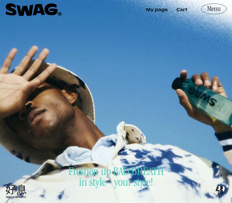
SWAG presents toothpaste and mouthwash with the visual confidence of a fashion label. An irregular, heavy black wordmark sits over full-screen photography. Oversized product props, coordinated clothing, fruit imagery, and saturated sets make the products part of a styled scene. Thin, narrow serif lettering introduces an unexpected editorial softness beside the dense sans-serif utility text.
Below the hero, a continuous mint field supports a substantial shop catalog. Product cutouts float directly on the background, with centered names, compact descriptions, and strong prices. There are no visible white card surfaces or conventional card shadows. The lower page returns to practical information, then closes with mint text on black and a photographic figure resting on the footer boundary.
This is a long brand storefront, with 26 catalog entries and supporting information. Preserve that browsing structure when adapting the design.
閉じる
SWAG — Style Reference
Oral care staged as a saturated fashion campaign, followed by an open mint storefront.
Website: swag.tokyo Original URL: https://swag.tokyo/ Final URL: https://swag.tokyo/ Theme: mint and black storefront, photographic hero, black footer; no theme switch was verified. Inspected: October 2, 2026, 00:31:31 JST; supplied retrieval timestamp: October 1, 2026, 15:31:31.446 UTC. Viewports: desktop 1440 × 1000 and mobile 390 × 844 CSS pixels. Scope: the current homepage, including the captured hero states, product catalog, FAQ ending, footer, persistent navigation, and promotional overlay. Rendered DOM evidence also covers the introductory shopping feature, repeated slogan track, product information, news, and closed menu/cart structures. Product detail pages, account pages, checkout, and opened overlays were not inspected.
SWAG presents toothpaste and mouthwash with the visual confidence of a fashion label. An irregular, heavy black wordmark sits over full-screen photography. Oversized product props, coordinated clothing, fruit imagery, and saturated sets make the products part of a styled scene. Thin, narrow serif lettering introduces an unexpected editorial softness beside the dense sans-serif utility text.
Below the hero, a continuous mint field supports a substantial shop catalog. Product cutouts float directly on the background, with centered names, compact descriptions, and strong prices. There are no visible white card surfaces or conventional card shadows. The lower page returns to practical information, then closes with mint text on black and a photographic figure resting on the footer boundary.
This is a long brand storefront, with 26 catalog entries and supporting information. Preserve that browsing structure when adapting the design.
How to Read This Reference
- Measured values come from the supplied rendered DOM and computed-style excerpts. They are CSS pixels unless stated otherwise.
- Calculated values are arithmetic derived from measured rectangles, such as column gaps and heading offsets.
- Visual estimates describe screenshot features whose element styles were not included, such as the footer figure and coupon dimensions.
- Recommendations describe a new implementation. They do not establish existing behavior.
- All token names introduced here are implementation aliases. The supplied source custom properties contain asset URLs, not a complete semantic design-token system.
- A computed font-family stack establishes the declared family order, not independent confirmation of every downloaded font or rendered glyph.
- Offscreen or hidden DOM content is not evidence that an overlay was opened. Different hero images across viewports do not establish autoplay timing or a responsive image-switching rule.
Tokens — Colors
Default Palette
| Name | Value | Suggested token | Evidence and role |
|---|---|---|---|
| SWAG Mint | #4CCDBB |
--color-mint |
Measured HTML background and hero text color. Also visually matches the catalog field, button lettering, and footer lettering. |
| Black | #000000 |
--color-ink |
Measured text and shopping-button fill. Visually forms the wordmark, footer, and principal outlines. |
| Sale Yellow | #FFF72C |
--color-sale |
Measured discounted-price color. The catalog also shows a bright yellow sale burst. |
| White | #FFFFFF |
--color-white |
Measured empty-cart text in the closed cart structure. White-looking grain appears at the upper right; its opacity and blend treatment were not measured. |
| Transparent | transparent |
— | Measured backgrounds of the header, product links, names, and utility controls. The underlying photography or mint remains visible. |
The mint is the main interface color, rather than a small accent. Black supplies text, action surfaces, and the footer. Yellow is reserved for commerce emphasis and promotional graphics.
Photographic Color Fields
The desktop hero capture is dominated by mango yellow and orange, with pink footwear and a warm knitted outfit. The mobile capture uses a purple set and oversized grape-mint tube, balanced by mint clothing and footwear.
These colors belong to photographic scenes. No corresponding solid CSS background values were supplied. Reproduce them through art direction and image selection rather than inventing additional exact brand tokens. The two captures show different hero frames; they do not prove that desktop always uses orange or mobile always uses purple.
Tokens — Typography
Editorial Display — Apple Garamond Stack
Measured source stack: 'Apple Garamond', Ginto, 'Zen Kaku Gothic Antique', sans-serif.
This stack appears on the body, hero slogan, product names, product descriptions, repeated slogan text, and Menu button. The visible Latin display lettering is narrow and high contrast, with distinctive serif shapes. It lets relatively large product names occupy modest widths.
Most sampled text uses weight 500; Menu uses 400. Do not automatically translate the visually strong interface into a universal 700 weight.
Utility and Commerce — Ginto
Measured source stack: Ginto, sans-serif.
Ginto is declared for account navigation, Cart, section headings, primary link buttons, prices, sold-out labels, and offscreen navigation links. Its broad, sturdy shapes establish practical hierarchy beside the serif product lettering.
Japanese Text
Zen Kaku Gothic Antique is present in the source fallback stack. Japanese explanatory content and FAQ questions appear as compact sans-serif text. The supplied element excerpt does not isolate every lower-page Japanese text style, so do not assign an exact font size or weight to all of those blocks based only on the body declaration.
Wordmark and Graphic Lettering
The SWAG wordmark has irregular letter proportions and a registered mark. Treat it as supplied brand artwork. Recreating it as ordinary bold text would lose a central part of the identity.
The corner stamp, coupon lettering, and sale artwork also have their own visual treatment. Their type should not be assumed to share the product-heading font.
Type Scale
Values below are measured unless explicitly identified as estimates. Size and line height are shown as size / line-height.
| Role | Desktop | Mobile | Family and weight |
|---|---|---|---|
| Body | 15 / 28px |
14 / 26.13px |
Source display/fallback stack, 500 |
| Hero slogan | 55 / 49px |
35 / 31.18px |
Source display stack, 500 |
| Repeated slogan track | 55 / 63.25px |
40 / 46px |
Source display stack, 500 |
| Recommended Product heading | 60 / 60px |
28 / 28px |
Ginto, 500 |
| Product name | 43 / 43px |
32 / 32px |
Source display stack, 500 |
| Product description | 20 / 24px |
14 / 16.8px |
Source display stack, 500 |
| Product price | 20 / 25px |
14 / 17.5px |
Ginto, 500 |
| Sold-out label | 20 / 20px |
14 / 14px |
Ginto, 500 |
| My page | 20 / 37.33px |
13 / 24.27px |
Ginto, 500 |
| Cart | 20 / 20px |
13 / 13px |
Ginto, 400 |
| Menu | 34 / 34px |
29 / 29px |
Source display stack, 400 |
| Shopping link button | 20 / 37.33px |
14 / 26.13px |
Ginto, 500; line-height is the reported computed value |
| Offscreen navigation links | 40 / 56px |
40 / 56px |
Ginto, 500; opened appearance unverified |
| Closed cart heading | 80 / 96px |
50 / 60px |
Ginto, 500; style evidence only |
| Footer small text | Approximately 12–15px |
Approximately 12–14px |
Visual estimate; individual footer styles were not supplied |
The sampled text uses normal letter spacing. The character comes primarily from family contrast, scale, and tight display leading, rather than widespread tracking.
The source HTML root computes to 10px at both inspected widths. The Quick Start uses explicit pixel tokens and can retain a conventional application root size.
Tokens — Spacing & Shapes
There is no demonstrated universal spacing grid. The useful values are component-specific: narrow utility padding, generous image stages, and large intervals between major content groups.
Spacing Scale
| Use | Desktop | Mobile | Status |
|---|---|---|---|
| Utility-control padding | 10px |
10px |
Measured |
| Product/content outside margin | 220px at this viewport |
18px |
Measured |
| Product column gap | 0px between link rectangles |
18px |
Calculated from adjacent rectangles |
| Product bottom padding | 46px |
46px |
Measured |
| Catalog-heading vertical padding | 30px above and below |
Same | Measured |
| Introductory section padding | 150px 0 110px |
85px 0 58px |
Measured |
| Intro heading-to-button interval | 52px |
52px |
Calculated from rectangles |
| Hero slogan bottom clearance | 66px |
40px |
Calculated from viewport and heading bounds |
| Hero-dot center spacing | 15px |
15px |
Calculated; 5px dots with 10px between them |
Desktop product links meet at their column boundaries, but the cutout artwork leaves ample internal space. Adding a conventional grid gutter on desktop would change the measured column centers.
Border Radius and Edges
| Element | Treatment | Evidence |
|---|---|---|
| Product links and text groups | Square, unboxed | Measured radius 0; screenshots show no separate card fill |
| Black link buttons | Square corners | Measured shopping-button radius 0; FAQ button visually agrees |
| Menu | Ellipse | Measured border-radius: 50% |
| Hero pagination | Tiny circles | Measured 5 × 5px, radius 50% |
| Coupon | Stepped speech-bubble outline | Screenshot observation |
| Coupon close affordance | Small dark circle with a light cross | Screenshot observation; click result unverified |
| Sale graphic | Sharp radial burst | Screenshot observation |
The Menu outline appears approximately one pixel thick. No general shadow or elevation scale is visible in the captured interface.
Layout Measurements
| Element | Desktop 1440 × 1000 | Mobile 390 × 844 |
|---|---|---|
| Document height | About 12,725px |
About 13,002px |
| Main element height | 12,339.64px |
12,492.31px |
| Catalog/content span | 1000px, from x = 220 to 1220 |
354px, from x = 18 to 372 |
| Product columns | Three at about 333.33px |
Two at 168px, with an 18px gap |
| Product title offset from link top | 529px |
314px |
| Typical product-link height with one-line name, description, price | 667px |
About 426.30px |
| Product catalog section | Starts at y ≈ 2903.91; height 6198px |
Starts at y ≈ 2642.95; height ≈ 5801.77px |
| Header logo link width | About 255.95px |
About 127.97px |
| Menu bounds | About 116.30 × 48.80px |
About 97.14 × 41.80px |
| Shopping link button | 300 × 62px |
205 × 50.80px |
| Hero slogan box | Full width, 98px high |
Full width, about 62.34px high |
| Lower-right mascot link | About 43.69 × 56.31px |
About 38 × 48.98px |
The 529px and 314px values describe the entire region preceding a product heading, including any image whitespace or spacing. They are not measured image-file dimensions.
The logo's inline anchor reports a short text line box. That height does not describe the visible wordmark artwork; its visible height is approximately 56px on desktop and 28px on mobile.
Components
Persistent Header
Role: identity and access to account, cart, and navigation.
The header is visually transparent and floats over the page. Its own measured block height is zero while its controls remain visible. The logo, utility links, and Menu retain their viewport positions in the hero, catalog, and footer captures, supporting a persistent viewport-anchored layout.
On desktop, the large wordmark sits near the upper-left corner. My page and Cart form a horizontal group toward the right, followed by the outlined Menu ellipse. The desktop Menu begins at y = 16px, with a 25px right inset.
On mobile, the wordmark halves in width. Menu remains horizontal at the top right, at y = 15px with a 15px right inset. My page and Cart rotate into a vertical reading rail along the right edge, beginning near y = 58px and y = 152px respectively.
My page is a link to /account/login. Cart and Menu are buttons. The rendered cart button includes item-count text in the DOM, but the screenshots primarily expose the Cart label. Do not assume the entire DOM text is visibly displayed.
Photographic Hero
Role: introduces the brand through a fashion image rather than dense product explanation.
The photograph fills the first captured viewport. On desktop, a model reclines beside oversized mango forms and an enormous angled toothpaste tube. The mobile capture shows a seated model beside a giant purple tube and grape forms. Cropping is strong: bodies, props, and packaging can extend beyond the viewport edges.
The slogan is live text centered near the bottom in mint:
“Freshen up BAD BREATH / in style - your style!”
Its two lines use unusually tight leading: 55px type on 49px lines on desktop, and 35px on approximately 31.18px lines on mobile. The lower position allows the photograph to establish the scene before the message is read.
Six small pagination buttons form a vertical rail near the right edge. Desktop buttons occupy x = 1405px; mobile buttons occupy x = 367px. One has a transparent background in each sampled state while the others are mint. The active-state meaning is inferred from the gallery structure, not confirmed by a click test.
Corner Branding and Grain
Role: creates a recognizable frame around changing content.
A dark 好息 stamp with the English subtitle Good Breath sits at the lower left. An illustrated mascot occupies the lower right. The mascot is explicitly a link to the homepage in the supplied DOM; there is no evidence that it is a chat launcher.
The mascot's measured right/bottom offsets are 31px / 24px on desktop and 18px / 15px on mobile. The left stamp appears approximately 26px from the desktop edge and 18px from the mobile edge.
A white granular texture is concentrated at the upper right and fades into the underlying image or mint canvas. Its repeated screen placement suggests a persistent decorative layer. Exact CSS positioning, texture dimensions, opacity, and blending were not supplied. Preserve its fine, irregular grain rather than replacing it with a smooth white glow.
At the footer, the dark left stamp becomes difficult to distinguish from black. This is a captured contrast issue, not a recommended color rule.
Introductory Shopping Feature
Role: bridges the hero and the catalog.
The rendered section containing shop the finest begins at y = 1062px on desktop and 888px on mobile. It uses large vertical padding and a centered black link button leading to /products/herbal-whitening.
A heading element precedes the button. Its measured typography is Ginto 65 / 77px on desktop and 28 / 33.17px on mobile, but its exported text is empty. The supplied screenshots do not show this section. Do not invent its headline or infer a missing message from the element dimensions.
Repeated Slogan Track
Role: introduces a graphic band of repeating brand language.
The DOM contains many consecutive copies of the slogan laid out horizontally. Desktop instances are approximately 784.58px wide; mobile instances are approximately 570.61px wide. Some rectangles sit far outside the viewport.
This supports a repeated, marquee-like track. It does not establish direction, speed, loop timing, or whether its movement is driven by CSS, JavaScript, or scrolling. In a new implementation, expose one meaningful copy to assistive technology and make any repeated decorative copies inert.
Product Grid and Product Link
Role: supports browsing a broad mix of oral-care products, sets, and branded objects.
The catalog contains 26 entries. Desktop uses three columns across the measured 1000px content span. Mobile uses two columns, producing thirteen rows. The desktop arrangement therefore ends with two items in its ninth row.
The visible hierarchy of a product link is:
- A tall region for isolated product artwork.
- A centered serif
h3name. - An optional short description, pack size, or promotion.
- A sans-serif price, sold-out label, or original/reduced price pair.
46pxbottom padding before the row ends.
The entire group is an anchor. Examples include Herbal whitening, Mouth wash, and Grape Mint. Product names remain visually dominant over descriptions and prices.
At mobile width, names can wrap naturally. Peach cola wash and Herbal whitening occupy two 32px lines in the supplied measurements. Row height follows the tallest item; shorter neighboring entries retain empty space beneath them. Do not impose a fixed single-line title or clip names to reproduce a uniform card height.
No separate Add to cart button appears inside the sampled catalog entries. The browsing action is the product link.
Price, Availability, and Sale Artwork
Role: communicates commerce state without introducing a separate card system.
Prices and sold out use Ginto. Several bundle entries show two vertically stacked prices; the lower price is measured as #FFF72C. Whether the original price has a line-through decoration is not established by the supplied style fields.
The captured three-tube promotion adds a sharp yellow Sale burst and a bold Get 1 free label near the product artwork. These graphics sit within the open mint composition rather than inside a rounded promotion badge.
Some sold-out objects link to the homepage, including Wheel and Road cone; other sold-out entries have product URLs. Record this as observed link data, not a reusable commerce recommendation. A new implementation should give unavailable items a clear, intentional destination or non-link state.
Product Information and News
Role: adds product context and practical updates after the catalog.
The rendered text includes three information topics: TPE material for brush and tongue-cleaner heads, breath-freshening ingredients, and packaging/recycled-plastic claims. These are source marketing statements, not independently verified product findings.
The News area contains two dated article links and a See more link to /blogs/news. The visible text dates are 2024.12.23 and 2022.12.06.
These sections are established by the DOM, but their full visual compositions are absent from the supplied captures and detailed element excerpt. Do not invent image placement, card styles, or animation treatments for them.
FAQ Ending
Role: answers basic usage concerns and leads to the full FAQ area.
The desktop ending shows centered question groups on mint. Each visible group places a large black Q above a Japanese question, with broad vertical separation. The visible question centers are approximately 158px apart; this is a screenshot estimate, not a source spacing token.
Examples include 誤って飲み込んでしまったのですが、どうしたらよいでしょうか? and 口内に炎症、異常を感じました。どうしたらよいでしょうか?.
The mobile ending shows a circled plus beneath the last visible question. No opened answer state or toggle result is supplied, so an accordion interaction remains unverified.
A centered See more link leads to /blogs/faq. At the footer boundary, a cutout model lies horizontally in a mint top, pink shorts, white socks, and orange shoes. The figure is approximately 450px wide on desktop and 215–220px on mobile. It visually rests on the top edge of the black footer.
Rectangular Link Button
Role: provides a strong, consistent onward action.
The shopping link is measured at 300 × 62px on desktop and approximately 205 × 50.8px on mobile. The captured FAQ See more button visually follows the same family.
Use a black rectangular surface, mint sans-serif lettering, square corners, a left-aligned label, and a right-pointing arrow toward the far end. The FAQ screenshot suggests approximately 30px left inset on desktop and 15px on mobile.
The measured shopping anchor reports padding and line-height values that do not alone explain its final bounds. Reproduce the visible box and alignment rather than blindly adding those values into a new box model. No hover endpoint was verified for these links.
Footer
Role: gathers practical navigation, social links, contact, payments, and closing identity.
The footer switches abruptly to black with mint lettering. Its desktop content aligns to the same approximately 1000px span as the product grid.
The upper area has two separated groups: utility/legal links on the left, and right-aligned social/contact links on the right. Source labels include NEWS, FAQ, 特定商取引法, プライバシーポリシー, and 利用規約. Instagram and Twitter are visibly larger than the compact legal list. The contact address is info@swag.tokyo.
The lower desktop row combines a mint SWAG logo, Payment method, seven payment marks, and copyright text. On mobile, the logo and payment area move below the upper link groups, followed by the copyright line. The upper link groups remain side by side rather than becoming one continuous list.
The footer logo appears approximately 176px wide in both captured sizes. Payment marks retain their own colors on the black surface.
Floating Coupon
Role: promotes a visible ¥500 coupon associated with LINE friendship registration.
A mint speech bubble with a stepped black outline sits above the lower-right mascot. It includes a yellow coin, oversized amount, compact coupon wording, a yellow instruction strip, and a dark circular close affordance.
Its visual width is approximately 290px on desktop and 190px on mobile. These are screenshot estimates. The overlay persists in the hero, catalog, and footer captures.
The mobile coupon covers part of the hero slogan and later overlaps footer content. Its click destination, dismissal behavior, persistence, and loading trigger were not verified. A new implementation should preserve the graphic character while preventing essential text and controls from being covered.
Menu and Cart Structures
Role: provide additional navigation and shopping state.
The DOM includes Store, News, FAQ, social links, and contact information in an offscreen menu region. Store points to /#recomended-product, preserving the source anchor spelling. The menu link rectangles begin beyond the right edge of both inspected viewports.
The cart structure contains Your cart, a close button, and カートは空です. Its heading is styled mint, and the empty-state message is white. Desktop and mobile cart-background asset variables are present.
These observations support the existence of menu and cart structures, but no opened screenshot establishes their complete appearance. Opening direction, backdrop treatment, focus management, Escape behavior, and animations are unverified.
Tokens — Motion & Interaction
| Element or behavior | Supplied evidence | What can be concluded |
|---|---|---|
| Menu color change | background-color 0.2s, color 0.2s |
A measured 200ms color transition is defined. Trigger and endpoint colors were not exercised. |
| Hero dots | background-color 0.2s |
A measured 200ms dot-color transition is defined. |
| Hero sequence | Six buttons and different captured photographic states | A multi-state hero is supported; autoplay, swipe, duration, and transition type remain unverified. |
| Repeated slogan | Many adjacent copies, including offscreen rectangles | A track-like structure exists; movement timing and direction are unknown. |
| Persistent header and corner elements | Similar viewport placement across scrolled captures | Persistent positioning is visually supported; exact positioning declarations were not supplied. |
| FAQ plus | Visible circled-plus affordance on mobile | An expansion affordance is present; opening behavior was not tested. |
| Menu and cart | Buttons plus associated DOM structures | Controls exist; no click results establish the opened experience. |
| Coupon close | Visible cross control | Dismissal is suggested, but not verified. |
| Custom cursors | URL-valued custom properties | Cursor artwork is referenced; application to specific elements is unverified. |
Most sampled nodes report animation: none and a generic transition value of all. Neither establishes that the entire page is static: ancestor animation, JavaScript motion, and unsampled elements remain possible. A generic all value without an effective duration is not evidence of a visible transition.
The capture process waited at least five seconds initially, awaited finite motion and layout stability within limits, and temporarily paused perpetual animations during readiness checks. It did not provide a frame-by-frame interaction record. Do not invent parallax, scroll snapping, spring motion, or carousel timing.
Surfaces
| Layer | Appearance | Purpose |
|---|---|---|
| Main canvas | Solid mint | Holds the catalog and supporting content together |
| Hero | Full-viewport photograph | Carries the strongest emotional and color impact |
| Product content | Transparent links and isolated imagery | Keeps the catalog open and image-led |
| Header | Transparent, floating controls | Preserves visibility of the scene beneath navigation |
| Main onward links | Black rectangles with mint text | Strong action emphasis without rounded-card styling |
| Footer | Black with mint text | Creates a clear ending and reverses the main palette |
| Grain decoration | Fine white particles near the upper right | Adds texture to both photographic and flat fields |
| Coupon | Mint graphic with black outline and yellow highlights | A separate promotional layer above page content |
Depth comes from photographic objects, overlap, and contrast. The captured UI does not use a general system of raised cards, glass panels, or soft drop shadows.
Imagery
Use two complementary image modes.
Campaign photography: highly styled people, exaggerated product scale, coordinated clothing, and saturated set design. The desktop mango scene uses large diagonal packaging and fruit forms; the mobile grape scene uses a tall tube as a major compositional object. Let crops feel editorial, but retain enough packaging to identify the product.
Catalog cutouts: isolated tubes, bottles, tools, bundles, and branded objects on the mint canvas. Preserve the silhouettes and original aspect ratios. Objects can vary substantially in shape and apparent scale; a road cone, wheel, toothpaste tube, and tool set should not be forced into identical tight crops.
The footer cutout connects the fashion imagery to the practical closing section. Its contact with the black boundary matters: it appears to lie on the footer rather than float inside a conventional image card.
Use normal photographic rendering for models and products. The coupon has a deliberately stepped, pixel-like outline, but this is not a reason to pixelate all imagery.
Observed Asset References
These paths appeared in source custom properties. Query-string versions are omitted for readability. Their files were not separately opened.
| Source variable | Observed path | Evidence scope |
|---|---|---|
--cursor-close-url |
/cdn/shop/t/3/assets/cursor-close-01.svg |
Cursor asset reference; actual interaction use unverified |
--cursor-link-url |
/cdn/shop/t/3/assets/cursor-link-01.svg |
Cursor asset reference; actual interaction use unverified |
--cursor-open-url |
/cdn/shop/t/3/assets/cursor-open-01.svg |
Cursor asset reference; actual interaction use unverified |
--cart-bg-url |
/cdn/shop/t/3/assets/cart-bg-01.png |
Desktop cart-background reference; opened cart not captured |
--cart-bg-url-sp |
/cdn/shop/t/3/assets/cart-bg-sp-01.png |
Mobile cart-background reference; opened cart not captured |
The supplied evidence does not expose exact URLs for the hero photographs, product cutouts, wordmarks, grain, footer model, or coupon artwork. Do not guess their filenames. Use authorized assets or create replacements specifically composed for these roles.
Layout & Responsive Behavior
Page Structure
The supplied content follows this sequence: photographic hero, introductory shopping feature, repeated brand-language content, Recommended Product catalog, product information, News, FAQ, and footer. The detailed appearance of the intermediate feature and information areas is only partially documented.
The desktop catalog begins nearly three viewport heights down the document. This gives the campaign imagery and introductory content considerable space before the long shopping grid. Preserve that sense of progression rather than placing the complete catalog directly under a compact banner.
Confirmed Desktop-to-Mobile Changes
| Feature | Desktop | Mobile |
|---|---|---|
| Wordmark | Approximately 256px wide |
Approximately 128px wide |
| Utilities | Horizontal near the top right | Rotated into a right-edge rail |
| Menu | 34px text in a roughly 116 × 49px ellipse |
29px text in a roughly 97 × 42px ellipse |
| Hero slogan | 55px, bottom clearance 66px |
35px, bottom clearance 40px |
| Catalog | Three columns within 1000px |
Two columns within 354px |
| Product artwork region before heading | 529px |
314px |
| Product name | 43px |
32px, wrapping where needed |
| Supporting product text | 20px |
14px |
| Main link button | 300 × 62px |
Approximately 205 × 51px |
| Footer lower area | Horizontal grouping | Logo, payments, and copyright stacked |
| Footer model | Approximately 450px wide |
Approximately 220px wide |
The mobile page is only about 276px taller overall despite having more catalog rows. Smaller media regions and typography compensate for the additional rows. A one-column phone catalog would materially change the observed density and page length.
The original breakpoint and interpolation rules were not supplied. A 768px breakpoint in the Quick Start is an implementation recommendation, not a measured source value. Tablet and landscape behavior remain unverified.
Captured Layout Issues
The mobile coupon overlaps the hero slogan and footer text. Persistent branding also overlaps the topmost FAQ content in the scrolled mobile ending. The dark lower-left stamp has weak visibility over the black footer.
Both footer captures expose a raw template message: Liquid error (layout/theme line 291): Could not find asset snippets/limitsify.liquid. It appears below the footer on mint. This is a current rendering defect and should not become a design component.
Do’s and Don’ts
Do
- Use measured mint
#4CCDBBas the large storefront field. - Pair narrow editorial serif display text with substantial sans-serif utility and price text.
- Preserve the irregular SWAG wordmark as artwork.
- Give campaign photography enough scale to dominate the opening viewport.
- Keep product links transparent and let cutout silhouettes define their content.
- Use three desktop columns and two phone columns at the inspected sizes.
- Let long product names wrap while keeping adjacent rows aligned by their tallest item.
- Retain square black onward links and the outlined elliptical Menu.
- Keep the footer's black-and-mint reversal and the figure resting on its boundary.
- Treat fine grain, sale bursts, and the coupon as distinct graphic treatments.
- Document uncertain interactions separately from observed visual states.
Don’t
- Don't replace the shop with a short generic campaign layout that omits the catalog and supporting information.
- Don't put every product inside a white rounded card with a shadow.
- Don't use the photographic orange or purple as an invented global theme rule.
- Don't substitute plain bold text for the custom wordmark.
- Don't make every heading sans-serif or every utility label serif.
- Don't shrink product names to prevent all wrapping on phones.
- Don't crop every product into the same square photographic frame.
- Don't assume the mascot launches chat or that the gallery advances automatically.
- Don't treat closed menu/cart measurements as screenshots of opened overlays.
- Don't reproduce coupon collisions, low-contrast corner branding, or the exposed template error as intentional style.
Recommended Implementation Additions
These are improvements for a new implementation, not verified original features:
- Keep a visible keyboard focus treatment on product links, Menu, Cart, and footer links.
- Give product images descriptive alternatives. Mark grain and purely decorative cutouts as decorative where adjacent text already provides their meaning.
- Provide usable gallery navigation. Six
5pxbuttons at15pxintervals cannot each have independent44pxtouch targets without overlap; use separate accessible next/previous controls or redesign the control spacing. - If the hero or slogan track moves automatically, provide pause controls and a reduced-motion alternative.
- Expose only one copy of repeated slogan text to assistive technology.
- Implement menu/cart focus management, Escape handling, and a reliable return of focus after closing.
- Keep the coupon dismissible and move it into normal flow or reserve space on phones so it cannot cover the headline, contact details, or copyright.
- Validate mint-over-photograph and yellow-over-mint text contrast. Keep essential prices and instructions readable even when promotional colors need adjustment.
- Use a contrasting corner-stamp variant when it crosses the black footer.
- Give unavailable products deliberate destinations instead of silently linking them back to the homepage.
- Remove the missing-template output and verify the complete page ending at both supplied viewport sizes.
Agent Prompt Guide
Quick Color Reference
- Main storefront: mint
#4CCDBB. - Text, wordmark, action surfaces, and footer background: black
#000000. - Footer text and rectangular-button labels: mint.
- Discounted-price source color: yellow
#FFF72C. - Texture: fine white grain concentrated toward the upper right.
- Campaign colors: supplied by photography; orange/mango and purple/grape are captured scenes, not fixed responsive themes.
Overall Prompt
“Create a fashion-led oral-care storefront inspired by SWAG. Use a continuous mint canvas #4CCDBB, black typography, an irregular oversized wordmark, narrow editorial serif product names, and sturdy sans-serif utility labels and prices. Begin with full-viewport campaign photography featuring styled people and oversized product props. Place a two-line mint slogan near the bottom, an elliptical Menu at the upper right, and six tiny visual pagination markers at the right edge. Follow with a long, unboxed product catalog: three columns on desktop and two on phones. Use isolated product artwork, centered names, small descriptions, black prices, and occasional sharp yellow promotional graphics. Finish with centered FAQs, a model cutout resting on a black footer, and mint footer navigation. Keep photographic color, graphic texture, and functional UI distinct. Implement accessible controls and avoid content-obscuring promotional overlays.”
Example Component Prompts
- Product link: “Build a transparent product link on mint. Give the isolated product image a tall stage, then center a narrow serif name, a short descriptor, and a sturdy sans-serif price. Use 43px names on desktop and 32px names on phones. Allow two-line names. No card border, separate fill, or shadow.”
- Persistent navigation: “Place a black brand wordmark at the upper left and a thin outlined elliptical Menu at the upper right. Use substantial sans-serif My page and Cart controls beside it on desktop. On phones, reduce the logo width by half and rotate the utility labels into a right-edge rail. Keep keyboard and touch access usable.”
- Hero: “Compose a saturated fashion photograph with a person, oversized oral-care packaging, and fruit-like props. Let the scene fill the viewport with deliberate cropping. Add a centered two-line mint serif slogan near the lower edge. Select a suitable crop for each viewport; do not infer a fixed device-specific color theme.”
- FAQ ending: “Center question groups on mint with large Q markers and compact Japanese question text. Add a square black See more link with mint text and a right arrow. Anchor a reclining photographic cutout to the top edge of the black footer. Treat expansion behavior as a separately specified interaction.”
- Footer: “Create a black footer with mint links. Keep legal navigation left and social/contact information right. Add a mint wordmark, compact payment marks, and copyright below. On phones, retain the two upper groups and stack the lower elements. Reserve clear space for any promotional UI.”
Quick Start
CSS Custom Properties
This is an implementation adaptation, not recovered source CSS. It preserves the measured palette, major type sizes, two inspected grid configurations, and principal bounds. The breakpoint, fallback fonts, safe-area handling, hover endpoint, and footer spacing are recommendations. Product-stage heights approximate the measured pre-heading regions, not the intrinsic image sizes.
Use authorized font files if available. The serif fallbacks below intentionally preserve the display character when Apple Garamond is unavailable; they differ from the original fallback order. Supply wordmark, photography, grain, and cutout assets separately. This CSS does not implement gallery playback, menu/cart state, or coupon behavior.
:root {
  /* Measured interface colors */
  --color-mint: #4ccdbb;
  --color-ink: #000000;
  --color-sale: #fff72c;
  --color-white: #ffffff;

  /* Source family names with recommended fallbacks */
  --font-display: 'Apple Garamond', Garamond, 'Times New Roman', serif;
  --font-sans: Ginto, 'Zen Kaku Gothic Antique', system-ui, sans-serif;
  --font-japanese: 'Zen Kaku Gothic Antique', sans-serif;
  --weight-main: 500;

  /* Desktop measurements */
  --content-width: 1000px;
  --page-inset: 18px;
  --logo-width: 256px;
  --hero-size: 55px;
  --hero-leading: 49px;
  --hero-bottom: 66px;
  --section-size: 60px;
  --product-size: 43px;
  --detail-size: 20px;
  --product-stage: 529px;
  --product-bottom: 46px;
  --product-gap: 0px;
  --cta-width: 300px;
  --cta-height: 62px;
  --control-transition: 200ms;
  --safe-bottom: env(safe-area-inset-bottom, 0px);
}

* {
  box-sizing: border-box;
}

body {
  margin: 0;
  color: var(--color-ink);
  background: var(--color-mint);
  font-family: var(--font-display);
  font-size: 15px;
  font-weight: var(--weight-main);
  line-height: 28px;
}

button,
a {
  -webkit-tap-highlight-color: transparent;
}

button {
  color: inherit;
  font: inherit;
}

.wrap {
  width: min(var(--content-width), calc(100% - 2 * var(--page-inset)));
  margin-inline: auto;
}

.site-header {
  position: fixed;
  inset: 0 0 auto;
  z-index: 40;
  height: 0;
}

.brand {
  position: absolute;
  top: 16px;
  left: 26px;
  width: var(--logo-width);
}

.brand img,
.footer-logo img {
  display: block;
  width: 100%;
  height: auto;
}

.utility-nav {
  position: absolute;
  top: 22px;
  right: 194px;
  display: flex;
  gap: 20px;
  font: 500 20px/1.2 var(--font-sans);
}

.utility-nav a,
.utility-nav button {
  display: flex;
  align-items: center;
  padding: 10px;
  border: 0;
  color: inherit;
  background: transparent;
  text-decoration: none;
  white-space: nowrap;
}

.menu-button {
  position: absolute;
  top: 16px;
  right: 25px;
  width: 116.3px;
  height: 48.8px;
  padding: 6px 0 0;
  border: 1px solid currentColor;
  border-radius: 50%;
  background: transparent;
  font: 400 34px/1 var(--font-display);
  cursor: pointer;
  transition:
    background-color var(--control-transition),
    color var(--control-transition);
}

/* Recommended hover endpoint; only the duration was measured. */
@media (hover: hover) {
  .menu-button:hover {
    color: var(--color-mint);
    background: var(--color-ink);
  }
}

.hero {
  position: relative;
  height: 100svh;
  overflow: clip;
}

.hero-media,
.hero-media img {
  position: absolute;
  inset: 0;
  width: 100%;
  height: 100%;
}

.hero-media img {
  object-fit: cover;
  object-position: var(--hero-focal-point, 50% 50%);
}

.hero-slogan {
  position: absolute;
  right: 0;
  bottom: var(--hero-bottom);
  left: 0;
  margin: 0;
  color: var(--color-mint);
  font: 500 var(--hero-size)/var(--hero-leading) var(--font-display);
  text-align: center;
}

.hero-dots {
  position: absolute;
  top: 50%;
  right: 30px;
  display: grid;
  gap: 10px;
  transform: translateY(-50%);
}

/* Visual markers; provide separate usable gallery controls. */
.hero-dot {
  width: 5px;
  height: 5px;
  border: 1px solid var(--color-mint);
  border-radius: 50%;
  background: var(--color-mint);
  transition: background-color var(--control-transition);
}

.hero-dot[aria-current='true'] {
  background: transparent;
}

.grain-layer {
  position: fixed;
  top: 0;
  right: 0;
  z-index: 30;
  width: min(720px, 100vw);
  pointer-events: none;
}

.grain-layer img {
  display: block;
  width: 100%;
  height: auto;
}

.intro-feature {
  padding-block: 150px 110px;
  text-align: center;
}

.intro-feature .cta {
  margin-top: 52px;
}

.section-title {
  margin: 0;
  padding-block: 30px;
  font: 500 var(--section-size)/1 var(--font-sans);
  text-align: center;
}

.product-grid {
  display: grid;
  grid-template-columns: repeat(3, minmax(0, 1fr));
  column-gap: var(--product-gap);
  align-items: start;
}

.product-link {
  display: block;
  min-width: 0;
  padding-bottom: var(--product-bottom);
  color: inherit;
  text-align: center;
  text-decoration: none;
}

.product-media {
  height: var(--product-stage);
}

.product-media img {
  display: block;
  width: 100%;
  height: 100%;
  object-fit: contain;
}

.product-name {
  margin: 0;
  font: 500 var(--product-size)/1 var(--font-display);
  overflow-wrap: break-word;
}

.product-detail {
  margin: 0;
  font: 500 var(--detail-size)/1.2 var(--font-display);
}

.product-price,
.product-status {
  margin: 0;
  font: 500 var(--detail-size)/1.25 var(--font-sans);
}

.product-status {
  line-height: 1;
}

.product-price--sale {
  color: var(--color-sale);
}

.cta {
  display: flex;
  align-items: center;
  justify-content: space-between;
  width: min(var(--cta-width), 100%);
  min-height: var(--cta-height);
  margin-inline: auto;
  padding: 12px 30px;
  border: 0;
  border-radius: 0;
  color: var(--color-mint);
  background: var(--color-ink);
  font: 500 20px/1.2 var(--font-sans);
  text-decoration: none;
}

.faq-question {
  font-family: var(--font-japanese);
  text-align: center;
}

/* Screenshot-based approximation of the closing composition. */
.faq-closing {
  position: relative;
  padding-bottom: 120px;
}

.faq-cutout {
  position: absolute;
  bottom: 0;
  left: max(18px, calc(50% - 624px));
  width: clamp(220px, 32vw, 450px);
  max-width: 65%;
  height: auto;
}

.site-footer {
  padding-block: 72px 48px;
  color: var(--color-mint);
  background: var(--color-ink);
  font-family: var(--font-sans);
}

.site-footer a {
  color: inherit;
  text-decoration: none;
}

.footer-top {
  display: flex;
  justify-content: space-between;
  gap: 18px;
}

.footer-links {
  display: grid;
  align-content: start;
  font-size: 15px;
  line-height: 28px;
}

.footer-social {
  text-align: right;
  font-size: 20px;
  line-height: 1.6;
}

.footer-contact {
  margin-top: 34px;
  font-size: 15px;
  line-height: 28px;
}

.footer-bottom {
  display: flex;
  align-items: center;
  justify-content: space-between;
  gap: 28px;
  margin-top: 72px;
  font-size: 12px;
  line-height: 1.5;
}

.footer-logo {
  flex: 0 0 176px;
  width: 176px;
}

.payment-marks {
  display: flex;
  flex-wrap: wrap;
  align-items: center;
  gap: 10px;
}

.mascot-link {
  position: fixed;
  right: 31px;
  bottom: calc(24px + var(--safe-bottom));
  z-index: 45;
  width: 43.69px;
}

.mascot-link img {
  display: block;
  width: 100%;
  height: auto;
}

/* Recommended focus treatment across mint, black, and imagery. */
:where(a, button, summary):focus-visible {
  outline: 3px solid var(--color-ink);
  outline-offset: 3px;
  box-shadow: 0 0 0 6px var(--color-mint);
}

/* Recommended breakpoint; original breakpoint was not supplied. */
@media (max-width: 767.98px) {
  :root {
    --logo-width: 128px;
    --hero-size: 35px;
    --hero-leading: 31.1818px;
    --hero-bottom: 40px;
    --section-size: 28px;
    --product-size: 32px;
    --detail-size: 14px;
    --product-stage: 314px;
    --product-gap: 18px;
    --cta-width: 205px;
    --cta-height: 50.8px;
  }

  body {
    font-size: 14px;
    line-height: 26.1333px;
  }

  .brand {
    top: 15px;
    left: 18px;
  }

  .menu-button {
    top: 15px;
    right: 15px;
    width: 97.14px;
    height: 41.8px;
    padding-top: 5px;
    font-size: 29px;
  }

  .utility-nav {
    top: 58px;
    right: auto;
    left: 100%;
    gap: 10px;
    font-size: 13px;
    transform: rotate(90deg);
    transform-origin: top left;
  }

  .hero-dots {
    right: 18px;
  }

  .intro-feature {
    padding-block: 85px 58px;
  }

  .product-grid {
    grid-template-columns: repeat(2, minmax(0, 1fr));
  }

  .cta {
    padding-inline: 15px;
    font-size: 14px;
  }

  .faq-closing {
    padding-bottom: 150px;
  }

  .site-footer {
    padding-block: 48px calc(80px + var(--safe-bottom));
  }

  .footer-links {
    font-size: 12px;
  }

  .footer-bottom {
    display: grid;
    justify-content: start;
    gap: 14px;
    margin-top: 76px;
  }

  .mascot-link {
    right: 18px;
    bottom: calc(15px + var(--safe-bottom));
    width: 38px;
  }
}

/* Recommended reduced-motion policy for added behavior. */
@media (prefers-reduced-motion: reduce) {
  .menu-button,
  .hero-dot {
    transition: none;
  }

  .slogan-track {
    animation: none;
    transform: none;
  }
}
Use a picture element or carefully selected image crop for the hero, and set --hero-focal-point per asset. The two supplied frames do not justify reusing one universal crop. Keep the hero slogan as real text with an intentional line break.
The product-link classes expect a media region, an h3 name, and optional description, price, or status elements in that order. The CTA expects a text label and a separate decorative arrow. Product sale color is reproduced for reference; verify contrast before using it for essential price information.
The code deliberately leaves the coupon, closed overlays, and behavioral scripts to separate implementation. Their complete behavior cannot be recovered from the supplied observations.
Tailwind v4 Token Mapping
Optional aliases for a project already using Tailwind v4. This is not evidence that the original website uses Tailwind. Define the custom properties above first.
@theme inline {
  --color-swag-mint: var(--color-mint);
  --color-swag-ink: var(--color-ink);
  --color-swag-sale: var(--color-sale);

  --font-editorial: var(--font-display);
  --font-utility: var(--font-sans);
  --font-japanese-copy: var(--font-japanese);

  --text-hero: var(--hero-size);
  --text-product: var(--product-size);
  --text-detail: var(--detail-size);
  --text-section: var(--section-size);

  --spacing-page-inset: var(--page-inset);
  --spacing-product-gap: var(--product-gap);
  --spacing-product-stage: var(--product-stage);
  --spacing-product-bottom: var(--product-bottom);

  --radius-menu: 50%;
  --radius-product: 0px;
}
Sources & Evidence
- SWAG homepage: original and final URL are identical; supplied HTTP status is
200. - Supplied retrieval timestamp:
2026-10-01T15:31:31.446Z, equivalent to October 2, 2026, 00:31:31.446 JST. - Supplied desktop captures at
1440 × 1000: photographic opening, catalog segment, and FAQ/footer ending. - Supplied mobile captures at
390 × 844: photographic opening and FAQ/footer ending. - Supplied rendered DOM and computed styles: text, destination URLs, element rectangles, declared font stacks, colors, spacing, transition strings, and URL-valued custom properties. Lower-page visual styles are not exhaustively included.
- Document heights are approximately
12,725pxon desktop and13,002pxon mobile. The detailed element records stop within the catalog, while full-page text and footer screenshots provide additional lower-page evidence. - The capture process included initial observation, image-decoding checks, finite-animation waits, sampled layout stability, and intermediate scrolling. SharedWorkers and service workers were disabled. These conditions do not establish all delayed content or normal runtime behavior.
- No independent browsing, asset-file inspection, or interaction testing was performed for this reference. Menu/cart opening, FAQ expansion, coupon dismissal, hover endpoints, gallery playback, and purchase flows remain unverified.
- A missing-template message is visible below the footer. The core homepage remains rendered and recognizable; the message is documented as a local defect.
This reference describes the supplied current homepage evidence. Uncaptured layouts and interactions remain explicitly limited, and implementation additions are separated from measured findings.
# SWAG — Style Reference

> Oral care staged as a saturated fashion campaign, followed by an open mint storefront.

**Website:** [swag.tokyo](https://swag.tokyo/)
**Original URL:** https://swag.tokyo/
**Final URL:** https://swag.tokyo/
**Theme:** mint and black storefront, photographic hero, black footer; no theme switch was verified.
**Inspected:** October 2, 2026, 00:31:31 JST; supplied retrieval timestamp: October 1, 2026, 15:31:31.446 UTC.
**Viewports:** desktop 1440 × 1000 and mobile 390 × 844 CSS pixels.
**Scope:** the current homepage, including the captured hero states, product catalog, FAQ ending, footer, persistent navigation, and promotional overlay. Rendered DOM evidence also covers the introductory shopping feature, repeated slogan track, product information, news, and closed menu/cart structures. Product detail pages, account pages, checkout, and opened overlays were not inspected.

SWAG presents toothpaste and mouthwash with the visual confidence of a fashion label. An irregular, heavy black wordmark sits over full-screen photography. Oversized product props, coordinated clothing, fruit imagery, and saturated sets make the products part of a styled scene. Thin, narrow serif lettering introduces an unexpected editorial softness beside the dense sans-serif utility text.

Below the hero, a continuous mint field supports a substantial shop catalog. Product cutouts float directly on the background, with centered names, compact descriptions, and strong prices. There are no visible white card surfaces or conventional card shadows. The lower page returns to practical information, then closes with mint text on black and a photographic figure resting on the footer boundary.

This is a long brand storefront, with 26 catalog entries and supporting information. Preserve that browsing structure when adapting the design.
閉じる
# SWAG — Style Reference

> Oral care staged as a saturated fashion campaign, followed by an open mint storefront.

**Website:** [swag.tokyo](https://swag.tokyo/)
**Original URL:** https://swag.tokyo/
**Final URL:** https://swag.tokyo/
**Theme:** mint and black storefront, photographic hero, black footer; no theme switch was verified.
**Inspected:** October 2, 2026, 00:31:31 JST; supplied retrieval timestamp: October 1, 2026, 15:31:31.446 UTC.
**Viewports:** desktop 1440 × 1000 and mobile 390 × 844 CSS pixels.
**Scope:** the current homepage, including the captured hero states, product catalog, FAQ ending, footer, persistent navigation, and promotional overlay. Rendered DOM evidence also covers the introductory shopping feature, repeated slogan track, product information, news, and closed menu/cart structures. Product detail pages, account pages, checkout, and opened overlays were not inspected.

SWAG presents toothpaste and mouthwash with the visual confidence of a fashion label. An irregular, heavy black wordmark sits over full-screen photography. Oversized product props, coordinated clothing, fruit imagery, and saturated sets make the products part of a styled scene. Thin, narrow serif lettering introduces an unexpected editorial softness beside the dense sans-serif utility text.

Below the hero, a continuous mint field supports a substantial shop catalog. Product cutouts float directly on the background, with centered names, compact descriptions, and strong prices. There are no visible white card surfaces or conventional card shadows. The lower page returns to practical information, then closes with mint text on black and a photographic figure resting on the footer boundary.

This is a long brand storefront, with 26 catalog entries and supporting information. Preserve that browsing structure when adapting the design.

## How to Read This Reference

- **Measured** values come from the supplied rendered DOM and computed-style excerpts. They are CSS pixels unless stated otherwise.
- **Calculated** values are arithmetic derived from measured rectangles, such as column gaps and heading offsets.
- **Visual estimates** describe screenshot features whose element styles were not included, such as the footer figure and coupon dimensions.
- **Recommendations** describe a new implementation. They do not establish existing behavior.
- All token names introduced here are implementation aliases. The supplied source custom properties contain asset URLs, not a complete semantic design-token system.
- A computed font-family stack establishes the declared family order, not independent confirmation of every downloaded font or rendered glyph.
- Offscreen or hidden DOM content is not evidence that an overlay was opened. Different hero images across viewports do not establish autoplay timing or a responsive image-switching rule.

## Tokens — Colors

### Default Palette

| Name | Value | Suggested token | Evidence and role |
| --- | --- | --- | --- |
| SWAG Mint | `#4CCDBB` | `--color-mint` | Measured HTML background and hero text color. Also visually matches the catalog field, button lettering, and footer lettering. |
| Black | `#000000` | `--color-ink` | Measured text and shopping-button fill. Visually forms the wordmark, footer, and principal outlines. |
| Sale Yellow | `#FFF72C` | `--color-sale` | Measured discounted-price color. The catalog also shows a bright yellow sale burst. |
| White | `#FFFFFF` | `--color-white` | Measured empty-cart text in the closed cart structure. White-looking grain appears at the upper right; its opacity and blend treatment were not measured. |
| Transparent | `transparent` | — | Measured backgrounds of the header, product links, names, and utility controls. The underlying photography or mint remains visible. |

The mint is the main interface color, rather than a small accent. Black supplies text, action surfaces, and the footer. Yellow is reserved for commerce emphasis and promotional graphics.

### Photographic Color Fields

The desktop hero capture is dominated by mango yellow and orange, with pink footwear and a warm knitted outfit. The mobile capture uses a purple set and oversized grape-mint tube, balanced by mint clothing and footwear.

These colors belong to photographic scenes. No corresponding solid CSS background values were supplied. Reproduce them through art direction and image selection rather than inventing additional exact brand tokens. The two captures show different hero frames; they do not prove that desktop always uses orange or mobile always uses purple.

## Tokens — Typography

### Editorial Display — Apple Garamond Stack

**Measured source stack:** `'Apple Garamond', Ginto, 'Zen Kaku Gothic Antique', sans-serif`.

This stack appears on the body, hero slogan, product names, product descriptions, repeated slogan text, and Menu button. The visible Latin display lettering is narrow and high contrast, with distinctive serif shapes. It lets relatively large product names occupy modest widths.

Most sampled text uses weight `500`; Menu uses `400`. Do not automatically translate the visually strong interface into a universal `700` weight.

### Utility and Commerce — Ginto

**Measured source stack:** `Ginto, sans-serif`.

Ginto is declared for account navigation, Cart, section headings, primary link buttons, prices, sold-out labels, and offscreen navigation links. Its broad, sturdy shapes establish practical hierarchy beside the serif product lettering.

### Japanese Text

`Zen Kaku Gothic Antique` is present in the source fallback stack. Japanese explanatory content and FAQ questions appear as compact sans-serif text. The supplied element excerpt does not isolate every lower-page Japanese text style, so do not assign an exact font size or weight to all of those blocks based only on the body declaration.

### Wordmark and Graphic Lettering

The SWAG wordmark has irregular letter proportions and a registered mark. Treat it as supplied brand artwork. Recreating it as ordinary bold text would lose a central part of the identity.

The corner stamp, coupon lettering, and sale artwork also have their own visual treatment. Their type should not be assumed to share the product-heading font.

### Type Scale

Values below are measured unless explicitly identified as estimates. Size and line height are shown as `size / line-height`.

| Role | Desktop | Mobile | Family and weight |
| --- | --- | --- | --- |
| Body | `15 / 28px` | `14 / 26.13px` | Source display/fallback stack, `500` |
| Hero slogan | `55 / 49px` | `35 / 31.18px` | Source display stack, `500` |
| Repeated slogan track | `55 / 63.25px` | `40 / 46px` | Source display stack, `500` |
| Recommended Product heading | `60 / 60px` | `28 / 28px` | Ginto, `500` |
| Product name | `43 / 43px` | `32 / 32px` | Source display stack, `500` |
| Product description | `20 / 24px` | `14 / 16.8px` | Source display stack, `500` |
| Product price | `20 / 25px` | `14 / 17.5px` | Ginto, `500` |
| Sold-out label | `20 / 20px` | `14 / 14px` | Ginto, `500` |
| My page | `20 / 37.33px` | `13 / 24.27px` | Ginto, `500` |
| Cart | `20 / 20px` | `13 / 13px` | Ginto, `400` |
| Menu | `34 / 34px` | `29 / 29px` | Source display stack, `400` |
| Shopping link button | `20 / 37.33px` | `14 / 26.13px` | Ginto, `500`; line-height is the reported computed value |
| Offscreen navigation links | `40 / 56px` | `40 / 56px` | Ginto, `500`; opened appearance unverified |
| Closed cart heading | `80 / 96px` | `50 / 60px` | Ginto, `500`; style evidence only |
| Footer small text | Approximately `12–15px` | Approximately `12–14px` | Visual estimate; individual footer styles were not supplied |

The sampled text uses normal letter spacing. The character comes primarily from family contrast, scale, and tight display leading, rather than widespread tracking.

The source HTML root computes to `10px` at both inspected widths. The Quick Start uses explicit pixel tokens and can retain a conventional application root size.

## Tokens — Spacing & Shapes

There is no demonstrated universal spacing grid. The useful values are component-specific: narrow utility padding, generous image stages, and large intervals between major content groups.

### Spacing Scale

| Use | Desktop | Mobile | Status |
| --- | --- | --- | --- |
| Utility-control padding | `10px` | `10px` | Measured |
| Product/content outside margin | `220px` at this viewport | `18px` | Measured |
| Product column gap | `0px` between link rectangles | `18px` | Calculated from adjacent rectangles |
| Product bottom padding | `46px` | `46px` | Measured |
| Catalog-heading vertical padding | `30px` above and below | Same | Measured |
| Introductory section padding | `150px 0 110px` | `85px 0 58px` | Measured |
| Intro heading-to-button interval | `52px` | `52px` | Calculated from rectangles |
| Hero slogan bottom clearance | `66px` | `40px` | Calculated from viewport and heading bounds |
| Hero-dot center spacing | `15px` | `15px` | Calculated; `5px` dots with `10px` between them |

Desktop product links meet at their column boundaries, but the cutout artwork leaves ample internal space. Adding a conventional grid gutter on desktop would change the measured column centers.

### Border Radius and Edges

| Element | Treatment | Evidence |
| --- | --- | --- |
| Product links and text groups | Square, unboxed | Measured radius `0`; screenshots show no separate card fill |
| Black link buttons | Square corners | Measured shopping-button radius `0`; FAQ button visually agrees |
| Menu | Ellipse | Measured `border-radius: 50%` |
| Hero pagination | Tiny circles | Measured `5 × 5px`, radius `50%` |
| Coupon | Stepped speech-bubble outline | Screenshot observation |
| Coupon close affordance | Small dark circle with a light cross | Screenshot observation; click result unverified |
| Sale graphic | Sharp radial burst | Screenshot observation |

The Menu outline appears approximately one pixel thick. No general shadow or elevation scale is visible in the captured interface.

### Layout Measurements

| Element | Desktop 1440 × 1000 | Mobile 390 × 844 |
| --- | --- | --- |
| Document height | About `12,725px` | About `13,002px` |
| Main element height | `12,339.64px` | `12,492.31px` |
| Catalog/content span | `1000px`, from x = `220` to `1220` | `354px`, from x = `18` to `372` |
| Product columns | Three at about `333.33px` | Two at `168px`, with an `18px` gap |
| Product title offset from link top | `529px` | `314px` |
| Typical product-link height with one-line name, description, price | `667px` | About `426.30px` |
| Product catalog section | Starts at y ≈ `2903.91`; height `6198px` | Starts at y ≈ `2642.95`; height ≈ `5801.77px` |
| Header logo link width | About `255.95px` | About `127.97px` |
| Menu bounds | About `116.30 × 48.80px` | About `97.14 × 41.80px` |
| Shopping link button | `300 × 62px` | `205 × 50.80px` |
| Hero slogan box | Full width, `98px` high | Full width, about `62.34px` high |
| Lower-right mascot link | About `43.69 × 56.31px` | About `38 × 48.98px` |

The `529px` and `314px` values describe the entire region preceding a product heading, including any image whitespace or spacing. They are not measured image-file dimensions.

The logo's inline anchor reports a short text line box. That height does not describe the visible wordmark artwork; its visible height is approximately `56px` on desktop and `28px` on mobile.

## Components

### Persistent Header

**Role:** identity and access to account, cart, and navigation.

The header is visually transparent and floats over the page. Its own measured block height is zero while its controls remain visible. The logo, utility links, and Menu retain their viewport positions in the hero, catalog, and footer captures, supporting a persistent viewport-anchored layout.

On desktop, the large wordmark sits near the upper-left corner. My page and Cart form a horizontal group toward the right, followed by the outlined Menu ellipse. The desktop Menu begins at y = `16px`, with a `25px` right inset.

On mobile, the wordmark halves in width. Menu remains horizontal at the top right, at y = `15px` with a `15px` right inset. My page and Cart rotate into a vertical reading rail along the right edge, beginning near y = `58px` and y = `152px` respectively.

My page is a link to `/account/login`. Cart and Menu are buttons. The rendered cart button includes item-count text in the DOM, but the screenshots primarily expose the Cart label. Do not assume the entire DOM text is visibly displayed.

### Photographic Hero

**Role:** introduces the brand through a fashion image rather than dense product explanation.

The photograph fills the first captured viewport. On desktop, a model reclines beside oversized mango forms and an enormous angled toothpaste tube. The mobile capture shows a seated model beside a giant purple tube and grape forms. Cropping is strong: bodies, props, and packaging can extend beyond the viewport edges.

The slogan is live text centered near the bottom in mint:

“Freshen up BAD BREATH / in style - your style!”

Its two lines use unusually tight leading: `55px` type on `49px` lines on desktop, and `35px` on approximately `31.18px` lines on mobile. The lower position allows the photograph to establish the scene before the message is read.

Six small pagination buttons form a vertical rail near the right edge. Desktop buttons occupy x = `1405px`; mobile buttons occupy x = `367px`. One has a transparent background in each sampled state while the others are mint. The active-state meaning is inferred from the gallery structure, not confirmed by a click test.

### Corner Branding and Grain

**Role:** creates a recognizable frame around changing content.

A dark `好息` stamp with the English subtitle Good Breath sits at the lower left. An illustrated mascot occupies the lower right. The mascot is explicitly a link to the homepage in the supplied DOM; there is no evidence that it is a chat launcher.

The mascot's measured right/bottom offsets are `31px / 24px` on desktop and `18px / 15px` on mobile. The left stamp appears approximately `26px` from the desktop edge and `18px` from the mobile edge.

A white granular texture is concentrated at the upper right and fades into the underlying image or mint canvas. Its repeated screen placement suggests a persistent decorative layer. Exact CSS positioning, texture dimensions, opacity, and blending were not supplied. Preserve its fine, irregular grain rather than replacing it with a smooth white glow.

At the footer, the dark left stamp becomes difficult to distinguish from black. This is a captured contrast issue, not a recommended color rule.

### Introductory Shopping Feature

**Role:** bridges the hero and the catalog.

The rendered section containing shop the finest begins at y = `1062px` on desktop and `888px` on mobile. It uses large vertical padding and a centered black link button leading to `/products/herbal-whitening`.

A heading element precedes the button. Its measured typography is Ginto `65 / 77px` on desktop and `28 / 33.17px` on mobile, but its exported text is empty. The supplied screenshots do not show this section. Do not invent its headline or infer a missing message from the element dimensions.

### Repeated Slogan Track

**Role:** introduces a graphic band of repeating brand language.

The DOM contains many consecutive copies of the slogan laid out horizontally. Desktop instances are approximately `784.58px` wide; mobile instances are approximately `570.61px` wide. Some rectangles sit far outside the viewport.

This supports a repeated, marquee-like track. It does not establish direction, speed, loop timing, or whether its movement is driven by CSS, JavaScript, or scrolling. In a new implementation, expose one meaningful copy to assistive technology and make any repeated decorative copies inert.

### Product Grid and Product Link

**Role:** supports browsing a broad mix of oral-care products, sets, and branded objects.

The catalog contains 26 entries. Desktop uses three columns across the measured `1000px` content span. Mobile uses two columns, producing thirteen rows. The desktop arrangement therefore ends with two items in its ninth row.

The visible hierarchy of a product link is:

1. A tall region for isolated product artwork.
2. A centered serif `h3` name.
3. An optional short description, pack size, or promotion.
4. A sans-serif price, sold-out label, or original/reduced price pair.
5. `46px` bottom padding before the row ends.

The entire group is an anchor. Examples include Herbal whitening, Mouth wash, and Grape Mint. Product names remain visually dominant over descriptions and prices.

At mobile width, names can wrap naturally. Peach cola wash and Herbal whitening occupy two `32px` lines in the supplied measurements. Row height follows the tallest item; shorter neighboring entries retain empty space beneath them. Do not impose a fixed single-line title or clip names to reproduce a uniform card height.

No separate Add to cart button appears inside the sampled catalog entries. The browsing action is the product link.

### Price, Availability, and Sale Artwork

**Role:** communicates commerce state without introducing a separate card system.

Prices and sold out use Ginto. Several bundle entries show two vertically stacked prices; the lower price is measured as `#FFF72C`. Whether the original price has a line-through decoration is not established by the supplied style fields.

The captured three-tube promotion adds a sharp yellow Sale burst and a bold Get 1 free label near the product artwork. These graphics sit within the open mint composition rather than inside a rounded promotion badge.

Some sold-out objects link to the homepage, including Wheel and Road cone; other sold-out entries have product URLs. Record this as observed link data, not a reusable commerce recommendation. A new implementation should give unavailable items a clear, intentional destination or non-link state.

### Product Information and News

**Role:** adds product context and practical updates after the catalog.

The rendered text includes three information topics: TPE material for brush and tongue-cleaner heads, breath-freshening ingredients, and packaging/recycled-plastic claims. These are source marketing statements, not independently verified product findings.

The News area contains two dated article links and a See more link to `/blogs/news`. The visible text dates are `2024.12.23` and `2022.12.06`.

These sections are established by the DOM, but their full visual compositions are absent from the supplied captures and detailed element excerpt. Do not invent image placement, card styles, or animation treatments for them.

### FAQ Ending

**Role:** answers basic usage concerns and leads to the full FAQ area.

The desktop ending shows centered question groups on mint. Each visible group places a large black Q above a Japanese question, with broad vertical separation. The visible question centers are approximately `158px` apart; this is a screenshot estimate, not a source spacing token.

Examples include `誤って飲み込んでしまったのですが、どうしたらよいでしょうか?` and `口内に炎症、異常を感じました。どうしたらよいでしょうか?`.

The mobile ending shows a circled plus beneath the last visible question. No opened answer state or toggle result is supplied, so an accordion interaction remains unverified.

A centered See more link leads to `/blogs/faq`. At the footer boundary, a cutout model lies horizontally in a mint top, pink shorts, white socks, and orange shoes. The figure is approximately `450px` wide on desktop and `215–220px` on mobile. It visually rests on the top edge of the black footer.

### Rectangular Link Button

**Role:** provides a strong, consistent onward action.

The shopping link is measured at `300 × 62px` on desktop and approximately `205 × 50.8px` on mobile. The captured FAQ See more button visually follows the same family.

Use a black rectangular surface, mint sans-serif lettering, square corners, a left-aligned label, and a right-pointing arrow toward the far end. The FAQ screenshot suggests approximately `30px` left inset on desktop and `15px` on mobile.

The measured shopping anchor reports padding and line-height values that do not alone explain its final bounds. Reproduce the visible box and alignment rather than blindly adding those values into a new box model. No hover endpoint was verified for these links.

### Footer

**Role:** gathers practical navigation, social links, contact, payments, and closing identity.

The footer switches abruptly to black with mint lettering. Its desktop content aligns to the same approximately `1000px` span as the product grid.

The upper area has two separated groups: utility/legal links on the left, and right-aligned social/contact links on the right. Source labels include NEWS, FAQ, `特定商取引法`, `プライバシーポリシー`, and `利用規約`. Instagram and Twitter are visibly larger than the compact legal list. The contact address is `info@swag.tokyo`.

The lower desktop row combines a mint SWAG logo, Payment method, seven payment marks, and copyright text. On mobile, the logo and payment area move below the upper link groups, followed by the copyright line. The upper link groups remain side by side rather than becoming one continuous list.

The footer logo appears approximately `176px` wide in both captured sizes. Payment marks retain their own colors on the black surface.

### Floating Coupon

**Role:** promotes a visible ¥500 coupon associated with LINE friendship registration.

A mint speech bubble with a stepped black outline sits above the lower-right mascot. It includes a yellow coin, oversized amount, compact coupon wording, a yellow instruction strip, and a dark circular close affordance.

Its visual width is approximately `290px` on desktop and `190px` on mobile. These are screenshot estimates. The overlay persists in the hero, catalog, and footer captures.

The mobile coupon covers part of the hero slogan and later overlaps footer content. Its click destination, dismissal behavior, persistence, and loading trigger were not verified. A new implementation should preserve the graphic character while preventing essential text and controls from being covered.

### Menu and Cart Structures

**Role:** provide additional navigation and shopping state.

The DOM includes Store, News, FAQ, social links, and contact information in an offscreen menu region. Store points to `/#recomended-product`, preserving the source anchor spelling. The menu link rectangles begin beyond the right edge of both inspected viewports.

The cart structure contains Your cart, a close button, and `カートは空です`. Its heading is styled mint, and the empty-state message is white. Desktop and mobile cart-background asset variables are present.

These observations support the existence of menu and cart structures, but no opened screenshot establishes their complete appearance. Opening direction, backdrop treatment, focus management, Escape behavior, and animations are unverified.

## Tokens — Motion & Interaction

| Element or behavior | Supplied evidence | What can be concluded |
| --- | --- | --- |
| Menu color change | `background-color 0.2s, color 0.2s` | A measured `200ms` color transition is defined. Trigger and endpoint colors were not exercised. |
| Hero dots | `background-color 0.2s` | A measured `200ms` dot-color transition is defined. |
| Hero sequence | Six buttons and different captured photographic states | A multi-state hero is supported; autoplay, swipe, duration, and transition type remain unverified. |
| Repeated slogan | Many adjacent copies, including offscreen rectangles | A track-like structure exists; movement timing and direction are unknown. |
| Persistent header and corner elements | Similar viewport placement across scrolled captures | Persistent positioning is visually supported; exact positioning declarations were not supplied. |
| FAQ plus | Visible circled-plus affordance on mobile | An expansion affordance is present; opening behavior was not tested. |
| Menu and cart | Buttons plus associated DOM structures | Controls exist; no click results establish the opened experience. |
| Coupon close | Visible cross control | Dismissal is suggested, but not verified. |
| Custom cursors | URL-valued custom properties | Cursor artwork is referenced; application to specific elements is unverified. |

Most sampled nodes report `animation: none` and a generic transition value of `all`. Neither establishes that the entire page is static: ancestor animation, JavaScript motion, and unsampled elements remain possible. A generic `all` value without an effective duration is not evidence of a visible transition.

The capture process waited at least five seconds initially, awaited finite motion and layout stability within limits, and temporarily paused perpetual animations during readiness checks. It did not provide a frame-by-frame interaction record. Do not invent parallax, scroll snapping, spring motion, or carousel timing.

## Surfaces

| Layer | Appearance | Purpose |
| --- | --- | --- |
| Main canvas | Solid mint | Holds the catalog and supporting content together |
| Hero | Full-viewport photograph | Carries the strongest emotional and color impact |
| Product content | Transparent links and isolated imagery | Keeps the catalog open and image-led |
| Header | Transparent, floating controls | Preserves visibility of the scene beneath navigation |
| Main onward links | Black rectangles with mint text | Strong action emphasis without rounded-card styling |
| Footer | Black with mint text | Creates a clear ending and reverses the main palette |
| Grain decoration | Fine white particles near the upper right | Adds texture to both photographic and flat fields |
| Coupon | Mint graphic with black outline and yellow highlights | A separate promotional layer above page content |

Depth comes from photographic objects, overlap, and contrast. The captured UI does not use a general system of raised cards, glass panels, or soft drop shadows.

## Imagery

Use two complementary image modes.

**Campaign photography:** highly styled people, exaggerated product scale, coordinated clothing, and saturated set design. The desktop mango scene uses large diagonal packaging and fruit forms; the mobile grape scene uses a tall tube as a major compositional object. Let crops feel editorial, but retain enough packaging to identify the product.

**Catalog cutouts:** isolated tubes, bottles, tools, bundles, and branded objects on the mint canvas. Preserve the silhouettes and original aspect ratios. Objects can vary substantially in shape and apparent scale; a road cone, wheel, toothpaste tube, and tool set should not be forced into identical tight crops.

The footer cutout connects the fashion imagery to the practical closing section. Its contact with the black boundary matters: it appears to lie on the footer rather than float inside a conventional image card.

Use normal photographic rendering for models and products. The coupon has a deliberately stepped, pixel-like outline, but this is not a reason to pixelate all imagery.

### Observed Asset References

These paths appeared in source custom properties. Query-string versions are omitted for readability. Their files were not separately opened.

| Source variable | Observed path | Evidence scope |
| --- | --- | --- |
| `--cursor-close-url` | `/cdn/shop/t/3/assets/cursor-close-01.svg` | Cursor asset reference; actual interaction use unverified |
| `--cursor-link-url` | `/cdn/shop/t/3/assets/cursor-link-01.svg` | Cursor asset reference; actual interaction use unverified |
| `--cursor-open-url` | `/cdn/shop/t/3/assets/cursor-open-01.svg` | Cursor asset reference; actual interaction use unverified |
| `--cart-bg-url` | `/cdn/shop/t/3/assets/cart-bg-01.png` | Desktop cart-background reference; opened cart not captured |
| `--cart-bg-url-sp` | `/cdn/shop/t/3/assets/cart-bg-sp-01.png` | Mobile cart-background reference; opened cart not captured |

The supplied evidence does not expose exact URLs for the hero photographs, product cutouts, wordmarks, grain, footer model, or coupon artwork. Do not guess their filenames. Use authorized assets or create replacements specifically composed for these roles.

## Layout & Responsive Behavior

### Page Structure

The supplied content follows this sequence: photographic hero, introductory shopping feature, repeated brand-language content, Recommended Product catalog, product information, News, FAQ, and footer. The detailed appearance of the intermediate feature and information areas is only partially documented.

The desktop catalog begins nearly three viewport heights down the document. This gives the campaign imagery and introductory content considerable space before the long shopping grid. Preserve that sense of progression rather than placing the complete catalog directly under a compact banner.

### Confirmed Desktop-to-Mobile Changes

| Feature | Desktop | Mobile |
| --- | --- | --- |
| Wordmark | Approximately `256px` wide | Approximately `128px` wide |
| Utilities | Horizontal near the top right | Rotated into a right-edge rail |
| Menu | `34px` text in a roughly `116 × 49px` ellipse | `29px` text in a roughly `97 × 42px` ellipse |
| Hero slogan | `55px`, bottom clearance `66px` | `35px`, bottom clearance `40px` |
| Catalog | Three columns within `1000px` | Two columns within `354px` |
| Product artwork region before heading | `529px` | `314px` |
| Product name | `43px` | `32px`, wrapping where needed |
| Supporting product text | `20px` | `14px` |
| Main link button | `300 × 62px` | Approximately `205 × 51px` |
| Footer lower area | Horizontal grouping | Logo, payments, and copyright stacked |
| Footer model | Approximately `450px` wide | Approximately `220px` wide |

The mobile page is only about `276px` taller overall despite having more catalog rows. Smaller media regions and typography compensate for the additional rows. A one-column phone catalog would materially change the observed density and page length.

The original breakpoint and interpolation rules were not supplied. A `768px` breakpoint in the Quick Start is an implementation recommendation, not a measured source value. Tablet and landscape behavior remain unverified.

### Captured Layout Issues

The mobile coupon overlaps the hero slogan and footer text. Persistent branding also overlaps the topmost FAQ content in the scrolled mobile ending. The dark lower-left stamp has weak visibility over the black footer.

Both footer captures expose a raw template message: `Liquid error (layout/theme line 291): Could not find asset snippets/limitsify.liquid`. It appears below the footer on mint. This is a current rendering defect and should not become a design component.

## Do’s and Don’ts

### Do

- Use measured mint `#4CCDBB` as the large storefront field.
- Pair narrow editorial serif display text with substantial sans-serif utility and price text.
- Preserve the irregular SWAG wordmark as artwork.
- Give campaign photography enough scale to dominate the opening viewport.
- Keep product links transparent and let cutout silhouettes define their content.
- Use three desktop columns and two phone columns at the inspected sizes.
- Let long product names wrap while keeping adjacent rows aligned by their tallest item.
- Retain square black onward links and the outlined elliptical Menu.
- Keep the footer's black-and-mint reversal and the figure resting on its boundary.
- Treat fine grain, sale bursts, and the coupon as distinct graphic treatments.
- Document uncertain interactions separately from observed visual states.

### Don’t

- Don't replace the shop with a short generic campaign layout that omits the catalog and supporting information.
- Don't put every product inside a white rounded card with a shadow.
- Don't use the photographic orange or purple as an invented global theme rule.
- Don't substitute plain bold text for the custom wordmark.
- Don't make every heading sans-serif or every utility label serif.
- Don't shrink product names to prevent all wrapping on phones.
- Don't crop every product into the same square photographic frame.
- Don't assume the mascot launches chat or that the gallery advances automatically.
- Don't treat closed menu/cart measurements as screenshots of opened overlays.
- Don't reproduce coupon collisions, low-contrast corner branding, or the exposed template error as intentional style.

## Recommended Implementation Additions

These are improvements for a new implementation, not verified original features:

- Keep a visible keyboard focus treatment on product links, Menu, Cart, and footer links.
- Give product images descriptive alternatives. Mark grain and purely decorative cutouts as decorative where adjacent text already provides their meaning.
- Provide usable gallery navigation. Six `5px` buttons at `15px` intervals cannot each have independent `44px` touch targets without overlap; use separate accessible next/previous controls or redesign the control spacing.
- If the hero or slogan track moves automatically, provide pause controls and a reduced-motion alternative.
- Expose only one copy of repeated slogan text to assistive technology.
- Implement menu/cart focus management, Escape handling, and a reliable return of focus after closing.
- Keep the coupon dismissible and move it into normal flow or reserve space on phones so it cannot cover the headline, contact details, or copyright.
- Validate mint-over-photograph and yellow-over-mint text contrast. Keep essential prices and instructions readable even when promotional colors need adjustment.
- Use a contrasting corner-stamp variant when it crosses the black footer.
- Give unavailable products deliberate destinations instead of silently linking them back to the homepage.
- Remove the missing-template output and verify the complete page ending at both supplied viewport sizes.

## Agent Prompt Guide

### Quick Color Reference

- Main storefront: mint `#4CCDBB`.
- Text, wordmark, action surfaces, and footer background: black `#000000`.
- Footer text and rectangular-button labels: mint.
- Discounted-price source color: yellow `#FFF72C`.
- Texture: fine white grain concentrated toward the upper right.
- Campaign colors: supplied by photography; orange/mango and purple/grape are captured scenes, not fixed responsive themes.

### Overall Prompt

“Create a fashion-led oral-care storefront inspired by SWAG. Use a continuous mint canvas `#4CCDBB`, black typography, an irregular oversized wordmark, narrow editorial serif product names, and sturdy sans-serif utility labels and prices. Begin with full-viewport campaign photography featuring styled people and oversized product props. Place a two-line mint slogan near the bottom, an elliptical Menu at the upper right, and six tiny visual pagination markers at the right edge. Follow with a long, unboxed product catalog: three columns on desktop and two on phones. Use isolated product artwork, centered names, small descriptions, black prices, and occasional sharp yellow promotional graphics. Finish with centered FAQs, a model cutout resting on a black footer, and mint footer navigation. Keep photographic color, graphic texture, and functional UI distinct. Implement accessible controls and avoid content-obscuring promotional overlays.”

### Example Component Prompts

1. **Product link:** “Build a transparent product link on mint. Give the isolated product image a tall stage, then center a narrow serif name, a short descriptor, and a sturdy sans-serif price. Use 43px names on desktop and 32px names on phones. Allow two-line names. No card border, separate fill, or shadow.”
2. **Persistent navigation:** “Place a black brand wordmark at the upper left and a thin outlined elliptical Menu at the upper right. Use substantial sans-serif My page and Cart controls beside it on desktop. On phones, reduce the logo width by half and rotate the utility labels into a right-edge rail. Keep keyboard and touch access usable.”
3. **Hero:** “Compose a saturated fashion photograph with a person, oversized oral-care packaging, and fruit-like props. Let the scene fill the viewport with deliberate cropping. Add a centered two-line mint serif slogan near the lower edge. Select a suitable crop for each viewport; do not infer a fixed device-specific color theme.”
4. **FAQ ending:** “Center question groups on mint with large Q markers and compact Japanese question text. Add a square black See more link with mint text and a right arrow. Anchor a reclining photographic cutout to the top edge of the black footer. Treat expansion behavior as a separately specified interaction.”
5. **Footer:** “Create a black footer with mint links. Keep legal navigation left and social/contact information right. Add a mint wordmark, compact payment marks, and copyright below. On phones, retain the two upper groups and stack the lower elements. Reserve clear space for any promotional UI.”

## Quick Start

### CSS Custom Properties

This is an implementation adaptation, not recovered source CSS. It preserves the measured palette, major type sizes, two inspected grid configurations, and principal bounds. The breakpoint, fallback fonts, safe-area handling, hover endpoint, and footer spacing are recommendations. Product-stage heights approximate the measured pre-heading regions, not the intrinsic image sizes.

Use authorized font files if available. The serif fallbacks below intentionally preserve the display character when Apple Garamond is unavailable; they differ from the original fallback order. Supply wordmark, photography, grain, and cutout assets separately. This CSS does not implement gallery playback, menu/cart state, or coupon behavior.

```css
:root {
  /* Measured interface colors */
  --color-mint: #4ccdbb;
  --color-ink: #000000;
  --color-sale: #fff72c;
  --color-white: #ffffff;

  /* Source family names with recommended fallbacks */
  --font-display: 'Apple Garamond', Garamond, 'Times New Roman', serif;
  --font-sans: Ginto, 'Zen Kaku Gothic Antique', system-ui, sans-serif;
  --font-japanese: 'Zen Kaku Gothic Antique', sans-serif;
  --weight-main: 500;

  /* Desktop measurements */
  --content-width: 1000px;
  --page-inset: 18px;
  --logo-width: 256px;
  --hero-size: 55px;
  --hero-leading: 49px;
  --hero-bottom: 66px;
  --section-size: 60px;
  --product-size: 43px;
  --detail-size: 20px;
  --product-stage: 529px;
  --product-bottom: 46px;
  --product-gap: 0px;
  --cta-width: 300px;
  --cta-height: 62px;
  --control-transition: 200ms;
  --safe-bottom: env(safe-area-inset-bottom, 0px);
}

* {
  box-sizing: border-box;
}

body {
  margin: 0;
  color: var(--color-ink);
  background: var(--color-mint);
  font-family: var(--font-display);
  font-size: 15px;
  font-weight: var(--weight-main);
  line-height: 28px;
}

button,
a {
  -webkit-tap-highlight-color: transparent;
}

button {
  color: inherit;
  font: inherit;
}

.wrap {
  width: min(var(--content-width), calc(100% - 2 * var(--page-inset)));
  margin-inline: auto;
}

.site-header {
  position: fixed;
  inset: 0 0 auto;
  z-index: 40;
  height: 0;
}

.brand {
  position: absolute;
  top: 16px;
  left: 26px;
  width: var(--logo-width);
}

.brand img,
.footer-logo img {
  display: block;
  width: 100%;
  height: auto;
}

.utility-nav {
  position: absolute;
  top: 22px;
  right: 194px;
  display: flex;
  gap: 20px;
  font: 500 20px/1.2 var(--font-sans);
}

.utility-nav a,
.utility-nav button {
  display: flex;
  align-items: center;
  padding: 10px;
  border: 0;
  color: inherit;
  background: transparent;
  text-decoration: none;
  white-space: nowrap;
}

.menu-button {
  position: absolute;
  top: 16px;
  right: 25px;
  width: 116.3px;
  height: 48.8px;
  padding: 6px 0 0;
  border: 1px solid currentColor;
  border-radius: 50%;
  background: transparent;
  font: 400 34px/1 var(--font-display);
  cursor: pointer;
  transition:
    background-color var(--control-transition),
    color var(--control-transition);
}

/* Recommended hover endpoint; only the duration was measured. */
@media (hover: hover) {
  .menu-button:hover {
    color: var(--color-mint);
    background: var(--color-ink);
  }
}

.hero {
  position: relative;
  height: 100svh;
  overflow: clip;
}

.hero-media,
.hero-media img {
  position: absolute;
  inset: 0;
  width: 100%;
  height: 100%;
}

.hero-media img {
  object-fit: cover;
  object-position: var(--hero-focal-point, 50% 50%);
}

.hero-slogan {
  position: absolute;
  right: 0;
  bottom: var(--hero-bottom);
  left: 0;
  margin: 0;
  color: var(--color-mint);
  font: 500 var(--hero-size)/var(--hero-leading) var(--font-display);
  text-align: center;
}

.hero-dots {
  position: absolute;
  top: 50%;
  right: 30px;
  display: grid;
  gap: 10px;
  transform: translateY(-50%);
}

/* Visual markers; provide separate usable gallery controls. */
.hero-dot {
  width: 5px;
  height: 5px;
  border: 1px solid var(--color-mint);
  border-radius: 50%;
  background: var(--color-mint);
  transition: background-color var(--control-transition);
}

.hero-dot[aria-current='true'] {
  background: transparent;
}

.grain-layer {
  position: fixed;
  top: 0;
  right: 0;
  z-index: 30;
  width: min(720px, 100vw);
  pointer-events: none;
}

.grain-layer img {
  display: block;
  width: 100%;
  height: auto;
}

.intro-feature {
  padding-block: 150px 110px;
  text-align: center;
}

.intro-feature .cta {
  margin-top: 52px;
}

.section-title {
  margin: 0;
  padding-block: 30px;
  font: 500 var(--section-size)/1 var(--font-sans);
  text-align: center;
}

.product-grid {
  display: grid;
  grid-template-columns: repeat(3, minmax(0, 1fr));
  column-gap: var(--product-gap);
  align-items: start;
}

.product-link {
  display: block;
  min-width: 0;
  padding-bottom: var(--product-bottom);
  color: inherit;
  text-align: center;
  text-decoration: none;
}

.product-media {
  height: var(--product-stage);
}

.product-media img {
  display: block;
  width: 100%;
  height: 100%;
  object-fit: contain;
}

.product-name {
  margin: 0;
  font: 500 var(--product-size)/1 var(--font-display);
  overflow-wrap: break-word;
}

.product-detail {
  margin: 0;
  font: 500 var(--detail-size)/1.2 var(--font-display);
}

.product-price,
.product-status {
  margin: 0;
  font: 500 var(--detail-size)/1.25 var(--font-sans);
}

.product-status {
  line-height: 1;
}

.product-price--sale {
  color: var(--color-sale);
}

.cta {
  display: flex;
  align-items: center;
  justify-content: space-between;
  width: min(var(--cta-width), 100%);
  min-height: var(--cta-height);
  margin-inline: auto;
  padding: 12px 30px;
  border: 0;
  border-radius: 0;
  color: var(--color-mint);
  background: var(--color-ink);
  font: 500 20px/1.2 var(--font-sans);
  text-decoration: none;
}

.faq-question {
  font-family: var(--font-japanese);
  text-align: center;
}

/* Screenshot-based approximation of the closing composition. */
.faq-closing {
  position: relative;
  padding-bottom: 120px;
}

.faq-cutout {
  position: absolute;
  bottom: 0;
  left: max(18px, calc(50% - 624px));
  width: clamp(220px, 32vw, 450px);
  max-width: 65%;
  height: auto;
}

.site-footer {
  padding-block: 72px 48px;
  color: var(--color-mint);
  background: var(--color-ink);
  font-family: var(--font-sans);
}

.site-footer a {
  color: inherit;
  text-decoration: none;
}

.footer-top {
  display: flex;
  justify-content: space-between;
  gap: 18px;
}

.footer-links {
  display: grid;
  align-content: start;
  font-size: 15px;
  line-height: 28px;
}

.footer-social {
  text-align: right;
  font-size: 20px;
  line-height: 1.6;
}

.footer-contact {
  margin-top: 34px;
  font-size: 15px;
  line-height: 28px;
}

.footer-bottom {
  display: flex;
  align-items: center;
  justify-content: space-between;
  gap: 28px;
  margin-top: 72px;
  font-size: 12px;
  line-height: 1.5;
}

.footer-logo {
  flex: 0 0 176px;
  width: 176px;
}

.payment-marks {
  display: flex;
  flex-wrap: wrap;
  align-items: center;
  gap: 10px;
}

.mascot-link {
  position: fixed;
  right: 31px;
  bottom: calc(24px + var(--safe-bottom));
  z-index: 45;
  width: 43.69px;
}

.mascot-link img {
  display: block;
  width: 100%;
  height: auto;
}

/* Recommended focus treatment across mint, black, and imagery. */
:where(a, button, summary):focus-visible {
  outline: 3px solid var(--color-ink);
  outline-offset: 3px;
  box-shadow: 0 0 0 6px var(--color-mint);
}

/* Recommended breakpoint; original breakpoint was not supplied. */
@media (max-width: 767.98px) {
  :root {
    --logo-width: 128px;
    --hero-size: 35px;
    --hero-leading: 31.1818px;
    --hero-bottom: 40px;
    --section-size: 28px;
    --product-size: 32px;
    --detail-size: 14px;
    --product-stage: 314px;
    --product-gap: 18px;
    --cta-width: 205px;
    --cta-height: 50.8px;
  }

  body {
    font-size: 14px;
    line-height: 26.1333px;
  }

  .brand {
    top: 15px;
    left: 18px;
  }

  .menu-button {
    top: 15px;
    right: 15px;
    width: 97.14px;
    height: 41.8px;
    padding-top: 5px;
    font-size: 29px;
  }

  .utility-nav {
    top: 58px;
    right: auto;
    left: 100%;
    gap: 10px;
    font-size: 13px;
    transform: rotate(90deg);
    transform-origin: top left;
  }

  .hero-dots {
    right: 18px;
  }

  .intro-feature {
    padding-block: 85px 58px;
  }

  .product-grid {
    grid-template-columns: repeat(2, minmax(0, 1fr));
  }

  .cta {
    padding-inline: 15px;
    font-size: 14px;
  }

  .faq-closing {
    padding-bottom: 150px;
  }

  .site-footer {
    padding-block: 48px calc(80px + var(--safe-bottom));
  }

  .footer-links {
    font-size: 12px;
  }

  .footer-bottom {
    display: grid;
    justify-content: start;
    gap: 14px;
    margin-top: 76px;
  }

  .mascot-link {
    right: 18px;
    bottom: calc(15px + var(--safe-bottom));
    width: 38px;
  }
}

/* Recommended reduced-motion policy for added behavior. */
@media (prefers-reduced-motion: reduce) {
  .menu-button,
  .hero-dot {
    transition: none;
  }

  .slogan-track {
    animation: none;
    transform: none;
  }
}
```

Use a `picture` element or carefully selected image crop for the hero, and set `--hero-focal-point` per asset. The two supplied frames do not justify reusing one universal crop. Keep the hero slogan as real text with an intentional line break.

The product-link classes expect a media region, an `h3` name, and optional description, price, or status elements in that order. The CTA expects a text label and a separate decorative arrow. Product sale color is reproduced for reference; verify contrast before using it for essential price information.

The code deliberately leaves the coupon, closed overlays, and behavioral scripts to separate implementation. Their complete behavior cannot be recovered from the supplied observations.

### Tailwind v4 Token Mapping

Optional aliases for a project already using Tailwind v4. This is not evidence that the original website uses Tailwind. Define the custom properties above first.

```css
@theme inline {
  --color-swag-mint: var(--color-mint);
  --color-swag-ink: var(--color-ink);
  --color-swag-sale: var(--color-sale);

  --font-editorial: var(--font-display);
  --font-utility: var(--font-sans);
  --font-japanese-copy: var(--font-japanese);

  --text-hero: var(--hero-size);
  --text-product: var(--product-size);
  --text-detail: var(--detail-size);
  --text-section: var(--section-size);

  --spacing-page-inset: var(--page-inset);
  --spacing-product-gap: var(--product-gap);
  --spacing-product-stage: var(--product-stage);
  --spacing-product-bottom: var(--product-bottom);

  --radius-menu: 50%;
  --radius-product: 0px;
}
```

## Sources & Evidence

- [SWAG homepage](https://swag.tokyo/): original and final URL are identical; supplied HTTP status is `200`.
- Supplied retrieval timestamp: `2026-10-01T15:31:31.446Z`, equivalent to October 2, 2026, 00:31:31.446 JST.
- Supplied desktop captures at `1440 × 1000`: photographic opening, catalog segment, and FAQ/footer ending.
- Supplied mobile captures at `390 × 844`: photographic opening and FAQ/footer ending.
- Supplied rendered DOM and computed styles: text, destination URLs, element rectangles, declared font stacks, colors, spacing, transition strings, and URL-valued custom properties. Lower-page visual styles are not exhaustively included.
- Document heights are approximately `12,725px` on desktop and `13,002px` on mobile. The detailed element records stop within the catalog, while full-page text and footer screenshots provide additional lower-page evidence.
- The capture process included initial observation, image-decoding checks, finite-animation waits, sampled layout stability, and intermediate scrolling. SharedWorkers and service workers were disabled. These conditions do not establish all delayed content or normal runtime behavior.
- No independent browsing, asset-file inspection, or interaction testing was performed for this reference. Menu/cart opening, FAQ expansion, coupon dismissal, hover endpoints, gallery playback, and purchase flows remain unverified.
- A missing-template message is visible below the footer. The core homepage remains rendered and recognizable; the message is documented as a local defect.

This reference describes the supplied current homepage evidence. Uncaptured layouts and interactions remain explicitly limited, and implementation additions are separated from measured findings.関連するデザイン
スタイルやページの種類、ジャンルが近いデザインを集めました。