プレビュー準備中デザインリファレンスを見る
DESIGN REFERENCE
双葉金属|0.5ミリで動かせ世界。
精密板金と働く人の写真を段差のある構図で組み合わせ、白い筆文字と深いグリーンで印象づける企業サイト。英字見出し、広い余白、細い罫線、大小の角丸を使い分けています。
FUTABA Metal — Style Reference
Precise metalwork, human portraits, and a brush-painted number across a quiet industrial canvas.
Website: www.futabam.co.jp Original URL: https://www.futabam.co.jp/ Final URL: https://www.futabam.co.jp/ Theme: light neutral surfaces with a deep green interview environment; no selectable theme was established. Inspected: September 23, 2026, Japan Standard Time. The supplied evidence bundle is timestamped September 22, 2026, at 21:12:26.742 UTC, equivalent to September 23 at 06:12:26.742 JST. Viewports: 1440 × 1000 desktop and 390 × 844 mobile, in CSS pixels. Scope: the current corporate homepage, including its opening composition, corporate message, business information, staff interviews, recruitment, news preview, company information, contact content, and footer. Visual captures directly cover the desktop hero, desktop interview, desktop footer, mobile hero, and mobile footer. Other sections are described from the supplied rendered text and computed element records.
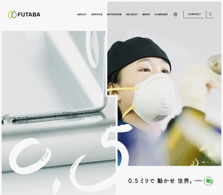
FUTABA presents precision manufacturing through the people who perform it. Pale photographs of folded metal and employees in navy workwear dominate the opening screen. A very large white brush-painted 0.5 crosses the photographic seam, while the actual Japanese tagline remains comparatively small. The logo adds two leaf outlines in different greens, with a gray overlap.
The broader page is a substantial corporate website with recruitment and inquiry functions. It alternates spacious editorial passages, service explanations, staff stories, company records, and practical navigation. Compact uppercase English labels provide structure; tracked Japanese text supplies the narrative. Rounded section boundaries, fine rules, and selective pill shapes soften the industrial subject without turning every content block into a card.
閉じる
FUTABA Metal — Style Reference
Precise metalwork, human portraits, and a brush-painted number across a quiet industrial canvas.
Website: www.futabam.co.jp Original URL: https://www.futabam.co.jp/ Final URL: https://www.futabam.co.jp/ Theme: light neutral surfaces with a deep green interview environment; no selectable theme was established. Inspected: September 23, 2026, Japan Standard Time. The supplied evidence bundle is timestamped September 22, 2026, at 21:12:26.742 UTC, equivalent to September 23 at 06:12:26.742 JST. Viewports: 1440 × 1000 desktop and 390 × 844 mobile, in CSS pixels. Scope: the current corporate homepage, including its opening composition, corporate message, business information, staff interviews, recruitment, news preview, company information, contact content, and footer. Visual captures directly cover the desktop hero, desktop interview, desktop footer, mobile hero, and mobile footer. Other sections are described from the supplied rendered text and computed element records.
FUTABA presents precision manufacturing through the people who perform it. Pale photographs of folded metal and employees in navy workwear dominate the opening screen. A very large white brush-painted 0.5 crosses the photographic seam, while the actual Japanese tagline remains comparatively small. The logo adds two leaf outlines in different greens, with a gray overlap.
The broader page is a substantial corporate website with recruitment and inquiry functions. It alternates spacious editorial passages, service explanations, staff stories, company records, and practical navigation. Compact uppercase English labels provide structure; tracked Japanese text supplies the narrative. Rounded section boundaries, fine rules, and selective pill shapes soften the industrial subject without turning every content block into a card.
How to Read This Reference
- Measured means a value appears in the supplied computed styles or element geometry. Measurements belong to the captured state, not every possible viewport or carousel position.
- Visual estimate means a dimension, color, or treatment was judged from the original-page screenshots. Estimated hex colors are reconstruction starting points, not sampled source values.
- Recommended means guidance for a new implementation. The CSS below is an adaptation, not recovered source code.
- Font names are taken from computed declarations. The evidence does not independently establish which font files supplied every rendered glyph.
- The DOM contains duplicate text, offscreen carousel items, and navigation-panel content. Nonzero element bounds do not establish visibility. Screenshot evidence takes precedence when identifying what was actually displayed.
- Only the supplied original-page evidence was used for design observations. Linked pages, downloads, media destinations, and form submission were not independently inspected.
Tokens — Colors
Default Palette
| Name | Value | Evidence | Suggested token | Role |
|---|---|---|---|---|
| Soft Canvas | #F7F7F7 |
Measured source variable --color_bg-gray1; computed service and recruitment backgrounds |
--color-canvas |
Main neutral environment and large light sections |
| Clean White | #FFFFFF |
Measured --color_white, reversed text, and download-link backgrounds |
--color-white |
Footer surface, reversed text, download pills, and the bright brush artwork |
| Black Ink | #000000 |
Measured text color | --color-ink |
Navigation, body copy, captions, and fine control edges |
| Signal Green | #009A00 |
Measured rgb(0, 154, 0) on brand kickers and news categories |
--color-green |
Small brand labels, category links, and selective emphasis |
| News Gray | #F0F0F0 |
Measured news-section background | --color-news |
Slightly darker neutral field behind the news preview |
| Secondary Gray | #777777 |
Measured nested navigation-link color | --color-muted |
Secondary destinations and subordinate navigation |
| Hairline Gray | Approximately #C8C8C8 |
Visual estimate from the footer | --color-rule |
Thin horizontal separators |
| Interview Forest | Approximately #005600 as a base |
Visual estimate; the screenshot contains substantial tonal variation | --color-forest |
Starting color for the deep green interview environment |
| Leaf Lime | Approximately #A8CE00 |
Visual estimate of the logo artwork | --color-leaf-lime |
First leaf outline; retain the original artwork when available |
| Leaf Green | Approximately #519D36 |
Visual estimate of the logo artwork | --color-leaf-green |
Second leaf outline |
The interview area is visibly darker and more textured than the small #009A00 accents. Do not fill that entire section with the accent token and expect the same result. Its screenshot shows darker edges, brighter green regions, and fine grain; the exact background asset or compositing method is not supplied.
The hero photographs introduce silver, cool gray, navy, skin tones, and occasional yellow equipment details. These are photographic colors rather than additional interface tokens.
Palette Boundaries
The extracted custom properties include generic publishing-system colors, gradients, shadows, and --swiper-theme-color: #007aff. Their presence does not demonstrate visible use. The captures do not support a blue action color, a purple accent system, or a general shadow scale.
Green has two distinct visual jobs: restrained navigation emphasis on pale surfaces, and an immersive background for the human stories. Keep those jobs separate.
Tokens — Typography
Japanese Body and Narrative Text
Measured stack: 'Zen Kaku Gothic Antique', 'Hiragino Kaku Gothic Pro', 'Yu Gothic', Meiryo, sans-serif.
Most sampled Japanese paragraphs use weight 500. Section subtitles and news titles include weight 400. The defining treatment is generous leading with deliberate tracking, rather than extremely heavy typography. Desktop body text commonly uses 16px / 34px; mobile passages commonly use 12px / 24–28px.
English Navigation and Display Labels
Measured family: proxima-nova, sans-serif.
Navigation, uppercase section titles, small editorial labels, staff romanization, and repeated display text use this family, usually at weight 700. Tracking changes by role: approximately 0.06em for small section labels, 0.1em for navigation and major section titles, and larger values in some decorative text.
The same family handles both 10–14px utility labels and very large display lettering. Preserve that family relationship instead of introducing a separate condensed font for every large heading.
Hero Tagline
Measured family: dnp-shuei-gothic-gin-std, sans-serif.
The tagline 0.5ミリで動かせ世界。 uses weight 600, 0.1em tracking, and a one-line-height setting. It measures 30px / 30px on desktop and 17px / 17px on mobile.
The large white 0.5 is visibly brush artwork. No font identity or asset filename was supplied for it. Treat it as a graphic rather than trying to reproduce it with the tagline font.
Declared but Unassigned Family
The source exposes --font-family_type3: 'Kanit', sans-serif. No sampled visible element establishes its role. It should not become the default font in a reconstruction merely because the variable exists.
Type Scale
All values below are measured computed styles unless a rendered-bound qualification is included.
| Role | Desktop size / line height | Mobile size / line height | Weight | Tracking |
|---|---|---|---|---|
| Primary navigation | 13 / 13px |
Hidden in the mobile capture | 700 |
1.3px |
| Small section label | 14 / 14px |
10 / 10px |
700 |
0.84px → 0.6px |
| Green FUTABA kicker | 16 / 16px |
12 / 12px |
700 |
0.96px → 0.72px |
| Main English section title | 56 / 56px |
36 / 36px |
700 |
5.6px → 3.6px |
| Japanese section subtitle | 20 / 20px |
14 / 14px |
Usually 400 |
2px → 1.4px |
| Hero tagline | 30 / 30px |
17 / 17px |
600 |
3px → 1.7px |
| Corporate-message paragraph | 18 / 56px |
12 / 28px |
500 |
3.24px → 0.72px |
| General explanatory paragraph | 16 / 34px |
12 / 24–28px |
500 |
Usually 0.64px → 0.24–0.48px |
| About paragraph | 16 / 38px |
12 / 26px |
500 |
0.32px → 0.24px |
| Interview quotation | 28 / 46px |
16 / 28px |
500 |
2.8px → 0.64px |
| Interview paragraph | 16 / 34px |
12 / 28px |
500 |
0.64px → 0.24px |
| About statement | 64 / 156px |
34 / 60px |
500 |
14.08px → 6.12px |
| Three-strengths introduction | 46 / 68px |
30 / 40px |
500 |
4.6px → 4.2px |
| News title | 16 / 24px |
14 / 22px |
400 |
0.32px → 0.28px |
| Repeated horizontal display text | 330 / 330px |
186 / 186px |
700 |
19.8px → 11.16px |
Root-size caution: the sampled root is 10px, while the body computes to 6.25px / 6.25px. Those inherited values are not representative of the visible reading text. Many actual labels and paragraphs override them, and some link containers contain separately styled descendants. Use explicit component sizes; do not copy a 6.25px reading size into a new site.
The mobile SCROLL label has a computed 10px font size but a rendered bounding height of 7px. This is consistent with transformed scaling, although the transform matrix was not supplied. Keep computed typography distinct from final painted dimensions.
Tokens — Spacing & Shapes
Spacing Model
The source exposes unitless spacing properties such as --space_level8: 24, --space_level13: 64, --space_level16: 96, and --space_jump16: 80, alongside --base-vw-w: 1500. The consuming CSS formulas were not provided, so these values do not establish a universal pixel conversion or an exact responsive grid.
The reliable design pattern is a mixture of narrow image gutters, moderate navigation spacing, generous paragraph leading, and very large section-level breathing room.
| Use | Desktop | Mobile | Evidence |
|---|---|---|---|
| Hero outer photo inset | About 8px |
About 12px horizontally |
Visual estimate |
| Gap between primary text-navigation links | 24px |
Navigation hidden | Calculated from measured link bounds |
| Header left inset | 51.83px |
22.92px |
Measured |
| Header right inset | 60.47px |
19.5px |
Measured |
| Typical service-heading left position | 72px |
38.45px |
Measured in the inspected section |
| Main mobile editorial width | Varies by section | About 313px, with 38.45px side margins |
Measured |
| Strengths body width | 548.72px |
333.84px |
Measured |
| Interview body width | 529.34px |
312px |
Measured |
| Interview heading-to-body gap | 25px |
22px |
Calculated from measured bounds |
| Corporate-message section top padding | 289px |
0px on the sampled section |
Measured; internal layout also changes |
| Footer navigation row | About 58px |
About 45px |
Visual estimate |
Do not force every mobile section into identical side margins. The supplied geometry includes approximately 23px, 28px, 38px, and 39px insets for different content families.
Border Radius
| Element | Desktop | Mobile | Evidence |
|---|---|---|---|
| Contact and menu corner | 0 0 0 2px |
Menu uses the same corner treatment | Measured |
| Service-section bottom corners | 80px |
50px |
Measured |
| Facility-section bottom corners | 80px |
50px |
Measured |
| Download pill | 100px |
100px |
Measured |
| Corporate video-link container | 10px 0 0 10px |
0px |
Measured |
| Footer top corners | Approximately 80px |
Not fully visible in the mobile footer capture | Visual estimate |
| Hero photo outer corners | Approximately 3–5px |
Small, nearly square corners | Visual estimate |
| Back-to-top control | Circle, about 72px diameter |
Circle, about 52px diameter |
Visual estimate |
The radius hierarchy is intentional: almost-square photos, tiny bracket corners, large section curves, and fully rounded utility pills. A uniform 16px card radius would remove that hierarchy.
Layout Measurements
| Element | Desktop | Mobile | Qualification |
|---|---|---|---|
| Document height | 23392.39px |
19615.13px |
Measured snapshot geometry; not a target height |
| Initial header | 1440 × 107.44px |
390 × 70px |
Measured; desktop includes 57px top padding |
| Header logo box | 207.11 × 50.44px |
94 × 22.89px |
Measured |
| Contact control | 111.14 × 40px |
Not displayed | Measured |
| Menu control | 41 × 40px |
30 × 29px |
Measured visual control box |
| Brush graphic wrapper | 800.63 × 459.17px |
334 × 191.55px |
Measured empty graphic wrapper corresponding to the visible artwork |
| Corporate-message text | 552.25px wide |
305.28px wide |
Measured |
| Corporate video link | 806.23 × 458.08px |
390 × 221.58px |
Measured, approximately 16:9 |
| Equipment download pill | 386.69 × 90px |
238.36 × 60px |
Measured |
| Recruitment download pill | 428.61 × 90px |
266.70 × 60px |
Measured |
Components
Persistent Header
Role: maintain identity and access to a long corporate page.
At the desktop opening, the logo sits at approximately (52, 57). The navigation begins around x = 643 and continues through ABOUT, SERVICE, INTERVIEW, RECRUIT, NEWS, and COMPANY. An 18px Instagram icon, CONTACT, and a menu button finish the row.
CONTACT and the menu button use thin left and bottom edges, creating an open bracket rather than a conventional complete rectangle. The contact label has measured padding of 13px 17px 13px 24px.
The header remains visible at the top of the interview and footer captures. Its compact desktop appearance is approximately 74px high, estimated from those images. The initial and compact appearances establish a persistent, shrinking header; the supplied element records do not identify whether the source uses fixed positioning, sticky positioning, or a combination.
INTERVIEW is green with a thin black underline in the interview capture. This establishes an active appearance, but not the exact scroll-tracking implementation.
On mobile, the header is a 70px strip with a 94px logo and the small bracketed menu control. Desktop text links, the contact label, and the separate social icon are absent from the visible header.
Opening Photo Composition
Role: connect small-scale precision with the people behind it.
The desktop hero has two offset photographic regions. A pale metal close-up begins about 167px below the top at the left. The worker portrait begins near the top-right corner and ends around y = 837. A narrow canvas-colored gap separates them, changing horizontal position at a stepped junction near the middle of the screen.
The large white brush graphic crosses both pictures. Its measured wrapper starts at approximately (57.59, 540.83) and reaches the bottom of the 1000px viewport. Treat this clipping as part of the composition rather than shrinking the artwork until every stroke fits.
The tagline sits below the right photograph at (807, 908), outside the image. Four small numbered positions appear inside the photograph near its lower-right corner. A SCROLL label and a small green ribbon-like ornament occupy the lower-right utility area.
On mobile, the composition changes orientation. The worker photograph sits above the metal photograph within a roughly 366px-wide frame. The photos occupy approximately y = 70–774. A horizontal stepped seam replaces the desktop vertical seam. The brush artwork spans the join at approximately x = 28, y = 330, and 334px wide. The tagline moves to (25, 802).
The desktop and mobile captures show different workers and different active numbers. That establishes multiple hero states, not a rule that a particular employee belongs to a particular breakpoint.
Section Heading Assembly
Role: make business sections recognizable without oversized Japanese headings.
The service and recruitment assemblies combine a small green FUTABA label, a Japanese subtitle, and a larger English section title. On desktop, the service assembly begins at x = 72; SERVICE uses 56px type. A 430px-wide explanatory paragraph sits farther right, and a small local navigation group occupies the far-right area around x = 1220.
On mobile, SERVICE becomes 36px, the Japanese subtitle becomes 14px, and the explanatory paragraph sits below in a roughly 313px column. The desktop local-navigation rail is not visible in the mobile text presentation.
Use the same family of elements for related sections while preserving their observed ordering differences. For example, the mobile news title and Japanese subtitle sit beside one another.
Corporate Message and Video Entry
Role: give the manufacturing claim an editorial pace.
The desktop message uses a narrow 552px text block with unusually loose 18px / 56px typography and 3.24px tracking. A large video-link container sits toward the right and later in the section. A concluding Japanese statement uses 40px / 64px type with 6.4px tracking.
On mobile, the body becomes 12px / 28px, the video link becomes full-width, and the concluding statement becomes a centered, three-line block using 20px / 45px type.
The desktop DOM contains black and white copies of the message at identical coordinates. This supports the presence of layered text, but does not establish the masking or color-transition technique. Do not render both copies as consecutive readable paragraphs.
The external video destination is present in the page evidence; playback, an embedded player, and any lightbox behavior were not tested.
Manufacturing Flow
Role: explain the production sequence.
The rendered content contains MAIN FLOW, six numbered positions, and the labels CAD・CAM, ブランク, バリ取り, プレス, 溶接, and 検査.
The desktop section has a measured 72px left inset and an inner content width of approximately 1057px. On mobile, its measured container is approximately 344px wide and 273px high. The element inventory does not establish the appearance of every diagram or image within it.
For a new implementation, use a semantic six-step sequence and preserve the compact numbering. Treat any tabs, diagram transitions, or swipe behavior as additional implementation work, not verified original behavior.
Three Strengths
Role: expand the technical case through three substantial explanations.
A small green FUTABA PRIDE label introduces the tracked English line FUTABA 3 STRONG POINTS. Desktop introductory text is broad, followed by narrower body passages of approximately 549px. The three themes address production variety, quality, and response speed.
The desktop DOM also records repeated, vertically arranged white display text in a 162px-wide region near the right side. This supports a large decorative typographic layer. Its exact motion and visible treatment are not established by a dedicated screenshot.
On mobile, the introduction wraps into a two-line 30px heading, and the body passages become approximately 334px wide at 12px / 24px. Preserve this hierarchy instead of compressing the content into three small equal cards.
Download Callout
Role: provide detailed equipment and recruitment information without expanding every specification inline.
Both download actions are large white pills with black content and a measured 100px radius. Desktop controls are 90px high, while mobile controls are 60px high. The equipment link includes the displayed size 1.1MB; the recruitment link includes 923KB.
Desktop padding is 35px 45px 37px 55px; mobile padding is 24px 20px. These are link-container measurements. The inherited 6.25px font size on the container should not be used to infer the size of its internal label.
The surrounding copy is white in the sampled styles. The exact background imagery of these callouts is not shown in the supplied captures. Preserve the verified contrast relationship without inventing a particular scene.
Staff Interview Feature
Role: make skilled work and workplace culture tangible.
The desktop screenshot shows a deep green field, a wide central factory photograph, small neighboring profile fragments, and vertical name treatments. The visible photograph spans approximately x = 313–1126; its top is cropped by the current scroll position, so its full height cannot be measured from this image.
Below the image, two small white outline capsules identify the employee's work and joining year. The photographed example shows 曲げ and 2017年入社. Their apparent height is about 26px, a visual estimate.
The quotation is centered within a measured 529.34px column, using 28px / 46px white text and 0.1em tracking. The paragraph below uses the same column with 16px / 34px text and more restrained tracking. Keep the paragraph aligned to its reading edge rather than centering every line.
Desktop Japanese names use vertical presentation with sampled 28px type and 7.84px tracking. Romanized names use 18px type with 2.16px tracking. Mobile records place romanized and Japanese names in horizontal blocks below the media: 10px English and 20px Japanese.
Three staff identities and repeated offscreen copies exist in the DOM. Each profile also contains a three-position number group. The evidence does not establish whether every number group selects media, profiles, or another state. Keep that uncertainty separate from the clearly observed profile composition.
Recruitment Stories
Role: explain the working environment through substantive narrative.
The supplied content covers international employees, workplace diversity, and environmentally considerate manufacturing. Desktop paragraph columns measure approximately 461px wide and use 16px / 34px text. Mobile paragraphs measure approximately 334px wide at 12px / 24px.
The recruitment section returns to the pale canvas after the green interview environment. Small uppercase labels and large English titles tie it back to the service section. Some recruitment headings have measured transform and opacity transitions, but their reveal triggers were not recorded.
News Preview
Role: expose company activity and route readers to separate news pages.
The news section uses the measured #F0F0F0 background. Desktop geometry places a heading and category column at the left, with horizontally arranged article regions to its right. The first two article links are approximately 253.58px wide with a calculated 57.05px gap.
On mobile, the heading and categories move above the articles. Article widths remain approximately 249.61px, with a calculated 13.67px gap. The second article begins at x = 290.30, extending beyond the viewport. This establishes a horizontal strip rather than a single full-width vertical list; dragging and pagination behavior remain untested.
Each item includes a media region in the layout, a date in the rendered text, a Japanese title, and a small green category link. The article title uses 16px / 24px on desktop and 14px / 22px on mobile. Avoid surrounding every item with a heavy border or raised panel.
Company Information and Contact
Role: provide the practical corporate record and an inquiry destination.
The rendered page includes a representative's message, philosophy, history, company outline, map destination, and contact content. Company history extends through a June 2026 entry in the supplied text. This is a content observation, not a visual specification for the history component.
The contact inventory includes inquiry categories, name, telephone, email, and message fields. Required labels are present for name, email, and the message. A personal-information note and reCAPTCHA policy text follow.
No dedicated contact screenshot or detailed input-style records were supplied. Field borders, validation states, confirmation steps, and successful submission cannot be specified as observed behavior. The form should follow the established neutral palette and typography in a new implementation, with its interaction states designed and tested separately.
Footer Contents Directory
Role: conclude the long page with a comprehensive navigation map.
The desktop footer is a large white surface with broadly rounded top corners. A stacked leaf symbol and FUTABA wordmark sit at the left. A small CONTENTS label occupies a middle column, and the navigation table begins around x = 655, extending to about x = 1325.
Top-level links have small green bullets. Service, recruitment, and company rows include smaller gray links with tiny green directional marks. Fine gray horizontal rules divide the rows. Instagram occupies a final, slightly taller row. There is no visible card shadow.
The company name, address, and telephone run along the lower-left area. Copyright sits toward the right, beside a thin green circular back-to-top control.
On mobile, the contents directory becomes a centered column approximately 216px wide, from x = 87 to 303. Rows are about 45px high. Service, recruitment, and company show green plus marks, while their nested destinations are not visible in the capture. This is evidence of a collapsed visual presentation, not proof of tested accordion behavior.
The address and telephone become centered lines below the directory. The telephone is green and underlined. Copyright and a roughly 52px back-to-top circle form a vertical ending.
The mobile capture begins partway through the footer's brand area. Do not interpret the clipped wordmark as a design that intentionally omits the leaf symbol.
Menu Panel Evidence
The DOM contains another contents directory associated with navigation, including a rounded gray Instagram link and an additional menu button. It is not the same visible presentation as the white footer directory.
No open-menu screenshot or opening interaction was supplied. Do not transfer its measured pill background, transformed bounds, or internal positioning to the footer. A reconstruction needs a separately verified or explicitly designed menu state.
Tokens — Motion & Interaction
| Treatment | Supplied evidence | What can be concluded |
|---|---|---|
| Header spacing change | padding 0.6s cubic-bezier(0.19, 1, 0.22, 1) |
A 600ms padding transition is defined; compact and expanded appearances are visible |
| Logo resizing | width 0.6s cubic-bezier(0.19, 1, 0.22, 1) |
Width changes use the same easing |
| Logo-link feedback | opacity 0.6s cubic-bezier(0.19, 1, 0.22, 1) |
Opacity feedback is defined; endpoints were not supplied |
| Navigation and article-title feedback | color 0.6s cubic-bezier(0.19, 1, 0.22, 1) |
Color transitions are defined; the interview active state is visible |
| Download-pill feedback | background-color 0.6s cubic-bezier(0.19, 1, 0.22, 1) |
Background-color transitions are defined; hover fill was not captured |
| Selected recruitment headings | Transform and opacity, 0.6s cubic-bezier(0.645, 0.045, 0.355, 1) |
Reveal-capable transitions exist; trigger, distance, and delay are unknown |
| Hero image sequence | Four numbers and different captured active states | Multiple states exist; autoplay, duration, and transition style are unverified |
| Interview sequence | Three identities, number groups, and offscreen duplicates | Carousel-like composition is supported; control semantics and timing are unverified |
| Large repeated text | Multiple copies at widely separated horizontal or vertical coordinates | A continuous-strip structure is supported; speed and direction are unverified |
| Mobile directory groups | Visible plus marks and hidden subordinate destinations | Collapsed appearance is visible; expansion was not exercised |
| Back-to-top and SCROLL cues | Visible symbols | Their exact scrolling behavior was not exercised |
Most sampled elements report animation: none. This does not rule out JavaScript-driven motion, animated ancestors, or pseudo-elements. A generic transition: all without a supplied duration is not evidence for an additional animation token.
Recommended motion approach: reuse the measured 600ms easing for restrained header and color changes. Keep essential copy visible without animation. If implementing automatic media changes, provide pause behavior and reduced-motion handling; do not invent a source autoplay interval.
Surfaces
| Layer | Appearance | Evidence and purpose |
|---|---|---|
| Neutral page field | Soft near-white | Measured on major sections; supports photographs and black typography |
| Hero media | Pale industrial photography with narrow gutters | Directly visible; carries the opening visual weight |
| Interview environment | Deep, uneven green with white text | Directly visible; exact color construction unverified |
| News field | #F0F0F0 |
Measured subtle section distinction |
| Footer | White with large rounded upper corners | Directly visible on desktop |
| Utility action | White pill or thin open bracket | Measured download controls and visible header controls |
| Navigation directory | Unboxed links separated by fine rules | Directly visible in the footer |
The captured design does not establish a general elevation system. Separation comes from background changes, photography, whitespace, rules, and large section contours.
Imagery
The hero uses close, observational photographs: a worker concentrating on a task and a metal component shown at a scale where bends, edges, and surface finish become the subject. Lighting is soft and relatively pale. Navy uniforms and workshop equipment provide contrast without a strongly saturated commercial-photo treatment.
The mobile worker is framed tightly enough that the face, hairstyle, and shoulder become a strong portrait. The metal photograph below is more abstract. Their relationship matters more than matching the same crop at every viewport.
The desktop interview photograph shows work clothing, gloves, a factory bench, and nearby equipment. It belongs to the employee's real working context. Avoid substituting generic office portraits or isolated machinery renders.
The brush numeral has irregular edges, missing flecks, and broad gestural strokes. Its expressiveness contrasts with the precision of the small typography. Keep it as a dedicated graphic with transparent negative space. The leaf logo also needs its original contours and overlap; recreating it with generic leaf icons would lose the identity.
Observed Asset References
| Asset or destination | Evidence | Implementation consequence |
|---|---|---|
| Horizontal and stacked FUTABA logo presentations | Visible in the header and desktop footer; no asset URL supplied | Obtain authorized logo files; do not guess filenames |
| Worker and metal hero photographs | Visible in original desktop and mobile captures; no asset URLs supplied | Prepare separate crops or focal positions for each composition |
| White brush numeral | Visible with measured wrapper dimensions; no asset URL supplied | Use an authorized transparent graphic rather than live display text |
| Interview factory photography | Visible in the desktop interview capture | Preserve workshop context and natural texture |
| Green interview background | Visible; source asset or paint method unknown | An approximation must be labeled as such |
| Equipment document | /assets/pdf/product_list.pdf |
Link destination and displayed size are observed; document contents were not inspected |
| Recruitment document | /assets/pdf/recruitment_information.pdf |
Link destination and displayed size are observed; document contents were not inspected |
No image-generation prompt can establish the actual appearance of uninspected original assets. For an adaptation, new photography should match the framing and lighting principles while representing the new organization accurately.
Layout & Responsive Behavior
Desktop Composition
The opening is asymmetrical, but the asymmetry is controlled: staggered photographs, a stepped seam, a large graphic crossing it, and a small tagline in the remaining neutral space. The persistent navigation is a thin horizontal layer over this composition.
Below the hero, the page uses different reading widths for different roles. Narrative passages are narrow; statements are broad; service headings and local navigation occupy separate horizontal zones. The interview returns to a centered reading column inside a full-width green environment. The footer closes with a three-part identity, label, and directory layout.
Mobile Recomposition
| Element | Desktop observation | Mobile observation |
|---|---|---|
| Header | Logo, text navigation, social link, contact, menu | Logo and menu only; 70px high |
| Hero photographs | Side-by-side offset arrangement | Vertical stack with a horizontal stepped seam |
| Brush graphic | About 801px wide, clipped at viewport bottom | 334px wide, centered across the photo join |
| Hero tagline | Below the right photo | Below the full photo stack |
| Main section title | 56px English display | 36px English display |
| Body text | Commonly 16px with 34px leading | Commonly 12px with 24–28px leading |
| Local section navigation | Far-right groups in sampled desktop layout | Not visible in the mobile presentation |
| Interview names | Vertical labels beside the photograph | Horizontal English and Japanese blocks beneath media, established by DOM |
| News items | Horizontal strip beside category column | Horizontal strip below category row |
| Download pills | 90px high | 60px high |
| Footer navigation | Broad rows with inline subordinate links | Narrow centered directory with plus-marked groups |
| Footer company details | Horizontal baseline arrangement | Centered stacked lines |
These are two measured endpoints, not evidence for an exact breakpoint. Tablet, landscape-phone, and intermediate-width layouts were not supplied.
The mobile document is shorter than the desktop document despite text wrapping. This is consistent with smaller typography, tighter section dimensions, and different media geometry. Do not emulate the measured page height with empty spacers.
The Quick Start uses an explicitly recommended 1100px breakpoint for its simplified composition. A production implementation should test intermediate widths and move that threshold when the navigation or imagery needs it.
Do’s and Don’ts
Do
- Pair human work photography with close views of metal surfaces.
- Preserve the stepped photo seam and let the brush numeral cross it.
- Keep the readable tagline outside the image on both inspected layouts.
- Use the measured neutral colors and
#009A00for small accents. - Give the interview area its own deeper green environment.
- Combine bold uppercase English labels with carefully spaced Japanese text.
- Preserve large section curves while keeping photo corners restrained.
- Use fine directory rules, small bullets, and open bracket controls.
- Recompose the hero vertically on mobile rather than shrinking the desktop arrangement.
- Keep business information, recruitment, news, and inquiry navigation distinct and reachable.
Don’t
- Don’t replace the opening with a centered headline and a generic CTA pair.
- Don’t turn every service explanation into a raised rounded card.
- Don’t render the brush numeral using an arbitrary handwriting font.
- Don’t apply the small accent green as a flat substitute for the interview background.
- Don’t treat publishing-system preset colors or shadows as the site's visual palette.
- Don’t infer visible menu behavior from offscreen DOM geometry.
- Don’t render carousel clones or layered message copies as duplicate article content.
- Don’t assign a fixed employee image to mobile merely because the captures show different slides.
- Don’t invent carousel timings, form states, or input styling from static evidence.
- Don’t use the body's inherited 6.25px size as a reading-text specification.
Recommended Implementation Additions
These are recommendations for a new implementation, not verified original features.
- Keep the visible mobile menu ornament small if desired, but provide a hit area of at least 44 × 44px.
- Give icon controls accessible names and expose the current navigation destination with an appropriate semantic state.
- Use separate links and disclosure buttons where a footer category both navigates and expands. Connect each disclosure button to its panel with
aria-controlsandaria-expanded. - Keep inactive carousel copies out of the keyboard sequence and accessibility tree. Provide direct access to every real profile.
- Consider increasing 12px mobile reading text to 14–16px for an adaptation, accepting the resulting change in vertical rhythm.
- Use dark text for small links if the accent green does not provide sufficient contrast against the chosen surface.
- Reserve media dimensions and load only the initial hero image eagerly. Avoid loading every carousel duplicate as a separate resource.
- Support reduced motion for large repeated text, header movement, and media transitions. JavaScript animation loops need their own reduced-motion handling.
- Give anchor targets clearance beneath the persistent header.
- Preserve displayed download sizes and identify document links clearly.
- Build and test contact validation, error messages, and successful submission independently of this visual reference.
Agent Prompt Guide
Quick Color Reference
- Main canvas:
#F7F7F7. - Footer and download surfaces:
#FFFFFF. - Text and header linework:
#000000. - Small brand and category accents: measured
#009A00. - News section: measured
#F0F0F0. - Secondary navigation: measured
#777777. - Interview background: deep textured green;
#005600is an estimated starting color, not an exact source token. - Photo colors: silver metal, navy workwear, soft skin tones, and workshop details.
Overall Prompt
“Create a Japanese precision-manufacturing corporate homepage inspired by FUTABA Metal's observed composition. Use a soft near-white canvas, black typography, restrained green accents, and documentary photographs of employees and sheet-metal parts. Build an asymmetrical desktop hero from two staggered photographs separated by a narrow stepped seam, with a large white brush numeral crossing the join and a small Japanese tagline below the right image. Use compact tracked English navigation, generous Japanese paragraph leading, 56px desktop section titles, and large rounded section boundaries. Give staff interviews a deep textured green field with white text and a narrow centered reading column. Finish with a white contents directory using thin gray rules. On mobile, stack the hero photographs, move the brush artwork across the horizontal join, simplify the header, and center the footer directory.”
Example Component Prompts
- Hero: “Compose a pale metal macro photograph and a worker portrait as offset panels with a stepped 8px neutral gutter. Place a transparent white brush graphic across both images. Keep the compact tagline below the portrait. At phone width, stack the photographs and rotate the seam's layout from vertical to horizontal without rotating the imagery.”
- Header: “Use the supplied leaf-and-wordmark logo at the left and 13px bold tracked English navigation at the right. Add a small social icon, an open left-and-bottom bracket around CONTACT, and a matching menu ornament. Create a compact persistent state; provide a larger invisible hit area for the mobile menu.”
- Interview: “Place a factory photograph in a deep green editorial section. Add thin white outline role and joining-year capsules, a centered two-line quotation, and a left-aligned paragraph in a 529px desktop column. Use 28/46px quotation type and 16/34px body text; reflow names horizontally below the image on mobile.”
- Section heading: “Combine a small green FUTABA-style kicker, a Japanese subtitle, and a bold tracked uppercase English title. Use 56px display text on desktop and 36px on mobile. Put the introductory paragraph in a separate right-hand column on desktop and below the heading on mobile.”
- Footer: “Build a broad white footer with approximately 80px upper corners, a stacked brand mark at the left, a small CONTENTS label, and a ruled navigation directory. Use small green bullets and muted inline sublinks. On mobile, make the directory about 216px wide, use working disclosures for grouped links, and stack address, telephone, copyright, and a thin circular back-to-top control.”
Quick Start
CSS Custom Properties
This is a usable starting shell, not a complete copy of the original site. Measured colors, type sizes, and control proportions are preserved where practical. The forest color, photo clip paths, interpolation, and 1100px breakpoint are recommended approximations. A conventional root font size is retained.
The hero needs authorized photographs and a transparent brush graphic. Header state, menu behavior, carousel selection, and directory disclosures require accessible application logic. The CSS does not hide reading content while waiting for JavaScript.
:root {
  /* Measured colors */
  --color-canvas: #f7f7f7;
  --color-white: #fff;
  --color-ink: #000;
  --color-green: #009a00;
  --color-news: #f0f0f0;
  --color-muted: #777;

  /* Visual approximations */
  --color-rule: #c8c8c8;
  --color-forest: #005600;

  /* Observed family declarations; load licensed fonts separately */
  --font-ja: 'Zen Kaku Gothic Antique', 'Hiragino Kaku Gothic Pro',
    'Yu Gothic', Meiryo, sans-serif;
  --font-en: proxima-nova, sans-serif;
  --font-tagline: dnp-shuei-gothic-gin-std, sans-serif;

  --text-body: 16px;
  --leading-body: 34px;
  --text-section: 56px;
  --text-label: 14px;
  --page-gutter: 5vw;
  --section-radius: 80px;
  --photo-radius: 4px;
  --ease-brand: cubic-bezier(0.19, 1, 0.22, 1);
  --ease-reveal: cubic-bezier(0.645, 0.045, 0.355, 1);
  --duration-brand: 600ms;
}

* { box-sizing: border-box; }
html { font-size: 100%; }
body {
  margin: 0;
  color: var(--color-ink);
  background: var(--color-canvas);
  font-family: var(--font-ja);
  font-size: var(--text-body);
  font-weight: 500;
  line-height: var(--leading-body);
}
img { display: block; max-width: 100%; }
a { color: inherit; }
button { font: inherit; }
[hidden] { display: none !important; }
section[id] { scroll-margin-top: 90px; }
:focus-visible { outline: 2px solid currentColor; outline-offset: 5px; }

/* Header positioning is an implementation recommendation. */
.site-header {
  position: fixed;
  inset: 0 0 auto;
  z-index: 30;
  display: flex;
  align-items: center;
  justify-content: space-between;
  gap: 24px;
  padding: 57px 4.2vw 0 3.6vw;
  transition: padding var(--duration-brand) var(--ease-brand);
}
.site-header__logo {
  flex: none;
  width: clamp(160px, 14.383vw, 224px);
  transition: width var(--duration-brand) var(--ease-brand);
}
.site-header__links,
.site-header__actions {
  display: flex;
  align-items: center;
}
.site-header__links { gap: 24px; margin-left: auto; }
.site-header__actions { gap: 12px; }
.site-header__links a,
.site-header__contact {
  font: 700 13px / 1 var(--font-en);
  letter-spacing: 0.1em;
  text-decoration: none;
  transition: color var(--duration-brand) var(--ease-brand);
}
.site-header__links a[aria-current] {
  color: var(--color-green);
  text-decoration: underline;
  text-decoration-color: var(--color-ink);
  text-underline-offset: 16px;
}
.bracket-control {
  display: inline-flex;
  align-items: center;
  justify-content: center;
  border: 0;
  border-left: 1px solid currentColor;
  border-bottom: 1px solid currentColor;
  border-radius: 0 0 0 2px;
  color: inherit;
  background: transparent;
}
.site-header__contact { min-height: 40px; padding: 13px 17px 13px 24px; }
.site-header__menu { position: relative; width: 41px; height: 40px; }
.site-header__menu::after {
  content: '';
  position: absolute;
  inset: 50% auto auto 50%;
  width: max(100%, 44px);
  height: max(100%, 44px);
  transform: translate(-50%, -50%);
}
.site-header.is-compact {
  padding-block: 14px;
  background: var(--color-canvas);
}
.site-header.is-compact .site-header__logo { width: 190px; }

/* Approximate the photographed opening geometry. */
.hero {
  position: relative;
  height: 100svh;
  min-height: 760px;
  overflow: hidden;
  isolation: isolate;
}
.hero__metal,
.hero__person {
  position: absolute;
  overflow: hidden;
  border-radius: var(--photo-radius);
}
.hero__metal {
  top: 16.7%;
  bottom: 0;
  left: 8px;
  width: calc(50% + 12px);
  clip-path: polygon(0 0, 93.3% 0, 93.3% 39%, 100% 39%, 100% 100%, 0 100%);
}
.hero__person {
  inset: 8px 8px 16.3% calc(50% - 20px);
  clip-path: polygon(0 0, 100% 0, 100% 100%, 6.7% 100%, 6.7% 58.8%, 0 58.8%);
}
.hero__metal img,
.hero__person img {
  width: 100%;
  height: 100%;
  object-fit: cover;
  object-position: var(--photo-position, 50% 50%);
}
.hero__brush {
  position: absolute;
  z-index: 2;
  left: 4%;
  bottom: 0;
  width: 55.6%;
  height: auto;
  pointer-events: none;
}
.hero__caption {
  position: absolute;
  left: 56.04%;
  right: 3.2%;
  bottom: 62px;
  display: flex;
  align-items: center;
  justify-content: space-between;
  gap: 24px;
}
.hero__tagline {
  margin: 0;
  font: 600 30px / 1 var(--font-tagline);
  letter-spacing: 0.1em;
  white-space: nowrap;
}
.hero__pagination {
  position: absolute;
  right: 30px;
  bottom: calc(16.3% + 12px);
  display: flex;
  gap: 10px;
  margin: 0;
  color: white;
  font: 700 10px / 1 var(--font-en);
  letter-spacing: 0.06em;
}
.hero__pagination span { opacity: 0.4; }
.hero__pagination [aria-current='true'] { opacity: 1; }
.scroll-cue {
  display: inline-flex;
  align-items: center;
  gap: 18px;
  font: 700 10px / 1 var(--font-en);
  letter-spacing: 0.1em;
}
.scroll-cue i {
  width: 38px;
  height: 17px;
  border-radius: 999px;
  background: linear-gradient(90deg, #43b849, #83d186 60%, transparent);
  transform: rotate(-28deg);
}

.section-shell { padding: 160px var(--page-gutter); }
.section-shell--rounded { border-radius: 0 0 var(--section-radius) var(--section-radius); }
.section-heading__meta { display: flex; align-items: baseline; gap: 140px; }
.section-kicker,
.eyebrow {
  margin: 0;
  font: 700 var(--text-label) / 1 var(--font-en);
  letter-spacing: 0.06em;
}
.section-kicker { color: var(--color-green); font-size: 16px; }
.section-subtitle { margin: 0; font-size: 20px; line-height: 1; letter-spacing: 0.1em; }
.section-title {
  margin: 24px 0 0;
  font: 700 var(--text-section) / 1 var(--font-en);
  letter-spacing: 0.1em;
}
.editorial-copy { max-width: 549px; letter-spacing: 0.04em; }
.editorial-copy p { margin: 0 0 1.5em; }

/* The green gradient is an approximation, not recovered source CSS. */
.interview {
  padding: 160px 24px;
  color: white;
  background: radial-gradient(ellipse at 70% 45%, #087308, var(--color-forest) 65%, #003e00);
}
.interview__media { width: min(100%, 814px); margin-inline: auto; }
.interview__media img { width: 100%; height: auto; border-radius: 4px; }
.interview__tags { display: flex; justify-content: center; gap: 6px; margin-block: 44px 38px; }
.outline-tag { padding: 3px 10px; border: 1px solid currentColor; border-radius: 999px; font-size: 14px; line-height: 1.3; }
.interview__copy { width: min(100%, 529.34px); margin-inline: auto; }
.interview__quote { margin: 0 0 25px; font-size: 28px; line-height: 46px; letter-spacing: 0.1em; text-align: center; }
.interview__body { margin: 0; font-size: 16px; line-height: 34px; letter-spacing: 0.04em; }
.download-pill {
  display: inline-flex;
  align-items: center;
  justify-content: center;
  min-height: 90px;
  max-width: 100%;
  padding: 24px 45px;
  border-radius: 100px;
  background: white;
  color: black;
  text-decoration: none;
  transition: background-color var(--duration-brand) var(--ease-brand);
}
.news-strip {
  display: grid;
  grid-auto-flow: column;
  grid-auto-columns: 254px;
  gap: 57px;
  overflow-x: auto;
  padding-block: 8px 24px;
}
.news-item__title { font-size: 16px; font-weight: 400; line-height: 24px; letter-spacing: 0.02em; }

.site-footer {
  padding: 110px 8vw 85px;
  border-radius: 80px 80px 0 0;
  background: white;
}
.footer-layout { display: grid; grid-template-columns: 32.1% 12.6% minmax(0, 1fr); }
.footer-logo { width: 174px; }
.footer-label { padding-top: 52px; }
.footer-contents { padding-top: 34px; }
.contents-row {
  display: grid;
  grid-template-columns: 140px minmax(0, 1fr);
  align-items: center;
  min-height: 58px;
  padding-inline: 28px;
  border-bottom: 1px solid var(--color-rule);
  font-size: 16px;
  line-height: 1.5;
}
.contents-row a { text-decoration: none; }
.contents-row__main::before { content: '•'; margin-right: 10px; color: var(--color-green); }
.contents-row__sub { display: flex; flex-wrap: wrap; gap: 8px 20px; color: var(--color-muted); font-size: 13px; }
.contents-row__toggle { display: none; }
.footer-base { display: flex; align-items: center; justify-content: space-between; gap: 24px; margin-top: 80px; font-size: 13px; }
.back-to-top { display: grid; place-items: center; flex: none; width: 72px; height: 72px; border: 1px solid var(--color-green); border-radius: 50%; color: var(--color-green); text-decoration: none; }

/* Recommended breakpoint; only the two reference viewports were inspected. */
@media (max-width: 1100px) {
  :root { --text-body: 12px; --leading-body: 28px; --text-section: 36px; --text-label: 10px; --page-gutter: 9.86vw; --section-radius: 50px; }
  .site-header,
  .site-header.is-compact { height: 70px; padding: 0 5vw 0 5.88vw; background: var(--color-canvas); }
  .site-header__logo,
  .site-header.is-compact .site-header__logo { width: 94px; }
  .site-header__links,
  .site-header__contact,
  .site-header__social { display: none; }
  .site-header__menu { width: 30px; height: 29px; }
  .hero { min-height: 680px; }
  .hero__person { inset: 70px 12px auto; height: calc((100% - 140px) / 2 + 8px); clip-path: polygon(0 0, 100% 0, 100% 95%, 50% 95%, 50% 100%, 0 100%); }
  .hero__metal { inset: calc(50% - 6px) 12px 70px; width: auto; clip-path: polygon(50% 0, 100% 0, 100% 100%, 0 100%, 0 4.5%, 50% 4.5%); }
  .hero__brush { top: calc(50% - 92px); left: 28px; bottom: auto; width: calc(100% - 56px); }
  .hero__caption { left: 25px; right: 19px; bottom: 25px; gap: 12px; }
  .hero__tagline { font-size: 17px; }
  .hero__pagination { right: 20px; bottom: 78px; color: black; gap: 8px; }
  .scroll-cue { gap: 10px; font-size: 7px; }
  .scroll-cue i { width: 29px; height: 14px; }
  .section-shell { padding-block: 90px; }
  .section-heading__meta { gap: 70px; }
  .section-kicker { font-size: 12px; }
  .section-subtitle { font-size: 14px; }
  .section-title { margin-top: 14px; }
  .interview { padding: 90px 0; }
  .interview__media { width: 86%; }
  .interview__copy { width: 80%; }
  .interview__quote { margin-bottom: 22px; font-size: 16px; line-height: 28px; letter-spacing: 0.04em; }
  .interview__body { font-size: 12px; line-height: 28px; letter-spacing: 0.02em; }
  .download-pill { min-height: 60px; padding: 18px 20px; }
  .news-strip { grid-auto-columns: 249.61px; gap: 13.67px; }
  .news-item__title { font-size: 14px; line-height: 22px; }
  .site-footer { padding: 80px 24px 32px; border-radius: 50px 50px 0 0; }
  .footer-layout { display: flex; flex-direction: column; align-items: center; }
  .footer-logo { width: 120px; }
  .footer-label,
  .footer-contents { width: min(216px, 100%); }
  .footer-label { padding-top: 60px; }
  .footer-contents { padding-top: 28px; }
  .contents-row { grid-template-columns: 1fr auto; min-height: 45px; padding-inline: 4px; font-size: 12px; }
  .contents-row__sub { grid-column: 1 / -1; flex-direction: column; padding: 12px 16px; font-size: 11px; }
  .contents-row__toggle { display: grid; place-items: center; width: 44px; height: 44px; border: 0; background: transparent; color: var(--color-green); }
  .footer-base { flex-direction: column; margin-top: 32px; text-align: center; font-size: 11px; }
  .back-to-top { width: 52px; height: 52px; }
}

@media (prefers-reduced-motion: reduce) {
  .site-header,
  .site-header__logo,
  .site-header__links a,
  .site-header__contact,
  .download-pill { transition: none; }
  .motion-track { animation: none !important; }
}
The footer's 120px mobile logo and 50px upper corners in this adaptation are recommendations; the supplied mobile footer image does not fully expose those features. The interview tags and gradient are also approximations. Only apply hidden to subordinate navigation when a working disclosure control can reveal it.
Minimal Hero Anatomy
The filenames below are illustrative local placeholders, not observed original asset paths. This example renders a static image pair and a position indicator. Add real carousel controls only when their behavior is implemented.
<section class='hero' aria-label='FUTABA Metal introduction'>
  <div class='hero__person'>
    <img src='./media/worker.jpg'
      alt='A FUTABA employee working in the factory'
      width='1200' height='1400' fetchpriority='high'>
  </div>
  <div class='hero__metal'>
    <img src='./media/metal-detail.jpg' alt=''
      width='1200' height='1400'>
  </div>
  <img class='hero__brush' src='./media/brush-numeral.png'
    alt='' width='800' height='459'>
  <p class='hero__pagination' aria-label='Image 1 of 4'>
    <span aria-current='true'>01</span><span>02</span>
    <span>03</span><span>04</span>
  </p>
  <div class='hero__caption'>
    <p class='hero__tagline' lang='ja'>0.5ミリで動かせ世界。</p>
    <span class='scroll-cue'>SCROLL<i aria-hidden='true'></i></span>
  </div>
</section>
Tailwind v4 Token Mapping
Optional mapping for an implementation that already uses Tailwind v4. This does not imply that the original website uses Tailwind. Define the preceding custom properties first.
@theme inline {
  --color-canvas: #f7f7f7;
  --color-ink: #000;
  --color-brand: #009a00;
  --color-news: #f0f0f0;
  --color-secondary: #777;
  --font-editorial: var(--font-ja);
  --font-label: var(--font-en);
  --font-hero-copy: var(--font-tagline);
  --text-reading: var(--text-body);
  --text-display: var(--text-section);
  --text-eyebrow: var(--text-label);
  --spacing-page: var(--page-gutter);
  --radius-section: var(--section-radius);
  --radius-photo: var(--photo-radius);
  --ease-brand: cubic-bezier(0.19, 1, 0.22, 1);
}
Sources & Evidence
- FUTABA Metal homepage: original and final URL in the supplied record, with HTTP status 200. The page title is
双葉金属 | 0.5ミリで動かせ世界。. - The supplied original-page capture set contains three desktop views at 1440 × 1000 and two mobile views at 390 × 844. These directly establish the hero compositions, desktop interview appearance, persistent header appearances, and footer layouts.
- Rendered text, links, computed family declarations, custom properties, and element rectangles were supplied for both viewports. These establish the typography, many dimensions, content structure, and several transition declarations.
- Company outline and the original footer identify the operator as
株式会社 双葉金属; the footer also displaysFUTABA METAL Co., Ltd.. No production-credit claim is established here from the original-page evidence. - Capture timestamp: September 22, 2026, 21:12:26.742 UTC / September 23, 2026, 06:12:26.742 JST. This is the supplied bundle timestamp, not a separate timestamp for every image.
- The inspection notes describe an initial observation of at least five seconds, readiness checks for layout, text, finite animations, and image decoding, and traversal through intermediate scroll positions. Perpetual animations were paused during readiness checks and resumed afterward. SharedWorkers and service workers were disabled.
- Those readiness checks do not establish every delayed state or interaction. Exact breakpoints, font-file delivery, original image URLs, menu opening, hover endpoints, carousel controls and timing, accordion expansion, video playback, download contents, and form submission remain unverified.
This reference describes the current page evidenced by the supplied inspection. Screenshot estimates, measured declarations, and recommended implementation choices are deliberately distinguished throughout.
# FUTABA Metal — Style Reference

> Precise metalwork, human portraits, and a brush-painted number across a quiet industrial canvas.

**Website:** [www.futabam.co.jp](https://www.futabam.co.jp/)
**Original URL:** https://www.futabam.co.jp/
**Final URL:** https://www.futabam.co.jp/
**Theme:** light neutral surfaces with a deep green interview environment; no selectable theme was established.
**Inspected:** September 23, 2026, Japan Standard Time. The supplied evidence bundle is timestamped September 22, 2026, at 21:12:26.742 UTC, equivalent to September 23 at 06:12:26.742 JST.
**Viewports:** 1440 × 1000 desktop and 390 × 844 mobile, in CSS pixels.
**Scope:** the current corporate homepage, including its opening composition, corporate message, business information, staff interviews, recruitment, news preview, company information, contact content, and footer. Visual captures directly cover the desktop hero, desktop interview, desktop footer, mobile hero, and mobile footer. Other sections are described from the supplied rendered text and computed element records.

FUTABA presents precision manufacturing through the people who perform it. Pale photographs of folded metal and employees in navy workwear dominate the opening screen. A very large white brush-painted `0.5` crosses the photographic seam, while the actual Japanese tagline remains comparatively small. The logo adds two leaf outlines in different greens, with a gray overlap.

The broader page is a substantial corporate website with recruitment and inquiry functions. It alternates spacious editorial passages, service explanations, staff stories, company records, and practical navigation. Compact uppercase English labels provide structure; tracked Japanese text supplies the narrative. Rounded section boundaries, fine rules, and selective pill shapes soften the industrial subject without turning every content block into a card.
閉じる
# FUTABA Metal — Style Reference

> Precise metalwork, human portraits, and a brush-painted number across a quiet industrial canvas.

**Website:** [www.futabam.co.jp](https://www.futabam.co.jp/)
**Original URL:** https://www.futabam.co.jp/
**Final URL:** https://www.futabam.co.jp/
**Theme:** light neutral surfaces with a deep green interview environment; no selectable theme was established.
**Inspected:** September 23, 2026, Japan Standard Time. The supplied evidence bundle is timestamped September 22, 2026, at 21:12:26.742 UTC, equivalent to September 23 at 06:12:26.742 JST.
**Viewports:** 1440 × 1000 desktop and 390 × 844 mobile, in CSS pixels.
**Scope:** the current corporate homepage, including its opening composition, corporate message, business information, staff interviews, recruitment, news preview, company information, contact content, and footer. Visual captures directly cover the desktop hero, desktop interview, desktop footer, mobile hero, and mobile footer. Other sections are described from the supplied rendered text and computed element records.

FUTABA presents precision manufacturing through the people who perform it. Pale photographs of folded metal and employees in navy workwear dominate the opening screen. A very large white brush-painted `0.5` crosses the photographic seam, while the actual Japanese tagline remains comparatively small. The logo adds two leaf outlines in different greens, with a gray overlap.

The broader page is a substantial corporate website with recruitment and inquiry functions. It alternates spacious editorial passages, service explanations, staff stories, company records, and practical navigation. Compact uppercase English labels provide structure; tracked Japanese text supplies the narrative. Rounded section boundaries, fine rules, and selective pill shapes soften the industrial subject without turning every content block into a card.

## How to Read This Reference

- **Measured** means a value appears in the supplied computed styles or element geometry. Measurements belong to the captured state, not every possible viewport or carousel position.
- **Visual estimate** means a dimension, color, or treatment was judged from the original-page screenshots. Estimated hex colors are reconstruction starting points, not sampled source values.
- **Recommended** means guidance for a new implementation. The CSS below is an adaptation, not recovered source code.
- Font names are taken from computed declarations. The evidence does not independently establish which font files supplied every rendered glyph.
- The DOM contains duplicate text, offscreen carousel items, and navigation-panel content. Nonzero element bounds do not establish visibility. Screenshot evidence takes precedence when identifying what was actually displayed.
- Only the supplied original-page evidence was used for design observations. Linked pages, downloads, media destinations, and form submission were not independently inspected.

## Tokens — Colors

### Default Palette

| Name | Value | Evidence | Suggested token | Role |
| --- | --- | --- | --- | --- |
| Soft Canvas | `#F7F7F7` | Measured source variable `--color_bg-gray1`; computed service and recruitment backgrounds | `--color-canvas` | Main neutral environment and large light sections |
| Clean White | `#FFFFFF` | Measured `--color_white`, reversed text, and download-link backgrounds | `--color-white` | Footer surface, reversed text, download pills, and the bright brush artwork |
| Black Ink | `#000000` | Measured text color | `--color-ink` | Navigation, body copy, captions, and fine control edges |
| Signal Green | `#009A00` | Measured `rgb(0, 154, 0)` on brand kickers and news categories | `--color-green` | Small brand labels, category links, and selective emphasis |
| News Gray | `#F0F0F0` | Measured news-section background | `--color-news` | Slightly darker neutral field behind the news preview |
| Secondary Gray | `#777777` | Measured nested navigation-link color | `--color-muted` | Secondary destinations and subordinate navigation |
| Hairline Gray | Approximately `#C8C8C8` | Visual estimate from the footer | `--color-rule` | Thin horizontal separators |
| Interview Forest | Approximately `#005600` as a base | Visual estimate; the screenshot contains substantial tonal variation | `--color-forest` | Starting color for the deep green interview environment |
| Leaf Lime | Approximately `#A8CE00` | Visual estimate of the logo artwork | `--color-leaf-lime` | First leaf outline; retain the original artwork when available |
| Leaf Green | Approximately `#519D36` | Visual estimate of the logo artwork | `--color-leaf-green` | Second leaf outline |

The interview area is visibly darker and more textured than the small `#009A00` accents. Do not fill that entire section with the accent token and expect the same result. Its screenshot shows darker edges, brighter green regions, and fine grain; the exact background asset or compositing method is not supplied.

The hero photographs introduce silver, cool gray, navy, skin tones, and occasional yellow equipment details. These are photographic colors rather than additional interface tokens.

### Palette Boundaries

The extracted custom properties include generic publishing-system colors, gradients, shadows, and `--swiper-theme-color: #007aff`. Their presence does not demonstrate visible use. The captures do not support a blue action color, a purple accent system, or a general shadow scale.

Green has two distinct visual jobs: restrained navigation emphasis on pale surfaces, and an immersive background for the human stories. Keep those jobs separate.

## Tokens — Typography

### Japanese Body and Narrative Text

**Measured stack:** `'Zen Kaku Gothic Antique', 'Hiragino Kaku Gothic Pro', 'Yu Gothic', Meiryo, sans-serif`.

Most sampled Japanese paragraphs use weight `500`. Section subtitles and news titles include weight `400`. The defining treatment is generous leading with deliberate tracking, rather than extremely heavy typography. Desktop body text commonly uses `16px / 34px`; mobile passages commonly use `12px / 24–28px`.

### English Navigation and Display Labels

**Measured family:** `proxima-nova, sans-serif`.

Navigation, uppercase section titles, small editorial labels, staff romanization, and repeated display text use this family, usually at weight `700`. Tracking changes by role: approximately `0.06em` for small section labels, `0.1em` for navigation and major section titles, and larger values in some decorative text.

The same family handles both 10–14px utility labels and very large display lettering. Preserve that family relationship instead of introducing a separate condensed font for every large heading.

### Hero Tagline

**Measured family:** `dnp-shuei-gothic-gin-std, sans-serif`.

The tagline `0.5ミリで動かせ世界。` uses weight `600`, `0.1em` tracking, and a one-line-height setting. It measures `30px / 30px` on desktop and `17px / 17px` on mobile.

The large white `0.5` is visibly brush artwork. No font identity or asset filename was supplied for it. Treat it as a graphic rather than trying to reproduce it with the tagline font.

### Declared but Unassigned Family

The source exposes `--font-family_type3: 'Kanit', sans-serif`. No sampled visible element establishes its role. It should not become the default font in a reconstruction merely because the variable exists.

### Type Scale

All values below are measured computed styles unless a rendered-bound qualification is included.

| Role | Desktop size / line height | Mobile size / line height | Weight | Tracking |
| --- | --- | --- | --- | --- |
| Primary navigation | `13 / 13px` | Hidden in the mobile capture | `700` | `1.3px` |
| Small section label | `14 / 14px` | `10 / 10px` | `700` | `0.84px` → `0.6px` |
| Green FUTABA kicker | `16 / 16px` | `12 / 12px` | `700` | `0.96px` → `0.72px` |
| Main English section title | `56 / 56px` | `36 / 36px` | `700` | `5.6px` → `3.6px` |
| Japanese section subtitle | `20 / 20px` | `14 / 14px` | Usually `400` | `2px` → `1.4px` |
| Hero tagline | `30 / 30px` | `17 / 17px` | `600` | `3px` → `1.7px` |
| Corporate-message paragraph | `18 / 56px` | `12 / 28px` | `500` | `3.24px` → `0.72px` |
| General explanatory paragraph | `16 / 34px` | `12 / 24–28px` | `500` | Usually `0.64px` → `0.24–0.48px` |
| About paragraph | `16 / 38px` | `12 / 26px` | `500` | `0.32px` → `0.24px` |
| Interview quotation | `28 / 46px` | `16 / 28px` | `500` | `2.8px` → `0.64px` |
| Interview paragraph | `16 / 34px` | `12 / 28px` | `500` | `0.64px` → `0.24px` |
| About statement | `64 / 156px` | `34 / 60px` | `500` | `14.08px` → `6.12px` |
| Three-strengths introduction | `46 / 68px` | `30 / 40px` | `500` | `4.6px` → `4.2px` |
| News title | `16 / 24px` | `14 / 22px` | `400` | `0.32px` → `0.28px` |
| Repeated horizontal display text | `330 / 330px` | `186 / 186px` | `700` | `19.8px` → `11.16px` |

**Root-size caution:** the sampled root is `10px`, while the body computes to `6.25px / 6.25px`. Those inherited values are not representative of the visible reading text. Many actual labels and paragraphs override them, and some link containers contain separately styled descendants. Use explicit component sizes; do not copy a 6.25px reading size into a new site.

The mobile SCROLL label has a computed `10px` font size but a rendered bounding height of `7px`. This is consistent with transformed scaling, although the transform matrix was not supplied. Keep computed typography distinct from final painted dimensions.

## Tokens — Spacing & Shapes

### Spacing Model

The source exposes unitless spacing properties such as `--space_level8: 24`, `--space_level13: 64`, `--space_level16: 96`, and `--space_jump16: 80`, alongside `--base-vw-w: 1500`. The consuming CSS formulas were not provided, so these values do not establish a universal pixel conversion or an exact responsive grid.

The reliable design pattern is a mixture of narrow image gutters, moderate navigation spacing, generous paragraph leading, and very large section-level breathing room.

| Use | Desktop | Mobile | Evidence |
| --- | --- | --- | --- |
| Hero outer photo inset | About `8px` | About `12px` horizontally | Visual estimate |
| Gap between primary text-navigation links | `24px` | Navigation hidden | Calculated from measured link bounds |
| Header left inset | `51.83px` | `22.92px` | Measured |
| Header right inset | `60.47px` | `19.5px` | Measured |
| Typical service-heading left position | `72px` | `38.45px` | Measured in the inspected section |
| Main mobile editorial width | Varies by section | About `313px`, with `38.45px` side margins | Measured |
| Strengths body width | `548.72px` | `333.84px` | Measured |
| Interview body width | `529.34px` | `312px` | Measured |
| Interview heading-to-body gap | `25px` | `22px` | Calculated from measured bounds |
| Corporate-message section top padding | `289px` | `0px` on the sampled section | Measured; internal layout also changes |
| Footer navigation row | About `58px` | About `45px` | Visual estimate |

Do not force every mobile section into identical side margins. The supplied geometry includes approximately 23px, 28px, 38px, and 39px insets for different content families.

### Border Radius

| Element | Desktop | Mobile | Evidence |
| --- | --- | --- | --- |
| Contact and menu corner | `0 0 0 2px` | Menu uses the same corner treatment | Measured |
| Service-section bottom corners | `80px` | `50px` | Measured |
| Facility-section bottom corners | `80px` | `50px` | Measured |
| Download pill | `100px` | `100px` | Measured |
| Corporate video-link container | `10px 0 0 10px` | `0px` | Measured |
| Footer top corners | Approximately `80px` | Not fully visible in the mobile footer capture | Visual estimate |
| Hero photo outer corners | Approximately `3–5px` | Small, nearly square corners | Visual estimate |
| Back-to-top control | Circle, about `72px` diameter | Circle, about `52px` diameter | Visual estimate |

The radius hierarchy is intentional: almost-square photos, tiny bracket corners, large section curves, and fully rounded utility pills. A uniform 16px card radius would remove that hierarchy.

### Layout Measurements

| Element | Desktop | Mobile | Qualification |
| --- | --- | --- | --- |
| Document height | `23392.39px` | `19615.13px` | Measured snapshot geometry; not a target height |
| Initial header | `1440 × 107.44px` | `390 × 70px` | Measured; desktop includes 57px top padding |
| Header logo box | `207.11 × 50.44px` | `94 × 22.89px` | Measured |
| Contact control | `111.14 × 40px` | Not displayed | Measured |
| Menu control | `41 × 40px` | `30 × 29px` | Measured visual control box |
| Brush graphic wrapper | `800.63 × 459.17px` | `334 × 191.55px` | Measured empty graphic wrapper corresponding to the visible artwork |
| Corporate-message text | `552.25px` wide | `305.28px` wide | Measured |
| Corporate video link | `806.23 × 458.08px` | `390 × 221.58px` | Measured, approximately 16:9 |
| Equipment download pill | `386.69 × 90px` | `238.36 × 60px` | Measured |
| Recruitment download pill | `428.61 × 90px` | `266.70 × 60px` | Measured |

## Components

### Persistent Header

**Role:** maintain identity and access to a long corporate page.

At the desktop opening, the logo sits at approximately `(52, 57)`. The navigation begins around `x = 643` and continues through ABOUT, SERVICE, INTERVIEW, RECRUIT, NEWS, and COMPANY. An 18px Instagram icon, CONTACT, and a menu button finish the row.

CONTACT and the menu button use thin left and bottom edges, creating an open bracket rather than a conventional complete rectangle. The contact label has measured padding of `13px 17px 13px 24px`.

The header remains visible at the top of the interview and footer captures. Its compact desktop appearance is approximately 74px high, estimated from those images. The initial and compact appearances establish a persistent, shrinking header; the supplied element records do not identify whether the source uses fixed positioning, sticky positioning, or a combination.

INTERVIEW is green with a thin black underline in the interview capture. This establishes an active appearance, but not the exact scroll-tracking implementation.

On mobile, the header is a 70px strip with a 94px logo and the small bracketed menu control. Desktop text links, the contact label, and the separate social icon are absent from the visible header.

### Opening Photo Composition

**Role:** connect small-scale precision with the people behind it.

The desktop hero has two offset photographic regions. A pale metal close-up begins about 167px below the top at the left. The worker portrait begins near the top-right corner and ends around `y = 837`. A narrow canvas-colored gap separates them, changing horizontal position at a stepped junction near the middle of the screen.

The large white brush graphic crosses both pictures. Its measured wrapper starts at approximately `(57.59, 540.83)` and reaches the bottom of the 1000px viewport. Treat this clipping as part of the composition rather than shrinking the artwork until every stroke fits.

The tagline sits below the right photograph at `(807, 908)`, outside the image. Four small numbered positions appear inside the photograph near its lower-right corner. A SCROLL label and a small green ribbon-like ornament occupy the lower-right utility area.

On mobile, the composition changes orientation. The worker photograph sits above the metal photograph within a roughly 366px-wide frame. The photos occupy approximately `y = 70–774`. A horizontal stepped seam replaces the desktop vertical seam. The brush artwork spans the join at approximately `x = 28`, `y = 330`, and `334px` wide. The tagline moves to `(25, 802)`.

The desktop and mobile captures show different workers and different active numbers. That establishes multiple hero states, not a rule that a particular employee belongs to a particular breakpoint.

### Section Heading Assembly

**Role:** make business sections recognizable without oversized Japanese headings.

The service and recruitment assemblies combine a small green FUTABA label, a Japanese subtitle, and a larger English section title. On desktop, the service assembly begins at `x = 72`; SERVICE uses `56px` type. A 430px-wide explanatory paragraph sits farther right, and a small local navigation group occupies the far-right area around `x = 1220`.

On mobile, SERVICE becomes 36px, the Japanese subtitle becomes 14px, and the explanatory paragraph sits below in a roughly 313px column. The desktop local-navigation rail is not visible in the mobile text presentation.

Use the same family of elements for related sections while preserving their observed ordering differences. For example, the mobile news title and Japanese subtitle sit beside one another.

### Corporate Message and Video Entry

**Role:** give the manufacturing claim an editorial pace.

The desktop message uses a narrow 552px text block with unusually loose `18px / 56px` typography and `3.24px` tracking. A large video-link container sits toward the right and later in the section. A concluding Japanese statement uses `40px / 64px` type with `6.4px` tracking.

On mobile, the body becomes `12px / 28px`, the video link becomes full-width, and the concluding statement becomes a centered, three-line block using `20px / 45px` type.

The desktop DOM contains black and white copies of the message at identical coordinates. This supports the presence of layered text, but does not establish the masking or color-transition technique. Do not render both copies as consecutive readable paragraphs.

The external video destination is present in the page evidence; playback, an embedded player, and any lightbox behavior were not tested.

### Manufacturing Flow

**Role:** explain the production sequence.

The rendered content contains MAIN FLOW, six numbered positions, and the labels `CAD・CAM`, `ブランク`, `バリ取り`, `プレス`, `溶接`, and `検査`.

The desktop section has a measured 72px left inset and an inner content width of approximately 1057px. On mobile, its measured container is approximately 344px wide and 273px high. The element inventory does not establish the appearance of every diagram or image within it.

For a new implementation, use a semantic six-step sequence and preserve the compact numbering. Treat any tabs, diagram transitions, or swipe behavior as additional implementation work, not verified original behavior.

### Three Strengths

**Role:** expand the technical case through three substantial explanations.

A small green FUTABA PRIDE label introduces the tracked English line FUTABA 3 STRONG POINTS. Desktop introductory text is broad, followed by narrower body passages of approximately 549px. The three themes address production variety, quality, and response speed.

The desktop DOM also records repeated, vertically arranged white display text in a 162px-wide region near the right side. This supports a large decorative typographic layer. Its exact motion and visible treatment are not established by a dedicated screenshot.

On mobile, the introduction wraps into a two-line 30px heading, and the body passages become approximately 334px wide at `12px / 24px`. Preserve this hierarchy instead of compressing the content into three small equal cards.

### Download Callout

**Role:** provide detailed equipment and recruitment information without expanding every specification inline.

Both download actions are large white pills with black content and a measured 100px radius. Desktop controls are 90px high, while mobile controls are 60px high. The equipment link includes the displayed size `1.1MB`; the recruitment link includes `923KB`.

Desktop padding is `35px 45px 37px 55px`; mobile padding is `24px 20px`. These are link-container measurements. The inherited 6.25px font size on the container should not be used to infer the size of its internal label.

The surrounding copy is white in the sampled styles. The exact background imagery of these callouts is not shown in the supplied captures. Preserve the verified contrast relationship without inventing a particular scene.

### Staff Interview Feature

**Role:** make skilled work and workplace culture tangible.

The desktop screenshot shows a deep green field, a wide central factory photograph, small neighboring profile fragments, and vertical name treatments. The visible photograph spans approximately `x = 313–1126`; its top is cropped by the current scroll position, so its full height cannot be measured from this image.

Below the image, two small white outline capsules identify the employee's work and joining year. The photographed example shows `曲げ` and `2017年入社`. Their apparent height is about 26px, a visual estimate.

The quotation is centered within a measured 529.34px column, using `28px / 46px` white text and `0.1em` tracking. The paragraph below uses the same column with `16px / 34px` text and more restrained tracking. Keep the paragraph aligned to its reading edge rather than centering every line.

Desktop Japanese names use vertical presentation with sampled `28px` type and `7.84px` tracking. Romanized names use `18px` type with `2.16px` tracking. Mobile records place romanized and Japanese names in horizontal blocks below the media: 10px English and 20px Japanese.

Three staff identities and repeated offscreen copies exist in the DOM. Each profile also contains a three-position number group. The evidence does not establish whether every number group selects media, profiles, or another state. Keep that uncertainty separate from the clearly observed profile composition.

### Recruitment Stories

**Role:** explain the working environment through substantive narrative.

The supplied content covers international employees, workplace diversity, and environmentally considerate manufacturing. Desktop paragraph columns measure approximately 461px wide and use `16px / 34px` text. Mobile paragraphs measure approximately 334px wide at `12px / 24px`.

The recruitment section returns to the pale canvas after the green interview environment. Small uppercase labels and large English titles tie it back to the service section. Some recruitment headings have measured transform and opacity transitions, but their reveal triggers were not recorded.

### News Preview

**Role:** expose company activity and route readers to separate news pages.

The news section uses the measured `#F0F0F0` background. Desktop geometry places a heading and category column at the left, with horizontally arranged article regions to its right. The first two article links are approximately 253.58px wide with a calculated 57.05px gap.

On mobile, the heading and categories move above the articles. Article widths remain approximately 249.61px, with a calculated 13.67px gap. The second article begins at `x = 290.30`, extending beyond the viewport. This establishes a horizontal strip rather than a single full-width vertical list; dragging and pagination behavior remain untested.

Each item includes a media region in the layout, a date in the rendered text, a Japanese title, and a small green category link. The article title uses `16px / 24px` on desktop and `14px / 22px` on mobile. Avoid surrounding every item with a heavy border or raised panel.

### Company Information and Contact

**Role:** provide the practical corporate record and an inquiry destination.

The rendered page includes a representative's message, philosophy, history, company outline, map destination, and contact content. Company history extends through a June 2026 entry in the supplied text. This is a content observation, not a visual specification for the history component.

The contact inventory includes inquiry categories, name, telephone, email, and message fields. Required labels are present for name, email, and the message. A personal-information note and reCAPTCHA policy text follow.

No dedicated contact screenshot or detailed input-style records were supplied. Field borders, validation states, confirmation steps, and successful submission cannot be specified as observed behavior. The form should follow the established neutral palette and typography in a new implementation, with its interaction states designed and tested separately.

### Footer Contents Directory

**Role:** conclude the long page with a comprehensive navigation map.

The desktop footer is a large white surface with broadly rounded top corners. A stacked leaf symbol and FUTABA wordmark sit at the left. A small CONTENTS label occupies a middle column, and the navigation table begins around `x = 655`, extending to about `x = 1325`.

Top-level links have small green bullets. Service, recruitment, and company rows include smaller gray links with tiny green directional marks. Fine gray horizontal rules divide the rows. Instagram occupies a final, slightly taller row. There is no visible card shadow.

The company name, address, and telephone run along the lower-left area. Copyright sits toward the right, beside a thin green circular back-to-top control.

On mobile, the contents directory becomes a centered column approximately 216px wide, from `x = 87` to `303`. Rows are about 45px high. Service, recruitment, and company show green plus marks, while their nested destinations are not visible in the capture. This is evidence of a collapsed visual presentation, not proof of tested accordion behavior.

The address and telephone become centered lines below the directory. The telephone is green and underlined. Copyright and a roughly 52px back-to-top circle form a vertical ending.

The mobile capture begins partway through the footer's brand area. Do not interpret the clipped wordmark as a design that intentionally omits the leaf symbol.

### Menu Panel Evidence

The DOM contains another contents directory associated with navigation, including a rounded gray Instagram link and an additional menu button. It is not the same visible presentation as the white footer directory.

No open-menu screenshot or opening interaction was supplied. Do not transfer its measured pill background, transformed bounds, or internal positioning to the footer. A reconstruction needs a separately verified or explicitly designed menu state.

## Tokens — Motion & Interaction

| Treatment | Supplied evidence | What can be concluded |
| --- | --- | --- |
| Header spacing change | `padding 0.6s cubic-bezier(0.19, 1, 0.22, 1)` | A 600ms padding transition is defined; compact and expanded appearances are visible |
| Logo resizing | `width 0.6s cubic-bezier(0.19, 1, 0.22, 1)` | Width changes use the same easing |
| Logo-link feedback | `opacity 0.6s cubic-bezier(0.19, 1, 0.22, 1)` | Opacity feedback is defined; endpoints were not supplied |
| Navigation and article-title feedback | `color 0.6s cubic-bezier(0.19, 1, 0.22, 1)` | Color transitions are defined; the interview active state is visible |
| Download-pill feedback | `background-color 0.6s cubic-bezier(0.19, 1, 0.22, 1)` | Background-color transitions are defined; hover fill was not captured |
| Selected recruitment headings | Transform and opacity, `0.6s cubic-bezier(0.645, 0.045, 0.355, 1)` | Reveal-capable transitions exist; trigger, distance, and delay are unknown |
| Hero image sequence | Four numbers and different captured active states | Multiple states exist; autoplay, duration, and transition style are unverified |
| Interview sequence | Three identities, number groups, and offscreen duplicates | Carousel-like composition is supported; control semantics and timing are unverified |
| Large repeated text | Multiple copies at widely separated horizontal or vertical coordinates | A continuous-strip structure is supported; speed and direction are unverified |
| Mobile directory groups | Visible plus marks and hidden subordinate destinations | Collapsed appearance is visible; expansion was not exercised |
| Back-to-top and SCROLL cues | Visible symbols | Their exact scrolling behavior was not exercised |

Most sampled elements report `animation: none`. This does not rule out JavaScript-driven motion, animated ancestors, or pseudo-elements. A generic `transition: all` without a supplied duration is not evidence for an additional animation token.

**Recommended motion approach:** reuse the measured 600ms easing for restrained header and color changes. Keep essential copy visible without animation. If implementing automatic media changes, provide pause behavior and reduced-motion handling; do not invent a source autoplay interval.

## Surfaces

| Layer | Appearance | Evidence and purpose |
| --- | --- | --- |
| Neutral page field | Soft near-white | Measured on major sections; supports photographs and black typography |
| Hero media | Pale industrial photography with narrow gutters | Directly visible; carries the opening visual weight |
| Interview environment | Deep, uneven green with white text | Directly visible; exact color construction unverified |
| News field | `#F0F0F0` | Measured subtle section distinction |
| Footer | White with large rounded upper corners | Directly visible on desktop |
| Utility action | White pill or thin open bracket | Measured download controls and visible header controls |
| Navigation directory | Unboxed links separated by fine rules | Directly visible in the footer |

The captured design does not establish a general elevation system. Separation comes from background changes, photography, whitespace, rules, and large section contours.

## Imagery

The hero uses close, observational photographs: a worker concentrating on a task and a metal component shown at a scale where bends, edges, and surface finish become the subject. Lighting is soft and relatively pale. Navy uniforms and workshop equipment provide contrast without a strongly saturated commercial-photo treatment.

The mobile worker is framed tightly enough that the face, hairstyle, and shoulder become a strong portrait. The metal photograph below is more abstract. Their relationship matters more than matching the same crop at every viewport.

The desktop interview photograph shows work clothing, gloves, a factory bench, and nearby equipment. It belongs to the employee's real working context. Avoid substituting generic office portraits or isolated machinery renders.

The brush numeral has irregular edges, missing flecks, and broad gestural strokes. Its expressiveness contrasts with the precision of the small typography. Keep it as a dedicated graphic with transparent negative space. The leaf logo also needs its original contours and overlap; recreating it with generic leaf icons would lose the identity.

### Observed Asset References

| Asset or destination | Evidence | Implementation consequence |
| --- | --- | --- |
| Horizontal and stacked FUTABA logo presentations | Visible in the header and desktop footer; no asset URL supplied | Obtain authorized logo files; do not guess filenames |
| Worker and metal hero photographs | Visible in original desktop and mobile captures; no asset URLs supplied | Prepare separate crops or focal positions for each composition |
| White brush numeral | Visible with measured wrapper dimensions; no asset URL supplied | Use an authorized transparent graphic rather than live display text |
| Interview factory photography | Visible in the desktop interview capture | Preserve workshop context and natural texture |
| Green interview background | Visible; source asset or paint method unknown | An approximation must be labeled as such |
| Equipment document | `/assets/pdf/product_list.pdf` | Link destination and displayed size are observed; document contents were not inspected |
| Recruitment document | `/assets/pdf/recruitment_information.pdf` | Link destination and displayed size are observed; document contents were not inspected |

No image-generation prompt can establish the actual appearance of uninspected original assets. For an adaptation, new photography should match the framing and lighting principles while representing the new organization accurately.

## Layout & Responsive Behavior

### Desktop Composition

The opening is asymmetrical, but the asymmetry is controlled: staggered photographs, a stepped seam, a large graphic crossing it, and a small tagline in the remaining neutral space. The persistent navigation is a thin horizontal layer over this composition.

Below the hero, the page uses different reading widths for different roles. Narrative passages are narrow; statements are broad; service headings and local navigation occupy separate horizontal zones. The interview returns to a centered reading column inside a full-width green environment. The footer closes with a three-part identity, label, and directory layout.

### Mobile Recomposition

| Element | Desktop observation | Mobile observation |
| --- | --- | --- |
| Header | Logo, text navigation, social link, contact, menu | Logo and menu only; 70px high |
| Hero photographs | Side-by-side offset arrangement | Vertical stack with a horizontal stepped seam |
| Brush graphic | About 801px wide, clipped at viewport bottom | 334px wide, centered across the photo join |
| Hero tagline | Below the right photo | Below the full photo stack |
| Main section title | 56px English display | 36px English display |
| Body text | Commonly 16px with 34px leading | Commonly 12px with 24–28px leading |
| Local section navigation | Far-right groups in sampled desktop layout | Not visible in the mobile presentation |
| Interview names | Vertical labels beside the photograph | Horizontal English and Japanese blocks beneath media, established by DOM |
| News items | Horizontal strip beside category column | Horizontal strip below category row |
| Download pills | 90px high | 60px high |
| Footer navigation | Broad rows with inline subordinate links | Narrow centered directory with plus-marked groups |
| Footer company details | Horizontal baseline arrangement | Centered stacked lines |

These are two measured endpoints, not evidence for an exact breakpoint. Tablet, landscape-phone, and intermediate-width layouts were not supplied.

The mobile document is shorter than the desktop document despite text wrapping. This is consistent with smaller typography, tighter section dimensions, and different media geometry. Do not emulate the measured page height with empty spacers.

The Quick Start uses an explicitly recommended 1100px breakpoint for its simplified composition. A production implementation should test intermediate widths and move that threshold when the navigation or imagery needs it.

## Do’s and Don’ts

### Do

- Pair human work photography with close views of metal surfaces.
- Preserve the stepped photo seam and let the brush numeral cross it.
- Keep the readable tagline outside the image on both inspected layouts.
- Use the measured neutral colors and `#009A00` for small accents.
- Give the interview area its own deeper green environment.
- Combine bold uppercase English labels with carefully spaced Japanese text.
- Preserve large section curves while keeping photo corners restrained.
- Use fine directory rules, small bullets, and open bracket controls.
- Recompose the hero vertically on mobile rather than shrinking the desktop arrangement.
- Keep business information, recruitment, news, and inquiry navigation distinct and reachable.

### Don’t

- Don’t replace the opening with a centered headline and a generic CTA pair.
- Don’t turn every service explanation into a raised rounded card.
- Don’t render the brush numeral using an arbitrary handwriting font.
- Don’t apply the small accent green as a flat substitute for the interview background.
- Don’t treat publishing-system preset colors or shadows as the site's visual palette.
- Don’t infer visible menu behavior from offscreen DOM geometry.
- Don’t render carousel clones or layered message copies as duplicate article content.
- Don’t assign a fixed employee image to mobile merely because the captures show different slides.
- Don’t invent carousel timings, form states, or input styling from static evidence.
- Don’t use the body's inherited 6.25px size as a reading-text specification.

## Recommended Implementation Additions

These are recommendations for a new implementation, not verified original features.

- Keep the visible mobile menu ornament small if desired, but provide a hit area of at least 44 × 44px.
- Give icon controls accessible names and expose the current navigation destination with an appropriate semantic state.
- Use separate links and disclosure buttons where a footer category both navigates and expands. Connect each disclosure button to its panel with `aria-controls` and `aria-expanded`.
- Keep inactive carousel copies out of the keyboard sequence and accessibility tree. Provide direct access to every real profile.
- Consider increasing 12px mobile reading text to 14–16px for an adaptation, accepting the resulting change in vertical rhythm.
- Use dark text for small links if the accent green does not provide sufficient contrast against the chosen surface.
- Reserve media dimensions and load only the initial hero image eagerly. Avoid loading every carousel duplicate as a separate resource.
- Support reduced motion for large repeated text, header movement, and media transitions. JavaScript animation loops need their own reduced-motion handling.
- Give anchor targets clearance beneath the persistent header.
- Preserve displayed download sizes and identify document links clearly.
- Build and test contact validation, error messages, and successful submission independently of this visual reference.

## Agent Prompt Guide

### Quick Color Reference

- Main canvas: `#F7F7F7`.
- Footer and download surfaces: `#FFFFFF`.
- Text and header linework: `#000000`.
- Small brand and category accents: measured `#009A00`.
- News section: measured `#F0F0F0`.
- Secondary navigation: measured `#777777`.
- Interview background: deep textured green; `#005600` is an estimated starting color, not an exact source token.
- Photo colors: silver metal, navy workwear, soft skin tones, and workshop details.

### Overall Prompt

“Create a Japanese precision-manufacturing corporate homepage inspired by FUTABA Metal's observed composition. Use a soft near-white canvas, black typography, restrained green accents, and documentary photographs of employees and sheet-metal parts. Build an asymmetrical desktop hero from two staggered photographs separated by a narrow stepped seam, with a large white brush numeral crossing the join and a small Japanese tagline below the right image. Use compact tracked English navigation, generous Japanese paragraph leading, 56px desktop section titles, and large rounded section boundaries. Give staff interviews a deep textured green field with white text and a narrow centered reading column. Finish with a white contents directory using thin gray rules. On mobile, stack the hero photographs, move the brush artwork across the horizontal join, simplify the header, and center the footer directory.”

### Example Component Prompts

1. **Hero:** “Compose a pale metal macro photograph and a worker portrait as offset panels with a stepped 8px neutral gutter. Place a transparent white brush graphic across both images. Keep the compact tagline below the portrait. At phone width, stack the photographs and rotate the seam's layout from vertical to horizontal without rotating the imagery.”
2. **Header:** “Use the supplied leaf-and-wordmark logo at the left and 13px bold tracked English navigation at the right. Add a small social icon, an open left-and-bottom bracket around CONTACT, and a matching menu ornament. Create a compact persistent state; provide a larger invisible hit area for the mobile menu.”
3. **Interview:** “Place a factory photograph in a deep green editorial section. Add thin white outline role and joining-year capsules, a centered two-line quotation, and a left-aligned paragraph in a 529px desktop column. Use 28/46px quotation type and 16/34px body text; reflow names horizontally below the image on mobile.”
4. **Section heading:** “Combine a small green FUTABA-style kicker, a Japanese subtitle, and a bold tracked uppercase English title. Use 56px display text on desktop and 36px on mobile. Put the introductory paragraph in a separate right-hand column on desktop and below the heading on mobile.”
5. **Footer:** “Build a broad white footer with approximately 80px upper corners, a stacked brand mark at the left, a small CONTENTS label, and a ruled navigation directory. Use small green bullets and muted inline sublinks. On mobile, make the directory about 216px wide, use working disclosures for grouped links, and stack address, telephone, copyright, and a thin circular back-to-top control.”

## Quick Start

### CSS Custom Properties

This is a usable starting shell, not a complete copy of the original site. Measured colors, type sizes, and control proportions are preserved where practical. The forest color, photo clip paths, interpolation, and 1100px breakpoint are recommended approximations. A conventional root font size is retained.

The hero needs authorized photographs and a transparent brush graphic. Header state, menu behavior, carousel selection, and directory disclosures require accessible application logic. The CSS does not hide reading content while waiting for JavaScript.

```css
:root {
  /* Measured colors */
  --color-canvas: #f7f7f7;
  --color-white: #fff;
  --color-ink: #000;
  --color-green: #009a00;
  --color-news: #f0f0f0;
  --color-muted: #777;

  /* Visual approximations */
  --color-rule: #c8c8c8;
  --color-forest: #005600;

  /* Observed family declarations; load licensed fonts separately */
  --font-ja: 'Zen Kaku Gothic Antique', 'Hiragino Kaku Gothic Pro',
    'Yu Gothic', Meiryo, sans-serif;
  --font-en: proxima-nova, sans-serif;
  --font-tagline: dnp-shuei-gothic-gin-std, sans-serif;

  --text-body: 16px;
  --leading-body: 34px;
  --text-section: 56px;
  --text-label: 14px;
  --page-gutter: 5vw;
  --section-radius: 80px;
  --photo-radius: 4px;
  --ease-brand: cubic-bezier(0.19, 1, 0.22, 1);
  --ease-reveal: cubic-bezier(0.645, 0.045, 0.355, 1);
  --duration-brand: 600ms;
}

* { box-sizing: border-box; }
html { font-size: 100%; }
body {
  margin: 0;
  color: var(--color-ink);
  background: var(--color-canvas);
  font-family: var(--font-ja);
  font-size: var(--text-body);
  font-weight: 500;
  line-height: var(--leading-body);
}
img { display: block; max-width: 100%; }
a { color: inherit; }
button { font: inherit; }
[hidden] { display: none !important; }
section[id] { scroll-margin-top: 90px; }
:focus-visible { outline: 2px solid currentColor; outline-offset: 5px; }

/* Header positioning is an implementation recommendation. */
.site-header {
  position: fixed;
  inset: 0 0 auto;
  z-index: 30;
  display: flex;
  align-items: center;
  justify-content: space-between;
  gap: 24px;
  padding: 57px 4.2vw 0 3.6vw;
  transition: padding var(--duration-brand) var(--ease-brand);
}
.site-header__logo {
  flex: none;
  width: clamp(160px, 14.383vw, 224px);
  transition: width var(--duration-brand) var(--ease-brand);
}
.site-header__links,
.site-header__actions {
  display: flex;
  align-items: center;
}
.site-header__links { gap: 24px; margin-left: auto; }
.site-header__actions { gap: 12px; }
.site-header__links a,
.site-header__contact {
  font: 700 13px / 1 var(--font-en);
  letter-spacing: 0.1em;
  text-decoration: none;
  transition: color var(--duration-brand) var(--ease-brand);
}
.site-header__links a[aria-current] {
  color: var(--color-green);
  text-decoration: underline;
  text-decoration-color: var(--color-ink);
  text-underline-offset: 16px;
}
.bracket-control {
  display: inline-flex;
  align-items: center;
  justify-content: center;
  border: 0;
  border-left: 1px solid currentColor;
  border-bottom: 1px solid currentColor;
  border-radius: 0 0 0 2px;
  color: inherit;
  background: transparent;
}
.site-header__contact { min-height: 40px; padding: 13px 17px 13px 24px; }
.site-header__menu { position: relative; width: 41px; height: 40px; }
.site-header__menu::after {
  content: '';
  position: absolute;
  inset: 50% auto auto 50%;
  width: max(100%, 44px);
  height: max(100%, 44px);
  transform: translate(-50%, -50%);
}
.site-header.is-compact {
  padding-block: 14px;
  background: var(--color-canvas);
}
.site-header.is-compact .site-header__logo { width: 190px; }

/* Approximate the photographed opening geometry. */
.hero {
  position: relative;
  height: 100svh;
  min-height: 760px;
  overflow: hidden;
  isolation: isolate;
}
.hero__metal,
.hero__person {
  position: absolute;
  overflow: hidden;
  border-radius: var(--photo-radius);
}
.hero__metal {
  top: 16.7%;
  bottom: 0;
  left: 8px;
  width: calc(50% + 12px);
  clip-path: polygon(0 0, 93.3% 0, 93.3% 39%, 100% 39%, 100% 100%, 0 100%);
}
.hero__person {
  inset: 8px 8px 16.3% calc(50% - 20px);
  clip-path: polygon(0 0, 100% 0, 100% 100%, 6.7% 100%, 6.7% 58.8%, 0 58.8%);
}
.hero__metal img,
.hero__person img {
  width: 100%;
  height: 100%;
  object-fit: cover;
  object-position: var(--photo-position, 50% 50%);
}
.hero__brush {
  position: absolute;
  z-index: 2;
  left: 4%;
  bottom: 0;
  width: 55.6%;
  height: auto;
  pointer-events: none;
}
.hero__caption {
  position: absolute;
  left: 56.04%;
  right: 3.2%;
  bottom: 62px;
  display: flex;
  align-items: center;
  justify-content: space-between;
  gap: 24px;
}
.hero__tagline {
  margin: 0;
  font: 600 30px / 1 var(--font-tagline);
  letter-spacing: 0.1em;
  white-space: nowrap;
}
.hero__pagination {
  position: absolute;
  right: 30px;
  bottom: calc(16.3% + 12px);
  display: flex;
  gap: 10px;
  margin: 0;
  color: white;
  font: 700 10px / 1 var(--font-en);
  letter-spacing: 0.06em;
}
.hero__pagination span { opacity: 0.4; }
.hero__pagination [aria-current='true'] { opacity: 1; }
.scroll-cue {
  display: inline-flex;
  align-items: center;
  gap: 18px;
  font: 700 10px / 1 var(--font-en);
  letter-spacing: 0.1em;
}
.scroll-cue i {
  width: 38px;
  height: 17px;
  border-radius: 999px;
  background: linear-gradient(90deg, #43b849, #83d186 60%, transparent);
  transform: rotate(-28deg);
}

.section-shell { padding: 160px var(--page-gutter); }
.section-shell--rounded { border-radius: 0 0 var(--section-radius) var(--section-radius); }
.section-heading__meta { display: flex; align-items: baseline; gap: 140px; }
.section-kicker,
.eyebrow {
  margin: 0;
  font: 700 var(--text-label) / 1 var(--font-en);
  letter-spacing: 0.06em;
}
.section-kicker { color: var(--color-green); font-size: 16px; }
.section-subtitle { margin: 0; font-size: 20px; line-height: 1; letter-spacing: 0.1em; }
.section-title {
  margin: 24px 0 0;
  font: 700 var(--text-section) / 1 var(--font-en);
  letter-spacing: 0.1em;
}
.editorial-copy { max-width: 549px; letter-spacing: 0.04em; }
.editorial-copy p { margin: 0 0 1.5em; }

/* The green gradient is an approximation, not recovered source CSS. */
.interview {
  padding: 160px 24px;
  color: white;
  background: radial-gradient(ellipse at 70% 45%, #087308, var(--color-forest) 65%, #003e00);
}
.interview__media { width: min(100%, 814px); margin-inline: auto; }
.interview__media img { width: 100%; height: auto; border-radius: 4px; }
.interview__tags { display: flex; justify-content: center; gap: 6px; margin-block: 44px 38px; }
.outline-tag { padding: 3px 10px; border: 1px solid currentColor; border-radius: 999px; font-size: 14px; line-height: 1.3; }
.interview__copy { width: min(100%, 529.34px); margin-inline: auto; }
.interview__quote { margin: 0 0 25px; font-size: 28px; line-height: 46px; letter-spacing: 0.1em; text-align: center; }
.interview__body { margin: 0; font-size: 16px; line-height: 34px; letter-spacing: 0.04em; }
.download-pill {
  display: inline-flex;
  align-items: center;
  justify-content: center;
  min-height: 90px;
  max-width: 100%;
  padding: 24px 45px;
  border-radius: 100px;
  background: white;
  color: black;
  text-decoration: none;
  transition: background-color var(--duration-brand) var(--ease-brand);
}
.news-strip {
  display: grid;
  grid-auto-flow: column;
  grid-auto-columns: 254px;
  gap: 57px;
  overflow-x: auto;
  padding-block: 8px 24px;
}
.news-item__title { font-size: 16px; font-weight: 400; line-height: 24px; letter-spacing: 0.02em; }

.site-footer {
  padding: 110px 8vw 85px;
  border-radius: 80px 80px 0 0;
  background: white;
}
.footer-layout { display: grid; grid-template-columns: 32.1% 12.6% minmax(0, 1fr); }
.footer-logo { width: 174px; }
.footer-label { padding-top: 52px; }
.footer-contents { padding-top: 34px; }
.contents-row {
  display: grid;
  grid-template-columns: 140px minmax(0, 1fr);
  align-items: center;
  min-height: 58px;
  padding-inline: 28px;
  border-bottom: 1px solid var(--color-rule);
  font-size: 16px;
  line-height: 1.5;
}
.contents-row a { text-decoration: none; }
.contents-row__main::before { content: '•'; margin-right: 10px; color: var(--color-green); }
.contents-row__sub { display: flex; flex-wrap: wrap; gap: 8px 20px; color: var(--color-muted); font-size: 13px; }
.contents-row__toggle { display: none; }
.footer-base { display: flex; align-items: center; justify-content: space-between; gap: 24px; margin-top: 80px; font-size: 13px; }
.back-to-top { display: grid; place-items: center; flex: none; width: 72px; height: 72px; border: 1px solid var(--color-green); border-radius: 50%; color: var(--color-green); text-decoration: none; }

/* Recommended breakpoint; only the two reference viewports were inspected. */
@media (max-width: 1100px) {
  :root { --text-body: 12px; --leading-body: 28px; --text-section: 36px; --text-label: 10px; --page-gutter: 9.86vw; --section-radius: 50px; }
  .site-header,
  .site-header.is-compact { height: 70px; padding: 0 5vw 0 5.88vw; background: var(--color-canvas); }
  .site-header__logo,
  .site-header.is-compact .site-header__logo { width: 94px; }
  .site-header__links,
  .site-header__contact,
  .site-header__social { display: none; }
  .site-header__menu { width: 30px; height: 29px; }
  .hero { min-height: 680px; }
  .hero__person { inset: 70px 12px auto; height: calc((100% - 140px) / 2 + 8px); clip-path: polygon(0 0, 100% 0, 100% 95%, 50% 95%, 50% 100%, 0 100%); }
  .hero__metal { inset: calc(50% - 6px) 12px 70px; width: auto; clip-path: polygon(50% 0, 100% 0, 100% 100%, 0 100%, 0 4.5%, 50% 4.5%); }
  .hero__brush { top: calc(50% - 92px); left: 28px; bottom: auto; width: calc(100% - 56px); }
  .hero__caption { left: 25px; right: 19px; bottom: 25px; gap: 12px; }
  .hero__tagline { font-size: 17px; }
  .hero__pagination { right: 20px; bottom: 78px; color: black; gap: 8px; }
  .scroll-cue { gap: 10px; font-size: 7px; }
  .scroll-cue i { width: 29px; height: 14px; }
  .section-shell { padding-block: 90px; }
  .section-heading__meta { gap: 70px; }
  .section-kicker { font-size: 12px; }
  .section-subtitle { font-size: 14px; }
  .section-title { margin-top: 14px; }
  .interview { padding: 90px 0; }
  .interview__media { width: 86%; }
  .interview__copy { width: 80%; }
  .interview__quote { margin-bottom: 22px; font-size: 16px; line-height: 28px; letter-spacing: 0.04em; }
  .interview__body { font-size: 12px; line-height: 28px; letter-spacing: 0.02em; }
  .download-pill { min-height: 60px; padding: 18px 20px; }
  .news-strip { grid-auto-columns: 249.61px; gap: 13.67px; }
  .news-item__title { font-size: 14px; line-height: 22px; }
  .site-footer { padding: 80px 24px 32px; border-radius: 50px 50px 0 0; }
  .footer-layout { display: flex; flex-direction: column; align-items: center; }
  .footer-logo { width: 120px; }
  .footer-label,
  .footer-contents { width: min(216px, 100%); }
  .footer-label { padding-top: 60px; }
  .footer-contents { padding-top: 28px; }
  .contents-row { grid-template-columns: 1fr auto; min-height: 45px; padding-inline: 4px; font-size: 12px; }
  .contents-row__sub { grid-column: 1 / -1; flex-direction: column; padding: 12px 16px; font-size: 11px; }
  .contents-row__toggle { display: grid; place-items: center; width: 44px; height: 44px; border: 0; background: transparent; color: var(--color-green); }
  .footer-base { flex-direction: column; margin-top: 32px; text-align: center; font-size: 11px; }
  .back-to-top { width: 52px; height: 52px; }
}

@media (prefers-reduced-motion: reduce) {
  .site-header,
  .site-header__logo,
  .site-header__links a,
  .site-header__contact,
  .download-pill { transition: none; }
  .motion-track { animation: none !important; }
}
```

The footer's 120px mobile logo and 50px upper corners in this adaptation are recommendations; the supplied mobile footer image does not fully expose those features. The interview tags and gradient are also approximations. Only apply `hidden` to subordinate navigation when a working disclosure control can reveal it.

### Minimal Hero Anatomy

The filenames below are illustrative local placeholders, not observed original asset paths. This example renders a static image pair and a position indicator. Add real carousel controls only when their behavior is implemented.

```html
<section class='hero' aria-label='FUTABA Metal introduction'>
  <div class='hero__person'>
    <img src='./media/worker.jpg'
      alt='A FUTABA employee working in the factory'
      width='1200' height='1400' fetchpriority='high'>
  </div>
  <div class='hero__metal'>
    <img src='./media/metal-detail.jpg' alt=''
      width='1200' height='1400'>
  </div>
  <img class='hero__brush' src='./media/brush-numeral.png'
    alt='' width='800' height='459'>
  <p class='hero__pagination' aria-label='Image 1 of 4'>
    <span aria-current='true'>01</span><span>02</span>
    <span>03</span><span>04</span>
  </p>
  <div class='hero__caption'>
    <p class='hero__tagline' lang='ja'>0.5ミリで動かせ世界。</p>
    <span class='scroll-cue'>SCROLL<i aria-hidden='true'></i></span>
  </div>
</section>
```

### Tailwind v4 Token Mapping

Optional mapping for an implementation that already uses Tailwind v4. This does not imply that the original website uses Tailwind. Define the preceding custom properties first.

```css
@theme inline {
  --color-canvas: #f7f7f7;
  --color-ink: #000;
  --color-brand: #009a00;
  --color-news: #f0f0f0;
  --color-secondary: #777;
  --font-editorial: var(--font-ja);
  --font-label: var(--font-en);
  --font-hero-copy: var(--font-tagline);
  --text-reading: var(--text-body);
  --text-display: var(--text-section);
  --text-eyebrow: var(--text-label);
  --spacing-page: var(--page-gutter);
  --radius-section: var(--section-radius);
  --radius-photo: var(--photo-radius);
  --ease-brand: cubic-bezier(0.19, 1, 0.22, 1);
}
```

## Sources & Evidence

- [FUTABA Metal homepage](https://www.futabam.co.jp/): original and final URL in the supplied record, with HTTP status 200. The page title is `双葉金属 | 0.5ミリで動かせ世界。`.
- The supplied original-page capture set contains three desktop views at **1440 × 1000** and two mobile views at **390 × 844**. These directly establish the hero compositions, desktop interview appearance, persistent header appearances, and footer layouts.
- Rendered text, links, computed family declarations, custom properties, and element rectangles were supplied for both viewports. These establish the typography, many dimensions, content structure, and several transition declarations.
- [Company outline](https://www.futabam.co.jp/#company_outline) and the original footer identify the operator as `株式会社 双葉金属`; the footer also displays `FUTABA METAL Co., Ltd.`. No production-credit claim is established here from the original-page evidence.
- **Capture timestamp:** September 22, 2026, 21:12:26.742 UTC / September 23, 2026, 06:12:26.742 JST. This is the supplied bundle timestamp, not a separate timestamp for every image.
- The inspection notes describe an initial observation of at least five seconds, readiness checks for layout, text, finite animations, and image decoding, and traversal through intermediate scroll positions. Perpetual animations were paused during readiness checks and resumed afterward. SharedWorkers and service workers were disabled.
- Those readiness checks do not establish every delayed state or interaction. Exact breakpoints, font-file delivery, original image URLs, menu opening, hover endpoints, carousel controls and timing, accordion expansion, video playback, download contents, and form submission remain unverified.

This reference describes the current page evidenced by the supplied inspection. Screenshot estimates, measured declarations, and recommended implementation choices are deliberately distinguished throughout.関連するデザイン
スタイルやページの種類、ジャンルが近いデザインを集めました。