プレビュー準備中デザインリファレンスを見る
DESIGN REFERENCE
寺田ニット|繊細な糸の線画と生成りの余白
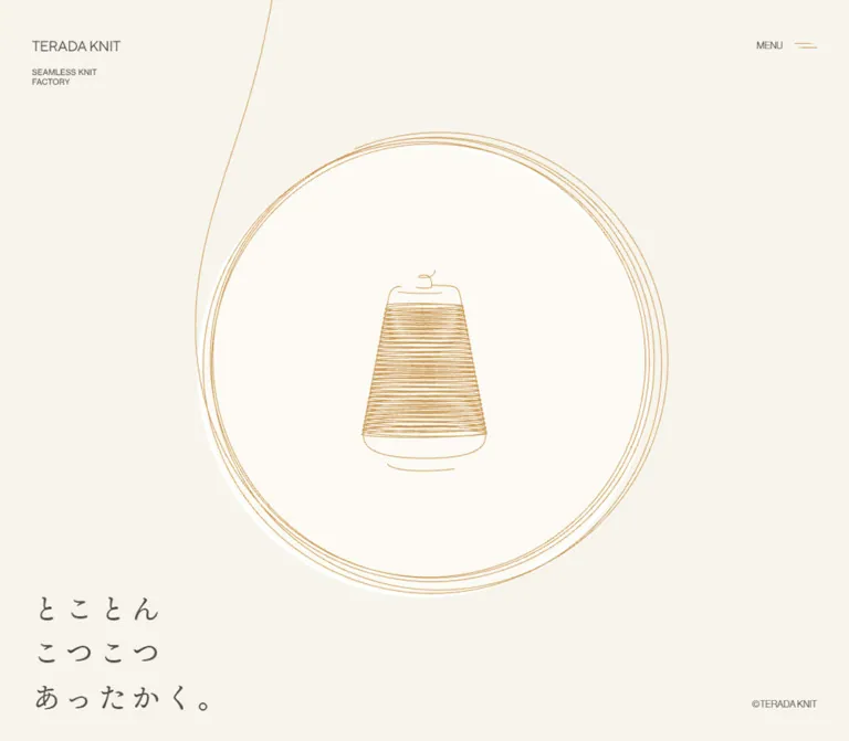
糸巻きと円形の糸の線画を中心に、生成りの背景、落ち着いた茶色、ゆったりした明朝体を組み合わせたニットメーカーの企業サイト。控えめな操作表示と大きな余白で、丁寧なものづくりを伝えています。
TERADA KNIT — Style Reference
A fine ochre thread, a quiet cream field, and an unhurried voice about making knitwear.
Original URL: terada-knit.co.jp
Final URL: terada-knit.co.jp
Theme: warm light canvas; no alternate theme was evidenced.
Inspected: October 2, 2026, at 01:39 JST; collection timestamp 2026-10-01T16:39:25.034Z.
Viewports: 1440 × 1000 and 390 × 844 CSS pixels.
Scope: the current corporate homepage. Visual evidence consists of three desktop and two mobile captures of the opening yarn scene. Rendered DOM and computed styles additionally cover philosophy, technology, business, company information, news, contact, and recruitment. Those later sections were not visually demonstrated in the supplied captures.
TERADA KNIT presents its manufacturing identity through restraint. A small company mark occupies the upper left; a compact MENU control balances it at the upper right. Fine ochre yarn winds around an almost circular field, enclosing a carefully drawn spool. The three-line statement, “とことん / こつこつ / あったかく。”, sits near the lower left, leaving the center to the illustration.
The page continues into a substantial corporate narrative. Japanese Mincho text supplies a literary, human tone, while Latin names, numbering, and utility controls use a restrained sans serif. Generous leading and deliberate line breaks are more important than large type or heavy weights. The design's distinctive relationship is between very thin drawing, warm empty space, and patient typography.
閉じる
TERADA KNIT — Style Reference
A fine ochre thread, a quiet cream field, and an unhurried voice about making knitwear.
Original URL: terada-knit.co.jp
Final URL: terada-knit.co.jp
Theme: warm light canvas; no alternate theme was evidenced.
Inspected: October 2, 2026, at 01:39 JST; collection timestamp 2026-10-01T16:39:25.034Z.
Viewports: 1440 × 1000 and 390 × 844 CSS pixels.
Scope: the current corporate homepage. Visual evidence consists of three desktop and two mobile captures of the opening yarn scene. Rendered DOM and computed styles additionally cover philosophy, technology, business, company information, news, contact, and recruitment. Those later sections were not visually demonstrated in the supplied captures.
TERADA KNIT presents its manufacturing identity through restraint. A small company mark occupies the upper left; a compact MENU control balances it at the upper right. Fine ochre yarn winds around an almost circular field, enclosing a carefully drawn spool. The three-line statement, “とことん / こつこつ / あったかく。”, sits near the lower left, leaving the center to the illustration.
The page continues into a substantial corporate narrative. Japanese Mincho text supplies a literary, human tone, while Latin names, numbering, and utility controls use a restrained sans serif. Generous leading and deliberate line breaks are more important than large type or heavy weights. The design's distinctive relationship is between very thin drawing, warm empty space, and patient typography.
How to Read This Reference
- Measured means a value appears in the supplied rendered DOM, computed styles, or element rectangles. Derived gaps and unit conversions are identified where relevant.
- Visual estimate means an approximation from the original-page captures. The cream colors, ochre color, illustration dimensions, and drawing stroke widths belong to this category; they were not sampled programmatically.
- Recommendation means guidance for a new implementation. The CSS scaffold, proposed breakpoint, accessible controls, and static content fallback are recommendations.
- DOM-only evidence establishes content, semantics where recorded, typography, and captured geometry. It does not prove that an element was visible or that its final animated position matched its recorded rectangle.
- Token names beginning with
--knit-are implementation aliases. The--easing-*,--vh, and--page-header-heightnames are present in the supplied source evidence.
The opening images are the authority for the visible composition. Several narrative passages appear twice in the DOM, including overlapping viewport-proximate copies and distant flow copies. Treat these as evidence of layered content, not as instructions to display duplicate paragraphs simultaneously.
Tokens — Colors
Default Palette
| Name | Value | Suggested token | Evidence and role |
|---|---|---|---|
| Brown Ink | #554d46 |
--knit-ink |
Measured: rgb(85, 77, 70) on text, headings, links, and sampled controls |
| Warm Canvas | Approximately #f7f4ed |
--knit-paper |
Visual estimate: the broad cream background of the opening |
| Inner Paper | Approximately #fcfaf5 |
--knit-disc |
Visual estimate: the subtly lighter field inside the yarn ring |
| Ochre Thread | Approximately #cc913e |
--knit-thread |
Visual estimate: spool linework, circular yarn, incoming strand, and menu symbol |
| News Wash | rgba(255, 255, 255, 0.1) |
--knit-news-wash |
Measured: captured background of the news links; the underlying surface was not independently measured |
Color Behavior
The supplied HTML, BODY, header, and most text elements have transparent computed backgrounds. Those values do not establish the color of the visible canvas or which layer paints it. Use the estimated cream tokens for an adaptation, but do not describe them as extracted source colors.
Brown carries readable information. Ochre is primarily illustrative and occupies little solid area, even though the drawing is large. Avoid turning the thread color into a broad button fill or a competing background panel.
The root includes generic utility variables containing blue, white, and transparent black. They are not evidence of additional visible brand colors. No theme selector, dark mode, or alternate palette was demonstrated.
Tokens — Typography
Japanese Editorial Text
- Measured family declaration:
ten-mincho-text, serif. - Measured weight:
400across the sampled Japanese headings and paragraphs. - Roles: opening statement, philosophy, section labels, technology headings, descriptive copy, company information headings, and news titles.
- Character: gently expressive Mincho forms with generous spacing. The large opening statement feels personal without becoming a handwritten logo.
- Implementation alias:
--knit-font-jp.
The computed family declaration is confirmed; font files and actual font-loading resolution were not inspected. A generic serif fallback will not reproduce the precise Japanese letterforms.
Latin Text and Utilities
- Measured family declaration:
neue-haas-grotesk-display, sans-serif. - Measured weight:
400. - Roles: inherited page typography, brand-link context, menu-button context, item numbers, Latin business names, and several link containers.
- Implementation alias:
--knit-font-latin.
Japanese text within a sans-serif container can use fallback glyphs. Do not assume the Latin font itself supplies all Japanese characters.
Brand Artwork and Small Captions
The TERADA KNIT link has a measured footprint of 122 × 13px at both viewports. Its container reports 16px / 24px, but that does not establish the visible mark's rendering method or glyph size. Preserve the footprint when using the actual mark; avoid recreating it solely from the inherited font size.
The two-line descriptor “SEAMLESS KNIT / FACTORY” appears approximately 11px high in type size. MENU and the opening copyright appear approximately 12px. These are visual estimates of nested content, not computed measurements of those specific glyphs.
Type Scale
All entries below are measured unless explicitly labeled otherwise. Sizes and line heights are in CSS pixels.
| Role | Desktop size / leading | Mobile size / leading | Tracking |
|---|---|---|---|
| Root and inherited UI | 16 / 24 |
16 / 24 |
Normal |
| Opening H1 | 36 / 55.8 |
30 / 46.5 |
0.15em: 5.4px / 4.5px |
| Major section H2 | 30 / 54 |
24 / 43.2 |
0.1em: 3px / 2.4px |
| Technology H3 | 24 / 37.2 |
22 / 34.1 |
0.1em: 2.4px / 2.2px |
| Company, news, contact headings | 22 / 34.1 |
22 / 34.1 |
0.05em: 1.1px |
| Section label | 12 / 24 |
12 / 24 |
0.7em: 8.4px |
| Philosophy and section introductions | 16 / 44.8 |
14 / 39.2 |
0.05em: 0.8px / 0.7px |
| Technology body | 16 / 32 |
14 / 28 |
0.03em: 0.48px / 0.42px |
| Business description | 16 / 32 |
14 / 28 |
0.05em: 0.8px / 0.7px |
| Latin business name | 28 / 28 |
30 / 30 |
Normal |
| Numbered item marker | 14 / 22.4 |
14 / 22.4 |
Normal |
| News title | 14 / 25.2 |
14 / 24 |
0.03em: 0.42px |
| Blog supporting sentence | 14 / 25.2 |
12 / 21.6 |
0.03em |
| Contact and recruitment body | 14 / 25.2 |
14 / 24 |
0.03em: 0.42px |
| Contact and recruitment link | 14 / 25.2 |
12 / 21.6 |
0.03em |
| SKIP link | 12 / 18 |
12 / 18 |
Normal |
The root remains 16px on mobile. Individual roles change independently: Latin business names become slightly larger, while the opening statement and Japanese body text become smaller. Do not reproduce this with one global scale transform.
Tokens — Spacing & Shapes
Spacing character: broad outer space, separate chrome and editorial gutters, and generous gaps between labels, headings, and prose.
No universal base spacing unit was established. The measured values include 20, 28, 32, 40, 48, 60, 100, 120, and 150px; they should not be forced into an invented eight-pixel system.
Spacing Scale
| Use | Desktop | Mobile | Evidence |
|---|---|---|---|
| Header horizontal inset | 40px | 20px | Computed padding |
| Header top inset | 51px | 24px | Computed padding |
| Main editorial left inset | 120px | Usually 48px | Element rectangles; animated story copies have exceptions |
| Opening statement left inset | 40px | 18px | H1 rectangle |
| Opening statement bottom clearance | 26px | 16px | Derived from H1 rectangle and viewport height |
| Section label to H2 | 60px | 28px | Derived from business and technology intro rectangles |
| H2 to introduction | 48px | 48px | Derived gap |
| Technology heading to body | 40px | 40px | Derived gap |
| Business name to description | 32px | 32px | Derived gap |
| Business description to action | 48px | 32px | Derived gap |
| Business section top padding | 150px | 120px | Computed padding |
| Company section top padding | 150px | 100px | Computed padding |
| News row vertical padding | 40px | 28px | Computed padding |
| News list to supporting sentence | 32px | 32px | Derived gap |
Opening Geometry
| Element | Desktop, 1440 × 1000 | Mobile, 390 × 844 | Status |
|---|---|---|---|
| Header rectangle | 1440 × 106px | 390 × 79px | Measured |
| Brand-link rectangle | x40, y51; 122 × 13px | x20, y24; 122 × 13px | Measured |
| Menu-button rectangle | x1324.55, y48; 75.45 × 18px | x294.55, y21; 75.45 × 18px | Measured |
| Opening H1 rectangle | x40, y806.61; 248.44 × 167.39px | x18, y688.5; 207 × 139.5px | Measured |
| Yarn-ring diameter | About 570–575px | About 350–355px | Visual estimate |
| Yarn-ring center | About x722, y495 | About x196, y416 | Visual estimate |
| Spool drawing | About 156 × 251px | About 107 × 172px | Visual estimate |
The mobile ring nearly fills the available width while the desktop ring occupies about 40% of the viewport width. The spool remains relatively small within it. The drawing is not a full-width illustration crop.
Borders, Corners, and Shape
Sampled text containers, links, sections, and controls report border-radius: 0. The opening has no visible card system, pill buttons, or shadow elevation.
The large circle is irregular yarn artwork. Do not model it as a thick, perfectly geometric UI border. Multiple fine loops and the pale rim beneath them create its edge. A drawing stroke around 0.5–1px is a visual approximation, not a measured SVG attribute.
The source declares --page-header-height: 2.75rem, equivalent to 44px at the measured root size. That variable does not equal the complete observed header height of 106px or 79px. Use the actual header anatomy when reproducing the opening.
Components
Opening Yarn Scene
Evidence: visible in all five original-page captures.
Anatomy: full-viewport cream field; a loose strand entering from above; several nearly circular yarn loops; a lighter circular interior; a centered tapered spool; corner identity, navigation, statement, and copyright.
The ring sits almost exactly at the viewport's vertical midpoint. Its outer strand continues upward and exits the top edge rather than ending neatly inside an illustration box. The spool widens toward the bottom, with dense horizontal windings, a lightly drawn base, and a small loose end above it.
Keep the large empty regions above and beside the scene. The ring is large enough to establish a focal point, but the spool itself occupies only a modest part of the screen. Avoid adding an explanatory paragraph or a primary button beside it.
This is the documented opening brand scene. Its duration, exit condition, and relationship to later content are unverified; it should not be labeled a loading screen on the available evidence.
Header and Brand Lockup
Evidence: screenshots and measured DOM.
The header is a transparent flex container. The left lockup stacks the compact TERADA KNIT mark above a small two-line descriptor. The right side contains an unboxed menu button.
Desktop padding is 51px 40px 0; mobile padding is 24px 20px 0. The logo footprint remains unchanged while its distance from the viewport edges reduces. There is no visible header band, bottom rule, or filled navigation surface.
The captures establish the header's opening position. They do not establish whether it remains fixed while navigating the longer page.
Menu Control
Evidence: visible closed state; button semantics and both labels present in the DOM.
A small MENU label sits beside an ochre stitched-line symbol. The symbol appears approximately 28px wide and uses short horizontal marks with broken details. It should not be replaced by a large, heavy three-bar icon.
The measured button rectangle is approximately 75.45 × 18px at both sizes. MENU is visible in the captures; CLOSE also exists in the text extraction. No open-menu layout, menu items, keyboard behavior, or transition was supplied.
Recommendation: preserve the compact visible mark but expand the interactive target to at least 44px high. Implement an accessible expanded state and focus behavior when adding the actual navigation panel.
Three-Line Opening Statement
Evidence: visible and measured.
The H1 contains three separately arranged lines:
とことん
こつこつ
あったかく。
Use regular-weight Mincho, 1.55 leading, and 0.15em tracking. Its size is 36px on desktop and 30px on mobile. Keep the deliberate three-line structure instead of allowing arbitrary text wrapping.
The H1 sits at the lower left independently of the centered drawing. On mobile it begins at x18 rather than the header's x20; this small optical difference is recorded, not a reason to invent a different global gutter.
A small “©TERADA KNIT” anchors the lower right. Its visual treatment is quiet sans serif, approximately 12px. Exact copyright element dimensions were not included.
Philosophy Narrative
Evidence: DOM text, computed typography, and layered geometry; no later narrative screenshot.
The section label “想い” introduces short Japanese passages about making comfortable knitwear, continued craftsmanship, and consideration for people, the environment, and the future. The label uses 12px type with unusually wide 0.7em tracking.
Body text uses 16px / 44.8px on desktop and 14px / 39.2px on mobile, both with 0.05em tracking. That 2.8 line-height ratio gives individual phrases room to breathe. Mobile text includes additional phrase breaks rather than merely reducing desktop lines to a smaller font.
The viewport-proximate mobile narrative layer uses x48 and a 294px width. Other flow copies retain x120 and narrower widths. These conflicting positions may belong to staging or animation. They should not be combined into one supposedly final mobile layout.
The measured vertical intervals are very large, and several passages overlap in another layer. A staged narrative is plausible, but exact pinning, scrolling, fading, and illustration transformations remain unverified.
Technology Introduction and Numbered Items
Evidence: DOM-only layout and typography.
The “技術” section has a small tracked label, a two-line H2, a long-leading introduction, and four numbered items. Their topics are low-waste production, handling manufacturing through shipment, machine expertise, and continuing technical development.
On desktop, the introduction starts at x120 and is approximately 487px wide. The first item body is 400px wide. Items have a Mincho H3, a small sans-serif number aligned toward the opposite edge, and a paragraph beginning 40px below the heading.
Technology titles use 24px / 37.2px on desktop and 22px / 34.1px on mobile. Body text uses 16px / 32px and 14px / 28px. Numbers remain 14px / 22.4px.
Desktop items share similar vertical coordinates but extend far beyond the right edge, suggesting a lateral arrangement. On mobile, item one is at x48; subsequent captured items begin at x198 and extend beyond the viewport. Those positions do not verify a carousel, a swipe gesture, or the final settled layout.
Recommendation: retain the title/number/body anatomy in a readable static list first. Add lateral or staged movement only with a separately defined interaction specification.
Business and Brand Entries
Evidence: DOM content, links, and measured text geometry; associated media was not supplied.
The “事業” section begins with a tracked label and a two-line Japanese heading. Desktop introductory prose occupies a right-side column beginning near x723, approximately 557px wide. On mobile it follows the heading at x48 with a 294px width.
Three numbered entries follow: cucumu, Kurumi Factory, and OEM/ODM. Each contains a narrow number column, a Latin name, Japanese description, and a compact action.
Desktop number markers begin near x140, with text beginning around x218–221. On mobile, numbers begin at x20 and text at approximately x46–49. The desktop text blocks are about 312–314px wide. Mobile text blocks expand to about 309–324px.
Latin names use 28px on desktop and 30px on mobile, both with a line height of 1. Descriptions begin 32px below the names. Actions follow descriptions after 48px on desktop and 32px on mobile.
The two “オンラインストア” links point to https://cucumu.official.ec/ and https://terada-knit.shop-pro.jp/. The OEM/ODM entry contains a button labeled “保有設備について”. Its activated state was not supplied; do not assume it opens a particular modal or drawer.
Company Profile
Evidence: original-page company text and DOM geometry.
The “私たちについて” section has a three-line editorial heading followed by “会社概要”. The profile identifies the company as “株式会社 寺田ニット” and supplies company name, address, establishment, representative, telephone, and fax fields, with a MAP link beside the address.
The profile heading is regular Mincho at 22px / 34.1px, with 0.05em tracking. Its desktop content region begins near x520 and is about 800px wide; the mobile region begins at x48 and is 294px wide.
The field content supports a label/value presentation, but row styling and complete table geometry were not supplied. A semantic definition list or table is a recommended implementation choice, not a verified source element type.
News List
Evidence: DOM-only component geometry and a measured transition declaration.
Three linked announcements contain a date and Japanese title. The newest recorded item is dated 2026/4/10. Links point to articles on the company's note.com account; those destinations were not inspected.
Desktop places the section heading at x120 and the list at x520, creating a 400px offset within a 1200px editorial span. Each link is about 800px wide and 105.2px high, with 40px vertical padding. Dates and titles occupy a horizontal arrangement.
Mobile places the heading and list at x48, within 294px. The date sits above the title. Rows use 28px vertical padding and measure 112px or 136px high depending on wrapping. News titles use 14px / 24px on mobile, slightly tighter than their desktop 14px / 25.2px treatment.
The captured row background is rgba(255,255,255,0.1). The computed transition is background-color 0.8s cubic-bezier(0.26, 0.06, 0, 1). A hover endpoint was not supplied.
A supporting sentence about the official blog follows the list after 32px. It reduces from 14px to 12px on mobile.
Contact and Recruitment
Evidence: DOM text, link destinations, and measured typography.
Contact and recruitment are separate stacked groups. Each has a 22px Mincho heading, a short explanatory paragraph, and an inline text action. The desktop text region is 432px wide at x758; mobile uses 294px at x48.
The contact action “お問い合わせはこちら” points to mailto:toiawase@terada-knit.co.jp. The recruitment action “採用情報をみる” points to https://terada-knit.co.jp/recruit/. No contact form or recruitment-page design was inspected.
Keep these actions typographically modest. The evidence shows inline-flex text links with transparent backgrounds, not large filled conversion buttons. Their exact icon artwork, if any, was not supplied.
Narrative Skip Link
Evidence: anchor and geometry in the DOM; not visibly established in the opening captures.
SKIP points to https://terada-knit.co.jp/#technology. Its computed typography is 12px / 18px. Recorded rectangles place it near the lower right, but its visibility and activation behavior were not demonstrated.
Recommendation: make a narrative bypass available without requiring completion of an animation. Preserve access to meaningful content even when motion is disabled.
Tokens — Motion & Interaction
Recorded Evidence
| Treatment | Evidence | What remains unknown |
|---|---|---|
| Incoming yarn and ring contours | Their shape changes between same-size captures while the composition stays stable | Timing, direction, loop period, trigger, and rendering technology |
| Opening text and corner controls | Stable positions across supplied captures | Any entrance or exit animation |
| Narrative staging | Repeated text layers, overlapping positions, and long flow geometry | Exact scroll linkage, pinning, fades, or synchronization with artwork |
| Technology arrangement | Desktop lateral offsets and mobile offscreen offsets | Final resting positions, navigation controls, and gesture behavior |
| News background change | Computed background-color 0.8s cubic-bezier(0.26, 0.06, 0, 1) |
Triggered state and destination color |
| MENU / CLOSE | Both labels exist in the button's DOM | Open state, panel appearance, transition, and focus management |
| Equipment button and SKIP | Interactive element or anchor semantics | Activated result and transition behavior |
The drawing variation is consistent with animation, but the captures do not provide a timestamped motion trace. Do not assign a duration, name an animation library, or claim pointer following from these images.
Source Easing Variables
| Source variable | Measured value | Confirmed use in supplied evidence |
|---|---|---|
--easing-0 |
cubic-bezier(.26, .06, 0, 1) |
Matches the news background transition |
--easing-1 |
cubic-bezier(.18, .06, .23, 1) |
Declared; specific use unverified |
--easing-2 |
cubic-bezier(.43, .05, .17, 1) |
Declared; specific use unverified |
--easing-3 |
cubic-bezier(.47, .16, .24, 1) |
Declared; specific use unverified |
Many sampled text elements report animation: none. That does not prove the page is static: scripted drawing, ancestor transforms, and unrecorded elements may animate. Likewise, a generic transition: all entry is not evidence of a particular active transition.
For an adaptation, subtle contour movement is appropriate. Keep text readable and the overall composition steady. A static illustration is a better documented starting point than invented scroll choreography.
Surfaces
| Layer | Appearance | Evidence and purpose |
|---|---|---|
| Opening canvas | Flat warm cream | Visible; exact color estimated |
| Ring interior | Slightly lighter cream | Visible; keeps the spool delicately separated from the page |
| Ring edge | Overlapping ochre hairlines with a pale rim | Artwork, not a conventional card border |
| Header and opening copy | Unboxed brown text | Visible; no opaque chrome panel |
| Sampled editorial containers | Transparent backgrounds and square corners | Computed evidence; final surrounding surfaces not visually captured |
| News links | White at 10% opacity | Computed fill with an 800ms background transition |
No general shadow system, glass treatment, glossy gradient, or rounded-card language is established by the inspected evidence. Menu and equipment overlays remain unknown.
Imagery
The opening illustration translates the subject of knitting into a continuous, very fine line. Dense horizontal strokes describe the spool without a solid silhouette. Small irregularities distinguish it from a mechanical icon: the winding is not perfectly uniform, the top has a loose curled end, and the base is described by lightly separated curved strokes.
Several circular strands surround the spool. They are close together but not exactly concentric. The thread exiting above the viewport makes the scene feel connected to a larger process outside the frame. Preserve that continuation and the small inconsistencies in the loops.
The supplied original-page captures contain no photography. This does not establish that the entire homepage is photograph-free: lower content and its media were not visually captured.
Observed Asset References
No image filenames, SVG source paths, canvas implementation, or original media URLs were included in the supplied evidence.
| Visible asset | Established appearance | Source-path status |
|---|---|---|
| TERADA KNIT mark | Compact brown wordmark; stable 122 × 13px link footprint | Not supplied |
| Factory descriptor | Two small uppercase lines below the mark | Rendering method not supplied |
| Spool | Tapered ochre line drawing with dense winding | Not supplied |
| Circular yarn and incoming strand | Fine, irregular loops with changing contours | Not supplied |
| Menu symbol | Small ochre horizontal stitch-like marks | Not supplied |
Use suitable original drawing assets when available. A CSS circle and a generic yarn icon will reproduce the subject but not the line quality. Do not invent asset URLs or assume a particular graphics technology.
Layout & Responsive Behavior
The visible opening retains its composition across desktop and mobile. Identity remains upper left, navigation upper right, the statement lower left, and copyright lower right. The artwork stays centered rather than moving above a centered text block.
| Relationship | Desktop | Mobile |
|---|---|---|
| Outer chrome gutter | 40px | 20px |
| Standard editorial gutter | 120px | 48px |
| Opening statement | 36px, three lines | 30px, same three lines |
| Ring width | About 40% of viewport width | About 90% of viewport width |
| Brand mark | 122 × 13px footprint | Same footprint |
| Major heading | 30px | 24px |
| Narrative body | 16px with 44.8px leading | 14px with 39.2px leading and additional phrase breaks |
| Business names | 28px | 30px |
| Company/news column | Approximately 800px, offset right | 294px, within editorial gutters |
| News date/title | Horizontal | Vertically arranged |
Mobile preserves substantial editorial side margins even though the ring approaches the screen edges. Do not apply the illustration's 20px inset to all body copy.
The root variable --vh is 10px on desktop and 8.44px on mobile, matching one percent of each recorded viewport height. Its update mechanism was not included. A modern adaptation can use small or dynamic viewport units, but that is an implementation recommendation.
There is an important geometry limitation: the reported document height equals the viewport height, while BODY and MAIN rectangles measure approximately 38,595px on desktop and 22,608px on mobile. Technology begins at recorded y26500 on desktop and y13844 on mobile. These values may encode staged content and transforms; they are not proof of an ordinary scrollable document of those lengths.
Do not reproduce those large heights as blank spacers. The supplied captures do not verify how a user traverses them. Exact breakpoints, tablet layouts, landscape behavior, browser-toolbar resizing, and safe-area handling remain unverified.
Do’s and Don’ts
Do
- Preserve the small corner controls and the independent, centered yarn composition.
- Use measured brown ink
#554d46and a warm, low-contrast cream field. - Treat cream and ochre hex values as estimates until original color declarations are available.
- Keep the drawing fine, slightly irregular, and visually continuous beyond the top edge.
- Use regular Mincho for Japanese editorial text and restrained sans serif for Latin utilities.
- Retain the opening statement's three lines,
1.55leading, and0.15emtracking. - Preserve the distinction between 20px mobile chrome gutters and 48px editorial gutters.
- Keep section labels small and widely tracked, with generous space before headings.
- Maintain numbered business and technology content as clear text hierarchies.
- Provide accessible access to the corporate information independently of decorative motion.
Don’t
- Do not turn the opening into a conventional headline, paragraph, and oversized CTA arrangement.
- Do not replace the thread with thick outlines, a stock yarn icon, or a perfect heavy circle.
- Do not add paper grain, knit photography, or fabric textures and describe them as observed opening assets.
- Do not use bold weight to create a hierarchy that the source achieves through spacing and size.
- Do not assume every DOM element with a rectangle was visible in the captures.
- Do not copy offscreen mobile positions or long narrative heights into a static implementation.
- Do not display the duplicated philosophy layers as repeated reading content.
- Do not invent the menu panel, equipment overlay, hover endpoint, or scroll behavior.
- Do not shrink every mobile element proportionally; several important sizes remain fixed or increase.
- Do not introduce a generic shadowed card system around the company information.
Recommended Implementation Additions
These are recommendations for a new implementation, not verified features of the original page:
- Give MENU a clear accessible name, expanded state, keyboard activation, and managed focus when its panel opens.
- Expand compact controls to comfortable touch targets while keeping their visible typography small.
- Keep a visible brown focus outline. Decorative ochre hairlines should not be the only indicator of an interactive state.
- Make a narrative bypass available early and ensure its target is reachable by keyboard.
- Provide a reduced-motion mode with the artwork held in a composed static frame and all narrative text accessible in normal flow.
- Keep only one semantic reading copy of the philosophy. Mark purely visual duplicate layers as hidden from assistive technology.
- Use appropriate heading levels and semantic company-information markup without relying on absolute positions for reading order.
- Recheck long-form text at narrow widths and high zoom. Increasing mobile body size is a reasonable accessibility adaptation if faithful 14px text becomes difficult to read.
- Validate essential text and control contrast against the actual chosen background; the cream and ochre tokens here are estimates.
Agent Prompt Guide
Quick Color Reference
- Main text and readable controls: measured
#554d46. - Opening canvas: estimated
#f7f4ed. - Ring interior: estimated
#fcfaf5. - Yarn and stitch symbol: estimated
#cc913e. - News surface: measured
rgba(255,255,255,0.1)over its underlying surface. - General treatment: flat fields, transparent text containers, no visible opening shadows.
Overall Prompt
“Create a Japanese knit manufacturer's corporate homepage inspired by TERADA KNIT's documented opening. Use a warm cream canvas, brown text #554d46, and extremely fine ochre yarn linework. Center a small tapered spool inside several imperfect circular thread loops, with a loose strand continuing beyond the top edge. Place a compact company mark and two-line factory descriptor at the upper left, a small MENU label with a stitch-like symbol at the upper right, a three-line regular Mincho statement at the lower left, and a tiny copyright at the lower right. Use ten-mincho-text for Japanese editorial text and neue-haas-grotesk-display for Latin text when those fonts are available. Preserve generous leading, wide tracking, and distinct chrome and editorial gutters. Follow the opening with readable corporate narrative, technology, business, company, news, and contact sections. Treat unobserved navigation and scroll choreography as new implementation decisions.”
Example Component Prompts
- Opening scene: “A viewport-filling warm cream composition with a roughly 572px yarn ring at a 1440 × 1000 viewport and about 350px at 390 × 844. Draw multiple delicate, imperfect ochre loops around a small line-drawn spool. Keep the ring centered near mid-height. Let one strand leave through the top boundary. Avoid filled illustration silhouettes or heavy geometric borders.”
- Opening typography: “Place the source statement ‘とことん / こつこつ / あったかく。’ in three lines at the lower left. Use regular Mincho at 36px desktop and 30px mobile, line-height 1.55, letter-spacing 0.15em, and brown
#554d46. Keep it separate from the central artwork rather than centering it underneath.” - Technology item: “Create a transparent editorial item with a regular Mincho heading on the left, a small sans-serif two-digit number on the right, and body text 40px below. Use 24px headings and 16px body on desktop; 22px and 14px on mobile. Body leading is 2. Keep all text reachable in a static layout before adding motion.”
- Business entry: “Use a narrow index column followed by a Latin brand name, Japanese description, and compact text action. Names are regular sans serif at 28px desktop and 30px mobile. Leave 32px before the description; use no rounded card or colored badge.”
- News list: “Set a quiet Japanese section heading beside an 800px desktop list within a 1200px editorial span. Each row has a date and Mincho title, 40px vertical padding, and a faint white wash. On a 390px phone, use a 294px column with 48px side margins, stack date over title, and reduce vertical padding to 28px. Use the measured 800ms easing for an explicitly designed background response.”
Quick Start
CSS Custom Properties
This is a recommended adaptation, not extracted source CSS. It reproduces documented typography and opening proportions while keeping later content in normal flow. The 64rem breakpoint and 680px minimum opening height are implementation choices; the original breakpoint and short-screen policy are unknown.
Expected opening structure: .knit-opening contains .knit-header, .thread-stage, .opening-title, and .opening-copyright. Inside .thread-stage, place .lead-art and .thread-disc; the disc contains .ring-art and .spool-art. Use supplied or appropriate drawing assets for those artwork elements. CSS alone does not provide the original winding paths.
The editorial classes below are static adaptations of DOM evidence. They do not recreate unseen media slots, offscreen transforms, or narrative scroll distances.
:root {
  /* Exact measured ink; other solid colors are visual estimates. */
  --knit-ink: #554d46;
  --knit-paper: #f7f4ed;
  --knit-disc: #fcfaf5;
  --knit-thread: #cc913e;
  --knit-news-wash: rgb(255 255 255 / 10%);

  /* Source family declarations; font files are not bundled. */
  --knit-font-jp: "ten-mincho-text", serif;
  --knit-font-latin: "neue-haas-grotesk-display", sans-serif;

  /* Mobile values measured at 390 × 844. */
  --knit-edge: 20px;
  --knit-header-top: 24px;
  --knit-content-inset: 48px;
  --knit-label-gap: 28px;
  --knit-section-space: 120px;
  --knit-hero-size: 30px;
  --knit-section-size: 24px;
  --knit-tech-size: 22px;
  --knit-body-size: 14px;
  --knit-brand-size: 30px;
  --knit-title-left: 18px;
  --knit-title-bottom: 16px;

  /* Approximate drawing geometry, not source formulas. */
  --knit-scene-y: 49.3%;
  --knit-ring-size: min(57.2vh, calc(100vw - 40px));
  --knit-spool-width: 31%;
  --knit-lead-factor: 0.88;

  /* Measured source easing declarations. */
  --easing-0: cubic-bezier(.26, .06, 0, 1);
  --easing-1: cubic-bezier(.18, .06, .23, 1);
  --easing-2: cubic-bezier(.43, .05, .17, 1);
  --easing-3: cubic-bezier(.47, .16, .24, 1);
}

@supports (height: 100svh) {
  :root {
    --knit-ring-size: min(57.2svh, calc(100vw - 40px));
  }
}

*,
*::before,
*::after {
  box-sizing: border-box;
}

body {
  margin: 0;
}

.knit-site {
  color: var(--knit-ink);
  background: var(--knit-paper);
  font: 400 16px / 1.5 var(--knit-font-latin);
}

.knit-site :where(h1, h2, h3, p) {
  margin: 0;
  font-weight: 400;
}

.knit-opening {
  position: relative;
  isolation: isolate;
  height: 100vh;
  height: 100svh;
  min-height: 680px;
  overflow: clip;
}

.knit-header {
  position: absolute;
  z-index: 2;
  inset: 0 0 auto;
  display: flex;
  justify-content: space-between;
  align-items: flex-start;
  padding: var(--knit-header-top) var(--knit-edge) 0;
}

.brand-link {
  display: block;
  color: inherit;
  text-decoration: none;
}

/* Apply this to the actual mark, not ordinary text. */
.brand-wordmark {
  display: block;
  width: 122px;
  height: 13px;
}

.brand-descriptor {
  margin-top: 20px;
  font: 400 11px / 11px var(--knit-font-latin);
}

.menu-button {
  position: relative;
  display: inline-flex;
  align-items: center;
  gap: 14px;
  height: 18px;
  margin-top: -3px;
  padding: 0;
  border: 0;
  border-radius: 0;
  color: inherit;
  background: transparent;
  font: 400 12px / 18px var(--knit-font-latin);
  cursor: pointer;
}

/* Recommended larger hit area without enlarging the visible mark. */
.menu-button::before {
  content: "";
  position: absolute;
  inset: -13px 0;
}

.menu-stitch {
  display: block;
  width: 28px;
  height: 8px;
  color: var(--knit-thread);
}

.thread-stage {
  position: absolute;
  z-index: 0;
  inset: 0;
  pointer-events: none;
}

.thread-disc {
  position: absolute;
  left: 50%;
  top: var(--knit-scene-y);
  width: var(--knit-ring-size);
  aspect-ratio: 1;
  border-radius: 50%;
  background: var(--knit-disc);
  transform: translate(-50%, -50%);
}

.ring-art {
  position: absolute;
  inset: 0;
  display: block;
  width: 100%;
  height: 100%;
}

.spool-art {
  position: absolute;
  left: 50%;
  top: 51%;
  display: block;
  width: var(--knit-spool-width);
  height: auto;
  transform: translate(-50%, -50%);
}

/* A separate lead SVG should meet the ring at its left midpoint. */
.lead-art {
  position: absolute;
  left: calc(50% - var(--knit-ring-size) / 2);
  top: 0;
  width: calc(var(--knit-ring-size) * var(--knit-lead-factor));
  height: var(--knit-scene-y);
  overflow: visible;
}

/* Apply only to paths authored for this adaptation. */
.thread-line {
  fill: none;
  stroke: var(--knit-thread);
  stroke-width: 0.75px;
  vector-effect: non-scaling-stroke;
}

.opening-title {
  position: absolute;
  z-index: 2;
  left: var(--knit-title-left);
  bottom: var(--knit-title-bottom);
  font-family: var(--knit-font-jp);
  font-size: var(--knit-hero-size);
  line-height: 1.55;
  letter-spacing: 0.15em;
}

.opening-title > span {
  display: block;
}

.opening-copyright {
  position: absolute;
  z-index: 2;
  right: var(--knit-edge);
  bottom: 17px;
  font: 400 12px / 18px var(--knit-font-latin);
}

.editorial-section {
  width: min(1200px, calc(100% - 2 * var(--knit-content-inset)));
  margin-inline: auto;
  padding-block-start: var(--knit-section-space);
}

.section-label {
  margin-bottom: var(--knit-label-gap) !important;
  font: 400 12px / 2 var(--knit-font-jp);
  letter-spacing: 0.7em;
}

.section-title {
  font-family: var(--knit-font-jp);
  font-size: var(--knit-section-size);
  line-height: 1.8;
  letter-spacing: 0.1em;
}

.section-intro,
.story-copy {
  font-family: var(--knit-font-jp);
  font-size: var(--knit-body-size);
  line-height: 2.8;
  letter-spacing: 0.05em;
}

.section-intro {
  margin-top: 48px !important;
}

.technology-list {
  display: grid;
  gap: 80px;
  margin-top: 80px;
}

.tech-item__heading {
  display: flex;
  align-items: flex-start;
  justify-content: space-between;
  gap: 24px;
}

.tech-item h3 {
  font-family: var(--knit-font-jp);
  font-size: var(--knit-tech-size);
  line-height: 1.55;
  letter-spacing: 0.1em;
}

.item-number {
  flex: none;
  font: 400 14px / 1.6 var(--knit-font-latin);
}

.tech-item__body {
  margin-top: 40px !important;
  font-family: var(--knit-font-jp);
  font-size: var(--knit-body-size);
  line-height: 2;
  letter-spacing: 0.03em;
}

/* Static text layout; unseen media placements are not reconstructed. */
.business-list {
  display: grid;
  gap: 100px;
  width: min(1160px, calc(100% - 40px));
  margin: 100px auto 0;
}

.business-item {
  display: grid;
  grid-template-columns: max-content minmax(0, 1fr);
  gap: 13px;
}

.business-item h3 {
  font: 400 var(--knit-brand-size) / 1 var(--knit-font-latin);
}

.business-description {
  margin-top: 32px !important;
  font-family: var(--knit-font-jp);
  font-size: var(--knit-body-size);
  line-height: 2;
  letter-spacing: 0.05em;
}

.business-action {
  display: inline-flex;
  margin-top: 32px;
  color: inherit;
  font-family: var(--knit-font-latin);
  text-underline-offset: 5px;
}

.split-section {
  display: grid;
  gap: 32px;
}

.utility-heading {
  font: 400 22px / 1.55 var(--knit-font-jp);
  letter-spacing: 0.05em;
}

.news-row {
  display: flex;
  flex-direction: column;
  gap: 8px;
  padding: 28px 0;
  border-radius: 0;
  color: inherit;
  background: var(--knit-news-wash);
  text-decoration: none;
  transition: background-color 800ms var(--easing-0);
}

.news-row time {
  font: 400 16px / 24px var(--knit-font-latin);
}

.news-title {
  font: 400 14px / 24px var(--knit-font-jp);
  letter-spacing: 0.03em;
}

/* Recommended endpoint; the source hover color was not supplied. */
@media (hover: hover) {
  .news-row:hover {
    background: rgb(255 255 255 / 24%);
  }
}

.knit-site :focus-visible {
  outline: 2px solid var(--knit-ink);
  outline-offset: 5px;
}

/* Recommended breakpoint, using measured desktop token values. */
@media (min-width: 64rem) {
  :root {
    --knit-edge: 40px;
    --knit-header-top: 51px;
    --knit-content-inset: 120px;
    --knit-label-gap: 60px;
    --knit-section-space: 150px;
    --knit-hero-size: 36px;
    --knit-section-size: 30px;
    --knit-tech-size: 24px;
    --knit-body-size: 16px;
    --knit-brand-size: 28px;
    --knit-title-left: 40px;
    --knit-title-bottom: 26px;
    --knit-scene-y: 49.5%;
    --knit-spool-width: 27.5%;
    --knit-lead-factor: 0.65;
  }

  .opening-copyright {
    bottom: 37px;
  }

  .technology-list {
    max-width: 400px;
  }

  .business-item {
    gap: 65px;
  }

  .business-item__copy {
    max-width: 314px;
  }

  .business-action {
    margin-top: 48px;
  }

  .split-section {
    grid-template-columns: 1fr 2fr;
    gap: 0;
  }

  .news-row {
    flex-direction: row;
    align-items: baseline;
    gap: 0;
    padding-block: 40px;
  }

  .news-row time {
    flex: 0 0 26.5%;
  }

  .news-title {
    line-height: 25.2px;
  }
}

/* Any separately added artwork animation must respect this mode. */
@media (prefers-reduced-motion: reduce) {
  .thread-stage,
  .thread-stage * {
    animation: none !important;
    transition: none !important;
  }

  .news-row {
    transition: none;
  }
}
Keep the opening and all later sections in a scrollable document. Do not make the entire site a fixed, overflow-hidden viewport merely because the supplied screenshots show one full-screen scene. Any scripted animation should also honor the reduced-motion preference; CSS cannot stop an independent rendering loop by itself.
Tailwind v4 Token Mapping
Optional aliases for a new project already using Tailwind v4. The supplied utility variables do not establish the original site's framework version. Define the custom properties above first.
@theme inline {
  --color-paper: var(--knit-paper);
  --color-disc: var(--knit-disc);
  --color-ink: var(--knit-ink);
  --color-thread: var(--knit-thread);

  --font-editorial: var(--knit-font-jp);
  --font-utility: var(--knit-font-latin);

  --text-hero: var(--knit-hero-size);
  --text-section: var(--knit-section-size);
  --text-body: var(--knit-body-size);

  --spacing-edge: var(--knit-edge);
  --spacing-editorial: var(--knit-content-inset);
  --spacing-label-gap: var(--knit-label-gap);
}
Sources & Evidence
- Inspected original and final website: TERADA KNIT. Both URLs are identical; the supplied collection records HTTP 200 and the page title “株式会社寺田ニット | SEAMLESS KNIT FACTORY –”.
- Collection timestamp:
2026-10-01T16:39:25.034Z, corresponding to October 2, 2026, 01:39 JST. Individual screenshot timestamps were not supplied. - Original-page visual evidence: three 1440 × 1000 desktop captures and two 390 × 844 mobile captures. All show the opening composition, with variations in the yarn contours.
- Rendered DOM and computed styles: supplied for both viewport sizes, including text, links, element rectangles, font declarations, colors, spacing, selected custom properties, and transition values. Later-section descriptions rely on this evidence and are explicitly distinguished from visible screenshots.
- Collection limits: the initial observation lasted at least five seconds, with bounded checks for layout stability, finite animation, and image readiness. Perpetual animations were paused for readiness checks and resumed. These checks do not prove completion of delayed or interactive content. SharedWorkers and service workers were disabled.
- Unverified behavior: menu opening, equipment-button result, narrative progression, SKIP activation, final technology positions, hover endpoints, keyboard interaction, reduced-motion behavior, and all external destinations.
- Analysis limits: no additional browsing, pixel sampling, font-file inspection, asset retrieval, or independent viewport testing was performed. Solid background and illustration colors remain visual estimates; proposed CSS formulas and accessibility behavior are recommendations.
This reference describes the current supplied page evidence. It preserves the documented opening and measured editorial system without treating unobserved animated states as established design facts.
# TERADA KNIT — Style Reference

> A fine ochre thread, a quiet cream field, and an unhurried voice about making knitwear.

**Original URL:** [terada-knit.co.jp](https://terada-knit.co.jp/)
**Final URL:** [terada-knit.co.jp](https://terada-knit.co.jp/)
**Theme:** warm light canvas; no alternate theme was evidenced.
**Inspected:** October 2, 2026, at 01:39 JST; collection timestamp `2026-10-01T16:39:25.034Z`.
**Viewports:** 1440 × 1000 and 390 × 844 CSS pixels.
**Scope:** the current corporate homepage. Visual evidence consists of three desktop and two mobile captures of the opening yarn scene. Rendered DOM and computed styles additionally cover philosophy, technology, business, company information, news, contact, and recruitment. Those later sections were not visually demonstrated in the supplied captures.

TERADA KNIT presents its manufacturing identity through restraint. A small company mark occupies the upper left; a compact MENU control balances it at the upper right. Fine ochre yarn winds around an almost circular field, enclosing a carefully drawn spool. The three-line statement, “とことん / こつこつ / あったかく。”, sits near the lower left, leaving the center to the illustration.

The page continues into a substantial corporate narrative. Japanese Mincho text supplies a literary, human tone, while Latin names, numbering, and utility controls use a restrained sans serif. Generous leading and deliberate line breaks are more important than large type or heavy weights. The design's distinctive relationship is between very thin drawing, warm empty space, and patient typography.
閉じる
# TERADA KNIT — Style Reference

> A fine ochre thread, a quiet cream field, and an unhurried voice about making knitwear.

**Original URL:** [terada-knit.co.jp](https://terada-knit.co.jp/)
**Final URL:** [terada-knit.co.jp](https://terada-knit.co.jp/)
**Theme:** warm light canvas; no alternate theme was evidenced.
**Inspected:** October 2, 2026, at 01:39 JST; collection timestamp `2026-10-01T16:39:25.034Z`.
**Viewports:** 1440 × 1000 and 390 × 844 CSS pixels.
**Scope:** the current corporate homepage. Visual evidence consists of three desktop and two mobile captures of the opening yarn scene. Rendered DOM and computed styles additionally cover philosophy, technology, business, company information, news, contact, and recruitment. Those later sections were not visually demonstrated in the supplied captures.

TERADA KNIT presents its manufacturing identity through restraint. A small company mark occupies the upper left; a compact MENU control balances it at the upper right. Fine ochre yarn winds around an almost circular field, enclosing a carefully drawn spool. The three-line statement, “とことん / こつこつ / あったかく。”, sits near the lower left, leaving the center to the illustration.

The page continues into a substantial corporate narrative. Japanese Mincho text supplies a literary, human tone, while Latin names, numbering, and utility controls use a restrained sans serif. Generous leading and deliberate line breaks are more important than large type or heavy weights. The design's distinctive relationship is between very thin drawing, warm empty space, and patient typography.

## How to Read This Reference

- **Measured** means a value appears in the supplied rendered DOM, computed styles, or element rectangles. Derived gaps and unit conversions are identified where relevant.
- **Visual estimate** means an approximation from the original-page captures. The cream colors, ochre color, illustration dimensions, and drawing stroke widths belong to this category; they were not sampled programmatically.
- **Recommendation** means guidance for a new implementation. The CSS scaffold, proposed breakpoint, accessible controls, and static content fallback are recommendations.
- **DOM-only evidence** establishes content, semantics where recorded, typography, and captured geometry. It does not prove that an element was visible or that its final animated position matched its recorded rectangle.
- **Token names** beginning with `--knit-` are implementation aliases. The `--easing-*`, `--vh`, and `--page-header-height` names are present in the supplied source evidence.

The opening images are the authority for the visible composition. Several narrative passages appear twice in the DOM, including overlapping viewport-proximate copies and distant flow copies. Treat these as evidence of layered content, not as instructions to display duplicate paragraphs simultaneously.

## Tokens — Colors

### Default Palette

| Name | Value | Suggested token | Evidence and role |
| --- | --- | --- | --- |
| Brown Ink | `#554d46` | `--knit-ink` | **Measured:** `rgb(85, 77, 70)` on text, headings, links, and sampled controls |
| Warm Canvas | Approximately `#f7f4ed` | `--knit-paper` | **Visual estimate:** the broad cream background of the opening |
| Inner Paper | Approximately `#fcfaf5` | `--knit-disc` | **Visual estimate:** the subtly lighter field inside the yarn ring |
| Ochre Thread | Approximately `#cc913e` | `--knit-thread` | **Visual estimate:** spool linework, circular yarn, incoming strand, and menu symbol |
| News Wash | `rgba(255, 255, 255, 0.1)` | `--knit-news-wash` | **Measured:** captured background of the news links; the underlying surface was not independently measured |

### Color Behavior

The supplied HTML, BODY, header, and most text elements have transparent computed backgrounds. Those values do not establish the color of the visible canvas or which layer paints it. Use the estimated cream tokens for an adaptation, but do not describe them as extracted source colors.

Brown carries readable information. Ochre is primarily illustrative and occupies little solid area, even though the drawing is large. Avoid turning the thread color into a broad button fill or a competing background panel.

The root includes generic utility variables containing blue, white, and transparent black. They are not evidence of additional visible brand colors. No theme selector, dark mode, or alternate palette was demonstrated.

## Tokens — Typography

### Japanese Editorial Text

- **Measured family declaration:** `ten-mincho-text, serif`.
- **Measured weight:** `400` across the sampled Japanese headings and paragraphs.
- **Roles:** opening statement, philosophy, section labels, technology headings, descriptive copy, company information headings, and news titles.
- **Character:** gently expressive Mincho forms with generous spacing. The large opening statement feels personal without becoming a handwritten logo.
- **Implementation alias:** `--knit-font-jp`.

The computed family declaration is confirmed; font files and actual font-loading resolution were not inspected. A generic serif fallback will not reproduce the precise Japanese letterforms.

### Latin Text and Utilities

- **Measured family declaration:** `neue-haas-grotesk-display, sans-serif`.
- **Measured weight:** `400`.
- **Roles:** inherited page typography, brand-link context, menu-button context, item numbers, Latin business names, and several link containers.
- **Implementation alias:** `--knit-font-latin`.

Japanese text within a sans-serif container can use fallback glyphs. Do not assume the Latin font itself supplies all Japanese characters.

### Brand Artwork and Small Captions

The TERADA KNIT link has a measured footprint of **122 × 13px** at both viewports. Its container reports `16px / 24px`, but that does not establish the visible mark's rendering method or glyph size. Preserve the footprint when using the actual mark; avoid recreating it solely from the inherited font size.

The two-line descriptor “SEAMLESS KNIT / FACTORY” appears approximately **11px** high in type size. MENU and the opening copyright appear approximately **12px**. These are visual estimates of nested content, not computed measurements of those specific glyphs.

### Type Scale

All entries below are measured unless explicitly labeled otherwise. Sizes and line heights are in CSS pixels.

| Role | Desktop size / leading | Mobile size / leading | Tracking |
| --- | --- | --- | --- |
| Root and inherited UI | `16 / 24` | `16 / 24` | Normal |
| Opening H1 | `36 / 55.8` | `30 / 46.5` | `0.15em`: 5.4px / 4.5px |
| Major section H2 | `30 / 54` | `24 / 43.2` | `0.1em`: 3px / 2.4px |
| Technology H3 | `24 / 37.2` | `22 / 34.1` | `0.1em`: 2.4px / 2.2px |
| Company, news, contact headings | `22 / 34.1` | `22 / 34.1` | `0.05em`: 1.1px |
| Section label | `12 / 24` | `12 / 24` | `0.7em`: 8.4px |
| Philosophy and section introductions | `16 / 44.8` | `14 / 39.2` | `0.05em`: 0.8px / 0.7px |
| Technology body | `16 / 32` | `14 / 28` | `0.03em`: 0.48px / 0.42px |
| Business description | `16 / 32` | `14 / 28` | `0.05em`: 0.8px / 0.7px |
| Latin business name | `28 / 28` | `30 / 30` | Normal |
| Numbered item marker | `14 / 22.4` | `14 / 22.4` | Normal |
| News title | `14 / 25.2` | `14 / 24` | `0.03em`: 0.42px |
| Blog supporting sentence | `14 / 25.2` | `12 / 21.6` | `0.03em` |
| Contact and recruitment body | `14 / 25.2` | `14 / 24` | `0.03em`: 0.42px |
| Contact and recruitment link | `14 / 25.2` | `12 / 21.6` | `0.03em` |
| SKIP link | `12 / 18` | `12 / 18` | Normal |

The root remains 16px on mobile. Individual roles change independently: Latin business names become slightly larger, while the opening statement and Japanese body text become smaller. Do not reproduce this with one global scale transform.

## Tokens — Spacing & Shapes

**Spacing character:** broad outer space, separate chrome and editorial gutters, and generous gaps between labels, headings, and prose.

No universal base spacing unit was established. The measured values include 20, 28, 32, 40, 48, 60, 100, 120, and 150px; they should not be forced into an invented eight-pixel system.

### Spacing Scale

| Use | Desktop | Mobile | Evidence |
| --- | --- | --- | --- |
| Header horizontal inset | 40px | 20px | Computed padding |
| Header top inset | 51px | 24px | Computed padding |
| Main editorial left inset | 120px | Usually 48px | Element rectangles; animated story copies have exceptions |
| Opening statement left inset | 40px | 18px | H1 rectangle |
| Opening statement bottom clearance | 26px | 16px | Derived from H1 rectangle and viewport height |
| Section label to H2 | 60px | 28px | Derived from business and technology intro rectangles |
| H2 to introduction | 48px | 48px | Derived gap |
| Technology heading to body | 40px | 40px | Derived gap |
| Business name to description | 32px | 32px | Derived gap |
| Business description to action | 48px | 32px | Derived gap |
| Business section top padding | 150px | 120px | Computed padding |
| Company section top padding | 150px | 100px | Computed padding |
| News row vertical padding | 40px | 28px | Computed padding |
| News list to supporting sentence | 32px | 32px | Derived gap |

### Opening Geometry

| Element | Desktop, 1440 × 1000 | Mobile, 390 × 844 | Status |
| --- | --- | --- | --- |
| Header rectangle | 1440 × 106px | 390 × 79px | Measured |
| Brand-link rectangle | x40, y51; 122 × 13px | x20, y24; 122 × 13px | Measured |
| Menu-button rectangle | x1324.55, y48; 75.45 × 18px | x294.55, y21; 75.45 × 18px | Measured |
| Opening H1 rectangle | x40, y806.61; 248.44 × 167.39px | x18, y688.5; 207 × 139.5px | Measured |
| Yarn-ring diameter | About 570–575px | About 350–355px | Visual estimate |
| Yarn-ring center | About x722, y495 | About x196, y416 | Visual estimate |
| Spool drawing | About 156 × 251px | About 107 × 172px | Visual estimate |

The mobile ring nearly fills the available width while the desktop ring occupies about 40% of the viewport width. The spool remains relatively small within it. The drawing is not a full-width illustration crop.

### Borders, Corners, and Shape

Sampled text containers, links, sections, and controls report `border-radius: 0`. The opening has no visible card system, pill buttons, or shadow elevation.

The large circle is irregular yarn artwork. Do not model it as a thick, perfectly geometric UI border. Multiple fine loops and the pale rim beneath them create its edge. A drawing stroke around **0.5–1px** is a visual approximation, not a measured SVG attribute.

The source declares `--page-header-height: 2.75rem`, equivalent to 44px at the measured root size. That variable does not equal the complete observed header height of 106px or 79px. Use the actual header anatomy when reproducing the opening.

## Components

### Opening Yarn Scene

**Evidence:** visible in all five original-page captures.

**Anatomy:** full-viewport cream field; a loose strand entering from above; several nearly circular yarn loops; a lighter circular interior; a centered tapered spool; corner identity, navigation, statement, and copyright.

The ring sits almost exactly at the viewport's vertical midpoint. Its outer strand continues upward and exits the top edge rather than ending neatly inside an illustration box. The spool widens toward the bottom, with dense horizontal windings, a lightly drawn base, and a small loose end above it.

Keep the large empty regions above and beside the scene. The ring is large enough to establish a focal point, but the spool itself occupies only a modest part of the screen. Avoid adding an explanatory paragraph or a primary button beside it.

This is the documented opening brand scene. Its duration, exit condition, and relationship to later content are unverified; it should not be labeled a loading screen on the available evidence.

### Header and Brand Lockup

**Evidence:** screenshots and measured DOM.

The header is a transparent flex container. The left lockup stacks the compact TERADA KNIT mark above a small two-line descriptor. The right side contains an unboxed menu button.

Desktop padding is `51px 40px 0`; mobile padding is `24px 20px 0`. The logo footprint remains unchanged while its distance from the viewport edges reduces. There is no visible header band, bottom rule, or filled navigation surface.

The captures establish the header's opening position. They do not establish whether it remains fixed while navigating the longer page.

### Menu Control

**Evidence:** visible closed state; button semantics and both labels present in the DOM.

A small MENU label sits beside an ochre stitched-line symbol. The symbol appears approximately 28px wide and uses short horizontal marks with broken details. It should not be replaced by a large, heavy three-bar icon.

The measured button rectangle is approximately `75.45 × 18px` at both sizes. MENU is visible in the captures; CLOSE also exists in the text extraction. No open-menu layout, menu items, keyboard behavior, or transition was supplied.

**Recommendation:** preserve the compact visible mark but expand the interactive target to at least 44px high. Implement an accessible expanded state and focus behavior when adding the actual navigation panel.

### Three-Line Opening Statement

**Evidence:** visible and measured.

The H1 contains three separately arranged lines:

> とことん
> こつこつ
> あったかく。

Use regular-weight Mincho, `1.55` leading, and `0.15em` tracking. Its size is 36px on desktop and 30px on mobile. Keep the deliberate three-line structure instead of allowing arbitrary text wrapping.

The H1 sits at the lower left independently of the centered drawing. On mobile it begins at x18 rather than the header's x20; this small optical difference is recorded, not a reason to invent a different global gutter.

A small “©TERADA KNIT” anchors the lower right. Its visual treatment is quiet sans serif, approximately 12px. Exact copyright element dimensions were not included.

### Philosophy Narrative

**Evidence:** DOM text, computed typography, and layered geometry; no later narrative screenshot.

The section label “想い” introduces short Japanese passages about making comfortable knitwear, continued craftsmanship, and consideration for people, the environment, and the future. The label uses 12px type with unusually wide `0.7em` tracking.

Body text uses `16px / 44.8px` on desktop and `14px / 39.2px` on mobile, both with `0.05em` tracking. That `2.8` line-height ratio gives individual phrases room to breathe. Mobile text includes additional phrase breaks rather than merely reducing desktop lines to a smaller font.

The viewport-proximate mobile narrative layer uses x48 and a 294px width. Other flow copies retain x120 and narrower widths. These conflicting positions may belong to staging or animation. They should not be combined into one supposedly final mobile layout.

The measured vertical intervals are very large, and several passages overlap in another layer. A staged narrative is plausible, but exact pinning, scrolling, fading, and illustration transformations remain unverified.

### Technology Introduction and Numbered Items

**Evidence:** DOM-only layout and typography.

The “技術” section has a small tracked label, a two-line H2, a long-leading introduction, and four numbered items. Their topics are low-waste production, handling manufacturing through shipment, machine expertise, and continuing technical development.

On desktop, the introduction starts at x120 and is approximately 487px wide. The first item body is 400px wide. Items have a Mincho H3, a small sans-serif number aligned toward the opposite edge, and a paragraph beginning 40px below the heading.

Technology titles use `24px / 37.2px` on desktop and `22px / 34.1px` on mobile. Body text uses `16px / 32px` and `14px / 28px`. Numbers remain `14px / 22.4px`.

Desktop items share similar vertical coordinates but extend far beyond the right edge, suggesting a lateral arrangement. On mobile, item one is at x48; subsequent captured items begin at x198 and extend beyond the viewport. Those positions do not verify a carousel, a swipe gesture, or the final settled layout.

**Recommendation:** retain the title/number/body anatomy in a readable static list first. Add lateral or staged movement only with a separately defined interaction specification.

### Business and Brand Entries

**Evidence:** DOM content, links, and measured text geometry; associated media was not supplied.

The “事業” section begins with a tracked label and a two-line Japanese heading. Desktop introductory prose occupies a right-side column beginning near x723, approximately 557px wide. On mobile it follows the heading at x48 with a 294px width.

Three numbered entries follow: cucumu, Kurumi Factory, and OEM/ODM. Each contains a narrow number column, a Latin name, Japanese description, and a compact action.

Desktop number markers begin near x140, with text beginning around x218–221. On mobile, numbers begin at x20 and text at approximately x46–49. The desktop text blocks are about 312–314px wide. Mobile text blocks expand to about 309–324px.

Latin names use **28px on desktop and 30px on mobile**, both with a line height of 1. Descriptions begin 32px below the names. Actions follow descriptions after 48px on desktop and 32px on mobile.

The two “オンラインストア” links point to `https://cucumu.official.ec/` and `https://terada-knit.shop-pro.jp/`. The OEM/ODM entry contains a button labeled “保有設備について”. Its activated state was not supplied; do not assume it opens a particular modal or drawer.

### Company Profile

**Evidence:** original-page company text and DOM geometry.

The “私たちについて” section has a three-line editorial heading followed by “会社概要”. The profile identifies the company as “株式会社 寺田ニット” and supplies company name, address, establishment, representative, telephone, and fax fields, with a MAP link beside the address.

The profile heading is regular Mincho at `22px / 34.1px`, with `0.05em` tracking. Its desktop content region begins near x520 and is about 800px wide; the mobile region begins at x48 and is 294px wide.

The field content supports a label/value presentation, but row styling and complete table geometry were not supplied. A semantic definition list or table is a recommended implementation choice, not a verified source element type.

### News List

**Evidence:** DOM-only component geometry and a measured transition declaration.

Three linked announcements contain a date and Japanese title. The newest recorded item is dated `2026/4/10`. Links point to articles on the company's note.com account; those destinations were not inspected.

Desktop places the section heading at x120 and the list at x520, creating a 400px offset within a 1200px editorial span. Each link is about 800px wide and 105.2px high, with 40px vertical padding. Dates and titles occupy a horizontal arrangement.

Mobile places the heading and list at x48, within 294px. The date sits above the title. Rows use 28px vertical padding and measure 112px or 136px high depending on wrapping. News titles use `14px / 24px` on mobile, slightly tighter than their desktop `14px / 25.2px` treatment.

The captured row background is `rgba(255,255,255,0.1)`. The computed transition is `background-color 0.8s cubic-bezier(0.26, 0.06, 0, 1)`. A hover endpoint was not supplied.

A supporting sentence about the official blog follows the list after 32px. It reduces from 14px to 12px on mobile.

### Contact and Recruitment

**Evidence:** DOM text, link destinations, and measured typography.

Contact and recruitment are separate stacked groups. Each has a 22px Mincho heading, a short explanatory paragraph, and an inline text action. The desktop text region is 432px wide at x758; mobile uses 294px at x48.

The contact action “お問い合わせはこちら” points to `mailto:toiawase@terada-knit.co.jp`. The recruitment action “採用情報をみる” points to `https://terada-knit.co.jp/recruit/`. No contact form or recruitment-page design was inspected.

Keep these actions typographically modest. The evidence shows inline-flex text links with transparent backgrounds, not large filled conversion buttons. Their exact icon artwork, if any, was not supplied.

### Narrative Skip Link

**Evidence:** anchor and geometry in the DOM; not visibly established in the opening captures.

SKIP points to `https://terada-knit.co.jp/#technology`. Its computed typography is `12px / 18px`. Recorded rectangles place it near the lower right, but its visibility and activation behavior were not demonstrated.

**Recommendation:** make a narrative bypass available without requiring completion of an animation. Preserve access to meaningful content even when motion is disabled.

## Tokens — Motion & Interaction

### Recorded Evidence

| Treatment | Evidence | What remains unknown |
| --- | --- | --- |
| Incoming yarn and ring contours | Their shape changes between same-size captures while the composition stays stable | Timing, direction, loop period, trigger, and rendering technology |
| Opening text and corner controls | Stable positions across supplied captures | Any entrance or exit animation |
| Narrative staging | Repeated text layers, overlapping positions, and long flow geometry | Exact scroll linkage, pinning, fades, or synchronization with artwork |
| Technology arrangement | Desktop lateral offsets and mobile offscreen offsets | Final resting positions, navigation controls, and gesture behavior |
| News background change | Computed `background-color 0.8s cubic-bezier(0.26, 0.06, 0, 1)` | Triggered state and destination color |
| MENU / CLOSE | Both labels exist in the button's DOM | Open state, panel appearance, transition, and focus management |
| Equipment button and SKIP | Interactive element or anchor semantics | Activated result and transition behavior |

The drawing variation is consistent with animation, but the captures do not provide a timestamped motion trace. Do not assign a duration, name an animation library, or claim pointer following from these images.

### Source Easing Variables

| Source variable | Measured value | Confirmed use in supplied evidence |
| --- | --- | --- |
| `--easing-0` | `cubic-bezier(.26, .06, 0, 1)` | Matches the news background transition |
| `--easing-1` | `cubic-bezier(.18, .06, .23, 1)` | Declared; specific use unverified |
| `--easing-2` | `cubic-bezier(.43, .05, .17, 1)` | Declared; specific use unverified |
| `--easing-3` | `cubic-bezier(.47, .16, .24, 1)` | Declared; specific use unverified |

Many sampled text elements report `animation: none`. That does not prove the page is static: scripted drawing, ancestor transforms, and unrecorded elements may animate. Likewise, a generic `transition: all` entry is not evidence of a particular active transition.

For an adaptation, subtle contour movement is appropriate. Keep text readable and the overall composition steady. A static illustration is a better documented starting point than invented scroll choreography.

## Surfaces

| Layer | Appearance | Evidence and purpose |
| --- | --- | --- |
| Opening canvas | Flat warm cream | Visible; exact color estimated |
| Ring interior | Slightly lighter cream | Visible; keeps the spool delicately separated from the page |
| Ring edge | Overlapping ochre hairlines with a pale rim | Artwork, not a conventional card border |
| Header and opening copy | Unboxed brown text | Visible; no opaque chrome panel |
| Sampled editorial containers | Transparent backgrounds and square corners | Computed evidence; final surrounding surfaces not visually captured |
| News links | White at 10% opacity | Computed fill with an 800ms background transition |

No general shadow system, glass treatment, glossy gradient, or rounded-card language is established by the inspected evidence. Menu and equipment overlays remain unknown.

## Imagery

The opening illustration translates the subject of knitting into a continuous, very fine line. Dense horizontal strokes describe the spool without a solid silhouette. Small irregularities distinguish it from a mechanical icon: the winding is not perfectly uniform, the top has a loose curled end, and the base is described by lightly separated curved strokes.

Several circular strands surround the spool. They are close together but not exactly concentric. The thread exiting above the viewport makes the scene feel connected to a larger process outside the frame. Preserve that continuation and the small inconsistencies in the loops.

The supplied original-page captures contain no photography. This does not establish that the entire homepage is photograph-free: lower content and its media were not visually captured.

### Observed Asset References

No image filenames, SVG source paths, canvas implementation, or original media URLs were included in the supplied evidence.

| Visible asset | Established appearance | Source-path status |
| --- | --- | --- |
| TERADA KNIT mark | Compact brown wordmark; stable 122 × 13px link footprint | Not supplied |
| Factory descriptor | Two small uppercase lines below the mark | Rendering method not supplied |
| Spool | Tapered ochre line drawing with dense winding | Not supplied |
| Circular yarn and incoming strand | Fine, irregular loops with changing contours | Not supplied |
| Menu symbol | Small ochre horizontal stitch-like marks | Not supplied |

Use suitable original drawing assets when available. A CSS circle and a generic yarn icon will reproduce the subject but not the line quality. Do not invent asset URLs or assume a particular graphics technology.

## Layout & Responsive Behavior

The visible opening retains its composition across desktop and mobile. Identity remains upper left, navigation upper right, the statement lower left, and copyright lower right. The artwork stays centered rather than moving above a centered text block.

| Relationship | Desktop | Mobile |
| --- | --- | --- |
| Outer chrome gutter | 40px | 20px |
| Standard editorial gutter | 120px | 48px |
| Opening statement | 36px, three lines | 30px, same three lines |
| Ring width | About 40% of viewport width | About 90% of viewport width |
| Brand mark | 122 × 13px footprint | Same footprint |
| Major heading | 30px | 24px |
| Narrative body | 16px with 44.8px leading | 14px with 39.2px leading and additional phrase breaks |
| Business names | 28px | 30px |
| Company/news column | Approximately 800px, offset right | 294px, within editorial gutters |
| News date/title | Horizontal | Vertically arranged |

Mobile preserves substantial editorial side margins even though the ring approaches the screen edges. Do not apply the illustration's 20px inset to all body copy.

The root variable `--vh` is 10px on desktop and 8.44px on mobile, matching one percent of each recorded viewport height. Its update mechanism was not included. A modern adaptation can use small or dynamic viewport units, but that is an implementation recommendation.

There is an important geometry limitation: the reported document height equals the viewport height, while BODY and MAIN rectangles measure approximately **38,595px** on desktop and **22,608px** on mobile. Technology begins at recorded y26500 on desktop and y13844 on mobile. These values may encode staged content and transforms; they are not proof of an ordinary scrollable document of those lengths.

Do not reproduce those large heights as blank spacers. The supplied captures do not verify how a user traverses them. Exact breakpoints, tablet layouts, landscape behavior, browser-toolbar resizing, and safe-area handling remain unverified.

## Do’s and Don’ts

### Do

- Preserve the small corner controls and the independent, centered yarn composition.
- Use measured brown ink `#554d46` and a warm, low-contrast cream field.
- Treat cream and ochre hex values as estimates until original color declarations are available.
- Keep the drawing fine, slightly irregular, and visually continuous beyond the top edge.
- Use regular Mincho for Japanese editorial text and restrained sans serif for Latin utilities.
- Retain the opening statement's three lines, `1.55` leading, and `0.15em` tracking.
- Preserve the distinction between 20px mobile chrome gutters and 48px editorial gutters.
- Keep section labels small and widely tracked, with generous space before headings.
- Maintain numbered business and technology content as clear text hierarchies.
- Provide accessible access to the corporate information independently of decorative motion.

### Don’t

- Do not turn the opening into a conventional headline, paragraph, and oversized CTA arrangement.
- Do not replace the thread with thick outlines, a stock yarn icon, or a perfect heavy circle.
- Do not add paper grain, knit photography, or fabric textures and describe them as observed opening assets.
- Do not use bold weight to create a hierarchy that the source achieves through spacing and size.
- Do not assume every DOM element with a rectangle was visible in the captures.
- Do not copy offscreen mobile positions or long narrative heights into a static implementation.
- Do not display the duplicated philosophy layers as repeated reading content.
- Do not invent the menu panel, equipment overlay, hover endpoint, or scroll behavior.
- Do not shrink every mobile element proportionally; several important sizes remain fixed or increase.
- Do not introduce a generic shadowed card system around the company information.

## Recommended Implementation Additions

These are recommendations for a new implementation, not verified features of the original page:

- Give MENU a clear accessible name, expanded state, keyboard activation, and managed focus when its panel opens.
- Expand compact controls to comfortable touch targets while keeping their visible typography small.
- Keep a visible brown focus outline. Decorative ochre hairlines should not be the only indicator of an interactive state.
- Make a narrative bypass available early and ensure its target is reachable by keyboard.
- Provide a reduced-motion mode with the artwork held in a composed static frame and all narrative text accessible in normal flow.
- Keep only one semantic reading copy of the philosophy. Mark purely visual duplicate layers as hidden from assistive technology.
- Use appropriate heading levels and semantic company-information markup without relying on absolute positions for reading order.
- Recheck long-form text at narrow widths and high zoom. Increasing mobile body size is a reasonable accessibility adaptation if faithful 14px text becomes difficult to read.
- Validate essential text and control contrast against the actual chosen background; the cream and ochre tokens here are estimates.

## Agent Prompt Guide

### Quick Color Reference

- Main text and readable controls: **measured** `#554d46`.
- Opening canvas: **estimated** `#f7f4ed`.
- Ring interior: **estimated** `#fcfaf5`.
- Yarn and stitch symbol: **estimated** `#cc913e`.
- News surface: **measured** `rgba(255,255,255,0.1)` over its underlying surface.
- General treatment: flat fields, transparent text containers, no visible opening shadows.

### Overall Prompt

“Create a Japanese knit manufacturer's corporate homepage inspired by TERADA KNIT's documented opening. Use a warm cream canvas, brown text `#554d46`, and extremely fine ochre yarn linework. Center a small tapered spool inside several imperfect circular thread loops, with a loose strand continuing beyond the top edge. Place a compact company mark and two-line factory descriptor at the upper left, a small MENU label with a stitch-like symbol at the upper right, a three-line regular Mincho statement at the lower left, and a tiny copyright at the lower right. Use `ten-mincho-text` for Japanese editorial text and `neue-haas-grotesk-display` for Latin text when those fonts are available. Preserve generous leading, wide tracking, and distinct chrome and editorial gutters. Follow the opening with readable corporate narrative, technology, business, company, news, and contact sections. Treat unobserved navigation and scroll choreography as new implementation decisions.”

### Example Component Prompts

1. **Opening scene:** “A viewport-filling warm cream composition with a roughly 572px yarn ring at a 1440 × 1000 viewport and about 350px at 390 × 844. Draw multiple delicate, imperfect ochre loops around a small line-drawn spool. Keep the ring centered near mid-height. Let one strand leave through the top boundary. Avoid filled illustration silhouettes or heavy geometric borders.”
2. **Opening typography:** “Place the source statement ‘とことん / こつこつ / あったかく。’ in three lines at the lower left. Use regular Mincho at 36px desktop and 30px mobile, line-height 1.55, letter-spacing 0.15em, and brown `#554d46`. Keep it separate from the central artwork rather than centering it underneath.”
3. **Technology item:** “Create a transparent editorial item with a regular Mincho heading on the left, a small sans-serif two-digit number on the right, and body text 40px below. Use 24px headings and 16px body on desktop; 22px and 14px on mobile. Body leading is 2. Keep all text reachable in a static layout before adding motion.”
4. **Business entry:** “Use a narrow index column followed by a Latin brand name, Japanese description, and compact text action. Names are regular sans serif at 28px desktop and 30px mobile. Leave 32px before the description; use no rounded card or colored badge.”
5. **News list:** “Set a quiet Japanese section heading beside an 800px desktop list within a 1200px editorial span. Each row has a date and Mincho title, 40px vertical padding, and a faint white wash. On a 390px phone, use a 294px column with 48px side margins, stack date over title, and reduce vertical padding to 28px. Use the measured 800ms easing for an explicitly designed background response.”

## Quick Start

### CSS Custom Properties

This is a **recommended adaptation**, not extracted source CSS. It reproduces documented typography and opening proportions while keeping later content in normal flow. The 64rem breakpoint and 680px minimum opening height are implementation choices; the original breakpoint and short-screen policy are unknown.

Expected opening structure: `.knit-opening` contains `.knit-header`, `.thread-stage`, `.opening-title`, and `.opening-copyright`. Inside `.thread-stage`, place `.lead-art` and `.thread-disc`; the disc contains `.ring-art` and `.spool-art`. Use supplied or appropriate drawing assets for those artwork elements. CSS alone does not provide the original winding paths.

The editorial classes below are static adaptations of DOM evidence. They do not recreate unseen media slots, offscreen transforms, or narrative scroll distances.

```css
:root {
  /* Exact measured ink; other solid colors are visual estimates. */
  --knit-ink: #554d46;
  --knit-paper: #f7f4ed;
  --knit-disc: #fcfaf5;
  --knit-thread: #cc913e;
  --knit-news-wash: rgb(255 255 255 / 10%);

  /* Source family declarations; font files are not bundled. */
  --knit-font-jp: "ten-mincho-text", serif;
  --knit-font-latin: "neue-haas-grotesk-display", sans-serif;

  /* Mobile values measured at 390 × 844. */
  --knit-edge: 20px;
  --knit-header-top: 24px;
  --knit-content-inset: 48px;
  --knit-label-gap: 28px;
  --knit-section-space: 120px;
  --knit-hero-size: 30px;
  --knit-section-size: 24px;
  --knit-tech-size: 22px;
  --knit-body-size: 14px;
  --knit-brand-size: 30px;
  --knit-title-left: 18px;
  --knit-title-bottom: 16px;

  /* Approximate drawing geometry, not source formulas. */
  --knit-scene-y: 49.3%;
  --knit-ring-size: min(57.2vh, calc(100vw - 40px));
  --knit-spool-width: 31%;
  --knit-lead-factor: 0.88;

  /* Measured source easing declarations. */
  --easing-0: cubic-bezier(.26, .06, 0, 1);
  --easing-1: cubic-bezier(.18, .06, .23, 1);
  --easing-2: cubic-bezier(.43, .05, .17, 1);
  --easing-3: cubic-bezier(.47, .16, .24, 1);
}

@supports (height: 100svh) {
  :root {
    --knit-ring-size: min(57.2svh, calc(100vw - 40px));
  }
}

*,
*::before,
*::after {
  box-sizing: border-box;
}

body {
  margin: 0;
}

.knit-site {
  color: var(--knit-ink);
  background: var(--knit-paper);
  font: 400 16px / 1.5 var(--knit-font-latin);
}

.knit-site :where(h1, h2, h3, p) {
  margin: 0;
  font-weight: 400;
}

.knit-opening {
  position: relative;
  isolation: isolate;
  height: 100vh;
  height: 100svh;
  min-height: 680px;
  overflow: clip;
}

.knit-header {
  position: absolute;
  z-index: 2;
  inset: 0 0 auto;
  display: flex;
  justify-content: space-between;
  align-items: flex-start;
  padding: var(--knit-header-top) var(--knit-edge) 0;
}

.brand-link {
  display: block;
  color: inherit;
  text-decoration: none;
}

/* Apply this to the actual mark, not ordinary text. */
.brand-wordmark {
  display: block;
  width: 122px;
  height: 13px;
}

.brand-descriptor {
  margin-top: 20px;
  font: 400 11px / 11px var(--knit-font-latin);
}

.menu-button {
  position: relative;
  display: inline-flex;
  align-items: center;
  gap: 14px;
  height: 18px;
  margin-top: -3px;
  padding: 0;
  border: 0;
  border-radius: 0;
  color: inherit;
  background: transparent;
  font: 400 12px / 18px var(--knit-font-latin);
  cursor: pointer;
}

/* Recommended larger hit area without enlarging the visible mark. */
.menu-button::before {
  content: "";
  position: absolute;
  inset: -13px 0;
}

.menu-stitch {
  display: block;
  width: 28px;
  height: 8px;
  color: var(--knit-thread);
}

.thread-stage {
  position: absolute;
  z-index: 0;
  inset: 0;
  pointer-events: none;
}

.thread-disc {
  position: absolute;
  left: 50%;
  top: var(--knit-scene-y);
  width: var(--knit-ring-size);
  aspect-ratio: 1;
  border-radius: 50%;
  background: var(--knit-disc);
  transform: translate(-50%, -50%);
}

.ring-art {
  position: absolute;
  inset: 0;
  display: block;
  width: 100%;
  height: 100%;
}

.spool-art {
  position: absolute;
  left: 50%;
  top: 51%;
  display: block;
  width: var(--knit-spool-width);
  height: auto;
  transform: translate(-50%, -50%);
}

/* A separate lead SVG should meet the ring at its left midpoint. */
.lead-art {
  position: absolute;
  left: calc(50% - var(--knit-ring-size) / 2);
  top: 0;
  width: calc(var(--knit-ring-size) * var(--knit-lead-factor));
  height: var(--knit-scene-y);
  overflow: visible;
}

/* Apply only to paths authored for this adaptation. */
.thread-line {
  fill: none;
  stroke: var(--knit-thread);
  stroke-width: 0.75px;
  vector-effect: non-scaling-stroke;
}

.opening-title {
  position: absolute;
  z-index: 2;
  left: var(--knit-title-left);
  bottom: var(--knit-title-bottom);
  font-family: var(--knit-font-jp);
  font-size: var(--knit-hero-size);
  line-height: 1.55;
  letter-spacing: 0.15em;
}

.opening-title > span {
  display: block;
}

.opening-copyright {
  position: absolute;
  z-index: 2;
  right: var(--knit-edge);
  bottom: 17px;
  font: 400 12px / 18px var(--knit-font-latin);
}

.editorial-section {
  width: min(1200px, calc(100% - 2 * var(--knit-content-inset)));
  margin-inline: auto;
  padding-block-start: var(--knit-section-space);
}

.section-label {
  margin-bottom: var(--knit-label-gap) !important;
  font: 400 12px / 2 var(--knit-font-jp);
  letter-spacing: 0.7em;
}

.section-title {
  font-family: var(--knit-font-jp);
  font-size: var(--knit-section-size);
  line-height: 1.8;
  letter-spacing: 0.1em;
}

.section-intro,
.story-copy {
  font-family: var(--knit-font-jp);
  font-size: var(--knit-body-size);
  line-height: 2.8;
  letter-spacing: 0.05em;
}

.section-intro {
  margin-top: 48px !important;
}

.technology-list {
  display: grid;
  gap: 80px;
  margin-top: 80px;
}

.tech-item__heading {
  display: flex;
  align-items: flex-start;
  justify-content: space-between;
  gap: 24px;
}

.tech-item h3 {
  font-family: var(--knit-font-jp);
  font-size: var(--knit-tech-size);
  line-height: 1.55;
  letter-spacing: 0.1em;
}

.item-number {
  flex: none;
  font: 400 14px / 1.6 var(--knit-font-latin);
}

.tech-item__body {
  margin-top: 40px !important;
  font-family: var(--knit-font-jp);
  font-size: var(--knit-body-size);
  line-height: 2;
  letter-spacing: 0.03em;
}

/* Static text layout; unseen media placements are not reconstructed. */
.business-list {
  display: grid;
  gap: 100px;
  width: min(1160px, calc(100% - 40px));
  margin: 100px auto 0;
}

.business-item {
  display: grid;
  grid-template-columns: max-content minmax(0, 1fr);
  gap: 13px;
}

.business-item h3 {
  font: 400 var(--knit-brand-size) / 1 var(--knit-font-latin);
}

.business-description {
  margin-top: 32px !important;
  font-family: var(--knit-font-jp);
  font-size: var(--knit-body-size);
  line-height: 2;
  letter-spacing: 0.05em;
}

.business-action {
  display: inline-flex;
  margin-top: 32px;
  color: inherit;
  font-family: var(--knit-font-latin);
  text-underline-offset: 5px;
}

.split-section {
  display: grid;
  gap: 32px;
}

.utility-heading {
  font: 400 22px / 1.55 var(--knit-font-jp);
  letter-spacing: 0.05em;
}

.news-row {
  display: flex;
  flex-direction: column;
  gap: 8px;
  padding: 28px 0;
  border-radius: 0;
  color: inherit;
  background: var(--knit-news-wash);
  text-decoration: none;
  transition: background-color 800ms var(--easing-0);
}

.news-row time {
  font: 400 16px / 24px var(--knit-font-latin);
}

.news-title {
  font: 400 14px / 24px var(--knit-font-jp);
  letter-spacing: 0.03em;
}

/* Recommended endpoint; the source hover color was not supplied. */
@media (hover: hover) {
  .news-row:hover {
    background: rgb(255 255 255 / 24%);
  }
}

.knit-site :focus-visible {
  outline: 2px solid var(--knit-ink);
  outline-offset: 5px;
}

/* Recommended breakpoint, using measured desktop token values. */
@media (min-width: 64rem) {
  :root {
    --knit-edge: 40px;
    --knit-header-top: 51px;
    --knit-content-inset: 120px;
    --knit-label-gap: 60px;
    --knit-section-space: 150px;
    --knit-hero-size: 36px;
    --knit-section-size: 30px;
    --knit-tech-size: 24px;
    --knit-body-size: 16px;
    --knit-brand-size: 28px;
    --knit-title-left: 40px;
    --knit-title-bottom: 26px;
    --knit-scene-y: 49.5%;
    --knit-spool-width: 27.5%;
    --knit-lead-factor: 0.65;
  }

  .opening-copyright {
    bottom: 37px;
  }

  .technology-list {
    max-width: 400px;
  }

  .business-item {
    gap: 65px;
  }

  .business-item__copy {
    max-width: 314px;
  }

  .business-action {
    margin-top: 48px;
  }

  .split-section {
    grid-template-columns: 1fr 2fr;
    gap: 0;
  }

  .news-row {
    flex-direction: row;
    align-items: baseline;
    gap: 0;
    padding-block: 40px;
  }

  .news-row time {
    flex: 0 0 26.5%;
  }

  .news-title {
    line-height: 25.2px;
  }
}

/* Any separately added artwork animation must respect this mode. */
@media (prefers-reduced-motion: reduce) {
  .thread-stage,
  .thread-stage * {
    animation: none !important;
    transition: none !important;
  }

  .news-row {
    transition: none;
  }
}
```

Keep the opening and all later sections in a scrollable document. Do not make the entire site a fixed, overflow-hidden viewport merely because the supplied screenshots show one full-screen scene. Any scripted animation should also honor the reduced-motion preference; CSS cannot stop an independent rendering loop by itself.

### Tailwind v4 Token Mapping

Optional aliases for a new project already using Tailwind v4. The supplied utility variables do not establish the original site's framework version. Define the custom properties above first.

```css
@theme inline {
  --color-paper: var(--knit-paper);
  --color-disc: var(--knit-disc);
  --color-ink: var(--knit-ink);
  --color-thread: var(--knit-thread);

  --font-editorial: var(--knit-font-jp);
  --font-utility: var(--knit-font-latin);

  --text-hero: var(--knit-hero-size);
  --text-section: var(--knit-section-size);
  --text-body: var(--knit-body-size);

  --spacing-edge: var(--knit-edge);
  --spacing-editorial: var(--knit-content-inset);
  --spacing-label-gap: var(--knit-label-gap);
}
```

## Sources & Evidence

- **Inspected original and final website:** [TERADA KNIT](https://terada-knit.co.jp/). Both URLs are identical; the supplied collection records HTTP 200 and the page title “株式会社寺田ニット | SEAMLESS KNIT FACTORY –”.
- **Collection timestamp:** `2026-10-01T16:39:25.034Z`, corresponding to October 2, 2026, 01:39 JST. Individual screenshot timestamps were not supplied.
- **Original-page visual evidence:** three 1440 × 1000 desktop captures and two 390 × 844 mobile captures. All show the opening composition, with variations in the yarn contours.
- **Rendered DOM and computed styles:** supplied for both viewport sizes, including text, links, element rectangles, font declarations, colors, spacing, selected custom properties, and transition values. Later-section descriptions rely on this evidence and are explicitly distinguished from visible screenshots.
- **Collection limits:** the initial observation lasted at least five seconds, with bounded checks for layout stability, finite animation, and image readiness. Perpetual animations were paused for readiness checks and resumed. These checks do not prove completion of delayed or interactive content. SharedWorkers and service workers were disabled.
- **Unverified behavior:** menu opening, equipment-button result, narrative progression, SKIP activation, final technology positions, hover endpoints, keyboard interaction, reduced-motion behavior, and all external destinations.
- **Analysis limits:** no additional browsing, pixel sampling, font-file inspection, asset retrieval, or independent viewport testing was performed. Solid background and illustration colors remain visual estimates; proposed CSS formulas and accessibility behavior are recommendations.

This reference describes the current supplied page evidence. It preserves the documented opening and measured editorial system without treating unobserved animated states as established design facts.関連するデザイン
スタイルやページの種類、ジャンルが近いデザインを集めました。