プレビュー準備中デザインリファレンスを見る
日本のWebデザインを、AIの制作リファレンスに。
DESIGN REFERENCE
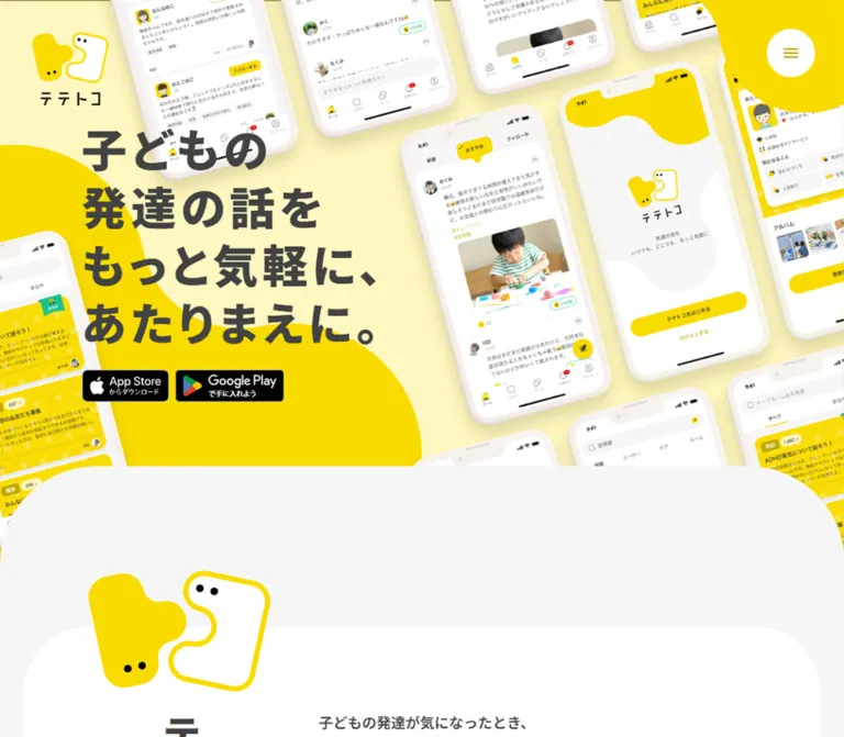
鮮やかな黄色、極太の日本語タイポグラフィ、斜めに並ぶスマートフォン画像が印象的な子育てSNSの公式サイト。大きな曲線と余白で親しみやすさをつくり、アプリ紹介から読み物や相談先へつなげています。
オリジナルサイトを見るA sunny parent-community website built from tilted phones, interlocking mascots, and heavy charcoal type.
Website / original URL: tetetoco.jp Final URL: tetetoco.jp Response: HTTP 200; original and final URLs are identical. Theme: light, with yellow brand artwork, pale gray surroundings, and white content surfaces. No theme switch was evidenced. Inspected: September 17, 2026, 04:29 JST. The supplied retrieval timestamp is September 16, 2026, 19:29:30.903 UTC. Viewports: 1440 × 1000 desktop and 390 × 844 mobile, in CSS pixels. Scope: the current public homepage: app introduction, three feature explanations, press mentions, reading previews, FAQ preview, community/contact destinations, download calls to action, and footer. Visual captures cover the desktop hero, press-to-reading transition, desktop footer, mobile hero, and mobile footer. Rendered text and selected computed styles cover the intervening sections. Destination pages and the mobile app itself were not inspected.
Tetetoco introduces a community app for parents discussing children's development, including developmental disabilities and the gray zone around diagnosis. Its homepage combines product explanation with an editorial hub and practical support navigation. The visual tone is friendly and energetic, while the large Japanese text and generous paragraph spacing keep the subject approachable for adults.
The strongest signature is the relationship between small, persistent corner controls and oversized content. A compact mascot logo sits above a full-bleed collage of tilted white phones. Heavy charcoal copy occupies an open yellow area within that composition. Farther down, pale gray space, white panels, rounded cards, and very large curves give the page room to breathe. Green and orange appear later as distinct destination panels rather than competing with the hero's yellow.
A sunny parent-community website built from tilted phones, interlocking mascots, and heavy charcoal type.
Website / original URL: tetetoco.jp Final URL: tetetoco.jp Response: HTTP 200; original and final URLs are identical. Theme: light, with yellow brand artwork, pale gray surroundings, and white content surfaces. No theme switch was evidenced. Inspected: September 17, 2026, 04:29 JST. The supplied retrieval timestamp is September 16, 2026, 19:29:30.903 UTC. Viewports: 1440 × 1000 desktop and 390 × 844 mobile, in CSS pixels. Scope: the current public homepage: app introduction, three feature explanations, press mentions, reading previews, FAQ preview, community/contact destinations, download calls to action, and footer. Visual captures cover the desktop hero, press-to-reading transition, desktop footer, mobile hero, and mobile footer. Rendered text and selected computed styles cover the intervening sections. Destination pages and the mobile app itself were not inspected.
Tetetoco introduces a community app for parents discussing children's development, including developmental disabilities and the gray zone around diagnosis. Its homepage combines product explanation with an editorial hub and practical support navigation. The visual tone is friendly and energetic, while the large Japanese text and generous paragraph spacing keep the subject approachable for adults.
The strongest signature is the relationship between small, persistent corner controls and oversized content. A compact mascot logo sits above a full-bleed collage of tilted white phones. Heavy charcoal copy occupies an open yellow area within that composition. Farther down, pale gray space, white panels, rounded cards, and very large curves give the page room to breathe. Green and orange appear later as distinct destination panels rather than competing with the hero's yellow.
--tt- are implementation aliases created for this reference.| Name | Value | Suggested token | Evidence and role |
|---|---|---|---|
| Charcoal | #424242 |
--tt-ink |
Measured body, headings, article titles, navigation, and yellow-button text |
| Pale Gray | #f6f6f6 |
--tt-canvas |
Measured HTML/body background; visible between white surfaces |
| White | #ffffff |
--tt-surface |
Measured article-card and footer backgrounds; also text on support panels |
| Action Yellow | #f9db00 |
--tt-action |
Measured background of the reading-index and FAQ-index buttons |
| Community Green | #1bc18e |
--tt-community |
Measured community-guidelines panel; also inherited color on some image links |
| Contact Orange | #ff7b01 |
--tt-contact |
Measured contact-panel background |
| Utility Gray | #8e8e93 |
--tt-muted |
Measured footer legal-link text |
| Artwork Yellow | approximately #ffe000 |
--tt-art-yellow |
Visual estimate for the bright hero field, mascot fill, and corner decoration |
| Hero Cream | approximately #fff7c2 |
--tt-cream |
Visual estimate for the pale field between the phone mockups |
| Badge Black | approximately #000000 |
— | Visible within official store-badge artwork; not the main website text color |
Keep measured button yellow and estimated artwork yellow distinct. The source provides an exact computed background for browse buttons, but not for the hero illustration or mascot artwork. A single universal yellow would erase that distinction.
The green computed on an image-link anchor does not make its visible badge green. The rendered image determines the badge's black-and-white appearance. Likewise, WordPress preset gradients, preset shadows, and the default blue Swiper variable appear in the exported custom properties but do not establish the visible brand palette.
The opening composition is predominantly bright yellow and warm cream, with white phones and charcoal copy. The reading and informational areas shift toward pale gray and white. Green and orange are concentrated in two substantial panels near the end of the main content. Black is most conspicuous in the official download badges, while small legal text recedes in gray.
Measured font stack: "Noto Sans JP", "Hiragino Kaku Gothic ProN", "Hiragino Sans", Meiryo, sans-serif.
The stack is present on the body and nearly all sampled interface text. It establishes a Japanese sans-serif system with unusually heavy display weights: 900 for the hero and introduction heading, 800 for major section and feature headings, and 700 for navigational emphasis. The computed family declaration does not independently prove which font file supplied every glyph.
The HTML root reports 10px, while body text is explicitly 18px on desktop and 16px on mobile. The root's reported Times family is overridden by the body and should not be treated as a visible design font.
The copyright wrapper declares "Josefin Sans", sans-serif, weight 400, with 0.03em tracking. Its measured parent size is 18px / 21.6px on desktop and 16px / 19.2px on mobile. The visible copyright lettering looks smaller than these parent values; descendant styles were not supplied. Do not assume that the wrapper measurement is the final glyph size.
All values in this table are measured. Sizes and line heights are CSS pixels.
| Role | Desktop size / line height | Mobile size / line height | Weight | Tracking |
|---|---|---|---|---|
| Hero statement | 56 / 71.96 |
37.44 / 48.1104 |
900 |
Desktop 0.1em; mobile 0.05em |
| Introduction heading | 48 / 57.6 |
28 / 33.6 |
900 |
0.1em |
| Major section heading | 64 / 70.4 |
24.96 / 27.456 |
800 |
0.05em |
| Feature heading | 32 / 48 |
24 / 36 |
800 |
0.05em |
| Standard body | 18 / 36 |
16 / 28 |
400 |
Normal |
| Introduction paragraphs | 18 / 36 |
16 / 28 |
600 |
Normal |
| Press heading | 24 / 28.8 |
24 / 28.8 |
700 |
Normal |
| Press link | 16 / 24 |
14 / 21 |
400 |
Normal |
| Article title | 16 / 24 |
14 / 21 |
700 |
Normal |
| FAQ question | 20 / 30 |
16 / 24 |
700 |
Normal |
| Yellow browse button | 18 / 23.4 |
14 / 18.2 |
700 |
0.05em |
| Support-panel heading | 24 / 28.8 |
24 / 36 |
700 |
0.05em |
| Support-panel body | 16 / 28 |
16 / 28 |
400 |
Normal |
| Footer download statement | 52 / 78 |
33.267 / 49.9005 |
800 |
0.15em |
| Footer primary navigation | 16 / 24 |
16 / 24 |
700 |
Normal |
| Footer legal links | 13 / 26 |
13 / 22.75 |
400 |
Normal |
Major section-heading boxes include substantial padding: 48px above and below the desktop text, and 25px above / 27px below on mobile. Their measured total heights are approximately 166.39px and 79.44px; these are not font sizes.
At 390px, the hero size equals 9.6vw and the major section size equals 6.4vw. Those are arithmetic equivalences at the measured width, not proof of the original CSS formulas.
The hero uses different phrase grouping across viewports:
子どもの / 発達の話を / もっと気軽に、 / あたりまえに。子どもの発達の話を / もっと気軽に、 / あたりまえに。Preserve live text and deliberate phrase breaks. The mobile composition is not a uniformly reduced desktop headline. Footer copy remains a two-line statement, with more tracking than the hero.
The system combines small, consistent component gaps with much larger editorial spacing. It is not well described by a single universal spacing unit.
| Use | Desktop | Mobile | Evidence |
|---|---|---|---|
| Gap between store badges | 8px |
8px |
Derived from anchor rectangles |
| Hero text to badge row | 24px |
24px |
Derived from text and anchor rectangles |
| Feature heading to paragraph | 32px |
24px |
Derived |
| Introduction paragraph gap | 36px |
32px |
Derived |
| Article-card padding | 36px |
36px 24px |
Measured |
| Article-card gap | 40px |
16px |
Derived |
| Gap between feature sections | 62px |
60px |
Derived |
| Gap between support panels | 40px |
16px vertically |
Derived |
| Footer navigation row pitch | 48px |
48px |
Derived; 24px text line plus 24px space |
| Feature section to press section | 192px |
80px |
Derived |
| Press section to reading section | 190px |
80px |
Derived |
| Element | Desktop | Mobile | Status |
|---|---|---|---|
| Article card | 40px |
20px |
Measured |
| Community/contact panel | 40px |
40px |
Measured |
| Yellow browse button | 60px |
60px |
Measured; effectively pill shaped |
| Footer top-left corner | 300px |
150px |
Measured; other corners are square |
| Menu button | Circle, about 60px diameter |
Circle, about 40px diameter |
Visual estimate |
| Social icon background | Circle, about 36px diameter |
Same | Visual shape; anchor dimensions measured |
| Press-panel corners | Approximately 80–90px |
Not visually established | Desktop visual estimate |
| Gray hero-to-content boundary | Approximately 120px upper curves |
Approximately 60px upper curves |
Visual estimate |
The mascot outlines and yellow corner ornament are irregular artwork, not simply rounded rectangles. Use dedicated shapes for these identity elements.
| Element | Desktop at 1440px | Mobile at 390px |
|---|---|---|
| Document height | 10485.03px |
9256.44px |
| Logo heading wrapper | 95 × 92px, at (40, 40) |
54 × 52.28px, at (16, 20) |
| Hero text rectangle | 377.95 × 287.81px, at (297, 396.94) |
345.64 × 144.28px, at (16, 534.72) |
| Store-badge row | Approximately 251.83 × 40px |
Same |
| Standard feature container | 1100px wide, x=170 |
356.72px wide, x=16.64 |
| Introduction body column | 654px wide, x=536 |
306.81px wide, x=41.59 |
| Feature copy column | 514px wide |
356.72px wide |
| Article card | 340 × 472.19px |
279.63px wide; 429.81–450.81px high |
| FAQ question area | 800px wide, x=320 |
356.72px wide, x=16.64 |
| Browse button | 420 × 79.17px |
356.72 × 61.56px |
| Support-panel group | 1286px wide, x=77 |
356.72px wide, x=16.64 |
| Footer inner span | 966px wide, x=237 |
340.09px wide, x=24.95 |
Mobile content has several intentional inset levels: approximately 16px for the hero and broad content, 25px for the footer, and 42px for introduction/press copy. Avoid forcing every section onto one identical mobile gutter.
Role: retain the brand and navigation access without a conventional full-width header bar.
The upper-left mark consists of two small irregular characters: a yellow filled piece and a white piece outlined in yellow, each with two black eyes. The Japanese wordmark sits below. The entire assembly is linked to the homepage and is contained in the source H1 wrapper.
At desktop width, its wrapper begins 40px from both the top and left. On mobile, it begins 16px from the left and 20px from the top. The same corner placement remains visible in the supplied scrolled captures, supporting persistent viewport positioning.
The top-right control is a white circle with a small yellow menu glyph, backed by a larger yellow shape that reaches beyond the viewport edge. Visually, the circle is about 60px on desktop and 40px on mobile. Keep the glyph small and centered; the larger corner artwork supplies the visual weight.
The exported header has zero layout height. The opening image therefore reaches the top edge without a separate horizontal navigation strip. Menu links exist in the rendered DOM, but no opened-menu capture or tested opening behavior was supplied. Its expanded layout, focus behavior, and animation are unverified.
Role: communicate the product visually before presenting detailed features.
The desktop opening is an edge-to-edge field of overlapping white phone mockups against cream and bright yellow. Devices are tilted in a broadly consistent direction, approximately 12–16 degrees counterclockwise by visual estimate. Several phones extend beyond the top, left, and right edges. Soft shadows belong to the device imagery and establish depth without making the surrounding website glossy.
A central phone shows a community feed with a child photograph. A larger adjacent phone shows the product's welcome screen. Other cropped devices show profile and discussion interfaces. Retain the contrast between detailed app screens and the simple surrounding brand shapes.
The headline is independent live text. On desktop, it begins at x=297px, y=396.94px, occupying a roughly 378px column within the open yellow area. The paired store badges begin 24px below it.
On mobile, the phones dominate the upper portion of the page, while the statement moves below the main device grouping. Its top is 534.72px, with a left inset of 16px. The yellow field continues behind the statement and badges. The visible gray transition into the next section begins around y=759px in the mobile screenshot; its desktop counterpart begins around y=829px. These transition positions are visual observations, not measured hero-element heights.
Reproduce this as an art-directed composition with separate text. A generic two-column hero with one upright phone would lose the defining visual structure.
Role: direct users to the two app marketplaces.
The App Store badge anchor measures 108.84 × 40px; the Google Play anchor measures 134.98 × 40px. The gap is 8px. These dimensions are unchanged between the two viewports and between the hero and footer.
The badges use their official black artwork, with the marks and small Japanese secondary text contained inside each image. They should not be recreated as ordinary yellow website buttons. Keep their natural aspect ratios and align their top and bottom edges.
The DOM contains actual App Store and Google Play destinations. Image alternative text and accessible names were not included in the supplied element samples, so they remain unverified.
Role: explain the community's purpose through empathetic, readable copy.
The introduction follows the curved gray transition and uses a white inner surface. Its desktop text is asymmetrical: the heading has a narrow 57.59px-wide, 369.61px-high rectangle at x=336px, while paragraphs begin at x=536px. This geometry is consistent with a vertical title column; the actual writing-mode declaration was not exported.
The body consists of four semibold paragraphs at 18px / 36px, in a 654px column. Paragraph gaps are 36px. It describes the difficulty of finding suitable information or a comfortable place to discuss children's development, then introduces the community as a place for everyday experiences and questions.
On mobile, the heading becomes horizontal at 28px / 33.6px. Text occupies a centered 306.81px column, with roughly 41.59px side insets. Paragraphs use 16px / 28px, weight 600, and 32px gaps. The heading-to-first-paragraph gap is 40px.
Keep this section more intimate than the large feature and article containers. Its narrower mobile column is a meaningful part of the reading rhythm.
Role: mark large changes in topic using typography and character artwork.
The reading heading, テテトコの読み物, is centered and visibly flanked by the two mascot pieces. They sit at different vertical positions and angles: the filled character rises beside the left edge, while the outlined character hangs lower on the right. This asymmetry makes the heading feel animated even in a still capture.
The title itself uses 64px, weight 800, 1.1 line height, and 0.05em tracking on desktop. Mobile uses 24.96px with the same proportional line height and tracking. The feature and FAQ headings share these measured typographic settings; their decorations were not individually visible in the supplied crops.
Use illustration layers around a real heading rather than baking the complete heading into an image. Decorative characters should not expand the text's accessible name.
Role: explain three specific app capabilities.
The sections describe connecting through a child's developmental characteristics, posting everyday thoughts, and discussing shared subjects in talk rooms. The first references ウチノコカード; the third references トークルーム.
Desktop sections are each 1100 × 640px, with 62px between sections. Copy alternates left, right, left: x=290px, x=636px, x=290px. Each copy column is 514px wide. Headings use 32px / 48px; paragraphs begin 32px below them at 18px / 36px.
On mobile, all copy aligns to x=16.64px and spans 356.72px. Headings use 24px / 36px and paragraphs use 16px / 28px, separated by 24px. The first two sections measure approximately 751.19px high; the third is 759.19px high because its heading wraps to three lines.
In all three mobile sections, the heading starts approximately 543.19px below the section top. This indicates substantial space preceding the text, consistent with media-first composition. The supplied crops do not show those feature visuals, and individual media rectangles were not exported. Do not invent their illustrations, asset ratios, or animation, or reproduce that distance as an unexplained blank spacer.
Role: present external recognition in a restrained information area.
The desktop capture shows a large white panel approximately 1100px wide on the pale gray background, with broad rounded corners. A compact 掲載実績 heading sits at x=250px; a thin vertical separator appears around x=426px; the dated list begins at x=507px.
Each entry consists of a small muted date above an ordinary charcoal text link. Link typography is measured at 16px / 24px; the visible date size is approximately 12–13px, a visual estimate. Consecutive desktop link rows start 102px apart.
Only the first few entries fit within the visible list area. The fourth is cut off near the bottom of that area, while the DOM contains ten entries. This establishes a constrained visible region, but independent scrolling was not exercised. Do not assume that all ten entries expand the outer panel or claim a verified internal scroll interaction.
Mobile geometry places the heading above the list rather than beside it. The heading remains 24px; link text becomes 14px / 21px in a 281.81px column. Longer entries wrap and increase the row pitch to approximately 112px.
Role: connect the app introduction to ongoing news and parenting content.
Six full-card links are present, each including a date, category, and title. Categories include ニュース and 子育てコラム. The observed sequence mixes dates; it should not be treated as proof of strict chronological sorting.
Desktop cards form a three-column, two-row arrangement. Their x positions are 170, 550, and 930px; widths are 340px. Both horizontal and vertical gaps are 40px. Cards have a white background, 40px radius, and 36px padding, yielding a 268px inner width.
The title sits toward the bottom and uses 16px / 24px, weight 700. Sampled desktop title boxes are 48px high. Their height does not establish the specific line-clamp or truncation mechanism. The media files, image crops, and separate date/category styles were not included in the evidence.
On mobile, all six cards share the same y coordinate and extend horizontally beyond the viewport. Each is 279.63px wide, with 16px gaps, 20px corners, and 36px 24px padding. The first begins at x=16.64px; the next begins at x=312.27px, leaving part of the following card within the viewport. This is a horizontal strip, not a six-card vertical stack.
Mobile titles use 14px / 21px; card heights vary between approximately 430px and 451px. Touch dragging, controls, autoplay, and snap behavior were not tested. A new implementation should make every card reachable through accessible horizontal navigation.
Role: provide a clear secondary destination after a content preview.
Two measured examples are すべての読み物を見る and もっと見る. On desktop, they are centered, 420px wide and approximately 79.17px high. Their computed padding is 27.9px 59.94px, with 60px radius, charcoal text, and #f9db00 background.
Mobile buttons fill the standard 356.72px content width and are approximately 61.56px high. Their padding becomes 21.7px 46.62px; text becomes 14px / 18.2px with 0.05em tracking.
They use a 0.2s background-color transition. The target hover color was not supplied. Keep these website navigation buttons visually distinct from the black store badges.
Role: answer practical eligibility and usage questions before the final download invitation.
Four question headings are present. On desktop, each occupies an 800px-wide region at x=320px, with 40px reserved on the right. Question text uses 20px / 30px, weight 700; consecutive question starts are 111px apart.
Mobile questions span the standard 356.72px container and use 16px / 24px. The first question wraps to two lines, increasing its row pitch. The right-side reservation remains 40px.
Answer text exists in the section's DOM text but is absent from the supplied visible-text summary. This is consistent with closed disclosure content. No expansion was demonstrated, and the control glyph, keyboard behavior, and animation were not supplied. Describe these as disclosure candidates rather than claiming a tested accordion implementation.
A full-width yellow もっと見る button follows the preview and links to the FAQ page.
Role: offer two substantial support destinations near the end of the main content.
Each panel is a single large anchor containing a heading and explanatory paragraph. Community guidelines use #1bc18e; contact uses #ff7b01. Both have white text and 40px corners.
On desktop, the panels sit side by side at x=77px and x=740px. Each measures 623 × 372.80px, with 40px between them. Computed padding is 120px 118.36px, leaving a 386.28px text column. Headings use 24px / 28.8px, followed by body text at 16px / 28px.
On mobile, the panels stack with a 16px gap. Their width is 356.72px; the guidelines panel is 340px high and contact is 304px high. Padding is 72px 36.56px 96px. The guidelines heading wraps to two lines, accounting for its greater height. Keep the whole panel as the destination target rather than adding a competing small button inside it.
Role: repeat the app download invitation and provide a complete site directory.
The footer is white with a dramatic top-left radius: 300px on desktop and 150px on mobile. Desktop padding is 175px 0 100px. The measured inner span is 966px, beginning at x=237px, while the download statement occupies a narrower 572px column.
The statement テテトコを / いますぐはじめよう! uses 52px / 78px, weight 800, and 0.15em tracking. The store badges repeat at their original 40px height. A thin divider separates the invitation from navigation; its visible desktop width is approximately 572px.
Desktop primary navigation forms two columns. The first contains home, FAQ, and contact; the second contains reading and community guidelines. Column starts are x=237px and x=448px. Links use 16px / 24px, weight 700, with 48px row pitch. Below them are a muted FOLLOW US label, a small pale-yellow circular X link, legal links separated by thin vertical rules, and the copyright line.
Mobile footer padding is 80px 24.96px. Primary navigation becomes one vertical sequence in the same reading order, retaining 16px text and 48px row pitch. Legal links wrap to two lines. The download statement becomes approximately 33.27px / 49.90px.
The mobile footer capture includes a clipped phone above the statement. Its full media area is outside that crop. The DOM places the statement approximately 427.89px below the footer top, so the top of this footer contains more than its nominal 80px padding. Do not remove that media region by treating the final screenshot as a complete footer-top view.
| Element or behavior | Supplied evidence | What can safely be concluded |
|---|---|---|
| Desktop hero statement | Transition serialized as 0.4s |
A duration is defined; changing properties, trigger, and endpoints are unverified |
| Press section | opacity 0.5s cubic-bezier(0.25, 0.25, 0.75, 0.75), transform 0.5s cubic-bezier(0.25, 0.25, 0.75, 0.75) |
Opacity and transform transitions are defined; travel distance and trigger are unknown |
| Article links | Transition serialized as 0.3s |
A transition duration is defined; no hover target or elevation was demonstrated |
| Yellow browse links | background-color 0.2s |
Background-color changes are supported by the declaration; destination color is unknown |
| Support panels | Transition serialized as 0.2s |
Short transition defined; its visual endpoint is unverified |
| Persistent corner identity/menu | Same viewport corners across supplied scroll captures | Persistent placement is visually supported |
| Mobile reading strip | Cards occupy successive offscreen x coordinates | Horizontal arrangement is measured; swipe and carousel behavior are untested |
| FAQ preview | Answer text present in DOM, questions in visible summary | Collapsed disclosure behavior is plausible but untested |
| Sampled keyframe animations | Exported elements report animation: none |
No active keyframe animation is established for those elements at sampling time |
Most other transition fields contain only all, without a nonzero duration in the supplied serialization. That is not evidence that every element visibly animates.
The collection process waited for finite visible motion and layout stability, and temporarily paused perpetual animations during readiness checks. These procedures do not supply a motion recording or establish the behavior of untested controls. No menu-opening, hover, drag, keyboard, or FAQ-expansion state was provided.
Recommended adaptation: retain short, quiet feedback around links and disclosures. Do not introduce continuous floating phones, parallax, bouncing mascots, autoplay, or large entrance sequences as if they were observed features. Any optional motion should support reduced-motion preferences and leave all essential content visible.
| Layer | Appearance | Purpose |
|---|---|---|
| Hero field | Bright yellow and pale cream, with irregular boundaries | Establish brand energy and provide open space for the headline |
| Device imagery | White hardware, detailed app screens, soft shadows | Communicate the app through tangible product views |
| Main canvas | #f6f6f6 |
Separate white surfaces while preserving a gentle overall contrast |
| Intro and press surfaces | White, with broad curves visible in captures | Create calm reading areas |
| Reading cards | White, 40px desktop / 20px mobile corners |
Group individual editorial destinations |
| Browse links | Solid measured yellow, pill geometry | Make section-level continuation obvious |
| Support destinations | Solid green or orange, white text, 40px corners |
Distinguish community guidance from contact |
| Footer | White, one oversized upper-left curve | Close the page with a fresh download invitation and directory |
There is no evidence for a general glass, gradient, or elevated-card system. Device shadows are visibly part of the imagery. Card box-shadow values were not exported, so do not generalize the phone shadows into a site-wide elevation language.
The identity combines organic mascot shapes with realistic device mockups. The mascots have almost no facial detail beyond paired black eyes; their interlocking silhouettes connect visually to the site's language about different developmental characteristics. Their simplicity makes them useful at both logo scale and as large heading decorations.
Phone imagery is dense and specific. White bezels, visible screen details, small avatars, yellow app accents, and the central child photograph contrast with the uncluttered website text. Retain this distinction: the phones contain complexity, while the surrounding layout remains broad and readable.
The hero crop changes materially on mobile. It prioritizes a small number of large, legible phones above the statement, rather than shrinking the entire desktop collage into a tiny banner. Preserve phone proportions and clip the composition at the viewport edges.
No original image URLs, filenames, intrinsic dimensions, or asset manifests were included in the supplied evidence. The following are visual asset roles, not downloadable path claims.
| Asset role | Observed treatment | Implementation guidance |
|---|---|---|
| Brand logo | Filled yellow and outlined white mascot pair above a Japanese wordmark | Use authorized logo artwork; preserve its internal proportions |
| Hero phone composition | Multiple tilted white devices extending outside the frame | Supply separate desktop/mobile crops or art direction |
| Central feed screen | Child photograph inside a community-post interface | Keep it within the device context; do not promote it to an unrelated full-page stock photo |
| Welcome-screen phone | Large mascot logo on a pale app screen with yellow accents | Preserve screen content as imagery unless implementing the actual app |
| Heading mascots | Two irregular figures at offset heights | Use transparent artwork or equivalent supplied vector shapes |
| Store badges | Official black App Store and Google Play marks | Preserve the official graphics and natural aspect ratios |
| Menu corner decoration | Yellow irregular shape behind a white circular control | Use a dedicated decorative layer with no pointer interception |
| Mobile footer phone | Partially visible above the closing statement | Full composition and asset dimensions remain unverified |
| Reading and feature media | Not individually exposed in supplied visual crops | Do not invent exact image subjects, ratios, or paths |
Use authorized artwork where available. CSS can reproduce the content system and broad shapes, but generic replacement phones and mascots will not reproduce the specific visual identity.
The desktop page is a long, ordinarily scrolling website. The main content uses several width systems rather than one universal container: 1100px for features and articles, 800px for FAQ questions, 1286px for the paired support panels, and 966px for the footer inner span.
The hero copy is deliberately offset inside a wider artwork composition. It does not align to the same x coordinate as the feature or article container. Introduction copy is more tightly framed, and the footer preserves a large empty region on the right in the supplied desktop capture.
The source document is approximately 10485px tall. Some large intervals between sampled text sections are not explained by the exported nodes. They may contain unmeasured artwork or wrappers; their content cannot be determined from the text coordinates alone. Do not reconstruct them as arbitrary fixed-height empty blocks.
At 390px, the design changes structure in several ways:
95px to 54px wide, while the menu remains a separate corner control.The mobile document is approximately 9256px tall. It is shorter than the desktop document despite narrower text, in part because the article collection occupies one horizontal row and large desktop section spacing changes.
No media-query definitions were supplied. A breakpoint around 900px is used in the Quick Start as a recommendation, not as a recovered source value. Add an intermediate two-column article layout if useful for a new project, but identify it as an extension: only the three-column desktop and horizontal mobile arrangements were observed.
Keep the actual store-badge row intact while space allows. Avoid scaling it down merely because the viewport is narrow. At widths smaller than the inspected phone, allow careful wrapping or extra vertical space rather than distorting badge artwork.
40px height.#424242.These are recommendations for a new implementation, not verified features of the original site:
44px while retaining a visually compact circle.#424242.#f6f6f6.#ffffff.#f9db00.#ffe000, cream near #fff7c2.#1bc18e.#ff7b01.#8e8e93.“Create a Japanese parent-community app homepage inspired by Tetetoco's current visual system. Use heavy Noto Sans JP-style typography, charcoal #424242, pale gray #f6f6f6, white content surfaces, and bright yellow organic artwork. Place a small interlocking mascot logo at the upper left and a white circular menu button inside a yellow corner shape at the upper right. Build an edge-to-edge hero from tilted white phone mockups, leaving a yellow area for live Japanese text and official black store badges. On mobile, prioritize large phones above a three-line statement. Continue with empathetic introductory copy, three feature explanations, a dated press panel, editorial cards, FAQ questions, colored support panels, and a white footer with an oversized top-left curve. Use a three-column article grid on desktop and a horizontal card strip on mobile. Keep motion optional and do not invent unverified interactions.”
テテトコの読み物 in heavy charcoal sans-serif. Place a filled yellow mascot above the left side and its white, yellow-outlined partner lower on the right. Use 64px desktop type with generous vertical space; keep the label live text.”This is an implementation scaffold, not recovered source CSS. It preserves measured colors, type relationships, card geometry, badge sizes, and the main responsive changes. It uses a conventional root font size and explicit pixel values. The 900px breakpoint, artwork colors, approximate hero geometry, hover endpoint, and optional focus treatment are recommendations.
Supply authorized logo, mascot, phone, and store-badge assets separately. No source asset paths are known. Use a <picture> inside .hero-art for desktop/mobile collage art direction, keep .hero-title as live text, and place the two badge image links inside .store-badges. The examples assume a .tetetoco-page wrapper. They do not implement an opened menu or FAQ state management.
:root {
  /* Measured interface colors */
  --tt-ink: #424242;
  --tt-canvas: #f6f6f6;
  --tt-surface: #ffffff;
  --tt-action: #f9db00;
  --tt-community: #1bc18e;
  --tt-contact: #ff7b01;
  --tt-muted: #8e8e93;

  /* Visual approximations for artwork, not extracted colors */
  --tt-art-yellow: #ffe000;
  --tt-cream: #fff7c2;

  --tt-font-body: 'Noto Sans JP', 'Hiragino Kaku Gothic ProN',
    'Hiragino Sans', Meiryo, sans-serif;
  --tt-font-latin: 'Josefin Sans', sans-serif;
  --tt-body-size: 18px;
  --tt-body-leading: 2;
  --tt-hero-size: 56px;
  --tt-section-size: 64px;
  --tt-feature-size: 32px;
  --tt-footer-size: 52px;

  --tt-content-max: 1100px;
  --tt-gutter: 16.64px;
  --tt-card-radius: 40px;
  --tt-panel-radius: 40px;
  --tt-pill-radius: 60px;
  --tt-footer-radius: 300px;
  --tt-card-gap: 40px;
  --tt-fast: 200ms;
  --tt-card-time: 300ms;
}

.tetetoco-page,
.tetetoco-page * {
  box-sizing: border-box;
}

body {
  margin: 0;
}

.tetetoco-page {
  color: var(--tt-ink);
  background: var(--tt-canvas);
  font-family: var(--tt-font-body);
  font-size: var(--tt-body-size);
  line-height: var(--tt-body-leading);
}

.tetetoco-page img {
  display: block;
  max-width: 100%;
}

.tetetoco-page button {
  font: inherit;
}

.content-width {
  width: min(var(--tt-content-max), calc(100% - 2 * var(--tt-gutter)));
  margin-inline: auto;
}

/* The supplied mark includes its own wordmark. */
.brand-mark {
  position: fixed;
  z-index: 50;
  top: 40px;
  left: 40px;
  width: 95px;
}

.brand-mark img {
  width: 100%;
  height: auto;
}

/* Use supplied decorative artwork behind this control. */
.menu-button {
  position: fixed;
  z-index: 51;
  top: 36px;
  right: 36px;
  display: grid;
  place-items: center;
  width: 60px;
  height: 60px;
  padding: 0;
  border: 0;
  border-radius: 50%;
  color: var(--tt-ink);
  background: var(--tt-surface);
  cursor: pointer;
}

/* Hero dimensions approximate the inspected composition. */
.hero {
  position: relative;
  min-height: 950px;
  overflow: hidden;
  background: var(--tt-art-yellow);
}

.hero-art {
  position: absolute;
  inset: 0;
}

.hero-art,
.hero-art picture,
.hero-art img {
  width: 100%;
  height: 100%;
}

.hero-art picture {
  display: block;
}

.hero-art img {
  object-fit: cover;
}

.hero-inner {
  position: relative;
  width: min(1100px, calc(100% - 32px));
  margin-inline: auto;
  padding: 396.94px 0 200px 127px;
}

.hero-title {
  max-width: 378px;
  margin: 0;
  font-size: var(--tt-hero-size);
  font-weight: 900;
  line-height: 1.285;
  letter-spacing: 0.1em;
}

.store-badges {
  display: flex;
  flex-wrap: wrap;
  align-items: center;
  gap: 8px;
  margin-top: 24px;
}

.store-badges a {
  display: block;
  flex: none;
}

.store-badges img {
  width: auto;
  height: 40px;
}

/* Add authorized mascot decorations around the text separately. */
.section-heading {
  margin: 0;
  padding-block: 48px;
  text-align: center;
  font-size: var(--tt-section-size);
  font-weight: 800;
  line-height: 1.1;
  letter-spacing: 0.05em;
}

.feature-copy h3 {
  margin: 0 0 32px;
  font-size: var(--tt-feature-size);
  font-weight: 800;
  line-height: 1.5;
  letter-spacing: 0.05em;
}

.feature-copy p {
  margin: 0;
}

.intro-copy {
  max-width: 654px;
  font-weight: 600;
}

.intro-copy p {
  margin: 0 0 36px;
}

/* Native overflow is a recommended baseline for the press list. */
.press-panel {
  display: grid;
  grid-template-columns: 177px minmax(0, 1fr);
  gap: 80px;
  padding: 80px;
  border-radius: 84px;
  background: var(--tt-surface);
}

.press-heading {
  margin: 0;
  padding-right: 24px;
  border-right: 1px solid #ededed;
  font-size: 24px;
  font-weight: 700;
  line-height: 1.2;
}

.press-list {
  max-height: 366px;
  overflow-y: auto;
  overscroll-behavior-y: contain;
}

.press-entry + .press-entry {
  margin-top: 56px;
}

.press-entry a {
  color: var(--tt-ink);
  font-size: 16px;
  line-height: 1.5;
  text-decoration: none;
}

.reading-grid {
  display: grid;
  grid-template-columns: repeat(3, minmax(0, 1fr));
  gap: var(--tt-card-gap);
  margin-top: 80px;
}

.reading-card {
  display: block;
  min-width: 0;
  padding: 36px;
  border-radius: var(--tt-card-radius);
  color: var(--tt-ink);
  background: var(--tt-surface);
  text-decoration: none;
}

/* Media should retain its supplied aspect ratio. */
.reading-card img {
  width: 100%;
  height: auto;
}

.reading-card h3 {
  margin: 16px 0 0;
  font-size: 16px;
  font-weight: 700;
  line-height: 1.5;
}

.browse-link {
  display: block;
  width: min(420px, 100%);
  margin: 30px auto 0;
  padding: 27.9px 59.94px;
  border-radius: var(--tt-pill-radius);
  color: var(--tt-ink);
  background: var(--tt-action);
  font-size: 18px;
  font-weight: 700;
  line-height: 1.3;
  letter-spacing: 0.05em;
  text-align: center;
  text-decoration: none;
  transition: background-color var(--tt-fast);
}

.faq-list {
  width: min(800px, calc(100% - 2 * var(--tt-gutter)));
  margin-inline: auto;
}

/* Apply to an accessible disclosure button inside each heading. */
.faq-question {
  display: block;
  width: 100%;
  padding: 0 40px 0 0;
  border: 0;
  color: inherit;
  background: transparent;
  font-size: 20px;
  font-weight: 700;
  line-height: 1.5;
  text-align: left;
  cursor: pointer;
}

.support-grid {
  display: grid;
  grid-template-columns: repeat(2, minmax(0, 1fr));
  gap: 40px;
  width: min(1286px, calc(100% - 2 * var(--tt-gutter)));
  margin-inline: auto;
}

.support-card {
  padding: 120px 19%;
  border-radius: var(--tt-panel-radius);
  color: var(--tt-surface);
  text-decoration: none;
}

.support-card--community {
  background: var(--tt-community);
}

.support-card--contact {
  background: var(--tt-contact);
}

.support-card h3 {
  margin: 0 0 20px;
  font-size: 24px;
  font-weight: 700;
  line-height: 1.2;
  letter-spacing: 0.05em;
}

.support-card p {
  margin: 0;
  font-size: 16px;
  line-height: 1.75;
}

/* Optional higher-contrast foreground for these colored panels. */
.support-card--readable {
  color: #262626;
}

.site-footer {
  padding: 175px 0 100px;
  border-top-left-radius: var(--tt-footer-radius);
  background: var(--tt-surface);
}

.footer-inner {
  width: min(966px, calc(100% - 50px));
  margin-inline: auto;
}

.footer-title {
  max-width: 572px;
  margin: 0;
  font-size: var(--tt-footer-size);
  font-weight: 800;
  line-height: 1.5;
  letter-spacing: 0.15em;
}

.footer-nav {
  display: grid;
  grid-template-columns: 211px minmax(0, 1fr);
  grid-template-rows: repeat(3, auto);
  grid-auto-flow: column;
  row-gap: 24px;
  max-width: 572px;
  margin-top: 60px;
  padding-top: 50px;
  border-top: 1px solid var(--tt-muted);
}

.footer-nav a {
  color: var(--tt-ink);
  font-size: 16px;
  font-weight: 700;
  line-height: 1.5;
  text-decoration: none;
}

.footer-legal {
  display: flex;
  flex-wrap: wrap;
  column-gap: 20px;
  margin-top: 40px;
  font-size: 13px;
  line-height: 2;
}

.footer-legal a {
  color: var(--tt-muted);
}

.copyright {
  font-family: var(--tt-font-latin);
  letter-spacing: 0.03em;
}

/* Recommended focus and hover states, not recovered endpoints. */
.tetetoco-page :focus-visible {
  outline: 3px solid var(--tt-ink);
  outline-offset: 5px;
}

@media (hover: hover) {
  .browse-link:hover {
    background: #e7cd00;
  }

  .press-entry a:hover,
  .footer-nav a:hover {
    text-decoration: underline;
    text-underline-offset: 0.2em;
  }
}

/* Recommended breakpoint; mobile values reproduce the 390px sample. */
@media (max-width: 900px) {
  :root {
    --tt-body-size: 16px;
    --tt-body-leading: 1.75;
    --tt-hero-size: clamp(30px, 9.6vw, 48px);
    --tt-section-size: clamp(23px, 6.4vw, 40px);
    --tt-feature-size: 24px;
    --tt-footer-size: clamp(28px, 8.53vw, 42px);
    --tt-card-radius: 20px;
    --tt-footer-radius: 150px;
  }

  .brand-mark {
    top: 20px;
    left: 16px;
    width: 54px;
  }

  .menu-button {
    top: 16px;
    right: 16px;
    width: 40px;
    height: 40px;
  }

  .menu-button::after {
    position: absolute;
    inset: -4px;
    content: '';
  }

  .hero {
    min-height: 819px;
  }

  .hero-inner {
    width: 100%;
    padding: 534.72px 16px 76px;
  }

  .hero-title {
    max-width: 100%;
    letter-spacing: 0.05em;
  }

  .section-heading {
    padding-block: 25px 27px;
  }

  .feature-copy h3 {
    margin-bottom: 24px;
  }

  .intro-copy {
    width: calc(100% - 83.18px);
    margin-inline: auto;
  }

  .intro-copy p {
    margin-bottom: 32px;
  }

  .press-panel {
    grid-template-columns: minmax(0, 1fr);
    gap: 40px;
    padding: 60px 24.95px;
    border-radius: 40px;
  }

  .press-heading {
    padding: 0 0 12px;
    border-right: 0;
    border-bottom: 1px solid #ededed;
  }

  .press-entry a {
    font-size: 14px;
  }

  .reading-grid {
    display: flex;
    gap: 16px;
    margin-top: 40px;
    overflow-x: auto;
    scroll-snap-type: x proximity;
    scroll-padding-inline: 0;
  }

  .reading-card {
    flex: 0 0 78.39%;
    align-self: flex-start;
    padding: 36px 24px;
    scroll-snap-align: start;
  }

  .reading-card h3 {
    font-size: 14px;
  }

  .browse-link {
    width: 100%;
    margin-top: 16px;
    padding: 21.7px 46.62px;
    font-size: 14px;
  }

  .faq-question {
    font-size: 16px;
  }

  .support-grid {
    grid-template-columns: minmax(0, 1fr);
    gap: 16px;
  }

  .support-card {
    padding: 72px 36.56px 96px;
  }

  .support-card h3 {
    margin-bottom: 16px;
    line-height: 1.5;
  }

  .site-footer {
    padding: 80px 24.96px;
  }

  .footer-inner {
    width: 100%;
  }

  .footer-nav {
    grid-template-columns: minmax(0, 1fr);
    grid-template-rows: none;
    grid-auto-flow: row;
  }

  .footer-legal {
    line-height: 1.75;
  }
}

@media (prefers-reduced-motion: reduce) {
  .tetetoco-page *,
  .tetetoco-page *::before,
  .tetetoco-page *::after {
    animation: none !important;
    transition: none !important;
    scroll-behavior: auto !important;
  }
}
The scaffold intentionally leaves feature-media composition, article-media sizing, the curved hero boundary, mascot placement, social/utility details, and the footer phone region to their supplied assets and actual content. Do not use fixed card heights to compensate for missing imagery. Validate the hero crop and text clearance at intermediate widths; the two captured endpoints do not define every responsive state.
Optional mapping for projects already using Tailwind v4. This is an adaptation and does not identify the original site's implementation framework. Define the custom properties above first.
@theme inline {
  --color-ink: var(--tt-ink);
  --color-canvas: var(--tt-canvas);
  --color-surface: var(--tt-surface);
  --color-action: var(--tt-action);
  --color-community: var(--tt-community);
  --color-contact: var(--tt-contact);
  --color-muted: var(--tt-muted);
  --color-art-yellow: var(--tt-art-yellow);
  --color-cream: var(--tt-cream);

  --font-body: var(--tt-font-body);
  --font-latin: var(--tt-font-latin);

  --text-hero: var(--tt-hero-size);
  --text-section: var(--tt-section-size);
  --text-feature: var(--tt-feature-size);
  --text-footer: var(--tt-footer-size);

  --radius-card: var(--tt-card-radius);
  --radius-panel: var(--tt-panel-radius);
  --radius-pill: var(--tt-pill-radius);
  --radius-footer: var(--tt-footer-radius);

  --spacing-content-gutter: var(--tt-gutter);
  --spacing-card-gap: var(--tt-card-gap);
}
テテトコ | 発達障害・グレーゾーンの子育てSNS.10485.03px.9256.44px.This reference describes the current homepage represented by the supplied original-page evidence. It is a reusable design analysis, not a claim of complete source-code recovery.
# Tetetoco — Style Reference

> A sunny parent-community website built from tilted phones, interlocking mascots, and heavy charcoal type.

**Website / original URL:** [tetetoco.jp](https://tetetoco.jp/)
**Final URL:** [tetetoco.jp](https://tetetoco.jp/)
**Response:** HTTP 200; original and final URLs are identical.
**Theme:** light, with yellow brand artwork, pale gray surroundings, and white content surfaces. No theme switch was evidenced.
**Inspected:** September 17, 2026, 04:29 JST. The supplied retrieval timestamp is September 16, 2026, 19:29:30.903 UTC.
**Viewports:** 1440 × 1000 desktop and 390 × 844 mobile, in CSS pixels.
**Scope:** the current public homepage: app introduction, three feature explanations, press mentions, reading previews, FAQ preview, community/contact destinations, download calls to action, and footer. Visual captures cover the desktop hero, press-to-reading transition, desktop footer, mobile hero, and mobile footer. Rendered text and selected computed styles cover the intervening sections. Destination pages and the mobile app itself were not inspected.

Tetetoco introduces a community app for parents discussing children's development, including developmental disabilities and the gray zone around diagnosis. Its homepage combines product explanation with an editorial hub and practical support navigation. The visual tone is friendly and energetic, while the large Japanese text and generous paragraph spacing keep the subject approachable for adults.

The strongest signature is the relationship between small, persistent corner controls and oversized content. A compact mascot logo sits above a full-bleed collage of tilted white phones. Heavy charcoal copy occupies an open yellow area within that composition. Farther down, pale gray space, white panels, rounded cards, and very large curves give the page room to breathe. Green and orange appear later as distinct destination panels rather than competing with the hero's yellow.
# Tetetoco — Style Reference

> A sunny parent-community website built from tilted phones, interlocking mascots, and heavy charcoal type.

**Website / original URL:** [tetetoco.jp](https://tetetoco.jp/)
**Final URL:** [tetetoco.jp](https://tetetoco.jp/)
**Response:** HTTP 200; original and final URLs are identical.
**Theme:** light, with yellow brand artwork, pale gray surroundings, and white content surfaces. No theme switch was evidenced.
**Inspected:** September 17, 2026, 04:29 JST. The supplied retrieval timestamp is September 16, 2026, 19:29:30.903 UTC.
**Viewports:** 1440 × 1000 desktop and 390 × 844 mobile, in CSS pixels.
**Scope:** the current public homepage: app introduction, three feature explanations, press mentions, reading previews, FAQ preview, community/contact destinations, download calls to action, and footer. Visual captures cover the desktop hero, press-to-reading transition, desktop footer, mobile hero, and mobile footer. Rendered text and selected computed styles cover the intervening sections. Destination pages and the mobile app itself were not inspected.

Tetetoco introduces a community app for parents discussing children's development, including developmental disabilities and the gray zone around diagnosis. Its homepage combines product explanation with an editorial hub and practical support navigation. The visual tone is friendly and energetic, while the large Japanese text and generous paragraph spacing keep the subject approachable for adults.

The strongest signature is the relationship between small, persistent corner controls and oversized content. A compact mascot logo sits above a full-bleed collage of tilted white phones. Heavy charcoal copy occupies an open yellow area within that composition. Farther down, pale gray space, white panels, rounded cards, and very large curves give the page room to breathe. Green and orange appear later as distinct destination panels rather than competing with the hero's yellow.

## How to Read This Reference

- **Measured** means supplied computed styles or rendered element rectangles. Coordinates are document coordinates unless explicitly described as screenshot positions.
- **Visual estimate** means an approximation from the current-page captures. It is not an extracted CSS declaration or a pixel-sampled color.
- **Derived** means arithmetic using supplied measurements, such as gaps between adjacent cards.
- **Recommended** means guidance for a new implementation. Suggested breakpoints, accessibility improvements, and the Quick Start are not claims about the original source code.
- Token names beginning with `--tt-` are implementation aliases created for this reference.
- Only two viewport widths were measured. Intermediate breakpoints, exact fluid formulas, and tablet behavior remain unverified.
- App controls pictured inside phone mockups are image content. They are not evidence of equivalent interactive controls on the website.

## Tokens — Colors

### Default Palette

| Name | Value | Suggested token | Evidence and role |
| --- | --- | --- | --- |
| Charcoal | `#424242` | `--tt-ink` | Measured body, headings, article titles, navigation, and yellow-button text |
| Pale Gray | `#f6f6f6` | `--tt-canvas` | Measured HTML/body background; visible between white surfaces |
| White | `#ffffff` | `--tt-surface` | Measured article-card and footer backgrounds; also text on support panels |
| Action Yellow | `#f9db00` | `--tt-action` | Measured background of the reading-index and FAQ-index buttons |
| Community Green | `#1bc18e` | `--tt-community` | Measured community-guidelines panel; also inherited color on some image links |
| Contact Orange | `#ff7b01` | `--tt-contact` | Measured contact-panel background |
| Utility Gray | `#8e8e93` | `--tt-muted` | Measured footer legal-link text |
| Artwork Yellow | approximately `#ffe000` | `--tt-art-yellow` | Visual estimate for the bright hero field, mascot fill, and corner decoration |
| Hero Cream | approximately `#fff7c2` | `--tt-cream` | Visual estimate for the pale field between the phone mockups |
| Badge Black | approximately `#000000` | — | Visible within official store-badge artwork; not the main website text color |

**Keep measured button yellow and estimated artwork yellow distinct.** The source provides an exact computed background for browse buttons, but not for the hero illustration or mascot artwork. A single universal yellow would erase that distinction.

The green computed on an image-link anchor does not make its visible badge green. The rendered image determines the badge's black-and-white appearance. Likewise, WordPress preset gradients, preset shadows, and the default blue Swiper variable appear in the exported custom properties but do not establish the visible brand palette.

### Color Distribution

The opening composition is predominantly bright yellow and warm cream, with white phones and charcoal copy. The reading and informational areas shift toward pale gray and white. Green and orange are concentrated in two substantial panels near the end of the main content. Black is most conspicuous in the official download badges, while small legal text recedes in gray.

## Tokens — Typography

### Primary Japanese Typeface

**Measured font stack:** `"Noto Sans JP", "Hiragino Kaku Gothic ProN", "Hiragino Sans", Meiryo, sans-serif`.

The stack is present on the body and nearly all sampled interface text. It establishes a Japanese sans-serif system with unusually heavy display weights: `900` for the hero and introduction heading, `800` for major section and feature headings, and `700` for navigational emphasis. The computed family declaration does not independently prove which font file supplied every glyph.

The HTML root reports `10px`, while body text is explicitly `18px` on desktop and `16px` on mobile. The root's reported Times family is overridden by the body and should not be treated as a visible design font.

### Latin Copyright Line

The copyright wrapper declares `"Josefin Sans", sans-serif`, weight `400`, with `0.03em` tracking. Its measured parent size is `18px / 21.6px` on desktop and `16px / 19.2px` on mobile. The visible copyright lettering looks smaller than these parent values; descendant styles were not supplied. Do not assume that the wrapper measurement is the final glyph size.

### Type Scale

All values in this table are measured. Sizes and line heights are CSS pixels.

| Role | Desktop size / line height | Mobile size / line height | Weight | Tracking |
| --- | --- | --- | --- | --- |
| Hero statement | `56 / 71.96` | `37.44 / 48.1104` | `900` | Desktop `0.1em`; mobile `0.05em` |
| Introduction heading | `48 / 57.6` | `28 / 33.6` | `900` | `0.1em` |
| Major section heading | `64 / 70.4` | `24.96 / 27.456` | `800` | `0.05em` |
| Feature heading | `32 / 48` | `24 / 36` | `800` | `0.05em` |
| Standard body | `18 / 36` | `16 / 28` | `400` | Normal |
| Introduction paragraphs | `18 / 36` | `16 / 28` | `600` | Normal |
| Press heading | `24 / 28.8` | `24 / 28.8` | `700` | Normal |
| Press link | `16 / 24` | `14 / 21` | `400` | Normal |
| Article title | `16 / 24` | `14 / 21` | `700` | Normal |
| FAQ question | `20 / 30` | `16 / 24` | `700` | Normal |
| Yellow browse button | `18 / 23.4` | `14 / 18.2` | `700` | `0.05em` |
| Support-panel heading | `24 / 28.8` | `24 / 36` | `700` | `0.05em` |
| Support-panel body | `16 / 28` | `16 / 28` | `400` | Normal |
| Footer download statement | `52 / 78` | `33.267 / 49.9005` | `800` | `0.15em` |
| Footer primary navigation | `16 / 24` | `16 / 24` | `700` | Normal |
| Footer legal links | `13 / 26` | `13 / 22.75` | `400` | Normal |

Major section-heading boxes include substantial padding: `48px` above and below the desktop text, and `25px` above / `27px` below on mobile. Their measured total heights are approximately `166.39px` and `79.44px`; these are not font sizes.

At 390px, the hero size equals `9.6vw` and the major section size equals `6.4vw`. Those are arithmetic equivalences at the measured width, not proof of the original CSS formulas.

### Line-Break Treatment

The hero uses different phrase grouping across viewports:

- Desktop: `子どもの` / `発達の話を` / `もっと気軽に、` / `あたりまえに。`
- Mobile: `子どもの発達の話を` / `もっと気軽に、` / `あたりまえに。`

Preserve live text and deliberate phrase breaks. The mobile composition is not a uniformly reduced desktop headline. Footer copy remains a two-line statement, with more tracking than the hero.

## Tokens — Spacing & Shapes

The system combines small, consistent component gaps with much larger editorial spacing. It is not well described by a single universal spacing unit.

### Spacing Scale

| Use | Desktop | Mobile | Evidence |
| --- | --- | --- | --- |
| Gap between store badges | `8px` | `8px` | Derived from anchor rectangles |
| Hero text to badge row | `24px` | `24px` | Derived from text and anchor rectangles |
| Feature heading to paragraph | `32px` | `24px` | Derived |
| Introduction paragraph gap | `36px` | `32px` | Derived |
| Article-card padding | `36px` | `36px 24px` | Measured |
| Article-card gap | `40px` | `16px` | Derived |
| Gap between feature sections | `62px` | `60px` | Derived |
| Gap between support panels | `40px` | `16px` vertically | Derived |
| Footer navigation row pitch | `48px` | `48px` | Derived; `24px` text line plus `24px` space |
| Feature section to press section | `192px` | `80px` | Derived |
| Press section to reading section | `190px` | `80px` | Derived |

### Border Radius

| Element | Desktop | Mobile | Status |
| --- | --- | --- | --- |
| Article card | `40px` | `20px` | Measured |
| Community/contact panel | `40px` | `40px` | Measured |
| Yellow browse button | `60px` | `60px` | Measured; effectively pill shaped |
| Footer top-left corner | `300px` | `150px` | Measured; other corners are square |
| Menu button | Circle, about `60px` diameter | Circle, about `40px` diameter | Visual estimate |
| Social icon background | Circle, about `36px` diameter | Same | Visual shape; anchor dimensions measured |
| Press-panel corners | Approximately `80–90px` | Not visually established | Desktop visual estimate |
| Gray hero-to-content boundary | Approximately `120px` upper curves | Approximately `60px` upper curves | Visual estimate |

The mascot outlines and yellow corner ornament are irregular artwork, not simply rounded rectangles. Use dedicated shapes for these identity elements.

### Layout Measurements

| Element | Desktop at 1440px | Mobile at 390px |
| --- | --- | --- |
| Document height | `10485.03px` | `9256.44px` |
| Logo heading wrapper | `95 × 92px`, at `(40, 40)` | `54 × 52.28px`, at `(16, 20)` |
| Hero text rectangle | `377.95 × 287.81px`, at `(297, 396.94)` | `345.64 × 144.28px`, at `(16, 534.72)` |
| Store-badge row | Approximately `251.83 × 40px` | Same |
| Standard feature container | `1100px` wide, x=`170` | `356.72px` wide, x=`16.64` |
| Introduction body column | `654px` wide, x=`536` | `306.81px` wide, x=`41.59` |
| Feature copy column | `514px` wide | `356.72px` wide |
| Article card | `340 × 472.19px` | `279.63px` wide; `429.81–450.81px` high |
| FAQ question area | `800px` wide, x=`320` | `356.72px` wide, x=`16.64` |
| Browse button | `420 × 79.17px` | `356.72 × 61.56px` |
| Support-panel group | `1286px` wide, x=`77` | `356.72px` wide, x=`16.64` |
| Footer inner span | `966px` wide, x=`237` | `340.09px` wide, x=`24.95` |

Mobile content has several intentional inset levels: approximately `16px` for the hero and broad content, `25px` for the footer, and `42px` for introduction/press copy. Avoid forcing every section onto one identical mobile gutter.

## Components

### Persistent Corner Identity and Menu

**Role:** retain the brand and navigation access without a conventional full-width header bar.

The upper-left mark consists of two small irregular characters: a yellow filled piece and a white piece outlined in yellow, each with two black eyes. The Japanese wordmark sits below. The entire assembly is linked to the homepage and is contained in the source H1 wrapper.

At desktop width, its wrapper begins `40px` from both the top and left. On mobile, it begins `16px` from the left and `20px` from the top. The same corner placement remains visible in the supplied scrolled captures, supporting persistent viewport positioning.

The top-right control is a white circle with a small yellow menu glyph, backed by a larger yellow shape that reaches beyond the viewport edge. Visually, the circle is about `60px` on desktop and `40px` on mobile. Keep the glyph small and centered; the larger corner artwork supplies the visual weight.

The exported header has zero layout height. The opening image therefore reaches the top edge without a separate horizontal navigation strip. Menu links exist in the rendered DOM, but no opened-menu capture or tested opening behavior was supplied. Its expanded layout, focus behavior, and animation are unverified.

### Hero Phone Collage

**Role:** communicate the product visually before presenting detailed features.

The desktop opening is an edge-to-edge field of overlapping white phone mockups against cream and bright yellow. Devices are tilted in a broadly consistent direction, approximately 12–16 degrees counterclockwise by visual estimate. Several phones extend beyond the top, left, and right edges. Soft shadows belong to the device imagery and establish depth without making the surrounding website glossy.

A central phone shows a community feed with a child photograph. A larger adjacent phone shows the product's welcome screen. Other cropped devices show profile and discussion interfaces. Retain the contrast between detailed app screens and the simple surrounding brand shapes.

The headline is independent live text. On desktop, it begins at x=`297px`, y=`396.94px`, occupying a roughly `378px` column within the open yellow area. The paired store badges begin `24px` below it.

On mobile, the phones dominate the upper portion of the page, while the statement moves below the main device grouping. Its top is `534.72px`, with a left inset of `16px`. The yellow field continues behind the statement and badges. The visible gray transition into the next section begins around y=`759px` in the mobile screenshot; its desktop counterpart begins around y=`829px`. These transition positions are visual observations, not measured hero-element heights.

Reproduce this as an art-directed composition with separate text. A generic two-column hero with one upright phone would lose the defining visual structure.

### Store Badge Pair

**Role:** direct users to the two app marketplaces.

The App Store badge anchor measures `108.84 × 40px`; the Google Play anchor measures `134.98 × 40px`. The gap is `8px`. These dimensions are unchanged between the two viewports and between the hero and footer.

The badges use their official black artwork, with the marks and small Japanese secondary text contained inside each image. They should not be recreated as ordinary yellow website buttons. Keep their natural aspect ratios and align their top and bottom edges.

The DOM contains actual App Store and Google Play destinations. Image alternative text and accessible names were not included in the supplied element samples, so they remain unverified.

### Introduction Panel

**Role:** explain the community's purpose through empathetic, readable copy.

The introduction follows the curved gray transition and uses a white inner surface. Its desktop text is asymmetrical: the heading has a narrow `57.59px`-wide, `369.61px`-high rectangle at x=`336px`, while paragraphs begin at x=`536px`. This geometry is consistent with a vertical title column; the actual writing-mode declaration was not exported.

The body consists of four semibold paragraphs at `18px / 36px`, in a `654px` column. Paragraph gaps are `36px`. It describes the difficulty of finding suitable information or a comfortable place to discuss children's development, then introduces the community as a place for everyday experiences and questions.

On mobile, the heading becomes horizontal at `28px / 33.6px`. Text occupies a centered `306.81px` column, with roughly `41.59px` side insets. Paragraphs use `16px / 28px`, weight `600`, and `32px` gaps. The heading-to-first-paragraph gap is `40px`.

Keep this section more intimate than the large feature and article containers. Its narrower mobile column is a meaningful part of the reading rhythm.

### Major Section Heading

**Role:** mark large changes in topic using typography and character artwork.

The reading heading, `テテトコの読み物`, is centered and visibly flanked by the two mascot pieces. They sit at different vertical positions and angles: the filled character rises beside the left edge, while the outlined character hangs lower on the right. This asymmetry makes the heading feel animated even in a still capture.

The title itself uses `64px`, weight `800`, `1.1` line height, and `0.05em` tracking on desktop. Mobile uses `24.96px` with the same proportional line height and tracking. The feature and FAQ headings share these measured typographic settings; their decorations were not individually visible in the supplied crops.

Use illustration layers around a real heading rather than baking the complete heading into an image. Decorative characters should not expand the text's accessible name.

### Feature Explanation Section

**Role:** explain three specific app capabilities.

The sections describe connecting through a child's developmental characteristics, posting everyday thoughts, and discussing shared subjects in talk rooms. The first references `ウチノコカード`; the third references `トークルーム`.

Desktop sections are each `1100 × 640px`, with `62px` between sections. Copy alternates left, right, left: x=`290px`, x=`636px`, x=`290px`. Each copy column is `514px` wide. Headings use `32px / 48px`; paragraphs begin `32px` below them at `18px / 36px`.

On mobile, all copy aligns to x=`16.64px` and spans `356.72px`. Headings use `24px / 36px` and paragraphs use `16px / 28px`, separated by `24px`. The first two sections measure approximately `751.19px` high; the third is `759.19px` high because its heading wraps to three lines.

In all three mobile sections, the heading starts approximately `543.19px` below the section top. This indicates substantial space preceding the text, consistent with media-first composition. The supplied crops do not show those feature visuals, and individual media rectangles were not exported. Do not invent their illustrations, asset ratios, or animation, or reproduce that distance as an unexplained blank spacer.

### Press Mentions Panel

**Role:** present external recognition in a restrained information area.

The desktop capture shows a large white panel approximately `1100px` wide on the pale gray background, with broad rounded corners. A compact `掲載実績` heading sits at x=`250px`; a thin vertical separator appears around x=`426px`; the dated list begins at x=`507px`.

Each entry consists of a small muted date above an ordinary charcoal text link. Link typography is measured at `16px / 24px`; the visible date size is approximately `12–13px`, a visual estimate. Consecutive desktop link rows start `102px` apart.

Only the first few entries fit within the visible list area. The fourth is cut off near the bottom of that area, while the DOM contains ten entries. This establishes a constrained visible region, but independent scrolling was not exercised. Do not assume that all ten entries expand the outer panel or claim a verified internal scroll interaction.

Mobile geometry places the heading above the list rather than beside it. The heading remains `24px`; link text becomes `14px / 21px` in a `281.81px` column. Longer entries wrap and increase the row pitch to approximately `112px`.

### Reading Card and Collection

**Role:** connect the app introduction to ongoing news and parenting content.

Six full-card links are present, each including a date, category, and title. Categories include `ニュース` and `子育てコラム`. The observed sequence mixes dates; it should not be treated as proof of strict chronological sorting.

Desktop cards form a three-column, two-row arrangement. Their x positions are `170`, `550`, and `930px`; widths are `340px`. Both horizontal and vertical gaps are `40px`. Cards have a white background, `40px` radius, and `36px` padding, yielding a `268px` inner width.

The title sits toward the bottom and uses `16px / 24px`, weight `700`. Sampled desktop title boxes are `48px` high. Their height does not establish the specific line-clamp or truncation mechanism. The media files, image crops, and separate date/category styles were not included in the evidence.

On mobile, all six cards share the same y coordinate and extend horizontally beyond the viewport. Each is `279.63px` wide, with `16px` gaps, `20px` corners, and `36px 24px` padding. The first begins at x=`16.64px`; the next begins at x=`312.27px`, leaving part of the following card within the viewport. This is a horizontal strip, not a six-card vertical stack.

Mobile titles use `14px / 21px`; card heights vary between approximately `430px` and `451px`. Touch dragging, controls, autoplay, and snap behavior were not tested. A new implementation should make every card reachable through accessible horizontal navigation.

### Yellow Browse Button

**Role:** provide a clear secondary destination after a content preview.

Two measured examples are `すべての読み物を見る` and `もっと見る`. On desktop, they are centered, `420px` wide and approximately `79.17px` high. Their computed padding is `27.9px 59.94px`, with `60px` radius, charcoal text, and `#f9db00` background.

Mobile buttons fill the standard `356.72px` content width and are approximately `61.56px` high. Their padding becomes `21.7px 46.62px`; text becomes `14px / 18.2px` with `0.05em` tracking.

They use a `0.2s` background-color transition. The target hover color was not supplied. Keep these website navigation buttons visually distinct from the black store badges.

### FAQ Preview

**Role:** answer practical eligibility and usage questions before the final download invitation.

Four question headings are present. On desktop, each occupies an `800px`-wide region at x=`320px`, with `40px` reserved on the right. Question text uses `20px / 30px`, weight `700`; consecutive question starts are `111px` apart.

Mobile questions span the standard `356.72px` container and use `16px / 24px`. The first question wraps to two lines, increasing its row pitch. The right-side reservation remains `40px`.

Answer text exists in the section's DOM text but is absent from the supplied visible-text summary. This is consistent with closed disclosure content. No expansion was demonstrated, and the control glyph, keyboard behavior, and animation were not supplied. Describe these as disclosure candidates rather than claiming a tested accordion implementation.

A full-width yellow `もっと見る` button follows the preview and links to the FAQ page.

### Community and Contact Panels

**Role:** offer two substantial support destinations near the end of the main content.

Each panel is a single large anchor containing a heading and explanatory paragraph. Community guidelines use `#1bc18e`; contact uses `#ff7b01`. Both have white text and `40px` corners.

On desktop, the panels sit side by side at x=`77px` and x=`740px`. Each measures `623 × 372.80px`, with `40px` between them. Computed padding is `120px 118.36px`, leaving a `386.28px` text column. Headings use `24px / 28.8px`, followed by body text at `16px / 28px`.

On mobile, the panels stack with a `16px` gap. Their width is `356.72px`; the guidelines panel is `340px` high and contact is `304px` high. Padding is `72px 36.56px 96px`. The guidelines heading wraps to two lines, accounting for its greater height. Keep the whole panel as the destination target rather than adding a competing small button inside it.

### Footer Download Area and Navigation

**Role:** repeat the app download invitation and provide a complete site directory.

The footer is white with a dramatic top-left radius: `300px` on desktop and `150px` on mobile. Desktop padding is `175px 0 100px`. The measured inner span is `966px`, beginning at x=`237px`, while the download statement occupies a narrower `572px` column.

The statement `テテトコを / いますぐはじめよう!` uses `52px / 78px`, weight `800`, and `0.15em` tracking. The store badges repeat at their original `40px` height. A thin divider separates the invitation from navigation; its visible desktop width is approximately `572px`.

Desktop primary navigation forms two columns. The first contains home, FAQ, and contact; the second contains reading and community guidelines. Column starts are x=`237px` and x=`448px`. Links use `16px / 24px`, weight `700`, with `48px` row pitch. Below them are a muted `FOLLOW US` label, a small pale-yellow circular X link, legal links separated by thin vertical rules, and the copyright line.

Mobile footer padding is `80px 24.96px`. Primary navigation becomes one vertical sequence in the same reading order, retaining `16px` text and `48px` row pitch. Legal links wrap to two lines. The download statement becomes approximately `33.27px / 49.90px`.

The mobile footer capture includes a clipped phone above the statement. Its full media area is outside that crop. The DOM places the statement approximately `427.89px` below the footer top, so the top of this footer contains more than its nominal `80px` padding. Do not remove that media region by treating the final screenshot as a complete footer-top view.

## Tokens — Motion & Interaction

| Element or behavior | Supplied evidence | What can safely be concluded |
| --- | --- | --- |
| Desktop hero statement | Transition serialized as `0.4s` | A duration is defined; changing properties, trigger, and endpoints are unverified |
| Press section | `opacity 0.5s cubic-bezier(0.25, 0.25, 0.75, 0.75), transform 0.5s cubic-bezier(0.25, 0.25, 0.75, 0.75)` | Opacity and transform transitions are defined; travel distance and trigger are unknown |
| Article links | Transition serialized as `0.3s` | A transition duration is defined; no hover target or elevation was demonstrated |
| Yellow browse links | `background-color 0.2s` | Background-color changes are supported by the declaration; destination color is unknown |
| Support panels | Transition serialized as `0.2s` | Short transition defined; its visual endpoint is unverified |
| Persistent corner identity/menu | Same viewport corners across supplied scroll captures | Persistent placement is visually supported |
| Mobile reading strip | Cards occupy successive offscreen x coordinates | Horizontal arrangement is measured; swipe and carousel behavior are untested |
| FAQ preview | Answer text present in DOM, questions in visible summary | Collapsed disclosure behavior is plausible but untested |
| Sampled keyframe animations | Exported elements report `animation: none` | No active keyframe animation is established for those elements at sampling time |

Most other transition fields contain only `all`, without a nonzero duration in the supplied serialization. That is not evidence that every element visibly animates.

The collection process waited for finite visible motion and layout stability, and temporarily paused perpetual animations during readiness checks. These procedures do not supply a motion recording or establish the behavior of untested controls. No menu-opening, hover, drag, keyboard, or FAQ-expansion state was provided.

**Recommended adaptation:** retain short, quiet feedback around links and disclosures. Do not introduce continuous floating phones, parallax, bouncing mascots, autoplay, or large entrance sequences as if they were observed features. Any optional motion should support reduced-motion preferences and leave all essential content visible.

## Surfaces

| Layer | Appearance | Purpose |
| --- | --- | --- |
| Hero field | Bright yellow and pale cream, with irregular boundaries | Establish brand energy and provide open space for the headline |
| Device imagery | White hardware, detailed app screens, soft shadows | Communicate the app through tangible product views |
| Main canvas | `#f6f6f6` | Separate white surfaces while preserving a gentle overall contrast |
| Intro and press surfaces | White, with broad curves visible in captures | Create calm reading areas |
| Reading cards | White, `40px` desktop / `20px` mobile corners | Group individual editorial destinations |
| Browse links | Solid measured yellow, pill geometry | Make section-level continuation obvious |
| Support destinations | Solid green or orange, white text, `40px` corners | Distinguish community guidance from contact |
| Footer | White, one oversized upper-left curve | Close the page with a fresh download invitation and directory |

There is no evidence for a general glass, gradient, or elevated-card system. Device shadows are visibly part of the imagery. Card box-shadow values were not exported, so do not generalize the phone shadows into a site-wide elevation language.

## Imagery

The identity combines organic mascot shapes with realistic device mockups. The mascots have almost no facial detail beyond paired black eyes; their interlocking silhouettes connect visually to the site's language about different developmental characteristics. Their simplicity makes them useful at both logo scale and as large heading decorations.

Phone imagery is dense and specific. White bezels, visible screen details, small avatars, yellow app accents, and the central child photograph contrast with the uncluttered website text. Retain this distinction: the phones contain complexity, while the surrounding layout remains broad and readable.

The hero crop changes materially on mobile. It prioritizes a small number of large, legible phones above the statement, rather than shrinking the entire desktop collage into a tiny banner. Preserve phone proportions and clip the composition at the viewport edges.

### Observed Asset References

No original image URLs, filenames, intrinsic dimensions, or asset manifests were included in the supplied evidence. The following are visual asset roles, not downloadable path claims.

| Asset role | Observed treatment | Implementation guidance |
| --- | --- | --- |
| Brand logo | Filled yellow and outlined white mascot pair above a Japanese wordmark | Use authorized logo artwork; preserve its internal proportions |
| Hero phone composition | Multiple tilted white devices extending outside the frame | Supply separate desktop/mobile crops or art direction |
| Central feed screen | Child photograph inside a community-post interface | Keep it within the device context; do not promote it to an unrelated full-page stock photo |
| Welcome-screen phone | Large mascot logo on a pale app screen with yellow accents | Preserve screen content as imagery unless implementing the actual app |
| Heading mascots | Two irregular figures at offset heights | Use transparent artwork or equivalent supplied vector shapes |
| Store badges | Official black App Store and Google Play marks | Preserve the official graphics and natural aspect ratios |
| Menu corner decoration | Yellow irregular shape behind a white circular control | Use a dedicated decorative layer with no pointer interception |
| Mobile footer phone | Partially visible above the closing statement | Full composition and asset dimensions remain unverified |
| Reading and feature media | Not individually exposed in supplied visual crops | Do not invent exact image subjects, ratios, or paths |

Use authorized artwork where available. CSS can reproduce the content system and broad shapes, but generic replacement phones and mascots will not reproduce the specific visual identity.

## Layout & Responsive Behavior

### Desktop Composition

The desktop page is a long, ordinarily scrolling website. The main content uses several width systems rather than one universal container: `1100px` for features and articles, `800px` for FAQ questions, `1286px` for the paired support panels, and `966px` for the footer inner span.

The hero copy is deliberately offset inside a wider artwork composition. It does not align to the same x coordinate as the feature or article container. Introduction copy is more tightly framed, and the footer preserves a large empty region on the right in the supplied desktop capture.

The source document is approximately `10485px` tall. Some large intervals between sampled text sections are not explained by the exported nodes. They may contain unmeasured artwork or wrappers; their content cannot be determined from the text coordinates alone. Do not reconstruct them as arbitrary fixed-height empty blocks.

### Mobile Composition

At 390px, the design changes structure in several ways:

1. The logo shrinks from `95px` to `54px` wide, while the menu remains a separate corner control.
2. The hero puts the most prominent device imagery above a three-line statement. Badge sizes remain unchanged.
3. The introduction heading changes from a narrow vertical arrangement to a horizontal heading above the paragraphs.
4. Feature copy stops alternating and shares a single left alignment beneath the preceding media region.
5. The reading collection becomes a horizontal strip with a partial next card visible.
6. Press information places the heading above its list, while body link text becomes smaller.
7. Support panels stack and preserve generous internal padding.
8. Footer navigation becomes a single column, while legal links wrap naturally.

The mobile document is approximately `9256px` tall. It is shorter than the desktop document despite narrower text, in part because the article collection occupies one horizontal row and large desktop section spacing changes.

### Breakpoint Guidance

No media-query definitions were supplied. A breakpoint around `900px` is used in the Quick Start as a recommendation, not as a recovered source value. Add an intermediate two-column article layout if useful for a new project, but identify it as an extension: only the three-column desktop and horizontal mobile arrangements were observed.

Keep the actual store-badge row intact while space allows. Avoid scaling it down merely because the viewport is narrow. At widths smaller than the inspected phone, allow careful wrapping or extra vertical space rather than distorting badge artwork.

## Do’s and Don’ts

### Do

- Build the identity around bright yellow artwork, charcoal type, pale gray surroundings, and white surfaces.
- Keep exact measured colors for website buttons and support panels separate from estimated image colors.
- Use heavy Japanese sans-serif display text with intentional phrase breaks.
- Preserve the contrast between small corner controls and large content sections.
- Art-direct the mobile phone collage instead of shrinking the entire desktop image.
- Keep download badges at their observed natural proportions and shared `40px` height.
- Use different content widths for narrative copy, feature sections, FAQs, and the footer.
- Retain the desktop article grid and mobile horizontal strip distinction.
- Preserve the footer's single oversized top-left curve.
- Keep metadata, navigation, and legal links quieter than the primary statements.
- Treat unshown media and untested interactions as implementation questions rather than established facts.

### Don’t

- Do not replace the organic mascot pair with generic rounded-square icons.
- Do not turn every surface yellow; white and pale gray provide essential relief.
- Do not substitute ordinary pill buttons for official marketplace badges.
- Do not use pure black for all website text; the measured primary ink is `#424242`.
- Do not flatten the mobile layout into a scaled desktop composition.
- Do not stack all six article cards vertically when reproducing the measured mobile arrangement.
- Do not infer carousel autoplay from the presence of Swiper custom properties.
- Do not treat default WordPress gradients and shadows as active brand tokens.
- Do not apply phone-mockup shadows to every content card.
- Do not bake the Japanese headline into the hero image.
- Do not claim menu, FAQ, or reveal behavior that was not exercised.
- Do not interpret missing image measurements or large text-coordinate gaps as proof of empty content.

## Recommended Implementation Additions

These are recommendations for a new implementation, not verified features of the original site:

- Give the menu button an accessible name, an expanded state, and an explicit controlled navigation region. If the menu behaves as a modal, manage focus and provide Escape dismissal.
- Increase the mobile menu's effective hit area to at least `44px` while retaining a visually compact circle.
- Give both store links meaningful accessible names. Treat surrounding decorative phone imagery as decorative when equivalent product information is already provided as text.
- Use a semantic primary heading for the page statement. The inspected source instead places its H1 around the logo and uses a paragraph for the hero statement.
- Implement FAQ rows with native disclosures or properly connected buttons and panels. Preserve clear keyboard focus and answer visibility without animation.
- Make every mobile reading card reachable with keyboard navigation and an obvious horizontal navigation mechanism. Native overflow is a useful baseline.
- Check small white copy on the green/orange panels and muted legal text against the intended accessibility contrast targets. Darker foregrounds or adjusted surface colors may be needed.
- Respect reduced-motion preferences. Optional reveal effects must not leave content hidden when scripts fail.
- Load above-the-fold collage imagery with explicit dimensions and responsive sources; defer below-the-fold media where appropriate.
- Reserve adequate clearance around persistent corner controls so content remains usable when zoomed or scrolled. The mobile footer capture shows the logo very close to the closing statement.

## Agent Prompt Guide

### Quick Color Reference

- Primary text: `#424242`.
- Main page canvas: `#f6f6f6`.
- Cards and footer: `#ffffff`.
- Measured yellow browse buttons: `#f9db00`.
- Hero artwork approximation: yellow near `#ffe000`, cream near `#fff7c2`.
- Community destination: `#1bc18e`.
- Contact destination: `#ff7b01`.
- Legal-link gray: `#8e8e93`.
- Download badges: official black artwork.

### Overall Prompt

“Create a Japanese parent-community app homepage inspired by Tetetoco's current visual system. Use heavy Noto Sans JP-style typography, charcoal `#424242`, pale gray `#f6f6f6`, white content surfaces, and bright yellow organic artwork. Place a small interlocking mascot logo at the upper left and a white circular menu button inside a yellow corner shape at the upper right. Build an edge-to-edge hero from tilted white phone mockups, leaving a yellow area for live Japanese text and official black store badges. On mobile, prioritize large phones above a three-line statement. Continue with empathetic introductory copy, three feature explanations, a dated press panel, editorial cards, FAQ questions, colored support panels, and a white footer with an oversized top-left curve. Use a three-column article grid on desktop and a horizontal card strip on mobile. Keep motion optional and do not invent unverified interactions.”

### Example Component Prompts

1. **Hero:** “Compose tilted white phone mockups over pale cream and bright yellow organic fields. Place a heavy charcoal Japanese statement in four desktop lines at roughly 56px, followed by 40px-high official store badges with an 8px gap. On a 390px phone, move the statement below the main device grouping and use approximately 37.44px type in three lines.”
2. **Reading heading:** “Center the Japanese label `テテトコの読み物` in heavy charcoal sans-serif. Place a filled yellow mascot above the left side and its white, yellow-outlined partner lower on the right. Use 64px desktop type with generous vertical space; keep the label live text.”
3. **Press panel:** “Create a broad white rounded panel on a pale gray canvas. On desktop, place a compact heading in a left column separated by a fine vertical rule, with dated charcoal links on the right. On mobile, move the heading above the list and use 14px link text. Ensure all entries remain reachable.”
4. **Reading collection:** “Build six white editorial links with 40px desktop corners, 36px padding, dates, category labels, media slots, and bold 16px titles. Use three 340px columns with 40px gaps. At the mobile breakpoint, change to roughly 280px-wide cards in a horizontal strip, with 16px gaps, 20px corners, and 14px titles.”
5. **Support destination:** “Make a large full-panel link with a 40px radius, a 24px bold heading, and 16px explanatory copy. Use green for community guidelines and orange for contact. Arrange the panels side by side on desktop and stack them on mobile, with comfortable internal space and verified text contrast.”
6. **Footer:** “Use a white footer with a dramatically rounded upper-left corner. Place a two-line, widely tracked Japanese download invitation above official store badges, then a fine divider, bold site navigation, a small circular X link, subdued legal links, and copyright. Change the navigation from two columns to one on mobile.”

## Quick Start

### CSS Custom Properties

This is an implementation scaffold, not recovered source CSS. It preserves measured colors, type relationships, card geometry, badge sizes, and the main responsive changes. It uses a conventional root font size and explicit pixel values. The `900px` breakpoint, artwork colors, approximate hero geometry, hover endpoint, and optional focus treatment are recommendations.

Supply authorized logo, mascot, phone, and store-badge assets separately. No source asset paths are known. Use a `<picture>` inside `.hero-art` for desktop/mobile collage art direction, keep `.hero-title` as live text, and place the two badge image links inside `.store-badges`. The examples assume a `.tetetoco-page` wrapper. They do not implement an opened menu or FAQ state management.

```css
:root {
  /* Measured interface colors */
  --tt-ink: #424242;
  --tt-canvas: #f6f6f6;
  --tt-surface: #ffffff;
  --tt-action: #f9db00;
  --tt-community: #1bc18e;
  --tt-contact: #ff7b01;
  --tt-muted: #8e8e93;

  /* Visual approximations for artwork, not extracted colors */
  --tt-art-yellow: #ffe000;
  --tt-cream: #fff7c2;

  --tt-font-body: 'Noto Sans JP', 'Hiragino Kaku Gothic ProN',
    'Hiragino Sans', Meiryo, sans-serif;
  --tt-font-latin: 'Josefin Sans', sans-serif;
  --tt-body-size: 18px;
  --tt-body-leading: 2;
  --tt-hero-size: 56px;
  --tt-section-size: 64px;
  --tt-feature-size: 32px;
  --tt-footer-size: 52px;

  --tt-content-max: 1100px;
  --tt-gutter: 16.64px;
  --tt-card-radius: 40px;
  --tt-panel-radius: 40px;
  --tt-pill-radius: 60px;
  --tt-footer-radius: 300px;
  --tt-card-gap: 40px;
  --tt-fast: 200ms;
  --tt-card-time: 300ms;
}

.tetetoco-page,
.tetetoco-page * {
  box-sizing: border-box;
}

body {
  margin: 0;
}

.tetetoco-page {
  color: var(--tt-ink);
  background: var(--tt-canvas);
  font-family: var(--tt-font-body);
  font-size: var(--tt-body-size);
  line-height: var(--tt-body-leading);
}

.tetetoco-page img {
  display: block;
  max-width: 100%;
}

.tetetoco-page button {
  font: inherit;
}

.content-width {
  width: min(var(--tt-content-max), calc(100% - 2 * var(--tt-gutter)));
  margin-inline: auto;
}

/* The supplied mark includes its own wordmark. */
.brand-mark {
  position: fixed;
  z-index: 50;
  top: 40px;
  left: 40px;
  width: 95px;
}

.brand-mark img {
  width: 100%;
  height: auto;
}

/* Use supplied decorative artwork behind this control. */
.menu-button {
  position: fixed;
  z-index: 51;
  top: 36px;
  right: 36px;
  display: grid;
  place-items: center;
  width: 60px;
  height: 60px;
  padding: 0;
  border: 0;
  border-radius: 50%;
  color: var(--tt-ink);
  background: var(--tt-surface);
  cursor: pointer;
}

/* Hero dimensions approximate the inspected composition. */
.hero {
  position: relative;
  min-height: 950px;
  overflow: hidden;
  background: var(--tt-art-yellow);
}

.hero-art {
  position: absolute;
  inset: 0;
}

.hero-art,
.hero-art picture,
.hero-art img {
  width: 100%;
  height: 100%;
}

.hero-art picture {
  display: block;
}

.hero-art img {
  object-fit: cover;
}

.hero-inner {
  position: relative;
  width: min(1100px, calc(100% - 32px));
  margin-inline: auto;
  padding: 396.94px 0 200px 127px;
}

.hero-title {
  max-width: 378px;
  margin: 0;
  font-size: var(--tt-hero-size);
  font-weight: 900;
  line-height: 1.285;
  letter-spacing: 0.1em;
}

.store-badges {
  display: flex;
  flex-wrap: wrap;
  align-items: center;
  gap: 8px;
  margin-top: 24px;
}

.store-badges a {
  display: block;
  flex: none;
}

.store-badges img {
  width: auto;
  height: 40px;
}

/* Add authorized mascot decorations around the text separately. */
.section-heading {
  margin: 0;
  padding-block: 48px;
  text-align: center;
  font-size: var(--tt-section-size);
  font-weight: 800;
  line-height: 1.1;
  letter-spacing: 0.05em;
}

.feature-copy h3 {
  margin: 0 0 32px;
  font-size: var(--tt-feature-size);
  font-weight: 800;
  line-height: 1.5;
  letter-spacing: 0.05em;
}

.feature-copy p {
  margin: 0;
}

.intro-copy {
  max-width: 654px;
  font-weight: 600;
}

.intro-copy p {
  margin: 0 0 36px;
}

/* Native overflow is a recommended baseline for the press list. */
.press-panel {
  display: grid;
  grid-template-columns: 177px minmax(0, 1fr);
  gap: 80px;
  padding: 80px;
  border-radius: 84px;
  background: var(--tt-surface);
}

.press-heading {
  margin: 0;
  padding-right: 24px;
  border-right: 1px solid #ededed;
  font-size: 24px;
  font-weight: 700;
  line-height: 1.2;
}

.press-list {
  max-height: 366px;
  overflow-y: auto;
  overscroll-behavior-y: contain;
}

.press-entry + .press-entry {
  margin-top: 56px;
}

.press-entry a {
  color: var(--tt-ink);
  font-size: 16px;
  line-height: 1.5;
  text-decoration: none;
}

.reading-grid {
  display: grid;
  grid-template-columns: repeat(3, minmax(0, 1fr));
  gap: var(--tt-card-gap);
  margin-top: 80px;
}

.reading-card {
  display: block;
  min-width: 0;
  padding: 36px;
  border-radius: var(--tt-card-radius);
  color: var(--tt-ink);
  background: var(--tt-surface);
  text-decoration: none;
}

/* Media should retain its supplied aspect ratio. */
.reading-card img {
  width: 100%;
  height: auto;
}

.reading-card h3 {
  margin: 16px 0 0;
  font-size: 16px;
  font-weight: 700;
  line-height: 1.5;
}

.browse-link {
  display: block;
  width: min(420px, 100%);
  margin: 30px auto 0;
  padding: 27.9px 59.94px;
  border-radius: var(--tt-pill-radius);
  color: var(--tt-ink);
  background: var(--tt-action);
  font-size: 18px;
  font-weight: 700;
  line-height: 1.3;
  letter-spacing: 0.05em;
  text-align: center;
  text-decoration: none;
  transition: background-color var(--tt-fast);
}

.faq-list {
  width: min(800px, calc(100% - 2 * var(--tt-gutter)));
  margin-inline: auto;
}

/* Apply to an accessible disclosure button inside each heading. */
.faq-question {
  display: block;
  width: 100%;
  padding: 0 40px 0 0;
  border: 0;
  color: inherit;
  background: transparent;
  font-size: 20px;
  font-weight: 700;
  line-height: 1.5;
  text-align: left;
  cursor: pointer;
}

.support-grid {
  display: grid;
  grid-template-columns: repeat(2, minmax(0, 1fr));
  gap: 40px;
  width: min(1286px, calc(100% - 2 * var(--tt-gutter)));
  margin-inline: auto;
}

.support-card {
  padding: 120px 19%;
  border-radius: var(--tt-panel-radius);
  color: var(--tt-surface);
  text-decoration: none;
}

.support-card--community {
  background: var(--tt-community);
}

.support-card--contact {
  background: var(--tt-contact);
}

.support-card h3 {
  margin: 0 0 20px;
  font-size: 24px;
  font-weight: 700;
  line-height: 1.2;
  letter-spacing: 0.05em;
}

.support-card p {
  margin: 0;
  font-size: 16px;
  line-height: 1.75;
}

/* Optional higher-contrast foreground for these colored panels. */
.support-card--readable {
  color: #262626;
}

.site-footer {
  padding: 175px 0 100px;
  border-top-left-radius: var(--tt-footer-radius);
  background: var(--tt-surface);
}

.footer-inner {
  width: min(966px, calc(100% - 50px));
  margin-inline: auto;
}

.footer-title {
  max-width: 572px;
  margin: 0;
  font-size: var(--tt-footer-size);
  font-weight: 800;
  line-height: 1.5;
  letter-spacing: 0.15em;
}

.footer-nav {
  display: grid;
  grid-template-columns: 211px minmax(0, 1fr);
  grid-template-rows: repeat(3, auto);
  grid-auto-flow: column;
  row-gap: 24px;
  max-width: 572px;
  margin-top: 60px;
  padding-top: 50px;
  border-top: 1px solid var(--tt-muted);
}

.footer-nav a {
  color: var(--tt-ink);
  font-size: 16px;
  font-weight: 700;
  line-height: 1.5;
  text-decoration: none;
}

.footer-legal {
  display: flex;
  flex-wrap: wrap;
  column-gap: 20px;
  margin-top: 40px;
  font-size: 13px;
  line-height: 2;
}

.footer-legal a {
  color: var(--tt-muted);
}

.copyright {
  font-family: var(--tt-font-latin);
  letter-spacing: 0.03em;
}

/* Recommended focus and hover states, not recovered endpoints. */
.tetetoco-page :focus-visible {
  outline: 3px solid var(--tt-ink);
  outline-offset: 5px;
}

@media (hover: hover) {
  .browse-link:hover {
    background: #e7cd00;
  }

  .press-entry a:hover,
  .footer-nav a:hover {
    text-decoration: underline;
    text-underline-offset: 0.2em;
  }
}

/* Recommended breakpoint; mobile values reproduce the 390px sample. */
@media (max-width: 900px) {
  :root {
    --tt-body-size: 16px;
    --tt-body-leading: 1.75;
    --tt-hero-size: clamp(30px, 9.6vw, 48px);
    --tt-section-size: clamp(23px, 6.4vw, 40px);
    --tt-feature-size: 24px;
    --tt-footer-size: clamp(28px, 8.53vw, 42px);
    --tt-card-radius: 20px;
    --tt-footer-radius: 150px;
  }

  .brand-mark {
    top: 20px;
    left: 16px;
    width: 54px;
  }

  .menu-button {
    top: 16px;
    right: 16px;
    width: 40px;
    height: 40px;
  }

  .menu-button::after {
    position: absolute;
    inset: -4px;
    content: '';
  }

  .hero {
    min-height: 819px;
  }

  .hero-inner {
    width: 100%;
    padding: 534.72px 16px 76px;
  }

  .hero-title {
    max-width: 100%;
    letter-spacing: 0.05em;
  }

  .section-heading {
    padding-block: 25px 27px;
  }

  .feature-copy h3 {
    margin-bottom: 24px;
  }

  .intro-copy {
    width: calc(100% - 83.18px);
    margin-inline: auto;
  }

  .intro-copy p {
    margin-bottom: 32px;
  }

  .press-panel {
    grid-template-columns: minmax(0, 1fr);
    gap: 40px;
    padding: 60px 24.95px;
    border-radius: 40px;
  }

  .press-heading {
    padding: 0 0 12px;
    border-right: 0;
    border-bottom: 1px solid #ededed;
  }

  .press-entry a {
    font-size: 14px;
  }

  .reading-grid {
    display: flex;
    gap: 16px;
    margin-top: 40px;
    overflow-x: auto;
    scroll-snap-type: x proximity;
    scroll-padding-inline: 0;
  }

  .reading-card {
    flex: 0 0 78.39%;
    align-self: flex-start;
    padding: 36px 24px;
    scroll-snap-align: start;
  }

  .reading-card h3 {
    font-size: 14px;
  }

  .browse-link {
    width: 100%;
    margin-top: 16px;
    padding: 21.7px 46.62px;
    font-size: 14px;
  }

  .faq-question {
    font-size: 16px;
  }

  .support-grid {
    grid-template-columns: minmax(0, 1fr);
    gap: 16px;
  }

  .support-card {
    padding: 72px 36.56px 96px;
  }

  .support-card h3 {
    margin-bottom: 16px;
    line-height: 1.5;
  }

  .site-footer {
    padding: 80px 24.96px;
  }

  .footer-inner {
    width: 100%;
  }

  .footer-nav {
    grid-template-columns: minmax(0, 1fr);
    grid-template-rows: none;
    grid-auto-flow: row;
  }

  .footer-legal {
    line-height: 1.75;
  }
}

@media (prefers-reduced-motion: reduce) {
  .tetetoco-page *,
  .tetetoco-page *::before,
  .tetetoco-page *::after {
    animation: none !important;
    transition: none !important;
    scroll-behavior: auto !important;
  }
}
```

The scaffold intentionally leaves feature-media composition, article-media sizing, the curved hero boundary, mascot placement, social/utility details, and the footer phone region to their supplied assets and actual content. Do not use fixed card heights to compensate for missing imagery. Validate the hero crop and text clearance at intermediate widths; the two captured endpoints do not define every responsive state.

### Tailwind v4 Token Mapping

Optional mapping for projects already using Tailwind v4. This is an adaptation and does not identify the original site's implementation framework. Define the custom properties above first.

```css
@theme inline {
  --color-ink: var(--tt-ink);
  --color-canvas: var(--tt-canvas);
  --color-surface: var(--tt-surface);
  --color-action: var(--tt-action);
  --color-community: var(--tt-community);
  --color-contact: var(--tt-contact);
  --color-muted: var(--tt-muted);
  --color-art-yellow: var(--tt-art-yellow);
  --color-cream: var(--tt-cream);

  --font-body: var(--tt-font-body);
  --font-latin: var(--tt-font-latin);

  --text-hero: var(--tt-hero-size);
  --text-section: var(--tt-section-size);
  --text-feature: var(--tt-feature-size);
  --text-footer: var(--tt-footer-size);

  --radius-card: var(--tt-card-radius);
  --radius-panel: var(--tt-panel-radius);
  --radius-pill: var(--tt-pill-radius);
  --radius-footer: var(--tt-footer-radius);

  --spacing-content-gutter: var(--tt-gutter);
  --spacing-card-gap: var(--tt-card-gap);
}
```

## Sources & Evidence

- **Original and final page:** [https://tetetoco.jp/](https://tetetoco.jp/). The supplied original-page observation reports HTTP 200 and the title `テテトコ | 発達障害・グレーゾーンの子育てSNS`.
- **Capture time:** September 16, 2026, 19:29:30.903 UTC, equivalent to September 17, 2026, 04:29:30.903 JST.
- **Desktop evidence:** 1440 × 1000 viewport; hero, press-to-reading transition, and footer screenshots; full-page rendered text and selected computed styles. Measured document height is approximately `10485.03px`.
- **Mobile evidence:** 390 × 844 viewport; hero and footer screenshots; full-page rendered text and selected computed styles. Measured document height is approximately `9256.44px`.
- **Measured sources:** supplied element rectangles, foreground/background colors, font declarations, font sizes and weights, line heights, letter spacing, padding, border radii, transition strings, and rendered link destinations.
- **Observed interaction scope:** scrolling was used during capture collection. Repeated corner-control placement and the resulting settled layouts are available; no click, hover, swipe, disclosure, or keyboard interaction results were supplied.
- **Collection limits:** the initial observation lasted at least five seconds. Readiness checks waited for finite motion, stable layout/text, and visible image decoding within time limits. Perpetual animations were temporarily paused during checks and resumed. SharedWorkers and service workers were disabled. These measures do not prove completeness of delayed or interactive content.
- **Analysis limits:** no additional browsing or command execution was performed. Individual image paths, complete stylesheet rules, media-query definitions, opened navigation, expanded FAQs, and destination-page designs were unavailable. Estimated colors, suggested responsive formulas, and implementation additions are labeled accordingly.

This reference describes the current homepage represented by the supplied original-page evidence. It is a reusable design analysis, not a claim of complete source-code recovery.スタイルやページの種類、ジャンルが近いデザインを集めました。