プレビュー準備中デザインリファレンスを見る
DESIGN REFERENCE
BOO BOO BAK KUT TEH|京都のバクテー専門店
鮮やかな黄色と朱色を軸に、豚のイラスト、縦長の料理写真、切り抜き写真、星形の予約ボタンを組み合わせた飲食店サイト。
BOO BOO BAK KUT TEH — Style Reference
A sunny restaurant signboard brought to the web through vermilion lettering, pig illustrations, and generous servings of food photography.
Original URL: https://booboobkt.com/ Final URL: https://booboobkt.com/ Theme: bright yellow and vermilion sections, with white used for illustration details and the recruitment area. Inspected: September 29, 2026. Supplied browser evidence was retrieved at 12:41:29.731 UTC, or 21:41:29.731 JST. Viewports: 1440 × 1000 desktop and 390 × 844 mobile, in CSS pixels. Scope: the current restaurant homepage, including its opening composition, restaurant introduction, food explanation, menu, tea story, store information, reservations, recruitment, and footer. Direct visual evidence covers the desktop and mobile opening, a desktop menu feature, and desktop/mobile recruitment endings. Other sections are described only to the extent supported by the supplied rendered DOM and computed styles.
BOO BOO BAK KUT TEH combines the warmth of a neighborhood restaurant with the graphic energy of a printed menu. Its main colors are a saturated yellow and a warm vermilion. White bowls, white illustration fills, and white lettering keep the compositions crisp. The identity comes from a hand-drawn pig, curved English logo lettering, Chinese-character display labels, and Japanese explanatory copy.
This is a long restaurant website serving several purposes: introducing the food, showing dishes and prices, explaining the venue, accepting reservations, and recruiting staff. The opening is an unusually narrow, tall food portrait centered in a broad yellow field. Further down, isolated dishes sit directly on the background, while recruitment switches to a quieter white surface. A small reservation seal remains available near the lower-right corner.
閉じる
BOO BOO BAK KUT TEH — Style Reference
A sunny restaurant signboard brought to the web through vermilion lettering, pig illustrations, and generous servings of food photography.
Original URL: https://booboobkt.com/ Final URL: https://booboobkt.com/ Theme: bright yellow and vermilion sections, with white used for illustration details and the recruitment area. Inspected: September 29, 2026. Supplied browser evidence was retrieved at 12:41:29.731 UTC, or 21:41:29.731 JST. Viewports: 1440 × 1000 desktop and 390 × 844 mobile, in CSS pixels. Scope: the current restaurant homepage, including its opening composition, restaurant introduction, food explanation, menu, tea story, store information, reservations, recruitment, and footer. Direct visual evidence covers the desktop and mobile opening, a desktop menu feature, and desktop/mobile recruitment endings. Other sections are described only to the extent supported by the supplied rendered DOM and computed styles.
BOO BOO BAK KUT TEH combines the warmth of a neighborhood restaurant with the graphic energy of a printed menu. Its main colors are a saturated yellow and a warm vermilion. White bowls, white illustration fills, and white lettering keep the compositions crisp. The identity comes from a hand-drawn pig, curved English logo lettering, Chinese-character display labels, and Japanese explanatory copy.
This is a long restaurant website serving several purposes: introducing the food, showing dishes and prices, explaining the venue, accepting reservations, and recruiting staff. The opening is an unusually narrow, tall food portrait centered in a broad yellow field. Further down, isolated dishes sit directly on the background, while recruitment switches to a quieter white surface. A small reservation seal remains available near the lower-right corner.
How to Read This Reference
- Measured means a value appears in the supplied computed-style or element-rectangle evidence. Values are CSS pixels unless stated otherwise.
- Visual estimate means a dimension or shape is estimated from an original-page screenshot. These estimates are useful for composition, but are not recovered source declarations.
- Recommended means an implementation choice for a new build. The CSS examples, semantic tokens, fallback fonts, breakpoint, and accessibility additions fall into this category unless explicitly identified as measured.
- The provided
customPropertiescollection is empty. Token names in this document are new descriptive aliases, not original variable names. - The DOM contains offscreen navigation, repeated gallery captions, and menu panels sharing similar coordinates. Their presence does not establish that all those elements were simultaneously visible.
- Computed font-family names are available, but font files, licensing, and per-glyph font resolution were not independently inspected.
Tokens — Colors
Default Palette
| Name | Value | Suggested token | Evidence and role |
|---|---|---|---|
| Restaurant Yellow | #fcd037 |
--color-yellow |
Measured as rgb(252, 208, 55) on menu, reservation, and footer backgrounds; also used for prices on vermilion |
| Vermilion | #e9503a |
--color-vermilion |
Measured as rgb(233, 80, 58) on the reservation notice, introduction/store sections, body copy, and price labels |
| White | #ffffff |
--color-white |
Measured recruitment background and reversed text; visibly used in logo artwork and decorative outlines |
| Dark Brown | #231815 |
--color-readable |
Measured on several link elements; an underlying text color rather than a dominant visible brand surface |
Use the measured colors for implementation. Screenshot display, image content, and color handling can affect their apparent appearance; visually guessing a different yellow is unnecessary when computed values are available.
Section Color Assignments
| Region | Background | Foreground | Evidence |
|---|---|---|---|
| Opening | Yellow | White illustration details, vermilion identity | Original desktop/mobile captures |
| Reservation notice | Vermilion | White | Captures and computed styles |
| Food introduction | Vermilion | White, with yellow benefit labels | Computed styles; local inner surfaces are not fully documented |
| Menu | Yellow | Vermilion | Desktop capture and computed styles |
| Store information | Vermilion | White | Computed styles |
| Reservations | Yellow | Vermilion | Computed styles |
| Recruitment | White | Vermilion, yellow rules | Captures and computed styles |
| Footer | Yellow | Vermilion | Captures and computed styles |
The palette changes by section. No user-selectable theme mechanism is evidenced. Photography provides greens, browns, cream ceramic tones, and deeper shadows without introducing additional interface accent colors.
Tokens — Typography
Main Text — AraletStd-DB
The computed body family is AraletStd-DB, with weight 400. Its compact, distinctive Japanese forms carry both practical information and much of the restaurant's personality.
- Desktop body:
16px,32pxline height,0.96pxtracking. - Mobile body:
13px,27pxline height,1.04pxtracking. - Important exception: mobile recruitment application instructions remain
16px, with27pxline height and inherited1.04pxtracking. - Suggested alias:
--font-body: 'AraletStd-DB', sans-serif.
The fallback is a recommendation. Simply naming the observed font does not supply its webfont files.
Display Text — ShinGyoReiStdN-R
This measured family appears on the food-benefits heading and menu category headings. It contributes a calligraphic character distinct from the body face.
- The benefits heading uses
25px, weight700,32pxline height, and2pxtracking. - Menu category headings use
40px, weight700, and1.6pxtracking at both inspected widths. - Their parent line height is an unusually tight
15px, while the measured heading box is41pxhigh. This is a composed heading with subordinate text; do not apply that line height indiscriminately to ordinary multiline headings. - Suggested alias:
--font-display: 'ShinGyoReiStdN-R', serif.
Prices — baoli
Prices have their own measured family, baoli, at 19px and weight 400. Yellow numerals sit in compact, rectangular vermilion labels. Their size stays constant between desktop and mobile, while the line height changes.
Logo and Illustrated Lettering
The large pig identity, curved English lettering, corner stamp, and some decorative labels are visually composed artwork. Empty-text heading elements occur in the DOM, but their computed heading font sizes do not describe the visible artwork. Do not rebuild the identity by treating the browser's heading font as its logo typeface.
Type Scale
| Role | Desktop | Mobile | Tracking / family | Status |
|---|---|---|---|---|
| Standard body | 16 / 32px |
13 / 27px |
0.96px / 1.04px; AraletStd-DB |
Measured |
| Top reservation notice | 15 / 30px |
15 / 27px |
Inherited tracking; AraletStd-DB |
Measured |
| Fixed reservation label | 16 / 19.2px |
13 / 15.6px |
AraletStd-DB |
Measured text style |
| Food introduction heading | 25 / 32px |
25 / 32px |
2px; AraletStd-DB, weight 700 |
Measured |
| Benefits heading | 25 / 32px |
25 / 32px |
2px; ShinGyoReiStdN-R, weight 700 |
Measured |
| Menu category heading | 40px |
40px |
1.6px; ShinGyoReiStdN-R |
Measured; composed line layout |
| Tall benefit labels | 60px |
60px |
AraletStd-DB |
Measured; narrow/tall layout boxes |
| Price | 19 / 38px |
19 / 27px |
baoli |
Measured |
| Tea-story heading | 40 / 33px |
40 / 22px |
AraletStd-DB |
Measured; tight source line box |
| Tea-story body | 16 / 33px |
13 / 22px |
AraletStd-DB |
Measured |
| Application instructions | 16 / 32px |
16 / 27px |
AraletStd-DB |
Measured |
| Contact oval text | 16 / 32px |
13 / 27px |
AraletStd-DB |
Measured |
The source root font size is 10px at both widths. The Quick Start keeps a conventional root and uses explicit pixel tokens; it does not depend on the source's rem interpretation.
Tokens — Spacing & Shapes
The layout alternates large open fields with carefully grouped content. There is no evidence of a universal spacing grid, but repeated values include 10px text insets, approximately 20px mobile gutters, and 60–100px section padding.
Measured Section Padding
| Section | Desktop vertical padding | Mobile vertical padding |
|---|---|---|
| Food introduction | 64px |
64px |
| Menu | 80px |
80px |
| Store information | 80px |
80px |
| Reservations | 60px |
30px |
| Recruitment | 100px |
30px |
These are section-level values, not the complete distance between headings, illustrations, photographs, and paragraphs.
Layout Measurements
| Element | Desktop at 1440px | Mobile at 390px | Evidence |
|---|---|---|---|
| Document height | 15,963.69px |
14,843.95px |
Measured rendered state |
| Top notice height | 51px |
48px |
Measured |
| Corner identity box | 64 × 97.73px |
32 × 48.86px |
Measured heading wrapper, corroborated visually |
| Corner identity position | 20px left, 12px top |
Same | Measured wrapper position |
| Opening photo | About 560px wide and 800px tall |
About 342px wide and 520px tall |
Visual estimate; desktop lower edge reaches the capture boundary |
| Large opening logo | About 300px wide |
About 240px wide |
Visual estimate |
| Reservation seal | About 120 × 120px |
About 80 × 80px |
Visual estimate; link widths support the width values |
| Reservation seal edge clearance | About 20px right/bottom |
About 10px right/bottom |
Visual estimate |
| Opening story text | 900px wide |
256.75px wide |
Measured |
| Featured menu description | 350px wide |
350px wide |
Measured; mobile starts at x = 20px |
| Tea-story body column | 330px wide |
260px wide |
Measured |
| Reservation/recruitment wrapper | 930px wide |
351px wide |
Measured; mobile is 90% of viewport width |
| Contact oval width | 279px |
240px |
Measured content/link width, visually consistent with fill |
| Contact oval height | About 84px |
About 74px |
Visual estimate |
| Footer box | 72px high |
72px high |
Measured; decorative upper edge extends beyond the plain box |
Shape Vocabulary
| Shape | Where it appears | Implementation guidance |
|---|---|---|
| Tall capsule | Opening food photograph | Round the ends while retaining a long central body; keep logo and ornaments outside the image clipping layer |
| Overlapping outlined circles | White character ornaments beside the opening photograph | Use a vertical chain of four medallions, slightly overlapping |
| Narrow oval stamp | Upper-left identity | Preserve the supplied illustrated mark |
| White horizontal oval | Backing behind the visible side-menu category title | Keep it small and subordinate to the lettering |
| Flat rectangle | Price labels and application requirements | Square corners; no elevation |
| Wide ellipse | Email and telephone actions | Use border-radius: 50%, not a conventional pill with straight central edges |
| Irregular burst | Persistent reservation action | Vermilion fill with a thin white outline |
| Shallow uneven zigzag | Footer boundary | A low-amplitude decorative edge, not a large wave |
Fine yellow rules organize the recruitment content. Their visible thickness is approximately 1–2px; the supplied element samples do not establish the exact border declaration.
Components
Reservation Notice
Role: announces online booking and links to the reservation section.
A full-width vermilion strip sits at the very top of the opening. Its visible label is RESERVE お席のオンライン予約受付中!, centered in white. The paragraph has measured 10px padding and 15px type at both viewport widths. The strip is 51px high on desktop and 48px on mobile.
The destination is the on-page #reserve section. This differs from the floating reservation seal, whose destination is the external booking service. The top notice is absent from the supplied lower-page captures, so it should not be treated as a persistent booking toolbar.
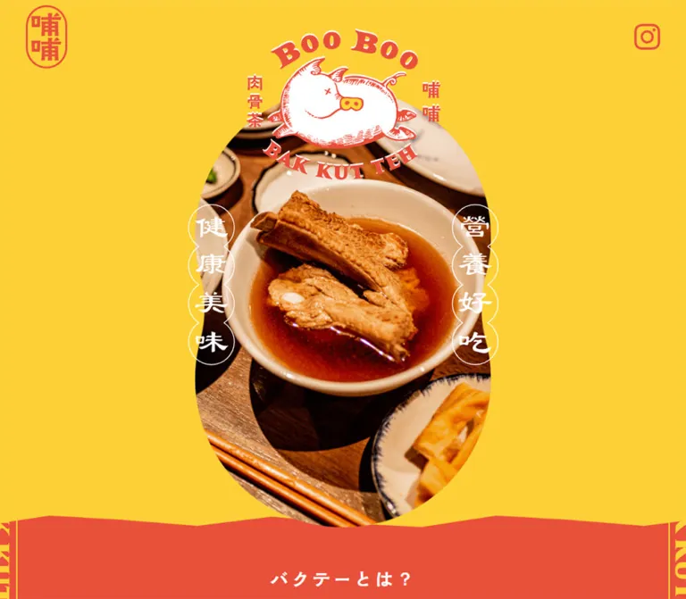
Opening Food Portrait
Role: establishes the restaurant through food, identity, and graphic framing.
The composition has four layers:
- A broad, uninterrupted yellow background.
- A tall centered capsule containing close-up food photography.
- The illustrated pig wordmark overlapping the capsule's upper arch.
- Two vertical chains of white outlined character medallions crossing its left and right edges.
The current photograph shows a branded white bowl of ribs, a stream of liquid being poured, garlic, ceramic side dishes, wood, and red printed table materials. The bowl occupies much of the lower-middle composition. Preserve that focal relationship when cropping.
At desktop width, the capsule is only about 39% of the viewport width. On the phone it occupies about 88%, leaving roughly 24px on either side. The pig identity remains large on mobile instead of shrinking in proportion to the entire desktop canvas.
The white side ornaments carry the source lettering 健康美味 and 營養好吃. Their circles are roughly 70px across on desktop and 55px on mobile. These are decorative graphic elements, not navigation controls.
Keep the photograph in its own clipping container. Applying overflow clipping to the whole composition would cut off the logo and the character medallions.
Corner Identity and Menu Control
Role: preserves orientation while the visitor moves through the long page.
The scrolled desktop and mobile captures show a vermilion stamp at the upper left and a small hand-drawn plus at the upper right. The stamp halves in width from 64px to 32px on mobile while retaining its 20px left and 12px top offsets. The plus remains visually prominent.
The opening captures do not visibly show this corner chrome. The evidence supports a difference between opening and scrolled presentation, but does not establish the exact scroll threshold or visibility logic.
The DOM contains links to #top, #intro, #menu, #store, #reserve, and #recruit, plus Instagram. In the sampled closed state, the navigation links sit offscreen: around x = 2430px on desktop and x = 585px on mobile. The menu was not opened in the supplied evidence. Its panel geometry, transition direction, focus handling, and close state remain unverified.
Persistent Reservation Seal
Role: provides a direct booking route throughout the page.
A vermilion burst with a thin white outline sits near the lower-right corner. The two-line white label reads 席を / 予約する. The shape is intentionally irregular, resembling a printed promotional seal rather than a geometric star icon.
Its desktop footprint is approximately 120px square; mobile reduces it to about 80px square. It appears in the same corner in opening, menu, and recruitment captures, supporting a persistent viewport-anchored presentation.
The recorded destination is https://www.tablecheck.com/ja/booboobkt/reserve/message. The link destination is verified; booking navigation and completion were not exercised.
The recorded inline anchor height is only 21px on desktop and 18px on mobile. Those rectangles describe text fragments, not the full visible seal. Do not use them as button-height measurements.
Restaurant Story and Venue Sequence
Role: introduces the Kyoto restaurant and its physical setting.
The opening story uses centered white paragraphs below the food portrait. A small illustrated garlic appears above the text in the mobile capture. The text column is 900px wide on desktop but only about 257px on mobile, making it notably narrower than the later 350px menu descriptions.
The DOM also records a venue sequence with five distinct captions and numbered markers. Captions describe the entrance businesses, interior, former freezer room, surviving butcher-shop details, and pig decorations. Repeated captions and offscreen coordinates are consistent with a gallery track containing repeated items.
The sampled desktop caption column is 380px wide; the mobile slide/caption width is 357px. Different captions occupy the visible range in the two samples. This supports a gallery-like structure, but does not prove autoplay, swipe controls, timing, or a particular gallery library.
Food Introduction and Benefits
Role: explains bak kut teh and presents three food-related themes.
The section uses a measured vermilion background and white introductory text. Its main heading, バクテーとは?, is 25px at both inspected widths. A second heading introduces three benefits using the display family.
Large 60px labels such as 健康營養, 国産豬肉, and 加湯免費 occupy tall boxes. Text and label positions alternate in the measured desktop layout, and the mobile layout retains narrow side labels beside 226px description columns.
The exact local backing shapes and illustration composition are not shown in the supplied original screenshots. Red description text is recorded within the section, but its immediate visual surface cannot be reconstructed confidently from the sampled transparent text elements alone.
A separate text-empty section, measured at 1200px high at both widths, follows this area. The evidence does not establish its visual contents or media behavior. Do not reproduce it as an arbitrary blank spacer or assume it is an autoplay video.
Menu Category and Featured Dish
Role: presents food as individual featured compositions with prices and descriptions.
The menu sits on yellow and has three recorded categories: bak kut teh, side dishes, and tea. The DOM contains six soup/main entries, nine side entries, and four tea entries. Several entries share coordinates, so this is not evidence of nineteen simultaneously visible cards.
The supplied desktop menu capture shows the side-dish category 單點小菜, with the smaller Japanese label サイドメニュー, a white oval behind the heading, and a small white pig silhouette above it. Four soup cutouts are visible higher in the frame, within the preceding menu area; they should not be mistaken for the site's primary navigation.
The featured side dish uses a strong two-part composition:
- Left: an isolated plate of greens, approximately 480px wide, with its natural cast shadow.
- Right: a centered display title, smaller Japanese dish name, compact rectangular price, and left-aligned description.
The visible price is ¥700. Its measured label is approximately 80.3 × 38px on desktop, with 10px horizontal padding, vermilion fill, and yellow 19px text. The description starts at x = 824px, has a 350px width, and uses 16px type on a 32px line height.
There is no enclosing card surface or generic shadow around the whole feature. The food, lettering, price, and copy sit directly on the yellow section.
On mobile, the recorded description moves to x = 20px, remains 350px wide, and uses 13px type. Prices are centered around the page midpoint. This supports a stacked detail arrangement, but a mobile menu screenshot was not supplied to verify the exact photograph crop and thumbnail layout.
Tea Story
Role: adds a slower editorial passage after the product presentations.
The DOM records a narrow centered text column headed お茶の話. Its body is 330px wide on desktop and 260px on mobile. The type is tighter than the general body rhythm: 33px line height on desktop and 22px on mobile.
This is a useful secondary layout pattern: a concentrated narrative column within a much larger color field. Its surrounding illustration or photographic framing is not established by the available screenshots.
Store Information and Reservations
Role: turns the visual introduction into practical visit planning.
The store section has a measured vermilion background, white text, four numbered gallery markers, and information for telephone, location, and opening hours. A map link is present. The exact information-table styling is not visible in the supplied captures.
The reservation section returns to yellow. Its content uses a 930px desktop wrapper and a 351px mobile wrapper. Recorded material includes party size, available booking times, a private-room explanation, booking instructions, and the action 今すぐ予約!.
Keep the distinction between the explanatory booking section and the persistent direct-booking seal. Both serve a useful purpose on a page of this length. The observed content structure does not establish an embedded booking form.
Recruitment Application Methods
Role: communicates hiring details with greater reading clarity.
Recruitment switches to a white background with vermilion text and thin yellow rules. The desktop application area is 930px wide. A centered 応募方法 label sits above a horizontal rule.
Below it, two columns explain email and postal applications. Their visible text starts around x = 305px and x = 770px. A thin vertical yellow divider separates the columns. The left side includes a square-cornered outlined requirements box with 必要事項 interrupting the top border.
That box is an informational callout, not an observed input form. It lists the requested application information and attachment requirement.
On mobile, the methods stack in reading order. The wrapper becomes approximately 351px wide with 19.5px side margins. The application instructions retain 16px text even though most other mobile copy uses 13px. The central vertical divider is absent from the visible mobile presentation.
Contact Ovals and Footer
Role: closes the recruitment section with clear contact routes and a branded ending.
Two wide vermilion ellipses contain white text: a small action label above an email address or telephone number. Desktop places the approximately 279 × 84px ovals side by side with about 60px between them. Mobile stacks approximately 240 × 74px ovals with about 30px between them.
The recorded links use mailto:hello@booboobkt.com and tel:075-211-1511. A small vermilion pig silhouette is centered below the actions, followed by substantial white space.
The footer returns to yellow with a shallow, uneven upper edge and a small vermilion copyright line. The mobile capture shows the persistent seal competing with the copyright region. A new implementation should provide clearance or wrapping rather than reproducing that overlap.
Tokens — Motion & Interaction
| Element or behavior | Evidence | What can be concluded |
|---|---|---|
| Body transition | Computed transition reports 2s |
A duration is declared; the changing property and trigger are not established |
| Header transition | Computed transition reports 0.2s |
A short header transition exists; its visual state change was not captured as a sequence |
| Other sampled elements | Frequently report transition: all |
This alone does not establish a nonzero duration or visible animation |
| Sampled CSS animations | Report none |
No named animation is reported on those sampled elements; descendants, pseudo-elements, video, and script behavior are not ruled out |
| Corner controls | Appear in scrolled screenshots | Persistent scrolled-page chrome is supported; reveal threshold is unknown |
| Venue gallery | Repeated captions, offscreen positions, numbered markers | Gallery structure is supported; autoplay, dragging, and timing are unverified |
| Menu features | Multiple entries occupy similar coordinates | Alternate-panel structure is suggested; selection mechanism and transitions are unverified |
| On-page navigation | Recorded hash destinations | Section targets are known; smooth scrolling was not tested |
| Booking/contact actions | Recorded external, mail, and telephone destinations | Intended destinations are known; activation was not tested |
| Hover, keyboard, menu-open state | No supplied interaction sequence | Treat as unverified |
The browser collection waited for load, image decoding, sampled stability, and finite animations within stated limits. Perpetual animations were paused during readiness checks and resumed afterward. Settled captures therefore should not be interpreted as proof that the page is static.
Recommended motion for an adaptation: use restrained 160–240ms feedback for controls and state changes. Do not add continuous rotation to the reservation seal, floating dishes, parallax, or automatic menu switching as though those behaviors were observed. Provide reduced-motion handling for any motion introduced.
Surfaces
| Layer | Appearance | Purpose |
|---|---|---|
| Yellow canvas | Flat saturated fill | Opening, menu, reservations, and footer |
| Vermilion chapter | Flat saturated fill with white copy | Food explanation and store information |
| White chapter | Plain white with red text and yellow rules | Recruitment and contact information |
| Food photography | Natural detail and real photographic shadows | Appetite and visual depth |
| Price label | Small square-cornered vermilion rectangle | Compact price emphasis |
| Contact action | Wide vermilion ellipse | Human, approachable contact route |
| Reservation seal | Irregular vermilion burst with white edge | Persistent booking access |
| Rules and ornaments | Thin yellow or white strokes | Grouping, rhythm, and identity |
There is no general card-elevation system in the supplied visual evidence. The shadows beneath dishes belong to the photographed presentation; they are not evidence of CSS shadows on every interactive component.
Imagery
The two main photographic modes are deliberately different. The opening uses an immersive table scene with a close crop. The menu uses isolated plates and bowls, lit strongly enough to produce clear cast shadows against yellow. Preserve those roles instead of applying a uniform rectangular image-card treatment everywhere.
The pig illustration is rounded, playful, and visibly drawn. Vermilion hatching and outlines sit against white fill, with small yellow details. Smaller pig silhouettes and a garlic illustration repeat the theme without needing additional colors.
The typography and artwork evoke restaurant signage and printed menus: curved lettering, compact bilingual labels, stamp shapes, and brush-like display forms. Keep decorative lettering separate from ordinary body copy so the text remains editable and readable.
Observed Asset References
Asset filenames and source paths were not included in the evidence. The following are visual references, not claimed file locations.
| Asset role | Observed treatment | Implementation guidance |
|---|---|---|
| Primary identity | Illustrated pig with curved English lettering and side characters | Use authorized artwork with its original proportions |
| Corner identity | Narrow vermilion stamp | Keep sharp at 64px and 32px widths |
| Opening photo | Rib soup with pouring liquid, garlic, wood, and branded ceramics | Preserve bowl placement within a tall capsule crop |
| Menu photographs | Isolated bowls and plates with cast shadows | Use clean cutouts or accurately matched backgrounds; retain natural shadows |
| Small ornaments | Pig silhouettes and garlic drawing | Use sparingly as section punctuation |
| Reservation seal | Irregular outlined burst | Prefer supplied artwork; CSS geometry is only an approximation |
| Footer edge | Shallow irregular zigzag | A small SVG or CSS shape can reproduce the structural idea |
Do not apply pixelated rendering to these assets. The food should remain photographic, and the illustration linework should remain crisp.
Layout & Responsive Behavior
The site keeps its long narrative structure across desktop and mobile. The desktop document is approximately 15,964px high; the mobile document is approximately 14,844px high in the sampled state. This difference should not be interpreted as evidence that mobile omits content.
| Relationship | Desktop observation | Mobile observation |
|---|---|---|
| Opening composition | Narrow central portrait with broad yellow margins | Portrait nearly fills the width, with the identity still prominent |
| Corner stamp | 64px wide | 32px wide |
| Booking seal | Approximately 120px | Approximately 80px |
| Body typography | 16px with 32px leading | 13px with 27px leading |
| Display hierarchy | 25px and 40px headings | Those principal sizes remain unchanged |
| Menu details | Image left, 350px description right | Description occupies the 350px content width below the upper feature content |
| Application methods | Two columns with central divider | One column; 16px application copy retained |
| Contact actions | Two horizontal ellipses | Two centered stacked ellipses |
| Reservation/recruitment padding | 60px / 100px | Both reduce to 30px |
The mobile layout is not a uniform scaled copy. It changes text size selectively, narrows some storytelling columns more than others, stacks practical content, and preserves large identity graphics.
Only two viewport widths were supplied. The exact breakpoint and intermediate/tablet behavior are unknown. The Quick Start uses a recommended 767px breakpoint and should be checked at intermediate widths before production.
Do’s and Don’ts
Do
- Use measured yellow
#fcd037, vermilion#e9503a, and white as the core palette. - Keep the opening photograph tall and centered, with generous desktop margins.
- Place the pig identity and white medallions outside the photo's clipping layer.
- Preserve separate roles for immersive table photography and isolated menu dishes.
- Let the menu breathe directly on the yellow surface.
- Keep prices compact, rectangular, and visually distinct from contact actions.
- Use wide ellipses for contact and an irregular burst for persistent reservations.
- Preserve the white recruitment chapter and its fine yellow rules.
- Retain the observed mobile exception that keeps application instructions at 16px.
- Support the whole restaurant journey: story, menu, location, reservations, and recruitment.
Don’t
- Do not turn the menu into a generic grid of rounded, elevated cards.
- Do not replace the pig artwork or curved identity lettering with an ordinary heading font.
- Do not stretch the opening photograph across the full desktop width.
- Do not add gradients, glass effects, or unrelated accent colors.
- Do not confuse photographic shadows with a site-wide CSS shadow treatment.
- Do not assume all text found in gallery or menu DOM nodes is visible simultaneously.
- Do not fabricate menu-open visuals, carousel timing, hover effects, or booking behavior.
- Do not copy tight display line heights into general multiline text without checking clipping.
- Do not let fixed controls obscure contact information or the footer on narrow screens.
- Do not substitute an empty spacer for the undocumented 1200px section.
Recommended Implementation Additions
These are recommendations for a new implementation, not verified original features.
- Give the plus control an accessible name,
aria-expanded, and a controlled navigation region. Ensure closed navigation is also unavailable to keyboard focus. - Use a single meaningful link for each contact ellipse and provide an adequate hit area around the small corner controls.
- Test contrast for vermilion-on-yellow, yellow-on-vermilion, and white-on-yellow text. The measured dark brown
#231815can support a more readable copy treatment where necessary. - Keep the illustrated brand treatment while offering semantic headings and meaningful text alternatives for important image lettering.
- Treat menu selections as keyboard-operable controls if alternate panels are implemented. Exclude duplicated gallery content from unnecessary screen-reader repetition.
- Add visible focus states, reduced-motion behavior, and sufficient scroll offset for fixed navigation.
- Reserve space around the mobile booking seal, particularly near contact information and copyright text.
- Supply responsive image sizes, explicit image dimensions, and suitable loading priorities. The opening image should not wait behind below-the-fold dish assets.
- Make prices, opening hours, booking details, and recruitment information editable content rather than decorative image text.
Agent Prompt Guide
Quick Color Reference
- Main yellow:
#fcd037. - Main vermilion:
#e9503a. - Reversed text, illustration fill, and outlines:
#ffffff. - Optional readable text color:
#231815, measured on underlying link elements. - Price: yellow text on a small vermilion rectangle.
- Contact: white text on a wide vermilion ellipse.
- Booking: white text on an irregular vermilion burst with a white edge.
- Recruitment: white background, vermilion text, yellow rules.
Overall Prompt
“Create a complete restaurant website inspired by BOO BOO BAK KUT TEH. Use saturated yellow #fcd037, vermilion #e9503a, and white. Begin with a narrow, tall capsule photograph of rib soup centered in a broad yellow field, with authorized pig-logo artwork overlapping the top and white character medallions beside the image. Follow with restaurant storytelling, a food explanation, generous menu features using isolated dish photography, store information, reservations, and a white recruitment section. Use the observed font families only when available and licensed: AraletStd-DB for body text, ShinGyoReiStdN-R for selected display headings, and baoli for prices. Keep contact links elliptical and a small burst-shaped reservation link fixed near the lower-right corner. Adapt the composition for mobile with stacked information, smaller corner branding, and carefully protected reading space.”
Example Component Prompts
- Opening composition: “A bright yellow restaurant opening with a tall central capsule photograph, a large illustrated pig identity overlapping the upper arch, and four overlapping white character medallions on each side. Keep generous desktop margins and preserve the bowl as the photographic focal point.”
- Featured dish: “An isolated plate of greens with a natural cast shadow on yellow. Put vermilion display lettering, a smaller Japanese dish name, a compact rectangular
¥700price, and a 350px description column to its right. No enclosing card, border, or interface shadow. Stack the detail beneath the image on mobile.” - Recruitment methods: “A white information section with vermilion copy, a centered application-method label above a thin yellow rule, and two desktop columns separated by a yellow line. Include a square requirements callout with its label interrupting the top border. Stack the methods on mobile and retain 16px instruction text.”
- Contact ending: “Two wide vermilion elliptical links with white label-over-value text, followed by a small pig silhouette and generous white space. End with a yellow footer having a shallow uneven top edge. On mobile, stack the links and keep the reservation seal clear of the footer text.”
- Navigation behavior: “Use the observed small corner stamp and hand-drawn plus as the closed navigation presentation. Design an accessible open state as a clearly identified addition, with keyboard support and visible focus. Do not claim an unobserved source animation or menu layout.”
Quick Start
CSS Custom Properties
This is a practical adaptation of the measured palette, typography, and responsive relationships. It is not recovered source CSS. Photo proportions, ornamental geometry, the 767px breakpoint, focus treatment, and control feedback are recommendations. Licensed artwork and font files must be supplied separately.
:root {
  /* Measured colors */
  --color-yellow: #fcd037;
  --color-vermilion: #e9503a;
  --color-white: #ffffff;
  --color-readable: #231815;

  /* Observed family names with recommended generic fallbacks */
  --font-body: 'AraletStd-DB', sans-serif;
  --font-display: 'ShinGyoReiStdN-R', serif;
  --font-price: 'baoli', serif;

  /* Measured desktop text values */
  --text-body: 16px;
  --leading-body: 32px;
  --tracking-body: 0.96px;
  --text-heading: 25px;
  --text-category: 40px;
  --text-price: 19px;
  --leading-price: 38px;

  /* Reusable layout aliases */
  --content-width: 930px;
  --dish-copy-width: 350px;
  --page-gutter: 20px;
  --rule-width: 1px;
  --seal-size: 120px;
  --seal-inset: 20px;
  --feedback-time: 180ms;
}

* {
  box-sizing: border-box;
}

body {
  margin: 0;
  color: var(--color-vermilion);
  background: var(--color-white);
  font-family: var(--font-body);
  font-size: var(--text-body);
  font-weight: 400;
  line-height: var(--leading-body);
  letter-spacing: var(--tracking-body);
}

img {
  display: block;
  max-width: 100%;
}

button,
input {
  font: inherit;
}

button,
a {
  -webkit-tap-highlight-color: transparent;
}

[hidden] {
  display: none !important;
}

.container {
  width: min(var(--content-width), calc(100% - 40px));
  margin-inline: auto;
}

section[id] {
  scroll-margin-top: 90px;
}

.surface-yellow {
  color: var(--color-vermilion);
  background: var(--color-yellow);
}

.surface-vermilion {
  color: var(--color-white);
  background: var(--color-vermilion);
}

.surface-white {
  color: var(--color-vermilion);
  background: var(--color-white);
}

/* The top notice links to the on-page reservation section. */
.reservation-notice {
  display: grid;
  min-height: 51px;
  place-items: center;
  padding: 10px;
  color: var(--color-white);
  background: var(--color-vermilion);
  font-size: 15px;
  line-height: 30px;
  text-align: center;
  text-decoration: none;
}

/* Recommended geometry based on the supplied opening captures. */
.hero {
  padding: 144px 0 80px;
  background: var(--color-yellow);
}

.hero-portrait {
  position: relative;
  width: min(560px, calc(100% - 48px));
  margin-inline: auto;
  aspect-ratio: 7 / 10;
}

.hero-photo {
  width: 100%;
  height: 100%;
  overflow: hidden;
  border-radius: 999px;
}

.hero-photo img {
  width: 100%;
  height: 100%;
  object-fit: cover;
  object-position: center;
}

.hero-wordmark {
  position: absolute;
  z-index: 2;
  top: -100px;
  left: 50%;
  width: 300px;
  max-width: 80%;
  transform: translateX(-50%);
}

/* Live-text approximation; authorized ornament artwork is preferable. */
.hero-medallions {
  position: absolute;
  top: 52%;
  display: flex;
  flex-direction: column;
  color: var(--color-white);
  transform: translateY(-50%);
}

.hero-medallions.is-left {
  left: -20px;
}

.hero-medallions.is-right {
  right: -20px;
}

.hero-medallions span {
  display: grid;
  width: 72px;
  height: 72px;
  place-items: center;
  border: 1px solid currentColor;
  border-radius: 50%;
  font-family: var(--font-display);
  font-size: 40px;
  line-height: 1;
}

.hero-medallions span + span {
  margin-top: -12px;
}

.hero-story {
  width: min(900px, calc(100% - 40px));
  margin: 100px auto 0;
  color: var(--color-white);
  text-align: center;
}

/* Apply opening/scrolled visibility through application state. */
.corner-brand {
  position: fixed;
  z-index: 30;
  top: 12px;
  left: 20px;
  width: 64px;
}

.menu-toggle {
  position: fixed;
  z-index: 30;
  top: 8px;
  right: 14px;
  display: grid;
  width: 44px;
  height: 44px;
  place-items: center;
  padding: 7px;
  border: 0;
  color: var(--color-vermilion);
  background: transparent;
  cursor: pointer;
}

/* Supply the illustrated plus inside the button. */
.menu-toggle svg,
.menu-toggle img {
  width: 30px;
  height: 30px;
}

/* Polygon fallback for the illustrated reservation seal. */
.reserve-seal {
  --burst: polygon(
    50% 0%, 59% 16%, 75% 5%, 77% 25%,
    97% 28%, 85% 44%, 100% 58%, 80% 65%,
    83% 86%, 63% 80%, 51% 100%, 41% 82%,
    22% 94%, 21% 73%, 1% 70%, 15% 54%,
    0% 40%, 20% 34%, 17% 13%, 37% 21%
  );
  position: fixed;
  z-index: 40;
  right: max(var(--seal-inset), env(safe-area-inset-right, 0px));
  bottom: max(var(--seal-inset), env(safe-area-inset-bottom, 0px));
  isolation: isolate;
  display: grid;
  width: var(--seal-size);
  height: var(--seal-size);
  place-content: center;
  padding: 20px;
  color: var(--color-white);
  font-size: var(--text-body);
  line-height: 1.2;
  text-align: center;
  text-decoration: none;
}

.reserve-seal::before,
.reserve-seal::after {
  position: absolute;
  content: '';
  clip-path: var(--burst);
}

.reserve-seal::before {
  z-index: -2;
  inset: 0;
  background: var(--color-white);
}

.reserve-seal::after {
  z-index: -1;
  inset: 2px;
  background: var(--color-vermilion);
}

.introduction-section {
  padding-block: 64px;
}

.menu-section,
.store-section {
  padding-block: 80px;
}

.reservation-section {
  padding-block: 60px;
}

.recruitment-section {
  padding-block: 100px;
}

.section-heading {
  margin: 0;
  font-size: var(--text-heading);
  font-weight: 700;
  line-height: 32px;
  letter-spacing: 2px;
  text-align: center;
}

.menu-category {
  position: relative;
  isolation: isolate;
  width: fit-content;
  max-width: calc(100% - 40px);
  margin: 60px auto;
  padding-inline: 12px;
  font-family: var(--font-display);
  font-size: var(--text-category);
  font-weight: 700;
  line-height: 1.1;
  letter-spacing: 1.6px;
  text-align: center;
}

.menu-category::before {
  position: absolute;
  z-index: -1;
  inset: 3px 12px;
  border-radius: 50%;
  background: var(--color-white);
  content: '';
}

.menu-category small {
  display: block;
  font-family: var(--font-body);
  font-size: 12px;
  line-height: 16px;
  letter-spacing: 1px;
}

.featured-dish {
  display: grid;
  grid-template-columns: minmax(0, 1fr) var(--dish-copy-width);
  gap: 80px;
  align-items: center;
}

.dish-image {
  width: 100%;
  max-width: 480px;
  height: auto;
  margin-inline: auto;
}

.dish-details {
  min-width: 0;
  text-align: center;
}

.dish-title {
  margin: 0;
  font-family: var(--font-display);
  font-size: 36px;
  line-height: 1.2;
}

.dish-subtitle {
  margin: 0;
  font-size: 13px;
  line-height: 24px;
}

.price {
  display: inline-block;
  margin: 14px 0 20px;
  padding-inline: 10px;
  border-radius: 0;
  color: var(--color-yellow);
  background: var(--color-vermilion);
  font-family: var(--font-price);
  font-size: var(--text-price);
  line-height: var(--leading-price);
}

.dish-description {
  margin: 0;
  text-align: left;
}

.tea-story {
  width: min(330px, calc(100% - 40px));
  margin-inline: auto;
  line-height: 33px;
}

.application-heading {
  margin: 0 0 40px;
  border-bottom: var(--rule-width) solid var(--color-yellow);
  font: inherit;
  text-align: center;
}

.application-columns {
  display: grid;
  grid-template-columns: repeat(2, minmax(0, 1fr));
}

.application-method {
  min-width: 0;
  padding: 30px 50px;
  font-size: 16px;
}

.application-method + .application-method {
  border-left: var(--rule-width) solid var(--color-yellow);
}

.requirements {
  position: relative;
  margin-top: 32px;
  padding: 30px 20px 20px;
  border: var(--rule-width) solid var(--color-yellow);
  text-align: center;
}

.requirements-title {
  position: absolute;
  top: -16px;
  left: 50%;
  width: 100px;
  margin: 0;
  background: var(--color-white);
  font: inherit;
  transform: translateX(-50%);
}

.requirements p {
  margin: 0;
}

.contact-actions {
  display: flex;
  justify-content: center;
  gap: 60px;
  margin-top: 50px;
}

.contact-oval {
  display: grid;
  width: 279px;
  min-height: 84px;
  place-content: center;
  padding: 10px 20px;
  border-radius: 50%;
  color: var(--color-white);
  background: var(--color-vermilion);
  text-align: center;
  text-decoration: none;
}

.contact-oval span {
  display: block;
}

.site-footer {
  position: relative;
  min-height: 72px;
  padding: 20px 20px 32px;
  color: var(--color-vermilion);
  background: var(--color-yellow);
  font-size: 13px;
  line-height: 20px;
  text-align: center;
}

.site-footer::before {
  position: absolute;
  inset: -19px 0 auto;
  height: 20px;
  background: inherit;
  clip-path: polygon(
    0 40%, 10% 90%, 19% 0, 34% 80%, 43% 10%,
    58% 90%, 67% 0, 82% 80%, 92% 10%,
    100% 60%, 100% 100%, 0 100%
  );
  content: '';
}

/* Optional readability enhancement for long copy. */
.readable-copy {
  color: var(--color-readable);
}

/* Recommended interaction additions, not observed source states. */
a:focus-visible,
button:focus-visible {
  outline: 3px solid var(--color-readable);
  outline-offset: 5px;
}

.contact-oval,
.reserve-seal {
  transition: opacity var(--feedback-time) ease;
}

@media (hover: hover) {
  .contact-oval:hover,
  .reserve-seal:hover {
    opacity: 0.88;
  }
}

@media (max-width: 767px) {
  :root {
    --text-body: 13px;
    --leading-body: 27px;
    --tracking-body: 1.04px;
    --leading-price: 27px;
    --seal-size: 80px;
    --seal-inset: 10px;
  }

  .reservation-notice {
    min-height: 48px;
    line-height: 27px;
  }

  .hero {
    padding-top: 128px;
  }

  .hero-portrait {
    aspect-ratio: 2 / 3;
  }

  .hero-wordmark {
    top: -84px;
    width: 240px;
  }

  .hero-medallions.is-left {
    left: -6px;
  }

  .hero-medallions.is-right {
    right: -6px;
  }

  .hero-medallions span {
    width: 56px;
    height: 56px;
    font-size: 32px;
  }

  .hero-medallions span + span {
    margin-top: -8px;
  }

  .hero-story {
    width: 66%;
    margin-top: 60px;
  }

  .corner-brand {
    width: 32px;
  }

  .reserve-seal {
    padding: 14px;
  }

  .featured-dish {
    grid-template-columns: minmax(0, 1fr);
    gap: 28px;
  }

  .dish-details {
    width: min(350px, 100%);
    margin-inline: auto;
  }

  .tea-story {
    width: min(260px, calc(100% - 40px));
    line-height: 22px;
  }

  .reservation-section,
  .recruitment-section {
    padding-block: 30px;
  }

  .reservation-section .container,
  .recruitment-section .container {
    width: 90%;
  }

  .application-columns {
    grid-template-columns: minmax(0, 1fr);
    gap: 40px;
  }

  .application-method {
    padding: 20px 0;
    font-size: 16px;
  }

  .application-method + .application-method {
    border-left: 0;
  }

  .contact-actions {
    flex-direction: column;
    align-items: center;
    gap: 30px;
  }

  .contact-oval {
    width: min(240px, 100%);
    min-height: 74px;
  }

  /* Additional clearance protects footer text from the fixed seal. */
  .site-footer {
    padding-bottom: 110px;
    overflow-wrap: anywhere;
  }

  .site-footer::before {
    top: -11px;
    height: 12px;
  }
}

@media (prefers-reduced-motion: reduce) {
  .contact-oval,
  .reserve-seal {
    transition: none;
  }
}
The CSS supplies the visual foundation, not gallery logic, menu visibility behavior, media playback, or booking integration. The normal display-heading line heights and mobile footer clearance intentionally improve robustness rather than reproducing every source constraint.
Tailwind v4 Token Mapping
Optional aliases for an existing Tailwind v4 project. This is not evidence that the original website uses Tailwind. Define the variables above first.
@theme inline {
  --color-restaurant-yellow: var(--color-yellow);
  --color-restaurant-vermilion: var(--color-vermilion);
  --color-restaurant-white: var(--color-white);
  --color-restaurant-readable: var(--color-readable);

  --font-restaurant-body: var(--font-body);
  --font-restaurant-display: var(--font-display);
  --font-restaurant-price: var(--font-price);

  --text-restaurant-body: var(--text-body);
  --text-restaurant-heading: var(--text-heading);
  --text-restaurant-category: var(--text-category);
  --text-restaurant-price: var(--text-price);

  --spacing-page-gutter: var(--page-gutter);
  --spacing-content: var(--content-width);
  --spacing-dish-copy: var(--dish-copy-width);
  --spacing-reservation-seal: var(--seal-size);
}
Sources & Evidence
- Original and final website: https://booboobkt.com/. The supplied browser observation reports HTTP 200 and no URL change.
- Capture record: evidence retrieved September 29, 2026 at 12:41:29.731 UTC. Separate timestamps for each individual screenshot were not supplied.
- Desktop evidence: 1440 × 1000 opening, menu-area, and recruitment/footer captures; rendered DOM, links, computed typography, colors, padding, transitions, and element rectangles.
- Mobile evidence: 390 × 844 opening and recruitment/footer captures; corresponding rendered DOM and computed-style samples.
- Recorded page targets:
#top,#intro,#menu,#store,#reserve, and#recruiton the original domain. Booking, map, Instagram, email, and telephone destinations were recorded as links, not independently visited. - Inspection method: supplied browser collection waited for document load, sampled layout/text stability, visible image decoding, and finite animation settling within time limits, and traversed intermediate scroll positions. SharedWorkers and service workers were disabled during collection.
- Limitations: no additional browsing or execution was performed for this reference. Open navigation, hover/focus states, gallery controls, animation sequences, media behavior, tablet layouts, and completed external actions were not available for verification. Asset URLs and font files were not provided. The CSS and recommendations above are an adaptation of the current evidence, not a reconstruction of undocumented states.
# BOO BOO BAK KUT TEH — Style Reference

> A sunny restaurant signboard brought to the web through vermilion lettering, pig illustrations, and generous servings of food photography.

**Original URL:** [https://booboobkt.com/](https://booboobkt.com/)
**Final URL:** [https://booboobkt.com/](https://booboobkt.com/)
**Theme:** bright yellow and vermilion sections, with white used for illustration details and the recruitment area.
**Inspected:** September 29, 2026. Supplied browser evidence was retrieved at 12:41:29.731 UTC, or 21:41:29.731 JST.
**Viewports:** 1440 × 1000 desktop and 390 × 844 mobile, in CSS pixels.
**Scope:** the current restaurant homepage, including its opening composition, restaurant introduction, food explanation, menu, tea story, store information, reservations, recruitment, and footer. Direct visual evidence covers the desktop and mobile opening, a desktop menu feature, and desktop/mobile recruitment endings. Other sections are described only to the extent supported by the supplied rendered DOM and computed styles.

BOO BOO BAK KUT TEH combines the warmth of a neighborhood restaurant with the graphic energy of a printed menu. Its main colors are a saturated yellow and a warm vermilion. White bowls, white illustration fills, and white lettering keep the compositions crisp. The identity comes from a hand-drawn pig, curved English logo lettering, Chinese-character display labels, and Japanese explanatory copy.

This is a long restaurant website serving several purposes: introducing the food, showing dishes and prices, explaining the venue, accepting reservations, and recruiting staff. The opening is an unusually narrow, tall food portrait centered in a broad yellow field. Further down, isolated dishes sit directly on the background, while recruitment switches to a quieter white surface. A small reservation seal remains available near the lower-right corner.
閉じる
# BOO BOO BAK KUT TEH — Style Reference

> A sunny restaurant signboard brought to the web through vermilion lettering, pig illustrations, and generous servings of food photography.

**Original URL:** [https://booboobkt.com/](https://booboobkt.com/)
**Final URL:** [https://booboobkt.com/](https://booboobkt.com/)
**Theme:** bright yellow and vermilion sections, with white used for illustration details and the recruitment area.
**Inspected:** September 29, 2026. Supplied browser evidence was retrieved at 12:41:29.731 UTC, or 21:41:29.731 JST.
**Viewports:** 1440 × 1000 desktop and 390 × 844 mobile, in CSS pixels.
**Scope:** the current restaurant homepage, including its opening composition, restaurant introduction, food explanation, menu, tea story, store information, reservations, recruitment, and footer. Direct visual evidence covers the desktop and mobile opening, a desktop menu feature, and desktop/mobile recruitment endings. Other sections are described only to the extent supported by the supplied rendered DOM and computed styles.

BOO BOO BAK KUT TEH combines the warmth of a neighborhood restaurant with the graphic energy of a printed menu. Its main colors are a saturated yellow and a warm vermilion. White bowls, white illustration fills, and white lettering keep the compositions crisp. The identity comes from a hand-drawn pig, curved English logo lettering, Chinese-character display labels, and Japanese explanatory copy.

This is a long restaurant website serving several purposes: introducing the food, showing dishes and prices, explaining the venue, accepting reservations, and recruiting staff. The opening is an unusually narrow, tall food portrait centered in a broad yellow field. Further down, isolated dishes sit directly on the background, while recruitment switches to a quieter white surface. A small reservation seal remains available near the lower-right corner.

## How to Read This Reference

- **Measured** means a value appears in the supplied computed-style or element-rectangle evidence. Values are CSS pixels unless stated otherwise.
- **Visual estimate** means a dimension or shape is estimated from an original-page screenshot. These estimates are useful for composition, but are not recovered source declarations.
- **Recommended** means an implementation choice for a new build. The CSS examples, semantic tokens, fallback fonts, breakpoint, and accessibility additions fall into this category unless explicitly identified as measured.
- The provided `customProperties` collection is empty. Token names in this document are new descriptive aliases, not original variable names.
- The DOM contains offscreen navigation, repeated gallery captions, and menu panels sharing similar coordinates. Their presence does not establish that all those elements were simultaneously visible.
- Computed font-family names are available, but font files, licensing, and per-glyph font resolution were not independently inspected.

## Tokens — Colors

### Default Palette

| Name | Value | Suggested token | Evidence and role |
| --- | --- | --- | --- |
| Restaurant Yellow | `#fcd037` | `--color-yellow` | Measured as `rgb(252, 208, 55)` on menu, reservation, and footer backgrounds; also used for prices on vermilion |
| Vermilion | `#e9503a` | `--color-vermilion` | Measured as `rgb(233, 80, 58)` on the reservation notice, introduction/store sections, body copy, and price labels |
| White | `#ffffff` | `--color-white` | Measured recruitment background and reversed text; visibly used in logo artwork and decorative outlines |
| Dark Brown | `#231815` | `--color-readable` | Measured on several link elements; an underlying text color rather than a dominant visible brand surface |

Use the measured colors for implementation. Screenshot display, image content, and color handling can affect their apparent appearance; visually guessing a different yellow is unnecessary when computed values are available.

### Section Color Assignments

| Region | Background | Foreground | Evidence |
| --- | --- | --- | --- |
| Opening | Yellow | White illustration details, vermilion identity | Original desktop/mobile captures |
| Reservation notice | Vermilion | White | Captures and computed styles |
| Food introduction | Vermilion | White, with yellow benefit labels | Computed styles; local inner surfaces are not fully documented |
| Menu | Yellow | Vermilion | Desktop capture and computed styles |
| Store information | Vermilion | White | Computed styles |
| Reservations | Yellow | Vermilion | Computed styles |
| Recruitment | White | Vermilion, yellow rules | Captures and computed styles |
| Footer | Yellow | Vermilion | Captures and computed styles |

The palette changes by section. No user-selectable theme mechanism is evidenced. Photography provides greens, browns, cream ceramic tones, and deeper shadows without introducing additional interface accent colors.

## Tokens — Typography

### Main Text — `AraletStd-DB`

The computed body family is `AraletStd-DB`, with weight `400`. Its compact, distinctive Japanese forms carry both practical information and much of the restaurant's personality.

- **Desktop body:** `16px`, `32px` line height, `0.96px` tracking.
- **Mobile body:** `13px`, `27px` line height, `1.04px` tracking.
- **Important exception:** mobile recruitment application instructions remain `16px`, with `27px` line height and inherited `1.04px` tracking.
- **Suggested alias:** `--font-body: 'AraletStd-DB', sans-serif`.

The fallback is a recommendation. Simply naming the observed font does not supply its webfont files.

### Display Text — `ShinGyoReiStdN-R`

This measured family appears on the food-benefits heading and menu category headings. It contributes a calligraphic character distinct from the body face.

- The benefits heading uses `25px`, weight `700`, `32px` line height, and `2px` tracking.
- Menu category headings use `40px`, weight `700`, and `1.6px` tracking at both inspected widths.
- Their parent line height is an unusually tight `15px`, while the measured heading box is `41px` high. This is a composed heading with subordinate text; do not apply that line height indiscriminately to ordinary multiline headings.
- **Suggested alias:** `--font-display: 'ShinGyoReiStdN-R', serif`.

### Prices — `baoli`

Prices have their own measured family, `baoli`, at `19px` and weight `400`. Yellow numerals sit in compact, rectangular vermilion labels. Their size stays constant between desktop and mobile, while the line height changes.

### Logo and Illustrated Lettering

The large pig identity, curved English lettering, corner stamp, and some decorative labels are visually composed artwork. Empty-text heading elements occur in the DOM, but their computed heading font sizes do not describe the visible artwork. Do not rebuild the identity by treating the browser's heading font as its logo typeface.

### Type Scale

| Role | Desktop | Mobile | Tracking / family | Status |
| --- | --- | --- | --- | --- |
| Standard body | `16 / 32px` | `13 / 27px` | `0.96px` / `1.04px`; `AraletStd-DB` | Measured |
| Top reservation notice | `15 / 30px` | `15 / 27px` | Inherited tracking; `AraletStd-DB` | Measured |
| Fixed reservation label | `16 / 19.2px` | `13 / 15.6px` | `AraletStd-DB` | Measured text style |
| Food introduction heading | `25 / 32px` | `25 / 32px` | `2px`; `AraletStd-DB`, weight `700` | Measured |
| Benefits heading | `25 / 32px` | `25 / 32px` | `2px`; `ShinGyoReiStdN-R`, weight `700` | Measured |
| Menu category heading | `40px` | `40px` | `1.6px`; `ShinGyoReiStdN-R` | Measured; composed line layout |
| Tall benefit labels | `60px` | `60px` | `AraletStd-DB` | Measured; narrow/tall layout boxes |
| Price | `19 / 38px` | `19 / 27px` | `baoli` | Measured |
| Tea-story heading | `40 / 33px` | `40 / 22px` | `AraletStd-DB` | Measured; tight source line box |
| Tea-story body | `16 / 33px` | `13 / 22px` | `AraletStd-DB` | Measured |
| Application instructions | `16 / 32px` | `16 / 27px` | `AraletStd-DB` | Measured |
| Contact oval text | `16 / 32px` | `13 / 27px` | `AraletStd-DB` | Measured |

The source root font size is `10px` at both widths. The Quick Start keeps a conventional root and uses explicit pixel tokens; it does not depend on the source's rem interpretation.

## Tokens — Spacing & Shapes

The layout alternates large open fields with carefully grouped content. There is no evidence of a universal spacing grid, but repeated values include 10px text insets, approximately 20px mobile gutters, and 60–100px section padding.

### Measured Section Padding

| Section | Desktop vertical padding | Mobile vertical padding |
| --- | --- | --- |
| Food introduction | `64px` | `64px` |
| Menu | `80px` | `80px` |
| Store information | `80px` | `80px` |
| Reservations | `60px` | `30px` |
| Recruitment | `100px` | `30px` |

These are section-level values, not the complete distance between headings, illustrations, photographs, and paragraphs.

### Layout Measurements

| Element | Desktop at 1440px | Mobile at 390px | Evidence |
| --- | --- | --- | --- |
| Document height | `15,963.69px` | `14,843.95px` | Measured rendered state |
| Top notice height | `51px` | `48px` | Measured |
| Corner identity box | `64 × 97.73px` | `32 × 48.86px` | Measured heading wrapper, corroborated visually |
| Corner identity position | `20px` left, `12px` top | Same | Measured wrapper position |
| Opening photo | About `560px` wide and `800px` tall | About `342px` wide and `520px` tall | Visual estimate; desktop lower edge reaches the capture boundary |
| Large opening logo | About `300px` wide | About `240px` wide | Visual estimate |
| Reservation seal | About `120 × 120px` | About `80 × 80px` | Visual estimate; link widths support the width values |
| Reservation seal edge clearance | About `20px` right/bottom | About `10px` right/bottom | Visual estimate |
| Opening story text | `900px` wide | `256.75px` wide | Measured |
| Featured menu description | `350px` wide | `350px` wide | Measured; mobile starts at `x = 20px` |
| Tea-story body column | `330px` wide | `260px` wide | Measured |
| Reservation/recruitment wrapper | `930px` wide | `351px` wide | Measured; mobile is 90% of viewport width |
| Contact oval width | `279px` | `240px` | Measured content/link width, visually consistent with fill |
| Contact oval height | About `84px` | About `74px` | Visual estimate |
| Footer box | `72px` high | `72px` high | Measured; decorative upper edge extends beyond the plain box |

### Shape Vocabulary

| Shape | Where it appears | Implementation guidance |
| --- | --- | --- |
| Tall capsule | Opening food photograph | Round the ends while retaining a long central body; keep logo and ornaments outside the image clipping layer |
| Overlapping outlined circles | White character ornaments beside the opening photograph | Use a vertical chain of four medallions, slightly overlapping |
| Narrow oval stamp | Upper-left identity | Preserve the supplied illustrated mark |
| White horizontal oval | Backing behind the visible side-menu category title | Keep it small and subordinate to the lettering |
| Flat rectangle | Price labels and application requirements | Square corners; no elevation |
| Wide ellipse | Email and telephone actions | Use `border-radius: 50%`, not a conventional pill with straight central edges |
| Irregular burst | Persistent reservation action | Vermilion fill with a thin white outline |
| Shallow uneven zigzag | Footer boundary | A low-amplitude decorative edge, not a large wave |

Fine yellow rules organize the recruitment content. Their visible thickness is approximately 1–2px; the supplied element samples do not establish the exact border declaration.

## Components

### Reservation Notice

**Role:** announces online booking and links to the reservation section.

A full-width vermilion strip sits at the very top of the opening. Its visible label is `RESERVE お席のオンライン予約受付中!`, centered in white. The paragraph has measured `10px` padding and `15px` type at both viewport widths. The strip is 51px high on desktop and 48px on mobile.

The destination is the on-page `#reserve` section. This differs from the floating reservation seal, whose destination is the external booking service. The top notice is absent from the supplied lower-page captures, so it should not be treated as a persistent booking toolbar.

### Opening Food Portrait

**Role:** establishes the restaurant through food, identity, and graphic framing.

The composition has four layers:

1. A broad, uninterrupted yellow background.
2. A tall centered capsule containing close-up food photography.
3. The illustrated pig wordmark overlapping the capsule's upper arch.
4. Two vertical chains of white outlined character medallions crossing its left and right edges.

The current photograph shows a branded white bowl of ribs, a stream of liquid being poured, garlic, ceramic side dishes, wood, and red printed table materials. The bowl occupies much of the lower-middle composition. Preserve that focal relationship when cropping.

At desktop width, the capsule is only about 39% of the viewport width. On the phone it occupies about 88%, leaving roughly 24px on either side. The pig identity remains large on mobile instead of shrinking in proportion to the entire desktop canvas.

The white side ornaments carry the source lettering `健康美味` and `營養好吃`. Their circles are roughly 70px across on desktop and 55px on mobile. These are decorative graphic elements, not navigation controls.

Keep the photograph in its own clipping container. Applying overflow clipping to the whole composition would cut off the logo and the character medallions.

### Corner Identity and Menu Control

**Role:** preserves orientation while the visitor moves through the long page.

The scrolled desktop and mobile captures show a vermilion stamp at the upper left and a small hand-drawn plus at the upper right. The stamp halves in width from 64px to 32px on mobile while retaining its 20px left and 12px top offsets. The plus remains visually prominent.

The opening captures do not visibly show this corner chrome. The evidence supports a difference between opening and scrolled presentation, but does not establish the exact scroll threshold or visibility logic.

The DOM contains links to `#top`, `#intro`, `#menu`, `#store`, `#reserve`, and `#recruit`, plus Instagram. In the sampled closed state, the navigation links sit offscreen: around `x = 2430px` on desktop and `x = 585px` on mobile. The menu was not opened in the supplied evidence. Its panel geometry, transition direction, focus handling, and close state remain unverified.

### Persistent Reservation Seal

**Role:** provides a direct booking route throughout the page.

A vermilion burst with a thin white outline sits near the lower-right corner. The two-line white label reads `席を` / `予約する`. The shape is intentionally irregular, resembling a printed promotional seal rather than a geometric star icon.

Its desktop footprint is approximately 120px square; mobile reduces it to about 80px square. It appears in the same corner in opening, menu, and recruitment captures, supporting a persistent viewport-anchored presentation.

The recorded destination is `https://www.tablecheck.com/ja/booboobkt/reserve/message`. The link destination is verified; booking navigation and completion were not exercised.

The recorded inline anchor height is only 21px on desktop and 18px on mobile. Those rectangles describe text fragments, not the full visible seal. Do not use them as button-height measurements.

### Restaurant Story and Venue Sequence

**Role:** introduces the Kyoto restaurant and its physical setting.

The opening story uses centered white paragraphs below the food portrait. A small illustrated garlic appears above the text in the mobile capture. The text column is 900px wide on desktop but only about 257px on mobile, making it notably narrower than the later 350px menu descriptions.

The DOM also records a venue sequence with five distinct captions and numbered markers. Captions describe the entrance businesses, interior, former freezer room, surviving butcher-shop details, and pig decorations. Repeated captions and offscreen coordinates are consistent with a gallery track containing repeated items.

The sampled desktop caption column is 380px wide; the mobile slide/caption width is 357px. Different captions occupy the visible range in the two samples. This supports a gallery-like structure, but does not prove autoplay, swipe controls, timing, or a particular gallery library.

### Food Introduction and Benefits

**Role:** explains bak kut teh and presents three food-related themes.

The section uses a measured vermilion background and white introductory text. Its main heading, `バクテーとは?`, is 25px at both inspected widths. A second heading introduces three benefits using the display family.

Large 60px labels such as `健康營養`, `国産豬肉`, and `加湯免費` occupy tall boxes. Text and label positions alternate in the measured desktop layout, and the mobile layout retains narrow side labels beside 226px description columns.

The exact local backing shapes and illustration composition are not shown in the supplied original screenshots. Red description text is recorded within the section, but its immediate visual surface cannot be reconstructed confidently from the sampled transparent text elements alone.

A separate text-empty section, measured at 1200px high at both widths, follows this area. The evidence does not establish its visual contents or media behavior. Do not reproduce it as an arbitrary blank spacer or assume it is an autoplay video.

### Menu Category and Featured Dish

**Role:** presents food as individual featured compositions with prices and descriptions.

The menu sits on yellow and has three recorded categories: bak kut teh, side dishes, and tea. The DOM contains six soup/main entries, nine side entries, and four tea entries. Several entries share coordinates, so this is not evidence of nineteen simultaneously visible cards.

The supplied desktop menu capture shows the side-dish category `單點小菜`, with the smaller Japanese label `サイドメニュー`, a white oval behind the heading, and a small white pig silhouette above it. Four soup cutouts are visible higher in the frame, within the preceding menu area; they should not be mistaken for the site's primary navigation.

The featured side dish uses a strong two-part composition:

- **Left:** an isolated plate of greens, approximately 480px wide, with its natural cast shadow.
- **Right:** a centered display title, smaller Japanese dish name, compact rectangular price, and left-aligned description.

The visible price is `¥700`. Its measured label is approximately 80.3 × 38px on desktop, with 10px horizontal padding, vermilion fill, and yellow 19px text. The description starts at `x = 824px`, has a 350px width, and uses 16px type on a 32px line height.

There is no enclosing card surface or generic shadow around the whole feature. The food, lettering, price, and copy sit directly on the yellow section.

On mobile, the recorded description moves to `x = 20px`, remains 350px wide, and uses 13px type. Prices are centered around the page midpoint. This supports a stacked detail arrangement, but a mobile menu screenshot was not supplied to verify the exact photograph crop and thumbnail layout.

### Tea Story

**Role:** adds a slower editorial passage after the product presentations.

The DOM records a narrow centered text column headed `お茶の話`. Its body is 330px wide on desktop and 260px on mobile. The type is tighter than the general body rhythm: 33px line height on desktop and 22px on mobile.

This is a useful secondary layout pattern: a concentrated narrative column within a much larger color field. Its surrounding illustration or photographic framing is not established by the available screenshots.

### Store Information and Reservations

**Role:** turns the visual introduction into practical visit planning.

The store section has a measured vermilion background, white text, four numbered gallery markers, and information for telephone, location, and opening hours. A map link is present. The exact information-table styling is not visible in the supplied captures.

The reservation section returns to yellow. Its content uses a 930px desktop wrapper and a 351px mobile wrapper. Recorded material includes party size, available booking times, a private-room explanation, booking instructions, and the action `今すぐ予約!`.

Keep the distinction between the explanatory booking section and the persistent direct-booking seal. Both serve a useful purpose on a page of this length. The observed content structure does not establish an embedded booking form.

### Recruitment Application Methods

**Role:** communicates hiring details with greater reading clarity.

Recruitment switches to a white background with vermilion text and thin yellow rules. The desktop application area is 930px wide. A centered `応募方法` label sits above a horizontal rule.

Below it, two columns explain email and postal applications. Their visible text starts around `x = 305px` and `x = 770px`. A thin vertical yellow divider separates the columns. The left side includes a square-cornered outlined requirements box with `必要事項` interrupting the top border.

That box is an informational callout, not an observed input form. It lists the requested application information and attachment requirement.

On mobile, the methods stack in reading order. The wrapper becomes approximately 351px wide with 19.5px side margins. The application instructions retain 16px text even though most other mobile copy uses 13px. The central vertical divider is absent from the visible mobile presentation.

### Contact Ovals and Footer

**Role:** closes the recruitment section with clear contact routes and a branded ending.

Two wide vermilion ellipses contain white text: a small action label above an email address or telephone number. Desktop places the approximately 279 × 84px ovals side by side with about 60px between them. Mobile stacks approximately 240 × 74px ovals with about 30px between them.

The recorded links use `mailto:hello@booboobkt.com` and `tel:075-211-1511`. A small vermilion pig silhouette is centered below the actions, followed by substantial white space.

The footer returns to yellow with a shallow, uneven upper edge and a small vermilion copyright line. The mobile capture shows the persistent seal competing with the copyright region. A new implementation should provide clearance or wrapping rather than reproducing that overlap.

## Tokens — Motion & Interaction

| Element or behavior | Evidence | What can be concluded |
| --- | --- | --- |
| Body transition | Computed transition reports `2s` | A duration is declared; the changing property and trigger are not established |
| Header transition | Computed transition reports `0.2s` | A short header transition exists; its visual state change was not captured as a sequence |
| Other sampled elements | Frequently report `transition: all` | This alone does not establish a nonzero duration or visible animation |
| Sampled CSS animations | Report `none` | No named animation is reported on those sampled elements; descendants, pseudo-elements, video, and script behavior are not ruled out |
| Corner controls | Appear in scrolled screenshots | Persistent scrolled-page chrome is supported; reveal threshold is unknown |
| Venue gallery | Repeated captions, offscreen positions, numbered markers | Gallery structure is supported; autoplay, dragging, and timing are unverified |
| Menu features | Multiple entries occupy similar coordinates | Alternate-panel structure is suggested; selection mechanism and transitions are unverified |
| On-page navigation | Recorded hash destinations | Section targets are known; smooth scrolling was not tested |
| Booking/contact actions | Recorded external, mail, and telephone destinations | Intended destinations are known; activation was not tested |
| Hover, keyboard, menu-open state | No supplied interaction sequence | Treat as unverified |

The browser collection waited for load, image decoding, sampled stability, and finite animations within stated limits. Perpetual animations were paused during readiness checks and resumed afterward. Settled captures therefore should not be interpreted as proof that the page is static.

**Recommended motion for an adaptation:** use restrained 160–240ms feedback for controls and state changes. Do not add continuous rotation to the reservation seal, floating dishes, parallax, or automatic menu switching as though those behaviors were observed. Provide reduced-motion handling for any motion introduced.

## Surfaces

| Layer | Appearance | Purpose |
| --- | --- | --- |
| Yellow canvas | Flat saturated fill | Opening, menu, reservations, and footer |
| Vermilion chapter | Flat saturated fill with white copy | Food explanation and store information |
| White chapter | Plain white with red text and yellow rules | Recruitment and contact information |
| Food photography | Natural detail and real photographic shadows | Appetite and visual depth |
| Price label | Small square-cornered vermilion rectangle | Compact price emphasis |
| Contact action | Wide vermilion ellipse | Human, approachable contact route |
| Reservation seal | Irregular vermilion burst with white edge | Persistent booking access |
| Rules and ornaments | Thin yellow or white strokes | Grouping, rhythm, and identity |

There is no general card-elevation system in the supplied visual evidence. The shadows beneath dishes belong to the photographed presentation; they are not evidence of CSS shadows on every interactive component.

## Imagery

The two main photographic modes are deliberately different. The opening uses an immersive table scene with a close crop. The menu uses isolated plates and bowls, lit strongly enough to produce clear cast shadows against yellow. Preserve those roles instead of applying a uniform rectangular image-card treatment everywhere.

The pig illustration is rounded, playful, and visibly drawn. Vermilion hatching and outlines sit against white fill, with small yellow details. Smaller pig silhouettes and a garlic illustration repeat the theme without needing additional colors.

The typography and artwork evoke restaurant signage and printed menus: curved lettering, compact bilingual labels, stamp shapes, and brush-like display forms. Keep decorative lettering separate from ordinary body copy so the text remains editable and readable.

### Observed Asset References

Asset filenames and source paths were not included in the evidence. The following are visual references, not claimed file locations.

| Asset role | Observed treatment | Implementation guidance |
| --- | --- | --- |
| Primary identity | Illustrated pig with curved English lettering and side characters | Use authorized artwork with its original proportions |
| Corner identity | Narrow vermilion stamp | Keep sharp at 64px and 32px widths |
| Opening photo | Rib soup with pouring liquid, garlic, wood, and branded ceramics | Preserve bowl placement within a tall capsule crop |
| Menu photographs | Isolated bowls and plates with cast shadows | Use clean cutouts or accurately matched backgrounds; retain natural shadows |
| Small ornaments | Pig silhouettes and garlic drawing | Use sparingly as section punctuation |
| Reservation seal | Irregular outlined burst | Prefer supplied artwork; CSS geometry is only an approximation |
| Footer edge | Shallow irregular zigzag | A small SVG or CSS shape can reproduce the structural idea |

Do not apply pixelated rendering to these assets. The food should remain photographic, and the illustration linework should remain crisp.

## Layout & Responsive Behavior

The site keeps its long narrative structure across desktop and mobile. The desktop document is approximately 15,964px high; the mobile document is approximately 14,844px high in the sampled state. This difference should not be interpreted as evidence that mobile omits content.

| Relationship | Desktop observation | Mobile observation |
| --- | --- | --- |
| Opening composition | Narrow central portrait with broad yellow margins | Portrait nearly fills the width, with the identity still prominent |
| Corner stamp | 64px wide | 32px wide |
| Booking seal | Approximately 120px | Approximately 80px |
| Body typography | 16px with 32px leading | 13px with 27px leading |
| Display hierarchy | 25px and 40px headings | Those principal sizes remain unchanged |
| Menu details | Image left, 350px description right | Description occupies the 350px content width below the upper feature content |
| Application methods | Two columns with central divider | One column; 16px application copy retained |
| Contact actions | Two horizontal ellipses | Two centered stacked ellipses |
| Reservation/recruitment padding | 60px / 100px | Both reduce to 30px |

The mobile layout is not a uniform scaled copy. It changes text size selectively, narrows some storytelling columns more than others, stacks practical content, and preserves large identity graphics.

Only two viewport widths were supplied. The exact breakpoint and intermediate/tablet behavior are unknown. The Quick Start uses a recommended 767px breakpoint and should be checked at intermediate widths before production.

## Do’s and Don’ts

### Do

- Use measured yellow `#fcd037`, vermilion `#e9503a`, and white as the core palette.
- Keep the opening photograph tall and centered, with generous desktop margins.
- Place the pig identity and white medallions outside the photo's clipping layer.
- Preserve separate roles for immersive table photography and isolated menu dishes.
- Let the menu breathe directly on the yellow surface.
- Keep prices compact, rectangular, and visually distinct from contact actions.
- Use wide ellipses for contact and an irregular burst for persistent reservations.
- Preserve the white recruitment chapter and its fine yellow rules.
- Retain the observed mobile exception that keeps application instructions at 16px.
- Support the whole restaurant journey: story, menu, location, reservations, and recruitment.

### Don’t

- Do not turn the menu into a generic grid of rounded, elevated cards.
- Do not replace the pig artwork or curved identity lettering with an ordinary heading font.
- Do not stretch the opening photograph across the full desktop width.
- Do not add gradients, glass effects, or unrelated accent colors.
- Do not confuse photographic shadows with a site-wide CSS shadow treatment.
- Do not assume all text found in gallery or menu DOM nodes is visible simultaneously.
- Do not fabricate menu-open visuals, carousel timing, hover effects, or booking behavior.
- Do not copy tight display line heights into general multiline text without checking clipping.
- Do not let fixed controls obscure contact information or the footer on narrow screens.
- Do not substitute an empty spacer for the undocumented 1200px section.

## Recommended Implementation Additions

These are recommendations for a new implementation, not verified original features.

- Give the plus control an accessible name, `aria-expanded`, and a controlled navigation region. Ensure closed navigation is also unavailable to keyboard focus.
- Use a single meaningful link for each contact ellipse and provide an adequate hit area around the small corner controls.
- Test contrast for vermilion-on-yellow, yellow-on-vermilion, and white-on-yellow text. The measured dark brown `#231815` can support a more readable copy treatment where necessary.
- Keep the illustrated brand treatment while offering semantic headings and meaningful text alternatives for important image lettering.
- Treat menu selections as keyboard-operable controls if alternate panels are implemented. Exclude duplicated gallery content from unnecessary screen-reader repetition.
- Add visible focus states, reduced-motion behavior, and sufficient scroll offset for fixed navigation.
- Reserve space around the mobile booking seal, particularly near contact information and copyright text.
- Supply responsive image sizes, explicit image dimensions, and suitable loading priorities. The opening image should not wait behind below-the-fold dish assets.
- Make prices, opening hours, booking details, and recruitment information editable content rather than decorative image text.

## Agent Prompt Guide

### Quick Color Reference

- Main yellow: `#fcd037`.
- Main vermilion: `#e9503a`.
- Reversed text, illustration fill, and outlines: `#ffffff`.
- Optional readable text color: `#231815`, measured on underlying link elements.
- Price: yellow text on a small vermilion rectangle.
- Contact: white text on a wide vermilion ellipse.
- Booking: white text on an irregular vermilion burst with a white edge.
- Recruitment: white background, vermilion text, yellow rules.

### Overall Prompt

“Create a complete restaurant website inspired by BOO BOO BAK KUT TEH. Use saturated yellow `#fcd037`, vermilion `#e9503a`, and white. Begin with a narrow, tall capsule photograph of rib soup centered in a broad yellow field, with authorized pig-logo artwork overlapping the top and white character medallions beside the image. Follow with restaurant storytelling, a food explanation, generous menu features using isolated dish photography, store information, reservations, and a white recruitment section. Use the observed font families only when available and licensed: AraletStd-DB for body text, ShinGyoReiStdN-R for selected display headings, and baoli for prices. Keep contact links elliptical and a small burst-shaped reservation link fixed near the lower-right corner. Adapt the composition for mobile with stacked information, smaller corner branding, and carefully protected reading space.”

### Example Component Prompts

1. **Opening composition:** “A bright yellow restaurant opening with a tall central capsule photograph, a large illustrated pig identity overlapping the upper arch, and four overlapping white character medallions on each side. Keep generous desktop margins and preserve the bowl as the photographic focal point.”
2. **Featured dish:** “An isolated plate of greens with a natural cast shadow on yellow. Put vermilion display lettering, a smaller Japanese dish name, a compact rectangular `¥700` price, and a 350px description column to its right. No enclosing card, border, or interface shadow. Stack the detail beneath the image on mobile.”
3. **Recruitment methods:** “A white information section with vermilion copy, a centered application-method label above a thin yellow rule, and two desktop columns separated by a yellow line. Include a square requirements callout with its label interrupting the top border. Stack the methods on mobile and retain 16px instruction text.”
4. **Contact ending:** “Two wide vermilion elliptical links with white label-over-value text, followed by a small pig silhouette and generous white space. End with a yellow footer having a shallow uneven top edge. On mobile, stack the links and keep the reservation seal clear of the footer text.”
5. **Navigation behavior:** “Use the observed small corner stamp and hand-drawn plus as the closed navigation presentation. Design an accessible open state as a clearly identified addition, with keyboard support and visible focus. Do not claim an unobserved source animation or menu layout.”

## Quick Start

### CSS Custom Properties

This is a practical adaptation of the measured palette, typography, and responsive relationships. It is not recovered source CSS. Photo proportions, ornamental geometry, the 767px breakpoint, focus treatment, and control feedback are recommendations. Licensed artwork and font files must be supplied separately.

```css
:root {
  /* Measured colors */
  --color-yellow: #fcd037;
  --color-vermilion: #e9503a;
  --color-white: #ffffff;
  --color-readable: #231815;

  /* Observed family names with recommended generic fallbacks */
  --font-body: 'AraletStd-DB', sans-serif;
  --font-display: 'ShinGyoReiStdN-R', serif;
  --font-price: 'baoli', serif;

  /* Measured desktop text values */
  --text-body: 16px;
  --leading-body: 32px;
  --tracking-body: 0.96px;
  --text-heading: 25px;
  --text-category: 40px;
  --text-price: 19px;
  --leading-price: 38px;

  /* Reusable layout aliases */
  --content-width: 930px;
  --dish-copy-width: 350px;
  --page-gutter: 20px;
  --rule-width: 1px;
  --seal-size: 120px;
  --seal-inset: 20px;
  --feedback-time: 180ms;
}

* {
  box-sizing: border-box;
}

body {
  margin: 0;
  color: var(--color-vermilion);
  background: var(--color-white);
  font-family: var(--font-body);
  font-size: var(--text-body);
  font-weight: 400;
  line-height: var(--leading-body);
  letter-spacing: var(--tracking-body);
}

img {
  display: block;
  max-width: 100%;
}

button,
input {
  font: inherit;
}

button,
a {
  -webkit-tap-highlight-color: transparent;
}

[hidden] {
  display: none !important;
}

.container {
  width: min(var(--content-width), calc(100% - 40px));
  margin-inline: auto;
}

section[id] {
  scroll-margin-top: 90px;
}

.surface-yellow {
  color: var(--color-vermilion);
  background: var(--color-yellow);
}

.surface-vermilion {
  color: var(--color-white);
  background: var(--color-vermilion);
}

.surface-white {
  color: var(--color-vermilion);
  background: var(--color-white);
}

/* The top notice links to the on-page reservation section. */
.reservation-notice {
  display: grid;
  min-height: 51px;
  place-items: center;
  padding: 10px;
  color: var(--color-white);
  background: var(--color-vermilion);
  font-size: 15px;
  line-height: 30px;
  text-align: center;
  text-decoration: none;
}

/* Recommended geometry based on the supplied opening captures. */
.hero {
  padding: 144px 0 80px;
  background: var(--color-yellow);
}

.hero-portrait {
  position: relative;
  width: min(560px, calc(100% - 48px));
  margin-inline: auto;
  aspect-ratio: 7 / 10;
}

.hero-photo {
  width: 100%;
  height: 100%;
  overflow: hidden;
  border-radius: 999px;
}

.hero-photo img {
  width: 100%;
  height: 100%;
  object-fit: cover;
  object-position: center;
}

.hero-wordmark {
  position: absolute;
  z-index: 2;
  top: -100px;
  left: 50%;
  width: 300px;
  max-width: 80%;
  transform: translateX(-50%);
}

/* Live-text approximation; authorized ornament artwork is preferable. */
.hero-medallions {
  position: absolute;
  top: 52%;
  display: flex;
  flex-direction: column;
  color: var(--color-white);
  transform: translateY(-50%);
}

.hero-medallions.is-left {
  left: -20px;
}

.hero-medallions.is-right {
  right: -20px;
}

.hero-medallions span {
  display: grid;
  width: 72px;
  height: 72px;
  place-items: center;
  border: 1px solid currentColor;
  border-radius: 50%;
  font-family: var(--font-display);
  font-size: 40px;
  line-height: 1;
}

.hero-medallions span + span {
  margin-top: -12px;
}

.hero-story {
  width: min(900px, calc(100% - 40px));
  margin: 100px auto 0;
  color: var(--color-white);
  text-align: center;
}

/* Apply opening/scrolled visibility through application state. */
.corner-brand {
  position: fixed;
  z-index: 30;
  top: 12px;
  left: 20px;
  width: 64px;
}

.menu-toggle {
  position: fixed;
  z-index: 30;
  top: 8px;
  right: 14px;
  display: grid;
  width: 44px;
  height: 44px;
  place-items: center;
  padding: 7px;
  border: 0;
  color: var(--color-vermilion);
  background: transparent;
  cursor: pointer;
}

/* Supply the illustrated plus inside the button. */
.menu-toggle svg,
.menu-toggle img {
  width: 30px;
  height: 30px;
}

/* Polygon fallback for the illustrated reservation seal. */
.reserve-seal {
  --burst: polygon(
    50% 0%, 59% 16%, 75% 5%, 77% 25%,
    97% 28%, 85% 44%, 100% 58%, 80% 65%,
    83% 86%, 63% 80%, 51% 100%, 41% 82%,
    22% 94%, 21% 73%, 1% 70%, 15% 54%,
    0% 40%, 20% 34%, 17% 13%, 37% 21%
  );
  position: fixed;
  z-index: 40;
  right: max(var(--seal-inset), env(safe-area-inset-right, 0px));
  bottom: max(var(--seal-inset), env(safe-area-inset-bottom, 0px));
  isolation: isolate;
  display: grid;
  width: var(--seal-size);
  height: var(--seal-size);
  place-content: center;
  padding: 20px;
  color: var(--color-white);
  font-size: var(--text-body);
  line-height: 1.2;
  text-align: center;
  text-decoration: none;
}

.reserve-seal::before,
.reserve-seal::after {
  position: absolute;
  content: '';
  clip-path: var(--burst);
}

.reserve-seal::before {
  z-index: -2;
  inset: 0;
  background: var(--color-white);
}

.reserve-seal::after {
  z-index: -1;
  inset: 2px;
  background: var(--color-vermilion);
}

.introduction-section {
  padding-block: 64px;
}

.menu-section,
.store-section {
  padding-block: 80px;
}

.reservation-section {
  padding-block: 60px;
}

.recruitment-section {
  padding-block: 100px;
}

.section-heading {
  margin: 0;
  font-size: var(--text-heading);
  font-weight: 700;
  line-height: 32px;
  letter-spacing: 2px;
  text-align: center;
}

.menu-category {
  position: relative;
  isolation: isolate;
  width: fit-content;
  max-width: calc(100% - 40px);
  margin: 60px auto;
  padding-inline: 12px;
  font-family: var(--font-display);
  font-size: var(--text-category);
  font-weight: 700;
  line-height: 1.1;
  letter-spacing: 1.6px;
  text-align: center;
}

.menu-category::before {
  position: absolute;
  z-index: -1;
  inset: 3px 12px;
  border-radius: 50%;
  background: var(--color-white);
  content: '';
}

.menu-category small {
  display: block;
  font-family: var(--font-body);
  font-size: 12px;
  line-height: 16px;
  letter-spacing: 1px;
}

.featured-dish {
  display: grid;
  grid-template-columns: minmax(0, 1fr) var(--dish-copy-width);
  gap: 80px;
  align-items: center;
}

.dish-image {
  width: 100%;
  max-width: 480px;
  height: auto;
  margin-inline: auto;
}

.dish-details {
  min-width: 0;
  text-align: center;
}

.dish-title {
  margin: 0;
  font-family: var(--font-display);
  font-size: 36px;
  line-height: 1.2;
}

.dish-subtitle {
  margin: 0;
  font-size: 13px;
  line-height: 24px;
}

.price {
  display: inline-block;
  margin: 14px 0 20px;
  padding-inline: 10px;
  border-radius: 0;
  color: var(--color-yellow);
  background: var(--color-vermilion);
  font-family: var(--font-price);
  font-size: var(--text-price);
  line-height: var(--leading-price);
}

.dish-description {
  margin: 0;
  text-align: left;
}

.tea-story {
  width: min(330px, calc(100% - 40px));
  margin-inline: auto;
  line-height: 33px;
}

.application-heading {
  margin: 0 0 40px;
  border-bottom: var(--rule-width) solid var(--color-yellow);
  font: inherit;
  text-align: center;
}

.application-columns {
  display: grid;
  grid-template-columns: repeat(2, minmax(0, 1fr));
}

.application-method {
  min-width: 0;
  padding: 30px 50px;
  font-size: 16px;
}

.application-method + .application-method {
  border-left: var(--rule-width) solid var(--color-yellow);
}

.requirements {
  position: relative;
  margin-top: 32px;
  padding: 30px 20px 20px;
  border: var(--rule-width) solid var(--color-yellow);
  text-align: center;
}

.requirements-title {
  position: absolute;
  top: -16px;
  left: 50%;
  width: 100px;
  margin: 0;
  background: var(--color-white);
  font: inherit;
  transform: translateX(-50%);
}

.requirements p {
  margin: 0;
}

.contact-actions {
  display: flex;
  justify-content: center;
  gap: 60px;
  margin-top: 50px;
}

.contact-oval {
  display: grid;
  width: 279px;
  min-height: 84px;
  place-content: center;
  padding: 10px 20px;
  border-radius: 50%;
  color: var(--color-white);
  background: var(--color-vermilion);
  text-align: center;
  text-decoration: none;
}

.contact-oval span {
  display: block;
}

.site-footer {
  position: relative;
  min-height: 72px;
  padding: 20px 20px 32px;
  color: var(--color-vermilion);
  background: var(--color-yellow);
  font-size: 13px;
  line-height: 20px;
  text-align: center;
}

.site-footer::before {
  position: absolute;
  inset: -19px 0 auto;
  height: 20px;
  background: inherit;
  clip-path: polygon(
    0 40%, 10% 90%, 19% 0, 34% 80%, 43% 10%,
    58% 90%, 67% 0, 82% 80%, 92% 10%,
    100% 60%, 100% 100%, 0 100%
  );
  content: '';
}

/* Optional readability enhancement for long copy. */
.readable-copy {
  color: var(--color-readable);
}

/* Recommended interaction additions, not observed source states. */
a:focus-visible,
button:focus-visible {
  outline: 3px solid var(--color-readable);
  outline-offset: 5px;
}

.contact-oval,
.reserve-seal {
  transition: opacity var(--feedback-time) ease;
}

@media (hover: hover) {
  .contact-oval:hover,
  .reserve-seal:hover {
    opacity: 0.88;
  }
}

@media (max-width: 767px) {
  :root {
    --text-body: 13px;
    --leading-body: 27px;
    --tracking-body: 1.04px;
    --leading-price: 27px;
    --seal-size: 80px;
    --seal-inset: 10px;
  }

  .reservation-notice {
    min-height: 48px;
    line-height: 27px;
  }

  .hero {
    padding-top: 128px;
  }

  .hero-portrait {
    aspect-ratio: 2 / 3;
  }

  .hero-wordmark {
    top: -84px;
    width: 240px;
  }

  .hero-medallions.is-left {
    left: -6px;
  }

  .hero-medallions.is-right {
    right: -6px;
  }

  .hero-medallions span {
    width: 56px;
    height: 56px;
    font-size: 32px;
  }

  .hero-medallions span + span {
    margin-top: -8px;
  }

  .hero-story {
    width: 66%;
    margin-top: 60px;
  }

  .corner-brand {
    width: 32px;
  }

  .reserve-seal {
    padding: 14px;
  }

  .featured-dish {
    grid-template-columns: minmax(0, 1fr);
    gap: 28px;
  }

  .dish-details {
    width: min(350px, 100%);
    margin-inline: auto;
  }

  .tea-story {
    width: min(260px, calc(100% - 40px));
    line-height: 22px;
  }

  .reservation-section,
  .recruitment-section {
    padding-block: 30px;
  }

  .reservation-section .container,
  .recruitment-section .container {
    width: 90%;
  }

  .application-columns {
    grid-template-columns: minmax(0, 1fr);
    gap: 40px;
  }

  .application-method {
    padding: 20px 0;
    font-size: 16px;
  }

  .application-method + .application-method {
    border-left: 0;
  }

  .contact-actions {
    flex-direction: column;
    align-items: center;
    gap: 30px;
  }

  .contact-oval {
    width: min(240px, 100%);
    min-height: 74px;
  }

  /* Additional clearance protects footer text from the fixed seal. */
  .site-footer {
    padding-bottom: 110px;
    overflow-wrap: anywhere;
  }

  .site-footer::before {
    top: -11px;
    height: 12px;
  }
}

@media (prefers-reduced-motion: reduce) {
  .contact-oval,
  .reserve-seal {
    transition: none;
  }
}
```

The CSS supplies the visual foundation, not gallery logic, menu visibility behavior, media playback, or booking integration. The normal display-heading line heights and mobile footer clearance intentionally improve robustness rather than reproducing every source constraint.

### Tailwind v4 Token Mapping

Optional aliases for an existing Tailwind v4 project. This is not evidence that the original website uses Tailwind. Define the variables above first.

```css
@theme inline {
  --color-restaurant-yellow: var(--color-yellow);
  --color-restaurant-vermilion: var(--color-vermilion);
  --color-restaurant-white: var(--color-white);
  --color-restaurant-readable: var(--color-readable);

  --font-restaurant-body: var(--font-body);
  --font-restaurant-display: var(--font-display);
  --font-restaurant-price: var(--font-price);

  --text-restaurant-body: var(--text-body);
  --text-restaurant-heading: var(--text-heading);
  --text-restaurant-category: var(--text-category);
  --text-restaurant-price: var(--text-price);

  --spacing-page-gutter: var(--page-gutter);
  --spacing-content: var(--content-width);
  --spacing-dish-copy: var(--dish-copy-width);
  --spacing-reservation-seal: var(--seal-size);
}
```

## Sources & Evidence

- **Original and final website:** [https://booboobkt.com/](https://booboobkt.com/). The supplied browser observation reports HTTP 200 and no URL change.
- **Capture record:** evidence retrieved September 29, 2026 at 12:41:29.731 UTC. Separate timestamps for each individual screenshot were not supplied.
- **Desktop evidence:** 1440 × 1000 opening, menu-area, and recruitment/footer captures; rendered DOM, links, computed typography, colors, padding, transitions, and element rectangles.
- **Mobile evidence:** 390 × 844 opening and recruitment/footer captures; corresponding rendered DOM and computed-style samples.
- **Recorded page targets:** `#top`, `#intro`, `#menu`, `#store`, `#reserve`, and `#recruit` on the original domain. Booking, map, Instagram, email, and telephone destinations were recorded as links, not independently visited.
- **Inspection method:** supplied browser collection waited for document load, sampled layout/text stability, visible image decoding, and finite animation settling within time limits, and traversed intermediate scroll positions. SharedWorkers and service workers were disabled during collection.
- **Limitations:** no additional browsing or execution was performed for this reference. Open navigation, hover/focus states, gallery controls, animation sequences, media behavior, tablet layouts, and completed external actions were not available for verification. Asset URLs and font files were not provided. The CSS and recommendations above are an adaptation of the current evidence, not a reconstruction of undocumented states.関連するデザイン
スタイルやページの種類、ジャンルが近いデザインを集めました。