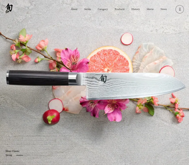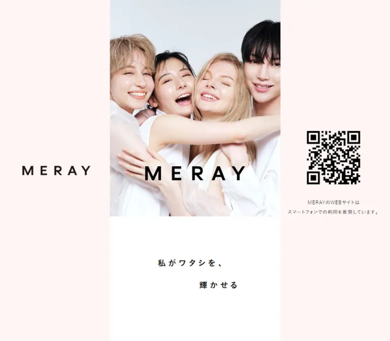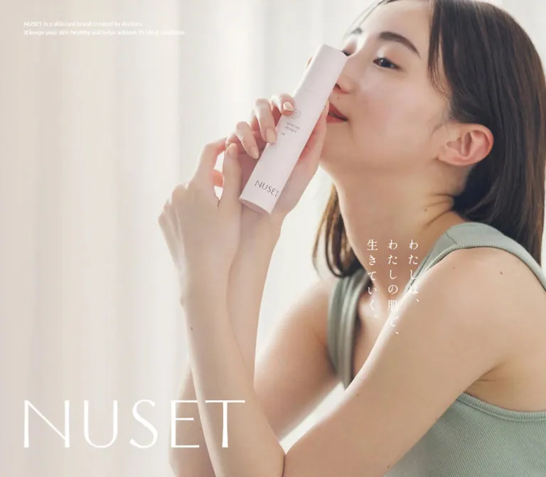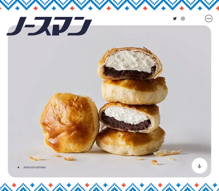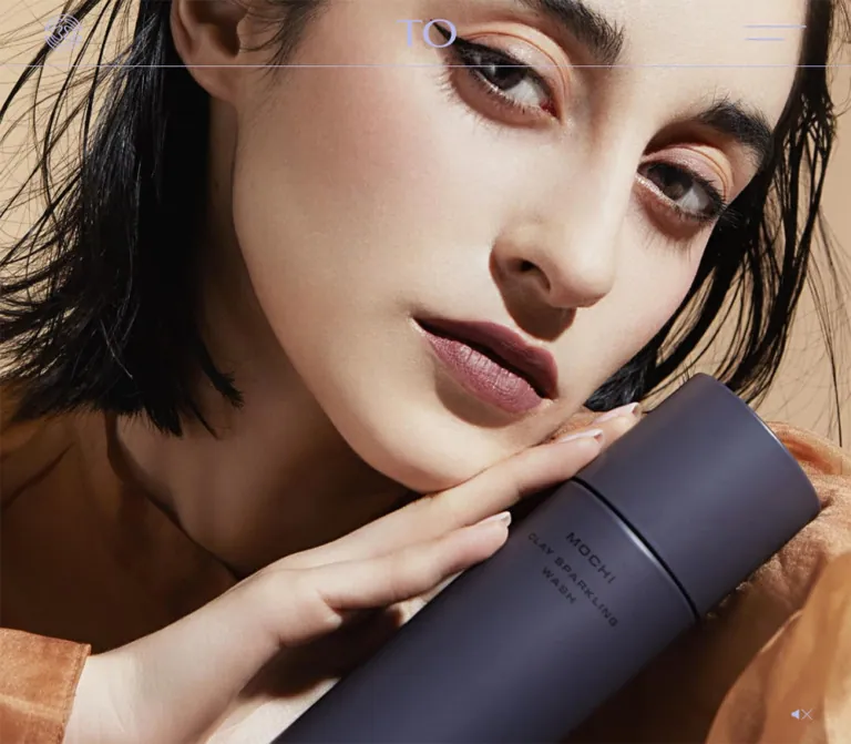
プレビュー準備中デザインリファレンスを見る
DESIGN REFERENCE
TO公式サイト — ラベンダーと陰影で魅せるスキンケアブランド
淡いラベンダー、横長の欧文書体、大きな商品写真と余白で構成されたブランド・ECサイト。左右交互の商品紹介から、ニュース一覧、濃紺のニュースレター領域へ展開します。
TO Official — Style Reference
Sculptural skincare imagery, expansive lavender space, and widely tracked typography.
Original URL: https://to-official.jp/ Final URL: https://to-official.jp/ Theme: lavender content canvas, near-black newsletter/footer, photographic opening Inspected: October 2, 2026, 05:14:49 JST — supplied retrieval timestamp: October 1, 2026, 20:14:49.150 UTC Viewports: 1440 × 1000 desktop and 390 × 844 mobile, in CSS pixels Scope: the current homepage: opening header and hero, seasonal announcement, four product showcases, story and philosophy sections, news index, newsletter, footer, and visible sound control. Analysis uses the supplied original-page captures and rendered DOM/computed-style records. Linked pages and transactional flows were not inspected.
TO combines a muted lavender interface with warm, strongly lit product imagery. Broad geometric English lettering supplies the main visual rhythm; lighter Japanese text explains the products without competing with them. Large transparent or visually isolated product compositions occupy more space than their purchase information. Fine rules and square controls provide structure with very little decorative chrome.
This is a brand homepage with commerce, editorial, and storytelling functions. The sequence moves from an immersive opening into a seasonal teaser, alternating product presentations, brand statements, news, and a substantial newsletter/footer. Its character depends on the relationship between oversized objects, narrow information columns, and unusually generous empty space.
閉じる
TO Official — Style Reference
Sculptural skincare imagery, expansive lavender space, and widely tracked typography.
Original URL: https://to-official.jp/ Final URL: https://to-official.jp/ Theme: lavender content canvas, near-black newsletter/footer, photographic opening Inspected: October 2, 2026, 05:14:49 JST — supplied retrieval timestamp: October 1, 2026, 20:14:49.150 UTC Viewports: 1440 × 1000 desktop and 390 × 844 mobile, in CSS pixels Scope: the current homepage: opening header and hero, seasonal announcement, four product showcases, story and philosophy sections, news index, newsletter, footer, and visible sound control. Analysis uses the supplied original-page captures and rendered DOM/computed-style records. Linked pages and transactional flows were not inspected.
TO combines a muted lavender interface with warm, strongly lit product imagery. Broad geometric English lettering supplies the main visual rhythm; lighter Japanese text explains the products without competing with them. Large transparent or visually isolated product compositions occupy more space than their purchase information. Fine rules and square controls provide structure with very little decorative chrome.
This is a brand homepage with commerce, editorial, and storytelling functions. The sequence moves from an immersive opening into a seasonal teaser, alternating product presentations, brand statements, news, and a substantial newsletter/footer. Its character depends on the relationship between oversized objects, narrow information columns, and unusually generous empty space.
How to Read This Reference
- Measured means a value appears in the supplied computed styles or element rectangles. Values are rounded for readability where appropriate.
- Visual estimate means a proportion, color, or dimension is inferred from an attached original-page capture. It is not a programmatic pixel sample.
- Derived means a calculation from measured values, such as the approximately 5.263% horizontal inset.
- Recommended means an implementation choice for reuse. Proposed breakpoints, accessibility behavior, and fallback handling are not verified original features.
- Token names are descriptive aliases. The only supplied source custom property is
--vh: 1000px, recorded at both viewport sizes. - Some desktop image rectangles disagree with the photographic content visible in the captures. Use the captures for visible image composition and the computed records for typography and colors; do not combine every recorded coordinate into a supposedly exact page blueprint.
Tokens — Colors
Default Palette
| Name | Value | Suggested token | Evidence and role |
|---|---|---|---|
| Lavender canvas | #B8B8CC |
--color-canvas |
Measured body background: rgb(184, 184, 204); product, news, and open content surfaces |
| Main ink | #0D0D1A |
--color-ink |
Measured body and most content text: rgb(13, 13, 26) |
| Midnight surface | #11111A |
--color-midnight |
Measured footer background and product detail-link text; the filled cart control appears consistent with this color |
| Footer lavender | #ADADCC |
--color-footer-ink |
Measured footer headings, paragraphs, legal links, and submit-button text |
| Hero white | #FFFFFF |
--color-hero-text |
Measured opening headline color |
| Header periwinkle | Approximately #B8B8ED |
--color-brand |
Visual estimate for the emblem, wordmark, menu strokes, and header rule; their actual asset fills were not supplied |
The two lavenders have different roles. #B8B8CC is a large background field; #ADADCC is foreground content on the dark footer. Preserve that distinction instead of using a single purple everywhere.
The gold, cream, brown, charcoal, and amber in the opening are photographic colors. They are not evidence of a gold interface accent or a CSS gradient system. Product photography carries the warmth while the interface remains cool.
Color Behavior
The visible page uses a light content field followed by a dark footer. No user-selectable theme system was demonstrated. A one-second body transition is recorded, but the changed properties and trigger are not established.
The newsletter submit label looks much dimmer in the captures than its computed text color alone suggests. An opacity, ancestor treatment, or control state could explain this; a disabled attribute was not supplied. Treat the appearance as observed, without claiming a verified validation state.
Tokens — Typography
Japanese Body and Product Information
Computed family: A-OTF-light, sans-serif.
This is the exact CSS family identifier in the evidence. It does not establish a more specific commercial Japanese typeface name. Body text uses weight 400, 14px size, and 27px line height at both inspected widths. That nearly double-spaced rhythm is important to the calm presentation.
Product categories use the same family with 0.2em tracking. Japanese product names increase to 18px on desktop and 16px on mobile.
Wide English Display
Computed family: EurostileNextProWide, serif.
The hero uses weight 300, broad letterforms, and 0.2em tracking. The same family identifier appears on seasonal product captions, dates, categories, and the Instagram text link in navigation.
The declared fallback is serif. The actual font files, loading status, and licensing were not independently inspected. A fallback font will change wrapping substantially.
Section and Product Headings
Computed family: EurostileNextPro-SemiBold, serif.
Product titles and the PRODUCTS heading use computed weight 600. Several other headings, including OUR STORY, PHILOSOPHY, NEWS, and NEWSLETTER, report weight 400 despite the family name containing SemiBold. Preserve the individual roles rather than applying one global bold setting.
Navigation and Story Statement
Computed family: EurostileNextPro-Extended, serif.
The closed navigation's offscreen links and the story statement use this family. The navigation itself was not opened during the supplied inspection.
Type Scale
Values below are measured. Tracking is expressed in pixels to retain the supplied precision.
| Role | Desktop size / line height | Mobile size / line height | Tracking, desktop → mobile |
|---|---|---|---|
| Hero statement | 50.4px / 75.6px |
33.6px / 50.4px |
10.08px → 6.72px |
| Primary navigation, offscreen state | 27px / 34px |
24px / 30px |
5.4px → 4.8px |
| Main section heading | 24px / 30px |
18px / 23px |
Usually 4.8px → 2.7px |
| PHILOSOPHY heading | 24px / 30px |
18px / 23px |
3.6px → 2.7px |
| NEWS heading | 24px / 30px |
18px / 23px |
4.8px → 3.6px |
| English product title | 24px / 33px |
18px / 30px |
4.8px → 2.7px |
| Japanese product name | 18px / 27px |
16px / 27px |
Normal |
| Product category | 14px / 27px |
14px / 27px |
2.8px at both widths |
| Price and quantity, sampled paragraph | 18px / 25px |
16px / 22px |
3.6px → 2.4px |
| Story statement | 24px / 42px |
21px / 36px |
4.8px → 3.15px |
| News headline | 16px / 27px |
16px / 27px |
3.2px → 1.6px |
| News date and category | 9px / 18px |
10px / 18px |
1.8px → 2px |
| NEWSLETTER heading | 21px / 26px |
18px / 23px |
4.2px → 3.6px |
| Body and detail links | 14px / 27px |
14px / 27px |
Usually normal |
| Newsletter submit | 14px / 14px |
14px / 14px |
Normal; computed family Arial |
The price paragraph reports A-OTF-light; any separate numeric span styling was not included. Do not infer another price font solely from the appearance of the digits.
The TO wordmark is represented by a zero-font-size heading/link with graphic dimensions. Its visible serif lettering should be treated as brand artwork, not recreated by guessing a text font.
Tokens — Spacing & Shapes
Horizontal System
The measured content insets are approximately proportional to viewport width:
- Desktop:
75.781pxon each side, leaving1288.438pxof content. - Mobile:
20.516pxon each side, leaving348.969pxof content. - Derived reusable approximation:
5.263vw, or approximately one nineteenth of the viewport.
Desktop product text is approximately five of these units wide. A large media region occupies approximately eleven units, with one unit between media and copy. This is a useful reconstruction model, not an inspected CSS grid declaration.
Layout Measurements
| Element | Desktop | Mobile | Status |
|---|---|---|---|
| Header | 1440 × 83px |
390 × 60px |
Measured |
| Header vertical padding | 18px top, 19px bottom |
14px top, 15px bottom |
Measured |
| Emblem link | 46 × 46px, x ≈ 52.78px |
31 × 31px, x ≈ 20.52px |
Measured |
| Center wordmark | 75 × 35px, x = 683px |
50 × 24px, x = 170px |
Measured |
| Product information column | 378.938px |
348.969px |
Measured |
| Product detail link | 378.938 × 49px |
348.969 × 49px |
Measured |
| Story headline column | 606.328px |
348.969px |
Measured |
| Full-width section before story | 1440 × 540px |
390 × 360px |
Measured bounds; visual content not established |
| News image | Approximately 378 × 253px |
About 349 × 232.5px |
Desktop visual estimate; mobile measured wrapper |
| Newsletter form width | 833.688px |
348.969px |
Measured |
| Newsletter submit height | 48px |
48px |
Measured |
| Footer padding | 72px 75.781px 68px |
54px 20.516px 57px |
Measured |
| Footer height | 661px |
695px |
Measured |
The desktop emblem is offset 23px left of the normal content inset. The hamburger also sits farther toward the right edge than the product columns. Do not assume all header graphics align to the main content grid.
Vertical Rhythm
These gaps are calculated from adjacent measured product elements, using the MOCHI block as the specimen.
| Relationship | Desktop | Mobile |
|---|---|---|
| Category box to English title | 7px |
10px |
| English title to Japanese name | 10px |
10px |
| Japanese name to price | 30px |
25px |
| Price box to detail link | 47px |
35px |
| Detail-link internal padding | 10px |
10px |
| Newsletter heading end to introductory copy | 140px |
100px |
| Newsletter input-wrapper end to submit button | 30px |
30px |
Section spacing is much larger than control spacing. The desktop product category positions are roughly 827–870px apart, but these are content-dependent intervals, not evidence of fixed-height product slides.
Shapes and Rules
- Sampled buttons, links, and containers have
0pxborder radius. - Product detail controls and variant tabs use thin, approximately one-pixel rules in the capture.
- News entries have no visible card fill, rounded frame, or elevation.
- The rounded silhouette of the folded blanket belongs to the photograph; it is not a UI corner-radius token.
- Shadows in the opening belong to the photographed scene. No general interface shadow system is established.
Components
Opening Header
Role: brand identity and access to navigation.
Three visual anchors span the opening: a circular line emblem at left, the TO wordmark centered on the viewport, and a two-stroke menu mark at right. A thin lavender rule crosses the full width beneath them. The header background is transparent in the measured state, allowing the opening imagery to show through.
The desktop emblem measures 46px; the mobile emblem measures 31px. The wordmark reduces from 75 × 35px to 50 × 24px. Visually, the menu's upper stroke is longer than its lower stroke; estimated widths are about 76/48px on desktop and 40/25px on mobile.
A three-column implementation with independent center alignment is appropriate. Header persistence on scroll was not established: it is absent from the supplied lower-page captures.
Navigation, Closed State
Role: access to HOME, PRODUCTS, OUR STORY, SOUND SPA, NEWS, utility pages, and Instagram.
The link list exists in the DOM but lies outside the viewport: primary desktop links begin around x = 2425px, and mobile links around x = 421px. This supports an offscreen closed navigation state. It does not establish the open panel's dimensions, surface, animation, or focus behavior.
PRODUCTS and NEWS point to homepage anchors. Story and Sound Spa point to separate pages. No opened navigation capture was provided, so avoid designing a supposedly observed full-screen menu from these coordinates alone.
Opening Hero
Role: establish the sensory character of the brand.
The desktop opening fills the 1440 × 1000px capture with a close, diagonal arrangement of dark cylindrical containers and amber bottles. Strong directional light creates long soft shadows and glowing translucent areas. The white statement, THE ART OF LIVING / BEAUTIFULLY., crosses the scene in two centered lines.
The measured headline box is 151.219px high, beginning at y ≈ 448.391px. Its center is about 24px below the viewport midpoint. Use broad letterforms and generous tracking rather than increasing font weight.
At 390 × 844px, the statement wraps into three lines: THE ART OF / LIVING / BEAUTIFULLY. The box remains about 151.172px high and begins at y ≈ 399.414px.
Capture limitation: the mobile hero shows a flat lavender field below a narrow photographic strip behind the header. This is the observed state. The evidence does not establish whether it is an intended mobile treatment, a media-loading condition, or a rendering/timing issue. A production adaptation should provide a reliable poster or image fallback.
Seasonal Announcement
Role: introduce forthcoming products before the main catalog.
The DOM contains COMING / THIS FALL / WINTER followed by TOKIMEKI — FORMULA GLOW LOTION and UTTORI — PERCEPTION RICH SERUM. The two product captions use EurostileNextProWide, 14px / 27px, and 2.8px tracking.
Their measured text block shifts from a rightward desktop placement around x = 640px to a narrower centered mobile placement around x = 54px, width 282px. No supplied capture documents the complete promotional composition, so its artwork and announcement-title scale remain unverified.
Alternating Product Showcase
Role: combine product presentation, detail navigation, price, and explanatory copy.
Each product's information follows a consistent order:
- Small Japanese category.
- Widely tracked uppercase English title.
- Japanese product name.
- Price and quantity or dimensions.
- Full-width outlined detail link labeled
さらに詳しく. - Product-specific purchase controls where present.
- Long Japanese description and applicable notes.
Desktop copy alternates sides. MOCHI and BOSSA begin around x = 75.8px; PACHI PACHI and NENNE begin around x = 985.3px. All measured product information columns are approximately 379px wide. On mobile, all four align to the same approximately 349px column at x = 20.5px.
The detail link is a square rectangle with a thin border, centered 14px text, 10px padding, and 49px total height. It is visually quieter than the filled purchase control.
Descriptions should retain their long line spacing and natural height. Some text overlaps near the top edge of the supplied desktop product capture; this should not be adopted as intentional typography.
NENNE Blanket Presentation and Variants
Role: display a tactile lifestyle product with color options.
The visible composition places a large folded brown blanket at left and three much smaller folded blankets in a vertical rail to its right. The right-hand information column contains the category, NENNE BLANKET, Japanese name, ¥20,900 / 110x165cm, detail link, variant row, cart control, and description.
The variant labels are BROWN, KHAKI, BEIGE, and GRAY. BROWN appears selected through an outlined tab connected to a shared horizontal baseline. The controls remain on the lavender canvas rather than becoming colored swatch pills. A near-black rectangular control below reads カートに入れる.
Visual estimates from the desktop capture:
- Main blanket silhouette: approximately
355 × 500px. - Smaller blanket silhouettes: approximately
95 × 133pxeach. - Detail-link bottom to variant row: about
40px. - Variant-row height: about
46px. - Variant baseline to cart control: about
18px. - Cart control height: about
49px.
The evidence does not identify whether the blanket composition is one image or several elements. It also does not demonstrate thumbnail clicks, color changes, stock behavior, or cart completion.
Story and Philosophy
Role: explain the brand's ideas between the catalog and news.
The DOM establishes separate OUR STORY and PHILOSOPHY sections. The story statement reads AWAKEN TO THE / INEVITABLE RHYTHM., paired with Japanese copy and a detail link to /story/.
The story headline is 24px / 42px on desktop and 21px / 36px on mobile. Its desktop column is approximately 606px wide, broader than a product information column. The story link measures only 30px high in its recorded rectangle and uses asymmetric padding, so it should not automatically inherit the product button's 49px box.
PHILOSOPHY contains several Japanese paragraphs. Full imagery, text placement around imagery, and the complete appearance of these sections are not visible in the supplied captures. Their text and typography are documented; their missing composition should remain unspecified.
News Entry and Index
Role: combine announcements, brand coverage, and editorial articles.
The DOM contains fourteen linked entries, with the latest dated September 4, 2026. Desktop entries occupy three columns; the final row contains two entries. Mobile entries form a single vertical column.
The visible desktop cards pair landscape images with widely tracked Japanese headlines and two small metadata lines. There is no independent card surface. The final two images depict a portrait with foliage and an exhibition booth; both have an approximately 3:2 frame.
News headlines keep 16px / 27px on mobile while reducing tracking from 3.2px to 1.6px. Metadata increases from 9px to 10px, preserving legibility as the layout narrows.
The metadata order also changes: desktop positions category above date, while mobile positions date above category. This is supported by the measured rectangles and visible captures, not just the DOM text order.
Several desktop image-wrapper records report 27px height even though the corresponding capture shows full landscape photography. Do not reproduce those short wrappers as the intended card design.
Newsletter
Role: a quiet subscription area that also begins the footer.
The background changes abruptly to #11111A; text, rules, and icons use pale lavender. A tracked NEWSLETTER heading sits well above the form content.
On desktop, the introductory copy occupies a 454.734px column including approximately 75.781px right padding. The form begins at x ≈ 530.516px and spans 833.688px. Its email field appears as a single underline, followed by a full-width outlined 48px submit button labeled 登録.
On mobile, the introduction, field, and button stack within the 348.969px content width. The heading-to-copy gap reduces to 100px; the copy-to-input-wrapper gap is 45px; the input-wrapper-to-button gap remains 30px.
The rendered email placeholder is E-mail. Privacy-consent text appears within the footer element's text record, but a visible consent control and its state were not captured. Submission, validation, success messages, and consent behavior remain unverified.
Footer Utilities
Role: social access, legal navigation, and copyright.
A large outline Instagram symbol sits below the newsletter. Its link box measures approximately 39 × 40px on desktop and 35 × 36px on mobile. Desktop social and legal content occupy separate horizontal regions; mobile stacks them.
Mobile spacing is particularly clear: the submit button ends about 95px before the social icon begins, and the social icon ends 40px before the legal text begins. Legal copy uses the body 14px / 27px rhythm. The visible copyright remains 2022; that displayed year is not the inspection date.
The mobile footer exposes different legal-link wording from desktop, including サイト利用規約・メンバー規約. The supplied link points to the same privacy-policy path. Preserve actual link semantics when implementing, rather than inventing additional destination pages.
Sound Control
Role: apparent audio control.
A tiny crossed-speaker graphic stays near the lower-right corner across the supplied captures. Its visual anchoring is consistent with a viewport-fixed control, although its CSS positioning was not supplied. An audio element is also represented in the DOM text.
This establishes an audio affordance, not verified playback, autoplay, sound content, or mute-state behavior. In a new implementation, retain the small visible symbol inside a larger accessible hit area.
Tokens — Motion & Interaction
Recorded Motion Declarations
| Target | Recorded value | What the evidence establishes |
|---|---|---|
| Header entrance | 1.5s ease-in-out 2s forwards fade |
Named fade animation with a two-second delay; keyframes were not supplied |
| Hero entrance | Same named fade animation | Shared entrance declaration; full sequence not captured |
| Hero opacity | 1.2s linear, delay 0.6s |
Defined opacity transition |
| Hero transform | 2.7s ease-out, delay 0.6s |
Defined transform transition; displacement and trigger unknown |
| Section headings and footer opacity | 0.8s linear, delay 0.2s |
Repeated reveal-related declaration |
| Section headings and footer transform | 1s ease-out, delay 0.2s |
Repeated transform timing; exact transform unknown |
| Header, links, submit button | 0.3s |
Short transition duration; changed properties and end states not established |
| Body | 1s |
Generic transition duration; trigger and property unknown |
These values support a restrained, slow reveal vocabulary. They do not prove parallax, scroll scrubbing, a carousel, or a particular media playback sequence. A computed transition string of all without a duration is not sufficient evidence of visible animation.
Interaction Coverage
| Feature | Supplied evidence | Unverified behavior |
|---|---|---|
| Primary navigation | Closed-state links and menu graphic | Opening, closing, focus management, overlay appearance |
| Product detail links | Four explicit product URLs | Destination-page behavior |
| Blanket variants | Four labels and selected-looking BROWN tab | Selection changes, media updates, availability |
| Cart | Visible cart control | Checkout, persistence, confirmation |
| News | Linked entries and responsive arrangement | Hover states and destination pages |
| Newsletter | Email field appearance and submit button | Validation, consent flow, submission result |
| Sound | Speaker graphic and audio element | Actual mute state, playback, user gesture requirements |
The capture procedure waited for visible finite animations and sampled layout stability, temporarily pausing perpetual animations during readiness checks. This improves static inspection but does not substitute for an interaction recording.
Surfaces
| Surface | Appearance | Structural purpose |
|---|---|---|
| Opening media | Warm directional light and deep photographic shadows | Immersive introduction |
| Main canvas | Solid #B8B8CC |
Unifies products, editorial content, and whitespace |
| Product controls | Transparent fill with fine dark rules | Detail navigation and variant structure |
| Purchase control | Near-black rectangular fill | Strong local action within a restrained product block |
| News entry | Same background as the page | Image and typography create grouping |
| Footer | Solid #11111A with #ADADCC foreground |
Distinct closing environment |
| Newsletter field | Transparent field with bottom rule | Low-chrome form entry |
Separation comes from scale, spacing, lines, and a single major background inversion. Avoid adding a general system of raised cards or blurred panels.
Imagery
The desktop hero treats containers as sculptural objects. Cylinders run along diagonal axes; the camera looks down across large lids and reflective bottle shoulders. Embossed circular marks, dark matte surfaces, textured amber glass, and long shadows give the scene its material quality. Preserve that lighting and object scale when commissioning replacement imagery.
The blanket composition shifts from hard packaging to soft textile. Its dark folds, plush texture, wide hem, and embroidered TO mark remain legible because the image is large and surrounded by plain lavender. Alternate color samples are visually subordinate.
News imagery is more documentary: a portrait and an exhibition stand appear in the supplied lower-page capture. Keep these images in clean landscape rectangles. Do not force every editorial image to look like a product render.
Observed Asset References
No original image, video, audio, SVG, or font-file URLs were included in the supplied evidence. The following are observations, not downloadable asset paths.
| Asset role | Evidence | Implementation implication |
|---|---|---|
| TO wordmark and circular emblem | Desktop and mobile opening captures; measured graphic-link boxes | Use authorized brand artwork; do not typeset a guessed substitute |
| Opening product composition | Desktop opening capture | Use a high-resolution image or suitable media poster; media format is unverified |
| Blanket composition | Desktop product capture | Preserve object proportions and lavender surroundings; avoid cropping away folds or color examples |
| News photographs | Desktop lower-page capture and mobile image-wrapper measurements | Approximately 3:2 landscape framing |
| Instagram symbol | Footer capture and measured link dimensions | Outline icon, approximately 35–40px visually |
| Speaker symbol | Lower-right corner of supplied captures | Small graphic with a larger recommended interaction target |
Do not use a generic gradient to imitate the hero's physical lighting. CSS can reproduce the layout and palette; the material character requires suitable imagery.
Layout & Responsive Behavior
The desktop page uses a broad composition grid with narrow reading columns. Alternating product copy creates a left-right rhythm, while news uses three aligned columns. The footer repeats the same horizontal logic with short introductory text at left and a much wider form at right.
Mobile retains the proportional side inset, stacks product information and news, and makes the newsletter a vertical sequence. It reduces headings more than body text. The metadata order and some footer links also change, so responsiveness involves more than shrinking type.
| Behavior | Desktop, 1440px wide | Mobile, 390px wide |
|---|---|---|
| Content inset | About 75.8px |
About 20.5px |
| Header height | 83px |
60px |
| Hero statement | Two lines | Three lines |
| Product copy | Alternating left and right columns | One shared full-width content column |
| Product titles | 24px, tracking 0.2em |
18px, tracking 0.15em |
| Body text | 14px / 27px |
Unchanged |
| News layout | Three columns | One column |
| News metadata order | Category, then date | Date, then category |
| Newsletter | Copy beside form | Copy above form |
| Footer utilities | Horizontal regions | Stacked social and legal content |
The supplied document heights are approximately 9408px on desktop and 15376px on mobile. Desktop body and document-height records are not completely consistent, and image geometry varies between records. These are inspection measurements, not fixed heights to copy.
The source custom property --vh remains 1000px in the mobile evidence despite the 844px viewport. Its use is not shown, so it cannot be identified as the cause of the mobile hero state. For a new implementation, prefer current viewport units or a correctly refreshed measurement.
No tablet viewport, landscape phone, expanded menu, or intermediate breakpoint was inspected. The 768px breakpoint in the Quick Start is a recommendation, not a recovered source breakpoint.
Do’s and Don’ts
Do
- Keep the lavender canvas and near-black footer distinct and exact.
- Use wide English lettering with role-specific tracking, balanced by lighter Japanese copy.
- Preserve the centered graphic wordmark and separate circular emblem.
- Give product imagery more space than product information on desktop.
- Alternate desktop product copy, then align it consistently on mobile.
- Keep detail links square, outlined, and approximately
49pxhigh. - Maintain the unboxed news layout and its landscape imagery.
- Preserve the newsletter's large vertical pauses and simple underlined input.
- Document visual anomalies separately from intended reusable styling.
Don’t
- Don’t turn every product into a conventional compact ecommerce card.
- Don’t introduce pill buttons, rounded panels, gradients, or soft UI shadows throughout.
- Don’t convert photographic gold into an unsupported interface accent color.
- Don’t replace the TO wordmark with an assumed serif font.
- Don’t apply
0.2emtracking to long Japanese body paragraphs. - Don’t shrink mobile body text along with the display headings.
- Don’t treat the mostly blank mobile hero as a confirmed design requirement.
- Don’t infer carousel, parallax, autoplay, or cart behavior from static captures.
- Don’t force all news metadata into one order when reproducing the observed responsive design.
- Don’t promote product-design attribution into a website-production credit.
Recommended Implementation Additions
These are recommendations for a new implementation, not verified original features:
- Give the menu, brand links, sound control, and Instagram link accessible names. Enlarge small icon hit areas to at least
44 × 44pxwithout enlarging the visible artwork. - If the menu is a modal overlay, implement keyboard focus management, Escape dismissal, and focus return. Use
aria-expandedon its trigger. - Represent blanket color choices with real selectable controls. Use radio semantics for purchasing choices, or tabs only if they control actual tab panels.
- Provide a durable hero poster and an explicit media-failure fallback. Essential text and navigation should remain usable before animation or media readiness.
- Offer reduced-motion behavior. Do not hide essential content for a mandatory two-second opening delay.
- Use an accessible email label,
type=email, autocomplete, and clear validation messages. Tie disabled styling to an actual disabled state. - Keep legal and consent text visible when required by the implemented subscription flow; do not infer it from hidden DOM text.
- Reserve image dimensions to prevent layout movement. Resolve overlapping copy and conflicting image heights rather than reproducing capture artifacts.
- Check hero-text contrast against every chosen media frame and preserve readable focus indicators on both light and dark surfaces.
Agent Prompt Guide
Quick Color Reference
- Main canvas:
#B8B8CC. - Main text:
#0D0D1A. - Footer and dark controls:
#11111A. - Footer text and rules:
#ADADCC. - Hero statement:
#FFFFFF. - Header artwork: pale periwinkle; approximately
#B8B8EDis an explicitly estimated substitute. - Warm brown, amber, cream, and gold belong primarily to photography.
Overall Prompt
“Create a skincare and lifestyle brand homepage inspired by the inspected TO website. Use a solid lavender canvas, near-black text, wide geometric English headings with generous tracking, and light Japanese body copy at a spacious line height. Open with sculptural dark product containers in warm directional light, a centered graphic wordmark, a circular emblem at left, and a two-stroke menu at right. Follow with generous alternating product showcases: large isolated imagery and narrow information columns containing category, English title, Japanese name, price, outlined detail link, and relevant purchase controls. Add understated brand-story sections, a three-column unboxed news index, and a dark newsletter/footer with a single-line email field. On mobile, stack the content while retaining approximately 5.263% side margins. Provide robust media fallbacks and accessible controls; do not invent unobserved interactions.”
Example Component Prompts
- Header and opening: “Build an 83px transparent desktop header over warm product photography. Place a 46px circular brand emblem left of the main content inset, a 75 × 35px wordmark at the viewport center, and unequal horizontal menu strokes at right. Add a fine periwinkle bottom rule. Reduce the header to 60px on mobile.”
- Product showcase: “On lavender, place an approximately 379px information column opposite a much larger product image. Stack a small Japanese category, tracked 24px uppercase product title, 18px Japanese name, price, and a 49px outlined detail link. Keep square corners, natural text height, and ample empty space. Reverse the composition for the next product.”
- Blanket variant block: “Show a large folded brown blanket with three smaller color examples beside it. In the information column, add four understated text choices labeled BROWN, KHAKI, BEIGE, and GRAY along a thin baseline. Use an outlined selected choice and a dark rectangular cart button beneath. Implement actual selection semantics separately.”
- News index: “Create a three-column lavender news grid with approximately 3:2 photographs, 16px Japanese headlines, and tiny wide-font metadata. Use no card background, border radius, or shadow. Stack to one column on mobile and place date before category there.”
- Newsletter: “Use a near-black full-width footer with pale lavender text. Place NEWSLETTER at the upper left, leave a large vertical gap, and align short introductory copy beside a wide underlined email field and outlined submit button. Stack on mobile, then place a large outline Instagram icon and small legal links below.”
Quick Start
CSS Custom Properties
This is a reusable adaptation, not recovered source code. It uses the measured colors, type values, control heights, and a derived nineteen-part desktop composition. The breakpoint, interpolation between inspected sizes, accessible target sizes, hover inversion, and reveal displacement are recommendations.
The font-family identifiers come from computed styles. Supply appropriately licensed files through your own font setup; no font URLs are known. Without those fonts, line breaks and widths will differ.
Suggested structure:
.to-header: emblem link, wordmark link, menu button..to-hero: media element and.to-hero-titlecontaining two block spans..to-product:.to-product-mediafollowed by.to-product-copy; add.is-reversedfor the opposite desktop arrangement..to-news-card: image, headline, and.to-news-metacontaining date followed by category..to-newsletter-grid: introduction followed by the form..to-footer-lower: social link followed by legal content.
:root {
  /* Measured colors */
  --color-canvas: #b8b8cc;
  --color-ink: #0d0d1a;
  --color-midnight: #11111a;
  --color-footer-ink: #adadcc;
  --color-hero-text: #fff;

  /* Visual estimate; original graphic fills were not supplied */
  --color-brand: #b8b8ed;

  /* Computed family identifiers; font files must be supplied separately */
  --font-body: 'A-OTF-light', sans-serif;
  --font-wide: 'EurostileNextProWide', serif;
  --font-heading: 'EurostileNextPro-SemiBold', serif;
  --font-extended: 'EurostileNextPro-Extended', serif;

  /* Derived horizontal system */
  --page-gutter: 5.2631579vw;
  --header-height: 83px;
  --emblem-size: 46px;
  --wordmark-width: 75px;
  --wordmark-height: 35px;

  /* Recommended interpolation between measured endpoint sizes */
  --text-hero: clamp(33.6px, 3.5vw, 50.4px);
  --text-section: 24px;
  --leading-section: 30px;
  --text-product: 24px;
  --leading-product: 33px;
  --text-product-jp: 18px;
  --text-price: 18px;
  --leading-price: 25px;
  --tracking-heading: 0.2em;
  --hero-offset: 24px;

  --rule: 1px;
  --radius: 0px;
  --control-height: 49px;
  --motion-control: 300ms ease;
  --motion-reveal-opacity: 800ms linear 200ms;
  --motion-reveal-transform: 1000ms ease-out 200ms;
}

* {
  box-sizing: border-box;
}

html {
  font-size: 100%;
}

body {
  margin: 0;
}

.to-site {
  color: var(--color-ink);
  background: var(--color-canvas);
  font-family: var(--font-body);
  font-size: 14px;
  font-weight: 400;
  line-height: 27px;
}

.to-site img {
  display: block;
  max-width: 100%;
}

.to-container {
  padding-inline: var(--page-gutter);
}

.to-header {
  position: absolute;
  inset: 0 0 auto;
  z-index: 10;
  display: grid;
  grid-template-columns: 1fr auto 1fr;
  align-items: center;
  height: var(--header-height);
  padding: 18px var(--page-gutter) 19px;
  border-bottom: var(--rule) solid var(--color-brand);
  color: var(--color-brand);
}

.to-emblem {
  justify-self: start;
  width: var(--emblem-size);
  margin-left: -23px;
}

.to-wordmark {
  width: var(--wordmark-width);
  height: var(--wordmark-height);
}

.to-emblem img,
.to-wordmark img {
  width: 100%;
  height: 100%;
  object-fit: contain;
}

.to-menu {
  justify-self: end;
  display: grid;
  align-content: center;
  gap: 15px;
  width: 76px;
  min-height: 44px;
  margin-right: calc(var(--page-gutter) * -0.5);
  padding: 0;
  border: 0;
  color: inherit;
  background: transparent;
  cursor: pointer;
}

.to-menu::before,
.to-menu::after {
  content: '';
  display: block;
  height: 1px;
  background: currentColor;
}

.to-menu::after {
  width: 63%;
}

.to-hero {
  position: relative;
  display: grid;
  place-items: center;
  min-height: 100vh;
  min-height: 100svh;
  overflow: hidden;
  background: var(--color-canvas);
}

.to-hero-media {
  position: absolute;
  inset: 0;
  width: 100%;
  height: 100%;
  object-fit: cover;
}

.to-hero-title {
  position: relative;
  z-index: 1;
  width: 100%;
  margin: 0;
  padding-inline: 16px;
  transform: translateY(var(--hero-offset));
  color: var(--color-hero-text);
  font-family: var(--font-wide);
  font-size: var(--text-hero);
  font-weight: 300;
  line-height: 1.5;
  letter-spacing: 0.2em;
  text-align: center;
}

.to-hero-title span {
  display: block;
}

.to-section-title {
  margin: 0;
  font-family: var(--font-heading);
  font-size: var(--text-section);
  font-weight: 400;
  line-height: var(--leading-section);
  letter-spacing: var(--tracking-heading);
}

.to-products-title {
  font-weight: 600;
}

.to-product {
  display: grid;
  grid-template-columns: repeat(17, minmax(0, 1fr));
  align-items: start;
  padding-block: 64px;
}

.to-product-media {
  grid-column: 7 / span 11;
  grid-row: 1;
}

.to-product-copy {
  grid-column: 1 / span 5;
  grid-row: 1;
  min-width: 0;
}

.to-product.is-reversed .to-product-media {
  grid-column: 1 / span 11;
}

.to-product.is-reversed .to-product-copy {
  grid-column: 13 / span 5;
}

.to-product-media img {
  width: 100%;
  height: auto;
  object-fit: contain;
}

.to-product-category {
  margin: 0 0 7px;
  letter-spacing: 0.2em;
}

.to-product-title {
  margin: 0 0 10px;
  font-family: var(--font-heading);
  font-size: var(--text-product);
  font-weight: 600;
  line-height: var(--leading-product);
  letter-spacing: var(--tracking-heading);
}

.to-product-name {
  margin: 0;
  font-size: var(--text-product-jp);
  line-height: 27px;
}

.to-product-price {
  margin: 30px 0 47px;
  font-size: var(--text-price);
  line-height: var(--leading-price);
  letter-spacing: var(--tracking-heading);
}

.to-button {
  display: flex;
  align-items: center;
  justify-content: center;
  width: 100%;
  min-height: var(--control-height);
  padding: 10px;
  border: var(--rule) solid currentColor;
  border-radius: var(--radius);
  color: var(--color-midnight);
  background: transparent;
  font: inherit;
  text-align: center;
  text-decoration: none;
  cursor: pointer;
  transition:
    color var(--motion-control),
    background-color var(--motion-control);
}

.to-button.is-filled {
  color: var(--color-canvas);
  background: var(--color-midnight);
  border-color: var(--color-midnight);
}

.to-product-description {
  margin: 40px 0 0;
}

/* Recommended semantic variant controls use aria-checked. */
.to-variants {
  display: grid;
  grid-template-columns: repeat(4, minmax(0, 1fr));
  margin-top: 40px;
  border-bottom: 1px solid currentColor;
}

.to-variant {
  min-width: 0;
  min-height: 46px;
  padding: 8px 4px;
  border: 1px solid transparent;
  border-radius: 0;
  color: inherit;
  background: transparent;
  font: 12px/20px var(--font-body);
  cursor: pointer;
}

.to-variant[aria-checked='true'] {
  margin-bottom: -1px;
  border-color: currentColor;
  border-bottom-color: var(--color-canvas);
}

.to-variants + .to-button {
  margin-top: 18px;
}

.to-news-grid {
  display: grid;
  grid-template-columns: repeat(3, minmax(0, 1fr));
  column-gap: var(--page-gutter);
  row-gap: 90px;
}

.to-news-card {
  min-width: 0;
  color: inherit;
  text-decoration: none;
}

.to-news-card img {
  width: 100%;
  aspect-ratio: 3 / 2;
  object-fit: cover;
}

.to-news-title {
  margin: 30px 0 6px;
  font-size: 16px;
  font-weight: 400;
  line-height: 27px;
  letter-spacing: 0.2em;
}

.to-news-meta {
  display: flex;
  flex-direction: column;
  font-family: var(--font-wide);
  font-size: 9px;
  line-height: 18px;
  letter-spacing: 0.2em;
}

.to-news-meta > * {
  margin: 0;
}

.to-news-category {
  order: -1;
}

.to-footer {
  padding: 72px var(--page-gutter) 68px;
  color: var(--color-footer-ink);
  background: var(--color-midnight);
}

.to-newsletter-title {
  margin: 0 0 140px;
  font-family: var(--font-heading);
  font-size: 21px;
  font-weight: 400;
  line-height: 26px;
  letter-spacing: 0.2em;
}

.to-newsletter-grid,
.to-footer-lower {
  display: grid;
  grid-template-columns: minmax(0, 6fr) minmax(0, 11fr);
}

.to-newsletter-intro {
  margin: 0;
  padding-right: var(--page-gutter);
}

.to-newsletter-form {
  display: grid;
  gap: 30px;
  min-width: 0;
  padding-top: 5px;
}

.to-newsletter-form input {
  width: 100%;
  min-width: 0;
  height: 32px;
  padding: 0 14px 8px;
  border: 0;
  border-bottom: 1px solid currentColor;
  border-radius: 0;
  color: inherit;
  background: transparent;
  font: inherit;
}

.to-newsletter-form input::placeholder {
  color: inherit;
  opacity: 1;
}

.to-newsletter-form button {
  min-height: 48px;
  padding: 16px;
  color: inherit;
  font: 14px/14px Arial, sans-serif;
}

.to-newsletter-form button:disabled {
  opacity: 0.4;
  cursor: not-allowed;
}

.to-footer-lower {
  align-items: center;
  margin-top: 186px;
}

.to-social {
  display: inline-flex;
  align-items: center;
  width: 44px;
  min-height: 44px;
  color: inherit;
}

.to-social svg {
  width: 39px;
  height: 40px;
}

.to-footer a {
  color: inherit;
}

.to-sound {
  position: fixed;
  right: calc(var(--page-gutter) * 0.5);
  bottom: calc(16px + env(safe-area-inset-bottom, 0px));
  z-index: 20;
  display: grid;
  place-items: center;
  width: 44px;
  height: 44px;
  padding: 0;
  border: 0;
  color: var(--color-brand);
  background: transparent;
  cursor: pointer;
}

/* Content remains visible unless enhancement code explicitly opts in. */
.to-reveal {
  transition:
    opacity var(--motion-reveal-opacity),
    transform var(--motion-reveal-transform);
}

[data-motion-ready] .to-reveal.is-pending {
  opacity: 0;
  transform: translateY(16px);
}

.to-site :focus-visible {
  outline: 2px solid currentColor;
  outline-offset: 4px;
}

.to-sr-only {
  position: absolute;
  width: 1px;
  height: 1px;
  padding: 0;
  overflow: hidden;
  clip-path: inset(50%);
  white-space: nowrap;
}

/* Recommended feedback; the original hover end state was not inspected. */
@media (hover: hover) {
  .to-product-copy .to-button:not(.is-filled):hover {
    color: var(--color-canvas);
    background: var(--color-midnight);
    border-color: var(--color-midnight);
  }
}

/* Recommended breakpoint; only 390px and 1440px were inspected. */
@media (max-width: 768px) {
  :root {
    --header-height: 60px;
    --emblem-size: 31px;
    --wordmark-width: 50px;
    --wordmark-height: 24px;
    --text-section: 18px;
    --leading-section: 23px;
    --text-product: 18px;
    --leading-product: 30px;
    --text-product-jp: 16px;
    --text-price: 16px;
    --leading-price: 22px;
    --tracking-heading: 0.15em;
    --hero-offset: 53px;
  }

  .to-header {
    padding-block: 14px 15px;
  }

  .to-emblem {
    margin-left: 0;
  }

  .to-menu {
    width: 40px;
    gap: 10px;
    margin-right: 0;
  }

  .to-product {
    display: flex;
    flex-direction: column;
    gap: 40px;
    padding-block: 60px;
  }

  .to-product-media,
  .to-product-copy {
    width: 100%;
  }

  .to-product-category {
    margin-bottom: 10px;
  }

  .to-product-price {
    margin-block: 25px 35px;
  }

  .to-news-grid {
    grid-template-columns: minmax(0, 1fr);
    row-gap: 63px;
  }

  .to-news-title {
    margin-bottom: 12px;
    letter-spacing: 0.1em;
  }

  .to-news-meta {
    font-size: 10px;
  }

  .to-news-category {
    order: 0;
  }

  .to-footer {
    padding-block: 54px 57px;
  }

  .to-newsletter-title {
    margin-bottom: 100px;
    font-size: 18px;
    line-height: 23px;
  }

  .to-newsletter-grid,
  .to-footer-lower {
    grid-template-columns: minmax(0, 1fr);
    gap: 40px;
  }

  .to-newsletter-intro {
    padding-right: 0;
  }

  .to-footer-lower {
    margin-top: 95px;
  }

  .to-social svg {
    width: 35px;
    height: 36px;
  }
}

@media (prefers-reduced-motion: reduce) {
  .to-site *,
  .to-site *::before,
  .to-site *::after {
    animation: none !important;
    transition: none !important;
  }

  [data-motion-ready] .to-reveal.is-pending {
    opacity: 1;
    transform: none;
  }
}
This CSS does not implement navigation state, media playback, newsletter submission, variant selection, or cart logic. The reveal selector requires enhancement code to remove .is-pending; without that opt-in, content stays visible. Keep the story and seasonal sections content-driven because their complete visual compositions were not supplied.
Tailwind v4 Token Mapping
Optional aliases for a project already using Tailwind v4. This is not evidence that the original website uses Tailwind. Define the custom properties above first.
@theme inline {
  --color-to-canvas: var(--color-canvas);
  --color-to-ink: var(--color-ink);
  --color-to-midnight: var(--color-midnight);
  --color-to-footer-ink: var(--color-footer-ink);
  --color-to-brand: var(--color-brand);

  --font-to-body: var(--font-body);
  --font-to-wide: var(--font-wide);
  --font-to-heading: var(--font-heading);
  --font-to-extended: var(--font-extended);

  --text-to-hero: var(--text-hero);
  --text-to-section: var(--text-section);
  --text-to-product: var(--text-product);
  --text-to-body: 14px;

  --spacing-to-gutter: var(--page-gutter);
  --spacing-to-control: var(--control-height);
  --spacing-to-header: var(--header-height);
  --radius-to-square: 0px;
}
Sources & Evidence
- Inspected homepage: TO official. The supplied original and final URLs are identical; the recorded HTTP status is
200. - Capture time:
2026-10-01T20:14:49.150Z, equivalent to October 2, 2026, 05:14:49.150 JST. - Desktop evidence:
1440 × 1000viewport, with original-page captures of the opening, blanket product area, and lower news/newsletter area; rendered text, links, element rectangles, and computed styles. - Mobile evidence:
390 × 844viewport, with original-page captures of the opening and lower newsletter/footer; rendered text, links, element rectangles, and computed styles. - Observed navigation targets: product pages at
/product/mochi/,/product/pachipachi/,/product/bossa/, and/product/nenne/;/story/;/soundspa/; homepage anchors; and individual news pages. Their presence is documented, but their destination content was not inspected. - Interaction scope: the supplied process traversed page positions and waited for capture readiness. No menu-opening, variant-selection, cart, subscription, or audio-playback test result was provided.
- Attribution scope: a homepage news headline names Yuta Takahashi for product design. It does not establish website design or development authorship.
- Limitations: mobile hero media is mostly absent in the supplied opening capture; some desktop image and document-height measurements disagree with the captures; complete story and seasonal imagery, asset URLs, font binaries, animation keyframes, and intermediate responsive states were not supplied. SharedWorkers and service workers were disabled during inspection.
This reference describes the current homepage evidence at the stated capture time. Measured values, visual estimates, derived proportions, and recommended implementation choices are explicitly distinguished.
# TO Official — Style Reference

> Sculptural skincare imagery, expansive lavender space, and widely tracked typography.

**Original URL:** [https://to-official.jp/](https://to-official.jp/)
**Final URL:** [https://to-official.jp/](https://to-official.jp/)
**Theme:** lavender content canvas, near-black newsletter/footer, photographic opening
**Inspected:** October 2, 2026, 05:14:49 JST — supplied retrieval timestamp: October 1, 2026, 20:14:49.150 UTC
**Viewports:** 1440 × 1000 desktop and 390 × 844 mobile, in CSS pixels
**Scope:** the current homepage: opening header and hero, seasonal announcement, four product showcases, story and philosophy sections, news index, newsletter, footer, and visible sound control. Analysis uses the supplied original-page captures and rendered DOM/computed-style records. Linked pages and transactional flows were not inspected.

TO combines a muted lavender interface with warm, strongly lit product imagery. Broad geometric English lettering supplies the main visual rhythm; lighter Japanese text explains the products without competing with them. Large transparent or visually isolated product compositions occupy more space than their purchase information. Fine rules and square controls provide structure with very little decorative chrome.

This is a brand homepage with commerce, editorial, and storytelling functions. The sequence moves from an immersive opening into a seasonal teaser, alternating product presentations, brand statements, news, and a substantial newsletter/footer. Its character depends on the relationship between oversized objects, narrow information columns, and unusually generous empty space.
閉じる
# TO Official — Style Reference

> Sculptural skincare imagery, expansive lavender space, and widely tracked typography.

**Original URL:** [https://to-official.jp/](https://to-official.jp/)
**Final URL:** [https://to-official.jp/](https://to-official.jp/)
**Theme:** lavender content canvas, near-black newsletter/footer, photographic opening
**Inspected:** October 2, 2026, 05:14:49 JST — supplied retrieval timestamp: October 1, 2026, 20:14:49.150 UTC
**Viewports:** 1440 × 1000 desktop and 390 × 844 mobile, in CSS pixels
**Scope:** the current homepage: opening header and hero, seasonal announcement, four product showcases, story and philosophy sections, news index, newsletter, footer, and visible sound control. Analysis uses the supplied original-page captures and rendered DOM/computed-style records. Linked pages and transactional flows were not inspected.

TO combines a muted lavender interface with warm, strongly lit product imagery. Broad geometric English lettering supplies the main visual rhythm; lighter Japanese text explains the products without competing with them. Large transparent or visually isolated product compositions occupy more space than their purchase information. Fine rules and square controls provide structure with very little decorative chrome.

This is a brand homepage with commerce, editorial, and storytelling functions. The sequence moves from an immersive opening into a seasonal teaser, alternating product presentations, brand statements, news, and a substantial newsletter/footer. Its character depends on the relationship between oversized objects, narrow information columns, and unusually generous empty space.

## How to Read This Reference

- **Measured** means a value appears in the supplied computed styles or element rectangles. Values are rounded for readability where appropriate.
- **Visual estimate** means a proportion, color, or dimension is inferred from an attached original-page capture. It is not a programmatic pixel sample.
- **Derived** means a calculation from measured values, such as the approximately 5.263% horizontal inset.
- **Recommended** means an implementation choice for reuse. Proposed breakpoints, accessibility behavior, and fallback handling are not verified original features.
- Token names are descriptive aliases. The only supplied source custom property is `--vh: 1000px`, recorded at both viewport sizes.
- Some desktop image rectangles disagree with the photographic content visible in the captures. Use the captures for visible image composition and the computed records for typography and colors; do not combine every recorded coordinate into a supposedly exact page blueprint.

## Tokens — Colors

### Default Palette

| Name | Value | Suggested token | Evidence and role |
| --- | --- | --- | --- |
| Lavender canvas | `#B8B8CC` | `--color-canvas` | Measured body background: `rgb(184, 184, 204)`; product, news, and open content surfaces |
| Main ink | `#0D0D1A` | `--color-ink` | Measured body and most content text: `rgb(13, 13, 26)` |
| Midnight surface | `#11111A` | `--color-midnight` | Measured footer background and product detail-link text; the filled cart control appears consistent with this color |
| Footer lavender | `#ADADCC` | `--color-footer-ink` | Measured footer headings, paragraphs, legal links, and submit-button text |
| Hero white | `#FFFFFF` | `--color-hero-text` | Measured opening headline color |
| Header periwinkle | Approximately `#B8B8ED` | `--color-brand` | Visual estimate for the emblem, wordmark, menu strokes, and header rule; their actual asset fills were not supplied |

The two lavenders have different roles. `#B8B8CC` is a large background field; `#ADADCC` is foreground content on the dark footer. Preserve that distinction instead of using a single purple everywhere.

The gold, cream, brown, charcoal, and amber in the opening are photographic colors. They are not evidence of a gold interface accent or a CSS gradient system. Product photography carries the warmth while the interface remains cool.

### Color Behavior

The visible page uses a light content field followed by a dark footer. No user-selectable theme system was demonstrated. A one-second body transition is recorded, but the changed properties and trigger are not established.

The newsletter submit label looks much dimmer in the captures than its computed text color alone suggests. An opacity, ancestor treatment, or control state could explain this; a disabled attribute was not supplied. Treat the appearance as observed, without claiming a verified validation state.

## Tokens — Typography

### Japanese Body and Product Information

**Computed family:** `A-OTF-light, sans-serif`.

This is the exact CSS family identifier in the evidence. It does not establish a more specific commercial Japanese typeface name. Body text uses weight `400`, `14px` size, and `27px` line height at both inspected widths. That nearly double-spaced rhythm is important to the calm presentation.

Product categories use the same family with `0.2em` tracking. Japanese product names increase to `18px` on desktop and `16px` on mobile.

### Wide English Display

**Computed family:** `EurostileNextProWide, serif`.

The hero uses weight `300`, broad letterforms, and `0.2em` tracking. The same family identifier appears on seasonal product captions, dates, categories, and the Instagram text link in navigation.

The declared fallback is `serif`. The actual font files, loading status, and licensing were not independently inspected. A fallback font will change wrapping substantially.

### Section and Product Headings

**Computed family:** `EurostileNextPro-SemiBold, serif`.

Product titles and the PRODUCTS heading use computed weight `600`. Several other headings, including OUR STORY, PHILOSOPHY, NEWS, and NEWSLETTER, report weight `400` despite the family name containing SemiBold. Preserve the individual roles rather than applying one global bold setting.

### Navigation and Story Statement

**Computed family:** `EurostileNextPro-Extended, serif`.

The closed navigation's offscreen links and the story statement use this family. The navigation itself was not opened during the supplied inspection.

### Type Scale

Values below are measured. Tracking is expressed in pixels to retain the supplied precision.

| Role | Desktop size / line height | Mobile size / line height | Tracking, desktop → mobile |
| --- | --- | --- | --- |
| Hero statement | `50.4px / 75.6px` | `33.6px / 50.4px` | `10.08px → 6.72px` |
| Primary navigation, offscreen state | `27px / 34px` | `24px / 30px` | `5.4px → 4.8px` |
| Main section heading | `24px / 30px` | `18px / 23px` | Usually `4.8px → 2.7px` |
| PHILOSOPHY heading | `24px / 30px` | `18px / 23px` | `3.6px → 2.7px` |
| NEWS heading | `24px / 30px` | `18px / 23px` | `4.8px → 3.6px` |
| English product title | `24px / 33px` | `18px / 30px` | `4.8px → 2.7px` |
| Japanese product name | `18px / 27px` | `16px / 27px` | Normal |
| Product category | `14px / 27px` | `14px / 27px` | `2.8px` at both widths |
| Price and quantity, sampled paragraph | `18px / 25px` | `16px / 22px` | `3.6px → 2.4px` |
| Story statement | `24px / 42px` | `21px / 36px` | `4.8px → 3.15px` |
| News headline | `16px / 27px` | `16px / 27px` | `3.2px → 1.6px` |
| News date and category | `9px / 18px` | `10px / 18px` | `1.8px → 2px` |
| NEWSLETTER heading | `21px / 26px` | `18px / 23px` | `4.2px → 3.6px` |
| Body and detail links | `14px / 27px` | `14px / 27px` | Usually normal |
| Newsletter submit | `14px / 14px` | `14px / 14px` | Normal; computed family `Arial` |

The price paragraph reports `A-OTF-light`; any separate numeric span styling was not included. Do not infer another price font solely from the appearance of the digits.

The TO wordmark is represented by a zero-font-size heading/link with graphic dimensions. Its visible serif lettering should be treated as brand artwork, not recreated by guessing a text font.

## Tokens — Spacing & Shapes

### Horizontal System

The measured content insets are approximately proportional to viewport width:

- Desktop: `75.781px` on each side, leaving `1288.438px` of content.
- Mobile: `20.516px` on each side, leaving `348.969px` of content.
- **Derived reusable approximation:** `5.263vw`, or approximately one nineteenth of the viewport.

Desktop product text is approximately five of these units wide. A large media region occupies approximately eleven units, with one unit between media and copy. This is a useful reconstruction model, not an inspected CSS grid declaration.

### Layout Measurements

| Element | Desktop | Mobile | Status |
| --- | --- | --- | --- |
| Header | `1440 × 83px` | `390 × 60px` | Measured |
| Header vertical padding | `18px` top, `19px` bottom | `14px` top, `15px` bottom | Measured |
| Emblem link | `46 × 46px`, x ≈ `52.78px` | `31 × 31px`, x ≈ `20.52px` | Measured |
| Center wordmark | `75 × 35px`, x = `683px` | `50 × 24px`, x = `170px` | Measured |
| Product information column | `378.938px` | `348.969px` | Measured |
| Product detail link | `378.938 × 49px` | `348.969 × 49px` | Measured |
| Story headline column | `606.328px` | `348.969px` | Measured |
| Full-width section before story | `1440 × 540px` | `390 × 360px` | Measured bounds; visual content not established |
| News image | Approximately `378 × 253px` | About `349 × 232.5px` | Desktop visual estimate; mobile measured wrapper |
| Newsletter form width | `833.688px` | `348.969px` | Measured |
| Newsletter submit height | `48px` | `48px` | Measured |
| Footer padding | `72px 75.781px 68px` | `54px 20.516px 57px` | Measured |
| Footer height | `661px` | `695px` | Measured |

The desktop emblem is offset `23px` left of the normal content inset. The hamburger also sits farther toward the right edge than the product columns. Do not assume all header graphics align to the main content grid.

### Vertical Rhythm

These gaps are calculated from adjacent measured product elements, using the MOCHI block as the specimen.

| Relationship | Desktop | Mobile |
| --- | --- | --- |
| Category box to English title | `7px` | `10px` |
| English title to Japanese name | `10px` | `10px` |
| Japanese name to price | `30px` | `25px` |
| Price box to detail link | `47px` | `35px` |
| Detail-link internal padding | `10px` | `10px` |
| Newsletter heading end to introductory copy | `140px` | `100px` |
| Newsletter input-wrapper end to submit button | `30px` | `30px` |

Section spacing is much larger than control spacing. The desktop product category positions are roughly 827–870px apart, but these are content-dependent intervals, not evidence of fixed-height product slides.

### Shapes and Rules

- Sampled buttons, links, and containers have `0px` border radius.
- Product detail controls and variant tabs use thin, approximately one-pixel rules in the capture.
- News entries have no visible card fill, rounded frame, or elevation.
- The rounded silhouette of the folded blanket belongs to the photograph; it is not a UI corner-radius token.
- Shadows in the opening belong to the photographed scene. No general interface shadow system is established.

## Components

### Opening Header

**Role:** brand identity and access to navigation.

Three visual anchors span the opening: a circular line emblem at left, the TO wordmark centered on the viewport, and a two-stroke menu mark at right. A thin lavender rule crosses the full width beneath them. The header background is transparent in the measured state, allowing the opening imagery to show through.

The desktop emblem measures `46px`; the mobile emblem measures `31px`. The wordmark reduces from `75 × 35px` to `50 × 24px`. Visually, the menu's upper stroke is longer than its lower stroke; estimated widths are about `76/48px` on desktop and `40/25px` on mobile.

A three-column implementation with independent center alignment is appropriate. Header persistence on scroll was not established: it is absent from the supplied lower-page captures.

### Navigation, Closed State

**Role:** access to HOME, PRODUCTS, OUR STORY, SOUND SPA, NEWS, utility pages, and Instagram.

The link list exists in the DOM but lies outside the viewport: primary desktop links begin around x = `2425px`, and mobile links around x = `421px`. This supports an offscreen closed navigation state. It does not establish the open panel's dimensions, surface, animation, or focus behavior.

PRODUCTS and NEWS point to homepage anchors. Story and Sound Spa point to separate pages. No opened navigation capture was provided, so avoid designing a supposedly observed full-screen menu from these coordinates alone.

### Opening Hero

**Role:** establish the sensory character of the brand.

The desktop opening fills the `1440 × 1000px` capture with a close, diagonal arrangement of dark cylindrical containers and amber bottles. Strong directional light creates long soft shadows and glowing translucent areas. The white statement, THE ART OF LIVING / BEAUTIFULLY., crosses the scene in two centered lines.

The measured headline box is `151.219px` high, beginning at y ≈ `448.391px`. Its center is about `24px` below the viewport midpoint. Use broad letterforms and generous tracking rather than increasing font weight.

At `390 × 844px`, the statement wraps into three lines: THE ART OF / LIVING / BEAUTIFULLY. The box remains about `151.172px` high and begins at y ≈ `399.414px`.

**Capture limitation:** the mobile hero shows a flat lavender field below a narrow photographic strip behind the header. This is the observed state. The evidence does not establish whether it is an intended mobile treatment, a media-loading condition, or a rendering/timing issue. A production adaptation should provide a reliable poster or image fallback.

### Seasonal Announcement

**Role:** introduce forthcoming products before the main catalog.

The DOM contains COMING / THIS FALL / WINTER followed by TOKIMEKI — FORMULA GLOW LOTION and UTTORI — PERCEPTION RICH SERUM. The two product captions use `EurostileNextProWide`, `14px / 27px`, and `2.8px` tracking.

Their measured text block shifts from a rightward desktop placement around x = `640px` to a narrower centered mobile placement around x = `54px`, width `282px`. No supplied capture documents the complete promotional composition, so its artwork and announcement-title scale remain unverified.

### Alternating Product Showcase

**Role:** combine product presentation, detail navigation, price, and explanatory copy.

Each product's information follows a consistent order:

1. Small Japanese category.
2. Widely tracked uppercase English title.
3. Japanese product name.
4. Price and quantity or dimensions.
5. Full-width outlined detail link labeled `さらに詳しく`.
6. Product-specific purchase controls where present.
7. Long Japanese description and applicable notes.

Desktop copy alternates sides. MOCHI and BOSSA begin around x = `75.8px`; PACHI PACHI and NENNE begin around x = `985.3px`. All measured product information columns are approximately `379px` wide. On mobile, all four align to the same approximately `349px` column at x = `20.5px`.

The detail link is a square rectangle with a thin border, centered `14px` text, `10px` padding, and `49px` total height. It is visually quieter than the filled purchase control.

Descriptions should retain their long line spacing and natural height. Some text overlaps near the top edge of the supplied desktop product capture; this should not be adopted as intentional typography.

### NENNE Blanket Presentation and Variants

**Role:** display a tactile lifestyle product with color options.

The visible composition places a large folded brown blanket at left and three much smaller folded blankets in a vertical rail to its right. The right-hand information column contains the category, NENNE BLANKET, Japanese name, `¥20,900 / 110x165cm`, detail link, variant row, cart control, and description.

The variant labels are BROWN, KHAKI, BEIGE, and GRAY. BROWN appears selected through an outlined tab connected to a shared horizontal baseline. The controls remain on the lavender canvas rather than becoming colored swatch pills. A near-black rectangular control below reads `カートに入れる`.

Visual estimates from the desktop capture:

- Main blanket silhouette: approximately `355 × 500px`.
- Smaller blanket silhouettes: approximately `95 × 133px` each.
- Detail-link bottom to variant row: about `40px`.
- Variant-row height: about `46px`.
- Variant baseline to cart control: about `18px`.
- Cart control height: about `49px`.

The evidence does not identify whether the blanket composition is one image or several elements. It also does not demonstrate thumbnail clicks, color changes, stock behavior, or cart completion.

### Story and Philosophy

**Role:** explain the brand's ideas between the catalog and news.

The DOM establishes separate OUR STORY and PHILOSOPHY sections. The story statement reads AWAKEN TO THE / INEVITABLE RHYTHM., paired with Japanese copy and a detail link to `/story/`.

The story headline is `24px / 42px` on desktop and `21px / 36px` on mobile. Its desktop column is approximately `606px` wide, broader than a product information column. The story link measures only `30px` high in its recorded rectangle and uses asymmetric padding, so it should not automatically inherit the product button's `49px` box.

PHILOSOPHY contains several Japanese paragraphs. Full imagery, text placement around imagery, and the complete appearance of these sections are not visible in the supplied captures. Their text and typography are documented; their missing composition should remain unspecified.

### News Entry and Index

**Role:** combine announcements, brand coverage, and editorial articles.

The DOM contains fourteen linked entries, with the latest dated September 4, 2026. Desktop entries occupy three columns; the final row contains two entries. Mobile entries form a single vertical column.

The visible desktop cards pair landscape images with widely tracked Japanese headlines and two small metadata lines. There is no independent card surface. The final two images depict a portrait with foliage and an exhibition booth; both have an approximately `3:2` frame.

News headlines keep `16px / 27px` on mobile while reducing tracking from `3.2px` to `1.6px`. Metadata increases from `9px` to `10px`, preserving legibility as the layout narrows.

The metadata order also changes: desktop positions category above date, while mobile positions date above category. This is supported by the measured rectangles and visible captures, not just the DOM text order.

Several desktop image-wrapper records report `27px` height even though the corresponding capture shows full landscape photography. Do not reproduce those short wrappers as the intended card design.

### Newsletter

**Role:** a quiet subscription area that also begins the footer.

The background changes abruptly to `#11111A`; text, rules, and icons use pale lavender. A tracked NEWSLETTER heading sits well above the form content.

On desktop, the introductory copy occupies a `454.734px` column including approximately `75.781px` right padding. The form begins at x ≈ `530.516px` and spans `833.688px`. Its email field appears as a single underline, followed by a full-width outlined `48px` submit button labeled `登録`.

On mobile, the introduction, field, and button stack within the `348.969px` content width. The heading-to-copy gap reduces to `100px`; the copy-to-input-wrapper gap is `45px`; the input-wrapper-to-button gap remains `30px`.

The rendered email placeholder is E-mail. Privacy-consent text appears within the footer element's text record, but a visible consent control and its state were not captured. Submission, validation, success messages, and consent behavior remain unverified.

### Footer Utilities

**Role:** social access, legal navigation, and copyright.

A large outline Instagram symbol sits below the newsletter. Its link box measures approximately `39 × 40px` on desktop and `35 × 36px` on mobile. Desktop social and legal content occupy separate horizontal regions; mobile stacks them.

Mobile spacing is particularly clear: the submit button ends about `95px` before the social icon begins, and the social icon ends `40px` before the legal text begins. Legal copy uses the body `14px / 27px` rhythm. The visible copyright remains 2022; that displayed year is not the inspection date.

The mobile footer exposes different legal-link wording from desktop, including `サイト利用規約・メンバー規約`. The supplied link points to the same privacy-policy path. Preserve actual link semantics when implementing, rather than inventing additional destination pages.

### Sound Control

**Role:** apparent audio control.

A tiny crossed-speaker graphic stays near the lower-right corner across the supplied captures. Its visual anchoring is consistent with a viewport-fixed control, although its CSS positioning was not supplied. An audio element is also represented in the DOM text.

This establishes an audio affordance, not verified playback, autoplay, sound content, or mute-state behavior. In a new implementation, retain the small visible symbol inside a larger accessible hit area.

## Tokens — Motion & Interaction

### Recorded Motion Declarations

| Target | Recorded value | What the evidence establishes |
| --- | --- | --- |
| Header entrance | `1.5s ease-in-out 2s forwards fade` | Named fade animation with a two-second delay; keyframes were not supplied |
| Hero entrance | Same named fade animation | Shared entrance declaration; full sequence not captured |
| Hero opacity | `1.2s linear`, delay `0.6s` | Defined opacity transition |
| Hero transform | `2.7s ease-out`, delay `0.6s` | Defined transform transition; displacement and trigger unknown |
| Section headings and footer opacity | `0.8s linear`, delay `0.2s` | Repeated reveal-related declaration |
| Section headings and footer transform | `1s ease-out`, delay `0.2s` | Repeated transform timing; exact transform unknown |
| Header, links, submit button | `0.3s` | Short transition duration; changed properties and end states not established |
| Body | `1s` | Generic transition duration; trigger and property unknown |

These values support a restrained, slow reveal vocabulary. They do not prove parallax, scroll scrubbing, a carousel, or a particular media playback sequence. A computed transition string of `all` without a duration is not sufficient evidence of visible animation.

### Interaction Coverage

| Feature | Supplied evidence | Unverified behavior |
| --- | --- | --- |
| Primary navigation | Closed-state links and menu graphic | Opening, closing, focus management, overlay appearance |
| Product detail links | Four explicit product URLs | Destination-page behavior |
| Blanket variants | Four labels and selected-looking BROWN tab | Selection changes, media updates, availability |
| Cart | Visible cart control | Checkout, persistence, confirmation |
| News | Linked entries and responsive arrangement | Hover states and destination pages |
| Newsletter | Email field appearance and submit button | Validation, consent flow, submission result |
| Sound | Speaker graphic and audio element | Actual mute state, playback, user gesture requirements |

The capture procedure waited for visible finite animations and sampled layout stability, temporarily pausing perpetual animations during readiness checks. This improves static inspection but does not substitute for an interaction recording.

## Surfaces

| Surface | Appearance | Structural purpose |
| --- | --- | --- |
| Opening media | Warm directional light and deep photographic shadows | Immersive introduction |
| Main canvas | Solid `#B8B8CC` | Unifies products, editorial content, and whitespace |
| Product controls | Transparent fill with fine dark rules | Detail navigation and variant structure |
| Purchase control | Near-black rectangular fill | Strong local action within a restrained product block |
| News entry | Same background as the page | Image and typography create grouping |
| Footer | Solid `#11111A` with `#ADADCC` foreground | Distinct closing environment |
| Newsletter field | Transparent field with bottom rule | Low-chrome form entry |

Separation comes from scale, spacing, lines, and a single major background inversion. Avoid adding a general system of raised cards or blurred panels.

## Imagery

The desktop hero treats containers as sculptural objects. Cylinders run along diagonal axes; the camera looks down across large lids and reflective bottle shoulders. Embossed circular marks, dark matte surfaces, textured amber glass, and long shadows give the scene its material quality. Preserve that lighting and object scale when commissioning replacement imagery.

The blanket composition shifts from hard packaging to soft textile. Its dark folds, plush texture, wide hem, and embroidered TO mark remain legible because the image is large and surrounded by plain lavender. Alternate color samples are visually subordinate.

News imagery is more documentary: a portrait and an exhibition stand appear in the supplied lower-page capture. Keep these images in clean landscape rectangles. Do not force every editorial image to look like a product render.

### Observed Asset References

No original image, video, audio, SVG, or font-file URLs were included in the supplied evidence. The following are observations, not downloadable asset paths.

| Asset role | Evidence | Implementation implication |
| --- | --- | --- |
| TO wordmark and circular emblem | Desktop and mobile opening captures; measured graphic-link boxes | Use authorized brand artwork; do not typeset a guessed substitute |
| Opening product composition | Desktop opening capture | Use a high-resolution image or suitable media poster; media format is unverified |
| Blanket composition | Desktop product capture | Preserve object proportions and lavender surroundings; avoid cropping away folds or color examples |
| News photographs | Desktop lower-page capture and mobile image-wrapper measurements | Approximately `3:2` landscape framing |
| Instagram symbol | Footer capture and measured link dimensions | Outline icon, approximately `35–40px` visually |
| Speaker symbol | Lower-right corner of supplied captures | Small graphic with a larger recommended interaction target |

Do not use a generic gradient to imitate the hero's physical lighting. CSS can reproduce the layout and palette; the material character requires suitable imagery.

## Layout & Responsive Behavior

The desktop page uses a broad composition grid with narrow reading columns. Alternating product copy creates a left-right rhythm, while news uses three aligned columns. The footer repeats the same horizontal logic with short introductory text at left and a much wider form at right.

Mobile retains the proportional side inset, stacks product information and news, and makes the newsletter a vertical sequence. It reduces headings more than body text. The metadata order and some footer links also change, so responsiveness involves more than shrinking type.

| Behavior | Desktop, 1440px wide | Mobile, 390px wide |
| --- | --- | --- |
| Content inset | About `75.8px` | About `20.5px` |
| Header height | `83px` | `60px` |
| Hero statement | Two lines | Three lines |
| Product copy | Alternating left and right columns | One shared full-width content column |
| Product titles | `24px`, tracking `0.2em` | `18px`, tracking `0.15em` |
| Body text | `14px / 27px` | Unchanged |
| News layout | Three columns | One column |
| News metadata order | Category, then date | Date, then category |
| Newsletter | Copy beside form | Copy above form |
| Footer utilities | Horizontal regions | Stacked social and legal content |

The supplied document heights are approximately `9408px` on desktop and `15376px` on mobile. Desktop body and document-height records are not completely consistent, and image geometry varies between records. These are inspection measurements, not fixed heights to copy.

The source custom property `--vh` remains `1000px` in the mobile evidence despite the `844px` viewport. Its use is not shown, so it cannot be identified as the cause of the mobile hero state. For a new implementation, prefer current viewport units or a correctly refreshed measurement.

No tablet viewport, landscape phone, expanded menu, or intermediate breakpoint was inspected. The `768px` breakpoint in the Quick Start is a recommendation, not a recovered source breakpoint.

## Do’s and Don’ts

### Do

- Keep the lavender canvas and near-black footer distinct and exact.
- Use wide English lettering with role-specific tracking, balanced by lighter Japanese copy.
- Preserve the centered graphic wordmark and separate circular emblem.
- Give product imagery more space than product information on desktop.
- Alternate desktop product copy, then align it consistently on mobile.
- Keep detail links square, outlined, and approximately `49px` high.
- Maintain the unboxed news layout and its landscape imagery.
- Preserve the newsletter's large vertical pauses and simple underlined input.
- Document visual anomalies separately from intended reusable styling.

### Don’t

- Don’t turn every product into a conventional compact ecommerce card.
- Don’t introduce pill buttons, rounded panels, gradients, or soft UI shadows throughout.
- Don’t convert photographic gold into an unsupported interface accent color.
- Don’t replace the TO wordmark with an assumed serif font.
- Don’t apply `0.2em` tracking to long Japanese body paragraphs.
- Don’t shrink mobile body text along with the display headings.
- Don’t treat the mostly blank mobile hero as a confirmed design requirement.
- Don’t infer carousel, parallax, autoplay, or cart behavior from static captures.
- Don’t force all news metadata into one order when reproducing the observed responsive design.
- Don’t promote product-design attribution into a website-production credit.

## Recommended Implementation Additions

These are recommendations for a new implementation, not verified original features:

- Give the menu, brand links, sound control, and Instagram link accessible names. Enlarge small icon hit areas to at least `44 × 44px` without enlarging the visible artwork.
- If the menu is a modal overlay, implement keyboard focus management, Escape dismissal, and focus return. Use `aria-expanded` on its trigger.
- Represent blanket color choices with real selectable controls. Use radio semantics for purchasing choices, or tabs only if they control actual tab panels.
- Provide a durable hero poster and an explicit media-failure fallback. Essential text and navigation should remain usable before animation or media readiness.
- Offer reduced-motion behavior. Do not hide essential content for a mandatory two-second opening delay.
- Use an accessible email label, `type=email`, autocomplete, and clear validation messages. Tie disabled styling to an actual disabled state.
- Keep legal and consent text visible when required by the implemented subscription flow; do not infer it from hidden DOM text.
- Reserve image dimensions to prevent layout movement. Resolve overlapping copy and conflicting image heights rather than reproducing capture artifacts.
- Check hero-text contrast against every chosen media frame and preserve readable focus indicators on both light and dark surfaces.

## Agent Prompt Guide

### Quick Color Reference

- Main canvas: `#B8B8CC`.
- Main text: `#0D0D1A`.
- Footer and dark controls: `#11111A`.
- Footer text and rules: `#ADADCC`.
- Hero statement: `#FFFFFF`.
- Header artwork: pale periwinkle; approximately `#B8B8ED` is an explicitly estimated substitute.
- Warm brown, amber, cream, and gold belong primarily to photography.

### Overall Prompt

“Create a skincare and lifestyle brand homepage inspired by the inspected TO website. Use a solid lavender canvas, near-black text, wide geometric English headings with generous tracking, and light Japanese body copy at a spacious line height. Open with sculptural dark product containers in warm directional light, a centered graphic wordmark, a circular emblem at left, and a two-stroke menu at right. Follow with generous alternating product showcases: large isolated imagery and narrow information columns containing category, English title, Japanese name, price, outlined detail link, and relevant purchase controls. Add understated brand-story sections, a three-column unboxed news index, and a dark newsletter/footer with a single-line email field. On mobile, stack the content while retaining approximately 5.263% side margins. Provide robust media fallbacks and accessible controls; do not invent unobserved interactions.”

### Example Component Prompts

1. **Header and opening:** “Build an 83px transparent desktop header over warm product photography. Place a 46px circular brand emblem left of the main content inset, a 75 × 35px wordmark at the viewport center, and unequal horizontal menu strokes at right. Add a fine periwinkle bottom rule. Reduce the header to 60px on mobile.”
2. **Product showcase:** “On lavender, place an approximately 379px information column opposite a much larger product image. Stack a small Japanese category, tracked 24px uppercase product title, 18px Japanese name, price, and a 49px outlined detail link. Keep square corners, natural text height, and ample empty space. Reverse the composition for the next product.”
3. **Blanket variant block:** “Show a large folded brown blanket with three smaller color examples beside it. In the information column, add four understated text choices labeled BROWN, KHAKI, BEIGE, and GRAY along a thin baseline. Use an outlined selected choice and a dark rectangular cart button beneath. Implement actual selection semantics separately.”
4. **News index:** “Create a three-column lavender news grid with approximately 3:2 photographs, 16px Japanese headlines, and tiny wide-font metadata. Use no card background, border radius, or shadow. Stack to one column on mobile and place date before category there.”
5. **Newsletter:** “Use a near-black full-width footer with pale lavender text. Place NEWSLETTER at the upper left, leave a large vertical gap, and align short introductory copy beside a wide underlined email field and outlined submit button. Stack on mobile, then place a large outline Instagram icon and small legal links below.”

## Quick Start

### CSS Custom Properties

This is a reusable adaptation, not recovered source code. It uses the measured colors, type values, control heights, and a derived nineteen-part desktop composition. The breakpoint, interpolation between inspected sizes, accessible target sizes, hover inversion, and reveal displacement are recommendations.

The font-family identifiers come from computed styles. Supply appropriately licensed files through your own font setup; no font URLs are known. Without those fonts, line breaks and widths will differ.

Suggested structure:

- `.to-header`: emblem link, wordmark link, menu button.
- `.to-hero`: media element and `.to-hero-title` containing two block spans.
- `.to-product`: `.to-product-media` followed by `.to-product-copy`; add `.is-reversed` for the opposite desktop arrangement.
- `.to-news-card`: image, headline, and `.to-news-meta` containing date followed by category.
- `.to-newsletter-grid`: introduction followed by the form.
- `.to-footer-lower`: social link followed by legal content.

```css
:root {
  /* Measured colors */
  --color-canvas: #b8b8cc;
  --color-ink: #0d0d1a;
  --color-midnight: #11111a;
  --color-footer-ink: #adadcc;
  --color-hero-text: #fff;

  /* Visual estimate; original graphic fills were not supplied */
  --color-brand: #b8b8ed;

  /* Computed family identifiers; font files must be supplied separately */
  --font-body: 'A-OTF-light', sans-serif;
  --font-wide: 'EurostileNextProWide', serif;
  --font-heading: 'EurostileNextPro-SemiBold', serif;
  --font-extended: 'EurostileNextPro-Extended', serif;

  /* Derived horizontal system */
  --page-gutter: 5.2631579vw;
  --header-height: 83px;
  --emblem-size: 46px;
  --wordmark-width: 75px;
  --wordmark-height: 35px;

  /* Recommended interpolation between measured endpoint sizes */
  --text-hero: clamp(33.6px, 3.5vw, 50.4px);
  --text-section: 24px;
  --leading-section: 30px;
  --text-product: 24px;
  --leading-product: 33px;
  --text-product-jp: 18px;
  --text-price: 18px;
  --leading-price: 25px;
  --tracking-heading: 0.2em;
  --hero-offset: 24px;

  --rule: 1px;
  --radius: 0px;
  --control-height: 49px;
  --motion-control: 300ms ease;
  --motion-reveal-opacity: 800ms linear 200ms;
  --motion-reveal-transform: 1000ms ease-out 200ms;
}

* {
  box-sizing: border-box;
}

html {
  font-size: 100%;
}

body {
  margin: 0;
}

.to-site {
  color: var(--color-ink);
  background: var(--color-canvas);
  font-family: var(--font-body);
  font-size: 14px;
  font-weight: 400;
  line-height: 27px;
}

.to-site img {
  display: block;
  max-width: 100%;
}

.to-container {
  padding-inline: var(--page-gutter);
}

.to-header {
  position: absolute;
  inset: 0 0 auto;
  z-index: 10;
  display: grid;
  grid-template-columns: 1fr auto 1fr;
  align-items: center;
  height: var(--header-height);
  padding: 18px var(--page-gutter) 19px;
  border-bottom: var(--rule) solid var(--color-brand);
  color: var(--color-brand);
}

.to-emblem {
  justify-self: start;
  width: var(--emblem-size);
  margin-left: -23px;
}

.to-wordmark {
  width: var(--wordmark-width);
  height: var(--wordmark-height);
}

.to-emblem img,
.to-wordmark img {
  width: 100%;
  height: 100%;
  object-fit: contain;
}

.to-menu {
  justify-self: end;
  display: grid;
  align-content: center;
  gap: 15px;
  width: 76px;
  min-height: 44px;
  margin-right: calc(var(--page-gutter) * -0.5);
  padding: 0;
  border: 0;
  color: inherit;
  background: transparent;
  cursor: pointer;
}

.to-menu::before,
.to-menu::after {
  content: '';
  display: block;
  height: 1px;
  background: currentColor;
}

.to-menu::after {
  width: 63%;
}

.to-hero {
  position: relative;
  display: grid;
  place-items: center;
  min-height: 100vh;
  min-height: 100svh;
  overflow: hidden;
  background: var(--color-canvas);
}

.to-hero-media {
  position: absolute;
  inset: 0;
  width: 100%;
  height: 100%;
  object-fit: cover;
}

.to-hero-title {
  position: relative;
  z-index: 1;
  width: 100%;
  margin: 0;
  padding-inline: 16px;
  transform: translateY(var(--hero-offset));
  color: var(--color-hero-text);
  font-family: var(--font-wide);
  font-size: var(--text-hero);
  font-weight: 300;
  line-height: 1.5;
  letter-spacing: 0.2em;
  text-align: center;
}

.to-hero-title span {
  display: block;
}

.to-section-title {
  margin: 0;
  font-family: var(--font-heading);
  font-size: var(--text-section);
  font-weight: 400;
  line-height: var(--leading-section);
  letter-spacing: var(--tracking-heading);
}

.to-products-title {
  font-weight: 600;
}

.to-product {
  display: grid;
  grid-template-columns: repeat(17, minmax(0, 1fr));
  align-items: start;
  padding-block: 64px;
}

.to-product-media {
  grid-column: 7 / span 11;
  grid-row: 1;
}

.to-product-copy {
  grid-column: 1 / span 5;
  grid-row: 1;
  min-width: 0;
}

.to-product.is-reversed .to-product-media {
  grid-column: 1 / span 11;
}

.to-product.is-reversed .to-product-copy {
  grid-column: 13 / span 5;
}

.to-product-media img {
  width: 100%;
  height: auto;
  object-fit: contain;
}

.to-product-category {
  margin: 0 0 7px;
  letter-spacing: 0.2em;
}

.to-product-title {
  margin: 0 0 10px;
  font-family: var(--font-heading);
  font-size: var(--text-product);
  font-weight: 600;
  line-height: var(--leading-product);
  letter-spacing: var(--tracking-heading);
}

.to-product-name {
  margin: 0;
  font-size: var(--text-product-jp);
  line-height: 27px;
}

.to-product-price {
  margin: 30px 0 47px;
  font-size: var(--text-price);
  line-height: var(--leading-price);
  letter-spacing: var(--tracking-heading);
}

.to-button {
  display: flex;
  align-items: center;
  justify-content: center;
  width: 100%;
  min-height: var(--control-height);
  padding: 10px;
  border: var(--rule) solid currentColor;
  border-radius: var(--radius);
  color: var(--color-midnight);
  background: transparent;
  font: inherit;
  text-align: center;
  text-decoration: none;
  cursor: pointer;
  transition:
    color var(--motion-control),
    background-color var(--motion-control);
}

.to-button.is-filled {
  color: var(--color-canvas);
  background: var(--color-midnight);
  border-color: var(--color-midnight);
}

.to-product-description {
  margin: 40px 0 0;
}

/* Recommended semantic variant controls use aria-checked. */
.to-variants {
  display: grid;
  grid-template-columns: repeat(4, minmax(0, 1fr));
  margin-top: 40px;
  border-bottom: 1px solid currentColor;
}

.to-variant {
  min-width: 0;
  min-height: 46px;
  padding: 8px 4px;
  border: 1px solid transparent;
  border-radius: 0;
  color: inherit;
  background: transparent;
  font: 12px/20px var(--font-body);
  cursor: pointer;
}

.to-variant[aria-checked='true'] {
  margin-bottom: -1px;
  border-color: currentColor;
  border-bottom-color: var(--color-canvas);
}

.to-variants + .to-button {
  margin-top: 18px;
}

.to-news-grid {
  display: grid;
  grid-template-columns: repeat(3, minmax(0, 1fr));
  column-gap: var(--page-gutter);
  row-gap: 90px;
}

.to-news-card {
  min-width: 0;
  color: inherit;
  text-decoration: none;
}

.to-news-card img {
  width: 100%;
  aspect-ratio: 3 / 2;
  object-fit: cover;
}

.to-news-title {
  margin: 30px 0 6px;
  font-size: 16px;
  font-weight: 400;
  line-height: 27px;
  letter-spacing: 0.2em;
}

.to-news-meta {
  display: flex;
  flex-direction: column;
  font-family: var(--font-wide);
  font-size: 9px;
  line-height: 18px;
  letter-spacing: 0.2em;
}

.to-news-meta > * {
  margin: 0;
}

.to-news-category {
  order: -1;
}

.to-footer {
  padding: 72px var(--page-gutter) 68px;
  color: var(--color-footer-ink);
  background: var(--color-midnight);
}

.to-newsletter-title {
  margin: 0 0 140px;
  font-family: var(--font-heading);
  font-size: 21px;
  font-weight: 400;
  line-height: 26px;
  letter-spacing: 0.2em;
}

.to-newsletter-grid,
.to-footer-lower {
  display: grid;
  grid-template-columns: minmax(0, 6fr) minmax(0, 11fr);
}

.to-newsletter-intro {
  margin: 0;
  padding-right: var(--page-gutter);
}

.to-newsletter-form {
  display: grid;
  gap: 30px;
  min-width: 0;
  padding-top: 5px;
}

.to-newsletter-form input {
  width: 100%;
  min-width: 0;
  height: 32px;
  padding: 0 14px 8px;
  border: 0;
  border-bottom: 1px solid currentColor;
  border-radius: 0;
  color: inherit;
  background: transparent;
  font: inherit;
}

.to-newsletter-form input::placeholder {
  color: inherit;
  opacity: 1;
}

.to-newsletter-form button {
  min-height: 48px;
  padding: 16px;
  color: inherit;
  font: 14px/14px Arial, sans-serif;
}

.to-newsletter-form button:disabled {
  opacity: 0.4;
  cursor: not-allowed;
}

.to-footer-lower {
  align-items: center;
  margin-top: 186px;
}

.to-social {
  display: inline-flex;
  align-items: center;
  width: 44px;
  min-height: 44px;
  color: inherit;
}

.to-social svg {
  width: 39px;
  height: 40px;
}

.to-footer a {
  color: inherit;
}

.to-sound {
  position: fixed;
  right: calc(var(--page-gutter) * 0.5);
  bottom: calc(16px + env(safe-area-inset-bottom, 0px));
  z-index: 20;
  display: grid;
  place-items: center;
  width: 44px;
  height: 44px;
  padding: 0;
  border: 0;
  color: var(--color-brand);
  background: transparent;
  cursor: pointer;
}

/* Content remains visible unless enhancement code explicitly opts in. */
.to-reveal {
  transition:
    opacity var(--motion-reveal-opacity),
    transform var(--motion-reveal-transform);
}

[data-motion-ready] .to-reveal.is-pending {
  opacity: 0;
  transform: translateY(16px);
}

.to-site :focus-visible {
  outline: 2px solid currentColor;
  outline-offset: 4px;
}

.to-sr-only {
  position: absolute;
  width: 1px;
  height: 1px;
  padding: 0;
  overflow: hidden;
  clip-path: inset(50%);
  white-space: nowrap;
}

/* Recommended feedback; the original hover end state was not inspected. */
@media (hover: hover) {
  .to-product-copy .to-button:not(.is-filled):hover {
    color: var(--color-canvas);
    background: var(--color-midnight);
    border-color: var(--color-midnight);
  }
}

/* Recommended breakpoint; only 390px and 1440px were inspected. */
@media (max-width: 768px) {
  :root {
    --header-height: 60px;
    --emblem-size: 31px;
    --wordmark-width: 50px;
    --wordmark-height: 24px;
    --text-section: 18px;
    --leading-section: 23px;
    --text-product: 18px;
    --leading-product: 30px;
    --text-product-jp: 16px;
    --text-price: 16px;
    --leading-price: 22px;
    --tracking-heading: 0.15em;
    --hero-offset: 53px;
  }

  .to-header {
    padding-block: 14px 15px;
  }

  .to-emblem {
    margin-left: 0;
  }

  .to-menu {
    width: 40px;
    gap: 10px;
    margin-right: 0;
  }

  .to-product {
    display: flex;
    flex-direction: column;
    gap: 40px;
    padding-block: 60px;
  }

  .to-product-media,
  .to-product-copy {
    width: 100%;
  }

  .to-product-category {
    margin-bottom: 10px;
  }

  .to-product-price {
    margin-block: 25px 35px;
  }

  .to-news-grid {
    grid-template-columns: minmax(0, 1fr);
    row-gap: 63px;
  }

  .to-news-title {
    margin-bottom: 12px;
    letter-spacing: 0.1em;
  }

  .to-news-meta {
    font-size: 10px;
  }

  .to-news-category {
    order: 0;
  }

  .to-footer {
    padding-block: 54px 57px;
  }

  .to-newsletter-title {
    margin-bottom: 100px;
    font-size: 18px;
    line-height: 23px;
  }

  .to-newsletter-grid,
  .to-footer-lower {
    grid-template-columns: minmax(0, 1fr);
    gap: 40px;
  }

  .to-newsletter-intro {
    padding-right: 0;
  }

  .to-footer-lower {
    margin-top: 95px;
  }

  .to-social svg {
    width: 35px;
    height: 36px;
  }
}

@media (prefers-reduced-motion: reduce) {
  .to-site *,
  .to-site *::before,
  .to-site *::after {
    animation: none !important;
    transition: none !important;
  }

  [data-motion-ready] .to-reveal.is-pending {
    opacity: 1;
    transform: none;
  }
}
```

This CSS does not implement navigation state, media playback, newsletter submission, variant selection, or cart logic. The reveal selector requires enhancement code to remove `.is-pending`; without that opt-in, content stays visible. Keep the story and seasonal sections content-driven because their complete visual compositions were not supplied.

### Tailwind v4 Token Mapping

Optional aliases for a project already using Tailwind v4. This is not evidence that the original website uses Tailwind. Define the custom properties above first.

```css
@theme inline {
  --color-to-canvas: var(--color-canvas);
  --color-to-ink: var(--color-ink);
  --color-to-midnight: var(--color-midnight);
  --color-to-footer-ink: var(--color-footer-ink);
  --color-to-brand: var(--color-brand);

  --font-to-body: var(--font-body);
  --font-to-wide: var(--font-wide);
  --font-to-heading: var(--font-heading);
  --font-to-extended: var(--font-extended);

  --text-to-hero: var(--text-hero);
  --text-to-section: var(--text-section);
  --text-to-product: var(--text-product);
  --text-to-body: 14px;

  --spacing-to-gutter: var(--page-gutter);
  --spacing-to-control: var(--control-height);
  --spacing-to-header: var(--header-height);
  --radius-to-square: 0px;
}
```

## Sources & Evidence

- **Inspected homepage:** [TO official](https://to-official.jp/). The supplied original and final URLs are identical; the recorded HTTP status is `200`.
- **Capture time:** `2026-10-01T20:14:49.150Z`, equivalent to October 2, 2026, 05:14:49.150 JST.
- **Desktop evidence:** `1440 × 1000` viewport, with original-page captures of the opening, blanket product area, and lower news/newsletter area; rendered text, links, element rectangles, and computed styles.
- **Mobile evidence:** `390 × 844` viewport, with original-page captures of the opening and lower newsletter/footer; rendered text, links, element rectangles, and computed styles.
- **Observed navigation targets:** product pages at `/product/mochi/`, `/product/pachipachi/`, `/product/bossa/`, and `/product/nenne/`; `/story/`; `/soundspa/`; homepage anchors; and individual news pages. Their presence is documented, but their destination content was not inspected.
- **Interaction scope:** the supplied process traversed page positions and waited for capture readiness. No menu-opening, variant-selection, cart, subscription, or audio-playback test result was provided.
- **Attribution scope:** a homepage news headline names Yuta Takahashi for product design. It does not establish website design or development authorship.
- **Limitations:** mobile hero media is mostly absent in the supplied opening capture; some desktop image and document-height measurements disagree with the captures; complete story and seasonal imagery, asset URLs, font binaries, animation keyframes, and intermediate responsive states were not supplied. SharedWorkers and service workers were disabled during inspection.

This reference describes the current homepage evidence at the stated capture time. Measured values, visual estimates, derived proportions, and recommended implementation choices are explicitly distinguished.関連するデザイン
スタイルやページの種類、ジャンルが近いデザインを集めました。