プレビュー準備中デザインリファレンスを見る
DESIGN REFERENCE
ノースマン公式サイト|生ノースマンが新登場
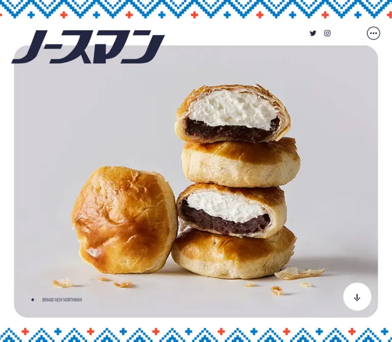
大きなロゴと菓子の断面写真を主役に、青と朱色の編み模様を配した公式ブランドサイト。明朝体の文章、淡いグレーの写真背景、余白を生かした構成が特徴。
NORTHMAN — Style Reference
Golden pastry photography framed by woven blue pixels and an oversized navy wordmark.
Original URL: northman-hokkaido.com Final URL: northman-hokkaido.com Theme: light opening view, with white canvas, navy identity, and cool gray photography surfaces. Inspected: October 2, 2026, 02:32:49 JST; supplied retrieval timestamp: October 1, 2026, 17:32:49.743 UTC. Viewports: 1440 × 1000 desktop and 390 × 844 mobile, in CSS pixels. Scope: the current official brand homepage. Visual evidence covers its opening composition; rendered text, element bounds, and computed styles extend through purchasing information, news, product introduction, brand story, ingredients, packaging, and footer. Linked pages and expanded navigation were not inspected.
NORTHMAN pairs a forceful, forward-slanting wordmark with restrained Japanese serif typography and unusually prominent food photography. The opening photograph shows glossy pastry, white cream, and dark bean paste against a quiet gray studio background. Blue stepped chevrons and alternating blue/coral crosses frame the page like a strip of woven fabric. The result feels connected to product packaging and northern craft traditions without making the interface itself rustic.
The homepage serves several purposes: brand storytelling, ingredient explanation, news, store discovery, and links to external shopping. Its first view prioritizes recognition and appetite. Commerce is available in the header, while a stronger orange purchase banner follows the opening section. Preserve that hierarchy rather than inserting a large sales headline over the photograph.
閉じる
NORTHMAN — Style Reference
Golden pastry photography framed by woven blue pixels and an oversized navy wordmark.
Original URL: northman-hokkaido.com Final URL: northman-hokkaido.com Theme: light opening view, with white canvas, navy identity, and cool gray photography surfaces. Inspected: October 2, 2026, 02:32:49 JST; supplied retrieval timestamp: October 1, 2026, 17:32:49.743 UTC. Viewports: 1440 × 1000 desktop and 390 × 844 mobile, in CSS pixels. Scope: the current official brand homepage. Visual evidence covers its opening composition; rendered text, element bounds, and computed styles extend through purchasing information, news, product introduction, brand story, ingredients, packaging, and footer. Linked pages and expanded navigation were not inspected.
NORTHMAN pairs a forceful, forward-slanting wordmark with restrained Japanese serif typography and unusually prominent food photography. The opening photograph shows glossy pastry, white cream, and dark bean paste against a quiet gray studio background. Blue stepped chevrons and alternating blue/coral crosses frame the page like a strip of woven fabric. The result feels connected to product packaging and northern craft traditions without making the interface itself rustic.
The homepage serves several purposes: brand storytelling, ingredient explanation, news, store discovery, and links to external shopping. Its first view prioritizes recognition and appetite. Commerce is available in the header, while a stronger orange purchase banner follows the opening section. Preserve that hierarchy rather than inserting a large sales headline over the photograph.
How to Read This Reference
- Measured values come from the supplied rendered DOM, computed styles, or CSS custom properties. They are not independently remeasured here.
- Visual estimates describe the supplied original-page screenshots. Frame edges and radii are approximate because their element styles were not included.
- Derived values are arithmetic interpretations of source tokens, such as the 28-part viewport module implied by
--col. - Recommendations and Quick Start code are implementation guidance, not recovered source code.
- The three desktop captures show essentially the same opening layout. The two mobile captures differ substantially in photograph visibility; the complete mobile photograph is the reference for composition, while the incomplete state remains an unresolved rendering observation.
- Lower-page typography and content structure have DOM support, but their full visual compositions were not captured. Background artwork, image placement, and expanded states in those sections remain unverified.
Tokens — Colors
Core Palette
The names in the first column are descriptive aliases. Source variable names and values are supplied evidence.
| Name | Value | Source token | Role and evidence |
|---|---|---|---|
| Canvas White | #ffffff |
--white |
White opening canvas; also the visible scroll disc and computed reversed text in story/footer content |
| Identity Navy | #232742 |
--navy |
Computed body and navigation text; visually consistent with the wordmark and icons |
| Textile Blue | #0077c3 |
--blue |
Source blue corresponding to the dominant blue border motif |
| Signal Orange | #f04933 |
--orange |
Measured purchase-button background; coral/orange accents also appear in the woven border |
| Hero Gray | #d1cfd4 |
--hero-bg |
Declared hero surface color, visually consistent with the pale gray photographic stage |
| Neutral Rule | #d8d8d8 |
--border |
Available source border token; the precise color of the visible header pill outlines was not separately measured |
The hero's gray is not a perfectly flat photographed field: illumination, shadows, and image processing create local variation. Use the token as the underlying surface and let photography supply those variations.
Additional Declared Colors
| Source token | Value | Evidence boundary |
|---|---|---|
--products-bg |
#e3e4e6 |
Declared product-surface token; application beyond the opening view was not visually verified |
--package-bg |
#dddcdf |
Declared packaging-surface token; the package section's complete appearance was not captured |
--sky |
#20aee5 |
Declared secondary blue; no visible opening component was conclusively mapped to it |
--gray |
#666666 |
Declared neutral; not the primary text color in the measured elements |
--black |
#010101 |
Declared near-black; the opening identity uses navy instead |
Numerous CMS preset colors, gradients, and shadows were also exposed. Their presence does not establish that the current design uses them. They are excluded from the working palette.
Color hierarchy: white and pale gray occupy most of the opening frame. Navy carries identity and controls. Blue and orange establish the border rhythm. Orange becomes a stronger functional accent in the purchase banner below the opening view.
Tokens — Typography
Japanese Editorial Serif
Computed source stack: fot-tsukuaoldmin-pr6n, 游明朝体, YuMincho, "Yu Mincho", serif.
This stack appears on body copy, navigation labels, purchase copy, ingredient headings, and most measured Japanese text. The dominant reported weight is 300, which creates a light editorial texture beside the dense wordmark. News headlines and the purchase availability note use 600.
The computed family identifies the requested stack; the evidence does not independently establish which font file supplied every glyph. Load the named webfont only when available and licensed, and retain a Japanese serif fallback.
Condensed English Utility Type
Computed source stack: acumin-pro-condensed, sans-serif.
The measured BRAND NEW NORTHMAN caption uses weight 500, normal tracking, and a compact condensed appearance. It is 14px on desktop and 12px on mobile. This provides a precise utility register beneath the much larger graphic logo.
Do not automatically assign this family to every English section label: individual computed styles for INFORMATION, FEATURES, and PACKAGE were not supplied.
Japanese Sans-serif Section Label
The measured Japanese brand-story label uses 游ゴシック体, YuGothic, "Yu Gothic", sans-serif, weight 300: 14px / 22.4px on desktop and 14.4px / 23.04px on mobile. This is a small labeling exception within a predominantly serif text system.
Wordmark as Artwork
The main ノースマン identity is a custom graphic wordmark. Its wide, heavy, slanted strokes are not represented by the heading's computed 22.5px or 24px text size. Reuse authorized artwork rather than trying to reconstruct the mark with a font and font-style: italic.
The DOM includes both a small home-logo heading and the large main mark. The supplied opening captures emphasize the large mark; do not render two prominent logos merely because both headings occur in the extraction.
Measured Type Scale
Values below are font-size / line-height in CSS pixels.
| Role | Desktop | Mobile | Weight and notes |
|---|---|---|---|
| Base body | 15 / 24 |
16 / 25.6 |
300; body text becomes slightly larger on mobile |
| Header pill labels | 17.6 / 28.16 |
17.6 / 28.16 computed |
300; labels are visually absent in the mobile header |
| Hero English caption | 14 / 22.4 |
12 / 19.2 |
Condensed sans-serif, 500 |
| Purchase-button copy | 15 / 24 |
16 / 25.6 |
Serif, 300 |
| Purchase availability note | 18 / 32.4 |
16.8 / 30.24 |
Serif, 600 |
| News title | 17.55 / 28.08 |
14.4 / 23.04 |
Serif, 600 |
| News detail link | 15 / 24 |
13.6 / 21.76 |
Serif, 300 |
| Product introduction headline | 48 / 76.8 |
31.2 / 49.92 |
Serif, 300 |
| Large brand statement | 39 / 62.4 |
26 / 41.6 |
Serif, 300 |
| Ingredient headline | 39 / 54.6 |
26 / 36.4 |
Serif, 300 |
| Introduction/package paragraphs | 18 / 32.4 |
17.2 / 30.96 |
Serif, 300 |
| Ingredient paragraphs | 15 / 27 |
16 / 28.8 |
Serif, 300 |
| Footer navigation | 14 / 22.4 |
14.4 / 23.04 |
Serif, 300 |
Tracking and Paragraph Rhythm
- Base text reports
-0.375pxtracking on desktop and-0.4pxon mobile. Both correspond to-0.025emat the respective body size, but many descendants inherit the absolute computed value. - Desktop header pills use
0.88pxtracking, equivalent to0.05em. Their mobile computed tracking is0.352px, or0.02em. - Purchase-button tracking is
0.75pxdesktop and0.8pxmobile, equivalent to0.05em. - Narrative paragraphs generally use
1.8line height. Ingredient headings use1.4; the introduction headline uses1.6. - Measured introduction paragraphs are separated by approximately one text-size unit:
18pxdesktop and17.2pxmobile. Packaging paragraphs have larger gaps of approximately one line height.
The system relies on light weight, careful line breaks, and generous leading rather than bold typography everywhere.
Tokens — Spacing & Shapes
Viewport Modules
| Source property | Desktop value | At 1440px width | Mobile value | At 390px width |
|---|---|---|---|---|
--col |
3.57143vw |
51.43px |
3.57143vw |
13.93px |
--dot |
0.59524vw |
8.57px |
1.19048vw |
4.64px |
--vh |
10px |
One percent of the captured height | 8.44px |
One percent of the captured height |
--col is approximately one twenty-eighth of the viewport. Desktop --dot is approximately one sixth of that column; mobile --dot is approximately one third. These are useful mathematical relationships, not evidence that the source implements a CSS Grid with 28 tracks.
| Derived spacing | Desktop | Mobile | Supported use |
|---|---|---|---|
1 × col |
51.43px |
13.93px |
Desktop hero side inset; several mobile section-header insets |
2 × col |
102.86px |
27.86px |
Desktop editorial inset; mobile hero and main paragraph inset |
3 × col |
154.29px |
41.79px |
Introduction section's measured vertical padding |
4 × col |
205.71px |
55.71px |
Mobile news inset and mobile scroll-disc diameter |
Avoid transferring one multiplier unchanged to every breakpoint. The module remains viewport-based, while individual components change their column allocation.
Opening Geometry
| Element | Desktop, 1440 × 1000 | Mobile, 390 × 844 | Evidence |
|---|---|---|---|
| Top textile band | About 68px high |
About 36px high |
Visual estimate |
| Hero frame | About x:51, y:167, w:1338, h:744px |
About x:28, y:114, w:334, h:695px |
Visual estimate |
| Hero radius | About 50–52px |
About 28–30px |
Visual estimate |
| Main wordmark box | x:41.14, y:95.14, w:565.70, h:154.28px |
x:19.50, y:148.75, w:348.20, h:83.56px |
DOM measurement; artwork ink occupies less than the box |
| Instagram/LINE link boxes | 39 × 39px |
40 × 40px |
DOM measurement |
| Product/store pill | 138.38 × 40.67px |
54.55 × 47.48px |
DOM measurement |
| Online pill | 156.86 × 40.67px |
54.55 × 47.48px |
DOM measurement |
| Menu circle | About 41px diameter |
About 42px diameter |
Visual estimate |
| Scroll disc/link | 102.84 × 102.84px |
55.70 × 55.70px |
DOM measurement |
| Hero caption group | 159.61 × 25.89px |
119.77 × 22.19px |
DOM measurement |
The desktop frame is a wide photographic stage, approximately 1.8:1. Mobile changes it into a tall stage, approximately 0.48:1. This is a significant recomposition rather than a uniformly scaled desktop layout.
Shapes and Rules
- Header destination links report
border-radius: 999px; their pale outlines are visible on desktop. - The mobile header retains compact link boxes but visually removes the text and surrounding pill treatment.
- The purchase link also reports
999pxradius. - The scroll link reports
50%radius and appears as a white disc with a small navy stepped arrow. - The menu control is a thin navy circle containing three small square dots.
- Main photographic corners are generous; the surrounding content does not establish a general rounded-card system.
- No interface elevation shadow is evident in the opening view. Shadows under the pastries belong to the photograph.
Components
Textile Page Frame
Role: connects the digital page to the brand's decorative packaging language.
A full-width strip of stepped blue chevrons runs along the top, with alternating coral and blue plus signs. A related strip appears beneath the photographic stage. The geometry resembles stitches assembled from small square units. It is crisp and rhythmic rather than softly illustrated.
The chevron rhythm is approximately 120px on desktop and 65px on mobile, estimated from the captures. Alternating cross colors make the complete color repeat longer. The actual tile dimensions and asset format were not supplied.
The packaging text independently describes weaving and knitting as design motifs. Preserve square steps and the white spaces between marks. Do not replace the border with a smooth zigzag or a generic dashed rule.
Header Utility Navigation
Role: immediate access to social channels, product information, stores, shopping, and further navigation.
The desktop order is Instagram, LINE, 商品一覧, 販売店舗, and オンライン, followed by a separately spaced circular ellipsis control. The first two are standalone brand icons. The three destination links combine a navy outline icon, a light Japanese serif label, a fine border, and a pill silhouette.
Measured desktop pill padding is 5.28px 14.08px. The product/store pills begin around x:775.83px and x:929.20px, with approximately 15px between adjacent items. Their top edge is about 93.88px.
On mobile, navigation becomes a single row above the wordmark and frame. Instagram and LINE remain recognizable symbols; gift, storefront, and shopping-cart icons stand without visible labels. Their measured padding is 5.28px 8.8px. The ellipsis circle remains distinct at the far right.
The supplied links establish these destinations:
| Control | Captured destination | Verification |
|---|---|---|
商品一覧 |
/products/ |
Href observed; destination not opened |
販売店舗 |
/store/ |
Href observed; destination not opened |
オンライン |
https://hokkaido-special.com/collections/northman |
External shopping href observed |
https://www.instagram.com/northman_hokkaido/ |
Href observed | |
| LINE | https://lin.ee/Nu3IylL |
Href observed |
Additional navigation links exist outside the captured viewport. Their presence does not establish the menu's open appearance, animation, focus behavior, or scroll locking.
Oversized Wordmark
Role: primary brand recognition and compositional anchor.
On desktop, the wordmark occupies the upper-left area and overlaps the frame's upper boundary. Its left edge sits slightly outside the photographic frame. The utility navigation occupies the upper-right area, balancing the logo without competing in scale.
On mobile, the mark moves below the utility row and lies across the upper portion of the gray stage. Its box is about 348px wide against a 334px frame, so it extends beyond both sides. The logo must remain outside the photograph's clipping container even though the photograph itself is rounded and clipped.
Keep the navy artwork solid and unshadowed. The contrast comes from shape and scale.
Product Photography Stage
Role: communicate pastry texture and the cream/bean filling before the visitor reads body copy.
The desktop composition contains a stack of pastries near the center-right, with cut faces exposing white cream above dark bean paste. One whole pastry leans at the left. Loose crumbs and a soft cast shadow connect the products to the studio surface. The generous gray surroundings leave breathing room for identity and controls.
The complete mobile capture retains a large gray area behind the wordmark, then places the pastry stack lower in the frame. The stack and left pastry are cropped by the narrow sides. This crop keeps the cream cross-sections prominent; it does not simply shrink the entire desktop photograph to phone width.
The mobile product scale suggests a separately positioned image plane within the tall frame. The exact source sizing and asset dimensions are unknown. A generic full-height object-fit: cover treatment should be checked carefully: it can enlarge the food far beyond the supplied mobile composition.
Hero Caption and Scroll Cue
Role: provide a small editorial signature and a clear continuation affordance.
The lower-left caption pairs a small star-like mark with BRAND NEW NORTHMAN. Its group begins at x:102.84px, y:832.66px on desktop and x:55.69px, y:759.31px on mobile.
The lower-right scroll cue is a white circle with a navy pixel-step arrow. Its measured location is x:1260.03px, y:781.42px on desktop and x:292.53px, y:739.72px on mobile. Relative to the visually estimated frame, its right and bottom clearance is approximately 26px desktop and 14px mobile.
The anchor targets #section-information. A click outcome, smooth-scroll duration, and final landing position were not supplied. Give it an explicit accessible name in a new implementation; the extracted link text is empty.
Purchase Banner
Role: translate interest into a specific shopping route after the opening composition.
This component is below the supplied screenshots but has detailed DOM measurements. A centered orange pill contains 生ノースマン 購入はこちら, followed by a separate bold availability note. The button links directly to an external product URL rather than the collection destination used in the header.
| Measurement | Desktop | Mobile |
|---|---|---|
| Button size | 382.81 × 57px |
343.22 × 65.25px |
| Button position in supplied bounds | x:528.59, y:1097.66px |
x:23.39, y:917.13px |
| Banner padding | 72px 102.86px 0 |
31.2px 23.4px 15.6px |
| Vertical gap | 12px |
11.2px |
| Button background | #f04933 |
#f04933 |
| Button text | White | White |
The mobile button nearly fills its available width. The note remains separate, so availability information can wrap without enlarging or destabilizing the action label. Treat the schedule as current content, not a permanent design token.
Information List
Role: publish dated sales and event announcements.
The observed content consists of three dated entries, each with a Japanese headline, explanatory text, and 詳しくはこちら. A separate 過去のお知らせを見る link leads to the archive. Dates in the supplied content are September 2026 entries.
Desktop headline blocks start at approximately x:462.88px and span 822.86px. On mobile, they start at x:55.69px and span 278.63px, producing a noticeably inset reading column. The measured headline-to-headline interval is approximately 212px desktop and 275px mobile, reflecting taller wrapped entries on the phone.
These measurements support a spacious editorial list. The date's exact alignment, list dividers, and surrounding artwork are not visible in the supplied captures and should not be invented as observed details.
Product Introduction
Role: explain how the cream-filled product develops the established pastry.
The section contains a graphic product heading, a large Japanese statement, and three narrative paragraphs. Desktop text is intentionally asymmetric: the headline begins near x:617px, while the narrower body column begins near x:823px and measures about 463px wide. It does not form a centered, full-width marketing text block.
On mobile, the headline and paragraphs share the approximately 334px column at x:27.84px. The headline changes from two lines to three in the rendered text:
ノースマンらしさを / 残しながら進化した、 / 生ノースマン.
The DOM contains separate desktop/mobile line-break variants. Preserve deliberate phrasing when adapting copy, but avoid presenting both variants to assistive technology.
Brand Story
Role: connect the product to its 1974 origin and manufacturing tradition.
The section includes Japanese and English labels, an introductory statement, READ MORE, and additional historical paragraphs in the DOM. The measured Japanese label and story copy are white. The supporting background layer is not present in the visual evidence, so its exact color or imagery cannot be established from transparent wrapper backgrounds.
The longer story paragraphs measure approximately 617px wide on desktop and 279px on mobile. Some extend beyond the reported section bounds and overlap later content coordinates. This could involve clipping or an unexercised state; it does not prove that all paragraphs are simultaneously visible.
The behavior of READ MORE is unverified. Do not claim a modal, accordion, or specific expansion animation.
Large Brand Statement
Role: provide an editorial pause between history and ingredient detail.
A large serif statement uses 39px / 62.4px on desktop and 26px / 41.6px on mobile. The desktop heading occupies a roughly 720px block beginning near x:617px; mobile uses the standard 334px content width.
Supporting copy follows at 18px / 32.4px desktop and 17.2px / 30.96px mobile. The text remains light in weight, allowing scale and line spacing to carry emphasis.
Ingredient Features
Role: explain the pastry, cream, and bean paste as three distinct product qualities.
The sequence is PIE, CREAM, and RED BEAN PASTE. Each feature has a two-line Japanese headline and two paragraphs. The repeated structure is editorial rather than a compact three-card feature grid.
Desktop text blocks begin around x:156.27px and measure 462.84px wide. Mobile blocks begin at x:27.84px and measure 334.31px. Headings use 39px desktop and 26px mobile, while body copy grows from 15px to 16px on mobile.
The content explains the folded pastry, Hokkaido cream, and peeled bean paste. The supplied extraction does not establish the ingredient photographs' exact positions, aspect ratios, or whether imagery alternates sides. Retain the verified text rhythm and treat any proposed image pairing as an implementation choice.
Packaging Section
Role: explain the visual identity and the textile-inspired packaging approach.
The section has Japanese and English labels followed by three substantial paragraphs. Its desktop body column starts near x:822.88px, at approximately 462.84px wide. Mobile uses the familiar 334.31px column at x:27.84px.
The original-page text attributes the established wordmark to Kenichi Kuriyagawa (栗谷川 健一) and explains that its design was retained and placed boldly on the packaging. This supports a credit for the original logotype, not a website-production credit.
The declared --package-bg is available, but the complete packaging surface and photography were not visually captured.
Footer
Role: consolidate navigation, brand ownership context, contact access, and return-to-top navigation.
The rendered footer includes the NORTHMAN identity, section links, products, stores, news, contact, 千秋庵, a Sapporo address, and © 2026 Sapporo Senshuan,inc. It also contains social and shopping links.
Desktop bounds place the company information toward the left and two columns of brand links to its right. Mobile places the brand navigation above the company information; the link list still has two columns, beginning around x:27.84px and x:202px.
The BACK TO TOP link moves from the desktop footer's lower-right region to an early, nearly full-width position on mobile. White footer text is measured, but the complete backing surface was not captured. The mobile utility-link bounds also indicate wrapping near the footer's end; do not assume they retain the single-row header arrangement.
Tokens — Motion & Interaction
Measured Transition Declarations
| Element | Supplied computed transition | What can be concluded |
|---|---|---|
| Header destination pills | background 0.2s |
Background changes have a 200ms transition; target colors were not supplied |
| Purchase link | opacity 0.2s, transform 0.2s |
Opacity and transform transitions are declared; hover/press endpoints are unknown |
| Introduction/package paragraphs | 0.6s, then 0.6s 0.2s and 0.6s 0.4s |
Staggered timing is declared; animated properties and triggers were not established |
| Ingredient paragraphs | 0.6s 0.2s and 0.6s 0.3s |
Related staggered timing; no measured displacement or opacity endpoints |
| Availability note | 0.6s 0.2s |
A delayed transition is declared |
| News detail links | 0.4s desktop; none mobile |
A breakpoint difference in transition treatment is directly recorded |
Entries that report only transition: all do not establish a useful animation duration. Sampled elements reporting animation: none do not rule out animation in descendants, pseudo-elements, images, or JavaScript.
Capture Differences and Limits
One mobile capture shows only a narrow upper fragment of the pastry while most of the stage remains gray. Another shows the full mobile composition. This is evidence of inconsistent captured visibility, not sufficient evidence for a specific reveal effect, clipping animation, loading design, or permanent fault.
The textile motif also shifts slightly between some captures, but the cause, speed, direction, and repeat behavior are unknown. Do not derive a scrolling marquee or parallax system from still images alone.
The capture process reports waiting for finite motion and image decoding within limits. Those checks improve readiness but do not prove semantic completeness. No supplied interaction log establishes menu opening, story expansion, button hover endpoints, or anchor-scroll behavior.
Recommended adaptation: begin with the complete photograph visible. Add only restrained, optional transitions, keep navigation functional without animation, and provide a reduced-motion path. The pixelated ornament does not by itself justify stepped animation throughout the interface.
Surfaces
| Layer | Appearance | Evidence and implementation implication |
|---|---|---|
| Opening canvas | White | Visually confirmed; gives the textile bands and identity clear separation |
| Hero stage | Cool pale gray with photographic tonal variation | Visually confirmed; source --hero-bg supplies an underlying color |
| Header destination links | Fine outlined pills on desktop | Visually confirmed; minimal contrast without elevation |
| Scroll control | White circular disc with navy arrow | Visually confirmed; shadow-free separation from the gray stage |
| Purchase action | Orange pill with white copy | Computed background and geometry confirmed below the opening view |
| Product/package surfaces | Pale gray tokens declared | Exact lower-page application is unverified |
| Story/footer contrast | White text confirmed | Background layer and full composition not supplied |
Use flat color, whitespace, large photographic boundaries, and typographic contrast. There is no evidence for a general glass, gradient, or shadow-elevation system.
Imagery
Food Photography
The hero is a carefully arranged studio still life. Essential characteristics include:
- Golden, glossy pastry with irregular folds and believable baked texture.
- Cut faces that clearly separate cream, bean paste, and pastry shell.
- A vertical stack balanced by a leaning whole pastry.
- A cool neutral sweep with soft directional shadows.
- Small scattered flakes that reinforce texture without making the scene cluttered.
- Sufficient empty background to accommodate the oversized logo and small controls.
Keep the photograph naturally rendered. Do not apply image-rendering: pixelated to the food: pixel geometry belongs to the border and arrow, while the pastry depends on fine photographic detail.
Graphic Assets
| Asset | Observed character | Source availability |
|---|---|---|
| Main wordmark | Heavy slanted navy custom lettering | Visible in captures; asset URL not supplied |
| Hero photograph | Stacked cream-filled pastries on gray | Visible in complete desktop/mobile captures; asset URL and intrinsic dimensions not supplied |
| Textile ornament | Blue square-step chevrons and blue/coral crosses | Visible; file format and repeat dimensions unknown |
| Scroll arrow | Small navy stepped arrow | Visible; implementation format unknown |
| Header symbols | Instagram, LINE, gift, shop, cart, ellipsis | Visible; exact icon assets or library not identified |
| Lower-page imagery | Not sufficiently exposed | Do not invent asset paths or detailed compositions |
Use authorized brand assets where available. A CSS layout can reproduce the spatial system, but the logo, photograph, and ornament provide much of the identity.
Layout & Responsive Behavior
Desktop Composition
The photograph occupies nearly the full viewport width with approximately one --col margin on each side. The oversized wordmark overlaps its upper-left edge, while the compact utility navigation occupies the upper-right region. The caption and scroll disc balance the lower corners.
Lower-page DOM measurements reveal a different rhythm: text shifts between left and right columns, with large amounts of unoccupied horizontal space. Introduction and packaging paragraphs occupy roughly nine columns; their headings can begin farther left. Ingredient text is left weighted. Preserve these changes in alignment rather than centering every section into the same narrow container.
Mobile Recomposition
- The utility controls move into a row at the very top, beneath the textile band.
- Product/store/shop labels disappear visually while their icons remain.
- The wordmark moves into the upper gray stage and slightly overhangs its sides.
- The hero becomes tall, with substantial gray space above the product.
- The photograph is tightly cropped horizontally while retaining readable cream cross-sections.
- The scroll disc shrinks from approximately
103pxto56px. - Most narrative and ingredient content uses a
334pxcolumn with approximately28pxside margins. - News entries are more deeply inset, using approximately
279pxwidth and56pxside margins. - Main headings shrink, but base and ingredient body text become slightly larger.
- The footer reorders major blocks and brings return-to-top navigation forward.
Breakpoint Evidence
An embedded style excerpt contains a desktop override beginning at min-width: 913px. This supports using 913px as a practical reconstruction breakpoint, but it does not establish the entire source breakpoint system. Only 1440px and 390px widths were captured; intermediate widths and landscape phones remain unverified.
Scroll and Geometry Caveat
The supplied documentHeight equals the viewport height at both sizes, while element bounds continue to approximately 11,299px on desktop and 9,483px on mobile. Several outer elements also report zero height. These values may reflect the page's containment or scrolling implementation, but the mechanism is not provided.
Do not treat the reported document height as evidence that the site contains only one screen, or treat the deepest element coordinate as a verified native scroll height. The supplied images show the opening view, not a successful visual traversal of every later section. For a new implementation, normal document flow is a reasonable accessible baseline unless custom scrolling is explicitly required.
Do’s and Don’ts
Do
- Preserve the contrast between the dense navy wordmark and light Japanese serif text.
- Let food photography carry the first view's main message.
- Keep the textile border crisp, modular, blue-led, and sparingly accented with coral.
- Use white and cool gray as large quiet fields.
- Keep desktop navigation small relative to the logo and photograph.
- Recompose the mobile photo instead of simply scaling down the desktop scene.
- Place the wordmark outside the image clipping layer so its overhang remains visible.
- Preserve the distinct reading widths for news, narrative copy, and ingredient sections.
- Maintain the separate collection-shopping link and product-specific purchase action.
- Keep orange concentrated in meaningful accents and the purchase action.
- Treat observed font sizes, graphic dimensions, and content line breaks as separate systems.
Don’t
- Do not replace the custom logo with a generic bold italic font.
- Do not flatten the homepage into a conventional hero-plus-three-cards template.
- Do not cover the pastry photograph with an invented large headline or oversized CTA.
- Do not pixelate the food photograph to match the decorative border.
- Do not smooth the square-step ornament into thin vector waves.
- Do not turn every section into a rounded, elevated card.
- Do not assume the incomplete mobile image is the intended finished appearance.
- Do not invent a carousel, parallax effect, menu drawer, or story modal from untested controls.
- Do not infer lower-section background colors from transparent element wrappers alone.
- Do not use the CMS's entire preset palette as the site's visual system.
- Do not assume all body copy becomes smaller on mobile; several measured roles become larger.
Recommended Implementation Additions
These are recommendations for a new implementation, not verified original-site features.
- Give the menu, scroll arrow, and all icon-only links explicit accessible names. Retain the Japanese destination labels for assistive technology when hiding them visually.
- Keep interactive hit areas at least approximately
44px, even where social artwork occupies39–40px. - Provide a visible navy focus outline. Decorative patterns must not obscure focus or overlap hit targets.
- Use the wordmark's text alternative once at the appropriate heading level; avoid duplicate accessible headings from responsive artwork variants.
- Mark textile borders and purely decorative stars as decorative. Give the product photograph concise descriptive alternative text when it conveys product information.
- Ensure the complete hero photograph is visible when scripts fail or reduced motion is requested.
- Reserve image dimensions and coordinate decoding with any reveal treatment so the partially visible mobile state is not left persistent.
- If the menu or story control opens additional content, implement keyboard access, state announcements, and focus handling appropriate to the actual pattern.
- Keep ordinary fragment links and deep links functional if enhancing scrolling.
- Check white text on the orange purchase fill for the chosen text size and weight. Preserve the original color as a brand token, but adjust the action treatment if accessibility testing requires it.
- Validate intermediate widths around the observed desktop breakpoint, especially the long header row and large wordmark.
Agent Prompt Guide
Quick Color Reference
- Main canvas:
#ffffff. - Text, identity, and utility icons:
#232742. - Textile blue:
#0077c3. - Textile accent and purchase fill:
#f04933. - Underlying hero surface:
#d1cfd4. - Available product/package surfaces:
#e3e4e6and#dddcdf; their exact placement needs further evidence. - Use flat surfaces and photographic shadows, not UI elevation.
Overall Prompt
“Create a Japanese confectionery brand homepage with an oversized custom navy wordmark, a broad rounded gray photography stage, and crisp blue textile borders made from square-step chevrons and alternating blue/coral crosses. Feature a studio still life of golden pastries with cream and bean-paste cross-sections, scattered flakes, and soft natural shadows. Use light Japanese serif body copy and a small condensed English caption. Place Instagram, LINE, product, store, and shopping utilities at the top, with a separate circular ellipsis control. On mobile, show icon-only utilities above the logo, use a tall gray stage, and carefully crop the pastry scene horizontally. Follow with a restrained orange purchase banner, dated news, asymmetric brand storytelling, three ingredient explanations, and packaging copy. Keep unverified interactions simple and accessible.”
Example Component Prompts
- Opening composition: “Build a white page with a blue-and-coral pixel textile band, a gray hero frame inset about 51px at 1440px width, approximately 51px corners, and a large navy wordmark overlapping its upper-left edge. Keep the photograph dominant. Add a tiny condensed caption at lower left and a white circular scroll control at lower right.”
- Responsive navigation: “Create two standalone social links, three outlined destination pills with Japanese serif labels, and a separate circle containing three square dots. At phone width, retain the icon order, visually hide destination labels accessibly, and remove the desktop pill outlines.”
- Mobile photograph: “Within a 334px-wide, approximately 695px-tall gray frame at a 390 × 844 viewport, reserve open gray space behind the large wordmark. Place a tightly cropped pastry still life lower in the frame with cream cross-sections visible. Tune the image plane independently from the frame's aspect ratio.”
- Editorial section: “Use light Japanese serif headings at 48px with 1.6 leading on desktop and 31.2px on mobile. Place desktop narrative paragraphs in a right-side column around 463px wide; switch to a 334px mobile column with 17.2px text and 1.8 leading. Avoid cards and heavy borders.”
- Purchase banner: “Place a centered orange pill below the opening section, with white Japanese purchase copy and a separate bold availability note. Use about 383 × 57px on desktop and nearly the full available width on mobile. Keep the action distinct from the quieter header shopping link.”
- Ingredient chapter: “Build three sequential editorial features for pastry, cream, and bean paste. Use two-line light serif headings, generous line height, and two readable paragraphs per feature. Match the verified text widths; introduce imagery only when suitable assets and composition requirements are available.”
Quick Start
CSS Custom Properties
This is a recommended CSS adaptation, not recovered source. It preserves measured colors, typography, viewport modules, and key control dimensions. Hero positioning and corner radii approximate the supplied screenshots. The mobile photograph settings are a starting point for artwork composed like the desktop capture and must be tuned to the actual asset.
Use .hero-wordmark as a sibling of .hero-frame, not a descendant of its clipped image area. Supply authorized image and logo elements. Set --knit-art to a project-owned repeating ornament asset; no original asset URL was provided.
:root {
  /* Observed source colors */
  --color-paper: #ffffff;
  --color-ink: #232742;
  --color-blue: #0077c3;
  --color-accent: #f04933;
  --color-hero: #d1cfd4;
  --color-rule: #d8d8d8;
  --color-products: #e3e4e6;
  --color-package: #dddcdf;

  /* Observed family names; font files are not included */
  --font-editorial: fot-tsukuaoldmin-pr6n, YuMincho,
    'Yu Mincho', serif;
  --font-condensed: acumin-pro-condensed, sans-serif;
  --font-label: YuGothic, 'Yu Gothic', sans-serif;

  /* Derived from source viewport modules */
  --col: calc(100vw / 28);
  --dot: calc(var(--col) / 6);
  --content-inset: calc(2 * var(--col));

  /* Measured desktop type */
  --text-body: 15px;
  --text-narrative: 18px;
  --text-feature: 39px;
  --text-intro: 48px;
  --text-caption: 14px;
  --tracking-body: -0.375px;

  /* Screenshot-based approximations */
  --hero-radius: var(--col);
  --knit-art: none;
  --knit-repeat: calc(28 * var(--dot));

  /* Observed transition durations, with recommended explicit easing */
  --motion-control: 200ms ease;
  --motion-copy: 600ms ease;
}

* {
  box-sizing: border-box;
}

body {
  margin: 0;
}

.northman-page {
  color: var(--color-ink);
  background: var(--color-paper);
  font-family: var(--font-editorial);
  font-size: var(--text-body);
  font-weight: 300;
  line-height: 1.6;
  letter-spacing: var(--tracking-body);
}

.northman-page a {
  color: inherit;
}

.hero {
  position: relative;
  display: flow-root;
}

.knit-band {
  height: calc(8 * var(--dot));
  background-image: var(--knit-art);
  background-repeat: repeat-x;
  background-size: var(--knit-repeat) 100%;
  pointer-events: none;
}

.knit-band--top {
  position: absolute;
  inset: 0 0 auto;
}

.knit-band--bottom {
  margin-top: calc(4.5 * var(--dot));
}

.hero-toolbar {
  position: absolute;
  z-index: 3;
  top: 6.52vw;
  right: 3vw;
  left: 46.375vw;
  display: flex;
  align-items: center;
  justify-content: space-between;
  gap: 20px;
}

.hero-links {
  display: flex;
  align-items: center;
  gap: 15px;
}

.social-link,
.nav-pill,
.menu-control {
  display: inline-flex;
  flex: none;
  align-items: center;
  justify-content: center;
  color: var(--color-ink);
  text-decoration: none;
}

.social-link {
  position: relative;
  width: 39px;
  height: 39px;
}

/* Recommended larger hit area without enlarging the artwork */
.social-link::after {
  position: absolute;
  inset: -3px;
  content: '';
}

.social-link > img,
.social-link > svg {
  display: block;
  width: 100%;
  height: 100%;
}

.nav-pill {
  width: 138.375px;
  min-height: 40.672px;
  gap: 8px;
  padding: 5.28px 14.08px;
  border: 1px solid var(--color-rule);
  border-radius: 999px;
  background: transparent;
  font-size: 17.6px;
  line-height: 1.6;
  letter-spacing: 0.05em;
  white-space: nowrap;
  transition: background var(--motion-control);
}

.nav-pill--online {
  width: 156.86px;
}

.nav-icon {
  flex: none;
  width: 23px;
  height: 23px;
}

.menu-control {
  width: 41px;
  height: 41px;
  padding: 0;
  border: 2px solid currentColor;
  border-radius: 50%;
  background: var(--color-paper);
  cursor: pointer;
}

/* Place a square-dot icon inside the menu button. */
.hero-frame {
  position: relative;
  height: max(420px, calc(100svh - 17.78vw));
  margin: 11.6vw var(--col) 0;
  overflow: hidden;
  border-radius: var(--hero-radius);
  background: var(--color-hero);
}

.hero-photo {
  display: block;
  width: 100%;
  height: 100%;
  object-fit: cover;
  object-position: center;
}

.hero-wordmark {
  position: absolute;
  z-index: 2;
  top: 6.607vw;
  left: 2.857vw;
  width: 39.286vw;
  height: 10.714vw;
  margin: 0;
}

.hero-wordmark img {
  display: block;
  width: 100%;
  height: 100%;
  object-fit: contain;
}

.hero-caption {
  position: absolute;
  z-index: 1;
  bottom: var(--col);
  left: var(--col);
  display: flex;
  align-items: center;
  gap: 18px;
  margin: 0;
  font-family: var(--font-condensed);
  font-size: var(--text-caption);
  font-weight: 500;
  line-height: 1.6;
  letter-spacing: normal;
}

.scroll-cue {
  position: absolute;
  z-index: 1;
  right: calc(0.5 * var(--col));
  bottom: calc(0.5 * var(--col));
  display: grid;
  width: calc(2 * var(--col));
  height: calc(2 * var(--col));
  place-items: center;
  border-radius: 50%;
  background: var(--color-paper);
  text-decoration: none;
}

.scroll-cue > svg,
.scroll-cue > img {
  width: 25%;
  height: 25%;
}

.purchase-banner {
  display: flex;
  flex-direction: column;
  align-items: center;
  gap: 12px;
  padding: 5vw var(--content-inset) 0;
}

.purchase-cta {
  display: flex;
  align-items: center;
  justify-content: center;
  width: min(100%, 382.81px);
  min-height: 57px;
  gap: 6px;
  padding: 10.5px 21px 10.5px 10.5px;
  border-radius: 999px;
  background: var(--color-accent);
  font-size: 15px;
  line-height: 1.6;
  letter-spacing: 0.05em;
  text-align: center;
  text-decoration: none;
  transition: opacity var(--motion-control),
    transform var(--motion-control);
}

.northman-page .purchase-cta {
  color: var(--color-paper);
}

.purchase-note {
  margin: 0;
  font-size: 18px;
  font-weight: 600;
  line-height: 1.8;
  letter-spacing: 0.04em;
  text-align: center;
}

.section-heading {
  padding: var(--col) var(--content-inset);
}

.intro {
  padding: calc(3 * var(--col)) var(--content-inset);
}

.intro-heading {
  width: calc(14 * var(--col));
  margin: 0 0 var(--col) auto;
  font-size: var(--text-intro);
  font-weight: 300;
  line-height: 1.6;
}

.intro-copy,
.package-copy {
  width: calc(9 * var(--col));
  margin-right: var(--col);
  margin-left: auto;
  font-size: var(--text-narrative);
  line-height: 1.8;
}

.intro-copy p {
  margin: 0 0 1em;
}

.package-copy p {
  margin: 0 0 1.8em;
}

.feature-copy {
  width: calc(9 * var(--col));
  margin-left: calc(3 * var(--col));
  font-size: var(--text-body);
  line-height: 1.8;
}

.feature-title {
  margin: 0 0 var(--col);
  font-size: var(--text-feature);
  font-weight: 300;
  line-height: 1.4;
}

.feature-copy p {
  margin: 0 0 1em;
}

/* Recommended focus treatment; original focus state was not captured. */
.northman-page :focus-visible {
  outline: 2px solid var(--color-ink);
  outline-offset: 5px;
}

@media (hover: hover) {
  /* Recommended endpoints; source durations alone were observed. */
  .nav-pill:hover {
    background: var(--color-products);
  }

  .purchase-cta:hover {
    transform: translateY(-2px);
  }
}

@media (max-width: 912px) {
  :root {
    --dot: calc(var(--col) / 3);
    --hero-radius: calc(2 * var(--col));
    --text-body: 16px;
    --text-narrative: 17.2px;
    --text-feature: 26px;
    --text-intro: 31.2px;
    --text-caption: 12px;
    --tracking-body: -0.4px;
  }

  .hero-toolbar {
    top: 40.94px;
    right: 5vw;
    left: 5.57vw;
    gap: 12px;
  }

  .hero-links {
    gap: clamp(0px, 1.466vw, 5.72px);
  }

  .social-link {
    width: 40px;
    height: 40px;
  }

  .nav-pill,
  .nav-pill--online {
    position: relative;
    width: 54.55px;
    min-height: 47.48px;
    padding: 5.28px 8.8px;
    border: 0;
    letter-spacing: 0.02em;
  }

  .nav-icon {
    width: 36.95px;
    height: 36.95px;
  }

  /* Preserve destination names for assistive technology. */
  .nav-label {
    position: absolute;
    width: 1px;
    height: 1px;
    padding: 0;
    overflow: hidden;
    clip-path: inset(50%);
    white-space: nowrap;
  }

  .menu-control {
    width: 42px;
    height: 42px;
  }

  .hero-frame {
    height: max(560px, calc(100svh - 149px));
    margin: 114px var(--content-inset) 0;
  }

  .hero-wordmark {
    top: 148.75px;
    left: 5vw;
    width: 89.286vw;
    height: 21.429vw;
  }

  /* Starting crop for a scene aligned like the desktop capture. */
  .hero-photo {
    position: absolute;
    top: 54%;
    left: 50%;
    width: 250%;
    max-width: none;
    height: auto;
    transform: translate(-50%, -50%);
  }

  .hero-caption {
    bottom: calc(2 * var(--col));
    left: calc(2 * var(--col));
    gap: 12px;
  }

  .scroll-cue {
    right: var(--col);
    bottom: var(--col);
    width: calc(4 * var(--col));
    height: calc(4 * var(--col));
  }

  .purchase-banner {
    gap: 11.2px;
    padding: 8vw 6vw 4vw;
  }

  .purchase-cta {
    width: 100%;
    min-height: 65.25px;
    gap: 5.6px;
    padding: 9.6px 17.6px 9.6px 9.6px;
    font-size: 16px;
  }

  .purchase-note {
    font-size: 16.8px;
  }

  .section-heading {
    padding: calc(2 * var(--col)) var(--col);
  }

  .intro-heading,
  .intro-copy {
    width: 100%;
    margin-right: 0;
    margin-left: 0;
  }

  .intro-heading {
    margin-bottom: var(--col);
  }

  .package-copy,
  .feature-copy {
    width: auto;
    margin-inline: var(--content-inset);
  }

  .feature-title {
    margin-bottom: var(--col);
  }
}

/* Recommended reduced-motion behavior. */
@media (prefers-reduced-motion: reduce) {
  .northman-page *,
  .northman-page *::before,
  .northman-page *::after {
    animation: none !important;
    transition: none !important;
    scroll-behavior: auto !important;
  }
}
The snippet deliberately leaves menu expansion, story disclosure, and lower-page image arrangement to explicit implementation requirements. It does not reproduce a custom scrolling engine or infer animation from incomplete image visibility. Validate the header at narrower and intermediate widths before using this adaptation in production.
Tailwind v4 Token Mapping
Optional mapping for a project already using Tailwind v4. This is not evidence that the original website uses Tailwind. Define the custom properties above first.
@theme inline {
  --color-paper: #ffffff;
  --color-ink: #232742;
  --color-textile: #0077c3;
  --color-signal: #f04933;
  --color-stage: #d1cfd4;
  --color-rule: #d8d8d8;

  --font-editorial: fot-tsukuaoldmin-pr6n, YuMincho,
    'Yu Mincho', serif;
  --font-condensed: acumin-pro-condensed, sans-serif;
  --font-label: YuGothic, 'Yu Gothic', sans-serif;

  --text-copy: var(--text-body);
  --text-narrative-copy: var(--text-narrative);
  --text-feature-heading: var(--text-feature);
  --text-intro-heading: var(--text-intro);
  --text-hero-caption: var(--text-caption);

  --spacing-column: var(--col);
  --spacing-dot: var(--dot);
  --spacing-content: var(--content-inset);
  --radius-stage: var(--hero-radius);
  --radius-pill: 999px;
}
Sources & Evidence
- NORTHMAN official homepage: supplied original and final URL, HTTP
200, rendered page title, homepage text, link destinations, computed styles, custom properties, and element bounds. The original and final URLs are identical. - Capture timestamp:
2026-10-01T17:32:49.743Z, equivalent to October 2, 2026, 02:32:49.743 JST. - Visual evidence: three supplied original-page desktop captures at
1440 × 1000and two mobile captures at390 × 844. All show the opening composition. One mobile capture contains incomplete photograph visibility. - DOM evidence: measurements for navigation, purchasing, information entries, introduction, story, ingredient features, packaging text, and footer at both viewport sizes. Offscreen bounds establish content and computed styling, not complete visual visibility.
- Interaction evidence: destination hrefs and transition declarations are available. Menu opening, story expansion, hover endpoints, anchor scrolling, and external destination behavior were not demonstrated.
- Inspection limits: no complete stylesheet, image URLs, font delivery records, lower-page screenshots, intermediate viewport captures, or interaction recordings were supplied. The reported viewport-sized document heights conflict with deeper element coordinates, so native scroll extent and containment remain uncertain.
This reference describes the current supplied homepage evidence. Measured values, screenshot estimates, derived relationships, and implementation recommendations are identified separately throughout.
# NORTHMAN — Style Reference

> Golden pastry photography framed by woven blue pixels and an oversized navy wordmark.

**Original URL:** [northman-hokkaido.com](https://northman-hokkaido.com/)
**Final URL:** [northman-hokkaido.com](https://northman-hokkaido.com/)
**Theme:** light opening view, with white canvas, navy identity, and cool gray photography surfaces.
**Inspected:** October 2, 2026, 02:32:49 JST; supplied retrieval timestamp: October 1, 2026, 17:32:49.743 UTC.
**Viewports:** 1440 × 1000 desktop and 390 × 844 mobile, in CSS pixels.
**Scope:** the current official brand homepage. Visual evidence covers its opening composition; rendered text, element bounds, and computed styles extend through purchasing information, news, product introduction, brand story, ingredients, packaging, and footer. Linked pages and expanded navigation were not inspected.

NORTHMAN pairs a forceful, forward-slanting wordmark with restrained Japanese serif typography and unusually prominent food photography. The opening photograph shows glossy pastry, white cream, and dark bean paste against a quiet gray studio background. Blue stepped chevrons and alternating blue/coral crosses frame the page like a strip of woven fabric. The result feels connected to product packaging and northern craft traditions without making the interface itself rustic.

The homepage serves several purposes: brand storytelling, ingredient explanation, news, store discovery, and links to external shopping. Its first view prioritizes recognition and appetite. Commerce is available in the header, while a stronger orange purchase banner follows the opening section. Preserve that hierarchy rather than inserting a large sales headline over the photograph.
閉じる
# NORTHMAN — Style Reference

> Golden pastry photography framed by woven blue pixels and an oversized navy wordmark.

**Original URL:** [northman-hokkaido.com](https://northman-hokkaido.com/)
**Final URL:** [northman-hokkaido.com](https://northman-hokkaido.com/)
**Theme:** light opening view, with white canvas, navy identity, and cool gray photography surfaces.
**Inspected:** October 2, 2026, 02:32:49 JST; supplied retrieval timestamp: October 1, 2026, 17:32:49.743 UTC.
**Viewports:** 1440 × 1000 desktop and 390 × 844 mobile, in CSS pixels.
**Scope:** the current official brand homepage. Visual evidence covers its opening composition; rendered text, element bounds, and computed styles extend through purchasing information, news, product introduction, brand story, ingredients, packaging, and footer. Linked pages and expanded navigation were not inspected.

NORTHMAN pairs a forceful, forward-slanting wordmark with restrained Japanese serif typography and unusually prominent food photography. The opening photograph shows glossy pastry, white cream, and dark bean paste against a quiet gray studio background. Blue stepped chevrons and alternating blue/coral crosses frame the page like a strip of woven fabric. The result feels connected to product packaging and northern craft traditions without making the interface itself rustic.

The homepage serves several purposes: brand storytelling, ingredient explanation, news, store discovery, and links to external shopping. Its first view prioritizes recognition and appetite. Commerce is available in the header, while a stronger orange purchase banner follows the opening section. Preserve that hierarchy rather than inserting a large sales headline over the photograph.

## How to Read This Reference

- **Measured** values come from the supplied rendered DOM, computed styles, or CSS custom properties. They are not independently remeasured here.
- **Visual estimates** describe the supplied original-page screenshots. Frame edges and radii are approximate because their element styles were not included.
- **Derived** values are arithmetic interpretations of source tokens, such as the 28-part viewport module implied by `--col`.
- **Recommendations** and Quick Start code are implementation guidance, not recovered source code.
- The three desktop captures show essentially the same opening layout. The two mobile captures differ substantially in photograph visibility; the complete mobile photograph is the reference for composition, while the incomplete state remains an unresolved rendering observation.
- Lower-page typography and content structure have DOM support, but their full visual compositions were not captured. Background artwork, image placement, and expanded states in those sections remain unverified.

## Tokens — Colors

### Core Palette

The names in the first column are descriptive aliases. Source variable names and values are supplied evidence.

| Name | Value | Source token | Role and evidence |
| --- | --- | --- | --- |
| Canvas White | `#ffffff` | `--white` | White opening canvas; also the visible scroll disc and computed reversed text in story/footer content |
| Identity Navy | `#232742` | `--navy` | Computed body and navigation text; visually consistent with the wordmark and icons |
| Textile Blue | `#0077c3` | `--blue` | Source blue corresponding to the dominant blue border motif |
| Signal Orange | `#f04933` | `--orange` | Measured purchase-button background; coral/orange accents also appear in the woven border |
| Hero Gray | `#d1cfd4` | `--hero-bg` | Declared hero surface color, visually consistent with the pale gray photographic stage |
| Neutral Rule | `#d8d8d8` | `--border` | Available source border token; the precise color of the visible header pill outlines was not separately measured |

The hero's gray is not a perfectly flat photographed field: illumination, shadows, and image processing create local variation. Use the token as the underlying surface and let photography supply those variations.

### Additional Declared Colors

| Source token | Value | Evidence boundary |
| --- | --- | --- |
| `--products-bg` | `#e3e4e6` | Declared product-surface token; application beyond the opening view was not visually verified |
| `--package-bg` | `#dddcdf` | Declared packaging-surface token; the package section's complete appearance was not captured |
| `--sky` | `#20aee5` | Declared secondary blue; no visible opening component was conclusively mapped to it |
| `--gray` | `#666666` | Declared neutral; not the primary text color in the measured elements |
| `--black` | `#010101` | Declared near-black; the opening identity uses navy instead |

Numerous CMS preset colors, gradients, and shadows were also exposed. Their presence does not establish that the current design uses them. They are excluded from the working palette.

**Color hierarchy:** white and pale gray occupy most of the opening frame. Navy carries identity and controls. Blue and orange establish the border rhythm. Orange becomes a stronger functional accent in the purchase banner below the opening view.

## Tokens — Typography

### Japanese Editorial Serif

**Computed source stack:** `fot-tsukuaoldmin-pr6n, 游明朝体, YuMincho, "Yu Mincho", serif`.

This stack appears on body copy, navigation labels, purchase copy, ingredient headings, and most measured Japanese text. The dominant reported weight is `300`, which creates a light editorial texture beside the dense wordmark. News headlines and the purchase availability note use `600`.

The computed family identifies the requested stack; the evidence does not independently establish which font file supplied every glyph. Load the named webfont only when available and licensed, and retain a Japanese serif fallback.

### Condensed English Utility Type

**Computed source stack:** `acumin-pro-condensed, sans-serif`.

The measured `BRAND NEW NORTHMAN` caption uses weight `500`, normal tracking, and a compact condensed appearance. It is `14px` on desktop and `12px` on mobile. This provides a precise utility register beneath the much larger graphic logo.

Do not automatically assign this family to every English section label: individual computed styles for `INFORMATION`, `FEATURES`, and `PACKAGE` were not supplied.

### Japanese Sans-serif Section Label

The measured Japanese brand-story label uses `游ゴシック体, YuGothic, "Yu Gothic", sans-serif`, weight `300`: `14px / 22.4px` on desktop and `14.4px / 23.04px` on mobile. This is a small labeling exception within a predominantly serif text system.

### Wordmark as Artwork

The main `ノースマン` identity is a custom graphic wordmark. Its wide, heavy, slanted strokes are not represented by the heading's computed `22.5px` or `24px` text size. Reuse authorized artwork rather than trying to reconstruct the mark with a font and `font-style: italic`.

The DOM includes both a small home-logo heading and the large main mark. The supplied opening captures emphasize the large mark; do not render two prominent logos merely because both headings occur in the extraction.

### Measured Type Scale

Values below are `font-size / line-height` in CSS pixels.

| Role | Desktop | Mobile | Weight and notes |
| --- | --- | --- | --- |
| Base body | `15 / 24` | `16 / 25.6` | `300`; body text becomes slightly larger on mobile |
| Header pill labels | `17.6 / 28.16` | `17.6 / 28.16` computed | `300`; labels are visually absent in the mobile header |
| Hero English caption | `14 / 22.4` | `12 / 19.2` | Condensed sans-serif, `500` |
| Purchase-button copy | `15 / 24` | `16 / 25.6` | Serif, `300` |
| Purchase availability note | `18 / 32.4` | `16.8 / 30.24` | Serif, `600` |
| News title | `17.55 / 28.08` | `14.4 / 23.04` | Serif, `600` |
| News detail link | `15 / 24` | `13.6 / 21.76` | Serif, `300` |
| Product introduction headline | `48 / 76.8` | `31.2 / 49.92` | Serif, `300` |
| Large brand statement | `39 / 62.4` | `26 / 41.6` | Serif, `300` |
| Ingredient headline | `39 / 54.6` | `26 / 36.4` | Serif, `300` |
| Introduction/package paragraphs | `18 / 32.4` | `17.2 / 30.96` | Serif, `300` |
| Ingredient paragraphs | `15 / 27` | `16 / 28.8` | Serif, `300` |
| Footer navigation | `14 / 22.4` | `14.4 / 23.04` | Serif, `300` |

### Tracking and Paragraph Rhythm

- Base text reports `-0.375px` tracking on desktop and `-0.4px` on mobile. Both correspond to `-0.025em` at the respective body size, but many descendants inherit the absolute computed value.
- Desktop header pills use `0.88px` tracking, equivalent to `0.05em`. Their mobile computed tracking is `0.352px`, or `0.02em`.
- Purchase-button tracking is `0.75px` desktop and `0.8px` mobile, equivalent to `0.05em`.
- Narrative paragraphs generally use `1.8` line height. Ingredient headings use `1.4`; the introduction headline uses `1.6`.
- Measured introduction paragraphs are separated by approximately one text-size unit: `18px` desktop and `17.2px` mobile. Packaging paragraphs have larger gaps of approximately one line height.

The system relies on light weight, careful line breaks, and generous leading rather than bold typography everywhere.

## Tokens — Spacing & Shapes

### Viewport Modules

| Source property | Desktop value | At 1440px width | Mobile value | At 390px width |
| --- | --- | --- | --- | --- |
| `--col` | `3.57143vw` | `51.43px` | `3.57143vw` | `13.93px` |
| `--dot` | `0.59524vw` | `8.57px` | `1.19048vw` | `4.64px` |
| `--vh` | `10px` | One percent of the captured height | `8.44px` | One percent of the captured height |

`--col` is approximately one twenty-eighth of the viewport. Desktop `--dot` is approximately one sixth of that column; mobile `--dot` is approximately one third. These are useful mathematical relationships, not evidence that the source implements a CSS Grid with 28 tracks.

| Derived spacing | Desktop | Mobile | Supported use |
| --- | --- | --- | --- |
| `1 × col` | `51.43px` | `13.93px` | Desktop hero side inset; several mobile section-header insets |
| `2 × col` | `102.86px` | `27.86px` | Desktop editorial inset; mobile hero and main paragraph inset |
| `3 × col` | `154.29px` | `41.79px` | Introduction section's measured vertical padding |
| `4 × col` | `205.71px` | `55.71px` | Mobile news inset and mobile scroll-disc diameter |

Avoid transferring one multiplier unchanged to every breakpoint. The module remains viewport-based, while individual components change their column allocation.

### Opening Geometry

| Element | Desktop, 1440 × 1000 | Mobile, 390 × 844 | Evidence |
| --- | --- | --- | --- |
| Top textile band | About `68px` high | About `36px` high | Visual estimate |
| Hero frame | About `x:51, y:167, w:1338, h:744px` | About `x:28, y:114, w:334, h:695px` | Visual estimate |
| Hero radius | About `50–52px` | About `28–30px` | Visual estimate |
| Main wordmark box | `x:41.14, y:95.14, w:565.70, h:154.28px` | `x:19.50, y:148.75, w:348.20, h:83.56px` | DOM measurement; artwork ink occupies less than the box |
| Instagram/LINE link boxes | `39 × 39px` | `40 × 40px` | DOM measurement |
| Product/store pill | `138.38 × 40.67px` | `54.55 × 47.48px` | DOM measurement |
| Online pill | `156.86 × 40.67px` | `54.55 × 47.48px` | DOM measurement |
| Menu circle | About `41px` diameter | About `42px` diameter | Visual estimate |
| Scroll disc/link | `102.84 × 102.84px` | `55.70 × 55.70px` | DOM measurement |
| Hero caption group | `159.61 × 25.89px` | `119.77 × 22.19px` | DOM measurement |

The desktop frame is a wide photographic stage, approximately `1.8:1`. Mobile changes it into a tall stage, approximately `0.48:1`. This is a significant recomposition rather than a uniformly scaled desktop layout.

### Shapes and Rules

- Header destination links report `border-radius: 999px`; their pale outlines are visible on desktop.
- The mobile header retains compact link boxes but visually removes the text and surrounding pill treatment.
- The purchase link also reports `999px` radius.
- The scroll link reports `50%` radius and appears as a white disc with a small navy stepped arrow.
- The menu control is a thin navy circle containing three small square dots.
- Main photographic corners are generous; the surrounding content does not establish a general rounded-card system.
- No interface elevation shadow is evident in the opening view. Shadows under the pastries belong to the photograph.

## Components

### Textile Page Frame

**Role:** connects the digital page to the brand's decorative packaging language.

A full-width strip of stepped blue chevrons runs along the top, with alternating coral and blue plus signs. A related strip appears beneath the photographic stage. The geometry resembles stitches assembled from small square units. It is crisp and rhythmic rather than softly illustrated.

The chevron rhythm is approximately `120px` on desktop and `65px` on mobile, estimated from the captures. Alternating cross colors make the complete color repeat longer. The actual tile dimensions and asset format were not supplied.

The packaging text independently describes weaving and knitting as design motifs. Preserve square steps and the white spaces between marks. Do not replace the border with a smooth zigzag or a generic dashed rule.

### Header Utility Navigation

**Role:** immediate access to social channels, product information, stores, shopping, and further navigation.

The desktop order is Instagram, LINE, `商品一覧`, `販売店舗`, and `オンライン`, followed by a separately spaced circular ellipsis control. The first two are standalone brand icons. The three destination links combine a navy outline icon, a light Japanese serif label, a fine border, and a pill silhouette.

Measured desktop pill padding is `5.28px 14.08px`. The product/store pills begin around `x:775.83px` and `x:929.20px`, with approximately `15px` between adjacent items. Their top edge is about `93.88px`.

On mobile, navigation becomes a single row above the wordmark and frame. Instagram and LINE remain recognizable symbols; gift, storefront, and shopping-cart icons stand without visible labels. Their measured padding is `5.28px 8.8px`. The ellipsis circle remains distinct at the far right.

The supplied links establish these destinations:

| Control | Captured destination | Verification |
| --- | --- | --- |
| `商品一覧` | `/products/` | Href observed; destination not opened |
| `販売店舗` | `/store/` | Href observed; destination not opened |
| `オンライン` | `https://hokkaido-special.com/collections/northman` | External shopping href observed |
| Instagram | `https://www.instagram.com/northman_hokkaido/` | Href observed |
| LINE | `https://lin.ee/Nu3IylL` | Href observed |

Additional navigation links exist outside the captured viewport. Their presence does not establish the menu's open appearance, animation, focus behavior, or scroll locking.

### Oversized Wordmark

**Role:** primary brand recognition and compositional anchor.

On desktop, the wordmark occupies the upper-left area and overlaps the frame's upper boundary. Its left edge sits slightly outside the photographic frame. The utility navigation occupies the upper-right area, balancing the logo without competing in scale.

On mobile, the mark moves below the utility row and lies across the upper portion of the gray stage. Its box is about `348px` wide against a `334px` frame, so it extends beyond both sides. The logo must remain outside the photograph's clipping container even though the photograph itself is rounded and clipped.

Keep the navy artwork solid and unshadowed. The contrast comes from shape and scale.

### Product Photography Stage

**Role:** communicate pastry texture and the cream/bean filling before the visitor reads body copy.

The desktop composition contains a stack of pastries near the center-right, with cut faces exposing white cream above dark bean paste. One whole pastry leans at the left. Loose crumbs and a soft cast shadow connect the products to the studio surface. The generous gray surroundings leave breathing room for identity and controls.

The complete mobile capture retains a large gray area behind the wordmark, then places the pastry stack lower in the frame. The stack and left pastry are cropped by the narrow sides. This crop keeps the cream cross-sections prominent; it does not simply shrink the entire desktop photograph to phone width.

The mobile product scale suggests a separately positioned image plane within the tall frame. The exact source sizing and asset dimensions are unknown. A generic full-height `object-fit: cover` treatment should be checked carefully: it can enlarge the food far beyond the supplied mobile composition.

### Hero Caption and Scroll Cue

**Role:** provide a small editorial signature and a clear continuation affordance.

The lower-left caption pairs a small star-like mark with `BRAND NEW NORTHMAN`. Its group begins at `x:102.84px, y:832.66px` on desktop and `x:55.69px, y:759.31px` on mobile.

The lower-right scroll cue is a white circle with a navy pixel-step arrow. Its measured location is `x:1260.03px, y:781.42px` on desktop and `x:292.53px, y:739.72px` on mobile. Relative to the visually estimated frame, its right and bottom clearance is approximately `26px` desktop and `14px` mobile.

The anchor targets `#section-information`. A click outcome, smooth-scroll duration, and final landing position were not supplied. Give it an explicit accessible name in a new implementation; the extracted link text is empty.

### Purchase Banner

**Role:** translate interest into a specific shopping route after the opening composition.

This component is below the supplied screenshots but has detailed DOM measurements. A centered orange pill contains `生ノースマン 購入はこちら`, followed by a separate bold availability note. The button links directly to an external product URL rather than the collection destination used in the header.

| Measurement | Desktop | Mobile |
| --- | --- | --- |
| Button size | `382.81 × 57px` | `343.22 × 65.25px` |
| Button position in supplied bounds | `x:528.59, y:1097.66px` | `x:23.39, y:917.13px` |
| Banner padding | `72px 102.86px 0` | `31.2px 23.4px 15.6px` |
| Vertical gap | `12px` | `11.2px` |
| Button background | `#f04933` | `#f04933` |
| Button text | White | White |

The mobile button nearly fills its available width. The note remains separate, so availability information can wrap without enlarging or destabilizing the action label. Treat the schedule as current content, not a permanent design token.

### Information List

**Role:** publish dated sales and event announcements.

The observed content consists of three dated entries, each with a Japanese headline, explanatory text, and `詳しくはこちら`. A separate `過去のお知らせを見る` link leads to the archive. Dates in the supplied content are September 2026 entries.

Desktop headline blocks start at approximately `x:462.88px` and span `822.86px`. On mobile, they start at `x:55.69px` and span `278.63px`, producing a noticeably inset reading column. The measured headline-to-headline interval is approximately `212px` desktop and `275px` mobile, reflecting taller wrapped entries on the phone.

These measurements support a spacious editorial list. The date's exact alignment, list dividers, and surrounding artwork are not visible in the supplied captures and should not be invented as observed details.

### Product Introduction

**Role:** explain how the cream-filled product develops the established pastry.

The section contains a graphic product heading, a large Japanese statement, and three narrative paragraphs. Desktop text is intentionally asymmetric: the headline begins near `x:617px`, while the narrower body column begins near `x:823px` and measures about `463px` wide. It does not form a centered, full-width marketing text block.

On mobile, the headline and paragraphs share the approximately `334px` column at `x:27.84px`. The headline changes from two lines to three in the rendered text:

`ノースマンらしさを` / `残しながら進化した、` / `生ノースマン`.

The DOM contains separate desktop/mobile line-break variants. Preserve deliberate phrasing when adapting copy, but avoid presenting both variants to assistive technology.

### Brand Story

**Role:** connect the product to its 1974 origin and manufacturing tradition.

The section includes Japanese and English labels, an introductory statement, `READ MORE`, and additional historical paragraphs in the DOM. The measured Japanese label and story copy are white. The supporting background layer is not present in the visual evidence, so its exact color or imagery cannot be established from transparent wrapper backgrounds.

The longer story paragraphs measure approximately `617px` wide on desktop and `279px` on mobile. Some extend beyond the reported section bounds and overlap later content coordinates. This could involve clipping or an unexercised state; it does not prove that all paragraphs are simultaneously visible.

The behavior of `READ MORE` is unverified. Do not claim a modal, accordion, or specific expansion animation.

### Large Brand Statement

**Role:** provide an editorial pause between history and ingredient detail.

A large serif statement uses `39px / 62.4px` on desktop and `26px / 41.6px` on mobile. The desktop heading occupies a roughly `720px` block beginning near `x:617px`; mobile uses the standard `334px` content width.

Supporting copy follows at `18px / 32.4px` desktop and `17.2px / 30.96px` mobile. The text remains light in weight, allowing scale and line spacing to carry emphasis.

### Ingredient Features

**Role:** explain the pastry, cream, and bean paste as three distinct product qualities.

The sequence is `PIE`, `CREAM`, and `RED BEAN PASTE`. Each feature has a two-line Japanese headline and two paragraphs. The repeated structure is editorial rather than a compact three-card feature grid.

Desktop text blocks begin around `x:156.27px` and measure `462.84px` wide. Mobile blocks begin at `x:27.84px` and measure `334.31px`. Headings use `39px` desktop and `26px` mobile, while body copy grows from `15px` to `16px` on mobile.

The content explains the folded pastry, Hokkaido cream, and peeled bean paste. The supplied extraction does not establish the ingredient photographs' exact positions, aspect ratios, or whether imagery alternates sides. Retain the verified text rhythm and treat any proposed image pairing as an implementation choice.

### Packaging Section

**Role:** explain the visual identity and the textile-inspired packaging approach.

The section has Japanese and English labels followed by three substantial paragraphs. Its desktop body column starts near `x:822.88px`, at approximately `462.84px` wide. Mobile uses the familiar `334.31px` column at `x:27.84px`.

The original-page text attributes the established wordmark to Kenichi Kuriyagawa (`栗谷川 健一`) and explains that its design was retained and placed boldly on the packaging. This supports a credit for the original logotype, not a website-production credit.

The declared `--package-bg` is available, but the complete packaging surface and photography were not visually captured.

### Footer

**Role:** consolidate navigation, brand ownership context, contact access, and return-to-top navigation.

The rendered footer includes the NORTHMAN identity, section links, products, stores, news, contact, `千秋庵`, a Sapporo address, and `© 2026 Sapporo Senshuan,inc`. It also contains social and shopping links.

Desktop bounds place the company information toward the left and two columns of brand links to its right. Mobile places the brand navigation above the company information; the link list still has two columns, beginning around `x:27.84px` and `x:202px`.

The `BACK TO TOP` link moves from the desktop footer's lower-right region to an early, nearly full-width position on mobile. White footer text is measured, but the complete backing surface was not captured. The mobile utility-link bounds also indicate wrapping near the footer's end; do not assume they retain the single-row header arrangement.

## Tokens — Motion & Interaction

### Measured Transition Declarations

| Element | Supplied computed transition | What can be concluded |
| --- | --- | --- |
| Header destination pills | `background 0.2s` | Background changes have a 200ms transition; target colors were not supplied |
| Purchase link | `opacity 0.2s, transform 0.2s` | Opacity and transform transitions are declared; hover/press endpoints are unknown |
| Introduction/package paragraphs | `0.6s`, then `0.6s 0.2s` and `0.6s 0.4s` | Staggered timing is declared; animated properties and triggers were not established |
| Ingredient paragraphs | `0.6s 0.2s` and `0.6s 0.3s` | Related staggered timing; no measured displacement or opacity endpoints |
| Availability note | `0.6s 0.2s` | A delayed transition is declared |
| News detail links | `0.4s` desktop; `none` mobile | A breakpoint difference in transition treatment is directly recorded |

Entries that report only `transition: all` do not establish a useful animation duration. Sampled elements reporting `animation: none` do not rule out animation in descendants, pseudo-elements, images, or JavaScript.

### Capture Differences and Limits

One mobile capture shows only a narrow upper fragment of the pastry while most of the stage remains gray. Another shows the full mobile composition. This is evidence of inconsistent captured visibility, not sufficient evidence for a specific reveal effect, clipping animation, loading design, or permanent fault.

The textile motif also shifts slightly between some captures, but the cause, speed, direction, and repeat behavior are unknown. Do not derive a scrolling marquee or parallax system from still images alone.

The capture process reports waiting for finite motion and image decoding within limits. Those checks improve readiness but do not prove semantic completeness. No supplied interaction log establishes menu opening, story expansion, button hover endpoints, or anchor-scroll behavior.

**Recommended adaptation:** begin with the complete photograph visible. Add only restrained, optional transitions, keep navigation functional without animation, and provide a reduced-motion path. The pixelated ornament does not by itself justify stepped animation throughout the interface.

## Surfaces

| Layer | Appearance | Evidence and implementation implication |
| --- | --- | --- |
| Opening canvas | White | Visually confirmed; gives the textile bands and identity clear separation |
| Hero stage | Cool pale gray with photographic tonal variation | Visually confirmed; source `--hero-bg` supplies an underlying color |
| Header destination links | Fine outlined pills on desktop | Visually confirmed; minimal contrast without elevation |
| Scroll control | White circular disc with navy arrow | Visually confirmed; shadow-free separation from the gray stage |
| Purchase action | Orange pill with white copy | Computed background and geometry confirmed below the opening view |
| Product/package surfaces | Pale gray tokens declared | Exact lower-page application is unverified |
| Story/footer contrast | White text confirmed | Background layer and full composition not supplied |

Use flat color, whitespace, large photographic boundaries, and typographic contrast. There is no evidence for a general glass, gradient, or shadow-elevation system.

## Imagery

### Food Photography

The hero is a carefully arranged studio still life. Essential characteristics include:

- Golden, glossy pastry with irregular folds and believable baked texture.
- Cut faces that clearly separate cream, bean paste, and pastry shell.
- A vertical stack balanced by a leaning whole pastry.
- A cool neutral sweep with soft directional shadows.
- Small scattered flakes that reinforce texture without making the scene cluttered.
- Sufficient empty background to accommodate the oversized logo and small controls.

Keep the photograph naturally rendered. Do not apply `image-rendering: pixelated` to the food: pixel geometry belongs to the border and arrow, while the pastry depends on fine photographic detail.

### Graphic Assets

| Asset | Observed character | Source availability |
| --- | --- | --- |
| Main wordmark | Heavy slanted navy custom lettering | Visible in captures; asset URL not supplied |
| Hero photograph | Stacked cream-filled pastries on gray | Visible in complete desktop/mobile captures; asset URL and intrinsic dimensions not supplied |
| Textile ornament | Blue square-step chevrons and blue/coral crosses | Visible; file format and repeat dimensions unknown |
| Scroll arrow | Small navy stepped arrow | Visible; implementation format unknown |
| Header symbols | Instagram, LINE, gift, shop, cart, ellipsis | Visible; exact icon assets or library not identified |
| Lower-page imagery | Not sufficiently exposed | Do not invent asset paths or detailed compositions |

Use authorized brand assets where available. A CSS layout can reproduce the spatial system, but the logo, photograph, and ornament provide much of the identity.

## Layout & Responsive Behavior

### Desktop Composition

The photograph occupies nearly the full viewport width with approximately one `--col` margin on each side. The oversized wordmark overlaps its upper-left edge, while the compact utility navigation occupies the upper-right region. The caption and scroll disc balance the lower corners.

Lower-page DOM measurements reveal a different rhythm: text shifts between left and right columns, with large amounts of unoccupied horizontal space. Introduction and packaging paragraphs occupy roughly nine columns; their headings can begin farther left. Ingredient text is left weighted. Preserve these changes in alignment rather than centering every section into the same narrow container.

### Mobile Recomposition

- The utility controls move into a row at the very top, beneath the textile band.
- Product/store/shop labels disappear visually while their icons remain.
- The wordmark moves into the upper gray stage and slightly overhangs its sides.
- The hero becomes tall, with substantial gray space above the product.
- The photograph is tightly cropped horizontally while retaining readable cream cross-sections.
- The scroll disc shrinks from approximately `103px` to `56px`.
- Most narrative and ingredient content uses a `334px` column with approximately `28px` side margins.
- News entries are more deeply inset, using approximately `279px` width and `56px` side margins.
- Main headings shrink, but base and ingredient body text become slightly larger.
- The footer reorders major blocks and brings return-to-top navigation forward.

### Breakpoint Evidence

An embedded style excerpt contains a desktop override beginning at `min-width: 913px`. This supports using `913px` as a practical reconstruction breakpoint, but it does not establish the entire source breakpoint system. Only 1440px and 390px widths were captured; intermediate widths and landscape phones remain unverified.

### Scroll and Geometry Caveat

The supplied `documentHeight` equals the viewport height at both sizes, while element bounds continue to approximately `11,299px` on desktop and `9,483px` on mobile. Several outer elements also report zero height. These values may reflect the page's containment or scrolling implementation, but the mechanism is not provided.

Do not treat the reported document height as evidence that the site contains only one screen, or treat the deepest element coordinate as a verified native scroll height. The supplied images show the opening view, not a successful visual traversal of every later section. For a new implementation, normal document flow is a reasonable accessible baseline unless custom scrolling is explicitly required.

## Do’s and Don’ts

### Do

- Preserve the contrast between the dense navy wordmark and light Japanese serif text.
- Let food photography carry the first view's main message.
- Keep the textile border crisp, modular, blue-led, and sparingly accented with coral.
- Use white and cool gray as large quiet fields.
- Keep desktop navigation small relative to the logo and photograph.
- Recompose the mobile photo instead of simply scaling down the desktop scene.
- Place the wordmark outside the image clipping layer so its overhang remains visible.
- Preserve the distinct reading widths for news, narrative copy, and ingredient sections.
- Maintain the separate collection-shopping link and product-specific purchase action.
- Keep orange concentrated in meaningful accents and the purchase action.
- Treat observed font sizes, graphic dimensions, and content line breaks as separate systems.

### Don’t

- Do not replace the custom logo with a generic bold italic font.
- Do not flatten the homepage into a conventional hero-plus-three-cards template.
- Do not cover the pastry photograph with an invented large headline or oversized CTA.
- Do not pixelate the food photograph to match the decorative border.
- Do not smooth the square-step ornament into thin vector waves.
- Do not turn every section into a rounded, elevated card.
- Do not assume the incomplete mobile image is the intended finished appearance.
- Do not invent a carousel, parallax effect, menu drawer, or story modal from untested controls.
- Do not infer lower-section background colors from transparent element wrappers alone.
- Do not use the CMS's entire preset palette as the site's visual system.
- Do not assume all body copy becomes smaller on mobile; several measured roles become larger.

## Recommended Implementation Additions

These are recommendations for a new implementation, not verified original-site features.

- Give the menu, scroll arrow, and all icon-only links explicit accessible names. Retain the Japanese destination labels for assistive technology when hiding them visually.
- Keep interactive hit areas at least approximately `44px`, even where social artwork occupies `39–40px`.
- Provide a visible navy focus outline. Decorative patterns must not obscure focus or overlap hit targets.
- Use the wordmark's text alternative once at the appropriate heading level; avoid duplicate accessible headings from responsive artwork variants.
- Mark textile borders and purely decorative stars as decorative. Give the product photograph concise descriptive alternative text when it conveys product information.
- Ensure the complete hero photograph is visible when scripts fail or reduced motion is requested.
- Reserve image dimensions and coordinate decoding with any reveal treatment so the partially visible mobile state is not left persistent.
- If the menu or story control opens additional content, implement keyboard access, state announcements, and focus handling appropriate to the actual pattern.
- Keep ordinary fragment links and deep links functional if enhancing scrolling.
- Check white text on the orange purchase fill for the chosen text size and weight. Preserve the original color as a brand token, but adjust the action treatment if accessibility testing requires it.
- Validate intermediate widths around the observed desktop breakpoint, especially the long header row and large wordmark.

## Agent Prompt Guide

### Quick Color Reference

- Main canvas: `#ffffff`.
- Text, identity, and utility icons: `#232742`.
- Textile blue: `#0077c3`.
- Textile accent and purchase fill: `#f04933`.
- Underlying hero surface: `#d1cfd4`.
- Available product/package surfaces: `#e3e4e6` and `#dddcdf`; their exact placement needs further evidence.
- Use flat surfaces and photographic shadows, not UI elevation.

### Overall Prompt

“Create a Japanese confectionery brand homepage with an oversized custom navy wordmark, a broad rounded gray photography stage, and crisp blue textile borders made from square-step chevrons and alternating blue/coral crosses. Feature a studio still life of golden pastries with cream and bean-paste cross-sections, scattered flakes, and soft natural shadows. Use light Japanese serif body copy and a small condensed English caption. Place Instagram, LINE, product, store, and shopping utilities at the top, with a separate circular ellipsis control. On mobile, show icon-only utilities above the logo, use a tall gray stage, and carefully crop the pastry scene horizontally. Follow with a restrained orange purchase banner, dated news, asymmetric brand storytelling, three ingredient explanations, and packaging copy. Keep unverified interactions simple and accessible.”

### Example Component Prompts

1. **Opening composition:** “Build a white page with a blue-and-coral pixel textile band, a gray hero frame inset about 51px at 1440px width, approximately 51px corners, and a large navy wordmark overlapping its upper-left edge. Keep the photograph dominant. Add a tiny condensed caption at lower left and a white circular scroll control at lower right.”
2. **Responsive navigation:** “Create two standalone social links, three outlined destination pills with Japanese serif labels, and a separate circle containing three square dots. At phone width, retain the icon order, visually hide destination labels accessibly, and remove the desktop pill outlines.”
3. **Mobile photograph:** “Within a 334px-wide, approximately 695px-tall gray frame at a 390 × 844 viewport, reserve open gray space behind the large wordmark. Place a tightly cropped pastry still life lower in the frame with cream cross-sections visible. Tune the image plane independently from the frame's aspect ratio.”
4. **Editorial section:** “Use light Japanese serif headings at 48px with 1.6 leading on desktop and 31.2px on mobile. Place desktop narrative paragraphs in a right-side column around 463px wide; switch to a 334px mobile column with 17.2px text and 1.8 leading. Avoid cards and heavy borders.”
5. **Purchase banner:** “Place a centered orange pill below the opening section, with white Japanese purchase copy and a separate bold availability note. Use about 383 × 57px on desktop and nearly the full available width on mobile. Keep the action distinct from the quieter header shopping link.”
6. **Ingredient chapter:** “Build three sequential editorial features for pastry, cream, and bean paste. Use two-line light serif headings, generous line height, and two readable paragraphs per feature. Match the verified text widths; introduce imagery only when suitable assets and composition requirements are available.”

## Quick Start

### CSS Custom Properties

This is a recommended CSS adaptation, not recovered source. It preserves measured colors, typography, viewport modules, and key control dimensions. Hero positioning and corner radii approximate the supplied screenshots. The mobile photograph settings are a starting point for artwork composed like the desktop capture and must be tuned to the actual asset.

Use `.hero-wordmark` as a sibling of `.hero-frame`, not a descendant of its clipped image area. Supply authorized image and logo elements. Set `--knit-art` to a project-owned repeating ornament asset; no original asset URL was provided.

```css
:root {
  /* Observed source colors */
  --color-paper: #ffffff;
  --color-ink: #232742;
  --color-blue: #0077c3;
  --color-accent: #f04933;
  --color-hero: #d1cfd4;
  --color-rule: #d8d8d8;
  --color-products: #e3e4e6;
  --color-package: #dddcdf;

  /* Observed family names; font files are not included */
  --font-editorial: fot-tsukuaoldmin-pr6n, YuMincho,
    'Yu Mincho', serif;
  --font-condensed: acumin-pro-condensed, sans-serif;
  --font-label: YuGothic, 'Yu Gothic', sans-serif;

  /* Derived from source viewport modules */
  --col: calc(100vw / 28);
  --dot: calc(var(--col) / 6);
  --content-inset: calc(2 * var(--col));

  /* Measured desktop type */
  --text-body: 15px;
  --text-narrative: 18px;
  --text-feature: 39px;
  --text-intro: 48px;
  --text-caption: 14px;
  --tracking-body: -0.375px;

  /* Screenshot-based approximations */
  --hero-radius: var(--col);
  --knit-art: none;
  --knit-repeat: calc(28 * var(--dot));

  /* Observed transition durations, with recommended explicit easing */
  --motion-control: 200ms ease;
  --motion-copy: 600ms ease;
}

* {
  box-sizing: border-box;
}

body {
  margin: 0;
}

.northman-page {
  color: var(--color-ink);
  background: var(--color-paper);
  font-family: var(--font-editorial);
  font-size: var(--text-body);
  font-weight: 300;
  line-height: 1.6;
  letter-spacing: var(--tracking-body);
}

.northman-page a {
  color: inherit;
}

.hero {
  position: relative;
  display: flow-root;
}

.knit-band {
  height: calc(8 * var(--dot));
  background-image: var(--knit-art);
  background-repeat: repeat-x;
  background-size: var(--knit-repeat) 100%;
  pointer-events: none;
}

.knit-band--top {
  position: absolute;
  inset: 0 0 auto;
}

.knit-band--bottom {
  margin-top: calc(4.5 * var(--dot));
}

.hero-toolbar {
  position: absolute;
  z-index: 3;
  top: 6.52vw;
  right: 3vw;
  left: 46.375vw;
  display: flex;
  align-items: center;
  justify-content: space-between;
  gap: 20px;
}

.hero-links {
  display: flex;
  align-items: center;
  gap: 15px;
}

.social-link,
.nav-pill,
.menu-control {
  display: inline-flex;
  flex: none;
  align-items: center;
  justify-content: center;
  color: var(--color-ink);
  text-decoration: none;
}

.social-link {
  position: relative;
  width: 39px;
  height: 39px;
}

/* Recommended larger hit area without enlarging the artwork */
.social-link::after {
  position: absolute;
  inset: -3px;
  content: '';
}

.social-link > img,
.social-link > svg {
  display: block;
  width: 100%;
  height: 100%;
}

.nav-pill {
  width: 138.375px;
  min-height: 40.672px;
  gap: 8px;
  padding: 5.28px 14.08px;
  border: 1px solid var(--color-rule);
  border-radius: 999px;
  background: transparent;
  font-size: 17.6px;
  line-height: 1.6;
  letter-spacing: 0.05em;
  white-space: nowrap;
  transition: background var(--motion-control);
}

.nav-pill--online {
  width: 156.86px;
}

.nav-icon {
  flex: none;
  width: 23px;
  height: 23px;
}

.menu-control {
  width: 41px;
  height: 41px;
  padding: 0;
  border: 2px solid currentColor;
  border-radius: 50%;
  background: var(--color-paper);
  cursor: pointer;
}

/* Place a square-dot icon inside the menu button. */
.hero-frame {
  position: relative;
  height: max(420px, calc(100svh - 17.78vw));
  margin: 11.6vw var(--col) 0;
  overflow: hidden;
  border-radius: var(--hero-radius);
  background: var(--color-hero);
}

.hero-photo {
  display: block;
  width: 100%;
  height: 100%;
  object-fit: cover;
  object-position: center;
}

.hero-wordmark {
  position: absolute;
  z-index: 2;
  top: 6.607vw;
  left: 2.857vw;
  width: 39.286vw;
  height: 10.714vw;
  margin: 0;
}

.hero-wordmark img {
  display: block;
  width: 100%;
  height: 100%;
  object-fit: contain;
}

.hero-caption {
  position: absolute;
  z-index: 1;
  bottom: var(--col);
  left: var(--col);
  display: flex;
  align-items: center;
  gap: 18px;
  margin: 0;
  font-family: var(--font-condensed);
  font-size: var(--text-caption);
  font-weight: 500;
  line-height: 1.6;
  letter-spacing: normal;
}

.scroll-cue {
  position: absolute;
  z-index: 1;
  right: calc(0.5 * var(--col));
  bottom: calc(0.5 * var(--col));
  display: grid;
  width: calc(2 * var(--col));
  height: calc(2 * var(--col));
  place-items: center;
  border-radius: 50%;
  background: var(--color-paper);
  text-decoration: none;
}

.scroll-cue > svg,
.scroll-cue > img {
  width: 25%;
  height: 25%;
}

.purchase-banner {
  display: flex;
  flex-direction: column;
  align-items: center;
  gap: 12px;
  padding: 5vw var(--content-inset) 0;
}

.purchase-cta {
  display: flex;
  align-items: center;
  justify-content: center;
  width: min(100%, 382.81px);
  min-height: 57px;
  gap: 6px;
  padding: 10.5px 21px 10.5px 10.5px;
  border-radius: 999px;
  background: var(--color-accent);
  font-size: 15px;
  line-height: 1.6;
  letter-spacing: 0.05em;
  text-align: center;
  text-decoration: none;
  transition: opacity var(--motion-control),
    transform var(--motion-control);
}

.northman-page .purchase-cta {
  color: var(--color-paper);
}

.purchase-note {
  margin: 0;
  font-size: 18px;
  font-weight: 600;
  line-height: 1.8;
  letter-spacing: 0.04em;
  text-align: center;
}

.section-heading {
  padding: var(--col) var(--content-inset);
}

.intro {
  padding: calc(3 * var(--col)) var(--content-inset);
}

.intro-heading {
  width: calc(14 * var(--col));
  margin: 0 0 var(--col) auto;
  font-size: var(--text-intro);
  font-weight: 300;
  line-height: 1.6;
}

.intro-copy,
.package-copy {
  width: calc(9 * var(--col));
  margin-right: var(--col);
  margin-left: auto;
  font-size: var(--text-narrative);
  line-height: 1.8;
}

.intro-copy p {
  margin: 0 0 1em;
}

.package-copy p {
  margin: 0 0 1.8em;
}

.feature-copy {
  width: calc(9 * var(--col));
  margin-left: calc(3 * var(--col));
  font-size: var(--text-body);
  line-height: 1.8;
}

.feature-title {
  margin: 0 0 var(--col);
  font-size: var(--text-feature);
  font-weight: 300;
  line-height: 1.4;
}

.feature-copy p {
  margin: 0 0 1em;
}

/* Recommended focus treatment; original focus state was not captured. */
.northman-page :focus-visible {
  outline: 2px solid var(--color-ink);
  outline-offset: 5px;
}

@media (hover: hover) {
  /* Recommended endpoints; source durations alone were observed. */
  .nav-pill:hover {
    background: var(--color-products);
  }

  .purchase-cta:hover {
    transform: translateY(-2px);
  }
}

@media (max-width: 912px) {
  :root {
    --dot: calc(var(--col) / 3);
    --hero-radius: calc(2 * var(--col));
    --text-body: 16px;
    --text-narrative: 17.2px;
    --text-feature: 26px;
    --text-intro: 31.2px;
    --text-caption: 12px;
    --tracking-body: -0.4px;
  }

  .hero-toolbar {
    top: 40.94px;
    right: 5vw;
    left: 5.57vw;
    gap: 12px;
  }

  .hero-links {
    gap: clamp(0px, 1.466vw, 5.72px);
  }

  .social-link {
    width: 40px;
    height: 40px;
  }

  .nav-pill,
  .nav-pill--online {
    position: relative;
    width: 54.55px;
    min-height: 47.48px;
    padding: 5.28px 8.8px;
    border: 0;
    letter-spacing: 0.02em;
  }

  .nav-icon {
    width: 36.95px;
    height: 36.95px;
  }

  /* Preserve destination names for assistive technology. */
  .nav-label {
    position: absolute;
    width: 1px;
    height: 1px;
    padding: 0;
    overflow: hidden;
    clip-path: inset(50%);
    white-space: nowrap;
  }

  .menu-control {
    width: 42px;
    height: 42px;
  }

  .hero-frame {
    height: max(560px, calc(100svh - 149px));
    margin: 114px var(--content-inset) 0;
  }

  .hero-wordmark {
    top: 148.75px;
    left: 5vw;
    width: 89.286vw;
    height: 21.429vw;
  }

  /* Starting crop for a scene aligned like the desktop capture. */
  .hero-photo {
    position: absolute;
    top: 54%;
    left: 50%;
    width: 250%;
    max-width: none;
    height: auto;
    transform: translate(-50%, -50%);
  }

  .hero-caption {
    bottom: calc(2 * var(--col));
    left: calc(2 * var(--col));
    gap: 12px;
  }

  .scroll-cue {
    right: var(--col);
    bottom: var(--col);
    width: calc(4 * var(--col));
    height: calc(4 * var(--col));
  }

  .purchase-banner {
    gap: 11.2px;
    padding: 8vw 6vw 4vw;
  }

  .purchase-cta {
    width: 100%;
    min-height: 65.25px;
    gap: 5.6px;
    padding: 9.6px 17.6px 9.6px 9.6px;
    font-size: 16px;
  }

  .purchase-note {
    font-size: 16.8px;
  }

  .section-heading {
    padding: calc(2 * var(--col)) var(--col);
  }

  .intro-heading,
  .intro-copy {
    width: 100%;
    margin-right: 0;
    margin-left: 0;
  }

  .intro-heading {
    margin-bottom: var(--col);
  }

  .package-copy,
  .feature-copy {
    width: auto;
    margin-inline: var(--content-inset);
  }

  .feature-title {
    margin-bottom: var(--col);
  }
}

/* Recommended reduced-motion behavior. */
@media (prefers-reduced-motion: reduce) {
  .northman-page *,
  .northman-page *::before,
  .northman-page *::after {
    animation: none !important;
    transition: none !important;
    scroll-behavior: auto !important;
  }
}
```

The snippet deliberately leaves menu expansion, story disclosure, and lower-page image arrangement to explicit implementation requirements. It does not reproduce a custom scrolling engine or infer animation from incomplete image visibility. Validate the header at narrower and intermediate widths before using this adaptation in production.

### Tailwind v4 Token Mapping

Optional mapping for a project already using Tailwind v4. This is not evidence that the original website uses Tailwind. Define the custom properties above first.

```css
@theme inline {
  --color-paper: #ffffff;
  --color-ink: #232742;
  --color-textile: #0077c3;
  --color-signal: #f04933;
  --color-stage: #d1cfd4;
  --color-rule: #d8d8d8;

  --font-editorial: fot-tsukuaoldmin-pr6n, YuMincho,
    'Yu Mincho', serif;
  --font-condensed: acumin-pro-condensed, sans-serif;
  --font-label: YuGothic, 'Yu Gothic', sans-serif;

  --text-copy: var(--text-body);
  --text-narrative-copy: var(--text-narrative);
  --text-feature-heading: var(--text-feature);
  --text-intro-heading: var(--text-intro);
  --text-hero-caption: var(--text-caption);

  --spacing-column: var(--col);
  --spacing-dot: var(--dot);
  --spacing-content: var(--content-inset);
  --radius-stage: var(--hero-radius);
  --radius-pill: 999px;
}
```

## Sources & Evidence

- [NORTHMAN official homepage](https://northman-hokkaido.com/): supplied original and final URL, HTTP `200`, rendered page title, homepage text, link destinations, computed styles, custom properties, and element bounds. The original and final URLs are identical.
- **Capture timestamp:** `2026-10-01T17:32:49.743Z`, equivalent to October 2, 2026, 02:32:49.743 JST.
- **Visual evidence:** three supplied original-page desktop captures at `1440 × 1000` and two mobile captures at `390 × 844`. All show the opening composition. One mobile capture contains incomplete photograph visibility.
- **DOM evidence:** measurements for navigation, purchasing, information entries, introduction, story, ingredient features, packaging text, and footer at both viewport sizes. Offscreen bounds establish content and computed styling, not complete visual visibility.
- **Interaction evidence:** destination hrefs and transition declarations are available. Menu opening, story expansion, hover endpoints, anchor scrolling, and external destination behavior were not demonstrated.
- **Inspection limits:** no complete stylesheet, image URLs, font delivery records, lower-page screenshots, intermediate viewport captures, or interaction recordings were supplied. The reported viewport-sized document heights conflict with deeper element coordinates, so native scroll extent and containment remain uncertain.

This reference describes the current supplied homepage evidence. Measured values, screenshot estimates, derived relationships, and implementation recommendations are identified separately throughout.関連するデザイン
スタイルやページの種類、ジャンルが近いデザインを集めました。