プレビュー準備中デザインリファレンスを見る
日本のWebデザインを、AIの制作リファレンスに。
DESIGN REFERENCE
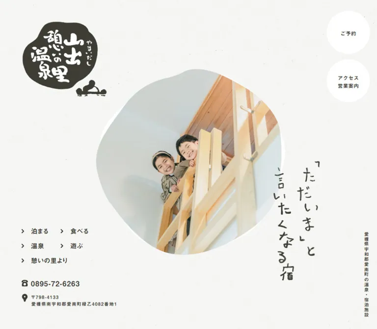
和紙調の背景に、墨色の文字、自然な輪郭で切り抜いた写真、縦書きの手描き見出しを組み合わせた温泉・宿泊施設のサイト。豊かな余白と家族の写真が、くつろいだ親しみやすさを伝えます。
オリジナルサイトを見るA quiet hospitality website composed like a handwritten welcome on lightly textured paper.
Original URL: yamaidashi.com
Final URL: yamaidashi.com
Theme: light paper with dark olive-charcoal ink and four small category accents.
Inspected: September 22, 2026. Supplied inspection record: 2026-09-22T13:35:26.907Z, or 22:35 JST.
Viewports: desktop 1440 × 1000; mobile 390 × 844, in CSS pixels.
Scope: the current homepage, including its opening composition, introduction, accommodation and activity summaries, news links, contact information, and operating-information footer. Destination pages and opened mobile controls were not inspected.
Yamaidashi presents a hot-spring and accommodation facility through natural wood, relaxed family photography, hand-drawn lettering, and abundant pale space. The canvas is almost white, with a faint fibrous texture. Dark olive-charcoal supplies text, icons, illustrations, and the irregular seal-like logo. Green, orange, coral, and blue appear as small category markers rather than large section backgrounds.
The desktop opening is a spacious composition with several anchors: the logo at upper left, a large organically cropped photograph near the center, a vertical handwritten message to its right, category navigation at lower left, and two circular utility links at upper right. Subsequent sections continue the asymmetry through offset text, vertical lettering, open image-and-copy groups, and small travel illustrations.
This is a multi-page hospitality homepage. Its navigation gives accommodation, dining, bathing, recreation, news, reservations, and access their own destinations. Preserve this browsing structure when adapting the design.
A quiet hospitality website composed like a handwritten welcome on lightly textured paper.
Original URL: yamaidashi.com
Final URL: yamaidashi.com
Theme: light paper with dark olive-charcoal ink and four small category accents.
Inspected: September 22, 2026. Supplied inspection record: 2026-09-22T13:35:26.907Z, or 22:35 JST.
Viewports: desktop 1440 × 1000; mobile 390 × 844, in CSS pixels.
Scope: the current homepage, including its opening composition, introduction, accommodation and activity summaries, news links, contact information, and operating-information footer. Destination pages and opened mobile controls were not inspected.
Yamaidashi presents a hot-spring and accommodation facility through natural wood, relaxed family photography, hand-drawn lettering, and abundant pale space. The canvas is almost white, with a faint fibrous texture. Dark olive-charcoal supplies text, icons, illustrations, and the irregular seal-like logo. Green, orange, coral, and blue appear as small category markers rather than large section backgrounds.
The desktop opening is a spacious composition with several anchors: the logo at upper left, a large organically cropped photograph near the center, a vertical handwritten message to its right, category navigation at lower left, and two circular utility links at upper right. Subsequent sections continue the asymmetry through offset text, vertical lettering, open image-and-copy groups, and small travel illustrations.
This is a multi-page hospitality homepage. Its navigation gives accommodation, dining, bathing, recreation, news, reservations, and access their own destinations. Preserve this browsing structure when adapting the design.
| Name | Value | Token | Evidence and role |
|---|---|---|---|
| Paper | #F7F8F6 |
--paper |
Measured body background at both viewports; the visible texture sits within this pale field |
| Olive-Charcoal Ink | #3E3D35 |
--ink |
Measured body, navigation, headings, and link color |
| Utility White | #FFFFFF |
--surface |
Measured fill of the desktop reservation and access circles |
| Stay Green | approximately #8DB334 |
--stay |
Visual approximation of the 泊まる category seal |
| Bath Orange | approximately #F2A23F |
--bath |
Visual approximation of the 温泉 category seal |
| Dining Coral | approximately #EF6B70 |
--food |
Visual approximation of the 食べる category seal |
| Play Blue | approximately #74B2DF |
--play |
Visual approximation of the 遊ぶ category seal |
| Quiet Rule | approximately #D5D6D0 |
--rule |
Visual approximation of footer information dividers; source border color was not supplied |
The paper texture changes local pixel brightness, so #F7F8F6 describes the measured base rather than every visible background pixel. Keep the texture low in contrast and small in scale: the page should read as a light continuous surface before its grain becomes noticeable.
The category colors function as a consistent four-part legend. Accommodation receives green, bathing orange, dining coral, and recreation blue. In the supplied desktop section, white labels sit inside these irregular colored seals. Color is concentrated in these markers and photography.
The extracted custom properties include numerous --wp--preset--* colors, gradients, and shadows. Their presence does not demonstrate use in this design. They are excluded from the visual palette.
No theme switcher or alternate color theme is evidenced. Treat the light paper treatment as the documented state; a dark palette would be a new design decision.
Declared stack: YakuHanJP, 中ゴシックBBB, 'Gothic Medium BBB', A-OTF-GothicBBBPro-Medium, 'A-OTF 中ゴシックBBB Pro', Meiryo, sans-serif.
The body uses Japanese Gothic typography with generous leading and modest tracking. Introductory paragraphs are comparatively large and airy. Service descriptions become smaller while retaining approximately double line spacing.
The measured body weight is 400. The recorded 10px body and root sizes are implementation baselines, not the visible size of all prose. Individual paragraphs explicitly use larger values.
Declared stack: 見出ゴMB31, 'Midashi Go MB31', 'A-OTF 見出ゴMB31 Pro', Meiryo, sans-serif.
Navigation, utility labels, article headings, contact details, and ordinary content headings use this display-oriented stack. Navigation and several controls have a measured CSS weight of 400 despite their substantial visual character. Content h3 headings use 700.
Preserve the distinction between the two declared stacks when the appropriate fonts are available and licensed. A fallback implementation should retain the measured sizes, tracking, and hierarchy without claiming an exact typeface match.
The hero message, large section headings, logo, and small handwritten annotations have irregular strokes and spacing. Their character is central to the design.
The hero h1 and several section h2 records have empty extracted text despite visible lettering. This supports treating the visible lettering as artwork for reproduction, but the supplied records do not expose its child markup or asset format. Do not identify it as a particular handwriting font or claim that it is SVG.
The measured 10px computed size on those heading containers does not describe the visible lettering. Use the artwork bounds as the relevant measurement.
Values below are measured computed styles. Normal means the evidence did not supply a numeric line height for that element.
| Role | Desktop size / line height | Mobile size / line height | Tracking: desktop → mobile | Weight |
|---|---|---|---|---|
| Main category navigation | 20px / normal |
20px / normal, offscreen in sampled state |
0.8px → 0.8px |
400 |
| Circular utility labels | 16px / normal |
12px / normal, offscreen in sampled state |
0.32px → 0.24px |
400 |
| Introduction paragraphs | 20px / 38px |
14px / 26.6px |
1.2px → 0.84px |
400 |
| Accommodation heading | 28px / 42px |
18px / 27px |
1.68px → 1.08px |
700 |
| Accommodation description | 18px / 36px |
12px / 24px |
1.08px → 0.72px |
400 |
| Accommodation detail link | 16px / normal |
11px / normal |
1.28px → 0.88px |
400 |
| Secondary service heading | 23px / 34.5px |
18px / 27px |
0.92px → 0.72px |
700 |
| Secondary service description | 16px / 32px |
12px / 24px |
0.4px → 0.4px |
400 |
| Secondary detail link | 14px / normal |
11px / normal |
1.12px → 0.88px |
400 |
| News title | 18px / normal |
14px / normal |
1.44px → 1.12px |
700 |
| Article-index link | 14px / normal |
11px / normal |
0.84px → 0.66px |
400 |
| Sampled footer schedule paragraphs | 15px / 27px |
12px / 16px |
0.3px → 0.24px |
400 |
| Footer email | 22px / normal |
22px / normal |
0.8px → 0.8px |
400 |
| Back-to-top caption | 11px / normal |
11px / normal |
1.32px → 1.32px |
400 |
The source root is measured at 10px at both viewports. The Quick Start below uses explicit pixel values and leaves the browser root conventional; it does not require copying the source root reset.
Density: sparse at the page level, moderately compact within navigation and information rows. Primary shapes: irregular rounded photo masks, uneven colored seals, true circular desktop utility links, and square-cornered editorial photographs.
There is no verified source spacing system. The following values are recurring measurements or useful adaptation aliases.
| Use | Desktop | Mobile | Status |
|---|---|---|---|
| Logo inset from left | 60px |
26px |
Measured |
| Desktop utility inset | 30px from top and right |
Replaced visually by icon controls | Measured on desktop |
| Gap between circular utility links | 15px |
15px between offscreen circles |
Calculated from measured bounds |
| Main content side margin | 180px |
approximately 26.52px |
Measured content alignments |
| Introduction paragraph gap | 30px |
16px |
Calculated from paragraph rectangles |
| Accommodation heading-to-body gap | 20px |
14px |
Calculated from rectangles |
| Accommodation body-to-link gap | 20px |
14px |
Calculated from rectangles |
| Header-to-introduction interval | 200px |
40px |
Calculated from section starts and header heights |
| Introduction-to-services interval | 140px |
76px |
Calculated from section bounds |
| Services-to-news interval | 120px |
42px |
Calculated from section bounds |
Useful reusable spacing values are 14, 16, 20, 26, 30, 40, 60, 80, 120, 140, and 200px. This list is a reference vocabulary, not a recovered token scale.
| Element | Treatment | Evidence |
|---|---|---|
| Reservation and access links | 9999px radius; square dimensions produce circles |
Measured |
| Main hero photograph | Uneven, broadly circular outline | Visually observed; exact mask unavailable |
| Category markers | Small irregular pebble/seal shapes | Visually observed |
| Mobile menu control | Dark irregular rounded shape | Visually observed; approximately 46 × 46px |
| Accommodation photograph | Square corners | Visually observed |
| Footer photograph | Uneven rounded outline | Visually observed |
| Information rows | Straight horizontal dividers | Visually observed |
Do not replace every rounded shape with the same radius. The distinction between perfect utility circles and handmade image/seal contours is intentional in the visible composition.
| Element | Desktop at 1440 × 1000 |
Mobile at 390 × 844 |
Evidence |
|---|---|---|---|
| Header bounds | 1440 × 1000px |
390 × 844px |
Measured |
| Brand link | 240 × 209.59px, at (60, 60) |
135.19 × 118.06px, at (26, 649.20) |
Measured |
| Hero lettering container | 171.92 × 450.22px, at (1038.08, 403.13) |
99.83 × 261.42px, at (266.78, 502.69) |
Measured |
| Hero photograph | Approximately 700 × 700px, near (360, 140) |
Approximately full width, from y ≈ 87 to 481px |
Screenshot estimates |
| Utility circles | 120 × 120px, at (1290, 30) and (1290, 165) |
90 × 90px, positioned outside the viewport in the sampled DOM |
Measured |
| Main content span | 1080px, from x = 180 to 1260 |
336.95px, from x ≈ 26.52 to 363.47 |
Derived from measured alignments |
| Introduction text | 719.98px wide, starting at x = 540.02 |
336.95px wide |
Measured |
| Accommodation text | 376.55px wide, starting at x = 380.45 |
249.59px wide, starting at x = 113.88 |
Measured |
| Secondary service text | Three columns, each 228.16px wide |
156px wide, with alternating left/right positions |
Measured |
| Footer information table | Approximately 530px wide, starting at x ≈ 730 |
Reflowed lower-page content; visual result unverified | Desktop screenshot estimate |
| Back-to-top link | 80.53 × 43px |
80.53 × 43px |
Measured |
The desktop content span equals 75% of the inspected viewport. The mobile text span equals approximately 86.4%. These are calculations from one sample per layout, not verified source width formulas.
Role: introduce the facility and make the main browsing paths immediately available.
The opening occupies the full measured desktop viewport height. A large family photograph sits in an irregular rounded mask, with a slender white offset visible along parts of its outline. The logo occupies the upper-left corner. The vertical message 「ただいま」と言いたくなる宿 stands beside the photograph, reaching toward its lower edge.
Navigation and contact details occupy the lower-left area. Reservations and access sit in separate white circles at upper right. A small vertical facility descriptor appears near the lower-right edge.
The composition relies on separate anchors and empty space. Its elements are not enclosed in a shared panel. Header persistence during scrolling is not established by the supplied captures; use normal page flow unless a separate behavior requirement calls for persistence.
Role: establish a distinctive, familiar identity.
The logo combines white brush lettering inside an uneven dark seal with a small bathing silhouette extending beyond the main shape. It reads as one supplied graphic, not typeset text inside a generic circle.
Its measured desktop link box is 240 × 209.59px. On mobile it becomes 135.19 × 118.06px and moves below the photograph, near the lower-left corner of the opening composition. Preserve the complete silhouette and its proportions.
Role: direct visitors to the facility's main offerings and news.
Desktop links form two compact columns: 泊まる beside 食べる, then 温泉 beside 遊ぶ, followed by a wider 憩いの里より row. Each link has a small right-pointing chevron before the label.
The first two columns start at x = 60px and 169.83px. Measured link boxes are 90 × 30px; successive rows begin 44px apart. The final link has a wider 264.5px box. Labels use the display Gothic stack at 20px, weight 400, with 0.8px tracking.
The destinations are /tomaru/, /taberu/, /onsen/, /asobu/, and /blog/. Their links are verified; destination-page designs are outside this reference.
Role: make reservations and practical arrival information easy to locate.
Two 120px white circles are stacked with a 15px gap. Their ink-colored labels are centered; the access label breaks across two lines as アクセス and 営業案内. The measured text size is 16px, with 0.32px tracking and 6px top padding.
The reservation circle links to /reserve/; access links to /access/. The recorded transition is 0.4s ease-in-out, but no hovered or activated visual state was supplied.
Role: provide compact access to essential controls above the photograph.
The mobile capture shows an envelope-like symbol, telephone symbol, location pin, and a dark uneven menu button with two light horizontal strokes. The row is aligned toward the upper-right area. Thin vertical separators divide some of the icon groups.
The envelope-like link resolves to /reserve/; its appearance alone should not lead to labeling it as email. The location link resolves to /access/. The recorded link rectangles are 56px wide but only about 15px and 22.64px high respectively; the complete event-target arrangement was not supplied.
Category links appear at x = 507px in the mobile DOM, outside the 390px viewport. Utility circles appear farther right. This is consistent with a concealed navigation arrangement, but opening, closing, backdrop behavior, and keyboard handling were not demonstrated.
Role: explain the place, its renewed accommodation, baths, local food, and unhurried atmosphere.
Desktop uses a tall lettering heading on the left and four paragraphs on the right. The text column begins at x = 540.02px, spans roughly 720px, and uses 20px / 38px text. Paragraphs are separated by 30px.
On mobile, the heading container becomes wider and shorter, and the prose occupies the main 336.95px content width at 14px / 26.6px. Paragraph gaps reduce to 16px. This establishes a real compositional change rather than uniform scaling.
The introduction's full visual decoration is not shown in the supplied desktop screenshots. Its copy and typography are established by DOM evidence.
Role: give accommodation the strongest emphasis within the service overview.
A large rectangular photograph shows a family seated beside bright windows and timber framing. In the supplied desktop section capture, its visible bounds are approximately 577 × 461px, close to a 5:4 ratio.
Below it, a green irregular 泊まる seal occupies the left side of the summary. To its right are a two-line heading, a short paragraph, and a right-aligned 詳しくはこちら link with a chevron. The text begins near x = 380.45px and is 376.55px wide.
The heading is 28px / 42px; the description is 18px / 36px. The colored seal is approximately 120px across. A separate backpack-and-sandals illustration sits in the open area to the right, reinforcing the travel theme without enclosing the content.
A tall handwritten section title occupies the upper-right side of the desktop composition. Keep it distinct from the typeset accommodation heading.
Role: introduce bathing, dining, and outdoor recreation as parallel destinations.
The desktop layout presents three open image-and-copy groups. Small orange, coral, and blue seals overlap the upper-left area of their respective photographs. The visible photo crops depict a bath interior, food, and a green outdoor setting.
The measured text columns begin at x = 405.92, 713.92, and 1021.92px; each is 228.16px wide. Their headings align at y = 3622px, descriptions at 3712.5px, and links at 3956.5px. The supplied description boxes are all 224px high, producing aligned link positions; the source technique used to obtain that alignment is unknown.
Headings use 23px / 34.5px, and descriptions use 16px / 32px. The groups share the page background and have no visible card borders or elevation shadows.
On mobile, the measured text positions alternate right, left, right. Bathing and recreation copy start at x = 208px; dining copy starts near 26px. Each text column is 156px wide. The accompanying mobile image positions are not directly evidenced by screenshots.
Role: expose facility updates and a route to the article index.
The supplied DOM contains two dated entries, ウェブサイト公開 and バイキング再開のお知らせ, plus 記事一覧へ. Dates are content timestamps, not inspection dates.
Desktop title text is 18px in the display stack. Entry link groups are approximately 360px wide and begin at x = 378.5px. The section heading has a tall, narrow 61 × 305px box at the left.
Mobile titles reduce to 14px, entry groups occupy the 336.95px content width, and the heading box becomes approximately 214.23 × 56.83px. The supplied evidence establishes the hierarchy and placement but does not provide a separate visual capture of this section.
Role: provide the practical details needed to plan a visit.
The desktop footer balances a large irregularly cropped loft photograph on the left against a repeated logo and operating-information table on the right. A handwritten note accompanies the loft image. Contact information sits below the photograph with solid envelope, telephone, and location icons.
The information table has thin horizontal rules, bold-looking row labels, and regular-weight details. Rows cover accommodation, bathing hours, restaurant arrangements, and the regular closing day. The restaurant row contains additional day-based subdivisions, making it taller than the others.
The table is approximately 530px wide, with a label area near 160px and a remaining detail area near 370px. These dimensions are visual estimates. Sampled schedule text is measured at 15px / 27px; the email link is 22px and remains that size in the mobile DOM.
The footer uses the same pale texture as the rest of the page. It gains structure from imagery, spacing, and fine rules rather than a contrasting background band.
Role: provide a quiet return route after the practical information.
A small upward arrow sits above ページの先頭へ, centered beneath the footer. The measured link box is 80.53 × 43px, and the caption uses 11px text with 1.32px tracking. Its destination is /#pagetop.
A 0.3s transition is declared. Smooth scrolling, scroll duration, and activation behavior were not tested.
| Element or state | Recorded evidence | What can be concluded |
|---|---|---|
| Header | 0.8s ease-in-out transition |
A transition is declared; its trigger and changed properties were not demonstrated |
| Hero heading | 1.2s cubic-bezier(0.65, 0, 0.35, 1) transition |
A long eased transition is declared; a particular reveal direction or transform is unverified |
| Circular utility links | 0.4s ease-in-out transition |
A short control transition exists; hover colors and movement are unverified |
| Back-to-top link | 0.3s transition |
The element has a transition declaration; this does not establish smooth scrolling |
| Sampled elements | animation: none |
No named animation was reported on those elements at sampling time |
| Other links | Transition output often reads all without a duration |
Insufficient evidence for a timed effect |
| Hero photography | Desktop shows children; mobile shows an empty accommodation room | Different images are visible, but carousel behavior, responsive asset selection, and timing are unresolved |
| Telephone content | Contact-panel text exists in the mobile DOM | Its visible open state and trigger were not captured |
| Loading text | ローディング中… appears in extraction |
A visible loading overlay is not demonstrated by the settled screenshots |
The supplied capture procedure waited for document loading, image decoding, and layout stability. It also temporarily paused perpetual animations during readiness checks. These checks improve the reliability of static observations; they do not establish a complete animation sequence.
Recommended adaptation: retain the quiet tone through restrained opacity and color transitions. If implementing an entrance, use the recorded easing as a starting point and establish the actual transition properties deliberately. Keep navigation usable before any entrance completes. Provide reduced-motion behavior and avoid making the hero dependent on autoplay.
Verified destinations include category pages, reservations, access, news entries, the email link, and the page-top anchor. No click-through navigation, mobile menu operation, telephone action, or booking flow was exercised in the supplied evidence.
| Layer | Appearance | Function |
|---|---|---|
| Page canvas | Pale #F7F8F6 with faint paper fibers |
Unifies the long page |
| Primary utility links | White circular fills | Separates two practical actions from the textured canvas |
| Hero and footer imagery | Natural photography in irregular rounded masks | Adds warmth and a handmade outline |
| Editorial imagery | Square-cornered photographs | Provides clear views of people, facilities, food, and surroundings |
| Category seals | Flat green, orange, coral, and blue | Identifies service categories |
| Information table | Transparent surface with quiet horizontal rules | Organizes operating details |
| Small illustrations | Dark textured linework on the paper | Adds personality without creating another surface |
No general card-shadow system is visible. The broad areas between content blocks remain open paper. The few solid fills belong to utility controls, category seals, and the logo.
Photography is bright, natural, and domestic in scale. The desktop hero looks upward toward smiling children at a timber loft railing. The mobile opening shows an uncluttered accommodation room with white bedding, pale timber, a ladder, exposed beams, and a view toward greenery. The accommodation section shows a family together beside windows.
The shared visual ingredients are warm wood, soft daylight, clean interiors, relaxed expressions, and nearby nature. Preserve realistic photographic color. The images are not tinted into the interface palette.
The hero and footer use irregular rounded crops; the main accommodation photograph stays rectangular. This variation is important: the organic mask is a focal treatment, not a requirement for every image.
Illustrations have slightly uneven, textured dark strokes. The backpack and sandals are small supporting drawings, while the logo and handwritten headings carry stronger identity. Utility icons are compact and solid. No icon library was identified.
Asset URLs and filenames were not included in the supplied original-page evidence. The following inventory describes visible material only; it does not assert file formats or source paths.
| Visible material | Documented use | Evidence |
|---|---|---|
| Irregular seal logo with bathing silhouette | Desktop opening, mobile opening, footer | Original-page screenshots; brand-link measurements |
| Family at loft railing | Desktop hero | Original desktop capture |
| Empty timber accommodation room | Mobile hero | Original mobile captures |
| Family seated at a table | Accommodation feature | Original desktop section capture |
| Bath, food, and outdoor photographs | Secondary service groups | Visible upper portions in the section capture |
| Child in a timber loft | Footer photograph | Original desktop footer capture |
| Backpack and sandals drawing | Accommodation-section decoration | Original desktop section capture |
| Handwritten headline and section lettering | Hero and section identity | Screenshots and empty-text heading-container records |
| Fine paper grain | Continuous background | Original desktop and mobile captures |
For a faithful implementation, obtain authorized photography, logo artwork, lettering, and texture. CSS can reproduce the layout and approximate rounded contours, but it cannot reproduce the identity of those materials on its own.
The measured desktop page extends to approximately 5917.14px. Its main content is organized around a 1080px span, although the hero uses the full viewport and the footer photograph visually extends beyond the main text alignment.
The introduction pairs a narrow lettering area with a larger prose column. Accommodation receives the largest service photograph and a broad summary. Three smaller service groups follow, shifted toward the right side of the content span. News returns to a left-hand lettering anchor. The footer then balances photography and contact information against practical details.
| Section | Desktop document start | Mobile document start | Evidence |
|---|---|---|---|
| Header | 0px |
0px |
Measured |
| Introduction | 1200px |
884px |
Measured |
| Service overview | 2400px |
1740.34px |
Measured |
| News | 4252.5px |
3452.89px |
Measured |
| Footer | 4876.59px |
3859.45px |
Measured |
| Footer bottom | approximately 5917.14px |
approximately 4970.02px |
Calculated from footer rectangles |
These are snapshot positions, not recommended hardcoded offsets for a new page.
The opening is recomposed into a vertical sequence. Compact utility icons appear first. The photograph expands nearly edge to edge below them. Beneath the image, the vertical headline sits at the right while the logo sits lower at the left. A thin horizontal rule separates the bottom facility descriptor from the main composition.
The hero lettering retains its tall proportions. Its measured width and height are each approximately 58% of the desktop equivalent. The logo is approximately 56% of its desktop width. These are calculated scaling relationships between the two samples, not verified responsive formulas.
The large desktop navigation and circular utility links are absent from the visible mobile opening. Their DOM elements still exist outside the sampled viewport. Do not reproduce them as visible content beneath the photograph simply because they appear in the extracted text.
The DOM shows substantial reflow:
26.5px side margins.x ≈ 113.88px.156px columns.Mobile inspection limitation: the record reports documentHeight: 844 and a body height of 844px, while lower elements extend to approximately 4970px. Both supplied mobile screenshots show the same opening state. This discrepancy leaves the actual scroll container, lower-page reachability, and visual appearance during mobile scrolling unverified. It is not evidence that the intended site consists of one screen.
No exact media-query breakpoint was supplied. The Quick Start's breakpoint is an explicit implementation recommendation. Tablet, landscape-phone, zoomed, and intermediate-width behavior require additional validation.
#F7F8F6 and #3E3D35.10px computed size as the visible artwork size.These are recommendations for a new implementation, not verified features of the inspected site:
44 × 44px usable targets around compact mobile symbols while keeping the visible icon sizes modest.tel: destination. Use a complete value such as tel:0895726263 when implementing the displayed telephone number, then test it on a device.12px mobile service prose to 14px where readability takes priority; allow the layout to grow accordingly.#F7F8F6, with very subtle paper grain.#3E3D35.#FFFFFF.#8DB334, bath #F2A23F, dining #EF6B70, play #74B2DF.#D5D6D0.“Create a Japanese hot-spring and accommodation homepage with a continuous pale paper surface, dark olive-charcoal typography, natural family photography, and supplied handwritten lettering. At desktop, place an irregular seal logo at upper left, a large organically cropped photograph near the center, a tall vertical message to its right, compact category navigation at lower left, and two white circular utility links at upper right. Build spacious editorial sections for accommodation, bathing, dining, recreation, and news. Use small green, orange, coral, and blue category seals. Finish with a loft photograph, contact information, and a finely ruled operating-information table. On mobile, place compact utility icons above a nearly full-width photograph, then arrange the vertical message at right and logo at lower left. Preserve normal document scrolling and make all navigation accessible.”
1440 × 1000 reference composition with a 240px-wide logo at (60, 60), a roughly 700px organic photo near the center, a 172 × 450px vertical lettering area on its right, and two 120px white utility circles with a 15px gap at upper right. Keep the pale paper visible between these anchors.”5:4 family photograph above an open summary row. Place an approximately 120px green irregular category seal at left and a 28px / 42px heading with 18px / 36px copy at right. Add a small right-aligned detail link and a separate hand-drawn backpack illustration in nearby open space.”23px display headings and 16px / 32px prose, with aligned detail links and no card shadows.”390 × 844, show a compact reservation, telephone, access, and menu row near the top right. Place a nearly edge-to-edge organically cropped room photograph beneath it. Position a roughly 100 × 261px vertical headline below the photograph at right and a roughly 135 × 118px logo at lower left. Add a fine rule above the bottom facility descriptor.”15px information text, and fine horizontal dividers. Center a small arrow-over-caption page-top link beneath the content.”26px outside gutters. Treat opposite-side image placement as a proposed implementation requiring visual validation, since only the mobile text geometry is documented.”This is an adaptation scaffold, not recovered source CSS. Exact paper, ink, white, typography values, and selected dimensions come from measurements. Category colors, divider color, organic radii, breakpoint, image aspect ratios where unmeasured, and hover feedback are recommendations or visual approximations.
The scaffold leaves the root font size conventional. It deliberately uses normal document flow rather than reproducing the unresolved mobile height behavior. It does not implement a menu, telephone panel, slideshow, or entrance sequence.
Expected hero children are .hero-brand, .hero-photo, .hero-title, .hero-nav, .hero-utilities, .hero-contact, .hero-descriptor, and .mobile-tools. The photograph, logo, and lettering containers expect authorized image assets. An .activity contains .activity-media and .activity-copy; place its category seal inside .activity-media.
:root {
  /* Measured base colors */
  --paper: #f7f8f6;
  --ink: #3e3d35;
  --surface: #ffffff;

  /* Visual approximations */
  --stay: #8db334;
  --bath: #f2a23f;
  --food: #ef6b70;
  --play: #74b2df;
  --rule: #d5d6d0;

  /* Declared source stacks; font files are not bundled here */
  --font-body: YakuHanJP, '中ゴシックBBB', 'Gothic Medium BBB',
    A-OTF-GothicBBBPro-Medium, 'A-OTF 中ゴシックBBB Pro',
    Meiryo, sans-serif;
  --font-display: '見出ゴMB31', 'Midashi Go MB31',
    'A-OTF 見出ゴMB31 Pro', Meiryo, sans-serif;

  --content-width: 1080px;
  --gutter: clamp(26px, 6.8vw, 80px);
  --section-gap: 140px;
  --text-intro: 20px;
  --text-feature: 28px;
  --text-feature-body: 18px;
  --text-service: 23px;
  --text-service-body: 16px;

  /* Approximate contours; replace with custom masks for fidelity */
  --photo-shape: 53% 47% 51% 49% / 47% 43% 57% 53%;
  --seal-shape: 46% 54% 48% 52% / 53% 42% 58% 47%;

  /* Supply an authorized subtle texture through this property */
  --paper-texture: none;
  --motion-control: 400ms ease-in-out;
}

* { box-sizing: border-box; }

body {
  margin: 0;
  color: var(--ink);
  background-color: var(--paper);
  background-image: var(--paper-texture);
  font-family: var(--font-body);
  font-size: 16px;
  font-weight: 400;
}

img { display: block; max-inline-size: 100%; }
a { color: inherit; }
button { font: inherit; }

.page-wrap {
  inline-size: min(var(--content-width), calc(100% - 2 * var(--gutter)));
  margin-inline: auto;
}

.hero {
  position: relative;
  min-block-size: 100svh;
  isolation: isolate;
}

.hero-brand {
  position: absolute;
  inset: 60px auto auto 60px;
  inline-size: 240px;
}

.hero-photo {
  position: absolute;
  inset-block-start: 14%;
  inset-inline-start: 50%;
  inline-size: min(49vw, 700px);
  aspect-ratio: 1;
  transform: translateX(-50%);
  overflow: hidden;
  border-radius: var(--photo-shape);
}

.hero-photo img {
  inline-size: 100%;
  block-size: 100%;
  object-fit: cover;
}

.hero-title {
  position: absolute;
  inset-block-start: 40.3%;
  inset-inline-end: 16%;
  inline-size: 171.92px;
  margin: 0;
}

.hero-brand img,
.hero-title img { inline-size: 100%; block-size: auto; }

.hero-nav {
  position: absolute;
  inset-inline-start: 60px;
  inset-block-end: 188px;
  display: grid;
  grid-template-columns: 90px 90px;
  gap: 14px 20px;
  font-family: var(--font-display);
  font-size: 20px;
  letter-spacing: 0.8px;
}

.hero-nav a {
  display: flex;
  align-items: center;
  gap: 20px;
  min-block-size: 30px;
  text-decoration: none;
}

.hero-nav a:last-child { grid-column: 1 / -1; }

.hero-nav a::before,
.detail-link::after {
  content: '';
  flex: 0 0 auto;
  inline-size: 6px;
  block-size: 6px;
  border-block-start: 2px solid currentColor;
  border-inline-end: 2px solid currentColor;
  transform: rotate(45deg);
}

.hero-utilities {
  position: absolute;
  inset: 30px 30px auto auto;
  display: grid;
  gap: 15px;
}

.hero-utilities a {
  display: flex;
  align-items: center;
  justify-content: center;
  inline-size: 120px;
  block-size: 120px;
  padding-block-start: 6px;
  border-radius: 9999px;
  background: var(--surface);
  font-family: var(--font-display);
  font-size: 16px;
  letter-spacing: 0.32px;
  text-align: center;
  text-decoration: none;
  transition: color var(--motion-control),
    background-color var(--motion-control);
}

.hero-contact {
  position: absolute;
  inset-inline-start: 60px;
  inset-block-end: 60px;
  display: grid;
  gap: 12px;
  font-family: var(--font-display);
}

.contact-primary { font-size: 22px; letter-spacing: 0.8px; }
.contact-address { font-size: 14px; line-height: 1.6; }

.hero-descriptor {
  position: absolute;
  inset-inline-end: 40px;
  inset-block-end: 44px;
  margin: 0;
  writing-mode: vertical-rl;
  font-family: var(--font-display);
  font-size: 14px;
}

.mobile-tools { display: none; }

.intro {
  display: grid;
  grid-template-columns: 1fr 2fr;
  margin-block-start: 200px;
}

.intro .section-lettering { inline-size: 176px; margin: 0; }
.intro-copy { padding-block-start: 100px; }

.intro-copy p {
  margin: 0 0 30px;
  font-size: var(--text-intro);
  line-height: 1.9;
  letter-spacing: 0.06em;
}

.experiences {
  position: relative;
  margin-block-start: var(--section-gap);
}

.experiences > .section-lettering {
  position: absolute;
  inset: 0 0 auto auto;
  inline-size: 188px;
  margin: 0;
}

.stay-feature {
  inline-size: min(100%, 577px);
  padding-block-start: 72px;
}

.stay-photo {
  inline-size: 100%;
  aspect-ratio: 5 / 4;
  object-fit: cover;
}

.stay-summary {
  display: grid;
  grid-template-columns: 120px minmax(0, 1fr);
  gap: 80px;
  margin-block-start: 60px;
}

.category-seal {
  display: grid;
  place-items: center;
  inline-size: 120px;
  aspect-ratio: 1;
  border-radius: var(--seal-shape);
  background: var(--category-color, var(--stay));
  color: var(--surface);
  font-family: var(--font-display);
  font-size: 20px;
}

.category-stay { --category-color: var(--stay); }
.category-bath { --category-color: var(--bath); }
.category-food { --category-color: var(--food); }
.category-play { --category-color: var(--play); }

.stay-copy h3 {
  margin: 0 0 20px;
  font-family: var(--font-display);
  font-size: var(--text-feature);
  line-height: 1.5;
  letter-spacing: 0.06em;
}

.stay-copy p {
  margin: 0 0 20px;
  font-size: var(--text-feature-body);
  line-height: 2;
  letter-spacing: 0.06em;
}

.detail-link {
  display: flex;
  align-items: center;
  justify-content: flex-end;
  gap: 14px;
  font-family: var(--font-display);
  font-size: 16px;
  letter-spacing: 0.08em;
  text-decoration: none;
}

.activity-list {
  display: grid;
  grid-template-columns: repeat(3, minmax(0, 1fr));
  gap: 60px;
  inline-size: 80%;
  margin: 150px 0 0 auto;
}

.activity-media { position: relative; }
.activity-media > img { inline-size: 100%; }

.activity-media .category-seal {
  position: absolute;
  inset: -20px auto auto -20px;
  inline-size: 86px;
  font-size: 14px;
}

.activity-copy { padding: 20px 10px 0; }

.activity-copy h3 {
  min-block-size: 70.5px;
  margin: 0 0 20px;
  font-family: var(--font-display);
  font-size: var(--text-service);
  line-height: 1.5;
  letter-spacing: 0.04em;
}

.activity-copy p {
  min-block-size: 224px;
  margin: 0 0 20px;
  font-size: var(--text-service-body);
  line-height: 2;
  letter-spacing: 0.4px;
}

.activity-copy .detail-link { font-size: 14px; }

.news { margin-block-start: 120px; }
.news-list { padding: 0; list-style: none; }
.news-list li + li { margin-block-start: 60px; }
.news-list a { text-decoration: none; }
.news-list time { font-size: 12px; }
.news-list h3 {
  margin: 6px 0 0;
  font-family: var(--font-display);
  font-size: 18px;
  letter-spacing: 0.08em;
}

.site-footer {
  display: grid;
  grid-template-columns: minmax(0, 1fr) 530px;
  gap: 80px 70px;
  margin-block-start: 120px;
  padding-block-end: 100px;
}

.footer-photo {
  grid-column: 1;
  grid-row: 1;
  inline-size: 400px;
  border-radius: var(--photo-shape);
}

.footer-info { grid-column: 2; grid-row: 1 / span 2; }
.footer-brand { inline-size: 160px; margin: 0 0 60px auto; }
.footer-contact { grid-column: 1; grid-row: 2; }

.info-row {
  display: grid;
  grid-template-columns: 160px minmax(0, 1fr);
  padding-block: 24px;
  border-block-start: 1px solid var(--rule);
  font-size: 15px;
  line-height: 1.8;
  letter-spacing: 0.3px;
}

.info-row:last-child { border-block-end: 1px solid var(--rule); }
.info-row dt { font-family: var(--font-display); }
.info-row dd { margin: 0; }

.back-top {
  grid-column: 1 / -1;
  justify-self: center;
  display: grid;
  justify-items: center;
  gap: 8px;
  font-family: var(--font-display);
  font-size: 11px;
  letter-spacing: 1.32px;
  text-decoration: none;
}

/* Recommended feedback; the original hover state was not captured. */
@media (hover: hover) {
  .hero-utilities a:hover {
    color: var(--surface);
    background-color: var(--ink);
  }
  .detail-link:hover { text-decoration: underline; }
}

:where(a, button):focus-visible {
  outline: 2px solid var(--ink);
  outline-offset: 4px;
}

/* Recommended breakpoint, not a recovered source media query. */
@media (max-width: 64rem) {
  :root {
    --text-intro: 14px;
    --text-feature: 18px;
    --text-feature-body: 12px;
    --text-service: 18px;
    --text-service-body: 12px;
    --section-gap: 76px;
  }

  /* A minimum preserves the sampled opening without locking scrolling. */
  .hero { min-block-size: max(844px, 100svh); }

  .hero-photo {
    inset-block-start: 87px;
    inline-size: min(100%, 390px);
    aspect-ratio: 390 / 394;
  }

  .hero-brand {
    inset: auto auto 76px 26px;
    inline-size: 135.19px;
  }

  .hero-title {
    inset: auto 6% 80px auto;
    inline-size: 99.83px;
  }

  .hero-nav,
  .hero-utilities,
  .hero-contact { display: none; }

  /* An independently implemented menu must expose all navigation. */
  .mobile-tools {
    position: absolute;
    inset: 16px 16px auto auto;
    display: flex;
    align-items: center;
  }

  .mobile-tools .tool {
    display: grid;
    place-items: center;
    inline-size: 56px;
    min-block-size: 46px;
    padding: 0;
    border: 0;
    color: var(--ink);
    background: transparent;
  }

  .mobile-tools .menu-toggle {
    display: grid;
    place-items: center;
    inline-size: 46px;
    block-size: 46px;
    margin-inline-start: 8px;
    border: 0;
    border-radius: var(--seal-shape);
    color: var(--surface);
    background: var(--ink);
  }

  .hero-descriptor {
    inset: auto 0 0;
    display: flex;
    align-items: center;
    min-block-size: 50px;
    padding-inline: 26px;
    border-block-start: 1px solid var(--ink);
    writing-mode: horizontal-tb;
    font-size: 10px;
    letter-spacing: 0.1em;
  }

  .intro { display: block; margin-block-start: 40px; }
  .intro .section-lettering { inline-size: 195.52px; }
  .intro-copy { padding-block-start: 30px; }
  .intro-copy p { margin-block-end: 16px; }

  /* Supply a suitably proportioned mobile lettering asset. */
  .experiences > .section-lettering {
    position: static;
    inline-size: 183px;
  }

  .stay-feature { padding-block-start: 48px; }
  .stay-summary {
    grid-template-columns: 64px minmax(0, 1fr);
    gap: 23px;
    margin-block-start: 60px;
  }
  .stay-summary > .category-seal {
    inline-size: 64px;
    font-size: 14px;
  }
  .stay-copy h3,
  .stay-copy p { margin-block-end: 14px; }
  .detail-link { font-size: 11px; }

  .activity-list {
    inline-size: 100%;
    grid-template-columns: 1fr;
    gap: 60px;
    margin-block-start: 80px;
  }

  /* Opposite-side images are a proposed adaptation of measured text positions. */
  .activity {
    display: grid;
    grid-template-columns: minmax(0, 1fr) minmax(0, 1fr);
    gap: 26px;
    align-items: start;
  }
  .activity:nth-child(even) .activity-media {
    grid-column: 2;
    grid-row: 1;
  }
  .activity:nth-child(even) .activity-copy {
    grid-column: 1;
    grid-row: 1;
  }
  .activity-copy { padding: 0; }
  .activity-copy h3 { min-block-size: 0; margin-block-end: 3px; }
  .activity-copy p { min-block-size: 0; margin-block-end: 10px; }
  .activity-copy .detail-link { font-size: 11px; }
  .activity-media .category-seal {
    inset: -12px auto auto -8px;
    inline-size: 60px;
    font-size: 12px;
  }

  .news { margin-block-start: 42px; }
  .news-list h3 { font-size: 14px; }

  .site-footer {
    grid-template-columns: minmax(0, 1fr);
    gap: 50px;
    margin-block-start: 60px;
    padding-block-end: 60px;
  }
  .footer-photo,
  .footer-info,
  .footer-contact { grid-column: 1; grid-row: auto; }
  .info-row {
    grid-template-columns: 1fr;
    gap: 10px;
    font-size: 12px;
    line-height: 1.6;
  }
}

@media (prefers-reduced-motion: reduce) {
  .hero-utilities a { transition: none; }
  html { scroll-behavior: auto; }
}
The paper texture defaults to none so the scaffold has no invented external asset dependency. Set --paper-texture only after choosing the actual texture. The percentage radii are approximate placeholders; use custom masks to reproduce the visibly irregular photo and seal boundaries.
Use a semantic heading with meaningful alternative text for lettering artwork. Supply the mobile section-lettering variants explicitly. The scaffold's footer stacking and opposite-side mobile imagery are proposed implementations, while their detailed original rendering remains unverified.
Optional mapping for a project already using Tailwind v4. This does not imply that the original site uses Tailwind. Define the properties above first.
@theme inline {
  --color-paper: var(--paper);
  --color-ink: var(--ink);
  --color-surface: var(--surface);
  --color-stay: var(--stay);
  --color-bath: var(--bath);
  --color-food: var(--food);
  --color-play: var(--play);
  --color-rule: var(--rule);

  --font-sans: var(--font-body);
  --font-heading: var(--font-display);

  --text-intro: var(--text-intro);
  --text-feature-heading: var(--text-feature);
  --text-feature-copy: var(--text-feature-body);
  --text-service-heading: var(--text-service);
  --text-service-copy: var(--text-service-body);

  --spacing-page-gutter: var(--gutter);
  --spacing-section: var(--section-gap);
  --radius-seal: var(--seal-shape);
}
For the intro text utility, avoid a self-referencing theme token in an actual build: rename the underlying --text-intro property to --size-intro and map --text-intro: var(--size-intro), or use the explicit 20px desktop value with a responsive 14px override.
200 and the same original/final URL.13:35:26.907 UTC / 22:35 JST. This is the provided retrieval timestamp; separate per-frame timestamps were not supplied.1440 × 1000, showing the opening composition, accommodation section, and footer; rendered text, links, element rectangles, font declarations, colors, and transitions; reported document height approximately 5917px.390 × 844, both showing the opening composition; rendered DOM measurements for the lower page. The reported 844px document height conflicts with footer geometry extending to approximately 4970px, so mobile scroll behavior and lower-page visual completeness remain unresolved.This reference uses the supplied current original-page evidence only. No further browsing, destination-page inspection, or file access was performed. Measurements, visual estimates, and implementation recommendations are separated throughout; the CSS is a reusable adaptation rather than a claim to reproduce the original source.
# Yamaidashi Ikoi no Sato Onsen — Style Reference

> A quiet hospitality website composed like a handwritten welcome on lightly textured paper.

**Original URL:** [yamaidashi.com](https://yamaidashi.com/)
**Final URL:** [yamaidashi.com](https://yamaidashi.com/)
**Theme:** light paper with dark olive-charcoal ink and four small category accents.
**Inspected:** September 22, 2026. Supplied inspection record: `2026-09-22T13:35:26.907Z`, or 22:35 JST.
**Viewports:** desktop `1440 × 1000`; mobile `390 × 844`, in CSS pixels.
**Scope:** the current homepage, including its opening composition, introduction, accommodation and activity summaries, news links, contact information, and operating-information footer. Destination pages and opened mobile controls were not inspected.

Yamaidashi presents a hot-spring and accommodation facility through natural wood, relaxed family photography, hand-drawn lettering, and abundant pale space. The canvas is almost white, with a faint fibrous texture. Dark olive-charcoal supplies text, icons, illustrations, and the irregular seal-like logo. Green, orange, coral, and blue appear as small category markers rather than large section backgrounds.

The desktop opening is a spacious composition with several anchors: the logo at upper left, a large organically cropped photograph near the center, a vertical handwritten message to its right, category navigation at lower left, and two circular utility links at upper right. Subsequent sections continue the asymmetry through offset text, vertical lettering, open image-and-copy groups, and small travel illustrations.

This is a multi-page hospitality homepage. Its navigation gives accommodation, dining, bathing, recreation, news, reservations, and access their own destinations. Preserve this browsing structure when adapting the design.
# Yamaidashi Ikoi no Sato Onsen — Style Reference

> A quiet hospitality website composed like a handwritten welcome on lightly textured paper.

**Original URL:** [yamaidashi.com](https://yamaidashi.com/)
**Final URL:** [yamaidashi.com](https://yamaidashi.com/)
**Theme:** light paper with dark olive-charcoal ink and four small category accents.
**Inspected:** September 22, 2026. Supplied inspection record: `2026-09-22T13:35:26.907Z`, or 22:35 JST.
**Viewports:** desktop `1440 × 1000`; mobile `390 × 844`, in CSS pixels.
**Scope:** the current homepage, including its opening composition, introduction, accommodation and activity summaries, news links, contact information, and operating-information footer. Destination pages and opened mobile controls were not inspected.

Yamaidashi presents a hot-spring and accommodation facility through natural wood, relaxed family photography, hand-drawn lettering, and abundant pale space. The canvas is almost white, with a faint fibrous texture. Dark olive-charcoal supplies text, icons, illustrations, and the irregular seal-like logo. Green, orange, coral, and blue appear as small category markers rather than large section backgrounds.

The desktop opening is a spacious composition with several anchors: the logo at upper left, a large organically cropped photograph near the center, a vertical handwritten message to its right, category navigation at lower left, and two circular utility links at upper right. Subsequent sections continue the asymmetry through offset text, vertical lettering, open image-and-copy groups, and small travel illustrations.

This is a multi-page hospitality homepage. Its navigation gives accommodation, dining, bathing, recreation, news, reservations, and access their own destinations. Preserve this browsing structure when adapting the design.

## How to Read This Reference

- **Measured values** come from the supplied rendered DOM rectangles and computed-style records. Coordinates are from the initial DOM snapshot unless described as screenshot estimates.
- **Visual estimates** describe the supplied original-page screenshots. Approximate colors were not sampled programmatically; approximate image dimensions are not source CSS declarations.
- **Calculated values** are explicitly identified, such as percentages derived from measured widths.
- **Named tokens** are implementation aliases created for this reference. They are not asserted to be original custom-property names.
- **Declared font stacks** identify the computed family declarations. The evidence does not establish which font file supplied every rendered glyph.
- **Recommendations** and the Quick Start are adaptation guidance. They do not establish original interaction behavior, breakpoints, accessibility support, or implementation technology.
- Desktop imagery is visually documented at the opening, accommodation section, and footer. Both mobile captures show the same opening view. Lower mobile content is described from DOM geometry, with corresponding limitations.

## Tokens — Colors

### Default Palette

| Name | Value | Token | Evidence and role |
| --- | --- | --- | --- |
| Paper | `#F7F8F6` | `--paper` | Measured body background at both viewports; the visible texture sits within this pale field |
| Olive-Charcoal Ink | `#3E3D35` | `--ink` | Measured body, navigation, headings, and link color |
| Utility White | `#FFFFFF` | `--surface` | Measured fill of the desktop reservation and access circles |
| Stay Green | approximately `#8DB334` | `--stay` | Visual approximation of the `泊まる` category seal |
| Bath Orange | approximately `#F2A23F` | `--bath` | Visual approximation of the `温泉` category seal |
| Dining Coral | approximately `#EF6B70` | `--food` | Visual approximation of the `食べる` category seal |
| Play Blue | approximately `#74B2DF` | `--play` | Visual approximation of the `遊ぶ` category seal |
| Quiet Rule | approximately `#D5D6D0` | `--rule` | Visual approximation of footer information dividers; source border color was not supplied |

The paper texture changes local pixel brightness, so `#F7F8F6` describes the measured base rather than every visible background pixel. Keep the texture low in contrast and small in scale: the page should read as a light continuous surface before its grain becomes noticeable.

The category colors function as a consistent four-part legend. Accommodation receives green, bathing orange, dining coral, and recreation blue. In the supplied desktop section, white labels sit inside these irregular colored seals. Color is concentrated in these markers and photography.

The extracted custom properties include numerous `--wp--preset--*` colors, gradients, and shadows. Their presence does not demonstrate use in this design. They are excluded from the visual palette.

### Theme Presets

No theme switcher or alternate color theme is evidenced. Treat the light paper treatment as the documented state; a dark palette would be a new design decision.

## Tokens — Typography

### Body Gothic — Explanatory Text

**Declared stack:** `YakuHanJP, 中ゴシックBBB, 'Gothic Medium BBB', A-OTF-GothicBBBPro-Medium, 'A-OTF 中ゴシックBBB Pro', Meiryo, sans-serif`.

The body uses Japanese Gothic typography with generous leading and modest tracking. Introductory paragraphs are comparatively large and airy. Service descriptions become smaller while retaining approximately double line spacing.

The measured body weight is `400`. The recorded `10px` body and root sizes are implementation baselines, not the visible size of all prose. Individual paragraphs explicitly use larger values.

### Display Gothic — Navigation and Content Headings

**Declared stack:** `見出ゴMB31, 'Midashi Go MB31', 'A-OTF 見出ゴMB31 Pro', Meiryo, sans-serif`.

Navigation, utility labels, article headings, contact details, and ordinary content headings use this display-oriented stack. Navigation and several controls have a measured CSS weight of `400` despite their substantial visual character. Content `h3` headings use `700`.

Preserve the distinction between the two declared stacks when the appropriate fonts are available and licensed. A fallback implementation should retain the measured sizes, tracking, and hierarchy without claiming an exact typeface match.

### Handwritten Lettering and Brand Artwork

The hero message, large section headings, logo, and small handwritten annotations have irregular strokes and spacing. Their character is central to the design.

The hero `h1` and several section `h2` records have empty extracted text despite visible lettering. This supports treating the visible lettering as artwork for reproduction, but the supplied records do not expose its child markup or asset format. Do not identify it as a particular handwriting font or claim that it is SVG.

The measured `10px` computed size on those heading containers does **not** describe the visible lettering. Use the artwork bounds as the relevant measurement.

### Type Scale

Values below are measured computed styles. `Normal` means the evidence did not supply a numeric line height for that element.

| Role | Desktop size / line height | Mobile size / line height | Tracking: desktop → mobile | Weight |
| --- | --- | --- | --- | --- |
| Main category navigation | `20px / normal` | `20px / normal`, offscreen in sampled state | `0.8px → 0.8px` | `400` |
| Circular utility labels | `16px / normal` | `12px / normal`, offscreen in sampled state | `0.32px → 0.24px` | `400` |
| Introduction paragraphs | `20px / 38px` | `14px / 26.6px` | `1.2px → 0.84px` | `400` |
| Accommodation heading | `28px / 42px` | `18px / 27px` | `1.68px → 1.08px` | `700` |
| Accommodation description | `18px / 36px` | `12px / 24px` | `1.08px → 0.72px` | `400` |
| Accommodation detail link | `16px / normal` | `11px / normal` | `1.28px → 0.88px` | `400` |
| Secondary service heading | `23px / 34.5px` | `18px / 27px` | `0.92px → 0.72px` | `700` |
| Secondary service description | `16px / 32px` | `12px / 24px` | `0.4px → 0.4px` | `400` |
| Secondary detail link | `14px / normal` | `11px / normal` | `1.12px → 0.88px` | `400` |
| News title | `18px / normal` | `14px / normal` | `1.44px → 1.12px` | `700` |
| Article-index link | `14px / normal` | `11px / normal` | `0.84px → 0.66px` | `400` |
| Sampled footer schedule paragraphs | `15px / 27px` | `12px / 16px` | `0.3px → 0.24px` | `400` |
| Footer email | `22px / normal` | `22px / normal` | `0.8px → 0.8px` | `400` |
| Back-to-top caption | `11px / normal` | `11px / normal` | `1.32px → 1.32px` | `400` |

The source root is measured at `10px` at both viewports. The Quick Start below uses explicit pixel values and leaves the browser root conventional; it does not require copying the source root reset.

## Tokens — Spacing & Shapes

**Density:** sparse at the page level, moderately compact within navigation and information rows.
**Primary shapes:** irregular rounded photo masks, uneven colored seals, true circular desktop utility links, and square-cornered editorial photographs.

### Spacing Scale

There is no verified source spacing system. The following values are recurring measurements or useful adaptation aliases.

| Use | Desktop | Mobile | Status |
| --- | --- | --- | --- |
| Logo inset from left | `60px` | `26px` | Measured |
| Desktop utility inset | `30px` from top and right | Replaced visually by icon controls | Measured on desktop |
| Gap between circular utility links | `15px` | `15px` between offscreen circles | Calculated from measured bounds |
| Main content side margin | `180px` | approximately `26.52px` | Measured content alignments |
| Introduction paragraph gap | `30px` | `16px` | Calculated from paragraph rectangles |
| Accommodation heading-to-body gap | `20px` | `14px` | Calculated from rectangles |
| Accommodation body-to-link gap | `20px` | `14px` | Calculated from rectangles |
| Header-to-introduction interval | `200px` | `40px` | Calculated from section starts and header heights |
| Introduction-to-services interval | `140px` | `76px` | Calculated from section bounds |
| Services-to-news interval | `120px` | `42px` | Calculated from section bounds |

Useful reusable spacing values are `14`, `16`, `20`, `26`, `30`, `40`, `60`, `80`, `120`, `140`, and `200px`. This list is a reference vocabulary, not a recovered token scale.

### Border Radius

| Element | Treatment | Evidence |
| --- | --- | --- |
| Reservation and access links | `9999px` radius; square dimensions produce circles | Measured |
| Main hero photograph | Uneven, broadly circular outline | Visually observed; exact mask unavailable |
| Category markers | Small irregular pebble/seal shapes | Visually observed |
| Mobile menu control | Dark irregular rounded shape | Visually observed; approximately `46 × 46px` |
| Accommodation photograph | Square corners | Visually observed |
| Footer photograph | Uneven rounded outline | Visually observed |
| Information rows | Straight horizontal dividers | Visually observed |

Do not replace every rounded shape with the same radius. The distinction between perfect utility circles and handmade image/seal contours is intentional in the visible composition.

### Layout Measurements

| Element | Desktop at `1440 × 1000` | Mobile at `390 × 844` | Evidence |
| --- | --- | --- | --- |
| Header bounds | `1440 × 1000px` | `390 × 844px` | Measured |
| Brand link | `240 × 209.59px`, at `(60, 60)` | `135.19 × 118.06px`, at `(26, 649.20)` | Measured |
| Hero lettering container | `171.92 × 450.22px`, at `(1038.08, 403.13)` | `99.83 × 261.42px`, at `(266.78, 502.69)` | Measured |
| Hero photograph | Approximately `700 × 700px`, near `(360, 140)` | Approximately full width, from `y ≈ 87` to `481px` | Screenshot estimates |
| Utility circles | `120 × 120px`, at `(1290, 30)` and `(1290, 165)` | `90 × 90px`, positioned outside the viewport in the sampled DOM | Measured |
| Main content span | `1080px`, from `x = 180` to `1260` | `336.95px`, from `x ≈ 26.52` to `363.47` | Derived from measured alignments |
| Introduction text | `719.98px` wide, starting at `x = 540.02` | `336.95px` wide | Measured |
| Accommodation text | `376.55px` wide, starting at `x = 380.45` | `249.59px` wide, starting at `x = 113.88` | Measured |
| Secondary service text | Three columns, each `228.16px` wide | `156px` wide, with alternating left/right positions | Measured |
| Footer information table | Approximately `530px` wide, starting at `x ≈ 730` | Reflowed lower-page content; visual result unverified | Desktop screenshot estimate |
| Back-to-top link | `80.53 × 43px` | `80.53 × 43px` | Measured |

The desktop content span equals 75% of the inspected viewport. The mobile text span equals approximately 86.4%. These are calculations from one sample per layout, not verified source width formulas.

## Components

### Desktop Opening Composition

**Role:** introduce the facility and make the main browsing paths immediately available.

The opening occupies the full measured desktop viewport height. A large family photograph sits in an irregular rounded mask, with a slender white offset visible along parts of its outline. The logo occupies the upper-left corner. The vertical message `「ただいま」と言いたくなる宿` stands beside the photograph, reaching toward its lower edge.

Navigation and contact details occupy the lower-left area. Reservations and access sit in separate white circles at upper right. A small vertical facility descriptor appears near the lower-right edge.

The composition relies on separate anchors and empty space. Its elements are not enclosed in a shared panel. Header persistence during scrolling is not established by the supplied captures; use normal page flow unless a separate behavior requirement calls for persistence.

### Brand Seal

**Role:** establish a distinctive, familiar identity.

The logo combines white brush lettering inside an uneven dark seal with a small bathing silhouette extending beyond the main shape. It reads as one supplied graphic, not typeset text inside a generic circle.

Its measured desktop link box is `240 × 209.59px`. On mobile it becomes `135.19 × 118.06px` and moves below the photograph, near the lower-left corner of the opening composition. Preserve the complete silhouette and its proportions.

### Category Navigation

**Role:** direct visitors to the facility's main offerings and news.

Desktop links form two compact columns: `泊まる` beside `食べる`, then `温泉` beside `遊ぶ`, followed by a wider `憩いの里より` row. Each link has a small right-pointing chevron before the label.

The first two columns start at `x = 60px` and `169.83px`. Measured link boxes are `90 × 30px`; successive rows begin `44px` apart. The final link has a wider `264.5px` box. Labels use the display Gothic stack at `20px`, weight `400`, with `0.8px` tracking.

The destinations are `/tomaru/`, `/taberu/`, `/onsen/`, `/asobu/`, and `/blog/`. Their links are verified; destination-page designs are outside this reference.

### Circular Utility Links

**Role:** make reservations and practical arrival information easy to locate.

Two `120px` white circles are stacked with a `15px` gap. Their ink-colored labels are centered; the access label breaks across two lines as `アクセス` and `営業案内`. The measured text size is `16px`, with `0.32px` tracking and `6px` top padding.

The reservation circle links to `/reserve/`; access links to `/access/`. The recorded transition is `0.4s ease-in-out`, but no hovered or activated visual state was supplied.

### Mobile Utility Row

**Role:** provide compact access to essential controls above the photograph.

The mobile capture shows an envelope-like symbol, telephone symbol, location pin, and a dark uneven menu button with two light horizontal strokes. The row is aligned toward the upper-right area. Thin vertical separators divide some of the icon groups.

The envelope-like link resolves to `/reserve/`; its appearance alone should not lead to labeling it as email. The location link resolves to `/access/`. The recorded link rectangles are `56px` wide but only about `15px` and `22.64px` high respectively; the complete event-target arrangement was not supplied.

Category links appear at `x = 507px` in the mobile DOM, outside the `390px` viewport. Utility circles appear farther right. This is consistent with a concealed navigation arrangement, but opening, closing, backdrop behavior, and keyboard handling were not demonstrated.

### Introduction

**Role:** explain the place, its renewed accommodation, baths, local food, and unhurried atmosphere.

Desktop uses a tall lettering heading on the left and four paragraphs on the right. The text column begins at `x = 540.02px`, spans roughly `720px`, and uses `20px / 38px` text. Paragraphs are separated by `30px`.

On mobile, the heading container becomes wider and shorter, and the prose occupies the main `336.95px` content width at `14px / 26.6px`. Paragraph gaps reduce to `16px`. This establishes a real compositional change rather than uniform scaling.

The introduction's full visual decoration is not shown in the supplied desktop screenshots. Its copy and typography are established by DOM evidence.

### Accommodation Feature

**Role:** give accommodation the strongest emphasis within the service overview.

A large rectangular photograph shows a family seated beside bright windows and timber framing. In the supplied desktop section capture, its visible bounds are approximately `577 × 461px`, close to a `5:4` ratio.

Below it, a green irregular `泊まる` seal occupies the left side of the summary. To its right are a two-line heading, a short paragraph, and a right-aligned `詳しくはこちら` link with a chevron. The text begins near `x = 380.45px` and is `376.55px` wide.

The heading is `28px / 42px`; the description is `18px / 36px`. The colored seal is approximately `120px` across. A separate backpack-and-sandals illustration sits in the open area to the right, reinforcing the travel theme without enclosing the content.

A tall handwritten section title occupies the upper-right side of the desktop composition. Keep it distinct from the typeset accommodation heading.

### Secondary Service Groups

**Role:** introduce bathing, dining, and outdoor recreation as parallel destinations.

The desktop layout presents three open image-and-copy groups. Small orange, coral, and blue seals overlap the upper-left area of their respective photographs. The visible photo crops depict a bath interior, food, and a green outdoor setting.

The measured text columns begin at `x = 405.92`, `713.92`, and `1021.92px`; each is `228.16px` wide. Their headings align at `y = 3622px`, descriptions at `3712.5px`, and links at `3956.5px`. The supplied description boxes are all `224px` high, producing aligned link positions; the source technique used to obtain that alignment is unknown.

Headings use `23px / 34.5px`, and descriptions use `16px / 32px`. The groups share the page background and have no visible card borders or elevation shadows.

On mobile, the measured text positions alternate right, left, right. Bathing and recreation copy start at `x = 208px`; dining copy starts near `26px`. Each text column is `156px` wide. The accompanying mobile image positions are not directly evidenced by screenshots.

### News Entries

**Role:** expose facility updates and a route to the article index.

The supplied DOM contains two dated entries, `ウェブサイト公開` and `バイキング再開のお知らせ`, plus `記事一覧へ`. Dates are content timestamps, not inspection dates.

Desktop title text is `18px` in the display stack. Entry link groups are approximately `360px` wide and begin at `x = 378.5px`. The section heading has a tall, narrow `61 × 305px` box at the left.

Mobile titles reduce to `14px`, entry groups occupy the `336.95px` content width, and the heading box becomes approximately `214.23 × 56.83px`. The supplied evidence establishes the hierarchy and placement but does not provide a separate visual capture of this section.

### Contact and Operating-Information Footer

**Role:** provide the practical details needed to plan a visit.

The desktop footer balances a large irregularly cropped loft photograph on the left against a repeated logo and operating-information table on the right. A handwritten note accompanies the loft image. Contact information sits below the photograph with solid envelope, telephone, and location icons.

The information table has thin horizontal rules, bold-looking row labels, and regular-weight details. Rows cover accommodation, bathing hours, restaurant arrangements, and the regular closing day. The restaurant row contains additional day-based subdivisions, making it taller than the others.

The table is approximately `530px` wide, with a label area near `160px` and a remaining detail area near `370px`. These dimensions are visual estimates. Sampled schedule text is measured at `15px / 27px`; the email link is `22px` and remains that size in the mobile DOM.

The footer uses the same pale texture as the rest of the page. It gains structure from imagery, spacing, and fine rules rather than a contrasting background band.

### Back-to-Top Link

**Role:** provide a quiet return route after the practical information.

A small upward arrow sits above `ページの先頭へ`, centered beneath the footer. The measured link box is `80.53 × 43px`, and the caption uses `11px` text with `1.32px` tracking. Its destination is `/#pagetop`.

A `0.3s` transition is declared. Smooth scrolling, scroll duration, and activation behavior were not tested.

## Tokens — Motion & Interaction

| Element or state | Recorded evidence | What can be concluded |
| --- | --- | --- |
| Header | `0.8s ease-in-out` transition | A transition is declared; its trigger and changed properties were not demonstrated |
| Hero heading | `1.2s cubic-bezier(0.65, 0, 0.35, 1)` transition | A long eased transition is declared; a particular reveal direction or transform is unverified |
| Circular utility links | `0.4s ease-in-out` transition | A short control transition exists; hover colors and movement are unverified |
| Back-to-top link | `0.3s` transition | The element has a transition declaration; this does not establish smooth scrolling |
| Sampled elements | `animation: none` | No named animation was reported on those elements at sampling time |
| Other links | Transition output often reads `all` without a duration | Insufficient evidence for a timed effect |
| Hero photography | Desktop shows children; mobile shows an empty accommodation room | Different images are visible, but carousel behavior, responsive asset selection, and timing are unresolved |
| Telephone content | Contact-panel text exists in the mobile DOM | Its visible open state and trigger were not captured |
| Loading text | `ローディング中…` appears in extraction | A visible loading overlay is not demonstrated by the settled screenshots |

The supplied capture procedure waited for document loading, image decoding, and layout stability. It also temporarily paused perpetual animations during readiness checks. These checks improve the reliability of static observations; they do not establish a complete animation sequence.

**Recommended adaptation:** retain the quiet tone through restrained opacity and color transitions. If implementing an entrance, use the recorded easing as a starting point and establish the actual transition properties deliberately. Keep navigation usable before any entrance completes. Provide reduced-motion behavior and avoid making the hero dependent on autoplay.

Verified destinations include category pages, reservations, access, news entries, the email link, and the page-top anchor. No click-through navigation, mobile menu operation, telephone action, or booking flow was exercised in the supplied evidence.

## Surfaces

| Layer | Appearance | Function |
| --- | --- | --- |
| Page canvas | Pale `#F7F8F6` with faint paper fibers | Unifies the long page |
| Primary utility links | White circular fills | Separates two practical actions from the textured canvas |
| Hero and footer imagery | Natural photography in irregular rounded masks | Adds warmth and a handmade outline |
| Editorial imagery | Square-cornered photographs | Provides clear views of people, facilities, food, and surroundings |
| Category seals | Flat green, orange, coral, and blue | Identifies service categories |
| Information table | Transparent surface with quiet horizontal rules | Organizes operating details |
| Small illustrations | Dark textured linework on the paper | Adds personality without creating another surface |

No general card-shadow system is visible. The broad areas between content blocks remain open paper. The few solid fills belong to utility controls, category seals, and the logo.

## Imagery

Photography is bright, natural, and domestic in scale. The desktop hero looks upward toward smiling children at a timber loft railing. The mobile opening shows an uncluttered accommodation room with white bedding, pale timber, a ladder, exposed beams, and a view toward greenery. The accommodation section shows a family together beside windows.

The shared visual ingredients are warm wood, soft daylight, clean interiors, relaxed expressions, and nearby nature. Preserve realistic photographic color. The images are not tinted into the interface palette.

The hero and footer use irregular rounded crops; the main accommodation photograph stays rectangular. This variation is important: the organic mask is a focal treatment, not a requirement for every image.

Illustrations have slightly uneven, textured dark strokes. The backpack and sandals are small supporting drawings, while the logo and handwritten headings carry stronger identity. Utility icons are compact and solid. No icon library was identified.

### Observed Asset References

Asset URLs and filenames were not included in the supplied original-page evidence. The following inventory describes visible material only; it does not assert file formats or source paths.

| Visible material | Documented use | Evidence |
| --- | --- | --- |
| Irregular seal logo with bathing silhouette | Desktop opening, mobile opening, footer | Original-page screenshots; brand-link measurements |
| Family at loft railing | Desktop hero | Original desktop capture |
| Empty timber accommodation room | Mobile hero | Original mobile captures |
| Family seated at a table | Accommodation feature | Original desktop section capture |
| Bath, food, and outdoor photographs | Secondary service groups | Visible upper portions in the section capture |
| Child in a timber loft | Footer photograph | Original desktop footer capture |
| Backpack and sandals drawing | Accommodation-section decoration | Original desktop section capture |
| Handwritten headline and section lettering | Hero and section identity | Screenshots and empty-text heading-container records |
| Fine paper grain | Continuous background | Original desktop and mobile captures |

For a faithful implementation, obtain authorized photography, logo artwork, lettering, and texture. CSS can reproduce the layout and approximate rounded contours, but it cannot reproduce the identity of those materials on its own.

## Layout & Responsive Behavior

### Desktop Structure

The measured desktop page extends to approximately `5917.14px`. Its main content is organized around a `1080px` span, although the hero uses the full viewport and the footer photograph visually extends beyond the main text alignment.

The introduction pairs a narrow lettering area with a larger prose column. Accommodation receives the largest service photograph and a broad summary. Three smaller service groups follow, shifted toward the right side of the content span. News returns to a left-hand lettering anchor. The footer then balances photography and contact information against practical details.

| Section | Desktop document start | Mobile document start | Evidence |
| --- | --- | --- | --- |
| Header | `0px` | `0px` | Measured |
| Introduction | `1200px` | `884px` | Measured |
| Service overview | `2400px` | `1740.34px` | Measured |
| News | `4252.5px` | `3452.89px` | Measured |
| Footer | `4876.59px` | `3859.45px` | Measured |
| Footer bottom | approximately `5917.14px` | approximately `4970.02px` | Calculated from footer rectangles |

These are snapshot positions, not recommended hardcoded offsets for a new page.

### Mobile Opening

The opening is recomposed into a vertical sequence. Compact utility icons appear first. The photograph expands nearly edge to edge below them. Beneath the image, the vertical headline sits at the right while the logo sits lower at the left. A thin horizontal rule separates the bottom facility descriptor from the main composition.

The hero lettering retains its tall proportions. Its measured width and height are each approximately 58% of the desktop equivalent. The logo is approximately 56% of its desktop width. These are calculated scaling relationships between the two samples, not verified responsive formulas.

The large desktop navigation and circular utility links are absent from the visible mobile opening. Their DOM elements still exist outside the sampled viewport. Do not reproduce them as visible content beneath the photograph simply because they appear in the extracted text.

### Lower Mobile Layout

The DOM shows substantial reflow:

- Introduction prose becomes one wide column with approximately `26.5px` side margins.
- Introduction, service, and news heading boxes change from tall to wide proportions. The underlying asset-switching mechanism is unknown.
- Accommodation keeps a left-side category area and a narrower text block beginning at `x ≈ 113.88px`.
- Secondary service text alternates right, left, right across `156px` columns.
- News entries use the main content width.
- Footer information and contact details occur sequentially in the lower-page coordinates.

**Mobile inspection limitation:** the record reports `documentHeight: 844` and a body height of `844px`, while lower elements extend to approximately `4970px`. Both supplied mobile screenshots show the same opening state. This discrepancy leaves the actual scroll container, lower-page reachability, and visual appearance during mobile scrolling unverified. It is not evidence that the intended site consists of one screen.

No exact media-query breakpoint was supplied. The Quick Start's breakpoint is an explicit implementation recommendation. Tablet, landscape-phone, zoomed, and intermediate-width behavior require additional validation.

## Do’s and Don’ts

### Do

- Keep the measured paper and ink pair: `#F7F8F6` and `#3E3D35`.
- Use a subtle fibrous texture across the continuous page surface.
- Preserve the complete logo, including its irregular boundary and small bathing silhouette.
- Use handwritten artwork for the major visual messages, with equivalent accessible text.
- Maintain generous space between the hero's independently positioned anchors.
- Keep photography bright, natural, and attentive to people, timber, and greenery.
- Preserve the four category-color assignments.
- Use rectangular photographs alongside selected organic masks.
- Keep explanatory text airy, with the documented long line heights.
- Treat the mobile layout as a recomposition with compact utility access and a lower-left logo.
- Retain practical information and direct navigation as important parts of the homepage.

### Don’t

- Do not substitute a generic handwriting font and call it the original lettering.
- Do not treat a heading container's `10px` computed size as the visible artwork size.
- Do not make all organic outlines identical perfect circles.
- Do not wrap every image-and-copy group in a filled, rounded card.
- Do not add glossy gradients or pronounced elevation shadows to the documented surfaces.
- Do not enlarge the colored category markers into full-width section backgrounds.
- Do not label the mobile envelope-like reservation link as email without checking its destination.
- Do not infer a carousel, automatic crossfade, or parallax effect from two different hero photographs.
- Do not treat offscreen mobile navigation as an observed open-menu design.
- Do not copy generic extracted WordPress presets into the site palette.
- Do not reproduce the reported mobile body-height discrepancy as a deliberate scroll lock.

## Recommended Implementation Additions

These are recommendations for a new implementation, not verified features of the inspected site:

- Give icon controls destination-based accessible names, including reservations, telephone inquiries, access, and menu.
- Provide at least `44 × 44px` usable targets around compact mobile symbols while keeping the visible icon sizes modest.
- Implement the mobile menu with clear expanded state, keyboard operation, appropriate focus handling, and a reliable close action. Ensure all category links remain reachable.
- Supply accessible text for the hero message and section-lettering artwork. Hide purely decorative travel illustrations from assistive technology.
- The supplied mobile link list contains an empty `tel:` destination. Use a complete value such as `tel:0895726263` when implementing the displayed telephone number, then test it on a device.
- Verify contrast for small white category labels against the final asset colors. Darken fills or use dark text if needed.
- Consider raising the observed `12px` mobile service prose to `14px` where readability takes priority; allow the layout to grow accordingly.
- Preserve visible keyboard focus and do not rely on hover to reveal essential information.
- Keep the page in a tested, reachable scrolling structure. Check the footer on real mobile browsers and with browser zoom.
- Supply responsive image sizes and explicit dimensions. Load the primary visible photograph promptly and defer lower-page photography where appropriate.
- Respect reduced-motion preferences. A static opening should still expose its headline, brand, controls, and content.

## Agent Prompt Guide

### Quick Color Reference

- Canvas: measured `#F7F8F6`, with very subtle paper grain.
- Text, icons, logo ink, and illustrations: measured `#3E3D35`.
- Desktop utility circles: measured `#FFFFFF`.
- Approximate category seals: stay `#8DB334`, bath `#F2A23F`, dining `#EF6B70`, play `#74B2DF`.
- Fine information rules: approximately `#D5D6D0`.
- Category and divider approximations need verification against authorized assets before a fidelity pass.

### Overall Prompt

“Create a Japanese hot-spring and accommodation homepage with a continuous pale paper surface, dark olive-charcoal typography, natural family photography, and supplied handwritten lettering. At desktop, place an irregular seal logo at upper left, a large organically cropped photograph near the center, a tall vertical message to its right, compact category navigation at lower left, and two white circular utility links at upper right. Build spacious editorial sections for accommodation, bathing, dining, recreation, and news. Use small green, orange, coral, and blue category seals. Finish with a loft photograph, contact information, and a finely ruled operating-information table. On mobile, place compact utility icons above a nearly full-width photograph, then arrange the vertical message at right and logo at lower left. Preserve normal document scrolling and make all navigation accessible.”

### Example Component Prompts

1. **Desktop hero:** “Use a `1440 × 1000` reference composition with a `240px`-wide logo at `(60, 60)`, a roughly `700px` organic photo near the center, a `172 × 450px` vertical lettering area on its right, and two `120px` white utility circles with a `15px` gap at upper right. Keep the pale paper visible between these anchors.”
2. **Accommodation feature:** “Create a square-cornered `5:4` family photograph above an open summary row. Place an approximately `120px` green irregular category seal at left and a `28px / 42px` heading with `18px / 36px` copy at right. Add a small right-aligned detail link and a separate hand-drawn backpack illustration in nearby open space.”
3. **Secondary services:** “Arrange three unboxed photo-and-copy groups for bathing, dining, and outdoor recreation. Overlap each photograph with a small colored seal. Use `23px` display headings and `16px / 32px` prose, with aligned detail links and no card shadows.”
4. **Mobile opening:** “At `390 × 844`, show a compact reservation, telephone, access, and menu row near the top right. Place a nearly edge-to-edge organically cropped room photograph beneath it. Position a roughly `100 × 261px` vertical headline below the photograph at right and a roughly `135 × 118px` logo at lower left. Add a fine rule above the bottom facility descriptor.”
5. **Footer:** “Balance an irregularly cropped loft photograph and icon-led contact details against a repeated logo and a quiet operating-information table. Use the same paper background throughout, `15px` information text, and fine horizontal dividers. Center a small arrow-over-caption page-top link beneath the content.”
6. **Responsive service adaptation:** “Preserve the observed mobile right-left-right text rhythm for bathing, dining, and recreation. Use approximately `26px` outside gutters. Treat opposite-side image placement as a proposed implementation requiring visual validation, since only the mobile text geometry is documented.”

## Quick Start

### CSS Custom Properties

This is an adaptation scaffold, not recovered source CSS. Exact paper, ink, white, typography values, and selected dimensions come from measurements. Category colors, divider color, organic radii, breakpoint, image aspect ratios where unmeasured, and hover feedback are recommendations or visual approximations.

The scaffold leaves the root font size conventional. It deliberately uses normal document flow rather than reproducing the unresolved mobile height behavior. It does not implement a menu, telephone panel, slideshow, or entrance sequence.

Expected hero children are `.hero-brand`, `.hero-photo`, `.hero-title`, `.hero-nav`, `.hero-utilities`, `.hero-contact`, `.hero-descriptor`, and `.mobile-tools`. The photograph, logo, and lettering containers expect authorized image assets. An `.activity` contains `.activity-media` and `.activity-copy`; place its category seal inside `.activity-media`.

```css
:root {
  /* Measured base colors */
  --paper: #f7f8f6;
  --ink: #3e3d35;
  --surface: #ffffff;

  /* Visual approximations */
  --stay: #8db334;
  --bath: #f2a23f;
  --food: #ef6b70;
  --play: #74b2df;
  --rule: #d5d6d0;

  /* Declared source stacks; font files are not bundled here */
  --font-body: YakuHanJP, '中ゴシックBBB', 'Gothic Medium BBB',
    A-OTF-GothicBBBPro-Medium, 'A-OTF 中ゴシックBBB Pro',
    Meiryo, sans-serif;
  --font-display: '見出ゴMB31', 'Midashi Go MB31',
    'A-OTF 見出ゴMB31 Pro', Meiryo, sans-serif;

  --content-width: 1080px;
  --gutter: clamp(26px, 6.8vw, 80px);
  --section-gap: 140px;
  --text-intro: 20px;
  --text-feature: 28px;
  --text-feature-body: 18px;
  --text-service: 23px;
  --text-service-body: 16px;

  /* Approximate contours; replace with custom masks for fidelity */
  --photo-shape: 53% 47% 51% 49% / 47% 43% 57% 53%;
  --seal-shape: 46% 54% 48% 52% / 53% 42% 58% 47%;

  /* Supply an authorized subtle texture through this property */
  --paper-texture: none;
  --motion-control: 400ms ease-in-out;
}

* { box-sizing: border-box; }

body {
  margin: 0;
  color: var(--ink);
  background-color: var(--paper);
  background-image: var(--paper-texture);
  font-family: var(--font-body);
  font-size: 16px;
  font-weight: 400;
}

img { display: block; max-inline-size: 100%; }
a { color: inherit; }
button { font: inherit; }

.page-wrap {
  inline-size: min(var(--content-width), calc(100% - 2 * var(--gutter)));
  margin-inline: auto;
}

.hero {
  position: relative;
  min-block-size: 100svh;
  isolation: isolate;
}

.hero-brand {
  position: absolute;
  inset: 60px auto auto 60px;
  inline-size: 240px;
}

.hero-photo {
  position: absolute;
  inset-block-start: 14%;
  inset-inline-start: 50%;
  inline-size: min(49vw, 700px);
  aspect-ratio: 1;
  transform: translateX(-50%);
  overflow: hidden;
  border-radius: var(--photo-shape);
}

.hero-photo img {
  inline-size: 100%;
  block-size: 100%;
  object-fit: cover;
}

.hero-title {
  position: absolute;
  inset-block-start: 40.3%;
  inset-inline-end: 16%;
  inline-size: 171.92px;
  margin: 0;
}

.hero-brand img,
.hero-title img { inline-size: 100%; block-size: auto; }

.hero-nav {
  position: absolute;
  inset-inline-start: 60px;
  inset-block-end: 188px;
  display: grid;
  grid-template-columns: 90px 90px;
  gap: 14px 20px;
  font-family: var(--font-display);
  font-size: 20px;
  letter-spacing: 0.8px;
}

.hero-nav a {
  display: flex;
  align-items: center;
  gap: 20px;
  min-block-size: 30px;
  text-decoration: none;
}

.hero-nav a:last-child { grid-column: 1 / -1; }

.hero-nav a::before,
.detail-link::after {
  content: '';
  flex: 0 0 auto;
  inline-size: 6px;
  block-size: 6px;
  border-block-start: 2px solid currentColor;
  border-inline-end: 2px solid currentColor;
  transform: rotate(45deg);
}

.hero-utilities {
  position: absolute;
  inset: 30px 30px auto auto;
  display: grid;
  gap: 15px;
}

.hero-utilities a {
  display: flex;
  align-items: center;
  justify-content: center;
  inline-size: 120px;
  block-size: 120px;
  padding-block-start: 6px;
  border-radius: 9999px;
  background: var(--surface);
  font-family: var(--font-display);
  font-size: 16px;
  letter-spacing: 0.32px;
  text-align: center;
  text-decoration: none;
  transition: color var(--motion-control),
    background-color var(--motion-control);
}

.hero-contact {
  position: absolute;
  inset-inline-start: 60px;
  inset-block-end: 60px;
  display: grid;
  gap: 12px;
  font-family: var(--font-display);
}

.contact-primary { font-size: 22px; letter-spacing: 0.8px; }
.contact-address { font-size: 14px; line-height: 1.6; }

.hero-descriptor {
  position: absolute;
  inset-inline-end: 40px;
  inset-block-end: 44px;
  margin: 0;
  writing-mode: vertical-rl;
  font-family: var(--font-display);
  font-size: 14px;
}

.mobile-tools { display: none; }

.intro {
  display: grid;
  grid-template-columns: 1fr 2fr;
  margin-block-start: 200px;
}

.intro .section-lettering { inline-size: 176px; margin: 0; }
.intro-copy { padding-block-start: 100px; }

.intro-copy p {
  margin: 0 0 30px;
  font-size: var(--text-intro);
  line-height: 1.9;
  letter-spacing: 0.06em;
}

.experiences {
  position: relative;
  margin-block-start: var(--section-gap);
}

.experiences > .section-lettering {
  position: absolute;
  inset: 0 0 auto auto;
  inline-size: 188px;
  margin: 0;
}

.stay-feature {
  inline-size: min(100%, 577px);
  padding-block-start: 72px;
}

.stay-photo {
  inline-size: 100%;
  aspect-ratio: 5 / 4;
  object-fit: cover;
}

.stay-summary {
  display: grid;
  grid-template-columns: 120px minmax(0, 1fr);
  gap: 80px;
  margin-block-start: 60px;
}

.category-seal {
  display: grid;
  place-items: center;
  inline-size: 120px;
  aspect-ratio: 1;
  border-radius: var(--seal-shape);
  background: var(--category-color, var(--stay));
  color: var(--surface);
  font-family: var(--font-display);
  font-size: 20px;
}

.category-stay { --category-color: var(--stay); }
.category-bath { --category-color: var(--bath); }
.category-food { --category-color: var(--food); }
.category-play { --category-color: var(--play); }

.stay-copy h3 {
  margin: 0 0 20px;
  font-family: var(--font-display);
  font-size: var(--text-feature);
  line-height: 1.5;
  letter-spacing: 0.06em;
}

.stay-copy p {
  margin: 0 0 20px;
  font-size: var(--text-feature-body);
  line-height: 2;
  letter-spacing: 0.06em;
}

.detail-link {
  display: flex;
  align-items: center;
  justify-content: flex-end;
  gap: 14px;
  font-family: var(--font-display);
  font-size: 16px;
  letter-spacing: 0.08em;
  text-decoration: none;
}

.activity-list {
  display: grid;
  grid-template-columns: repeat(3, minmax(0, 1fr));
  gap: 60px;
  inline-size: 80%;
  margin: 150px 0 0 auto;
}

.activity-media { position: relative; }
.activity-media > img { inline-size: 100%; }

.activity-media .category-seal {
  position: absolute;
  inset: -20px auto auto -20px;
  inline-size: 86px;
  font-size: 14px;
}

.activity-copy { padding: 20px 10px 0; }

.activity-copy h3 {
  min-block-size: 70.5px;
  margin: 0 0 20px;
  font-family: var(--font-display);
  font-size: var(--text-service);
  line-height: 1.5;
  letter-spacing: 0.04em;
}

.activity-copy p {
  min-block-size: 224px;
  margin: 0 0 20px;
  font-size: var(--text-service-body);
  line-height: 2;
  letter-spacing: 0.4px;
}

.activity-copy .detail-link { font-size: 14px; }

.news { margin-block-start: 120px; }
.news-list { padding: 0; list-style: none; }
.news-list li + li { margin-block-start: 60px; }
.news-list a { text-decoration: none; }
.news-list time { font-size: 12px; }
.news-list h3 {
  margin: 6px 0 0;
  font-family: var(--font-display);
  font-size: 18px;
  letter-spacing: 0.08em;
}

.site-footer {
  display: grid;
  grid-template-columns: minmax(0, 1fr) 530px;
  gap: 80px 70px;
  margin-block-start: 120px;
  padding-block-end: 100px;
}

.footer-photo {
  grid-column: 1;
  grid-row: 1;
  inline-size: 400px;
  border-radius: var(--photo-shape);
}

.footer-info { grid-column: 2; grid-row: 1 / span 2; }
.footer-brand { inline-size: 160px; margin: 0 0 60px auto; }
.footer-contact { grid-column: 1; grid-row: 2; }

.info-row {
  display: grid;
  grid-template-columns: 160px minmax(0, 1fr);
  padding-block: 24px;
  border-block-start: 1px solid var(--rule);
  font-size: 15px;
  line-height: 1.8;
  letter-spacing: 0.3px;
}

.info-row:last-child { border-block-end: 1px solid var(--rule); }
.info-row dt { font-family: var(--font-display); }
.info-row dd { margin: 0; }

.back-top {
  grid-column: 1 / -1;
  justify-self: center;
  display: grid;
  justify-items: center;
  gap: 8px;
  font-family: var(--font-display);
  font-size: 11px;
  letter-spacing: 1.32px;
  text-decoration: none;
}

/* Recommended feedback; the original hover state was not captured. */
@media (hover: hover) {
  .hero-utilities a:hover {
    color: var(--surface);
    background-color: var(--ink);
  }
  .detail-link:hover { text-decoration: underline; }
}

:where(a, button):focus-visible {
  outline: 2px solid var(--ink);
  outline-offset: 4px;
}

/* Recommended breakpoint, not a recovered source media query. */
@media (max-width: 64rem) {
  :root {
    --text-intro: 14px;
    --text-feature: 18px;
    --text-feature-body: 12px;
    --text-service: 18px;
    --text-service-body: 12px;
    --section-gap: 76px;
  }

  /* A minimum preserves the sampled opening without locking scrolling. */
  .hero { min-block-size: max(844px, 100svh); }

  .hero-photo {
    inset-block-start: 87px;
    inline-size: min(100%, 390px);
    aspect-ratio: 390 / 394;
  }

  .hero-brand {
    inset: auto auto 76px 26px;
    inline-size: 135.19px;
  }

  .hero-title {
    inset: auto 6% 80px auto;
    inline-size: 99.83px;
  }

  .hero-nav,
  .hero-utilities,
  .hero-contact { display: none; }

  /* An independently implemented menu must expose all navigation. */
  .mobile-tools {
    position: absolute;
    inset: 16px 16px auto auto;
    display: flex;
    align-items: center;
  }

  .mobile-tools .tool {
    display: grid;
    place-items: center;
    inline-size: 56px;
    min-block-size: 46px;
    padding: 0;
    border: 0;
    color: var(--ink);
    background: transparent;
  }

  .mobile-tools .menu-toggle {
    display: grid;
    place-items: center;
    inline-size: 46px;
    block-size: 46px;
    margin-inline-start: 8px;
    border: 0;
    border-radius: var(--seal-shape);
    color: var(--surface);
    background: var(--ink);
  }

  .hero-descriptor {
    inset: auto 0 0;
    display: flex;
    align-items: center;
    min-block-size: 50px;
    padding-inline: 26px;
    border-block-start: 1px solid var(--ink);
    writing-mode: horizontal-tb;
    font-size: 10px;
    letter-spacing: 0.1em;
  }

  .intro { display: block; margin-block-start: 40px; }
  .intro .section-lettering { inline-size: 195.52px; }
  .intro-copy { padding-block-start: 30px; }
  .intro-copy p { margin-block-end: 16px; }

  /* Supply a suitably proportioned mobile lettering asset. */
  .experiences > .section-lettering {
    position: static;
    inline-size: 183px;
  }

  .stay-feature { padding-block-start: 48px; }
  .stay-summary {
    grid-template-columns: 64px minmax(0, 1fr);
    gap: 23px;
    margin-block-start: 60px;
  }
  .stay-summary > .category-seal {
    inline-size: 64px;
    font-size: 14px;
  }
  .stay-copy h3,
  .stay-copy p { margin-block-end: 14px; }
  .detail-link { font-size: 11px; }

  .activity-list {
    inline-size: 100%;
    grid-template-columns: 1fr;
    gap: 60px;
    margin-block-start: 80px;
  }

  /* Opposite-side images are a proposed adaptation of measured text positions. */
  .activity {
    display: grid;
    grid-template-columns: minmax(0, 1fr) minmax(0, 1fr);
    gap: 26px;
    align-items: start;
  }
  .activity:nth-child(even) .activity-media {
    grid-column: 2;
    grid-row: 1;
  }
  .activity:nth-child(even) .activity-copy {
    grid-column: 1;
    grid-row: 1;
  }
  .activity-copy { padding: 0; }
  .activity-copy h3 { min-block-size: 0; margin-block-end: 3px; }
  .activity-copy p { min-block-size: 0; margin-block-end: 10px; }
  .activity-copy .detail-link { font-size: 11px; }
  .activity-media .category-seal {
    inset: -12px auto auto -8px;
    inline-size: 60px;
    font-size: 12px;
  }

  .news { margin-block-start: 42px; }
  .news-list h3 { font-size: 14px; }

  .site-footer {
    grid-template-columns: minmax(0, 1fr);
    gap: 50px;
    margin-block-start: 60px;
    padding-block-end: 60px;
  }
  .footer-photo,
  .footer-info,
  .footer-contact { grid-column: 1; grid-row: auto; }
  .info-row {
    grid-template-columns: 1fr;
    gap: 10px;
    font-size: 12px;
    line-height: 1.6;
  }
}

@media (prefers-reduced-motion: reduce) {
  .hero-utilities a { transition: none; }
  html { scroll-behavior: auto; }
}
```

The paper texture defaults to none so the scaffold has no invented external asset dependency. Set `--paper-texture` only after choosing the actual texture. The percentage radii are approximate placeholders; use custom masks to reproduce the visibly irregular photo and seal boundaries.

Use a semantic heading with meaningful alternative text for lettering artwork. Supply the mobile section-lettering variants explicitly. The scaffold's footer stacking and opposite-side mobile imagery are proposed implementations, while their detailed original rendering remains unverified.

### Tailwind v4 Token Mapping

Optional mapping for a project already using Tailwind v4. This does not imply that the original site uses Tailwind. Define the properties above first.

```css
@theme inline {
  --color-paper: var(--paper);
  --color-ink: var(--ink);
  --color-surface: var(--surface);
  --color-stay: var(--stay);
  --color-bath: var(--bath);
  --color-food: var(--food);
  --color-play: var(--play);
  --color-rule: var(--rule);

  --font-sans: var(--font-body);
  --font-heading: var(--font-display);

  --text-intro: var(--text-intro);
  --text-feature-heading: var(--text-feature);
  --text-feature-copy: var(--text-feature-body);
  --text-service-heading: var(--text-service);
  --text-service-copy: var(--text-service-body);

  --spacing-page-gutter: var(--gutter);
  --spacing-section: var(--section-gap);
  --radius-seal: var(--seal-shape);
}
```

For the intro text utility, avoid a self-referencing theme token in an actual build: rename the underlying `--text-intro` property to `--size-intro` and map `--text-intro: var(--size-intro)`, or use the explicit `20px` desktop value with a responsive `14px` override.

## Sources & Evidence

- **Original and final website:** [https://yamaidashi.com/](https://yamaidashi.com/). The supplied record reports HTTP `200` and the same original/final URL.
- **Inspection record:** September 22, 2026, `13:35:26.907 UTC` / `22:35 JST`. This is the provided retrieval timestamp; separate per-frame timestamps were not supplied.
- **Desktop evidence:** original-page captures at `1440 × 1000`, showing the opening composition, accommodation section, and footer; rendered text, links, element rectangles, font declarations, colors, and transitions; reported document height approximately `5917px`.
- **Mobile evidence:** two original-page captures at `390 × 844`, both showing the opening composition; rendered DOM measurements for the lower page. The reported `844px` document height conflicts with footer geometry extending to approximately `4970px`, so mobile scroll behavior and lower-page visual completeness remain unresolved.
- **Interaction evidence:** link destinations and computed transition declarations are available. No supplied interaction sequence demonstrates the open menu, telephone panel, hover feedback, reservation flow, or page-top scrolling behavior.
- **Asset limitations:** no original image URLs, mask definitions, font-file inventory, or texture paths were provided. Those details are intentionally not invented.

This reference uses the supplied current original-page evidence only. No further browsing, destination-page inspection, or file access was performed. Measurements, visual estimates, and implementation recommendations are separated throughout; the CSS is a reusable adaptation rather than a claim to reproduce the original source.スタイルやページの種類、ジャンルが近いデザインを集めました。