プレビュー準備中デザインリファレンスを見る
DESIGN REFERENCE
戸田建設株式会社 新卒採用サイト
温かいベージュに朱赤とシアンの大胆な抽象グラフィック、大きな斜体の英字コピーを重ねた新卒採用サイト。企業・事業・社員・働く環境へ案内する構成。
TODA CORPORATION RECRUIT — Style Reference
A recruitment homepage with the scale of a graphic poster and the warmth of colorful paper cutouts.
Website: TODA CORPORATION RECRUIT
Original URL: https://www.toda.co.jp/recruit/fresh/
Final URL: https://www.toda.co.jp/recruit/fresh/
Theme: light opening canvas with saturated illustration colors and black typography.
Inspected: September 29, 2026. Supplied observation timestamp: 2026-09-29T12:49:24.346Z, or 21:49:24 JST.
Viewports: desktop 1440 × 1000 and mobile 390 × 844 CSS pixels.
Scope: current homepage opening composition, header, desktop news, scroll cue, and promotional banners, supported by screenshots. Navigation, manifesto, content sections, carousel structures, and footer are additionally documented from supplied rendered DOM and computed styles. Their complete visual and interactive states were not captured.
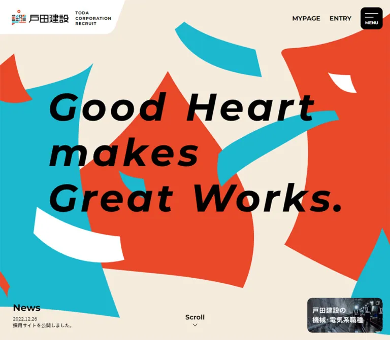
TODA's recruitment homepage uses a warm cream field, enormous vermilion and cyan shapes, and an emphatic black slogan: “Good Heart / makes / Great Works.” The illustration has sweeping edges, pointed corners, ribbon fragments, and smile-like white openings. Its scale extends well beyond the viewport. A small corporate identity panel and compact utility controls make the surrounding interface feel precise against the expansive artwork.
This is a recruitment portal with five principal information groups: company introduction, businesses, people and jobs, working environment, and recruitment information. The opening screen establishes personality; the document then contains a Japanese manifesto and routes into those groups. Preserve that information architecture when reusing the visual approach.
閉じる
TODA CORPORATION RECRUIT — Style Reference
A recruitment homepage with the scale of a graphic poster and the warmth of colorful paper cutouts.
Website: TODA CORPORATION RECRUIT
Original URL: https://www.toda.co.jp/recruit/fresh/
Final URL: https://www.toda.co.jp/recruit/fresh/
Theme: light opening canvas with saturated illustration colors and black typography.
Inspected: September 29, 2026. Supplied observation timestamp: 2026-09-29T12:49:24.346Z, or 21:49:24 JST.
Viewports: desktop 1440 × 1000 and mobile 390 × 844 CSS pixels.
Scope: current homepage opening composition, header, desktop news, scroll cue, and promotional banners, supported by screenshots. Navigation, manifesto, content sections, carousel structures, and footer are additionally documented from supplied rendered DOM and computed styles. Their complete visual and interactive states were not captured.
TODA's recruitment homepage uses a warm cream field, enormous vermilion and cyan shapes, and an emphatic black slogan: “Good Heart / makes / Great Works.” The illustration has sweeping edges, pointed corners, ribbon fragments, and smile-like white openings. Its scale extends well beyond the viewport. A small corporate identity panel and compact utility controls make the surrounding interface feel precise against the expansive artwork.
This is a recruitment portal with five principal information groups: company introduction, businesses, people and jobs, working environment, and recruitment information. The opening screen establishes personality; the document then contains a Japanese manifesto and routes into those groups. Preserve that information architecture when reusing the visual approach.
How to Read This Reference
- Measured means a value supplied in rendered element rectangles or computed styles. These measurements may include transformed, hidden, or offscreen elements.
- Visually observed means visible in the current desktop or mobile captures. Screenshot-based dimensions and color approximations are labeled as estimates.
- Derived means calculated from measured values, such as banner spacing or the proportion of the screen occupied by the slogan.
- Recommended means an implementation choice for a new project. Proposed breakpoints, accessible states, and fallback CSS are not recovered source code.
- Token names are descriptive aliases. The only supplied source custom property is
--vh. - The captures show the opening state. DOM presence alone does not establish visibility, successful scrolling, menu expansion, or carousel behavior.
The reported document height equals the viewport height at both sizes, while numerous element rectangles extend far below it. This discrepancy leaves the scrolling and layering mechanism unresolved. Do not interpret it as proof that the homepage contains only one screen, or copy it into a body-level scroll lock.
Tokens — Colors
Default Palette
| Name | Value | Suggested token | Role | Evidence |
|---|---|---|---|---|
| Warm Cream | Approximately #F4EBDD |
--color-canvas |
Opening background and negative space between cutouts | Visual estimate; no corresponding computed fill supplied |
| Vermilion | Approximately #EF4427 |
--color-vermilion |
Large central and right-hand shapes; smaller fragments | Visual estimate |
| Clear Cyan | Approximately #18B3C7 |
--color-cyan |
Large left-hand shape, crossing ribbons, and small fragments | Visual estimate |
| Black | #000000 |
--color-ink |
Text, menu surface, navigation, and news | Measured as rgb(0, 0, 0) on sampled elements |
| White | #FFFFFF |
--color-white |
Internship pill and promotional surfaces; also visible in identity panel and artwork | Measured on controls and banners; visually observed elsewhere |
| Charcoal | Approximately #494948 |
--color-charcoal |
Small dark wedges within the illustration | Visual estimate |
| Navigation Gray | #787878 |
--color-muted |
Secondary links in the navigation DOM | Measured as rgb(120, 120, 120); open-menu appearance unverified |
The four illustration colors above are practical starting values, not verified brand specifications or extracted image samples. The supplied body background is transparent, so its computed value does not identify the visible cream canvas.
Color Relationships
Vermilion and cyan occupy large, irregular regions rather than appearing only as button accents. Cream separates those regions and keeps the crowded composition readable. Black supplies the principal hierarchy, from the enormous slogan to small utility labels. White isolates the corporate mark and the promotional graphics.
Use flat fills. The opening artwork has no visible gradients, texture overlays, dimensional lighting, or general shadow system. The engineering promotion introduces a small area of dark photography without changing the overall graphic language.
Tokens — Typography
Japanese Body and Editorial Text
Measured regular stack: TazuganeGothicStdN-Regular, sans-serif.
Measured bold stack: TazuganeGothicStdN-Bold, sans-serif.
The body uses the regular family at weight 400. Japanese navigation subtitles, section introductions, card titles, and the manifesto use the bold family at weight 700. Several editorial passages are therefore substantially heavier than ordinary corporate body text.
These are the reported family names. Font files, licensing, and successful loading of every face were not independently checked. Use an appropriate Japanese sans-serif fallback if the original fonts are unavailable.
English Navigation and Section Titles
Measured stack: Montserrat, sans-serif, usually weight 700.
This family is explicitly reported for INTERNSHIP, MYPAGE, ENTRY, News, navigation group headings, and main English section headings. Compact uppercase utility labels sit above larger mixed-case titles such as Welcome to TODA and Our Business.
The sampled text elements use normal letter spacing. Do not apply the hero's visibly spacious lettering to all navigation and paragraphs.
Hero Lettering
The slogan is visibly a heavy italic sans-serif composition with three deliberate lines:
Good HeartmakesGreat Works.
The sampled hero H2 has empty text and a measured rectangle of 800 × 372px on desktop. Its inherited 15px Japanese font declaration does not describe the visible slogan. A graphical rendering is suggested, but its asset format, exact typeface, and source lettering dimensions were not supplied.
Visual estimate: a live-text approximation would begin around 100px on desktop and 44px on the inspected phone, with strong italic weight and generous tracking. Those are reconstruction starting points, not measured font sizes. Preserve an authorized original graphic when exact lettering is required.
Type Scale
Values below are computed font size / line height unless identified otherwise.
| Role | Desktop | Mobile | Family and qualification |
|---|---|---|---|
| General body | 15 / 27px |
14 / 25.2px |
Tazugane regular |
| Internship pill | 14 / 25.2px |
Not visible in opening header | Montserrat, 700 |
| Mypage / Entry | 17 / 40px |
Not visible in opening header | Montserrat, 700; inline rectangle height is only 20px |
| Graduation-year links | 15 / 24px |
Present elsewhere in document | Montserrat, 700; expanded state unverified |
| Menu control container | 11 / 11px |
12 / 12px |
Tazugane regular reported on sampled anchor |
| Navigation English heading | 20 / 36px |
20 / 36px |
Montserrat, 700; navigation DOM |
| Navigation Japanese subtitle | 13 / 23.4px |
13 / 23.4px |
Tazugane bold |
| Navigation secondary link | 14 / 25.2px |
14 / 25.2px |
Tazugane bold |
| News heading | 26 / 26px |
22 / 39.6px |
Mobile measurement belongs to navigation content, not the visible hero |
| Main English section title | 60 / 68.4px |
43.68 / 49.7952px |
Montserrat, 700; measured on Welcome and Business |
| Japanese section subtitle | 20 / 24px |
21.06 / 25.272px |
Tazugane bold |
| Section introduction | 17 / 31.96px |
15.6 / 26.52px |
Tazugane bold |
| Content-card title | 21 / 25.2px |
17.16 / 20.592px |
Tazugane bold; some rectangles reflect scaling |
| Manifesto heading | 65 / 96.2px |
29.952 / 44.329px |
Tazugane bold, white; DOM-only appearance |
| Manifesto paragraphs | 20 / 44px |
14.82 / 34.086px |
Tazugane bold, white; DOM-only appearance |
| Hero slogan | About 100px lettering |
About 44px lettering |
Visual approximation; exact family and size unknown |
Notice that the Japanese section subtitle is slightly larger in the mobile measurement, even while the English title becomes smaller. The hierarchy is adjusted by role rather than scaled uniformly.
Tokens — Spacing & Shapes
There is no demonstrated universal spacing unit. The interface mixes fixed corner offsets, fluid mobile text, large editorial intervals, and separately sized artwork.
Viewport Unit
The supplied source property is:
| Viewport | Observed property | Derived relationship |
|---|---|---|
1440 × 1000 |
--vh: 10px |
One percent of viewport height |
390 × 844 |
--vh: 8.44px |
One percent of viewport height |
The evidence does not identify every consumer of this property. A new implementation can use svh or a maintained viewport-height variable, while keeping the rest of the document scrollable.
Spacing Scale
| Use | Desktop | Mobile | Status |
|---|---|---|---|
| Menu distance from top/right | 20 / 20px |
10 / 10px |
Derived from measured rectangles |
| Promotional stack distance from right/bottom | 20 / 20px |
10 / 15px |
Derived |
| Gap between corner banners | 15px |
10px |
Derived |
| Logo-link left offset | 29px |
15px |
Measured; not the same as visible artwork bounds |
| Hero news left offset | 35px |
No visible hero news block | Measured desktop |
| Mobile section content inset | — | 25px |
Measured on Welcome and Business |
| Main English title to Japanese subtitle | About 10px |
About 10.1px |
Derived from sampled section rectangles |
| Japanese subtitle to introductory copy | 30px |
About 12.5px |
Derived |
| Large promotional pair gap | 60px horizontally |
39px vertically |
Derived from DOM rectangles |
| Gap between circular carousel controls | 20px |
20px |
Derived; each control is 50px wide |
Border Radius
| Element | Desktop | Mobile | Qualification |
|---|---|---|---|
| Menu control | 12px |
8px |
Measured |
| Corner promotional banner | 14px |
10px |
Measured |
| Larger promotional banner | 30px |
24.96px |
Measured in lower-page DOM |
| Internship pill | 999px |
Not shown in opening header | Measured desktop |
| Carousel control | 50% |
50% |
Measured |
| Content link wrapper | 0 |
0 |
Does not establish the shape of any nested image mask |
| Corporate identity panel | Custom sloping edge and curved lower-right termination | Smaller custom silhouette | Visually observed; exact path unavailable |
Layout Measurements
| Element | Desktop 1440 × 1000 |
Mobile 390 × 844 |
|---|---|---|
| Hero slogan wrapper | x:320, y:284, 800 × 372px |
x:23.406, y:338.703, 343.188 × 166.594px |
| Slogan wrapper width / viewport width | 55.56% |
Approximately 88% |
| Slogan wrapper center / viewport height | 47% |
50% |
| Menu control | x:1360, y:20, 60 × 60px |
x:324, y:10, 56 × 56px |
| Identity H1 layout box | 344 × 100px |
344 × 66px |
| Identity link rectangle | x:29, y:25, 274.313 × 50px |
x:15, y:7.75, 238.125 × 57.094px |
| Upper corner banner | x:1235, y:793.563, 185 × 85.719px |
x:246, y:695, 134 × 62px |
| Lower corner banner | x:1235, y:894.281, 185 × 85.719px |
x:246, y:767, 134 × 62px |
| Large promotional banners | Each 453 × 210px, side by side |
Each 340 × 157.609px, stacked |
| First content section | 1440 × 620px |
390 × 616.688px |
The mobile identity H1 remains 344px wide in the DOM, but its visible white panel is only about 225px wide at the top. The layout box, link target, and painted silhouette are different measurements. Use the screenshot to judge the visible panel.
Components
Corporate Identity Panel
Role: establish the corporate operator without competing with the slogan.
The upper-left corner contains a white panel attached to both screen edges. Inside it, the colored company symbol and Japanese wordmark sit beside a small three-line English recruitment lockup. The panel's right side slopes inward and resolves into a rounded lower corner.
At desktop size, the visible panel is approximately 340px wide and 93px high. On mobile it becomes approximately 225px wide and 66px high, while retaining a readable symbol, wordmark, and lockup. These painted dimensions are visual estimates; the separate DOM rectangles appear above.
The original page identifies the operator as 戸田建設株式会社 through its title, logo link text, and corporate-site destination. Preserve the supplied identity artwork rather than rebuilding the company wordmark with ordinary text.
Desktop Utility Navigation
Role: provide direct recruitment actions and a social destination.
The top-right sequence is INTERNSHIP, an Instagram icon, MYPAGE, ENTRY, and the black menu control. The internship link is a white, thinly outlined 130 × 40px pill. Mypage and Entry are unboxed bold text. The Instagram anchor has a 36 × 38px measured box, with a smaller visible outline icon inside it.
The document contains graduation-year destinations labeled 2027卒 and 2028卒 for both Mypage and Entry. They are not visible in the supplied opening screenshot. Their existence does not establish whether they open on hover, click, focus, or some combination.
At the inspected mobile width, the utility row is absent from the opening header. Recruitment and internship destinations remain present later in the document.
Menu Control
Role: expose the site's grouped navigation.
A black rounded square holds two white horizontal strokes above MENU. It is 60px square on desktop and 56px square on mobile. The mobile control becomes proportionally more prominent as the other header utilities disappear.
The sampled anchor contains both MENU and CLOSE, but only the closed appearance is visible. Its computed background-color transition lasts 0.3s. Opening direction, backdrop, stroke transformation, and focus behavior were not tested.
Recommended implementation: use a real button with an accessible name, aria-expanded, and aria-controls. Preserve the observed dimensions and label placement.
Opening Hero
Role: communicate an energetic, people-centered recruitment identity.
The hero fills the captured viewport. Illustration extends to every edge and is deliberately cropped. At desktop size, a broad cyan form occupies the left, vermilion masses dominate the center and right, and a cyan ribbon crosses behind the lettering. White and charcoal fragments introduce facial or folded-paper associations without becoming detailed characters.
The slogan is horizontally centered as a block but internally left aligned. The first and third lines are long; the middle line is short. This imbalance creates a strong rhythm against the intersecting shapes. The heading sits slightly above the vertical midpoint on desktop and at the midpoint on mobile.
Keep the illustration behind the black lettering and the navigation above it. There is no visible paragraph or large conversion button attached to the hero slogan. Its supporting tasks occupy the corners instead.
News Block
Role: show a small current update without interrupting the hero.
The visible desktop block sits near the lower-left corner. It contains a bold News heading, a compact date-and-title row, and two small pagination dots. The displayed item is dated 2026.7.15 with the source label 会社概要情報を更新しました。. A second item dated 2026.5.1 appears in the DOM.
The heading is measured at 26px / 26px. The first visible heading rectangle starts at x:35, y:887.109. Pagination buttons have 20 × 20px rectangles, while their visible dots are much smaller. The active dot appears black and the other pale gray.
No news block is visible in the mobile opening capture. A mobile News heading exists in the navigation DOM; do not place it on top of the hero merely because it has a computed rectangle. Automatic rotation and pagination response were not verified.
Scroll Cue
Role: suggest continuation into the recruitment content.
A bold black Scroll label sits above a fine downward chevron near the bottom center. It appears around 19px in both captures, a visual estimate. The desktop label begins around y:930; the mobile label around y:784.
The cue has no pill, border, shadow, or colored surface. Click behavior and animation are unknown. A new implementation can link it to the next section while respecting reduced-motion preferences.
Corner Promotional Stack
Role: keep two editorial destinations available within the opening composition.
Two wide rounded banners sit at the lower right. The upper banner presents Build the Culture. on white, with a small colored architectural motif. The lower banner combines dark industrial photography with the Japanese engineering-careers label. Small overlapping-square symbols are visible near their upper-right corners; new-window behavior was not supplied.
Their aspect ratio is approximately 2.16:1. Desktop banners are 185 × 85.719px, separated by 15px. Mobile banners are 134 × 62px, separated by 10px. Both retain the same content and order.
The observed destinations are the corporate Build the Culture page and the recruitment engineering-careers page. Their location is corner-anchored in the captured state; persistence during scrolling is unverified.
Manifesto
Role: expand the English slogan into a Japanese statement about people, places, and work.
The source heading is いい仕事には、愛がある。. Subsequent paragraphs include the English slogan and end with 愛ある仕事で、新しい世界の景色をつくろう。.
The DOM reports white bold text, a 65px desktop heading, and 20px / 44px paragraphs. On mobile, these become approximately 29.95px / 44.33px and 14.82px / 34.09px. Desktop paragraphs occupy a right-shifted column approximately 546px wide; the mobile text region starts around 42px from the left.
These elements overlap the hero's coordinate range in the supplied measurements but are not visible in its screenshot. Their background, reveal sequence, and final compositing are unknown. Treat the typography as measured evidence, not as a complete reconstruction of the manifesto screen.
Larger Promotional Pair
Role: repeat the two editorial destinations at a more readable content scale.
The lower-page DOM includes the same destination pair in larger white rounded link wrappers. On desktop they are 453 × 210px, positioned side by side with 60px between them. On mobile they are 340 × 157.609px, inset 25px and stacked with 39px between them.
This preserves approximately the same banner ratio as the corner version. It is a separate component size, not evidence that the corner banners simply grow during scrolling.
Content Section Introduction
Role: organize the recruitment portal into recognizable editorial chapters.
The document contains:
| English group | Source Japanese label | Representative content |
|---|---|---|
| Welcome to TODA | 戸田建設について |
Introductory movie, company overview, future vision, sustainability, new building |
| Our Business | 事業内容を知る |
Project stories, construction, civil engineering, new and overseas businesses, technology |
| Meet Us | 人と仕事に出会う |
Worksites, engineering careers, job types, employee interviews, career stories |
| Culture | 働く環境 |
Training, diversity, employee benefits |
| Recruit | 採用情報 |
Recruitment information and FAQ |
The first two measured introductions combine a large English title, a smaller bold Japanese subtitle, and a short bold Japanese paragraph group. On desktop, Welcome's introduction starts at x:860, while Business starts at x:160, supporting an alternating composition for these two sections. The provided data does not establish the exact arrangement of every later section.
On mobile, both measured introductions start at x:25 with a 340px heading region. Their text precedes the smaller carousel track in DOM geometry. Preserve clear bilingual hierarchy and short paragraph lengths.
Content Carousel and Teaser
Role: offer multiple destination pages within each content group.
Repeated link sets, horizontally displaced rectangles, and paired circular controls support the presence of carousel structures. The first desktop track includes a 420 × 460.188px link and neighboring 378 × 414.169px links. The latter dimensions are exactly 90% of the former, consistent with scaled neighboring slides; the transform declaration itself was not supplied.
Card titles use bold Japanese sans-serif at 21px / 25.2px. On the smaller mobile track, representative link wrappers measure 263.031 × 295.297px; their horizontal stride is 289px, leaving approximately 25.969px between wrappers. A centered item begins at x:63.672, with adjacent items extending past the viewport.
The DOM also includes alternate tracks with 840px or 1066px item widths. Their active visibility is unresolved. Do not treat those dimensions as the intended visible mobile card size or reproduce every duplicated item as separate content.
Two circular controls measure 50 × 50px and sit 20px apart. Arrow appearance, slide timing, dragging, autoplay, looping, and keyboard behavior were not demonstrated. Card-image subjects and masks are also outside the screenshot evidence.
Grouped Navigation and Footer
Role: expose the full recruitment information architecture and supporting links.
The navigation DOM contains the five groups above, English headings, Japanese subtitles, and secondary links. Desktop group columns occupy roughly a 1000px region beginning at x:220. Mobile group headings share a 25px left inset.
Closed-state navigation rectangles overlap or fall outside the visible viewport. They are useful for typography and content inventory, not for reconstructing an open menu. An accordion or overlay mechanism cannot be confirmed from these measurements alone.
The footer text includes the company identity, internship and application routes, graduation years, Corporate Site, Privacy Policy, Staff List, and © TODA CORPORATION. Its complete surface, layout, and spacing were not captured. The Staff List destination is present, but its contents were not inspected.
Tokens — Motion & Interaction
Measured Transition Declarations
| Element | Supplied computed value | Supported conclusion |
|---|---|---|
| Header | 0.6s |
A transition is configured; changed properties and trigger are unspecified |
| Internship link | background-color 0.3s, color 0.3s |
Fill and text can transition; endpoint colors were not captured |
| Instagram link | opacity 0.3s |
Opacity transition is configured |
| Mypage, Entry, year links | opacity 0.3s |
Opacity transition is configured; disclosure interaction is unknown |
| Secondary navigation links | opacity 0.3s |
Same short transition family |
| Menu control | background-color 0.3s |
Background transition is configured |
| Several desktop teaser links | 0.3s |
Short transition exists; properties are not identified |
| Circular carousel controls | 0.3s |
Short transition exists; interaction outcome unverified |
A computed value of transition: all without a nonzero duration is not evidence of visible animation. Likewise, animation: none on sampled elements does not rule out JavaScript animation, transforms on other nodes, or animated assets.
Motion Evidence and Limits
The observation process waited at least five seconds initially, awaited finite visible or potentially revealing animations, and temporarily paused perpetual animation during readiness checks before resuming it. The supplied stills show substantially the same opening state at each size.
There is no reliable evidence here for hero rotation, floating cutout loops, parallax, a specific entrance timeline, smooth-scroll duration, news autoplay interval, or carousel easing. The graphic composition feels dynamic, but that is not proof of movement.
Recommended adaptation: retain approximately 300ms color and opacity feedback for utility controls. Keep the slogan stable. If decorative motion is added, provide a static reduced-motion composition and do not make essential navigation depend on an entrance animation.
Surfaces
| Layer | Appearance | Structural purpose |
|---|---|---|
| Opening canvas | Warm cream, flat | Separates saturated shapes and supports black text |
| Decorative artwork | Large cyan and vermilion regions with white and charcoal fragments | Supplies scale, personality, and directional energy |
| Identity panel | White custom silhouette | Protects the corporate mark from the artwork |
| Utility navigation | Mostly transparent; one outlined white pill | Keeps functional hierarchy compact |
| Menu control | Black rounded square with white details | Strong, consistent navigation anchor |
| Corner promotions | White graphic banner and dark photographic banner, both rounded | Creates legible secondary destinations |
| Teaser link wrappers | Transparent in supplied styles | Leaves the nested media and caption to carry the component |
| Manifesto text layer | White typography; background unresolved | Establishes a different text treatment in the DOM |
The visible hierarchy comes from scale, placement, cropping, and flat color. There is no visible general-purpose system of raised cards or soft elevation shadows.
Imagery
Cutout Composition
Use large, asymmetric shapes with a mixture of stretched curves and sharp tips. The shapes resemble folded or curling paper, with occasional facial suggestions produced by small dark wedges and broad white arcs. They are crisp and flat, without outlines or modeled volume.
The desktop composition is expansive: major shapes run beyond the left, right, and top edges. Smaller ribbon pieces cross those masses. On mobile, the cyan form occupies the upper left, a large vermilion form extends below the slogan, and additional small fragments appear toward the bottom. This is a materially different composition or crop, not a uniformly reduced desktop screenshot.
Recommended asset treatment: use separate art-directed desktop and mobile compositions when available. SVG is suitable for this visual language, but the supplied evidence does not establish the original asset format.
Photography and Identity Assets
The visible lower-right engineering banner uses a dark industrial image behind white Japanese lettering. Preserve its embedded contrast and compact two-line information hierarchy. The upper banner remains predominantly white and typographic.
The corporate symbol and Japanese wordmark are identity artwork. The oversized slogan may also be graphic lettering. Avoid substituting unrelated stock illustration or a generic geometric logo.
The original-page DOM includes 撮影:西山芳一 beside the Sustainability item. This supports an item-level photography attribution; it does not identify the designer or creative director of the overall site.
Observed Asset References
Asset filenames and image-source URLs were not included in the evidence. The following are identifiable visual roles, not invented file paths.
| Asset or visual | Where observed | Availability |
|---|---|---|
| Company symbol, Japanese wordmark, recruitment lockup | Desktop and mobile header | Visible artwork; source file unspecified |
| Three-line English slogan | Desktop and mobile hero | Visible lettering; exact font and asset format unknown |
| Cyan, vermilion, white, and charcoal cutouts | Desktop and mobile hero | Visible composition; source files unspecified |
| Build the Culture graphic | Upper corner banner | Destination supplied; image URL unspecified |
| Engineering-careers image banner | Lower corner banner | Destination supplied; image URL unspecified |
| Section teaser imagery | Carousel link structures | Image subjects and detailed rendering not visually established |
Layout & Responsive Behavior
Opening Composition
| Feature | Desktop observation | Mobile observation |
|---|---|---|
| Header identity | Broad white corner panel | Smaller painted panel with compact lockup |
| Header utilities | Internship, Instagram, Mypage, Entry, Menu | Menu remains visible beside identity |
| Slogan | 800px wrapper, about 56% of viewport width | About 343px wrapper, 88% of viewport width |
| Slogan placement | Wrapper centered at 47% of screen height | Wrapper centered at 50% of screen height |
| Artwork | Broad lateral composition with large edge crops | Tall composition with different shape relationships |
| News | Visible at lower left | Not visible in opening capture |
| Promotional banners | 185px wide, 15px gap | 134px wide, 10px gap |
| Scroll cue | Bottom center | Bottom center, left of the banner stack |
The smartphone design does not shrink every item by the same factor. The menu retains almost its desktop size, while the slogan expands relative to viewport width. The banners shrink less aggressively than the artwork. These independent scales preserve both personality and navigation clarity.
Lower-Page DOM Observations
The large promotional pair changes from two columns to one. Welcome and Business introductions change from alternating desktop positions to a common left-aligned mobile inset. English section titles decrease from 60px to 43.68px, and paragraph line heights become more compact.
Mobile carousel geometry suggests a centered card with neighboring items peeking in from the sides. This is supported by rectangles, not by a lower-page screenshot. Avoid treating the alternate large-width tracks as evidence of intentional page-wide overflow.
Implementation Boundaries
The source breakpoint was not supplied. The Quick Start uses 900px as a recommended switching point and clamps a few sizes between the inspected endpoints. Test intermediate widths, browser zoom, short landscape screens, and long translated labels before treating those recommendations as finished responsive behavior.
Keep the hero's decorative clipping local to the hero. The rest of the recruitment homepage should remain reachable in normal document flow unless a verified alternative scrolling implementation is intentionally reproduced.
Do’s and Don’ts
Do
- Preserve the relationship between warm cream, large vermilion and cyan shapes, and black lettering.
- Keep the slogan on three deliberate lines with a short middle line.
- Use the company identity as a compact, protected white corner element.
- Retain the prominent black menu square on both desktop and mobile.
- Distinguish the outlined internship pill from unboxed Mypage and Entry labels.
- Place the news and promotional utilities around the hero rather than crowding the slogan.
- Adapt artwork placement and cropping specifically for a tall mobile viewport.
- Use Montserrat for the English roles established by computed styles.
- Retain bold Japanese section introductions and their generous line spacing.
- Preserve the five recruitment content groups and their clear bilingual labels.
- Treat graphic-lettering fidelity separately from ordinary text styling.
Don’t
- Don't treat the hero H2's inherited 15px or 14px declaration as the slogan's visible font size.
- Don't claim the hero lettering uses Montserrat merely because nearby English controls do.
- Don't present estimated illustration colors as exact recovered brand tokens.
- Don't reduce the page to a hero and application form; the supplied document contains a substantial recruitment portal.
- Don't add glossy gradients, pervasive shadows, or glass panels to the opening composition.
- Don't make all components use the same radius or scale factor.
- Don't duplicate carousel clones as distinct editorial items.
- Don't position hidden menu content over the hero based on its closed-state rectangles.
- Don't infer hover menus, autoplay, parallax, or scroll persistence from still images.
- Don't force the whole document to one viewport height because that is the reported document-height value.
Recommended Implementation Additions
These are recommendations for a new implementation, not verified features of the original:
- Provide an accessible text equivalent for the slogan if it is delivered as an image or outlined SVG. Hide purely decorative cutouts from assistive technology.
- Implement the menu trigger as a button. If it opens a modal navigation surface, support Escape, appropriate focus management, and focus restoration.
- Expose graduation-year choices through a keyboard-operable control with an explicit expanded state.
- Give Instagram, promotional image links, and carousel controls meaningful accessible names.
- Increase the interactive area around small news dots without enlarging their visible marks unnecessarily.
- Keep carousel clones out of the accessibility tree and tab order if an infinite track is used.
- Offer a reduced-motion mode, and expose pause controls if content advances automatically.
- Check slogan contrast wherever charcoal artwork passes behind it; adjust decorative placement rather than adding a large opaque text card.
- Add safe-area allowances and a short-screen layout so corner banners cannot cover essential text or controls.
- Keep a usable static document order if animation or custom scrolling fails to initialize.
Agent Prompt Guide
Quick Color Reference
- Canvas: approximately
#F4EBDD, visual estimate. - Large warm shapes: approximately
#EF4427, visual estimate. - Large cool shapes: approximately
#18B3C7, visual estimate. - Text and menu: measured
#000000. - Identity and banner surfaces: measured or visibly established white
#FFFFFF. - Small dark artwork: approximately
#494948, visual estimate. - Secondary navigation text: measured
#787878.
Overall Prompt
“Create a Japanese corporate recruitment homepage inspired by the current TODA recruitment composition. Use a warm cream canvas with enormous flat vermilion and cyan cutout shapes, a few charcoal wedges, and curved white fragments. Center a bold black italic slogan in three left-aligned lines, with a short middle line. Protect a compact corporate identity in a white upper-left panel with a sloping right edge. Place a black rounded menu square at the upper right; desktop also has an outlined internship pill, a social icon, and unboxed application utilities. Put compact news at the desktop lower left, a minimal scroll cue at bottom center, and two wide rounded promotional banners at lower right. Continue with a Japanese manifesto and five recruitment content groups. Recompose the artwork for mobile, retain the menu's physical prominence, and let the slogan occupy about 88% of the phone width. Treat exact hero lettering and illustration assets as separate supplied artwork.”
Example Component Prompts
- Identity and header: “Build a white corner identity plaque with a diagonal right edge and a softly curved lower termination. Keep the corporate logo and compact three-line recruitment lockup together. Add a 60px black menu square on desktop and 56px on mobile. Use a white outlined pill only for Internship.”
- Hero: “Compose a cream full-height opening with oversized red and cyan paper-cut shapes cropped beyond the viewport. Overlay ‘Good Heart / makes / Great Works.’ as three bold italic black lines. Keep the text block left aligned and centered as a whole. On a 390px phone, target a 343px text-art wrapper centered vertically.”
- Promotional stack: “Create two 2.16:1 image links at the lower right: a white culture graphic above a dark industrial careers banner. Use 185px widths, 14px radii, and 15px spacing on desktop; 134px widths, 10px radii, and 10px spacing on mobile.”
- Section introduction: “Pair a 60px bold Montserrat English heading with a 20px bold Japanese subtitle and a short 17px Japanese introduction. Alternate the first two desktop introduction positions. On mobile, use a common 25px inset, an approximately 44px English title, and 15.6px body text.”
- Teaser track: “Build an image-and-caption recruitment destination track with a centered mobile card approximately 263px wide and neighboring cards partly visible. Use bold Japanese captions and separate 50px circular previous/next buttons. Implement accessible navigation; do not assume autoplay is part of the reference.”
Quick Start
CSS Custom Properties
This is an implementation scaffold, not extracted source CSS. Black, white, the recorded type families, and several endpoint dimensions are measured. Illustration colors are estimates. The 900px breakpoint, live-text slogan, focus treatment, and native horizontal carousel are recommendations.
Load licensed fonts separately if available. The scaffold does not contain the original logo, cutout artwork, slogan asset, menu logic, or carousel JavaScript. It deliberately keeps the page in normal vertical flow.
:root {
  /* Estimated illustration colors */
  --color-canvas: #f4ebdd;
  --color-vermilion: #ef4427;
  --color-cyan: #18b3c7;
  --color-charcoal: #494948;

  /* Measured interface colors */
  --color-ink: #000;
  --color-white: #fff;
  --color-muted: #787878;

  /* Reported font families; load authorized files separately */
  --font-en: 'Montserrat', sans-serif;
  --font-ja: 'TazuganeGothicStdN-Regular', sans-serif;
  --font-ja-bold: 'TazuganeGothicStdN-Bold', sans-serif;

  /* Mobile endpoint geometry */
  --content-inset: 25px;
  --corner-inset: 10px;
  --menu-size: 56px;
  --menu-radius: 8px;
  --promo-width: 134px;
  --promo-radius: 10px;
  --promo-gap: 10px;
  --promo-bottom: 15px;
  --teaser-width: clamp(240px, 67.445vw, 420px);
  --feedback-duration: 300ms;
}

* {
  box-sizing: border-box;
}

body {
  margin: 0;
  color: var(--color-ink);
  background: var(--color-canvas);
  font-family: var(--font-ja);
  font-size: 14px;
  line-height: 1.8;
}

button,
a {
  -webkit-tap-highlight-color: transparent;
}

button {
  font: inherit;
}

img {
  display: block;
  max-width: 100%;
}

.toda-hero {
  position: relative;
  isolation: isolate;
  min-height: 680px;
  height: 100vh;
  height: 100svh;
  overflow: hidden;
  overflow: clip;
  background: var(--color-canvas);
}

.toda-header {
  position: absolute;
  inset: 0 0 auto;
  z-index: 4;
}

.brand-plaque {
  position: absolute;
  inset: 0 auto auto 0;
  display: flex;
  align-items: center;
  width: 226px;
  height: 66px;
  padding: 12px 15px;
  background: var(--color-white);
  /* Approximation of the painted silhouette */
  clip-path: polygon(0 0, 100% 0, 91% 80%, 86% 100%, 0 100%);
}

.brand-plaque img {
  width: 177px;
  height: auto;
}

.header-utilities {
  display: none;
}

.menu-toggle {
  position: absolute;
  top: var(--corner-inset);
  right: var(--corner-inset);
  display: grid;
  place-content: center;
  justify-items: center;
  gap: 7px;
  width: var(--menu-size);
  height: var(--menu-size);
  padding: 0;
  border: 0;
  border-radius: var(--menu-radius);
  color: var(--color-white);
  background: var(--color-ink);
  font-size: 12px;
  line-height: 1;
  cursor: pointer;
  transition: background-color var(--feedback-duration);
}

.menu-toggle__lines {
  display: block;
  width: 32px;
  height: 11px;
  border-top: 2px solid currentColor;
  border-bottom: 2px solid currentColor;
}

.hero-art {
  position: absolute;
  inset: 0;
  z-index: 0;
  pointer-events: none;
}

.hero-art picture,
.hero-art img,
.hero-art svg {
  display: block;
  width: 100%;
  height: 100%;
}

.hero-art img {
  object-fit: cover;
}

.hero-slogan {
  position: absolute;
  top: 50%;
  left: 50%;
  z-index: 1;
  width: min(800px, 88vw);
  margin: 0;
  transform: translate(-50%, -50%);
  /* Live-text approximation, not the verified hero typeface */
  font-family: var(--font-en);
  font-size: clamp(34px, 11.28vw, 100px);
  font-style: italic;
  font-weight: 700;
  line-height: 1.24;
  letter-spacing: 0.05em;
}

.hero-slogan > span {
  display: block;
}

.hero-slogan > img {
  width: 100%;
  height: auto;
}

.hero-news {
  display: none;
}

.hero-scroll {
  position: absolute;
  bottom: 29px;
  left: 50%;
  z-index: 2;
  display: grid;
  justify-items: center;
  gap: 8px;
  transform: translateX(-50%);
  color: inherit;
  font-family: var(--font-en);
  font-size: 19px;
  font-weight: 700;
  line-height: 1.2;
  text-decoration: none;
}

.hero-scroll::after {
  content: '';
  width: 8px;
  height: 8px;
  border-right: 1px solid currentColor;
  border-bottom: 1px solid currentColor;
  transform: rotate(45deg);
}

.hero-promos {
  position: absolute;
  right: max(var(--corner-inset), env(safe-area-inset-right, 0px));
  bottom: calc(var(--promo-bottom) + env(safe-area-inset-bottom, 0px));
  z-index: 2;
  display: grid;
  gap: var(--promo-gap);
  width: var(--promo-width);
}

.promo-link {
  display: block;
  overflow: hidden;
  aspect-ratio: 453 / 210;
  border-radius: var(--promo-radius);
  background: var(--color-white);
}

.promo-link img {
  width: 100%;
  height: 100%;
  object-fit: contain;
}

.promo-pair {
  display: grid;
  gap: 39px;
  width: min(966px, calc(100% - 50px));
  margin: 80px auto;
}

.promo-pair .promo-link {
  border-radius: 24.96px;
}

.recruit-section {
  padding-block: 30px 70px;
}

.section-intro {
  margin-inline: var(--content-inset);
}

.section-title {
  margin: 0 0 10px;
  font-family: var(--font-en);
  font-size: clamp(36px, 11.2vw, 60px);
  font-weight: 700;
  line-height: 1.14;
}

.section-subtitle {
  margin: 0 0 12.5px;
  font-family: var(--font-ja-bold);
  font-size: clamp(20px, 5.4vw, 22px);
  font-weight: 700;
  line-height: 1.2;
}

.section-copy {
  margin: 0;
  font-family: var(--font-ja-bold);
  font-size: clamp(14px, 4vw, 17px);
  font-weight: 700;
  line-height: 1.7;
}

.teaser-track {
  display: flex;
  gap: 26px;
  overflow-x: auto;
  padding: 30px max(25px, calc((100% - var(--teaser-width)) / 2));
  scroll-snap-type: x mandatory;
  scroll-padding-inline: 25px;
}

.teaser {
  flex: 0 0 var(--teaser-width);
  min-width: 0;
  color: inherit;
  text-decoration: none;
  scroll-snap-align: center;
}

.teaser img {
  width: 100%;
  /* Square media is a scaffold recommendation */
  aspect-ratio: 1;
  object-fit: cover;
}

.teaser-title {
  margin: 12px 0 0;
  font-family: var(--font-ja-bold);
  font-size: 17.16px;
  font-weight: 700;
  line-height: 1.2;
}

.track-controls {
  display: flex;
  justify-content: center;
  gap: 20px;
}

.track-controls button {
  width: 50px;
  height: 50px;
  padding: 0;
  border: 0;
  border-radius: 50%;
  color: var(--color-ink);
  background: var(--color-white);
  cursor: pointer;
}

/* Recommended focus treatment, including dark photographic surfaces */
a:focus-visible,
button:focus-visible {
  outline: 3px solid var(--color-ink);
  outline-offset: 4px;
  box-shadow: 0 0 0 4px var(--color-white);
}

@media (min-width: 900px) {
  :root {
    --corner-inset: 20px;
    --menu-size: 60px;
    --menu-radius: 12px;
    --promo-width: 185px;
    --promo-radius: 14px;
    --promo-gap: 15px;
    --promo-bottom: 20px;
    --teaser-width: 420px;
  }

  body {
    font-size: 15px;
  }

  .brand-plaque {
    width: 344px;
    height: 100px;
    padding: 25px 29px;
  }

  .brand-plaque img {
    width: 274px;
  }

  .header-utilities {
    position: absolute;
    top: 30px;
    right: 93px;
    display: flex;
    align-items: center;
    gap: 17px;
    font-family: var(--font-en);
    font-size: 17px;
    font-weight: 700;
  }

  .header-utilities a {
    color: inherit;
    text-decoration: none;
    transition: opacity var(--feedback-duration);
  }

  .header-utilities .internship-link {
    display: grid;
    place-items: center;
    width: 130px;
    height: 40px;
    border: 1px solid currentColor;
    border-radius: 999px;
    background: var(--color-white);
    font-size: 14px;
    transition: background-color 300ms, color 300ms;
  }

  .menu-toggle {
    font-size: 11px;
  }

  .hero-slogan {
    top: 47%;
  }

  .hero-news {
    position: absolute;
    bottom: 30px;
    left: 35px;
    z-index: 2;
    display: block;
    max-width: 45%;
  }

  .hero-news h3 {
    margin: 0 0 10px;
    font: 700 26px/1 var(--font-en);
  }

  .hero-news p {
    margin: 0;
    font-size: 13px;
  }

  .hero-scroll {
    bottom: 39px;
  }

  .promo-pair {
    grid-template-columns: repeat(2, minmax(0, 1fr));
    gap: 60px;
  }

  .promo-pair .promo-link {
    border-radius: 30px;
  }

  .recruit-section {
    display: grid;
    grid-template-columns: minmax(0, 1fr) minmax(0, 1fr);
    align-items: center;
    min-height: 620px;
    padding-block: 70px;
  }

  .section-intro {
    width: min(380px, calc(100% - 60px));
    margin-inline: auto;
  }

  .section-title {
    font-size: 60px;
  }

  .section-subtitle {
    margin-bottom: 30px;
    font-size: 20px;
  }

  .section-copy {
    font-size: 17px;
    line-height: 1.88;
  }

  .teaser-title {
    margin-top: 15px;
    font-size: 21px;
  }

  /* Explicit class for a chapter whose introduction sits on the right */
  .recruit-section--intro-right .section-intro {
    grid-column: 2;
    grid-row: 1;
  }

  .recruit-section--intro-right .section-media {
    grid-column: 1;
    grid-row: 1;
  }
}

/* Recommended static behavior for any added decoration */
@media (prefers-reduced-motion: reduce) {
  .hero-art *,
  .hero-scroll,
  .header-utilities a,
  .menu-toggle {
    animation: none !important;
    transition: none !important;
  }

  .teaser-track {
    scroll-behavior: auto;
  }
}
Use three block spans inside .hero-slogan for the text fallback. If the original slogan graphic is available, replace those spans with an image carrying an appropriate text alternative. Place responsive decorative artwork in .hero-art and mark that container aria-hidden='true'.
The CSS models the visible opening proportions and provides a usable content foundation. It does not recreate the unresolved manifesto background or an unobserved menu overlay. Wire navigation and carousel controls separately, and verify all three slogan lines after the actual fonts load.
Tailwind v4 Token Mapping
Optional aliases for a project already using Tailwind v4. Define the custom properties above first. This does not imply that the original site uses Tailwind.
@theme inline {
  --color-cream: var(--color-canvas);
  --color-vermilion: #ef4427;
  --color-cyan: #18b3c7;
  --color-ink: #000;
  --color-charcoal: #494948;
  --font-editorial: var(--font-en);
  --font-japanese: var(--font-ja);
  --font-japanese-bold: var(--font-ja-bold);
  --spacing-content-inset: var(--content-inset);
  --spacing-menu: var(--menu-size);
  --spacing-promo: var(--promo-width);
  --radius-menu: var(--menu-radius);
  --radius-promo: var(--promo-radius);
}
Sources & Evidence
- Current original homepage: supplied HTTP status
200; original and final URLs are identical. Authority for the current identity, content inventory, links, and reported element styles. - Observation timestamp:
2026-09-29T12:49:24.346Z. Desktop viewport1440 × 1000; mobile viewport390 × 844CSS pixels. - Current visual evidence: three supplied desktop captures and two mobile captures, showing substantially the same opening state at each size. These establish the visible artwork composition, header, slogan, desktop news, scroll cue, and two corner banners.
- Rendered DOM and computed styles: supplied font families, sizes, line heights, colors, border radii, transitions, element rectangles, link destinations, and the
--vhvalues. Hidden and duplicate structures remain qualified throughout this reference. - Observed original-page destinations: Build the Culture, engineering careers, and Staff List. Their links are evidenced on the homepage; destination-page contents were not inspected.
- Inspection limits: no supplied open-menu, dropdown, hover, keyboard, carousel-transition, or successful lower-page visual state. Exact illustration fills, hero lettering family, artwork source URLs, source breakpoints, and continuous motion remain unverified. Readiness checks improve capture stability but do not establish semantic completeness.
This reference describes the current page using the supplied evidence only. All proposed CSS, accessibility behavior, responsive interpolation, and asset-handling techniques are implementation recommendations rather than claims about unseen source code.
# TODA CORPORATION RECRUIT — Style Reference

> A recruitment homepage with the scale of a graphic poster and the warmth of colorful paper cutouts.

**Website:** [TODA CORPORATION RECRUIT](https://www.toda.co.jp/recruit/fresh/)
**Original URL:** https://www.toda.co.jp/recruit/fresh/
**Final URL:** https://www.toda.co.jp/recruit/fresh/
**Theme:** light opening canvas with saturated illustration colors and black typography.
**Inspected:** September 29, 2026. Supplied observation timestamp: `2026-09-29T12:49:24.346Z`, or 21:49:24 JST.
**Viewports:** desktop `1440 × 1000` and mobile `390 × 844` CSS pixels.
**Scope:** current homepage opening composition, header, desktop news, scroll cue, and promotional banners, supported by screenshots. Navigation, manifesto, content sections, carousel structures, and footer are additionally documented from supplied rendered DOM and computed styles. Their complete visual and interactive states were not captured.

TODA's recruitment homepage uses a warm cream field, enormous vermilion and cyan shapes, and an emphatic black slogan: “Good Heart / makes / Great Works.” The illustration has sweeping edges, pointed corners, ribbon fragments, and smile-like white openings. Its scale extends well beyond the viewport. A small corporate identity panel and compact utility controls make the surrounding interface feel precise against the expansive artwork.

This is a recruitment portal with five principal information groups: company introduction, businesses, people and jobs, working environment, and recruitment information. The opening screen establishes personality; the document then contains a Japanese manifesto and routes into those groups. Preserve that information architecture when reusing the visual approach.
閉じる
# TODA CORPORATION RECRUIT — Style Reference

> A recruitment homepage with the scale of a graphic poster and the warmth of colorful paper cutouts.

**Website:** [TODA CORPORATION RECRUIT](https://www.toda.co.jp/recruit/fresh/)
**Original URL:** https://www.toda.co.jp/recruit/fresh/
**Final URL:** https://www.toda.co.jp/recruit/fresh/
**Theme:** light opening canvas with saturated illustration colors and black typography.
**Inspected:** September 29, 2026. Supplied observation timestamp: `2026-09-29T12:49:24.346Z`, or 21:49:24 JST.
**Viewports:** desktop `1440 × 1000` and mobile `390 × 844` CSS pixels.
**Scope:** current homepage opening composition, header, desktop news, scroll cue, and promotional banners, supported by screenshots. Navigation, manifesto, content sections, carousel structures, and footer are additionally documented from supplied rendered DOM and computed styles. Their complete visual and interactive states were not captured.

TODA's recruitment homepage uses a warm cream field, enormous vermilion and cyan shapes, and an emphatic black slogan: “Good Heart / makes / Great Works.” The illustration has sweeping edges, pointed corners, ribbon fragments, and smile-like white openings. Its scale extends well beyond the viewport. A small corporate identity panel and compact utility controls make the surrounding interface feel precise against the expansive artwork.

This is a recruitment portal with five principal information groups: company introduction, businesses, people and jobs, working environment, and recruitment information. The opening screen establishes personality; the document then contains a Japanese manifesto and routes into those groups. Preserve that information architecture when reusing the visual approach.

## How to Read This Reference

- **Measured** means a value supplied in rendered element rectangles or computed styles. These measurements may include transformed, hidden, or offscreen elements.
- **Visually observed** means visible in the current desktop or mobile captures. Screenshot-based dimensions and color approximations are labeled as estimates.
- **Derived** means calculated from measured values, such as banner spacing or the proportion of the screen occupied by the slogan.
- **Recommended** means an implementation choice for a new project. Proposed breakpoints, accessible states, and fallback CSS are not recovered source code.
- Token names are descriptive aliases. The only supplied source custom property is `--vh`.
- The captures show the opening state. DOM presence alone does not establish visibility, successful scrolling, menu expansion, or carousel behavior.

The reported document height equals the viewport height at both sizes, while numerous element rectangles extend far below it. This discrepancy leaves the scrolling and layering mechanism unresolved. Do not interpret it as proof that the homepage contains only one screen, or copy it into a body-level scroll lock.

## Tokens — Colors

### Default Palette

| Name | Value | Suggested token | Role | Evidence |
| --- | --- | --- | --- | --- |
| Warm Cream | Approximately `#F4EBDD` | `--color-canvas` | Opening background and negative space between cutouts | Visual estimate; no corresponding computed fill supplied |
| Vermilion | Approximately `#EF4427` | `--color-vermilion` | Large central and right-hand shapes; smaller fragments | Visual estimate |
| Clear Cyan | Approximately `#18B3C7` | `--color-cyan` | Large left-hand shape, crossing ribbons, and small fragments | Visual estimate |
| Black | `#000000` | `--color-ink` | Text, menu surface, navigation, and news | Measured as `rgb(0, 0, 0)` on sampled elements |
| White | `#FFFFFF` | `--color-white` | Internship pill and promotional surfaces; also visible in identity panel and artwork | Measured on controls and banners; visually observed elsewhere |
| Charcoal | Approximately `#494948` | `--color-charcoal` | Small dark wedges within the illustration | Visual estimate |
| Navigation Gray | `#787878` | `--color-muted` | Secondary links in the navigation DOM | Measured as `rgb(120, 120, 120)`; open-menu appearance unverified |

The four illustration colors above are practical starting values, not verified brand specifications or extracted image samples. The supplied body background is transparent, so its computed value does not identify the visible cream canvas.

### Color Relationships

Vermilion and cyan occupy large, irregular regions rather than appearing only as button accents. Cream separates those regions and keeps the crowded composition readable. Black supplies the principal hierarchy, from the enormous slogan to small utility labels. White isolates the corporate mark and the promotional graphics.

Use flat fills. The opening artwork has no visible gradients, texture overlays, dimensional lighting, or general shadow system. The engineering promotion introduces a small area of dark photography without changing the overall graphic language.

## Tokens — Typography

### Japanese Body and Editorial Text

**Measured regular stack:** `TazuganeGothicStdN-Regular, sans-serif`.

**Measured bold stack:** `TazuganeGothicStdN-Bold, sans-serif`.

The body uses the regular family at weight `400`. Japanese navigation subtitles, section introductions, card titles, and the manifesto use the bold family at weight `700`. Several editorial passages are therefore substantially heavier than ordinary corporate body text.

These are the reported family names. Font files, licensing, and successful loading of every face were not independently checked. Use an appropriate Japanese sans-serif fallback if the original fonts are unavailable.

### English Navigation and Section Titles

**Measured stack:** `Montserrat, sans-serif`, usually weight `700`.

This family is explicitly reported for `INTERNSHIP`, `MYPAGE`, `ENTRY`, `News`, navigation group headings, and main English section headings. Compact uppercase utility labels sit above larger mixed-case titles such as `Welcome to TODA` and `Our Business`.

The sampled text elements use normal letter spacing. Do not apply the hero's visibly spacious lettering to all navigation and paragraphs.

### Hero Lettering

The slogan is visibly a heavy italic sans-serif composition with three deliberate lines:

1. `Good Heart`
2. `makes`
3. `Great Works.`

The sampled hero `H2` has empty text and a measured rectangle of `800 × 372px` on desktop. Its inherited `15px` Japanese font declaration does **not** describe the visible slogan. A graphical rendering is suggested, but its asset format, exact typeface, and source lettering dimensions were not supplied.

**Visual estimate:** a live-text approximation would begin around `100px` on desktop and `44px` on the inspected phone, with strong italic weight and generous tracking. Those are reconstruction starting points, not measured font sizes. Preserve an authorized original graphic when exact lettering is required.

### Type Scale

Values below are computed font size / line height unless identified otherwise.

| Role | Desktop | Mobile | Family and qualification |
| --- | --- | --- | --- |
| General body | `15 / 27px` | `14 / 25.2px` | Tazugane regular |
| Internship pill | `14 / 25.2px` | Not visible in opening header | Montserrat, 700 |
| Mypage / Entry | `17 / 40px` | Not visible in opening header | Montserrat, 700; inline rectangle height is only 20px |
| Graduation-year links | `15 / 24px` | Present elsewhere in document | Montserrat, 700; expanded state unverified |
| Menu control container | `11 / 11px` | `12 / 12px` | Tazugane regular reported on sampled anchor |
| Navigation English heading | `20 / 36px` | `20 / 36px` | Montserrat, 700; navigation DOM |
| Navigation Japanese subtitle | `13 / 23.4px` | `13 / 23.4px` | Tazugane bold |
| Navigation secondary link | `14 / 25.2px` | `14 / 25.2px` | Tazugane bold |
| News heading | `26 / 26px` | `22 / 39.6px` | Mobile measurement belongs to navigation content, not the visible hero |
| Main English section title | `60 / 68.4px` | `43.68 / 49.7952px` | Montserrat, 700; measured on Welcome and Business |
| Japanese section subtitle | `20 / 24px` | `21.06 / 25.272px` | Tazugane bold |
| Section introduction | `17 / 31.96px` | `15.6 / 26.52px` | Tazugane bold |
| Content-card title | `21 / 25.2px` | `17.16 / 20.592px` | Tazugane bold; some rectangles reflect scaling |
| Manifesto heading | `65 / 96.2px` | `29.952 / 44.329px` | Tazugane bold, white; DOM-only appearance |
| Manifesto paragraphs | `20 / 44px` | `14.82 / 34.086px` | Tazugane bold, white; DOM-only appearance |
| Hero slogan | About `100px` lettering | About `44px` lettering | Visual approximation; exact family and size unknown |

Notice that the Japanese section subtitle is slightly larger in the mobile measurement, even while the English title becomes smaller. The hierarchy is adjusted by role rather than scaled uniformly.

## Tokens — Spacing & Shapes

There is no demonstrated universal spacing unit. The interface mixes fixed corner offsets, fluid mobile text, large editorial intervals, and separately sized artwork.

### Viewport Unit

The supplied source property is:

| Viewport | Observed property | Derived relationship |
| --- | --- | --- |
| `1440 × 1000` | `--vh: 10px` | One percent of viewport height |
| `390 × 844` | `--vh: 8.44px` | One percent of viewport height |

The evidence does not identify every consumer of this property. A new implementation can use `svh` or a maintained viewport-height variable, while keeping the rest of the document scrollable.

### Spacing Scale

| Use | Desktop | Mobile | Status |
| --- | --- | --- | --- |
| Menu distance from top/right | `20 / 20px` | `10 / 10px` | Derived from measured rectangles |
| Promotional stack distance from right/bottom | `20 / 20px` | `10 / 15px` | Derived |
| Gap between corner banners | `15px` | `10px` | Derived |
| Logo-link left offset | `29px` | `15px` | Measured; not the same as visible artwork bounds |
| Hero news left offset | `35px` | No visible hero news block | Measured desktop |
| Mobile section content inset | — | `25px` | Measured on Welcome and Business |
| Main English title to Japanese subtitle | About `10px` | About `10.1px` | Derived from sampled section rectangles |
| Japanese subtitle to introductory copy | `30px` | About `12.5px` | Derived |
| Large promotional pair gap | `60px` horizontally | `39px` vertically | Derived from DOM rectangles |
| Gap between circular carousel controls | `20px` | `20px` | Derived; each control is 50px wide |

### Border Radius

| Element | Desktop | Mobile | Qualification |
| --- | --- | --- | --- |
| Menu control | `12px` | `8px` | Measured |
| Corner promotional banner | `14px` | `10px` | Measured |
| Larger promotional banner | `30px` | `24.96px` | Measured in lower-page DOM |
| Internship pill | `999px` | Not shown in opening header | Measured desktop |
| Carousel control | `50%` | `50%` | Measured |
| Content link wrapper | `0` | `0` | Does not establish the shape of any nested image mask |
| Corporate identity panel | Custom sloping edge and curved lower-right termination | Smaller custom silhouette | Visually observed; exact path unavailable |

### Layout Measurements

| Element | Desktop `1440 × 1000` | Mobile `390 × 844` |
| --- | --- | --- |
| Hero slogan wrapper | `x:320, y:284`, `800 × 372px` | `x:23.406, y:338.703`, `343.188 × 166.594px` |
| Slogan wrapper width / viewport width | `55.56%` | Approximately `88%` |
| Slogan wrapper center / viewport height | `47%` | `50%` |
| Menu control | `x:1360, y:20`, `60 × 60px` | `x:324, y:10`, `56 × 56px` |
| Identity H1 layout box | `344 × 100px` | `344 × 66px` |
| Identity link rectangle | `x:29, y:25`, `274.313 × 50px` | `x:15, y:7.75`, `238.125 × 57.094px` |
| Upper corner banner | `x:1235, y:793.563`, `185 × 85.719px` | `x:246, y:695`, `134 × 62px` |
| Lower corner banner | `x:1235, y:894.281`, `185 × 85.719px` | `x:246, y:767`, `134 × 62px` |
| Large promotional banners | Each `453 × 210px`, side by side | Each `340 × 157.609px`, stacked |
| First content section | `1440 × 620px` | `390 × 616.688px` |

The mobile identity H1 remains 344px wide in the DOM, but its visible white panel is only about 225px wide at the top. The layout box, link target, and painted silhouette are different measurements. Use the screenshot to judge the visible panel.

## Components

### Corporate Identity Panel

**Role:** establish the corporate operator without competing with the slogan.

The upper-left corner contains a white panel attached to both screen edges. Inside it, the colored company symbol and Japanese wordmark sit beside a small three-line English recruitment lockup. The panel's right side slopes inward and resolves into a rounded lower corner.

At desktop size, the visible panel is approximately 340px wide and 93px high. On mobile it becomes approximately 225px wide and 66px high, while retaining a readable symbol, wordmark, and lockup. These painted dimensions are visual estimates; the separate DOM rectangles appear above.

The original page identifies the operator as 戸田建設株式会社 through its title, logo link text, and corporate-site destination. Preserve the supplied identity artwork rather than rebuilding the company wordmark with ordinary text.

### Desktop Utility Navigation

**Role:** provide direct recruitment actions and a social destination.

The top-right sequence is `INTERNSHIP`, an Instagram icon, `MYPAGE`, `ENTRY`, and the black menu control. The internship link is a white, thinly outlined `130 × 40px` pill. Mypage and Entry are unboxed bold text. The Instagram anchor has a `36 × 38px` measured box, with a smaller visible outline icon inside it.

The document contains graduation-year destinations labeled `2027卒` and `2028卒` for both Mypage and Entry. They are not visible in the supplied opening screenshot. Their existence does not establish whether they open on hover, click, focus, or some combination.

At the inspected mobile width, the utility row is absent from the opening header. Recruitment and internship destinations remain present later in the document.

### Menu Control

**Role:** expose the site's grouped navigation.

A black rounded square holds two white horizontal strokes above `MENU`. It is `60px` square on desktop and `56px` square on mobile. The mobile control becomes proportionally more prominent as the other header utilities disappear.

The sampled anchor contains both `MENU` and `CLOSE`, but only the closed appearance is visible. Its computed background-color transition lasts `0.3s`. Opening direction, backdrop, stroke transformation, and focus behavior were not tested.

**Recommended implementation:** use a real button with an accessible name, `aria-expanded`, and `aria-controls`. Preserve the observed dimensions and label placement.

### Opening Hero

**Role:** communicate an energetic, people-centered recruitment identity.

The hero fills the captured viewport. Illustration extends to every edge and is deliberately cropped. At desktop size, a broad cyan form occupies the left, vermilion masses dominate the center and right, and a cyan ribbon crosses behind the lettering. White and charcoal fragments introduce facial or folded-paper associations without becoming detailed characters.

The slogan is horizontally centered as a block but internally left aligned. The first and third lines are long; the middle line is short. This imbalance creates a strong rhythm against the intersecting shapes. The heading sits slightly above the vertical midpoint on desktop and at the midpoint on mobile.

Keep the illustration behind the black lettering and the navigation above it. There is no visible paragraph or large conversion button attached to the hero slogan. Its supporting tasks occupy the corners instead.

### News Block

**Role:** show a small current update without interrupting the hero.

The visible desktop block sits near the lower-left corner. It contains a bold `News` heading, a compact date-and-title row, and two small pagination dots. The displayed item is dated `2026.7.15` with the source label `会社概要情報を更新しました。`. A second item dated `2026.5.1` appears in the DOM.

The heading is measured at `26px / 26px`. The first visible heading rectangle starts at `x:35, y:887.109`. Pagination buttons have `20 × 20px` rectangles, while their visible dots are much smaller. The active dot appears black and the other pale gray.

No news block is visible in the mobile opening capture. A mobile `News` heading exists in the navigation DOM; do not place it on top of the hero merely because it has a computed rectangle. Automatic rotation and pagination response were not verified.

### Scroll Cue

**Role:** suggest continuation into the recruitment content.

A bold black `Scroll` label sits above a fine downward chevron near the bottom center. It appears around 19px in both captures, a visual estimate. The desktop label begins around `y:930`; the mobile label around `y:784`.

The cue has no pill, border, shadow, or colored surface. Click behavior and animation are unknown. A new implementation can link it to the next section while respecting reduced-motion preferences.

### Corner Promotional Stack

**Role:** keep two editorial destinations available within the opening composition.

Two wide rounded banners sit at the lower right. The upper banner presents `Build the Culture.` on white, with a small colored architectural motif. The lower banner combines dark industrial photography with the Japanese engineering-careers label. Small overlapping-square symbols are visible near their upper-right corners; new-window behavior was not supplied.

Their aspect ratio is approximately `2.16:1`. Desktop banners are `185 × 85.719px`, separated by 15px. Mobile banners are `134 × 62px`, separated by 10px. Both retain the same content and order.

The observed destinations are the corporate Build the Culture page and the recruitment engineering-careers page. Their location is corner-anchored in the captured state; persistence during scrolling is unverified.

### Manifesto

**Role:** expand the English slogan into a Japanese statement about people, places, and work.

The source heading is `いい仕事には、愛がある。`. Subsequent paragraphs include the English slogan and end with `愛ある仕事で、新しい世界の景色をつくろう。`.

The DOM reports white bold text, a `65px` desktop heading, and `20px / 44px` paragraphs. On mobile, these become approximately `29.95px / 44.33px` and `14.82px / 34.09px`. Desktop paragraphs occupy a right-shifted column approximately 546px wide; the mobile text region starts around 42px from the left.

These elements overlap the hero's coordinate range in the supplied measurements but are not visible in its screenshot. Their background, reveal sequence, and final compositing are unknown. Treat the typography as measured evidence, not as a complete reconstruction of the manifesto screen.

### Larger Promotional Pair

**Role:** repeat the two editorial destinations at a more readable content scale.

The lower-page DOM includes the same destination pair in larger white rounded link wrappers. On desktop they are `453 × 210px`, positioned side by side with 60px between them. On mobile they are `340 × 157.609px`, inset 25px and stacked with 39px between them.

This preserves approximately the same banner ratio as the corner version. It is a separate component size, not evidence that the corner banners simply grow during scrolling.

### Content Section Introduction

**Role:** organize the recruitment portal into recognizable editorial chapters.

The document contains:

| English group | Source Japanese label | Representative content |
| --- | --- | --- |
| Welcome to TODA | `戸田建設について` | Introductory movie, company overview, future vision, sustainability, new building |
| Our Business | `事業内容を知る` | Project stories, construction, civil engineering, new and overseas businesses, technology |
| Meet Us | `人と仕事に出会う` | Worksites, engineering careers, job types, employee interviews, career stories |
| Culture | `働く環境` | Training, diversity, employee benefits |
| Recruit | `採用情報` | Recruitment information and FAQ |

The first two measured introductions combine a large English title, a smaller bold Japanese subtitle, and a short bold Japanese paragraph group. On desktop, Welcome's introduction starts at `x:860`, while Business starts at `x:160`, supporting an alternating composition for these two sections. The provided data does not establish the exact arrangement of every later section.

On mobile, both measured introductions start at `x:25` with a 340px heading region. Their text precedes the smaller carousel track in DOM geometry. Preserve clear bilingual hierarchy and short paragraph lengths.

### Content Carousel and Teaser

**Role:** offer multiple destination pages within each content group.

Repeated link sets, horizontally displaced rectangles, and paired circular controls support the presence of carousel structures. The first desktop track includes a `420 × 460.188px` link and neighboring `378 × 414.169px` links. The latter dimensions are exactly 90% of the former, consistent with scaled neighboring slides; the transform declaration itself was not supplied.

Card titles use bold Japanese sans-serif at `21px / 25.2px`. On the smaller mobile track, representative link wrappers measure `263.031 × 295.297px`; their horizontal stride is 289px, leaving approximately 25.969px between wrappers. A centered item begins at `x:63.672`, with adjacent items extending past the viewport.

The DOM also includes alternate tracks with 840px or 1066px item widths. Their active visibility is unresolved. Do not treat those dimensions as the intended visible mobile card size or reproduce every duplicated item as separate content.

Two circular controls measure `50 × 50px` and sit 20px apart. Arrow appearance, slide timing, dragging, autoplay, looping, and keyboard behavior were not demonstrated. Card-image subjects and masks are also outside the screenshot evidence.

### Grouped Navigation and Footer

**Role:** expose the full recruitment information architecture and supporting links.

The navigation DOM contains the five groups above, English headings, Japanese subtitles, and secondary links. Desktop group columns occupy roughly a 1000px region beginning at `x:220`. Mobile group headings share a 25px left inset.

Closed-state navigation rectangles overlap or fall outside the visible viewport. They are useful for typography and content inventory, not for reconstructing an open menu. An accordion or overlay mechanism cannot be confirmed from these measurements alone.

The footer text includes the company identity, internship and application routes, graduation years, `Corporate Site`, `Privacy Policy`, `Staff List`, and `© TODA CORPORATION`. Its complete surface, layout, and spacing were not captured. The Staff List destination is present, but its contents were not inspected.

## Tokens — Motion & Interaction

### Measured Transition Declarations

| Element | Supplied computed value | Supported conclusion |
| --- | --- | --- |
| Header | `0.6s` | A transition is configured; changed properties and trigger are unspecified |
| Internship link | `background-color 0.3s, color 0.3s` | Fill and text can transition; endpoint colors were not captured |
| Instagram link | `opacity 0.3s` | Opacity transition is configured |
| Mypage, Entry, year links | `opacity 0.3s` | Opacity transition is configured; disclosure interaction is unknown |
| Secondary navigation links | `opacity 0.3s` | Same short transition family |
| Menu control | `background-color 0.3s` | Background transition is configured |
| Several desktop teaser links | `0.3s` | Short transition exists; properties are not identified |
| Circular carousel controls | `0.3s` | Short transition exists; interaction outcome unverified |

A computed value of `transition: all` without a nonzero duration is not evidence of visible animation. Likewise, `animation: none` on sampled elements does not rule out JavaScript animation, transforms on other nodes, or animated assets.

### Motion Evidence and Limits

The observation process waited at least five seconds initially, awaited finite visible or potentially revealing animations, and temporarily paused perpetual animation during readiness checks before resuming it. The supplied stills show substantially the same opening state at each size.

There is no reliable evidence here for hero rotation, floating cutout loops, parallax, a specific entrance timeline, smooth-scroll duration, news autoplay interval, or carousel easing. The graphic composition feels dynamic, but that is not proof of movement.

**Recommended adaptation:** retain approximately 300ms color and opacity feedback for utility controls. Keep the slogan stable. If decorative motion is added, provide a static reduced-motion composition and do not make essential navigation depend on an entrance animation.

## Surfaces

| Layer | Appearance | Structural purpose |
| --- | --- | --- |
| Opening canvas | Warm cream, flat | Separates saturated shapes and supports black text |
| Decorative artwork | Large cyan and vermilion regions with white and charcoal fragments | Supplies scale, personality, and directional energy |
| Identity panel | White custom silhouette | Protects the corporate mark from the artwork |
| Utility navigation | Mostly transparent; one outlined white pill | Keeps functional hierarchy compact |
| Menu control | Black rounded square with white details | Strong, consistent navigation anchor |
| Corner promotions | White graphic banner and dark photographic banner, both rounded | Creates legible secondary destinations |
| Teaser link wrappers | Transparent in supplied styles | Leaves the nested media and caption to carry the component |
| Manifesto text layer | White typography; background unresolved | Establishes a different text treatment in the DOM |

The visible hierarchy comes from scale, placement, cropping, and flat color. There is no visible general-purpose system of raised cards or soft elevation shadows.

## Imagery

### Cutout Composition

Use large, asymmetric shapes with a mixture of stretched curves and sharp tips. The shapes resemble folded or curling paper, with occasional facial suggestions produced by small dark wedges and broad white arcs. They are crisp and flat, without outlines or modeled volume.

The desktop composition is expansive: major shapes run beyond the left, right, and top edges. Smaller ribbon pieces cross those masses. On mobile, the cyan form occupies the upper left, a large vermilion form extends below the slogan, and additional small fragments appear toward the bottom. This is a materially different composition or crop, not a uniformly reduced desktop screenshot.

**Recommended asset treatment:** use separate art-directed desktop and mobile compositions when available. SVG is suitable for this visual language, but the supplied evidence does not establish the original asset format.

### Photography and Identity Assets

The visible lower-right engineering banner uses a dark industrial image behind white Japanese lettering. Preserve its embedded contrast and compact two-line information hierarchy. The upper banner remains predominantly white and typographic.

The corporate symbol and Japanese wordmark are identity artwork. The oversized slogan may also be graphic lettering. Avoid substituting unrelated stock illustration or a generic geometric logo.

The original-page DOM includes `撮影:西山芳一` beside the Sustainability item. This supports an item-level photography attribution; it does not identify the designer or creative director of the overall site.

### Observed Asset References

Asset filenames and image-source URLs were not included in the evidence. The following are identifiable visual roles, not invented file paths.

| Asset or visual | Where observed | Availability |
| --- | --- | --- |
| Company symbol, Japanese wordmark, recruitment lockup | Desktop and mobile header | Visible artwork; source file unspecified |
| Three-line English slogan | Desktop and mobile hero | Visible lettering; exact font and asset format unknown |
| Cyan, vermilion, white, and charcoal cutouts | Desktop and mobile hero | Visible composition; source files unspecified |
| Build the Culture graphic | Upper corner banner | Destination supplied; image URL unspecified |
| Engineering-careers image banner | Lower corner banner | Destination supplied; image URL unspecified |
| Section teaser imagery | Carousel link structures | Image subjects and detailed rendering not visually established |

## Layout & Responsive Behavior

### Opening Composition

| Feature | Desktop observation | Mobile observation |
| --- | --- | --- |
| Header identity | Broad white corner panel | Smaller painted panel with compact lockup |
| Header utilities | Internship, Instagram, Mypage, Entry, Menu | Menu remains visible beside identity |
| Slogan | 800px wrapper, about 56% of viewport width | About 343px wrapper, 88% of viewport width |
| Slogan placement | Wrapper centered at 47% of screen height | Wrapper centered at 50% of screen height |
| Artwork | Broad lateral composition with large edge crops | Tall composition with different shape relationships |
| News | Visible at lower left | Not visible in opening capture |
| Promotional banners | 185px wide, 15px gap | 134px wide, 10px gap |
| Scroll cue | Bottom center | Bottom center, left of the banner stack |

The smartphone design does not shrink every item by the same factor. The menu retains almost its desktop size, while the slogan expands relative to viewport width. The banners shrink less aggressively than the artwork. These independent scales preserve both personality and navigation clarity.

### Lower-Page DOM Observations

The large promotional pair changes from two columns to one. Welcome and Business introductions change from alternating desktop positions to a common left-aligned mobile inset. English section titles decrease from 60px to 43.68px, and paragraph line heights become more compact.

Mobile carousel geometry suggests a centered card with neighboring items peeking in from the sides. This is supported by rectangles, not by a lower-page screenshot. Avoid treating the alternate large-width tracks as evidence of intentional page-wide overflow.

### Implementation Boundaries

The source breakpoint was not supplied. The Quick Start uses `900px` as a recommended switching point and clamps a few sizes between the inspected endpoints. Test intermediate widths, browser zoom, short landscape screens, and long translated labels before treating those recommendations as finished responsive behavior.

Keep the hero's decorative clipping local to the hero. The rest of the recruitment homepage should remain reachable in normal document flow unless a verified alternative scrolling implementation is intentionally reproduced.

## Do’s and Don’ts

### Do

- Preserve the relationship between warm cream, large vermilion and cyan shapes, and black lettering.
- Keep the slogan on three deliberate lines with a short middle line.
- Use the company identity as a compact, protected white corner element.
- Retain the prominent black menu square on both desktop and mobile.
- Distinguish the outlined internship pill from unboxed Mypage and Entry labels.
- Place the news and promotional utilities around the hero rather than crowding the slogan.
- Adapt artwork placement and cropping specifically for a tall mobile viewport.
- Use Montserrat for the English roles established by computed styles.
- Retain bold Japanese section introductions and their generous line spacing.
- Preserve the five recruitment content groups and their clear bilingual labels.
- Treat graphic-lettering fidelity separately from ordinary text styling.

### Don’t

- Don't treat the hero H2's inherited 15px or 14px declaration as the slogan's visible font size.
- Don't claim the hero lettering uses Montserrat merely because nearby English controls do.
- Don't present estimated illustration colors as exact recovered brand tokens.
- Don't reduce the page to a hero and application form; the supplied document contains a substantial recruitment portal.
- Don't add glossy gradients, pervasive shadows, or glass panels to the opening composition.
- Don't make all components use the same radius or scale factor.
- Don't duplicate carousel clones as distinct editorial items.
- Don't position hidden menu content over the hero based on its closed-state rectangles.
- Don't infer hover menus, autoplay, parallax, or scroll persistence from still images.
- Don't force the whole document to one viewport height because that is the reported document-height value.

## Recommended Implementation Additions

These are recommendations for a new implementation, not verified features of the original:

- Provide an accessible text equivalent for the slogan if it is delivered as an image or outlined SVG. Hide purely decorative cutouts from assistive technology.
- Implement the menu trigger as a button. If it opens a modal navigation surface, support Escape, appropriate focus management, and focus restoration.
- Expose graduation-year choices through a keyboard-operable control with an explicit expanded state.
- Give Instagram, promotional image links, and carousel controls meaningful accessible names.
- Increase the interactive area around small news dots without enlarging their visible marks unnecessarily.
- Keep carousel clones out of the accessibility tree and tab order if an infinite track is used.
- Offer a reduced-motion mode, and expose pause controls if content advances automatically.
- Check slogan contrast wherever charcoal artwork passes behind it; adjust decorative placement rather than adding a large opaque text card.
- Add safe-area allowances and a short-screen layout so corner banners cannot cover essential text or controls.
- Keep a usable static document order if animation or custom scrolling fails to initialize.

## Agent Prompt Guide

### Quick Color Reference

- Canvas: approximately `#F4EBDD`, visual estimate.
- Large warm shapes: approximately `#EF4427`, visual estimate.
- Large cool shapes: approximately `#18B3C7`, visual estimate.
- Text and menu: measured `#000000`.
- Identity and banner surfaces: measured or visibly established white `#FFFFFF`.
- Small dark artwork: approximately `#494948`, visual estimate.
- Secondary navigation text: measured `#787878`.

### Overall Prompt

“Create a Japanese corporate recruitment homepage inspired by the current TODA recruitment composition. Use a warm cream canvas with enormous flat vermilion and cyan cutout shapes, a few charcoal wedges, and curved white fragments. Center a bold black italic slogan in three left-aligned lines, with a short middle line. Protect a compact corporate identity in a white upper-left panel with a sloping right edge. Place a black rounded menu square at the upper right; desktop also has an outlined internship pill, a social icon, and unboxed application utilities. Put compact news at the desktop lower left, a minimal scroll cue at bottom center, and two wide rounded promotional banners at lower right. Continue with a Japanese manifesto and five recruitment content groups. Recompose the artwork for mobile, retain the menu's physical prominence, and let the slogan occupy about 88% of the phone width. Treat exact hero lettering and illustration assets as separate supplied artwork.”

### Example Component Prompts

1. **Identity and header:** “Build a white corner identity plaque with a diagonal right edge and a softly curved lower termination. Keep the corporate logo and compact three-line recruitment lockup together. Add a 60px black menu square on desktop and 56px on mobile. Use a white outlined pill only for Internship.”
2. **Hero:** “Compose a cream full-height opening with oversized red and cyan paper-cut shapes cropped beyond the viewport. Overlay ‘Good Heart / makes / Great Works.’ as three bold italic black lines. Keep the text block left aligned and centered as a whole. On a 390px phone, target a 343px text-art wrapper centered vertically.”
3. **Promotional stack:** “Create two 2.16:1 image links at the lower right: a white culture graphic above a dark industrial careers banner. Use 185px widths, 14px radii, and 15px spacing on desktop; 134px widths, 10px radii, and 10px spacing on mobile.”
4. **Section introduction:** “Pair a 60px bold Montserrat English heading with a 20px bold Japanese subtitle and a short 17px Japanese introduction. Alternate the first two desktop introduction positions. On mobile, use a common 25px inset, an approximately 44px English title, and 15.6px body text.”
5. **Teaser track:** “Build an image-and-caption recruitment destination track with a centered mobile card approximately 263px wide and neighboring cards partly visible. Use bold Japanese captions and separate 50px circular previous/next buttons. Implement accessible navigation; do not assume autoplay is part of the reference.”

## Quick Start

### CSS Custom Properties

This is an implementation scaffold, not extracted source CSS. Black, white, the recorded type families, and several endpoint dimensions are measured. Illustration colors are estimates. The `900px` breakpoint, live-text slogan, focus treatment, and native horizontal carousel are recommendations.

Load licensed fonts separately if available. The scaffold does not contain the original logo, cutout artwork, slogan asset, menu logic, or carousel JavaScript. It deliberately keeps the page in normal vertical flow.

```css
:root {
  /* Estimated illustration colors */
  --color-canvas: #f4ebdd;
  --color-vermilion: #ef4427;
  --color-cyan: #18b3c7;
  --color-charcoal: #494948;

  /* Measured interface colors */
  --color-ink: #000;
  --color-white: #fff;
  --color-muted: #787878;

  /* Reported font families; load authorized files separately */
  --font-en: 'Montserrat', sans-serif;
  --font-ja: 'TazuganeGothicStdN-Regular', sans-serif;
  --font-ja-bold: 'TazuganeGothicStdN-Bold', sans-serif;

  /* Mobile endpoint geometry */
  --content-inset: 25px;
  --corner-inset: 10px;
  --menu-size: 56px;
  --menu-radius: 8px;
  --promo-width: 134px;
  --promo-radius: 10px;
  --promo-gap: 10px;
  --promo-bottom: 15px;
  --teaser-width: clamp(240px, 67.445vw, 420px);
  --feedback-duration: 300ms;
}

* {
  box-sizing: border-box;
}

body {
  margin: 0;
  color: var(--color-ink);
  background: var(--color-canvas);
  font-family: var(--font-ja);
  font-size: 14px;
  line-height: 1.8;
}

button,
a {
  -webkit-tap-highlight-color: transparent;
}

button {
  font: inherit;
}

img {
  display: block;
  max-width: 100%;
}

.toda-hero {
  position: relative;
  isolation: isolate;
  min-height: 680px;
  height: 100vh;
  height: 100svh;
  overflow: hidden;
  overflow: clip;
  background: var(--color-canvas);
}

.toda-header {
  position: absolute;
  inset: 0 0 auto;
  z-index: 4;
}

.brand-plaque {
  position: absolute;
  inset: 0 auto auto 0;
  display: flex;
  align-items: center;
  width: 226px;
  height: 66px;
  padding: 12px 15px;
  background: var(--color-white);
  /* Approximation of the painted silhouette */
  clip-path: polygon(0 0, 100% 0, 91% 80%, 86% 100%, 0 100%);
}

.brand-plaque img {
  width: 177px;
  height: auto;
}

.header-utilities {
  display: none;
}

.menu-toggle {
  position: absolute;
  top: var(--corner-inset);
  right: var(--corner-inset);
  display: grid;
  place-content: center;
  justify-items: center;
  gap: 7px;
  width: var(--menu-size);
  height: var(--menu-size);
  padding: 0;
  border: 0;
  border-radius: var(--menu-radius);
  color: var(--color-white);
  background: var(--color-ink);
  font-size: 12px;
  line-height: 1;
  cursor: pointer;
  transition: background-color var(--feedback-duration);
}

.menu-toggle__lines {
  display: block;
  width: 32px;
  height: 11px;
  border-top: 2px solid currentColor;
  border-bottom: 2px solid currentColor;
}

.hero-art {
  position: absolute;
  inset: 0;
  z-index: 0;
  pointer-events: none;
}

.hero-art picture,
.hero-art img,
.hero-art svg {
  display: block;
  width: 100%;
  height: 100%;
}

.hero-art img {
  object-fit: cover;
}

.hero-slogan {
  position: absolute;
  top: 50%;
  left: 50%;
  z-index: 1;
  width: min(800px, 88vw);
  margin: 0;
  transform: translate(-50%, -50%);
  /* Live-text approximation, not the verified hero typeface */
  font-family: var(--font-en);
  font-size: clamp(34px, 11.28vw, 100px);
  font-style: italic;
  font-weight: 700;
  line-height: 1.24;
  letter-spacing: 0.05em;
}

.hero-slogan > span {
  display: block;
}

.hero-slogan > img {
  width: 100%;
  height: auto;
}

.hero-news {
  display: none;
}

.hero-scroll {
  position: absolute;
  bottom: 29px;
  left: 50%;
  z-index: 2;
  display: grid;
  justify-items: center;
  gap: 8px;
  transform: translateX(-50%);
  color: inherit;
  font-family: var(--font-en);
  font-size: 19px;
  font-weight: 700;
  line-height: 1.2;
  text-decoration: none;
}

.hero-scroll::after {
  content: '';
  width: 8px;
  height: 8px;
  border-right: 1px solid currentColor;
  border-bottom: 1px solid currentColor;
  transform: rotate(45deg);
}

.hero-promos {
  position: absolute;
  right: max(var(--corner-inset), env(safe-area-inset-right, 0px));
  bottom: calc(var(--promo-bottom) + env(safe-area-inset-bottom, 0px));
  z-index: 2;
  display: grid;
  gap: var(--promo-gap);
  width: var(--promo-width);
}

.promo-link {
  display: block;
  overflow: hidden;
  aspect-ratio: 453 / 210;
  border-radius: var(--promo-radius);
  background: var(--color-white);
}

.promo-link img {
  width: 100%;
  height: 100%;
  object-fit: contain;
}

.promo-pair {
  display: grid;
  gap: 39px;
  width: min(966px, calc(100% - 50px));
  margin: 80px auto;
}

.promo-pair .promo-link {
  border-radius: 24.96px;
}

.recruit-section {
  padding-block: 30px 70px;
}

.section-intro {
  margin-inline: var(--content-inset);
}

.section-title {
  margin: 0 0 10px;
  font-family: var(--font-en);
  font-size: clamp(36px, 11.2vw, 60px);
  font-weight: 700;
  line-height: 1.14;
}

.section-subtitle {
  margin: 0 0 12.5px;
  font-family: var(--font-ja-bold);
  font-size: clamp(20px, 5.4vw, 22px);
  font-weight: 700;
  line-height: 1.2;
}

.section-copy {
  margin: 0;
  font-family: var(--font-ja-bold);
  font-size: clamp(14px, 4vw, 17px);
  font-weight: 700;
  line-height: 1.7;
}

.teaser-track {
  display: flex;
  gap: 26px;
  overflow-x: auto;
  padding: 30px max(25px, calc((100% - var(--teaser-width)) / 2));
  scroll-snap-type: x mandatory;
  scroll-padding-inline: 25px;
}

.teaser {
  flex: 0 0 var(--teaser-width);
  min-width: 0;
  color: inherit;
  text-decoration: none;
  scroll-snap-align: center;
}

.teaser img {
  width: 100%;
  /* Square media is a scaffold recommendation */
  aspect-ratio: 1;
  object-fit: cover;
}

.teaser-title {
  margin: 12px 0 0;
  font-family: var(--font-ja-bold);
  font-size: 17.16px;
  font-weight: 700;
  line-height: 1.2;
}

.track-controls {
  display: flex;
  justify-content: center;
  gap: 20px;
}

.track-controls button {
  width: 50px;
  height: 50px;
  padding: 0;
  border: 0;
  border-radius: 50%;
  color: var(--color-ink);
  background: var(--color-white);
  cursor: pointer;
}

/* Recommended focus treatment, including dark photographic surfaces */
a:focus-visible,
button:focus-visible {
  outline: 3px solid var(--color-ink);
  outline-offset: 4px;
  box-shadow: 0 0 0 4px var(--color-white);
}

@media (min-width: 900px) {
  :root {
    --corner-inset: 20px;
    --menu-size: 60px;
    --menu-radius: 12px;
    --promo-width: 185px;
    --promo-radius: 14px;
    --promo-gap: 15px;
    --promo-bottom: 20px;
    --teaser-width: 420px;
  }

  body {
    font-size: 15px;
  }

  .brand-plaque {
    width: 344px;
    height: 100px;
    padding: 25px 29px;
  }

  .brand-plaque img {
    width: 274px;
  }

  .header-utilities {
    position: absolute;
    top: 30px;
    right: 93px;
    display: flex;
    align-items: center;
    gap: 17px;
    font-family: var(--font-en);
    font-size: 17px;
    font-weight: 700;
  }

  .header-utilities a {
    color: inherit;
    text-decoration: none;
    transition: opacity var(--feedback-duration);
  }

  .header-utilities .internship-link {
    display: grid;
    place-items: center;
    width: 130px;
    height: 40px;
    border: 1px solid currentColor;
    border-radius: 999px;
    background: var(--color-white);
    font-size: 14px;
    transition: background-color 300ms, color 300ms;
  }

  .menu-toggle {
    font-size: 11px;
  }

  .hero-slogan {
    top: 47%;
  }

  .hero-news {
    position: absolute;
    bottom: 30px;
    left: 35px;
    z-index: 2;
    display: block;
    max-width: 45%;
  }

  .hero-news h3 {
    margin: 0 0 10px;
    font: 700 26px/1 var(--font-en);
  }

  .hero-news p {
    margin: 0;
    font-size: 13px;
  }

  .hero-scroll {
    bottom: 39px;
  }

  .promo-pair {
    grid-template-columns: repeat(2, minmax(0, 1fr));
    gap: 60px;
  }

  .promo-pair .promo-link {
    border-radius: 30px;
  }

  .recruit-section {
    display: grid;
    grid-template-columns: minmax(0, 1fr) minmax(0, 1fr);
    align-items: center;
    min-height: 620px;
    padding-block: 70px;
  }

  .section-intro {
    width: min(380px, calc(100% - 60px));
    margin-inline: auto;
  }

  .section-title {
    font-size: 60px;
  }

  .section-subtitle {
    margin-bottom: 30px;
    font-size: 20px;
  }

  .section-copy {
    font-size: 17px;
    line-height: 1.88;
  }

  .teaser-title {
    margin-top: 15px;
    font-size: 21px;
  }

  /* Explicit class for a chapter whose introduction sits on the right */
  .recruit-section--intro-right .section-intro {
    grid-column: 2;
    grid-row: 1;
  }

  .recruit-section--intro-right .section-media {
    grid-column: 1;
    grid-row: 1;
  }
}

/* Recommended static behavior for any added decoration */
@media (prefers-reduced-motion: reduce) {
  .hero-art *,
  .hero-scroll,
  .header-utilities a,
  .menu-toggle {
    animation: none !important;
    transition: none !important;
  }

  .teaser-track {
    scroll-behavior: auto;
  }
}
```

Use three block spans inside `.hero-slogan` for the text fallback. If the original slogan graphic is available, replace those spans with an image carrying an appropriate text alternative. Place responsive decorative artwork in `.hero-art` and mark that container `aria-hidden='true'`.

The CSS models the visible opening proportions and provides a usable content foundation. It does not recreate the unresolved manifesto background or an unobserved menu overlay. Wire navigation and carousel controls separately, and verify all three slogan lines after the actual fonts load.

### Tailwind v4 Token Mapping

Optional aliases for a project already using Tailwind v4. Define the custom properties above first. This does not imply that the original site uses Tailwind.

```css
@theme inline {
  --color-cream: var(--color-canvas);
  --color-vermilion: #ef4427;
  --color-cyan: #18b3c7;
  --color-ink: #000;
  --color-charcoal: #494948;
  --font-editorial: var(--font-en);
  --font-japanese: var(--font-ja);
  --font-japanese-bold: var(--font-ja-bold);
  --spacing-content-inset: var(--content-inset);
  --spacing-menu: var(--menu-size);
  --spacing-promo: var(--promo-width);
  --radius-menu: var(--menu-radius);
  --radius-promo: var(--promo-radius);
}
```

## Sources & Evidence

- [Current original homepage](https://www.toda.co.jp/recruit/fresh/): supplied HTTP status `200`; original and final URLs are identical. Authority for the current identity, content inventory, links, and reported element styles.
- **Observation timestamp:** `2026-09-29T12:49:24.346Z`. Desktop viewport `1440 × 1000`; mobile viewport `390 × 844` CSS pixels.
- **Current visual evidence:** three supplied desktop captures and two mobile captures, showing substantially the same opening state at each size. These establish the visible artwork composition, header, slogan, desktop news, scroll cue, and two corner banners.
- **Rendered DOM and computed styles:** supplied font families, sizes, line heights, colors, border radii, transitions, element rectangles, link destinations, and the `--vh` values. Hidden and duplicate structures remain qualified throughout this reference.
- **Observed original-page destinations:** [Build the Culture](https://www.toda.co.jp/company/library/buildtheculture/), [engineering careers](https://www.toda.co.jp/recruit/fresh/meet/kiden/), and [Staff List](https://www.toda.co.jp/recruit/fresh/credit/). Their links are evidenced on the homepage; destination-page contents were not inspected.
- **Inspection limits:** no supplied open-menu, dropdown, hover, keyboard, carousel-transition, or successful lower-page visual state. Exact illustration fills, hero lettering family, artwork source URLs, source breakpoints, and continuous motion remain unverified. Readiness checks improve capture stability but do not establish semantic completeness.

This reference describes the current page using the supplied evidence only. All proposed CSS, accessibility behavior, responsive interpolation, and asset-handling techniques are implementation recommendations rather than claims about unseen source code.
関連するデザイン
スタイルやページの種類、ジャンルが近いデザインを集めました。