プレビュー準備中デザインリファレンスを見る
日本のWebデザインを、AIの制作リファレンスに。
DESIGN REFERENCE
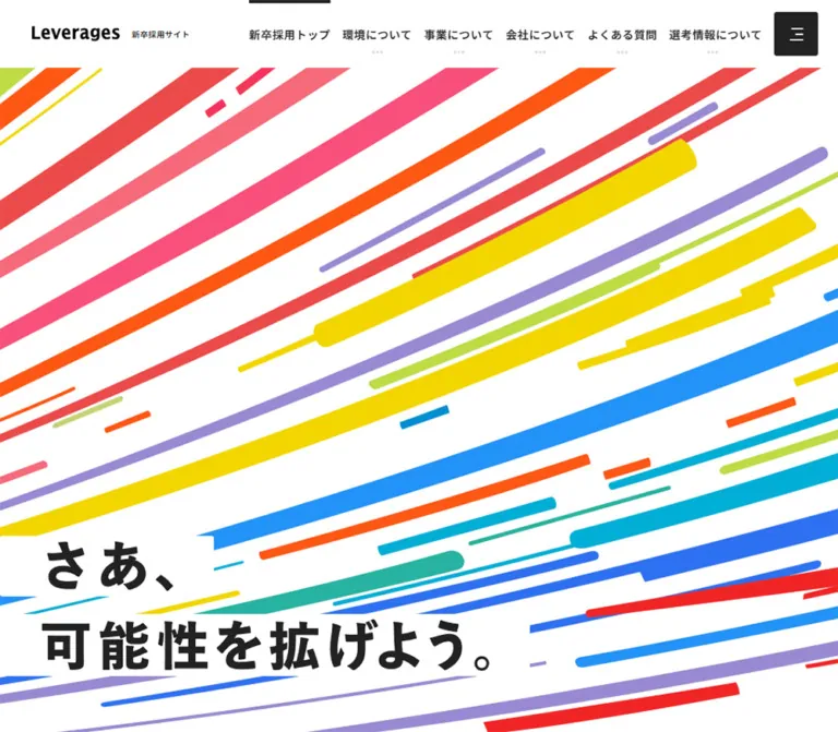
多彩な斜線グラフィックと力強い日本語コピーを主役に、白と淡い水色の余白、青い見出し、黒い応募導線で構成した新卒採用サイト。
オリジナルサイトを見るA field of bright, rising strokes opens into a spacious, orderly recruitment website.
Website: Leverages Graduate Recruitment Original URL: https://recruit.leverages.jp/recruit/graduates/ Final URL: https://recruit.leverages.jp/recruit/graduates/ Theme: predominantly white, with charcoal utility surfaces, pale cyan sections, blue editorial headings, and multicolor opening artwork. Inspected: September 17, 2026, at 05:25 JST; supplied retrieval timestamp: September 16, 2026, 20:25:41.864 UTC. Viewports: desktop 1440 × 1000 CSS pixels; mobile 390 × 844 CSS pixels. Scope: the current graduate recruitment homepage. Evidence includes desktop opening, middle, and footer captures; mobile opening and footer captures; and rendered text, links, element rectangles, and computed styles at both sizes. Linked recruitment sections, application destinations, and opened navigation states were not inspected.
The opening composition combines extremely bold Japanese lettering with long, saturated strokes crossing a white canvas. The strokes vary in width, length, and angle. White rectangular strips behind the slogan preserve readability while allowing the artwork to remain visually dominant. A compact recruitment identity and disciplined navigation sit above this expansive graphic field.
Below the opening, the page becomes a structured recruitment hub: announcements, working environment, employee career paths, business information, company information, and selection/application links. Blue headings, generous paragraph leading, large vertical intervals, and broad rectangular links establish a calm reading rhythm. The design’s defining relationship is between expressive artwork and restrained information architecture.
A field of bright, rising strokes opens into a spacious, orderly recruitment website.
Website: Leverages Graduate Recruitment Original URL: https://recruit.leverages.jp/recruit/graduates/ Final URL: https://recruit.leverages.jp/recruit/graduates/ Theme: predominantly white, with charcoal utility surfaces, pale cyan sections, blue editorial headings, and multicolor opening artwork. Inspected: September 17, 2026, at 05:25 JST; supplied retrieval timestamp: September 16, 2026, 20:25:41.864 UTC. Viewports: desktop 1440 × 1000 CSS pixels; mobile 390 × 844 CSS pixels. Scope: the current graduate recruitment homepage. Evidence includes desktop opening, middle, and footer captures; mobile opening and footer captures; and rendered text, links, element rectangles, and computed styles at both sizes. Linked recruitment sections, application destinations, and opened navigation states were not inspected.
The opening composition combines extremely bold Japanese lettering with long, saturated strokes crossing a white canvas. The strokes vary in width, length, and angle. White rectangular strips behind the slogan preserve readability while allowing the artwork to remain visually dominant. A compact recruitment identity and disciplined navigation sit above this expansive graphic field.
Below the opening, the page becomes a structured recruitment hub: announcements, working environment, employee career paths, business information, company information, and selection/application links. Blue headings, generous paragraph leading, large vertical intervals, and broad rectangular links establish a calm reading rhythm. The design’s defining relationship is between expressive artwork and restrained information architecture.
--swiper-theme-color and --vw were exposed as source custom properties.| Name | Value | Suggested token | Evidence and role |
|---|---|---|---|
| White | #ffffff |
--color-paper |
Measured body and section background; visible header, footer, and headline backing strips |
| Charcoal | #222222 |
--color-ink |
Measured body text and News background; visually consistent with entry panels and legal footer |
| Editorial Blue | #3f89c5 |
--color-blue |
Measured Japanese section headlines and career-year numbers |
| Pale Cyan | #e1f1f4 |
--color-cyan-surface |
Measured Our Service background on mobile; corresponds to the desktop section capture |
| Secondary Ink | #353538 |
--color-secondary-ink |
Measured social and interview-media captions |
| Entry Overlay | rgba(34, 34, 34, 0.9) |
--color-entry-overlay |
Measured mobile floating entry-link background |
| Selection Tint | rgba(34, 34, 34, 0.2) |
--color-selection-tint |
Measured selection-information link background inside the mobile closing section |
| Muted White | rgba(255, 255, 255, 0.5) |
--color-copyright |
Measured copyright text |
| Divider Gray | approximately #e7e7e7 |
--color-rule |
Screenshot estimate for footer separators |
| Broad-Link Gray | approximately #5a5a5a |
--color-action-gray |
Screenshot estimate for the visible Environment learn-more link |
The gray learn-more link is a prominent navigation control. Its appearance is not evidence of a disabled state. The stronger charcoal entry treatment distinguishes applying from exploring information.
These values are visual approximations, not sampled asset colors or source variables. Use the authorized original graphic for precise reproduction.
| Color family | Approximate value | Appearance |
|---|---|---|
| Red | #f04449 |
Broad diagonals and narrower lower strokes |
| Pink | #f84880 |
Long prominent bands |
| Orange | #ff5416 |
Strong diagonals and short accents |
| Yellow | #f3db00 |
Broad bands and fine parallel marks |
| Grass Green | #7aca00 |
Large upper-left accents |
| Lime | #b9dc42 |
Secondary green bands |
| Teal | #24b4a6 |
Lower and upper-left strokes |
| Cyan | #00afd0 |
Thin and broad lower strokes |
| Bright Blue | #258ff4 |
Broad lower diagonals |
| Deep Blue | #2e6bee |
Low, shallow-angle strokes |
| Lavender | #9889d2 |
Long intermediate and lower strokes |
This is a collection of distinct flat colors. A continuous rainbow gradient would change the artwork substantially. Preserve white gaps between the strokes.
The supplied runtime values are --swiper-theme-color: #007aff and --vw: 1vw. The first is not the measured blue used by editorial headings. Neither property establishes a complete color system, a global scaling formula, or a verified carousel configuration.
Measured stack: 'Noto Sans JP', 'Hiragino Kaku Gothic ProN', 'Hiragino Sans', Meiryo, sans-serif.
Body inheritance is 16px, weight 400, with a 24px line height. Editorial paragraphs override this to weight 500 and a 32px line height. Navigation and labels commonly use weight 600. Japanese section headlines use weight 800 and 0.08em tracking.
The root element reports Times, but the body explicitly overrides it. Times is not the visible page’s general typeface.
Measured stack: 'Roboto Condensed', sans-serif on career-year numbers and their accompanying year labels.
Numbers remain 32px at both observed viewport sizes. Smaller explanatory labels compress considerably on mobile. The declared stack does not establish which fallback renders individual Japanese glyphs.
The visible English section labels also appear condensed, but their child-level font declarations were not supplied. Using the condensed family for them is a reasonable adaptation, not a verified source assignment.
The Leverages and meLev wordmarks should be treated as brand artwork. Their exact source files and typefaces were not included.
The visible hero slogan is さあ、可能性を拡げよう。. Its H1 has empty extracted text despite clearly visible lettering. This is consistent with graphical lettering, but the supplied evidence does not identify its exact implementation. The H1’s computed 32px size is therefore not a reliable description of the displayed letterforms.
For a text-based approximation, use very heavy Japanese sans-serif lettering, carefully controlled line breaks, and individual white backing strips. Do not describe that substitute as the original display font.
| Role | Desktop | Mobile | Weight / tracking | Evidence |
|---|---|---|---|---|
| Header recruitment caption | 10px / 14px | Same | 600 / 0.04em |
Measured |
| Primary navigation label | 14px / 14px | Desktop row hidden | 600 / 0.04em |
Measured |
| Hidden desktop submenu label | 13px / 13px | Not established | 500 / 0.04em |
Measured declaration; unopened state |
| Section H2 container | 24px / 36px | Same | 700 | Measured parent; mixed child typography |
| Blue Japanese headline | 36px / 56px | 24px / 37.333px | 800 / 0.08em |
Measured |
| Editorial paragraph | 16px / 32px | Same | 500 / normal | Measured |
| News announcement | 16px / 24px | Same | 500 / normal | Measured |
| Employee education label | 16px / 18px | 14px / 18px | 600 | Measured |
| Career-year number | 32px / 26px | Same | 600 | Measured |
| Career-year qualifier | 12px / 26px | 10px / 10px | 600 | Measured; mobile can wrap |
| Career milestone description | 12px / 20px | 10px / 15px | 600 desktop; 700 mobile | Measured; mobile tracking -0.5px |
| Learn-more label | About 18px visually | 16px / 24px | Mobile 600 / 0.04em |
Desktop estimate; mobile measured |
| Floating entry label | About 16px visually | 12px / 18px | Mobile 600 / 0.04em |
Desktop estimate; mobile measured |
| Footer navigation | About 14px visually | 14px / 14px | Mobile 600 / 0.04em |
Mobile measured |
| Mobile footer social caption | — | 14px / 16.333px | 600 / 0.14em |
Measured |
| Copyright and legal links | About 12px visually | 12px / 24px | Mobile 500 / 0.04em |
Mobile measured |
A headline can be bold without becoming tightly packed: the measured blue headings have generous leading and tracking. Paragraphs retain their 16px size on mobile, maintaining a clear reading scale.
There is no evidence of a universal spacing grid. Repeated values include 15, 20, 25, 30, 60, 70, 80, and approximately 150px, with different systems for page content, header chrome, and floating controls.
| Use | Desktop | Mobile | Status |
|---|---|---|---|
| Header height | 85px | 85px | Measured |
| Header left padding | 70px | 20px | Measured |
| Header right clearance | 70px to menu edge | 15px | Desktop calculated from menu rectangle; mobile measured |
| Brand-lockup gap | 15px horizontal | 8px in stacked lockup | Measured gap; orientation visible |
| Navigation link horizontal padding | Usually 12.5px per side | Not applicable to hidden row | Measured |
| Main editorial left edge | 180px at 1440px | 15px at 390px | Measured |
| Environment section padding | 145px top, 150px bottom | 76px top, 80px bottom | Measured |
| News section padding | 75px top, 60px bottom | 157px top, 80px bottom | Measured |
| Mobile Service padding | — | 73px top, 60px bottom | Measured |
| Mobile Company padding | — | 74px top, 60px bottom | Measured |
| Environment headline-to-copy gap | 32px | 45px | Calculated from rectangles |
| H1 row gap | 22px | 10px | Measured container gap |
| Footer row vertical padding | Visually about 30px | 30px | Mobile measured |
The 157px mobile News top padding is a particular measured section treatment. It should not become a universal mobile spacing token.
| Element | Radius | Evidence |
|---|---|---|
| Menu button | 3px | Measured |
| Mobile floating entry link | 5px | Measured |
| Mobile closing selection and application links | 3px | Measured |
| Editorial sections and footer rows | Square | Visible; sampled containers report 0px |
| Direction icons | Circular | Visible; about 20px in footer and broad links |
| Floating entry icon backing | Circular | Visible; about 30px |
The interface has almost square geometry. Circular arrow icons supply a small recurring counterpoint; large rounded cards and pill buttons are not the organizing shapes.
| Element | Desktop 1440 × 1000 | Mobile 390 × 844 | Evidence |
|---|---|---|---|
| Document height | 7017.81px | 7884.77px | Measured snapshot state |
| Main content start | y = 85px | y = 85px | Measured |
| Hero lower boundary | y = 1000px | y = 844px | Measured next-section start |
| Hero area below header | 915px | 759px | Calculated |
| H1 rectangle | x = 0, y = 701.67; 896 × 221.55px | x = 0, y = 336.16; 356.72 × 274.67px | Measured container, not glyph bounds |
| Menu button | x = 1315, y = 15; 55 × 55px | x = 320, y = 15; 55 × 55px | Measured |
| Editorial working width | About 1080px, x = 180–1260 | 360px, x = 15–375 | Desktop inferred across elements; mobile measured |
| Environment paragraph | 570 × 160px | 360 × 224px | Measured |
| Environment learn-more link | About 600 × 80px | 360 × 70px | Desktop screenshot estimate; mobile measured |
| Floating entry link | About 300 × 84px | 374.39 × 66px | Desktop estimate; mobile measured visible-page variant |
| Floating entry clearance | About 70px right, 63px bottom | About 7.8px sides, 19px bottom | Desktop estimate; mobile calculated |
| Mobile footer content | — | 358.81px wide, x = 15.59px | Measured; approximately 92% viewport width |
Do not substitute the separate 86px-high entry anchor found within the header/menu subtree for the visible mobile page CTA. The latter is the 66px-high version shown over the hero.
Role: identifies the recruitment site and provides access to its main information categories.
At the top of the page, the header is an 85px white strip. The desktop brand link begins at x = 70px and spans about 219.81px. Its wordmark and small 新卒採用サイト caption sit side by side with a 15px gap. On mobile, the lockup becomes vertical, with a 140px-wide link area and an 8px gap; the caption remains 10px.
The six desktop navigation labels cover home, environment, business, company, FAQ, and selection information. A short charcoal bar touches the top edge above the current home item. Several other categories have tiny three-dot indicators beneath their labels. These details are visually observed; the mechanism and opening trigger of the corresponding menus were not exercised.
The menu control is a 55px square with a 3px radius, a dark visible surface, and three short white horizontal marks. It remains present alongside desktop navigation and becomes the only visible primary navigation control on the phone.
In the scrolled desktop captures, the right navigation area retains its white backing while the upper-left brand is no longer visible. In the mobile footer capture, the brand and menu remain at the top. This establishes different scrolled appearances, but not the threshold or exact positioning algorithm.
Role: expresses opportunity and forward momentum before the information sections begin.
The opening fills the first viewport below the header. Long colored strokes run from lower-left toward upper-right at varying inclinations. Their trajectories fan across the frame: upper marks are steeper, and many lower marks are shallower. Widths range from hairline-like accents to broad bands. Some ends are clipped or square; others are rounded. Short fragments interrupt the long strokes.
The slogan sits on opaque white strips that follow its line lengths rather than on one large white panel. The lettering is heavy, black, and deliberately oversized.
さあ、 followed by 可能性を拡げよう。, positioned low on the left.さあ、, 可能性を, and 拡げよう。, occupying the middle of the graphic field.The mobile version changes composition substantially. It preserves large lettering and crops/repositions the graphic field instead of shrinking the desktop scene into the phone width. Exact artwork sizing and anchoring rules were not provided.
A separate section begins immediately after the first viewport. It measures approximately 988.83px high on desktop and 940.97px on mobile, with a computed rgba(255,255,255,0.9) background. Its sampled extracted text is empty.
No supplied screenshot establishes its internal visual content. Empty text extraction does not prove an intentionally blank section: imagery, graphical text, or other presentation may be present. Preserve this as an inspection limitation rather than inventing its content or reproducing a large empty spacer.
Role: presents dated recruitment updates.
The measured surface is charcoal. Four extracted announcements cover application and internship openings, with dates from February 2025 through August 2026. Announcement text uses white, 16px type at weight 500 and a 24px line height.
Desktop places the section label at x = 180px and announcement text farther right, around x = 605px. Announcement text origins are approximately 80px apart vertically. On mobile, the section label and announcements occupy the same 360px content width; longer items wrap to two lines.
The section height changes from 432px to 766px. Its extra mobile height reflects both stacking and different padding. The supplied link evidence does not establish the announcements as clickable links, so a new implementation should not silently assume they are article cards.
Role: introduces a major content area with a compact English identifier and a Japanese label.
Examples include Environment, Our Service, and About us. The visible Service heading has a condensed English title, a short vertical divider, and a smaller Japanese label on the same line. The H2 container reports inline flex with a 14px horizontal gap and a 28px rendered height.
A larger blue Japanese headline follows beneath. The Environment example uses 36px desktop type with 56px leading, dropping to 24px with approximately 37.33px leading on mobile. This hierarchy is more important than assuming both languages share the H2 container’s font size.
Role: explains the work culture and introduces career development evidence.
On desktop, its introductory text occupies a 570px-wide column beginning at x = 180px. The headline occupies two 56px lines. The paragraph begins 32px after it and uses a relaxed 16px / 32px rhythm.
On mobile, the same content occupies 360px with a 45px gap between headline and paragraph. The copy remains 16px rather than being reduced to fit. Employee information then appears farther down the section, followed by career milestones and a wide learn-more link.
The section is white, with blue used for the headline and progression details. Its structure is editorial rather than a collection of elevated cards.
Role: makes career progression concrete through individual examples.
The rendered content contains three profile identities, including D.H, S.F, and M.I, each with an education/graduation label and career milestones. The visible desktop text selected S.F, while the mobile extraction selected M.I. This is evidence of different captured states, not evidence of viewport-specific employee selection.
The desktop middle capture shows part of a horizontal career timeline. Blue year numbers sit above pale cyan milestone panels with thin blue boundaries and directional lines. Successive milestones step upward slightly. In the measured desktop five-stage sequence, number origins rise by roughly 10px per stage; the corresponding mobile sequence uses approximately 5px steps.
Milestone count is content dependent: the supplied profiles contain three, four, or five stages. Keep it data driven. Desktop description type is 12px / 20px. Mobile descriptions use a much tighter 10px / 15px declaration and negative tracking; some measured rectangles also indicate transformed rendering, so nominal font size is not a complete account of their visible size.
Three small pagination indicators appear in the desktop middle capture, with a blue ring around the middle marker. Multiple profile states and opacity transitions support a changing-profile component. Swipe support, autoplay timing, click behavior, and synchronization details were not tested.
No supplied current screenshot shows enough employee imagery to document portrait cropping, lighting, or photographic treatment.
Role: introduces the company’s business activity and links to the dedicated business page.
This is the clearest observed content-section composition. A full-width pale cyan surface supports an approximately 1080px working area. In the desktop capture, the heading group begins at x = 180px and the paragraph at approximately x = 725px. Their top edges are nearly aligned, forming a broad two-column introduction.
The blue headline is 社会を支える事業を創る. The right column uses medium-weight black Japanese text, approximately 535px wide, with the same generous paragraph leading as the Environment section. Large unboxed space surrounds both columns.
The mobile DOM confirms stacking: section identifier, blue headline, paragraph, later content, and a learn-more link. It measures 1155.94px overall, but the intervening media composition is not covered by the supplied screenshots. Do not infer a specific illustration, chart, or photo arrangement from that height alone.
Role: explains company growth and philosophy, then links to further company information.
The mobile evidence records a white section with the shared bilingual label and blue headline system. Its headline occupies three lines, followed by a 16px / 32px paragraph after a 45px gap. The learn-more link is 360 × 70px.
The text discusses growth and company philosophy. The supplied captures do not establish the appearance of any accompanying media. Reuse the measured heading, copy, spacing, and action anatomy without inventing a chart or photography style.
Role: closes a major section with a clear route to its dedicated page.
The visible desktop Environment link is approximately 600 × 80px and centered in the content area. It has a medium-dark gray fill, a small corner radius, centered white text, and a white circular arrow near the right edge. Its width and surrounding whitespace make it prominent without a saturated action color.
The mobile links measure 360 × 70px. Labels are left aligned within 30px left padding; the measured anchor also has 25px right padding. Label type is 16px / 24px, weight 600, with 0.04em tracking.
Use the whole rectangle as the link target. Treat the circular arrow as supporting decoration rather than a separate control.
Role: keeps the current graduate-entry route visible during browsing.
Desktop captures show a dark rectangle approximately 300 × 84px, positioned about 70px from the right edge and 63px from the bottom. The two-line label is centered, and a white disc containing a small overlapping-square symbol sits at the right.
At 390px width, the visible page version measures 374.39 × 66px with 15px internal padding and a 5px radius. Its width is approximately 96% of the viewport. The background is 90%-opaque charcoal, allowing the colored artwork to show faintly through it. Text is 12px / 18px, weight 600.
The observed label is 【本サイト限定ES免除】 above 28年卒エントリー. Its destination is the 2028 recruitment entry URL exposed in the original-page links. Treat graduation year and campaign wording as managed content.
The floating control is present in opening and middle captures but absent from the supplied footer captures. Footer-related visibility handling is plausible; its exact trigger is unverified. The overlapping-square symbol also does not prove that the link opens a new browser tab.
Role: offers selection information and a larger application route before the footer.
The desktop footer capture shows a large white inset panel surrounded by the recurring colored strokes, with a wide charcoal application block inside. Only the lower portion is visible, so the full desktop arrangement is not established.
Mobile measurements provide clearer anatomy: a selection explanation at 14px / 28px, a 319.44 × 70px tinted information link, and a separate 319.44 × 175px entry block. The entry block contains a 20px graduate-year heading and 14px supporting text. These controls begin at approximately x = 35.28px, making them narrower than ordinary 360px section links.
The graphic motif returns here as a framing device, connecting the end of the page to the opening.
Role: provides a complete secondary navigation surface and corporate context.
Desktop uses an expansive white footer. A large Leverages lockup and social/media links occupy the left. A separate home-link column sits in the middle, and the remaining primary categories form a wider column at the right. Fine horizontal rules separate approximately 81px navigation rows. Company information includes a smaller 代表メッセージ sublink.
YouTube, Instagram, and X retain their recognizable brand marks. The interview-media area displays the meLev wordmark below its explanatory caption. These external brand colors are confined to their logos.
Mobile reorganizes this into a vertical sequence: footer identity, navigation rows, centered social block, centered interview-media block, then a charcoal legal area. Footer navigation width is approximately 358.81px. Social marks have individually measured sizes: YouTube 53 × 36.25px, Instagram 43 × 43px, and X 28 × 28px. The meLev link box measures 134 × 33.5px.
The desktop legal bar is approximately 80px high, with copyright on the left and corporate/privacy links on the right. Mobile stacks the two links above copyright in a taller dark block. The visible copyright reads © Leverages Co., Ltd.; the original page also links to the corporate website at https://leverages.jp/.
The following values are computed transition declarations, not independently timed interaction recordings.
| Element or treatment | Supplied declaration | What the evidence supports |
|---|---|---|
| Header background | 0.2s cubic-bezier(0.25, 1, 0.5, 1) |
Short surface-color transition is defined |
| Brand and social/media links | opacity 0.3s ease-out |
Opacity-based feedback is defined; final hover opacity unknown |
| Header caption color | 0.2s cubic-bezier(0.25, 1, 0.5, 1) |
Color transition is defined |
| Desktop submenu label | Transform 0.6s cubic-bezier(0.47, 0.16, 0.24, 1) and opacity 0.6s |
Reveal-capable styling exists; opening behavior untested |
| Inactive profile education label | opacity 0.2s |
Short fade is defined |
| Active profile education label | opacity 0.4s 0.8s |
A delayed fade is defined in the captured active state |
| Closing section and footer | Transform 0.4s cubic-bezier(0.47, 0.16, 0.24, 1) and opacity 0.4s |
Transition styling exists; trigger and travel distance unknown |
| Mobile selection-information link | Background color 0.6s cubic-bezier(0.19, 1, 0.22, 1) |
A slower color transition is defined |
The hero graphic suggests movement visually, but no verified keyframes, velocity, loop duration, or pointer response were supplied. Do not invent parallax, cursor tracking, or a particular animation path.
Many sampled elements report animation: none. That does not rule out animation on unsampled descendants, pseudo-elements, SVG content, or JavaScript-controlled graphics. Similarly, a serialized transition: all does not establish a meaningful duration.
The supplied inspection waited for document readiness, image decoding, and sampled layout stability, and traversed scrolling positions. Perpetual animations were temporarily paused during readiness checks and resumed. These precautions do not verify all delayed content or interactive states.
| Surface | Treatment | Function |
|---|---|---|
| Main canvas | Pure white | Neutral field for graphics and reading |
| Hero | White with separate saturated strokes | Primary visual identity |
| Headline strips | Opaque white rectangles | Protect black lettering from the artwork |
| News | Charcoal with white announcement text | Distinct informational band |
| Environment and Company | White, blue headlines | Calm editorial presentation |
| Service | Pale cyan, blue headlines | Section differentiation without card containers |
| Career milestones | Pale cyan washes and blue lines | Makes progression legible |
| Exploration link | Medium-dark gray with white label | Repeated section-level navigation |
| Entry controls | Charcoal; mobile floating version translucent | Application emphasis |
| Footer | White with fine rules | Broad secondary navigation |
| Legal bar | Charcoal with white and muted-white text | Corporate and privacy information |
The inspected components do not depend on shadow elevation. Separation comes from full-width background changes, whitespace, rules, and strong light/dark contrast.
The principal verified artwork is abstract and directional. It combines broad flat bands, thin accent lines, occasional rounded ends, interrupted fragments, and considerable white space. The composition should feel like many independent paths moving in a shared direction, rather than a mechanically repeated stripe pattern.
Keep the artwork edge to edge while giving the content a narrower editorial measure. Preserve clean edges; pixelated rendering and photographic texture would not match the visible graphic.
The closing recruitment area reuses the multicolor vocabulary. Logos and platform symbols remain crisp, recognizable, and proportionate. There is insufficient current screenshot coverage to specify employee photography or the media inside Service and Company sections.
No original image, SVG, or font-file URLs were supplied. The following inventory identifies visible assets without inventing filenames.
| Asset | Evidence | Implementation guidance |
|---|---|---|
| Leverages wordmark | Header and footer captures | Use an authorized brand asset; do not guess its font |
| Hero strokes | Desktop and mobile opening captures | Prefer art-directed vector or high-resolution artwork |
| Hero slogan lettering | Visible captures; empty H1 text extraction | Preserve line composition; verify accessible naming separately |
| Closing graphic frame | Desktop footer-area capture | Reuse the hero’s visual vocabulary |
| YouTube, Instagram, X marks | Footer captures and original-page links | Preserve each mark’s proportions |
| meLev wordmark | Footer captures and original-page link | Use the proper media identity |
| Circular direction and external symbols | Buttons and footer captures | Small consistent decorative icons inside larger links |
The first viewport contains an 85px header and 915px graphic area. The headline sits low on the left, while the entry link occupies the lower-right corner. Content below uses a narrower working area, approximately 1080px wide, creating 180px side margins at 1440px.
The Service introduction visibly places its heading group and paragraph side by side. Environment uses a 570px introductory text column with profile material elsewhere in the section. Desktop footer navigation spreads horizontally instead of becoming a compact centered stack.
The scrolled header’s reduced left-side presence is an observed state, not a reason to make every desktop section start beneath a permanently full white header plate.
At 390 × 844, the header remains 85px high. Desktop navigation labels disappear, but the 55px menu control retains its size. The brand caption moves beneath the wordmark.
The hero headline changes from two rows to three and shifts upward within the artwork. Its measured width is about 91.5% of the viewport. The floating entry link becomes approximately 96% wide near the bottom.
Editorial content generally uses 15px side gutters. Footer content uses approximately 4% side gutters, while the closing recruitment controls have larger insets. These differences are observable and should not be flattened into one universal mobile padding value.
Section headlines reduce from 36px to 24px, while ordinary paragraphs stay 16px / 32px. Footer navigation becomes a vertical list with generous row targets. Social/media blocks become centered, and the legal links precede the copyright.
Only 1440px and 390px widths were supplied. Exact source breakpoints, tablet layouts, landscape-phone behavior, safe-area handling, and browser-toolbar resizing were not verified.
For a new implementation, start by collapsing the wide header below approximately 1200px and stacking editorial columns below 768px. These are recommended starting points; validate intermediate widths against actual content. Use viewport-aware hero sizing with a fallback, and prevent fixed controls from obscuring reading or footer links.
Do not set entire sections to the recorded document heights. Those heights depend on content, state, and media that are only partly represented in the evidence.
#222222, #3f89c5, and #e1f1f4.These are recommendations, not verified features of the inspected site:
#ffffff.#222222.#3f89c5.#e1f1f4.rgba(34,34,34,0.9).#5a5a5a.“Create a Japanese graduate recruitment homepage with a white 85px header, compact brand lockup, six desktop navigation categories, and a dark square menu button. Open with a viewport-sized field of multicolor strokes rising across white space. Place extremely bold Japanese lettering on separate white strips at the lower left; use two rows on desktop and three on mobile. Follow with a dark announcements band, spacious white editorial sections, a pale cyan business section, blue Japanese headings, bilingual section labels, career progression timelines, and broad gray learn-more links. Keep a charcoal application link near the viewport’s lower edge and finish with a detailed ruled footer. Use measured Noto Sans JP interface typography and condensed career numerals. Treat unverified animation and menu behavior as separate implementation decisions.”
さあ、可能性を拡げよう。 in very heavy black Japanese lettering on fitted white strips. Use two rows on desktop and three on a 390px phone. Keep the original lettering asset separate from any fallback text approximation.”#e1f1f4 section with an approximately 1080px desktop content area. Put an English/Japanese section identifier and a 36px blue Japanese headline on the left, with a 16px / 32px paragraph on the right. Stack at mobile size and reduce the headline to 24px. Use no card border or shadow.”This is an implementation scaffold, not extracted source CSS. It combines measured tokens with clearly identified approximations. It does not implement menu logic, profile rotation, the original hero assets, or the precise scrolled-header behavior. Load the named fonts through your project’s authorized font setup; a family declaration alone does not load them.
:root {
  /* Measured interface colors */
  --color-paper: #ffffff;
  --color-ink: #222222;
  --color-blue: #3f89c5;
  --color-cyan-surface: #e1f1f4;
  --color-secondary-ink: #353538;
  --color-entry-overlay: rgb(34 34 34 / 90%);
  --color-selection-tint: rgb(34 34 34 / 20%);
  --color-copyright: rgb(255 255 255 / 50%);

  /* Screenshot estimates */
  --color-rule: #e7e7e7;
  --color-action-gray: #5a5a5a;
  --streak-red: #f04449;
  --streak-pink: #f84880;
  --streak-orange: #ff5416;
  --streak-yellow: #f3db00;
  --streak-green: #7aca00;
  --streak-teal: #24b4a6;
  --streak-blue: #258ff4;
  --streak-lavender: #9889d2;

  /* Measured font stacks */
  --font-body: 'Noto Sans JP', 'Hiragino Kaku Gothic ProN',
    'Hiragino Sans', Meiryo, sans-serif;
  --font-condensed: 'Roboto Condensed', sans-serif;
  --text-body: 16px;
  --leading-body: 32px;
  --text-headline: 36px;
  --leading-headline: 56px;
  --tracking-label: 0.04em;
  --tracking-headline: 0.08em;

  /* Measured dimensions and derived working width */
  --header-height: 85px;
  --menu-size: 55px;
  --content-width: 1080px;
  --chrome-inset: 70px;
  --radius-control: 3px;
  --radius-floating: 5px;

  /* Measured transition declarations */
  --motion-surface: 200ms cubic-bezier(0.25, 1, 0.5, 1);
  --motion-link: 300ms ease-out;
  --motion-reveal: 400ms cubic-bezier(0.47, 0.16, 0.24, 1);
}

* { box-sizing: border-box; }

body {
  margin: 0;
  color: var(--color-ink);
  background: var(--color-paper);
  font-family: var(--font-body);
  font-size: var(--text-body);
  line-height: 1.5;
}

button, a { -webkit-tap-highlight-color: transparent; }
button { font: inherit; }
img, svg { max-width: 100%; }

.content-width {
  width: min(var(--content-width), calc(100% - 30px));
  margin-inline: auto;
}

.site-header {
  position: fixed;
  z-index: 30;
  inset: 0 0 auto;
  height: var(--header-height);
  display: flex;
  align-items: center;
  justify-content: space-between;
  gap: 24px;
  padding-inline: var(--chrome-inset);
  background: var(--color-paper);
  transition: background-color var(--motion-surface);
}

.brand {
  display: flex;
  align-items: center;
  gap: 15px;
  flex: 0 0 auto;
  color: inherit;
  text-decoration: none;
}

.brand img { display: block; width: 132px; }
.brand small {
  font-size: 10px;
  line-height: 14px;
  font-weight: 600;
  letter-spacing: var(--tracking-label);
}

.header-controls,
.desktop-nav {
  display: flex;
  align-items: center;
}

.header-controls { gap: 25px; }
.desktop-nav { height: var(--header-height); }
.desktop-nav a {
  position: relative;
  display: grid;
  align-items: center;
  height: 100%;
  padding-inline: 12.5px;
  color: inherit;
  text-decoration: none;
  white-space: nowrap;
  font-size: 14px;
  font-weight: 600;
  letter-spacing: var(--tracking-label);
}

.desktop-nav a[aria-current='page']::before {
  content: '';
  position: absolute;
  inset: 0 12.5px auto;
  height: 4px;
  background: currentColor;
}

.menu-button {
  display: grid;
  place-content: center;
  gap: 5px;
  width: var(--menu-size);
  height: var(--menu-size);
  flex: 0 0 auto;
  padding: 0;
  border: 0;
  border-radius: var(--radius-control);
  color: white;
  background: var(--color-ink);
  cursor: pointer;
}

.menu-button span {
  display: block;
  width: 16px;
  height: 2px;
  background: currentColor;
}
.menu-button span:nth-child(2) {
  width: 10px;
  justify-self: end;
}

.page-main { padding-top: var(--header-height); }
section { scroll-margin-top: calc(var(--header-height) + 20px); }

.hero {
  position: relative;
  isolation: isolate;
  min-height: calc(100vh - var(--header-height));
  min-height: calc(100svh - var(--header-height));
  overflow: hidden;
}

.hero-art {
  position: absolute;
  z-index: -1;
  inset: 0;
  width: 100%;
  height: 100%;
  fill: none;
  pointer-events: none;
}

/* Text approximation; the source display lettering is unverified. */
.hero-title {
  position: absolute;
  inset-inline-start: 0;
  bottom: 76px;
  display: flex;
  flex-direction: column;
  align-items: flex-start;
  gap: 22px;
  max-width: 100%;
  margin: 0;
  font-size: 88px;
  line-height: 1.13;
  font-weight: 900;
  letter-spacing: 0.04em;
}

.title-strip {
  display: block;
  padding-inline: 70px 12px;
  background: var(--color-paper);
  white-space: nowrap;
}
.title-message { display: flex; }
.title-message .title-strip + .title-strip { padding-left: 0; }

.editorial-section { padding-block: 145px 150px; }
.service-section { background: var(--color-cyan-surface); }
.section-split {
  display: grid;
  grid-template-columns: repeat(2, minmax(0, 1fr));
  gap: 10px;
}

.section-kicker {
  display: flex;
  align-items: center;
  gap: 14px;
  margin: 0 0 22px;
  font-size: 24px;
  line-height: 28px;
  font-weight: 700;
}

/* Condensed English labels are an adaptation, not a verified child style. */
.section-kicker > span { font-family: var(--font-condensed); }
.section-kicker small {
  padding-left: 14px;
  border-left: 1px solid currentColor;
  font-size: 16px;
  line-height: 1;
}

.section-title {
  margin: 0;
  color: var(--color-blue);
  font-size: var(--text-headline);
  line-height: var(--leading-headline);
  font-weight: 800;
  letter-spacing: var(--tracking-headline);
}

.section-copy {
  margin: 0;
  font-size: var(--text-body);
  line-height: var(--leading-body);
  font-weight: 500;
}

.section-action {
  position: relative;
  display: flex;
  align-items: center;
  justify-content: center;
  width: min(600px, 100%);
  min-height: 80px;
  margin: 60px auto 0;
  padding: 20px 60px;
  border-radius: var(--radius-control);
  color: white;
  background: var(--color-action-gray);
  text-decoration: none;
  font-size: 18px;
  font-weight: 600;
  letter-spacing: var(--tracking-label);
}

.arrow-disc {
  display: grid;
  place-items: center;
  width: 20px;
  height: 20px;
  flex: 0 0 auto;
  border-radius: 50%;
  color: var(--color-ink);
  background: white;
  font: 700 14px / 1 sans-serif;
}
.arrow-disc::before { content: '→'; }
.section-action .arrow-disc {
  position: absolute;
  right: 20px;
}

.entry-floating {
  position: fixed;
  z-index: 20;
  right: 70px;
  bottom: 63px;
  display: flex;
  align-items: center;
  justify-content: center;
  width: 300px;
  min-height: 84px;
  padding: 18px 60px 18px 30px;
  border-radius: var(--radius-control);
  color: white;
  background: var(--color-ink);
  text-align: center;
  text-decoration: none;
  font-size: 16px;
  line-height: 24px;
  font-weight: 600;
  letter-spacing: var(--tracking-label);
}

.external-disc {
  position: absolute;
  right: 30px;
  width: 30px;
  height: 30px;
  border-radius: 50%;
  background: white;
}
.external-disc::before,
.external-disc::after {
  content: '';
  position: absolute;
  width: 6px;
  height: 6px;
  background: var(--color-ink);
}
.external-disc::before { left: 10px; top: 14px; }
.external-disc::after { left: 13px; top: 11px; }

/* Recommended hook; visibility logic must be implemented separately. */
.entry-floating[hidden] { display: none; }

.footer-row {
  display: flex;
  align-items: center;
  justify-content: space-between;
  min-height: 81px;
  padding-block: 30px;
  border-bottom: 1px solid var(--color-rule);
  color: inherit;
  text-decoration: none;
  font-size: 14px;
  line-height: 20px;
  font-weight: 600;
  letter-spacing: var(--tracking-label);
}
.footer-row .arrow-disc {
  color: white;
  background: var(--color-ink);
}

/* Recommended focus treatment. */
a:focus-visible,
button:focus-visible {
  outline: 3px solid var(--color-blue);
  outline-offset: 4px;
}

/* Recommended header breakpoint; not an extracted source rule. */
@media (max-width: 1199px) {
  .site-header { padding-inline: 20px 15px; }
  .desktop-nav { display: none; }
  .brand { flex-direction: column; align-items: flex-start; gap: 8px; }
  .brand img { width: 140px; }
}

/* Recommended content breakpoint. */
@media (max-width: 767px) {
  :root {
    --text-headline: 24px;
    --leading-headline: 37.333px;
  }
  .hero-title {
    top: 33.1%;
    bottom: auto;
    gap: 10px;
    font-size: clamp(58px, 18.46vw, 76px);
    line-height: 1.18;
  }
  .title-message { display: contents; }
  .title-strip,
  .title-message .title-strip + .title-strip {
    padding-inline: 15px 12px;
  }
  .editorial-section { padding-block: 76px 80px; }
  .service-section { padding-block: 73px 60px; }
  .section-split { grid-template-columns: 1fr; gap: 45px; }
  .section-kicker { margin-bottom: 24px; }
  .section-action {
    justify-content: flex-start;
    min-height: 70px;
    padding: 15px 55px 15px 30px;
    font-size: 16px;
    line-height: 24px;
  }
  .section-action .arrow-disc { right: 25px; }
  .entry-floating {
    right: 2%;
    bottom: calc(19px + env(safe-area-inset-bottom, 0px));
    width: 96%;
    min-height: 66px;
    padding: 15px 45px 15px 15px;
    border-radius: var(--radius-floating);
    background: var(--color-entry-overlay);
    font-size: 12px;
    line-height: 18px;
  }
  .entry-floating .external-disc { right: 15px; }
}

/* Recommended reduced-motion safeguard for this scaffold. */
@media (prefers-reduced-motion: reduce) {
  .site-header,
  .brand,
  .section-action,
  .entry-floating {
    transition: none;
  }
  .hero-art { animation: none; }
}
The following demonstrates the hero’s line structure and a Service introduction. The small SVG is original illustrative geometry for this scaffold, not a reconstruction of the inspected artwork. Replace it with authorized, separately art-directed desktop/mobile assets for higher fidelity. A persistent header and the remaining page sections are separate components.
<main class='page-main'>
  <section class='hero' aria-labelledby='hero-title'>
    <svg class='hero-art' viewBox='0 0 1440 915'
      preserveAspectRatio='xMidYMid slice'
      aria-hidden='true' focusable='false'>
      <path d='M-140 470 L500 -80'
        stroke='var(--streak-green)' stroke-width='36' />
      <path d='M-120 560 L820 -80'
        stroke='var(--streak-red)' stroke-width='34' />
      <path d='M-100 650 L1100 -80'
        stroke='var(--streak-pink)' stroke-width='38' />
      <path d='M-100 720 L1380 -60'
        stroke='var(--streak-orange)' stroke-width='26' />
      <path d='M-100 790 Q650 540 1520 120'
        stroke='var(--streak-lavender)' stroke-width='18' />
      <path d='M-100 840 Q650 640 1520 200'
        stroke='var(--streak-yellow)' stroke-width='36' />
      <path d='M-100 930 Q650 760 1520 370'
        stroke='var(--streak-blue)' stroke-width='36' />
      <path d='M-100 1000 Q700 850 1520 600'
        stroke='var(--streak-teal)' stroke-width='20' />
      <path d='M360 650 L520 580 M800 450 L1100 280'
        stroke='var(--streak-orange)' stroke-width='5'
        stroke-linecap='round' />
      <path d='M100 900 L500 840 M800 850 L1380 750'
        stroke='var(--streak-lavender)' stroke-width='7'
        stroke-linecap='round' />
    </svg>
    <h1 class='hero-title' id='hero-title'>
      <span class='title-strip'>さあ、</span>
      <span class='title-message'>
        <span class='title-strip'>可能性を</span>
        <span class='title-strip'>拡げよう。</span>
      </span>
    </h1>
  </section>

  <section class='editorial-section service-section'
    aria-labelledby='service-heading'>
    <div class='content-width'>
      <div class='section-split'>
        <div>
          <h2 class='section-kicker' id='service-heading'>
            <span lang='en'>Our Service</span>
            <small>事業について</small>
          </h2>
          <h3 class='section-title'>社会を支える事業を創る</h3>
        </div>
        <p class='section-copy'>
          レバレジーズは、自分たちの仕事によって誰かが必ずプラスの感情になる
          「感情への貢献」をテーマに、創業以来事業を創り続けてきました。
        </p>
      </div>
      <a class='section-action'
        href='https://recruit.leverages.jp/recruit/graduates/business/'>
        事業についてもっと見る
        <span class='arrow-disc' aria-hidden='true'></span>
      </a>
    </div>
  </section>
</main>
Optional aliases for a project already using Tailwind v4. This is not evidence that the original site uses Tailwind. Define the custom properties above first.
@theme inline {
  --color-paper: var(--color-paper);
  --color-ink: var(--color-ink);
  --color-editorial-blue: var(--color-blue);
  --color-service-surface: var(--color-cyan-surface);
  --font-japanese: var(--font-body);
  --font-numeral: var(--font-condensed);
  --text-editorial: var(--text-headline);
  --radius-control: 3px;
  --radius-entry: 5px;
  --spacing-header: 85px;
  --spacing-menu: 55px;
}
When integrating these aliases, avoid redefining a variable in terms of itself in the same CSS scope. For paper and ink, use the literal values #ffffff and #222222 if your build emits those names as root variables.
This reference describes the supplied current recruitment homepage. Exact measurements are distinguished from screenshot estimates and implementation recommendations; unobserved content and interaction states remain unverified.
# Leverages Graduate Recruitment — Style Reference

> A field of bright, rising strokes opens into a spacious, orderly recruitment website.

**Website:** [Leverages Graduate Recruitment](https://recruit.leverages.jp/recruit/graduates/)
**Original URL:** https://recruit.leverages.jp/recruit/graduates/
**Final URL:** https://recruit.leverages.jp/recruit/graduates/
**Theme:** predominantly white, with charcoal utility surfaces, pale cyan sections, blue editorial headings, and multicolor opening artwork.
**Inspected:** September 17, 2026, at 05:25 JST; supplied retrieval timestamp: September 16, 2026, 20:25:41.864 UTC.
**Viewports:** desktop 1440 × 1000 CSS pixels; mobile 390 × 844 CSS pixels.
**Scope:** the current graduate recruitment homepage. Evidence includes desktop opening, middle, and footer captures; mobile opening and footer captures; and rendered text, links, element rectangles, and computed styles at both sizes. Linked recruitment sections, application destinations, and opened navigation states were not inspected.

The opening composition combines extremely bold Japanese lettering with long, saturated strokes crossing a white canvas. The strokes vary in width, length, and angle. White rectangular strips behind the slogan preserve readability while allowing the artwork to remain visually dominant. A compact recruitment identity and disciplined navigation sit above this expansive graphic field.

Below the opening, the page becomes a structured recruitment hub: announcements, working environment, employee career paths, business information, company information, and selection/application links. Blue headings, generous paragraph leading, large vertical intervals, and broad rectangular links establish a calm reading rhythm. The design’s defining relationship is between expressive artwork and restrained information architecture.
# Leverages Graduate Recruitment — Style Reference

> A field of bright, rising strokes opens into a spacious, orderly recruitment website.

**Website:** [Leverages Graduate Recruitment](https://recruit.leverages.jp/recruit/graduates/)
**Original URL:** https://recruit.leverages.jp/recruit/graduates/
**Final URL:** https://recruit.leverages.jp/recruit/graduates/
**Theme:** predominantly white, with charcoal utility surfaces, pale cyan sections, blue editorial headings, and multicolor opening artwork.
**Inspected:** September 17, 2026, at 05:25 JST; supplied retrieval timestamp: September 16, 2026, 20:25:41.864 UTC.
**Viewports:** desktop 1440 × 1000 CSS pixels; mobile 390 × 844 CSS pixels.
**Scope:** the current graduate recruitment homepage. Evidence includes desktop opening, middle, and footer captures; mobile opening and footer captures; and rendered text, links, element rectangles, and computed styles at both sizes. Linked recruitment sections, application destinations, and opened navigation states were not inspected.

The opening composition combines extremely bold Japanese lettering with long, saturated strokes crossing a white canvas. The strokes vary in width, length, and angle. White rectangular strips behind the slogan preserve readability while allowing the artwork to remain visually dominant. A compact recruitment identity and disciplined navigation sit above this expansive graphic field.

Below the opening, the page becomes a structured recruitment hub: announcements, working environment, employee career paths, business information, company information, and selection/application links. Blue headings, generous paragraph leading, large vertical intervals, and broad rectangular links establish a calm reading rhythm. The design’s defining relationship is between expressive artwork and restrained information architecture.

## How to Read This Reference

- **Measured** means supplied computed styles or element rectangles. Values are CSS pixels unless otherwise stated; long fractional values are rounded for readability.
- **Estimated** means visually assessed from the current-page screenshots. These are useful reconstruction targets, not extracted source declarations.
- **Calculated** means arithmetic using measured values, such as a width-to-viewport ratio.
- **Recommended** means an implementation choice for a new site. Breakpoints, accessible interaction behavior, and the Quick Start’s illustrative artwork fall into this category.
- Token names are descriptive implementation aliases. Only `--swiper-theme-color` and `--vw` were exposed as source custom properties.
- The DOM sample includes duplicated navigation and career content, zero-height submenu items, and transformed rectangles. Their presence does not establish visibility or an opened state.
- Screenshot colors can come from descendants, graphics, or pseudo-elements. A transparent anchor background does not mean its visible button is transparent.

## Tokens — Colors

### Core Palette

| Name | Value | Suggested token | Evidence and role |
| --- | --- | --- | --- |
| White | `#ffffff` | `--color-paper` | Measured body and section background; visible header, footer, and headline backing strips |
| Charcoal | `#222222` | `--color-ink` | Measured body text and News background; visually consistent with entry panels and legal footer |
| Editorial Blue | `#3f89c5` | `--color-blue` | Measured Japanese section headlines and career-year numbers |
| Pale Cyan | `#e1f1f4` | `--color-cyan-surface` | Measured Our Service background on mobile; corresponds to the desktop section capture |
| Secondary Ink | `#353538` | `--color-secondary-ink` | Measured social and interview-media captions |
| Entry Overlay | `rgba(34, 34, 34, 0.9)` | `--color-entry-overlay` | Measured mobile floating entry-link background |
| Selection Tint | `rgba(34, 34, 34, 0.2)` | `--color-selection-tint` | Measured selection-information link background inside the mobile closing section |
| Muted White | `rgba(255, 255, 255, 0.5)` | `--color-copyright` | Measured copyright text |
| Divider Gray | approximately `#e7e7e7` | `--color-rule` | Screenshot estimate for footer separators |
| Broad-Link Gray | approximately `#5a5a5a` | `--color-action-gray` | Screenshot estimate for the visible Environment learn-more link |

The gray learn-more link is a prominent navigation control. Its appearance is not evidence of a disabled state. The stronger charcoal entry treatment distinguishes applying from exploring information.

### Hero Spectrum

These values are **visual approximations**, not sampled asset colors or source variables. Use the authorized original graphic for precise reproduction.

| Color family | Approximate value | Appearance |
| --- | --- | --- |
| Red | `#f04449` | Broad diagonals and narrower lower strokes |
| Pink | `#f84880` | Long prominent bands |
| Orange | `#ff5416` | Strong diagonals and short accents |
| Yellow | `#f3db00` | Broad bands and fine parallel marks |
| Grass Green | `#7aca00` | Large upper-left accents |
| Lime | `#b9dc42` | Secondary green bands |
| Teal | `#24b4a6` | Lower and upper-left strokes |
| Cyan | `#00afd0` | Thin and broad lower strokes |
| Bright Blue | `#258ff4` | Broad lower diagonals |
| Deep Blue | `#2e6bee` | Low, shallow-angle strokes |
| Lavender | `#9889d2` | Long intermediate and lower strokes |

This is a collection of distinct flat colors. A continuous rainbow gradient would change the artwork substantially. Preserve white gaps between the strokes.

### Source Custom Properties

The supplied runtime values are `--swiper-theme-color: #007aff` and `--vw: 1vw`. The first is not the measured blue used by editorial headings. Neither property establishes a complete color system, a global scaling formula, or a verified carousel configuration.

## Tokens — Typography

### Japanese Interface and Editorial Copy

**Measured stack:** `'Noto Sans JP', 'Hiragino Kaku Gothic ProN', 'Hiragino Sans', Meiryo, sans-serif`.

Body inheritance is 16px, weight 400, with a 24px line height. Editorial paragraphs override this to weight 500 and a 32px line height. Navigation and labels commonly use weight 600. Japanese section headlines use weight 800 and `0.08em` tracking.

The root element reports Times, but the body explicitly overrides it. Times is not the visible page’s general typeface.

### Condensed Career Numerals

**Measured stack:** `'Roboto Condensed', sans-serif` on career-year numbers and their accompanying year labels.

Numbers remain 32px at both observed viewport sizes. Smaller explanatory labels compress considerably on mobile. The declared stack does not establish which fallback renders individual Japanese glyphs.

The visible English section labels also appear condensed, but their child-level font declarations were not supplied. Using the condensed family for them is a reasonable adaptation, not a verified source assignment.

### Wordmarks and Hero Lettering

The Leverages and meLev wordmarks should be treated as brand artwork. Their exact source files and typefaces were not included.

The visible hero slogan is `さあ、可能性を拡げよう。`. Its H1 has empty extracted text despite clearly visible lettering. This is consistent with graphical lettering, but the supplied evidence does not identify its exact implementation. The H1’s computed 32px size is therefore not a reliable description of the displayed letterforms.

For a text-based approximation, use very heavy Japanese sans-serif lettering, carefully controlled line breaks, and individual white backing strips. Do not describe that substitute as the original display font.

### Type Scale

| Role | Desktop | Mobile | Weight / tracking | Evidence |
| --- | --- | --- | --- | --- |
| Header recruitment caption | 10px / 14px | Same | 600 / `0.04em` | Measured |
| Primary navigation label | 14px / 14px | Desktop row hidden | 600 / `0.04em` | Measured |
| Hidden desktop submenu label | 13px / 13px | Not established | 500 / `0.04em` | Measured declaration; unopened state |
| Section H2 container | 24px / 36px | Same | 700 | Measured parent; mixed child typography |
| Blue Japanese headline | 36px / 56px | 24px / 37.333px | 800 / `0.08em` | Measured |
| Editorial paragraph | 16px / 32px | Same | 500 / normal | Measured |
| News announcement | 16px / 24px | Same | 500 / normal | Measured |
| Employee education label | 16px / 18px | 14px / 18px | 600 | Measured |
| Career-year number | 32px / 26px | Same | 600 | Measured |
| Career-year qualifier | 12px / 26px | 10px / 10px | 600 | Measured; mobile can wrap |
| Career milestone description | 12px / 20px | 10px / 15px | 600 desktop; 700 mobile | Measured; mobile tracking `-0.5px` |
| Learn-more label | About 18px visually | 16px / 24px | Mobile 600 / `0.04em` | Desktop estimate; mobile measured |
| Floating entry label | About 16px visually | 12px / 18px | Mobile 600 / `0.04em` | Desktop estimate; mobile measured |
| Footer navigation | About 14px visually | 14px / 14px | Mobile 600 / `0.04em` | Mobile measured |
| Mobile footer social caption | — | 14px / 16.333px | 600 / `0.14em` | Measured |
| Copyright and legal links | About 12px visually | 12px / 24px | Mobile 500 / `0.04em` | Mobile measured |

A headline can be bold without becoming tightly packed: the measured blue headings have generous leading and tracking. Paragraphs retain their 16px size on mobile, maintaining a clear reading scale.

## Tokens — Spacing & Shapes

There is no evidence of a universal spacing grid. Repeated values include 15, 20, 25, 30, 60, 70, 80, and approximately 150px, with different systems for page content, header chrome, and floating controls.

### Spacing Scale

| Use | Desktop | Mobile | Status |
| --- | --- | --- | --- |
| Header height | 85px | 85px | Measured |
| Header left padding | 70px | 20px | Measured |
| Header right clearance | 70px to menu edge | 15px | Desktop calculated from menu rectangle; mobile measured |
| Brand-lockup gap | 15px horizontal | 8px in stacked lockup | Measured gap; orientation visible |
| Navigation link horizontal padding | Usually 12.5px per side | Not applicable to hidden row | Measured |
| Main editorial left edge | 180px at 1440px | 15px at 390px | Measured |
| Environment section padding | 145px top, 150px bottom | 76px top, 80px bottom | Measured |
| News section padding | 75px top, 60px bottom | 157px top, 80px bottom | Measured |
| Mobile Service padding | — | 73px top, 60px bottom | Measured |
| Mobile Company padding | — | 74px top, 60px bottom | Measured |
| Environment headline-to-copy gap | 32px | 45px | Calculated from rectangles |
| H1 row gap | 22px | 10px | Measured container gap |
| Footer row vertical padding | Visually about 30px | 30px | Mobile measured |

The 157px mobile News top padding is a particular measured section treatment. It should not become a universal mobile spacing token.

### Border Radius

| Element | Radius | Evidence |
| --- | --- | --- |
| Menu button | 3px | Measured |
| Mobile floating entry link | 5px | Measured |
| Mobile closing selection and application links | 3px | Measured |
| Editorial sections and footer rows | Square | Visible; sampled containers report 0px |
| Direction icons | Circular | Visible; about 20px in footer and broad links |
| Floating entry icon backing | Circular | Visible; about 30px |

The interface has almost square geometry. Circular arrow icons supply a small recurring counterpoint; large rounded cards and pill buttons are not the organizing shapes.

### Layout Measurements

| Element | Desktop 1440 × 1000 | Mobile 390 × 844 | Evidence |
| --- | --- | --- | --- |
| Document height | 7017.81px | 7884.77px | Measured snapshot state |
| Main content start | y = 85px | y = 85px | Measured |
| Hero lower boundary | y = 1000px | y = 844px | Measured next-section start |
| Hero area below header | 915px | 759px | Calculated |
| H1 rectangle | x = 0, y = 701.67; 896 × 221.55px | x = 0, y = 336.16; 356.72 × 274.67px | Measured container, not glyph bounds |
| Menu button | x = 1315, y = 15; 55 × 55px | x = 320, y = 15; 55 × 55px | Measured |
| Editorial working width | About 1080px, x = 180–1260 | 360px, x = 15–375 | Desktop inferred across elements; mobile measured |
| Environment paragraph | 570 × 160px | 360 × 224px | Measured |
| Environment learn-more link | About 600 × 80px | 360 × 70px | Desktop screenshot estimate; mobile measured |
| Floating entry link | About 300 × 84px | 374.39 × 66px | Desktop estimate; mobile measured visible-page variant |
| Floating entry clearance | About 70px right, 63px bottom | About 7.8px sides, 19px bottom | Desktop estimate; mobile calculated |
| Mobile footer content | — | 358.81px wide, x = 15.59px | Measured; approximately 92% viewport width |

Do not substitute the separate 86px-high entry anchor found within the header/menu subtree for the visible mobile page CTA. The latter is the 66px-high version shown over the hero.

## Components

### Persistent Header and Brand Lockup

**Role:** identifies the recruitment site and provides access to its main information categories.

At the top of the page, the header is an 85px white strip. The desktop brand link begins at x = 70px and spans about 219.81px. Its wordmark and small `新卒採用サイト` caption sit side by side with a 15px gap. On mobile, the lockup becomes vertical, with a 140px-wide link area and an 8px gap; the caption remains 10px.

The six desktop navigation labels cover home, environment, business, company, FAQ, and selection information. A short charcoal bar touches the top edge above the current home item. Several other categories have tiny three-dot indicators beneath their labels. These details are visually observed; the mechanism and opening trigger of the corresponding menus were not exercised.

The menu control is a 55px square with a 3px radius, a dark visible surface, and three short white horizontal marks. It remains present alongside desktop navigation and becomes the only visible primary navigation control on the phone.

In the scrolled desktop captures, the right navigation area retains its white backing while the upper-left brand is no longer visible. In the mobile footer capture, the brand and menu remain at the top. This establishes different scrolled appearances, but not the threshold or exact positioning algorithm.

### Graphic Hero and Slogan

**Role:** expresses opportunity and forward momentum before the information sections begin.

The opening fills the first viewport below the header. Long colored strokes run from lower-left toward upper-right at varying inclinations. Their trajectories fan across the frame: upper marks are steeper, and many lower marks are shallower. Widths range from hairline-like accents to broad bands. Some ends are clipped or square; others are rounded. Short fragments interrupt the long strokes.

The slogan sits on opaque white strips that follow its line lengths rather than on one large white panel. The lettering is heavy, black, and deliberately oversized.

- **Desktop:** two visual rows, `さあ、` followed by `可能性を拡げよう。`, positioned low on the left.
- **Mobile:** three visual rows, `さあ、`, `可能性を`, and `拡げよう。`, occupying the middle of the graphic field.

The mobile version changes composition substantially. It preserves large lettering and crops/repositions the graphic field instead of shrinking the desktop scene into the phone width. Exact artwork sizing and anchoring rules were not provided.

### Post-Hero Section — Geometry Only

A separate section begins immediately after the first viewport. It measures approximately 988.83px high on desktop and 940.97px on mobile, with a computed `rgba(255,255,255,0.9)` background. Its sampled extracted text is empty.

No supplied screenshot establishes its internal visual content. Empty text extraction does not prove an intentionally blank section: imagery, graphical text, or other presentation may be present. Preserve this as an inspection limitation rather than inventing its content or reproducing a large empty spacer.

### News Section

**Role:** presents dated recruitment updates.

The measured surface is charcoal. Four extracted announcements cover application and internship openings, with dates from February 2025 through August 2026. Announcement text uses white, 16px type at weight 500 and a 24px line height.

Desktop places the section label at x = 180px and announcement text farther right, around x = 605px. Announcement text origins are approximately 80px apart vertically. On mobile, the section label and announcements occupy the same 360px content width; longer items wrap to two lines.

The section height changes from 432px to 766px. Its extra mobile height reflects both stacking and different padding. The supplied link evidence does not establish the announcements as clickable links, so a new implementation should not silently assume they are article cards.

### Bilingual Section Heading

**Role:** introduces a major content area with a compact English identifier and a Japanese label.

Examples include `Environment`, `Our Service`, and `About us`. The visible Service heading has a condensed English title, a short vertical divider, and a smaller Japanese label on the same line. The H2 container reports inline flex with a 14px horizontal gap and a 28px rendered height.

A larger blue Japanese headline follows beneath. The Environment example uses 36px desktop type with 56px leading, dropping to 24px with approximately 37.33px leading on mobile. This hierarchy is more important than assuming both languages share the H2 container’s font size.

### Environment Introduction

**Role:** explains the work culture and introduces career development evidence.

On desktop, its introductory text occupies a 570px-wide column beginning at x = 180px. The headline occupies two 56px lines. The paragraph begins 32px after it and uses a relaxed 16px / 32px rhythm.

On mobile, the same content occupies 360px with a 45px gap between headline and paragraph. The copy remains 16px rather than being reduced to fit. Employee information then appears farther down the section, followed by career milestones and a wide learn-more link.

The section is white, with blue used for the headline and progression details. Its structure is editorial rather than a collection of elevated cards.

### Employee Profiles and Career Timeline

**Role:** makes career progression concrete through individual examples.

The rendered content contains three profile identities, including `D.H`, `S.F`, and `M.I`, each with an education/graduation label and career milestones. The visible desktop text selected `S.F`, while the mobile extraction selected `M.I`. This is evidence of different captured states, not evidence of viewport-specific employee selection.

The desktop middle capture shows part of a horizontal career timeline. Blue year numbers sit above pale cyan milestone panels with thin blue boundaries and directional lines. Successive milestones step upward slightly. In the measured desktop five-stage sequence, number origins rise by roughly 10px per stage; the corresponding mobile sequence uses approximately 5px steps.

Milestone count is content dependent: the supplied profiles contain three, four, or five stages. Keep it data driven. Desktop description type is 12px / 20px. Mobile descriptions use a much tighter 10px / 15px declaration and negative tracking; some measured rectangles also indicate transformed rendering, so nominal font size is not a complete account of their visible size.

Three small pagination indicators appear in the desktop middle capture, with a blue ring around the middle marker. Multiple profile states and opacity transitions support a changing-profile component. Swipe support, autoplay timing, click behavior, and synchronization details were not tested.

No supplied current screenshot shows enough employee imagery to document portrait cropping, lighting, or photographic treatment.

### Our Service Section

**Role:** introduces the company’s business activity and links to the dedicated business page.

This is the clearest observed content-section composition. A full-width pale cyan surface supports an approximately 1080px working area. In the desktop capture, the heading group begins at x = 180px and the paragraph at approximately x = 725px. Their top edges are nearly aligned, forming a broad two-column introduction.

The blue headline is `社会を支える事業を創る`. The right column uses medium-weight black Japanese text, approximately 535px wide, with the same generous paragraph leading as the Environment section. Large unboxed space surrounds both columns.

The mobile DOM confirms stacking: section identifier, blue headline, paragraph, later content, and a learn-more link. It measures 1155.94px overall, but the intervening media composition is not covered by the supplied screenshots. Do not infer a specific illustration, chart, or photo arrangement from that height alone.

### About Us Section

**Role:** explains company growth and philosophy, then links to further company information.

The mobile evidence records a white section with the shared bilingual label and blue headline system. Its headline occupies three lines, followed by a 16px / 32px paragraph after a 45px gap. The learn-more link is 360 × 70px.

The text discusses growth and company philosophy. The supplied captures do not establish the appearance of any accompanying media. Reuse the measured heading, copy, spacing, and action anatomy without inventing a chart or photography style.

### Broad Learn-More Link

**Role:** closes a major section with a clear route to its dedicated page.

The visible desktop Environment link is approximately 600 × 80px and centered in the content area. It has a medium-dark gray fill, a small corner radius, centered white text, and a white circular arrow near the right edge. Its width and surrounding whitespace make it prominent without a saturated action color.

The mobile links measure 360 × 70px. Labels are left aligned within 30px left padding; the measured anchor also has 25px right padding. Label type is 16px / 24px, weight 600, with `0.04em` tracking.

Use the whole rectangle as the link target. Treat the circular arrow as supporting decoration rather than a separate control.

### Floating Entry Link

**Role:** keeps the current graduate-entry route visible during browsing.

Desktop captures show a dark rectangle approximately 300 × 84px, positioned about 70px from the right edge and 63px from the bottom. The two-line label is centered, and a white disc containing a small overlapping-square symbol sits at the right.

At 390px width, the visible page version measures 374.39 × 66px with 15px internal padding and a 5px radius. Its width is approximately 96% of the viewport. The background is 90%-opaque charcoal, allowing the colored artwork to show faintly through it. Text is 12px / 18px, weight 600.

The observed label is `【本サイト限定ES免除】` above `28年卒エントリー`. Its destination is the 2028 recruitment entry URL exposed in the original-page links. Treat graduation year and campaign wording as managed content.

The floating control is present in opening and middle captures but absent from the supplied footer captures. Footer-related visibility handling is plausible; its exact trigger is unverified. The overlapping-square symbol also does not prove that the link opens a new browser tab.

### Closing Recruitment Panel

**Role:** offers selection information and a larger application route before the footer.

The desktop footer capture shows a large white inset panel surrounded by the recurring colored strokes, with a wide charcoal application block inside. Only the lower portion is visible, so the full desktop arrangement is not established.

Mobile measurements provide clearer anatomy: a selection explanation at 14px / 28px, a 319.44 × 70px tinted information link, and a separate 319.44 × 175px entry block. The entry block contains a 20px graduate-year heading and 14px supporting text. These controls begin at approximately x = 35.28px, making them narrower than ordinary 360px section links.

The graphic motif returns here as a framing device, connecting the end of the page to the opening.

### Footer Navigation, Social Links, and Legal Bar

**Role:** provides a complete secondary navigation surface and corporate context.

Desktop uses an expansive white footer. A large Leverages lockup and social/media links occupy the left. A separate home-link column sits in the middle, and the remaining primary categories form a wider column at the right. Fine horizontal rules separate approximately 81px navigation rows. Company information includes a smaller `代表メッセージ` sublink.

YouTube, Instagram, and X retain their recognizable brand marks. The interview-media area displays the meLev wordmark below its explanatory caption. These external brand colors are confined to their logos.

Mobile reorganizes this into a vertical sequence: footer identity, navigation rows, centered social block, centered interview-media block, then a charcoal legal area. Footer navigation width is approximately 358.81px. Social marks have individually measured sizes: YouTube 53 × 36.25px, Instagram 43 × 43px, and X 28 × 28px. The meLev link box measures 134 × 33.5px.

The desktop legal bar is approximately 80px high, with copyright on the left and corporate/privacy links on the right. Mobile stacks the two links above copyright in a taller dark block. The visible copyright reads `© Leverages Co., Ltd.`; the original page also links to the corporate website at `https://leverages.jp/`.

## Tokens — Motion & Interaction

The following values are **computed transition declarations**, not independently timed interaction recordings.

| Element or treatment | Supplied declaration | What the evidence supports |
| --- | --- | --- |
| Header background | `0.2s cubic-bezier(0.25, 1, 0.5, 1)` | Short surface-color transition is defined |
| Brand and social/media links | `opacity 0.3s ease-out` | Opacity-based feedback is defined; final hover opacity unknown |
| Header caption color | `0.2s cubic-bezier(0.25, 1, 0.5, 1)` | Color transition is defined |
| Desktop submenu label | Transform `0.6s cubic-bezier(0.47, 0.16, 0.24, 1)` and opacity `0.6s` | Reveal-capable styling exists; opening behavior untested |
| Inactive profile education label | `opacity 0.2s` | Short fade is defined |
| Active profile education label | `opacity 0.4s 0.8s` | A delayed fade is defined in the captured active state |
| Closing section and footer | Transform `0.4s cubic-bezier(0.47, 0.16, 0.24, 1)` and opacity `0.4s` | Transition styling exists; trigger and travel distance unknown |
| Mobile selection-information link | Background color `0.6s cubic-bezier(0.19, 1, 0.22, 1)` | A slower color transition is defined |

The hero graphic suggests movement visually, but no verified keyframes, velocity, loop duration, or pointer response were supplied. Do not invent parallax, cursor tracking, or a particular animation path.

Many sampled elements report `animation: none`. That does not rule out animation on unsampled descendants, pseudo-elements, SVG content, or JavaScript-controlled graphics. Similarly, a serialized `transition: all` does not establish a meaningful duration.

The supplied inspection waited for document readiness, image decoding, and sampled layout stability, and traversed scrolling positions. Perpetual animations were temporarily paused during readiness checks and resumed. These precautions do not verify all delayed content or interactive states.

## Surfaces

| Surface | Treatment | Function |
| --- | --- | --- |
| Main canvas | Pure white | Neutral field for graphics and reading |
| Hero | White with separate saturated strokes | Primary visual identity |
| Headline strips | Opaque white rectangles | Protect black lettering from the artwork |
| News | Charcoal with white announcement text | Distinct informational band |
| Environment and Company | White, blue headlines | Calm editorial presentation |
| Service | Pale cyan, blue headlines | Section differentiation without card containers |
| Career milestones | Pale cyan washes and blue lines | Makes progression legible |
| Exploration link | Medium-dark gray with white label | Repeated section-level navigation |
| Entry controls | Charcoal; mobile floating version translucent | Application emphasis |
| Footer | White with fine rules | Broad secondary navigation |
| Legal bar | Charcoal with white and muted-white text | Corporate and privacy information |

The inspected components do not depend on shadow elevation. Separation comes from full-width background changes, whitespace, rules, and strong light/dark contrast.

## Imagery

The principal verified artwork is abstract and directional. It combines broad flat bands, thin accent lines, occasional rounded ends, interrupted fragments, and considerable white space. The composition should feel like many independent paths moving in a shared direction, rather than a mechanically repeated stripe pattern.

Keep the artwork edge to edge while giving the content a narrower editorial measure. Preserve clean edges; pixelated rendering and photographic texture would not match the visible graphic.

The closing recruitment area reuses the multicolor vocabulary. Logos and platform symbols remain crisp, recognizable, and proportionate. There is insufficient current screenshot coverage to specify employee photography or the media inside Service and Company sections.

### Observed Asset References

No original image, SVG, or font-file URLs were supplied. The following inventory identifies visible assets without inventing filenames.

| Asset | Evidence | Implementation guidance |
| --- | --- | --- |
| Leverages wordmark | Header and footer captures | Use an authorized brand asset; do not guess its font |
| Hero strokes | Desktop and mobile opening captures | Prefer art-directed vector or high-resolution artwork |
| Hero slogan lettering | Visible captures; empty H1 text extraction | Preserve line composition; verify accessible naming separately |
| Closing graphic frame | Desktop footer-area capture | Reuse the hero’s visual vocabulary |
| YouTube, Instagram, X marks | Footer captures and original-page links | Preserve each mark’s proportions |
| meLev wordmark | Footer captures and original-page link | Use the proper media identity |
| Circular direction and external symbols | Buttons and footer captures | Small consistent decorative icons inside larger links |

## Layout & Responsive Behavior

### Desktop Composition

The first viewport contains an 85px header and 915px graphic area. The headline sits low on the left, while the entry link occupies the lower-right corner. Content below uses a narrower working area, approximately 1080px wide, creating 180px side margins at 1440px.

The Service introduction visibly places its heading group and paragraph side by side. Environment uses a 570px introductory text column with profile material elsewhere in the section. Desktop footer navigation spreads horizontally instead of becoming a compact centered stack.

The scrolled header’s reduced left-side presence is an observed state, not a reason to make every desktop section start beneath a permanently full white header plate.

### Mobile Composition

At 390 × 844, the header remains 85px high. Desktop navigation labels disappear, but the 55px menu control retains its size. The brand caption moves beneath the wordmark.

The hero headline changes from two rows to three and shifts upward within the artwork. Its measured width is about 91.5% of the viewport. The floating entry link becomes approximately 96% wide near the bottom.

Editorial content generally uses 15px side gutters. Footer content uses approximately 4% side gutters, while the closing recruitment controls have larger insets. These differences are observable and should not be flattened into one universal mobile padding value.

Section headlines reduce from 36px to 24px, while ordinary paragraphs stay 16px / 32px. Footer navigation becomes a vertical list with generous row targets. Social/media blocks become centered, and the legal links precede the copyright.

### Limits and Recommended Breakpoints

Only 1440px and 390px widths were supplied. Exact source breakpoints, tablet layouts, landscape-phone behavior, safe-area handling, and browser-toolbar resizing were not verified.

For a new implementation, start by collapsing the wide header below approximately 1200px and stacking editorial columns below 768px. These are recommended starting points; validate intermediate widths against actual content. Use viewport-aware hero sizing with a fallback, and prevent fixed controls from obscuring reading or footer links.

Do not set entire sections to the recorded document heights. Those heights depend on content, state, and media that are only partly represented in the evidence.

## Do’s and Don’ts

### Do

- Preserve the multicolor graphic opening and the quieter editorial sections below it.
- Use white strips fitted to the slogan’s rows.
- Art-direct the mobile headline as three large rows rather than scaling down the desktop composition.
- Keep measured structural colors exact: white, `#222222`, `#3f89c5`, and `#e1f1f4`.
- Retain generous 16px / 32px paragraph typography.
- Use bilingual section identifiers above larger blue Japanese headings.
- Keep broad exploration links visually distinct from application controls.
- Preserve the small radii, fine footer rules, and circular direction symbols.
- Treat career milestone count and recruitment-year wording as content.
- Keep the recruitment site’s navigation depth and footer information architecture.

### Don’t

- Don’t replace the hero strokes with a rainbow gradient or evenly repeated diagonal pattern.
- Don’t place the entire slogan inside a single rounded white card.
- Don’t infer the displayed hero font from its empty H1 container’s 32px declaration.
- Don’t turn every section into a grid of floating cards with shadows.
- Don’t use every artwork color for buttons, badges, and headings.
- Don’t describe the gray learn-more link as disabled.
- Don’t treat duplicated DOM profile entries as simultaneously visible content.
- Don’t infer autoplay, swipe, parallax, or menu triggers from static captures.
- Don’t reproduce unknown media areas as unexplained blank spacers.
- Don’t hardcode the current entry campaign into an otherwise reusable design system.

## Recommended Implementation Additions

These are recommendations, not verified features of the inspected site:

- Provide a real accessible H1 containing the visible slogan when reproducing graphical lettering. Keep decorative strokes out of the accessibility tree.
- Give the menu button an accessible name and expanded state. Implement keyboard access, Escape dismissal, and focus handling for the actual navigation pattern chosen.
- Ensure a closed menu’s duplicate links are neither exposed as active controls nor reachable by keyboard.
- Give profile navigation explicit names and selected states. If profiles advance automatically, provide a pause mechanism and respect reduced-motion preferences.
- Make essential career information available at a readable size. A stacked or horizontally scrollable mobile alternative is preferable to shrinking long descriptions further.
- Verify contrast for small blue timeline labels and muted legal text.
- Preserve visible focus on light and dark surfaces; the circular icon should not be the only focusable portion of a link.
- Add safe-area clearance to the mobile entry bar and enough layout space to prevent content obstruction.
- If the floating entry link is suppressed near the footer, define and test that rule explicitly rather than relying on a large z-index or accidental overlap.
- Ensure the hero remains recognizable as a static composition when animation is disabled.

## Agent Prompt Guide

### Quick Color Reference

- Main page, header, footer, and slogan strips: `#ffffff`.
- Main text and strong entry surfaces: `#222222`.
- Japanese editorial headlines and career details: `#3f89c5`.
- Service section background: `#e1f1f4`.
- Mobile floating entry surface: `rgba(34,34,34,0.9)`.
- Exploration-link gray: approximately `#5a5a5a`.
- Hero: separate red, pink, orange, yellow, green, teal, cyan, blue, and lavender strokes; exact artwork colors remain unmeasured.

### Overall Prompt

“Create a Japanese graduate recruitment homepage with a white 85px header, compact brand lockup, six desktop navigation categories, and a dark square menu button. Open with a viewport-sized field of multicolor strokes rising across white space. Place extremely bold Japanese lettering on separate white strips at the lower left; use two rows on desktop and three on mobile. Follow with a dark announcements band, spacious white editorial sections, a pale cyan business section, blue Japanese headings, bilingual section labels, career progression timelines, and broad gray learn-more links. Keep a charcoal application link near the viewport’s lower edge and finish with a detailed ruled footer. Use measured Noto Sans JP interface typography and condensed career numerals. Treat unverified animation and menu behavior as separate implementation decisions.”

### Example Component Prompts

1. **Hero:** “Compose independent red, pink, orange, yellow, green, teal, blue, and lavender strokes on white. Vary their thickness, length, and upward angle. Add the slogan `さあ、可能性を拡げよう。` in very heavy black Japanese lettering on fitted white strips. Use two rows on desktop and three on a 390px phone. Keep the original lettering asset separate from any fallback text approximation.”
2. **Service introduction:** “Build a full-width `#e1f1f4` section with an approximately 1080px desktop content area. Put an English/Japanese section identifier and a 36px blue Japanese headline on the left, with a 16px / 32px paragraph on the right. Stack at mobile size and reduce the headline to 24px. Use no card border or shadow.”
3. **Career timeline:** “Render a content-driven horizontal progression with three to five milestones, condensed blue 32px year numbers, pale cyan panels, fine blue rules, and a slight upward step across stages. Pair it with employee identity and education information. Provide an accessible mobile reading alternative for dense descriptions.”
4. **Entry link:** “Make a charcoal two-line application link with a white circular external-link symbol at the right. On desktop use approximately 300 × 84px near the lower-right corner. On a 390px phone use about 96% width, 66px height, 5px corners, and 12px / 18px white text.”
5. **Footer:** “Use a broad white desktop footer with a large brand lockup, separated navigation columns, fine gray horizontal rules, and small circular arrows. Stack navigation on mobile, then center platform logos and the interview-media wordmark. Finish with a charcoal legal area; put mobile legal links above copyright.”

## Quick Start

### CSS Custom Properties

This is an **implementation scaffold**, not extracted source CSS. It combines measured tokens with clearly identified approximations. It does not implement menu logic, profile rotation, the original hero assets, or the precise scrolled-header behavior. Load the named fonts through your project’s authorized font setup; a family declaration alone does not load them.

```css
:root {
  /* Measured interface colors */
  --color-paper: #ffffff;
  --color-ink: #222222;
  --color-blue: #3f89c5;
  --color-cyan-surface: #e1f1f4;
  --color-secondary-ink: #353538;
  --color-entry-overlay: rgb(34 34 34 / 90%);
  --color-selection-tint: rgb(34 34 34 / 20%);
  --color-copyright: rgb(255 255 255 / 50%);

  /* Screenshot estimates */
  --color-rule: #e7e7e7;
  --color-action-gray: #5a5a5a;
  --streak-red: #f04449;
  --streak-pink: #f84880;
  --streak-orange: #ff5416;
  --streak-yellow: #f3db00;
  --streak-green: #7aca00;
  --streak-teal: #24b4a6;
  --streak-blue: #258ff4;
  --streak-lavender: #9889d2;

  /* Measured font stacks */
  --font-body: 'Noto Sans JP', 'Hiragino Kaku Gothic ProN',
    'Hiragino Sans', Meiryo, sans-serif;
  --font-condensed: 'Roboto Condensed', sans-serif;
  --text-body: 16px;
  --leading-body: 32px;
  --text-headline: 36px;
  --leading-headline: 56px;
  --tracking-label: 0.04em;
  --tracking-headline: 0.08em;

  /* Measured dimensions and derived working width */
  --header-height: 85px;
  --menu-size: 55px;
  --content-width: 1080px;
  --chrome-inset: 70px;
  --radius-control: 3px;
  --radius-floating: 5px;

  /* Measured transition declarations */
  --motion-surface: 200ms cubic-bezier(0.25, 1, 0.5, 1);
  --motion-link: 300ms ease-out;
  --motion-reveal: 400ms cubic-bezier(0.47, 0.16, 0.24, 1);
}

* { box-sizing: border-box; }

body {
  margin: 0;
  color: var(--color-ink);
  background: var(--color-paper);
  font-family: var(--font-body);
  font-size: var(--text-body);
  line-height: 1.5;
}

button, a { -webkit-tap-highlight-color: transparent; }
button { font: inherit; }
img, svg { max-width: 100%; }

.content-width {
  width: min(var(--content-width), calc(100% - 30px));
  margin-inline: auto;
}

.site-header {
  position: fixed;
  z-index: 30;
  inset: 0 0 auto;
  height: var(--header-height);
  display: flex;
  align-items: center;
  justify-content: space-between;
  gap: 24px;
  padding-inline: var(--chrome-inset);
  background: var(--color-paper);
  transition: background-color var(--motion-surface);
}

.brand {
  display: flex;
  align-items: center;
  gap: 15px;
  flex: 0 0 auto;
  color: inherit;
  text-decoration: none;
}

.brand img { display: block; width: 132px; }
.brand small {
  font-size: 10px;
  line-height: 14px;
  font-weight: 600;
  letter-spacing: var(--tracking-label);
}

.header-controls,
.desktop-nav {
  display: flex;
  align-items: center;
}

.header-controls { gap: 25px; }
.desktop-nav { height: var(--header-height); }
.desktop-nav a {
  position: relative;
  display: grid;
  align-items: center;
  height: 100%;
  padding-inline: 12.5px;
  color: inherit;
  text-decoration: none;
  white-space: nowrap;
  font-size: 14px;
  font-weight: 600;
  letter-spacing: var(--tracking-label);
}

.desktop-nav a[aria-current='page']::before {
  content: '';
  position: absolute;
  inset: 0 12.5px auto;
  height: 4px;
  background: currentColor;
}

.menu-button {
  display: grid;
  place-content: center;
  gap: 5px;
  width: var(--menu-size);
  height: var(--menu-size);
  flex: 0 0 auto;
  padding: 0;
  border: 0;
  border-radius: var(--radius-control);
  color: white;
  background: var(--color-ink);
  cursor: pointer;
}

.menu-button span {
  display: block;
  width: 16px;
  height: 2px;
  background: currentColor;
}
.menu-button span:nth-child(2) {
  width: 10px;
  justify-self: end;
}

.page-main { padding-top: var(--header-height); }
section { scroll-margin-top: calc(var(--header-height) + 20px); }

.hero {
  position: relative;
  isolation: isolate;
  min-height: calc(100vh - var(--header-height));
  min-height: calc(100svh - var(--header-height));
  overflow: hidden;
}

.hero-art {
  position: absolute;
  z-index: -1;
  inset: 0;
  width: 100%;
  height: 100%;
  fill: none;
  pointer-events: none;
}

/* Text approximation; the source display lettering is unverified. */
.hero-title {
  position: absolute;
  inset-inline-start: 0;
  bottom: 76px;
  display: flex;
  flex-direction: column;
  align-items: flex-start;
  gap: 22px;
  max-width: 100%;
  margin: 0;
  font-size: 88px;
  line-height: 1.13;
  font-weight: 900;
  letter-spacing: 0.04em;
}

.title-strip {
  display: block;
  padding-inline: 70px 12px;
  background: var(--color-paper);
  white-space: nowrap;
}
.title-message { display: flex; }
.title-message .title-strip + .title-strip { padding-left: 0; }

.editorial-section { padding-block: 145px 150px; }
.service-section { background: var(--color-cyan-surface); }
.section-split {
  display: grid;
  grid-template-columns: repeat(2, minmax(0, 1fr));
  gap: 10px;
}

.section-kicker {
  display: flex;
  align-items: center;
  gap: 14px;
  margin: 0 0 22px;
  font-size: 24px;
  line-height: 28px;
  font-weight: 700;
}

/* Condensed English labels are an adaptation, not a verified child style. */
.section-kicker > span { font-family: var(--font-condensed); }
.section-kicker small {
  padding-left: 14px;
  border-left: 1px solid currentColor;
  font-size: 16px;
  line-height: 1;
}

.section-title {
  margin: 0;
  color: var(--color-blue);
  font-size: var(--text-headline);
  line-height: var(--leading-headline);
  font-weight: 800;
  letter-spacing: var(--tracking-headline);
}

.section-copy {
  margin: 0;
  font-size: var(--text-body);
  line-height: var(--leading-body);
  font-weight: 500;
}

.section-action {
  position: relative;
  display: flex;
  align-items: center;
  justify-content: center;
  width: min(600px, 100%);
  min-height: 80px;
  margin: 60px auto 0;
  padding: 20px 60px;
  border-radius: var(--radius-control);
  color: white;
  background: var(--color-action-gray);
  text-decoration: none;
  font-size: 18px;
  font-weight: 600;
  letter-spacing: var(--tracking-label);
}

.arrow-disc {
  display: grid;
  place-items: center;
  width: 20px;
  height: 20px;
  flex: 0 0 auto;
  border-radius: 50%;
  color: var(--color-ink);
  background: white;
  font: 700 14px / 1 sans-serif;
}
.arrow-disc::before { content: '→'; }
.section-action .arrow-disc {
  position: absolute;
  right: 20px;
}

.entry-floating {
  position: fixed;
  z-index: 20;
  right: 70px;
  bottom: 63px;
  display: flex;
  align-items: center;
  justify-content: center;
  width: 300px;
  min-height: 84px;
  padding: 18px 60px 18px 30px;
  border-radius: var(--radius-control);
  color: white;
  background: var(--color-ink);
  text-align: center;
  text-decoration: none;
  font-size: 16px;
  line-height: 24px;
  font-weight: 600;
  letter-spacing: var(--tracking-label);
}

.external-disc {
  position: absolute;
  right: 30px;
  width: 30px;
  height: 30px;
  border-radius: 50%;
  background: white;
}
.external-disc::before,
.external-disc::after {
  content: '';
  position: absolute;
  width: 6px;
  height: 6px;
  background: var(--color-ink);
}
.external-disc::before { left: 10px; top: 14px; }
.external-disc::after { left: 13px; top: 11px; }

/* Recommended hook; visibility logic must be implemented separately. */
.entry-floating[hidden] { display: none; }

.footer-row {
  display: flex;
  align-items: center;
  justify-content: space-between;
  min-height: 81px;
  padding-block: 30px;
  border-bottom: 1px solid var(--color-rule);
  color: inherit;
  text-decoration: none;
  font-size: 14px;
  line-height: 20px;
  font-weight: 600;
  letter-spacing: var(--tracking-label);
}
.footer-row .arrow-disc {
  color: white;
  background: var(--color-ink);
}

/* Recommended focus treatment. */
a:focus-visible,
button:focus-visible {
  outline: 3px solid var(--color-blue);
  outline-offset: 4px;
}

/* Recommended header breakpoint; not an extracted source rule. */
@media (max-width: 1199px) {
  .site-header { padding-inline: 20px 15px; }
  .desktop-nav { display: none; }
  .brand { flex-direction: column; align-items: flex-start; gap: 8px; }
  .brand img { width: 140px; }
}

/* Recommended content breakpoint. */
@media (max-width: 767px) {
  :root {
    --text-headline: 24px;
    --leading-headline: 37.333px;
  }
  .hero-title {
    top: 33.1%;
    bottom: auto;
    gap: 10px;
    font-size: clamp(58px, 18.46vw, 76px);
    line-height: 1.18;
  }
  .title-message { display: contents; }
  .title-strip,
  .title-message .title-strip + .title-strip {
    padding-inline: 15px 12px;
  }
  .editorial-section { padding-block: 76px 80px; }
  .service-section { padding-block: 73px 60px; }
  .section-split { grid-template-columns: 1fr; gap: 45px; }
  .section-kicker { margin-bottom: 24px; }
  .section-action {
    justify-content: flex-start;
    min-height: 70px;
    padding: 15px 55px 15px 30px;
    font-size: 16px;
    line-height: 24px;
  }
  .section-action .arrow-disc { right: 25px; }
  .entry-floating {
    right: 2%;
    bottom: calc(19px + env(safe-area-inset-bottom, 0px));
    width: 96%;
    min-height: 66px;
    padding: 15px 45px 15px 15px;
    border-radius: var(--radius-floating);
    background: var(--color-entry-overlay);
    font-size: 12px;
    line-height: 18px;
  }
  .entry-floating .external-disc { right: 15px; }
}

/* Recommended reduced-motion safeguard for this scaffold. */
@media (prefers-reduced-motion: reduce) {
  .site-header,
  .brand,
  .section-action,
  .entry-floating {
    transition: none;
  }
  .hero-art { animation: none; }
}
```

### Minimal Markup

The following demonstrates the hero’s line structure and a Service introduction. The small SVG is original illustrative geometry for this scaffold, not a reconstruction of the inspected artwork. Replace it with authorized, separately art-directed desktop/mobile assets for higher fidelity. A persistent header and the remaining page sections are separate components.

```html
<main class='page-main'>
  <section class='hero' aria-labelledby='hero-title'>
    <svg class='hero-art' viewBox='0 0 1440 915'
      preserveAspectRatio='xMidYMid slice'
      aria-hidden='true' focusable='false'>
      <path d='M-140 470 L500 -80'
        stroke='var(--streak-green)' stroke-width='36' />
      <path d='M-120 560 L820 -80'
        stroke='var(--streak-red)' stroke-width='34' />
      <path d='M-100 650 L1100 -80'
        stroke='var(--streak-pink)' stroke-width='38' />
      <path d='M-100 720 L1380 -60'
        stroke='var(--streak-orange)' stroke-width='26' />
      <path d='M-100 790 Q650 540 1520 120'
        stroke='var(--streak-lavender)' stroke-width='18' />
      <path d='M-100 840 Q650 640 1520 200'
        stroke='var(--streak-yellow)' stroke-width='36' />
      <path d='M-100 930 Q650 760 1520 370'
        stroke='var(--streak-blue)' stroke-width='36' />
      <path d='M-100 1000 Q700 850 1520 600'
        stroke='var(--streak-teal)' stroke-width='20' />
      <path d='M360 650 L520 580 M800 450 L1100 280'
        stroke='var(--streak-orange)' stroke-width='5'
        stroke-linecap='round' />
      <path d='M100 900 L500 840 M800 850 L1380 750'
        stroke='var(--streak-lavender)' stroke-width='7'
        stroke-linecap='round' />
    </svg>
    <h1 class='hero-title' id='hero-title'>
      <span class='title-strip'>さあ、</span>
      <span class='title-message'>
        <span class='title-strip'>可能性を</span>
        <span class='title-strip'>拡げよう。</span>
      </span>
    </h1>
  </section>

  <section class='editorial-section service-section'
    aria-labelledby='service-heading'>
    <div class='content-width'>
      <div class='section-split'>
        <div>
          <h2 class='section-kicker' id='service-heading'>
            <span lang='en'>Our Service</span>
            <small>事業について</small>
          </h2>
          <h3 class='section-title'>社会を支える事業を創る</h3>
        </div>
        <p class='section-copy'>
          レバレジーズは、自分たちの仕事によって誰かが必ずプラスの感情になる
          「感情への貢献」をテーマに、創業以来事業を創り続けてきました。
        </p>
      </div>
      <a class='section-action'
        href='https://recruit.leverages.jp/recruit/graduates/business/'>
        事業についてもっと見る
        <span class='arrow-disc' aria-hidden='true'></span>
      </a>
    </div>
  </section>
</main>
```

### Tailwind v4 Token Mapping

Optional aliases for a project already using Tailwind v4. This is not evidence that the original site uses Tailwind. Define the custom properties above first.

```css
@theme inline {
  --color-paper: var(--color-paper);
  --color-ink: var(--color-ink);
  --color-editorial-blue: var(--color-blue);
  --color-service-surface: var(--color-cyan-surface);
  --font-japanese: var(--font-body);
  --font-numeral: var(--font-condensed);
  --text-editorial: var(--text-headline);
  --radius-control: 3px;
  --radius-entry: 5px;
  --spacing-header: 85px;
  --spacing-menu: 55px;
}
```

When integrating these aliases, avoid redefining a variable in terms of itself in the same CSS scope. For `paper` and `ink`, use the literal values `#ffffff` and `#222222` if your build emits those names as root variables.

## Sources & Evidence

- [Current Leverages Graduate Recruitment homepage](https://recruit.leverages.jp/recruit/graduates/): original and final URL are identical; supplied HTTP status is 200.
- Supplied retrieval timestamp: September 16, 2026, 20:25:41.864 UTC, equivalent to September 17, 2026, 05:25:41.864 JST.
- Current-page visual evidence: three 1440 × 1000 desktop captures covering the opening, an Environment/Service transition, and the closing/footer area; two 390 × 844 mobile captures covering the opening and footer.
- Supplied rendered DOM evidence at both viewport sizes: page text, original-page link destinations, element rectangles, computed typography, backgrounds, spacing, radii, transition declarations, and limited custom properties.
- Header persistence, mobile reflow, hero line breaks, visible entry-link placement, and footer arrangement are supported by captures. Menu activation, submenu triggers, profile controls, application flows, and motion timing were not exercised.
- Original asset URLs, full stylesheets, child-level styles for some mixed headings, and complete visual coverage of intermediate media were not supplied. No further browsing or file inspection was performed.

This reference describes the supplied current recruitment homepage. Exact measurements are distinguished from screenshot estimates and implementation recommendations; unobserved content and interaction states remain unverified.スタイルやページの種類、ジャンルが近いデザインを集めました。