プレビュー準備中デザインリファレンスを見る
DESIGN REFERENCE
奥村組 新卒採用サイト
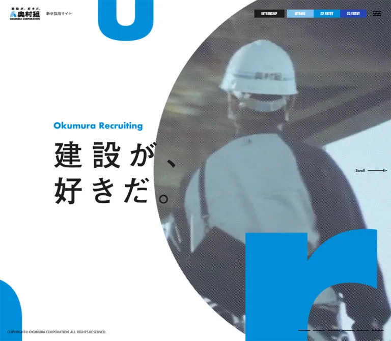
青と白、大きな円形の建設現場ビジュアル、画面からはみ出す英字を組み合わせた新卒採用サイト。PCの横方向の画面構成をスマートフォンでは縦長に再編し、新人事制度の告知を白いモーダルで表示しています。
Okumura Corporation — Graduate Recruitment Style Reference
Construction imagery inside a monumental circle, cropped blue letterforms, and a precise white announcement panel.
Website: Okumura graduate recruitment Original URL: https://www.okumuragumi.co.jp/recruit/graduate/ Final URL: https://www.okumuragumi.co.jp/recruit/graduate/ Theme: a light canvas with saturated blue, black typography, and secondary recruitment-action colors. Inspected: October 5, 2026, at 06:05 JST; supplied retrieval timestamp: October 4, 2026, at 21:05:46.860 UTC. Viewports: desktop 1440 × 1000 CSS pixels; mobile 390 × 844 CSS pixels. Scope: the current recruitment homepage, its initial announcement, exposed hero and header, mobile footer state, and the supplied rendered DOM and computed styles for subsequent content. Three current desktop captures and two current mobile captures were supplied. The announcement remains open in all five.
This is a recruitment website with multiple editorial destinations: company information, projects, occupations, employee interviews, working culture, and application information. Its desktop composition places major sections beside one another in viewport-sized panels. On mobile, those sections form a long vertical document.
The visual identity combines broad white space, a large circular construction-media crop, oversized blue letter fragments, condensed English navigation, and Japanese sans-serif copy. The current opening state adds a centered white announcement about the 2028 recruitment changes. Its black headline, blue outlined date label, and two rectangular blue links temporarily dominate the composition.
The gray appearance surrounding that announcement is an overlay effect. It should not be interpreted as the normal page background or as a separate dark theme.
閉じる
Okumura Corporation — Graduate Recruitment Style Reference
Construction imagery inside a monumental circle, cropped blue letterforms, and a precise white announcement panel.
Website: Okumura graduate recruitment Original URL: https://www.okumuragumi.co.jp/recruit/graduate/ Final URL: https://www.okumuragumi.co.jp/recruit/graduate/ Theme: a light canvas with saturated blue, black typography, and secondary recruitment-action colors. Inspected: October 5, 2026, at 06:05 JST; supplied retrieval timestamp: October 4, 2026, at 21:05:46.860 UTC. Viewports: desktop 1440 × 1000 CSS pixels; mobile 390 × 844 CSS pixels. Scope: the current recruitment homepage, its initial announcement, exposed hero and header, mobile footer state, and the supplied rendered DOM and computed styles for subsequent content. Three current desktop captures and two current mobile captures were supplied. The announcement remains open in all five.
This is a recruitment website with multiple editorial destinations: company information, projects, occupations, employee interviews, working culture, and application information. Its desktop composition places major sections beside one another in viewport-sized panels. On mobile, those sections form a long vertical document.
The visual identity combines broad white space, a large circular construction-media crop, oversized blue letter fragments, condensed English navigation, and Japanese sans-serif copy. The current opening state adds a centered white announcement about the 2028 recruitment changes. Its black headline, blue outlined date label, and two rectangular blue links temporarily dominate the composition.
The gray appearance surrounding that announcement is an overlay effect. It should not be interpreted as the normal page background or as a separate dark theme.
How to Read This Reference
- Measured values come from the supplied rendered DOM and computed-style records. Values are rounded where additional decimals would not help implementation.
- Visual estimates come from the current screenshots. The announcement was not included in the supplied element-style sample, so its geometry and typography are estimates rather than extracted CSS.
- Calculated values are simple relationships derived from recorded dimensions, such as column gaps and image ratios.
- Recommended values describe an adaptation or accessibility improvement. They are not claims about the original implementation.
- All custom-property names below are proposed aliases. The supplied custom-property extracts were empty.
- Offscreen elements can have valid rectangles without being visible. Menu entries, dropdown options, carousel clones, and desktop panels must not all be treated as simultaneously displayed content.
- No additional browsing or interaction testing was performed for this reference. Linked pages, documents, application portals, and media sources were not opened.
Tokens — Colors
Default Palette
| Name | Value | Suggested token | Evidence and role |
|---|---|---|---|
| Recruitment Blue | #008dd7 |
--color-brand |
Measured on the three desktop information links and employee index numbers. Principal brand accent. |
| White | #ffffff |
--color-surface |
Measured in navigation text and dropdown surfaces; the announcement is visually white. |
| Black | #000000 |
--color-ink |
Measured default text color. Visually used for the announcement headline and supporting copy. |
| Charcoal | #1c1c1c |
--color-charcoal |
Measured internship-link background and editorial-link text. |
| Account Blue | #80c1ea |
--color-account |
Measured text color of desktop year-specific MYPAGE links. The exposed parent control has a related pale-blue treatment. |
| Entry Green | #00ad78 |
--color-entry |
Measured text color of year-specific ENTRY links. The visible parent entry control uses green. |
| Close-Control Gray | Approximately #ededed |
--color-close |
Visual estimate for the small square behind the announcement’s close icon. |
| Announcement Scrim | Approximately rgb(0 0 0 / 50%) |
--color-scrim |
Visual approximation of the neutral darkening over the entire underlying page. Opacity was not extracted. |
The announcement’s blue buttons and highlighted words appear close to the measured brand blue, with a slightly more cyan impression in the screenshots. Their exact declarations were not supplied. Reusing #008dd7 is a practical adaptation, not an exact measurement of those elements.
Color Behavior
The scrim darkens the logo, navigation, photography, decorative letters, and footer together. Keep it on a separate layer above the page and below the announcement. Do not replace the base palette with colors sampled from the dimmed background.
Blue carries brand expression and information links. Green identifies entry-related navigation, while pale blue distinguishes account access. These secondary colors are functional accents rather than a general multicolor section system. No theme selector or dark-mode behavior was evidenced.
Tokens — Typography
Japanese Interface and Editorial Copy
Measured stack: YakuHanJP, "Noto Sans JP", sans-serif.
The body, Japanese editorial paragraphs, card captions, and menu links declare this stack. Treat YakuHanJP as part of the punctuation treatment rather than as the name of the entire visible Japanese typeface. The evidence establishes the computed family declaration, not successful loading of every font resource.
Editorial paragraphs use weight 500; the internship promotion caption uses 700. The announcement appears bold, but its exact family and weights were not extracted.
Condensed English Labels
Measured stack: "Bebas Neue", sans-serif.
This appears on English header controls, section labels such as MESSAGE and SPECIAL, and employee index numbers. Desktop navigation uses modest tracking: 0.81px at a 16.2px font size, equivalent to 0.05em.
The Japanese information buttons also declare this family, but that does not establish which font supplies their Japanese glyphs. Preserve an explicit Japanese fallback in a new implementation.
Hero Display Artwork
The large English recruitment wordmark and Japanese statement occupy elements whose supplied text fields are empty. Their visual lettering should therefore be treated separately from the ordinary body type scale. An image, background asset, or another rendering technique may be involved; the underlying implementation and asset URLs were not supplied.
Do not identify the large display lettering as Bebas Neue or Noto Sans JP merely because those fonts appear elsewhere on the page.
Type Scale
| Role | Desktop | Mobile | Status and notes |
|---|---|---|---|
| Root font size | 9px |
5.2px |
Measured; a layout scaling base, not the intended size of all readable text. |
| Header site descriptor container | 10.8px |
16.64px |
Measured parent H1 styles. Nested visible label styling was not supplied, so the mobile value is not a reliable visual label size. |
| Desktop Japanese information links | 12.6px, weight 600 |
Not visibly present in the compact header | Measured desktop styles. |
| Main internship navigation | 16.2px / 16.2px, weight 400 |
13px / 13px, weight 400 |
Measured on the visible controls. |
| English section labels | 21.6px / 21.6px |
15.6px / 15.6px |
Measured; mobile label footprints are vertical. |
| Message paragraphs | 18px / 33.75px, weight 500 |
13px / 24.375px, weight 500 |
Measured. Mobile tracking is -0.26px, or -0.02em. |
| Editorial link captions | 16.2px / 16.2px, weight 500 |
13px / 13px, weight 500 |
Measured outer Japanese caption styles. Nested English styling was not separately extracted. |
| Employee index numbers | 21.6px, weight 400 |
15.6px, weight 400 |
Measured Bebas Neue, in brand blue. |
| Internship promotion copy | 16.2px / 22.68px, weight 700 |
11.44px / 16.016px, weight 700 |
Measured; white text over imagery. |
| Announcement date label | Approximately 20px |
Approximately 18px |
Visual estimate; one desktop line becomes two mobile lines. |
| Announcement headline | Approximately 40px / 60px |
Approximately 28px / 45px |
Visual estimate; two deliberately composed lines. |
| Announcement supporting headline | Approximately 24px |
Approximately 22px / 30px |
Visual estimate; one desktop line and two mobile lines. |
| Announcement explanation | Approximately 14px, with larger blue emphasis |
Approximately 14px / 25px, with larger blue emphasis |
Visual estimate. |
| Announcement link labels | Approximately 18px, bold |
Approximately 14px, bold |
Visual estimate. |
The HTML element’s Times default and the carousel buttons’ Arial declaration are not evidence of an editorial serif or Arial-based brand system.
Tokens — Spacing & Shapes
Responsive Unit
The root measures 9px at 1440px wide and 5.2px at 390px wide. Many dimensions are compatible with a small root-based scale: the desktop logo is approximately 12.4 × 5.2 root units, and its mobile dimensions preserve that relationship.
The original scaling formula and media-query breakpoints were not supplied. Two endpoints are insufficient to establish a universal viewport formula. The Quick Start keeps a conventional root size and reproduces important dimensions explicitly.
Spacing Scale
| Use | Desktop | Mobile | Evidence |
|---|---|---|---|
| Header padding | 27px 36px |
14.56px 15.6px |
Measured. |
| Hero text left position | 198px |
26px |
Measured. |
| Main mobile editorial column | — | Left 78px; right 26px |
Measured from the 286px-wide content column. |
| Message-to-About column gap | 54px |
Stacked | Calculated from recorded rectangles. |
| Editorial image-to-caption gap | Approximately 9px |
Approximately 10.4px |
Calculated from measured rectangles. |
| Employee-card inset | 18px |
15.6px top and sides; 0 bottom |
Measured. |
| Announcement top padding | Approximately 50px |
Approximately 40px |
Visual estimate. |
| Announcement action side inset | Approximately 95px |
Approximately 20px |
Visual estimate relative to the panel. |
| Announcement action gap | Approximately 10px |
Approximately 8px |
Visual estimate. |
| Announcement bottom padding | Approximately 60px |
Approximately 30px |
Visual estimate. |
Border Radius
| Element | Treatment | Evidence |
|---|---|---|
| Header links and editorial image containers | Square corners | Computed radius 0. |
| Announcement and its two primary links | Square corners | Visible in both viewport sizes. |
| Announcement date label | Thin rectangular outline | Visible; approximately 2px blue border. |
| Hero media | Large circular crop | Visible; exact masking implementation unavailable. |
| Arrow medallions inside announcement links | White circles | Visible; approximately 22px desktop and 17px mobile. |
| Interview-list link | Pill | Measured radius 90px on a 216 × 54.2px desktop link. Its complete visual fill was not evidenced. |
This is predominantly a square-edged interface with a few deliberate circular and pill-shaped exceptions.
Layout Measurements
| Element | Desktop 1440 × 1000 | Mobile 390 × 844 | Status |
|---|---|---|---|
| Header | 1440 × 100.8px |
390 × 65.5px |
Measured. |
| Logo link | 111.6 × 46.8px at (36, 27) |
64.5 × 27px at approximately (15.6, 19.2) |
Measured. |
| Hero section | 1440 × 1000px |
390 × 780px |
Measured. |
| Hero English artwork box | 327.6 × 35.2px at approximately (198, 319.9) |
189.3 × 20px at approximately (26, 499.2) |
Measured element bounds. |
| Hero Japanese artwork box | 450 × 235px |
260 × 135.4px |
Measured element bounds. |
| Podcast promotion | 225 × 141px |
156 × 94.4px |
Measured. |
| Internship promotion | 225 × 143px |
156 × 96.4px |
Measured. |
| Announcement panel | Approximately 740 × 560px at (350, 220) |
Approximately 351 × 543px at (20, 151) |
Screenshot estimate. |
| Announcement date box | Approximately 414 × 46px |
Approximately 216 × 69px |
Screenshot estimate. |
| Announcement action | Approximately 550 × 50px |
Approximately 311 × 45px |
Screenshot estimate. |
| Close-control visible square | Approximately 30 × 30px |
Approximately 30 × 30px |
Screenshot estimate. |
| Document height | 1000px |
Approximately 5246px |
Recorded document measurements. |
Components
Recruitment Header
Role: persistent identity, application access, and navigation into the wider recruitment site.
On desktop, place the logo and the small site descriptor at the upper left. Align a compact utility row toward the right: three blue information links, a charcoal INTERNSHIP link, a pale-blue MYPAGE control, a green ENTRY control, and a three-line menu icon.
The three blue links measure 135 × 34.4px. The internship link measures approximately 106.2 × 34.4px. Keep the controls shallow, rectangular, and tightly grouped. The visible benefits link also has a light outline in the screenshot; its border declaration was not supplied.
At 390px, the visible row simplifies to the smaller logo, a 78 × 36.4px internship link, a green block with stacked ENTRY and MYPAGE labels, and an approximately 22.9px menu icon. The three blue information links are not visible in this compact row.
Year-specific 27 and 28 entry/account destinations exist in the DOM. Their presence does not prove that their dropdowns were open or establish whether hover, click, or another action opens them.
Circular Hero and Cropped Letterforms
Role: establishes construction work as a vivid, human setting rather than a purely institutional subject.
The desktop hero fills the viewport. Its text artwork sits on the left, while an enormous circular media area occupies the right and extends beyond the screen. Fine diagonal lines visibly texture the construction imagery. Huge blue letter fragments intrude from the top, lower left, and lower right.
The circle and oversized letters provide most of the composition’s scale. Keep the surrounding white field spacious. The hero text should remain a compact block relative to these graphic elements.
On mobile, the media occupies the upper part of the hero, while the text artwork begins around y = 499px. Large blue letter fragments remain visible near the lower edge. The announcement obscures much of this arrangement, so a complete unobstructed mobile hero composition cannot be reconstructed from the supplied captures.
Hero Promotion Stack
Role: offers timely recruitment content without becoming the main navigation system.
Two image-led links sit near the desktop lower-right corner. The podcast promotion begins at (1188, 652) and the internship promotion at (1188, 803). Both are 225px wide, leaving a 27px right inset. Their measured gap is 10px.
The internship tile uses a construction-worker photograph, bold white copy near the bottom, and a small circular directional symbol at the right. The podcast tile has its own denser promotional artwork and an embedded dark label strip.
On mobile, both tiles are 156px wide and align with the right viewport edge at x = 234px. They occupy approximately y = 332–530px, with an 8px gap. Their scale and position are part of the hero composition rather than a full-width mobile card list.
Recruitment-Policy Announcement
Role: explains the new personnel system and routes readers to two detailed destinations.
This is the most fully visible component in the current evidence. Its anatomy is:
- A white, square-cornered panel centered over a neutral scrim.
- A small close control at the upper-right corner, visually inset by approximately 10px.
- A blue outlined label quoting
2028年卒採用より、新人事制度がスタート. - A bold two-line headline:
「ゼネコン=全国転勤」followed byの常識を、打ち砕け。. - The supporting statement
多様な選択肢が、あなたを待っています。. - A short centered explanation, with key words and program names emphasized in blue.
- Two equal-width blue destination links, stacked vertically.
The first link is labeled 「本拠地制度」の詳細はこちら。 and points to the document at /recruit/graduate/image/common/base-system.pdf. The second is labeled 「多様な選考コース」の詳細はこちら。 and points to /recruit/graduate/work/. These are recorded destinations; their contents were not inspected.
Each link uses centered white bold text and a small white circular arrow at the right. Reserve space for that arrow so it does not force the label away from the optical center.
At desktop size, the panel is approximately 740px wide, with 550px-wide actions. At mobile size, it becomes approximately 90% of the viewport width, with 20px inner action gutters. The date label and supporting statement each break into two lines; the explanation expands from two broad lines to four shorter lines.
The panel remains at the same apparent viewport position in the mobile opening and footer captures. This supports a viewport-anchored overlay. Closing behavior, outside-click dismissal, Escape handling, focus management, and repeat-visit persistence were not exercised.
Message and About Panel
Role: combines the recruitment message with compact routes into company information.
The desktop DOM places this panel at x = 1440px, immediately to the right of the hero, with a full viewport width and height. Its content has two columns: a 576px message column and a 342px About column, separated by approximately 54px.
Message paragraphs use 18px Japanese text with a generous 33.75px line height. The About column contains three image-and-caption links: company introduction, keywords, and a company-profile movie. Each image box is 342 × 126px, followed by a compact bilingual caption.
On mobile, the section follows the 780px hero and becomes approximately 1008.8px tall. Text and About links share a 286px-wide column at x = 78px. Section-label rectangles occupy a narrow rail around x = 19.3px; their vertical proportions are consistent with rotated labels, though the transform itself was not supplied.
Mobile About image boxes measure approximately 286 × 93.6px. This changes their aspect ratio from the desktop version, so simply scaling the desktop image box is insufficient.
Special Editorial Panel
Role: presents future-facing company content alongside project and job-film destinations.
The desktop panel begins at x = 2880px. A large future-oriented link occupies the left, with an image measuring approximately 579.6 × 463.5px. Two smaller links stack at the right, each with a 333 × 207px image. The calculated horizontal gap between these image columns is approximately 68.4px.
Keep captions below the images rather than placing every title inside a colored card. The image blocks have square corners and no measured rounded container.
On mobile, all three links stack in the 286px editorial column. The main image becomes approximately 286 × 228.7px; the two secondary images become 286 × 177.8px. These preserve their desktop proportions more closely than the About images do.
The supplied screenshots do not expose this panel’s artwork. Its dimensions and content hierarchy are DOM-supported; its photographic subjects and full color treatment are unverified.
Work and Employee Interviews
Role: connects occupational routes with individual employee stories.
The desktop panel starts at x = 4320px. The job-description link uses a tall 288 × 463.5px image box. Beside it, employee links form a horizontal carousel structure.
Each desktop employee link measures approximately 180 × 311.6px, has 18px padding, and contains a 144 × 144px image box. A blue condensed index number sits near the upper-left area, followed by occupation, organizational information, and joining year.
There are eleven unique interview destinations. Repeated entries in the extracted text are consistent with carousel cloning; they do not represent additional unique employees.
On mobile, employee links measure approximately 140.4 × 245.9px, with 109.2px square image boxes. The recorded positions place employee 01 near the center, with neighboring items extending beyond the viewport. Previous and Next buttons are present in the DOM, but their operation was not tested.
The job-description image changes to approximately 286 × 166.4px on mobile, a substantial shift from portrait to landscape. This requires a different crop or asset treatment; the evidence does not establish which method the original uses.
The desktop INTERVIEW LIST link is a deliberate shape exception: a 216 × 54.2px pill with a measured 90px radius and white text. Its complete background treatment was not captured.
Workstyle, Information, and Footer
Role: provides culture stories, application details, supporting resources, and legal navigation.
The supplied DOM includes links for individual visions, a young-employee roundtable, veteran conversation, application requirements, growth environment, and FAQ. Detailed visual measurements for these later sections were not included in the element sample.
The mobile footer capture shows a broad blue region behind the announcement, followed by a light legal footer. Three policy links appear in a compact horizontal row, with a small centered copyright line beneath. The desktop opening capture instead shows the copyright at the lower-left viewport edge.
Do not invent a card grid or detailed information-section composition from these labels alone.
Tokens — Motion & Interaction
| Treatment | Evidence | Interpretation and limitation |
|---|---|---|
| Header-link transitions | Computed 0.5s |
A duration is declared. Hover and active endpoints were not supplied or exercised. |
| Offscreen menu-link fading | Computed opacity 0.5s |
Supports an opacity transition for those links, not a verified menu-opening sequence. |
| Editorial image-container effect | Computed box-shadow 0.3s 0.6s |
A 300ms transition with a 600ms delay is declared. Its shadow values and trigger are unknown. |
| Hero media changes | Different construction frames appear across desktop captures | Consistent with moving footage or another changing media source. Element type, playback rate, looping, autoplay, and audio are unverified. |
| Desktop panel arrangement | Successive sections at x = 0, 1440, 2880, 4320 |
Confirms horizontal layout at this viewport. Wheel mapping, swipe behavior, animation duration, and keyboard control are unverified. |
| Panel navigation | Seven slide links exist in the desktop link inventory | A navigation structure is present; its active state and operation were not tested. |
| Employee carousel | Repeated items and Previous/Next buttons in DOM | Supports carousel structure. Autoplay, drag, swipe, and looping behavior remain unverified. |
| Announcement positioning | Same apparent screen position over different mobile background positions | Supports viewport anchoring. It does not establish correct background scroll locking. |
| Announcement entrance and dismissal | Open state only | No defensible duration, easing, persistence, or dismissal behavior can be assigned. |
Many sampled elements report animation: none. That does not rule out video playback, JavaScript transforms, or animation on unsampled descendants and pseudo-elements. Likewise, a bare transition: all entry should not be converted into an invented duration.
Surfaces
| Layer | Appearance | Purpose |
|---|---|---|
| Base canvas | Light, visually white | Creates space around oversized graphics and editorial blocks. |
| Hero media | Construction imagery inside a circular crop, with fine diagonal texture | Supplies human activity and industrial context. |
| Decorative letters | Large solid blue fragments | Creates scale, cropping, and visual continuity. |
| Header utilities | Flat blue, charcoal, pale-blue, and green rectangles | Distinguishes information, internship, account, and entry actions. |
| Editorial links | Image above caption; mostly transparent surrounding containers | Keeps content integrated with the page rather than enclosed in generic cards. |
| Scrim | Neutral translucent dark layer | Separates the announcement from all underlying content. |
| Announcement | Flat white rectangle | Provides a calm, legible information surface. |
| Announcement links | Solid blue rectangles with white text and circular arrow details | Gives equal prominence to two destinations. |
No broad shadow-elevation system is established by the screenshots. The declared image-container shadow transition is a specific unresolved detail, not evidence for adding shadows to every component.
Imagery
The exposed hero imagery depicts construction work and structural environments, with workers, equipment, and large architectural surfaces. The oversized circular mask turns this activity into a graphic centerpiece. A fine diagonal texture remains visible across the media, helping it sit beside the large flat-blue shapes.
The current captures show different media frames while the surrounding composition stays stable. Preserve the relationship between the circular boundary and the moving subject; avoid fitting each frame independently in a way that makes the circle or layout jump.
The internship tile uses a closer human subject, while the podcast tile uses purpose-made promotional artwork. These serve different editorial roles and should not be homogenized into identical stock-photo cards.
Observed Asset References
No original image, video, SVG, or font-file URLs were included in the supplied evidence. The following is an asset-role inventory, not a fabricated file manifest.
| Asset role | What is supported | Implementation guidance |
|---|---|---|
| Corporate logo lockup | Visible in the header; link bounds measured at both sizes | Use an authorized logo asset and preserve its proportions. |
| Hero English wordmark | Empty-text element with measured bounds; partially visible behind the announcement | Preserve as display artwork if the source asset becomes available. |
| Hero Japanese statement | Large empty-text element with measured bounds; mostly occluded | Do not derive its complete composition from obscured regions. |
| Construction media | Circular crop, diagonal texture, and changing frames visible | Use an approved image or media asset; provide a stable poster when motion is unavailable. |
| Decorative letter fragments | Solid blue oversized shapes visible around the hero | Preserve intentional edge cropping; mark purely decorative instances as hidden from assistive technology. |
| Podcast promotion | Visible promotional artwork inside a measured link box | Retain its own artwork hierarchy and aspect treatment. |
| Internship promotion | Worker photograph, white caption, circular directional mark | Keep text contrast independent of the chosen image frame. |
| Editorial and employee images | Container dimensions supplied in the DOM | Subjects, file paths, and exact crop positions are not established. |
Do not treat a PDF destination or a video-page link as an image asset URL. The shell can be approximated in CSS, but the identity carried by the logo, letter artwork, and construction media requires suitable assets.
Layout & Responsive Behavior
Desktop: Viewport Panels
The recorded document height is 1000px, matching the viewport, while major sections occupy consecutive horizontal coordinates. This is a panel-based desktop layout rather than a conventional long vertical homepage.
The hero uses an approximately 198px text inset. Later editorial panels retain similar left positioning, with content vertically grouped around the middle of the screen. Header utilities and viewport-edge details remain outside those main content blocks.
The supplied desktop captures continue to show the hero beneath the announcement. The geometric arrangement of later panels is documented, but successful navigation through them was not demonstrated.
Mobile: Vertical Document and Label Rail
At 390px wide, the page becomes approximately 5246px tall. Major measured section starts are:
| Section | Mobile document position |
|---|---|
| Hero | y = 0, height 780px |
| Message and About | y = 780px, height approximately 1008.8px |
| Special | y = 1788.8px, height approximately 764.4px |
| Work and People | y = 2553.2px, height approximately 717.6px |
Most editorial content occupies a 286px column, leaving a substantial 78px left region for the narrow section-label rail and a 26px right margin. This asymmetry is a defining mobile feature. A generic centered column with equal gutters would lose it.
Header controls are selectively simplified. Hero promotions remain attached to the right edge. Editorial feature links stack, while the employee carousel retains horizontal overflow within the vertical page.
Announcement Reflow
The desktop announcement occupies approximately 51% of the viewport width; the mobile announcement occupies approximately 90%. It stays centered rather than becoming a bottom sheet.
Mobile changes include a narrower two-line date label, a two-line supporting statement, four lines of explanatory copy, shorter link heights, smaller directional circles, and reduced inner padding. The primary headline remains strongly composed across two lines at the inspected width.
Only 1440px and 390px widths were inspected. Tablet behavior, the exact switching breakpoint, landscape phones, browser zoom, and very short viewport handling are unverified. Use content-driven breakpoints and independently scrollable dialog content in an adaptation.
Do’s and Don’ts
Do
- Preserve the light canvas, saturated blue, and strong black Japanese typography.
- Make the circular construction-media crop and oversized letter fragments the hero’s main graphic devices.
- Keep the desktop panel structure distinct from the mobile vertical flow.
- Retain the asymmetric mobile editorial column and narrow section-label rail.
- Use measured condensed English typography for navigation, section labels, and employee numbers.
- Keep announcement actions equal in width and stacked, with centered text and small circular arrows.
- Separate the scrim from the underlying page palette.
- Preserve the square image-and-caption structure of editorial links.
- Account for the radically different desktop and mobile job-description image shapes.
- Distinguish unique employee records from carousel clones.
Don't
- Don't turn the whole recruitment website into a single generic conversion page.
- Don't interpret the dimmed screenshots as evidence for a gray base theme.
- Don't replace the circular hero with a conventional full-width rectangular banner.
- Don't introduce rounded, elevated cards throughout the interface.
- Don't use green as the default action color outside its entry-navigation role.
- Don't identify artwork lettering with a font that was only measured on other elements.
- Don't assume offscreen menu entries or dropdown links were visible.
- Don't infer autoplay, easing, scroll hijacking, or dismissal persistence from static states.
- Don't reproduce the tiny source root size without reproducing its explicit text-size overrides.
- Don't invent unseen artwork, asset filenames, production credits, or linked-page designs.
Recommended Implementation Additions
These are recommendations for a new implementation, not verified features of the original:
- Use a semantic modal dialog with an accessible title, Escape dismissal, controlled focus, and focus restoration to the opening control.
- Prevent accidental background interaction while the announcement is modal. The supplied mobile captures do not demonstrate scroll locking.
- Preserve the visible 30px close square while enlarging its interactive target to at least 44px.
- Allow the announcement to scroll within short viewports; keep every destination and the close control reachable at enlarged text sizes.
- Check small white text on blue and pale-blue controls for contrast. A darker functional blue may be needed for smaller labels without changing the large decorative brand blue.
- Give horizontal panel navigation explicit keyboard-operable controls and a non-animated alternative. Essential recruitment links should remain reachable without wheel gestures.
- Remove inactive carousel clones from the tab order and accessibility tree. Offer an ordinary interview-list destination alongside the carousel.
- Provide a static hero poster and reduced-motion behavior. CSS alone cannot pause a playing video; media state needs application logic.
- Use real text or equivalent accessible names for essential display artwork. Avoid using decorative letters as heading content.
- Identify document and external application destinations clearly, without assuming that every link opens in a new tab.
Agent Prompt Guide
Quick Color Reference
- Principal measured blue:
#008dd7. - Main surface: white; primary text: black.
- Internship utility:
#1c1c1c. - Account accent:
#80c1ea; entry accent:#00ad78. - Announcement: white panel, black hierarchy, blue outline label, two blue rectangular links.
- Scrim: neutral black transparency, approximately 50% as a visual starting point.
- Avoid deriving undimmed colors from the background of the announcement captures.
Overall Prompt
“Create a Japanese construction-company graduate recruitment website with a white canvas, saturated blue #008dd7, black Japanese sans-serif copy, and condensed English navigation. Build a desktop hero around a huge circular construction-media crop on the right, a compact display-artwork block on the left, and oversized blue letter fragments cropped by the screen edges. Place compact rectangular recruitment utilities at the top and two small image promotions near the lower right. Arrange desktop editorial sections as horizontal viewport panels; reflow them into a vertical mobile document with a narrow left label rail and an asymmetric content column. Add a centered square-cornered white announcement with a blue outlined date label, a bold Japanese headline, concise supporting copy, and two equal stacked blue destination links. Treat unverified animation behavior as an implementation decision.”
Example Component Prompts
- Announcement: “Create a flat white recruitment announcement approximately 740px wide on desktop and 90vw on mobile. Use a small gray close square, a blue outlined date label, a bold two-line black headline, blue emphasis within centered explanatory copy, and two full-width blue links with white circular arrows. Preserve generous desktop spacing and deliberate mobile line breaks. Add accessible dialog behavior.”
- Header: “Create a transparent recruitment header with a compact logo at left and shallow square-cornered utilities at right. Use three blue information links, a charcoal internship link, pale-blue account access, green entry access, and a three-line menu icon. On phones, show the logo, internship, a combined entry/account block, and the menu icon.”
- Editorial panel: “Create a desktop panel with a large square-edged feature image on the left and two smaller image-and-caption links stacked on the right. Use compact Japanese captions with secondary English labels. On mobile, stack all three in a 286px column at a 390px viewport, leaving a narrow section-label rail on the left.”
- Employee carousel: “Create employee story links with square portraits, blue condensed two-digit indices, Japanese occupation labels, organization details, and joining years. Use approximately 180px-wide cards on desktop and 140px cards on mobile. Keep a horizontal browsing structure and a separate interview-list link. Ensure duplicate loop items are not announced twice.”
- Hero media: “Place approved construction imagery in a very large circular crop that extends beyond the desktop top and right edges. Add a subtle fine diagonal texture and oversized solid-blue decorative letter fragments. Keep the left text region quiet and readable. Provide a static reduced-motion version without inventing a source playback rhythm.”
Quick Start
CSS Custom Properties
This is a practical adaptation, not recovered source CSS. It uses measured colors, measured desktop header dimensions, and screenshot-estimated announcement proportions. The 1100px breakpoint, native horizontal scrolling, hover endpoints, and accessible target sizes are recommendations. Load the declared fonts separately when authorized and available.
:root {
  /* Measured palette, with estimated overlay details */
  --color-brand: #008dd7;
  --color-surface: #ffffff;
  --color-ink: #000000;
  --color-charcoal: #1c1c1c;
  --color-account: #80c1ea;
  --color-entry: #00ad78;
  --color-close: #ededed;
  --color-scrim: rgb(0 0 0 / 50%);

  /* Computed family declarations from the supplied page */
  --font-body: YakuHanJP, 'Noto Sans JP', sans-serif;
  --font-condensed: 'Bebas Neue', sans-serif;

  /* Adaptation dimensions; the document root stays conventional */
  --header-padding-block: 27px;
  --header-padding-inline: 36px;
  --panel-inset: 13.75vw;
  --notice-width: 740px;
  --notice-action-width: 550px;
  --radius-square: 0;
  --motion-link: 500ms;
}

*,
*::before,
*::after {
  box-sizing: border-box;
}

body {
  margin: 0;
  color: var(--color-ink);
  background: var(--color-surface);
  font-family: var(--font-body);
  font-size: 16px;
}

.recruit-header {
  position: fixed;
  inset: 0 0 auto;
  z-index: 20;
  display: flex;
  align-items: center;
  justify-content: space-between;
  padding: var(--header-padding-block) var(--header-padding-inline);
}

.recruit-logo {
  display: block;
  inline-size: 111.6px;
  block-size: auto;
}

.header-actions {
  display: flex;
  align-items: center;
  gap: 8px;
}

.header-link {
  display: grid;
  place-items: center;
  min-block-size: 34.4px;
  padding: 8px 14px;
  border-radius: var(--radius-square);
  color: white;
  background: var(--color-brand);
  font: 400 16.2px / 1 var(--font-condensed);
  letter-spacing: 0.05em;
  text-decoration: none;
  transition: opacity var(--motion-link);
}

.header-link--information {
  inline-size: 135px;
  font-family: var(--font-condensed), var(--font-body);
  font-size: 12.6px;
  font-weight: 600;
  letter-spacing: normal;
}

.header-link--internship { background: var(--color-charcoal); }
.header-link--account { background: var(--color-account); }
.header-link--entry { background: var(--color-entry); }
.header-link--mobile { display: none; }

/* Native horizontal navigation is an adaptation, not a source claim. */
.panel-track {
  display: flex;
  overflow-x: auto;
  scroll-snap-type: x proximity;
}

.page-panel {
  position: relative;
  flex: 0 0 100%;
  min-inline-size: 0;
  min-block-size: 100svh;
  scroll-snap-align: start;
}

.hero {
  overflow: hidden;
}

.hero-media {
  position: absolute;
  inset-block-start: -5vh;
  inset-inline-start: 42%;
  inline-size: 110vh;
  aspect-ratio: 1;
  overflow: hidden;
  border-radius: 50%;
}

.hero-media > :is(img, video) {
  display: block;
  inline-size: 100%;
  block-size: 100%;
  object-fit: cover;
}

/* Visual approximation of the exposed diagonal media texture. */
.hero-media::after {
  content: '';
  position: absolute;
  inset: 0;
  pointer-events: none;
  background: repeating-linear-gradient(
    135deg,
    rgb(0 141 215 / 22%) 0 0.7px,
    transparent 0.7px 3px
  );
}

.hero-copy {
  position: absolute;
  inset-block-start: 32%;
  inset-inline-start: var(--panel-inset);
  z-index: 2;
}

.hero-kicker-art {
  display: block;
  inline-size: 327.6px;
  max-inline-size: 100%;
  block-size: auto;
}

.hero-statement-art {
  display: block;
  inline-size: 450px;
  max-inline-size: 100%;
  block-size: auto;
  margin-block-start: 36px;
}

.promotion-stack {
  position: absolute;
  inset-inline-end: 27px;
  inset-block-end: 54px;
  z-index: 3;
  display: grid;
  gap: 10px;
  inline-size: 225px;
}

.promotion-stack img {
  display: block;
  inline-size: 100%;
  block-size: auto;
}

.editorial-link {
  display: block;
  color: var(--color-charcoal);
  text-decoration: none;
}

.editorial-link img {
  display: block;
  inline-size: 100%;
  block-size: auto;
  border-radius: 0;
}

.editorial-caption {
  margin: 9px 0 0;
  font-size: 16.2px;
  font-weight: 500;
  line-height: 1.25;
}

.section-label {
  font: 400 21.6px / 1 var(--font-condensed);
}

/* Use showModal() to place this native dialog above the header. */
.recruit-notice {
  position: fixed;
  inset: 0;
  inline-size: min(var(--notice-width), 90vw);
  max-inline-size: none;
  max-block-size: calc(100dvh - 40px);
  margin: auto;
  padding: 50px 40px 60px;
  overflow: auto;
  border: 0;
  border-radius: 0;
  color: var(--color-ink);
  background: var(--color-surface);
  font-family: var(--font-body);
  text-align: center;
}

.recruit-notice::backdrop {
  background: var(--color-scrim);
}

.notice-close-form {
  margin: 0;
}

/* A 44px target surrounds the estimated 30px visible square. */
.notice-close {
  position: absolute;
  inset-block-start: 3px;
  inset-inline-end: 3px;
  display: grid;
  place-items: center;
  inline-size: 44px;
  block-size: 44px;
  padding: 0;
  border: 0;
  color: var(--color-charcoal);
  background: transparent;
  cursor: pointer;
}

.notice-close span {
  position: relative;
  inline-size: 30px;
  block-size: 30px;
  background: var(--color-close);
}

.notice-close span::before,
.notice-close span::after {
  content: '';
  position: absolute;
  inset: 50% auto auto 50%;
  inline-size: 17px;
  block-size: 1px;
  background: currentColor;
  transform: translate(-50%, -50%) rotate(45deg);
}

.notice-close span::after {
  transform: translate(-50%, -50%) rotate(-45deg);
}

.notice-kicker {
  display: table;
  max-inline-size: 100%;
  margin: 0 auto;
  padding: 8px 16px;
  border: 2px solid var(--color-brand);
  color: var(--color-brand);
  font-size: 20px;
  font-weight: 700;
  line-height: 26px;
}

.notice-title {
  margin: 16px 0 0;
  font-size: 40px;
  font-weight: 700;
  line-height: 60px;
}

.notice-subtitle {
  margin: 12px 0 0;
  font-size: 24px;
  font-weight: 700;
  line-height: 36px;
}

.notice-body {
  margin: 18px 0 0;
  font-size: 14px;
  font-weight: 700;
  line-height: 32px;
}

.notice-body strong {
  color: var(--color-brand);
  font-size: 18px;
}

.notice-actions {
  display: grid;
  gap: 10px;
  max-inline-size: var(--notice-action-width);
  margin: 28px auto 0;
}

.notice-action {
  position: relative;
  display: grid;
  place-items: center;
  min-block-size: 50px;
  padding: 10px 46px;
  color: white;
  background: var(--color-brand);
  font-size: 18px;
  font-weight: 700;
  line-height: 1.5;
  text-decoration: none;
}

.notice-action-icon {
  position: absolute;
  inset-inline-end: 15px;
  inset-block-start: 50%;
  display: grid;
  place-items: center;
  inline-size: 22px;
  block-size: 22px;
  border-radius: 50%;
  color: var(--color-brand);
  background: white;
  font-size: 14px;
  line-height: 1;
  transform: translateY(-50%);
}

.mobile-break {
  display: none;
}

:where(a, button):focus-visible {
  outline: 3px solid currentColor;
  outline-offset: 4px;
}

.notice-action:focus-visible {
  outline-color: var(--color-ink);
}

@media (hover: hover) {
  /* Recommended endpoint; only the source duration was measured. */
  .header-link:hover {
    opacity: 0.8;
  }
}

@media (max-width: 1100px) {
  .recruit-header {
    padding: 14.56px 4vw;
  }

  .recruit-logo {
    inline-size: 64.5px;
  }

  .header-actions {
    gap: 5.2px;
  }

  .header-link--desktop {
    display: none;
  }

  .header-link--mobile {
    display: grid;
    inline-size: 78px;
    min-block-size: 36.4px;
    padding: 5px 8px;
    font-size: 13px;
  }

  .panel-track {
    display: block;
    overflow: visible;
    scroll-snap-type: none;
  }

  .page-panel {
    min-block-size: auto;
  }

  .hero {
    min-block-size: 200vw;
  }

  .hero-media {
    inset-block-start: 12vw;
    inset-inline-start: 0;
    inline-size: 110vw;
  }

  .hero-copy {
    inset-block-start: 128vw;
    inset-inline-start: 6.6667vw;
  }

  .hero-kicker-art {
    inline-size: 48.53vw;
  }

  .hero-statement-art {
    inline-size: 66.6667vw;
    margin-block-start: 20.8px;
  }

  .promotion-stack {
    inset-block-start: 85.13vw;
    inset-block-end: auto;
    inset-inline-end: 0;
    inline-size: 40vw;
    gap: 8px;
  }

  .editorial-column {
    margin-inline: 20vw 6.6667vw;
  }

  .editorial-caption {
    margin-block-start: 10.4px;
    font-size: 13px;
  }

  .section-label {
    font-size: 15.6px;
  }

  .recruit-notice {
    padding: 40px 20px 30px;
  }

  .notice-kicker {
    padding: 6px 16px;
    font-size: 18px;
    line-height: 26px;
  }

  .notice-title {
    margin-block-start: 14px;
    font-size: clamp(20px, 7.18vw, 28px);
    line-height: 45px;
  }

  .notice-subtitle {
    margin-block-start: 8px;
    font-size: 22px;
    line-height: 30px;
  }

  .notice-body {
    margin-block-start: 10px;
    line-height: 25px;
  }

  .notice-actions {
    gap: 8px;
    margin-block-start: 24px;
  }

  .notice-action {
    min-block-size: 45px;
    padding: 10px 30px;
    font-size: 14px;
  }

  .notice-action-icon {
    inset-inline-end: 10px;
    inline-size: 17px;
    block-size: 17px;
    font-size: 11px;
  }

  .mobile-break {
    display: initial;
  }
}

@media (prefers-reduced-motion: reduce) {
  .panel-track {
    scroll-behavior: auto;
  }

  .header-link {
    transition: none;
  }
}
The hero positioning rules above approximate the inspected compositions. They do not reproduce unknown letter assets, media timing, or the original panel-navigation script. Apply header-link--desktop to desktop-only utilities and header-link--mobile to the compact variants.
A minimal announcement structure using the actual visible copy follows. Call showModal() from the application’s announcement trigger. Native modal behavior is a recommended implementation choice, not a claim about the original site.
<dialog class="recruit-notice" aria-labelledby="notice-title">
  <form method="dialog" class="notice-close-form">
    <button class="notice-close" aria-label="Close announcement">
      <span aria-hidden="true"></span>
    </button>
  </form>

  <p class="notice-kicker">
    2028年卒採用より、<br class="mobile-break">
    新人事制度がスタート
  </p>

  <h2 class="notice-title" id="notice-title">
    「ゼネコン=全国転勤」<br>
    の常識を、打ち砕け。
  </h2>

  <p class="notice-subtitle">
    多様な選択肢が、<br class="mobile-break">
    あなたを待っています。
  </p>

  <p class="notice-body">
    全国で<strong>挑戦</strong>を。人生に<strong>安心</strong>を。<br class="mobile-break">
    その両方を、諦めない。<br>
    <strong>本拠地制度</strong>と<strong>多様な選考コース</strong>を<br class="mobile-break">
    スタートします。
  </p>

  <div class="notice-actions">
    <a class="notice-action"
       href="https://www.okumuragumi.co.jp/recruit/graduate/image/common/base-system.pdf">
      「本拠地制度」の詳細はこちら。
      <span class="notice-action-icon" aria-hidden="true">→</span>
    </a>
    <a class="notice-action"
       href="https://www.okumuragumi.co.jp/recruit/graduate/work/">
      「多様な選考コース」の詳細はこちら。
      <span class="notice-action-icon" aria-hidden="true">→</span>
    </a>
  </div>
</dialog>
Tailwind v4 Token Mapping
Optional aliases for a project already using Tailwind v4. They do not imply that the original website uses Tailwind.
@theme inline {
  --color-brand: #008dd7;
  --color-surface: #ffffff;
  --color-ink: #000000;
  --color-charcoal: #1c1c1c;
  --color-account: #80c1ea;
  --color-entry: #00ad78;

  --font-body: YakuHanJP, 'Noto Sans JP', sans-serif;
  --font-condensed: 'Bebas Neue', sans-serif;

  --text-editorial: 18px;
  --text-editorial-mobile: 13px;
  --text-section-label: 21.6px;
  --text-notice-title: 40px;

  --spacing-notice: 740px;
  --spacing-notice-action: 550px;
  --radius-square: 0px;
}
Sources & Evidence
- Inspected original and final page: https://www.okumuragumi.co.jp/recruit/graduate/. The supplied record reports HTTP 200 and no URL change.
- Capture time: October 4, 2026, 21:05:46.860 UTC, equivalent to October 5, 2026, 06:05:46.860 JST.
- Current visual evidence: three desktop captures at 1440 × 1000 and two mobile captures at 390 × 844. All show the announcement open; the mobile captures include opening and footer backgrounds.
- Rendered DOM evidence: page text, link destinations, element rectangles, computed colors, font declarations, spacing, radii, transitions, and document dimensions at both viewports. Several measured components are offscreen or obscured rather than directly visible.
- Capture preparation: the supplied process waited for document loading, finite animation readiness, sampled layout/text stability, and visible image decoding within stated time limits. Perpetual animations were paused during readiness checks and resumed afterward. These checks do not establish full semantic completeness.
- Observed changes: hero construction frames differ across desktop captures; the mobile background position changes while the announcement remains visually centered. No recorded action establishes modal dismissal, menu opening, dropdown operation, carousel navigation, or desktop panel navigation.
- Limitations: no unobstructed announcement-dismissed capture, no tablet viewport, no full stylesheet source, no original image or media URLs, and no verified hover, focus, audio, reduced-motion, or persistence behavior. Linked documents and destinations were not inspected.
This reference describes the current supplied page evidence. Measured styles, screenshot estimates, and implementation recommendations remain explicitly separated throughout.
# Okumura Corporation — Graduate Recruitment Style Reference

> Construction imagery inside a monumental circle, cropped blue letterforms, and a precise white announcement panel.

**Website:** [Okumura graduate recruitment](https://www.okumuragumi.co.jp/recruit/graduate/)
**Original URL:** https://www.okumuragumi.co.jp/recruit/graduate/
**Final URL:** https://www.okumuragumi.co.jp/recruit/graduate/
**Theme:** a light canvas with saturated blue, black typography, and secondary recruitment-action colors.
**Inspected:** October 5, 2026, at 06:05 JST; supplied retrieval timestamp: October 4, 2026, at 21:05:46.860 UTC.
**Viewports:** desktop 1440 × 1000 CSS pixels; mobile 390 × 844 CSS pixels.
**Scope:** the current recruitment homepage, its initial announcement, exposed hero and header, mobile footer state, and the supplied rendered DOM and computed styles for subsequent content. Three current desktop captures and two current mobile captures were supplied. The announcement remains open in all five.

This is a recruitment website with multiple editorial destinations: company information, projects, occupations, employee interviews, working culture, and application information. Its desktop composition places major sections beside one another in viewport-sized panels. On mobile, those sections form a long vertical document.

The visual identity combines broad white space, a large circular construction-media crop, oversized blue letter fragments, condensed English navigation, and Japanese sans-serif copy. The current opening state adds a centered white announcement about the 2028 recruitment changes. Its black headline, blue outlined date label, and two rectangular blue links temporarily dominate the composition.

The gray appearance surrounding that announcement is an overlay effect. It should not be interpreted as the normal page background or as a separate dark theme.
閉じる
# Okumura Corporation — Graduate Recruitment Style Reference

> Construction imagery inside a monumental circle, cropped blue letterforms, and a precise white announcement panel.

**Website:** [Okumura graduate recruitment](https://www.okumuragumi.co.jp/recruit/graduate/)
**Original URL:** https://www.okumuragumi.co.jp/recruit/graduate/
**Final URL:** https://www.okumuragumi.co.jp/recruit/graduate/
**Theme:** a light canvas with saturated blue, black typography, and secondary recruitment-action colors.
**Inspected:** October 5, 2026, at 06:05 JST; supplied retrieval timestamp: October 4, 2026, at 21:05:46.860 UTC.
**Viewports:** desktop 1440 × 1000 CSS pixels; mobile 390 × 844 CSS pixels.
**Scope:** the current recruitment homepage, its initial announcement, exposed hero and header, mobile footer state, and the supplied rendered DOM and computed styles for subsequent content. Three current desktop captures and two current mobile captures were supplied. The announcement remains open in all five.

This is a recruitment website with multiple editorial destinations: company information, projects, occupations, employee interviews, working culture, and application information. Its desktop composition places major sections beside one another in viewport-sized panels. On mobile, those sections form a long vertical document.

The visual identity combines broad white space, a large circular construction-media crop, oversized blue letter fragments, condensed English navigation, and Japanese sans-serif copy. The current opening state adds a centered white announcement about the 2028 recruitment changes. Its black headline, blue outlined date label, and two rectangular blue links temporarily dominate the composition.

The gray appearance surrounding that announcement is an overlay effect. It should not be interpreted as the normal page background or as a separate dark theme.

## How to Read This Reference

- **Measured** values come from the supplied rendered DOM and computed-style records. Values are rounded where additional decimals would not help implementation.
- **Visual estimates** come from the current screenshots. The announcement was not included in the supplied element-style sample, so its geometry and typography are estimates rather than extracted CSS.
- **Calculated** values are simple relationships derived from recorded dimensions, such as column gaps and image ratios.
- **Recommended** values describe an adaptation or accessibility improvement. They are not claims about the original implementation.
- All custom-property names below are proposed aliases. The supplied custom-property extracts were empty.
- Offscreen elements can have valid rectangles without being visible. Menu entries, dropdown options, carousel clones, and desktop panels must not all be treated as simultaneously displayed content.
- No additional browsing or interaction testing was performed for this reference. Linked pages, documents, application portals, and media sources were not opened.

## Tokens — Colors

### Default Palette

| Name | Value | Suggested token | Evidence and role |
| --- | --- | --- | --- |
| Recruitment Blue | `#008dd7` | `--color-brand` | Measured on the three desktop information links and employee index numbers. Principal brand accent. |
| White | `#ffffff` | `--color-surface` | Measured in navigation text and dropdown surfaces; the announcement is visually white. |
| Black | `#000000` | `--color-ink` | Measured default text color. Visually used for the announcement headline and supporting copy. |
| Charcoal | `#1c1c1c` | `--color-charcoal` | Measured internship-link background and editorial-link text. |
| Account Blue | `#80c1ea` | `--color-account` | Measured text color of desktop year-specific MYPAGE links. The exposed parent control has a related pale-blue treatment. |
| Entry Green | `#00ad78` | `--color-entry` | Measured text color of year-specific ENTRY links. The visible parent entry control uses green. |
| Close-Control Gray | Approximately `#ededed` | `--color-close` | Visual estimate for the small square behind the announcement’s close icon. |
| Announcement Scrim | Approximately `rgb(0 0 0 / 50%)` | `--color-scrim` | Visual approximation of the neutral darkening over the entire underlying page. Opacity was not extracted. |

The announcement’s blue buttons and highlighted words appear close to the measured brand blue, with a slightly more cyan impression in the screenshots. Their exact declarations were not supplied. Reusing `#008dd7` is a practical adaptation, not an exact measurement of those elements.

### Color Behavior

The scrim darkens the logo, navigation, photography, decorative letters, and footer together. Keep it on a separate layer above the page and below the announcement. Do not replace the base palette with colors sampled from the dimmed background.

Blue carries brand expression and information links. Green identifies entry-related navigation, while pale blue distinguishes account access. These secondary colors are functional accents rather than a general multicolor section system. No theme selector or dark-mode behavior was evidenced.

## Tokens — Typography

### Japanese Interface and Editorial Copy

**Measured stack:** `YakuHanJP, "Noto Sans JP", sans-serif`.

The body, Japanese editorial paragraphs, card captions, and menu links declare this stack. Treat YakuHanJP as part of the punctuation treatment rather than as the name of the entire visible Japanese typeface. The evidence establishes the computed family declaration, not successful loading of every font resource.

Editorial paragraphs use weight `500`; the internship promotion caption uses `700`. The announcement appears bold, but its exact family and weights were not extracted.

### Condensed English Labels

**Measured stack:** `"Bebas Neue", sans-serif`.

This appears on English header controls, section labels such as `MESSAGE` and `SPECIAL`, and employee index numbers. Desktop navigation uses modest tracking: `0.81px` at a `16.2px` font size, equivalent to `0.05em`.

The Japanese information buttons also declare this family, but that does not establish which font supplies their Japanese glyphs. Preserve an explicit Japanese fallback in a new implementation.

### Hero Display Artwork

The large English recruitment wordmark and Japanese statement occupy elements whose supplied text fields are empty. Their visual lettering should therefore be treated separately from the ordinary body type scale. An image, background asset, or another rendering technique may be involved; the underlying implementation and asset URLs were not supplied.

Do not identify the large display lettering as Bebas Neue or Noto Sans JP merely because those fonts appear elsewhere on the page.

### Type Scale

| Role | Desktop | Mobile | Status and notes |
| --- | --- | --- | --- |
| Root font size | `9px` | `5.2px` | Measured; a layout scaling base, not the intended size of all readable text. |
| Header site descriptor container | `10.8px` | `16.64px` | Measured parent H1 styles. Nested visible label styling was not supplied, so the mobile value is not a reliable visual label size. |
| Desktop Japanese information links | `12.6px`, weight `600` | Not visibly present in the compact header | Measured desktop styles. |
| Main internship navigation | `16.2px / 16.2px`, weight `400` | `13px / 13px`, weight `400` | Measured on the visible controls. |
| English section labels | `21.6px / 21.6px` | `15.6px / 15.6px` | Measured; mobile label footprints are vertical. |
| Message paragraphs | `18px / 33.75px`, weight `500` | `13px / 24.375px`, weight `500` | Measured. Mobile tracking is `-0.26px`, or `-0.02em`. |
| Editorial link captions | `16.2px / 16.2px`, weight `500` | `13px / 13px`, weight `500` | Measured outer Japanese caption styles. Nested English styling was not separately extracted. |
| Employee index numbers | `21.6px`, weight `400` | `15.6px`, weight `400` | Measured Bebas Neue, in brand blue. |
| Internship promotion copy | `16.2px / 22.68px`, weight `700` | `11.44px / 16.016px`, weight `700` | Measured; white text over imagery. |
| Announcement date label | Approximately `20px` | Approximately `18px` | Visual estimate; one desktop line becomes two mobile lines. |
| Announcement headline | Approximately `40px / 60px` | Approximately `28px / 45px` | Visual estimate; two deliberately composed lines. |
| Announcement supporting headline | Approximately `24px` | Approximately `22px / 30px` | Visual estimate; one desktop line and two mobile lines. |
| Announcement explanation | Approximately `14px`, with larger blue emphasis | Approximately `14px / 25px`, with larger blue emphasis | Visual estimate. |
| Announcement link labels | Approximately `18px`, bold | Approximately `14px`, bold | Visual estimate. |

The HTML element’s Times default and the carousel buttons’ Arial declaration are not evidence of an editorial serif or Arial-based brand system.

## Tokens — Spacing & Shapes

### Responsive Unit

The root measures `9px` at 1440px wide and `5.2px` at 390px wide. Many dimensions are compatible with a small root-based scale: the desktop logo is approximately `12.4 × 5.2` root units, and its mobile dimensions preserve that relationship.

The original scaling formula and media-query breakpoints were not supplied. Two endpoints are insufficient to establish a universal viewport formula. The Quick Start keeps a conventional root size and reproduces important dimensions explicitly.

### Spacing Scale

| Use | Desktop | Mobile | Evidence |
| --- | --- | --- | --- |
| Header padding | `27px 36px` | `14.56px 15.6px` | Measured. |
| Hero text left position | `198px` | `26px` | Measured. |
| Main mobile editorial column | — | Left `78px`; right `26px` | Measured from the 286px-wide content column. |
| Message-to-About column gap | `54px` | Stacked | Calculated from recorded rectangles. |
| Editorial image-to-caption gap | Approximately `9px` | Approximately `10.4px` | Calculated from measured rectangles. |
| Employee-card inset | `18px` | `15.6px` top and sides; `0` bottom | Measured. |
| Announcement top padding | Approximately `50px` | Approximately `40px` | Visual estimate. |
| Announcement action side inset | Approximately `95px` | Approximately `20px` | Visual estimate relative to the panel. |
| Announcement action gap | Approximately `10px` | Approximately `8px` | Visual estimate. |
| Announcement bottom padding | Approximately `60px` | Approximately `30px` | Visual estimate. |

### Border Radius

| Element | Treatment | Evidence |
| --- | --- | --- |
| Header links and editorial image containers | Square corners | Computed radius `0`. |
| Announcement and its two primary links | Square corners | Visible in both viewport sizes. |
| Announcement date label | Thin rectangular outline | Visible; approximately 2px blue border. |
| Hero media | Large circular crop | Visible; exact masking implementation unavailable. |
| Arrow medallions inside announcement links | White circles | Visible; approximately 22px desktop and 17px mobile. |
| Interview-list link | Pill | Measured radius `90px` on a `216 × 54.2px` desktop link. Its complete visual fill was not evidenced. |

This is predominantly a square-edged interface with a few deliberate circular and pill-shaped exceptions.

### Layout Measurements

| Element | Desktop 1440 × 1000 | Mobile 390 × 844 | Status |
| --- | --- | --- | --- |
| Header | `1440 × 100.8px` | `390 × 65.5px` | Measured. |
| Logo link | `111.6 × 46.8px` at `(36, 27)` | `64.5 × 27px` at approximately `(15.6, 19.2)` | Measured. |
| Hero section | `1440 × 1000px` | `390 × 780px` | Measured. |
| Hero English artwork box | `327.6 × 35.2px` at approximately `(198, 319.9)` | `189.3 × 20px` at approximately `(26, 499.2)` | Measured element bounds. |
| Hero Japanese artwork box | `450 × 235px` | `260 × 135.4px` | Measured element bounds. |
| Podcast promotion | `225 × 141px` | `156 × 94.4px` | Measured. |
| Internship promotion | `225 × 143px` | `156 × 96.4px` | Measured. |
| Announcement panel | Approximately `740 × 560px` at `(350, 220)` | Approximately `351 × 543px` at `(20, 151)` | Screenshot estimate. |
| Announcement date box | Approximately `414 × 46px` | Approximately `216 × 69px` | Screenshot estimate. |
| Announcement action | Approximately `550 × 50px` | Approximately `311 × 45px` | Screenshot estimate. |
| Close-control visible square | Approximately `30 × 30px` | Approximately `30 × 30px` | Screenshot estimate. |
| Document height | `1000px` | Approximately `5246px` | Recorded document measurements. |

## Components

### Recruitment Header

**Role:** persistent identity, application access, and navigation into the wider recruitment site.

On desktop, place the logo and the small site descriptor at the upper left. Align a compact utility row toward the right: three blue information links, a charcoal `INTERNSHIP` link, a pale-blue `MYPAGE` control, a green `ENTRY` control, and a three-line menu icon.

The three blue links measure `135 × 34.4px`. The internship link measures approximately `106.2 × 34.4px`. Keep the controls shallow, rectangular, and tightly grouped. The visible benefits link also has a light outline in the screenshot; its border declaration was not supplied.

At 390px, the visible row simplifies to the smaller logo, a `78 × 36.4px` internship link, a green block with stacked `ENTRY` and `MYPAGE` labels, and an approximately `22.9px` menu icon. The three blue information links are not visible in this compact row.

Year-specific 27 and 28 entry/account destinations exist in the DOM. Their presence does not prove that their dropdowns were open or establish whether hover, click, or another action opens them.

### Circular Hero and Cropped Letterforms

**Role:** establishes construction work as a vivid, human setting rather than a purely institutional subject.

The desktop hero fills the viewport. Its text artwork sits on the left, while an enormous circular media area occupies the right and extends beyond the screen. Fine diagonal lines visibly texture the construction imagery. Huge blue letter fragments intrude from the top, lower left, and lower right.

The circle and oversized letters provide most of the composition’s scale. Keep the surrounding white field spacious. The hero text should remain a compact block relative to these graphic elements.

On mobile, the media occupies the upper part of the hero, while the text artwork begins around `y = 499px`. Large blue letter fragments remain visible near the lower edge. The announcement obscures much of this arrangement, so a complete unobstructed mobile hero composition cannot be reconstructed from the supplied captures.

### Hero Promotion Stack

**Role:** offers timely recruitment content without becoming the main navigation system.

Two image-led links sit near the desktop lower-right corner. The podcast promotion begins at `(1188, 652)` and the internship promotion at `(1188, 803)`. Both are 225px wide, leaving a 27px right inset. Their measured gap is 10px.

The internship tile uses a construction-worker photograph, bold white copy near the bottom, and a small circular directional symbol at the right. The podcast tile has its own denser promotional artwork and an embedded dark label strip.

On mobile, both tiles are 156px wide and align with the right viewport edge at `x = 234px`. They occupy approximately `y = 332–530px`, with an 8px gap. Their scale and position are part of the hero composition rather than a full-width mobile card list.

### Recruitment-Policy Announcement

**Role:** explains the new personnel system and routes readers to two detailed destinations.

This is the most fully visible component in the current evidence. Its anatomy is:

1. A white, square-cornered panel centered over a neutral scrim.
2. A small close control at the upper-right corner, visually inset by approximately 10px.
3. A blue outlined label quoting `2028年卒採用より、新人事制度がスタート`.
4. A bold two-line headline: `「ゼネコン=全国転勤」` followed by `の常識を、打ち砕け。`.
5. The supporting statement `多様な選択肢が、あなたを待っています。`.
6. A short centered explanation, with key words and program names emphasized in blue.
7. Two equal-width blue destination links, stacked vertically.

The first link is labeled `「本拠地制度」の詳細はこちら。` and points to the document at `/recruit/graduate/image/common/base-system.pdf`. The second is labeled `「多様な選考コース」の詳細はこちら。` and points to `/recruit/graduate/work/`. These are recorded destinations; their contents were not inspected.

Each link uses centered white bold text and a small white circular arrow at the right. Reserve space for that arrow so it does not force the label away from the optical center.

At desktop size, the panel is approximately 740px wide, with 550px-wide actions. At mobile size, it becomes approximately 90% of the viewport width, with 20px inner action gutters. The date label and supporting statement each break into two lines; the explanation expands from two broad lines to four shorter lines.

The panel remains at the same apparent viewport position in the mobile opening and footer captures. This supports a viewport-anchored overlay. Closing behavior, outside-click dismissal, Escape handling, focus management, and repeat-visit persistence were not exercised.

### Message and About Panel

**Role:** combines the recruitment message with compact routes into company information.

The desktop DOM places this panel at `x = 1440px`, immediately to the right of the hero, with a full viewport width and height. Its content has two columns: a 576px message column and a 342px About column, separated by approximately 54px.

Message paragraphs use `18px` Japanese text with a generous `33.75px` line height. The About column contains three image-and-caption links: company introduction, keywords, and a company-profile movie. Each image box is `342 × 126px`, followed by a compact bilingual caption.

On mobile, the section follows the 780px hero and becomes approximately 1008.8px tall. Text and About links share a 286px-wide column at `x = 78px`. Section-label rectangles occupy a narrow rail around `x = 19.3px`; their vertical proportions are consistent with rotated labels, though the transform itself was not supplied.

Mobile About image boxes measure approximately `286 × 93.6px`. This changes their aspect ratio from the desktop version, so simply scaling the desktop image box is insufficient.

### Special Editorial Panel

**Role:** presents future-facing company content alongside project and job-film destinations.

The desktop panel begins at `x = 2880px`. A large future-oriented link occupies the left, with an image measuring approximately `579.6 × 463.5px`. Two smaller links stack at the right, each with a `333 × 207px` image. The calculated horizontal gap between these image columns is approximately 68.4px.

Keep captions below the images rather than placing every title inside a colored card. The image blocks have square corners and no measured rounded container.

On mobile, all three links stack in the 286px editorial column. The main image becomes approximately `286 × 228.7px`; the two secondary images become `286 × 177.8px`. These preserve their desktop proportions more closely than the About images do.

The supplied screenshots do not expose this panel’s artwork. Its dimensions and content hierarchy are DOM-supported; its photographic subjects and full color treatment are unverified.

### Work and Employee Interviews

**Role:** connects occupational routes with individual employee stories.

The desktop panel starts at `x = 4320px`. The job-description link uses a tall `288 × 463.5px` image box. Beside it, employee links form a horizontal carousel structure.

Each desktop employee link measures approximately `180 × 311.6px`, has 18px padding, and contains a `144 × 144px` image box. A blue condensed index number sits near the upper-left area, followed by occupation, organizational information, and joining year.

There are eleven unique interview destinations. Repeated entries in the extracted text are consistent with carousel cloning; they do not represent additional unique employees.

On mobile, employee links measure approximately `140.4 × 245.9px`, with `109.2px` square image boxes. The recorded positions place employee 01 near the center, with neighboring items extending beyond the viewport. Previous and Next buttons are present in the DOM, but their operation was not tested.

The job-description image changes to approximately `286 × 166.4px` on mobile, a substantial shift from portrait to landscape. This requires a different crop or asset treatment; the evidence does not establish which method the original uses.

The desktop `INTERVIEW LIST` link is a deliberate shape exception: a `216 × 54.2px` pill with a measured 90px radius and white text. Its complete background treatment was not captured.

### Workstyle, Information, and Footer

**Role:** provides culture stories, application details, supporting resources, and legal navigation.

The supplied DOM includes links for individual visions, a young-employee roundtable, veteran conversation, application requirements, growth environment, and FAQ. Detailed visual measurements for these later sections were not included in the element sample.

The mobile footer capture shows a broad blue region behind the announcement, followed by a light legal footer. Three policy links appear in a compact horizontal row, with a small centered copyright line beneath. The desktop opening capture instead shows the copyright at the lower-left viewport edge.

Do not invent a card grid or detailed information-section composition from these labels alone.

## Tokens — Motion & Interaction

| Treatment | Evidence | Interpretation and limitation |
| --- | --- | --- |
| Header-link transitions | Computed `0.5s` | A duration is declared. Hover and active endpoints were not supplied or exercised. |
| Offscreen menu-link fading | Computed `opacity 0.5s` | Supports an opacity transition for those links, not a verified menu-opening sequence. |
| Editorial image-container effect | Computed `box-shadow 0.3s 0.6s` | A 300ms transition with a 600ms delay is declared. Its shadow values and trigger are unknown. |
| Hero media changes | Different construction frames appear across desktop captures | Consistent with moving footage or another changing media source. Element type, playback rate, looping, autoplay, and audio are unverified. |
| Desktop panel arrangement | Successive sections at `x = 0, 1440, 2880, 4320` | Confirms horizontal layout at this viewport. Wheel mapping, swipe behavior, animation duration, and keyboard control are unverified. |
| Panel navigation | Seven slide links exist in the desktop link inventory | A navigation structure is present; its active state and operation were not tested. |
| Employee carousel | Repeated items and Previous/Next buttons in DOM | Supports carousel structure. Autoplay, drag, swipe, and looping behavior remain unverified. |
| Announcement positioning | Same apparent screen position over different mobile background positions | Supports viewport anchoring. It does not establish correct background scroll locking. |
| Announcement entrance and dismissal | Open state only | No defensible duration, easing, persistence, or dismissal behavior can be assigned. |

Many sampled elements report `animation: none`. That does not rule out video playback, JavaScript transforms, or animation on unsampled descendants and pseudo-elements. Likewise, a bare `transition: all` entry should not be converted into an invented duration.

## Surfaces

| Layer | Appearance | Purpose |
| --- | --- | --- |
| Base canvas | Light, visually white | Creates space around oversized graphics and editorial blocks. |
| Hero media | Construction imagery inside a circular crop, with fine diagonal texture | Supplies human activity and industrial context. |
| Decorative letters | Large solid blue fragments | Creates scale, cropping, and visual continuity. |
| Header utilities | Flat blue, charcoal, pale-blue, and green rectangles | Distinguishes information, internship, account, and entry actions. |
| Editorial links | Image above caption; mostly transparent surrounding containers | Keeps content integrated with the page rather than enclosed in generic cards. |
| Scrim | Neutral translucent dark layer | Separates the announcement from all underlying content. |
| Announcement | Flat white rectangle | Provides a calm, legible information surface. |
| Announcement links | Solid blue rectangles with white text and circular arrow details | Gives equal prominence to two destinations. |

No broad shadow-elevation system is established by the screenshots. The declared image-container shadow transition is a specific unresolved detail, not evidence for adding shadows to every component.

## Imagery

The exposed hero imagery depicts construction work and structural environments, with workers, equipment, and large architectural surfaces. The oversized circular mask turns this activity into a graphic centerpiece. A fine diagonal texture remains visible across the media, helping it sit beside the large flat-blue shapes.

The current captures show different media frames while the surrounding composition stays stable. Preserve the relationship between the circular boundary and the moving subject; avoid fitting each frame independently in a way that makes the circle or layout jump.

The internship tile uses a closer human subject, while the podcast tile uses purpose-made promotional artwork. These serve different editorial roles and should not be homogenized into identical stock-photo cards.

### Observed Asset References

No original image, video, SVG, or font-file URLs were included in the supplied evidence. The following is an asset-role inventory, not a fabricated file manifest.

| Asset role | What is supported | Implementation guidance |
| --- | --- | --- |
| Corporate logo lockup | Visible in the header; link bounds measured at both sizes | Use an authorized logo asset and preserve its proportions. |
| Hero English wordmark | Empty-text element with measured bounds; partially visible behind the announcement | Preserve as display artwork if the source asset becomes available. |
| Hero Japanese statement | Large empty-text element with measured bounds; mostly occluded | Do not derive its complete composition from obscured regions. |
| Construction media | Circular crop, diagonal texture, and changing frames visible | Use an approved image or media asset; provide a stable poster when motion is unavailable. |
| Decorative letter fragments | Solid blue oversized shapes visible around the hero | Preserve intentional edge cropping; mark purely decorative instances as hidden from assistive technology. |
| Podcast promotion | Visible promotional artwork inside a measured link box | Retain its own artwork hierarchy and aspect treatment. |
| Internship promotion | Worker photograph, white caption, circular directional mark | Keep text contrast independent of the chosen image frame. |
| Editorial and employee images | Container dimensions supplied in the DOM | Subjects, file paths, and exact crop positions are not established. |

Do not treat a PDF destination or a video-page link as an image asset URL. The shell can be approximated in CSS, but the identity carried by the logo, letter artwork, and construction media requires suitable assets.

## Layout & Responsive Behavior

### Desktop: Viewport Panels

The recorded document height is 1000px, matching the viewport, while major sections occupy consecutive horizontal coordinates. This is a panel-based desktop layout rather than a conventional long vertical homepage.

The hero uses an approximately 198px text inset. Later editorial panels retain similar left positioning, with content vertically grouped around the middle of the screen. Header utilities and viewport-edge details remain outside those main content blocks.

The supplied desktop captures continue to show the hero beneath the announcement. The geometric arrangement of later panels is documented, but successful navigation through them was not demonstrated.

### Mobile: Vertical Document and Label Rail

At 390px wide, the page becomes approximately 5246px tall. Major measured section starts are:

| Section | Mobile document position |
| --- | --- |
| Hero | `y = 0`, height `780px` |
| Message and About | `y = 780px`, height approximately `1008.8px` |
| Special | `y = 1788.8px`, height approximately `764.4px` |
| Work and People | `y = 2553.2px`, height approximately `717.6px` |

Most editorial content occupies a 286px column, leaving a substantial 78px left region for the narrow section-label rail and a 26px right margin. This asymmetry is a defining mobile feature. A generic centered column with equal gutters would lose it.

Header controls are selectively simplified. Hero promotions remain attached to the right edge. Editorial feature links stack, while the employee carousel retains horizontal overflow within the vertical page.

### Announcement Reflow

The desktop announcement occupies approximately 51% of the viewport width; the mobile announcement occupies approximately 90%. It stays centered rather than becoming a bottom sheet.

Mobile changes include a narrower two-line date label, a two-line supporting statement, four lines of explanatory copy, shorter link heights, smaller directional circles, and reduced inner padding. The primary headline remains strongly composed across two lines at the inspected width.

Only 1440px and 390px widths were inspected. Tablet behavior, the exact switching breakpoint, landscape phones, browser zoom, and very short viewport handling are unverified. Use content-driven breakpoints and independently scrollable dialog content in an adaptation.

## Do’s and Don’ts

### Do

- Preserve the light canvas, saturated blue, and strong black Japanese typography.
- Make the circular construction-media crop and oversized letter fragments the hero’s main graphic devices.
- Keep the desktop panel structure distinct from the mobile vertical flow.
- Retain the asymmetric mobile editorial column and narrow section-label rail.
- Use measured condensed English typography for navigation, section labels, and employee numbers.
- Keep announcement actions equal in width and stacked, with centered text and small circular arrows.
- Separate the scrim from the underlying page palette.
- Preserve the square image-and-caption structure of editorial links.
- Account for the radically different desktop and mobile job-description image shapes.
- Distinguish unique employee records from carousel clones.

### Don't

- Don't turn the whole recruitment website into a single generic conversion page.
- Don't interpret the dimmed screenshots as evidence for a gray base theme.
- Don't replace the circular hero with a conventional full-width rectangular banner.
- Don't introduce rounded, elevated cards throughout the interface.
- Don't use green as the default action color outside its entry-navigation role.
- Don't identify artwork lettering with a font that was only measured on other elements.
- Don't assume offscreen menu entries or dropdown links were visible.
- Don't infer autoplay, easing, scroll hijacking, or dismissal persistence from static states.
- Don't reproduce the tiny source root size without reproducing its explicit text-size overrides.
- Don't invent unseen artwork, asset filenames, production credits, or linked-page designs.

## Recommended Implementation Additions

These are recommendations for a new implementation, not verified features of the original:

- Use a semantic modal dialog with an accessible title, Escape dismissal, controlled focus, and focus restoration to the opening control.
- Prevent accidental background interaction while the announcement is modal. The supplied mobile captures do not demonstrate scroll locking.
- Preserve the visible 30px close square while enlarging its interactive target to at least 44px.
- Allow the announcement to scroll within short viewports; keep every destination and the close control reachable at enlarged text sizes.
- Check small white text on blue and pale-blue controls for contrast. A darker functional blue may be needed for smaller labels without changing the large decorative brand blue.
- Give horizontal panel navigation explicit keyboard-operable controls and a non-animated alternative. Essential recruitment links should remain reachable without wheel gestures.
- Remove inactive carousel clones from the tab order and accessibility tree. Offer an ordinary interview-list destination alongside the carousel.
- Provide a static hero poster and reduced-motion behavior. CSS alone cannot pause a playing video; media state needs application logic.
- Use real text or equivalent accessible names for essential display artwork. Avoid using decorative letters as heading content.
- Identify document and external application destinations clearly, without assuming that every link opens in a new tab.

## Agent Prompt Guide

### Quick Color Reference

- Principal measured blue: `#008dd7`.
- Main surface: white; primary text: black.
- Internship utility: `#1c1c1c`.
- Account accent: `#80c1ea`; entry accent: `#00ad78`.
- Announcement: white panel, black hierarchy, blue outline label, two blue rectangular links.
- Scrim: neutral black transparency, approximately 50% as a visual starting point.
- Avoid deriving undimmed colors from the background of the announcement captures.

### Overall Prompt

“Create a Japanese construction-company graduate recruitment website with a white canvas, saturated blue `#008dd7`, black Japanese sans-serif copy, and condensed English navigation. Build a desktop hero around a huge circular construction-media crop on the right, a compact display-artwork block on the left, and oversized blue letter fragments cropped by the screen edges. Place compact rectangular recruitment utilities at the top and two small image promotions near the lower right. Arrange desktop editorial sections as horizontal viewport panels; reflow them into a vertical mobile document with a narrow left label rail and an asymmetric content column. Add a centered square-cornered white announcement with a blue outlined date label, a bold Japanese headline, concise supporting copy, and two equal stacked blue destination links. Treat unverified animation behavior as an implementation decision.”

### Example Component Prompts

1. **Announcement:** “Create a flat white recruitment announcement approximately 740px wide on desktop and 90vw on mobile. Use a small gray close square, a blue outlined date label, a bold two-line black headline, blue emphasis within centered explanatory copy, and two full-width blue links with white circular arrows. Preserve generous desktop spacing and deliberate mobile line breaks. Add accessible dialog behavior.”
2. **Header:** “Create a transparent recruitment header with a compact logo at left and shallow square-cornered utilities at right. Use three blue information links, a charcoal internship link, pale-blue account access, green entry access, and a three-line menu icon. On phones, show the logo, internship, a combined entry/account block, and the menu icon.”
3. **Editorial panel:** “Create a desktop panel with a large square-edged feature image on the left and two smaller image-and-caption links stacked on the right. Use compact Japanese captions with secondary English labels. On mobile, stack all three in a 286px column at a 390px viewport, leaving a narrow section-label rail on the left.”
4. **Employee carousel:** “Create employee story links with square portraits, blue condensed two-digit indices, Japanese occupation labels, organization details, and joining years. Use approximately 180px-wide cards on desktop and 140px cards on mobile. Keep a horizontal browsing structure and a separate interview-list link. Ensure duplicate loop items are not announced twice.”
5. **Hero media:** “Place approved construction imagery in a very large circular crop that extends beyond the desktop top and right edges. Add a subtle fine diagonal texture and oversized solid-blue decorative letter fragments. Keep the left text region quiet and readable. Provide a static reduced-motion version without inventing a source playback rhythm.”

## Quick Start

### CSS Custom Properties

This is a practical adaptation, not recovered source CSS. It uses measured colors, measured desktop header dimensions, and screenshot-estimated announcement proportions. The `1100px` breakpoint, native horizontal scrolling, hover endpoints, and accessible target sizes are recommendations. Load the declared fonts separately when authorized and available.

```css
:root {
  /* Measured palette, with estimated overlay details */
  --color-brand: #008dd7;
  --color-surface: #ffffff;
  --color-ink: #000000;
  --color-charcoal: #1c1c1c;
  --color-account: #80c1ea;
  --color-entry: #00ad78;
  --color-close: #ededed;
  --color-scrim: rgb(0 0 0 / 50%);

  /* Computed family declarations from the supplied page */
  --font-body: YakuHanJP, 'Noto Sans JP', sans-serif;
  --font-condensed: 'Bebas Neue', sans-serif;

  /* Adaptation dimensions; the document root stays conventional */
  --header-padding-block: 27px;
  --header-padding-inline: 36px;
  --panel-inset: 13.75vw;
  --notice-width: 740px;
  --notice-action-width: 550px;
  --radius-square: 0;
  --motion-link: 500ms;
}

*,
*::before,
*::after {
  box-sizing: border-box;
}

body {
  margin: 0;
  color: var(--color-ink);
  background: var(--color-surface);
  font-family: var(--font-body);
  font-size: 16px;
}

.recruit-header {
  position: fixed;
  inset: 0 0 auto;
  z-index: 20;
  display: flex;
  align-items: center;
  justify-content: space-between;
  padding: var(--header-padding-block) var(--header-padding-inline);
}

.recruit-logo {
  display: block;
  inline-size: 111.6px;
  block-size: auto;
}

.header-actions {
  display: flex;
  align-items: center;
  gap: 8px;
}

.header-link {
  display: grid;
  place-items: center;
  min-block-size: 34.4px;
  padding: 8px 14px;
  border-radius: var(--radius-square);
  color: white;
  background: var(--color-brand);
  font: 400 16.2px / 1 var(--font-condensed);
  letter-spacing: 0.05em;
  text-decoration: none;
  transition: opacity var(--motion-link);
}

.header-link--information {
  inline-size: 135px;
  font-family: var(--font-condensed), var(--font-body);
  font-size: 12.6px;
  font-weight: 600;
  letter-spacing: normal;
}

.header-link--internship { background: var(--color-charcoal); }
.header-link--account { background: var(--color-account); }
.header-link--entry { background: var(--color-entry); }
.header-link--mobile { display: none; }

/* Native horizontal navigation is an adaptation, not a source claim. */
.panel-track {
  display: flex;
  overflow-x: auto;
  scroll-snap-type: x proximity;
}

.page-panel {
  position: relative;
  flex: 0 0 100%;
  min-inline-size: 0;
  min-block-size: 100svh;
  scroll-snap-align: start;
}

.hero {
  overflow: hidden;
}

.hero-media {
  position: absolute;
  inset-block-start: -5vh;
  inset-inline-start: 42%;
  inline-size: 110vh;
  aspect-ratio: 1;
  overflow: hidden;
  border-radius: 50%;
}

.hero-media > :is(img, video) {
  display: block;
  inline-size: 100%;
  block-size: 100%;
  object-fit: cover;
}

/* Visual approximation of the exposed diagonal media texture. */
.hero-media::after {
  content: '';
  position: absolute;
  inset: 0;
  pointer-events: none;
  background: repeating-linear-gradient(
    135deg,
    rgb(0 141 215 / 22%) 0 0.7px,
    transparent 0.7px 3px
  );
}

.hero-copy {
  position: absolute;
  inset-block-start: 32%;
  inset-inline-start: var(--panel-inset);
  z-index: 2;
}

.hero-kicker-art {
  display: block;
  inline-size: 327.6px;
  max-inline-size: 100%;
  block-size: auto;
}

.hero-statement-art {
  display: block;
  inline-size: 450px;
  max-inline-size: 100%;
  block-size: auto;
  margin-block-start: 36px;
}

.promotion-stack {
  position: absolute;
  inset-inline-end: 27px;
  inset-block-end: 54px;
  z-index: 3;
  display: grid;
  gap: 10px;
  inline-size: 225px;
}

.promotion-stack img {
  display: block;
  inline-size: 100%;
  block-size: auto;
}

.editorial-link {
  display: block;
  color: var(--color-charcoal);
  text-decoration: none;
}

.editorial-link img {
  display: block;
  inline-size: 100%;
  block-size: auto;
  border-radius: 0;
}

.editorial-caption {
  margin: 9px 0 0;
  font-size: 16.2px;
  font-weight: 500;
  line-height: 1.25;
}

.section-label {
  font: 400 21.6px / 1 var(--font-condensed);
}

/* Use showModal() to place this native dialog above the header. */
.recruit-notice {
  position: fixed;
  inset: 0;
  inline-size: min(var(--notice-width), 90vw);
  max-inline-size: none;
  max-block-size: calc(100dvh - 40px);
  margin: auto;
  padding: 50px 40px 60px;
  overflow: auto;
  border: 0;
  border-radius: 0;
  color: var(--color-ink);
  background: var(--color-surface);
  font-family: var(--font-body);
  text-align: center;
}

.recruit-notice::backdrop {
  background: var(--color-scrim);
}

.notice-close-form {
  margin: 0;
}

/* A 44px target surrounds the estimated 30px visible square. */
.notice-close {
  position: absolute;
  inset-block-start: 3px;
  inset-inline-end: 3px;
  display: grid;
  place-items: center;
  inline-size: 44px;
  block-size: 44px;
  padding: 0;
  border: 0;
  color: var(--color-charcoal);
  background: transparent;
  cursor: pointer;
}

.notice-close span {
  position: relative;
  inline-size: 30px;
  block-size: 30px;
  background: var(--color-close);
}

.notice-close span::before,
.notice-close span::after {
  content: '';
  position: absolute;
  inset: 50% auto auto 50%;
  inline-size: 17px;
  block-size: 1px;
  background: currentColor;
  transform: translate(-50%, -50%) rotate(45deg);
}

.notice-close span::after {
  transform: translate(-50%, -50%) rotate(-45deg);
}

.notice-kicker {
  display: table;
  max-inline-size: 100%;
  margin: 0 auto;
  padding: 8px 16px;
  border: 2px solid var(--color-brand);
  color: var(--color-brand);
  font-size: 20px;
  font-weight: 700;
  line-height: 26px;
}

.notice-title {
  margin: 16px 0 0;
  font-size: 40px;
  font-weight: 700;
  line-height: 60px;
}

.notice-subtitle {
  margin: 12px 0 0;
  font-size: 24px;
  font-weight: 700;
  line-height: 36px;
}

.notice-body {
  margin: 18px 0 0;
  font-size: 14px;
  font-weight: 700;
  line-height: 32px;
}

.notice-body strong {
  color: var(--color-brand);
  font-size: 18px;
}

.notice-actions {
  display: grid;
  gap: 10px;
  max-inline-size: var(--notice-action-width);
  margin: 28px auto 0;
}

.notice-action {
  position: relative;
  display: grid;
  place-items: center;
  min-block-size: 50px;
  padding: 10px 46px;
  color: white;
  background: var(--color-brand);
  font-size: 18px;
  font-weight: 700;
  line-height: 1.5;
  text-decoration: none;
}

.notice-action-icon {
  position: absolute;
  inset-inline-end: 15px;
  inset-block-start: 50%;
  display: grid;
  place-items: center;
  inline-size: 22px;
  block-size: 22px;
  border-radius: 50%;
  color: var(--color-brand);
  background: white;
  font-size: 14px;
  line-height: 1;
  transform: translateY(-50%);
}

.mobile-break {
  display: none;
}

:where(a, button):focus-visible {
  outline: 3px solid currentColor;
  outline-offset: 4px;
}

.notice-action:focus-visible {
  outline-color: var(--color-ink);
}

@media (hover: hover) {
  /* Recommended endpoint; only the source duration was measured. */
  .header-link:hover {
    opacity: 0.8;
  }
}

@media (max-width: 1100px) {
  .recruit-header {
    padding: 14.56px 4vw;
  }

  .recruit-logo {
    inline-size: 64.5px;
  }

  .header-actions {
    gap: 5.2px;
  }

  .header-link--desktop {
    display: none;
  }

  .header-link--mobile {
    display: grid;
    inline-size: 78px;
    min-block-size: 36.4px;
    padding: 5px 8px;
    font-size: 13px;
  }

  .panel-track {
    display: block;
    overflow: visible;
    scroll-snap-type: none;
  }

  .page-panel {
    min-block-size: auto;
  }

  .hero {
    min-block-size: 200vw;
  }

  .hero-media {
    inset-block-start: 12vw;
    inset-inline-start: 0;
    inline-size: 110vw;
  }

  .hero-copy {
    inset-block-start: 128vw;
    inset-inline-start: 6.6667vw;
  }

  .hero-kicker-art {
    inline-size: 48.53vw;
  }

  .hero-statement-art {
    inline-size: 66.6667vw;
    margin-block-start: 20.8px;
  }

  .promotion-stack {
    inset-block-start: 85.13vw;
    inset-block-end: auto;
    inset-inline-end: 0;
    inline-size: 40vw;
    gap: 8px;
  }

  .editorial-column {
    margin-inline: 20vw 6.6667vw;
  }

  .editorial-caption {
    margin-block-start: 10.4px;
    font-size: 13px;
  }

  .section-label {
    font-size: 15.6px;
  }

  .recruit-notice {
    padding: 40px 20px 30px;
  }

  .notice-kicker {
    padding: 6px 16px;
    font-size: 18px;
    line-height: 26px;
  }

  .notice-title {
    margin-block-start: 14px;
    font-size: clamp(20px, 7.18vw, 28px);
    line-height: 45px;
  }

  .notice-subtitle {
    margin-block-start: 8px;
    font-size: 22px;
    line-height: 30px;
  }

  .notice-body {
    margin-block-start: 10px;
    line-height: 25px;
  }

  .notice-actions {
    gap: 8px;
    margin-block-start: 24px;
  }

  .notice-action {
    min-block-size: 45px;
    padding: 10px 30px;
    font-size: 14px;
  }

  .notice-action-icon {
    inset-inline-end: 10px;
    inline-size: 17px;
    block-size: 17px;
    font-size: 11px;
  }

  .mobile-break {
    display: initial;
  }
}

@media (prefers-reduced-motion: reduce) {
  .panel-track {
    scroll-behavior: auto;
  }

  .header-link {
    transition: none;
  }
}
```

The hero positioning rules above approximate the inspected compositions. They do not reproduce unknown letter assets, media timing, or the original panel-navigation script. Apply `header-link--desktop` to desktop-only utilities and `header-link--mobile` to the compact variants.

A minimal announcement structure using the actual visible copy follows. Call `showModal()` from the application’s announcement trigger. Native modal behavior is a recommended implementation choice, not a claim about the original site.

```html
<dialog class="recruit-notice" aria-labelledby="notice-title">
  <form method="dialog" class="notice-close-form">
    <button class="notice-close" aria-label="Close announcement">
      <span aria-hidden="true"></span>
    </button>
  </form>

  <p class="notice-kicker">
    2028年卒採用より、<br class="mobile-break">
    新人事制度がスタート
  </p>

  <h2 class="notice-title" id="notice-title">
    「ゼネコン=全国転勤」<br>
    の常識を、打ち砕け。
  </h2>

  <p class="notice-subtitle">
    多様な選択肢が、<br class="mobile-break">
    あなたを待っています。
  </p>

  <p class="notice-body">
    全国で<strong>挑戦</strong>を。人生に<strong>安心</strong>を。<br class="mobile-break">
    その両方を、諦めない。<br>
    <strong>本拠地制度</strong>と<strong>多様な選考コース</strong>を<br class="mobile-break">
    スタートします。
  </p>

  <div class="notice-actions">
    <a class="notice-action"
       href="https://www.okumuragumi.co.jp/recruit/graduate/image/common/base-system.pdf">
      「本拠地制度」の詳細はこちら。
      <span class="notice-action-icon" aria-hidden="true">→</span>
    </a>
    <a class="notice-action"
       href="https://www.okumuragumi.co.jp/recruit/graduate/work/">
      「多様な選考コース」の詳細はこちら。
      <span class="notice-action-icon" aria-hidden="true">→</span>
    </a>
  </div>
</dialog>
```

### Tailwind v4 Token Mapping

Optional aliases for a project already using Tailwind v4. They do not imply that the original website uses Tailwind.

```css
@theme inline {
  --color-brand: #008dd7;
  --color-surface: #ffffff;
  --color-ink: #000000;
  --color-charcoal: #1c1c1c;
  --color-account: #80c1ea;
  --color-entry: #00ad78;

  --font-body: YakuHanJP, 'Noto Sans JP', sans-serif;
  --font-condensed: 'Bebas Neue', sans-serif;

  --text-editorial: 18px;
  --text-editorial-mobile: 13px;
  --text-section-label: 21.6px;
  --text-notice-title: 40px;

  --spacing-notice: 740px;
  --spacing-notice-action: 550px;
  --radius-square: 0px;
}
```

## Sources & Evidence

- **Inspected original and final page:** [https://www.okumuragumi.co.jp/recruit/graduate/](https://www.okumuragumi.co.jp/recruit/graduate/). The supplied record reports HTTP 200 and no URL change.
- **Capture time:** October 4, 2026, 21:05:46.860 UTC, equivalent to October 5, 2026, 06:05:46.860 JST.
- **Current visual evidence:** three desktop captures at 1440 × 1000 and two mobile captures at 390 × 844. All show the announcement open; the mobile captures include opening and footer backgrounds.
- **Rendered DOM evidence:** page text, link destinations, element rectangles, computed colors, font declarations, spacing, radii, transitions, and document dimensions at both viewports. Several measured components are offscreen or obscured rather than directly visible.
- **Capture preparation:** the supplied process waited for document loading, finite animation readiness, sampled layout/text stability, and visible image decoding within stated time limits. Perpetual animations were paused during readiness checks and resumed afterward. These checks do not establish full semantic completeness.
- **Observed changes:** hero construction frames differ across desktop captures; the mobile background position changes while the announcement remains visually centered. No recorded action establishes modal dismissal, menu opening, dropdown operation, carousel navigation, or desktop panel navigation.
- **Limitations:** no unobstructed announcement-dismissed capture, no tablet viewport, no full stylesheet source, no original image or media URLs, and no verified hover, focus, audio, reduced-motion, or persistence behavior. Linked documents and destinations were not inspected.

This reference describes the current supplied page evidence. Measured styles, screenshot estimates, and implementation recommendations remain explicitly separated throughout.関連するデザイン
スタイルやページの種類、ジャンルが近いデザインを集めました。