プレビュー準備中デザインリファレンスを見る
DESIGN REFERENCE
うなぎの寝床 — 地域文化と日用品を伝えるオンラインショップ
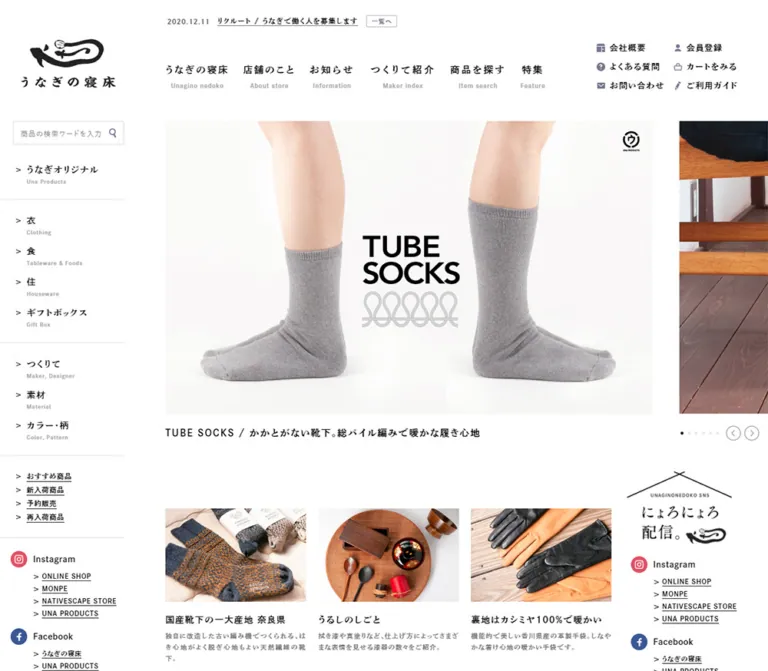
白地と明朝系書体を基調に、左側の商品分類、横長の写真カルーセル、産地・つくりて情報付きの商品一覧を組み合わせた地域文化商社のサイト。
Unagino Nedoko — Style Reference
A regional craft catalogue arranged with the openness of a shop floor and the typography of an editorial index.
Website: unagino-nedoko.net Original URL: https://unagino-nedoko.net/ Final URL: https://unagino-nedoko.net/ Response: HTTP 200 Theme: white canvas, black typography, restrained utility and product-status accents Inspected: October 6, 2026, at 01:35:53.789 JST — October 5, 2026, at 16:35:53.789 UTC Viewports: 1440 × 1000 and 390 × 844 CSS pixels Scope: the current homepage, using supplied browser captures and rendered DOM evidence: header, shopping navigation, promotional carousel, editorial recommendations, social directory, news, exhibitions, product catalogue, category index, and footer. Linked pages and checkout were not inspected.
Unagino Nedoko combines shopping, regional culture, maker information, company information, and editorial publishing within one long homepage. The design gives these functions a shared vocabulary: white space, compact Japanese typography, underlined links, straightforward photography, and small explanatory labels. Products carry their places of origin and makers alongside their names and prices, making provenance part of the shopping interface.
The desktop composition is strongly offset. A narrow shopping rail occupies the left edge; the main photographic and editorial content begins at x = 310px. A large landscape carousel leads into three editorial columns with a separate social directory, followed by wider information sections and a four-column product catalogue. There is no oversized sales headline or dominant filled conversion button. Images, content relationships, and navigation provide the hierarchy.
The supplied narrow-viewport rendering retains a wide desktop canvas. At 390px, the header and main element still measure 1300px across, and most content extends beyond the right edge. This limitation is part of the observed state. A mobile reflow proposed later in this document is an implementation recommendation.
閉じる
Unagino Nedoko — Style Reference
A regional craft catalogue arranged with the openness of a shop floor and the typography of an editorial index.
Website: unagino-nedoko.net Original URL: https://unagino-nedoko.net/ Final URL: https://unagino-nedoko.net/ Response: HTTP 200 Theme: white canvas, black typography, restrained utility and product-status accents Inspected: October 6, 2026, at 01:35:53.789 JST — October 5, 2026, at 16:35:53.789 UTC Viewports: 1440 × 1000 and 390 × 844 CSS pixels Scope: the current homepage, using supplied browser captures and rendered DOM evidence: header, shopping navigation, promotional carousel, editorial recommendations, social directory, news, exhibitions, product catalogue, category index, and footer. Linked pages and checkout were not inspected.
Unagino Nedoko combines shopping, regional culture, maker information, company information, and editorial publishing within one long homepage. The design gives these functions a shared vocabulary: white space, compact Japanese typography, underlined links, straightforward photography, and small explanatory labels. Products carry their places of origin and makers alongside their names and prices, making provenance part of the shopping interface.
The desktop composition is strongly offset. A narrow shopping rail occupies the left edge; the main photographic and editorial content begins at x = 310px. A large landscape carousel leads into three editorial columns with a separate social directory, followed by wider information sections and a four-column product catalogue. There is no oversized sales headline or dominant filled conversion button. Images, content relationships, and navigation provide the hierarchy.
The supplied narrow-viewport rendering retains a wide desktop canvas. At 390px, the header and main element still measure 1300px across, and most content extends beyond the right edge. This limitation is part of the observed state. A mobile reflow proposed later in this document is an implementation recommendation.
How to Read This Reference
- Measured means a value supplied by rendered element bounds or computed styles. Decimal measurements are rounded where that improves readability.
- Derived means arithmetic based on those bounds, such as the 46px space between carousel slides.
- Estimated means a visual approximation from the current-page screenshots. Product badge colors, several footer dimensions, and product typography fall into this category.
- Recommended identifies a new implementation decision, including accessibility changes, responsive reflow, and CSS organization.
- Token names beginning with
--unagi-are aliases created for this reference, not recovered source variables. - Font evidence identifies computed family stacks. It does not independently establish which font file rendered every glyph.
- Interaction evidence includes visible controls, link destinations, carousel states, and computed transition declarations. No supplied click, hover, keyboard, search, or checkout test establishes their complete behavior.
The three desktop captures show the opening composition, a section of the product catalogue, and the bottom of the page. Two 390px captures show the opening and footer. The supplied DOM adds measurements for sections between those screenshots; it is not an exhaustive stylesheet or asset inventory.
Tokens — Colors
Default Palette
| Name | Value | Suggested token | Evidence and role |
|---|---|---|---|
| Canvas White | #ffffff |
--unagi-paper |
Measured body background; also the visible background of the header, rail, catalogue, and footer |
| Body Ink | #121212 |
--unagi-ink |
Measured body and section text color |
| Link Black | #000000 |
--unagi-link |
Measured navigation, carousel, story, and news-link text |
| Editorial Gray | #787878 |
--unagi-muted |
Measured editorial category captions such as [お買い物] |
| Browse Gray | #555555 |
--unagi-secondary |
Measured news and exhibition index-link text |
| Utility Slate | #717188 |
--unagi-utility |
Measured text color of the small notification index link; utility icons look similar, but their exact color was not measured |
Estimated Supporting Colors
| Name | Approximation | Suggested token | Visible use |
|---|---|---|---|
| Pale Caption Gray | #999999 |
--unagi-caption |
Small English navigation subtitles |
| Product Ground | #f7f7f7 |
--unagi-image-ground |
Pale rectangular grounds behind product photography |
| Hairline Gray | #e9e9e9 |
--unagi-line |
Subtle product-image edges and light separators |
| New-Product Red | #9b211c |
--unagi-new |
Tiny filled 新商品 badges with white text |
| Original-Product Indigo | #1d1a46 |
--unagi-original |
Tiny filled オリジナル badges with white text |
These supporting hex values are reproduction estimates, not extracted declarations. Product photographs supply most of the visible blue, green, cream, brown, and charcoal. Those photographic colors should not become additional interface accents automatically.
Social links introduce recognizable platform colors in small circular marks. Their role is local identification; they do not define the page-wide action palette.
The supplied custom-property inventory contains generic WordPress colors, gradients, shadows, and type presets. Their presence does not demonstrate use in the visible homepage. The observed design does not support adopting those gradients or shadows as brand tokens. No theme selector or alternate color mode is evidenced.
Tokens — Typography
Editorial Japanese Typography
Measured family stack:
dnp-shuei-anti-std, 游明朝体, 游明朝, YuMincho,
'ヒラギノ明朝 ProN', 'Hiragino Mincho ProN',
'MS P明朝', 'MS PMincho', serif
This stack appears on primary navigation anchors, utility links, carousel captions, editorial titles, news, and exhibition text. It produces the page's literary, distinctly Japanese character. Many sampled headings compute to weight 400, despite looking emphatic in the screenshots. Preserve the family, tracking, and scale before increasing weight.
The first family is explicitly present in computed styles. Its font-loading success was not independently verified. A family declaration alone will not load it in a new project.
General Interface Typography
Measured body stack:
'游ゴシック Medium', 'Yu Gothic Medium', 游ゴシック体,
YuGothic, 'Hiragino Sans', 'ヒラギノ角ゴ ProN',
'Hiragino Kaku Gothic ProN', メイリオ, Meiryo, sans-serif
The body computes to 14px, weight 400, and 14px line height. Individual components override this tight inherited line height. The product catalogue visually combines practical text with the more expressive editorial type used elsewhere; exact product-child font declarations were not included in the sampled elements.
The root computes to 16px. This site does not provide evidence for a special viewport-derived typography unit.
Type Scale
| Role | Size / line height | Tracking | Status |
|---|---|---|---|
| Body default | 14px / 14px |
Normal | Measured inherited default |
| Notification headline | 12px / 12px |
1.2px |
Measured |
| Notification index link | 10px / 10px |
1.5px |
Measured |
| Primary navigation anchor | 14px / 14px |
Normal | Measured parent; does not establish the size of its child labels |
| Visible primary Japanese label | Approximately 18px |
Visibly open | Screenshot estimate |
| English navigation subtitle | Approximately 10px |
Approximately 0.1em |
Screenshot estimate |
| Header utility link | 14px / 14px |
1.4px |
Measured |
| Carousel caption | 16px / 25.6px |
1.6px |
Measured |
| Editorial story title | 15px / 24px |
1.5px |
Measured |
| Editorial category caption | 11px / 19.8px |
1.1px |
Measured |
| News and exhibition section heading | 22px / 22px |
2.2px |
Measured |
| News item title | 14px / 23.8px |
1.4px |
Measured |
| Exhibition item title | 15px / 25.5px |
1.2px |
Measured |
| Section index link | 12px / 12px |
1.44px desktop |
Measured; narrow capture uses 1.2px |
| Social account sublink | 11px / 16.5px |
0.66px |
Measured |
| Product title | Approximately 14px / 22px |
Slightly open | Screenshot estimate |
| Product origin and maker | Approximately 12px / 17px |
Slightly open | Screenshot estimate |
| Product description | Approximately 12px / 19px |
Normal to slight | Screenshot estimate |
| Product price | Approximately 13px |
Slightly open | Screenshot estimate |
| Product status badge | Approximately 9–10px |
Compact | Screenshot estimate |
The logo is artwork. The empty heading element around it computes to 28px, but that is not a reliable specification for redrawing the wordmark as live text.
Tokens — Spacing & Shapes
The page uses pixel-based geometry in the supplied measurements. No consistent source spacing unit was established. Small text groups are compact, while major sections are separated by roughly 100–120px.
Layout Measurements
| Element | At 1440 × 1000 | At 390 × 844 | Evidence |
|---|---|---|---|
| Header | 1440 × 205px |
1300 × 205px |
Measured |
| Main element width | 1440px |
1300px |
Measured |
| Document height | 7806.56px |
7582.38px |
Measured; rounded report values are 7807 and 7582 |
| Logo heading box | x 35, y 66, 160 × 83px |
Same | Measured |
| Main content start | x 310px |
x 280px |
Measured on carousel and sections |
| Shopping rail | Approximately 210px wide |
Approximately unchanged | Screenshot estimate |
| Search field | Approximately x 20, y 205, 190 × 40px |
Approximately unchanged | Screenshot estimate |
| Carousel slide link | 824 × 541.59px |
Same dimensions | Measured, including caption |
| Carousel image | Approximately 824 × 496px |
Same large image area extends offscreen | Screenshot estimate |
| Carousel slide pitch | 870px |
870px |
Derived from adjacent slide origins |
| Space between slides | 46px |
46px |
Derived: 870 minus 824 |
| Editorial section start | y 861.59px |
y 861.59px |
Measured |
| Editorial card | 259.55 × 264.13px |
239.39 × 250.75px |
Measured |
| Editorial column gap | 22.66px |
20.89px |
Derived |
| Editorial row gap | 38px |
38px |
Derived |
| Social masthead | 214 × 148px |
170 × 117.56px, offscreen to the right |
Measured |
| News row link | 1070 × 54.80px |
960 × 54.80px |
Measured |
| Exhibition item link | 502.89 × 106px |
451.19 × 106px |
Measured |
| Product image box | Approximately 227 × 152px |
Not measured | Screenshot estimate |
| Product catalogue | Four columns spanning approximately 1030px |
Not visually established | Screenshot estimate |
Spacing Relationships
| Relationship | Value | Status |
|---|---|---|
| Carousel caption below image | Approximately 20px |
Image-based estimate |
| Carousel link bottom to editorial grid top | 115px |
Derived |
| Editorial cards to news section | 120px |
Derived |
| News section to exhibition section | 100px |
Derived |
| Section right padding | 60px |
Measured on editorial, news, and exhibition sections |
| News row interior | 16px 5px 15px |
Measured |
| News title start relative to row start | 125px |
Derived; includes the date region and inset |
| Exhibition title start relative to item start | 185px |
Derived; preceding media region and gap are not separately measured |
| Footer category index to notice area | Roughly 300px of white space in the bottom capture |
Screenshot estimate |
Border Radius
| Element | Treatment | Evidence |
|---|---|---|
| Photography and editorial cards | Square | Visible; sampled card links have 0px radius |
| Notification index link | 2px |
Measured |
| News and exhibition index links | 20px |
Measured, small pill geometry |
| Search field | Approximately 2px |
Screenshot estimate |
| Product badges | Approximately 1–2px |
Screenshot estimate |
| Carousel arrows | Circular graphic within a 28 × 28px button |
Measured button box; visible circle is not established as button border radius |
| Share marks | Circles | Visible |
Rounded utility controls are exceptions within a predominantly rectangular composition. There is no general elevated-card system.
Components
Brand and Header
Role: establish identity while exposing company, editorial, travel, and shopping destinations.
The header is 205px tall. The eel emblem and Japanese wordmark sit in a 160 × 83px box at x = 35, y = 66. This generous identity area belongs to the left rail rather than the center of the page.
The primary navigation runs horizontally around y = 95. It contains seven visible groups: うなぎの寝床, 店舗のこと, 宿と旅, おしらせ, 特集, つくりて紹介, and 商品を買う. Each pairs a Japanese label with a much smaller pale English subtitle. Most measured anchors use 15px 11px padding and are 71px tall on desktop.
At the right is a separate two-column, three-row utility group for company information, recruitment, FAQ, cart, contact, and shopping guidance. Utility anchors are 32px high with 9px vertical padding and 22px reserved at the left for an icon. The icons are muted and subordinate to the text. Their library or asset format is unverified.
Additional travel, news, and maker links appear in the DOM. An opened navigation panel is not shown, so its trigger, background, animation, and keyboard behavior remain unverified.
Notification Strip
Role: communicate practical updates without competing with the main photographs.
A small strip sits above the primary navigation, aligned near the main content origin. The visible desktop item combines a date, an underlined shipping announcement, and a tiny outlined 一覧へ link. That link measures 52 × 20px with a 2px radius.
The DOM contains repeated shipping and recruitment entries at different vertical positions. This is consistent with a cycling notification structure. The screenshot shows one presentation row; do not reproduce the duplicated DOM entries as several visible announcements. Rotation timing and transition mechanics were not supplied.
Shopping Rail and Search
Role: provide product discovery through several independent classifications.
The rail begins below the logo. A thin gray search box contains a Japanese keyword placeholder and a small search icon at the right. Beneath it, a black horizontal rule introduces the category navigation.
The expanded list uses underlined Japanese labels or brand names with small gray English translations underneath. Its hierarchy includes UNA PRODUCTS, clothing, food and tableware, houseware, gifts, bulk orders, makers, materials, and colors or patterns. Recommendation, new-arrival, and restock links form a smaller group below. Further ruled rows introduce price and official social categories.
Keep the rail unboxed and vertically readable. Its category rhythm is approximately 54px per bilingual entry. The space between its right edge and the main content is substantial: about 100px on the desktop opening view.
Chevrons and a CLOSE label exist in the evidence, but opening and closing actions were not exercised. The rail is absent from the supplied middle and bottom viewport captures; persistent fixed positioning is not established.
Promotional Carousel
Role: feature changing seasonal products and editorial shopping stories.
The visible desktop slide begins at x = 310, y = 205. Its image is approximately 824 × 496px, followed by a modest caption on white. The next slide begins at x = 1180, leaving a 46px gutter and a deliberate partial preview at the right edge.
The captured main photograph shows two people wearing dark and light knitwear in front of a timber-framed building. Its caption is 【新商品】オーガニックスムースニット カーディガン&現代風MONPE. Text stays below the photograph, without a gradient overlay or floating CTA.
Five small pagination marks and two circular arrow graphics sit to the right of the caption region. Arrow buttons measure 28 × 28px. Desktop pagination button boxes measure 21 × 21px, while their visible dots are much smaller.
The DOM contains five distinct promotions and repeated slide entries. Treat these as five content items with implementation clones, not twelve unique campaigns. Different active items appear in the desktop and narrow captures; autoplay, manual advancement, swipe, and looping behavior were not independently tested.
Editorial Recommendation Card
Role: connect product discovery with use, material, and everyday life.
Nine stories form a three-column, three-row grid on desktop. Each card contains a landscape photograph, a two-line editorial title, and a small gray bracketed category such as [お買い物] or [コラム].
Measured desktop card width is about 259.55px, with 22.66px horizontal gutters and 38px row gaps. Story titles use 15px / 24px, weight 400, and 1.5px tracking. The category caption uses 11px / 19.8px.
The card is a plain link on the page canvas. Its photograph supplies the surface. Preserve the open title area and understated category line rather than enclosing the entire item in a colored or rounded panel.
Social Directory
Role: distinguish the brand's multiple publishing channels and accounts.
A separate column sits beside the editorial grid. Its illustrated masthead begins about 63px above the first story row and measures 214 × 148px on desktop. A simple roof-like line drawing, expressive Japanese lettering, and the eel mark give it a more playful voice than the surrounding catalogue.
Below are platform headings and subordinate account links. The DOM includes multiple Instagram accounts, Facebook, X, note, YouTube, LINE, email subscription, and a small staff-related directory. Measured account sublinks use 11px editorial type with 0.66px tracking.
Maintain the distinction between a platform and its accounts. Flattening the whole directory into an undifferentiated row of social icons would lose meaningful organization.
News List
Role: provide a compact chronological index of current updates.
The news section begins around y = 1850 on desktop. A 22px tracked heading sits opposite a small index link with a 20px radius. Four dated entries follow.
Each row is a wide flex link, about 1070 × 54.8px, with 16px 5px 15px padding. The title begins 125px from the row's left edge. Titles use 14px / 23.8px, allowing a quiet but readable editorial rhythm.
Use explicit date and title regions. Keep dates secondary and preserve the stable alignment of the title column. The heading is only moderately larger than the entries; the surrounding space makes the section clear.
Exhibition Index
Role: connect the online catalogue with physical shops, events, and craft activities.
Four linked event items form two columns and two rows in the supplied geometry. Each desktop item measures approximately 502.89 × 106px. Its title begins 185px after the item's left edge, with date text above the title region. Titles use 15px / 25.5px and 1.2px tracking.
The section includes an exhibition index link and a calendar destination. The supplied screenshots do not expose the complete event artwork, and the DOM sample does not provide separate image bounds. A thumbnail beside the date/title block is a practical implementation model; the exact thumbnail dimensions remain unverified.
Product Catalogue Item
Role: sell an object while explaining its material and production context.
The desktop catalogue uses four columns. In the middle capture, image origins are approximately x = 310, 578, 846, and 1113. Image boxes are about 227 × 152px, with light gray grounds and very fine edges.
The component anatomy is important:
- Place or places of production.
- Maker names, including multiple collaborators when applicable.
- Product photograph.
- Linked product name, including model and color.
- Short material, manufacturing, or use description.
- Tax-inclusive price.
- Optional status badges.
The sampled product links distinguish maker destinations from the product-image and product-title destinations. Use an article with separate anchors; avoid nesting maker links inside a whole-card anchor.
Maker text can wrap across several lines. The screenshot aligns the product images within a row while allowing price and badge positions to vary with the text below. A new implementation can use shared sizing for the provenance region without forcing every subsequent text line into equal-height slots.
The cards have no outer background, shadow, or prominent purchase button. Their content flows directly on the white canvas. Products include apparel, footwear, textiles, and wooden storage objects, so keep image framing suitable for varied silhouettes.
Product Status Badges
Role: annotate catalogue items with compact factual status.
新商品 appears as a small red rectangle and オリジナル as a small dark-indigo rectangle, both with white text. They sit below the price and can appear together. The DOM also includes limited-stock and restock statuses, whose precise color treatments are not established by the supplied middle screenshot.
Keep the badge scale close to a typeset annotation. These are status labels; their presence does not establish button behavior. Avoid expanding them into large filter pills or making them the main visual attraction of a card.
Category Image Index
Role: offer a visual alternative to the text-based shopping rail.
The supplied page text contains 24 category labels, ranging from MONPE variants and clothing to tableware, toys, cleaning tools, towels, and bedding. The visible final row is arranged in six columns.
Each category combines a pale image rectangle, a centered Japanese label that may wrap to two lines, and, for some categories, a cluster of very small circular image previews. These miniature pictures should not automatically be interpreted as selectable color swatches; their exact behavior is unverified.
This index is denser than the product catalogue and uses centered labels rather than the catalogue's left-aligned descriptive stack.
Footer Notice and Share Area
Role: repeat relevant announcements and expose page sharing before the site directory.
A broad white interval separates the category index from a compact notice block. Its left label is underlined; exhibition notices and a recent update occupy the main area. Two small outlined editorial labels accompany the recent update.
At the right, a small share heading sits above circular X, Facebook, and LINE marks. These local colors remain isolated within an otherwise monochrome footer.
Footer Directory
Role: provide a complete map of the organization's content and shopping utilities.
The footer remains white. A contact block at the left contains the postal address and a short stack of shopping and support links. To its right, six directory groups cover the organization, stores, accommodation and travel, news, makers, and features.
Group titles are visibly larger than their underlined links. Lists use compact line spacing and generous gaps between columns. The eel logo appears again near the lower left. Account and legal links run along the lower right, while a long product-related link occupies the lower left edge. A small copyright line is placed vertically near the right side.
The current footer identifies the organization with © Unaginonedoko Co.,Ltd.. The supplied homepage does not establish website production credits.
Tokens — Motion & Interaction
| Element | Supplied value or state | What can be concluded |
|---|---|---|
| Most sampled links | 0.15s ease-out |
A short transition is declared; the hover endpoint is not supplied |
| Carousel arrow buttons | 0.15s ease-out |
Short control transition; activated appearance unverified |
| Carousel pagination buttons | 0.15s linear |
Short state transition declaration |
| Some carousel captions | 0.2s ease-out 0.3s |
A 200ms transition with a 300ms delay is present |
| Active-state carousel captions | 0.4s cubic-bezier(0.165, 0.84, 0.44, 1) 0.45s |
A 400ms transition with a 450ms delay is present |
| Caption bounds | Some inactive captions are 30px above the active caption position | State-dependent geometry exists; its exact transform implementation is unverified |
| Hero content | Five distinct entries, repeated track elements, different active captures | Carousel structure is established; automatic timing and input support are not |
| Notification strip | Repeated entries at vertically offset coordinates | Cycling structure is plausible; rotation behavior is unverified |
| Shopping sections | Chevrons and category-control text | Disclosure affordances exist; toggling was not exercised |
| Catalogue navigation | Distinct recommendation, new-arrival, and restock URLs | Navigation links are established; client-side filtering is not |
Many sampled elements report animation: none. This does not establish a motionless site: JavaScript, ancestor transforms, and state transitions can still move content.
Use subtle, brief feedback and allow photography to remain stable. The evidence does not support parallax, scroll-scrubbed storytelling, spring motion, image zoom on hover, or elaborate page transitions.
For a new implementation, expose real previous/next buttons and named pagination controls. If automatic rotation is introduced, provide pause behavior and reduced-motion handling. These are recommendations, not verified original features.
Surfaces
| Surface | Appearance | Purpose |
|---|---|---|
| Page canvas | Solid white | Unifies company, editorial, and shopping content |
| Header and shopping rail | Same white, small rules and labels | Navigation without a separate colored shell |
| Promotional and editorial media | Square-edged natural photography | Primary visual emphasis |
| Product-image field | Very pale gray with a subtle edge | Consistent presentation of varied objects |
| Product-information area | Unboxed white canvas | Readable provenance, descriptions, and prices |
| Utility control | Small outlined rectangle or pill | Secondary navigation and compact controls |
| Product status | Tiny red or indigo fill | Local metadata emphasis |
| Footer | White with underlined text groups | Dense directory without a visual theme change |
Structure comes from alignment, typography, image edges, and white space. No visible component requires a soft elevation shadow, glass effect, or decorative gradient.
Imagery
Photography supplies both warmth and evidence of use. The main current slide shows garments worn by ordinary-looking models against a real timber-and-masonry setting. Editorial tiles show clothing in daily environments and objects in use. Product images shift to controlled, pale backgrounds, making silhouettes, textures, and color variations easy to compare.
Preserve natural wood, woven fabric, concrete, greenery, and soft ambient light. The result should feel materially specific. Avoid applying one strong color filter across all products, since accurate material and color differences are central to the catalogue.
Use two framing strategies:
- Editorial media: landscape compositions with people, surroundings, and contextual detail. Crop deliberately for the intended frame.
- Product media: approximately 3:2 pale fields with the whole object visible. Prefer containment when an alternative asset would otherwise lose important edges.
The eel emblem and social masthead are identity-bearing artwork. Their irregular strokes contrast with the orderly grids. Preserve their proportions rather than approximating them with a generic icon or a newly typeset wordmark.
Observed Asset References
Exact image-file URLs were not included in the supplied evidence. The following are identification references and observed link destinations, not media download paths.
| Visual | Identification | Observed destination |
|---|---|---|
| Main logo | Black eel emblem over Japanese wordmark; 160 × 83px heading box |
Homepage |
| Captured desktop hero | Two people wearing organic smooth-knit garments | Featured article |
| First editorial tile | KAPPOGI in an everyday-use scene | KAPPOGI category |
| Second editorial tile | Light outerwear photographed outdoors | HAORI category |
| Catalogue footwear | Dark, beige, brown, and pale athletic or casual shoes on light grounds | Product links appear in the supplied homepage DOM |
| Social masthead | Roof-like linework, Japanese lettering, and eel mark | Asset URL not supplied |
| Category previews | Small objects on pale rectangular fields, with some circular sub-previews | Category links appear in the supplied homepage DOM |
These destination pages were not opened during this analysis. No asset filename, resolution, or file format is inferred from them.
Layout & Responsive Behavior
Desktop Composition
The opening view has three distinct horizontal roles: a roughly 210px shopping rail, a main image beginning at 310px, and a right edge that exposes the next carousel slide. The 100px interval between the rail and the principal content is a defining part of the composition.
Below the carousel, the story grid occupies approximately 824px and the social directory sits to its right. Later sections expand into the wider main-content area: news rows measure 1070px, while the product screenshot shows an approximately 1030px four-column catalogue. Preserve these different content widths rather than forcing every section into the same grid.
The page is long—about 7807px in the desktop report. Dense clusters of small text alternate with broad vertical pauses. The footer continues the directory-like organization instead of introducing a separate dark band.
Observed Narrow Viewport
At 390 × 844, the root and body measure 390px wide, while the header and main element measure 1300px wide. The rendered page therefore exposes a left-hand slice of a much wider layout.
Specific consequences are visible and measurable:
- The logo stays at x = 35, y = 66 and keeps its desktop size.
- The shopping rail and search field occupy most of the available left area.
- Main content starts at x = 280, leaving only 110px of it inside the initial viewport.
- The hero slide remains 824px wide. Only about 13% of its width can appear at that starting position.
- Primary navigation remains horizontal; the first navigation anchor begins at x = 268.
- Carousel arrows are at x = 1226 and x = 1260, outside the visible 390px area.
- Editorial cards remain in three columns, with widths reduced to about 239.39px within the wide canvas.
- News rows remain 960px wide and retain their date/title arrangement.
- The footer also extends beyond the right edge, leaving only its contact block and part of the first directory group visible.
There is limited compact-layout adjustment—such as a 30px shift in content origin and smaller social artwork—but no usable single-column mobile reflow is shown. The evidence does not establish whether horizontal panning exposes every offscreen control. The pale sliver of the mobile hero is insufficient to diagnose an image-loading failure.
Recommended Adaptation
For a new site, preserve the desktop hierarchy while removing the wide minimum canvas at a suitable breakpoint. Keep search and category access available through an explicitly labeled disclosure, fit the carousel to the viewport, and reduce product columns as space requires. A breakpoint around 1100px and two product columns near 390px are implementation suggestions, not observed source rules.
Do not scale the whole desktop page down until its typography becomes tiny. Retain readable type, natural image proportions, and the separation between editorial and product content.
Do’s and Don’ts
Do
- Keep the main canvas white and the principal text black or near-black.
- Preserve the contrast between Japanese editorial typography and small practical supporting text.
- Use actual material and lifestyle photography as the main source of color.
- Maintain the desktop relationship between the narrow rail, broad gutter, large carousel, and secondary social column.
- Put carousel captions below their images.
- Include origin and maker information as part of product anatomy.
- Allow long maker names and product titles to wrap naturally.
- Keep catalogue cards unboxed and use pale grounds only where product imagery needs them.
- Use small underlined links, restrained rules, and compact status badges.
- Preserve separate story, product, event, and category layouts.
- Document mobile clipping accurately and label any repaired reflow as an adaptation.
Don’t
- Do not recast the homepage as a short sales funnel with a giant headline and one conversion button.
- Do not introduce oversized rounded cards, gradients, glass effects, or decorative shadows.
- Do not make every title bold merely because the Japanese glyphs appear visually dense.
- Do not use generic WordPress preset colors as evidence of the visible palette.
- Do not treat clothing colors or social platform colors as a page-wide CTA system.
- Do not crop product silhouettes just to fill an editorial image ratio.
- Do not discard the makers and production locations to simplify catalogue cards.
- Do not mistake carousel clones for unique content or hidden navigation text for an opened menu.
- Do not claim verified autoplay, swipe, dropdown, or hover behavior from static states alone.
- Do not describe the captured 390px rendering as a successful responsive layout.
Recommended Implementation Additions
These changes improve a new implementation; they are not established features of the original page.
- Replace the narrow-screen overflow with a genuine responsive layout, while retaining the desktop rail and editorial proportions where space permits.
- Give search a programmatic label in addition to its placeholder. Use a real submit button with an accessible name.
- Make category disclosures keyboard-operable and expose their expanded state.
- Keep a visible focus indicator on the many text links and small controls.
- Increase touch targets around the 28px carousel arrows and tiny pagination marks without enlarging their visible graphics unnecessarily.
- Keep carousel clones out of the accessibility tree and tab order; expose the active slide consistently.
- Respect reduced motion and provide a pause control if rotating content advances automatically.
- Improve the contrast of pale English subtitles when they communicate necessary information. A darker gray can preserve the hierarchy without relying on very low contrast.
- Use semantic product articles with independent maker and product links. Preserve natural reading order when responsive layouts change.
- Reserve image dimensions to reduce layout movement. Load below-fold catalogue media progressively while keeping the opening image available promptly.
- Treat badge color as supplementary: retain the visible status words.
- Keep footer groups reachable on small screens through wrapping columns or accessible disclosures.
Agent Prompt Guide
Quick Color Reference
- Canvas: measured
#ffffff. - Body text: measured
#121212; principal links: measured#000000. - Editorial captions: measured
#787878. - Small browse-link text: measured
#555555. - Notification utility text: measured
#717188. - Product-image ground: estimated
#f7f7f7. - New-product stamp: estimated
#9b211c, white text. - Original-product stamp: estimated
#1d1a46, white text. - Large action treatment: predominantly text and linked photography; no broad accent fill is required.
Overall Prompt
“Create a Japanese regional-craft and lifestyle-commerce homepage inspired by Unagino Nedoko. Use a white canvas, near-black text, Japanese editorial typography, pale English navigation subtitles, thin rules, and generous asymmetric space. At desktop width, place a narrow category-and-search rail at the left and begin the main content around 310px from the viewport edge. Lead with an 824px landscape photograph, a caption below, and a partial next-slide preview. Follow with three columns of editorial stories beside a separate illustrated social directory, dated news, exhibitions, a four-column product catalogue, a six-column category index, and an extensive white footer. Product cards must include production location, maker links, image, title, material description, tax-inclusive price, and tiny status stamps. Use natural photography and minimal container decoration. For narrow screens, provide an explicitly designed responsive adaptation.”
Example Component Prompts
- Header and rail: “Arrange a black eel-style brand asset at the upper left, a small notification line above bilingual navigation, and a separate two-column utility menu at the right. Below the logo, add a 190px search field and underlined category links with small gray English subtitles. Keep white space between the rail and the main images.”
- Carousel: “Use a square-edged 824 × 496px photographic frame with a 16px Japanese editorial caption below. Leave 46px before the next slide and expose its left portion at the viewport edge. Place five tiny pagination marks and two restrained circular arrow graphics to the right of the caption region. Do not add overlay copy.”
- Editorial story card: “Build an unboxed landscape-image link around 260px wide. Follow the image with a two-line 15px editorial title at 24px line height and a small gray bracketed category. Use approximately 23px horizontal gutters and 38px between rows.”
- Product item: “Create a plain catalogue article with origin and linked maker names above a pale 3:2 image field. Below it, stack a compact product title, two short lines about material or manufacture, a tax-inclusive price, and small red or indigo status stamps. Show the whole object and allow collaborator names to wrap.”
- Footer: “Build a white directory footer with an address and support links at left, six groups of underlined editorial links to the right, a small repeated brand mark, restrained circular sharing icons, and legal links along the bottom. Separate it from the category index with generous white space.”
- Responsive adaptation: “Retain the white palette, compact editorial typography, provenance details, and photographic hierarchy at 390px. Fit content to the viewport, keep category access in a labeled disclosure, use two product columns, and ensure carousel controls and footer links remain reachable. This is an improvement to the supplied wide-canvas mobile rendering.”
Quick Start
CSS Custom Properties
The starter below translates observed desktop dimensions into reusable classes. Color approximations and unmeasured product text sizes remain estimates. The compact-canvas breakpoint is a chosen reproduction aid, not a recovered source media query. The base deliberately models the wide canvas seen in the supplied captures; an optional responsive override follows.
The CSS does not load fonts or implement carousel, search, or menu behavior. Supply actual image assets and semantic controls. The abbreviated English font stacks below retain families present in the computed evidence.
:root {
  /* Measured colors */
  --unagi-paper: #fff;
  --unagi-ink: #121212;
  --unagi-link: #000;
  --unagi-muted: #787878;
  --unagi-secondary: #555;
  --unagi-utility: #717188;

  /* Screenshot estimates */
  --unagi-caption: #999;
  --unagi-image-ground: #f7f7f7;
  --unagi-line: #e9e9e9;
  --unagi-new: #9b211c;
  --unagi-original: #1d1a46;

  --unagi-editorial: dnp-shuei-anti-std, YuMincho,
    'Hiragino Mincho ProN', 'MS PMincho', serif;
  --unagi-ui: 'Yu Gothic Medium', YuGothic, 'Hiragino Sans',
    'Hiragino Kaku Gothic ProN', Meiryo, sans-serif;

  --unagi-content-left: 310px;
  --unagi-header-height: 205px;
  --unagi-rail-width: 210px;
  --unagi-right-inset: 60px;
  --unagi-hero-width: 824px;
  --unagi-hero-height: 496px;
  --unagi-slide-gap: 46px;
  --unagi-story-gap: 22.66px;
  --unagi-social-width: 214px;
  --unagi-social-gap: 32px;

  --unagi-motion-link: 150ms ease-out;
  --unagi-motion-dot: 150ms linear;
  --unagi-motion-caption: 400ms
    cubic-bezier(0.165, 0.84, 0.44, 1) 450ms;
}

* { box-sizing: border-box; }
body { margin: 0; background: var(--unagi-paper); }

.unagi-site {
  position: relative;
  min-width: 1300px;
  color: var(--unagi-ink);
  background: var(--unagi-paper);
  font: 400 14px/1.6 var(--unagi-ui);
}

/* A 1.6 default is an adaptation for readable flowing text. */
a { color: var(--unagi-link); text-underline-offset: 3px; }
button, input { font: inherit; }
img { display: block; max-width: 100%; }

.site-header {
  position: relative;
  height: var(--unagi-header-height);
}
.brand {
  position: absolute;
  left: 35px;
  top: 66px;
  width: 160px;
  height: 83px;
  margin: 0;
}
.brand img { width: 100%; height: 100%; object-fit: contain; }
.notice-strip {
  position: absolute;
  left: calc(var(--unagi-content-left) + 1px);
  top: 16px;
  height: 36px;
  overflow: hidden;
  font: 400 12px/1 var(--unagi-editorial);
  letter-spacing: 0.1em;
}
.primary-nav {
  position: absolute;
  left: calc(var(--unagi-content-left) - 14px);
  top: 95px;
  display: flex;
}
.primary-nav > a {
  display: flex;
  flex-direction: column;
  align-items: center;
  gap: 10px;
  padding: 15px 11px;
  white-space: nowrap;
  text-decoration: none;
}
.nav-label {
  font: 400 18px/1 var(--unagi-editorial);
  letter-spacing: 0.1em;
}
.nav-translation {
  color: var(--unagi-caption);
  font: 400 10px/1.3 var(--unagi-ui);
  letter-spacing: 0.1em;
}
.utility-nav {
  position: absolute;
  top: 65px;
  right: 56px;
  display: grid;
  grid-template-columns: max-content max-content;
  column-gap: 20px;
}
.utility-nav a {
  padding: 9px 0 9px 22px;
  font: 400 14px/1 var(--unagi-editorial);
  letter-spacing: 0.1em;
  text-decoration: none;
}

.catalog-rail {
  position: absolute;
  left: 0;
  top: var(--unagi-header-height);
  width: var(--unagi-rail-width);
}
.catalog-search {
  display: flex;
  width: 190px;
  min-height: 40px;
  margin: 0 0 24px 20px;
  border: 1px solid #d8d8d8;
  border-radius: 2px;
}
.catalog-search input {
  width: 100%;
  min-width: 0;
  padding: 10px;
  border: 0;
  background: transparent;
  font-size: 12px;
}
.catalog-search button {
  flex: 0 0 32px;
  border: 0;
  color: var(--unagi-utility);
  background: transparent;
}
.rail-heading { border-top: 1px solid; padding: 8px 6px; }
.rail-list { margin: 24px 0; padding: 0 0 0 28px; list-style: none; }
.rail-list li { margin-block: 0 18px; }
.rail-list small {
  display: block;
  margin-top: 4px;
  color: var(--unagi-caption);
  font-size: 10px;
  letter-spacing: 0.1em;
}
.main-content { margin-left: var(--unagi-content-left); }

.hero-carousel { position: relative; overflow: hidden; }
.hero-track { display: flex; gap: var(--unagi-slide-gap); }
.hero-slide { flex: 0 0 var(--unagi-hero-width); margin: 0; }
.hero-slide > a { display: block; text-decoration: none; }
.hero-image {
  width: var(--unagi-hero-width);
  height: var(--unagi-hero-height);
  object-fit: cover;
}
.hero-caption {
  margin: 20px 0 0;
  font: 400 16px/1.6 var(--unagi-editorial);
  letter-spacing: 0.1em;
}
.hero-controls {
  position: absolute;
  right: 22px;
  bottom: 0;
  display: flex;
  align-items: center;
  gap: 74px;
}
.hero-dots, .hero-arrows { display: flex; align-items: center; }
.hero-arrows { gap: 8px; }
.hero-arrow {
  width: 28px;
  height: 28px;
  padding: 0;
  border: 1px solid #aaa;
  border-radius: 50%;
  color: #888;
  background: #fff;
}
.hero-dot {
  display: grid;
  place-items: center;
  width: 21px;
  height: 21px;
  padding: 0;
  border: 0;
  background: transparent;
}
.hero-dot::before {
  content: '';
  width: 5px;
  height: 5px;
  border-radius: 50%;
  background: #e5e5e5;
  transition: background-color var(--unagi-motion-dot);
}
.hero-dot[aria-current='true']::before { background: #121212; }

.editorial-and-social {
  display: grid;
  grid-template-columns: minmax(0, 1fr) var(--unagi-social-width);
  gap: var(--unagi-social-gap);
  margin: 115px var(--unagi-right-inset) 0 0;
}
.story-grid {
  display: grid;
  grid-template-columns: repeat(3, minmax(0, 1fr));
  gap: 38px var(--unagi-story-gap);
}
.story-link { display: block; text-decoration: none; }
.story-image { width: 100%; aspect-ratio: 3 / 2; object-fit: cover; }
.story-title {
  margin: 17px 0 6px;
  font: 400 15px/1.6 var(--unagi-editorial);
  letter-spacing: 0.1em;
}
.story-kicker {
  margin: 0;
  color: var(--unagi-muted);
  font: 400 11px/1.8 var(--unagi-editorial);
  letter-spacing: 0.1em;
}
.social-panel { transform: translateY(-63px); }
.social-panel img { width: 100%; height: auto; }
.social-panel a { font: 400 11px/1.5 var(--unagi-editorial); }

.content-section { margin: 120px var(--unagi-right-inset) 0 0; }
.section-heading-row {
  display: flex;
  align-items: center;
  justify-content: space-between;
  gap: 24px;
}
.section-title {
  margin: 0;
  font: 400 22px/1 var(--unagi-editorial);
  letter-spacing: 0.1em;
}
.section-index {
  padding: 8px 14px 8px 16px;
  border: 1px solid var(--unagi-line);
  border-radius: 20px;
  color: var(--unagi-secondary);
  font: 400 12px/1 var(--unagi-editorial);
  letter-spacing: 0.12em;
  text-decoration: none;
}
.news-list { margin: 31px 0 0; padding: 0; list-style: none; }
.news-list li { border-bottom: 1px solid var(--unagi-line); }
.news-link {
  display: grid;
  grid-template-columns: 120px minmax(0, 1fr);
  padding: 16px 5px 15px;
  font: 400 14px/1.7 var(--unagi-editorial);
  letter-spacing: 0.1em;
  text-decoration: none;
}
.exhibition-section { margin-top: 100px; }
.event-grid {
  display: grid;
  grid-template-columns: repeat(2, minmax(0, 1fr));
  gap: 32px 43px;
  margin-top: 60px;
}
.event-link {
  display: grid;
  grid-template-columns: 160px minmax(0, 1fr);
  gap: 25px;
  text-decoration: none;
}
/* The event media size is an implementation approximation. */
.event-link img { width: 160px; aspect-ratio: 3 / 2; object-fit: cover; }
.event-title { font: 400 15px/1.7 var(--unagi-editorial); }

.product-grid {
  display: grid;
  grid-template-columns: repeat(4, minmax(0, 1fr));
  gap: 56px 41.33px;
  width: min(1030px, 100%);
}
.product-card { min-width: 0; }
.product-provenance {
  margin: 0 0 10px;
  font-size: 12px;
  line-height: 1.45;
}
.product-media {
  display: block;
  border: 1px solid var(--unagi-line);
  background: var(--unagi-image-ground);
}
.product-media img {
  width: 100%;
  aspect-ratio: 3 / 2;
  object-fit: contain;
}
.product-title { margin: 12px 0 8px; font-size: 14px; line-height: 1.6; }
.product-title a { text-decoration: none; }
.product-description { margin: 0 0 8px; color: var(--unagi-muted); font-size: 12px; }
.product-price { margin: 0 0 12px; font-size: 13px; letter-spacing: 0.06em; }
.product-badges { display: flex; flex-wrap: wrap; gap: 4px; }
.product-badge {
  padding: 1px 4px;
  border-radius: 1px;
  color: #fff;
  font-size: 9px;
  line-height: 1.6;
}
.product-badge--new { background: var(--unagi-new); }
.product-badge--original { background: var(--unagi-original); }
.category-grid { display: grid; grid-template-columns: repeat(6, 1fr); gap: 32px; }
.category-item { text-align: center; font-family: var(--unagi-editorial); }

.site-footer { margin-top: 300px; padding: 0 46px 32px; }
.footer-grid {
  display: grid;
  grid-template-columns: 210px minmax(0, 1fr);
  gap: 44px;
}
.footer-directory { display: grid; grid-template-columns: repeat(6, 1fr); gap: 24px; }
.footer-directory h3 { font: 400 18px/1.5 var(--unagi-editorial); }
.footer-directory a { display: block; font: 400 14px/1.8 var(--unagi-editorial); }

/* Chosen compact-canvas approximation, not a source breakpoint. */
@media (max-width: 1399px) {
  .unagi-site {
    --unagi-content-left: 280px;
    --unagi-social-width: 170px;
    --unagi-social-gap: 30px;
    --unagi-story-gap: 20.89px;
  }
}

/* Recommended focus treatment. */
.unagi-site :focus-visible {
  outline: 2px solid var(--unagi-ink);
  outline-offset: 4px;
}
For products with several makers, align the provenance regions using shared grid rows or measured row grouping in the application. The basic starter allows natural content height and does not truncate maker names.
Recommended Responsive Override
Add unagi-site--reflow to opt into the following adaptation. Keep category controls accessible in the markup; a native disclosure is one option. This CSS changes the captured wide-canvas behavior and should be reviewed as a new design decision.
@media (max-width: 1100px) {
  .unagi-site--reflow { min-width: 0; }
  .unagi-site--reflow .site-header {
    display: flex;
    flex-wrap: wrap;
    gap: 24px;
    height: auto;
    padding: 24px;
  }
  .unagi-site--reflow :is(.brand, .notice-strip, .primary-nav, .utility-nav) {
    position: static;
  }
  .unagi-site--reflow .notice-strip { width: 100%; height: auto; line-height: 1.7; }
  .unagi-site--reflow .primary-nav { width: 100%; overflow-x: auto; }
  .unagi-site--reflow .catalog-rail { position: static; width: auto; margin: 24px; }
  .unagi-site--reflow .rail-list { display: grid; grid-template-columns: repeat(2, 1fr); }
  .unagi-site--reflow .main-content { margin-left: 0; }
  .unagi-site--reflow .hero-carousel { padding-inline: 24px; }
  .unagi-site--reflow .hero-slide { flex-basis: min(824px, calc(100vw - 48px)); }
  .unagi-site--reflow .hero-image { width: 100%; height: auto; aspect-ratio: 824 / 496; }
  .unagi-site--reflow .hero-controls { position: static; justify-content: flex-end; margin-top: 16px; }
  .unagi-site--reflow .editorial-and-social { grid-template-columns: 1fr; margin: 64px 24px 0; }
  .unagi-site--reflow .social-panel { transform: none; max-width: 214px; }
  .unagi-site--reflow .content-section { margin: 64px 24px 0; }
  .unagi-site--reflow .product-grid { grid-template-columns: repeat(3, minmax(0, 1fr)); gap: 40px 20px; }
  .unagi-site--reflow .category-grid { grid-template-columns: repeat(3, 1fr); }
  .unagi-site--reflow .site-footer { margin-top: 96px; padding: 0 24px 32px; }
  .unagi-site--reflow .footer-grid { grid-template-columns: 1fr; }
  .unagi-site--reflow .footer-directory { grid-template-columns: repeat(3, 1fr); }
}

@media (max-width: 640px) {
  .unagi-site--reflow .story-grid { grid-template-columns: 1fr; }
  .unagi-site--reflow .event-grid { grid-template-columns: 1fr; }
  .unagi-site--reflow .event-link { grid-template-columns: 100px minmax(0, 1fr); gap: 16px; }
  .unagi-site--reflow .event-link img { width: 100px; }
  .unagi-site--reflow .news-link { grid-template-columns: 1fr; gap: 8px; }
  .unagi-site--reflow :is(.product-grid, .category-grid, .footer-directory) {
    grid-template-columns: repeat(2, minmax(0, 1fr));
    column-gap: 16px;
  }
  .unagi-site--reflow .hero-controls { gap: 24px; }
}

/* The application must also stop any JavaScript autoplay. */
@media (prefers-reduced-motion: reduce) {
  .unagi-site *, .unagi-site *::before, .unagi-site *::after {
    transition: none !important;
    animation: none !important;
    scroll-behavior: auto !important;
  }
}
Tailwind v4 Token Mapping
Optional aliases for a project already using Tailwind v4. This is not evidence that the original site uses Tailwind. Define the custom properties above first.
@theme inline {
  --color-paper: var(--unagi-paper);
  --color-ink: var(--unagi-ink);
  --color-muted: var(--unagi-muted);
  --color-utility: var(--unagi-utility);
  --color-product-ground: var(--unagi-image-ground);
  --color-new-product: var(--unagi-new);
  --color-original-product: var(--unagi-original);
  --font-editorial: var(--unagi-editorial);
  --font-ui: var(--unagi-ui);
  --text-caption: 11px;
  --text-story: 15px;
  --text-section: 22px;
  --spacing-content-offset: var(--unagi-content-left);
  --spacing-hero: var(--unagi-hero-width);
  --radius-utility: 2px;
  --radius-index: 20px;
}
Sources & Evidence
- Inspected original and final page: https://unagino-nedoko.net/. The supplied browser report records HTTP 200 and the same original and final URL.
- Capture timestamp: October 5, 2026, 16:35:53.789 UTC, equivalent to October 6, 2026, 01:35:53.789 JST.
- Desktop evidence: 1440 × 1000 CSS-pixel viewport; opening, product-catalogue, and bottom-page captures; rendered document height approximately 7807px.
- Narrow-viewport evidence: 390 × 844 CSS-pixel viewport; opening and footer captures; rendered document height approximately 7582px. Header and main bounds remain 1300px wide.
- Rendered DOM and computed styles: element coordinates and dimensions, visible and offscreen text, link destinations, family stacks, font sizes, line heights, tracking, colors, padding, radii, and selected transition declarations.
- Capture procedure: the supplied report describes at least five seconds of initial observation, load and layout-stability checks, bounded image-decoding waits, and scrolling through intermediate positions. Perpetual animations were paused during readiness checks and resumed afterward. SharedWorkers and service workers were disabled.
- Inspection limits: readiness checks do not prove semantic completeness. Delayed content, exact media asset paths, successful font-file resolution, opened navigation panels, hover endpoints, search submission, carousel input behavior, checkout, horizontal panning, and actual reduced-motion support remain unverified. No additional browsing, command execution, or file inspection was performed for this reference.
Measured desktop geometry and the visibly clipped narrow rendering describe the supplied current homepage. Estimated colors and geometry are labeled, and the responsive CSS and accessibility changes are recommendations for a new implementation.
# Unagino Nedoko — Style Reference

> A regional craft catalogue arranged with the openness of a shop floor and the typography of an editorial index.

**Website:** [unagino-nedoko.net](https://unagino-nedoko.net/)
**Original URL:** https://unagino-nedoko.net/
**Final URL:** https://unagino-nedoko.net/
**Response:** HTTP 200
**Theme:** white canvas, black typography, restrained utility and product-status accents
**Inspected:** October 6, 2026, at 01:35:53.789 JST — October 5, 2026, at 16:35:53.789 UTC
**Viewports:** 1440 × 1000 and 390 × 844 CSS pixels
**Scope:** the current homepage, using supplied browser captures and rendered DOM evidence: header, shopping navigation, promotional carousel, editorial recommendations, social directory, news, exhibitions, product catalogue, category index, and footer. Linked pages and checkout were not inspected.

Unagino Nedoko combines shopping, regional culture, maker information, company information, and editorial publishing within one long homepage. The design gives these functions a shared vocabulary: white space, compact Japanese typography, underlined links, straightforward photography, and small explanatory labels. Products carry their places of origin and makers alongside their names and prices, making provenance part of the shopping interface.

The desktop composition is strongly offset. A narrow shopping rail occupies the left edge; the main photographic and editorial content begins at x = 310px. A large landscape carousel leads into three editorial columns with a separate social directory, followed by wider information sections and a four-column product catalogue. There is no oversized sales headline or dominant filled conversion button. Images, content relationships, and navigation provide the hierarchy.

The supplied narrow-viewport rendering retains a wide desktop canvas. At 390px, the header and main element still measure 1300px across, and most content extends beyond the right edge. This limitation is part of the observed state. A mobile reflow proposed later in this document is an implementation recommendation.
閉じる
# Unagino Nedoko — Style Reference

> A regional craft catalogue arranged with the openness of a shop floor and the typography of an editorial index.

**Website:** [unagino-nedoko.net](https://unagino-nedoko.net/)
**Original URL:** https://unagino-nedoko.net/
**Final URL:** https://unagino-nedoko.net/
**Response:** HTTP 200
**Theme:** white canvas, black typography, restrained utility and product-status accents
**Inspected:** October 6, 2026, at 01:35:53.789 JST — October 5, 2026, at 16:35:53.789 UTC
**Viewports:** 1440 × 1000 and 390 × 844 CSS pixels
**Scope:** the current homepage, using supplied browser captures and rendered DOM evidence: header, shopping navigation, promotional carousel, editorial recommendations, social directory, news, exhibitions, product catalogue, category index, and footer. Linked pages and checkout were not inspected.

Unagino Nedoko combines shopping, regional culture, maker information, company information, and editorial publishing within one long homepage. The design gives these functions a shared vocabulary: white space, compact Japanese typography, underlined links, straightforward photography, and small explanatory labels. Products carry their places of origin and makers alongside their names and prices, making provenance part of the shopping interface.

The desktop composition is strongly offset. A narrow shopping rail occupies the left edge; the main photographic and editorial content begins at x = 310px. A large landscape carousel leads into three editorial columns with a separate social directory, followed by wider information sections and a four-column product catalogue. There is no oversized sales headline or dominant filled conversion button. Images, content relationships, and navigation provide the hierarchy.

The supplied narrow-viewport rendering retains a wide desktop canvas. At 390px, the header and main element still measure 1300px across, and most content extends beyond the right edge. This limitation is part of the observed state. A mobile reflow proposed later in this document is an implementation recommendation.

## How to Read This Reference

- **Measured** means a value supplied by rendered element bounds or computed styles. Decimal measurements are rounded where that improves readability.
- **Derived** means arithmetic based on those bounds, such as the 46px space between carousel slides.
- **Estimated** means a visual approximation from the current-page screenshots. Product badge colors, several footer dimensions, and product typography fall into this category.
- **Recommended** identifies a new implementation decision, including accessibility changes, responsive reflow, and CSS organization.
- **Token names** beginning with `--unagi-` are aliases created for this reference, not recovered source variables.
- **Font evidence** identifies computed family stacks. It does not independently establish which font file rendered every glyph.
- **Interaction evidence** includes visible controls, link destinations, carousel states, and computed transition declarations. No supplied click, hover, keyboard, search, or checkout test establishes their complete behavior.

The three desktop captures show the opening composition, a section of the product catalogue, and the bottom of the page. Two 390px captures show the opening and footer. The supplied DOM adds measurements for sections between those screenshots; it is not an exhaustive stylesheet or asset inventory.

## Tokens — Colors

### Default Palette

| Name | Value | Suggested token | Evidence and role |
| --- | --- | --- | --- |
| Canvas White | `#ffffff` | `--unagi-paper` | Measured body background; also the visible background of the header, rail, catalogue, and footer |
| Body Ink | `#121212` | `--unagi-ink` | Measured body and section text color |
| Link Black | `#000000` | `--unagi-link` | Measured navigation, carousel, story, and news-link text |
| Editorial Gray | `#787878` | `--unagi-muted` | Measured editorial category captions such as `[お買い物]` |
| Browse Gray | `#555555` | `--unagi-secondary` | Measured news and exhibition index-link text |
| Utility Slate | `#717188` | `--unagi-utility` | Measured text color of the small notification index link; utility icons look similar, but their exact color was not measured |

### Estimated Supporting Colors

| Name | Approximation | Suggested token | Visible use |
| --- | --- | --- | --- |
| Pale Caption Gray | `#999999` | `--unagi-caption` | Small English navigation subtitles |
| Product Ground | `#f7f7f7` | `--unagi-image-ground` | Pale rectangular grounds behind product photography |
| Hairline Gray | `#e9e9e9` | `--unagi-line` | Subtle product-image edges and light separators |
| New-Product Red | `#9b211c` | `--unagi-new` | Tiny filled `新商品` badges with white text |
| Original-Product Indigo | `#1d1a46` | `--unagi-original` | Tiny filled `オリジナル` badges with white text |

These supporting hex values are reproduction estimates, not extracted declarations. Product photographs supply most of the visible blue, green, cream, brown, and charcoal. Those photographic colors should not become additional interface accents automatically.

Social links introduce recognizable platform colors in small circular marks. Their role is local identification; they do not define the page-wide action palette.

The supplied custom-property inventory contains generic WordPress colors, gradients, shadows, and type presets. Their presence does not demonstrate use in the visible homepage. The observed design does not support adopting those gradients or shadows as brand tokens. No theme selector or alternate color mode is evidenced.

## Tokens — Typography

### Editorial Japanese Typography

**Measured family stack:**

```css
dnp-shuei-anti-std, 游明朝体, 游明朝, YuMincho,
'ヒラギノ明朝 ProN', 'Hiragino Mincho ProN',
'MS P明朝', 'MS PMincho', serif
```

This stack appears on primary navigation anchors, utility links, carousel captions, editorial titles, news, and exhibition text. It produces the page's literary, distinctly Japanese character. Many sampled headings compute to weight `400`, despite looking emphatic in the screenshots. Preserve the family, tracking, and scale before increasing weight.

The first family is explicitly present in computed styles. Its font-loading success was not independently verified. A family declaration alone will not load it in a new project.

### General Interface Typography

**Measured body stack:**

```css
'游ゴシック Medium', 'Yu Gothic Medium', 游ゴシック体,
YuGothic, 'Hiragino Sans', 'ヒラギノ角ゴ ProN',
'Hiragino Kaku Gothic ProN', メイリオ, Meiryo, sans-serif
```

The body computes to `14px`, weight `400`, and `14px` line height. Individual components override this tight inherited line height. The product catalogue visually combines practical text with the more expressive editorial type used elsewhere; exact product-child font declarations were not included in the sampled elements.

The root computes to `16px`. This site does not provide evidence for a special viewport-derived typography unit.

### Type Scale

| Role | Size / line height | Tracking | Status |
| --- | --- | --- | --- |
| Body default | `14px / 14px` | Normal | Measured inherited default |
| Notification headline | `12px / 12px` | `1.2px` | Measured |
| Notification index link | `10px / 10px` | `1.5px` | Measured |
| Primary navigation anchor | `14px / 14px` | Normal | Measured parent; does not establish the size of its child labels |
| Visible primary Japanese label | Approximately `18px` | Visibly open | Screenshot estimate |
| English navigation subtitle | Approximately `10px` | Approximately `0.1em` | Screenshot estimate |
| Header utility link | `14px / 14px` | `1.4px` | Measured |
| Carousel caption | `16px / 25.6px` | `1.6px` | Measured |
| Editorial story title | `15px / 24px` | `1.5px` | Measured |
| Editorial category caption | `11px / 19.8px` | `1.1px` | Measured |
| News and exhibition section heading | `22px / 22px` | `2.2px` | Measured |
| News item title | `14px / 23.8px` | `1.4px` | Measured |
| Exhibition item title | `15px / 25.5px` | `1.2px` | Measured |
| Section index link | `12px / 12px` | `1.44px` desktop | Measured; narrow capture uses `1.2px` |
| Social account sublink | `11px / 16.5px` | `0.66px` | Measured |
| Product title | Approximately `14px / 22px` | Slightly open | Screenshot estimate |
| Product origin and maker | Approximately `12px / 17px` | Slightly open | Screenshot estimate |
| Product description | Approximately `12px / 19px` | Normal to slight | Screenshot estimate |
| Product price | Approximately `13px` | Slightly open | Screenshot estimate |
| Product status badge | Approximately `9–10px` | Compact | Screenshot estimate |

The logo is artwork. The empty heading element around it computes to `28px`, but that is not a reliable specification for redrawing the wordmark as live text.

## Tokens — Spacing & Shapes

The page uses pixel-based geometry in the supplied measurements. No consistent source spacing unit was established. Small text groups are compact, while major sections are separated by roughly 100–120px.

### Layout Measurements

| Element | At 1440 × 1000 | At 390 × 844 | Evidence |
| --- | --- | --- | --- |
| Header | `1440 × 205px` | `1300 × 205px` | Measured |
| Main element width | `1440px` | `1300px` | Measured |
| Document height | `7806.56px` | `7582.38px` | Measured; rounded report values are 7807 and 7582 |
| Logo heading box | x `35`, y `66`, `160 × 83px` | Same | Measured |
| Main content start | x `310px` | x `280px` | Measured on carousel and sections |
| Shopping rail | Approximately `210px` wide | Approximately unchanged | Screenshot estimate |
| Search field | Approximately x `20`, y `205`, `190 × 40px` | Approximately unchanged | Screenshot estimate |
| Carousel slide link | `824 × 541.59px` | Same dimensions | Measured, including caption |
| Carousel image | Approximately `824 × 496px` | Same large image area extends offscreen | Screenshot estimate |
| Carousel slide pitch | `870px` | `870px` | Derived from adjacent slide origins |
| Space between slides | `46px` | `46px` | Derived: 870 minus 824 |
| Editorial section start | y `861.59px` | y `861.59px` | Measured |
| Editorial card | `259.55 × 264.13px` | `239.39 × 250.75px` | Measured |
| Editorial column gap | `22.66px` | `20.89px` | Derived |
| Editorial row gap | `38px` | `38px` | Derived |
| Social masthead | `214 × 148px` | `170 × 117.56px`, offscreen to the right | Measured |
| News row link | `1070 × 54.80px` | `960 × 54.80px` | Measured |
| Exhibition item link | `502.89 × 106px` | `451.19 × 106px` | Measured |
| Product image box | Approximately `227 × 152px` | Not measured | Screenshot estimate |
| Product catalogue | Four columns spanning approximately `1030px` | Not visually established | Screenshot estimate |

### Spacing Relationships

| Relationship | Value | Status |
| --- | --- | --- |
| Carousel caption below image | Approximately `20px` | Image-based estimate |
| Carousel link bottom to editorial grid top | `115px` | Derived |
| Editorial cards to news section | `120px` | Derived |
| News section to exhibition section | `100px` | Derived |
| Section right padding | `60px` | Measured on editorial, news, and exhibition sections |
| News row interior | `16px 5px 15px` | Measured |
| News title start relative to row start | `125px` | Derived; includes the date region and inset |
| Exhibition title start relative to item start | `185px` | Derived; preceding media region and gap are not separately measured |
| Footer category index to notice area | Roughly `300px` of white space in the bottom capture | Screenshot estimate |

### Border Radius

| Element | Treatment | Evidence |
| --- | --- | --- |
| Photography and editorial cards | Square | Visible; sampled card links have `0px` radius |
| Notification index link | `2px` | Measured |
| News and exhibition index links | `20px` | Measured, small pill geometry |
| Search field | Approximately `2px` | Screenshot estimate |
| Product badges | Approximately `1–2px` | Screenshot estimate |
| Carousel arrows | Circular graphic within a `28 × 28px` button | Measured button box; visible circle is not established as button border radius |
| Share marks | Circles | Visible |

Rounded utility controls are exceptions within a predominantly rectangular composition. There is no general elevated-card system.

## Components

### Brand and Header

**Role:** establish identity while exposing company, editorial, travel, and shopping destinations.

The header is 205px tall. The eel emblem and Japanese wordmark sit in a `160 × 83px` box at x = 35, y = 66. This generous identity area belongs to the left rail rather than the center of the page.

The primary navigation runs horizontally around y = 95. It contains seven visible groups: `うなぎの寝床`, `店舗のこと`, `宿と旅`, `おしらせ`, `特集`, `つくりて紹介`, and `商品を買う`. Each pairs a Japanese label with a much smaller pale English subtitle. Most measured anchors use `15px 11px` padding and are 71px tall on desktop.

At the right is a separate two-column, three-row utility group for company information, recruitment, FAQ, cart, contact, and shopping guidance. Utility anchors are 32px high with `9px` vertical padding and `22px` reserved at the left for an icon. The icons are muted and subordinate to the text. Their library or asset format is unverified.

Additional travel, news, and maker links appear in the DOM. An opened navigation panel is not shown, so its trigger, background, animation, and keyboard behavior remain unverified.

### Notification Strip

**Role:** communicate practical updates without competing with the main photographs.

A small strip sits above the primary navigation, aligned near the main content origin. The visible desktop item combines a date, an underlined shipping announcement, and a tiny outlined `一覧へ` link. That link measures `52 × 20px` with a 2px radius.

The DOM contains repeated shipping and recruitment entries at different vertical positions. This is consistent with a cycling notification structure. The screenshot shows one presentation row; do not reproduce the duplicated DOM entries as several visible announcements. Rotation timing and transition mechanics were not supplied.

### Shopping Rail and Search

**Role:** provide product discovery through several independent classifications.

The rail begins below the logo. A thin gray search box contains a Japanese keyword placeholder and a small search icon at the right. Beneath it, a black horizontal rule introduces the category navigation.

The expanded list uses underlined Japanese labels or brand names with small gray English translations underneath. Its hierarchy includes `UNA PRODUCTS`, clothing, food and tableware, houseware, gifts, bulk orders, makers, materials, and colors or patterns. Recommendation, new-arrival, and restock links form a smaller group below. Further ruled rows introduce price and official social categories.

Keep the rail unboxed and vertically readable. Its category rhythm is approximately 54px per bilingual entry. The space between its right edge and the main content is substantial: about 100px on the desktop opening view.

Chevrons and a `CLOSE` label exist in the evidence, but opening and closing actions were not exercised. The rail is absent from the supplied middle and bottom viewport captures; persistent fixed positioning is not established.

### Promotional Carousel

**Role:** feature changing seasonal products and editorial shopping stories.

The visible desktop slide begins at x = 310, y = 205. Its image is approximately `824 × 496px`, followed by a modest caption on white. The next slide begins at x = 1180, leaving a 46px gutter and a deliberate partial preview at the right edge.

The captured main photograph shows two people wearing dark and light knitwear in front of a timber-framed building. Its caption is `【新商品】オーガニックスムースニット カーディガン&現代風MONPE`. Text stays below the photograph, without a gradient overlay or floating CTA.

Five small pagination marks and two circular arrow graphics sit to the right of the caption region. Arrow buttons measure `28 × 28px`. Desktop pagination button boxes measure `21 × 21px`, while their visible dots are much smaller.

The DOM contains five distinct promotions and repeated slide entries. Treat these as five content items with implementation clones, not twelve unique campaigns. Different active items appear in the desktop and narrow captures; autoplay, manual advancement, swipe, and looping behavior were not independently tested.

### Editorial Recommendation Card

**Role:** connect product discovery with use, material, and everyday life.

Nine stories form a three-column, three-row grid on desktop. Each card contains a landscape photograph, a two-line editorial title, and a small gray bracketed category such as `[お買い物]` or `[コラム]`.

Measured desktop card width is about 259.55px, with 22.66px horizontal gutters and 38px row gaps. Story titles use `15px / 24px`, weight 400, and 1.5px tracking. The category caption uses `11px / 19.8px`.

The card is a plain link on the page canvas. Its photograph supplies the surface. Preserve the open title area and understated category line rather than enclosing the entire item in a colored or rounded panel.

### Social Directory

**Role:** distinguish the brand's multiple publishing channels and accounts.

A separate column sits beside the editorial grid. Its illustrated masthead begins about 63px above the first story row and measures `214 × 148px` on desktop. A simple roof-like line drawing, expressive Japanese lettering, and the eel mark give it a more playful voice than the surrounding catalogue.

Below are platform headings and subordinate account links. The DOM includes multiple Instagram accounts, Facebook, X, note, YouTube, LINE, email subscription, and a small staff-related directory. Measured account sublinks use 11px editorial type with 0.66px tracking.

Maintain the distinction between a platform and its accounts. Flattening the whole directory into an undifferentiated row of social icons would lose meaningful organization.

### News List

**Role:** provide a compact chronological index of current updates.

The news section begins around y = 1850 on desktop. A 22px tracked heading sits opposite a small index link with a 20px radius. Four dated entries follow.

Each row is a wide flex link, about `1070 × 54.8px`, with `16px 5px 15px` padding. The title begins 125px from the row's left edge. Titles use `14px / 23.8px`, allowing a quiet but readable editorial rhythm.

Use explicit date and title regions. Keep dates secondary and preserve the stable alignment of the title column. The heading is only moderately larger than the entries; the surrounding space makes the section clear.

### Exhibition Index

**Role:** connect the online catalogue with physical shops, events, and craft activities.

Four linked event items form two columns and two rows in the supplied geometry. Each desktop item measures approximately `502.89 × 106px`. Its title begins 185px after the item's left edge, with date text above the title region. Titles use `15px / 25.5px` and 1.2px tracking.

The section includes an exhibition index link and a calendar destination. The supplied screenshots do not expose the complete event artwork, and the DOM sample does not provide separate image bounds. A thumbnail beside the date/title block is a practical implementation model; the exact thumbnail dimensions remain unverified.

### Product Catalogue Item

**Role:** sell an object while explaining its material and production context.

The desktop catalogue uses four columns. In the middle capture, image origins are approximately x = 310, 578, 846, and 1113. Image boxes are about `227 × 152px`, with light gray grounds and very fine edges.

The component anatomy is important:

1. Place or places of production.
2. Maker names, including multiple collaborators when applicable.
3. Product photograph.
4. Linked product name, including model and color.
5. Short material, manufacturing, or use description.
6. Tax-inclusive price.
7. Optional status badges.

The sampled product links distinguish maker destinations from the product-image and product-title destinations. Use an article with separate anchors; avoid nesting maker links inside a whole-card anchor.

Maker text can wrap across several lines. The screenshot aligns the product images within a row while allowing price and badge positions to vary with the text below. A new implementation can use shared sizing for the provenance region without forcing every subsequent text line into equal-height slots.

The cards have no outer background, shadow, or prominent purchase button. Their content flows directly on the white canvas. Products include apparel, footwear, textiles, and wooden storage objects, so keep image framing suitable for varied silhouettes.

### Product Status Badges

**Role:** annotate catalogue items with compact factual status.

`新商品` appears as a small red rectangle and `オリジナル` as a small dark-indigo rectangle, both with white text. They sit below the price and can appear together. The DOM also includes limited-stock and restock statuses, whose precise color treatments are not established by the supplied middle screenshot.

Keep the badge scale close to a typeset annotation. These are status labels; their presence does not establish button behavior. Avoid expanding them into large filter pills or making them the main visual attraction of a card.

### Category Image Index

**Role:** offer a visual alternative to the text-based shopping rail.

The supplied page text contains 24 category labels, ranging from MONPE variants and clothing to tableware, toys, cleaning tools, towels, and bedding. The visible final row is arranged in six columns.

Each category combines a pale image rectangle, a centered Japanese label that may wrap to two lines, and, for some categories, a cluster of very small circular image previews. These miniature pictures should not automatically be interpreted as selectable color swatches; their exact behavior is unverified.

This index is denser than the product catalogue and uses centered labels rather than the catalogue's left-aligned descriptive stack.

### Footer Notice and Share Area

**Role:** repeat relevant announcements and expose page sharing before the site directory.

A broad white interval separates the category index from a compact notice block. Its left label is underlined; exhibition notices and a recent update occupy the main area. Two small outlined editorial labels accompany the recent update.

At the right, a small share heading sits above circular X, Facebook, and LINE marks. These local colors remain isolated within an otherwise monochrome footer.

### Footer Directory

**Role:** provide a complete map of the organization's content and shopping utilities.

The footer remains white. A contact block at the left contains the postal address and a short stack of shopping and support links. To its right, six directory groups cover the organization, stores, accommodation and travel, news, makers, and features.

Group titles are visibly larger than their underlined links. Lists use compact line spacing and generous gaps between columns. The eel logo appears again near the lower left. Account and legal links run along the lower right, while a long product-related link occupies the lower left edge. A small copyright line is placed vertically near the right side.

The current footer identifies the organization with `© Unaginonedoko Co.,Ltd.`. The supplied homepage does not establish website production credits.

## Tokens — Motion & Interaction

| Element | Supplied value or state | What can be concluded |
| --- | --- | --- |
| Most sampled links | `0.15s ease-out` | A short transition is declared; the hover endpoint is not supplied |
| Carousel arrow buttons | `0.15s ease-out` | Short control transition; activated appearance unverified |
| Carousel pagination buttons | `0.15s linear` | Short state transition declaration |
| Some carousel captions | `0.2s ease-out 0.3s` | A 200ms transition with a 300ms delay is present |
| Active-state carousel captions | `0.4s cubic-bezier(0.165, 0.84, 0.44, 1) 0.45s` | A 400ms transition with a 450ms delay is present |
| Caption bounds | Some inactive captions are 30px above the active caption position | State-dependent geometry exists; its exact transform implementation is unverified |
| Hero content | Five distinct entries, repeated track elements, different active captures | Carousel structure is established; automatic timing and input support are not |
| Notification strip | Repeated entries at vertically offset coordinates | Cycling structure is plausible; rotation behavior is unverified |
| Shopping sections | Chevrons and category-control text | Disclosure affordances exist; toggling was not exercised |
| Catalogue navigation | Distinct recommendation, new-arrival, and restock URLs | Navigation links are established; client-side filtering is not |

Many sampled elements report `animation: none`. This does not establish a motionless site: JavaScript, ancestor transforms, and state transitions can still move content.

Use subtle, brief feedback and allow photography to remain stable. The evidence does not support parallax, scroll-scrubbed storytelling, spring motion, image zoom on hover, or elaborate page transitions.

For a new implementation, expose real previous/next buttons and named pagination controls. If automatic rotation is introduced, provide pause behavior and reduced-motion handling. These are recommendations, not verified original features.

## Surfaces

| Surface | Appearance | Purpose |
| --- | --- | --- |
| Page canvas | Solid white | Unifies company, editorial, and shopping content |
| Header and shopping rail | Same white, small rules and labels | Navigation without a separate colored shell |
| Promotional and editorial media | Square-edged natural photography | Primary visual emphasis |
| Product-image field | Very pale gray with a subtle edge | Consistent presentation of varied objects |
| Product-information area | Unboxed white canvas | Readable provenance, descriptions, and prices |
| Utility control | Small outlined rectangle or pill | Secondary navigation and compact controls |
| Product status | Tiny red or indigo fill | Local metadata emphasis |
| Footer | White with underlined text groups | Dense directory without a visual theme change |

Structure comes from alignment, typography, image edges, and white space. No visible component requires a soft elevation shadow, glass effect, or decorative gradient.

## Imagery

Photography supplies both warmth and evidence of use. The main current slide shows garments worn by ordinary-looking models against a real timber-and-masonry setting. Editorial tiles show clothing in daily environments and objects in use. Product images shift to controlled, pale backgrounds, making silhouettes, textures, and color variations easy to compare.

Preserve natural wood, woven fabric, concrete, greenery, and soft ambient light. The result should feel materially specific. Avoid applying one strong color filter across all products, since accurate material and color differences are central to the catalogue.

Use two framing strategies:

- **Editorial media:** landscape compositions with people, surroundings, and contextual detail. Crop deliberately for the intended frame.
- **Product media:** approximately 3:2 pale fields with the whole object visible. Prefer containment when an alternative asset would otherwise lose important edges.

The eel emblem and social masthead are identity-bearing artwork. Their irregular strokes contrast with the orderly grids. Preserve their proportions rather than approximating them with a generic icon or a newly typeset wordmark.

### Observed Asset References

Exact image-file URLs were not included in the supplied evidence. The following are identification references and observed link destinations, not media download paths.

| Visual | Identification | Observed destination |
| --- | --- | --- |
| Main logo | Black eel emblem over Japanese wordmark; `160 × 83px` heading box | [Homepage](https://unagino-nedoko.net/) |
| Captured desktop hero | Two people wearing organic smooth-knit garments | [Featured article](https://unagino-nedoko.net/archives/63891/) |
| First editorial tile | KAPPOGI in an everyday-use scene | [KAPPOGI category](https://unagino-nedoko.net/product/tax_category/kappogi/) |
| Second editorial tile | Light outerwear photographed outdoors | [HAORI category](https://unagino-nedoko.net/product/tax_category/una-products/haori/) |
| Catalogue footwear | Dark, beige, brown, and pale athletic or casual shoes on light grounds | Product links appear in the supplied homepage DOM |
| Social masthead | Roof-like linework, Japanese lettering, and eel mark | Asset URL not supplied |
| Category previews | Small objects on pale rectangular fields, with some circular sub-previews | Category links appear in the supplied homepage DOM |

These destination pages were not opened during this analysis. No asset filename, resolution, or file format is inferred from them.

## Layout & Responsive Behavior

### Desktop Composition

The opening view has three distinct horizontal roles: a roughly 210px shopping rail, a main image beginning at 310px, and a right edge that exposes the next carousel slide. The 100px interval between the rail and the principal content is a defining part of the composition.

Below the carousel, the story grid occupies approximately 824px and the social directory sits to its right. Later sections expand into the wider main-content area: news rows measure 1070px, while the product screenshot shows an approximately 1030px four-column catalogue. Preserve these different content widths rather than forcing every section into the same grid.

The page is long—about 7807px in the desktop report. Dense clusters of small text alternate with broad vertical pauses. The footer continues the directory-like organization instead of introducing a separate dark band.

### Observed Narrow Viewport

At 390 × 844, the root and body measure 390px wide, while the header and main element measure 1300px wide. The rendered page therefore exposes a left-hand slice of a much wider layout.

Specific consequences are visible and measurable:

- The logo stays at x = 35, y = 66 and keeps its desktop size.
- The shopping rail and search field occupy most of the available left area.
- Main content starts at x = 280, leaving only 110px of it inside the initial viewport.
- The hero slide remains 824px wide. Only about 13% of its width can appear at that starting position.
- Primary navigation remains horizontal; the first navigation anchor begins at x = 268.
- Carousel arrows are at x = 1226 and x = 1260, outside the visible 390px area.
- Editorial cards remain in three columns, with widths reduced to about 239.39px within the wide canvas.
- News rows remain 960px wide and retain their date/title arrangement.
- The footer also extends beyond the right edge, leaving only its contact block and part of the first directory group visible.

There is limited compact-layout adjustment—such as a 30px shift in content origin and smaller social artwork—but no usable single-column mobile reflow is shown. The evidence does not establish whether horizontal panning exposes every offscreen control. The pale sliver of the mobile hero is insufficient to diagnose an image-loading failure.

### Recommended Adaptation

For a new site, preserve the desktop hierarchy while removing the wide minimum canvas at a suitable breakpoint. Keep search and category access available through an explicitly labeled disclosure, fit the carousel to the viewport, and reduce product columns as space requires. A breakpoint around 1100px and two product columns near 390px are implementation suggestions, not observed source rules.

Do not scale the whole desktop page down until its typography becomes tiny. Retain readable type, natural image proportions, and the separation between editorial and product content.

## Do’s and Don’ts

### Do

- Keep the main canvas white and the principal text black or near-black.
- Preserve the contrast between Japanese editorial typography and small practical supporting text.
- Use actual material and lifestyle photography as the main source of color.
- Maintain the desktop relationship between the narrow rail, broad gutter, large carousel, and secondary social column.
- Put carousel captions below their images.
- Include origin and maker information as part of product anatomy.
- Allow long maker names and product titles to wrap naturally.
- Keep catalogue cards unboxed and use pale grounds only where product imagery needs them.
- Use small underlined links, restrained rules, and compact status badges.
- Preserve separate story, product, event, and category layouts.
- Document mobile clipping accurately and label any repaired reflow as an adaptation.

### Don’t

- Do not recast the homepage as a short sales funnel with a giant headline and one conversion button.
- Do not introduce oversized rounded cards, gradients, glass effects, or decorative shadows.
- Do not make every title bold merely because the Japanese glyphs appear visually dense.
- Do not use generic WordPress preset colors as evidence of the visible palette.
- Do not treat clothing colors or social platform colors as a page-wide CTA system.
- Do not crop product silhouettes just to fill an editorial image ratio.
- Do not discard the makers and production locations to simplify catalogue cards.
- Do not mistake carousel clones for unique content or hidden navigation text for an opened menu.
- Do not claim verified autoplay, swipe, dropdown, or hover behavior from static states alone.
- Do not describe the captured 390px rendering as a successful responsive layout.

## Recommended Implementation Additions

These changes improve a new implementation; they are not established features of the original page.

- Replace the narrow-screen overflow with a genuine responsive layout, while retaining the desktop rail and editorial proportions where space permits.
- Give search a programmatic label in addition to its placeholder. Use a real submit button with an accessible name.
- Make category disclosures keyboard-operable and expose their expanded state.
- Keep a visible focus indicator on the many text links and small controls.
- Increase touch targets around the 28px carousel arrows and tiny pagination marks without enlarging their visible graphics unnecessarily.
- Keep carousel clones out of the accessibility tree and tab order; expose the active slide consistently.
- Respect reduced motion and provide a pause control if rotating content advances automatically.
- Improve the contrast of pale English subtitles when they communicate necessary information. A darker gray can preserve the hierarchy without relying on very low contrast.
- Use semantic product articles with independent maker and product links. Preserve natural reading order when responsive layouts change.
- Reserve image dimensions to reduce layout movement. Load below-fold catalogue media progressively while keeping the opening image available promptly.
- Treat badge color as supplementary: retain the visible status words.
- Keep footer groups reachable on small screens through wrapping columns or accessible disclosures.

## Agent Prompt Guide

### Quick Color Reference

- Canvas: measured `#ffffff`.
- Body text: measured `#121212`; principal links: measured `#000000`.
- Editorial captions: measured `#787878`.
- Small browse-link text: measured `#555555`.
- Notification utility text: measured `#717188`.
- Product-image ground: estimated `#f7f7f7`.
- New-product stamp: estimated `#9b211c`, white text.
- Original-product stamp: estimated `#1d1a46`, white text.
- Large action treatment: predominantly text and linked photography; no broad accent fill is required.

### Overall Prompt

“Create a Japanese regional-craft and lifestyle-commerce homepage inspired by Unagino Nedoko. Use a white canvas, near-black text, Japanese editorial typography, pale English navigation subtitles, thin rules, and generous asymmetric space. At desktop width, place a narrow category-and-search rail at the left and begin the main content around 310px from the viewport edge. Lead with an 824px landscape photograph, a caption below, and a partial next-slide preview. Follow with three columns of editorial stories beside a separate illustrated social directory, dated news, exhibitions, a four-column product catalogue, a six-column category index, and an extensive white footer. Product cards must include production location, maker links, image, title, material description, tax-inclusive price, and tiny status stamps. Use natural photography and minimal container decoration. For narrow screens, provide an explicitly designed responsive adaptation.”

### Example Component Prompts

1. **Header and rail:** “Arrange a black eel-style brand asset at the upper left, a small notification line above bilingual navigation, and a separate two-column utility menu at the right. Below the logo, add a 190px search field and underlined category links with small gray English subtitles. Keep white space between the rail and the main images.”
2. **Carousel:** “Use a square-edged 824 × 496px photographic frame with a 16px Japanese editorial caption below. Leave 46px before the next slide and expose its left portion at the viewport edge. Place five tiny pagination marks and two restrained circular arrow graphics to the right of the caption region. Do not add overlay copy.”
3. **Editorial story card:** “Build an unboxed landscape-image link around 260px wide. Follow the image with a two-line 15px editorial title at 24px line height and a small gray bracketed category. Use approximately 23px horizontal gutters and 38px between rows.”
4. **Product item:** “Create a plain catalogue article with origin and linked maker names above a pale 3:2 image field. Below it, stack a compact product title, two short lines about material or manufacture, a tax-inclusive price, and small red or indigo status stamps. Show the whole object and allow collaborator names to wrap.”
5. **Footer:** “Build a white directory footer with an address and support links at left, six groups of underlined editorial links to the right, a small repeated brand mark, restrained circular sharing icons, and legal links along the bottom. Separate it from the category index with generous white space.”
6. **Responsive adaptation:** “Retain the white palette, compact editorial typography, provenance details, and photographic hierarchy at 390px. Fit content to the viewport, keep category access in a labeled disclosure, use two product columns, and ensure carousel controls and footer links remain reachable. This is an improvement to the supplied wide-canvas mobile rendering.”

## Quick Start

### CSS Custom Properties

The starter below translates observed desktop dimensions into reusable classes. Color approximations and unmeasured product text sizes remain estimates. The compact-canvas breakpoint is a chosen reproduction aid, not a recovered source media query. The base deliberately models the wide canvas seen in the supplied captures; an optional responsive override follows.

The CSS does not load fonts or implement carousel, search, or menu behavior. Supply actual image assets and semantic controls. The abbreviated English font stacks below retain families present in the computed evidence.

```css
:root {
  /* Measured colors */
  --unagi-paper: #fff;
  --unagi-ink: #121212;
  --unagi-link: #000;
  --unagi-muted: #787878;
  --unagi-secondary: #555;
  --unagi-utility: #717188;

  /* Screenshot estimates */
  --unagi-caption: #999;
  --unagi-image-ground: #f7f7f7;
  --unagi-line: #e9e9e9;
  --unagi-new: #9b211c;
  --unagi-original: #1d1a46;

  --unagi-editorial: dnp-shuei-anti-std, YuMincho,
    'Hiragino Mincho ProN', 'MS PMincho', serif;
  --unagi-ui: 'Yu Gothic Medium', YuGothic, 'Hiragino Sans',
    'Hiragino Kaku Gothic ProN', Meiryo, sans-serif;

  --unagi-content-left: 310px;
  --unagi-header-height: 205px;
  --unagi-rail-width: 210px;
  --unagi-right-inset: 60px;
  --unagi-hero-width: 824px;
  --unagi-hero-height: 496px;
  --unagi-slide-gap: 46px;
  --unagi-story-gap: 22.66px;
  --unagi-social-width: 214px;
  --unagi-social-gap: 32px;

  --unagi-motion-link: 150ms ease-out;
  --unagi-motion-dot: 150ms linear;
  --unagi-motion-caption: 400ms
    cubic-bezier(0.165, 0.84, 0.44, 1) 450ms;
}

* { box-sizing: border-box; }
body { margin: 0; background: var(--unagi-paper); }

.unagi-site {
  position: relative;
  min-width: 1300px;
  color: var(--unagi-ink);
  background: var(--unagi-paper);
  font: 400 14px/1.6 var(--unagi-ui);
}

/* A 1.6 default is an adaptation for readable flowing text. */
a { color: var(--unagi-link); text-underline-offset: 3px; }
button, input { font: inherit; }
img { display: block; max-width: 100%; }

.site-header {
  position: relative;
  height: var(--unagi-header-height);
}
.brand {
  position: absolute;
  left: 35px;
  top: 66px;
  width: 160px;
  height: 83px;
  margin: 0;
}
.brand img { width: 100%; height: 100%; object-fit: contain; }
.notice-strip {
  position: absolute;
  left: calc(var(--unagi-content-left) + 1px);
  top: 16px;
  height: 36px;
  overflow: hidden;
  font: 400 12px/1 var(--unagi-editorial);
  letter-spacing: 0.1em;
}
.primary-nav {
  position: absolute;
  left: calc(var(--unagi-content-left) - 14px);
  top: 95px;
  display: flex;
}
.primary-nav > a {
  display: flex;
  flex-direction: column;
  align-items: center;
  gap: 10px;
  padding: 15px 11px;
  white-space: nowrap;
  text-decoration: none;
}
.nav-label {
  font: 400 18px/1 var(--unagi-editorial);
  letter-spacing: 0.1em;
}
.nav-translation {
  color: var(--unagi-caption);
  font: 400 10px/1.3 var(--unagi-ui);
  letter-spacing: 0.1em;
}
.utility-nav {
  position: absolute;
  top: 65px;
  right: 56px;
  display: grid;
  grid-template-columns: max-content max-content;
  column-gap: 20px;
}
.utility-nav a {
  padding: 9px 0 9px 22px;
  font: 400 14px/1 var(--unagi-editorial);
  letter-spacing: 0.1em;
  text-decoration: none;
}

.catalog-rail {
  position: absolute;
  left: 0;
  top: var(--unagi-header-height);
  width: var(--unagi-rail-width);
}
.catalog-search {
  display: flex;
  width: 190px;
  min-height: 40px;
  margin: 0 0 24px 20px;
  border: 1px solid #d8d8d8;
  border-radius: 2px;
}
.catalog-search input {
  width: 100%;
  min-width: 0;
  padding: 10px;
  border: 0;
  background: transparent;
  font-size: 12px;
}
.catalog-search button {
  flex: 0 0 32px;
  border: 0;
  color: var(--unagi-utility);
  background: transparent;
}
.rail-heading { border-top: 1px solid; padding: 8px 6px; }
.rail-list { margin: 24px 0; padding: 0 0 0 28px; list-style: none; }
.rail-list li { margin-block: 0 18px; }
.rail-list small {
  display: block;
  margin-top: 4px;
  color: var(--unagi-caption);
  font-size: 10px;
  letter-spacing: 0.1em;
}
.main-content { margin-left: var(--unagi-content-left); }

.hero-carousel { position: relative; overflow: hidden; }
.hero-track { display: flex; gap: var(--unagi-slide-gap); }
.hero-slide { flex: 0 0 var(--unagi-hero-width); margin: 0; }
.hero-slide > a { display: block; text-decoration: none; }
.hero-image {
  width: var(--unagi-hero-width);
  height: var(--unagi-hero-height);
  object-fit: cover;
}
.hero-caption {
  margin: 20px 0 0;
  font: 400 16px/1.6 var(--unagi-editorial);
  letter-spacing: 0.1em;
}
.hero-controls {
  position: absolute;
  right: 22px;
  bottom: 0;
  display: flex;
  align-items: center;
  gap: 74px;
}
.hero-dots, .hero-arrows { display: flex; align-items: center; }
.hero-arrows { gap: 8px; }
.hero-arrow {
  width: 28px;
  height: 28px;
  padding: 0;
  border: 1px solid #aaa;
  border-radius: 50%;
  color: #888;
  background: #fff;
}
.hero-dot {
  display: grid;
  place-items: center;
  width: 21px;
  height: 21px;
  padding: 0;
  border: 0;
  background: transparent;
}
.hero-dot::before {
  content: '';
  width: 5px;
  height: 5px;
  border-radius: 50%;
  background: #e5e5e5;
  transition: background-color var(--unagi-motion-dot);
}
.hero-dot[aria-current='true']::before { background: #121212; }

.editorial-and-social {
  display: grid;
  grid-template-columns: minmax(0, 1fr) var(--unagi-social-width);
  gap: var(--unagi-social-gap);
  margin: 115px var(--unagi-right-inset) 0 0;
}
.story-grid {
  display: grid;
  grid-template-columns: repeat(3, minmax(0, 1fr));
  gap: 38px var(--unagi-story-gap);
}
.story-link { display: block; text-decoration: none; }
.story-image { width: 100%; aspect-ratio: 3 / 2; object-fit: cover; }
.story-title {
  margin: 17px 0 6px;
  font: 400 15px/1.6 var(--unagi-editorial);
  letter-spacing: 0.1em;
}
.story-kicker {
  margin: 0;
  color: var(--unagi-muted);
  font: 400 11px/1.8 var(--unagi-editorial);
  letter-spacing: 0.1em;
}
.social-panel { transform: translateY(-63px); }
.social-panel img { width: 100%; height: auto; }
.social-panel a { font: 400 11px/1.5 var(--unagi-editorial); }

.content-section { margin: 120px var(--unagi-right-inset) 0 0; }
.section-heading-row {
  display: flex;
  align-items: center;
  justify-content: space-between;
  gap: 24px;
}
.section-title {
  margin: 0;
  font: 400 22px/1 var(--unagi-editorial);
  letter-spacing: 0.1em;
}
.section-index {
  padding: 8px 14px 8px 16px;
  border: 1px solid var(--unagi-line);
  border-radius: 20px;
  color: var(--unagi-secondary);
  font: 400 12px/1 var(--unagi-editorial);
  letter-spacing: 0.12em;
  text-decoration: none;
}
.news-list { margin: 31px 0 0; padding: 0; list-style: none; }
.news-list li { border-bottom: 1px solid var(--unagi-line); }
.news-link {
  display: grid;
  grid-template-columns: 120px minmax(0, 1fr);
  padding: 16px 5px 15px;
  font: 400 14px/1.7 var(--unagi-editorial);
  letter-spacing: 0.1em;
  text-decoration: none;
}
.exhibition-section { margin-top: 100px; }
.event-grid {
  display: grid;
  grid-template-columns: repeat(2, minmax(0, 1fr));
  gap: 32px 43px;
  margin-top: 60px;
}
.event-link {
  display: grid;
  grid-template-columns: 160px minmax(0, 1fr);
  gap: 25px;
  text-decoration: none;
}
/* The event media size is an implementation approximation. */
.event-link img { width: 160px; aspect-ratio: 3 / 2; object-fit: cover; }
.event-title { font: 400 15px/1.7 var(--unagi-editorial); }

.product-grid {
  display: grid;
  grid-template-columns: repeat(4, minmax(0, 1fr));
  gap: 56px 41.33px;
  width: min(1030px, 100%);
}
.product-card { min-width: 0; }
.product-provenance {
  margin: 0 0 10px;
  font-size: 12px;
  line-height: 1.45;
}
.product-media {
  display: block;
  border: 1px solid var(--unagi-line);
  background: var(--unagi-image-ground);
}
.product-media img {
  width: 100%;
  aspect-ratio: 3 / 2;
  object-fit: contain;
}
.product-title { margin: 12px 0 8px; font-size: 14px; line-height: 1.6; }
.product-title a { text-decoration: none; }
.product-description { margin: 0 0 8px; color: var(--unagi-muted); font-size: 12px; }
.product-price { margin: 0 0 12px; font-size: 13px; letter-spacing: 0.06em; }
.product-badges { display: flex; flex-wrap: wrap; gap: 4px; }
.product-badge {
  padding: 1px 4px;
  border-radius: 1px;
  color: #fff;
  font-size: 9px;
  line-height: 1.6;
}
.product-badge--new { background: var(--unagi-new); }
.product-badge--original { background: var(--unagi-original); }
.category-grid { display: grid; grid-template-columns: repeat(6, 1fr); gap: 32px; }
.category-item { text-align: center; font-family: var(--unagi-editorial); }

.site-footer { margin-top: 300px; padding: 0 46px 32px; }
.footer-grid {
  display: grid;
  grid-template-columns: 210px minmax(0, 1fr);
  gap: 44px;
}
.footer-directory { display: grid; grid-template-columns: repeat(6, 1fr); gap: 24px; }
.footer-directory h3 { font: 400 18px/1.5 var(--unagi-editorial); }
.footer-directory a { display: block; font: 400 14px/1.8 var(--unagi-editorial); }

/* Chosen compact-canvas approximation, not a source breakpoint. */
@media (max-width: 1399px) {
  .unagi-site {
    --unagi-content-left: 280px;
    --unagi-social-width: 170px;
    --unagi-social-gap: 30px;
    --unagi-story-gap: 20.89px;
  }
}

/* Recommended focus treatment. */
.unagi-site :focus-visible {
  outline: 2px solid var(--unagi-ink);
  outline-offset: 4px;
}
```

For products with several makers, align the provenance regions using shared grid rows or measured row grouping in the application. The basic starter allows natural content height and does not truncate maker names.

### Recommended Responsive Override

Add `unagi-site--reflow` to opt into the following adaptation. Keep category controls accessible in the markup; a native disclosure is one option. This CSS changes the captured wide-canvas behavior and should be reviewed as a new design decision.

```css
@media (max-width: 1100px) {
  .unagi-site--reflow { min-width: 0; }
  .unagi-site--reflow .site-header {
    display: flex;
    flex-wrap: wrap;
    gap: 24px;
    height: auto;
    padding: 24px;
  }
  .unagi-site--reflow :is(.brand, .notice-strip, .primary-nav, .utility-nav) {
    position: static;
  }
  .unagi-site--reflow .notice-strip { width: 100%; height: auto; line-height: 1.7; }
  .unagi-site--reflow .primary-nav { width: 100%; overflow-x: auto; }
  .unagi-site--reflow .catalog-rail { position: static; width: auto; margin: 24px; }
  .unagi-site--reflow .rail-list { display: grid; grid-template-columns: repeat(2, 1fr); }
  .unagi-site--reflow .main-content { margin-left: 0; }
  .unagi-site--reflow .hero-carousel { padding-inline: 24px; }
  .unagi-site--reflow .hero-slide { flex-basis: min(824px, calc(100vw - 48px)); }
  .unagi-site--reflow .hero-image { width: 100%; height: auto; aspect-ratio: 824 / 496; }
  .unagi-site--reflow .hero-controls { position: static; justify-content: flex-end; margin-top: 16px; }
  .unagi-site--reflow .editorial-and-social { grid-template-columns: 1fr; margin: 64px 24px 0; }
  .unagi-site--reflow .social-panel { transform: none; max-width: 214px; }
  .unagi-site--reflow .content-section { margin: 64px 24px 0; }
  .unagi-site--reflow .product-grid { grid-template-columns: repeat(3, minmax(0, 1fr)); gap: 40px 20px; }
  .unagi-site--reflow .category-grid { grid-template-columns: repeat(3, 1fr); }
  .unagi-site--reflow .site-footer { margin-top: 96px; padding: 0 24px 32px; }
  .unagi-site--reflow .footer-grid { grid-template-columns: 1fr; }
  .unagi-site--reflow .footer-directory { grid-template-columns: repeat(3, 1fr); }
}

@media (max-width: 640px) {
  .unagi-site--reflow .story-grid { grid-template-columns: 1fr; }
  .unagi-site--reflow .event-grid { grid-template-columns: 1fr; }
  .unagi-site--reflow .event-link { grid-template-columns: 100px minmax(0, 1fr); gap: 16px; }
  .unagi-site--reflow .event-link img { width: 100px; }
  .unagi-site--reflow .news-link { grid-template-columns: 1fr; gap: 8px; }
  .unagi-site--reflow :is(.product-grid, .category-grid, .footer-directory) {
    grid-template-columns: repeat(2, minmax(0, 1fr));
    column-gap: 16px;
  }
  .unagi-site--reflow .hero-controls { gap: 24px; }
}

/* The application must also stop any JavaScript autoplay. */
@media (prefers-reduced-motion: reduce) {
  .unagi-site *, .unagi-site *::before, .unagi-site *::after {
    transition: none !important;
    animation: none !important;
    scroll-behavior: auto !important;
  }
}
```

### Tailwind v4 Token Mapping

Optional aliases for a project already using Tailwind v4. This is not evidence that the original site uses Tailwind. Define the custom properties above first.

```css
@theme inline {
  --color-paper: var(--unagi-paper);
  --color-ink: var(--unagi-ink);
  --color-muted: var(--unagi-muted);
  --color-utility: var(--unagi-utility);
  --color-product-ground: var(--unagi-image-ground);
  --color-new-product: var(--unagi-new);
  --color-original-product: var(--unagi-original);
  --font-editorial: var(--unagi-editorial);
  --font-ui: var(--unagi-ui);
  --text-caption: 11px;
  --text-story: 15px;
  --text-section: 22px;
  --spacing-content-offset: var(--unagi-content-left);
  --spacing-hero: var(--unagi-hero-width);
  --radius-utility: 2px;
  --radius-index: 20px;
}
```

## Sources & Evidence

- **Inspected original and final page:** [https://unagino-nedoko.net/](https://unagino-nedoko.net/). The supplied browser report records HTTP 200 and the same original and final URL.
- **Capture timestamp:** October 5, 2026, 16:35:53.789 UTC, equivalent to October 6, 2026, 01:35:53.789 JST.
- **Desktop evidence:** 1440 × 1000 CSS-pixel viewport; opening, product-catalogue, and bottom-page captures; rendered document height approximately 7807px.
- **Narrow-viewport evidence:** 390 × 844 CSS-pixel viewport; opening and footer captures; rendered document height approximately 7582px. Header and main bounds remain 1300px wide.
- **Rendered DOM and computed styles:** element coordinates and dimensions, visible and offscreen text, link destinations, family stacks, font sizes, line heights, tracking, colors, padding, radii, and selected transition declarations.
- **Capture procedure:** the supplied report describes at least five seconds of initial observation, load and layout-stability checks, bounded image-decoding waits, and scrolling through intermediate positions. Perpetual animations were paused during readiness checks and resumed afterward. SharedWorkers and service workers were disabled.
- **Inspection limits:** readiness checks do not prove semantic completeness. Delayed content, exact media asset paths, successful font-file resolution, opened navigation panels, hover endpoints, search submission, carousel input behavior, checkout, horizontal panning, and actual reduced-motion support remain unverified. No additional browsing, command execution, or file inspection was performed for this reference.

Measured desktop geometry and the visibly clipped narrow rendering describe the supplied current homepage. Estimated colors and geometry are labeled, and the responsive CSS and accessibility changes are recommendations for a new implementation.関連するデザイン
スタイルやページの種類、ジャンルが近いデザインを集めました。