プレビュー準備中デザインリファレンスを見る
DESIGN REFERENCE
UTグループ株式会社|働く人の写真と鮮やかな緑が印象的な企業サイト
斜めに分割した働く人の写真、鮮やかな緑のフレーム、大胆な余白と日英の文字組み、濃紺のサイトマップが特徴のコーポレートサイト。
UT Group — Style Reference
Close-up working lives, a vivid green frame, and an expansive corporate information system.
Website: www.ut-g.co.jp Original URL: https://www.ut-g.co.jp/ Final URL: https://www.ut-g.co.jp/ Theme: predominantly white content, photographic opening, lime-green accents, and a deep navy footer. Inspected: supplied browser capture dated October 5, 2026, 06:05:52 JST; October 4, 2026, 21:05:52.428 UTC. Viewports: desktop 1440 × 1000 CSS pixels; mobile 390 × 844 CSS pixels. Scope: the current Japanese corporate homepage. Visual evidence covers the desktop opening, an audience-navigation section, desktop footer, mobile opening, and mobile footer. Rendered DOM evidence additionally covers news, mission, U-LIFE stories, sustainability, group companies, and navigation structures. Menu opening, search, hover effects, and destination pages were not exercised.
UT Group places working people at the center of its identity. The opening fills the screen with closely cropped industrial photography, divided by a strong diagonal. White Japanese copy crosses that photographic field, while a bright green perimeter and an offset green scroll panel give the composition a recognizable architectural shape. Small condensed English labels provide a precise counterpoint to the broad Japanese lettering.
The homepage serves several audiences: job seekers, client companies, readers, investors, and visitors seeking corporate information. Its long sequence combines corporate announcements, a mission statement, employee stories, audience gateways, sustainability, and group-company information. White sections use generous space and strong typographic hierarchy. A substantial navy sitemap closes the page, retaining an unusually asymmetric arrangement even on mobile.
閉じる
UT Group — Style Reference
Close-up working lives, a vivid green frame, and an expansive corporate information system.
Website: www.ut-g.co.jp Original URL: https://www.ut-g.co.jp/ Final URL: https://www.ut-g.co.jp/ Theme: predominantly white content, photographic opening, lime-green accents, and a deep navy footer. Inspected: supplied browser capture dated October 5, 2026, 06:05:52 JST; October 4, 2026, 21:05:52.428 UTC. Viewports: desktop 1440 × 1000 CSS pixels; mobile 390 × 844 CSS pixels. Scope: the current Japanese corporate homepage. Visual evidence covers the desktop opening, an audience-navigation section, desktop footer, mobile opening, and mobile footer. Rendered DOM evidence additionally covers news, mission, U-LIFE stories, sustainability, group companies, and navigation structures. Menu opening, search, hover effects, and destination pages were not exercised.
UT Group places working people at the center of its identity. The opening fills the screen with closely cropped industrial photography, divided by a strong diagonal. White Japanese copy crosses that photographic field, while a bright green perimeter and an offset green scroll panel give the composition a recognizable architectural shape. Small condensed English labels provide a precise counterpoint to the broad Japanese lettering.
The homepage serves several audiences: job seekers, client companies, readers, investors, and visitors seeking corporate information. Its long sequence combines corporate announcements, a mission statement, employee stories, audience gateways, sustainability, and group-company information. White sections use generous space and strong typographic hierarchy. A substantial navy sitemap closes the page, retaining an unusually asymmetric arrangement even on mobile.
How to Read This Reference
- Measured means a value appears directly in the supplied rendered DOM or computed-style evidence. Measurements apply to the stated viewport and sampled state.
- Estimated means a dimension or color is judged from the current screenshots. These values are approximate, not extracted source declarations.
- Recommended means an implementation choice for a new project. Breakpoints, accessibility improvements, and the Quick Start are recommendations unless explicitly identified otherwise.
- Token names are descriptive aliases introduced here. The supplied custom-property list does not expose the site's public design-token system.
- Visibility matters: navigation descendants have measured boxes even when their menus are not visibly open. A computed rectangle does not establish that an element was visible to the visitor.
- Geometry has limits: some mobile elements lie beyond the reported document height, and some company links have far-offscreen horizontal coordinates. Their local typography and padding are useful; their absolute positions cannot establish a settled page layout or animation sequence.
Tokens — Colors
Default Palette
| Name | Value | Suggested token | Evidence and role |
|---|---|---|---|
| UT Green | #7fce43 |
--ut-green |
Measured on audience labels and search-button fills; visually corresponds to the perimeter, scroll panel, and page-top block. |
| Footer Navy | #151c2a |
--ut-navy |
Measured mobile footer background; the desktop footer has the same visual treatment. |
| White | #ffffff |
--ut-white |
Measured reversed text and SVG fills; the principal content panels also appear white in the screenshots. Their panel background declarations were not supplied. |
| Black | #000000 |
--ut-ink |
Measured news headings, story headings, and main content text. |
| Muted Gray | #b4b4b4 |
--ut-muted |
Measured news categories, story summaries, and footer links. |
| Body Substrate | #f1f1f1 |
--ut-substrate |
Measured body background at both viewports. This does not mean every visible section is gray. |
| Outline Gray | Approximately #e8e8e8 |
--ut-outline |
Estimated from the very faint oversized lettering in the desktop audience capture. |
| Banner Cream | Approximately #f6f3e8 |
Asset-specific | Estimated from the illustrated promotional banner. It belongs to that artwork, not the general page palette. |
Green has two scales of use: fine identifying marks and very large structural surfaces. It appears as small uppercase labels and short rule accents, but also as the broad opening scroll panel. Preserve that contrast in scale.
The navy footer is a section treatment, not evidence of a selectable dark theme. Likewise, white navigation over the opening photograph and black navigation over white content are contextual variants of the header.
The supplied administrative custom properties include blue values such as --wp-admin-theme-color. They are not evidence of a blue public-facing brand palette and should not enter a recreation's visual token set.
Tokens — Typography
Japanese Interface and Editorial Text
The measured base stack is:
YuGothic, 游ゴシック, 'Hiragino Kaku Gothic ProN', 'Hiragino Sans', Meiryo, sans-serif
Primary navigation, news titles, story titles, mission copy, and several other content elements prepend Noto Sans JP to that stack. Use the distinction intentionally: the larger Japanese editorial typography is bold and substantial, while supporting text remains compact.
Computed family declarations establish the requested stack, not which font file rendered every individual glyph.
Condensed English Labels
Barlow Condensed is explicitly present in the measured stacks for audience labels, story numbers, news categories, copyright text, and English navigation-panel headings. Weight 600 is common for labels; the opening copyright uses 400.
This condensed family gives small English text a tall, narrow profile. Uppercase labels use noticeably more tracking than ordinary Japanese text. It should remain a supporting voice rather than replacing Japanese headings.
Hero and Section-Heading Caution
The sampled hero and section-heading wrappers inherit small base sizes, while their visible lettering is much larger. Inner text, SVGs, or other descendants were not separately measured. Do not use the wrapper's 12.6px or 13.52px font size as the rendered hero headline size.
The hero appears to use bold Japanese sans-serif lettering at approximately 60–64px on desktop and 31–34px on mobile. These are visual estimates. The exact family and weight of the visible hero lettering are not established by the wrapper measurement.
The root element reports Times, but visible content overrides it. There is no evidence of a browser-serif editorial system.
Type Scale
Values below are measured unless marked as estimates. Size and line height are shown as size / line-height.
| Role | Desktop | Mobile | Weight and tracking |
|---|---|---|---|
| Root font size | 14.4px |
16.64px |
Computational context only. |
| Base body style | 12.6 / 12.6px |
13.52 / 13.52px |
400; individual components override this tight leading. |
| Primary navigation | 13.5 / 13.5px |
Replaced by MENU in the opening | 700; generally 0.1em, with NEWS at 0.16em. |
| Desktop utility links | 12.6 / 12.6px |
Not displayed as the same opening row | 700; normal tracking. |
| News category / story number | 14.4 / 14.4px |
12.48 / 12.48px |
600; 0.06em. |
| News title | 23.4 / 36px |
18.72 / 29.2032px |
Noto Sans JP, 700; 0.1em. |
| Mission paragraph | 14.4 / 41.4px |
13.52 / 31.2px |
Noto Sans JP, 700; 0.15em. |
| U-LIFE introduction | 14.4 / 32.4px |
14.56 / 26px |
Noto Sans JP, 500; 0.15em. |
| Story headline | 36 / 50.4px |
27.04 / 41.6px |
Noto Sans JP, 700; 0.1em. |
| Story summary | 14.4 / 32.4px |
13.52 / 26.0001px |
Noto Sans JP, 400; 0.1em. |
| Audience English label | 18 / 18px |
14.56 / 14.56px |
Barlow Condensed, 600; 0.12em. |
| Audience Japanese heading | 36 / 36px |
21.84 / 21.84px |
Noto Sans JP, 700; normal tracking. |
| Sustainability paragraph | 14.4 / 32.4px |
13.52 / 23.92px |
Noto Sans JP, 500; 0.15em; white. |
| Footer secondary link | Not separately sampled | 12.48 / 29.12px |
Base Japanese stack, 500; 0.02em. |
| Hero headline | Approximately 60–64px |
Approximately 31–34px |
Estimated from screenshots; bold Japanese sans-serif. |
The desktop opening copyright is measured at 10.8px, with 1.296px tracking. On mobile, its declared size is 12.48px, but its rendered box is only about 6.24px high. The evidence does not resolve the cause of that discrepancy. Treat the screenshot's tiny visual size as an observation, not as a recommended reading size.
Tokens — Spacing & Shapes
Layout Measurements
| Element | Desktop, 1440px wide | Mobile, 390px wide | Status |
|---|---|---|---|
| Standard content left edge | 108px |
41.59375px |
Measured. |
| Standard content width | 1224px |
306.8125px |
Measured on section headings. |
| Content gutter ratio | 7.5% |
Approximately 10.67% |
Calculated from measured values; not a recovered CSS formula. |
| Header box height | 137.46875px |
93.59375px |
Measured; includes transparent layout space. |
| Header logo wrapper width | 53.09375px |
42.625px |
Measured; wrapper geometry is not necessarily artwork geometry. |
| Main navigation top | 84.484375px |
Not applicable to the closed mobile header | Measured. |
| Mobile logo position | — | x: 305.78125px, y: 41.59375px |
Measured. |
| Opening headline left edge | Approximately 216px |
41.59375px wrapper edge |
Desktop estimate agrees with the wrapper's additional 108px left padding. |
| Green perimeter | Approximately 7px on top and right |
Approximately 7px on top and right |
Screenshot estimate. |
| Scroll-panel start | Approximately x: 230px, y: 905px |
Approximately x: 42px, y: 408px |
Screenshot estimate. |
| Promotional banner | Approximately 540 × 180px |
Approximately 312 × 111px |
Screenshot estimate; different aspect ratios may reflect responsive artwork or cropping. |
| Mobile footer navigation | — | x: 166.40625px, width 182px |
Measured. |
| Mobile footer padding | — | 124.8px top, 106.08px bottom |
Measured. |
The desktop scroll panel extends beyond the supplied opening capture. About 95px of its height is visible; its complete source height cannot be recovered from that screenshot.
Component Spacing
| Use | Desktop | Mobile | Evidence |
|---|---|---|---|
| Primary navigation trailing padding | 36px |
— | Measured per navigation link. |
| News-link internal padding | 0 85.5px 0 63px |
0 0 0 37.44px |
Measured. |
| Gap between mobile news links | — | Approximately 36.39px |
Calculated from adjacent measured boxes. |
| Detail-link leading space | 54px |
36.92px |
Measured left padding; the exact decorative element was not sampled. |
| Story-row vertical padding | 28.8px top, 49.5px bottom |
26px top, 24.44px bottom |
Measured. |
| U-LIFE introduction width | 252px |
306.8125px |
Measured. |
| U-LIFE main-column width | 864px |
306.8125px |
Measured. |
| U-LIFE inter-column space | 108px |
Columns stack | Calculated from measured horizontal positions. |
| Company-link padding | 45px 48.6px |
31.2px 31.2px 30.16px |
Measured on offscreen samples. |
Shape Language
Most sampled content links have 0px border radius. The page relies on cropping, large rectangular fields, fine rules, and typography rather than rounded containers.
A measured search button uses 5.4px radius on desktop and 3.12px on mobile. The opening green panel and mobile page-top block also show small corner rounding, estimated at roughly 5–6px. The scroll indicator is a fine outlined circle, approximately 21–22px across in the supplied captures.
Do not generalize these exceptions into a large-radius card system.
Components
Page Frame
Role: make the brand visible before any text is read.
A thin green strip runs across the top and down the right of the opening and white content captures. The photograph meets the left edge, producing deliberate asymmetry. The footer occupies a full dark field in the supplied bottom captures; a green right rail is not visible there.
For a new implementation, scope the perimeter to the appropriate upper-page wrapper. A permanent viewport border across every section would not reproduce the supplied footer state.
Desktop Header
Role: expose both visitor categories and corporate utilities without hiding the opening image.
The opening header has two tiers. A compact upper row includes the job site, headquarters recruitment, group-company links, contact, and language selection. The larger lower row includes job seekers, clients, U-LIFE, NEWS, sustainability, investors, and corporate information. An inline SVG UT mark sits separately at the far right.
The first utility link begins near x: 618px, y: 47px; the main row starts at x: 108px, y: 84.5px. Primary links use bold 13.5px Japanese text with broad tracking and 36px trailing space.
The opening screenshot shows white navigation and a white logo. The middle-page screenshot shows black navigation, a black-and-green logo, and a visible search icon on white. Navigation remains near the top in that scrolled capture, supporting a persistent desktop-header treatment. Its positioning method and changeover threshold are unverified.
Navigation Panels and Mobile MENU
Role: preserve the extensive information hierarchy at smaller widths.
The desktop DOM contains navigation-panel groups with English category labels and numerous child links. Sampled panel labels use Barlow Condensed at 32.4px, weight 600. Their presence does not establish an open menu in the supplied screenshots.
On mobile, the visible opening header reduces to a thin-line MENU control at the upper left and the white UT mark at the upper right. The logo is about 42.6px wide. The DOM contains a long mobile navigation hierarchy, language links, search, and legal links, but no open-menu capture was supplied.
Do not infer panel animation, accordion behavior, backdrop appearance, or focus handling from these hidden structures.
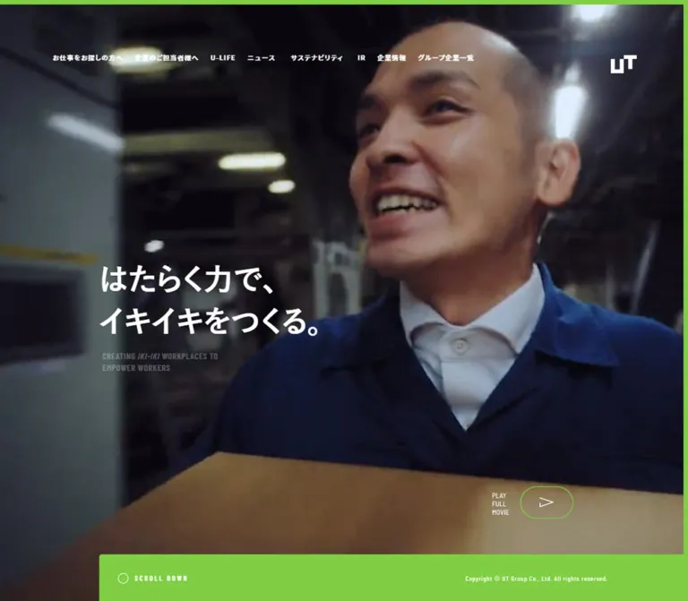
Photographic Hero
Role: connect the corporate promise to recognizable people performing skilled work.
The current desktop image pairs a worker in a blue cap on the left with a worker wearing protective glasses on the right. Faces, hands, machinery, and protective clothing are closely cropped. The dividing edge descends diagonally from approximately x: 935px at the top to x: 540px near the lower edge of the main image.
White copy reads “はたらく力で、イキイキをつくる。” across two lines, with a small condensed English translation underneath. The headline sits around x: 216px, well inside the left photograph, rather than aligning with the main navigation's 108px edge.
Mobile recomposes the same subjects into upper and lower regions with a diagonal cut between them. The headline begins around x: 42px, y: 190px. This is more than a proportional desktop shrink: the composition preserves both people within a narrow, tall crop.
The supplied evidence does not establish whether this montage is one prepared image or multiple composited layers. A two-image CSS clipping approach is a recommended adaptation, not a claim about the original implementation.
Green Scroll Panel
Role: transition from the photographic opening to the long corporate page.
A broad green rectangle begins partway across the image and extends to the right edge. Its upper-left corner is subtly rounded. Inside, a small outlined circle precedes the widely tracked SCROLL DOWN label. Copyright information occupies the far right on desktop.
On mobile, the panel starts near y: 408px, overlaps the lower photograph, and ends around y: 530px. Its left edge aligns with the approximately 42px content gutter. The copyright moves beneath the scroll label, producing a compact cluster within a much larger green field.
The label suggests scrolling, but its click behavior and scroll duration were not tested.
Illustrated Promotional Banner
Role: introduce a more conversational editorial feature within the corporate opening.
The current banner uses cream paper, black hand-drawn linework, a speech bubble, and bold Japanese lettering including “人生酒場”. Its illustration depicts a bar setting. This is a self-contained artwork treatment; the rest of the interface does not adopt hand-drawn typography.
Desktop places the banner over the lower-right photograph, approximately x: 831px, y: 647px. Mobile moves it into the white content flow beneath the green panel, with about 25px of space above it. It precedes the NEWS heading.
Its destination and asset URL were not provided. Preserve it as artwork when the authorized asset is available; do not fabricate a source path or reconstruct its lettering with ordinary text.
Bilingual Section Heading
Role: give a long page clear editorial landmarks.
The DOM pairs small English labels with larger Japanese section names: NEWS, MISSION, U-LIFE, SUSTAINABILITY, and GROUP COMPANIES. The mobile opening visibly shows a green NEWS label above a large black “ニュース”.
The complete heading wrapper measures approximately 123.69px high on desktop and 73.13px on mobile for several sections. These are component heights, not font sizes. The visible mobile Japanese NEWS heading is approximately 36–40px, estimated from the screenshot.
Keep the English label separate from the Japanese title so its condensed proportions, tracking, and accent color can be controlled independently.
News Links
Role: present current corporate announcements and investor notices.
Three linked entries appear in the supplied DOM: one company announcement and two IR documents. Each entry groups category, date, and a bold multiline Japanese title. The desktop samples are arranged horizontally, with 423px link boxes and 274.5px title regions. Their sampled boxes slightly overlap, so they should not be treated as a clean source grid specification.
On mobile, the links stack within the 306.81px content width. Each reserves 37.44px on the left; title text occupies about 269.38px. News titles reduce from 23.4px to 18.72px, while retaining bold weight and 0.1em tracking.
The category is muted gray and condensed. The links are transparent and square-cornered in the measured styles. A separate “ニュース一覧をみる” link follows the group. Two supplied destinations are PDF files; their contents were not inspected.
Mission Statement
Role: articulate the corporate purpose in a deliberately paced reading block.
The section repeats the opening promise and follows it with a bold Japanese paragraph about career development and quality workplaces. The measured paragraph uses unusually generous leading: 41.4px for 14.4px type on desktop, and 31.2px for 13.52px type on mobile.
Explicit line breaks and 0.15em tracking give the statement a measured rhythm. Its container is broad, but the text itself is arranged as shorter lines. A “詳細を見る” link follows.
The DOM also includes large English mission wording. Its exact visible treatment is outside the supplied screenshots and should not be reconstructed solely from extracted text.
U-LIFE Story List
Role: give individual working lives an editorial presence within the corporate site.
Desktop uses a narrow introduction at x: 108px, width 252px, beside a much wider story column at x: 468px, width 864px. The 108px gap is as important as the columns themselves.
Each story link contains a small header with a two-digit number and date, a large bold Japanese headline, and a muted summary. The first measured desktop row is approximately 287px high; later rows are taller because of content. Titles use 36px / 50.4px, while summaries use 14.4px / 32.4px.
On mobile, the introduction and stories share the same 306.81px column. Titles become 27.04px / 41.6px; the first sampled headline spans three lines. Rows retain their metadata and summary instead of collapsing into title-only links.
Do not add story thumbnails merely because this is editorial content. The supplied evidence establishes the text structure, not a visible thumbnail treatment.
Audience Gateways and Outline Lettering
Role: separate the two principal commercial audiences.
The desktop capture shows a large white field with pale outlined English lettering extending beyond the viewport edges. FOR JOB SEEKERS and FOR CLIENTS appear as oversized background phrases. Smaller green labels and bold black Japanese headings identify the two gateways near the bottom of the capture.
The gateway labels measure 18px, with 0.12em tracking. Japanese headings measure 36px. Desktop heading containers are approximately 574px and 552px wide. Mobile samples share an approximately 291.72px width at x: 49.14px and occur one after the other vertically; Japanese headings reduce to 21.84px.
The captured white field is unusually sparse. It is evidence of the recorded state, not proof that every intended reveal has completed. No continuous marquee direction or speed is established. The DOM's separate repeated IKIIKI text should not automatically be assigned to the same visual layer.
Sustainability Section
Role: connect the workforce mission to equal opportunity and fair treatment.
The DOM establishes a bilingual heading, a white Japanese paragraph, and a detail link. Desktop text begins at x: 198px, inset further than the standard 108px grid. On mobile, it returns to the standard 41.59px gutter.
The supplied screenshots do not show the section's background. White text alone cannot establish whether the original uses photography, a solid fill, or another treatment. Recover that artwork or inspect that section before claiming a specific background design.
Group-Company Modules
Role: make the group structure and service coverage navigable.
Eight companies are represented in the extracted content. Entries combine a logo, company name, short business description, and service labels such as staffing, contracting, BPO, or recruitment. These labels describe services; filtering behavior is not evidenced.
Sampled desktop links are approximately 374.39 × 328.5px, with 45px 48.6px padding and a flex layout. Mobile links are approximately 306.8px wide, with content-dependent heights of roughly 165–226px and about 31px internal padding. Sampled logo wrappers reduce from 94.5px to 49.39px wide.
These elements were measured far offscreen. Their text, local dimensions, and square corners are usable evidence, but the complete settled desktop arrangement, carousel controls, and entrance behavior are unverified.
Sitemap Footer
Role: offer comprehensive navigation and a clear visual endpoint.
A deep navy field contains branding, copyright, language, search, contact, legal links, and grouped site navigation. In the desktop screenshot, utility content begins near x: 108px; navigation groups begin around x: 464px, 768px, and 1073px.
Section headings are white and relatively bold. Secondary links are gray and widely spaced vertically. Fine horizontal rules introduce selected groups, with a short green segment at the beginning. A job-site banner appears within the job-seeker group.
Mobile preserves a narrow identity and utility rail at the left. The long navigation column starts at x: 166.41px and is only 182px wide. Long Japanese labels wrap naturally within this column. Legal links follow beneath the navigation on the right, leaving substantial empty navy space to the left in the bottom capture.
The green PAGE TOP block sits at the lower left: approximately 358 × 108px in the desktop bottom capture and 109 × 62px on mobile. Its label is small, white, uppercase, and condensed. The screenshots do not establish whether this control is fixed, sticky, or positioned within the footer.
Tokens — Motion & Interaction
| Element | Measured declaration or visual evidence | What can be concluded |
|---|---|---|
| Several desktop utility links | opacity 0.6s |
Opacity changes are configured; the trigger and final opacity were not tested. |
| Search control and button | 0.6s cubic-bezier(0.26, 0.06, 0, 1) |
A 600ms transition is configured; its changed properties are not established here. |
| News links | 0.6s cubic-bezier(0.26, 0.06, 0, 1) |
Shared transition timing is measured; a specific hover movement is not. |
| Audience labels and headings | 0.75s cubic-bezier(0.26, 0.06, 0, 1) |
A slower 750ms transition is configured. Reveal distance and trigger are unknown. |
| Header appearance | White over the opening; black over white content | Two visible contextual states exist. Threshold and transition timing are unverified. |
| SCROLL DOWN / PAGE TOP | Visible labels and controls | Intended navigation direction is clear; activation behavior is untested. |
| Offscreen company modules | Large horizontal offsets in the sampled rectangles | Transformed or otherwise displaced geometry exists; this does not prove a carousel or a particular entrance effect. |
Many elements report animation: none. This does not exclude JavaScript-driven transforms, animations on unsampled descendants, or media playback. Conversely, a transition: all entry without an effective duration is not evidence of a visible animation.
The current supplied opening captures show the photographic montage. No current video element, playback control, autoplay behavior, or movie interaction is established by this evidence.
Recommended adaptation: retain the measured easing for restrained opacity and transform transitions, but make content visible by default. Do not require a scroll animation to reveal essential navigation or text. Provide a reduced-motion path with static imagery and immediate state changes.
Surfaces
| Surface | Appearance | Purpose and confidence |
|---|---|---|
| Opening | Cool industrial photography with white text | Visually observed; exact compositing and overlay values are unknown. |
| Brand frame | Narrow green top and right strips | Visually observed in the opening and white desktop section. |
| Scroll panel | Large solid green rectangle | Visually observed; slight corner rounding. |
| Main content | White, spacious, mostly unboxed | Visually observed in supplied content captures; supported by transparent content-link styles. |
| Promotional artwork | Cream with black illustration | Visually observed; confined to the banner. |
| Audience decoration | Very pale outlined lettering on white | Visually observed; exact stroke color and size are estimated. |
| Footer | Solid #151c2a with white headings and gray links |
Measured and visually observed. |
| Search submit | Green with white text and a small radius | Measured; the opened search state was not visually inspected. |
There is no evidenced general shadow or raised-card system. Reproduce hierarchy through image scale, blank space, text weight, and contrasting section fields.
Imagery
The opening is documentary in subject and dramatic in crop. Emphasize skilled work through faces, hands, tools, protective glasses, caps, gloves, and machinery. Cool blue workwear and greenish industrial surroundings allow the green brand surface to remain distinct.
The diagonal joins two human perspectives. It should preserve faces and the action of working, not arbitrarily cut through identifying features. Mobile needs a separately considered composition because a centered desktop crop would lose one of the two workers.
The overall image appears subdued enough for white lettering. Exact filters or overlay opacity were not supplied. Start from appropriately graded photography and test text contrast over the actual crop; do not assume a particular CSS filter was used.
The illustrated banner provides a deliberate change of texture. Keep its cream paper, thick black lettering, and hand-drawn lines inside the artwork boundary. Interface icons remain thin and geometric: the supplied DOM contains inline SVG logo and utility graphics, including globe, person, contact, and search forms.
Observed Asset References
| Asset | Evidence | Implementation guidance |
|---|---|---|
| Worker montage | Current desktop and mobile opening screenshots | Original file URL not supplied; use authorized responsive artwork. |
| UT brand mark | Inline SVG fragments in the rendered DOM and visible header/footer logos | Preserve the actual mark; do not typeset it as ordinary U and T characters. |
| Utility icons | Inline SVG fragments and visible header/footer controls | Match thin strokes and compact optical size. |
| Illustrated editorial banner | Current desktop and mobile opening screenshots | Preserve lettering and illustration together. |
| Job-site banner | Current desktop footer screenshot and associated link text | The linked destination is evidenced; the image file URL is not. |
| Company logos | Inline SVG content within group-company links | Logo presence is established; complete asset definitions are not included. |
No reliable image-file paths were supplied. The Quick Start therefore uses semantic image slots rather than invented asset URLs.
Layout & Responsive Behavior
Desktop Structure
The repeated 108px gutter produces an 1224px content span at 1440px. The opening headline uses a deeper inset, while the promotional banner occupies the lower-right region. The hero's offset green panel leaves a strip of photograph exposed at the lower left.
News is arranged across the page. U-LIFE uses a narrow introduction beside a broad story list. Audience gateways sit side by side. The footer distributes utilities and navigation across several columns. These relationships create variety without relying on different card styles for every section.
Mobile Structure
At 390px, the common content gutter is approximately 41.6px, or 10.67% of the viewport. This remains generous for a phone and leaves an approximately 306.8px reading column.
The opening changes in several concrete ways:
- The desktop navigation becomes MENU plus a smaller logo.
- The two-worker image becomes a vertically organized diagonal composition.
- The headline moves to the standard mobile gutter.
- The green scroll panel overlaps the photograph and carries copyright beneath its label.
- The promotional banner moves below the panel into normal content flow.
- NEWS becomes visible within the initial
844pxscreenshot, while its first item starts just below the captured lower edge.
News and stories stack vertically. Audience headings become smaller and their groups occur sequentially. The footer retains a left utility rail and a narrow right navigation column instead of centering every item.
Measurement Limits
The supplied desktop documentHeight is 10695px. The mobile snapshot reports 10335px, while its root/body rectangles and some later element coordinates disagree with that figure. These inconsistencies make absolute lower-page positions unsuitable for recreating section heights.
Only two viewport widths were inspected. Neither the original breakpoints nor a continuous fluid sizing formula can be recovered from them. Any intermediate-width rules in the Quick Start are recommended interpolation, not original CSS.
The mostly empty desktop audience capture should be documented as captured. It should not be used to invent missing photography, an animation timeline, or an intentional full-screen blank section.
Do’s and Don’ts
Do
- Keep the measured green
#7fce43and navy#151c2acentral to the system. - Preserve the asymmetry of the green perimeter, offset scroll panel, and footer.
- Use close, human working scenes with a deliberate diagonal composition.
- Recompose the hero for mobile so both people remain meaningful.
- Pair substantial Japanese sans-serif headings with narrow, tracked English labels.
- Retain generous gutters and the unusually open mission-paragraph leading.
- Preserve separate job-seeker, client, investor, and corporate information routes.
- Keep news categories, dates, and story numbering subordinate to titles.
- Move the illustrated banner into the mobile content flow.
- Distinguish measured component dimensions from uncertain offscreen positions.
Don’t
- Don't flatten the corporate homepage into a single-action campaign page.
- Don't turn every information group into a rounded, shadowed card.
- Don't replace the worker montage with an unrelated office stock photograph.
- Don't use the hero wrapper's inherited font size as the visible headline size.
- Don't treat hidden navigation text as an open-menu screenshot.
- Don't infer a video player or carousel from imagery or displaced rectangles alone.
- Don't make pale decorative lettering compete with foreground headings.
- Don't extend the banner's illustrated style to the entire interface.
- Don't use administrative blue custom properties as public brand colors.
- Don't hardcode inconsistent lower-page coordinates as layout spacing.
Recommended Implementation Additions
These are recommendations for a new implementation, not verified features of the original:
- Preserve the visual hierarchy while increasing small text and touch targets where needed. A small icon may sit inside a larger, at least
44pxinteraction area. - Audit green-on-white labels, white-on-green controls, and muted gray summaries.
#b4b4b4on white is too light for ordinary body text; a darker functional gray can preserve hierarchy while improving readability. - Give MENU a real button, an accessible name, and an expanded state. When its panel is closed, remove its links from keyboard navigation.
- Use buttons for search disclosure and links for destinations. Keep visible focus states on both dark and light surfaces.
- Give repeated “詳細を見る” links contextual accessible names.
- Mark oversized outline lettering as decorative so it does not duplicate the meaningful audience headings.
- Keep news dates machine-readable, and identify document links when they open a PDF.
- Ensure essential content remains available without entrance animations. Respect reduced-motion preferences.
- Supply image dimensions and responsive image sources to prevent the hero and promotional banner from shifting after load.
Agent Prompt Guide
Quick Color Reference
- Brand green:
#7fce43. - Footer navy:
#151c2a. - Main text:
#000000. - Reversed text:
#ffffff. - Observed secondary gray:
#b4b4b4; consider a darker accessible equivalent for long reading text. - Body substrate:
#f1f1f1, underneath predominantly white visible content. - Outline lettering: approximately
#e8e8e8, with an intentionally faint stroke.
Overall Prompt
“Create a Japanese corporate homepage for a workforce-services group, inspired by the current UT Group reference. Open with close-up industrial worker photography joined by a diagonal cut, a bold two-line white Japanese promise, and a small condensed English translation. Use lime green #7fce43 as a thin top/right perimeter and a large scroll panel offset from the left. Place the logo at the upper right and use two compact navigation tiers on desktop. Follow with spacious white sections for news, mission, employee stories, audience gateways, sustainability, and group companies. Pair Noto Sans JP content typography with Barlow Condensed labels. Finish with a deep navy #151c2a sitemap footer. Preserve the information hierarchy and avoid inventing unseen media or navigation behavior.”
Example Component Prompts
- Opening composition: “Create an asymmetric corporate hero with two close-up worker photographs separated by a strong diagonal. Keep white Japanese copy in two lines over the left-middle region. Add a thin green top/right frame and a green scroll slab beginning around one sixth of the desktop width. Use supplied authorized photographs; keep the source of each crop explicit.”
- Mobile opening: “At a 390px reference width, use approximately 42px content gutters, a MENU control at upper left, and a 43px-wide logo at upper right. Recompose the worker images vertically, place the headline near y=190px, and overlap the lower photo with a green panel starting near y=408px. Place the illustrated banner below the panel in normal flow.”
- News group: “Build three transparent news links across the desktop content area and stack them on mobile. Each contains a muted category, date, and bold Japanese title. Use approximately 23.4px/36px desktop titles and 18.72px/29.2px mobile titles with 0.1em tracking. Keep corners square and avoid elevation.”
- Story list: “Use a 252px introduction column, a 108px gap, and an 864px story column at a 1440px viewport. Each story has a two-digit number, date, large Japanese headline, and gray summary. Stack everything inside a roughly 307px column on a 390px phone.”
- Audience gateways: “Present job-seeker and client links as two centered typographic groups on white, with small green condensed English labels and bold black Japanese headings. Place very pale oversized outline lettering behind the section. Keep decoration static unless a separate motion specification is supplied.”
- Footer: “Create a navy sitemap with white headings, gray links, thin dividers, and short green rule accents. On mobile, retain a narrow left branding rail and a right navigation column beginning around x=166px at a 390px viewport. Place a green PAGE TOP block at the lower left.”
Quick Start
CSS Custom Properties
This is a recommended implementation scaffold, not recovered source CSS. It preserves measured colors and several local type and spacing values. It uses a conventional root font size, estimated hero geometry, normalized grids, and explicit recommended breakpoints.
Place the upper page inside .ut-frame, with the footer outside it. An .ut-intro contains .ut-hero followed by .ut-promo. Inside the hero, provide .ut-scene with two authorized images, .ut-hero__copy, and .ut-scroll-panel. The promotional element is overlaid on desktop and returns to document flow on mobile.
Load the evidenced fonts separately when authorized. This CSS declares their names but does not invent font-file URLs. Navigation disclosure, search, and contextual header-state logic require application code; their original behavior is unverified.
:root {
  /* Measured colors, with one estimated decorative color. */
  --ut-green: #7fce43;
  --ut-navy: #151c2a;
  --ut-white: #ffffff;
  --ut-ink: #000000;
  --ut-muted: #b4b4b4;
  --ut-substrate: #f1f1f1;
  --ut-outline: #e8e8e8;

  /* Recommended accessible alternative for long summaries. */
  --ut-readable-muted: #666666;

  --ut-font-base: YuGothic, '游ゴシック',
    'Hiragino Kaku Gothic ProN', 'Hiragino Sans', Meiryo, sans-serif;
  --ut-font-jp: 'Noto Sans JP', var(--ut-font-base);
  --ut-font-latin: 'Barlow Condensed', var(--ut-font-base);

  /* Matches the measured desktop gutter at 1440px. */
  --ut-gutter: 7.5vw;
  --ut-frame-width: 7px;
  --ut-news-size: 23.4px;
  --ut-news-leading: 36px;
  --ut-story-size: 36px;
  --ut-story-leading: 50.4px;
  --ut-copy-size: 14.4px;
  --ut-copy-leading: 32.4px;
  --ut-label-size: 18px;
  --ut-audience-size: 36px;

  --ut-ease: cubic-bezier(0.26, 0.06, 0, 1);
  --ut-transition: 600ms var(--ut-ease);
  --ut-emphasis-transition: 750ms var(--ut-ease);
}

* { box-sizing: border-box; }

body {
  margin: 0;
  color: var(--ut-ink);
  background: var(--ut-substrate);
  font-family: var(--ut-font-base);
  line-height: 1.6;
}

img { display: block; max-width: 100%; }
button, input { font: inherit; }
a { color: inherit; }

.ut-frame {
  position: relative;
  background: var(--ut-white);
}

.ut-frame::before,
.ut-frame::after {
  content: '';
  position: absolute;
  z-index: 30;
  background: var(--ut-green);
  pointer-events: none;
}

.ut-frame::before {
  inset: 0 0 auto;
  height: var(--ut-frame-width);
}

.ut-frame::after {
  inset: 0 0 0 auto;
  width: var(--ut-frame-width);
}

.ut-content { margin-inline: var(--ut-gutter); }

/* Opening header only; persistent behavior needs separate logic. */
.ut-header {
  position: absolute;
  inset: 0 0 auto;
  z-index: 20;
  height: 137.47px;
  padding: 46.8px var(--ut-gutter) 0;
  color: var(--ut-white);
}

.ut-header[data-surface='light'] {
  color: var(--ut-ink);
  background: var(--ut-white);
}

.ut-header__utility {
  display: flex;
  justify-content: flex-end;
  gap: 18px;
  padding-right: 10.3vw;
  font-size: 12.6px;
  font-weight: 700;
  line-height: 18px;
}

.ut-header__main {
  display: flex;
  align-items: center;
  gap: 36px;
  margin-top: 19.7px;
}

.ut-header__main a {
  font-family: var(--ut-font-jp);
  font-size: 13.5px;
  font-weight: 700;
  line-height: 1;
  letter-spacing: 0.1em;
  text-decoration: none;
  white-space: nowrap;
}

.ut-header__logo {
  position: absolute;
  top: 86.3px;
  right: 7.3vw;
  width: 53.1px;
}

.ut-menu-button {
  display: none;
  min-width: 44px;
  min-height: 44px;
  padding: 0;
  border: 0;
  color: inherit;
  background: transparent;
  font-family: var(--ut-font-latin);
}

.ut-intro { position: relative; }
.ut-hero { position: relative; min-height: 100svh; }

.ut-scene {
  position: absolute;
  inset: var(--ut-frame-width) var(--ut-frame-width) 0 0;
  overflow: hidden;
  background: var(--ut-navy);
}

.ut-scene img {
  position: absolute;
  inset: 0;
  width: 100%;
  height: 100%;
  object-fit: cover;
}

/* Estimated composition; tune focal points to the actual assets. */
.ut-scene__secondary {
  clip-path: polygon(65% 0, 100% 0, 100% 100%, 35% 100%);
}

.ut-hero__copy {
  position: absolute;
  top: 42svh;
  left: 15vw;
  z-index: 2;
  color: var(--ut-white);
}

.ut-hero__copy h1 {
  margin: 0;
  font-family: var(--ut-font-jp);
  font-size: clamp(48px, 4.25vw, 64px);
  font-weight: 700;
  line-height: 1.4;
}

.ut-hero__translation {
  margin-top: 20px;
  font-family: var(--ut-font-latin);
  font-size: 16px;
  line-height: 1.5;
  letter-spacing: 0.04em;
}

.ut-scroll-panel {
  position: absolute;
  z-index: 3;
  right: 0;
  bottom: 0;
  left: 16vw;
  display: flex;
  align-items: center;
  justify-content: space-between;
  gap: 24px;
  min-height: 95px;
  padding: 26px 11.5vw 26px 38px;
  border-radius: 6px 0 0;
  color: var(--ut-white);
  background: var(--ut-green);
}

.ut-scroll-link {
  display: inline-flex;
  align-items: center;
  gap: 14px;
  min-height: 44px;
  font-family: var(--ut-font-latin);
  font-size: 14px;
  font-weight: 600;
  letter-spacing: 0.2em;
  text-decoration: none;
}

.ut-scroll-link::before {
  content: '';
  width: 22px;
  height: 22px;
  border: 1px solid currentColor;
  border-radius: 50%;
}

.ut-copyright {
  margin: 0;
  font-family: var(--ut-font-latin);
  font-size: 10.8px;
  letter-spacing: 0.12em;
}

.ut-promo {
  position: absolute;
  z-index: 4;
  top: 64.7svh;
  right: 4.8vw;
  width: 37.5vw;
}

.ut-promo img { width: 100%; height: auto; }

/* Section spacing and title size are recommended approximations. */
.ut-section { padding-block: 120px; }

.ut-eyebrow {
  margin: 0 0 24px;
  color: var(--ut-green);
  font-family: var(--ut-font-latin);
  font-size: var(--ut-label-size);
  font-weight: 600;
  line-height: 1;
  letter-spacing: 0.12em;
}

.ut-section-title {
  margin: 0 0 80px;
  font-family: var(--ut-font-jp);
  font-size: clamp(36px, 4vw, 58px);
  font-weight: 700;
  line-height: 1.3;
}

.ut-news-grid {
  display: grid;
  grid-template-columns: repeat(3, minmax(0, 1fr));
}

/* Normalized grid insets; see the table for measured source insets. */
.ut-news-link {
  display: block;
  padding-inline: 63px;
  text-decoration: none;
  transition: opacity var(--ut-transition);
}

.ut-meta {
  display: flex;
  flex-wrap: wrap;
  gap: 12px;
  color: var(--ut-muted);
  font-family: var(--ut-font-latin);
  font-size: 14.4px;
  font-weight: 600;
  line-height: 1;
  letter-spacing: 0.06em;
}

.ut-news-link h3 {
  margin: 24px 0 0;
  font-family: var(--ut-font-jp);
  font-size: var(--ut-news-size);
  line-height: var(--ut-news-leading);
  letter-spacing: 0.1em;
}

.ut-mission-copy {
  font-family: var(--ut-font-jp);
  font-size: 14.4px;
  font-weight: 700;
  line-height: 41.4px;
  letter-spacing: 0.15em;
}

.ut-story-layout {
  display: grid;
  grid-template-columns: 252px minmax(0, 1fr);
  gap: 108px;
}

.ut-story-intro {
  margin: 0;
  font-family: var(--ut-font-jp);
  font-size: var(--ut-copy-size);
  font-weight: 500;
  line-height: var(--ut-copy-leading);
  letter-spacing: 0.15em;
}

.ut-story-link {
  display: block;
  padding-block: 28.8px 49.5px;
  text-decoration: none;
}

.ut-story-link h3 {
  margin: 13px 0 16px;
  font-family: var(--ut-font-jp);
  font-size: var(--ut-story-size);
  line-height: var(--ut-story-leading);
  letter-spacing: 0.1em;
}

.ut-story-summary {
  margin: 0;
  color: var(--ut-readable-muted);
  font-family: var(--ut-font-jp);
  font-size: var(--ut-copy-size);
  line-height: var(--ut-copy-leading);
  letter-spacing: 0.1em;
}

.ut-audience-grid {
  display: grid;
  grid-template-columns: repeat(2, minmax(0, 1fr));
  gap: 6vw;
  text-align: center;
}

.ut-audience-grid h3 {
  font-family: var(--ut-font-jp);
  font-size: var(--ut-audience-size);
  line-height: 1.2;
}

.ut-outline-type {
  overflow: hidden;
  color: transparent;
  font-family: var(--ut-font-latin);
  font-size: clamp(96px, 12vw, 176px);
  font-weight: 600;
  line-height: 1;
  white-space: nowrap;
  -webkit-text-stroke: 1px var(--ut-outline);
}

.ut-footer {
  position: relative;
  display: grid;
  grid-template-columns: 250px minmax(0, 1fr);
  grid-template-areas: 'identity nav' 'policies nav';
  gap: 60px 106px;
  padding: 126px var(--ut-gutter) 170px;
  color: var(--ut-white);
  background: var(--ut-navy);
}

.ut-footer__identity { grid-area: identity; }
.ut-footer__policies { grid-area: policies; }

.ut-footer__nav {
  grid-area: nav;
  display: grid;
  grid-template-columns: repeat(3, minmax(0, 1fr));
  gap: 68px 48px;
}

.ut-footer__group {
  position: relative;
  padding-top: 22px;
  border-top: 1px solid rgb(255 255 255 / 16%);
}

.ut-footer__group::before {
  content: '';
  position: absolute;
  top: -1px;
  left: 0;
  width: 18px;
  height: 1px;
  background: var(--ut-green);
}

.ut-footer h3 { margin: 0 0 24px; font-size: 14px; }
.ut-footer ul { margin: 0; padding: 0; list-style: none; }

.ut-footer li a {
  color: var(--ut-muted);
  font-size: 12.48px;
  font-weight: 500;
  line-height: 29.12px;
  letter-spacing: 0.02em;
  text-decoration: none;
  overflow-wrap: anywhere;
}

.ut-page-top {
  position: absolute;
  bottom: 0;
  left: 0;
  display: grid;
  place-items: center;
  width: 25vw;
  min-height: 108px;
  color: var(--ut-white);
  background: var(--ut-green);
  font-family: var(--ut-font-latin);
  font-size: 14px;
  font-weight: 600;
  letter-spacing: 0.16em;
  text-decoration: none;
}

/* Recommended focus and hover behavior; original endpoints untested. */
a:focus-visible,
button:focus-visible {
  outline: 2px solid currentColor;
  outline-offset: 5px;
}

@media (hover: hover) {
  .ut-news-link:hover { opacity: 0.72; }
  .ut-footer li a:hover { color: var(--ut-white); }
}

/* Recommended navigation breakpoint, not an observed source value. */
@media (max-width: 80rem) {
  .ut-header__utility,
  .ut-header__main { display: none; }
  .ut-menu-button { display: inline-grid; place-items: center; }
  .ut-header__logo { top: 42px; }
  .ut-footer { column-gap: 48px; }
  .ut-footer__nav { grid-template-columns: repeat(2, minmax(0, 1fr)); }
}

/* Recommended mobile breakpoint; values target the 390px capture. */
@media (max-width: 48rem) {
  :root {
    --ut-gutter: 10.6667vw;
    --ut-news-size: 18.72px;
    --ut-news-leading: 29.2032px;
    --ut-story-size: 27.04px;
    --ut-story-leading: 41.6px;
    --ut-copy-size: 13.52px;
    --ut-copy-leading: 26px;
    --ut-label-size: 14.56px;
    --ut-audience-size: 21.84px;
  }

  .ut-header {
    height: 93.6px;
    padding: 35px var(--ut-gutter) 0;
  }

  .ut-header__logo {
    top: 41.6px;
    right: var(--ut-gutter);
    width: 42.6px;
  }

  .ut-hero { min-height: 0; height: 135.9vw; }
  .ut-scene { bottom: auto; height: 118.46vw; }

  .ut-scene__secondary {
    clip-path: polygon(100% 20%, 100% 100%, 0 100%, 0 80%);
  }

  .ut-hero__copy { top: 47.8vw; left: var(--ut-gutter); }
  .ut-hero__copy h1 { font-size: 8.27vw; line-height: 1.4; }
  .ut-hero__translation { margin-top: 16px; font-size: 11px; }

  .ut-scroll-panel {
    top: 104.6vw;
    bottom: auto;
    left: var(--ut-gutter);
    display: block;
    min-height: 31.3vw;
    padding: 22px 32px;
  }

  .ut-scroll-link { font-size: 12px; letter-spacing: 0.08em; }
  .ut-copyright { margin-left: 36px; font-size: 10px; }

  .ut-promo {
    position: static;
    width: 80vw;
    margin: 25px 0 40px var(--ut-gutter);
  }

  .ut-section { padding-block: 72px; }
  .ut-section--news { padding-top: 0; }
  .ut-section-title { margin-bottom: 64px; font-size: 38px; }

  .ut-news-grid { grid-template-columns: 1fr; gap: 36.4px; }
  .ut-news-link { padding: 0 0 0 37.44px; }
  .ut-meta { font-size: 12.48px; }
  .ut-news-link h3 { margin-top: 14.5px; }

  .ut-mission-copy { font-size: 13.52px; line-height: 31.2px; }
  .ut-story-layout { grid-template-columns: 1fr; gap: 52px; }
  .ut-story-intro { font-size: 14.56px; line-height: 26px; }
  .ut-story-link { padding-block: 26px 24.44px; }
  .ut-audience-grid { grid-template-columns: 1fr; gap: 96px; }

  .ut-footer {
    grid-template-columns: 124.8px minmax(0, 1fr);
    grid-template-areas: 'identity nav' '. policies';
    gap: 52px 0;
    padding: 124.8px var(--ut-gutter) 106.08px;
  }

  .ut-footer__nav { grid-template-columns: 1fr; gap: 36px; }
  .ut-footer__group::before { width: 10px; }

  .ut-page-top {
    width: 28vw;
    min-height: 62.4px;
    border-radius: 0 5px 0 0;
    font-size: 12px;
    letter-spacing: 0.04em;
  }
}

@media (prefers-reduced-motion: reduce) {
  .ut-frame *,
  .ut-footer * {
    animation: none !important;
    transition: none !important;
    scroll-behavior: auto !important;
  }
}
The estimated hero geometry targets the two supplied captures. Test other phone widths, text zoom, and translated copy before production use. The scaffold intentionally leaves unverified sustainability artwork and company-module behavior unspecified.
Tailwind v4 Token Mapping
Optional aliases for a project already using Tailwind v4. This does not imply that the original website uses Tailwind. Define the custom properties above first.
@theme inline {
  --color-brand: var(--ut-green);
  --color-footer: var(--ut-navy);
  --color-ink: var(--ut-ink);
  --color-page: var(--ut-white);
  --color-muted-source: var(--ut-muted);
  --color-muted-readable: var(--ut-readable-muted);
  --color-outline: var(--ut-outline);

  --font-japanese: var(--ut-font-jp);
  --font-condensed: var(--ut-font-latin);

  --text-news: var(--ut-news-size);
  --text-story: var(--ut-story-size);
  --text-copy: var(--ut-copy-size);
  --text-label: var(--ut-label-size);

  --spacing-page-gutter: var(--ut-gutter);
  --spacing-frame: var(--ut-frame-width);
}
Sources & Evidence
- UT Group Japanese homepage: original and final inspected URL; supplied HTTP status
200. Page title and copyright independently identify UT Group Co., Ltd. - Capture timestamp:
2026-10-04T21:05:52.428Z, equivalent to October 5, 2026, 06:05:52.428 JST. - Desktop evidence: 1440 × 1000 CSS-pixel opening, audience-section, and footer screenshots; rendered text, links, element rectangles, computed fonts, colors, padding, radii, and transition declarations.
- Mobile evidence: 390 × 844 CSS-pixel opening and footer screenshots, together with the supplied mobile DOM and computed-style samples.
- Capture procedure: the supplied browser observation included at least five seconds of initial observation, bounded readiness checks for layout and images, and scrolling through intermediate positions. Perpetual animations were temporarily paused during readiness checks and resumed. SharedWorkers and service workers were disabled.
- Observed states: photographic opening, contextual desktop header appearances, mobile MENU affordance, white audience section, and navy footer. No menu, search, media, hover, or page-top activation was supplied as an exercised interaction.
- Limitations: screenshots do not cover every middle-page section. Font declarations do not prove individual font-file resolution. Hero asset paths and detailed compositing are unavailable. Offscreen rectangles and inconsistent mobile document coordinates prevent reliable reconstruction of complete motion or absolute section positions.
This reference describes the current supplied homepage evidence. Estimates, accessible adaptations, and reusable CSS are explicitly separated from measured original-page values.
# UT Group — Style Reference

> Close-up working lives, a vivid green frame, and an expansive corporate information system.

**Website:** [www.ut-g.co.jp](https://www.ut-g.co.jp/)
**Original URL:** https://www.ut-g.co.jp/
**Final URL:** https://www.ut-g.co.jp/
**Theme:** predominantly white content, photographic opening, lime-green accents, and a deep navy footer.
**Inspected:** supplied browser capture dated October 5, 2026, 06:05:52 JST; October 4, 2026, 21:05:52.428 UTC.
**Viewports:** desktop 1440 × 1000 CSS pixels; mobile 390 × 844 CSS pixels.
**Scope:** the current Japanese corporate homepage. Visual evidence covers the desktop opening, an audience-navigation section, desktop footer, mobile opening, and mobile footer. Rendered DOM evidence additionally covers news, mission, U-LIFE stories, sustainability, group companies, and navigation structures. Menu opening, search, hover effects, and destination pages were not exercised.

UT Group places working people at the center of its identity. The opening fills the screen with closely cropped industrial photography, divided by a strong diagonal. White Japanese copy crosses that photographic field, while a bright green perimeter and an offset green scroll panel give the composition a recognizable architectural shape. Small condensed English labels provide a precise counterpoint to the broad Japanese lettering.

The homepage serves several audiences: job seekers, client companies, readers, investors, and visitors seeking corporate information. Its long sequence combines corporate announcements, a mission statement, employee stories, audience gateways, sustainability, and group-company information. White sections use generous space and strong typographic hierarchy. A substantial navy sitemap closes the page, retaining an unusually asymmetric arrangement even on mobile.
閉じる
# UT Group — Style Reference

> Close-up working lives, a vivid green frame, and an expansive corporate information system.

**Website:** [www.ut-g.co.jp](https://www.ut-g.co.jp/)
**Original URL:** https://www.ut-g.co.jp/
**Final URL:** https://www.ut-g.co.jp/
**Theme:** predominantly white content, photographic opening, lime-green accents, and a deep navy footer.
**Inspected:** supplied browser capture dated October 5, 2026, 06:05:52 JST; October 4, 2026, 21:05:52.428 UTC.
**Viewports:** desktop 1440 × 1000 CSS pixels; mobile 390 × 844 CSS pixels.
**Scope:** the current Japanese corporate homepage. Visual evidence covers the desktop opening, an audience-navigation section, desktop footer, mobile opening, and mobile footer. Rendered DOM evidence additionally covers news, mission, U-LIFE stories, sustainability, group companies, and navigation structures. Menu opening, search, hover effects, and destination pages were not exercised.

UT Group places working people at the center of its identity. The opening fills the screen with closely cropped industrial photography, divided by a strong diagonal. White Japanese copy crosses that photographic field, while a bright green perimeter and an offset green scroll panel give the composition a recognizable architectural shape. Small condensed English labels provide a precise counterpoint to the broad Japanese lettering.

The homepage serves several audiences: job seekers, client companies, readers, investors, and visitors seeking corporate information. Its long sequence combines corporate announcements, a mission statement, employee stories, audience gateways, sustainability, and group-company information. White sections use generous space and strong typographic hierarchy. A substantial navy sitemap closes the page, retaining an unusually asymmetric arrangement even on mobile.

## How to Read This Reference

- **Measured** means a value appears directly in the supplied rendered DOM or computed-style evidence. Measurements apply to the stated viewport and sampled state.
- **Estimated** means a dimension or color is judged from the current screenshots. These values are approximate, not extracted source declarations.
- **Recommended** means an implementation choice for a new project. Breakpoints, accessibility improvements, and the Quick Start are recommendations unless explicitly identified otherwise.
- **Token names** are descriptive aliases introduced here. The supplied custom-property list does not expose the site's public design-token system.
- **Visibility matters:** navigation descendants have measured boxes even when their menus are not visibly open. A computed rectangle does not establish that an element was visible to the visitor.
- **Geometry has limits:** some mobile elements lie beyond the reported document height, and some company links have far-offscreen horizontal coordinates. Their local typography and padding are useful; their absolute positions cannot establish a settled page layout or animation sequence.

## Tokens — Colors

### Default Palette

| Name | Value | Suggested token | Evidence and role |
| --- | --- | --- | --- |
| UT Green | `#7fce43` | `--ut-green` | Measured on audience labels and search-button fills; visually corresponds to the perimeter, scroll panel, and page-top block. |
| Footer Navy | `#151c2a` | `--ut-navy` | Measured mobile footer background; the desktop footer has the same visual treatment. |
| White | `#ffffff` | `--ut-white` | Measured reversed text and SVG fills; the principal content panels also appear white in the screenshots. Their panel background declarations were not supplied. |
| Black | `#000000` | `--ut-ink` | Measured news headings, story headings, and main content text. |
| Muted Gray | `#b4b4b4` | `--ut-muted` | Measured news categories, story summaries, and footer links. |
| Body Substrate | `#f1f1f1` | `--ut-substrate` | Measured body background at both viewports. This does not mean every visible section is gray. |
| Outline Gray | Approximately `#e8e8e8` | `--ut-outline` | Estimated from the very faint oversized lettering in the desktop audience capture. |
| Banner Cream | Approximately `#f6f3e8` | Asset-specific | Estimated from the illustrated promotional banner. It belongs to that artwork, not the general page palette. |

Green has two scales of use: fine identifying marks and very large structural surfaces. It appears as small uppercase labels and short rule accents, but also as the broad opening scroll panel. Preserve that contrast in scale.

The navy footer is a section treatment, not evidence of a selectable dark theme. Likewise, white navigation over the opening photograph and black navigation over white content are contextual variants of the header.

The supplied administrative custom properties include blue values such as `--wp-admin-theme-color`. They are not evidence of a blue public-facing brand palette and should not enter a recreation's visual token set.

## Tokens — Typography

### Japanese Interface and Editorial Text

The measured base stack is:

`YuGothic, 游ゴシック, 'Hiragino Kaku Gothic ProN', 'Hiragino Sans', Meiryo, sans-serif`

Primary navigation, news titles, story titles, mission copy, and several other content elements prepend **Noto Sans JP** to that stack. Use the distinction intentionally: the larger Japanese editorial typography is bold and substantial, while supporting text remains compact.

Computed family declarations establish the requested stack, not which font file rendered every individual glyph.

### Condensed English Labels

**Barlow Condensed** is explicitly present in the measured stacks for audience labels, story numbers, news categories, copyright text, and English navigation-panel headings. Weight `600` is common for labels; the opening copyright uses `400`.

This condensed family gives small English text a tall, narrow profile. Uppercase labels use noticeably more tracking than ordinary Japanese text. It should remain a supporting voice rather than replacing Japanese headings.

### Hero and Section-Heading Caution

The sampled hero and section-heading wrappers inherit small base sizes, while their visible lettering is much larger. Inner text, SVGs, or other descendants were not separately measured. Do not use the wrapper's `12.6px` or `13.52px` font size as the rendered hero headline size.

The hero appears to use bold Japanese sans-serif lettering at approximately **60–64px on desktop** and **31–34px on mobile**. These are visual estimates. The exact family and weight of the visible hero lettering are not established by the wrapper measurement.

The root element reports `Times`, but visible content overrides it. There is no evidence of a browser-serif editorial system.

### Type Scale

Values below are measured unless marked as estimates. Size and line height are shown as `size / line-height`.

| Role | Desktop | Mobile | Weight and tracking |
| --- | --- | --- | --- |
| Root font size | `14.4px` | `16.64px` | Computational context only. |
| Base body style | `12.6 / 12.6px` | `13.52 / 13.52px` | `400`; individual components override this tight leading. |
| Primary navigation | `13.5 / 13.5px` | Replaced by MENU in the opening | `700`; generally `0.1em`, with NEWS at `0.16em`. |
| Desktop utility links | `12.6 / 12.6px` | Not displayed as the same opening row | `700`; normal tracking. |
| News category / story number | `14.4 / 14.4px` | `12.48 / 12.48px` | `600`; `0.06em`. |
| News title | `23.4 / 36px` | `18.72 / 29.2032px` | Noto Sans JP, `700`; `0.1em`. |
| Mission paragraph | `14.4 / 41.4px` | `13.52 / 31.2px` | Noto Sans JP, `700`; `0.15em`. |
| U-LIFE introduction | `14.4 / 32.4px` | `14.56 / 26px` | Noto Sans JP, `500`; `0.15em`. |
| Story headline | `36 / 50.4px` | `27.04 / 41.6px` | Noto Sans JP, `700`; `0.1em`. |
| Story summary | `14.4 / 32.4px` | `13.52 / 26.0001px` | Noto Sans JP, `400`; `0.1em`. |
| Audience English label | `18 / 18px` | `14.56 / 14.56px` | Barlow Condensed, `600`; `0.12em`. |
| Audience Japanese heading | `36 / 36px` | `21.84 / 21.84px` | Noto Sans JP, `700`; normal tracking. |
| Sustainability paragraph | `14.4 / 32.4px` | `13.52 / 23.92px` | Noto Sans JP, `500`; `0.15em`; white. |
| Footer secondary link | Not separately sampled | `12.48 / 29.12px` | Base Japanese stack, `500`; `0.02em`. |
| Hero headline | Approximately `60–64px` | Approximately `31–34px` | Estimated from screenshots; bold Japanese sans-serif. |

The desktop opening copyright is measured at `10.8px`, with `1.296px` tracking. On mobile, its declared size is `12.48px`, but its rendered box is only about `6.24px` high. The evidence does not resolve the cause of that discrepancy. Treat the screenshot's tiny visual size as an observation, not as a recommended reading size.

## Tokens — Spacing & Shapes

### Layout Measurements

| Element | Desktop, 1440px wide | Mobile, 390px wide | Status |
| --- | --- | --- | --- |
| Standard content left edge | `108px` | `41.59375px` | Measured. |
| Standard content width | `1224px` | `306.8125px` | Measured on section headings. |
| Content gutter ratio | `7.5%` | Approximately `10.67%` | Calculated from measured values; not a recovered CSS formula. |
| Header box height | `137.46875px` | `93.59375px` | Measured; includes transparent layout space. |
| Header logo wrapper width | `53.09375px` | `42.625px` | Measured; wrapper geometry is not necessarily artwork geometry. |
| Main navigation top | `84.484375px` | Not applicable to the closed mobile header | Measured. |
| Mobile logo position | — | `x: 305.78125px`, `y: 41.59375px` | Measured. |
| Opening headline left edge | Approximately `216px` | `41.59375px` wrapper edge | Desktop estimate agrees with the wrapper's additional `108px` left padding. |
| Green perimeter | Approximately `7px` on top and right | Approximately `7px` on top and right | Screenshot estimate. |
| Scroll-panel start | Approximately `x: 230px`, `y: 905px` | Approximately `x: 42px`, `y: 408px` | Screenshot estimate. |
| Promotional banner | Approximately `540 × 180px` | Approximately `312 × 111px` | Screenshot estimate; different aspect ratios may reflect responsive artwork or cropping. |
| Mobile footer navigation | — | `x: 166.40625px`, width `182px` | Measured. |
| Mobile footer padding | — | `124.8px` top, `106.08px` bottom | Measured. |

The desktop scroll panel extends beyond the supplied opening capture. About `95px` of its height is visible; its complete source height cannot be recovered from that screenshot.

### Component Spacing

| Use | Desktop | Mobile | Evidence |
| --- | --- | --- | --- |
| Primary navigation trailing padding | `36px` | — | Measured per navigation link. |
| News-link internal padding | `0 85.5px 0 63px` | `0 0 0 37.44px` | Measured. |
| Gap between mobile news links | — | Approximately `36.39px` | Calculated from adjacent measured boxes. |
| Detail-link leading space | `54px` | `36.92px` | Measured left padding; the exact decorative element was not sampled. |
| Story-row vertical padding | `28.8px` top, `49.5px` bottom | `26px` top, `24.44px` bottom | Measured. |
| U-LIFE introduction width | `252px` | `306.8125px` | Measured. |
| U-LIFE main-column width | `864px` | `306.8125px` | Measured. |
| U-LIFE inter-column space | `108px` | Columns stack | Calculated from measured horizontal positions. |
| Company-link padding | `45px 48.6px` | `31.2px 31.2px 30.16px` | Measured on offscreen samples. |

### Shape Language

Most sampled content links have `0px` border radius. The page relies on cropping, large rectangular fields, fine rules, and typography rather than rounded containers.

A measured search button uses `5.4px` radius on desktop and `3.12px` on mobile. The opening green panel and mobile page-top block also show small corner rounding, estimated at roughly `5–6px`. The scroll indicator is a fine outlined circle, approximately `21–22px` across in the supplied captures.

Do not generalize these exceptions into a large-radius card system.

## Components

### Page Frame

**Role:** make the brand visible before any text is read.

A thin green strip runs across the top and down the right of the opening and white content captures. The photograph meets the left edge, producing deliberate asymmetry. The footer occupies a full dark field in the supplied bottom captures; a green right rail is not visible there.

For a new implementation, scope the perimeter to the appropriate upper-page wrapper. A permanent viewport border across every section would not reproduce the supplied footer state.

### Desktop Header

**Role:** expose both visitor categories and corporate utilities without hiding the opening image.

The opening header has two tiers. A compact upper row includes the job site, headquarters recruitment, group-company links, contact, and language selection. The larger lower row includes job seekers, clients, U-LIFE, NEWS, sustainability, investors, and corporate information. An inline SVG UT mark sits separately at the far right.

The first utility link begins near `x: 618px`, `y: 47px`; the main row starts at `x: 108px`, `y: 84.5px`. Primary links use bold `13.5px` Japanese text with broad tracking and `36px` trailing space.

The opening screenshot shows white navigation and a white logo. The middle-page screenshot shows black navigation, a black-and-green logo, and a visible search icon on white. Navigation remains near the top in that scrolled capture, supporting a persistent desktop-header treatment. Its positioning method and changeover threshold are unverified.

### Navigation Panels and Mobile MENU

**Role:** preserve the extensive information hierarchy at smaller widths.

The desktop DOM contains navigation-panel groups with English category labels and numerous child links. Sampled panel labels use Barlow Condensed at `32.4px`, weight `600`. Their presence does not establish an open menu in the supplied screenshots.

On mobile, the visible opening header reduces to a thin-line MENU control at the upper left and the white UT mark at the upper right. The logo is about `42.6px` wide. The DOM contains a long mobile navigation hierarchy, language links, search, and legal links, but no open-menu capture was supplied.

Do not infer panel animation, accordion behavior, backdrop appearance, or focus handling from these hidden structures.

### Photographic Hero

**Role:** connect the corporate promise to recognizable people performing skilled work.

The current desktop image pairs a worker in a blue cap on the left with a worker wearing protective glasses on the right. Faces, hands, machinery, and protective clothing are closely cropped. The dividing edge descends diagonally from approximately `x: 935px` at the top to `x: 540px` near the lower edge of the main image.

White copy reads “はたらく力で、イキイキをつくる。” across two lines, with a small condensed English translation underneath. The headline sits around `x: 216px`, well inside the left photograph, rather than aligning with the main navigation's `108px` edge.

Mobile recomposes the same subjects into upper and lower regions with a diagonal cut between them. The headline begins around `x: 42px`, `y: 190px`. This is more than a proportional desktop shrink: the composition preserves both people within a narrow, tall crop.

The supplied evidence does not establish whether this montage is one prepared image or multiple composited layers. A two-image CSS clipping approach is a recommended adaptation, not a claim about the original implementation.

### Green Scroll Panel

**Role:** transition from the photographic opening to the long corporate page.

A broad green rectangle begins partway across the image and extends to the right edge. Its upper-left corner is subtly rounded. Inside, a small outlined circle precedes the widely tracked SCROLL DOWN label. Copyright information occupies the far right on desktop.

On mobile, the panel starts near `y: 408px`, overlaps the lower photograph, and ends around `y: 530px`. Its left edge aligns with the approximately `42px` content gutter. The copyright moves beneath the scroll label, producing a compact cluster within a much larger green field.

The label suggests scrolling, but its click behavior and scroll duration were not tested.

### Illustrated Promotional Banner

**Role:** introduce a more conversational editorial feature within the corporate opening.

The current banner uses cream paper, black hand-drawn linework, a speech bubble, and bold Japanese lettering including “人生酒場”. Its illustration depicts a bar setting. This is a self-contained artwork treatment; the rest of the interface does not adopt hand-drawn typography.

Desktop places the banner over the lower-right photograph, approximately `x: 831px`, `y: 647px`. Mobile moves it into the white content flow beneath the green panel, with about `25px` of space above it. It precedes the NEWS heading.

Its destination and asset URL were not provided. Preserve it as artwork when the authorized asset is available; do not fabricate a source path or reconstruct its lettering with ordinary text.

### Bilingual Section Heading

**Role:** give a long page clear editorial landmarks.

The DOM pairs small English labels with larger Japanese section names: NEWS, MISSION, U-LIFE, SUSTAINABILITY, and GROUP COMPANIES. The mobile opening visibly shows a green NEWS label above a large black “ニュース”.

The complete heading wrapper measures approximately `123.69px` high on desktop and `73.13px` on mobile for several sections. These are component heights, not font sizes. The visible mobile Japanese NEWS heading is approximately `36–40px`, estimated from the screenshot.

Keep the English label separate from the Japanese title so its condensed proportions, tracking, and accent color can be controlled independently.

### News Links

**Role:** present current corporate announcements and investor notices.

Three linked entries appear in the supplied DOM: one company announcement and two IR documents. Each entry groups category, date, and a bold multiline Japanese title. The desktop samples are arranged horizontally, with `423px` link boxes and `274.5px` title regions. Their sampled boxes slightly overlap, so they should not be treated as a clean source grid specification.

On mobile, the links stack within the `306.81px` content width. Each reserves `37.44px` on the left; title text occupies about `269.38px`. News titles reduce from `23.4px` to `18.72px`, while retaining bold weight and `0.1em` tracking.

The category is muted gray and condensed. The links are transparent and square-cornered in the measured styles. A separate “ニュース一覧をみる” link follows the group. Two supplied destinations are PDF files; their contents were not inspected.

### Mission Statement

**Role:** articulate the corporate purpose in a deliberately paced reading block.

The section repeats the opening promise and follows it with a bold Japanese paragraph about career development and quality workplaces. The measured paragraph uses unusually generous leading: `41.4px` for `14.4px` type on desktop, and `31.2px` for `13.52px` type on mobile.

Explicit line breaks and `0.15em` tracking give the statement a measured rhythm. Its container is broad, but the text itself is arranged as shorter lines. A “詳細を見る” link follows.

The DOM also includes large English mission wording. Its exact visible treatment is outside the supplied screenshots and should not be reconstructed solely from extracted text.

### U-LIFE Story List

**Role:** give individual working lives an editorial presence within the corporate site.

Desktop uses a narrow introduction at `x: 108px`, width `252px`, beside a much wider story column at `x: 468px`, width `864px`. The `108px` gap is as important as the columns themselves.

Each story link contains a small header with a two-digit number and date, a large bold Japanese headline, and a muted summary. The first measured desktop row is approximately `287px` high; later rows are taller because of content. Titles use `36px / 50.4px`, while summaries use `14.4px / 32.4px`.

On mobile, the introduction and stories share the same `306.81px` column. Titles become `27.04px / 41.6px`; the first sampled headline spans three lines. Rows retain their metadata and summary instead of collapsing into title-only links.

Do not add story thumbnails merely because this is editorial content. The supplied evidence establishes the text structure, not a visible thumbnail treatment.

### Audience Gateways and Outline Lettering

**Role:** separate the two principal commercial audiences.

The desktop capture shows a large white field with pale outlined English lettering extending beyond the viewport edges. FOR JOB SEEKERS and FOR CLIENTS appear as oversized background phrases. Smaller green labels and bold black Japanese headings identify the two gateways near the bottom of the capture.

The gateway labels measure `18px`, with `0.12em` tracking. Japanese headings measure `36px`. Desktop heading containers are approximately `574px` and `552px` wide. Mobile samples share an approximately `291.72px` width at `x: 49.14px` and occur one after the other vertically; Japanese headings reduce to `21.84px`.

The captured white field is unusually sparse. It is evidence of the recorded state, not proof that every intended reveal has completed. No continuous marquee direction or speed is established. The DOM's separate repeated IKIIKI text should not automatically be assigned to the same visual layer.

### Sustainability Section

**Role:** connect the workforce mission to equal opportunity and fair treatment.

The DOM establishes a bilingual heading, a white Japanese paragraph, and a detail link. Desktop text begins at `x: 198px`, inset further than the standard `108px` grid. On mobile, it returns to the standard `41.59px` gutter.

The supplied screenshots do not show the section's background. White text alone cannot establish whether the original uses photography, a solid fill, or another treatment. Recover that artwork or inspect that section before claiming a specific background design.

### Group-Company Modules

**Role:** make the group structure and service coverage navigable.

Eight companies are represented in the extracted content. Entries combine a logo, company name, short business description, and service labels such as staffing, contracting, BPO, or recruitment. These labels describe services; filtering behavior is not evidenced.

Sampled desktop links are approximately `374.39 × 328.5px`, with `45px 48.6px` padding and a flex layout. Mobile links are approximately `306.8px` wide, with content-dependent heights of roughly `165–226px` and about `31px` internal padding. Sampled logo wrappers reduce from `94.5px` to `49.39px` wide.

These elements were measured far offscreen. Their text, local dimensions, and square corners are usable evidence, but the complete settled desktop arrangement, carousel controls, and entrance behavior are unverified.

### Sitemap Footer

**Role:** offer comprehensive navigation and a clear visual endpoint.

A deep navy field contains branding, copyright, language, search, contact, legal links, and grouped site navigation. In the desktop screenshot, utility content begins near `x: 108px`; navigation groups begin around `x: 464px`, `768px`, and `1073px`.

Section headings are white and relatively bold. Secondary links are gray and widely spaced vertically. Fine horizontal rules introduce selected groups, with a short green segment at the beginning. A job-site banner appears within the job-seeker group.

Mobile preserves a narrow identity and utility rail at the left. The long navigation column starts at `x: 166.41px` and is only `182px` wide. Long Japanese labels wrap naturally within this column. Legal links follow beneath the navigation on the right, leaving substantial empty navy space to the left in the bottom capture.

The green PAGE TOP block sits at the lower left: approximately `358 × 108px` in the desktop bottom capture and `109 × 62px` on mobile. Its label is small, white, uppercase, and condensed. The screenshots do not establish whether this control is fixed, sticky, or positioned within the footer.

## Tokens — Motion & Interaction

| Element | Measured declaration or visual evidence | What can be concluded |
| --- | --- | --- |
| Several desktop utility links | `opacity 0.6s` | Opacity changes are configured; the trigger and final opacity were not tested. |
| Search control and button | `0.6s cubic-bezier(0.26, 0.06, 0, 1)` | A 600ms transition is configured; its changed properties are not established here. |
| News links | `0.6s cubic-bezier(0.26, 0.06, 0, 1)` | Shared transition timing is measured; a specific hover movement is not. |
| Audience labels and headings | `0.75s cubic-bezier(0.26, 0.06, 0, 1)` | A slower 750ms transition is configured. Reveal distance and trigger are unknown. |
| Header appearance | White over the opening; black over white content | Two visible contextual states exist. Threshold and transition timing are unverified. |
| SCROLL DOWN / PAGE TOP | Visible labels and controls | Intended navigation direction is clear; activation behavior is untested. |
| Offscreen company modules | Large horizontal offsets in the sampled rectangles | Transformed or otherwise displaced geometry exists; this does not prove a carousel or a particular entrance effect. |

Many elements report `animation: none`. This does not exclude JavaScript-driven transforms, animations on unsampled descendants, or media playback. Conversely, a `transition: all` entry without an effective duration is not evidence of a visible animation.

The current supplied opening captures show the photographic montage. No current video element, playback control, autoplay behavior, or movie interaction is established by this evidence.

**Recommended adaptation:** retain the measured easing for restrained opacity and transform transitions, but make content visible by default. Do not require a scroll animation to reveal essential navigation or text. Provide a reduced-motion path with static imagery and immediate state changes.

## Surfaces

| Surface | Appearance | Purpose and confidence |
| --- | --- | --- |
| Opening | Cool industrial photography with white text | Visually observed; exact compositing and overlay values are unknown. |
| Brand frame | Narrow green top and right strips | Visually observed in the opening and white desktop section. |
| Scroll panel | Large solid green rectangle | Visually observed; slight corner rounding. |
| Main content | White, spacious, mostly unboxed | Visually observed in supplied content captures; supported by transparent content-link styles. |
| Promotional artwork | Cream with black illustration | Visually observed; confined to the banner. |
| Audience decoration | Very pale outlined lettering on white | Visually observed; exact stroke color and size are estimated. |
| Footer | Solid `#151c2a` with white headings and gray links | Measured and visually observed. |
| Search submit | Green with white text and a small radius | Measured; the opened search state was not visually inspected. |

There is no evidenced general shadow or raised-card system. Reproduce hierarchy through image scale, blank space, text weight, and contrasting section fields.

## Imagery

The opening is documentary in subject and dramatic in crop. Emphasize skilled work through faces, hands, tools, protective glasses, caps, gloves, and machinery. Cool blue workwear and greenish industrial surroundings allow the green brand surface to remain distinct.

The diagonal joins two human perspectives. It should preserve faces and the action of working, not arbitrarily cut through identifying features. Mobile needs a separately considered composition because a centered desktop crop would lose one of the two workers.

The overall image appears subdued enough for white lettering. Exact filters or overlay opacity were not supplied. Start from appropriately graded photography and test text contrast over the actual crop; do not assume a particular CSS filter was used.

The illustrated banner provides a deliberate change of texture. Keep its cream paper, thick black lettering, and hand-drawn lines inside the artwork boundary. Interface icons remain thin and geometric: the supplied DOM contains inline SVG logo and utility graphics, including globe, person, contact, and search forms.

### Observed Asset References

| Asset | Evidence | Implementation guidance |
| --- | --- | --- |
| Worker montage | Current desktop and mobile opening screenshots | Original file URL not supplied; use authorized responsive artwork. |
| UT brand mark | Inline SVG fragments in the rendered DOM and visible header/footer logos | Preserve the actual mark; do not typeset it as ordinary U and T characters. |
| Utility icons | Inline SVG fragments and visible header/footer controls | Match thin strokes and compact optical size. |
| Illustrated editorial banner | Current desktop and mobile opening screenshots | Preserve lettering and illustration together. |
| Job-site banner | Current desktop footer screenshot and associated link text | The linked destination is evidenced; the image file URL is not. |
| Company logos | Inline SVG content within group-company links | Logo presence is established; complete asset definitions are not included. |

No reliable image-file paths were supplied. The Quick Start therefore uses semantic image slots rather than invented asset URLs.

## Layout & Responsive Behavior

### Desktop Structure

The repeated `108px` gutter produces an `1224px` content span at 1440px. The opening headline uses a deeper inset, while the promotional banner occupies the lower-right region. The hero's offset green panel leaves a strip of photograph exposed at the lower left.

News is arranged across the page. U-LIFE uses a narrow introduction beside a broad story list. Audience gateways sit side by side. The footer distributes utilities and navigation across several columns. These relationships create variety without relying on different card styles for every section.

### Mobile Structure

At 390px, the common content gutter is approximately `41.6px`, or `10.67%` of the viewport. This remains generous for a phone and leaves an approximately `306.8px` reading column.

The opening changes in several concrete ways:

1. The desktop navigation becomes MENU plus a smaller logo.
2. The two-worker image becomes a vertically organized diagonal composition.
3. The headline moves to the standard mobile gutter.
4. The green scroll panel overlaps the photograph and carries copyright beneath its label.
5. The promotional banner moves below the panel into normal content flow.
6. NEWS becomes visible within the initial `844px` screenshot, while its first item starts just below the captured lower edge.

News and stories stack vertically. Audience headings become smaller and their groups occur sequentially. The footer retains a left utility rail and a narrow right navigation column instead of centering every item.

### Measurement Limits

The supplied desktop `documentHeight` is `10695px`. The mobile snapshot reports `10335px`, while its root/body rectangles and some later element coordinates disagree with that figure. These inconsistencies make absolute lower-page positions unsuitable for recreating section heights.

Only two viewport widths were inspected. Neither the original breakpoints nor a continuous fluid sizing formula can be recovered from them. Any intermediate-width rules in the Quick Start are recommended interpolation, not original CSS.

The mostly empty desktop audience capture should be documented as captured. It should not be used to invent missing photography, an animation timeline, or an intentional full-screen blank section.

## Do’s and Don’ts

### Do

- Keep the measured green `#7fce43` and navy `#151c2a` central to the system.
- Preserve the asymmetry of the green perimeter, offset scroll panel, and footer.
- Use close, human working scenes with a deliberate diagonal composition.
- Recompose the hero for mobile so both people remain meaningful.
- Pair substantial Japanese sans-serif headings with narrow, tracked English labels.
- Retain generous gutters and the unusually open mission-paragraph leading.
- Preserve separate job-seeker, client, investor, and corporate information routes.
- Keep news categories, dates, and story numbering subordinate to titles.
- Move the illustrated banner into the mobile content flow.
- Distinguish measured component dimensions from uncertain offscreen positions.

### Don’t

- Don't flatten the corporate homepage into a single-action campaign page.
- Don't turn every information group into a rounded, shadowed card.
- Don't replace the worker montage with an unrelated office stock photograph.
- Don't use the hero wrapper's inherited font size as the visible headline size.
- Don't treat hidden navigation text as an open-menu screenshot.
- Don't infer a video player or carousel from imagery or displaced rectangles alone.
- Don't make pale decorative lettering compete with foreground headings.
- Don't extend the banner's illustrated style to the entire interface.
- Don't use administrative blue custom properties as public brand colors.
- Don't hardcode inconsistent lower-page coordinates as layout spacing.

## Recommended Implementation Additions

These are recommendations for a new implementation, not verified features of the original:

- Preserve the visual hierarchy while increasing small text and touch targets where needed. A small icon may sit inside a larger, at least `44px` interaction area.
- Audit green-on-white labels, white-on-green controls, and muted gray summaries. `#b4b4b4` on white is too light for ordinary body text; a darker functional gray can preserve hierarchy while improving readability.
- Give MENU a real button, an accessible name, and an expanded state. When its panel is closed, remove its links from keyboard navigation.
- Use buttons for search disclosure and links for destinations. Keep visible focus states on both dark and light surfaces.
- Give repeated “詳細を見る” links contextual accessible names.
- Mark oversized outline lettering as decorative so it does not duplicate the meaningful audience headings.
- Keep news dates machine-readable, and identify document links when they open a PDF.
- Ensure essential content remains available without entrance animations. Respect reduced-motion preferences.
- Supply image dimensions and responsive image sources to prevent the hero and promotional banner from shifting after load.

## Agent Prompt Guide

### Quick Color Reference

- Brand green: `#7fce43`.
- Footer navy: `#151c2a`.
- Main text: `#000000`.
- Reversed text: `#ffffff`.
- Observed secondary gray: `#b4b4b4`; consider a darker accessible equivalent for long reading text.
- Body substrate: `#f1f1f1`, underneath predominantly white visible content.
- Outline lettering: approximately `#e8e8e8`, with an intentionally faint stroke.

### Overall Prompt

“Create a Japanese corporate homepage for a workforce-services group, inspired by the current UT Group reference. Open with close-up industrial worker photography joined by a diagonal cut, a bold two-line white Japanese promise, and a small condensed English translation. Use lime green #7fce43 as a thin top/right perimeter and a large scroll panel offset from the left. Place the logo at the upper right and use two compact navigation tiers on desktop. Follow with spacious white sections for news, mission, employee stories, audience gateways, sustainability, and group companies. Pair Noto Sans JP content typography with Barlow Condensed labels. Finish with a deep navy #151c2a sitemap footer. Preserve the information hierarchy and avoid inventing unseen media or navigation behavior.”

### Example Component Prompts

1. **Opening composition:** “Create an asymmetric corporate hero with two close-up worker photographs separated by a strong diagonal. Keep white Japanese copy in two lines over the left-middle region. Add a thin green top/right frame and a green scroll slab beginning around one sixth of the desktop width. Use supplied authorized photographs; keep the source of each crop explicit.”
2. **Mobile opening:** “At a 390px reference width, use approximately 42px content gutters, a MENU control at upper left, and a 43px-wide logo at upper right. Recompose the worker images vertically, place the headline near y=190px, and overlap the lower photo with a green panel starting near y=408px. Place the illustrated banner below the panel in normal flow.”
3. **News group:** “Build three transparent news links across the desktop content area and stack them on mobile. Each contains a muted category, date, and bold Japanese title. Use approximately 23.4px/36px desktop titles and 18.72px/29.2px mobile titles with 0.1em tracking. Keep corners square and avoid elevation.”
4. **Story list:** “Use a 252px introduction column, a 108px gap, and an 864px story column at a 1440px viewport. Each story has a two-digit number, date, large Japanese headline, and gray summary. Stack everything inside a roughly 307px column on a 390px phone.”
5. **Audience gateways:** “Present job-seeker and client links as two centered typographic groups on white, with small green condensed English labels and bold black Japanese headings. Place very pale oversized outline lettering behind the section. Keep decoration static unless a separate motion specification is supplied.”
6. **Footer:** “Create a navy sitemap with white headings, gray links, thin dividers, and short green rule accents. On mobile, retain a narrow left branding rail and a right navigation column beginning around x=166px at a 390px viewport. Place a green PAGE TOP block at the lower left.”

## Quick Start

### CSS Custom Properties

This is a recommended implementation scaffold, not recovered source CSS. It preserves measured colors and several local type and spacing values. It uses a conventional root font size, estimated hero geometry, normalized grids, and explicit recommended breakpoints.

Place the upper page inside `.ut-frame`, with the footer outside it. An `.ut-intro` contains `.ut-hero` followed by `.ut-promo`. Inside the hero, provide `.ut-scene` with two authorized images, `.ut-hero__copy`, and `.ut-scroll-panel`. The promotional element is overlaid on desktop and returns to document flow on mobile.

Load the evidenced fonts separately when authorized. This CSS declares their names but does not invent font-file URLs. Navigation disclosure, search, and contextual header-state logic require application code; their original behavior is unverified.

```css
:root {
  /* Measured colors, with one estimated decorative color. */
  --ut-green: #7fce43;
  --ut-navy: #151c2a;
  --ut-white: #ffffff;
  --ut-ink: #000000;
  --ut-muted: #b4b4b4;
  --ut-substrate: #f1f1f1;
  --ut-outline: #e8e8e8;

  /* Recommended accessible alternative for long summaries. */
  --ut-readable-muted: #666666;

  --ut-font-base: YuGothic, '游ゴシック',
    'Hiragino Kaku Gothic ProN', 'Hiragino Sans', Meiryo, sans-serif;
  --ut-font-jp: 'Noto Sans JP', var(--ut-font-base);
  --ut-font-latin: 'Barlow Condensed', var(--ut-font-base);

  /* Matches the measured desktop gutter at 1440px. */
  --ut-gutter: 7.5vw;
  --ut-frame-width: 7px;
  --ut-news-size: 23.4px;
  --ut-news-leading: 36px;
  --ut-story-size: 36px;
  --ut-story-leading: 50.4px;
  --ut-copy-size: 14.4px;
  --ut-copy-leading: 32.4px;
  --ut-label-size: 18px;
  --ut-audience-size: 36px;

  --ut-ease: cubic-bezier(0.26, 0.06, 0, 1);
  --ut-transition: 600ms var(--ut-ease);
  --ut-emphasis-transition: 750ms var(--ut-ease);
}

* { box-sizing: border-box; }

body {
  margin: 0;
  color: var(--ut-ink);
  background: var(--ut-substrate);
  font-family: var(--ut-font-base);
  line-height: 1.6;
}

img { display: block; max-width: 100%; }
button, input { font: inherit; }
a { color: inherit; }

.ut-frame {
  position: relative;
  background: var(--ut-white);
}

.ut-frame::before,
.ut-frame::after {
  content: '';
  position: absolute;
  z-index: 30;
  background: var(--ut-green);
  pointer-events: none;
}

.ut-frame::before {
  inset: 0 0 auto;
  height: var(--ut-frame-width);
}

.ut-frame::after {
  inset: 0 0 0 auto;
  width: var(--ut-frame-width);
}

.ut-content { margin-inline: var(--ut-gutter); }

/* Opening header only; persistent behavior needs separate logic. */
.ut-header {
  position: absolute;
  inset: 0 0 auto;
  z-index: 20;
  height: 137.47px;
  padding: 46.8px var(--ut-gutter) 0;
  color: var(--ut-white);
}

.ut-header[data-surface='light'] {
  color: var(--ut-ink);
  background: var(--ut-white);
}

.ut-header__utility {
  display: flex;
  justify-content: flex-end;
  gap: 18px;
  padding-right: 10.3vw;
  font-size: 12.6px;
  font-weight: 700;
  line-height: 18px;
}

.ut-header__main {
  display: flex;
  align-items: center;
  gap: 36px;
  margin-top: 19.7px;
}

.ut-header__main a {
  font-family: var(--ut-font-jp);
  font-size: 13.5px;
  font-weight: 700;
  line-height: 1;
  letter-spacing: 0.1em;
  text-decoration: none;
  white-space: nowrap;
}

.ut-header__logo {
  position: absolute;
  top: 86.3px;
  right: 7.3vw;
  width: 53.1px;
}

.ut-menu-button {
  display: none;
  min-width: 44px;
  min-height: 44px;
  padding: 0;
  border: 0;
  color: inherit;
  background: transparent;
  font-family: var(--ut-font-latin);
}

.ut-intro { position: relative; }
.ut-hero { position: relative; min-height: 100svh; }

.ut-scene {
  position: absolute;
  inset: var(--ut-frame-width) var(--ut-frame-width) 0 0;
  overflow: hidden;
  background: var(--ut-navy);
}

.ut-scene img {
  position: absolute;
  inset: 0;
  width: 100%;
  height: 100%;
  object-fit: cover;
}

/* Estimated composition; tune focal points to the actual assets. */
.ut-scene__secondary {
  clip-path: polygon(65% 0, 100% 0, 100% 100%, 35% 100%);
}

.ut-hero__copy {
  position: absolute;
  top: 42svh;
  left: 15vw;
  z-index: 2;
  color: var(--ut-white);
}

.ut-hero__copy h1 {
  margin: 0;
  font-family: var(--ut-font-jp);
  font-size: clamp(48px, 4.25vw, 64px);
  font-weight: 700;
  line-height: 1.4;
}

.ut-hero__translation {
  margin-top: 20px;
  font-family: var(--ut-font-latin);
  font-size: 16px;
  line-height: 1.5;
  letter-spacing: 0.04em;
}

.ut-scroll-panel {
  position: absolute;
  z-index: 3;
  right: 0;
  bottom: 0;
  left: 16vw;
  display: flex;
  align-items: center;
  justify-content: space-between;
  gap: 24px;
  min-height: 95px;
  padding: 26px 11.5vw 26px 38px;
  border-radius: 6px 0 0;
  color: var(--ut-white);
  background: var(--ut-green);
}

.ut-scroll-link {
  display: inline-flex;
  align-items: center;
  gap: 14px;
  min-height: 44px;
  font-family: var(--ut-font-latin);
  font-size: 14px;
  font-weight: 600;
  letter-spacing: 0.2em;
  text-decoration: none;
}

.ut-scroll-link::before {
  content: '';
  width: 22px;
  height: 22px;
  border: 1px solid currentColor;
  border-radius: 50%;
}

.ut-copyright {
  margin: 0;
  font-family: var(--ut-font-latin);
  font-size: 10.8px;
  letter-spacing: 0.12em;
}

.ut-promo {
  position: absolute;
  z-index: 4;
  top: 64.7svh;
  right: 4.8vw;
  width: 37.5vw;
}

.ut-promo img { width: 100%; height: auto; }

/* Section spacing and title size are recommended approximations. */
.ut-section { padding-block: 120px; }

.ut-eyebrow {
  margin: 0 0 24px;
  color: var(--ut-green);
  font-family: var(--ut-font-latin);
  font-size: var(--ut-label-size);
  font-weight: 600;
  line-height: 1;
  letter-spacing: 0.12em;
}

.ut-section-title {
  margin: 0 0 80px;
  font-family: var(--ut-font-jp);
  font-size: clamp(36px, 4vw, 58px);
  font-weight: 700;
  line-height: 1.3;
}

.ut-news-grid {
  display: grid;
  grid-template-columns: repeat(3, minmax(0, 1fr));
}

/* Normalized grid insets; see the table for measured source insets. */
.ut-news-link {
  display: block;
  padding-inline: 63px;
  text-decoration: none;
  transition: opacity var(--ut-transition);
}

.ut-meta {
  display: flex;
  flex-wrap: wrap;
  gap: 12px;
  color: var(--ut-muted);
  font-family: var(--ut-font-latin);
  font-size: 14.4px;
  font-weight: 600;
  line-height: 1;
  letter-spacing: 0.06em;
}

.ut-news-link h3 {
  margin: 24px 0 0;
  font-family: var(--ut-font-jp);
  font-size: var(--ut-news-size);
  line-height: var(--ut-news-leading);
  letter-spacing: 0.1em;
}

.ut-mission-copy {
  font-family: var(--ut-font-jp);
  font-size: 14.4px;
  font-weight: 700;
  line-height: 41.4px;
  letter-spacing: 0.15em;
}

.ut-story-layout {
  display: grid;
  grid-template-columns: 252px minmax(0, 1fr);
  gap: 108px;
}

.ut-story-intro {
  margin: 0;
  font-family: var(--ut-font-jp);
  font-size: var(--ut-copy-size);
  font-weight: 500;
  line-height: var(--ut-copy-leading);
  letter-spacing: 0.15em;
}

.ut-story-link {
  display: block;
  padding-block: 28.8px 49.5px;
  text-decoration: none;
}

.ut-story-link h3 {
  margin: 13px 0 16px;
  font-family: var(--ut-font-jp);
  font-size: var(--ut-story-size);
  line-height: var(--ut-story-leading);
  letter-spacing: 0.1em;
}

.ut-story-summary {
  margin: 0;
  color: var(--ut-readable-muted);
  font-family: var(--ut-font-jp);
  font-size: var(--ut-copy-size);
  line-height: var(--ut-copy-leading);
  letter-spacing: 0.1em;
}

.ut-audience-grid {
  display: grid;
  grid-template-columns: repeat(2, minmax(0, 1fr));
  gap: 6vw;
  text-align: center;
}

.ut-audience-grid h3 {
  font-family: var(--ut-font-jp);
  font-size: var(--ut-audience-size);
  line-height: 1.2;
}

.ut-outline-type {
  overflow: hidden;
  color: transparent;
  font-family: var(--ut-font-latin);
  font-size: clamp(96px, 12vw, 176px);
  font-weight: 600;
  line-height: 1;
  white-space: nowrap;
  -webkit-text-stroke: 1px var(--ut-outline);
}

.ut-footer {
  position: relative;
  display: grid;
  grid-template-columns: 250px minmax(0, 1fr);
  grid-template-areas: 'identity nav' 'policies nav';
  gap: 60px 106px;
  padding: 126px var(--ut-gutter) 170px;
  color: var(--ut-white);
  background: var(--ut-navy);
}

.ut-footer__identity { grid-area: identity; }
.ut-footer__policies { grid-area: policies; }

.ut-footer__nav {
  grid-area: nav;
  display: grid;
  grid-template-columns: repeat(3, minmax(0, 1fr));
  gap: 68px 48px;
}

.ut-footer__group {
  position: relative;
  padding-top: 22px;
  border-top: 1px solid rgb(255 255 255 / 16%);
}

.ut-footer__group::before {
  content: '';
  position: absolute;
  top: -1px;
  left: 0;
  width: 18px;
  height: 1px;
  background: var(--ut-green);
}

.ut-footer h3 { margin: 0 0 24px; font-size: 14px; }
.ut-footer ul { margin: 0; padding: 0; list-style: none; }

.ut-footer li a {
  color: var(--ut-muted);
  font-size: 12.48px;
  font-weight: 500;
  line-height: 29.12px;
  letter-spacing: 0.02em;
  text-decoration: none;
  overflow-wrap: anywhere;
}

.ut-page-top {
  position: absolute;
  bottom: 0;
  left: 0;
  display: grid;
  place-items: center;
  width: 25vw;
  min-height: 108px;
  color: var(--ut-white);
  background: var(--ut-green);
  font-family: var(--ut-font-latin);
  font-size: 14px;
  font-weight: 600;
  letter-spacing: 0.16em;
  text-decoration: none;
}

/* Recommended focus and hover behavior; original endpoints untested. */
a:focus-visible,
button:focus-visible {
  outline: 2px solid currentColor;
  outline-offset: 5px;
}

@media (hover: hover) {
  .ut-news-link:hover { opacity: 0.72; }
  .ut-footer li a:hover { color: var(--ut-white); }
}

/* Recommended navigation breakpoint, not an observed source value. */
@media (max-width: 80rem) {
  .ut-header__utility,
  .ut-header__main { display: none; }
  .ut-menu-button { display: inline-grid; place-items: center; }
  .ut-header__logo { top: 42px; }
  .ut-footer { column-gap: 48px; }
  .ut-footer__nav { grid-template-columns: repeat(2, minmax(0, 1fr)); }
}

/* Recommended mobile breakpoint; values target the 390px capture. */
@media (max-width: 48rem) {
  :root {
    --ut-gutter: 10.6667vw;
    --ut-news-size: 18.72px;
    --ut-news-leading: 29.2032px;
    --ut-story-size: 27.04px;
    --ut-story-leading: 41.6px;
    --ut-copy-size: 13.52px;
    --ut-copy-leading: 26px;
    --ut-label-size: 14.56px;
    --ut-audience-size: 21.84px;
  }

  .ut-header {
    height: 93.6px;
    padding: 35px var(--ut-gutter) 0;
  }

  .ut-header__logo {
    top: 41.6px;
    right: var(--ut-gutter);
    width: 42.6px;
  }

  .ut-hero { min-height: 0; height: 135.9vw; }
  .ut-scene { bottom: auto; height: 118.46vw; }

  .ut-scene__secondary {
    clip-path: polygon(100% 20%, 100% 100%, 0 100%, 0 80%);
  }

  .ut-hero__copy { top: 47.8vw; left: var(--ut-gutter); }
  .ut-hero__copy h1 { font-size: 8.27vw; line-height: 1.4; }
  .ut-hero__translation { margin-top: 16px; font-size: 11px; }

  .ut-scroll-panel {
    top: 104.6vw;
    bottom: auto;
    left: var(--ut-gutter);
    display: block;
    min-height: 31.3vw;
    padding: 22px 32px;
  }

  .ut-scroll-link { font-size: 12px; letter-spacing: 0.08em; }
  .ut-copyright { margin-left: 36px; font-size: 10px; }

  .ut-promo {
    position: static;
    width: 80vw;
    margin: 25px 0 40px var(--ut-gutter);
  }

  .ut-section { padding-block: 72px; }
  .ut-section--news { padding-top: 0; }
  .ut-section-title { margin-bottom: 64px; font-size: 38px; }

  .ut-news-grid { grid-template-columns: 1fr; gap: 36.4px; }
  .ut-news-link { padding: 0 0 0 37.44px; }
  .ut-meta { font-size: 12.48px; }
  .ut-news-link h3 { margin-top: 14.5px; }

  .ut-mission-copy { font-size: 13.52px; line-height: 31.2px; }
  .ut-story-layout { grid-template-columns: 1fr; gap: 52px; }
  .ut-story-intro { font-size: 14.56px; line-height: 26px; }
  .ut-story-link { padding-block: 26px 24.44px; }
  .ut-audience-grid { grid-template-columns: 1fr; gap: 96px; }

  .ut-footer {
    grid-template-columns: 124.8px minmax(0, 1fr);
    grid-template-areas: 'identity nav' '. policies';
    gap: 52px 0;
    padding: 124.8px var(--ut-gutter) 106.08px;
  }

  .ut-footer__nav { grid-template-columns: 1fr; gap: 36px; }
  .ut-footer__group::before { width: 10px; }

  .ut-page-top {
    width: 28vw;
    min-height: 62.4px;
    border-radius: 0 5px 0 0;
    font-size: 12px;
    letter-spacing: 0.04em;
  }
}

@media (prefers-reduced-motion: reduce) {
  .ut-frame *,
  .ut-footer * {
    animation: none !important;
    transition: none !important;
    scroll-behavior: auto !important;
  }
}
```

The estimated hero geometry targets the two supplied captures. Test other phone widths, text zoom, and translated copy before production use. The scaffold intentionally leaves unverified sustainability artwork and company-module behavior unspecified.

### Tailwind v4 Token Mapping

Optional aliases for a project already using Tailwind v4. This does not imply that the original website uses Tailwind. Define the custom properties above first.

```css
@theme inline {
  --color-brand: var(--ut-green);
  --color-footer: var(--ut-navy);
  --color-ink: var(--ut-ink);
  --color-page: var(--ut-white);
  --color-muted-source: var(--ut-muted);
  --color-muted-readable: var(--ut-readable-muted);
  --color-outline: var(--ut-outline);

  --font-japanese: var(--ut-font-jp);
  --font-condensed: var(--ut-font-latin);

  --text-news: var(--ut-news-size);
  --text-story: var(--ut-story-size);
  --text-copy: var(--ut-copy-size);
  --text-label: var(--ut-label-size);

  --spacing-page-gutter: var(--ut-gutter);
  --spacing-frame: var(--ut-frame-width);
}
```

## Sources & Evidence

- [UT Group Japanese homepage](https://www.ut-g.co.jp/): original and final inspected URL; supplied HTTP status `200`. Page title and copyright independently identify UT Group Co., Ltd.
- **Capture timestamp:** `2026-10-04T21:05:52.428Z`, equivalent to October 5, 2026, 06:05:52.428 JST.
- **Desktop evidence:** 1440 × 1000 CSS-pixel opening, audience-section, and footer screenshots; rendered text, links, element rectangles, computed fonts, colors, padding, radii, and transition declarations.
- **Mobile evidence:** 390 × 844 CSS-pixel opening and footer screenshots, together with the supplied mobile DOM and computed-style samples.
- **Capture procedure:** the supplied browser observation included at least five seconds of initial observation, bounded readiness checks for layout and images, and scrolling through intermediate positions. Perpetual animations were temporarily paused during readiness checks and resumed. SharedWorkers and service workers were disabled.
- **Observed states:** photographic opening, contextual desktop header appearances, mobile MENU affordance, white audience section, and navy footer. No menu, search, media, hover, or page-top activation was supplied as an exercised interaction.
- **Limitations:** screenshots do not cover every middle-page section. Font declarations do not prove individual font-file resolution. Hero asset paths and detailed compositing are unavailable. Offscreen rectangles and inconsistent mobile document coordinates prevent reliable reconstruction of complete motion or absolute section positions.

This reference describes the current supplied homepage evidence. Estimates, accessible adaptations, and reusable CSS are explicitly separated from measured original-page values.関連するデザイン
スタイルやページの種類、ジャンルが近いデザインを集めました。