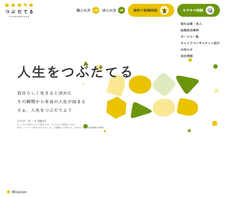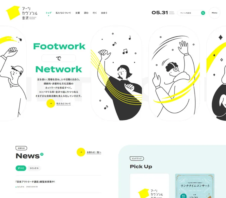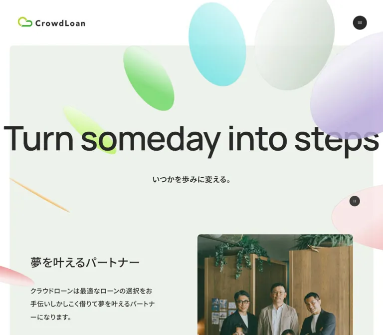
プレビュー準備中デザインリファレンスを見る
DESIGN REFERENCE
株式会社コーナー|人事・ESG領域のコーポレートサイト
クリーム色の背景に有機的なグリーンの造形と細い白線を重ねた企業サイト。緑から黄へのグラデーション、力強い日本語コピー、広い余白、円形矢印の導線が特徴。
CORNER — Style Reference
A spacious corporate identity built from warm cream, living green forms, and fine white trajectories.
Website: CORNER
Original URL: https://www.corner-inc.co.jp/
Final URL: https://www.corner-inc.co.jp/
Response: HTTP 200; original and final URLs are identical.
Theme: light, with cream identity areas, white editorial areas, and a broad green-to-yellow service field.
Inspected: October 2, 2026, at 05:15:56 JST; collection timestamp 2026-10-01T20:15:56.136Z.
Viewports: desktop 1440 × 1000 and mobile 390 × 844 CSS pixels.
Scope: the current corporate homepage: identity header, purpose statement, Feature section, audience-specific services, UPGRADE, CORNER DAY, foCus ONE, News, Recruit, and footer. Visual evidence consists of three desktop captures and two mobile captures, supplemented by rendered DOM measurements. Linked destinations and opened navigation states were not inspected.
CORNER combines a restrained corporate information structure with a large, irregular green graphic. The opening uses a cream canvas, a compact geometric logo, three emphatic lines of Japanese lettering, and thin white curves that cross the composition. The final headline line changes from green toward amber. Large empty areas allow these few elements to carry the identity.
The rest of the homepage broadens into an information hub. Features introduce the business, paired service cards distinguish companies from individual professionals, and media and community modules share a luminous gradient background. News and recruitment return to white. The cream footer closes the page with navigation, policies, social links on mobile, and a certification image. This is a corporate homepage with several destinations and audiences, rather than a single conversion funnel.
閉じる
CORNER — Style Reference
A spacious corporate identity built from warm cream, living green forms, and fine white trajectories.
Website: CORNER
Original URL: https://www.corner-inc.co.jp/
Final URL: https://www.corner-inc.co.jp/
Response: HTTP 200; original and final URLs are identical.
Theme: light, with cream identity areas, white editorial areas, and a broad green-to-yellow service field.
Inspected: October 2, 2026, at 05:15:56 JST; collection timestamp 2026-10-01T20:15:56.136Z.
Viewports: desktop 1440 × 1000 and mobile 390 × 844 CSS pixels.
Scope: the current corporate homepage: identity header, purpose statement, Feature section, audience-specific services, UPGRADE, CORNER DAY, foCus ONE, News, Recruit, and footer. Visual evidence consists of three desktop captures and two mobile captures, supplemented by rendered DOM measurements. Linked destinations and opened navigation states were not inspected.
CORNER combines a restrained corporate information structure with a large, irregular green graphic. The opening uses a cream canvas, a compact geometric logo, three emphatic lines of Japanese lettering, and thin white curves that cross the composition. The final headline line changes from green toward amber. Large empty areas allow these few elements to carry the identity.
The rest of the homepage broadens into an information hub. Features introduce the business, paired service cards distinguish companies from individual professionals, and media and community modules share a luminous gradient background. News and recruitment return to white. The cream footer closes the page with navigation, policies, social links on mobile, and a certification image. This is a corporate homepage with several destinations and audiences, rather than a single conversion funnel.
How to Read This Reference
- Measured means a supplied computed style, custom property, or element rectangle. Measurements are CSS pixels; selected fractional values are rounded for readability.
- Observed means visible in the original-page captures. Visual observations do not establish the underlying rendering technology.
- Estimated means an approximate dimension or appearance inferred from a capture. Estimates are explicitly identified.
- Recommended means a reusable implementation choice, not a verified feature of the original.
- Token names introduced here are descriptive aliases. Original custom-property names are identified separately.
- The DOM includes navigation content that is not visible in the closed-header captures. Its presence and geometry do not prove that a menu was opened.
- Several headings contain nested artwork or styled descendants not included in the element sample. A wrapper's computed font size is not necessarily the size of its visible lettering.
- Mobile screenshots cover the opening and footer. Intermediate mobile layouts are documented from DOM geometry, with their visual limitations stated.
Tokens — Colors
Default Palette
| Name | Value | Source / proposed alias | Role and evidence |
|---|---|---|---|
| Warm Cream | #fcf4e1 |
Source --sub-bg; alias --color-cream |
Identity background seen in the hero and directly measured on the footer |
| White | #ffffff |
Source --main-bg; alias --color-white |
Root canvas; measured News and Recruit backgrounds; visible service-card surfaces |
| Charcoal | #313131 |
Source --main-color; alias --color-ink |
Body copy, navigation, and utility controls |
| Brand Green | #a1d25e |
Source --grad-start-color and --hover-color; alias --color-green |
Declared gradient endpoint and hover color |
| Brand Yellow | #e1d746 |
Source --grad-end-color; alias --color-yellow |
Declared gradient endpoint |
| Translucent White | rgba(255,255,255,0.7) |
Measured foCus ONE background; alias --color-panel |
Separates the recruitment-service panel from the colorful service field |
| White Linework | Visually white | Alias --color-orbit: #ffffff |
Fine curves across the hero; exact stroke opacity was not supplied |
The hero lettering appears black in its first two lines, while ordinary page copy is measured charcoal. The headline's parent reports charcoal, but its internal painted fills are not included in the evidence. Use black as a visual approximation for the display lettering, not as a replacement for the measured body token.
Gradient Treatment
There are three distinct uses of blended color:
- Hero graphic: overlapping irregular green and yellow-green surfaces, with translucent outer layers and softly varying interiors. Some silhouette segments are visibly angular. It is more complex than a single ellipse with a linear gradient.
- Services background: a continuous field spanning multiple modules. The supplied desktop capture is greener at the left and lower areas, and warmer yellow toward the right. Its exact background-image declaration and stops were not supplied.
- Final headline line: a darker green-to-amber fill that remains distinguishable from the pale graphic behind it. Do not automatically apply the two pale source endpoints to this lettering.
Estimated adaptation colors: approximately #659600 and #e8ad00 can start a reconstruction of the final headline's darker gradient. These are visual estimates, not extracted source values or sampled pixels.
The stylesheet also declares --notice-color: #d7072e and --swiper-theme-color: #007aff. Neither is established as a prominent visible color in the supplied page views. Keep them out of the main visual palette unless a corresponding component is independently verified.
Tokens — Typography
Japanese Body and Supporting Copy
Measured stack: YakuHanJP, 'Noto Sans JP', 'Hiragino Sans', 'Hiragino Kaku Gothic ProN', Meiryo, sans-serif.
The body uses weight 500; mission statements and feature headings use 700. This combination gives supporting text more presence than a thin editorial face while maintaining a calm hierarchy.
The root and body measure 16px on desktop and 14.4px on mobile. The source --fs changes from 100% to 90%. Much of the interface follows this reduction, but several roles have separate responsive rules.
Body-level letter spacing is 0.96px on desktop and 0.864px on mobile. Feature descriptions override it to -0.32px and -0.288px, respectively. Service narratives use normal tracking.
Do not carry the body's measured line-height: 1 into paragraphs. Actual paragraph styles provide much more generous leading.
English Labels and Utility Type
Measured family: Montserrat, sans-serif on Feature and Services labels, View all, mobile Contact, and service-action text wrappers.
- Feature and Services labels use weight
700. - View all uses weight
700. - Service-action text wrappers use weight
600. - Japanese characters inside a Montserrat declaration can resolve through fallback fonts; the specific rendered fallback was not identified.
The UPGRADE wordmark is visibly tall and condensed. Its font or asset implementation was not identified. Preserve it as brand artwork when available rather than inventing a font attribution.
Hero Display Lettering
The three source lines are:
- “人事を変え、”
- “組織を変え、”
- “世界を変える。”
The visible lettering is heavy, sharply articulated Japanese display lettering. Its identity is not established by the measured body font stack.
The desktop H1 wrapper is 381 × 261px, positioned at (910, 460). The mobile wrapper is approximately 274.31 × 161.97px, positioned at (26, 379.88). However, those wrappers report font sizes of only 16px and 11.52px. These values clearly do not describe the large visible glyphs.
Visual estimate: display glyphs are roughly 54px high on desktop and 38–40px on mobile. Exact letterforms and spacing require the original authorized artwork or additional child-element evidence. A text fallback can approximate the composition but should not be presented as a typographic match.
Type Scale
| Role | Desktop | Mobile | Weight / notes |
|---|---|---|---|
| Root and base body | 16px |
14.4px |
Body weight 500; base line height is not paragraph leading |
| Mission paragraphs | 21px / 31.5px |
18px / 27px |
700 |
| Feature / Services label | 20px / 20px |
32.4px / 32.4px |
Montserrat 700; labels become larger on mobile |
| Section introduction | 26px / 46.8px |
18px / 30.6px |
700 |
| Feature title | 20px |
18px |
700; two-line title boxes measure 48px and 43.19px high |
| Feature description | 16px / 30.4px |
14.4px / 27.36px |
500; slightly negative tracking |
| Audience-service statement | 18px / 30.6px |
15.6px / 26.52px |
500 |
| Service narrative | 16px / 35.2px |
14.4px / 31.68px |
500; normal tracking |
| Service-action text wrapper | 19px / 19px |
14.82px / 14.82px |
Montserrat declaration, 600 |
| News title | 17px / 30.6px |
15.3px / 27.54px |
400 |
| View all | 16px / 16px |
17.28px / 17.28px |
Montserrat 700 |
| Mobile footer Service button | — | 18.63px / 18.63px |
1.4904px tracking |
| Mobile footer Contact | — | 14.58px / 14.58px |
Montserrat 700 |
The Feature label has a transparent computed text color. Its complete paint treatment is absent from the supplied style sample, so that value should not be interpreted as proof that the label is intentionally invisible.
Tokens — Spacing & Shapes
The page does not demonstrate a single universal spacing grid. It combines a centered desktop content width, substantial section padding, role-specific internal spacing, and mobile adjustments. Preserve those relationships before normalizing them into a new token system.
Spacing Scale
| Use | Desktop measured value | Mobile measured value |
|---|---|---|
| Header top / horizontal padding | 70px / 70px |
27px / 26px |
| Main service-container side margins | 200px at 1440px width |
26px at 390px width |
| Gap between audience cards | 40px horizontally |
Approximately 34.66px vertically |
| Gap between mission paragraphs | 24px |
Approximately 20.56px |
| Feature section top / bottom padding | 209px / 110px |
112.86px / 59.4px |
| Services section top / bottom padding | 80px / 200px |
59.4px / 79.2px |
| News section top padding | 110px |
59.4px |
| Recruit section top / bottom padding | 156px / 148px |
84.24px / 79.92px |
| foCus ONE vertical / horizontal padding | 30px / 40px |
40px / 30px |
| Footer top / bottom padding | 148px / 76px |
49.5px / 34.2px |
| Mobile footer horizontal inset | — | 39px |
Useful reusable spacing aliases are 18, 24, 30, 40, 55, 80, and 110px, with explicit mobile overrides. These are adaptation choices, not a recovered source scale.
Border Radius
| Element | Evidence | Treatment |
|---|---|---|
| foCus ONE panel | Measured 16px |
Moderately rounded rectangle |
| Audience service cards | Rounded corners visible in desktop capture | Approximately 16px; estimate |
| Menu button box | Measured 50% |
Transparent circular hit area; visible icon remains three bars |
| View More arrow | Circular in capture | Approximately 65px diameter on desktop |
| Audience service actions | Partially visible in capture | Pill-like ends; exact radius not supplied |
| Hero graphic | Irregular silhouette | Not a reusable card radius |
Layout Measurements
| Element | Desktop | Mobile |
|---|---|---|
| Document height | 7255.13px |
8387.98px |
| Common services width | 1040px, x = 200 |
338px, x = 26 |
| Logo link | 113 × 86px, x/y = 70/70 |
167.03 × 30.95px, x/y = 26/27 |
| Menu button | 48 × 48px, x/y = 1332/60 |
43.19 × 43.19px, x/y ≈ 320.81/21.59 |
| Hero H1 wrapper | 381 × 261px |
274.31 × 161.97px |
| First mission paragraph top | 975px |
649.84px |
| Feature section | 1030.14px high |
1596.27px high |
| Audience service card | 500 × 654.69px each |
Company 338 × 544.23px; individual 338 × 486.95px |
| UPGRADE module | 1040 × 385.23px |
338 × 522.61px |
| CORNER DAY module | 1040 × 226.78px |
338 × 448.72px |
| foCus ONE panel | 1040 × 449.84px |
338 × 764.33px |
| Standard View More link | Approximately 185.92 × 65px |
Approximately 167.27 × 58.5px |
| Certification image link | 130.5 × 76.19px |
93.59 × 54.64px |
The source custom property --section-width contains the unitless value 1040. The measured service blocks independently establish the resulting 1040px desktop width. The Quick Start converts this into a conventional length token.
Components
Identity Header
Role: maintain a recognizable brand and a small navigation entry point without occupying the opening with a horizontal menu.
The desktop logo uses a stacked lockup: a green/yellow geometric symbol above the CORNER wordmark. Its link occupies 113 × 86px at a generous 70px inset. On mobile, the symbol and wordmark sit side by side in a 167 × 31px horizontal lockup.
The menu button is visually unboxed. Three dark horizontal bars sit inside a circular transparent button rectangle. The bars appear approximately 30px wide on desktop and 27px on mobile; these are visual estimates rather than extracted child dimensions.
The hamburger remains at the upper right in the supplied scrolled captures. The mobile logo also remains visible in the footer capture, while the desktop logo is absent from the supplied middle and bottom views. This supports persistent navigation with breakpoint-specific identity treatment, but the exact fixed/sticky logic was not provided.
Primary Navigation
Role: expose the corporate structure and both service audiences.
The DOM contains Top, About, Service, Recruit, News, and Contact. About includes Purpose・Vision・Mission, Values, Board member, and Company profile. Service contains company and parallel-worker branches, each linking to HR and ESG offerings, followed by UPGRADE and foCus ONE.
The navigation heading “サイト内ナビゲーション” has a 1 × 1px rectangle, consistent with visually hidden labeling. This does not independently verify the menu button's accessible name or focus behavior.
No opened-menu screenshot or activation result is supplied. Do not invent an overlay background, entrance animation, close icon, focus trap, or expanded layout from the latent DOM rectangles.
Hero Graphic and Purpose Headline
Role: make the company's change-oriented purpose the strongest visual statement.
The hero contains four principal layers:
- A full-width warm cream base.
- A very large irregular green form, with yellow-green variation and translucent surrounding layers.
- Thin white curves whose centers and endpoints extend beyond the viewport.
- Three lines of display lettering, with the last line filled by a darker green-to-amber gradient.
At desktop size, the graphic fills much of the left and central area and extends beyond the top and bottom of the first capture. The headline sits in the right half, beginning at x = 910px and y = 460px. Its position overlaps the graphic rather than occupying a separate text card.
On mobile, the graphic is cropped at the sides and appears approximately between y = 192px and y = 660px. The headline moves to the left content inset, beginning near y = 380px. This is a recomposed scene, not a scaled desktop screenshot.
The curves remain decorative. Their precise path data, layering method, opacity, and rendering technology were not supplied.
Mission Copy and About Link
Role: convert the display statement into a short, readable corporate narrative.
Three centered, bold paragraphs follow the headline. They use 21px / 31.5px on desktop and 18px / 27px on mobile. Desktop paragraph tops are 55.5px apart, reflecting a 31.5px line box and 24px gap.
At the desktop capture height, only the first paragraph begins to enter the viewport. On mobile, all three statements appear beneath the graphic within the opening capture; the longer paragraphs wrap to two lines. The About link follows at approximately y = 873px, below the 844px mobile viewport.
Keep this copy visually centered and distinct from the left-aligned service narratives. The circular-arrow About link belongs beneath the mission, not beside the main headline.
Feature Introduction and Three Feature Items
Role: explain the business through three separate advantages.
The DOM identifies three items: the professional talent network, support available in the required amount and timing, and multiple service models. A centered English label and bold Japanese introduction precede them.
Desktop item wrappers occupy three 389px-wide slots. Their text areas are approximately 290px wide. These wrapper widths should not be mistaken for three equal divisions of the standard 1040px service container.
On mobile, the items stack in order. Each measured text area is approximately 304.19px wide at x = 42.91px, narrower than the usual 338px content region. The first and second items are separated by 54px after their measured bottoms.
There is substantial space before each item title: approximately 311px from desktop item top to heading, and 233px on mobile. This is consistent with a leading media area, but its artwork is not visible in the supplied original-page captures. Do not fabricate the illustrations or treat that space as a verified blank design element.
Audience Service Cards
Role: separate business clients from individual professionals before sending them to detailed service sites.
Two white cards sit side by side in the gradient section. Each desktop card is 500px wide, separated by 40px. The visible bottom portions show rounded white corners and colored pill-shaped actions.
Each card contains a Japanese category label, an English audience title, a leading visual region, a short statement, and two detail actions for HR and ESG. The labels include “for Company” and “for Parallel workers.” Company-action text is measured white; individual-action text is measured charcoal.
Mobile cards become separate 338px-wide blocks. The company card is taller because its supporting statement occupies more lines. Let text determine height instead of forcing desktop equality onto the mobile version.
The supplied link rectangles are not uniform: company links include a larger action wrapper, while individual links expose smaller inline bounds. These are not reliable evidence that one audience receives a smaller touch target. Match the visible action surface and verify its interactive bounds in an implementation.
Text-and-Circle Link
Role: provide a recurring, recognizable route to additional content without a large filled CTA rectangle.
The visible View More treatment consists of a bold English label, a short horizontal gap, and a white circular button containing a dark right arrow. The circle has a fine green/yellow edge. The entire label-and-circle assembly should act as one link.
The desktop UPGRADE instance measures approximately 185.92 × 65px. Its mobile equivalent measures 167.27 × 58.5px. The desktop label-to-circle gap is visually around 18px.
About and the foCus ONE detail link use related geometry with different text widths. News uses a more compact View all treatment; do not force it into the same 65px circle without further evidence.
UPGRADE Media Module
Role: present the owned media destination as a useful content product.
The desktop row has a 446px text region on the left and an overlapping tablet-and-phone image on the right. The combined device artwork appears approximately 528 × 385px, leaving roughly 66px between text and image within the 1040px row.
The text hierarchy is a small Japanese category label, the condensed UPGRADE wordmark, a paragraph, and View More. The paragraph uses 16px / 35.2px, giving three lines generous separation in the supplied capture.
The device image has dark blue frames and a small phone overlapping the lower-left part of a landscape tablet. It is a screenshot within an illustration, not evidence of a live interactive embedded browser.
On mobile, the heading begins approximately 258px below the module's top. This supports a leading-media, then text arrangement. Exact mobile image dimensions and cropping were not supplied.
CORNER DAY Community Module
Role: introduce an invitation-based community through a simple relational illustration and editorial copy.
The desktop module begins with a Japanese category label and the uppercase CORNER DAY title. Beneath it, a small illustration at the left connects three outlined people. Green fills and small orange/yellow tie accents keep it within the brand palette.
The illustration is approximately 120px wide in the screenshot. The paragraph begins 160px after the shared left edge, at x = 360px, leaving about 40px between an estimated 120px icon and the copy. Its measured width is 880px, with 16px / 35.2px type.
On mobile, the heading begins approximately 207px below the module top, followed by full-width copy. The geometry indicates reordering of the leading visual, heading, and description; the precise mobile illustration scale remains unverified.
foCus ONE Service Panel
Role: distinguish the additional career-support service while retaining the shared Services context.
This panel is directly measured as 70% opaque white with a 16px radius. It uses 30px 40px padding on desktop and 40px 30px on mobile.
On desktop, the heading spans the interior. The description occupies a 576px right column, beginning at x = 624px. The action aligns to the inner right edge at x = 1200px. On mobile, the panel becomes 338px wide with a 278px interior, and the heading follows a leading visual region.
The source identifies the service and its copy, but the supplied original-page screenshots do not reveal the full panel artwork. Its imagery should remain unspecified until actual assets are available. The measured translucent panel is not evidence of backdrop blur or a glass effect.
News List
Role: publish current corporate announcements in a readable editorial structure.
Five linked entries are present in the supplied DOM, covering June through September 2026. News uses a white background. Desktop article titles begin at x = 381px, 181px after the standard section edge, leaving a leading region for metadata or other row content. Exact desktop date geometry is not supplied.
Titles use 17px / 30.6px on desktop and 15.3px / 27.54px on mobile. Mobile title blocks are approximately 314.63px wide, inset slightly farther than the general 26px content edge. Dates are present in the mobile rendered text.
View all sits near the desktop section heading, toward the right edge. On mobile it follows the list and is centered. Row border styling and hover end states are not visible in the supplied captures.
Recruit Section
Role: provide a separate route into employment information.
The section is measured on white, with generous vertical padding and a Recruit title, Japanese subtitle, and View More link. The desktop section is 889px high; mobile is approximately 742.83px high.
The mobile title and CTA are inset around 60.8px from the viewport edge, deeper than the usual 26px content inset. The recruitment CTA also scales down to approximately 143.38 × 49.72px.
A cropped green shape from the preceding content is visible above the mobile footer. That fragment does not establish the complete recruitment image or its motion. Avoid inventing photography, staff portraits, or a complete illustrated scene for this section.
Corporate Footer
Role: close the homepage with site navigation, service access, contact, policies, and certification information.
The footer background is measured cream. Desktop DOM geometry shows navigation groups beginning near x = 200px, 361.73px, and 606.34px. Policy links form a vertical list, while the certification image and copyright sit toward the right.
The mobile capture clearly shows a different composition: Top, About, and Recruit in a vertical list; a full-width Service row with a plus symbol; Facebook and Twitter bird icons; Contact; five underlined policy links; the certification image; and copyright. The Service row is a measured button with approximately 76.94px height. Expansion behavior was not exercised.
Mobile footer content uses a 39px inset. Policy-link tops are approximately 29.14px apart. The certification image is about 93.59 × 54.64px, followed by small copyright text.
Capture limitation: the desktop bottom image shows a large white area above the final cream legal strip, despite DOM measurements placing additional footer content in that region. The evidence does not establish why those elements are not visibly painted. Do not reproduce the empty area as an intentional spacer or assert a loading/reveal cause.
Tokens — Motion & Interaction
| Treatment | Supplied evidence | What can be concluded |
|---|---|---|
| Shared transition token | 0.3s cubic-bezier(.25, .46, .45, .94) |
A reusable 300ms easing is declared |
| Navigation and article links | Computed color transition with the shared duration/easing | Color changes are supported; hovered end states were not captured |
| View all text | Computed transform transition with the shared duration/easing | Transform feedback is defined; displacement and trigger were not supplied |
| Mobile social links | Computed opacity transition with the shared duration/easing | Opacity feedback is defined; final opacity is unknown |
| Several feature items | Transition property reported as transform | Insufficient information to recover a complete entrance or scroll animation |
| Hero graphic and curves | Static original-page captures | Shape, placement, and layering are visible; animation mechanism and timing are unverified |
| Header menu | Button and navigation DOM | Opening, closing, scrolling, and keyboard behavior were not exercised |
| Mobile footer Service | Button with visible plus indicator | A disclosure affordance is visible; expanded state was not inspected |
The collection protocol temporarily paused perpetual animations during readiness checks and then resumed them. This is a description of the inspection method, not proof that any specific hero element animates.
The sampled elements generally report animation: none. This does not rule out animation in descendants, SVG, canvas, pseudo-elements, or scripts omitted from the sample. Do not specify WebGL, a particular animation library, parallax, morph duration, or scroll synchronization as observed behavior.
Recommended adaptation: reuse the measured 300ms easing for restrained link feedback. Keep decorative artwork static until actual motion evidence or a separate motion brief is available.
Surfaces
| Layer | Appearance | Use |
|---|---|---|
| Identity canvas | Warm cream | Hero and footer |
| Editorial canvas | White | News and Recruit; base page surface |
| Services field | Continuous green/yellow blend | Shared background for multiple service modules |
| Audience cards | White with modest rounded corners | Separate company and professional routes |
| Additional service panel | 70% white, 16px radius | foCus ONE |
| Circular link surface | White disk with fine colored edge | About and View More family |
| Hero decoration | Translucent organic layers and white curves | Identity and atmosphere |
| Footer separators | Fine pale warm rules, visually observed on mobile | Delimit the Service row |
No general elevation system is established by the evidence. The visible components rely on spacing, color fields, modest corner rounding, and graphic contrast rather than conspicuous drop shadows.
Imagery
The visible imagery belongs to three related families:
- Abstract identity graphics: very large irregular green forms, translucent layers, and white curves. The effect is expansive and organic without becoming a busy background texture.
- Product presentation: overlapping device frames containing a content-site screenshot. The frames provide structure while keeping the service image integrated with the gradient field.
- Simple human diagrams: outlined figures, a small number of connecting strokes, green fills, and tiny warm accents.
The logo combines simple geometric parts in green and yellow. The desktop and mobile lockups differ in arrangement, so preserving the correct version matters more than scaling one asset everywhere.
Use the supplied certification image as a factual brand/trust asset when authorized. Its presence should not be expanded into unverified claims about certification scope or validity.
Observed Asset References
No original image URLs, filenames, SVG path data, or media manifests were supplied. The following are visual references, not fabricated asset paths.
| Asset | Original-page evidence | Reuse guidance |
|---|---|---|
| CORNER stacked logo | Desktop opening | Use the authorized vertical lockup |
| CORNER horizontal logo | Mobile opening and footer capture | Use the authorized horizontal lockup |
| Organic hero graphic | Desktop and mobile openings | Preserve irregular layering and breakpoint-specific cropping |
| Three-line headline lettering | Desktop and mobile openings | Preserve letterforms through original artwork when available; provide accessible text |
| UPGRADE wordmark | Desktop Services capture | Treat as a distinct wordmark; font identity is unverified |
| Tablet/phone composition | Desktop Services capture | Retain device overlap, aspect ratio, and dark frames |
| CORNER DAY people diagram | Desktop Services capture | Preserve sparse outlines and small colored accents |
| Certification image | Desktop and mobile footer captures | Preserve aspect ratio and legibility |
| Social icons | Mobile footer capture | Facebook and the observed Twitter bird; destinations are present in the DOM |
Photography is not established as a dominant visual system by these captures. Do not fill unobserved sections with generic office photography and present that as the current site's design.
Layout & Responsive Behavior
The desktop homepage uses a 1040px service container, producing 200px margins at 1440px. Mobile service modules use 338px within a 390px viewport, producing 26px margins. The footer uses a separate 39px mobile inset, and feature descriptions use another narrower measure.
| Relationship | Desktop observation | Mobile observation |
|---|---|---|
| Identity | Stacked logo | Horizontal logo |
| Headline | Overlaps right side of large graphic | Left-aligned within a side-cropped graphic |
| Mission | Single-line paragraphs | Longer paragraphs wrap to two lines |
| Feature items | Three adjacent slots | Three stacked items |
| Audience services | Two 500px cards | Separate full-width cards with content-driven heights |
| UPGRADE | Copy left, devices right | Leading media region before heading and copy |
| CORNER DAY | Heading above icon/copy row | Leading visual region before heading and copy |
| foCus ONE | Wide translucent panel with right text column | Narrow panel with vertically reordered content |
| News View all | Near heading, toward right | Centered after the list |
| Footer | Multiple navigation groups in DOM | Visible vertical links and collapsed Service affordance |
The increase in document height from approximately 7255px to 8388px reflects stacking and wrapping, despite reduced mobile type and many reduced section paddings.
The exact media-query breakpoints were not provided. A breakpoint used in the Quick Start is a recommendation. Do not claim it was extracted from the original stylesheet.
The first desktop viewport is almost entirely the hero, while the mobile opening already includes the mission paragraphs. Preserve the measured composition through explicit responsive placement rather than setting every hero to exactly 100vh.
Do’s and Don’ts
Do
- Keep cream
#fcf4e1, charcoal#313131, and the measured green/yellow endpoints as the core palette. - Preserve the distinction between the darker headline gradient and the pale background graphics.
- Make the organic form oversized and partially cropped, with several overlapping layers.
- Keep the white curves thin, sparse, and decorative.
- Maintain the three deliberate headline lines and the separate centered mission block.
- Use the horizontal logo lockup on mobile.
- Preserve the continuous Services color field across several different module types.
- Distinguish company and individual service routes clearly.
- Use circular-arrow links as a recurring secondary navigation motif.
- Retain generous paragraph leading and varied content measures.
- Reorder media and copy on mobile rather than shrinking desktop columns.
- Keep factual assets and wordmarks intact when authorized versions are available.
Don’t
- Do not infer the visible hero font from the H1 wrapper's 16px computed style.
- Do not replace the irregular layered graphic with a small, perfectly round gradient disk.
- Do not use the pale gradient endpoints for all small text or white-on-green actions without checking contrast.
- Do not turn every section into the same rounded-card grid.
- Do not fill the hero with a navigation bar, a form, or several competing CTA buttons.
- Do not interpret the mobile footer as an opened hamburger menu.
- Do not treat the blank desktop footer area as a verified design requirement.
- Do not invent feature illustrations, recruitment photography, or foCus ONE artwork from DOM spacing alone.
- Do not claim a morphing, 3D, or scroll-linked implementation from static captures.
- Do not promote unused library color variables into the page's visual identity.
Recommended Implementation Additions
These recommendations are for a new implementation and are not verified features of the original:
- Give the menu button an accessible name and an explicit expanded state. If it controls a modal navigation panel, implement focus management and a keyboard close action.
- Make the mobile Service disclosure keyboard-operable and connect it to its expanded content using appropriate semantics.
- Use at least a 44px touch target for the mobile menu; its measured source box is approximately 43.19px.
- Keep headline copy available as real text or an equivalent accessible name when visible lettering uses vector artwork.
- Mark decorative blobs and curves as hidden from assistive technology and prevent them from intercepting pointer input.
- Add a clear charcoal focus indicator and preserve underlines on policy links.
- Check small text and action contrast independently of decorative brand colors. Darken functional colors where necessary.
- Provide meaningful alternatives for device artwork and the community diagram according to their actual informational role.
- Preserve a static, complete page when animation is disabled or scripts fail. Avoid content that remains invisible after a missed reveal trigger.
- Respect reduced-motion preferences if motion is added. A static organic composition should retain the design's identity.
Agent Prompt Guide
Quick Color Reference
- Identity background and footer:
#fcf4e1. - Main text:
#313131. - Editorial areas and card surfaces:
#ffffff. - Source gradient endpoints:
#a1d25eand#e1d746. - Additional service panel:
rgba(255,255,255,0.7). - Hero curves: thin white strokes.
- Final display-line gradient: darker green to amber; exact source stops are unverified.
- Avoid adding red or blue as general UI accents based on unused stylesheet variables.
Overall Prompt
“Create a spacious Japanese corporate homepage for an HR and ESG professional-services company. Use warm cream #fcf4e1, charcoal #313131, white editorial sections, and a continuous green-to-yellow Services background based on #a1d25e and #e1d746. Build an oversized irregular layered green hero graphic with fine white curves. Place three lines of heavy Japanese display lettering over its right side on desktop, with the final line in a darker green-to-amber gradient. Below it, center three short mission paragraphs. Use a 1040px desktop content measure, two audience service cards, an overlapping tablet-and-phone media illustration, a simple three-person community diagram, a translucent white additional-service panel, a News list, and a recruitment route. Use label-plus-circular-arrow links. On mobile, use a horizontal logo, move the headline to the left inset, crop the graphic at the sides, stack service modules with media first, and finish with a cream footer containing a Service disclosure. Keep unverified interactions and artwork explicitly provisional.”
Example Component Prompts
- Hero: “A cream corporate opening with a huge translucent green organic form, mildly faceted irregular edges, and two or three fine white curves extending outside the frame. Put the three source Japanese headline lines over the right side on desktop and at a 26px left inset on mobile. Keep the final line darker green-to-amber. Use static artwork unless a separate motion specification is supplied.”
- Audience services: “Two equal desktop white cards, 500px wide with a 40px gap, on a shared green/yellow field. Each contains a small Japanese category label, a prominent English audience name, a visual region, a short statement, and two pill-shaped HR/ESG links. Stack the cards on mobile and allow their heights to differ.”
- UPGRADE: “Within a 1040px row, place a 446px text block left and an approximately 528px tablet-and-phone composition right. Use a condensed brand wordmark, charcoal body copy with 2.2 line height, and a View More label next to a white 65px arrow circle. Put the media above the copy on mobile.”
- Community: “Create a light editorial module directly on the shared gradient. Put a small category label above CORNER DAY, then a sparse three-person outline diagram beside generously led copy. Use tiny yellow/orange accents and no surrounding card shadow.”
- Mobile footer: “A cream footer with 39px side insets, stacked Top/About/Recruit links, a separated Service disclosure row with a plus indicator, two social icons, Contact, five underlined policies, a small certification image, and copyright. Keep it visually distinct from the header menu.”
Quick Start
CSS Custom Properties
This is a usable static adaptation, not recovered source CSS. Exact source colors, the common container width, selected component measurements, and the shared easing are retained. The hero shape, display-text fallback, hover displacement, footer rules, and 48rem breakpoint are recommendations or visual approximations. Original logo, wordmark, device, and illustration assets must be supplied separately.
The conventional root size is retained; explicit mobile tokens reproduce important measured sizes without globally scaling every component.
:root {
  /* Measured source palette */
  --color-cream: #fcf4e1;
  --color-white: #fff;
  --color-ink: #313131;
  --color-green: #a1d25e;
  --color-yellow: #e1d746;
  --color-panel: rgb(255 255 255 / 70%);

  /* Estimated display colors, not extracted source stops */
  --display-green: #659600;
  --display-amber: #e8ad00;

  --font-body: YakuHanJP, 'Noto Sans JP', 'Hiragino Sans',
    'Hiragino Kaku Gothic ProN', Meiryo, sans-serif;
  --font-label: Montserrat, sans-serif;
  --text-body: 16px;
  --text-mission: 21px;
  --text-section-label: 20px;
  --text-section-intro: 26px;
  --text-news: 17px;
  --tracking-body: 0.96px;

  --content-width: 1040px;
  --page-gutter: 26px;
  --radius-panel: 16px;
  --circle-size: 65px;
  --ease-brand: cubic-bezier(.25, .46, .45, .94);
  --transition-brand: 300ms var(--ease-brand);
}

* { box-sizing: border-box; }
body {
  margin: 0;
  color: var(--color-ink);
  background: var(--color-white);
  font-family: var(--font-body);
  font-size: var(--text-body);
  font-weight: 500;
  letter-spacing: var(--tracking-body);
}
img { display: block; max-width: 100%; height: auto; }
a { color: inherit; }
button { font: inherit; }
.container {
  width: min(var(--content-width), calc(100% - 2 * var(--page-gutter)));
  margin-inline: auto;
}
:focus-visible {
  outline: 3px solid var(--color-ink);
  outline-offset: 4px;
}

/* Header positioning approximates the supplied capture states. */
.site-header {
  position: absolute;
  inset: 0 0 auto;
  z-index: 20;
  padding: 70px 70px 0;
  pointer-events: none;
}
.brand-link { display: block; width: 113px; pointer-events: auto; }
.brand-wide { display: none; }
.menu-toggle {
  position: fixed;
  top: 60px;
  right: 60px;
  display: flex;
  flex-direction: column;
  align-items: center;
  justify-content: center;
  gap: 7px;
  width: 48px;
  height: 48px;
  padding: 0;
  border: 0;
  border-radius: 50%;
  color: var(--color-ink);
  background: transparent;
  cursor: pointer;
  pointer-events: auto;
}
.menu-toggle span { width: 30px; height: 4px; background: currentColor; }

.hero {
  position: relative;
  isolation: isolate;
  overflow: hidden;
  padding-top: 975px;
  background: var(--color-cream);
}
/* Static approximation; replace with authorized artwork for fidelity. */
.hero-art {
  position: absolute;
  z-index: -2;
  top: -70px;
  left: calc(50% - 570px);
  width: 1100px;
  height: 1120px;
  background:
    radial-gradient(ellipse at 65% 47%, var(--color-yellow), transparent 52%),
    var(--color-green);
  clip-path: polygon(24% 2%, 43% 8%, 62% 0%, 72% 15%,
    92% 23%, 100% 39%, 93% 55%, 99% 69%, 84% 79%,
    79% 94%, 59% 100%, 44% 92%, 29% 97%, 18% 80%,
    4% 68%, 0% 48%, 10% 29%, 13% 13%);
  opacity: .82;
  pointer-events: none;
}
.hero-art::before,
.hero-art::after {
  content: '';
  position: absolute;
  inset: 6%;
  border-radius: 36% 57% 40% 62% / 52% 35% 61% 43%;
  background: var(--color-yellow);
  opacity: .25;
  transform: rotate(19deg);
}
.hero-art::after {
  inset: 12% 3% 2% 15%;
  background: var(--color-green);
  opacity: .65;
  transform: rotate(-17deg);
}
.hero-orbit {
  position: absolute;
  z-index: -1;
  top: -420px;
  left: 32%;
  width: 1000px;
  height: 1800px;
  border: 1px solid white;
  border-radius: 50%;
  transform: rotate(-12deg);
  pointer-events: none;
}
.hero-orbit--cross { transform: rotate(58deg); }
.hero-title {
  position: absolute;
  top: 460px;
  right: clamp(26px, 10.35vw, 149px);
  display: grid;
  gap: 41.5px;
  margin: 0;
  color: #000;
  font-size: 54px;
  font-weight: 900;
  line-height: 1.1;
  letter-spacing: .015em;
}
.hero-title > span { display: block; white-space: nowrap; }
.hero-title .accent {
  color: var(--display-green);
  background: linear-gradient(90deg, var(--display-green), var(--display-amber));
  background-clip: text;
  -webkit-background-clip: text;
  -webkit-text-fill-color: transparent;
}
.mission { display: grid; gap: 24px; text-align: center; }
.mission p {
  margin: 0;
  padding-inline: var(--page-gutter);
  font-size: var(--text-mission);
  font-weight: 700;
  line-height: 1.5;
}
.hero-more { width: fit-content; margin: 55px auto 0; }

.section-label {
  margin: 0 0 26px;
  font: 700 var(--text-section-label)/1 var(--font-label);
  text-align: center;
}
.section-intro {
  margin: 0 auto;
  font-size: var(--text-section-intro);
  font-weight: 700;
  line-height: 1.8;
  text-align: center;
}
.feature-section { padding-block: 209px 110px; }
.feature-grid {
  display: grid;
  grid-template-columns: repeat(3, minmax(0, 1fr));
  gap: 100px;
  max-width: 1068px;
  margin: 68px auto 0;
}
.feature-item p { line-height: 1.9; letter-spacing: -.02em; }

.services {
  padding-block: 80px 200px;
  /* Approximation of the continuous painted service field. */
  background: linear-gradient(65deg, var(--color-green), var(--color-yellow));
}
.audience-grid {
  display: grid;
  grid-template-columns: repeat(2, minmax(0, 1fr));
  gap: 40px;
  margin-top: 55px;
}
.service-card {
  padding: 56px 32px;
  border-radius: var(--radius-panel);
  background: var(--color-white);
}
.service-actions { display: grid; gap: 30px; }
.service-action {
  display: flex;
  align-items: center;
  justify-content: center;
  min-height: 69px;
  padding: 16px 20px;
  border-radius: 999px;
  color: var(--color-ink);
  background: var(--color-green);
  font-weight: 700;
  text-decoration: none;
}
.service-action--yellow { background: var(--color-yellow); }

.more-link {
  display: inline-flex;
  align-items: center;
  gap: 18px;
  min-height: var(--circle-size);
  font-family: var(--font-label);
  font-size: 18px;
  font-weight: 700;
  text-decoration: none;
}
.more-link .arrow-circle {
  display: grid;
  place-items: center;
  flex: 0 0 var(--circle-size);
  width: var(--circle-size);
  height: var(--circle-size);
  border: 2px solid transparent;
  border-radius: 50%;
  background:
    linear-gradient(white, white) padding-box,
    linear-gradient(135deg, var(--color-yellow), var(--color-green)) border-box;
}
.more-link .arrow { transition: transform var(--transition-brand); }
@media (hover: hover) {
  /* Recommended feedback; source displacement was not supplied. */
  .more-link:hover .arrow { transform: translateX(3px); }
}

.media-row {
  display: grid;
  grid-template-columns: minmax(0, 446px) minmax(0, 1fr);
  gap: 66px;
  align-items: start;
  margin-top: 77px;
}
.service-copy p { line-height: 2.2; letter-spacing: normal; }
.media-visual img { width: 100%; object-fit: contain; }
.community-block {
  display: grid;
  grid-template-columns: 120px minmax(0, 1fr);
  gap: 20px 40px;
  margin-top: 93px;
}
.community-block h3 { grid-column: 1 / -1; margin: 0; }
.community-copy { line-height: 2.2; letter-spacing: normal; }
.focus-panel {
  display: grid;
  grid-template-columns: minmax(0, 324px) minmax(0, 1fr);
  gap: 30px 60px;
  margin-top: 93px;
  padding: 30px 40px;
  border-radius: var(--radius-panel);
  background: var(--color-panel);
}
.focus-panel h3 { grid-column: 1 / -1; margin: 0; }
.focus-panel .more-link { display: flex; width: fit-content; margin-left: auto; }

.news { padding-top: 110px; background: white; }
.news-title { font-size: var(--text-news); font-weight: 400; line-height: 1.8; }
.recruit { padding-block: 156px 148px; background: white; }
.site-footer { padding-block: 148px 76px; background: var(--color-cream); }
.footer-main { display: grid; grid-template-columns: 140px 223px 1fr; gap: 22px; }
.footer-legal { display: grid; gap: 12px; }
.footer-legal a { width: fit-content; text-underline-offset: 3px; }
.footer-service-toggle {
  display: flex;
  justify-content: space-between;
  align-items: center;
  width: 100%;
  min-height: 77px;
  border: 0;
  border-block: 1px solid #eadfbc;
  background: transparent;
  color: inherit;
  cursor: pointer;
}

/* Recommended breakpoint; the original breakpoint is unknown. */
@media (max-width: 48rem) {
  :root {
    --text-body: 14.4px;
    --text-mission: 18px;
    --text-section-label: 32.4px;
    --text-section-intro: 18px;
    --text-news: 15.3px;
    --tracking-body: .864px;
    --circle-size: 58.5px;
  }
  .site-header { position: fixed; padding: 27px 26px 0; }
  .brand-link { width: 167.03px; }
  .brand-stacked { display: none; }
  .brand-wide { display: block; }
  .menu-toggle { top: 21.6px; right: 26px; width: 44px; height: 44px; gap: 6px; }
  .menu-toggle span { width: 27px; }
  .hero { padding-top: 649.84px; }
  .hero-art { top: 190px; left: -35px; width: 460px; height: 480px; }
  .hero-orbit { top: -230px; left: -150px; width: 680px; height: 1100px; }
  .hero-title {
    top: 379.88px;
    right: auto;
    left: 26px;
    gap: 18.3px;
    font-size: clamp(30px, 9.75vw, 38px);
  }
  .mission { gap: 20.56px; }
  .hero-more { margin-top: 47px; }
  .section-label { margin-bottom: 18px; }
  .section-intro { line-height: 1.7; }
  .feature-section { padding-block: 112.86px 59.4px; }
  .feature-grid { grid-template-columns: 1fr; gap: 54px; margin-top: 61px; }
  .feature-item { width: 90%; margin-inline: auto; }
  .services { padding-block: 59.4px 79.2px; }
  .audience-grid { grid-template-columns: 1fr; gap: 34.66px; }
  .service-card { padding: 48.5px 22px; }
  .service-actions { gap: 26px; }
  .service-action { min-height: 54px; }
  .more-link { gap: 16.2px; font-size: 16.2px; }
  .media-row { grid-template-columns: 1fr; gap: 28px; margin-top: 69.3px; }
  .media-visual { grid-row: 1; }
  .media-copy { grid-row: 2; }
  .community-block { grid-template-columns: 1fr; gap: 24px; margin-top: 83.7px; }
  .community-art { grid-row: 1; justify-self: center; }
  .community-block h3 { grid-row: 2; }
  .community-copy { grid-row: 3; }
  .focus-panel { grid-template-columns: 1fr; gap: 24px; padding: 40px 30px; }
  .focus-visual { grid-row: 1; }
  .focus-panel h3 { grid-row: 2; }
  .focus-copy { grid-row: 3; }
  .news { padding-top: 59.4px; }
  .recruit { padding-block: 84.24px 79.92px; }
  .site-footer { padding-block: 49.5px 34.2px; }
  .site-footer .container { width: calc(100% - 78px); }
  .footer-main { display: block; }
  .footer-legal { gap: 10px; font-size: 12.96px; }
}

@media (prefers-reduced-motion: reduce) {
  .more-link .arrow { transition: none; }
}
Example semantic markup for the display fallback and recurring link:
<h1 class='hero-title'>
  <span>人事を変え、</span>
  <span>組織を変え、</span>
  <span class='accent'>世界を変える。</span>
</h1>

<a class='more-link' href='https://www.corner-inc.co.jp/media/'>
  <span>View More</span>
  <span class='arrow-circle' aria-hidden='true'>
    <span class='arrow'>→</span>
  </span>
</a>
This excerpt does not implement navigation state, disclosure behavior, asset loading, or an animation system. Keep decorative artwork elements separate from the H1, and give them aria-hidden='true'.
Tailwind v4 Token Mapping
Optional aliases for a project already using Tailwind v4. They are not evidence that the original site uses Tailwind. Define the custom properties above first.
@theme inline {
  --color-cream: #fcf4e1;
  --color-ink: #313131;
  --color-brand-green: #a1d25e;
  --color-brand-yellow: #e1d746;
  --color-service-panel: rgb(255 255 255 / 70%);

  --font-sans: var(--font-body);
  --font-display: var(--font-label);

  --text-copy: var(--text-body);
  --text-purpose: var(--text-mission);
  --text-section: var(--text-section-label);
  --text-intro: var(--text-section-intro);
  --text-article: var(--text-news);

  --spacing-content: 1040px;
  --spacing-gutter: 26px;
  --spacing-arrow: var(--circle-size);
  --radius-panel: 16px;
  --ease-brand: cubic-bezier(.25, .46, .45, .94);
}
Sources & Evidence
- Inspected original and final page: https://www.corner-inc.co.jp/. The supplied collection reports HTTP 200 and identical original/final URLs.
- Capture timestamp:
2026-10-01T20:15:56.136Z, equivalent to October 2, 2026, 05:15:56 JST. - Desktop evidence:
1440 × 1000viewport; opening, Services detail, and bottom-page captures; rendered document height approximately 7255.13px. - Mobile evidence:
390 × 844viewport; opening and footer captures; rendered document height approximately 8387.98px. - DOM and styles: selected element rectangles, computed typography, colors, padding, border radii, transition properties, custom properties, page text, and link destinations supplied with the captures. This was not a complete stylesheet or asset-source dump.
- Observed states: closed header, opening composition, scrolled service content, and footer with a collapsed-looking mobile Service affordance. No menu-opening, disclosure-expansion, hover, focus, or destination-navigation results were supplied.
- Readiness limitations: the collection waited for load, sampled stability, finite motion, and image decoding under bounded timeouts. Perpetual animations were paused during checks and resumed. These checks do not establish semantic completeness or verify every delayed reveal.
- Visual limitations: several middle-page components are supported by DOM measurements rather than direct screenshots. The desktop bottom capture and footer DOM do not fully agree on painted visibility. Exact hero lettering, motion implementation, decorative paths, and unprovided assets remain unverified.
This reference describes the current homepage evidenced by the supplied collection. Source measurements, visual estimates, and implementation recommendations are intentionally kept distinct.
# CORNER — Style Reference

> A spacious corporate identity built from warm cream, living green forms, and fine white trajectories.

**Website:** [CORNER](https://www.corner-inc.co.jp/)
**Original URL:** https://www.corner-inc.co.jp/
**Final URL:** https://www.corner-inc.co.jp/
**Response:** HTTP 200; original and final URLs are identical.
**Theme:** light, with cream identity areas, white editorial areas, and a broad green-to-yellow service field.
**Inspected:** October 2, 2026, at 05:15:56 JST; collection timestamp `2026-10-01T20:15:56.136Z`.
**Viewports:** desktop `1440 × 1000` and mobile `390 × 844` CSS pixels.
**Scope:** the current corporate homepage: identity header, purpose statement, Feature section, audience-specific services, UPGRADE, CORNER DAY, foCus ONE, News, Recruit, and footer. Visual evidence consists of three desktop captures and two mobile captures, supplemented by rendered DOM measurements. Linked destinations and opened navigation states were not inspected.

CORNER combines a restrained corporate information structure with a large, irregular green graphic. The opening uses a cream canvas, a compact geometric logo, three emphatic lines of Japanese lettering, and thin white curves that cross the composition. The final headline line changes from green toward amber. Large empty areas allow these few elements to carry the identity.

The rest of the homepage broadens into an information hub. Features introduce the business, paired service cards distinguish companies from individual professionals, and media and community modules share a luminous gradient background. News and recruitment return to white. The cream footer closes the page with navigation, policies, social links on mobile, and a certification image. This is a corporate homepage with several destinations and audiences, rather than a single conversion funnel.
閉じる
# CORNER — Style Reference

> A spacious corporate identity built from warm cream, living green forms, and fine white trajectories.

**Website:** [CORNER](https://www.corner-inc.co.jp/)
**Original URL:** https://www.corner-inc.co.jp/
**Final URL:** https://www.corner-inc.co.jp/
**Response:** HTTP 200; original and final URLs are identical.
**Theme:** light, with cream identity areas, white editorial areas, and a broad green-to-yellow service field.
**Inspected:** October 2, 2026, at 05:15:56 JST; collection timestamp `2026-10-01T20:15:56.136Z`.
**Viewports:** desktop `1440 × 1000` and mobile `390 × 844` CSS pixels.
**Scope:** the current corporate homepage: identity header, purpose statement, Feature section, audience-specific services, UPGRADE, CORNER DAY, foCus ONE, News, Recruit, and footer. Visual evidence consists of three desktop captures and two mobile captures, supplemented by rendered DOM measurements. Linked destinations and opened navigation states were not inspected.

CORNER combines a restrained corporate information structure with a large, irregular green graphic. The opening uses a cream canvas, a compact geometric logo, three emphatic lines of Japanese lettering, and thin white curves that cross the composition. The final headline line changes from green toward amber. Large empty areas allow these few elements to carry the identity.

The rest of the homepage broadens into an information hub. Features introduce the business, paired service cards distinguish companies from individual professionals, and media and community modules share a luminous gradient background. News and recruitment return to white. The cream footer closes the page with navigation, policies, social links on mobile, and a certification image. This is a corporate homepage with several destinations and audiences, rather than a single conversion funnel.

## How to Read This Reference

- **Measured** means a supplied computed style, custom property, or element rectangle. Measurements are CSS pixels; selected fractional values are rounded for readability.
- **Observed** means visible in the original-page captures. Visual observations do not establish the underlying rendering technology.
- **Estimated** means an approximate dimension or appearance inferred from a capture. Estimates are explicitly identified.
- **Recommended** means a reusable implementation choice, not a verified feature of the original.
- Token names introduced here are descriptive aliases. Original custom-property names are identified separately.
- The DOM includes navigation content that is not visible in the closed-header captures. Its presence and geometry do not prove that a menu was opened.
- Several headings contain nested artwork or styled descendants not included in the element sample. A wrapper's computed font size is not necessarily the size of its visible lettering.
- Mobile screenshots cover the opening and footer. Intermediate mobile layouts are documented from DOM geometry, with their visual limitations stated.

## Tokens — Colors

### Default Palette

| Name | Value | Source / proposed alias | Role and evidence |
| --- | --- | --- | --- |
| Warm Cream | `#fcf4e1` | Source `--sub-bg`; alias `--color-cream` | Identity background seen in the hero and directly measured on the footer |
| White | `#ffffff` | Source `--main-bg`; alias `--color-white` | Root canvas; measured News and Recruit backgrounds; visible service-card surfaces |
| Charcoal | `#313131` | Source `--main-color`; alias `--color-ink` | Body copy, navigation, and utility controls |
| Brand Green | `#a1d25e` | Source `--grad-start-color` and `--hover-color`; alias `--color-green` | Declared gradient endpoint and hover color |
| Brand Yellow | `#e1d746` | Source `--grad-end-color`; alias `--color-yellow` | Declared gradient endpoint |
| Translucent White | `rgba(255,255,255,0.7)` | Measured foCus ONE background; alias `--color-panel` | Separates the recruitment-service panel from the colorful service field |
| White Linework | Visually white | Alias `--color-orbit: #ffffff` | Fine curves across the hero; exact stroke opacity was not supplied |

The hero lettering appears black in its first two lines, while ordinary page copy is measured charcoal. The headline's parent reports charcoal, but its internal painted fills are not included in the evidence. Use black as a visual approximation for the display lettering, not as a replacement for the measured body token.

### Gradient Treatment

There are three distinct uses of blended color:

1. **Hero graphic:** overlapping irregular green and yellow-green surfaces, with translucent outer layers and softly varying interiors. Some silhouette segments are visibly angular. It is more complex than a single ellipse with a linear gradient.
2. **Services background:** a continuous field spanning multiple modules. The supplied desktop capture is greener at the left and lower areas, and warmer yellow toward the right. Its exact background-image declaration and stops were not supplied.
3. **Final headline line:** a darker green-to-amber fill that remains distinguishable from the pale graphic behind it. Do not automatically apply the two pale source endpoints to this lettering.

**Estimated adaptation colors:** approximately `#659600` and `#e8ad00` can start a reconstruction of the final headline's darker gradient. These are visual estimates, not extracted source values or sampled pixels.

The stylesheet also declares `--notice-color: #d7072e` and `--swiper-theme-color: #007aff`. Neither is established as a prominent visible color in the supplied page views. Keep them out of the main visual palette unless a corresponding component is independently verified.

## Tokens — Typography

### Japanese Body and Supporting Copy

**Measured stack:** `YakuHanJP, 'Noto Sans JP', 'Hiragino Sans', 'Hiragino Kaku Gothic ProN', Meiryo, sans-serif`.

The body uses weight `500`; mission statements and feature headings use `700`. This combination gives supporting text more presence than a thin editorial face while maintaining a calm hierarchy.

The root and body measure `16px` on desktop and `14.4px` on mobile. The source `--fs` changes from `100%` to `90%`. Much of the interface follows this reduction, but several roles have separate responsive rules.

Body-level letter spacing is `0.96px` on desktop and `0.864px` on mobile. Feature descriptions override it to `-0.32px` and `-0.288px`, respectively. Service narratives use normal tracking.

Do not carry the body's measured `line-height: 1` into paragraphs. Actual paragraph styles provide much more generous leading.

### English Labels and Utility Type

**Measured family:** `Montserrat, sans-serif` on Feature and Services labels, View all, mobile Contact, and service-action text wrappers.

- Feature and Services labels use weight `700`.
- View all uses weight `700`.
- Service-action text wrappers use weight `600`.
- Japanese characters inside a Montserrat declaration can resolve through fallback fonts; the specific rendered fallback was not identified.

The UPGRADE wordmark is visibly tall and condensed. Its font or asset implementation was not identified. Preserve it as brand artwork when available rather than inventing a font attribution.

### Hero Display Lettering

The three source lines are:

- “人事を変え、”
- “組織を変え、”
- “世界を変える。”

The visible lettering is heavy, sharply articulated Japanese display lettering. Its identity is not established by the measured body font stack.

The desktop H1 wrapper is `381 × 261px`, positioned at `(910, 460)`. The mobile wrapper is approximately `274.31 × 161.97px`, positioned at `(26, 379.88)`. However, those wrappers report font sizes of only `16px` and `11.52px`. These values clearly do not describe the large visible glyphs.

**Visual estimate:** display glyphs are roughly `54px` high on desktop and `38–40px` on mobile. Exact letterforms and spacing require the original authorized artwork or additional child-element evidence. A text fallback can approximate the composition but should not be presented as a typographic match.

### Type Scale

| Role | Desktop | Mobile | Weight / notes |
| --- | --- | --- | --- |
| Root and base body | `16px` | `14.4px` | Body weight `500`; base line height is not paragraph leading |
| Mission paragraphs | `21px / 31.5px` | `18px / 27px` | `700` |
| Feature / Services label | `20px / 20px` | `32.4px / 32.4px` | Montserrat `700`; labels become larger on mobile |
| Section introduction | `26px / 46.8px` | `18px / 30.6px` | `700` |
| Feature title | `20px` | `18px` | `700`; two-line title boxes measure `48px` and `43.19px` high |
| Feature description | `16px / 30.4px` | `14.4px / 27.36px` | `500`; slightly negative tracking |
| Audience-service statement | `18px / 30.6px` | `15.6px / 26.52px` | `500` |
| Service narrative | `16px / 35.2px` | `14.4px / 31.68px` | `500`; normal tracking |
| Service-action text wrapper | `19px / 19px` | `14.82px / 14.82px` | Montserrat declaration, `600` |
| News title | `17px / 30.6px` | `15.3px / 27.54px` | `400` |
| View all | `16px / 16px` | `17.28px / 17.28px` | Montserrat `700` |
| Mobile footer Service button | — | `18.63px / 18.63px` | `1.4904px` tracking |
| Mobile footer Contact | — | `14.58px / 14.58px` | Montserrat `700` |

The Feature label has a transparent computed text color. Its complete paint treatment is absent from the supplied style sample, so that value should not be interpreted as proof that the label is intentionally invisible.

## Tokens — Spacing & Shapes

The page does not demonstrate a single universal spacing grid. It combines a centered desktop content width, substantial section padding, role-specific internal spacing, and mobile adjustments. Preserve those relationships before normalizing them into a new token system.

### Spacing Scale

| Use | Desktop measured value | Mobile measured value |
| --- | --- | --- |
| Header top / horizontal padding | `70px / 70px` | `27px / 26px` |
| Main service-container side margins | `200px` at 1440px width | `26px` at 390px width |
| Gap between audience cards | `40px` horizontally | Approximately `34.66px` vertically |
| Gap between mission paragraphs | `24px` | Approximately `20.56px` |
| Feature section top / bottom padding | `209px / 110px` | `112.86px / 59.4px` |
| Services section top / bottom padding | `80px / 200px` | `59.4px / 79.2px` |
| News section top padding | `110px` | `59.4px` |
| Recruit section top / bottom padding | `156px / 148px` | `84.24px / 79.92px` |
| foCus ONE vertical / horizontal padding | `30px / 40px` | `40px / 30px` |
| Footer top / bottom padding | `148px / 76px` | `49.5px / 34.2px` |
| Mobile footer horizontal inset | — | `39px` |

Useful reusable spacing aliases are `18`, `24`, `30`, `40`, `55`, `80`, and `110px`, with explicit mobile overrides. These are adaptation choices, not a recovered source scale.

### Border Radius

| Element | Evidence | Treatment |
| --- | --- | --- |
| foCus ONE panel | Measured `16px` | Moderately rounded rectangle |
| Audience service cards | Rounded corners visible in desktop capture | Approximately `16px`; estimate |
| Menu button box | Measured `50%` | Transparent circular hit area; visible icon remains three bars |
| View More arrow | Circular in capture | Approximately `65px` diameter on desktop |
| Audience service actions | Partially visible in capture | Pill-like ends; exact radius not supplied |
| Hero graphic | Irregular silhouette | Not a reusable card radius |

### Layout Measurements

| Element | Desktop | Mobile |
| --- | --- | --- |
| Document height | `7255.13px` | `8387.98px` |
| Common services width | `1040px`, x = `200` | `338px`, x = `26` |
| Logo link | `113 × 86px`, x/y = `70/70` | `167.03 × 30.95px`, x/y = `26/27` |
| Menu button | `48 × 48px`, x/y = `1332/60` | `43.19 × 43.19px`, x/y ≈ `320.81/21.59` |
| Hero H1 wrapper | `381 × 261px` | `274.31 × 161.97px` |
| First mission paragraph top | `975px` | `649.84px` |
| Feature section | `1030.14px` high | `1596.27px` high |
| Audience service card | `500 × 654.69px` each | Company `338 × 544.23px`; individual `338 × 486.95px` |
| UPGRADE module | `1040 × 385.23px` | `338 × 522.61px` |
| CORNER DAY module | `1040 × 226.78px` | `338 × 448.72px` |
| foCus ONE panel | `1040 × 449.84px` | `338 × 764.33px` |
| Standard View More link | Approximately `185.92 × 65px` | Approximately `167.27 × 58.5px` |
| Certification image link | `130.5 × 76.19px` | `93.59 × 54.64px` |

The source custom property `--section-width` contains the unitless value `1040`. The measured service blocks independently establish the resulting 1040px desktop width. The Quick Start converts this into a conventional length token.

## Components

### Identity Header

**Role:** maintain a recognizable brand and a small navigation entry point without occupying the opening with a horizontal menu.

The desktop logo uses a stacked lockup: a green/yellow geometric symbol above the CORNER wordmark. Its link occupies `113 × 86px` at a generous 70px inset. On mobile, the symbol and wordmark sit side by side in a `167 × 31px` horizontal lockup.

The menu button is visually unboxed. Three dark horizontal bars sit inside a circular transparent button rectangle. The bars appear approximately 30px wide on desktop and 27px on mobile; these are visual estimates rather than extracted child dimensions.

The hamburger remains at the upper right in the supplied scrolled captures. The mobile logo also remains visible in the footer capture, while the desktop logo is absent from the supplied middle and bottom views. This supports persistent navigation with breakpoint-specific identity treatment, but the exact fixed/sticky logic was not provided.

### Primary Navigation

**Role:** expose the corporate structure and both service audiences.

The DOM contains Top, About, Service, Recruit, News, and Contact. About includes Purpose・Vision・Mission, Values, Board member, and Company profile. Service contains company and parallel-worker branches, each linking to HR and ESG offerings, followed by UPGRADE and foCus ONE.

The navigation heading “サイト内ナビゲーション” has a `1 × 1px` rectangle, consistent with visually hidden labeling. This does not independently verify the menu button's accessible name or focus behavior.

No opened-menu screenshot or activation result is supplied. Do not invent an overlay background, entrance animation, close icon, focus trap, or expanded layout from the latent DOM rectangles.

### Hero Graphic and Purpose Headline

**Role:** make the company's change-oriented purpose the strongest visual statement.

The hero contains four principal layers:

1. A full-width warm cream base.
2. A very large irregular green form, with yellow-green variation and translucent surrounding layers.
3. Thin white curves whose centers and endpoints extend beyond the viewport.
4. Three lines of display lettering, with the last line filled by a darker green-to-amber gradient.

At desktop size, the graphic fills much of the left and central area and extends beyond the top and bottom of the first capture. The headline sits in the right half, beginning at x = 910px and y = 460px. Its position overlaps the graphic rather than occupying a separate text card.

On mobile, the graphic is cropped at the sides and appears approximately between y = 192px and y = 660px. The headline moves to the left content inset, beginning near y = 380px. This is a recomposed scene, not a scaled desktop screenshot.

The curves remain decorative. Their precise path data, layering method, opacity, and rendering technology were not supplied.

### Mission Copy and About Link

**Role:** convert the display statement into a short, readable corporate narrative.

Three centered, bold paragraphs follow the headline. They use `21px / 31.5px` on desktop and `18px / 27px` on mobile. Desktop paragraph tops are 55.5px apart, reflecting a 31.5px line box and 24px gap.

At the desktop capture height, only the first paragraph begins to enter the viewport. On mobile, all three statements appear beneath the graphic within the opening capture; the longer paragraphs wrap to two lines. The About link follows at approximately y = 873px, below the 844px mobile viewport.

Keep this copy visually centered and distinct from the left-aligned service narratives. The circular-arrow About link belongs beneath the mission, not beside the main headline.

### Feature Introduction and Three Feature Items

**Role:** explain the business through three separate advantages.

The DOM identifies three items: the professional talent network, support available in the required amount and timing, and multiple service models. A centered English label and bold Japanese introduction precede them.

Desktop item wrappers occupy three 389px-wide slots. Their text areas are approximately 290px wide. These wrapper widths should not be mistaken for three equal divisions of the standard 1040px service container.

On mobile, the items stack in order. Each measured text area is approximately `304.19px` wide at x = `42.91px`, narrower than the usual 338px content region. The first and second items are separated by 54px after their measured bottoms.

There is substantial space before each item title: approximately 311px from desktop item top to heading, and 233px on mobile. This is consistent with a leading media area, but its artwork is not visible in the supplied original-page captures. Do not fabricate the illustrations or treat that space as a verified blank design element.

### Audience Service Cards

**Role:** separate business clients from individual professionals before sending them to detailed service sites.

Two white cards sit side by side in the gradient section. Each desktop card is 500px wide, separated by 40px. The visible bottom portions show rounded white corners and colored pill-shaped actions.

Each card contains a Japanese category label, an English audience title, a leading visual region, a short statement, and two detail actions for HR and ESG. The labels include “for Company” and “for Parallel workers.” Company-action text is measured white; individual-action text is measured charcoal.

Mobile cards become separate 338px-wide blocks. The company card is taller because its supporting statement occupies more lines. Let text determine height instead of forcing desktop equality onto the mobile version.

The supplied link rectangles are not uniform: company links include a larger action wrapper, while individual links expose smaller inline bounds. These are not reliable evidence that one audience receives a smaller touch target. Match the visible action surface and verify its interactive bounds in an implementation.

### Text-and-Circle Link

**Role:** provide a recurring, recognizable route to additional content without a large filled CTA rectangle.

The visible View More treatment consists of a bold English label, a short horizontal gap, and a white circular button containing a dark right arrow. The circle has a fine green/yellow edge. The entire label-and-circle assembly should act as one link.

The desktop UPGRADE instance measures approximately `185.92 × 65px`. Its mobile equivalent measures `167.27 × 58.5px`. The desktop label-to-circle gap is visually around 18px.

About and the foCus ONE detail link use related geometry with different text widths. News uses a more compact View all treatment; do not force it into the same 65px circle without further evidence.

### UPGRADE Media Module

**Role:** present the owned media destination as a useful content product.

The desktop row has a 446px text region on the left and an overlapping tablet-and-phone image on the right. The combined device artwork appears approximately `528 × 385px`, leaving roughly 66px between text and image within the 1040px row.

The text hierarchy is a small Japanese category label, the condensed UPGRADE wordmark, a paragraph, and View More. The paragraph uses `16px / 35.2px`, giving three lines generous separation in the supplied capture.

The device image has dark blue frames and a small phone overlapping the lower-left part of a landscape tablet. It is a screenshot within an illustration, not evidence of a live interactive embedded browser.

On mobile, the heading begins approximately 258px below the module's top. This supports a leading-media, then text arrangement. Exact mobile image dimensions and cropping were not supplied.

### CORNER DAY Community Module

**Role:** introduce an invitation-based community through a simple relational illustration and editorial copy.

The desktop module begins with a Japanese category label and the uppercase CORNER DAY title. Beneath it, a small illustration at the left connects three outlined people. Green fills and small orange/yellow tie accents keep it within the brand palette.

The illustration is approximately 120px wide in the screenshot. The paragraph begins 160px after the shared left edge, at x = 360px, leaving about 40px between an estimated 120px icon and the copy. Its measured width is 880px, with `16px / 35.2px` type.

On mobile, the heading begins approximately 207px below the module top, followed by full-width copy. The geometry indicates reordering of the leading visual, heading, and description; the precise mobile illustration scale remains unverified.

### foCus ONE Service Panel

**Role:** distinguish the additional career-support service while retaining the shared Services context.

This panel is directly measured as 70% opaque white with a 16px radius. It uses `30px 40px` padding on desktop and `40px 30px` on mobile.

On desktop, the heading spans the interior. The description occupies a 576px right column, beginning at x = 624px. The action aligns to the inner right edge at x = 1200px. On mobile, the panel becomes 338px wide with a 278px interior, and the heading follows a leading visual region.

The source identifies the service and its copy, but the supplied original-page screenshots do not reveal the full panel artwork. Its imagery should remain unspecified until actual assets are available. The measured translucent panel is not evidence of backdrop blur or a glass effect.

### News List

**Role:** publish current corporate announcements in a readable editorial structure.

Five linked entries are present in the supplied DOM, covering June through September 2026. News uses a white background. Desktop article titles begin at x = 381px, 181px after the standard section edge, leaving a leading region for metadata or other row content. Exact desktop date geometry is not supplied.

Titles use `17px / 30.6px` on desktop and `15.3px / 27.54px` on mobile. Mobile title blocks are approximately 314.63px wide, inset slightly farther than the general 26px content edge. Dates are present in the mobile rendered text.

View all sits near the desktop section heading, toward the right edge. On mobile it follows the list and is centered. Row border styling and hover end states are not visible in the supplied captures.

### Recruit Section

**Role:** provide a separate route into employment information.

The section is measured on white, with generous vertical padding and a Recruit title, Japanese subtitle, and View More link. The desktop section is 889px high; mobile is approximately 742.83px high.

The mobile title and CTA are inset around 60.8px from the viewport edge, deeper than the usual 26px content inset. The recruitment CTA also scales down to approximately `143.38 × 49.72px`.

A cropped green shape from the preceding content is visible above the mobile footer. That fragment does not establish the complete recruitment image or its motion. Avoid inventing photography, staff portraits, or a complete illustrated scene for this section.

### Corporate Footer

**Role:** close the homepage with site navigation, service access, contact, policies, and certification information.

The footer background is measured cream. Desktop DOM geometry shows navigation groups beginning near x = 200px, 361.73px, and 606.34px. Policy links form a vertical list, while the certification image and copyright sit toward the right.

The mobile capture clearly shows a different composition: Top, About, and Recruit in a vertical list; a full-width Service row with a plus symbol; Facebook and Twitter bird icons; Contact; five underlined policy links; the certification image; and copyright. The Service row is a measured button with approximately 76.94px height. Expansion behavior was not exercised.

Mobile footer content uses a 39px inset. Policy-link tops are approximately 29.14px apart. The certification image is about `93.59 × 54.64px`, followed by small copyright text.

**Capture limitation:** the desktop bottom image shows a large white area above the final cream legal strip, despite DOM measurements placing additional footer content in that region. The evidence does not establish why those elements are not visibly painted. Do not reproduce the empty area as an intentional spacer or assert a loading/reveal cause.

## Tokens — Motion & Interaction

| Treatment | Supplied evidence | What can be concluded |
| --- | --- | --- |
| Shared transition token | `0.3s cubic-bezier(.25, .46, .45, .94)` | A reusable 300ms easing is declared |
| Navigation and article links | Computed color transition with the shared duration/easing | Color changes are supported; hovered end states were not captured |
| View all text | Computed transform transition with the shared duration/easing | Transform feedback is defined; displacement and trigger were not supplied |
| Mobile social links | Computed opacity transition with the shared duration/easing | Opacity feedback is defined; final opacity is unknown |
| Several feature items | Transition property reported as transform | Insufficient information to recover a complete entrance or scroll animation |
| Hero graphic and curves | Static original-page captures | Shape, placement, and layering are visible; animation mechanism and timing are unverified |
| Header menu | Button and navigation DOM | Opening, closing, scrolling, and keyboard behavior were not exercised |
| Mobile footer Service | Button with visible plus indicator | A disclosure affordance is visible; expanded state was not inspected |

The collection protocol temporarily paused perpetual animations during readiness checks and then resumed them. This is a description of the inspection method, not proof that any specific hero element animates.

The sampled elements generally report `animation: none`. This does not rule out animation in descendants, SVG, canvas, pseudo-elements, or scripts omitted from the sample. Do not specify WebGL, a particular animation library, parallax, morph duration, or scroll synchronization as observed behavior.

**Recommended adaptation:** reuse the measured 300ms easing for restrained link feedback. Keep decorative artwork static until actual motion evidence or a separate motion brief is available.

## Surfaces

| Layer | Appearance | Use |
| --- | --- | --- |
| Identity canvas | Warm cream | Hero and footer |
| Editorial canvas | White | News and Recruit; base page surface |
| Services field | Continuous green/yellow blend | Shared background for multiple service modules |
| Audience cards | White with modest rounded corners | Separate company and professional routes |
| Additional service panel | 70% white, 16px radius | foCus ONE |
| Circular link surface | White disk with fine colored edge | About and View More family |
| Hero decoration | Translucent organic layers and white curves | Identity and atmosphere |
| Footer separators | Fine pale warm rules, visually observed on mobile | Delimit the Service row |

No general elevation system is established by the evidence. The visible components rely on spacing, color fields, modest corner rounding, and graphic contrast rather than conspicuous drop shadows.

## Imagery

The visible imagery belongs to three related families:

- **Abstract identity graphics:** very large irregular green forms, translucent layers, and white curves. The effect is expansive and organic without becoming a busy background texture.
- **Product presentation:** overlapping device frames containing a content-site screenshot. The frames provide structure while keeping the service image integrated with the gradient field.
- **Simple human diagrams:** outlined figures, a small number of connecting strokes, green fills, and tiny warm accents.

The logo combines simple geometric parts in green and yellow. The desktop and mobile lockups differ in arrangement, so preserving the correct version matters more than scaling one asset everywhere.

Use the supplied certification image as a factual brand/trust asset when authorized. Its presence should not be expanded into unverified claims about certification scope or validity.

### Observed Asset References

No original image URLs, filenames, SVG path data, or media manifests were supplied. The following are visual references, not fabricated asset paths.

| Asset | Original-page evidence | Reuse guidance |
| --- | --- | --- |
| CORNER stacked logo | Desktop opening | Use the authorized vertical lockup |
| CORNER horizontal logo | Mobile opening and footer capture | Use the authorized horizontal lockup |
| Organic hero graphic | Desktop and mobile openings | Preserve irregular layering and breakpoint-specific cropping |
| Three-line headline lettering | Desktop and mobile openings | Preserve letterforms through original artwork when available; provide accessible text |
| UPGRADE wordmark | Desktop Services capture | Treat as a distinct wordmark; font identity is unverified |
| Tablet/phone composition | Desktop Services capture | Retain device overlap, aspect ratio, and dark frames |
| CORNER DAY people diagram | Desktop Services capture | Preserve sparse outlines and small colored accents |
| Certification image | Desktop and mobile footer captures | Preserve aspect ratio and legibility |
| Social icons | Mobile footer capture | Facebook and the observed Twitter bird; destinations are present in the DOM |

Photography is not established as a dominant visual system by these captures. Do not fill unobserved sections with generic office photography and present that as the current site's design.

## Layout & Responsive Behavior

The desktop homepage uses a 1040px service container, producing 200px margins at 1440px. Mobile service modules use 338px within a 390px viewport, producing 26px margins. The footer uses a separate 39px mobile inset, and feature descriptions use another narrower measure.

| Relationship | Desktop observation | Mobile observation |
| --- | --- | --- |
| Identity | Stacked logo | Horizontal logo |
| Headline | Overlaps right side of large graphic | Left-aligned within a side-cropped graphic |
| Mission | Single-line paragraphs | Longer paragraphs wrap to two lines |
| Feature items | Three adjacent slots | Three stacked items |
| Audience services | Two 500px cards | Separate full-width cards with content-driven heights |
| UPGRADE | Copy left, devices right | Leading media region before heading and copy |
| CORNER DAY | Heading above icon/copy row | Leading visual region before heading and copy |
| foCus ONE | Wide translucent panel with right text column | Narrow panel with vertically reordered content |
| News View all | Near heading, toward right | Centered after the list |
| Footer | Multiple navigation groups in DOM | Visible vertical links and collapsed Service affordance |

The increase in document height from approximately 7255px to 8388px reflects stacking and wrapping, despite reduced mobile type and many reduced section paddings.

The exact media-query breakpoints were not provided. A breakpoint used in the Quick Start is a recommendation. Do not claim it was extracted from the original stylesheet.

The first desktop viewport is almost entirely the hero, while the mobile opening already includes the mission paragraphs. Preserve the measured composition through explicit responsive placement rather than setting every hero to exactly `100vh`.

## Do’s and Don’ts

### Do

- Keep cream `#fcf4e1`, charcoal `#313131`, and the measured green/yellow endpoints as the core palette.
- Preserve the distinction between the darker headline gradient and the pale background graphics.
- Make the organic form oversized and partially cropped, with several overlapping layers.
- Keep the white curves thin, sparse, and decorative.
- Maintain the three deliberate headline lines and the separate centered mission block.
- Use the horizontal logo lockup on mobile.
- Preserve the continuous Services color field across several different module types.
- Distinguish company and individual service routes clearly.
- Use circular-arrow links as a recurring secondary navigation motif.
- Retain generous paragraph leading and varied content measures.
- Reorder media and copy on mobile rather than shrinking desktop columns.
- Keep factual assets and wordmarks intact when authorized versions are available.

### Don’t

- Do not infer the visible hero font from the H1 wrapper's 16px computed style.
- Do not replace the irregular layered graphic with a small, perfectly round gradient disk.
- Do not use the pale gradient endpoints for all small text or white-on-green actions without checking contrast.
- Do not turn every section into the same rounded-card grid.
- Do not fill the hero with a navigation bar, a form, or several competing CTA buttons.
- Do not interpret the mobile footer as an opened hamburger menu.
- Do not treat the blank desktop footer area as a verified design requirement.
- Do not invent feature illustrations, recruitment photography, or foCus ONE artwork from DOM spacing alone.
- Do not claim a morphing, 3D, or scroll-linked implementation from static captures.
- Do not promote unused library color variables into the page's visual identity.

## Recommended Implementation Additions

These recommendations are for a new implementation and are not verified features of the original:

- Give the menu button an accessible name and an explicit expanded state. If it controls a modal navigation panel, implement focus management and a keyboard close action.
- Make the mobile Service disclosure keyboard-operable and connect it to its expanded content using appropriate semantics.
- Use at least a 44px touch target for the mobile menu; its measured source box is approximately 43.19px.
- Keep headline copy available as real text or an equivalent accessible name when visible lettering uses vector artwork.
- Mark decorative blobs and curves as hidden from assistive technology and prevent them from intercepting pointer input.
- Add a clear charcoal focus indicator and preserve underlines on policy links.
- Check small text and action contrast independently of decorative brand colors. Darken functional colors where necessary.
- Provide meaningful alternatives for device artwork and the community diagram according to their actual informational role.
- Preserve a static, complete page when animation is disabled or scripts fail. Avoid content that remains invisible after a missed reveal trigger.
- Respect reduced-motion preferences if motion is added. A static organic composition should retain the design's identity.

## Agent Prompt Guide

### Quick Color Reference

- Identity background and footer: `#fcf4e1`.
- Main text: `#313131`.
- Editorial areas and card surfaces: `#ffffff`.
- Source gradient endpoints: `#a1d25e` and `#e1d746`.
- Additional service panel: `rgba(255,255,255,0.7)`.
- Hero curves: thin white strokes.
- Final display-line gradient: darker green to amber; exact source stops are unverified.
- Avoid adding red or blue as general UI accents based on unused stylesheet variables.

### Overall Prompt

“Create a spacious Japanese corporate homepage for an HR and ESG professional-services company. Use warm cream `#fcf4e1`, charcoal `#313131`, white editorial sections, and a continuous green-to-yellow Services background based on `#a1d25e` and `#e1d746`. Build an oversized irregular layered green hero graphic with fine white curves. Place three lines of heavy Japanese display lettering over its right side on desktop, with the final line in a darker green-to-amber gradient. Below it, center three short mission paragraphs. Use a 1040px desktop content measure, two audience service cards, an overlapping tablet-and-phone media illustration, a simple three-person community diagram, a translucent white additional-service panel, a News list, and a recruitment route. Use label-plus-circular-arrow links. On mobile, use a horizontal logo, move the headline to the left inset, crop the graphic at the sides, stack service modules with media first, and finish with a cream footer containing a Service disclosure. Keep unverified interactions and artwork explicitly provisional.”

### Example Component Prompts

1. **Hero:** “A cream corporate opening with a huge translucent green organic form, mildly faceted irregular edges, and two or three fine white curves extending outside the frame. Put the three source Japanese headline lines over the right side on desktop and at a 26px left inset on mobile. Keep the final line darker green-to-amber. Use static artwork unless a separate motion specification is supplied.”
2. **Audience services:** “Two equal desktop white cards, 500px wide with a 40px gap, on a shared green/yellow field. Each contains a small Japanese category label, a prominent English audience name, a visual region, a short statement, and two pill-shaped HR/ESG links. Stack the cards on mobile and allow their heights to differ.”
3. **UPGRADE:** “Within a 1040px row, place a 446px text block left and an approximately 528px tablet-and-phone composition right. Use a condensed brand wordmark, charcoal body copy with 2.2 line height, and a View More label next to a white 65px arrow circle. Put the media above the copy on mobile.”
4. **Community:** “Create a light editorial module directly on the shared gradient. Put a small category label above CORNER DAY, then a sparse three-person outline diagram beside generously led copy. Use tiny yellow/orange accents and no surrounding card shadow.”
5. **Mobile footer:** “A cream footer with 39px side insets, stacked Top/About/Recruit links, a separated Service disclosure row with a plus indicator, two social icons, Contact, five underlined policies, a small certification image, and copyright. Keep it visually distinct from the header menu.”

## Quick Start

### CSS Custom Properties

This is a usable static adaptation, not recovered source CSS. Exact source colors, the common container width, selected component measurements, and the shared easing are retained. The hero shape, display-text fallback, hover displacement, footer rules, and 48rem breakpoint are recommendations or visual approximations. Original logo, wordmark, device, and illustration assets must be supplied separately.

The conventional root size is retained; explicit mobile tokens reproduce important measured sizes without globally scaling every component.

```css
:root {
  /* Measured source palette */
  --color-cream: #fcf4e1;
  --color-white: #fff;
  --color-ink: #313131;
  --color-green: #a1d25e;
  --color-yellow: #e1d746;
  --color-panel: rgb(255 255 255 / 70%);

  /* Estimated display colors, not extracted source stops */
  --display-green: #659600;
  --display-amber: #e8ad00;

  --font-body: YakuHanJP, 'Noto Sans JP', 'Hiragino Sans',
    'Hiragino Kaku Gothic ProN', Meiryo, sans-serif;
  --font-label: Montserrat, sans-serif;
  --text-body: 16px;
  --text-mission: 21px;
  --text-section-label: 20px;
  --text-section-intro: 26px;
  --text-news: 17px;
  --tracking-body: 0.96px;

  --content-width: 1040px;
  --page-gutter: 26px;
  --radius-panel: 16px;
  --circle-size: 65px;
  --ease-brand: cubic-bezier(.25, .46, .45, .94);
  --transition-brand: 300ms var(--ease-brand);
}

* { box-sizing: border-box; }
body {
  margin: 0;
  color: var(--color-ink);
  background: var(--color-white);
  font-family: var(--font-body);
  font-size: var(--text-body);
  font-weight: 500;
  letter-spacing: var(--tracking-body);
}
img { display: block; max-width: 100%; height: auto; }
a { color: inherit; }
button { font: inherit; }
.container {
  width: min(var(--content-width), calc(100% - 2 * var(--page-gutter)));
  margin-inline: auto;
}
:focus-visible {
  outline: 3px solid var(--color-ink);
  outline-offset: 4px;
}

/* Header positioning approximates the supplied capture states. */
.site-header {
  position: absolute;
  inset: 0 0 auto;
  z-index: 20;
  padding: 70px 70px 0;
  pointer-events: none;
}
.brand-link { display: block; width: 113px; pointer-events: auto; }
.brand-wide { display: none; }
.menu-toggle {
  position: fixed;
  top: 60px;
  right: 60px;
  display: flex;
  flex-direction: column;
  align-items: center;
  justify-content: center;
  gap: 7px;
  width: 48px;
  height: 48px;
  padding: 0;
  border: 0;
  border-radius: 50%;
  color: var(--color-ink);
  background: transparent;
  cursor: pointer;
  pointer-events: auto;
}
.menu-toggle span { width: 30px; height: 4px; background: currentColor; }

.hero {
  position: relative;
  isolation: isolate;
  overflow: hidden;
  padding-top: 975px;
  background: var(--color-cream);
}
/* Static approximation; replace with authorized artwork for fidelity. */
.hero-art {
  position: absolute;
  z-index: -2;
  top: -70px;
  left: calc(50% - 570px);
  width: 1100px;
  height: 1120px;
  background:
    radial-gradient(ellipse at 65% 47%, var(--color-yellow), transparent 52%),
    var(--color-green);
  clip-path: polygon(24% 2%, 43% 8%, 62% 0%, 72% 15%,
    92% 23%, 100% 39%, 93% 55%, 99% 69%, 84% 79%,
    79% 94%, 59% 100%, 44% 92%, 29% 97%, 18% 80%,
    4% 68%, 0% 48%, 10% 29%, 13% 13%);
  opacity: .82;
  pointer-events: none;
}
.hero-art::before,
.hero-art::after {
  content: '';
  position: absolute;
  inset: 6%;
  border-radius: 36% 57% 40% 62% / 52% 35% 61% 43%;
  background: var(--color-yellow);
  opacity: .25;
  transform: rotate(19deg);
}
.hero-art::after {
  inset: 12% 3% 2% 15%;
  background: var(--color-green);
  opacity: .65;
  transform: rotate(-17deg);
}
.hero-orbit {
  position: absolute;
  z-index: -1;
  top: -420px;
  left: 32%;
  width: 1000px;
  height: 1800px;
  border: 1px solid white;
  border-radius: 50%;
  transform: rotate(-12deg);
  pointer-events: none;
}
.hero-orbit--cross { transform: rotate(58deg); }
.hero-title {
  position: absolute;
  top: 460px;
  right: clamp(26px, 10.35vw, 149px);
  display: grid;
  gap: 41.5px;
  margin: 0;
  color: #000;
  font-size: 54px;
  font-weight: 900;
  line-height: 1.1;
  letter-spacing: .015em;
}
.hero-title > span { display: block; white-space: nowrap; }
.hero-title .accent {
  color: var(--display-green);
  background: linear-gradient(90deg, var(--display-green), var(--display-amber));
  background-clip: text;
  -webkit-background-clip: text;
  -webkit-text-fill-color: transparent;
}
.mission { display: grid; gap: 24px; text-align: center; }
.mission p {
  margin: 0;
  padding-inline: var(--page-gutter);
  font-size: var(--text-mission);
  font-weight: 700;
  line-height: 1.5;
}
.hero-more { width: fit-content; margin: 55px auto 0; }

.section-label {
  margin: 0 0 26px;
  font: 700 var(--text-section-label)/1 var(--font-label);
  text-align: center;
}
.section-intro {
  margin: 0 auto;
  font-size: var(--text-section-intro);
  font-weight: 700;
  line-height: 1.8;
  text-align: center;
}
.feature-section { padding-block: 209px 110px; }
.feature-grid {
  display: grid;
  grid-template-columns: repeat(3, minmax(0, 1fr));
  gap: 100px;
  max-width: 1068px;
  margin: 68px auto 0;
}
.feature-item p { line-height: 1.9; letter-spacing: -.02em; }

.services {
  padding-block: 80px 200px;
  /* Approximation of the continuous painted service field. */
  background: linear-gradient(65deg, var(--color-green), var(--color-yellow));
}
.audience-grid {
  display: grid;
  grid-template-columns: repeat(2, minmax(0, 1fr));
  gap: 40px;
  margin-top: 55px;
}
.service-card {
  padding: 56px 32px;
  border-radius: var(--radius-panel);
  background: var(--color-white);
}
.service-actions { display: grid; gap: 30px; }
.service-action {
  display: flex;
  align-items: center;
  justify-content: center;
  min-height: 69px;
  padding: 16px 20px;
  border-radius: 999px;
  color: var(--color-ink);
  background: var(--color-green);
  font-weight: 700;
  text-decoration: none;
}
.service-action--yellow { background: var(--color-yellow); }

.more-link {
  display: inline-flex;
  align-items: center;
  gap: 18px;
  min-height: var(--circle-size);
  font-family: var(--font-label);
  font-size: 18px;
  font-weight: 700;
  text-decoration: none;
}
.more-link .arrow-circle {
  display: grid;
  place-items: center;
  flex: 0 0 var(--circle-size);
  width: var(--circle-size);
  height: var(--circle-size);
  border: 2px solid transparent;
  border-radius: 50%;
  background:
    linear-gradient(white, white) padding-box,
    linear-gradient(135deg, var(--color-yellow), var(--color-green)) border-box;
}
.more-link .arrow { transition: transform var(--transition-brand); }
@media (hover: hover) {
  /* Recommended feedback; source displacement was not supplied. */
  .more-link:hover .arrow { transform: translateX(3px); }
}

.media-row {
  display: grid;
  grid-template-columns: minmax(0, 446px) minmax(0, 1fr);
  gap: 66px;
  align-items: start;
  margin-top: 77px;
}
.service-copy p { line-height: 2.2; letter-spacing: normal; }
.media-visual img { width: 100%; object-fit: contain; }
.community-block {
  display: grid;
  grid-template-columns: 120px minmax(0, 1fr);
  gap: 20px 40px;
  margin-top: 93px;
}
.community-block h3 { grid-column: 1 / -1; margin: 0; }
.community-copy { line-height: 2.2; letter-spacing: normal; }
.focus-panel {
  display: grid;
  grid-template-columns: minmax(0, 324px) minmax(0, 1fr);
  gap: 30px 60px;
  margin-top: 93px;
  padding: 30px 40px;
  border-radius: var(--radius-panel);
  background: var(--color-panel);
}
.focus-panel h3 { grid-column: 1 / -1; margin: 0; }
.focus-panel .more-link { display: flex; width: fit-content; margin-left: auto; }

.news { padding-top: 110px; background: white; }
.news-title { font-size: var(--text-news); font-weight: 400; line-height: 1.8; }
.recruit { padding-block: 156px 148px; background: white; }
.site-footer { padding-block: 148px 76px; background: var(--color-cream); }
.footer-main { display: grid; grid-template-columns: 140px 223px 1fr; gap: 22px; }
.footer-legal { display: grid; gap: 12px; }
.footer-legal a { width: fit-content; text-underline-offset: 3px; }
.footer-service-toggle {
  display: flex;
  justify-content: space-between;
  align-items: center;
  width: 100%;
  min-height: 77px;
  border: 0;
  border-block: 1px solid #eadfbc;
  background: transparent;
  color: inherit;
  cursor: pointer;
}

/* Recommended breakpoint; the original breakpoint is unknown. */
@media (max-width: 48rem) {
  :root {
    --text-body: 14.4px;
    --text-mission: 18px;
    --text-section-label: 32.4px;
    --text-section-intro: 18px;
    --text-news: 15.3px;
    --tracking-body: .864px;
    --circle-size: 58.5px;
  }
  .site-header { position: fixed; padding: 27px 26px 0; }
  .brand-link { width: 167.03px; }
  .brand-stacked { display: none; }
  .brand-wide { display: block; }
  .menu-toggle { top: 21.6px; right: 26px; width: 44px; height: 44px; gap: 6px; }
  .menu-toggle span { width: 27px; }
  .hero { padding-top: 649.84px; }
  .hero-art { top: 190px; left: -35px; width: 460px; height: 480px; }
  .hero-orbit { top: -230px; left: -150px; width: 680px; height: 1100px; }
  .hero-title {
    top: 379.88px;
    right: auto;
    left: 26px;
    gap: 18.3px;
    font-size: clamp(30px, 9.75vw, 38px);
  }
  .mission { gap: 20.56px; }
  .hero-more { margin-top: 47px; }
  .section-label { margin-bottom: 18px; }
  .section-intro { line-height: 1.7; }
  .feature-section { padding-block: 112.86px 59.4px; }
  .feature-grid { grid-template-columns: 1fr; gap: 54px; margin-top: 61px; }
  .feature-item { width: 90%; margin-inline: auto; }
  .services { padding-block: 59.4px 79.2px; }
  .audience-grid { grid-template-columns: 1fr; gap: 34.66px; }
  .service-card { padding: 48.5px 22px; }
  .service-actions { gap: 26px; }
  .service-action { min-height: 54px; }
  .more-link { gap: 16.2px; font-size: 16.2px; }
  .media-row { grid-template-columns: 1fr; gap: 28px; margin-top: 69.3px; }
  .media-visual { grid-row: 1; }
  .media-copy { grid-row: 2; }
  .community-block { grid-template-columns: 1fr; gap: 24px; margin-top: 83.7px; }
  .community-art { grid-row: 1; justify-self: center; }
  .community-block h3 { grid-row: 2; }
  .community-copy { grid-row: 3; }
  .focus-panel { grid-template-columns: 1fr; gap: 24px; padding: 40px 30px; }
  .focus-visual { grid-row: 1; }
  .focus-panel h3 { grid-row: 2; }
  .focus-copy { grid-row: 3; }
  .news { padding-top: 59.4px; }
  .recruit { padding-block: 84.24px 79.92px; }
  .site-footer { padding-block: 49.5px 34.2px; }
  .site-footer .container { width: calc(100% - 78px); }
  .footer-main { display: block; }
  .footer-legal { gap: 10px; font-size: 12.96px; }
}

@media (prefers-reduced-motion: reduce) {
  .more-link .arrow { transition: none; }
}
```

Example semantic markup for the display fallback and recurring link:

```html
<h1 class='hero-title'>
  <span>人事を変え、</span>
  <span>組織を変え、</span>
  <span class='accent'>世界を変える。</span>
</h1>

<a class='more-link' href='https://www.corner-inc.co.jp/media/'>
  <span>View More</span>
  <span class='arrow-circle' aria-hidden='true'>
    <span class='arrow'>→</span>
  </span>
</a>
```

This excerpt does not implement navigation state, disclosure behavior, asset loading, or an animation system. Keep decorative artwork elements separate from the H1, and give them `aria-hidden='true'`.

### Tailwind v4 Token Mapping

Optional aliases for a project already using Tailwind v4. They are not evidence that the original site uses Tailwind. Define the custom properties above first.

```css
@theme inline {
  --color-cream: #fcf4e1;
  --color-ink: #313131;
  --color-brand-green: #a1d25e;
  --color-brand-yellow: #e1d746;
  --color-service-panel: rgb(255 255 255 / 70%);

  --font-sans: var(--font-body);
  --font-display: var(--font-label);

  --text-copy: var(--text-body);
  --text-purpose: var(--text-mission);
  --text-section: var(--text-section-label);
  --text-intro: var(--text-section-intro);
  --text-article: var(--text-news);

  --spacing-content: 1040px;
  --spacing-gutter: 26px;
  --spacing-arrow: var(--circle-size);
  --radius-panel: 16px;
  --ease-brand: cubic-bezier(.25, .46, .45, .94);
}
```

## Sources & Evidence

- **Inspected original and final page:** [https://www.corner-inc.co.jp/](https://www.corner-inc.co.jp/). The supplied collection reports HTTP 200 and identical original/final URLs.
- **Capture timestamp:** `2026-10-01T20:15:56.136Z`, equivalent to October 2, 2026, 05:15:56 JST.
- **Desktop evidence:** `1440 × 1000` viewport; opening, Services detail, and bottom-page captures; rendered document height approximately 7255.13px.
- **Mobile evidence:** `390 × 844` viewport; opening and footer captures; rendered document height approximately 8387.98px.
- **DOM and styles:** selected element rectangles, computed typography, colors, padding, border radii, transition properties, custom properties, page text, and link destinations supplied with the captures. This was not a complete stylesheet or asset-source dump.
- **Observed states:** closed header, opening composition, scrolled service content, and footer with a collapsed-looking mobile Service affordance. No menu-opening, disclosure-expansion, hover, focus, or destination-navigation results were supplied.
- **Readiness limitations:** the collection waited for load, sampled stability, finite motion, and image decoding under bounded timeouts. Perpetual animations were paused during checks and resumed. These checks do not establish semantic completeness or verify every delayed reveal.
- **Visual limitations:** several middle-page components are supported by DOM measurements rather than direct screenshots. The desktop bottom capture and footer DOM do not fully agree on painted visibility. Exact hero lettering, motion implementation, decorative paths, and unprovided assets remain unverified.

This reference describes the current homepage evidenced by the supplied collection. Source measurements, visual estimates, and implementation recommendations are intentionally kept distinct.関連するデザイン
スタイルやページの種類、ジャンルが近いデザインを集めました。