プレビュー準備中デザインリファレンスを見る
DESIGN REFERENCE
専門学校ビジョナリーアーツ 東京校
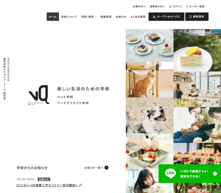
大きな余白と動物・製菓の写真コラージュを組み合わせた専門学校サイト。落ち着いたベージュの導線、非対称の記事配置、スマートフォン専用のナビゲーションが特徴。
Visionary Arts Tokyo — Style Reference
A spacious white school prospectus paired with a dense collage of animals, pastry, and everyday learning.
Website: Visionary Arts Tokyo Original URL: https://www.va-t.ac.jp/ Final URL: https://www.va-t.ac.jp/ Response: HTTP 200 Theme: light, with white content surfaces, muted gold actions, and a gray sitemap footer Inspected: October 5, 2026, 06:41 JST; supplied retrieval timestamp: October 4, 2026, 21:41:51.917 UTC Viewports: desktop 1440 × 1000 CSS pixels; mobile 390 × 844 CSS pixels Scope: the current institutional homepage, including the opening composition, notices, department introductions, news feed, school-information and LINE promotions, navigation structures, and footer. Visual captures cover the desktop opening, scrolled news, desktop footer, mobile opening, and mobile footer. Other sections are documented from supplied rendered DOM measurements.
The homepage balances two different densities. Navigation, identity, and short notices occupy an unusually quiet white canvas. Photographs supply warmth and activity: a dog being washed, a student holding a ferret, café drinks, carefully finished pastries, and practical learning scenes. The interface contributes little decoration beyond tracked Japanese sans-serif text, small circular arrows, fine card borders, and restrained gold buttons.
This is a substantial school website with several audiences and destinations. Department discovery, admissions, tuition, employment, news, account utilities, campus events, and brochure requests coexist. Preserve that information architecture when borrowing its visual language.
The desktop identity is strongly asymmetric: a calm left field faces two tightly packed photographic columns. On mobile, those columns fill the width and a white message panel interrupts the photography. The news section also changes structure, from a large featured article beside two smaller columns to a horizontal sequence of cards.
閉じる
Visionary Arts Tokyo — Style Reference
A spacious white school prospectus paired with a dense collage of animals, pastry, and everyday learning.
Website: Visionary Arts Tokyo Original URL: https://www.va-t.ac.jp/ Final URL: https://www.va-t.ac.jp/ Response: HTTP 200 Theme: light, with white content surfaces, muted gold actions, and a gray sitemap footer Inspected: October 5, 2026, 06:41 JST; supplied retrieval timestamp: October 4, 2026, 21:41:51.917 UTC Viewports: desktop 1440 × 1000 CSS pixels; mobile 390 × 844 CSS pixels Scope: the current institutional homepage, including the opening composition, notices, department introductions, news feed, school-information and LINE promotions, navigation structures, and footer. Visual captures cover the desktop opening, scrolled news, desktop footer, mobile opening, and mobile footer. Other sections are documented from supplied rendered DOM measurements.
The homepage balances two different densities. Navigation, identity, and short notices occupy an unusually quiet white canvas. Photographs supply warmth and activity: a dog being washed, a student holding a ferret, café drinks, carefully finished pastries, and practical learning scenes. The interface contributes little decoration beyond tracked Japanese sans-serif text, small circular arrows, fine card borders, and restrained gold buttons.
This is a substantial school website with several audiences and destinations. Department discovery, admissions, tuition, employment, news, account utilities, campus events, and brochure requests coexist. Preserve that information architecture when borrowing its visual language.
The desktop identity is strongly asymmetric: a calm left field faces two tightly packed photographic columns. On mobile, those columns fill the width and a white message panel interrupts the photography. The news section also changes structure, from a large featured article beside two smaller columns to a horizontal sequence of cards.
How to Read This Reference
- Measured means a value appears in the supplied computed-style or element-rectangle evidence. Coordinates refer to that extraction state, not necessarily the later scrolled screenshot.
- Calculated means arithmetic derived from measured rectangles, such as a gutter or aspect ratio.
- Visual estimate means a proportion, color, or dimension inferred from a current screenshot. These values are not pixel samples or recovered CSS declarations.
- Recommended means guidance for a new implementation. Breakpoints, accessibility additions, and the reusable CSS are explicitly adaptations.
- Token names are descriptive aliases. The only supplied source custom property is
--swiper-theme-color; the semantic names below are not original source variables. - DOM text includes offscreen navigation and carousel content. Its presence does not establish that a panel was open or that an interaction was tested.
Tokens — Colors
Default Palette
| Name | Value | Suggested token | Evidence and role |
|---|---|---|---|
| White canvas | #ffffff |
--color-canvas |
Measured body background; also used by navigation and white action surfaces |
| Main ink | #212121 |
--color-ink |
Measured body, navigation, article copy, and white-button text |
| Headline gray | #434343 |
--color-heading |
Measured opening headline color on both viewports |
| Muted gold | #b6ab88 |
--color-gold |
Measured brochure button, news-index action, school-information action, and related-site links |
| Footer gray | #6f6f6f |
--color-footer |
Measured full-width sitemap background |
| Reversed text | #ffffff |
--color-on-dark |
Measured footer links, department headings, and gold-button labels |
| LINE green | #00b900 |
--color-line |
Measured text color of the white friend-addition button; surrounding promotion background was not measured |
Small Accents and Graphic Colors
| Name | Approximation | Evidence and use |
|---|---|---|
| Mobile event teal | #75aeac |
Visual estimate of the mobile opening's campus-event pill |
| Pet-category green | #91c65e |
Visual estimate of the tiny circular arrow beside the pet/nursing department link |
| Food-category orange | #efac4e |
Visual estimate of the equivalent food-department arrow |
| Card rule | #bdbdbd |
Visual estimate of the fine gray article-card outline |
| Logo black | Approximately #000000 |
Graphic appearance in the screenshots; no logo fill declaration was supplied |
Gold is an interface accent, not a page tint. Most of the canvas remains white. The small department colors identify destinations without turning the surrounding sections into large colored panels. Photography supplies the pink, brown, cream, green, and blue areas seen in the opening.
The computed property --swiper-theme-color: #007aff is present on both viewports. It is not evidence that blue is a visible brand color, and it should not enter the primary palette merely because the library default exists.
No alternate color theme or theme-switching control is established by the evidence.
Tokens — Typography
Japanese Sans-Serif Stack
Measured family: YakuHanJP_Noto, "Noto Sans JP", sans-serif.
This stack is used throughout the inspected body content and controls. Preserve the source ordering when those font resources are available. The evidence establishes the computed family declaration, not successful font-file loading for every glyph.
The prevailing weight is 500. Department titles use a lighter 400; selected calls to action, LINE copy, and institutional footer details use 700. The resulting hierarchy depends on spacing and composition as much as weight.
The HTML element reports Times, but the body overrides it. It is not the visible editorial typeface and should not be adopted as a secondary display font.
Tracking
- General measured tracking:
1.19px, inherited across many differently sized elements. - Opening headline:
3.7pxat 20px desktop and4.255pxat 23px mobile, equivalent to0.185emin both cases. - Desktop footer specialization links:
0.325pxat 13px. - Mobile institutional heading: the sampled H1 retains
1.19pxtracking despite its compact 9px size.
Do not replace all these values with one proportional em value. The supplied general tracking is a fixed computed length, while the opening headline clearly scales proportionally.
Type Scale
| Role | Desktop | Mobile | Weight | Evidence |
|---|---|---|---|---|
| General body/control baseline | 14px / 16.1px | Same | 500 | Measured; individual paragraphs override this tight baseline |
| Utility navigation | 11px / 12.65px | Desktop row not shown | 500 | Measured |
| Primary navigation | 14px / 14px | Replaced by menu control | 500 | Measured |
| Desktop submenu item | 13px / 14.95px | — | 500 | Measured, unopened state |
| Mobile submenu item | — | 12px / 13.8px | 400 | Measured offscreen menu content |
| Mobile school-name H1 | — | 9px / 18px | 700 | Measured |
| Opening headline | 20px / 23px | 23px / 26.45px | 500 | Measured |
| Opening department links | 14px / 16.1px | 14px / 16.1px | 500 | Measured computed typography |
| Small section heading | 16px / 18.4px | Same | 500 | Measured notices, departments, and news headings |
| Notice headline | 14px / 20.02px | Same | 500 | Measured |
| Department introduction | 18px / 20.7px | 14px / 16.1px | 500 | Measured |
| Department title | 38px / 56.24px | 25px / 37px | 400 | Measured |
| Department detail action | 16px / 18.4px | Same | 700 | Measured |
| Article headline | Approximately 22px | Not visually inspected | Exact weight unmeasured | Desktop visual estimate; recommend 18–20px for mobile adaptation |
| Article excerpt | 14px / 23.94px | Same | 500 | Measured |
| Standard filled action | 14px / 22.4px | Same | 500 | Measured |
| LINE promotion heading | 23px / 35.65px | 19px / 29.45px | 700 | Measured |
| LINE explanatory copy | 14px / 24.92px | Same | 700 | Measured |
| Footer specialization link | 13px / 40px | 12px / 40px | 500 | Measured |
| Desktop copyright | 12px / 13.8px | Approximately 12px visually | 500 desktop | Mobile computed value not supplied |
The opening headline becomes slightly larger on the phone. Do not assume that every text role shrinks at the mobile breakpoint. Department titles, in contrast, reduce substantially.
Tokens — Spacing & Shapes
The original evidence does not expose a global spacing scale. Repeated measured values include 10, 15, 20, 25, 40, 50, and 80px. The following is a practical vocabulary assembled from those component measurements.
Spacing Scale
| Use | Value | Status |
|---|---|---|
| Desktop footer action gap | 10px | Calculated from 80px controls at 90px intervals |
| Mobile promotional-banner gap | 15px | Calculated |
| Mobile article gap | 18px | Calculated from card starts 318px apart and 300px widths |
| Related-site button gap | 20px | Measured/calculated on desktop; visually consistent on mobile |
| Mobile content gutter | 25px | Measured notices and banner positions |
| Mobile opening-copy inset | 30px | Measured text x-position; panel padding visually inferred |
| Desktop small-card column gap | 36px | Calculated |
| Desktop card interior | Approximately 40px plus 1px border | Calculated from card and paragraph x-positions |
| Mobile card interior | Approximately 20px plus 1px border | Calculated |
| Featured/news-grid separation | Approximately 43px | Calculated |
| Mobile footer vertical padding | 50px | Measured |
| Desktop page gutter | 80px | Measured in notices, cards, and footer |
| Desktop footer vertical padding | 80px | Measured |
Border Radius
| Element | Value | Status |
|---|---|---|
| Photo-collage tiles | Visually square | Screenshot observation |
| Article cards | 3px | Measured |
| Standard filled buttons | 3px | Measured |
| Department detail block | 3px 0 0 3px |
Measured |
| Mobile opening action pills | Approximately 20px / fully rounded | Visual estimate |
| Small direction markers | Circle | Screenshot observation |
| Mobile news pagination buttons | 50% | Measured |
There is no visible general-purpose shadow system. Photo boundaries, subtle borders, white space, and large changes of background establish the sections.
Layout Measurements
| Element | Desktop 1440 × 1000 | Mobile 390 × 844 | Evidence |
|---|---|---|---|
| Header/content offset | 140px | 80px | Desktop body/main start; mobile header rectangle |
| Main content width between standard gutters | 1280px | 340px | Calculated |
| Opening photo field | x ≈ 604 to right edge; width ≈ 836px | Full viewport width | Visual estimate |
| Opening photo column | Approximately 418px | Approximately 195px | Calculated from visible division |
| Typical full photo tile | Approximately 418 × 314px | Approximately 195 × 146px | Visual estimate; boundary tiles are cropped |
| Opening headline position | x 275.95, y 476.41 | x 30, y 449.34 | Measured |
| Notice column | x 80, width 450px | x 25, width 340px | Measured |
| Three promotional banners | Each 304.75 × 116.83px | Each 340 × 130.34px | Measured |
| Featured article | 480.97 × 577.11px | First card 300 × 488.19px | Measured extraction state |
| Secondary article width | 360.02px | 300px | Measured |
| Department detail action | 370 × 150px | 320 × 95px | Measured |
| News-index action | 450 × 60px | Not established in mobile layout | Measured desktop |
| School-information action | 300 × 80px | 325 × 60px | Measured |
| Footer right-hand action | 340 × 80px | Approximately 320 × 60px | Desktop measured; mobile screenshot estimate |
| Related-site button | 446.66 × 70px | Approximately 340 × 70px | Desktop measured; mobile screenshot estimate |
| Total document height | 8458.28px | 7486.23px | Measured at capture time |
Document heights describe these content and rendering states. They are not design targets to hardcode.
Components
Desktop Header and Vertical Identity
Role: provide a broad school navigation system while leaving the opening visually quiet.
The white header occupies the first 140px. Its two navigation rows align toward the right, leaving substantial unused space at the left. The utility row begins at y 15 and uses 32px-high links with 10px horizontal padding. It contains audience links, news, login, and registration.
The main row begins at y 61 and is 40px high. Labels cover school information, departments, admissions, tuition, employment, and frequently asked questions. Small downward chevrons distinguish grouped destinations. Campus-event and brochure actions terminate the row as gold rectangles with white labels and small outline icons. The measured brochure action is approximately 128 × 40px, with 25px horizontal padding and a 3px radius.
A narrow vertical school-name treatment remains visible near the left edge in the desktop opening and news captures. It serves as a secondary identity marker outside the principal content grid. Its exact positioning rule was not supplied.
The DOM contains desktop logo links and opacity/transform transitions, but those rectangles alone do not prove their visibility. The supplied desktop header appears largely blank on its left side; do not insert a permanently visible extra logo there simply because a link has measurable bounds.
Desktop Navigation Submenus
Role: expose the school's extensive department and admissions structure.
The DOM establishes department overview blocks and lists of specialization links. Sampled department overview anchors measure 270 × 214px, with 20px padding. Specialization links measure 216 × 40px, with 10px 10px 10px 15px padding and 3px corners. Other dropdown groups contain approximately 250 × 40px links.
These measurements describe available submenu content, not an exercised open state. The screenshot does not establish hover versus click activation, panel background, focus handling, or the final appearance of expanded navigation.
Mobile Header and Menu Trigger
Role: keep school identity and navigation immediately available on a narrow screen.
The mobile header is an 80px-high white strip. Its left school-name block uses a compact three-line treatment; the sampled H1 is 9px, weight 700, with 18px line height and a 20px left inset. A separate VA symbol is centered at x 171.5, y 16.5, measuring approximately 47 × 49px.
The right menu button occupies an 80 × 80px target at x 310. Its visible symbol is a three-by-three arrangement of black dots. Preserve the generous target independently of the much smaller graphic.
The closed-menu DOM places navigation content at x 390, immediately outside the viewport. Main rows measure 390 × 75px; many child links form two 195px-wide columns with 40px row heights. This supports an offscreen panel structure. Its opening motion and accordion behavior were not tested.
Opening Identity and Photo Collage
Role: introduce the school's everyday atmosphere and its two principal study areas.
On desktop, the collage begins around x 604 and extends to the right viewport edge. Two approximately equal columns touch without conventional gutters. Tiles show tightly cropped animals, students, drinks, pastries, and practical learning. The columns have different visible crop boundaries, producing a staggered rhythm.
The left field contains a large black VA mark, a small tracked headline, and two stacked department links. The headline is the actual source copy 楽しい生活のための学校. Its modest 20px size leaves the imagery and space to carry the first impression. Each department link begins with a tiny colored circular arrow: green for ペット学科・動物看護学科, orange for フードクリエイト学科.
On the phone, photography becomes a full-width two-column background. A white message panel starts around y 424 and extends approximately 352px from the left edge, leaving a narrow photographic strip visible at the right. Text begins at x 30. The headline grows to 23px, followed by the two links with tighter vertical separation. The large hero logo is replaced by the centered logo already present in the mobile header.
This panel should remain a distinct white interruption in the photo field. A full-image gradient overlay or centered white headline on a photograph would change the composition substantially.
School Notices
Role: surface urgent institutional updates without making them large promotional cards.
The desktop notice block sits beneath the opening identity in the left white field. Its 16px heading aligns left; a small circular-arrow index link aligns at the right edge of the 450px column. Each notice pairs a subdued date and small gold category label with an underlined headline below. A small link symbol appears beside the headline in the capture.
Measured notice anchors use 7px vertical padding. Desktop rows are approximately 63.66px high with additional separation; mobile rows are approximately 73.66px high. On mobile, the block moves below the tall opening photo area and uses 25px page gutters.
Notice dates and article dates are separate fields in the supplied content. Preserve the distinction instead of forcing a shared date across the notice list and article cards.
Promotional Banner Row
Role: offer short visual routes into current admissions and event announcements.
Three linked banners are confirmed by DOM rectangles. On desktop they sit in one row, each approximately 304.75 × 116.83px. On mobile they stack at 340 × 130.34px with 15px gaps. These dimensions preserve an approximately 2.61:1 ratio.
The supplied visual captures do not show the full banner row. Its precise artwork and embedded typography are not established here. Do not invent banner imagery from the destination titles.
Department Feature Sections
Role: introduce the pet/animal-nursing and food-creation programs before the news feed.
The rendered DOM confirms two substantial feature sections with a short introductory sentence, a department title, specialization examples, and a large white detail link. The desktop department heading is 38px, weight 400, with 56.24px line height. The pet/nursing title spans two lines; the food title occupies one.
The detail link measures 370 × 150px on desktop and sits at x 990, toward the right. Its label is 16px and bold, with 38px left padding. On mobile it becomes 320 × 95px at x 45 and uses 19px left padding. Department headings reduce to 25px / 37px.
White text and white action surfaces are measured. Background media, overlays, image selections, and exact crops are not established by the supplied screenshots, so those details should remain open in an implementation specification.
Featured Article and Two-Column News Feed
Role: show current school life and admissions content with an editorial hierarchy.
The desktop layout has a large featured article at x 80, approximately 481px wide. To its right, two 360px columns begin at x 604 and x 1000. The gap between the feature and the smaller grid is approximately 43px; the smaller columns are 36px apart.
Each card is a linked composition containing:
- A large photograph or event graphic at the top.
- A prominent Japanese headline.
- A short excerpt, including editorial emoji where present in the actual content.
- A subdued date at lower left.
- A small gold circular direction marker at lower right.
Cards have 3px corners, a fine gray outline, and no visible shadow. Text begins approximately 41px inside the desktop card edge, consistent with a 40px inset plus border. Excerpts use 14px / 23.94px typography. Card heights vary with content and row treatment; the first feature is approximately 577px high.
In the scrolled news screenshot, the large first article remains near the top while later articles occupy the right columns. This is consistent with a sticky featured article, but the exact positioning declaration, offset, and release boundary were not supplied. Treat sticky behavior as a strongly supported visual inference rather than a recovered source rule.
Mobile News Carousel
Role: retain the same editorial content without stacking every desktop card into a long vertical feed.
The mobile DOM places 300px-wide cards horizontally at x 18, 336, 654, and subsequent 318px intervals. This produces an 18px gap and a partial view of the next card. Nine circular button elements, each 15 × 15px, sit above the row at 25px intervals.
This is evidence of a carousel structure. It does not establish autoplay, swipe physics, looping, the selected-dot color, or tested keyboard behavior. Offscreen card heights differ from the first card in the extraction; do not copy those heights as a requirement for all visible slides.
For adaptation, preserve the 300px card width, modest inter-card gap, 20px text inset, and visible continuation cue. Keep card height content-driven.
School Information and LINE Promotion
Role: connect the editorial content to practical school information and a subscription channel.
The school-information section contains explanatory text and a gold action. Its desktop action is 300 × 80px at the right; the mobile action is 325 × 60px and centered. Mobile explanatory text uses 27.02px line height and wraps onto two lines.
The LINE promotion uses bold white text and a white friend-addition action with measured green text. The heading changes from 23px desktop to 19px mobile. The action measures 540 × 60px on desktop and 290 × 60px on mobile.
The complete visual backgrounds of these sections are not included in the supplied captures. Preserve the measured text and control hierarchy without assigning an unsupported background photograph or exact green panel fill.
Sitemap Footer and Contact Block
Role: provide comprehensive navigation and repeat high-value school actions.
A full-width #6f6f6f surface contains white links. Desktop padding is 80px above and below. The left side holds grouped navigation for general school information, departments and specializations, admissions, and news. Top-level links begin with small white circular arrows. Child links wrap across lines and use 13px type with 40px line boxes.
The right side combines a reversed VA logo, institutional name, address, telephone link, and three stacked white action rectangles. The actions lead to campus events, brochure requests, and contact. Each is 340 × 80px, separated by 10px. Their outline icons and labels are centered as compact groups.
The original footer independently names 学校法人 安達文化学園 and 専門学校 ビジョナリーアーツ. That identity is visible website content.
On mobile, footer sections stack. Major links use much taller rows, with sampled heights around 72–82px and 28px top padding. Specialization links form two columns. The source rectangles occasionally extend slightly beyond the viewport; a new implementation should preserve the two-column intent while containing the grid safely.
Social and Related-Site Footer
Role: finish the page with social destinations and sibling programs/sites.
This final area returns to white. Desktop copyright sits left, while a short social label and approximately 26 × 27px Instagram and LINE marks sit right. Three gold related-site buttons span a lower row, each approximately 446.66 × 70px, with 20px gaps and approximately 30px outer margins.
On mobile, the social invitation becomes a large centered line, visually around 21px. The two brand icons enlarge to approximately 50px. Three 340 × 70px gold buttons stack with 20px gaps, followed by the copyright at the bottom. Each related-site button includes a small white circular direction mark near its right edge.
Preserve this order change: social first, related destinations second, copyright last.
Mobile Opening Action Band
Role: provide immediate access to campus events and brochure requests.
The mobile opening capture shows a white bottom band, approximately 73px high, with two roughly 175 × 40px pills. The left event control is muted teal; the right brochure control is gold. Both use white outline icons and Japanese labels.
The band is absent from the supplied mobile footer capture. A precise visibility threshold, dismissal action, or footer-intersection rule is not established. Do not describe it as unconditionally fixed throughout the page. The DOM includes PET and FOOD event destinations, but the intermediate selection interaction was not exercised.
Tokens — Motion & Interaction
Measured Transition Declarations
| Element | Supplied computed transition | What it establishes |
|---|---|---|
| Ordinary notice/logo/social links | opacity 0.2s cubic-bezier(0.19, 1, 0.22, 1) |
A short opacity response is defined; target opacity was not captured |
| Primary desktop navigation | Background and text color, 0.4s linear |
Color transitions exist; final hover colors are unverified |
| Desktop submenu links | Background and text color, 0.4s cubic-bezier(0.215, 0.61, 0.355, 1) |
Submenu color changes have a defined eased duration |
| Standard action buttons | Background, text, border, and opacity, 0.4s linear |
Multiple visual properties can transition without changing geometry |
| Article cards | border-color 0.4s linear |
Border feedback is defined; elevation is not established |
| Desktop logo links | Opacity and transform, 0.2s cubic-bezier(0.215, 0.61, 0.355, 1), with 0.2s or 0.4s delays |
A staggered logo-related transition is declared; its trigger and end state are unverified |
Many sampled elements show a bare transition: all and animation: none. A bare property list does not establish a nonzero transition duration. These samples also do not prove that every image, ancestor, pseudo-element, or script-controlled component is static.
Interaction Evidence and Limits
- The header remains at the top in the supplied opening and scrolled views, supporting persistent-header behavior.
- The scrolled desktop news composition supports a sticky-feature interpretation, without exposing its complete rules.
- Mobile offscreen menu geometry and button elements establish a menu structure, not a tested opening sequence.
- Horizontally positioned mobile news cards and pagination buttons establish a carousel structure, not autoplay or a verified gesture model.
- Different photographic crops across viewport captures do not establish motion direction, speed, looping, or parallax.
- No click, hover, menu-opening, carousel-selection, form-submission, or reduced-motion test results were supplied.
For a new implementation, use restrained opacity and border/color feedback. Keep any additional photo motion optional until its intended behavior has been specified.
Surfaces
| Layer | Appearance | Purpose |
|---|---|---|
| Main canvas | Pure white | Creates space around identity, notices, and articles |
| Opening photographs | Edge-to-edge rectangular tiles | Supplies color, activity, and school-specific subject matter |
| Mobile message panel | Opaque white interruption in the collage | Protects readability and repeats the desktop's white/photo contrast |
| Article cards | White, fine gray outline, 3px corners | Groups editorial content without elevation |
| Primary site actions | Muted gold, white text, 3px corners | Connects key destinations across the long page |
| Mobile opening actions | Teal and gold pills on a white band | Provides a distinct compact action treatment |
| Sitemap | Solid medium gray with white text | Separates dense institutional navigation |
| Footer contact actions | White rectangles with dark icons and labels | Maintains strong legibility within the gray field |
| Social/related area | White with brand icons and gold links | Gives the page a lighter final section |
Do not derive a gradient or decorative tint system from colors found inside photographs. The page's structural surfaces are mostly flat.
Imagery
Photography is the principal expressive layer. Animals are shown close enough to feel approachable; students appear engaged in practical handling or learning; food is photographed as finished craft. Drinks, cakes, pastries, chocolate, coffee equipment, and a planted school entrance connect the education offer to tangible everyday experiences.
The current opening mixes documentary and product photography. A dog covered in shampoo and a student holding a ferret sit alongside neatly composed drinks and small pastries. Warm materials, pale tabletops, pastel backdrops, and natural greenery keep the collage inviting without requiring colored UI decoration.
Use varied subjects with consistent exposure and enough detail to survive a narrow crop. Preserve faces, animal heads, hands, and complete food silhouettes where practical. object-fit: cover is an implementation recommendation; per-image focal positioning is necessary to reproduce the observed crops.
Article imagery has a different role. Event graphics may include bold colors and embedded Japanese promotional text. Those graphics belong to individual editorial items and should not redefine the page's global typography or palette.
Observed Asset References
| Asset role | Current evidence | Reuse guidance |
|---|---|---|
| VA identity mark | Black in the opening/mobile header; white in the gray footer | Use an authorized logo asset rather than approximating it with a font |
| Animal photographs | Grooming dog, multiple school dogs, student with ferret | Keep handling and school context visible |
| Food photographs | Café drinks, pastries, canelés, cakes, chocolate | Mix close product detail with wider craft settings |
| Learning photographs | Students and practical equipment | Preserve the human scale and activity |
| School entrance | Planted facade in the featured article | Treat as editorial content, not a generic architectural background |
| Event graphics | Campus-event article artwork | Preserve source artwork proportions and embedded copy |
| Social marks | Instagram and LINE | Use authorized brand assets at the demonstrated desktop/mobile sizes |
| Utility symbols | Building, document, contact bubble, chevrons, circular arrows | Keep simple outlines and modest visual weight; no icon-family name is established |
Image src URLs, native dimensions, and downloadable asset paths were not supplied. Article destination URLs are not image asset URLs. No filenames or asset endpoints should be invented from them.
Layout & Responsive Behavior
Desktop Composition
At 1440px, repeated 80px side gutters produce a 1280px content region. The opening deliberately departs from that region: photography reaches the right viewport edge while identity and notices remain in a narrow left field. The visual split is approximately 42% white/identity area and 58% photography.
Later sections alternate generous separation with dense content. Small 16px section headings introduce department features and news; large department titles create local emphasis. The article area uses a featured-plus-two-column arrangement rather than three equal columns. The footer then consolidates the school's extensive navigation into a gray field.
Mobile Recomposition
At 390px, the desktop utility rows disappear from the visible header. Identity is redistributed into the left school-name block and centered logo, with the dotted menu trigger at right.
The opening collage spans the screen. Its two columns remain side by side rather than becoming one large photograph. The message panel overlays the collage and removes the large desktop logo. Notices follow below the tall photo region at x 25.
Promotional banners stack vertically. Department headings shrink and their large detail controls become nearly full-width. News becomes a horizontal card sequence. Footer groups stack while their specialization links retain two columns. The social area and related-site links become centered vertical content, with copyright last.
Responsive Measurements to Preserve
| Relationship | Desktop | Mobile |
|---|---|---|
| Header height | 140px | 80px |
| Standard content gutter | 80px | 25px |
| Opening headline | 20px, very wide tracking | 23px, same proportional tracking |
| Article text inset | About 40px | About 20px |
| Department title | 38px | 25px |
| Department action height | 150px | 95px |
| Footer layout | Sitemap beside contact block | Stacked groups and contact block |
| News arrangement | Feature plus two columns | 300px horizontal cards with 18px gaps |
Only two viewports were supplied. The exact source breakpoint, tablet behavior, and intermediate fluid formulas are unknown. The Quick Start uses 1024px as a recommended adaptation breakpoint, not a recovered source value.
Do’s and Don’ts
Do
- Keep white space as an active part of the desktop composition.
- Use the measured gold
#b6ab88, ink#212121, and footer gray#6f6f6fconsistently. - Retain the two-column photographic collage on both desktop and mobile.
- Place mobile introductory text on an opaque white panel with photography still visible beside it.
- Use the measured Japanese font stack and carefully distinguish general tracking from headline tracking.
- Keep ordinary section headings modest; reserve the larger scale for department names and article titles.
- Preserve the featured article's dominance over the two smaller desktop columns.
- Use fine outlines and 3px corners for cards and standard actions.
- Keep event artwork and editorial emoji attached to their actual content.
- Preserve the comprehensive navigation, notices, and school-information functions.
- Treat the phone layout as a recomposition, including the news carousel and footer order.
Don’t
- Don't turn the institutional homepage into a single campaign funnel.
- Don't replace the opening with a full-screen darkened photograph and oversized centered slogan.
- Don't make all desktop article cards equal width.
- Don't add heavy card shadows, glass effects, decorative gradients, or large rounded photo corners.
- Don't use the mobile action-pill shape for every desktop control.
- Don't expand the tiny pet and food accent colors into an unrelated multicolor UI system.
- Don't identify
Timesor the library's default blue as visible design choices. - Don't infer menu behavior or photo autoplay from static screenshots and offscreen DOM alone.
- Don't hardcode article heights from offscreen mobile carousel measurements.
- Don't assume the mobile bottom action band remains visible over the footer.
- Don't invent image paths, font resources, production roles, or unobserved page states.
Recommended Implementation Additions
These are recommendations for a new implementation, not verified original-site features:
- Give the dotted menu button an accessible name,
aria-expanded, and an explicit controlled panel. Keep closed navigation out of the keyboard focus order. - Implement dropdowns and mobile category groups with keyboard-operable controls, visible focus, and reliable focus return after closing.
- Keep carousel cards reachable without requiring a drag gesture. Label pagination controls and expose the selected item programmatically.
- Increase the effective touch target around 15px pagination dots without enlarging their visible circles excessively.
- Define mobile action-band visibility deliberately. Hiding it when equivalent footer controls become visible would be consistent with the supplied endpoint captures, but is a proposed rule.
- Account for safe-area insets and prevent bottom controls from obscuring links or focused content.
- Review action-label contrast. White text on measured gold calculates to approximately 2.3:1. A darker action fill or dark-ink labels would improve contrast; preserve the original color as a reference token rather than silently calling it accessible.
- Supply meaningful alternative text for documentary images and accessible equivalents for event graphics containing essential text.
- Set image dimensions to avoid layout shifts, load initial visible images promptly, and defer distant article imagery.
- Keep text and destinations available if carousel or menu scripting fails.
- Respect reduced-motion preferences for any added photo movement and decorative transitions.
Agent Prompt Guide
Quick Color Reference
- Canvas and cards:
#ffffff. - Main text and outline icons:
#212121. - Opening headline:
#434343. - Standard action fill:
#b6ab88. - Sitemap background:
#6f6f6fwith white links. - Mobile event pill: approximately
#75aeac, pending exact measurement. - Category arrows: small green and orange accents, not large surfaces.
- No general drop-shadow or gradient system.
Overall Prompt
“Create a responsive Japanese vocational-school homepage inspired by the current Visionary Arts Tokyo composition. Use a white canvas, Noto Sans JP with the observed YakuHanJP_Noto-first stack when available, dark gray text, fixed 1.19px general tracking, muted gold rectangular actions, and a medium-gray sitemap footer. On desktop, place a small VA-style identity asset and a modest tracked headline in a broad white left field, with two touching photographic columns filling the right side. Use authentic animal-care, café, pastry, and school-life photographs. Add compact notices, substantial department introductions, and a news layout with one large featured article beside two smaller columns. On mobile, retain the two photographic columns across the full width, overlay a white introductory panel, use an 80px header with centered identity and a nine-dot menu symbol, and present news as horizontal 300px cards. Preserve the full school information architecture and distinguish measured values from proposed interactions.”
Example Component Prompts
- Opening composition: “At 1440px, begin content below a 140px white header. Reserve roughly 42% of the width for white space, a black identity mark, a 20px tracked Japanese headline, and two department links. Fill the remaining width with two photographic columns without gutters. Use square image boundaries and no dark overlay.”
- Mobile opening: “At 390px, use an 80px white header, two 195px photographic columns, and an approximately 352px-wide white copy panel entering from the left. Set the source headline at 23px with 0.185em tracking and keep small green/orange circular arrows beside department links.”
- Article card: “Build a white editorial card with a fine gray border, 3px corners, a broad top image, a medium Japanese headline, 14px excerpts with approximately 24px line height, a small date, and a gold circular arrow at lower right. Use about 40px inner padding on desktop and 20px on mobile; no shadow.”
- News layout: “Within a 1280px desktop region, place a roughly 481px featured article beside a 756px area containing two 360px card columns with 36px gaps. Treat sticky feature behavior as an implementation choice informed by the reference. On phones, use a horizontal 300px card track with 18px gaps and accessible pagination.”
- Footer: “Create a flat #6f6f6f sitemap with white grouped links and small circular arrows. Put a reversed school logo, institution details, and three 340 × 80px white actions at the right. Follow with a white social area and three gold related-site links. On mobile, stack sections, enlarge social icons, and place copyright last.”
Quick Start
CSS Custom Properties
This is a reusable adaptation, not copied source CSS. Exact measured colors and type values are retained. Photo split, article-title size, border color, mobile accent colors, and opening placement include documented approximations. The 1024px breakpoint is recommended. Keep a conventional root size; explicit pixel values below reproduce the measured component scale.
The selectors assume semantic header/navigation elements, a .hero containing .hero__intro and .hero__mosaic, a .news-layout containing one featured card and .news-rest, and separate gray/footer-bottom regions. Supply authorized logo and photographic assets independently.
:root {
  /* Measured colors */
  --color-canvas: #ffffff;
  --color-ink: #212121;
  --color-heading: #434343;
  --color-gold: #b6ab88;
  --color-footer: #6f6f6f;
  --color-line: #00b900;

  /* Visual approximations, pending direct measurement */
  --color-rule: #bdbdbd;
  --color-event: #75aeac;
  --color-pet: #91c65e;
  --color-food: #efac4e;

  /* Measured typography */
  --font-school: YakuHanJP_Noto, 'Noto Sans JP', sans-serif;
  --tracking-body: 1.19px;
  --tracking-hero: 0.185em;
  --text-body: 14px;
  --text-section: 16px;
  --text-hero: 20px;
  --text-department: 38px;

  /* Measured geometry and reusable adaptation values */
  --header-height: 140px;
  --page-gutter: 80px;
  --content-max: 1280px;
  --radius-small: 3px;
  --card-inset: 40px;
  --motion-color: 400ms linear;
  --motion-opacity: 200ms cubic-bezier(0.19, 1, 0.22, 1);
}

* { box-sizing: border-box; }

body {
  margin: 0;
  padding-top: var(--header-height);
  color: var(--color-ink);
  background: var(--color-canvas);
  font-family: var(--font-school);
  font-size: var(--text-body);
  font-weight: 500;
  line-height: 1.15;
  letter-spacing: var(--tracking-body);
}

img { display: block; max-width: 100%; }
a { color: inherit; }
button { font: inherit; letter-spacing: inherit; }
[hidden] { display: none !important; }
p { line-height: 1.71; }

.container {
  width: min(var(--content-max), calc(100% - 2 * var(--page-gutter)));
  margin-inline: auto;
}

.site-header {
  position: fixed;
  inset: 0 0 auto;
  z-index: 50;
  height: var(--header-height);
  display: grid;
  grid-template-rows: 32px 40px;
  row-gap: 14px;
  justify-content: end;
  padding: 15px var(--page-gutter) 39px;
  background: var(--color-canvas);
}

.utility-nav,
.primary-nav {
  display: flex;
  align-items: center;
  justify-content: flex-end;
}

.utility-nav a {
  display: flex;
  align-items: center;
  min-height: 32px;
  padding-inline: 10px;
  font-size: 11px;
  text-decoration: none;
}

.primary-nav > a {
  display: inline-flex;
  align-items: center;
  min-height: 40px;
  padding-inline: 14px;
  text-decoration: none;
  transition: color var(--motion-color),
              background-color var(--motion-color);
}

.button {
  display: inline-flex;
  align-items: center;
  justify-content: center;
  gap: 8px;
  min-height: 60px;
  padding: 12px 25px;
  border: 1px solid transparent;
  border-radius: var(--radius-small);
  color: var(--color-ink);
  background: var(--color-canvas);
  line-height: 1.6;
  text-decoration: none;
  text-align: center;
  transition: background-color var(--motion-color),
              color var(--motion-color),
              border-color var(--motion-color),
              opacity var(--motion-color);
}

.button--gold {
  color: #fff;
  background: var(--color-gold);
}

.primary-nav > .button {
  min-height: 40px;
  margin-left: 4px;
  padding-inline: 25px;
  font-size: 13px;
}

.mobile-brand,
.menu-trigger,
.mobile-actions { display: none; }

/* Approximate desktop first-fold placement from the supplied capture. */
.hero {
  position: relative;
  display: grid;
  grid-template-columns: 42% 58%;
  min-height: 1000px;
}

.hero__intro { padding: 0 74px 0 80px; }

.hero__identity {
  display: flex;
  align-items: center;
  justify-content: flex-end;
  gap: 40px;
  padding-top: 336px;
}

.hero__logo { width: 106px; flex: 0 0 106px; }
.hero__copy { flex: 0 0 auto; }

.hero__copy h2 {
  margin: 0 0 27px;
  color: var(--color-heading);
  font-size: var(--text-hero);
  font-weight: 500;
  line-height: 1.15;
  letter-spacing: var(--tracking-hero);
}

.hero__links { display: grid; gap: 20px; }

.category-link {
  display: flex;
  align-items: center;
  gap: 6px;
  text-decoration: none;
}

.category-marker {
  display: inline-grid;
  place-items: center;
  flex: 0 0 12px;
  width: 12px;
  height: 12px;
  border-radius: 50%;
  color: #fff;
  background: var(--color-pet);
  font-size: 11px;
  line-height: 1;
}

.category-marker--food { background: var(--color-food); }

.hero__mosaic {
  display: grid;
  grid-template-columns: repeat(2, minmax(0, 1fr));
  height: 1000px;
  overflow: hidden;
}

/* Set offsets per column after choosing the actual image sequence. */
.hero__column { transform: translateY(var(--collage-offset, 0px)); }
.hero__column img {
  width: 100%;
  aspect-ratio: 4 / 3;
  object-fit: cover;
  object-position: var(--image-focus, 50% 50%);
}

.hero__notices { margin-top: 300px; }
.notice-heading {
  display: flex;
  align-items: center;
  justify-content: space-between;
  gap: 16px;
}

.section-heading,
.notice-heading h3 {
  margin: 0;
  font-size: var(--text-section);
  font-weight: 500;
  line-height: 1.15;
}

.notice-list { margin-top: 30px; }
.notice {
  display: block;
  padding-block: 7px;
  margin-bottom: 10px;
  text-decoration: none;
  transition: opacity var(--motion-opacity);
}

.notice__meta { display: flex; align-items: center; gap: 16px; }
.notice__date { font-size: 11px; color: #777; }
.notice__tag {
  padding: 3px 6px;
  color: #fff;
  background: var(--color-gold);
  font-size: 11px;
}
.notice__title { margin: 12px 0 0; line-height: 1.43; text-decoration: underline; }

.promo-grid {
  display: grid;
  grid-template-columns: repeat(3, minmax(0, 1fr));
  gap: 32px;
  max-width: 980px;
  margin: 70px auto 150px;
}
.promo-grid img { width: 100%; height: auto; }

.department-title {
  margin: 15px 0;
  color: #fff;
  font-size: var(--text-department);
  font-weight: 400;
  line-height: 1.48;
}

.department-action {
  width: 370px;
  min-height: 150px;
  justify-content: flex-start;
  padding-left: 38px;
  border-radius: 3px 0 0 3px;
  font-size: 16px;
  font-weight: 700;
}

.news-layout {
  display: grid;
  grid-template-columns: minmax(0, 481fr) minmax(0, 756fr);
  align-items: start;
  gap: 43px;
}

/* Recommended implementation of the apparent sticky feature. */
.news-feature {
  position: sticky;
  top: calc(var(--header-height) + 10px);
}

.news-rest {
  display: grid;
  grid-template-columns: repeat(2, minmax(0, 1fr));
  gap: 36px;
}

.news-card {
  display: flex;
  flex-direction: column;
  min-width: 0;
  overflow: hidden;
  border: 1px solid var(--color-rule);
  border-radius: var(--radius-small);
  background: var(--color-canvas);
  text-decoration: none;
  transition: border-color var(--motion-color);
}

.news-card__image { width: 100%; aspect-ratio: 4 / 3; object-fit: cover; }
.news-card__body { display: flex; flex: 1; flex-direction: column; padding: 28px var(--card-inset); }
.news-card__title { margin: 0 0 28px; font-size: 22px; font-weight: 500; line-height: 1.54; }
.news-card__excerpt { margin: 0; font-size: 14px; line-height: 1.71; }
.news-card__meta { display: flex; align-items: center; justify-content: space-between; gap: 16px; margin-top: 32px; font-size: 12px; }

.round-arrow {
  display: inline-grid;
  place-items: center;
  width: 19px;
  height: 19px;
  border-radius: 50%;
  color: #fff;
  background: var(--color-gold);
  line-height: 1;
}

.site-footer { margin-top: 100px; padding-block: 80px; background: var(--color-footer); color: #fff; }
.footer-grid { display: grid; grid-template-columns: minmax(0, 1fr) 340px; gap: 60px; }
.footer-group + .footer-group { margin-top: 45px; }
.footer-group__links { display: flex; flex-wrap: wrap; gap: 0 16px; margin-top: 5px; }
.footer-group__links a { font-size: 13px; line-height: 40px; letter-spacing: 0.325px; text-decoration: none; }
.footer-actions { display: grid; gap: 10px; margin-top: 80px; }
.footer-actions .button { width: 100%; min-height: 80px; }

.footer-bottom {
  display: grid;
  grid-template-areas: 'copyright social' 'related related';
  grid-template-columns: 1fr auto;
  align-items: center;
  gap: 35px 20px;
  padding: 40px 30px 0;
}
.footer-copyright { grid-area: copyright; margin: 0; padding-left: 50px; font-size: 12px; }
.footer-social { grid-area: social; display: flex; align-items: center; gap: 20px; }
.footer-social__icons { display: flex; gap: 20px; }
.footer-social__icons img { width: 26px; height: 27px; object-fit: contain; }
.related-links { grid-area: related; display: grid; grid-template-columns: repeat(3, minmax(0, 1fr)); gap: 20px; }
.related-links .button { min-height: 70px; }

/* Recommended focus and contrast options. */
:where(a, button):focus-visible { outline: 2px solid currentColor; outline-offset: 4px; }
.accessible-actions .button--gold { color: var(--color-ink); }

@media (hover: hover) {
  /* Proposed end states; the source transition targets were not supplied. */
  .notice:hover { opacity: 0.75; }
  .news-card:hover { border-color: var(--color-gold); }
}

/* Recommended intermediate adjustment; this viewport was not inspected. */
@media (min-width: 1024px) and (max-width: 1279px) {
  :root { --page-gutter: 40px; }
  .hero__intro { padding-inline: 40px; }
  .hero__identity { flex-wrap: wrap; justify-content: flex-start; gap: 24px; }
  .primary-nav > a { padding-inline: 9px; }
}

@media (max-width: 1023px) {
  :root {
    --header-height: 80px;
    --page-gutter: 25px;
    --text-hero: 23px;
    --text-department: 25px;
    --card-inset: 20px;
  }

  .site-header { display: block; padding: 0; }
  .utility-nav, .primary-nav { display: none; }
  .mobile-brand { display: block; }
  .mobile-brand__name { position: absolute; top: 13px; left: 20px; margin: 0; font-size: 9px; font-weight: 700; line-height: 18px; }
  .mobile-brand__logo { position: absolute; top: 16.5px; left: 50%; width: 47px; transform: translateX(-50%); }
  .menu-trigger { position: absolute; inset: 0 0 auto auto; display: grid; place-items: center; width: 80px; height: 80px; padding: 0; border: 0; background: transparent; }
  .menu-trigger__dots { width: 30px; height: 30px; background: radial-gradient(circle, currentColor 2px, transparent 2.2px) 0 0 / 10px 10px; }

  .hero { display: block; min-height: 0; }
  .hero__intro { padding: 0; }
  .hero__identity { position: absolute; top: 344px; left: 0; z-index: 2; display: block; width: min(352px, 100%); padding: 25px 30px 30px; background: #fff; }
  .hero__logo { display: none; }
  .hero__copy h2 { margin-bottom: 24px; }
  .hero__links { gap: 10px; }
  .hero__mosaic { position: absolute; inset: 0 0 auto; height: 864px; }
  .hero__notices { position: relative; margin: 0 25px; padding-top: 894px; }
  .notice-list { margin-top: 15px; }
  .notice { margin-bottom: 0; min-height: 74px; }

  .promo-grid { grid-template-columns: 1fr; gap: 15px; width: calc(100% - 50px); margin: 35px auto 100px; }
  .department-action { width: min(320px, 100%); min-height: 95px; padding-left: 19px; }

  /* Native horizontal scrolling is a proposed carousel baseline. */
  .news-layout { display: flex; width: 100%; gap: 18px; padding: 0 18px 12px; overflow-x: auto; scroll-snap-type: x proximity; scroll-padding-inline: 18px; }
  .news-rest { display: contents; }
  .news-card { flex: 0 0 300px; scroll-snap-align: start; }
  .news-feature { position: static; }
  .news-card__title { font-size: 19px; }

  .site-footer { padding-block: 50px; }
  .footer-grid { grid-template-columns: 1fr; gap: 50px; }
  .footer-group__links { display: grid; grid-template-columns: repeat(2, minmax(0, 1fr)); gap: 0 12px; }
  .footer-group__links a { font-size: 12px; letter-spacing: 1.19px; overflow-wrap: anywhere; }
  .footer-actions { width: min(320px, 100%); margin: 40px auto 0; }
  .footer-actions .button { min-height: 60px; }
  .footer-bottom { grid-template-areas: 'social' 'related' 'copyright'; grid-template-columns: 1fr; gap: 45px; padding: 76px 25px 40px; }
  .footer-social { flex-direction: column; gap: 30px; text-align: center; }
  .footer-social__label { margin: 0; font-size: 21px; line-height: 1.4; letter-spacing: 0.525px; }
  .footer-social__icons img { width: 50px; height: 52px; }
  .related-links { grid-template-columns: 1fr; }
  .footer-copyright { padding: 0; text-align: center; }

  /* The application must control visibility near the footer. */
  .mobile-actions {
    position: fixed;
    inset: auto 0 0;
    z-index: 40;
    display: grid;
    grid-template-columns: repeat(2, minmax(0, 1fr));
    gap: 15px;
    padding: 17px 13px calc(15px + env(safe-area-inset-bottom, 0px));
    background: #fff;
  }
  .mobile-actions .button { min-height: 40px; padding: 8px 6px; border-radius: 999px; }
  .mobile-actions__event { color: #fff; background: var(--color-event); }
  .has-mobile-actions { padding-bottom: calc(73px + env(safe-area-inset-bottom, 0px)); }
}

@media (prefers-reduced-motion: reduce) {
  .notice, .news-card, .button, .primary-nav > a { transition: none; }
  .news-layout { scroll-behavior: auto; }
}
The opening placement values reproduce the supplied 1440px and 390px compositions approximately. They are starting points, not recovered responsive formulas. Validate wrapping with the chosen fonts and real photographs. Add accessible menu/carousel behavior separately; decorative marker elements should be hidden from assistive technology when their adjacent text already names the destination.
Tailwind v4 Token Mapping
Optional aliases for a project already using Tailwind v4. This does not imply that the original site uses Tailwind. Define the custom properties above first.
@theme inline {
  --color-va-canvas: var(--color-canvas);
  --color-va-ink: var(--color-ink);
  --color-va-heading: var(--color-heading);
  --color-va-gold: var(--color-gold);
  --color-va-footer: var(--color-footer);
  --color-va-event: var(--color-event);
  --color-va-rule: var(--color-rule);

  --font-va: var(--font-school);
  --text-va-body: var(--text-body);
  --text-va-section: var(--text-section);
  --text-va-hero: var(--text-hero);
  --text-va-department: var(--text-department);

  --spacing-va-gutter: var(--page-gutter);
  --spacing-va-header: var(--header-height);
  --spacing-va-card-inset: var(--card-inset);
  --radius-va: var(--radius-small);
}
Sources & Evidence
- Original and final website: https://www.va-t.ac.jp/. Supplied browser evidence reports HTTP 200 and the same original/final URL.
- Capture time: October 4, 2026, 21:41:51.917 UTC, equivalent to October 5, 2026, 06:41:51.917 JST. This reference analyzes that supplied current-page inspection; no additional browsing was performed.
- Desktop evidence: 1440 × 1000 CSS pixels; opening, scrolled article section, and footer captures, plus rendered text, destination links, element rectangles, and computed styles.
- Mobile evidence: 390 × 844 CSS pixels; opening and footer captures, plus rendered navigation, section, carousel, and footer geometry.
- Confirmed destination structure: the original-page DOM includes department, admissions, news, school-information, event, brochure-request, and contact links. Destination pages were not separately inspected.
- Readiness scope: the supplied capture process waited for document loading, image decoding, finite visible or revealing animation, and sampled layout/text stability within stated time limits. Perpetual animations were paused during readiness checks and then resumed. These checks do not establish complete delayed content or motion semantics.
- Interaction scope: scroll traversal produced the supplied page views. No results were supplied for opening menus, activating controls, selecting carousel items, submitting forms, or testing keyboard and reduced-motion behavior.
- Known limitations: image asset URLs, native image sizes, complete stylesheets, source breakpoint rules, exact hover endpoints, photo-motion timing, and mobile action-band visibility logic were not supplied. Several below-fold sections are supported by DOM measurements without corresponding visual captures. SharedWorkers and service workers were disabled during inspection.
Measured values, screenshot estimates, and implementation recommendations are distinguished throughout. The CSS and prompts are reusable adaptations of the current observed design, not a claim to reproduce its undisclosed implementation.
# Visionary Arts Tokyo — Style Reference

> A spacious white school prospectus paired with a dense collage of animals, pastry, and everyday learning.

**Website:** [Visionary Arts Tokyo](https://www.va-t.ac.jp/)
**Original URL:** https://www.va-t.ac.jp/
**Final URL:** https://www.va-t.ac.jp/
**Response:** HTTP 200
**Theme:** light, with white content surfaces, muted gold actions, and a gray sitemap footer
**Inspected:** October 5, 2026, 06:41 JST; supplied retrieval timestamp: October 4, 2026, 21:41:51.917 UTC
**Viewports:** desktop 1440 × 1000 CSS pixels; mobile 390 × 844 CSS pixels
**Scope:** the current institutional homepage, including the opening composition, notices, department introductions, news feed, school-information and LINE promotions, navigation structures, and footer. Visual captures cover the desktop opening, scrolled news, desktop footer, mobile opening, and mobile footer. Other sections are documented from supplied rendered DOM measurements.

The homepage balances two different densities. Navigation, identity, and short notices occupy an unusually quiet white canvas. Photographs supply warmth and activity: a dog being washed, a student holding a ferret, café drinks, carefully finished pastries, and practical learning scenes. The interface contributes little decoration beyond tracked Japanese sans-serif text, small circular arrows, fine card borders, and restrained gold buttons.

This is a substantial school website with several audiences and destinations. Department discovery, admissions, tuition, employment, news, account utilities, campus events, and brochure requests coexist. Preserve that information architecture when borrowing its visual language.

The desktop identity is strongly asymmetric: a calm left field faces two tightly packed photographic columns. On mobile, those columns fill the width and a white message panel interrupts the photography. The news section also changes structure, from a large featured article beside two smaller columns to a horizontal sequence of cards.
閉じる
# Visionary Arts Tokyo — Style Reference

> A spacious white school prospectus paired with a dense collage of animals, pastry, and everyday learning.

**Website:** [Visionary Arts Tokyo](https://www.va-t.ac.jp/)
**Original URL:** https://www.va-t.ac.jp/
**Final URL:** https://www.va-t.ac.jp/
**Response:** HTTP 200
**Theme:** light, with white content surfaces, muted gold actions, and a gray sitemap footer
**Inspected:** October 5, 2026, 06:41 JST; supplied retrieval timestamp: October 4, 2026, 21:41:51.917 UTC
**Viewports:** desktop 1440 × 1000 CSS pixels; mobile 390 × 844 CSS pixels
**Scope:** the current institutional homepage, including the opening composition, notices, department introductions, news feed, school-information and LINE promotions, navigation structures, and footer. Visual captures cover the desktop opening, scrolled news, desktop footer, mobile opening, and mobile footer. Other sections are documented from supplied rendered DOM measurements.

The homepage balances two different densities. Navigation, identity, and short notices occupy an unusually quiet white canvas. Photographs supply warmth and activity: a dog being washed, a student holding a ferret, café drinks, carefully finished pastries, and practical learning scenes. The interface contributes little decoration beyond tracked Japanese sans-serif text, small circular arrows, fine card borders, and restrained gold buttons.

This is a substantial school website with several audiences and destinations. Department discovery, admissions, tuition, employment, news, account utilities, campus events, and brochure requests coexist. Preserve that information architecture when borrowing its visual language.

The desktop identity is strongly asymmetric: a calm left field faces two tightly packed photographic columns. On mobile, those columns fill the width and a white message panel interrupts the photography. The news section also changes structure, from a large featured article beside two smaller columns to a horizontal sequence of cards.

## How to Read This Reference

- **Measured** means a value appears in the supplied computed-style or element-rectangle evidence. Coordinates refer to that extraction state, not necessarily the later scrolled screenshot.
- **Calculated** means arithmetic derived from measured rectangles, such as a gutter or aspect ratio.
- **Visual estimate** means a proportion, color, or dimension inferred from a current screenshot. These values are not pixel samples or recovered CSS declarations.
- **Recommended** means guidance for a new implementation. Breakpoints, accessibility additions, and the reusable CSS are explicitly adaptations.
- Token names are descriptive aliases. The only supplied source custom property is `--swiper-theme-color`; the semantic names below are not original source variables.
- DOM text includes offscreen navigation and carousel content. Its presence does not establish that a panel was open or that an interaction was tested.

## Tokens — Colors

### Default Palette

| Name | Value | Suggested token | Evidence and role |
| --- | --- | --- | --- |
| White canvas | `#ffffff` | `--color-canvas` | Measured body background; also used by navigation and white action surfaces |
| Main ink | `#212121` | `--color-ink` | Measured body, navigation, article copy, and white-button text |
| Headline gray | `#434343` | `--color-heading` | Measured opening headline color on both viewports |
| Muted gold | `#b6ab88` | `--color-gold` | Measured brochure button, news-index action, school-information action, and related-site links |
| Footer gray | `#6f6f6f` | `--color-footer` | Measured full-width sitemap background |
| Reversed text | `#ffffff` | `--color-on-dark` | Measured footer links, department headings, and gold-button labels |
| LINE green | `#00b900` | `--color-line` | Measured text color of the white friend-addition button; surrounding promotion background was not measured |

### Small Accents and Graphic Colors

| Name | Approximation | Evidence and use |
| --- | --- | --- |
| Mobile event teal | `#75aeac` | Visual estimate of the mobile opening's campus-event pill |
| Pet-category green | `#91c65e` | Visual estimate of the tiny circular arrow beside the pet/nursing department link |
| Food-category orange | `#efac4e` | Visual estimate of the equivalent food-department arrow |
| Card rule | `#bdbdbd` | Visual estimate of the fine gray article-card outline |
| Logo black | Approximately `#000000` | Graphic appearance in the screenshots; no logo fill declaration was supplied |

Gold is an interface accent, not a page tint. Most of the canvas remains white. The small department colors identify destinations without turning the surrounding sections into large colored panels. Photography supplies the pink, brown, cream, green, and blue areas seen in the opening.

The computed property `--swiper-theme-color: #007aff` is present on both viewports. It is not evidence that blue is a visible brand color, and it should not enter the primary palette merely because the library default exists.

No alternate color theme or theme-switching control is established by the evidence.

## Tokens — Typography

### Japanese Sans-Serif Stack

**Measured family:** `YakuHanJP_Noto, "Noto Sans JP", sans-serif`.

This stack is used throughout the inspected body content and controls. Preserve the source ordering when those font resources are available. The evidence establishes the computed family declaration, not successful font-file loading for every glyph.

The prevailing weight is `500`. Department titles use a lighter `400`; selected calls to action, LINE copy, and institutional footer details use `700`. The resulting hierarchy depends on spacing and composition as much as weight.

The HTML element reports `Times`, but the body overrides it. It is not the visible editorial typeface and should not be adopted as a secondary display font.

### Tracking

- **General measured tracking:** `1.19px`, inherited across many differently sized elements.
- **Opening headline:** `3.7px` at 20px desktop and `4.255px` at 23px mobile, equivalent to `0.185em` in both cases.
- **Desktop footer specialization links:** `0.325px` at 13px.
- **Mobile institutional heading:** the sampled H1 retains `1.19px` tracking despite its compact 9px size.

Do not replace all these values with one proportional `em` value. The supplied general tracking is a fixed computed length, while the opening headline clearly scales proportionally.

### Type Scale

| Role | Desktop | Mobile | Weight | Evidence |
| --- | --- | --- | --- | --- |
| General body/control baseline | 14px / 16.1px | Same | 500 | Measured; individual paragraphs override this tight baseline |
| Utility navigation | 11px / 12.65px | Desktop row not shown | 500 | Measured |
| Primary navigation | 14px / 14px | Replaced by menu control | 500 | Measured |
| Desktop submenu item | 13px / 14.95px | — | 500 | Measured, unopened state |
| Mobile submenu item | — | 12px / 13.8px | 400 | Measured offscreen menu content |
| Mobile school-name H1 | — | 9px / 18px | 700 | Measured |
| Opening headline | 20px / 23px | 23px / 26.45px | 500 | Measured |
| Opening department links | 14px / 16.1px | 14px / 16.1px | 500 | Measured computed typography |
| Small section heading | 16px / 18.4px | Same | 500 | Measured notices, departments, and news headings |
| Notice headline | 14px / 20.02px | Same | 500 | Measured |
| Department introduction | 18px / 20.7px | 14px / 16.1px | 500 | Measured |
| Department title | 38px / 56.24px | 25px / 37px | 400 | Measured |
| Department detail action | 16px / 18.4px | Same | 700 | Measured |
| Article headline | Approximately 22px | Not visually inspected | Exact weight unmeasured | Desktop visual estimate; recommend 18–20px for mobile adaptation |
| Article excerpt | 14px / 23.94px | Same | 500 | Measured |
| Standard filled action | 14px / 22.4px | Same | 500 | Measured |
| LINE promotion heading | 23px / 35.65px | 19px / 29.45px | 700 | Measured |
| LINE explanatory copy | 14px / 24.92px | Same | 700 | Measured |
| Footer specialization link | 13px / 40px | 12px / 40px | 500 | Measured |
| Desktop copyright | 12px / 13.8px | Approximately 12px visually | 500 desktop | Mobile computed value not supplied |

The opening headline becomes slightly larger on the phone. Do not assume that every text role shrinks at the mobile breakpoint. Department titles, in contrast, reduce substantially.

## Tokens — Spacing & Shapes

The original evidence does not expose a global spacing scale. Repeated measured values include 10, 15, 20, 25, 40, 50, and 80px. The following is a practical vocabulary assembled from those component measurements.

### Spacing Scale

| Use | Value | Status |
| --- | --- | --- |
| Desktop footer action gap | 10px | Calculated from 80px controls at 90px intervals |
| Mobile promotional-banner gap | 15px | Calculated |
| Mobile article gap | 18px | Calculated from card starts 318px apart and 300px widths |
| Related-site button gap | 20px | Measured/calculated on desktop; visually consistent on mobile |
| Mobile content gutter | 25px | Measured notices and banner positions |
| Mobile opening-copy inset | 30px | Measured text x-position; panel padding visually inferred |
| Desktop small-card column gap | 36px | Calculated |
| Desktop card interior | Approximately 40px plus 1px border | Calculated from card and paragraph x-positions |
| Mobile card interior | Approximately 20px plus 1px border | Calculated |
| Featured/news-grid separation | Approximately 43px | Calculated |
| Mobile footer vertical padding | 50px | Measured |
| Desktop page gutter | 80px | Measured in notices, cards, and footer |
| Desktop footer vertical padding | 80px | Measured |

### Border Radius

| Element | Value | Status |
| --- | --- | --- |
| Photo-collage tiles | Visually square | Screenshot observation |
| Article cards | 3px | Measured |
| Standard filled buttons | 3px | Measured |
| Department detail block | `3px 0 0 3px` | Measured |
| Mobile opening action pills | Approximately 20px / fully rounded | Visual estimate |
| Small direction markers | Circle | Screenshot observation |
| Mobile news pagination buttons | 50% | Measured |

There is no visible general-purpose shadow system. Photo boundaries, subtle borders, white space, and large changes of background establish the sections.

### Layout Measurements

| Element | Desktop 1440 × 1000 | Mobile 390 × 844 | Evidence |
| --- | --- | --- | --- |
| Header/content offset | 140px | 80px | Desktop body/main start; mobile header rectangle |
| Main content width between standard gutters | 1280px | 340px | Calculated |
| Opening photo field | x ≈ 604 to right edge; width ≈ 836px | Full viewport width | Visual estimate |
| Opening photo column | Approximately 418px | Approximately 195px | Calculated from visible division |
| Typical full photo tile | Approximately 418 × 314px | Approximately 195 × 146px | Visual estimate; boundary tiles are cropped |
| Opening headline position | x 275.95, y 476.41 | x 30, y 449.34 | Measured |
| Notice column | x 80, width 450px | x 25, width 340px | Measured |
| Three promotional banners | Each 304.75 × 116.83px | Each 340 × 130.34px | Measured |
| Featured article | 480.97 × 577.11px | First card 300 × 488.19px | Measured extraction state |
| Secondary article width | 360.02px | 300px | Measured |
| Department detail action | 370 × 150px | 320 × 95px | Measured |
| News-index action | 450 × 60px | Not established in mobile layout | Measured desktop |
| School-information action | 300 × 80px | 325 × 60px | Measured |
| Footer right-hand action | 340 × 80px | Approximately 320 × 60px | Desktop measured; mobile screenshot estimate |
| Related-site button | 446.66 × 70px | Approximately 340 × 70px | Desktop measured; mobile screenshot estimate |
| Total document height | 8458.28px | 7486.23px | Measured at capture time |

Document heights describe these content and rendering states. They are not design targets to hardcode.

## Components

### Desktop Header and Vertical Identity

**Role:** provide a broad school navigation system while leaving the opening visually quiet.

The white header occupies the first 140px. Its two navigation rows align toward the right, leaving substantial unused space at the left. The utility row begins at y 15 and uses 32px-high links with 10px horizontal padding. It contains audience links, news, login, and registration.

The main row begins at y 61 and is 40px high. Labels cover school information, departments, admissions, tuition, employment, and frequently asked questions. Small downward chevrons distinguish grouped destinations. Campus-event and brochure actions terminate the row as gold rectangles with white labels and small outline icons. The measured brochure action is approximately 128 × 40px, with 25px horizontal padding and a 3px radius.

A narrow vertical school-name treatment remains visible near the left edge in the desktop opening and news captures. It serves as a secondary identity marker outside the principal content grid. Its exact positioning rule was not supplied.

The DOM contains desktop logo links and opacity/transform transitions, but those rectangles alone do not prove their visibility. The supplied desktop header appears largely blank on its left side; do not insert a permanently visible extra logo there simply because a link has measurable bounds.

### Desktop Navigation Submenus

**Role:** expose the school's extensive department and admissions structure.

The DOM establishes department overview blocks and lists of specialization links. Sampled department overview anchors measure 270 × 214px, with 20px padding. Specialization links measure 216 × 40px, with `10px 10px 10px 15px` padding and 3px corners. Other dropdown groups contain approximately 250 × 40px links.

These measurements describe available submenu content, not an exercised open state. The screenshot does not establish hover versus click activation, panel background, focus handling, or the final appearance of expanded navigation.

### Mobile Header and Menu Trigger

**Role:** keep school identity and navigation immediately available on a narrow screen.

The mobile header is an 80px-high white strip. Its left school-name block uses a compact three-line treatment; the sampled H1 is 9px, weight 700, with 18px line height and a 20px left inset. A separate VA symbol is centered at x 171.5, y 16.5, measuring approximately 47 × 49px.

The right menu button occupies an 80 × 80px target at x 310. Its visible symbol is a three-by-three arrangement of black dots. Preserve the generous target independently of the much smaller graphic.

The closed-menu DOM places navigation content at x 390, immediately outside the viewport. Main rows measure 390 × 75px; many child links form two 195px-wide columns with 40px row heights. This supports an offscreen panel structure. Its opening motion and accordion behavior were not tested.

### Opening Identity and Photo Collage

**Role:** introduce the school's everyday atmosphere and its two principal study areas.

On desktop, the collage begins around x 604 and extends to the right viewport edge. Two approximately equal columns touch without conventional gutters. Tiles show tightly cropped animals, students, drinks, pastries, and practical learning. The columns have different visible crop boundaries, producing a staggered rhythm.

The left field contains a large black VA mark, a small tracked headline, and two stacked department links. The headline is the actual source copy `楽しい生活のための学校`. Its modest 20px size leaves the imagery and space to carry the first impression. Each department link begins with a tiny colored circular arrow: green for `ペット学科・動物看護学科`, orange for `フードクリエイト学科`.

On the phone, photography becomes a full-width two-column background. A white message panel starts around y 424 and extends approximately 352px from the left edge, leaving a narrow photographic strip visible at the right. Text begins at x 30. The headline grows to 23px, followed by the two links with tighter vertical separation. The large hero logo is replaced by the centered logo already present in the mobile header.

This panel should remain a distinct white interruption in the photo field. A full-image gradient overlay or centered white headline on a photograph would change the composition substantially.

### School Notices

**Role:** surface urgent institutional updates without making them large promotional cards.

The desktop notice block sits beneath the opening identity in the left white field. Its 16px heading aligns left; a small circular-arrow index link aligns at the right edge of the 450px column. Each notice pairs a subdued date and small gold category label with an underlined headline below. A small link symbol appears beside the headline in the capture.

Measured notice anchors use 7px vertical padding. Desktop rows are approximately 63.66px high with additional separation; mobile rows are approximately 73.66px high. On mobile, the block moves below the tall opening photo area and uses 25px page gutters.

Notice dates and article dates are separate fields in the supplied content. Preserve the distinction instead of forcing a shared date across the notice list and article cards.

### Promotional Banner Row

**Role:** offer short visual routes into current admissions and event announcements.

Three linked banners are confirmed by DOM rectangles. On desktop they sit in one row, each approximately 304.75 × 116.83px. On mobile they stack at 340 × 130.34px with 15px gaps. These dimensions preserve an approximately 2.61:1 ratio.

The supplied visual captures do not show the full banner row. Its precise artwork and embedded typography are not established here. Do not invent banner imagery from the destination titles.

### Department Feature Sections

**Role:** introduce the pet/animal-nursing and food-creation programs before the news feed.

The rendered DOM confirms two substantial feature sections with a short introductory sentence, a department title, specialization examples, and a large white detail link. The desktop department heading is 38px, weight 400, with 56.24px line height. The pet/nursing title spans two lines; the food title occupies one.

The detail link measures 370 × 150px on desktop and sits at x 990, toward the right. Its label is 16px and bold, with 38px left padding. On mobile it becomes 320 × 95px at x 45 and uses 19px left padding. Department headings reduce to 25px / 37px.

White text and white action surfaces are measured. Background media, overlays, image selections, and exact crops are not established by the supplied screenshots, so those details should remain open in an implementation specification.

### Featured Article and Two-Column News Feed

**Role:** show current school life and admissions content with an editorial hierarchy.

The desktop layout has a large featured article at x 80, approximately 481px wide. To its right, two 360px columns begin at x 604 and x 1000. The gap between the feature and the smaller grid is approximately 43px; the smaller columns are 36px apart.

Each card is a linked composition containing:

1. A large photograph or event graphic at the top.
2. A prominent Japanese headline.
3. A short excerpt, including editorial emoji where present in the actual content.
4. A subdued date at lower left.
5. A small gold circular direction marker at lower right.

Cards have 3px corners, a fine gray outline, and no visible shadow. Text begins approximately 41px inside the desktop card edge, consistent with a 40px inset plus border. Excerpts use 14px / 23.94px typography. Card heights vary with content and row treatment; the first feature is approximately 577px high.

In the scrolled news screenshot, the large first article remains near the top while later articles occupy the right columns. This is consistent with a sticky featured article, but the exact positioning declaration, offset, and release boundary were not supplied. Treat sticky behavior as a strongly supported visual inference rather than a recovered source rule.

### Mobile News Carousel

**Role:** retain the same editorial content without stacking every desktop card into a long vertical feed.

The mobile DOM places 300px-wide cards horizontally at x 18, 336, 654, and subsequent 318px intervals. This produces an 18px gap and a partial view of the next card. Nine circular button elements, each 15 × 15px, sit above the row at 25px intervals.

This is evidence of a carousel structure. It does not establish autoplay, swipe physics, looping, the selected-dot color, or tested keyboard behavior. Offscreen card heights differ from the first card in the extraction; do not copy those heights as a requirement for all visible slides.

For adaptation, preserve the 300px card width, modest inter-card gap, 20px text inset, and visible continuation cue. Keep card height content-driven.

### School Information and LINE Promotion

**Role:** connect the editorial content to practical school information and a subscription channel.

The school-information section contains explanatory text and a gold action. Its desktop action is 300 × 80px at the right; the mobile action is 325 × 60px and centered. Mobile explanatory text uses 27.02px line height and wraps onto two lines.

The LINE promotion uses bold white text and a white friend-addition action with measured green text. The heading changes from 23px desktop to 19px mobile. The action measures 540 × 60px on desktop and 290 × 60px on mobile.

The complete visual backgrounds of these sections are not included in the supplied captures. Preserve the measured text and control hierarchy without assigning an unsupported background photograph or exact green panel fill.

### Sitemap Footer and Contact Block

**Role:** provide comprehensive navigation and repeat high-value school actions.

A full-width `#6f6f6f` surface contains white links. Desktop padding is 80px above and below. The left side holds grouped navigation for general school information, departments and specializations, admissions, and news. Top-level links begin with small white circular arrows. Child links wrap across lines and use 13px type with 40px line boxes.

The right side combines a reversed VA logo, institutional name, address, telephone link, and three stacked white action rectangles. The actions lead to campus events, brochure requests, and contact. Each is 340 × 80px, separated by 10px. Their outline icons and labels are centered as compact groups.

The original footer independently names `学校法人 安達文化学園` and `専門学校 ビジョナリーアーツ`. That identity is visible website content.

On mobile, footer sections stack. Major links use much taller rows, with sampled heights around 72–82px and 28px top padding. Specialization links form two columns. The source rectangles occasionally extend slightly beyond the viewport; a new implementation should preserve the two-column intent while containing the grid safely.

### Social and Related-Site Footer

**Role:** finish the page with social destinations and sibling programs/sites.

This final area returns to white. Desktop copyright sits left, while a short social label and approximately 26 × 27px Instagram and LINE marks sit right. Three gold related-site buttons span a lower row, each approximately 446.66 × 70px, with 20px gaps and approximately 30px outer margins.

On mobile, the social invitation becomes a large centered line, visually around 21px. The two brand icons enlarge to approximately 50px. Three 340 × 70px gold buttons stack with 20px gaps, followed by the copyright at the bottom. Each related-site button includes a small white circular direction mark near its right edge.

Preserve this order change: social first, related destinations second, copyright last.

### Mobile Opening Action Band

**Role:** provide immediate access to campus events and brochure requests.

The mobile opening capture shows a white bottom band, approximately 73px high, with two roughly 175 × 40px pills. The left event control is muted teal; the right brochure control is gold. Both use white outline icons and Japanese labels.

The band is absent from the supplied mobile footer capture. A precise visibility threshold, dismissal action, or footer-intersection rule is not established. Do not describe it as unconditionally fixed throughout the page. The DOM includes PET and FOOD event destinations, but the intermediate selection interaction was not exercised.

## Tokens — Motion & Interaction

### Measured Transition Declarations

| Element | Supplied computed transition | What it establishes |
| --- | --- | --- |
| Ordinary notice/logo/social links | `opacity 0.2s cubic-bezier(0.19, 1, 0.22, 1)` | A short opacity response is defined; target opacity was not captured |
| Primary desktop navigation | Background and text color, `0.4s linear` | Color transitions exist; final hover colors are unverified |
| Desktop submenu links | Background and text color, `0.4s cubic-bezier(0.215, 0.61, 0.355, 1)` | Submenu color changes have a defined eased duration |
| Standard action buttons | Background, text, border, and opacity, `0.4s linear` | Multiple visual properties can transition without changing geometry |
| Article cards | `border-color 0.4s linear` | Border feedback is defined; elevation is not established |
| Desktop logo links | Opacity and transform, `0.2s cubic-bezier(0.215, 0.61, 0.355, 1)`, with 0.2s or 0.4s delays | A staggered logo-related transition is declared; its trigger and end state are unverified |

Many sampled elements show a bare `transition: all` and `animation: none`. A bare property list does not establish a nonzero transition duration. These samples also do not prove that every image, ancestor, pseudo-element, or script-controlled component is static.

### Interaction Evidence and Limits

- The header remains at the top in the supplied opening and scrolled views, supporting persistent-header behavior.
- The scrolled desktop news composition supports a sticky-feature interpretation, without exposing its complete rules.
- Mobile offscreen menu geometry and button elements establish a menu structure, not a tested opening sequence.
- Horizontally positioned mobile news cards and pagination buttons establish a carousel structure, not autoplay or a verified gesture model.
- Different photographic crops across viewport captures do not establish motion direction, speed, looping, or parallax.
- No click, hover, menu-opening, carousel-selection, form-submission, or reduced-motion test results were supplied.

For a new implementation, use restrained opacity and border/color feedback. Keep any additional photo motion optional until its intended behavior has been specified.

## Surfaces

| Layer | Appearance | Purpose |
| --- | --- | --- |
| Main canvas | Pure white | Creates space around identity, notices, and articles |
| Opening photographs | Edge-to-edge rectangular tiles | Supplies color, activity, and school-specific subject matter |
| Mobile message panel | Opaque white interruption in the collage | Protects readability and repeats the desktop's white/photo contrast |
| Article cards | White, fine gray outline, 3px corners | Groups editorial content without elevation |
| Primary site actions | Muted gold, white text, 3px corners | Connects key destinations across the long page |
| Mobile opening actions | Teal and gold pills on a white band | Provides a distinct compact action treatment |
| Sitemap | Solid medium gray with white text | Separates dense institutional navigation |
| Footer contact actions | White rectangles with dark icons and labels | Maintains strong legibility within the gray field |
| Social/related area | White with brand icons and gold links | Gives the page a lighter final section |

Do not derive a gradient or decorative tint system from colors found inside photographs. The page's structural surfaces are mostly flat.

## Imagery

Photography is the principal expressive layer. Animals are shown close enough to feel approachable; students appear engaged in practical handling or learning; food is photographed as finished craft. Drinks, cakes, pastries, chocolate, coffee equipment, and a planted school entrance connect the education offer to tangible everyday experiences.

The current opening mixes documentary and product photography. A dog covered in shampoo and a student holding a ferret sit alongside neatly composed drinks and small pastries. Warm materials, pale tabletops, pastel backdrops, and natural greenery keep the collage inviting without requiring colored UI decoration.

Use varied subjects with consistent exposure and enough detail to survive a narrow crop. Preserve faces, animal heads, hands, and complete food silhouettes where practical. `object-fit: cover` is an implementation recommendation; per-image focal positioning is necessary to reproduce the observed crops.

Article imagery has a different role. Event graphics may include bold colors and embedded Japanese promotional text. Those graphics belong to individual editorial items and should not redefine the page's global typography or palette.

### Observed Asset References

| Asset role | Current evidence | Reuse guidance |
| --- | --- | --- |
| VA identity mark | Black in the opening/mobile header; white in the gray footer | Use an authorized logo asset rather than approximating it with a font |
| Animal photographs | Grooming dog, multiple school dogs, student with ferret | Keep handling and school context visible |
| Food photographs | Café drinks, pastries, canelés, cakes, chocolate | Mix close product detail with wider craft settings |
| Learning photographs | Students and practical equipment | Preserve the human scale and activity |
| School entrance | Planted facade in the featured article | Treat as editorial content, not a generic architectural background |
| Event graphics | Campus-event article artwork | Preserve source artwork proportions and embedded copy |
| Social marks | Instagram and LINE | Use authorized brand assets at the demonstrated desktop/mobile sizes |
| Utility symbols | Building, document, contact bubble, chevrons, circular arrows | Keep simple outlines and modest visual weight; no icon-family name is established |

Image `src` URLs, native dimensions, and downloadable asset paths were not supplied. Article destination URLs are not image asset URLs. No filenames or asset endpoints should be invented from them.

## Layout & Responsive Behavior

### Desktop Composition

At 1440px, repeated 80px side gutters produce a 1280px content region. The opening deliberately departs from that region: photography reaches the right viewport edge while identity and notices remain in a narrow left field. The visual split is approximately 42% white/identity area and 58% photography.

Later sections alternate generous separation with dense content. Small 16px section headings introduce department features and news; large department titles create local emphasis. The article area uses a featured-plus-two-column arrangement rather than three equal columns. The footer then consolidates the school's extensive navigation into a gray field.

### Mobile Recomposition

At 390px, the desktop utility rows disappear from the visible header. Identity is redistributed into the left school-name block and centered logo, with the dotted menu trigger at right.

The opening collage spans the screen. Its two columns remain side by side rather than becoming one large photograph. The message panel overlays the collage and removes the large desktop logo. Notices follow below the tall photo region at x 25.

Promotional banners stack vertically. Department headings shrink and their large detail controls become nearly full-width. News becomes a horizontal card sequence. Footer groups stack while their specialization links retain two columns. The social area and related-site links become centered vertical content, with copyright last.

### Responsive Measurements to Preserve

| Relationship | Desktop | Mobile |
| --- | --- | --- |
| Header height | 140px | 80px |
| Standard content gutter | 80px | 25px |
| Opening headline | 20px, very wide tracking | 23px, same proportional tracking |
| Article text inset | About 40px | About 20px |
| Department title | 38px | 25px |
| Department action height | 150px | 95px |
| Footer layout | Sitemap beside contact block | Stacked groups and contact block |
| News arrangement | Feature plus two columns | 300px horizontal cards with 18px gaps |

Only two viewports were supplied. The exact source breakpoint, tablet behavior, and intermediate fluid formulas are unknown. The Quick Start uses 1024px as a recommended adaptation breakpoint, not a recovered source value.

## Do’s and Don’ts

### Do

- Keep white space as an active part of the desktop composition.
- Use the measured gold `#b6ab88`, ink `#212121`, and footer gray `#6f6f6f` consistently.
- Retain the two-column photographic collage on both desktop and mobile.
- Place mobile introductory text on an opaque white panel with photography still visible beside it.
- Use the measured Japanese font stack and carefully distinguish general tracking from headline tracking.
- Keep ordinary section headings modest; reserve the larger scale for department names and article titles.
- Preserve the featured article's dominance over the two smaller desktop columns.
- Use fine outlines and 3px corners for cards and standard actions.
- Keep event artwork and editorial emoji attached to their actual content.
- Preserve the comprehensive navigation, notices, and school-information functions.
- Treat the phone layout as a recomposition, including the news carousel and footer order.

### Don’t

- Don't turn the institutional homepage into a single campaign funnel.
- Don't replace the opening with a full-screen darkened photograph and oversized centered slogan.
- Don't make all desktop article cards equal width.
- Don't add heavy card shadows, glass effects, decorative gradients, or large rounded photo corners.
- Don't use the mobile action-pill shape for every desktop control.
- Don't expand the tiny pet and food accent colors into an unrelated multicolor UI system.
- Don't identify `Times` or the library's default blue as visible design choices.
- Don't infer menu behavior or photo autoplay from static screenshots and offscreen DOM alone.
- Don't hardcode article heights from offscreen mobile carousel measurements.
- Don't assume the mobile bottom action band remains visible over the footer.
- Don't invent image paths, font resources, production roles, or unobserved page states.

## Recommended Implementation Additions

These are recommendations for a new implementation, not verified original-site features:

- Give the dotted menu button an accessible name, `aria-expanded`, and an explicit controlled panel. Keep closed navigation out of the keyboard focus order.
- Implement dropdowns and mobile category groups with keyboard-operable controls, visible focus, and reliable focus return after closing.
- Keep carousel cards reachable without requiring a drag gesture. Label pagination controls and expose the selected item programmatically.
- Increase the effective touch target around 15px pagination dots without enlarging their visible circles excessively.
- Define mobile action-band visibility deliberately. Hiding it when equivalent footer controls become visible would be consistent with the supplied endpoint captures, but is a proposed rule.
- Account for safe-area insets and prevent bottom controls from obscuring links or focused content.
- Review action-label contrast. White text on measured gold calculates to approximately 2.3:1. A darker action fill or dark-ink labels would improve contrast; preserve the original color as a reference token rather than silently calling it accessible.
- Supply meaningful alternative text for documentary images and accessible equivalents for event graphics containing essential text.
- Set image dimensions to avoid layout shifts, load initial visible images promptly, and defer distant article imagery.
- Keep text and destinations available if carousel or menu scripting fails.
- Respect reduced-motion preferences for any added photo movement and decorative transitions.

## Agent Prompt Guide

### Quick Color Reference

- Canvas and cards: `#ffffff`.
- Main text and outline icons: `#212121`.
- Opening headline: `#434343`.
- Standard action fill: `#b6ab88`.
- Sitemap background: `#6f6f6f` with white links.
- Mobile event pill: approximately `#75aeac`, pending exact measurement.
- Category arrows: small green and orange accents, not large surfaces.
- No general drop-shadow or gradient system.

### Overall Prompt

“Create a responsive Japanese vocational-school homepage inspired by the current Visionary Arts Tokyo composition. Use a white canvas, Noto Sans JP with the observed YakuHanJP_Noto-first stack when available, dark gray text, fixed 1.19px general tracking, muted gold rectangular actions, and a medium-gray sitemap footer. On desktop, place a small VA-style identity asset and a modest tracked headline in a broad white left field, with two touching photographic columns filling the right side. Use authentic animal-care, café, pastry, and school-life photographs. Add compact notices, substantial department introductions, and a news layout with one large featured article beside two smaller columns. On mobile, retain the two photographic columns across the full width, overlay a white introductory panel, use an 80px header with centered identity and a nine-dot menu symbol, and present news as horizontal 300px cards. Preserve the full school information architecture and distinguish measured values from proposed interactions.”

### Example Component Prompts

1. **Opening composition:** “At 1440px, begin content below a 140px white header. Reserve roughly 42% of the width for white space, a black identity mark, a 20px tracked Japanese headline, and two department links. Fill the remaining width with two photographic columns without gutters. Use square image boundaries and no dark overlay.”
2. **Mobile opening:** “At 390px, use an 80px white header, two 195px photographic columns, and an approximately 352px-wide white copy panel entering from the left. Set the source headline at 23px with 0.185em tracking and keep small green/orange circular arrows beside department links.”
3. **Article card:** “Build a white editorial card with a fine gray border, 3px corners, a broad top image, a medium Japanese headline, 14px excerpts with approximately 24px line height, a small date, and a gold circular arrow at lower right. Use about 40px inner padding on desktop and 20px on mobile; no shadow.”
4. **News layout:** “Within a 1280px desktop region, place a roughly 481px featured article beside a 756px area containing two 360px card columns with 36px gaps. Treat sticky feature behavior as an implementation choice informed by the reference. On phones, use a horizontal 300px card track with 18px gaps and accessible pagination.”
5. **Footer:** “Create a flat #6f6f6f sitemap with white grouped links and small circular arrows. Put a reversed school logo, institution details, and three 340 × 80px white actions at the right. Follow with a white social area and three gold related-site links. On mobile, stack sections, enlarge social icons, and place copyright last.”

## Quick Start

### CSS Custom Properties

This is a reusable adaptation, not copied source CSS. Exact measured colors and type values are retained. Photo split, article-title size, border color, mobile accent colors, and opening placement include documented approximations. The 1024px breakpoint is recommended. Keep a conventional root size; explicit pixel values below reproduce the measured component scale.

The selectors assume semantic header/navigation elements, a `.hero` containing `.hero__intro` and `.hero__mosaic`, a `.news-layout` containing one featured card and `.news-rest`, and separate gray/footer-bottom regions. Supply authorized logo and photographic assets independently.

```css
:root {
  /* Measured colors */
  --color-canvas: #ffffff;
  --color-ink: #212121;
  --color-heading: #434343;
  --color-gold: #b6ab88;
  --color-footer: #6f6f6f;
  --color-line: #00b900;

  /* Visual approximations, pending direct measurement */
  --color-rule: #bdbdbd;
  --color-event: #75aeac;
  --color-pet: #91c65e;
  --color-food: #efac4e;

  /* Measured typography */
  --font-school: YakuHanJP_Noto, 'Noto Sans JP', sans-serif;
  --tracking-body: 1.19px;
  --tracking-hero: 0.185em;
  --text-body: 14px;
  --text-section: 16px;
  --text-hero: 20px;
  --text-department: 38px;

  /* Measured geometry and reusable adaptation values */
  --header-height: 140px;
  --page-gutter: 80px;
  --content-max: 1280px;
  --radius-small: 3px;
  --card-inset: 40px;
  --motion-color: 400ms linear;
  --motion-opacity: 200ms cubic-bezier(0.19, 1, 0.22, 1);
}

* { box-sizing: border-box; }

body {
  margin: 0;
  padding-top: var(--header-height);
  color: var(--color-ink);
  background: var(--color-canvas);
  font-family: var(--font-school);
  font-size: var(--text-body);
  font-weight: 500;
  line-height: 1.15;
  letter-spacing: var(--tracking-body);
}

img { display: block; max-width: 100%; }
a { color: inherit; }
button { font: inherit; letter-spacing: inherit; }
[hidden] { display: none !important; }
p { line-height: 1.71; }

.container {
  width: min(var(--content-max), calc(100% - 2 * var(--page-gutter)));
  margin-inline: auto;
}

.site-header {
  position: fixed;
  inset: 0 0 auto;
  z-index: 50;
  height: var(--header-height);
  display: grid;
  grid-template-rows: 32px 40px;
  row-gap: 14px;
  justify-content: end;
  padding: 15px var(--page-gutter) 39px;
  background: var(--color-canvas);
}

.utility-nav,
.primary-nav {
  display: flex;
  align-items: center;
  justify-content: flex-end;
}

.utility-nav a {
  display: flex;
  align-items: center;
  min-height: 32px;
  padding-inline: 10px;
  font-size: 11px;
  text-decoration: none;
}

.primary-nav > a {
  display: inline-flex;
  align-items: center;
  min-height: 40px;
  padding-inline: 14px;
  text-decoration: none;
  transition: color var(--motion-color),
              background-color var(--motion-color);
}

.button {
  display: inline-flex;
  align-items: center;
  justify-content: center;
  gap: 8px;
  min-height: 60px;
  padding: 12px 25px;
  border: 1px solid transparent;
  border-radius: var(--radius-small);
  color: var(--color-ink);
  background: var(--color-canvas);
  line-height: 1.6;
  text-decoration: none;
  text-align: center;
  transition: background-color var(--motion-color),
              color var(--motion-color),
              border-color var(--motion-color),
              opacity var(--motion-color);
}

.button--gold {
  color: #fff;
  background: var(--color-gold);
}

.primary-nav > .button {
  min-height: 40px;
  margin-left: 4px;
  padding-inline: 25px;
  font-size: 13px;
}

.mobile-brand,
.menu-trigger,
.mobile-actions { display: none; }

/* Approximate desktop first-fold placement from the supplied capture. */
.hero {
  position: relative;
  display: grid;
  grid-template-columns: 42% 58%;
  min-height: 1000px;
}

.hero__intro { padding: 0 74px 0 80px; }

.hero__identity {
  display: flex;
  align-items: center;
  justify-content: flex-end;
  gap: 40px;
  padding-top: 336px;
}

.hero__logo { width: 106px; flex: 0 0 106px; }
.hero__copy { flex: 0 0 auto; }

.hero__copy h2 {
  margin: 0 0 27px;
  color: var(--color-heading);
  font-size: var(--text-hero);
  font-weight: 500;
  line-height: 1.15;
  letter-spacing: var(--tracking-hero);
}

.hero__links { display: grid; gap: 20px; }

.category-link {
  display: flex;
  align-items: center;
  gap: 6px;
  text-decoration: none;
}

.category-marker {
  display: inline-grid;
  place-items: center;
  flex: 0 0 12px;
  width: 12px;
  height: 12px;
  border-radius: 50%;
  color: #fff;
  background: var(--color-pet);
  font-size: 11px;
  line-height: 1;
}

.category-marker--food { background: var(--color-food); }

.hero__mosaic {
  display: grid;
  grid-template-columns: repeat(2, minmax(0, 1fr));
  height: 1000px;
  overflow: hidden;
}

/* Set offsets per column after choosing the actual image sequence. */
.hero__column { transform: translateY(var(--collage-offset, 0px)); }
.hero__column img {
  width: 100%;
  aspect-ratio: 4 / 3;
  object-fit: cover;
  object-position: var(--image-focus, 50% 50%);
}

.hero__notices { margin-top: 300px; }
.notice-heading {
  display: flex;
  align-items: center;
  justify-content: space-between;
  gap: 16px;
}

.section-heading,
.notice-heading h3 {
  margin: 0;
  font-size: var(--text-section);
  font-weight: 500;
  line-height: 1.15;
}

.notice-list { margin-top: 30px; }
.notice {
  display: block;
  padding-block: 7px;
  margin-bottom: 10px;
  text-decoration: none;
  transition: opacity var(--motion-opacity);
}

.notice__meta { display: flex; align-items: center; gap: 16px; }
.notice__date { font-size: 11px; color: #777; }
.notice__tag {
  padding: 3px 6px;
  color: #fff;
  background: var(--color-gold);
  font-size: 11px;
}
.notice__title { margin: 12px 0 0; line-height: 1.43; text-decoration: underline; }

.promo-grid {
  display: grid;
  grid-template-columns: repeat(3, minmax(0, 1fr));
  gap: 32px;
  max-width: 980px;
  margin: 70px auto 150px;
}
.promo-grid img { width: 100%; height: auto; }

.department-title {
  margin: 15px 0;
  color: #fff;
  font-size: var(--text-department);
  font-weight: 400;
  line-height: 1.48;
}

.department-action {
  width: 370px;
  min-height: 150px;
  justify-content: flex-start;
  padding-left: 38px;
  border-radius: 3px 0 0 3px;
  font-size: 16px;
  font-weight: 700;
}

.news-layout {
  display: grid;
  grid-template-columns: minmax(0, 481fr) minmax(0, 756fr);
  align-items: start;
  gap: 43px;
}

/* Recommended implementation of the apparent sticky feature. */
.news-feature {
  position: sticky;
  top: calc(var(--header-height) + 10px);
}

.news-rest {
  display: grid;
  grid-template-columns: repeat(2, minmax(0, 1fr));
  gap: 36px;
}

.news-card {
  display: flex;
  flex-direction: column;
  min-width: 0;
  overflow: hidden;
  border: 1px solid var(--color-rule);
  border-radius: var(--radius-small);
  background: var(--color-canvas);
  text-decoration: none;
  transition: border-color var(--motion-color);
}

.news-card__image { width: 100%; aspect-ratio: 4 / 3; object-fit: cover; }
.news-card__body { display: flex; flex: 1; flex-direction: column; padding: 28px var(--card-inset); }
.news-card__title { margin: 0 0 28px; font-size: 22px; font-weight: 500; line-height: 1.54; }
.news-card__excerpt { margin: 0; font-size: 14px; line-height: 1.71; }
.news-card__meta { display: flex; align-items: center; justify-content: space-between; gap: 16px; margin-top: 32px; font-size: 12px; }

.round-arrow {
  display: inline-grid;
  place-items: center;
  width: 19px;
  height: 19px;
  border-radius: 50%;
  color: #fff;
  background: var(--color-gold);
  line-height: 1;
}

.site-footer { margin-top: 100px; padding-block: 80px; background: var(--color-footer); color: #fff; }
.footer-grid { display: grid; grid-template-columns: minmax(0, 1fr) 340px; gap: 60px; }
.footer-group + .footer-group { margin-top: 45px; }
.footer-group__links { display: flex; flex-wrap: wrap; gap: 0 16px; margin-top: 5px; }
.footer-group__links a { font-size: 13px; line-height: 40px; letter-spacing: 0.325px; text-decoration: none; }
.footer-actions { display: grid; gap: 10px; margin-top: 80px; }
.footer-actions .button { width: 100%; min-height: 80px; }

.footer-bottom {
  display: grid;
  grid-template-areas: 'copyright social' 'related related';
  grid-template-columns: 1fr auto;
  align-items: center;
  gap: 35px 20px;
  padding: 40px 30px 0;
}
.footer-copyright { grid-area: copyright; margin: 0; padding-left: 50px; font-size: 12px; }
.footer-social { grid-area: social; display: flex; align-items: center; gap: 20px; }
.footer-social__icons { display: flex; gap: 20px; }
.footer-social__icons img { width: 26px; height: 27px; object-fit: contain; }
.related-links { grid-area: related; display: grid; grid-template-columns: repeat(3, minmax(0, 1fr)); gap: 20px; }
.related-links .button { min-height: 70px; }

/* Recommended focus and contrast options. */
:where(a, button):focus-visible { outline: 2px solid currentColor; outline-offset: 4px; }
.accessible-actions .button--gold { color: var(--color-ink); }

@media (hover: hover) {
  /* Proposed end states; the source transition targets were not supplied. */
  .notice:hover { opacity: 0.75; }
  .news-card:hover { border-color: var(--color-gold); }
}

/* Recommended intermediate adjustment; this viewport was not inspected. */
@media (min-width: 1024px) and (max-width: 1279px) {
  :root { --page-gutter: 40px; }
  .hero__intro { padding-inline: 40px; }
  .hero__identity { flex-wrap: wrap; justify-content: flex-start; gap: 24px; }
  .primary-nav > a { padding-inline: 9px; }
}

@media (max-width: 1023px) {
  :root {
    --header-height: 80px;
    --page-gutter: 25px;
    --text-hero: 23px;
    --text-department: 25px;
    --card-inset: 20px;
  }

  .site-header { display: block; padding: 0; }
  .utility-nav, .primary-nav { display: none; }
  .mobile-brand { display: block; }
  .mobile-brand__name { position: absolute; top: 13px; left: 20px; margin: 0; font-size: 9px; font-weight: 700; line-height: 18px; }
  .mobile-brand__logo { position: absolute; top: 16.5px; left: 50%; width: 47px; transform: translateX(-50%); }
  .menu-trigger { position: absolute; inset: 0 0 auto auto; display: grid; place-items: center; width: 80px; height: 80px; padding: 0; border: 0; background: transparent; }
  .menu-trigger__dots { width: 30px; height: 30px; background: radial-gradient(circle, currentColor 2px, transparent 2.2px) 0 0 / 10px 10px; }

  .hero { display: block; min-height: 0; }
  .hero__intro { padding: 0; }
  .hero__identity { position: absolute; top: 344px; left: 0; z-index: 2; display: block; width: min(352px, 100%); padding: 25px 30px 30px; background: #fff; }
  .hero__logo { display: none; }
  .hero__copy h2 { margin-bottom: 24px; }
  .hero__links { gap: 10px; }
  .hero__mosaic { position: absolute; inset: 0 0 auto; height: 864px; }
  .hero__notices { position: relative; margin: 0 25px; padding-top: 894px; }
  .notice-list { margin-top: 15px; }
  .notice { margin-bottom: 0; min-height: 74px; }

  .promo-grid { grid-template-columns: 1fr; gap: 15px; width: calc(100% - 50px); margin: 35px auto 100px; }
  .department-action { width: min(320px, 100%); min-height: 95px; padding-left: 19px; }

  /* Native horizontal scrolling is a proposed carousel baseline. */
  .news-layout { display: flex; width: 100%; gap: 18px; padding: 0 18px 12px; overflow-x: auto; scroll-snap-type: x proximity; scroll-padding-inline: 18px; }
  .news-rest { display: contents; }
  .news-card { flex: 0 0 300px; scroll-snap-align: start; }
  .news-feature { position: static; }
  .news-card__title { font-size: 19px; }

  .site-footer { padding-block: 50px; }
  .footer-grid { grid-template-columns: 1fr; gap: 50px; }
  .footer-group__links { display: grid; grid-template-columns: repeat(2, minmax(0, 1fr)); gap: 0 12px; }
  .footer-group__links a { font-size: 12px; letter-spacing: 1.19px; overflow-wrap: anywhere; }
  .footer-actions { width: min(320px, 100%); margin: 40px auto 0; }
  .footer-actions .button { min-height: 60px; }
  .footer-bottom { grid-template-areas: 'social' 'related' 'copyright'; grid-template-columns: 1fr; gap: 45px; padding: 76px 25px 40px; }
  .footer-social { flex-direction: column; gap: 30px; text-align: center; }
  .footer-social__label { margin: 0; font-size: 21px; line-height: 1.4; letter-spacing: 0.525px; }
  .footer-social__icons img { width: 50px; height: 52px; }
  .related-links { grid-template-columns: 1fr; }
  .footer-copyright { padding: 0; text-align: center; }

  /* The application must control visibility near the footer. */
  .mobile-actions {
    position: fixed;
    inset: auto 0 0;
    z-index: 40;
    display: grid;
    grid-template-columns: repeat(2, minmax(0, 1fr));
    gap: 15px;
    padding: 17px 13px calc(15px + env(safe-area-inset-bottom, 0px));
    background: #fff;
  }
  .mobile-actions .button { min-height: 40px; padding: 8px 6px; border-radius: 999px; }
  .mobile-actions__event { color: #fff; background: var(--color-event); }
  .has-mobile-actions { padding-bottom: calc(73px + env(safe-area-inset-bottom, 0px)); }
}

@media (prefers-reduced-motion: reduce) {
  .notice, .news-card, .button, .primary-nav > a { transition: none; }
  .news-layout { scroll-behavior: auto; }
}
```

The opening placement values reproduce the supplied 1440px and 390px compositions approximately. They are starting points, not recovered responsive formulas. Validate wrapping with the chosen fonts and real photographs. Add accessible menu/carousel behavior separately; decorative marker elements should be hidden from assistive technology when their adjacent text already names the destination.

### Tailwind v4 Token Mapping

Optional aliases for a project already using Tailwind v4. This does not imply that the original site uses Tailwind. Define the custom properties above first.

```css
@theme inline {
  --color-va-canvas: var(--color-canvas);
  --color-va-ink: var(--color-ink);
  --color-va-heading: var(--color-heading);
  --color-va-gold: var(--color-gold);
  --color-va-footer: var(--color-footer);
  --color-va-event: var(--color-event);
  --color-va-rule: var(--color-rule);

  --font-va: var(--font-school);
  --text-va-body: var(--text-body);
  --text-va-section: var(--text-section);
  --text-va-hero: var(--text-hero);
  --text-va-department: var(--text-department);

  --spacing-va-gutter: var(--page-gutter);
  --spacing-va-header: var(--header-height);
  --spacing-va-card-inset: var(--card-inset);
  --radius-va: var(--radius-small);
}
```

## Sources & Evidence

- **Original and final website:** [https://www.va-t.ac.jp/](https://www.va-t.ac.jp/). Supplied browser evidence reports HTTP 200 and the same original/final URL.
- **Capture time:** October 4, 2026, 21:41:51.917 UTC, equivalent to October 5, 2026, 06:41:51.917 JST. This reference analyzes that supplied current-page inspection; no additional browsing was performed.
- **Desktop evidence:** 1440 × 1000 CSS pixels; opening, scrolled article section, and footer captures, plus rendered text, destination links, element rectangles, and computed styles.
- **Mobile evidence:** 390 × 844 CSS pixels; opening and footer captures, plus rendered navigation, section, carousel, and footer geometry.
- **Confirmed destination structure:** the original-page DOM includes department, admissions, news, school-information, event, brochure-request, and contact links. Destination pages were not separately inspected.
- **Readiness scope:** the supplied capture process waited for document loading, image decoding, finite visible or revealing animation, and sampled layout/text stability within stated time limits. Perpetual animations were paused during readiness checks and then resumed. These checks do not establish complete delayed content or motion semantics.
- **Interaction scope:** scroll traversal produced the supplied page views. No results were supplied for opening menus, activating controls, selecting carousel items, submitting forms, or testing keyboard and reduced-motion behavior.
- **Known limitations:** image asset URLs, native image sizes, complete stylesheets, source breakpoint rules, exact hover endpoints, photo-motion timing, and mobile action-band visibility logic were not supplied. Several below-fold sections are supported by DOM measurements without corresponding visual captures. SharedWorkers and service workers were disabled during inspection.

Measured values, screenshot estimates, and implementation recommendations are distinguished throughout. The CSS and prompts are reusable adaptations of the current observed design, not a claim to reproduce its undisclosed implementation.関連するデザイン
スタイルやページの種類、ジャンルが近いデザインを集めました。