プレビュー準備中デザインリファレンスを見る
DESIGN REFERENCE
西伊丹幼稚園・認定こども園 西伊丹保育園
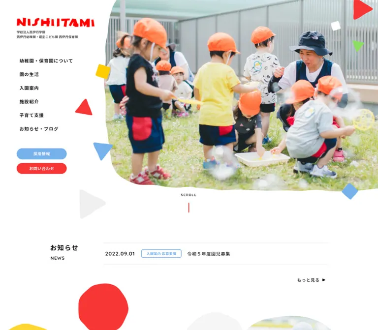
園庭や保育風景の写真を有機的な輪郭で切り取り、赤・青・黄・緑の図形を添えた親しみやすい学校サイト。広い余白、丸いボタン、保護者向けの情報導線と採用案内が特徴です。
Nishi-Itami Kindergarten & Nursery — Style Reference
A bright school day framed by white space, rounded photographs, and scattered pieces of primary color.
Original URL: nishi-itami-k.ed.jp
Final URL: nishi-itami-k.ed.jp, unchanged; reported HTTP status 200.
Theme: light content surfaces, colorful accents, and a dark slate footer. No theme selector was observed.
Inspected: supplied browser capture dated October 2, 2026, at 02:48 JST; exact retrieval timestamp 2026-10-01T17:48:15.301Z.
Viewports: desktop 1440 × 1000 and mobile 390 × 844 CSS pixels.
Scope: the current institutional homepage: opening hero, news, educational philosophy, admissions guidance, recruitment banner, and footer. Three desktop captures and two mobile captures accompany rendered text, link destinations, element rectangles, and computed styles. Child pages and the open mobile menu were not inspected.
The homepage introduces 西伊丹幼稚園・認定こども園 西伊丹保育園, with 学校法人西伊丹学園 identified in its heading and footer. It serves several audiences: current families checking announcements, prospective parents researching the school, and people considering employment. Its structure supports these ongoing information needs through repeated navigation and a substantial contact footer.
Large photographs establish the setting before any promotional headline appears. At desktop width, a white navigation rail occupies the left side of the opening view while a courtyard photograph fills the right. An irregular image boundary, red triangles, blue squares, and smaller yellow and green pieces make the composition playful. Below, generous white space separates practical announcements from the school's educational message. A pale blue admissions section leads into a photographic recruitment banner and a dense, useful footer.
閉じる
Nishi-Itami Kindergarten & Nursery — Style Reference
A bright school day framed by white space, rounded photographs, and scattered pieces of primary color.
Original URL: nishi-itami-k.ed.jp
Final URL: nishi-itami-k.ed.jp, unchanged; reported HTTP status 200.
Theme: light content surfaces, colorful accents, and a dark slate footer. No theme selector was observed.
Inspected: supplied browser capture dated October 2, 2026, at 02:48 JST; exact retrieval timestamp 2026-10-01T17:48:15.301Z.
Viewports: desktop 1440 × 1000 and mobile 390 × 844 CSS pixels.
Scope: the current institutional homepage: opening hero, news, educational philosophy, admissions guidance, recruitment banner, and footer. Three desktop captures and two mobile captures accompany rendered text, link destinations, element rectangles, and computed styles. Child pages and the open mobile menu were not inspected.
The homepage introduces 西伊丹幼稚園・認定こども園 西伊丹保育園, with 学校法人西伊丹学園 identified in its heading and footer. It serves several audiences: current families checking announcements, prospective parents researching the school, and people considering employment. Its structure supports these ongoing information needs through repeated navigation and a substantial contact footer.
Large photographs establish the setting before any promotional headline appears. At desktop width, a white navigation rail occupies the left side of the opening view while a courtyard photograph fills the right. An irregular image boundary, red triangles, blue squares, and smaller yellow and green pieces make the composition playful. Below, generous white space separates practical announcements from the school's educational message. A pale blue admissions section leads into a photographic recruitment banner and a dense, useful footer.
How to Read This Reference
- Measured means a value supplied by the rendered DOM or computed-style evidence. Dimensions are CSS pixels; tables round some fractional values for readability.
- Estimated means a visual reading of the current screenshots. This applies especially to decorative colors, photograph contours, shadows, and the settled desktop header.
- Calculated means arithmetic derived from measured values. It does not establish the original CSS formula.
- Recommended means guidance for a new implementation. Breakpoints, accessibility changes, approximate masks, and the CSS starter are recommendations unless explicitly marked otherwise.
- Token names such as
--color-actionare reference aliases, not recovered source variables. - The page contains multiple navigation arrangements. Extracted rectangles may describe a different header state from the one visible in a particular screenshot. Use the screenshots to establish visibility and the appropriate DOM sample to establish measurements.
- The supplied
--wp--preset--*properties include many generic colors, gradients, and shadows. Their presence does not show that they are used in this design. The palette below prioritizes styles attached to visible components.
Tokens — Colors
Default Palette
| Name | Value | Suggested token | Evidence and role |
|---|---|---|---|
| White | #ffffff |
--color-paper |
Measured on white buttons; visually the principal page canvas and header surface |
| Body Black | #000000 |
--color-ink |
Measured body and section-heading text |
| Link Black | #111111 |
--color-link |
Measured navigation and news links |
| Identity Gray | #555555 |
--color-muted |
Measured small institutional text beneath the opening wordmark |
| Action Red | #f73636 |
--color-action |
Measured contact fills and red text on white navigation pills |
| Recruitment Blue | #76b1eb |
--color-blue |
Measured recruitment button fill and recruitment-banner button text |
| Footer Slate | #51595c |
--color-footer |
Measured footer background |
| Admissions Ice | approximately #e4f5f9 |
--color-ice |
Estimated pale blue admissions-section background |
| Play Yellow | approximately #ffca00 |
--color-yellow |
Estimated small decorative yellow pieces; larger pale yellow shapes vary |
| Play Green | approximately #91dc65 |
--color-green |
Estimated green decorative pieces; some large shapes appear lighter |
| Quiet Gray | approximately #f0f0f0 |
--color-soft |
Estimated pale background shapes and subtle separators |
The wordmark appears more saturated red than some interface elements. Its color is embedded in artwork, and its exact value was not supplied. Do not assume the measured button red is also the exact logo color.
White carries most of the page. Red identifies contact actions and many secondary links; blue identifies recruitment in the main navigation and banner. These roles are contextual: the mobile footer renders both recruitment and news as white pills with red labels. Yellow and green are decorative accents rather than a verified category-color system.
Keep the pale admissions field quiet enough for black text and colorful shapes to remain distinct. The footer is slate gray, with white information and a red contact action; it is not a separate dark theme.
Tokens — Typography
Japanese Interface and Body Copy
- Measured family:
'Noto Sans JP', sans-serif. - Weights:
400for body copy,500for news titles and some footer links, and700for prominent headings and navigation. - Character: clear Japanese sans-serif with generous line spacing and deliberate tracking.
- Desktop body:
16px / 34px, with1.28pxinherited tracking. Editorial paragraphs override tracking to0.8px. - Mobile body:
14.43px / 28.86px. Long editorial paragraphs use normal tracking rather than the body's inherited1.1544px.
Rounded Latin Details
- Measured family:
Quicksand, sans-serifon theMAPlink, telephone number, and copyright line. - Measured weight:
700on those elements. - Role: a rounded, friendly counterpoint to the Japanese interface, especially in the contact area.
- The supplied evidence does not independently establish the family of every English section label or news date. Do not extend the verified font assignment to every Latin character as an original-site claim.
Wordmark and Root Defaults
The irregular NISHIITAMI lettering is visible artwork. Its font, asset format, and source path are not established. Treat it as a supplied brand asset rather than recreating it with a guessed display font.
The root element reports Times, but the body and inspected interface elements override it. This is not evidence of a visible serif typography system.
Type Scale
Sizes below are measured. A slash separates font size and line height.
| Role | Desktop | Mobile | Weight | Tracking notes |
|---|---|---|---|---|
| Institutional identity text | 11 / 17px |
10.14 / 17.238px |
700 |
0.44px desktop; 0.2028px mobile |
| Body copy | 16 / 34px |
14.43 / 28.86px |
400 |
Editorial paragraphs reduce or remove inherited tracking |
| Opening rail navigation | 16 / 34px |
Not visible | 700 |
1.6px |
| Sampled desktop header links | 16 / 24px |
Replaced by menu control | 700 |
0.64px |
| News section heading | 24 / 33.6px |
21.645 / 30.303px |
700 |
1.28px / 1.1544px |
| News article title | 16 / 25.143px |
14.43 / 22.676px |
500 |
1.28px / 1.1544px |
| Philosophy statement | 35 / 67px |
25.74 / 45.302px |
700 |
3.5px / 2.574px |
| Admissions heading | 30 / 51.818px |
22.62 / 39.071px |
700 |
6px / 2.262px |
| Recruitment statement | 34 / 60px |
24.96 / 39.52px |
700 |
2.72px / 1.57248px |
| Philosophy button label | 15 / 21.429px |
15.6 / 22.286px |
700 |
1.2px / 1.248px |
| Telephone number | 30 / 30px |
31.2 / 31.2px |
700 |
Quicksand; 1.5px / 1.56px |
| Copyright | 14 / 29.75px |
12.48 / 24.96px |
700 |
Quicksand; 0.7px / 0.624px |
The hierarchy comes from weight, tracking, and spacing as much as size. The desktop philosophy statement is only 35px, but its 67px line height gives it substantial presence. On mobile, button labels and the telephone number remain comparatively large instead of shrinking proportionally with the body.
Tokens — Spacing & Shapes
There is no verified universal spacing unit. The measured layout combines generous section intervals, fixed desktop dimensions, and fractional mobile values. Use a practical spacing scale for a new build, but do not describe it as the original site's source system.
Spacing Measurements
| Relationship | Measured value | Application |
|---|---|---|
| Desktop content side margin | 220px at 1440px width |
Centers the recurring 1000px content region |
| Mobile news side margin | approximately 20.66px |
Produces a 348.69px content width |
| Opening rail link interval | 49px between starts |
A 34px line box plus 15px separation |
| Opening rail action separation | 13px between boxes |
Two compact stacked pills |
| Desktop news internal gap | 16px |
Between date, category, and title tracks |
| Desktop news row interval | 77px between starts |
Keeps announcements distinct without cards |
| Mobile news internal gap | 1.95px 13.26px |
Small row gap; wider metadata-column gap |
| Desktop philosophy action gap | 30px |
Between two 250px buttons |
| Mobile philosophy action gap | approximately 25.73px |
Between two full-width stacked buttons |
| Desktop admissions portal gap | 35px |
Three 310px links inside 1000px |
| Mobile admissions portal gap | approximately 33.9px |
Between stacked links |
| Desktop footer padding | 75px 0 90px |
Room above navigation and below contact details |
| Mobile footer padding | 41.34px 20.67px 51.87px |
Smaller outer spacing around a taller stack |
Border Radius and Shape Language
| Element | Evidence | Treatment |
|---|---|---|
| Text action pills | Measured 999px radius |
Fully rounded ends across several button sizes |
| Mobile menu | Measured 66.30px square control; visually red and circular | Painted circular surface with three white horizontal lines |
| News category label | Visual estimate | Small blue outline with modest corner rounding |
| Settled desktop header | Visual estimate | White bar with rounded lower corners and a faint shadow |
| Hero photograph | Visual observation | Irregular left edge and shallow undulating lower edge |
| Philosophy photographs | Visual observation | Uneven oval/blob crops with different sizes |
| Decorative pieces | Visual observation | Soft triangles, tilted squares, and irregular circles |
The mobile button element itself reports a transparent background and zero radius. Its red circular appearance therefore belongs to an inner graphic or another painted layer not described by that element's sampled styles. Reproduce the visible control, not the transparent wrapper alone.
Layout Measurements
| Element | Desktop, 1440 × 1000 | Mobile, 390 × 844 | Basis |
|---|---|---|---|
| Document height | 3981.50px |
4875.52px |
Measured element rectangles; reported document heights round upward |
| Main content start | y = 929.52px |
y = 771.13px |
Measured |
| Recurring content width | 1000px |
approximately 349px |
Measured; small section-specific differences exist |
| Hero photo extent | Right approximately 1060px; lower edge near 740px | Full width; lower edge around 600–615px | Screenshot estimate |
| Settled desktop header | Approximately 1420 × 80px, inset 10px horizontally |
Not displayed in this form | Screenshot estimate |
| Mobile menu control | Not applicable | 66.30 × 66.30px, at approximately (303.05, 31.19) |
Measured |
| Opening rail actions | 180 × 39.75px |
Not visible in opening view | Measured |
| Philosophy action | 250 × 59.42px |
343.63 × 61.27px |
Measured |
| Admissions portal | 310 × 239px |
approximately 349.47 × 247–249px |
Measured link boxes |
| Admissions contact action | 493 × 60.84px |
349.47 × 61.27px |
Measured |
| Footer | 1440 × 445.03px |
390 × 718.22px |
Measured |
Components
Opening Hero and Navigation Rail
Role: establish identity, show the school environment, and expose the main information routes immediately.
The opening desktop composition places a white rail at left and a large courtyard photograph at right. The rail contains the red wordmark, two small lines of institutional identity, six plain-text navigation links, and two stacked action pills. The identity heading begins at approximately (60, 90.75) and occupies a 314 × 78px box. Navigation starts at x = 70px; the action pills return to x = 60px.
The primary links lead to school information, daily life, admissions, facilities, parenting support, and news. The blue 採用情報 pill and red お問い合わせ pill provide secondary audience routes beneath the list. The opening rail uses more tracking than the sampled horizontal header links.
The photograph shows children playing in a planted courtyard with the school building visible behind them. It reaches the top and right edges of the viewport. Its uneven left boundary separates it from the white rail without a straight divider. Decorative pieces overlap both the white field and the photograph boundary.
There is no large marketing headline over this opening photograph. The school's philosophy appears later in the page. A centered SCROLL label and thin vertical marker sit below the image, followed by substantial white space before news.
Persistent Desktop Header
Role: retain navigation after the opening composition has left view.
The middle and bottom desktop captures show a white horizontal header across nearly the whole viewport. Its visible arrangement is wordmark, six information links, blue recruitment pill, and red contact pill. The bar sits about 10px from each side, is approximately 80px high, and has softly rounded lower corners with a subtle shadow.
The visible wordmark is approximately 255px wide. The two actions appear around 150 × 50px in this settled state; these are screenshot estimates, not measurements from the separately sampled header state.
Its consistent screen position across scrolled captures supports persistent behavior. The precise switch point, positioning rule, animation, and reverse-scroll behavior are not established. A new implementation can use a scroll-state class, but should not present an invented threshold as source behavior.
Mobile Identity and Menu Control
Role: keep the photograph dominant while reducing navigation to one compact entry point.
At 390px width, the white rail disappears. The wordmark overlays the photograph near (25.73, 31.19) in a 226.58 × 28.31px box. Small dark institutional text sits immediately beneath it. A red circular menu control occupies the upper-right corner, with a measured 66.30px square interaction box and three white horizontal strokes.
The menu control remains visible at the same screen position in the footer capture, while the opening wordmark is absent there. The menu's open state, focus behavior, dismissal controls, and animation were not exercised.
The image becomes a tall, full-width crop. Its irregular white lower boundary remains visible, with small colored pieces overlapping the boundary. Preserve enough subject context to show the courtyard activity rather than enlarging a single face to fill the screen.
News List
Role: surface timely operational information without competing with the imagery.
The desktop news region uses a left section title, お知らせ with NEWS beneath, and a right list of three announcements. A right-aligned もっと見る link follows the list. Fine gray rules separate the rows; the rows do not use elevated card surfaces.
Each announcement is one link containing a date, an outlined blue category label, and a title. The measured desktop grid is:
grid-template-columns: 120px 145px minmax(0, 1fr);
gap: 16px;
At the inspected width, the remaining title track is approximately 510.80px. The list begins at x = 412.20px and is 807.80px wide. Article titles use 16px medium-weight text rather than the bolder navigation style.
On mobile, the section heading precedes the list. Each row uses two metadata columns, approximately 103.73px and 231.70px, with a 13.26px gap. The title spans both columns below. The first title occupies two lines and creates an approximately 80px link box; shorter titles create approximately 57px boxes. Preserve this content-driven height instead of truncating every announcement to one line.
The visible announcements include dates 2026.10.01 and 2026.09.28, covering admissions and a playground-opening event. These are current content examples, not permanent design tokens.
Educational Philosophy Section
Role: explain the school's educational outlook through readable copy and everyday activities.
The desktop statement is a bold, widely spaced two-line block beginning with 生きるってすばらしい! and 子どもが生き生き!. Its measured typography is 35px with a 67px line height. Below it, a calm 16px paragraph uses a 34px line height and intentional line breaks.
The visible composition places text toward the left and organically cropped photographs toward the right. One photograph shows children tending a planter; a smaller photograph shows a child using a keyboard instrument. Large, softly colored shapes sit around the photographs and section edges.
The paragraph's DOM box is 996px wide, but its visible line breaks keep the text concentrated in the left portion. Do not treat that bounding box as proof of a 996px uninterrupted reading measure.
Two white, shadowed pills follow the copy: 教育方針 and 園の生活. Each desktop button is 250px wide, with a red centered label and small red right-pointing marker near its trailing edge. Their padding is measured as 19px 40px, with a 999px radius.
On mobile, the statement becomes 25.74px, the paragraph uses normal tracking, and the two buttons stack at approximately 343.63px wide. The supplied mobile DOM confirms text and button reflow; it does not establish the full mobile arrangement of the surrounding photographs.
Admissions Guidance Section
Role: organize the next steps for prospective parents.
A full-width pale blue field introduces 入園をご検討の保護者の皆さまへ. The desktop heading is centered, with 30px type and unusually open 6px tracking. A centered paragraph below is measured at 675px wide. Red, yellow, green, and white shapes decorate the outer area without becoming content containers.
Three numbered portal links follow:
CHECK 01—入園のご案内, linking to/admission/.CHECK 02—子育て支援イベント, linking to/support/.CHECK 03—施設紹介, with当園へのアクセス方法, linking to/facility/.
Their desktop wrappers measure 310 × 239px and start at x = 220, 565, and 910px. On mobile, they become one vertical sequence of approximately 349px-wide links, with roughly 34px between them.
The exact media, internal label placement, and decorative treatment inside these portal links are not visible in the supplied screenshots. The sampled link backgrounds are transparent. Use the measured grouping and destinations confidently; treat any added image, border, or badge arrangement as a new implementation decision.
A wide white pill labeled お問い合わせはこちらから closes this section. It is 493px wide on desktop and fills the approximately 349px content column on mobile.
Recruitment Banner
Role: give prospective staff a distinct, human introduction to recruitment.
A wide classroom photograph fills the banner. In the desktop capture, a smiling adult appears on the right and a child near the center. White text occupies the left side. The photograph has a cool, subdued appearance that improves text separation; the evidence does not identify whether this comes from an overlay, image processing, or another rendering layer.
A large blue rounded shape carries 採用情報 and RECRUIT near the upper-left region. Other translucent blue and white shapes overlap the image. The main message reads 私たちといっしょに、子どもの成長を見守りませんか? in two desktop lines, using measured 34px type and a 60px line height.
The white recruitment pill uses blue text and measures 260 × 44px on desktop. On mobile it becomes approximately 349.47 × 47.20px. The statement wraps into three lines at 24.96px with a 39.52px line height.
The visible desktop image band is approximately 433px high. The mobile end capture shows only its lower fragment, so a complete mobile crop cannot be reconstructed from that screenshot alone.
Footer Navigation and Contact Block
Role: consolidate the site's destinations, institutional identity, physical location, and contact options.
The footer uses the measured slate background #51595c and white text. On desktop, the 1000px container starts with a horizontal navigation row and a white pill for お知らせ・ブログ. A subtle rule separates navigation from the information below.
The lower region places the institution and address on the left and contact details on the right. An outlined MAP pill sits beside the address. The phone number is a prominent Quicksand link using tel:0727832351; the fax number is displayed beneath it. A red お問い合わせフォーム pill links to /contact/.
The desktop map control measures 146 × 28px. The desktop contact pill measures approximately 254.66 × 39.63px. These are compact source dimensions; larger touch targets are recommended for reuse.
On mobile, the footer becomes a 718.22px-tall sequence:
- Six informational links in two columns and three rows, with small white triangular markers.
- Two side-by-side white pills for recruitment and news.
- Institutional name and address.
- A nearly full-width outlined map link, approximately 338.95 × 41.42px.
- Contact label, prominent telephone and fax numbers, then a wide red contact pill.
- Centered copyright text.
The mobile phone type increases slightly to 31.2px. This preserves practical contact prominence even though the main body text is smaller than on desktop.
Tokens — Motion & Interaction
| Treatment | Supplied evidence | What can be concluded |
|---|---|---|
| Desktop opening identity | 0.8s 0.5s forwards left_fade |
An 800ms named entrance animation with a 500ms delay is declared |
| Mobile wordmark, menu, and identity | 0.8s 0.5s forwards fadein |
These elements declare an entrance animation with the same duration and delay |
| Many pills, news links, map, and more link | transform 0.3s |
A 300ms transform transition is declared; the triggering state and transform distance are not supplied |
| Desktop header after scrolling | Visible at the top in middle and end captures | A persistent scrolled presentation exists; exact trigger and transition are unverified |
| Mobile menu persistence | Same screen position in opening and end captures | The menu remains available while the page scrolls |
| Scroll cue | Label and thin vertical marker visible | Its appearance is verified; clickability and animation are not |
| Decorative shapes | Static appearances in supplied captures | Shape movement, rotation, or continuous floating is not established |
| Navigation and contact links | Rendered hrefs supplied | Destinations are known; destination-page behavior was not tested |
The keyframes for left_fade and fadein were not included. Their names do not establish exact translation distances, opacity curves, or easing. Likewise, transition: transform 0.3s does not prove a particular hover lift or scale.
The capture process waited for finite motion and sampled layout stability, while temporarily pausing perpetual animations during readiness checks. These settled screenshots are not a motion recording. Do not infer a slideshow, video hero, parallax, floating-shape loop, or a menu-opening effect.
For a new implementation, brief opacity entrances and restrained button feedback fit the visual language. Treat their keyframes as recommendations, and retain a usable static presentation with reduced motion.
Surfaces
| Layer | Appearance | Purpose |
|---|---|---|
| Main canvas | White, with extensive open space | Keeps photographs and Japanese copy easy to separate |
| Opening navigation rail | White continuous field | Supports identity and wayfinding beside the hero |
| Persistent header | White with faint shadow and rounded lower corners | Separates navigation from content beneath |
| News rows | Unfilled rows with subtle rules | Organizes operational information without heavy containers |
| Editorial action pills | White, rounded, softly shadowed | Makes links tactile while preserving a light surface |
| Admissions field | Estimated pale blue | Groups parent-oriented guidance into one broad section |
| Recruitment banner | Photograph with a subdued cool appearance | Supports white recruitment copy and blue accents |
| Footer | Solid #51595c |
Anchors dense contact and navigation information |
Shadows are localized to floating navigation and prominent white pills. No exact shadow values were included in the component samples. A soft shadow in the CSS starter is therefore an approximation, not a recovered token.
Imagery
The current imagery is specific to daily school life: a courtyard with plants and children, hands-on planting, a musical activity, and an adult interacting with a child indoors. The photographs provide both warmth and practical evidence of the environment.
Use natural daylight, recognizable spaces, and interactions between people. The photographs should retain enough context to communicate an activity. Organic cropping softens the composition, but the image itself remains photographic and legible.
Decorations use simple shapes with a slightly uneven character: rounded triangles, tilted quadrilaterals, and soft circular blobs. Small saturated pieces cluster near the hero boundary, while larger, quieter shapes sit behind content. They should punctuate the layout rather than fill every gap.
Observed Asset References
No image URLs, asset filenames, mask paths, or native image dimensions were included in the supplied original-page evidence. The following identifies visible assets without inventing paths.
| Asset | Verified visual content | Placement and treatment |
|---|---|---|
| Wordmark | Red irregular NISHIITAMI lettering |
Opening rail, mobile hero overlay, and desktop persistent header |
| Hero photograph | Children in a planted school courtyard with building facade | Large desktop right-hand image; tall mobile crop |
| Philosophy photograph | Children tending flowers in a planter | Large irregular crop toward the desktop right side |
| Activity detail | Child using a keyboard instrument | Smaller organic crop beneath the larger philosophy photograph |
| Recruitment photograph | Adult and child in a classroom | Wide background band with white copy and blue/white decorations |
| Decorative artwork | Colored triangles, squares, and blobs | Hero edges, editorial areas, admissions background, and recruitment banner |
The portal-link artwork is not documented visually in the supplied captures. Do not invent asset names or assume that those links repeat the photographs above.
For reuse, provide authorized photographs and a real wordmark asset. CSS can establish the geometry and rhythm, but it cannot reproduce the identity conveyed by these school-specific images.
Layout & Responsive Behavior
| Area | Desktop observation | Mobile observation |
|---|---|---|
| Opening navigation | Left rail with six links and two actions | Rail removed; logo and circular menu overlay the image |
| Scrolled navigation | Horizontal persistent white bar | Circular menu remains; no equivalent horizontal bar |
| Hero image | Wide image beside the rail | Full-width tall crop with organic lower edge |
| News | Section label beside three-column rows | Section label above; metadata row followed by full-width title |
| Philosophy text | Larger two-line statement and spacious paragraphs | Smaller statement and naturally reflowed paragraphs |
| Philosophy actions | Two 250px pills in a row | Two approximately 344px pills stacked vertically |
| Admissions heading | One line with 6px tracking | Two lines with 2.262px tracking |
| Admissions portals | Three 310px columns | One approximately 349px column |
| Recruitment statement | Two lines | Three lines |
| Footer | Horizontal navigation and two information regions | Two-column link group followed by stacked contact content |
At 1440px, the recurring 1000px region leaves 220px on either side. At 390px, the news region is approximately 348.69px wide, leaving about 20.66px per side. Other mobile sections differ by fractions of a pixel, so these should be understood as a common visual inset rather than one proven shared container declaration.
Some mobile values equal simple viewport ratios: 14.43px = 3.7vw, 15.6px = 4vw, and 20.67px = 5.3vw at 390px. These are calculated equivalences. With only one mobile width, they do not prove the original fluid formulas, caps, or breakpoints.
The page is approximately 894px taller on mobile despite its narrower imagery and smaller type. Stacked portal links, buttons, and footer content explain much of that additional vertical space.
Only the supplied desktop and phone widths were inspected. Tablet navigation, landscape layouts, browser zoom, safe-area handling, and widths between the two captures remain unverified. The CSS starter's breakpoint is a practical recommendation rather than a recovered source value.
Do’s and Don’ts
Do
- Let a large photograph of everyday school life introduce the page.
- Preserve white space around the hero boundary and before news.
- Use the measured red, blue, and slate colors for their established interface roles.
- Keep decorative yellow and green pieces subordinate to content.
- Use Noto Sans JP for the Japanese interface and retain the verified Quicksand treatment in contact details.
- Pair bold headings with generous line height and deliberate tracking.
- Preserve the distinction between plain navigation, outlined metadata, and rounded action pills.
- Let news titles wrap naturally on phones.
- Reflow admissions links into a single mobile sequence.
- Give the footer enough room for institutional identity, address, map, telephone, fax, and contact access.
- Keep image crops organic and varied in scale.
- Separate confirmed motion timings from proposed hover and entrance effects.
Don't
- Don't turn the homepage into a single-purpose campaign funnel; it has ongoing news and several audience routes.
- Don't place an invented oversized sales headline across the opening photograph.
- Don't replace the wordmark with an approximate commercial font.
- Don't treat every generic CMS color preset as part of the visible palette.
- Don't turn announcements into a dense collection of elevated cards.
- Don't apply the same circular crop to every photograph.
- Don't shrink desktop navigation until it fits a phone; use the observed change in structure.
- Don't claim a carousel, parallax effect, or floating-shape animation from still captures.
- Don't infer the open mobile menu from its closed control.
- Don't guess image paths, card artwork, or exact mask geometry.
- Don't reuse the full desktop paragraph bounding width as an unrestricted reading measure.
- Don't add colorful decoration where it competes with address details, dates, or contact information.
Recommended Implementation Additions
These are recommendations for a new implementation, not verified features of the original site:
- Give the menu button an accessible name,
aria-expanded, andaria-controls. Implement keyboard opening, dismissal, focus management, and focus restoration appropriate to the chosen menu pattern. - Keep the circular persistent menu clear of important text and action labels. In the mobile end capture, it overlays the upper-right recruitment area.
- Make compact source controls at least 44px high through their interactive area. Several visible source pills are approximately 40px high, and the desktop map link is only 28px high.
- Add visible keyboard focus indicators and verify text contrast, particularly blue labels on white and white labels on blue.
- Retain the source palette for branding; if contrast adjustments are required, introduce separately named accessible text variants rather than silently changing measured tokens.
- Mark purely decorative shapes as hidden from assistive technology. Keep meaningful photograph alternatives concise and specific to the activity.
- Ensure the complete institution name exists as readable text alongside the graphic wordmark.
- Reserve image dimensions to prevent layout movement. Load the opening image promptly and defer lower photographs where appropriate.
- Use real headings for the section hierarchy. The large philosophy statement is a paragraph in the supplied DOM; a new implementation can improve semantics without changing its appearance.
- Preserve the phone link, explicit map destination, and readable address independently of decorative layout.
- Support reduced motion and avoid delaying access to essential navigation behind entrance effects.
- Test Japanese wrapping at intermediate widths and increased text size. The supplied desktop and phone captures do not establish behavior in those conditions.
Agent Prompt Guide
Quick Color Reference
- Canvas and raised pills:
#ffffff. - Body text:
#000000; links:#111111. - Contact fill and red action labels: measured
#f73636. - Recruitment accent: measured
#76b1eb. - Footer: measured
#51595c, with white content. - Admissions field: estimated
#e4f5f9. - Decorative accents: estimated yellow
#ffca00, green#91dc65, and pale gray#f0f0f0. - Wordmark color belongs to the supplied artwork; its exact value is unverified.
Overall Prompt
“Create a Japanese kindergarten and nursery homepage with a large documentary photograph of everyday school life, an irregular organic image boundary, extensive white space, and sparse red, blue, yellow, and green shapes. At desktop width, place the red graphic wordmark and six navigation links in a white left rail, with blue recruitment and red contact pills beneath. Use a persistent horizontal white header in the scrolled presentation. On mobile, replace the rail with a logo overlay and a large red circular menu button. Build a practical news list, a spacious educational-philosophy section, pale blue parent guidance with three linked destinations, a photographic recruitment banner, and a slate contact footer. Use Noto Sans JP, rounded Quicksand contact numerals, bold tracked headings, and white pill buttons. Keep unverified menu and motion behavior explicitly separate from the visual reference.”
Example Component Prompts
- Opening hero: “At 1440px width, reserve roughly the left quarter for a white school identity and navigation rail. Fill the right side with a bright courtyard photograph, reaching the top and right edges. Use an uneven left and lower image contour, a few colorful soft triangles and tilted squares, and a centered small scroll cue below. Keep the photograph free of a large promotional headline.”
- News list: “Create a 1000px-wide desktop news region with a Japanese heading and small English label on the left. Each linked row has a 120px date track, 145px category track, 16px gaps, and a flexible title. Use fine gray dividers and blue outlined category labels. On mobile, move the title beneath the two metadata columns and allow natural wrapping.”
- Philosophy section: “Use a bold 35px Japanese statement with a 67px line height, readable body text, and two 250px white pills with red labels and small trailing arrows. Place everyday activity photographs in unequal organic crops toward the right, with quiet colored blobs nearby. Stack the buttons on mobile.”
- Admissions guidance: “Build a pale blue section with a centered, widely tracked heading, a 675px desktop paragraph, and three equal linked destinations separated by 35px. Preserve the labels CHECK 01 through CHECK 03 and stack the destinations on mobile. The original link interiors are undocumented; propose their internal design explicitly as a new choice.”
- Recruitment and footer: “Place white recruitment copy over a wide classroom photograph with blue and white organic accents. Follow it with a #51595c footer containing navigation, institution name, address, an outlined map control, prominent rounded telephone numerals, fax details, and a red contact pill. On mobile, keep two columns only for the compact navigation group and stack the contact content.”
Quick Start
CSS Custom Properties
This is a reusable adaptation, not extracted source CSS. Measured colors, type sizes, and selected dimensions are retained. Estimated colors and shadows are labeled. Organic border-radius values provide a fallback approximation; exact wavy edges require authored masks or supplied artwork.
Use ordinary 16px root sizing. The 80rem breakpoint is recommended to avoid crowding the desktop navigation; it is not a verified source breakpoint. Several compact controls intentionally receive a 44px minimum interaction height.
:root {
  /* Measured interface colors */
  --color-paper: #ffffff;
  --color-ink: #000000;
  --color-link: #111111;
  --color-muted: #555555;
  --color-action: #f73636;
  --color-blue: #76b1eb;
  --color-footer: #51595c;

  /* Screenshot estimates */
  --color-ice: #e4f5f9;
  --color-yellow: #ffca00;
  --color-green: #91dc65;
  --color-soft: #f0f0f0;
  --color-rule: #e8e8e8;
  --shadow-soft: 0 4px 16px rgb(0 0 0 / 12%);

  /* Verified families; font loading is project-specific */
  --font-japanese: 'Noto Sans JP', sans-serif;
  --font-latin: 'Quicksand', sans-serif;
  --text-body: 16px;
  --leading-body: 34px;
  --text-statement: 35px;
  --leading-statement: 67px;
  --text-section: 30px;
  --text-recruit: 34px;

  /* Measured desktop dimensions and reusable aliases */
  --content-width: 1000px;
  --radius-pill: 999px;
  --portal-gap: 35px;
  --motion-control: 300ms;
  --motion-enter-duration: 800ms;
  --motion-enter-delay: 500ms;
}

* { box-sizing: border-box; }

body {
  margin: 0;
  color: var(--color-ink);
  background: var(--color-paper);
  font-family: var(--font-japanese);
  font-size: var(--text-body);
  line-height: var(--leading-body);
  letter-spacing: 0.08em;
}

img { display: block; max-width: 100%; }
button, input, textarea { font: inherit; }
a { color: var(--color-link); }

.container {
  width: min(var(--content-width), calc(100% - 40px));
  margin-inline: auto;
}

/* Approximate opening composition */
.hero {
  position: relative;
  display: grid;
  grid-template-columns: 26% minmax(0, 1fr);
}

.hero-side {
  position: relative;
  z-index: 2;
  padding: 90px 0 0 60px;
  background: var(--color-paper);
}

.hero-brand { min-height: 78px; }
.hero-brand img { width: 280px; }

.hero-identity {
  margin: 6px 0 0;
  color: var(--color-muted);
  font-size: 11px;
  font-weight: 700;
  line-height: 17px;
  letter-spacing: 0.04em;
}

.hero-nav {
  display: grid;
  justify-items: start;
  gap: 15px;
  margin: 60px 0 0 10px;
}

.hero-nav a {
  font-weight: 700;
  line-height: 34px;
  letter-spacing: 0.1em;
  text-decoration: none;
}

.hero-actions {
  display: grid;
  gap: 13px;
  width: 180px;
  margin-top: 54px;
}

.hero-media {
  height: clamp(640px, 51.5vw, 820px);
  overflow: hidden;
  /* Fallback contour, not the original mask */
  border-radius: 6% 0 0 17% / 23% 0 0 19%;
}

.hero-media img {
  width: 100%;
  height: 100%;
  object-fit: cover;
  object-position: center;
}

.scroll-cue {
  width: max-content;
  margin: 8px auto 0;
  font-size: 12px;
  font-weight: 700;
  line-height: 18px;
  letter-spacing: 0.12em;
  text-align: center;
}

.scroll-cue::after {
  content: '';
  display: block;
  width: 2px;
  height: 38px;
  margin: 18px auto 0;
  background: linear-gradient(
    to bottom, var(--color-rule) 85%, var(--color-action) 85%
  );
}

/* Reusable controls; 44px minimum is an accessibility addition */
.pill {
  position: relative;
  display: inline-flex;
  align-items: center;
  justify-content: center;
  min-height: 44px;
  padding: 19px 40px;
  border: 0;
  border-radius: var(--radius-pill);
  color: var(--color-action);
  background: var(--color-paper);
  font-size: 15px;
  font-weight: 700;
  line-height: 1.4286;
  letter-spacing: 0.08em;
  text-align: center;
  text-decoration: none;
  transition: transform var(--motion-control);
}

.pill--raised { box-shadow: var(--shadow-soft); }
.pill--red { color: white; background: var(--color-action); }
.pill--blue { color: white; background: var(--color-blue); }
.pill--blue-label { color: var(--color-blue); }
.pill--compact { padding: 8px 20px; }

.pill--arrow::after {
  content: '';
  position: absolute;
  right: 30px;
  border-block: 4px solid transparent;
  border-left: 7px solid currentColor;
}

.hero-actions .pill {
  padding: 5px 10px;
  font-size: 14px;
  font-weight: 400;
  line-height: 29.75px;
}

/* Integration hook; the source scroll threshold is unknown */
.persistent-header {
  position: fixed;
  z-index: 40;
  inset: 0 10px auto;
  display: none;
  align-items: center;
  gap: 30px;
  min-height: 80px;
  padding: 15px 20px 15px 35px;
  border-radius: 0 0 16px 16px;
  background: white;
  box-shadow: var(--shadow-soft);
}

.is-scrolled .persistent-header { display: flex; }
.persistent-header__brand { flex: 0 0 255px; }

.persistent-header__nav {
  display: flex;
  align-items: center;
  gap: 30px;
  margin-left: auto;
  font-weight: 700;
  line-height: 24px;
  letter-spacing: 0.04em;
  white-space: nowrap;
}

.persistent-header__nav a { text-decoration: none; }
.persistent-header__actions { display: flex; gap: 10px; }
.persistent-header__actions .pill { width: 150px; padding: 12px 16px; }
.menu-toggle { display: none; }

/* News: source-derived desktop tracks */
.news {
  display: grid;
  grid-template-columns: 103.2px minmax(0, 1fr);
  gap: 89px;
  margin-top: 105px;
}

.news-heading {
  margin: 0;
  font-size: 24px;
  line-height: 1.4;
}

.section-label {
  display: block;
  margin-top: 11px;
  font-size: 14px;
  line-height: 1.4;
}

.news-list { border-top: 1px solid var(--color-rule); }

.news-row {
  display: grid;
  grid-template-columns: 120px 145px minmax(0, 1fr);
  align-items: center;
  gap: 16px;
  padding: 22px 0;
  border-bottom: 1px solid var(--color-rule);
  text-decoration: none;
}

.news-category {
  justify-self: start;
  padding: 5px 10px;
  border: 1px solid var(--color-blue);
  border-radius: 5px;
  color: var(--color-blue);
  font-size: 12px;
  line-height: 1.4;
}

.news-row h3 {
  min-width: 0;
  margin: 0;
  padding-left: 4px;
  font-size: 16px;
  font-weight: 500;
  line-height: 1.57143;
  overflow-wrap: anywhere;
}

.news-more {
  display: block;
  width: max-content;
  margin: 36px 0 0 auto;
  font-size: 15px;
  text-decoration: none;
}

/* Editorial rhythm; photo arrangement requires project markup */
.philosophy { position: relative; padding-block: 180px; }
.philosophy-copy { max-width: 610px; }

.philosophy-statement {
  margin: 0 0 28px;
  font-size: var(--text-statement);
  font-weight: 700;
  line-height: var(--leading-statement);
  letter-spacing: 0.1em;
}

.editorial-copy { letter-spacing: 0.05em; }
.action-row { display: flex; gap: 30px; margin-top: 34px; }
.action-row .pill { width: 250px; }

.blob-image {
  width: 100%;
  object-fit: cover;
  border-radius: 44% 56% 43% 57% / 38% 42% 58% 62%;
}

/* Admissions layout; portal interiors are intentionally unspecified */
.parents {
  padding-block: 125px 150px;
  background: var(--color-ice);
}

.parents-heading {
  margin: 0;
  font-size: var(--text-section);
  line-height: 1.72727;
  letter-spacing: 0.2em;
  text-align: center;
}

.parents-copy {
  max-width: 675px;
  margin: 32px auto 0;
  letter-spacing: 0.05em;
}

.portal-grid {
  display: grid;
  grid-template-columns: repeat(3, minmax(0, 1fr));
  gap: var(--portal-gap);
  margin-top: 79px;
}

.portal-link {
  display: block;
  min-height: 239px;
  text-decoration: none;
}

.parents-contact {
  display: flex;
  width: min(493px, 100%);
  margin: 60px auto 0;
}

/* Set --recruit-image to an authorized image URL in project code */
.recruit {
  min-height: 433px;
  padding-bottom: 35px;
  color: white;
  background-color: var(--color-blue);
  /* The tint below is a recommended approximation */
  background-image:
    linear-gradient(rgb(50 84 89 / 22%), rgb(50 84 89 / 22%)),
    var(--recruit-image, none);
  background-position: center;
  background-size: cover;
}

.recruit-badge {
  width: 242px;
  min-height: 141px;
  padding-top: 32px;
  font-size: 24px;
  font-weight: 700;
}

.recruit-statement {
  margin: 37px 0 56px;
  font-size: var(--text-recruit);
  font-weight: 700;
  line-height: 60px;
}

.recruit .pill { width: 260px; padding: 12px 40px; font-size: 14px; }

.site-footer {
  padding: 75px 0 90px;
  color: white;
  background: var(--color-footer);
}

.site-footer a { color: inherit; }
.site-footer .pill--red { color: white; }
.site-footer .pill--paper { color: var(--color-action); }

.footer-nav {
  display: flex;
  flex-wrap: wrap;
  align-items: center;
  gap: 24px;
  padding-bottom: 34px;
  border-bottom: 1px solid rgb(255 255 255 / 30%);
}

.footer-nav a { font-weight: 500; text-decoration: none; }

.footer-grid {
  display: grid;
  grid-template-columns: minmax(0, 1fr) auto;
  gap: 40px;
  margin-top: 35px;
}

.map-link {
  display: inline-flex;
  align-items: center;
  justify-content: center;
  min-width: 146px;
  min-height: 44px;
  padding: 2px 20px;
  border: 2px solid white;
  border-radius: var(--radius-pill);
  font-family: var(--font-latin);
  font-weight: 700;
  line-height: 20px;
  text-decoration: none;
}

.contact-number {
  font-family: var(--font-latin);
  font-size: 30px;
  font-weight: 700;
  line-height: 1;
  letter-spacing: 0.05em;
  text-decoration: none;
}

.footer-copyright {
  font-family: var(--font-latin);
  font-size: 14px;
  font-weight: 700;
  line-height: 29.75px;
  letter-spacing: 0.05em;
}

/* Recommended feedback; the original transform distance is unknown */
@media (hover: hover) {
  .pill:hover { transform: translateY(-2px); }
}

:where(a, button):focus-visible {
  outline: 3px solid currentColor;
  outline-offset: 5px;
}

@media (max-width: 80rem) {
  body {
    font-size: clamp(14.43px, 3.7vw, 16px);
    line-height: 2;
  }

  .container { width: min(700px, 89.4%); }
  .persistent-header,
  .is-scrolled .persistent-header { display: none; }

  .hero { display: block; }
  .hero-side {
    position: absolute;
    inset: 31.2px auto auto 6.6%;
    width: min(58.1vw, 280px);
    padding: 0;
    background: transparent;
  }
  .hero-brand { min-height: 0; }
  .hero-brand img { width: 100%; }
  .hero-identity {
    margin-top: 4px;
    font-size: 10.14px;
    line-height: 17.238px;
    letter-spacing: 0.02em;
  }
  .hero-nav, .hero-actions { display: none; }
  .hero-media {
    height: min(157.7vw, 780px);
    border-radius: 0 0 12% 8% / 0 0 4% 3%;
  }

  .menu-toggle {
    position: fixed;
    z-index: 50;
    top: 31.2px;
    right: 5.3%;
    display: grid;
    align-content: center;
    justify-items: center;
    gap: 6px;
    width: 66.3px;
    height: 66.3px;
    padding: 0;
    border: 0;
    border-radius: 50%;
    color: white;
    background: var(--color-action);
    cursor: pointer;
  }
  .menu-toggle span { width: 34px; height: 3px; background: currentColor; }

  .scroll-cue::after { background: var(--color-action); }
  .news { grid-template-columns: 1fr; gap: 35px; margin-top: 74px; }
  .news-heading { font-size: 21.645px; }
  .section-label { margin-top: 5px; }
  .news-row {
    grid-template-columns: minmax(0, 103.734px) minmax(0, 1fr);
    gap: 1.95px 13.26px;
    padding-block: 16px;
  }
  .news-row h3 { grid-column: 1 / -1; font-size: inherit; }

  .philosophy { padding-block: 140px; }
  .philosophy-statement {
    font-size: 25.74px;
    line-height: 45.302px;
  }
  .editorial-copy, .parents-copy { letter-spacing: normal; }
  .action-row { flex-direction: column; gap: 25.73px; }
  .action-row .pill { width: 100%; }
  .pill { font-size: 15.6px; }

  .parents { padding-block: 100px 68px; }
  .parents-heading {
    font-size: 22.62px;
    line-height: 39.071px;
    letter-spacing: 0.1em;
  }
  .portal-grid { grid-template-columns: 1fr; gap: 34px; margin-top: 41px; }
  .portal-link { min-height: 247px; }
  .parents-contact { width: 100%; margin-top: 36px; }

  .recruit { min-height: 348px; }
  .recruit-badge { width: 157px; min-height: 114px; font-size: 21.645px; }
  .recruit-statement {
    margin: 11px 0 29px;
    font-size: 24.96px;
    line-height: 39.52px;
    letter-spacing: 0.063em;
  }
  .recruit .pill { width: 100%; font-size: 15.6px; }

  .site-footer { padding: 41.34px 0 51.87px; }
  .footer-nav {
    display: grid;
    grid-template-columns: max-content minmax(0, 1fr);
    gap: 20.65px 22.6px;
    border: 0;
  }
  .footer-nav a { font-size: 15.6px; font-weight: 700; }
  .footer-grid { grid-template-columns: 1fr; gap: 34px; }
  .map-link { display: flex; width: 100%; margin-top: 20px; }
  .contact-number { font-size: 31.2px; }
  .footer-contact .pill { display: flex; width: 100%; }
  .footer-copyright { margin-top: 28px; font-size: 12.48px; text-align: center; }
}

@media (prefers-reduced-motion: reduce) {
  .pill { transition: none; }
  .pill:hover { transform: none; }
  .brand-enter { animation: none; }
}
The starter expects semantic project markup: a .hero containing .hero-side and .hero-media, a separate .scroll-cue, a .news region with a heading and list, and section containers using the named classes. Put a real image inside .hero-media; apply .blob-image to editorial photographs. Mark decorative menu strokes as hidden from assistive technology and label the button itself.
The .is-scrolled class is an integration hook, not implemented behavior. Menu contents, menu state management, precise image masks, decorative shape placement, the recruitment badge artwork, and admissions-link interiors require separate implementation. Do not ship the menu control without its corresponding working navigation.
Tailwind v4 Token Mapping
Optional aliases for a project already using Tailwind v4. This does not imply that the original site uses Tailwind. Load the custom properties above first.
@theme inline {
  --color-paper: #ffffff;
  --color-ink: #000000;
  --color-action: #f73636;
  --color-school-blue: #76b1eb;
  --color-footer-slate: #51595c;

  /* Estimated supporting colors */
  --color-admissions-ice: #e4f5f9;
  --color-play-yellow: #ffca00;
  --color-play-green: #91dc65;

  --font-japanese: 'Noto Sans JP', sans-serif;
  --font-rounded: 'Quicksand', sans-serif;
  --text-body: 16px;
  --text-statement: 35px;
  --text-section: 30px;
  --text-recruit: 34px;
  --radius-pill: 999px;
  --spacing-portal-gap: 35px;
  --container-school: 1000px;
}
Sources & Evidence
- Inspected original and final page: https://nishi-itami-k.ed.jp/. The supplied record reports an unchanged final URL and HTTP
200. - Capture timestamp:
2026-10-01T17:48:15.301Z, equivalent to October 2, 2026, 02:48:15.301 JST. - Desktop evidence: three current screenshots at
1440 × 1000, covering the opening view, a middle scroll position, and the recruitment/footer end; rendered document height approximately3981.50px. - Mobile evidence: two current screenshots at
390 × 844, covering the opening view and page end; rendered document height approximately4875.52px. The supplied DOM adds measurements for intermediate sections not visually shown on mobile. - Style evidence: supplied computed families, sizes, weights, tracking, colors, padding, radii, grid tracks, transition declarations, named entrance animations, and element rectangles. Exact stylesheet rules, keyframes, mask assets, image URLs, and breakpoint definitions were not provided.
- Navigation evidence: rendered links identify
/about/,/days/,/admission/,/facility/,/support/,/blog/,/recruit/,/contact/, the telephone target, and a Google Maps destination. These establish intended destinations, not inspected child-page designs. - Inspection limits: the initial observation lasted at least five seconds and used image-decoding and stability checks with finite time limits. Settled captures do not establish all delayed content or runtime behavior. No open-menu, hover, keyboard, form-submission, or destination-page interactions were supplied. Shared workers and service workers were disabled in the capture environment.
This reference describes the current homepage shown in the supplied original-page evidence. The reusable CSS, proposed breakpoint, accessibility additions, and approximate decorative geometry are implementation guidance rather than claims of exact source reconstruction.
# Nishi-Itami Kindergarten & Nursery — Style Reference

> A bright school day framed by white space, rounded photographs, and scattered pieces of primary color.

**Original URL:** [nishi-itami-k.ed.jp](https://nishi-itami-k.ed.jp/)
**Final URL:** [nishi-itami-k.ed.jp](https://nishi-itami-k.ed.jp/), unchanged; reported HTTP status `200`.
**Theme:** light content surfaces, colorful accents, and a dark slate footer. No theme selector was observed.
**Inspected:** supplied browser capture dated October 2, 2026, at 02:48 JST; exact retrieval timestamp `2026-10-01T17:48:15.301Z`.
**Viewports:** desktop `1440 × 1000` and mobile `390 × 844` CSS pixels.
**Scope:** the current institutional homepage: opening hero, news, educational philosophy, admissions guidance, recruitment banner, and footer. Three desktop captures and two mobile captures accompany rendered text, link destinations, element rectangles, and computed styles. Child pages and the open mobile menu were not inspected.

The homepage introduces 西伊丹幼稚園・認定こども園 西伊丹保育園, with 学校法人西伊丹学園 identified in its heading and footer. It serves several audiences: current families checking announcements, prospective parents researching the school, and people considering employment. Its structure supports these ongoing information needs through repeated navigation and a substantial contact footer.

Large photographs establish the setting before any promotional headline appears. At desktop width, a white navigation rail occupies the left side of the opening view while a courtyard photograph fills the right. An irregular image boundary, red triangles, blue squares, and smaller yellow and green pieces make the composition playful. Below, generous white space separates practical announcements from the school's educational message. A pale blue admissions section leads into a photographic recruitment banner and a dense, useful footer.
閉じる
# Nishi-Itami Kindergarten & Nursery — Style Reference

> A bright school day framed by white space, rounded photographs, and scattered pieces of primary color.

**Original URL:** [nishi-itami-k.ed.jp](https://nishi-itami-k.ed.jp/)
**Final URL:** [nishi-itami-k.ed.jp](https://nishi-itami-k.ed.jp/), unchanged; reported HTTP status `200`.
**Theme:** light content surfaces, colorful accents, and a dark slate footer. No theme selector was observed.
**Inspected:** supplied browser capture dated October 2, 2026, at 02:48 JST; exact retrieval timestamp `2026-10-01T17:48:15.301Z`.
**Viewports:** desktop `1440 × 1000` and mobile `390 × 844` CSS pixels.
**Scope:** the current institutional homepage: opening hero, news, educational philosophy, admissions guidance, recruitment banner, and footer. Three desktop captures and two mobile captures accompany rendered text, link destinations, element rectangles, and computed styles. Child pages and the open mobile menu were not inspected.

The homepage introduces 西伊丹幼稚園・認定こども園 西伊丹保育園, with 学校法人西伊丹学園 identified in its heading and footer. It serves several audiences: current families checking announcements, prospective parents researching the school, and people considering employment. Its structure supports these ongoing information needs through repeated navigation and a substantial contact footer.

Large photographs establish the setting before any promotional headline appears. At desktop width, a white navigation rail occupies the left side of the opening view while a courtyard photograph fills the right. An irregular image boundary, red triangles, blue squares, and smaller yellow and green pieces make the composition playful. Below, generous white space separates practical announcements from the school's educational message. A pale blue admissions section leads into a photographic recruitment banner and a dense, useful footer.

## How to Read This Reference

- **Measured** means a value supplied by the rendered DOM or computed-style evidence. Dimensions are CSS pixels; tables round some fractional values for readability.
- **Estimated** means a visual reading of the current screenshots. This applies especially to decorative colors, photograph contours, shadows, and the settled desktop header.
- **Calculated** means arithmetic derived from measured values. It does not establish the original CSS formula.
- **Recommended** means guidance for a new implementation. Breakpoints, accessibility changes, approximate masks, and the CSS starter are recommendations unless explicitly marked otherwise.
- Token names such as `--color-action` are reference aliases, not recovered source variables.
- The page contains multiple navigation arrangements. Extracted rectangles may describe a different header state from the one visible in a particular screenshot. Use the screenshots to establish visibility and the appropriate DOM sample to establish measurements.
- The supplied `--wp--preset--*` properties include many generic colors, gradients, and shadows. Their presence does not show that they are used in this design. The palette below prioritizes styles attached to visible components.

## Tokens — Colors

### Default Palette

| Name | Value | Suggested token | Evidence and role |
| --- | --- | --- | --- |
| White | `#ffffff` | `--color-paper` | Measured on white buttons; visually the principal page canvas and header surface |
| Body Black | `#000000` | `--color-ink` | Measured body and section-heading text |
| Link Black | `#111111` | `--color-link` | Measured navigation and news links |
| Identity Gray | `#555555` | `--color-muted` | Measured small institutional text beneath the opening wordmark |
| Action Red | `#f73636` | `--color-action` | Measured contact fills and red text on white navigation pills |
| Recruitment Blue | `#76b1eb` | `--color-blue` | Measured recruitment button fill and recruitment-banner button text |
| Footer Slate | `#51595c` | `--color-footer` | Measured footer background |
| Admissions Ice | approximately `#e4f5f9` | `--color-ice` | Estimated pale blue admissions-section background |
| Play Yellow | approximately `#ffca00` | `--color-yellow` | Estimated small decorative yellow pieces; larger pale yellow shapes vary |
| Play Green | approximately `#91dc65` | `--color-green` | Estimated green decorative pieces; some large shapes appear lighter |
| Quiet Gray | approximately `#f0f0f0` | `--color-soft` | Estimated pale background shapes and subtle separators |

The wordmark appears more saturated red than some interface elements. Its color is embedded in artwork, and its exact value was not supplied. Do not assume the measured button red is also the exact logo color.

White carries most of the page. Red identifies contact actions and many secondary links; blue identifies recruitment in the main navigation and banner. These roles are contextual: the mobile footer renders both recruitment and news as white pills with red labels. Yellow and green are decorative accents rather than a verified category-color system.

Keep the pale admissions field quiet enough for black text and colorful shapes to remain distinct. The footer is slate gray, with white information and a red contact action; it is not a separate dark theme.

## Tokens — Typography

### Japanese Interface and Body Copy

- **Measured family:** `'Noto Sans JP', sans-serif`.
- **Weights:** `400` for body copy, `500` for news titles and some footer links, and `700` for prominent headings and navigation.
- **Character:** clear Japanese sans-serif with generous line spacing and deliberate tracking.
- **Desktop body:** `16px / 34px`, with `1.28px` inherited tracking. Editorial paragraphs override tracking to `0.8px`.
- **Mobile body:** `14.43px / 28.86px`. Long editorial paragraphs use normal tracking rather than the body's inherited `1.1544px`.

### Rounded Latin Details

- **Measured family:** `Quicksand, sans-serif` on the `MAP` link, telephone number, and copyright line.
- **Measured weight:** `700` on those elements.
- **Role:** a rounded, friendly counterpoint to the Japanese interface, especially in the contact area.
- The supplied evidence does not independently establish the family of every English section label or news date. Do not extend the verified font assignment to every Latin character as an original-site claim.

### Wordmark and Root Defaults

The irregular `NISHIITAMI` lettering is visible artwork. Its font, asset format, and source path are not established. Treat it as a supplied brand asset rather than recreating it with a guessed display font.

The root element reports `Times`, but the body and inspected interface elements override it. This is not evidence of a visible serif typography system.

### Type Scale

Sizes below are measured. A slash separates font size and line height.

| Role | Desktop | Mobile | Weight | Tracking notes |
| --- | --- | --- | --- | --- |
| Institutional identity text | `11 / 17px` | `10.14 / 17.238px` | `700` | `0.44px` desktop; `0.2028px` mobile |
| Body copy | `16 / 34px` | `14.43 / 28.86px` | `400` | Editorial paragraphs reduce or remove inherited tracking |
| Opening rail navigation | `16 / 34px` | Not visible | `700` | `1.6px` |
| Sampled desktop header links | `16 / 24px` | Replaced by menu control | `700` | `0.64px` |
| News section heading | `24 / 33.6px` | `21.645 / 30.303px` | `700` | `1.28px` / `1.1544px` |
| News article title | `16 / 25.143px` | `14.43 / 22.676px` | `500` | `1.28px` / `1.1544px` |
| Philosophy statement | `35 / 67px` | `25.74 / 45.302px` | `700` | `3.5px` / `2.574px` |
| Admissions heading | `30 / 51.818px` | `22.62 / 39.071px` | `700` | `6px` / `2.262px` |
| Recruitment statement | `34 / 60px` | `24.96 / 39.52px` | `700` | `2.72px` / `1.57248px` |
| Philosophy button label | `15 / 21.429px` | `15.6 / 22.286px` | `700` | `1.2px` / `1.248px` |
| Telephone number | `30 / 30px` | `31.2 / 31.2px` | `700` | Quicksand; `1.5px` / `1.56px` |
| Copyright | `14 / 29.75px` | `12.48 / 24.96px` | `700` | Quicksand; `0.7px` / `0.624px` |

The hierarchy comes from weight, tracking, and spacing as much as size. The desktop philosophy statement is only 35px, but its 67px line height gives it substantial presence. On mobile, button labels and the telephone number remain comparatively large instead of shrinking proportionally with the body.

## Tokens — Spacing & Shapes

There is no verified universal spacing unit. The measured layout combines generous section intervals, fixed desktop dimensions, and fractional mobile values. Use a practical spacing scale for a new build, but do not describe it as the original site's source system.

### Spacing Measurements

| Relationship | Measured value | Application |
| --- | --- | --- |
| Desktop content side margin | `220px` at 1440px width | Centers the recurring 1000px content region |
| Mobile news side margin | approximately `20.66px` | Produces a 348.69px content width |
| Opening rail link interval | `49px` between starts | A 34px line box plus 15px separation |
| Opening rail action separation | `13px` between boxes | Two compact stacked pills |
| Desktop news internal gap | `16px` | Between date, category, and title tracks |
| Desktop news row interval | `77px` between starts | Keeps announcements distinct without cards |
| Mobile news internal gap | `1.95px 13.26px` | Small row gap; wider metadata-column gap |
| Desktop philosophy action gap | `30px` | Between two 250px buttons |
| Mobile philosophy action gap | approximately `25.73px` | Between two full-width stacked buttons |
| Desktop admissions portal gap | `35px` | Three 310px links inside 1000px |
| Mobile admissions portal gap | approximately `33.9px` | Between stacked links |
| Desktop footer padding | `75px 0 90px` | Room above navigation and below contact details |
| Mobile footer padding | `41.34px 20.67px 51.87px` | Smaller outer spacing around a taller stack |

### Border Radius and Shape Language

| Element | Evidence | Treatment |
| --- | --- | --- |
| Text action pills | Measured `999px` radius | Fully rounded ends across several button sizes |
| Mobile menu | Measured 66.30px square control; visually red and circular | Painted circular surface with three white horizontal lines |
| News category label | Visual estimate | Small blue outline with modest corner rounding |
| Settled desktop header | Visual estimate | White bar with rounded lower corners and a faint shadow |
| Hero photograph | Visual observation | Irregular left edge and shallow undulating lower edge |
| Philosophy photographs | Visual observation | Uneven oval/blob crops with different sizes |
| Decorative pieces | Visual observation | Soft triangles, tilted squares, and irregular circles |

The mobile button element itself reports a transparent background and zero radius. Its red circular appearance therefore belongs to an inner graphic or another painted layer not described by that element's sampled styles. Reproduce the visible control, not the transparent wrapper alone.

### Layout Measurements

| Element | Desktop, 1440 × 1000 | Mobile, 390 × 844 | Basis |
| --- | --- | --- | --- |
| Document height | `3981.50px` | `4875.52px` | Measured element rectangles; reported document heights round upward |
| Main content start | `y = 929.52px` | `y = 771.13px` | Measured |
| Recurring content width | `1000px` | approximately `349px` | Measured; small section-specific differences exist |
| Hero photo extent | Right approximately 1060px; lower edge near 740px | Full width; lower edge around 600–615px | Screenshot estimate |
| Settled desktop header | Approximately `1420 × 80px`, inset 10px horizontally | Not displayed in this form | Screenshot estimate |
| Mobile menu control | Not applicable | `66.30 × 66.30px`, at approximately `(303.05, 31.19)` | Measured |
| Opening rail actions | `180 × 39.75px` | Not visible in opening view | Measured |
| Philosophy action | `250 × 59.42px` | `343.63 × 61.27px` | Measured |
| Admissions portal | `310 × 239px` | approximately `349.47 × 247–249px` | Measured link boxes |
| Admissions contact action | `493 × 60.84px` | `349.47 × 61.27px` | Measured |
| Footer | `1440 × 445.03px` | `390 × 718.22px` | Measured |

## Components

### Opening Hero and Navigation Rail

**Role:** establish identity, show the school environment, and expose the main information routes immediately.

The opening desktop composition places a white rail at left and a large courtyard photograph at right. The rail contains the red wordmark, two small lines of institutional identity, six plain-text navigation links, and two stacked action pills. The identity heading begins at approximately `(60, 90.75)` and occupies a 314 × 78px box. Navigation starts at `x = 70px`; the action pills return to `x = 60px`.

The primary links lead to school information, daily life, admissions, facilities, parenting support, and news. The blue `採用情報` pill and red `お問い合わせ` pill provide secondary audience routes beneath the list. The opening rail uses more tracking than the sampled horizontal header links.

The photograph shows children playing in a planted courtyard with the school building visible behind them. It reaches the top and right edges of the viewport. Its uneven left boundary separates it from the white rail without a straight divider. Decorative pieces overlap both the white field and the photograph boundary.

There is no large marketing headline over this opening photograph. The school's philosophy appears later in the page. A centered `SCROLL` label and thin vertical marker sit below the image, followed by substantial white space before news.

### Persistent Desktop Header

**Role:** retain navigation after the opening composition has left view.

The middle and bottom desktop captures show a white horizontal header across nearly the whole viewport. Its visible arrangement is wordmark, six information links, blue recruitment pill, and red contact pill. The bar sits about 10px from each side, is approximately 80px high, and has softly rounded lower corners with a subtle shadow.

The visible wordmark is approximately 255px wide. The two actions appear around 150 × 50px in this settled state; these are screenshot estimates, not measurements from the separately sampled header state.

Its consistent screen position across scrolled captures supports persistent behavior. The precise switch point, positioning rule, animation, and reverse-scroll behavior are not established. A new implementation can use a scroll-state class, but should not present an invented threshold as source behavior.

### Mobile Identity and Menu Control

**Role:** keep the photograph dominant while reducing navigation to one compact entry point.

At 390px width, the white rail disappears. The wordmark overlays the photograph near `(25.73, 31.19)` in a `226.58 × 28.31px` box. Small dark institutional text sits immediately beneath it. A red circular menu control occupies the upper-right corner, with a measured 66.30px square interaction box and three white horizontal strokes.

The menu control remains visible at the same screen position in the footer capture, while the opening wordmark is absent there. The menu's open state, focus behavior, dismissal controls, and animation were not exercised.

The image becomes a tall, full-width crop. Its irregular white lower boundary remains visible, with small colored pieces overlapping the boundary. Preserve enough subject context to show the courtyard activity rather than enlarging a single face to fill the screen.

### News List

**Role:** surface timely operational information without competing with the imagery.

The desktop news region uses a left section title, `お知らせ` with `NEWS` beneath, and a right list of three announcements. A right-aligned `もっと見る` link follows the list. Fine gray rules separate the rows; the rows do not use elevated card surfaces.

Each announcement is one link containing a date, an outlined blue category label, and a title. The measured desktop grid is:

```css
grid-template-columns: 120px 145px minmax(0, 1fr);
gap: 16px;
```

At the inspected width, the remaining title track is approximately `510.80px`. The list begins at `x = 412.20px` and is `807.80px` wide. Article titles use 16px medium-weight text rather than the bolder navigation style.

On mobile, the section heading precedes the list. Each row uses two metadata columns, approximately `103.73px` and `231.70px`, with a `13.26px` gap. The title spans both columns below. The first title occupies two lines and creates an approximately 80px link box; shorter titles create approximately 57px boxes. Preserve this content-driven height instead of truncating every announcement to one line.

The visible announcements include dates `2026.10.01` and `2026.09.28`, covering admissions and a playground-opening event. These are current content examples, not permanent design tokens.

### Educational Philosophy Section

**Role:** explain the school's educational outlook through readable copy and everyday activities.

The desktop statement is a bold, widely spaced two-line block beginning with `生きるってすばらしい!` and `子どもが生き生き!`. Its measured typography is 35px with a 67px line height. Below it, a calm 16px paragraph uses a 34px line height and intentional line breaks.

The visible composition places text toward the left and organically cropped photographs toward the right. One photograph shows children tending a planter; a smaller photograph shows a child using a keyboard instrument. Large, softly colored shapes sit around the photographs and section edges.

The paragraph's DOM box is 996px wide, but its visible line breaks keep the text concentrated in the left portion. Do not treat that bounding box as proof of a 996px uninterrupted reading measure.

Two white, shadowed pills follow the copy: `教育方針` and `園の生活`. Each desktop button is 250px wide, with a red centered label and small red right-pointing marker near its trailing edge. Their padding is measured as `19px 40px`, with a `999px` radius.

On mobile, the statement becomes 25.74px, the paragraph uses normal tracking, and the two buttons stack at approximately 343.63px wide. The supplied mobile DOM confirms text and button reflow; it does not establish the full mobile arrangement of the surrounding photographs.

### Admissions Guidance Section

**Role:** organize the next steps for prospective parents.

A full-width pale blue field introduces `入園をご検討の保護者の皆さまへ`. The desktop heading is centered, with 30px type and unusually open 6px tracking. A centered paragraph below is measured at 675px wide. Red, yellow, green, and white shapes decorate the outer area without becoming content containers.

Three numbered portal links follow:

1. `CHECK 01` — `入園のご案内`, linking to `/admission/`.
2. `CHECK 02` — `子育て支援イベント`, linking to `/support/`.
3. `CHECK 03` — `施設紹介`, with `当園へのアクセス方法`, linking to `/facility/`.

Their desktop wrappers measure 310 × 239px and start at `x = 220`, `565`, and `910px`. On mobile, they become one vertical sequence of approximately 349px-wide links, with roughly 34px between them.

The exact media, internal label placement, and decorative treatment inside these portal links are not visible in the supplied screenshots. The sampled link backgrounds are transparent. Use the measured grouping and destinations confidently; treat any added image, border, or badge arrangement as a new implementation decision.

A wide white pill labeled `お問い合わせはこちらから` closes this section. It is 493px wide on desktop and fills the approximately 349px content column on mobile.

### Recruitment Banner

**Role:** give prospective staff a distinct, human introduction to recruitment.

A wide classroom photograph fills the banner. In the desktop capture, a smiling adult appears on the right and a child near the center. White text occupies the left side. The photograph has a cool, subdued appearance that improves text separation; the evidence does not identify whether this comes from an overlay, image processing, or another rendering layer.

A large blue rounded shape carries `採用情報` and `RECRUIT` near the upper-left region. Other translucent blue and white shapes overlap the image. The main message reads `私たちといっしょに、子どもの成長を見守りませんか?` in two desktop lines, using measured 34px type and a 60px line height.

The white recruitment pill uses blue text and measures 260 × 44px on desktop. On mobile it becomes approximately 349.47 × 47.20px. The statement wraps into three lines at 24.96px with a 39.52px line height.

The visible desktop image band is approximately 433px high. The mobile end capture shows only its lower fragment, so a complete mobile crop cannot be reconstructed from that screenshot alone.

### Footer Navigation and Contact Block

**Role:** consolidate the site's destinations, institutional identity, physical location, and contact options.

The footer uses the measured slate background `#51595c` and white text. On desktop, the 1000px container starts with a horizontal navigation row and a white pill for `お知らせ・ブログ`. A subtle rule separates navigation from the information below.

The lower region places the institution and address on the left and contact details on the right. An outlined `MAP` pill sits beside the address. The phone number is a prominent Quicksand link using `tel:0727832351`; the fax number is displayed beneath it. A red `お問い合わせフォーム` pill links to `/contact/`.

The desktop map control measures 146 × 28px. The desktop contact pill measures approximately 254.66 × 39.63px. These are compact source dimensions; larger touch targets are recommended for reuse.

On mobile, the footer becomes a 718.22px-tall sequence:

- Six informational links in two columns and three rows, with small white triangular markers.
- Two side-by-side white pills for recruitment and news.
- Institutional name and address.
- A nearly full-width outlined map link, approximately 338.95 × 41.42px.
- Contact label, prominent telephone and fax numbers, then a wide red contact pill.
- Centered copyright text.

The mobile phone type increases slightly to 31.2px. This preserves practical contact prominence even though the main body text is smaller than on desktop.

## Tokens — Motion & Interaction

| Treatment | Supplied evidence | What can be concluded |
| --- | --- | --- |
| Desktop opening identity | `0.8s 0.5s forwards left_fade` | An 800ms named entrance animation with a 500ms delay is declared |
| Mobile wordmark, menu, and identity | `0.8s 0.5s forwards fadein` | These elements declare an entrance animation with the same duration and delay |
| Many pills, news links, map, and more link | `transform 0.3s` | A 300ms transform transition is declared; the triggering state and transform distance are not supplied |
| Desktop header after scrolling | Visible at the top in middle and end captures | A persistent scrolled presentation exists; exact trigger and transition are unverified |
| Mobile menu persistence | Same screen position in opening and end captures | The menu remains available while the page scrolls |
| Scroll cue | Label and thin vertical marker visible | Its appearance is verified; clickability and animation are not |
| Decorative shapes | Static appearances in supplied captures | Shape movement, rotation, or continuous floating is not established |
| Navigation and contact links | Rendered hrefs supplied | Destinations are known; destination-page behavior was not tested |

The keyframes for `left_fade` and `fadein` were not included. Their names do not establish exact translation distances, opacity curves, or easing. Likewise, `transition: transform 0.3s` does not prove a particular hover lift or scale.

The capture process waited for finite motion and sampled layout stability, while temporarily pausing perpetual animations during readiness checks. These settled screenshots are not a motion recording. Do not infer a slideshow, video hero, parallax, floating-shape loop, or a menu-opening effect.

For a new implementation, brief opacity entrances and restrained button feedback fit the visual language. Treat their keyframes as recommendations, and retain a usable static presentation with reduced motion.

## Surfaces

| Layer | Appearance | Purpose |
| --- | --- | --- |
| Main canvas | White, with extensive open space | Keeps photographs and Japanese copy easy to separate |
| Opening navigation rail | White continuous field | Supports identity and wayfinding beside the hero |
| Persistent header | White with faint shadow and rounded lower corners | Separates navigation from content beneath |
| News rows | Unfilled rows with subtle rules | Organizes operational information without heavy containers |
| Editorial action pills | White, rounded, softly shadowed | Makes links tactile while preserving a light surface |
| Admissions field | Estimated pale blue | Groups parent-oriented guidance into one broad section |
| Recruitment banner | Photograph with a subdued cool appearance | Supports white recruitment copy and blue accents |
| Footer | Solid `#51595c` | Anchors dense contact and navigation information |

Shadows are localized to floating navigation and prominent white pills. No exact shadow values were included in the component samples. A soft shadow in the CSS starter is therefore an approximation, not a recovered token.

## Imagery

The current imagery is specific to daily school life: a courtyard with plants and children, hands-on planting, a musical activity, and an adult interacting with a child indoors. The photographs provide both warmth and practical evidence of the environment.

Use natural daylight, recognizable spaces, and interactions between people. The photographs should retain enough context to communicate an activity. Organic cropping softens the composition, but the image itself remains photographic and legible.

Decorations use simple shapes with a slightly uneven character: rounded triangles, tilted quadrilaterals, and soft circular blobs. Small saturated pieces cluster near the hero boundary, while larger, quieter shapes sit behind content. They should punctuate the layout rather than fill every gap.

### Observed Asset References

No image URLs, asset filenames, mask paths, or native image dimensions were included in the supplied original-page evidence. The following identifies visible assets without inventing paths.

| Asset | Verified visual content | Placement and treatment |
| --- | --- | --- |
| Wordmark | Red irregular `NISHIITAMI` lettering | Opening rail, mobile hero overlay, and desktop persistent header |
| Hero photograph | Children in a planted school courtyard with building facade | Large desktop right-hand image; tall mobile crop |
| Philosophy photograph | Children tending flowers in a planter | Large irregular crop toward the desktop right side |
| Activity detail | Child using a keyboard instrument | Smaller organic crop beneath the larger philosophy photograph |
| Recruitment photograph | Adult and child in a classroom | Wide background band with white copy and blue/white decorations |
| Decorative artwork | Colored triangles, squares, and blobs | Hero edges, editorial areas, admissions background, and recruitment banner |

The portal-link artwork is not documented visually in the supplied captures. Do not invent asset names or assume that those links repeat the photographs above.

For reuse, provide authorized photographs and a real wordmark asset. CSS can establish the geometry and rhythm, but it cannot reproduce the identity conveyed by these school-specific images.

## Layout & Responsive Behavior

| Area | Desktop observation | Mobile observation |
| --- | --- | --- |
| Opening navigation | Left rail with six links and two actions | Rail removed; logo and circular menu overlay the image |
| Scrolled navigation | Horizontal persistent white bar | Circular menu remains; no equivalent horizontal bar |
| Hero image | Wide image beside the rail | Full-width tall crop with organic lower edge |
| News | Section label beside three-column rows | Section label above; metadata row followed by full-width title |
| Philosophy text | Larger two-line statement and spacious paragraphs | Smaller statement and naturally reflowed paragraphs |
| Philosophy actions | Two 250px pills in a row | Two approximately 344px pills stacked vertically |
| Admissions heading | One line with 6px tracking | Two lines with 2.262px tracking |
| Admissions portals | Three 310px columns | One approximately 349px column |
| Recruitment statement | Two lines | Three lines |
| Footer | Horizontal navigation and two information regions | Two-column link group followed by stacked contact content |

At 1440px, the recurring 1000px region leaves 220px on either side. At 390px, the news region is approximately 348.69px wide, leaving about 20.66px per side. Other mobile sections differ by fractions of a pixel, so these should be understood as a common visual inset rather than one proven shared container declaration.

Some mobile values equal simple viewport ratios: `14.43px = 3.7vw`, `15.6px = 4vw`, and `20.67px = 5.3vw` at 390px. These are calculated equivalences. With only one mobile width, they do not prove the original fluid formulas, caps, or breakpoints.

The page is approximately 894px taller on mobile despite its narrower imagery and smaller type. Stacked portal links, buttons, and footer content explain much of that additional vertical space.

Only the supplied desktop and phone widths were inspected. Tablet navigation, landscape layouts, browser zoom, safe-area handling, and widths between the two captures remain unverified. The CSS starter's breakpoint is a practical recommendation rather than a recovered source value.

## Do’s and Don’ts

### Do

- Let a large photograph of everyday school life introduce the page.
- Preserve white space around the hero boundary and before news.
- Use the measured red, blue, and slate colors for their established interface roles.
- Keep decorative yellow and green pieces subordinate to content.
- Use Noto Sans JP for the Japanese interface and retain the verified Quicksand treatment in contact details.
- Pair bold headings with generous line height and deliberate tracking.
- Preserve the distinction between plain navigation, outlined metadata, and rounded action pills.
- Let news titles wrap naturally on phones.
- Reflow admissions links into a single mobile sequence.
- Give the footer enough room for institutional identity, address, map, telephone, fax, and contact access.
- Keep image crops organic and varied in scale.
- Separate confirmed motion timings from proposed hover and entrance effects.

### Don't

- Don't turn the homepage into a single-purpose campaign funnel; it has ongoing news and several audience routes.
- Don't place an invented oversized sales headline across the opening photograph.
- Don't replace the wordmark with an approximate commercial font.
- Don't treat every generic CMS color preset as part of the visible palette.
- Don't turn announcements into a dense collection of elevated cards.
- Don't apply the same circular crop to every photograph.
- Don't shrink desktop navigation until it fits a phone; use the observed change in structure.
- Don't claim a carousel, parallax effect, or floating-shape animation from still captures.
- Don't infer the open mobile menu from its closed control.
- Don't guess image paths, card artwork, or exact mask geometry.
- Don't reuse the full desktop paragraph bounding width as an unrestricted reading measure.
- Don't add colorful decoration where it competes with address details, dates, or contact information.

## Recommended Implementation Additions

These are recommendations for a new implementation, not verified features of the original site:

- Give the menu button an accessible name, `aria-expanded`, and `aria-controls`. Implement keyboard opening, dismissal, focus management, and focus restoration appropriate to the chosen menu pattern.
- Keep the circular persistent menu clear of important text and action labels. In the mobile end capture, it overlays the upper-right recruitment area.
- Make compact source controls at least 44px high through their interactive area. Several visible source pills are approximately 40px high, and the desktop map link is only 28px high.
- Add visible keyboard focus indicators and verify text contrast, particularly blue labels on white and white labels on blue.
- Retain the source palette for branding; if contrast adjustments are required, introduce separately named accessible text variants rather than silently changing measured tokens.
- Mark purely decorative shapes as hidden from assistive technology. Keep meaningful photograph alternatives concise and specific to the activity.
- Ensure the complete institution name exists as readable text alongside the graphic wordmark.
- Reserve image dimensions to prevent layout movement. Load the opening image promptly and defer lower photographs where appropriate.
- Use real headings for the section hierarchy. The large philosophy statement is a paragraph in the supplied DOM; a new implementation can improve semantics without changing its appearance.
- Preserve the phone link, explicit map destination, and readable address independently of decorative layout.
- Support reduced motion and avoid delaying access to essential navigation behind entrance effects.
- Test Japanese wrapping at intermediate widths and increased text size. The supplied desktop and phone captures do not establish behavior in those conditions.

## Agent Prompt Guide

### Quick Color Reference

- Canvas and raised pills: `#ffffff`.
- Body text: `#000000`; links: `#111111`.
- Contact fill and red action labels: measured `#f73636`.
- Recruitment accent: measured `#76b1eb`.
- Footer: measured `#51595c`, with white content.
- Admissions field: estimated `#e4f5f9`.
- Decorative accents: estimated yellow `#ffca00`, green `#91dc65`, and pale gray `#f0f0f0`.
- Wordmark color belongs to the supplied artwork; its exact value is unverified.

### Overall Prompt

“Create a Japanese kindergarten and nursery homepage with a large documentary photograph of everyday school life, an irregular organic image boundary, extensive white space, and sparse red, blue, yellow, and green shapes. At desktop width, place the red graphic wordmark and six navigation links in a white left rail, with blue recruitment and red contact pills beneath. Use a persistent horizontal white header in the scrolled presentation. On mobile, replace the rail with a logo overlay and a large red circular menu button. Build a practical news list, a spacious educational-philosophy section, pale blue parent guidance with three linked destinations, a photographic recruitment banner, and a slate contact footer. Use Noto Sans JP, rounded Quicksand contact numerals, bold tracked headings, and white pill buttons. Keep unverified menu and motion behavior explicitly separate from the visual reference.”

### Example Component Prompts

1. **Opening hero:** “At 1440px width, reserve roughly the left quarter for a white school identity and navigation rail. Fill the right side with a bright courtyard photograph, reaching the top and right edges. Use an uneven left and lower image contour, a few colorful soft triangles and tilted squares, and a centered small scroll cue below. Keep the photograph free of a large promotional headline.”
2. **News list:** “Create a 1000px-wide desktop news region with a Japanese heading and small English label on the left. Each linked row has a 120px date track, 145px category track, 16px gaps, and a flexible title. Use fine gray dividers and blue outlined category labels. On mobile, move the title beneath the two metadata columns and allow natural wrapping.”
3. **Philosophy section:** “Use a bold 35px Japanese statement with a 67px line height, readable body text, and two 250px white pills with red labels and small trailing arrows. Place everyday activity photographs in unequal organic crops toward the right, with quiet colored blobs nearby. Stack the buttons on mobile.”
4. **Admissions guidance:** “Build a pale blue section with a centered, widely tracked heading, a 675px desktop paragraph, and three equal linked destinations separated by 35px. Preserve the labels CHECK 01 through CHECK 03 and stack the destinations on mobile. The original link interiors are undocumented; propose their internal design explicitly as a new choice.”
5. **Recruitment and footer:** “Place white recruitment copy over a wide classroom photograph with blue and white organic accents. Follow it with a #51595c footer containing navigation, institution name, address, an outlined map control, prominent rounded telephone numerals, fax details, and a red contact pill. On mobile, keep two columns only for the compact navigation group and stack the contact content.”

## Quick Start

### CSS Custom Properties

This is a reusable adaptation, not extracted source CSS. Measured colors, type sizes, and selected dimensions are retained. Estimated colors and shadows are labeled. Organic `border-radius` values provide a fallback approximation; exact wavy edges require authored masks or supplied artwork.

Use ordinary 16px root sizing. The `80rem` breakpoint is recommended to avoid crowding the desktop navigation; it is not a verified source breakpoint. Several compact controls intentionally receive a 44px minimum interaction height.

```css
:root {
  /* Measured interface colors */
  --color-paper: #ffffff;
  --color-ink: #000000;
  --color-link: #111111;
  --color-muted: #555555;
  --color-action: #f73636;
  --color-blue: #76b1eb;
  --color-footer: #51595c;

  /* Screenshot estimates */
  --color-ice: #e4f5f9;
  --color-yellow: #ffca00;
  --color-green: #91dc65;
  --color-soft: #f0f0f0;
  --color-rule: #e8e8e8;
  --shadow-soft: 0 4px 16px rgb(0 0 0 / 12%);

  /* Verified families; font loading is project-specific */
  --font-japanese: 'Noto Sans JP', sans-serif;
  --font-latin: 'Quicksand', sans-serif;
  --text-body: 16px;
  --leading-body: 34px;
  --text-statement: 35px;
  --leading-statement: 67px;
  --text-section: 30px;
  --text-recruit: 34px;

  /* Measured desktop dimensions and reusable aliases */
  --content-width: 1000px;
  --radius-pill: 999px;
  --portal-gap: 35px;
  --motion-control: 300ms;
  --motion-enter-duration: 800ms;
  --motion-enter-delay: 500ms;
}

* { box-sizing: border-box; }

body {
  margin: 0;
  color: var(--color-ink);
  background: var(--color-paper);
  font-family: var(--font-japanese);
  font-size: var(--text-body);
  line-height: var(--leading-body);
  letter-spacing: 0.08em;
}

img { display: block; max-width: 100%; }
button, input, textarea { font: inherit; }
a { color: var(--color-link); }

.container {
  width: min(var(--content-width), calc(100% - 40px));
  margin-inline: auto;
}

/* Approximate opening composition */
.hero {
  position: relative;
  display: grid;
  grid-template-columns: 26% minmax(0, 1fr);
}

.hero-side {
  position: relative;
  z-index: 2;
  padding: 90px 0 0 60px;
  background: var(--color-paper);
}

.hero-brand { min-height: 78px; }
.hero-brand img { width: 280px; }

.hero-identity {
  margin: 6px 0 0;
  color: var(--color-muted);
  font-size: 11px;
  font-weight: 700;
  line-height: 17px;
  letter-spacing: 0.04em;
}

.hero-nav {
  display: grid;
  justify-items: start;
  gap: 15px;
  margin: 60px 0 0 10px;
}

.hero-nav a {
  font-weight: 700;
  line-height: 34px;
  letter-spacing: 0.1em;
  text-decoration: none;
}

.hero-actions {
  display: grid;
  gap: 13px;
  width: 180px;
  margin-top: 54px;
}

.hero-media {
  height: clamp(640px, 51.5vw, 820px);
  overflow: hidden;
  /* Fallback contour, not the original mask */
  border-radius: 6% 0 0 17% / 23% 0 0 19%;
}

.hero-media img {
  width: 100%;
  height: 100%;
  object-fit: cover;
  object-position: center;
}

.scroll-cue {
  width: max-content;
  margin: 8px auto 0;
  font-size: 12px;
  font-weight: 700;
  line-height: 18px;
  letter-spacing: 0.12em;
  text-align: center;
}

.scroll-cue::after {
  content: '';
  display: block;
  width: 2px;
  height: 38px;
  margin: 18px auto 0;
  background: linear-gradient(
    to bottom, var(--color-rule) 85%, var(--color-action) 85%
  );
}

/* Reusable controls; 44px minimum is an accessibility addition */
.pill {
  position: relative;
  display: inline-flex;
  align-items: center;
  justify-content: center;
  min-height: 44px;
  padding: 19px 40px;
  border: 0;
  border-radius: var(--radius-pill);
  color: var(--color-action);
  background: var(--color-paper);
  font-size: 15px;
  font-weight: 700;
  line-height: 1.4286;
  letter-spacing: 0.08em;
  text-align: center;
  text-decoration: none;
  transition: transform var(--motion-control);
}

.pill--raised { box-shadow: var(--shadow-soft); }
.pill--red { color: white; background: var(--color-action); }
.pill--blue { color: white; background: var(--color-blue); }
.pill--blue-label { color: var(--color-blue); }
.pill--compact { padding: 8px 20px; }

.pill--arrow::after {
  content: '';
  position: absolute;
  right: 30px;
  border-block: 4px solid transparent;
  border-left: 7px solid currentColor;
}

.hero-actions .pill {
  padding: 5px 10px;
  font-size: 14px;
  font-weight: 400;
  line-height: 29.75px;
}

/* Integration hook; the source scroll threshold is unknown */
.persistent-header {
  position: fixed;
  z-index: 40;
  inset: 0 10px auto;
  display: none;
  align-items: center;
  gap: 30px;
  min-height: 80px;
  padding: 15px 20px 15px 35px;
  border-radius: 0 0 16px 16px;
  background: white;
  box-shadow: var(--shadow-soft);
}

.is-scrolled .persistent-header { display: flex; }
.persistent-header__brand { flex: 0 0 255px; }

.persistent-header__nav {
  display: flex;
  align-items: center;
  gap: 30px;
  margin-left: auto;
  font-weight: 700;
  line-height: 24px;
  letter-spacing: 0.04em;
  white-space: nowrap;
}

.persistent-header__nav a { text-decoration: none; }
.persistent-header__actions { display: flex; gap: 10px; }
.persistent-header__actions .pill { width: 150px; padding: 12px 16px; }
.menu-toggle { display: none; }

/* News: source-derived desktop tracks */
.news {
  display: grid;
  grid-template-columns: 103.2px minmax(0, 1fr);
  gap: 89px;
  margin-top: 105px;
}

.news-heading {
  margin: 0;
  font-size: 24px;
  line-height: 1.4;
}

.section-label {
  display: block;
  margin-top: 11px;
  font-size: 14px;
  line-height: 1.4;
}

.news-list { border-top: 1px solid var(--color-rule); }

.news-row {
  display: grid;
  grid-template-columns: 120px 145px minmax(0, 1fr);
  align-items: center;
  gap: 16px;
  padding: 22px 0;
  border-bottom: 1px solid var(--color-rule);
  text-decoration: none;
}

.news-category {
  justify-self: start;
  padding: 5px 10px;
  border: 1px solid var(--color-blue);
  border-radius: 5px;
  color: var(--color-blue);
  font-size: 12px;
  line-height: 1.4;
}

.news-row h3 {
  min-width: 0;
  margin: 0;
  padding-left: 4px;
  font-size: 16px;
  font-weight: 500;
  line-height: 1.57143;
  overflow-wrap: anywhere;
}

.news-more {
  display: block;
  width: max-content;
  margin: 36px 0 0 auto;
  font-size: 15px;
  text-decoration: none;
}

/* Editorial rhythm; photo arrangement requires project markup */
.philosophy { position: relative; padding-block: 180px; }
.philosophy-copy { max-width: 610px; }

.philosophy-statement {
  margin: 0 0 28px;
  font-size: var(--text-statement);
  font-weight: 700;
  line-height: var(--leading-statement);
  letter-spacing: 0.1em;
}

.editorial-copy { letter-spacing: 0.05em; }
.action-row { display: flex; gap: 30px; margin-top: 34px; }
.action-row .pill { width: 250px; }

.blob-image {
  width: 100%;
  object-fit: cover;
  border-radius: 44% 56% 43% 57% / 38% 42% 58% 62%;
}

/* Admissions layout; portal interiors are intentionally unspecified */
.parents {
  padding-block: 125px 150px;
  background: var(--color-ice);
}

.parents-heading {
  margin: 0;
  font-size: var(--text-section);
  line-height: 1.72727;
  letter-spacing: 0.2em;
  text-align: center;
}

.parents-copy {
  max-width: 675px;
  margin: 32px auto 0;
  letter-spacing: 0.05em;
}

.portal-grid {
  display: grid;
  grid-template-columns: repeat(3, minmax(0, 1fr));
  gap: var(--portal-gap);
  margin-top: 79px;
}

.portal-link {
  display: block;
  min-height: 239px;
  text-decoration: none;
}

.parents-contact {
  display: flex;
  width: min(493px, 100%);
  margin: 60px auto 0;
}

/* Set --recruit-image to an authorized image URL in project code */
.recruit {
  min-height: 433px;
  padding-bottom: 35px;
  color: white;
  background-color: var(--color-blue);
  /* The tint below is a recommended approximation */
  background-image:
    linear-gradient(rgb(50 84 89 / 22%), rgb(50 84 89 / 22%)),
    var(--recruit-image, none);
  background-position: center;
  background-size: cover;
}

.recruit-badge {
  width: 242px;
  min-height: 141px;
  padding-top: 32px;
  font-size: 24px;
  font-weight: 700;
}

.recruit-statement {
  margin: 37px 0 56px;
  font-size: var(--text-recruit);
  font-weight: 700;
  line-height: 60px;
}

.recruit .pill { width: 260px; padding: 12px 40px; font-size: 14px; }

.site-footer {
  padding: 75px 0 90px;
  color: white;
  background: var(--color-footer);
}

.site-footer a { color: inherit; }
.site-footer .pill--red { color: white; }
.site-footer .pill--paper { color: var(--color-action); }

.footer-nav {
  display: flex;
  flex-wrap: wrap;
  align-items: center;
  gap: 24px;
  padding-bottom: 34px;
  border-bottom: 1px solid rgb(255 255 255 / 30%);
}

.footer-nav a { font-weight: 500; text-decoration: none; }

.footer-grid {
  display: grid;
  grid-template-columns: minmax(0, 1fr) auto;
  gap: 40px;
  margin-top: 35px;
}

.map-link {
  display: inline-flex;
  align-items: center;
  justify-content: center;
  min-width: 146px;
  min-height: 44px;
  padding: 2px 20px;
  border: 2px solid white;
  border-radius: var(--radius-pill);
  font-family: var(--font-latin);
  font-weight: 700;
  line-height: 20px;
  text-decoration: none;
}

.contact-number {
  font-family: var(--font-latin);
  font-size: 30px;
  font-weight: 700;
  line-height: 1;
  letter-spacing: 0.05em;
  text-decoration: none;
}

.footer-copyright {
  font-family: var(--font-latin);
  font-size: 14px;
  font-weight: 700;
  line-height: 29.75px;
  letter-spacing: 0.05em;
}

/* Recommended feedback; the original transform distance is unknown */
@media (hover: hover) {
  .pill:hover { transform: translateY(-2px); }
}

:where(a, button):focus-visible {
  outline: 3px solid currentColor;
  outline-offset: 5px;
}

@media (max-width: 80rem) {
  body {
    font-size: clamp(14.43px, 3.7vw, 16px);
    line-height: 2;
  }

  .container { width: min(700px, 89.4%); }
  .persistent-header,
  .is-scrolled .persistent-header { display: none; }

  .hero { display: block; }
  .hero-side {
    position: absolute;
    inset: 31.2px auto auto 6.6%;
    width: min(58.1vw, 280px);
    padding: 0;
    background: transparent;
  }
  .hero-brand { min-height: 0; }
  .hero-brand img { width: 100%; }
  .hero-identity {
    margin-top: 4px;
    font-size: 10.14px;
    line-height: 17.238px;
    letter-spacing: 0.02em;
  }
  .hero-nav, .hero-actions { display: none; }
  .hero-media {
    height: min(157.7vw, 780px);
    border-radius: 0 0 12% 8% / 0 0 4% 3%;
  }

  .menu-toggle {
    position: fixed;
    z-index: 50;
    top: 31.2px;
    right: 5.3%;
    display: grid;
    align-content: center;
    justify-items: center;
    gap: 6px;
    width: 66.3px;
    height: 66.3px;
    padding: 0;
    border: 0;
    border-radius: 50%;
    color: white;
    background: var(--color-action);
    cursor: pointer;
  }
  .menu-toggle span { width: 34px; height: 3px; background: currentColor; }

  .scroll-cue::after { background: var(--color-action); }
  .news { grid-template-columns: 1fr; gap: 35px; margin-top: 74px; }
  .news-heading { font-size: 21.645px; }
  .section-label { margin-top: 5px; }
  .news-row {
    grid-template-columns: minmax(0, 103.734px) minmax(0, 1fr);
    gap: 1.95px 13.26px;
    padding-block: 16px;
  }
  .news-row h3 { grid-column: 1 / -1; font-size: inherit; }

  .philosophy { padding-block: 140px; }
  .philosophy-statement {
    font-size: 25.74px;
    line-height: 45.302px;
  }
  .editorial-copy, .parents-copy { letter-spacing: normal; }
  .action-row { flex-direction: column; gap: 25.73px; }
  .action-row .pill { width: 100%; }
  .pill { font-size: 15.6px; }

  .parents { padding-block: 100px 68px; }
  .parents-heading {
    font-size: 22.62px;
    line-height: 39.071px;
    letter-spacing: 0.1em;
  }
  .portal-grid { grid-template-columns: 1fr; gap: 34px; margin-top: 41px; }
  .portal-link { min-height: 247px; }
  .parents-contact { width: 100%; margin-top: 36px; }

  .recruit { min-height: 348px; }
  .recruit-badge { width: 157px; min-height: 114px; font-size: 21.645px; }
  .recruit-statement {
    margin: 11px 0 29px;
    font-size: 24.96px;
    line-height: 39.52px;
    letter-spacing: 0.063em;
  }
  .recruit .pill { width: 100%; font-size: 15.6px; }

  .site-footer { padding: 41.34px 0 51.87px; }
  .footer-nav {
    display: grid;
    grid-template-columns: max-content minmax(0, 1fr);
    gap: 20.65px 22.6px;
    border: 0;
  }
  .footer-nav a { font-size: 15.6px; font-weight: 700; }
  .footer-grid { grid-template-columns: 1fr; gap: 34px; }
  .map-link { display: flex; width: 100%; margin-top: 20px; }
  .contact-number { font-size: 31.2px; }
  .footer-contact .pill { display: flex; width: 100%; }
  .footer-copyright { margin-top: 28px; font-size: 12.48px; text-align: center; }
}

@media (prefers-reduced-motion: reduce) {
  .pill { transition: none; }
  .pill:hover { transform: none; }
  .brand-enter { animation: none; }
}
```

The starter expects semantic project markup: a `.hero` containing `.hero-side` and `.hero-media`, a separate `.scroll-cue`, a `.news` region with a heading and list, and section containers using the named classes. Put a real image inside `.hero-media`; apply `.blob-image` to editorial photographs. Mark decorative menu strokes as hidden from assistive technology and label the button itself.

The `.is-scrolled` class is an integration hook, not implemented behavior. Menu contents, menu state management, precise image masks, decorative shape placement, the recruitment badge artwork, and admissions-link interiors require separate implementation. Do not ship the menu control without its corresponding working navigation.

### Tailwind v4 Token Mapping

Optional aliases for a project already using Tailwind v4. This does not imply that the original site uses Tailwind. Load the custom properties above first.

```css
@theme inline {
  --color-paper: #ffffff;
  --color-ink: #000000;
  --color-action: #f73636;
  --color-school-blue: #76b1eb;
  --color-footer-slate: #51595c;

  /* Estimated supporting colors */
  --color-admissions-ice: #e4f5f9;
  --color-play-yellow: #ffca00;
  --color-play-green: #91dc65;

  --font-japanese: 'Noto Sans JP', sans-serif;
  --font-rounded: 'Quicksand', sans-serif;
  --text-body: 16px;
  --text-statement: 35px;
  --text-section: 30px;
  --text-recruit: 34px;
  --radius-pill: 999px;
  --spacing-portal-gap: 35px;
  --container-school: 1000px;
}
```

## Sources & Evidence

- **Inspected original and final page:** [https://nishi-itami-k.ed.jp/](https://nishi-itami-k.ed.jp/). The supplied record reports an unchanged final URL and HTTP `200`.
- **Capture timestamp:** `2026-10-01T17:48:15.301Z`, equivalent to October 2, 2026, 02:48:15.301 JST.
- **Desktop evidence:** three current screenshots at `1440 × 1000`, covering the opening view, a middle scroll position, and the recruitment/footer end; rendered document height approximately `3981.50px`.
- **Mobile evidence:** two current screenshots at `390 × 844`, covering the opening view and page end; rendered document height approximately `4875.52px`. The supplied DOM adds measurements for intermediate sections not visually shown on mobile.
- **Style evidence:** supplied computed families, sizes, weights, tracking, colors, padding, radii, grid tracks, transition declarations, named entrance animations, and element rectangles. Exact stylesheet rules, keyframes, mask assets, image URLs, and breakpoint definitions were not provided.
- **Navigation evidence:** rendered links identify `/about/`, `/days/`, `/admission/`, `/facility/`, `/support/`, `/blog/`, `/recruit/`, `/contact/`, the telephone target, and a Google Maps destination. These establish intended destinations, not inspected child-page designs.
- **Inspection limits:** the initial observation lasted at least five seconds and used image-decoding and stability checks with finite time limits. Settled captures do not establish all delayed content or runtime behavior. No open-menu, hover, keyboard, form-submission, or destination-page interactions were supplied. Shared workers and service workers were disabled in the capture environment.

This reference describes the current homepage shown in the supplied original-page evidence. The reusable CSS, proposed breakpoint, accessibility additions, and approximate decorative geometry are implementation guidance rather than claims of exact source reconstruction.関連するデザイン
スタイルやページの種類、ジャンルが近いデザインを集めました。