プレビュー準備中デザインリファレンスを見る
DESIGN REFERENCE
山本珈琲株式会社 — 余白と珈琲色で魅せる企業サイト
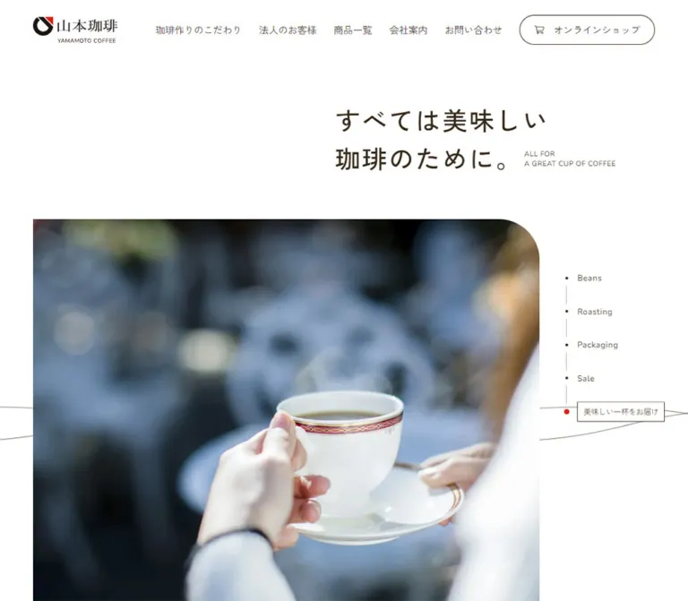
白い余白、深いブラウンの文字、非対称に配置した大きな写真が特徴。工程ナビゲーション、円形の写真、細い罫線と矢印で、珈琲づくりから商品・企業情報へ導くデザイン。
Yamamoto Coffee — Style Reference
White space, coffee-brown lettering, and generous photographic windows into the making of a cup.
Website / original URL: yamamotocoffee.co.jp
Final URL: https://www.yamamotocoffee.co.jp/
Theme: a light presentation with a brown footer and photographic closing links.
Inspected: supplied capture batch dated September 24, 2026, 06:35:30 JST; retrieval timestamp 2026-09-23T21:35:30.049Z.
Viewports: desktop 1440 × 1000 and mobile 390 × 844 CSS pixels.
Scope: the current corporate homepage: header, process-oriented hero, company philosophy, quality and factory links, services, company information, news, contact/FAQ panels, footer, and online-shop links. Linked destination pages and opened navigation states were not inspected.
Yamamoto Coffee presents manufacturing expertise through a quiet editorial layout. White is the dominant surface; dark brown supplies text, rules, and outline controls. Small red dots mark section labels and the active process stage. Photography provides the material richness: wooden barrels, coffee beans, roasting equipment, grinders, a café interior, and a cup on moss.
The defining composition is asymmetric. The opening statement sits toward the right above a large photograph that extends from the left. Desktop process navigation occupies the photograph’s right margin. Later sections alternate narrow text columns, large photographic links, ruled service rows, and circular company images. The page serves several corporate and commercial journeys rather than a single conversion funnel.
閉じる
Yamamoto Coffee — Style Reference
White space, coffee-brown lettering, and generous photographic windows into the making of a cup.
Website / original URL: yamamotocoffee.co.jp
Final URL: https://www.yamamotocoffee.co.jp/
Theme: a light presentation with a brown footer and photographic closing links.
Inspected: supplied capture batch dated September 24, 2026, 06:35:30 JST; retrieval timestamp 2026-09-23T21:35:30.049Z.
Viewports: desktop 1440 × 1000 and mobile 390 × 844 CSS pixels.
Scope: the current corporate homepage: header, process-oriented hero, company philosophy, quality and factory links, services, company information, news, contact/FAQ panels, footer, and online-shop links. Linked destination pages and opened navigation states were not inspected.
Yamamoto Coffee presents manufacturing expertise through a quiet editorial layout. White is the dominant surface; dark brown supplies text, rules, and outline controls. Small red dots mark section labels and the active process stage. Photography provides the material richness: wooden barrels, coffee beans, roasting equipment, grinders, a café interior, and a cup on moss.
The defining composition is asymmetric. The opening statement sits toward the right above a large photograph that extends from the left. Desktop process navigation occupies the photograph’s right margin. Later sections alternate narrow text columns, large photographic links, ruled service rows, and circular company images. The page serves several corporate and commercial journeys rather than a single conversion funnel.
How to Read This Reference
- Measured values come from the supplied rendered DOM and computed styles. Tables round most measurements to two decimal places.
- Visual estimates come from the five supplied original-page screenshots. Estimated colors are approximate implementation targets, not sampled stylesheet values.
- Recommendations describe reusable implementation choices. They are not claims about the original source.
- Token names are descriptive aliases introduced here. No custom brand-token names were exposed in the evidence.
- Font declarations identify computed family stacks. They do not establish which fallback supplied every rendered glyph.
- Geometry requires context. Some menu descendants have boxes despite being absent from the closed-menu screenshots. Company and footer coordinates also contain inconsistencies that prevent treating the extraction as one static document map.
- Interaction evidence is limited. Initial rendering and scrolling were captured; no menu opening, stage selection, hover sequence, or destination navigation was documented.
Tokens — Colors
Default Palette
| Name | Value | Suggested token | Evidence and role |
|---|---|---|---|
| White canvas | #FFFFFF |
--paper |
Measured body, header, main, and news background; also measured reversed text on photographic links |
| Coffee ink | #362918 |
--ink |
Measured rgb(54, 41, 24) throughout the main interface; the strongest reusable color anchor |
| Footer brown | Approximately #5E4B3B |
--footer-brown |
Visual estimate of the large footer field; its painted wrapper was not included in the computed-style sample |
| Service gray | Approximately #F1F0EE |
--surface-muted |
Visual estimate of the broad service-section background in the desktop capture |
| Signal red | Approximately #E6211B |
--signal |
Visual estimate of the active process dot and small section markers |
| Quiet divider | Approximately #D1CECA |
--rule-muted |
Visual estimate of the mobile news divider; service rules appear darker |
| Decorative line | Approximately #A69D94 |
--line-art |
Visual estimate of the thin curves behind the hero media |
| Shop underlay | #21292D |
--shop-underlay |
Measured background on the final online-shop link; its visible appearance is dominated by photography and overlays |
Keep red confined to small indicators and the brand mark. The header shop link is a brown outline on white, while the closing shop link uses white text over beans. Neither is a large red conversion button.
The extracted custom properties include numerous WordPress preset colors, gradients, and shadows. Their presence does not establish their use in the visible design. Do not import that preset rainbow or shadow collection into this palette.
Theme Presets
Only one light presentation is evidenced. No theme selector or alternate color mode was shown. The brown footer and darkened image panels are sections within that presentation.
Tokens — Typography
Japanese Interface and Body Copy
Declared primary family: Zen Kaku Gothic New.
The recorded fallback stack includes Hiragino Sans, Hiragino Kaku Gothic ProN, YuGothic, Noto Sans JP, BIZ UDPGothic, Meiryo, Helvetica Neue, Arial, and generic sans-serif, with additional Japanese-named system-font aliases.
The important distinction is between regular explanatory text and medium-weight Japanese statements:
- Body copy and navigation generally use weight
400. - Hero copy, service headings, company-link headings, and news titles use weight
500. - Major Japanese statements commonly use
0.05emletter spacing and1.5line height. - Reading paragraphs use approximately
1.75line height.
The body element itself has a measured line height equal to its font size. That inherited base is not the paragraph rhythm: the inspected paragraphs override it. Use the paragraph measurements when implementing prose.
English Display Lettering
Directly measured stack: Optima, Marcellus, sans-serif on Contact, FAQ, and the desktop footer headings.
This stack produces a softer, more classical display texture than the Japanese interface face. Contact and FAQ are large but regular in weight. Footer headings such as About, Customers, Products, and Company use the same declared stack at a smaller size.
The large About Us title visibly belongs to this editorial treatment. However, the extraction sampled its parent H2, which reports the Japanese family; the English child’s own family was not supplied. Applying the confirmed display stack to all large English section titles is a reasonable adaptation, not a separately verified child-font measurement.
English Utility Labels
Declared stack: Nunito Sans, sans-serif.
Confirmed uses include Quality, In House Factory, service labels, company-link captions, and the copyright line. These use weight 400, often with 0.05em tracking. They are quiet navigational annotations rather than bold display headings.
Brand Marks
The header and footer use graphic wordmarks. The header’s text-bearing H1 reports font-size: 0, while its graphic occupies a visible box. Do not use that zero value as a typography token or substitute a guessed typeface for the logo.
Type Scale
| Role | Desktop size / line height | Mobile size / line height | Weight and tracking | Evidence |
|---|---|---|---|---|
| Base body | 17.48 / 17.48px |
14.05 / 14.05px |
400, normal |
Measured inherited base |
| Header navigation | 16.33 / 24.49px |
Not visible in the closed header | 400 |
Measured desktop controls |
| Hero statement | 46.73 / 70.10px |
25.31 / 37.96px |
500, 0.05em |
Measured H1 |
| Philosophy statement | 39.78 / 59.67px |
25.21 / 37.81px |
500, 0.05em |
Measured paragraph |
| Section-title parent | 80.43 / 80.43px |
50.43 / 50.43px |
400, -0.025em |
Measured H2; nested labels have their own styles |
| Lead paragraph | 19.35 / 33.86px |
15.06 / 26.36px |
400 |
Measured philosophy, service introduction, and company copy |
| Service heading | 33.91 / 50.87px |
20.20 / 30.29px |
500, 0.05em |
Measured |
| Service description | 17.48 / 30.59px |
14.05 / 24.59px |
400 |
Measured |
| Quality/factory Japanese title | 33.91 / 50.87px |
20.37 / 30.55px |
500, 0.05em |
Measured |
| Quality/factory English caption | 13.74 / 13.74px |
12.05 / 12.05px |
400, 0.05em |
Measured Nunito Sans stack |
| Company-link title | 32.17 / 48.26px |
20.17 / 30.26px |
500, 0.05em |
Measured |
| Company-link English caption | 12.74 / 12.74px |
11.02 / 11.02px |
400, 0.05em |
Measured Nunito Sans stack |
| News title | 21.09 / 31.63px |
15.09 / 22.63px |
500, 0.05em |
Measured |
| Contact / FAQ English title | 56.08 / 56.08px |
30.37 / 30.37px |
400 |
Measured display stack |
| Contact / FAQ Japanese label | 18.82 / 28.24px |
11.11 / 16.67px |
500, 0.05em |
Measured |
| Footer group heading | 28.69 / 28.69px |
Groups not visible | 400 |
Measured display stack |
| Copyright | 13.61 / 13.61px |
11.04 / 11.04px |
400, 0.05em |
Measured Nunito Sans stack |
| Closing shop label | 26.30 / 39.45px |
15.16 / 22.74px |
500, 0.05em |
Measured |
The small red-dot section labels appear around 11–13px. Do not render them at the 50–80px size reported by their H2 parent. The philosophy H2 is a particularly clear example: its visible label occupies a box only about 11–13px high.
Tokens — Spacing & Shapes
Density: broad section spacing with compact annotations and thin controls.
Shape vocabulary: square thumbnails, selectively rounded photographic edges, circles, and one pill-shaped shop button. The page does not use a universal rounded-card system.
Responsive Unit
The HTML root reports 16px at both inspected widths. Component sizes vary between viewports, but their source formulas and media-query thresholds were not supplied.
The fractional values therefore support responsive sizing, not a claim about a specific vw, clamp(), or custom-unit implementation. The Quick Start uses recommended interpolation between the measured endpoints.
Spacing Scale
| Use | Desktop | Mobile | Status |
|---|---|---|---|
| Header outer inset | 64.11px |
28.52px |
Measured brand position |
| Main text-container inset | 168.44px |
28.52px |
Measured repeated alignment |
| Hero section top padding | 77.82px |
30.67px |
Measured, below the header reservation |
| Philosophy section top padding | 154.98px |
56.41px |
Measured |
| Services section top padding | 93.47px |
50.61px |
Measured |
| Company section top padding | 211.06px |
86.78px |
Measured |
| News section top padding | 88.47px |
45.61px |
Measured |
| News section bottom padding | 168.02px |
56.59px |
Measured |
| Service-row top / bottom padding | 42.39 / 49.78px |
25.24 / 15.49px |
Measured |
| News-row vertical padding | 33.04px |
20.18px |
Measured |
| Company-link internal horizontal gap | Not applicable to the desktop image-over-label layout | 25.31px |
Measured mobile flex gap |
| Header shop-button padding | 12.25px 32.65px |
Header button not visible | Measured |
These are component-specific values. A reusable implementation can organize nearby values into a simpler spacing scale, but should preserve the large differences between desktop and phone section spacing.
Border Radius
| Element | Radius | Evidence |
|---|---|---|
| Header shop link | 9999px |
Measured pill |
| Desktop Contact panel | Bottom-left 74.78px; other corners 0 |
Measured |
| Desktop FAQ panel | Bottom-right 74.78px; other corners 0 |
Measured |
| Mobile Contact / FAQ panels | 0 |
Measured |
| Hero photograph | Upper-right approximately 75px desktop / 40px mobile |
Visual estimate |
| Broad service surface | Lower-right approximately 75px in the desktop capture |
Visual estimate |
| Company photographs | Circular | Visible desktop treatment; image-node styles not included |
| Arrow controls | Circular outline | Visible; diameter varies by context |
| Retail thumbnail | Square corners | Visible desktop treatment |
Layout Measurements
| Element | Desktop 1440 × 1000 |
Mobile 390 × 844 |
Notes |
|---|---|---|---|
| Header | 1440 × 104.50px |
390 × 68.50px |
Measured |
| Header logo | 150.84 × 45.53px |
90.84 × 27.42px |
Measured graphic box |
| Main content width | 1103.13px |
332.97px |
Measured; approximately 76.6% and 85.4% of viewport width |
| Hero heading wrapper | 1103.13 × 140.19px |
332.97 × 113.91px |
The visible copy occupies its right side |
| Hero photograph | Starts near (65, 405); about 1108px wide |
Approximately (0, 249), 361 × 404px |
Screenshot estimate; desktop bottom extends beyond the opening capture |
| Hero section height | 1005.09px |
584.53px |
Measured, excluding the preceding header reservation |
| Quality/factory link bounds | Each 730.64 × 757.36px |
Each 361.48 × 358.08px |
Measured link boxes, not independently measured image crops |
| Retail row | 1103.13 × 366.48px |
332.97 × 305.39px |
Measured |
| Retail thumbnail | Approximately 213 × 214px |
Image box not sampled | Desktop screenshot estimate |
| Company link | 396.48 × 516.94px |
327.50 × 141.70px |
Measured anchor boxes |
| News row | 795.38 × 154.16px |
332.97px wide; 103.16–125.77px high |
Longer mobile title wraps |
| Contact / FAQ link | Each 720 × 559.95px |
Each 390 × 182.20px |
Measured |
| Complete footer | 845.05px high |
282.03px high |
Measured footer wrapper |
| Closing shop banner | 233.67px high |
126.52px high |
Measured |
| Document height | Approximately 8923px |
Approximately 4624px |
Captured state; not a reusable height target |
Components
Corporate Header
Role: identify the company and expose the principal information routes.
The desktop header is a white strip with the graphic logo at the far left and a long navigation group aligned right. Five Japanese text controls precede a outlined online-shop pill containing a cart icon. The pill measures approximately 246.80 × 50.95px.
The five top-level text controls are recorded as buttons. Associated destination links exist in the DOM, including quality, factory, retail, products, company, and contact pages. That supports a disclosure-oriented navigation structure, but the opened panel appearance and its trigger behavior were not captured. Do not describe an unobserved hover menu as verified.
On mobile, the desktop link row and shop pill disappear from the visible header. A small three-line menu icon sits near the right inset. The menu’s open layout, focus behavior, and animation remain unverified.
Asymmetric Hero Statement
Role: establish the company’s guiding idea before introducing production imagery.
The Japanese statement, すべては美味しい / 珈琲のために。, is arranged as two lines. On desktop, it begins visually around x ≈ 757px, despite the much wider H1 wrapper. The small English phrase, ALL FOR / A GREAT CUP OF COFFEE, sits beside the second Japanese line.
On mobile, the Japanese text remains offset to the right, beginning around x ≈ 148px. The English annotation moves below it. Keep this offset: centering the entire block would remove one of the page’s strongest compositional features.
The English annotation is visually tiny on mobile, roughly 7–8px; its exact child style was not recorded. A new implementation can use a slightly larger readability floor, explicitly accepting a small visual difference.
Hero Media and Process Rail
Role: connect the brand statement to coffee production and delivery.
The desktop capture shows wooden barrels and sacks. The mobile capture shows a roasting or cooling tray filled with beans. These are separate captured media states. They do not establish whether the original uses a video, image sequence, responsive source swap, or timed slideshow.
The media’s upper-right corner is rounded; the upper-left remains square. On desktop it begins near the header’s left inset and stops well short of the right edge. On mobile it starts flush with the viewport’s left edge and leaves approximately 29px of white space on the right.
The desktop rail contains five button elements: Beans, Roasting, Packaging, Sale, and "Your" Cup. Small nodes are connected by fine dotted vertical segments. The visible selected stage has a red node and a thin rectangular Japanese caption, while the other stages display compact English labels. Button origins are approximately 54.25px apart vertically.
The mobile opening capture has no visible process rail. Selection behavior, automatic advancement, timing, and persistence were not exercised.
Thin curved lines cross the white field behind the media. Treat these as subtle decorative linework; keep them below the image and outside the text’s reading area.
Philosophy and Photographic Feature Links
Role: explain the company’s approach and route visitors to quality and factory information.
The philosophy starts with a small red-dot label, repeats the main Japanese statement, and follows with two readable paragraphs. Desktop text occupies a column about 406px wide; mobile copy uses the 333px content width.
Quality and In House Factory are large linked regions with white bilingual text. Desktop boxes begin near x = 711px; mobile boxes begin at x = 28.52px and reach the right viewport edge. This creates the opposite edge alignment from the opening photograph.
The recorded bounds of the two feature links overlap vertically by approximately 74.8px on desktop and 40.5px on mobile. Their complete clipping geometry was not shown in the supplied screenshots. Preserve their large scale and asymmetric placement, but do not infer the exact mask or reproduce the overlap using an unexplained negative margin.
Bilingual Section Heading
Role: make the page’s corporate information easy to scan without losing the editorial tone.
Use a small Japanese category label with a red dot, followed by a much larger English title such as Our Services, About Us, or News. The two languages have separate jobs: the Japanese label is precise navigation context; the English line establishes visual rhythm.
The desktop About Us example has a large regular-weight title above a narrow prose column, with circular imagery beginning to its right. Avoid making both language lines equally large or bold.
Ruled Service Row
Role: present a business route as one substantial link.
The desktop retail example has this anatomy:
- A full-width top rule.
- A small numbered index,
/ 02, and the English label For Retail. - A square supermarket photograph at left.
- A medium-weight Japanese title and multi-line description in the center.
- A thin outlined arrow circle near the right edge.
- A full-width bottom rule.
The row sits on a broad pale-gray field rather than an individual elevated card. Its content starts at the main 168px inset; the title begins around x = 468px. The arrow circle is approximately 85px in diameter in the screenshot.
On mobile, the DOM places the title around 127px to the right of the content origin, while the description returns to the full content width below. This supports a compact image/title grouping followed by full-width prose. The detailed mobile image and arrow geometry was not visually captured.
The Products route uses the same measured desktop row height and hierarchy. Its exact photograph was not shown in the supplied original-page captures.
Company Information Links
Role: provide routes to company overview, directly operated shops, and offices.
Desktop company images are circular and arranged in a horizontal sequence to the right of the introductory text. The measured link width is 396.48px; neighboring links begin approximately 451.91px apart, giving a calculated gap of 55.42px. The third link begins beyond the right viewport edge.
The visible images include coffee equipment and a café interior. Beneath each image, the DOM records a small English caption and a larger Japanese destination title.
Mobile link boxes switch to horizontal flex rows: image region at left, bilingual text at right, and a measured 25.31px gap. Their approximately 142px height suggests a substantially smaller image treatment.
The evidence does not establish how the desktop strip advances. It could involve scrolling or another transform mechanism, but dragging, autoplay, and scroll-linked movement were not tested. Mobile company-child coordinates also extend beyond the recorded parent into the News coordinates. Do not copy the extracted 410px parent height or assume this represents an intended visible overlap.
News List
Role: surface current company notices within the same restrained visual system.
Desktop uses a heading above a two-part layout: category/archive controls on the left and a wider article list on the right. Each article is a link with a date, a small outlined category pill, a Japanese title, a right arrow, and a fine divider.
The captured entries are dated June 12, 2026; June 12, 2025; and April 2, 2025. These are article dates, not design-version dates.
Mobile places the category controls above the full-width article list. The archive link, 一覧へ, moves below the rows and aligns right. Its small circle-plus-label group measures 91.23 × 39.11px. The first article is taller because its title wraps; retain content-driven row heights.
Contact and FAQ Photo Links
Role: close the information journey with two clear support routes.
Desktop uses two adjacent 720 × 559.95px photographic links. Contact shows wooden manual grinders; FAQ shows a cup in a mossy setting. White Japanese labels sit above large English titles, with a thin white circular arrow toward the right.
Each text block starts 90px from its panel’s left edge. The outer bottom corners are rounded by 74.78px, exposing the brown footer beneath them; the internal seam remains straight.
Mobile stacks the panels without a gap. Each becomes 390 × 182.20px, with square corners and text inset 48.75px. The photographs therefore require different crops, not simply a proportional scale-down. Preserve the grinder and cup as recognizable subjects while keeping white text legible.
Brown Footer
Role: provide a final site map, company identity, and utility links.
The desktop footer’s upper field is approximately 611px high, calculated by subtracting the shop-banner height from the total footer height. Four navigation groups occupy the upper-right area; the white company wordmark and Instagram icon sit lower left. Copyright appears beneath the brand, with utility links arranged toward the lower right.
The mobile footer reduces the visible brown field to approximately 156px. The multi-column site map and desktop utility row are absent from the capture; the white logo, Instagram icon, and copyright remain. Other navigation destinations still exist in the menu DOM, but their usability was not tested.
The footer reads as a flat color field. It has no observed card borders or elevation shadows.
Closing Online-Shop Banner
Role: keep a commercial route available at the end of the corporate page.
A full-width close-up of roasted beans sits below the brown field. A cart icon and the Japanese online-shop label form the centered foreground action. Oversized, low-contrast English lettering stretches behind them.
The link targets https://yamamotocoffeekan.jp/, as recorded in the original-page DOM. The destination itself was not inspected.
The original body reserves approximately 845px on desktop and 282px on mobile, closely matching the measured footer heights. The footer wrapper is also positioned at the bottom of the sampled viewport. This is consistent with a bottom-anchored reveal arrangement, but the necessary position, stacking, and scroll-state styles were not supplied. The Quick Start uses a normal-flow footer as an explicit implementation simplification.
Tokens — Motion & Interaction
The following values are recorded transition declarations. They establish available transition channels and timings, not complete observed animations.
| Element | Recorded declaration | What is established / limited |
|---|---|---|
| Header | Opacity and visibility 0.25s; transform 0.5s cubic-bezier(0.215, 0.61, 0.355, 1) |
A header state transition is defined; hide/reveal trigger and travel distance are unknown |
| Brand link | Opacity 0.375s |
Opacity feedback is available; end values not supplied |
| Top-level navigation button | Opacity 0.25s |
Does not establish menu-opening behavior |
| Navigation destination links | Color 0.1875s |
Color transition defined; target color unverified |
| Header shop pill | Background color 0.375s |
Filled hover color was not captured |
| Hero H1 | Filter 2s; opacity 1s, both with cubic-bezier(0.39, 0.575, 0.565, 1) |
Supports a soft reveal; initial filter and exact trigger unknown |
| Philosophy statement | Filter 0.75s; opacity 0.375s; delay 0.5s |
Measured transition configuration |
| Lead paragraphs | Opacity 0.375s; transform 1.125s; delays including 0.5s, 0.625s, and 0.75s |
Staggered reveal timing is declared; transform distance unrecorded |
| News titles | Opacity and color 0.1875s |
Small local feedback channel |
| Archive link | Color 0.375s |
Target state not captured |
| Footer text links | Text-decoration color 0.1875s |
Underline-color transition defined |
Many sampled nodes report animation: none. This does not prove the absence of JavaScript-driven motion, media playback, animations on unsampled descendants, or scroll effects. Likewise, a serialized transition: all without a positive duration is not evidence of visible animation.
The capture process waited for finite motion and sampled layout stability, and traversed intermediate scroll positions. Perpetual animations were temporarily paused during readiness checks and then resumed. The supplied stills cannot establish motion cadence.
Recommended adaptation: use quiet opacity, underline, and small arrow transitions. If implementing process advancement or an image strip, provide explicit controls and a reduced-motion path. Do not invent autoplay timing and label it source behavior.
Surfaces
| Surface | Appearance | Structural purpose |
|---|---|---|
| Main canvas | Solid white | Creates breathing space around text and photos |
| Header | Solid white, brown controls | Keeps navigation visually light |
| Service field | Pale warm gray | Groups the business routes as one section |
| Service and news rows | Flat surfaces with fine rules | Separates content without card elevation |
| Photographic links | Full-bleed images with white labels | Combines atmosphere with destination navigation |
| Company images | Circular crops on white | Softens the corporate information sequence |
| Footer | Warm medium brown with white details | Creates a strong closing field |
| Shop banner | Darkened bean photograph | Separates the commercial exit from the site map |
No general shadow system is evidenced. Large curves, circles, image boundaries, spacing, and rules provide the hierarchy.
Imagery
The image direction is material and specific. It combines industrial coffee production with familiar café objects and a small amount of natural scenery. The photographs carry the warmth; the surrounding interface stays largely white.
Use authentic textures: worn barrel staves, metal bands, dense beds of beans, painted machinery, wooden grinders, brick, foliage, and ceramic cups. Avoid replacing all of these with repeated isolated cup packshots. The breadth of imagery supports the company’s manufacturing, wholesale, and retail roles.
Photography is not treated with one global sepia filter. The opening barrel image is warm, while the mobile roasting image contains cool blue metal and clothing. The FAQ panel introduces green moss. Preserve these natural differences inside the restrained interface palette.
Observed Asset References
The supplied evidence does not expose image src, srcset, video URLs, logo file paths, or icon asset paths. The following are visual references, not downloadable asset identifiers.
| Visual | Evidence | Reuse guidance |
|---|---|---|
| Dark company logo with small red detail | Desktop and mobile headers | Use an authorized graphic asset; retain its proportions |
| Barrels and sacks | Desktop opening capture | Wide process photograph with an upper-right curved corner |
| Bean-filled roasting/cooling tray | Mobile opening capture | Tall crop that preserves the central machinery |
| Supermarket interior | Desktop retail row | Small square thumbnail with a clear retail context |
| Coffee equipment and café interior | Desktop company section | Circular crops with recognizable subjects |
| Wooden manual grinders | Contact panel | Compose around white text and a right-side arrow |
| Cup on moss | FAQ panel | Preserve the cup in the short mobile crop |
| Roasted beans | Closing shop banner | Dense texture behind a centered white action |
| Fine cart, arrow, menu, and Instagram symbols | Header, rows, panels, and footer | Match thin strokes and simple silhouettes |
Quality and factory links are present in the DOM, but their complete photographs were not shown in the supplied original-page captures. Do not assign invented filenames or unverified subjects to them.
Layout & Responsive Behavior
Desktop Composition
The page has two distinct horizontal alignments. The header and opening photograph begin near 64px, while most reading content starts near 168px. Keeping both creates the layered relationship between broad imagery and narrower editorial content.
The opening photograph occupies most of the width but leaves room for a process rail. The company section instead uses circular images extending toward and beyond the right edge. Services return to a controlled 1103px ruled layout. The contact/FAQ pair expands to the full viewport width before the brown footer.
Mobile Recomposition
At 390px, the standard reading inset becomes approximately 28.52px, leaving a 332.97px content column. This inset is reused by the logo, philosophy, services, news, and footer identity.
The hero retains its right-offset statement, but removes the visible process rail. Its photograph is flush left and inset right. Quality/factory link bounds reverse that alignment, becoming inset left and flush right.
Services preserve an image/title relationship while moving explanatory copy below. News changes from sidebar-plus-list to controls above a single list, with the archive action below. Contact and FAQ stack and lose their rounded outer corners. The footer site map compresses to a small identity block above the shop banner.
Limits and Implementation Decisions
Only the two stated widths were inspected. The actual breakpoint, tablet layout, landscape behavior, maximum content-width formula, and browser zoom behavior remain unknown.
Company-link coordinates are not reliable enough to establish a complete mobile section flow. Several descendants extend below their parent’s reported bounds and overlap later-section coordinates in the extraction. Hidden navigation links likewise have measurable boxes without being visible in the screenshots. Treat these as inspection limitations, not instructions to reproduce overlapping content.
For a new implementation, use content-driven section heights, allow Japanese text to wrap naturally, and clip photographic treatments locally. If the company sequence becomes horizontally scrollable, contain overflow inside that component rather than allowing the whole document to scroll sideways.
Do’s and Don’ts
Do
- Anchor the interface in measured white
#FFFFFFand coffee ink#362918. - Preserve the difference between the broad image alignment and the narrower reading column.
- Keep the hero statement right-offset at both inspected widths.
- Use medium Japanese headings with generous line height and regular English display lettering.
- Reserve red for tiny markers and brand details.
- Mix large photographic windows, square service thumbnails, and circular company images deliberately.
- Use thin rules and outlined arrow circles to make whole-row links understandable.
- Recompose image crops and content order for mobile.
- Keep the online-shop route visually distinct in both the header and closing banner.
- Let news and body copy determine their own height.
Don't
- Don't replace the corporate information architecture with a single-action campaign layout.
- Don't center every section or apply the same inset to every photograph.
- Don't turn each section into a floating rounded card with a shadow.
- Don't make all corners round; the selective corners are part of the identity.
- Don't use the red indicator color as a large background fill.
- Don't substitute a heavy geometric sans-serif for every English heading.
- Don't describe parent H2 metrics as the size of the small Japanese section label.
- Don't treat platform preset gradients and colors as the site’s visible palette.
- Don't assume stage autoplay, draggable company images, or hover-menu behavior from still screenshots.
- Don't copy anomalous extracted section heights or footer offsets into a new layout.
Recommended Implementation Additions
These are recommendations for a new implementation, not verified features of the original:
- Give the mobile menu button an accessible name, an expanded state, and keyboard-operable disclosure behavior.
- Keep stage controls available to keyboard users if interactive media switching is implemented; communicate the selected stage without relying only on red.
- Provide a pause mechanism for automatically advancing media and honor reduced-motion preferences.
- Use at least
44 × 44pxinteractive targets even where the visible arrow circle is smaller. - Preserve visible focus indicators on photographic links, service rows, news rows, and the shop pill.
- Give meaningful image alternatives where imagery conveys content; use empty alternatives for purely decorative duplicates and hide the hero curves from assistive technology.
- Check white-text contrast across all crops of Contact, FAQ, and the shop photograph. A localized overlay can improve reliability without flattening the entire image.
- Keep decorative repeated slogans and oversized background lettering out of the accessible reading order.
- Ensure all company links remain reachable when simplifying the unverified desktop motion treatment.
- Reserve image dimensions before loading, and avoid hiding essential content behind an animation that may never complete.
Agent Prompt Guide
Quick Color Reference
- Canvas and reversed text: measured
#FFFFFF. - Primary lettering and outlines: measured
#362918. - Footer field: approximately
#5E4B3B. - Service field: approximately
#F1F0EE. - Tiny active and section markers: approximately
#E6211B. - Photo-panel action: white text and a white outline circle.
- Main header action: brown outlined pill on white.
Overall Prompt
Create a Japanese coffee company homepage with the restraint of an editorial corporate site. Use a white canvas, dark coffee-brown text #362918, Zen Kaku Gothic New for Japanese copy, a regular classical English display treatment based on the confirmed Optima/Marcellus stack, and small tracked Nunito Sans labels. Place a two-line Japanese brand statement toward the right above a large left-aligned production photograph with only its upper-right corner rounded. Add a five-stage process rail on desktop. Continue with a philosophy column, large quality and factory links, a pale-gray service section with ruled image/text rows, circular company photographs, a compact news list, paired photographic Contact and FAQ links, and a brown footer above a bean-photo shop banner. Use tiny red markers, thin outlines, and ample space. Recompose the layout for phones rather than uniformly shrinking it. Keep unverified media and menu behaviors as explicit implementation choices.
Example Component Prompts
- Hero: Build a white coffee-company hero with a right-offset, two-line Japanese statement. Place a tiny English annotation beside the second line on desktop and below it on mobile. Use a large authentic production image with an upper-right curved corner. Leave a narrow desktop rail for five small process controls; hide the rail in the compact layout.
- Service row: Create a pale-gray editorial service row with thin top and bottom rules, a small numbered English caption, a square retail photograph, a medium Japanese heading, explanatory copy, and an outlined circular arrow. On mobile, place the description below the image/title grouping.
- Company links: Place circular equipment and café photographs beside a narrow About Us introduction. Use a small English caption and larger Japanese destination title for each link. On mobile, use image-left and text-right rows with generous separation. Make every destination reachable without depending on autoplay.
- Contact pair: Create adjacent grinder and moss-and-cup photo links with white Japanese labels, regular English titles, and white outlined arrow circles. Round only the outer bottom corners on desktop. Stack them as short, square-cornered panels on mobile.
- Footer: Build a flat brown corporate footer with white branding, small navigation text, and regular English group headings. Follow it with a full-width roasted-bean image carrying a centered white cart-and-shop action and large low-contrast background lettering.
Quick Start
CSS Custom Properties
This is a recommended adaptation, not recovered source CSS. Exact colors and selected dimensions come from the evidence; estimated colors are marked. Fluid formulas interpolate approximately between the inspected widths. The 64rem breakpoint is a recommendation.
The selectors assume semantic markup: the service row contains separate index, image, title, description, and arrow children; photographic links contain an image, a text block, and an arrow. Supply authorized assets through HTML. Font loading and interactive behavior require separate implementation.
:root {
  /* Measured colors */
  --paper: #ffffff;
  --ink: #362918;
  --shop-underlay: #21292d;

  /* Visual estimates */
  --footer-brown: #5e4b3b;
  --surface-muted: #f1f0ee;
  --signal: #e6211b;
  --rule-muted: #d1ceca;

  /* Verified family names; shortened fallback stack */
  --font-japanese: 'Zen Kaku Gothic New', 'Hiragino Sans',
    'Hiragino Kaku Gothic ProN', YuGothic, 'Noto Sans JP',
    Meiryo, Arial, sans-serif;
  --font-display: Optima, Marcellus, sans-serif;
  --font-utility: 'Nunito Sans', sans-serif;

  /* Recommended interpolation between measured endpoints */
  --type-body: clamp(14.05px, calc(12.78px + 0.3265vw), 17.48px);
  --type-lead: clamp(15.06px, calc(13.47px + 0.4082vw), 19.35px);
  --type-hero: clamp(25.31px, calc(17.35px + 2.0408vw), 46.73px);
  --type-section: clamp(50.43px, calc(39.29px + 2.8571vw), 80.43px);
  --type-item: clamp(20.20px, calc(15.10px + 1.3061vw), 33.91px);
  --type-photo: clamp(30.37px, calc(20.82px + 2.449vw), 56.08px);

  --content-width: 1103.125px;
  --edge: clamp(28.52px, 4.452vw, 64.11px);
  --header-height: clamp(68.5px, calc(55.13px + 3.4286vw), 104.5px);
  --corner: 74.78px;
  --rule: 1px;
  --ease-reveal: cubic-bezier(0.39, 0.575, 0.565, 1);
  --motion-link: 187.5ms;
  --motion-surface: 375ms;
}

* { box-sizing: border-box; }
body {
  margin: 0;
  color: var(--ink);
  background: var(--paper);
  font-family: var(--font-japanese);
  font-size: var(--type-body);
  line-height: 1.75;
}
img { display: block; max-width: 100%; }
button { font: inherit; color: inherit; }
a { color: inherit; }
.container {
  width: min(var(--content-width), calc(100% - 2 * var(--edge)));
  margin-inline: auto;
}

.site-header {
  min-height: var(--header-height);
  padding-inline: var(--edge);
  display: flex;
  align-items: center;
  justify-content: space-between;
  gap: 32px;
  background: var(--paper);
}
.brand { display: block; flex: none; }
.brand img {
  width: clamp(90.84px, calc(68.55px + 5.7143vw), 150.84px);
  height: auto;
}
.desktop-nav {
  display: flex;
  align-items: center;
  gap: 35.8px;
  font-size: 16.33px;
  line-height: 1.5;
}
.desktop-nav a { text-decoration: none; }
.nav-trigger {
  padding: 12px 0;
  border: 0;
  background: none;
  cursor: pointer;
}
.shop-pill {
  display: inline-flex;
  align-items: center;
  justify-content: center;
  gap: 16.33px;
  min-height: 50.95px;
  padding: 12.25px 32.65px;
  border: var(--rule) solid currentColor;
  border-radius: 9999px;
  text-decoration: none;
  transition: background-color var(--motion-surface);
}
.menu-toggle {
  display: none;
  width: 44px;
  height: 44px;
  border: 0;
  background: none;
}

.hero { padding-top: 77.82px; }
.hero-copy {
  width: max-content;
  max-width: 100%;
  margin-left: auto;
  margin-bottom: 82.5px;
}
.hero-title {
  margin: 0;
  font-size: var(--type-hero);
  font-weight: 500;
  line-height: 1.5;
  letter-spacing: 0.05em;
}
.hero-line { display: block; }
.hero-last-line {
  display: flex;
  align-items: center;
  gap: 24px;
}
.hero-english {
  font-family: var(--font-utility);
  font-size: 13px;
  font-weight: 400;
  line-height: 1.35;
  letter-spacing: 0.02em;
}
.hero-visual {
  margin-inline: var(--edge);
  display: grid;
  grid-template-columns: minmax(0, 1fr) 148px;
  gap: 54.88px;
}
.hero-media {
  margin: 0;
  overflow: hidden;
  border-top-right-radius: var(--corner);
  aspect-ratio: 1.58;
  /* Recommended desktop ratio; full image height was not captured. */
}
.hero-media img {
  width: 100%;
  height: 100%;
  object-fit: cover;
}
.process-rail {
  align-self: start;
  margin: 88px 0 0;
  padding: 0 0 0 18px;
  list-style: none;
}
.process-rail li {
  position: relative;
  min-height: 36.8px;
  margin-bottom: 17.45px;
}
.process-rail li::before {
  content: '';
  position: absolute;
  left: -20px;
  top: 17px;
  width: 4px;
  height: 4px;
  border-radius: 50%;
  background: var(--ink);
}
.process-rail li:not(:last-child)::after {
  content: '';
  position: absolute;
  left: -18.5px;
  top: 26px;
  height: 28px;
  border-left: 1px dotted var(--ink);
  opacity: 0.45;
}
.process-rail button {
  min-height: 44px;
  padding: 6px 0;
  border: 0;
  background: none;
  text-align: left;
  font-family: var(--font-utility);
  font-size: 13px;
  cursor: pointer;
}
.process-rail .is-active::before {
  left: -22px;
  top: 15px;
  width: 8px;
  height: 8px;
  background: var(--signal);
}
.process-caption {
  padding: 6px 9px;
  border: 1px solid var(--ink);
  background: var(--paper);
  font-family: var(--font-japanese);
  font-size: 12px;
}

.section { padding-block: 93.47px; }
.eyebrow {
  display: flex;
  align-items: center;
  gap: 5px;
  margin: 0 0 22px;
  font-size: 12px;
  line-height: 1.2;
}
.eyebrow::before {
  content: '';
  width: 5px;
  height: 5px;
  flex: none;
  border-radius: 50%;
  background: var(--signal);
}
.section-title {
  margin: 0;
  font-family: var(--font-display);
  font-size: var(--type-section);
  font-weight: 400;
  line-height: 1;
  letter-spacing: -0.025em;
  /* Display stack applied consistently as an adaptation. */
}
.lead {
  font-size: var(--type-lead);
  line-height: 1.75;
}
.services-surface {
  background: var(--surface-muted);
  border-bottom-right-radius: var(--corner);
}
.service-row {
  display: grid;
  grid-template-columns: 214px minmax(0, 1fr) 85px;
  grid-template-areas:
    'index index index'
    'image title arrow'
    'image copy arrow';
  gap: 20px 85px;
  padding-block: 42.39px 49.78px;
  border-top: 1px solid var(--ink);
  color: inherit;
  text-decoration: none;
}
.service-row:last-child { border-bottom: 1px solid var(--ink); }
.service-index {
  grid-area: index;
  font-family: var(--font-utility);
  font-size: 13.61px;
  letter-spacing: 0.05em;
}
.service-image {
  grid-area: image;
  width: 100%;
  aspect-ratio: 1;
  object-fit: cover;
}
.service-title {
  grid-area: title;
  align-self: end;
  margin: 0;
  font-size: var(--type-item);
  font-weight: 500;
  line-height: 1.5;
  letter-spacing: 0.05em;
}
.service-description { grid-area: copy; margin: 0; }
.circle-arrow {
  display: inline-grid;
  place-items: center;
  width: 85px;
  aspect-ratio: 1;
  border: 1px solid currentColor;
  border-radius: 50%;
  flex: none;
}
.service-row > .circle-arrow {
  grid-area: arrow;
  align-self: center;
}
.circle-arrow svg { width: 22px; height: 22px; }

/* An accessible horizontal strip is a recommended fallback. */
.company-track {
  display: flex;
  gap: 55.42px;
  overflow-x: auto;
  padding-block: 8px 20px;
}
.company-link {
  flex: 0 0 396.48px;
  text-decoration: none;
}
.company-image {
  width: 100%;
  aspect-ratio: 1;
  border-radius: 50%;
  object-fit: cover;
}
.company-caption {
  margin-top: 32px;
  font-family: var(--font-utility);
  font-size: 12.74px;
  letter-spacing: 0.05em;
}
.company-name {
  margin: 12px 0 0;
  font-size: 32.17px;
  font-weight: 500;
  line-height: 1.5;
}
.news-row {
  display: block;
  padding: 33.04px 25px 33.04px 0;
  border-bottom: 1px solid var(--rule-muted);
  text-decoration: none;
}
.news-title {
  margin: 18px 0 0;
  font-size: 21.09px;
  font-weight: 500;
  line-height: 1.5;
  letter-spacing: 0.05em;
}
.news-category {
  display: inline-block;
  margin-left: 12px;
  padding: 2px 12px;
  border: 1px solid var(--rule-muted);
  border-radius: 9999px;
  font-size: 12px;
}

.contact-pair { display: grid; grid-template-columns: 1fr 1fr; }
.photo-link {
  position: relative;
  isolation: isolate;
  min-height: 559.95px;
  display: flex;
  align-items: center;
  justify-content: space-between;
  gap: 24px;
  padding-inline: 12.5%;
  overflow: hidden;
  color: var(--paper);
  background: var(--shop-underlay);
  text-decoration: none;
}
.photo-link > img {
  position: absolute;
  inset: 0;
  z-index: -2;
  width: 100%;
  height: 100%;
  object-fit: cover;
}
.photo-link::before {
  content: '';
  position: absolute;
  inset: 0;
  z-index: -1;
  background: rgb(0 0 0 / 18%);
  /* Recommended contrast layer; tune against each photograph. */
}
.contact-pair .photo-link:first-child {
  border-bottom-left-radius: var(--corner);
}
.contact-pair .photo-link:last-child {
  border-bottom-right-radius: var(--corner);
}
.photo-label { margin: 0 0 18.69px; font-weight: 500; }
.photo-title {
  margin: 0;
  font-family: var(--font-display);
  font-size: var(--type-photo);
  font-weight: 400;
  line-height: 1;
}

/* Normal-flow footer; the original reveal mechanism is unverified. */
.site-footer { color: var(--paper); background: var(--footer-brown); }
.footer-main { padding-block: 140px 110px; }
.footer-nav {
  display: grid;
  grid-template-columns: repeat(4, minmax(0, 1fr));
  gap: 48px;
  margin-left: 30%;
}
.footer-heading {
  margin: 0 0 56px;
  font-family: var(--font-display);
  font-size: 28.69px;
  font-weight: 400;
  line-height: 1;
}
.footer-brand { margin-top: 64px; }
.copyright {
  font-family: var(--font-utility);
  font-size: 13.61px;
  letter-spacing: 0.05em;
}
.shop-banner {
  min-height: 233.67px;
  justify-content: center;
  border-radius: 0;
  font-size: 26.30px;
  font-weight: 500;
  letter-spacing: 0.05em;
}

/* Recommended interaction feedback, not a recovered hover state. */
@media (hover: hover) {
  .shop-pill:hover { background: var(--surface-muted); }
  .news-row:hover .news-title { text-decoration: underline; }
}
:where(a, button):focus-visible {
  outline: 2px solid currentColor;
  outline-offset: 5px;
}

@media (max-width: 64rem) {
  :root { --corner: 40.5px; }
  .desktop-nav { display: none; }
  .menu-toggle { display: grid; place-items: center; }
  .hero { padding-top: 30.67px; }
  .hero-copy { margin-bottom: 36px; }
  .hero-last-line { display: block; }
  .hero-english {
    display: block;
    margin-top: 12px;
    font-size: 10px;
    /* Readability floor; the captured caption appears smaller. */
  }
  .hero-visual { display: block; margin: 0 var(--edge) 0 0; }
  .hero-media { aspect-ratio: 361.5 / 404; }
  .process-rail { display: none; }
  .section { padding-block: 50.61px; }
  .service-row {
    grid-template-columns: 101px minmax(0, 1fr) 44px;
    grid-template-areas:
      'index index index'
      'image title arrow'
      'copy copy copy';
    gap: 20px 25px;
    padding-block: 25.24px 15.49px;
  }
  .service-title { align-self: center; }
  .service-row > .circle-arrow { width: 44px; }
  .company-track { display: grid; gap: 20px; overflow: visible; }
  .company-link { display: flex; align-items: center; gap: 25.31px; }
  .company-image { width: 141.7px; flex: none; }
  .company-caption { margin-top: 0; font-size: 11.02px; }
  .company-name { font-size: 20.17px; }
  .news-row { padding-block: 20.18px; }
  .news-title { font-size: 15.09px; }
  .contact-pair { grid-template-columns: 1fr; }
  .contact-pair .photo-link {
    min-height: 182.20px;
    padding-inline: 12.5% 6.7%;
    border-radius: 0;
  }
  .photo-label { margin-bottom: 10px; font-size: 11.11px; }
  .photo-link .circle-arrow { width: 49px; }
  .footer-main { padding-block: 76px 30px; }
  .footer-nav, .footer-utilities { display: none; }
  .footer-brand { margin-top: 0; }
  .copyright { font-size: 11.04px; }
  .shop-banner { min-height: 126.52px; font-size: 15.16px; }
}

@media (prefers-reduced-motion: reduce) {
  .shop-pill, .nav-trigger, .news-title { transition: none; }
  html { scroll-behavior: auto; }
  /* Any added media controller must also stop automatic advancement. */
}
For the hero markup, keep the first Japanese line in .hero-line and group the second line plus .hero-english inside .hero-last-line. For company links, wrap the caption and destination title together beside the image so the mobile flex layout can reposition them as a unit.
The CSS intentionally does not fabricate the feature-link masks, header disclosure panels, media controller, company scroll choreography, or footer reveal. It provides the measured visual foundation and a usable responsive fallback.
Tailwind v4 Token Mapping
Optional aliases for a project already using Tailwind v4. This does not imply that the inspected site uses Tailwind. Define the custom properties above first.
@theme inline {
  --color-coffee-paper: var(--paper);
  --color-coffee-ink: var(--ink);
  --color-coffee-footer: var(--footer-brown);
  --color-coffee-muted: var(--surface-muted);
  --color-coffee-signal: var(--signal);
  --color-coffee-rule: var(--rule-muted);

  --font-sans: var(--font-japanese);
  --font-editorial: var(--font-display);
  --font-caption: var(--font-utility);

  --text-body: var(--type-body);
  --text-lead: var(--type-lead);
  --text-hero: var(--type-hero);
  --text-section: var(--type-section);
  --text-item: var(--type-item);
  --text-photo: var(--type-photo);

  --spacing-page: var(--edge);
  --radius-photo: var(--corner);
}
Sources & Evidence
- Original and final page: Yamamoto Coffee. The supplied inspection reports HTTP
200and an unchanged final URL. The page title, linked brand identity, and footer identify 山本珈琲株式会社. - Capture timestamp:
2026-09-23T21:35:30.049Z, equivalent to September 24, 2026, 06:35:30.049 JST. This is the supplied batch timestamp; individual screenshot timestamps were not provided. - Desktop evidence:
1440 × 1000viewport, approximately8923pxdocument height, rendered text and links, computed element styles, and three screenshots covering the opening, service/company transition, and closing footer. - Mobile evidence:
390 × 844viewport, approximately4624pxdocument height, rendered text and links, computed element styles, and two screenshots covering the opening and closing page regions. - Inspection procedure: initial observation of at least five seconds; readiness checks for loading, finite animation, layout/text stability, and visible image decoding; intermediate scrolling; temporary pausing of perpetual animation during readiness checks. SharedWorkers and service workers were disabled.
- Unverified details: opened menus, hover end states, stage-selection outcomes, media format and timing, image filenames, exact clipping paths, tablet breakpoints, company-strip controls, footer positioning mechanism, and linked destination pages.
This reference describes the current homepage represented by the supplied inspection. Measurements, visual estimates, and recommended implementation choices are intentionally distinguished. The displayed ©2023 copyright is preserved as page content and is not treated as the inspection date or evidence of a particular redesign date.
# Yamamoto Coffee — Style Reference

> White space, coffee-brown lettering, and generous photographic windows into the making of a cup.

**Website / original URL:** [yamamotocoffee.co.jp](https://www.yamamotocoffee.co.jp/)
**Final URL:** [https://www.yamamotocoffee.co.jp/](https://www.yamamotocoffee.co.jp/)
**Theme:** a light presentation with a brown footer and photographic closing links.
**Inspected:** supplied capture batch dated September 24, 2026, 06:35:30 JST; retrieval timestamp `2026-09-23T21:35:30.049Z`.
**Viewports:** desktop `1440 × 1000` and mobile `390 × 844` CSS pixels.
**Scope:** the current corporate homepage: header, process-oriented hero, company philosophy, quality and factory links, services, company information, news, contact/FAQ panels, footer, and online-shop links. Linked destination pages and opened navigation states were not inspected.

Yamamoto Coffee presents manufacturing expertise through a quiet editorial layout. White is the dominant surface; dark brown supplies text, rules, and outline controls. Small red dots mark section labels and the active process stage. Photography provides the material richness: wooden barrels, coffee beans, roasting equipment, grinders, a café interior, and a cup on moss.

The defining composition is asymmetric. The opening statement sits toward the right above a large photograph that extends from the left. Desktop process navigation occupies the photograph’s right margin. Later sections alternate narrow text columns, large photographic links, ruled service rows, and circular company images. The page serves several corporate and commercial journeys rather than a single conversion funnel.
閉じる
# Yamamoto Coffee — Style Reference

> White space, coffee-brown lettering, and generous photographic windows into the making of a cup.

**Website / original URL:** [yamamotocoffee.co.jp](https://www.yamamotocoffee.co.jp/)
**Final URL:** [https://www.yamamotocoffee.co.jp/](https://www.yamamotocoffee.co.jp/)
**Theme:** a light presentation with a brown footer and photographic closing links.
**Inspected:** supplied capture batch dated September 24, 2026, 06:35:30 JST; retrieval timestamp `2026-09-23T21:35:30.049Z`.
**Viewports:** desktop `1440 × 1000` and mobile `390 × 844` CSS pixels.
**Scope:** the current corporate homepage: header, process-oriented hero, company philosophy, quality and factory links, services, company information, news, contact/FAQ panels, footer, and online-shop links. Linked destination pages and opened navigation states were not inspected.

Yamamoto Coffee presents manufacturing expertise through a quiet editorial layout. White is the dominant surface; dark brown supplies text, rules, and outline controls. Small red dots mark section labels and the active process stage. Photography provides the material richness: wooden barrels, coffee beans, roasting equipment, grinders, a café interior, and a cup on moss.

The defining composition is asymmetric. The opening statement sits toward the right above a large photograph that extends from the left. Desktop process navigation occupies the photograph’s right margin. Later sections alternate narrow text columns, large photographic links, ruled service rows, and circular company images. The page serves several corporate and commercial journeys rather than a single conversion funnel.

## How to Read This Reference

- **Measured** values come from the supplied rendered DOM and computed styles. Tables round most measurements to two decimal places.
- **Visual estimates** come from the five supplied original-page screenshots. Estimated colors are approximate implementation targets, not sampled stylesheet values.
- **Recommendations** describe reusable implementation choices. They are not claims about the original source.
- **Token names** are descriptive aliases introduced here. No custom brand-token names were exposed in the evidence.
- **Font declarations** identify computed family stacks. They do not establish which fallback supplied every rendered glyph.
- **Geometry requires context.** Some menu descendants have boxes despite being absent from the closed-menu screenshots. Company and footer coordinates also contain inconsistencies that prevent treating the extraction as one static document map.
- **Interaction evidence is limited.** Initial rendering and scrolling were captured; no menu opening, stage selection, hover sequence, or destination navigation was documented.

## Tokens — Colors

### Default Palette

| Name | Value | Suggested token | Evidence and role |
| --- | --- | --- | --- |
| White canvas | `#FFFFFF` | `--paper` | Measured body, header, main, and news background; also measured reversed text on photographic links |
| Coffee ink | `#362918` | `--ink` | Measured `rgb(54, 41, 24)` throughout the main interface; the strongest reusable color anchor |
| Footer brown | Approximately `#5E4B3B` | `--footer-brown` | Visual estimate of the large footer field; its painted wrapper was not included in the computed-style sample |
| Service gray | Approximately `#F1F0EE` | `--surface-muted` | Visual estimate of the broad service-section background in the desktop capture |
| Signal red | Approximately `#E6211B` | `--signal` | Visual estimate of the active process dot and small section markers |
| Quiet divider | Approximately `#D1CECA` | `--rule-muted` | Visual estimate of the mobile news divider; service rules appear darker |
| Decorative line | Approximately `#A69D94` | `--line-art` | Visual estimate of the thin curves behind the hero media |
| Shop underlay | `#21292D` | `--shop-underlay` | Measured background on the final online-shop link; its visible appearance is dominated by photography and overlays |

Keep red confined to small indicators and the brand mark. The header shop link is a brown outline on white, while the closing shop link uses white text over beans. Neither is a large red conversion button.

The extracted custom properties include numerous WordPress preset colors, gradients, and shadows. Their presence does not establish their use in the visible design. Do not import that preset rainbow or shadow collection into this palette.

### Theme Presets

Only one light presentation is evidenced. No theme selector or alternate color mode was shown. The brown footer and darkened image panels are sections within that presentation.

## Tokens — Typography

### Japanese Interface and Body Copy

**Declared primary family:** `Zen Kaku Gothic New`.

The recorded fallback stack includes Hiragino Sans, Hiragino Kaku Gothic ProN, YuGothic, Noto Sans JP, BIZ UDPGothic, Meiryo, Helvetica Neue, Arial, and generic sans-serif, with additional Japanese-named system-font aliases.

The important distinction is between regular explanatory text and medium-weight Japanese statements:

- Body copy and navigation generally use weight `400`.
- Hero copy, service headings, company-link headings, and news titles use weight `500`.
- Major Japanese statements commonly use `0.05em` letter spacing and `1.5` line height.
- Reading paragraphs use approximately `1.75` line height.

The body element itself has a measured line height equal to its font size. That inherited base is not the paragraph rhythm: the inspected paragraphs override it. Use the paragraph measurements when implementing prose.

### English Display Lettering

**Directly measured stack:** `Optima, Marcellus, sans-serif` on Contact, FAQ, and the desktop footer headings.

This stack produces a softer, more classical display texture than the Japanese interface face. Contact and FAQ are large but regular in weight. Footer headings such as About, Customers, Products, and Company use the same declared stack at a smaller size.

The large About Us title visibly belongs to this editorial treatment. However, the extraction sampled its parent H2, which reports the Japanese family; the English child’s own family was not supplied. Applying the confirmed display stack to all large English section titles is a reasonable adaptation, not a separately verified child-font measurement.

### English Utility Labels

**Declared stack:** `Nunito Sans, sans-serif`.

Confirmed uses include Quality, In House Factory, service labels, company-link captions, and the copyright line. These use weight `400`, often with `0.05em` tracking. They are quiet navigational annotations rather than bold display headings.

### Brand Marks

The header and footer use graphic wordmarks. The header’s text-bearing H1 reports `font-size: 0`, while its graphic occupies a visible box. Do not use that zero value as a typography token or substitute a guessed typeface for the logo.

### Type Scale

| Role | Desktop size / line height | Mobile size / line height | Weight and tracking | Evidence |
| --- | --- | --- | --- | --- |
| Base body | `17.48 / 17.48px` | `14.05 / 14.05px` | `400`, normal | Measured inherited base |
| Header navigation | `16.33 / 24.49px` | Not visible in the closed header | `400` | Measured desktop controls |
| Hero statement | `46.73 / 70.10px` | `25.31 / 37.96px` | `500`, `0.05em` | Measured H1 |
| Philosophy statement | `39.78 / 59.67px` | `25.21 / 37.81px` | `500`, `0.05em` | Measured paragraph |
| Section-title parent | `80.43 / 80.43px` | `50.43 / 50.43px` | `400`, `-0.025em` | Measured H2; nested labels have their own styles |
| Lead paragraph | `19.35 / 33.86px` | `15.06 / 26.36px` | `400` | Measured philosophy, service introduction, and company copy |
| Service heading | `33.91 / 50.87px` | `20.20 / 30.29px` | `500`, `0.05em` | Measured |
| Service description | `17.48 / 30.59px` | `14.05 / 24.59px` | `400` | Measured |
| Quality/factory Japanese title | `33.91 / 50.87px` | `20.37 / 30.55px` | `500`, `0.05em` | Measured |
| Quality/factory English caption | `13.74 / 13.74px` | `12.05 / 12.05px` | `400`, `0.05em` | Measured Nunito Sans stack |
| Company-link title | `32.17 / 48.26px` | `20.17 / 30.26px` | `500`, `0.05em` | Measured |
| Company-link English caption | `12.74 / 12.74px` | `11.02 / 11.02px` | `400`, `0.05em` | Measured Nunito Sans stack |
| News title | `21.09 / 31.63px` | `15.09 / 22.63px` | `500`, `0.05em` | Measured |
| Contact / FAQ English title | `56.08 / 56.08px` | `30.37 / 30.37px` | `400` | Measured display stack |
| Contact / FAQ Japanese label | `18.82 / 28.24px` | `11.11 / 16.67px` | `500`, `0.05em` | Measured |
| Footer group heading | `28.69 / 28.69px` | Groups not visible | `400` | Measured display stack |
| Copyright | `13.61 / 13.61px` | `11.04 / 11.04px` | `400`, `0.05em` | Measured Nunito Sans stack |
| Closing shop label | `26.30 / 39.45px` | `15.16 / 22.74px` | `500`, `0.05em` | Measured |

The small red-dot section labels appear around `11–13px`. Do not render them at the `50–80px` size reported by their H2 parent. The philosophy H2 is a particularly clear example: its visible label occupies a box only about `11–13px` high.

## Tokens — Spacing & Shapes

**Density:** broad section spacing with compact annotations and thin controls.

**Shape vocabulary:** square thumbnails, selectively rounded photographic edges, circles, and one pill-shaped shop button. The page does not use a universal rounded-card system.

### Responsive Unit

The HTML root reports `16px` at both inspected widths. Component sizes vary between viewports, but their source formulas and media-query thresholds were not supplied.

The fractional values therefore support responsive sizing, not a claim about a specific `vw`, `clamp()`, or custom-unit implementation. The Quick Start uses recommended interpolation between the measured endpoints.

### Spacing Scale

| Use | Desktop | Mobile | Status |
| --- | --- | --- | --- |
| Header outer inset | `64.11px` | `28.52px` | Measured brand position |
| Main text-container inset | `168.44px` | `28.52px` | Measured repeated alignment |
| Hero section top padding | `77.82px` | `30.67px` | Measured, below the header reservation |
| Philosophy section top padding | `154.98px` | `56.41px` | Measured |
| Services section top padding | `93.47px` | `50.61px` | Measured |
| Company section top padding | `211.06px` | `86.78px` | Measured |
| News section top padding | `88.47px` | `45.61px` | Measured |
| News section bottom padding | `168.02px` | `56.59px` | Measured |
| Service-row top / bottom padding | `42.39 / 49.78px` | `25.24 / 15.49px` | Measured |
| News-row vertical padding | `33.04px` | `20.18px` | Measured |
| Company-link internal horizontal gap | Not applicable to the desktop image-over-label layout | `25.31px` | Measured mobile flex gap |
| Header shop-button padding | `12.25px 32.65px` | Header button not visible | Measured |

These are component-specific values. A reusable implementation can organize nearby values into a simpler spacing scale, but should preserve the large differences between desktop and phone section spacing.

### Border Radius

| Element | Radius | Evidence |
| --- | --- | --- |
| Header shop link | `9999px` | Measured pill |
| Desktop Contact panel | Bottom-left `74.78px`; other corners `0` | Measured |
| Desktop FAQ panel | Bottom-right `74.78px`; other corners `0` | Measured |
| Mobile Contact / FAQ panels | `0` | Measured |
| Hero photograph | Upper-right approximately `75px` desktop / `40px` mobile | Visual estimate |
| Broad service surface | Lower-right approximately `75px` in the desktop capture | Visual estimate |
| Company photographs | Circular | Visible desktop treatment; image-node styles not included |
| Arrow controls | Circular outline | Visible; diameter varies by context |
| Retail thumbnail | Square corners | Visible desktop treatment |

### Layout Measurements

| Element | Desktop `1440 × 1000` | Mobile `390 × 844` | Notes |
| --- | --- | --- | --- |
| Header | `1440 × 104.50px` | `390 × 68.50px` | Measured |
| Header logo | `150.84 × 45.53px` | `90.84 × 27.42px` | Measured graphic box |
| Main content width | `1103.13px` | `332.97px` | Measured; approximately 76.6% and 85.4% of viewport width |
| Hero heading wrapper | `1103.13 × 140.19px` | `332.97 × 113.91px` | The visible copy occupies its right side |
| Hero photograph | Starts near `(65, 405)`; about `1108px` wide | Approximately `(0, 249)`, `361 × 404px` | Screenshot estimate; desktop bottom extends beyond the opening capture |
| Hero section height | `1005.09px` | `584.53px` | Measured, excluding the preceding header reservation |
| Quality/factory link bounds | Each `730.64 × 757.36px` | Each `361.48 × 358.08px` | Measured link boxes, not independently measured image crops |
| Retail row | `1103.13 × 366.48px` | `332.97 × 305.39px` | Measured |
| Retail thumbnail | Approximately `213 × 214px` | Image box not sampled | Desktop screenshot estimate |
| Company link | `396.48 × 516.94px` | `327.50 × 141.70px` | Measured anchor boxes |
| News row | `795.38 × 154.16px` | `332.97px` wide; `103.16–125.77px` high | Longer mobile title wraps |
| Contact / FAQ link | Each `720 × 559.95px` | Each `390 × 182.20px` | Measured |
| Complete footer | `845.05px` high | `282.03px` high | Measured footer wrapper |
| Closing shop banner | `233.67px` high | `126.52px` high | Measured |
| Document height | Approximately `8923px` | Approximately `4624px` | Captured state; not a reusable height target |

## Components

### Corporate Header

**Role:** identify the company and expose the principal information routes.

The desktop header is a white strip with the graphic logo at the far left and a long navigation group aligned right. Five Japanese text controls precede a outlined online-shop pill containing a cart icon. The pill measures approximately `246.80 × 50.95px`.

The five top-level text controls are recorded as buttons. Associated destination links exist in the DOM, including quality, factory, retail, products, company, and contact pages. That supports a disclosure-oriented navigation structure, but the opened panel appearance and its trigger behavior were not captured. Do not describe an unobserved hover menu as verified.

On mobile, the desktop link row and shop pill disappear from the visible header. A small three-line menu icon sits near the right inset. The menu’s open layout, focus behavior, and animation remain unverified.

### Asymmetric Hero Statement

**Role:** establish the company’s guiding idea before introducing production imagery.

The Japanese statement, `すべては美味しい / 珈琲のために。`, is arranged as two lines. On desktop, it begins visually around `x ≈ 757px`, despite the much wider H1 wrapper. The small English phrase, ALL FOR / A GREAT CUP OF COFFEE, sits beside the second Japanese line.

On mobile, the Japanese text remains offset to the right, beginning around `x ≈ 148px`. The English annotation moves below it. Keep this offset: centering the entire block would remove one of the page’s strongest compositional features.

The English annotation is visually tiny on mobile, roughly `7–8px`; its exact child style was not recorded. A new implementation can use a slightly larger readability floor, explicitly accepting a small visual difference.

### Hero Media and Process Rail

**Role:** connect the brand statement to coffee production and delivery.

The desktop capture shows wooden barrels and sacks. The mobile capture shows a roasting or cooling tray filled with beans. These are separate captured media states. They do not establish whether the original uses a video, image sequence, responsive source swap, or timed slideshow.

The media’s upper-right corner is rounded; the upper-left remains square. On desktop it begins near the header’s left inset and stops well short of the right edge. On mobile it starts flush with the viewport’s left edge and leaves approximately `29px` of white space on the right.

The desktop rail contains five button elements: Beans, Roasting, Packaging, Sale, and `"Your" Cup`. Small nodes are connected by fine dotted vertical segments. The visible selected stage has a red node and a thin rectangular Japanese caption, while the other stages display compact English labels. Button origins are approximately `54.25px` apart vertically.

The mobile opening capture has no visible process rail. Selection behavior, automatic advancement, timing, and persistence were not exercised.

Thin curved lines cross the white field behind the media. Treat these as subtle decorative linework; keep them below the image and outside the text’s reading area.

### Philosophy and Photographic Feature Links

**Role:** explain the company’s approach and route visitors to quality and factory information.

The philosophy starts with a small red-dot label, repeats the main Japanese statement, and follows with two readable paragraphs. Desktop text occupies a column about `406px` wide; mobile copy uses the `333px` content width.

Quality and In House Factory are large linked regions with white bilingual text. Desktop boxes begin near `x = 711px`; mobile boxes begin at `x = 28.52px` and reach the right viewport edge. This creates the opposite edge alignment from the opening photograph.

The recorded bounds of the two feature links overlap vertically by approximately `74.8px` on desktop and `40.5px` on mobile. Their complete clipping geometry was not shown in the supplied screenshots. Preserve their large scale and asymmetric placement, but do not infer the exact mask or reproduce the overlap using an unexplained negative margin.

### Bilingual Section Heading

**Role:** make the page’s corporate information easy to scan without losing the editorial tone.

Use a small Japanese category label with a red dot, followed by a much larger English title such as Our Services, About Us, or News. The two languages have separate jobs: the Japanese label is precise navigation context; the English line establishes visual rhythm.

The desktop About Us example has a large regular-weight title above a narrow prose column, with circular imagery beginning to its right. Avoid making both language lines equally large or bold.

### Ruled Service Row

**Role:** present a business route as one substantial link.

The desktop retail example has this anatomy:

1. A full-width top rule.
2. A small numbered index, `/ 02`, and the English label For Retail.
3. A square supermarket photograph at left.
4. A medium-weight Japanese title and multi-line description in the center.
5. A thin outlined arrow circle near the right edge.
6. A full-width bottom rule.

The row sits on a broad pale-gray field rather than an individual elevated card. Its content starts at the main `168px` inset; the title begins around `x = 468px`. The arrow circle is approximately `85px` in diameter in the screenshot.

On mobile, the DOM places the title around `127px` to the right of the content origin, while the description returns to the full content width below. This supports a compact image/title grouping followed by full-width prose. The detailed mobile image and arrow geometry was not visually captured.

The Products route uses the same measured desktop row height and hierarchy. Its exact photograph was not shown in the supplied original-page captures.

### Company Information Links

**Role:** provide routes to company overview, directly operated shops, and offices.

Desktop company images are circular and arranged in a horizontal sequence to the right of the introductory text. The measured link width is `396.48px`; neighboring links begin approximately `451.91px` apart, giving a calculated gap of `55.42px`. The third link begins beyond the right viewport edge.

The visible images include coffee equipment and a café interior. Beneath each image, the DOM records a small English caption and a larger Japanese destination title.

Mobile link boxes switch to horizontal flex rows: image region at left, bilingual text at right, and a measured `25.31px` gap. Their approximately `142px` height suggests a substantially smaller image treatment.

The evidence does not establish how the desktop strip advances. It could involve scrolling or another transform mechanism, but dragging, autoplay, and scroll-linked movement were not tested. Mobile company-child coordinates also extend beyond the recorded parent into the News coordinates. Do not copy the extracted `410px` parent height or assume this represents an intended visible overlap.

### News List

**Role:** surface current company notices within the same restrained visual system.

Desktop uses a heading above a two-part layout: category/archive controls on the left and a wider article list on the right. Each article is a link with a date, a small outlined category pill, a Japanese title, a right arrow, and a fine divider.

The captured entries are dated June 12, 2026; June 12, 2025; and April 2, 2025. These are article dates, not design-version dates.

Mobile places the category controls above the full-width article list. The archive link, `一覧へ`, moves below the rows and aligns right. Its small circle-plus-label group measures `91.23 × 39.11px`. The first article is taller because its title wraps; retain content-driven row heights.

### Contact and FAQ Photo Links

**Role:** close the information journey with two clear support routes.

Desktop uses two adjacent `720 × 559.95px` photographic links. Contact shows wooden manual grinders; FAQ shows a cup in a mossy setting. White Japanese labels sit above large English titles, with a thin white circular arrow toward the right.

Each text block starts `90px` from its panel’s left edge. The outer bottom corners are rounded by `74.78px`, exposing the brown footer beneath them; the internal seam remains straight.

Mobile stacks the panels without a gap. Each becomes `390 × 182.20px`, with square corners and text inset `48.75px`. The photographs therefore require different crops, not simply a proportional scale-down. Preserve the grinder and cup as recognizable subjects while keeping white text legible.

### Brown Footer

**Role:** provide a final site map, company identity, and utility links.

The desktop footer’s upper field is approximately `611px` high, calculated by subtracting the shop-banner height from the total footer height. Four navigation groups occupy the upper-right area; the white company wordmark and Instagram icon sit lower left. Copyright appears beneath the brand, with utility links arranged toward the lower right.

The mobile footer reduces the visible brown field to approximately `156px`. The multi-column site map and desktop utility row are absent from the capture; the white logo, Instagram icon, and copyright remain. Other navigation destinations still exist in the menu DOM, but their usability was not tested.

The footer reads as a flat color field. It has no observed card borders or elevation shadows.

### Closing Online-Shop Banner

**Role:** keep a commercial route available at the end of the corporate page.

A full-width close-up of roasted beans sits below the brown field. A cart icon and the Japanese online-shop label form the centered foreground action. Oversized, low-contrast English lettering stretches behind them.

The link targets `https://yamamotocoffeekan.jp/`, as recorded in the original-page DOM. The destination itself was not inspected.

The original body reserves approximately `845px` on desktop and `282px` on mobile, closely matching the measured footer heights. The footer wrapper is also positioned at the bottom of the sampled viewport. This is consistent with a bottom-anchored reveal arrangement, but the necessary position, stacking, and scroll-state styles were not supplied. The Quick Start uses a normal-flow footer as an explicit implementation simplification.

## Tokens — Motion & Interaction

The following values are recorded transition declarations. They establish available transition channels and timings, not complete observed animations.

| Element | Recorded declaration | What is established / limited |
| --- | --- | --- |
| Header | Opacity and visibility `0.25s`; transform `0.5s cubic-bezier(0.215, 0.61, 0.355, 1)` | A header state transition is defined; hide/reveal trigger and travel distance are unknown |
| Brand link | Opacity `0.375s` | Opacity feedback is available; end values not supplied |
| Top-level navigation button | Opacity `0.25s` | Does not establish menu-opening behavior |
| Navigation destination links | Color `0.1875s` | Color transition defined; target color unverified |
| Header shop pill | Background color `0.375s` | Filled hover color was not captured |
| Hero H1 | Filter `2s`; opacity `1s`, both with `cubic-bezier(0.39, 0.575, 0.565, 1)` | Supports a soft reveal; initial filter and exact trigger unknown |
| Philosophy statement | Filter `0.75s`; opacity `0.375s`; delay `0.5s` | Measured transition configuration |
| Lead paragraphs | Opacity `0.375s`; transform `1.125s`; delays including `0.5s`, `0.625s`, and `0.75s` | Staggered reveal timing is declared; transform distance unrecorded |
| News titles | Opacity and color `0.1875s` | Small local feedback channel |
| Archive link | Color `0.375s` | Target state not captured |
| Footer text links | Text-decoration color `0.1875s` | Underline-color transition defined |

Many sampled nodes report `animation: none`. This does not prove the absence of JavaScript-driven motion, media playback, animations on unsampled descendants, or scroll effects. Likewise, a serialized `transition: all` without a positive duration is not evidence of visible animation.

The capture process waited for finite motion and sampled layout stability, and traversed intermediate scroll positions. Perpetual animations were temporarily paused during readiness checks and then resumed. The supplied stills cannot establish motion cadence.

**Recommended adaptation:** use quiet opacity, underline, and small arrow transitions. If implementing process advancement or an image strip, provide explicit controls and a reduced-motion path. Do not invent autoplay timing and label it source behavior.

## Surfaces

| Surface | Appearance | Structural purpose |
| --- | --- | --- |
| Main canvas | Solid white | Creates breathing space around text and photos |
| Header | Solid white, brown controls | Keeps navigation visually light |
| Service field | Pale warm gray | Groups the business routes as one section |
| Service and news rows | Flat surfaces with fine rules | Separates content without card elevation |
| Photographic links | Full-bleed images with white labels | Combines atmosphere with destination navigation |
| Company images | Circular crops on white | Softens the corporate information sequence |
| Footer | Warm medium brown with white details | Creates a strong closing field |
| Shop banner | Darkened bean photograph | Separates the commercial exit from the site map |

No general shadow system is evidenced. Large curves, circles, image boundaries, spacing, and rules provide the hierarchy.

## Imagery

The image direction is material and specific. It combines industrial coffee production with familiar café objects and a small amount of natural scenery. The photographs carry the warmth; the surrounding interface stays largely white.

Use authentic textures: worn barrel staves, metal bands, dense beds of beans, painted machinery, wooden grinders, brick, foliage, and ceramic cups. Avoid replacing all of these with repeated isolated cup packshots. The breadth of imagery supports the company’s manufacturing, wholesale, and retail roles.

Photography is not treated with one global sepia filter. The opening barrel image is warm, while the mobile roasting image contains cool blue metal and clothing. The FAQ panel introduces green moss. Preserve these natural differences inside the restrained interface palette.

### Observed Asset References

The supplied evidence does not expose image `src`, `srcset`, video URLs, logo file paths, or icon asset paths. The following are visual references, not downloadable asset identifiers.

| Visual | Evidence | Reuse guidance |
| --- | --- | --- |
| Dark company logo with small red detail | Desktop and mobile headers | Use an authorized graphic asset; retain its proportions |
| Barrels and sacks | Desktop opening capture | Wide process photograph with an upper-right curved corner |
| Bean-filled roasting/cooling tray | Mobile opening capture | Tall crop that preserves the central machinery |
| Supermarket interior | Desktop retail row | Small square thumbnail with a clear retail context |
| Coffee equipment and café interior | Desktop company section | Circular crops with recognizable subjects |
| Wooden manual grinders | Contact panel | Compose around white text and a right-side arrow |
| Cup on moss | FAQ panel | Preserve the cup in the short mobile crop |
| Roasted beans | Closing shop banner | Dense texture behind a centered white action |
| Fine cart, arrow, menu, and Instagram symbols | Header, rows, panels, and footer | Match thin strokes and simple silhouettes |

Quality and factory links are present in the DOM, but their complete photographs were not shown in the supplied original-page captures. Do not assign invented filenames or unverified subjects to them.

## Layout & Responsive Behavior

### Desktop Composition

The page has two distinct horizontal alignments. The header and opening photograph begin near `64px`, while most reading content starts near `168px`. Keeping both creates the layered relationship between broad imagery and narrower editorial content.

The opening photograph occupies most of the width but leaves room for a process rail. The company section instead uses circular images extending toward and beyond the right edge. Services return to a controlled `1103px` ruled layout. The contact/FAQ pair expands to the full viewport width before the brown footer.

### Mobile Recomposition

At `390px`, the standard reading inset becomes approximately `28.52px`, leaving a `332.97px` content column. This inset is reused by the logo, philosophy, services, news, and footer identity.

The hero retains its right-offset statement, but removes the visible process rail. Its photograph is flush left and inset right. Quality/factory link bounds reverse that alignment, becoming inset left and flush right.

Services preserve an image/title relationship while moving explanatory copy below. News changes from sidebar-plus-list to controls above a single list, with the archive action below. Contact and FAQ stack and lose their rounded outer corners. The footer site map compresses to a small identity block above the shop banner.

### Limits and Implementation Decisions

Only the two stated widths were inspected. The actual breakpoint, tablet layout, landscape behavior, maximum content-width formula, and browser zoom behavior remain unknown.

Company-link coordinates are not reliable enough to establish a complete mobile section flow. Several descendants extend below their parent’s reported bounds and overlap later-section coordinates in the extraction. Hidden navigation links likewise have measurable boxes without being visible in the screenshots. Treat these as inspection limitations, not instructions to reproduce overlapping content.

For a new implementation, use content-driven section heights, allow Japanese text to wrap naturally, and clip photographic treatments locally. If the company sequence becomes horizontally scrollable, contain overflow inside that component rather than allowing the whole document to scroll sideways.

## Do’s and Don’ts

### Do

- Anchor the interface in measured white `#FFFFFF` and coffee ink `#362918`.
- Preserve the difference between the broad image alignment and the narrower reading column.
- Keep the hero statement right-offset at both inspected widths.
- Use medium Japanese headings with generous line height and regular English display lettering.
- Reserve red for tiny markers and brand details.
- Mix large photographic windows, square service thumbnails, and circular company images deliberately.
- Use thin rules and outlined arrow circles to make whole-row links understandable.
- Recompose image crops and content order for mobile.
- Keep the online-shop route visually distinct in both the header and closing banner.
- Let news and body copy determine their own height.

### Don't

- Don't replace the corporate information architecture with a single-action campaign layout.
- Don't center every section or apply the same inset to every photograph.
- Don't turn each section into a floating rounded card with a shadow.
- Don't make all corners round; the selective corners are part of the identity.
- Don't use the red indicator color as a large background fill.
- Don't substitute a heavy geometric sans-serif for every English heading.
- Don't describe parent H2 metrics as the size of the small Japanese section label.
- Don't treat platform preset gradients and colors as the site’s visible palette.
- Don't assume stage autoplay, draggable company images, or hover-menu behavior from still screenshots.
- Don't copy anomalous extracted section heights or footer offsets into a new layout.

## Recommended Implementation Additions

These are recommendations for a new implementation, not verified features of the original:

- Give the mobile menu button an accessible name, an expanded state, and keyboard-operable disclosure behavior.
- Keep stage controls available to keyboard users if interactive media switching is implemented; communicate the selected stage without relying only on red.
- Provide a pause mechanism for automatically advancing media and honor reduced-motion preferences.
- Use at least `44 × 44px` interactive targets even where the visible arrow circle is smaller.
- Preserve visible focus indicators on photographic links, service rows, news rows, and the shop pill.
- Give meaningful image alternatives where imagery conveys content; use empty alternatives for purely decorative duplicates and hide the hero curves from assistive technology.
- Check white-text contrast across all crops of Contact, FAQ, and the shop photograph. A localized overlay can improve reliability without flattening the entire image.
- Keep decorative repeated slogans and oversized background lettering out of the accessible reading order.
- Ensure all company links remain reachable when simplifying the unverified desktop motion treatment.
- Reserve image dimensions before loading, and avoid hiding essential content behind an animation that may never complete.

## Agent Prompt Guide

### Quick Color Reference

- Canvas and reversed text: measured `#FFFFFF`.
- Primary lettering and outlines: measured `#362918`.
- Footer field: approximately `#5E4B3B`.
- Service field: approximately `#F1F0EE`.
- Tiny active and section markers: approximately `#E6211B`.
- Photo-panel action: white text and a white outline circle.
- Main header action: brown outlined pill on white.

### Overall Prompt

Create a Japanese coffee company homepage with the restraint of an editorial corporate site. Use a white canvas, dark coffee-brown text `#362918`, Zen Kaku Gothic New for Japanese copy, a regular classical English display treatment based on the confirmed Optima/Marcellus stack, and small tracked Nunito Sans labels. Place a two-line Japanese brand statement toward the right above a large left-aligned production photograph with only its upper-right corner rounded. Add a five-stage process rail on desktop. Continue with a philosophy column, large quality and factory links, a pale-gray service section with ruled image/text rows, circular company photographs, a compact news list, paired photographic Contact and FAQ links, and a brown footer above a bean-photo shop banner. Use tiny red markers, thin outlines, and ample space. Recompose the layout for phones rather than uniformly shrinking it. Keep unverified media and menu behaviors as explicit implementation choices.

### Example Component Prompts

1. **Hero:** Build a white coffee-company hero with a right-offset, two-line Japanese statement. Place a tiny English annotation beside the second line on desktop and below it on mobile. Use a large authentic production image with an upper-right curved corner. Leave a narrow desktop rail for five small process controls; hide the rail in the compact layout.
2. **Service row:** Create a pale-gray editorial service row with thin top and bottom rules, a small numbered English caption, a square retail photograph, a medium Japanese heading, explanatory copy, and an outlined circular arrow. On mobile, place the description below the image/title grouping.
3. **Company links:** Place circular equipment and café photographs beside a narrow About Us introduction. Use a small English caption and larger Japanese destination title for each link. On mobile, use image-left and text-right rows with generous separation. Make every destination reachable without depending on autoplay.
4. **Contact pair:** Create adjacent grinder and moss-and-cup photo links with white Japanese labels, regular English titles, and white outlined arrow circles. Round only the outer bottom corners on desktop. Stack them as short, square-cornered panels on mobile.
5. **Footer:** Build a flat brown corporate footer with white branding, small navigation text, and regular English group headings. Follow it with a full-width roasted-bean image carrying a centered white cart-and-shop action and large low-contrast background lettering.

## Quick Start

### CSS Custom Properties

This is a recommended adaptation, not recovered source CSS. Exact colors and selected dimensions come from the evidence; estimated colors are marked. Fluid formulas interpolate approximately between the inspected widths. The `64rem` breakpoint is a recommendation.

The selectors assume semantic markup: the service row contains separate index, image, title, description, and arrow children; photographic links contain an image, a text block, and an arrow. Supply authorized assets through HTML. Font loading and interactive behavior require separate implementation.

```css
:root {
  /* Measured colors */
  --paper: #ffffff;
  --ink: #362918;
  --shop-underlay: #21292d;

  /* Visual estimates */
  --footer-brown: #5e4b3b;
  --surface-muted: #f1f0ee;
  --signal: #e6211b;
  --rule-muted: #d1ceca;

  /* Verified family names; shortened fallback stack */
  --font-japanese: 'Zen Kaku Gothic New', 'Hiragino Sans',
    'Hiragino Kaku Gothic ProN', YuGothic, 'Noto Sans JP',
    Meiryo, Arial, sans-serif;
  --font-display: Optima, Marcellus, sans-serif;
  --font-utility: 'Nunito Sans', sans-serif;

  /* Recommended interpolation between measured endpoints */
  --type-body: clamp(14.05px, calc(12.78px + 0.3265vw), 17.48px);
  --type-lead: clamp(15.06px, calc(13.47px + 0.4082vw), 19.35px);
  --type-hero: clamp(25.31px, calc(17.35px + 2.0408vw), 46.73px);
  --type-section: clamp(50.43px, calc(39.29px + 2.8571vw), 80.43px);
  --type-item: clamp(20.20px, calc(15.10px + 1.3061vw), 33.91px);
  --type-photo: clamp(30.37px, calc(20.82px + 2.449vw), 56.08px);

  --content-width: 1103.125px;
  --edge: clamp(28.52px, 4.452vw, 64.11px);
  --header-height: clamp(68.5px, calc(55.13px + 3.4286vw), 104.5px);
  --corner: 74.78px;
  --rule: 1px;
  --ease-reveal: cubic-bezier(0.39, 0.575, 0.565, 1);
  --motion-link: 187.5ms;
  --motion-surface: 375ms;
}

* { box-sizing: border-box; }
body {
  margin: 0;
  color: var(--ink);
  background: var(--paper);
  font-family: var(--font-japanese);
  font-size: var(--type-body);
  line-height: 1.75;
}
img { display: block; max-width: 100%; }
button { font: inherit; color: inherit; }
a { color: inherit; }
.container {
  width: min(var(--content-width), calc(100% - 2 * var(--edge)));
  margin-inline: auto;
}

.site-header {
  min-height: var(--header-height);
  padding-inline: var(--edge);
  display: flex;
  align-items: center;
  justify-content: space-between;
  gap: 32px;
  background: var(--paper);
}
.brand { display: block; flex: none; }
.brand img {
  width: clamp(90.84px, calc(68.55px + 5.7143vw), 150.84px);
  height: auto;
}
.desktop-nav {
  display: flex;
  align-items: center;
  gap: 35.8px;
  font-size: 16.33px;
  line-height: 1.5;
}
.desktop-nav a { text-decoration: none; }
.nav-trigger {
  padding: 12px 0;
  border: 0;
  background: none;
  cursor: pointer;
}
.shop-pill {
  display: inline-flex;
  align-items: center;
  justify-content: center;
  gap: 16.33px;
  min-height: 50.95px;
  padding: 12.25px 32.65px;
  border: var(--rule) solid currentColor;
  border-radius: 9999px;
  text-decoration: none;
  transition: background-color var(--motion-surface);
}
.menu-toggle {
  display: none;
  width: 44px;
  height: 44px;
  border: 0;
  background: none;
}

.hero { padding-top: 77.82px; }
.hero-copy {
  width: max-content;
  max-width: 100%;
  margin-left: auto;
  margin-bottom: 82.5px;
}
.hero-title {
  margin: 0;
  font-size: var(--type-hero);
  font-weight: 500;
  line-height: 1.5;
  letter-spacing: 0.05em;
}
.hero-line { display: block; }
.hero-last-line {
  display: flex;
  align-items: center;
  gap: 24px;
}
.hero-english {
  font-family: var(--font-utility);
  font-size: 13px;
  font-weight: 400;
  line-height: 1.35;
  letter-spacing: 0.02em;
}
.hero-visual {
  margin-inline: var(--edge);
  display: grid;
  grid-template-columns: minmax(0, 1fr) 148px;
  gap: 54.88px;
}
.hero-media {
  margin: 0;
  overflow: hidden;
  border-top-right-radius: var(--corner);
  aspect-ratio: 1.58;
  /* Recommended desktop ratio; full image height was not captured. */
}
.hero-media img {
  width: 100%;
  height: 100%;
  object-fit: cover;
}
.process-rail {
  align-self: start;
  margin: 88px 0 0;
  padding: 0 0 0 18px;
  list-style: none;
}
.process-rail li {
  position: relative;
  min-height: 36.8px;
  margin-bottom: 17.45px;
}
.process-rail li::before {
  content: '';
  position: absolute;
  left: -20px;
  top: 17px;
  width: 4px;
  height: 4px;
  border-radius: 50%;
  background: var(--ink);
}
.process-rail li:not(:last-child)::after {
  content: '';
  position: absolute;
  left: -18.5px;
  top: 26px;
  height: 28px;
  border-left: 1px dotted var(--ink);
  opacity: 0.45;
}
.process-rail button {
  min-height: 44px;
  padding: 6px 0;
  border: 0;
  background: none;
  text-align: left;
  font-family: var(--font-utility);
  font-size: 13px;
  cursor: pointer;
}
.process-rail .is-active::before {
  left: -22px;
  top: 15px;
  width: 8px;
  height: 8px;
  background: var(--signal);
}
.process-caption {
  padding: 6px 9px;
  border: 1px solid var(--ink);
  background: var(--paper);
  font-family: var(--font-japanese);
  font-size: 12px;
}

.section { padding-block: 93.47px; }
.eyebrow {
  display: flex;
  align-items: center;
  gap: 5px;
  margin: 0 0 22px;
  font-size: 12px;
  line-height: 1.2;
}
.eyebrow::before {
  content: '';
  width: 5px;
  height: 5px;
  flex: none;
  border-radius: 50%;
  background: var(--signal);
}
.section-title {
  margin: 0;
  font-family: var(--font-display);
  font-size: var(--type-section);
  font-weight: 400;
  line-height: 1;
  letter-spacing: -0.025em;
  /* Display stack applied consistently as an adaptation. */
}
.lead {
  font-size: var(--type-lead);
  line-height: 1.75;
}
.services-surface {
  background: var(--surface-muted);
  border-bottom-right-radius: var(--corner);
}
.service-row {
  display: grid;
  grid-template-columns: 214px minmax(0, 1fr) 85px;
  grid-template-areas:
    'index index index'
    'image title arrow'
    'image copy arrow';
  gap: 20px 85px;
  padding-block: 42.39px 49.78px;
  border-top: 1px solid var(--ink);
  color: inherit;
  text-decoration: none;
}
.service-row:last-child { border-bottom: 1px solid var(--ink); }
.service-index {
  grid-area: index;
  font-family: var(--font-utility);
  font-size: 13.61px;
  letter-spacing: 0.05em;
}
.service-image {
  grid-area: image;
  width: 100%;
  aspect-ratio: 1;
  object-fit: cover;
}
.service-title {
  grid-area: title;
  align-self: end;
  margin: 0;
  font-size: var(--type-item);
  font-weight: 500;
  line-height: 1.5;
  letter-spacing: 0.05em;
}
.service-description { grid-area: copy; margin: 0; }
.circle-arrow {
  display: inline-grid;
  place-items: center;
  width: 85px;
  aspect-ratio: 1;
  border: 1px solid currentColor;
  border-radius: 50%;
  flex: none;
}
.service-row > .circle-arrow {
  grid-area: arrow;
  align-self: center;
}
.circle-arrow svg { width: 22px; height: 22px; }

/* An accessible horizontal strip is a recommended fallback. */
.company-track {
  display: flex;
  gap: 55.42px;
  overflow-x: auto;
  padding-block: 8px 20px;
}
.company-link {
  flex: 0 0 396.48px;
  text-decoration: none;
}
.company-image {
  width: 100%;
  aspect-ratio: 1;
  border-radius: 50%;
  object-fit: cover;
}
.company-caption {
  margin-top: 32px;
  font-family: var(--font-utility);
  font-size: 12.74px;
  letter-spacing: 0.05em;
}
.company-name {
  margin: 12px 0 0;
  font-size: 32.17px;
  font-weight: 500;
  line-height: 1.5;
}
.news-row {
  display: block;
  padding: 33.04px 25px 33.04px 0;
  border-bottom: 1px solid var(--rule-muted);
  text-decoration: none;
}
.news-title {
  margin: 18px 0 0;
  font-size: 21.09px;
  font-weight: 500;
  line-height: 1.5;
  letter-spacing: 0.05em;
}
.news-category {
  display: inline-block;
  margin-left: 12px;
  padding: 2px 12px;
  border: 1px solid var(--rule-muted);
  border-radius: 9999px;
  font-size: 12px;
}

.contact-pair { display: grid; grid-template-columns: 1fr 1fr; }
.photo-link {
  position: relative;
  isolation: isolate;
  min-height: 559.95px;
  display: flex;
  align-items: center;
  justify-content: space-between;
  gap: 24px;
  padding-inline: 12.5%;
  overflow: hidden;
  color: var(--paper);
  background: var(--shop-underlay);
  text-decoration: none;
}
.photo-link > img {
  position: absolute;
  inset: 0;
  z-index: -2;
  width: 100%;
  height: 100%;
  object-fit: cover;
}
.photo-link::before {
  content: '';
  position: absolute;
  inset: 0;
  z-index: -1;
  background: rgb(0 0 0 / 18%);
  /* Recommended contrast layer; tune against each photograph. */
}
.contact-pair .photo-link:first-child {
  border-bottom-left-radius: var(--corner);
}
.contact-pair .photo-link:last-child {
  border-bottom-right-radius: var(--corner);
}
.photo-label { margin: 0 0 18.69px; font-weight: 500; }
.photo-title {
  margin: 0;
  font-family: var(--font-display);
  font-size: var(--type-photo);
  font-weight: 400;
  line-height: 1;
}

/* Normal-flow footer; the original reveal mechanism is unverified. */
.site-footer { color: var(--paper); background: var(--footer-brown); }
.footer-main { padding-block: 140px 110px; }
.footer-nav {
  display: grid;
  grid-template-columns: repeat(4, minmax(0, 1fr));
  gap: 48px;
  margin-left: 30%;
}
.footer-heading {
  margin: 0 0 56px;
  font-family: var(--font-display);
  font-size: 28.69px;
  font-weight: 400;
  line-height: 1;
}
.footer-brand { margin-top: 64px; }
.copyright {
  font-family: var(--font-utility);
  font-size: 13.61px;
  letter-spacing: 0.05em;
}
.shop-banner {
  min-height: 233.67px;
  justify-content: center;
  border-radius: 0;
  font-size: 26.30px;
  font-weight: 500;
  letter-spacing: 0.05em;
}

/* Recommended interaction feedback, not a recovered hover state. */
@media (hover: hover) {
  .shop-pill:hover { background: var(--surface-muted); }
  .news-row:hover .news-title { text-decoration: underline; }
}
:where(a, button):focus-visible {
  outline: 2px solid currentColor;
  outline-offset: 5px;
}

@media (max-width: 64rem) {
  :root { --corner: 40.5px; }
  .desktop-nav { display: none; }
  .menu-toggle { display: grid; place-items: center; }
  .hero { padding-top: 30.67px; }
  .hero-copy { margin-bottom: 36px; }
  .hero-last-line { display: block; }
  .hero-english {
    display: block;
    margin-top: 12px;
    font-size: 10px;
    /* Readability floor; the captured caption appears smaller. */
  }
  .hero-visual { display: block; margin: 0 var(--edge) 0 0; }
  .hero-media { aspect-ratio: 361.5 / 404; }
  .process-rail { display: none; }
  .section { padding-block: 50.61px; }
  .service-row {
    grid-template-columns: 101px minmax(0, 1fr) 44px;
    grid-template-areas:
      'index index index'
      'image title arrow'
      'copy copy copy';
    gap: 20px 25px;
    padding-block: 25.24px 15.49px;
  }
  .service-title { align-self: center; }
  .service-row > .circle-arrow { width: 44px; }
  .company-track { display: grid; gap: 20px; overflow: visible; }
  .company-link { display: flex; align-items: center; gap: 25.31px; }
  .company-image { width: 141.7px; flex: none; }
  .company-caption { margin-top: 0; font-size: 11.02px; }
  .company-name { font-size: 20.17px; }
  .news-row { padding-block: 20.18px; }
  .news-title { font-size: 15.09px; }
  .contact-pair { grid-template-columns: 1fr; }
  .contact-pair .photo-link {
    min-height: 182.20px;
    padding-inline: 12.5% 6.7%;
    border-radius: 0;
  }
  .photo-label { margin-bottom: 10px; font-size: 11.11px; }
  .photo-link .circle-arrow { width: 49px; }
  .footer-main { padding-block: 76px 30px; }
  .footer-nav, .footer-utilities { display: none; }
  .footer-brand { margin-top: 0; }
  .copyright { font-size: 11.04px; }
  .shop-banner { min-height: 126.52px; font-size: 15.16px; }
}

@media (prefers-reduced-motion: reduce) {
  .shop-pill, .nav-trigger, .news-title { transition: none; }
  html { scroll-behavior: auto; }
  /* Any added media controller must also stop automatic advancement. */
}
```

For the hero markup, keep the first Japanese line in `.hero-line` and group the second line plus `.hero-english` inside `.hero-last-line`. For company links, wrap the caption and destination title together beside the image so the mobile flex layout can reposition them as a unit.

The CSS intentionally does not fabricate the feature-link masks, header disclosure panels, media controller, company scroll choreography, or footer reveal. It provides the measured visual foundation and a usable responsive fallback.

### Tailwind v4 Token Mapping

Optional aliases for a project already using Tailwind v4. This does not imply that the inspected site uses Tailwind. Define the custom properties above first.

```css
@theme inline {
  --color-coffee-paper: var(--paper);
  --color-coffee-ink: var(--ink);
  --color-coffee-footer: var(--footer-brown);
  --color-coffee-muted: var(--surface-muted);
  --color-coffee-signal: var(--signal);
  --color-coffee-rule: var(--rule-muted);

  --font-sans: var(--font-japanese);
  --font-editorial: var(--font-display);
  --font-caption: var(--font-utility);

  --text-body: var(--type-body);
  --text-lead: var(--type-lead);
  --text-hero: var(--type-hero);
  --text-section: var(--type-section);
  --text-item: var(--type-item);
  --text-photo: var(--type-photo);

  --spacing-page: var(--edge);
  --radius-photo: var(--corner);
}
```

## Sources & Evidence

- **Original and final page:** [Yamamoto Coffee](https://www.yamamotocoffee.co.jp/). The supplied inspection reports HTTP `200` and an unchanged final URL. The page title, linked brand identity, and footer identify 山本珈琲株式会社.
- **Capture timestamp:** `2026-09-23T21:35:30.049Z`, equivalent to September 24, 2026, 06:35:30.049 JST. This is the supplied batch timestamp; individual screenshot timestamps were not provided.
- **Desktop evidence:** `1440 × 1000` viewport, approximately `8923px` document height, rendered text and links, computed element styles, and three screenshots covering the opening, service/company transition, and closing footer.
- **Mobile evidence:** `390 × 844` viewport, approximately `4624px` document height, rendered text and links, computed element styles, and two screenshots covering the opening and closing page regions.
- **Inspection procedure:** initial observation of at least five seconds; readiness checks for loading, finite animation, layout/text stability, and visible image decoding; intermediate scrolling; temporary pausing of perpetual animation during readiness checks. SharedWorkers and service workers were disabled.
- **Unverified details:** opened menus, hover end states, stage-selection outcomes, media format and timing, image filenames, exact clipping paths, tablet breakpoints, company-strip controls, footer positioning mechanism, and linked destination pages.

This reference describes the current homepage represented by the supplied inspection. Measurements, visual estimates, and recommended implementation choices are intentionally distinguished. The displayed `©2023` copyright is preserved as page content and is not treated as the inspection date or evidence of a particular redesign date.関連するデザイン
スタイルやページの種類、ジャンルが近いデザインを集めました。