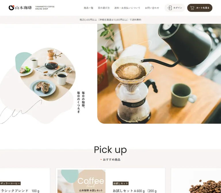
プレビュー準備中デザインリファレンスを見る
DESIGN REFERENCE
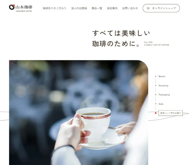
山本珈琲 オンラインショップ
白と淡いベージュを基調に、珈琲の生活写真、有機的な曲線、ブラウンの丸いボタンを組み合わせた通販サイト。豆の味わい比較と営業日カレンダーまで丁寧に構成。
Yamamoto Coffee Online Shop — Style Reference
Everyday coffee presented through bright photography, generous white space, and soft organic shapes.
Website / original URL: yamamotocoffeekan.jp Final URL: yamamotocoffeekan.jp Theme: light; white canvas, warm neutral surfaces, dark coffee-brown controls Inspected: September 23, 2026, at 06:37 JST; supplied retrieval timestamp: September 22, 2026, 21:37:18.053 UTC Viewports: desktop 1440 × 1000 and mobile 390 × 844 CSS pixels Scope: the current online-shop homepage, including its header, shipping notice, photographic hero, promotional product rail, categories, roast-selection guide, four-product comparison, supporting photographic sections, news, footer navigation, and business calendars. Linked destinations and purchase flows were not inspected.
Yamamoto Coffee combines practical shopping navigation with the atmosphere of a relaxed coffee break. Its main canvas is white, with pale warm panels and large photographic areas supplying the changes in rhythm. Dark brown appears chiefly in navigation actions. A muted mint shape, irregular image masks, and thin looping strokes soften the otherwise orderly layout.
The page is a substantial shop homepage with several browsing routes: current promotions, product categories, roast preferences, individual blends, and brewing guidance. Its identity depends on the balance between these useful structures and spacious lifestyle imagery. The hero does not need an oversized sales headline or an immediate purchase button to establish that character.
閉じる
Yamamoto Coffee Online Shop — Style Reference
Everyday coffee presented through bright photography, generous white space, and soft organic shapes.
Website / original URL: yamamotocoffeekan.jp Final URL: yamamotocoffeekan.jp Theme: light; white canvas, warm neutral surfaces, dark coffee-brown controls Inspected: September 23, 2026, at 06:37 JST; supplied retrieval timestamp: September 22, 2026, 21:37:18.053 UTC Viewports: desktop 1440 × 1000 and mobile 390 × 844 CSS pixels Scope: the current online-shop homepage, including its header, shipping notice, photographic hero, promotional product rail, categories, roast-selection guide, four-product comparison, supporting photographic sections, news, footer navigation, and business calendars. Linked destinations and purchase flows were not inspected.
Yamamoto Coffee combines practical shopping navigation with the atmosphere of a relaxed coffee break. Its main canvas is white, with pale warm panels and large photographic areas supplying the changes in rhythm. Dark brown appears chiefly in navigation actions. A muted mint shape, irregular image masks, and thin looping strokes soften the otherwise orderly layout.
The page is a substantial shop homepage with several browsing routes: current promotions, product categories, roast preferences, individual blends, and brewing guidance. Its identity depends on the balance between these useful structures and spacious lifestyle imagery. The hero does not need an oversized sales headline or an immediate purchase button to establish that character.
How to Read This Reference
- Measured values come from the supplied rendered DOM and computed styles. Values are rounded for readability; the underlying measurements often contain fractional pixels.
- Calculated values are arithmetic derived from those measurements, such as container widths, gaps, and section clearances.
- Estimated values describe visible screenshot features whose exact CSS was not supplied, including organic contours, certain image bounds, and decorative colors.
- Recommended values and implementation choices are adaptations for a new build. They are not claims about the original code.
- Token names are descriptive aliases. The supplied custom-property inventory primarily contains library defaults, rather than a complete brand token system.
- The five original-page captures provide visual evidence for the desktop hero, desktop blend comparison, desktop footer, mobile hero, and mobile calendars. Other sections are described primarily from their rendered DOM geometry and text.
- Screenshot coordinates within scrolled captures are viewport-relative. Section positions quoted below use the supplied document coordinates.
Tokens — Colors
Default Palette
| Name | Value | Suggested token | Evidence and role |
|---|---|---|---|
| White | #ffffff |
--paper |
Measured body and header background; visually also the calendar panels |
| Warm surface | #f8f5f3 |
--surface |
Measured login fill, promotional section background, and supporting banner section background |
| Main ink | #222222 |
--ink |
Measured body text, navigation, product titles, and tasting information |
| Cart brown | #473a2c |
--brown-dark |
Measured cart fill and footer external-link text |
| Action brown | #4b3e2f |
--brown |
Measured paired browse-button fill |
| Promotional beige | #e4dad3 |
--promo |
Measured promotional product-link background |
| Muted gray | #aaaaaa |
--muted |
Measured footer copyright text |
| Decorative mint | Approximately #afd3ce |
--mint |
Visual estimate for the small organic shape behind the hero’s secondary photograph |
| Calendar red | Approximately #ff0000 |
--closed |
Visual estimate for closed-day cells and the closure legend |
| Calendar rule | Approximately #cccccc |
--rule |
Visual estimate for the fine line beneath month headings |
Keep the two measured browns distinct when matching the supplied page closely. Their difference is subtle, but the cart and the large browse buttons do not share exactly the same computed fill.
White dominates the page. Warm neutrals divide sections without turning every item into a card. Mint is a decorative accent, while calendar red communicates business closures. Neither is the general purchase-action color.
The supplied --swiper-theme-color: #007aff is a library variable. It is not evidence that bright blue belongs in the visible brand palette.
Theme Behavior
Only the light presentation is evidenced. No theme switcher, alternate palette, or dark-mode state was inspected.
Tokens — Typography
Japanese Interface Text
Measured leading family: Zen Kaku Gothic New.
The computed fallback chain includes Hiragino families, Yu Gothic variants, Noto Sans JP, BIZ UDPGothic, Meiryo, Helvetica Neue, Arial, and a generic sans-serif. Body copy uses weight 400; product names, category labels, and many controls use 500.
This creates a restrained, readable Japanese interface with a gentle appearance. Do not replace all medium-weight labels with heavy bold type. The photographs and section spacing already provide substantial emphasis.
English Labels
Measured stack: Poppins, sans-serif.
Verified uses include the small header descriptor, roast labels, the smaller “Pick up” heading above the blend comparison, and footer copyright. Weight 500 is common. Tracking is restrained: approximately 0.025em for roast labels and 0.05em for the header descriptor.
Roast Numbers
Measured stack: Optima, Marcellus, sans-serif.
The five roast-selection numbers use weight 400 and a line height of 1. Their character is more elegant and editorial than the surrounding Japanese text. A computed family list does not establish which font file supplied every glyph on the inspection machine.
Brand and Decorative Lettering
The Japanese wordmark and the handwritten “Coffee” mark should be treated as brand artwork. The thin loops across the hero also read as artwork. Their exact asset format and construction were not supplied; no additional script font can be identified from the screenshots alone.
Type Scale
All values below are measured unless explicitly marked as estimates.
| Role | Desktop size / line height | Mobile size / line height | Weight and notes |
|---|---|---|---|
| Body | 15.74 / 27.54px |
14.02 / 24.54px |
400; approximately 1.75 leading |
| Header English descriptor | 11.04 / 13.80px |
8.04 / 10.05px |
Poppins 500; about 0.05em tracking |
| Desktop navigation | 13.80 / 20.71px |
Hidden in the captured header | 400; about 0.025em tracking |
| Header login/cart label | 12.87 / 22.52px |
Cart label not visually shown | 500 |
| Japanese section subtitle | 17.48 / 26.22px |
14.05 / 21.07px |
500; about 0.0125em tracking |
| Promotional product title | 20.89 / 31.33px |
18.05 / 27.07px |
500 |
| Promotional price | 17.54 / 26.31px |
14.54 / 21.81px |
400 |
| Primary category title | 18.75 / 28.13px |
15.60 / 23.41px |
500 |
| Secondary category title | 17.03 / 25.54px |
14.58 / 21.87px |
500 |
| Roast-selection number | 37.39 / 37.39px |
40.49 / 40.49px |
Optima/Marcellus stack, 400 |
| Roast description | 15.52 / 23.28px |
13.53 / 20.30px |
500 |
| English roast label | 12.87 / 19.30px |
12.01 / 18.02px |
Poppins 500 |
| Blend-comparison “Pick up” | 28.63 / 35.79px |
19.63 / 24.54px |
Poppins 500 |
| Blend product title | 17.54 / 26.31px |
14.54 / 21.81px |
500; 0.025em tracking |
| Tasting information | 13.80 / 24.16px |
12.52 / 21.91px |
400 |
| Large browse-button label | 15.67 / 25.47px |
13.53 / 20.30px |
500 |
| News-link text | 17.54 / 26.31px |
14.54 / 21.81px |
400 |
| Footer copyright | 11.74 / 14.67px |
10.02 / 12.53px |
Poppins 500, gray |
| Calendar month heading | 14.74 / 22.11px |
Not separately supplied | 500 |
The large “Pick up” title visible at the bottom of the desktop hero capture is a different heading from the measured 28.63px comparison heading farther down the page. Its visible desktop size is approximately 56–60px, estimated from the screenshot. The Japanese H2’s computed font size does not identify the size of this separate English display treatment.
Tokens — Spacing & Shapes
Layout Measurements
| Element | Desktop, 1440px wide | Mobile, 390px wide | Evidence |
|---|---|---|---|
| Document height | 7089.30px |
9492.11px |
Measured |
| Header height | 95.81px |
68.39px |
Measured |
| Header outer gutter | 54.77px |
20.48px |
Measured grid tracks |
| Main content width | 1104.41px |
349px |
Calculated from grid tracks |
| Main content outer gutter | 167.80px |
20.48px |
Measured |
| Shipping strip height | 48.28px |
62.56px |
Calculated between header and main |
| Hero section height | 653.77px |
794.88px |
Measured |
| Hero-to-promotion clearance | 158.89px |
86.03px |
Calculated between section bounds |
| Primary category width | 343.22px |
349px |
Measured |
| Four-column item width | 248.06px |
164.38px in two columns |
Measured |
| Standard grid column gap | 37.38px |
20.23px |
Calculated from item bounds |
| Promotional item | 690.58 × 319.09px |
300.59 × 533.64px |
Measured |
| Promotional item gap | 36.72px |
15.28px |
Calculated |
| Large browse button | 300 × 69.34px |
300 × 65.03px |
Measured |
| Supporting linked banner | 533.52 × 334.56px |
349 × 218.86px |
Measured |
| Entire footer | 845.63px high |
1521.91px high |
Measured |
The header uses a wider container than the product sections. At desktop, its content begins around 55px from the edge, while the central product grid begins around 168px. Preserve this distinction instead of imposing one container width on everything.
Spacing Scale
There is no supplied source spacing formula. These are useful reference points, not proof of a uniform base-unit system.
| Use | Desktop | Mobile |
|---|---|---|
| Header descriptor gap | 22.09px |
16.09px |
| Header utility-button gap | Approximately 12.86px |
Cart sits beside the menu hit area |
| Product image to title | Approximately 17.53px |
Approximately 14.53px |
| Product title to tasting lines | Approximately 10.35px |
Approximately 9.38px |
| Product-grid row gap | Single row | Approximately 30.36px |
| Browse-button pair gap | 37.38px horizontally |
20.23px vertically |
| Category-section padding | 65.43px top and bottom |
35.43px top and bottom |
| Supporting banner-section padding | 121.51px top and bottom |
65.80px top and bottom |
| News-section padding | 158.90px top, 130.86px bottom |
86.04px top, 70.86px bottom |
Border Radius and Contours
| Element | Treatment | Evidence |
|---|---|---|
| Login, cart, browse actions | 9999px radius |
Measured |
| Mobile cart | 44.02px circle |
Measured |
| Browse-button arrow disc | Approximately 35px |
Measured layout track; visible circle |
| Footer external-link arrow | 36px layout box with circular outline |
Measured box and screenshot |
| Main hero photograph | Only the lower-left corner is visibly rounded; approximately 45–50px desktop and 25–30px mobile |
Estimated |
| Secondary hero photograph | Irregular oval/blob contour | Visual observation; exact path unknown |
| Decorative background shapes | Uneven, asymmetric curves | Visual observation |
| Product imagery and calendar panels | Square corners | Visual observation |
Do not turn the organic masks into standard circles or apply the hero’s rounding to every image. The contrast between irregular lifestyle framing and square product presentation is part of the design.
Components
Application Header
Role: identity, primary shopping navigation, account access, and cart access.
The desktop header is a white strip approximately 96px high. Its brand link occupies about 278.88 × 30.58px and combines the Japanese logo with a two-line English shop descriptor. Four navigation links follow: 商品一覧, 豆の選び方, 送料・お支払いについて, and お問い合わせ.
The right side contains a pale login pill, approximately 136.42 × 47.02px, and a dark cart pill, approximately 162.78 × 47.02px. Both pair a thin outline icon with a short label. The header is spacious but visually shallow; it has no observed card shadow.
On mobile, the brand link becomes approximately 211.25 × 24.05px. The text navigation and login pill leave the visible header. The cart becomes a 44px brown circle, followed by a hamburger icon inside a 68.39 × 68.39px button area.
The mobile DOM includes a broader navigation structure with categories and account links. The supplied screenshot shows its closed presentation. Its opening transition, overlay behavior, focus handling, and scroll locking were not exercised.
Shipping Notice
Role: communicate the purchase threshold before browsing.
A full-width pale strip sits immediately beneath the header. Its centered copy includes the regular free-shipping threshold and higher thresholds for Hokkaido and Okinawa. The source label begins 税込5,400円以上.
The strip is about 48px high on desktop and 63px on mobile, where the copy wraps to two lines. Retain the complete regional conditions when using the actual message; do not reproduce only the shortest threshold while presenting it as equivalent.
Photographic Hero
Role: establish the daily-life setting of the shop.
The desktop composition has an approximately 44:56 split. A large pour-over photograph begins near x=633 and extends to the right viewport edge, showing a dark gooseneck kettle, a glass dripper and server, a green mug, and warm wood. Its visible height is approximately 654px. A soft lower-left corner connects it to the surrounding white space.
The left side holds a smaller irregularly masked lifestyle photograph, overlapping pale and mint shapes, a thin looping stroke, and two short vertical lines of Japanese copy: 毎日の珈琲、毎日のくつろぎ.
On mobile, the main photograph comes first, beginning about 20px from the left edge and continuing to the right edge. Its visible crop is approximately 370 × 379px. The message follows as two horizontal lines. The smaller organic photograph sits below it, toward the right.
The desktop secondary image shows a work surface with a laptop and coffee; the mobile capture shows coffee and dessert. These are two evidenced image states. The material does not establish whether their difference comes from responsive image selection, a timed sequence, or another mechanism.
Promotional Product Rail
Role: expose current campaigns and recommended merchandise.
This is the first “Pick up” treatment, on a warm off-white section beginning at document y≈957 on desktop and y≈1012 on mobile. The heading overlaps its upper boundary.
The measured desktop item is about 691px wide and 319px high. Its product title appears in the right half, alongside the image area. On mobile, the item becomes about 301px wide and 534px high, with the title appearing below the upper image region. The fill is measured promotional beige, #e4dad3.
Each link combines a category label, campaign/product title, and tax-inclusive price. Four distinct destinations appear repeatedly in the DOM. Their repetition and offscreen positions are consistent with a looping carousel implementation, but do not establish its autoplay interval, movement speed, controls, or swipe behavior. Represent four unique content items in the data model rather than treating every repeated node as separate merchandise.
The next item extends beyond the viewport in both measured layouts, providing evidence of a horizontal rail rather than a conventional multi-row grid.
Category Navigation
Role: let visitors browse by product format.
Three primary categories occupy a desktop row: regular coffee, drip-bag coffee, and iced coffee/tea. Each link is approximately 343px wide and combines an upper visual area, a medium-weight title, and one supporting line. The title starts around 273px below the top of the link.
A second row contains four smaller categories: tea, food, equipment, and wrapping. Their links are approximately 248px wide.
On mobile, the three primary categories stack at the full 349px content width. The four smaller categories form a two-column grid with approximately 164px-wide items. The supplied geometry supports this asymmetric category hierarchy; making all seven categories equal tiles would change it.
The middle-page category artwork was not supplied as a dedicated screenshot. Its exact crops and decorative details should not be inferred from the anchor rectangles alone.
Roast-Selection Guide
Role: translate taste preferences into five numbered entry points.
The desktop guide presents five horizontally arranged options, numbered 01 through 05, with short Japanese taste descriptions and English roast labels beneath. The sequence runs from Medium roast through High, City, French, and Italian roast. The outer options additionally carry light- and dark-roast labels.
The measured clickable region for each desktop option is approximately 164.91 × 227.38px; its roast caption occupies a broader box below. Each option links to the corresponding #bean01 through #bean05 anchor on the bean-selection page.
Mobile changes the arrangement substantially. Five wide options stack vertically, each about 294.38 × 141.84px, with the number and description alongside one another. A narrow roast-label box sits to the left. Its tall, narrow geometry indicates a vertical side treatment, but the exact text rotation or writing-mode rule is not included in the supplied evidence.
The roast numbers become slightly larger on mobile, approximately 40.49px versus 37.39px on desktop. This is deliberate re-layout rather than uniform scaling down.
Blend-Comparison Product Card
Role: connect roast education to individual coffee products.
A smaller centered “Pick up” heading introduces four products. The desktop screenshot shows square photographs of roasted beans on white, each approximately 248px wide. Roast identification is placed inside the lower-left part of the photograph: a number such as #02, followed by an English roast label.
Below the photograph, a medium-weight product name is followed by four compact tasting lines. The labels are 苦味, 酸味, コク, and 香り; solid black dots communicate intensity. These are sensory attributes, not review stars or customer-rating counts.
| Product label from the page | Roast | Bitterness | Acidity | Body | Aroma |
|---|---|---|---|---|---|
マイルドブレンド 100g |
02 / High roast | 2 dots | 4 dots | 3 dots | 3 dots |
セレクトブレンド 100g |
02 / High roast | 3 dots | 3 dots | 3 dots | 4 dots |
エクセレントスペシャルブレンド 100g |
03 / City roast | 3 dots | 2 dots | 3 dots | 3 dots |
山本珈琲館ブレンド 100g |
04 / French roast | 5 dots | 1 dot | 5 dots | 4 dots |
The card is a whole-item link with no enclosing shadow or colored panel. Titles wrap naturally. In the desktop capture, the longer third title moves its tasting lines downward; the original does not force all tasting rows onto identical baselines.
On mobile, these products form two columns and two rows. Image widths become approximately 164px. The measured title and tasting sizes remain distinct at about 14.54px and 12.52px.
Paired Browse Buttons
Role: provide a clear next step after the taste comparison.
Two dark-brown pills link to 商品一覧 and 豆の選び方. Each is 300px wide, with centered white text and a white circular arrow disc on the left. The desktop grid reserves a matching 35px track on the right, keeping the text centered independently of the icon.
They sit side by side on desktop with a 37px gap. On mobile, they stack with a 20px gap and retain the same 300px width. Their height decreases only slightly, from roughly 69px to 65px.
Supporting Photography and Linked Banners
Role: alternate product browsing with the experience of preparing and enjoying coffee.
Immediately after the taste section, the desktop capture begins to reveal a large image at the left and a smaller image at the right, separated by substantial white space. The corresponding DOM section is about 752px high on desktop and 1008px on mobile. Its full composition and any embedded text are not visible in the supplied captures.
A later warm-background section contains two linked banners: one leads to trial sets and the other to brewing guidance. Their measured ratio is approximately 1.595:1. They sit side by side at 533.52 × 334.56px on desktop and stack at 349 × 218.86px on mobile.
The link text extraction is empty for these banners. That does not establish their accessible names or the exact wording embedded in their artwork.
News List
Role: publish campaigns, stock announcements, and operating notices.
Five dated entries appear in the inspected homepage. On desktop, the heading occupies a left-hand area while the list begins near x=478. Each row is approximately 794px wide and 93px high, with date and title in separate grid columns. The measured columns are approximately 97px and 640px before accounting for their surrounding row padding.
On mobile, the heading moves above the list. Date and title remain side by side rather than automatically becoming separate lines. The sampled rows are approximately 328px wide and 85px high, with 20px padding and a date column around 75px wide. A compact 一覧を見る link follows the list.
A background-color transition is defined for each news link. The active hover color was not recorded.
Footer Navigation
Role: provide repeat navigation, policies, and connections to the wider brand.
The desktop footer places the Japanese logo and a small gray copyright line on the left. Two text columns follow: a stronger-weight group of shopping and learning links, then a smaller utility/legal group.
The right side sits over a large pale organic shape. Two external-link blocks show “Corporate Site” and “Official Instagram,” followed by their primary labels. Each block is approximately 242px wide, ends in a thin horizontal rule, and includes a 36px circular outline arrow.
On mobile, the logo and copyright precede the navigation in the measured document flow. The supplied element sample stops early in this region, so the exact arrangement of every lower mobile footer link is not established.
The visible copyright reads ©2023 Yamamoto Coffee Co., Ltd.. Its year is footer content, not evidence of the current design’s production date.
Business Calendars
Role: communicate business closures for the current and following month.
The final section uses a full-width photograph of a pale cup, coffee beans, and a wooden scoop on a cool, light tabletop. The desktop view places the shop’s handwritten secondary mark at lower left and two white calendar panels toward the right.
The shown months are September and October 2026. Each panel has a small left-aligned month heading, a fine horizontal rule, a seven-column weekday row, and a date grid. Closed dates use bright red square cells with white numbers. The first panel includes a red-square legend labeled 休業日.
Panel dimensions are visually estimated at approximately 316 × 340px on desktop, separated by about 20px. On mobile, they stack at approximately 312px wide with 39px outer margins. The first panel is about 311px high and the second about 271px high; the legend contributes to the difference. The secondary shop mark follows beneath them.
The marked dates include weekday closures as well as weekends. Populate this component from business-calendar data; do not generate the appearance merely by coloring every Saturday and Sunday. No date selection, month navigation, or booking behavior is evidenced.
Tokens — Motion & Interaction
Measured Transition Declarations
| Target | Supplied computed transition | What it establishes |
|---|---|---|
| Header | Opacity 0.25s cubic-bezier(0.39, 0.575, 0.565, 1), visibility 0.25s, transform 0.5s cubic-bezier(0.215, 0.61, 0.355, 1) |
Timing exists for header state changes; the triggering behavior is unknown |
| Brand links | Opacity 0.25s cubic-bezier(0.39, 0.575, 0.565, 1) |
A short opacity transition is defined |
| Login/cart links | Background and border color 0.25s cubic-bezier(0.39, 0.575, 0.565, 1) |
Color changes can animate; endpoint colors were not inspected |
| Large browse buttons | Color and background 0.25s cubic-bezier(0.39, 0.575, 0.565, 1) |
Short control feedback is defined |
| News links | Background color 0.25s cubic-bezier(0.39, 0.575, 0.565, 1) |
Row-background feedback is defined |
Many other sampled elements report animation: none and a transition shorthand of all without an evidenced nonzero duration. This is not a basis for inventing a page-wide reveal animation.
Observed Behavior and Limits
- The supplied inspection loaded the page and traversed it by scrolling. No click-result or hover-state sequence was supplied.
- Promotional items have repeated nodes and offscreen positions consistent with a carousel. Autoplay, swipe support, arrow controls, and timing remain unverified.
- Desktop and mobile hero captures show different secondary photographs. No transition between those states was captured.
- The hero’s thin strokes are visible decoration. A drawing animation was not demonstrated.
- Header transition properties do not prove that it is sticky, hides on downward scroll, or returns on upward scroll.
- The contact link uses a page fragment associated with the shop system. Its resulting contact interface was not opened.
For a new implementation, restrained 250ms color or opacity feedback fits the measured motion language. Any carousel controls, menu animation, image transitions, or reduced-motion behavior should be described as implementation choices until tested against further original-page evidence.
Surfaces
| Layer | Appearance | Purpose |
|---|---|---|
| Main canvas | White | Gives products and photography room to breathe |
| Shipping and section bands | Warm off-white | Separates practical information and selected content groups |
| Promotional item | Solid pale beige | Distinguishes campaign merchandise within the rail |
| Category and blend links | Mostly open canvas around imagery and text | Keeps browsing editorial and uncluttered |
| Primary controls | Coffee-brown pills with white details | Concentrates action emphasis |
| Organic decoration | Pale warm shapes and a small mint shape | Adds softness without extra interface chrome |
| Footer link area | White with a large pale curved backdrop | Groups external connections |
| Calendar panels | Flat white rectangles over a photograph | Keeps dense operational information legible |
No general shadow-based elevation system is visible. Separation comes from whitespace, contrasting fills, image crops, fine rules, and a few distinctive contours.
Imagery
The main image language is bright, natural coffee photography. Warm wood, soft daylight, pale ceramics, green mugs, and the physical details of brewing make the shop feel domestic and approachable. The hero’s dark kettle provides strong contrast without requiring a dark interface.
Secondary imagery connects coffee to working, dessert, and quiet daily breaks. Product comparison photographs are more controlled: beans appear against white, and differences in roast darkness remain visible. Avoid replacing these with identical generic bean images, since the image sequence supports the taste comparison.
The footer shifts toward a cooler tabletop, with dark beans and a pale cup. This allows white calendar panels to remain readable while retaining a photographic ending to the page.
Observed Asset References
No original image filenames, image URLs, or SVG paths were included in the supplied evidence. The references below identify observed image roles rather than inventing asset paths.
| Asset role | Observed content | Handling guidance |
|---|---|---|
| Header/footer logo | Black Japanese wordmark and black/red symbol | Preserve as supplied brand artwork |
| Main hero image | Kettle pouring into a glass coffee dripper | Match focal point and responsive crop; preserve the lower-left curve |
| Desktop secondary hero image | Laptop, notebook, phone, and coffee | Use an irregular organic crop |
| Mobile secondary hero image | Coffee cups and dessert | Treat as an evidenced state, not proof of a mobile-only asset |
| Hero decoration | Pale blob, mint shape, very thin looping strokes | Keep separate from readable content and controls |
| Blend images | Four square bean photographs with roast identification | Preserve white grounds and roast differences |
| Supporting photo section | Large left image and smaller right image visible at the next section’s edge | Full arrangement is not documented |
| Calendar background | Cup, beans, and scoop on a cool light tabletop | Art-direct its crop separately at mobile width |
| Secondary shop mark | Spaced uppercase name and handwritten “Coffee” | Preserve as artwork; do not substitute an unidentified font |
Use authorized source assets where available. CSS can approximate the containers and organic shapes, but photographs and wordmarks carry much of the identity.
Layout & Responsive Behavior
Page Sequence
The supplied document follows this sequence: header and shipping notice, lifestyle hero, promotional rail, categories, roast guide, blend comparison and browse buttons, supporting photography, trial/brewing banners, news, footer navigation, and business calendars.
The two “Pick up” treatments serve different purposes. The early section promotes current merchandise; the later section compares four blends beneath the roast guide. Keep their hierarchy and content models separate.
Desktop-to-Mobile Changes
| Component | Desktop | Mobile |
|---|---|---|
| Header | Full navigation, login, labeled cart | Brand, circular cart, menu button |
| Shipping notice | Single centered line | Two wrapped lines |
| Hero | Secondary collage left, large photo right, vertical copy | Main photo first, horizontal copy, secondary collage below |
| Promotional item | Wide composition, text in right portion | Tall composition, text below upper image region |
| Primary categories | Three columns | One column |
| Secondary categories | Four columns | Two columns |
| Roast guide | Five options across | Five broad options stacked, with side captions |
| Blend comparison | Four columns | Two columns |
| Browse actions | Two 300px pills in a row | Two 300px pills stacked |
| Supporting banners | Two columns | One column |
| News heading | Beside list | Above list |
| Calendars | Two panels side by side | Two panels stacked, secondary mark beneath |
The mobile page is approximately 2403px taller despite its smaller type. The category stack, roast-guide rows, supporting imagery, and expanded footer contribute to this increased length.
No exact media-query breakpoint or interpolation formula was supplied. The two measured viewport states establish the endpoints, not the implementation between them. The Quick Start uses a recommended 64rem breakpoint as an initial layout choice; intermediate widths require review.
Do’s and Don’ts
Do
- Keep white as the dominant surface and reserve brown fills for meaningful actions.
- Preserve the spacious desktop composition and the visibly reordered mobile hero.
- Use the measured Japanese/English font pairing and modest medium weights.
- Retain the contrast between organic lifestyle masks and square product imagery.
- Keep the three primary categories more prominent than the four secondary categories.
- Maintain the five-step roast guide and the distinct four-product comparison.
- Render tasting dots as product attributes with clear labels.
- Center browse-button labels independently of their left-hand arrow discs.
- Let longer product titles wrap naturally.
- Preserve the complete shipping message and data-driven closure dates.
- Keep the photographic calendar ending as part of the page’s visual identity.
Don’t
- Don’t reduce the homepage to a hero and a single conversion button.
- Don’t merge the promotional carousel and the later blend comparison into one generic product grid.
- Don’t place every category or product inside a rounded, shadowed card.
- Don’t replace dark brown actions with the blue found in a library default variable.
- Don’t use mint or calendar red as an all-purpose action accent.
- Don’t turn the hero collage into a symmetrical pair of circular photographs.
- Don’t convert sensory dots into customer ratings.
- Don’t repeat carousel clones as separate catalog products.
- Don’t infer a sticky header, autoplay interval, or animated line drawing from static captures.
- Don’t treat the displayed calendar months or campaign prices as permanent design content.
Recommended Implementation Additions
These are recommendations for a new build, not verified original features:
- Give the mobile menu button an accessible name,
aria-expanded, and a relationship to its navigation region. If implemented as a modal drawer, support Escape, focus management, and background inertness. - Preserve a meaningful accessible cart label when the visual label disappears on mobile.
- Expose tasting values as readable text, such as “Bitterness: 2,” while marking purely decorative dot sequences appropriately.
- Use semantic tables for calendars, with month captions, weekday headers, and explicit closed-day text alternatives. Do not rely exclusively on red.
- Review the small gray footer text and white-on-red date cells for contrast. A darker closure red can be used as an accessibility adaptation, clearly distinguished from the screenshot approximation.
- Provide keyboard access and an explicit pause mechanism if adding automatic carousel movement. Keep cloned items out of duplicate focus and reading order.
- Give image-led trial and brewing links meaningful names even when their artwork contains the visible copy.
- Load the lead image promptly, reserve image dimensions, and defer lower-page imagery. Use responsive crops without distorting the dripper, cups, or brand artwork.
- Keep text and shopping links visible before enhancement scripts run. Add reduced-motion support for any new transitions or moving imagery.
Agent Prompt Guide
Quick Color Reference
- Main canvas:
#ffffff. - Pale section fill:
#f8f5f3. - Main text:
#222222. - Header cart:
#473a2c. - Large browse actions:
#4b3e2f. - Promotional item fill:
#e4dad3. - Decorative mint: approximately
#afd3ce, used sparingly. - Closure red: approximately
#ff0000, limited to calendar status.
Overall Prompt
“Create a Japanese coffee-shop homepage with a white canvas, warm off-white section bands, dark coffee-brown pill actions, and bright photography of everyday coffee rituals. Pair Zen Kaku Gothic New interface text with Poppins English labels and elegant Optima/Marcellus-style roast numbers. On desktop, use a broad header and a narrower central product container around 1104px wide. Build an asymmetric hero with a large pour-over photograph touching the right edge, a smaller organic photo collage at left, mint and pale background shapes, thin looping strokes, and short vertical Japanese copy. Include a promotional rail, three major product categories followed by four smaller categories, a five-step roast guide, four unboxed blend cards with tasting dots, supporting imagery, news, and photographic business calendars. Recompose these sections for mobile instead of uniformly shrinking them.”
Example Component Prompts
- Hero: “At 1440px, devote about 56% of the hero width to a right-edge pour-over photo with only its lower-left corner rounded. Place an irregular lifestyle-photo crop and understated organic decoration on the left. On a 390px phone, show the main image first, then two horizontal lines of copy, then the secondary collage. Preserve generous white space.”
- Blend card: “Create an unboxed coffee product link with a square white-background bean photograph, a small roast number and English roast label inside the image’s lower-left corner, a medium-weight Japanese product name, and four labeled lines of solid tasting dots. Use four columns on desktop and two on mobile. Do not add review stars or a shadow.”
- Browse button: “Build a 300px dark-brown pill with centered white Japanese text and a 35px white circular arrow at the left. Reserve equal invisible space on the right so the text remains centered. Use a height around 69px desktop and 65px mobile.”
- Category group: “Present three prominent image-led coffee categories across the desktop container, followed by four smaller categories. Stack the prominent categories on mobile while keeping the smaller group in two columns. Use open white space, medium-weight titles, and short supporting text.”
- Calendar ending: “Place two flat white business-calendar panels over a full-width photograph of coffee beans, a pale cup, and a wooden scoop. Use small month headings, thin gray rules, seven equal columns, and square red closure cells. Put the panels side by side on desktop and stack them with roughly 39px mobile side margins. Include a handwritten shop mark as supplied artwork.”
Quick Start
CSS Custom Properties
This is a recommended implementation scaffold based on the measured endpoints. It is not extracted source CSS. Fluid values and the breakpoint are adaptations; irregular contours are approximations. Load the evidenced fonts separately if available, and supply authorized photographs and brand artwork.
Class structure: .yc-hero contains .yc-hero-photo and .yc-hero-intro; the intro contains .yc-hero-copy and .yc-hero-detail. A .yc-product contains .yc-product-media, .yc-product-title, and .yc-tasting. A .yc-calendar-band contains .yc-calendars and .yc-calendar-brand. The background image is supplied through --calendar-image.
:root {
  /* Measured colors */
  --paper: #ffffff;
  --surface: #f8f5f3;
  --ink: #222222;
  --brown-dark: #473a2c;
  --brown: #4b3e2f;
  --promo: #e4dad3;
  --muted: #aaaaaa;

  /* Visual estimates */
  --mint: #afd3ce;
  --closed: #ff0000;
  --rule: #cccccc;

  /* Evidenced families with a shortened fallback chain */
  --font-jp: 'Zen Kaku Gothic New', 'Hiragino Sans',
    'Noto Sans JP', Meiryo, Arial, sans-serif;
  --font-en: Poppins, sans-serif;
  --font-number: Optima, Marcellus, sans-serif;

  /* Recommended interpolation between observed sizes */
  --text-body: clamp(14.02px, calc(13.38px + 0.164vw), 15.74px);
  --text-product: clamp(14.54px, calc(13.43px + 0.286vw), 17.54px);
  --text-small: clamp(12.52px, calc(12.04px + 0.122vw), 13.80px);
  --text-pickup: clamp(19.63px, calc(16.29px + 0.857vw), 28.63px);
  --leading-body: 1.75;
  --tracking-label: 0.025em;

  --content-max: 1104.4px;
  --page-inset: 20.5px;
  --grid-gap: clamp(20.23px, 2.596vw, 37.38px);
  --section-space: clamp(86px, 11.035vw, 158.9px);
  --header-height: 68.39px;
  --radius-pill: 9999px;
  --radius-hero: 28px;

  /* Measured control easing; state endpoints below are recommendations */
  --ease-control: cubic-bezier(0.39, 0.575, 0.565, 1);
  --duration-control: 250ms;
}

* { box-sizing: border-box; }
body { margin: 0; }
.yc-site {
  color: var(--ink);
  background: var(--paper);
  font: 400 var(--text-body) / var(--leading-body) var(--font-jp);
}
.yc-site img { display: block; max-width: 100%; }
.yc-site a { color: inherit; }
.yc-site button { font: inherit; }
.yc-container {
  width: min(calc(100% - 2 * var(--page-inset)), var(--content-max));
  margin-inline: auto;
}

/* Header: desktop navigation is introduced at a recommended breakpoint. */
.yc-header {
  display: flex;
  align-items: center;
  min-height: var(--header-height);
  padding-inline: var(--page-inset) 0;
  background: var(--paper);
}
.yc-brand {
  display: flex;
  align-items: center;
  gap: 16.09px;
  text-decoration: none;
}
.yc-brand img { width: 110px; height: auto; }
.yc-brand-description {
  font: 500 8.04px / 1.25 var(--font-en);
  letter-spacing: 0.05em;
}
.yc-nav, .yc-login { display: none; }
.yc-header-actions { display: flex; align-items: center; margin-left: auto; }
.yc-cart {
  display: flex;
  align-items: center;
  justify-content: center;
  width: 44.02px;
  height: 44.02px;
  border-radius: var(--radius-pill);
  background: var(--brown-dark);
  color: var(--paper) !important;
  text-decoration: none;
}
.yc-cart-label { display: none; }
.yc-menu-button {
  display: grid;
  place-items: center;
  width: var(--header-height);
  height: var(--header-height);
  padding: 0;
  border: 0;
  background: transparent;
  color: var(--ink);
}
.yc-shipping {
  display: grid;
  place-items: center;
  min-height: 62.56px;
  padding: 10px var(--page-inset);
  background: var(--surface);
  text-align: center;
  font-size: 12px;
}

/* Hero contours approximate the supplied artwork. */
.yc-hero { display: flex; flex-direction: column; }
.yc-hero-photo {
  width: calc(100% - var(--page-inset));
  aspect-ratio: 370 / 379;
  margin: 0 0 0 var(--page-inset);
  overflow: hidden;
  border-bottom-left-radius: var(--radius-hero);
}
.yc-hero-photo img { width: 100%; height: 100%; object-fit: cover; }
.yc-hero-intro { position: relative; isolation: isolate; min-height: 416px; }
.yc-hero-copy {
  margin: 30px var(--page-inset) 0;
  font-size: 18px;
  font-weight: 500;
  line-height: 1.8;
  letter-spacing: 0.1em;
}
.yc-hero-copy span { display: block; }
.yc-hero-intro::before {
  content: '';
  position: absolute;
  z-index: -1;
  left: 4%;
  top: 39%;
  width: 72%;
  height: 58%;
  background: var(--surface);
  border-radius: 58% 42% 39% 61% / 59% 38% 62% 41%;
}
.yc-hero-detail {
  position: relative;
  width: 65%;
  aspect-ratio: 310 / 336;
  margin: 24px 24px 0 auto;
}
.yc-hero-detail::before {
  content: '';
  position: absolute;
  z-index: -1;
  width: 46%;
  height: 43%;
  left: -18%;
  top: 10%;
  background: var(--mint);
  border-radius: 44% 56% 40% 60% / 35% 50% 50% 65%;
}
.yc-hero-detail img {
  width: 100%;
  height: 100%;
  object-fit: cover;
  border-radius: 48% 52% 57% 43% / 52% 55% 45% 48%;
}

/* A native scrolling rail is a recommended accessible starting point. */
.yc-promo {
  margin-top: var(--section-space);
  padding-bottom: clamp(45.55px, 5.842vw, 84.12px);
  background: var(--surface);
}
.yc-section-title {
  margin: 0;
  text-align: center;
  font: 500 clamp(40px, 4vw, 58px) / 1.2 var(--font-en);
}
.yc-section-subtitle {
  display: block;
  margin-top: 14px;
  font: 500 clamp(14.05px, 1.214vw, 17.48px) / 1.5 var(--font-jp);
}
.yc-promo .yc-section-title { transform: translateY(-25%); }
.yc-promo-rail {
  --promo-width: min(300.59px, calc(100vw - 41px));
  display: flex;
  gap: 15.28px;
  overflow-x: auto;
  scroll-snap-type: x proximity;
  padding: 8px calc((100% - var(--promo-width)) / 2);
}
.yc-promo-card {
  flex: 0 0 var(--promo-width);
  display: grid;
  align-content: start;
  min-height: 533.64px;
  background: var(--promo);
  text-decoration: none;
  scroll-snap-align: center;
}
.yc-promo-media { width: 100%; aspect-ratio: 1; object-fit: contain; }
.yc-promo-info { padding: 20px; }
.yc-promo-title { margin: 0; font-size: 18.05px; font-weight: 500; line-height: 1.5; }

.yc-categories-major, .yc-categories-minor, .yc-products {
  display: grid;
  gap: 30.36px var(--grid-gap);
}
.yc-categories-major { grid-template-columns: 1fr; }
.yc-categories-minor, .yc-products { grid-template-columns: repeat(2, minmax(0, 1fr)); }
.yc-pickup-title {
  margin: 0 0 1em;
  text-align: center;
  font: 500 var(--text-pickup) / 1.25 var(--font-en);
}
.yc-product { min-width: 0; text-decoration: none; }
.yc-product-media { position: relative; aspect-ratio: 1; background: var(--paper); }
.yc-product-media > img { width: 100%; height: 100%; object-fit: contain; }
.yc-roast-label { position: absolute; left: 7%; bottom: 6%; }
.yc-roast-number { font: 400 25px / 1 var(--font-number); }
.yc-roast-name { display: block; margin-top: 4px; font: 400 12px / 1.4 var(--font-en); }
.yc-product-title {
  margin: 1em 0 0.6em;
  font-size: var(--text-product);
  font-weight: 500;
  line-height: 1.5;
  letter-spacing: var(--tracking-label);
  overflow-wrap: anywhere;
}
.yc-tasting {
  margin: 0;
  font-size: var(--text-small);
  line-height: 1.75;
  letter-spacing: var(--tracking-label);
}
.yc-tasting > span { display: block; }

.yc-actions { display: flex; flex-direction: column; align-items: center; gap: 20.23px; margin-top: 35px; }
.yc-action {
  display: grid;
  grid-template-columns: 35px minmax(0, 1fr) 35px;
  align-items: center;
  gap: 13.53px;
  width: min(300px, 100%);
  min-height: 65.03px;
  padding: 13.53px;
  border-radius: var(--radius-pill);
  background: var(--brown);
  color: var(--paper) !important;
  text-align: center;
  text-decoration: none;
  font-size: 13.53px;
  font-weight: 500;
  transition: background-color var(--duration-control) var(--ease-control);
}
.yc-action::after { content: ''; }
.yc-action-icon {
  display: grid;
  place-items: center;
  width: 35px;
  height: 35px;
  border-radius: 50%;
  background: var(--paper);
  color: var(--brown);
}
.yc-banners { display: grid; gap: var(--grid-gap); }
.yc-banner img { width: 100%; aspect-ratio: 1.595; object-fit: contain; }

/* Calendar tables should include captions and explicit closure labels. */
.yc-calendar-band {
  display: grid;
  gap: 32px;
  padding: 52px 39px 48px;
  background-color: #dce4e2;
  background-image: var(--calendar-image, none);
  background-size: cover;
  background-position: center;
}
.yc-calendars { display: grid; gap: 20px; }
.yc-calendar { min-width: 0; padding: 20px; background: var(--paper); }
.yc-calendar table { width: 100%; table-layout: fixed; border-collapse: collapse; }
.yc-calendar caption {
  padding-bottom: 11px;
  border-bottom: 1px solid var(--rule);
  text-align: left;
  font-size: 14px;
  font-weight: 500;
}
.yc-calendar th { height: 36px; color: var(--brown-dark); font-weight: 500; }
.yc-calendar th:first-child { color: var(--closed); }
.yc-calendar td { height: 35px; border: 1px solid var(--paper); text-align: center; font-size: 13px; }
.yc-calendar .is-closed { background: var(--closed); color: var(--paper); }
.yc-calendar-brand { width: 150px; margin: 0; }

/* Recommended interaction additions; original hover colors were not supplied. */
.yc-site :focus-visible { outline: 2px solid var(--brown-dark); outline-offset: 4px; }
@media (hover: hover) {
  .yc-action:hover { background: var(--brown-dark); }
}

@media (min-width: 64rem) {
  :root { --header-height: 95.81px; --radius-hero: 48px; }
  .yc-header { gap: 18px; padding-inline: clamp(24px, 3.803vw, 54.77px); }
  .yc-brand { gap: 22.09px; }
  .yc-brand img { width: 140px; }
  .yc-brand-description { font-size: 11.04px; }
  .yc-nav { display: flex; margin-left: auto; }
  .yc-nav a { padding: 13.8px; font-size: 13.8px; text-decoration: none; }
  .yc-header-actions { gap: 12.86px; margin-left: 0; }
  .yc-login { display: flex; align-items: center; justify-content: center; gap: 9.65px; width: 136.42px; min-height: 47.02px; border-radius: var(--radius-pill); background: var(--surface); text-decoration: none; font-size: 12.87px; }
  .yc-cart { width: 162.78px; height: 47.02px; gap: 9.65px; font-size: 12.87px; }
  .yc-cart-label { display: inline; }
  .yc-menu-button { display: none; }
  .yc-shipping { min-height: 48.28px; font-size: 13.8px; }
  .yc-hero { display: grid; grid-template-columns: 44% 56%; }
  .yc-hero-photo { grid-column: 2; grid-row: 1; width: 100%; height: min(45.4vw, 653.77px); aspect-ratio: auto; margin: 0; }
  .yc-hero-intro { grid-column: 1; grid-row: 1; min-height: 0; }
  .yc-hero-detail { position: absolute; top: 23.7%; left: 26.5%; width: 49%; margin: 0; }
  .yc-hero-copy { position: absolute; right: 12.5%; bottom: 10%; margin: 0; writing-mode: vertical-rl; }
  .yc-promo-rail { --promo-width: 690.58px; gap: 36.72px; }
  .yc-promo-card { grid-template-columns: 46.2% minmax(0, 1fr); min-height: 319.09px; }
  .yc-promo-media { height: 319.09px; aspect-ratio: auto; }
  .yc-promo-info { align-self: center; padding: 28.69px; }
  .yc-promo-title { font-size: 20.89px; }
  .yc-categories-major { grid-template-columns: repeat(3, minmax(0, 1fr)); }
  .yc-categories-minor, .yc-products { grid-template-columns: repeat(4, minmax(0, 1fr)); }
  .yc-actions { flex-direction: row; justify-content: center; gap: 37.38px; margin-top: 48px; }
  .yc-action { min-height: 69.34px; padding: 15.67px; gap: 15.67px; font-size: 15.67px; }
  .yc-banners { grid-template-columns: repeat(2, minmax(0, 1fr)); }
  .yc-calendar-band { grid-template-columns: minmax(0, 1fr) auto; min-height: 562px; padding: 70px; align-items: center; }
  .yc-calendars { grid-column: 2; grid-row: 1; grid-template-columns: repeat(2, 316.4px); }
  .yc-calendar-brand { grid-column: 1; grid-row: 1; align-self: end; }
  .yc-calendar td { height: 39px; }
}

@media (prefers-reduced-motion: reduce) {
  .yc-site *, .yc-site *::before, .yc-site *::after {
    animation: none !important;
    transition: none !important;
    scroll-behavior: auto !important;
  }
}
The scaffold leaves menu state management, live calendar data, carousel enhancement, decorative strokes, and asset selection to the application. It intentionally does not invent an autoplay sequence or an exact original organic mask. Test the header at intermediate widths and move the recommended breakpoint upward if its navigation no longer fits.
Tailwind v4 Token Mapping
Optional aliases for a project already using Tailwind v4. This does not imply that the original website uses Tailwind. Define the custom properties above first.
@theme inline {
  --color-coffee-paper: var(--paper);
  --color-coffee-surface: var(--surface);
  --color-coffee-ink: var(--ink);
  --color-coffee-brown: var(--brown);
  --color-coffee-cart: var(--brown-dark);
  --color-coffee-promo: var(--promo);
  --color-coffee-mint: var(--mint);
  --color-coffee-closed: var(--closed);

  --font-coffee-jp: var(--font-jp);
  --font-coffee-en: var(--font-en);
  --font-coffee-number: var(--font-number);

  --text-coffee-body: var(--text-body);
  --text-coffee-product: var(--text-product);
  --text-coffee-small: var(--text-small);
  --text-coffee-pickup: var(--text-pickup);

  --spacing-coffee-inset: var(--page-inset);
  --spacing-coffee-gap: var(--grid-gap);
  --radius-coffee-pill: var(--radius-pill);
  --radius-coffee-hero: var(--radius-hero);
}
Sources & Evidence
- Inspected original and final page: Yamamoto Coffee Online Shop. The supplied browser record reports HTTP 200 and no URL change.
- Capture time:
2026-09-22T21:37:18.053Z, equivalent to September 23, 2026, 06:37:18.053 JST. - Desktop evidence: 1440 × 1000 CSS-pixel viewport; document height approximately 7089.30px. Original-page screenshots cover the hero, blend comparison, and footer/calendar ending.
- Mobile evidence: 390 × 844 CSS-pixel viewport; document height approximately 9492.11px. Original-page screenshots cover the hero and calendar ending. The supplied mobile DOM measurement sample is incomplete near the footer.
- DOM and computed styles: supplied element rectangles, font-family stacks, text sizes, weights, colors, backgrounds, grid tracks, padding, radius values, transitions, document text, and link destinations. These establish the measured values in this reference.
- Inspection method: the supplied browser procedure waited for load, visible image decoding, and sampled layout/text stability, with an initial observation of at least five seconds. It traversed intermediate scroll positions. Perpetual animations were temporarily paused for readiness checks and resumed. Service workers and shared workers were disabled.
- Limits: no independent browsing, asset retrieval, click testing, hover testing, or source-code execution was performed for this reference. Delayed content, actual font-file selection, complete decorative assets, carousel timing, menu behavior, and linked-page designs remain unverified.
This reference describes the current homepage represented by the supplied inspection. Measurements, visual estimates, and implementation recommendations are identified separately throughout.
# Yamamoto Coffee Online Shop — Style Reference

> Everyday coffee presented through bright photography, generous white space, and soft organic shapes.

**Website / original URL:** [yamamotocoffeekan.jp](https://yamamotocoffeekan.jp/)
**Final URL:** [yamamotocoffeekan.jp](https://yamamotocoffeekan.jp/)
**Theme:** light; white canvas, warm neutral surfaces, dark coffee-brown controls
**Inspected:** September 23, 2026, at 06:37 JST; supplied retrieval timestamp: September 22, 2026, 21:37:18.053 UTC
**Viewports:** desktop 1440 × 1000 and mobile 390 × 844 CSS pixels
**Scope:** the current online-shop homepage, including its header, shipping notice, photographic hero, promotional product rail, categories, roast-selection guide, four-product comparison, supporting photographic sections, news, footer navigation, and business calendars. Linked destinations and purchase flows were not inspected.

Yamamoto Coffee combines practical shopping navigation with the atmosphere of a relaxed coffee break. Its main canvas is white, with pale warm panels and large photographic areas supplying the changes in rhythm. Dark brown appears chiefly in navigation actions. A muted mint shape, irregular image masks, and thin looping strokes soften the otherwise orderly layout.

The page is a substantial shop homepage with several browsing routes: current promotions, product categories, roast preferences, individual blends, and brewing guidance. Its identity depends on the balance between these useful structures and spacious lifestyle imagery. The hero does not need an oversized sales headline or an immediate purchase button to establish that character.
閉じる
# Yamamoto Coffee Online Shop — Style Reference

> Everyday coffee presented through bright photography, generous white space, and soft organic shapes.

**Website / original URL:** [yamamotocoffeekan.jp](https://yamamotocoffeekan.jp/)
**Final URL:** [yamamotocoffeekan.jp](https://yamamotocoffeekan.jp/)
**Theme:** light; white canvas, warm neutral surfaces, dark coffee-brown controls
**Inspected:** September 23, 2026, at 06:37 JST; supplied retrieval timestamp: September 22, 2026, 21:37:18.053 UTC
**Viewports:** desktop 1440 × 1000 and mobile 390 × 844 CSS pixels
**Scope:** the current online-shop homepage, including its header, shipping notice, photographic hero, promotional product rail, categories, roast-selection guide, four-product comparison, supporting photographic sections, news, footer navigation, and business calendars. Linked destinations and purchase flows were not inspected.

Yamamoto Coffee combines practical shopping navigation with the atmosphere of a relaxed coffee break. Its main canvas is white, with pale warm panels and large photographic areas supplying the changes in rhythm. Dark brown appears chiefly in navigation actions. A muted mint shape, irregular image masks, and thin looping strokes soften the otherwise orderly layout.

The page is a substantial shop homepage with several browsing routes: current promotions, product categories, roast preferences, individual blends, and brewing guidance. Its identity depends on the balance between these useful structures and spacious lifestyle imagery. The hero does not need an oversized sales headline or an immediate purchase button to establish that character.

## How to Read This Reference

- **Measured** values come from the supplied rendered DOM and computed styles. Values are rounded for readability; the underlying measurements often contain fractional pixels.
- **Calculated** values are arithmetic derived from those measurements, such as container widths, gaps, and section clearances.
- **Estimated** values describe visible screenshot features whose exact CSS was not supplied, including organic contours, certain image bounds, and decorative colors.
- **Recommended** values and implementation choices are adaptations for a new build. They are not claims about the original code.
- Token names are descriptive aliases. The supplied custom-property inventory primarily contains library defaults, rather than a complete brand token system.
- The five original-page captures provide visual evidence for the desktop hero, desktop blend comparison, desktop footer, mobile hero, and mobile calendars. Other sections are described primarily from their rendered DOM geometry and text.
- Screenshot coordinates within scrolled captures are viewport-relative. Section positions quoted below use the supplied document coordinates.

## Tokens — Colors

### Default Palette

| Name | Value | Suggested token | Evidence and role |
| --- | --- | --- | --- |
| White | `#ffffff` | `--paper` | Measured body and header background; visually also the calendar panels |
| Warm surface | `#f8f5f3` | `--surface` | Measured login fill, promotional section background, and supporting banner section background |
| Main ink | `#222222` | `--ink` | Measured body text, navigation, product titles, and tasting information |
| Cart brown | `#473a2c` | `--brown-dark` | Measured cart fill and footer external-link text |
| Action brown | `#4b3e2f` | `--brown` | Measured paired browse-button fill |
| Promotional beige | `#e4dad3` | `--promo` | Measured promotional product-link background |
| Muted gray | `#aaaaaa` | `--muted` | Measured footer copyright text |
| Decorative mint | Approximately `#afd3ce` | `--mint` | Visual estimate for the small organic shape behind the hero’s secondary photograph |
| Calendar red | Approximately `#ff0000` | `--closed` | Visual estimate for closed-day cells and the closure legend |
| Calendar rule | Approximately `#cccccc` | `--rule` | Visual estimate for the fine line beneath month headings |

Keep the two measured browns distinct when matching the supplied page closely. Their difference is subtle, but the cart and the large browse buttons do not share exactly the same computed fill.

White dominates the page. Warm neutrals divide sections without turning every item into a card. Mint is a decorative accent, while calendar red communicates business closures. Neither is the general purchase-action color.

The supplied `--swiper-theme-color: #007aff` is a library variable. It is not evidence that bright blue belongs in the visible brand palette.

### Theme Behavior

Only the light presentation is evidenced. No theme switcher, alternate palette, or dark-mode state was inspected.

## Tokens — Typography

### Japanese Interface Text

**Measured leading family:** `Zen Kaku Gothic New`.

The computed fallback chain includes Hiragino families, Yu Gothic variants, Noto Sans JP, BIZ UDPGothic, Meiryo, Helvetica Neue, Arial, and a generic sans-serif. Body copy uses weight `400`; product names, category labels, and many controls use `500`.

This creates a restrained, readable Japanese interface with a gentle appearance. Do not replace all medium-weight labels with heavy bold type. The photographs and section spacing already provide substantial emphasis.

### English Labels

**Measured stack:** `Poppins, sans-serif`.

Verified uses include the small header descriptor, roast labels, the smaller “Pick up” heading above the blend comparison, and footer copyright. Weight `500` is common. Tracking is restrained: approximately `0.025em` for roast labels and `0.05em` for the header descriptor.

### Roast Numbers

**Measured stack:** `Optima, Marcellus, sans-serif`.

The five roast-selection numbers use weight `400` and a line height of `1`. Their character is more elegant and editorial than the surrounding Japanese text. A computed family list does not establish which font file supplied every glyph on the inspection machine.

### Brand and Decorative Lettering

The Japanese wordmark and the handwritten “Coffee” mark should be treated as brand artwork. The thin loops across the hero also read as artwork. Their exact asset format and construction were not supplied; no additional script font can be identified from the screenshots alone.

### Type Scale

All values below are measured unless explicitly marked as estimates.

| Role | Desktop size / line height | Mobile size / line height | Weight and notes |
| --- | --- | --- | --- |
| Body | `15.74 / 27.54px` | `14.02 / 24.54px` | `400`; approximately `1.75` leading |
| Header English descriptor | `11.04 / 13.80px` | `8.04 / 10.05px` | Poppins `500`; about `0.05em` tracking |
| Desktop navigation | `13.80 / 20.71px` | Hidden in the captured header | `400`; about `0.025em` tracking |
| Header login/cart label | `12.87 / 22.52px` | Cart label not visually shown | `500` |
| Japanese section subtitle | `17.48 / 26.22px` | `14.05 / 21.07px` | `500`; about `0.0125em` tracking |
| Promotional product title | `20.89 / 31.33px` | `18.05 / 27.07px` | `500` |
| Promotional price | `17.54 / 26.31px` | `14.54 / 21.81px` | `400` |
| Primary category title | `18.75 / 28.13px` | `15.60 / 23.41px` | `500` |
| Secondary category title | `17.03 / 25.54px` | `14.58 / 21.87px` | `500` |
| Roast-selection number | `37.39 / 37.39px` | `40.49 / 40.49px` | Optima/Marcellus stack, `400` |
| Roast description | `15.52 / 23.28px` | `13.53 / 20.30px` | `500` |
| English roast label | `12.87 / 19.30px` | `12.01 / 18.02px` | Poppins `500` |
| Blend-comparison “Pick up” | `28.63 / 35.79px` | `19.63 / 24.54px` | Poppins `500` |
| Blend product title | `17.54 / 26.31px` | `14.54 / 21.81px` | `500`; `0.025em` tracking |
| Tasting information | `13.80 / 24.16px` | `12.52 / 21.91px` | `400` |
| Large browse-button label | `15.67 / 25.47px` | `13.53 / 20.30px` | `500` |
| News-link text | `17.54 / 26.31px` | `14.54 / 21.81px` | `400` |
| Footer copyright | `11.74 / 14.67px` | `10.02 / 12.53px` | Poppins `500`, gray |
| Calendar month heading | `14.74 / 22.11px` | Not separately supplied | `500` |

The large “Pick up” title visible at the bottom of the desktop hero capture is a different heading from the measured `28.63px` comparison heading farther down the page. Its visible desktop size is approximately `56–60px`, estimated from the screenshot. The Japanese H2’s computed font size does not identify the size of this separate English display treatment.

## Tokens — Spacing & Shapes

### Layout Measurements

| Element | Desktop, 1440px wide | Mobile, 390px wide | Evidence |
| --- | --- | --- | --- |
| Document height | `7089.30px` | `9492.11px` | Measured |
| Header height | `95.81px` | `68.39px` | Measured |
| Header outer gutter | `54.77px` | `20.48px` | Measured grid tracks |
| Main content width | `1104.41px` | `349px` | Calculated from grid tracks |
| Main content outer gutter | `167.80px` | `20.48px` | Measured |
| Shipping strip height | `48.28px` | `62.56px` | Calculated between header and main |
| Hero section height | `653.77px` | `794.88px` | Measured |
| Hero-to-promotion clearance | `158.89px` | `86.03px` | Calculated between section bounds |
| Primary category width | `343.22px` | `349px` | Measured |
| Four-column item width | `248.06px` | `164.38px` in two columns | Measured |
| Standard grid column gap | `37.38px` | `20.23px` | Calculated from item bounds |
| Promotional item | `690.58 × 319.09px` | `300.59 × 533.64px` | Measured |
| Promotional item gap | `36.72px` | `15.28px` | Calculated |
| Large browse button | `300 × 69.34px` | `300 × 65.03px` | Measured |
| Supporting linked banner | `533.52 × 334.56px` | `349 × 218.86px` | Measured |
| Entire footer | `845.63px` high | `1521.91px` high | Measured |

The header uses a wider container than the product sections. At desktop, its content begins around 55px from the edge, while the central product grid begins around 168px. Preserve this distinction instead of imposing one container width on everything.

### Spacing Scale

There is no supplied source spacing formula. These are useful reference points, not proof of a uniform base-unit system.

| Use | Desktop | Mobile |
| --- | --- | --- |
| Header descriptor gap | `22.09px` | `16.09px` |
| Header utility-button gap | Approximately `12.86px` | Cart sits beside the menu hit area |
| Product image to title | Approximately `17.53px` | Approximately `14.53px` |
| Product title to tasting lines | Approximately `10.35px` | Approximately `9.38px` |
| Product-grid row gap | Single row | Approximately `30.36px` |
| Browse-button pair gap | `37.38px` horizontally | `20.23px` vertically |
| Category-section padding | `65.43px` top and bottom | `35.43px` top and bottom |
| Supporting banner-section padding | `121.51px` top and bottom | `65.80px` top and bottom |
| News-section padding | `158.90px` top, `130.86px` bottom | `86.04px` top, `70.86px` bottom |

### Border Radius and Contours

| Element | Treatment | Evidence |
| --- | --- | --- |
| Login, cart, browse actions | `9999px` radius | Measured |
| Mobile cart | `44.02px` circle | Measured |
| Browse-button arrow disc | Approximately `35px` | Measured layout track; visible circle |
| Footer external-link arrow | `36px` layout box with circular outline | Measured box and screenshot |
| Main hero photograph | Only the lower-left corner is visibly rounded; approximately `45–50px` desktop and `25–30px` mobile | Estimated |
| Secondary hero photograph | Irregular oval/blob contour | Visual observation; exact path unknown |
| Decorative background shapes | Uneven, asymmetric curves | Visual observation |
| Product imagery and calendar panels | Square corners | Visual observation |

Do not turn the organic masks into standard circles or apply the hero’s rounding to every image. The contrast between irregular lifestyle framing and square product presentation is part of the design.

## Components

### Application Header

**Role:** identity, primary shopping navigation, account access, and cart access.

The desktop header is a white strip approximately 96px high. Its brand link occupies about `278.88 × 30.58px` and combines the Japanese logo with a two-line English shop descriptor. Four navigation links follow: `商品一覧`, `豆の選び方`, `送料・お支払いについて`, and `お問い合わせ`.

The right side contains a pale login pill, approximately `136.42 × 47.02px`, and a dark cart pill, approximately `162.78 × 47.02px`. Both pair a thin outline icon with a short label. The header is spacious but visually shallow; it has no observed card shadow.

On mobile, the brand link becomes approximately `211.25 × 24.05px`. The text navigation and login pill leave the visible header. The cart becomes a 44px brown circle, followed by a hamburger icon inside a `68.39 × 68.39px` button area.

The mobile DOM includes a broader navigation structure with categories and account links. The supplied screenshot shows its closed presentation. Its opening transition, overlay behavior, focus handling, and scroll locking were not exercised.

### Shipping Notice

**Role:** communicate the purchase threshold before browsing.

A full-width pale strip sits immediately beneath the header. Its centered copy includes the regular free-shipping threshold and higher thresholds for Hokkaido and Okinawa. The source label begins `税込5,400円以上`.

The strip is about 48px high on desktop and 63px on mobile, where the copy wraps to two lines. Retain the complete regional conditions when using the actual message; do not reproduce only the shortest threshold while presenting it as equivalent.

### Photographic Hero

**Role:** establish the daily-life setting of the shop.

The desktop composition has an approximately 44:56 split. A large pour-over photograph begins near x=633 and extends to the right viewport edge, showing a dark gooseneck kettle, a glass dripper and server, a green mug, and warm wood. Its visible height is approximately 654px. A soft lower-left corner connects it to the surrounding white space.

The left side holds a smaller irregularly masked lifestyle photograph, overlapping pale and mint shapes, a thin looping stroke, and two short vertical lines of Japanese copy: `毎日の珈琲、毎日のくつろぎ`.

On mobile, the main photograph comes first, beginning about 20px from the left edge and continuing to the right edge. Its visible crop is approximately `370 × 379px`. The message follows as two horizontal lines. The smaller organic photograph sits below it, toward the right.

The desktop secondary image shows a work surface with a laptop and coffee; the mobile capture shows coffee and dessert. These are two evidenced image states. The material does not establish whether their difference comes from responsive image selection, a timed sequence, or another mechanism.

### Promotional Product Rail

**Role:** expose current campaigns and recommended merchandise.

This is the first “Pick up” treatment, on a warm off-white section beginning at document y≈957 on desktop and y≈1012 on mobile. The heading overlaps its upper boundary.

The measured desktop item is about 691px wide and 319px high. Its product title appears in the right half, alongside the image area. On mobile, the item becomes about 301px wide and 534px high, with the title appearing below the upper image region. The fill is measured promotional beige, `#e4dad3`.

Each link combines a category label, campaign/product title, and tax-inclusive price. Four distinct destinations appear repeatedly in the DOM. Their repetition and offscreen positions are consistent with a looping carousel implementation, but do not establish its autoplay interval, movement speed, controls, or swipe behavior. Represent four unique content items in the data model rather than treating every repeated node as separate merchandise.

The next item extends beyond the viewport in both measured layouts, providing evidence of a horizontal rail rather than a conventional multi-row grid.

### Category Navigation

**Role:** let visitors browse by product format.

Three primary categories occupy a desktop row: regular coffee, drip-bag coffee, and iced coffee/tea. Each link is approximately 343px wide and combines an upper visual area, a medium-weight title, and one supporting line. The title starts around 273px below the top of the link.

A second row contains four smaller categories: tea, food, equipment, and wrapping. Their links are approximately 248px wide.

On mobile, the three primary categories stack at the full 349px content width. The four smaller categories form a two-column grid with approximately 164px-wide items. The supplied geometry supports this asymmetric category hierarchy; making all seven categories equal tiles would change it.

The middle-page category artwork was not supplied as a dedicated screenshot. Its exact crops and decorative details should not be inferred from the anchor rectangles alone.

### Roast-Selection Guide

**Role:** translate taste preferences into five numbered entry points.

The desktop guide presents five horizontally arranged options, numbered `01` through `05`, with short Japanese taste descriptions and English roast labels beneath. The sequence runs from Medium roast through High, City, French, and Italian roast. The outer options additionally carry light- and dark-roast labels.

The measured clickable region for each desktop option is approximately `164.91 × 227.38px`; its roast caption occupies a broader box below. Each option links to the corresponding `#bean01` through `#bean05` anchor on the bean-selection page.

Mobile changes the arrangement substantially. Five wide options stack vertically, each about `294.38 × 141.84px`, with the number and description alongside one another. A narrow roast-label box sits to the left. Its tall, narrow geometry indicates a vertical side treatment, but the exact text rotation or writing-mode rule is not included in the supplied evidence.

The roast numbers become slightly larger on mobile, approximately 40.49px versus 37.39px on desktop. This is deliberate re-layout rather than uniform scaling down.

### Blend-Comparison Product Card

**Role:** connect roast education to individual coffee products.

A smaller centered “Pick up” heading introduces four products. The desktop screenshot shows square photographs of roasted beans on white, each approximately 248px wide. Roast identification is placed inside the lower-left part of the photograph: a number such as `#02`, followed by an English roast label.

Below the photograph, a medium-weight product name is followed by four compact tasting lines. The labels are `苦味`, `酸味`, `コク`, and `香り`; solid black dots communicate intensity. These are sensory attributes, not review stars or customer-rating counts.

| Product label from the page | Roast | Bitterness | Acidity | Body | Aroma |
| --- | --- | --- | --- | --- | --- |
| `マイルドブレンド 100g` | 02 / High roast | 2 dots | 4 dots | 3 dots | 3 dots |
| `セレクトブレンド 100g` | 02 / High roast | 3 dots | 3 dots | 3 dots | 4 dots |
| `エクセレントスペシャルブレンド 100g` | 03 / City roast | 3 dots | 2 dots | 3 dots | 3 dots |
| `山本珈琲館ブレンド 100g` | 04 / French roast | 5 dots | 1 dot | 5 dots | 4 dots |

The card is a whole-item link with no enclosing shadow or colored panel. Titles wrap naturally. In the desktop capture, the longer third title moves its tasting lines downward; the original does not force all tasting rows onto identical baselines.

On mobile, these products form two columns and two rows. Image widths become approximately 164px. The measured title and tasting sizes remain distinct at about 14.54px and 12.52px.

### Paired Browse Buttons

**Role:** provide a clear next step after the taste comparison.

Two dark-brown pills link to `商品一覧` and `豆の選び方`. Each is 300px wide, with centered white text and a white circular arrow disc on the left. The desktop grid reserves a matching 35px track on the right, keeping the text centered independently of the icon.

They sit side by side on desktop with a 37px gap. On mobile, they stack with a 20px gap and retain the same 300px width. Their height decreases only slightly, from roughly 69px to 65px.

### Supporting Photography and Linked Banners

**Role:** alternate product browsing with the experience of preparing and enjoying coffee.

Immediately after the taste section, the desktop capture begins to reveal a large image at the left and a smaller image at the right, separated by substantial white space. The corresponding DOM section is about 752px high on desktop and 1008px on mobile. Its full composition and any embedded text are not visible in the supplied captures.

A later warm-background section contains two linked banners: one leads to trial sets and the other to brewing guidance. Their measured ratio is approximately 1.595:1. They sit side by side at `533.52 × 334.56px` on desktop and stack at `349 × 218.86px` on mobile.

The link text extraction is empty for these banners. That does not establish their accessible names or the exact wording embedded in their artwork.

### News List

**Role:** publish campaigns, stock announcements, and operating notices.

Five dated entries appear in the inspected homepage. On desktop, the heading occupies a left-hand area while the list begins near x=478. Each row is approximately 794px wide and 93px high, with date and title in separate grid columns. The measured columns are approximately 97px and 640px before accounting for their surrounding row padding.

On mobile, the heading moves above the list. Date and title remain side by side rather than automatically becoming separate lines. The sampled rows are approximately 328px wide and 85px high, with 20px padding and a date column around 75px wide. A compact `一覧を見る` link follows the list.

A background-color transition is defined for each news link. The active hover color was not recorded.

### Footer Navigation

**Role:** provide repeat navigation, policies, and connections to the wider brand.

The desktop footer places the Japanese logo and a small gray copyright line on the left. Two text columns follow: a stronger-weight group of shopping and learning links, then a smaller utility/legal group.

The right side sits over a large pale organic shape. Two external-link blocks show “Corporate Site” and “Official Instagram,” followed by their primary labels. Each block is approximately 242px wide, ends in a thin horizontal rule, and includes a 36px circular outline arrow.

On mobile, the logo and copyright precede the navigation in the measured document flow. The supplied element sample stops early in this region, so the exact arrangement of every lower mobile footer link is not established.

The visible copyright reads `©2023 Yamamoto Coffee Co., Ltd.`. Its year is footer content, not evidence of the current design’s production date.

### Business Calendars

**Role:** communicate business closures for the current and following month.

The final section uses a full-width photograph of a pale cup, coffee beans, and a wooden scoop on a cool, light tabletop. The desktop view places the shop’s handwritten secondary mark at lower left and two white calendar panels toward the right.

The shown months are September and October 2026. Each panel has a small left-aligned month heading, a fine horizontal rule, a seven-column weekday row, and a date grid. Closed dates use bright red square cells with white numbers. The first panel includes a red-square legend labeled `休業日`.

Panel dimensions are visually estimated at approximately `316 × 340px` on desktop, separated by about 20px. On mobile, they stack at approximately 312px wide with 39px outer margins. The first panel is about 311px high and the second about 271px high; the legend contributes to the difference. The secondary shop mark follows beneath them.

The marked dates include weekday closures as well as weekends. Populate this component from business-calendar data; do not generate the appearance merely by coloring every Saturday and Sunday. No date selection, month navigation, or booking behavior is evidenced.

## Tokens — Motion & Interaction

### Measured Transition Declarations

| Target | Supplied computed transition | What it establishes |
| --- | --- | --- |
| Header | Opacity `0.25s cubic-bezier(0.39, 0.575, 0.565, 1)`, visibility `0.25s`, transform `0.5s cubic-bezier(0.215, 0.61, 0.355, 1)` | Timing exists for header state changes; the triggering behavior is unknown |
| Brand links | Opacity `0.25s cubic-bezier(0.39, 0.575, 0.565, 1)` | A short opacity transition is defined |
| Login/cart links | Background and border color `0.25s cubic-bezier(0.39, 0.575, 0.565, 1)` | Color changes can animate; endpoint colors were not inspected |
| Large browse buttons | Color and background `0.25s cubic-bezier(0.39, 0.575, 0.565, 1)` | Short control feedback is defined |
| News links | Background color `0.25s cubic-bezier(0.39, 0.575, 0.565, 1)` | Row-background feedback is defined |

Many other sampled elements report `animation: none` and a transition shorthand of `all` without an evidenced nonzero duration. This is not a basis for inventing a page-wide reveal animation.

### Observed Behavior and Limits

- The supplied inspection loaded the page and traversed it by scrolling. No click-result or hover-state sequence was supplied.
- Promotional items have repeated nodes and offscreen positions consistent with a carousel. Autoplay, swipe support, arrow controls, and timing remain unverified.
- Desktop and mobile hero captures show different secondary photographs. No transition between those states was captured.
- The hero’s thin strokes are visible decoration. A drawing animation was not demonstrated.
- Header transition properties do not prove that it is sticky, hides on downward scroll, or returns on upward scroll.
- The contact link uses a page fragment associated with the shop system. Its resulting contact interface was not opened.

For a new implementation, restrained 250ms color or opacity feedback fits the measured motion language. Any carousel controls, menu animation, image transitions, or reduced-motion behavior should be described as implementation choices until tested against further original-page evidence.

## Surfaces

| Layer | Appearance | Purpose |
| --- | --- | --- |
| Main canvas | White | Gives products and photography room to breathe |
| Shipping and section bands | Warm off-white | Separates practical information and selected content groups |
| Promotional item | Solid pale beige | Distinguishes campaign merchandise within the rail |
| Category and blend links | Mostly open canvas around imagery and text | Keeps browsing editorial and uncluttered |
| Primary controls | Coffee-brown pills with white details | Concentrates action emphasis |
| Organic decoration | Pale warm shapes and a small mint shape | Adds softness without extra interface chrome |
| Footer link area | White with a large pale curved backdrop | Groups external connections |
| Calendar panels | Flat white rectangles over a photograph | Keeps dense operational information legible |

No general shadow-based elevation system is visible. Separation comes from whitespace, contrasting fills, image crops, fine rules, and a few distinctive contours.

## Imagery

The main image language is bright, natural coffee photography. Warm wood, soft daylight, pale ceramics, green mugs, and the physical details of brewing make the shop feel domestic and approachable. The hero’s dark kettle provides strong contrast without requiring a dark interface.

Secondary imagery connects coffee to working, dessert, and quiet daily breaks. Product comparison photographs are more controlled: beans appear against white, and differences in roast darkness remain visible. Avoid replacing these with identical generic bean images, since the image sequence supports the taste comparison.

The footer shifts toward a cooler tabletop, with dark beans and a pale cup. This allows white calendar panels to remain readable while retaining a photographic ending to the page.

### Observed Asset References

No original image filenames, image URLs, or SVG paths were included in the supplied evidence. The references below identify observed image roles rather than inventing asset paths.

| Asset role | Observed content | Handling guidance |
| --- | --- | --- |
| Header/footer logo | Black Japanese wordmark and black/red symbol | Preserve as supplied brand artwork |
| Main hero image | Kettle pouring into a glass coffee dripper | Match focal point and responsive crop; preserve the lower-left curve |
| Desktop secondary hero image | Laptop, notebook, phone, and coffee | Use an irregular organic crop |
| Mobile secondary hero image | Coffee cups and dessert | Treat as an evidenced state, not proof of a mobile-only asset |
| Hero decoration | Pale blob, mint shape, very thin looping strokes | Keep separate from readable content and controls |
| Blend images | Four square bean photographs with roast identification | Preserve white grounds and roast differences |
| Supporting photo section | Large left image and smaller right image visible at the next section’s edge | Full arrangement is not documented |
| Calendar background | Cup, beans, and scoop on a cool light tabletop | Art-direct its crop separately at mobile width |
| Secondary shop mark | Spaced uppercase name and handwritten “Coffee” | Preserve as artwork; do not substitute an unidentified font |

Use authorized source assets where available. CSS can approximate the containers and organic shapes, but photographs and wordmarks carry much of the identity.

## Layout & Responsive Behavior

### Page Sequence

The supplied document follows this sequence: header and shipping notice, lifestyle hero, promotional rail, categories, roast guide, blend comparison and browse buttons, supporting photography, trial/brewing banners, news, footer navigation, and business calendars.

The two “Pick up” treatments serve different purposes. The early section promotes current merchandise; the later section compares four blends beneath the roast guide. Keep their hierarchy and content models separate.

### Desktop-to-Mobile Changes

| Component | Desktop | Mobile |
| --- | --- | --- |
| Header | Full navigation, login, labeled cart | Brand, circular cart, menu button |
| Shipping notice | Single centered line | Two wrapped lines |
| Hero | Secondary collage left, large photo right, vertical copy | Main photo first, horizontal copy, secondary collage below |
| Promotional item | Wide composition, text in right portion | Tall composition, text below upper image region |
| Primary categories | Three columns | One column |
| Secondary categories | Four columns | Two columns |
| Roast guide | Five options across | Five broad options stacked, with side captions |
| Blend comparison | Four columns | Two columns |
| Browse actions | Two 300px pills in a row | Two 300px pills stacked |
| Supporting banners | Two columns | One column |
| News heading | Beside list | Above list |
| Calendars | Two panels side by side | Two panels stacked, secondary mark beneath |

The mobile page is approximately 2403px taller despite its smaller type. The category stack, roast-guide rows, supporting imagery, and expanded footer contribute to this increased length.

No exact media-query breakpoint or interpolation formula was supplied. The two measured viewport states establish the endpoints, not the implementation between them. The Quick Start uses a recommended `64rem` breakpoint as an initial layout choice; intermediate widths require review.

## Do’s and Don’ts

### Do

- Keep white as the dominant surface and reserve brown fills for meaningful actions.
- Preserve the spacious desktop composition and the visibly reordered mobile hero.
- Use the measured Japanese/English font pairing and modest medium weights.
- Retain the contrast between organic lifestyle masks and square product imagery.
- Keep the three primary categories more prominent than the four secondary categories.
- Maintain the five-step roast guide and the distinct four-product comparison.
- Render tasting dots as product attributes with clear labels.
- Center browse-button labels independently of their left-hand arrow discs.
- Let longer product titles wrap naturally.
- Preserve the complete shipping message and data-driven closure dates.
- Keep the photographic calendar ending as part of the page’s visual identity.

### Don’t

- Don’t reduce the homepage to a hero and a single conversion button.
- Don’t merge the promotional carousel and the later blend comparison into one generic product grid.
- Don’t place every category or product inside a rounded, shadowed card.
- Don’t replace dark brown actions with the blue found in a library default variable.
- Don’t use mint or calendar red as an all-purpose action accent.
- Don’t turn the hero collage into a symmetrical pair of circular photographs.
- Don’t convert sensory dots into customer ratings.
- Don’t repeat carousel clones as separate catalog products.
- Don’t infer a sticky header, autoplay interval, or animated line drawing from static captures.
- Don’t treat the displayed calendar months or campaign prices as permanent design content.

## Recommended Implementation Additions

These are recommendations for a new build, not verified original features:

- Give the mobile menu button an accessible name, `aria-expanded`, and a relationship to its navigation region. If implemented as a modal drawer, support Escape, focus management, and background inertness.
- Preserve a meaningful accessible cart label when the visual label disappears on mobile.
- Expose tasting values as readable text, such as “Bitterness: 2,” while marking purely decorative dot sequences appropriately.
- Use semantic tables for calendars, with month captions, weekday headers, and explicit closed-day text alternatives. Do not rely exclusively on red.
- Review the small gray footer text and white-on-red date cells for contrast. A darker closure red can be used as an accessibility adaptation, clearly distinguished from the screenshot approximation.
- Provide keyboard access and an explicit pause mechanism if adding automatic carousel movement. Keep cloned items out of duplicate focus and reading order.
- Give image-led trial and brewing links meaningful names even when their artwork contains the visible copy.
- Load the lead image promptly, reserve image dimensions, and defer lower-page imagery. Use responsive crops without distorting the dripper, cups, or brand artwork.
- Keep text and shopping links visible before enhancement scripts run. Add reduced-motion support for any new transitions or moving imagery.

## Agent Prompt Guide

### Quick Color Reference

- Main canvas: `#ffffff`.
- Pale section fill: `#f8f5f3`.
- Main text: `#222222`.
- Header cart: `#473a2c`.
- Large browse actions: `#4b3e2f`.
- Promotional item fill: `#e4dad3`.
- Decorative mint: approximately `#afd3ce`, used sparingly.
- Closure red: approximately `#ff0000`, limited to calendar status.

### Overall Prompt

“Create a Japanese coffee-shop homepage with a white canvas, warm off-white section bands, dark coffee-brown pill actions, and bright photography of everyday coffee rituals. Pair Zen Kaku Gothic New interface text with Poppins English labels and elegant Optima/Marcellus-style roast numbers. On desktop, use a broad header and a narrower central product container around 1104px wide. Build an asymmetric hero with a large pour-over photograph touching the right edge, a smaller organic photo collage at left, mint and pale background shapes, thin looping strokes, and short vertical Japanese copy. Include a promotional rail, three major product categories followed by four smaller categories, a five-step roast guide, four unboxed blend cards with tasting dots, supporting imagery, news, and photographic business calendars. Recompose these sections for mobile instead of uniformly shrinking them.”

### Example Component Prompts

1. **Hero:** “At 1440px, devote about 56% of the hero width to a right-edge pour-over photo with only its lower-left corner rounded. Place an irregular lifestyle-photo crop and understated organic decoration on the left. On a 390px phone, show the main image first, then two horizontal lines of copy, then the secondary collage. Preserve generous white space.”
2. **Blend card:** “Create an unboxed coffee product link with a square white-background bean photograph, a small roast number and English roast label inside the image’s lower-left corner, a medium-weight Japanese product name, and four labeled lines of solid tasting dots. Use four columns on desktop and two on mobile. Do not add review stars or a shadow.”
3. **Browse button:** “Build a 300px dark-brown pill with centered white Japanese text and a 35px white circular arrow at the left. Reserve equal invisible space on the right so the text remains centered. Use a height around 69px desktop and 65px mobile.”
4. **Category group:** “Present three prominent image-led coffee categories across the desktop container, followed by four smaller categories. Stack the prominent categories on mobile while keeping the smaller group in two columns. Use open white space, medium-weight titles, and short supporting text.”
5. **Calendar ending:** “Place two flat white business-calendar panels over a full-width photograph of coffee beans, a pale cup, and a wooden scoop. Use small month headings, thin gray rules, seven equal columns, and square red closure cells. Put the panels side by side on desktop and stack them with roughly 39px mobile side margins. Include a handwritten shop mark as supplied artwork.”

## Quick Start

### CSS Custom Properties

This is a recommended implementation scaffold based on the measured endpoints. It is not extracted source CSS. Fluid values and the breakpoint are adaptations; irregular contours are approximations. Load the evidenced fonts separately if available, and supply authorized photographs and brand artwork.

Class structure: `.yc-hero` contains `.yc-hero-photo` and `.yc-hero-intro`; the intro contains `.yc-hero-copy` and `.yc-hero-detail`. A `.yc-product` contains `.yc-product-media`, `.yc-product-title`, and `.yc-tasting`. A `.yc-calendar-band` contains `.yc-calendars` and `.yc-calendar-brand`. The background image is supplied through `--calendar-image`.

```css
:root {
  /* Measured colors */
  --paper: #ffffff;
  --surface: #f8f5f3;
  --ink: #222222;
  --brown-dark: #473a2c;
  --brown: #4b3e2f;
  --promo: #e4dad3;
  --muted: #aaaaaa;

  /* Visual estimates */
  --mint: #afd3ce;
  --closed: #ff0000;
  --rule: #cccccc;

  /* Evidenced families with a shortened fallback chain */
  --font-jp: 'Zen Kaku Gothic New', 'Hiragino Sans',
    'Noto Sans JP', Meiryo, Arial, sans-serif;
  --font-en: Poppins, sans-serif;
  --font-number: Optima, Marcellus, sans-serif;

  /* Recommended interpolation between observed sizes */
  --text-body: clamp(14.02px, calc(13.38px + 0.164vw), 15.74px);
  --text-product: clamp(14.54px, calc(13.43px + 0.286vw), 17.54px);
  --text-small: clamp(12.52px, calc(12.04px + 0.122vw), 13.80px);
  --text-pickup: clamp(19.63px, calc(16.29px + 0.857vw), 28.63px);
  --leading-body: 1.75;
  --tracking-label: 0.025em;

  --content-max: 1104.4px;
  --page-inset: 20.5px;
  --grid-gap: clamp(20.23px, 2.596vw, 37.38px);
  --section-space: clamp(86px, 11.035vw, 158.9px);
  --header-height: 68.39px;
  --radius-pill: 9999px;
  --radius-hero: 28px;

  /* Measured control easing; state endpoints below are recommendations */
  --ease-control: cubic-bezier(0.39, 0.575, 0.565, 1);
  --duration-control: 250ms;
}

* { box-sizing: border-box; }
body { margin: 0; }
.yc-site {
  color: var(--ink);
  background: var(--paper);
  font: 400 var(--text-body) / var(--leading-body) var(--font-jp);
}
.yc-site img { display: block; max-width: 100%; }
.yc-site a { color: inherit; }
.yc-site button { font: inherit; }
.yc-container {
  width: min(calc(100% - 2 * var(--page-inset)), var(--content-max));
  margin-inline: auto;
}

/* Header: desktop navigation is introduced at a recommended breakpoint. */
.yc-header {
  display: flex;
  align-items: center;
  min-height: var(--header-height);
  padding-inline: var(--page-inset) 0;
  background: var(--paper);
}
.yc-brand {
  display: flex;
  align-items: center;
  gap: 16.09px;
  text-decoration: none;
}
.yc-brand img { width: 110px; height: auto; }
.yc-brand-description {
  font: 500 8.04px / 1.25 var(--font-en);
  letter-spacing: 0.05em;
}
.yc-nav, .yc-login { display: none; }
.yc-header-actions { display: flex; align-items: center; margin-left: auto; }
.yc-cart {
  display: flex;
  align-items: center;
  justify-content: center;
  width: 44.02px;
  height: 44.02px;
  border-radius: var(--radius-pill);
  background: var(--brown-dark);
  color: var(--paper) !important;
  text-decoration: none;
}
.yc-cart-label { display: none; }
.yc-menu-button {
  display: grid;
  place-items: center;
  width: var(--header-height);
  height: var(--header-height);
  padding: 0;
  border: 0;
  background: transparent;
  color: var(--ink);
}
.yc-shipping {
  display: grid;
  place-items: center;
  min-height: 62.56px;
  padding: 10px var(--page-inset);
  background: var(--surface);
  text-align: center;
  font-size: 12px;
}

/* Hero contours approximate the supplied artwork. */
.yc-hero { display: flex; flex-direction: column; }
.yc-hero-photo {
  width: calc(100% - var(--page-inset));
  aspect-ratio: 370 / 379;
  margin: 0 0 0 var(--page-inset);
  overflow: hidden;
  border-bottom-left-radius: var(--radius-hero);
}
.yc-hero-photo img { width: 100%; height: 100%; object-fit: cover; }
.yc-hero-intro { position: relative; isolation: isolate; min-height: 416px; }
.yc-hero-copy {
  margin: 30px var(--page-inset) 0;
  font-size: 18px;
  font-weight: 500;
  line-height: 1.8;
  letter-spacing: 0.1em;
}
.yc-hero-copy span { display: block; }
.yc-hero-intro::before {
  content: '';
  position: absolute;
  z-index: -1;
  left: 4%;
  top: 39%;
  width: 72%;
  height: 58%;
  background: var(--surface);
  border-radius: 58% 42% 39% 61% / 59% 38% 62% 41%;
}
.yc-hero-detail {
  position: relative;
  width: 65%;
  aspect-ratio: 310 / 336;
  margin: 24px 24px 0 auto;
}
.yc-hero-detail::before {
  content: '';
  position: absolute;
  z-index: -1;
  width: 46%;
  height: 43%;
  left: -18%;
  top: 10%;
  background: var(--mint);
  border-radius: 44% 56% 40% 60% / 35% 50% 50% 65%;
}
.yc-hero-detail img {
  width: 100%;
  height: 100%;
  object-fit: cover;
  border-radius: 48% 52% 57% 43% / 52% 55% 45% 48%;
}

/* A native scrolling rail is a recommended accessible starting point. */
.yc-promo {
  margin-top: var(--section-space);
  padding-bottom: clamp(45.55px, 5.842vw, 84.12px);
  background: var(--surface);
}
.yc-section-title {
  margin: 0;
  text-align: center;
  font: 500 clamp(40px, 4vw, 58px) / 1.2 var(--font-en);
}
.yc-section-subtitle {
  display: block;
  margin-top: 14px;
  font: 500 clamp(14.05px, 1.214vw, 17.48px) / 1.5 var(--font-jp);
}
.yc-promo .yc-section-title { transform: translateY(-25%); }
.yc-promo-rail {
  --promo-width: min(300.59px, calc(100vw - 41px));
  display: flex;
  gap: 15.28px;
  overflow-x: auto;
  scroll-snap-type: x proximity;
  padding: 8px calc((100% - var(--promo-width)) / 2);
}
.yc-promo-card {
  flex: 0 0 var(--promo-width);
  display: grid;
  align-content: start;
  min-height: 533.64px;
  background: var(--promo);
  text-decoration: none;
  scroll-snap-align: center;
}
.yc-promo-media { width: 100%; aspect-ratio: 1; object-fit: contain; }
.yc-promo-info { padding: 20px; }
.yc-promo-title { margin: 0; font-size: 18.05px; font-weight: 500; line-height: 1.5; }

.yc-categories-major, .yc-categories-minor, .yc-products {
  display: grid;
  gap: 30.36px var(--grid-gap);
}
.yc-categories-major { grid-template-columns: 1fr; }
.yc-categories-minor, .yc-products { grid-template-columns: repeat(2, minmax(0, 1fr)); }
.yc-pickup-title {
  margin: 0 0 1em;
  text-align: center;
  font: 500 var(--text-pickup) / 1.25 var(--font-en);
}
.yc-product { min-width: 0; text-decoration: none; }
.yc-product-media { position: relative; aspect-ratio: 1; background: var(--paper); }
.yc-product-media > img { width: 100%; height: 100%; object-fit: contain; }
.yc-roast-label { position: absolute; left: 7%; bottom: 6%; }
.yc-roast-number { font: 400 25px / 1 var(--font-number); }
.yc-roast-name { display: block; margin-top: 4px; font: 400 12px / 1.4 var(--font-en); }
.yc-product-title {
  margin: 1em 0 0.6em;
  font-size: var(--text-product);
  font-weight: 500;
  line-height: 1.5;
  letter-spacing: var(--tracking-label);
  overflow-wrap: anywhere;
}
.yc-tasting {
  margin: 0;
  font-size: var(--text-small);
  line-height: 1.75;
  letter-spacing: var(--tracking-label);
}
.yc-tasting > span { display: block; }

.yc-actions { display: flex; flex-direction: column; align-items: center; gap: 20.23px; margin-top: 35px; }
.yc-action {
  display: grid;
  grid-template-columns: 35px minmax(0, 1fr) 35px;
  align-items: center;
  gap: 13.53px;
  width: min(300px, 100%);
  min-height: 65.03px;
  padding: 13.53px;
  border-radius: var(--radius-pill);
  background: var(--brown);
  color: var(--paper) !important;
  text-align: center;
  text-decoration: none;
  font-size: 13.53px;
  font-weight: 500;
  transition: background-color var(--duration-control) var(--ease-control);
}
.yc-action::after { content: ''; }
.yc-action-icon {
  display: grid;
  place-items: center;
  width: 35px;
  height: 35px;
  border-radius: 50%;
  background: var(--paper);
  color: var(--brown);
}
.yc-banners { display: grid; gap: var(--grid-gap); }
.yc-banner img { width: 100%; aspect-ratio: 1.595; object-fit: contain; }

/* Calendar tables should include captions and explicit closure labels. */
.yc-calendar-band {
  display: grid;
  gap: 32px;
  padding: 52px 39px 48px;
  background-color: #dce4e2;
  background-image: var(--calendar-image, none);
  background-size: cover;
  background-position: center;
}
.yc-calendars { display: grid; gap: 20px; }
.yc-calendar { min-width: 0; padding: 20px; background: var(--paper); }
.yc-calendar table { width: 100%; table-layout: fixed; border-collapse: collapse; }
.yc-calendar caption {
  padding-bottom: 11px;
  border-bottom: 1px solid var(--rule);
  text-align: left;
  font-size: 14px;
  font-weight: 500;
}
.yc-calendar th { height: 36px; color: var(--brown-dark); font-weight: 500; }
.yc-calendar th:first-child { color: var(--closed); }
.yc-calendar td { height: 35px; border: 1px solid var(--paper); text-align: center; font-size: 13px; }
.yc-calendar .is-closed { background: var(--closed); color: var(--paper); }
.yc-calendar-brand { width: 150px; margin: 0; }

/* Recommended interaction additions; original hover colors were not supplied. */
.yc-site :focus-visible { outline: 2px solid var(--brown-dark); outline-offset: 4px; }
@media (hover: hover) {
  .yc-action:hover { background: var(--brown-dark); }
}

@media (min-width: 64rem) {
  :root { --header-height: 95.81px; --radius-hero: 48px; }
  .yc-header { gap: 18px; padding-inline: clamp(24px, 3.803vw, 54.77px); }
  .yc-brand { gap: 22.09px; }
  .yc-brand img { width: 140px; }
  .yc-brand-description { font-size: 11.04px; }
  .yc-nav { display: flex; margin-left: auto; }
  .yc-nav a { padding: 13.8px; font-size: 13.8px; text-decoration: none; }
  .yc-header-actions { gap: 12.86px; margin-left: 0; }
  .yc-login { display: flex; align-items: center; justify-content: center; gap: 9.65px; width: 136.42px; min-height: 47.02px; border-radius: var(--radius-pill); background: var(--surface); text-decoration: none; font-size: 12.87px; }
  .yc-cart { width: 162.78px; height: 47.02px; gap: 9.65px; font-size: 12.87px; }
  .yc-cart-label { display: inline; }
  .yc-menu-button { display: none; }
  .yc-shipping { min-height: 48.28px; font-size: 13.8px; }
  .yc-hero { display: grid; grid-template-columns: 44% 56%; }
  .yc-hero-photo { grid-column: 2; grid-row: 1; width: 100%; height: min(45.4vw, 653.77px); aspect-ratio: auto; margin: 0; }
  .yc-hero-intro { grid-column: 1; grid-row: 1; min-height: 0; }
  .yc-hero-detail { position: absolute; top: 23.7%; left: 26.5%; width: 49%; margin: 0; }
  .yc-hero-copy { position: absolute; right: 12.5%; bottom: 10%; margin: 0; writing-mode: vertical-rl; }
  .yc-promo-rail { --promo-width: 690.58px; gap: 36.72px; }
  .yc-promo-card { grid-template-columns: 46.2% minmax(0, 1fr); min-height: 319.09px; }
  .yc-promo-media { height: 319.09px; aspect-ratio: auto; }
  .yc-promo-info { align-self: center; padding: 28.69px; }
  .yc-promo-title { font-size: 20.89px; }
  .yc-categories-major { grid-template-columns: repeat(3, minmax(0, 1fr)); }
  .yc-categories-minor, .yc-products { grid-template-columns: repeat(4, minmax(0, 1fr)); }
  .yc-actions { flex-direction: row; justify-content: center; gap: 37.38px; margin-top: 48px; }
  .yc-action { min-height: 69.34px; padding: 15.67px; gap: 15.67px; font-size: 15.67px; }
  .yc-banners { grid-template-columns: repeat(2, minmax(0, 1fr)); }
  .yc-calendar-band { grid-template-columns: minmax(0, 1fr) auto; min-height: 562px; padding: 70px; align-items: center; }
  .yc-calendars { grid-column: 2; grid-row: 1; grid-template-columns: repeat(2, 316.4px); }
  .yc-calendar-brand { grid-column: 1; grid-row: 1; align-self: end; }
  .yc-calendar td { height: 39px; }
}

@media (prefers-reduced-motion: reduce) {
  .yc-site *, .yc-site *::before, .yc-site *::after {
    animation: none !important;
    transition: none !important;
    scroll-behavior: auto !important;
  }
}
```

The scaffold leaves menu state management, live calendar data, carousel enhancement, decorative strokes, and asset selection to the application. It intentionally does not invent an autoplay sequence or an exact original organic mask. Test the header at intermediate widths and move the recommended breakpoint upward if its navigation no longer fits.

### Tailwind v4 Token Mapping

Optional aliases for a project already using Tailwind v4. This does not imply that the original website uses Tailwind. Define the custom properties above first.

```css
@theme inline {
  --color-coffee-paper: var(--paper);
  --color-coffee-surface: var(--surface);
  --color-coffee-ink: var(--ink);
  --color-coffee-brown: var(--brown);
  --color-coffee-cart: var(--brown-dark);
  --color-coffee-promo: var(--promo);
  --color-coffee-mint: var(--mint);
  --color-coffee-closed: var(--closed);

  --font-coffee-jp: var(--font-jp);
  --font-coffee-en: var(--font-en);
  --font-coffee-number: var(--font-number);

  --text-coffee-body: var(--text-body);
  --text-coffee-product: var(--text-product);
  --text-coffee-small: var(--text-small);
  --text-coffee-pickup: var(--text-pickup);

  --spacing-coffee-inset: var(--page-inset);
  --spacing-coffee-gap: var(--grid-gap);
  --radius-coffee-pill: var(--radius-pill);
  --radius-coffee-hero: var(--radius-hero);
}
```

## Sources & Evidence

- **Inspected original and final page:** [Yamamoto Coffee Online Shop](https://yamamotocoffeekan.jp/). The supplied browser record reports HTTP 200 and no URL change.
- **Capture time:** `2026-09-22T21:37:18.053Z`, equivalent to September 23, 2026, 06:37:18.053 JST.
- **Desktop evidence:** 1440 × 1000 CSS-pixel viewport; document height approximately 7089.30px. Original-page screenshots cover the hero, blend comparison, and footer/calendar ending.
- **Mobile evidence:** 390 × 844 CSS-pixel viewport; document height approximately 9492.11px. Original-page screenshots cover the hero and calendar ending. The supplied mobile DOM measurement sample is incomplete near the footer.
- **DOM and computed styles:** supplied element rectangles, font-family stacks, text sizes, weights, colors, backgrounds, grid tracks, padding, radius values, transitions, document text, and link destinations. These establish the measured values in this reference.
- **Inspection method:** the supplied browser procedure waited for load, visible image decoding, and sampled layout/text stability, with an initial observation of at least five seconds. It traversed intermediate scroll positions. Perpetual animations were temporarily paused for readiness checks and resumed. Service workers and shared workers were disabled.
- **Limits:** no independent browsing, asset retrieval, click testing, hover testing, or source-code execution was performed for this reference. Delayed content, actual font-file selection, complete decorative assets, carousel timing, menu behavior, and linked-page designs remain unverified.

This reference describes the current homepage represented by the supplied inspection. Measurements, visual estimates, and implementation recommendations are identified separately throughout.関連するデザイン
スタイルやページの種類、ジャンルが近いデザインを集めました。