プレビュー準備中デザインリファレンスを見る
DESIGN REFERENCE
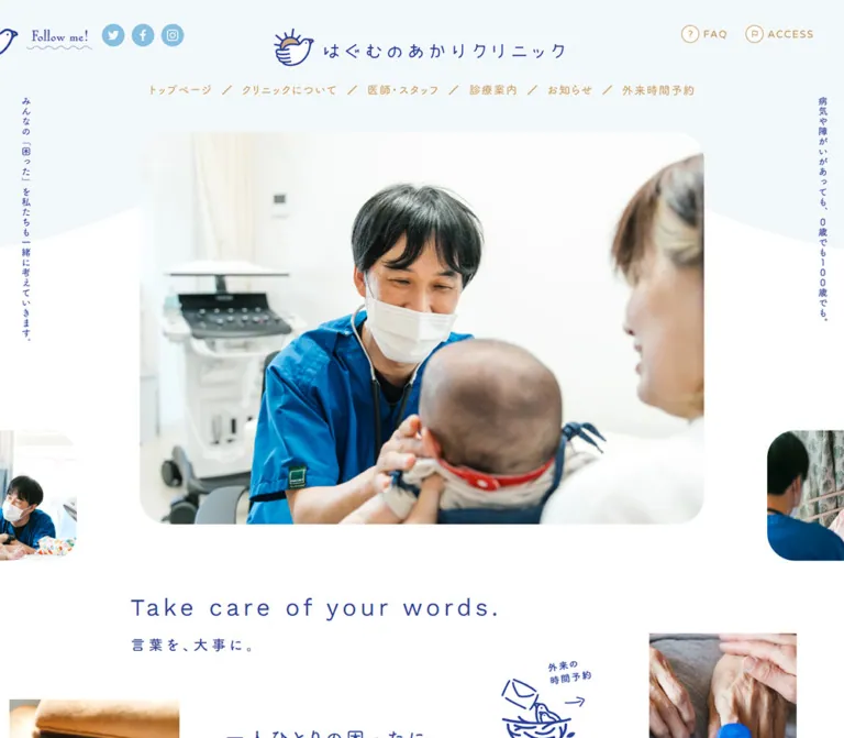
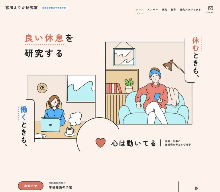
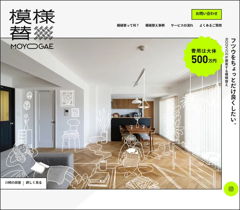
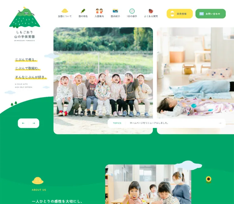
やまのみ保育園|写真と手描きイラストで伝える保育園サイト
温かなブラウンの文字とパステルカラー、日常写真、手描きキャラクターが特徴。子ども・保護者・働く人を軸に、園紹介や採用情報へ案内する保育園サイト。
Yamanomi Nursery — Style Reference
Sunlit nursery life framed by rounded paper labels, pastel landscapes, and a hand-drawn garden.
Original URL: yamanomi-hoiku.com Final URL: yamanomi-hoiku.com Theme: light; white and cream surfaces with brown text and audience-specific pastel backgrounds. Inspected: September 23, 2026, 06:01 JST. The supplied retrieval record is timestamped September 22, 2026, 21:01:00.923 UTC; individual screenshot timestamps were not supplied. Viewports: 1440 × 1000 and 390 × 844 CSS pixels. Scope: the current nursery-group homepage: header, photographic introduction, six nursery destinations, shared mission, children/parents/staff sections, news, nursery and recruitment links, comic promotions, and footer. Attached visual coverage includes the desktop opening, parents section, and footer, plus the mobile opening and footer. Other sections are documented through the supplied rendered DOM and computed measurements. Linked destination pages were not inspected.
Yamanomi presents nursery life as a shared community. Large photographs establish the real setting; illustrated children, caregivers, parents, birds, and small animals make the surrounding interface approachable. Brown lettering replaces neutral black across navigation and body copy. White space, pale yellow, blue, and green give the illustrations room to breathe.
The page is a substantial institutional homepage with several useful destinations. Its organizing idea is three audiences: children, parents, and people who work at the nurseries. Preserve that information architecture alongside the decorative treatment. The most distinctive visual relationships are the white logo shoulder over the photograph, separate cream headline strips, photographs projecting above rounded white stages, and the illustrated garden that closes the page.
閉じる
Yamanomi Nursery — Style Reference
Sunlit nursery life framed by rounded paper labels, pastel landscapes, and a hand-drawn garden.
Original URL: yamanomi-hoiku.com Final URL: yamanomi-hoiku.com Theme: light; white and cream surfaces with brown text and audience-specific pastel backgrounds. Inspected: September 23, 2026, 06:01 JST. The supplied retrieval record is timestamped September 22, 2026, 21:01:00.923 UTC; individual screenshot timestamps were not supplied. Viewports: 1440 × 1000 and 390 × 844 CSS pixels. Scope: the current nursery-group homepage: header, photographic introduction, six nursery destinations, shared mission, children/parents/staff sections, news, nursery and recruitment links, comic promotions, and footer. Attached visual coverage includes the desktop opening, parents section, and footer, plus the mobile opening and footer. Other sections are documented through the supplied rendered DOM and computed measurements. Linked destination pages were not inspected.
Yamanomi presents nursery life as a shared community. Large photographs establish the real setting; illustrated children, caregivers, parents, birds, and small animals make the surrounding interface approachable. Brown lettering replaces neutral black across navigation and body copy. White space, pale yellow, blue, and green give the illustrations room to breathe.
The page is a substantial institutional homepage with several useful destinations. Its organizing idea is three audiences: children, parents, and people who work at the nurseries. Preserve that information architecture alongside the decorative treatment. The most distinctive visual relationships are the white logo shoulder over the photograph, separate cream headline strips, photographs projecting above rounded white stages, and the illustrated garden that closes the page.
How to Read This Reference
- Measured means a value appears in the supplied computed styles or element bounds. Dimensions are CSS pixels; tables sometimes round fractional values for readability.
- Calculated means a relationship is derived from those measurements. For example, a 312px mobile text column occupies 80% of a 390px viewport. This does not establish the original CSS formula.
- Estimated means a visual approximation from the original-page screenshots. These values are appropriate starting points, not recovered declarations.
- Recommended identifies an implementation choice for a new project. The Quick Start is an adaptation, not the original stylesheet.
- Empty text wrappers, offscreen navigation, and repeated news links remain part of the DOM evidence. Their presence alone does not prove that they were visible or interactive in a captured state.
- Several prominent headings and the logo appear as artwork. Their inherited wrapper font sizes do not measure the lettering inside the artwork.
Tokens — Colors
Main Palette
| Name | Value | Source or evidence | Role |
|---|---|---|---|
| Brown Ink | #a46305 |
Measured: --base-text-color; computed body and link color |
Main text, navigation, headings, and interface lettering |
| White | #ffffff |
Measured body and button backgrounds | Header, audience stages, footer, and action surfaces |
| Warm Cream | #fffbf3 |
Measured mission and news section backgrounds | Softer reading areas between stronger pastel sections |
| Child Yellow | #ffef8f |
Measured: --base-color-yellow; children section background |
Children’s section, recruitment tab, and lower destination area |
| Parent Blue | #cfe6f6 |
Measured: --base-color-blue; parents section background |
Parents’ section and associated visual accents |
| Lawn Green | #b4df9c |
Measured source variable: --base-color-green |
Green framing language visible around the hero and footer landscape |
| Staff Green | #d6e9bf |
Measured: --base-color-green02; staff section background |
Staff section; lighter and quieter than Lawn Green |
| Link Orange | #ec803e |
Measured source variable: --base-link-color |
Available link accent; sampled resting links mostly remain Brown Ink |
The audience colors are structural. Yellow belongs to children, blue to parents, and pale green to staff. Small patches behind the corresponding desktop navigation labels echo that assignment. They are irregular highlights around the beginning of each label, rather than full-width filled navigation buttons.
Supporting Visual Accents
| Name | Suggested approximation | Evidence status | Use |
|---|---|---|---|
| Leaf Arrow | #78be53 |
Estimated from small green triangles | Footer bullets and small directional marks |
| Paper Edge | #b18b53 |
Estimated from the offset edge beneath cream labels | A short, solid paper-like shadow |
| Recruitment Coral | #ff6b75 |
Estimated from the external recruitment banner | Local outline and emphasized text within that banner |
Keep these estimates subordinate to the exact source palette. The coral banner is a separate recruitment treatment, not evidence for making every primary action coral.
The exported --swiper-theme-color: #007aff is also present. Its bright blue is not established as a visible brand color in the supplied captures and should not be added to the design palette merely because the variable exists.
Tokens — Typography
Rounded Japanese Text
Computed family stack: 'Zen Maru Gothic', 'Noto Sans JP', 'Noto Sans Japanese', 'メイリオ', Meiryo, sans-serif.
The rounded Japanese forms support the friendly illustrations without making the prose look handwritten. Most sampled navigation, body copy, location names, and footer links use weight 500. The English recruitment caption uses 700.
The record establishes the declared/computed stack, not which font file supplied every glyph. Font loading details and fallback use were not provided.
Artwork Lettering
The logo combines Japanese lettering, two acorn characters, a leaf, and a curved English nursery caption. Preserve it as one identity asset. An ordinary text font cannot reproduce that arrangement.
The desktop hero has three visually separate cream text strips, while mobile uses a narrow composition of three vertical strips. Their heading wrappers contain no extracted text and inherit a 6.25px font size. That value is not the visible headline size. The audience headings show the same distinction between wrapper measurements and artwork lettering.
Visual estimate for a text-based adaptation: approximately 30–34px for the desktop paper-label lettering and 20–21px for the mobile vertical hero lettering. These are not measured font declarations.
Measured Type Scale
| Role | Desktop size / line height | Mobile size / line height | Weight | Tracking |
|---|---|---|---|---|
| Desktop navigation | 17 / 17px |
Replaced by compact menu control | 500 |
Normal on audience links |
| Offscreen mobile menu links | — | 15 / 15px for main links |
500 |
0.1875px |
| Nursery names | 19 / 19px |
15 / 15px |
500 |
0.05em |
| Mission statement | 38 / 38px |
27 / 27px |
500 |
0.1875px on wrapper |
| Audience paragraphs | 17 / 37.995px |
15 / 30px |
500 |
0.03em |
| News section heading | 39 / 39px |
29 / 29px |
500 |
0.12em |
| News item titles | 19 / 29.999px |
17 / 27.88px |
500 |
0.1875px |
| Lower destination headings | 34 / 34px |
29 / 29px |
500 |
0.05em |
| Lower destination descriptions | 16 / 30px |
14 / 24.99px |
500 |
0.03em |
| Comic teaser description | 13 / 21.97px |
12 / 17.736px |
500 |
0.1875px |
| Main footer links | 16 / 16px |
13 / 13px |
500 |
Desktop 0.16em; mobile 0.1em |
| Footer nursery links | 14 / 14px |
13 / 13px |
500 |
0.16em |
| English recruitment caption | 15 / 15px |
Not visible in the closed mobile header | 700 |
0.12em |
The large line spacing is essential to the prose. A desktop audience paragraph uses roughly 2.235 line height, and the mobile equivalent uses 2. Increasing text density would substantially change the character of these scenes.
The source root computes to 10px, while the body computes to 6.25px; many visible components then declare their own sizes. Do not copy that body size into a new site’s reading text. The Quick Start retains a conventional root and uses explicit component values.
Tokens — Spacing & Shapes
Observed rhythm: close grouping inside labels and controls, generous separation between narrative scenes, and illustrations extending beyond otherwise orderly content boxes.
No universal spacing unit was established. A recommended working scale is 4, 8, 12, 16, 24, 32, 40, 56, 80, 120px, supplemented by the measured component dimensions below.
Layout Measurements
| Element | Desktop | Mobile | Evidence |
|---|---|---|---|
| Opening region | 1440 × 1000px |
390 × 844px |
Measured main bounds; one captured viewport high |
| Header | 1440 × 200px, at page top |
390 × 88px, starting at y = 25px |
Measured |
| Header logo link | 264 × 129px, at approximately (38.39, 55) |
184 × 88px, at approximately (26.69, 25) |
Measured; desktop H1 wrapper is taller than the link |
| Recruitment tab | 210 × 200px, right aligned |
Not visible in the closed header | Measured desktop bounds |
| Hero photograph | Approximately 1363 × 770px, beginning near (38, 130) |
Approximately 366 × 717px, beginning near (12, 22) |
Estimated visible image region; image-element bounds were not supplied |
| Hero headline artwork | Widths 243, 683, 308px; each 67px high |
Combined wrapper 117 × 312.31px |
Measured wrappers |
| Hero comic teaser | 701.63 × 150px |
365.63 × 105px |
Measured link bounds |
| Raised mobile comic masthead | Within desktop teaser | 130 × 100px, beginning 100px above the link |
Measured |
| Nursery cards | 314.30 × 214.42px |
168.17 × 121.34px |
Measured link bounds |
| Audience paragraph column | 477.20px |
312px |
Measured |
| Audience detail link | 477.20 × 70px |
312 × 70px |
Measured |
| News item links | Approximately 296.03 × 329.81px |
Approximately 277.14 × 315.83px |
Measured; some positions are offscreen |
| News archive link | 198 × 68px |
273 × 65px |
Measured |
| Circular destination links | 120 × 120px |
100 × 100px |
Measured |
| Lower comic banner | 1247.98 × 191.98px |
315.89 × 164.08px |
Measured |
| Footer logo | 267px wide wrapper |
218 × 105.31px wrapper |
Measured; use screenshots to judge visible artwork height |
Gutters and Local Spacing
| Relationship | Observed value | Interpretation |
|---|---|---|
| Desktop hero left frame | Approximately 38.4px |
About 2.67% of viewport width, calculated |
| Mobile hero and teaser gutter | 12.1875px |
3.125% of viewport width, calculated |
| Desktop hero headline left edge | 96px |
6.67% of viewport width, calculated |
| Desktop headline wrapper gap | 5px |
From y = 524, 596, 668 with 67px heights |
| Desktop nursery column gap | Approximately 33.36px |
Calculated from neighboring card bounds |
| Mobile nursery column gap | Approximately 14.66px |
Calculated from neighboring card bounds |
| Nursery row gap | Desktop 40px; mobile 19.5px |
Calculated from card positions |
| Mobile narrative side margins | 39px |
A centered 312px, or 80vw, text column at this viewport |
| Desktop audience section bottom padding | 240px |
Measured; leaves room for illustration and section boundaries |
| Footer top padding | Desktop 140px; mobile 50px |
Measured |
| Main footer link row pitch | Desktop 34px; mobile 31px in the captured wrapping |
Calculated from positions |
These relationships should guide alignment. They do not establish a single fluid formula across all intermediate widths.
Shape Vocabulary
| Element | Shape | Status |
|---|---|---|
| Recruitment tab | Square upper edges with a 70px lower-left radius |
Measured |
| Desktop comic teaser | 30px outer radius |
Measured |
| Mobile comic teaser | 15px lower corners; separate raised masthead |
Measured |
| Mobile comic masthead | 30px upper-left radius |
Measured |
| Audience detail links | 70px declared radius on a 70px-high shape |
Measured; visually a capsule |
| News archive link | Desktop 30px; mobile 33px radius |
Measured |
| Circular destination links | Radius equal to their declared width | Measured; visually circular |
| Cream headline strips | Approximately 18–24px desktop corner rounding, short brown offset edge |
Estimated from artwork |
| Large white audience stage | Approximately 60–65px corners |
Estimated from the parents capture |
| Audience photograph frame | Approximately 90–105px upper corner rounding with a 10–12px white rim |
Estimated from the parents capture |
| Section transitions | Shallow waves; footer uses hand-drawn scalloped vegetation | Visually observed; implementation unknown |
A wrapper with border-radius: 0 can still contain visibly rounded artwork. Do not replace the screenshot’s shape with the wrapper’s radius when the rounding belongs to an image or nested element.
Components
Header and Audience Navigation
Role: establish identity and direct visitors to the appropriate part of the organization.
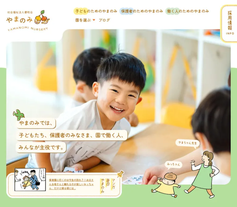
The desktop header has three visual zones: the acorn logo at left, brown text navigation across the middle, and a tall recruitment tab at right. The logo sits on a white shoulder that extends downward over the photograph. The shoulder’s curved lower-right edge is a major part of the opening silhouette.
Navigation includes 園を選ぶ, the three audience links, and ブログ. Audience labels receive small yellow, blue, or green highlights behind their first words. Text starts near y = 55px; it does not sit inside a conventional centered navigation bar with a full-width bottom rule.
The nursery selector displays a small downward triangle. Nested nursery destinations appear in the DOM, but opening the selector was not demonstrated. Its trigger mode, focus behavior, and expanded appearance remain unverified.
Recruitment Tab and Mobile Menu
Role: expose recruitment on desktop and provide compact navigation on mobile.
The desktop recruitment link occupies the upper-right 210 × 200px region. It uses pale yellow, a subtle repeated dot texture, a strongly rounded lower-left corner, Japanese recruitment lettering, the English caption Recruit, and a small cream/white detail label. Its recorded destination is /blog/category/recruit/.
On the phone, the visible header instead has a yellow MENU control near the upper-right corner, approximately 90 × 90px by visual inspection. Brown horizontal lines sit above its English caption. The logo remains large enough to read at 184px wide.
The mobile DOM contains a separate offscreen navigation structure with main links around 343px wide and nursery links around 165px wide. This establishes available content, not the appearance of an opened menu. No menu-opening interaction or overlay state was supplied.
Photographic Opening
Role: introduce everyday nursery life and the shared-community message.
The desktop photograph dominates the first viewport. In the supplied capture, children gather indoors, with a smiling child near the center-right. Its frame begins below the header at roughly 130px, while the white logo shoulder cuts into its upper-left region. A green field appears around the lower photograph.
Three separate cream strips sit at the lower-left:
やまのみでは、子どもたち、保護者のみなさま、園で働く人、みんなが主役です。
Each strip follows the length of its phrase. A small illustrated bird overlaps the first. A caregiver and child stand at the lower-right, with speech bubbles identifying the characters. The illustration is layered partly outside the photograph, connecting the real scene to the surrounding page.
The mobile capture shows an outdoor caregiver-and-children photograph. The copy changes to three vertical columns near the left side, with the introductory column at the right. This is a deliberate recomposition of the reading direction and line grouping. Shrinking the desktop strips would not reproduce it.
Different photographs are visible in the supplied desktop and mobile openings. The evidence does not determine whether this comes from responsive image selection, a timed sequence, or both. For a new implementation, choose image crops independently and protect faces from text overlays.
Opening Comic Teaser
Role: bring the nursery’s illustrated daily-life content into the opening view.
The desktop teaser is a wide, low card overlapping the photograph’s bottom edge. Its anatomy is a comic panel at left, a short editorial label and underlined description in the center, and a vertical comic masthead at right. A dotted orange-brown inner border and a pin illustration make it resemble a notice attached to paper.
Measured desktop padding reserves 226px on the left and 140px on the right for the artwork. The central description uses 13px text with approximately 22px line height.
On mobile, the link becomes a 105px-high bottom shelf across nearly the full frame width. The comic preview overlaps its upper edge, and the masthead rises in a separate 130 × 100px white tab on the right. The desktop editorial label is not visible in this captured mobile composition. The description is 12px with approximately 17.74px line height.
Both layouts link to /blog/category/comic/. Preserve the shared destination while treating desktop and mobile as distinct compositions.
Six-Nursery Directory
Role: provide direct access to the individual facilities.
Six link cards appear below the opening. The DOM identifies five locations in Fukuoka City and one in Tokyo. Each item groups a location label, a visual area, a nursery name, and a detail affordance where present.
Desktop uses three columns and two rows. The first card starts at approximately x = 115px; cards measure about 314px wide. Mobile uses two columns and three rows with 19.5px outer margins and approximately 168px-wide cards. The names change from 19px to 15px, rather than scaling all text in proportion to the viewport.
The directory heading wrapper is tall and narrow on desktop (38 × 210px) and wide and shallow on mobile (151 × 27px). This supports a change in heading artwork orientation. The directory’s individual image treatment is not visible in the attached viewport crops, so its precise image masks and crops are not established here.
The six destinations are /nurseries/01.php through /nurseries/06.php. Treat them as independent nursery links, not as selectable options inside a single form.
Shared-Mission Interlude
Role: bridge practical facility navigation and the three audience stories.
A warm-cream section introduces the statement that everyone is a protagonist. The measured heading is 38px on desktop and 27px on mobile. Its extracted text is split into individual character fragments, with みんな grouped together.
Desktop records one broad heading row; mobile records a taller, multiline composition. Individual character wrappers could support decorative treatment, but their presence does not prove a particular animation. The section’s full visual composition is outside the attached crops, so additional illustration placement should not be inferred.
Audience Feature Scene
Role: tell the nursery story from the perspective of children, parents, and staff.
The three sections share an anatomy: a pastel field, a large white stage, documentary photography, cream title strips, a narrow English side label, a spacious first-person paragraph, a detail link, and illustrated characters near the edges.
The parents screenshot provides the clearest visual evidence. A photograph of a family and caregiver at a nursery entrance fills the left side. Its rounded white frame projects about 100px above the white stage. On the right, the title strips read 保護者のための、 and やまのみ. Narrow vertical English lettering sits alongside them. The paragraph and long capsule link align below.
The measured text columns alternate across the desktop page: children and staff paragraphs begin around x = 139.5px; the parents paragraph begins around x = 843.3px. All three are about 477.2px wide. This creates an alternating narrative rhythm without changing the basic component.
On mobile, paragraphs and detail links use a centered 312px column. Heading artwork becomes tall and narrow: approximately 84 × 221px for children, 83 × 178px for parents, and 83 × 218px for staff. The DOM places those headings above the prose, with alternating horizontal positions. Full mobile audience screenshots were not supplied; exact photo/character layering remains unverified.
Dotted Detail Link
Role: move from a short audience story to its dedicated page.
The visible parents link is a long white capsule with a dotted warm outline inset from its edge, brown centered lettering, a small green triangle, and a pale-blue offset layer below. The measured outer link is 477.2 × 70px on desktop and 312 × 70px on mobile.
The outer anchor’s computed font size is inherited and does not establish the label’s visible size. For a new implementation, use approximately 18–20px text as a visual starting point, then fit it against the reference.
The three repeated 詳細はこちら links lead to /child/, /parents/, and /worker/. Preserve their visible wording if desired, but give each an accessible name that identifies its destination.
News Rail
Role: surface nursery updates, recruitment notices, and other current posts.
The DOM describes a horizontal sequence under 園からのお知らせ. The data includes repeated post links and positions extending well beyond both viewport edges. These measurements support a replicated horizontal rail. They do not establish its autoplay interval, drag behavior, or control design.
Each item combines category/location information, a date, and a title. Desktop link bounds are approximately 296px wide; mobile bounds are approximately 277px wide. Neighboring positions imply about 5px between items. Some sampled items have vertical offsets of 40px on desktop and 30px on mobile, producing a staggered arrangement in the recorded geometry.
The archive link sits beside the desktop heading and below the mobile rail. Its dimensions change from 198 × 68px to 273 × 65px. News imagery and detailed card borders are outside the attached visual crops and should not be invented from the link boxes alone.
For a reusable implementation, retain one semantic instance of each post. If a looping presentation requires clones, keep those duplicates out of keyboard navigation and the accessibility tree.
Lower Nursery and Recruitment Links
Role: offer two broad destinations after the news section.
A yellow section contains a nursery-directory feature and a recruitment feature. Each combines a visual area, short descriptive copy, a vertical heading, and a circular 一覧へ link. The headings are 34px on desktop and 29px on mobile; circular links reduce from 120px to 100px.
Desktop places the features side by side. Mobile stacks them and reverses their emphasis: the directory heading and circle sit at the right, while recruitment’s heading and circle sit at the left. The measured mobile descriptions occupy 241px columns on opposite sides.
The destinations are /nurseries/ and /blog/category/recruit/. Preserve this distinction from the six individual facility links above.
Wide Comic Banner
Role: repeat the illustrated-content destination before the footer.
The desktop banner is a warm paper strip containing a caregiver and child at left, a loose sequence of comic panels across the center, and a vertical masthead and pin at right. The panels have black hand-drawn borders and slight changes in angle. The banner spans approximately 1248 × 192px.
Its bottom extends approximately 50px into the footer’s measured region. This overlap makes it a bridge between the yellow section and white footer.
The mobile banner measures approximately 316 × 164px, a substantially different aspect ratio. Only its lower edge is visible in the attached mobile footer crop, so the exact internal rearrangement is not established. Do not squeeze the entire desktop strip into the mobile dimensions.
Footer and Illustrated Garden
Role: provide a complete navigation index and a memorable end to the page.
Desktop places the logo at left, audience links in the next column, a two-column nursery list in the middle, and recruitment/blog links at right. Small green triangles mark the major links. The footer has substantial white space and no enclosing card border.
A coral-outlined external recruitment banner sits below the audience links. Its measured link width is 296px on desktop and approximately 309px on mobile. Its visible height is about 70px, estimated from the screenshots; the 9px inline-anchor height in the DOM does not measure the image it contains. The original page supplies an outbound recruitment-directory URL, but that destination was not inspected.
Mobile centers the 218px logo above the navigation. Main links wrap naturally, while the six nursery names remain in two columns. The external recruitment banner spans most of the content width.
At the bottom, a green garden with uneven black outlines supports flowers, children, butterflies, and small animals. Desktop lets characters spread across a wide landscape, including a child projecting into the foreground. Mobile uses a tighter grouping above the hedge. The copyright mark moves from a vertical desktop position near the right edge to a centered horizontal position within the mobile green area.
Tokens — Motion & Interaction
Recorded Transition Declarations
| Target | Recorded value | What is established |
|---|---|---|
| Common links | 0.4s cubic-bezier(0.25, 0.46, 0.45, 0.94) |
A 400ms eased transition is declared; the changed property and triggered state are not fully documented |
| Header logo wrapper | opacity 0.5s 0.5s |
A 500ms opacity transition with a 500ms delay |
| Recruitment tab | height 0.4s, padding 0.4s |
Height and padding can transition; the triggering condition was not captured |
| Desktop audience paragraphs and detail links | 0.5s cubic-bezier(0.17, 0.88, 0.3, 1.28) |
An overshooting easing curve is declared |
| Many mobile audience elements and lower comic banner | 0.6s cubic-bezier(0.17, 0.88, 0.3, 1.28) |
A slightly longer mobile transition is declared; some elements retain 500ms |
| Footer nursery links | color 0.4s |
Color is explicitly named as the transitioned property |
| News rail | Timing unavailable | Repetition and offscreen positions establish rail-like geometry, not its playback behavior |
The relevant source easing aliases are --easeOutQuad and --easePopUp. The latter exceeds 1 in its control points and can produce overshoot. This supports a playful motion vocabulary, but does not prove that a particular character bounces or that a particular section animates on scroll.
The sampled elements report animation: none. That is not evidence that the entire page is static: transitions, image changes, pseudo-elements, and JavaScript-driven movement are not comprehensively described by these samples.
Unverified States
The DOM includes a welcome heading, ようこそ、やまのみへ!, styled at 36px, weight 700, with 7.2px tracking. It is absent from the settled screenshots. Its entrance, duration, dismissal, and relationship to loading are unverified; do not add a permanent welcome overlay based only on its DOM presence.
The capture procedure waited for layout, text, image decoding, and finite motion within bounded time limits. Perpetual animations were paused during readiness checks and resumed afterward. This is not a time-resolved interaction recording.
No direct evidence was supplied for opened menus, selector behavior, hover endpoints, keyboard focus, a sticky header, carousel controls, or reduced-motion handling. Link destinations are verified as rendered attributes, not as completed navigation tests.
Recommended motion: use the recorded 400–600ms easing family for small, purposeful effects. Keep all content visible without animation, avoid large unsolicited image movement, and provide reduced-motion behavior. Do not invent an autoplay cadence as though it were measured.
Surfaces
| Surface | Appearance | Purpose |
|---|---|---|
| Main canvas | White | Header, directory, and footer clarity |
| Reading interlude | Warm cream | Mission statement and news separation |
| Audience field | Yellow, blue, or staff green | Distinguish the three audiences |
| Audience stage | Large rounded white shape | Hold prose and connect overlapping photography |
| Headline strip | Cream with a short solid brown edge | Keep wording legible over photography and color |
| Detail control | White capsule, dotted warm outline, pale offset layer | A tactile, paper-like navigation target |
| Comic promotion | Warm paper texture, panels, pin, and masthead | Give editorial content its own recognizable identity |
| Closing landscape | Lawn green with illustrated contours | Finish the page as part of the same nursery world |
There is no general system of blurred elevation shadows. Depth comes from overlapping artwork, white image rims, asymmetric silhouettes, and short solid offset edges. Dots resemble stitching or a noticeboard outline; they are localized accents rather than a texture covering every surface.
Imagery
Photography is bright and documentary. The supplied opening images show indoor play and outdoor care; the parents feature shows a real nursery entrance. The compositions emphasize relationships, gestures, and everyday surroundings. Backgrounds can be softly out of focus, but the photographs retain ordinary clothing, architecture, and activity.
Illustrations use irregular dark outlines, flat pastel fills, simple facial features, and loose proportions. Children often wear pale yellow; the caregiver’s green apron connects her to the landscape palette. Birds, butterflies, squirrels, flowers, and acorn characters recur without becoming a uniform icon set.
The contrast between real photography and simplified drawing is productive: photographs establish trust and specificity, while characters provide continuity across sections. Keep photos naturally rendered. Do not apply pixelation, strong duotone filters, or artificial vector cleanup to either medium.
Observed Asset References
The supplied evidence contains no original asset filenames or image URLs. The following inventory identifies visible assets without inventing paths.
| Asset | Original-page evidence | Reuse requirement |
|---|---|---|
| Acorn nursery logo | Desktop and mobile headers and footers | Preserve Japanese lettering, paired acorns, leaf, and curved English caption together |
| Desktop opening photograph | Indoor group of children | Retain an open area for lower-left headline strips |
| Mobile opening photograph | Caregiver interacting with children outdoors | Compose for a tall frame and vertical copy |
| Hero character pair | Caregiver and child at desktop lower-right | Maintain transparent surrounding space and speech-bubble relationships |
| Daily-life comic preview | Opening teaser in both sizes | Preserve panel lettering and black border |
| Parents photograph | Family/caregiver at nursery entrance | Keep people and entrance legible inside the rounded white frame |
| Wide comic promotion | Desktop pre-footer banner | Use an intentionally composed mobile alternative if needed |
| Footer garden | Both footer captures | Preserve organic contours and responsive character placement |
| Pin, book, bird, and butterfly details | Hero, banners, and section edges | Use the same hand-drawn line quality as the larger characters |
The exact formats, intrinsic resolutions, responsive source sets, and animation status of these assets are unknown. CSS can reproduce layout and simple paper shapes; it cannot reproduce the identity carried by the logo, comic lettering, and character artwork.
Layout & Responsive Behavior
Recorded Page Sequence
Values below are rounded from the supplied element bounds. They describe the captured layouts, not prescribed fixed section heights.
| Region | Desktop start / height | Mobile start / height |
|---|---|---|
| Opening | 0 / 1000px |
0 / 844px |
| Six-nursery directory | 1000 / 729px |
844 / 670px |
| Mission interlude | 1729 / 863px |
1514 / 597px |
| Children | 2592 / 884px |
2110 / 980px |
| Parents | 3476 / 881px |
3091 / 925px |
| Staff | 4357 / 919px |
4015 / 998px |
| News | 5276 / 780px |
5013 / 637px |
| Nursery/recruitment features and comic banner | 6056 / 684px |
5651 / 801px |
| Footer | 6740 / 695px |
6451 / 831px |
The measured document heights are approximately 7435.33px and 7282.14px. The similar totals conceal substantial rearrangement: the phone’s narrative sections become taller, while other regions become more compact.
Responsive Changes That Matter
| Area | Desktop | Mobile |
|---|---|---|
| Header | Full navigation and recruitment tab | Logo plus visible MENU control |
| Opening copy | Three horizontal paper strips | Three vertical columns with different phrase grouping |
| Opening image | Wide indoor scene | Tall outdoor scene in the supplied capture |
| Comic teaser | Horizontal card with internal masthead | Bottom shelf with raised right-hand masthead |
| Nursery links | Three columns, two rows | Two columns, three rows |
| Directory heading | Tall narrow wrapper | Wide shallow wrapper |
| Audience content | Alternating broad text columns | Centered 80%-width prose and narrow heading artwork |
| News | Several card widths across the viewport | One principal card width with neighboring content outside the viewport |
| News archive link | Near heading | Below rail |
| Lower destination features | Side by side | Stacked with alternating side placement |
| Footer | Logo and navigation columns across the page | Centered logo, wrapped links, two-column nursery list |
| Copyright | Vertical near right edge | Horizontal, centered over the garden |
Only two viewport sizes were provided. Exact media-query breakpoints and tablet layouts are unknown. The Quick Start uses recommended breakpoints at 1100px for compact navigation and 767px for the phone composition; these are implementation choices.
Maintain ordinary document scrolling. Avoid reproducing desktop section heights as fixed mobile heights: text reflow, font fallback, and accessibility settings must be allowed to increase content height. Clip a news rail or photograph locally, while allowing decorative figures to project outside their stage.
Do’s and Don’ts
Do
- Keep Brown Ink
#a46305consistent across primary text and navigation. - Preserve the yellow/blue/pale-green audience mapping.
- Pair real nursery photography with a coherent family of hand-drawn characters.
- Retain the logo’s white shoulder and the generous photograph beneath it.
- Give headline phrases separate cream strips with widths fitted to their wording.
- Recompose the phone’s hero copy vertically instead of uniformly shrinking the desktop layout.
- Preserve the three-to-two-column nursery grid change.
- Use wide line spacing for first-person audience paragraphs.
- Keep dotted outlines and solid offset edges restrained and localized.
- Let photo frames and character artwork overlap the white stages deliberately.
- Keep nursery, audience, news, comics, and recruitment destinations distinct.
- Treat the footer garden as part of the page composition, with its own mobile arrangement.
Don’t
- Don’t reduce the homepage to one conversion path or omit its practical navigation.
- Don’t substitute generic rounded cards for every narrative section.
- Don’t use black body text merely because it is a common default.
- Don’t turn the exported bright library blue into a new brand accent.
- Don’t treat the coral recruitment banner as the main button system.
- Don’t read an artwork wrapper’s
6.25pxfont size as the visible heading size. - Don’t apply a soft shadow to every white surface.
- Don’t stretch faces or squeeze a wide comic collage into the phone banner.
- Don’t replace all illustration details with uniform geometric icons.
- Don’t claim hover, autoplay, menu, or scroll-animation behavior from static captures alone.
- Don’t expose repeated carousel clones as repeated content to assistive technology.
- Don’t use fixed content heights that clip expanded Japanese text.
Recommended Implementation Additions
These recommendations are not verified features of the original site:
- Give the mobile menu button an accessible name,
aria-expanded, and a controlled navigation region. Ensure closed navigation is not keyboard-focusable. - Make the nursery selector usable by keyboard and touch, with visible focus and an explicit expanded state.
- Preserve one accessible text version of image-based headings. If separate desktop/mobile artwork is used, avoid announcing the same heading twice.
- Give repeated detail links contextual names, such as the audience page they open.
- Use meaningful alternatives for informative photographs and comics; mark purely decorative birds, pins, and garden figures as decorative.
- Keep the small green triangles decorative. Their low visual prominence should not be the only indication that text is a link.
- If the news rail moves automatically, provide pause controls and a static reduced-motion alternative. Maintain a useful presentation without autoplay.
- Increase the clickable area around small footer labels while keeping their visible typography compact.
- Verify text contrast on every pastel surface and in hover/focus states, especially if Link Orange is used for small text.
- Load the primary hero image promptly; reserve image dimensions and defer lower-page images. Use responsive sources to preserve detail without loading desktop-size assets on a phone.
Agent Prompt Guide
Quick Color Reference
- Main ink:
#a46305. - White surfaces:
#ffffff. - Reading background:
#fffbf3. - Children and yellow feature areas:
#ffef8f. - Parents:
#cfe6f6. - Staff:
#d6e9bf. - Lawn and closing landscape:
#b4df9c. - Available source link accent:
#ec803e; resting links are predominantly brown. - Details: small green triangles, dotted warm outlines, and short solid paper edges.
Overall Prompt
“Create a Japanese nursery-group homepage with a generous photographic opening, warm brown text #a46305, white and cream surfaces, and three audience sections colored pale yellow, blue, and green. Use the observed Zen Maru Gothic family stack for live text. Place the acorn-style identity on a white curved shoulder over the opening photograph. Present the main statement on separate cream paper strips; recompose it into vertical columns on phones. Follow the opening with a six-location directory, a shared mission, alternating audience stories, news, nursery and recruitment destinations, comic promotions, and a complete footer. Combine documentary photography with consistent hand-drawn children, caregivers, animals, and garden artwork. Use rounded white stages, overlapping photo frames, dotted capsule links, and generous prose line spacing. Preserve the site’s multiple navigation purposes.”
Example Component Prompts
- Opening: “Build a wide nursery photograph framed by white at the top and pastel lawn green below. Place a large logo on an overlapping white shoulder, three cream phrase strips at lower-left, a caregiver-and-child illustration at lower-right, and a comic teaser crossing the bottom edge. On a phone, use a tall crop, vertical phrase strips, and a raised comic masthead. Do not assume the photograph must animate.”
- Parents scene: “Create a pale-blue section with a large rounded white stage. Let a rounded photograph of a nursery entrance project about 100px above the stage at left. On the right, use cream title strips, narrow vertical English lettering, brown Japanese prose at approximately 17px/38px, and a long white capsule link with an inset dotted outline.”
- Nursery directory: “Arrange six facility links in three columns on desktop and two on mobile. Keep each location label, visual, and nursery name together. Use brown medium-weight names at 19px desktop and 15px mobile, with airy gaps and no unnecessary card shadow.”
- Comic teaser: “Make a paper notice with a comic preview, short underlined description, vertical masthead, dotted inner border, and illustrated pin. Desktop is a low horizontal strip; mobile is a bottom shelf with the masthead raised on the right. Preserve the comic artwork’s lettering and proportions.”
- Footer: “Use a large white footer with an acorn logo, brown tracked navigation, green triangular bullets, a two-column list of nursery names, and a modest external recruitment banner. Finish with an illustrated green hedge and flowers. Center the logo and reorganize the characters for the phone layout.”
- Interaction: “Use 400ms ease-out transitions and, where appropriate, restrained 500–600ms overshoot. Keep text and navigation available without animation. Implement menu, focus, and reduced-motion behavior explicitly; do not infer an autoplay sequence from static reference images.”
Quick Start
CSS Custom Properties
This adaptation uses the exact core palette and measured text sizes. Paper-edge colors, photo radii, image ratios, and breakpoints are recommendations. The curved shoulder is approximated with CSS; exact silhouettes, comic lettering, and character art require project assets. No asset filenames or font-loading URLs were provided.
The class structure expects a header, a hero with a media element and copy, a comic teaser, nursery links, audience stages, a news rail, and a footer. Use real links for navigation and a real button for the menu. Menu state and any carousel behavior require separate logic.
:root {
  /* Exact source colors and measured surface colors */
  --color-ink: #a46305;
  --color-white: #ffffff;
  --color-cream: #fffbf3;
  --color-child: #ffef8f;
  --color-parent: #cfe6f6;
  --color-staff: #d6e9bf;
  --color-lawn: #b4df9c;
  --color-link: #ec803e;

  /* Estimated supporting colors */
  --color-arrow: #78be53;
  --color-paper-edge: #b18b53;

  --font-body: 'Zen Maru Gothic', 'Noto Sans JP',
    'Noto Sans Japanese', 'メイリオ', Meiryo, sans-serif;
  --weight-body: 500;
  --text-body: 17px;
  --leading-body: 2.235;
  --text-news: 39px;
  --text-label: 32px;

  /* Recommended geometry based on the captured layouts */
  --hero-gutter: 2.6667vw;
  --radius-stage: 64px;
  --radius-photo: 100px;
  --radius-label: 22px;
  --radius-capsule: 999px;

  /* Recorded easing curves */
  --ease-out: cubic-bezier(0.25, 0.46, 0.45, 0.94);
  --ease-pop: cubic-bezier(0.17, 0.88, 0.3, 1.28);
  --motion-link: 400ms;
  --motion-scene: 500ms;
}

* { box-sizing: border-box; }
html { font-size: 100%; }
body {
  margin: 0;
  color: var(--color-ink);
  background: var(--color-white);
  font-family: var(--font-body);
  font-size: var(--text-body);
  font-weight: var(--weight-body);
  line-height: var(--leading-body);
  letter-spacing: 0.03em;
}
img { display: block; max-width: 100%; }
a { color: inherit; }
button { font: inherit; color: inherit; }

/* Header shoulder approximates the observed artwork silhouette. */
.site-header {
  position: absolute;
  inset: 0 0 auto;
  z-index: 10;
  display: grid;
  grid-template-columns: 264px minmax(0, 1fr) 210px;
  align-items: start;
  gap: 38px;
  height: 200px;
  padding-left: var(--hero-gutter);
}
.brand {
  position: relative;
  isolation: isolate;
  display: block;
  width: 264px;
  margin-top: 55px;
}
.brand::before {
  content: '';
  position: absolute;
  z-index: -1;
  inset: -55px -66px -56px calc(-1 * var(--hero-gutter));
  background: var(--color-white);
  border-bottom-right-radius: 64px;
}
.primary-nav {
  display: flex;
  justify-content: space-between;
  gap: 18px;
  margin-top: 55px;
  font-size: 17px;
  line-height: 1;
  letter-spacing: normal;
}
.primary-nav a { text-decoration: none; }
.recruit-tab {
  min-height: 200px;
  padding: 52px 16px 20px;
  border-bottom-left-radius: 70px;
  background-color: var(--color-child);
  background-image: radial-gradient(
    rgba(164, 99, 5, 0.1) 1px, transparent 1px
  );
  background-size: 12px 12px;
  text-align: center;
  text-decoration: none;
}
.menu-trigger {
  display: none;
  width: 90px;
  height: 90px;
  padding: 18px 12px;
  border: 0;
  border-radius: 16px 16px 28px 28px;
  background: var(--color-child);
  font-size: 16px;
  font-weight: 700;
  line-height: 1;
  letter-spacing: 0.12em;
  cursor: pointer;
}

/* The minimum height is a recommendation for content clearance. */
.hero {
  position: relative;
  isolation: isolate;
  height: max(900px, 100svh);
  padding: 130px var(--hero-gutter) 100px;
}
.hero::before {
  content: '';
  position: absolute;
  z-index: -1;
  inset: 38% 0 0;
  border-radius: 60px 60px 0 0;
  background: var(--color-lawn);
}
.hero__media {
  width: 100%;
  height: 100%;
  overflow: hidden;
  border-radius: 64px 30px 30px 30px;
}
.hero__image {
  width: 100%;
  height: 100%;
  object-fit: cover;
  object-position: var(--hero-focus, 50% 50%);
}
.hero-copy {
  position: absolute;
  left: 6.6667%;
  bottom: 265px;
  margin: 0;
  font-size: var(--text-label);
  font-weight: 500;
  line-height: 1.25;
}
.hero-copy__desktop {
  display: grid;
  justify-items: start;
  gap: 8px;
}
.hero-copy__mobile { display: none; }
.paper-label {
  display: inline-block;
  padding: 12px 18px;
  border-radius: var(--radius-label);
  background: var(--color-cream);
  box-shadow: 3px 3px 0 var(--color-paper-edge);
}
.hero__characters {
  position: absolute;
  right: 5.5%;
  bottom: 40px;
  width: clamp(300px, 29vw, 420px);
  pointer-events: none;
}

.comic-teaser {
  position: absolute;
  left: var(--hero-gutter);
  bottom: 40px;
  display: grid;
  grid-template-columns: 168px minmax(0, 1fr) 76px;
  align-items: center;
  gap: 20px;
  width: min(702px, calc(100% - 2 * var(--hero-gutter)));
  height: 150px;
  padding: 12px 30px;
  border: 6px solid var(--color-white);
  border-radius: 30px;
  background: var(--color-cream);
  text-decoration: none;
}
.comic-teaser::before {
  content: '';
  position: absolute;
  inset: 3px;
  border: 2px dotted var(--color-ink);
  border-radius: 22px;
  pointer-events: none;
}
.comic-teaser__preview {
  position: relative;
  width: 168px;
  height: 120px;
  object-fit: contain;
}
.comic-teaser__text {
  margin: 0;
  font-size: 13px;
  line-height: 1.69;
  text-decoration: underline;
  text-underline-offset: 3px;
}
.comic-teaser__masthead img {
  width: 76px;
  margin-inline: auto;
}

/* Image ratio is recommended; image bounds were not supplied. */
.nursery-grid {
  display: grid;
  grid-template-columns: repeat(3, minmax(0, 1fr));
  gap: 40px 3.3%;
  width: 70.11%;
  margin-left: 8%;
}
.nursery-card { text-decoration: none; }
.nursery-card__image {
  width: 100%;
  aspect-ratio: 16 / 9;
  object-fit: cover;
}
.nursery-card__name {
  margin: 18px 0 0;
  font-size: 19px;
  line-height: 1;
  letter-spacing: 0.05em;
}

.audience {
  --scene-color: var(--color-child);
  padding: 100px 4% 240px;
  background: var(--scene-color);
}
.audience--parents {
  --scene-color: var(--color-parent);
  padding-top: 85px;
}
.audience--staff {
  --scene-color: var(--color-staff);
  padding-top: 85px;
}
.audience__stage {
  position: relative;
  isolation: isolate;
  display: grid;
  grid-template-columns: repeat(2, minmax(0, 1fr));
  align-items: start;
  gap: 8%;
  padding: 0 5.7% 60px;
}
.audience__stage::before {
  content: '';
  position: absolute;
  z-index: -1;
  inset: 100px 0 0;
  border-radius: var(--radius-stage);
  background: var(--color-white);
}
.audience__photo {
  width: 100%;
  border: 12px solid var(--color-white);
  border-radius: var(--radius-photo);
}
.audience__copy { padding-top: 70px; }
.audience__title {
  display: grid;
  justify-items: start;
  gap: 8px;
  margin: 0;
  font-size: var(--text-label);
  font-weight: 500;
  line-height: 1.25;
}
.audience__text { margin: 46px 0 54px; }
.detail-link {
  position: relative;
  display: flex;
  align-items: center;
  justify-content: center;
  gap: 14px;
  min-height: 70px;
  padding: 12px 24px;
  border-radius: var(--radius-capsule);
  background: var(--color-white);
  box-shadow: 5px 6px 0 var(--scene-color, var(--color-parent));
  font-size: 19px;
  font-weight: 700;
  line-height: 1.4;
  text-align: center;
  text-decoration: none;
  transition: transform var(--motion-link) var(--ease-out);
}
.detail-link::before {
  content: '';
  position: absolute;
  inset: 6px;
  border: 2px dotted #dfad45;
  border-radius: inherit;
  pointer-events: none;
}
.detail-link::after {
  content: '';
  order: -1;
  width: 9px;
  height: 8px;
  flex: 0 0 auto;
  background: var(--color-arrow);
  clip-path: polygon(0 0, 100% 50%, 0 100%);
}

/* Static scrolling is a recommended baseline, not observed behavior. */
.news {
  padding-block: 96px 120px;
  background: var(--color-cream);
}
.news__title {
  margin: 0 0 70px;
  font-size: var(--text-news);
  font-weight: 500;
  line-height: 1.2;
  letter-spacing: 0.12em;
  text-align: center;
}
.news-rail {
  display: flex;
  gap: 5px;
  overflow-x: auto;
  padding: 0 4vw 45px;
  scroll-snap-type: x proximity;
}
.news-card {
  flex: 0 0 296px;
  scroll-snap-align: center;
  text-decoration: none;
}
.news-card__title {
  padding-inline: 25px;
  font-size: 19px;
  line-height: 30px;
}

.site-footer { padding-top: 140px; }
.footer__inner {
  display: grid;
  grid-template-columns: 267px minmax(0, 1fr);
  gap: clamp(40px, 9.44vw, 136px);
  width: 86.6667%;
  margin-inline: auto;
}
.footer__logo { width: 267px; }
.footer__nav {
  display: flex;
  flex-wrap: wrap;
  align-content: start;
  gap: 18px 32px;
  font-size: 16px;
  line-height: 1.5;
  letter-spacing: 0.16em;
}
.footer__nurseries {
  display: grid;
  grid-template-columns: repeat(2, minmax(0, 1fr));
  gap: 14px 18px;
  font-size: 14px;
}
.footer__garden {
  width: 100%;
  margin-top: 60px;
  background: var(--color-lawn);
}

/* Recommended compact-navigation breakpoint. */
@media (max-width: 1100px) {
  .site-header {
    grid-template-columns: 1fr auto;
    padding-right: 39px;
  }
  .primary-nav,
  .recruit-tab { display: none; }
  .menu-trigger { display: block; margin-top: 15px; }
}

/* Recommended phone breakpoint; not recovered from source CSS. */
@media (max-width: 767px) {
  :root {
    --hero-gutter: 3.125vw;
    --text-body: 15px;
    --leading-body: 2;
    --text-news: 29px;
    --text-label: 25px;
    --radius-stage: 36px;
    --radius-photo: 60px;
    --motion-scene: 600ms;
  }
  .site-header {
    height: 113px;
    padding-left: 26.7px;
  }
  .brand { width: 184px; margin-top: 25px; }
  .brand::before {
    inset: -25px -27px -24px -26.7px;
    border-bottom-right-radius: 55px;
  }
  .hero {
    height: max(760px, 100svh);
    padding: 22px var(--hero-gutter) 105px;
  }
  .hero__media { border-radius: 36px 20px 0 0; }
  .hero-copy {
    left: 10.125%;
    top: 43.45%;
    bottom: auto;
  }
  .hero-copy__desktop { display: none; }
  .hero-copy__mobile {
    display: flex;
    flex-direction: row-reverse;
    align-items: flex-start;
    gap: 4px;
  }
  .hero-copy__mobile .paper-label {
    padding: 8px 6px;
    border-radius: 9px;
    box-shadow: 2px 2px 0 var(--color-paper-edge);
    font-size: 20px;
    line-height: 1;
    writing-mode: vertical-rl;
    text-orientation: upright;
    white-space: nowrap;
  }
  .hero__characters { display: none; }
  .comic-teaser {
    bottom: 0;
    grid-template-columns: 140px minmax(0, 1fr);
    gap: 9px;
    width: calc(100% - 2 * var(--hero-gutter));
    height: 105px;
    padding: 12px 28px 12px 16px;
    border: 0;
    border-radius: 0 0 15px 15px;
    background: var(--color-white);
  }
  .comic-teaser::before { display: none; }
  .comic-teaser__preview {
    align-self: start;
    width: 140px;
    height: 100px;
    margin-top: -26px;
  }
  .comic-teaser__text {
    align-self: start;
    font-size: 12px;
    line-height: 1.478;
  }
  .comic-teaser__masthead {
    position: absolute;
    right: 0;
    top: -100px;
    width: 130px;
    height: 100px;
    padding-top: 25px;
    border-top-left-radius: 30px;
    background: var(--color-white);
  }
  .nursery-grid {
    grid-template-columns: repeat(2, minmax(0, 1fr));
    gap: 19.5px 4.18%;
    width: 90%;
    margin-inline: auto;
  }
  .nursery-card__name {
    margin-top: 12px;
    font-size: 15px;
    line-height: 1.5;
  }
  .audience { padding: 45px 5% 90px; }
  .audience__stage {
    grid-template-columns: minmax(0, 1fr);
    gap: 28px;
    padding: 0 0 35px;
  }
  .audience__photo {
    width: 92%;
    margin-inline: auto;
    border-width: 8px;
  }
  .audience__copy {
    width: 88.8889%;
    margin-inline: auto;
    padding-top: 0;
  }
  .audience__text { margin: 35px 0 40px; }
  .news { padding-block: 40px 88px; }
  .news-card { flex-basis: 277px; }
  .news-card__title {
    padding-inline: 5px;
    font-size: 17px;
    line-height: 27.88px;
  }
  .site-footer { padding-top: 50px; }
  .footer__inner {
    grid-template-columns: minmax(0, 1fr);
    gap: 50px;
    width: 79.2%;
  }
  .footer__logo { width: 218px; margin-inline: auto; }
  .footer__nav {
    gap: 18px;
    font-size: 13px;
    letter-spacing: 0.1em;
  }
  .footer__nurseries {
    font-size: 13px;
    letter-spacing: 0.16em;
  }
}

/* Recommended feedback; original hover endpoints were not captured. */
@media (hover: hover) {
  .detail-link:hover { transform: translateY(-2px); }
}
:where(a, button):focus-visible {
  outline: 3px solid var(--color-ink);
  outline-offset: 5px;
}
@media (prefers-reduced-motion: reduce) {
  .detail-link { transition: none; }
}
.sr-only {
  position: absolute;
  width: 1px;
  height: 1px;
  padding: 0;
  margin: -1px;
  overflow: hidden;
  clip-path: inset(50%);
  white-space: nowrap;
  border: 0;
}
The audience CSS above supplies a readable stacked mobile baseline. To closely match the source’s mobile title compositions, provide dedicated vertical heading artwork or a separately designed vertical text arrangement. Their exact placement cannot be recovered from the supplied phone crops alone.
For the hero, separate visual line groupings can share one accessible heading. This example preserves the observed difference between desktop and mobile phrase grouping:
<h1 class='hero-copy'>
  <span class='sr-only'>やまのみでは、子どもたち、保護者のみなさま、園で働く人、みんなが主役です。</span>
  <span class='hero-copy__desktop' aria-hidden='true'>
    <span class='paper-label'>やまのみでは、</span>
    <span class='paper-label'>子どもたち、保護者のみなさま、園で働く人、</span>
    <span class='paper-label'>みんなが主役です。</span>
  </span>
  <span class='hero-copy__mobile' aria-hidden='true'>
    <span class='paper-label'>やまのみでは、</span>
    <span class='paper-label'>子どもたち、保護者のみなさま、</span>
    <span class='paper-label'>園で働く人、みんなが主役です。</span>
  </span>
</h1>
Tailwind v4 Token Mapping
Optional mapping for an implementation that already uses Tailwind v4. This does not identify the original site’s technology. Define the custom properties above first.
@theme inline {
  --color-nursery-ink: var(--color-ink);
  --color-nursery-paper: var(--color-cream);
  --color-nursery-child: var(--color-child);
  --color-nursery-parent: var(--color-parent);
  --color-nursery-staff: var(--color-staff);
  --color-nursery-lawn: var(--color-lawn);
  --font-nursery: var(--font-body);
  --text-nursery-body: var(--text-body);
  --text-nursery-heading: var(--text-news);
  --radius-nursery-stage: var(--radius-stage);
  --radius-nursery-photo: var(--radius-photo);
  --radius-nursery-label: var(--radius-label);
}
Sources & Evidence
- Original homepage: the supplied inspection records this same address as both the original and final URL, with HTTP status
200. - Inspection timestamp:
2026-09-22T21:01:00.923Z, equivalent to September 23, 2026, 06:01 JST. Individual screenshot capture times were not supplied. - Desktop evidence: original-page captures at
1440 × 1000, showing the opening, parents feature, and footer; rendered DOM and computed styles covering the homepage; measured document height approximately7435.33px. - Mobile evidence: original-page captures at
390 × 844, showing the opening and footer; rendered DOM and computed styles covering the homepage; measured document height approximately7282.14px. - Style evidence: exported custom properties, computed font stacks, sizes, weights, line heights, tracking, surface colors, padding, radii, transition declarations, and element rectangles. Image-element measurements and original asset paths were not supplied.
- Navigation evidence: homepage-rendered links establish the audience, nursery, news, recruitment, and comic destinations described above. Those destination pages were not opened for this reference.
- Inspection limits: the supplied procedure observed the initial page for at least five seconds and used bounded readiness checks and scrolling. It does not establish delayed content completeness or unexercised interaction states. No additional browsing, file access, or command execution was used to produce this document.
This reference describes the current homepage represented by the supplied original-page evidence. Measurements, visual estimates, and implementation recommendations are identified separately; no historical reconstruction or unverified production attribution is included.
# Yamanomi Nursery — Style Reference

> Sunlit nursery life framed by rounded paper labels, pastel landscapes, and a hand-drawn garden.

**Original URL:** [yamanomi-hoiku.com](https://yamanomi-hoiku.com/)
**Final URL:** [yamanomi-hoiku.com](https://yamanomi-hoiku.com/)
**Theme:** light; white and cream surfaces with brown text and audience-specific pastel backgrounds.
**Inspected:** September 23, 2026, 06:01 JST. The supplied retrieval record is timestamped September 22, 2026, 21:01:00.923 UTC; individual screenshot timestamps were not supplied.
**Viewports:** 1440 × 1000 and 390 × 844 CSS pixels.
**Scope:** the current nursery-group homepage: header, photographic introduction, six nursery destinations, shared mission, children/parents/staff sections, news, nursery and recruitment links, comic promotions, and footer. Attached visual coverage includes the desktop opening, parents section, and footer, plus the mobile opening and footer. Other sections are documented through the supplied rendered DOM and computed measurements. Linked destination pages were not inspected.

Yamanomi presents nursery life as a shared community. Large photographs establish the real setting; illustrated children, caregivers, parents, birds, and small animals make the surrounding interface approachable. Brown lettering replaces neutral black across navigation and body copy. White space, pale yellow, blue, and green give the illustrations room to breathe.

The page is a substantial institutional homepage with several useful destinations. Its organizing idea is three audiences: children, parents, and people who work at the nurseries. Preserve that information architecture alongside the decorative treatment. The most distinctive visual relationships are the white logo shoulder over the photograph, separate cream headline strips, photographs projecting above rounded white stages, and the illustrated garden that closes the page.
閉じる
# Yamanomi Nursery — Style Reference

> Sunlit nursery life framed by rounded paper labels, pastel landscapes, and a hand-drawn garden.

**Original URL:** [yamanomi-hoiku.com](https://yamanomi-hoiku.com/)
**Final URL:** [yamanomi-hoiku.com](https://yamanomi-hoiku.com/)
**Theme:** light; white and cream surfaces with brown text and audience-specific pastel backgrounds.
**Inspected:** September 23, 2026, 06:01 JST. The supplied retrieval record is timestamped September 22, 2026, 21:01:00.923 UTC; individual screenshot timestamps were not supplied.
**Viewports:** 1440 × 1000 and 390 × 844 CSS pixels.
**Scope:** the current nursery-group homepage: header, photographic introduction, six nursery destinations, shared mission, children/parents/staff sections, news, nursery and recruitment links, comic promotions, and footer. Attached visual coverage includes the desktop opening, parents section, and footer, plus the mobile opening and footer. Other sections are documented through the supplied rendered DOM and computed measurements. Linked destination pages were not inspected.

Yamanomi presents nursery life as a shared community. Large photographs establish the real setting; illustrated children, caregivers, parents, birds, and small animals make the surrounding interface approachable. Brown lettering replaces neutral black across navigation and body copy. White space, pale yellow, blue, and green give the illustrations room to breathe.

The page is a substantial institutional homepage with several useful destinations. Its organizing idea is three audiences: children, parents, and people who work at the nurseries. Preserve that information architecture alongside the decorative treatment. The most distinctive visual relationships are the white logo shoulder over the photograph, separate cream headline strips, photographs projecting above rounded white stages, and the illustrated garden that closes the page.

## How to Read This Reference

- **Measured** means a value appears in the supplied computed styles or element bounds. Dimensions are CSS pixels; tables sometimes round fractional values for readability.
- **Calculated** means a relationship is derived from those measurements. For example, a 312px mobile text column occupies 80% of a 390px viewport. This does not establish the original CSS formula.
- **Estimated** means a visual approximation from the original-page screenshots. These values are appropriate starting points, not recovered declarations.
- **Recommended** identifies an implementation choice for a new project. The Quick Start is an adaptation, not the original stylesheet.
- Empty text wrappers, offscreen navigation, and repeated news links remain part of the DOM evidence. Their presence alone does not prove that they were visible or interactive in a captured state.
- Several prominent headings and the logo appear as artwork. Their inherited wrapper font sizes do not measure the lettering inside the artwork.

## Tokens — Colors

### Main Palette

| Name | Value | Source or evidence | Role |
| --- | --- | --- | --- |
| Brown Ink | `#a46305` | Measured: `--base-text-color`; computed body and link color | Main text, navigation, headings, and interface lettering |
| White | `#ffffff` | Measured body and button backgrounds | Header, audience stages, footer, and action surfaces |
| Warm Cream | `#fffbf3` | Measured mission and news section backgrounds | Softer reading areas between stronger pastel sections |
| Child Yellow | `#ffef8f` | Measured: `--base-color-yellow`; children section background | Children’s section, recruitment tab, and lower destination area |
| Parent Blue | `#cfe6f6` | Measured: `--base-color-blue`; parents section background | Parents’ section and associated visual accents |
| Lawn Green | `#b4df9c` | Measured source variable: `--base-color-green` | Green framing language visible around the hero and footer landscape |
| Staff Green | `#d6e9bf` | Measured: `--base-color-green02`; staff section background | Staff section; lighter and quieter than Lawn Green |
| Link Orange | `#ec803e` | Measured source variable: `--base-link-color` | Available link accent; sampled resting links mostly remain Brown Ink |

The audience colors are structural. Yellow belongs to children, blue to parents, and pale green to staff. Small patches behind the corresponding desktop navigation labels echo that assignment. They are irregular highlights around the beginning of each label, rather than full-width filled navigation buttons.

### Supporting Visual Accents

| Name | Suggested approximation | Evidence status | Use |
| --- | --- | --- | --- |
| Leaf Arrow | `#78be53` | Estimated from small green triangles | Footer bullets and small directional marks |
| Paper Edge | `#b18b53` | Estimated from the offset edge beneath cream labels | A short, solid paper-like shadow |
| Recruitment Coral | `#ff6b75` | Estimated from the external recruitment banner | Local outline and emphasized text within that banner |

Keep these estimates subordinate to the exact source palette. The coral banner is a separate recruitment treatment, not evidence for making every primary action coral.

The exported `--swiper-theme-color: #007aff` is also present. Its bright blue is not established as a visible brand color in the supplied captures and should not be added to the design palette merely because the variable exists.

## Tokens — Typography

### Rounded Japanese Text

**Computed family stack:** `'Zen Maru Gothic', 'Noto Sans JP', 'Noto Sans Japanese', 'メイリオ', Meiryo, sans-serif`.

The rounded Japanese forms support the friendly illustrations without making the prose look handwritten. Most sampled navigation, body copy, location names, and footer links use weight `500`. The English recruitment caption uses `700`.

The record establishes the declared/computed stack, not which font file supplied every glyph. Font loading details and fallback use were not provided.

### Artwork Lettering

The logo combines Japanese lettering, two acorn characters, a leaf, and a curved English nursery caption. Preserve it as one identity asset. An ordinary text font cannot reproduce that arrangement.

The desktop hero has three visually separate cream text strips, while mobile uses a narrow composition of three vertical strips. Their heading wrappers contain no extracted text and inherit a `6.25px` font size. That value is not the visible headline size. The audience headings show the same distinction between wrapper measurements and artwork lettering.

**Visual estimate for a text-based adaptation:** approximately 30–34px for the desktop paper-label lettering and 20–21px for the mobile vertical hero lettering. These are not measured font declarations.

### Measured Type Scale

| Role | Desktop size / line height | Mobile size / line height | Weight | Tracking |
| --- | --- | --- | --- | --- |
| Desktop navigation | `17 / 17px` | Replaced by compact menu control | `500` | Normal on audience links |
| Offscreen mobile menu links | — | `15 / 15px` for main links | `500` | `0.1875px` |
| Nursery names | `19 / 19px` | `15 / 15px` | `500` | `0.05em` |
| Mission statement | `38 / 38px` | `27 / 27px` | `500` | `0.1875px` on wrapper |
| Audience paragraphs | `17 / 37.995px` | `15 / 30px` | `500` | `0.03em` |
| News section heading | `39 / 39px` | `29 / 29px` | `500` | `0.12em` |
| News item titles | `19 / 29.999px` | `17 / 27.88px` | `500` | `0.1875px` |
| Lower destination headings | `34 / 34px` | `29 / 29px` | `500` | `0.05em` |
| Lower destination descriptions | `16 / 30px` | `14 / 24.99px` | `500` | `0.03em` |
| Comic teaser description | `13 / 21.97px` | `12 / 17.736px` | `500` | `0.1875px` |
| Main footer links | `16 / 16px` | `13 / 13px` | `500` | Desktop `0.16em`; mobile `0.1em` |
| Footer nursery links | `14 / 14px` | `13 / 13px` | `500` | `0.16em` |
| English recruitment caption | `15 / 15px` | Not visible in the closed mobile header | `700` | `0.12em` |

The large line spacing is essential to the prose. A desktop audience paragraph uses roughly `2.235` line height, and the mobile equivalent uses `2`. Increasing text density would substantially change the character of these scenes.

The source root computes to `10px`, while the body computes to `6.25px`; many visible components then declare their own sizes. Do not copy that body size into a new site’s reading text. The Quick Start retains a conventional root and uses explicit component values.

## Tokens — Spacing & Shapes

**Observed rhythm:** close grouping inside labels and controls, generous separation between narrative scenes, and illustrations extending beyond otherwise orderly content boxes.

No universal spacing unit was established. A recommended working scale is `4, 8, 12, 16, 24, 32, 40, 56, 80, 120px`, supplemented by the measured component dimensions below.

### Layout Measurements

| Element | Desktop | Mobile | Evidence |
| --- | --- | --- | --- |
| Opening region | `1440 × 1000px` | `390 × 844px` | Measured main bounds; one captured viewport high |
| Header | `1440 × 200px`, at page top | `390 × 88px`, starting at `y = 25px` | Measured |
| Header logo link | `264 × 129px`, at approximately `(38.39, 55)` | `184 × 88px`, at approximately `(26.69, 25)` | Measured; desktop H1 wrapper is taller than the link |
| Recruitment tab | `210 × 200px`, right aligned | Not visible in the closed header | Measured desktop bounds |
| Hero photograph | Approximately `1363 × 770px`, beginning near `(38, 130)` | Approximately `366 × 717px`, beginning near `(12, 22)` | Estimated visible image region; image-element bounds were not supplied |
| Hero headline artwork | Widths `243`, `683`, `308px`; each `67px` high | Combined wrapper `117 × 312.31px` | Measured wrappers |
| Hero comic teaser | `701.63 × 150px` | `365.63 × 105px` | Measured link bounds |
| Raised mobile comic masthead | Within desktop teaser | `130 × 100px`, beginning `100px` above the link | Measured |
| Nursery cards | `314.30 × 214.42px` | `168.17 × 121.34px` | Measured link bounds |
| Audience paragraph column | `477.20px` | `312px` | Measured |
| Audience detail link | `477.20 × 70px` | `312 × 70px` | Measured |
| News item links | Approximately `296.03 × 329.81px` | Approximately `277.14 × 315.83px` | Measured; some positions are offscreen |
| News archive link | `198 × 68px` | `273 × 65px` | Measured |
| Circular destination links | `120 × 120px` | `100 × 100px` | Measured |
| Lower comic banner | `1247.98 × 191.98px` | `315.89 × 164.08px` | Measured |
| Footer logo | `267px` wide wrapper | `218 × 105.31px` wrapper | Measured; use screenshots to judge visible artwork height |

### Gutters and Local Spacing

| Relationship | Observed value | Interpretation |
| --- | --- | --- |
| Desktop hero left frame | Approximately `38.4px` | About `2.67%` of viewport width, calculated |
| Mobile hero and teaser gutter | `12.1875px` | `3.125%` of viewport width, calculated |
| Desktop hero headline left edge | `96px` | `6.67%` of viewport width, calculated |
| Desktop headline wrapper gap | `5px` | From `y = 524, 596, 668` with `67px` heights |
| Desktop nursery column gap | Approximately `33.36px` | Calculated from neighboring card bounds |
| Mobile nursery column gap | Approximately `14.66px` | Calculated from neighboring card bounds |
| Nursery row gap | Desktop `40px`; mobile `19.5px` | Calculated from card positions |
| Mobile narrative side margins | `39px` | A centered `312px`, or `80vw`, text column at this viewport |
| Desktop audience section bottom padding | `240px` | Measured; leaves room for illustration and section boundaries |
| Footer top padding | Desktop `140px`; mobile `50px` | Measured |
| Main footer link row pitch | Desktop `34px`; mobile `31px` in the captured wrapping | Calculated from positions |

These relationships should guide alignment. They do not establish a single fluid formula across all intermediate widths.

### Shape Vocabulary

| Element | Shape | Status |
| --- | --- | --- |
| Recruitment tab | Square upper edges with a `70px` lower-left radius | Measured |
| Desktop comic teaser | `30px` outer radius | Measured |
| Mobile comic teaser | `15px` lower corners; separate raised masthead | Measured |
| Mobile comic masthead | `30px` upper-left radius | Measured |
| Audience detail links | `70px` declared radius on a `70px`-high shape | Measured; visually a capsule |
| News archive link | Desktop `30px`; mobile `33px` radius | Measured |
| Circular destination links | Radius equal to their declared width | Measured; visually circular |
| Cream headline strips | Approximately `18–24px` desktop corner rounding, short brown offset edge | Estimated from artwork |
| Large white audience stage | Approximately `60–65px` corners | Estimated from the parents capture |
| Audience photograph frame | Approximately `90–105px` upper corner rounding with a `10–12px` white rim | Estimated from the parents capture |
| Section transitions | Shallow waves; footer uses hand-drawn scalloped vegetation | Visually observed; implementation unknown |

A wrapper with `border-radius: 0` can still contain visibly rounded artwork. Do not replace the screenshot’s shape with the wrapper’s radius when the rounding belongs to an image or nested element.

## Components

### Header and Audience Navigation

**Role:** establish identity and direct visitors to the appropriate part of the organization.

The desktop header has three visual zones: the acorn logo at left, brown text navigation across the middle, and a tall recruitment tab at right. The logo sits on a white shoulder that extends downward over the photograph. The shoulder’s curved lower-right edge is a major part of the opening silhouette.

Navigation includes `園を選ぶ`, the three audience links, and `ブログ`. Audience labels receive small yellow, blue, or green highlights behind their first words. Text starts near `y = 55px`; it does not sit inside a conventional centered navigation bar with a full-width bottom rule.

The nursery selector displays a small downward triangle. Nested nursery destinations appear in the DOM, but opening the selector was not demonstrated. Its trigger mode, focus behavior, and expanded appearance remain unverified.

### Recruitment Tab and Mobile Menu

**Role:** expose recruitment on desktop and provide compact navigation on mobile.

The desktop recruitment link occupies the upper-right `210 × 200px` region. It uses pale yellow, a subtle repeated dot texture, a strongly rounded lower-left corner, Japanese recruitment lettering, the English caption `Recruit`, and a small cream/white detail label. Its recorded destination is `/blog/category/recruit/`.

On the phone, the visible header instead has a yellow `MENU` control near the upper-right corner, approximately `90 × 90px` by visual inspection. Brown horizontal lines sit above its English caption. The logo remains large enough to read at `184px` wide.

The mobile DOM contains a separate offscreen navigation structure with main links around `343px` wide and nursery links around `165px` wide. This establishes available content, not the appearance of an opened menu. No menu-opening interaction or overlay state was supplied.

### Photographic Opening

**Role:** introduce everyday nursery life and the shared-community message.

The desktop photograph dominates the first viewport. In the supplied capture, children gather indoors, with a smiling child near the center-right. Its frame begins below the header at roughly `130px`, while the white logo shoulder cuts into its upper-left region. A green field appears around the lower photograph.

Three separate cream strips sit at the lower-left:

- `やまのみでは、`
- `子どもたち、保護者のみなさま、園で働く人、`
- `みんなが主役です。`

Each strip follows the length of its phrase. A small illustrated bird overlaps the first. A caregiver and child stand at the lower-right, with speech bubbles identifying the characters. The illustration is layered partly outside the photograph, connecting the real scene to the surrounding page.

The mobile capture shows an outdoor caregiver-and-children photograph. The copy changes to three vertical columns near the left side, with the introductory column at the right. This is a deliberate recomposition of the reading direction and line grouping. Shrinking the desktop strips would not reproduce it.

Different photographs are visible in the supplied desktop and mobile openings. The evidence does not determine whether this comes from responsive image selection, a timed sequence, or both. For a new implementation, choose image crops independently and protect faces from text overlays.

### Opening Comic Teaser

**Role:** bring the nursery’s illustrated daily-life content into the opening view.

The desktop teaser is a wide, low card overlapping the photograph’s bottom edge. Its anatomy is a comic panel at left, a short editorial label and underlined description in the center, and a vertical comic masthead at right. A dotted orange-brown inner border and a pin illustration make it resemble a notice attached to paper.

Measured desktop padding reserves `226px` on the left and `140px` on the right for the artwork. The central description uses `13px` text with approximately `22px` line height.

On mobile, the link becomes a `105px`-high bottom shelf across nearly the full frame width. The comic preview overlaps its upper edge, and the masthead rises in a separate `130 × 100px` white tab on the right. The desktop editorial label is not visible in this captured mobile composition. The description is `12px` with approximately `17.74px` line height.

Both layouts link to `/blog/category/comic/`. Preserve the shared destination while treating desktop and mobile as distinct compositions.

### Six-Nursery Directory

**Role:** provide direct access to the individual facilities.

Six link cards appear below the opening. The DOM identifies five locations in Fukuoka City and one in Tokyo. Each item groups a location label, a visual area, a nursery name, and a detail affordance where present.

Desktop uses three columns and two rows. The first card starts at approximately `x = 115px`; cards measure about `314px` wide. Mobile uses two columns and three rows with `19.5px` outer margins and approximately `168px`-wide cards. The names change from `19px` to `15px`, rather than scaling all text in proportion to the viewport.

The directory heading wrapper is tall and narrow on desktop (`38 × 210px`) and wide and shallow on mobile (`151 × 27px`). This supports a change in heading artwork orientation. The directory’s individual image treatment is not visible in the attached viewport crops, so its precise image masks and crops are not established here.

The six destinations are `/nurseries/01.php` through `/nurseries/06.php`. Treat them as independent nursery links, not as selectable options inside a single form.

### Shared-Mission Interlude

**Role:** bridge practical facility navigation and the three audience stories.

A warm-cream section introduces the statement that everyone is a protagonist. The measured heading is `38px` on desktop and `27px` on mobile. Its extracted text is split into individual character fragments, with `みんな` grouped together.

Desktop records one broad heading row; mobile records a taller, multiline composition. Individual character wrappers could support decorative treatment, but their presence does not prove a particular animation. The section’s full visual composition is outside the attached crops, so additional illustration placement should not be inferred.

### Audience Feature Scene

**Role:** tell the nursery story from the perspective of children, parents, and staff.

The three sections share an anatomy: a pastel field, a large white stage, documentary photography, cream title strips, a narrow English side label, a spacious first-person paragraph, a detail link, and illustrated characters near the edges.

The parents screenshot provides the clearest visual evidence. A photograph of a family and caregiver at a nursery entrance fills the left side. Its rounded white frame projects about `100px` above the white stage. On the right, the title strips read `保護者のための、` and `やまのみ`. Narrow vertical English lettering sits alongside them. The paragraph and long capsule link align below.

The measured text columns alternate across the desktop page: children and staff paragraphs begin around `x = 139.5px`; the parents paragraph begins around `x = 843.3px`. All three are about `477.2px` wide. This creates an alternating narrative rhythm without changing the basic component.

On mobile, paragraphs and detail links use a centered `312px` column. Heading artwork becomes tall and narrow: approximately `84 × 221px` for children, `83 × 178px` for parents, and `83 × 218px` for staff. The DOM places those headings above the prose, with alternating horizontal positions. Full mobile audience screenshots were not supplied; exact photo/character layering remains unverified.

### Dotted Detail Link

**Role:** move from a short audience story to its dedicated page.

The visible parents link is a long white capsule with a dotted warm outline inset from its edge, brown centered lettering, a small green triangle, and a pale-blue offset layer below. The measured outer link is `477.2 × 70px` on desktop and `312 × 70px` on mobile.

The outer anchor’s computed font size is inherited and does not establish the label’s visible size. For a new implementation, use approximately `18–20px` text as a visual starting point, then fit it against the reference.

The three repeated `詳細はこちら` links lead to `/child/`, `/parents/`, and `/worker/`. Preserve their visible wording if desired, but give each an accessible name that identifies its destination.

### News Rail

**Role:** surface nursery updates, recruitment notices, and other current posts.

The DOM describes a horizontal sequence under `園からのお知らせ`. The data includes repeated post links and positions extending well beyond both viewport edges. These measurements support a replicated horizontal rail. They do not establish its autoplay interval, drag behavior, or control design.

Each item combines category/location information, a date, and a title. Desktop link bounds are approximately `296px` wide; mobile bounds are approximately `277px` wide. Neighboring positions imply about `5px` between items. Some sampled items have vertical offsets of `40px` on desktop and `30px` on mobile, producing a staggered arrangement in the recorded geometry.

The archive link sits beside the desktop heading and below the mobile rail. Its dimensions change from `198 × 68px` to `273 × 65px`. News imagery and detailed card borders are outside the attached visual crops and should not be invented from the link boxes alone.

For a reusable implementation, retain one semantic instance of each post. If a looping presentation requires clones, keep those duplicates out of keyboard navigation and the accessibility tree.

### Lower Nursery and Recruitment Links

**Role:** offer two broad destinations after the news section.

A yellow section contains a nursery-directory feature and a recruitment feature. Each combines a visual area, short descriptive copy, a vertical heading, and a circular `一覧へ` link. The headings are `34px` on desktop and `29px` on mobile; circular links reduce from `120px` to `100px`.

Desktop places the features side by side. Mobile stacks them and reverses their emphasis: the directory heading and circle sit at the right, while recruitment’s heading and circle sit at the left. The measured mobile descriptions occupy `241px` columns on opposite sides.

The destinations are `/nurseries/` and `/blog/category/recruit/`. Preserve this distinction from the six individual facility links above.

### Wide Comic Banner

**Role:** repeat the illustrated-content destination before the footer.

The desktop banner is a warm paper strip containing a caregiver and child at left, a loose sequence of comic panels across the center, and a vertical masthead and pin at right. The panels have black hand-drawn borders and slight changes in angle. The banner spans approximately `1248 × 192px`.

Its bottom extends approximately `50px` into the footer’s measured region. This overlap makes it a bridge between the yellow section and white footer.

The mobile banner measures approximately `316 × 164px`, a substantially different aspect ratio. Only its lower edge is visible in the attached mobile footer crop, so the exact internal rearrangement is not established. Do not squeeze the entire desktop strip into the mobile dimensions.

### Footer and Illustrated Garden

**Role:** provide a complete navigation index and a memorable end to the page.

Desktop places the logo at left, audience links in the next column, a two-column nursery list in the middle, and recruitment/blog links at right. Small green triangles mark the major links. The footer has substantial white space and no enclosing card border.

A coral-outlined external recruitment banner sits below the audience links. Its measured link width is `296px` on desktop and approximately `309px` on mobile. Its visible height is about `70px`, estimated from the screenshots; the `9px` inline-anchor height in the DOM does not measure the image it contains. The original page supplies an outbound recruitment-directory URL, but that destination was not inspected.

Mobile centers the `218px` logo above the navigation. Main links wrap naturally, while the six nursery names remain in two columns. The external recruitment banner spans most of the content width.

At the bottom, a green garden with uneven black outlines supports flowers, children, butterflies, and small animals. Desktop lets characters spread across a wide landscape, including a child projecting into the foreground. Mobile uses a tighter grouping above the hedge. The copyright mark moves from a vertical desktop position near the right edge to a centered horizontal position within the mobile green area.

## Tokens — Motion & Interaction

### Recorded Transition Declarations

| Target | Recorded value | What is established |
| --- | --- | --- |
| Common links | `0.4s cubic-bezier(0.25, 0.46, 0.45, 0.94)` | A 400ms eased transition is declared; the changed property and triggered state are not fully documented |
| Header logo wrapper | `opacity 0.5s 0.5s` | A 500ms opacity transition with a 500ms delay |
| Recruitment tab | `height 0.4s, padding 0.4s` | Height and padding can transition; the triggering condition was not captured |
| Desktop audience paragraphs and detail links | `0.5s cubic-bezier(0.17, 0.88, 0.3, 1.28)` | An overshooting easing curve is declared |
| Many mobile audience elements and lower comic banner | `0.6s cubic-bezier(0.17, 0.88, 0.3, 1.28)` | A slightly longer mobile transition is declared; some elements retain 500ms |
| Footer nursery links | `color 0.4s` | Color is explicitly named as the transitioned property |
| News rail | Timing unavailable | Repetition and offscreen positions establish rail-like geometry, not its playback behavior |

The relevant source easing aliases are `--easeOutQuad` and `--easePopUp`. The latter exceeds `1` in its control points and can produce overshoot. This supports a playful motion vocabulary, but does not prove that a particular character bounces or that a particular section animates on scroll.

The sampled elements report `animation: none`. That is not evidence that the entire page is static: transitions, image changes, pseudo-elements, and JavaScript-driven movement are not comprehensively described by these samples.

### Unverified States

The DOM includes a welcome heading, `ようこそ、やまのみへ!`, styled at `36px`, weight `700`, with `7.2px` tracking. It is absent from the settled screenshots. Its entrance, duration, dismissal, and relationship to loading are unverified; do not add a permanent welcome overlay based only on its DOM presence.

The capture procedure waited for layout, text, image decoding, and finite motion within bounded time limits. Perpetual animations were paused during readiness checks and resumed afterward. This is not a time-resolved interaction recording.

No direct evidence was supplied for opened menus, selector behavior, hover endpoints, keyboard focus, a sticky header, carousel controls, or reduced-motion handling. Link destinations are verified as rendered attributes, not as completed navigation tests.

**Recommended motion:** use the recorded 400–600ms easing family for small, purposeful effects. Keep all content visible without animation, avoid large unsolicited image movement, and provide reduced-motion behavior. Do not invent an autoplay cadence as though it were measured.

## Surfaces

| Surface | Appearance | Purpose |
| --- | --- | --- |
| Main canvas | White | Header, directory, and footer clarity |
| Reading interlude | Warm cream | Mission statement and news separation |
| Audience field | Yellow, blue, or staff green | Distinguish the three audiences |
| Audience stage | Large rounded white shape | Hold prose and connect overlapping photography |
| Headline strip | Cream with a short solid brown edge | Keep wording legible over photography and color |
| Detail control | White capsule, dotted warm outline, pale offset layer | A tactile, paper-like navigation target |
| Comic promotion | Warm paper texture, panels, pin, and masthead | Give editorial content its own recognizable identity |
| Closing landscape | Lawn green with illustrated contours | Finish the page as part of the same nursery world |

There is no general system of blurred elevation shadows. Depth comes from overlapping artwork, white image rims, asymmetric silhouettes, and short solid offset edges. Dots resemble stitching or a noticeboard outline; they are localized accents rather than a texture covering every surface.

## Imagery

Photography is bright and documentary. The supplied opening images show indoor play and outdoor care; the parents feature shows a real nursery entrance. The compositions emphasize relationships, gestures, and everyday surroundings. Backgrounds can be softly out of focus, but the photographs retain ordinary clothing, architecture, and activity.

Illustrations use irregular dark outlines, flat pastel fills, simple facial features, and loose proportions. Children often wear pale yellow; the caregiver’s green apron connects her to the landscape palette. Birds, butterflies, squirrels, flowers, and acorn characters recur without becoming a uniform icon set.

The contrast between real photography and simplified drawing is productive: photographs establish trust and specificity, while characters provide continuity across sections. Keep photos naturally rendered. Do not apply pixelation, strong duotone filters, or artificial vector cleanup to either medium.

### Observed Asset References

The supplied evidence contains no original asset filenames or image URLs. The following inventory identifies visible assets without inventing paths.

| Asset | Original-page evidence | Reuse requirement |
| --- | --- | --- |
| Acorn nursery logo | Desktop and mobile headers and footers | Preserve Japanese lettering, paired acorns, leaf, and curved English caption together |
| Desktop opening photograph | Indoor group of children | Retain an open area for lower-left headline strips |
| Mobile opening photograph | Caregiver interacting with children outdoors | Compose for a tall frame and vertical copy |
| Hero character pair | Caregiver and child at desktop lower-right | Maintain transparent surrounding space and speech-bubble relationships |
| Daily-life comic preview | Opening teaser in both sizes | Preserve panel lettering and black border |
| Parents photograph | Family/caregiver at nursery entrance | Keep people and entrance legible inside the rounded white frame |
| Wide comic promotion | Desktop pre-footer banner | Use an intentionally composed mobile alternative if needed |
| Footer garden | Both footer captures | Preserve organic contours and responsive character placement |
| Pin, book, bird, and butterfly details | Hero, banners, and section edges | Use the same hand-drawn line quality as the larger characters |

The exact formats, intrinsic resolutions, responsive source sets, and animation status of these assets are unknown. CSS can reproduce layout and simple paper shapes; it cannot reproduce the identity carried by the logo, comic lettering, and character artwork.

## Layout & Responsive Behavior

### Recorded Page Sequence

Values below are rounded from the supplied element bounds. They describe the captured layouts, not prescribed fixed section heights.

| Region | Desktop start / height | Mobile start / height |
| --- | --- | --- |
| Opening | `0 / 1000px` | `0 / 844px` |
| Six-nursery directory | `1000 / 729px` | `844 / 670px` |
| Mission interlude | `1729 / 863px` | `1514 / 597px` |
| Children | `2592 / 884px` | `2110 / 980px` |
| Parents | `3476 / 881px` | `3091 / 925px` |
| Staff | `4357 / 919px` | `4015 / 998px` |
| News | `5276 / 780px` | `5013 / 637px` |
| Nursery/recruitment features and comic banner | `6056 / 684px` | `5651 / 801px` |
| Footer | `6740 / 695px` | `6451 / 831px` |

The measured document heights are approximately `7435.33px` and `7282.14px`. The similar totals conceal substantial rearrangement: the phone’s narrative sections become taller, while other regions become more compact.

### Responsive Changes That Matter

| Area | Desktop | Mobile |
| --- | --- | --- |
| Header | Full navigation and recruitment tab | Logo plus visible `MENU` control |
| Opening copy | Three horizontal paper strips | Three vertical columns with different phrase grouping |
| Opening image | Wide indoor scene | Tall outdoor scene in the supplied capture |
| Comic teaser | Horizontal card with internal masthead | Bottom shelf with raised right-hand masthead |
| Nursery links | Three columns, two rows | Two columns, three rows |
| Directory heading | Tall narrow wrapper | Wide shallow wrapper |
| Audience content | Alternating broad text columns | Centered 80%-width prose and narrow heading artwork |
| News | Several card widths across the viewport | One principal card width with neighboring content outside the viewport |
| News archive link | Near heading | Below rail |
| Lower destination features | Side by side | Stacked with alternating side placement |
| Footer | Logo and navigation columns across the page | Centered logo, wrapped links, two-column nursery list |
| Copyright | Vertical near right edge | Horizontal, centered over the garden |

Only two viewport sizes were provided. Exact media-query breakpoints and tablet layouts are unknown. The Quick Start uses recommended breakpoints at `1100px` for compact navigation and `767px` for the phone composition; these are implementation choices.

Maintain ordinary document scrolling. Avoid reproducing desktop section heights as fixed mobile heights: text reflow, font fallback, and accessibility settings must be allowed to increase content height. Clip a news rail or photograph locally, while allowing decorative figures to project outside their stage.

## Do’s and Don’ts

### Do

- Keep Brown Ink `#a46305` consistent across primary text and navigation.
- Preserve the yellow/blue/pale-green audience mapping.
- Pair real nursery photography with a coherent family of hand-drawn characters.
- Retain the logo’s white shoulder and the generous photograph beneath it.
- Give headline phrases separate cream strips with widths fitted to their wording.
- Recompose the phone’s hero copy vertically instead of uniformly shrinking the desktop layout.
- Preserve the three-to-two-column nursery grid change.
- Use wide line spacing for first-person audience paragraphs.
- Keep dotted outlines and solid offset edges restrained and localized.
- Let photo frames and character artwork overlap the white stages deliberately.
- Keep nursery, audience, news, comics, and recruitment destinations distinct.
- Treat the footer garden as part of the page composition, with its own mobile arrangement.

### Don’t

- Don’t reduce the homepage to one conversion path or omit its practical navigation.
- Don’t substitute generic rounded cards for every narrative section.
- Don’t use black body text merely because it is a common default.
- Don’t turn the exported bright library blue into a new brand accent.
- Don’t treat the coral recruitment banner as the main button system.
- Don’t read an artwork wrapper’s `6.25px` font size as the visible heading size.
- Don’t apply a soft shadow to every white surface.
- Don’t stretch faces or squeeze a wide comic collage into the phone banner.
- Don’t replace all illustration details with uniform geometric icons.
- Don’t claim hover, autoplay, menu, or scroll-animation behavior from static captures alone.
- Don’t expose repeated carousel clones as repeated content to assistive technology.
- Don’t use fixed content heights that clip expanded Japanese text.

## Recommended Implementation Additions

These recommendations are not verified features of the original site:

- Give the mobile menu button an accessible name, `aria-expanded`, and a controlled navigation region. Ensure closed navigation is not keyboard-focusable.
- Make the nursery selector usable by keyboard and touch, with visible focus and an explicit expanded state.
- Preserve one accessible text version of image-based headings. If separate desktop/mobile artwork is used, avoid announcing the same heading twice.
- Give repeated detail links contextual names, such as the audience page they open.
- Use meaningful alternatives for informative photographs and comics; mark purely decorative birds, pins, and garden figures as decorative.
- Keep the small green triangles decorative. Their low visual prominence should not be the only indication that text is a link.
- If the news rail moves automatically, provide pause controls and a static reduced-motion alternative. Maintain a useful presentation without autoplay.
- Increase the clickable area around small footer labels while keeping their visible typography compact.
- Verify text contrast on every pastel surface and in hover/focus states, especially if Link Orange is used for small text.
- Load the primary hero image promptly; reserve image dimensions and defer lower-page images. Use responsive sources to preserve detail without loading desktop-size assets on a phone.

## Agent Prompt Guide

### Quick Color Reference

- Main ink: `#a46305`.
- White surfaces: `#ffffff`.
- Reading background: `#fffbf3`.
- Children and yellow feature areas: `#ffef8f`.
- Parents: `#cfe6f6`.
- Staff: `#d6e9bf`.
- Lawn and closing landscape: `#b4df9c`.
- Available source link accent: `#ec803e`; resting links are predominantly brown.
- Details: small green triangles, dotted warm outlines, and short solid paper edges.

### Overall Prompt

“Create a Japanese nursery-group homepage with a generous photographic opening, warm brown text `#a46305`, white and cream surfaces, and three audience sections colored pale yellow, blue, and green. Use the observed Zen Maru Gothic family stack for live text. Place the acorn-style identity on a white curved shoulder over the opening photograph. Present the main statement on separate cream paper strips; recompose it into vertical columns on phones. Follow the opening with a six-location directory, a shared mission, alternating audience stories, news, nursery and recruitment destinations, comic promotions, and a complete footer. Combine documentary photography with consistent hand-drawn children, caregivers, animals, and garden artwork. Use rounded white stages, overlapping photo frames, dotted capsule links, and generous prose line spacing. Preserve the site’s multiple navigation purposes.”

### Example Component Prompts

1. **Opening:** “Build a wide nursery photograph framed by white at the top and pastel lawn green below. Place a large logo on an overlapping white shoulder, three cream phrase strips at lower-left, a caregiver-and-child illustration at lower-right, and a comic teaser crossing the bottom edge. On a phone, use a tall crop, vertical phrase strips, and a raised comic masthead. Do not assume the photograph must animate.”
2. **Parents scene:** “Create a pale-blue section with a large rounded white stage. Let a rounded photograph of a nursery entrance project about 100px above the stage at left. On the right, use cream title strips, narrow vertical English lettering, brown Japanese prose at approximately 17px/38px, and a long white capsule link with an inset dotted outline.”
3. **Nursery directory:** “Arrange six facility links in three columns on desktop and two on mobile. Keep each location label, visual, and nursery name together. Use brown medium-weight names at 19px desktop and 15px mobile, with airy gaps and no unnecessary card shadow.”
4. **Comic teaser:** “Make a paper notice with a comic preview, short underlined description, vertical masthead, dotted inner border, and illustrated pin. Desktop is a low horizontal strip; mobile is a bottom shelf with the masthead raised on the right. Preserve the comic artwork’s lettering and proportions.”
5. **Footer:** “Use a large white footer with an acorn logo, brown tracked navigation, green triangular bullets, a two-column list of nursery names, and a modest external recruitment banner. Finish with an illustrated green hedge and flowers. Center the logo and reorganize the characters for the phone layout.”
6. **Interaction:** “Use 400ms ease-out transitions and, where appropriate, restrained 500–600ms overshoot. Keep text and navigation available without animation. Implement menu, focus, and reduced-motion behavior explicitly; do not infer an autoplay sequence from static reference images.”

## Quick Start

### CSS Custom Properties

This adaptation uses the exact core palette and measured text sizes. Paper-edge colors, photo radii, image ratios, and breakpoints are recommendations. The curved shoulder is approximated with CSS; exact silhouettes, comic lettering, and character art require project assets. No asset filenames or font-loading URLs were provided.

The class structure expects a header, a hero with a media element and copy, a comic teaser, nursery links, audience stages, a news rail, and a footer. Use real links for navigation and a real button for the menu. Menu state and any carousel behavior require separate logic.

```css
:root {
  /* Exact source colors and measured surface colors */
  --color-ink: #a46305;
  --color-white: #ffffff;
  --color-cream: #fffbf3;
  --color-child: #ffef8f;
  --color-parent: #cfe6f6;
  --color-staff: #d6e9bf;
  --color-lawn: #b4df9c;
  --color-link: #ec803e;

  /* Estimated supporting colors */
  --color-arrow: #78be53;
  --color-paper-edge: #b18b53;

  --font-body: 'Zen Maru Gothic', 'Noto Sans JP',
    'Noto Sans Japanese', 'メイリオ', Meiryo, sans-serif;
  --weight-body: 500;
  --text-body: 17px;
  --leading-body: 2.235;
  --text-news: 39px;
  --text-label: 32px;

  /* Recommended geometry based on the captured layouts */
  --hero-gutter: 2.6667vw;
  --radius-stage: 64px;
  --radius-photo: 100px;
  --radius-label: 22px;
  --radius-capsule: 999px;

  /* Recorded easing curves */
  --ease-out: cubic-bezier(0.25, 0.46, 0.45, 0.94);
  --ease-pop: cubic-bezier(0.17, 0.88, 0.3, 1.28);
  --motion-link: 400ms;
  --motion-scene: 500ms;
}

* { box-sizing: border-box; }
html { font-size: 100%; }
body {
  margin: 0;
  color: var(--color-ink);
  background: var(--color-white);
  font-family: var(--font-body);
  font-size: var(--text-body);
  font-weight: var(--weight-body);
  line-height: var(--leading-body);
  letter-spacing: 0.03em;
}
img { display: block; max-width: 100%; }
a { color: inherit; }
button { font: inherit; color: inherit; }

/* Header shoulder approximates the observed artwork silhouette. */
.site-header {
  position: absolute;
  inset: 0 0 auto;
  z-index: 10;
  display: grid;
  grid-template-columns: 264px minmax(0, 1fr) 210px;
  align-items: start;
  gap: 38px;
  height: 200px;
  padding-left: var(--hero-gutter);
}
.brand {
  position: relative;
  isolation: isolate;
  display: block;
  width: 264px;
  margin-top: 55px;
}
.brand::before {
  content: '';
  position: absolute;
  z-index: -1;
  inset: -55px -66px -56px calc(-1 * var(--hero-gutter));
  background: var(--color-white);
  border-bottom-right-radius: 64px;
}
.primary-nav {
  display: flex;
  justify-content: space-between;
  gap: 18px;
  margin-top: 55px;
  font-size: 17px;
  line-height: 1;
  letter-spacing: normal;
}
.primary-nav a { text-decoration: none; }
.recruit-tab {
  min-height: 200px;
  padding: 52px 16px 20px;
  border-bottom-left-radius: 70px;
  background-color: var(--color-child);
  background-image: radial-gradient(
    rgba(164, 99, 5, 0.1) 1px, transparent 1px
  );
  background-size: 12px 12px;
  text-align: center;
  text-decoration: none;
}
.menu-trigger {
  display: none;
  width: 90px;
  height: 90px;
  padding: 18px 12px;
  border: 0;
  border-radius: 16px 16px 28px 28px;
  background: var(--color-child);
  font-size: 16px;
  font-weight: 700;
  line-height: 1;
  letter-spacing: 0.12em;
  cursor: pointer;
}

/* The minimum height is a recommendation for content clearance. */
.hero {
  position: relative;
  isolation: isolate;
  height: max(900px, 100svh);
  padding: 130px var(--hero-gutter) 100px;
}
.hero::before {
  content: '';
  position: absolute;
  z-index: -1;
  inset: 38% 0 0;
  border-radius: 60px 60px 0 0;
  background: var(--color-lawn);
}
.hero__media {
  width: 100%;
  height: 100%;
  overflow: hidden;
  border-radius: 64px 30px 30px 30px;
}
.hero__image {
  width: 100%;
  height: 100%;
  object-fit: cover;
  object-position: var(--hero-focus, 50% 50%);
}
.hero-copy {
  position: absolute;
  left: 6.6667%;
  bottom: 265px;
  margin: 0;
  font-size: var(--text-label);
  font-weight: 500;
  line-height: 1.25;
}
.hero-copy__desktop {
  display: grid;
  justify-items: start;
  gap: 8px;
}
.hero-copy__mobile { display: none; }
.paper-label {
  display: inline-block;
  padding: 12px 18px;
  border-radius: var(--radius-label);
  background: var(--color-cream);
  box-shadow: 3px 3px 0 var(--color-paper-edge);
}
.hero__characters {
  position: absolute;
  right: 5.5%;
  bottom: 40px;
  width: clamp(300px, 29vw, 420px);
  pointer-events: none;
}

.comic-teaser {
  position: absolute;
  left: var(--hero-gutter);
  bottom: 40px;
  display: grid;
  grid-template-columns: 168px minmax(0, 1fr) 76px;
  align-items: center;
  gap: 20px;
  width: min(702px, calc(100% - 2 * var(--hero-gutter)));
  height: 150px;
  padding: 12px 30px;
  border: 6px solid var(--color-white);
  border-radius: 30px;
  background: var(--color-cream);
  text-decoration: none;
}
.comic-teaser::before {
  content: '';
  position: absolute;
  inset: 3px;
  border: 2px dotted var(--color-ink);
  border-radius: 22px;
  pointer-events: none;
}
.comic-teaser__preview {
  position: relative;
  width: 168px;
  height: 120px;
  object-fit: contain;
}
.comic-teaser__text {
  margin: 0;
  font-size: 13px;
  line-height: 1.69;
  text-decoration: underline;
  text-underline-offset: 3px;
}
.comic-teaser__masthead img {
  width: 76px;
  margin-inline: auto;
}

/* Image ratio is recommended; image bounds were not supplied. */
.nursery-grid {
  display: grid;
  grid-template-columns: repeat(3, minmax(0, 1fr));
  gap: 40px 3.3%;
  width: 70.11%;
  margin-left: 8%;
}
.nursery-card { text-decoration: none; }
.nursery-card__image {
  width: 100%;
  aspect-ratio: 16 / 9;
  object-fit: cover;
}
.nursery-card__name {
  margin: 18px 0 0;
  font-size: 19px;
  line-height: 1;
  letter-spacing: 0.05em;
}

.audience {
  --scene-color: var(--color-child);
  padding: 100px 4% 240px;
  background: var(--scene-color);
}
.audience--parents {
  --scene-color: var(--color-parent);
  padding-top: 85px;
}
.audience--staff {
  --scene-color: var(--color-staff);
  padding-top: 85px;
}
.audience__stage {
  position: relative;
  isolation: isolate;
  display: grid;
  grid-template-columns: repeat(2, minmax(0, 1fr));
  align-items: start;
  gap: 8%;
  padding: 0 5.7% 60px;
}
.audience__stage::before {
  content: '';
  position: absolute;
  z-index: -1;
  inset: 100px 0 0;
  border-radius: var(--radius-stage);
  background: var(--color-white);
}
.audience__photo {
  width: 100%;
  border: 12px solid var(--color-white);
  border-radius: var(--radius-photo);
}
.audience__copy { padding-top: 70px; }
.audience__title {
  display: grid;
  justify-items: start;
  gap: 8px;
  margin: 0;
  font-size: var(--text-label);
  font-weight: 500;
  line-height: 1.25;
}
.audience__text { margin: 46px 0 54px; }
.detail-link {
  position: relative;
  display: flex;
  align-items: center;
  justify-content: center;
  gap: 14px;
  min-height: 70px;
  padding: 12px 24px;
  border-radius: var(--radius-capsule);
  background: var(--color-white);
  box-shadow: 5px 6px 0 var(--scene-color, var(--color-parent));
  font-size: 19px;
  font-weight: 700;
  line-height: 1.4;
  text-align: center;
  text-decoration: none;
  transition: transform var(--motion-link) var(--ease-out);
}
.detail-link::before {
  content: '';
  position: absolute;
  inset: 6px;
  border: 2px dotted #dfad45;
  border-radius: inherit;
  pointer-events: none;
}
.detail-link::after {
  content: '';
  order: -1;
  width: 9px;
  height: 8px;
  flex: 0 0 auto;
  background: var(--color-arrow);
  clip-path: polygon(0 0, 100% 50%, 0 100%);
}

/* Static scrolling is a recommended baseline, not observed behavior. */
.news {
  padding-block: 96px 120px;
  background: var(--color-cream);
}
.news__title {
  margin: 0 0 70px;
  font-size: var(--text-news);
  font-weight: 500;
  line-height: 1.2;
  letter-spacing: 0.12em;
  text-align: center;
}
.news-rail {
  display: flex;
  gap: 5px;
  overflow-x: auto;
  padding: 0 4vw 45px;
  scroll-snap-type: x proximity;
}
.news-card {
  flex: 0 0 296px;
  scroll-snap-align: center;
  text-decoration: none;
}
.news-card__title {
  padding-inline: 25px;
  font-size: 19px;
  line-height: 30px;
}

.site-footer { padding-top: 140px; }
.footer__inner {
  display: grid;
  grid-template-columns: 267px minmax(0, 1fr);
  gap: clamp(40px, 9.44vw, 136px);
  width: 86.6667%;
  margin-inline: auto;
}
.footer__logo { width: 267px; }
.footer__nav {
  display: flex;
  flex-wrap: wrap;
  align-content: start;
  gap: 18px 32px;
  font-size: 16px;
  line-height: 1.5;
  letter-spacing: 0.16em;
}
.footer__nurseries {
  display: grid;
  grid-template-columns: repeat(2, minmax(0, 1fr));
  gap: 14px 18px;
  font-size: 14px;
}
.footer__garden {
  width: 100%;
  margin-top: 60px;
  background: var(--color-lawn);
}

/* Recommended compact-navigation breakpoint. */
@media (max-width: 1100px) {
  .site-header {
    grid-template-columns: 1fr auto;
    padding-right: 39px;
  }
  .primary-nav,
  .recruit-tab { display: none; }
  .menu-trigger { display: block; margin-top: 15px; }
}

/* Recommended phone breakpoint; not recovered from source CSS. */
@media (max-width: 767px) {
  :root {
    --hero-gutter: 3.125vw;
    --text-body: 15px;
    --leading-body: 2;
    --text-news: 29px;
    --text-label: 25px;
    --radius-stage: 36px;
    --radius-photo: 60px;
    --motion-scene: 600ms;
  }
  .site-header {
    height: 113px;
    padding-left: 26.7px;
  }
  .brand { width: 184px; margin-top: 25px; }
  .brand::before {
    inset: -25px -27px -24px -26.7px;
    border-bottom-right-radius: 55px;
  }
  .hero {
    height: max(760px, 100svh);
    padding: 22px var(--hero-gutter) 105px;
  }
  .hero__media { border-radius: 36px 20px 0 0; }
  .hero-copy {
    left: 10.125%;
    top: 43.45%;
    bottom: auto;
  }
  .hero-copy__desktop { display: none; }
  .hero-copy__mobile {
    display: flex;
    flex-direction: row-reverse;
    align-items: flex-start;
    gap: 4px;
  }
  .hero-copy__mobile .paper-label {
    padding: 8px 6px;
    border-radius: 9px;
    box-shadow: 2px 2px 0 var(--color-paper-edge);
    font-size: 20px;
    line-height: 1;
    writing-mode: vertical-rl;
    text-orientation: upright;
    white-space: nowrap;
  }
  .hero__characters { display: none; }
  .comic-teaser {
    bottom: 0;
    grid-template-columns: 140px minmax(0, 1fr);
    gap: 9px;
    width: calc(100% - 2 * var(--hero-gutter));
    height: 105px;
    padding: 12px 28px 12px 16px;
    border: 0;
    border-radius: 0 0 15px 15px;
    background: var(--color-white);
  }
  .comic-teaser::before { display: none; }
  .comic-teaser__preview {
    align-self: start;
    width: 140px;
    height: 100px;
    margin-top: -26px;
  }
  .comic-teaser__text {
    align-self: start;
    font-size: 12px;
    line-height: 1.478;
  }
  .comic-teaser__masthead {
    position: absolute;
    right: 0;
    top: -100px;
    width: 130px;
    height: 100px;
    padding-top: 25px;
    border-top-left-radius: 30px;
    background: var(--color-white);
  }
  .nursery-grid {
    grid-template-columns: repeat(2, minmax(0, 1fr));
    gap: 19.5px 4.18%;
    width: 90%;
    margin-inline: auto;
  }
  .nursery-card__name {
    margin-top: 12px;
    font-size: 15px;
    line-height: 1.5;
  }
  .audience { padding: 45px 5% 90px; }
  .audience__stage {
    grid-template-columns: minmax(0, 1fr);
    gap: 28px;
    padding: 0 0 35px;
  }
  .audience__photo {
    width: 92%;
    margin-inline: auto;
    border-width: 8px;
  }
  .audience__copy {
    width: 88.8889%;
    margin-inline: auto;
    padding-top: 0;
  }
  .audience__text { margin: 35px 0 40px; }
  .news { padding-block: 40px 88px; }
  .news-card { flex-basis: 277px; }
  .news-card__title {
    padding-inline: 5px;
    font-size: 17px;
    line-height: 27.88px;
  }
  .site-footer { padding-top: 50px; }
  .footer__inner {
    grid-template-columns: minmax(0, 1fr);
    gap: 50px;
    width: 79.2%;
  }
  .footer__logo { width: 218px; margin-inline: auto; }
  .footer__nav {
    gap: 18px;
    font-size: 13px;
    letter-spacing: 0.1em;
  }
  .footer__nurseries {
    font-size: 13px;
    letter-spacing: 0.16em;
  }
}

/* Recommended feedback; original hover endpoints were not captured. */
@media (hover: hover) {
  .detail-link:hover { transform: translateY(-2px); }
}
:where(a, button):focus-visible {
  outline: 3px solid var(--color-ink);
  outline-offset: 5px;
}
@media (prefers-reduced-motion: reduce) {
  .detail-link { transition: none; }
}
.sr-only {
  position: absolute;
  width: 1px;
  height: 1px;
  padding: 0;
  margin: -1px;
  overflow: hidden;
  clip-path: inset(50%);
  white-space: nowrap;
  border: 0;
}
```

The audience CSS above supplies a readable stacked mobile baseline. To closely match the source’s mobile title compositions, provide dedicated vertical heading artwork or a separately designed vertical text arrangement. Their exact placement cannot be recovered from the supplied phone crops alone.

For the hero, separate visual line groupings can share one accessible heading. This example preserves the observed difference between desktop and mobile phrase grouping:

```html
<h1 class='hero-copy'>
  <span class='sr-only'>やまのみでは、子どもたち、保護者のみなさま、園で働く人、みんなが主役です。</span>
  <span class='hero-copy__desktop' aria-hidden='true'>
    <span class='paper-label'>やまのみでは、</span>
    <span class='paper-label'>子どもたち、保護者のみなさま、園で働く人、</span>
    <span class='paper-label'>みんなが主役です。</span>
  </span>
  <span class='hero-copy__mobile' aria-hidden='true'>
    <span class='paper-label'>やまのみでは、</span>
    <span class='paper-label'>子どもたち、保護者のみなさま、</span>
    <span class='paper-label'>園で働く人、みんなが主役です。</span>
  </span>
</h1>
```

### Tailwind v4 Token Mapping

Optional mapping for an implementation that already uses Tailwind v4. This does not identify the original site’s technology. Define the custom properties above first.

```css
@theme inline {
  --color-nursery-ink: var(--color-ink);
  --color-nursery-paper: var(--color-cream);
  --color-nursery-child: var(--color-child);
  --color-nursery-parent: var(--color-parent);
  --color-nursery-staff: var(--color-staff);
  --color-nursery-lawn: var(--color-lawn);
  --font-nursery: var(--font-body);
  --text-nursery-body: var(--text-body);
  --text-nursery-heading: var(--text-news);
  --radius-nursery-stage: var(--radius-stage);
  --radius-nursery-photo: var(--radius-photo);
  --radius-nursery-label: var(--radius-label);
}
```

## Sources & Evidence

- [Original homepage](https://yamanomi-hoiku.com/): the supplied inspection records this same address as both the original and final URL, with HTTP status `200`.
- **Inspection timestamp:** `2026-09-22T21:01:00.923Z`, equivalent to September 23, 2026, 06:01 JST. Individual screenshot capture times were not supplied.
- **Desktop evidence:** original-page captures at `1440 × 1000`, showing the opening, parents feature, and footer; rendered DOM and computed styles covering the homepage; measured document height approximately `7435.33px`.
- **Mobile evidence:** original-page captures at `390 × 844`, showing the opening and footer; rendered DOM and computed styles covering the homepage; measured document height approximately `7282.14px`.
- **Style evidence:** exported custom properties, computed font stacks, sizes, weights, line heights, tracking, surface colors, padding, radii, transition declarations, and element rectangles. Image-element measurements and original asset paths were not supplied.
- **Navigation evidence:** homepage-rendered links establish the audience, nursery, news, recruitment, and comic destinations described above. Those destination pages were not opened for this reference.
- **Inspection limits:** the supplied procedure observed the initial page for at least five seconds and used bounded readiness checks and scrolling. It does not establish delayed content completeness or unexercised interaction states. No additional browsing, file access, or command execution was used to produce this document.

This reference describes the current homepage represented by the supplied original-page evidence. Measurements, visual estimates, and implementation recommendations are identified separately; no historical reconstruction or unverified production attribution is included.関連するデザイン
スタイルやページの種類、ジャンルが近いデザインを集めました。