プレビュー準備中デザインリファレンスを見る
日本のWebデザインを、AIの制作リファレンスに。
DESIGN REFERENCE
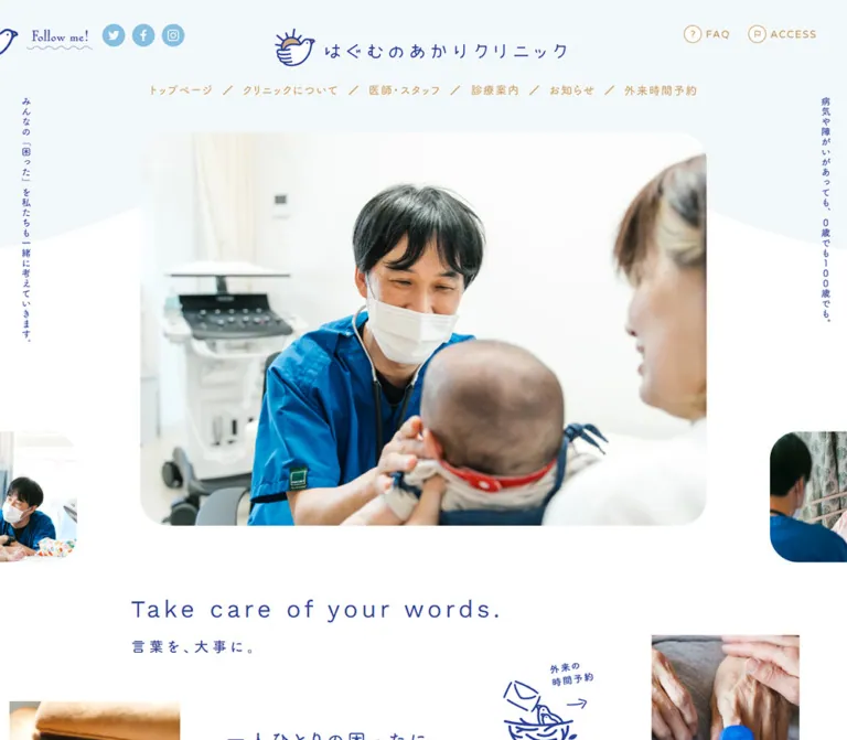
白と青を基調に、丸ゴシック、診療風景の写真、鳥の線画を組み合わせたクリニックサイト。広い余白と端末ごとに組み替わる診療案内・予約導線が特徴。
オリジナルサイトを見るSpacious blue lettering, rounded photographs, and a small bird make everyday medical care feel approachable.
Website: hagumu-akari.com Original URL: https://hagumu-akari.com/ Final URL: https://hagumu-akari.com/ Theme: light, with a white canvas, pale blue supporting surfaces, indigo text and actions, and a separate teal treatment for the sister clinic. Inspected: September 23, 2026, 00:44 JST; supplied retrieval timestamp: September 22, 2026, 15:44:16.376 UTC. Viewports: desktop 1440 × 1000 and mobile 390 × 844 CSS pixels. Scope: the current clinic homepage: opening composition, philosophy copy, concept feature, five services, appointment and access information, news, sister-clinic announcement, footer, and floating controls. Current screenshots cover the desktop opening, services, and footer, plus the mobile opening and footer. Additional sections are documented through the supplied rendered DOM and computed styles. Detail pages and external booking flows were not inspected.
The homepage presents a working medical practice through photographs of clinicians, children, families, and home care. Indigo establishes identity and navigation; gray carries explanatory prose; muted brown marks supporting labels and directions. Rounded Japanese lettering, generous tracking, and unusually relaxed paragraph leading soften the clinical subject matter without making the interface visually busy.
Its strongest structural feature is the relationship between spacious editorial content and compact practical controls. A large photograph occupies most of the desktop opening, while booking and news remain close to the viewport edges. Services use a deliberate three-plus-two arrangement. On mobile, the composition is reorganized: branding moves below the opening photograph, the three principal services stack, the two specialties remain side by side, and booking controls become a vertical rail.
Spacious blue lettering, rounded photographs, and a small bird make everyday medical care feel approachable.
Website: hagumu-akari.com Original URL: https://hagumu-akari.com/ Final URL: https://hagumu-akari.com/ Theme: light, with a white canvas, pale blue supporting surfaces, indigo text and actions, and a separate teal treatment for the sister clinic. Inspected: September 23, 2026, 00:44 JST; supplied retrieval timestamp: September 22, 2026, 15:44:16.376 UTC. Viewports: desktop 1440 × 1000 and mobile 390 × 844 CSS pixels. Scope: the current clinic homepage: opening composition, philosophy copy, concept feature, five services, appointment and access information, news, sister-clinic announcement, footer, and floating controls. Current screenshots cover the desktop opening, services, and footer, plus the mobile opening and footer. Additional sections are documented through the supplied rendered DOM and computed styles. Detail pages and external booking flows were not inspected.
The homepage presents a working medical practice through photographs of clinicians, children, families, and home care. Indigo establishes identity and navigation; gray carries explanatory prose; muted brown marks supporting labels and directions. Rounded Japanese lettering, generous tracking, and unusually relaxed paragraph leading soften the clinical subject matter without making the interface visually busy.
Its strongest structural feature is the relationship between spacious editorial content and compact practical controls. A large photograph occupies most of the desktop opening, while booking and news remain close to the viewport edges. Services use a deliberate three-plus-two arrangement. On mobile, the composition is reorganized: branding moves below the opening photograph, the three principal services stack, the two specialties remain side by side, and booking controls become a vertical rail.
| Name | Value | Source or reference token | Evidence and role |
|---|---|---|---|
| White canvas | #FFFFFF |
Source --color-bg; alias --color-paper |
Declared and measured on the body. Main page background and open spaces between sections. |
| Clinic indigo | #2C4198 |
Source --color-blue; alias --color-ink |
Declared and measured on headings, service links, footer text, and filled buttons. |
| Body gray | #565656 |
Source --color-font; alias --color-body |
Declared and measured on descriptive paragraphs. |
| Secondary gray | #777777 |
Source --color-font-light |
Declared; specific visible usage was not established by the supplied element sample. |
| Booking blue | #649DCD |
Alias --color-booking |
Measured as rgb(100, 157, 205) on the desktop floating appointment button. |
| Pale blue | #F8FCFF |
Source --color-blue-light; alias --color-mist |
Declared and measured on the mobile services section. The opening also has a pale blue family of tones, but its precise surface color was not separately measured. |
| Pale blue rule | #DDECF4 |
Source --color-border-blue; alias --color-rule |
Declared; consistent with the subtle dotted separators visible between services and above the desktop footer. Individual rule colors were not separately measured. |
| Muted brown | #BE8B4C |
Source --color-brown; alias --color-accent |
Declared and measured on booking annotations, parking headings, and route links. Navigation artwork visually uses the same color family. |
| Sister-clinic teal | #006F74 |
Source --color-green; alias --color-teal |
Declared and measured on the sister-clinic link and location text. |
| Pale teal | #F3FAFA |
Source --color-green-light; alias --color-teal-wash |
Declared and visually consistent with the sister-clinic panel. Its container background was not included as a computed measurement. |
| Yellow accent | #FFD951 |
Source --color-yellow |
Declared. Small yellow details appear in the identity and illustrated booking treatment; exact asset-to-token mapping is unverified. |
| Social blue | Approximately #83BFDC |
Recommended alias --color-social |
Screenshot estimate for the circular social icons. No exact computed fill was supplied. |
Indigo is both the identity color and the strongest action color. It appears in the bird outline, clinic name, major headings, service pills, news pill, phone control, and footer. Explanatory prose stays gray, allowing indigo text to signal a destination or a stronger information level.
Brown is a supporting navigation and annotation color. Teal is localized to the sister-clinic announcement rather than distributed across unrelated services. The three principal services share the same indigo treatment; they are distinguished through photography and labels rather than separate category colors.
The supplied properties also include generic editor gradients, black borders, and shadow presets. These do not establish an active visual theme. The current screenshots show flat surfaces without a general gradient or shadow system.
Measured primary family: FOT-筑紫A丸ゴシック Std D.
The source --font-gothic stack continues through Japanese system fallbacks including 游ゴシック Medium, Yu Gothic Medium, 游ゴシック体, YuGothic, Hiragino Sans, ヒラギノ角ゴ ProN, Hiragino Kaku Gothic ProN, メイリオ, Meiryo, and sans-serif.
This stack is present in the computed styles of body text, service headings, buttons, phone numbers, and most links. Computed family strings establish the requested font stack; they do not independently confirm which downloaded font supplied every glyph.
Most sampled text uses font-weight 400. Hierarchy comes primarily from size, color, tracking, position, and space. Avoid interpreting every heading as a heavy bold style.
--font-gothic-b names FOT-筑紫A丸ゴシック Std B with the same fallback sequence. It is measured on the concept heading and selected directional or sister-clinic links.--font-gothic-m names FOT-筑紫A丸ゴシック Std M. It is declared, but a specific application was not demonstrated in the supplied element sample.font-weight: 400. The family variant and CSS numerical weight should not be conflated.The page declares --font-sans: 'Varela Round', sans-serif and --font-sans-num: 'Work Sans', sans-serif.
Their exact application is not established by the supplied child-element measurements. In particular, the measured phone-number links use the Japanese primary stack. Do not automatically assign Work Sans to phone numbers or claim that the English philosophy line uses Varela Round.
The bird mark, clinic wordmark, several navigation labels, and small illustrated labels are graphical elements. Preserve authorized original artwork when reproducing the existing identity. Ordinary text set in the primary font will not exactly reproduce the logo or the handwritten Follow me! treatment.
Values below are measured unless explicitly qualified. Tracking is shown in em, calculated from the supplied pixel values.
| Role | Desktop size / line height | Mobile size / line height | Tracking, desktop → mobile |
|---|---|---|---|
| Body baseline | 14 / 14px |
14 / 14px |
Normal; this is inherited baseline styling, not paragraph leading |
| Philosophy statement | 30 / 52.5px |
21 / 37.8px |
0.18em → 0.16em |
| Philosophy paragraphs | 16 / 32px |
14 / 28px |
0.10em → 0.06em |
| Concept-feature heading | 37 / 37px |
17 / 17px |
0.24em → 0.14em; B family |
| Concept-feature paragraph | 18 / 36px |
11 / 18.15px |
0.12em → 0.04em |
| Five-services heading | 32 / 32px |
21 / 21px |
0.18em at both sizes |
| Booking-availability annotation | 22 / 22px |
14 / 14px |
0.10em |
| Principal service title | 18 / 27px |
16 / 24px |
0.12em → 0.10em |
| Principal service description | 14 / 25.2px |
13 / 22.75px |
0.02em |
| Specialty description | 14 / 23.8px |
12 / 19.8px |
0.02em |
| Individual service pill | 16 / 16px |
Not present in the mobile service sequence | 0.10em |
| Mobile service-directory pill | Not present in the sampled desktop sequence | 14 / 14px |
0.10em |
| News title | 20 / 32px |
14 / 21px |
0.08em |
| Floating notice | 16 / 25.6px |
12 / 19.2px |
0.05em → 0.04em; mobile weight 600 |
| Sister-clinic paragraph | 16 / 30.4px |
13 / 23.4px |
0.10em → 0.05em |
| Footer phone number | 19 / 19px |
18 / 28.8px |
0.08em → 0.04em |
| Footer booking pill | 14 / 14px |
13 / 13px |
0.10em |
The two desktop specialty titles use 17px / 25.5px with 0.12em tracking. On mobile, the development title uses 16px / 24px; the longer endocrine/kidney title uses 14px / 21px and wraps onto two lines.
The bilingual philosophy heading wrapper reports 21px on both viewports, but its internal English and Japanese lettering was not separately measured. Do not treat that wrapper value as a complete specification for both visible lines.
Density: broad section spacing, moderately narrow reading columns, and compact controls. Spacing system: no authoritative base-unit scale was supplied. The layout uses several different percentage insets and fixed widths.
| Use | Value | Evidence |
|---|---|---|
| Desktop footer outer inset | 40px |
Measured footer padding |
| Desktop notice left inset | 40px |
Measured link position |
| Desktop floating controls bottom clearance | 30px |
Calculated from their y: 928px, 42px height, and a 1000px viewport |
| Mobile philosophy inset | 42.89px per side |
Measured; approximately 11% of viewport width |
| Mobile services outer inset | 19.5px per side |
Measured; 5% of viewport width |
| Mobile principal service content inset | 27.5px from viewport edge |
Measured content position; 8px inside the services inset |
| Mobile footer inset | 31.19px per side |
Measured; approximately 8% of viewport width |
| Mobile services section padding | 65px top, 60px bottom |
Measured |
| Desktop principal service gap | 80px |
Calculated between 300px columns at x = 190, 570, and 950 |
| Desktop specialty image-to-copy gap | Approximately 34px |
Image width estimated at 190px; copy starts at x = 414 after an image starting at x = 190 |
| Mobile specialty column gap | 20px |
Calculated from 157.5px columns starting at x = 27.5 and 205 |
| Desktop major section intervals | Commonly 130–200px |
Calculated from sampled section boundaries |
| Main content to footer | 200px desktop; 150px mobile |
Measured difference between main-content end and footer start |
| Element | Value | Status |
|---|---|---|
| Filled service and booking pills | 30px |
Measured CSS radius |
| Desktop phone control | 50% on a 42 × 42px box |
Measured |
| Mobile phone control | 50% on a 45 × 45px box |
Measured |
| Main desktop photograph | Approximately 44–46px |
Screenshot estimate |
| Main mobile photograph | Approximately 30px |
Screenshot estimate |
| Service photographs | Approximately 7–8px |
Screenshot estimate |
| Sister-clinic panel | Approximately 8px |
Screenshot estimate |
| Social icons and mobile menu disc | Circular | Screenshot observation |
Large hero corners, modest service-image corners, and fully rounded actions have different jobs. Retain those three levels rather than applying one radius to every component.
| Element | Desktop | Mobile | Evidence |
|---|---|---|---|
| Full document | About 6639.3px high |
About 6629.5px high |
Measured body rectangles |
| Header element | 174.25px high |
184.95px high |
Measured; overlapping artwork makes this different from the visible opening composition |
| Central opening photograph | About 950 × 660px, x = 245, y = 210 |
About 312 × 217px, x = 39, y = 75 |
Screenshot estimates |
| Philosophy heading wrapper | 928px wide |
304.22px wide |
Measured |
| Philosophy main copy | 777px wide, x = 408 |
304.22px wide, x = 42.89 |
Measured |
| Principal service content | Three 300px columns |
Three vertically arranged 335px columns |
Measured text widths and positions |
| Specialty copy | Two 263px text columns beside photographs |
Two 157.5px columns |
Measured |
| Access/schedule section | 1150px wide |
Full-width section with internal insets | Measured |
| News section | 1020px wide |
390px outer section with 29.25px padding |
Measured |
| Footer | 469px high |
528.52px high |
Measured |
Role: identify the clinic and expose site-wide navigation, social accounts, and practical utilities.
The desktop header has three horizontal zones: a social cluster at the upper left, a centered horizontal bird-and-wordmark lockup, and FAQ / ACCESS at the upper right. A second centered row contains the main navigation, separated visually by short diagonal brown strokes.
The main destinations are the homepage, clinic information, doctors/staff, services, news, and WEB予約・問診. These are navigation entries for a multi-page clinic website. Their sampled link boxes include generous padding; many visible labels are graphics rather than directly measurable text.
Desktop social links have 43 × 43px boxes with 5px padding, consistent with roughly 33px visible circular icons. On mobile, the upper-left link boxes are 29 × 34px; the artwork is approximately 24px across.
The mobile opening omits the desktop navigation row and shows a blue circular menu control at the upper right, with loose white horizontal strokes and adjacent bird artwork extending toward the viewport edge. This control remains visible in the mobile footer capture. Its opened state, animation, focus handling, and navigation layout were not exercised.
Service and booking submenu destinations exist in the desktop DOM. Several submenu rectangles have zero height, so their presence must not be treated as evidence of a visible open menu.
Role: introduce the people and care setting before the detailed information.
On desktop, a large rounded photograph sits centrally below the logo and navigation. The current opening shows a clinician in blue scrubs examining a baby, with a caregiver at the right. Smaller photographic portions peek in from the left and right edges near the lower half of the main image.
The surrounding pale blue area has a broad curved boundary against the white page. Narrow vertical Japanese statements sit near both viewport edges. Their placement makes the photograph feel framed by the clinic's outlook without placing a large headline over faces.
On mobile, the principal image occupies about 80% of the viewport width. The bird and stacked clinic name appear below the photograph, followed by the small brown specialty label 小児科・訪問診療. The desktop vertical side statements are absent from the supplied mobile opening.
The mobile image shows adjoining portions of a clinician photograph and an older patient's photograph. This could be an intermediate image-change state; a still capture does not establish the transition method. Preserve the observed rounded aperture and side peeks without assuming a particular slider library, autoplay interval, or swipe behavior.
Role: express the practice's approach through readable editorial copy.
The introduction begins with Take care of your words. and 言葉を、大事に。. A larger two-line Japanese statement follows, then several gray paragraphs explaining the clinic's approach to patients and families.
Desktop alignment is intentionally staggered: the heading wrapper begins around x = 257, while the main statement and paragraphs begin at x = 408. The body column is 777px wide. The large statement uses indigo, 30px type, 52.5px leading, and substantial tracking.
On mobile, these elements share an approximately 304px column with 11% side insets. The statement becomes 21px / 37.8px; paragraphs become 14px / 28px. Line breaks are deliberately short and calm.
An illustrated booking link sits to the right of this content. Its measured link box changes from 222 × 222px on desktop to 68 × 100px on mobile. The mobile artwork includes a blue nurturing-themed drawing, a small yellow circular accent, and the label 外来の時間予約. It is separate from the persistent booking rail.
Role: provide a second, more visual expression of the clinic's philosophy and link to the clinic-information page.
The rendered DOM identifies a heading, short paragraph, and concept link, all in white. The heading uses the B font family variant. Its section measures 827px high on desktop and 307px on mobile.
The supplied current screenshots do not directly show this section's full background or artwork. Its white typography and dimensions are measured; the exact underlying imagery, layering, and decorative treatment remain unverified. Do not infer its appearance solely from the large section height or from white text.
The mobile concept paragraph is only 11px. A new implementation can increase this size, but doing so is an accessibility adaptation rather than an exact reproduction.
Role: explain the available care and provide direct routes to each service.
The heading はぐむの5つの柱 is paired with the brown annotation 〈WEB予約可能〉. Desktop places these on one line; mobile places the smaller annotation beneath the heading.
The three principal services are general pediatrics, home visits, and home rehabilitation. Each desktop item contains:
300 × 215px by visual estimate.18px / 27px.14px / 25.2px.16px label.The items sit directly on white, without enclosing card fills or shadows. Pale dotted vertical rules divide the three columns. Each pill measures 304 × 42px, extending 2px beyond either side of its 300px content column.
Below them, development consultation and pediatric endocrine/kidney care form two horizontal items. Each pairs an approximately 190px square photograph with 263px of text. Titles are left aligned, and the 267 × 42px pills align beneath the copy. A dotted vertical rule separates these two groups.
The mobile version is structurally different:
335px content columns.13px / 22.75px, with 10px horizontal paragraph padding.157.5px columns, with smaller descriptions and a wrapped long title.診療一覧 pill measuring 339 × 44px.#F8FCFF background and 65px / 60px top/bottom padding.This mixed arrangement is a defining responsive feature. An implementation that stacks all five services identically would lose the observed hierarchy.
Role: keep the most frequently needed actions available while reading.
The desktop opening and services captures show a lower-right group: a 42px indigo phone circle, a 150 × 42px blue 外来予約 pill, and a matching 事前問診 pill. They sit approximately 30px above the viewport bottom.
The appointment link points to the clinic's external DoctorQube booking destination. The desktop phone-shaped control points to #footer-info, while the mobile phone control uses tel:093-616-0666. These are different actions despite the shared phone symbol.
On mobile, three approximately 45px circular controls form a vertical rail at the right edge. The appointment and intake controls appear as white circles with indigo outlines and compact stacked labels. The lower phone control is filled indigo. The measured appointment position is x = 330, y = 684; the phone is at x = 330, y = 786 in the 390 × 844 viewport.
The DOM supplies distinct general and specialist intake URLs on desktop. Their reveal mechanism was not tested. Do not assume that the intake control navigates directly to one form or that it opens on hover.
The floating group is absent from the final footer captures. Its exact suppression rule is unknown; the screenshots establish the end state, not the JavaScript mechanism.
Role: surface the latest announcement without replacing the main content.
A narrow indigo capsule sits at the lower left. The desktop notice includes a date and title, with measured 16px / 25.6px text, 0.05em tracking, and 8px 28px 9px link padding. The actual background and rounded edge appear to belong to a surrounding element; the sampled anchor itself reports a transparent background and zero radius.
On mobile, the visible date is omitted and the notice becomes approximately 32px high, with 12px / 19.2px text and weight 600. Its measured left inset is 16px.
The opening mobile capture shows very little clearance between this notice, the contact rail, and page text. For a new implementation, reserve adequate space and prevent the controls from covering reading content. No scrolling ticker behavior was demonstrated.
Role: turn the welcoming presentation into practical visit information.
The rendered content contains a weekly reception-hours table, reservation explanations, a booking link, parking information, address, two phone numbers, route link, and an online-consultation note. The desktop section is 1150px wide; its lower information area uses two broad columns, with measured copy widths of approximately 476px and 469px.
The table includes morning, appointment-period, and late-afternoon rows, along with weekday headings and availability markers. The flattened text does not preserve all cell relationships reliably. It should not be used alone to rebuild a clinical schedule.
The main booking link is another indigo pill. It measures approximately 313 × 42px in the desktop information area and 347 × 41px on mobile. Brown headings identify online booking and parking information; phone numbers and address text are indigo.
No current screenshot directly covers the complete timetable or its surrounding imagery. Table border treatments, map presentation, and image placement are therefore not fully established. Implement a semantic table from authoritative structured schedule data, and validate its small-screen behavior separately.
Role: provide a small, current editorial feed.
The supplied DOM contains three dated entries followed by おしらせ 一覧. Desktop entry links are 1020px wide and 60px high, using flex layout. Dates sit before indigo titles, which use 20px / 32px text.
Mobile switches each entry to block layout. The title uses 14px / 21px; entry height grows from 62px to 83px when the longer title wraps. The dates remain in this full news list even though the floating notice omits its date on mobile.
The index link is a broad indigo capsule: approximately 1056 × 57px on desktop and 343.5 × 44px on mobile. Detailed row ornaments were not separately captured, so do not invent arrows or divider styling beyond the evidence.
Role: introduce the related clinic as a distinct destination within the same visual family.
The desktop panel combines a clinic-interior photograph on the left with a teal identity lockup, opening date, paragraph, and underlined arrow link on the right. A vertical location label sits near the panel's right edge. The visible photograph contains warm wood, tree murals, and furnishings at child height.
The panel is approximately 1055px wide, with around 60px inner spacing on desktop. These dimensions are screenshot estimates. The measured paragraph width is 511px, with 16px / 30.4px text and 0.10em tracking.
Mobile places the image/identity content and description in a narrower vertical arrangement. The visible panel is about 351px wide with approximately 30px inner spacing. The paragraph measures 287px wide and uses 13px / 23.4px; the teal destination link uses 15px text.
This is a pale teal inset panel with a modest corner radius. Its destination is the sister-clinic domain linked by the original homepage; that destination was not inspected.
Role: end the page with a concise identity statement, navigation, and complete contact information.
Desktop uses three broad zones beneath a pale dotted horizontal rule:
一人ひとりの 困ったを、一緒に。, horizontal social circles, and the sister-clinic link.The footer remains white and uses indigo for almost all text. It does not introduce a dark closing band.
Mobile removes the visible sitemap columns. The copyright appears above the statement, followed by the clinic identity and contact details. Social icons become a vertical group at the right of the lower contact area. The booking pill measures 260 × 37px; the sister-clinic link follows beneath it.
The mobile menu disc remains at the upper right in the footer capture, while the floating news and booking group are absent. Preserve the distinction between the menu control and the booking rail when implementing their visibility rules.
| Treatment | Supplied evidence | Practical interpretation |
|---|---|---|
| Desktop link transitions | Many sampled anchors report 0.15s ease-out |
A measured duration and easing, but no verified hover-property changes or end states |
| Mobile transitions | Sampled anchors generally report all without an explicit positive duration |
Insufficient evidence for a mobile animation timing token |
| Sampled element animations | Most sampled text and layout elements report animation: none |
Does not rule out animation on image children, pseudo-elements, or JavaScript-controlled layers |
| Opening photograph changes | Desktop and mobile show different image compositions; mobile includes adjoining photo portions | Possible image-changing behavior; timing, direction, trigger, and pause controls unverified |
| Floating controls during scrolling | Present in opening/middle captures and absent at the footer | Visibility change evidenced; exact threshold and implementation unknown |
| Mobile menu | Closed control visible in both mobile captures | Open state, transition, keyboard behavior, and focus handling unverified |
| Service/booking submenus | Destinations present in DOM; some rectangles have zero height | Content exists, but opening interaction is unverified |
| Booking, route, and phone links | Link destinations recorded | Destination intent is known; completion of external flows was not tested |
The capture procedure waited for document load, image decoding, and sampled layout/text stability, and traversed intermediate scroll positions. Perpetual animations were temporarily paused during readiness checks and resumed. This supports settled visual observations, but it does not establish complete motion behavior or rule out delayed content.
Recommended motion approach: use the measured 150ms ease-out timing for restrained link feedback, keep any new menu transition short, and provide reduced-motion handling. Do not invent parallax, spring motion, or automatic image timing as source behavior.
| Layer | Appearance | Evidence and purpose |
|---|---|---|
| Page canvas | White | Measured body background; supports broad open spaces |
| Opening surround | Very pale blue with a broad curved white boundary | Screenshot observation; exact curve and fill not measured |
| Desktop service area | White with pale dotted separators | Screenshot observation; no enclosing elevated cards |
| Mobile service area | #F8FCFF |
Measured section background |
| Filled destination controls | Indigo with white labels and pill geometry | Measured service, booking, and news-index controls |
| Desktop floating appointment controls | #649DCD with white labels |
Measured appointment control and visual sibling treatment |
| Mobile booking controls | White circular faces with indigo outlines | Screenshot observation |
| Sister-clinic panel | Pale teal with teal identity and link | Screenshot observation supported by declared palette and measured text colors |
| Footer | White with indigo content | Current desktop/mobile screenshots |
| Concept feature | White text over an unverified underlying treatment | Typography measured; full surface not captured |
There is no observed general elevation system. Separation comes from space, pale fills, dotted rules, photograph boundaries, and changes in alignment.
The photographs show care being delivered: a clinician leaning toward a baby, a home-care setting with medical equipment, rehabilitation with a child, a consultation at a table, and families gathered in the clinic. Blue scrubs connect the images to the interface palette. Skin tones, wood, curtains, toys, and daylight keep the page warm.
Use natural color and preserve the relationship between clinician, patient, and caregiver. Cropping should maintain faces, hands, and the interaction that explains each service. The current images are not monochrome or visibly processed into a uniform color overlay.
The bird mark uses indigo linework, a sun-like yellow detail, and a wing with a hand-like contour. Related blue line illustrations appear around booking and navigation. Their irregularity complements the rounded typography; it should not be replaced wholesale with unrelated generic medical icons.
No image src URLs, SVG filenames, or downloadable asset paths were supplied. The table identifies visual assets from the current captures rather than inventing paths.
| Asset | Visible subject or treatment | Role |
|---|---|---|
| Clinic identity | Indigo bird outline, small warm accent, spaced Japanese wordmark | Header, mobile opening, and footer |
| Main opening photograph | Clinician in blue scrubs examining a baby with a caregiver nearby | Desktop first impression |
| Other opening photo portions | Home-care and older-patient imagery | Mobile opening and peripheral image peeks |
| Pediatrics photograph | Baby being examined | Principal service |
| Home-visits photograph | Caregiver/clinician with a child and medical equipment | Principal service |
| Rehabilitation photograph | Adult supporting a child during activity | Principal service |
| Development photograph | Child at a consultation table | Specialty service |
| Endocrine/kidney-care photograph | Small group of adults and children in the clinic | Specialty service |
| Sister-clinic photograph | Wood ceiling, tree murals, bright interior | Related-clinic announcement |
| Illustrated booking link | Blue line illustration, small arrow and yellow detail | Editorial booking invitation |
| Social icons | White platform symbols on pale blue circles | Header, information area, and footer |
Use original photography and identity artwork only when authorized. For a new clinic, commission equivalent scenes and a distinct identity while preserving the compositional principles.
The page is a long clinic homepage with multiple information tasks. Its measured document coordinates show the section rhythm:
| Section | Desktop start / height | Mobile start / height |
|---|---|---|
| Philosophy introduction | 983.5 / 570px |
457.0 / 788.3px |
| Concept feature | 1733.5 / 827px |
1320.4 / 307px |
| Five services | 2690.5 / 851.8px |
1627.4 / 1904.4px |
| Schedule and access | 3682.3 / 1263.0px |
3531.8 / 1438.1px |
| News | 5105.3 / 328px |
5044.9 / 306px |
| End of main content | 5970.3px |
5951.0px |
| Footer | 6170.3 / 469px |
6101.0 / 528.5px |
These are observations of document positions, not recommended absolute CSS offsets. Content changes should be allowed to change section heights naturally.
The nearly equal desktop and mobile document heights conceal major reflow. The opening and concept feature become much shorter on mobile, while the services section becomes substantially taller.
| Area | Desktop | Mobile |
|---|---|---|
| Identity | Horizontal lockup above the main photograph | Stacked identity below the photograph |
| Navigation | Centered row plus corner utilities | Circular menu control; open menu unverified |
| Opening photograph | Approximately 950px wide |
Approximately 80vw, or 312px at the inspected width |
| Edge statements | Vertical text at both sides | Absent from the supplied opening capture |
| Philosophy alignment | Offset heading and copy columns | Shared 78%-width column |
| Main services | Three columns on white | Three stacked items on pale blue |
| Specialties | Two horizontal image/copy groups | Two compact columns with images above copy |
| Service destinations | Five repeated pills | Linked titles/images plus one directory pill |
| News entries | Date and title in a flex row | Date above title |
| Booking controls | Horizontal pills and phone circle | Vertical circular rail |
| Footer | Statement, sitemap, contact columns | Statement and contact stack; sitemap not visible |
| Footer social links | Horizontal under the statement | Vertical at the right of contact content |
No exact original breakpoint was provided. The Quick Start uses a recommended 64rem switch to demonstrate these transformations. It must be tested at intermediate widths; it is not recovered source CSS.
#2C4198 consistently for identity, major headings, links, and strong action fills.These are recommendations for a new implementation, not verified features of the original site:
44px target.11px concept text and 12px specialty text. Rebalance spacing after increasing them.#FFFFFF.#2C4198.#565656.#649DCD.#F8FCFF.#DDECF4.#BE8B4C.#006F74 / #F3FAFA.#83BFDC; this is an estimate.“Create a welcoming Japanese clinic homepage for pediatrics and home care. Use a white canvas, indigo #2C4198, gray prose, pale blue supporting surfaces, and restrained brown annotations. Use a licensed rounded Japanese font with mostly regular weight, generous tracking, and spacious paragraph leading. Place a large rounded care photograph beneath a centered identity, with small photographic peeks at the outer edges. Build three principal service columns followed by two horizontal specialty groups, separated by fine dotted rules. On mobile, move the identity beneath the opening image, stack the three main services, retain a two-column specialty row, and replace repeated service pills with one directory link. Include compact booking controls, dated news, a pale teal sister-clinic panel, and a white footer with complete contact information. Use distinct authorized photography and identity artwork.”
診療一覧 pill beneath the group.”This is a recommended implementation scaffold, not extracted source code. Exact colors, typography values, pill radii, and selected dimensions follow the measured evidence. Hero geometry, social blue, image ratios, and the 64rem breakpoint are approximations or implementation choices.
Use .primary-services for the three main .service items. Use .secondary-services for two .specialty items, each containing an image and .specialty__copy. Give the longer specialty title the modifier .specialty__title--long. Place the single mobile directory link in .services__index.
The CSS does not fetch images or fonts. Supply authorized assets and appropriate semantic markup. Menu behavior, image changes, intake disclosure, and footer-aware control visibility require separate implementation. The [hidden] rules support a visibility controller without assuming how the original site implements it.
:root {
  /* Measured colors and source-declared palette values */
  --color-paper: #ffffff;
  --color-ink: #2c4198;
  --color-body: #565656;
  --color-muted: #777777;
  --color-booking: #649dcd;
  --color-mist: #f8fcff;
  --color-rule: #ddecf4;
  --color-accent: #be8b4c;
  --color-teal: #006f74;
  --color-teal-wash: #f3fafa;
  --color-yellow: #ffd951;

  /* Screenshot estimate */
  --color-social: #83bfdc;

  /* Source font names require an appropriate licensed font setup */
  --font-clinic: 'FOT-筑紫A丸ゴシック Std D',
    '游ゴシック Medium', 'Yu Gothic Medium', '游ゴシック体',
    YuGothic, 'Hiragino Sans', 'ヒラギノ角ゴ ProN',
    'Hiragino Kaku Gothic ProN', 'メイリオ', Meiryo, sans-serif;
  --font-clinic-alt: 'FOT-筑紫A丸ゴシック Std B',
    'Yu Gothic Medium', 'Hiragino Sans', Meiryo, sans-serif;

  /* Layout aliases derived from the inspected composition */
  --content-width: 1060px;
  --wide-width: 1150px;
  --hero-width: 950px;
  --gutter: 40px;
  --section-space: 140px;
  --radius-pill: 30px;
  --radius-photo: 44px;
  --radius-small: 8px;
  --motion-link: 150ms ease-out;
  --safe-bottom: env(safe-area-inset-bottom, 0px);
}

* { box-sizing: border-box; }

body {
  margin: 0;
  color: var(--color-body);
  background: var(--color-paper);
  font-family: var(--font-clinic);
  font-size: 14px;
  font-weight: 400;
  line-height: 1.8;
}

img { display: block; max-inline-size: 100%; block-size: auto; }
button, input, select, textarea { font: inherit; }
a { color: inherit; text-underline-offset: 0.22em; }
h1, h2, h3, p { margin: 0; }
h1, h2, h3 { font-weight: 400; }

.container {
  inline-size: min(var(--content-width), calc(100% - 2 * var(--gutter)));
  margin-inline: auto;
}

.container--wide { --content-width: var(--wide-width); }
.section { margin-block-start: var(--section-space); }

.pill {
  display: inline-flex;
  align-items: center;
  justify-content: center;
  gap: 10px;
  min-block-size: 42px;
  padding: 11px 28px 15px;
  border: 0;
  border-radius: var(--radius-pill);
  color: white;
  background: var(--color-ink);
  font-size: 16px;
  line-height: 1;
  letter-spacing: 0.1em;
  text-align: center;
  text-decoration: none;
  transition: background-color var(--motion-link), color var(--motion-link);
}

/* Recommended feedback; the original hover end state is unverified */
@media (hover: hover) {
  .pill:hover { text-decoration: underline; }
}

/* Approximation of the observed opening geometry */
.hero {
  position: relative;
  isolation: isolate;
  overflow: clip;
  padding-block-start: 210px;
}

.hero::before,
.hero::after {
  content: '';
  position: absolute;
  z-index: -1;
  pointer-events: none;
}

.hero::before {
  inset: 0 0 auto;
  block-size: 410px;
  background: var(--color-mist);
}

.hero::after {
  inset-block-start: 220px;
  inset-inline-start: -15%;
  inline-size: 130%;
  block-size: 400px;
  border-radius: 50% 50% 0 0;
  background: var(--color-paper);
}

.hero__photo {
  inline-size: min(var(--hero-width), calc(100% - 80px));
  aspect-ratio: 95 / 66;
  margin: 0 auto;
  overflow: hidden;
  border-radius: var(--radius-photo);
}

.hero__photo img {
  inline-size: 100%;
  block-size: 100%;
  object-fit: cover;
}

.hero__brand-mobile { display: none; }

.intro {
  inline-size: min(928px, calc(100% - 80px));
  margin: 110px auto 0;
  color: var(--color-ink);
}

.intro__copy { margin-block-start: 110px; padding-inline-start: 151px; }
.intro__statement { font-size: 30px; line-height: 1.75; letter-spacing: 0.18em; }
.intro__paragraphs { margin-block-start: 34px; }
.intro__paragraphs p {
  color: var(--color-body);
  font-size: 16px;
  line-height: 2;
  letter-spacing: 0.1em;
}
.intro__paragraphs p + p { margin-block-start: 10px; }

.services__heading {
  display: flex;
  justify-content: center;
  align-items: baseline;
  gap: 16px;
  margin-block-end: 80px;
  text-align: center;
}

.services__heading h2 {
  color: var(--color-ink);
  font-size: 32px;
  line-height: 1;
  letter-spacing: 0.18em;
}

.services__note {
  color: var(--color-accent);
  font-size: 22px;
  line-height: 1.3;
  letter-spacing: 0.1em;
}

.primary-services {
  display: grid;
  grid-template-columns: repeat(3, minmax(0, 1fr));
  gap: 80px;
}

.service { position: relative; display: flex; flex-direction: column; min-inline-size: 0; }
.service + .service::before {
  content: '';
  position: absolute;
  inset-block: 0;
  inset-inline-start: -40px;
  border-inline-start: 1px dotted var(--color-rule);
}

.service__image {
  inline-size: 100%;
  aspect-ratio: 7 / 5;
  object-fit: cover;
  border-radius: var(--radius-small);
}

.service__title {
  margin-block: 22px 14px;
  color: var(--color-ink);
  font-size: 18px;
  line-height: 1.5;
  letter-spacing: 0.12em;
  text-align: center;
}

.service__title a,
.specialty__title a { text-decoration: none; }

.service__description {
  flex: 1;
  font-size: 14px;
  line-height: 1.8;
  letter-spacing: 0.02em;
}

.service > .pill {
  inline-size: calc(100% + 4px);
  margin-block-start: 26px;
  margin-inline-start: -2px;
}

.secondary-services {
  display: grid;
  grid-template-columns: repeat(2, minmax(0, 1fr));
  gap: 86px;
  margin-block-start: 74px;
}

.specialty {
  position: relative;
  display: grid;
  grid-template-columns: 190px minmax(0, 1fr);
  gap: 34px;
  min-inline-size: 0;
}

.specialty + .specialty::before {
  content: '';
  position: absolute;
  inset-block: 0;
  inset-inline-start: -43px;
  border-inline-start: 1px dotted var(--color-rule);
}

.specialty__image {
  inline-size: 100%;
  aspect-ratio: 1;
  object-fit: cover;
  border-radius: var(--radius-small);
}

.specialty__title {
  margin-block-end: 8px;
  color: var(--color-ink);
  font-size: 17px;
  line-height: 1.5;
  letter-spacing: 0.12em;
}

.specialty__description { font-size: 14px; line-height: 1.7; letter-spacing: 0.02em; }
.specialty__copy > .pill {
  inline-size: calc(100% + 4px);
  margin-block-start: 24px;
  margin-inline-start: -2px;
}
.services__index { display: none; }

.sister-panel {
  display: grid;
  grid-template-columns: 370px minmax(0, 1fr);
  gap: 52px;
  padding: 60px;
  border-radius: var(--radius-small);
  background: var(--color-teal-wash);
}
.sister-panel__image { inline-size: 100%; border-radius: var(--radius-small); }
.sister-panel__copy { font-size: 16px; line-height: 1.9; letter-spacing: 0.1em; }
.sister-panel__link { display: inline-block; margin-block-start: 18px; color: var(--color-teal); }

.booking-rail {
  position: fixed;
  z-index: 50;
  inset-inline-end: 45px;
  inset-block-end: calc(30px + var(--safe-bottom));
  display: flex;
  align-items: center;
  gap: 12px;
}

.booking-rail__action {
  display: grid;
  place-items: center;
  inline-size: 150px;
  min-block-size: 42px;
  padding: 5px 12px;
  border: 0;
  border-radius: 30px;
  color: white;
  background: var(--color-booking);
  font-size: 16px;
  line-height: 1.25;
  letter-spacing: 0.08em;
  text-align: center;
  text-decoration: none;
}

.booking-rail__phone {
  inline-size: 42px;
  block-size: 42px;
  margin-inline-end: 2px;
  border-radius: 50%;
  background: var(--color-ink);
}

.notice {
  position: fixed;
  z-index: 40;
  inset-inline-start: 40px;
  inset-block-end: calc(30px + var(--safe-bottom));
  max-inline-size: min(550px, calc(100vw - 470px));
  padding: 8px 28px 9px;
  overflow: hidden;
  border-radius: 30px;
  color: white;
  background: var(--color-ink);
  font-size: 16px;
  line-height: 1.6;
  letter-spacing: 0.05em;
  white-space: nowrap;
  text-overflow: ellipsis;
  text-decoration: none;
}
.notice__date { margin-inline-end: 16px; }
.booking-rail[hidden], .notice[hidden] { display: none; }

.site-footer {
  position: relative;
  display: grid;
  grid-template-columns: 320px minmax(0, 1fr) 352px;
  gap: 60px;
  inline-size: calc(100% - 80px);
  margin: 200px auto 0;
  padding: 60px 20px;
  border-block-start: 1px dotted var(--color-rule);
  color: var(--color-ink);
}
.site-footer__statement { font-size: 28px; line-height: 1.8; letter-spacing: 0.16em; }
.site-footer__phone { font-size: 19px; line-height: 1.6; letter-spacing: 0.08em; white-space: nowrap; }
.site-footer__route { color: var(--color-accent); }

/* Recommended breakpoint; the original threshold is unknown */
@media (max-width: 64rem) {
  :root { --gutter: 20px; --section-space: 75px; }

  .hero { padding-block-start: 75px; }
  .hero::before { block-size: 250px; }
  .hero::after { inset-block-start: 170px; block-size: 180px; }
  .hero__photo { inline-size: 80%; border-radius: 30px; }
  .hero__brand-mobile {
    position: relative;
    display: block;
    inline-size: 164px;
    margin: -20px auto 0;
  }

  .intro { inline-size: 78%; margin-block-start: 40px; }
  .intro__copy { margin-block-start: 28px; padding-inline-start: 0; }
  .intro__statement { font-size: 21px; line-height: 1.8; letter-spacing: 0.16em; }
  .intro__paragraphs { margin-block-start: 26px; }
  .intro__paragraphs p { font-size: 14px; line-height: 2; letter-spacing: 0.06em; }
  .intro__paragraphs p + p { margin-block-start: 11px; }

  .services { padding-block: 65px 60px; background: var(--color-mist); }
  .services > .container { inline-size: calc(90% - 16px); }
  .services__heading { display: block; margin-block-end: 37px; }
  .services__heading h2 { font-size: 21px; }
  .services__note { display: block; margin-block-start: 15px; font-size: 14px; }
  .primary-services { grid-template-columns: minmax(0, 1fr); gap: 48px; }
  .service + .service::before,
  .specialty + .specialty::before { display: none; }
  .service__title { margin-block: 15px 12px; padding-block-start: 8px; font-size: 16px; letter-spacing: 0.1em; }
  .service__description { padding-inline: 10px; font-size: 13px; line-height: 1.75; }
  .service > .pill,
  .specialty__copy > .pill { display: none; }

  .secondary-services { gap: 20px; margin-block-start: 40px; }
  .specialty { display: block; }
  .specialty__title {
    min-block-size: 42px;
    margin-block: 12px 10px;
    font-size: 16px;
    line-height: 1.5;
    letter-spacing: 0.1em;
    text-align: center;
  }
  .specialty__title--long { font-size: 14px; }
  .specialty__description { font-size: 12px; line-height: 1.65; }
  .services__index {
    display: flex;
    inline-size: calc(100% + 4px);
    min-block-size: 44px;
    margin: 44px 0 0 -2px;
    font-size: 14px;
  }

  .sister-panel { grid-template-columns: minmax(0, 1fr); gap: 24px; padding: 30px; }
  .sister-panel__copy { font-size: 13px; line-height: 1.8; letter-spacing: 0.05em; }
  .sister-panel__link { font-size: 15px; letter-spacing: 0.07em; }

  .booking-rail {
    inset-inline-end: 15px;
    inset-block-end: calc(13px + var(--safe-bottom));
    flex-direction: column;
    gap: 6px;
  }
  .booking-rail__action {
    inline-size: 45px;
    block-size: 45px;
    min-block-size: 45px;
    padding: 3px;
    border: 1.5px solid var(--color-ink);
    border-radius: 50%;
    color: var(--color-ink);
    background: white;
    font-size: 12px;
    line-height: 1.2;
    letter-spacing: 0;
  }
  .booking-rail__phone { order: 3; margin: 0; color: white; background: var(--color-ink); }

  /* Adapted clearance avoids the overlap visible in the source capture */
  .notice {
    inset-inline-start: 16px;
    inset-block-end: calc(18px + var(--safe-bottom));
    max-inline-size: calc(100vw - 90px);
    padding: 7px 17px 6px;
    font-size: 12px;
    font-weight: 600;
    letter-spacing: 0.04em;
  }
  .notice__date { display: none; }

  .site-footer {
    grid-template-columns: minmax(0, 1fr);
    gap: 30px;
    inline-size: 84%;
    margin-block-start: 150px;
    padding: 0 0 42px;
    border: 0;
  }
  .site-footer__sitemap { display: none; }
  .site-footer__statement { font-size: 21px; }
  .site-footer__phone { font-size: 18px; letter-spacing: 0.04em; }
}

/* Recommended accessibility additions */
:where(a, button, input, select, textarea):focus-visible {
  outline: 2px solid var(--color-ink);
  outline-offset: 4px;
}

html { scroll-padding-block-end: 180px; }

@media (prefers-reduced-motion: reduce) {
  .pill, .booking-rail__action { transition: none; }
}
The CSS intentionally leaves the concept feature's unverified background unspecified. It also does not fabricate the original navigation graphics, peripheral photograph positions, menu contents, or timetable decoration. Build those from authorized assets and additional direct evidence when fidelity is required.
Optional aliases for a project already using Tailwind v4. Define the custom properties above first. This is a recommended mapping, not a claim that the original site uses Tailwind.
@theme inline {
  --color-clinic-paper: var(--color-paper);
  --color-clinic-ink: var(--color-ink);
  --color-clinic-body: var(--color-body);
  --color-clinic-booking: var(--color-booking);
  --color-clinic-mist: var(--color-mist);
  --color-clinic-rule: var(--color-rule);
  --color-clinic-accent: var(--color-accent);
  --color-clinic-teal: var(--color-teal);
  --color-clinic-teal-wash: var(--color-teal-wash);

  --font-clinic-ui: var(--font-clinic);
  --font-clinic-alternate: var(--font-clinic-alt);

  --radius-clinic-pill: var(--radius-pill);
  --radius-clinic-photo: var(--radius-photo);
  --radius-clinic-small: var(--radius-small);

  --text-clinic-body: 14px;
  --text-clinic-service: 18px;
  --text-clinic-statement: 30px;
}
200 and no URL change.2026-09-22T15:44:16.376Z, corresponding to September 23, 2026, 00:44:16 JST.1440 × 1000, covering the opening, services, and footer; rendered text, link destinations, custom properties, and computed element rectangles/styles. Measured body height: approximately 6639.28px.390 × 844, covering the opening and footer; rendered text, link destinations, custom properties, and computed element rectangles/styles. Measured body height: approximately 6629.47px.This reference describes the current homepage represented by the supplied inspection. Estimated geometry and recommended implementation code are labeled separately from directly measured values.
# Hagumu no Akari Clinic — Style Reference

> Spacious blue lettering, rounded photographs, and a small bird make everyday medical care feel approachable.

**Website:** [hagumu-akari.com](https://hagumu-akari.com/)
**Original URL:** https://hagumu-akari.com/
**Final URL:** https://hagumu-akari.com/
**Theme:** light, with a white canvas, pale blue supporting surfaces, indigo text and actions, and a separate teal treatment for the sister clinic.
**Inspected:** September 23, 2026, 00:44 JST; supplied retrieval timestamp: September 22, 2026, 15:44:16.376 UTC.
**Viewports:** desktop **1440 × 1000** and mobile **390 × 844** CSS pixels.
**Scope:** the current clinic homepage: opening composition, philosophy copy, concept feature, five services, appointment and access information, news, sister-clinic announcement, footer, and floating controls. Current screenshots cover the desktop opening, services, and footer, plus the mobile opening and footer. Additional sections are documented through the supplied rendered DOM and computed styles. Detail pages and external booking flows were not inspected.

The homepage presents a working medical practice through photographs of clinicians, children, families, and home care. Indigo establishes identity and navigation; gray carries explanatory prose; muted brown marks supporting labels and directions. Rounded Japanese lettering, generous tracking, and unusually relaxed paragraph leading soften the clinical subject matter without making the interface visually busy.

Its strongest structural feature is the relationship between spacious editorial content and compact practical controls. A large photograph occupies most of the desktop opening, while booking and news remain close to the viewport edges. Services use a deliberate three-plus-two arrangement. On mobile, the composition is reorganized: branding moves below the opening photograph, the three principal services stack, the two specialties remain side by side, and booking controls become a vertical rail.
# Hagumu no Akari Clinic — Style Reference

> Spacious blue lettering, rounded photographs, and a small bird make everyday medical care feel approachable.

**Website:** [hagumu-akari.com](https://hagumu-akari.com/)
**Original URL:** https://hagumu-akari.com/
**Final URL:** https://hagumu-akari.com/
**Theme:** light, with a white canvas, pale blue supporting surfaces, indigo text and actions, and a separate teal treatment for the sister clinic.
**Inspected:** September 23, 2026, 00:44 JST; supplied retrieval timestamp: September 22, 2026, 15:44:16.376 UTC.
**Viewports:** desktop **1440 × 1000** and mobile **390 × 844** CSS pixels.
**Scope:** the current clinic homepage: opening composition, philosophy copy, concept feature, five services, appointment and access information, news, sister-clinic announcement, footer, and floating controls. Current screenshots cover the desktop opening, services, and footer, plus the mobile opening and footer. Additional sections are documented through the supplied rendered DOM and computed styles. Detail pages and external booking flows were not inspected.

The homepage presents a working medical practice through photographs of clinicians, children, families, and home care. Indigo establishes identity and navigation; gray carries explanatory prose; muted brown marks supporting labels and directions. Rounded Japanese lettering, generous tracking, and unusually relaxed paragraph leading soften the clinical subject matter without making the interface visually busy.

Its strongest structural feature is the relationship between spacious editorial content and compact practical controls. A large photograph occupies most of the desktop opening, while booking and news remain close to the viewport edges. Services use a deliberate three-plus-two arrangement. On mobile, the composition is reorganized: branding moves below the opening photograph, the three principal services stack, the two specialties remain side by side, and booking controls become a vertical rail.

## How to Read This Reference

- **Measured** means a value appears in the supplied computed styles or element rectangles. Measurements are CSS pixels unless stated otherwise.
- **Estimated** means a dimension, color, or shape is judged from a current screenshot. These values are approximate, not recovered CSS declarations.
- **Declared** means a custom property exists in the supplied page data. Its presence alone does not prove that a particular visible element uses it.
- **Recommended** means implementation guidance for a new site, including the Quick Start CSS. Recommendations are not claims about the original implementation.
- Token aliases introduced here are descriptive. Source variable names are identified explicitly.
- Several logos and navigation labels are graphical. An inline link rectangle measuring only 20px high does not describe the full image inside it. Screenshot estimates are used for visible artwork where image rectangles were not supplied.
- The evidence includes desktop and mobile endpoints, but no tablet inspection or original media-query rules. Exact breakpoint locations remain unknown.

## Tokens — Colors

### Default Palette

| Name | Value | Source or reference token | Evidence and role |
| --- | --- | --- | --- |
| White canvas | `#FFFFFF` | Source `--color-bg`; alias `--color-paper` | Declared and measured on the body. Main page background and open spaces between sections. |
| Clinic indigo | `#2C4198` | Source `--color-blue`; alias `--color-ink` | Declared and measured on headings, service links, footer text, and filled buttons. |
| Body gray | `#565656` | Source `--color-font`; alias `--color-body` | Declared and measured on descriptive paragraphs. |
| Secondary gray | `#777777` | Source `--color-font-light` | Declared; specific visible usage was not established by the supplied element sample. |
| Booking blue | `#649DCD` | Alias `--color-booking` | Measured as `rgb(100, 157, 205)` on the desktop floating appointment button. |
| Pale blue | `#F8FCFF` | Source `--color-blue-light`; alias `--color-mist` | Declared and measured on the mobile services section. The opening also has a pale blue family of tones, but its precise surface color was not separately measured. |
| Pale blue rule | `#DDECF4` | Source `--color-border-blue`; alias `--color-rule` | Declared; consistent with the subtle dotted separators visible between services and above the desktop footer. Individual rule colors were not separately measured. |
| Muted brown | `#BE8B4C` | Source `--color-brown`; alias `--color-accent` | Declared and measured on booking annotations, parking headings, and route links. Navigation artwork visually uses the same color family. |
| Sister-clinic teal | `#006F74` | Source `--color-green`; alias `--color-teal` | Declared and measured on the sister-clinic link and location text. |
| Pale teal | `#F3FAFA` | Source `--color-green-light`; alias `--color-teal-wash` | Declared and visually consistent with the sister-clinic panel. Its container background was not included as a computed measurement. |
| Yellow accent | `#FFD951` | Source `--color-yellow` | Declared. Small yellow details appear in the identity and illustrated booking treatment; exact asset-to-token mapping is unverified. |
| Social blue | Approximately `#83BFDC` | Recommended alias `--color-social` | Screenshot estimate for the circular social icons. No exact computed fill was supplied. |

### Color Hierarchy

Indigo is both the identity color and the strongest action color. It appears in the bird outline, clinic name, major headings, service pills, news pill, phone control, and footer. Explanatory prose stays gray, allowing indigo text to signal a destination or a stronger information level.

Brown is a supporting navigation and annotation color. Teal is localized to the sister-clinic announcement rather than distributed across unrelated services. The three principal services share the same indigo treatment; they are distinguished through photography and labels rather than separate category colors.

The supplied properties also include generic editor gradients, black borders, and shadow presets. These do not establish an active visual theme. The current screenshots show flat surfaces without a general gradient or shadow system.

## Tokens — Typography

### Rounded Japanese Text

**Measured primary family:** `FOT-筑紫A丸ゴシック Std D`.

The source `--font-gothic` stack continues through Japanese system fallbacks including `游ゴシック Medium`, `Yu Gothic Medium`, `游ゴシック体`, `YuGothic`, `Hiragino Sans`, `ヒラギノ角ゴ ProN`, `Hiragino Kaku Gothic ProN`, `メイリオ`, `Meiryo`, and `sans-serif`.

This stack is present in the computed styles of body text, service headings, buttons, phone numbers, and most links. Computed family strings establish the requested font stack; they do not independently confirm which downloaded font supplied every glyph.

Most sampled text uses **font-weight 400**. Hierarchy comes primarily from size, color, tracking, position, and space. Avoid interpreting every heading as a heavy bold style.

### Alternate Family Variants

- Source `--font-gothic-b` names `FOT-筑紫A丸ゴシック Std B` with the same fallback sequence. It is measured on the concept heading and selected directional or sister-clinic links.
- Source `--font-gothic-m` names `FOT-筑紫A丸ゴシック Std M`. It is declared, but a specific application was not demonstrated in the supplied element sample.
- Elements using the B family still report `font-weight: 400`. The family variant and CSS numerical weight should not be conflated.

### Latin and Numeral Families

The page declares `--font-sans: 'Varela Round', sans-serif` and `--font-sans-num: 'Work Sans', sans-serif`.

Their exact application is not established by the supplied child-element measurements. In particular, the measured phone-number links use the Japanese primary stack. Do not automatically assign Work Sans to phone numbers or claim that the English philosophy line uses Varela Round.

### Graphical Lettering

The bird mark, clinic wordmark, several navigation labels, and small illustrated labels are graphical elements. Preserve authorized original artwork when reproducing the existing identity. Ordinary text set in the primary font will not exactly reproduce the logo or the handwritten `Follow me!` treatment.

### Type Scale

Values below are measured unless explicitly qualified. Tracking is shown in `em`, calculated from the supplied pixel values.

| Role | Desktop size / line height | Mobile size / line height | Tracking, desktop → mobile |
| --- | --- | --- | --- |
| Body baseline | `14 / 14px` | `14 / 14px` | Normal; this is inherited baseline styling, not paragraph leading |
| Philosophy statement | `30 / 52.5px` | `21 / 37.8px` | `0.18em → 0.16em` |
| Philosophy paragraphs | `16 / 32px` | `14 / 28px` | `0.10em → 0.06em` |
| Concept-feature heading | `37 / 37px` | `17 / 17px` | `0.24em → 0.14em`; B family |
| Concept-feature paragraph | `18 / 36px` | `11 / 18.15px` | `0.12em → 0.04em` |
| Five-services heading | `32 / 32px` | `21 / 21px` | `0.18em` at both sizes |
| Booking-availability annotation | `22 / 22px` | `14 / 14px` | `0.10em` |
| Principal service title | `18 / 27px` | `16 / 24px` | `0.12em → 0.10em` |
| Principal service description | `14 / 25.2px` | `13 / 22.75px` | `0.02em` |
| Specialty description | `14 / 23.8px` | `12 / 19.8px` | `0.02em` |
| Individual service pill | `16 / 16px` | Not present in the mobile service sequence | `0.10em` |
| Mobile service-directory pill | Not present in the sampled desktop sequence | `14 / 14px` | `0.10em` |
| News title | `20 / 32px` | `14 / 21px` | `0.08em` |
| Floating notice | `16 / 25.6px` | `12 / 19.2px` | `0.05em → 0.04em`; mobile weight `600` |
| Sister-clinic paragraph | `16 / 30.4px` | `13 / 23.4px` | `0.10em → 0.05em` |
| Footer phone number | `19 / 19px` | `18 / 28.8px` | `0.08em → 0.04em` |
| Footer booking pill | `14 / 14px` | `13 / 13px` | `0.10em` |

The two desktop specialty titles use `17px / 25.5px` with `0.12em` tracking. On mobile, the development title uses `16px / 24px`; the longer endocrine/kidney title uses `14px / 21px` and wraps onto two lines.

The bilingual philosophy heading wrapper reports `21px` on both viewports, but its internal English and Japanese lettering was not separately measured. Do not treat that wrapper value as a complete specification for both visible lines.

## Tokens — Spacing & Shapes

**Density:** broad section spacing, moderately narrow reading columns, and compact controls.
**Spacing system:** no authoritative base-unit scale was supplied. The layout uses several different percentage insets and fixed widths.

### Spacing Scale

| Use | Value | Evidence |
| --- | --- | --- |
| Desktop footer outer inset | `40px` | Measured footer padding |
| Desktop notice left inset | `40px` | Measured link position |
| Desktop floating controls bottom clearance | `30px` | Calculated from their `y: 928px`, `42px` height, and a `1000px` viewport |
| Mobile philosophy inset | `42.89px` per side | Measured; approximately `11%` of viewport width |
| Mobile services outer inset | `19.5px` per side | Measured; `5%` of viewport width |
| Mobile principal service content inset | `27.5px` from viewport edge | Measured content position; `8px` inside the services inset |
| Mobile footer inset | `31.19px` per side | Measured; approximately `8%` of viewport width |
| Mobile services section padding | `65px` top, `60px` bottom | Measured |
| Desktop principal service gap | `80px` | Calculated between `300px` columns at x = `190`, `570`, and `950` |
| Desktop specialty image-to-copy gap | Approximately `34px` | Image width estimated at `190px`; copy starts at x = `414` after an image starting at x = `190` |
| Mobile specialty column gap | `20px` | Calculated from `157.5px` columns starting at x = `27.5` and `205` |
| Desktop major section intervals | Commonly `130–200px` | Calculated from sampled section boundaries |
| Main content to footer | `200px` desktop; `150px` mobile | Measured difference between main-content end and footer start |

### Border Radius

| Element | Value | Status |
| --- | --- | --- |
| Filled service and booking pills | `30px` | Measured CSS radius |
| Desktop phone control | `50%` on a `42 × 42px` box | Measured |
| Mobile phone control | `50%` on a `45 × 45px` box | Measured |
| Main desktop photograph | Approximately `44–46px` | Screenshot estimate |
| Main mobile photograph | Approximately `30px` | Screenshot estimate |
| Service photographs | Approximately `7–8px` | Screenshot estimate |
| Sister-clinic panel | Approximately `8px` | Screenshot estimate |
| Social icons and mobile menu disc | Circular | Screenshot observation |

Large hero corners, modest service-image corners, and fully rounded actions have different jobs. Retain those three levels rather than applying one radius to every component.

### Layout Measurements

| Element | Desktop | Mobile | Evidence |
| --- | --- | --- | --- |
| Full document | About `6639.3px` high | About `6629.5px` high | Measured body rectangles |
| Header element | `174.25px` high | `184.95px` high | Measured; overlapping artwork makes this different from the visible opening composition |
| Central opening photograph | About `950 × 660px`, x = `245`, y = `210` | About `312 × 217px`, x = `39`, y = `75` | Screenshot estimates |
| Philosophy heading wrapper | `928px` wide | `304.22px` wide | Measured |
| Philosophy main copy | `777px` wide, x = `408` | `304.22px` wide, x = `42.89` | Measured |
| Principal service content | Three `300px` columns | Three vertically arranged `335px` columns | Measured text widths and positions |
| Specialty copy | Two `263px` text columns beside photographs | Two `157.5px` columns | Measured |
| Access/schedule section | `1150px` wide | Full-width section with internal insets | Measured |
| News section | `1020px` wide | `390px` outer section with `29.25px` padding | Measured |
| Footer | `469px` high | `528.52px` high | Measured |

## Components

### Desktop Header and Mobile Menu Control

**Role:** identify the clinic and expose site-wide navigation, social accounts, and practical utilities.

The desktop header has three horizontal zones: a social cluster at the upper left, a centered horizontal bird-and-wordmark lockup, and `FAQ` / `ACCESS` at the upper right. A second centered row contains the main navigation, separated visually by short diagonal brown strokes.

The main destinations are the homepage, clinic information, doctors/staff, services, news, and `WEB予約・問診`. These are navigation entries for a multi-page clinic website. Their sampled link boxes include generous padding; many visible labels are graphics rather than directly measurable text.

Desktop social links have `43 × 43px` boxes with `5px` padding, consistent with roughly `33px` visible circular icons. On mobile, the upper-left link boxes are `29 × 34px`; the artwork is approximately `24px` across.

The mobile opening omits the desktop navigation row and shows a blue circular menu control at the upper right, with loose white horizontal strokes and adjacent bird artwork extending toward the viewport edge. This control remains visible in the mobile footer capture. Its opened state, animation, focus handling, and navigation layout were not exercised.

Service and booking submenu destinations exist in the desktop DOM. Several submenu rectangles have zero height, so their presence must not be treated as evidence of a visible open menu.

### Photographic Opening

**Role:** introduce the people and care setting before the detailed information.

On desktop, a large rounded photograph sits centrally below the logo and navigation. The current opening shows a clinician in blue scrubs examining a baby, with a caregiver at the right. Smaller photographic portions peek in from the left and right edges near the lower half of the main image.

The surrounding pale blue area has a broad curved boundary against the white page. Narrow vertical Japanese statements sit near both viewport edges. Their placement makes the photograph feel framed by the clinic's outlook without placing a large headline over faces.

On mobile, the principal image occupies about `80%` of the viewport width. The bird and stacked clinic name appear below the photograph, followed by the small brown specialty label `小児科・訪問診療`. The desktop vertical side statements are absent from the supplied mobile opening.

The mobile image shows adjoining portions of a clinician photograph and an older patient's photograph. This could be an intermediate image-change state; a still capture does not establish the transition method. Preserve the observed rounded aperture and side peeks without assuming a particular slider library, autoplay interval, or swipe behavior.

### Philosophy Introduction

**Role:** express the practice's approach through readable editorial copy.

The introduction begins with `Take care of your words.` and `言葉を、大事に。`. A larger two-line Japanese statement follows, then several gray paragraphs explaining the clinic's approach to patients and families.

Desktop alignment is intentionally staggered: the heading wrapper begins around x = `257`, while the main statement and paragraphs begin at x = `408`. The body column is `777px` wide. The large statement uses indigo, `30px` type, `52.5px` leading, and substantial tracking.

On mobile, these elements share an approximately `304px` column with `11%` side insets. The statement becomes `21px / 37.8px`; paragraphs become `14px / 28px`. Line breaks are deliberately short and calm.

An illustrated booking link sits to the right of this content. Its measured link box changes from `222 × 222px` on desktop to `68 × 100px` on mobile. The mobile artwork includes a blue nurturing-themed drawing, a small yellow circular accent, and the label `外来の時間予約`. It is separate from the persistent booking rail.

### Concept Feature

**Role:** provide a second, more visual expression of the clinic's philosophy and link to the clinic-information page.

The rendered DOM identifies a heading, short paragraph, and concept link, all in white. The heading uses the B font family variant. Its section measures `827px` high on desktop and `307px` on mobile.

The supplied current screenshots do not directly show this section's full background or artwork. Its white typography and dimensions are measured; the exact underlying imagery, layering, and decorative treatment remain unverified. Do not infer its appearance solely from the large section height or from white text.

The mobile concept paragraph is only `11px`. A new implementation can increase this size, but doing so is an accessibility adaptation rather than an exact reproduction.

### Five-Service Arrangement

**Role:** explain the available care and provide direct routes to each service.

The heading `はぐむの5つの柱` is paired with the brown annotation `〈WEB予約可能〉`. Desktop places these on one line; mobile places the smaller annotation beneath the heading.

The three principal services are general pediatrics, home visits, and home rehabilitation. Each desktop item contains:

1. A linked landscape photograph, approximately `300 × 215px` by visual estimate.
2. A centered indigo title at `18px / 27px`.
3. A gray description at `14px / 25.2px`.
4. A full-width indigo pill with a white `16px` label.

The items sit directly on white, without enclosing card fills or shadows. Pale dotted vertical rules divide the three columns. Each pill measures `304 × 42px`, extending `2px` beyond either side of its `300px` content column.

Below them, development consultation and pediatric endocrine/kidney care form two horizontal items. Each pairs an approximately `190px` square photograph with `263px` of text. Titles are left aligned, and the `267 × 42px` pills align beneath the copy. A dotted vertical rule separates these two groups.

The mobile version is structurally different:

- The first three services stack in `335px` content columns.
- Their descriptions use `13px / 22.75px`, with `10px` horizontal paragraph padding.
- The two specialties remain side by side in `157.5px` columns, with smaller descriptions and a wrapped long title.
- The five repeated desktop pills are absent from the rendered mobile sequence. Linked images and titles remain, followed by one `診療一覧` pill measuring `339 × 44px`.
- The entire services section gains a measured `#F8FCFF` background and `65px / 60px` top/bottom padding.

This mixed arrangement is a defining responsive feature. An implementation that stacks all five services identically would lose the observed hierarchy.

### Floating Booking and Contact Controls

**Role:** keep the most frequently needed actions available while reading.

The desktop opening and services captures show a lower-right group: a `42px` indigo phone circle, a `150 × 42px` blue `外来予約` pill, and a matching `事前問診` pill. They sit approximately `30px` above the viewport bottom.

The appointment link points to the clinic's external DoctorQube booking destination. The desktop phone-shaped control points to `#footer-info`, while the mobile phone control uses `tel:093-616-0666`. These are different actions despite the shared phone symbol.

On mobile, three approximately `45px` circular controls form a vertical rail at the right edge. The appointment and intake controls appear as white circles with indigo outlines and compact stacked labels. The lower phone control is filled indigo. The measured appointment position is x = `330`, y = `684`; the phone is at x = `330`, y = `786` in the `390 × 844` viewport.

The DOM supplies distinct general and specialist intake URLs on desktop. Their reveal mechanism was not tested. Do not assume that the intake control navigates directly to one form or that it opens on hover.

The floating group is absent from the final footer captures. Its exact suppression rule is unknown; the screenshots establish the end state, not the JavaScript mechanism.

### Floating News Notice

**Role:** surface the latest announcement without replacing the main content.

A narrow indigo capsule sits at the lower left. The desktop notice includes a date and title, with measured `16px / 25.6px` text, `0.05em` tracking, and `8px 28px 9px` link padding. The actual background and rounded edge appear to belong to a surrounding element; the sampled anchor itself reports a transparent background and zero radius.

On mobile, the visible date is omitted and the notice becomes approximately `32px` high, with `12px / 19.2px` text and weight `600`. Its measured left inset is `16px`.

The opening mobile capture shows very little clearance between this notice, the contact rail, and page text. For a new implementation, reserve adequate space and prevent the controls from covering reading content. No scrolling ticker behavior was demonstrated.

### Schedule, Booking, and Access Information

**Role:** turn the welcoming presentation into practical visit information.

The rendered content contains a weekly reception-hours table, reservation explanations, a booking link, parking information, address, two phone numbers, route link, and an online-consultation note. The desktop section is `1150px` wide; its lower information area uses two broad columns, with measured copy widths of approximately `476px` and `469px`.

The table includes morning, appointment-period, and late-afternoon rows, along with weekday headings and availability markers. The flattened text does not preserve all cell relationships reliably. It should not be used alone to rebuild a clinical schedule.

The main booking link is another indigo pill. It measures approximately `313 × 42px` in the desktop information area and `347 × 41px` on mobile. Brown headings identify online booking and parking information; phone numbers and address text are indigo.

No current screenshot directly covers the complete timetable or its surrounding imagery. Table border treatments, map presentation, and image placement are therefore not fully established. Implement a semantic table from authoritative structured schedule data, and validate its small-screen behavior separately.

### News List

**Role:** provide a small, current editorial feed.

The supplied DOM contains three dated entries followed by `おしらせ 一覧`. Desktop entry links are `1020px` wide and `60px` high, using flex layout. Dates sit before indigo titles, which use `20px / 32px` text.

Mobile switches each entry to block layout. The title uses `14px / 21px`; entry height grows from `62px` to `83px` when the longer title wraps. The dates remain in this full news list even though the floating notice omits its date on mobile.

The index link is a broad indigo capsule: approximately `1056 × 57px` on desktop and `343.5 × 44px` on mobile. Detailed row ornaments were not separately captured, so do not invent arrows or divider styling beyond the evidence.

### Sister-Clinic Announcement

**Role:** introduce the related clinic as a distinct destination within the same visual family.

The desktop panel combines a clinic-interior photograph on the left with a teal identity lockup, opening date, paragraph, and underlined arrow link on the right. A vertical location label sits near the panel's right edge. The visible photograph contains warm wood, tree murals, and furnishings at child height.

The panel is approximately `1055px` wide, with around `60px` inner spacing on desktop. These dimensions are screenshot estimates. The measured paragraph width is `511px`, with `16px / 30.4px` text and `0.10em` tracking.

Mobile places the image/identity content and description in a narrower vertical arrangement. The visible panel is about `351px` wide with approximately `30px` inner spacing. The paragraph measures `287px` wide and uses `13px / 23.4px`; the teal destination link uses `15px` text.

This is a pale teal inset panel with a modest corner radius. Its destination is the sister-clinic domain linked by the original homepage; that destination was not inspected.

### Footer and Social Links

**Role:** end the page with a concise identity statement, navigation, and complete contact information.

Desktop uses three broad zones beneath a pale dotted horizontal rule:

- Left: the two-line statement `一人ひとりの 困ったを、一緒に。`, horizontal social circles, and the sister-clinic link.
- Middle: a general navigation column and a service directory, accompanied by small copyright text.
- Right: the clinic identity, address, station-access note, phone numbers, online-consultation note, booking pill, and brown route link.

The footer remains white and uses indigo for almost all text. It does not introduce a dark closing band.

Mobile removes the visible sitemap columns. The copyright appears above the statement, followed by the clinic identity and contact details. Social icons become a vertical group at the right of the lower contact area. The booking pill measures `260 × 37px`; the sister-clinic link follows beneath it.

The mobile menu disc remains at the upper right in the footer capture, while the floating news and booking group are absent. Preserve the distinction between the menu control and the booking rail when implementing their visibility rules.

## Tokens — Motion & Interaction

| Treatment | Supplied evidence | Practical interpretation |
| --- | --- | --- |
| Desktop link transitions | Many sampled anchors report `0.15s ease-out` | A measured duration and easing, but no verified hover-property changes or end states |
| Mobile transitions | Sampled anchors generally report `all` without an explicit positive duration | Insufficient evidence for a mobile animation timing token |
| Sampled element animations | Most sampled text and layout elements report `animation: none` | Does not rule out animation on image children, pseudo-elements, or JavaScript-controlled layers |
| Opening photograph changes | Desktop and mobile show different image compositions; mobile includes adjoining photo portions | Possible image-changing behavior; timing, direction, trigger, and pause controls unverified |
| Floating controls during scrolling | Present in opening/middle captures and absent at the footer | Visibility change evidenced; exact threshold and implementation unknown |
| Mobile menu | Closed control visible in both mobile captures | Open state, transition, keyboard behavior, and focus handling unverified |
| Service/booking submenus | Destinations present in DOM; some rectangles have zero height | Content exists, but opening interaction is unverified |
| Booking, route, and phone links | Link destinations recorded | Destination intent is known; completion of external flows was not tested |

The capture procedure waited for document load, image decoding, and sampled layout/text stability, and traversed intermediate scroll positions. Perpetual animations were temporarily paused during readiness checks and resumed. This supports settled visual observations, but it does not establish complete motion behavior or rule out delayed content.

**Recommended motion approach:** use the measured `150ms ease-out` timing for restrained link feedback, keep any new menu transition short, and provide reduced-motion handling. Do not invent parallax, spring motion, or automatic image timing as source behavior.

## Surfaces

| Layer | Appearance | Evidence and purpose |
| --- | --- | --- |
| Page canvas | White | Measured body background; supports broad open spaces |
| Opening surround | Very pale blue with a broad curved white boundary | Screenshot observation; exact curve and fill not measured |
| Desktop service area | White with pale dotted separators | Screenshot observation; no enclosing elevated cards |
| Mobile service area | `#F8FCFF` | Measured section background |
| Filled destination controls | Indigo with white labels and pill geometry | Measured service, booking, and news-index controls |
| Desktop floating appointment controls | `#649DCD` with white labels | Measured appointment control and visual sibling treatment |
| Mobile booking controls | White circular faces with indigo outlines | Screenshot observation |
| Sister-clinic panel | Pale teal with teal identity and link | Screenshot observation supported by declared palette and measured text colors |
| Footer | White with indigo content | Current desktop/mobile screenshots |
| Concept feature | White text over an unverified underlying treatment | Typography measured; full surface not captured |

There is no observed general elevation system. Separation comes from space, pale fills, dotted rules, photograph boundaries, and changes in alignment.

## Imagery

The photographs show care being delivered: a clinician leaning toward a baby, a home-care setting with medical equipment, rehabilitation with a child, a consultation at a table, and families gathered in the clinic. Blue scrubs connect the images to the interface palette. Skin tones, wood, curtains, toys, and daylight keep the page warm.

Use natural color and preserve the relationship between clinician, patient, and caregiver. Cropping should maintain faces, hands, and the interaction that explains each service. The current images are not monochrome or visibly processed into a uniform color overlay.

The bird mark uses indigo linework, a sun-like yellow detail, and a wing with a hand-like contour. Related blue line illustrations appear around booking and navigation. Their irregularity complements the rounded typography; it should not be replaced wholesale with unrelated generic medical icons.

### Observed Asset References

No image `src` URLs, SVG filenames, or downloadable asset paths were supplied. The table identifies visual assets from the current captures rather than inventing paths.

| Asset | Visible subject or treatment | Role |
| --- | --- | --- |
| Clinic identity | Indigo bird outline, small warm accent, spaced Japanese wordmark | Header, mobile opening, and footer |
| Main opening photograph | Clinician in blue scrubs examining a baby with a caregiver nearby | Desktop first impression |
| Other opening photo portions | Home-care and older-patient imagery | Mobile opening and peripheral image peeks |
| Pediatrics photograph | Baby being examined | Principal service |
| Home-visits photograph | Caregiver/clinician with a child and medical equipment | Principal service |
| Rehabilitation photograph | Adult supporting a child during activity | Principal service |
| Development photograph | Child at a consultation table | Specialty service |
| Endocrine/kidney-care photograph | Small group of adults and children in the clinic | Specialty service |
| Sister-clinic photograph | Wood ceiling, tree murals, bright interior | Related-clinic announcement |
| Illustrated booking link | Blue line illustration, small arrow and yellow detail | Editorial booking invitation |
| Social icons | White platform symbols on pale blue circles | Header, information area, and footer |

Use original photography and identity artwork only when authorized. For a new clinic, commission equivalent scenes and a distinct identity while preserving the compositional principles.

## Layout & Responsive Behavior

### Document Structure

The page is a long clinic homepage with multiple information tasks. Its measured document coordinates show the section rhythm:

| Section | Desktop start / height | Mobile start / height |
| --- | --- | --- |
| Philosophy introduction | `983.5 / 570px` | `457.0 / 788.3px` |
| Concept feature | `1733.5 / 827px` | `1320.4 / 307px` |
| Five services | `2690.5 / 851.8px` | `1627.4 / 1904.4px` |
| Schedule and access | `3682.3 / 1263.0px` | `3531.8 / 1438.1px` |
| News | `5105.3 / 328px` | `5044.9 / 306px` |
| End of main content | `5970.3px` | `5951.0px` |
| Footer | `6170.3 / 469px` | `6101.0 / 528.5px` |

These are observations of document positions, not recommended absolute CSS offsets. Content changes should be allowed to change section heights naturally.

The nearly equal desktop and mobile document heights conceal major reflow. The opening and concept feature become much shorter on mobile, while the services section becomes substantially taller.

### Responsive Transformations

| Area | Desktop | Mobile |
| --- | --- | --- |
| Identity | Horizontal lockup above the main photograph | Stacked identity below the photograph |
| Navigation | Centered row plus corner utilities | Circular menu control; open menu unverified |
| Opening photograph | Approximately `950px` wide | Approximately `80vw`, or `312px` at the inspected width |
| Edge statements | Vertical text at both sides | Absent from the supplied opening capture |
| Philosophy alignment | Offset heading and copy columns | Shared `78%`-width column |
| Main services | Three columns on white | Three stacked items on pale blue |
| Specialties | Two horizontal image/copy groups | Two compact columns with images above copy |
| Service destinations | Five repeated pills | Linked titles/images plus one directory pill |
| News entries | Date and title in a flex row | Date above title |
| Booking controls | Horizontal pills and phone circle | Vertical circular rail |
| Footer | Statement, sitemap, contact columns | Statement and contact stack; sitemap not visible |
| Footer social links | Horizontal under the statement | Vertical at the right of contact content |

No exact original breakpoint was provided. The Quick Start uses a **recommended `64rem` switch** to demonstrate these transformations. It must be tested at intermediate widths; it is not recovered source CSS.

## Do’s and Don’ts

### Do

- Use `#2C4198` consistently for identity, major headings, links, and strong action fills.
- Keep explanatory prose gray and give it generous line height.
- Preserve regular-weight rounded Japanese typography and deliberate tracking.
- Let people and care interactions carry the main visual narrative.
- Keep the large rounded opening image distinct from smaller service-image corners.
- Preserve the desktop three-plus-two service hierarchy and its mixed mobile arrangement.
- Use pale dotted rules and whitespace to divide desktop services.
- Keep repeated appointment opportunities available in context and near the viewport edge.
- Treat the sister clinic as a localized teal variation.
- Maintain the white, information-rich footer and prominent phone/contact details.
- Distinguish measured text styles from graphical lettering and logo artwork.

### Don’t

- Don’t turn every service into an elevated card with a colored background.
- Don’t assign a different bright accent to each medical specialty.
- Don’t replace the modest heading scale with an oversized promotional headline.
- Don’t use heavy font weight as the primary hierarchy mechanism.
- Don’t crop out the patient–clinician relationship to fill arbitrary image boxes.
- Don’t flatten all five mobile services into identical stacked blocks.
- Don’t copy a 20px inline anchor height as the height of its photograph or logo.
- Don’t infer hover effects, menu transitions, or carousel timing from static captures.
- Don’t apply generic editor gradient and shadow presets merely because their variables exist.
- Don’t treat an image-only link's empty extracted text as proof that its accessible name is missing; inspect accessibility semantics separately.
- Don’t let floating controls obscure paragraphs or contact information in a new implementation.

## Recommended Implementation Additions

These are recommendations for a new implementation, not verified features of the original site:

- Give graphical navigation links, social controls, and the mobile menu explicit accessible names. Use a real button for menu or intake disclosure and expose its expanded state.
- Provide visible indigo focus outlines and preserve keyboard access to all service destinations.
- Increase small touch targets without enlarging their visible icon artwork. Several observed social-link boxes are below a comfortable `44px` target.
- Recheck contrast for small brown text and white text on the lighter booking blue. Preserve the palette through darker text or adjusted control colors where necessary.
- Consider larger mobile descriptions, especially the observed `11px` concept text and `12px` specialty text. Rebalance spacing after increasing them.
- Keep timetable data semantic and structurally complete. Provide a readable overflow strategy at narrow widths rather than shrinking essential schedule text excessively.
- Reserve space for floating controls and account for mobile safe areas. Coordinate their visibility with the complete contact block so they do not cover it.
- If automatic image changes are introduced, supply a pause mechanism and a reduced-motion/static alternative. Autoplay is not established by this evidence.
- Load licensed fonts through the appropriate provider and test the supplied system fallbacks. Do not assume that declaring the family makes the font available.
- Use meaningful image alternatives for care photographs. Keep purely decorative bird fragments and flourishes out of the accessibility tree.

## Agent Prompt Guide

### Quick Color Reference

- Main canvas: `#FFFFFF`.
- Clinic identity, strong links, and primary pills: `#2C4198`.
- Paragraphs: `#565656`.
- Floating desktop appointment fill: `#649DCD`.
- Mobile services background: `#F8FCFF`.
- Fine separators: `#DDECF4`.
- Supporting labels and route links: `#BE8B4C`.
- Sister-clinic identity and panel: `#006F74` / `#F3FAFA`.
- Social-circle color: approximately `#83BFDC`; this is an estimate.

### Overall Prompt

“Create a welcoming Japanese clinic homepage for pediatrics and home care. Use a white canvas, indigo `#2C4198`, gray prose, pale blue supporting surfaces, and restrained brown annotations. Use a licensed rounded Japanese font with mostly regular weight, generous tracking, and spacious paragraph leading. Place a large rounded care photograph beneath a centered identity, with small photographic peeks at the outer edges. Build three principal service columns followed by two horizontal specialty groups, separated by fine dotted rules. On mobile, move the identity beneath the opening image, stack the three main services, retain a two-column specialty row, and replace repeated service pills with one directory link. Include compact booking controls, dated news, a pale teal sister-clinic panel, and a white footer with complete contact information. Use distinct authorized photography and identity artwork.”

### Example Component Prompts

1. **Principal service:** “Create a flat service item with a softly rounded landscape care photograph, centered indigo title, gray description at approximately 14px with 1.8 line height, and a 42px indigo pill below. Use no enclosing card fill or shadow. Separate neighboring desktop items with pale dotted vertical rules.”
2. **Mobile services:** “At 390px wide, stack three main services in approximately 335px columns. Follow them with two 157.5px specialty columns separated by 20px. Use a pale blue section background, linked images and titles, and a single full-width `診療一覧` pill beneath the group.”
3. **Opening composition:** “Use a large naturally colored photograph of a clinician interacting with a patient inside a broad rounded aperture. Surround it with pale blue and white space. On desktop, place the identity above and narrow vertical statements at the sides; on mobile, use an approximately 80vw image and a stacked identity below. Keep movement unspecified unless requirements provide it.”
4. **Booking controls:** “Create compact indigo and blue booking actions. On desktop, use a phone circle and two horizontal pills; on mobile, use a right-side vertical stack of outlined circular appointment/intake controls and a filled phone control. Provide visible focus states, safe-area clearance, and no overlap with reading content.”
5. **Sister-clinic panel:** “Create a pale teal announcement with a warm clinic-interior photograph, teal identity, restrained opening-date label, gray paragraph, and underlined arrow link. Use a horizontal composition on desktop and a vertical arrangement on mobile, with modest rounded corners and no shadow.”
6. **Footer:** “Build a white clinic footer with an indigo two-line statement, small blue social circles, a service sitemap, and a contact block containing address, transit note, two phone numbers, booking pill, and brown directions link. On mobile, remove the visible sitemap columns, keep the contact stack, and place social icons in a narrow vertical group at the right.”

## Quick Start

### CSS Custom Properties

This is a **recommended implementation scaffold**, not extracted source code. Exact colors, typography values, pill radii, and selected dimensions follow the measured evidence. Hero geometry, social blue, image ratios, and the `64rem` breakpoint are approximations or implementation choices.

Use `.primary-services` for the three main `.service` items. Use `.secondary-services` for two `.specialty` items, each containing an image and `.specialty__copy`. Give the longer specialty title the modifier `.specialty__title--long`. Place the single mobile directory link in `.services__index`.

The CSS does not fetch images or fonts. Supply authorized assets and appropriate semantic markup. Menu behavior, image changes, intake disclosure, and footer-aware control visibility require separate implementation. The `[hidden]` rules support a visibility controller without assuming how the original site implements it.

```css
:root {
  /* Measured colors and source-declared palette values */
  --color-paper: #ffffff;
  --color-ink: #2c4198;
  --color-body: #565656;
  --color-muted: #777777;
  --color-booking: #649dcd;
  --color-mist: #f8fcff;
  --color-rule: #ddecf4;
  --color-accent: #be8b4c;
  --color-teal: #006f74;
  --color-teal-wash: #f3fafa;
  --color-yellow: #ffd951;

  /* Screenshot estimate */
  --color-social: #83bfdc;

  /* Source font names require an appropriate licensed font setup */
  --font-clinic: 'FOT-筑紫A丸ゴシック Std D',
    '游ゴシック Medium', 'Yu Gothic Medium', '游ゴシック体',
    YuGothic, 'Hiragino Sans', 'ヒラギノ角ゴ ProN',
    'Hiragino Kaku Gothic ProN', 'メイリオ', Meiryo, sans-serif;
  --font-clinic-alt: 'FOT-筑紫A丸ゴシック Std B',
    'Yu Gothic Medium', 'Hiragino Sans', Meiryo, sans-serif;

  /* Layout aliases derived from the inspected composition */
  --content-width: 1060px;
  --wide-width: 1150px;
  --hero-width: 950px;
  --gutter: 40px;
  --section-space: 140px;
  --radius-pill: 30px;
  --radius-photo: 44px;
  --radius-small: 8px;
  --motion-link: 150ms ease-out;
  --safe-bottom: env(safe-area-inset-bottom, 0px);
}

* { box-sizing: border-box; }

body {
  margin: 0;
  color: var(--color-body);
  background: var(--color-paper);
  font-family: var(--font-clinic);
  font-size: 14px;
  font-weight: 400;
  line-height: 1.8;
}

img { display: block; max-inline-size: 100%; block-size: auto; }
button, input, select, textarea { font: inherit; }
a { color: inherit; text-underline-offset: 0.22em; }
h1, h2, h3, p { margin: 0; }
h1, h2, h3 { font-weight: 400; }

.container {
  inline-size: min(var(--content-width), calc(100% - 2 * var(--gutter)));
  margin-inline: auto;
}

.container--wide { --content-width: var(--wide-width); }
.section { margin-block-start: var(--section-space); }

.pill {
  display: inline-flex;
  align-items: center;
  justify-content: center;
  gap: 10px;
  min-block-size: 42px;
  padding: 11px 28px 15px;
  border: 0;
  border-radius: var(--radius-pill);
  color: white;
  background: var(--color-ink);
  font-size: 16px;
  line-height: 1;
  letter-spacing: 0.1em;
  text-align: center;
  text-decoration: none;
  transition: background-color var(--motion-link), color var(--motion-link);
}

/* Recommended feedback; the original hover end state is unverified */
@media (hover: hover) {
  .pill:hover { text-decoration: underline; }
}

/* Approximation of the observed opening geometry */
.hero {
  position: relative;
  isolation: isolate;
  overflow: clip;
  padding-block-start: 210px;
}

.hero::before,
.hero::after {
  content: '';
  position: absolute;
  z-index: -1;
  pointer-events: none;
}

.hero::before {
  inset: 0 0 auto;
  block-size: 410px;
  background: var(--color-mist);
}

.hero::after {
  inset-block-start: 220px;
  inset-inline-start: -15%;
  inline-size: 130%;
  block-size: 400px;
  border-radius: 50% 50% 0 0;
  background: var(--color-paper);
}

.hero__photo {
  inline-size: min(var(--hero-width), calc(100% - 80px));
  aspect-ratio: 95 / 66;
  margin: 0 auto;
  overflow: hidden;
  border-radius: var(--radius-photo);
}

.hero__photo img {
  inline-size: 100%;
  block-size: 100%;
  object-fit: cover;
}

.hero__brand-mobile { display: none; }

.intro {
  inline-size: min(928px, calc(100% - 80px));
  margin: 110px auto 0;
  color: var(--color-ink);
}

.intro__copy { margin-block-start: 110px; padding-inline-start: 151px; }
.intro__statement { font-size: 30px; line-height: 1.75; letter-spacing: 0.18em; }
.intro__paragraphs { margin-block-start: 34px; }
.intro__paragraphs p {
  color: var(--color-body);
  font-size: 16px;
  line-height: 2;
  letter-spacing: 0.1em;
}
.intro__paragraphs p + p { margin-block-start: 10px; }

.services__heading {
  display: flex;
  justify-content: center;
  align-items: baseline;
  gap: 16px;
  margin-block-end: 80px;
  text-align: center;
}

.services__heading h2 {
  color: var(--color-ink);
  font-size: 32px;
  line-height: 1;
  letter-spacing: 0.18em;
}

.services__note {
  color: var(--color-accent);
  font-size: 22px;
  line-height: 1.3;
  letter-spacing: 0.1em;
}

.primary-services {
  display: grid;
  grid-template-columns: repeat(3, minmax(0, 1fr));
  gap: 80px;
}

.service { position: relative; display: flex; flex-direction: column; min-inline-size: 0; }
.service + .service::before {
  content: '';
  position: absolute;
  inset-block: 0;
  inset-inline-start: -40px;
  border-inline-start: 1px dotted var(--color-rule);
}

.service__image {
  inline-size: 100%;
  aspect-ratio: 7 / 5;
  object-fit: cover;
  border-radius: var(--radius-small);
}

.service__title {
  margin-block: 22px 14px;
  color: var(--color-ink);
  font-size: 18px;
  line-height: 1.5;
  letter-spacing: 0.12em;
  text-align: center;
}

.service__title a,
.specialty__title a { text-decoration: none; }

.service__description {
  flex: 1;
  font-size: 14px;
  line-height: 1.8;
  letter-spacing: 0.02em;
}

.service > .pill {
  inline-size: calc(100% + 4px);
  margin-block-start: 26px;
  margin-inline-start: -2px;
}

.secondary-services {
  display: grid;
  grid-template-columns: repeat(2, minmax(0, 1fr));
  gap: 86px;
  margin-block-start: 74px;
}

.specialty {
  position: relative;
  display: grid;
  grid-template-columns: 190px minmax(0, 1fr);
  gap: 34px;
  min-inline-size: 0;
}

.specialty + .specialty::before {
  content: '';
  position: absolute;
  inset-block: 0;
  inset-inline-start: -43px;
  border-inline-start: 1px dotted var(--color-rule);
}

.specialty__image {
  inline-size: 100%;
  aspect-ratio: 1;
  object-fit: cover;
  border-radius: var(--radius-small);
}

.specialty__title {
  margin-block-end: 8px;
  color: var(--color-ink);
  font-size: 17px;
  line-height: 1.5;
  letter-spacing: 0.12em;
}

.specialty__description { font-size: 14px; line-height: 1.7; letter-spacing: 0.02em; }
.specialty__copy > .pill {
  inline-size: calc(100% + 4px);
  margin-block-start: 24px;
  margin-inline-start: -2px;
}
.services__index { display: none; }

.sister-panel {
  display: grid;
  grid-template-columns: 370px minmax(0, 1fr);
  gap: 52px;
  padding: 60px;
  border-radius: var(--radius-small);
  background: var(--color-teal-wash);
}
.sister-panel__image { inline-size: 100%; border-radius: var(--radius-small); }
.sister-panel__copy { font-size: 16px; line-height: 1.9; letter-spacing: 0.1em; }
.sister-panel__link { display: inline-block; margin-block-start: 18px; color: var(--color-teal); }

.booking-rail {
  position: fixed;
  z-index: 50;
  inset-inline-end: 45px;
  inset-block-end: calc(30px + var(--safe-bottom));
  display: flex;
  align-items: center;
  gap: 12px;
}

.booking-rail__action {
  display: grid;
  place-items: center;
  inline-size: 150px;
  min-block-size: 42px;
  padding: 5px 12px;
  border: 0;
  border-radius: 30px;
  color: white;
  background: var(--color-booking);
  font-size: 16px;
  line-height: 1.25;
  letter-spacing: 0.08em;
  text-align: center;
  text-decoration: none;
}

.booking-rail__phone {
  inline-size: 42px;
  block-size: 42px;
  margin-inline-end: 2px;
  border-radius: 50%;
  background: var(--color-ink);
}

.notice {
  position: fixed;
  z-index: 40;
  inset-inline-start: 40px;
  inset-block-end: calc(30px + var(--safe-bottom));
  max-inline-size: min(550px, calc(100vw - 470px));
  padding: 8px 28px 9px;
  overflow: hidden;
  border-radius: 30px;
  color: white;
  background: var(--color-ink);
  font-size: 16px;
  line-height: 1.6;
  letter-spacing: 0.05em;
  white-space: nowrap;
  text-overflow: ellipsis;
  text-decoration: none;
}
.notice__date { margin-inline-end: 16px; }
.booking-rail[hidden], .notice[hidden] { display: none; }

.site-footer {
  position: relative;
  display: grid;
  grid-template-columns: 320px minmax(0, 1fr) 352px;
  gap: 60px;
  inline-size: calc(100% - 80px);
  margin: 200px auto 0;
  padding: 60px 20px;
  border-block-start: 1px dotted var(--color-rule);
  color: var(--color-ink);
}
.site-footer__statement { font-size: 28px; line-height: 1.8; letter-spacing: 0.16em; }
.site-footer__phone { font-size: 19px; line-height: 1.6; letter-spacing: 0.08em; white-space: nowrap; }
.site-footer__route { color: var(--color-accent); }

/* Recommended breakpoint; the original threshold is unknown */
@media (max-width: 64rem) {
  :root { --gutter: 20px; --section-space: 75px; }

  .hero { padding-block-start: 75px; }
  .hero::before { block-size: 250px; }
  .hero::after { inset-block-start: 170px; block-size: 180px; }
  .hero__photo { inline-size: 80%; border-radius: 30px; }
  .hero__brand-mobile {
    position: relative;
    display: block;
    inline-size: 164px;
    margin: -20px auto 0;
  }

  .intro { inline-size: 78%; margin-block-start: 40px; }
  .intro__copy { margin-block-start: 28px; padding-inline-start: 0; }
  .intro__statement { font-size: 21px; line-height: 1.8; letter-spacing: 0.16em; }
  .intro__paragraphs { margin-block-start: 26px; }
  .intro__paragraphs p { font-size: 14px; line-height: 2; letter-spacing: 0.06em; }
  .intro__paragraphs p + p { margin-block-start: 11px; }

  .services { padding-block: 65px 60px; background: var(--color-mist); }
  .services > .container { inline-size: calc(90% - 16px); }
  .services__heading { display: block; margin-block-end: 37px; }
  .services__heading h2 { font-size: 21px; }
  .services__note { display: block; margin-block-start: 15px; font-size: 14px; }
  .primary-services { grid-template-columns: minmax(0, 1fr); gap: 48px; }
  .service + .service::before,
  .specialty + .specialty::before { display: none; }
  .service__title { margin-block: 15px 12px; padding-block-start: 8px; font-size: 16px; letter-spacing: 0.1em; }
  .service__description { padding-inline: 10px; font-size: 13px; line-height: 1.75; }
  .service > .pill,
  .specialty__copy > .pill { display: none; }

  .secondary-services { gap: 20px; margin-block-start: 40px; }
  .specialty { display: block; }
  .specialty__title {
    min-block-size: 42px;
    margin-block: 12px 10px;
    font-size: 16px;
    line-height: 1.5;
    letter-spacing: 0.1em;
    text-align: center;
  }
  .specialty__title--long { font-size: 14px; }
  .specialty__description { font-size: 12px; line-height: 1.65; }
  .services__index {
    display: flex;
    inline-size: calc(100% + 4px);
    min-block-size: 44px;
    margin: 44px 0 0 -2px;
    font-size: 14px;
  }

  .sister-panel { grid-template-columns: minmax(0, 1fr); gap: 24px; padding: 30px; }
  .sister-panel__copy { font-size: 13px; line-height: 1.8; letter-spacing: 0.05em; }
  .sister-panel__link { font-size: 15px; letter-spacing: 0.07em; }

  .booking-rail {
    inset-inline-end: 15px;
    inset-block-end: calc(13px + var(--safe-bottom));
    flex-direction: column;
    gap: 6px;
  }
  .booking-rail__action {
    inline-size: 45px;
    block-size: 45px;
    min-block-size: 45px;
    padding: 3px;
    border: 1.5px solid var(--color-ink);
    border-radius: 50%;
    color: var(--color-ink);
    background: white;
    font-size: 12px;
    line-height: 1.2;
    letter-spacing: 0;
  }
  .booking-rail__phone { order: 3; margin: 0; color: white; background: var(--color-ink); }

  /* Adapted clearance avoids the overlap visible in the source capture */
  .notice {
    inset-inline-start: 16px;
    inset-block-end: calc(18px + var(--safe-bottom));
    max-inline-size: calc(100vw - 90px);
    padding: 7px 17px 6px;
    font-size: 12px;
    font-weight: 600;
    letter-spacing: 0.04em;
  }
  .notice__date { display: none; }

  .site-footer {
    grid-template-columns: minmax(0, 1fr);
    gap: 30px;
    inline-size: 84%;
    margin-block-start: 150px;
    padding: 0 0 42px;
    border: 0;
  }
  .site-footer__sitemap { display: none; }
  .site-footer__statement { font-size: 21px; }
  .site-footer__phone { font-size: 18px; letter-spacing: 0.04em; }
}

/* Recommended accessibility additions */
:where(a, button, input, select, textarea):focus-visible {
  outline: 2px solid var(--color-ink);
  outline-offset: 4px;
}

html { scroll-padding-block-end: 180px; }

@media (prefers-reduced-motion: reduce) {
  .pill, .booking-rail__action { transition: none; }
}
```

The CSS intentionally leaves the concept feature's unverified background unspecified. It also does not fabricate the original navigation graphics, peripheral photograph positions, menu contents, or timetable decoration. Build those from authorized assets and additional direct evidence when fidelity is required.

### Tailwind v4 Token Mapping

Optional aliases for a project already using Tailwind v4. Define the custom properties above first. This is a recommended mapping, not a claim that the original site uses Tailwind.

```css
@theme inline {
  --color-clinic-paper: var(--color-paper);
  --color-clinic-ink: var(--color-ink);
  --color-clinic-body: var(--color-body);
  --color-clinic-booking: var(--color-booking);
  --color-clinic-mist: var(--color-mist);
  --color-clinic-rule: var(--color-rule);
  --color-clinic-accent: var(--color-accent);
  --color-clinic-teal: var(--color-teal);
  --color-clinic-teal-wash: var(--color-teal-wash);

  --font-clinic-ui: var(--font-clinic);
  --font-clinic-alternate: var(--font-clinic-alt);

  --radius-clinic-pill: var(--radius-pill);
  --radius-clinic-photo: var(--radius-photo);
  --radius-clinic-small: var(--radius-small);

  --text-clinic-body: 14px;
  --text-clinic-service: 18px;
  --text-clinic-statement: 30px;
}
```

## Sources & Evidence

- **Original and final homepage:** [https://hagumu-akari.com/](https://hagumu-akari.com/). The supplied inspection reports HTTP `200` and no URL change.
- **Capture time:** `2026-09-22T15:44:16.376Z`, corresponding to September 23, 2026, 00:44:16 JST.
- **Desktop evidence:** three current screenshots at `1440 × 1000`, covering the opening, services, and footer; rendered text, link destinations, custom properties, and computed element rectangles/styles. Measured body height: approximately `6639.28px`.
- **Mobile evidence:** two current screenshots at `390 × 844`, covering the opening and footer; rendered text, link destinations, custom properties, and computed element rectangles/styles. Measured body height: approximately `6629.47px`.
- **Inspection behavior:** the supplied browser process observed the initial page for at least five seconds, waited for load/image/layout readiness within finite limits, and traversed intermediate scroll positions. SharedWorkers and service workers were disabled during inspection.
- **Interaction limits:** no supplied evidence demonstrates opened menus, activated intake disclosures, hover end states, keyboard navigation, slider controls, completed bookings, or visited external destinations.
- **Measurement limits:** no original image URLs, complete stylesheets, media queries, font-loading records, accessibility tree, or exact decorative pseudo-element geometry were supplied. Computed family declarations do not prove actual glyph provenance. Several middle sections are documented through DOM evidence without a dedicated current screenshot.

This reference describes the current homepage represented by the supplied inspection. Estimated geometry and recommended implementation code are labeled separately from directly measured values.スタイルやページの種類、ジャンルが近いデザインを集めました。