プレビュー準備中デザインリファレンスを見る
DESIGN REFERENCE
ZAKONE(ザコネ)|睡眠コミュニティの公式サイト
眠るZのキャラクター、鮮やかなシアン、広い余白が印象的なコミュニティサイト。波形のセクション境界と丸みのある装飾で、記事・参加企業・問い合わせを親しみやすくつなぎます。
ZAKONE / Sleep Network Hub — Style Reference
A sleeping letter Z, a bright cyan world, and enough empty space to take a breath.
Website: zakone.jp Original URL: https://zakone.jp/ Final URL: https://zakone.jp/ Theme: light gray canvas, black identity artwork, white surfaces, and large cyan sections. Inspected: supplied capture set retrieved October 1, 2026 at 18:15:42.091 UTC — October 2, 2026 at 03:15:42.091 JST. Viewports: desktop 1440 × 1000 CSS pixels; mobile 390 × 844 CSS pixels. Scope: the current community homepage. Screenshots cover the desktop opening, part of the article section, and contact area, plus the mobile opening and contact area. Rendered DOM evidence additionally covers the concept statement, community introduction, article groups, members, member overlay structure, FAQ, social labels, and news. Linked pages and control activation were not inspected.
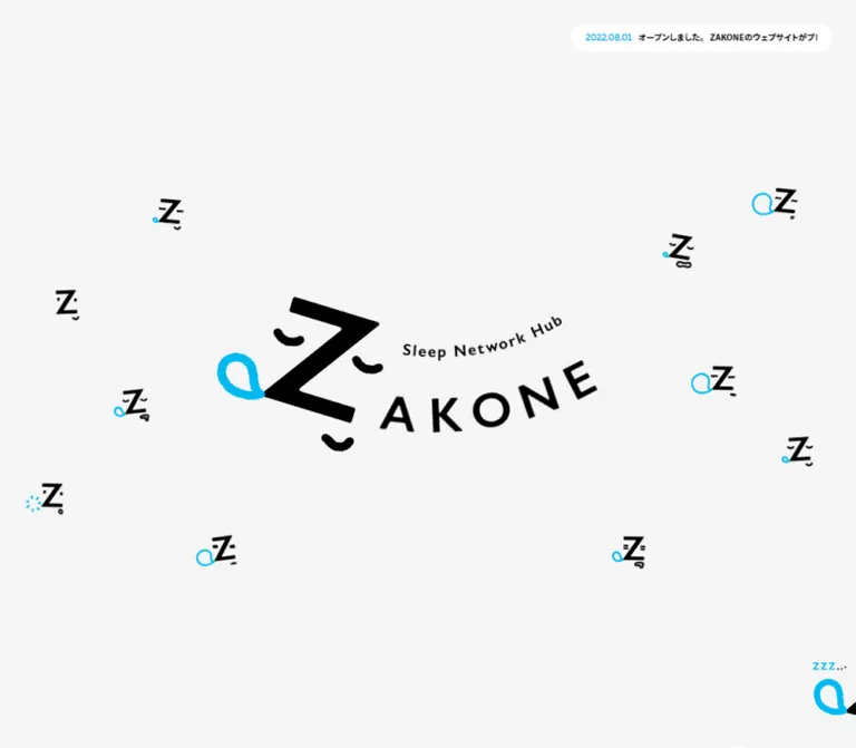
ZAKONE presents a sleep industry community through an unusually relaxed visual identity. A large black Z becomes a sleeping character with curved eyelids, a small mouth, and a cyan loop. The opening gives this artwork almost the entire viewport. A compact announcement pill and an illustrated control at the right edge supply the only prominent utility elements in the captured first screen.
Below the opening, the site combines a long mission statement with editorial content, participating companies, practical questions, news, and contact information. It is a community homepage with several browsing purposes. Broad cyan fields, white pillow shapes, rounded controls, and uneven wave boundaries carry the identity through these different kinds of content.
The most reusable relationship is between generous empty space and compact, information-rich groups. Keep the opening quiet, the article hierarchy clear, and the sleeping character recognizable. The artwork provides the personality; the Japanese text remains orderly and readable within the available space.
閉じる
ZAKONE / Sleep Network Hub — Style Reference
A sleeping letter Z, a bright cyan world, and enough empty space to take a breath.
Website: zakone.jp Original URL: https://zakone.jp/ Final URL: https://zakone.jp/ Theme: light gray canvas, black identity artwork, white surfaces, and large cyan sections. Inspected: supplied capture set retrieved October 1, 2026 at 18:15:42.091 UTC — October 2, 2026 at 03:15:42.091 JST. Viewports: desktop 1440 × 1000 CSS pixels; mobile 390 × 844 CSS pixels. Scope: the current community homepage. Screenshots cover the desktop opening, part of the article section, and contact area, plus the mobile opening and contact area. Rendered DOM evidence additionally covers the concept statement, community introduction, article groups, members, member overlay structure, FAQ, social labels, and news. Linked pages and control activation were not inspected.
ZAKONE presents a sleep industry community through an unusually relaxed visual identity. A large black Z becomes a sleeping character with curved eyelids, a small mouth, and a cyan loop. The opening gives this artwork almost the entire viewport. A compact announcement pill and an illustrated control at the right edge supply the only prominent utility elements in the captured first screen.
Below the opening, the site combines a long mission statement with editorial content, participating companies, practical questions, news, and contact information. It is a community homepage with several browsing purposes. Broad cyan fields, white pillow shapes, rounded controls, and uneven wave boundaries carry the identity through these different kinds of content.
The most reusable relationship is between generous empty space and compact, information-rich groups. Keep the opening quiet, the article hierarchy clear, and the sleeping character recognizable. The artwork provides the personality; the Japanese text remains orderly and readable within the available space.
How to Read This Reference
- Measured values come from the supplied rendered DOM and computed styles. Dimensions are CSS pixels unless stated otherwise.
- Estimated values come from visible screenshot geometry. Footer styling and illustration silhouettes have less computed evidence than the article and member sections.
- Derived values are calculations from measured rectangles, such as gaps between adjacent columns.
- Recommended values are implementation choices for a new build. They are not claims about the original stylesheet.
- Token names beginning with
--zk-are descriptive aliases. The supplied source custom properties are--firstViewHeightand--vw. - A DOM rectangle does not prove that an element was visible. Menu links, alternate article groups, answers, and overlay content can retain measurable geometry while concealed by an ancestor.
Tokens — Colors
Default Palette
| Name | Value | Suggested token | Evidence and role |
|---|---|---|---|
| Quiet Gray | #f5f5f5 |
--zk-paper |
Measured body background at both viewports; the principal opening canvas |
| Sleep Cyan | #00b9ef |
--zk-cyan |
Measured announcement date, selected category text, and some control text |
| White | #ffffff |
--zk-white |
Measured reversed article text; visibly used for pillows, the announcement pill, featured copy panel, and contact button |
| Black | #000000 |
--zk-ink |
Measured primary text; visible logo, eyelids, and mouth |
| Deeper Cyan | #00aee1 |
--zk-cyan-deep |
Measured Check More background |
| Light Navigation Cyan | #10c9ff |
--zk-cyan-nav |
Measured navigation-link color; the expanded menu was not visually verified |
The article and contact screenshots show broad, flat cyan fields. The sampled section elements themselves report transparent backgrounds, so their painted background layer was not isolated. Using #00b9ef for those fields is the recommended approximation in the Quick Start, not an independently measured section fill.
White serves two distinct purposes: reversed text on cyan, and solid objects such as pillows and buttons. Preserve that distinction. The gray canvas is visibly separate from the white artwork and announcement surface.
Palette Behavior
The visible page alternates between a pale canvas and saturated cyan regions. There is no established theme-switching system. Avoid treating the cyan section as a dark mode: it is a major brand surface with white content and black character details.
The deeper cyan button is intentionally close to its surrounding field. It reads as a quiet continuation control, while the white contact pill has much stronger separation.
Tokens — Typography
Japanese Text
Measured source stack: "Noto Sans JP", "ヒラギノ角ゴ ProN", "Hiragino Kaku Gothic ProN", メイリオ, meiryo, sans-serif.
The body uses weight 400; the concept statement, article titles, and member names use 700. Default body line height is twice the font size. Article titles and excerpts generally tighten this to 1.8, while the concept statement opens it to 2.5.
The default tracking is 0.8px on desktop and 0.624px on mobile. These values are inherited by several larger and smaller roles; they should not all be replaced with the same local em value.
English Labels and Utilities
Measured source stack: Pally, sans-serif.
Pally appears in navigation, dates, category controls, community activity labels, the continuation button, and the member-overlay heading. Its rounded forms soften the interface without making Japanese article text decorative.
The contact heading, Shall we dream?, has a similarly rounded appearance, but its computed font declaration was not included. Using Pally there is a reasonable implementation recommendation, rather than a confirmed font assignment for that element.
Identity and Graphic Headings
The main wordmark is artwork. Its angled letters, curved subtitle, sleeping face, and cyan loop should remain one composed asset. Do not reproduce it by typing a large Z and rotating ordinary text.
Several h1 and h2 elements have empty extracted text and measurable graphic boxes. Their inherited 16px or 12.48px computed font size does not describe the visible artwork. The extraction does not establish the complete accessible naming of those graphics.
Type Scale
All values in this table are measured. Size and line height are shown as size / line-height.
| Role | Family | Weight | Desktop | Mobile |
|---|---|---|---|---|
| General body | Japanese stack | 400 | 16 / 32px |
12.48 / 24.96px |
| Concept paragraphs | Japanese stack | 700 | 18 / 45px |
12.48 / 31.2px |
| Closing concept statement | Japanese stack | 700 | 28 / 70px |
20.8 / 52px |
| Announcement date | Pally | 400 | 16 / 32px |
12.48 / 24.96px |
| Announcement headline | Japanese stack | 700 | 14 / 28px |
12.48 / 24.96px |
| Navigation links | Pally | 700 | 18 / 36px |
14.56 / 29.12px |
| Activity labels | Pally | 700 | 16 / 32px |
12.48 / 24.96px |
| Article category controls | Pally | 400 | 20 / 36px |
14.56 / 26.208px |
| Featured article title | Japanese stack | 700 | 24 / 43.2px |
16.64 / 29.952px |
| Featured article excerpt | Japanese stack | 400 | 16 / 28.8px |
12.48 / 22.464px |
| Secondary article title | Japanese stack | 700 | 18 / 32.4px |
12.48 / 22.464px |
| Secondary article excerpt | Japanese stack | 400 | 14 / 25.2px |
11.44 / 20.592px |
Check More |
Pally | 700 | 16 / 32px |
12.48 / 24.96px |
| Member company name | Japanese stack | 700 | 14 / 28px |
12.48 / 24.96px |
| Member-overlay heading | Pally | 700 | 36 / 72px |
21.84 / 43.68px |
| Member-overlay biography | Japanese stack | 400 | 14 / 28px |
11.44 / 22.88px |
Announcement tracking is tighter than the page default: 0.16px on desktop and 0.1248px on mobile. Concept paragraphs report normal tracking.
Screenshot Estimates
| Role | Desktop estimate | Mobile estimate | Limitation |
|---|---|---|---|
| Contact heading | 52–56px |
About 36px |
No computed heading style supplied |
| Contact body | About 16px, with 32px line spacing |
About 12–13px, with 25px line spacing |
Visually consistent with body styles |
| Contact button label | About 18–20px |
About 14–16px |
Estimated from screenshot lettering |
| Article category badge | About 12px |
Not visually sampled | Badge element styles were not included |
Tokens — Spacing & Shapes
Scaling Model
The measured root font size is 10px on desktop and 5.2px on mobile. Body size changes from 16px to 12.48px, so the mobile interface is not a uniform 52% reduction of the desktop interface.
At the sampled phone width, 5.2px equals 390 / 75. That numerical relationship alone does not establish the site's complete responsive formula or breakpoint. The Quick Start uses a conventional root and explicit component sizes.
The supplied custom properties are:
| Source property | Desktop | Mobile |
|---|---|---|
--firstViewHeight |
1000px |
844px |
--vw |
1440px |
390px |
Layout Measurements
| Element | Desktop | Mobile | Evidence |
|---|---|---|---|
| Opening section height | 1000px |
844px |
Measured; equals each viewport height |
| Main wordmark layout box | 744 × 320px |
358.80 × 153.91px |
Measured; includes clear space around visible artwork |
| Wordmark box origin | 335.5, 340px |
10.41, 345.05px |
Measured; slightly left of geometric horizontal center |
| Announcement pill | About 440 × 48px |
About 328 × 50px |
Screenshot estimate |
| Announcement position | About 40px from top and right |
About 26px from top and 31px from either side |
Screenshot estimate |
| Right-edge control | 86 × 93px |
62.39 × 67.59px |
Measured button box |
| Control bottom clearance | 54px |
45.75px |
Derived from button and viewport rectangles |
| Main desktop content span | 1280px, with 80px side margins |
Component-specific | Derived from article and member positions |
| Featured article link | 600px wide |
348.38px wide |
Measured |
| Secondary article region | 600px wide |
327.59px wide |
Measured from links and continuation button |
| Desktop editorial column gap | 80px |
Main feature stacks above secondary items | Derived |
| Mobile secondary cards | — | Two 156px columns; approximately 15.6px gap |
Measured and derived |
| Member tile | 200 × 191px |
166.39 × 159.11px |
Measured |
| Member column gap | 16px |
About 15.6px |
Derived |
| Member row gap | 24px |
26px |
Derived |
Check More |
600 × 52px |
327.59 × 46.80px |
Measured |
| Member action controls | Two 300 × 98px controls side by side |
Two 187.19 × 67.59px controls stacked |
Measured |
Vertical Rhythm
The concept section uses large spaces even by the standards of this spacious page:
- Desktop padding:
213pxabove and180pxbelow. - Mobile padding:
64.48pxabove and54.08pxbelow. - Desktop paragraph groups are separated by
45px; mobile groups by approximately31.2px. - The final concept statement begins
80pxafter the preceding desktop paragraph group and about41.6pxafter it on mobile. - Desktop secondary article links have
80pxbetween their measured boxes. The dotted rules visually occupy this separation.
These are component rhythms, not evidence of a universal spacing scale. Useful implementation aliases are 8, 16, 24, 32, 40, 80, and 180px, with mobile overrides where measured.
Shapes
| Element | Treatment | Confidence |
|---|---|---|
| Announcement and contact button | Full capsule | Visually observed |
Check More |
10px desktop radius; 10.4px mobile radius |
Measured |
| Featured copy panel | White inset surface with a prominent rounded lower-right corner | Visually observed; full upper silhouette is cropped |
| Article thumbnail | Soft corners with uneven or clipped transitions | Visually observed; exact mask unknown |
| Section boundary | Shallow, asymmetric wave | Visually observed; path unknown |
| Pillow and blanket | Irregular soft silhouette | Visually observed artwork |
| Overlay close control | Circular box; 50px desktop, 41.59px mobile |
Measured; activated appearance unverified |
Components
Full-Viewport Opening
Role: establish identity before introducing the community's information.
The opening occupies exactly one captured viewport. The wordmark sits vertically centered, with abundant gray around it. At desktop size, the measured artwork box is 744 × 320px, while the visible ink occupies a smaller region within that box. On mobile, the box grows to approximately 92% of the viewport width and retains its wide aspect ratio.
The composition has no visible conventional top navigation bar. The announcement pill sits independently near the upper edge. The illustrated menu control occupies the lower-right edge and is partly cropped in the screenshots.
Preserve the artwork's intrinsic clear space. Enlarging only the visible black letter to fill the measured heading box would produce a substantially heavier opening.
Announcement Pill
Role: surface one current update without overwhelming the identity.
An unshadowed white capsule contains a cyan date followed by a bold, underlined black headline. The date stays in a stable left slot. The headline occupies a horizontally clipped region.
The DOM contains two copies of the same announcement, and their horizontal positions extend outside the visible pill. This is consistent with a repeating ticker. Its exact motion, period, direction, and pause behavior were not recorded.
At desktop size, the capsule is approximately 440px wide and aligned 40px from the top and right. At mobile size, it becomes approximately 328px wide and centered horizontally. The mobile date and headline both measure 12.48px.
The observed article link points to an external note article. Preserve the full readable title in the link's accessible content even if the visual track is clipped.
Illustrated Edge Navigation
Role: provide section navigation while keeping the opening visually quiet.
A transparent button box sits flush with the right edge. Its sleeping-character artwork and small text fragments remain visible across the supplied page positions. This supports a persistent edge-control treatment; its exact positioning implementation was not supplied.
The DOM includes CONCEPT, ABOUT, MEMBER, CONTENTS, FAQ, NEWS, and CONTACT links targeting homepage fragments. Their measured typography is Pally bold, 18px on desktop and 14.56px on mobile.
The screenshots do not show the full expanded navigation. Do not place the extracted link list permanently over the opening based solely on its DOM rectangles. Opening, closing, focus handling, and scroll behavior remain unverified.
Concept Statement
Role: explain the mission through a slow reading rhythm.
A graphic heading is followed by three groups of Japanese statements and a larger two-line closing statement, 世界平和のために / みんなで寝よう.
The text uses bold Japanese sans-serif with a 2.5 line-height ratio. Its deliberate line breaks and generous group spacing are more important than ornamental containers. The desktop section measures approximately 1615px high; the mobile section measures approximately 932px high.
The final statement increases to 28px desktop and 20.8px mobile. Keep this escalation modest relative to the main identity artwork.
Community Introduction and Activity Groups
Role: turn the mission into three understandable activities.
The introduction explains the community and includes the link 健康経営サポートはこちら. Its measured link box is approximately 274.59 × 60px on desktop and 212.11 × 46.80px on mobile.
Three groups follow: Community, Collaboration, and Information. Each pairs a bold Pally English label with a short, bold Japanese explanation. Both text layers are white in the computed styles.
Desktop group centers are approximately 380, 720, and 1060px, with the middle group lower than the outer groups. On mobile, the first group is near the viewport center while the next groups have offscreen horizontal coordinates. This supports a horizontal arrangement, but does not verify swipe, autoplay, or carousel controls. Do not assume that all three stack vertically on the phone.
The group's illustrated backgrounds were not individually captured, so their exact shapes are not specified here.
Article Category Controls
Role: distinguish all content, columns, events, and projects.
A centered row contains All, Column, Event, and Project buttons. The selected All label computes to cyan; the others compute to white. The sampled button backgrounds are transparent, so the complete selected-state surface cannot be reconstructed from those nodes alone.
Use the measured type sizes and compact horizontal padding: 11px per side on desktop and 10.4px on mobile. The visual desktop line box is 36px; the mobile line box is approximately 26.2px.
Alternate content groups are present in the DOM at overlapping coordinates. They should not be interpreted as consecutive visible article sections. Filtering was not exercised.
Featured Article
Role: give one editorial item substantially more prominence.
On desktop, the leading article occupies the left 600px column. The supplied screenshot shows its lower white title panel and the white excerpt below it; the upper media area is cropped out.
The white panel is inset from the link's outer bounds. Its visible width is approximately 520px, and the measured title width is 460px. These dimensions imply 40px outer insets and another 30px on each side of the title. The title is black, bold, 24px, and uses 43.2px line spacing. A small cyan category label precedes it.
The excerpt sits on the cyan field outside the white panel. Keep that separation: wrapping the excerpt into the white surface would change the observed hierarchy.
On mobile, the featured link is 348.38px wide. Its title is 286px wide at 16.64px, and its excerpt is approximately 327.59px wide. It sits above the smaller articles.
Secondary Article Card
Role: offer denser editorial choices alongside the lead item.
Desktop anatomy is a wide linked row with a landscape thumbnail at left and category, title, and excerpt at right. The row is 600px wide. Text begins 322px into the row and occupies 278px; a practical reconstruction is two 278px columns with a 44px gap.
Visible thumbnails are approximately 275 × 138px, close to 2:1, and use soft, slightly irregular clipping. The screenshot includes product photography and branded interview graphics. Retain the original composition within each thumbnail rather than imposing a portrait crop.
The white category badge uses cyan lettering. The title is 18px / 32.4px, and the excerpt is 14px / 25.2px. Fine white dots separate successive rows. Their visible spacing is approximately 13px, but the exact source rule was not supplied.
On mobile, these items become two columns of 156px cards. Each link changes from horizontal flex layout to block layout, placing its image area above the text. Titles reduce to 12.48px; excerpts reduce to 11.44px. This is a genuine layout change, not a scaled desktop row.
Continuation Button
Role: continue browsing the current article group.
Check More spans the desktop secondary column and the mobile secondary-card region. It has a deeper cyan fill, white bold Pally lettering, a 10px desktop radius, and no visible shadow.
Desktop size is 600 × 52px. Mobile size is approximately 327.59 × 46.80px, with a 10.4px radius. Its measured placement is 40px below the last desktop article and about 31.2px below the mobile grid.
The element is a button. Whether it expands the list, loads more content, or invokes another behavior was not established.
Member Directory Preview
Role: demonstrate the breadth of the community and provide organization links.
The current count reads 現在342社. Treat this as content from the capture, not a permanent design token.
The desktop preview contains eighteen organization links arranged in six columns and three rows. Tiles measure 200 × 191px, with 16px horizontal gaps and 24px vertical gaps. Company names are bold 14px / 28px below their visual regions.
The mobile preview contains eight links arranged in two columns and four rows. Tiles measure approximately 166.39 × 159.11px. The two follow-up controls stack beneath the grid: すべての企業を見る and ボードメンバーを見る.
The first control links to /company/; the second is a button. Organization names in this roster identify community participants and do not establish website production roles.
Member Overlay Structure
Role: present community-member profiles beyond the directory preview.
The DOM contains a viewport-sized section with a ZAKONE COMMUNITY MEMBER heading, profile text, a top-right circular close control, and a lower 閉じる button. A visibility/opacity transition is defined.
Measured profile text columns are 290px wide across four desktop columns. Mobile uses two columns of approximately 166.39px. Each profile separates affiliation, name, and biography; the biography uses regular Japanese text.
This structure is consistent with an overlay, but no opened screenshot was supplied. Its painted background, scroll behavior, opening trigger response, keyboard behavior, and dismissal interactions remain unverified.
FAQ, Social Links, and News
Role: answer practical questions and expose ongoing community activity.
The FAQ contains seven questions about joining, conditions, withdrawal, collaboration, interviews, updates, and fees. In the mobile sample, question and answer paragraphs reserve 52px of left padding, suggesting a dedicated marker area. The marker artwork itself was not captured.
Some answer rectangles overlap subsequent question positions in the extracted geometry. That is insufficient evidence for an expanded layout with every answer visible. Disclosure states and click behavior require separate verification.
The page also contains social labels and a dated news archive. Destinations are supplied for several social links. The observed Instagram href is the homepage #, while no Podcast destination appears in the supplied link list. Do not invent destinations for those labels.
The news archive uses dates and linked announcements. Its text is available, but detailed row styling is outside the supplied screenshot and computed-style coverage.
Contact Finale
Role: invite membership, interview, and collaboration inquiries.
A broad cyan area begins with a shallow irregular wave. A large sleeping Z rests against a white pillow near the upper-right edge on desktop. Another sleeping character peeks from behind a large white blanket at the lower-left edge.
The central stack contains Shall we dream?, explanatory Japanese text, a white capsule labeled お問い合わせはこちら, and an underlined analytics-policy link. The desktop contact button is approximately 280 × 98px; the mobile button is approximately 228 × 83px. These are screenshot estimates.
On mobile, the upper pillow character moves above the heading and becomes part of the centered composition. The paragraph wraps into four lines rather than the desktop's three. The lower-left blanket remains a cropped corner decoration.
Observed destination: the contact link points to https://forms.gle/KGF2wSAYunqJAaNz6. Nearby copy mentions email, but the href is a Google Forms URL. A faithful implementation should preserve the evidenced link destination rather than infer a mailto: action. The policy link points to /policy/.
Tokens — Motion & Interaction
| Treatment | Evidence | Interpretation and limitation |
|---|---|---|
| Ordinary link color transition | color 0.15s cubic-bezier(0.25, 0.25, 0.75, 0.75) |
Measured transition declaration; final hover colors were not exercised |
| Article category color transition | color 0.2s cubic-bezier(0.25, 0.25, 0.75, 0.75) |
Measured; content-switching behavior unverified |
| Member overlay visibility and opacity | 0.15s with the same cubic Bézier |
Measured declaration; open/close sequence unverified |
| Announcement track | Duplicate headlines, clipped text, shifted horizontal coordinates | Consistent with a repeating ticker; timing and movement direction unknown |
| Edge-control lettering | Different partial text fragments across captures | Frame variation is visible; exact animation mechanism unknown |
| Pillow, character, and wave motion | Static visual evidence only | No verified amplitude, duration, easing, or scroll linkage |
| FAQ disclosure and continuation button | Content and controls exist | Activation results were not recorded |
Many sampled elements report animation: none. That does not establish that the whole page is static: animation may occur on an ancestor, pseudo-element, artwork asset, or through JavaScript.
The capture process waited for finite visible motion and layout stability, temporarily paused perpetual animations during readiness checks, then resumed them. It is not a complete temporal recording. Avoid prescribing a particle system, parallax sequence, breathing loop, or animated wave as an observed requirement.
For a new implementation, keep the measured short color transitions. Provide a static announcement and character presentation when reduced motion is requested. Any additional ambient movement should be explicitly treated as a new design choice.
Surfaces
| Layer | Appearance | Purpose |
|---|---|---|
| Main canvas | Flat #f5f5f5 |
Quiet space for identity and informational sections |
| Cyan field | Saturated, full-width, flat color | Groups editorial content and the final inquiry area |
| Featured copy surface | White, inset, partly rounded | Gives the leading article a distinct reading surface |
| Small article badge | White with cyan text | Compact content classification |
| Continuation surface | #00aee1, modest radius |
Low-emphasis browsing action |
| Contact action | Large white capsule | Strongly separated inquiry link |
| Decorative bedding | White irregular shapes | Connects the page's surfaces to the sleep theme |
No general elevation or shadow system is visible in the supplied screenshots. Separation comes from flat color, generous spacing, waves, and a few strongly shaped white objects.
Imagery
The identity is built around an anthropomorphic black Z. Its hard diagonal geometry contrasts with curved eyelids, a small curved mouth, and a cyan loop. White pillows and blankets extend the same character into the footer.
Keep the illustrations flat and clean. Their irregularity comes from shape and contour rather than texture, shading, or photographic lighting. The visible artwork has crisp edges; there is no evidence for pixelated image rendering.
Photography is concentrated in article thumbnails, where product images and people coexist with branded editorial text. This allows a playful shell to contain practical community stories without restyling every image into the brand palette.
Observed Asset References
Image URLs and filenames were not included in the supplied evidence. These are visual references to the current captures, not downloadable asset paths.
| Asset group | Observed use | Implementation guidance |
|---|---|---|
| Main wordmark | Desktop and mobile opening | Preserve the complete composition, including its clear space |
| Sleeping Z with pillow | Upper contact area | Use a transparent asset; reposition separately from the text |
| Sleeping Z behind blanket | Lower-left contact corner | Crop decoratively at the section edge |
| Small edge-control character | Lower-right viewport edge | Keep the illustration separate from the button's accessible label |
| Interview thumbnails | Desktop secondary article rows | Preserve approximately 2:1 composition and readable embedded artwork |
| Graphic section headings | Measured heading boxes in the DOM | Obtain actual artwork or use clearly identified substitutes |
Use authorized assets when available. The CSS below reproduces layout and surface relationships; it does not recreate the distinctive character artwork.
Layout & Responsive Behavior
Page Structure
The rendered document measures approximately 9356.13px high on desktop and 7765.05px on mobile. These are capture-state measurements, not fixed target heights.
The major progression is opening, concept, community introduction, articles, members, FAQ, social/news material, and contact. The navigation order places MEMBER before CONTENTS, while the measured page positions place the article section before the member section. Preserve actual content order when building the document.
Verified Changes
| Area | Desktop | Mobile |
|---|---|---|
| Opening | Full viewport; 744px artwork box |
Full viewport; approximately 359px artwork box |
| Announcement | Upper right | Centered near top |
| Concept | Large vertical padding and 18px text |
Reduced padding and 12.48px text |
| Activities | Three horizontally separated groups | Later groups positioned offscreen horizontally |
| Articles | Featured left column and secondary right column | Full-width feature above a two-column secondary grid |
| Secondary article anatomy | Image beside text | Image area above text |
| Members | Six columns; eighteen preview entries | Two columns; eight preview entries |
| Member actions | Side by side | Stacked |
| Profile overlay structure | Four text columns | Two text columns |
| Contact mascot | Large upper-right decoration | Centered above heading |
| Contact paragraph | Three visible lines | Four visible lines |
The supplied evidence does not establish the breakpoint or tablet layout. A breakpoint around 768px is used in the Quick Start as a recommendation only.
Do not hardcode the document heights or use absolute coordinates for article and member content. Let text determine height. Reserve positioning for decorative artwork, the announcement within the opening, and the persistent edge control.
Do’s and Don’ts
Do
- Preserve the quiet gray opening and the centered sleeping-Z identity.
- Keep the announcement small and separate from the main artwork.
- Pair measured Japanese sans-serif typography with Pally utility labels.
- Use broad cyan fields, white bedding shapes, and shallow uneven waves.
- Preserve the lead article's white copy panel and separate excerpt.
- Reflow desktop article rows into a mobile two-column card grid.
- Keep the member preview's six-column desktop and two-column mobile relationship.
- Treat the large contact capsule as a distinct action from the quieter continuation button.
- Keep thumbnail photography and editorial graphics legible within their original compositions.
- Preserve full content and accessible names behind visually clipped or illustrated controls.
Don’t
- Don't replace the opening with a dense header, promotional headline, and multiple competing buttons.
- Don't rebuild the wordmark with generic text and emoji.
- Don't turn every component into a white card with a shadow.
- Don't use gradients or glass effects to separate sections.
- Don't scale every mobile dimension by the root-font ratio.
- Don't stack all secondary articles into one mobile column when matching the measured layout.
- Don't display every extracted article group or FAQ answer simultaneously.
- Don't infer carousel, menu, or modal behavior from element rectangles alone.
- Don't invent artwork paths, exact footer font declarations, or animation timings.
- Don't convert the contact link into an email action based only on nearby copy.
Recommended Implementation Additions
These are improvements for a new implementation, not verified original features:
- Give the illustrated menu button an explicit accessible name and synchronized
aria-expandedstate. Keep concealed links out of keyboard navigation. - Add semantic heading text or appropriate text alternatives for graphic headings without duplicating spoken content.
- Implement article categories as an accessible filter or tab pattern, with the active state conveyed beyond color.
- If the member panel behaves as a modal, provide focus management, Escape dismissal, an accessible title, and focus return.
- Use keyboard-operable disclosures for FAQ answers and keep their expanded state explicit.
- Raise small mobile body and excerpt text where readability requires it. The measured
11.44pxexcerpts and12.48pxbody are reference values, not recommended accessibility targets. - Check contrast for white text on cyan and cyan text on white. Preserve the large brand fields while adjusting text colors or local reading surfaces where necessary.
- Make announcement content readable without continuous motion. Pause optional ticker movement on focus and hover, and offer a reduced-motion state.
- Keep only decorative artwork cropped at viewport edges; preserve complete hit targets and focus indicators.
- Verify placeholder social destinations and fragment targets before shipping.
Agent Prompt Guide
Quick Color Reference
- Main canvas:
#f5f5f5. - Primary text and identity artwork:
#000000. - Measured brand text cyan:
#00b9ef. - Large cyan fields: use
#00b9efas a documented approximation. - Reversed text, pillows, featured panel, and contact capsule:
#ffffff. - Continuation button:
#00aee1. - Measured navigation-link cyan:
#10c9ff. - Separation: flat color, spacing, dotted rules, and waves.
Overall Prompt
“Create a Japanese sleep-community homepage using a pale gray #f5f5f5 canvas, black identity artwork, bright cyan sections, and white pillow-shaped decoration. Begin with a full-viewport composition centered on an authorized sleeping-Z wordmark, a small white announcement capsule near the top, and an illustrated menu control at the lower-right edge. Pair Noto Sans JP body text with Pally English utility labels. Follow the opening with a spacious mission statement, community activities, editorial content, participating organizations, practical questions, news, and contact. On desktop, place a prominent featured article beside a column of image-and-text article rows. On mobile, place the feature above a two-column secondary grid. Finish with an uneven cyan wave, sleeping pillow artwork, the heading ‘Shall we dream?’, and a large white contact capsule. Keep surfaces flat and use generous space.”
Example Component Prompts
- Opening: “A viewport-height light-gray opening with a wide sleeping-character wordmark centered vertically. Preserve transparent clear space within the logo asset. Add a small white announcement capsule at the desktop upper right and center it near the top on mobile. Keep the main composition uncluttered.”
- Article section: “A bright cyan editorial section with two 600px desktop columns separated by 80px. The left feature has an inset white copy panel with a large black Japanese title; its excerpt sits below on cyan. The right column has landscape thumbnails beside white titles and excerpts, separated by sparse white dotted rules.”
- Mobile articles: “At a 390px viewport, place a roughly 348px-wide feature above two 156px article columns with a 15.6px gap. Put each secondary image above its text. A deeper-cyan continuation button spans the roughly 328px secondary-grid region.”
- Members: “A quiet organization preview on a pale canvas: six 200px desktop columns with 16px gaps, changing to two columns on mobile. Keep logos or other supplied organization visuals above compact bold names. Follow with directory and profile controls.”
- Contact: “A flat cyan finale with a shallow irregular wave at its top. Use authorized sleeping-Z pillow artwork at the upper right on desktop and above the centered heading on mobile. Stack a rounded English heading, short Japanese explanation, white capsule action, and underlined policy link. Keep a blanket illustration partially cropped at the lower-left corner.”
- Interaction specification: “Use the evidenced 150ms link-color and 200ms category-color transitions. Treat menu activation, filtering, continuation, FAQ disclosure, and ambient character animation as behaviors requiring an explicit implementation specification. Provide keyboard access and reduced-motion alternatives.”
Quick Start
CSS Custom Properties
This is a reusable adaptation of the measured layout. It keeps a conventional root font size, reproduces the sampled desktop/mobile typography, and uses a recommended 768px breakpoint. Cyan section fills, footer typography, selected-filter surfaces, thumbnail rounding, and the wave path are approximations. Font files and illustration assets must be supplied separately.
The expected article structure is an .article-layout containing .feature and .article-side; the latter contains .article-list and .check-more. The announcement is static in this starter. Interactive state changes require separate implementation.
:root {
  /* Measured palette; cyan fields reuse the measured brand text color. */
  --zk-paper: #f5f5f5;
  --zk-ink: #000000;
  --zk-white: #ffffff;
  --zk-cyan: #00b9ef;
  --zk-cyan-deep: #00aee1;
  --zk-cyan-nav: #10c9ff;

  /* Families reported by computed styles; load font files separately. */
  --zk-font-body: 'Noto Sans JP', 'Hiragino Kaku Gothic ProN', Meiryo, sans-serif;
  --zk-font-round: Pally, sans-serif;

  --zk-text-body: 16px;
  --zk-text-feature: 24px;
  --zk-text-card: 18px;
  --zk-text-excerpt: 14px;
  --zk-text-tabs: 20px;
  --zk-tracking: 0.8px;
  --zk-gutter: 80px;
  --zk-content-max: 1280px;
  --zk-column-gap: 80px;
  --zk-radius-more: 10px;
  --zk-link-motion: 150ms cubic-bezier(0.25, 0.25, 0.75, 0.75);
  --zk-filter-motion: 200ms cubic-bezier(0.25, 0.25, 0.75, 0.75);
}

* { box-sizing: border-box; }

body {
  margin: 0;
  color: var(--zk-ink);
  background: var(--zk-paper);
  font-family: var(--zk-font-body);
  font-size: var(--zk-text-body);
  line-height: 2;
  letter-spacing: var(--zk-tracking);
}

button, input, select, textarea { font: inherit; }
a { color: inherit; transition: color var(--zk-link-motion); }
button { cursor: pointer; }
img { max-width: 100%; }
[hidden] { display: none !important; }

.shell {
  width: calc(100% - 2 * var(--zk-gutter));
  max-width: var(--zk-content-max);
  margin-inline: auto;
}

.hero {
  position: relative;
  display: grid;
  place-items: center;
  min-height: 100svh;
}

.hero-logo {
  width: min(744px, 92vw);
  aspect-ratio: 744 / 320;
  margin: 0;
  transform: translateX(-12.5px);
}

.hero-logo img {
  display: block;
  width: 100%;
  height: 100%;
  object-fit: contain;
}

.notice {
  position: absolute;
  top: 40px;
  right: 40px;
  display: flex;
  align-items: center;
  gap: 10px;
  width: 440px;
  min-height: 48px;
  padding: 8px 25px;
  border-radius: 999px;
  background: var(--zk-white);
  letter-spacing: 0.16px;
}

.notice time {
  flex: none;
  color: var(--zk-cyan);
  font-family: var(--zk-font-round);
  font-size: 16px;
}

.notice-copy {
  min-width: 0;
  overflow: hidden;
  white-space: nowrap;
  font-size: 14px;
  font-weight: 700;
}

.notice-copy a { text-decoration: underline; }

.edge-menu {
  position: fixed;
  z-index: 20;
  right: 0;
  bottom: max(54px, env(safe-area-inset-bottom, 0px));
  width: 86px;
  height: 93px;
  padding: 0;
  border: 0;
  background: transparent;
}

.edge-menu img { display: block; width: 100%; height: 100%; object-fit: contain; }

.concept {
  padding: 213px 20px 180px;
  text-align: center;
}

.concept-copy { margin-top: 90px; }
.concept-copy p { margin: 0; font-size: 18px; font-weight: 700; line-height: 2.5; letter-spacing: normal; }
.concept-copy p + p { margin-top: 45px; }
.concept-copy .motto { margin-top: 80px; font-size: 28px; letter-spacing: var(--zk-tracking); }

.contents-band {
  position: relative;
  padding-block: 80px 100px;
  color: var(--zk-white);
  background: var(--zk-cyan);
}

.filters {
  display: flex;
  justify-content: center;
  flex-wrap: wrap;
  margin-bottom: 80px;
}

.filters button {
  min-height: 44px;
  padding: 0 11px;
  border: 0;
  color: var(--zk-white);
  background: transparent;
  font-family: var(--zk-font-round);
  font-size: var(--zk-text-tabs);
  line-height: 1.8;
  transition: color var(--zk-filter-motion);
}

/* Recommended selected surface; its original background was not sampled. */
.filters button[aria-pressed='true'] {
  color: var(--zk-cyan);
  background: var(--zk-white);
  border-radius: 999px;
}

.article-layout {
  display: grid;
  grid-template-columns: repeat(2, minmax(0, 1fr));
  gap: var(--zk-column-gap);
  align-items: start;
}

.feature, .article-card { display: block; color: inherit; text-decoration: none; }
.feature-panel {
  margin-inline: 40px;
  padding: 24px 30px;
  color: var(--zk-ink);
  background: var(--zk-white);
  border-radius: 0 0 32px 0;
}

.feature h3 { margin: 12px 0 0; font-size: var(--zk-text-feature); line-height: 1.8; }
.feature-summary { margin: 20px 40px 0; line-height: 1.8; }
.article-list { display: grid; gap: 80px; }

.article-card {
  position: relative;
  display: grid;
  grid-template-columns: repeat(2, minmax(0, 1fr));
  gap: 44px;
  align-items: start;
}

.article-card + .article-card::before {
  content: '';
  position: absolute;
  top: -40px;
  left: 0;
  right: 0;
  height: 2px;
  background-image: radial-gradient(circle, #fff 1px, transparent 1.2px);
  background-size: 13px 2px;
}

.article-thumb {
  display: block;
  width: 100%;
  aspect-ratio: 2 / 1;
  object-fit: cover;
  border-radius: 24px 30px 24px 24px;
}

.article-tag {
  display: inline-block;
  padding: 3px 12px;
  border-radius: 8px;
  color: var(--zk-cyan);
  background: var(--zk-white);
  font: 700 1.5 12px var(--zk-font-round);
}

/* Use explicit font properties for consistent shorthand parsing. */
.article-tag { font-family: var(--zk-font-round); font-size: 12px; font-weight: 700; line-height: 1.5; }
.article-card h3 { margin: 12px 0 10px; font-size: var(--zk-text-card); line-height: 1.8; }
.article-card p { margin: 0; font-size: var(--zk-text-excerpt); line-height: 1.8; }

.check-more {
  display: grid;
  place-items: center;
  width: 100%;
  min-height: 52px;
  margin-top: 40px;
  padding: 8px 20px;
  border: 0;
  border-radius: var(--zk-radius-more);
  color: var(--zk-white);
  background: var(--zk-cyan-deep);
  font-family: var(--zk-font-round);
  font-size: var(--zk-text-body);
  font-weight: 700;
}

.member-grid {
  display: grid;
  grid-template-columns: repeat(6, minmax(0, 1fr));
  gap: 24px 16px;
}

.member { min-width: 0; text-align: center; text-decoration: none; }
.member-visual { display: grid; place-items: center; aspect-ratio: 200 / 153; }
.member-visual img { max-width: 100%; max-height: 100%; object-fit: contain; }
.member-name { margin: 10px 0 0; font-size: 14px; font-weight: 700; line-height: 2; overflow-wrap: anywhere; }

/* Footer values below are screenshot-based approximations. */
.contact {
  position: relative;
  isolation: isolate;
  padding: 180px 24px 140px;
  color: var(--zk-white);
  background: var(--zk-cyan);
  text-align: center;
}

.section-wave {
  position: absolute;
  top: -79px;
  left: 0;
  display: block;
  width: 100%;
  height: 80px;
  fill: var(--zk-cyan);
  pointer-events: none;
}

.contact-copy { position: relative; z-index: 1; }
.contact h2 { margin: 0; font-family: var(--zk-font-round); font-size: 54px; font-weight: 700; line-height: 1.2; letter-spacing: 0.08em; }
.contact p { max-width: 680px; margin: 40px auto 0; }

.contact-action {
  display: grid;
  place-items: center;
  width: min(280px, 100%);
  min-height: 98px;
  margin: 52px auto 0;
  padding: 20px;
  border-radius: 999px;
  color: var(--zk-cyan);
  background: var(--zk-white);
  font-size: 18px;
  font-weight: 700;
  text-decoration: none;
}

.contact-policy { display: inline-block; margin-top: 48px; text-underline-offset: 3px; }
.contact-mascot { position: absolute; top: -200px; right: 76px; width: 410px; pointer-events: none; }
.contact-sleeper { position: absolute; left: 0; bottom: 0; width: 500px; pointer-events: none; }

/* Recommended focus treatment, distinct from the decorative artwork. */
:where(a, button, summary):focus-visible {
  outline: 3px solid var(--zk-ink);
  outline-offset: 5px;
}

@media (max-width: 767px) {
  :root {
    --zk-text-body: 12.48px;
    --zk-text-feature: 16.64px;
    --zk-text-card: 12.48px;
    --zk-text-excerpt: 11.44px;
    --zk-text-tabs: 14.56px;
    --zk-tracking: 0.624px;
    --zk-gutter: 5.333333vw;
    --zk-radius-more: 10.4px;
  }

  .hero-logo { transform: translateX(-5.2px); }
  .notice { top: 26px; right: auto; left: 8%; width: 84%; min-height: 50px; padding: 10px 26px; letter-spacing: 0.1248px; }
  .notice time, .notice-copy { font-size: 12.48px; }
  .edge-menu { width: 62.4px; height: 67.6px; bottom: max(45.75px, env(safe-area-inset-bottom, 0px)); }

  .concept { padding: 64.48px 16px 54.08px; }
  .concept-copy { margin-top: 57.2px; }
  .concept-copy p { font-size: 12.48px; }
  .concept-copy p + p { margin-top: 31.2px; }
  .concept-copy .motto { margin-top: 41.6px; font-size: 20.8px; }

  .filters { margin-bottom: 62.4px; }
  .filters button { padding-inline: 10.4px; }
  .article-layout { display: block; }
  .feature-panel { margin-inline: 10.4px; padding: 20.8px; }
  .feature-summary { margin-inline: 10.4px; }
  .article-side { margin: 31.2px 10.4px 0; }
  .article-list { grid-template-columns: repeat(2, minmax(0, 1fr)); gap: 31.2px 15.6px; }
  .article-card { display: block; }
  .article-card + .article-card::before { display: none; }
  .article-card .article-tag { margin-top: 16px; }
  .article-card h3 { margin-bottom: 7.8px; }
  .check-more { min-height: 46.8px; margin-top: 31.2px; }

  .member-grid { grid-template-columns: repeat(2, minmax(0, 1fr)); gap: 26px 15.6px; }
  .member-name { margin-top: 6.8px; font-size: 12.48px; }

  .contact { padding: 164px 24px 125px; }
  .contact h2 { font-size: 36px; letter-spacing: 0.05em; }
  .contact p { max-width: 342px; margin-top: 24px; }
  .contact-action { width: min(228px, 100%); min-height: 83px; margin-top: 28px; font-size: 14.56px; }
  .contact-policy { margin-top: 32px; }
  .contact-mascot { top: -98px; right: auto; left: 50%; width: 208px; transform: translateX(-50%); }
  .contact-sleeper { width: 170px; }
}

@media (prefers-reduced-motion: reduce) {
  a, .filters button { transition: none; }
  .notice-copy { overflow: visible; white-space: normal; line-height: 1.6; }
}
Contact Markup and Wave
The wave below is an original approximation of the observed shallow silhouette. It is not the source site's path. Place authorized transparent illustrations in the indicated positions.
<section class="contact" id="Contact" aria-labelledby="contact-title">
  <svg class="section-wave" viewBox="0 0 1440 80"
       preserveAspectRatio="none" aria-hidden="true">
    <path d="M0 48 C90 42 150 58 230 46
             C470 8 650 -8 830 15
             C1020 43 1130 68 1250 43
             C1340 26 1390 40 1440 48 V80 H0 Z" />
  </svg>

  <!-- Add authorized decorative images with empty alt text here. -->
  <!-- Use contact-mascot and contact-sleeper for their positions. -->

  <div class="contact-copy">
    <h2 id="contact-title">Shall we dream?</h2>
    <p>Ask about interviews, membership, or collaboration.</p>
    <a class="contact-action"
       href="https://forms.gle/KGF2wSAYunqJAaNz6">
      お問い合わせはこちら
    </a>
    <a class="contact-policy" href="https://zakone.jp/policy/">
      Googleアナリティクスの利用について
    </a>
  </div>
</section>
The English paragraph above is example implementation copy. Matching the captured contact height requires the original three-line desktop and four-line mobile Japanese paragraph treatment. The member preview's differing entry counts require a content decision; the CSS does not silently remove organization links.
Tailwind v4 Token Mapping
Optional aliases for a project already using Tailwind v4. Define the custom properties above first. This does not imply that the original site uses Tailwind.
@theme inline {
  --color-paper: var(--zk-paper);
  --color-ink: var(--zk-ink);
  --color-sleep: var(--zk-cyan);
  --color-sleep-deep: var(--zk-cyan-deep);
  --color-sleep-nav: var(--zk-cyan-nav);
  --font-body: var(--zk-font-body);
  --font-round: var(--zk-font-round);
  --text-body: var(--zk-text-body);
  --text-feature: var(--zk-text-feature);
  --text-card: var(--zk-text-card);
  --text-excerpt: var(--zk-text-excerpt);
  --radius-more: var(--zk-radius-more);
}
Sources & Evidence
- ZAKONE — Sleep Network Hub: original and final inspected URL; supplied response status
200. - Capture-set timestamp:
2026-10-01T18:15:42.091Z, equivalent to October 2, 2026 at 03:15:42.091 JST. - Desktop evidence:
1440 × 1000viewport; opening, article-section crop, and contact screenshots; rendered document height approximately9356.13px. - Mobile evidence:
390 × 844viewport; opening and contact screenshots; rendered document height approximately7765.05px. - Computed evidence: element rectangles, colors, typography, spacing, selected radii, transitions, source viewport custom properties, rendered text, and link destinations.
- Inspection limitations: no external page visits, no complete stylesheet or asset inventory, no recorded menu/filter/FAQ/continuation/modal activation, and no continuous motion recording. Some extracted elements belong to concealed or alternate states. The readiness process does not establish that every delayed or interactive state was reached.
This reference describes the current homepage represented by the supplied captures. Screenshot estimates, derived measurements, and recommended implementation choices are labeled separately from measured source values.
# ZAKONE / Sleep Network Hub — Style Reference

> A sleeping letter Z, a bright cyan world, and enough empty space to take a breath.

**Website:** [zakone.jp](https://zakone.jp/)
**Original URL:** https://zakone.jp/
**Final URL:** https://zakone.jp/
**Theme:** light gray canvas, black identity artwork, white surfaces, and large cyan sections.
**Inspected:** supplied capture set retrieved October 1, 2026 at 18:15:42.091 UTC — October 2, 2026 at 03:15:42.091 JST.
**Viewports:** desktop 1440 × 1000 CSS pixels; mobile 390 × 844 CSS pixels.
**Scope:** the current community homepage. Screenshots cover the desktop opening, part of the article section, and contact area, plus the mobile opening and contact area. Rendered DOM evidence additionally covers the concept statement, community introduction, article groups, members, member overlay structure, FAQ, social labels, and news. Linked pages and control activation were not inspected.

ZAKONE presents a sleep industry community through an unusually relaxed visual identity. A large black Z becomes a sleeping character with curved eyelids, a small mouth, and a cyan loop. The opening gives this artwork almost the entire viewport. A compact announcement pill and an illustrated control at the right edge supply the only prominent utility elements in the captured first screen.

Below the opening, the site combines a long mission statement with editorial content, participating companies, practical questions, news, and contact information. It is a community homepage with several browsing purposes. Broad cyan fields, white pillow shapes, rounded controls, and uneven wave boundaries carry the identity through these different kinds of content.

The most reusable relationship is between generous empty space and compact, information-rich groups. Keep the opening quiet, the article hierarchy clear, and the sleeping character recognizable. The artwork provides the personality; the Japanese text remains orderly and readable within the available space.
閉じる
# ZAKONE / Sleep Network Hub — Style Reference

> A sleeping letter Z, a bright cyan world, and enough empty space to take a breath.

**Website:** [zakone.jp](https://zakone.jp/)
**Original URL:** https://zakone.jp/
**Final URL:** https://zakone.jp/
**Theme:** light gray canvas, black identity artwork, white surfaces, and large cyan sections.
**Inspected:** supplied capture set retrieved October 1, 2026 at 18:15:42.091 UTC — October 2, 2026 at 03:15:42.091 JST.
**Viewports:** desktop 1440 × 1000 CSS pixels; mobile 390 × 844 CSS pixels.
**Scope:** the current community homepage. Screenshots cover the desktop opening, part of the article section, and contact area, plus the mobile opening and contact area. Rendered DOM evidence additionally covers the concept statement, community introduction, article groups, members, member overlay structure, FAQ, social labels, and news. Linked pages and control activation were not inspected.

ZAKONE presents a sleep industry community through an unusually relaxed visual identity. A large black Z becomes a sleeping character with curved eyelids, a small mouth, and a cyan loop. The opening gives this artwork almost the entire viewport. A compact announcement pill and an illustrated control at the right edge supply the only prominent utility elements in the captured first screen.

Below the opening, the site combines a long mission statement with editorial content, participating companies, practical questions, news, and contact information. It is a community homepage with several browsing purposes. Broad cyan fields, white pillow shapes, rounded controls, and uneven wave boundaries carry the identity through these different kinds of content.

The most reusable relationship is between generous empty space and compact, information-rich groups. Keep the opening quiet, the article hierarchy clear, and the sleeping character recognizable. The artwork provides the personality; the Japanese text remains orderly and readable within the available space.

## How to Read This Reference

- **Measured** values come from the supplied rendered DOM and computed styles. Dimensions are CSS pixels unless stated otherwise.
- **Estimated** values come from visible screenshot geometry. Footer styling and illustration silhouettes have less computed evidence than the article and member sections.
- **Derived** values are calculations from measured rectangles, such as gaps between adjacent columns.
- **Recommended** values are implementation choices for a new build. They are not claims about the original stylesheet.
- Token names beginning with `--zk-` are descriptive aliases. The supplied source custom properties are `--firstViewHeight` and `--vw`.
- A DOM rectangle does not prove that an element was visible. Menu links, alternate article groups, answers, and overlay content can retain measurable geometry while concealed by an ancestor.

## Tokens — Colors

### Default Palette

| Name | Value | Suggested token | Evidence and role |
| --- | --- | --- | --- |
| Quiet Gray | `#f5f5f5` | `--zk-paper` | Measured body background at both viewports; the principal opening canvas |
| Sleep Cyan | `#00b9ef` | `--zk-cyan` | Measured announcement date, selected category text, and some control text |
| White | `#ffffff` | `--zk-white` | Measured reversed article text; visibly used for pillows, the announcement pill, featured copy panel, and contact button |
| Black | `#000000` | `--zk-ink` | Measured primary text; visible logo, eyelids, and mouth |
| Deeper Cyan | `#00aee1` | `--zk-cyan-deep` | Measured `Check More` background |
| Light Navigation Cyan | `#10c9ff` | `--zk-cyan-nav` | Measured navigation-link color; the expanded menu was not visually verified |

The article and contact screenshots show broad, flat cyan fields. The sampled section elements themselves report transparent backgrounds, so their painted background layer was not isolated. **Using `#00b9ef` for those fields is the recommended approximation in the Quick Start, not an independently measured section fill.**

White serves two distinct purposes: reversed text on cyan, and solid objects such as pillows and buttons. Preserve that distinction. The gray canvas is visibly separate from the white artwork and announcement surface.

### Palette Behavior

The visible page alternates between a pale canvas and saturated cyan regions. There is no established theme-switching system. Avoid treating the cyan section as a dark mode: it is a major brand surface with white content and black character details.

The deeper cyan button is intentionally close to its surrounding field. It reads as a quiet continuation control, while the white contact pill has much stronger separation.

## Tokens — Typography

### Japanese Text

**Measured source stack:** `"Noto Sans JP", "ヒラギノ角ゴ ProN", "Hiragino Kaku Gothic ProN", メイリオ, meiryo, sans-serif`.

The body uses weight `400`; the concept statement, article titles, and member names use `700`. Default body line height is twice the font size. Article titles and excerpts generally tighten this to `1.8`, while the concept statement opens it to `2.5`.

The default tracking is `0.8px` on desktop and `0.624px` on mobile. These values are inherited by several larger and smaller roles; they should not all be replaced with the same local `em` value.

### English Labels and Utilities

**Measured source stack:** `Pally, sans-serif`.

Pally appears in navigation, dates, category controls, community activity labels, the continuation button, and the member-overlay heading. Its rounded forms soften the interface without making Japanese article text decorative.

The contact heading, `Shall we dream?`, has a similarly rounded appearance, but its computed font declaration was not included. Using Pally there is a reasonable implementation recommendation, rather than a confirmed font assignment for that element.

### Identity and Graphic Headings

The main wordmark is artwork. Its angled letters, curved subtitle, sleeping face, and cyan loop should remain one composed asset. Do not reproduce it by typing a large Z and rotating ordinary text.

Several `h1` and `h2` elements have empty extracted text and measurable graphic boxes. Their inherited `16px` or `12.48px` computed font size does not describe the visible artwork. The extraction does not establish the complete accessible naming of those graphics.

### Type Scale

All values in this table are measured. Size and line height are shown as `size / line-height`.

| Role | Family | Weight | Desktop | Mobile |
| --- | --- | --- | --- | --- |
| General body | Japanese stack | 400 | `16 / 32px` | `12.48 / 24.96px` |
| Concept paragraphs | Japanese stack | 700 | `18 / 45px` | `12.48 / 31.2px` |
| Closing concept statement | Japanese stack | 700 | `28 / 70px` | `20.8 / 52px` |
| Announcement date | Pally | 400 | `16 / 32px` | `12.48 / 24.96px` |
| Announcement headline | Japanese stack | 700 | `14 / 28px` | `12.48 / 24.96px` |
| Navigation links | Pally | 700 | `18 / 36px` | `14.56 / 29.12px` |
| Activity labels | Pally | 700 | `16 / 32px` | `12.48 / 24.96px` |
| Article category controls | Pally | 400 | `20 / 36px` | `14.56 / 26.208px` |
| Featured article title | Japanese stack | 700 | `24 / 43.2px` | `16.64 / 29.952px` |
| Featured article excerpt | Japanese stack | 400 | `16 / 28.8px` | `12.48 / 22.464px` |
| Secondary article title | Japanese stack | 700 | `18 / 32.4px` | `12.48 / 22.464px` |
| Secondary article excerpt | Japanese stack | 400 | `14 / 25.2px` | `11.44 / 20.592px` |
| `Check More` | Pally | 700 | `16 / 32px` | `12.48 / 24.96px` |
| Member company name | Japanese stack | 700 | `14 / 28px` | `12.48 / 24.96px` |
| Member-overlay heading | Pally | 700 | `36 / 72px` | `21.84 / 43.68px` |
| Member-overlay biography | Japanese stack | 400 | `14 / 28px` | `11.44 / 22.88px` |

Announcement tracking is tighter than the page default: `0.16px` on desktop and `0.1248px` on mobile. Concept paragraphs report normal tracking.

### Screenshot Estimates

| Role | Desktop estimate | Mobile estimate | Limitation |
| --- | --- | --- | --- |
| Contact heading | `52–56px` | About `36px` | No computed heading style supplied |
| Contact body | About `16px`, with `32px` line spacing | About `12–13px`, with `25px` line spacing | Visually consistent with body styles |
| Contact button label | About `18–20px` | About `14–16px` | Estimated from screenshot lettering |
| Article category badge | About `12px` | Not visually sampled | Badge element styles were not included |

## Tokens — Spacing & Shapes

### Scaling Model

The measured root font size is `10px` on desktop and `5.2px` on mobile. Body size changes from `16px` to `12.48px`, so the mobile interface is **not** a uniform 52% reduction of the desktop interface.

At the sampled phone width, `5.2px` equals `390 / 75`. That numerical relationship alone does not establish the site's complete responsive formula or breakpoint. The Quick Start uses a conventional root and explicit component sizes.

The supplied custom properties are:

| Source property | Desktop | Mobile |
| --- | --- | --- |
| `--firstViewHeight` | `1000px` | `844px` |
| `--vw` | `1440px` | `390px` |

### Layout Measurements

| Element | Desktop | Mobile | Evidence |
| --- | --- | --- | --- |
| Opening section height | `1000px` | `844px` | Measured; equals each viewport height |
| Main wordmark layout box | `744 × 320px` | `358.80 × 153.91px` | Measured; includes clear space around visible artwork |
| Wordmark box origin | `335.5, 340px` | `10.41, 345.05px` | Measured; slightly left of geometric horizontal center |
| Announcement pill | About `440 × 48px` | About `328 × 50px` | Screenshot estimate |
| Announcement position | About `40px` from top and right | About `26px` from top and `31px` from either side | Screenshot estimate |
| Right-edge control | `86 × 93px` | `62.39 × 67.59px` | Measured button box |
| Control bottom clearance | `54px` | `45.75px` | Derived from button and viewport rectangles |
| Main desktop content span | `1280px`, with `80px` side margins | Component-specific | Derived from article and member positions |
| Featured article link | `600px` wide | `348.38px` wide | Measured |
| Secondary article region | `600px` wide | `327.59px` wide | Measured from links and continuation button |
| Desktop editorial column gap | `80px` | Main feature stacks above secondary items | Derived |
| Mobile secondary cards | — | Two `156px` columns; approximately `15.6px` gap | Measured and derived |
| Member tile | `200 × 191px` | `166.39 × 159.11px` | Measured |
| Member column gap | `16px` | About `15.6px` | Derived |
| Member row gap | `24px` | `26px` | Derived |
| `Check More` | `600 × 52px` | `327.59 × 46.80px` | Measured |
| Member action controls | Two `300 × 98px` controls side by side | Two `187.19 × 67.59px` controls stacked | Measured |

### Vertical Rhythm

The concept section uses large spaces even by the standards of this spacious page:

- Desktop padding: `213px` above and `180px` below.
- Mobile padding: `64.48px` above and `54.08px` below.
- Desktop paragraph groups are separated by `45px`; mobile groups by approximately `31.2px`.
- The final concept statement begins `80px` after the preceding desktop paragraph group and about `41.6px` after it on mobile.
- Desktop secondary article links have `80px` between their measured boxes. The dotted rules visually occupy this separation.

These are component rhythms, not evidence of a universal spacing scale. Useful implementation aliases are `8`, `16`, `24`, `32`, `40`, `80`, and `180px`, with mobile overrides where measured.

### Shapes

| Element | Treatment | Confidence |
| --- | --- | --- |
| Announcement and contact button | Full capsule | Visually observed |
| `Check More` | `10px` desktop radius; `10.4px` mobile radius | Measured |
| Featured copy panel | White inset surface with a prominent rounded lower-right corner | Visually observed; full upper silhouette is cropped |
| Article thumbnail | Soft corners with uneven or clipped transitions | Visually observed; exact mask unknown |
| Section boundary | Shallow, asymmetric wave | Visually observed; path unknown |
| Pillow and blanket | Irregular soft silhouette | Visually observed artwork |
| Overlay close control | Circular box; `50px` desktop, `41.59px` mobile | Measured; activated appearance unverified |

## Components

### Full-Viewport Opening

**Role:** establish identity before introducing the community's information.

The opening occupies exactly one captured viewport. The wordmark sits vertically centered, with abundant gray around it. At desktop size, the measured artwork box is `744 × 320px`, while the visible ink occupies a smaller region within that box. On mobile, the box grows to approximately 92% of the viewport width and retains its wide aspect ratio.

The composition has no visible conventional top navigation bar. The announcement pill sits independently near the upper edge. The illustrated menu control occupies the lower-right edge and is partly cropped in the screenshots.

Preserve the artwork's intrinsic clear space. Enlarging only the visible black letter to fill the measured heading box would produce a substantially heavier opening.

### Announcement Pill

**Role:** surface one current update without overwhelming the identity.

An unshadowed white capsule contains a cyan date followed by a bold, underlined black headline. The date stays in a stable left slot. The headline occupies a horizontally clipped region.

The DOM contains two copies of the same announcement, and their horizontal positions extend outside the visible pill. This is consistent with a repeating ticker. Its exact motion, period, direction, and pause behavior were not recorded.

At desktop size, the capsule is approximately `440px` wide and aligned `40px` from the top and right. At mobile size, it becomes approximately `328px` wide and centered horizontally. The mobile date and headline both measure `12.48px`.

The observed article link points to an external note article. Preserve the full readable title in the link's accessible content even if the visual track is clipped.

### Illustrated Edge Navigation

**Role:** provide section navigation while keeping the opening visually quiet.

A transparent button box sits flush with the right edge. Its sleeping-character artwork and small text fragments remain visible across the supplied page positions. This supports a persistent edge-control treatment; its exact positioning implementation was not supplied.

The DOM includes `CONCEPT`, `ABOUT`, `MEMBER`, `CONTENTS`, `FAQ`, `NEWS`, and `CONTACT` links targeting homepage fragments. Their measured typography is Pally bold, `18px` on desktop and `14.56px` on mobile.

The screenshots do not show the full expanded navigation. Do not place the extracted link list permanently over the opening based solely on its DOM rectangles. Opening, closing, focus handling, and scroll behavior remain unverified.

### Concept Statement

**Role:** explain the mission through a slow reading rhythm.

A graphic heading is followed by three groups of Japanese statements and a larger two-line closing statement, `世界平和のために / みんなで寝よう`.

The text uses bold Japanese sans-serif with a `2.5` line-height ratio. Its deliberate line breaks and generous group spacing are more important than ornamental containers. The desktop section measures approximately `1615px` high; the mobile section measures approximately `932px` high.

The final statement increases to `28px` desktop and `20.8px` mobile. Keep this escalation modest relative to the main identity artwork.

### Community Introduction and Activity Groups

**Role:** turn the mission into three understandable activities.

The introduction explains the community and includes the link `健康経営サポートはこちら`. Its measured link box is approximately `274.59 × 60px` on desktop and `212.11 × 46.80px` on mobile.

Three groups follow: `Community`, `Collaboration`, and `Information`. Each pairs a bold Pally English label with a short, bold Japanese explanation. Both text layers are white in the computed styles.

Desktop group centers are approximately `380`, `720`, and `1060px`, with the middle group lower than the outer groups. On mobile, the first group is near the viewport center while the next groups have offscreen horizontal coordinates. This supports a horizontal arrangement, but does not verify swipe, autoplay, or carousel controls. Do not assume that all three stack vertically on the phone.

The group's illustrated backgrounds were not individually captured, so their exact shapes are not specified here.

### Article Category Controls

**Role:** distinguish all content, columns, events, and projects.

A centered row contains `All`, `Column`, `Event`, and `Project` buttons. The selected `All` label computes to cyan; the others compute to white. The sampled button backgrounds are transparent, so the complete selected-state surface cannot be reconstructed from those nodes alone.

Use the measured type sizes and compact horizontal padding: `11px` per side on desktop and `10.4px` on mobile. The visual desktop line box is `36px`; the mobile line box is approximately `26.2px`.

Alternate content groups are present in the DOM at overlapping coordinates. They should not be interpreted as consecutive visible article sections. Filtering was not exercised.

### Featured Article

**Role:** give one editorial item substantially more prominence.

On desktop, the leading article occupies the left `600px` column. The supplied screenshot shows its lower white title panel and the white excerpt below it; the upper media area is cropped out.

The white panel is inset from the link's outer bounds. Its visible width is approximately `520px`, and the measured title width is `460px`. These dimensions imply `40px` outer insets and another `30px` on each side of the title. The title is black, bold, `24px`, and uses `43.2px` line spacing. A small cyan category label precedes it.

The excerpt sits on the cyan field outside the white panel. Keep that separation: wrapping the excerpt into the white surface would change the observed hierarchy.

On mobile, the featured link is `348.38px` wide. Its title is `286px` wide at `16.64px`, and its excerpt is approximately `327.59px` wide. It sits above the smaller articles.

### Secondary Article Card

**Role:** offer denser editorial choices alongside the lead item.

Desktop anatomy is a wide linked row with a landscape thumbnail at left and category, title, and excerpt at right. The row is `600px` wide. Text begins `322px` into the row and occupies `278px`; a practical reconstruction is two `278px` columns with a `44px` gap.

Visible thumbnails are approximately `275 × 138px`, close to `2:1`, and use soft, slightly irregular clipping. The screenshot includes product photography and branded interview graphics. Retain the original composition within each thumbnail rather than imposing a portrait crop.

The white category badge uses cyan lettering. The title is `18px / 32.4px`, and the excerpt is `14px / 25.2px`. Fine white dots separate successive rows. Their visible spacing is approximately `13px`, but the exact source rule was not supplied.

On mobile, these items become two columns of `156px` cards. Each link changes from horizontal flex layout to block layout, placing its image area above the text. Titles reduce to `12.48px`; excerpts reduce to `11.44px`. This is a genuine layout change, not a scaled desktop row.

### Continuation Button

**Role:** continue browsing the current article group.

`Check More` spans the desktop secondary column and the mobile secondary-card region. It has a deeper cyan fill, white bold Pally lettering, a `10px` desktop radius, and no visible shadow.

Desktop size is `600 × 52px`. Mobile size is approximately `327.59 × 46.80px`, with a `10.4px` radius. Its measured placement is `40px` below the last desktop article and about `31.2px` below the mobile grid.

The element is a button. Whether it expands the list, loads more content, or invokes another behavior was not established.

### Member Directory Preview

**Role:** demonstrate the breadth of the community and provide organization links.

The current count reads `現在342社`. Treat this as content from the capture, not a permanent design token.

The desktop preview contains eighteen organization links arranged in six columns and three rows. Tiles measure `200 × 191px`, with `16px` horizontal gaps and `24px` vertical gaps. Company names are bold `14px / 28px` below their visual regions.

The mobile preview contains eight links arranged in two columns and four rows. Tiles measure approximately `166.39 × 159.11px`. The two follow-up controls stack beneath the grid: `すべての企業を見る` and `ボードメンバーを見る`.

The first control links to `/company/`; the second is a button. Organization names in this roster identify community participants and do not establish website production roles.

### Member Overlay Structure

**Role:** present community-member profiles beyond the directory preview.

The DOM contains a viewport-sized section with a `ZAKONE COMMUNITY MEMBER` heading, profile text, a top-right circular close control, and a lower `閉じる` button. A visibility/opacity transition is defined.

Measured profile text columns are `290px` wide across four desktop columns. Mobile uses two columns of approximately `166.39px`. Each profile separates affiliation, name, and biography; the biography uses regular Japanese text.

This structure is consistent with an overlay, but no opened screenshot was supplied. Its painted background, scroll behavior, opening trigger response, keyboard behavior, and dismissal interactions remain unverified.

### FAQ, Social Links, and News

**Role:** answer practical questions and expose ongoing community activity.

The FAQ contains seven questions about joining, conditions, withdrawal, collaboration, interviews, updates, and fees. In the mobile sample, question and answer paragraphs reserve `52px` of left padding, suggesting a dedicated marker area. The marker artwork itself was not captured.

Some answer rectangles overlap subsequent question positions in the extracted geometry. That is insufficient evidence for an expanded layout with every answer visible. Disclosure states and click behavior require separate verification.

The page also contains social labels and a dated news archive. Destinations are supplied for several social links. The observed `Instagram` href is the homepage `#`, while no Podcast destination appears in the supplied link list. Do not invent destinations for those labels.

The news archive uses dates and linked announcements. Its text is available, but detailed row styling is outside the supplied screenshot and computed-style coverage.

### Contact Finale

**Role:** invite membership, interview, and collaboration inquiries.

A broad cyan area begins with a shallow irregular wave. A large sleeping Z rests against a white pillow near the upper-right edge on desktop. Another sleeping character peeks from behind a large white blanket at the lower-left edge.

The central stack contains `Shall we dream?`, explanatory Japanese text, a white capsule labeled `お問い合わせはこちら`, and an underlined analytics-policy link. The desktop contact button is approximately `280 × 98px`; the mobile button is approximately `228 × 83px`. These are screenshot estimates.

On mobile, the upper pillow character moves above the heading and becomes part of the centered composition. The paragraph wraps into four lines rather than the desktop's three. The lower-left blanket remains a cropped corner decoration.

**Observed destination:** the contact link points to `https://forms.gle/KGF2wSAYunqJAaNz6`. Nearby copy mentions email, but the href is a Google Forms URL. A faithful implementation should preserve the evidenced link destination rather than infer a `mailto:` action. The policy link points to `/policy/`.

## Tokens — Motion & Interaction

| Treatment | Evidence | Interpretation and limitation |
| --- | --- | --- |
| Ordinary link color transition | `color 0.15s cubic-bezier(0.25, 0.25, 0.75, 0.75)` | Measured transition declaration; final hover colors were not exercised |
| Article category color transition | `color 0.2s cubic-bezier(0.25, 0.25, 0.75, 0.75)` | Measured; content-switching behavior unverified |
| Member overlay visibility and opacity | `0.15s` with the same cubic Bézier | Measured declaration; open/close sequence unverified |
| Announcement track | Duplicate headlines, clipped text, shifted horizontal coordinates | Consistent with a repeating ticker; timing and movement direction unknown |
| Edge-control lettering | Different partial text fragments across captures | Frame variation is visible; exact animation mechanism unknown |
| Pillow, character, and wave motion | Static visual evidence only | No verified amplitude, duration, easing, or scroll linkage |
| FAQ disclosure and continuation button | Content and controls exist | Activation results were not recorded |

Many sampled elements report `animation: none`. That does not establish that the whole page is static: animation may occur on an ancestor, pseudo-element, artwork asset, or through JavaScript.

The capture process waited for finite visible motion and layout stability, temporarily paused perpetual animations during readiness checks, then resumed them. It is not a complete temporal recording. Avoid prescribing a particle system, parallax sequence, breathing loop, or animated wave as an observed requirement.

For a new implementation, keep the measured short color transitions. Provide a static announcement and character presentation when reduced motion is requested. Any additional ambient movement should be explicitly treated as a new design choice.

## Surfaces

| Layer | Appearance | Purpose |
| --- | --- | --- |
| Main canvas | Flat `#f5f5f5` | Quiet space for identity and informational sections |
| Cyan field | Saturated, full-width, flat color | Groups editorial content and the final inquiry area |
| Featured copy surface | White, inset, partly rounded | Gives the leading article a distinct reading surface |
| Small article badge | White with cyan text | Compact content classification |
| Continuation surface | `#00aee1`, modest radius | Low-emphasis browsing action |
| Contact action | Large white capsule | Strongly separated inquiry link |
| Decorative bedding | White irregular shapes | Connects the page's surfaces to the sleep theme |

No general elevation or shadow system is visible in the supplied screenshots. Separation comes from flat color, generous spacing, waves, and a few strongly shaped white objects.

## Imagery

The identity is built around an anthropomorphic black Z. Its hard diagonal geometry contrasts with curved eyelids, a small curved mouth, and a cyan loop. White pillows and blankets extend the same character into the footer.

Keep the illustrations flat and clean. Their irregularity comes from shape and contour rather than texture, shading, or photographic lighting. The visible artwork has crisp edges; there is no evidence for pixelated image rendering.

Photography is concentrated in article thumbnails, where product images and people coexist with branded editorial text. This allows a playful shell to contain practical community stories without restyling every image into the brand palette.

### Observed Asset References

Image URLs and filenames were not included in the supplied evidence. These are visual references to the current captures, not downloadable asset paths.

| Asset group | Observed use | Implementation guidance |
| --- | --- | --- |
| Main wordmark | Desktop and mobile opening | Preserve the complete composition, including its clear space |
| Sleeping Z with pillow | Upper contact area | Use a transparent asset; reposition separately from the text |
| Sleeping Z behind blanket | Lower-left contact corner | Crop decoratively at the section edge |
| Small edge-control character | Lower-right viewport edge | Keep the illustration separate from the button's accessible label |
| Interview thumbnails | Desktop secondary article rows | Preserve approximately `2:1` composition and readable embedded artwork |
| Graphic section headings | Measured heading boxes in the DOM | Obtain actual artwork or use clearly identified substitutes |

Use authorized assets when available. The CSS below reproduces layout and surface relationships; it does not recreate the distinctive character artwork.

## Layout & Responsive Behavior

### Page Structure

The rendered document measures approximately `9356.13px` high on desktop and `7765.05px` on mobile. These are capture-state measurements, not fixed target heights.

The major progression is opening, concept, community introduction, articles, members, FAQ, social/news material, and contact. The navigation order places `MEMBER` before `CONTENTS`, while the measured page positions place the article section before the member section. Preserve actual content order when building the document.

### Verified Changes

| Area | Desktop | Mobile |
| --- | --- | --- |
| Opening | Full viewport; `744px` artwork box | Full viewport; approximately `359px` artwork box |
| Announcement | Upper right | Centered near top |
| Concept | Large vertical padding and `18px` text | Reduced padding and `12.48px` text |
| Activities | Three horizontally separated groups | Later groups positioned offscreen horizontally |
| Articles | Featured left column and secondary right column | Full-width feature above a two-column secondary grid |
| Secondary article anatomy | Image beside text | Image area above text |
| Members | Six columns; eighteen preview entries | Two columns; eight preview entries |
| Member actions | Side by side | Stacked |
| Profile overlay structure | Four text columns | Two text columns |
| Contact mascot | Large upper-right decoration | Centered above heading |
| Contact paragraph | Three visible lines | Four visible lines |

The supplied evidence does not establish the breakpoint or tablet layout. A breakpoint around `768px` is used in the Quick Start as a recommendation only.

Do not hardcode the document heights or use absolute coordinates for article and member content. Let text determine height. Reserve positioning for decorative artwork, the announcement within the opening, and the persistent edge control.

## Do’s and Don’ts

### Do

- Preserve the quiet gray opening and the centered sleeping-Z identity.
- Keep the announcement small and separate from the main artwork.
- Pair measured Japanese sans-serif typography with Pally utility labels.
- Use broad cyan fields, white bedding shapes, and shallow uneven waves.
- Preserve the lead article's white copy panel and separate excerpt.
- Reflow desktop article rows into a mobile two-column card grid.
- Keep the member preview's six-column desktop and two-column mobile relationship.
- Treat the large contact capsule as a distinct action from the quieter continuation button.
- Keep thumbnail photography and editorial graphics legible within their original compositions.
- Preserve full content and accessible names behind visually clipped or illustrated controls.

### Don’t

- Don't replace the opening with a dense header, promotional headline, and multiple competing buttons.
- Don't rebuild the wordmark with generic text and emoji.
- Don't turn every component into a white card with a shadow.
- Don't use gradients or glass effects to separate sections.
- Don't scale every mobile dimension by the root-font ratio.
- Don't stack all secondary articles into one mobile column when matching the measured layout.
- Don't display every extracted article group or FAQ answer simultaneously.
- Don't infer carousel, menu, or modal behavior from element rectangles alone.
- Don't invent artwork paths, exact footer font declarations, or animation timings.
- Don't convert the contact link into an email action based only on nearby copy.

## Recommended Implementation Additions

These are improvements for a new implementation, not verified original features:

- Give the illustrated menu button an explicit accessible name and synchronized `aria-expanded` state. Keep concealed links out of keyboard navigation.
- Add semantic heading text or appropriate text alternatives for graphic headings without duplicating spoken content.
- Implement article categories as an accessible filter or tab pattern, with the active state conveyed beyond color.
- If the member panel behaves as a modal, provide focus management, Escape dismissal, an accessible title, and focus return.
- Use keyboard-operable disclosures for FAQ answers and keep their expanded state explicit.
- Raise small mobile body and excerpt text where readability requires it. The measured `11.44px` excerpts and `12.48px` body are reference values, not recommended accessibility targets.
- Check contrast for white text on cyan and cyan text on white. Preserve the large brand fields while adjusting text colors or local reading surfaces where necessary.
- Make announcement content readable without continuous motion. Pause optional ticker movement on focus and hover, and offer a reduced-motion state.
- Keep only decorative artwork cropped at viewport edges; preserve complete hit targets and focus indicators.
- Verify placeholder social destinations and fragment targets before shipping.

## Agent Prompt Guide

### Quick Color Reference

- Main canvas: `#f5f5f5`.
- Primary text and identity artwork: `#000000`.
- Measured brand text cyan: `#00b9ef`.
- Large cyan fields: use `#00b9ef` as a documented approximation.
- Reversed text, pillows, featured panel, and contact capsule: `#ffffff`.
- Continuation button: `#00aee1`.
- Measured navigation-link cyan: `#10c9ff`.
- Separation: flat color, spacing, dotted rules, and waves.

### Overall Prompt

“Create a Japanese sleep-community homepage using a pale gray `#f5f5f5` canvas, black identity artwork, bright cyan sections, and white pillow-shaped decoration. Begin with a full-viewport composition centered on an authorized sleeping-Z wordmark, a small white announcement capsule near the top, and an illustrated menu control at the lower-right edge. Pair Noto Sans JP body text with Pally English utility labels. Follow the opening with a spacious mission statement, community activities, editorial content, participating organizations, practical questions, news, and contact. On desktop, place a prominent featured article beside a column of image-and-text article rows. On mobile, place the feature above a two-column secondary grid. Finish with an uneven cyan wave, sleeping pillow artwork, the heading ‘Shall we dream?’, and a large white contact capsule. Keep surfaces flat and use generous space.”

### Example Component Prompts

1. **Opening:** “A viewport-height light-gray opening with a wide sleeping-character wordmark centered vertically. Preserve transparent clear space within the logo asset. Add a small white announcement capsule at the desktop upper right and center it near the top on mobile. Keep the main composition uncluttered.”
2. **Article section:** “A bright cyan editorial section with two 600px desktop columns separated by 80px. The left feature has an inset white copy panel with a large black Japanese title; its excerpt sits below on cyan. The right column has landscape thumbnails beside white titles and excerpts, separated by sparse white dotted rules.”
3. **Mobile articles:** “At a 390px viewport, place a roughly 348px-wide feature above two 156px article columns with a 15.6px gap. Put each secondary image above its text. A deeper-cyan continuation button spans the roughly 328px secondary-grid region.”
4. **Members:** “A quiet organization preview on a pale canvas: six 200px desktop columns with 16px gaps, changing to two columns on mobile. Keep logos or other supplied organization visuals above compact bold names. Follow with directory and profile controls.”
5. **Contact:** “A flat cyan finale with a shallow irregular wave at its top. Use authorized sleeping-Z pillow artwork at the upper right on desktop and above the centered heading on mobile. Stack a rounded English heading, short Japanese explanation, white capsule action, and underlined policy link. Keep a blanket illustration partially cropped at the lower-left corner.”
6. **Interaction specification:** “Use the evidenced 150ms link-color and 200ms category-color transitions. Treat menu activation, filtering, continuation, FAQ disclosure, and ambient character animation as behaviors requiring an explicit implementation specification. Provide keyboard access and reduced-motion alternatives.”

## Quick Start

### CSS Custom Properties

This is a reusable adaptation of the measured layout. It keeps a conventional root font size, reproduces the sampled desktop/mobile typography, and uses a recommended `768px` breakpoint. Cyan section fills, footer typography, selected-filter surfaces, thumbnail rounding, and the wave path are approximations. Font files and illustration assets must be supplied separately.

The expected article structure is an `.article-layout` containing `.feature` and `.article-side`; the latter contains `.article-list` and `.check-more`. The announcement is static in this starter. Interactive state changes require separate implementation.

```css
:root {
  /* Measured palette; cyan fields reuse the measured brand text color. */
  --zk-paper: #f5f5f5;
  --zk-ink: #000000;
  --zk-white: #ffffff;
  --zk-cyan: #00b9ef;
  --zk-cyan-deep: #00aee1;
  --zk-cyan-nav: #10c9ff;

  /* Families reported by computed styles; load font files separately. */
  --zk-font-body: 'Noto Sans JP', 'Hiragino Kaku Gothic ProN', Meiryo, sans-serif;
  --zk-font-round: Pally, sans-serif;

  --zk-text-body: 16px;
  --zk-text-feature: 24px;
  --zk-text-card: 18px;
  --zk-text-excerpt: 14px;
  --zk-text-tabs: 20px;
  --zk-tracking: 0.8px;
  --zk-gutter: 80px;
  --zk-content-max: 1280px;
  --zk-column-gap: 80px;
  --zk-radius-more: 10px;
  --zk-link-motion: 150ms cubic-bezier(0.25, 0.25, 0.75, 0.75);
  --zk-filter-motion: 200ms cubic-bezier(0.25, 0.25, 0.75, 0.75);
}

* { box-sizing: border-box; }

body {
  margin: 0;
  color: var(--zk-ink);
  background: var(--zk-paper);
  font-family: var(--zk-font-body);
  font-size: var(--zk-text-body);
  line-height: 2;
  letter-spacing: var(--zk-tracking);
}

button, input, select, textarea { font: inherit; }
a { color: inherit; transition: color var(--zk-link-motion); }
button { cursor: pointer; }
img { max-width: 100%; }
[hidden] { display: none !important; }

.shell {
  width: calc(100% - 2 * var(--zk-gutter));
  max-width: var(--zk-content-max);
  margin-inline: auto;
}

.hero {
  position: relative;
  display: grid;
  place-items: center;
  min-height: 100svh;
}

.hero-logo {
  width: min(744px, 92vw);
  aspect-ratio: 744 / 320;
  margin: 0;
  transform: translateX(-12.5px);
}

.hero-logo img {
  display: block;
  width: 100%;
  height: 100%;
  object-fit: contain;
}

.notice {
  position: absolute;
  top: 40px;
  right: 40px;
  display: flex;
  align-items: center;
  gap: 10px;
  width: 440px;
  min-height: 48px;
  padding: 8px 25px;
  border-radius: 999px;
  background: var(--zk-white);
  letter-spacing: 0.16px;
}

.notice time {
  flex: none;
  color: var(--zk-cyan);
  font-family: var(--zk-font-round);
  font-size: 16px;
}

.notice-copy {
  min-width: 0;
  overflow: hidden;
  white-space: nowrap;
  font-size: 14px;
  font-weight: 700;
}

.notice-copy a { text-decoration: underline; }

.edge-menu {
  position: fixed;
  z-index: 20;
  right: 0;
  bottom: max(54px, env(safe-area-inset-bottom, 0px));
  width: 86px;
  height: 93px;
  padding: 0;
  border: 0;
  background: transparent;
}

.edge-menu img { display: block; width: 100%; height: 100%; object-fit: contain; }

.concept {
  padding: 213px 20px 180px;
  text-align: center;
}

.concept-copy { margin-top: 90px; }
.concept-copy p { margin: 0; font-size: 18px; font-weight: 700; line-height: 2.5; letter-spacing: normal; }
.concept-copy p + p { margin-top: 45px; }
.concept-copy .motto { margin-top: 80px; font-size: 28px; letter-spacing: var(--zk-tracking); }

.contents-band {
  position: relative;
  padding-block: 80px 100px;
  color: var(--zk-white);
  background: var(--zk-cyan);
}

.filters {
  display: flex;
  justify-content: center;
  flex-wrap: wrap;
  margin-bottom: 80px;
}

.filters button {
  min-height: 44px;
  padding: 0 11px;
  border: 0;
  color: var(--zk-white);
  background: transparent;
  font-family: var(--zk-font-round);
  font-size: var(--zk-text-tabs);
  line-height: 1.8;
  transition: color var(--zk-filter-motion);
}

/* Recommended selected surface; its original background was not sampled. */
.filters button[aria-pressed='true'] {
  color: var(--zk-cyan);
  background: var(--zk-white);
  border-radius: 999px;
}

.article-layout {
  display: grid;
  grid-template-columns: repeat(2, minmax(0, 1fr));
  gap: var(--zk-column-gap);
  align-items: start;
}

.feature, .article-card { display: block; color: inherit; text-decoration: none; }
.feature-panel {
  margin-inline: 40px;
  padding: 24px 30px;
  color: var(--zk-ink);
  background: var(--zk-white);
  border-radius: 0 0 32px 0;
}

.feature h3 { margin: 12px 0 0; font-size: var(--zk-text-feature); line-height: 1.8; }
.feature-summary { margin: 20px 40px 0; line-height: 1.8; }
.article-list { display: grid; gap: 80px; }

.article-card {
  position: relative;
  display: grid;
  grid-template-columns: repeat(2, minmax(0, 1fr));
  gap: 44px;
  align-items: start;
}

.article-card + .article-card::before {
  content: '';
  position: absolute;
  top: -40px;
  left: 0;
  right: 0;
  height: 2px;
  background-image: radial-gradient(circle, #fff 1px, transparent 1.2px);
  background-size: 13px 2px;
}

.article-thumb {
  display: block;
  width: 100%;
  aspect-ratio: 2 / 1;
  object-fit: cover;
  border-radius: 24px 30px 24px 24px;
}

.article-tag {
  display: inline-block;
  padding: 3px 12px;
  border-radius: 8px;
  color: var(--zk-cyan);
  background: var(--zk-white);
  font: 700 1.5 12px var(--zk-font-round);
}

/* Use explicit font properties for consistent shorthand parsing. */
.article-tag { font-family: var(--zk-font-round); font-size: 12px; font-weight: 700; line-height: 1.5; }
.article-card h3 { margin: 12px 0 10px; font-size: var(--zk-text-card); line-height: 1.8; }
.article-card p { margin: 0; font-size: var(--zk-text-excerpt); line-height: 1.8; }

.check-more {
  display: grid;
  place-items: center;
  width: 100%;
  min-height: 52px;
  margin-top: 40px;
  padding: 8px 20px;
  border: 0;
  border-radius: var(--zk-radius-more);
  color: var(--zk-white);
  background: var(--zk-cyan-deep);
  font-family: var(--zk-font-round);
  font-size: var(--zk-text-body);
  font-weight: 700;
}

.member-grid {
  display: grid;
  grid-template-columns: repeat(6, minmax(0, 1fr));
  gap: 24px 16px;
}

.member { min-width: 0; text-align: center; text-decoration: none; }
.member-visual { display: grid; place-items: center; aspect-ratio: 200 / 153; }
.member-visual img { max-width: 100%; max-height: 100%; object-fit: contain; }
.member-name { margin: 10px 0 0; font-size: 14px; font-weight: 700; line-height: 2; overflow-wrap: anywhere; }

/* Footer values below are screenshot-based approximations. */
.contact {
  position: relative;
  isolation: isolate;
  padding: 180px 24px 140px;
  color: var(--zk-white);
  background: var(--zk-cyan);
  text-align: center;
}

.section-wave {
  position: absolute;
  top: -79px;
  left: 0;
  display: block;
  width: 100%;
  height: 80px;
  fill: var(--zk-cyan);
  pointer-events: none;
}

.contact-copy { position: relative; z-index: 1; }
.contact h2 { margin: 0; font-family: var(--zk-font-round); font-size: 54px; font-weight: 700; line-height: 1.2; letter-spacing: 0.08em; }
.contact p { max-width: 680px; margin: 40px auto 0; }

.contact-action {
  display: grid;
  place-items: center;
  width: min(280px, 100%);
  min-height: 98px;
  margin: 52px auto 0;
  padding: 20px;
  border-radius: 999px;
  color: var(--zk-cyan);
  background: var(--zk-white);
  font-size: 18px;
  font-weight: 700;
  text-decoration: none;
}

.contact-policy { display: inline-block; margin-top: 48px; text-underline-offset: 3px; }
.contact-mascot { position: absolute; top: -200px; right: 76px; width: 410px; pointer-events: none; }
.contact-sleeper { position: absolute; left: 0; bottom: 0; width: 500px; pointer-events: none; }

/* Recommended focus treatment, distinct from the decorative artwork. */
:where(a, button, summary):focus-visible {
  outline: 3px solid var(--zk-ink);
  outline-offset: 5px;
}

@media (max-width: 767px) {
  :root {
    --zk-text-body: 12.48px;
    --zk-text-feature: 16.64px;
    --zk-text-card: 12.48px;
    --zk-text-excerpt: 11.44px;
    --zk-text-tabs: 14.56px;
    --zk-tracking: 0.624px;
    --zk-gutter: 5.333333vw;
    --zk-radius-more: 10.4px;
  }

  .hero-logo { transform: translateX(-5.2px); }
  .notice { top: 26px; right: auto; left: 8%; width: 84%; min-height: 50px; padding: 10px 26px; letter-spacing: 0.1248px; }
  .notice time, .notice-copy { font-size: 12.48px; }
  .edge-menu { width: 62.4px; height: 67.6px; bottom: max(45.75px, env(safe-area-inset-bottom, 0px)); }

  .concept { padding: 64.48px 16px 54.08px; }
  .concept-copy { margin-top: 57.2px; }
  .concept-copy p { font-size: 12.48px; }
  .concept-copy p + p { margin-top: 31.2px; }
  .concept-copy .motto { margin-top: 41.6px; font-size: 20.8px; }

  .filters { margin-bottom: 62.4px; }
  .filters button { padding-inline: 10.4px; }
  .article-layout { display: block; }
  .feature-panel { margin-inline: 10.4px; padding: 20.8px; }
  .feature-summary { margin-inline: 10.4px; }
  .article-side { margin: 31.2px 10.4px 0; }
  .article-list { grid-template-columns: repeat(2, minmax(0, 1fr)); gap: 31.2px 15.6px; }
  .article-card { display: block; }
  .article-card + .article-card::before { display: none; }
  .article-card .article-tag { margin-top: 16px; }
  .article-card h3 { margin-bottom: 7.8px; }
  .check-more { min-height: 46.8px; margin-top: 31.2px; }

  .member-grid { grid-template-columns: repeat(2, minmax(0, 1fr)); gap: 26px 15.6px; }
  .member-name { margin-top: 6.8px; font-size: 12.48px; }

  .contact { padding: 164px 24px 125px; }
  .contact h2 { font-size: 36px; letter-spacing: 0.05em; }
  .contact p { max-width: 342px; margin-top: 24px; }
  .contact-action { width: min(228px, 100%); min-height: 83px; margin-top: 28px; font-size: 14.56px; }
  .contact-policy { margin-top: 32px; }
  .contact-mascot { top: -98px; right: auto; left: 50%; width: 208px; transform: translateX(-50%); }
  .contact-sleeper { width: 170px; }
}

@media (prefers-reduced-motion: reduce) {
  a, .filters button { transition: none; }
  .notice-copy { overflow: visible; white-space: normal; line-height: 1.6; }
}
```

### Contact Markup and Wave

The wave below is an original approximation of the observed shallow silhouette. It is not the source site's path. Place authorized transparent illustrations in the indicated positions.

```html
<section class="contact" id="Contact" aria-labelledby="contact-title">
  <svg class="section-wave" viewBox="0 0 1440 80"
       preserveAspectRatio="none" aria-hidden="true">
    <path d="M0 48 C90 42 150 58 230 46
             C470 8 650 -8 830 15
             C1020 43 1130 68 1250 43
             C1340 26 1390 40 1440 48 V80 H0 Z" />
  </svg>

  <!-- Add authorized decorative images with empty alt text here. -->
  <!-- Use contact-mascot and contact-sleeper for their positions. -->

  <div class="contact-copy">
    <h2 id="contact-title">Shall we dream?</h2>
    <p>Ask about interviews, membership, or collaboration.</p>
    <a class="contact-action"
       href="https://forms.gle/KGF2wSAYunqJAaNz6">
      お問い合わせはこちら
    </a>
    <a class="contact-policy" href="https://zakone.jp/policy/">
      Googleアナリティクスの利用について
    </a>
  </div>
</section>
```

The English paragraph above is example implementation copy. Matching the captured contact height requires the original three-line desktop and four-line mobile Japanese paragraph treatment. The member preview's differing entry counts require a content decision; the CSS does not silently remove organization links.

### Tailwind v4 Token Mapping

Optional aliases for a project already using Tailwind v4. Define the custom properties above first. This does not imply that the original site uses Tailwind.

```css
@theme inline {
  --color-paper: var(--zk-paper);
  --color-ink: var(--zk-ink);
  --color-sleep: var(--zk-cyan);
  --color-sleep-deep: var(--zk-cyan-deep);
  --color-sleep-nav: var(--zk-cyan-nav);
  --font-body: var(--zk-font-body);
  --font-round: var(--zk-font-round);
  --text-body: var(--zk-text-body);
  --text-feature: var(--zk-text-feature);
  --text-card: var(--zk-text-card);
  --text-excerpt: var(--zk-text-excerpt);
  --radius-more: var(--zk-radius-more);
}
```

## Sources & Evidence

- [ZAKONE — Sleep Network Hub](https://zakone.jp/): original and final inspected URL; supplied response status `200`.
- Capture-set timestamp: `2026-10-01T18:15:42.091Z`, equivalent to October 2, 2026 at 03:15:42.091 JST.
- Desktop evidence: `1440 × 1000` viewport; opening, article-section crop, and contact screenshots; rendered document height approximately `9356.13px`.
- Mobile evidence: `390 × 844` viewport; opening and contact screenshots; rendered document height approximately `7765.05px`.
- Computed evidence: element rectangles, colors, typography, spacing, selected radii, transitions, source viewport custom properties, rendered text, and link destinations.
- Inspection limitations: no external page visits, no complete stylesheet or asset inventory, no recorded menu/filter/FAQ/continuation/modal activation, and no continuous motion recording. Some extracted elements belong to concealed or alternate states. The readiness process does not establish that every delayed or interactive state was reached.

This reference describes the current homepage represented by the supplied captures. Screenshot estimates, derived measurements, and recommended implementation choices are labeled separately from measured source values.関連するデザイン
スタイルやページの種類、ジャンルが近いデザインを集めました。