プレビュー準備中デザインリファレンスを見る
日本のWebデザインを、AIの制作リファレンスに。
DESIGN REFERENCE
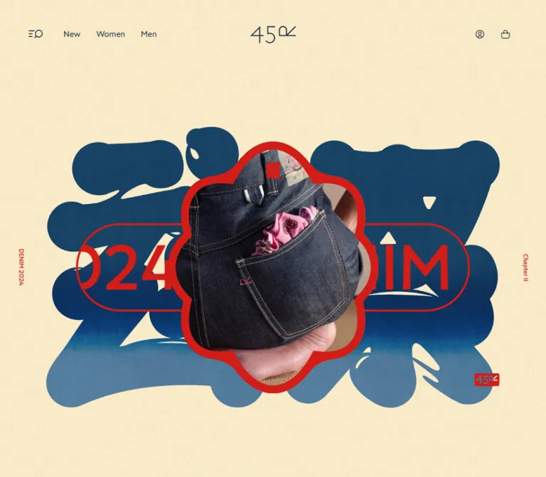
生成りの背景に藍色と朱色を重ね、デニムの写真、円形の記事サムネイル、祭りの暦を組み合わせた45Rの特設ページ。海外配送案内を含む現行表示と、モバイルで変化する記事レイアウトを記録。
オリジナルサイトを見るIndigo cloth, vermilion festival graphics, and a denim journal on warm cream paper.
Website: 45R — Denim Matsuri
Original URL: https://45r.jp/ja/denim-matsuri/
Final URL: https://45r.jp/ja/denim-matsuri/
Theme: light; warm cream canvas with indigo text and vermilion accents.
Inspected: September 17, 2026, at 05:09 JST; supplied retrieval timestamp: 2026-09-16T20:09:45.292Z.
Viewports: 1440 × 1000 desktop and 390 × 844 mobile, in CSS pixels.
Scope: the current Japanese festival and editorial feature within the 45R brand website: navigation, opening artwork, introductory copy, event calendar, festival explanation, featured stories, collection link, additional stories, shopping link, shipping guidance dialog, and footer. Analysis uses the supplied original-page captures and rendered DOM evidence; no additional browsing was performed.
45R combines an expressive festival composition with an orderly editorial system. Oversized indigo forms and vermilion linework establish the opening identity. Below, denim photographs become large circular windows inside closely spaced, softly tinted cards. Bold Japanese typography, tall section-heading arrangements, and generous pauses between sections connect the page to printed festival material and clothing craftsmanship.
This is a long brand feature with event information, reading material, and routes into the shop. Its structure includes eight featured stories and a separate continuation archive. On mobile, these become two different browsing systems: a horizontal featured-story rail and a compact two-column archive.
A shipping guidance dialog remains open throughout the supplied captures. On desktop, the surrounding hero, story cards, and footer are partly visible. On mobile, the dialog covers almost the entire page. Its clean, pale surface and restrained indigo button form a distinct utility layer over the more expressive festival content.
Indigo cloth, vermilion festival graphics, and a denim journal on warm cream paper.
Website: 45R — Denim Matsuri
Original URL: https://45r.jp/ja/denim-matsuri/
Final URL: https://45r.jp/ja/denim-matsuri/
Theme: light; warm cream canvas with indigo text and vermilion accents.
Inspected: September 17, 2026, at 05:09 JST; supplied retrieval timestamp: 2026-09-16T20:09:45.292Z.
Viewports: 1440 × 1000 desktop and 390 × 844 mobile, in CSS pixels.
Scope: the current Japanese festival and editorial feature within the 45R brand website: navigation, opening artwork, introductory copy, event calendar, festival explanation, featured stories, collection link, additional stories, shopping link, shipping guidance dialog, and footer. Analysis uses the supplied original-page captures and rendered DOM evidence; no additional browsing was performed.
45R combines an expressive festival composition with an orderly editorial system. Oversized indigo forms and vermilion linework establish the opening identity. Below, denim photographs become large circular windows inside closely spaced, softly tinted cards. Bold Japanese typography, tall section-heading arrangements, and generous pauses between sections connect the page to printed festival material and clothing craftsmanship.
This is a long brand feature with event information, reading material, and routes into the shop. Its structure includes eight featured stories and a separate continuation archive. On mobile, these become two different browsing systems: a horizontal featured-story rail and a compact two-column archive.
A shipping guidance dialog remains open throughout the supplied captures. On desktop, the surrounding hero, story cards, and footer are partly visible. On mobile, the dialog covers almost the entire page. Its clean, pale surface and restrained indigo button form a distinct utility layer over the more expressive festival content.
--dm- are implementation aliases. Original WordPress property names are identified separately where relevant.| Name | Value | Alias / source evidence | Role and confidence |
|---|---|---|---|
| Cream Paper | #FAEDCD |
--dm-paper; computed body background |
Measured main page canvas at both viewports |
| Interface Indigo | #1C2940 |
--dm-ink; source --wp--preset--color--indigo |
Measured navigation, card text, footer text, and filled buttons |
| Editorial Indigo | #193854 |
--dm-content-ink; computed content text |
Measured introductory copy, section headings, and festival explanation |
| Festival Vermilion | #D21D17 |
--dm-vermilion; computed H1 color |
Measured hero-label color; visually corresponds to the red graphic accents |
| Utility Gray | #838994 |
--dm-muted; source --wp--preset--color--light |
Measured in offscreen utility navigation; a similar gray appears in the dialog translation |
| White | #FFFFFF |
--dm-white; source --wp--preset--color--white |
Measured button text and desktop circular close-control background |
| Fine Rule | #E5E7E9 |
--dm-rule; source --wp--preset--color--line |
Exact declared token; its application to the visible dialog rule is visually consistent but not individually measured |
| Calendar Wash | rgba(71, 113, 139, 0.2) |
--dm-calendar-wash; computed event-link background |
Measured translucent blue fill on the white-denim calendar entry |
The cream body appears substantially darker in the captures because a black dialog backdrop covers it. Use the computed #FAEDCD for the underlying page rather than reproducing the dimmed screenshot as the default canvas.
Keep Interface Indigo and Editorial Indigo separate when closely matching the reference. Their difference is subtle, but both are explicitly present in the computed evidence.
| Surface | Evidence | Implementation guidance |
|---|---|---|
| Shipping panel | Visually near-white with fine grain; no panel background measurement supplied | #FAFAF7 is a recommended flat approximation, not a sampled source color |
| Dialog backdrop | Computed black background; opacity absent from the extract | Start near rgb(0 0 0 / 0.5) and verify visually; the alpha is an estimate |
| Article tints | Blue-gray, ochre, sage, and clay fields visible beneath the backdrop | Use subdued translucent washes; exact unobscured colors are unavailable |
| Paper grain | Fine texture visible across the captures | Add an authorized texture only after matching the flat palette; its original implementation is unknown |
The card anchors themselves report transparent backgrounds. Their visible tints may come from background images, descendants, pseudo-elements, or another layer not included in the extract. Do not describe the proposed CSS gradients below as recovered source rules.
The full WordPress preset list contains many vivid colors, gradients, and shadows. Their declaration alone does not establish their use on this page. They are not an additional festival palette or elevation system.
'A1 Gothic R', sans-serif.400.16px at both inspected viewports.'A1 Gothic M'.400.font-weight: 500.'A1 Gothic B'.400.The 45R wordmark and several social symbols use the measured font family icomoon. The header wordmark has an approximately 88 × 33px rendered box on desktop and 60 × 22px on mobile. These are custom glyphs; typing ordinary characters at the reported font size will not reproduce them.
Use an authorized wordmark or equivalent supplied brand asset. Do not invent the icon font mapping or font-file URLs.
| Role | Desktop | Mobile | Family / tracking | Evidence |
|---|---|---|---|---|
| Root interface | 16px |
16px |
R; normal | Measured |
| Header shop links | 16px / 35px |
Not present in the compact header text | R; normal | Measured desktop |
| Hero side labels | 12px / 14.4px |
12px / 14.4px |
M; normal | Measured |
| Introductory statement | 28px / 36.4px |
20px / 26px |
B; 0.02em desktop, normal mobile |
Measured |
| Calendar heading | 48px / 48px |
Same | B; -0.06em |
Measured |
| Featured-stories heading | 48px / 52.8px |
Same | B; -0.06em |
Measured |
| Narrow section introduction | 12px / 18px |
Same | M; -0.06em |
Measured |
| Continuation heading | 32px / 35.2px |
Same | B; -0.06em |
Measured |
| Featured-story title | 20px / 26px |
Same | B; normal | Measured |
| Continuation-story title | 20px / 26px |
14px / 18.2px |
B; normal | Measured |
| Story excerpt | 14px / 22.4px |
Same in featured rail; absent from visible continuation text | M; 0.02em |
Measured |
| Festival explanation | 14px / 18.2px |
Same | M; 0.02em |
Measured |
| Main content CTA | 16px / 32px |
14px / 20px |
R or M according to component | Measured |
| Shipping CTA | 14px / 26px |
12px / 24px |
R; normal | Measured |
| Footer legal links | 12px / 20px |
10px / 20px |
R; -0.02em desktop, -0.03em mobile |
Measured |
| Shipping-dialog heading | About 36px |
About 22px |
Individual heading style not supplied | Visual estimate |
Large section headings occupy unusually tall, narrow boxes: approximately 92 × 158px for the calendar heading and 106 × 264px for the featured-stories heading. These measurements support a stacked or vertical Japanese composition. The extract does not include writing-mode or the internal span arrangement, so it cannot establish the exact typesetting mechanism.
The hero H1 is another important exception: its desktop bounding box is roughly 1351 × 741px, while its measured text size is only 12px. That box belongs to the broader hero arrangement, not a giant ordinary text heading.
Base system: a measured 16px root with component dimensions reported in pixels. No viewport-derived root formula was supplied.
Rhythm: tightly grouped cards and controls, separated by large editorial intervals.
| Use | Value | Status |
|---|---|---|
| Mobile dialog outer clearance | About 6px |
Screenshot estimate |
| Horizontal article gap | 8px |
Calculated from card coordinates at both viewports |
| Calendar tile padding and internal gap | 10px |
Measured |
| Mobile continuation-card horizontal padding | 11px |
Measured |
| Featured-card vertical / horizontal padding | 20px / 22px |
Measured |
| Standard mobile content gutter | 22px |
Measured for explanation, archive, and footer |
| Mobile featured-rail first-card inset | 28px |
Measured |
| Mobile introductory-copy gutter | 36px |
Measured |
| Desktop article-section gutter | 40px |
Measured |
| Desktop footer gutter | 80px |
Measured |
| Desktop introductory-copy gutter | 108px |
Measured |
| Major section interval | 200px desktop; 150px mobile |
Calculated at the intro/calendar and calendar/stories boundaries |
| Final shopping CTA to footer | 150px desktop; 100px mobile |
Calculated |
| Element | Radius | Evidence |
|---|---|---|
| Article card | 10px |
Measured |
| Calendar product tile | 10px |
Measured |
| Filled CTA | 6px |
Measured |
| Desktop close button | 50% |
Measured |
| Article image crop | Circle | Visible in desktop screenshots; image style not separately extracted |
| Shipping-panel corners | Visually square | Screenshot observation |
| Element | Desktop, 1440 × 1000 | Mobile, 390 × 844 |
|---|---|---|
| Document height | 8290px |
6713px |
| Header wordmark | 88 × 33px, x≈676, y≈50 |
60 × 22px, x=165, y=42 |
| Introductory text | 1224px wide at x=108 |
318px wide at x=36 |
| Featured-story card | About 334 × 527px in first row |
About 334 × 527px in rail |
| Featured-card inner width | About 290px |
290px |
| Continuation card | About 334px wide |
169px wide |
| Mobile continuation inner width | — | 147px |
| Shipping panel | About 800 × 600px, x=320, y=200 |
About 378 × 832px, x=6, y=6 |
| Shipping CTA | 279.8 × 46px |
346 × 40px |
| Shipping close control | 56 × 56px, below panel |
50 × 50px, at upper right |
| Footer | About 218px high |
249px high |
Panel dimensions are screenshot estimates; CTA and close-control dimensions are measured DOM values. Card heights vary with the row and title wrapping. Some desktop vertical rectangles overlap slightly in the supplied sample, so they should not be used to reverse-engineer an exact row-gap or positioning algorithm. Horizontal spacing is consistent.
Role: connect the festival feature to the larger 45R brand and shop.
The desktop header places the fine-line 45R wordmark at the exact horizontal center. A menu/search-like symbol and the text links New, Women, and Men sit to the left. Account and shopping-bag controls sit to the right. All remain visually light against the cream canvas.
Measured desktop controls include a 57 × 46px menu button, a 48 × 48px account link, and a 42 × 48px bag button. The wordmark begins around y=50px, leaving a quiet top margin.
The mobile DOM retains a centered 60px-wide wordmark, a left menu control, and right account/bag controls. The three desktop shop labels disappear from the compact header text. This underlying header is obscured by the shipping dialog in the supplied mobile screenshots.
The header wrapper has zero measured flow height while its children have positioned boxes. Treat its layout as out of normal flow in the inspected state. Persistent sticky behavior was not established.
Role: provide access to shopping categories, editorial areas, stores, news, and account utilities.
The DOM contains grouped navigation headed by ITEMS and CONTENTS, recent update links, legal links, and social links. Most of these elements have negative horizontal coordinates in the captured state, consistent with an offscreen menu.
Primary menu text uses A1 Gothic M at 16px / 32px on desktop and 18px / 28px on mobile. Smaller links use 12px type. This is useful evidence for the hidden menu's typography, but its open layout, scrolling, focus order, and opening interaction were not inspected.
Role: establish the page's festival and denim identity before the reading content.
The visible desktop perimeter contains oversized indigo graphic forms, vermilion lettering inside a long rounded outline, a small owl-like figure toward the left, a red-bordered photographic fragment below the dialog, and a small red brand stamp near the lower right. Small DENIM and Chapter II labels flank the composition.
The H1 arrangement measures approximately x=44.7, y=184.8, width=1350.7, height=740.5 on desktop. On mobile, its text box becomes approximately 28.8 × 52.8px at x=21.9, y=100. That change does not reveal the dimensions of the complete mobile artwork.
The center is concealed by the shipping panel. Its exact photograph, full mask outline, asset structure, and motion cannot be recovered from these captures. Preserve an artwork slot rather than rebuilding the hidden center from assumptions.
Role: explain the traveling festival in a strong editorial voice.
A broad paragraph follows the hero. Its source copy begins わっしょい、わっしょい! and describes the festival traveling between cities, indigo curtains, vermilion lanterns, drums, and the watching festival character.
The desktop paragraph uses A1 Gothic B at 28px / 36.4px, spans 1224px, and occupies about four lines. Mobile reduces it to 20px / 26px within a 318px column, producing ten measured lines. Keep it as a substantial statement rather than a small centered caption.
Role: punctuate the long page with compact Japanese editorial compositions.
The calendar heading and featured-stories heading use 48px A1 Gothic B with tight negative tracking. Their associated introductions use narrow, approximately 54px-wide boxes with 12px / 18px type.
The calendar heading sits toward the left of its section; the featured-stories heading arrangement sits farther right. The continuation heading is smaller at 32px and centered within a roughly 241px-wide box.
The tall measured boxes are compatible with vertical or stacked text, but the precise writing mode is unavailable. A vertical Japanese treatment is an appropriate implementation recommendation, not a recovered declaration.
Role: expose dates, locations, completion status, and product-related announcements.
The rendered text contains the heading 祭の暦, year labels 二〇二六 and 二〇二五, Japanese/English month pairs, a TODAY marker, dates, prefecture labels, venue names, and the status 会期終了.
The supplied records include 2025 event dates despite the September 2026 inspection. Preserve those as observed content; the evidence does not establish how the active year or current date is selected.
Several entries have x coordinates far beyond the viewport, indicating a horizontally extensive calendar layout. Its scrolling or dragging mechanism was not exercised.
One measured product entry has a rounded blue wash, 10px padding, a 10px gap, and three grid columns. Its desktop box is approximately 400 × 80px with columns near 50px 206px 104px. Mobile retains a wide 384 × 80px tile with 40px 200px 104px columns. It does not collapse into a narrow vertically stacked card.
Use separate typographic levels for the date, small uppercase category or prefecture, completion status, and venue. The white-denim entry has a real shop link. Other event-detail activation is suggested by the page copy but was not tested.
Role: explain what visitors can encounter at the festival and lead to its archive.
The source pairs the heading デニム祭とは with a compact paragraph and a filled Libraryはこちら link. On desktop, the text is positioned in a right-side column about 480px wide. The surrounding visual content is not shown clearly enough to describe a complete two-column composition.
The heading is 20px / 26px A1 Gothic B. The paragraph is 14px / 18.2px A1 Gothic M. The Library button measures approximately 300 × 64px on desktop and expands to 346 × 54px on mobile within 22px side gutters.
Role: make denim materials, details, people, and festival practices easy to browse.
Each card is a single anchor containing a large circular image, a small red category label, a bold title, a short excerpt, and a right-aligned underlined 続きを読む cue. Do not nest a second link inside the card merely to reproduce that cue.
Desktop cards form four columns with approximately 334px widths and calculated 8px horizontal gaps. Their internal padding is 20px vertically and 22px horizontally, leaving an approximately 290px content column. The visible circle closely matches that inner width.
Titles use 20px / 26px A1 Gothic B. Excerpts use 14px / 22.4px A1 Gothic M with 0.02em tracking. Many excerpt boxes measure about 67.2px high, equivalent to three lines, and the screenshots show truncation. The exact truncation property was not supplied.
Soft blue-gray, ochre, sage, and clay fields give the cards individual character while retaining the cream-and-indigo system. The cards have 10px corners and no conspicuous raised shadow.
The first desktop row includes stories about Fox Brothers, a belt loop, denim materials, and a wear record. The next row includes a festival coat, another wear record, printing, and distressed denim. Keep these subjects visually specific: fabric, seams, wear, printed matter, and workwear details supply the character.
Role: retain the full-size editorial card on a narrow screen.
All eight measured featured cards share the same y coordinate on mobile. Their x positions begin at 28, 370, 712, and 1054px, continuing in 342px increments. This yields a 334px card and an 8px gap, with the first card centered in the 390px viewport.
Eight 20 × 20px button boxes appear below the rail, each with 5px padding. These support a paginated carousel interpretation. Their visual selected state, accessible labels, swipe response, looping, and autoplay are unverified.
Do not shrink this group into the compact two-column layout used by the continuation archive. Its retained desktop-sized image, title, and excerpt are a deliberate responsive distinction.
Role: interrupt the reading sequence with a route to the denim collection.
Between the two story groups, the DOM contains another repeated DENIM CHAPTER Ⅱ sequence and the link デニムのコレクションを見る. The linked destination is the site's denim collection page.
The button is approximately 300 × 64px on desktop and 300 × 54px on mobile. The visual composition around it is obscured or absent from the provided captures. Repeated text nodes do not establish a marquee or a particular animation.
Role: provide a larger secondary archive without repeating the mobile featured-card density.
Desktop retains four columns and the same general card anatomy, with eleven article entries represented in the evidence. The final row contains three cards.
Mobile changes to two columns inside 22px page gutters. Each card is 169px wide, with an 8px gap and padding of 10px 11px 20px. The 147px inner width is consistent with a smaller image treatment, although that mobile image crop is obscured in the screenshots.
Titles reduce to 14px / 18.2px. Excerpts no longer appear in the visible mobile text extraction, and the reading cue becomes 続き. Eight entries are represented before もっと読み込む; the expansion behavior was not tested.
The final デニム一覧を見る shopping link measures approximately 400 × 64px on desktop and 346 × 54px on mobile.
Role: direct visitors who need shipping outside Japan to the official global website.
The dialog contains an English welcome heading, a shipping question, an English explanatory sentence, a quieter Japanese translation, a thin divider with the centered label Online store outside of Japan, one filled CTA, and a close control. No country selector or form fields are visible.
Desktop anatomy: a visually square, near-white panel approximately 800 × 600px at x=320, y=200. The heading is centered near the top. The bilingual copy occupies a compact central block, followed by generous whitespace before the divider and CTA. The measured CTA is 279.8 × 46px, with 6px corners, indigo fill, white 14px text, and the label Discover the Official Global Website.
A separate 56px white circular close button sits below the panel at approximately x=692, y=834. Its top is about 34px below the estimated panel edge. The page's original header remains visible above the dialog.
Mobile anatomy: the pale panel nearly fills the viewport, leaving approximately 6px around its edges. A 60 × 22px 45R wordmark appears at x=165, y=42. The close button moves to the upper-right corner as a transparent 50 × 50px control at x=330, y=28. The centered welcome heading appears around y=122, the shipping copy below it, the divider around y=389, and the CTA at y=420.
The mobile CTA spans 346px and is 40px high, with 12px type. Large blank space remains beneath it. Preserve that quiet layout when matching the captured state; it is not a second content section.
The destination is the independently recorded link https://45rglobal.com/. Opening the page did not itself redirect there. Close behavior, backdrop dismissal, Escape handling, initial focus, and any visit-persistence rule remain unverified.
Role: close the editorial feature with brand identity, social links, legal navigation, and language routes.
The desktop footer places a large 178 × 67px 45R wordmark at the left, a character illustration nearby, and social links toward the right. A fine horizontal rule separates this upper area from the small legal and language links beneath it.
Mobile reduces the wordmark to 91 × 34px and uses 22px main gutters. The DOM positions social links below the wordmark, legal links across two rows, and JA / GLOBAL toward the right. Legal type becomes 10px, so readability deserves attention in an adaptation.
The inspected original page prints ©45rpm studio co., ltd. and includes a company-information link. No production-credit statement was identified in the supplied original-page evidence.
The following are measured computed transition declarations. They establish timing and affected properties, not that every transition was visibly triggered during inspection.
| Treatment | Recorded value | Evidence boundary |
|---|---|---|
| Header movement | Margin 0.2s; transform 0.5s; cubic-bezier(0.445, 0.05, 0.55, 0.95) |
Trigger and sticky behavior unverified |
| Navigation/control color | color 0.2s |
End-state colors not captured |
| Filled CTA feedback | color 0.3s, background 0.3s |
Hover/focus appearance not exercised |
| Overlay backdrop | Opacity 0.5s cubic-bezier(0.55, 0.085, 0.68, 0.53) |
Backdrop alpha not provided |
| Desktop dialog close control | Opacity 0.2s after 0.5s; transform 0.2s cubic-bezier(0.77, 0, 0.175, 1) after 0.5s |
Initial and final transforms not provided |
| Mobile section headings | Opacity 0.7s cubic-bezier(0.55, 0.085, 0.68, 0.53); transform 0.7s cubic-bezier(0.25, 0.46, 0.45, 0.94) |
Entrance-like declaration; activation threshold unknown |
| Mobile calendar heading delay | Additional 0.5s |
Recorded on this heading, not every section |
| Mobile story cards | Opacity and transform 0.6s, using the same respective curves as headings |
Travel distance and sequencing unknown |
Most sampled elements report animation: none. That does not rule out JavaScript motion, transitions, animated images, or motion on unsampled descendants.
The inspection process waited for initial readiness, finite motion, layout stability, and visible image decoding within bounded time limits. Perpetual animations were temporarily paused during readiness checks and resumed afterward. These procedures do not supply an animation recording or prove that all delayed content appeared.
There is no verified hero loop duration, marquee speed, carousel autoplay, hover image zoom, calendar drag behavior, or scroll-parallax specification. Keep such features out of a faithful implementation unless separately established.
| Layer | Appearance | Practical role |
|---|---|---|
| Page canvas | Warm cream, visually textured | Continuous ground for the festival and journal |
| Hero artwork | Large indigo forms with vermilion accents | Strong expressive identity without a separate boxed section |
| Article cards | Soft tinted fields, 10px corners, circular photography | Separate topics while remaining part of the paper surface |
| Calendar product tile | Translucent blue wash, 10px corners | Compact event/product information |
| Filled links | Solid interface indigo, white text, 6px corners | Clear destinations to archives, collections, and shopping |
| Dialog backdrop | Dark translucent veil | Separates the regional shipping guidance from the page |
| Shipping panel | Near-white, fine grain, square outline | Calm utility surface with concentrated central content |
| Footer | Continuous cream surface with a thin rule | Low-emphasis structural closure |
No glass blur or substantial card-shadow system is visible. The strongest separation comes from the dialog veil. Within the editorial page, color fields, circular crops, typography, and spacing provide the hierarchy.
Use close, tactile photography: washed denim, seams, buttons, pockets, woven texture, worn edges, patches, and indigo garments. The visible cards favor material and garment detail over generic lifestyle panoramas. Circular cropping makes these details read as individual specimens within a journal.
The opening artwork operates at a different scale. Broad indigo shapes and red outlines surround photographic and character elements. Preserve the difference between expressive campaign artwork and quiet repeatable story cards.
The footer includes a character illustration with small star-like marks. The first capture also exposes an owl-like figure in the hero. Their exact files and any animation are unknown.
Fine grain is visible on the page and dialog. It should remain subtle enough that body text stays clear. The evidence does not establish whether the grain is a global overlay, a repeating image, or embedded in individual assets.
No image src values, native image dimensions, font-file paths, or downloadable artwork URLs were supplied. The references below identify observed subjects and associated content links; they are not image asset URLs, and their destination pages were not inspected.
| Subject | Visible use | Associated original-page link |
|---|---|---|
| Worn denim front and buttons | Circular first featured-story image | Fox Brothers story |
| Dark folded denim | Circular materials-story image | Denim materials |
| Indigo festival coat | Circular second-row image | Festival coat |
| Faded patched jeans | Circular distressed-denim image | Distressed denim |
| Printed loom-related character mark | Final desktop archive row | Power-loom stamp |
Use authorized photography, illustrations, and brand assets. The CSS shell can reproduce the composition, but it cannot supply the identity of these materials.
The main sequence is hero → introduction → calendar and festival explanation → featured stories → collection interlude → continuation stories → shopping link → footer. The shipping dialog overlays this sequence rather than replacing it.
| Relationship | Desktop evidence | Mobile evidence |
|---|---|---|
| Introductory copy | Wide 1224px paragraph; 28px type | 318px column; 20px type |
| Major section headings | 48px, tall narrow assemblies | Retain 48px scale and tall proportions |
| Featured stories | Four columns across 1360px content width | One horizontal row of 334px cards; eight pagination controls |
| Continuation stories | Four columns; eleven represented entries | Two 169px columns; eight entries before load-more text |
| Featured excerpts | Three-line text boxes | Retained at the same 14px scale |
| Continuation excerpts | Present | Absent from visible mobile text |
| Calendar entry | Wide 400px tile | Still wide at 384px; part of an extensive horizontal arrangement |
| Main action height | 64px | 54px |
| Shipping dialog | Centered 800 × 600px panel; close below | Nearly full viewport; logo and close inside top area |
| Footer | Wide upper identity/social row | Smaller identity, lower social row, wrapped legal links |
The mobile document is shorter despite the narrower viewport. The horizontal featured rail, compact continuation grid, and smaller initial archive set explain much of that change. Do not attribute the difference solely to proportional scaling.
Only 390px and 1440px widths were measured. Tablet layouts, exact breakpoint values, landscape behavior, browser zoom, and safe-area handling are unknown. The Quick Start uses explicit recommended breakpoints and internal dialog scrolling to remain usable outside the captured sizes.
Do not hardcode the measured document heights. They describe one content and loading state, not a layout requirement.
#FAEDCD, interface indigo #1C2940, editorial indigo #193854, and vermilion #D21D17.These recommendations improve a new implementation; they are not verified original-site features.
#FAEDCD.#1C2940.#193854.#D21D17.#838994.rgba(71, 113, 139, 0.2).#FAFAF7 is an approximation.“Create a Japanese denim festival and editorial feature inspired by the observed 45R page. Use warm cream #FAEDCD, indigo interface text #1C2940, slightly bluer editorial ink #193854, and vermilion #D21D17. Pair expressive supplied festival artwork with restrained A1 Gothic typography, large section intervals, and dense article groups. Desktop stories use four columns of approximately 334px cards, 8px gaps, circular fabric-detail photographs, red category labels, bold 20px titles, and short 14px excerpts. On mobile, retain full-size featured cards in a horizontal rail and use a separate two-column archive with 14px titles. Include the observed shipping guidance overlay as a distinct responsive component. Keep unverified animation, hidden artwork, and interaction details explicitly outside the reconstruction.”
続き. Omit the visible excerpt in this compact variant.”This starter implements the measured palette, card dimensions, responsive distinction, buttons, and approximate shipping-panel geometry. It is an adaptation, not recovered production CSS.
Use .denim-page on the page container, .story-rail for featured stories, and .story-grid for the continuation archive. Each .story-card is a single link containing .story-media, .story-category, .story-title, .story-excerpt, and .story-more.
For the overlay, use a native dialog.shipping-dialog containing .shipping-panel and a sibling .shipping-close button. The panel contains an authorized .shipping-brand asset, .shipping-title, .shipping-copy, .shipping-divider, and .shipping-action. Connect its opening policy and close button separately with showModal() and close(); the original visit-persistence policy is unknown.
The 1100px and 767px breakpoints are recommendations. Card gradients, dialog surface color, backdrop alpha, and unmeasured dialog spacing are approximations. Supply licensed fonts and authorized artwork separately; no asset paths are assumed.
:root {
  /* Measured page colors */
  --dm-paper: #faedcd;
  --dm-ink: #1c2940;
  --dm-content-ink: #193854;
  --dm-vermilion: #d21d17;
  --dm-muted: #838994;
  --dm-white: #fff;
  --dm-rule: #e5e7e9;
  --dm-calendar-wash: rgb(71 113 139 / 0.2);

  /* Estimated surfaces for this adaptation */
  --dm-dialog: #fafaf7;
  --dm-backdrop: rgb(0 0 0 / 0.5);

  /* Source family names; font files must be supplied separately */
  --dm-font-regular: 'A1 Gothic R', sans-serif;
  --dm-font-medium: 'A1 Gothic M', sans-serif;
  --dm-font-bold: 'A1 Gothic B', sans-serif;

  --dm-page-gutter: 40px;
  --dm-shell-gutter: 80px;
  --dm-section-space: 200px;
  --dm-card-gap: 8px;
  --dm-card-radius: 10px;
  --dm-button-radius: 6px;

  /* Recorded transition curves */
  --dm-ease-opacity: cubic-bezier(0.55, 0.085, 0.68, 0.53);
  --dm-ease-transform: cubic-bezier(0.25, 0.46, 0.45, 0.94);
}

* {
  box-sizing: border-box;
}

.denim-page {
  margin: 0;
  color: var(--dm-ink);
  background: var(--dm-paper);
  font-family: var(--dm-font-regular);
  font-size: 16px;
  font-weight: 400;
}

.brand-header {
  display: grid;
  grid-template-columns: 1fr auto 1fr;
  align-items: center;
  min-height: 132px;
  padding-inline: var(--dm-shell-gutter);
}

.brand-header__start,
.brand-header__end {
  display: flex;
  align-items: center;
  gap: 30px;
}

.brand-header__end {
  justify-content: end;
  gap: 4px;
}

.brand-header__logo {
  display: block;
  width: 88px;
  height: 33px;
  object-fit: contain;
}

.brand-header a {
  color: inherit;
  text-decoration: none;
  transition: color 200ms;
}

/* Artwork geometry must come from an authorized supplied asset. */
.festival-artwork {
  display: block;
  width: 100%;
  height: auto;
}

.festival-intro {
  width: 85%;
  margin: 120px auto var(--dm-section-space);
  color: var(--dm-content-ink);
  font-family: var(--dm-font-bold);
  font-size: 28px;
  font-weight: 400;
  line-height: 1.3;
  letter-spacing: 0.02em;
}

.editorial-section + .editorial-section {
  margin-block-start: var(--dm-section-space);
}

.chapter-title {
  margin: 0;
  color: var(--dm-content-ink);
  font-family: var(--dm-font-bold);
  font-size: 48px;
  font-weight: 400;
  line-height: 1.1;
  letter-spacing: -0.06em;
}

/* Recommended vertical variant; original writing-mode was not supplied. */
.chapter-title--vertical {
  writing-mode: vertical-rl;
  text-orientation: upright;
}

.chapter-title--continuation {
  font-size: 32px;
  text-align: center;
}

.calendar-viewport {
  overflow-x: auto;
}

.calendar-product {
  display: grid;
  grid-template-columns: 50px minmax(0, 1fr) 104px;
  align-items: center;
  gap: 10px;
  width: 400px;
  min-height: 80px;
  padding: 10px;
  border-radius: var(--dm-card-radius);
  color: var(--dm-ink);
  background: var(--dm-calendar-wash);
  text-decoration: none;
}

.story-rail,
.story-grid {
  display: grid;
  grid-template-columns: repeat(4, minmax(0, 1fr));
  gap: var(--dm-card-gap);
  padding-inline: var(--dm-page-gutter);
}

.story-card {
  display: grid;
  grid-template-rows: auto auto auto 1fr auto;
  min-width: 0;
  padding: 20px 22px;
  border-radius: var(--dm-card-radius);
  color: var(--dm-ink);
  text-decoration: none;

  /* Suggested wash, not a recovered source gradient. */
  background: linear-gradient(
    180deg,
    var(--story-tint, rgb(71 113 139 / 0.18)),
    transparent 88%
  );
}

/* Optional approximate companion tints */
.story-card--ochre {
  --story-tint: rgb(190 143 30 / 0.24);
}

.story-card--sage {
  --story-tint: rgb(94 131 106 / 0.2);
}

.story-card--clay {
  --story-tint: rgb(187 111 82 / 0.2);
}

.story-media {
  display: block;
  width: 100%;
  aspect-ratio: 1;
  margin-block-end: 12px;
  border-radius: 50%;
  object-fit: cover;
}

.story-category {
  margin: 0 0 4px;
  color: var(--dm-vermilion);
  font-family: var(--dm-font-medium);
  font-size: 12px;
  line-height: 1.2;
}

.story-title {
  margin: 0;
  font-family: var(--dm-font-bold);
  font-size: 20px;
  font-weight: 400;
  line-height: 1.3;
}

.story-excerpt {
  display: -webkit-box;
  overflow: hidden;
  -webkit-box-orient: vertical;
  -webkit-line-clamp: 3;
  margin: 16px 0 0;
  font-family: var(--dm-font-medium);
  font-size: 14px;
  line-height: 1.6;
  letter-spacing: 0.02em;
}

.story-more {
  justify-self: end;
  align-self: end;
  margin-block-start: 16px;
  font-size: 12px;
  line-height: 16px;
  text-decoration: underline;
  text-underline-offset: 2px;
}

.primary-link {
  display: inline-flex;
  align-items: center;
  justify-content: center;
  width: 300px;
  max-width: 100%;
  min-height: 64px;
  padding: 12px 20px;
  border: 0;
  border-radius: var(--dm-button-radius);
  color: var(--dm-white);
  background: var(--dm-ink);
  font-family: var(--dm-font-regular);
  font-size: 16px;
  line-height: 2;
  text-align: center;
  text-decoration: none;
  transition: color 300ms, background 300ms;
}

.primary-link--wide {
  width: 400px;
}

/* Recommended hover endpoint; source endpoint was not captured. */
@media (hover: hover) {
  .primary-link:hover {
    background: var(--dm-content-ink);
  }

  .story-card:hover .story-title {
    text-decoration: underline;
    text-underline-offset: 3px;
  }
}

.shipping-dialog {
  position: fixed;
  inset: 0;
  width: min(800px, calc(100vw - 44px));
  height: min(600px, calc(100dvh - 200px));
  max-width: none;
  max-height: none;
  margin: auto;
  padding: 0;
  overflow: visible;
  border: 0;
  color: var(--dm-ink);
  background: transparent;
  font-family: var(--dm-font-regular);
}

.shipping-dialog::backdrop {
  background: var(--dm-backdrop);
}

.shipping-panel {
  height: 100%;
  padding: 68px 80px 48px;
  overflow-y: auto;
  background: var(--dm-dialog);
  text-align: center;
}

.shipping-brand {
  display: none;
}

.shipping-title {
  margin: 0;
  font-size: 36px;
  font-weight: 400;
  line-height: 1.3;
}

.shipping-copy {
  margin-block-start: 64px;
  font-size: 14px;
  line-height: 22px;
}

.shipping-copy p {
  margin: 0;
}

.shipping-copy .shipping-translation {
  margin-block-start: 10px;
  color: var(--dm-muted);
  font-size: 12px;
  line-height: 20px;
}

.shipping-divider {
  display: flex;
  align-items: center;
  gap: 8px;
  margin-block-start: 72px;
  font-size: 12px;
  line-height: 16px;
}

.shipping-divider::before,
.shipping-divider::after {
  content: '';
  flex: 1;
  height: 1px;
  background: var(--dm-rule);
}

.shipping-action {
  width: 280px;
  min-height: 46px;
  margin-block-start: 47px;
  padding: 10px 28px;
  font-size: 14px;
  line-height: 26px;
}

.shipping-close {
  position: absolute;
  top: calc(100% + 34px);
  left: 50%;
  display: grid;
  place-items: center;
  width: 56px;
  height: 56px;
  padding: 0;
  transform: translateX(-50%);
  border: 0;
  border-radius: 50%;
  color: var(--dm-ink);
  background: var(--dm-white);
  cursor: pointer;
}

/* Supply an accessible name on the button. */
.shipping-close::before,
.shipping-close::after {
  content: '';
  position: absolute;
  width: 13px;
  height: 1px;
  background: currentColor;
  transform: rotate(45deg);
}

.shipping-close::after {
  transform: rotate(-45deg);
}

/* Recommended intermediate layout; not an inspected breakpoint. */
@media (max-width: 1100px) {
  .story-rail,
  .story-grid {
    grid-template-columns: repeat(2, minmax(0, 1fr));
  }
}

@media (max-width: 767px) {
  :root {
    --dm-page-gutter: 22px;
    --dm-shell-gutter: 22px;
    --dm-section-space: 150px;
  }

  .brand-header {
    min-height: 106px;
  }

  .brand-header__logo {
    width: 60px;
    height: 22px;
  }

  .brand-header__shop-links {
    display: none;
  }

  .festival-intro {
    width: calc(100% - 72px);
    font-size: 20px;
    letter-spacing: normal;
  }

  .calendar-product {
    width: 384px;
    grid-template-columns: 40px 200px 104px;
  }

  .story-rail {
    grid-template-columns: none;
    grid-auto-flow: column;
    grid-auto-columns: min(334px, calc(100vw - 56px));
    overflow-x: auto;
    padding-inline: 28px;
    scroll-padding-inline: 28px;
    scroll-snap-type: x proximity;
  }

  /* Native overflow and snapping are adaptation choices. */
  .story-rail .story-card {
    scroll-snap-align: center;
  }

  .story-grid {
    grid-template-columns: repeat(2, minmax(0, 1fr));
  }

  .story-grid .story-card {
    padding: 10px 11px 20px;
  }

  .story-grid .story-title {
    font-size: 14px;
    line-height: 1.3;
  }

  .story-grid .story-excerpt {
    display: none;
  }

  .primary-link {
    min-height: 54px;
    font-size: 14px;
    line-height: 20px;
  }

  .primary-link--mobile-fill {
    width: 100%;
  }

  .shipping-dialog {
    width: calc(100vw - 12px);
    height: calc(100dvh - 12px);
  }

  .shipping-panel {
    padding: 110px 16px 32px;
  }

  .shipping-brand {
    position: absolute;
    top: 36px;
    left: 50%;
    display: block;
    width: 60px;
    height: 22px;
    transform: translateX(-50%);
    object-fit: contain;
  }

  .shipping-title {
    font-size: 22px;
  }

  .shipping-copy {
    margin-block-start: 30px;
    line-height: 24px;
  }

  .shipping-copy .shipping-translation {
    margin-block-start: 20px;
    font-size: 10px;
    line-height: 20px;
  }

  .shipping-divider {
    margin-block-start: 56px;
    font-size: 11px;
  }

  .shipping-action {
    width: 100%;
    min-height: 40px;
    margin-block-start: 22px;
    padding: 8px 12px;
    font-size: 12px;
    line-height: 24px;
  }

  .shipping-close {
    top: 22px;
    right: 4px;
    left: auto;
    width: 50px;
    height: 50px;
    transform: none;
    border-radius: 0;
    background: transparent;
  }

  .shipping-close::before,
  .shipping-close::after {
    width: 28px;
  }
}

/* Recommended accessible focus and motion behavior */
.denim-page :focus-visible,
.shipping-dialog :focus-visible {
  outline: 2px solid var(--dm-ink);
  outline-offset: 4px;
}

@media (prefers-reduced-motion: reduce) {
  .denim-page *,
  .shipping-dialog * {
    animation: none !important;
    transition: none !important;
    scroll-behavior: auto !important;
  }
}
The starter leaves content visible by default. It does not implement unverified entrance triggers, carousel autoplay, archive loading, calendar event dialogs, or hero motion. If the A1 Gothic faces are unavailable, choose fallback weights deliberately: headings need an explicit bold fallback rather than relying on an unavailable B family at weight 400.
Optional mapping for a project already using Tailwind v4. These aliases do not imply that the original site uses Tailwind. Define the custom properties above first.
@theme inline {
  --color-paper: var(--dm-paper);
  --color-ink: var(--dm-ink);
  --color-editorial-ink: var(--dm-content-ink);
  --color-vermilion: var(--dm-vermilion);
  --color-muted: var(--dm-muted);
  --color-rule: var(--dm-rule);

  --font-body: var(--dm-font-regular);
  --font-copy: var(--dm-font-medium);
  --font-heading: var(--dm-font-bold);

  --text-caption: 12px;
  --text-copy: 14px;
  --text-card: 20px;
  --text-intro: 28px;
  --text-continuation: 32px;
  --text-section: 48px;

  --spacing-card-gap: 8px;
  --spacing-page: var(--dm-page-gutter);
  --spacing-section: var(--dm-section-space);

  --radius-card: 10px;
  --radius-control: 6px;
}
デニム祭 | 45R.2026-09-16T20:09:45.292Z, equivalent to September 17, 2026, at 05:09:45 JST.This reference describes the current captured page and separates its observed visual perimeter from DOM-supported content beneath the overlay. Exact artwork internals, unobstructed mobile visuals, intermediate responsive rules, and unexercised interaction states remain unverified.
# 45R / Denim Matsuri — Style Reference

> Indigo cloth, vermilion festival graphics, and a denim journal on warm cream paper.

**Website:** [45R — Denim Matsuri](https://45r.jp/ja/denim-matsuri/)
**Original URL:** https://45r.jp/ja/denim-matsuri/
**Final URL:** https://45r.jp/ja/denim-matsuri/
**Theme:** light; warm cream canvas with indigo text and vermilion accents.
**Inspected:** September 17, 2026, at 05:09 JST; supplied retrieval timestamp: `2026-09-16T20:09:45.292Z`.
**Viewports:** 1440 × 1000 desktop and 390 × 844 mobile, in CSS pixels.
**Scope:** the current Japanese festival and editorial feature within the 45R brand website: navigation, opening artwork, introductory copy, event calendar, festival explanation, featured stories, collection link, additional stories, shopping link, shipping guidance dialog, and footer. Analysis uses the supplied original-page captures and rendered DOM evidence; no additional browsing was performed.

45R combines an expressive festival composition with an orderly editorial system. Oversized indigo forms and vermilion linework establish the opening identity. Below, denim photographs become large circular windows inside closely spaced, softly tinted cards. Bold Japanese typography, tall section-heading arrangements, and generous pauses between sections connect the page to printed festival material and clothing craftsmanship.

This is a long brand feature with event information, reading material, and routes into the shop. Its structure includes eight featured stories and a separate continuation archive. On mobile, these become two different browsing systems: a horizontal featured-story rail and a compact two-column archive.

A shipping guidance dialog remains open throughout the supplied captures. On desktop, the surrounding hero, story cards, and footer are partly visible. On mobile, the dialog covers almost the entire page. Its clean, pale surface and restrained indigo button form a distinct utility layer over the more expressive festival content.
# 45R / Denim Matsuri — Style Reference

> Indigo cloth, vermilion festival graphics, and a denim journal on warm cream paper.

**Website:** [45R — Denim Matsuri](https://45r.jp/ja/denim-matsuri/)
**Original URL:** https://45r.jp/ja/denim-matsuri/
**Final URL:** https://45r.jp/ja/denim-matsuri/
**Theme:** light; warm cream canvas with indigo text and vermilion accents.
**Inspected:** September 17, 2026, at 05:09 JST; supplied retrieval timestamp: `2026-09-16T20:09:45.292Z`.
**Viewports:** 1440 × 1000 desktop and 390 × 844 mobile, in CSS pixels.
**Scope:** the current Japanese festival and editorial feature within the 45R brand website: navigation, opening artwork, introductory copy, event calendar, festival explanation, featured stories, collection link, additional stories, shopping link, shipping guidance dialog, and footer. Analysis uses the supplied original-page captures and rendered DOM evidence; no additional browsing was performed.

45R combines an expressive festival composition with an orderly editorial system. Oversized indigo forms and vermilion linework establish the opening identity. Below, denim photographs become large circular windows inside closely spaced, softly tinted cards. Bold Japanese typography, tall section-heading arrangements, and generous pauses between sections connect the page to printed festival material and clothing craftsmanship.

This is a long brand feature with event information, reading material, and routes into the shop. Its structure includes eight featured stories and a separate continuation archive. On mobile, these become two different browsing systems: a horizontal featured-story rail and a compact two-column archive.

A shipping guidance dialog remains open throughout the supplied captures. On desktop, the surrounding hero, story cards, and footer are partly visible. On mobile, the dialog covers almost the entire page. Its clean, pale surface and restrained indigo button form a distinct utility layer over the more expressive festival content.

## How to Read This Reference

- **Measured** means reported by the supplied rendered DOM or computed styles. Values are rounded where subpixel precision adds no practical value.
- **Calculated** means derived from reported dimensions or coordinates, such as the 8px horizontal card gap.
- **Estimated** means visually assessed from the original-page screenshots. The dialog surface color, image-circle diameter, and some dialog spacing fall into this category.
- **Recommended** means an implementation choice for a new build. Intermediate breakpoints, accessible controls, and CSS approximations are not claims about the original code.
- Token names beginning with `--dm-` are implementation aliases. Original WordPress property names are identified separately where relevant.
- The mobile page beneath the dialog is documented primarily through DOM measurements. Its unobstructed appearance was not visually inspected.
- Offscreen navigation links appear in the DOM extraction. Their presence does not mean the expanded menu was visible or tested.
- Captures show different background scroll positions with the dialog in the same viewport position. This establishes the captured overlay arrangement, not whether manual background scrolling, focus trapping, or dismissal works in a particular way.

## Tokens — Colors

### Default Palette

| Name | Value | Alias / source evidence | Role and confidence |
| --- | --- | --- | --- |
| Cream Paper | `#FAEDCD` | `--dm-paper`; computed body background | Measured main page canvas at both viewports |
| Interface Indigo | `#1C2940` | `--dm-ink`; source `--wp--preset--color--indigo` | Measured navigation, card text, footer text, and filled buttons |
| Editorial Indigo | `#193854` | `--dm-content-ink`; computed content text | Measured introductory copy, section headings, and festival explanation |
| Festival Vermilion | `#D21D17` | `--dm-vermilion`; computed H1 color | Measured hero-label color; visually corresponds to the red graphic accents |
| Utility Gray | `#838994` | `--dm-muted`; source `--wp--preset--color--light` | Measured in offscreen utility navigation; a similar gray appears in the dialog translation |
| White | `#FFFFFF` | `--dm-white`; source `--wp--preset--color--white` | Measured button text and desktop circular close-control background |
| Fine Rule | `#E5E7E9` | `--dm-rule`; source `--wp--preset--color--line` | Exact declared token; its application to the visible dialog rule is visually consistent but not individually measured |
| Calendar Wash | `rgba(71, 113, 139, 0.2)` | `--dm-calendar-wash`; computed event-link background | Measured translucent blue fill on the white-denim calendar entry |

The cream body appears substantially darker in the captures because a black dialog backdrop covers it. Use the computed `#FAEDCD` for the underlying page rather than reproducing the dimmed screenshot as the default canvas.

Keep Interface Indigo and Editorial Indigo separate when closely matching the reference. Their difference is subtle, but both are explicitly present in the computed evidence.

### Estimated and Recommended Surface Colors

| Surface | Evidence | Implementation guidance |
| --- | --- | --- |
| Shipping panel | Visually near-white with fine grain; no panel background measurement supplied | `#FAFAF7` is a recommended flat approximation, not a sampled source color |
| Dialog backdrop | Computed black background; opacity absent from the extract | Start near `rgb(0 0 0 / 0.5)` and verify visually; the alpha is an estimate |
| Article tints | Blue-gray, ochre, sage, and clay fields visible beneath the backdrop | Use subdued translucent washes; exact unobscured colors are unavailable |
| Paper grain | Fine texture visible across the captures | Add an authorized texture only after matching the flat palette; its original implementation is unknown |

The card anchors themselves report transparent backgrounds. Their visible tints may come from background images, descendants, pseudo-elements, or another layer not included in the extract. Do not describe the proposed CSS gradients below as recovered source rules.

The full WordPress preset list contains many vivid colors, gradients, and shadows. Their declaration alone does not establish their use on this page. They are not an additional festival palette or elevation system.

## Tokens — Typography

### A1 Gothic — Regular Interface

- **Measured family:** `'A1 Gothic R', sans-serif`.
- **Measured weight:** `400`.
- **Roles:** root interface text, desktop navigation, card containers, several buttons, and footer links.
- **Root size:** `16px` at both inspected viewports.
- **Character:** restrained Japanese sans-serif typography that leaves room for the expressive artwork and heavier editorial headings.

### A1 Gothic — Medium Editorial Copy

- **Measured family:** `'A1 Gothic M'`.
- **Measured weight:** `400`.
- **Roles:** story excerpts, calendar labels, festival explanation, small section introductions, and offscreen menu links.
- The medium appearance comes from a separately named font family. It is not recorded as `font-weight: 500`.

### A1 Gothic — Bold Editorial Headings

- **Measured family:** `'A1 Gothic B'`.
- **Measured weight:** `400`.
- **Roles:** introductory statement, major section headings, and article titles.
- Preserve the family distinction when the licensed faces are available. Applying synthetic bold on top of the B face may make the result too heavy.

### Wordmark and Icons

The 45R wordmark and several social symbols use the measured font family `icomoon`. The header wordmark has an approximately 88 × 33px rendered box on desktop and 60 × 22px on mobile. These are custom glyphs; typing ordinary characters at the reported font size will not reproduce them.

Use an authorized wordmark or equivalent supplied brand asset. Do not invent the icon font mapping or font-file URLs.

### Type Scale

| Role | Desktop | Mobile | Family / tracking | Evidence |
| --- | --- | --- | --- | --- |
| Root interface | `16px` | `16px` | R; normal | Measured |
| Header shop links | `16px / 35px` | Not present in the compact header text | R; normal | Measured desktop |
| Hero side labels | `12px / 14.4px` | `12px / 14.4px` | M; normal | Measured |
| Introductory statement | `28px / 36.4px` | `20px / 26px` | B; `0.02em` desktop, normal mobile | Measured |
| Calendar heading | `48px / 48px` | Same | B; `-0.06em` | Measured |
| Featured-stories heading | `48px / 52.8px` | Same | B; `-0.06em` | Measured |
| Narrow section introduction | `12px / 18px` | Same | M; `-0.06em` | Measured |
| Continuation heading | `32px / 35.2px` | Same | B; `-0.06em` | Measured |
| Featured-story title | `20px / 26px` | Same | B; normal | Measured |
| Continuation-story title | `20px / 26px` | `14px / 18.2px` | B; normal | Measured |
| Story excerpt | `14px / 22.4px` | Same in featured rail; absent from visible continuation text | M; `0.02em` | Measured |
| Festival explanation | `14px / 18.2px` | Same | M; `0.02em` | Measured |
| Main content CTA | `16px / 32px` | `14px / 20px` | R or M according to component | Measured |
| Shipping CTA | `14px / 26px` | `12px / 24px` | R; normal | Measured |
| Footer legal links | `12px / 20px` | `10px / 20px` | R; `-0.02em` desktop, `-0.03em` mobile | Measured |
| Shipping-dialog heading | About `36px` | About `22px` | Individual heading style not supplied | Visual estimate |

Large section headings occupy unusually tall, narrow boxes: approximately 92 × 158px for the calendar heading and 106 × 264px for the featured-stories heading. These measurements support a stacked or vertical Japanese composition. The extract does not include `writing-mode` or the internal span arrangement, so it cannot establish the exact typesetting mechanism.

The hero H1 is another important exception: its desktop bounding box is roughly 1351 × 741px, while its measured text size is only 12px. That box belongs to the broader hero arrangement, not a giant ordinary text heading.

## Tokens — Spacing & Shapes

**Base system:** a measured 16px root with component dimensions reported in pixels. No viewport-derived root formula was supplied.

**Rhythm:** tightly grouped cards and controls, separated by large editorial intervals.

### Spacing Scale

| Use | Value | Status |
| --- | --- | --- |
| Mobile dialog outer clearance | About `6px` | Screenshot estimate |
| Horizontal article gap | `8px` | Calculated from card coordinates at both viewports |
| Calendar tile padding and internal gap | `10px` | Measured |
| Mobile continuation-card horizontal padding | `11px` | Measured |
| Featured-card vertical / horizontal padding | `20px / 22px` | Measured |
| Standard mobile content gutter | `22px` | Measured for explanation, archive, and footer |
| Mobile featured-rail first-card inset | `28px` | Measured |
| Mobile introductory-copy gutter | `36px` | Measured |
| Desktop article-section gutter | `40px` | Measured |
| Desktop footer gutter | `80px` | Measured |
| Desktop introductory-copy gutter | `108px` | Measured |
| Major section interval | `200px` desktop; `150px` mobile | Calculated at the intro/calendar and calendar/stories boundaries |
| Final shopping CTA to footer | `150px` desktop; `100px` mobile | Calculated |

### Border Radius

| Element | Radius | Evidence |
| --- | --- | --- |
| Article card | `10px` | Measured |
| Calendar product tile | `10px` | Measured |
| Filled CTA | `6px` | Measured |
| Desktop close button | `50%` | Measured |
| Article image crop | Circle | Visible in desktop screenshots; image style not separately extracted |
| Shipping-panel corners | Visually square | Screenshot observation |

### Layout Measurements

| Element | Desktop, 1440 × 1000 | Mobile, 390 × 844 |
| --- | --- | --- |
| Document height | `8290px` | `6713px` |
| Header wordmark | `88 × 33px`, x≈676, y≈50 | `60 × 22px`, x=165, y=42 |
| Introductory text | `1224px` wide at x=108 | `318px` wide at x=36 |
| Featured-story card | About `334 × 527px` in first row | About `334 × 527px` in rail |
| Featured-card inner width | About `290px` | `290px` |
| Continuation card | About `334px` wide | `169px` wide |
| Mobile continuation inner width | — | `147px` |
| Shipping panel | About `800 × 600px`, x=320, y=200 | About `378 × 832px`, x=6, y=6 |
| Shipping CTA | `279.8 × 46px` | `346 × 40px` |
| Shipping close control | `56 × 56px`, below panel | `50 × 50px`, at upper right |
| Footer | About `218px` high | `249px` high |

Panel dimensions are screenshot estimates; CTA and close-control dimensions are measured DOM values. Card heights vary with the row and title wrapping. Some desktop vertical rectangles overlap slightly in the supplied sample, so they should not be used to reverse-engineer an exact row-gap or positioning algorithm. Horizontal spacing is consistent.

## Components

### Brand Header

**Role:** connect the festival feature to the larger 45R brand and shop.

The desktop header places the fine-line 45R wordmark at the exact horizontal center. A menu/search-like symbol and the text links `New`, `Women`, and `Men` sit to the left. Account and shopping-bag controls sit to the right. All remain visually light against the cream canvas.

Measured desktop controls include a 57 × 46px menu button, a 48 × 48px account link, and a 42 × 48px bag button. The wordmark begins around y=50px, leaving a quiet top margin.

The mobile DOM retains a centered 60px-wide wordmark, a left menu control, and right account/bag controls. The three desktop shop labels disappear from the compact header text. This underlying header is obscured by the shipping dialog in the supplied mobile screenshots.

The header wrapper has zero measured flow height while its children have positioned boxes. Treat its layout as out of normal flow in the inspected state. Persistent sticky behavior was not established.

### Expanded Navigation Content

**Role:** provide access to shopping categories, editorial areas, stores, news, and account utilities.

The DOM contains grouped navigation headed by `ITEMS` and `CONTENTS`, recent update links, legal links, and social links. Most of these elements have negative horizontal coordinates in the captured state, consistent with an offscreen menu.

Primary menu text uses A1 Gothic M at 16px / 32px on desktop and 18px / 28px on mobile. Smaller links use 12px type. This is useful evidence for the hidden menu's typography, but its open layout, scrolling, focus order, and opening interaction were not inspected.

### Festival Hero

**Role:** establish the page's festival and denim identity before the reading content.

The visible desktop perimeter contains oversized indigo graphic forms, vermilion lettering inside a long rounded outline, a small owl-like figure toward the left, a red-bordered photographic fragment below the dialog, and a small red brand stamp near the lower right. Small `DENIM` and `Chapter II` labels flank the composition.

The H1 arrangement measures approximately x=44.7, y=184.8, width=1350.7, height=740.5 on desktop. On mobile, its text box becomes approximately 28.8 × 52.8px at x=21.9, y=100. That change does not reveal the dimensions of the complete mobile artwork.

The center is concealed by the shipping panel. Its exact photograph, full mask outline, asset structure, and motion cannot be recovered from these captures. Preserve an artwork slot rather than rebuilding the hidden center from assumptions.

### Introductory Statement

**Role:** explain the traveling festival in a strong editorial voice.

A broad paragraph follows the hero. Its source copy begins `わっしょい、わっしょい!` and describes the festival traveling between cities, indigo curtains, vermilion lanterns, drums, and the watching festival character.

The desktop paragraph uses A1 Gothic B at 28px / 36.4px, spans 1224px, and occupies about four lines. Mobile reduces it to 20px / 26px within a 318px column, producing ten measured lines. Keep it as a substantial statement rather than a small centered caption.

### Section Heading Assemblies

**Role:** punctuate the long page with compact Japanese editorial compositions.

The calendar heading and featured-stories heading use 48px A1 Gothic B with tight negative tracking. Their associated introductions use narrow, approximately 54px-wide boxes with 12px / 18px type.

The calendar heading sits toward the left of its section; the featured-stories heading arrangement sits farther right. The continuation heading is smaller at 32px and centered within a roughly 241px-wide box.

The tall measured boxes are compatible with vertical or stacked text, but the precise writing mode is unavailable. A vertical Japanese treatment is an appropriate implementation recommendation, not a recovered declaration.

### Festival Calendar

**Role:** expose dates, locations, completion status, and product-related announcements.

The rendered text contains the heading `祭の暦`, year labels `二〇二六` and `二〇二五`, Japanese/English month pairs, a `TODAY` marker, dates, prefecture labels, venue names, and the status `会期終了`.

The supplied records include 2025 event dates despite the September 2026 inspection. Preserve those as observed content; the evidence does not establish how the active year or current date is selected.

Several entries have x coordinates far beyond the viewport, indicating a horizontally extensive calendar layout. Its scrolling or dragging mechanism was not exercised.

One measured product entry has a rounded blue wash, 10px padding, a 10px gap, and three grid columns. Its desktop box is approximately 400 × 80px with columns near `50px 206px 104px`. Mobile retains a wide 384 × 80px tile with `40px 200px 104px` columns. It does not collapse into a narrow vertically stacked card.

Use separate typographic levels for the date, small uppercase category or prefecture, completion status, and venue. The white-denim entry has a real shop link. Other event-detail activation is suggested by the page copy but was not tested.

### Festival Explanation and Library Link

**Role:** explain what visitors can encounter at the festival and lead to its archive.

The source pairs the heading `デニム祭とは` with a compact paragraph and a filled `Libraryはこちら` link. On desktop, the text is positioned in a right-side column about 480px wide. The surrounding visual content is not shown clearly enough to describe a complete two-column composition.

The heading is 20px / 26px A1 Gothic B. The paragraph is 14px / 18.2px A1 Gothic M. The Library button measures approximately 300 × 64px on desktop and expands to 346 × 54px on mobile within 22px side gutters.

### Featured Story Card

**Role:** make denim materials, details, people, and festival practices easy to browse.

Each card is a single anchor containing a large circular image, a small red category label, a bold title, a short excerpt, and a right-aligned underlined `続きを読む` cue. Do not nest a second link inside the card merely to reproduce that cue.

Desktop cards form four columns with approximately 334px widths and calculated 8px horizontal gaps. Their internal padding is 20px vertically and 22px horizontally, leaving an approximately 290px content column. The visible circle closely matches that inner width.

Titles use 20px / 26px A1 Gothic B. Excerpts use 14px / 22.4px A1 Gothic M with 0.02em tracking. Many excerpt boxes measure about 67.2px high, equivalent to three lines, and the screenshots show truncation. The exact truncation property was not supplied.

Soft blue-gray, ochre, sage, and clay fields give the cards individual character while retaining the cream-and-indigo system. The cards have 10px corners and no conspicuous raised shadow.

The first desktop row includes stories about Fox Brothers, a belt loop, denim materials, and a wear record. The next row includes a festival coat, another wear record, printing, and distressed denim. Keep these subjects visually specific: fabric, seams, wear, printed matter, and workwear details supply the character.

### Mobile Featured Story Rail

**Role:** retain the full-size editorial card on a narrow screen.

All eight measured featured cards share the same y coordinate on mobile. Their x positions begin at 28, 370, 712, and 1054px, continuing in 342px increments. This yields a 334px card and an 8px gap, with the first card centered in the 390px viewport.

Eight 20 × 20px button boxes appear below the rail, each with 5px padding. These support a paginated carousel interpretation. Their visual selected state, accessible labels, swipe response, looping, and autoplay are unverified.

Do not shrink this group into the compact two-column layout used by the continuation archive. Its retained desktop-sized image, title, and excerpt are a deliberate responsive distinction.

### Collection Interlude

**Role:** interrupt the reading sequence with a route to the denim collection.

Between the two story groups, the DOM contains another repeated `DENIM CHAPTER Ⅱ` sequence and the link `デニムのコレクションを見る`. The linked destination is the site's denim collection page.

The button is approximately 300 × 64px on desktop and 300 × 54px on mobile. The visual composition around it is obscured or absent from the provided captures. Repeated text nodes do not establish a marquee or a particular animation.

### Continuation Story Grid

**Role:** provide a larger secondary archive without repeating the mobile featured-card density.

Desktop retains four columns and the same general card anatomy, with eleven article entries represented in the evidence. The final row contains three cards.

Mobile changes to two columns inside 22px page gutters. Each card is 169px wide, with an 8px gap and padding of `10px 11px 20px`. The 147px inner width is consistent with a smaller image treatment, although that mobile image crop is obscured in the screenshots.

Titles reduce to 14px / 18.2px. Excerpts no longer appear in the visible mobile text extraction, and the reading cue becomes `続き`. Eight entries are represented before `もっと読み込む`; the expansion behavior was not tested.

The final `デニム一覧を見る` shopping link measures approximately 400 × 64px on desktop and 346 × 54px on mobile.

### Shipping Guidance Dialog

**Role:** direct visitors who need shipping outside Japan to the official global website.

The dialog contains an English welcome heading, a shipping question, an English explanatory sentence, a quieter Japanese translation, a thin divider with the centered label `Online store outside of Japan`, one filled CTA, and a close control. No country selector or form fields are visible.

**Desktop anatomy:** a visually square, near-white panel approximately 800 × 600px at x=320, y=200. The heading is centered near the top. The bilingual copy occupies a compact central block, followed by generous whitespace before the divider and CTA. The measured CTA is 279.8 × 46px, with 6px corners, indigo fill, white 14px text, and the label `Discover the Official Global Website`.

A separate 56px white circular close button sits below the panel at approximately x=692, y=834. Its top is about 34px below the estimated panel edge. The page's original header remains visible above the dialog.

**Mobile anatomy:** the pale panel nearly fills the viewport, leaving approximately 6px around its edges. A 60 × 22px 45R wordmark appears at x=165, y=42. The close button moves to the upper-right corner as a transparent 50 × 50px control at x=330, y=28. The centered welcome heading appears around y=122, the shipping copy below it, the divider around y=389, and the CTA at y=420.

The mobile CTA spans 346px and is 40px high, with 12px type. Large blank space remains beneath it. Preserve that quiet layout when matching the captured state; it is not a second content section.

The destination is the independently recorded link `https://45rglobal.com/`. Opening the page did not itself redirect there. Close behavior, backdrop dismissal, Escape handling, initial focus, and any visit-persistence rule remain unverified.

### Brand Footer

**Role:** close the editorial feature with brand identity, social links, legal navigation, and language routes.

The desktop footer places a large 178 × 67px 45R wordmark at the left, a character illustration nearby, and social links toward the right. A fine horizontal rule separates this upper area from the small legal and language links beneath it.

Mobile reduces the wordmark to 91 × 34px and uses 22px main gutters. The DOM positions social links below the wordmark, legal links across two rows, and `JA` / `GLOBAL` toward the right. Legal type becomes 10px, so readability deserves attention in an adaptation.

The inspected original page prints `©45rpm studio co., ltd.` and includes a company-information link. No production-credit statement was identified in the supplied original-page evidence.

## Tokens — Motion & Interaction

The following are measured computed transition declarations. They establish timing and affected properties, not that every transition was visibly triggered during inspection.

| Treatment | Recorded value | Evidence boundary |
| --- | --- | --- |
| Header movement | Margin `0.2s`; transform `0.5s`; `cubic-bezier(0.445, 0.05, 0.55, 0.95)` | Trigger and sticky behavior unverified |
| Navigation/control color | `color 0.2s` | End-state colors not captured |
| Filled CTA feedback | `color 0.3s, background 0.3s` | Hover/focus appearance not exercised |
| Overlay backdrop | Opacity `0.5s cubic-bezier(0.55, 0.085, 0.68, 0.53)` | Backdrop alpha not provided |
| Desktop dialog close control | Opacity `0.2s` after `0.5s`; transform `0.2s cubic-bezier(0.77, 0, 0.175, 1)` after `0.5s` | Initial and final transforms not provided |
| Mobile section headings | Opacity `0.7s cubic-bezier(0.55, 0.085, 0.68, 0.53)`; transform `0.7s cubic-bezier(0.25, 0.46, 0.45, 0.94)` | Entrance-like declaration; activation threshold unknown |
| Mobile calendar heading delay | Additional `0.5s` | Recorded on this heading, not every section |
| Mobile story cards | Opacity and transform `0.6s`, using the same respective curves as headings | Travel distance and sequencing unknown |

Most sampled elements report `animation: none`. That does not rule out JavaScript motion, transitions, animated images, or motion on unsampled descendants.

The inspection process waited for initial readiness, finite motion, layout stability, and visible image decoding within bounded time limits. Perpetual animations were temporarily paused during readiness checks and resumed afterward. These procedures do not supply an animation recording or prove that all delayed content appeared.

There is no verified hero loop duration, marquee speed, carousel autoplay, hover image zoom, calendar drag behavior, or scroll-parallax specification. Keep such features out of a faithful implementation unless separately established.

## Surfaces

| Layer | Appearance | Practical role |
| --- | --- | --- |
| Page canvas | Warm cream, visually textured | Continuous ground for the festival and journal |
| Hero artwork | Large indigo forms with vermilion accents | Strong expressive identity without a separate boxed section |
| Article cards | Soft tinted fields, 10px corners, circular photography | Separate topics while remaining part of the paper surface |
| Calendar product tile | Translucent blue wash, 10px corners | Compact event/product information |
| Filled links | Solid interface indigo, white text, 6px corners | Clear destinations to archives, collections, and shopping |
| Dialog backdrop | Dark translucent veil | Separates the regional shipping guidance from the page |
| Shipping panel | Near-white, fine grain, square outline | Calm utility surface with concentrated central content |
| Footer | Continuous cream surface with a thin rule | Low-emphasis structural closure |

No glass blur or substantial card-shadow system is visible. The strongest separation comes from the dialog veil. Within the editorial page, color fields, circular crops, typography, and spacing provide the hierarchy.

## Imagery

Use close, tactile photography: washed denim, seams, buttons, pockets, woven texture, worn edges, patches, and indigo garments. The visible cards favor material and garment detail over generic lifestyle panoramas. Circular cropping makes these details read as individual specimens within a journal.

The opening artwork operates at a different scale. Broad indigo shapes and red outlines surround photographic and character elements. Preserve the difference between expressive campaign artwork and quiet repeatable story cards.

The footer includes a character illustration with small star-like marks. The first capture also exposes an owl-like figure in the hero. Their exact files and any animation are unknown.

Fine grain is visible on the page and dialog. It should remain subtle enough that body text stays clear. The evidence does not establish whether the grain is a global overlay, a repeating image, or embedded in individual assets.

### Observed Asset References

No image `src` values, native image dimensions, font-file paths, or downloadable artwork URLs were supplied. The references below identify observed subjects and associated content links; they are not image asset URLs, and their destination pages were not inspected.

| Subject | Visible use | Associated original-page link |
| --- | --- | --- |
| Worn denim front and buttons | Circular first featured-story image | [Fox Brothers story](https://45r.jp/denim-matsuri/scene2/) |
| Dark folded denim | Circular materials-story image | [Denim materials](https://45r.jp/denim-matsuri/material/) |
| Indigo festival coat | Circular second-row image | [Festival coat](https://45r.jp/denim-matsuri/happi/) |
| Faded patched jeans | Circular distressed-denim image | [Distressed denim](https://45r.jp/denim-matsuri/appare_distressed/) |
| Printed loom-related character mark | Final desktop archive row | [Power-loom stamp](https://45r.jp/denim-matsuri/powerloom_selvedge/) |

Use authorized photography, illustrations, and brand assets. The CSS shell can reproduce the composition, but it cannot supply the identity of these materials.

## Layout & Responsive Behavior

The main sequence is hero → introduction → calendar and festival explanation → featured stories → collection interlude → continuation stories → shopping link → footer. The shipping dialog overlays this sequence rather than replacing it.

| Relationship | Desktop evidence | Mobile evidence |
| --- | --- | --- |
| Introductory copy | Wide 1224px paragraph; 28px type | 318px column; 20px type |
| Major section headings | 48px, tall narrow assemblies | Retain 48px scale and tall proportions |
| Featured stories | Four columns across 1360px content width | One horizontal row of 334px cards; eight pagination controls |
| Continuation stories | Four columns; eleven represented entries | Two 169px columns; eight entries before load-more text |
| Featured excerpts | Three-line text boxes | Retained at the same 14px scale |
| Continuation excerpts | Present | Absent from visible mobile text |
| Calendar entry | Wide 400px tile | Still wide at 384px; part of an extensive horizontal arrangement |
| Main action height | 64px | 54px |
| Shipping dialog | Centered 800 × 600px panel; close below | Nearly full viewport; logo and close inside top area |
| Footer | Wide upper identity/social row | Smaller identity, lower social row, wrapped legal links |

The mobile document is shorter despite the narrower viewport. The horizontal featured rail, compact continuation grid, and smaller initial archive set explain much of that change. Do not attribute the difference solely to proportional scaling.

Only 390px and 1440px widths were measured. Tablet layouts, exact breakpoint values, landscape behavior, browser zoom, and safe-area handling are unknown. The Quick Start uses explicit recommended breakpoints and internal dialog scrolling to remain usable outside the captured sizes.

Do not hardcode the measured document heights. They describe one content and loading state, not a layout requirement.

## Do’s and Don’ts

### Do

- Use the measured cream `#FAEDCD`, interface indigo `#1C2940`, editorial indigo `#193854`, and vermilion `#D21D17`.
- Preserve the distinction between A1 Gothic R, M, and B when licensed fonts are available.
- Let material photography and the festival artwork carry the visual identity.
- Keep article images circular and the surrounding cards softly rounded.
- Maintain tight 8px horizontal gaps within the desktop grids.
- Preserve the mobile featured rail and continuation grid as separate patterns.
- Keep substantial 200px desktop and 150px mobile pauses at major editorial boundaries.
- Treat the shipping panel as a separate utility layer with its own responsive anatomy.
- Keep article titles and excerpts available as real text outside image assets.
- Preserve specific destinations and meaningful reading cues.

### Don’t

- Don’t use the dimmed screenshot background as the underlying cream color.
- Don’t interpret every declared WordPress gradient or shadow as an active design token.
- Don’t turn all mobile articles into one repeated layout.
- Don’t shrink the featured rail's 20px titles to match the smaller archive cards.
- Don’t reproduce the wordmark by typing ordinary characters in a generic font.
- Don’t replace tactile denim details with unrelated stock photography.
- Don’t add strong elevation, glossy effects, or saturated category badges to the cards.
- Don’t infer hero animation or marquee behavior from repeated text nodes.
- Don’t assume menu, calendar, load-more, or dialog interactions were verified.
- Don’t fill the obscured hero center with an invented reconstruction.

## Recommended Implementation Additions

These recommendations improve a new implementation; they are not verified original-site features.

- Use a properly named native dialog or equivalent accessible modal. Support Escape, focus containment, focus restoration, and a clearly named close button.
- Keep the shipping explanation readable at increased text sizes. Allow the panel body to scroll and keep the close action reachable on short screens.
- Provide keyboard navigation and meaningful labels for the featured rail. Its recorded 20px pagination boxes should receive larger interaction areas without enlarging the visible dots.
- Give calendar navigation an explicit keyboard-accessible method and a readable chronological alternative where appropriate.
- Ensure archive expansion exposes additional stories to assistive technology and announces the result without moving focus unexpectedly.
- Provide a useful text alternative for the hero composition and descriptive alternatives for editorial photographs; mark purely decorative flourishes accordingly.
- Offer reduced-motion behavior. Essential content should remain visible if reveal scripts fail or motion is disabled.
- Check contrast and small-type legibility for vermilion categories, gray translated text, and mobile legal links. Preserve the visual hierarchy while allowing larger text when necessary.

## Agent Prompt Guide

### Quick Color Reference

- Main canvas: `#FAEDCD`.
- Interface text and filled buttons: `#1C2940`.
- Editorial headings and introduction: `#193854`.
- Festival emphasis: `#D21D17`.
- Utility gray: `#838994`.
- Button text: white.
- Calendar product tile: `rgba(71, 113, 139, 0.2)`.
- Dialog surface: near-white; `#FAFAF7` is an approximation.
- Card washes and backdrop alpha require visual tuning; exact source values are unavailable.

### Overall Prompt

“Create a Japanese denim festival and editorial feature inspired by the observed 45R page. Use warm cream `#FAEDCD`, indigo interface text `#1C2940`, slightly bluer editorial ink `#193854`, and vermilion `#D21D17`. Pair expressive supplied festival artwork with restrained A1 Gothic typography, large section intervals, and dense article groups. Desktop stories use four columns of approximately 334px cards, 8px gaps, circular fabric-detail photographs, red category labels, bold 20px titles, and short 14px excerpts. On mobile, retain full-size featured cards in a horizontal rail and use a separate two-column archive with 14px titles. Include the observed shipping guidance overlay as a distinct responsive component. Keep unverified animation, hidden artwork, and interaction details explicitly outside the reconstruction.”

### Example Component Prompts

1. **Featured card:** “Build one linked denim story card with 20px vertical and 22px horizontal padding, 10px corners, a circular image about 290px wide, a small vermilion category, a 20px / 26px bold Japanese title, a three-line 14px / 22.4px excerpt, and an underlined reading cue aligned right. Use a subdued tinted field without elevation.”
2. **Mobile featured rail:** “At 390px width, place 334px story cards in a horizontal row with 8px gaps and a 28px first-card inset. Retain the full-size title and excerpt. Add accessible pagination controls; do not assume autoplay.”
3. **Mobile archive:** “Use 22px outer gutters, two 169px columns, and an 8px gap. Give each card 10px top, 11px horizontal, and 20px bottom padding. Use a circular image, category label, 14px / 18.2px title, and the source cue `続き`. Omit the visible excerpt in this compact variant.”
4. **Shipping dialog:** “On a 1440 × 1000 viewport, center an approximately 800 × 600px square-cornered near-white panel over a dark translucent veil. Center the welcome heading, bilingual explanation, labeled divider, and indigo global-site CTA. Place a 56px circular close control below. At 390 × 844, use a panel inset about 6px, place the supplied wordmark at the top, move close to the upper right, and use a 346 × 40px CTA.”
5. **Section heading:** “Compose a compact Japanese heading assembly using 48px A1 Gothic B with -0.06em tracking and a narrow 12px / 18px introduction. Preserve a tall editorial arrangement and generous surrounding space. Treat exact vertical typesetting as an adaptation because the original writing-mode declaration is unavailable.”

## Quick Start

### CSS Custom Properties

This starter implements the measured palette, card dimensions, responsive distinction, buttons, and approximate shipping-panel geometry. It is an adaptation, not recovered production CSS.

Use `.denim-page` on the page container, `.story-rail` for featured stories, and `.story-grid` for the continuation archive. Each `.story-card` is a single link containing `.story-media`, `.story-category`, `.story-title`, `.story-excerpt`, and `.story-more`.

For the overlay, use a native `dialog.shipping-dialog` containing `.shipping-panel` and a sibling `.shipping-close` button. The panel contains an authorized `.shipping-brand` asset, `.shipping-title`, `.shipping-copy`, `.shipping-divider`, and `.shipping-action`. Connect its opening policy and close button separately with `showModal()` and `close()`; the original visit-persistence policy is unknown.

The 1100px and 767px breakpoints are recommendations. Card gradients, dialog surface color, backdrop alpha, and unmeasured dialog spacing are approximations. Supply licensed fonts and authorized artwork separately; no asset paths are assumed.

```css
:root {
  /* Measured page colors */
  --dm-paper: #faedcd;
  --dm-ink: #1c2940;
  --dm-content-ink: #193854;
  --dm-vermilion: #d21d17;
  --dm-muted: #838994;
  --dm-white: #fff;
  --dm-rule: #e5e7e9;
  --dm-calendar-wash: rgb(71 113 139 / 0.2);

  /* Estimated surfaces for this adaptation */
  --dm-dialog: #fafaf7;
  --dm-backdrop: rgb(0 0 0 / 0.5);

  /* Source family names; font files must be supplied separately */
  --dm-font-regular: 'A1 Gothic R', sans-serif;
  --dm-font-medium: 'A1 Gothic M', sans-serif;
  --dm-font-bold: 'A1 Gothic B', sans-serif;

  --dm-page-gutter: 40px;
  --dm-shell-gutter: 80px;
  --dm-section-space: 200px;
  --dm-card-gap: 8px;
  --dm-card-radius: 10px;
  --dm-button-radius: 6px;

  /* Recorded transition curves */
  --dm-ease-opacity: cubic-bezier(0.55, 0.085, 0.68, 0.53);
  --dm-ease-transform: cubic-bezier(0.25, 0.46, 0.45, 0.94);
}

* {
  box-sizing: border-box;
}

.denim-page {
  margin: 0;
  color: var(--dm-ink);
  background: var(--dm-paper);
  font-family: var(--dm-font-regular);
  font-size: 16px;
  font-weight: 400;
}

.brand-header {
  display: grid;
  grid-template-columns: 1fr auto 1fr;
  align-items: center;
  min-height: 132px;
  padding-inline: var(--dm-shell-gutter);
}

.brand-header__start,
.brand-header__end {
  display: flex;
  align-items: center;
  gap: 30px;
}

.brand-header__end {
  justify-content: end;
  gap: 4px;
}

.brand-header__logo {
  display: block;
  width: 88px;
  height: 33px;
  object-fit: contain;
}

.brand-header a {
  color: inherit;
  text-decoration: none;
  transition: color 200ms;
}

/* Artwork geometry must come from an authorized supplied asset. */
.festival-artwork {
  display: block;
  width: 100%;
  height: auto;
}

.festival-intro {
  width: 85%;
  margin: 120px auto var(--dm-section-space);
  color: var(--dm-content-ink);
  font-family: var(--dm-font-bold);
  font-size: 28px;
  font-weight: 400;
  line-height: 1.3;
  letter-spacing: 0.02em;
}

.editorial-section + .editorial-section {
  margin-block-start: var(--dm-section-space);
}

.chapter-title {
  margin: 0;
  color: var(--dm-content-ink);
  font-family: var(--dm-font-bold);
  font-size: 48px;
  font-weight: 400;
  line-height: 1.1;
  letter-spacing: -0.06em;
}

/* Recommended vertical variant; original writing-mode was not supplied. */
.chapter-title--vertical {
  writing-mode: vertical-rl;
  text-orientation: upright;
}

.chapter-title--continuation {
  font-size: 32px;
  text-align: center;
}

.calendar-viewport {
  overflow-x: auto;
}

.calendar-product {
  display: grid;
  grid-template-columns: 50px minmax(0, 1fr) 104px;
  align-items: center;
  gap: 10px;
  width: 400px;
  min-height: 80px;
  padding: 10px;
  border-radius: var(--dm-card-radius);
  color: var(--dm-ink);
  background: var(--dm-calendar-wash);
  text-decoration: none;
}

.story-rail,
.story-grid {
  display: grid;
  grid-template-columns: repeat(4, minmax(0, 1fr));
  gap: var(--dm-card-gap);
  padding-inline: var(--dm-page-gutter);
}

.story-card {
  display: grid;
  grid-template-rows: auto auto auto 1fr auto;
  min-width: 0;
  padding: 20px 22px;
  border-radius: var(--dm-card-radius);
  color: var(--dm-ink);
  text-decoration: none;

  /* Suggested wash, not a recovered source gradient. */
  background: linear-gradient(
    180deg,
    var(--story-tint, rgb(71 113 139 / 0.18)),
    transparent 88%
  );
}

/* Optional approximate companion tints */
.story-card--ochre {
  --story-tint: rgb(190 143 30 / 0.24);
}

.story-card--sage {
  --story-tint: rgb(94 131 106 / 0.2);
}

.story-card--clay {
  --story-tint: rgb(187 111 82 / 0.2);
}

.story-media {
  display: block;
  width: 100%;
  aspect-ratio: 1;
  margin-block-end: 12px;
  border-radius: 50%;
  object-fit: cover;
}

.story-category {
  margin: 0 0 4px;
  color: var(--dm-vermilion);
  font-family: var(--dm-font-medium);
  font-size: 12px;
  line-height: 1.2;
}

.story-title {
  margin: 0;
  font-family: var(--dm-font-bold);
  font-size: 20px;
  font-weight: 400;
  line-height: 1.3;
}

.story-excerpt {
  display: -webkit-box;
  overflow: hidden;
  -webkit-box-orient: vertical;
  -webkit-line-clamp: 3;
  margin: 16px 0 0;
  font-family: var(--dm-font-medium);
  font-size: 14px;
  line-height: 1.6;
  letter-spacing: 0.02em;
}

.story-more {
  justify-self: end;
  align-self: end;
  margin-block-start: 16px;
  font-size: 12px;
  line-height: 16px;
  text-decoration: underline;
  text-underline-offset: 2px;
}

.primary-link {
  display: inline-flex;
  align-items: center;
  justify-content: center;
  width: 300px;
  max-width: 100%;
  min-height: 64px;
  padding: 12px 20px;
  border: 0;
  border-radius: var(--dm-button-radius);
  color: var(--dm-white);
  background: var(--dm-ink);
  font-family: var(--dm-font-regular);
  font-size: 16px;
  line-height: 2;
  text-align: center;
  text-decoration: none;
  transition: color 300ms, background 300ms;
}

.primary-link--wide {
  width: 400px;
}

/* Recommended hover endpoint; source endpoint was not captured. */
@media (hover: hover) {
  .primary-link:hover {
    background: var(--dm-content-ink);
  }

  .story-card:hover .story-title {
    text-decoration: underline;
    text-underline-offset: 3px;
  }
}

.shipping-dialog {
  position: fixed;
  inset: 0;
  width: min(800px, calc(100vw - 44px));
  height: min(600px, calc(100dvh - 200px));
  max-width: none;
  max-height: none;
  margin: auto;
  padding: 0;
  overflow: visible;
  border: 0;
  color: var(--dm-ink);
  background: transparent;
  font-family: var(--dm-font-regular);
}

.shipping-dialog::backdrop {
  background: var(--dm-backdrop);
}

.shipping-panel {
  height: 100%;
  padding: 68px 80px 48px;
  overflow-y: auto;
  background: var(--dm-dialog);
  text-align: center;
}

.shipping-brand {
  display: none;
}

.shipping-title {
  margin: 0;
  font-size: 36px;
  font-weight: 400;
  line-height: 1.3;
}

.shipping-copy {
  margin-block-start: 64px;
  font-size: 14px;
  line-height: 22px;
}

.shipping-copy p {
  margin: 0;
}

.shipping-copy .shipping-translation {
  margin-block-start: 10px;
  color: var(--dm-muted);
  font-size: 12px;
  line-height: 20px;
}

.shipping-divider {
  display: flex;
  align-items: center;
  gap: 8px;
  margin-block-start: 72px;
  font-size: 12px;
  line-height: 16px;
}

.shipping-divider::before,
.shipping-divider::after {
  content: '';
  flex: 1;
  height: 1px;
  background: var(--dm-rule);
}

.shipping-action {
  width: 280px;
  min-height: 46px;
  margin-block-start: 47px;
  padding: 10px 28px;
  font-size: 14px;
  line-height: 26px;
}

.shipping-close {
  position: absolute;
  top: calc(100% + 34px);
  left: 50%;
  display: grid;
  place-items: center;
  width: 56px;
  height: 56px;
  padding: 0;
  transform: translateX(-50%);
  border: 0;
  border-radius: 50%;
  color: var(--dm-ink);
  background: var(--dm-white);
  cursor: pointer;
}

/* Supply an accessible name on the button. */
.shipping-close::before,
.shipping-close::after {
  content: '';
  position: absolute;
  width: 13px;
  height: 1px;
  background: currentColor;
  transform: rotate(45deg);
}

.shipping-close::after {
  transform: rotate(-45deg);
}

/* Recommended intermediate layout; not an inspected breakpoint. */
@media (max-width: 1100px) {
  .story-rail,
  .story-grid {
    grid-template-columns: repeat(2, minmax(0, 1fr));
  }
}

@media (max-width: 767px) {
  :root {
    --dm-page-gutter: 22px;
    --dm-shell-gutter: 22px;
    --dm-section-space: 150px;
  }

  .brand-header {
    min-height: 106px;
  }

  .brand-header__logo {
    width: 60px;
    height: 22px;
  }

  .brand-header__shop-links {
    display: none;
  }

  .festival-intro {
    width: calc(100% - 72px);
    font-size: 20px;
    letter-spacing: normal;
  }

  .calendar-product {
    width: 384px;
    grid-template-columns: 40px 200px 104px;
  }

  .story-rail {
    grid-template-columns: none;
    grid-auto-flow: column;
    grid-auto-columns: min(334px, calc(100vw - 56px));
    overflow-x: auto;
    padding-inline: 28px;
    scroll-padding-inline: 28px;
    scroll-snap-type: x proximity;
  }

  /* Native overflow and snapping are adaptation choices. */
  .story-rail .story-card {
    scroll-snap-align: center;
  }

  .story-grid {
    grid-template-columns: repeat(2, minmax(0, 1fr));
  }

  .story-grid .story-card {
    padding: 10px 11px 20px;
  }

  .story-grid .story-title {
    font-size: 14px;
    line-height: 1.3;
  }

  .story-grid .story-excerpt {
    display: none;
  }

  .primary-link {
    min-height: 54px;
    font-size: 14px;
    line-height: 20px;
  }

  .primary-link--mobile-fill {
    width: 100%;
  }

  .shipping-dialog {
    width: calc(100vw - 12px);
    height: calc(100dvh - 12px);
  }

  .shipping-panel {
    padding: 110px 16px 32px;
  }

  .shipping-brand {
    position: absolute;
    top: 36px;
    left: 50%;
    display: block;
    width: 60px;
    height: 22px;
    transform: translateX(-50%);
    object-fit: contain;
  }

  .shipping-title {
    font-size: 22px;
  }

  .shipping-copy {
    margin-block-start: 30px;
    line-height: 24px;
  }

  .shipping-copy .shipping-translation {
    margin-block-start: 20px;
    font-size: 10px;
    line-height: 20px;
  }

  .shipping-divider {
    margin-block-start: 56px;
    font-size: 11px;
  }

  .shipping-action {
    width: 100%;
    min-height: 40px;
    margin-block-start: 22px;
    padding: 8px 12px;
    font-size: 12px;
    line-height: 24px;
  }

  .shipping-close {
    top: 22px;
    right: 4px;
    left: auto;
    width: 50px;
    height: 50px;
    transform: none;
    border-radius: 0;
    background: transparent;
  }

  .shipping-close::before,
  .shipping-close::after {
    width: 28px;
  }
}

/* Recommended accessible focus and motion behavior */
.denim-page :focus-visible,
.shipping-dialog :focus-visible {
  outline: 2px solid var(--dm-ink);
  outline-offset: 4px;
}

@media (prefers-reduced-motion: reduce) {
  .denim-page *,
  .shipping-dialog * {
    animation: none !important;
    transition: none !important;
    scroll-behavior: auto !important;
  }
}
```

The starter leaves content visible by default. It does not implement unverified entrance triggers, carousel autoplay, archive loading, calendar event dialogs, or hero motion. If the A1 Gothic faces are unavailable, choose fallback weights deliberately: headings need an explicit bold fallback rather than relying on an unavailable B family at weight 400.

### Tailwind v4 Token Mapping

Optional mapping for a project already using Tailwind v4. These aliases do not imply that the original site uses Tailwind. Define the custom properties above first.

```css
@theme inline {
  --color-paper: var(--dm-paper);
  --color-ink: var(--dm-ink);
  --color-editorial-ink: var(--dm-content-ink);
  --color-vermilion: var(--dm-vermilion);
  --color-muted: var(--dm-muted);
  --color-rule: var(--dm-rule);

  --font-body: var(--dm-font-regular);
  --font-copy: var(--dm-font-medium);
  --font-heading: var(--dm-font-bold);

  --text-caption: 12px;
  --text-copy: 14px;
  --text-card: 20px;
  --text-intro: 28px;
  --text-continuation: 32px;
  --text-section: 48px;

  --spacing-card-gap: 8px;
  --spacing-page: var(--dm-page-gutter);
  --spacing-section: var(--dm-section-space);

  --radius-card: 10px;
  --radius-control: 6px;
}
```

## Sources & Evidence

- **Inspected original and final page:** [45R — Denim Matsuri](https://45r.jp/ja/denim-matsuri/). Both URLs are identical; the supplied HTTP status is 200 and the document title is `デニム祭 | 45R`.
- **Capture time:** `2026-09-16T20:09:45.292Z`, equivalent to September 17, 2026, at 05:09:45 JST.
- **Desktop evidence:** three supplied 1440 × 1000 original-page captures showing the opening artwork perimeter, featured-story cards, and lower archive/footer with the shipping dialog open. The rendered document height is 8290px.
- **Mobile evidence:** two supplied 390 × 844 original-page captures showing the nearly full-screen shipping dialog. The accompanying DOM records the underlying responsive layouts and a 6713px document height.
- **Measured authority:** supplied rendered text, links, element rectangles, computed font families and sizes, line heights, tracking, padding, radii, grid columns, colors, transition declarations, and CSS custom properties. Full stylesheets, image URLs, and application scripts were not supplied.
- **Interaction limits:** no documented manual activation of the menu, dialog close, shipping link, calendar entries, pagination, or load-more control. The capture process traversed background scroll positions, but does not establish ordinary user scrolling or focus behavior while the dialog is open.

This reference describes the current captured page and separates its observed visual perimeter from DOM-supported content beneath the overlay. Exact artwork internals, unobstructed mobile visuals, intermediate responsive rules, and unexercised interaction states remain unverified.スタイルやページの種類、ジャンルが近いデザインを集めました。