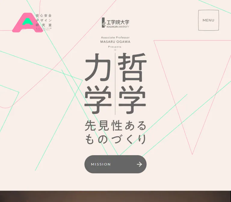
プレビュー準備中デザインリファレンスを見る
DESIGN REFERENCE
安心安全デザイン研究室|工学院大学
生成りの背景にグレーの縦組み文字とピンク・ミントの細線を重ねた研究室サイト。モノクロの人物写真、大きな余白、丸型・カプセル型の導線が特徴。
AA Design Lab — Style Reference
A quiet academic canvas crossed by fluorescent drafting lines, with mechanics and philosophy presented as a paired visual identity.
Website / original URL: aa-design-lab.com Final URL: https://aa-design-lab.com/ Theme: warm light surfaces, a black information section, and a broad gray closing navigation band. Inspected: October 2, 2026, 03:30 JST; supplied evidence retrieved October 1, 2026, at 18:30:06.716 UTC. Viewports: 1440 × 1000 and 390 × 844 CSS pixels. Scope: the current laboratory homepage: opening composition, news, mechanics and philosophy links, researcher profile, education and joint-research introductions, visible location imagery, closing navigation, and footer. The evidence includes three desktop captures, two mobile captures, and rendered DOM measurements across the homepage. Menu expansion and destination pages were not inspected.
The homepage of 安心安全デザイン研究室 combines university identification with an unusually expressive research identity. Warm peach paper and medium-gray text establish a restrained base. A pink-and-mint laboratory mark, extremely fine geometric outlines, and oversized vertical Japanese lettering supply the contrast. The central pairing of 「力学」 and 「哲学」 makes the relationship between the two research perspectives immediately visible.
The page continues as a substantial institutional homepage. A compact news list, two tall research entry cards, a large researcher portrait, alternating editorial sections, and detailed contact navigation provide several independent routes into the site. Its character comes from changes in scale: tiny tracked English labels beside large Japanese statements, hairline geometry beside substantial gray buttons, and a large portrait above small institutional details.
閉じる
AA Design Lab — Style Reference
A quiet academic canvas crossed by fluorescent drafting lines, with mechanics and philosophy presented as a paired visual identity.
Website / original URL: aa-design-lab.com Final URL: https://aa-design-lab.com/ Theme: warm light surfaces, a black information section, and a broad gray closing navigation band. Inspected: October 2, 2026, 03:30 JST; supplied evidence retrieved October 1, 2026, at 18:30:06.716 UTC. Viewports: 1440 × 1000 and 390 × 844 CSS pixels. Scope: the current laboratory homepage: opening composition, news, mechanics and philosophy links, researcher profile, education and joint-research introductions, visible location imagery, closing navigation, and footer. The evidence includes three desktop captures, two mobile captures, and rendered DOM measurements across the homepage. Menu expansion and destination pages were not inspected.
The homepage of 安心安全デザイン研究室 combines university identification with an unusually expressive research identity. Warm peach paper and medium-gray text establish a restrained base. A pink-and-mint laboratory mark, extremely fine geometric outlines, and oversized vertical Japanese lettering supply the contrast. The central pairing of 「力学」 and 「哲学」 makes the relationship between the two research perspectives immediately visible.
The page continues as a substantial institutional homepage. A compact news list, two tall research entry cards, a large researcher portrait, alternating editorial sections, and detailed contact navigation provide several independent routes into the site. Its character comes from changes in scale: tiny tracked English labels beside large Japanese statements, hairline geometry beside substantial gray buttons, and a large portrait above small institutional details.
How to Read This Reference
- Measured values come from the supplied rendered DOM and computed styles. They were not independently remeasured during this analysis.
- Visual estimates describe the supplied current-page captures. Estimated colors were not obtained through pixel sampling.
- Calculated values are simple relationships between supplied measurements, such as gaps and width proportions.
- Recommendations describe a reusable implementation. They are not claims about existing source code or behavior.
- Token names beginning with
--aa-are implementation aliases introduced here. The supplied source exposes font variables, but no useful semantic palette or spacing system was recovered. - Recorded element positions describe the sampled layout. Do not turn document coordinates into fixed positioning rules, especially for elements with long transition declarations.
Tokens — Colors
Default Palette
| Name | Value | Suggested token | Evidence and role |
|---|---|---|---|
| Warm Paper | #F9EFE8 |
--aa-paper |
Measured footer background and closing-band text color. The hero and profile canvas visually match this warm family. |
| Graphite | #666666 |
--aa-ink |
Measured primary text, MISSION fill, contact-button fill, and telephone text. The closing band visually uses the same gray. |
| Pale Sand | #F2E3D6 |
--aa-sand |
Measured background of both research cards. A similar pale peach appears behind the portrait and in oversized background lettering. |
| White | #FFFFFF |
--aa-white |
Measured MISSION, contact-button, research-label, and news text. |
| Information Black | Approximately #000000 |
--aa-news |
Visually observed at the beginning of the information section in the mobile capture; its containing background was not included in the style sample. |
| Signal Pink | Approximately #FF73AD |
--aa-pink |
Visual estimate for the laboratory mark and pink hero outlines. Exact asset color is unavailable. |
| Signal Mint | Approximately #00FFA6 |
--aa-mint |
Visual estimate for the inner laboratory mark and green hero outlines. Exact asset color is unavailable. |
| Caption Gray | #777777 |
--aa-caption |
Measured campus-image captions. |
| Muted Gray | #888888 |
--aa-muted |
Measured contact introduction and privacy link. |
| Fine-print Gray | #999999 |
--aa-faint |
Measured address, copyright, and production-label text. |
| Peach Rule | Approximately #E8CEBD |
--aa-rule |
Visual approximation for footer separators and the student-counseling outline. |
The fluorescent accents occupy very little area. They identify the laboratory and trace shapes across the opening canvas; the primary action surfaces remain gray. Preserve this distribution when adapting the palette.
The raw BODY background is white, and several container elements report #333333. These ancestor values do not describe the dominant visible paper surface or the colors of their explicitly styled child labels. Likewise, transparent --g-color-* variables are not evidence of a visible gradient treatment.
Theme Presets
No theme selector or alternate user-selectable palette is evidenced. The black information section and gray closing band are local section treatments within the same page.
Tokens — Typography
Japanese Text — Noto Sans JP
Measured family: 'Noto Sans JP', exposed through source variable --s-font-b18a6aaf.
The sampled Japanese news titles, feature headings, descriptions, researcher name, and contact text use this family. Regular text generally uses weight 400; feature headings, section labels, and the researcher name use 500. The contact-button label uses 700.
The typography feels measured and open. Feature paragraphs use a generous 2 line-height ratio, while headings use 1.5. Tracking is modest in Japanese prose and more pronounced in labels.
English Labels and Numbers — Lato
Measured family: Lato, exposed through source variable --s-font-6799bf9c.
Lato appears in MENU, MISSION, MORE, INFORMATION, research-card labels, dates, the telephone number, and the small Romanized profile text. Uppercase navigation labels commonly use 0.23em tracking. MENU uses the tighter 0.1em.
Some Japanese footer labels and campus captions also report Lato as their computed family. The evidence does not identify the actual fallback font used for Japanese glyphs in those elements. Do not interpret that declaration as proof that Lato supplies their Japanese letterforms.
Fine Print — Roboto
The small Web Produced by label is measured as Roboto, 10px / 14px, weight 400, with 0.8px tracking. This is a narrowly scoped detail rather than the primary interface font.
Hero Lettering and Background Display Type
The large 「力学」 and 「哲学」 lettering, university lockup, and hero statement are visible in the captures but absent from the supplied text-element measurements. Their exact font, asset format, and construction are unverified.
The paired title occupies approximately 284 × 280px on desktop and 196 × 190px on mobile. These are visual bounds, not measured font sizes. The statement beneath reads 「事故ふせぐ / 新たな視点」 in both current opening captures.
A Montserrat source variable is present, but none of the sampled text elements establishes its use. Do not assign Montserrat to the hero or oversized profile background lettering without further evidence.
Type Scale
Values below are measured. Sizes are shown as font-size / line-height.
| Role | Family / weight | Desktop | Mobile | Tracking |
|---|---|---|---|---|
| MENU | Lato / 400 | 16 / 22.4px |
13 / 18.2px |
0.1em |
| MISSION | Lato / 400 | 16 / 22.4px |
14 / 19.6px |
0.23em |
| INFORMATION | Lato / 400 | 28 / 39.2px |
16 / 22.4px |
0.23em desktop; 0.27em mobile |
| News date | Lato / 400 | 14 / 14px |
12 / 12px |
Normal |
| News category | Noto Sans JP / 400 | 12 / 16.8px |
12 / 12px |
0.05em |
| News title | Noto Sans JP / 400 | 15 / 24px |
15 / 24px |
Normal |
| Research-card label | Lato / 400 | 16 / 22.4px |
16 / 22.4px |
0.23em |
| Researcher name | Noto Sans JP / 500 | 48 / 67.2px |
28 / 39.2px |
0.05em |
| Romanized name and role | Lato / 400 | 12 / 16.8px |
Same | 0.1em |
| Circular MORE label | Lato / 400 | 16 / 22.4px |
12 / 16.8px |
0.21em |
| Japanese feature eyebrow | Noto Sans JP / 500 | 14 / 19.6px |
Same | 0.05em |
| English feature eyebrow | Lato / 400 | 12 / 16.8px |
Same | 0.05em |
| Feature heading | Noto Sans JP / 500 | 40 / 60px |
22 / 33px |
0.05em |
| Feature paragraph | Noto Sans JP / 400 | 20 / 40px |
14 / 28px |
0.04em |
| Feature MORE label | Lato / 400 | 16 / 22.4px |
Same | 0.23em |
| Closing-band label | Noto Sans JP / 400 | 28 / 42px |
20 / 30px |
0.05em |
| Footer navigation label | Lato declaration / 400 | 14 / 19.6px |
12 / 16.8px |
0.1em |
| Footer English translation | Lato / 400 | 12 / 16.8px |
Not visibly displayed | 0.1em |
| Telephone number | Lato / 700 | 30 / 30px |
25 / 25px |
Normal |
| Contact-button label | Noto Sans JP / 700 | 14 / 19.6px |
Same | 0.11em |
| Address and copyright | Noto Sans JP / 400 | 12 / 16.8px |
Same | 0.08em |
Additional measured exceptions matter: the information-section MORE label becomes 14px on mobile, while the editorial MORE labels remain 16px. The student-counseling label increases from 16px on desktop to 18px on mobile. The privacy link stays 11px / 18.7px, with -0.01em tracking.
Tokens — Spacing & Shapes
Density: sparse at the section level, compact within navigation and metadata.
The page uses several distinct shapes: nearly square outlined MENU controls, capsule links, two tall rounded research cards, a tilted oval portrait composition, a circular profile link, and straight footer rules. These shapes have separate roles; there is no single universal card treatment.
Responsive Unit
No global fluid spacing formula was supplied. Both sampled root elements report a conventional 16px font size. The desktop and mobile measurements demonstrate selective resizing, stacking, and retained dimensions rather than uniform scaling.
For reuse, treat the measured values as endpoint references. Any clamp() formula or breakpoint introduced in an implementation is a recommendation.
Spacing Scale
| Use | Desktop | Mobile | Evidence |
|---|---|---|---|
| Header horizontal clearance | 55px |
20px |
Measured from corner-control bounds |
| MENU top position | 53px |
25px |
Measured |
| MISSION internal padding | 30px |
20px |
Computed style |
| Standard MORE padding | 20px 30px |
Same | Computed style |
| Contact-button padding | 15px 30px |
20px 30px |
Computed style |
| News date-to-category gap | 21px |
21px |
Calculated from adjacent bounds |
| Space between news-link boxes | 30px |
30px |
Calculated |
| Research-card separation | 180px horizontally |
60px vertically |
Calculated |
| Feature heading-to-paragraph gap | 60px |
40px |
Calculated from measured text bounds |
| Feature paragraph-to-MORE gap | 40px |
40px |
Calculated |
| Footer top padding | 80px |
50px |
Computed style |
| Footer navigation text inset | 10px |
10px |
Computed style |
Border Radius
| Element | Measured value | Interpretation |
|---|---|---|
| MISSION, MORE, contact links | 64px |
Produces capsules at the sampled heights |
| Research cards | 30px |
Substantial rounded portrait panels |
| Profile MORE | 50% |
True circle |
| Student-counseling link | 8px |
Small outlined utility rectangle |
| MENU element | 0px |
Its visible outline bows slightly; the outline construction is not exposed |
| Footer navigation rows | 0px |
Flat rows separated by rules |
Hero lines and fine outlines appear approximately 0.5–1px thick. This is a visual estimate; their source stroke widths were not supplied.
Layout Measurements
| Element | 1440 × 1000 | 390 × 844 | Notes |
|---|---|---|---|
| Document height | 5829.14px |
6032.02px |
Sampled HTML bounds |
| Header box | 1440 × 150px |
390 × 117px |
Transparent in both samples |
| Logo link box | 180 × 89.77px |
98 × 67px |
Mobile artwork occupies less height than its link box |
| MENU | 95 × 95px |
60 × 60px |
Preserves a square footprint |
| MISSION | 284 × 82.39px |
195.53 × 59.59px |
Centered at each viewport |
| News link width | 568px |
299.5px |
Longer mobile entry wraps to two title lines |
| Information MORE | 324 × 64.39px |
324 × 61.59px |
Width remains unchanged at these endpoints |
| Each research card | 375 × 590px |
292.5 × 460px |
Mobile width equals 75% of the viewport |
| Profile MORE | 240 × 240px |
100 × 100px |
Stronger reduction than ordinary controls |
| Editorial MORE | 324 × 64.39px |
323.5 × 64.39px |
Nearly unchanged |
| Closing navigation band | 1440 × 240px |
390 × 240px |
Height remains constant |
| Footer | 1440 × 470.27px |
390 × 719.66px |
Contact content stacks on mobile |
| Footer navigation row | Approximately 296.34 × 67.39px |
162.42 × 37.80px |
English translations disappear visually on mobile |
| Contact link | 241.91 × 49.59px |
265.19 × 59.59px |
Becomes larger on mobile |
Components
Persistent Corner Identity and MENU
Role: maintain identity and access to navigation while leaving the content canvas open.
The desktop logo sits at approximately 55px from the left and 56.6px from the top. MENU sits 55px from the right in a 95px square. Neither is placed inside an opaque navigation bar. The laboratory mark combines a broad pink A-like silhouette, a mint inset, and small Japanese identification text.
MENU uses centered gray Lato text and a very thin, subtly curved square outline. Its element reports zero border radius, so a normal rounded rectangle should not be presented as the verified source construction. An SVG outline would be a reasonable recreation technique.
On mobile, the logo link becomes 98px wide, and MENU becomes 60px square with 13px text. The logo remains visible in the supplied lower-page mobile capture, but MENU is absent there. The exact scroll-dependent visibility rule is unverified. Desktop captures show both controls at consistent viewport positions.
The DOM identifies MENU as a button. No opened state, navigation overlay, focus behavior, or closing interaction was supplied.
Opening Hero Composition
Role: introduce the laboratory through the visual pairing of mechanics and philosophy.
The main composition has a narrow central axis despite the full-width canvas. Its visible layers are:
- A small gray university lockup near the top center.
- Small English professor identification and a presentation label.
- Two oversized Japanese columns: 「力学」 at left and 「哲学」 at right.
- A thin central vertical divider with a small cross-like detail above it.
- The two-line statement 「事故ふせぐ / 新たな視点」.
- A filled gray MISSION capsule with a right arrow.
The university lockup appears approximately 125px wide in both opening captures. The main title and statement shrink more noticeably. This retained institutional mark helps keep the mobile composition legible and recognizable.
The surrounding geometry combines long mint diagonals and angular open polygons with a pink looping curve and a large inverted triangular outline. Shapes extend beyond the viewport and are cropped at its edges. Their scale belongs to the whole hero, rather than to individual text blocks. Keep their strokes extremely fine and their interiors unfilled.
On desktop, MISSION begins at y = 768.75px. On mobile, it begins at y = 568.63px, and the cream hero gives way to the black information section at approximately y = 708px. These are observed endpoint positions, not evidence of a particular viewport-height formula.
MISSION links to /rule. Its destination is a separate route; no same-page mission scroll was demonstrated.
Capsule Link with Arrow
Role: repeat a clear, calm navigation affordance across different content sections.
The anatomy is a capsule container, left-aligned text, substantial empty space, and a rightward arrow near the trailing edge. English labels are widely tracked and generally regular weight. The Japanese contact label is bold.
| Variant | Treatment | Measured geometry |
|---|---|---|
| Hero MISSION | Gray fill, white label and light arrow | 284 × 82.39px; mobile 195.53 × 59.59px |
| Information MORE | Transparent anchor with white label on the dark section | 324 × 64.39px; mobile height 61.59px |
| Editorial MORE | Transparent anchor with gray label | Approximately 324 × 64.39px |
| Footer contact | Gray fill, bold white Japanese label | Desktop 241.91 × 49.59px; mobile 265.19 × 59.59px |
The computed samples do not include border properties for every MORE variant. A fine outline for transparent capsules is a practical adaptation, but should not be labeled a verified border measurement.
The arrows look like simple horizontal shafts with open angled heads. Their exact asset or icon implementation is unavailable. Font Awesome variables exist in the source, but they do not establish the implementation of each visible arrow.
Information Section
Role: give current laboratory news a distinct, compact reading area.
The supplied mobile capture reveals a black full-width section with white, widely tracked INFORMATION text and a short underline. The remaining news layout is documented by DOM measurements.
Three linked entries are present. Each combines a date and a small category on the first line, followed by a Japanese title. Categories are plain text, without evidenced colored badges. The sampled dates include 2026/08/21, 2026/4/1, and 2026/2/2.
On desktop, link boxes are 568px wide and approximately 55.8px high, separated by 30px. The first metadata line uses a 14px date and a 12px category, with approximately 21px between them. The title follows in 15px / 24px Noto Sans JP.
On mobile, link boxes narrow to 299.5px. Short entries measure 53px high; the longer funding announcement measures 77px because its title wraps to two lines. The date shrinks to 12px, while the title stays 15px. Preserve this emphasis on readable news text.
The measured short mobile text groups are inset farther than the longest entry. A new implementation may standardize their left alignment, but that is a cleanup recommendation rather than a source measurement.
The MORE link leads to /information. The three individual entries have their own /information/... destinations; their detail pages were not opened.
Mechanics and Philosophy Entry Cards
Role: present the two principal research perspectives as equally important destinations.
The DOM establishes two tall links with identical peach backgrounds, 30px radii, and white uppercase labels near their lower edges. Their destinations are /mechanics and /philosophy.
At desktop width, the cards sit side by side at x = 255px and x = 810px. Each measures 375 × 590px, producing a calculated 180px gap. At mobile width, each measures 292.5 × 460px, is centered at x = 48.75px, and stacks with a 60px gap.
Their aspect ratios remain close to 0.636, so the mobile treatment preserves their tall format. The label typography stays at 16px / 22.4px with 0.23em tracking.
Background-image declarations are present, but the supplied asset strings are truncated, and the captures do not show the complete card artwork. Do not invent illustrations, diagrams, or image subjects for these cards. Their measured geometry and navigational role are the reliable reference.
Researcher Profile Feature
Role: make the laboratory's principal researcher a central part of its identity.
The desktop capture shows a large monochrome portrait within a pale, tilted oval composition running from lower left to upper right. The portrait is a formal suit photograph with a direct, approachable expression. Its graphic treatment is smooth grayscale, with no visible halftone texture or distressed effect.
Very large, pale English lettering runs behind the portrait in horizontal rows and extends beyond the screen edges. Visible wording includes the researcher's name and the mechanics/philosophy identity. It functions as atmosphere rather than essential reading content. Its font family and motion are unverified.
Below the portrait, 「小川 雅」 appears in medium-weight Japanese type, followed by MASARU OGAWA and PI / Associate Professor in small Lato. A separate thin outlined circular MORE link occupies the lower-right side of the composition.
The circle measures 240px on desktop and 100px on mobile. The Japanese name changes from 48px to 28px, while the English identification remains 12px. Mobile portrait cropping is not shown in the supplied images; only the name and link geometry are established by mobile DOM evidence.
The profile link leads to /profile. Neither a portrait interaction nor background-text scrolling was demonstrated.
Education and Joint-Research Introductions
Role: connect the research identity to teaching and collaboration.
Each introduction contains a campus-image caption, a small Japanese section label, an English translation, a two-line Japanese heading, a spacious paragraph, and a MORE capsule.
The education heading reads 「多角的視点から / 安心安全を学ぶ。」. The joint-research heading reads 「企業と共創する / 安心安全。」. Their measured desktop typography is 40px / 60px, weight 500, with 2px tracking.
The desktop measurements place education text on the right and joint-research text on the left, establishing an alternating editorial arrangement. The image captions identify the Shinjuku campus atrium and exterior. Complete photographs are not shown in the supplied captures, so their cropping and color treatment remain unverified.
A characteristic inset separates heading blocks from body copy. On desktop, the section labels and headings begin 36px to the right of the paragraph and MORE link. On mobile, that inset becomes 26px. This gives the editorial blocks a subtle stagger without enclosing them in cards.
The mobile flow places each campus-image caption before its text introduction. Headings become 22px / 33px; paragraphs become 14px / 28px. Paragraph-to-link spacing remains 40px.
Education links to /seminar; joint research links to /rule#relationship. These are observed destinations, not inspected page designs.
Location Image and Closing Navigation Band
The lower desktop capture shows a grayscale street map with a pin identifying the university's Shinjuku campus. In that capture, map imagery occupies the left portion of a wider pale-gray area above the closing band. Its element bounds, provider implementation, and interaction model are not exposed by the supplied DOM sample. Treat it as visible location imagery, without assuming a draggable or zoomable map.
The following band spans the full viewport and measures 240px high at both inspected widths. It presents 「社会的役割」 with a right arrow, centered on a medium-gray field. The text is warm paper rather than pure white: measured #F9EFE8.
Its label changes from 28px / 42px on desktop to 20px / 30px on mobile. The entire band is a link to /rule, making it a large closing navigation gesture.
Footer Navigation and Contact
Role: provide a compact directory, institutional contact access, and supporting details.
The desktop footer uses warm paper with 80px top padding. Its main content stretches from approximately x = 216px to x = 1224px, a calculated 1008px width. Two navigation columns occupy the left side; contact information sits to the right with a broad intervening gap.
The six navigation destinations are arranged as two groups of three. Each desktop row has a Japanese label, a smaller English translation, a pale separator, and a small right arrow. The original English wording Social rule appears beneath 「社会的役割」 and is preserved here as source UI text.
The contact group contains:
- A small university consultation introduction.
- A telephone icon and bold telephone number.
- A filled 「お問合せ」 capsule leading to
/contact. - A small privacy-policy link to the university website.
- An outlined student-counseling link beside an X symbol.
The student-counseling control includes a note-style wordmark, but its observed destination is the local /student-counseling-room route. Do not assume it directly opens an external publishing platform.
On mobile, navigation retains two columns while English translations disappear visually. The navigation block spans 331.5px, with 29.25px side margins. Contact information moves below and becomes centered. The contact capsule becomes wider and taller than on desktop.
The lower footer includes an address, the copyright text 「©安心安全デザイン研究室 | 工学院大学」, and a very small production label with a linked symbol. The current-page evidence establishes the displayed laboratory/university affiliation. No readable producer name is present in the supplied original-page text.
Two external banner links occupy the desktop lower-right area. Their desktop boxes are 149 × 44px and 125 × 44px. On mobile, both narrow to 64px; the JKA graphic is visibly cropped inside its 64 × 44px box. Preserve complete banner artwork in a new implementation instead of copying this crop.
Observed content issue: the visible telephone number is 042-628-4928, while the link destination is tel:0426284940. Confirm the intended number before implementing a working telephone link.
Tokens — Motion & Interaction
The evidence supports transition declarations and navigational targets. It does not contain an interaction recording or a sequence proving animation trajectories.
| Element or treatment | Measured declaration | What can be concluded |
|---|---|---|
| Most labels, links, header elements | 0.3s cubic-bezier(0.4, 0.4, 0, 1) |
A common short transition timing exists; changed properties and triggers are not demonstrated. |
| BODY background | 0.5s cubic-bezier(0.4, 0.4, 0, 1) |
Background changes are transitionable; no theme-switch action was observed. |
| Desktop information MORE | 1.8s cubic-bezier(0.25, 0, 0, 1) |
Longer timing is declared on desktop. The mobile sample reports the common 0.3s timing. |
| Desktop mechanics card | 1.8s cubic-bezier(0.25, 0, 0, 1) with 0.7s delay |
A delayed transition is declared. Exact entry behavior is unverified. |
| Desktop philosophy card | Same duration and easing with 1s delay |
The two declarations establish a 0.3s stagger difference. |
| Mobile research cards | 0.3s cubic-bezier(0.4, 0.4, 0, 1) |
Desktop timing and delays are not retained in the sampled mobile declarations. |
| Editorial H2 elements | 1.8s cubic-bezier(0.4, 0.4, 0, 1) |
Long heading transitions are declared at both widths. |
| Sampled CSS animations | none |
No keyframe animation was reported for these sampled elements. This does not audit all descendants, pseudo-elements, or JavaScript effects. |
The capture process waited for finite motion and sampled layout stability, and temporarily paused perpetual animations during readiness checks. That procedure does not establish that any particular hero line, portrait, or background word actually animates.
Scrolling is represented by the supplied captures at different page positions. No hover, menu opening, keyboard navigation, map manipulation, contact submission, or destination-page transition was exercised in the evidence.
Recommended adaptation: use the measured 300ms easing for a small arrow movement or understated link feedback. If adding section entrances, keep content visible without JavaScript and provide a reduced-motion path. Do not invent a cursor-following hero, marquee, changing headline, or parallax portrait and describe it as observed behavior.
Surfaces
| Surface | Appearance | Function |
|---|---|---|
| Main canvas | Flat warm paper | Supports the hero, portrait, editorial content, and footer |
| Hero decoration | Unfilled pink and mint hairlines | Adds technical geometry without large areas of saturated color |
| Information section | Black with white typography | Creates a strong change of pace around compact news content |
| Research entry panels | Pale sand, tall proportions, 30px corners |
Groups the two research destinations |
| Profile composition | Pale oval, grayscale portrait, faint oversized lettering | Creates the main photographic focal point |
| Filled action | Graphite with white text | Gives MISSION and contact access substantial visual weight |
| Circular action | Transparent center and fine gray outline | Distinguishes the profile destination |
| Closing band | Full-width gray field with paper-colored text | Provides a large final route into the laboratory's mission |
| Footer rows | Paper with pale rules | Organizes dense navigation without separate cards |
The supplied captures show flat surfaces without a visible shadow hierarchy. Reproduce separation through scale, spacing, rules, and changes of background color.
Imagery
The key image relationship is between a colorful abstract laboratory identity and restrained institutional imagery. The hero needs no photographic background. Its subject is the large Japanese title and the open geometric field.
The profile photograph is the strongest photographic element actually visible in the evidence. Preserve a natural grayscale tonal range, a clear face, formal clothing, and a substantial silhouette. Its tilted oval presentation should feel deliberately composed; a standard circular avatar would lose much of the section's character.
The map is also visibly grayscale. Campus photographs are identified by their captions, but their full appearance is not documented here. Do not automatically apply the portrait's treatment to every campus asset.
Observed Asset References
Complete asset URLs were not supplied for the main artwork. The following inventory distinguishes visible material from incomplete asset evidence.
| Asset | Evidence | Reuse guidance |
|---|---|---|
| Laboratory logo | Visible in desktop and mobile captures; linked to the homepage | Preserve its pink/mint mark and small identification text; use authorized source artwork |
| University lockup | Visible above the hero title | Retain its proportions and small central placement |
| Hero lettering and statement | Visible in both opening captures; no corresponding text-style measurement | Obtain the original artwork or an approved equivalent; do not claim a font match |
| Hero line field | Visible pink curves and mint polygons | SVG is a suitable implementation recommendation; source format is unknown |
| Research-card artwork | Truncated background-image declarations | Obtain complete files before attempting faithful reproduction |
| Researcher portrait | Clearly visible in the desktop profile capture | Preserve monochrome photography and the diagonal oval composition |
| Campus atrium and exterior | Identified by rendered captions | Image subject is known; crop, grade, and aspect ratio are unverified |
| Location map | Visible in the lower desktop capture | Retain readable geographic context; interaction model is unknown |
| JKA and KEIRIN banners | Visible footer graphics with external links | Preserve complete artwork and intrinsic aspect ratios |
Decorative geometry can be rebuilt in code. Identity marks, portrait photography, campus imagery, and research-card illustrations require appropriate source assets.
Layout & Responsive Behavior
The desktop page alternates between full-width sections and constrained inner compositions. The opening title is only about 284px wide within a 1440px canvas. Research cards form a centered pair. The profile expands into a large image-and-lettering composition, and the two editorial sections alternate their text placement. The footer returns to a compact directory.
The mobile page retains the same content hierarchy while changing its proportions selectively:
| Area | Desktop behavior | Mobile behavior |
|---|---|---|
| Header | Large corner logo and 95px MENU |
Smaller logo and 60px MENU; 20px edge clearance |
| Hero | Narrow centered composition within a broad line field | Same paired vertical title; geometry is cropped more aggressively |
| First section boundary | Hero fills approximately the opening desktop capture | Black information section begins around 708px, within the 844px viewport |
| Information | Larger section label, 568px link boxes |
Smaller section label, 299.5px link boxes; title text remains 15px |
| Research entries | Two 375px cards with a wide gap |
Two centered 292.5px cards stacked vertically |
| Profile navigation | 240px circle and 48px name |
100px circle and 28px name |
| Editorial content | Alternating left/right arrangement | Image/caption then text; body shrinks to 14px while retaining double leading |
| Editorial links | Approximately 324px wide |
Remain approximately 324px wide |
| Closing band | 240px high |
Still 240px high |
| Footer | Navigation left, contact right | Two-column navigation above centered contact details |
| Footer translations | Visible beneath Japanese labels | Visually omitted |
| External banners | Full horizontal artwork | Narrow stacked boxes, including a visible crop issue |
The supplied body text exposes a max-width: 1140px media rule for conditional line breaks. This proves that such a breakpoint exists for that purpose; it does not establish the breakpoint governing every layout change. No tablet or intermediate-width capture was provided.
For implementation, preserve content flow and allow text expansion. Avoid fixing the entire page to either measured document height. The decorative background may overflow within a clipped hero, but content and footer banners should remain within usable page bounds.
Do’s and Don’ts
Do
- Use warm paper and medium gray as the primary surface/text relationship.
- Keep pink and mint concentrated in the laboratory identity and fine geometric decoration.
- Preserve the central pairing of two vertical Japanese research terms.
- Pair Lato utility labels with measured Noto Sans JP content typography.
- Give English action labels generous tracking and Japanese paragraphs generous leading.
- Retain the distinction between capsule links, the large circular profile link, and the square MENU control.
- Keep the research cards tall and equally weighted, with a mobile vertical stack.
- Give the profile portrait enough space to act as a major editorial moment.
- Preserve the footer's two-column link directory on mobile.
- Use the measured responsive exceptions, including larger mobile contact controls and nearly unchanged editorial links.
- Obtain actual identity and research artwork before claiming a faithful implementation.
Don’t
- Don’t turn every section into an interchangeable rounded card.
- Don’t fill the hero polygons or make their strokes visually heavy.
- Don’t spread the fluorescent accents across paragraph text, badges, and every action surface.
- Don’t identify the hero font from appearance alone.
- Don’t interpret a declared font variable as proof that a particular element uses it.
- Don’t replace the portrait composition with a small conventional avatar.
- Don’t apply the desktop-to-mobile width ratio to all typography and controls.
- Don’t describe MENU behavior, parallax, line animation, or a headline carousel as verified.
- Don’t substitute unrelated campus or research illustrations for undocumented source assets.
- Don’t reproduce the cropped mobile JKA graphic or the inconsistent telephone destination as intentional design features.
Recommended Implementation Additions
These are recommendations for a new implementation, not verified features of the inspected site.
- Give the home logo an accessible name and provide text equivalents for hero lettering if it is rendered as artwork.
- Implement MENU with an explicit expanded state, keyboard access, and focus management appropriate to the navigation surface eventually chosen.
- Keep decorative lines and oversized background lettering out of the accessibility tree and prevent them from intercepting pointer input.
- Provide a visible gray or black focus indicator. The neon line colors should not be the only way to identify focus.
- Give each MORE link a destination-specific accessible name, such as profile, news, education, or joint research.
- Increase the approximately
38pxmobile footer rows to at least44pxfor a more comfortable touch target. - Review the contrast of
#888888and#999999fine print against the paper background. Important contact and legal information can use a darker gray while retaining the visual hierarchy. - Keep partner banners in normal document flow, preserve their aspect ratios, and use
object-fit: containwhere an image box is required. - Verify the telephone number against an authoritative contact source before choosing the
tel:destination. - Preserve complete content when reduced motion is requested, when fonts fail to load, and when scripts are unavailable.
Agent Prompt Guide
Quick Color Reference
- Main paper:
#F9EFE8, measured in the footer. - Main text and filled actions:
#666666, measured. - Research-card surface:
#F2E3D6, measured. - Light labels:
#FFFFFF, measured; closing-band text uses#F9EFE8. - Information section: approximately black, visually observed.
- Pink and mint accents: approximately
#FF73ADand#00FFA6; replace with verified asset colors when available. - Fine footer rules: pale peach, not a strong dark border.
Overall Prompt
“Create a Japanese academic laboratory homepage using warm paper #F9EFE8, graphite text #666666, and pale sand research panels #F2E3D6. Place a small laboratory identity at the upper left and a thin outlined square MENU control at the upper right. Center a narrow hero composition with a university mark, small English professor identification, two large vertical Japanese research terms separated by a fine rule, a short two-line statement, and a gray MISSION capsule. Surround it with oversized, unfilled pink and mint hairline geometry cropped by the viewport. Continue with a black news section, two tall research entry cards, a large monochrome portrait in a tilted oval composition, alternating education and collaboration sections, a full-width gray closing link, and a warm-paper directory footer. Use Noto Sans JP for measured Japanese content roles and Lato for tracked English controls. Keep mobile content spacious, stack the research cards, and retain two footer navigation columns.”
Example Component Prompts
- Hero: “Compose a warm-paper academic hero with a roughly 284px central artwork column on desktop and 196px on a 390px phone. Preserve two adjacent vertical Japanese terms, a small university lockup, and a substantial gray MISSION pill. Use thin pink curves and mint diagonal polygons as oversized background drawing. Treat the exact display lettering as supplied artwork.”
- News list: “Build a black information section with a white tracked Lato heading. Each news link has a small date and plain Japanese category above a 15px Japanese title with 24px leading. Separate entry boxes by 30px. Allow long mobile titles to wrap without shrinking the title text.”
- Research entries: “Create two equally weighted peach research links, 375 × 590px on the desktop reference, with 30px corners and tracked uppercase labels. At 390px, use 292.5 × 460px panels with a 60px vertical gap. Reserve artwork slots for approved assets.”
- Profile: “Present a large grayscale formal portrait inside a pale diagonal oval composition. Place enormous, faint English lettering behind it, cropped at the viewport edges. Below, pair a medium-weight Japanese name with small English identification and a separate outlined circular MORE link.”
- Editorial section: “Pair a campus image and caption with a small bilingual eyebrow, a two-line Japanese heading, a paragraph with double leading, and a wide MORE capsule. Inset the heading block slightly relative to the paragraph. Alternate the desktop composition and use image-first mobile flow.”
- Footer: “Use warm paper, two columns of thinly ruled navigation links, and a separate contact group with a bold telephone number and gray contact pill. Stack the contact group below the directory on mobile. Keep external banners fully visible and give legal text its own clear area.”
Quick Start
CSS Custom Properties
This CSS is a reusable adaptation, not extracted source. Apply aa-site to the page body and use the component classes on semantic elements. Load licensed or otherwise authorized font files separately; no font-loading URLs were supplied.
The hero expects separate university artwork and a composite title asset containing professor identification, the paired title, and the short statement. Its artwork proportions are visual estimates. The 767px breakpoint, transparent-button outlines, hover arrow movement, and improved mobile footer targets are recommendations. The header models the visible opening state; it does not invent a scroll-hide rule or an expanded menu.
:root {
  /* Measured colors */
  --aa-paper: #f9efe8;
  --aa-ink: #666666;
  --aa-sand: #f2e3d6;
  --aa-white: #ffffff;
  --aa-caption: #777777;
  --aa-muted: #888888;
  --aa-faint: #999999;

  /* Visual approximations: verify against authorized assets */
  --aa-news: #000000;
  --aa-pink: #ff73ad;
  --aa-mint: #00ffa6;
  --aa-rule: #e8cebd;

  /* Observed families with recommended fallbacks */
  --aa-font-jp: 'Noto Sans JP', sans-serif;
  --aa-font-latin: 'Lato', sans-serif;
  --aa-font-credit: 'Roboto', sans-serif;

  --aa-heading: 40px;
  --aa-body: 20px;
  --aa-name: 48px;
  --aa-tracking-action: 0.23em;
  --aa-radius-pill: 64px;
  --aa-radius-card: 30px;
  --aa-radius-utility: 8px;
  --aa-ease: cubic-bezier(0.4, 0.4, 0, 1);
  --aa-ease-entry: cubic-bezier(0.25, 0, 0, 1);
  --aa-duration-ui: 300ms;
  --aa-duration-entry: 1800ms;
}

.aa-site,
.aa-site *,
.aa-site *::before,
.aa-site *::after {
  box-sizing: border-box;
}

.aa-site {
  margin: 0;
  color: var(--aa-ink);
  background: var(--aa-paper);
  font-family: var(--aa-font-jp);
}

.aa-site img {
  display: block;
  max-width: 100%;
  height: auto;
}

.aa-site a {
  color: inherit;
}

.aa-header {
  position: fixed;
  z-index: 20;
  inset: 0 0 auto;
  display: flex;
  align-items: flex-start;
  justify-content: space-between;
  height: 150px;
  padding: 53px 55px 0;
  pointer-events: none;
}

.aa-header > * {
  pointer-events: auto;
}

.aa-brand {
  display: block;
  width: 180px;
  margin-top: 3.6px;
}

.aa-menu {
  display: grid;
  place-items: center;
  width: 95px;
  height: 95px;
  padding: 0;
  border: 1px solid currentColor;
  border-radius: 0;
  color: var(--aa-ink);
  background: transparent;
  font: 400 16px / 1.4 var(--aa-font-latin);
  letter-spacing: 0.1em;
  cursor: pointer;
}

/* A plain border approximates the source's subtly bowed outline. */
.aa-hero {
  position: relative;
  isolation: isolate;
  min-height: 100svh;
  overflow: hidden;
  padding: 149px 20px 148px;
  background: var(--aa-paper);
}

.aa-hero__geometry {
  position: absolute;
  z-index: -1;
  inset: 0;
  width: 100%;
  height: 100%;
  pointer-events: none;
}

.aa-hero__geometry path {
  fill: none;
  stroke-width: 0.75;
  vector-effect: non-scaling-stroke;
}

.aa-geometry--pink { stroke: var(--aa-pink); }
.aa-geometry--mint { stroke: var(--aa-mint); }

.aa-hero__stack {
  width: min(284px, 100%);
  margin-inline: auto;
  text-align: center;
}

.aa-hero__institution {
  width: 125px;
  margin: 0 auto 40px;
}

.aa-hero__art {
  width: 100%;
  height: auto;
}

.aa-site .aa-pill {
  display: flex;
  align-items: center;
  justify-content: space-between;
  gap: 24px;
  width: 324px;
  max-width: 100%;
  padding: 20px 30px;
  border: 1px solid currentColor;
  border-radius: var(--aa-radius-pill);
  color: var(--aa-ink);
  background: transparent;
  font: 400 16px / 1.4 var(--aa-font-latin);
  letter-spacing: var(--aa-tracking-action);
  text-decoration: none;
}

.aa-site .aa-pill--solid {
  border: 0;
  color: var(--aa-white);
  background: var(--aa-ink);
}

.aa-site .aa-mission {
  width: 284px;
  margin-top: 50px;
  padding: 30px;
}

/* The arrow's small layout height preserves measured pill heights. */
.aa-arrow {
  position: relative;
  display: block;
  flex: none;
  width: 24px;
  height: 3px;
  background: currentColor;
  transition: transform var(--aa-duration-ui) var(--aa-ease);
}

.aa-arrow::after {
  content: '';
  position: absolute;
  top: 50%;
  right: 0;
  width: 14px;
  height: 14px;
  border-top: 3px solid currentColor;
  border-right: 3px solid currentColor;
  transform: translateY(-50%) rotate(45deg);
}

.aa-news {
  padding: 120px 7.5%;
  color: var(--aa-white);
  background: var(--aa-news);
}

.aa-news__heading {
  margin: 0;
  text-align: center;
  font: 400 28px / 1.4 var(--aa-font-latin);
  letter-spacing: 0.23em;
}

.aa-news__heading::after {
  content: '';
  display: block;
  width: 50px;
  height: 1px;
  margin: 10px auto 0;
  background: currentColor;
}

.aa-news__list {
  display: grid;
  gap: 30px;
  width: min(568px, 100%);
  margin: 60px auto 0;
  padding: 0;
  list-style: none;
}

.aa-news__item {
  display: block;
  padding-bottom: 10px;
  text-decoration: none;
}

.aa-news__meta {
  display: flex;
  flex-wrap: wrap;
  align-items: baseline;
  gap: 8px 21px;
}

.aa-news__date {
  font: 400 14px / 1 var(--aa-font-latin);
}

.aa-news__category {
  font-size: 12px;
  line-height: 1.4;
  letter-spacing: 0.05em;
}

.aa-news__title {
  margin: 5px 0 0;
  font-size: 15px;
  font-weight: 400;
  line-height: 24px;
}

.aa-news .aa-pill {
  margin: 60px auto 0;
  color: var(--aa-white);
}

.aa-topics {
  display: grid;
  grid-template-columns: repeat(2, minmax(0, 375px));
  justify-content: center;
  gap: clamp(40px, 12.5vw, 180px);
  padding: 100px 7.5%;
}

.aa-topic {
  display: flex;
  flex-direction: column;
  justify-content: flex-end;
  min-width: 0;
  aspect-ratio: 375 / 590;
  overflow: hidden;
  border-radius: var(--aa-radius-card);
  background: var(--aa-sand);
  text-decoration: none;
}

/* Recommended backing until the complete card artwork is supplied. */
.aa-topic__label {
  margin: 0;
  padding: 28px 16px;
  color: var(--aa-white);
  background: var(--aa-ink);
  text-align: center;
  font: 400 16px / 1.4 var(--aa-font-latin);
  letter-spacing: 0.23em;
}

.aa-profile__name {
  margin: 0;
  font-size: var(--aa-name);
  font-weight: 500;
  line-height: 1.4;
  letter-spacing: 0.05em;
}

.aa-profile__caption {
  margin: 5px 0 0;
  font: 400 12px / 1.4 var(--aa-font-latin);
  letter-spacing: 0.1em;
}

.aa-circle-link {
  display: flex;
  flex-direction: column;
  align-items: center;
  justify-content: center;
  gap: 28px;
  width: 240px;
  height: 240px;
  border: 1px solid currentColor;
  border-radius: 50%;
  font: 400 16px / 1.4 var(--aa-font-latin);
  letter-spacing: 0.21em;
  text-decoration: none;
}

.aa-feature {
  display: grid;
  grid-template-columns: repeat(2, minmax(0, 1fr));
  align-items: center;
  gap: clamp(48px, 8vw, 120px);
  width: min(1140px, 85%);
  margin: 120px auto;
}

/* Use media first in the DOM; reverse its desktop placement if needed. */
.aa-feature--reverse .aa-feature__media {
  order: 2;
}

.aa-feature__media {
  margin: 0;
}

.aa-feature__caption {
  margin-top: 12px;
  color: var(--aa-caption);
  text-align: right;
  font-size: 12px;
  line-height: 1.4;
}

.aa-feature__heading-group {
  margin-left: 36px;
}

.aa-feature__eyebrow {
  margin: 0;
  font-size: 14px;
  font-weight: 500;
  line-height: 1.4;
  letter-spacing: 0.05em;
}

.aa-feature__translation {
  margin: 6px 0 0;
  font: 400 12px / 1.4 var(--aa-font-latin);
  letter-spacing: 0.05em;
}

.aa-feature__heading {
  margin: 20px 0 0;
  font-size: var(--aa-heading);
  font-weight: 500;
  line-height: 1.5;
  letter-spacing: 0.05em;
}

.aa-feature__body {
  margin: 60px 0 40px;
  font-size: var(--aa-body);
  line-height: 2;
  letter-spacing: 0.04em;
}

.aa-site .aa-closing-link {
  display: flex;
  align-items: center;
  justify-content: center;
  gap: 32px;
  min-height: 240px;
  padding: 30px;
  color: var(--aa-paper);
  background: var(--aa-ink);
  font-size: 28px;
  line-height: 1.5;
  letter-spacing: 0.05em;
  text-decoration: none;
}

.aa-footer {
  padding-top: 80px;
  background: var(--aa-paper);
}

.aa-footer__top {
  display: grid;
  grid-template-columns: 60% 24%;
  justify-content: space-between;
  width: min(1008px, 85%);
  margin-inline: auto;
}

.aa-footer__nav {
  display: grid;
  grid-template-columns: repeat(2, minmax(0, 1fr));
  gap: 2%;
}

.aa-footer__link {
  display: flex;
  align-items: center;
  justify-content: space-between;
  gap: 12px;
  min-height: 67.4px;
  padding: 12px 10px;
  border-top: 1px solid var(--aa-rule);
  font-size: 14px;
  line-height: 1.4;
  letter-spacing: 0.1em;
  text-decoration: none;
}

.aa-footer__translation {
  display: block;
  font: 400 12px / 1.4 var(--aa-font-latin);
  letter-spacing: 0.1em;
}

.aa-contact__intro {
  margin: 0 0 15px;
  color: var(--aa-muted);
  font-size: 12px;
  font-weight: 500;
  line-height: 1.7;
}

.aa-contact__phone {
  font: 700 30px / 1 var(--aa-font-latin);
  text-decoration: none;
}

.aa-site .aa-contact__button {
  width: 100%;
  margin-top: 10px;
  padding: 15px 30px;
  font-family: var(--aa-font-jp);
  font-size: 14px;
  font-weight: 700;
  letter-spacing: 0.11em;
}

.aa-footer__meta {
  margin: 80px auto 0;
  padding: 0 20px 20px;
  text-align: center;
  color: var(--aa-faint);
  font-size: 12px;
  line-height: 1.4;
  letter-spacing: 0.08em;
}

/* Recommended normal-flow placement prevents cropped partner artwork. */
.aa-footer__banners {
  display: flex;
  flex-wrap: wrap;
  justify-content: center;
  align-items: center;
  gap: 16px;
  padding: 16px 20px 24px;
}

.aa-footer__banners img {
  width: auto;
  max-width: 149px;
  max-height: 44px;
  object-fit: contain;
}

.aa-site :focus-visible {
  outline: 2px solid var(--aa-ink);
  outline-offset: 5px;
}

.aa-news :focus-visible,
.aa-closing-link:focus-visible {
  outline-color: var(--aa-white);
  outline-offset: -5px;
}

@media (hover: hover) and (prefers-reduced-motion: no-preference) {
  .aa-pill:hover .aa-arrow,
  .aa-circle-link:hover .aa-arrow {
    transform: translateX(4px);
  }
}

/* Recommended breakpoint; exact source layout breakpoints are unknown. */
@media (max-width: 767px) {
  :root {
    --aa-heading: 22px;
    --aa-body: 14px;
    --aa-name: 28px;
  }

  .aa-header {
    height: 117px;
    padding: 25px 20px 0;
  }

  .aa-brand {
    width: 98px;
    min-height: 67px;
    margin-top: 4px;
  }

  .aa-menu {
    width: 60px;
    height: 60px;
    font-size: 13px;
  }

  .aa-hero {
    min-height: 708px;
    padding: 120px 20px 80px;
  }

  .aa-hero__stack {
    width: min(195.53px, 100%);
  }

  .aa-hero__institution {
    margin-bottom: 19px;
  }

  .aa-site .aa-mission {
    width: 100%;
    padding: 20px;
    font-size: 14px;
  }

  .aa-news {
    padding-block: 87px 80px;
  }

  .aa-news__heading {
    font-size: 16px;
    letter-spacing: 0.27em;
  }

  .aa-news__list {
    width: min(299.5px, 100%);
    margin-top: 40px;
  }

  .aa-news__date,
  .aa-news__category {
    font-size: 12px;
    line-height: 1;
  }

  .aa-news__title {
    margin-top: 7px;
  }

  .aa-news .aa-pill {
    margin-top: 30px;
    font-size: 14px;
  }

  .aa-topics {
    grid-template-columns: minmax(0, 292.5px);
    gap: 60px;
    padding: 80px 12.5%;
  }

  .aa-topic {
    aspect-ratio: 292.5 / 460;
  }

  .aa-circle-link {
    width: 100px;
    height: 100px;
    gap: 20px;
    font-size: 12px;
  }

  .aa-feature {
    grid-template-columns: minmax(0, 1fr);
    gap: 24px;
    margin-block: 80px;
  }

  .aa-feature--reverse .aa-feature__media {
    order: initial;
  }

  .aa-feature__heading-group {
    margin-left: 26px;
  }

  .aa-feature__heading {
    margin-top: 10px;
  }

  .aa-feature__body {
    margin-top: 40px;
  }

  .aa-site .aa-closing-link {
    font-size: 20px;
  }

  .aa-footer {
    padding-top: 50px;
  }

  .aa-footer__top {
    grid-template-columns: minmax(0, 1fr);
    gap: 30px;
  }

  .aa-footer__link {
    min-height: 44px;
    padding-block: 10px;
    font-size: 12px;
  }

  .aa-footer__translation {
    display: none;
  }

  .aa-contact {
    text-align: center;
  }

  .aa-contact__phone {
    font-size: 25px;
  }

  .aa-site .aa-contact__button {
    width: 80%;
    margin: 20px auto 0;
    padding: 20px 30px;
  }

  .aa-footer__meta {
    margin-top: 130px;
  }
}

@media (prefers-reduced-motion: reduce) {
  .aa-site *,
  .aa-site *::before,
  .aa-site *::after {
    animation: none !important;
    transition: none !important;
    scroll-behavior: auto !important;
  }
}
A static SVG can establish the line-field vocabulary. This example is an approximate drawing, not recovered artwork. Place it inside .aa-hero; keep the approved title artwork and actionable elements outside the SVG.
<svg class='aa-hero__geometry'
     viewBox='0 0 1440 1000'
     preserveAspectRatio='xMidYMid slice'
     aria-hidden='true'
     focusable='false'>
  <path class='aa-geometry--mint'
        d='M213 22 L736 908 L736 976 M0 344 L562 544 L335 976
           M786 22 L1402 277 L1384 454 L769 976
           M0 669 L64 529 L258 602 L77 976' />
  <path class='aa-geometry--pink'
        d='M683 22 C676 158 442 61 379 126
           C310 196 421 304 211 306
           C93 306 43 297 9 395
           C-35 515 109 625 155 666
           C233 736 353 537 466 445 L843 22
           M904 353 L1301 353 L1088 900 Z' />
</svg>
For action markup, use a real destination and a decorative arrow span. Repeated MORE labels should receive a destination-specific accessible name.
<a class='aa-pill aa-pill--solid aa-mission' href='/rule'>
  <span>MISSION</span>
  <span class='aa-arrow' aria-hidden='true'></span>
</a>

<a class='aa-circle-link' href='/profile' aria-label='View researcher profile'>
  <span>MORE</span>
  <span class='aa-arrow' aria-hidden='true'></span>
</a>
Tailwind v4 Token Mapping
Optional aliases for a project already using Tailwind v4. Define the custom properties above first. This does not imply that the original website uses Tailwind.
@theme inline {
  --color-paper: var(--aa-paper);
  --color-ink: var(--aa-ink);
  --color-sand: var(--aa-sand);
  --color-signal-pink: var(--aa-pink);
  --color-signal-mint: var(--aa-mint);
  --color-news: var(--aa-news);
  --color-soft-rule: var(--aa-rule);

  --font-japanese: var(--aa-font-jp);
  --font-latin: var(--aa-font-latin);
  --font-credit: var(--aa-font-credit);

  --text-feature: var(--aa-heading);
  --text-feature-body: var(--aa-body);
  --text-profile-name: var(--aa-name);

  --radius-capsule: var(--aa-radius-pill);
  --radius-research: var(--aa-radius-card);
  --radius-utility: var(--aa-radius-utility);
}
Sources & Evidence
- Original and final page: https://aa-design-lab.com/. The supplied observation reports HTTP
200, with identical original and final URLs and the rendered title 「安心安全デザイン研究室」. - Capture batch timestamp:
2026-10-01T18:30:06.716Z, corresponding to October 2, 2026, at 03:30:06.716 JST. Individual screenshot timestamps were not separately supplied. - Desktop evidence: three current-page captures at
1440 × 1000, showing the opening hero, researcher profile, and lower map/navigation/footer area; rendered DOM and computed-style samples covering additional homepage sections. - Mobile evidence: two current-page captures at
390 × 844, showing the opening hero/information boundary and lower footer; rendered DOM measurements covering the remaining homepage content. - Measured data: element bounds, computed colors, font families, sizes, weights, leading, tracking, padding, radii, transition declarations, and link destinations. Complete source stylesheets and full asset URLs were not provided.
- Inspection method reported with the evidence: an initial observation of at least five seconds, readiness checks for loading, finite motion, layout/text stability, and image decoding, followed by scrolling through intermediate positions. These checks do not prove semantic completeness or reveal every interaction.
- Limitations: no expanded MENU state, hover demonstration, keyboard audit, animation trace, map interaction, contact submission, destination-page inspection, or intermediate-width capture. Hero font attribution, complete research-card artwork, mobile portrait cropping, and precise accent colors remain unverified.
The CSS, SVG, accessibility changes, and proposed breakpoint are implementation recommendations. Measured endpoint values and visible current-page features remain distinct from those additions.
# AA Design Lab — Style Reference

> A quiet academic canvas crossed by fluorescent drafting lines, with mechanics and philosophy presented as a paired visual identity.

**Website / original URL:** [aa-design-lab.com](https://aa-design-lab.com/)
**Final URL:** [https://aa-design-lab.com/](https://aa-design-lab.com/)
**Theme:** warm light surfaces, a black information section, and a broad gray closing navigation band.
**Inspected:** October 2, 2026, 03:30 JST; supplied evidence retrieved October 1, 2026, at 18:30:06.716 UTC.
**Viewports:** 1440 × 1000 and 390 × 844 CSS pixels.
**Scope:** the current laboratory homepage: opening composition, news, mechanics and philosophy links, researcher profile, education and joint-research introductions, visible location imagery, closing navigation, and footer. The evidence includes three desktop captures, two mobile captures, and rendered DOM measurements across the homepage. Menu expansion and destination pages were not inspected.

The homepage of **安心安全デザイン研究室** combines university identification with an unusually expressive research identity. Warm peach paper and medium-gray text establish a restrained base. A pink-and-mint laboratory mark, extremely fine geometric outlines, and oversized vertical Japanese lettering supply the contrast. The central pairing of 「力学」 and 「哲学」 makes the relationship between the two research perspectives immediately visible.

The page continues as a substantial institutional homepage. A compact news list, two tall research entry cards, a large researcher portrait, alternating editorial sections, and detailed contact navigation provide several independent routes into the site. Its character comes from changes in scale: tiny tracked English labels beside large Japanese statements, hairline geometry beside substantial gray buttons, and a large portrait above small institutional details.
閉じる
# AA Design Lab — Style Reference

> A quiet academic canvas crossed by fluorescent drafting lines, with mechanics and philosophy presented as a paired visual identity.

**Website / original URL:** [aa-design-lab.com](https://aa-design-lab.com/)
**Final URL:** [https://aa-design-lab.com/](https://aa-design-lab.com/)
**Theme:** warm light surfaces, a black information section, and a broad gray closing navigation band.
**Inspected:** October 2, 2026, 03:30 JST; supplied evidence retrieved October 1, 2026, at 18:30:06.716 UTC.
**Viewports:** 1440 × 1000 and 390 × 844 CSS pixels.
**Scope:** the current laboratory homepage: opening composition, news, mechanics and philosophy links, researcher profile, education and joint-research introductions, visible location imagery, closing navigation, and footer. The evidence includes three desktop captures, two mobile captures, and rendered DOM measurements across the homepage. Menu expansion and destination pages were not inspected.

The homepage of **安心安全デザイン研究室** combines university identification with an unusually expressive research identity. Warm peach paper and medium-gray text establish a restrained base. A pink-and-mint laboratory mark, extremely fine geometric outlines, and oversized vertical Japanese lettering supply the contrast. The central pairing of 「力学」 and 「哲学」 makes the relationship between the two research perspectives immediately visible.

The page continues as a substantial institutional homepage. A compact news list, two tall research entry cards, a large researcher portrait, alternating editorial sections, and detailed contact navigation provide several independent routes into the site. Its character comes from changes in scale: tiny tracked English labels beside large Japanese statements, hairline geometry beside substantial gray buttons, and a large portrait above small institutional details.

## How to Read This Reference

- **Measured** values come from the supplied rendered DOM and computed styles. They were not independently remeasured during this analysis.
- **Visual estimates** describe the supplied current-page captures. Estimated colors were not obtained through pixel sampling.
- **Calculated** values are simple relationships between supplied measurements, such as gaps and width proportions.
- **Recommendations** describe a reusable implementation. They are not claims about existing source code or behavior.
- Token names beginning with `--aa-` are implementation aliases introduced here. The supplied source exposes font variables, but no useful semantic palette or spacing system was recovered.
- Recorded element positions describe the sampled layout. Do not turn document coordinates into fixed positioning rules, especially for elements with long transition declarations.

## Tokens — Colors

### Default Palette

| Name | Value | Suggested token | Evidence and role |
| --- | --- | --- | --- |
| Warm Paper | `#F9EFE8` | `--aa-paper` | Measured footer background and closing-band text color. The hero and profile canvas visually match this warm family. |
| Graphite | `#666666` | `--aa-ink` | Measured primary text, MISSION fill, contact-button fill, and telephone text. The closing band visually uses the same gray. |
| Pale Sand | `#F2E3D6` | `--aa-sand` | Measured background of both research cards. A similar pale peach appears behind the portrait and in oversized background lettering. |
| White | `#FFFFFF` | `--aa-white` | Measured MISSION, contact-button, research-label, and news text. |
| Information Black | Approximately `#000000` | `--aa-news` | Visually observed at the beginning of the information section in the mobile capture; its containing background was not included in the style sample. |
| Signal Pink | Approximately `#FF73AD` | `--aa-pink` | Visual estimate for the laboratory mark and pink hero outlines. Exact asset color is unavailable. |
| Signal Mint | Approximately `#00FFA6` | `--aa-mint` | Visual estimate for the inner laboratory mark and green hero outlines. Exact asset color is unavailable. |
| Caption Gray | `#777777` | `--aa-caption` | Measured campus-image captions. |
| Muted Gray | `#888888` | `--aa-muted` | Measured contact introduction and privacy link. |
| Fine-print Gray | `#999999` | `--aa-faint` | Measured address, copyright, and production-label text. |
| Peach Rule | Approximately `#E8CEBD` | `--aa-rule` | Visual approximation for footer separators and the student-counseling outline. |

The fluorescent accents occupy very little area. They identify the laboratory and trace shapes across the opening canvas; the primary action surfaces remain gray. Preserve this distribution when adapting the palette.

The raw `BODY` background is white, and several container elements report `#333333`. These ancestor values do not describe the dominant visible paper surface or the colors of their explicitly styled child labels. Likewise, transparent `--g-color-*` variables are not evidence of a visible gradient treatment.

### Theme Presets

No theme selector or alternate user-selectable palette is evidenced. The black information section and gray closing band are local section treatments within the same page.

## Tokens — Typography

### Japanese Text — Noto Sans JP

**Measured family:** `'Noto Sans JP'`, exposed through source variable `--s-font-b18a6aaf`.

The sampled Japanese news titles, feature headings, descriptions, researcher name, and contact text use this family. Regular text generally uses weight `400`; feature headings, section labels, and the researcher name use `500`. The contact-button label uses `700`.

The typography feels measured and open. Feature paragraphs use a generous `2` line-height ratio, while headings use `1.5`. Tracking is modest in Japanese prose and more pronounced in labels.

### English Labels and Numbers — Lato

**Measured family:** `Lato`, exposed through source variable `--s-font-6799bf9c`.

Lato appears in MENU, MISSION, MORE, INFORMATION, research-card labels, dates, the telephone number, and the small Romanized profile text. Uppercase navigation labels commonly use `0.23em` tracking. MENU uses the tighter `0.1em`.

Some Japanese footer labels and campus captions also report `Lato` as their computed family. The evidence does not identify the actual fallback font used for Japanese glyphs in those elements. Do not interpret that declaration as proof that Lato supplies their Japanese letterforms.

### Fine Print — Roboto

The small `Web Produced by` label is measured as `Roboto`, `10px / 14px`, weight `400`, with `0.8px` tracking. This is a narrowly scoped detail rather than the primary interface font.

### Hero Lettering and Background Display Type

The large 「力学」 and 「哲学」 lettering, university lockup, and hero statement are visible in the captures but absent from the supplied text-element measurements. Their exact font, asset format, and construction are unverified.

The paired title occupies approximately **284 × 280px** on desktop and **196 × 190px** on mobile. These are visual bounds, not measured font sizes. The statement beneath reads 「事故ふせぐ / 新たな視点」 in both current opening captures.

A Montserrat source variable is present, but none of the sampled text elements establishes its use. Do not assign Montserrat to the hero or oversized profile background lettering without further evidence.

### Type Scale

Values below are measured. Sizes are shown as `font-size / line-height`.

| Role | Family / weight | Desktop | Mobile | Tracking |
| --- | --- | --- | --- | --- |
| MENU | Lato / 400 | `16 / 22.4px` | `13 / 18.2px` | `0.1em` |
| MISSION | Lato / 400 | `16 / 22.4px` | `14 / 19.6px` | `0.23em` |
| INFORMATION | Lato / 400 | `28 / 39.2px` | `16 / 22.4px` | `0.23em` desktop; `0.27em` mobile |
| News date | Lato / 400 | `14 / 14px` | `12 / 12px` | Normal |
| News category | Noto Sans JP / 400 | `12 / 16.8px` | `12 / 12px` | `0.05em` |
| News title | Noto Sans JP / 400 | `15 / 24px` | `15 / 24px` | Normal |
| Research-card label | Lato / 400 | `16 / 22.4px` | `16 / 22.4px` | `0.23em` |
| Researcher name | Noto Sans JP / 500 | `48 / 67.2px` | `28 / 39.2px` | `0.05em` |
| Romanized name and role | Lato / 400 | `12 / 16.8px` | Same | `0.1em` |
| Circular MORE label | Lato / 400 | `16 / 22.4px` | `12 / 16.8px` | `0.21em` |
| Japanese feature eyebrow | Noto Sans JP / 500 | `14 / 19.6px` | Same | `0.05em` |
| English feature eyebrow | Lato / 400 | `12 / 16.8px` | Same | `0.05em` |
| Feature heading | Noto Sans JP / 500 | `40 / 60px` | `22 / 33px` | `0.05em` |
| Feature paragraph | Noto Sans JP / 400 | `20 / 40px` | `14 / 28px` | `0.04em` |
| Feature MORE label | Lato / 400 | `16 / 22.4px` | Same | `0.23em` |
| Closing-band label | Noto Sans JP / 400 | `28 / 42px` | `20 / 30px` | `0.05em` |
| Footer navigation label | Lato declaration / 400 | `14 / 19.6px` | `12 / 16.8px` | `0.1em` |
| Footer English translation | Lato / 400 | `12 / 16.8px` | Not visibly displayed | `0.1em` |
| Telephone number | Lato / 700 | `30 / 30px` | `25 / 25px` | Normal |
| Contact-button label | Noto Sans JP / 700 | `14 / 19.6px` | Same | `0.11em` |
| Address and copyright | Noto Sans JP / 400 | `12 / 16.8px` | Same | `0.08em` |

Additional measured exceptions matter: the information-section MORE label becomes `14px` on mobile, while the editorial MORE labels remain `16px`. The student-counseling label increases from `16px` on desktop to `18px` on mobile. The privacy link stays `11px / 18.7px`, with `-0.01em` tracking.

## Tokens — Spacing & Shapes

**Density:** sparse at the section level, compact within navigation and metadata.

The page uses several distinct shapes: nearly square outlined MENU controls, capsule links, two tall rounded research cards, a tilted oval portrait composition, a circular profile link, and straight footer rules. These shapes have separate roles; there is no single universal card treatment.

### Responsive Unit

No global fluid spacing formula was supplied. Both sampled root elements report a conventional `16px` font size. The desktop and mobile measurements demonstrate selective resizing, stacking, and retained dimensions rather than uniform scaling.

For reuse, treat the measured values as endpoint references. Any `clamp()` formula or breakpoint introduced in an implementation is a recommendation.

### Spacing Scale

| Use | Desktop | Mobile | Evidence |
| --- | --- | --- | --- |
| Header horizontal clearance | `55px` | `20px` | Measured from corner-control bounds |
| MENU top position | `53px` | `25px` | Measured |
| MISSION internal padding | `30px` | `20px` | Computed style |
| Standard MORE padding | `20px 30px` | Same | Computed style |
| Contact-button padding | `15px 30px` | `20px 30px` | Computed style |
| News date-to-category gap | `21px` | `21px` | Calculated from adjacent bounds |
| Space between news-link boxes | `30px` | `30px` | Calculated |
| Research-card separation | `180px` horizontally | `60px` vertically | Calculated |
| Feature heading-to-paragraph gap | `60px` | `40px` | Calculated from measured text bounds |
| Feature paragraph-to-MORE gap | `40px` | `40px` | Calculated |
| Footer top padding | `80px` | `50px` | Computed style |
| Footer navigation text inset | `10px` | `10px` | Computed style |

### Border Radius

| Element | Measured value | Interpretation |
| --- | --- | --- |
| MISSION, MORE, contact links | `64px` | Produces capsules at the sampled heights |
| Research cards | `30px` | Substantial rounded portrait panels |
| Profile MORE | `50%` | True circle |
| Student-counseling link | `8px` | Small outlined utility rectangle |
| MENU element | `0px` | Its visible outline bows slightly; the outline construction is not exposed |
| Footer navigation rows | `0px` | Flat rows separated by rules |

Hero lines and fine outlines appear approximately `0.5–1px` thick. This is a visual estimate; their source stroke widths were not supplied.

### Layout Measurements

| Element | 1440 × 1000 | 390 × 844 | Notes |
| --- | --- | --- | --- |
| Document height | `5829.14px` | `6032.02px` | Sampled HTML bounds |
| Header box | `1440 × 150px` | `390 × 117px` | Transparent in both samples |
| Logo link box | `180 × 89.77px` | `98 × 67px` | Mobile artwork occupies less height than its link box |
| MENU | `95 × 95px` | `60 × 60px` | Preserves a square footprint |
| MISSION | `284 × 82.39px` | `195.53 × 59.59px` | Centered at each viewport |
| News link width | `568px` | `299.5px` | Longer mobile entry wraps to two title lines |
| Information MORE | `324 × 64.39px` | `324 × 61.59px` | Width remains unchanged at these endpoints |
| Each research card | `375 × 590px` | `292.5 × 460px` | Mobile width equals 75% of the viewport |
| Profile MORE | `240 × 240px` | `100 × 100px` | Stronger reduction than ordinary controls |
| Editorial MORE | `324 × 64.39px` | `323.5 × 64.39px` | Nearly unchanged |
| Closing navigation band | `1440 × 240px` | `390 × 240px` | Height remains constant |
| Footer | `1440 × 470.27px` | `390 × 719.66px` | Contact content stacks on mobile |
| Footer navigation row | Approximately `296.34 × 67.39px` | `162.42 × 37.80px` | English translations disappear visually on mobile |
| Contact link | `241.91 × 49.59px` | `265.19 × 59.59px` | Becomes larger on mobile |

## Components

### Persistent Corner Identity and MENU

**Role:** maintain identity and access to navigation while leaving the content canvas open.

The desktop logo sits at approximately `55px` from the left and `56.6px` from the top. MENU sits `55px` from the right in a `95px` square. Neither is placed inside an opaque navigation bar. The laboratory mark combines a broad pink A-like silhouette, a mint inset, and small Japanese identification text.

MENU uses centered gray Lato text and a very thin, subtly curved square outline. Its element reports zero border radius, so a normal rounded rectangle should not be presented as the verified source construction. An SVG outline would be a reasonable recreation technique.

On mobile, the logo link becomes `98px` wide, and MENU becomes `60px` square with `13px` text. The logo remains visible in the supplied lower-page mobile capture, but MENU is absent there. The exact scroll-dependent visibility rule is unverified. Desktop captures show both controls at consistent viewport positions.

The DOM identifies MENU as a button. No opened state, navigation overlay, focus behavior, or closing interaction was supplied.

### Opening Hero Composition

**Role:** introduce the laboratory through the visual pairing of mechanics and philosophy.

The main composition has a narrow central axis despite the full-width canvas. Its visible layers are:

1. A small gray university lockup near the top center.
2. Small English professor identification and a presentation label.
3. Two oversized Japanese columns: 「力学」 at left and 「哲学」 at right.
4. A thin central vertical divider with a small cross-like detail above it.
5. The two-line statement 「事故ふせぐ / 新たな視点」.
6. A filled gray MISSION capsule with a right arrow.

The university lockup appears approximately `125px` wide in both opening captures. The main title and statement shrink more noticeably. This retained institutional mark helps keep the mobile composition legible and recognizable.

The surrounding geometry combines long mint diagonals and angular open polygons with a pink looping curve and a large inverted triangular outline. Shapes extend beyond the viewport and are cropped at its edges. Their scale belongs to the whole hero, rather than to individual text blocks. Keep their strokes extremely fine and their interiors unfilled.

On desktop, MISSION begins at `y = 768.75px`. On mobile, it begins at `y = 568.63px`, and the cream hero gives way to the black information section at approximately `y = 708px`. These are observed endpoint positions, not evidence of a particular viewport-height formula.

MISSION links to `/rule`. Its destination is a separate route; no same-page mission scroll was demonstrated.

### Capsule Link with Arrow

**Role:** repeat a clear, calm navigation affordance across different content sections.

The anatomy is a capsule container, left-aligned text, substantial empty space, and a rightward arrow near the trailing edge. English labels are widely tracked and generally regular weight. The Japanese contact label is bold.

| Variant | Treatment | Measured geometry |
| --- | --- | --- |
| Hero MISSION | Gray fill, white label and light arrow | `284 × 82.39px`; mobile `195.53 × 59.59px` |
| Information MORE | Transparent anchor with white label on the dark section | `324 × 64.39px`; mobile height `61.59px` |
| Editorial MORE | Transparent anchor with gray label | Approximately `324 × 64.39px` |
| Footer contact | Gray fill, bold white Japanese label | Desktop `241.91 × 49.59px`; mobile `265.19 × 59.59px` |

The computed samples do not include border properties for every MORE variant. A fine outline for transparent capsules is a practical adaptation, but should not be labeled a verified border measurement.

The arrows look like simple horizontal shafts with open angled heads. Their exact asset or icon implementation is unavailable. Font Awesome variables exist in the source, but they do not establish the implementation of each visible arrow.

### Information Section

**Role:** give current laboratory news a distinct, compact reading area.

The supplied mobile capture reveals a black full-width section with white, widely tracked INFORMATION text and a short underline. The remaining news layout is documented by DOM measurements.

Three linked entries are present. Each combines a date and a small category on the first line, followed by a Japanese title. Categories are plain text, without evidenced colored badges. The sampled dates include `2026/08/21`, `2026/4/1`, and `2026/2/2`.

On desktop, link boxes are `568px` wide and approximately `55.8px` high, separated by `30px`. The first metadata line uses a `14px` date and a `12px` category, with approximately `21px` between them. The title follows in `15px / 24px` Noto Sans JP.

On mobile, link boxes narrow to `299.5px`. Short entries measure `53px` high; the longer funding announcement measures `77px` because its title wraps to two lines. The date shrinks to `12px`, while the title stays `15px`. Preserve this emphasis on readable news text.

The measured short mobile text groups are inset farther than the longest entry. A new implementation may standardize their left alignment, but that is a cleanup recommendation rather than a source measurement.

The MORE link leads to `/information`. The three individual entries have their own `/information/...` destinations; their detail pages were not opened.

### Mechanics and Philosophy Entry Cards

**Role:** present the two principal research perspectives as equally important destinations.

The DOM establishes two tall links with identical peach backgrounds, `30px` radii, and white uppercase labels near their lower edges. Their destinations are `/mechanics` and `/philosophy`.

At desktop width, the cards sit side by side at `x = 255px` and `x = 810px`. Each measures `375 × 590px`, producing a calculated `180px` gap. At mobile width, each measures `292.5 × 460px`, is centered at `x = 48.75px`, and stacks with a `60px` gap.

Their aspect ratios remain close to `0.636`, so the mobile treatment preserves their tall format. The label typography stays at `16px / 22.4px` with `0.23em` tracking.

Background-image declarations are present, but the supplied asset strings are truncated, and the captures do not show the complete card artwork. Do not invent illustrations, diagrams, or image subjects for these cards. Their measured geometry and navigational role are the reliable reference.

### Researcher Profile Feature

**Role:** make the laboratory's principal researcher a central part of its identity.

The desktop capture shows a large monochrome portrait within a pale, tilted oval composition running from lower left to upper right. The portrait is a formal suit photograph with a direct, approachable expression. Its graphic treatment is smooth grayscale, with no visible halftone texture or distressed effect.

Very large, pale English lettering runs behind the portrait in horizontal rows and extends beyond the screen edges. Visible wording includes the researcher's name and the mechanics/philosophy identity. It functions as atmosphere rather than essential reading content. Its font family and motion are unverified.

Below the portrait, 「小川 雅」 appears in medium-weight Japanese type, followed by `MASARU OGAWA` and `PI / Associate Professor` in small Lato. A separate thin outlined circular MORE link occupies the lower-right side of the composition.

The circle measures `240px` on desktop and `100px` on mobile. The Japanese name changes from `48px` to `28px`, while the English identification remains `12px`. Mobile portrait cropping is not shown in the supplied images; only the name and link geometry are established by mobile DOM evidence.

The profile link leads to `/profile`. Neither a portrait interaction nor background-text scrolling was demonstrated.

### Education and Joint-Research Introductions

**Role:** connect the research identity to teaching and collaboration.

Each introduction contains a campus-image caption, a small Japanese section label, an English translation, a two-line Japanese heading, a spacious paragraph, and a MORE capsule.

The education heading reads 「多角的視点から / 安心安全を学ぶ。」. The joint-research heading reads 「企業と共創する / 安心安全。」. Their measured desktop typography is `40px / 60px`, weight `500`, with `2px` tracking.

The desktop measurements place education text on the right and joint-research text on the left, establishing an alternating editorial arrangement. The image captions identify the Shinjuku campus atrium and exterior. Complete photographs are not shown in the supplied captures, so their cropping and color treatment remain unverified.

A characteristic inset separates heading blocks from body copy. On desktop, the section labels and headings begin `36px` to the right of the paragraph and MORE link. On mobile, that inset becomes `26px`. This gives the editorial blocks a subtle stagger without enclosing them in cards.

The mobile flow places each campus-image caption before its text introduction. Headings become `22px / 33px`; paragraphs become `14px / 28px`. Paragraph-to-link spacing remains `40px`.

Education links to `/seminar`; joint research links to `/rule#relationship`. These are observed destinations, not inspected page designs.

### Location Image and Closing Navigation Band

The lower desktop capture shows a grayscale street map with a pin identifying the university's Shinjuku campus. In that capture, map imagery occupies the left portion of a wider pale-gray area above the closing band. Its element bounds, provider implementation, and interaction model are not exposed by the supplied DOM sample. Treat it as visible location imagery, without assuming a draggable or zoomable map.

The following band spans the full viewport and measures `240px` high at both inspected widths. It presents 「社会的役割」 with a right arrow, centered on a medium-gray field. The text is warm paper rather than pure white: measured `#F9EFE8`.

Its label changes from `28px / 42px` on desktop to `20px / 30px` on mobile. The entire band is a link to `/rule`, making it a large closing navigation gesture.

### Footer Navigation and Contact

**Role:** provide a compact directory, institutional contact access, and supporting details.

The desktop footer uses warm paper with `80px` top padding. Its main content stretches from approximately `x = 216px` to `x = 1224px`, a calculated `1008px` width. Two navigation columns occupy the left side; contact information sits to the right with a broad intervening gap.

The six navigation destinations are arranged as two groups of three. Each desktop row has a Japanese label, a smaller English translation, a pale separator, and a small right arrow. The original English wording `Social rule` appears beneath 「社会的役割」 and is preserved here as source UI text.

The contact group contains:

- A small university consultation introduction.
- A telephone icon and bold telephone number.
- A filled 「お問合せ」 capsule leading to `/contact`.
- A small privacy-policy link to the university website.
- An outlined student-counseling link beside an X symbol.

The student-counseling control includes a note-style wordmark, but its observed destination is the local `/student-counseling-room` route. Do not assume it directly opens an external publishing platform.

On mobile, navigation retains two columns while English translations disappear visually. The navigation block spans `331.5px`, with `29.25px` side margins. Contact information moves below and becomes centered. The contact capsule becomes wider and taller than on desktop.

The lower footer includes an address, the copyright text 「©安心安全デザイン研究室 | 工学院大学」, and a very small production label with a linked symbol. The current-page evidence establishes the displayed laboratory/university affiliation. No readable producer name is present in the supplied original-page text.

Two external banner links occupy the desktop lower-right area. Their desktop boxes are `149 × 44px` and `125 × 44px`. On mobile, both narrow to `64px`; the JKA graphic is visibly cropped inside its `64 × 44px` box. Preserve complete banner artwork in a new implementation instead of copying this crop.

**Observed content issue:** the visible telephone number is `042-628-4928`, while the link destination is `tel:0426284940`. Confirm the intended number before implementing a working telephone link.

## Tokens — Motion & Interaction

The evidence supports transition declarations and navigational targets. It does not contain an interaction recording or a sequence proving animation trajectories.

| Element or treatment | Measured declaration | What can be concluded |
| --- | --- | --- |
| Most labels, links, header elements | `0.3s cubic-bezier(0.4, 0.4, 0, 1)` | A common short transition timing exists; changed properties and triggers are not demonstrated. |
| BODY background | `0.5s cubic-bezier(0.4, 0.4, 0, 1)` | Background changes are transitionable; no theme-switch action was observed. |
| Desktop information MORE | `1.8s cubic-bezier(0.25, 0, 0, 1)` | Longer timing is declared on desktop. The mobile sample reports the common `0.3s` timing. |
| Desktop mechanics card | `1.8s cubic-bezier(0.25, 0, 0, 1)` with `0.7s` delay | A delayed transition is declared. Exact entry behavior is unverified. |
| Desktop philosophy card | Same duration and easing with `1s` delay | The two declarations establish a `0.3s` stagger difference. |
| Mobile research cards | `0.3s cubic-bezier(0.4, 0.4, 0, 1)` | Desktop timing and delays are not retained in the sampled mobile declarations. |
| Editorial H2 elements | `1.8s cubic-bezier(0.4, 0.4, 0, 1)` | Long heading transitions are declared at both widths. |
| Sampled CSS animations | `none` | No keyframe animation was reported for these sampled elements. This does not audit all descendants, pseudo-elements, or JavaScript effects. |

The capture process waited for finite motion and sampled layout stability, and temporarily paused perpetual animations during readiness checks. That procedure does not establish that any particular hero line, portrait, or background word actually animates.

Scrolling is represented by the supplied captures at different page positions. No hover, menu opening, keyboard navigation, map manipulation, contact submission, or destination-page transition was exercised in the evidence.

**Recommended adaptation:** use the measured `300ms` easing for a small arrow movement or understated link feedback. If adding section entrances, keep content visible without JavaScript and provide a reduced-motion path. Do not invent a cursor-following hero, marquee, changing headline, or parallax portrait and describe it as observed behavior.

## Surfaces

| Surface | Appearance | Function |
| --- | --- | --- |
| Main canvas | Flat warm paper | Supports the hero, portrait, editorial content, and footer |
| Hero decoration | Unfilled pink and mint hairlines | Adds technical geometry without large areas of saturated color |
| Information section | Black with white typography | Creates a strong change of pace around compact news content |
| Research entry panels | Pale sand, tall proportions, `30px` corners | Groups the two research destinations |
| Profile composition | Pale oval, grayscale portrait, faint oversized lettering | Creates the main photographic focal point |
| Filled action | Graphite with white text | Gives MISSION and contact access substantial visual weight |
| Circular action | Transparent center and fine gray outline | Distinguishes the profile destination |
| Closing band | Full-width gray field with paper-colored text | Provides a large final route into the laboratory's mission |
| Footer rows | Paper with pale rules | Organizes dense navigation without separate cards |

The supplied captures show flat surfaces without a visible shadow hierarchy. Reproduce separation through scale, spacing, rules, and changes of background color.

## Imagery

The key image relationship is between a colorful abstract laboratory identity and restrained institutional imagery. The hero needs no photographic background. Its subject is the large Japanese title and the open geometric field.

The profile photograph is the strongest photographic element actually visible in the evidence. Preserve a natural grayscale tonal range, a clear face, formal clothing, and a substantial silhouette. Its tilted oval presentation should feel deliberately composed; a standard circular avatar would lose much of the section's character.

The map is also visibly grayscale. Campus photographs are identified by their captions, but their full appearance is not documented here. Do not automatically apply the portrait's treatment to every campus asset.

### Observed Asset References

Complete asset URLs were not supplied for the main artwork. The following inventory distinguishes visible material from incomplete asset evidence.

| Asset | Evidence | Reuse guidance |
| --- | --- | --- |
| Laboratory logo | Visible in desktop and mobile captures; linked to the homepage | Preserve its pink/mint mark and small identification text; use authorized source artwork |
| University lockup | Visible above the hero title | Retain its proportions and small central placement |
| Hero lettering and statement | Visible in both opening captures; no corresponding text-style measurement | Obtain the original artwork or an approved equivalent; do not claim a font match |
| Hero line field | Visible pink curves and mint polygons | SVG is a suitable implementation recommendation; source format is unknown |
| Research-card artwork | Truncated background-image declarations | Obtain complete files before attempting faithful reproduction |
| Researcher portrait | Clearly visible in the desktop profile capture | Preserve monochrome photography and the diagonal oval composition |
| Campus atrium and exterior | Identified by rendered captions | Image subject is known; crop, grade, and aspect ratio are unverified |
| Location map | Visible in the lower desktop capture | Retain readable geographic context; interaction model is unknown |
| JKA and KEIRIN banners | Visible footer graphics with external links | Preserve complete artwork and intrinsic aspect ratios |

Decorative geometry can be rebuilt in code. Identity marks, portrait photography, campus imagery, and research-card illustrations require appropriate source assets.

## Layout & Responsive Behavior

The desktop page alternates between full-width sections and constrained inner compositions. The opening title is only about `284px` wide within a `1440px` canvas. Research cards form a centered pair. The profile expands into a large image-and-lettering composition, and the two editorial sections alternate their text placement. The footer returns to a compact directory.

The mobile page retains the same content hierarchy while changing its proportions selectively:

| Area | Desktop behavior | Mobile behavior |
| --- | --- | --- |
| Header | Large corner logo and `95px` MENU | Smaller logo and `60px` MENU; `20px` edge clearance |
| Hero | Narrow centered composition within a broad line field | Same paired vertical title; geometry is cropped more aggressively |
| First section boundary | Hero fills approximately the opening desktop capture | Black information section begins around `708px`, within the `844px` viewport |
| Information | Larger section label, `568px` link boxes | Smaller section label, `299.5px` link boxes; title text remains `15px` |
| Research entries | Two `375px` cards with a wide gap | Two centered `292.5px` cards stacked vertically |
| Profile navigation | `240px` circle and `48px` name | `100px` circle and `28px` name |
| Editorial content | Alternating left/right arrangement | Image/caption then text; body shrinks to `14px` while retaining double leading |
| Editorial links | Approximately `324px` wide | Remain approximately `324px` wide |
| Closing band | `240px` high | Still `240px` high |
| Footer | Navigation left, contact right | Two-column navigation above centered contact details |
| Footer translations | Visible beneath Japanese labels | Visually omitted |
| External banners | Full horizontal artwork | Narrow stacked boxes, including a visible crop issue |

The supplied body text exposes a `max-width: 1140px` media rule for conditional line breaks. This proves that such a breakpoint exists for that purpose; it does not establish the breakpoint governing every layout change. No tablet or intermediate-width capture was provided.

For implementation, preserve content flow and allow text expansion. Avoid fixing the entire page to either measured document height. The decorative background may overflow within a clipped hero, but content and footer banners should remain within usable page bounds.

## Do’s and Don’ts

### Do

- Use warm paper and medium gray as the primary surface/text relationship.
- Keep pink and mint concentrated in the laboratory identity and fine geometric decoration.
- Preserve the central pairing of two vertical Japanese research terms.
- Pair Lato utility labels with measured Noto Sans JP content typography.
- Give English action labels generous tracking and Japanese paragraphs generous leading.
- Retain the distinction between capsule links, the large circular profile link, and the square MENU control.
- Keep the research cards tall and equally weighted, with a mobile vertical stack.
- Give the profile portrait enough space to act as a major editorial moment.
- Preserve the footer's two-column link directory on mobile.
- Use the measured responsive exceptions, including larger mobile contact controls and nearly unchanged editorial links.
- Obtain actual identity and research artwork before claiming a faithful implementation.

### Don’t

- Don’t turn every section into an interchangeable rounded card.
- Don’t fill the hero polygons or make their strokes visually heavy.
- Don’t spread the fluorescent accents across paragraph text, badges, and every action surface.
- Don’t identify the hero font from appearance alone.
- Don’t interpret a declared font variable as proof that a particular element uses it.
- Don’t replace the portrait composition with a small conventional avatar.
- Don’t apply the desktop-to-mobile width ratio to all typography and controls.
- Don’t describe MENU behavior, parallax, line animation, or a headline carousel as verified.
- Don’t substitute unrelated campus or research illustrations for undocumented source assets.
- Don’t reproduce the cropped mobile JKA graphic or the inconsistent telephone destination as intentional design features.

## Recommended Implementation Additions

These are recommendations for a new implementation, not verified features of the inspected site.

- Give the home logo an accessible name and provide text equivalents for hero lettering if it is rendered as artwork.
- Implement MENU with an explicit expanded state, keyboard access, and focus management appropriate to the navigation surface eventually chosen.
- Keep decorative lines and oversized background lettering out of the accessibility tree and prevent them from intercepting pointer input.
- Provide a visible gray or black focus indicator. The neon line colors should not be the only way to identify focus.
- Give each MORE link a destination-specific accessible name, such as profile, news, education, or joint research.
- Increase the approximately `38px` mobile footer rows to at least `44px` for a more comfortable touch target.
- Review the contrast of `#888888` and `#999999` fine print against the paper background. Important contact and legal information can use a darker gray while retaining the visual hierarchy.
- Keep partner banners in normal document flow, preserve their aspect ratios, and use `object-fit: contain` where an image box is required.
- Verify the telephone number against an authoritative contact source before choosing the `tel:` destination.
- Preserve complete content when reduced motion is requested, when fonts fail to load, and when scripts are unavailable.

## Agent Prompt Guide

### Quick Color Reference

- Main paper: `#F9EFE8`, measured in the footer.
- Main text and filled actions: `#666666`, measured.
- Research-card surface: `#F2E3D6`, measured.
- Light labels: `#FFFFFF`, measured; closing-band text uses `#F9EFE8`.
- Information section: approximately black, visually observed.
- Pink and mint accents: approximately `#FF73AD` and `#00FFA6`; replace with verified asset colors when available.
- Fine footer rules: pale peach, not a strong dark border.

### Overall Prompt

“Create a Japanese academic laboratory homepage using warm paper `#F9EFE8`, graphite text `#666666`, and pale sand research panels `#F2E3D6`. Place a small laboratory identity at the upper left and a thin outlined square MENU control at the upper right. Center a narrow hero composition with a university mark, small English professor identification, two large vertical Japanese research terms separated by a fine rule, a short two-line statement, and a gray MISSION capsule. Surround it with oversized, unfilled pink and mint hairline geometry cropped by the viewport. Continue with a black news section, two tall research entry cards, a large monochrome portrait in a tilted oval composition, alternating education and collaboration sections, a full-width gray closing link, and a warm-paper directory footer. Use Noto Sans JP for measured Japanese content roles and Lato for tracked English controls. Keep mobile content spacious, stack the research cards, and retain two footer navigation columns.”

### Example Component Prompts

1. **Hero:** “Compose a warm-paper academic hero with a roughly 284px central artwork column on desktop and 196px on a 390px phone. Preserve two adjacent vertical Japanese terms, a small university lockup, and a substantial gray MISSION pill. Use thin pink curves and mint diagonal polygons as oversized background drawing. Treat the exact display lettering as supplied artwork.”
2. **News list:** “Build a black information section with a white tracked Lato heading. Each news link has a small date and plain Japanese category above a 15px Japanese title with 24px leading. Separate entry boxes by 30px. Allow long mobile titles to wrap without shrinking the title text.”
3. **Research entries:** “Create two equally weighted peach research links, 375 × 590px on the desktop reference, with 30px corners and tracked uppercase labels. At 390px, use 292.5 × 460px panels with a 60px vertical gap. Reserve artwork slots for approved assets.”
4. **Profile:** “Present a large grayscale formal portrait inside a pale diagonal oval composition. Place enormous, faint English lettering behind it, cropped at the viewport edges. Below, pair a medium-weight Japanese name with small English identification and a separate outlined circular MORE link.”
5. **Editorial section:** “Pair a campus image and caption with a small bilingual eyebrow, a two-line Japanese heading, a paragraph with double leading, and a wide MORE capsule. Inset the heading block slightly relative to the paragraph. Alternate the desktop composition and use image-first mobile flow.”
6. **Footer:** “Use warm paper, two columns of thinly ruled navigation links, and a separate contact group with a bold telephone number and gray contact pill. Stack the contact group below the directory on mobile. Keep external banners fully visible and give legal text its own clear area.”

## Quick Start

### CSS Custom Properties

This CSS is a reusable adaptation, not extracted source. Apply `aa-site` to the page body and use the component classes on semantic elements. Load licensed or otherwise authorized font files separately; no font-loading URLs were supplied.

The hero expects separate university artwork and a composite title asset containing professor identification, the paired title, and the short statement. Its artwork proportions are visual estimates. The `767px` breakpoint, transparent-button outlines, hover arrow movement, and improved mobile footer targets are recommendations. The header models the visible opening state; it does not invent a scroll-hide rule or an expanded menu.

```css
:root {
  /* Measured colors */
  --aa-paper: #f9efe8;
  --aa-ink: #666666;
  --aa-sand: #f2e3d6;
  --aa-white: #ffffff;
  --aa-caption: #777777;
  --aa-muted: #888888;
  --aa-faint: #999999;

  /* Visual approximations: verify against authorized assets */
  --aa-news: #000000;
  --aa-pink: #ff73ad;
  --aa-mint: #00ffa6;
  --aa-rule: #e8cebd;

  /* Observed families with recommended fallbacks */
  --aa-font-jp: 'Noto Sans JP', sans-serif;
  --aa-font-latin: 'Lato', sans-serif;
  --aa-font-credit: 'Roboto', sans-serif;

  --aa-heading: 40px;
  --aa-body: 20px;
  --aa-name: 48px;
  --aa-tracking-action: 0.23em;
  --aa-radius-pill: 64px;
  --aa-radius-card: 30px;
  --aa-radius-utility: 8px;
  --aa-ease: cubic-bezier(0.4, 0.4, 0, 1);
  --aa-ease-entry: cubic-bezier(0.25, 0, 0, 1);
  --aa-duration-ui: 300ms;
  --aa-duration-entry: 1800ms;
}

.aa-site,
.aa-site *,
.aa-site *::before,
.aa-site *::after {
  box-sizing: border-box;
}

.aa-site {
  margin: 0;
  color: var(--aa-ink);
  background: var(--aa-paper);
  font-family: var(--aa-font-jp);
}

.aa-site img {
  display: block;
  max-width: 100%;
  height: auto;
}

.aa-site a {
  color: inherit;
}

.aa-header {
  position: fixed;
  z-index: 20;
  inset: 0 0 auto;
  display: flex;
  align-items: flex-start;
  justify-content: space-between;
  height: 150px;
  padding: 53px 55px 0;
  pointer-events: none;
}

.aa-header > * {
  pointer-events: auto;
}

.aa-brand {
  display: block;
  width: 180px;
  margin-top: 3.6px;
}

.aa-menu {
  display: grid;
  place-items: center;
  width: 95px;
  height: 95px;
  padding: 0;
  border: 1px solid currentColor;
  border-radius: 0;
  color: var(--aa-ink);
  background: transparent;
  font: 400 16px / 1.4 var(--aa-font-latin);
  letter-spacing: 0.1em;
  cursor: pointer;
}

/* A plain border approximates the source's subtly bowed outline. */
.aa-hero {
  position: relative;
  isolation: isolate;
  min-height: 100svh;
  overflow: hidden;
  padding: 149px 20px 148px;
  background: var(--aa-paper);
}

.aa-hero__geometry {
  position: absolute;
  z-index: -1;
  inset: 0;
  width: 100%;
  height: 100%;
  pointer-events: none;
}

.aa-hero__geometry path {
  fill: none;
  stroke-width: 0.75;
  vector-effect: non-scaling-stroke;
}

.aa-geometry--pink { stroke: var(--aa-pink); }
.aa-geometry--mint { stroke: var(--aa-mint); }

.aa-hero__stack {
  width: min(284px, 100%);
  margin-inline: auto;
  text-align: center;
}

.aa-hero__institution {
  width: 125px;
  margin: 0 auto 40px;
}

.aa-hero__art {
  width: 100%;
  height: auto;
}

.aa-site .aa-pill {
  display: flex;
  align-items: center;
  justify-content: space-between;
  gap: 24px;
  width: 324px;
  max-width: 100%;
  padding: 20px 30px;
  border: 1px solid currentColor;
  border-radius: var(--aa-radius-pill);
  color: var(--aa-ink);
  background: transparent;
  font: 400 16px / 1.4 var(--aa-font-latin);
  letter-spacing: var(--aa-tracking-action);
  text-decoration: none;
}

.aa-site .aa-pill--solid {
  border: 0;
  color: var(--aa-white);
  background: var(--aa-ink);
}

.aa-site .aa-mission {
  width: 284px;
  margin-top: 50px;
  padding: 30px;
}

/* The arrow's small layout height preserves measured pill heights. */
.aa-arrow {
  position: relative;
  display: block;
  flex: none;
  width: 24px;
  height: 3px;
  background: currentColor;
  transition: transform var(--aa-duration-ui) var(--aa-ease);
}

.aa-arrow::after {
  content: '';
  position: absolute;
  top: 50%;
  right: 0;
  width: 14px;
  height: 14px;
  border-top: 3px solid currentColor;
  border-right: 3px solid currentColor;
  transform: translateY(-50%) rotate(45deg);
}

.aa-news {
  padding: 120px 7.5%;
  color: var(--aa-white);
  background: var(--aa-news);
}

.aa-news__heading {
  margin: 0;
  text-align: center;
  font: 400 28px / 1.4 var(--aa-font-latin);
  letter-spacing: 0.23em;
}

.aa-news__heading::after {
  content: '';
  display: block;
  width: 50px;
  height: 1px;
  margin: 10px auto 0;
  background: currentColor;
}

.aa-news__list {
  display: grid;
  gap: 30px;
  width: min(568px, 100%);
  margin: 60px auto 0;
  padding: 0;
  list-style: none;
}

.aa-news__item {
  display: block;
  padding-bottom: 10px;
  text-decoration: none;
}

.aa-news__meta {
  display: flex;
  flex-wrap: wrap;
  align-items: baseline;
  gap: 8px 21px;
}

.aa-news__date {
  font: 400 14px / 1 var(--aa-font-latin);
}

.aa-news__category {
  font-size: 12px;
  line-height: 1.4;
  letter-spacing: 0.05em;
}

.aa-news__title {
  margin: 5px 0 0;
  font-size: 15px;
  font-weight: 400;
  line-height: 24px;
}

.aa-news .aa-pill {
  margin: 60px auto 0;
  color: var(--aa-white);
}

.aa-topics {
  display: grid;
  grid-template-columns: repeat(2, minmax(0, 375px));
  justify-content: center;
  gap: clamp(40px, 12.5vw, 180px);
  padding: 100px 7.5%;
}

.aa-topic {
  display: flex;
  flex-direction: column;
  justify-content: flex-end;
  min-width: 0;
  aspect-ratio: 375 / 590;
  overflow: hidden;
  border-radius: var(--aa-radius-card);
  background: var(--aa-sand);
  text-decoration: none;
}

/* Recommended backing until the complete card artwork is supplied. */
.aa-topic__label {
  margin: 0;
  padding: 28px 16px;
  color: var(--aa-white);
  background: var(--aa-ink);
  text-align: center;
  font: 400 16px / 1.4 var(--aa-font-latin);
  letter-spacing: 0.23em;
}

.aa-profile__name {
  margin: 0;
  font-size: var(--aa-name);
  font-weight: 500;
  line-height: 1.4;
  letter-spacing: 0.05em;
}

.aa-profile__caption {
  margin: 5px 0 0;
  font: 400 12px / 1.4 var(--aa-font-latin);
  letter-spacing: 0.1em;
}

.aa-circle-link {
  display: flex;
  flex-direction: column;
  align-items: center;
  justify-content: center;
  gap: 28px;
  width: 240px;
  height: 240px;
  border: 1px solid currentColor;
  border-radius: 50%;
  font: 400 16px / 1.4 var(--aa-font-latin);
  letter-spacing: 0.21em;
  text-decoration: none;
}

.aa-feature {
  display: grid;
  grid-template-columns: repeat(2, minmax(0, 1fr));
  align-items: center;
  gap: clamp(48px, 8vw, 120px);
  width: min(1140px, 85%);
  margin: 120px auto;
}

/* Use media first in the DOM; reverse its desktop placement if needed. */
.aa-feature--reverse .aa-feature__media {
  order: 2;
}

.aa-feature__media {
  margin: 0;
}

.aa-feature__caption {
  margin-top: 12px;
  color: var(--aa-caption);
  text-align: right;
  font-size: 12px;
  line-height: 1.4;
}

.aa-feature__heading-group {
  margin-left: 36px;
}

.aa-feature__eyebrow {
  margin: 0;
  font-size: 14px;
  font-weight: 500;
  line-height: 1.4;
  letter-spacing: 0.05em;
}

.aa-feature__translation {
  margin: 6px 0 0;
  font: 400 12px / 1.4 var(--aa-font-latin);
  letter-spacing: 0.05em;
}

.aa-feature__heading {
  margin: 20px 0 0;
  font-size: var(--aa-heading);
  font-weight: 500;
  line-height: 1.5;
  letter-spacing: 0.05em;
}

.aa-feature__body {
  margin: 60px 0 40px;
  font-size: var(--aa-body);
  line-height: 2;
  letter-spacing: 0.04em;
}

.aa-site .aa-closing-link {
  display: flex;
  align-items: center;
  justify-content: center;
  gap: 32px;
  min-height: 240px;
  padding: 30px;
  color: var(--aa-paper);
  background: var(--aa-ink);
  font-size: 28px;
  line-height: 1.5;
  letter-spacing: 0.05em;
  text-decoration: none;
}

.aa-footer {
  padding-top: 80px;
  background: var(--aa-paper);
}

.aa-footer__top {
  display: grid;
  grid-template-columns: 60% 24%;
  justify-content: space-between;
  width: min(1008px, 85%);
  margin-inline: auto;
}

.aa-footer__nav {
  display: grid;
  grid-template-columns: repeat(2, minmax(0, 1fr));
  gap: 2%;
}

.aa-footer__link {
  display: flex;
  align-items: center;
  justify-content: space-between;
  gap: 12px;
  min-height: 67.4px;
  padding: 12px 10px;
  border-top: 1px solid var(--aa-rule);
  font-size: 14px;
  line-height: 1.4;
  letter-spacing: 0.1em;
  text-decoration: none;
}

.aa-footer__translation {
  display: block;
  font: 400 12px / 1.4 var(--aa-font-latin);
  letter-spacing: 0.1em;
}

.aa-contact__intro {
  margin: 0 0 15px;
  color: var(--aa-muted);
  font-size: 12px;
  font-weight: 500;
  line-height: 1.7;
}

.aa-contact__phone {
  font: 700 30px / 1 var(--aa-font-latin);
  text-decoration: none;
}

.aa-site .aa-contact__button {
  width: 100%;
  margin-top: 10px;
  padding: 15px 30px;
  font-family: var(--aa-font-jp);
  font-size: 14px;
  font-weight: 700;
  letter-spacing: 0.11em;
}

.aa-footer__meta {
  margin: 80px auto 0;
  padding: 0 20px 20px;
  text-align: center;
  color: var(--aa-faint);
  font-size: 12px;
  line-height: 1.4;
  letter-spacing: 0.08em;
}

/* Recommended normal-flow placement prevents cropped partner artwork. */
.aa-footer__banners {
  display: flex;
  flex-wrap: wrap;
  justify-content: center;
  align-items: center;
  gap: 16px;
  padding: 16px 20px 24px;
}

.aa-footer__banners img {
  width: auto;
  max-width: 149px;
  max-height: 44px;
  object-fit: contain;
}

.aa-site :focus-visible {
  outline: 2px solid var(--aa-ink);
  outline-offset: 5px;
}

.aa-news :focus-visible,
.aa-closing-link:focus-visible {
  outline-color: var(--aa-white);
  outline-offset: -5px;
}

@media (hover: hover) and (prefers-reduced-motion: no-preference) {
  .aa-pill:hover .aa-arrow,
  .aa-circle-link:hover .aa-arrow {
    transform: translateX(4px);
  }
}

/* Recommended breakpoint; exact source layout breakpoints are unknown. */
@media (max-width: 767px) {
  :root {
    --aa-heading: 22px;
    --aa-body: 14px;
    --aa-name: 28px;
  }

  .aa-header {
    height: 117px;
    padding: 25px 20px 0;
  }

  .aa-brand {
    width: 98px;
    min-height: 67px;
    margin-top: 4px;
  }

  .aa-menu {
    width: 60px;
    height: 60px;
    font-size: 13px;
  }

  .aa-hero {
    min-height: 708px;
    padding: 120px 20px 80px;
  }

  .aa-hero__stack {
    width: min(195.53px, 100%);
  }

  .aa-hero__institution {
    margin-bottom: 19px;
  }

  .aa-site .aa-mission {
    width: 100%;
    padding: 20px;
    font-size: 14px;
  }

  .aa-news {
    padding-block: 87px 80px;
  }

  .aa-news__heading {
    font-size: 16px;
    letter-spacing: 0.27em;
  }

  .aa-news__list {
    width: min(299.5px, 100%);
    margin-top: 40px;
  }

  .aa-news__date,
  .aa-news__category {
    font-size: 12px;
    line-height: 1;
  }

  .aa-news__title {
    margin-top: 7px;
  }

  .aa-news .aa-pill {
    margin-top: 30px;
    font-size: 14px;
  }

  .aa-topics {
    grid-template-columns: minmax(0, 292.5px);
    gap: 60px;
    padding: 80px 12.5%;
  }

  .aa-topic {
    aspect-ratio: 292.5 / 460;
  }

  .aa-circle-link {
    width: 100px;
    height: 100px;
    gap: 20px;
    font-size: 12px;
  }

  .aa-feature {
    grid-template-columns: minmax(0, 1fr);
    gap: 24px;
    margin-block: 80px;
  }

  .aa-feature--reverse .aa-feature__media {
    order: initial;
  }

  .aa-feature__heading-group {
    margin-left: 26px;
  }

  .aa-feature__heading {
    margin-top: 10px;
  }

  .aa-feature__body {
    margin-top: 40px;
  }

  .aa-site .aa-closing-link {
    font-size: 20px;
  }

  .aa-footer {
    padding-top: 50px;
  }

  .aa-footer__top {
    grid-template-columns: minmax(0, 1fr);
    gap: 30px;
  }

  .aa-footer__link {
    min-height: 44px;
    padding-block: 10px;
    font-size: 12px;
  }

  .aa-footer__translation {
    display: none;
  }

  .aa-contact {
    text-align: center;
  }

  .aa-contact__phone {
    font-size: 25px;
  }

  .aa-site .aa-contact__button {
    width: 80%;
    margin: 20px auto 0;
    padding: 20px 30px;
  }

  .aa-footer__meta {
    margin-top: 130px;
  }
}

@media (prefers-reduced-motion: reduce) {
  .aa-site *,
  .aa-site *::before,
  .aa-site *::after {
    animation: none !important;
    transition: none !important;
    scroll-behavior: auto !important;
  }
}
```

A static SVG can establish the line-field vocabulary. This example is an approximate drawing, not recovered artwork. Place it inside `.aa-hero`; keep the approved title artwork and actionable elements outside the SVG.

```html
<svg class='aa-hero__geometry'
     viewBox='0 0 1440 1000'
     preserveAspectRatio='xMidYMid slice'
     aria-hidden='true'
     focusable='false'>
  <path class='aa-geometry--mint'
        d='M213 22 L736 908 L736 976 M0 344 L562 544 L335 976
           M786 22 L1402 277 L1384 454 L769 976
           M0 669 L64 529 L258 602 L77 976' />
  <path class='aa-geometry--pink'
        d='M683 22 C676 158 442 61 379 126
           C310 196 421 304 211 306
           C93 306 43 297 9 395
           C-35 515 109 625 155 666
           C233 736 353 537 466 445 L843 22
           M904 353 L1301 353 L1088 900 Z' />
</svg>
```

For action markup, use a real destination and a decorative arrow span. Repeated MORE labels should receive a destination-specific accessible name.

```html
<a class='aa-pill aa-pill--solid aa-mission' href='/rule'>
  <span>MISSION</span>
  <span class='aa-arrow' aria-hidden='true'></span>
</a>

<a class='aa-circle-link' href='/profile' aria-label='View researcher profile'>
  <span>MORE</span>
  <span class='aa-arrow' aria-hidden='true'></span>
</a>
```

### Tailwind v4 Token Mapping

Optional aliases for a project already using Tailwind v4. Define the custom properties above first. This does not imply that the original website uses Tailwind.

```css
@theme inline {
  --color-paper: var(--aa-paper);
  --color-ink: var(--aa-ink);
  --color-sand: var(--aa-sand);
  --color-signal-pink: var(--aa-pink);
  --color-signal-mint: var(--aa-mint);
  --color-news: var(--aa-news);
  --color-soft-rule: var(--aa-rule);

  --font-japanese: var(--aa-font-jp);
  --font-latin: var(--aa-font-latin);
  --font-credit: var(--aa-font-credit);

  --text-feature: var(--aa-heading);
  --text-feature-body: var(--aa-body);
  --text-profile-name: var(--aa-name);

  --radius-capsule: var(--aa-radius-pill);
  --radius-research: var(--aa-radius-card);
  --radius-utility: var(--aa-radius-utility);
}
```

## Sources & Evidence

- **Original and final page:** [https://aa-design-lab.com/](https://aa-design-lab.com/). The supplied observation reports HTTP `200`, with identical original and final URLs and the rendered title 「安心安全デザイン研究室」.
- **Capture batch timestamp:** `2026-10-01T18:30:06.716Z`, corresponding to October 2, 2026, at 03:30:06.716 JST. Individual screenshot timestamps were not separately supplied.
- **Desktop evidence:** three current-page captures at `1440 × 1000`, showing the opening hero, researcher profile, and lower map/navigation/footer area; rendered DOM and computed-style samples covering additional homepage sections.
- **Mobile evidence:** two current-page captures at `390 × 844`, showing the opening hero/information boundary and lower footer; rendered DOM measurements covering the remaining homepage content.
- **Measured data:** element bounds, computed colors, font families, sizes, weights, leading, tracking, padding, radii, transition declarations, and link destinations. Complete source stylesheets and full asset URLs were not provided.
- **Inspection method reported with the evidence:** an initial observation of at least five seconds, readiness checks for loading, finite motion, layout/text stability, and image decoding, followed by scrolling through intermediate positions. These checks do not prove semantic completeness or reveal every interaction.
- **Limitations:** no expanded MENU state, hover demonstration, keyboard audit, animation trace, map interaction, contact submission, destination-page inspection, or intermediate-width capture. Hero font attribution, complete research-card artwork, mobile portrait cropping, and precise accent colors remain unverified.

The CSS, SVG, accessibility changes, and proposed breakpoint are implementation recommendations. Measured endpoint values and visible current-page features remain distinct from those additions.関連するデザイン
スタイルやページの種類、ジャンルが近いデザインを集めました。