プレビュー準備中デザインリファレンスを見る
DESIGN REFERENCE
西伊豆 & ANGLER|釣りのある暮らしを伝える地域サイト
港に集う人々の写真、手書き文字とロープのロゴ、白と濃紺で西伊豆の暮らしを伝えるサイト。移住者インタビューや体験ツアーを案内し、夕景と大きな欧文で締めくくります。
NISHIIZU & ANGLER — Style Reference
A coastal community portrait framed by navy ink, handwritten lettering, and the quiet scale of the sea.
Website: NISHIIZU & ANGLER Original URL: https://andangler.com/nishiizu/ Final URL: https://andangler.com/nishiizu/ Response: HTTP 200; the supplied final URL is unchanged. Inspected: September 24, 2026, Japan time. Supplied capture timestamp: September 23, 2026, 20:47:19.403 UTC, equivalent to September 24 at 05:47:19.403 JST. Viewports: 1440 × 1000 desktop and 390 × 844 mobile, in CSS pixels. Theme: white and deep navy, with reversed white graphics over coastal photography. No theme selector was evidenced. Scope: the current home page. Visual evidence covers a logo-only opening state, the photographic opening composition, and the closing sunset/footer composition. Rendered DOM and computed styles additionally cover activity updates, interviews, tour plans, relocation guidance, contact information, and navigation entries. Intermediate sections and an opened menu were not supplied as screenshots; linked pages and external forms were not inspected.
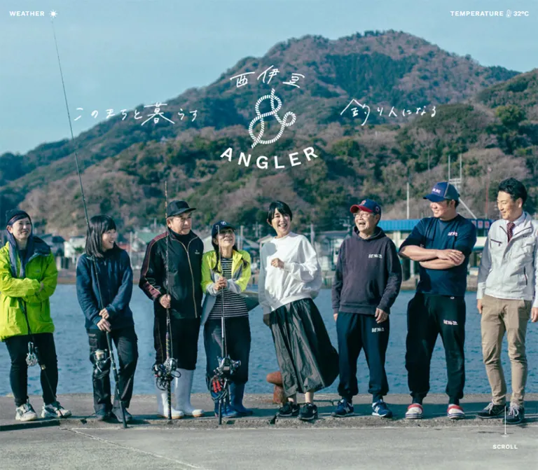
NISHIIZU & ANGLER presents fishing as part of belonging to a place. Its opening image brings residents and anglers together on a harbor edge, with mountains and water providing the setting. A rope-shaped ampersand, handwritten Japanese lettering, and widely spaced Latin capitals make the identity feel connected to fishing without turning the interface into nautical decoration everywhere.
The page combines that photographic introduction with an editorial sequence: current activity, accounts from people who moved to the area, a two-day experience tour, steps toward relocation, and a local contact. Small English labels provide navigation and structure; Japanese paragraphs have unusually generous leading. At the end, a sunset, an oversized cropped serif wordmark, and a dark textured field create a visual closing scene.
The defining relationship is between expansive photography and restrained interface elements. Preserve the community portrait, the two distinct brand lockups, the navy/white pairing, the long reading rhythm, and the deliberate mobile recomposition.
閉じる
NISHIIZU & ANGLER — Style Reference
A coastal community portrait framed by navy ink, handwritten lettering, and the quiet scale of the sea.
Website: NISHIIZU & ANGLER Original URL: https://andangler.com/nishiizu/ Final URL: https://andangler.com/nishiizu/ Response: HTTP 200; the supplied final URL is unchanged. Inspected: September 24, 2026, Japan time. Supplied capture timestamp: September 23, 2026, 20:47:19.403 UTC, equivalent to September 24 at 05:47:19.403 JST. Viewports: 1440 × 1000 desktop and 390 × 844 mobile, in CSS pixels. Theme: white and deep navy, with reversed white graphics over coastal photography. No theme selector was evidenced. Scope: the current home page. Visual evidence covers a logo-only opening state, the photographic opening composition, and the closing sunset/footer composition. Rendered DOM and computed styles additionally cover activity updates, interviews, tour plans, relocation guidance, contact information, and navigation entries. Intermediate sections and an opened menu were not supplied as screenshots; linked pages and external forms were not inspected.
NISHIIZU & ANGLER presents fishing as part of belonging to a place. Its opening image brings residents and anglers together on a harbor edge, with mountains and water providing the setting. A rope-shaped ampersand, handwritten Japanese lettering, and widely spaced Latin capitals make the identity feel connected to fishing without turning the interface into nautical decoration everywhere.
The page combines that photographic introduction with an editorial sequence: current activity, accounts from people who moved to the area, a two-day experience tour, steps toward relocation, and a local contact. Small English labels provide navigation and structure; Japanese paragraphs have unusually generous leading. At the end, a sunset, an oversized cropped serif wordmark, and a dark textured field create a visual closing scene.
The defining relationship is between expansive photography and restrained interface elements. Preserve the community portrait, the two distinct brand lockups, the navy/white pairing, the long reading rhythm, and the deliberate mobile recomposition.
How to Read This Reference
- Measured means supplied computed styles or element rectangles. Values are specific to the two inspected viewports.
- Calculated means arithmetic derived from those measurements, such as column gaps and container widths.
- Estimated means a visual approximation from the original-page captures. Estimated colors were not programmatically sampled.
- Recommended means a proposed implementation choice, including all unverified breakpoints, accessibility additions, and fallback artwork treatments.
- Token names are descriptive aliases. The supplied custom-property records were empty; these names are not presented as original source variables.
- Computed font-family declarations establish the requested stacks, but do not independently establish which font file rendered every glyph.
- A DOM rectangle does not prove that an element was visible in a capture. Hidden navigation and offscreen content remain distinguishable from screenshot observations.
- The desktop document-height report conflicts with the positions of later elements. Absolute vertical coordinates are therefore unsuitable for reconstructing the page's scrolling mechanism.
Tokens — Colors
Default Palette
| Name | Value | Suggested token | Evidence and role |
|---|---|---|---|
| Harbor Navy | #143750 |
--color-ink |
Measured: rgb(20, 55, 80) on the body and most sampled text. Used by the compact header, editorial text, navigation labels, and the logo-only opening graphic. |
| White | #ffffff |
--color-paper |
Measured: body background and reversed utility text. Visually confirmed as the opening logo state's canvas. |
| Reversed White | #ffffff |
--color-on-photo |
Measured: weather labels, scroll caption, contact introduction, share label, and copyright. |
| Sky Cyan | Approximately #a4ccd6 |
--color-sky-reference |
Estimated: a descriptive reference for the opening photograph's pale sky. This is photographic color, not a verified UI surface. |
| Sunset Peach | Approximately #e9af91 |
--color-sunset-reference |
Estimated: a representative warm area in the closing sky. Do not make it a general action color. |
| Warm Slate | Approximately #5c4d4c |
--color-footer-warm |
Estimated: the warmer upper portion of the dark closing field. |
| Deep Closing Navy | Approximately #143750 |
--color-footer-deep |
Estimated as a surface: the lower closing field approaches the measured ink color. Exact gradient stops were not supplied. |
The site's interface palette is much narrower than its photographs. Lime jackets, teal water, orange sky, and muted mountain greens belong to the imagery. They do not establish additional button or category colors.
Several sampled elements have transparent backgrounds. That establishes the element's own fill, not the full appearance behind it. In particular, the intermediate sections cannot all be declared plain white merely because their text nodes are transparent.
Theme Behavior
The supplied evidence shows navy details on light areas and white details on photographs or darker areas. This is contextual contrast, not evidence of a user-selectable dark theme.
For a new implementation, keep three semantic roles separate: ink on paper, white on photography, and the closing atmospheric background. Reusing the same navy value is appropriate; applying the footer's estimated gradient to every content block is not.
Tokens — Typography
Japanese Editorial Text
Measured stack: 'Noto Sans JP', sans-serif.
The main Japanese text uses weight 500; article headings and interview summaries use 700. Reading text relies on open line spacing and repeated 0.08em tracking rather than a large font size. Desktop introductions are 18px / 40px; mobile introductions are 16px / 35px. Supporting process copy is smaller but even more open proportionally.
The body itself computes to 10px / 10px, while the root computes to 16px. Most meaningful text overrides the body default. Do not treat 10px as the site's intended reading size or assume that one source rem equals 10px.
English Utility Labels
Measured stack: 'Work Sans', sans-serif.
Most English utility labels use weight 600, uppercase letters, and 0.08em tracking. This includes MENU, WEATHER, interview numbers, READ MORE, and day labels. The section labels INTERVIEW and TOUR PLAN use slightly tighter 0.06em tracking.
Not every Latin label uses Work Sans. The sampled news VIEW MORE, dates, SHARE, and copyright inherit Noto Sans JP. Preserve this distinction when matching the supplied computed styles.
Brand Lettering and Closing Display
The main identity has three graphic parts: handwritten Japanese place lettering, an ampersand drawn as twisted rope, and arcing Latin capitals. The compact header uses a separate horizontal lockup. These should be treated as brand artwork, not reconstructed with an invented handwriting font.
The closing scene uses very large white serif capitals with strong thick/thin contrast. The exact typeface and whether the lettering is live text or artwork were not established. The visible capital height is approximately 110–120px on desktop and approximately 40–45px on mobile. Those are screenshot estimates, not measured font sizes.
Several H2 elements have no extracted text despite substantial rectangles. Their inherited 10px font size is not evidence that the visible chapter headings are tiny. Graphic heading content or other non-text rendering may be involved; the supplied records do not identify its implementation.
Type Scale
All values below are measured. Sizes are shown as font-size / line-height; padding is excluded.
| Role | Family | Desktop | Mobile | Weight | Tracking |
|---|---|---|---|---|---|
| Menu / close | Work Sans | 18 / 18px |
14 / 14px |
600 | 0.08em |
| Weather / temperature labels | Work Sans | 16 / 16px |
14 / 14px |
600 | 0.08em |
| Temperature value | Work Sans | 16 / 16px |
14 / 14px |
600 | Normal |
| Scroll caption | Work Sans | 14 / 14px |
13 / 13px |
600 desktop; 400 mobile | 0.08em |
| Main introductions | Noto Sans JP | 18 / 40px |
16 / 35px |
500 | Usually 0.08em |
| News introduction | Noto Sans JP | 18 / 40px |
16 / 35px |
500 | 0.08em desktop; 0.04em mobile |
| News title | Noto Sans JP | 24 / 40px |
24 / 40px |
700 | 0.08em |
| News date | Noto Sans JP | 16 / 36px |
16 / 36px |
500 | 0.08em |
| News view-more link | Noto Sans JP | 16 / 32px |
16 / 32px |
600 | 0.08em |
| Interview / tour section label | Work Sans | 34 / 34px |
28 / 28px |
600 | 0.06em |
| Interview index | Work Sans | 16 / 16px |
16 / 16px |
600 | 0.08em |
| Interview summary | Noto Sans JP | 16 / 32px |
14 / 28px |
700 | 0.08em |
| Card read-more / view-more | Work Sans | 15 / 15px |
15 / 15px |
600 | 0.08em |
| Tour day label | Work Sans | 24 / 24px |
24 / 24px |
600 | 0.08em |
| Tour invitation | Noto Sans JP | 24 / 42px |
18 / 35px |
500 | 0.08em |
| Application / contact label | Noto Sans JP | 16 / 16px |
16 / 16px |
500 | 0.08em |
| Process number | Work Sans | 46 / 46px |
38 / 38px |
600 | 0.08em |
| Process title | Noto Sans JP | 24 / 45.6px |
22 / 41.8px |
700 | 0.08em |
| Process description | Noto Sans JP | 16 / 38px |
14 / approximately 32px |
500 | 0.08em |
| Contact invitation | Noto Sans JP | 30 / 30px |
20 / 34px |
500 | 0.08em |
| Local contact introduction | Noto Sans JP | 16 / 38px |
16 / 38px |
500 | 0.08em |
| Share label | Noto Sans JP | 24 / 24px |
20 / 20px |
700 | 0.08em |
| Copyright | Noto Sans JP | 18 / 18px |
12 / 12px |
500 | 0.08em |
Tokens — Spacing & Shapes
The measured spacing does not demonstrate a single rigid base unit. Repeated 24px mobile margins, 40px mobile card gaps, 56px action heights, and generous paragraph leading provide more useful implementation anchors than forcing every value onto an 8px scale.
Spacing Scale
| Use | Desktop | Mobile | Evidence |
|---|---|---|---|
| Main content side inset | 117px |
24px |
Measured across multiple sections |
| Weather side inset | 23px |
23px |
Measured; independent of the main container |
| Three-column news gap | Approximately 47.63px |
40px between rows |
Calculated from card rectangles |
| Two-column story / tour gap | 80px |
40px between rows |
Calculated |
| Introductory paragraph top padding | 41px |
26px |
Measured in interview and tour sections |
| Introductory paragraph bottom padding | 83px |
52px |
Measured in those sections |
| English section-label bottom padding | 16px |
16px |
Measured |
| Interview summary top / bottom padding | 20px / 18px |
20px / 18px |
Measured |
| Read-more bottom padding | 9px |
9px |
Measured |
| Process title top padding | 34px |
23px |
Measured |
| Process description top padding | 13px |
9px |
Measured |
| Action-label left padding | 35px |
35px |
Measured inside the action's inner element |
| Mobile invitation additional inset | — | 24px inside the 342px container |
Calculated from its 294px width |
Border Radius
All sampled anchors, paragraphs, and headings report 0px border radius. The visible opening and closing compositions also avoid rounded panels.
Use square media and restrained rectangular actions for an adaptation. The evidence does not include every wrapper's styles, so it does not prove that every possible surface on the site has zero radius.
The action rectangles have a 1px inset between outer and inner bounds on every side. This is consistent with a 1px outline, but border-style and border-color values were not supplied. A 1px solid currentColor outline is therefore a recommended reconstruction, not a fully measured source declaration.
Layout Measurements
| Element | Desktop | Mobile | Interpretation |
|---|---|---|---|
| Main content region | 1206px wide at x 117 |
342px wide at x 24 |
Measured |
| News card | Approximately 370.23 × 398px |
342 × 364px |
Measured outer link bounds |
| Interview card | 563 × 460.89px |
342 × 328.89px |
Measured outer link bounds |
| Tour card | 563 × approximately 386px |
342 × approximately 262px |
Measured outer link bounds |
| Interview media interval | Approximately 316px high |
Approximately 192px high |
Calculated space between index and summary; roughly 16:9, not a measured image node |
| Process text column | 603px |
342px |
Measured |
| Tour application action | 313 × 56px |
294 × 56px |
Measured |
| Relocation inquiry action | 342 × 56px |
294 × 56px |
Measured |
| General contact action | 313 × 56px |
342 × 56px |
Measured |
| Compact header brand link width | 245px |
Approximately 174.22px |
Measured inline link width; not a full artwork bounding box |
| Closing footer section | 500px high |
422px high |
Measured section rectangle |
| Copyright rectangle | 18 × 209.56px |
12 × 139.70px |
Measured; visibly vertical in the captures |
At 1440px, the 117px inset is 8.125% of viewport width. The evidence does not establish whether the original uses a percentage, a maximum-width container, or another formula. A container capped at 1206px with 24px minimum side margins reproduces both sampled widths and is a practical recommendation.
Components
Opening Logo State
Visual evidence: a white 1440 × 1000 canvas with a centered navy brand mark, approximately 240px wide and 255px tall.
The handwritten place name sits above the rope ampersand; the spaced Latin wordmark curves underneath. There is no visible progress bar, percentage, spinner, or explanatory caption.
This is an opening-style state, not evidence that the whole page is blank or discontinued. The additional capture shows the complete photographic opening. Its duration and transition into that composition were not recorded, so do not assign a specific loading delay or fade sequence.
Photographic Opening
Anatomy: full-bleed community photograph, corner weather utilities, central brand artwork, handwritten message, and a minimal scroll cue.
On desktop, the logo is approximately 240px wide, centered horizontally, and begins around y 120px. The Japanese message is divided into two graphic phrases flanking the mark. Eight people form a broad line across the lower portion of the photograph, with fishing rods, harbor water, and mountains providing the setting. The message reads “このまちと暮らす釣り人になる”.
On mobile, the approximately 180px-wide mark sits near y 86px. The message becomes a single horizontal line below it. A large expanse of sky separates this identity group from the people, whose bodies sit close to the bottom of the viewport. The outermost people are partly cropped.
This is a meaningful compositional change. A centered cover crop of the desktop screenshot would not reproduce the mobile arrangement. Use suitably art-directed source photography or a mobile-specific composition when building a similar page.
Weather and Temperature Utilities
WEATHER sits at the upper left with a small white weather icon. TEMPERATURE, a thermometer symbol, and 22°C sit at the upper right in the supplied original-page captures.
Desktop labels begin around y 26px; mobile labels remain around y 27px. The horizontal outer inset stays at 23px despite the different main content margins. Labels have no enclosing chip or panel.
The displayed value is confirmed; the data provider, update interval, geolocation behavior, and whether the display updates automatically are not. A new implementation should use a real data source or explicitly defined static content rather than imply an unimplemented live feed.
Scroll Cue
The cue resembles a fine fishing line ending in a small curved detail, with SCROLL underneath. It appears near the lower right on desktop and at the bottom center on mobile.
The measured caption box is 71px wide in both views. Its desktop position is x 1324, y 920, including 17px top padding. On mobile it is x 159.5, y 794, including 8px top padding. The caption becomes smaller and lighter on mobile.
A scroll invitation is visually established. Click-to-scroll behavior and line animation were not tested. If implemented as an action, use a real link to the next section with an accessible name.
Compact Header and Menu Control
The closing captures show the horizontal navy brand lockup at the upper left and MENU at the upper right. Desktop alignment follows the 117px content inset; mobile alignment follows 24px.
The compact lockup is distinct from the central rope-logo composition. Keep both assets available rather than shrinking the large stacked mark into the header.
The header is present in separated page views, but the supplied evidence does not distinguish fixed positioning, state-dependent visibility, duplicated headers, or another mechanism. The photographic opening does not visibly show the same compact header alongside its weather utilities. Do not display all header variants simultaneously merely because their DOM entries coexist.
Chapter Introductions
The DOM establishes substantial heading regions followed by explanatory Japanese text. Interview and tour introductions use matching typography and padding, giving them a shared chapter structure.
The measured desktop H2 regions are approximately 188px and 187px tall; mobile equivalents are approximately 95px. Their text extraction is empty. Preserve the need for prominent chapter artwork or headings, but do not invent their wording, exact font, or visual treatment from these rectangles alone.
A new implementation can retain accessible text headings beneath authorized graphic artwork, or use live headings if the original artwork is unavailable. That is an implementation recommendation.
Activity Updates
DOM-supported anatomy: introductory sentence, three linked article units, publication dates, and a right-aligned VIEW MORE link to a note collection.
The three sampled articles cover an upcoming tour, a local job opportunity, and an earlier tour marked as closed. They establish this as an ongoing regional information site with current updates, rather than a static conversion-only composition.
Desktop cards form three columns. At mobile width, all three are stacked in their original order with 40px gaps. Titles are inset 17px from card edges; dates are inset 20px. The title remains 24px / 40px on mobile rather than shrinking with the container.
Article template evidence identifies a thumbnail role, but actual thumbnail assets and their image rectangles were not supplied. Do not infer their subjects or exact aspect ratios.
The long titles occupy reported 40px-high heading rectangles. This does not establish whether the original clamps, clips, or handles overflow elsewhere. The quick start allows natural title height instead of copying an unverified truncation behavior.
Interview Cards
DOM-supported anatomy: small numeric index, a broad media interval, bold Japanese summary, and a right-aligned READ MORE label within the whole linked card.
Desktop cards are 563px wide, separated by 80px. Mobile cards are 342px wide, stacked with a 40px gap. The space between the index and summary is consistent with approximately 16:9 media. That proportion is inferred from neighboring rectangles; the image nodes themselves were not measured.
The numeric label stays at 16px across viewports. Summaries change from 16px / 32px to 14px / 28px. The read-more label remains 15px / 15px with 9px bottom padding.
The two destinations are interview01.html and interview02.html under the inspected site. Their contents were not opened. Implement the unit as one meaningful link rather than separate nested links for image, caption, and read-more label.
Tour Plan Cards and Invitation
Two linked cards introduce DAY 01 and DAY 02. Each has a substantial media interval and a bottom row pairing the 24px day label with a 15px VIEW MORE label. Desktop uses the same 563px columns and 80px gap as interviews; mobile stacks the cards with 40px separation.
Below them, an invitation describes a one-night, two-day experience involving fishing, selling or eating the catch, and meeting local people. A smaller note says to inquire about pricing. The action is labeled “ツアーに申し込む” and points to an external form.
On desktop, the invitation text and action share a horizontal arrangement. On mobile, the text wraps into three lines and the action sits below, within a 294px-wide inner region. The action retains its measured 56px height and 16px label.
Do not infer checkout, immediate booking confirmation, or an on-page form. Only the external application link is established.
Relocation Process
Three numbered steps describe applying for an experience tour, visiting the area, and receiving relocation support. Numbers are large Work Sans labels; Japanese headings are bold, followed by widely led explanatory paragraphs.
Desktop text uses 603px-wide half-container regions. Steps 01 and 02 begin at x 117, while step 03 begins at x 720. The composition therefore changes alignment across the sequence rather than presenting a uniform three-column row.
On mobile, all steps use the full 342px content width. Numbers reduce from 46px to 38px, headings from 24px to 22px, and descriptions from 16px to 14px. Keep the 32px mobile description leading; compressing it to a typical dense paragraph would change the reading rhythm substantially.
Large intervening spaces may accommodate graphics or composition not represented in the text records. Their imagery and any scroll-linked behavior remain unverified.
Inquiry and Local Contact
The relocation inquiry combines an invitation with “移住に関するお問い合わせ”, which is a mail link. Desktop places the 30px invitation beside a 342px action. Mobile breaks the invitation into two lines at 20px / 34px and places a 294px action below it.
A later contact introduction identifies a local municipal contact and explains support related to the town and fishing. Its paragraph is white at 16px / 38px in both views. The measured paragraph width is 313px on desktop and 342px on mobile. The general “お問い合わせ” action links to another external form.
The mobile contact paragraph includes approximately 344px of bottom padding. This proves reserved space, not the presence or subject of an unseen portrait. The contact section's full background and artwork were not visually supplied.
Closing Sunset and Footer
Visual evidence: a broad sunset photograph, compact navy header, oversized cropped white serif lettering, a loose white underline, a dark textured field, sharing controls, and vertical copyright.
At desktop size, the sea/sky photograph reaches roughly y 500px in the supplied frame. The huge wordmark crosses the lower edge of the photograph into the darker field. Its line extends beyond the viewport and is intentionally clipped. A thin, irregular underline sits below it.
On mobile, the sunset still receives roughly 500px of visible height, while the oversized lettering remains a single clipped line around the lower part of the photograph. The sunset's crop emphasizes the horizon, cloud bank, and the dark coastal silhouette at the right.
The lower field shifts from warm gray-brown toward deep blue and contains faint grain or speckling. The exact gradient, texture asset, and compositing method are unknown.
SHARE and X/Facebook symbols sit near the lower left. Desktop arranges them horizontally. Mobile DOM geometry places the symbols below the label; the supplied mobile capture cuts off part of this area, so that layout is supported by the rectangles rather than a complete visual view. Copyright runs vertically near the right edge.
The wide lettering is evidence of overflow clipping, not proof of an animated marquee.
Navigation Contents
The rendered records include MENU, CLOSE, two interview entries with names, and two day-plan entries. They also include a larger home-brand region associated with navigation content.
Desktop interview entries place each name beside its English identifier. Mobile records place the name below the identifier. Slash separators divide the two entries. Day entries remain compact Latin labels.
These measurements establish navigation content and responsive grouping. They do not establish the open panel's background, entrance animation, focus handling, scroll locking, or exact visible appearance. An opened menu was not captured.
Tokens — Motion & Interaction
| Element or treatment | Supplied evidence | What can be concluded |
|---|---|---|
| Menu / close label | opacity 0.2s ease-out |
A 200ms opacity transition is declared; triggering state and opacity endpoint are unknown. |
| Navigation destination links | opacity 0.2s ease-out |
A brief opacity transition is declared. |
| Interview / tour read-more labels | opacity 0.2s ease-out, border-bottom 0.2s ease-out |
Opacity and underline-related changes are supported by the computed style. End states were not captured. |
| News view-more control | opacity 0.3s ease-out |
A 300ms opacity transition is declared. |
| Application / contact label | color 0.3s ease-out |
A 300ms text-color transition is declared. Background behavior is not established. |
| Logo-only opening | Separate static capture | A distinct opening state exists; its duration and reveal mechanism are unknown. |
| Opening-to-closing page journey | Captures at separated positions | Different compositions exist; parallax, pinning, and scroll-triggered animations are unverified. |
| Giant closing wordmark | Cropped single line | Clipping is visible; movement is not established. |
| Weather display | 22°C and an icon |
The displayed state is confirmed; automatic updates are unverified. |
Most sampled elements report animation: none. This does not exclude animation on unlisted descendants, SVG contents, pseudo-elements, or JavaScript-controlled layers. Similarly, a bare transition: all record is not evidence of a meaningful nonzero transition duration.
The capture process waited for loading and sampled stability, including at least five seconds of initial observation. Its finite waiting limits do not establish that every delayed effect or interaction was exercised. No hover, keyboard, menu-opening, or form-submission outcome was supplied.
For an adaptation, use the measured 200–300ms ease-out transitions for small controls. Treat splash choreography, parallax, line drawing, and marquee motion as optional new design decisions requiring separate validation.
Surfaces
| Layer | Appearance | Evidence and implementation implication |
|---|---|---|
| Opening logo canvas | White with navy artwork | Visually confirmed; no framed panel is needed. |
| Photographic opening | Full-bleed harbor portrait | Visually confirmed; white graphics sit directly over the image. |
| Editorial text layer | Navy text with transparent sampled element backgrounds | Computed evidence; full intermediate backdrops remain unverified. |
| Cards and actions | Square sampled geometry | Measured on listed elements; use restrained rectangular construction. |
| Local contact text | White text and white action label | Measured; the complete supporting surface was not captured. |
| Closing photograph | Warm sunset above dark blue water | Visually confirmed. |
| Closing field | Warm-to-navy tonal shift with subtle texture | Visually confirmed character; exact CSS and asset treatment unknown. |
The visible opening and closing do not use a card-shadow or glass-panel system. Depth comes from photography, scale, and the transition between light and dark fields. Avoid introducing floating rounded containers into these compositions.
Imagery
Use documentary coastal photography with people as the primary subject. The opening works because it records a recognizable group interacting in a real harbor setting: fishing rods, practical clothing, individual expressions, and the town's mountainous backdrop remain visible.
The color treatment is cool and slightly muted, with soft cyan sky, deep blue-green water, and subdued earth tones. Bright clothing survives as an occasional photographic accent. The image should retain natural detail and a lightly textured photographic character; pixelation is not part of this design.
The closing scene changes emotional temperature. Peach and orange light above blue water introduces warmth before the page settles into deep navy. Preserve the horizon and the dark landform on the right when choosing a mobile crop.
Graphic identity provides the handmade layer: irregular Japanese brush lettering, twisted rope, the curved Latin wordmark, and the closing underline. Uniform geometric iconography cannot replace those assets without changing the character.
Observed Asset References
No source image URLs, filenames, SVG paths, or background-image declarations were supplied. The following are visual roles, not invented asset paths.
| Asset role | Confirmed appearance | Reuse guidance |
|---|---|---|
| Stacked primary mark | Japanese place name, rope ampersand, arcing Latin wordmark | Maintain proportions; use authorized artwork in navy and white. |
| Compact horizontal mark | Handwritten place name followed by Latin brand text | Use the distinct compact lockup in the header. |
| Desktop community photograph | Eight people along the harbor, mountains behind | Retain the breadth of the group and environmental context. |
| Mobile opening composition | Broad sky above a smaller group near the bottom | Supply art-directed media; do not expect CSS cropping alone to create this composition. |
| Handwritten message | Split around the logo on desktop; one line beneath it on mobile | Preserve the visual handwriting with accessible text alternatives. |
| Weather and thermometer symbols | Small white utility graphics | Keep subordinate to the labels; asset format is unknown. |
| Scroll line | Fine vertical line with a curved lower detail | Prefer an appropriate vector asset; a CSS approximation is acceptable for a new implementation. |
| Closing photograph | Sunset, horizon, sea, right-edge coastal silhouette | Test desktop and portrait crops separately. |
| Closing wordmark and underline | Oversized serif capitals and a loose white stroke | Exact typeface and rendering format are unverified. |
| News / interview / tour media | Media roles supported by DOM structure or spacing | Actual images were not supplied visually; do not invent their subjects. |
Layout & Responsive Behavior
Opening Composition
The mobile hero is measured at exactly 390 × 844px. The desktop hero also visually fills its 1440 × 1000 capture, although its sampled section rectangle has zero height. The desktop rectangle therefore cannot be used as a literal CSS-height specification.
Desktop distributes the identity horizontally: phrase, stacked mark, phrase. Mobile stacks the mark and a single message line, leaving a large sky interval above the people. Weather labels remain near the same physical edge inset while the scroll cue moves from right to center.
Editorial Columns
The 1206px desktop region supports three news columns or two interview/tour columns. Mobile uses a consistent 342px single column. The 40px stacked-card spacing is shared by all three groups.
Not all typography scales down. News titles remain 24px, day labels remain 24px, card actions remain 15px, and application labels remain 16px. Preserve this selective scaling rather than applying one global shrink factor.
Invitations and Process Copy
Desktop invitation rows become vertical groups on mobile, with an extra 24px inset inside the main container for the tour and relocation callouts. Process text abandons its desktop half-container alignment and becomes full-width mobile copy.
The contact introduction keeps its 16px type and 38px leading on mobile, making it a distinct reading treatment from the smaller 14px process descriptions.
Closing Composition
The footer retains oversized cropped lettering at both sizes. It does not reduce the entire brand line until it fits. Copyright remains vertical but reduces from 18px to 12px. Sharing changes from a horizontal desktop arrangement to a label-over-icons mobile grouping according to the supplied rectangles.
Scroll Geometry Limitations
The desktop reports a document height of 1000px while later element coordinates extend beyond 16000px. Mobile reports 14494px, while the final footer rectangle extends to approximately 14580px. These inconsistencies may involve capture state, transformed content, clipping, or other layout behavior; the evidence does not identify the cause.
Do not reproduce these heights as fixed page dimensions or infer a specific smooth-scroll library. The practical reference is the local geometry of each content group. Use accessible document scrolling as the default recommendation until the original mechanism is independently established.
Only two viewport widths were inspected. The quick start's 48rem breakpoint is a recommendation, not an extracted breakpoint. Tablet, landscape-phone, text-zoom, and intermediate-width behavior remain unverified.
Do’s and Don’ts
Do
- Anchor interface colors in measured navy
#143750and white. - Keep the people, harbor, and mountains recognizable in the opening image.
- Compose the mobile opening separately, with generous sky and the group near the lower edge.
- Use the stacked rope mark and compact horizontal mark for their different roles.
- Preserve the division between handwritten artwork and clean sans-serif utility text.
- Use Noto Sans JP for measured Japanese roles and Work Sans for the identified English labels.
- Retain generous Japanese leading, especially
18/40,16/35, and14/32reading treatments. - Match the 1206px desktop and 342px mobile content widths at the supplied viewports.
- Stack news, interview, and tour cards on mobile with approximately 40px gaps.
- Keep application and inquiry actions comfortably tall at 56px.
- Let the closing serif lettering remain deliberately oversized and locally clipped.
- Distinguish screenshot observations from DOM-only measurements when extending this reference.
Don’t
- Do not replace the community photograph with a generic solitary angler or unrelated ocean stock image.
- Do not reuse the desktop screenshot as a phone background and expect the same composition.
- Do not turn photographic lime, peach, or cyan into an unsupported button palette.
- Do not add pill-shaped cards, heavy shadows, or translucent glass behind every label.
- Do not substitute an arbitrary handwriting font for the brand artwork and call it exact.
- Do not assume every English label uses the same font family.
- Do not copy the body's 10px default into actual reading paragraphs.
- Do not force long news titles into a 40px height without establishing their overflow behavior.
- Do not infer a moving marquee, parallax scene, or loading timeline from static captures.
- Do not hardcode the captured weather value as though a live integration exists.
- Do not infer unseen intermediate photographs, chapter wording, or open-menu styling.
- Do not use the reported document-height anomalies as page-layout specifications.
Recommended Implementation Additions
These are recommendations for a new implementation, not verified features of the original:
- Use semantic headings even when decorative heading artwork is supplied. Give the primary brand a useful accessible name and avoid duplicate spoken labels.
- Implement menu opening as a keyboard-operable button with
aria-expandedandaria-controls. Manage focus and Escape behavior if it opens a modal navigation panel. - Give weather and sharing icons accessible names where their meaning is not already provided by adjacent text.
- Keep the displayed weather state truthful. Handle unavailable data without showing an invented current measurement.
- Check white label contrast against the actual photograph at each crop. Add a restrained local contrast treatment only where necessary.
- Use responsive image sources with intrinsic dimensions. Prioritize the opening photograph and defer below-fold media without causing layout shifts.
- Preserve visible keyboard focus on entire-card links and 56px actions. Small read-more lettering can remain visually small within a larger operable link.
- Keep the full article title available to assistive technology if visual truncation is introduced.
- Respect reduced-motion preferences. A logo-only opening should not prevent access when animation or scripting fails.
- Contain oversized footer text within its own clipping region so it cannot cause horizontal page scrolling.
- Make the final sharing controls and copyright reachable on short screens; do not reproduce the incomplete mobile capture as intentional clipping of functional content.
Agent Prompt Guide
Quick Color Reference
- Primary ink:
#143750, measured. - Paper and reversed graphics:
#ffffff, measured. - Opening cyan and sunset peach: photographic colors, not interface accents.
- Closing warm slate to navy: visual approximation; use approximately
#5c4d4cto#143750only when reconstructing that scene. - Card/action geometry: square; a 1px current-color action outline is a recommended approximation.
- Typography: Noto Sans JP for Japanese content; Work Sans for the identified uppercase utility labels. The closing serif face is unknown.
Overall Prompt
“Create a regional fishing-and-relocation website inspired by the supplied NISHIIZU & ANGLER evidence. Start with a full-viewport documentary photograph of a community at a harbor. Overlay a white stacked identity with handwritten Japanese place lettering, a rope-shaped ampersand, and spaced Latin capitals. Place small weather and temperature utilities in the upper corners. Use deep navy #143750 for editorial text, Noto Sans JP for Japanese copy, Work Sans for measured English labels, and generous paragraph leading. Organize current updates, two interviews, two tour days, and three relocation steps inside a 1206px desktop container. At 390px width use 24px side margins and single-column cards. Art-direct the mobile hero with broad sky above the people. Close with a sunset, oversized clipped white serif brand lettering, an irregular underline, a textured dark field, and vertical copyright. Treat unverified animation and artwork as separate implementation decisions.”
Example Component Prompts
- Opening: “Design a 1440 × 1000 harbor portrait with a roughly 240px-wide white stacked brand mark near the upper center. Place handwritten phrases on either side, small tracked weather utilities 23px from the outer edges, and a fine fishing-line scroll cue at the lower right. Keep the people and mountains prominent.”
- Mobile opening: “Recompose the same identity for 390 × 844. Use a roughly 180px-wide mark near y 86, one handwritten line below, expansive sky, and the community group near the bottom. Center the scroll cue. Use an art-directed mobile image instead of cropping the desktop screenshot.”
- Interview pair: “Build two square-edged editorial links, each 563px wide, with an 80px gap inside a 1206px container. Each has a small index, an approximately 16:9 media slot, a bold Japanese summary at 16/32, and a right-aligned Work Sans read-more label at 15px. At 390px, stack 342px-wide cards with 40px gaps and use 14/28 summaries. The media ratio is an evidence-based approximation.”
- Tour invitation: “Pair a calm Japanese tour description with a 56px-high application link. Use navy text and an understated rectangular outline. On mobile, stack the description, pricing note, and action within a 294px inner column. Keep the action label at 16px and avoid checkout-style urgency.”
- Closing: “Create a sunset-over-sea closing scene with navy compact header controls, huge white high-contrast serif capitals extending beyond the viewport, and a loose white underline. Continue into a subtly textured warm-slate-to-navy field with sharing controls at left and vertical copyright at right. Keep the lettering static unless motion is separately specified.”
Quick Start
CSS Custom Properties
This is a usable adaptation, not extracted source CSS. It reproduces the measured color, typography, container, and control anchors while using normal document flow. The 48rem breakpoint, intermediate-width interpolation, action outline, serif fallback, and footer gradient are recommendations.
Supply authorized artwork through the markup. A .hero-media picture should contain art-directed desktop and mobile sources; .hero-lockup and the tagline elements should be images or vectors with appropriate text alternatives. Use the compact header in the page states where it is intended to appear, rather than layering it over the opening weather utilities. The .brand-state is optional and has no automatic loading delay.
The CSS does not implement navigation state, weather retrieval, form submission, or unverified scroll effects.
:root {
  /* Measured interface colors */
  --color-ink: #143750;
  --color-paper: #ffffff;
  --color-on-photo: #ffffff;

  /* Estimated closing surface */
  --color-footer-warm: #5c4d4c;
  --color-footer-deep: #143750;

  /* Measured requested font stacks */
  --font-japanese: 'Noto Sans JP', sans-serif;
  --font-latin: 'Work Sans', sans-serif;

  /* Recommended fallback; the original display face is unknown */
  --font-display: Georgia, 'Times New Roman', serif;

  --content-max: 1206px;
  --page-inset: 24px;
  --news-gap: 47.625px;
  --pair-gap: 80px;
  --stack-gap: 40px;
  --action-height: 56px;
  --action-width: 313px;
  --radius-ui: 0px;

  --tracking-ui: 0.08em;
  --tracking-section: 0.06em;
  --text-lead: 18px;
  --leading-lead: 40px;
  --text-section: 34px;
  --text-summary: 16px;
  --leading-summary: 32px;
  --text-step-number: 46px;
  --text-step-title: 24px;
  --text-step-body: 16px;
  --leading-step-body: 38px;
  --intro-top: 41px;
  --intro-bottom: 83px;

  --motion-link: 200ms ease-out;
  --motion-action: 300ms ease-out;
}

* { box-sizing: border-box; }

body {
  margin: 0;
  color: var(--color-ink);
  background: var(--color-paper);
  font-family: var(--font-japanese);
  font-weight: 500;
}

img { display: block; max-inline-size: 100%; }
a { color: inherit; }
button { font: inherit; }

.container {
  inline-size: min(
    var(--content-max),
    calc(100% - 2 * var(--page-inset))
  );
  margin-inline: auto;
}

.brand-state {
  min-block-size: 100vh;
  min-block-size: 100svh;
  display: grid;
  place-items: center;
  background: var(--color-paper);
}

.brand-state img { inline-size: 240px; }

.hero {
  position: relative;
  min-block-size: 100vh;
  min-block-size: 100svh;
  overflow: hidden;
  color: var(--color-on-photo);
}

.hero-media,
.hero-media img {
  position: absolute;
  inset: 0;
  inline-size: 100%;
  block-size: 100%;
}

.hero-media img {
  object-fit: cover;
  object-position: center bottom;
}

.hero-utilities {
  position: absolute;
  z-index: 2;
  inset: 26px 23px auto;
  display: flex;
  justify-content: space-between;
  align-items: center;
  gap: 16px;
  font: 600 16px/1 var(--font-latin);
  letter-spacing: var(--tracking-ui);
}

.weather,
.temperature {
  display: inline-flex;
  align-items: center;
  gap: 6px;
}

.temperature-value { letter-spacing: normal; }

.hero-identity {
  position: absolute;
  z-index: 1;
  inset-block-start: 120px;
  inset-inline-start: 50%;
  transform: translateX(-50%);
  inline-size: min(960px, calc(100% - 48px));
  display: grid;
  grid-template-columns: minmax(0, 1fr) 240px minmax(0, 1fr);
  align-items: center;
  gap: 40px;
}

.hero-lockup {
  grid-area: 1 / 2;
  inline-size: 240px;
}

.hero-tagline-left { grid-area: 1 / 1; }
.hero-tagline-right { grid-area: 1 / 3; }
.hero-tagline-mobile { display: none; }

/* Recommended static approximation of the line cue */
.scroll-cue {
  position: absolute;
  z-index: 2;
  inset-inline-end: 45px;
  inset-block-end: 49px;
  inline-size: 71px;
  text-align: center;
  text-decoration: none;
  font: 600 14px/1 var(--font-latin);
  letter-spacing: var(--tracking-ui);
}

.scroll-cue::before {
  content: '';
  display: block;
  inline-size: 1px;
  block-size: 76px;
  margin: 0 auto 17px;
  background: currentColor;
}

.site-header {
  position: absolute;
  z-index: 3;
  inset: 0 0 auto;
  color: var(--color-ink);
}

.site-header-inner {
  min-block-size: 90px;
  display: flex;
  align-items: center;
  justify-content: space-between;
}

.compact-brand { inline-size: 245px; }

.menu-control {
  min-block-size: 44px;
  padding: 0;
  border: 0;
  background: transparent;
  color: inherit;
  cursor: pointer;
  font: 600 18px/1 var(--font-latin);
  letter-spacing: var(--tracking-ui);
  transition: opacity var(--motion-link);
}

.section-intro {
  margin: 0;
  padding-block: var(--intro-top) var(--intro-bottom);
  font-size: var(--text-lead);
  line-height: var(--leading-lead);
  letter-spacing: 0.08em;
}

.section-label {
  margin: 0;
  padding-block-end: 16px;
  font: 600 var(--text-section)/1 var(--font-latin);
  letter-spacing: var(--tracking-section);
}

.news-grid,
.pair-grid { display: grid; }

.news-grid {
  grid-template-columns: repeat(3, minmax(0, 1fr));
  gap: var(--news-gap);
}

.pair-grid {
  grid-template-columns: repeat(2, minmax(0, 1fr));
  gap: var(--pair-gap);
}

.editorial-card {
  display: block;
  min-inline-size: 0;
  color: inherit;
  border-radius: var(--radius-ui);
  text-decoration: none;
}

.card-index {
  margin: 0;
  padding-block-end: 2px;
  font: 600 16px/1 var(--font-latin);
  letter-spacing: var(--tracking-ui);
}

/* The interview ratio is inferred, not a measured image style */
.story-media {
  inline-size: 100%;
  aspect-ratio: 16 / 9;
  object-fit: cover;
}

.news-media { inline-size: 100%; block-size: auto; }

.news-title {
  margin: 0;
  padding-inline: 17px;
  font-size: 24px;
  line-height: 40px;
  font-weight: 700;
  letter-spacing: 0.08em;
  overflow-wrap: anywhere;
}

.news-date {
  margin: 0;
  padding: 0 20px 23px;
  font-size: 16px;
  line-height: 36px;
  letter-spacing: 0.08em;
}

.story-summary {
  margin: 0;
  padding-block: 20px 18px;
  font-size: var(--text-summary);
  line-height: var(--leading-summary);
  font-weight: 700;
  letter-spacing: 0.08em;
}

.read-more {
  display: table;
  margin-inline-start: auto;
  padding-block-end: 9px;
  border-block-end: 1px solid currentColor;
  font: 600 15px/1 var(--font-latin);
  letter-spacing: var(--tracking-ui);
  transition:
    opacity var(--motion-link),
    border-color var(--motion-link);
}

.tour-card-meta {
  display: flex;
  align-items: center;
  justify-content: space-between;
  gap: 16px;
  padding-block-start: 28px;
}

.day-label {
  margin: 0;
  font: 600 24px/1 var(--font-latin);
  letter-spacing: var(--tracking-ui);
}

/* Recommended action outline and callout composition */
.callout {
  display: grid;
  grid-template-columns: minmax(0, 1fr) var(--action-width);
  align-items: center;
  gap: 24px;
  padding: 60px;
}

.callout-copy {
  margin: 0;
  font-size: 24px;
  line-height: 42px;
  letter-spacing: 0.08em;
}

.callout-note {
  margin: 7px 0 0;
  font-size: 16px;
  line-height: 28px;
  letter-spacing: 0.08em;
}

.action-link {
  display: flex;
  align-items: center;
  min-block-size: var(--action-height);
  padding: 12px 24px 12px 35px;
  border: 1px solid currentColor;
  border-radius: 0;
  font-size: 16px;
  line-height: 1.5;
  letter-spacing: 0.08em;
  text-decoration: none;
  transition: color var(--motion-action);
}

.process-step { max-inline-size: 603px; }
.process-step + .process-step { margin-block-start: 92px; }
.process-step:nth-child(3) { margin-inline-start: auto; }

.step-number {
  margin: 0;
  font: 600 var(--text-step-number)/1 var(--font-latin);
  letter-spacing: 0.08em;
}

.step-title {
  margin: 0;
  padding-block-start: 34px;
  font-size: var(--text-step-title);
  font-weight: 700;
  line-height: 1.9;
  letter-spacing: 0.08em;
}

.step-body {
  margin: 0;
  padding-block-start: 13px;
  font-size: var(--text-step-body);
  line-height: var(--leading-step-body);
  letter-spacing: 0.08em;
}

/* Static approximation of the supplied closing composition */
.closing {
  position: relative;
  overflow: hidden;
  color: var(--color-on-photo);
  background: linear-gradient(
    var(--color-footer-warm),
    var(--color-footer-deep)
  );
}

.closing-photo {
  inline-size: 100%;
  block-size: 500px;
  object-fit: cover;
  object-position: center;
}

.closing-title {
  position: absolute;
  z-index: 1;
  inset-block-start: 430px;
  inset-inline-start: -0.025em;
  margin: 0;
  inline-size: max-content;
  white-space: nowrap;
  font: 700 clamp(64px, 11.1vw, 160px)/0.85 var(--font-display);
}

.closing-stroke {
  position: absolute;
  inset-block-start: 575px;
  inset-inline-start: 6.5%;
  inline-size: 83%;
}

.closing-base {
  position: relative;
  min-block-size: 500px;
}

.share-group {
  position: absolute;
  inset-inline-start: max(24px, calc((100% - 1206px) / 2));
  inset-block-end: 60px;
  display: flex;
  align-items: center;
  gap: 20px;
}

.share-label {
  margin: 0;
  font-size: 24px;
  line-height: 1;
  font-weight: 700;
  letter-spacing: 0.08em;
}

.share-links { display: flex; align-items: center; gap: 8px; }
.share-links a { display: grid; place-items: center; min-block-size: 44px; }

.copyright {
  position: absolute;
  inset-inline-end: 5px;
  inset-block-end: 48px;
  margin: 0;
  writing-mode: vertical-rl;
  font-size: 18px;
  line-height: 1;
  letter-spacing: 0.08em;
}

/* Recommended feedback endpoints; source endpoints were not supplied */
@media (hover: hover) {
  .menu-control:hover,
  .editorial-card:hover .read-more { opacity: 0.65; }
}

:where(a, button):focus-visible {
  outline: 2px solid currentColor;
  outline-offset: 5px;
}

/* Recommended breakpoint, not an extracted source value */
@media (max-width: 48rem) {
  :root {
    --text-lead: 16px;
    --leading-lead: 35px;
    --text-section: 28px;
    --text-summary: 14px;
    --leading-summary: 28px;
    --text-step-number: 38px;
    --text-step-title: 22px;
    --text-step-body: 14px;
    --leading-step-body: 32px;
    --intro-top: 26px;
    --intro-bottom: 52px;
  }

  .hero-utilities { inset-block-start: 27px; font-size: 14px; }
  .hero-identity {
    inset-block-start: 86px;
    inline-size: calc(100% - 96px);
    display: flex;
    flex-direction: column;
    gap: 30px;
  }
  .hero-lockup { inline-size: 180px; }
  .hero-tagline-left,
  .hero-tagline-right { display: none; }
  .hero-tagline-mobile { display: block; inline-size: 100%; }
  .scroll-cue {
    inset-inline: 50% auto;
    inset-block-end: 29px;
    transform: translateX(-50%);
    font-size: 13px;
    font-weight: 400;
  }
  .scroll-cue::before { block-size: 50px; margin-block-end: 8px; }
  .site-header-inner { min-block-size: 60px; }
  .compact-brand { inline-size: 174.22px; }
  .menu-control { font-size: 14px; }
  .news-grid,
  .pair-grid { grid-template-columns: minmax(0, 1fr); gap: 40px; }
  .callout { grid-template-columns: minmax(0, 1fr); padding: 24px; }
  .callout-copy { font-size: 18px; line-height: 35px; }
  .callout-note { font-size: 14px; line-height: 24.5px; }
  .action-link { inline-size: 100%; }
  .process-step { max-inline-size: none; }
  .process-step + .process-step { margin-block-start: 52px; }
  .process-step:nth-child(3) { margin-inline-start: 0; }
  .step-title { padding-block-start: 23px; }
  .step-body { padding-block-start: 9px; }
  .closing-title { inset-block-start: 390px; }
  .closing-stroke { inset-block-start: 456px; }
  .closing-base { min-block-size: 422px; }
  .share-group {
    inset-block-end: 25px;
    display: grid;
    justify-items: start;
    gap: 9px;
  }
  .share-label { font-size: 20px; }
  .copyright {
    inset-inline-end: 4px;
    inset-block-end: 32px;
    font-size: 12px;
  }
}

/* Recommended reduced-motion behavior */
@media (prefers-reduced-motion: reduce) {
  html { scroll-behavior: auto; }
  .nishiizu-page *,
  .nishiizu-page *::before,
  .nishiizu-page *::after {
    animation: none !important;
    transition: none !important;
  }
}
Tailwind v4 Token Mapping
Optional aliases for a project already using Tailwind v4. This is not evidence that the original site uses Tailwind. Define the properties above first; font files and graphic assets still need to be supplied separately.
@theme inline {
  --color-harbor: var(--color-ink);
  --color-paper: #ffffff;
  --color-on-photo: #ffffff;
  --font-editorial: var(--font-japanese);
  --font-utility: var(--font-latin);
  --font-closing: var(--font-display);
  --text-lead: var(--text-lead);
  --text-chapter-label: var(--text-section);
  --spacing-page-inset: var(--page-inset);
  --spacing-card-stack: var(--stack-gap);
  --spacing-action: var(--action-height);
  --radius-editorial: 0px;
}
When mapping tokens in a real project, avoid defining a theme variable through an identically named source variable. For example, rename the source lead-size variable to --site-text-lead and map Tailwind's --text-lead to that name, or set it directly to the desired responsive value.
Sources & Evidence
- Original and final page: https://andangler.com/nishiizu/. The supplied browser observation reports HTTP 200 and the title “西伊豆 & ANGLER | このまちと暮らす釣り人になる”.
- Capture timestamp: September 23, 2026, 20:47:19.403 UTC; September 24, 2026, 05:47:19.403 JST.
- Desktop visual evidence: three supplied 1440 × 1000 captures showing the logo-only state, photographic opening, and closing sunset/footer.
- Mobile visual evidence: two supplied 390 × 844 captures showing the opening and closing compositions.
- Rendered evidence: element rectangles, computed font stacks, colors, type sizes, weights, line heights, tracking, selected padding, radius, transition declarations, page text, and link destinations at both viewports.
- Link scope: the DOM identifies two internal interview destinations, two internal tour-plan destinations, external activity articles, application/contact forms, a mail link, and sharing destinations. These targets were not separately opened or exercised.
- Inspection limitations: no complete intermediate-section screenshots, opened navigation capture, image asset URLs, stylesheet source, hover-state captures, interaction recordings, verified font-file loads, weather integration details, or tested motion timeline were supplied. Desktop and mobile document-height inconsistencies limit conclusions about scrolling implementation.
This reference describes the current page represented by the supplied original-page evidence. Measured values, visual estimates, and recommended reconstruction choices are identified separately throughout.
# NISHIIZU & ANGLER — Style Reference

> A coastal community portrait framed by navy ink, handwritten lettering, and the quiet scale of the sea.

**Website:** [NISHIIZU & ANGLER](https://andangler.com/nishiizu/)
**Original URL:** https://andangler.com/nishiizu/
**Final URL:** https://andangler.com/nishiizu/
**Response:** HTTP 200; the supplied final URL is unchanged.
**Inspected:** September 24, 2026, Japan time. Supplied capture timestamp: September 23, 2026, 20:47:19.403 UTC, equivalent to September 24 at 05:47:19.403 JST.
**Viewports:** 1440 × 1000 desktop and 390 × 844 mobile, in CSS pixels.
**Theme:** white and deep navy, with reversed white graphics over coastal photography. No theme selector was evidenced.
**Scope:** the current home page. Visual evidence covers a logo-only opening state, the photographic opening composition, and the closing sunset/footer composition. Rendered DOM and computed styles additionally cover activity updates, interviews, tour plans, relocation guidance, contact information, and navigation entries. Intermediate sections and an opened menu were not supplied as screenshots; linked pages and external forms were not inspected.

NISHIIZU & ANGLER presents fishing as part of belonging to a place. Its opening image brings residents and anglers together on a harbor edge, with mountains and water providing the setting. A rope-shaped ampersand, handwritten Japanese lettering, and widely spaced Latin capitals make the identity feel connected to fishing without turning the interface into nautical decoration everywhere.

The page combines that photographic introduction with an editorial sequence: current activity, accounts from people who moved to the area, a two-day experience tour, steps toward relocation, and a local contact. Small English labels provide navigation and structure; Japanese paragraphs have unusually generous leading. At the end, a sunset, an oversized cropped serif wordmark, and a dark textured field create a visual closing scene.

The defining relationship is between expansive photography and restrained interface elements. Preserve the community portrait, the two distinct brand lockups, the navy/white pairing, the long reading rhythm, and the deliberate mobile recomposition.
閉じる
# NISHIIZU & ANGLER — Style Reference

> A coastal community portrait framed by navy ink, handwritten lettering, and the quiet scale of the sea.

**Website:** [NISHIIZU & ANGLER](https://andangler.com/nishiizu/)
**Original URL:** https://andangler.com/nishiizu/
**Final URL:** https://andangler.com/nishiizu/
**Response:** HTTP 200; the supplied final URL is unchanged.
**Inspected:** September 24, 2026, Japan time. Supplied capture timestamp: September 23, 2026, 20:47:19.403 UTC, equivalent to September 24 at 05:47:19.403 JST.
**Viewports:** 1440 × 1000 desktop and 390 × 844 mobile, in CSS pixels.
**Theme:** white and deep navy, with reversed white graphics over coastal photography. No theme selector was evidenced.
**Scope:** the current home page. Visual evidence covers a logo-only opening state, the photographic opening composition, and the closing sunset/footer composition. Rendered DOM and computed styles additionally cover activity updates, interviews, tour plans, relocation guidance, contact information, and navigation entries. Intermediate sections and an opened menu were not supplied as screenshots; linked pages and external forms were not inspected.

NISHIIZU & ANGLER presents fishing as part of belonging to a place. Its opening image brings residents and anglers together on a harbor edge, with mountains and water providing the setting. A rope-shaped ampersand, handwritten Japanese lettering, and widely spaced Latin capitals make the identity feel connected to fishing without turning the interface into nautical decoration everywhere.

The page combines that photographic introduction with an editorial sequence: current activity, accounts from people who moved to the area, a two-day experience tour, steps toward relocation, and a local contact. Small English labels provide navigation and structure; Japanese paragraphs have unusually generous leading. At the end, a sunset, an oversized cropped serif wordmark, and a dark textured field create a visual closing scene.

The defining relationship is between expansive photography and restrained interface elements. Preserve the community portrait, the two distinct brand lockups, the navy/white pairing, the long reading rhythm, and the deliberate mobile recomposition.

## How to Read This Reference

- **Measured** means supplied computed styles or element rectangles. Values are specific to the two inspected viewports.
- **Calculated** means arithmetic derived from those measurements, such as column gaps and container widths.
- **Estimated** means a visual approximation from the original-page captures. Estimated colors were not programmatically sampled.
- **Recommended** means a proposed implementation choice, including all unverified breakpoints, accessibility additions, and fallback artwork treatments.
- Token names are descriptive aliases. The supplied custom-property records were empty; these names are not presented as original source variables.
- Computed font-family declarations establish the requested stacks, but do not independently establish which font file rendered every glyph.
- A DOM rectangle does not prove that an element was visible in a capture. Hidden navigation and offscreen content remain distinguishable from screenshot observations.
- The desktop document-height report conflicts with the positions of later elements. Absolute vertical coordinates are therefore unsuitable for reconstructing the page's scrolling mechanism.

## Tokens — Colors

### Default Palette

| Name | Value | Suggested token | Evidence and role |
| --- | --- | --- | --- |
| Harbor Navy | `#143750` | `--color-ink` | **Measured:** `rgb(20, 55, 80)` on the body and most sampled text. Used by the compact header, editorial text, navigation labels, and the logo-only opening graphic. |
| White | `#ffffff` | `--color-paper` | **Measured:** body background and reversed utility text. Visually confirmed as the opening logo state's canvas. |
| Reversed White | `#ffffff` | `--color-on-photo` | **Measured:** weather labels, scroll caption, contact introduction, share label, and copyright. |
| Sky Cyan | Approximately `#a4ccd6` | `--color-sky-reference` | **Estimated:** a descriptive reference for the opening photograph's pale sky. This is photographic color, not a verified UI surface. |
| Sunset Peach | Approximately `#e9af91` | `--color-sunset-reference` | **Estimated:** a representative warm area in the closing sky. Do not make it a general action color. |
| Warm Slate | Approximately `#5c4d4c` | `--color-footer-warm` | **Estimated:** the warmer upper portion of the dark closing field. |
| Deep Closing Navy | Approximately `#143750` | `--color-footer-deep` | **Estimated as a surface:** the lower closing field approaches the measured ink color. Exact gradient stops were not supplied. |

The site's interface palette is much narrower than its photographs. Lime jackets, teal water, orange sky, and muted mountain greens belong to the imagery. They do not establish additional button or category colors.

Several sampled elements have transparent backgrounds. That establishes the element's own fill, not the full appearance behind it. In particular, the intermediate sections cannot all be declared plain white merely because their text nodes are transparent.

### Theme Behavior

The supplied evidence shows navy details on light areas and white details on photographs or darker areas. This is contextual contrast, not evidence of a user-selectable dark theme.

For a new implementation, keep three semantic roles separate: ink on paper, white on photography, and the closing atmospheric background. Reusing the same navy value is appropriate; applying the footer's estimated gradient to every content block is not.

## Tokens — Typography

### Japanese Editorial Text

**Measured stack:** `'Noto Sans JP', sans-serif`.

The main Japanese text uses weight `500`; article headings and interview summaries use `700`. Reading text relies on open line spacing and repeated `0.08em` tracking rather than a large font size. Desktop introductions are `18px / 40px`; mobile introductions are `16px / 35px`. Supporting process copy is smaller but even more open proportionally.

The body itself computes to `10px / 10px`, while the root computes to `16px`. Most meaningful text overrides the body default. Do not treat 10px as the site's intended reading size or assume that one source rem equals 10px.

### English Utility Labels

**Measured stack:** `'Work Sans', sans-serif`.

Most English utility labels use weight `600`, uppercase letters, and `0.08em` tracking. This includes `MENU`, `WEATHER`, interview numbers, `READ MORE`, and day labels. The section labels `INTERVIEW` and `TOUR PLAN` use slightly tighter `0.06em` tracking.

Not every Latin label uses Work Sans. The sampled news `VIEW MORE`, dates, `SHARE`, and copyright inherit Noto Sans JP. Preserve this distinction when matching the supplied computed styles.

### Brand Lettering and Closing Display

The main identity has three graphic parts: handwritten Japanese place lettering, an ampersand drawn as twisted rope, and arcing Latin capitals. The compact header uses a separate horizontal lockup. These should be treated as brand artwork, not reconstructed with an invented handwriting font.

The closing scene uses very large white serif capitals with strong thick/thin contrast. The exact typeface and whether the lettering is live text or artwork were not established. The visible capital height is approximately 110–120px on desktop and approximately 40–45px on mobile. Those are screenshot estimates, not measured font sizes.

Several H2 elements have no extracted text despite substantial rectangles. Their inherited `10px` font size is not evidence that the visible chapter headings are tiny. Graphic heading content or other non-text rendering may be involved; the supplied records do not identify its implementation.

### Type Scale

All values below are measured. Sizes are shown as `font-size / line-height`; padding is excluded.

| Role | Family | Desktop | Mobile | Weight | Tracking |
| --- | --- | --- | --- | --- | --- |
| Menu / close | Work Sans | `18 / 18px` | `14 / 14px` | 600 | `0.08em` |
| Weather / temperature labels | Work Sans | `16 / 16px` | `14 / 14px` | 600 | `0.08em` |
| Temperature value | Work Sans | `16 / 16px` | `14 / 14px` | 600 | Normal |
| Scroll caption | Work Sans | `14 / 14px` | `13 / 13px` | 600 desktop; 400 mobile | `0.08em` |
| Main introductions | Noto Sans JP | `18 / 40px` | `16 / 35px` | 500 | Usually `0.08em` |
| News introduction | Noto Sans JP | `18 / 40px` | `16 / 35px` | 500 | `0.08em` desktop; `0.04em` mobile |
| News title | Noto Sans JP | `24 / 40px` | `24 / 40px` | 700 | `0.08em` |
| News date | Noto Sans JP | `16 / 36px` | `16 / 36px` | 500 | `0.08em` |
| News view-more link | Noto Sans JP | `16 / 32px` | `16 / 32px` | 600 | `0.08em` |
| Interview / tour section label | Work Sans | `34 / 34px` | `28 / 28px` | 600 | `0.06em` |
| Interview index | Work Sans | `16 / 16px` | `16 / 16px` | 600 | `0.08em` |
| Interview summary | Noto Sans JP | `16 / 32px` | `14 / 28px` | 700 | `0.08em` |
| Card read-more / view-more | Work Sans | `15 / 15px` | `15 / 15px` | 600 | `0.08em` |
| Tour day label | Work Sans | `24 / 24px` | `24 / 24px` | 600 | `0.08em` |
| Tour invitation | Noto Sans JP | `24 / 42px` | `18 / 35px` | 500 | `0.08em` |
| Application / contact label | Noto Sans JP | `16 / 16px` | `16 / 16px` | 500 | `0.08em` |
| Process number | Work Sans | `46 / 46px` | `38 / 38px` | 600 | `0.08em` |
| Process title | Noto Sans JP | `24 / 45.6px` | `22 / 41.8px` | 700 | `0.08em` |
| Process description | Noto Sans JP | `16 / 38px` | `14 / approximately 32px` | 500 | `0.08em` |
| Contact invitation | Noto Sans JP | `30 / 30px` | `20 / 34px` | 500 | `0.08em` |
| Local contact introduction | Noto Sans JP | `16 / 38px` | `16 / 38px` | 500 | `0.08em` |
| Share label | Noto Sans JP | `24 / 24px` | `20 / 20px` | 700 | `0.08em` |
| Copyright | Noto Sans JP | `18 / 18px` | `12 / 12px` | 500 | `0.08em` |

## Tokens — Spacing & Shapes

The measured spacing does not demonstrate a single rigid base unit. Repeated 24px mobile margins, 40px mobile card gaps, 56px action heights, and generous paragraph leading provide more useful implementation anchors than forcing every value onto an 8px scale.

### Spacing Scale

| Use | Desktop | Mobile | Evidence |
| --- | --- | --- | --- |
| Main content side inset | `117px` | `24px` | Measured across multiple sections |
| Weather side inset | `23px` | `23px` | Measured; independent of the main container |
| Three-column news gap | Approximately `47.63px` | `40px` between rows | Calculated from card rectangles |
| Two-column story / tour gap | `80px` | `40px` between rows | Calculated |
| Introductory paragraph top padding | `41px` | `26px` | Measured in interview and tour sections |
| Introductory paragraph bottom padding | `83px` | `52px` | Measured in those sections |
| English section-label bottom padding | `16px` | `16px` | Measured |
| Interview summary top / bottom padding | `20px / 18px` | `20px / 18px` | Measured |
| Read-more bottom padding | `9px` | `9px` | Measured |
| Process title top padding | `34px` | `23px` | Measured |
| Process description top padding | `13px` | `9px` | Measured |
| Action-label left padding | `35px` | `35px` | Measured inside the action's inner element |
| Mobile invitation additional inset | — | `24px` inside the 342px container | Calculated from its 294px width |

### Border Radius

All sampled anchors, paragraphs, and headings report `0px` border radius. The visible opening and closing compositions also avoid rounded panels.

Use square media and restrained rectangular actions for an adaptation. The evidence does not include every wrapper's styles, so it does not prove that every possible surface on the site has zero radius.

The action rectangles have a 1px inset between outer and inner bounds on every side. This is consistent with a 1px outline, but border-style and border-color values were not supplied. A `1px solid currentColor` outline is therefore a **recommended reconstruction**, not a fully measured source declaration.

### Layout Measurements

| Element | Desktop | Mobile | Interpretation |
| --- | --- | --- | --- |
| Main content region | `1206px` wide at x `117` | `342px` wide at x `24` | Measured |
| News card | Approximately `370.23 × 398px` | `342 × 364px` | Measured outer link bounds |
| Interview card | `563 × 460.89px` | `342 × 328.89px` | Measured outer link bounds |
| Tour card | `563 × approximately 386px` | `342 × approximately 262px` | Measured outer link bounds |
| Interview media interval | Approximately `316px` high | Approximately `192px` high | Calculated space between index and summary; roughly 16:9, not a measured image node |
| Process text column | `603px` | `342px` | Measured |
| Tour application action | `313 × 56px` | `294 × 56px` | Measured |
| Relocation inquiry action | `342 × 56px` | `294 × 56px` | Measured |
| General contact action | `313 × 56px` | `342 × 56px` | Measured |
| Compact header brand link width | `245px` | Approximately `174.22px` | Measured inline link width; not a full artwork bounding box |
| Closing footer section | `500px` high | `422px` high | Measured section rectangle |
| Copyright rectangle | `18 × 209.56px` | `12 × 139.70px` | Measured; visibly vertical in the captures |

At 1440px, the 117px inset is 8.125% of viewport width. The evidence does not establish whether the original uses a percentage, a maximum-width container, or another formula. A container capped at 1206px with 24px minimum side margins reproduces both sampled widths and is a practical recommendation.

## Components

### Opening Logo State

**Visual evidence:** a white 1440 × 1000 canvas with a centered navy brand mark, approximately 240px wide and 255px tall.

The handwritten place name sits above the rope ampersand; the spaced Latin wordmark curves underneath. There is no visible progress bar, percentage, spinner, or explanatory caption.

This is an opening-style state, not evidence that the whole page is blank or discontinued. The additional capture shows the complete photographic opening. Its duration and transition into that composition were not recorded, so do not assign a specific loading delay or fade sequence.

### Photographic Opening

**Anatomy:** full-bleed community photograph, corner weather utilities, central brand artwork, handwritten message, and a minimal scroll cue.

On desktop, the logo is approximately 240px wide, centered horizontally, and begins around y 120px. The Japanese message is divided into two graphic phrases flanking the mark. Eight people form a broad line across the lower portion of the photograph, with fishing rods, harbor water, and mountains providing the setting. The message reads “このまちと暮らす釣り人になる”.

On mobile, the approximately 180px-wide mark sits near y 86px. The message becomes a single horizontal line below it. A large expanse of sky separates this identity group from the people, whose bodies sit close to the bottom of the viewport. The outermost people are partly cropped.

This is a meaningful compositional change. A centered cover crop of the desktop screenshot would not reproduce the mobile arrangement. Use suitably art-directed source photography or a mobile-specific composition when building a similar page.

### Weather and Temperature Utilities

`WEATHER` sits at the upper left with a small white weather icon. `TEMPERATURE`, a thermometer symbol, and `22°C` sit at the upper right in the supplied original-page captures.

Desktop labels begin around y 26px; mobile labels remain around y 27px. The horizontal outer inset stays at 23px despite the different main content margins. Labels have no enclosing chip or panel.

The displayed value is confirmed; the data provider, update interval, geolocation behavior, and whether the display updates automatically are not. A new implementation should use a real data source or explicitly defined static content rather than imply an unimplemented live feed.

### Scroll Cue

The cue resembles a fine fishing line ending in a small curved detail, with `SCROLL` underneath. It appears near the lower right on desktop and at the bottom center on mobile.

The measured caption box is 71px wide in both views. Its desktop position is x 1324, y 920, including 17px top padding. On mobile it is x 159.5, y 794, including 8px top padding. The caption becomes smaller and lighter on mobile.

A scroll invitation is visually established. Click-to-scroll behavior and line animation were not tested. If implemented as an action, use a real link to the next section with an accessible name.

### Compact Header and Menu Control

The closing captures show the horizontal navy brand lockup at the upper left and `MENU` at the upper right. Desktop alignment follows the 117px content inset; mobile alignment follows 24px.

The compact lockup is distinct from the central rope-logo composition. Keep both assets available rather than shrinking the large stacked mark into the header.

The header is present in separated page views, but the supplied evidence does not distinguish fixed positioning, state-dependent visibility, duplicated headers, or another mechanism. The photographic opening does not visibly show the same compact header alongside its weather utilities. Do not display all header variants simultaneously merely because their DOM entries coexist.

### Chapter Introductions

The DOM establishes substantial heading regions followed by explanatory Japanese text. Interview and tour introductions use matching typography and padding, giving them a shared chapter structure.

The measured desktop H2 regions are approximately 188px and 187px tall; mobile equivalents are approximately 95px. Their text extraction is empty. Preserve the need for prominent chapter artwork or headings, but do not invent their wording, exact font, or visual treatment from these rectangles alone.

A new implementation can retain accessible text headings beneath authorized graphic artwork, or use live headings if the original artwork is unavailable. That is an implementation recommendation.

### Activity Updates

**DOM-supported anatomy:** introductory sentence, three linked article units, publication dates, and a right-aligned `VIEW MORE` link to a note collection.

The three sampled articles cover an upcoming tour, a local job opportunity, and an earlier tour marked as closed. They establish this as an ongoing regional information site with current updates, rather than a static conversion-only composition.

Desktop cards form three columns. At mobile width, all three are stacked in their original order with 40px gaps. Titles are inset 17px from card edges; dates are inset 20px. The title remains `24px / 40px` on mobile rather than shrinking with the container.

Article template evidence identifies a thumbnail role, but actual thumbnail assets and their image rectangles were not supplied. Do not infer their subjects or exact aspect ratios.

The long titles occupy reported 40px-high heading rectangles. This does not establish whether the original clamps, clips, or handles overflow elsewhere. The quick start allows natural title height instead of copying an unverified truncation behavior.

### Interview Cards

**DOM-supported anatomy:** small numeric index, a broad media interval, bold Japanese summary, and a right-aligned `READ MORE` label within the whole linked card.

Desktop cards are 563px wide, separated by 80px. Mobile cards are 342px wide, stacked with a 40px gap. The space between the index and summary is consistent with approximately 16:9 media. That proportion is inferred from neighboring rectangles; the image nodes themselves were not measured.

The numeric label stays at 16px across viewports. Summaries change from `16px / 32px` to `14px / 28px`. The read-more label remains `15px / 15px` with 9px bottom padding.

The two destinations are `interview01.html` and `interview02.html` under the inspected site. Their contents were not opened. Implement the unit as one meaningful link rather than separate nested links for image, caption, and read-more label.

### Tour Plan Cards and Invitation

Two linked cards introduce `DAY 01` and `DAY 02`. Each has a substantial media interval and a bottom row pairing the 24px day label with a 15px `VIEW MORE` label. Desktop uses the same 563px columns and 80px gap as interviews; mobile stacks the cards with 40px separation.

Below them, an invitation describes a one-night, two-day experience involving fishing, selling or eating the catch, and meeting local people. A smaller note says to inquire about pricing. The action is labeled “ツアーに申し込む” and points to an external form.

On desktop, the invitation text and action share a horizontal arrangement. On mobile, the text wraps into three lines and the action sits below, within a 294px-wide inner region. The action retains its measured 56px height and 16px label.

Do not infer checkout, immediate booking confirmation, or an on-page form. Only the external application link is established.

### Relocation Process

Three numbered steps describe applying for an experience tour, visiting the area, and receiving relocation support. Numbers are large Work Sans labels; Japanese headings are bold, followed by widely led explanatory paragraphs.

Desktop text uses 603px-wide half-container regions. Steps 01 and 02 begin at x 117, while step 03 begins at x 720. The composition therefore changes alignment across the sequence rather than presenting a uniform three-column row.

On mobile, all steps use the full 342px content width. Numbers reduce from 46px to 38px, headings from 24px to 22px, and descriptions from 16px to 14px. Keep the 32px mobile description leading; compressing it to a typical dense paragraph would change the reading rhythm substantially.

Large intervening spaces may accommodate graphics or composition not represented in the text records. Their imagery and any scroll-linked behavior remain unverified.

### Inquiry and Local Contact

The relocation inquiry combines an invitation with “移住に関するお問い合わせ”, which is a mail link. Desktop places the 30px invitation beside a 342px action. Mobile breaks the invitation into two lines at `20px / 34px` and places a 294px action below it.

A later contact introduction identifies a local municipal contact and explains support related to the town and fishing. Its paragraph is white at `16px / 38px` in both views. The measured paragraph width is 313px on desktop and 342px on mobile. The general “お問い合わせ” action links to another external form.

The mobile contact paragraph includes approximately 344px of bottom padding. This proves reserved space, not the presence or subject of an unseen portrait. The contact section's full background and artwork were not visually supplied.

### Closing Sunset and Footer

**Visual evidence:** a broad sunset photograph, compact navy header, oversized cropped white serif lettering, a loose white underline, a dark textured field, sharing controls, and vertical copyright.

At desktop size, the sea/sky photograph reaches roughly y 500px in the supplied frame. The huge wordmark crosses the lower edge of the photograph into the darker field. Its line extends beyond the viewport and is intentionally clipped. A thin, irregular underline sits below it.

On mobile, the sunset still receives roughly 500px of visible height, while the oversized lettering remains a single clipped line around the lower part of the photograph. The sunset's crop emphasizes the horizon, cloud bank, and the dark coastal silhouette at the right.

The lower field shifts from warm gray-brown toward deep blue and contains faint grain or speckling. The exact gradient, texture asset, and compositing method are unknown.

`SHARE` and X/Facebook symbols sit near the lower left. Desktop arranges them horizontally. Mobile DOM geometry places the symbols below the label; the supplied mobile capture cuts off part of this area, so that layout is supported by the rectangles rather than a complete visual view. Copyright runs vertically near the right edge.

The wide lettering is evidence of overflow clipping, not proof of an animated marquee.

### Navigation Contents

The rendered records include `MENU`, `CLOSE`, two interview entries with names, and two day-plan entries. They also include a larger home-brand region associated with navigation content.

Desktop interview entries place each name beside its English identifier. Mobile records place the name below the identifier. Slash separators divide the two entries. Day entries remain compact Latin labels.

These measurements establish navigation content and responsive grouping. They do not establish the open panel's background, entrance animation, focus handling, scroll locking, or exact visible appearance. An opened menu was not captured.

## Tokens — Motion & Interaction

| Element or treatment | Supplied evidence | What can be concluded |
| --- | --- | --- |
| Menu / close label | `opacity 0.2s ease-out` | A 200ms opacity transition is declared; triggering state and opacity endpoint are unknown. |
| Navigation destination links | `opacity 0.2s ease-out` | A brief opacity transition is declared. |
| Interview / tour read-more labels | `opacity 0.2s ease-out, border-bottom 0.2s ease-out` | Opacity and underline-related changes are supported by the computed style. End states were not captured. |
| News view-more control | `opacity 0.3s ease-out` | A 300ms opacity transition is declared. |
| Application / contact label | `color 0.3s ease-out` | A 300ms text-color transition is declared. Background behavior is not established. |
| Logo-only opening | Separate static capture | A distinct opening state exists; its duration and reveal mechanism are unknown. |
| Opening-to-closing page journey | Captures at separated positions | Different compositions exist; parallax, pinning, and scroll-triggered animations are unverified. |
| Giant closing wordmark | Cropped single line | Clipping is visible; movement is not established. |
| Weather display | `22°C` and an icon | The displayed state is confirmed; automatic updates are unverified. |

Most sampled elements report `animation: none`. This does not exclude animation on unlisted descendants, SVG contents, pseudo-elements, or JavaScript-controlled layers. Similarly, a bare `transition: all` record is not evidence of a meaningful nonzero transition duration.

The capture process waited for loading and sampled stability, including at least five seconds of initial observation. Its finite waiting limits do not establish that every delayed effect or interaction was exercised. No hover, keyboard, menu-opening, or form-submission outcome was supplied.

For an adaptation, use the measured 200–300ms ease-out transitions for small controls. Treat splash choreography, parallax, line drawing, and marquee motion as optional new design decisions requiring separate validation.

## Surfaces

| Layer | Appearance | Evidence and implementation implication |
| --- | --- | --- |
| Opening logo canvas | White with navy artwork | Visually confirmed; no framed panel is needed. |
| Photographic opening | Full-bleed harbor portrait | Visually confirmed; white graphics sit directly over the image. |
| Editorial text layer | Navy text with transparent sampled element backgrounds | Computed evidence; full intermediate backdrops remain unverified. |
| Cards and actions | Square sampled geometry | Measured on listed elements; use restrained rectangular construction. |
| Local contact text | White text and white action label | Measured; the complete supporting surface was not captured. |
| Closing photograph | Warm sunset above dark blue water | Visually confirmed. |
| Closing field | Warm-to-navy tonal shift with subtle texture | Visually confirmed character; exact CSS and asset treatment unknown. |

The visible opening and closing do not use a card-shadow or glass-panel system. Depth comes from photography, scale, and the transition between light and dark fields. Avoid introducing floating rounded containers into these compositions.

## Imagery

Use documentary coastal photography with people as the primary subject. The opening works because it records a recognizable group interacting in a real harbor setting: fishing rods, practical clothing, individual expressions, and the town's mountainous backdrop remain visible.

The color treatment is cool and slightly muted, with soft cyan sky, deep blue-green water, and subdued earth tones. Bright clothing survives as an occasional photographic accent. The image should retain natural detail and a lightly textured photographic character; pixelation is not part of this design.

The closing scene changes emotional temperature. Peach and orange light above blue water introduces warmth before the page settles into deep navy. Preserve the horizon and the dark landform on the right when choosing a mobile crop.

Graphic identity provides the handmade layer: irregular Japanese brush lettering, twisted rope, the curved Latin wordmark, and the closing underline. Uniform geometric iconography cannot replace those assets without changing the character.

### Observed Asset References

No source image URLs, filenames, SVG paths, or background-image declarations were supplied. The following are visual roles, not invented asset paths.

| Asset role | Confirmed appearance | Reuse guidance |
| --- | --- | --- |
| Stacked primary mark | Japanese place name, rope ampersand, arcing Latin wordmark | Maintain proportions; use authorized artwork in navy and white. |
| Compact horizontal mark | Handwritten place name followed by Latin brand text | Use the distinct compact lockup in the header. |
| Desktop community photograph | Eight people along the harbor, mountains behind | Retain the breadth of the group and environmental context. |
| Mobile opening composition | Broad sky above a smaller group near the bottom | Supply art-directed media; do not expect CSS cropping alone to create this composition. |
| Handwritten message | Split around the logo on desktop; one line beneath it on mobile | Preserve the visual handwriting with accessible text alternatives. |
| Weather and thermometer symbols | Small white utility graphics | Keep subordinate to the labels; asset format is unknown. |
| Scroll line | Fine vertical line with a curved lower detail | Prefer an appropriate vector asset; a CSS approximation is acceptable for a new implementation. |
| Closing photograph | Sunset, horizon, sea, right-edge coastal silhouette | Test desktop and portrait crops separately. |
| Closing wordmark and underline | Oversized serif capitals and a loose white stroke | Exact typeface and rendering format are unverified. |
| News / interview / tour media | Media roles supported by DOM structure or spacing | Actual images were not supplied visually; do not invent their subjects. |

## Layout & Responsive Behavior

### Opening Composition

The mobile hero is measured at exactly 390 × 844px. The desktop hero also visually fills its 1440 × 1000 capture, although its sampled section rectangle has zero height. The desktop rectangle therefore cannot be used as a literal CSS-height specification.

Desktop distributes the identity horizontally: phrase, stacked mark, phrase. Mobile stacks the mark and a single message line, leaving a large sky interval above the people. Weather labels remain near the same physical edge inset while the scroll cue moves from right to center.

### Editorial Columns

The 1206px desktop region supports three news columns or two interview/tour columns. Mobile uses a consistent 342px single column. The 40px stacked-card spacing is shared by all three groups.

Not all typography scales down. News titles remain 24px, day labels remain 24px, card actions remain 15px, and application labels remain 16px. Preserve this selective scaling rather than applying one global shrink factor.

### Invitations and Process Copy

Desktop invitation rows become vertical groups on mobile, with an extra 24px inset inside the main container for the tour and relocation callouts. Process text abandons its desktop half-container alignment and becomes full-width mobile copy.

The contact introduction keeps its 16px type and 38px leading on mobile, making it a distinct reading treatment from the smaller 14px process descriptions.

### Closing Composition

The footer retains oversized cropped lettering at both sizes. It does not reduce the entire brand line until it fits. Copyright remains vertical but reduces from 18px to 12px. Sharing changes from a horizontal desktop arrangement to a label-over-icons mobile grouping according to the supplied rectangles.

### Scroll Geometry Limitations

The desktop reports a document height of 1000px while later element coordinates extend beyond 16000px. Mobile reports 14494px, while the final footer rectangle extends to approximately 14580px. These inconsistencies may involve capture state, transformed content, clipping, or other layout behavior; the evidence does not identify the cause.

Do not reproduce these heights as fixed page dimensions or infer a specific smooth-scroll library. The practical reference is the local geometry of each content group. Use accessible document scrolling as the default recommendation until the original mechanism is independently established.

Only two viewport widths were inspected. The quick start's 48rem breakpoint is a recommendation, not an extracted breakpoint. Tablet, landscape-phone, text-zoom, and intermediate-width behavior remain unverified.

## Do’s and Don’ts

### Do

- Anchor interface colors in measured navy `#143750` and white.
- Keep the people, harbor, and mountains recognizable in the opening image.
- Compose the mobile opening separately, with generous sky and the group near the lower edge.
- Use the stacked rope mark and compact horizontal mark for their different roles.
- Preserve the division between handwritten artwork and clean sans-serif utility text.
- Use Noto Sans JP for measured Japanese roles and Work Sans for the identified English labels.
- Retain generous Japanese leading, especially `18/40`, `16/35`, and `14/32` reading treatments.
- Match the 1206px desktop and 342px mobile content widths at the supplied viewports.
- Stack news, interview, and tour cards on mobile with approximately 40px gaps.
- Keep application and inquiry actions comfortably tall at 56px.
- Let the closing serif lettering remain deliberately oversized and locally clipped.
- Distinguish screenshot observations from DOM-only measurements when extending this reference.

### Don’t

- Do not replace the community photograph with a generic solitary angler or unrelated ocean stock image.
- Do not reuse the desktop screenshot as a phone background and expect the same composition.
- Do not turn photographic lime, peach, or cyan into an unsupported button palette.
- Do not add pill-shaped cards, heavy shadows, or translucent glass behind every label.
- Do not substitute an arbitrary handwriting font for the brand artwork and call it exact.
- Do not assume every English label uses the same font family.
- Do not copy the body's 10px default into actual reading paragraphs.
- Do not force long news titles into a 40px height without establishing their overflow behavior.
- Do not infer a moving marquee, parallax scene, or loading timeline from static captures.
- Do not hardcode the captured weather value as though a live integration exists.
- Do not infer unseen intermediate photographs, chapter wording, or open-menu styling.
- Do not use the reported document-height anomalies as page-layout specifications.

## Recommended Implementation Additions

These are recommendations for a new implementation, not verified features of the original:

- Use semantic headings even when decorative heading artwork is supplied. Give the primary brand a useful accessible name and avoid duplicate spoken labels.
- Implement menu opening as a keyboard-operable button with `aria-expanded` and `aria-controls`. Manage focus and Escape behavior if it opens a modal navigation panel.
- Give weather and sharing icons accessible names where their meaning is not already provided by adjacent text.
- Keep the displayed weather state truthful. Handle unavailable data without showing an invented current measurement.
- Check white label contrast against the actual photograph at each crop. Add a restrained local contrast treatment only where necessary.
- Use responsive image sources with intrinsic dimensions. Prioritize the opening photograph and defer below-fold media without causing layout shifts.
- Preserve visible keyboard focus on entire-card links and 56px actions. Small read-more lettering can remain visually small within a larger operable link.
- Keep the full article title available to assistive technology if visual truncation is introduced.
- Respect reduced-motion preferences. A logo-only opening should not prevent access when animation or scripting fails.
- Contain oversized footer text within its own clipping region so it cannot cause horizontal page scrolling.
- Make the final sharing controls and copyright reachable on short screens; do not reproduce the incomplete mobile capture as intentional clipping of functional content.

## Agent Prompt Guide

### Quick Color Reference

- Primary ink: `#143750`, measured.
- Paper and reversed graphics: `#ffffff`, measured.
- Opening cyan and sunset peach: photographic colors, not interface accents.
- Closing warm slate to navy: visual approximation; use approximately `#5c4d4c` to `#143750` only when reconstructing that scene.
- Card/action geometry: square; a 1px current-color action outline is a recommended approximation.
- Typography: Noto Sans JP for Japanese content; Work Sans for the identified uppercase utility labels. The closing serif face is unknown.

### Overall Prompt

“Create a regional fishing-and-relocation website inspired by the supplied NISHIIZU & ANGLER evidence. Start with a full-viewport documentary photograph of a community at a harbor. Overlay a white stacked identity with handwritten Japanese place lettering, a rope-shaped ampersand, and spaced Latin capitals. Place small weather and temperature utilities in the upper corners. Use deep navy #143750 for editorial text, Noto Sans JP for Japanese copy, Work Sans for measured English labels, and generous paragraph leading. Organize current updates, two interviews, two tour days, and three relocation steps inside a 1206px desktop container. At 390px width use 24px side margins and single-column cards. Art-direct the mobile hero with broad sky above the people. Close with a sunset, oversized clipped white serif brand lettering, an irregular underline, a textured dark field, and vertical copyright. Treat unverified animation and artwork as separate implementation decisions.”

### Example Component Prompts

1. **Opening:** “Design a 1440 × 1000 harbor portrait with a roughly 240px-wide white stacked brand mark near the upper center. Place handwritten phrases on either side, small tracked weather utilities 23px from the outer edges, and a fine fishing-line scroll cue at the lower right. Keep the people and mountains prominent.”
2. **Mobile opening:** “Recompose the same identity for 390 × 844. Use a roughly 180px-wide mark near y 86, one handwritten line below, expansive sky, and the community group near the bottom. Center the scroll cue. Use an art-directed mobile image instead of cropping the desktop screenshot.”
3. **Interview pair:** “Build two square-edged editorial links, each 563px wide, with an 80px gap inside a 1206px container. Each has a small index, an approximately 16:9 media slot, a bold Japanese summary at 16/32, and a right-aligned Work Sans read-more label at 15px. At 390px, stack 342px-wide cards with 40px gaps and use 14/28 summaries. The media ratio is an evidence-based approximation.”
4. **Tour invitation:** “Pair a calm Japanese tour description with a 56px-high application link. Use navy text and an understated rectangular outline. On mobile, stack the description, pricing note, and action within a 294px inner column. Keep the action label at 16px and avoid checkout-style urgency.”
5. **Closing:** “Create a sunset-over-sea closing scene with navy compact header controls, huge white high-contrast serif capitals extending beyond the viewport, and a loose white underline. Continue into a subtly textured warm-slate-to-navy field with sharing controls at left and vertical copyright at right. Keep the lettering static unless motion is separately specified.”

## Quick Start

### CSS Custom Properties

This is a usable adaptation, not extracted source CSS. It reproduces the measured color, typography, container, and control anchors while using normal document flow. The 48rem breakpoint, intermediate-width interpolation, action outline, serif fallback, and footer gradient are recommendations.

Supply authorized artwork through the markup. A `.hero-media` picture should contain art-directed desktop and mobile sources; `.hero-lockup` and the tagline elements should be images or vectors with appropriate text alternatives. Use the compact header in the page states where it is intended to appear, rather than layering it over the opening weather utilities. The `.brand-state` is optional and has no automatic loading delay.

The CSS does not implement navigation state, weather retrieval, form submission, or unverified scroll effects.

```css
:root {
  /* Measured interface colors */
  --color-ink: #143750;
  --color-paper: #ffffff;
  --color-on-photo: #ffffff;

  /* Estimated closing surface */
  --color-footer-warm: #5c4d4c;
  --color-footer-deep: #143750;

  /* Measured requested font stacks */
  --font-japanese: 'Noto Sans JP', sans-serif;
  --font-latin: 'Work Sans', sans-serif;

  /* Recommended fallback; the original display face is unknown */
  --font-display: Georgia, 'Times New Roman', serif;

  --content-max: 1206px;
  --page-inset: 24px;
  --news-gap: 47.625px;
  --pair-gap: 80px;
  --stack-gap: 40px;
  --action-height: 56px;
  --action-width: 313px;
  --radius-ui: 0px;

  --tracking-ui: 0.08em;
  --tracking-section: 0.06em;
  --text-lead: 18px;
  --leading-lead: 40px;
  --text-section: 34px;
  --text-summary: 16px;
  --leading-summary: 32px;
  --text-step-number: 46px;
  --text-step-title: 24px;
  --text-step-body: 16px;
  --leading-step-body: 38px;
  --intro-top: 41px;
  --intro-bottom: 83px;

  --motion-link: 200ms ease-out;
  --motion-action: 300ms ease-out;
}

* { box-sizing: border-box; }

body {
  margin: 0;
  color: var(--color-ink);
  background: var(--color-paper);
  font-family: var(--font-japanese);
  font-weight: 500;
}

img { display: block; max-inline-size: 100%; }
a { color: inherit; }
button { font: inherit; }

.container {
  inline-size: min(
    var(--content-max),
    calc(100% - 2 * var(--page-inset))
  );
  margin-inline: auto;
}

.brand-state {
  min-block-size: 100vh;
  min-block-size: 100svh;
  display: grid;
  place-items: center;
  background: var(--color-paper);
}

.brand-state img { inline-size: 240px; }

.hero {
  position: relative;
  min-block-size: 100vh;
  min-block-size: 100svh;
  overflow: hidden;
  color: var(--color-on-photo);
}

.hero-media,
.hero-media img {
  position: absolute;
  inset: 0;
  inline-size: 100%;
  block-size: 100%;
}

.hero-media img {
  object-fit: cover;
  object-position: center bottom;
}

.hero-utilities {
  position: absolute;
  z-index: 2;
  inset: 26px 23px auto;
  display: flex;
  justify-content: space-between;
  align-items: center;
  gap: 16px;
  font: 600 16px/1 var(--font-latin);
  letter-spacing: var(--tracking-ui);
}

.weather,
.temperature {
  display: inline-flex;
  align-items: center;
  gap: 6px;
}

.temperature-value { letter-spacing: normal; }

.hero-identity {
  position: absolute;
  z-index: 1;
  inset-block-start: 120px;
  inset-inline-start: 50%;
  transform: translateX(-50%);
  inline-size: min(960px, calc(100% - 48px));
  display: grid;
  grid-template-columns: minmax(0, 1fr) 240px minmax(0, 1fr);
  align-items: center;
  gap: 40px;
}

.hero-lockup {
  grid-area: 1 / 2;
  inline-size: 240px;
}

.hero-tagline-left { grid-area: 1 / 1; }
.hero-tagline-right { grid-area: 1 / 3; }
.hero-tagline-mobile { display: none; }

/* Recommended static approximation of the line cue */
.scroll-cue {
  position: absolute;
  z-index: 2;
  inset-inline-end: 45px;
  inset-block-end: 49px;
  inline-size: 71px;
  text-align: center;
  text-decoration: none;
  font: 600 14px/1 var(--font-latin);
  letter-spacing: var(--tracking-ui);
}

.scroll-cue::before {
  content: '';
  display: block;
  inline-size: 1px;
  block-size: 76px;
  margin: 0 auto 17px;
  background: currentColor;
}

.site-header {
  position: absolute;
  z-index: 3;
  inset: 0 0 auto;
  color: var(--color-ink);
}

.site-header-inner {
  min-block-size: 90px;
  display: flex;
  align-items: center;
  justify-content: space-between;
}

.compact-brand { inline-size: 245px; }

.menu-control {
  min-block-size: 44px;
  padding: 0;
  border: 0;
  background: transparent;
  color: inherit;
  cursor: pointer;
  font: 600 18px/1 var(--font-latin);
  letter-spacing: var(--tracking-ui);
  transition: opacity var(--motion-link);
}

.section-intro {
  margin: 0;
  padding-block: var(--intro-top) var(--intro-bottom);
  font-size: var(--text-lead);
  line-height: var(--leading-lead);
  letter-spacing: 0.08em;
}

.section-label {
  margin: 0;
  padding-block-end: 16px;
  font: 600 var(--text-section)/1 var(--font-latin);
  letter-spacing: var(--tracking-section);
}

.news-grid,
.pair-grid { display: grid; }

.news-grid {
  grid-template-columns: repeat(3, minmax(0, 1fr));
  gap: var(--news-gap);
}

.pair-grid {
  grid-template-columns: repeat(2, minmax(0, 1fr));
  gap: var(--pair-gap);
}

.editorial-card {
  display: block;
  min-inline-size: 0;
  color: inherit;
  border-radius: var(--radius-ui);
  text-decoration: none;
}

.card-index {
  margin: 0;
  padding-block-end: 2px;
  font: 600 16px/1 var(--font-latin);
  letter-spacing: var(--tracking-ui);
}

/* The interview ratio is inferred, not a measured image style */
.story-media {
  inline-size: 100%;
  aspect-ratio: 16 / 9;
  object-fit: cover;
}

.news-media { inline-size: 100%; block-size: auto; }

.news-title {
  margin: 0;
  padding-inline: 17px;
  font-size: 24px;
  line-height: 40px;
  font-weight: 700;
  letter-spacing: 0.08em;
  overflow-wrap: anywhere;
}

.news-date {
  margin: 0;
  padding: 0 20px 23px;
  font-size: 16px;
  line-height: 36px;
  letter-spacing: 0.08em;
}

.story-summary {
  margin: 0;
  padding-block: 20px 18px;
  font-size: var(--text-summary);
  line-height: var(--leading-summary);
  font-weight: 700;
  letter-spacing: 0.08em;
}

.read-more {
  display: table;
  margin-inline-start: auto;
  padding-block-end: 9px;
  border-block-end: 1px solid currentColor;
  font: 600 15px/1 var(--font-latin);
  letter-spacing: var(--tracking-ui);
  transition:
    opacity var(--motion-link),
    border-color var(--motion-link);
}

.tour-card-meta {
  display: flex;
  align-items: center;
  justify-content: space-between;
  gap: 16px;
  padding-block-start: 28px;
}

.day-label {
  margin: 0;
  font: 600 24px/1 var(--font-latin);
  letter-spacing: var(--tracking-ui);
}

/* Recommended action outline and callout composition */
.callout {
  display: grid;
  grid-template-columns: minmax(0, 1fr) var(--action-width);
  align-items: center;
  gap: 24px;
  padding: 60px;
}

.callout-copy {
  margin: 0;
  font-size: 24px;
  line-height: 42px;
  letter-spacing: 0.08em;
}

.callout-note {
  margin: 7px 0 0;
  font-size: 16px;
  line-height: 28px;
  letter-spacing: 0.08em;
}

.action-link {
  display: flex;
  align-items: center;
  min-block-size: var(--action-height);
  padding: 12px 24px 12px 35px;
  border: 1px solid currentColor;
  border-radius: 0;
  font-size: 16px;
  line-height: 1.5;
  letter-spacing: 0.08em;
  text-decoration: none;
  transition: color var(--motion-action);
}

.process-step { max-inline-size: 603px; }
.process-step + .process-step { margin-block-start: 92px; }
.process-step:nth-child(3) { margin-inline-start: auto; }

.step-number {
  margin: 0;
  font: 600 var(--text-step-number)/1 var(--font-latin);
  letter-spacing: 0.08em;
}

.step-title {
  margin: 0;
  padding-block-start: 34px;
  font-size: var(--text-step-title);
  font-weight: 700;
  line-height: 1.9;
  letter-spacing: 0.08em;
}

.step-body {
  margin: 0;
  padding-block-start: 13px;
  font-size: var(--text-step-body);
  line-height: var(--leading-step-body);
  letter-spacing: 0.08em;
}

/* Static approximation of the supplied closing composition */
.closing {
  position: relative;
  overflow: hidden;
  color: var(--color-on-photo);
  background: linear-gradient(
    var(--color-footer-warm),
    var(--color-footer-deep)
  );
}

.closing-photo {
  inline-size: 100%;
  block-size: 500px;
  object-fit: cover;
  object-position: center;
}

.closing-title {
  position: absolute;
  z-index: 1;
  inset-block-start: 430px;
  inset-inline-start: -0.025em;
  margin: 0;
  inline-size: max-content;
  white-space: nowrap;
  font: 700 clamp(64px, 11.1vw, 160px)/0.85 var(--font-display);
}

.closing-stroke {
  position: absolute;
  inset-block-start: 575px;
  inset-inline-start: 6.5%;
  inline-size: 83%;
}

.closing-base {
  position: relative;
  min-block-size: 500px;
}

.share-group {
  position: absolute;
  inset-inline-start: max(24px, calc((100% - 1206px) / 2));
  inset-block-end: 60px;
  display: flex;
  align-items: center;
  gap: 20px;
}

.share-label {
  margin: 0;
  font-size: 24px;
  line-height: 1;
  font-weight: 700;
  letter-spacing: 0.08em;
}

.share-links { display: flex; align-items: center; gap: 8px; }
.share-links a { display: grid; place-items: center; min-block-size: 44px; }

.copyright {
  position: absolute;
  inset-inline-end: 5px;
  inset-block-end: 48px;
  margin: 0;
  writing-mode: vertical-rl;
  font-size: 18px;
  line-height: 1;
  letter-spacing: 0.08em;
}

/* Recommended feedback endpoints; source endpoints were not supplied */
@media (hover: hover) {
  .menu-control:hover,
  .editorial-card:hover .read-more { opacity: 0.65; }
}

:where(a, button):focus-visible {
  outline: 2px solid currentColor;
  outline-offset: 5px;
}

/* Recommended breakpoint, not an extracted source value */
@media (max-width: 48rem) {
  :root {
    --text-lead: 16px;
    --leading-lead: 35px;
    --text-section: 28px;
    --text-summary: 14px;
    --leading-summary: 28px;
    --text-step-number: 38px;
    --text-step-title: 22px;
    --text-step-body: 14px;
    --leading-step-body: 32px;
    --intro-top: 26px;
    --intro-bottom: 52px;
  }

  .hero-utilities { inset-block-start: 27px; font-size: 14px; }
  .hero-identity {
    inset-block-start: 86px;
    inline-size: calc(100% - 96px);
    display: flex;
    flex-direction: column;
    gap: 30px;
  }
  .hero-lockup { inline-size: 180px; }
  .hero-tagline-left,
  .hero-tagline-right { display: none; }
  .hero-tagline-mobile { display: block; inline-size: 100%; }
  .scroll-cue {
    inset-inline: 50% auto;
    inset-block-end: 29px;
    transform: translateX(-50%);
    font-size: 13px;
    font-weight: 400;
  }
  .scroll-cue::before { block-size: 50px; margin-block-end: 8px; }
  .site-header-inner { min-block-size: 60px; }
  .compact-brand { inline-size: 174.22px; }
  .menu-control { font-size: 14px; }
  .news-grid,
  .pair-grid { grid-template-columns: minmax(0, 1fr); gap: 40px; }
  .callout { grid-template-columns: minmax(0, 1fr); padding: 24px; }
  .callout-copy { font-size: 18px; line-height: 35px; }
  .callout-note { font-size: 14px; line-height: 24.5px; }
  .action-link { inline-size: 100%; }
  .process-step { max-inline-size: none; }
  .process-step + .process-step { margin-block-start: 52px; }
  .process-step:nth-child(3) { margin-inline-start: 0; }
  .step-title { padding-block-start: 23px; }
  .step-body { padding-block-start: 9px; }
  .closing-title { inset-block-start: 390px; }
  .closing-stroke { inset-block-start: 456px; }
  .closing-base { min-block-size: 422px; }
  .share-group {
    inset-block-end: 25px;
    display: grid;
    justify-items: start;
    gap: 9px;
  }
  .share-label { font-size: 20px; }
  .copyright {
    inset-inline-end: 4px;
    inset-block-end: 32px;
    font-size: 12px;
  }
}

/* Recommended reduced-motion behavior */
@media (prefers-reduced-motion: reduce) {
  html { scroll-behavior: auto; }
  .nishiizu-page *,
  .nishiizu-page *::before,
  .nishiizu-page *::after {
    animation: none !important;
    transition: none !important;
  }
}
```

### Tailwind v4 Token Mapping

Optional aliases for a project already using Tailwind v4. This is not evidence that the original site uses Tailwind. Define the properties above first; font files and graphic assets still need to be supplied separately.

```css
@theme inline {
  --color-harbor: var(--color-ink);
  --color-paper: #ffffff;
  --color-on-photo: #ffffff;
  --font-editorial: var(--font-japanese);
  --font-utility: var(--font-latin);
  --font-closing: var(--font-display);
  --text-lead: var(--text-lead);
  --text-chapter-label: var(--text-section);
  --spacing-page-inset: var(--page-inset);
  --spacing-card-stack: var(--stack-gap);
  --spacing-action: var(--action-height);
  --radius-editorial: 0px;
}
```

When mapping tokens in a real project, avoid defining a theme variable through an identically named source variable. For example, rename the source lead-size variable to `--site-text-lead` and map Tailwind's `--text-lead` to that name, or set it directly to the desired responsive value.

## Sources & Evidence

- **Original and final page:** [https://andangler.com/nishiizu/](https://andangler.com/nishiizu/). The supplied browser observation reports HTTP 200 and the title “西伊豆 & ANGLER | このまちと暮らす釣り人になる”.
- **Capture timestamp:** September 23, 2026, 20:47:19.403 UTC; September 24, 2026, 05:47:19.403 JST.
- **Desktop visual evidence:** three supplied 1440 × 1000 captures showing the logo-only state, photographic opening, and closing sunset/footer.
- **Mobile visual evidence:** two supplied 390 × 844 captures showing the opening and closing compositions.
- **Rendered evidence:** element rectangles, computed font stacks, colors, type sizes, weights, line heights, tracking, selected padding, radius, transition declarations, page text, and link destinations at both viewports.
- **Link scope:** the DOM identifies two internal interview destinations, two internal tour-plan destinations, external activity articles, application/contact forms, a mail link, and sharing destinations. These targets were not separately opened or exercised.
- **Inspection limitations:** no complete intermediate-section screenshots, opened navigation capture, image asset URLs, stylesheet source, hover-state captures, interaction recordings, verified font-file loads, weather integration details, or tested motion timeline were supplied. Desktop and mobile document-height inconsistencies limit conclusions about scrolling implementation.

This reference describes the current page represented by the supplied original-page evidence. Measured values, visual estimates, and recommended reconstruction choices are identified separately throughout.関連するデザイン
スタイルやページの種類、ジャンルが近いデザインを集めました。