プレビュー準備中デザインリファレンスを見る
DESIGN REFERENCE
AtomsWorld|エネルギー革命を目指すトータルソリューショングループ
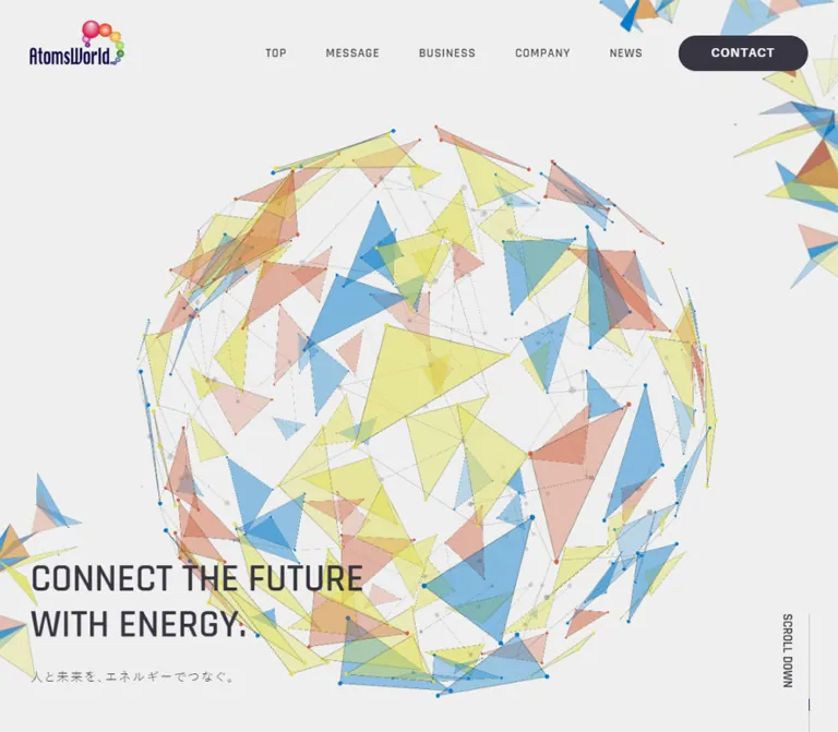
半透明の三角形と点・線で構成した球体、細身の英字見出し、広い余白が特徴の企業サイト。会社紹介やニュースから、濃色の問い合わせフッターへつなぎます。
AtomsWorld — Style Reference
An energy group expressed through translucent geometry, fine technical lettering, and expansive space.
Original URL: atomsworld.co.jp
Final URL: atomsworld.co.jp
Theme: a light, cool-gray canvas with a dark translucent contact footer.
Inspected evidence: October 2, 2026, Japan Standard Time. The supplied browser observation was retrieved at 2026-10-01T17:21:58.491Z, equivalent to October 2 at 02:21:58.491 JST. Individual screenshot timestamps were not supplied.
Viewports: desktop 1440 × 1000 and mobile 390 × 844 CSS pixels.
Scope: the current corporate homepage: header, introductory hero, group statement, Message and Company links, news, and contact footer. Screenshots visually document the desktop hero, Company feature, and footer, plus the mobile hero and footer. The other sections are documented through rendered DOM measurements. Linked pages, the open mobile menu, and the contact form itself were not inspected.
AtomsWorld builds its identity around a large spherical network of translucent triangular faces, fine connecting lines, and small vertices. Pale blue, yellow, and salmon overlap on a nearly white field. The result suggests connection and energy without relying on conventional electricity icons. A small, saturated logo anchors the top-left corner, while a two-line English statement sits near the lower-left edge of the opening screen.
The rest of the homepage retains that spacious composition. Thin Rajdhani headings accompany Japanese body text, an architectural photograph appears as a slightly angled plane, and vertical section labels occupy the outer margin. The final contact area reverses the typography to white while allowing the geometric sphere to remain faintly visible beneath a charcoal veil. This is a corporate overview with multiple destinations and current news, rather than a single-purpose campaign page.
閉じる
AtomsWorld — Style Reference
An energy group expressed through translucent geometry, fine technical lettering, and expansive space.
Original URL: atomsworld.co.jp
Final URL: atomsworld.co.jp
Theme: a light, cool-gray canvas with a dark translucent contact footer.
Inspected evidence: October 2, 2026, Japan Standard Time. The supplied browser observation was retrieved at 2026-10-01T17:21:58.491Z, equivalent to October 2 at 02:21:58.491 JST. Individual screenshot timestamps were not supplied.
Viewports: desktop 1440 × 1000 and mobile 390 × 844 CSS pixels.
Scope: the current corporate homepage: header, introductory hero, group statement, Message and Company links, news, and contact footer. Screenshots visually document the desktop hero, Company feature, and footer, plus the mobile hero and footer. The other sections are documented through rendered DOM measurements. Linked pages, the open mobile menu, and the contact form itself were not inspected.
AtomsWorld builds its identity around a large spherical network of translucent triangular faces, fine connecting lines, and small vertices. Pale blue, yellow, and salmon overlap on a nearly white field. The result suggests connection and energy without relying on conventional electricity icons. A small, saturated logo anchors the top-left corner, while a two-line English statement sits near the lower-left edge of the opening screen.
The rest of the homepage retains that spacious composition. Thin Rajdhani headings accompany Japanese body text, an architectural photograph appears as a slightly angled plane, and vertical section labels occupy the outer margin. The final contact area reverses the typography to white while allowing the geometric sphere to remain faintly visible beneath a charcoal veil. This is a corporate overview with multiple destinations and current news, rather than a single-purpose campaign page.
How to Read This Reference
- Measured values come from the supplied rendered DOM and computed-style records. All dimensions are CSS pixels unless stated otherwise.
- Visual estimates describe the supplied original-page screenshots. Approximate colors, artwork bounds, and unsampled lettering are not extracted stylesheet values.
- Derived values are calculations from measured bounds, such as the approximately
3.6%desktop and8%mobile outer margins. - Recommendations describe reusable implementation choices. The Quick Start is an adaptation, not recovered source code.
- The sampled elements do not include every child, pseudo-element, image, or graphics surface. A parent's computed font or color may differ from the lettering visibly painted inside it.
- Desktop feature panels have overlapping reported coordinates and transform transitions. Treat those bounds as state-dependent evidence, not as a complete static document-flow specification.
Tokens — Colors
Default Palette
Token names below are implementation aliases, not original custom-property names.
| Name | Value | Suggested token | Evidence and role |
|---|---|---|---|
| Charcoal Ink | #373541 |
--aw-ink |
Measured body text, many links, headings, and desktop CONTACT background |
| Statement Ink | #1a191f |
--aw-strong |
Measured group-statement heading color |
| White | #ffffff |
--aw-white |
Measured footer text, READ MORE surface, category pills, and underlying HTML/body background |
| Cool Canvas | Approximately #edeeee |
--aw-canvas |
Visual estimate of the hero field; the Company capture appears slightly darker |
| Mesh Blue | Approximately #70b1d3 |
--aw-mesh-blue |
Visual estimate of a representative translucent blue face |
| Mesh Yellow | Approximately #e7e68f |
--aw-mesh-yellow |
Visual estimate of a representative pale yellow face |
| Mesh Salmon | Approximately #dba898 |
--aw-mesh-salmon |
Visual estimate of a representative peach/salmon face |
| Network Gray | Approximately #bcc0c0 |
--aw-network |
Visual estimate for faint lines and subdued nodes |
| Section Dot | Approximately #bb8c85 |
--aw-marker |
Visual estimate of the small muted pink marker above the desktop section label |
| Footer Veil | rgba(55, 53, 65, 0.85) |
--aw-footer-veil |
Measured footer background; allows the underlying artwork to remain visible |
The mesh does not have one flat color per category. Transparency, overlapping faces, edge strokes, and underlying space produce many intermediate shades. Use the three estimated face colors as an art-direction starting point, not as verified renderer inputs.
Painted background versus body background: the computed HTML and BODY backgrounds are white, but the screenshots show a cool-gray field. An unsampled visual layer contributes to the final appearance. Setting the body to white alone will not reproduce the supplied captures.
The footer should preserve its translucent construction when artwork exists behind it. Over the estimated #edeeee canvas alone, its measured veil would produce approximately #52515b; that is a calculated composite, not an additional source color. The actual composite varies over the mesh.
Source Custom Properties
The supplied records expose --swiper-theme-color: #007aff and --swiper-navigation-size: 44px. These are library-style properties, not evidence that bright blue is the site's primary action color. Their presence also does not establish a visible carousel or a tested swipe interaction.
Tokens — Typography
Japanese Body and Statement Text
Measured source stack: 游ゴシック体, YuGothic, 游ゴシック, 'Yu Gothic', メイリオ, 'Hiragino Kaku Gothic ProN', 'Hiragino Sans', sans-serif.
The body uses 16px, weight 500, and 0.8px tracking. Paragraphs are unusually airy: group copy has 36px line height, while feature descriptions use 32px. Preserve that difference. The dense Japanese statement gains emphasis through weight and line spacing rather than through a colored panel.
The Japanese hero line, 人と未来を、エネルギーでつなぐ。, is the measured H1. It is visually subordinate to the English statement: 18px on desktop and 16px on mobile, both weight 400 with 0.1em tracking.
Rajdhani — English Display and Utility Text
Measured source family: Rajdhani, sans-serif.
Rajdhani is explicitly recorded on Contents labels, Message and Company headings, vertical section labels, READ MORE and More News links, the contact heading, and footer navigation. Its narrow proportions and softly squared shapes give the page a light technical character.
Use the measured weight distinctions:
300for the large Message, Company, and Contact form headings.400for Contents labels and section rails.500for footer navigation and the CONTACT anchor.600for READ MORE and More News.
Unsampled Lettering
The visible English hero statement is much larger than its sampled P wrapper's 16px computed font size. Its painted child lettering was not separately measured. Visually, it resembles the condensed English family used elsewhere, but its exact family, size, and weight are unverified.
The same caution applies to top-navigation labels and copyright lettering. The CONTACT anchor reports charcoal text on a charcoal background, while the screenshot clearly shows a white label. That is evidence of styling below or beyond the sampled wrapper, not evidence of an intentionally invisible label.
Type Scale
| Role | Desktop | Mobile | Evidence |
|---|---|---|---|
| Base Japanese text | 16px, 500, tracking 0.8px |
Same | Measured |
| English hero statement | Approximately 50px; two visible lines |
Approximately 28px; two visible lines |
Visual estimate; wrapper heights measured at 118px and 61.59px |
| Japanese hero H1 | 18px, 400, tracking 1.8px; 27px box |
16px, 400, tracking 1.6px; 24px box |
Measured; line height reported as normal |
| Group statement | 38px / 72px, 700, tracking 1.52px |
28px / 53.05px, 700, normal tracking |
Measured |
| Group paragraph | 16px / 36px, 500 |
Same | Measured |
| Vertical section label | 20px / 20px, 400 |
Not present in the sampled mobile layout | Measured desktop treatment |
| Contents eyebrow | 33px, 400, tracking -0.99px; 42px box |
14px, 400, tracking -0.42px; 18px box |
Measured |
| Message / Company title | 90px, 300, tracking -2.7px; 115px box |
48px / 48px, 300, tracking -1.44px |
Measured |
| Feature description | 16px / 32px, 500 |
Same | Measured |
| News title | 20px / 36px, 700 |
18px / 32.4px, 700 |
Measured |
| News category | 12px, 500; 20px pill height |
Same | Measured; pill height is not a measured line height |
| READ MORE / More News | 17px, 600 |
Same | Measured |
| Contact form | 100px / 100px, 300 |
56px / 56px, 300 |
Measured |
| Contact explanation | 18px / 36px, 700 |
14px / 22.4px, 500 |
Measured |
| Footer navigation | 20px, 500; 26px inline box |
Same | Measured |
The typographic hierarchy depends on contrast between thin English display text and substantial Japanese text. Avoid applying the same weight and line-height policy to both.
Tokens — Spacing & Shapes
Density: broad, atmospheric sections with compact navigation and readable text columns.
Underlying spacing system: no complete source scale was supplied. Repeated dimensions suggest useful working increments, but they do not prove a universal spacing unit.
Layout Measurements
| Element | Desktop at 1440 × 1000 | Mobile at 390 × 844 |
|---|---|---|
| Common outer left inset | 51.84px, approximately 3.6vw |
31.20px, approximately 8vw |
| Common available width | 1336.31px |
327.59px, approximately 84vw |
| Header | 120px high |
74px high |
| Logo wrapper | 131.47 × 62.03px, at approximately (51.84, 28.98) |
76 × 35.84px, at approximately (31.20, 19.08) |
| Hero section | 1000px high |
784px high |
| English hero wrapper | Top 761px, height 118px |
Top 644.41px, height 61.59px |
| Japanese hero H1 | Top 911px, height 27px |
Top 718px, height 24px |
| Desktop feature link | 950px wide, starting at x = 245px |
327.59px wide, starting at x = 31.20px |
| Feature text column | 318.25px wide |
327.59px wide |
| Footer | 1000px high |
844px high |
| Document height | 9096px |
Approximately 6373px |
The mobile hero is 60px shorter than the captured viewport. This is an observed endpoint, not proof of a particular vh, browser-toolbar, or JavaScript sizing formula.
Component Geometry
| Element | Measured geometry | Character |
|---|---|---|
| Desktop CONTACT | 182 × 50px, radius 25px |
A fully rounded dark pill |
| READ MORE | 220 × 50px, horizontal padding 35px, radius 0 |
A white rectangular link |
| News category | 80 × 20px, horizontal padding 15px, radius 10px |
A small white capsule |
| Mobile menu button | 40 × 16px reported bounds |
Three fine strokes, with a shorter lower stroke in the screenshot |
| Most sampled containers | Radius 0 |
No general rounded-card system |
Vertical Rhythm
Measured gaps between major sections are substantial:
| Gap | Desktop | Mobile |
|---|---|---|
| Hero end to group section start | 275px |
120px |
| Group end to Contents start | 345px |
150px |
| Contents end to News start | 520px |
240px |
These are document-layout gaps at the inspected states. The desktop Contents region itself is 3000px high and contains overlapping feature-panel coordinates. It should not be reconstructed as three empty screens without understanding the original scroll behavior.
For a new implementation, a practical supporting scale is 4, 8, 12, 20, 25, 32, 35, 50, 60, 90, 120px, with larger section spacing handled independently. This is a recommendation assembled around observed dimensions.
Components
Corporate Header
Role: identity and navigation across the corporate website.
On desktop, the logo sits at the far left while TOP, MESSAGE, BUSINESS, COMPANY, NEWS, and CONTACT form a single row on the right. Consecutive text-link boxes are separated by approximately 55px; the final gap before CONTACT is approximately 50px. The contact pill occupies (1206.16, 50) with dimensions 182 × 50px.
The header is transparent and unruled. Background geometry remains visible around it. Do not add a solid navigation bar or a broad shadow to the opening view.
On mobile, the logo shrinks to 76px wide and the link row is replaced visually by the small line menu control at approximately (318.80, 29). The corresponding navigation links remain in the DOM with their first x coordinate around 421px, outside the 390px viewport. This supports a closed offscreen-navigation state. Its opening behavior, backdrop, focus management, and animation were not exercised.
The desktop Company and footer screenshots do not show the header. A 0.4s opacity transition is recorded, but the evidence does not establish whether the header is fixed, sticky, scroll-hidden, or hidden by another state rule.
Hero and Geometric Sphere
Role: establish the energy-and-connection identity before presenting detailed corporate information.
The desktop screenshot places a roughly 800px spherical network near the horizontal center, approximately between x = 325–1120 and y = 173–958. These are visual estimates. The sphere contains many open spaces: fine edges and tiny vertices connect translucent triangular planes without forming a continuous opaque globe.
Additional polygon fragments are cropped along the lower-left and upper-right edges. They extend the visual field beyond the central object and prevent the page from feeling like a centered illustration inside a box.
The copy sits low and left:
- English statement:
CONNECT THE FUTUREfollowed byWITH ENERGY. - Japanese H1:
人と未来を、エネルギーでつなぐ。
The measured gap from the English wrapper to the Japanese H1 is 32px on desktop and 12px on mobile. The H1 ends approximately 62px above the desktop hero bottom and 42px above the mobile hero bottom.
On mobile, the sphere extends beyond both side edges. Its visible geometry begins around y = 144px and continues close to the bottom of the capture. Keep this enlarged crop: scaling the entire desktop globe down to fit inside the phone would change the composition substantially.
Section Rail and Scroll Cue
Role: quiet orientation within large visual sections.
The desktop Company screenshot has a small muted-pink dot near the upper-left corner, followed by a vertical CONTENTS label. DOM records place the section-label text near x = 71.80px, with 20px Rajdhani text and a 20px line height.
A vertical SCROLL DOWN label and fine vertical rule appear near the lower-right edge of the desktop hero and Company views. Its typography and exact rule dimensions were not sampled. No click action was verified for this cue.
These rails are absent from the supplied mobile screenshots. Mobile news instead has a normal horizontal heading, measured at 24px / 24px with -0.72px tracking.
Group Statement and Company Links
Role: explain the group's purpose and connect its constituent businesses.
This section is supported by DOM evidence rather than a dedicated supplied screenshot. Its desktop statement begins at x = 461px and uses a content width of approximately 875.69px. The result is strongly offset to the right of the outer margin.
The hierarchy is a bold Japanese vision statement, three linked group-company marks, a generously led paragraph, and READ MORE. The desktop statement uses 38px / 72px; mobile uses 28px / 53.05px and fills the common 327.59px content width.
Three external company links are present. Their sampled anchor widths are approximately 244, 229, and 257px on desktop, reducing to 155, 145, and 168px on mobile. Image URLs and individual logo bounds were not supplied, so these anchor measurements should not be treated as complete asset specifications.
READ MORE is a 220 × 50px white, square-cornered link to /company/, using Rajdhani 17px, weight 600, and 35px horizontal padding.
Message and Company Features
Role: large editorial links into the main corporate content.
Each feature is a single anchor containing the Contents eyebrow, an English H2, descriptive Japanese copy, and a visual region. The supplied Company screenshot is the clearest visual authority for this component.
On desktop, the text begins around x = 386px, while the building photograph begins around x = 757px. The measured text column is 318.25px wide. The 90px, weight-300 heading has tight -0.03em tracking and no enclosing panel.
A fine horizontal rule begins to the right of the Contents eyebrow and continues over the photograph. The image is approximately 426px wide in the screenshot. Its left edge spans roughly y = 185–817, while the right edge is slightly shorter, producing a subtle perspective-plane appearance. This is a visual estimate; the transform matrix was not supplied.
A large, diffuse blue-gray and dark bloom appears behind the image toward the right and bottom. It reads as an atmospheric extension of the photograph. There is no evidence of a general card-elevation system.
On mobile, measured positions establish the order: Contents label, 48px heading, a substantial intervening media region, and body copy. Message is approximately 760px tall and Company approximately 696px tall, separated by 90px. The media itself is not shown in the supplied mobile screenshots, so its crop and perspective treatment are unverified.
The desktop records place both links in nearly the same stage, while the mobile records place them sequentially. A scroll-controlled presentation is plausible, but pinning mechanics, transition order, and triggers are not established.
News List and Recruitment Feature
Role: current company updates with a separately emphasized recruitment item.
The rendered DOM contains seven 2026 updates, beginning with 2026.09/24, plus the recruitment item 採用情報について, dated 2023.09/01. Each entry is a link containing a date, the category お知らせ, and a Japanese title.
Desktop geometry distinguishes two areas:
- Main update links start at
x = 245px, are approximately586pxwide, and usually165pxhigh. Consecutive row starts are197pxapart, giving approximately32pxbetween these rows. - Text begins approximately
245pxinside each main row. This implies a reserved left media area, although the media asset itself was not included in the sampled elements. - The recruitment link sits separately at approximately
x = 901.92px, with a width of388.80pxand height of292.83px.
On mobile, the recruitment feature appears above the chronological list according to its measured y coordinate. The first current update starts below it. Each main row uses the full 327.59px width, with metadata at the outer left and title text beginning at x = 157.66px, leaving a title column of 201.14px beside a reserved media area. Row gaps are approximately 28px.
The category stays small and neutral: a white 80 × 20px pill with 12px text. Titles use bold Japanese type rather than colored badges. More News is a compact Rajdhani text link to /news/, with 33px of measured right padding; the supplied evidence does not identify the decoration occupying that space.
News image subjects, crops, and hover appearance are not visually verified by the supplied screenshots.
Contact Footer
Role: a large contact destination and final corporate navigation.
The footer fills one captured viewport at both sizes: 1000px on desktop and 844px on mobile. Its measured background is rgba(55, 53, 65, 0.85). A large network sphere remains faintly visible underneath, creating continuity with the opening view.
Contact form is a link to /contact/, not a form embedded in the homepage. Its title uses white Rajdhani at 100px / 100px, weight 300, on desktop and 56px / 56px on mobile. The Japanese explanation belongs to the same link.
On desktop, the contact block begins approximately 386.5px below the footer top. Navigation starts to its right at x = 868.97px. Preserve the navigation arrangement:
- First row: TOP.
- Second row: MESSAGE and BUSINESS.
- Third row: NEWS and COMPANY.
The second navigation column begins around x = 1066.94px. Row starts are separated by 51px.
On mobile, the contact title begins approximately 284.61px below the footer top. The explanation wraps to two lines. Navigation follows about 60px after the contact block and retains two columns, beginning at x = 31.20px and x = 195px.
The copyright sits below, aligned with the contact text. The source wording is Copyright ©︎ AtomsWorld, All Rights Reserved.; it does not display a year. Its small white, tracked appearance is visible in the screenshots, but the actual painted child typography was not separately measured.
Tokens — Motion & Interaction
| Treatment | Recorded value or evidence | What can be concluded |
|---|---|---|
| Header visibility | opacity 0.4s |
An opacity transition is defined; its trigger was not observed |
| Header links | 0s 5s forwards animeOpacity |
A zero-duration animation with a five-second delay and forwards fill is declared; keyframes were not supplied |
| Feature headings | transform 0.6s, -webkit-transform 0.6s |
Transform changes are intended to transition over 600ms; direction and trigger remain unknown |
| READ MORE | border 0.4s |
A border transition is declared; endpoints were not captured |
| News title | background-size 0.4s |
A background-size transition is declared; an underline effect is plausible but unverified |
| Mobile menu | Offscreen navigation and a visible menu button | Closed-state geometry is supported; open-state behavior was not tested |
| Geometric sphere | Static captures of a layered network | Renderer, speed, rotation, pointer response, and scroll coupling are unverified |
| Links | Rendered destination URLs | Navigation targets are known; destination-page behavior was not inspected |
Many sampled elements report only transition: all. Without a nonzero duration, this does not establish a visible transition.
The capture procedure waited for finite animations and temporarily paused perpetual animation during readiness checks. That procedure is not a temporal recording of this page's sphere. Do not invent an orbit duration, scroll-scrubbing relationship, particle simulation, or rendering library from these stills.
For an adaptation, restrained transitions around 400–600ms fit the recorded UI timing. Keep content available immediately rather than copying the five-second delayed declaration without its original context. Any continuous sphere movement should be separately specified, optional, and compatible with reduced-motion preferences.
Surfaces
| Layer | Appearance | Role |
|---|---|---|
| Underlying document | Computed white | Base browser surface |
| Visible main field | Nearly white, cool gray | Calm background for translucent geometry |
| Network artwork | Fine lines, small nodes, overlapping colored faces | Identity and visual continuity |
| Editorial content | Mostly transparent containers | Lets typography, imagery, and spacing define structure |
| Photograph | Sharp rectangular plane with perspective-like edges | Concrete architectural counterpoint to abstract geometry |
| Photograph bloom | Broad, diffuse, partly color-tinted | Local depth around the feature image |
| Small links and metadata | White rectangle or capsule | Compact utility hierarchy |
| Contact footer | Charcoal veil over faint geometry | Strong tonal ending with white typography |
Depth is concentrated in the artwork and photograph. Avoid spreading shadows, borders, and tinted containers across every section.
Imagery
The main artwork is a hollow-looking spherical arrangement of irregular triangular planes. Its character comes from the combination of transparent color, incomplete surfaces, fine connections, and visible vertices. A solid faceted ball would lose much of this lightness. A generic field of glowing dots would lose the triangular materiality.
Some planes overlap to create muted green or brown intersections. Others are almost empty except for their connecting edges. Larger fragments leave the frame at the page boundaries. Keep a mix of face sizes and orientations rather than a uniform triangular tessellation.
The Company image shows a building at dusk: blue sky and exterior tones, warm illuminated interiors, dark structure, vegetation, and infrastructure in the foreground. Preserve the cool/warm contrast and architectural detail. The screenshot does not independently establish the building's location or ownership.
The logo combines a dark wordmark with a curved cluster of saturated colored spheres. It should remain a supplied brand asset; recreating it as ordinary text and CSS circles would discard its distinctive proportions.
Observed Asset References
No original image src values, font-file URLs, graphics scripts, or mesh files were supplied.
| Asset | Evidence available | Reuse guidance |
|---|---|---|
| AtomsWorld logo | Visible in desktop and mobile hero captures | Use an authorized original asset and preserve its aspect ratio |
| Network sphere and edge fragments | Visible in hero, Company surroundings, and footer | Supply a dedicated SVG, canvas, or rendered asset; implementation technology is a new choice |
| Company building photograph | Visible in the desktop Company capture | Preserve the architectural composition and cool/warm lighting relationship |
| Group-company marks | Linked regions recorded in the DOM | Obtain actual assets before recreating the section |
| News media | Space implied by measured text offsets | Confirm the original media before choosing subjects or crops |
Do not invent original asset paths. The CSS below supplies the page structure and treatments; it does not generate the identifying artwork.
Layout & Responsive Behavior
Document Structure
| Region | Desktop document bounds | Mobile document bounds |
|---|---|---|
| Hero | 0–1000px |
0–784px |
| Group section | 1275–2510px |
Approximately 904–1906px |
| Contents | 2855–5855px |
Approximately 2056–3602px |
| News | 6375–8096px |
Approximately 3842–5529px |
| Footer | 8096–9096px |
Approximately 5529–6373px |
These bounds describe the inspected document states. They are not a recommendation to hardcode all section heights.
Desktop Composition
The page uses several distinct alignment systems. The logo, hero copy, and footer start near the 3.6vw outer margin. Feature links use a 950px centered stage. Group text starts much farther right at approximately 32% of viewport width. News extends beyond the feature stage through a separate right-hand recruitment feature.
Preserve these deliberate offsets. Forcing every element into one centered text container would flatten the composition.
Mobile Reflow
The outer margin grows proportionally to 8vw, leaving an 84vw content column. Navigation collapses visually to the menu button. The hero artwork remains oversized and cropped, while the logo and statement become smaller.
Feature headings, media regions, and descriptions become sequential blocks. Japanese body copy remains 16px with generous line height. The recruitment feature moves above the current news list. The footer contact block moves above its two-column navigation without reducing the footer links below their measured 20px size.
Only the two supplied widths are verified. The exact breakpoint is unknown. A breakpoint near 64rem is a reasonable starting recommendation for the static adaptation, but intermediate widths and landscape layouts require testing.
Do’s and Don’ts
Do
- Keep charcoal text, cool pale space, and translucent blue/yellow/salmon artwork as separate visual layers.
- Preserve holes, fine connections, and small vertices within the sphere.
- Anchor the hero statement near the lower-left edge.
- Use verified Rajdhani weights for the English display system and retain the Japanese body stack.
- Keep Message and Company headings thin and tightly tracked.
- Let desktop sections use different horizontal alignments.
- Preserve the mobile sphere's deliberate side cropping.
- Keep the Company photograph sharp while concentrating atmospheric blur behind it.
- Maintain the recruitment feature's mobile placement above the current updates.
- Use the large contact text as a link and retain the footer's two-column navigation topology.
Don’t
- Don't turn the sphere into an opaque low-poly ball or a neon particle tunnel.
- Don't use the estimated pastel face colors as saturated button fills.
- Don't mistake the library blue custom property for the primary brand color.
- Don't shrink all desktop elements proportionally to create the mobile layout.
- Don't replace the open editorial layout with rounded cards.
- Don't apply a generic shadow to every content block.
- Don't treat the English hero wrapper's
16pxfont size as the visible headline size. - Don't recreate overlapping desktop DOM coordinates as accidental text collisions.
- Don't infer a slider, WebGL library, pointer effect, or rotation speed from the available evidence.
- Don't expose offscreen menu links to keyboard users in a new closed-menu implementation.
Recommended Implementation Additions
These are recommendations for a new implementation, not verified features of the original:
- Give the mobile menu a comfortably sized target, such as
44 × 44px, while retaining its small visible line mark. Provide an accessible name,aria-expanded, and a controlled navigation region. - Make closed navigation inert or otherwise unavailable to keyboard focus. If implemented as a modal drawer, manage focus and Escape behavior explicitly.
- Mark decorative network artwork as hidden from assistive technology and keep all corporate text in semantic HTML.
- Provide a static mesh fallback and stop continuous rendering when reduced motion is requested or the artwork is offscreen.
- Use explicit visible focus indicators on whole-feature links, news links, and the contact block.
- Preserve reading order when moving recruitment content between desktop and mobile positions.
- Reserve image space before loading to protect the large, carefully spaced layout from shifts.
- Keep the hero's text readable over moving or overlapping faces. If necessary, reduce nearby face opacity rather than adding a conspicuous opaque text card.
- Test text enlargement, narrow landscape screens, and mobile browser chrome. Prefer minimum heights over fixed heights where additional text could otherwise be clipped.
Agent Prompt Guide
Quick Color Reference
- Main ink: measured
#373541. - Strong Japanese statement: measured
#1a191f. - Main visible canvas: approximately
#edeeee. - Mesh faces: approximate blue
#70b1d3, yellow#e7e68f, and salmon#dba898with varied transparency. - Contact footer: measured
rgba(55,53,65,0.85)over the artwork. - Footer text and small utility surfaces: measured white.
- Primary desktop contact treatment: charcoal capsule with a visibly white label.
Overall Prompt
“Create a Japanese corporate homepage inspired by the supplied AtomsWorld reference. Use a cool nearly white canvas, charcoal text, a small colorful logo, and an oversized hollow sphere assembled from translucent blue, pale yellow, and salmon triangles, fine gray connections, and tiny vertices. Place a condensed two-line English statement low on the left with a smaller Japanese H1 beneath it. Use Rajdhani at weight 300 for large English section headings and spacious Japanese body typography. Build offset corporate text, large Message and Company feature links, an architectural photograph with a subtle perspective-plane treatment and diffuse bloom, a news list with a separate recruitment feature, and a viewport-height dark contact footer. On mobile use 8vw gutters, crop the sphere beyond the screen edges, stack feature content, move recruitment above news, and keep two footer navigation columns. Treat any globe animation or menu-opening behavior as a separately specified implementation.”
Example Component Prompts
- Hero: “At 1440 × 1000, place a roughly 800px translucent network sphere near the center, with scattered fragments leaving the corners. Position the English statement at the lower left around x=52px, followed by a small Japanese line. At 390px wide, use a 31px text inset and retain a much wider-than-screen sphere. Keep the text in HTML.”
- Company feature: “Create a whole-panel company link with a thin 33px Contents eyebrow, a 90px weight-300 Rajdhani heading, and a 318px Japanese text column. Place a cool dusk architectural photograph to the right, with subtly converging top and bottom edges and a broad atmospheric shadow. Extend a fine horizontal rule from the eyebrow area across the image. Stack heading, media, and copy on mobile.”
- News: “Use bold Japanese titles, dates in the source YYYY.MM/DD format, small white category capsules, and reserved media areas without card backgrounds. Give recruitment its own desktop feature and place it before the current updates on mobile. Keep category pills 80 × 20px and titles 20px desktop or 18px mobile.”
- Footer: “Build a full-height contact area with a translucent charcoal veil over a faint enlarged network sphere. Use a white 100px weight-300 Contact form heading on desktop and 56px on mobile. Link the heading and explanation together. Arrange navigation as TOP, then MESSAGE/BUSINESS, then NEWS/COMPANY. Place small tracked copyright text below.”
- Closed mobile header: “Use a transparent 74px header, a 76px-wide logo at an 8vw inset, and a fine three-stroke menu mark at the right. Keep the visible mark approximately 40 × 16px inside a larger accessible button. Implement and test the open state separately.”
Quick Start
CSS Custom Properties
This is a static, responsive foundation based on measured endpoints. Canvas and mesh colors, English hero typography, the photo mask and shadow, the breakpoint, and unmeasured layout rules are recommended approximations. It intentionally does not reproduce the unverified desktop scroll stage or the delayed navigation animation.
Load Rajdhani weights 300–600 through an authorized font source before evaluating the typography. No original font-file URL was supplied. Provide actual logo, mesh, and photographic assets separately.
The feature selectors assume one .feature-link containing a .feature-text wrapper with .feature-heading and .feature-description, plus a sibling .feature-media. On mobile, display: contents allows the heading, media, and description to occupy consecutive grid rows. The footer uses .footer-inner, .footer-main, a contact link, navigation, and copyright. Put optional mesh artwork in .footer-art beneath the veil.
:root {
  /* Measured interface colors */
  --aw-ink: #373541;
  --aw-strong: #1a191f;
  --aw-white: #fff;
  --aw-footer-veil: rgb(55 53 65 / 85%);

  /* Visual approximations for the artwork and painted canvas */
  --aw-canvas: #edeeee;
  --aw-mesh-blue: #70b1d3;
  --aw-mesh-yellow: #e7e68f;
  --aw-mesh-salmon: #dba898;
  --aw-network: #bcc0c0;
  --aw-marker: #bb8c85;

  --aw-font-display: 'Rajdhani', sans-serif;
  --aw-font-jp: '游ゴシック体', YuGothic, '游ゴシック',
    'Yu Gothic', 'メイリオ', 'Hiragino Kaku Gothic ProN',
    'Hiragino Sans', sans-serif;

  --aw-gutter: 3.6vw;
  --aw-feature-width: 950px;
  --aw-copy-width: 318.25px;
  --aw-rule: 1px;
  --aw-radius-contact: 25px;
  --aw-radius-category: 10px;
  --aw-motion-ui: 400ms;
  --aw-motion-feature: 600ms;
}

* { box-sizing: border-box; }

body {
  margin: 0;
  color: var(--aw-ink);
  background: var(--aw-canvas);
  font-family: var(--aw-font-jp);
  font-size: 16px;
  font-weight: 500;
  letter-spacing: 0.8px;
}

img { display: block; max-width: 100%; }
button { font: inherit; }
a { color: inherit; }

.site-header {
  position: absolute;
  inset: 0 0 auto;
  z-index: 10;
  height: 120px;
  padding-inline: var(--aw-gutter);
  display: flex;
  align-items: center;
  justify-content: space-between;
}

.site-logo { width: 131.47px; }

.primary-nav {
  display: flex;
  align-items: center;
  gap: 55px;
  transform: translateY(15px);
  font: 500 20px/1 var(--aw-font-display);
  letter-spacing: 0;
}

.primary-nav a { text-decoration: none; }

.contact-pill {
  display: inline-flex;
  align-items: center;
  justify-content: center;
  width: 182px;
  height: 50px;
  margin-inline-start: -5px;
  border-radius: var(--aw-radius-contact);
  color: var(--aw-white);
  background: var(--aw-ink);
}

.menu-toggle { display: none; }

.hero {
  position: relative;
  min-height: 100vh;
  min-height: 100svh;
  overflow: hidden;
}

/* Supply a real SVG, canvas, or image for the network artwork. */
.world-orb {
  position: absolute;
  width: 800px;
  height: 800px;
  left: 50%;
  top: 17.3%;
  transform: translateX(-50%);
  pointer-events: none;
}

.hero-copy {
  position: absolute;
  z-index: 2;
  inset-inline: var(--aw-gutter);
  bottom: 62px;
}

/* Estimated lettering; line box follows the measured wrapper height. */
.hero-statement {
  margin: 0;
  font: 600 50px/1.18 var(--aw-font-display);
  letter-spacing: 0.02em;
}

.hero-statement span { display: block; }

.hero-tagline {
  margin: 32px 0 0;
  font-size: 18px;
  font-weight: 400;
  line-height: 1.5;
  letter-spacing: 0.1em;
}

.group-copy {
  margin-inline: 32% 7.17%;
}

.group-statement {
  margin: 0;
  color: var(--aw-strong);
  font-size: 38px;
  font-weight: 700;
  line-height: 72px;
  letter-spacing: 0.04em;
}

.group-description { line-height: 36px; }

.read-more {
  display: inline-flex;
  align-items: center;
  width: 220px;
  min-height: 50px;
  padding-inline: 35px;
  border: 1px solid transparent;
  border-radius: 0;
  background: var(--aw-white);
  text-decoration: none;
  font: 600 17px/1.3 var(--aw-font-display);
  letter-spacing: 0;
  transition: border-color var(--aw-motion-ui);
}

.feature-link {
  display: grid;
  grid-template-columns: var(--aw-copy-width) minmax(0, 1fr);
  align-items: center;
  gap: 52px;
  width: min(var(--aw-feature-width),
    calc(100% - var(--aw-gutter) - var(--aw-gutter)));
  margin: 160px auto;
  padding-inline: 141.3px 11.7px;
  text-decoration: none;
}

.feature-text {
  position: relative;
  z-index: 2;
  transform: translateY(90px);
}

.feature-kicker {
  position: relative;
  margin: 0;
  font: 400 33px/42px var(--aw-font-display);
  letter-spacing: -0.03em;
}

.feature-kicker::after {
  content: '';
  position: absolute;
  top: 50%;
  left: 200px;
  width: 598px;
  height: var(--aw-rule);
  background: currentColor;
}

.feature-title {
  margin: 0;
  font: 300 90px/1.278 var(--aw-font-display);
  letter-spacing: -0.03em;
}

.feature-description {
  margin: 12px 0 0;
  font-size: 16px;
  line-height: 32px;
}

/* Recommended static approximations of the photograph treatment. */
.feature-media {
  margin: 0;
  filter: drop-shadow(42px 38px 38px rgb(55 53 65 / 20%));
}

.feature-media img {
  width: 100%;
  aspect-ratio: 427 / 632;
  object-fit: cover;
  clip-path: polygon(0 0, 100% 3.6%, 100% 96.4%, 0 100%);
}

.news-layout {
  display: grid;
  grid-template-columns: minmax(0, 1.506fr) minmax(0, 1fr);
  gap: 71px;
  max-width: 1046px;
  margin-inline: auto;
}

.news-list {
  display: grid;
  gap: 32px;
}

.news-row { text-decoration: none; }

.news-meta {
  display: flex;
  align-items: center;
  gap: 16px;
}

.news-category {
  display: inline-flex;
  align-items: center;
  justify-content: center;
  width: 80px;
  height: 20px;
  padding-inline: 15px;
  border-radius: var(--aw-radius-category);
  background: var(--aw-white);
  font-size: 12px;
  letter-spacing: 0;
}

.news-title {
  font-size: 20px;
  font-weight: 700;
  line-height: 36px;
}

.site-footer {
  position: relative;
  isolation: isolate;
  display: flex;
  align-items: center;
  min-height: 100vh;
  min-height: 100svh;
  padding: 200px var(--aw-gutter) 100px;
  overflow: hidden;
  color: var(--aw-white);
  background: var(--aw-canvas);
}

.footer-art {
  position: absolute;
  inset: 0;
  z-index: -2;
  width: 100%;
  height: 100%;
  object-fit: cover;
  pointer-events: none;
}

.site-footer::before {
  content: '';
  position: absolute;
  inset: 0;
  z-index: -1;
  background: var(--aw-footer-veil);
}

.footer-inner { width: 100%; }

.footer-main {
  display: grid;
  grid-template-columns: 61.15% minmax(0, 1fr);
  align-items: start;
}

.footer-contact {
  display: inline-block;
  justify-self: start;
  text-decoration: none;
}

.footer-title {
  margin: 0;
  font: 300 100px/100px var(--aw-font-display);
  letter-spacing: 0;
}

.footer-description {
  margin: 0;
  font-size: 18px;
  font-weight: 700;
  line-height: 36px;
}

.footer-nav {
  display: grid;
  grid-template-columns: 198px minmax(0, 1fr);
  row-gap: 25px;
  padding-top: 30px;
  font: 500 20px/26px var(--aw-font-display);
  letter-spacing: 0;
}

.footer-nav a { text-decoration: none; }
.footer-nav .nav-top { grid-column: 1 / -1; }

/* Painted copyright lettering is approximated from the screenshots. */
.copyright {
  margin: 145px 0 0;
  font: 500 18px/24px var(--aw-font-display);
  letter-spacing: 0.1em;
}

:where(a, button):focus-visible {
  outline: 2px solid currentColor;
  outline-offset: 6px;
}

@media (hover: hover) {
  .read-more:hover { border-color: var(--aw-ink); }
}

/* Recommended breakpoint, not a recovered source breakpoint. */
@media (max-width: 64rem) {
  :root { --aw-gutter: 8vw; }

  .site-header { height: 74px; }
  .site-logo { width: 76px; }
  .primary-nav { display: none; }

  /* Wire this button to a separately implemented accessible menu. */
  .menu-toggle {
    display: flex;
    flex-direction: column;
    align-items: flex-end;
    justify-content: center;
    gap: 7px;
    width: 44px;
    height: 44px;
    padding: 0;
    border: 0;
    color: inherit;
    background: transparent;
  }

  .menu-toggle span {
    display: block;
    width: 40px;
    height: 1px;
    background: currentColor;
  }

  .menu-toggle span:last-child { width: 20px; }

  .hero {
    min-height: calc(100vh - 60px);
    min-height: calc(100svh - 60px);
  }

  .world-orb {
    top: 144px;
    width: 670px;
    height: 670px;
  }

  .hero-copy { bottom: 42px; }
  .hero-statement { font-size: 28px; line-height: 1.1; }
  .hero-tagline { margin-top: 12px; font-size: 16px; }

  .group-copy { margin-inline: var(--aw-gutter); }
  .group-statement {
    font-size: 28px;
    line-height: 1.8947;
    letter-spacing: 0;
  }

  .feature-link {
    grid-template-columns: minmax(0, 1fr);
    gap: 24px;
    margin-block: 90px;
    padding: 0;
  }

  .feature-text { display: contents; }
  .feature-heading { grid-row: 1; }
  .feature-media { grid-row: 2; }
  .feature-description { grid-row: 3; margin: 0; }
  .feature-kicker { font-size: 14px; line-height: 18px; }
  .feature-kicker::after { display: none; }
  .feature-title { font-size: 48px; line-height: 48px; }

  .news-layout {
    display: flex;
    flex-direction: column;
    gap: 55px;
    margin-inline: var(--aw-gutter);
  }

  .news-feature { order: -1; }
  .news-list { gap: 28px; }
  .news-title { font-size: 18px; line-height: 32.4px; }

  .site-footer { padding: 140px var(--aw-gutter) 35px; }
  .footer-main { display: block; }
  .footer-title { font-size: 56px; line-height: 56px; }
  .footer-description {
    margin-top: 5px;
    font-size: 14px;
    font-weight: 500;
    line-height: 22.4px;
  }

  .footer-nav {
    grid-template-columns: repeat(2, minmax(0, 1fr));
    margin-top: 60px;
    padding-top: 0;
  }

  .copyright { margin-top: 62px; font-size: 12px; }
}

@media (prefers-reduced-motion: reduce) {
  .read-more,
  .feature-title {
    transition: none;
  }
  /* Also stop any separately implemented graphics render loop. */
}
The news CSS establishes typography and the main/featured relationship. Add the confirmed media assets and their row layout once available. It does not claim to recover the missing image markup. The mobile menu similarly requires its own accessible open-state implementation.
Tailwind v4 Token Mapping
Optional aliases for a project already using Tailwind v4. Define the custom properties above first. This is not evidence that the original site uses Tailwind.
@theme inline {
  --color-canvas: var(--aw-canvas);
  --color-ink: var(--aw-ink);
  --color-strong: var(--aw-strong);
  --color-mesh-blue: var(--aw-mesh-blue);
  --color-mesh-yellow: var(--aw-mesh-yellow);
  --color-mesh-salmon: var(--aw-mesh-salmon);

  --font-display: var(--aw-font-display);
  --font-japanese: var(--aw-font-jp);

  --spacing-page: var(--aw-gutter);
  --radius-contact: var(--aw-radius-contact);
  --radius-category: var(--aw-radius-category);

  --text-feature: 90px;
  --text-feature-mobile: 48px;
  --text-contact: 100px;
  --text-contact-mobile: 56px;
}
Sources & Evidence
- AtomsWorld homepage: original and final URL, reported HTTP
200, current page title, rendered text, link destinations, element bounds, computed styles, and supplied original-page screenshots. - Observation timestamp:
2026-10-01T17:21:58.491Z, or October 2, 2026 at 02:21:58.491 JST. Per-image capture timestamps were not provided. - Desktop evidence:
1440 × 1000CSS pixels; document height9096px; screenshots of the hero, Company feature, and footer. - Mobile evidence:
390 × 844CSS pixels; document height approximately6373px; screenshots of the hero and footer, supplemented by rendered measurements for the remaining sections. - Destination evidence:
/message/,/business/,/company/,/news/, and/contact/are recorded links from the homepage. Their destination pages were not inspected for this reference. - Inspection limits: no additional browsing, commands, or file inspection were performed. No open-menu, hover, focus, form, or time-sequenced graphics recording was supplied. The capture's settling checks do not establish all delayed content or interaction states. Colors and artwork geometry explicitly marked approximate are visual estimates; CSS adaptations and accessibility behavior are recommendations.
# AtomsWorld — Style Reference

> An energy group expressed through translucent geometry, fine technical lettering, and expansive space.

**Original URL:** [atomsworld.co.jp](https://atomsworld.co.jp/)
**Final URL:** [atomsworld.co.jp](https://atomsworld.co.jp/)
**Theme:** a light, cool-gray canvas with a dark translucent contact footer.
**Inspected evidence:** October 2, 2026, Japan Standard Time. The supplied browser observation was retrieved at `2026-10-01T17:21:58.491Z`, equivalent to October 2 at 02:21:58.491 JST. Individual screenshot timestamps were not supplied.
**Viewports:** desktop `1440 × 1000` and mobile `390 × 844` CSS pixels.
**Scope:** the current corporate homepage: header, introductory hero, group statement, Message and Company links, news, and contact footer. Screenshots visually document the desktop hero, Company feature, and footer, plus the mobile hero and footer. The other sections are documented through rendered DOM measurements. Linked pages, the open mobile menu, and the contact form itself were not inspected.

AtomsWorld builds its identity around a large spherical network of translucent triangular faces, fine connecting lines, and small vertices. Pale blue, yellow, and salmon overlap on a nearly white field. The result suggests connection and energy without relying on conventional electricity icons. A small, saturated logo anchors the top-left corner, while a two-line English statement sits near the lower-left edge of the opening screen.

The rest of the homepage retains that spacious composition. Thin Rajdhani headings accompany Japanese body text, an architectural photograph appears as a slightly angled plane, and vertical section labels occupy the outer margin. The final contact area reverses the typography to white while allowing the geometric sphere to remain faintly visible beneath a charcoal veil. This is a corporate overview with multiple destinations and current news, rather than a single-purpose campaign page.
閉じる
# AtomsWorld — Style Reference

> An energy group expressed through translucent geometry, fine technical lettering, and expansive space.

**Original URL:** [atomsworld.co.jp](https://atomsworld.co.jp/)
**Final URL:** [atomsworld.co.jp](https://atomsworld.co.jp/)
**Theme:** a light, cool-gray canvas with a dark translucent contact footer.
**Inspected evidence:** October 2, 2026, Japan Standard Time. The supplied browser observation was retrieved at `2026-10-01T17:21:58.491Z`, equivalent to October 2 at 02:21:58.491 JST. Individual screenshot timestamps were not supplied.
**Viewports:** desktop `1440 × 1000` and mobile `390 × 844` CSS pixels.
**Scope:** the current corporate homepage: header, introductory hero, group statement, Message and Company links, news, and contact footer. Screenshots visually document the desktop hero, Company feature, and footer, plus the mobile hero and footer. The other sections are documented through rendered DOM measurements. Linked pages, the open mobile menu, and the contact form itself were not inspected.

AtomsWorld builds its identity around a large spherical network of translucent triangular faces, fine connecting lines, and small vertices. Pale blue, yellow, and salmon overlap on a nearly white field. The result suggests connection and energy without relying on conventional electricity icons. A small, saturated logo anchors the top-left corner, while a two-line English statement sits near the lower-left edge of the opening screen.

The rest of the homepage retains that spacious composition. Thin Rajdhani headings accompany Japanese body text, an architectural photograph appears as a slightly angled plane, and vertical section labels occupy the outer margin. The final contact area reverses the typography to white while allowing the geometric sphere to remain faintly visible beneath a charcoal veil. This is a corporate overview with multiple destinations and current news, rather than a single-purpose campaign page.

## How to Read This Reference

- **Measured** values come from the supplied rendered DOM and computed-style records. All dimensions are CSS pixels unless stated otherwise.
- **Visual estimates** describe the supplied original-page screenshots. Approximate colors, artwork bounds, and unsampled lettering are not extracted stylesheet values.
- **Derived** values are calculations from measured bounds, such as the approximately `3.6%` desktop and `8%` mobile outer margins.
- **Recommendations** describe reusable implementation choices. The Quick Start is an adaptation, not recovered source code.
- The sampled elements do not include every child, pseudo-element, image, or graphics surface. A parent's computed font or color may differ from the lettering visibly painted inside it.
- Desktop feature panels have overlapping reported coordinates and transform transitions. Treat those bounds as state-dependent evidence, not as a complete static document-flow specification.

## Tokens — Colors

### Default Palette

Token names below are implementation aliases, not original custom-property names.

| Name | Value | Suggested token | Evidence and role |
| --- | --- | --- | --- |
| Charcoal Ink | `#373541` | `--aw-ink` | Measured body text, many links, headings, and desktop CONTACT background |
| Statement Ink | `#1a191f` | `--aw-strong` | Measured group-statement heading color |
| White | `#ffffff` | `--aw-white` | Measured footer text, READ MORE surface, category pills, and underlying HTML/body background |
| Cool Canvas | Approximately `#edeeee` | `--aw-canvas` | Visual estimate of the hero field; the Company capture appears slightly darker |
| Mesh Blue | Approximately `#70b1d3` | `--aw-mesh-blue` | Visual estimate of a representative translucent blue face |
| Mesh Yellow | Approximately `#e7e68f` | `--aw-mesh-yellow` | Visual estimate of a representative pale yellow face |
| Mesh Salmon | Approximately `#dba898` | `--aw-mesh-salmon` | Visual estimate of a representative peach/salmon face |
| Network Gray | Approximately `#bcc0c0` | `--aw-network` | Visual estimate for faint lines and subdued nodes |
| Section Dot | Approximately `#bb8c85` | `--aw-marker` | Visual estimate of the small muted pink marker above the desktop section label |
| Footer Veil | `rgba(55, 53, 65, 0.85)` | `--aw-footer-veil` | Measured footer background; allows the underlying artwork to remain visible |

The mesh does not have one flat color per category. Transparency, overlapping faces, edge strokes, and underlying space produce many intermediate shades. Use the three estimated face colors as an art-direction starting point, not as verified renderer inputs.

**Painted background versus body background:** the computed HTML and BODY backgrounds are white, but the screenshots show a cool-gray field. An unsampled visual layer contributes to the final appearance. Setting the body to white alone will not reproduce the supplied captures.

The footer should preserve its translucent construction when artwork exists behind it. Over the estimated `#edeeee` canvas alone, its measured veil would produce approximately `#52515b`; that is a calculated composite, not an additional source color. The actual composite varies over the mesh.

### Source Custom Properties

The supplied records expose `--swiper-theme-color: #007aff` and `--swiper-navigation-size: 44px`. These are library-style properties, not evidence that bright blue is the site's primary action color. Their presence also does not establish a visible carousel or a tested swipe interaction.

## Tokens — Typography

### Japanese Body and Statement Text

**Measured source stack:** `游ゴシック体, YuGothic, 游ゴシック, 'Yu Gothic', メイリオ, 'Hiragino Kaku Gothic ProN', 'Hiragino Sans', sans-serif`.

The body uses `16px`, weight `500`, and `0.8px` tracking. Paragraphs are unusually airy: group copy has `36px` line height, while feature descriptions use `32px`. Preserve that difference. The dense Japanese statement gains emphasis through weight and line spacing rather than through a colored panel.

The Japanese hero line, `人と未来を、エネルギーでつなぐ。`, is the measured H1. It is visually subordinate to the English statement: `18px` on desktop and `16px` on mobile, both weight `400` with `0.1em` tracking.

### Rajdhani — English Display and Utility Text

**Measured source family:** `Rajdhani, sans-serif`.

Rajdhani is explicitly recorded on Contents labels, Message and Company headings, vertical section labels, READ MORE and More News links, the contact heading, and footer navigation. Its narrow proportions and softly squared shapes give the page a light technical character.

Use the measured weight distinctions:

- `300` for the large Message, Company, and Contact form headings.
- `400` for Contents labels and section rails.
- `500` for footer navigation and the CONTACT anchor.
- `600` for READ MORE and More News.

### Unsampled Lettering

The visible English hero statement is much larger than its sampled P wrapper's `16px` computed font size. Its painted child lettering was not separately measured. Visually, it resembles the condensed English family used elsewhere, but its exact family, size, and weight are unverified.

The same caution applies to top-navigation labels and copyright lettering. The CONTACT anchor reports charcoal text on a charcoal background, while the screenshot clearly shows a white label. That is evidence of styling below or beyond the sampled wrapper, not evidence of an intentionally invisible label.

### Type Scale

| Role | Desktop | Mobile | Evidence |
| --- | --- | --- | --- |
| Base Japanese text | `16px`, `500`, tracking `0.8px` | Same | Measured |
| English hero statement | Approximately `50px`; two visible lines | Approximately `28px`; two visible lines | Visual estimate; wrapper heights measured at `118px` and `61.59px` |
| Japanese hero H1 | `18px`, `400`, tracking `1.8px`; `27px` box | `16px`, `400`, tracking `1.6px`; `24px` box | Measured; line height reported as normal |
| Group statement | `38px / 72px`, `700`, tracking `1.52px` | `28px / 53.05px`, `700`, normal tracking | Measured |
| Group paragraph | `16px / 36px`, `500` | Same | Measured |
| Vertical section label | `20px / 20px`, `400` | Not present in the sampled mobile layout | Measured desktop treatment |
| Contents eyebrow | `33px`, `400`, tracking `-0.99px`; `42px` box | `14px`, `400`, tracking `-0.42px`; `18px` box | Measured |
| Message / Company title | `90px`, `300`, tracking `-2.7px`; `115px` box | `48px / 48px`, `300`, tracking `-1.44px` | Measured |
| Feature description | `16px / 32px`, `500` | Same | Measured |
| News title | `20px / 36px`, `700` | `18px / 32.4px`, `700` | Measured |
| News category | `12px`, `500`; `20px` pill height | Same | Measured; pill height is not a measured line height |
| READ MORE / More News | `17px`, `600` | Same | Measured |
| Contact form | `100px / 100px`, `300` | `56px / 56px`, `300` | Measured |
| Contact explanation | `18px / 36px`, `700` | `14px / 22.4px`, `500` | Measured |
| Footer navigation | `20px`, `500`; `26px` inline box | Same | Measured |

The typographic hierarchy depends on contrast between thin English display text and substantial Japanese text. Avoid applying the same weight and line-height policy to both.

## Tokens — Spacing & Shapes

**Density:** broad, atmospheric sections with compact navigation and readable text columns.

**Underlying spacing system:** no complete source scale was supplied. Repeated dimensions suggest useful working increments, but they do not prove a universal spacing unit.

### Layout Measurements

| Element | Desktop at 1440 × 1000 | Mobile at 390 × 844 |
| --- | --- | --- |
| Common outer left inset | `51.84px`, approximately `3.6vw` | `31.20px`, approximately `8vw` |
| Common available width | `1336.31px` | `327.59px`, approximately `84vw` |
| Header | `120px` high | `74px` high |
| Logo wrapper | `131.47 × 62.03px`, at approximately `(51.84, 28.98)` | `76 × 35.84px`, at approximately `(31.20, 19.08)` |
| Hero section | `1000px` high | `784px` high |
| English hero wrapper | Top `761px`, height `118px` | Top `644.41px`, height `61.59px` |
| Japanese hero H1 | Top `911px`, height `27px` | Top `718px`, height `24px` |
| Desktop feature link | `950px` wide, starting at `x = 245px` | `327.59px` wide, starting at `x = 31.20px` |
| Feature text column | `318.25px` wide | `327.59px` wide |
| Footer | `1000px` high | `844px` high |
| Document height | `9096px` | Approximately `6373px` |

The mobile hero is `60px` shorter than the captured viewport. This is an observed endpoint, not proof of a particular `vh`, browser-toolbar, or JavaScript sizing formula.

### Component Geometry

| Element | Measured geometry | Character |
| --- | --- | --- |
| Desktop CONTACT | `182 × 50px`, radius `25px` | A fully rounded dark pill |
| READ MORE | `220 × 50px`, horizontal padding `35px`, radius `0` | A white rectangular link |
| News category | `80 × 20px`, horizontal padding `15px`, radius `10px` | A small white capsule |
| Mobile menu button | `40 × 16px` reported bounds | Three fine strokes, with a shorter lower stroke in the screenshot |
| Most sampled containers | Radius `0` | No general rounded-card system |

### Vertical Rhythm

Measured gaps between major sections are substantial:

| Gap | Desktop | Mobile |
| --- | --- | --- |
| Hero end to group section start | `275px` | `120px` |
| Group end to Contents start | `345px` | `150px` |
| Contents end to News start | `520px` | `240px` |

These are document-layout gaps at the inspected states. The desktop Contents region itself is `3000px` high and contains overlapping feature-panel coordinates. It should not be reconstructed as three empty screens without understanding the original scroll behavior.

For a new implementation, a practical supporting scale is `4, 8, 12, 20, 25, 32, 35, 50, 60, 90, 120px`, with larger section spacing handled independently. This is a recommendation assembled around observed dimensions.

## Components

### Corporate Header

**Role:** identity and navigation across the corporate website.

On desktop, the logo sits at the far left while TOP, MESSAGE, BUSINESS, COMPANY, NEWS, and CONTACT form a single row on the right. Consecutive text-link boxes are separated by approximately `55px`; the final gap before CONTACT is approximately `50px`. The contact pill occupies `(1206.16, 50)` with dimensions `182 × 50px`.

The header is transparent and unruled. Background geometry remains visible around it. Do not add a solid navigation bar or a broad shadow to the opening view.

On mobile, the logo shrinks to `76px` wide and the link row is replaced visually by the small line menu control at approximately `(318.80, 29)`. The corresponding navigation links remain in the DOM with their first x coordinate around `421px`, outside the `390px` viewport. This supports a closed offscreen-navigation state. Its opening behavior, backdrop, focus management, and animation were not exercised.

The desktop Company and footer screenshots do not show the header. A `0.4s` opacity transition is recorded, but the evidence does not establish whether the header is fixed, sticky, scroll-hidden, or hidden by another state rule.

### Hero and Geometric Sphere

**Role:** establish the energy-and-connection identity before presenting detailed corporate information.

The desktop screenshot places a roughly `800px` spherical network near the horizontal center, approximately between `x = 325–1120` and `y = 173–958`. These are visual estimates. The sphere contains many open spaces: fine edges and tiny vertices connect translucent triangular planes without forming a continuous opaque globe.

Additional polygon fragments are cropped along the lower-left and upper-right edges. They extend the visual field beyond the central object and prevent the page from feeling like a centered illustration inside a box.

The copy sits low and left:

- English statement: `CONNECT THE FUTURE` followed by `WITH ENERGY.`
- Japanese H1: `人と未来を、エネルギーでつなぐ。`

The measured gap from the English wrapper to the Japanese H1 is `32px` on desktop and `12px` on mobile. The H1 ends approximately `62px` above the desktop hero bottom and `42px` above the mobile hero bottom.

On mobile, the sphere extends beyond both side edges. Its visible geometry begins around `y = 144px` and continues close to the bottom of the capture. Keep this enlarged crop: scaling the entire desktop globe down to fit inside the phone would change the composition substantially.

### Section Rail and Scroll Cue

**Role:** quiet orientation within large visual sections.

The desktop Company screenshot has a small muted-pink dot near the upper-left corner, followed by a vertical CONTENTS label. DOM records place the section-label text near `x = 71.80px`, with `20px` Rajdhani text and a `20px` line height.

A vertical SCROLL DOWN label and fine vertical rule appear near the lower-right edge of the desktop hero and Company views. Its typography and exact rule dimensions were not sampled. No click action was verified for this cue.

These rails are absent from the supplied mobile screenshots. Mobile news instead has a normal horizontal heading, measured at `24px / 24px` with `-0.72px` tracking.

### Group Statement and Company Links

**Role:** explain the group's purpose and connect its constituent businesses.

This section is supported by DOM evidence rather than a dedicated supplied screenshot. Its desktop statement begins at `x = 461px` and uses a content width of approximately `875.69px`. The result is strongly offset to the right of the outer margin.

The hierarchy is a bold Japanese vision statement, three linked group-company marks, a generously led paragraph, and READ MORE. The desktop statement uses `38px / 72px`; mobile uses `28px / 53.05px` and fills the common `327.59px` content width.

Three external company links are present. Their sampled anchor widths are approximately `244`, `229`, and `257px` on desktop, reducing to `155`, `145`, and `168px` on mobile. Image URLs and individual logo bounds were not supplied, so these anchor measurements should not be treated as complete asset specifications.

READ MORE is a `220 × 50px` white, square-cornered link to `/company/`, using Rajdhani `17px`, weight `600`, and `35px` horizontal padding.

### Message and Company Features

**Role:** large editorial links into the main corporate content.

Each feature is a single anchor containing the Contents eyebrow, an English H2, descriptive Japanese copy, and a visual region. The supplied Company screenshot is the clearest visual authority for this component.

On desktop, the text begins around `x = 386px`, while the building photograph begins around `x = 757px`. The measured text column is `318.25px` wide. The `90px`, weight-300 heading has tight `-0.03em` tracking and no enclosing panel.

A fine horizontal rule begins to the right of the Contents eyebrow and continues over the photograph. The image is approximately `426px` wide in the screenshot. Its left edge spans roughly `y = 185–817`, while the right edge is slightly shorter, producing a subtle perspective-plane appearance. This is a visual estimate; the transform matrix was not supplied.

A large, diffuse blue-gray and dark bloom appears behind the image toward the right and bottom. It reads as an atmospheric extension of the photograph. There is no evidence of a general card-elevation system.

On mobile, measured positions establish the order: Contents label, `48px` heading, a substantial intervening media region, and body copy. Message is approximately `760px` tall and Company approximately `696px` tall, separated by `90px`. The media itself is not shown in the supplied mobile screenshots, so its crop and perspective treatment are unverified.

The desktop records place both links in nearly the same stage, while the mobile records place them sequentially. A scroll-controlled presentation is plausible, but pinning mechanics, transition order, and triggers are not established.

### News List and Recruitment Feature

**Role:** current company updates with a separately emphasized recruitment item.

The rendered DOM contains seven 2026 updates, beginning with `2026.09/24`, plus the recruitment item `採用情報について`, dated `2023.09/01`. Each entry is a link containing a date, the category `お知らせ`, and a Japanese title.

Desktop geometry distinguishes two areas:

- Main update links start at `x = 245px`, are approximately `586px` wide, and usually `165px` high. Consecutive row starts are `197px` apart, giving approximately `32px` between these rows.
- Text begins approximately `245px` inside each main row. This implies a reserved left media area, although the media asset itself was not included in the sampled elements.
- The recruitment link sits separately at approximately `x = 901.92px`, with a width of `388.80px` and height of `292.83px`.

On mobile, the recruitment feature appears above the chronological list according to its measured y coordinate. The first current update starts below it. Each main row uses the full `327.59px` width, with metadata at the outer left and title text beginning at `x = 157.66px`, leaving a title column of `201.14px` beside a reserved media area. Row gaps are approximately `28px`.

The category stays small and neutral: a white `80 × 20px` pill with `12px` text. Titles use bold Japanese type rather than colored badges. More News is a compact Rajdhani text link to `/news/`, with `33px` of measured right padding; the supplied evidence does not identify the decoration occupying that space.

News image subjects, crops, and hover appearance are not visually verified by the supplied screenshots.

### Contact Footer

**Role:** a large contact destination and final corporate navigation.

The footer fills one captured viewport at both sizes: `1000px` on desktop and `844px` on mobile. Its measured background is `rgba(55, 53, 65, 0.85)`. A large network sphere remains faintly visible underneath, creating continuity with the opening view.

Contact form is a link to `/contact/`, not a form embedded in the homepage. Its title uses white Rajdhani at `100px / 100px`, weight `300`, on desktop and `56px / 56px` on mobile. The Japanese explanation belongs to the same link.

On desktop, the contact block begins approximately `386.5px` below the footer top. Navigation starts to its right at `x = 868.97px`. Preserve the navigation arrangement:

- First row: TOP.
- Second row: MESSAGE and BUSINESS.
- Third row: NEWS and COMPANY.

The second navigation column begins around `x = 1066.94px`. Row starts are separated by `51px`.

On mobile, the contact title begins approximately `284.61px` below the footer top. The explanation wraps to two lines. Navigation follows about `60px` after the contact block and retains two columns, beginning at `x = 31.20px` and `x = 195px`.

The copyright sits below, aligned with the contact text. The source wording is `Copyright ©︎ AtomsWorld, All Rights Reserved.`; it does not display a year. Its small white, tracked appearance is visible in the screenshots, but the actual painted child typography was not separately measured.

## Tokens — Motion & Interaction

| Treatment | Recorded value or evidence | What can be concluded |
| --- | --- | --- |
| Header visibility | `opacity 0.4s` | An opacity transition is defined; its trigger was not observed |
| Header links | `0s 5s forwards animeOpacity` | A zero-duration animation with a five-second delay and forwards fill is declared; keyframes were not supplied |
| Feature headings | `transform 0.6s, -webkit-transform 0.6s` | Transform changes are intended to transition over 600ms; direction and trigger remain unknown |
| READ MORE | `border 0.4s` | A border transition is declared; endpoints were not captured |
| News title | `background-size 0.4s` | A background-size transition is declared; an underline effect is plausible but unverified |
| Mobile menu | Offscreen navigation and a visible menu button | Closed-state geometry is supported; open-state behavior was not tested |
| Geometric sphere | Static captures of a layered network | Renderer, speed, rotation, pointer response, and scroll coupling are unverified |
| Links | Rendered destination URLs | Navigation targets are known; destination-page behavior was not inspected |

Many sampled elements report only `transition: all`. Without a nonzero duration, this does not establish a visible transition.

The capture procedure waited for finite animations and temporarily paused perpetual animation during readiness checks. That procedure is not a temporal recording of this page's sphere. Do not invent an orbit duration, scroll-scrubbing relationship, particle simulation, or rendering library from these stills.

For an adaptation, restrained transitions around `400–600ms` fit the recorded UI timing. Keep content available immediately rather than copying the five-second delayed declaration without its original context. Any continuous sphere movement should be separately specified, optional, and compatible with reduced-motion preferences.

## Surfaces

| Layer | Appearance | Role |
| --- | --- | --- |
| Underlying document | Computed white | Base browser surface |
| Visible main field | Nearly white, cool gray | Calm background for translucent geometry |
| Network artwork | Fine lines, small nodes, overlapping colored faces | Identity and visual continuity |
| Editorial content | Mostly transparent containers | Lets typography, imagery, and spacing define structure |
| Photograph | Sharp rectangular plane with perspective-like edges | Concrete architectural counterpoint to abstract geometry |
| Photograph bloom | Broad, diffuse, partly color-tinted | Local depth around the feature image |
| Small links and metadata | White rectangle or capsule | Compact utility hierarchy |
| Contact footer | Charcoal veil over faint geometry | Strong tonal ending with white typography |

Depth is concentrated in the artwork and photograph. Avoid spreading shadows, borders, and tinted containers across every section.

## Imagery

The main artwork is a hollow-looking spherical arrangement of irregular triangular planes. Its character comes from the combination of transparent color, incomplete surfaces, fine connections, and visible vertices. A solid faceted ball would lose much of this lightness. A generic field of glowing dots would lose the triangular materiality.

Some planes overlap to create muted green or brown intersections. Others are almost empty except for their connecting edges. Larger fragments leave the frame at the page boundaries. Keep a mix of face sizes and orientations rather than a uniform triangular tessellation.

The Company image shows a building at dusk: blue sky and exterior tones, warm illuminated interiors, dark structure, vegetation, and infrastructure in the foreground. Preserve the cool/warm contrast and architectural detail. The screenshot does not independently establish the building's location or ownership.

The logo combines a dark wordmark with a curved cluster of saturated colored spheres. It should remain a supplied brand asset; recreating it as ordinary text and CSS circles would discard its distinctive proportions.

### Observed Asset References

No original image `src` values, font-file URLs, graphics scripts, or mesh files were supplied.

| Asset | Evidence available | Reuse guidance |
| --- | --- | --- |
| AtomsWorld logo | Visible in desktop and mobile hero captures | Use an authorized original asset and preserve its aspect ratio |
| Network sphere and edge fragments | Visible in hero, Company surroundings, and footer | Supply a dedicated SVG, canvas, or rendered asset; implementation technology is a new choice |
| Company building photograph | Visible in the desktop Company capture | Preserve the architectural composition and cool/warm lighting relationship |
| Group-company marks | Linked regions recorded in the DOM | Obtain actual assets before recreating the section |
| News media | Space implied by measured text offsets | Confirm the original media before choosing subjects or crops |

Do not invent original asset paths. The CSS below supplies the page structure and treatments; it does not generate the identifying artwork.

## Layout & Responsive Behavior

### Document Structure

| Region | Desktop document bounds | Mobile document bounds |
| --- | --- | --- |
| Hero | `0–1000px` | `0–784px` |
| Group section | `1275–2510px` | Approximately `904–1906px` |
| Contents | `2855–5855px` | Approximately `2056–3602px` |
| News | `6375–8096px` | Approximately `3842–5529px` |
| Footer | `8096–9096px` | Approximately `5529–6373px` |

These bounds describe the inspected document states. They are not a recommendation to hardcode all section heights.

### Desktop Composition

The page uses several distinct alignment systems. The logo, hero copy, and footer start near the `3.6vw` outer margin. Feature links use a `950px` centered stage. Group text starts much farther right at approximately `32%` of viewport width. News extends beyond the feature stage through a separate right-hand recruitment feature.

Preserve these deliberate offsets. Forcing every element into one centered text container would flatten the composition.

### Mobile Reflow

The outer margin grows proportionally to `8vw`, leaving an `84vw` content column. Navigation collapses visually to the menu button. The hero artwork remains oversized and cropped, while the logo and statement become smaller.

Feature headings, media regions, and descriptions become sequential blocks. Japanese body copy remains `16px` with generous line height. The recruitment feature moves above the current news list. The footer contact block moves above its two-column navigation without reducing the footer links below their measured `20px` size.

Only the two supplied widths are verified. The exact breakpoint is unknown. A breakpoint near `64rem` is a reasonable starting recommendation for the static adaptation, but intermediate widths and landscape layouts require testing.

## Do’s and Don’ts

### Do

- Keep charcoal text, cool pale space, and translucent blue/yellow/salmon artwork as separate visual layers.
- Preserve holes, fine connections, and small vertices within the sphere.
- Anchor the hero statement near the lower-left edge.
- Use verified Rajdhani weights for the English display system and retain the Japanese body stack.
- Keep Message and Company headings thin and tightly tracked.
- Let desktop sections use different horizontal alignments.
- Preserve the mobile sphere's deliberate side cropping.
- Keep the Company photograph sharp while concentrating atmospheric blur behind it.
- Maintain the recruitment feature's mobile placement above the current updates.
- Use the large contact text as a link and retain the footer's two-column navigation topology.

### Don’t

- Don't turn the sphere into an opaque low-poly ball or a neon particle tunnel.
- Don't use the estimated pastel face colors as saturated button fills.
- Don't mistake the library blue custom property for the primary brand color.
- Don't shrink all desktop elements proportionally to create the mobile layout.
- Don't replace the open editorial layout with rounded cards.
- Don't apply a generic shadow to every content block.
- Don't treat the English hero wrapper's `16px` font size as the visible headline size.
- Don't recreate overlapping desktop DOM coordinates as accidental text collisions.
- Don't infer a slider, WebGL library, pointer effect, or rotation speed from the available evidence.
- Don't expose offscreen menu links to keyboard users in a new closed-menu implementation.

## Recommended Implementation Additions

These are recommendations for a new implementation, not verified features of the original:

- Give the mobile menu a comfortably sized target, such as `44 × 44px`, while retaining its small visible line mark. Provide an accessible name, `aria-expanded`, and a controlled navigation region.
- Make closed navigation inert or otherwise unavailable to keyboard focus. If implemented as a modal drawer, manage focus and Escape behavior explicitly.
- Mark decorative network artwork as hidden from assistive technology and keep all corporate text in semantic HTML.
- Provide a static mesh fallback and stop continuous rendering when reduced motion is requested or the artwork is offscreen.
- Use explicit visible focus indicators on whole-feature links, news links, and the contact block.
- Preserve reading order when moving recruitment content between desktop and mobile positions.
- Reserve image space before loading to protect the large, carefully spaced layout from shifts.
- Keep the hero's text readable over moving or overlapping faces. If necessary, reduce nearby face opacity rather than adding a conspicuous opaque text card.
- Test text enlargement, narrow landscape screens, and mobile browser chrome. Prefer minimum heights over fixed heights where additional text could otherwise be clipped.

## Agent Prompt Guide

### Quick Color Reference

- Main ink: measured `#373541`.
- Strong Japanese statement: measured `#1a191f`.
- Main visible canvas: approximately `#edeeee`.
- Mesh faces: approximate blue `#70b1d3`, yellow `#e7e68f`, and salmon `#dba898` with varied transparency.
- Contact footer: measured `rgba(55,53,65,0.85)` over the artwork.
- Footer text and small utility surfaces: measured white.
- Primary desktop contact treatment: charcoal capsule with a visibly white label.

### Overall Prompt

“Create a Japanese corporate homepage inspired by the supplied AtomsWorld reference. Use a cool nearly white canvas, charcoal text, a small colorful logo, and an oversized hollow sphere assembled from translucent blue, pale yellow, and salmon triangles, fine gray connections, and tiny vertices. Place a condensed two-line English statement low on the left with a smaller Japanese H1 beneath it. Use Rajdhani at weight 300 for large English section headings and spacious Japanese body typography. Build offset corporate text, large Message and Company feature links, an architectural photograph with a subtle perspective-plane treatment and diffuse bloom, a news list with a separate recruitment feature, and a viewport-height dark contact footer. On mobile use 8vw gutters, crop the sphere beyond the screen edges, stack feature content, move recruitment above news, and keep two footer navigation columns. Treat any globe animation or menu-opening behavior as a separately specified implementation.”

### Example Component Prompts

1. **Hero:** “At 1440 × 1000, place a roughly 800px translucent network sphere near the center, with scattered fragments leaving the corners. Position the English statement at the lower left around x=52px, followed by a small Japanese line. At 390px wide, use a 31px text inset and retain a much wider-than-screen sphere. Keep the text in HTML.”
2. **Company feature:** “Create a whole-panel company link with a thin 33px Contents eyebrow, a 90px weight-300 Rajdhani heading, and a 318px Japanese text column. Place a cool dusk architectural photograph to the right, with subtly converging top and bottom edges and a broad atmospheric shadow. Extend a fine horizontal rule from the eyebrow area across the image. Stack heading, media, and copy on mobile.”
3. **News:** “Use bold Japanese titles, dates in the source YYYY.MM/DD format, small white category capsules, and reserved media areas without card backgrounds. Give recruitment its own desktop feature and place it before the current updates on mobile. Keep category pills 80 × 20px and titles 20px desktop or 18px mobile.”
4. **Footer:** “Build a full-height contact area with a translucent charcoal veil over a faint enlarged network sphere. Use a white 100px weight-300 Contact form heading on desktop and 56px on mobile. Link the heading and explanation together. Arrange navigation as TOP, then MESSAGE/BUSINESS, then NEWS/COMPANY. Place small tracked copyright text below.”
5. **Closed mobile header:** “Use a transparent 74px header, a 76px-wide logo at an 8vw inset, and a fine three-stroke menu mark at the right. Keep the visible mark approximately 40 × 16px inside a larger accessible button. Implement and test the open state separately.”

## Quick Start

### CSS Custom Properties

This is a static, responsive foundation based on measured endpoints. Canvas and mesh colors, English hero typography, the photo mask and shadow, the breakpoint, and unmeasured layout rules are recommended approximations. It intentionally does not reproduce the unverified desktop scroll stage or the delayed navigation animation.

Load Rajdhani weights `300–600` through an authorized font source before evaluating the typography. No original font-file URL was supplied. Provide actual logo, mesh, and photographic assets separately.

The feature selectors assume one `.feature-link` containing a `.feature-text` wrapper with `.feature-heading` and `.feature-description`, plus a sibling `.feature-media`. On mobile, `display: contents` allows the heading, media, and description to occupy consecutive grid rows. The footer uses `.footer-inner`, `.footer-main`, a contact link, navigation, and copyright. Put optional mesh artwork in `.footer-art` beneath the veil.

```css
:root {
  /* Measured interface colors */
  --aw-ink: #373541;
  --aw-strong: #1a191f;
  --aw-white: #fff;
  --aw-footer-veil: rgb(55 53 65 / 85%);

  /* Visual approximations for the artwork and painted canvas */
  --aw-canvas: #edeeee;
  --aw-mesh-blue: #70b1d3;
  --aw-mesh-yellow: #e7e68f;
  --aw-mesh-salmon: #dba898;
  --aw-network: #bcc0c0;
  --aw-marker: #bb8c85;

  --aw-font-display: 'Rajdhani', sans-serif;
  --aw-font-jp: '游ゴシック体', YuGothic, '游ゴシック',
    'Yu Gothic', 'メイリオ', 'Hiragino Kaku Gothic ProN',
    'Hiragino Sans', sans-serif;

  --aw-gutter: 3.6vw;
  --aw-feature-width: 950px;
  --aw-copy-width: 318.25px;
  --aw-rule: 1px;
  --aw-radius-contact: 25px;
  --aw-radius-category: 10px;
  --aw-motion-ui: 400ms;
  --aw-motion-feature: 600ms;
}

* { box-sizing: border-box; }

body {
  margin: 0;
  color: var(--aw-ink);
  background: var(--aw-canvas);
  font-family: var(--aw-font-jp);
  font-size: 16px;
  font-weight: 500;
  letter-spacing: 0.8px;
}

img { display: block; max-width: 100%; }
button { font: inherit; }
a { color: inherit; }

.site-header {
  position: absolute;
  inset: 0 0 auto;
  z-index: 10;
  height: 120px;
  padding-inline: var(--aw-gutter);
  display: flex;
  align-items: center;
  justify-content: space-between;
}

.site-logo { width: 131.47px; }

.primary-nav {
  display: flex;
  align-items: center;
  gap: 55px;
  transform: translateY(15px);
  font: 500 20px/1 var(--aw-font-display);
  letter-spacing: 0;
}

.primary-nav a { text-decoration: none; }

.contact-pill {
  display: inline-flex;
  align-items: center;
  justify-content: center;
  width: 182px;
  height: 50px;
  margin-inline-start: -5px;
  border-radius: var(--aw-radius-contact);
  color: var(--aw-white);
  background: var(--aw-ink);
}

.menu-toggle { display: none; }

.hero {
  position: relative;
  min-height: 100vh;
  min-height: 100svh;
  overflow: hidden;
}

/* Supply a real SVG, canvas, or image for the network artwork. */
.world-orb {
  position: absolute;
  width: 800px;
  height: 800px;
  left: 50%;
  top: 17.3%;
  transform: translateX(-50%);
  pointer-events: none;
}

.hero-copy {
  position: absolute;
  z-index: 2;
  inset-inline: var(--aw-gutter);
  bottom: 62px;
}

/* Estimated lettering; line box follows the measured wrapper height. */
.hero-statement {
  margin: 0;
  font: 600 50px/1.18 var(--aw-font-display);
  letter-spacing: 0.02em;
}

.hero-statement span { display: block; }

.hero-tagline {
  margin: 32px 0 0;
  font-size: 18px;
  font-weight: 400;
  line-height: 1.5;
  letter-spacing: 0.1em;
}

.group-copy {
  margin-inline: 32% 7.17%;
}

.group-statement {
  margin: 0;
  color: var(--aw-strong);
  font-size: 38px;
  font-weight: 700;
  line-height: 72px;
  letter-spacing: 0.04em;
}

.group-description { line-height: 36px; }

.read-more {
  display: inline-flex;
  align-items: center;
  width: 220px;
  min-height: 50px;
  padding-inline: 35px;
  border: 1px solid transparent;
  border-radius: 0;
  background: var(--aw-white);
  text-decoration: none;
  font: 600 17px/1.3 var(--aw-font-display);
  letter-spacing: 0;
  transition: border-color var(--aw-motion-ui);
}

.feature-link {
  display: grid;
  grid-template-columns: var(--aw-copy-width) minmax(0, 1fr);
  align-items: center;
  gap: 52px;
  width: min(var(--aw-feature-width),
    calc(100% - var(--aw-gutter) - var(--aw-gutter)));
  margin: 160px auto;
  padding-inline: 141.3px 11.7px;
  text-decoration: none;
}

.feature-text {
  position: relative;
  z-index: 2;
  transform: translateY(90px);
}

.feature-kicker {
  position: relative;
  margin: 0;
  font: 400 33px/42px var(--aw-font-display);
  letter-spacing: -0.03em;
}

.feature-kicker::after {
  content: '';
  position: absolute;
  top: 50%;
  left: 200px;
  width: 598px;
  height: var(--aw-rule);
  background: currentColor;
}

.feature-title {
  margin: 0;
  font: 300 90px/1.278 var(--aw-font-display);
  letter-spacing: -0.03em;
}

.feature-description {
  margin: 12px 0 0;
  font-size: 16px;
  line-height: 32px;
}

/* Recommended static approximations of the photograph treatment. */
.feature-media {
  margin: 0;
  filter: drop-shadow(42px 38px 38px rgb(55 53 65 / 20%));
}

.feature-media img {
  width: 100%;
  aspect-ratio: 427 / 632;
  object-fit: cover;
  clip-path: polygon(0 0, 100% 3.6%, 100% 96.4%, 0 100%);
}

.news-layout {
  display: grid;
  grid-template-columns: minmax(0, 1.506fr) minmax(0, 1fr);
  gap: 71px;
  max-width: 1046px;
  margin-inline: auto;
}

.news-list {
  display: grid;
  gap: 32px;
}

.news-row { text-decoration: none; }

.news-meta {
  display: flex;
  align-items: center;
  gap: 16px;
}

.news-category {
  display: inline-flex;
  align-items: center;
  justify-content: center;
  width: 80px;
  height: 20px;
  padding-inline: 15px;
  border-radius: var(--aw-radius-category);
  background: var(--aw-white);
  font-size: 12px;
  letter-spacing: 0;
}

.news-title {
  font-size: 20px;
  font-weight: 700;
  line-height: 36px;
}

.site-footer {
  position: relative;
  isolation: isolate;
  display: flex;
  align-items: center;
  min-height: 100vh;
  min-height: 100svh;
  padding: 200px var(--aw-gutter) 100px;
  overflow: hidden;
  color: var(--aw-white);
  background: var(--aw-canvas);
}

.footer-art {
  position: absolute;
  inset: 0;
  z-index: -2;
  width: 100%;
  height: 100%;
  object-fit: cover;
  pointer-events: none;
}

.site-footer::before {
  content: '';
  position: absolute;
  inset: 0;
  z-index: -1;
  background: var(--aw-footer-veil);
}

.footer-inner { width: 100%; }

.footer-main {
  display: grid;
  grid-template-columns: 61.15% minmax(0, 1fr);
  align-items: start;
}

.footer-contact {
  display: inline-block;
  justify-self: start;
  text-decoration: none;
}

.footer-title {
  margin: 0;
  font: 300 100px/100px var(--aw-font-display);
  letter-spacing: 0;
}

.footer-description {
  margin: 0;
  font-size: 18px;
  font-weight: 700;
  line-height: 36px;
}

.footer-nav {
  display: grid;
  grid-template-columns: 198px minmax(0, 1fr);
  row-gap: 25px;
  padding-top: 30px;
  font: 500 20px/26px var(--aw-font-display);
  letter-spacing: 0;
}

.footer-nav a { text-decoration: none; }
.footer-nav .nav-top { grid-column: 1 / -1; }

/* Painted copyright lettering is approximated from the screenshots. */
.copyright {
  margin: 145px 0 0;
  font: 500 18px/24px var(--aw-font-display);
  letter-spacing: 0.1em;
}

:where(a, button):focus-visible {
  outline: 2px solid currentColor;
  outline-offset: 6px;
}

@media (hover: hover) {
  .read-more:hover { border-color: var(--aw-ink); }
}

/* Recommended breakpoint, not a recovered source breakpoint. */
@media (max-width: 64rem) {
  :root { --aw-gutter: 8vw; }

  .site-header { height: 74px; }
  .site-logo { width: 76px; }
  .primary-nav { display: none; }

  /* Wire this button to a separately implemented accessible menu. */
  .menu-toggle {
    display: flex;
    flex-direction: column;
    align-items: flex-end;
    justify-content: center;
    gap: 7px;
    width: 44px;
    height: 44px;
    padding: 0;
    border: 0;
    color: inherit;
    background: transparent;
  }

  .menu-toggle span {
    display: block;
    width: 40px;
    height: 1px;
    background: currentColor;
  }

  .menu-toggle span:last-child { width: 20px; }

  .hero {
    min-height: calc(100vh - 60px);
    min-height: calc(100svh - 60px);
  }

  .world-orb {
    top: 144px;
    width: 670px;
    height: 670px;
  }

  .hero-copy { bottom: 42px; }
  .hero-statement { font-size: 28px; line-height: 1.1; }
  .hero-tagline { margin-top: 12px; font-size: 16px; }

  .group-copy { margin-inline: var(--aw-gutter); }
  .group-statement {
    font-size: 28px;
    line-height: 1.8947;
    letter-spacing: 0;
  }

  .feature-link {
    grid-template-columns: minmax(0, 1fr);
    gap: 24px;
    margin-block: 90px;
    padding: 0;
  }

  .feature-text { display: contents; }
  .feature-heading { grid-row: 1; }
  .feature-media { grid-row: 2; }
  .feature-description { grid-row: 3; margin: 0; }
  .feature-kicker { font-size: 14px; line-height: 18px; }
  .feature-kicker::after { display: none; }
  .feature-title { font-size: 48px; line-height: 48px; }

  .news-layout {
    display: flex;
    flex-direction: column;
    gap: 55px;
    margin-inline: var(--aw-gutter);
  }

  .news-feature { order: -1; }
  .news-list { gap: 28px; }
  .news-title { font-size: 18px; line-height: 32.4px; }

  .site-footer { padding: 140px var(--aw-gutter) 35px; }
  .footer-main { display: block; }
  .footer-title { font-size: 56px; line-height: 56px; }
  .footer-description {
    margin-top: 5px;
    font-size: 14px;
    font-weight: 500;
    line-height: 22.4px;
  }

  .footer-nav {
    grid-template-columns: repeat(2, minmax(0, 1fr));
    margin-top: 60px;
    padding-top: 0;
  }

  .copyright { margin-top: 62px; font-size: 12px; }
}

@media (prefers-reduced-motion: reduce) {
  .read-more,
  .feature-title {
    transition: none;
  }
  /* Also stop any separately implemented graphics render loop. */
}
```

The news CSS establishes typography and the main/featured relationship. Add the confirmed media assets and their row layout once available. It does not claim to recover the missing image markup. The mobile menu similarly requires its own accessible open-state implementation.

### Tailwind v4 Token Mapping

Optional aliases for a project already using Tailwind v4. Define the custom properties above first. This is not evidence that the original site uses Tailwind.

```css
@theme inline {
  --color-canvas: var(--aw-canvas);
  --color-ink: var(--aw-ink);
  --color-strong: var(--aw-strong);
  --color-mesh-blue: var(--aw-mesh-blue);
  --color-mesh-yellow: var(--aw-mesh-yellow);
  --color-mesh-salmon: var(--aw-mesh-salmon);

  --font-display: var(--aw-font-display);
  --font-japanese: var(--aw-font-jp);

  --spacing-page: var(--aw-gutter);
  --radius-contact: var(--aw-radius-contact);
  --radius-category: var(--aw-radius-category);

  --text-feature: 90px;
  --text-feature-mobile: 48px;
  --text-contact: 100px;
  --text-contact-mobile: 56px;
}
```

## Sources & Evidence

- [AtomsWorld homepage](https://atomsworld.co.jp/): original and final URL, reported HTTP `200`, current page title, rendered text, link destinations, element bounds, computed styles, and supplied original-page screenshots.
- **Observation timestamp:** `2026-10-01T17:21:58.491Z`, or October 2, 2026 at 02:21:58.491 JST. Per-image capture timestamps were not provided.
- **Desktop evidence:** `1440 × 1000` CSS pixels; document height `9096px`; screenshots of the hero, Company feature, and footer.
- **Mobile evidence:** `390 × 844` CSS pixels; document height approximately `6373px`; screenshots of the hero and footer, supplemented by rendered measurements for the remaining sections.
- **Destination evidence:** `/message/`, `/business/`, `/company/`, `/news/`, and `/contact/` are recorded links from the homepage. Their destination pages were not inspected for this reference.
- **Inspection limits:** no additional browsing, commands, or file inspection were performed. No open-menu, hover, focus, form, or time-sequenced graphics recording was supplied. The capture's settling checks do not establish all delayed content or interaction states. Colors and artwork geometry explicitly marked approximate are visual estimates; CSS adaptations and accessibility behavior are recommendations.
関連するデザイン
スタイルやページの種類、ジャンルが近いデザインを集めました。