プレビュー準備中デザインリファレンスを見る
日本のWebデザインを、AIの制作リファレンスに。
DESIGN REFERENCE
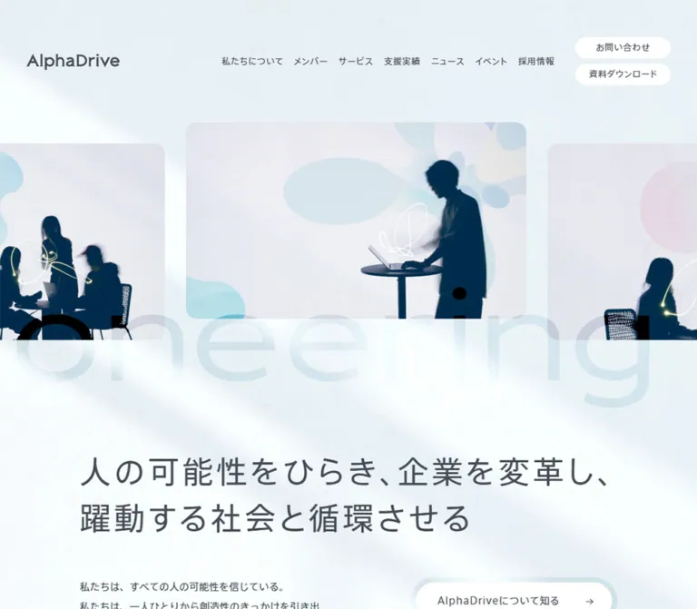
淡いブルーの背景、人物のシルエット写真、大きな透過英字が特徴。ゆったりした和文タイポグラフィ、角丸カード、控えめなグラデーションのボタンで構成されたコーポレートサイト。
オリジナルサイトを見るHuman silhouettes and drifting words suspended in pale blue daylight.
Original URL: corp.alphadrive.co.jp
Final URL: corp.alphadrive.co.jp
Theme: light; misty blue-white content canvas and a predominantly white footer.
Inspected: September 23, 2026, Japan time. The supplied inspection timestamp is September 22, 2026, 17:59:05.619 UTC / September 23, 2026, 02:59:05.619 JST.
Viewports: desktop 1440 × 1000 CSS pixels; mobile 390 × 844 CSS pixels.
Scope: the current corporate homepage, including its opening imagery, purpose statement, service navigation, content rails, impact figures, client wall, news categories, company links, contact routes, promotional banner, and footer. Visual captures cover the desktop opening, client wall, and footer, plus the mobile opening and footer. Rendered DOM evidence supplies additional component measurements throughout much of the page.
AlphaDrive presents business development through a calm, human-centered visual language. Dark blue silhouettes sit inside softly rounded photographs of projected pastel shapes. Large, translucent English lettering crosses the imagery, while Japanese text remains clear, restrained, and generously spaced. The background resembles diffused daylight: pale blue, broad white blooms, and a faint granular texture.
This is a substantial corporate homepage with multiple routes into services, case studies, events, editorial content, recruitment, and company information. Its structure alternates expansive introductions with compact content inside white cards. Rounded pills and subtle colored halos provide action cues without dominating the page. The footer becomes quieter still, using broad white space, a detailed sitemap, and a localized cyan-to-lavender glow.
Human silhouettes and drifting words suspended in pale blue daylight.
Original URL: corp.alphadrive.co.jp
Final URL: corp.alphadrive.co.jp
Theme: light; misty blue-white content canvas and a predominantly white footer.
Inspected: September 23, 2026, Japan time. The supplied inspection timestamp is September 22, 2026, 17:59:05.619 UTC / September 23, 2026, 02:59:05.619 JST.
Viewports: desktop 1440 × 1000 CSS pixels; mobile 390 × 844 CSS pixels.
Scope: the current corporate homepage, including its opening imagery, purpose statement, service navigation, content rails, impact figures, client wall, news categories, company links, contact routes, promotional banner, and footer. Visual captures cover the desktop opening, client wall, and footer, plus the mobile opening and footer. Rendered DOM evidence supplies additional component measurements throughout much of the page.
AlphaDrive presents business development through a calm, human-centered visual language. Dark blue silhouettes sit inside softly rounded photographs of projected pastel shapes. Large, translucent English lettering crosses the imagery, while Japanese text remains clear, restrained, and generously spaced. The background resembles diffused daylight: pale blue, broad white blooms, and a faint granular texture.
This is a substantial corporate homepage with multiple routes into services, case studies, events, editorial content, recruitment, and company information. Its structure alternates expansive introductions with compact content inside white cards. Rounded pills and subtle colored halos provide action cues without dominating the page. The footer becomes quieter still, using broad white space, a detailed sitemap, and a localized cyan-to-lavender glow.
| Name | Value | Suggested token | Evidence and role |
|---|---|---|---|
| Slate text | #444c55 |
--ad-ink |
Measured: body copy, navigation, mission heading, and sampled card titles |
| Muted slate | #99a1ac |
--ad-muted |
Measured: dates, client metadata, service numbering, and notes |
| White surface | #ffffff |
--ad-surface |
Measured: content-card backgrounds, desktop header action pills, and the selected mobile news category |
| Faint navy wash | rgba(0, 51, 102, 0.05) |
--ad-wash |
Measured: service-detail pills and unselected mobile news categories |
| Mist canvas | approximately #e7f0f3 |
--ad-mist |
Estimated: the blue-white background between brighter light patches |
| Cyan glow | approximately #bfe7ed |
--ad-cyan |
Estimated: atmospheric accents and the footer glow |
| Lavender glow | approximately #c7b5e8 |
--ad-lavender |
Estimated: footer atmosphere and colored button surrounds |
| Fine blue-gray rule | approximately #c6d4df |
--ad-rule |
Estimated: delicate separators visible against white |
| Silhouette navy | approximately #00334b |
Imagery reference only | Estimated: people within the hero photography; not an observed UI fill token |
The body itself has a transparent computed background. The visible atmosphere therefore comes from other layers or artwork whose full styling is not included in the supplied samples. Do not mistake transparency for the final canvas color.
The navy wash is translucent. Over pure white, its calculated composite is approximately #f2f5f7; over the mist background, it produces a different result. Preserve the alpha value when layering it over a changing background.
The site obtains much of its character from low-contrast compositing: pale photographic backgrounds, translucent oversized lettering, broad white light, and soft colored surrounds. The exact blend modes, background assets, and opacity values were not supplied.
The captured impact numerals appear pale blue, while their sampled text color is #444c55. This establishes a difference between the text declaration and final appearance, but does not identify the compositing mechanism. Treat a blue numeral fill as a visual approximation until that layer is inspected directly.
Full-color client logos and the saturated blue book advertisement are content-specific artwork. Their colors should not become the general navigation or CTA palette.
The presence of WordPress color presets and --swiper-theme-color: #007aff is not evidence that those colors define the visible design. No alternate theme or dark-mode control was established.
"A+mfCv-AXIS Font ベーシック R ProN", sans-serif.400 in the sampled body, mission heading, navigation, service headings, and metadata.--ad-font-body."A+mfCv-AXIS Font ベーシック M ProN", sans-serif.400.font-weight: 500.--ad-font-medium.adrianna-extended, sans-serif.Clients, impact numerals, and the sampled mobile-navigation copyright.--ad-font-latin.The AlphaDrive wordmark is an SVG image. The large phrase Pioneering People's Potential is also supplied as SVG artwork. Their letterforms should not be reconstructed by guessing a text font.
These are computed family declarations. The evidence does not include font files, licensing information, or a separate glyph-resolution audit. A reuse project must provide authorized font assets or accept a fallback.
| Role | Desktop | Mobile | Tracking | Evidence |
|---|---|---|---|---|
| Mission heading | 48px / 72px |
24px / 36px |
0.1em |
Measured; regular face |
| Main explanatory copy | 15px / 30px |
13px / 26px |
Normal | Measured in mission and section introductions |
| Desktop navigation | 13px / 39px |
Replaced by menu trigger | 0.05em |
Measured on link containers |
| Offscreen mobile navigation | Not applicable | 15px / 26.25px |
0.05em |
Measured; medium face; open state not captured |
| Header action pills | 13px / 19.5px |
Same size in offscreen menu | 0.05em |
Measured |
| Service-detail heading | 32px / 48px |
Detail not visible in captured initial state | 0.1em |
Measured desktop |
| Project-card title | 19px / 33.25px |
17px / 29.75px |
0.05em |
Measured; medium face |
| Dates and client names | 13px / 19.5px |
11px / 16.5px |
0.05em |
Measured |
| English micro-labels | 10px / 10px |
10px / 10px where sampled |
0.05em |
Measured; extended Latin face |
| Impact numerals | 64px / 64px |
64px / 64px |
Normal | Measured; size is retained on mobile |
| Impact labels | 15px / 26.25px |
13px / 19.5px |
0.05em |
Measured |
| Impact-date note | 11px / 16.5px |
10px / 15px |
Normal | Measured |
| Mobile news-category pills | Not sampled | 11px / 11px |
0.05em |
Measured |
Inheritance requires care: the desktop body defaults to 13px / 26px, while the mobile body defaults to 15px / 30px. Actual long-form paragraphs override those defaults to 15px / 30px on desktop and 13px / 26px on mobile. Copying only the body rule would reverse the intended prose scaling.
Some section headings are composed of styled children. Their sampled parent can report a small inherited font size even when a visible child is much larger. The desktop event title appears around 32px, and its mobile counterpart around 21px; these are visual/layout estimates, not recovered child font declarations.
The page uses a conventional 16px root in the supplied samples. Its recurring dimensions suggest a useful implementation scale around multiples of eight, but no original named spacing scale was provided.
| Value | Observed use or derived relationship |
|---|---|
8px |
Gap between desktop header action pills; padding around several large CTA wrappers; gap between desktop rail-control boxes |
16px |
Calculated gaps between content cards on both viewports |
24px |
Desktop secondary-pill right padding; mobile offscreen navigation vertical padding |
28px |
Common leading inset on secondary pills; mobile stacked section-heading gap |
32px |
Standard card-body inset; mobile header side padding; selected desktop service-row indentation |
40px |
Desktop secondary-pill label-to-arrow gap; mobile service-row vertical padding |
48px |
Desktop project-card text inset; common secondary-action height |
56px |
Desktop rail-control box size; desktop header top padding |
64px |
Desktop announcement height; mobile large CTA wrapper height |
80px |
Desktop service-explorer column gap |
120px |
Desktop content gutter at 1440px; mobile gap between several major sections |
200px |
Desktop gap after the announcement and between the Services and Project sections |
| Element | Value | Status |
|---|---|---|
| Content cards | 16px |
Measured on service, project, event, and news cards |
| Mobile announcement | 16px |
Measured |
| Desktop announcement | 64px |
Measured; produces a capsule |
| Header action pills | 32px |
Measured |
| Secondary action pills | 48px |
Measured |
| Mobile news-category pills | 32px |
Measured |
| Hero photographs | Approximately 16px |
Estimated from captures |
| Client-logo panel | Approximately 16px |
Estimated from desktop capture |
| Halo CTAs and Pagetop | Fully rounded | Visually observed; inner-element radius not sampled |
Some large CTA anchors report border-radius: 0 and transparent backgrounds because they are wrappers. The rounded white center and colored surround belong to their visual composition. Do not turn the visible button into a square simply by copying its outer anchor's computed radius.
| Element | Desktop at 1440 × 1000 | Mobile at 390 × 844 |
|---|---|---|
| Document height | 11496.78px, rounded to 11497px |
11245.67px, rounded to 11246px |
| Main content span | 1200px, starting at x = 120px |
306.81px, starting at x = 41.59px |
| Header rectangle | 1440 × 128px |
390 × 100px |
| Header padding | 56px 90px 0 |
0 32px |
| Header wordmark | Image attributes 140 × 24px |
Rendered width 118px; proportional height approximately 20.23px |
| Main content start | y = 184px |
y = 100px |
| Mission heading box | 1200 × 144px |
306.81 × 144px |
| Mission paragraph | 777.53 × 210px |
306.81 × 260px |
| Main introductory CTA | 302.47 × 72px |
259.06 × 64px |
| Service explorer | 560px + 80px gap + 560px |
One full-width 390px column |
| Standard rail card | 389.33px wide |
307px wide |
| Project rail card | 592px wide |
307px wide |
| Card gap | 16px, calculated |
16px, calculated |
| Service/event card-body inset | 32px |
32px |
| Project card-body inset | 48px |
32px |
| Desktop carousel-control pair | Two 56 × 56px boxes, 8px apart |
Corresponding controls not established by the mobile samples |
The measured mobile content inset is approximately 10.67% of viewport width. The desktop content inset is 8.33% at the inspected width. These are endpoint ratios, not proof of the source's formulas or breakpoints.
Role: maintain identity and routes through a long corporate homepage.
On desktop, place the SVG wordmark at the left, eight small navigation links across the right half, and two stacked white action pills at the far right. The observed labels include 私たちについて, メンバー, サービス, 支援実績, ニュース, イベント, ナレッジ, and 採用情報. The action pills are お問い合わせ and 資料ダウンロード.
The header is visually transparent over the opening atmosphere. Its logo starts at x = 90px; the action column ends at x = 1350px. Each action is approximately 142.55 × 32px, with an 8px vertical gap. Navigation anchors have 12px padding and 63px measured height, making their interactive region larger than the visible text.
The header remains in the same viewport region in the scrolled desktop and mobile captures. This supports a persistent-header description; the supplied properties do not identify whether the source uses fixed positioning, sticky positioning, or another mechanism.
On mobile, the wordmark starts at x = 32px, and a small two-line menu glyph sits near the right edge. Its button box is much larger than its artwork: 84 × 100px, beginning at x = 306px.
The DOM contains a separate mobile navigation structure displaced off the left side of the screen. Its links form two measured 147px columns, with Japanese labels and English subtitles. Contact links and copyright follow. This establishes the offscreen structure, but the menu was not opened in the supplied observations. Its visible open appearance, focus behavior, and transition remain unverified.
Role: introduce people and possibility before explaining services.
The hero is an edge-to-edge strip of landscape photographs with rounded corners. People appear as dark blue silhouettes in front of pale projected organic shapes. Thin luminous lines cross parts of the scenes. These are visible properties of the artwork; independent line animation or video playback was not established.
The observed hero image attributes are 512 × 296px, giving a 64:37 proportion. In the desktop capture, a complete frame occupies approximately that size, with 32px between neighboring frames. Successive visible frames start at different vertical positions, including y = 184, 216, and 248px. Neighboring images extend beyond both screen edges.
On mobile, the visible frames are approximately 296 × 171px, with a gap near 16px. One frame is cropped at the left edge, and the next continues beyond the right. Preserve the feeling of a longer image sequence instead of forcing the entire hero into one small contained photograph.
A very large SVG phrase, Pioneering People's Potential, crosses the lower part of the imagery. The desktop message track is measured at 191px high; the mobile track is 95.86px high. Its low contrast makes it an atmospheric graphic rather than the principal reading headline.
The message has an explicitly reported infinite animation. The photographs' own timing and interaction model were not supplied. Do not assume that the image strip shares the same animation or functions as an interactive carousel.
Role: translate the abstract hero into the company's purpose.
The mission heading is regular-weight Japanese text with 0.1em tracking. Its desktop composition uses two lines:
人の可能性をひらき、企業を変革し、 躍動する社会と循環させる
On mobile, the supplied rendering uses four lines:
人の可能性をひらき、 企業を変革し、 躍動する社会と 循環させる
The desktop heading uses 48px / 72px; mobile uses 24px / 36px. Both measured boxes are 144px tall. This is a deliberate change in reading rhythm, not uniform scaling of the whole hero.
Below the heading, desktop prose and actions sit beside one another. The paragraph measures approximately 777.53px wide, the action column 302.47px, and the calculated intervening space is 120px. On mobile, prose and actions stack within the 306.81px content column.
The main AlphaDriveについて知る link has an 8px outer wrapper and a rounded visual treatment. Secondary contact and download links use slimmer 48px-high pills with a label and small arrow. Their desktop label-to-arrow gap is 40px; the mobile gap is 32px.
In the mobile capture, the principal introductory CTA begins below the first viewport at approximately y = 849.55px. Preserve that measured relationship when referencing this page; a large above-the-fold conversion button would change the opening hierarchy.
Role: expose a recent update between the purpose statement and service introduction.
At desktop size, this is one white 1200 × 64px capsule. Its anatomy is date, category, title slot, and arrow. Measured padding is 16px 32px 16px 40px. The title uses 15px / 30px, and the date uses muted 13px / 19.5px text.
At mobile size, the same item becomes a white 306.81 × 240.75px rounded card. Its padding is 32px 32px 108px; the larger bottom allowance accommodates a low-positioned arrow. The date reduces to 11px / 16.5px, and the title has a 78px-high text box at 13px / 26px, equivalent to three line boxes. The exact clipping or truncation rule was not supplied.
This capsule-to-card transformation is more important than copying one fixed border radius across both viewports.
Role: give a long page a consistent editorial rhythm.
Major introductions pair an English label such as Services or Project with a Japanese section name. Their heading wrappers use a vertical grid gap of 60px on desktop and 28px on mobile.
Desktop explanatory copy begins considerably to the right of the heading: the sampled Services paragraph starts at approximately x = 627.61px and is 692.39px wide. On mobile, the heading, explanation, and section CTA share the main content column and stack vertically.
The smaller Event/News heading pattern places the Japanese title beside an English caption. In the desktop event capture, a tiny multicolored oval separates the two. The wrapper gap is 32px on desktop and 20px on mobile. Keep this accent small; the page does not use a broad rainbow heading system.
Role: organize six service areas while keeping the desktop presentation spacious.
The desktop service area uses two 560px columns separated by 80px. The left side contains a service illustration resource, a small number, a 32px Japanese heading, a 10px English caption, descriptive copy, and a secondary pill link. The right side contains six tall button rows.
The categories are new business creation, regional revitalization, technology, media, R&D, and events. Each desktop button row is approximately 121px high, with row starts 122px apart. The first sampled row is muted and has 32px additional left padding, while the remaining rows use the darker text color and no extra left inset. This is evidence of a selected-looking initial state, not a tested switching sequence.
On mobile, the explanatory detail block is absent from the captured initial reading flow. Six full-width buttons remain, each 390 × 123px, with 40px 55px 40px 40px padding and 38px reserved for numbering. Their starts are 124px apart.
This suggests a responsive change in disclosure, but no mobile expansion was exercised. Describe the observed state as closed service rows. If implementing an accordion, treat the disclosure behavior and accessibility semantics as new implementation work.
Role: let visitors browse several services, projects, or events without making every item a separate vertical section.
The rendered rectangles establish horizontal card sequences. Desktop standard cards are 389.33px wide: three cards plus two 16px gaps fit the 1200px content span. Project cards are 592px wide: two cards plus one gap fit the same span.
At mobile size, all sampled variants are 307px wide, starting at x = 41.59px. The second card starts at x = 364.59px, leaving approximately 25.41px of it visible within the viewport. That partial next card is a useful continuation cue.
| Variant | Content anatomy | Desktop measured card | Mobile measured card |
|---|---|---|---|
| Pickup service | Wide image, service name, short description, category hashtag | 389.33 × 379.17px |
307 × 331.55px |
| Project | Wide image, Clients label and company name, title, industry, topic hashtags |
592 × 664.09px |
307 × 464.80px |
| Event | Promotional image, date/day/time, title, optional registration status, topic hashtags | 389.33 × 454.67px |
307 × 403.05px |
| News | Image, date, title, category hashtags | Desktop card dimensions not supplied in this excerpt | 307 × 378.80px |
All these sampled cards have white backgrounds and 16px corners. The whole item is an anchor. Keep its metadata, title, and image within one coherent reading target; do not introduce nested buttons merely to imitate the tags.
Image elements repeatedly declare 336 × 176px, a 21:11 proportion. The measured metadata offsets are consistent with a wide media slot followed by 32px body padding on standard cards and mobile project cards. Desktop project cards increase the body inset to 48px.
Project titles use the medium Japanese face. The mobile title boxes are 89.25px high at a 29.75px line height, indicating a three-line allocation. The evidence does not expose the exact overflow rule.
Desktop rail-control buttons are present in the DOM as two 56px boxes aligned to the content area's right edge. Their click results, disabled states, drag behavior, and autoplay were not tested. The horizontal geometry supports a rail layout; it does not establish those interaction details.
Role: add scale and recognizable evidence after project examples.
Three desktop metric columns span the content area at approximately 400px each. The values are 23,800, 260, and 250. Each pairs a small Japanese descriptor with a large 64px extended-Latin numeral. The source explicitly dates these figures to August 2025; retain a date note when reproducing the content.
Mobile stacks the metrics vertically and retains the 64px numeral size. The first two label positions are about 205.5px apart. This creates emphasis through vertical space rather than shrinking every metric to fit one row.
The supplied desktop client-wall capture shows a white rounded panel approximately 1200 × 500px, filled with dozens of full-color company marks arranged across six loose rows. Logos maintain their individual proportions and varied visual widths. The panel is clean and flat against the atmospheric canvas.
Its mobile layout and underlying asset structure were not supplied. A responsive logo grid would be a recommendation, not an observed source implementation.
Role: provide editorial depth and several ways to continue exploring.
The news section exposes six category buttons, including すべて, お知らせ, イベント, サービス, メディア情報, and リクルート. At mobile size, they wrap into two rows. Each is 28px high with 32px radius, 11px text, and 8px 12px 7px padding. Calculated gaps are 8px horizontally and 12px vertically.
The initial すべて button is white; other buttons use the faint navy wash. A 0.5s background/border transition is declared. Category switching was not tested. Repeated article groups in the DOM may represent alternate panels; they should not be counted as simultaneously visible sections.
The Knowledge section contains four interview links and a route to more articles. All four supplied image references point to the same no-image resource. Do not invent article photography for this observed state. Detailed Knowledge geometry was not included in the style samples.
Role: connect the business offering to people, purpose, and practical next steps.
The rendered page includes a Who we are introduction followed by three linked items: Purpose, Member, and Company. Their resource references include three portrait-format images with declared dimensions of 672 × 944px. Their exact desktop and mobile presentation is not established by the supplied captures.
Two subsequent contact routes are labeled Contact and Material download, each with a Japanese label and a short explanation. They link to the site's contact and download pages. Their content and destinations are verified; their detailed surfaces, dimensions, and hover states are not.
For extensions, retain the distinction between learning about the organization and requesting information. Use the existing pale palette, bilingual hierarchy, and rounded action language rather than inventing a new high-contrast closing section.
Role: promote a publication independently of the main page hierarchy.
The opening and middle desktop captures show a book advertisement near the lower-right corner, approximately 400px wide and 120px high. Mobile shows an approximately 300 × 90px version, around 11px from the bottom and right edges. Its artwork combines a book cover at left, dense publication copy, a blue lower strip, and a portrait at right.
The DOM identifies it as an image link to an external book destination. The promotional artwork contains its own typography and colors. Do not use those graphic choices to infer the site's main text styles or CTA color.
The banner overlaps underlying content in the supplied opening captures, including mobile prose. It is absent from both supplied footer captures. The visibility trigger and any dismissal behavior are unknown; no close control is visible in these images.
For a new implementation, prevent this promotion from obscuring reading or focused controls. An in-flow mobile placement or an accessible dismissal control is a recommended improvement.
Role: provide comprehensive navigation and a quiet end to the page.
The desktop footer uses a predominantly white field. A larger 188 × 32px SVG wordmark sits toward the left, with a small copyright line beside it and a Facebook icon near the right. Below, five groups organize company information, services, industries, editorial links, and contact/recruitment links. The sitemap begins well to the right of the wordmark's left edge, leaving a broad empty region.
The desktop screenshot shows approximate column starts near x = 456, 632, 808, 984, and 1160px. Footer items are small, regular-weight, dark gray text with generous vertical separation. Privacy and information-security links sit much lower on the left.
The mobile footer reorganizes the sitemap into two columns, beginning around x = 41px and 203px. The supplied image captures its lower portion; it is the page footer, not an opened mobile menu. The persistent header remains visible over this scrolled content.
A concentrated cyan and lavender glow rises from the lower-right corner. Pagetop sits in a white pill with an upward arrow and a translucent colored surround. Its visible outer size is approximately 178 × 64px on both captures. The link destination is #top; smooth scrolling was not verified.
| Treatment | Reported evidence | What can be concluded |
|---|---|---|
| Oversized hero message | 127.52s linear infinite scroll-mv-message on both viewports |
A perpetual CSS message animation is declared; its complete loop was not watched |
| Navigation links | color 0.5s |
Color changes have a half-second transition; target colors were not supplied |
| Header action pills | background-color 0.5s |
Background transitions are declared |
| Secondary pills | background-color 0.5s, border-color 0.5s, color 0.5s |
Multiple visual properties share the same duration |
| News-capsule arrow | transform 0.5s |
A transform transition exists; displacement and trigger are unknown |
| Service rows | color 0.5s, padding 0.5s |
The source supports animated color and indentation changes |
| Project-card titles | color 0.5s |
Text-color feedback is declared |
| Mobile news categories | background-color 0.5s, border-color 0.5s |
Category styling can transition; filtering results were not exercised |
| Header persistence | Same viewport placement across scrolled captures | Persistent appearance is observed; positioning mechanism is not sampled |
| Menu, rails, service switching | Controls and state-related geometry in DOM | Open/changed states, keyboard handling, and exact interaction models remain unverified |
Treat the documented motion as slow atmosphere plus restrained interface feedback. The evidence does not support adding scroll-driven parallax, count-up metrics, spring animations, automatic card advance, or animated hero light trails as original features.
A computed value reported only as transition: all does not establish a useful nonzero transition duration. It should not be converted into an invented animation token.
| Layer | Appearance | Purpose |
|---|---|---|
| Main atmosphere | Pale blue-white, broad soft light patches, faint grain | Connects the opening and content sections without heavy dividers |
| Hero media | Rounded rectangular photography with dark silhouettes | Supplies human presence and visual contrast |
| Message artwork | Very large, low-contrast SVG lettering | Gives the hero breadth and motion |
| Content cards | White with 16px corners |
Separates readable content from the textured background |
| Secondary action | Transparent or faint navy-tinted pill | Provides a quiet action cue |
| Large action surround | Soft blue/lavender halo around a white pill | Adds emphasis without a saturated solid fill |
| Client wall | Large white rounded panel | Makes diverse logos legible together |
| Footer | Mostly white with a localized lower-right glow | Reduces density around the sitemap and return-to-top action |
The supplied captures do not establish a general elevated shadow system. Keep the reusable shell predominantly flat. The colored button surround reads as a halo or rim, not a conventional gray drop shadow. Exact shadow declarations were not included in the evidence.
The opening photographs combine recognizable work situations with abstraction: a person at a laptop, small groups in conversation, projected circles and organic forms, and light-drawn lines. Faces and clothing details are subdued into dark silhouettes. Pastel projection colors and soft exposure keep the imagery compatible with the surrounding mist.
Use landscape crops for the hero and wide media slots for cards. Keep people, hands, and shared activity readable within the crop. Preserve soft photographic detail; pixelated rendering would be inappropriate here.
Content imagery has several distinct roles. Service cards carry service-specific artwork. Project cards reference client stories. Event cards use information-rich promotional graphics. Client logos preserve their original colors. The publication banner is a self-contained advertisement. These should not all receive the hero's silhouette treatment.
Paths below were present in the supplied original-page DOM. They are relative to https://corp.alphadrive.co.jp/ and are not bundled with this document.
| Asset | Observed path | Evidence and use |
|---|---|---|
| Wordmark | wp-content/themes/unitbase/assets/img/common/img_logo.svg |
Header and footer identity; attributes 140 × 24 and 188 × 32 |
| Hero photograph | wp-content/themes/unitbase/assets/img/index/mv_img_thumb_01.jpg.webp |
One directly identified hero resource; attributes 512 × 296 |
| Oversized message | wp-content/themes/unitbase/assets/img/index/mv_txt_message.svg |
Pioneering People's Potential; attributes 3188 × 191 |
| Service illustration | wp-content/uploads/2023/11/img_services_01.png |
Service-explorer resource; attributes 380 × 512; detailed appearance not captured |
| Pickup-service artwork | wp-content/uploads/2023/11/service_img_thumb_01.jpg |
First pickup-service card |
| AXL artwork | wp-content/uploads/2023/11/service_img_thumb_02.jpg |
AXL pickup-service card |
| UNIDGE artwork | wp-content/uploads/2023/11/service_img_thumb_05.jpg |
UNIDGE pickup-service card |
| Ambitions artwork | wp-content/uploads/2023/11/service_img_thumb_18.jpg |
Ambitions pickup-service card |
| POT artwork | wp-content/uploads/2023/11/service_img_thumb_20.jpg |
POT pickup-service card |
| Project photograph example | wp-content/uploads/2026/07/Lr_2295-2-1584x1056.jpg |
First sampled project card |
| Knowledge fallback | wp-content/themes/unitbase/assets/img/common/img_noimage.png.webp |
Referenced by all four supplied Knowledge items |
| Purpose image | wp-content/themes/unitbase/assets/img/index/about_img_card_01_sp.png.webp |
Company-introduction link; attributes 672 × 944 |
| Member image | wp-content/themes/unitbase/assets/img/index/about_img_card_02_sp.png.webp |
Member link; attributes 672 × 944 |
| Company image | wp-content/themes/unitbase/assets/img/index/about_img_card_03_sp.png.webp |
Company-information link; attributes 672 × 944 |
| Book promotion | wp-content/themes/unitbase/assets/img/common/btn_banner_book.png.webp |
Floating publication advertisement |
| Facebook icon | wp-content/themes/unitbase/assets/img/common/sns_img_facebook.svg |
Footer social link; attributes 24 × 24 |
No background-texture URL or client-wall asset URL was established by the supplied excerpt. Do not invent file names for these elements. Use authorized original assets where available; otherwise, treat their recreation as a separate visual-production task.
The homepage preserves its major content order across the supplied viewports: hero, purpose, latest update, services, pickup services, projects, impact figures and clients, events, news, knowledge, company introduction, contact routes, and footer.
| System | Desktop | Mobile |
|---|---|---|
| Header | Wordmark, full navigation, two stacked action pills | Smaller wordmark and menu trigger |
| Opening imagery | Multiple large staggered frames across the viewport | Cropped neighboring frames retain the horizontal sequence |
| Mission | Two lines at 48px |
Four lines at 24px |
| Introductory content | Paragraph and CTA column side by side | Paragraph followed by stacked actions |
| Latest update | Long 64px capsule |
Tall rounded card |
| Section introduction | Heading at left, explanation farther right | One shared vertical content column |
| Service explorer | Detail panel beside six selector rows | Six closed full-width rows in the sampled initial state |
| Standard rails | Three cards fit the main content span | One full card plus a small next-card edge |
| Project rail | Two large cards fit the main content span | Same 307px mobile width as other rails |
| Impact figures | Three columns | Three vertically spaced items; numerals stay 64px |
| News categories | Desktop geometry not sampled | Six pills wrap into two rows |
| Footer sitemap | Five groups arranged horizontally | Two-column organization |
Mobile content margins are substantial: about 41.6px on each side of a 390px viewport. This leaves approximately 307px for readable text and cards. Reducing them to a generic 16px would materially change the design.
Some components intentionally escape that column. Hero imagery crosses the viewport, and mobile service buttons occupy the full 390px width. Card rails begin at the main inset but continue beyond the right edge. Keep these three width systems distinct.
The exact breakpoints, tablet layouts, landscape behavior, and rules above 1440px were not supplied. The Quick Start proposes breakpoints and a content-width cap to make the reference usable; those choices are recommendations.
#444c55 for the main typographic structure and white for content surfaces.16px card corners and 16px gaps between rail items.307px mobile card width.These are recommendations for a new implementation, not verified features of the original site:
#99a1ac can be too faint for small essential text; a darker slate may be needed for dates and critical status information.#444c55.#99a1ac.#ffffff.rgba(0, 51, 102, 0.05).#e7f0f3 with broad white light patches.#bfe7ed and lavender #c7b5e8.“Create a Japanese corporate homepage inspired by AlphaDrive's current visual system. Use an airy blue-white atmosphere with faint grain, slate text #444c55, and white cards with 16px corners. Open with staggered landscape photographs of people silhouetted against pastel projections, extending beyond both screen edges. Overlay very large translucent English message artwork. Follow with a regular-weight Japanese mission heading at 48px/72px with 0.1em tracking, changing to 24px/36px and four deliberate lines on a 390px phone. Use a 1200px desktop content span, generous section spacing, compact bilingual labels, quiet rounded actions, and horizontal service, project, and event rails. On mobile, retain approximately 42px content margins and 307px cards with a partial next card visible. End with a white sitemap footer and a localized cyan-lavender glow. Treat unverified interactions as implementation decisions.”
Clients label, muted company name, and a 19px/33.25px Japanese title. At mobile width, use a 307px card, 32px insets, and 17px/29.75px title text.”This CSS is a reusable approximation of the measured shell. Exact measured colors, typography, card geometry, and transition durations are retained where possible. Background gradients, breakpoint choices, the maximum content width beyond the inspected desktop, and marquee keyframes are recommended implementations.
The font names below match the supplied computed declarations; the snippet does not load or license those fonts. Background grain and original artwork require separately supplied assets.
:root {
  /* Measured colors */
  --ad-ink: #444c55;
  --ad-muted: #99a1ac;
  --ad-surface: #fff;
  --ad-wash: rgb(0 51 102 / 5%);

  /* Visual estimates for atmospheric decoration */
  --ad-mist: #e7f0f3;
  --ad-cyan: #bfe7ed;
  --ad-lavender: #c7b5e8;
  --ad-rule: #c6d4df;

  /* Source family declarations; font assets are not bundled */
  --ad-font-body: 'A+mfCv-AXIS Font ベーシック R ProN', sans-serif;
  --ad-font-medium: 'A+mfCv-AXIS Font ベーシック M ProN', sans-serif;
  --ad-font-latin: adrianna-extended, sans-serif;

  --ad-text-base: 13px;
  --ad-text-copy: 15px;
  --ad-text-mission: 48px;
  --ad-text-card-title: 19px;
  --ad-text-meta: 13px;
  --ad-text-micro: 10px;
  --ad-text-number: 64px;

  /* Endpoint-matching geometry; formulas are adaptations */
  --ad-gutter: 8.333333vw;
  --ad-content-max: 1200px;
  --ad-card-gap: 16px;
  --ad-card-radius: 16px;
  --ad-section-gap: 200px;
  --ad-hero-frame: 512px;
  --ad-hero-gap: 32px;
  --ad-message-height: 191px;
  --ad-message-top: 239px;
  --ad-main-start: 184px;

  --ad-feedback: 500ms;
  --ad-message-duration: 127.52s;
}

* { box-sizing: border-box; }

body {
  margin: 0;
  color: var(--ad-ink);
  font: 400 var(--ad-text-base)/2 var(--ad-font-body);
  background: var(--ad-mist);
}

button, input, textarea, select { font: inherit; }
a { color: inherit; }
img { display: block; max-width: 100%; }

.ad-page {
  overflow-x: clip;
  /* Approximation of the visible atmosphere, not source CSS */
  background:
    radial-gradient(ellipse at 8% 14%, #fff 0, transparent 36%),
    radial-gradient(ellipse at 70% 30%, #ffffffd9 0, transparent 42%),
    linear-gradient(145deg, var(--ad-mist), #f8fcfc 48%, var(--ad-mist));
}

.ad-container {
  width: min(
    var(--ad-content-max),
    calc(100% - var(--ad-gutter) - var(--ad-gutter))
  );
  margin-inline: auto;
}

.ad-section + .ad-section {
  margin-block-start: var(--ad-section-gap);
}

.ad-copy {
  margin: 0;
  font-size: var(--ad-text-copy);
  line-height: 2;
}

.ad-micro {
  font: 400 var(--ad-text-micro)/1 var(--ad-font-latin);
  letter-spacing: .05em;
}

/* Fixed positioning reproduces the observed persistent appearance. */
.ad-header {
  position: fixed;
  inset: 0 0 auto;
  z-index: 30;
  display: flex;
  align-items: center;
  gap: 28px;
  padding: 56px 6.25vw 0;
}

.ad-logo { width: 140px; height: auto; flex: none; }
.ad-header-nav { display: flex; margin-inline-start: auto; }
.ad-header-nav a {
  padding: 12px;
  font-size: 13px;
  line-height: 39px;
  letter-spacing: .05em;
  text-decoration: none;
  white-space: nowrap;
  transition: color var(--ad-feedback);
}

.ad-header-actions { display: grid; gap: 8px; }
.ad-header-actions a {
  display: flex;
  align-items: center;
  justify-content: center;
  min-height: 32px;
  padding-inline: 20px;
  border-radius: 32px;
  background: var(--ad-surface);
  font-size: 13px;
  line-height: 1.5;
  letter-spacing: .05em;
  text-decoration: none;
  white-space: nowrap;
  transition: background-color var(--ad-feedback);
}

.ad-menu-toggle { display: none; }
.ad-main { padding-block-start: var(--ad-main-start); }

.ad-hero {
  position: relative;
  height: 430px;
  overflow: hidden;
}

.ad-hero-strip {
  display: flex;
  gap: var(--ad-hero-gap);
  width: max-content;
  margin-inline-start: calc(var(--ad-gutter) + 5px);
}

.ad-hero-frame {
  flex: 0 0 var(--ad-hero-frame);
  width: var(--ad-hero-frame);
  margin: 0;
  overflow: hidden;
  border-radius: 16px;
}

.ad-hero-frame:nth-child(3n + 2) { transform: translateY(32px); }
.ad-hero-frame:nth-child(3n) { transform: translateY(64px); }
.ad-hero-frame img {
  width: 100%;
  aspect-ratio: 64 / 37;
  object-fit: cover;
}

/* Use exactly two identical message groups for this loop. */
.ad-marquee {
  position: absolute;
  inset-block-start: var(--ad-message-top);
  inset-inline-start: 0;
  display: flex;
  width: max-content;
  opacity: .16; /* Estimated appearance */
  pointer-events: none;
  animation: ad-message var(--ad-message-duration) linear infinite;
}

.ad-marquee-group { flex: none; padding-inline-end: 100px; }
.ad-marquee-group img {
  width: auto;
  max-width: none;
  height: var(--ad-message-height);
}

@keyframes ad-message {
  to { transform: translateX(-50%); }
}

.ad-intro { margin-block-start: 62px; }
.ad-mission {
  margin: 0;
  font-size: var(--ad-text-mission);
  font-weight: 400;
  line-height: 1.5;
  letter-spacing: .1em;
}

.ad-mobile-break { display: none; }
.ad-intro-grid {
  display: grid;
  grid-template-columns: minmax(0, 1fr) 302.47px;
  gap: 120px;
  margin-block-start: 52px;
}

.ad-intro-actions { display: grid; align-content: start; gap: 24px; }

.ad-pill {
  display: inline-grid;
  grid-template-columns: minmax(0, 1fr) 11px;
  align-items: center;
  gap: 40px;
  min-height: 48px;
  width: fit-content;
  padding: 10px 24px 10px 28px;
  border: 1px solid transparent;
  border-radius: 48px;
  background: var(--ad-wash);
  font-size: 13px;
  line-height: 26px;
  text-decoration: none;
  transition:
    background-color var(--ad-feedback),
    border-color var(--ad-feedback),
    color var(--ad-feedback);
}

/* The halo is an approximation of the visible layered control. */
.ad-halo-link {
  display: inline-block;
  width: fit-content;
  padding: 8px;
  border-radius: 999px;
  background: linear-gradient(110deg, #bfe7ed66, #c7b5e888);
  text-decoration: none;
}

.ad-halo-link > span {
  display: flex;
  align-items: center;
  justify-content: space-between;
  gap: 40px;
  min-height: 56px;
  padding-inline: 28px;
  border-radius: inherit;
  background: var(--ad-surface);
  font-size: 13px;
}

/* Native horizontal scrolling is a recommended rail implementation. */
.ad-rail {
  display: grid;
  grid-auto-flow: column;
  grid-auto-columns: calc((100% - 32px) / 3);
  gap: var(--ad-card-gap);
  overflow-x: auto;
  scroll-snap-type: x proximity;
  scroll-padding-inline: 0;
  padding-block: 4px 16px;
}

.ad-rail--projects { grid-auto-columns: calc((100% - 16px) / 2); }
.ad-card {
  display: grid;
  grid-template-rows: auto 1fr;
  min-width: 0;
  overflow: hidden;
  border-radius: var(--ad-card-radius);
  background: var(--ad-surface);
  text-decoration: none;
  scroll-snap-align: start;
}

.ad-card-media {
  width: 100%;
  aspect-ratio: 21 / 11;
  object-fit: cover;
}

.ad-card-media--contain { object-fit: contain; }
.ad-card-body { padding: 32px; }
.ad-card--project .ad-card-body { padding: 48px; }
.ad-card-meta {
  margin: 0 0 16px;
  color: var(--ad-muted);
  font-size: var(--ad-text-meta);
  line-height: 1.5;
  letter-spacing: .05em;
}

.ad-card-title {
  margin: 0;
  font: 400 var(--ad-text-card-title)/1.75 var(--ad-font-medium);
  letter-spacing: .05em;
  transition: color var(--ad-feedback);
}

.ad-service-explorer {
  display: grid;
  grid-template-columns: repeat(2, minmax(0, 1fr));
  gap: 80px;
}

.ad-service-row {
  display: grid;
  grid-template-columns: 46px minmax(0, 1fr);
  width: 100%;
  min-height: 122px;
  padding: 38px 0;
  border: 0;
  border-block-start: 1px solid var(--ad-rule);
  color: var(--ad-ink);
  background: transparent;
  text-align: start;
  cursor: pointer;
  transition: color var(--ad-feedback), padding var(--ad-feedback);
}

.ad-service-row[data-active='true'] {
  padding-inline-start: 32px;
  color: var(--ad-muted);
}

.ad-metrics { display: grid; grid-template-columns: repeat(3, 1fr); }
.ad-metric { padding-inline: 24px; text-align: center; }
.ad-metric + .ad-metric { border-inline-start: 1px solid var(--ad-rule); }
.ad-metric-number {
  margin: 28px 0 0;
  font: 400 var(--ad-text-number)/1 var(--ad-font-latin);
}

.ad-filters { display: flex; flex-wrap: wrap; gap: 12px 8px; }
.ad-filter {
  min-height: 28px;
  padding: 8px 12px 7px;
  border: 1px solid transparent;
  border-radius: 32px;
  color: var(--ad-ink);
  background: var(--ad-wash);
  font-size: 11px;
  line-height: 1;
  letter-spacing: .05em;
  cursor: pointer;
  transition:
    background-color var(--ad-feedback),
    border-color var(--ad-feedback);
}
.ad-filter[aria-pressed='true'] { background: var(--ad-surface); }

.ad-footer {
  padding-block: 120px;
  background:
    radial-gradient(ellipse at 100% 100%, #c7b5e8aa, transparent 34%),
    radial-gradient(ellipse at 78% 100%, #bfe7edaa, transparent 30%),
    #fff;
}
.ad-footer-links {
  display: grid;
  grid-template-columns: repeat(5, minmax(0, 1fr));
  gap: 32px;
  margin-inline-start: 28%;
}
.ad-footer-links ul { margin: 0; padding: 0; list-style: none; }
.ad-footer-links li + li { margin-block-start: 20px; }
.ad-footer-links a { text-decoration: none; }
.ad-footer-bottom {
  display: flex;
  justify-content: space-between;
  align-items: end;
  gap: 32px;
  margin-block-start: 120px;
}
.ad-pagetop > span { min-height: 48px; }

/* Recommended focus feedback; original focus states were not sampled. */
:where(a, button, input, select, textarea):focus-visible {
  outline: 2px solid var(--ad-ink);
  outline-offset: 4px;
}

/* Recommended navigation breakpoint, not a recovered source value. */
@media (max-width: 75rem) {
  .ad-header { height: 100px; padding: 0 32px; }
  .ad-logo { width: 118px; }
  .ad-header-nav, .ad-header-actions { display: none; }
  .ad-menu-toggle {
    position: relative;
    display: block;
    width: 84px;
    height: 100px;
    margin-inline: auto -32px;
    border: 0;
    color: var(--ad-ink);
    background: transparent;
  }
  .ad-menu-toggle::before, .ad-menu-toggle::after {
    content: '';
    position: absolute;
    left: 32px;
    width: 20px;
    height: 1px;
    background: currentColor;
  }
  .ad-menu-toggle::before { top: 48px; }
  .ad-menu-toggle::after { top: 52px; }
}

/* Recommended content breakpoint, not a recovered source value. */
@media (max-width: 64rem) {
  :root {
    --ad-text-base: 15px;
    --ad-text-copy: 13px;
    --ad-text-mission: 24px;
    --ad-text-card-title: 17px;
    --ad-text-meta: 11px;
    --ad-gutter: 10.666667vw;
    --ad-section-gap: 120px;
    --ad-hero-frame: 296px;
    --ad-hero-gap: 16px;
    --ad-message-height: 96px;
    --ad-message-top: 147px;
    --ad-main-start: 100px;
  }
  .ad-hero { height: 243px; }
  .ad-hero-strip { margin-inline-start: -188px; }
  .ad-intro { margin-block-start: 26px; }
  .ad-mobile-break { display: initial; }
  .ad-intro-grid { grid-template-columns: 1fr; gap: 40px; margin-top: 36px; }
  .ad-intro-actions { gap: 20px; }
  .ad-pill { gap: 32px; padding: 8px 20px 8px 28px; }
  .ad-halo-link > span { min-height: 48px; }
  .ad-rail, .ad-rail--projects {
    width: 100vw;
    margin-inline-start: calc(-1 * var(--ad-gutter));
    padding-inline: var(--ad-gutter);
    grid-auto-columns: calc(100vw - var(--ad-gutter) - var(--ad-gutter));
    scroll-padding-inline: var(--ad-gutter);
  }
  .ad-card--project .ad-card-body { padding: 32px; }
  .ad-service-explorer { display: block; }
  .ad-service-row {
    grid-template-columns: 38px minmax(0, 1fr);
    min-height: 124px;
    padding: 40px 55px 40px 40px;
  }
  .ad-service-row[data-active='true'] { padding-inline-start: 40px; }
  .ad-metrics { grid-template-columns: 1fr; gap: 96px; }
  .ad-metric { padding: 0; }
  .ad-metric + .ad-metric { border: 0; }
  .ad-metric-number { margin-block-start: 20px; }
  .ad-footer { padding-block: 80px; }
  .ad-footer-links {
    grid-template-columns: repeat(2, minmax(0, 1fr));
    gap: 48px 16px;
    margin-inline-start: 0;
  }
  .ad-footer-bottom { flex-wrap: wrap; margin-block-start: 80px; }
  .ad-pagetop { margin-inline-start: auto; }
}

@media (prefers-reduced-motion: reduce) {
  .ad-marquee { animation: none; }
  .ad-page *, .ad-page *::before, .ad-page *::after {
    transition-duration: 0s !important;
  }
}
The rail CSS assumes each .ad-rail sits inside .ad-container. The mobile service explorer should sit outside that container when matching the observed full-width rows. Use .ad-card-media--contain for artwork that must retain all embedded text or logos.
The CSS deliberately does not implement menu opening, service switching, category filtering, or promotional-banner visibility. Those require state handling and keyboard behavior beyond the supplied evidence. Do not hide service descriptions until an accessible disclosure mechanism can reveal them.
This example shows the intended class relationships. Supply authorized image paths and real destinations in an implementation.
<section class="ad-intro ad-container">
  <h2 class="ad-mission">
    人の可能性をひらき、<br class="ad-mobile-break">
    企業を変革し、<br>
    躍動する社会と<br class="ad-mobile-break">循環させる
  </h2>
  <div class="ad-intro-grid">
    <p class="ad-copy">私たちは、すべての人の可能性を信じている。</p>
    <div class="ad-intro-actions">
      <a class="ad-halo-link" href="/about/">
        <span>AlphaDriveについて知る <span aria-hidden="true">→</span></span>
      </a>
      <a class="ad-pill" href="/contact/">
        お問い合わせ <span aria-hidden="true">→</span>
      </a>
    </div>
  </div>
</section>
Optional aliases for projects already using Tailwind v4. Define the custom properties above first. This mapping does not imply that the original site uses Tailwind.
@theme inline {
  --color-ink: var(--ad-ink);
  --color-muted: var(--ad-muted);
  --color-surface: var(--ad-surface);
  --color-mist: var(--ad-mist);
  --color-cyan-glow: var(--ad-cyan);
  --color-lavender-glow: var(--ad-lavender);

  --font-body: var(--ad-font-body);
  --font-medium: var(--ad-font-medium);
  --font-latin: var(--ad-font-latin);

  --text-mission: var(--ad-text-mission);
  --text-copy: var(--ad-text-copy);
  --text-project-title: var(--ad-text-card-title);
  --text-meta: var(--ad-text-meta);
  --text-impact: var(--ad-text-number);

  --spacing-page-gutter: var(--ad-gutter);
  --spacing-card-gap: var(--ad-card-gap);
  --spacing-section-gap: var(--ad-section-gap);
  --radius-card: var(--ad-card-radius);
}
200 with no URL change.2026-09-22T17:59:05.619Z, equivalent to September 23, 2026, at 02:59:05.619 JST. This is the observation bundle's retrieval timestamp; individual capture timestamps were not supplied.1440 × 1000 CSS-pixel viewport, three supplied original-page captures covering the opening, client wall, and footer; rendered document height approximately 11497px.390 × 844 CSS-pixel viewport, two supplied original-page captures covering the opening and lower footer; rendered document height approximately 11246px.This reference describes the current page represented by the supplied original-site evidence. Exact values, visual estimates, and reusable implementation choices are identified separately throughout.
# AlphaDrive — Style Reference

> Human silhouettes and drifting words suspended in pale blue daylight.

**Original URL:** [corp.alphadrive.co.jp](https://corp.alphadrive.co.jp/)
**Final URL:** [corp.alphadrive.co.jp](https://corp.alphadrive.co.jp/)
**Theme:** light; misty blue-white content canvas and a predominantly white footer.
**Inspected:** September 23, 2026, Japan time. The supplied inspection timestamp is September 22, 2026, 17:59:05.619 UTC / September 23, 2026, 02:59:05.619 JST.
**Viewports:** desktop `1440 × 1000` CSS pixels; mobile `390 × 844` CSS pixels.
**Scope:** the current corporate homepage, including its opening imagery, purpose statement, service navigation, content rails, impact figures, client wall, news categories, company links, contact routes, promotional banner, and footer. Visual captures cover the desktop opening, client wall, and footer, plus the mobile opening and footer. Rendered DOM evidence supplies additional component measurements throughout much of the page.

AlphaDrive presents business development through a calm, human-centered visual language. Dark blue silhouettes sit inside softly rounded photographs of projected pastel shapes. Large, translucent English lettering crosses the imagery, while Japanese text remains clear, restrained, and generously spaced. The background resembles diffused daylight: pale blue, broad white blooms, and a faint granular texture.

This is a substantial corporate homepage with multiple routes into services, case studies, events, editorial content, recruitment, and company information. Its structure alternates expansive introductions with compact content inside white cards. Rounded pills and subtle colored halos provide action cues without dominating the page. The footer becomes quieter still, using broad white space, a detailed sitemap, and a localized cyan-to-lavender glow.
# AlphaDrive — Style Reference

> Human silhouettes and drifting words suspended in pale blue daylight.

**Original URL:** [corp.alphadrive.co.jp](https://corp.alphadrive.co.jp/)
**Final URL:** [corp.alphadrive.co.jp](https://corp.alphadrive.co.jp/)
**Theme:** light; misty blue-white content canvas and a predominantly white footer.
**Inspected:** September 23, 2026, Japan time. The supplied inspection timestamp is September 22, 2026, 17:59:05.619 UTC / September 23, 2026, 02:59:05.619 JST.
**Viewports:** desktop `1440 × 1000` CSS pixels; mobile `390 × 844` CSS pixels.
**Scope:** the current corporate homepage, including its opening imagery, purpose statement, service navigation, content rails, impact figures, client wall, news categories, company links, contact routes, promotional banner, and footer. Visual captures cover the desktop opening, client wall, and footer, plus the mobile opening and footer. Rendered DOM evidence supplies additional component measurements throughout much of the page.

AlphaDrive presents business development through a calm, human-centered visual language. Dark blue silhouettes sit inside softly rounded photographs of projected pastel shapes. Large, translucent English lettering crosses the imagery, while Japanese text remains clear, restrained, and generously spaced. The background resembles diffused daylight: pale blue, broad white blooms, and a faint granular texture.

This is a substantial corporate homepage with multiple routes into services, case studies, events, editorial content, recruitment, and company information. Its structure alternates expansive introductions with compact content inside white cards. Rounded pills and subtle colored halos provide action cues without dominating the page. The footer becomes quieter still, using broad white space, a detailed sitemap, and a localized cyan-to-lavender glow.

## How to Read This Reference

- **Measured** means a value appears in the supplied rendered DOM or computed-style evidence. Dimensions are CSS pixels unless stated otherwise.
- **Calculated** means arithmetic derived from those measurements, such as card gaps or image proportions.
- **Estimated** means a visual approximation from the original-page captures. Estimated colors are not pixel samples or recovered source variables.
- **Recommended** means an implementation choice for reuse. The Quick Start is an adaptation, not recovered source code.
- All custom-property names introduced here are descriptive aliases. The supplied root variables primarily contain general platform presets rather than a usable site-specific token system.
- Offscreen elements and repeated content can have measurable rectangles without being visible. The mobile navigation and several service/news panels require this distinction.
- Screenshots establish appearance at particular scroll positions. They do not establish every hover state, transition endpoint, or click behavior.

## Tokens — Colors

### Default Palette

| Name | Value | Suggested token | Evidence and role |
| --- | --- | --- | --- |
| Slate text | `#444c55` | `--ad-ink` | **Measured:** body copy, navigation, mission heading, and sampled card titles |
| Muted slate | `#99a1ac` | `--ad-muted` | **Measured:** dates, client metadata, service numbering, and notes |
| White surface | `#ffffff` | `--ad-surface` | **Measured:** content-card backgrounds, desktop header action pills, and the selected mobile news category |
| Faint navy wash | `rgba(0, 51, 102, 0.05)` | `--ad-wash` | **Measured:** service-detail pills and unselected mobile news categories |
| Mist canvas | approximately `#e7f0f3` | `--ad-mist` | **Estimated:** the blue-white background between brighter light patches |
| Cyan glow | approximately `#bfe7ed` | `--ad-cyan` | **Estimated:** atmospheric accents and the footer glow |
| Lavender glow | approximately `#c7b5e8` | `--ad-lavender` | **Estimated:** footer atmosphere and colored button surrounds |
| Fine blue-gray rule | approximately `#c6d4df` | `--ad-rule` | **Estimated:** delicate separators visible against white |
| Silhouette navy | approximately `#00334b` | Imagery reference only | **Estimated:** people within the hero photography; not an observed UI fill token |

The body itself has a transparent computed background. The visible atmosphere therefore comes from other layers or artwork whose full styling is not included in the supplied samples. Do not mistake transparency for the final canvas color.

The navy wash is translucent. Over pure white, its calculated composite is approximately `#f2f5f7`; over the mist background, it produces a different result. Preserve the alpha value when layering it over a changing background.

### Color Behavior and Limits

The site obtains much of its character from low-contrast compositing: pale photographic backgrounds, translucent oversized lettering, broad white light, and soft colored surrounds. The exact blend modes, background assets, and opacity values were not supplied.

The captured impact numerals appear pale blue, while their sampled text color is `#444c55`. This establishes a difference between the text declaration and final appearance, but does not identify the compositing mechanism. Treat a blue numeral fill as a visual approximation until that layer is inspected directly.

Full-color client logos and the saturated blue book advertisement are content-specific artwork. Their colors should not become the general navigation or CTA palette.

The presence of WordPress color presets and `--swiper-theme-color: #007aff` is not evidence that those colors define the visible design. No alternate theme or dark-mode control was established.

## Tokens — Typography

### Japanese Body and Display Text

- **Computed source family:** `"A+mfCv-AXIS Font ベーシック R ProN", sans-serif`.
- **Computed weight:** `400` in the sampled body, mission heading, navigation, service headings, and metadata.
- **Character:** clean Japanese sans-serif with an open, composed rhythm. Scale, spacing, and line length establish hierarchy more often than heavy weight.
- **Implementation alias:** `--ad-font-body`.

### Card Titles and Mobile Navigation

- **Computed source family:** `"A+mfCv-AXIS Font ベーシック M ProN", sans-serif`.
- **Computed weight:** still `400`.
- **Role:** a stronger face for project titles and the offscreen mobile navigation labels.
- **Important:** the medium face is identified through a separate family name. Do not translate this evidence into a claim that the source uses `font-weight: 500`.
- **Implementation alias:** `--ad-font-medium`.

### English Captions and Impact Figures

- **Computed source family:** `adrianna-extended, sans-serif`.
- **Measured uses:** service numbers, English service captions, `Clients`, impact numerals, and the sampled mobile-navigation copyright.
- **Character:** extended Latin proportions that contrast with the Japanese body face.
- **Implementation alias:** `--ad-font-latin`.

The AlphaDrive wordmark is an SVG image. The large phrase `Pioneering People's Potential` is also supplied as SVG artwork. Their letterforms should not be reconstructed by guessing a text font.

These are computed family declarations. The evidence does not include font files, licensing information, or a separate glyph-resolution audit. A reuse project must provide authorized font assets or accept a fallback.

### Type Scale

| Role | Desktop | Mobile | Tracking | Evidence |
| --- | --- | --- | --- | --- |
| Mission heading | `48px / 72px` | `24px / 36px` | `0.1em` | Measured; regular face |
| Main explanatory copy | `15px / 30px` | `13px / 26px` | Normal | Measured in mission and section introductions |
| Desktop navigation | `13px / 39px` | Replaced by menu trigger | `0.05em` | Measured on link containers |
| Offscreen mobile navigation | Not applicable | `15px / 26.25px` | `0.05em` | Measured; medium face; open state not captured |
| Header action pills | `13px / 19.5px` | Same size in offscreen menu | `0.05em` | Measured |
| Service-detail heading | `32px / 48px` | Detail not visible in captured initial state | `0.1em` | Measured desktop |
| Project-card title | `19px / 33.25px` | `17px / 29.75px` | `0.05em` | Measured; medium face |
| Dates and client names | `13px / 19.5px` | `11px / 16.5px` | `0.05em` | Measured |
| English micro-labels | `10px / 10px` | `10px / 10px` where sampled | `0.05em` | Measured; extended Latin face |
| Impact numerals | `64px / 64px` | `64px / 64px` | Normal | Measured; size is retained on mobile |
| Impact labels | `15px / 26.25px` | `13px / 19.5px` | `0.05em` | Measured |
| Impact-date note | `11px / 16.5px` | `10px / 15px` | Normal | Measured |
| Mobile news-category pills | Not sampled | `11px / 11px` | `0.05em` | Measured |

**Inheritance requires care:** the desktop body defaults to `13px / 26px`, while the mobile body defaults to `15px / 30px`. Actual long-form paragraphs override those defaults to `15px / 30px` on desktop and `13px / 26px` on mobile. Copying only the body rule would reverse the intended prose scaling.

Some section headings are composed of styled children. Their sampled parent can report a small inherited font size even when a visible child is much larger. The desktop event title appears around `32px`, and its mobile counterpart around `21px`; these are visual/layout estimates, not recovered child font declarations.

## Tokens — Spacing & Shapes

The page uses a conventional `16px` root in the supplied samples. Its recurring dimensions suggest a useful implementation scale around multiples of eight, but no original named spacing scale was provided.

### Spacing Scale

| Value | Observed use or derived relationship |
| --- | --- |
| `8px` | Gap between desktop header action pills; padding around several large CTA wrappers; gap between desktop rail-control boxes |
| `16px` | Calculated gaps between content cards on both viewports |
| `24px` | Desktop secondary-pill right padding; mobile offscreen navigation vertical padding |
| `28px` | Common leading inset on secondary pills; mobile stacked section-heading gap |
| `32px` | Standard card-body inset; mobile header side padding; selected desktop service-row indentation |
| `40px` | Desktop secondary-pill label-to-arrow gap; mobile service-row vertical padding |
| `48px` | Desktop project-card text inset; common secondary-action height |
| `56px` | Desktop rail-control box size; desktop header top padding |
| `64px` | Desktop announcement height; mobile large CTA wrapper height |
| `80px` | Desktop service-explorer column gap |
| `120px` | Desktop content gutter at 1440px; mobile gap between several major sections |
| `200px` | Desktop gap after the announcement and between the Services and Project sections |

### Border Radius

| Element | Value | Status |
| --- | --- | --- |
| Content cards | `16px` | Measured on service, project, event, and news cards |
| Mobile announcement | `16px` | Measured |
| Desktop announcement | `64px` | Measured; produces a capsule |
| Header action pills | `32px` | Measured |
| Secondary action pills | `48px` | Measured |
| Mobile news-category pills | `32px` | Measured |
| Hero photographs | Approximately `16px` | Estimated from captures |
| Client-logo panel | Approximately `16px` | Estimated from desktop capture |
| Halo CTAs and Pagetop | Fully rounded | Visually observed; inner-element radius not sampled |

Some large CTA anchors report `border-radius: 0` and transparent backgrounds because they are wrappers. The rounded white center and colored surround belong to their visual composition. Do not turn the visible button into a square simply by copying its outer anchor's computed radius.

### Layout Measurements

| Element | Desktop at 1440 × 1000 | Mobile at 390 × 844 |
| --- | --- | --- |
| Document height | `11496.78px`, rounded to `11497px` | `11245.67px`, rounded to `11246px` |
| Main content span | `1200px`, starting at `x = 120px` | `306.81px`, starting at `x = 41.59px` |
| Header rectangle | `1440 × 128px` | `390 × 100px` |
| Header padding | `56px 90px 0` | `0 32px` |
| Header wordmark | Image attributes `140 × 24px` | Rendered width `118px`; proportional height approximately `20.23px` |
| Main content start | `y = 184px` | `y = 100px` |
| Mission heading box | `1200 × 144px` | `306.81 × 144px` |
| Mission paragraph | `777.53 × 210px` | `306.81 × 260px` |
| Main introductory CTA | `302.47 × 72px` | `259.06 × 64px` |
| Service explorer | `560px + 80px gap + 560px` | One full-width `390px` column |
| Standard rail card | `389.33px` wide | `307px` wide |
| Project rail card | `592px` wide | `307px` wide |
| Card gap | `16px`, calculated | `16px`, calculated |
| Service/event card-body inset | `32px` | `32px` |
| Project card-body inset | `48px` | `32px` |
| Desktop carousel-control pair | Two `56 × 56px` boxes, `8px` apart | Corresponding controls not established by the mobile samples |

The measured mobile content inset is approximately `10.67%` of viewport width. The desktop content inset is `8.33%` at the inspected width. These are endpoint ratios, not proof of the source's formulas or breakpoints.

## Components

### Persistent Header and Mobile Navigation

**Role:** maintain identity and routes through a long corporate homepage.

On desktop, place the SVG wordmark at the left, eight small navigation links across the right half, and two stacked white action pills at the far right. The observed labels include `私たちについて`, `メンバー`, `サービス`, `支援実績`, `ニュース`, `イベント`, `ナレッジ`, and `採用情報`. The action pills are `お問い合わせ` and `資料ダウンロード`.

The header is visually transparent over the opening atmosphere. Its logo starts at `x = 90px`; the action column ends at `x = 1350px`. Each action is approximately `142.55 × 32px`, with an `8px` vertical gap. Navigation anchors have `12px` padding and `63px` measured height, making their interactive region larger than the visible text.

The header remains in the same viewport region in the scrolled desktop and mobile captures. This supports a persistent-header description; the supplied properties do not identify whether the source uses fixed positioning, sticky positioning, or another mechanism.

On mobile, the wordmark starts at `x = 32px`, and a small two-line menu glyph sits near the right edge. Its button box is much larger than its artwork: `84 × 100px`, beginning at `x = 306px`.

The DOM contains a separate mobile navigation structure displaced off the left side of the screen. Its links form two measured `147px` columns, with Japanese labels and English subtitles. Contact links and copyright follow. This establishes the offscreen structure, but the menu was not opened in the supplied observations. Its visible open appearance, focus behavior, and transition remain unverified.

### Hero Photography and Oversized Message

**Role:** introduce people and possibility before explaining services.

The hero is an edge-to-edge strip of landscape photographs with rounded corners. People appear as dark blue silhouettes in front of pale projected organic shapes. Thin luminous lines cross parts of the scenes. These are visible properties of the artwork; independent line animation or video playback was not established.

The observed hero image attributes are `512 × 296px`, giving a `64:37` proportion. In the desktop capture, a complete frame occupies approximately that size, with `32px` between neighboring frames. Successive visible frames start at different vertical positions, including `y = 184`, `216`, and `248px`. Neighboring images extend beyond both screen edges.

On mobile, the visible frames are approximately `296 × 171px`, with a gap near `16px`. One frame is cropped at the left edge, and the next continues beyond the right. Preserve the feeling of a longer image sequence instead of forcing the entire hero into one small contained photograph.

A very large SVG phrase, `Pioneering People's Potential`, crosses the lower part of the imagery. The desktop message track is measured at `191px` high; the mobile track is `95.86px` high. Its low contrast makes it an atmospheric graphic rather than the principal reading headline.

The message has an explicitly reported infinite animation. The photographs' own timing and interaction model were not supplied. Do not assume that the image strip shares the same animation or functions as an interactive carousel.

### Purpose Statement and Introductory Actions

**Role:** translate the abstract hero into the company's purpose.

The mission heading is regular-weight Japanese text with `0.1em` tracking. Its desktop composition uses two lines:

> 人の可能性をひらき、企業を変革し、
> 躍動する社会と循環させる

On mobile, the supplied rendering uses four lines:

> 人の可能性をひらき、
> 企業を変革し、
> 躍動する社会と
> 循環させる

The desktop heading uses `48px / 72px`; mobile uses `24px / 36px`. Both measured boxes are `144px` tall. This is a deliberate change in reading rhythm, not uniform scaling of the whole hero.

Below the heading, desktop prose and actions sit beside one another. The paragraph measures approximately `777.53px` wide, the action column `302.47px`, and the calculated intervening space is `120px`. On mobile, prose and actions stack within the `306.81px` content column.

The main `AlphaDriveについて知る` link has an `8px` outer wrapper and a rounded visual treatment. Secondary contact and download links use slimmer `48px`-high pills with a label and small arrow. Their desktop label-to-arrow gap is `40px`; the mobile gap is `32px`.

In the mobile capture, the principal introductory CTA begins below the first viewport at approximately `y = 849.55px`. Preserve that measured relationship when referencing this page; a large above-the-fold conversion button would change the opening hierarchy.

### Latest-News Capsule

**Role:** expose a recent update between the purpose statement and service introduction.

At desktop size, this is one white `1200 × 64px` capsule. Its anatomy is date, category, title slot, and arrow. Measured padding is `16px 32px 16px 40px`. The title uses `15px / 30px`, and the date uses muted `13px / 19.5px` text.

At mobile size, the same item becomes a white `306.81 × 240.75px` rounded card. Its padding is `32px 32px 108px`; the larger bottom allowance accommodates a low-positioned arrow. The date reduces to `11px / 16.5px`, and the title has a `78px`-high text box at `13px / 26px`, equivalent to three line boxes. The exact clipping or truncation rule was not supplied.

This capsule-to-card transformation is more important than copying one fixed border radius across both viewports.

### Bilingual Section Headings

**Role:** give a long page a consistent editorial rhythm.

Major introductions pair an English label such as `Services` or `Project` with a Japanese section name. Their heading wrappers use a vertical grid gap of `60px` on desktop and `28px` on mobile.

Desktop explanatory copy begins considerably to the right of the heading: the sampled Services paragraph starts at approximately `x = 627.61px` and is `692.39px` wide. On mobile, the heading, explanation, and section CTA share the main content column and stack vertically.

The smaller Event/News heading pattern places the Japanese title beside an English caption. In the desktop event capture, a tiny multicolored oval separates the two. The wrapper gap is `32px` on desktop and `20px` on mobile. Keep this accent small; the page does not use a broad rainbow heading system.

### Service Explorer

**Role:** organize six service areas while keeping the desktop presentation spacious.

The desktop service area uses two `560px` columns separated by `80px`. The left side contains a service illustration resource, a small number, a `32px` Japanese heading, a `10px` English caption, descriptive copy, and a secondary pill link. The right side contains six tall button rows.

The categories are new business creation, regional revitalization, technology, media, R&D, and events. Each desktop button row is approximately `121px` high, with row starts `122px` apart. The first sampled row is muted and has `32px` additional left padding, while the remaining rows use the darker text color and no extra left inset. This is evidence of a selected-looking initial state, not a tested switching sequence.

On mobile, the explanatory detail block is absent from the captured initial reading flow. Six full-width buttons remain, each `390 × 123px`, with `40px 55px 40px 40px` padding and `38px` reserved for numbering. Their starts are `124px` apart.

This suggests a responsive change in disclosure, but no mobile expansion was exercised. Describe the observed state as closed service rows. If implementing an accordion, treat the disclosure behavior and accessibility semantics as new implementation work.

### Shared Content Rails

**Role:** let visitors browse several services, projects, or events without making every item a separate vertical section.

The rendered rectangles establish horizontal card sequences. Desktop standard cards are `389.33px` wide: three cards plus two `16px` gaps fit the `1200px` content span. Project cards are `592px` wide: two cards plus one gap fit the same span.

At mobile size, all sampled variants are `307px` wide, starting at `x = 41.59px`. The second card starts at `x = 364.59px`, leaving approximately `25.41px` of it visible within the viewport. That partial next card is a useful continuation cue.

| Variant | Content anatomy | Desktop measured card | Mobile measured card |
| --- | --- | --- | --- |
| Pickup service | Wide image, service name, short description, category hashtag | `389.33 × 379.17px` | `307 × 331.55px` |
| Project | Wide image, `Clients` label and company name, title, industry, topic hashtags | `592 × 664.09px` | `307 × 464.80px` |
| Event | Promotional image, date/day/time, title, optional registration status, topic hashtags | `389.33 × 454.67px` | `307 × 403.05px` |
| News | Image, date, title, category hashtags | Desktop card dimensions not supplied in this excerpt | `307 × 378.80px` |

All these sampled cards have white backgrounds and `16px` corners. The whole item is an anchor. Keep its metadata, title, and image within one coherent reading target; do not introduce nested buttons merely to imitate the tags.

Image elements repeatedly declare `336 × 176px`, a `21:11` proportion. The measured metadata offsets are consistent with a wide media slot followed by `32px` body padding on standard cards and mobile project cards. Desktop project cards increase the body inset to `48px`.

Project titles use the medium Japanese face. The mobile title boxes are `89.25px` high at a `29.75px` line height, indicating a three-line allocation. The evidence does not expose the exact overflow rule.

Desktop rail-control buttons are present in the DOM as two `56px` boxes aligned to the content area's right edge. Their click results, disabled states, drag behavior, and autoplay were not tested. The horizontal geometry supports a rail layout; it does not establish those interaction details.

### Impact Figures and Client Wall

**Role:** add scale and recognizable evidence after project examples.

Three desktop metric columns span the content area at approximately `400px` each. The values are `23,800`, `260`, and `250`. Each pairs a small Japanese descriptor with a large `64px` extended-Latin numeral. The source explicitly dates these figures to August 2025; retain a date note when reproducing the content.

Mobile stacks the metrics vertically and retains the `64px` numeral size. The first two label positions are about `205.5px` apart. This creates emphasis through vertical space rather than shrinking every metric to fit one row.

The supplied desktop client-wall capture shows a white rounded panel approximately `1200 × 500px`, filled with dozens of full-color company marks arranged across six loose rows. Logos maintain their individual proportions and varied visual widths. The panel is clean and flat against the atmospheric canvas.

Its mobile layout and underlying asset structure were not supplied. A responsive logo grid would be a recommendation, not an observed source implementation.

### News Categories and Knowledge Links

**Role:** provide editorial depth and several ways to continue exploring.

The news section exposes six category buttons, including `すべて`, `お知らせ`, `イベント`, `サービス`, `メディア情報`, and `リクルート`. At mobile size, they wrap into two rows. Each is `28px` high with `32px` radius, `11px` text, and `8px 12px 7px` padding. Calculated gaps are `8px` horizontally and `12px` vertically.

The initial `すべて` button is white; other buttons use the faint navy wash. A `0.5s` background/border transition is declared. Category switching was not tested. Repeated article groups in the DOM may represent alternate panels; they should not be counted as simultaneously visible sections.

The Knowledge section contains four interview links and a route to more articles. All four supplied image references point to the same no-image resource. Do not invent article photography for this observed state. Detailed Knowledge geometry was not included in the style samples.

### Company Introduction and Contact Routes

**Role:** connect the business offering to people, purpose, and practical next steps.

The rendered page includes a `Who we are` introduction followed by three linked items: Purpose, Member, and Company. Their resource references include three portrait-format images with declared dimensions of `672 × 944px`. Their exact desktop and mobile presentation is not established by the supplied captures.

Two subsequent contact routes are labeled `Contact` and `Material download`, each with a Japanese label and a short explanation. They link to the site's contact and download pages. Their content and destinations are verified; their detailed surfaces, dimensions, and hover states are not.

For extensions, retain the distinction between learning about the organization and requesting information. Use the existing pale palette, bilingual hierarchy, and rounded action language rather than inventing a new high-contrast closing section.

### Floating Book Promotion

**Role:** promote a publication independently of the main page hierarchy.

The opening and middle desktop captures show a book advertisement near the lower-right corner, approximately `400px` wide and `120px` high. Mobile shows an approximately `300 × 90px` version, around `11px` from the bottom and right edges. Its artwork combines a book cover at left, dense publication copy, a blue lower strip, and a portrait at right.

The DOM identifies it as an image link to an external book destination. The promotional artwork contains its own typography and colors. Do not use those graphic choices to infer the site's main text styles or CTA color.

The banner overlaps underlying content in the supplied opening captures, including mobile prose. It is absent from both supplied footer captures. The visibility trigger and any dismissal behavior are unknown; no close control is visible in these images.

For a new implementation, prevent this promotion from obscuring reading or focused controls. An in-flow mobile placement or an accessible dismissal control is a recommended improvement.

### Footer and Pagetop

**Role:** provide comprehensive navigation and a quiet end to the page.

The desktop footer uses a predominantly white field. A larger `188 × 32px` SVG wordmark sits toward the left, with a small copyright line beside it and a Facebook icon near the right. Below, five groups organize company information, services, industries, editorial links, and contact/recruitment links. The sitemap begins well to the right of the wordmark's left edge, leaving a broad empty region.

The desktop screenshot shows approximate column starts near `x = 456`, `632`, `808`, `984`, and `1160px`. Footer items are small, regular-weight, dark gray text with generous vertical separation. Privacy and information-security links sit much lower on the left.

The mobile footer reorganizes the sitemap into two columns, beginning around `x = 41px` and `203px`. The supplied image captures its lower portion; it is the page footer, not an opened mobile menu. The persistent header remains visible over this scrolled content.

A concentrated cyan and lavender glow rises from the lower-right corner. `Pagetop` sits in a white pill with an upward arrow and a translucent colored surround. Its visible outer size is approximately `178 × 64px` on both captures. The link destination is `#top`; smooth scrolling was not verified.

## Tokens — Motion & Interaction

| Treatment | Reported evidence | What can be concluded |
| --- | --- | --- |
| Oversized hero message | `127.52s linear infinite scroll-mv-message` on both viewports | A perpetual CSS message animation is declared; its complete loop was not watched |
| Navigation links | `color 0.5s` | Color changes have a half-second transition; target colors were not supplied |
| Header action pills | `background-color 0.5s` | Background transitions are declared |
| Secondary pills | `background-color 0.5s, border-color 0.5s, color 0.5s` | Multiple visual properties share the same duration |
| News-capsule arrow | `transform 0.5s` | A transform transition exists; displacement and trigger are unknown |
| Service rows | `color 0.5s, padding 0.5s` | The source supports animated color and indentation changes |
| Project-card titles | `color 0.5s` | Text-color feedback is declared |
| Mobile news categories | `background-color 0.5s, border-color 0.5s` | Category styling can transition; filtering results were not exercised |
| Header persistence | Same viewport placement across scrolled captures | Persistent appearance is observed; positioning mechanism is not sampled |
| Menu, rails, service switching | Controls and state-related geometry in DOM | Open/changed states, keyboard handling, and exact interaction models remain unverified |

Treat the documented motion as slow atmosphere plus restrained interface feedback. The evidence does not support adding scroll-driven parallax, count-up metrics, spring animations, automatic card advance, or animated hero light trails as original features.

A computed value reported only as `transition: all` does not establish a useful nonzero transition duration. It should not be converted into an invented animation token.

## Surfaces

| Layer | Appearance | Purpose |
| --- | --- | --- |
| Main atmosphere | Pale blue-white, broad soft light patches, faint grain | Connects the opening and content sections without heavy dividers |
| Hero media | Rounded rectangular photography with dark silhouettes | Supplies human presence and visual contrast |
| Message artwork | Very large, low-contrast SVG lettering | Gives the hero breadth and motion |
| Content cards | White with `16px` corners | Separates readable content from the textured background |
| Secondary action | Transparent or faint navy-tinted pill | Provides a quiet action cue |
| Large action surround | Soft blue/lavender halo around a white pill | Adds emphasis without a saturated solid fill |
| Client wall | Large white rounded panel | Makes diverse logos legible together |
| Footer | Mostly white with a localized lower-right glow | Reduces density around the sitemap and return-to-top action |

The supplied captures do not establish a general elevated shadow system. Keep the reusable shell predominantly flat. The colored button surround reads as a halo or rim, not a conventional gray drop shadow. Exact shadow declarations were not included in the evidence.

## Imagery

The opening photographs combine recognizable work situations with abstraction: a person at a laptop, small groups in conversation, projected circles and organic forms, and light-drawn lines. Faces and clothing details are subdued into dark silhouettes. Pastel projection colors and soft exposure keep the imagery compatible with the surrounding mist.

Use landscape crops for the hero and wide media slots for cards. Keep people, hands, and shared activity readable within the crop. Preserve soft photographic detail; pixelated rendering would be inappropriate here.

Content imagery has several distinct roles. Service cards carry service-specific artwork. Project cards reference client stories. Event cards use information-rich promotional graphics. Client logos preserve their original colors. The publication banner is a self-contained advertisement. These should not all receive the hero's silhouette treatment.

### Observed Asset References

Paths below were present in the supplied original-page DOM. They are relative to `https://corp.alphadrive.co.jp/` and are not bundled with this document.

| Asset | Observed path | Evidence and use |
| --- | --- | --- |
| Wordmark | `wp-content/themes/unitbase/assets/img/common/img_logo.svg` | Header and footer identity; attributes `140 × 24` and `188 × 32` |
| Hero photograph | `wp-content/themes/unitbase/assets/img/index/mv_img_thumb_01.jpg.webp` | One directly identified hero resource; attributes `512 × 296` |
| Oversized message | `wp-content/themes/unitbase/assets/img/index/mv_txt_message.svg` | `Pioneering People's Potential`; attributes `3188 × 191` |
| Service illustration | `wp-content/uploads/2023/11/img_services_01.png` | Service-explorer resource; attributes `380 × 512`; detailed appearance not captured |
| Pickup-service artwork | `wp-content/uploads/2023/11/service_img_thumb_01.jpg` | First pickup-service card |
| AXL artwork | `wp-content/uploads/2023/11/service_img_thumb_02.jpg` | AXL pickup-service card |
| UNIDGE artwork | `wp-content/uploads/2023/11/service_img_thumb_05.jpg` | UNIDGE pickup-service card |
| Ambitions artwork | `wp-content/uploads/2023/11/service_img_thumb_18.jpg` | Ambitions pickup-service card |
| POT artwork | `wp-content/uploads/2023/11/service_img_thumb_20.jpg` | POT pickup-service card |
| Project photograph example | `wp-content/uploads/2026/07/Lr_2295-2-1584x1056.jpg` | First sampled project card |
| Knowledge fallback | `wp-content/themes/unitbase/assets/img/common/img_noimage.png.webp` | Referenced by all four supplied Knowledge items |
| Purpose image | `wp-content/themes/unitbase/assets/img/index/about_img_card_01_sp.png.webp` | Company-introduction link; attributes `672 × 944` |
| Member image | `wp-content/themes/unitbase/assets/img/index/about_img_card_02_sp.png.webp` | Member link; attributes `672 × 944` |
| Company image | `wp-content/themes/unitbase/assets/img/index/about_img_card_03_sp.png.webp` | Company-information link; attributes `672 × 944` |
| Book promotion | `wp-content/themes/unitbase/assets/img/common/btn_banner_book.png.webp` | Floating publication advertisement |
| Facebook icon | `wp-content/themes/unitbase/assets/img/common/sns_img_facebook.svg` | Footer social link; attributes `24 × 24` |

No background-texture URL or client-wall asset URL was established by the supplied excerpt. Do not invent file names for these elements. Use authorized original assets where available; otherwise, treat their recreation as a separate visual-production task.

## Layout & Responsive Behavior

The homepage preserves its major content order across the supplied viewports: hero, purpose, latest update, services, pickup services, projects, impact figures and clients, events, news, knowledge, company introduction, contact routes, and footer.

### Observed Changes

| System | Desktop | Mobile |
| --- | --- | --- |
| Header | Wordmark, full navigation, two stacked action pills | Smaller wordmark and menu trigger |
| Opening imagery | Multiple large staggered frames across the viewport | Cropped neighboring frames retain the horizontal sequence |
| Mission | Two lines at `48px` | Four lines at `24px` |
| Introductory content | Paragraph and CTA column side by side | Paragraph followed by stacked actions |
| Latest update | Long `64px` capsule | Tall rounded card |
| Section introduction | Heading at left, explanation farther right | One shared vertical content column |
| Service explorer | Detail panel beside six selector rows | Six closed full-width rows in the sampled initial state |
| Standard rails | Three cards fit the main content span | One full card plus a small next-card edge |
| Project rail | Two large cards fit the main content span | Same `307px` mobile width as other rails |
| Impact figures | Three columns | Three vertically spaced items; numerals stay `64px` |
| News categories | Desktop geometry not sampled | Six pills wrap into two rows |
| Footer sitemap | Five groups arranged horizontally | Two-column organization |

Mobile content margins are substantial: about `41.6px` on each side of a `390px` viewport. This leaves approximately `307px` for readable text and cards. Reducing them to a generic `16px` would materially change the design.

Some components intentionally escape that column. Hero imagery crosses the viewport, and mobile service buttons occupy the full `390px` width. Card rails begin at the main inset but continue beyond the right edge. Keep these three width systems distinct.

The exact breakpoints, tablet layouts, landscape behavior, and rules above 1440px were not supplied. The Quick Start proposes breakpoints and a content-width cap to make the reference usable; those choices are recommendations.

## Do’s and Don’ts

### Do

- Use slate `#444c55` for the main typographic structure and white for content surfaces.
- Preserve the atmospheric blue-white background, keeping its brightest regions broad and subtle.
- Keep the Japanese mission regular-weight, widely tracked, and deliberately reflowed on mobile.
- Use the SVG wordmark and message artwork when authorized; preserve their proportions.
- Let hero photographs extend beyond the viewport and retain their staggered vertical arrangement.
- Maintain `16px` card corners and `16px` gaps between rail items.
- Preserve the larger desktop project-card treatment and the shared `307px` mobile card width.
- Keep metadata quiet and English micro-labels compact.
- Retain a visible next-card edge on mobile.
- Preserve the full-color client logos inside a generous white panel.
- Keep the footer mostly white and place its colored glow near the lower-right corner.
- Document interaction assumptions separately from observed initial states.

### Don’t

- Don’t reduce the corporate homepage to one conversion-focused hero and a short feature list.
- Don’t replace the pale canvas with a dark navy theme or saturated full-page gradient.
- Don’t make all Japanese headings bold or tightly tracked.
- Don’t use the publication banner's blue as the default button color.
- Don’t interpret generic platform color variables as the site's visual palette.
- Don’t turn the horizontal rails into a desktop grid of every item when matching the observed layout.
- Don’t scale the mobile impact numerals down merely because the columns stack.
- Don’t present offscreen navigation or inactive panels as visible content.
- Don’t assume a button's outer wrapper contains its visible rounded styling.
- Don’t invent autoplay, parallax, count-up effects, hover colors, or menu transitions.
- Don’t replace the Knowledge fallback resources with invented article photography when documenting the current state.
- Don’t preserve the promotional banner's content obstruction in a new accessible implementation.

## Recommended Implementation Additions

These are recommendations for a new implementation, not verified features of the original site:

- Give the mobile menu trigger an accessible name, expanded state, and controlled-region relationship. Keep closed navigation out of the tab order; implement focus return and Escape handling when appropriate.
- Choose explicit service-selector semantics. Desktop tabs need selected-state and panel relationships; mobile disclosures need expanded-state relationships. The evidence does not establish either implementation.
- Give horizontal rails keyboard-accessible navigation and meaningful control labels. Preserve access to every item without relying only on dragging.
- Provide a way to pause perpetual message motion, and honor reduced-motion preferences with a static composition.
- Check muted metadata against its actual background. `#99a1ac` can be too faint for small essential text; a darker slate may be needed for dates and critical status information.
- Enlarge the interactive hit area of compact news-category pills while retaining their visible proportions.
- Keep the book promotion from covering copy or keyboard focus. Use an in-flow mobile variant or provide an accessible dismissal mechanism.
- Treat duplicated marquee artwork as decorative to assistive technology. Avoid repeated announcements of the same phrase.
- Preserve full article titles in accessible content when their visual presentation is clamped.
- Reserve image dimensions to reduce layout shifts, and avoid lazy-loading the first essential hero image in a new implementation.

## Agent Prompt Guide

### Quick Color Reference

- Main text: measured `#444c55`.
- Muted metadata: measured `#99a1ac`.
- Card and pill surfaces: measured `#ffffff`.
- Quiet secondary fill: measured `rgba(0, 51, 102, 0.05)`.
- Atmospheric canvas: estimated `#e7f0f3` with broad white light patches.
- Decorative glow: estimated cyan `#bfe7ed` and lavender `#c7b5e8`.
- Strong navy belongs mainly to the hero silhouettes; saturated blues belong to specific promotional artwork.

### Overall Prompt

“Create a Japanese corporate homepage inspired by AlphaDrive's current visual system. Use an airy blue-white atmosphere with faint grain, slate text `#444c55`, and white cards with 16px corners. Open with staggered landscape photographs of people silhouetted against pastel projections, extending beyond both screen edges. Overlay very large translucent English message artwork. Follow with a regular-weight Japanese mission heading at 48px/72px with 0.1em tracking, changing to 24px/36px and four deliberate lines on a 390px phone. Use a 1200px desktop content span, generous section spacing, compact bilingual labels, quiet rounded actions, and horizontal service, project, and event rails. On mobile, retain approximately 42px content margins and 307px cards with a partial next card visible. End with a white sitemap footer and a localized cyan-lavender glow. Treat unverified interactions as implementation decisions.”

### Example Component Prompts

1. **Hero:** “Create a full-width photographic sequence with 512×296 desktop frames, approximately 16px corners, 32px gaps, and staggered vertical positions. Use dark human silhouettes against pale projected organic shapes. Place a 191px-high translucent SVG phrase across the lower image area. Only the message's slow linear loop is established; keep photo motion unspecified.”
2. **Project card:** “Create a white 592px-wide desktop case-study card with 16px corners, a wide 21:11 media slot, 48px content insets, a tiny extended-Latin `Clients` label, muted company name, and a 19px/33.25px Japanese title. At mobile width, use a 307px card, 32px insets, and 17px/29.75px title text.”
3. **Service explorer:** “Use a two-column desktop section with 560px columns and an 80px gap. Place the service detail at left and six tall numbered rows at right. Indicate the initial selected row with muted text and a 32px inset. On mobile, show full-width closed rows about 123px high. Implement disclosure behavior accessibly as new work.”
4. **News feature:** “Transform a 1200×64 white desktop announcement capsule into a 307px-wide mobile card with 16px corners. Stack its date and title, retain generous padding, and place a small arrow toward the lower-right corner.”
5. **Footer:** “Design a mostly white footer with an SVG wordmark, small copyright, five desktop sitemap groups, and two mobile columns. Add a diffuse cyan-lavender glow in the lower-right corner and a white Pagetop pill with a soft colored surround. Keep all decoration subordinate to the links.”

## Quick Start

### CSS Custom Properties

This CSS is a reusable approximation of the measured shell. Exact measured colors, typography, card geometry, and transition durations are retained where possible. Background gradients, breakpoint choices, the maximum content width beyond the inspected desktop, and marquee keyframes are recommended implementations.

The font names below match the supplied computed declarations; the snippet does not load or license those fonts. Background grain and original artwork require separately supplied assets.

```css
:root {
  /* Measured colors */
  --ad-ink: #444c55;
  --ad-muted: #99a1ac;
  --ad-surface: #fff;
  --ad-wash: rgb(0 51 102 / 5%);

  /* Visual estimates for atmospheric decoration */
  --ad-mist: #e7f0f3;
  --ad-cyan: #bfe7ed;
  --ad-lavender: #c7b5e8;
  --ad-rule: #c6d4df;

  /* Source family declarations; font assets are not bundled */
  --ad-font-body: 'A+mfCv-AXIS Font ベーシック R ProN', sans-serif;
  --ad-font-medium: 'A+mfCv-AXIS Font ベーシック M ProN', sans-serif;
  --ad-font-latin: adrianna-extended, sans-serif;

  --ad-text-base: 13px;
  --ad-text-copy: 15px;
  --ad-text-mission: 48px;
  --ad-text-card-title: 19px;
  --ad-text-meta: 13px;
  --ad-text-micro: 10px;
  --ad-text-number: 64px;

  /* Endpoint-matching geometry; formulas are adaptations */
  --ad-gutter: 8.333333vw;
  --ad-content-max: 1200px;
  --ad-card-gap: 16px;
  --ad-card-radius: 16px;
  --ad-section-gap: 200px;
  --ad-hero-frame: 512px;
  --ad-hero-gap: 32px;
  --ad-message-height: 191px;
  --ad-message-top: 239px;
  --ad-main-start: 184px;

  --ad-feedback: 500ms;
  --ad-message-duration: 127.52s;
}

* { box-sizing: border-box; }

body {
  margin: 0;
  color: var(--ad-ink);
  font: 400 var(--ad-text-base)/2 var(--ad-font-body);
  background: var(--ad-mist);
}

button, input, textarea, select { font: inherit; }
a { color: inherit; }
img { display: block; max-width: 100%; }

.ad-page {
  overflow-x: clip;
  /* Approximation of the visible atmosphere, not source CSS */
  background:
    radial-gradient(ellipse at 8% 14%, #fff 0, transparent 36%),
    radial-gradient(ellipse at 70% 30%, #ffffffd9 0, transparent 42%),
    linear-gradient(145deg, var(--ad-mist), #f8fcfc 48%, var(--ad-mist));
}

.ad-container {
  width: min(
    var(--ad-content-max),
    calc(100% - var(--ad-gutter) - var(--ad-gutter))
  );
  margin-inline: auto;
}

.ad-section + .ad-section {
  margin-block-start: var(--ad-section-gap);
}

.ad-copy {
  margin: 0;
  font-size: var(--ad-text-copy);
  line-height: 2;
}

.ad-micro {
  font: 400 var(--ad-text-micro)/1 var(--ad-font-latin);
  letter-spacing: .05em;
}

/* Fixed positioning reproduces the observed persistent appearance. */
.ad-header {
  position: fixed;
  inset: 0 0 auto;
  z-index: 30;
  display: flex;
  align-items: center;
  gap: 28px;
  padding: 56px 6.25vw 0;
}

.ad-logo { width: 140px; height: auto; flex: none; }
.ad-header-nav { display: flex; margin-inline-start: auto; }
.ad-header-nav a {
  padding: 12px;
  font-size: 13px;
  line-height: 39px;
  letter-spacing: .05em;
  text-decoration: none;
  white-space: nowrap;
  transition: color var(--ad-feedback);
}

.ad-header-actions { display: grid; gap: 8px; }
.ad-header-actions a {
  display: flex;
  align-items: center;
  justify-content: center;
  min-height: 32px;
  padding-inline: 20px;
  border-radius: 32px;
  background: var(--ad-surface);
  font-size: 13px;
  line-height: 1.5;
  letter-spacing: .05em;
  text-decoration: none;
  white-space: nowrap;
  transition: background-color var(--ad-feedback);
}

.ad-menu-toggle { display: none; }
.ad-main { padding-block-start: var(--ad-main-start); }

.ad-hero {
  position: relative;
  height: 430px;
  overflow: hidden;
}

.ad-hero-strip {
  display: flex;
  gap: var(--ad-hero-gap);
  width: max-content;
  margin-inline-start: calc(var(--ad-gutter) + 5px);
}

.ad-hero-frame {
  flex: 0 0 var(--ad-hero-frame);
  width: var(--ad-hero-frame);
  margin: 0;
  overflow: hidden;
  border-radius: 16px;
}

.ad-hero-frame:nth-child(3n + 2) { transform: translateY(32px); }
.ad-hero-frame:nth-child(3n) { transform: translateY(64px); }
.ad-hero-frame img {
  width: 100%;
  aspect-ratio: 64 / 37;
  object-fit: cover;
}

/* Use exactly two identical message groups for this loop. */
.ad-marquee {
  position: absolute;
  inset-block-start: var(--ad-message-top);
  inset-inline-start: 0;
  display: flex;
  width: max-content;
  opacity: .16; /* Estimated appearance */
  pointer-events: none;
  animation: ad-message var(--ad-message-duration) linear infinite;
}

.ad-marquee-group { flex: none; padding-inline-end: 100px; }
.ad-marquee-group img {
  width: auto;
  max-width: none;
  height: var(--ad-message-height);
}

@keyframes ad-message {
  to { transform: translateX(-50%); }
}

.ad-intro { margin-block-start: 62px; }
.ad-mission {
  margin: 0;
  font-size: var(--ad-text-mission);
  font-weight: 400;
  line-height: 1.5;
  letter-spacing: .1em;
}

.ad-mobile-break { display: none; }
.ad-intro-grid {
  display: grid;
  grid-template-columns: minmax(0, 1fr) 302.47px;
  gap: 120px;
  margin-block-start: 52px;
}

.ad-intro-actions { display: grid; align-content: start; gap: 24px; }

.ad-pill {
  display: inline-grid;
  grid-template-columns: minmax(0, 1fr) 11px;
  align-items: center;
  gap: 40px;
  min-height: 48px;
  width: fit-content;
  padding: 10px 24px 10px 28px;
  border: 1px solid transparent;
  border-radius: 48px;
  background: var(--ad-wash);
  font-size: 13px;
  line-height: 26px;
  text-decoration: none;
  transition:
    background-color var(--ad-feedback),
    border-color var(--ad-feedback),
    color var(--ad-feedback);
}

/* The halo is an approximation of the visible layered control. */
.ad-halo-link {
  display: inline-block;
  width: fit-content;
  padding: 8px;
  border-radius: 999px;
  background: linear-gradient(110deg, #bfe7ed66, #c7b5e888);
  text-decoration: none;
}

.ad-halo-link > span {
  display: flex;
  align-items: center;
  justify-content: space-between;
  gap: 40px;
  min-height: 56px;
  padding-inline: 28px;
  border-radius: inherit;
  background: var(--ad-surface);
  font-size: 13px;
}

/* Native horizontal scrolling is a recommended rail implementation. */
.ad-rail {
  display: grid;
  grid-auto-flow: column;
  grid-auto-columns: calc((100% - 32px) / 3);
  gap: var(--ad-card-gap);
  overflow-x: auto;
  scroll-snap-type: x proximity;
  scroll-padding-inline: 0;
  padding-block: 4px 16px;
}

.ad-rail--projects { grid-auto-columns: calc((100% - 16px) / 2); }
.ad-card {
  display: grid;
  grid-template-rows: auto 1fr;
  min-width: 0;
  overflow: hidden;
  border-radius: var(--ad-card-radius);
  background: var(--ad-surface);
  text-decoration: none;
  scroll-snap-align: start;
}

.ad-card-media {
  width: 100%;
  aspect-ratio: 21 / 11;
  object-fit: cover;
}

.ad-card-media--contain { object-fit: contain; }
.ad-card-body { padding: 32px; }
.ad-card--project .ad-card-body { padding: 48px; }
.ad-card-meta {
  margin: 0 0 16px;
  color: var(--ad-muted);
  font-size: var(--ad-text-meta);
  line-height: 1.5;
  letter-spacing: .05em;
}

.ad-card-title {
  margin: 0;
  font: 400 var(--ad-text-card-title)/1.75 var(--ad-font-medium);
  letter-spacing: .05em;
  transition: color var(--ad-feedback);
}

.ad-service-explorer {
  display: grid;
  grid-template-columns: repeat(2, minmax(0, 1fr));
  gap: 80px;
}

.ad-service-row {
  display: grid;
  grid-template-columns: 46px minmax(0, 1fr);
  width: 100%;
  min-height: 122px;
  padding: 38px 0;
  border: 0;
  border-block-start: 1px solid var(--ad-rule);
  color: var(--ad-ink);
  background: transparent;
  text-align: start;
  cursor: pointer;
  transition: color var(--ad-feedback), padding var(--ad-feedback);
}

.ad-service-row[data-active='true'] {
  padding-inline-start: 32px;
  color: var(--ad-muted);
}

.ad-metrics { display: grid; grid-template-columns: repeat(3, 1fr); }
.ad-metric { padding-inline: 24px; text-align: center; }
.ad-metric + .ad-metric { border-inline-start: 1px solid var(--ad-rule); }
.ad-metric-number {
  margin: 28px 0 0;
  font: 400 var(--ad-text-number)/1 var(--ad-font-latin);
}

.ad-filters { display: flex; flex-wrap: wrap; gap: 12px 8px; }
.ad-filter {
  min-height: 28px;
  padding: 8px 12px 7px;
  border: 1px solid transparent;
  border-radius: 32px;
  color: var(--ad-ink);
  background: var(--ad-wash);
  font-size: 11px;
  line-height: 1;
  letter-spacing: .05em;
  cursor: pointer;
  transition:
    background-color var(--ad-feedback),
    border-color var(--ad-feedback);
}
.ad-filter[aria-pressed='true'] { background: var(--ad-surface); }

.ad-footer {
  padding-block: 120px;
  background:
    radial-gradient(ellipse at 100% 100%, #c7b5e8aa, transparent 34%),
    radial-gradient(ellipse at 78% 100%, #bfe7edaa, transparent 30%),
    #fff;
}
.ad-footer-links {
  display: grid;
  grid-template-columns: repeat(5, minmax(0, 1fr));
  gap: 32px;
  margin-inline-start: 28%;
}
.ad-footer-links ul { margin: 0; padding: 0; list-style: none; }
.ad-footer-links li + li { margin-block-start: 20px; }
.ad-footer-links a { text-decoration: none; }
.ad-footer-bottom {
  display: flex;
  justify-content: space-between;
  align-items: end;
  gap: 32px;
  margin-block-start: 120px;
}
.ad-pagetop > span { min-height: 48px; }

/* Recommended focus feedback; original focus states were not sampled. */
:where(a, button, input, select, textarea):focus-visible {
  outline: 2px solid var(--ad-ink);
  outline-offset: 4px;
}

/* Recommended navigation breakpoint, not a recovered source value. */
@media (max-width: 75rem) {
  .ad-header { height: 100px; padding: 0 32px; }
  .ad-logo { width: 118px; }
  .ad-header-nav, .ad-header-actions { display: none; }
  .ad-menu-toggle {
    position: relative;
    display: block;
    width: 84px;
    height: 100px;
    margin-inline: auto -32px;
    border: 0;
    color: var(--ad-ink);
    background: transparent;
  }
  .ad-menu-toggle::before, .ad-menu-toggle::after {
    content: '';
    position: absolute;
    left: 32px;
    width: 20px;
    height: 1px;
    background: currentColor;
  }
  .ad-menu-toggle::before { top: 48px; }
  .ad-menu-toggle::after { top: 52px; }
}

/* Recommended content breakpoint, not a recovered source value. */
@media (max-width: 64rem) {
  :root {
    --ad-text-base: 15px;
    --ad-text-copy: 13px;
    --ad-text-mission: 24px;
    --ad-text-card-title: 17px;
    --ad-text-meta: 11px;
    --ad-gutter: 10.666667vw;
    --ad-section-gap: 120px;
    --ad-hero-frame: 296px;
    --ad-hero-gap: 16px;
    --ad-message-height: 96px;
    --ad-message-top: 147px;
    --ad-main-start: 100px;
  }
  .ad-hero { height: 243px; }
  .ad-hero-strip { margin-inline-start: -188px; }
  .ad-intro { margin-block-start: 26px; }
  .ad-mobile-break { display: initial; }
  .ad-intro-grid { grid-template-columns: 1fr; gap: 40px; margin-top: 36px; }
  .ad-intro-actions { gap: 20px; }
  .ad-pill { gap: 32px; padding: 8px 20px 8px 28px; }
  .ad-halo-link > span { min-height: 48px; }
  .ad-rail, .ad-rail--projects {
    width: 100vw;
    margin-inline-start: calc(-1 * var(--ad-gutter));
    padding-inline: var(--ad-gutter);
    grid-auto-columns: calc(100vw - var(--ad-gutter) - var(--ad-gutter));
    scroll-padding-inline: var(--ad-gutter);
  }
  .ad-card--project .ad-card-body { padding: 32px; }
  .ad-service-explorer { display: block; }
  .ad-service-row {
    grid-template-columns: 38px minmax(0, 1fr);
    min-height: 124px;
    padding: 40px 55px 40px 40px;
  }
  .ad-service-row[data-active='true'] { padding-inline-start: 40px; }
  .ad-metrics { grid-template-columns: 1fr; gap: 96px; }
  .ad-metric { padding: 0; }
  .ad-metric + .ad-metric { border: 0; }
  .ad-metric-number { margin-block-start: 20px; }
  .ad-footer { padding-block: 80px; }
  .ad-footer-links {
    grid-template-columns: repeat(2, minmax(0, 1fr));
    gap: 48px 16px;
    margin-inline-start: 0;
  }
  .ad-footer-bottom { flex-wrap: wrap; margin-block-start: 80px; }
  .ad-pagetop { margin-inline-start: auto; }
}

@media (prefers-reduced-motion: reduce) {
  .ad-marquee { animation: none; }
  .ad-page *, .ad-page *::before, .ad-page *::after {
    transition-duration: 0s !important;
  }
}
```

The rail CSS assumes each `.ad-rail` sits inside `.ad-container`. The mobile service explorer should sit outside that container when matching the observed full-width rows. Use `.ad-card-media--contain` for artwork that must retain all embedded text or logos.

The CSS deliberately does not implement menu opening, service switching, category filtering, or promotional-banner visibility. Those require state handling and keyboard behavior beyond the supplied evidence. Do not hide service descriptions until an accessible disclosure mechanism can reveal them.

### Minimal Component Markup

This example shows the intended class relationships. Supply authorized image paths and real destinations in an implementation.

```html
<section class="ad-intro ad-container">
  <h2 class="ad-mission">
    人の可能性をひらき、<br class="ad-mobile-break">
    企業を変革し、<br>
    躍動する社会と<br class="ad-mobile-break">循環させる
  </h2>
  <div class="ad-intro-grid">
    <p class="ad-copy">私たちは、すべての人の可能性を信じている。</p>
    <div class="ad-intro-actions">
      <a class="ad-halo-link" href="/about/">
        <span>AlphaDriveについて知る <span aria-hidden="true">→</span></span>
      </a>
      <a class="ad-pill" href="/contact/">
        お問い合わせ <span aria-hidden="true">→</span>
      </a>
    </div>
  </div>
</section>
```

### Tailwind v4 Token Mapping

Optional aliases for projects already using Tailwind v4. Define the custom properties above first. This mapping does not imply that the original site uses Tailwind.

```css
@theme inline {
  --color-ink: var(--ad-ink);
  --color-muted: var(--ad-muted);
  --color-surface: var(--ad-surface);
  --color-mist: var(--ad-mist);
  --color-cyan-glow: var(--ad-cyan);
  --color-lavender-glow: var(--ad-lavender);

  --font-body: var(--ad-font-body);
  --font-medium: var(--ad-font-medium);
  --font-latin: var(--ad-font-latin);

  --text-mission: var(--ad-text-mission);
  --text-copy: var(--ad-text-copy);
  --text-project-title: var(--ad-text-card-title);
  --text-meta: var(--ad-text-meta);
  --text-impact: var(--ad-text-number);

  --spacing-page-gutter: var(--ad-gutter);
  --spacing-card-gap: var(--ad-card-gap);
  --spacing-section-gap: var(--ad-section-gap);
  --radius-card: var(--ad-card-radius);
}
```

## Sources & Evidence

- **Original and final page:** [AlphaDrive corporate homepage](https://corp.alphadrive.co.jp/). The supplied browser observation reports HTTP `200` with no URL change.
- **Inspection timestamp:** `2026-09-22T17:59:05.619Z`, equivalent to September 23, 2026, at 02:59:05.619 JST. This is the observation bundle's retrieval timestamp; individual capture timestamps were not supplied.
- **Desktop evidence:** `1440 × 1000` CSS-pixel viewport, three supplied original-page captures covering the opening, client wall, and footer; rendered document height approximately `11497px`.
- **Mobile evidence:** `390 × 844` CSS-pixel viewport, two supplied original-page captures covering the opening and lower footer; rendered document height approximately `11246px`.
- **Rendered DOM and computed styles:** text, link destinations, image references, element rectangles, fonts, colors, padding, gaps, radii, and selected animation/transition declarations. Detailed style samples extend through Events on desktop and into News on mobile; later sections have less geometric evidence.
- **Observed procedure:** the provided capture process waited at least five seconds initially, checked document and image readiness, sampled layout/text stability, and traversed intermediate scroll positions. Perpetual animations were paused during readiness checks and then resumed.
- **Interaction limits:** no supplied record of opening the mobile menu, switching service rows, advancing rails, changing news categories, activating Pagetop, testing hover/focus, or visiting linked pages. Delayed content, complete animation cycles, reduced-motion behavior, and intermediate responsive widths remain unverified.

This reference describes the current page represented by the supplied original-site evidence. Exact values, visual estimates, and reusable implementation choices are identified separately throughout.スタイルやページの種類、ジャンルが近いデザインを集めました。