プレビュー準備中デザインリファレンスを見る
DESIGN REFERENCE
FLEX Bar & Grill(フレックス沖縄)|ジャマイカ料理店の公式サイト
黒い余白にネオンロゴと装飾書体を配し、マスタードイエローの料理一覧、グリーンのヘッダー、ブラウンの映像セクションへ展開する飲食店サイト。
FLEX Bar & Grill — Style Reference
A neon restaurant sign above a black stage, followed by a mustard-yellow photographic menu.
Website: bar-flex.com Original URL: https://bar-flex.com/ Final URL: https://bar-flex.com/ Theme: a black opening with mustard, green, cream, and brown section surfaces. Inspected: October 6, 2026, at 01:08 JST; supplied retrieval timestamp: October 5, 2026, at 16:08:01.981 UTC. Viewports: 1440 × 1000 desktop and 390 × 844 mobile, in CSS pixels. Scope: the current restaurant website, including its opening composition, navigation evidence, restaurant story, shop promotion, food and drink catalog, access information, social sections, and anniversary video. Visual evidence covers the opening at both widths, part of the desktop menu, the desktop anniversary section, and the mobile social-to-anniversary transition. Other sections are documented from supplied rendered DOM measurements.
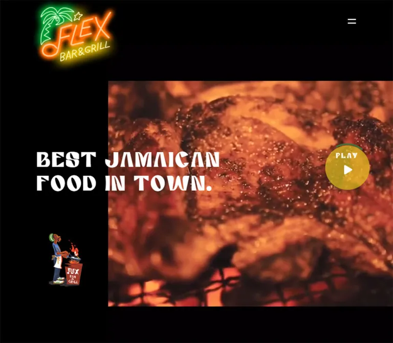
FLEX combines the atmosphere of a nighttime bar with the directness of a large illustrated restaurant menu. Its opening uses extensive black space, a glowing palm-tree wordmark, white cutout-style lettering, a rectangular media window, and a small illustrated grill character. The circular PLAY control overlaps this composition instead of occupying a conventional button row.
Further down, mustard yellow becomes the dominant field. Square food photographs sit directly on that field with small Japanese labels and much larger English names. Green provides the compact header and shop-promotion surface; pale cream separates practical visiting information; deep brown frames the anniversary recording. This is a complete restaurant website with browsing, visiting, shopping, and social destinations. Its visual reference should preserve that breadth.
閉じる
FLEX Bar & Grill — Style Reference
A neon restaurant sign above a black stage, followed by a mustard-yellow photographic menu.
Website: bar-flex.com Original URL: https://bar-flex.com/ Final URL: https://bar-flex.com/ Theme: a black opening with mustard, green, cream, and brown section surfaces. Inspected: October 6, 2026, at 01:08 JST; supplied retrieval timestamp: October 5, 2026, at 16:08:01.981 UTC. Viewports: 1440 × 1000 desktop and 390 × 844 mobile, in CSS pixels. Scope: the current restaurant website, including its opening composition, navigation evidence, restaurant story, shop promotion, food and drink catalog, access information, social sections, and anniversary video. Visual evidence covers the opening at both widths, part of the desktop menu, the desktop anniversary section, and the mobile social-to-anniversary transition. Other sections are documented from supplied rendered DOM measurements.
FLEX combines the atmosphere of a nighttime bar with the directness of a large illustrated restaurant menu. Its opening uses extensive black space, a glowing palm-tree wordmark, white cutout-style lettering, a rectangular media window, and a small illustrated grill character. The circular PLAY control overlaps this composition instead of occupying a conventional button row.
Further down, mustard yellow becomes the dominant field. Square food photographs sit directly on that field with small Japanese labels and much larger English names. Green provides the compact header and shop-promotion surface; pale cream separates practical visiting information; deep brown frames the anniversary recording. This is a complete restaurant website with browsing, visiting, shopping, and social destinations. Its visual reference should preserve that breadth.
How to Read This Reference
- Measured means explicitly present in the supplied computed styles or element rectangles. Measurements are rounded where additional decimal places would not help implementation.
- Derived means calculated from those measurements, such as the 40px distance between menu columns.
- Visual estimate means judged from a supplied current-page screenshot. It is not a computed CSS value or a programmatic pixel sample.
- Recommended means an implementation choice for a new build. Breakpoints, accessibility behavior, and the Quick Start formulas belong to this category unless stated otherwise.
- Named tokens are reference aliases. The evidence returned no custom properties; these names are not claimed to exist in the original source.
- The screenshots and DOM capture different views of the page. A DOM rectangle for a navigation item does not establish that its panel was visibly open.
- Only the supplied evidence was analyzed. No additional page visit, file inspection, link activation, or interaction test was performed for this reference.
Tokens — Colors
Default Palette
| Name | Value | Suggested token | Evidence and role |
|---|---|---|---|
| Stage Black | #000000 |
--color-stage |
Measured body and Instagram-section background; visible opening canvas |
| White | #FFFFFF |
--color-white |
Measured reversed headings and navigation text; access-heading highlight |
| Menu Mustard | #DFC220 |
--color-mustard |
Measured About and menu backgrounds; SHOP NOW surface |
| Heading Ochre | #CEAE2F |
--color-highlight |
Measured inline backgrounds behind THE ONE & ONLY and Real jamaican taste |
| Restaurant Green | #337039 |
--color-green |
Measured shop-banner background; visually consistent with the compact header |
| Access Cream | #F1DD9E |
--color-cream |
Measured access-section background |
| Wood Brown | #583C32 |
--color-brown |
Measured anniversary section, map action, and return-link background |
| Text Black | #000000 |
--color-ink |
Measured ordinary text on yellow and cream |
| Link Charcoal | #111111 |
--color-link |
Measured food-image links, contact links, and shop-action text |
| Image Underlay | #223632 |
--color-image-underlay |
Measured background beneath food-image anchors; usually covered by photography |
The neon artwork introduces luminous orange, green, and yellow. Those colors belong to the logo and photography; their exact values were not supplied as CSS tokens. Preserve the artwork's glow instead of applying a generic neon shadow to every heading.
The PLAY disc appears as muted yellow or olive, with colored perimeter strokes. Its anchor has a transparent computed background, so the visible disc belongs to a nested or decorative layer not measured here. Its exact fill, opacity, and compositing cannot be recovered from the anchor value. The Quick Start uses translucent mustard as an explicitly approximate treatment.
Theme Presets
No selectable themes are evidenced. The palette changes through section backgrounds and header state. Keep those changes connected to content structure rather than presenting them as user-selectable modes.
Tokens — Typography
MBFUmami — Display Lettering
- Measured family:
MBFUmami, cursive. - Measured weight:
400for sampled display headings and navigation links. - Character: broad, irregular lettering with triangular cuts, strong silhouettes, and a handmade sign-painting quality.
- Roles: hero statement, navigation, section headings, English menu names, shop title, social heading, and anniversary title.
- Tracking: normal on sampled display text.
The heavy appearance comes from the typeface itself. Substituting a generic bold sans-serif or adding synthetic bold changes the shape and spacing substantially. English labels appear uppercase in the captures even where extracted source text uses mixed case; the evidence does not establish whether that appearance comes from styling, glyph design, or both.
The font family is verified, but its file URL, loading strategy, and license are not supplied. Load an authorized copy separately when implementing it.
System Sans — Japanese Copy and Utility Text
The measured body stack begins with -apple-system, system-ui, Roboto, Segoe UI, Helvetica Neue, HelveticaNeue, followed by Japanese system-font alternatives including YuGothic, Yu Gothic, Hiragino Kaku Gothic ProN, and Meiryo, then a sans-serif fallback.
Body copy remains 16px / 27.2px, weight 400, at both inspected widths. This stable reading size contrasts with the strongly responsive display typography. Japanese dish labels are visually much smaller than the English names; their individual computed style was not included.
Type Scale
Sizes and line heights below are measured unless marked as estimates.
| Role | Desktop size / line height | Mobile size / line height | Weight and use |
|---|---|---|---|
| Hero H1 | 86.4px / 103.68px |
30px / 36px |
400; two visible lines |
| Main section heading | 80px / 80px |
60px / 60px |
400; About, menu, access, Instagram |
| Navigation link | 60px / 60px |
31.2px / 31.2px |
400; navigation visibility not independently tested |
| Navigation shop link | 70px / 70px |
39px / 39px |
400 |
| Shop-banner title | 48px / 52.8px |
27.3px / 30.03px |
400 |
| English dish name | 40px / 44px |
25px / 27.5px |
400 |
| Japanese dish label | Approximately 12–13px |
Individual style unavailable | Visual estimate from desktop capture |
| Follow us | 70px / 77px |
40px / 44px |
400 |
| Anniversary title | 70px / 70px |
40px / 40px |
400; measured heading occupies two lines |
| Body copy | 16px / 27.2px |
Same | 400 |
| Secondary contact text in navigation | 15px / 25.5px |
Same | 400 |
| Access phone and email links | 24px / 24px |
Same | 700 |
| SHOP NOW and GOOGLE MAP | 12px / 50px |
Same | 600; 2.2px letter spacing |
| Copyright | 10px / 12px |
Same | 400; 0.5px letter spacing |
The source root is measured at 10px, while the body is explicitly 16px. The Quick Start uses explicit pixel values and a conventional root; it does not assume the original site's rem scale.
Tokens — Spacing & Shapes
The system combines broad section spacing with unboxed content. Photographs, shop surfaces, and rectangular utility actions have square corners. Circular geometry is reserved for the prominent playback control and social-logo forms.
Spacing Scale
| Use | Value | Status |
|---|---|---|
| Inline heading highlight inset | 8px desktop; 6px mobile |
Measured for 80px and 60px headings |
| Food image to heading block | 20px |
Derived at both widths |
| Shop text inset from banner edge | 30px |
Derived at both widths |
| Shop banner vertical padding | 20px |
Measured |
| Rectangular action horizontal padding | 32px |
Measured |
| About paragraph separation | Approximately 34px |
Derived from consecutive paragraph rectangles |
| Desktop food-column gap | 40px |
Derived |
| Mobile food-card separation after caption | Approximately 60.7px |
Derived for the first entries |
| Desktop gap after a two-line food caption | Approximately 80px |
Derived for the first column; later positions vary |
| Main menu/access heading offset from section top | 130px desktop; 90px mobile |
Derived |
| Anniversary heading offset | 100px desktop; 50px mobile |
Derived |
| Instagram-section vertical padding | 80px |
Measured |
Border Radius
| Element | Treatment | Evidence |
|---|---|---|
| Food-image link | 0 |
Measured |
| Shop banner | 0 |
Measured |
| SHOP NOW and GOOGLE MAP | 0 |
Measured |
| Heading highlights | Square inline strips | Measured zero radius and visible rectangular treatment |
| PLAY artwork | Circle with partial outer strokes | Visual observation; outer anchor itself reports zero radius |
| Video frame | Square outer corners | Visual observation |
Layout Measurements
| Element | Desktop: 1440 × 1000 | Mobile: 390 × 844 |
|---|---|---|
| Opening section | 1440 × 1000px |
390 × 844px |
| Initial header box | 120px high; 72px horizontal padding |
100px high; 19.5px horizontal padding |
| Compact header | Approximately 70px high |
Approximately 70px high |
| Menu-toggle target | 48 × 48px |
48 × 48px |
| Hero H1 box | x 129.6, y 379.9, width 864px |
x 35.1, y 380.1, width 300px |
| PLAY anchor | 140 × 140px |
140 × 140px |
| First menu image | 364.8 × 364.8px |
318.8 × 318.8px |
| Menu image-column starts | x 188.0, 592.8, 997.6 |
x 35.6 |
| Shop banner | 1170 × 280.8px |
358.8 × 368.3px |
| Shop text-column width | 540px |
298.8px |
| Anniversary content width | 883.2px |
358.8px |
| Full document height | Approximately 12,432px |
Approximately 19,503px |
Compact-header height is a screenshot estimate. The other values in this table come from DOM rectangles, except the anniversary media width, which is also visually consistent with its measured heading container.
Components
Site Header
Role: keep restaurant identity and navigation available across a long page.
The opening header is transparent over black. A large neon logo occupies the upper-left area; the upper-right menu symbol consists of two short white horizontal strokes. The measured interaction target is 48px square, larger than the visible strokes.
Scrolled captures show a compact green bar with a much smaller flat-color logo. It remains at the top of both desktop and mobile captures. Its visible height is about 70px, compared with initial DOM header heights of 120px and 100px. The exact positioning rule and scroll threshold are not recorded.
Treat the glowing opening logo and compact flat logo as two distinct visual states. The neon's luminous fringe extends beyond its crisp lettering and should not be mistaken for an opaque rectangular image background.
Navigation Content
Role: jump between restaurant sections and expose shop, contact, and social destinations.
Recorded links are Movie, About us, Menu, Hours & Access, Memories, and Online Shop. The internal destinations are #main, #dark-block-2, #dark-block-3, #dark-block-4, and #memory. Shop navigation points to https://shop.bar-flex.com/.
The measured navigation geometry places primary links in a left-hand desktop column and shop/contact content toward the right. On mobile, these elements form one vertical stack. Primary display type reduces from 60px to 31.2px; the shop link reduces from 70px to 39px. Small social icons, telephone, email, address, and copyright accompany the links.
Limitation: no screenshot of an opened navigation panel or verified toggle sequence was supplied. The DOM supports its content and typography, but does not establish its backdrop, entrance direction, focus behavior, or closing mechanism.
Opening Media Composition
Role: establish the venue's atmosphere before the detailed menu.
The desktop opening is intentionally asymmetric. The headline begins approximately 9% from the left edge, while the visible media window starts around x 396px and y 227px. The media extends to the right viewport edge and ends near y 892px. These media boundaries are visual estimates; its underlying source dimensions are unknown.
The statement reads BEST JAMAICAN / FOOD IN TOWN. Its white lettering crosses from the black left margin into the media window. A small illustrated person grilling food sits below the headline, separated from the main media rectangle by black space.
On mobile, the media begins around x 20px and y 287px and ends near y 501px. The title sits inside its left region at a measured x 35.1px and y 380.1px. The large amount of black space above and below the media remains part of the composition.
The H1's extracted DOM text repeats the headline, while the screenshots show one visible statement. Do not interpret this as two separate content headings. A new implementation should expose one semantic H1, even if decorative layers are used visually.
Circular PLAY Control
Role: invite a media action without adding a conventional rectangular CTA.
The measured anchor is 140px square at both widths. Inside it, the visible olive-yellow disc is approximately 120px across. White display lettering sits above a white triangular play mark. Partial colored strokes appear outside the circle.
On desktop, the anchor is near the media's right side. On mobile, its measured top is y 456.1px, so it overlaps the media's lower edge and extends into the black field beneath it. Keeping its size while shrinking the title makes the control proportionally more prominent on a phone.
The recorded destination is #0. This does not establish whether activation opens a modal, changes the media, or triggers another script. Playback behavior, audio, and the perimeter decoration's animation remain unverified.
Restaurant Story
Role: explain the restaurant's Jamaican cooking, location, and identity.
The section uses the mustard background with THE ONE & ONLY in black MBFUmami on a darker ochre highlight. Its Japanese paragraphs use the stable 16px / 27.2px system-sans treatment.
On desktop, the measured text column starts around x 832.8px and is approximately 492px wide. On mobile, it starts at x 31.2px and is approximately 327.6px wide. The mobile heading appears well below the section's beginning, so the content cannot be reduced to a title immediately following the hero.
The supplied screenshots do not show this section's full imagery. The evidence establishes the text layout, color, and spacing; any adjacent visual composition requires additional original-page evidence.
Online Shop Banner
Role: connect the restaurant story to its separate retail destination.
A single large linked green rectangle contains a white display title, white Japanese explanatory copy, and a mustard SHOP NOW strip. The link wraps the promotion as a whole; the source's visible action label is a paragraph within that link, not an independently measured button.
The desktop banner is 1170px wide, with a 540px text column. Mobile uses a 358.8px banner with approximately 30px horizontal text insets. The title scales down, but body text remains 16px. The action strip stays 50px high and uses small, widely tracked uppercase text.
For a semantic adaptation, use one anchor for the banner and a styled span for its action label. Avoid nesting a second interactive element inside it.
Food and Drink Catalog
Role: provide a substantial photographic menu rather than a short selection of featured dishes.
The supplied links identify 28 entries: 22 food entries and six drink entries. The collection includes grilled plates, taco rice, curries, sandwiches, sides, desserts, beer, cocktails, and nonalcoholic drinks.
Each visible unit consists of:
- A square linked photograph with a dark green underlay.
- A 20px separation before the caption block.
- A small Japanese label, such as
サンドイッチ. - A much larger English name in MBFUmami.
There is no separate card background, visible border, radius, shadow, price badge, or cart action in the supplied menu capture. Yellow remains visible between images and underneath captions.
Desktop uses three columns of approximately 364.8px images with 40px gutters. The screenshot shows generous vertical breathing room after captions. Some DOM image positions differ by about 30px within a nominal row; the evidence does not establish whether this comes from layout, transforms, or reveal state. Do not claim a specific masonry implementation.
Mobile uses one centered column of 318.8px images. English names shrink to 25px / 27.5px. Japanese labels remain subordinate, and longer names may use multiple lines.
A narrow white strip carrying the vertical Food Menu & Drink label is visible in the desktop left margin. Its exact rotation, sticky behavior, and mobile presentation were not supplied.
Food-image anchors point to .webp files. A transform transition is measured, but image-opening behavior and any lightbox interface were not exercised.
Access and Opening Hours
Role: make visiting information easy to distinguish from the photographic catalog.
This section switches to pale cream. Hello & welcome uses the same large display family, now with white inline highlighting. Phone and email are prominent black 24px bold sans-serif links. Smaller body text gives the location in Japanese and English.
The opening-hours content has weekday rows and Lunch/Dinner columns. Mobile text inserts extra line breaks around last-order details. Preserve this information hierarchy when adapting the table rather than compressing all details into a single line.
GOOGLE MAP is a brown, square-cornered action with white 12px text and 2.2px tracking. It measures approximately 188px wide on desktop and expands to the 358.8px content width on mobile, while remaining 50px high.
Telephone, email, and map destinations are present in the DOM. Their activation and any embedded map interface were not tested.
Instagram and Follow us
Role: connect the venue's visual identity to its social presence.
The DOM records a black Instagram section with 80px vertical padding and a large white display heading. It does not provide enough visible evidence to describe a loaded social-feed grid or its behavior.
A separate Follow us area uses a photograph of the restaurant's illuminated sign and surrounding foliage. Centered white heading text and large Facebook and Instagram marks sit over the image. The social marks have a measured 60px font size and remain large on mobile.
The Follow us region measures approximately 750px high on desktop and 422px on mobile. Keep the photographic backdrop legible as a venue image; it is not an abstract gradient or generic tropical illustration.
Anniversary Video
Role: present a venue memory and performance recording at the end of the page.
A full-width brown section contains a centered white 20TH ANNIVERSARY PARTY heading above a YouTube player. On desktop, the content is approximately 883px wide; the player appears near 883 × 498px, consistent with 16:9. On mobile, the player is approximately 359 × 202px with roughly 16px side margins.
The desktop heading uses 70px / 70px. Mobile uses 40px / 40px, and the screenshot shows an awkward break inside ANNIVERSARY. That wrap is an observed limitation, not a typography rule to reproduce deliberately.
The red play control, video title, channel badge, and localized player labels belong to the YouTube interface. Do not interpret those labels or the red button as the restaurant's own typography or action-color system. No video URL or playback test was supplied.
Return Link
The DOM ends with an anchor targeting #main. Its box is 40 × 40px on desktop and 390 × 40px on mobile, with a brown background. Its icon, visibility timing, and scrolling behavior are not established by the supplied screenshots.
Tokens — Motion & Interaction
The evidence contains computed transition and animation declarations, but no interaction recording. A declaration establishes that a property can animate; it does not reveal its endpoint or prove that a particular hover or click was exercised.
| Element | Supplied declaration | What can be concluded |
|---|---|---|
| Header size and surface | height 0.3s, background-color 0.3s ease-in-out |
Header dimensions and color have transition support; compact appearance is separately visible |
| Header entrance | 0.6s ease-in-out 0.8s both d |
600ms animation, 800ms delay, fill mode both; keyframes named d were not supplied |
| Menu toggle | transform 0.3s, opacity 0.3s ease-in-out |
Transform and opacity can transition; final toggle shape is unknown |
| Primary navigation links | color 0.1s ease-in-out |
Short color feedback is declared; destination color is unknown |
| Food-image links | transform 0.3s ease-in-out |
A transform transition exists; zoom amount and activation condition are unknown |
| Shop banner | 0.5s |
A 500ms transition is present; changed properties and endpoint are not identified |
| Rectangular actions and access links | 0.3s ease-in-out |
300ms transition timing is present |
| Access and Follow us headings | 0.5s 0.5s; animation name e |
Transition duration and delay are recorded; reveal keyframes are unavailable |
| Social links | color 0.1s ease-in-out or 0.3s |
Feedback timing differs by location; exact changes are not established |
| PLAY perimeter strokes | Visible decorative arcs | No measured timing, rotation, or state relationship |
The capture process allowed an initial observation of at least five seconds, waited for finite animation and layout readiness within its limits, and temporarily paused perpetual animations during readiness checks. These are capture procedures, not evidence of specific animation effects.
Do not infer autoplay, looping, parallax, scroll scrubbing, a modal video, smooth anchor scrolling, or image-lightbox controls. For a new build, short 100–300ms feedback and a 300ms header change are compatible with measured timings. Additional motion should be labeled as an implementation decision and should support reduced-motion preferences.
Surfaces
| Surface | Treatment | Purpose |
|---|---|---|
| Opening stage | Pure black with white type and neon artwork | Separates branding, media, and illustration through empty space |
| Story and menu | Continuous mustard field | Carries black text and warm food photography |
| Heading marker | Flat ochre or white inline rectangle | Emphasizes display text without creating a full panel |
| Shop promotion | Solid green rectangle | Groups a retail invitation within the restaurant story |
| Access area | Pale cream | Gives practical information a quieter reading surface |
| Social backdrop | Venue photograph with white overlay content | Reinforces the physical restaurant identity |
| Anniversary area | Solid brown | Frames the performance recording with a warm, darker surface |
The interface does not show a general system of elevated cards. Section color, text scale, imagery, and empty space perform most of the grouping. The neon glow is an identity-specific effect, not an elevation shadow.
Imagery
The supplied food photography is warm, detailed, and materially specific: grilled surfaces, curry sauces, wooden serving dishes, tropical printed cloths, banana leaves, sandwich cross-sections, and colorful children's plates. Square crops concentrate attention on the food while retaining enough surroundings to feel like an actual restaurant table.
The opening media capture shows the venue exterior, handwritten signs, furniture, and evening light. The social photograph returns to the neon sign among foliage. The anniversary player shows a singer with a microphone and instrument in a warmly lit indoor setting.
Two illustrated brand assets interrupt the photography: the glowing palm-tree logo and the slim grill character. Preserve their transparent surroundings and distinctive silhouettes. Do not replace them with generic emoji, stock palm icons, or a CSS recreation of the wordmark.
Use normal photographic interpolation. There is no evidence for pixelated image rendering, duotone processing, or global color filters.
Observed Asset References
These paths are recorded original-page link destinations, relative to https://bar-flex.com/. They were not downloaded or independently inspected. They may be full-size image targets rather than the exact thumbnail sources.
| Asset | Observed path | Recorded use |
|---|---|---|
| Jerk chicken plate | img/food_jerk-chicken-plate.webp |
Food-image link |
| Vegetable curry | img/food_vegetable-curry.webp |
Visible desktop menu entry |
| Fried chicken curry | img/food_fried-chiken-curry.webp |
Visible desktop menu entry |
| Fried chicken plate | img/food_fried-chiken.webp |
Visible desktop menu entry |
| Sandwich | img/food_wandwich.webp |
Visible desktop menu entry |
| Burrito | img/food_burrito.webp |
Visible desktop menu entry |
| Children's plates | img/food_kids.webp |
Visible desktop menu entry |
| Festival | img/food_festival.webp |
Food-image link |
| Beer | img/drink_beer.webp |
Drink-image link |
| Mojito | img/drink_flex-mojito.webp |
Drink-image link |
| Original cocktails | img/drink_flex-original-cocktail.webp |
Drink-image link |
Preserve recorded path spellings when referencing these assets. URLs for the neon logo, compact logo, grill illustration, social backdrop, hero media, display-font file, and anniversary embed were not supplied; do not invent them.
Layout & Responsive Behavior
Page Sequence
The source is a long scrolling restaurant website. Rounded measurements below describe the captured content, not recommended fixed section heights.
| Region | Desktop start / height | Mobile start / height |
|---|---|---|
| Opening | 0 / 1000px |
0 / 844px |
| About and shop | 1000 / 1937px |
844 / 2240px |
| Food and drink | 2937 / 6018px |
3084 / 13,175px |
| Access | 8955 / 1248px |
16,258 / 1851px |
10,203 / 553px |
18,109 / 501px |
|
| Follow us | 10,755 / 750px |
18,609 / 422px |
| Anniversary | 11,506 / 887px |
19,031 / 432px |
Observed Responsive Changes
- Hero: the title reduces from 86.4px to 30px, while the PLAY target remains 140px square. The media becomes a narrow horizontal window across most of the phone width, and the control overlaps its bottom edge.
- Header: opening height changes from 120px to 100px. Both scrolled captures show the compact green state at about 70px.
- Navigation: measured link and contact positions change from separated desktop columns to a mobile stack. Open-panel behavior is unverified.
- Story: the right-hand desktop text column becomes a narrow mobile content column; body type stays 16px.
- Catalog: three columns become one. Image size changes relatively little, from approximately 365px to 319px, so the mobile page becomes substantially longer.
- Access: phone and email move from a shared horizontal region to separate vertical positions. The map action becomes full width. Opening-hours details wrap across more lines.
- Anniversary: the content changes from approximately 61.3% of desktop width to 92% of mobile width. The player retains a landscape ratio.
Only two widths were supplied. The original media-query breakpoints, tablet layout, maximum container widths, and behavior at intermediate heights are unknown.
The desktop hero font happens to equal 6vw at 1440px, and the mobile navigation size equals 8vw at 390px. These are numerical equivalences, not verified source formulas. Any fluid rule in the Quick Start is an adaptation.
Do’s and Don’ts
Do
- Preserve the black opening, mustard menu, green accents, cream access section, and brown anniversary frame.
- Use MBFUmami at its observed regular weight when an authorized font is available.
- Keep ordinary Japanese copy in a readable system sans-serif at approximately 16px / 1.7.
- Retain the asymmetric hero and the headline's overlap with the media area.
- Keep the PLAY control large on mobile and preserve its overlap with the media edge.
- Use square food photographs with separate Japanese and English caption scales.
- Let yellow show between menu entries instead of enclosing them in cards.
- Keep practical contact and opening-hours information visually distinct from the catalog.
- Preserve the difference between the neon opening logo and the compact flat logo.
- Keep external video-player chrome separate from the restaurant's design tokens.
Don’t
- Don't turn the 28-entry catalog into a few generic feature cards.
- Don't replace the display font with a uniformly bold geometric sans-serif.
- Don't apply rounded corners, glossy gradients, or soft shadows throughout the page.
- Don't brighten or recolor every photograph to match the CSS mustard.
- Don't remove the opening's black space simply to move more content above the fold.
- Don't reduce mobile images to small thumbnails when the observed design keeps them prominent.
- Don't infer a lightbox from image-file links or a video modal from the PLAY label.
- Don't animate the decorative arcs with an invented timing and call it source behavior.
- Don't copy awkward word splitting or inconsistent bilingual labels as deliberate design features.
- Don't fabricate asset URLs, tablet breakpoints, or production credits.
Recommended Implementation Additions
These are recommendations for a new implementation, not verified features of the current site:
- Implement the navigation trigger as a named button with
aria-expandedandaria-controls. If it opens a modal panel, provide focus management, Escape dismissal, and focus restoration. - Give PLAY an accessible name that describes its actual action. If background video is introduced, provide a pause control and avoid automatic audible playback.
- Keep one semantic H1. Hide purely decorative duplicates from assistive technology.
- Give image links meaningful names. If they open enlarged images, implement and test that experience explicitly rather than relying on an unexplained image URL.
- Add visible keyboard focus styles on every surface, including photographic backgrounds.
- Use a real opening-hours table with header associations and allow last-order details to wrap naturally.
- Keep ANNIVERSARY intact on mobile through adjusted line grouping or a slightly smaller title. Let the section height grow when necessary.
- Review bilingual menu copy: the observed vegetable-curry entry carries the Japanese label
FLEXドライカレー, also used elsewhere. Confirm intended wording before publication. - Reserve image dimensions, serve responsive image sizes, and defer below-the-fold media where appropriate. The long mobile catalog makes predictable loading particularly useful.
- Add sticky-header scroll offsets to section targets and honor reduced-motion preferences.
Agent Prompt Guide
Quick Color Reference
- Opening and Instagram canvas:
#000000. - Reversed display text:
#FFFFFF. - Story and catalog:
#DFC220. - Inline heading highlight:
#CEAE2F. - Shop and compact-header reference green:
#337039. - Access canvas:
#F1DD9E. - Anniversary and map action:
#583C32. - Photography underlay:
#223632. - PLAY disc: muted translucent mustard approximation; its original fill was not measured.
Overall Prompt
“Create a complete restaurant website inspired by FLEX Bar & Grill's observed visual structure. Begin with a full-height black composition containing an authorized neon logo at upper left, a small two-stroke menu trigger at upper right, a right-offset rectangular venue-media window, large white MBFUmami lettering crossing its left edge, a small grill illustration, and an overlapping circular PLAY control. Continue into mustard-yellow restaurant-story and food-menu sections. Use square food photography, small Japanese labels, and much larger English display names, with three columns on desktop and one on mobile. Add a green shop promotion, pale-cream access information, a photographic social panel, and a brown anniversary-video section. Keep surfaces flat and corners square. Use the supplied measured values as anchors; identify any invented interactions or responsive rules as implementation decisions.”
Example Component Prompts
- Hero: “Compose a black 1440 × 1000 opening with the headline starting near x 130px and the venue-media window starting near x 396px. Use 86.4px / 103.68px white MBFUmami and a 140px PLAY target. At 390 × 844, use a 30px / 36px headline, retain the play target's size, and move it across the media's lower-right edge. Preserve generous black space.”
- Menu entry: “Place a square food photograph directly on #DFC220. Below it, leave 20px before a caption comprising a small Japanese system-sans label and a 40px / 44px MBFUmami English name. Use no card fill, border, radius, price badge, or shadow. On mobile, use a roughly 319px image and 25px / 27.5px English name.”
- Shop promotion: “Build a square-cornered #337039 linked banner with a white display title, readable Japanese copy, and a full-width #DFC220 SHOP NOW strip. Give the strip 12px semibold text, 2.2px tracking, and a 50px minimum height. Use one interactive link for the entire banner.”
- Access section: “Use #F1DD9E with a large black MBFUmami heading over white inline highlighting. Present telephone and email as 24px bold links, followed by a readable weekday lunch/dinner table and location text. Use a brown GOOGLE MAP action that expands to full content width on mobile.”
- Anniversary: “Center a white display title and a 16:9 video within a #583C32 section. Use about 883px content width at a 1440px viewport and about 359px at 390px. Preserve external player branding, allow the title to wrap at word boundaries, and do not reproduce the observed split inside ANNIVERSARY.”
Quick Start
CSS Custom Properties
This is an implementation scaffold, not recovered source CSS. It uses measured colors, type sizes, and menu geometry; approximates hero positioning; and introduces a recommended 767px breakpoint. Load authorized artwork and the display font separately. Header state, navigation behavior, media playback, and external embeds require their own implementation.
The menu container formula reproduces approximately 364.8px desktop squares with 40px gutters at 1440px, and 318.8px mobile squares at 390px. Normal grid flow is used without trying to reproduce unexplained source offsets.
:root {
  /* Measured palette */
  --color-stage: #000000;
  --color-white: #ffffff;
  --color-mustard: #dfc220;
  --color-highlight: #ceae2f;
  --color-green: #337039;
  --color-cream: #f1dd9e;
  --color-brown: #583c32;
  --color-ink: #000000;
  --color-link: #111111;
  --color-image-underlay: #223632;

  /* Load an authorized MBFUmami font separately. */
  --font-display: 'MBFUmami', cursive;
  --font-body: -apple-system, system-ui, Roboto, 'Segoe UI',
    'Helvetica Neue', HelveticaNeue, YuGothic, 'Yu Gothic',
    'Hiragino Kaku Gothic ProN', Meiryo, sans-serif;

  --text-body: 16px;
  --text-section: 80px;
  --text-food: 40px;
  --text-shop: 48px;
  --text-memory: 70px;
  --leading-body: 1.7;
  --tracking-action: 2.2px;

  --space-small: 20px;
  --space-inset: 30px;
  --space-column: 40px;
  --space-row: 80px;
  --section-top: 130px;
  --header-height: 120px;
  --header-compact-height: 70px;
  --play-target: 140px;
  --radius-surface: 0;

  /* Timing references; endpoints still require design decisions. */
  --motion-color: 100ms ease-in-out;
  --motion-ui: 300ms ease-in-out;
}

* { box-sizing: border-box; }

body {
  margin: 0;
  color: var(--color-white);
  background: var(--color-stage);
  font: 400 var(--text-body) / var(--leading-body) var(--font-body);
}

img, video { display: block; max-width: 100%; }
button, a { -webkit-tap-highlight-color: transparent; }
button { font: inherit; }

.display {
  font-family: var(--font-display);
  font-weight: 400;
  letter-spacing: normal;
}

/* Recommended persistent header implementation. */
.site-header {
  position: fixed;
  inset: 0 0 auto;
  z-index: 50;
  display: flex;
  align-items: center;
  justify-content: space-between;
  height: var(--header-height);
  padding-inline: 5vw;
  background: transparent;
  transition: height var(--motion-ui), background-color var(--motion-ui);
}

.site-header[data-compact='true'] {
  height: var(--header-compact-height);
  background: var(--color-green);
}

.brand-neon { width: 220px; }
.brand-flat { display: none; width: 74px; }
.site-header[data-compact='true'] .brand-neon { display: none; }
.site-header[data-compact='true'] .brand-flat { display: block; }

.menu-toggle {
  position: relative;
  width: 48px;
  height: 48px;
  padding: 0;
  border: 0;
  color: var(--color-white);
  background: transparent;
  cursor: pointer;
}

.menu-toggle::before,
.menu-toggle::after {
  content: '';
  position: absolute;
  left: 13px;
  width: 22px;
  height: 3px;
  background: currentColor;
}

.menu-toggle::before { top: 18px; }
.menu-toggle::after { top: 28px; }

/* Hero coordinates approximate the supplied screenshots. */
.hero {
  position: relative;
  min-height: 100svh;
  isolation: isolate;
  background: var(--color-stage);
}

.hero__media {
  position: absolute;
  top: 22.7%;
  right: 0;
  left: 27.5%;
  height: 66.5%;
  overflow: hidden;
}

.hero__media :is(img, video) {
  width: 100%;
  height: 100%;
  object-fit: cover;
}

.hero__title {
  position: absolute;
  z-index: 1;
  top: 38%;
  left: 9%;
  width: 60%;
  margin: 0;
  font: 400 clamp(30px, 6vw, 100px) / 1.2 var(--font-display);
  color: var(--color-white);
}

.hero__title > span { display: block; }

.hero__mascot {
  position: absolute;
  top: 71%;
  left: 11.5%;
  width: auto;
  height: 145px;
  object-fit: contain;
}

.play-control {
  position: absolute;
  z-index: 2;
  top: 41.6%;
  right: 5%;
  display: grid;
  place-content: center;
  justify-items: center;
  gap: 16px;
  width: var(--play-target);
  height: var(--play-target);
  padding: 0;
  border: 0;
  isolation: isolate;
  background: transparent;
  color: var(--color-white);
  font: 400 24px / 1 var(--font-display);
  cursor: pointer;
}

.play-control::before {
  content: '';
  position: absolute;
  z-index: -1;
  inset: 10px;
  border-radius: 50%;
  /* Approximation: original decorative fill was not measured. */
  background: rgb(223 194 32 / 0.72);
}

.play-control::after {
  content: '';
  position: absolute;
  z-index: -1;
  inset: 4px;
  border: 3px solid transparent;
  border-top-color: var(--color-green);
  border-right-color: var(--color-green);
  border-radius: 50%;
  transform: rotate(-45deg);
  /* Static decoration; no original rotation timing is known. */
}

.play-control__icon {
  width: 0;
  height: 0;
  margin-left: 5px;
  border-top: 12px solid transparent;
  border-bottom: 12px solid transparent;
  border-left: 20px solid currentColor;
}

.page-section {
  position: relative;
  padding-block: var(--section-top) 80px;
  color: var(--color-ink);
  background: var(--color-mustard);
}

.section-body {
  margin-left: 11.666667vw;
  margin-right: 4vw;
}

.section-heading-wrap {
  max-width: 430px;
  margin-bottom: 30px;
}

.section-heading {
  display: inline;
  padding-inline: 0.1em;
  margin: 0;
  background: var(--color-highlight);
  font: 400 var(--text-section) / 1 var(--font-display);
  -webkit-box-decoration-break: clone;
  box-decoration-break: clone;
}

.story-copy { max-width: 492px; margin-left: auto; }
.story-copy p { margin: 0 0 34px; }

.shop-banner {
  display: block;
  margin-inline: 20px;
  padding: 20px 30px;
  border-radius: var(--radius-surface);
  color: var(--color-white);
  background: var(--color-green);
  text-decoration: none;
}

.shop-banner__copy { max-width: 540px; }
.shop-banner h3 {
  margin: 0 0 10px;
  font: 400 var(--text-shop) / 1.1 var(--font-display);
}

.action-strip {
  display: flex;
  align-items: center;
  justify-content: center;
  min-height: 50px;
  padding: 12px 32px;
  border: 0;
  border-radius: 0;
  color: var(--color-link);
  background: var(--color-mustard);
  font: 600 12px / 1.4 var(--font-body);
  letter-spacing: var(--tracking-action);
  text-transform: uppercase;
  text-decoration: none;
}

.food-grid {
  display: grid;
  grid-template-columns: repeat(3, minmax(0, 1fr));
  gap: var(--space-row) var(--space-column);
  margin: 0;
  padding: 0 20px;
  list-style: none;
}

.food-card { min-width: 0; }
.food-card__media {
  display: block;
  aspect-ratio: 1;
  overflow: hidden;
  border-radius: 0;
  background: var(--color-image-underlay);
  transition: transform var(--motion-ui);
}

.food-card__media img {
  width: 100%;
  height: 100%;
  object-fit: cover;
}

.food-card__title {
  margin: 20px 0 0;
  font: 400 var(--text-food) / 1.1 var(--font-display);
}

.food-card__ja {
  display: block;
  margin-bottom: 2px;
  /* Approximation: the individual label style was not supplied. */
  font: 400 13px / 1.7 var(--font-body);
  letter-spacing: 0.08em;
}

.food-card__en { display: block; }
.access { background: var(--color-cream); }
.access .section-heading { background: var(--color-white); }

.access-grid {
  display: grid;
  grid-template-columns: repeat(2, minmax(0, 1fr));
  gap: 30px;
}

.contact-link {
  color: var(--color-link);
  font-size: 24px;
  font-weight: 700;
  line-height: 1;
  overflow-wrap: anywhere;
}

.hours-table { width: 100%; border-collapse: collapse; }
.hours-table :is(th, td) {
  padding: 12px 8px;
  text-align: left;
  vertical-align: top;
}

.action-strip--map {
  width: fit-content;
  margin-left: auto;
  color: var(--color-white);
  background: var(--color-brown);
}

/* Supply an authorized venue photograph separately. */
.social-panel {
  display: grid;
  align-content: center;
  justify-items: center;
  min-height: 750px;
  color: var(--color-white);
  background-color: var(--color-stage);
  background-size: cover;
  background-position: center;
}

.social-panel h2 {
  margin: 0 0 60px;
  font: 400 70px / 1.1 var(--font-display);
}

.social-links { display: flex; align-items: center; gap: 20px; }
.social-links a { display: block; width: 60px; color: inherit; }
.social-links svg { display: block; width: 60px; height: 60px; }

.memory {
  padding-block: 100px 80px;
  color: var(--color-white);
  background: var(--color-brown);
}

.memory__inner { width: 61.333333%; margin-inline: auto; }
.memory h2 {
  margin: 0 0 70px;
  font: 400 var(--text-memory) / 1 var(--font-display);
  text-align: center;
  overflow-wrap: normal;
  word-break: normal;
}

.video-frame { width: 100%; aspect-ratio: 16 / 9; }
.video-frame iframe { display: block; width: 100%; height: 100%; border: 0; }

/* Recommended accessibility and anchor behavior. */
[id] { scroll-margin-top: 90px; }
:where(a, button):focus-visible {
  outline: 3px solid currentColor;
  outline-offset: 5px;
}

@media (max-width: 767px) {
  :root {
    --header-height: 100px;
    --text-section: 60px;
    --text-food: 25px;
    --text-shop: 27.3px;
    --text-memory: 40px;
    --section-top: 90px;
    --space-row: 61px;
  }

  .brand-neon { width: 160px; }
  .hero__media { top: 34%; left: 5%; height: 25.4%; }
  .hero__title { top: 45%; width: min(300px, 82%); font-size: 30px; }
  .hero__mascot { top: 64.5%; left: 18%; height: 145px; }
  .play-control { top: 54%; }

  .section-body { margin-inline: 4vw; }
  .section-heading-wrap { max-width: 330px; }
  .story-copy { max-width: none; margin-inline: 4vw; }
  .shop-banner { margin-inline: 0; }
  .food-grid { grid-template-columns: minmax(0, 1fr); }
  .access-grid { grid-template-columns: minmax(0, 1fr); }
  .action-strip--map { width: 100%; }

  .social-panel { min-height: 422px; }
  .social-panel h2 { margin-bottom: 40px; font-size: 40px; }
  .memory { padding-block: 50px 60px; }
  .memory__inner { width: 92%; }
  .memory h2 { margin-bottom: 40px; }
  /* Allow an extra title line instead of splitting a word. */
}

@media (prefers-reduced-motion: reduce) {
  .site-header,
  .food-card__media { transition: none; }
  html { scroll-behavior: auto; }
}
The hero expects two title spans, one media wrapper, an optional decorative mascot, and a real playback button. A food-card heading expects separate .food-card__ja and .food-card__en spans. Add useful alternative text to food images, empty alternative text to decorative duplicates, and an accessible title to the video iframe.
Tailwind v4 Token Mapping
Optional aliases for a project already using Tailwind v4. This does not imply that the original website uses Tailwind. Define the properties above first.
@theme inline {
  --color-stage: var(--color-stage);
  --color-menu: var(--color-mustard);
  --color-marker: var(--color-highlight);
  --color-restaurant: var(--color-green);
  --color-access: var(--color-cream);
  --color-memory: var(--color-brown);
  --color-photo-base: var(--color-image-underlay);

  --font-sign: var(--font-display);
  --font-copy: var(--font-body);

  --text-section-title: var(--text-section);
  --text-menu-title: var(--text-food);
  --text-shop-title: var(--text-shop);
  --text-anniversary: var(--text-memory);

  --spacing-menu-column: 40px;
  --spacing-menu-row: var(--space-row);
  --spacing-play-target: 140px;
  --radius-flat: 0px;
}
Sources & Evidence
- FLEX Bar & Grill — original and final page: the supplied evidence reports HTTP 200 and the same original/final URL. Page title: FLEX Bar & Grill(フレックス沖縄).
- Capture time: October 5, 2026, 16:08:01.981 UTC / October 6, 2026, 01:08:01.981 JST.
- Desktop evidence: 1440 × 1000 CSS-pixel viewport; approximately 12,432px document height; opening, menu excerpt, and anniversary screenshots; rendered text, link destinations, computed typography, colors, element rectangles, transitions, and animation declarations.
- Mobile evidence: 390 × 844 CSS-pixel viewport; approximately 19,503px document height; opening and social/anniversary screenshots; corresponding rendered DOM and computed-style measurements.
- Inspection boundaries: supplied snapshots document current visible states and DOM content. No navigation toggle, hover endpoint, image enlargement, shop journey, contact action, map action, or video playback was independently exercised. Referenced destinations and asset paths were not followed.
- Capture limitations: finite-motion and layout readiness checks had time limits; perpetual motion was temporarily paused during checks. Delayed content and unexercised states may therefore be absent. SharedWorkers and service workers were disabled during capture.
This reference describes the current supplied restaurant page. Exact token values are grounded in computed evidence; screenshot geometry is identified as approximate; responsive formulas, accessibility additions, and reusable code are implementation recommendations.
# FLEX Bar & Grill — Style Reference

> A neon restaurant sign above a black stage, followed by a mustard-yellow photographic menu.

**Website:** [bar-flex.com](https://bar-flex.com/)
**Original URL:** https://bar-flex.com/
**Final URL:** https://bar-flex.com/
**Theme:** a black opening with mustard, green, cream, and brown section surfaces.
**Inspected:** October 6, 2026, at 01:08 JST; supplied retrieval timestamp: October 5, 2026, at 16:08:01.981 UTC.
**Viewports:** 1440 × 1000 desktop and 390 × 844 mobile, in CSS pixels.
**Scope:** the current restaurant website, including its opening composition, navigation evidence, restaurant story, shop promotion, food and drink catalog, access information, social sections, and anniversary video. Visual evidence covers the opening at both widths, part of the desktop menu, the desktop anniversary section, and the mobile social-to-anniversary transition. Other sections are documented from supplied rendered DOM measurements.

FLEX combines the atmosphere of a nighttime bar with the directness of a large illustrated restaurant menu. Its opening uses extensive black space, a glowing palm-tree wordmark, white cutout-style lettering, a rectangular media window, and a small illustrated grill character. The circular PLAY control overlaps this composition instead of occupying a conventional button row.

Further down, mustard yellow becomes the dominant field. Square food photographs sit directly on that field with small Japanese labels and much larger English names. Green provides the compact header and shop-promotion surface; pale cream separates practical visiting information; deep brown frames the anniversary recording. This is a complete restaurant website with browsing, visiting, shopping, and social destinations. Its visual reference should preserve that breadth.
閉じる
# FLEX Bar & Grill — Style Reference

> A neon restaurant sign above a black stage, followed by a mustard-yellow photographic menu.

**Website:** [bar-flex.com](https://bar-flex.com/)
**Original URL:** https://bar-flex.com/
**Final URL:** https://bar-flex.com/
**Theme:** a black opening with mustard, green, cream, and brown section surfaces.
**Inspected:** October 6, 2026, at 01:08 JST; supplied retrieval timestamp: October 5, 2026, at 16:08:01.981 UTC.
**Viewports:** 1440 × 1000 desktop and 390 × 844 mobile, in CSS pixels.
**Scope:** the current restaurant website, including its opening composition, navigation evidence, restaurant story, shop promotion, food and drink catalog, access information, social sections, and anniversary video. Visual evidence covers the opening at both widths, part of the desktop menu, the desktop anniversary section, and the mobile social-to-anniversary transition. Other sections are documented from supplied rendered DOM measurements.

FLEX combines the atmosphere of a nighttime bar with the directness of a large illustrated restaurant menu. Its opening uses extensive black space, a glowing palm-tree wordmark, white cutout-style lettering, a rectangular media window, and a small illustrated grill character. The circular PLAY control overlaps this composition instead of occupying a conventional button row.

Further down, mustard yellow becomes the dominant field. Square food photographs sit directly on that field with small Japanese labels and much larger English names. Green provides the compact header and shop-promotion surface; pale cream separates practical visiting information; deep brown frames the anniversary recording. This is a complete restaurant website with browsing, visiting, shopping, and social destinations. Its visual reference should preserve that breadth.

## How to Read This Reference

- **Measured** means explicitly present in the supplied computed styles or element rectangles. Measurements are rounded where additional decimal places would not help implementation.
- **Derived** means calculated from those measurements, such as the 40px distance between menu columns.
- **Visual estimate** means judged from a supplied current-page screenshot. It is not a computed CSS value or a programmatic pixel sample.
- **Recommended** means an implementation choice for a new build. Breakpoints, accessibility behavior, and the Quick Start formulas belong to this category unless stated otherwise.
- **Named tokens** are reference aliases. The evidence returned no custom properties; these names are not claimed to exist in the original source.
- The screenshots and DOM capture different views of the page. A DOM rectangle for a navigation item does not establish that its panel was visibly open.
- Only the supplied evidence was analyzed. No additional page visit, file inspection, link activation, or interaction test was performed for this reference.

## Tokens — Colors

### Default Palette

| Name | Value | Suggested token | Evidence and role |
| --- | --- | --- | --- |
| Stage Black | `#000000` | `--color-stage` | Measured body and Instagram-section background; visible opening canvas |
| White | `#FFFFFF` | `--color-white` | Measured reversed headings and navigation text; access-heading highlight |
| Menu Mustard | `#DFC220` | `--color-mustard` | Measured About and menu backgrounds; SHOP NOW surface |
| Heading Ochre | `#CEAE2F` | `--color-highlight` | Measured inline backgrounds behind THE ONE & ONLY and Real jamaican taste |
| Restaurant Green | `#337039` | `--color-green` | Measured shop-banner background; visually consistent with the compact header |
| Access Cream | `#F1DD9E` | `--color-cream` | Measured access-section background |
| Wood Brown | `#583C32` | `--color-brown` | Measured anniversary section, map action, and return-link background |
| Text Black | `#000000` | `--color-ink` | Measured ordinary text on yellow and cream |
| Link Charcoal | `#111111` | `--color-link` | Measured food-image links, contact links, and shop-action text |
| Image Underlay | `#223632` | `--color-image-underlay` | Measured background beneath food-image anchors; usually covered by photography |

The neon artwork introduces luminous orange, green, and yellow. Those colors belong to the logo and photography; their exact values were not supplied as CSS tokens. Preserve the artwork's glow instead of applying a generic neon shadow to every heading.

The PLAY disc appears as muted yellow or olive, with colored perimeter strokes. Its anchor has a transparent computed background, so the visible disc belongs to a nested or decorative layer not measured here. Its exact fill, opacity, and compositing cannot be recovered from the anchor value. The Quick Start uses translucent mustard as an explicitly approximate treatment.

### Theme Presets

No selectable themes are evidenced. The palette changes through section backgrounds and header state. Keep those changes connected to content structure rather than presenting them as user-selectable modes.

## Tokens — Typography

### MBFUmami — Display Lettering

- **Measured family:** `MBFUmami, cursive`.
- **Measured weight:** `400` for sampled display headings and navigation links.
- **Character:** broad, irregular lettering with triangular cuts, strong silhouettes, and a handmade sign-painting quality.
- **Roles:** hero statement, navigation, section headings, English menu names, shop title, social heading, and anniversary title.
- **Tracking:** normal on sampled display text.

The heavy appearance comes from the typeface itself. Substituting a generic bold sans-serif or adding synthetic bold changes the shape and spacing substantially. English labels appear uppercase in the captures even where extracted source text uses mixed case; the evidence does not establish whether that appearance comes from styling, glyph design, or both.

The font family is verified, but its file URL, loading strategy, and license are not supplied. Load an authorized copy separately when implementing it.

### System Sans — Japanese Copy and Utility Text

The measured body stack begins with `-apple-system, system-ui, Roboto, Segoe UI, Helvetica Neue, HelveticaNeue`, followed by Japanese system-font alternatives including `YuGothic`, `Yu Gothic`, `Hiragino Kaku Gothic ProN`, and `Meiryo`, then a sans-serif fallback.

Body copy remains **16px / 27.2px**, weight **400**, at both inspected widths. This stable reading size contrasts with the strongly responsive display typography. Japanese dish labels are visually much smaller than the English names; their individual computed style was not included.

### Type Scale

Sizes and line heights below are measured unless marked as estimates.

| Role | Desktop size / line height | Mobile size / line height | Weight and use |
| --- | --- | --- | --- |
| Hero H1 | `86.4px / 103.68px` | `30px / 36px` | 400; two visible lines |
| Main section heading | `80px / 80px` | `60px / 60px` | 400; About, menu, access, Instagram |
| Navigation link | `60px / 60px` | `31.2px / 31.2px` | 400; navigation visibility not independently tested |
| Navigation shop link | `70px / 70px` | `39px / 39px` | 400 |
| Shop-banner title | `48px / 52.8px` | `27.3px / 30.03px` | 400 |
| English dish name | `40px / 44px` | `25px / 27.5px` | 400 |
| Japanese dish label | Approximately `12–13px` | Individual style unavailable | Visual estimate from desktop capture |
| Follow us | `70px / 77px` | `40px / 44px` | 400 |
| Anniversary title | `70px / 70px` | `40px / 40px` | 400; measured heading occupies two lines |
| Body copy | `16px / 27.2px` | Same | 400 |
| Secondary contact text in navigation | `15px / 25.5px` | Same | 400 |
| Access phone and email links | `24px / 24px` | Same | 700 |
| SHOP NOW and GOOGLE MAP | `12px / 50px` | Same | 600; `2.2px` letter spacing |
| Copyright | `10px / 12px` | Same | 400; `0.5px` letter spacing |

The source root is measured at **10px**, while the body is explicitly 16px. The Quick Start uses explicit pixel values and a conventional root; it does not assume the original site's rem scale.

## Tokens — Spacing & Shapes

The system combines broad section spacing with unboxed content. Photographs, shop surfaces, and rectangular utility actions have square corners. Circular geometry is reserved for the prominent playback control and social-logo forms.

### Spacing Scale

| Use | Value | Status |
| --- | --- | --- |
| Inline heading highlight inset | `8px` desktop; `6px` mobile | Measured for 80px and 60px headings |
| Food image to heading block | `20px` | Derived at both widths |
| Shop text inset from banner edge | `30px` | Derived at both widths |
| Shop banner vertical padding | `20px` | Measured |
| Rectangular action horizontal padding | `32px` | Measured |
| About paragraph separation | Approximately `34px` | Derived from consecutive paragraph rectangles |
| Desktop food-column gap | `40px` | Derived |
| Mobile food-card separation after caption | Approximately `60.7px` | Derived for the first entries |
| Desktop gap after a two-line food caption | Approximately `80px` | Derived for the first column; later positions vary |
| Main menu/access heading offset from section top | `130px` desktop; `90px` mobile | Derived |
| Anniversary heading offset | `100px` desktop; `50px` mobile | Derived |
| Instagram-section vertical padding | `80px` | Measured |

### Border Radius

| Element | Treatment | Evidence |
| --- | --- | --- |
| Food-image link | `0` | Measured |
| Shop banner | `0` | Measured |
| SHOP NOW and GOOGLE MAP | `0` | Measured |
| Heading highlights | Square inline strips | Measured zero radius and visible rectangular treatment |
| PLAY artwork | Circle with partial outer strokes | Visual observation; outer anchor itself reports zero radius |
| Video frame | Square outer corners | Visual observation |

### Layout Measurements

| Element | Desktop: 1440 × 1000 | Mobile: 390 × 844 |
| --- | --- | --- |
| Opening section | `1440 × 1000px` | `390 × 844px` |
| Initial header box | `120px` high; `72px` horizontal padding | `100px` high; `19.5px` horizontal padding |
| Compact header | Approximately `70px` high | Approximately `70px` high |
| Menu-toggle target | `48 × 48px` | `48 × 48px` |
| Hero H1 box | x `129.6`, y `379.9`, width `864px` | x `35.1`, y `380.1`, width `300px` |
| PLAY anchor | `140 × 140px` | `140 × 140px` |
| First menu image | `364.8 × 364.8px` | `318.8 × 318.8px` |
| Menu image-column starts | x `188.0`, `592.8`, `997.6` | x `35.6` |
| Shop banner | `1170 × 280.8px` | `358.8 × 368.3px` |
| Shop text-column width | `540px` | `298.8px` |
| Anniversary content width | `883.2px` | `358.8px` |
| Full document height | Approximately `12,432px` | Approximately `19,503px` |

Compact-header height is a screenshot estimate. The other values in this table come from DOM rectangles, except the anniversary media width, which is also visually consistent with its measured heading container.

## Components

### Site Header

**Role:** keep restaurant identity and navigation available across a long page.

The opening header is transparent over black. A large neon logo occupies the upper-left area; the upper-right menu symbol consists of two short white horizontal strokes. The measured interaction target is 48px square, larger than the visible strokes.

Scrolled captures show a compact green bar with a much smaller flat-color logo. It remains at the top of both desktop and mobile captures. Its visible height is about 70px, compared with initial DOM header heights of 120px and 100px. The exact positioning rule and scroll threshold are not recorded.

Treat the glowing opening logo and compact flat logo as two distinct visual states. The neon's luminous fringe extends beyond its crisp lettering and should not be mistaken for an opaque rectangular image background.

### Navigation Content

**Role:** jump between restaurant sections and expose shop, contact, and social destinations.

Recorded links are Movie, About us, Menu, Hours & Access, Memories, and Online Shop. The internal destinations are `#main`, `#dark-block-2`, `#dark-block-3`, `#dark-block-4`, and `#memory`. Shop navigation points to `https://shop.bar-flex.com/`.

The measured navigation geometry places primary links in a left-hand desktop column and shop/contact content toward the right. On mobile, these elements form one vertical stack. Primary display type reduces from 60px to 31.2px; the shop link reduces from 70px to 39px. Small social icons, telephone, email, address, and copyright accompany the links.

**Limitation:** no screenshot of an opened navigation panel or verified toggle sequence was supplied. The DOM supports its content and typography, but does not establish its backdrop, entrance direction, focus behavior, or closing mechanism.

### Opening Media Composition

**Role:** establish the venue's atmosphere before the detailed menu.

The desktop opening is intentionally asymmetric. The headline begins approximately 9% from the left edge, while the visible media window starts around x 396px and y 227px. The media extends to the right viewport edge and ends near y 892px. These media boundaries are visual estimates; its underlying source dimensions are unknown.

The statement reads BEST JAMAICAN / FOOD IN TOWN. Its white lettering crosses from the black left margin into the media window. A small illustrated person grilling food sits below the headline, separated from the main media rectangle by black space.

On mobile, the media begins around x 20px and y 287px and ends near y 501px. The title sits inside its left region at a measured x 35.1px and y 380.1px. The large amount of black space above and below the media remains part of the composition.

The H1's extracted DOM text repeats the headline, while the screenshots show one visible statement. Do not interpret this as two separate content headings. A new implementation should expose one semantic H1, even if decorative layers are used visually.

### Circular PLAY Control

**Role:** invite a media action without adding a conventional rectangular CTA.

The measured anchor is 140px square at both widths. Inside it, the visible olive-yellow disc is approximately 120px across. White display lettering sits above a white triangular play mark. Partial colored strokes appear outside the circle.

On desktop, the anchor is near the media's right side. On mobile, its measured top is y 456.1px, so it overlaps the media's lower edge and extends into the black field beneath it. Keeping its size while shrinking the title makes the control proportionally more prominent on a phone.

The recorded destination is `#0`. This does not establish whether activation opens a modal, changes the media, or triggers another script. Playback behavior, audio, and the perimeter decoration's animation remain unverified.

### Restaurant Story

**Role:** explain the restaurant's Jamaican cooking, location, and identity.

The section uses the mustard background with THE ONE & ONLY in black MBFUmami on a darker ochre highlight. Its Japanese paragraphs use the stable 16px / 27.2px system-sans treatment.

On desktop, the measured text column starts around x 832.8px and is approximately 492px wide. On mobile, it starts at x 31.2px and is approximately 327.6px wide. The mobile heading appears well below the section's beginning, so the content cannot be reduced to a title immediately following the hero.

The supplied screenshots do not show this section's full imagery. The evidence establishes the text layout, color, and spacing; any adjacent visual composition requires additional original-page evidence.

### Online Shop Banner

**Role:** connect the restaurant story to its separate retail destination.

A single large linked green rectangle contains a white display title, white Japanese explanatory copy, and a mustard SHOP NOW strip. The link wraps the promotion as a whole; the source's visible action label is a paragraph within that link, not an independently measured button.

The desktop banner is 1170px wide, with a 540px text column. Mobile uses a 358.8px banner with approximately 30px horizontal text insets. The title scales down, but body text remains 16px. The action strip stays 50px high and uses small, widely tracked uppercase text.

For a semantic adaptation, use one anchor for the banner and a styled span for its action label. Avoid nesting a second interactive element inside it.

### Food and Drink Catalog

**Role:** provide a substantial photographic menu rather than a short selection of featured dishes.

The supplied links identify **28 entries: 22 food entries and six drink entries**. The collection includes grilled plates, taco rice, curries, sandwiches, sides, desserts, beer, cocktails, and nonalcoholic drinks.

Each visible unit consists of:

1. A square linked photograph with a dark green underlay.
2. A 20px separation before the caption block.
3. A small Japanese label, such as `サンドイッチ`.
4. A much larger English name in MBFUmami.

There is no separate card background, visible border, radius, shadow, price badge, or cart action in the supplied menu capture. Yellow remains visible between images and underneath captions.

Desktop uses three columns of approximately 364.8px images with 40px gutters. The screenshot shows generous vertical breathing room after captions. Some DOM image positions differ by about 30px within a nominal row; the evidence does not establish whether this comes from layout, transforms, or reveal state. Do not claim a specific masonry implementation.

Mobile uses one centered column of 318.8px images. English names shrink to 25px / 27.5px. Japanese labels remain subordinate, and longer names may use multiple lines.

A narrow white strip carrying the vertical Food Menu & Drink label is visible in the desktop left margin. Its exact rotation, sticky behavior, and mobile presentation were not supplied.

Food-image anchors point to `.webp` files. A transform transition is measured, but image-opening behavior and any lightbox interface were not exercised.

### Access and Opening Hours

**Role:** make visiting information easy to distinguish from the photographic catalog.

This section switches to pale cream. Hello & welcome uses the same large display family, now with white inline highlighting. Phone and email are prominent black 24px bold sans-serif links. Smaller body text gives the location in Japanese and English.

The opening-hours content has weekday rows and Lunch/Dinner columns. Mobile text inserts extra line breaks around last-order details. Preserve this information hierarchy when adapting the table rather than compressing all details into a single line.

GOOGLE MAP is a brown, square-cornered action with white 12px text and 2.2px tracking. It measures approximately 188px wide on desktop and expands to the 358.8px content width on mobile, while remaining 50px high.

Telephone, email, and map destinations are present in the DOM. Their activation and any embedded map interface were not tested.

### Instagram and Follow us

**Role:** connect the venue's visual identity to its social presence.

The DOM records a black Instagram section with 80px vertical padding and a large white display heading. It does not provide enough visible evidence to describe a loaded social-feed grid or its behavior.

A separate Follow us area uses a photograph of the restaurant's illuminated sign and surrounding foliage. Centered white heading text and large Facebook and Instagram marks sit over the image. The social marks have a measured 60px font size and remain large on mobile.

The Follow us region measures approximately 750px high on desktop and 422px on mobile. Keep the photographic backdrop legible as a venue image; it is not an abstract gradient or generic tropical illustration.

### Anniversary Video

**Role:** present a venue memory and performance recording at the end of the page.

A full-width brown section contains a centered white 20TH ANNIVERSARY PARTY heading above a YouTube player. On desktop, the content is approximately 883px wide; the player appears near 883 × 498px, consistent with 16:9. On mobile, the player is approximately 359 × 202px with roughly 16px side margins.

The desktop heading uses 70px / 70px. Mobile uses 40px / 40px, and the screenshot shows an awkward break inside ANNIVERSARY. That wrap is an observed limitation, not a typography rule to reproduce deliberately.

The red play control, video title, channel badge, and localized player labels belong to the YouTube interface. Do not interpret those labels or the red button as the restaurant's own typography or action-color system. No video URL or playback test was supplied.

### Return Link

The DOM ends with an anchor targeting `#main`. Its box is 40 × 40px on desktop and 390 × 40px on mobile, with a brown background. Its icon, visibility timing, and scrolling behavior are not established by the supplied screenshots.

## Tokens — Motion & Interaction

The evidence contains computed transition and animation declarations, but no interaction recording. A declaration establishes that a property can animate; it does not reveal its endpoint or prove that a particular hover or click was exercised.

| Element | Supplied declaration | What can be concluded |
| --- | --- | --- |
| Header size and surface | `height 0.3s, background-color 0.3s ease-in-out` | Header dimensions and color have transition support; compact appearance is separately visible |
| Header entrance | `0.6s ease-in-out 0.8s both d` | 600ms animation, 800ms delay, fill mode both; keyframes named `d` were not supplied |
| Menu toggle | `transform 0.3s, opacity 0.3s ease-in-out` | Transform and opacity can transition; final toggle shape is unknown |
| Primary navigation links | `color 0.1s ease-in-out` | Short color feedback is declared; destination color is unknown |
| Food-image links | `transform 0.3s ease-in-out` | A transform transition exists; zoom amount and activation condition are unknown |
| Shop banner | `0.5s` | A 500ms transition is present; changed properties and endpoint are not identified |
| Rectangular actions and access links | `0.3s ease-in-out` | 300ms transition timing is present |
| Access and Follow us headings | `0.5s 0.5s`; animation name `e` | Transition duration and delay are recorded; reveal keyframes are unavailable |
| Social links | `color 0.1s ease-in-out` or `0.3s` | Feedback timing differs by location; exact changes are not established |
| PLAY perimeter strokes | Visible decorative arcs | No measured timing, rotation, or state relationship |

The capture process allowed an initial observation of at least five seconds, waited for finite animation and layout readiness within its limits, and temporarily paused perpetual animations during readiness checks. These are capture procedures, not evidence of specific animation effects.

Do not infer autoplay, looping, parallax, scroll scrubbing, a modal video, smooth anchor scrolling, or image-lightbox controls. For a new build, short 100–300ms feedback and a 300ms header change are compatible with measured timings. Additional motion should be labeled as an implementation decision and should support reduced-motion preferences.

## Surfaces

| Surface | Treatment | Purpose |
| --- | --- | --- |
| Opening stage | Pure black with white type and neon artwork | Separates branding, media, and illustration through empty space |
| Story and menu | Continuous mustard field | Carries black text and warm food photography |
| Heading marker | Flat ochre or white inline rectangle | Emphasizes display text without creating a full panel |
| Shop promotion | Solid green rectangle | Groups a retail invitation within the restaurant story |
| Access area | Pale cream | Gives practical information a quieter reading surface |
| Social backdrop | Venue photograph with white overlay content | Reinforces the physical restaurant identity |
| Anniversary area | Solid brown | Frames the performance recording with a warm, darker surface |

The interface does not show a general system of elevated cards. Section color, text scale, imagery, and empty space perform most of the grouping. The neon glow is an identity-specific effect, not an elevation shadow.

## Imagery

The supplied food photography is warm, detailed, and materially specific: grilled surfaces, curry sauces, wooden serving dishes, tropical printed cloths, banana leaves, sandwich cross-sections, and colorful children's plates. Square crops concentrate attention on the food while retaining enough surroundings to feel like an actual restaurant table.

The opening media capture shows the venue exterior, handwritten signs, furniture, and evening light. The social photograph returns to the neon sign among foliage. The anniversary player shows a singer with a microphone and instrument in a warmly lit indoor setting.

Two illustrated brand assets interrupt the photography: the glowing palm-tree logo and the slim grill character. Preserve their transparent surroundings and distinctive silhouettes. Do not replace them with generic emoji, stock palm icons, or a CSS recreation of the wordmark.

Use normal photographic interpolation. There is no evidence for pixelated image rendering, duotone processing, or global color filters.

### Observed Asset References

These paths are recorded original-page link destinations, relative to `https://bar-flex.com/`. They were not downloaded or independently inspected. They may be full-size image targets rather than the exact thumbnail sources.

| Asset | Observed path | Recorded use |
| --- | --- | --- |
| Jerk chicken plate | `img/food_jerk-chicken-plate.webp` | Food-image link |
| Vegetable curry | `img/food_vegetable-curry.webp` | Visible desktop menu entry |
| Fried chicken curry | `img/food_fried-chiken-curry.webp` | Visible desktop menu entry |
| Fried chicken plate | `img/food_fried-chiken.webp` | Visible desktop menu entry |
| Sandwich | `img/food_wandwich.webp` | Visible desktop menu entry |
| Burrito | `img/food_burrito.webp` | Visible desktop menu entry |
| Children's plates | `img/food_kids.webp` | Visible desktop menu entry |
| Festival | `img/food_festival.webp` | Food-image link |
| Beer | `img/drink_beer.webp` | Drink-image link |
| Mojito | `img/drink_flex-mojito.webp` | Drink-image link |
| Original cocktails | `img/drink_flex-original-cocktail.webp` | Drink-image link |

Preserve recorded path spellings when referencing these assets. URLs for the neon logo, compact logo, grill illustration, social backdrop, hero media, display-font file, and anniversary embed were not supplied; do not invent them.

## Layout & Responsive Behavior

### Page Sequence

The source is a long scrolling restaurant website. Rounded measurements below describe the captured content, not recommended fixed section heights.

| Region | Desktop start / height | Mobile start / height |
| --- | --- | --- |
| Opening | `0 / 1000px` | `0 / 844px` |
| About and shop | `1000 / 1937px` | `844 / 2240px` |
| Food and drink | `2937 / 6018px` | `3084 / 13,175px` |
| Access | `8955 / 1248px` | `16,258 / 1851px` |
| Instagram | `10,203 / 553px` | `18,109 / 501px` |
| Follow us | `10,755 / 750px` | `18,609 / 422px` |
| Anniversary | `11,506 / 887px` | `19,031 / 432px` |

### Observed Responsive Changes

- **Hero:** the title reduces from 86.4px to 30px, while the PLAY target remains 140px square. The media becomes a narrow horizontal window across most of the phone width, and the control overlaps its bottom edge.
- **Header:** opening height changes from 120px to 100px. Both scrolled captures show the compact green state at about 70px.
- **Navigation:** measured link and contact positions change from separated desktop columns to a mobile stack. Open-panel behavior is unverified.
- **Story:** the right-hand desktop text column becomes a narrow mobile content column; body type stays 16px.
- **Catalog:** three columns become one. Image size changes relatively little, from approximately 365px to 319px, so the mobile page becomes substantially longer.
- **Access:** phone and email move from a shared horizontal region to separate vertical positions. The map action becomes full width. Opening-hours details wrap across more lines.
- **Anniversary:** the content changes from approximately 61.3% of desktop width to 92% of mobile width. The player retains a landscape ratio.

Only two widths were supplied. The original media-query breakpoints, tablet layout, maximum container widths, and behavior at intermediate heights are unknown.

The desktop hero font happens to equal 6vw at 1440px, and the mobile navigation size equals 8vw at 390px. These are numerical equivalences, not verified source formulas. Any fluid rule in the Quick Start is an adaptation.

## Do’s and Don’ts

### Do

- Preserve the black opening, mustard menu, green accents, cream access section, and brown anniversary frame.
- Use MBFUmami at its observed regular weight when an authorized font is available.
- Keep ordinary Japanese copy in a readable system sans-serif at approximately 16px / 1.7.
- Retain the asymmetric hero and the headline's overlap with the media area.
- Keep the PLAY control large on mobile and preserve its overlap with the media edge.
- Use square food photographs with separate Japanese and English caption scales.
- Let yellow show between menu entries instead of enclosing them in cards.
- Keep practical contact and opening-hours information visually distinct from the catalog.
- Preserve the difference between the neon opening logo and the compact flat logo.
- Keep external video-player chrome separate from the restaurant's design tokens.

### Don’t

- Don't turn the 28-entry catalog into a few generic feature cards.
- Don't replace the display font with a uniformly bold geometric sans-serif.
- Don't apply rounded corners, glossy gradients, or soft shadows throughout the page.
- Don't brighten or recolor every photograph to match the CSS mustard.
- Don't remove the opening's black space simply to move more content above the fold.
- Don't reduce mobile images to small thumbnails when the observed design keeps them prominent.
- Don't infer a lightbox from image-file links or a video modal from the PLAY label.
- Don't animate the decorative arcs with an invented timing and call it source behavior.
- Don't copy awkward word splitting or inconsistent bilingual labels as deliberate design features.
- Don't fabricate asset URLs, tablet breakpoints, or production credits.

## Recommended Implementation Additions

These are recommendations for a new implementation, not verified features of the current site:

- Implement the navigation trigger as a named button with `aria-expanded` and `aria-controls`. If it opens a modal panel, provide focus management, Escape dismissal, and focus restoration.
- Give PLAY an accessible name that describes its actual action. If background video is introduced, provide a pause control and avoid automatic audible playback.
- Keep one semantic H1. Hide purely decorative duplicates from assistive technology.
- Give image links meaningful names. If they open enlarged images, implement and test that experience explicitly rather than relying on an unexplained image URL.
- Add visible keyboard focus styles on every surface, including photographic backgrounds.
- Use a real opening-hours table with header associations and allow last-order details to wrap naturally.
- Keep ANNIVERSARY intact on mobile through adjusted line grouping or a slightly smaller title. Let the section height grow when necessary.
- Review bilingual menu copy: the observed vegetable-curry entry carries the Japanese label `FLEXドライカレー`, also used elsewhere. Confirm intended wording before publication.
- Reserve image dimensions, serve responsive image sizes, and defer below-the-fold media where appropriate. The long mobile catalog makes predictable loading particularly useful.
- Add sticky-header scroll offsets to section targets and honor reduced-motion preferences.

## Agent Prompt Guide

### Quick Color Reference

- Opening and Instagram canvas: `#000000`.
- Reversed display text: `#FFFFFF`.
- Story and catalog: `#DFC220`.
- Inline heading highlight: `#CEAE2F`.
- Shop and compact-header reference green: `#337039`.
- Access canvas: `#F1DD9E`.
- Anniversary and map action: `#583C32`.
- Photography underlay: `#223632`.
- PLAY disc: muted translucent mustard approximation; its original fill was not measured.

### Overall Prompt

“Create a complete restaurant website inspired by FLEX Bar & Grill's observed visual structure. Begin with a full-height black composition containing an authorized neon logo at upper left, a small two-stroke menu trigger at upper right, a right-offset rectangular venue-media window, large white MBFUmami lettering crossing its left edge, a small grill illustration, and an overlapping circular PLAY control. Continue into mustard-yellow restaurant-story and food-menu sections. Use square food photography, small Japanese labels, and much larger English display names, with three columns on desktop and one on mobile. Add a green shop promotion, pale-cream access information, a photographic social panel, and a brown anniversary-video section. Keep surfaces flat and corners square. Use the supplied measured values as anchors; identify any invented interactions or responsive rules as implementation decisions.”

### Example Component Prompts

1. **Hero:** “Compose a black 1440 × 1000 opening with the headline starting near x 130px and the venue-media window starting near x 396px. Use 86.4px / 103.68px white MBFUmami and a 140px PLAY target. At 390 × 844, use a 30px / 36px headline, retain the play target's size, and move it across the media's lower-right edge. Preserve generous black space.”
2. **Menu entry:** “Place a square food photograph directly on #DFC220. Below it, leave 20px before a caption comprising a small Japanese system-sans label and a 40px / 44px MBFUmami English name. Use no card fill, border, radius, price badge, or shadow. On mobile, use a roughly 319px image and 25px / 27.5px English name.”
3. **Shop promotion:** “Build a square-cornered #337039 linked banner with a white display title, readable Japanese copy, and a full-width #DFC220 SHOP NOW strip. Give the strip 12px semibold text, 2.2px tracking, and a 50px minimum height. Use one interactive link for the entire banner.”
4. **Access section:** “Use #F1DD9E with a large black MBFUmami heading over white inline highlighting. Present telephone and email as 24px bold links, followed by a readable weekday lunch/dinner table and location text. Use a brown GOOGLE MAP action that expands to full content width on mobile.”
5. **Anniversary:** “Center a white display title and a 16:9 video within a #583C32 section. Use about 883px content width at a 1440px viewport and about 359px at 390px. Preserve external player branding, allow the title to wrap at word boundaries, and do not reproduce the observed split inside ANNIVERSARY.”

## Quick Start

### CSS Custom Properties

This is an implementation scaffold, not recovered source CSS. It uses measured colors, type sizes, and menu geometry; approximates hero positioning; and introduces a recommended 767px breakpoint. Load authorized artwork and the display font separately. Header state, navigation behavior, media playback, and external embeds require their own implementation.

The menu container formula reproduces approximately 364.8px desktop squares with 40px gutters at 1440px, and 318.8px mobile squares at 390px. Normal grid flow is used without trying to reproduce unexplained source offsets.

```css
:root {
  /* Measured palette */
  --color-stage: #000000;
  --color-white: #ffffff;
  --color-mustard: #dfc220;
  --color-highlight: #ceae2f;
  --color-green: #337039;
  --color-cream: #f1dd9e;
  --color-brown: #583c32;
  --color-ink: #000000;
  --color-link: #111111;
  --color-image-underlay: #223632;

  /* Load an authorized MBFUmami font separately. */
  --font-display: 'MBFUmami', cursive;
  --font-body: -apple-system, system-ui, Roboto, 'Segoe UI',
    'Helvetica Neue', HelveticaNeue, YuGothic, 'Yu Gothic',
    'Hiragino Kaku Gothic ProN', Meiryo, sans-serif;

  --text-body: 16px;
  --text-section: 80px;
  --text-food: 40px;
  --text-shop: 48px;
  --text-memory: 70px;
  --leading-body: 1.7;
  --tracking-action: 2.2px;

  --space-small: 20px;
  --space-inset: 30px;
  --space-column: 40px;
  --space-row: 80px;
  --section-top: 130px;
  --header-height: 120px;
  --header-compact-height: 70px;
  --play-target: 140px;
  --radius-surface: 0;

  /* Timing references; endpoints still require design decisions. */
  --motion-color: 100ms ease-in-out;
  --motion-ui: 300ms ease-in-out;
}

* { box-sizing: border-box; }

body {
  margin: 0;
  color: var(--color-white);
  background: var(--color-stage);
  font: 400 var(--text-body) / var(--leading-body) var(--font-body);
}

img, video { display: block; max-width: 100%; }
button, a { -webkit-tap-highlight-color: transparent; }
button { font: inherit; }

.display {
  font-family: var(--font-display);
  font-weight: 400;
  letter-spacing: normal;
}

/* Recommended persistent header implementation. */
.site-header {
  position: fixed;
  inset: 0 0 auto;
  z-index: 50;
  display: flex;
  align-items: center;
  justify-content: space-between;
  height: var(--header-height);
  padding-inline: 5vw;
  background: transparent;
  transition: height var(--motion-ui), background-color var(--motion-ui);
}

.site-header[data-compact='true'] {
  height: var(--header-compact-height);
  background: var(--color-green);
}

.brand-neon { width: 220px; }
.brand-flat { display: none; width: 74px; }
.site-header[data-compact='true'] .brand-neon { display: none; }
.site-header[data-compact='true'] .brand-flat { display: block; }

.menu-toggle {
  position: relative;
  width: 48px;
  height: 48px;
  padding: 0;
  border: 0;
  color: var(--color-white);
  background: transparent;
  cursor: pointer;
}

.menu-toggle::before,
.menu-toggle::after {
  content: '';
  position: absolute;
  left: 13px;
  width: 22px;
  height: 3px;
  background: currentColor;
}

.menu-toggle::before { top: 18px; }
.menu-toggle::after { top: 28px; }

/* Hero coordinates approximate the supplied screenshots. */
.hero {
  position: relative;
  min-height: 100svh;
  isolation: isolate;
  background: var(--color-stage);
}

.hero__media {
  position: absolute;
  top: 22.7%;
  right: 0;
  left: 27.5%;
  height: 66.5%;
  overflow: hidden;
}

.hero__media :is(img, video) {
  width: 100%;
  height: 100%;
  object-fit: cover;
}

.hero__title {
  position: absolute;
  z-index: 1;
  top: 38%;
  left: 9%;
  width: 60%;
  margin: 0;
  font: 400 clamp(30px, 6vw, 100px) / 1.2 var(--font-display);
  color: var(--color-white);
}

.hero__title > span { display: block; }

.hero__mascot {
  position: absolute;
  top: 71%;
  left: 11.5%;
  width: auto;
  height: 145px;
  object-fit: contain;
}

.play-control {
  position: absolute;
  z-index: 2;
  top: 41.6%;
  right: 5%;
  display: grid;
  place-content: center;
  justify-items: center;
  gap: 16px;
  width: var(--play-target);
  height: var(--play-target);
  padding: 0;
  border: 0;
  isolation: isolate;
  background: transparent;
  color: var(--color-white);
  font: 400 24px / 1 var(--font-display);
  cursor: pointer;
}

.play-control::before {
  content: '';
  position: absolute;
  z-index: -1;
  inset: 10px;
  border-radius: 50%;
  /* Approximation: original decorative fill was not measured. */
  background: rgb(223 194 32 / 0.72);
}

.play-control::after {
  content: '';
  position: absolute;
  z-index: -1;
  inset: 4px;
  border: 3px solid transparent;
  border-top-color: var(--color-green);
  border-right-color: var(--color-green);
  border-radius: 50%;
  transform: rotate(-45deg);
  /* Static decoration; no original rotation timing is known. */
}

.play-control__icon {
  width: 0;
  height: 0;
  margin-left: 5px;
  border-top: 12px solid transparent;
  border-bottom: 12px solid transparent;
  border-left: 20px solid currentColor;
}

.page-section {
  position: relative;
  padding-block: var(--section-top) 80px;
  color: var(--color-ink);
  background: var(--color-mustard);
}

.section-body {
  margin-left: 11.666667vw;
  margin-right: 4vw;
}

.section-heading-wrap {
  max-width: 430px;
  margin-bottom: 30px;
}

.section-heading {
  display: inline;
  padding-inline: 0.1em;
  margin: 0;
  background: var(--color-highlight);
  font: 400 var(--text-section) / 1 var(--font-display);
  -webkit-box-decoration-break: clone;
  box-decoration-break: clone;
}

.story-copy { max-width: 492px; margin-left: auto; }
.story-copy p { margin: 0 0 34px; }

.shop-banner {
  display: block;
  margin-inline: 20px;
  padding: 20px 30px;
  border-radius: var(--radius-surface);
  color: var(--color-white);
  background: var(--color-green);
  text-decoration: none;
}

.shop-banner__copy { max-width: 540px; }
.shop-banner h3 {
  margin: 0 0 10px;
  font: 400 var(--text-shop) / 1.1 var(--font-display);
}

.action-strip {
  display: flex;
  align-items: center;
  justify-content: center;
  min-height: 50px;
  padding: 12px 32px;
  border: 0;
  border-radius: 0;
  color: var(--color-link);
  background: var(--color-mustard);
  font: 600 12px / 1.4 var(--font-body);
  letter-spacing: var(--tracking-action);
  text-transform: uppercase;
  text-decoration: none;
}

.food-grid {
  display: grid;
  grid-template-columns: repeat(3, minmax(0, 1fr));
  gap: var(--space-row) var(--space-column);
  margin: 0;
  padding: 0 20px;
  list-style: none;
}

.food-card { min-width: 0; }
.food-card__media {
  display: block;
  aspect-ratio: 1;
  overflow: hidden;
  border-radius: 0;
  background: var(--color-image-underlay);
  transition: transform var(--motion-ui);
}

.food-card__media img {
  width: 100%;
  height: 100%;
  object-fit: cover;
}

.food-card__title {
  margin: 20px 0 0;
  font: 400 var(--text-food) / 1.1 var(--font-display);
}

.food-card__ja {
  display: block;
  margin-bottom: 2px;
  /* Approximation: the individual label style was not supplied. */
  font: 400 13px / 1.7 var(--font-body);
  letter-spacing: 0.08em;
}

.food-card__en { display: block; }
.access { background: var(--color-cream); }
.access .section-heading { background: var(--color-white); }

.access-grid {
  display: grid;
  grid-template-columns: repeat(2, minmax(0, 1fr));
  gap: 30px;
}

.contact-link {
  color: var(--color-link);
  font-size: 24px;
  font-weight: 700;
  line-height: 1;
  overflow-wrap: anywhere;
}

.hours-table { width: 100%; border-collapse: collapse; }
.hours-table :is(th, td) {
  padding: 12px 8px;
  text-align: left;
  vertical-align: top;
}

.action-strip--map {
  width: fit-content;
  margin-left: auto;
  color: var(--color-white);
  background: var(--color-brown);
}

/* Supply an authorized venue photograph separately. */
.social-panel {
  display: grid;
  align-content: center;
  justify-items: center;
  min-height: 750px;
  color: var(--color-white);
  background-color: var(--color-stage);
  background-size: cover;
  background-position: center;
}

.social-panel h2 {
  margin: 0 0 60px;
  font: 400 70px / 1.1 var(--font-display);
}

.social-links { display: flex; align-items: center; gap: 20px; }
.social-links a { display: block; width: 60px; color: inherit; }
.social-links svg { display: block; width: 60px; height: 60px; }

.memory {
  padding-block: 100px 80px;
  color: var(--color-white);
  background: var(--color-brown);
}

.memory__inner { width: 61.333333%; margin-inline: auto; }
.memory h2 {
  margin: 0 0 70px;
  font: 400 var(--text-memory) / 1 var(--font-display);
  text-align: center;
  overflow-wrap: normal;
  word-break: normal;
}

.video-frame { width: 100%; aspect-ratio: 16 / 9; }
.video-frame iframe { display: block; width: 100%; height: 100%; border: 0; }

/* Recommended accessibility and anchor behavior. */
[id] { scroll-margin-top: 90px; }
:where(a, button):focus-visible {
  outline: 3px solid currentColor;
  outline-offset: 5px;
}

@media (max-width: 767px) {
  :root {
    --header-height: 100px;
    --text-section: 60px;
    --text-food: 25px;
    --text-shop: 27.3px;
    --text-memory: 40px;
    --section-top: 90px;
    --space-row: 61px;
  }

  .brand-neon { width: 160px; }
  .hero__media { top: 34%; left: 5%; height: 25.4%; }
  .hero__title { top: 45%; width: min(300px, 82%); font-size: 30px; }
  .hero__mascot { top: 64.5%; left: 18%; height: 145px; }
  .play-control { top: 54%; }

  .section-body { margin-inline: 4vw; }
  .section-heading-wrap { max-width: 330px; }
  .story-copy { max-width: none; margin-inline: 4vw; }
  .shop-banner { margin-inline: 0; }
  .food-grid { grid-template-columns: minmax(0, 1fr); }
  .access-grid { grid-template-columns: minmax(0, 1fr); }
  .action-strip--map { width: 100%; }

  .social-panel { min-height: 422px; }
  .social-panel h2 { margin-bottom: 40px; font-size: 40px; }
  .memory { padding-block: 50px 60px; }
  .memory__inner { width: 92%; }
  .memory h2 { margin-bottom: 40px; }
  /* Allow an extra title line instead of splitting a word. */
}

@media (prefers-reduced-motion: reduce) {
  .site-header,
  .food-card__media { transition: none; }
  html { scroll-behavior: auto; }
}
```

The hero expects two title spans, one media wrapper, an optional decorative mascot, and a real playback button. A food-card heading expects separate `.food-card__ja` and `.food-card__en` spans. Add useful alternative text to food images, empty alternative text to decorative duplicates, and an accessible title to the video iframe.

### Tailwind v4 Token Mapping

Optional aliases for a project already using Tailwind v4. This does not imply that the original website uses Tailwind. Define the properties above first.

```css
@theme inline {
  --color-stage: var(--color-stage);
  --color-menu: var(--color-mustard);
  --color-marker: var(--color-highlight);
  --color-restaurant: var(--color-green);
  --color-access: var(--color-cream);
  --color-memory: var(--color-brown);
  --color-photo-base: var(--color-image-underlay);

  --font-sign: var(--font-display);
  --font-copy: var(--font-body);

  --text-section-title: var(--text-section);
  --text-menu-title: var(--text-food);
  --text-shop-title: var(--text-shop);
  --text-anniversary: var(--text-memory);

  --spacing-menu-column: 40px;
  --spacing-menu-row: var(--space-row);
  --spacing-play-target: 140px;
  --radius-flat: 0px;
}
```

## Sources & Evidence

- [FLEX Bar & Grill — original and final page](https://bar-flex.com/): the supplied evidence reports HTTP 200 and the same original/final URL. Page title: FLEX Bar & Grill(フレックス沖縄).
- **Capture time:** October 5, 2026, 16:08:01.981 UTC / October 6, 2026, 01:08:01.981 JST.
- **Desktop evidence:** 1440 × 1000 CSS-pixel viewport; approximately 12,432px document height; opening, menu excerpt, and anniversary screenshots; rendered text, link destinations, computed typography, colors, element rectangles, transitions, and animation declarations.
- **Mobile evidence:** 390 × 844 CSS-pixel viewport; approximately 19,503px document height; opening and social/anniversary screenshots; corresponding rendered DOM and computed-style measurements.
- **Inspection boundaries:** supplied snapshots document current visible states and DOM content. No navigation toggle, hover endpoint, image enlargement, shop journey, contact action, map action, or video playback was independently exercised. Referenced destinations and asset paths were not followed.
- **Capture limitations:** finite-motion and layout readiness checks had time limits; perpetual motion was temporarily paused during checks. Delayed content and unexercised states may therefore be absent. SharedWorkers and service workers were disabled during capture.

This reference describes the current supplied restaurant page. Exact token values are grounded in computed evidence; screenshot geometry is identified as approximate; responsive formulas, accessibility additions, and reusable code are implementation recommendations.関連するデザイン
スタイルやページの種類、ジャンルが近いデザインを集めました。