プレビュー準備中デザインリファレンスを見る
日本のWebデザインを、AIの制作リファレンスに。
DESIGN REFERENCE
深緑と温かなオフホワイトを基調に、朝の情景を映す大画面ビジュアル、縦書きの見出し、料理写真で台湾朝食の世界観を伝えるサイト。細い輪郭のボタンと広い余白が特徴。
オリジナルサイトを見るDeep green lettering, warm paper, and everyday breakfast scenes arranged with the calm of a neighborhood café.
Website: wanna-manna.com Original URL: https://wanna-manna.com/ Final URL: https://wanna-manna.com/ Theme: a light, warm canvas with green typography; white interface elements over the photographic opening. Inspected: September 23, 2026, Japan Standard Time. The supplied retrieval timestamp is September 22, 2026, at 17:58:25.871 UTC. Viewports: 1440 × 1000 and 390 × 844 CSS pixels. Scope: the current homepage, including its opening visual, Topics, Concept, menu introduction, shop finder, and footer. Visual captures cover the desktop opening, Concept, and page bottom, plus the mobile opening and page bottom. Rendered DOM measurements additionally cover the intervening sections. Linked pages and expanded navigation were not inspected.
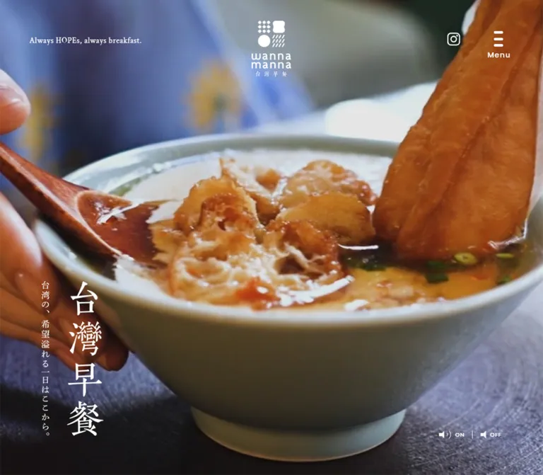
wanna manna presents Taiwanese breakfast through close photography, restrained typography, and generous space. Its opening fills the desktop viewport with a scene from daily preparation. A small white brand mark sits at the top center, while a large vertical Japanese title occupies the lower left. Once the page reaches its content sections, the palette becomes warm off-white, deep green, and muted brown.
This is a restaurant brand homepage with news, a brand story, a menu introduction, and store discovery. Its structure supports browsing several destinations. The visual hierarchy comes from photography, vertical lettering, asymmetric section layouts, and changes in scale rather than a repeated sequence of promotional cards.
The most transferable relationships are the green-on-paper palette, the contrast between Japanese display lettering and tracked English labels, the thin outlined action links, and the shift from broad desktop compositions to a deliberate mobile sequence.
Deep green lettering, warm paper, and everyday breakfast scenes arranged with the calm of a neighborhood café.
Website: wanna-manna.com Original URL: https://wanna-manna.com/ Final URL: https://wanna-manna.com/ Theme: a light, warm canvas with green typography; white interface elements over the photographic opening. Inspected: September 23, 2026, Japan Standard Time. The supplied retrieval timestamp is September 22, 2026, at 17:58:25.871 UTC. Viewports: 1440 × 1000 and 390 × 844 CSS pixels. Scope: the current homepage, including its opening visual, Topics, Concept, menu introduction, shop finder, and footer. Visual captures cover the desktop opening, Concept, and page bottom, plus the mobile opening and page bottom. Rendered DOM measurements additionally cover the intervening sections. Linked pages and expanded navigation were not inspected.
wanna manna presents Taiwanese breakfast through close photography, restrained typography, and generous space. Its opening fills the desktop viewport with a scene from daily preparation. A small white brand mark sits at the top center, while a large vertical Japanese title occupies the lower left. Once the page reaches its content sections, the palette becomes warm off-white, deep green, and muted brown.
This is a restaurant brand homepage with news, a brand story, a menu introduction, and store discovery. Its structure supports browsing several destinations. The visual hierarchy comes from photography, vertical lettering, asymmetric section layouts, and changes in scale rather than a repeated sequence of promotional cards.
The most transferable relationships are the green-on-paper palette, the contrast between Japanese display lettering and tracked English labels, the thin outlined action links, and the shift from broad desktop compositions to a deliberate mobile sequence.
| Name | Value | Suggested token | Evidence and role |
|---|---|---|---|
| Breakfast Green | #004b34 |
--color-ink |
Measured body foreground, paragraph text, Topics heading, navigation, and action-link text. The central identity color. |
| Warm Paper | #f9f6f4 |
--color-paper |
Measured body background. Broad open areas between sections use this warm, nearly white field. |
| Concept Brown | #a9876d |
--color-editorial-accent |
Measured foreground of the CONCEPT label. |
| Utility Ochre | #b6946d |
--color-utility-accent |
Measured Back to Top foreground. Similar tan appears visually in the menu control and brand artwork, but those exact fills were not sampled. |
| White | #ffffff |
--color-white |
Measured opening tagline and ON / OFF text. The Concept panel also appears white, without a supplied panel-background measurement. |
| Soft Panel | Approximately #f4efeb |
--color-panel |
Visual estimate for the slightly deeper warm tint in the shop information panel and footer. This is a proposed approximation, not a measured source value. |
Keep green as the primary text and outline color. Brown and ochre work as supporting labels and small graphic details. Photography supplies most of the saturation: foliage, green storefront tiles, blue clothing, warm wood, and food.
The dark opening frame does not establish a dark page theme. Its darkness belongs to the photograph; the surrounding interface changes to green and tan on light surfaces farther down the page.
No theme selector or alternate palette was evidenced. White opening controls and tan controls on light sections are contextual treatments within one visual system.
Measured source stack: "Noto Sans JP", 游ゴシック, "Yu Gothic", YuGothic, sans-serif.
The body uses regular-weight Japanese sans-serif with a notably generous line height. It supports readable descriptive passages without competing with the larger display lettering. At desktop size, the Concept paragraph occupies seven 33px lines. On mobile, its ten measured lines use approximately 29.07px line spacing.
The mobile body is smaller but remains airy. Tracking changes from 0.05em on desktop to 0.03em on mobile.
Measured source family: Poppins-Medium, sans-serif.
Measured weight: 500.
This family appears on TOPICS, CONCEPT, SHOP LIST, footer navigation, sound labels, and the Back to Top caption. Uppercase labels use generous tracking. This supplies a clean geometric counterpart to the Japanese display lettering.
Preserve the distinction between the large standalone TOPICS heading, smaller editorial labels such as CONCEPT, and the strongly tracked footer navigation.
Measured source family: CrimsonText-Regular, serif.
Measured size: 15px with a 21px line height and 0.75px tracking.
The line “Always HOPEs, always breakfast.” sits quietly near the upper-left corner of the desktop hero. Its small serif treatment adds warmth without functioning as the main headline. It is absent from the supplied mobile rendered text and opening capture.
The vertical 台灣早餐 lettering, the large Concept statement, and the shop heading have a serif or calligraphic appearance. Their exact font families are not established by the supplied computed-style samples.
Several heading elements have empty extracted text while still occupying visible graphic areas. Consequently, their inherited body font is not evidence that the visible lettering uses the body face. Preserve original heading artwork when authorized and available. A Japanese serif fallback in a new implementation is an approximation.
The brand mark is artwork: a four-part symbol paired with stacked lowercase lettering. It should not be recreated merely by typing the brand name in Poppins.
Values below are measured unless marked as visual estimates. Tracking is shown in CSS pixels at the inspected viewport.
| Role | Desktop size / line height | Mobile size / line height | Tracking: desktop / mobile |
|---|---|---|---|
| Japanese body | 15 / 33px | 13.52 / 29.068px | 0.75 / 0.4056px |
TOPICS heading |
40 / 40px | 24.96 / 24.96px | 2 / 1.248px |
CONCEPT label |
18 / 18px | 11.44 / 11.44px | 1.44 / 0.9152px |
SHOP LIST subtitle |
18 / 18px | 14.56 / 14.56px | 1.44 / 1.1648px |
| Footer primary navigation | 20 / 20px | 16.224 / 16.224px | 3 / 2.704px |
| Footer secondary navigation | 14 / 14px | 11.3568 / 11.3568px | 2.1 / 1.8928px |
Back to Top caption |
14 / 14px | 12.6187 / 12.6187px | 0.7 / 0.630933px |
| Opening tagline | 15 / 21px | Not visible | 0.75px / — |
| Sound labels | 11 / 12.1px | Not visible | 0.75px / — |
| Standard action-link anchor | 15 / 53px | 15 / 47px | 0.75 / 0.4056px |
| Concept display statement | Approximately 44–46px | Not visually established | Not measured |
The action-link row describes the sampled anchor. An inner label may have its own typography; the supplied evidence does not resolve its styling separately.
Overall density: sparse sections, comfortable paragraph leading, compact labels, and substantial pauses between destinations.
There is no evidence of a single source spacing scale. Use the measured relationships below rather than forcing every dimension onto an assumed 8px grid.
| Relationship | Desktop | Mobile | Status |
|---|---|---|---|
| Topics content side inset | 120px | 27.30px | Measured |
| Topics section start to heading | 150px | 52px | Calculated from measured positions |
| Topics heading bottom to card anchor top | 110px | 52px | Calculated; the small new-post marker can extend above the anchor |
| Topics column gap | Approximately 26.67px | Approximately 13.42px | Calculated |
| Topics cards to following action link | 85px | Approximately 41.59px | Calculated |
| Concept paragraph bottom to action link | 70px | Approximately 46.80px | Calculated |
| Shop panel bottom to footer start | 200px | Approximately 114.39px | Calculated |
| Footer navigation vertical link padding | Not supplied as block padding | 12px above and below | Measured |
| Element | Value | Evidence |
|---|---|---|
| Action-link capsule | 100px | Measured computed radius on both viewports |
| Desktop shop panel | Approximately 40px | Visual estimate |
| Mobile shop panel | Approximately 15–18px | Visual estimate |
| Concept image lower-right corner | Approximately 40px | Visual estimate |
| Concept white panel lower-left corner | Approximately 40px | Visual estimate |
| Mobile Topics image corners | Approximately 12–16px | Visual estimate from the visible upper corners |
| Action-link outline | Approximately 1px | Visual estimate; border width was not supplied |
Corner treatment is selective. Large photographic and editorial surfaces receive soft corners, while the full-bleed hero has none. Buttons are fully rounded. There is no visible general-purpose shadow system.
| Element | At 1440 × 1000 | At 390 × 844 |
|---|---|---|
| Document height | 5005.28px | 4169.81px |
| Opening visual height, inferred from Topics start | 1000px | 581.09px |
| Topics content width | 1200px | 335.39px |
| Visible/rendered Topics entries | Four | Two |
| Topics card anchor | 280 × 380.09px | 160.98 × 233.97px |
Standard read more link |
200 × 54px | 170 × 48px |
| Shop-finder link | 170 × 48px | 170 × 48px |
| Menu-control anchor box | 70 × 70px | 60 × 60px |
| Menu-control anchor position | x 1302.81, y 40px | x 314.41, y 20px |
| Header logo anchor width | 77px | 52px |
| Footer logo anchor width | 290px | 187.19px |
| Shop section height | 352px | 421.36px |
| Footer height | 395px | 525.83px |
At desktop size, the shop card visually spans approximately 870px, centered from x ≈ 285px. The photograph occupies approximately 535px and the information panel approximately 335px. These widths are screenshot estimates, unlike the section height supplied by the DOM.
Role: introduce the atmosphere of breakfast preparation before presenting the site's destinations.
The desktop opening covers the full 1440 × 1000 viewport. The current captured scene is a close view of a metal vessel containing pale liquid, with strong texture and dark surrounding forms. White interface elements sit directly over the image.
Its composition has five distinct anchors:
ON / OFF sound controls at the lower right.The mobile opening ends at y ≈ 581px in an 844px-tall viewport, allowing the Topics heading and the start of its cards to appear immediately below. Its current frame shows a person watering plants. The white brand artwork remains centered at the top, the menu remains at the upper right, and Instagram moves to the lower right.
Different scenes and the desktop sound controls suggest a media-led opening. They do not independently establish a video element, autoplay, looping, a shared desktop/mobile media file, or playback timing.
Role: carry identity without a large conventional navigation bar.
The symbol combines small diamond tiles, a softly pinched solid shape, a circle, and diagonal strokes. The hero uses a compact white arrangement with the symbol above the lettering. The footer uses a much wider green-and-tan arrangement with the symbol beside the stacked wordmark.
Approximate visible hero-artwork sizes are 77 × 108px on desktop and 52 × 73px on mobile. These heights are screenshot estimates. The source anchor rectangles are much shorter because they represent inline boxes.
Use the correct supplied logo variant for each placement. Do not derive the footer lockup by stretching the opening mark.
Role: provide navigation access while preserving the open composition.
Three short rounded horizontal strokes sit above the caption Menu. The visible strokes occupy a small area inside a much larger anchor box: 70px square on desktop and 60px square on mobile.
The control remains near the same upper-right position in the supplied scrolled captures, consistent with fixed positioning. Its visual color is white over the opening and tan over the light content. The exact positioning declaration and state-change trigger were not supplied.
The expanded menu was not captured. Its contents, overlay treatment, animation, close control, keyboard handling, and focus behavior remain unverified.
Role: establish the cultural and editorial character of the opening.
The large 台灣早餐 title runs vertically near the lower left. A much narrower companion line sits to its left. Their visible spans are approximately 70 × 300px and 40 × 166px for the large title on desktop and mobile respectively; these are artwork estimates, not measured font sizes.
In the desktop Concept capture, another tall Japanese title and smaller vertical supporting line occupy the far-right side. This creates a visual counterweight to the large image on the left.
Preserve the hierarchy between large vertical display lettering and delicate supporting copy. Ordinary horizontal headings cannot reproduce this composition on their own.
Role: expose timely store and product updates.
A centered TOPICS heading leads into a row of entries. Desktop has four 280px-wide linked entries in a 1200px content area. Mobile presents two entries side by side within an approximately 335px content area; the other two desktop entries are absent from the mobile rendered evidence.
Each visible mobile entry starts with a tiny NEW POST! marker, a prominent month/day, and a smaller AM/PM timestamp. A rounded image follows, then the Japanese article title. The supplied crop shows only the upper part of the images, so their complete aspect ratio is not established.
The entries are individual links, not heavily enclosed cards. Their visual separation comes from whitespace and image boundaries. A centered outlined read more link leads to /topics/.
The observed first two articles concern a store-hours change and a new mango dessert. Their dates are displayed without a year; the capture timestamp should not be treated as their publication year.
Role: explain the breakfast culture and the brand's point of view.
The desktop feature is asymmetric. A large photograph occupies approximately the left 42.5% of the viewport. A text column begins at x ≈ 691.20px, or 48% of the viewport, and measures approximately 425.25px wide. A broad white panel sits behind the copy and extends toward the right edge, with a rounded lower-left corner.
The photograph shows breakfast on a wooden tray: a bowl, a pale drink, a plate of food, utensils, and part of a person in blue clothing. Its lower-right corner is rounded. The image is not placed inside a small card; it is one of the section's dominant structural elements.
The copy stack contains:
CONCEPT label.台湾の、希望溢れる一日はここから。read more link leading to /concept/.The desktop paragraph uses a 425.25 × 231px box. On mobile, it becomes a 335.39 × 290.47px box at the shared 27.30px side inset, and the action link is centered. The mobile Concept section grows to approximately 1193.55px tall, compared with 940px on desktop. The mobile photograph and decorative-title arrangement are not directly shown in the supplied captures.
Role: introduce the food offering and provide access to the menu page.
The rendered text mentions traditional soy milk, savory soy-milk soup, and Taiwanese rice balls. A read more link leads to /menu/.
Desktop measurements place a text-empty heading box on the left, the descriptive paragraph at x ≈ 345.61px, and the action link near x ≈ 1127.50px at the same vertical level as the paragraph. The paragraph spans approximately 674.86px and two 33px lines.
On mobile, the heading box is narrow and centered, measuring approximately 62.39 × 185.50px. The paragraph sits farther down in the standard 335.39px content width and spans three lines. The action link follows underneath, centered.
The visual crops do not show this section's imagery. The heading artwork, product-image count, image layout, and any carousel behavior cannot be specified from this evidence.
Role: provide a quiet, consistent next step between editorial sections.
The component is a transparent capsule with a thin green outline, a centered label, and a small filled diamond toward the right. Desktop read more links measure 200 × 54px; mobile versions measure 170 × 48px. The shop finder uses the smaller size on both viewports.
The source radius is 100px, which makes these dimensions fully rounded. The visible diamond is a small directional accent rather than a conventional arrow. A rotated square is a reasonable implementation approximation.
These are real navigation anchors in the evidence. Their destinations are Topics, Concept, Menu, and Shop. A 300ms transition is declared, but its hover endpoint was not observed.
Role: make store discovery the closing content action.
Desktop presents a centered, approximately 870 × 352px split panel. A photograph of the green-tiled storefront occupies the left portion. A warm-tinted information panel occupies the right, with three centered elements:
店舗情報.SHOP LIST.お店を探す link to /shop/.The desktop heading box measures 198 × 41px. Its English subtitle begins 20px below that box, and the action begins 40px below the subtitle's bottom.
On mobile, the card is approximately 335px wide and stacks its image above its information panel. The visible bottom corners are more tightly rounded than on desktop. The heading box reduces to approximately 150.80 × 31.22px, while the action retains its 170 × 48px dimensions.
A broad empty area follows the shop panel before the footer: 200px on desktop and approximately 114px on mobile. This pause is part of the composition.
Role: provide the complete navigation set and a calm visual ending.
The desktop footer uses a warm tinted field. A large green-and-tan logo occupies the left. To the right, the primary destinations form a horizontal row: TOPICS, CONCEPT, MENU, and SHOP LIST. A lower row contains COMPANY, CONTACT, PRIVACY POLICY, and Instagram. Copyright sits at the lower left, while Back to Top sits near the lower right.
The back-to-top mark is made from two short tan diagonal strokes with a caption below. It echoes the rounded strokes and small geometric marks elsewhere in the identity.
Mobile reorganizes the footer into a centered logo, two navigation columns, a centered back-to-top control, and centered copyright. Primary links occupy the left column. Secondary links and Instagram occupy the right. Its measured height increases from 395px to approximately 525.83px.
The mobile primary navigation uses approximately 40.22px-high link boxes, including vertical padding. Secondary links use approximately 35.36px-high boxes. Enlarging those targets in a new implementation is an accessibility recommendation, not an observed original behavior.
| Element or behavior | Supplied evidence | What can be concluded |
|---|---|---|
| Topics entry links | 0.3s cubic-bezier(0.22, 1, 0.36, 1) transition |
A 300ms transition with this easing is declared. Changed properties and hover appearance are unverified. |
| Outlined action links | Same 300ms cubic-bezier transition | Reuse this timing for restrained feedback, without claiming a particular original fill or movement. |
| Footer navigation | Same 300ms cubic-bezier transition | Timing is established; interaction endpoints are not. |
| Header utility links and back-to-top link | 0.3s transition |
Duration is established. No animated result was tested. |
| Sampled node animations | animation: none |
No animation was reported on those sampled nodes. This does not rule out media, descendants, pseudo-elements, or script-driven motion. |
| Opening media | Different current desktop/mobile scenes; desktop sound labels | A media presentation is suggested. Playback, loop, mute state, and media source remain unverified. |
| Menu color | White in the opening; tan over light content | Two visual contexts are established. The mechanism and threshold are unknown. |
| Back to top | Anchor destination https://wanna-manna.com/# |
A top-of-page destination is present. Smooth scrolling was not verified. |
Do not invent parallax, scroll reveals, image zooms, menu choreography, or a slider from these still captures. The automated capture process waited for layout stability and handled animations during readiness checks; it is not a recording of normal playback or every interaction.
For a new implementation, use the measured 300ms easing sparingly on color and border feedback. Respect reduced motion. If video is used, provide a real pause mechanism in addition to any sound control; CSS alone cannot pause a video element.
| Layer | Appearance | Purpose |
|---|---|---|
| Opening | Full-bleed photography with white overlays | Establish atmosphere and identity |
| Main canvas | Measured warm paper #f9f6f4 |
Join the editorial sections with generous space |
| Concept panel | Visually white, large lower-left rounding | Separate the story text from the surrounding paper |
| Topic entries | Mostly unboxed content with rounded imagery | Keep dates and updates lightweight |
| Shop information panel | Slightly deeper warm tint | Pair practical store access with storefront photography |
| Footer | Broad warm tinted field | Group navigation and close the page |
| Actions | Transparent fill, fine green outline | Preserve a calm hierarchy |
Very faint oversized geometric motifs are visible behind parts of the light content, particularly around the mobile Topics section. They are low-contrast decoration, not a second foreground layer. Their asset source and repetition method are unknown.
The imagery emphasizes texture and routine: preparation equipment, a hand-held watering can, foliage, wooden trays, ceramic dishes, pale drinks, and a green-tiled storefront. The feeling is tactile and inhabited. People are shown through partial gestures and clothing rather than formal portraiture in the supplied captures.
Use large photographs with enough visual structure to support their crop. The Concept image needs a strong vertical composition that still keeps the bowl, drink, and plate legible. The shop image must retain the storefront identity and entrance context. The opening should leave readable regions for the white brand and vertical lettering across changing scenes.
Do not apply a universal dark filter to the entire site because the desktop opening happens to show a dark preparation frame. The Concept and shop photographs retain natural color and contrast.
No image, logo, font-file, or media asset URLs were supplied. The table identifies visible assets without inventing paths.
| Asset | Current evidence | Use and limitation |
|---|---|---|
| White vertical brand lockup | Desktop and mobile opening captures | Centered opening identity; preserve artwork proportions |
| Green-and-tan horizontal brand lockup | Desktop and mobile footer captures | Footer identity; a distinct arrangement from the opening |
| Preparation scene | Desktop opening capture | Full-bleed media frame; source format unknown |
| Plant-watering scene | Mobile opening capture | Portrait crop; relationship to the desktop media file unknown |
| Breakfast tray photograph | Desktop Concept capture | Large left-side editorial image with rounded lower-right corner |
| Green storefront photograph | Desktop shop panel capture | Store-discovery image; mobile panel shows only a cropped edge in the supplied bottom capture |
| Topics image previews | Mobile opening capture | Upper portions visible; complete image ratios unavailable |
| Japanese display titles | Opening, Concept, and shop captures | Exact font or graphic implementation unknown |
| Pale geometric background motifs | Light-section captures | Subtle brand texture; implementation unknown |
Use authorized artwork and photography. The CSS below supplies layout and tokens; it does not supply the visual assets that carry the identity.
| Section | Desktop top / height | Mobile top / height |
|---|---|---|
| Opening, inferred | 0 / 1000px | 0 / 581.09px |
| Topics | 1000 / 969.09px | 581.09 / 509.70px |
| Concept | 1969.09 / 940px | 1090.80 / 1193.55px |
| Menu introduction | 2967.09 / 1091.19px | 2284.34 / 823.89px |
| Shop finder | 4058.28 / 352px | 3108.23 / 421.36px |
| Footer | 4610.28 / 395px | 3643.98 / 525.83px |
These are measured section boxes, not a recipe to assign fixed heights. Desktop has approximately 58px between the Concept section box and the next section box. Decorative panels may also extend beyond their section's measured box.
The page alternates between centered and asymmetric structures. Topics uses a centered 1200px row; Concept uses a full-width photograph/text composition; the menu introduction spreads heading, text, and action across the page; the shop finder returns to a compact centered panel.
This variation matters. Applying the same maximum-width card grid to every section would lose the original rhythm.
At 390px wide, the shared content width is approximately 335.39px, equivalent to 86% of the viewport. The opening is approximately 68.85% of the captured viewport height, allowing the next section to appear above the fold.
Topics retains two columns but shows only two entries. The evidence does not establish whether this results from CSS visibility or a different rendered content set. Concept uses full-width copy within the shared inset, centered actions, and a longer vertical section. The shop panel stacks image and text. Footer navigation becomes two columns beneath a centered brand mark.
The opening tagline and sound labels are not visible in the mobile evidence. Instagram moves from the desktop top-right grouping to the mobile opening's lower-right corner.
Only two viewport widths were inspected. No exact breakpoint, fluid scaling formula, tablet layout, landscape behavior, or safe-area handling was supplied. The 48rem breakpoint in the Quick Start is a recommendation.
Some mobile footer utility-link rectangles extend slightly beyond the nominal viewport, although the visible text fits in the screenshot. This does not establish horizontal page scrolling. In a new implementation, constrain grid children with min-width: 0 and verify the actual scroll width.
#004b34 and warm paper #f9f6f4 as the foundation.These are recommendations for a new implementation, not verified features of the inspected homepage:
aria-expanded, and aria-controls. If it opens a modal navigation panel, implement focus management and Escape behavior.read more links destination-specific accessible names without changing their visible wording.#004b34.#f9f6f4.#a9876d.#b6946d.#ffffff.#f4efeb, explicitly unmeasured.“Create a restaurant brand homepage inspired by wanna manna's current visual system. Use deep green #004b34 on warm off-white #f9f6f4, with muted brown labels and natural breakfast photography. Begin with a full-width photographic media area, a small centered white logo, a compact upper-right menu control, and large vertical Japanese lettering near the lower left. Follow with dated news, an asymmetric photograph-and-story section, a menu introduction, a storefront finder, and a spacious footer. Pair regular Japanese sans-serif body copy with tracked medium-weight English labels and authorized Japanese display artwork. Use thin outlined pill links with tiny diamond accents, selective rounded corners, and no heavy shadows. On mobile, shorten the opening enough to reveal Topics, show two news entries, stack the shop panel, and arrange footer links in two columns. Treat media playback and expanded navigation as separately specified functionality.”
This is a recommended adaptation, not recovered source code. It uses the measured colors, declared font-family names, control dimensions, and endpoint typography. Estimated panel colors and corner radii are marked in comments. The mobile breakpoint and interpolation choices are implementation decisions.
The CSS expects semantic sections and appropriately named child elements. Supply authorized logo, heading, photograph, and media assets separately. No font files or asset URLs are included. The serif display fallback will not reproduce original heading artwork exactly.
:root {
  /* Measured colors */
  --color-ink: #004b34;
  --color-paper: #f9f6f4;
  --color-editorial-accent: #a9876d;
  --color-utility-accent: #b6946d;
  --color-white: #ffffff;

  /* Visual approximation; not a measured source color */
  --color-panel: #f4efeb;

  /* Declared source stacks; font files must be supplied separately */
  --font-body: 'Noto Sans JP', '游ゴシック', 'Yu Gothic', YuGothic, sans-serif;
  --font-label: 'Poppins-Medium', sans-serif;
  --font-tagline: 'CrimsonText-Regular', serif;
  --font-display-fallback: serif;

  --text-body: 15px;
  --leading-body: 2.2;
  --tracking-body: 0.05em;
  --text-topics: 40px;
  --text-eyebrow: 18px;
  --text-shop-label: 18px;

  --content-width: 1200px;
  --shop-width: 870px;
  --pill-width: 200px;
  --pill-height: 54px;
  --radius-pill: 100px;

  /* Estimated geometry */
  --radius-panel: 40px;
  --radius-image: 14px;
  --rule-width: 1px;

  /* Measured transition timing; endpoints below are recommendations */
  --motion-link: 300ms cubic-bezier(0.22, 1, 0.36, 1);
}

* { box-sizing: border-box; }

body {
  margin: 0;
  color: var(--color-ink);
  background: var(--color-paper);
  font: 400 var(--text-body) / var(--leading-body) var(--font-body);
  letter-spacing: var(--tracking-body);
}

img { display: block; max-inline-size: 100%; }
a { color: inherit; }
button { font: inherit; }

.container {
  inline-size: min(var(--content-width), 86%);
  margin-inline: auto;
}

.eyebrow {
  margin: 0;
  font: 500 var(--text-eyebrow) / 1 var(--font-label);
  letter-spacing: 0.08em;
}

.pill {
  display: inline-flex;
  align-items: center;
  justify-content: center;
  gap: 16px;
  inline-size: var(--pill-width);
  min-block-size: var(--pill-height);
  padding: 8px 20px;
  border: var(--rule-width) solid currentColor;
  border-radius: var(--radius-pill);
  color: var(--color-ink);
  background: transparent;
  font-size: 15px;
  line-height: 1.4;
  text-decoration: none;
  transition: color var(--motion-link), background-color var(--motion-link);
}

.pill::after {
  content: '';
  flex: 0 0 8px;
  inline-size: 8px;
  block-size: 8px;
  border-radius: 1px;
  background: currentColor;
  transform: rotate(45deg);
}

.pill--small {
  inline-size: 170px;
  min-block-size: 48px;
}

/* Recommended hover endpoint; the original endpoint was not captured. */
@media (hover: hover) {
  .pill:hover {
    color: var(--color-paper);
    background: var(--color-ink);
  }
}

.hero {
  position: relative;
  isolation: isolate;
  block-size: 100svh;
  overflow: hidden;
  color: var(--color-white);
  background: var(--color-ink);
}

.hero__media {
  position: absolute;
  inset: 0;
  z-index: -1;
  inline-size: 100%;
  block-size: 100%;
  object-fit: cover;
}

.hero__brand {
  position: absolute;
  inset-block-start: 40px;
  inset-inline-start: 50%;
  inline-size: 77px;
  transform: translateX(-50%);
}

.hero__tagline {
  position: absolute;
  inset-block-start: 68px;
  inset-inline-start: 5.333%;
  margin: 0;
  font: 400 15px / 21px var(--font-tagline);
  letter-spacing: 0.75px;
}

/* Text fallback only; use authorized display artwork for fidelity. */
.hero__title {
  position: absolute;
  inset-inline-start: 9%;
  inset-block-end: 70px;
  margin: 0;
  writing-mode: vertical-rl;
  font: 400 70px / 1.1 var(--font-display-fallback);
}

.hero__companion {
  position: absolute;
  inset-inline-start: 5.333%;
  inset-block-end: 70px;
  margin: 0;
  writing-mode: vertical-rl;
  font: 400 16px / 1.2 var(--font-display-fallback);
}

.hero__social {
  position: absolute;
  inset-block-start: 61px;
  inset-inline-end: 11.11%;
  inline-size: 25px;
}

.hero__sound {
  position: absolute;
  inset-inline-end: 80px;
  inset-block-end: 70px;
  font: 500 11px / 1.1 var(--font-label);
}

.site-menu {
  position: fixed;
  z-index: 20;
  inset-block-start: 40px;
  inset-inline-end: 4.667%;
  display: grid;
  place-content: center;
  gap: 8px;
  inline-size: 70px;
  block-size: 70px;
  padding: 0;
  border: 0;
  color: var(--color-utility-accent);
  background: transparent;
  cursor: pointer;
}

/* Application code must manage this context class. */
.site-menu.is-over-hero { color: var(--color-white); }
.site-menu__bars { display: grid; gap: 7px; justify-content: center; }
.site-menu__bars span {
  display: block;
  inline-size: 18px;
  block-size: 5px;
  border-radius: 3px;
  background: currentColor;
}
.site-menu__label {
  font: 500 14px / 1 var(--font-label);
  letter-spacing: 0.08em;
}

.topics { padding-block: 150px; }
.topics__heading {
  margin: 0 0 110px;
  text-align: center;
  font: 500 var(--text-topics) / 1 var(--font-label);
  letter-spacing: 0.05em;
}
.topics__grid {
  display: grid;
  grid-template-columns: repeat(4, minmax(0, 1fr));
  gap: 26.667px;
}
.topic-card { min-inline-size: 0; text-decoration: none; }
.topic-card__image {
  inline-size: 100%;
  block-size: auto;
  border-radius: var(--radius-image);
}
.topics__action { margin-block-start: 85px; text-align: center; }

/* Recommended structure based on the observed desktop proportions. */
.concept {
  position: relative;
  isolation: isolate;
  display: grid;
  grid-template-columns: 42.5% 29.53%;
  column-gap: 5.5%;
  padding-block-end: 80px;
}
.concept::before {
  content: '';
  position: absolute;
  z-index: -1;
  inset: 58px 0 -58px 24%;
  border-end-start-radius: var(--radius-panel);
  background: var(--color-white);
}
.concept__photo {
  inline-size: 100%;
  block-size: auto;
  border-end-end-radius: var(--radius-panel);
}
.concept__copy { min-inline-size: 0; padding-block-start: 172px; }
.concept .eyebrow { color: var(--color-editorial-accent); }
.concept__headline {
  margin: 50px 0;
  font: 400 44px / 1.7 var(--font-display-fallback);
}
.concept__body { margin: 0; }
.concept__action { margin-block-start: 70px; }

.shop-area { padding-block-end: 200px; }
.shop-panel {
  display: grid;
  grid-template-columns: 535fr 335fr;
  inline-size: min(var(--shop-width), 86%);
  min-block-size: 352px;
  margin-inline: auto;
  overflow: hidden;
  border-radius: var(--radius-panel);
  background: var(--color-panel);
}
.shop-panel__image {
  inline-size: 100%;
  block-size: 100%;
  object-fit: cover;
}
.shop-panel__info {
  display: flex;
  flex-direction: column;
  align-items: center;
  justify-content: center;
  padding: 40px 24px;
  text-align: center;
}
.shop-panel__title {
  margin: 0;
  font: 400 40px / 1 var(--font-display-fallback);
}
.shop-panel__label {
  margin: 20px 0 40px;
  font: 500 var(--text-shop-label) / 1 var(--font-label);
  letter-spacing: 0.08em;
}

.site-footer {
  position: relative;
  padding-block: 90px 70px;
  background: var(--color-panel);
}
.footer-inner {
  display: grid;
  grid-template-columns: 290px minmax(0, 570px);
  align-items: center;
  gap: 85px clamp(48px, 13.194vw, 190px);
  inline-size: min(1150px, 86%);
  margin-inline: auto;
}
.footer__brand { inline-size: 290px; }
.footer__primary, .footer__secondary {
  display: flex;
  flex-wrap: wrap;
  align-items: center;
  justify-content: space-between;
  gap: 20px;
  min-inline-size: 0;
  font-family: var(--font-label);
  font-weight: 500;
  line-height: 1;
}
.footer__primary { font-size: 20px; letter-spacing: 3px; }
.footer__secondary {
  grid-column: 2;
  grid-row: 2;
  font-size: 14px;
  letter-spacing: 2.1px;
}
.footer__primary a, .footer__secondary a { text-decoration: none; }
.footer__copyright {
  grid-column: 1;
  grid-row: 2;
  margin: 0;
  font: 400 13px / 1.5 serif;
  letter-spacing: normal;
}
.footer__back-top {
  position: absolute;
  inset-inline-end: 5.2%;
  inset-block-end: 65px;
  color: var(--color-utility-accent);
  font: 500 14px / 1 var(--font-label);
  text-align: center;
  text-decoration: none;
}

/* Recommended accessibility treatment. */
:where(a, button):focus-visible {
  outline: 2px solid currentColor;
  outline-offset: 5px;
}
.tap-target { min-inline-size: 44px; min-block-size: 44px; }

/* Proposed breakpoint; only the 390px and 1440px endpoints were inspected. */
@media (max-width: 48rem) {
  :root {
    --text-body: 13.52px;
    --leading-body: 2.15;
    --tracking-body: 0.03em;
    --text-topics: 24.96px;
    --text-eyebrow: 11.44px;
    --text-shop-label: 14.56px;
    --pill-width: 170px;
    --pill-height: 48px;
    --radius-panel: 16px;
  }

  /* Reproduces the observed opening ratio, not a verified source formula. */
  .hero { block-size: auto; aspect-ratio: 390 / 581.09375; }
  .hero__brand { inset-block-start: 26px; inline-size: 52px; }
  .hero__tagline, .hero__sound { display: none; }
  .hero__title {
    inset-inline-start: 13.5%;
    inset-block-end: 32px;
    font-size: 40px;
  }
  .hero__companion {
    inset-inline-start: 6.5%;
    inset-block-end: 32px;
    font-size: 9px;
  }
  .hero__social {
    inset-block-start: auto;
    inset-block-end: 31px;
    inset-inline-end: 7.5%;
  }
  .site-menu {
    inset-block-start: 20px;
    inset-inline-end: 4%;
    inline-size: 60px;
    block-size: 60px;
  }
  .site-menu__label { font-size: 11px; }

  .topics { padding-block: 52px 57px; }
  .topics__heading { margin-block-end: 52px; }
  .topics__grid { grid-template-columns: repeat(2, minmax(0, 1fr)); gap: 4%; }
  /* Optional selection behavior matching the observed visible entry count. */
  .topics__grid > :nth-child(n + 3) { display: none; }
  .topics__action { margin-block-start: 42px; }

  /* Mobile image placement is a recommendation; its capture was unavailable. */
  .concept { display: block; padding-block-end: 52px; }
  .concept::before { inset: 120px 0 0 7%; }
  .concept__photo { inline-size: 93%; }
  .concept__copy { padding: 48px 7% 0; }
  .concept__headline { margin-block: 32px; font-size: 30px; line-height: 1.65; }
  .concept__action { margin-block-start: 47px; text-align: center; }

  .shop-area { padding-block-end: 114px; }
  .shop-panel { grid-template-columns: minmax(0, 1fr); min-block-size: 0; }
  .shop-panel__image { block-size: auto; aspect-ratio: 535 / 352; object-fit: cover; }
  .shop-panel__info { min-block-size: 201px; padding: 30px 20px 36px; }
  .shop-panel__title { font-size: 32px; }
  .shop-panel__label { margin-block: 16px 25px; }

  .site-footer { padding-block: 56px 38px; }
  .footer-inner { grid-template-columns: repeat(2, minmax(0, 1fr)); gap: 0; }
  .footer__brand { grid-column: 1 / -1; inline-size: 187.19px; margin-inline: auto; }
  .footer__primary, .footer__secondary {
    display: flex;
    flex-direction: column;
    align-items: flex-start;
    justify-content: flex-start;
    gap: 0;
    grid-row: 2;
    margin-block-start: 44px;
    padding-inline-start: 30px;
  }
  .footer__primary { grid-column: 1; font-size: 16.224px; letter-spacing: 2.704px; }
  .footer__secondary { grid-column: 2; font-size: 11.3568px; letter-spacing: 1.8928px; }
  .footer__primary a, .footer__secondary a { padding-block: 12px; }
  .footer__back-top {
    position: static;
    grid-column: 1 / -1;
    grid-row: 3;
    min-block-size: 57px;
    margin-block-start: 40px;
    font-size: 12.6187px;
  }
  .footer__copyright {
    grid-column: 1 / -1;
    grid-row: 4;
    margin-block-start: 40px;
    text-align: center;
  }
}

@media (prefers-reduced-motion: reduce) {
  html { scroll-behavior: auto; }
  .pill { transition: none; }
  /* Pause or replace moving media in application code. */
}
Place the footer brand, primary navigation, copyright, secondary navigation, and back-to-top link inside .footer-inner for the grid rules above. Menu opening, media playback, accessible state updates, and any back-to-top scrolling enhancement require separate behavior code.
The menu introduction intentionally has no image-layout recipe here: the supplied evidence establishes its text and action positions but not its complete visual composition. Reuse the body, label, and action tokens after obtaining that section's actual imagery.
Optional aliases for an implementation that already uses Tailwind v4. This is not evidence that the original website uses Tailwind. Define the properties above first.
@theme inline {
  --color-breakfast-green: var(--color-ink);
  --color-warm-paper: var(--color-paper);
  --color-soft-panel: var(--color-panel);
  --color-concept-brown: var(--color-editorial-accent);
  --color-utility-ochre: var(--color-utility-accent);

  --font-japanese: var(--font-body);
  --font-english-label: var(--font-label);
  --font-english-serif: var(--font-tagline);

  --text-copy: var(--text-body);
  --text-section: var(--text-topics);
  --text-section-label: var(--text-eyebrow);

  --radius-capsule: var(--radius-pill);
  --radius-editorial-panel: var(--radius-panel);
  --radius-news-image: var(--radius-image);
}
This reference describes the current homepage represented by the supplied original-page evidence. Measured values, screenshot estimates, calculated relationships, and recommended implementation choices are kept separate throughout.
# wanna manna / Taiwanese Breakfast — Style Reference

> Deep green lettering, warm paper, and everyday breakfast scenes arranged with the calm of a neighborhood café.

**Website:** [wanna-manna.com](https://wanna-manna.com/)
**Original URL:** https://wanna-manna.com/
**Final URL:** https://wanna-manna.com/
**Theme:** a light, warm canvas with green typography; white interface elements over the photographic opening.
**Inspected:** September 23, 2026, Japan Standard Time. The supplied retrieval timestamp is September 22, 2026, at 17:58:25.871 UTC.
**Viewports:** 1440 × 1000 and 390 × 844 CSS pixels.
**Scope:** the current homepage, including its opening visual, Topics, Concept, menu introduction, shop finder, and footer. Visual captures cover the desktop opening, Concept, and page bottom, plus the mobile opening and page bottom. Rendered DOM measurements additionally cover the intervening sections. Linked pages and expanded navigation were not inspected.

wanna manna presents Taiwanese breakfast through close photography, restrained typography, and generous space. Its opening fills the desktop viewport with a scene from daily preparation. A small white brand mark sits at the top center, while a large vertical Japanese title occupies the lower left. Once the page reaches its content sections, the palette becomes warm off-white, deep green, and muted brown.

This is a restaurant brand homepage with news, a brand story, a menu introduction, and store discovery. Its structure supports browsing several destinations. The visual hierarchy comes from photography, vertical lettering, asymmetric section layouts, and changes in scale rather than a repeated sequence of promotional cards.

The most transferable relationships are the green-on-paper palette, the contrast between Japanese display lettering and tracked English labels, the thin outlined action links, and the shift from broad desktop compositions to a deliberate mobile sequence.
# wanna manna / Taiwanese Breakfast — Style Reference

> Deep green lettering, warm paper, and everyday breakfast scenes arranged with the calm of a neighborhood café.

**Website:** [wanna-manna.com](https://wanna-manna.com/)
**Original URL:** https://wanna-manna.com/
**Final URL:** https://wanna-manna.com/
**Theme:** a light, warm canvas with green typography; white interface elements over the photographic opening.
**Inspected:** September 23, 2026, Japan Standard Time. The supplied retrieval timestamp is September 22, 2026, at 17:58:25.871 UTC.
**Viewports:** 1440 × 1000 and 390 × 844 CSS pixels.
**Scope:** the current homepage, including its opening visual, Topics, Concept, menu introduction, shop finder, and footer. Visual captures cover the desktop opening, Concept, and page bottom, plus the mobile opening and page bottom. Rendered DOM measurements additionally cover the intervening sections. Linked pages and expanded navigation were not inspected.

wanna manna presents Taiwanese breakfast through close photography, restrained typography, and generous space. Its opening fills the desktop viewport with a scene from daily preparation. A small white brand mark sits at the top center, while a large vertical Japanese title occupies the lower left. Once the page reaches its content sections, the palette becomes warm off-white, deep green, and muted brown.

This is a restaurant brand homepage with news, a brand story, a menu introduction, and store discovery. Its structure supports browsing several destinations. The visual hierarchy comes from photography, vertical lettering, asymmetric section layouts, and changes in scale rather than a repeated sequence of promotional cards.

The most transferable relationships are the green-on-paper palette, the contrast between Japanese display lettering and tracked English labels, the thin outlined action links, and the shift from broad desktop compositions to a deliberate mobile sequence.

## How to Read This Reference

- **Measured** values come from the supplied rendered DOM and computed styles. Decimal measurements describe the inspected viewport, not necessarily the original CSS declaration.
- **Visual estimates** come from the supplied current-page screenshots. They are identified explicitly; no pixel-sampling tool was used.
- **Calculated** values are simple differences or ratios derived from supplied measurements.
- **Recommendations** describe a reusable implementation. They do not establish behavior in the original site.
- Named CSS tokens below are implementation aliases. The supplied custom-property extraction is empty; original variable names were not established.
- Computed font-family strings identify declared stacks. They do not independently confirm which font file rendered every glyph.
- Inline anchor rectangles can describe a text line rather than the full dimensions of an image inside it. Logo widths are useful evidence; their short anchor heights should not be copied as logo heights.
- No additional browsing, file inspection, or interaction testing was performed for this reference.

## Tokens — Colors

### Default Palette

| Name | Value | Suggested token | Evidence and role |
| --- | --- | --- | --- |
| Breakfast Green | `#004b34` | `--color-ink` | Measured body foreground, paragraph text, Topics heading, navigation, and action-link text. The central identity color. |
| Warm Paper | `#f9f6f4` | `--color-paper` | Measured body background. Broad open areas between sections use this warm, nearly white field. |
| Concept Brown | `#a9876d` | `--color-editorial-accent` | Measured foreground of the `CONCEPT` label. |
| Utility Ochre | `#b6946d` | `--color-utility-accent` | Measured `Back to Top` foreground. Similar tan appears visually in the menu control and brand artwork, but those exact fills were not sampled. |
| White | `#ffffff` | `--color-white` | Measured opening tagline and `ON` / `OFF` text. The Concept panel also appears white, without a supplied panel-background measurement. |
| Soft Panel | Approximately `#f4efeb` | `--color-panel` | Visual estimate for the slightly deeper warm tint in the shop information panel and footer. This is a proposed approximation, not a measured source value. |

Keep green as the primary text and outline color. Brown and ochre work as supporting labels and small graphic details. Photography supplies most of the saturation: foliage, green storefront tiles, blue clothing, warm wood, and food.

The dark opening frame does not establish a dark page theme. Its darkness belongs to the photograph; the surrounding interface changes to green and tan on light surfaces farther down the page.

### Theme Presets

No theme selector or alternate palette was evidenced. White opening controls and tan controls on light sections are contextual treatments within one visual system.

## Tokens — Typography

### Japanese Body Copy

**Measured source stack:** `"Noto Sans JP", 游ゴシック, "Yu Gothic", YuGothic, sans-serif`.

The body uses regular-weight Japanese sans-serif with a notably generous line height. It supports readable descriptive passages without competing with the larger display lettering. At desktop size, the Concept paragraph occupies seven 33px lines. On mobile, its ten measured lines use approximately 29.07px line spacing.

The mobile body is smaller but remains airy. Tracking changes from 0.05em on desktop to 0.03em on mobile.

### English Section Labels and Navigation

**Measured source family:** `Poppins-Medium, sans-serif`.
**Measured weight:** `500`.

This family appears on `TOPICS`, `CONCEPT`, `SHOP LIST`, footer navigation, sound labels, and the `Back to Top` caption. Uppercase labels use generous tracking. This supplies a clean geometric counterpart to the Japanese display lettering.

Preserve the distinction between the large standalone `TOPICS` heading, smaller editorial labels such as `CONCEPT`, and the strongly tracked footer navigation.

### Opening Tagline

**Measured source family:** `CrimsonText-Regular, serif`.
**Measured size:** 15px with a 21px line height and 0.75px tracking.

The line “Always HOPEs, always breakfast.” sits quietly near the upper-left corner of the desktop hero. Its small serif treatment adds warmth without functioning as the main headline. It is absent from the supplied mobile rendered text and opening capture.

### Japanese Display Lettering and Brand Artwork

The vertical `台灣早餐` lettering, the large Concept statement, and the shop heading have a serif or calligraphic appearance. Their exact font families are not established by the supplied computed-style samples.

Several heading elements have empty extracted text while still occupying visible graphic areas. Consequently, their inherited body font is not evidence that the visible lettering uses the body face. Preserve original heading artwork when authorized and available. A Japanese serif fallback in a new implementation is an approximation.

The brand mark is artwork: a four-part symbol paired with stacked lowercase lettering. It should not be recreated merely by typing the brand name in Poppins.

### Type Scale

Values below are measured unless marked as visual estimates. Tracking is shown in CSS pixels at the inspected viewport.

| Role | Desktop size / line height | Mobile size / line height | Tracking: desktop / mobile |
| --- | --- | --- | --- |
| Japanese body | 15 / 33px | 13.52 / 29.068px | 0.75 / 0.4056px |
| `TOPICS` heading | 40 / 40px | 24.96 / 24.96px | 2 / 1.248px |
| `CONCEPT` label | 18 / 18px | 11.44 / 11.44px | 1.44 / 0.9152px |
| `SHOP LIST` subtitle | 18 / 18px | 14.56 / 14.56px | 1.44 / 1.1648px |
| Footer primary navigation | 20 / 20px | 16.224 / 16.224px | 3 / 2.704px |
| Footer secondary navigation | 14 / 14px | 11.3568 / 11.3568px | 2.1 / 1.8928px |
| `Back to Top` caption | 14 / 14px | 12.6187 / 12.6187px | 0.7 / 0.630933px |
| Opening tagline | 15 / 21px | Not visible | 0.75px / — |
| Sound labels | 11 / 12.1px | Not visible | 0.75px / — |
| Standard action-link anchor | 15 / 53px | 15 / 47px | 0.75 / 0.4056px |
| Concept display statement | Approximately 44–46px | Not visually established | Not measured |

The action-link row describes the sampled anchor. An inner label may have its own typography; the supplied evidence does not resolve its styling separately.

## Tokens — Spacing & Shapes

**Overall density:** sparse sections, comfortable paragraph leading, compact labels, and substantial pauses between destinations.

There is no evidence of a single source spacing scale. Use the measured relationships below rather than forcing every dimension onto an assumed 8px grid.

### Spacing Scale

| Relationship | Desktop | Mobile | Status |
| --- | --- | --- | --- |
| Topics content side inset | 120px | 27.30px | Measured |
| Topics section start to heading | 150px | 52px | Calculated from measured positions |
| Topics heading bottom to card anchor top | 110px | 52px | Calculated; the small new-post marker can extend above the anchor |
| Topics column gap | Approximately 26.67px | Approximately 13.42px | Calculated |
| Topics cards to following action link | 85px | Approximately 41.59px | Calculated |
| Concept paragraph bottom to action link | 70px | Approximately 46.80px | Calculated |
| Shop panel bottom to footer start | 200px | Approximately 114.39px | Calculated |
| Footer navigation vertical link padding | Not supplied as block padding | 12px above and below | Measured |

### Border Radius

| Element | Value | Evidence |
| --- | --- | --- |
| Action-link capsule | 100px | Measured computed radius on both viewports |
| Desktop shop panel | Approximately 40px | Visual estimate |
| Mobile shop panel | Approximately 15–18px | Visual estimate |
| Concept image lower-right corner | Approximately 40px | Visual estimate |
| Concept white panel lower-left corner | Approximately 40px | Visual estimate |
| Mobile Topics image corners | Approximately 12–16px | Visual estimate from the visible upper corners |
| Action-link outline | Approximately 1px | Visual estimate; border width was not supplied |

Corner treatment is selective. Large photographic and editorial surfaces receive soft corners, while the full-bleed hero has none. Buttons are fully rounded. There is no visible general-purpose shadow system.

### Layout Measurements

| Element | At 1440 × 1000 | At 390 × 844 |
| --- | --- | --- |
| Document height | 5005.28px | 4169.81px |
| Opening visual height, inferred from Topics start | 1000px | 581.09px |
| Topics content width | 1200px | 335.39px |
| Visible/rendered Topics entries | Four | Two |
| Topics card anchor | 280 × 380.09px | 160.98 × 233.97px |
| Standard `read more` link | 200 × 54px | 170 × 48px |
| Shop-finder link | 170 × 48px | 170 × 48px |
| Menu-control anchor box | 70 × 70px | 60 × 60px |
| Menu-control anchor position | x 1302.81, y 40px | x 314.41, y 20px |
| Header logo anchor width | 77px | 52px |
| Footer logo anchor width | 290px | 187.19px |
| Shop section height | 352px | 421.36px |
| Footer height | 395px | 525.83px |

At desktop size, the shop card visually spans approximately 870px, centered from x ≈ 285px. The photograph occupies approximately 535px and the information panel approximately 335px. These widths are screenshot estimates, unlike the section height supplied by the DOM.

## Components

### Opening Visual

**Role:** introduce the atmosphere of breakfast preparation before presenting the site's destinations.

The desktop opening covers the full 1440 × 1000 viewport. The current captured scene is a close view of a metal vessel containing pale liquid, with strong texture and dark surrounding forms. White interface elements sit directly over the image.

Its composition has five distinct anchors:

1. Small centered brand artwork near the top.
2. The English tagline at the upper left.
3. Instagram and the compact menu control at the upper right.
4. Large vertical Japanese lettering with a smaller vertical companion line at the lower left.
5. `ON` / `OFF` sound controls at the lower right.

The mobile opening ends at y ≈ 581px in an 844px-tall viewport, allowing the Topics heading and the start of its cards to appear immediately below. Its current frame shows a person watering plants. The white brand artwork remains centered at the top, the menu remains at the upper right, and Instagram moves to the lower right.

Different scenes and the desktop sound controls suggest a media-led opening. They do not independently establish a video element, autoplay, looping, a shared desktop/mobile media file, or playback timing.

### Brand Mark

**Role:** carry identity without a large conventional navigation bar.

The symbol combines small diamond tiles, a softly pinched solid shape, a circle, and diagonal strokes. The hero uses a compact white arrangement with the symbol above the lettering. The footer uses a much wider green-and-tan arrangement with the symbol beside the stacked wordmark.

Approximate visible hero-artwork sizes are 77 × 108px on desktop and 52 × 73px on mobile. These heights are screenshot estimates. The source anchor rectangles are much shorter because they represent inline boxes.

Use the correct supplied logo variant for each placement. Do not derive the footer lockup by stretching the opening mark.

### Persistent Menu Control

**Role:** provide navigation access while preserving the open composition.

Three short rounded horizontal strokes sit above the caption `Menu`. The visible strokes occupy a small area inside a much larger anchor box: 70px square on desktop and 60px square on mobile.

The control remains near the same upper-right position in the supplied scrolled captures, consistent with fixed positioning. Its visual color is white over the opening and tan over the light content. The exact positioning declaration and state-change trigger were not supplied.

The expanded menu was not captured. Its contents, overlay treatment, animation, close control, keyboard handling, and focus behavior remain unverified.

### Vertical Title Pair

**Role:** establish the cultural and editorial character of the opening.

The large `台灣早餐` title runs vertically near the lower left. A much narrower companion line sits to its left. Their visible spans are approximately 70 × 300px and 40 × 166px for the large title on desktop and mobile respectively; these are artwork estimates, not measured font sizes.

In the desktop Concept capture, another tall Japanese title and smaller vertical supporting line occupy the far-right side. This creates a visual counterweight to the large image on the left.

Preserve the hierarchy between large vertical display lettering and delicate supporting copy. Ordinary horizontal headings cannot reproduce this composition on their own.

### Topics Section

**Role:** expose timely store and product updates.

A centered `TOPICS` heading leads into a row of entries. Desktop has four 280px-wide linked entries in a 1200px content area. Mobile presents two entries side by side within an approximately 335px content area; the other two desktop entries are absent from the mobile rendered evidence.

Each visible mobile entry starts with a tiny `NEW POST!` marker, a prominent month/day, and a smaller AM/PM timestamp. A rounded image follows, then the Japanese article title. The supplied crop shows only the upper part of the images, so their complete aspect ratio is not established.

The entries are individual links, not heavily enclosed cards. Their visual separation comes from whitespace and image boundaries. A centered outlined `read more` link leads to `/topics/`.

The observed first two articles concern a store-hours change and a new mango dessert. Their dates are displayed without a year; the capture timestamp should not be treated as their publication year.

### Concept Feature

**Role:** explain the breakfast culture and the brand's point of view.

The desktop feature is asymmetric. A large photograph occupies approximately the left 42.5% of the viewport. A text column begins at x ≈ 691.20px, or 48% of the viewport, and measures approximately 425.25px wide. A broad white panel sits behind the copy and extends toward the right edge, with a rounded lower-left corner.

The photograph shows breakfast on a wooden tray: a bowl, a pale drink, a plate of food, utensils, and part of a person in blue clothing. Its lower-right corner is rounded. The image is not placed inside a small card; it is one of the section's dominant structural elements.

The copy stack contains:

- A small brown `CONCEPT` label.
- A large three-line Japanese statement: `台湾の、希望溢れる一日はここから。`
- A green descriptive paragraph with generous line spacing.
- A left-aligned outlined `read more` link leading to `/concept/`.

The desktop paragraph uses a 425.25 × 231px box. On mobile, it becomes a 335.39 × 290.47px box at the shared 27.30px side inset, and the action link is centered. The mobile Concept section grows to approximately 1193.55px tall, compared with 940px on desktop. The mobile photograph and decorative-title arrangement are not directly shown in the supplied captures.

### Menu Introduction

**Role:** introduce the food offering and provide access to the menu page.

The rendered text mentions traditional soy milk, savory soy-milk soup, and Taiwanese rice balls. A `read more` link leads to `/menu/`.

Desktop measurements place a text-empty heading box on the left, the descriptive paragraph at x ≈ 345.61px, and the action link near x ≈ 1127.50px at the same vertical level as the paragraph. The paragraph spans approximately 674.86px and two 33px lines.

On mobile, the heading box is narrow and centered, measuring approximately 62.39 × 185.50px. The paragraph sits farther down in the standard 335.39px content width and spans three lines. The action link follows underneath, centered.

The visual crops do not show this section's imagery. The heading artwork, product-image count, image layout, and any carousel behavior cannot be specified from this evidence.

### Outlined Action Link

**Role:** provide a quiet, consistent next step between editorial sections.

The component is a transparent capsule with a thin green outline, a centered label, and a small filled diamond toward the right. Desktop `read more` links measure 200 × 54px; mobile versions measure 170 × 48px. The shop finder uses the smaller size on both viewports.

The source radius is 100px, which makes these dimensions fully rounded. The visible diamond is a small directional accent rather than a conventional arrow. A rotated square is a reasonable implementation approximation.

These are real navigation anchors in the evidence. Their destinations are Topics, Concept, Menu, and Shop. A 300ms transition is declared, but its hover endpoint was not observed.

### Shop Finder Panel

**Role:** make store discovery the closing content action.

Desktop presents a centered, approximately 870 × 352px split panel. A photograph of the green-tiled storefront occupies the left portion. A warm-tinted information panel occupies the right, with three centered elements:

- Japanese heading artwork reading `店舗情報`.
- The tracked English subtitle `SHOP LIST`.
- A 170 × 48px outlined `お店を探す` link to `/shop/`.

The desktop heading box measures 198 × 41px. Its English subtitle begins 20px below that box, and the action begins 40px below the subtitle's bottom.

On mobile, the card is approximately 335px wide and stacks its image above its information panel. The visible bottom corners are more tightly rounded than on desktop. The heading box reduces to approximately 150.80 × 31.22px, while the action retains its 170 × 48px dimensions.

A broad empty area follows the shop panel before the footer: 200px on desktop and approximately 114px on mobile. This pause is part of the composition.

### Footer

**Role:** provide the complete navigation set and a calm visual ending.

The desktop footer uses a warm tinted field. A large green-and-tan logo occupies the left. To the right, the primary destinations form a horizontal row: `TOPICS`, `CONCEPT`, `MENU`, and `SHOP LIST`. A lower row contains `COMPANY`, `CONTACT`, `PRIVACY POLICY`, and Instagram. Copyright sits at the lower left, while `Back to Top` sits near the lower right.

The back-to-top mark is made from two short tan diagonal strokes with a caption below. It echoes the rounded strokes and small geometric marks elsewhere in the identity.

Mobile reorganizes the footer into a centered logo, two navigation columns, a centered back-to-top control, and centered copyright. Primary links occupy the left column. Secondary links and Instagram occupy the right. Its measured height increases from 395px to approximately 525.83px.

The mobile primary navigation uses approximately 40.22px-high link boxes, including vertical padding. Secondary links use approximately 35.36px-high boxes. Enlarging those targets in a new implementation is an accessibility recommendation, not an observed original behavior.

## Tokens — Motion & Interaction

| Element or behavior | Supplied evidence | What can be concluded |
| --- | --- | --- |
| Topics entry links | `0.3s cubic-bezier(0.22, 1, 0.36, 1)` transition | A 300ms transition with this easing is declared. Changed properties and hover appearance are unverified. |
| Outlined action links | Same 300ms cubic-bezier transition | Reuse this timing for restrained feedback, without claiming a particular original fill or movement. |
| Footer navigation | Same 300ms cubic-bezier transition | Timing is established; interaction endpoints are not. |
| Header utility links and back-to-top link | `0.3s` transition | Duration is established. No animated result was tested. |
| Sampled node animations | `animation: none` | No animation was reported on those sampled nodes. This does not rule out media, descendants, pseudo-elements, or script-driven motion. |
| Opening media | Different current desktop/mobile scenes; desktop sound labels | A media presentation is suggested. Playback, loop, mute state, and media source remain unverified. |
| Menu color | White in the opening; tan over light content | Two visual contexts are established. The mechanism and threshold are unknown. |
| Back to top | Anchor destination `https://wanna-manna.com/#` | A top-of-page destination is present. Smooth scrolling was not verified. |

Do not invent parallax, scroll reveals, image zooms, menu choreography, or a slider from these still captures. The automated capture process waited for layout stability and handled animations during readiness checks; it is not a recording of normal playback or every interaction.

For a new implementation, use the measured 300ms easing sparingly on color and border feedback. Respect reduced motion. If video is used, provide a real pause mechanism in addition to any sound control; CSS alone cannot pause a video element.

## Surfaces

| Layer | Appearance | Purpose |
| --- | --- | --- |
| Opening | Full-bleed photography with white overlays | Establish atmosphere and identity |
| Main canvas | Measured warm paper `#f9f6f4` | Join the editorial sections with generous space |
| Concept panel | Visually white, large lower-left rounding | Separate the story text from the surrounding paper |
| Topic entries | Mostly unboxed content with rounded imagery | Keep dates and updates lightweight |
| Shop information panel | Slightly deeper warm tint | Pair practical store access with storefront photography |
| Footer | Broad warm tinted field | Group navigation and close the page |
| Actions | Transparent fill, fine green outline | Preserve a calm hierarchy |

Very faint oversized geometric motifs are visible behind parts of the light content, particularly around the mobile Topics section. They are low-contrast decoration, not a second foreground layer. Their asset source and repetition method are unknown.

## Imagery

The imagery emphasizes texture and routine: preparation equipment, a hand-held watering can, foliage, wooden trays, ceramic dishes, pale drinks, and a green-tiled storefront. The feeling is tactile and inhabited. People are shown through partial gestures and clothing rather than formal portraiture in the supplied captures.

Use large photographs with enough visual structure to support their crop. The Concept image needs a strong vertical composition that still keeps the bowl, drink, and plate legible. The shop image must retain the storefront identity and entrance context. The opening should leave readable regions for the white brand and vertical lettering across changing scenes.

Do not apply a universal dark filter to the entire site because the desktop opening happens to show a dark preparation frame. The Concept and shop photographs retain natural color and contrast.

### Observed Asset References

No image, logo, font-file, or media asset URLs were supplied. The table identifies visible assets without inventing paths.

| Asset | Current evidence | Use and limitation |
| --- | --- | --- |
| White vertical brand lockup | Desktop and mobile opening captures | Centered opening identity; preserve artwork proportions |
| Green-and-tan horizontal brand lockup | Desktop and mobile footer captures | Footer identity; a distinct arrangement from the opening |
| Preparation scene | Desktop opening capture | Full-bleed media frame; source format unknown |
| Plant-watering scene | Mobile opening capture | Portrait crop; relationship to the desktop media file unknown |
| Breakfast tray photograph | Desktop Concept capture | Large left-side editorial image with rounded lower-right corner |
| Green storefront photograph | Desktop shop panel capture | Store-discovery image; mobile panel shows only a cropped edge in the supplied bottom capture |
| Topics image previews | Mobile opening capture | Upper portions visible; complete image ratios unavailable |
| Japanese display titles | Opening, Concept, and shop captures | Exact font or graphic implementation unknown |
| Pale geometric background motifs | Light-section captures | Subtle brand texture; implementation unknown |

Use authorized artwork and photography. The CSS below supplies layout and tokens; it does not supply the visual assets that carry the identity.

## Layout & Responsive Behavior

### Page Sequence

| Section | Desktop top / height | Mobile top / height |
| --- | --- | --- |
| Opening, inferred | 0 / 1000px | 0 / 581.09px |
| Topics | 1000 / 969.09px | 581.09 / 509.70px |
| Concept | 1969.09 / 940px | 1090.80 / 1193.55px |
| Menu introduction | 2967.09 / 1091.19px | 2284.34 / 823.89px |
| Shop finder | 4058.28 / 352px | 3108.23 / 421.36px |
| Footer | 4610.28 / 395px | 3643.98 / 525.83px |

These are measured section boxes, not a recipe to assign fixed heights. Desktop has approximately 58px between the Concept section box and the next section box. Decorative panels may also extend beyond their section's measured box.

### Desktop Composition

The page alternates between centered and asymmetric structures. Topics uses a centered 1200px row; Concept uses a full-width photograph/text composition; the menu introduction spreads heading, text, and action across the page; the shop finder returns to a compact centered panel.

This variation matters. Applying the same maximum-width card grid to every section would lose the original rhythm.

### Mobile Composition

At 390px wide, the shared content width is approximately 335.39px, equivalent to 86% of the viewport. The opening is approximately 68.85% of the captured viewport height, allowing the next section to appear above the fold.

Topics retains two columns but shows only two entries. The evidence does not establish whether this results from CSS visibility or a different rendered content set. Concept uses full-width copy within the shared inset, centered actions, and a longer vertical section. The shop panel stacks image and text. Footer navigation becomes two columns beneath a centered brand mark.

The opening tagline and sound labels are not visible in the mobile evidence. Instagram moves from the desktop top-right grouping to the mobile opening's lower-right corner.

### Responsive Limits

Only two viewport widths were inspected. No exact breakpoint, fluid scaling formula, tablet layout, landscape behavior, or safe-area handling was supplied. The 48rem breakpoint in the Quick Start is a recommendation.

Some mobile footer utility-link rectangles extend slightly beyond the nominal viewport, although the visible text fits in the screenshot. This does not establish horizontal page scrolling. In a new implementation, constrain grid children with `min-width: 0` and verify the actual scroll width.

## Do’s and Don’ts

### Do

- Keep the measured deep green `#004b34` and warm paper `#f9f6f4` as the foundation.
- Let photography supply most of the color and visual density.
- Preserve the centered opening logo and the lower-left vertical title pair.
- Distinguish Japanese body copy, English utility labels, and display lettering.
- Retain the source's generous paragraph leading: 2.2 on desktop and approximately 2.15 on mobile.
- Use thin outlined capsules with small diamond accents for section links.
- Alternate centered modules with broad asymmetric editorial sections.
- Keep the shop photograph and practical store-finder action together.
- Preserve a substantial pause before the footer.
- Reorganize the mobile footer into a centered brand and two navigation columns.
- Treat the two logo arrangements as separate assets.

### Don't

- Don't convert every section into the same rounded card pattern.
- Don't make every heading a bold geometric sans-serif.
- Don't infer a Japanese display-font name from an inherited body style.
- Don't use the inline logo anchor's short height as the artwork height.
- Don't force the mobile opening to fill the entire viewport; the next section is visibly introduced in the capture.
- Don't assume all four desktop news entries appear on mobile.
- Don't introduce heavy shadows, glossy gradients, or bright conversion-button fills.
- Don't invent a menu overlay, product carousel, parallax effect, or hover animation.
- Don't infer media behavior from a single frame or the mere presence of sound labels.
- Don't assign hardcoded section heights from the measurement table when content length changes.

## Recommended Implementation Additions

These are recommendations for a new implementation, not verified features of the inspected homepage:

- Use a semantic button for the menu trigger with an accessible name, `aria-expanded`, and `aria-controls`. If it opens a modal navigation panel, implement focus management and Escape behavior.
- Give Instagram and sound controls explicit accessible names. Expose the actual sound state programmatically.
- Provide pause/play for moving imagery and a static poster for reduced-motion users. Require user action before audible playback.
- Keep text alternatives or accessible text equivalents for heading artwork and brand images. Mark duplicate decorative lettering as decorative.
- Give repeated `read more` links destination-specific accessible names without changing their visible wording.
- Aim for at least 44px touch targets on footer and social controls, while retaining their small visual marks.
- Verify white-overlay contrast across every media frame. If necessary, use a restrained local scrim rather than heavily darkening all imagery.
- Load opening media conservatively and defer offscreen images. Reserve image dimensions to avoid layout shifts.
- Keep body text comfortably readable if adapting the reference to longer content; increasing mobile copy to 14–16px is a reasonable accessibility adjustment.
- Test navigation wrapping, 200% zoom, narrow screens, reduced motion, and horizontal overflow. None of these tests are established by the supplied captures.

## Agent Prompt Guide

### Quick Color Reference

- Main foreground and outlines: `#004b34`.
- Page background: `#f9f6f4`.
- Concept label: `#a9876d`.
- Utility accent: `#b6946d`.
- Opening text and marks: `#ffffff`.
- Suggested shop/footer panel approximation: `#f4efeb`, explicitly unmeasured.
- Primary action style: transparent capsule, fine green border, label, small green diamond.

### Overall Prompt

“Create a restaurant brand homepage inspired by wanna manna's current visual system. Use deep green #004b34 on warm off-white #f9f6f4, with muted brown labels and natural breakfast photography. Begin with a full-width photographic media area, a small centered white logo, a compact upper-right menu control, and large vertical Japanese lettering near the lower left. Follow with dated news, an asymmetric photograph-and-story section, a menu introduction, a storefront finder, and a spacious footer. Pair regular Japanese sans-serif body copy with tracked medium-weight English labels and authorized Japanese display artwork. Use thin outlined pill links with tiny diamond accents, selective rounded corners, and no heavy shadows. On mobile, shorten the opening enough to reveal Topics, show two news entries, stack the shop panel, and arrange footer links in two columns. Treat media playback and expanded navigation as separately specified functionality.”

### Example Component Prompts

1. **Opening:** “A full-bleed preparation or everyday café scene with white overlay graphics. Center a compact brand mark near the top, place a three-stroke Menu control at the upper right, and pair large vertical Japanese title lettering with a delicate vertical companion line at the lower left. Keep important overlay regions readable across all frames.”
2. **Topics:** “A warm-paper news section with a centered green TOPICS heading. Place four unboxed dated entries across desktop and two across mobile. Each entry has a small new-post marker when applicable, a month/day, a tiny time label, rounded photography, and Japanese article text. Finish with a centered outlined capsule link.”
3. **Concept:** “A broad breakfast photograph on the left, with a rounded lower-right corner. Place a white editorial panel behind a narrow right-hand text column containing a brown CONCEPT label, a large three-line Japanese statement, airy green body copy, and an outlined read more link. Add vertical display lettering near the far-right edge where space permits.”
4. **Shop finder:** “A centered split panel with a green-tiled storefront photograph on the left and a warm neutral information panel on the right. Center Japanese heading artwork, a tracked SHOP LIST subtitle, and a small outlined store-finder capsule. Stack the photograph above the text on mobile.”
5. **Footer:** “A generous warm tinted footer with a green-and-tan horizontal logo, tracked green destination links, a smaller secondary navigation row, Instagram, and a tan two-stroke back-to-top mark. On mobile, center the logo and back-to-top control around two compact navigation columns.”

## Quick Start

### CSS Custom Properties

This is a recommended adaptation, not recovered source code. It uses the measured colors, declared font-family names, control dimensions, and endpoint typography. Estimated panel colors and corner radii are marked in comments. The mobile breakpoint and interpolation choices are implementation decisions.

The CSS expects semantic sections and appropriately named child elements. Supply authorized logo, heading, photograph, and media assets separately. No font files or asset URLs are included. The serif display fallback will not reproduce original heading artwork exactly.

```css
:root {
  /* Measured colors */
  --color-ink: #004b34;
  --color-paper: #f9f6f4;
  --color-editorial-accent: #a9876d;
  --color-utility-accent: #b6946d;
  --color-white: #ffffff;

  /* Visual approximation; not a measured source color */
  --color-panel: #f4efeb;

  /* Declared source stacks; font files must be supplied separately */
  --font-body: 'Noto Sans JP', '游ゴシック', 'Yu Gothic', YuGothic, sans-serif;
  --font-label: 'Poppins-Medium', sans-serif;
  --font-tagline: 'CrimsonText-Regular', serif;
  --font-display-fallback: serif;

  --text-body: 15px;
  --leading-body: 2.2;
  --tracking-body: 0.05em;
  --text-topics: 40px;
  --text-eyebrow: 18px;
  --text-shop-label: 18px;

  --content-width: 1200px;
  --shop-width: 870px;
  --pill-width: 200px;
  --pill-height: 54px;
  --radius-pill: 100px;

  /* Estimated geometry */
  --radius-panel: 40px;
  --radius-image: 14px;
  --rule-width: 1px;

  /* Measured transition timing; endpoints below are recommendations */
  --motion-link: 300ms cubic-bezier(0.22, 1, 0.36, 1);
}

* { box-sizing: border-box; }

body {
  margin: 0;
  color: var(--color-ink);
  background: var(--color-paper);
  font: 400 var(--text-body) / var(--leading-body) var(--font-body);
  letter-spacing: var(--tracking-body);
}

img { display: block; max-inline-size: 100%; }
a { color: inherit; }
button { font: inherit; }

.container {
  inline-size: min(var(--content-width), 86%);
  margin-inline: auto;
}

.eyebrow {
  margin: 0;
  font: 500 var(--text-eyebrow) / 1 var(--font-label);
  letter-spacing: 0.08em;
}

.pill {
  display: inline-flex;
  align-items: center;
  justify-content: center;
  gap: 16px;
  inline-size: var(--pill-width);
  min-block-size: var(--pill-height);
  padding: 8px 20px;
  border: var(--rule-width) solid currentColor;
  border-radius: var(--radius-pill);
  color: var(--color-ink);
  background: transparent;
  font-size: 15px;
  line-height: 1.4;
  text-decoration: none;
  transition: color var(--motion-link), background-color var(--motion-link);
}

.pill::after {
  content: '';
  flex: 0 0 8px;
  inline-size: 8px;
  block-size: 8px;
  border-radius: 1px;
  background: currentColor;
  transform: rotate(45deg);
}

.pill--small {
  inline-size: 170px;
  min-block-size: 48px;
}

/* Recommended hover endpoint; the original endpoint was not captured. */
@media (hover: hover) {
  .pill:hover {
    color: var(--color-paper);
    background: var(--color-ink);
  }
}

.hero {
  position: relative;
  isolation: isolate;
  block-size: 100svh;
  overflow: hidden;
  color: var(--color-white);
  background: var(--color-ink);
}

.hero__media {
  position: absolute;
  inset: 0;
  z-index: -1;
  inline-size: 100%;
  block-size: 100%;
  object-fit: cover;
}

.hero__brand {
  position: absolute;
  inset-block-start: 40px;
  inset-inline-start: 50%;
  inline-size: 77px;
  transform: translateX(-50%);
}

.hero__tagline {
  position: absolute;
  inset-block-start: 68px;
  inset-inline-start: 5.333%;
  margin: 0;
  font: 400 15px / 21px var(--font-tagline);
  letter-spacing: 0.75px;
}

/* Text fallback only; use authorized display artwork for fidelity. */
.hero__title {
  position: absolute;
  inset-inline-start: 9%;
  inset-block-end: 70px;
  margin: 0;
  writing-mode: vertical-rl;
  font: 400 70px / 1.1 var(--font-display-fallback);
}

.hero__companion {
  position: absolute;
  inset-inline-start: 5.333%;
  inset-block-end: 70px;
  margin: 0;
  writing-mode: vertical-rl;
  font: 400 16px / 1.2 var(--font-display-fallback);
}

.hero__social {
  position: absolute;
  inset-block-start: 61px;
  inset-inline-end: 11.11%;
  inline-size: 25px;
}

.hero__sound {
  position: absolute;
  inset-inline-end: 80px;
  inset-block-end: 70px;
  font: 500 11px / 1.1 var(--font-label);
}

.site-menu {
  position: fixed;
  z-index: 20;
  inset-block-start: 40px;
  inset-inline-end: 4.667%;
  display: grid;
  place-content: center;
  gap: 8px;
  inline-size: 70px;
  block-size: 70px;
  padding: 0;
  border: 0;
  color: var(--color-utility-accent);
  background: transparent;
  cursor: pointer;
}

/* Application code must manage this context class. */
.site-menu.is-over-hero { color: var(--color-white); }
.site-menu__bars { display: grid; gap: 7px; justify-content: center; }
.site-menu__bars span {
  display: block;
  inline-size: 18px;
  block-size: 5px;
  border-radius: 3px;
  background: currentColor;
}
.site-menu__label {
  font: 500 14px / 1 var(--font-label);
  letter-spacing: 0.08em;
}

.topics { padding-block: 150px; }
.topics__heading {
  margin: 0 0 110px;
  text-align: center;
  font: 500 var(--text-topics) / 1 var(--font-label);
  letter-spacing: 0.05em;
}
.topics__grid {
  display: grid;
  grid-template-columns: repeat(4, minmax(0, 1fr));
  gap: 26.667px;
}
.topic-card { min-inline-size: 0; text-decoration: none; }
.topic-card__image {
  inline-size: 100%;
  block-size: auto;
  border-radius: var(--radius-image);
}
.topics__action { margin-block-start: 85px; text-align: center; }

/* Recommended structure based on the observed desktop proportions. */
.concept {
  position: relative;
  isolation: isolate;
  display: grid;
  grid-template-columns: 42.5% 29.53%;
  column-gap: 5.5%;
  padding-block-end: 80px;
}
.concept::before {
  content: '';
  position: absolute;
  z-index: -1;
  inset: 58px 0 -58px 24%;
  border-end-start-radius: var(--radius-panel);
  background: var(--color-white);
}
.concept__photo {
  inline-size: 100%;
  block-size: auto;
  border-end-end-radius: var(--radius-panel);
}
.concept__copy { min-inline-size: 0; padding-block-start: 172px; }
.concept .eyebrow { color: var(--color-editorial-accent); }
.concept__headline {
  margin: 50px 0;
  font: 400 44px / 1.7 var(--font-display-fallback);
}
.concept__body { margin: 0; }
.concept__action { margin-block-start: 70px; }

.shop-area { padding-block-end: 200px; }
.shop-panel {
  display: grid;
  grid-template-columns: 535fr 335fr;
  inline-size: min(var(--shop-width), 86%);
  min-block-size: 352px;
  margin-inline: auto;
  overflow: hidden;
  border-radius: var(--radius-panel);
  background: var(--color-panel);
}
.shop-panel__image {
  inline-size: 100%;
  block-size: 100%;
  object-fit: cover;
}
.shop-panel__info {
  display: flex;
  flex-direction: column;
  align-items: center;
  justify-content: center;
  padding: 40px 24px;
  text-align: center;
}
.shop-panel__title {
  margin: 0;
  font: 400 40px / 1 var(--font-display-fallback);
}
.shop-panel__label {
  margin: 20px 0 40px;
  font: 500 var(--text-shop-label) / 1 var(--font-label);
  letter-spacing: 0.08em;
}

.site-footer {
  position: relative;
  padding-block: 90px 70px;
  background: var(--color-panel);
}
.footer-inner {
  display: grid;
  grid-template-columns: 290px minmax(0, 570px);
  align-items: center;
  gap: 85px clamp(48px, 13.194vw, 190px);
  inline-size: min(1150px, 86%);
  margin-inline: auto;
}
.footer__brand { inline-size: 290px; }
.footer__primary, .footer__secondary {
  display: flex;
  flex-wrap: wrap;
  align-items: center;
  justify-content: space-between;
  gap: 20px;
  min-inline-size: 0;
  font-family: var(--font-label);
  font-weight: 500;
  line-height: 1;
}
.footer__primary { font-size: 20px; letter-spacing: 3px; }
.footer__secondary {
  grid-column: 2;
  grid-row: 2;
  font-size: 14px;
  letter-spacing: 2.1px;
}
.footer__primary a, .footer__secondary a { text-decoration: none; }
.footer__copyright {
  grid-column: 1;
  grid-row: 2;
  margin: 0;
  font: 400 13px / 1.5 serif;
  letter-spacing: normal;
}
.footer__back-top {
  position: absolute;
  inset-inline-end: 5.2%;
  inset-block-end: 65px;
  color: var(--color-utility-accent);
  font: 500 14px / 1 var(--font-label);
  text-align: center;
  text-decoration: none;
}

/* Recommended accessibility treatment. */
:where(a, button):focus-visible {
  outline: 2px solid currentColor;
  outline-offset: 5px;
}
.tap-target { min-inline-size: 44px; min-block-size: 44px; }

/* Proposed breakpoint; only the 390px and 1440px endpoints were inspected. */
@media (max-width: 48rem) {
  :root {
    --text-body: 13.52px;
    --leading-body: 2.15;
    --tracking-body: 0.03em;
    --text-topics: 24.96px;
    --text-eyebrow: 11.44px;
    --text-shop-label: 14.56px;
    --pill-width: 170px;
    --pill-height: 48px;
    --radius-panel: 16px;
  }

  /* Reproduces the observed opening ratio, not a verified source formula. */
  .hero { block-size: auto; aspect-ratio: 390 / 581.09375; }
  .hero__brand { inset-block-start: 26px; inline-size: 52px; }
  .hero__tagline, .hero__sound { display: none; }
  .hero__title {
    inset-inline-start: 13.5%;
    inset-block-end: 32px;
    font-size: 40px;
  }
  .hero__companion {
    inset-inline-start: 6.5%;
    inset-block-end: 32px;
    font-size: 9px;
  }
  .hero__social {
    inset-block-start: auto;
    inset-block-end: 31px;
    inset-inline-end: 7.5%;
  }
  .site-menu {
    inset-block-start: 20px;
    inset-inline-end: 4%;
    inline-size: 60px;
    block-size: 60px;
  }
  .site-menu__label { font-size: 11px; }

  .topics { padding-block: 52px 57px; }
  .topics__heading { margin-block-end: 52px; }
  .topics__grid { grid-template-columns: repeat(2, minmax(0, 1fr)); gap: 4%; }
  /* Optional selection behavior matching the observed visible entry count. */
  .topics__grid > :nth-child(n + 3) { display: none; }
  .topics__action { margin-block-start: 42px; }

  /* Mobile image placement is a recommendation; its capture was unavailable. */
  .concept { display: block; padding-block-end: 52px; }
  .concept::before { inset: 120px 0 0 7%; }
  .concept__photo { inline-size: 93%; }
  .concept__copy { padding: 48px 7% 0; }
  .concept__headline { margin-block: 32px; font-size: 30px; line-height: 1.65; }
  .concept__action { margin-block-start: 47px; text-align: center; }

  .shop-area { padding-block-end: 114px; }
  .shop-panel { grid-template-columns: minmax(0, 1fr); min-block-size: 0; }
  .shop-panel__image { block-size: auto; aspect-ratio: 535 / 352; object-fit: cover; }
  .shop-panel__info { min-block-size: 201px; padding: 30px 20px 36px; }
  .shop-panel__title { font-size: 32px; }
  .shop-panel__label { margin-block: 16px 25px; }

  .site-footer { padding-block: 56px 38px; }
  .footer-inner { grid-template-columns: repeat(2, minmax(0, 1fr)); gap: 0; }
  .footer__brand { grid-column: 1 / -1; inline-size: 187.19px; margin-inline: auto; }
  .footer__primary, .footer__secondary {
    display: flex;
    flex-direction: column;
    align-items: flex-start;
    justify-content: flex-start;
    gap: 0;
    grid-row: 2;
    margin-block-start: 44px;
    padding-inline-start: 30px;
  }
  .footer__primary { grid-column: 1; font-size: 16.224px; letter-spacing: 2.704px; }
  .footer__secondary { grid-column: 2; font-size: 11.3568px; letter-spacing: 1.8928px; }
  .footer__primary a, .footer__secondary a { padding-block: 12px; }
  .footer__back-top {
    position: static;
    grid-column: 1 / -1;
    grid-row: 3;
    min-block-size: 57px;
    margin-block-start: 40px;
    font-size: 12.6187px;
  }
  .footer__copyright {
    grid-column: 1 / -1;
    grid-row: 4;
    margin-block-start: 40px;
    text-align: center;
  }
}

@media (prefers-reduced-motion: reduce) {
  html { scroll-behavior: auto; }
  .pill { transition: none; }
  /* Pause or replace moving media in application code. */
}
```

Place the footer brand, primary navigation, copyright, secondary navigation, and back-to-top link inside `.footer-inner` for the grid rules above. Menu opening, media playback, accessible state updates, and any back-to-top scrolling enhancement require separate behavior code.

The menu introduction intentionally has no image-layout recipe here: the supplied evidence establishes its text and action positions but not its complete visual composition. Reuse the body, label, and action tokens after obtaining that section's actual imagery.

### Tailwind v4 Token Mapping

Optional aliases for an implementation that already uses Tailwind v4. This is not evidence that the original website uses Tailwind. Define the properties above first.

```css
@theme inline {
  --color-breakfast-green: var(--color-ink);
  --color-warm-paper: var(--color-paper);
  --color-soft-panel: var(--color-panel);
  --color-concept-brown: var(--color-editorial-accent);
  --color-utility-ochre: var(--color-utility-accent);

  --font-japanese: var(--font-body);
  --font-english-label: var(--font-label);
  --font-english-serif: var(--font-tagline);

  --text-copy: var(--text-body);
  --text-section: var(--text-topics);
  --text-section-label: var(--text-eyebrow);

  --radius-capsule: var(--radius-pill);
  --radius-editorial-panel: var(--radius-panel);
  --radius-news-image: var(--radius-image);
}
```

## Sources & Evidence

- [Current wanna manna homepage](https://wanna-manna.com/): both the original and final inspected URL. Supplied response status: HTTP 200.
- **Capture time:** September 22, 2026, 17:58:25.871 UTC, equivalent to September 23, 2026, 02:58:25.871 JST.
- **Desktop evidence:** 1440 × 1000 CSS-pixel viewport; opening, Concept, and shop/footer screenshots; rendered text, links, element rectangles, and selected computed styles. Measured document height: 5005.28px.
- **Mobile evidence:** 390 × 844 CSS-pixel viewport; opening/Topics and shop/footer screenshots; rendered text, links, element rectangles, and selected computed styles. Measured document height: 4169.81px.
- **Observed destinations:** the homepage exposes Topics, Concept, Menu, Shop, Company, Contact, Privacy Policy, individual news articles, Instagram, and a top-of-page anchor. Destination content was not inspected.
- **Inspection limits:** no expanded navigation, hover endpoint, sound change, playback sequence, keyboard interaction, or linked-page state was supplied. No source media URLs, font-file URLs, original CSS variables, complete stylesheet, or exact responsive breakpoint was available.

This reference describes the current homepage represented by the supplied original-page evidence. Measured values, screenshot estimates, calculated relationships, and recommended implementation choices are kept separate throughout.スタイルやページの種類、ジャンルが近いデザインを集めました。