プレビュー準備中デザインリファレンスを見る
日本のWebデザインを、AIの制作リファレンスに。
DESIGN REFERENCE
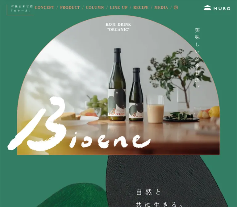
深いグリーンにコーラルを合わせ、アーチ形の写真、筆文字ロゴ、縦書きの見出し、ゆったりした明朝体で自然と発酵の世界観を伝えるブランドサイト。
オリジナルサイトを見るOrganic rice fermentation presented through green fields, arched photographs, and spacious Japanese typography.
Website: bioene.tokyo Original URL: https://bioene.tokyo/ Final URL: https://bioene.tokyo/ Response: HTTP 200; no redirect recorded. Theme: a continuous green canvas with white text and coral accents. No selectable theme was observed. Inspected: September 22, 2026, at 13:58:16.110 UTC / 22:58:16.110 JST, using the supplied browser inspection. Viewports: desktop 1440 × 1000 and mobile 390 × 844 CSS pixels. Scope: the current single-page product brand website, including its opening composition, concept, product information, rice education, three-product lineup, package and factory notes, recipe collection, media announcements, and MURO footer. Visual captures cover the desktop opening, column-to-lineup transition, desktop footer, mobile opening, and mobile footer. Rendered text and element measurements cover additional sections. Menu expansion, recipe activation, purchase destinations, and hover states were not exercised.
Bioene uses a saturated but restrained green background as the continuous setting for its organic brown-rice koji drink. White Mincho text, coral navigation, dark bottle photography, and textured abstract artwork connect the website to the product packaging. A large photograph with a semicircular crown establishes the opening silhouette. Vertical Japanese copy crosses its right edge, while a white brush-lettered wordmark overlaps the lower image area.
The page combines brand storytelling, ingredient education, a small product catalog, recipes, and external shopping links. Its character comes from unusually generous line spacing, tracked Japanese text, changing column arrangements, and photographic surfaces without conventional card containers. The mobile layout retains these details while stacking the larger editorial and product groups.
Organic rice fermentation presented through green fields, arched photographs, and spacious Japanese typography.
Website: bioene.tokyo Original URL: https://bioene.tokyo/ Final URL: https://bioene.tokyo/ Response: HTTP 200; no redirect recorded. Theme: a continuous green canvas with white text and coral accents. No selectable theme was observed. Inspected: September 22, 2026, at 13:58:16.110 UTC / 22:58:16.110 JST, using the supplied browser inspection. Viewports: desktop 1440 × 1000 and mobile 390 × 844 CSS pixels. Scope: the current single-page product brand website, including its opening composition, concept, product information, rice education, three-product lineup, package and factory notes, recipe collection, media announcements, and MURO footer. Visual captures cover the desktop opening, column-to-lineup transition, desktop footer, mobile opening, and mobile footer. Rendered text and element measurements cover additional sections. Menu expansion, recipe activation, purchase destinations, and hover states were not exercised.
Bioene uses a saturated but restrained green background as the continuous setting for its organic brown-rice koji drink. White Mincho text, coral navigation, dark bottle photography, and textured abstract artwork connect the website to the product packaging. A large photograph with a semicircular crown establishes the opening silhouette. Vertical Japanese copy crosses its right edge, while a white brush-lettered wordmark overlaps the lower image area.
The page combines brand storytelling, ingredient education, a small product catalog, recipes, and external shopping links. Its character comes from unusually generous line spacing, tracked Japanese text, changing column arrangements, and photographic surfaces without conventional card containers. The mobile layout retains these details while stacking the larger editorial and product groups.
| Name | Value | Suggested token | Evidence and role |
|---|---|---|---|
| Bioene Green | #327d64 |
--color-canvas |
Measured body background at both viewports; the main continuous page field |
| Coral | #eb8c6e |
--color-coral |
Measured navigation, concept note, media dates, and store/social links; visually associated with photograph outlines |
| White | #ffffff |
--color-text |
Measured body copy, section labels, purchase labels, and hero kicker; also visible in brand artwork |
| Fresh Green | #78c882 |
--color-secondary-heading |
Measured PACKAGE DESIGN and FACTORY headings |
| Pale Peach | #f8b694 |
--color-source-note |
Measured source caption below the rice comparison graphic |
| Deep Green | #004600 |
--color-deep |
Measured footer slash and copyright text; a minor supporting color |
| Terracotta | Approximately #b16042 |
--color-column |
Visual estimate of the large rice-education panel; its background declaration was not included |
| Charcoal | Approximately #252b28 |
--color-art-dark |
Visual estimate for textured abstract artwork and dark packaging; preserve texture rather than flattening it into a UI fill |
| Grain Yellow | Approximately #f3d06a |
--color-chart-highlight |
Visual estimate of infographic emphasis and diagram outlines |
Green, white, and coral form the reusable core. Fresh green and pale peach serve specific editorial roles. Yellow, cream, and pale blue belong mainly to the rice diagram rather than a general interface palette.
The sampled section and header wrappers are transparent. They inherit the visual field beneath them rather than introducing new panel backgrounds. Generic wrapper text colors such as #333333 do not describe the explicitly styled white text inside them.
The body has a declared background transition, but the supplied states show the same green background. There is no evidence of a user-controlled palette switch. The many transparent gradient custom properties in the DOM do not establish a visible gradient treatment.
Derived, rounded contrast ratios: white against the measured green is approximately 4.9:1; coral against green is approximately 2.0:1; deep green against green is approximately 2.3:1. The coral navigation and small dark copyright therefore need attention in an accessible adaptation. A recommended adjustment is white functional text with coral reserved for rules, dates accompanied by readable text, and decorative emphasis.
秀英初号明朝.--s-font-efa830f7.400.--font-display.This family provides the small editorial headings and English labels. The supplied desktop and mobile images do not render every Latin label identically, so do not infer a second named font from appearance alone.
秀英明朝 M JIS2004.--s-font-768a559f.400.--font-body.Wide tracking and long line boxes are central to the reading rhythm. Most editorial paragraphs use 0.2em tracking with line heights between 2.2 and 2.8.
The desktop explanation of the product name declares 秀英明朝 B JIS2004, supplied through --s-font-4f8ca927. Its computed weight is still 400; the letter B is part of the family name and should not be translated into an assumed CSS weight of 700.
On mobile, this note uses the M family, a smaller font, and much tighter tracking.
The visible brush-lettered Bioene mark and geometric MURO mark are artwork. A transparent DOM h1 reading Bioene measures 20px / 28px; that measurement is not the size of the large visible brush lettering.
The desktop Instagram link declares Font Awesome 6 Brands at 18px / 18px. The mobile menu appears as three thin white horizontal strokes. Its exact implementation beyond the recorded button geometry is not established.
Values below are font size / line height, followed by letter spacing. Unless noted, these are measured and use weight 400.
| Role | Desktop | Mobile | Family or interpretation |
|---|---|---|---|
| Visible desktop navigation | 16 / 22.4px, 0.8px |
Replaced visually by menu button | Display family; hidden/duplicate mobile entries compute to 14 / 19.6px |
| Hero kicker | 16 / 22.4px, 0.8px |
Same | Display family; two centered lines |
| Vertical section label | 20 / 28px, 1px |
14 / 19.6px, 0.7px |
Display family |
| Concept paragraph | 18 / 50.4px, 3.6px |
14 / 39.2px, 2.8px |
Reading family; line-height ratio 2.8 |
| Product and gift paragraphs | 16 / 35.2px, 3.2px |
14 / 30.8px, 2.8px |
Reading family; ratio 2.2 |
| Concept name note | 14 / 28px, 2.8px |
13 / 26px, 0.65px |
B family on desktop; M family on mobile |
| Main purchase label | 20 / 28px, 1px |
Same | Reading family |
| Product name and price | 16 / 35.2px, 3.2px |
14 / 30.8px, 2.8px |
Reading family |
| Tax qualifier | 11 / 24.2px, 2.2px |
Same | Smaller text beside price |
| Lineup purchase label | 16 / 22.4px, 0.8px |
Same | Reading family |
| Package/factory heading | 20 / 28px, 2px |
Same | Display family; fresh green |
| Package/factory paragraph | 13 / 28.6px, 2.6px |
11 / 24.2px, 2.2px |
Reading family |
| Package credit line | 13 / 28.6px, 0.65px |
10 / 22px, 0.5px |
Reading family |
| Recipe introduction | 14 / 30.8px, 2.8px |
Same | Reading family |
| Recipe title | 16 / 35.2px, 0.8px |
Same | Reading family |
| Media date | 16 / 22.4px, 0.8px |
14 / 19.6px, 0.7px |
Coral text |
| Media headline | 16 / 28.8px, 0.8px |
14 / 25.2px, 0.7px |
White text |
| Footer brand paragraph | 14 / 39.2px, 2.8px |
14 / 33.6px, 2.8px |
Ratio changes from 2.8 to 2.4 |
| Footer store/social links | 20 / 28px, 1px |
16 / 22.4px, 0.8px |
Display family; coral |
| Contact line | 14 / 19.6px, 0.7px |
Same | Reading family |
| Copyright | 10 / 14px, 0.5px |
Same | Deep green |
The vertical Japanese hero copy appears approximately 26–30px in the captures, and the mobile concept statement approximately 28px. These are visual estimates; their text styling was not separately measured.
Spacing character: small utility gaps around a large, slow editorial composition. A single universal spacing formula was not supplied.
| Value | Evidence | Use |
|---|---|---|
10px |
Measured | Horizontal padding on each side of navigation slashes; mobile header side inset |
15px |
Derived | Desktop package heading-to-paragraph gap |
20px |
Derived/measured | Price-to-purchase spacing; footer paragraph-to-links gap; desktop media row separation |
30px |
Measured/derived | Desktop header side inset; separation after short mobile media items |
40px |
Derived | Vertical gap between mobile recipe buttons; mobile space below copyright |
50px |
Measured | Mobile concept section gap; desktop footer section gap |
60px |
Measured | Mobile lineup gap and mobile footer section gap |
80px |
Measured | Product section gap at both viewports; desktop lineup gap |
100px |
Measured | Desktop concept section gap; desktop media content begins approximately this far below its section start |
Approximately 150px |
Visual estimate | Green breathing room between the terracotta panel and the next product photographs in the middle desktop capture |
These values have different responsibilities. Keep small gaps inside a product group and substantially larger gaps between editorial chapters.
| Element | Observed appearance | Implementation guidance |
|---|---|---|
| Opening photograph | Semicircular crown, vertical sides, flat bottom | Use a dedicated clipping wrapper; large equal top radii reproduce the silhouette |
| Product photographs | Broad rounded upper corners and thin coral edges | Upper radius is approximately 50–60px on desktop; lower corners are outside the supplied crop |
| Header identity frame | Fine left and bottom strokes | Keep the frame open at the top and right |
| Rice panel | Broad rectangular color field | No visible card shadow or soft elevation |
| Purchase anchor wrappers | Computed 0px radius |
Do not assume a pill button; descendant decorations were not fully recorded |
| Storefront photograph | Square corners | Preserve its tall rectangular format |
| Media list | Unboxed text rows | Separation comes from spacing and date alignment |
| Element | Desktop 1440 × 1000 | Mobile 390 × 844 | Status |
|---|---|---|---|
| Document height | 8738.36px |
11415.06px |
Measured snapshot height; not an implementation target |
| Header box | 1440 × 85.89px |
390 × 71.53px |
Measured |
| Header padding | 10px 30px 0 |
20px 10px 0 |
Measured |
| Left identity link | 165.59 × 75.89px |
129.5 × 51.53px |
Measured link box |
| Header MURO link | 120.81 × 34.52px |
97.22 × 18.13px |
Measured link box, not necessarily visible artwork bounds |
| Menu button | Not visible | 30 × 13px, at approximately 350, 27.56 |
Measured; no larger hit area established |
| Hero image window | Approximately 1166 × 806px, at 137, 86 |
Approximately 342 × 476px, at 23, 88 |
Visual estimates |
| Concept paragraph | 646.20px wide |
348px wide |
Measured |
| Concept note | 188.88px wide, separate right column |
348px wide, below paragraph |
Measured |
| Main purchase link | 150 × 52px |
150 × 52px |
Measured |
| Lineup purchase link | Approximately 118.8 × 37.2px |
Approximately 119.2 × 37.9px |
Measured |
| Mobile recipe button | Not separately recorded | 308 × 314.4px, approximately |
Measured |
| Media date column | 100px wide |
100px wide above headline |
Measured |
| Footer paragraph | 666.48px wide |
348px wide |
Measured |
| Footer brand lockup link | 140.77 × 311.81px |
99.83 × 221.56px |
Measured |
The opening image is roughly 81% of the desktop viewport width and 88% of the mobile viewport width. These are derived proportions from the captures, not recovered source width formulas.
Role: provide product identity, section navigation, and the MURO connection throughout the long page.
The desktop header has three visible groups: an open-frame Japanese product lockup on the left, a horizontal coral navigation line through the middle, and a white MURO mark at the right. The left lockup reads 有機玄米甘酒「ビオーネ」. It is compact, widely spaced, and framed only along the left and bottom.
The navigation sequence is CONCEPT / PRODUCT / COLUMN / LINE UP / RECIPE / MEDIA /, followed by an Instagram icon. Each slash has 10px horizontal padding. The navigation labels are 16px with 0.05em tracking.
The header remains at the top in captures from different scroll positions, supporting a persistent pinned treatment. Its exact position declaration was not supplied. The visible surface is transparent: the terracotta infographic and footer text pass behind it.
On mobile, the horizontal list is absent from the visible header. The product lockup stays left, MURO moves beside the right-hand menu button, and the three white menu strokes occupy a measured 30 × 13px button. The expanded menu was not captured.
Implementation recommendation: use a real navigation landmark, hide inactive duplicate navigation from keyboard and accessibility navigation, and give the menu a larger invisible hit area. Add a readable header surface when content passes underneath if preserving transparency would obscure text.
Role: establish the relationship between the drink, natural ingredients, and the packaging artwork.
The composition has five distinct layers:
KOJI DRINK / "ORGANIC" kicker near the crown.美味しい玄米甘酒。 along the right side.The desktop capture shows a close view of the bottle label, with another bottle out of focus behind it. The mobile capture shows a wooded river valley. Both are evidence of current displayed imagery, but their difference does not prove a carousel, video, timed sequence, or breakpoint-specific asset rule.
The image window changes proportion substantially: approximately 1166 × 806px on desktop and 342 × 476px on mobile. Its crown remains approximately semicircular, leaving longer straight sides on the phone.
Keep the clipping wrapper separate from the wordmark and vertical text. Clipping the entire hero would cut off the intentional lettering overlap. The mobile wordmark is visible across almost the full screen width. The desktop capture shows only part of its white brush form; the reason for that state is unverified.
Role: introduce the product in an editorial voice.
The mobile opening reveals the two-line statement 自然と 共に生きる。 below the hero. A large dark textured form descends behind it, with another green textured shape entering from below. The solid canvas remains visible around these forms.
The chapter pairs a vertical -CONCEPT label near the left edge with a white paragraph set at 18px / 50.4px on desktop. Its measured desktop text width is approximately 646px; a smaller coral explanation of the product name sits separately to the right.
On mobile, the paragraph becomes 14px / 39.2px in a 348px text box. The explanatory note follows below at 13px / 26px. This is a reorganization of the reading hierarchy, not a uniformly scaled desktop composition.
The vertical label has a narrow footprint: 28px on desktop and approximately 19.6px on mobile. It identifies the chapter without competing with the larger photographic and Japanese text elements.
Role: explain ingredients and use occasions before presenting individual products.
Measured desktop paragraph positions establish an alternating composition: an ingredient paragraph occupies a left-side column approximately 461px wide, while a later paragraph occupies a right-side column approximately 591px wide. Both use white 16px / 35.2px text with 3.2px tracking.
On mobile, both paragraphs occupy the same 348px column and use 14px / 30.8px text. The section retains an 80px gap in its sampled layout.
A centered 購入する link follows the narrative. Its measured box is 150 × 52px at both viewports, containing a 20px / 28px white label. The recorded destination is the external Bioene collection at https://koujiamasake.jp/collections/bioene_collection.
The purchase wrapper is transparent and square-cornered in the recorded styles. Border graphics, hover appearance, and destination behavior were not verified; a colored filled button should not be described as an observed component.
Role: give the ingredient story a distinct visual chapter.
The desktop middle capture shows a broad terracotta field inset slightly from the page edge. A large rice cross-section illustration occupies the left and middle areas; a compact nutritional comparison table occupies the right. Labels and connector lines explain the outer rice layers, embryo, and polished interior. Cream and white grain shapes, yellow emphasis, pale blue outlining, and dark fine rules sit against the warm background.
The table is dense and typographic. It uses narrow rows, visible separators, and highlighted comparison values rather than large chart bars. A pale-peach source caption appears below it at measured 12px / 16.8px with 0.6px tracking.
Mobile DOM evidence includes a 308px-wide explanatory paragraph at 14px / 29.4px. The mobile infographic itself is not visible in the supplied captures, so its exact reflow and legibility remain unverified.
Implementation recommendation: keep explanatory diagrams and nutritional data accessible as text, with semantic table headings. The design reference documents presentation; it does not independently validate the nutritional statements.
Role: show the three purchasable formats clearly while maintaining the photographic brand language.
The desktop capture shows two similarly sized bottle photographs followed by a wider gift-set photograph. Estimated visible frame widths are approximately 330px, 330px, and 445px, with approximately 60px gaps. Each frame has broad rounded top corners and a coral outline. The first two show a bottle with a glass of the drink; the third shows a presentation box and two bottles.
The catalog anatomy is photograph, centered product name, centered price with a smaller tax qualifier, then a compact 購入する link. There is no visible contrasting card background around the group.
| Captured product label | Captured tax-inclusive price | Recorded purchase destination |
|---|---|---|
Bioene 720ml |
2,484円 |
https://koujiamasake.jp/products/bng00102400100 |
Bioene 300ml |
1,490円 |
https://koujiamasake.jp/collections/bioene_collection/products/bng00102300100 |
ギフトセット(720ml×2本) |
5,634円 |
https://koujiamasake.jp/products/st-00248800100 |
These are captured content values, not a guarantee of current pricing at the external store.
Mobile measurements place all three product-name centers on approximately the same x-coordinate, at progressively later document positions. This confirms a single vertical product sequence. Names and prices reduce to 14px; purchase labels stay 16px and tax qualifiers stay 11px.
A centered gift explanation follows the catalog. Its text box changes from approximately 955px on desktop to 329px on mobile. Preserve the distinction between product metadata and this longer editorial paragraph.
Role: explain how the visual identity and production story support the product.
Two editorial blocks sit side by side on desktop: PACKAGE DESIGN begins near x 102px, and FACTORY near x 817px. On mobile, both begin near x 31.7px, with the factory block appearing after the package block.
The fresh-green headings remain 20px at both viewports. Supporting paragraphs become unusually small on mobile: 11px / 24.2px, compared with 13px / 28.6px on desktop.
The inspected page credits package artwork to ほりはた まお and package art direction to 関 翔吾. These appear under PACKAGE DESIGN and establish package-related roles, not website design or development roles.
Credit lines use tighter 0.05em tracking than the surrounding paragraphs. On mobile, they reduce to 10px, making a larger minimum size a useful adaptation improvement.
Role: extend the drink into practical serving ideas.
The rendered content introduces a recipe collaboration, followed by two contributor labels and five drink entries. The recipe titles are Bioene スパイスティー, 柚子茶 Bioene, Bioene アップルほうじ茶, Bioene ジンジャー, and Bioene 玉露.
Desktop title coordinates support three entries in the first row and two centered entries in the second row. The recipe imagery itself is outside the supplied current screenshots, so its photographic styling and exact crop should not be inferred.
Mobile evidence identifies each entry as a button approximately 308px wide and 314.4px high. The buttons form one column with a derived 40px gap. Each title is centered approximately 241px below its button's top, leaving a substantial upper region for media. The measured wrapper is transparent with 0px radius and 10px bottom padding.
Button semantics establish an interactive target, but the result of activation is unknown. Do not invent a recipe modal, accordion, flip effect, or download action. A new implementation should supply an explicit accessible detail experience appropriate to its content.
Role: provide a chronological record of coverage and product milestones.
This section uses coral dates and white headlines on the green page. Desktop rows align a 100px date column with a headline column separated by approximately 80px. Short rows repeat at a vertical interval of approximately 48.8px: a 28.8px headline line box plus 20px separation.
Seven entries are present in the rendered evidence. Several headlines link to external media pages; the product debut entry is plain text rather than an anchor. Keep this semantic distinction when reconstructing the list.
On mobile, the date moves above the headline. The derived date-to-headline gap is 10px; short entries have approximately 30px separation before the next date. Headlines wrap naturally in a text region up to 338px wide.
A longer announcement includes smaller supporting text. The section ends with a long dark horizontal divider before the MURO footer. Its visual role is a quiet chapter boundary, not a boxed news module.
Role: connect the product to the broader brand and provide shopping, social, and contact routes.
The desktop footer combines a long white brand paragraph at the left with a narrow storefront photograph and a tall white brand lockup at the right. The lockup includes KOJI SPECIALITY, a short Japanese statement, a fine horizontal rule, and the geometric MURO symbol and wordmark.
The paragraph is approximately 666px wide and uses 14px / 39.2px text. Coral ONLINE STORE / Instagram links sit below it, at 20px. A contact line and a small copyright line are centered beneath the whole composition.
On mobile, the paragraph becomes a 348px column at 14px / 33.6px. The store/social links are centered below it at 16px. The storefront photograph and white lockup remain side by side beneath the text, rather than stacking individually. Their visible sizes are approximately 153 × 223px and 100 × 222px respectively.
The ONLINE STORE link points to https://kojidrink.jp/, while the header MURO link points to https://koujiamasake.jp/. The supplied record establishes these destinations but does not establish their redirect behavior or current external designs.
The mobile footer capture visibly places paragraph text behind the persistent header. Preserve this as an inspection finding; for a new implementation, improve separation so navigation does not obscure reading content.
| Target | Measured declaration | What it establishes |
|---|---|---|
| Body background | background 0.5s cubic-bezier(0.4, 0.4, 0, 1) |
A background transition is configured; no actual palette change was demonstrated |
| Header, navigation, many text elements | 0.3s cubic-bezier(0.4, 0.4, 0, 1) plus generated custom-property transitions |
A shared transition duration and easing; no specific hover effect is established |
| Several desktop sections | 1s cubic-bezier(0.4, 0.4, 0, 1) |
Longer transitions are configured on product, column, lineup, recipe, and footer wrappers |
| Corresponding mobile section samples | 0.3s cubic-bezier(0.4, 0.4, 0, 1) |
The supplied mobile declarations differ from desktop |
| Mobile recipe buttons | 0.4s cubic-bezier(0.4, 0.4, 0, 1) |
A button transition is configured; activation and hover effects remain unknown |
| Sampled elements | animation: none |
No CSS keyframe animation was reported on those sampled nodes at inspection time |
The transition declarations do not prove that a reveal, color change, or movement occurred. Nor does animation: none rule out video, JavaScript animation, animated imagery, or unsampled descendants.
#consept.#wrapper.Use the measured cubic-bezier(0.4, 0.4, 0, 1) easing for any newly introduced transitions that need to fit the page. Keep control feedback around 300–400ms. Longer editorial transitions may use the recorded 1s duration, but content should remain visible without animation.
If implementing changing hero imagery, treat its timing, controls, and reduced-motion behavior as new design decisions. Do not attribute an automatic slideshow or brush-drawing animation to the original from still captures alone.
| Surface | Appearance | Function |
|---|---|---|
| Main canvas | Solid green | Connects all editorial chapters and the footer |
| Header | Transparent, white identity artwork, coral desktop links | Persistent navigation without a separate bar fill |
| Hero window | Full-color image, fine coral edge, arched crown | Dominant opening image |
| Concept artwork | Oversized charcoal and green textured forms | Carries packaging character into the page |
| Rice panel | Flat terracotta field with illustrated diagrams and fine table rules | Distinguishes ingredient education |
| Product media | Full-color photography, rounded upper corners, coral outlines | Separates catalog imagery from the green canvas |
| Media list | Unboxed dates and headlines | Creates a compact editorial index |
| Footer | Same green field, rectangular photograph, white brand artwork | Ends the page without changing visual language |
The inspected design has no general shadow-based elevation system. Hierarchy comes from image scale, curvature, whitespace, text orientation, and carefully limited color changes.
Photography is quiet and material. The desktop bottle close-up emphasizes the paper label, dark green glass, and shallow depth of field. The product lineup places bottles beside glasses on a pale surface in a softly focused interior. The mobile river photograph connects the product to trees, hills, and clear water. The storefront image adds a specific physical place to the otherwise atmospheric brand narrative.
The packaging artwork uses irregular organic forms with visible grain and directional texture. The webpage enlarges related shapes beyond their original label scale. Keep that rough material quality: a smooth geometric blob would reproduce the silhouette while losing the surface character.
The Bioene wordmark has broad, irregular white strokes. MURO uses precise geometric white shapes and widely spaced lettering. Their contrast is part of the identity; neither should be replaced with an arbitrary script font or a generic icon.
The supplied evidence does not include image src values, media URLs, native image sizes, or font files. The following references identify visible subjects without inventing asset paths.
| Asset or subject | Current evidence | Treatment |
|---|---|---|
| Bottle label close-up | Desktop opening capture | Cropped into the large arched window |
| River and wooded hills | Mobile opening capture | Tall crop inside the same arched motif |
| Bioene brush wordmark | Desktop and mobile opening captures | White artwork overlapping the image boundary |
| Textured abstract forms | Opening and mobile concept area | Enlarged behind editorial content |
| Large bottle and glass | Desktop lineup capture | Coral-edged photograph with rounded upper corners |
| Small bottle and glass | Desktop lineup capture | Matching photographic setting and frame treatment |
| Two-bottle gift set | Desktop lineup capture | Wider composition including the presentation box |
| Rice structure diagram and comparison table | Desktop middle capture | Warm panel with annotated illustration and compact data rows |
| MURO storefront | Desktop and mobile footer captures | Tall rectangular photograph without rounded corners |
| MURO brand lockup | Header and footer captures | White geometric identity artwork |
Use authorized original assets when available. The CSS shell can reproduce layout and framing, but the bottle label, brush lettering, and textured forms carry much of the site's identity.
The desktop page alternates broad images, asymmetrical editorial columns, a three-item product row, supporting two-column notes, a recipe arrangement, and a narrow chronological media list. It does not impose one repeated card grid on every section.
Section labels run vertically near the left edge. Main content commonly begins substantially farther inward, around 100–170px in several measured sections. The media list is narrower still: its date column begins near x 311px and headlines near x 491px.
The header spans the viewport independently of these content widths. The hero occupies approximately 81% of the viewport width. Its substantial height nearly fills the initial 1000px capture, leaving only the beginning of the textured concept artwork visible below.
At 390 × 844, the opening image is approximately 342px wide and 476px high. The vertical Japanese statement remains on its right side, the white wordmark remains prominent, and the concept statement begins below it within the first viewport.
The responsive changes supported by the evidence are:
| Area | Desktop | Mobile |
|---|---|---|
| Header navigation | Horizontal coral links | Visible menu button and compact identity groups |
| Concept | Main paragraph plus separate note column | Paragraph followed by note |
| Product story | Paragraphs placed on different sides | Shared narrow text column |
| Lineup | Three products across, wider gift image | One product after another |
| Package/factory | Side-by-side editorial blocks | Package block followed by factory block |
| Recipes | Caption coordinates indicate three plus two | Five stacked buttons, 308px wide, 40px gaps |
| Media | Date beside headline | Date above headline |
| Footer | Text beside storefront and lockup | Text first, then storefront and lockup still paired |
The body text scale does not shrink uniformly. Recipe titles stay 16px; package/factory headings stay 20px; the main purchase control stays 150 × 52px. Small editorial notes shrink more aggressively than primary actions.
An exposed stylesheet fragment contains a max-width: 1140px query for responsive line-break handling. It does not establish that navigation, grids, and every other component change at that same breakpoint. Only the two supplied viewport endpoints were inspected.
Use content-driven heights and independent responsive rules for the hero, editorial text, catalog, and footer. A single viewport scale factor cannot reproduce the observed behavior.
Retain the long reading rhythm while letting Japanese paragraphs rewrap. Desktop-only line breaks should not force short, awkward mobile lines. At intermediate widths, collapse columns before the wide tracking makes paragraphs or navigation collide.
#327d64 as the continuous page field.0.2em tracking and generous leading in the main Japanese editorial copy.h1 measurement as the brush logo's visible size.These are improvements for a new implementation, not verified features of the original:
44 × 44px while keeping its visible strokes compact.44px; the observed visual boxes are approximately 37–38px high.10–11px text is too small for the intended audience.#327d64.#ffffff.#eb8c6e.#78c882.#f8b694.#004600, with a readability review before reuse.#b16042; this is an estimated implementation color.“Create an editorial product brand website for an organic Japanese rice-koji drink, using the current Bioene composition as a visual reference. Use a continuous green canvas #327d64, white Japanese Mincho text, coral #eb8c6e navigation and image outlines, and spacious paragraphs with approximately 0.2em tracking. Open with a large photograph clipped to a semicircular crown with straight sides and a flat bottom. Place a small two-line English kicker near the crown, vertical Japanese copy along the right, and authorized white brush-lettered brand artwork overlapping the lower image edge. Continue through concept, ingredient education, a three-product lineup, package and factory notes, recipes, media dates, and a brand footer. Preserve textured organic artwork, varied editorial columns, restrained purchase links, and a transparent persistent header. On mobile, stack the product and recipe groups while keeping the footer storefront photo and brand lockup side by side. Treat menu, recipe-detail, and changing-media behavior as explicit implementation decisions.”
#327d64, about 81% of the desktop viewport width. Use a fine coral outline, a white two-line kicker, vertical Japanese copy 美味しい玄米甘酒。, and a separate white brush-wordmark asset that can extend outside the image crop. Adapt the window to approximately 342 × 476px at a 390px viewport.”-CONCEPT label near the left edge. Set the main white Mincho paragraph at 18px with 50.4px leading and 0.2em tracking on desktop. Add a narrow coral explanatory note at the right. On phones, use a 348px reading column with 14px text and 39.2px leading, followed by the note.”This is a reusable adaptation, not recovered source CSS. Exact colors and typography come from the supplied measurements. Hero proportions, photo radii, grid implementation, and the 1140px collapse point are reconstruction choices. The source only confirms a line-break query at that width.
Supply licensed fonts and authorized artwork separately. No asset URLs were available. The header expects .bioene-brand, .bioene-nav, .muro-brand, and .menu-button children. The hero expects a clipping .hero-window containing its photograph, with the kicker, vertical statement, and wordmark as separate siblings. Menu expansion and recipe details require additional behavior.
The CSS includes recommended focus styling, larger touch targets, and an optional purchase-link underline. Those additions are not claims about the original controls.
:root {
  /* Measured palette */
  --color-canvas: #327d64;
  --color-text: #ffffff;
  --color-coral: #eb8c6e;
  --color-secondary-heading: #78c882;
  --color-source-note: #f8b694;
  --color-deep: #004600;

  /* Estimated panel color */
  --color-column: #b16042;

  /* Declared source families; font files are not bundled */
  --font-display: '秀英初号明朝', serif;
  --font-body: '秀英明朝 M JIS2004', serif;
  --font-note: '秀英明朝 B JIS2004', serif;
  --text-body: 16px;
  --text-lead: 18px;
  --tracking-body: 0.2em;
  --tracking-ui: 0.05em;
  --leading-body: 2.2;
  --leading-lead: 2.8;

  /* Reconstruction geometry */
  --header-height: 86px;
  --content-width: 1224px;
  --page-gutter: clamp(32px, 7.5vw, 108px);
  --section-space: 80px;
  --photo-radius: 56px;

  /* Measured transition vocabulary */
  --ease-editorial: cubic-bezier(0.4, 0.4, 0, 1);
  --duration-ui: 300ms;
  --duration-recipe: 400ms;
  --duration-background: 500ms;
  --duration-section: 1000ms;
}

* { box-sizing: border-box; }

body {
  margin: 0;
  color: var(--color-text);
  background: var(--color-canvas);
  font-family: var(--font-body);
  font-weight: 400;
}

img { display: block; max-width: 100%; }
a { color: inherit; }
button { font: inherit; }

.bioene-page { padding-top: var(--header-height); }

.container {
  width: calc(100% - 2 * var(--page-gutter));
  max-width: var(--content-width);
  margin-inline: auto;
}

.bioene-header {
  position: fixed;
  inset: 0 0 auto;
  z-index: 50;
  display: grid;
  grid-template-columns: 166px minmax(0, 1fr) 121px;
  align-items: start;
  gap: 24px;
  min-height: var(--header-height);
  padding: 10px 30px 0;
  background: transparent;
}

.bioene-brand { display: block; width: 166px; }
.muro-brand { display: block; width: 121px; }
.bioene-brand img, .muro-brand img { width: 100%; height: auto; }

.bioene-nav {
  justify-self: center;
  padding-top: 12px;
  color: var(--color-coral);
  font-family: var(--font-display);
  font-size: 16px;
  line-height: 1.4;
  letter-spacing: var(--tracking-ui);
}

.bioene-nav ul {
  display: flex;
  align-items: center;
  margin: 0;
  padding: 0;
  list-style: none;
  white-space: nowrap;
}

.bioene-nav li { display: flex; align-items: center; }
.bioene-nav a { text-decoration: none; }
.bioene-nav li + li::before { content: '/'; padding-inline: 10px; }
.menu-button { display: none; }

.bioene-hero {
  position: relative;
  isolation: isolate;
  width: 81%;
  margin-inline: auto;
}

.hero-window {
  aspect-ratio: 1166 / 806;
  overflow: hidden;
  border: 1px solid var(--color-coral);
  border-radius: 9999px 9999px 0 0;
}

.hero-window img {
  width: 100%;
  height: 100%;
  object-fit: cover;
}

.hero-kicker {
  position: absolute;
  top: 30px;
  left: 50%;
  margin: 0;
  transform: translateX(-50%);
  color: var(--color-text);
  font: 400 16px/1.4 var(--font-display);
  letter-spacing: var(--tracking-ui);
  text-align: center;
}

/* Vertical statement size and placement are visual approximations. */
.hero-statement {
  position: absolute;
  top: 68px;
  right: 10%;
  margin: 0;
  writing-mode: vertical-rl;
  text-orientation: upright;
  font-size: 28px;
  line-height: 1.4;
  letter-spacing: 0.4em;
}

/* Use complete authorized wordmark artwork as the stable state. */
.hero-wordmark {
  position: absolute;
  left: -5%;
  bottom: 24px;
  width: 65%;
  height: auto;
  max-width: none;
  pointer-events: none;
}

.bioene-section {
  position: relative;
  padding-block: var(--section-space);
  scroll-margin-top: calc(var(--header-height) + 24px);
}

.section-rail {
  position: absolute;
  top: 0;
  left: 20px;
  margin: 0;
  writing-mode: vertical-rl;
  text-orientation: sideways;
  font: 400 20px/1.4 var(--font-display);
  letter-spacing: var(--tracking-ui);
}

.editorial-copy {
  margin: 0;
  font-size: var(--text-body);
  line-height: var(--leading-body);
  letter-spacing: var(--tracking-body);
}

.concept-grid {
  display: grid;
  grid-template-columns: minmax(0, 650px) 190px;
  align-items: center;
  justify-content: space-between;
  gap: 80px;
  max-width: 1100px;
  margin-inline: auto;
}

.concept-copy {
  font-size: var(--text-lead);
  line-height: var(--leading-lead);
}

.concept-note {
  margin: 0;
  color: var(--color-coral);
  font: 400 14px/2 var(--font-note);
  letter-spacing: 0.2em;
}

.column-panel {
  padding: 80px clamp(24px, 6vw, 90px);
  background: var(--color-column);
}

.source-note {
  color: var(--color-source-note);
  font-size: 12px;
  line-height: 1.4;
  letter-spacing: var(--tracking-ui);
}

.product-grid {
  display: grid;
  grid-template-columns: 1fr 1fr 1.35fr;
  align-items: start;
  gap: 60px;
}

.product-card { min-width: 0; text-align: center; }

/* Aspect ratios and lower corners are adaptation choices. */
.product-photo {
  width: 100%;
  aspect-ratio: 1;
  object-fit: cover;
  border: 2px solid var(--color-coral);
  border-radius: var(--photo-radius) var(--photo-radius) 0 0;
}

.product-card--gift .product-photo { aspect-ratio: 4 / 3; }

.product-name, .product-price {
  margin: 0;
  font-size: var(--text-body);
  line-height: 2.2;
  letter-spacing: var(--tracking-body);
}

.product-name { margin-top: 20px; font-weight: 400; }
.product-price small { font-size: 11px; letter-spacing: 0.2em; }

.buy-link {
  display: inline-flex;
  align-items: center;
  justify-content: center;
  min-width: 119px;
  min-height: 44px;
  margin-top: 20px;
  padding-inline: 20px;
  border-bottom: 1px solid var(--color-coral);
  color: var(--color-text);
  font-size: 16px;
  line-height: 1.4;
  letter-spacing: var(--tracking-ui);
  text-decoration: none;
}

.buy-link--main { min-width: 150px; min-height: 52px; font-size: 20px; }

.supporting-grid {
  display: grid;
  grid-template-columns: 1fr 1fr;
  gap: 100px;
  margin-top: 100px;
}

.supporting-heading {
  margin: 0 0 15px;
  color: var(--color-secondary-heading);
  font: 400 20px/1.4 var(--font-display);
  letter-spacing: 0.1em;
}

.supporting-copy { font-size: 13px; line-height: 2.2; letter-spacing: 0.2em; }

.recipe-grid {
  display: grid;
  grid-template-columns: repeat(6, minmax(0, 1fr));
  gap: 40px;
}

.recipe-card {
  grid-column: span 2;
  min-width: 0;
  padding: 0 0 10px;
  border: 0;
  color: var(--color-text);
  background: transparent;
  cursor: pointer;
}

.recipe-card:nth-child(4) { grid-column: 2 / span 2; }
.recipe-title { font-size: 16px; line-height: 2.2; letter-spacing: 0.05em; }

.media-list { max-width: 822px; margin-inline: auto; padding: 0; list-style: none; }

.media-row {
  display: grid;
  grid-template-columns: 100px minmax(0, 1fr);
  gap: 80px;
  margin-bottom: 20px;
  font-size: 16px;
  letter-spacing: var(--tracking-ui);
}

.media-date { color: var(--color-coral); line-height: 1.4; }
.media-headline { margin: 0; line-height: 1.8; text-decoration: none; }

.brand-footer { padding-block: 100px 40px; border-top: 1px solid var(--color-deep); }
.footer-main { display: grid; grid-template-columns: 1.6fr 1fr; gap: 50px; }
.footer-copy { margin: 0; font-size: 14px; line-height: 2.8; letter-spacing: 0.2em; }

.footer-links {
  display: flex;
  flex-wrap: wrap;
  gap: 10px;
  margin-top: 20px;
  color: var(--color-coral);
  font: 400 20px/1.4 var(--font-display);
  letter-spacing: var(--tracking-ui);
}

.footer-media { display: grid; grid-template-columns: 1.52fr 1fr; gap: 60px; align-items: start; }
.footer-media img { width: 100%; height: auto; }
.footer-contact { margin: 50px 20px 0; text-align: center; font-size: 14px; line-height: 1.4; }

/* Recommended accessible focus and link feedback. */
a:focus-visible, button:focus-visible {
  outline: 2px solid var(--color-text);
  outline-offset: 5px;
}

@media (hover: hover) {
  .bioene-nav a:hover, .media-headline:hover, .footer-links a:hover {
    text-decoration: underline;
    text-underline-offset: 0.25em;
  }
}

/* Chosen adaptation breakpoint; component thresholds are unverified. */
@media (max-width: 1140px) {
  :root { --header-height: 72px; --page-gutter: 24px; }

  .bioene-header {
    grid-template-columns: 129.5px minmax(0, 1fr) 44px;
    gap: 6px;
    padding: 20px 10px 0;
  }
  .bioene-brand { width: 129.5px; }
  .bioene-nav { display: none; }
  .muro-brand { justify-self: end; width: 97.2px; margin-top: 5px; }
  .menu-button {
    display: grid;
    place-items: center;
    width: 44px;
    min-height: 44px;
    padding: 0;
    border: 0;
    color: var(--color-text);
    background: transparent;
  }
  .concept-grid { grid-template-columns: minmax(0, 1fr); gap: 20px; }
  .supporting-grid, .footer-main { grid-template-columns: minmax(0, 1fr); gap: 60px; }
  .footer-media { width: 100%; max-width: 415px; margin-inline: auto; }
}

/* Phone composition approximates the inspected 390px viewport. */
@media (max-width: 640px) {
  :root { --text-body: 14px; --text-lead: 14px; --section-space: 60px; }

  .bioene-page { padding-top: 88px; }
  .bioene-hero { width: calc(100% - 48px); }
  .hero-window { aspect-ratio: 342 / 476; }
  .hero-kicker { top: 22px; }
  .hero-statement { top: -10px; right: 6%; font-size: 26px; letter-spacing: 0.3em; }
  .hero-wordmark { left: -7%; bottom: 18px; width: 110%; }
  .section-rail { left: 4px; font-size: 14px; }
  .concept-note { font-family: var(--font-body); font-size: 13px; letter-spacing: 0.05em; }
  .product-grid { grid-template-columns: minmax(0, 1fr); max-width: 308px; margin-inline: auto; }
  .supporting-grid { margin-top: 60px; }
  .supporting-copy { font-size: 13px; }
  .recipe-grid { grid-template-columns: minmax(0, 1fr); max-width: 308px; margin-inline: auto; }
  .recipe-card, .recipe-card:nth-child(4) { grid-column: auto; }
  .media-row { grid-template-columns: minmax(0, 1fr); gap: 10px; margin-bottom: 30px; font-size: 14px; }
  .brand-footer { padding-top: 80px; }
  .footer-copy { line-height: 2.4; }
  .footer-links { justify-content: center; font-size: 16px; }
  .footer-media { max-width: 303px; gap: 50px; }
  .footer-contact { margin-top: 60px; }
}

@media (prefers-reduced-motion: reduce) {
  .bioene-page *, .bioene-header * {
    animation: none !important;
    transition: none !important;
  }
}
The code deliberately retains a larger 13px minimum for mobile supporting paragraphs and a 44px minimum for small purchase controls. These are readability and touch-target improvements over the recorded values. Coral functional text is retained for visual reference; use white where the required contrast level demands it.
Optional aliases for an implementation already using Tailwind v4. Define the preceding custom properties first. This mapping does not imply that the original website uses Tailwind.
@theme inline {
  --color-bio-green: var(--color-canvas);
  --color-bio-white: var(--color-text);
  --color-bio-coral: var(--color-coral);
  --color-bio-fresh: var(--color-secondary-heading);
  --color-bio-peach: var(--color-source-note);
  --color-bio-deep: var(--color-deep);
  --color-bio-clay: var(--color-column);

  --font-bio-display: var(--font-display);
  --font-bio-body: var(--font-body);
  --font-bio-note: var(--font-note);

  --text-bio-body: var(--text-body);
  --text-bio-lead: var(--text-lead);
  --radius-bio-photo: var(--photo-radius);
  --spacing-bio-section: var(--section-space);
  --spacing-bio-gutter: var(--page-gutter);
}
2026-09-22T13:58:16.110Z.#wrapper, #consept, #product, #column, #lineup, #recipe, and #media on the original domain. Link destinations were recorded, not followed during this analysis.This reference describes the current page through the supplied original-site evidence. Screenshot estimates and implementation recommendations are labeled separately from measured values.
# Bioene / MURO — Style Reference

> Organic rice fermentation presented through green fields, arched photographs, and spacious Japanese typography.

**Website:** [bioene.tokyo](https://bioene.tokyo/)
**Original URL:** https://bioene.tokyo/
**Final URL:** https://bioene.tokyo/
**Response:** HTTP 200; no redirect recorded.
**Theme:** a continuous green canvas with white text and coral accents. No selectable theme was observed.
**Inspected:** September 22, 2026, at 13:58:16.110 UTC / 22:58:16.110 JST, using the supplied browser inspection.
**Viewports:** desktop 1440 × 1000 and mobile 390 × 844 CSS pixels.
**Scope:** the current single-page product brand website, including its opening composition, concept, product information, rice education, three-product lineup, package and factory notes, recipe collection, media announcements, and MURO footer. Visual captures cover the desktop opening, column-to-lineup transition, desktop footer, mobile opening, and mobile footer. Rendered text and element measurements cover additional sections. Menu expansion, recipe activation, purchase destinations, and hover states were not exercised.

Bioene uses a saturated but restrained green background as the continuous setting for its organic brown-rice koji drink. White Mincho text, coral navigation, dark bottle photography, and textured abstract artwork connect the website to the product packaging. A large photograph with a semicircular crown establishes the opening silhouette. Vertical Japanese copy crosses its right edge, while a white brush-lettered wordmark overlaps the lower image area.

The page combines brand storytelling, ingredient education, a small product catalog, recipes, and external shopping links. Its character comes from unusually generous line spacing, tracked Japanese text, changing column arrangements, and photographic surfaces without conventional card containers. The mobile layout retains these details while stacking the larger editorial and product groups.
# Bioene / MURO — Style Reference

> Organic rice fermentation presented through green fields, arched photographs, and spacious Japanese typography.

**Website:** [bioene.tokyo](https://bioene.tokyo/)
**Original URL:** https://bioene.tokyo/
**Final URL:** https://bioene.tokyo/
**Response:** HTTP 200; no redirect recorded.
**Theme:** a continuous green canvas with white text and coral accents. No selectable theme was observed.
**Inspected:** September 22, 2026, at 13:58:16.110 UTC / 22:58:16.110 JST, using the supplied browser inspection.
**Viewports:** desktop 1440 × 1000 and mobile 390 × 844 CSS pixels.
**Scope:** the current single-page product brand website, including its opening composition, concept, product information, rice education, three-product lineup, package and factory notes, recipe collection, media announcements, and MURO footer. Visual captures cover the desktop opening, column-to-lineup transition, desktop footer, mobile opening, and mobile footer. Rendered text and element measurements cover additional sections. Menu expansion, recipe activation, purchase destinations, and hover states were not exercised.

Bioene uses a saturated but restrained green background as the continuous setting for its organic brown-rice koji drink. White Mincho text, coral navigation, dark bottle photography, and textured abstract artwork connect the website to the product packaging. A large photograph with a semicircular crown establishes the opening silhouette. Vertical Japanese copy crosses its right edge, while a white brush-lettered wordmark overlaps the lower image area.

The page combines brand storytelling, ingredient education, a small product catalog, recipes, and external shopping links. Its character comes from unusually generous line spacing, tracked Japanese text, changing column arrangements, and photographic surfaces without conventional card containers. The mobile layout retains these details while stacking the larger editorial and product groups.

## How to Read This Reference

- **Measured** means supplied computed styles or rendered element rectangles. Values are CSS pixels unless otherwise stated.
- **Visual estimate** means an approximation from the current desktop or mobile captures. Image boundaries, unspecified colors, and decorative shapes belong to this category.
- **Derived** means calculated from recorded values, such as a line-height ratio or the gap between adjacent rectangles.
- **Recommended** means an implementation choice for a new adaptation. It does not establish behavior in the original website.
- Token names below are descriptive aliases. The three documented font custom properties are actual source variables.
- A computed font-family name establishes the declared family, not independent confirmation that every glyph rendered from the intended font file.
- The DOM contains duplicate navigation and text structures. Some mobile navigation entries have offscreen coordinates despite being absent from the visible header. They should not be reproduced as an additional visible navigation row.
- Absolute section coordinates can reflect different capture states. Use local dimensions and relationships rather than fixing an implementation to recorded document heights.

## Tokens — Colors

### Default Palette

| Name | Value | Suggested token | Evidence and role |
| --- | --- | --- | --- |
| Bioene Green | `#327d64` | `--color-canvas` | Measured body background at both viewports; the main continuous page field |
| Coral | `#eb8c6e` | `--color-coral` | Measured navigation, concept note, media dates, and store/social links; visually associated with photograph outlines |
| White | `#ffffff` | `--color-text` | Measured body copy, section labels, purchase labels, and hero kicker; also visible in brand artwork |
| Fresh Green | `#78c882` | `--color-secondary-heading` | Measured `PACKAGE DESIGN` and `FACTORY` headings |
| Pale Peach | `#f8b694` | `--color-source-note` | Measured source caption below the rice comparison graphic |
| Deep Green | `#004600` | `--color-deep` | Measured footer slash and copyright text; a minor supporting color |
| Terracotta | Approximately `#b16042` | `--color-column` | Visual estimate of the large rice-education panel; its background declaration was not included |
| Charcoal | Approximately `#252b28` | `--color-art-dark` | Visual estimate for textured abstract artwork and dark packaging; preserve texture rather than flattening it into a UI fill |
| Grain Yellow | Approximately `#f3d06a` | `--color-chart-highlight` | Visual estimate of infographic emphasis and diagram outlines |

Green, white, and coral form the reusable core. Fresh green and pale peach serve specific editorial roles. Yellow, cream, and pale blue belong mainly to the rice diagram rather than a general interface palette.

The sampled section and header wrappers are transparent. They inherit the visual field beneath them rather than introducing new panel backgrounds. Generic wrapper text colors such as `#333333` do not describe the explicitly styled white text inside them.

### Color Behavior and Contrast

The body has a declared background transition, but the supplied states show the same green background. There is no evidence of a user-controlled palette switch. The many transparent gradient custom properties in the DOM do not establish a visible gradient treatment.

**Derived, rounded contrast ratios:** white against the measured green is approximately 4.9:1; coral against green is approximately 2.0:1; deep green against green is approximately 2.3:1. The coral navigation and small dark copyright therefore need attention in an accessible adaptation. A recommended adjustment is white functional text with coral reserved for rules, dates accompanied by readable text, and decorative emphasis.

## Tokens — Typography

### Declared Display Family

- **Measured family:** `秀英初号明朝`.
- **Source variable:** `--s-font-efa830f7`.
- **Observed uses:** desktop navigation, hero kicker, vertical section labels, package/factory headings, and footer store links.
- **Measured weight:** `400`.
- **Suggested alias:** `--font-display`.

This family provides the small editorial headings and English labels. The supplied desktop and mobile images do not render every Latin label identically, so do not infer a second named font from appearance alone.

### Declared Reading Family

- **Measured family:** `秀英明朝 M JIS2004`.
- **Source variable:** `--s-font-768a559f`.
- **Observed uses:** Japanese paragraphs, product names and prices, purchase labels, recipe titles, media links, and footer copy.
- **Measured weight:** `400`.
- **Suggested alias:** `--font-body`.

Wide tracking and long line boxes are central to the reading rhythm. Most editorial paragraphs use `0.2em` tracking with line heights between `2.2` and `2.8`.

### Concept Note Family

The desktop explanation of the product name declares `秀英明朝 B JIS2004`, supplied through `--s-font-4f8ca927`. Its computed weight is still `400`; the letter B is part of the family name and should not be translated into an assumed CSS weight of `700`.

On mobile, this note uses the M family, a smaller font, and much tighter tracking.

### Logos and Icons

The visible brush-lettered Bioene mark and geometric MURO mark are artwork. A transparent DOM `h1` reading `Bioene` measures `20px / 28px`; that measurement is not the size of the large visible brush lettering.

The desktop Instagram link declares `Font Awesome 6 Brands` at `18px / 18px`. The mobile menu appears as three thin white horizontal strokes. Its exact implementation beyond the recorded button geometry is not established.

### Type Scale

Values below are **font size / line height**, followed by letter spacing. Unless noted, these are measured and use weight `400`.

| Role | Desktop | Mobile | Family or interpretation |
| --- | --- | --- | --- |
| Visible desktop navigation | `16 / 22.4px`, `0.8px` | Replaced visually by menu button | Display family; hidden/duplicate mobile entries compute to `14 / 19.6px` |
| Hero kicker | `16 / 22.4px`, `0.8px` | Same | Display family; two centered lines |
| Vertical section label | `20 / 28px`, `1px` | `14 / 19.6px`, `0.7px` | Display family |
| Concept paragraph | `18 / 50.4px`, `3.6px` | `14 / 39.2px`, `2.8px` | Reading family; line-height ratio `2.8` |
| Product and gift paragraphs | `16 / 35.2px`, `3.2px` | `14 / 30.8px`, `2.8px` | Reading family; ratio `2.2` |
| Concept name note | `14 / 28px`, `2.8px` | `13 / 26px`, `0.65px` | B family on desktop; M family on mobile |
| Main purchase label | `20 / 28px`, `1px` | Same | Reading family |
| Product name and price | `16 / 35.2px`, `3.2px` | `14 / 30.8px`, `2.8px` | Reading family |
| Tax qualifier | `11 / 24.2px`, `2.2px` | Same | Smaller text beside price |
| Lineup purchase label | `16 / 22.4px`, `0.8px` | Same | Reading family |
| Package/factory heading | `20 / 28px`, `2px` | Same | Display family; fresh green |
| Package/factory paragraph | `13 / 28.6px`, `2.6px` | `11 / 24.2px`, `2.2px` | Reading family |
| Package credit line | `13 / 28.6px`, `0.65px` | `10 / 22px`, `0.5px` | Reading family |
| Recipe introduction | `14 / 30.8px`, `2.8px` | Same | Reading family |
| Recipe title | `16 / 35.2px`, `0.8px` | Same | Reading family |
| Media date | `16 / 22.4px`, `0.8px` | `14 / 19.6px`, `0.7px` | Coral text |
| Media headline | `16 / 28.8px`, `0.8px` | `14 / 25.2px`, `0.7px` | White text |
| Footer brand paragraph | `14 / 39.2px`, `2.8px` | `14 / 33.6px`, `2.8px` | Ratio changes from `2.8` to `2.4` |
| Footer store/social links | `20 / 28px`, `1px` | `16 / 22.4px`, `0.8px` | Display family; coral |
| Contact line | `14 / 19.6px`, `0.7px` | Same | Reading family |
| Copyright | `10 / 14px`, `0.5px` | Same | Deep green |

The vertical Japanese hero copy appears approximately `26–30px` in the captures, and the mobile concept statement approximately `28px`. These are visual estimates; their text styling was not separately measured.

## Tokens — Spacing & Shapes

**Spacing character:** small utility gaps around a large, slow editorial composition. A single universal spacing formula was not supplied.

### Spacing Scale

| Value | Evidence | Use |
| --- | --- | --- |
| `10px` | Measured | Horizontal padding on each side of navigation slashes; mobile header side inset |
| `15px` | Derived | Desktop package heading-to-paragraph gap |
| `20px` | Derived/measured | Price-to-purchase spacing; footer paragraph-to-links gap; desktop media row separation |
| `30px` | Measured/derived | Desktop header side inset; separation after short mobile media items |
| `40px` | Derived | Vertical gap between mobile recipe buttons; mobile space below copyright |
| `50px` | Measured | Mobile concept section gap; desktop footer section gap |
| `60px` | Measured | Mobile lineup gap and mobile footer section gap |
| `80px` | Measured | Product section gap at both viewports; desktop lineup gap |
| `100px` | Measured | Desktop concept section gap; desktop media content begins approximately this far below its section start |
| Approximately `150px` | Visual estimate | Green breathing room between the terracotta panel and the next product photographs in the middle desktop capture |

These values have different responsibilities. Keep small gaps inside a product group and substantially larger gaps between editorial chapters.

### Border Radius and Edge Treatment

| Element | Observed appearance | Implementation guidance |
| --- | --- | --- |
| Opening photograph | Semicircular crown, vertical sides, flat bottom | Use a dedicated clipping wrapper; large equal top radii reproduce the silhouette |
| Product photographs | Broad rounded upper corners and thin coral edges | Upper radius is approximately `50–60px` on desktop; lower corners are outside the supplied crop |
| Header identity frame | Fine left and bottom strokes | Keep the frame open at the top and right |
| Rice panel | Broad rectangular color field | No visible card shadow or soft elevation |
| Purchase anchor wrappers | Computed `0px` radius | Do not assume a pill button; descendant decorations were not fully recorded |
| Storefront photograph | Square corners | Preserve its tall rectangular format |
| Media list | Unboxed text rows | Separation comes from spacing and date alignment |

### Layout Measurements

| Element | Desktop 1440 × 1000 | Mobile 390 × 844 | Status |
| --- | --- | --- | --- |
| Document height | `8738.36px` | `11415.06px` | Measured snapshot height; not an implementation target |
| Header box | `1440 × 85.89px` | `390 × 71.53px` | Measured |
| Header padding | `10px 30px 0` | `20px 10px 0` | Measured |
| Left identity link | `165.59 × 75.89px` | `129.5 × 51.53px` | Measured link box |
| Header MURO link | `120.81 × 34.52px` | `97.22 × 18.13px` | Measured link box, not necessarily visible artwork bounds |
| Menu button | Not visible | `30 × 13px`, at approximately `350, 27.56` | Measured; no larger hit area established |
| Hero image window | Approximately `1166 × 806px`, at `137, 86` | Approximately `342 × 476px`, at `23, 88` | Visual estimates |
| Concept paragraph | `646.20px` wide | `348px` wide | Measured |
| Concept note | `188.88px` wide, separate right column | `348px` wide, below paragraph | Measured |
| Main purchase link | `150 × 52px` | `150 × 52px` | Measured |
| Lineup purchase link | Approximately `118.8 × 37.2px` | Approximately `119.2 × 37.9px` | Measured |
| Mobile recipe button | Not separately recorded | `308 × 314.4px`, approximately | Measured |
| Media date column | `100px` wide | `100px` wide above headline | Measured |
| Footer paragraph | `666.48px` wide | `348px` wide | Measured |
| Footer brand lockup link | `140.77 × 311.81px` | `99.83 × 221.56px` | Measured |

The opening image is roughly 81% of the desktop viewport width and 88% of the mobile viewport width. These are derived proportions from the captures, not recovered source width formulas.

## Components

### Persistent Brand Header

**Role:** provide product identity, section navigation, and the MURO connection throughout the long page.

The desktop header has three visible groups: an open-frame Japanese product lockup on the left, a horizontal coral navigation line through the middle, and a white MURO mark at the right. The left lockup reads `有機玄米甘酒「ビオーネ」`. It is compact, widely spaced, and framed only along the left and bottom.

The navigation sequence is `CONCEPT / PRODUCT / COLUMN / LINE UP / RECIPE / MEDIA /`, followed by an Instagram icon. Each slash has `10px` horizontal padding. The navigation labels are `16px` with `0.05em` tracking.

The header remains at the top in captures from different scroll positions, supporting a persistent pinned treatment. Its exact `position` declaration was not supplied. The visible surface is transparent: the terracotta infographic and footer text pass behind it.

On mobile, the horizontal list is absent from the visible header. The product lockup stays left, MURO moves beside the right-hand menu button, and the three white menu strokes occupy a measured `30 × 13px` button. The expanded menu was not captured.

**Implementation recommendation:** use a real navigation landmark, hide inactive duplicate navigation from keyboard and accessibility navigation, and give the menu a larger invisible hit area. Add a readable header surface when content passes underneath if preserving transparency would obscure text.

### Arched Opening Composition

**Role:** establish the relationship between the drink, natural ingredients, and the packaging artwork.

The composition has five distinct layers:

1. The uninterrupted green page field.
2. A large arched photograph with a fine coral edge.
3. A centered two-line white `KOJI DRINK` / `"ORGANIC"` kicker near the crown.
4. The vertical Japanese statement `美味しい玄米甘酒。` along the right side.
5. White brush-lettered Bioene artwork overlapping the lower image area and extending beyond its left boundary.

The desktop capture shows a close view of the bottle label, with another bottle out of focus behind it. The mobile capture shows a wooded river valley. Both are evidence of current displayed imagery, but their difference does not prove a carousel, video, timed sequence, or breakpoint-specific asset rule.

The image window changes proportion substantially: approximately `1166 × 806px` on desktop and `342 × 476px` on mobile. Its crown remains approximately semicircular, leaving longer straight sides on the phone.

Keep the clipping wrapper separate from the wordmark and vertical text. Clipping the entire hero would cut off the intentional lettering overlap. The mobile wordmark is visible across almost the full screen width. The desktop capture shows only part of its white brush form; the reason for that state is unverified.

### Concept Chapter

**Role:** introduce the product in an editorial voice.

The mobile opening reveals the two-line statement `自然と 共に生きる。` below the hero. A large dark textured form descends behind it, with another green textured shape entering from below. The solid canvas remains visible around these forms.

The chapter pairs a vertical `-CONCEPT` label near the left edge with a white paragraph set at `18px / 50.4px` on desktop. Its measured desktop text width is approximately `646px`; a smaller coral explanation of the product name sits separately to the right.

On mobile, the paragraph becomes `14px / 39.2px` in a `348px` text box. The explanatory note follows below at `13px / 26px`. This is a reorganization of the reading hierarchy, not a uniformly scaled desktop composition.

The vertical label has a narrow footprint: `28px` on desktop and approximately `19.6px` on mobile. It identifies the chapter without competing with the larger photographic and Japanese text elements.

### Product Story and Main Purchase Link

**Role:** explain ingredients and use occasions before presenting individual products.

Measured desktop paragraph positions establish an alternating composition: an ingredient paragraph occupies a left-side column approximately `461px` wide, while a later paragraph occupies a right-side column approximately `591px` wide. Both use white `16px / 35.2px` text with `3.2px` tracking.

On mobile, both paragraphs occupy the same `348px` column and use `14px / 30.8px` text. The section retains an `80px` gap in its sampled layout.

A centered `購入する` link follows the narrative. Its measured box is `150 × 52px` at both viewports, containing a `20px / 28px` white label. The recorded destination is the external Bioene collection at `https://koujiamasake.jp/collections/bioene_collection`.

The purchase wrapper is transparent and square-cornered in the recorded styles. Border graphics, hover appearance, and destination behavior were not verified; a colored filled button should not be described as an observed component.

### Rice Education Panel

**Role:** give the ingredient story a distinct visual chapter.

The desktop middle capture shows a broad terracotta field inset slightly from the page edge. A large rice cross-section illustration occupies the left and middle areas; a compact nutritional comparison table occupies the right. Labels and connector lines explain the outer rice layers, embryo, and polished interior. Cream and white grain shapes, yellow emphasis, pale blue outlining, and dark fine rules sit against the warm background.

The table is dense and typographic. It uses narrow rows, visible separators, and highlighted comparison values rather than large chart bars. A pale-peach source caption appears below it at measured `12px / 16.8px` with `0.6px` tracking.

Mobile DOM evidence includes a `308px`-wide explanatory paragraph at `14px / 29.4px`. The mobile infographic itself is not visible in the supplied captures, so its exact reflow and legibility remain unverified.

**Implementation recommendation:** keep explanatory diagrams and nutritional data accessible as text, with semantic table headings. The design reference documents presentation; it does not independently validate the nutritional statements.

### Product Lineup

**Role:** show the three purchasable formats clearly while maintaining the photographic brand language.

The desktop capture shows two similarly sized bottle photographs followed by a wider gift-set photograph. Estimated visible frame widths are approximately `330px`, `330px`, and `445px`, with approximately `60px` gaps. Each frame has broad rounded top corners and a coral outline. The first two show a bottle with a glass of the drink; the third shows a presentation box and two bottles.

The catalog anatomy is photograph, centered product name, centered price with a smaller tax qualifier, then a compact `購入する` link. There is no visible contrasting card background around the group.

| Captured product label | Captured tax-inclusive price | Recorded purchase destination |
| --- | --- | --- |
| `Bioene 720ml` | `2,484円` | `https://koujiamasake.jp/products/bng00102400100` |
| `Bioene 300ml` | `1,490円` | `https://koujiamasake.jp/collections/bioene_collection/products/bng00102300100` |
| `ギフトセット(720ml×2本)` | `5,634円` | `https://koujiamasake.jp/products/st-00248800100` |

These are captured content values, not a guarantee of current pricing at the external store.

Mobile measurements place all three product-name centers on approximately the same x-coordinate, at progressively later document positions. This confirms a single vertical product sequence. Names and prices reduce to `14px`; purchase labels stay `16px` and tax qualifiers stay `11px`.

A centered gift explanation follows the catalog. Its text box changes from approximately `955px` on desktop to `329px` on mobile. Preserve the distinction between product metadata and this longer editorial paragraph.

### Package Design and Factory Notes

**Role:** explain how the visual identity and production story support the product.

Two editorial blocks sit side by side on desktop: `PACKAGE DESIGN` begins near x `102px`, and `FACTORY` near x `817px`. On mobile, both begin near x `31.7px`, with the factory block appearing after the package block.

The fresh-green headings remain `20px` at both viewports. Supporting paragraphs become unusually small on mobile: `11px / 24.2px`, compared with `13px / 28.6px` on desktop.

The inspected page credits package artwork to **ほりはた まお** and package art direction to **関 翔吾**. These appear under `PACKAGE DESIGN` and establish package-related roles, not website design or development roles.

Credit lines use tighter `0.05em` tracking than the surrounding paragraphs. On mobile, they reduce to `10px`, making a larger minimum size a useful adaptation improvement.

### Recipe Collection

**Role:** extend the drink into practical serving ideas.

The rendered content introduces a recipe collaboration, followed by two contributor labels and five drink entries. The recipe titles are `Bioene スパイスティー`, `柚子茶 Bioene`, `Bioene アップルほうじ茶`, `Bioene ジンジャー`, and `Bioene 玉露`.

Desktop title coordinates support three entries in the first row and two centered entries in the second row. The recipe imagery itself is outside the supplied current screenshots, so its photographic styling and exact crop should not be inferred.

Mobile evidence identifies each entry as a button approximately `308px` wide and `314.4px` high. The buttons form one column with a derived `40px` gap. Each title is centered approximately `241px` below its button's top, leaving a substantial upper region for media. The measured wrapper is transparent with `0px` radius and `10px` bottom padding.

Button semantics establish an interactive target, but the result of activation is unknown. Do not invent a recipe modal, accordion, flip effect, or download action. A new implementation should supply an explicit accessible detail experience appropriate to its content.

### Media Announcements

**Role:** provide a chronological record of coverage and product milestones.

This section uses coral dates and white headlines on the green page. Desktop rows align a `100px` date column with a headline column separated by approximately `80px`. Short rows repeat at a vertical interval of approximately `48.8px`: a `28.8px` headline line box plus `20px` separation.

Seven entries are present in the rendered evidence. Several headlines link to external media pages; the product debut entry is plain text rather than an anchor. Keep this semantic distinction when reconstructing the list.

On mobile, the date moves above the headline. The derived date-to-headline gap is `10px`; short entries have approximately `30px` separation before the next date. Headlines wrap naturally in a text region up to `338px` wide.

A longer announcement includes smaller supporting text. The section ends with a long dark horizontal divider before the MURO footer. Its visual role is a quiet chapter boundary, not a boxed news module.

### MURO Brand Footer

**Role:** connect the product to the broader brand and provide shopping, social, and contact routes.

The desktop footer combines a long white brand paragraph at the left with a narrow storefront photograph and a tall white brand lockup at the right. The lockup includes `KOJI SPECIALITY`, a short Japanese statement, a fine horizontal rule, and the geometric MURO symbol and wordmark.

The paragraph is approximately `666px` wide and uses `14px / 39.2px` text. Coral `ONLINE STORE / Instagram` links sit below it, at `20px`. A contact line and a small copyright line are centered beneath the whole composition.

On mobile, the paragraph becomes a `348px` column at `14px / 33.6px`. The store/social links are centered below it at `16px`. The storefront photograph and white lockup remain side by side beneath the text, rather than stacking individually. Their visible sizes are approximately `153 × 223px` and `100 × 222px` respectively.

The `ONLINE STORE` link points to `https://kojidrink.jp/`, while the header MURO link points to `https://koujiamasake.jp/`. The supplied record establishes these destinations but does not establish their redirect behavior or current external designs.

The mobile footer capture visibly places paragraph text behind the persistent header. Preserve this as an inspection finding; for a new implementation, improve separation so navigation does not obscure reading content.

## Tokens — Motion & Interaction

### Recorded Transition Declarations

| Target | Measured declaration | What it establishes |
| --- | --- | --- |
| Body background | `background 0.5s cubic-bezier(0.4, 0.4, 0, 1)` | A background transition is configured; no actual palette change was demonstrated |
| Header, navigation, many text elements | `0.3s cubic-bezier(0.4, 0.4, 0, 1)` plus generated custom-property transitions | A shared transition duration and easing; no specific hover effect is established |
| Several desktop sections | `1s cubic-bezier(0.4, 0.4, 0, 1)` | Longer transitions are configured on product, column, lineup, recipe, and footer wrappers |
| Corresponding mobile section samples | `0.3s cubic-bezier(0.4, 0.4, 0, 1)` | The supplied mobile declarations differ from desktop |
| Mobile recipe buttons | `0.4s cubic-bezier(0.4, 0.4, 0, 1)` | A button transition is configured; activation and hover effects remain unknown |
| Sampled elements | `animation: none` | No CSS keyframe animation was reported on those sampled nodes at inspection time |

The transition declarations do not prove that a reveal, color change, or movement occurred. Nor does `animation: none` rule out video, JavaScript animation, animated imagery, or unsampled descendants.

### Interaction Evidence

- Desktop navigation contains same-page destinations for the six sections. The source spelling of the concept target is **`#consept`**.
- Identity links target `#wrapper`.
- Purchase links lead to the external collection or individual product URLs documented above.
- The mobile menu is a button; its expanded state was not supplied.
- Mobile recipe entries are buttons; their activated states were not supplied.
- Multiple scroll positions show the persistent header above page content.
- No recorded click sequence establishes smooth scrolling, focus movement, hover inversion, or recipe detail behavior.

### Motion Recommendations

Use the measured `cubic-bezier(0.4, 0.4, 0, 1)` easing for any newly introduced transitions that need to fit the page. Keep control feedback around `300–400ms`. Longer editorial transitions may use the recorded `1s` duration, but content should remain visible without animation.

If implementing changing hero imagery, treat its timing, controls, and reduced-motion behavior as new design decisions. Do not attribute an automatic slideshow or brush-drawing animation to the original from still captures alone.

## Surfaces

| Surface | Appearance | Function |
| --- | --- | --- |
| Main canvas | Solid green | Connects all editorial chapters and the footer |
| Header | Transparent, white identity artwork, coral desktop links | Persistent navigation without a separate bar fill |
| Hero window | Full-color image, fine coral edge, arched crown | Dominant opening image |
| Concept artwork | Oversized charcoal and green textured forms | Carries packaging character into the page |
| Rice panel | Flat terracotta field with illustrated diagrams and fine table rules | Distinguishes ingredient education |
| Product media | Full-color photography, rounded upper corners, coral outlines | Separates catalog imagery from the green canvas |
| Media list | Unboxed dates and headlines | Creates a compact editorial index |
| Footer | Same green field, rectangular photograph, white brand artwork | Ends the page without changing visual language |

The inspected design has no general shadow-based elevation system. Hierarchy comes from image scale, curvature, whitespace, text orientation, and carefully limited color changes.

## Imagery

Photography is quiet and material. The desktop bottle close-up emphasizes the paper label, dark green glass, and shallow depth of field. The product lineup places bottles beside glasses on a pale surface in a softly focused interior. The mobile river photograph connects the product to trees, hills, and clear water. The storefront image adds a specific physical place to the otherwise atmospheric brand narrative.

The packaging artwork uses irregular organic forms with visible grain and directional texture. The webpage enlarges related shapes beyond their original label scale. Keep that rough material quality: a smooth geometric blob would reproduce the silhouette while losing the surface character.

The Bioene wordmark has broad, irregular white strokes. MURO uses precise geometric white shapes and widely spaced lettering. Their contrast is part of the identity; neither should be replaced with an arbitrary script font or a generic icon.

### Observed Asset References

The supplied evidence does not include image `src` values, media URLs, native image sizes, or font files. The following references identify visible subjects without inventing asset paths.

| Asset or subject | Current evidence | Treatment |
| --- | --- | --- |
| Bottle label close-up | Desktop opening capture | Cropped into the large arched window |
| River and wooded hills | Mobile opening capture | Tall crop inside the same arched motif |
| Bioene brush wordmark | Desktop and mobile opening captures | White artwork overlapping the image boundary |
| Textured abstract forms | Opening and mobile concept area | Enlarged behind editorial content |
| Large bottle and glass | Desktop lineup capture | Coral-edged photograph with rounded upper corners |
| Small bottle and glass | Desktop lineup capture | Matching photographic setting and frame treatment |
| Two-bottle gift set | Desktop lineup capture | Wider composition including the presentation box |
| Rice structure diagram and comparison table | Desktop middle capture | Warm panel with annotated illustration and compact data rows |
| MURO storefront | Desktop and mobile footer captures | Tall rectangular photograph without rounded corners |
| MURO brand lockup | Header and footer captures | White geometric identity artwork |

Use authorized original assets when available. The CSS shell can reproduce layout and framing, but the bottle label, brush lettering, and textured forms carry much of the site's identity.

## Layout & Responsive Behavior

### Desktop Organization

The desktop page alternates broad images, asymmetrical editorial columns, a three-item product row, supporting two-column notes, a recipe arrangement, and a narrow chronological media list. It does not impose one repeated card grid on every section.

Section labels run vertically near the left edge. Main content commonly begins substantially farther inward, around `100–170px` in several measured sections. The media list is narrower still: its date column begins near x `311px` and headlines near x `491px`.

The header spans the viewport independently of these content widths. The hero occupies approximately 81% of the viewport width. Its substantial height nearly fills the initial 1000px capture, leaving only the beginning of the textured concept artwork visible below.

### Mobile Organization

At 390 × 844, the opening image is approximately `342px` wide and `476px` high. The vertical Japanese statement remains on its right side, the white wordmark remains prominent, and the concept statement begins below it within the first viewport.

The responsive changes supported by the evidence are:

| Area | Desktop | Mobile |
| --- | --- | --- |
| Header navigation | Horizontal coral links | Visible menu button and compact identity groups |
| Concept | Main paragraph plus separate note column | Paragraph followed by note |
| Product story | Paragraphs placed on different sides | Shared narrow text column |
| Lineup | Three products across, wider gift image | One product after another |
| Package/factory | Side-by-side editorial blocks | Package block followed by factory block |
| Recipes | Caption coordinates indicate three plus two | Five stacked buttons, `308px` wide, `40px` gaps |
| Media | Date beside headline | Date above headline |
| Footer | Text beside storefront and lockup | Text first, then storefront and lockup still paired |

The body text scale does not shrink uniformly. Recipe titles stay `16px`; package/factory headings stay `20px`; the main purchase control stays `150 × 52px`. Small editorial notes shrink more aggressively than primary actions.

An exposed stylesheet fragment contains a `max-width: 1140px` query for responsive line-break handling. It does **not** establish that navigation, grids, and every other component change at that same breakpoint. Only the two supplied viewport endpoints were inspected.

### Reuse Guidance

Use content-driven heights and independent responsive rules for the hero, editorial text, catalog, and footer. A single viewport scale factor cannot reproduce the observed behavior.

Retain the long reading rhythm while letting Japanese paragraphs rewrap. Desktop-only line breaks should not force short, awkward mobile lines. At intermediate widths, collapse columns before the wide tracking makes paragraphs or navigation collide.

## Do’s and Don’ts

### Do

- Keep measured green `#327d64` as the continuous page field.
- Pair white reading text with coral details and photographic outlines.
- Preserve the semicircular hero crown and flat lower edge.
- Layer the brush wordmark outside the photograph's clipping wrapper.
- Use declared Mincho families when licensed and available, with suitable serif fallbacks.
- Preserve `0.2em` tracking and generous leading in the main Japanese editorial copy.
- Keep vertical section labels small and near the page edge.
- Give the gift product a wider desktop image composition than the individual bottles.
- Stack product and recipe groups on mobile while retaining the footer's photograph-and-lockup pair.
- Preserve real paper, glass, wood, landscape, and artwork textures.
- Keep product purchasing, recipe actions, media links, and ordinary text semantically distinct.

### Don’t

- Don't replace the page with a generic grid of raised white cards.
- Don't turn every purchase action into an oversized pill or bright filled banner.
- Don't use smooth vector blobs as a substitute for the textured packaging artwork.
- Don't apply the product-photo corner radius to every surface.
- Don't treat the transparent `h1` measurement as the brush logo's visible size.
- Don't duplicate navigation merely because repeated structures appear in the DOM.
- Don't assume different hero images prove a particular slideshow or video implementation.
- Don't freeze the partially visible desktop brushmark as the intended complete logo.
- Don't invent recipe modal contents, menu animation, hover states, or asset URLs.
- Don't reproduce small, low-contrast functional text without evaluating readability.
- Don't hardcode the captured document heights or every absolute section coordinate.

## Recommended Implementation Additions

These are improvements for a new implementation, not verified features of the original:

- Increase the mobile menu's interactive area to at least `44 × 44px` while keeping its visible strokes compact.
- Give the menu an accessible name, expanded state, and a reliable keyboard closing path. Keep inactive navigation out of the tab order.
- Give small lineup purchase controls a minimum interactive height of `44px`; the observed visual boxes are approximately `37–38px` high.
- Add visible focus indicators and sufficient scroll offset for section links beneath the persistent header.
- Improve coral navigation and deep-green copyright contrast. White functional text can retain coral decoration without losing the palette.
- Increase mobile package paragraphs and credit lines where `10–11px` text is too small for the intended audience.
- Prevent footer paragraphs from visually colliding with the header during scrolling.
- Provide text alternatives for meaningful photography and a semantic equivalent for the rice diagram and data table.
- Preserve a static, fully visible page when motion is reduced. If changing media is added, provide appropriate pause behavior.
- Reserve image dimensions to avoid layout shifts, and use responsive image sources suited to the very different desktop and phone crops.
- Test intermediate widths and longer translations; neither was included in the supplied visual inspection.

## Agent Prompt Guide

### Quick Color Reference

- Continuous page background: `#327d64`.
- Main text and white identity artwork: `#ffffff`.
- Navigation, dates, external-link emphasis: `#eb8c6e`.
- Secondary editorial headings: `#78c882`.
- Source captions: `#f8b694`.
- Minor footer details: `#004600`, with a readability review before reuse.
- Rice-panel approximation: `#b16042`; this is an estimated implementation color.
- Photography and artwork supply most secondary colors and textures.

### Overall Prompt

“Create an editorial product brand website for an organic Japanese rice-koji drink, using the current Bioene composition as a visual reference. Use a continuous green canvas `#327d64`, white Japanese Mincho text, coral `#eb8c6e` navigation and image outlines, and spacious paragraphs with approximately `0.2em` tracking. Open with a large photograph clipped to a semicircular crown with straight sides and a flat bottom. Place a small two-line English kicker near the crown, vertical Japanese copy along the right, and authorized white brush-lettered brand artwork overlapping the lower image edge. Continue through concept, ingredient education, a three-product lineup, package and factory notes, recipes, media dates, and a brand footer. Preserve textured organic artwork, varied editorial columns, restrained purchase links, and a transparent persistent header. On mobile, stack the product and recipe groups while keeping the footer storefront photo and brand lockup side by side. Treat menu, recipe-detail, and changing-media behavior as explicit implementation decisions.”

### Example Component Prompts

1. **Opening composition:** “Build an arched photographic hero on green `#327d64`, about 81% of the desktop viewport width. Use a fine coral outline, a white two-line kicker, vertical Japanese copy `美味しい玄米甘酒。`, and a separate white brush-wordmark asset that can extend outside the image crop. Adapt the window to approximately 342 × 476px at a 390px viewport.”
2. **Editorial chapter:** “Place a small vertical `-CONCEPT` label near the left edge. Set the main white Mincho paragraph at 18px with 50.4px leading and 0.2em tracking on desktop. Add a narrow coral explanatory note at the right. On phones, use a 348px reading column with 14px text and 39.2px leading, followed by the note.”
3. **Product lineup:** “Create three unboxed product groups on the green canvas. Use two equally sized bottle photographs and a wider gift-set photograph, coral outlines, and broad rounded top corners. Center the product names and prices below the images; place a smaller tax qualifier beside each price and a compact purchase link beneath. Stack all three groups on mobile.”
4. **Rice education:** “Create a terracotta editorial panel with a rice cross-section diagram on the left and a compact comparison table on the right. Use cream and white grain shapes, thin connector lines, restrained yellow emphasis, and a pale-peach source caption. Include accessible text and a semantic table rather than relying exclusively on a single image.”
5. **Media list:** “Design a narrow announcement list directly on green. Use a 100px coral date column, an 80px gap, and white Mincho headlines at 16px/28.8px. On phones, place each date above its headline with a 10px gap and around 30px before the next item. Keep plain-text milestones distinct from linked coverage.”
6. **Brand footer:** “Create a green footer with a generous white Mincho brand paragraph, coral ONLINE STORE and Instagram links, a tall rectangular storefront photograph, and a white stacked brand lockup. On mobile, move the paragraph above the imagery but preserve the photograph and lockup as a two-column pair. Center the contact line beneath.”

## Quick Start

### CSS Custom Properties

This is a reusable adaptation, not recovered source CSS. Exact colors and typography come from the supplied measurements. Hero proportions, photo radii, grid implementation, and the `1140px` collapse point are reconstruction choices. The source only confirms a line-break query at that width.

Supply licensed fonts and authorized artwork separately. No asset URLs were available. The header expects `.bioene-brand`, `.bioene-nav`, `.muro-brand`, and `.menu-button` children. The hero expects a clipping `.hero-window` containing its photograph, with the kicker, vertical statement, and wordmark as separate siblings. Menu expansion and recipe details require additional behavior.

The CSS includes recommended focus styling, larger touch targets, and an optional purchase-link underline. Those additions are not claims about the original controls.

```css
:root {
  /* Measured palette */
  --color-canvas: #327d64;
  --color-text: #ffffff;
  --color-coral: #eb8c6e;
  --color-secondary-heading: #78c882;
  --color-source-note: #f8b694;
  --color-deep: #004600;

  /* Estimated panel color */
  --color-column: #b16042;

  /* Declared source families; font files are not bundled */
  --font-display: '秀英初号明朝', serif;
  --font-body: '秀英明朝 M JIS2004', serif;
  --font-note: '秀英明朝 B JIS2004', serif;
  --text-body: 16px;
  --text-lead: 18px;
  --tracking-body: 0.2em;
  --tracking-ui: 0.05em;
  --leading-body: 2.2;
  --leading-lead: 2.8;

  /* Reconstruction geometry */
  --header-height: 86px;
  --content-width: 1224px;
  --page-gutter: clamp(32px, 7.5vw, 108px);
  --section-space: 80px;
  --photo-radius: 56px;

  /* Measured transition vocabulary */
  --ease-editorial: cubic-bezier(0.4, 0.4, 0, 1);
  --duration-ui: 300ms;
  --duration-recipe: 400ms;
  --duration-background: 500ms;
  --duration-section: 1000ms;
}

* { box-sizing: border-box; }

body {
  margin: 0;
  color: var(--color-text);
  background: var(--color-canvas);
  font-family: var(--font-body);
  font-weight: 400;
}

img { display: block; max-width: 100%; }
a { color: inherit; }
button { font: inherit; }

.bioene-page { padding-top: var(--header-height); }

.container {
  width: calc(100% - 2 * var(--page-gutter));
  max-width: var(--content-width);
  margin-inline: auto;
}

.bioene-header {
  position: fixed;
  inset: 0 0 auto;
  z-index: 50;
  display: grid;
  grid-template-columns: 166px minmax(0, 1fr) 121px;
  align-items: start;
  gap: 24px;
  min-height: var(--header-height);
  padding: 10px 30px 0;
  background: transparent;
}

.bioene-brand { display: block; width: 166px; }
.muro-brand { display: block; width: 121px; }
.bioene-brand img, .muro-brand img { width: 100%; height: auto; }

.bioene-nav {
  justify-self: center;
  padding-top: 12px;
  color: var(--color-coral);
  font-family: var(--font-display);
  font-size: 16px;
  line-height: 1.4;
  letter-spacing: var(--tracking-ui);
}

.bioene-nav ul {
  display: flex;
  align-items: center;
  margin: 0;
  padding: 0;
  list-style: none;
  white-space: nowrap;
}

.bioene-nav li { display: flex; align-items: center; }
.bioene-nav a { text-decoration: none; }
.bioene-nav li + li::before { content: '/'; padding-inline: 10px; }
.menu-button { display: none; }

.bioene-hero {
  position: relative;
  isolation: isolate;
  width: 81%;
  margin-inline: auto;
}

.hero-window {
  aspect-ratio: 1166 / 806;
  overflow: hidden;
  border: 1px solid var(--color-coral);
  border-radius: 9999px 9999px 0 0;
}

.hero-window img {
  width: 100%;
  height: 100%;
  object-fit: cover;
}

.hero-kicker {
  position: absolute;
  top: 30px;
  left: 50%;
  margin: 0;
  transform: translateX(-50%);
  color: var(--color-text);
  font: 400 16px/1.4 var(--font-display);
  letter-spacing: var(--tracking-ui);
  text-align: center;
}

/* Vertical statement size and placement are visual approximations. */
.hero-statement {
  position: absolute;
  top: 68px;
  right: 10%;
  margin: 0;
  writing-mode: vertical-rl;
  text-orientation: upright;
  font-size: 28px;
  line-height: 1.4;
  letter-spacing: 0.4em;
}

/* Use complete authorized wordmark artwork as the stable state. */
.hero-wordmark {
  position: absolute;
  left: -5%;
  bottom: 24px;
  width: 65%;
  height: auto;
  max-width: none;
  pointer-events: none;
}

.bioene-section {
  position: relative;
  padding-block: var(--section-space);
  scroll-margin-top: calc(var(--header-height) + 24px);
}

.section-rail {
  position: absolute;
  top: 0;
  left: 20px;
  margin: 0;
  writing-mode: vertical-rl;
  text-orientation: sideways;
  font: 400 20px/1.4 var(--font-display);
  letter-spacing: var(--tracking-ui);
}

.editorial-copy {
  margin: 0;
  font-size: var(--text-body);
  line-height: var(--leading-body);
  letter-spacing: var(--tracking-body);
}

.concept-grid {
  display: grid;
  grid-template-columns: minmax(0, 650px) 190px;
  align-items: center;
  justify-content: space-between;
  gap: 80px;
  max-width: 1100px;
  margin-inline: auto;
}

.concept-copy {
  font-size: var(--text-lead);
  line-height: var(--leading-lead);
}

.concept-note {
  margin: 0;
  color: var(--color-coral);
  font: 400 14px/2 var(--font-note);
  letter-spacing: 0.2em;
}

.column-panel {
  padding: 80px clamp(24px, 6vw, 90px);
  background: var(--color-column);
}

.source-note {
  color: var(--color-source-note);
  font-size: 12px;
  line-height: 1.4;
  letter-spacing: var(--tracking-ui);
}

.product-grid {
  display: grid;
  grid-template-columns: 1fr 1fr 1.35fr;
  align-items: start;
  gap: 60px;
}

.product-card { min-width: 0; text-align: center; }

/* Aspect ratios and lower corners are adaptation choices. */
.product-photo {
  width: 100%;
  aspect-ratio: 1;
  object-fit: cover;
  border: 2px solid var(--color-coral);
  border-radius: var(--photo-radius) var(--photo-radius) 0 0;
}

.product-card--gift .product-photo { aspect-ratio: 4 / 3; }

.product-name, .product-price {
  margin: 0;
  font-size: var(--text-body);
  line-height: 2.2;
  letter-spacing: var(--tracking-body);
}

.product-name { margin-top: 20px; font-weight: 400; }
.product-price small { font-size: 11px; letter-spacing: 0.2em; }

.buy-link {
  display: inline-flex;
  align-items: center;
  justify-content: center;
  min-width: 119px;
  min-height: 44px;
  margin-top: 20px;
  padding-inline: 20px;
  border-bottom: 1px solid var(--color-coral);
  color: var(--color-text);
  font-size: 16px;
  line-height: 1.4;
  letter-spacing: var(--tracking-ui);
  text-decoration: none;
}

.buy-link--main { min-width: 150px; min-height: 52px; font-size: 20px; }

.supporting-grid {
  display: grid;
  grid-template-columns: 1fr 1fr;
  gap: 100px;
  margin-top: 100px;
}

.supporting-heading {
  margin: 0 0 15px;
  color: var(--color-secondary-heading);
  font: 400 20px/1.4 var(--font-display);
  letter-spacing: 0.1em;
}

.supporting-copy { font-size: 13px; line-height: 2.2; letter-spacing: 0.2em; }

.recipe-grid {
  display: grid;
  grid-template-columns: repeat(6, minmax(0, 1fr));
  gap: 40px;
}

.recipe-card {
  grid-column: span 2;
  min-width: 0;
  padding: 0 0 10px;
  border: 0;
  color: var(--color-text);
  background: transparent;
  cursor: pointer;
}

.recipe-card:nth-child(4) { grid-column: 2 / span 2; }
.recipe-title { font-size: 16px; line-height: 2.2; letter-spacing: 0.05em; }

.media-list { max-width: 822px; margin-inline: auto; padding: 0; list-style: none; }

.media-row {
  display: grid;
  grid-template-columns: 100px minmax(0, 1fr);
  gap: 80px;
  margin-bottom: 20px;
  font-size: 16px;
  letter-spacing: var(--tracking-ui);
}

.media-date { color: var(--color-coral); line-height: 1.4; }
.media-headline { margin: 0; line-height: 1.8; text-decoration: none; }

.brand-footer { padding-block: 100px 40px; border-top: 1px solid var(--color-deep); }
.footer-main { display: grid; grid-template-columns: 1.6fr 1fr; gap: 50px; }
.footer-copy { margin: 0; font-size: 14px; line-height: 2.8; letter-spacing: 0.2em; }

.footer-links {
  display: flex;
  flex-wrap: wrap;
  gap: 10px;
  margin-top: 20px;
  color: var(--color-coral);
  font: 400 20px/1.4 var(--font-display);
  letter-spacing: var(--tracking-ui);
}

.footer-media { display: grid; grid-template-columns: 1.52fr 1fr; gap: 60px; align-items: start; }
.footer-media img { width: 100%; height: auto; }
.footer-contact { margin: 50px 20px 0; text-align: center; font-size: 14px; line-height: 1.4; }

/* Recommended accessible focus and link feedback. */
a:focus-visible, button:focus-visible {
  outline: 2px solid var(--color-text);
  outline-offset: 5px;
}

@media (hover: hover) {
  .bioene-nav a:hover, .media-headline:hover, .footer-links a:hover {
    text-decoration: underline;
    text-underline-offset: 0.25em;
  }
}

/* Chosen adaptation breakpoint; component thresholds are unverified. */
@media (max-width: 1140px) {
  :root { --header-height: 72px; --page-gutter: 24px; }

  .bioene-header {
    grid-template-columns: 129.5px minmax(0, 1fr) 44px;
    gap: 6px;
    padding: 20px 10px 0;
  }
  .bioene-brand { width: 129.5px; }
  .bioene-nav { display: none; }
  .muro-brand { justify-self: end; width: 97.2px; margin-top: 5px; }
  .menu-button {
    display: grid;
    place-items: center;
    width: 44px;
    min-height: 44px;
    padding: 0;
    border: 0;
    color: var(--color-text);
    background: transparent;
  }
  .concept-grid { grid-template-columns: minmax(0, 1fr); gap: 20px; }
  .supporting-grid, .footer-main { grid-template-columns: minmax(0, 1fr); gap: 60px; }
  .footer-media { width: 100%; max-width: 415px; margin-inline: auto; }
}

/* Phone composition approximates the inspected 390px viewport. */
@media (max-width: 640px) {
  :root { --text-body: 14px; --text-lead: 14px; --section-space: 60px; }

  .bioene-page { padding-top: 88px; }
  .bioene-hero { width: calc(100% - 48px); }
  .hero-window { aspect-ratio: 342 / 476; }
  .hero-kicker { top: 22px; }
  .hero-statement { top: -10px; right: 6%; font-size: 26px; letter-spacing: 0.3em; }
  .hero-wordmark { left: -7%; bottom: 18px; width: 110%; }
  .section-rail { left: 4px; font-size: 14px; }
  .concept-note { font-family: var(--font-body); font-size: 13px; letter-spacing: 0.05em; }
  .product-grid { grid-template-columns: minmax(0, 1fr); max-width: 308px; margin-inline: auto; }
  .supporting-grid { margin-top: 60px; }
  .supporting-copy { font-size: 13px; }
  .recipe-grid { grid-template-columns: minmax(0, 1fr); max-width: 308px; margin-inline: auto; }
  .recipe-card, .recipe-card:nth-child(4) { grid-column: auto; }
  .media-row { grid-template-columns: minmax(0, 1fr); gap: 10px; margin-bottom: 30px; font-size: 14px; }
  .brand-footer { padding-top: 80px; }
  .footer-copy { line-height: 2.4; }
  .footer-links { justify-content: center; font-size: 16px; }
  .footer-media { max-width: 303px; gap: 50px; }
  .footer-contact { margin-top: 60px; }
}

@media (prefers-reduced-motion: reduce) {
  .bioene-page *, .bioene-header * {
    animation: none !important;
    transition: none !important;
  }
}
```

The code deliberately retains a larger `13px` minimum for mobile supporting paragraphs and a `44px` minimum for small purchase controls. These are readability and touch-target improvements over the recorded values. Coral functional text is retained for visual reference; use white where the required contrast level demands it.

### Tailwind v4 Token Mapping

Optional aliases for an implementation already using Tailwind v4. Define the preceding custom properties first. This mapping does not imply that the original website uses Tailwind.

```css
@theme inline {
  --color-bio-green: var(--color-canvas);
  --color-bio-white: var(--color-text);
  --color-bio-coral: var(--color-coral);
  --color-bio-fresh: var(--color-secondary-heading);
  --color-bio-peach: var(--color-source-note);
  --color-bio-deep: var(--color-deep);
  --color-bio-clay: var(--color-column);

  --font-bio-display: var(--font-display);
  --font-bio-body: var(--font-body);
  --font-bio-note: var(--font-note);

  --text-bio-body: var(--text-body);
  --text-bio-lead: var(--text-lead);
  --radius-bio-photo: var(--photo-radius);
  --spacing-bio-section: var(--section-space);
  --spacing-bio-gutter: var(--page-gutter);
}
```

## Sources & Evidence

- **Inspected original and final page:** [Bioene](https://bioene.tokyo/), HTTP 200, retrieved September 22, 2026, at `2026-09-22T13:58:16.110Z`.
- **Desktop evidence:** 1440 × 1000 CSS-pixel viewport; supplied opening, rice-panel/product-lineup, and media/footer captures; rendered text, links, custom properties, element rectangles, and computed styles.
- **Mobile evidence:** 390 × 844 CSS-pixel viewport; supplied opening and footer captures; rendered text and measurements for the remaining page sections.
- **Observed navigation targets:** `#wrapper`, `#consept`, `#product`, `#column`, `#lineup`, `#recipe`, and `#media` on the original domain. Link destinations were recorded, not followed during this analysis.
- **Capture process:** the supplied browser record describes an initial observation of at least five seconds, bounded readiness checks for layout, visible text, images, and finite animations, and traversal through intermediate scroll positions. Perpetual animations were paused during readiness checks and then resumed. Service workers and SharedWorkers were disabled.
- **Inspection limitations:** no interaction trace for menu expansion, recipe activation, purchase flows, hover, or keyboard navigation; no image/media source URLs; no complete stylesheet or font-loading verification; no intermediate-width captures. Readiness checks do not establish that delayed or interactive content was fully inspected.

This reference describes the current page through the supplied original-site evidence. Screenshot estimates and implementation recommendations are labeled separately from measured values.スタイルやページの種類、ジャンルが近いデザインを集めました。