プレビュー準備中デザインリファレンスを見る
DESIGN REFERENCE
Creaimo <クリーモ>|壺芋ブリュレ&壺芋ブリュレのおすそ分け
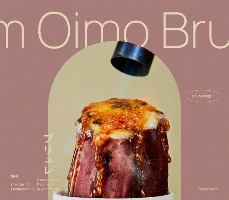
くすみピンクと生成りを基調に、アーチ形の食品写真、大きく細い欧文、楕円ボタン、細い罫線を組み合わせたスイーツブランドサイト。横長の商品紹介と、モバイルでの縦積み構成が特徴。
Creaimo — Style Reference
Warm paper, oversized food portraits, and delicate outlines around a richly textured sweet.
Website: creaimo.jp Original URL: https://creaimo.jp/ Final URL: https://creaimo.jp/ Theme: muted rose and warm paper surfaces, cream hero lettering, and black product information. Inspected: October 2, 2026, at 02:19 JST. Supplied retrieval timestamp: October 1, 2026, at 17:19:29.697 UTC. Viewports: desktop 1440 × 1000; mobile 390 × 844 CSS pixels. Scope: the current brand and product homepage: opening food imagery, two product presentations, an external-store feature, media logos, sharing controls, and the closing brand footer. Desktop captures show the opening, a product-panel state, and the page ending. Mobile captures show the opening and page ending; mobile product geometry is supported by the rendered DOM.
Creaimo presents two sweet-potato products and directs purchasing to a separate online store. Its visual identity comes from a small number of strong relationships: a tall arch against dusty rose, extremely large pale lettering behind food imagery, small peripheral navigation, and elliptical outlines around purchase links. A fine grain unifies the colored backgrounds and photographic scenes.
The product area becomes more architectural. Narrow numbered rails, vertical Japanese labels, compact centered information, and large photographs form adjoining desktop panels. Black hairlines divide the composition without introducing raised cards. On mobile, the product information moves into successive full-width sections with horizontal labels. The closing area changes to warm beige, using layered photographs, media marks, generous empty space, and a compact script wordmark.
閉じる
Creaimo — Style Reference
Warm paper, oversized food portraits, and delicate outlines around a richly textured sweet.
Website: creaimo.jp Original URL: https://creaimo.jp/ Final URL: https://creaimo.jp/ Theme: muted rose and warm paper surfaces, cream hero lettering, and black product information. Inspected: October 2, 2026, at 02:19 JST. Supplied retrieval timestamp: October 1, 2026, at 17:19:29.697 UTC. Viewports: desktop 1440 × 1000; mobile 390 × 844 CSS pixels. Scope: the current brand and product homepage: opening food imagery, two product presentations, an external-store feature, media logos, sharing controls, and the closing brand footer. Desktop captures show the opening, a product-panel state, and the page ending. Mobile captures show the opening and page ending; mobile product geometry is supported by the rendered DOM.
Creaimo presents two sweet-potato products and directs purchasing to a separate online store. Its visual identity comes from a small number of strong relationships: a tall arch against dusty rose, extremely large pale lettering behind food imagery, small peripheral navigation, and elliptical outlines around purchase links. A fine grain unifies the colored backgrounds and photographic scenes.
The product area becomes more architectural. Narrow numbered rails, vertical Japanese labels, compact centered information, and large photographs form adjoining desktop panels. Black hairlines divide the composition without introducing raised cards. On mobile, the product information moves into successive full-width sections with horizontal labels. The closing area changes to warm beige, using layered photographs, media marks, generous empty space, and a compact script wordmark.
How to Read This Reference
- Measured means a value appears in the supplied rendered DOM or computed-style evidence. Measurements describe the captured state, not necessarily a universal CSS rule.
- Estimated means a dimension, color, or treatment was judged from the original-page screenshots. Screenshot estimates are rounded and are not stylesheet declarations.
- Derived means a value was calculated from measured dimensions, such as the usable width inside a padded paragraph.
- Recommended means an implementation choice for a new project. Recommended breakpoints, accessibility changes, substitute lettering, and CSS behavior are not claims about the original implementation.
- Token names and component classes below are descriptive aliases. The only supplied source custom properties are viewport and layout dimensions.
- Computed font-family lists identify declared stacks. They do not independently prove that every named font downloaded successfully.
- Several headings and controls contain artwork or unsampled descendants. Their parent font sizes must not be mistaken for the dimensions of the visible lettering.
- DOM sampling and scrolled screenshots represent different page states. Transformed rectangles and horizontal panel positions should not be combined into a single immutable layout.
Tokens — Colors
Default Palette
| Name | Value | Suggested token | Evidence and role |
|---|---|---|---|
| Dusty Rose | #ab807b |
--color-rose |
Measured HTML/body background at both viewports; visually matches the opening and first product information field |
| Pale Cream | #eaddba |
--color-cream |
Measured hero utility text and shop-feature control backgrounds |
| Warm Paper | #d3c19d |
--color-paper |
Measured footer background; supports the shop feature, media area, sharing section, and closing footer |
| Black Ink | #000000 |
--color-ink |
Measured product text and footer text; screenshots also show black outlines and icons |
| Muted Ink | rgba(0, 0, 0, 0.5) |
--color-muted |
Measured copyright text color |
| Olive Paper | Approximately #aaa087 |
--color-olive-estimate |
Screenshot estimate for the second desktop product panel; its background declaration was not supplied |
The palette is deliberately restrained. Saturated gold, caramel brown, pale blue-gray, and cream appear primarily inside food photography. They should not automatically become additional UI accent colors.
Texture changes the apparent color. The screenshots show a fine grain across large colored fields and imagery. The measured background values are the underlying CSS colors; individual screenshot pixels will vary. The evidence does not identify the grain asset, compositing mode, or opacity.
Color Relationships
- The opening uses cream text and outlines over rose, with the food image carrying most of the contrast and visual detail.
- Product information uses black text over muted color fields. The purchase ellipse remains transparent rather than becoming a filled accent button.
- The closing area uses black on warm paper. Cream appears again as the fill of the shop badge and circular arrow.
- There is no observed palette selector. Do not infer alternate themes from the different section backgrounds.
Tokens — Typography
Japanese Body and Product Copy
Measured primary family: Zen Kaku Gothic New.
The declared fallback sequence includes Noto Sans JP, Noto Sans CJK JP, Noto Sans Japanese, Hiragino Kaku Gothic ProN, other Japanese system faces, Meiryo, MS PGothic, and sans-serif.
Regular paragraphs use weight 400. Product package descriptions use weight 700. The desktop copy is compact: 13px with a 17.875px line height. Mobile explanatory paragraphs decrease to 11px but increase their relative leading to 1.6.
The effect is precise and economical. Long Japanese descriptions occupy a modest block beneath a much more prominent product mark and price.
Latin Utility and Section Typography
Measured family: Manrope, sans-serif.
- Hero social links, the three-line English caption, and the scroll cue use weight
500. MEDIAandSHAREuse weight600and0.2emtracking.- The large
Online Shopfeature title uses weight300. Contactuses weight700.- Copyright text uses weight
400with translucent black.
This gives English text two distinct roles: airy display lettering for the shop feature and controlled, compact labels for navigation and section markers.
Decorative Hero Lettering
The repeated text is Brulee Cream Oimo Brulee Cream Oimo. It appears as an exceptionally large, thin, single-line treatment, cropped at the viewport edges and partly covered by the arch.
The sampled paragraph reports font-size: 0px and line-height: 0px, while its rendered rectangle measures approximately 3984 × 344px on desktop and 2783 × 240px on mobile. These are container bounds, not usable font sizes. The supplied evidence does not establish the visible lettering's font, drawing method, or child styles.
For a new implementation, a light Manrope treatment is a reasonable substitute, not a verified reconstruction of this graphic.
Brand and Product Marks
The product marks and script Creaimo wordmark are visible graphics inside text-empty heading elements. Their inherited heading font sizes do not explain their appearance. Preserve supplied artwork when available; selecting a cursive font will not reproduce the footer identity.
Type Scale
| Role | Desktop | Mobile | Weight / tracking | Evidence |
|---|---|---|---|---|
| Base Japanese text | 13px / 17.875px |
11px / 15.125px |
400, normal tracking |
Measured |
| Product explanatory copy | 13px / 17.875px |
11px / 17.6px |
400 |
Measured |
| Product package description | 13px / 17.875px |
13px / 17.875px |
700 |
Measured; retained size on mobile |
| Hero social links | 16px / 22px |
12px / 16.5px |
Manrope 500 |
Measured |
| Hero caption and scroll cue | 16px / 22px |
11px / 15.125px |
Manrope 500 |
Measured |
MEDIA, SHARE |
26px / 26px |
16px / 16px |
Manrope 600, 0.2em |
Measured |
| Shop-feature title | 50px / 68.75px |
24px / 33px |
Manrope 300 |
Measured |
| Repeating shop URL | 15px / 15px |
11px / 11px |
Manrope 500 |
Measured |
| Contact link | 15px / 20.625px |
13px / 17.875px |
Manrope 700 |
Measured |
| Copyright parent | 13px / 17.875px |
11px / 15.125px |
Manrope 400 |
Measured parent style |
| Price numerals | Approximately 20px |
Child size unavailable | Stronger than surrounding copy | Desktop screenshot estimate |
The Online shop and BUY NOW anchors inherit 13px on desktop and 11px on mobile. Their visible label descendants were not separately sampled; do not treat these parent values as definitive lettering sizes.
Tokens — Spacing & Shapes
Overall density: very spacious image and section composition, with compact product text and small utility controls.
There is no evidence of a universal spacing scale. The recurring values below are useful aliases extracted from specific relationships.
Spacing Scale
| Relationship | Desktop | Mobile | Status |
|---|---|---|---|
| Hero social inset | 50px from left |
10px from left and top |
Measured |
| Hero shop inset | 40px from right |
10px from right and top |
Derived from measured rectangles |
| Hero caption left edge | About 251px |
15px |
Measured |
| Hero caption / scroll cue bottom clearance | 40px |
115px |
Derived for the captured viewport state |
| Product paragraph horizontal padding | 60px |
39px |
Measured |
| Product logo to package description | 20px |
15px |
Derived |
| Package description to price | 15px |
5px |
Derived |
| Price to explanatory copy | 20px |
15px |
Derived |
| Explanatory copy to purchase ellipse | 30px |
20px |
Derived |
| Mobile purchase ellipse to preparation row | Not a fixed desktop gap | 50px |
Derived |
| Footer top padding | 160px |
127px |
Measured |
| Front shop photograph offset from rear photograph | About 30px right, 60px down |
About 15px right, 30px down |
Derived from measured image-link boxes |
The mobile hero utility baseline is substantially above the viewport bottom. The evidence does not establish why this clearance is 115px; do not attribute it to a browser toolbar or safe-area rule without further inspection.
Border Radius and Rules
| Element | Geometry | Evidence |
|---|---|---|
| Hero food window | Semicircular top with straight vertical sides | Screenshot observation |
| Hero shop link | border-radius: 50% on a wide rectangle |
Measured |
| Product purchase link | border-radius: 50% on a wide rectangle |
Measured |
| Shop-feature title badge | Elliptical cream surface | Measured radius and background; transformed bounds |
| Shop arrow | Circle | Measured equal dimensions and 50% radius |
| Product panels and photographs | Square edges | Screenshot observation |
| Section and panel dividers | Approximately 1px, black |
Screenshot estimate |
An ellipse is important here. A 50% radius on a 240 × 50px box produces a different outline from a conventional rounded pill with long straight top and bottom edges.
Layout Measurements
| Element | Desktop 1440 × 1000 | Mobile 390 × 844 | Status |
|---|---|---|---|
| Hero arch | About 836px wide, left 302px, top 190px |
About 315px wide, left 37px, top 155px |
Screenshot estimates |
| Arch width as viewport proportion | About 58.1% |
About 80.8% |
Derived from estimates |
| Hero shop link | 160 × 56px |
102 × 36px |
Measured |
| Product number rail | About 80px wide |
Horizontal header instead | Desktop screenshot estimate; mobile DOM |
| Product information column | 470px wide |
390px wide |
Measured |
| Effective paragraph width | 350px |
312px |
Derived after padding |
| First product mark | 200 × 160px |
120 × 96px |
Measured heading/link box |
| Second product mark | 200 × 92px |
About 120 × 55.2px |
Measured heading/link box |
| Purchase ellipse | 240 × 50px |
175 × 50px |
Measured |
| Preparation button | 470 × 70px |
390 × 56px |
Measured |
| Each shop photograph link | About 510 × 700px |
About 256.9 × 352.6px |
Measured |
| Shop arrow | 116 × 116px, 28px padding |
80 × 80px, 20px padding |
Measured |
| Share link box | 44 × 44px |
36 × 36px |
Measured |
| Footer social link box | 40 × 40px |
26 × 26px |
Measured |
| Footer wordmark box | 184 × 56px |
115 × 35px |
Measured |
| Document height | About 7383px |
About 4960px |
Measured capture state |
The complete arch height is not available from the opening screenshots: its imagery continues beyond the lower visible edge. Do not derive a full aspect ratio from the cropped opening alone.
Components
Opening Food Scene
Role: establish the product's texture and the brand's visual identity before presenting detailed information.
The scene has four layers:
- A full-width dusty rose field.
- A huge cream text strip extending beyond both viewport edges.
- A centered food image with an arched top, covering part of the text strip.
- Small navigation and captions positioned around or across the image boundary.
The desktop capture shows pale cream and a whisk at close range. The mobile capture shows moist yellow sweet-potato flesh and dark skin. These are different captured visual states; their media format and playback sequence were not supplied.
Keep the image crop close enough for food texture to dominate. The arch is a large structural shape, not a small rounded thumbnail. Its straight sides continue toward the bottom of the scene.
Peripheral Hero Navigation
Role: provide immediate store and social access without competing with the food image.
On desktop, the Online shop ellipse sits at x: 1240px, y: 450px. The social links occupy the lower-left corner beneath an SNS label. A three-line English caption sits nearer the arch's left edge, and Please Scroll sits at the lower right.
On mobile, the hierarchy changes rather than simply shrinking. Twitter and Instagram move into a single row at the upper left; the shop ellipse moves to the upper right. The desktop SNS heading is absent from the mobile rendering. The English caption and scroll cue remain low in the composition.
The social labels include parentheses and small outbound arrows. Preserve their typographic lightness and compact spacing. The shop and social destinations are real anchors in the DOM; new-tab behavior was not established.
Vertical Ingredient Caption
Role: connect the large food image with a short Japanese descriptor.
The desktop scene shows クリーム vertically near the arch's lower-left edge; the mobile scene shows お芋. The cream-colored lettering crosses the boundary between the rose field and photograph.
This is a small but distinctive overlap. It prevents the image from reading as an isolated card. The switching logic between words and imagery is unverified, so a new implementation should define that relationship explicitly rather than assume a particular slideshow sequence.
Desktop Product Panel
Role: present a product as a complete editorial spread with a direct route to purchase.
The visible anatomy is:
- A narrow outer rail with a product number at the top, a vertical Japanese name, and a vertically oriented Latin name near the bottom.
- A
470pxinformation field containing the product mark, package description, price, explanatory paragraph, and purchase ellipse. - A large adjacent photograph filling the panel height.
- A preparation-information button along the bottom of the information field.
In the first product capture, the information field spans approximately x: 80–550px. The photograph begins at x: 550px, and the next product's rail is visible toward the right edge. The photograph's visible width in that capture is not a reliable intrinsic column width because the adjoining panel is partially revealed.
The first product image shows an upright caramelized sweet potato in a pale blue-gray cylindrical vessel, photographed against a warm tan background. Its tall silhouette echoes the hero arch without repeating the arch mask.
Product Information Stack
Role: make package details and purchasing information easy to find inside a visually spacious spread.
The first mark occupies 200 × 160px on desktop. Beneath it, the package line 壺芋ブリュレ3本(オリジナルシュガー付き) uses bold 13px Japanese type. The price is ¥3,300, followed by a small 税込 qualifier. A compact paragraph explains the product, followed by the outlined purchase link.
The second entry uses a shallower mark and the package line 壺芋ブリュレのおすそわけ(1セット6袋), with a captured price of ¥1,500. These are observed page contents, not permanent pricing assumptions.
Keep marks and short metadata centered. Keep the explanatory paragraph left aligned within its padded column. This contrast between centered identity and readable prose is part of the composition.
Purchase Ellipse
Role: direct the visitor to the external store.
The desktop box is 240 × 50px; mobile narrows it to 175px while retaining the 50px height. It has a thin black outline, no visible fill, and the label BUY NOW with an arrow angled toward the upper right.
Both product purchase links point to https://tsuboimo.stores.jp/. The evidence does not show product-specific checkout destinations or an on-page cart.
Use an actual anchor and preserve the full ellipse as the hit area. Avoid turning it into a thick filled button: its restraint allows the photograph and product mark to remain dominant.
Preparation Information Button
Role: expose additional serving or preparation guidance.
The observed control is a real button labeled 美味しい食べ方. On desktop it spans the information column and is separated by a fine top rule. A plus symbol sits to the left of the centered label. Its measured height decreases from 70px to 56px on mobile.
The button was not activated in the supplied evidence. Whether it opens an inline disclosure, dialog, or another presentation remains unknown. Only the closed control should be treated as verified.
Online Shop Collage
Role: provide a second, more expressive route to the external store after the product presentations.
Two portrait photograph links overlap on the warm paper field. The front photograph shifts slightly right and down. Their measured proportions are consistent across viewports, close to 51:70.
A large cream ellipse carrying Online Shop overlaps the photographs. Its title uses light Manrope, 50px on desktop and 24px on mobile. The measured badge rectangles include transformation, so their axis-aligned bounds should not be copied as untransformed CSS width and height.
A cream circular arrow overlaps the right side of the composition. On mobile, the supplied ending capture shows the lower portion of a tabletop photograph, the offset image borders, and this arrow. The full desktop collage is supported by DOM geometry rather than a complete supplied screenshot.
A separate shop-URL text element has a measured 10s linear infinite loop-text animation. The title badge, photograph links, arrow, and URL all lead to the same store destination.
Media Logo Strip
Role: present recognition through publication and program identities.
The centered MEDIA heading uses tracked black capitals. Below it is a long horizontal row of heterogeneous logos, with marks visibly clipped at the viewport edges. Recognizable examples in the captures include Hanako, KELLY, ラヴィット!, and 日経クロストレンド.
Preserve the logos as artwork with different optical proportions. Their colors appear predominantly black, cream, and muted brown within the page treatment. Do not force every logo into a uniform text font or equal-width boxed card.
The row's overflow is visible. Automatic motion, drag behavior, and individual logo destinations were not verified.
Share Section
Role: provide a quiet social-sharing moment before the final footer.
A full-width warm paper band is bounded by thin black rules. SHARE sits above a centered Twitter bird and Facebook icon. These are sharing controls, distinct from the brand-profile links in the final footer.
Measured link boxes are 44px on desktop and 36px on mobile. The desktop horizontal gap between boxes is 10px; the mobile gap is 15px. The visible glyphs are smaller than their anchor boxes.
The section is approximately 400px tall on desktop and 258px on mobile, estimated from the supplied screenshots. Much of this height is empty space, giving the footer a deliberately unhurried cadence.
Closing Brand Footer
Role: close the page with identity, profile links, contact access, and copyright.
Desktop uses a single horizontal composition: the script Creaimo mark at the left and Instagram, Twitter, LINE, Contact, and ©2022 Creaimo toward the right. The mark's measured box is 184 × 56px.
Mobile places a 115 × 35px wordmark in its own centered row. About 50px separates its bottom from the row of social links, contact, and copyright. The mobile social-link boxes shrink to 26px, while the utility row remains horizontal in the captured 390px viewport.
The Contact destination is an external store news URL. No contact form was inspected. The underline is visible, and its computed style includes a background-position 0.3s transition; the hover endpoint is not supplied.
Tokens — Motion & Interaction
| Treatment | Evidence | What can be concluded |
|---|---|---|
| Shop URL loop | 10s linear infinite loop-text on desktop and mobile |
A perpetual CSS text animation is declared; its keyframes and exact travel distance are unavailable |
| Contact link transition | background-position 0.3s |
A 300ms background-position transition is defined; trigger and endpoint appearance were not tested |
| Oversized hero strip | Repeated content, negative horizontal position, cropped bounds | A repeating-strip composition is verified; loop timing and input relationship are not |
| Hero food imagery | Different food scenes in the supplied desktop and mobile captures | Multiple captured states exist; video, slideshow, autoplay, and sequencing remain unverified |
| Desktop product presentation | Adjoining panels, an offscreen second entry in DOM geometry, and a partially visible second panel in the screenshot | Horizontal composition is verified; wheel mapping, pinning, snapping, and dragging are unverified |
| Media strip | Logos clipped at both sides | Horizontal overflow is verified; automatic scrolling is not |
| Preparation control | Native button and plus indicator | A control exists; its opened state and behavior were not inspected |
| Store, profile, and share controls | Destination URLs in rendered anchors | Link intent is verified; destination-page behavior was not tested |
Many sampled elements report transition: all without a supplied nonzero duration. That is insufficient evidence of a visible animation.
The capture process waited for page readiness and finite layout changes, temporarily paused perpetual animations during stability checks, and resumed them afterward. Still captures therefore cannot establish animation choreography or prove the absence of delayed content.
Recommended motion direction: use restrained continuous movement only where it serves the repeated lettering or media presentation. Keep purchasing and preparation controls immediately usable. Do not invent a complex scroll narrative from the available screenshots alone.
Surfaces
| Surface | Appearance | Structural role |
|---|---|---|
| Opening canvas | Dusty rose with fine grain | Holds pale display lettering and the arched food image |
| First product information field | Rose-toned flat surface with black text | Separates concise product details from the photograph |
| Second product field | Muted olive/khaki, visually estimated | Differentiates the second product within the same panel system |
| Product photography | Warm, directional studio light; natural food texture | Supplies depth, color variation, and product scale |
| Closing canvas | Warm paper with grain | Unifies shop collage, media marks, sharing, and footer |
| Action outlines | Fine black or cream elliptical strokes | Signals interaction without card elevation |
| Shop badge and arrow | Pale cream fill with black outline | Creates physical overlap against the photo collage |
| Structural divisions | Thin black rules | Defines panel rails, preparation rows, and footer bands |
There is no visible general-purpose shadow system. Depth comes from photography, image overlap, and the contrast between large shapes and fine outlines.
Imagery
The food imagery is close, tactile, and slightly nostalgic. The current opening captures emphasize cream on a whisk and the uneven, moist surface of sweet-potato flesh. The product photograph gives the sweet a sculptural upright presentation against a warm, uncluttered studio background.
Preserve visible pores, cream ridges, caramel edges, and skin texture. The photographs should feel rich without becoming glossy advertising cutouts on pure white. Warm beige and peach backgrounds work with the rose and paper UI; the pale blue-gray serving vessel introduces a quieter complementary note.
A fine noise treatment is visible across the composition. Its implementation is unknown. For a new site, use a subtle texture layer or consistent photographic grading, and keep live text crisp enough to read.
Observed Asset References
No original asset-file URLs were supplied. The following are visible assets or measured artwork containers, not invented filenames.
| Asset | Original-page evidence | Reuse guidance |
|---|---|---|
| Arched hero food imagery | Desktop cream/whisk scene and mobile sweet-potato close-up | Use a tall crop with a semicircular top; preserve the focal texture across breakpoints |
| Repeated hero lettering | Visible pale outline-light typography; large text-container bounds | Use the original artwork if available; otherwise document any substitute font |
| First product mark | 200 × 160px desktop, 120 × 96px mobile |
Preserve its complete lockup and aspect ratio |
| Second product mark | 200 × 92px desktop, about 120 × 55.2px mobile |
Preserve its shallower proportions |
| Product photograph | Upright caramelized sweet potato in a cylindrical vessel | Keep the full object silhouette within its photographic panel |
| Shop collage photographs | Two overlapping portrait link boxes; tabletop detail visible on mobile | Retain square borders and the right/down offset |
| Media identities | Publication and program marks visible in the strip | Size by optical weight rather than identical raw dimensions |
| Creaimo footer mark | Script artwork in 184 × 56px and 115 × 35px boxes |
Preserve artwork rather than recreating it with a generic script font |
| Social and arrow symbols | Visible platform marks and simple directional arrows | Keep icon silhouettes and fine arrow strokes consistent with the original scene |
Layout & Responsive Behavior
Desktop Composition
The opening uses width asymmetrically. The arch occupies about 58% of the viewport, leaving substantial rose margins for tiny navigation and captions. The giant text strip spans far beyond the viewport, so clipping is intentional within the scene.
The product area places information and imagery side by side. An approximately 80px rail and a measured 470px information field establish fixed visual anchors while the photograph occupies the larger adjacent region. The second panel appears at the right edge in the supplied scrolled state. The exact mechanism for advancing the presentation is not available.
The footer broadens into centered, full-width bands. The shop imagery remains a relatively narrow layered composition; the media strip can exceed the viewport width; sharing is centered; and the final brand row spreads identity and utilities toward opposite edges.
Mobile Composition
At 390 × 844, the arch grows to about 81% of viewport width. It begins around 155px from the top, below the upper utility row. The oversized lettering remains cropped rather than wrapping into a conventional headline.
The DOM shows the product entries sequentially down the document. Their labels become horizontal: the first Japanese label begins at x: 15px, while its Latin counterpart ends near x: 375px. The longer second entry wraps within the same available width.
Product marks shrink to 120px wide. The package line stays at 13px, while explanatory copy becomes 11px / 17.6px. Paragraph padding is 39px on each side, exactly 10% of the captured viewport width. Purchase ellipses remain 50px tall, and preparation rows span the entire viewport.
The space between each mobile product header and its mark is consistent with an image-led stack, but the middle mobile section was not supplied as a screenshot and its image bounds were not sampled. Exact photo cropping and height remain unverified.
In the closing area, the layered images are roughly half their desktop size. MEDIA and SHARE decrease from 26px to 16px, and the footer wordmark moves above the utility row.
Source Dimensions and Breakpoint Limits
The source exposes these dimension variables:
| Source property | Desktop | Mobile |
|---|---|---|
--layout-width |
1440px |
390px |
--layout-height |
1000px |
844px |
--visible-width |
1440px |
390px |
--visible-height |
1000px |
844px |
--saved-visible-width |
1440px |
390px |
--saved-visible-height |
1000px |
844px |
These values confirm viewport-related layout inputs, but the formulas that use them were not supplied. The actual responsive breakpoint is unknown. The 767px breakpoint in the Quick Start is a recommendation chosen to separate the two evidenced layouts.
Only the two stated viewports were inspected. Tablet, landscape-phone, very narrow phone, browser-zoom, and expanded preparation states require separate validation.
Do’s and Don’ts
Do
- Build the palette around measured rose
#ab807b, cream#eaddba, warm paper#d3c19d, and black. - Let macro food texture carry the opening rather than surrounding it with dense copy.
- Preserve the arch's semicircular top and long straight sides.
- Keep the oversized hero lettering cropped and partially covered by the image.
- Use Manrope for the measured Latin utility roles and Zen Kaku Gothic New for Japanese body text.
- Preserve product and brand marks as artwork.
- Use true elliptical outlines for purchase links.
- Pair compact centered product metadata with left-aligned explanatory paragraphs.
- Keep desktop product rails narrow, clearly ruled, and vertically labeled.
- Move navigation and product labels into practical horizontal arrangements on mobile.
- Use fine grain consistently and keep the closing sections spacious.
- Distinguish sharing actions from links to the brand's social profiles.
Don’t
- Do not replace the arch with an ordinary rounded rectangle.
- Do not convert the adjoining product spreads into a generic rounded-card grid.
- Do not add heavy shadows, glossy gradients, or unrelated bright CTA colors.
- Do not mistake a heading's inherited font size for the size of artwork inside it.
- Do not treat transformed collage bounds as untransformed element dimensions.
- Do not use the decorative strip's
0pxparent font size in a text-based recreation. - Do not force every media logo into the same shape or typographic style.
- Do not infer autoplay, a video format, scroll pinning, or modal behavior from a still capture.
- Do not shrink the desktop navigation arrangement unchanged onto a phone.
- Do not invent original image paths, product-specific checkout URLs, or unseen preparation content.
Recommended Implementation Additions
These are recommendations for a new implementation, not verified features of the current page:
- Give product-mark links, social icons, and the circular shop arrow meaningful accessible names. Empty extracted link text alone does not establish whether the original has accessible naming.
- Ensure repeated decorative hero wording is not announced multiple times. Keep a concise semantic page heading independently available.
- Check the cream-on-rose utility text against text-size contrast requirements. Preserve the palette while adjusting text treatment where needed.
- Consider
14–16pxmobile explanatory copy when readability takes priority over matching the observed11pxsize. - Expand the mobile
26pxfooter link hit areas toward44pxwithout necessarily enlarging their visible icons. Allow the utility row to wrap at smaller widths. - Implement the preparation button according to its actual chosen behavior: use
aria-expandedandaria-controlsfor an inline disclosure, or appropriate dialog semantics if a dialog is designed. - Provide a static or paused alternative for any moving hero media and repeating text. Avoid making horizontal product content dependent on wheel input alone.
- Keep clipping local to decorative strips and the arch. Do not hide meaningful product content or keyboard focus outside the viewport.
- Reserve image dimensions to reduce layout shifts, prioritize the opening image, and defer lower-page photography where practical.
Agent Prompt Guide
Quick Color Reference
- Opening and first product field: dusty rose
#ab807b. - Hero lettering and outlines: pale cream
#eaddba. - Closing sections: warm paper
#d3c19d. - Product information, rules, and footer icons: black
#000000. - Copyright: black at
50%opacity. - Second product field: muted olive paper;
#aaa087is a visual approximation, not a measured source token. - Depth: overlapping photography and fine outlines, with subtle grain.
Overall Prompt
“Create a Japanese sweets brand homepage inspired by Creaimo's current visual structure. Use dusty rose #ab807b, pale cream #eaddba, warm paper #d3c19d, and fine black rules. Open with oversized thin cream lettering cropped across the viewport behind a tall arched macro food photograph. Place small social links, an elliptical shop link, a short vertical Japanese ingredient label, and a restrained scroll cue around the image. Present two products as desktop spreads with narrow numbered vertical rails, compact centered product information, transparent elliptical purchase links, and large food photographs. On mobile, move utilities to the top and stack the products with horizontal labels. Finish with overlapping shop photographs, a cream circular arrow, a cropped media-logo strip, a spacious share band, and a script brand mark. Use Manrope for Latin utilities and Zen Kaku Gothic New for Japanese copy. Treat original artwork, media playback, and scroll choreography as separate assets and requirements.”
Example Component Prompts
- Hero: “A dusty rose viewport with an approximately 58%-width arched food image centered on desktop. Giant pale-cream wording runs behind the image and is clipped at both edges. Add a small true elliptical shop link at the right, social links at the lower left, and a vertical ingredient label crossing the image boundary. On a 390px phone, expand the arch to about 81% width and move social and shop links to the top.”
- Product spread: “An editorial product panel with an 80px numbered rail, a 470px information field, and a large warm studio photograph. Use black hairline divisions, a centered product mark, a bold package line, a modest price, a left-aligned Japanese paragraph, and a 240 × 50px outlined ellipse labeled BUY NOW. Put a full-width preparation button along the information column's bottom edge.”
- Mobile product: “A full-width product section with a horizontal number/name header, an image region, a centered 120px-wide product mark, compact package and price information, a paragraph inset by 10%, a 175 × 50px purchase ellipse, and a 56px preparation row. The image height is an implementation choice because the supplied mobile image bounds are unavailable.”
- Shop feature: “Two square-edged portrait photographs overlap on warm paper, with the front image shifted slightly right and down. Add a pale cream elliptical Online Shop badge and a thinly outlined cream circular arrow overlapping the right edge. Keep the composition tactile and photographic rather than using a raised card.”
- Closing sections: “A warm paper media band with tracked uppercase heading and an edge-clipped row of publication logos; below it, a generously spaced SHARE band between one-pixel black rules. Finish with a script wordmark and small black social icons. On mobile, center the wordmark above the utility row.”
Quick Start
CSS Custom Properties
This is a practical adaptation of the measured palette, type roles, and principal dimensions. It does not reproduce unknown source code. The hero's text-based display treatment, noise layer, 767px breakpoint, mobile photo ratio, and native horizontal product scroller are recommended substitutes. The latter provides accessible horizontal access without claiming to reproduce the original panel choreography.
Load the named fonts separately if available. Supply real product marks, food imagery, media logos, and the footer wordmark; no original asset URLs were included in the evidence.
Suggested structure: .creaimo-page contains .hero, .products, and .site-footer. Each .product contains .product-rail, .product-info, .product-photo, and .product-help. The footer contains .shop-collage, .media, .share, and .footer-bar. Use anchors for destinations and a button for preparation information.
:root {
  /* Measured colors, except the explicitly estimated olive */
  --color-rose: #ab807b;
  --color-cream: #eaddba;
  --color-paper: #d3c19d;
  --color-ink: #000;
  --color-muted: rgb(0 0 0 / 50%);
  --color-olive-estimate: #aaa087;

  /* Shortened versions of the observed font stacks */
  --font-jp: 'Zen Kaku Gothic New', 'Noto Sans JP',
    'Hiragino Kaku Gothic ProN', Meiryo, sans-serif;
  --font-en: Manrope, sans-serif;
  --text-body: 13px;
  --leading-body: 1.375;
  --text-section: 26px;
  --tracking-section: 0.2em;

  --rule: 1px solid var(--color-ink);
  --radius-ellipse: 50%;
  --rail-width: 80px;
  --info-width: 470px;
  --copy-inset: 60px;
  --buy-width: 240px;
  --help-height: 70px;

  /* Fitted to screenshot geometry, not recovered source formulas */
  --arch-width: 58.06vw;
  --arch-top: 19svh;
  --hero-bottom: 40px;
  --grain-opacity: 0.12;
}

* { box-sizing: border-box; }
body { margin: 0; }

.creaimo-page {
  color: var(--color-ink);
  background: var(--color-rose);
  font: 400 var(--text-body)/var(--leading-body) var(--font-jp);
}

.creaimo-page a { color: inherit; }
.creaimo-page img { display: block; max-width: 100%; }
.creaimo-page button { font: inherit; }

/* Recommended texture approximation; source texture is unknown. */
.grain-surface { position: relative; isolation: isolate; }
.grain-surface::after {
  content: '';
  position: absolute;
  inset: 0;
  z-index: 3;
  pointer-events: none;
  opacity: var(--grain-opacity);
  mix-blend-mode: soft-light;
  background-size: 160px 160px;
  background-image: url('data:image/svg+xml,%3Csvg xmlns=%22http://www.w3.org/2000/svg%22 viewBox=%220 0 160 160%22%3E%3Cfilter id=%22g%22%3E%3CfeTurbulence type=%22fractalNoise%22 baseFrequency=%22.85%22 numOctaves=%223%22 stitchTiles=%22stitch%22/%3E%3C/filter%3E%3Cpath fill=%22%23888%22 filter=%22url(%23g)%22 d=%22M0 0h160v160H0z%22/%3E%3C/svg%3E');
}

.hero {
  position: relative;
  min-height: 100svh;
  overflow: hidden;
  isolation: isolate;
  color: var(--color-cream);
  background: var(--color-rose);
}

/* Substitute live lettering; the source glyph font is unverified. */
.hero-title-track {
  position: absolute;
  top: -37px;
  left: -44vw;
  margin: 0;
  white-space: nowrap;
  font: 300 clamp(160px, 16.7vw, 240px)/1.43 var(--font-en);
}

.hero-arch {
  position: absolute;
  z-index: 1;
  top: var(--arch-top);
  left: 50%;
  width: var(--arch-width);
  height: 100%;
  transform: translateX(-50%);
  overflow: hidden;
  border-radius: calc(var(--arch-width) / 2)
    calc(var(--arch-width) / 2) 0 0;
}

.hero-arch > img,
.hero-arch > video {
  width: 100%;
  height: 100%;
  object-fit: cover;
}

.hero-shop,
.hero-socials,
.hero-caption,
.hero-scroll,
.hero-keyword {
  position: absolute;
  z-index: 4;
}

.ellipse-link {
  display: inline-flex;
  align-items: center;
  justify-content: center;
  gap: 12px;
  border: 1px solid currentColor;
  border-radius: var(--radius-ellipse);
  text-decoration: none;
  background: transparent;
}

.hero-shop { top: 45%; right: 40px; width: 160px; height: 56px; }
.hero-socials { left: 50px; bottom: var(--hero-bottom); }
.hero-socials a { display: block; text-decoration: none; }
.hero-socials,
.hero-caption,
.hero-scroll { font: 500 16px/22px var(--font-en); }
.hero-caption {
  left: calc(50% - var(--arch-width) / 2 - 51px);
  bottom: var(--hero-bottom);
  margin: 0;
}
.hero-scroll { right: 50px; bottom: var(--hero-bottom); margin: 0; }
.hero-keyword {
  left: calc(50% - var(--arch-width) / 2 - 22px);
  bottom: 112px;
  writing-mode: vertical-rl;
  font-size: 48px;
  line-height: 1.1;
}

/* Native overflow is an adaptation, not verified source behavior. */
.products {
  display: flex;
  overflow-x: auto;
  scroll-snap-type: x proximity;
}
.product {
  display: grid;
  grid-template-columns: var(--rail-width) var(--info-width) minmax(0, 1fr);
  grid-template-rows: minmax(0, 1fr) var(--help-height);
  flex: 0 0 calc(100vw - var(--rail-width));
  min-height: 100svh;
  border-block: var(--rule);
  background: var(--color-rose);
  scroll-snap-align: start;
}
.product--second { background: var(--color-olive-estimate); }
.product-rail {
  grid-column: 1;
  grid-row: 1 / 3;
  display: flex;
  flex-direction: column;
  align-items: center;
  padding: 28px 0;
  border-right: var(--rule);
}
.rail-name { display: flex; flex-direction: column; align-items: center; gap: 28px; }
.rail-jp,
.rail-en { writing-mode: vertical-rl; }
.rail-en { margin-top: auto; }
.product-info {
  grid-column: 2;
  grid-row: 1;
  display: flex;
  flex-direction: column;
  align-items: center;
  justify-content: center;
  padding-block: 40px;
}
.product-logo { width: 200px; height: auto; }
.product-summary { margin: 20px 16px 0; text-align: center; font-size: 13px; font-weight: 700; }
.product-price {
  margin: 15px 0 0;
  font: 600 20px/27.5px var(--font-en);
}
.product-price small { margin-left: 6px; font: 400 10px/1.4 var(--font-jp); }
.product-copy {
  width: 100%;
  margin: 20px 0 0;
  padding-inline: var(--copy-inset);
  text-align: left;
}
.product-buy { width: var(--buy-width); height: 50px; margin-top: 30px; }
.product-photo {
  grid-column: 3;
  grid-row: 1 / 3;
  width: 100%;
  height: 100%;
  min-height: 0;
  object-fit: cover;
}
.product-help {
  grid-column: 2;
  grid-row: 2;
  display: flex;
  align-items: center;
  justify-content: center;
  gap: 16px;
  width: 100%;
  min-height: var(--help-height);
  border: 0;
  border-top: var(--rule);
  color: inherit;
  background: transparent;
  cursor: pointer;
}

.site-footer { padding-top: 160px; background: var(--color-paper); }
.shop-collage {
  position: relative;
  width: min(510px, 65.865vw);
  aspect-ratio: 51 / 76;
  margin-inline: auto;
}
.shop-image {
  position: absolute;
  inset: 0 auto auto 0;
  width: 100%;
  aspect-ratio: 51 / 70;
  border: var(--rule);
}
.shop-image img { width: 100%; height: 100%; object-fit: cover; }
.shop-image.is-front { transform: translate(5.885%, 8.57%); }
.shop-badge {
  position: absolute;
  z-index: 4;
  top: 38%;
  left: -38%;
  padding: 33px 44px 36px;
  border: var(--rule);
  border-radius: 50%;
  background: var(--color-cream);
  font: 300 50px/1.375 var(--font-en);
  text-decoration: none;
  transform: rotate(-15deg); /* Recommended collage pose */
}
.shop-arrow {
  position: absolute;
  z-index: 4;
  top: 45%;
  right: -88px;
  display: grid;
  place-items: center;
  width: 116px;
  height: 116px;
  padding: 28px;
  border: var(--rule);
  border-radius: 50%;
  background: var(--color-cream);
}
.section-label {
  margin: 0;
  text-align: center;
  font: 600 var(--text-section)/1 var(--font-en);
  letter-spacing: var(--tracking-section);
}
.media { overflow: hidden; padding-top: 180px; }
.media-track {
  display: flex;
  align-items: center;
  gap: 60px;
  width: max-content;
  padding-block: 90px 100px;
}
.media-logo { width: auto; max-width: 220px; max-height: 112px; object-fit: contain; }
.share { padding: 140px 20px 160px; border-block: var(--rule); }
.share-links { display: flex; justify-content: center; gap: 10px; margin-top: 30px; }
.share-links a { display: grid; place-items: center; width: 44px; height: 44px; }
.footer-bar {
  display: flex;
  align-items: center;
  justify-content: space-between;
  gap: 30px;
  min-height: 160px;
  padding: 50px;
}
.footer-logo { width: 184px; height: 56px; object-fit: contain; }
.footer-utilities,
.footer-socials { display: flex; align-items: center; }
.footer-socials { gap: 15px; }
.footer-socials a { display: grid; place-items: center; width: 40px; height: 40px; }
.footer-contact { margin-left: 50px; font: 700 15px/1.375 var(--font-en); text-underline-offset: 5px; }
.copyright { margin: 0 0 0 55px; color: var(--color-muted); font: 400 13px/1.375 var(--font-en); }

/* Recommended keyboard treatment */
.creaimo-page :focus-visible { outline: 2px solid currentColor; outline-offset: 5px; }

/* Recommended breakpoint fitted to the two inspected layouts */
@media (max-width: 767px) {
  :root {
    --text-body: 11px;
    --text-section: 16px;
    --copy-inset: 10%;
    --buy-width: 175px;
    --help-height: 56px;
    --arch-width: 80.77vw;
    --arch-top: 155px;
    --hero-bottom: 13.63svh;
  }
  .hero-title-track { top: 15px; font-size: 160px; line-height: 1.5; }
  .hero-shop { top: 10px; right: 10px; width: 102px; height: 36px; }
  .hero-socials { top: 10px; left: 10px; bottom: auto; display: flex; gap: 5px; font-size: 12px; line-height: 16.5px; }
  .hero-socials-label { display: none; }
  .hero-caption { left: 15px; font-size: 11px; line-height: 15.125px; }
  .hero-scroll { right: 15px; font-size: 11px; line-height: 15.125px; }
  .hero-keyword { left: 20px; bottom: calc(var(--hero-bottom) + 55px); font-size: 32px; }

  .products { display: block; overflow: visible; }
  .product { grid-template-columns: 1fr; grid-template-rows: auto auto auto auto; min-height: 0; }
  .product-rail { grid-column: 1; grid-row: 1; flex-direction: row; justify-content: space-between; gap: 12px; padding: 10px 15px; border-right: 0; border-bottom: var(--rule); }
  .rail-name { flex-direction: row; gap: 8px; }
  .rail-jp,
  .rail-en { writing-mode: horizontal-tb; }
  .rail-en { margin: 0; text-align: right; }
  .product-photo { grid-column: 1; grid-row: 2; height: auto; aspect-ratio: 4 / 3; }
  .product-info { grid-column: 1; grid-row: 3; padding-block: 50px; }
  .product-logo { width: 120px; }
  .product-summary { margin-top: 15px; }
  .product-price { margin-top: 5px; }
  .product-copy { margin-top: 15px; line-height: 1.6; }
  .product-buy { margin-top: 20px; }
  .product-help { grid-column: 1; grid-row: 4; }

  .site-footer { padding-top: 127px; }
  .shop-badge { top: 0; left: -23.5%; padding: 16px 21px 17px; font-size: 24px; }
  .shop-arrow { top: auto; right: -55px; bottom: 20px; width: 80px; height: 80px; padding: 20px; }
  .media { padding-top: 120px; }
  .media-track { gap: 40px; padding-block: 40px; }
  .media-logo { max-width: 145px; max-height: 70px; }
  .share { padding: 90px 20px 100px; }
  .share-links { gap: 15px; margin-top: 15px; }
  .share-links a { width: 36px; height: 36px; }
  .footer-bar { flex-direction: column; gap: 50px; padding: 50px 15px 25px; }
  .footer-logo { width: 115px; height: 35px; }
  .footer-utilities { justify-content: center; flex-wrap: wrap; row-gap: 20px; }
  .footer-socials { gap: 11px; }
  .footer-socials a { width: 26px; height: 26px; }
  .footer-contact { margin-left: 20px; font-size: 13px; }
  .copyright { margin-left: 25px; font-size: 11px; }
}

/* Apply if animation is added to this static starting point. */
@media (prefers-reduced-motion: reduce) {
  .creaimo-page *,
  .creaimo-page *::before,
  .creaimo-page *::after {
    animation: none !important;
    transition: none !important;
    scroll-behavior: auto !important;
  }
  .products { scroll-snap-type: none; }
}
The CSS starts with static imagery and lettering. It does not implement the preparation panel, hero media playback, or the URL loop's unknown keyframes. When adding those behaviors, keep the measured 10s URL duration separate from any newly chosen travel distance or easing elsewhere.
The mobile product image ratio and price numeral typography are implementation approximations. The small footer link boxes follow the captured geometry; enlarge their effective targets when implementing the accessibility recommendations above.
Tailwind v4 Token Mapping
Optional aliases for a project that already uses Tailwind v4. These do not identify the original site's framework. Define the custom properties above first.
@theme inline {
  --color-brand-rose: var(--color-rose);
  --color-brand-cream: var(--color-cream);
  --color-brand-paper: var(--color-paper);
  --color-brand-ink: var(--color-ink);
  --color-brand-muted: var(--color-muted);
  --color-brand-olive: var(--color-olive-estimate);

  --font-body: var(--font-jp);
  --font-latin: var(--font-en);

  --text-product-copy: var(--text-body);
  --text-section-label: var(--text-section);
  --tracking-section-label: 0.2em;

  --spacing-product-rail: var(--rail-width);
  --spacing-product-info: var(--info-width);
  --spacing-product-buy: var(--buy-width);
  --spacing-product-help: var(--help-height);

  --radius-ellipse: 50%;
}
Sources & Evidence
- Creaimo original and final page: supplied current-page response with HTTP
200, page title, rendered text, link destinations, selected element rectangles, computed styles, and viewport custom properties. - Capture timestamp: October 1, 2026,
17:19:29.697 UTC, equivalent to October 2, 2026,02:19:29.697 JST. - Desktop evidence:
1440 × 1000viewport; original-page opening, product-panel, and ending captures. Measured document height was approximately7383px. - Mobile evidence:
390 × 844viewport; original-page opening and ending captures, with rendered DOM evidence for both product entries. Measured document height was approximately4960px. - Verified destination evidence: store, social profiles, sharing endpoints, and Contact URLs were present in original-page anchors. Those destination pages were not inspected for this reference.
- Interaction scope: supplied captures include scrolled page states. No click result, opened preparation panel, purchase flow, hover endpoint, keyboard behavior, or motion recording was supplied.
- Inspection limitations: the capture process used readiness and image-decoding checks with finite time limits. SharedWorkers and service workers were disabled. Delayed content, actual font-file loading, original asset paths, responsive breakpoints, motion keyframes, and intermediate viewport behavior remain unverified.
This reference describes the current page supported by the supplied original-site captures and rendered evidence. Estimates and implementation recommendations are labeled separately from measured values.
# Creaimo — Style Reference

> Warm paper, oversized food portraits, and delicate outlines around a richly textured sweet.

**Website:** [creaimo.jp](https://creaimo.jp/)
**Original URL:** https://creaimo.jp/
**Final URL:** https://creaimo.jp/
**Theme:** muted rose and warm paper surfaces, cream hero lettering, and black product information.
**Inspected:** October 2, 2026, at 02:19 JST. Supplied retrieval timestamp: October 1, 2026, at 17:19:29.697 UTC.
**Viewports:** desktop 1440 × 1000; mobile 390 × 844 CSS pixels.
**Scope:** the current brand and product homepage: opening food imagery, two product presentations, an external-store feature, media logos, sharing controls, and the closing brand footer. Desktop captures show the opening, a product-panel state, and the page ending. Mobile captures show the opening and page ending; mobile product geometry is supported by the rendered DOM.

Creaimo presents two sweet-potato products and directs purchasing to a separate online store. Its visual identity comes from a small number of strong relationships: a tall arch against dusty rose, extremely large pale lettering behind food imagery, small peripheral navigation, and elliptical outlines around purchase links. A fine grain unifies the colored backgrounds and photographic scenes.

The product area becomes more architectural. Narrow numbered rails, vertical Japanese labels, compact centered information, and large photographs form adjoining desktop panels. Black hairlines divide the composition without introducing raised cards. On mobile, the product information moves into successive full-width sections with horizontal labels. The closing area changes to warm beige, using layered photographs, media marks, generous empty space, and a compact script wordmark.
閉じる
# Creaimo — Style Reference

> Warm paper, oversized food portraits, and delicate outlines around a richly textured sweet.

**Website:** [creaimo.jp](https://creaimo.jp/)
**Original URL:** https://creaimo.jp/
**Final URL:** https://creaimo.jp/
**Theme:** muted rose and warm paper surfaces, cream hero lettering, and black product information.
**Inspected:** October 2, 2026, at 02:19 JST. Supplied retrieval timestamp: October 1, 2026, at 17:19:29.697 UTC.
**Viewports:** desktop 1440 × 1000; mobile 390 × 844 CSS pixels.
**Scope:** the current brand and product homepage: opening food imagery, two product presentations, an external-store feature, media logos, sharing controls, and the closing brand footer. Desktop captures show the opening, a product-panel state, and the page ending. Mobile captures show the opening and page ending; mobile product geometry is supported by the rendered DOM.

Creaimo presents two sweet-potato products and directs purchasing to a separate online store. Its visual identity comes from a small number of strong relationships: a tall arch against dusty rose, extremely large pale lettering behind food imagery, small peripheral navigation, and elliptical outlines around purchase links. A fine grain unifies the colored backgrounds and photographic scenes.

The product area becomes more architectural. Narrow numbered rails, vertical Japanese labels, compact centered information, and large photographs form adjoining desktop panels. Black hairlines divide the composition without introducing raised cards. On mobile, the product information moves into successive full-width sections with horizontal labels. The closing area changes to warm beige, using layered photographs, media marks, generous empty space, and a compact script wordmark.

## How to Read This Reference

- **Measured** means a value appears in the supplied rendered DOM or computed-style evidence. Measurements describe the captured state, not necessarily a universal CSS rule.
- **Estimated** means a dimension, color, or treatment was judged from the original-page screenshots. Screenshot estimates are rounded and are not stylesheet declarations.
- **Derived** means a value was calculated from measured dimensions, such as the usable width inside a padded paragraph.
- **Recommended** means an implementation choice for a new project. Recommended breakpoints, accessibility changes, substitute lettering, and CSS behavior are not claims about the original implementation.
- Token names and component classes below are descriptive aliases. The only supplied source custom properties are viewport and layout dimensions.
- Computed font-family lists identify declared stacks. They do not independently prove that every named font downloaded successfully.
- Several headings and controls contain artwork or unsampled descendants. Their parent font sizes must not be mistaken for the dimensions of the visible lettering.
- DOM sampling and scrolled screenshots represent different page states. Transformed rectangles and horizontal panel positions should not be combined into a single immutable layout.

## Tokens — Colors

### Default Palette

| Name | Value | Suggested token | Evidence and role |
| --- | --- | --- | --- |
| Dusty Rose | `#ab807b` | `--color-rose` | Measured HTML/body background at both viewports; visually matches the opening and first product information field |
| Pale Cream | `#eaddba` | `--color-cream` | Measured hero utility text and shop-feature control backgrounds |
| Warm Paper | `#d3c19d` | `--color-paper` | Measured footer background; supports the shop feature, media area, sharing section, and closing footer |
| Black Ink | `#000000` | `--color-ink` | Measured product text and footer text; screenshots also show black outlines and icons |
| Muted Ink | `rgba(0, 0, 0, 0.5)` | `--color-muted` | Measured copyright text color |
| Olive Paper | Approximately `#aaa087` | `--color-olive-estimate` | Screenshot estimate for the second desktop product panel; its background declaration was not supplied |

The palette is deliberately restrained. Saturated gold, caramel brown, pale blue-gray, and cream appear primarily inside food photography. They should not automatically become additional UI accent colors.

**Texture changes the apparent color.** The screenshots show a fine grain across large colored fields and imagery. The measured background values are the underlying CSS colors; individual screenshot pixels will vary. The evidence does not identify the grain asset, compositing mode, or opacity.

### Color Relationships

- The opening uses cream text and outlines over rose, with the food image carrying most of the contrast and visual detail.
- Product information uses black text over muted color fields. The purchase ellipse remains transparent rather than becoming a filled accent button.
- The closing area uses black on warm paper. Cream appears again as the fill of the shop badge and circular arrow.
- There is no observed palette selector. Do not infer alternate themes from the different section backgrounds.

## Tokens — Typography

### Japanese Body and Product Copy

**Measured primary family:** `Zen Kaku Gothic New`.

The declared fallback sequence includes `Noto Sans JP`, `Noto Sans CJK JP`, `Noto Sans Japanese`, `Hiragino Kaku Gothic ProN`, other Japanese system faces, Meiryo, `MS PGothic`, and `sans-serif`.

Regular paragraphs use weight `400`. Product package descriptions use weight `700`. The desktop copy is compact: `13px` with a `17.875px` line height. Mobile explanatory paragraphs decrease to `11px` but increase their relative leading to `1.6`.

The effect is precise and economical. Long Japanese descriptions occupy a modest block beneath a much more prominent product mark and price.

### Latin Utility and Section Typography

**Measured family:** `Manrope, sans-serif`.

- Hero social links, the three-line English caption, and the scroll cue use weight `500`.
- `MEDIA` and `SHARE` use weight `600` and `0.2em` tracking.
- The large `Online Shop` feature title uses weight `300`.
- `Contact` uses weight `700`.
- Copyright text uses weight `400` with translucent black.

This gives English text two distinct roles: airy display lettering for the shop feature and controlled, compact labels for navigation and section markers.

### Decorative Hero Lettering

The repeated text is `Brulee Cream Oimo Brulee Cream Oimo`. It appears as an exceptionally large, thin, single-line treatment, cropped at the viewport edges and partly covered by the arch.

The sampled paragraph reports `font-size: 0px` and `line-height: 0px`, while its rendered rectangle measures approximately `3984 × 344px` on desktop and `2783 × 240px` on mobile. These are **container bounds**, not usable font sizes. The supplied evidence does not establish the visible lettering's font, drawing method, or child styles.

For a new implementation, a light Manrope treatment is a reasonable **substitute**, not a verified reconstruction of this graphic.

### Brand and Product Marks

The product marks and script Creaimo wordmark are visible graphics inside text-empty heading elements. Their inherited heading font sizes do not explain their appearance. Preserve supplied artwork when available; selecting a cursive font will not reproduce the footer identity.

### Type Scale

| Role | Desktop | Mobile | Weight / tracking | Evidence |
| --- | --- | --- | --- | --- |
| Base Japanese text | `13px / 17.875px` | `11px / 15.125px` | `400`, normal tracking | Measured |
| Product explanatory copy | `13px / 17.875px` | `11px / 17.6px` | `400` | Measured |
| Product package description | `13px / 17.875px` | `13px / 17.875px` | `700` | Measured; retained size on mobile |
| Hero social links | `16px / 22px` | `12px / 16.5px` | Manrope `500` | Measured |
| Hero caption and scroll cue | `16px / 22px` | `11px / 15.125px` | Manrope `500` | Measured |
| `MEDIA`, `SHARE` | `26px / 26px` | `16px / 16px` | Manrope `600`, `0.2em` | Measured |
| Shop-feature title | `50px / 68.75px` | `24px / 33px` | Manrope `300` | Measured |
| Repeating shop URL | `15px / 15px` | `11px / 11px` | Manrope `500` | Measured |
| Contact link | `15px / 20.625px` | `13px / 17.875px` | Manrope `700` | Measured |
| Copyright parent | `13px / 17.875px` | `11px / 15.125px` | Manrope `400` | Measured parent style |
| Price numerals | Approximately `20px` | Child size unavailable | Stronger than surrounding copy | Desktop screenshot estimate |

The `Online shop` and `BUY NOW` anchors inherit `13px` on desktop and `11px` on mobile. Their visible label descendants were not separately sampled; do not treat these parent values as definitive lettering sizes.

## Tokens — Spacing & Shapes

**Overall density:** very spacious image and section composition, with compact product text and small utility controls.

There is no evidence of a universal spacing scale. The recurring values below are useful aliases extracted from specific relationships.

### Spacing Scale

| Relationship | Desktop | Mobile | Status |
| --- | --- | --- | --- |
| Hero social inset | `50px` from left | `10px` from left and top | Measured |
| Hero shop inset | `40px` from right | `10px` from right and top | Derived from measured rectangles |
| Hero caption left edge | About `251px` | `15px` | Measured |
| Hero caption / scroll cue bottom clearance | `40px` | `115px` | Derived for the captured viewport state |
| Product paragraph horizontal padding | `60px` | `39px` | Measured |
| Product logo to package description | `20px` | `15px` | Derived |
| Package description to price | `15px` | `5px` | Derived |
| Price to explanatory copy | `20px` | `15px` | Derived |
| Explanatory copy to purchase ellipse | `30px` | `20px` | Derived |
| Mobile purchase ellipse to preparation row | Not a fixed desktop gap | `50px` | Derived |
| Footer top padding | `160px` | `127px` | Measured |
| Front shop photograph offset from rear photograph | About `30px` right, `60px` down | About `15px` right, `30px` down | Derived from measured image-link boxes |

The mobile hero utility baseline is substantially above the viewport bottom. The evidence does not establish why this clearance is `115px`; do not attribute it to a browser toolbar or safe-area rule without further inspection.

### Border Radius and Rules

| Element | Geometry | Evidence |
| --- | --- | --- |
| Hero food window | Semicircular top with straight vertical sides | Screenshot observation |
| Hero shop link | `border-radius: 50%` on a wide rectangle | Measured |
| Product purchase link | `border-radius: 50%` on a wide rectangle | Measured |
| Shop-feature title badge | Elliptical cream surface | Measured radius and background; transformed bounds |
| Shop arrow | Circle | Measured equal dimensions and `50%` radius |
| Product panels and photographs | Square edges | Screenshot observation |
| Section and panel dividers | Approximately `1px`, black | Screenshot estimate |

An ellipse is important here. A `50%` radius on a `240 × 50px` box produces a different outline from a conventional rounded pill with long straight top and bottom edges.

### Layout Measurements

| Element | Desktop 1440 × 1000 | Mobile 390 × 844 | Status |
| --- | --- | --- | --- |
| Hero arch | About `836px` wide, left `302px`, top `190px` | About `315px` wide, left `37px`, top `155px` | Screenshot estimates |
| Arch width as viewport proportion | About `58.1%` | About `80.8%` | Derived from estimates |
| Hero shop link | `160 × 56px` | `102 × 36px` | Measured |
| Product number rail | About `80px` wide | Horizontal header instead | Desktop screenshot estimate; mobile DOM |
| Product information column | `470px` wide | `390px` wide | Measured |
| Effective paragraph width | `350px` | `312px` | Derived after padding |
| First product mark | `200 × 160px` | `120 × 96px` | Measured heading/link box |
| Second product mark | `200 × 92px` | About `120 × 55.2px` | Measured heading/link box |
| Purchase ellipse | `240 × 50px` | `175 × 50px` | Measured |
| Preparation button | `470 × 70px` | `390 × 56px` | Measured |
| Each shop photograph link | About `510 × 700px` | About `256.9 × 352.6px` | Measured |
| Shop arrow | `116 × 116px`, `28px` padding | `80 × 80px`, `20px` padding | Measured |
| Share link box | `44 × 44px` | `36 × 36px` | Measured |
| Footer social link box | `40 × 40px` | `26 × 26px` | Measured |
| Footer wordmark box | `184 × 56px` | `115 × 35px` | Measured |
| Document height | About `7383px` | About `4960px` | Measured capture state |

The complete arch height is not available from the opening screenshots: its imagery continues beyond the lower visible edge. Do not derive a full aspect ratio from the cropped opening alone.

## Components

### Opening Food Scene

**Role:** establish the product's texture and the brand's visual identity before presenting detailed information.

The scene has four layers:

1. A full-width dusty rose field.
2. A huge cream text strip extending beyond both viewport edges.
3. A centered food image with an arched top, covering part of the text strip.
4. Small navigation and captions positioned around or across the image boundary.

The desktop capture shows pale cream and a whisk at close range. The mobile capture shows moist yellow sweet-potato flesh and dark skin. These are different captured visual states; their media format and playback sequence were not supplied.

Keep the image crop close enough for food texture to dominate. The arch is a large structural shape, not a small rounded thumbnail. Its straight sides continue toward the bottom of the scene.

### Peripheral Hero Navigation

**Role:** provide immediate store and social access without competing with the food image.

On desktop, the `Online shop` ellipse sits at `x: 1240px`, `y: 450px`. The social links occupy the lower-left corner beneath an `SNS` label. A three-line English caption sits nearer the arch's left edge, and `Please Scroll` sits at the lower right.

On mobile, the hierarchy changes rather than simply shrinking. Twitter and Instagram move into a single row at the upper left; the shop ellipse moves to the upper right. The desktop `SNS` heading is absent from the mobile rendering. The English caption and scroll cue remain low in the composition.

The social labels include parentheses and small outbound arrows. Preserve their typographic lightness and compact spacing. The shop and social destinations are real anchors in the DOM; new-tab behavior was not established.

### Vertical Ingredient Caption

**Role:** connect the large food image with a short Japanese descriptor.

The desktop scene shows `クリーム` vertically near the arch's lower-left edge; the mobile scene shows `お芋`. The cream-colored lettering crosses the boundary between the rose field and photograph.

This is a small but distinctive overlap. It prevents the image from reading as an isolated card. The switching logic between words and imagery is unverified, so a new implementation should define that relationship explicitly rather than assume a particular slideshow sequence.

### Desktop Product Panel

**Role:** present a product as a complete editorial spread with a direct route to purchase.

The visible anatomy is:

- A narrow outer rail with a product number at the top, a vertical Japanese name, and a vertically oriented Latin name near the bottom.
- A `470px` information field containing the product mark, package description, price, explanatory paragraph, and purchase ellipse.
- A large adjacent photograph filling the panel height.
- A preparation-information button along the bottom of the information field.

In the first product capture, the information field spans approximately `x: 80–550px`. The photograph begins at `x: 550px`, and the next product's rail is visible toward the right edge. The photograph's visible width in that capture is not a reliable intrinsic column width because the adjoining panel is partially revealed.

The first product image shows an upright caramelized sweet potato in a pale blue-gray cylindrical vessel, photographed against a warm tan background. Its tall silhouette echoes the hero arch without repeating the arch mask.

### Product Information Stack

**Role:** make package details and purchasing information easy to find inside a visually spacious spread.

The first mark occupies `200 × 160px` on desktop. Beneath it, the package line `壺芋ブリュレ3本(オリジナルシュガー付き)` uses bold `13px` Japanese type. The price is `¥3,300`, followed by a small `税込` qualifier. A compact paragraph explains the product, followed by the outlined purchase link.

The second entry uses a shallower mark and the package line `壺芋ブリュレのおすそわけ(1セット6袋)`, with a captured price of `¥1,500`. These are observed page contents, not permanent pricing assumptions.

Keep marks and short metadata centered. Keep the explanatory paragraph left aligned within its padded column. This contrast between centered identity and readable prose is part of the composition.

### Purchase Ellipse

**Role:** direct the visitor to the external store.

The desktop box is `240 × 50px`; mobile narrows it to `175px` while retaining the `50px` height. It has a thin black outline, no visible fill, and the label `BUY NOW` with an arrow angled toward the upper right.

Both product purchase links point to `https://tsuboimo.stores.jp/`. The evidence does not show product-specific checkout destinations or an on-page cart.

Use an actual anchor and preserve the full ellipse as the hit area. Avoid turning it into a thick filled button: its restraint allows the photograph and product mark to remain dominant.

### Preparation Information Button

**Role:** expose additional serving or preparation guidance.

The observed control is a real button labeled `美味しい食べ方`. On desktop it spans the information column and is separated by a fine top rule. A plus symbol sits to the left of the centered label. Its measured height decreases from `70px` to `56px` on mobile.

The button was not activated in the supplied evidence. Whether it opens an inline disclosure, dialog, or another presentation remains unknown. Only the closed control should be treated as verified.

### Online Shop Collage

**Role:** provide a second, more expressive route to the external store after the product presentations.

Two portrait photograph links overlap on the warm paper field. The front photograph shifts slightly right and down. Their measured proportions are consistent across viewports, close to `51:70`.

A large cream ellipse carrying `Online Shop` overlaps the photographs. Its title uses light Manrope, `50px` on desktop and `24px` on mobile. The measured badge rectangles include transformation, so their axis-aligned bounds should not be copied as untransformed CSS width and height.

A cream circular arrow overlaps the right side of the composition. On mobile, the supplied ending capture shows the lower portion of a tabletop photograph, the offset image borders, and this arrow. The full desktop collage is supported by DOM geometry rather than a complete supplied screenshot.

A separate shop-URL text element has a measured `10s linear infinite loop-text` animation. The title badge, photograph links, arrow, and URL all lead to the same store destination.

### Media Logo Strip

**Role:** present recognition through publication and program identities.

The centered `MEDIA` heading uses tracked black capitals. Below it is a long horizontal row of heterogeneous logos, with marks visibly clipped at the viewport edges. Recognizable examples in the captures include Hanako, KELLY, `ラヴィット!`, and `日経クロストレンド`.

Preserve the logos as artwork with different optical proportions. Their colors appear predominantly black, cream, and muted brown within the page treatment. Do not force every logo into a uniform text font or equal-width boxed card.

The row's overflow is visible. Automatic motion, drag behavior, and individual logo destinations were not verified.

### Share Section

**Role:** provide a quiet social-sharing moment before the final footer.

A full-width warm paper band is bounded by thin black rules. `SHARE` sits above a centered Twitter bird and Facebook icon. These are sharing controls, distinct from the brand-profile links in the final footer.

Measured link boxes are `44px` on desktop and `36px` on mobile. The desktop horizontal gap between boxes is `10px`; the mobile gap is `15px`. The visible glyphs are smaller than their anchor boxes.

The section is approximately `400px` tall on desktop and `258px` on mobile, estimated from the supplied screenshots. Much of this height is empty space, giving the footer a deliberately unhurried cadence.

### Closing Brand Footer

**Role:** close the page with identity, profile links, contact access, and copyright.

Desktop uses a single horizontal composition: the script Creaimo mark at the left and Instagram, Twitter, LINE, `Contact`, and `©2022 Creaimo` toward the right. The mark's measured box is `184 × 56px`.

Mobile places a `115 × 35px` wordmark in its own centered row. About `50px` separates its bottom from the row of social links, contact, and copyright. The mobile social-link boxes shrink to `26px`, while the utility row remains horizontal in the captured `390px` viewport.

The Contact destination is an external store news URL. No contact form was inspected. The underline is visible, and its computed style includes a `background-position 0.3s` transition; the hover endpoint is not supplied.

## Tokens — Motion & Interaction

| Treatment | Evidence | What can be concluded |
| --- | --- | --- |
| Shop URL loop | `10s linear infinite loop-text` on desktop and mobile | A perpetual CSS text animation is declared; its keyframes and exact travel distance are unavailable |
| Contact link transition | `background-position 0.3s` | A 300ms background-position transition is defined; trigger and endpoint appearance were not tested |
| Oversized hero strip | Repeated content, negative horizontal position, cropped bounds | A repeating-strip composition is verified; loop timing and input relationship are not |
| Hero food imagery | Different food scenes in the supplied desktop and mobile captures | Multiple captured states exist; video, slideshow, autoplay, and sequencing remain unverified |
| Desktop product presentation | Adjoining panels, an offscreen second entry in DOM geometry, and a partially visible second panel in the screenshot | Horizontal composition is verified; wheel mapping, pinning, snapping, and dragging are unverified |
| Media strip | Logos clipped at both sides | Horizontal overflow is verified; automatic scrolling is not |
| Preparation control | Native button and plus indicator | A control exists; its opened state and behavior were not inspected |
| Store, profile, and share controls | Destination URLs in rendered anchors | Link intent is verified; destination-page behavior was not tested |

Many sampled elements report `transition: all` without a supplied nonzero duration. That is insufficient evidence of a visible animation.

The capture process waited for page readiness and finite layout changes, temporarily paused perpetual animations during stability checks, and resumed them afterward. Still captures therefore cannot establish animation choreography or prove the absence of delayed content.

**Recommended motion direction:** use restrained continuous movement only where it serves the repeated lettering or media presentation. Keep purchasing and preparation controls immediately usable. Do not invent a complex scroll narrative from the available screenshots alone.

## Surfaces

| Surface | Appearance | Structural role |
| --- | --- | --- |
| Opening canvas | Dusty rose with fine grain | Holds pale display lettering and the arched food image |
| First product information field | Rose-toned flat surface with black text | Separates concise product details from the photograph |
| Second product field | Muted olive/khaki, visually estimated | Differentiates the second product within the same panel system |
| Product photography | Warm, directional studio light; natural food texture | Supplies depth, color variation, and product scale |
| Closing canvas | Warm paper with grain | Unifies shop collage, media marks, sharing, and footer |
| Action outlines | Fine black or cream elliptical strokes | Signals interaction without card elevation |
| Shop badge and arrow | Pale cream fill with black outline | Creates physical overlap against the photo collage |
| Structural divisions | Thin black rules | Defines panel rails, preparation rows, and footer bands |

There is no visible general-purpose shadow system. Depth comes from photography, image overlap, and the contrast between large shapes and fine outlines.

## Imagery

The food imagery is close, tactile, and slightly nostalgic. The current opening captures emphasize cream on a whisk and the uneven, moist surface of sweet-potato flesh. The product photograph gives the sweet a sculptural upright presentation against a warm, uncluttered studio background.

Preserve visible pores, cream ridges, caramel edges, and skin texture. The photographs should feel rich without becoming glossy advertising cutouts on pure white. Warm beige and peach backgrounds work with the rose and paper UI; the pale blue-gray serving vessel introduces a quieter complementary note.

A fine noise treatment is visible across the composition. Its implementation is unknown. For a new site, use a subtle texture layer or consistent photographic grading, and keep live text crisp enough to read.

### Observed Asset References

No original asset-file URLs were supplied. The following are visible assets or measured artwork containers, not invented filenames.

| Asset | Original-page evidence | Reuse guidance |
| --- | --- | --- |
| Arched hero food imagery | Desktop cream/whisk scene and mobile sweet-potato close-up | Use a tall crop with a semicircular top; preserve the focal texture across breakpoints |
| Repeated hero lettering | Visible pale outline-light typography; large text-container bounds | Use the original artwork if available; otherwise document any substitute font |
| First product mark | `200 × 160px` desktop, `120 × 96px` mobile | Preserve its complete lockup and aspect ratio |
| Second product mark | `200 × 92px` desktop, about `120 × 55.2px` mobile | Preserve its shallower proportions |
| Product photograph | Upright caramelized sweet potato in a cylindrical vessel | Keep the full object silhouette within its photographic panel |
| Shop collage photographs | Two overlapping portrait link boxes; tabletop detail visible on mobile | Retain square borders and the right/down offset |
| Media identities | Publication and program marks visible in the strip | Size by optical weight rather than identical raw dimensions |
| Creaimo footer mark | Script artwork in `184 × 56px` and `115 × 35px` boxes | Preserve artwork rather than recreating it with a generic script font |
| Social and arrow symbols | Visible platform marks and simple directional arrows | Keep icon silhouettes and fine arrow strokes consistent with the original scene |

## Layout & Responsive Behavior

### Desktop Composition

The opening uses width asymmetrically. The arch occupies about `58%` of the viewport, leaving substantial rose margins for tiny navigation and captions. The giant text strip spans far beyond the viewport, so clipping is intentional within the scene.

The product area places information and imagery side by side. An approximately `80px` rail and a measured `470px` information field establish fixed visual anchors while the photograph occupies the larger adjacent region. The second panel appears at the right edge in the supplied scrolled state. The exact mechanism for advancing the presentation is not available.

The footer broadens into centered, full-width bands. The shop imagery remains a relatively narrow layered composition; the media strip can exceed the viewport width; sharing is centered; and the final brand row spreads identity and utilities toward opposite edges.

### Mobile Composition

At `390 × 844`, the arch grows to about `81%` of viewport width. It begins around `155px` from the top, below the upper utility row. The oversized lettering remains cropped rather than wrapping into a conventional headline.

The DOM shows the product entries sequentially down the document. Their labels become horizontal: the first Japanese label begins at `x: 15px`, while its Latin counterpart ends near `x: 375px`. The longer second entry wraps within the same available width.

Product marks shrink to `120px` wide. The package line stays at `13px`, while explanatory copy becomes `11px / 17.6px`. Paragraph padding is `39px` on each side, exactly `10%` of the captured viewport width. Purchase ellipses remain `50px` tall, and preparation rows span the entire viewport.

The space between each mobile product header and its mark is consistent with an image-led stack, but the middle mobile section was not supplied as a screenshot and its image bounds were not sampled. Exact photo cropping and height remain unverified.

In the closing area, the layered images are roughly half their desktop size. `MEDIA` and `SHARE` decrease from `26px` to `16px`, and the footer wordmark moves above the utility row.

### Source Dimensions and Breakpoint Limits

The source exposes these dimension variables:

| Source property | Desktop | Mobile |
| --- | --- | --- |
| `--layout-width` | `1440px` | `390px` |
| `--layout-height` | `1000px` | `844px` |
| `--visible-width` | `1440px` | `390px` |
| `--visible-height` | `1000px` | `844px` |
| `--saved-visible-width` | `1440px` | `390px` |
| `--saved-visible-height` | `1000px` | `844px` |

These values confirm viewport-related layout inputs, but the formulas that use them were not supplied. The actual responsive breakpoint is unknown. The `767px` breakpoint in the Quick Start is a recommendation chosen to separate the two evidenced layouts.

Only the two stated viewports were inspected. Tablet, landscape-phone, very narrow phone, browser-zoom, and expanded preparation states require separate validation.

## Do’s and Don’ts

### Do

- Build the palette around measured rose `#ab807b`, cream `#eaddba`, warm paper `#d3c19d`, and black.
- Let macro food texture carry the opening rather than surrounding it with dense copy.
- Preserve the arch's semicircular top and long straight sides.
- Keep the oversized hero lettering cropped and partially covered by the image.
- Use Manrope for the measured Latin utility roles and Zen Kaku Gothic New for Japanese body text.
- Preserve product and brand marks as artwork.
- Use true elliptical outlines for purchase links.
- Pair compact centered product metadata with left-aligned explanatory paragraphs.
- Keep desktop product rails narrow, clearly ruled, and vertically labeled.
- Move navigation and product labels into practical horizontal arrangements on mobile.
- Use fine grain consistently and keep the closing sections spacious.
- Distinguish sharing actions from links to the brand's social profiles.

### Don’t

- Do not replace the arch with an ordinary rounded rectangle.
- Do not convert the adjoining product spreads into a generic rounded-card grid.
- Do not add heavy shadows, glossy gradients, or unrelated bright CTA colors.
- Do not mistake a heading's inherited font size for the size of artwork inside it.
- Do not treat transformed collage bounds as untransformed element dimensions.
- Do not use the decorative strip's `0px` parent font size in a text-based recreation.
- Do not force every media logo into the same shape or typographic style.
- Do not infer autoplay, a video format, scroll pinning, or modal behavior from a still capture.
- Do not shrink the desktop navigation arrangement unchanged onto a phone.
- Do not invent original image paths, product-specific checkout URLs, or unseen preparation content.

## Recommended Implementation Additions

These are recommendations for a new implementation, not verified features of the current page:

- Give product-mark links, social icons, and the circular shop arrow meaningful accessible names. Empty extracted link text alone does not establish whether the original has accessible naming.
- Ensure repeated decorative hero wording is not announced multiple times. Keep a concise semantic page heading independently available.
- Check the cream-on-rose utility text against text-size contrast requirements. Preserve the palette while adjusting text treatment where needed.
- Consider `14–16px` mobile explanatory copy when readability takes priority over matching the observed `11px` size.
- Expand the mobile `26px` footer link hit areas toward `44px` without necessarily enlarging their visible icons. Allow the utility row to wrap at smaller widths.
- Implement the preparation button according to its actual chosen behavior: use `aria-expanded` and `aria-controls` for an inline disclosure, or appropriate dialog semantics if a dialog is designed.
- Provide a static or paused alternative for any moving hero media and repeating text. Avoid making horizontal product content dependent on wheel input alone.
- Keep clipping local to decorative strips and the arch. Do not hide meaningful product content or keyboard focus outside the viewport.
- Reserve image dimensions to reduce layout shifts, prioritize the opening image, and defer lower-page photography where practical.

## Agent Prompt Guide

### Quick Color Reference

- Opening and first product field: dusty rose `#ab807b`.
- Hero lettering and outlines: pale cream `#eaddba`.
- Closing sections: warm paper `#d3c19d`.
- Product information, rules, and footer icons: black `#000000`.
- Copyright: black at `50%` opacity.
- Second product field: muted olive paper; `#aaa087` is a visual approximation, not a measured source token.
- Depth: overlapping photography and fine outlines, with subtle grain.

### Overall Prompt

“Create a Japanese sweets brand homepage inspired by Creaimo's current visual structure. Use dusty rose `#ab807b`, pale cream `#eaddba`, warm paper `#d3c19d`, and fine black rules. Open with oversized thin cream lettering cropped across the viewport behind a tall arched macro food photograph. Place small social links, an elliptical shop link, a short vertical Japanese ingredient label, and a restrained scroll cue around the image. Present two products as desktop spreads with narrow numbered vertical rails, compact centered product information, transparent elliptical purchase links, and large food photographs. On mobile, move utilities to the top and stack the products with horizontal labels. Finish with overlapping shop photographs, a cream circular arrow, a cropped media-logo strip, a spacious share band, and a script brand mark. Use Manrope for Latin utilities and Zen Kaku Gothic New for Japanese copy. Treat original artwork, media playback, and scroll choreography as separate assets and requirements.”

### Example Component Prompts

1. **Hero:** “A dusty rose viewport with an approximately 58%-width arched food image centered on desktop. Giant pale-cream wording runs behind the image and is clipped at both edges. Add a small true elliptical shop link at the right, social links at the lower left, and a vertical ingredient label crossing the image boundary. On a 390px phone, expand the arch to about 81% width and move social and shop links to the top.”
2. **Product spread:** “An editorial product panel with an 80px numbered rail, a 470px information field, and a large warm studio photograph. Use black hairline divisions, a centered product mark, a bold package line, a modest price, a left-aligned Japanese paragraph, and a 240 × 50px outlined ellipse labeled BUY NOW. Put a full-width preparation button along the information column's bottom edge.”
3. **Mobile product:** “A full-width product section with a horizontal number/name header, an image region, a centered 120px-wide product mark, compact package and price information, a paragraph inset by 10%, a 175 × 50px purchase ellipse, and a 56px preparation row. The image height is an implementation choice because the supplied mobile image bounds are unavailable.”
4. **Shop feature:** “Two square-edged portrait photographs overlap on warm paper, with the front image shifted slightly right and down. Add a pale cream elliptical Online Shop badge and a thinly outlined cream circular arrow overlapping the right edge. Keep the composition tactile and photographic rather than using a raised card.”
5. **Closing sections:** “A warm paper media band with tracked uppercase heading and an edge-clipped row of publication logos; below it, a generously spaced SHARE band between one-pixel black rules. Finish with a script wordmark and small black social icons. On mobile, center the wordmark above the utility row.”

## Quick Start

### CSS Custom Properties

This is a practical adaptation of the measured palette, type roles, and principal dimensions. It does not reproduce unknown source code. The hero's text-based display treatment, noise layer, `767px` breakpoint, mobile photo ratio, and native horizontal product scroller are **recommended substitutes**. The latter provides accessible horizontal access without claiming to reproduce the original panel choreography.

Load the named fonts separately if available. Supply real product marks, food imagery, media logos, and the footer wordmark; no original asset URLs were included in the evidence.

Suggested structure: `.creaimo-page` contains `.hero`, `.products`, and `.site-footer`. Each `.product` contains `.product-rail`, `.product-info`, `.product-photo`, and `.product-help`. The footer contains `.shop-collage`, `.media`, `.share`, and `.footer-bar`. Use anchors for destinations and a button for preparation information.

```css
:root {
  /* Measured colors, except the explicitly estimated olive */
  --color-rose: #ab807b;
  --color-cream: #eaddba;
  --color-paper: #d3c19d;
  --color-ink: #000;
  --color-muted: rgb(0 0 0 / 50%);
  --color-olive-estimate: #aaa087;

  /* Shortened versions of the observed font stacks */
  --font-jp: 'Zen Kaku Gothic New', 'Noto Sans JP',
    'Hiragino Kaku Gothic ProN', Meiryo, sans-serif;
  --font-en: Manrope, sans-serif;
  --text-body: 13px;
  --leading-body: 1.375;
  --text-section: 26px;
  --tracking-section: 0.2em;

  --rule: 1px solid var(--color-ink);
  --radius-ellipse: 50%;
  --rail-width: 80px;
  --info-width: 470px;
  --copy-inset: 60px;
  --buy-width: 240px;
  --help-height: 70px;

  /* Fitted to screenshot geometry, not recovered source formulas */
  --arch-width: 58.06vw;
  --arch-top: 19svh;
  --hero-bottom: 40px;
  --grain-opacity: 0.12;
}

* { box-sizing: border-box; }
body { margin: 0; }

.creaimo-page {
  color: var(--color-ink);
  background: var(--color-rose);
  font: 400 var(--text-body)/var(--leading-body) var(--font-jp);
}

.creaimo-page a { color: inherit; }
.creaimo-page img { display: block; max-width: 100%; }
.creaimo-page button { font: inherit; }

/* Recommended texture approximation; source texture is unknown. */
.grain-surface { position: relative; isolation: isolate; }
.grain-surface::after {
  content: '';
  position: absolute;
  inset: 0;
  z-index: 3;
  pointer-events: none;
  opacity: var(--grain-opacity);
  mix-blend-mode: soft-light;
  background-size: 160px 160px;
  background-image: url('data:image/svg+xml,%3Csvg xmlns=%22http://www.w3.org/2000/svg%22 viewBox=%220 0 160 160%22%3E%3Cfilter id=%22g%22%3E%3CfeTurbulence type=%22fractalNoise%22 baseFrequency=%22.85%22 numOctaves=%223%22 stitchTiles=%22stitch%22/%3E%3C/filter%3E%3Cpath fill=%22%23888%22 filter=%22url(%23g)%22 d=%22M0 0h160v160H0z%22/%3E%3C/svg%3E');
}

.hero {
  position: relative;
  min-height: 100svh;
  overflow: hidden;
  isolation: isolate;
  color: var(--color-cream);
  background: var(--color-rose);
}

/* Substitute live lettering; the source glyph font is unverified. */
.hero-title-track {
  position: absolute;
  top: -37px;
  left: -44vw;
  margin: 0;
  white-space: nowrap;
  font: 300 clamp(160px, 16.7vw, 240px)/1.43 var(--font-en);
}

.hero-arch {
  position: absolute;
  z-index: 1;
  top: var(--arch-top);
  left: 50%;
  width: var(--arch-width);
  height: 100%;
  transform: translateX(-50%);
  overflow: hidden;
  border-radius: calc(var(--arch-width) / 2)
    calc(var(--arch-width) / 2) 0 0;
}

.hero-arch > img,
.hero-arch > video {
  width: 100%;
  height: 100%;
  object-fit: cover;
}

.hero-shop,
.hero-socials,
.hero-caption,
.hero-scroll,
.hero-keyword {
  position: absolute;
  z-index: 4;
}

.ellipse-link {
  display: inline-flex;
  align-items: center;
  justify-content: center;
  gap: 12px;
  border: 1px solid currentColor;
  border-radius: var(--radius-ellipse);
  text-decoration: none;
  background: transparent;
}

.hero-shop { top: 45%; right: 40px; width: 160px; height: 56px; }
.hero-socials { left: 50px; bottom: var(--hero-bottom); }
.hero-socials a { display: block; text-decoration: none; }
.hero-socials,
.hero-caption,
.hero-scroll { font: 500 16px/22px var(--font-en); }
.hero-caption {
  left: calc(50% - var(--arch-width) / 2 - 51px);
  bottom: var(--hero-bottom);
  margin: 0;
}
.hero-scroll { right: 50px; bottom: var(--hero-bottom); margin: 0; }
.hero-keyword {
  left: calc(50% - var(--arch-width) / 2 - 22px);
  bottom: 112px;
  writing-mode: vertical-rl;
  font-size: 48px;
  line-height: 1.1;
}

/* Native overflow is an adaptation, not verified source behavior. */
.products {
  display: flex;
  overflow-x: auto;
  scroll-snap-type: x proximity;
}
.product {
  display: grid;
  grid-template-columns: var(--rail-width) var(--info-width) minmax(0, 1fr);
  grid-template-rows: minmax(0, 1fr) var(--help-height);
  flex: 0 0 calc(100vw - var(--rail-width));
  min-height: 100svh;
  border-block: var(--rule);
  background: var(--color-rose);
  scroll-snap-align: start;
}
.product--second { background: var(--color-olive-estimate); }
.product-rail {
  grid-column: 1;
  grid-row: 1 / 3;
  display: flex;
  flex-direction: column;
  align-items: center;
  padding: 28px 0;
  border-right: var(--rule);
}
.rail-name { display: flex; flex-direction: column; align-items: center; gap: 28px; }
.rail-jp,
.rail-en { writing-mode: vertical-rl; }
.rail-en { margin-top: auto; }
.product-info {
  grid-column: 2;
  grid-row: 1;
  display: flex;
  flex-direction: column;
  align-items: center;
  justify-content: center;
  padding-block: 40px;
}
.product-logo { width: 200px; height: auto; }
.product-summary { margin: 20px 16px 0; text-align: center; font-size: 13px; font-weight: 700; }
.product-price {
  margin: 15px 0 0;
  font: 600 20px/27.5px var(--font-en);
}
.product-price small { margin-left: 6px; font: 400 10px/1.4 var(--font-jp); }
.product-copy {
  width: 100%;
  margin: 20px 0 0;
  padding-inline: var(--copy-inset);
  text-align: left;
}
.product-buy { width: var(--buy-width); height: 50px; margin-top: 30px; }
.product-photo {
  grid-column: 3;
  grid-row: 1 / 3;
  width: 100%;
  height: 100%;
  min-height: 0;
  object-fit: cover;
}
.product-help {
  grid-column: 2;
  grid-row: 2;
  display: flex;
  align-items: center;
  justify-content: center;
  gap: 16px;
  width: 100%;
  min-height: var(--help-height);
  border: 0;
  border-top: var(--rule);
  color: inherit;
  background: transparent;
  cursor: pointer;
}

.site-footer { padding-top: 160px; background: var(--color-paper); }
.shop-collage {
  position: relative;
  width: min(510px, 65.865vw);
  aspect-ratio: 51 / 76;
  margin-inline: auto;
}
.shop-image {
  position: absolute;
  inset: 0 auto auto 0;
  width: 100%;
  aspect-ratio: 51 / 70;
  border: var(--rule);
}
.shop-image img { width: 100%; height: 100%; object-fit: cover; }
.shop-image.is-front { transform: translate(5.885%, 8.57%); }
.shop-badge {
  position: absolute;
  z-index: 4;
  top: 38%;
  left: -38%;
  padding: 33px 44px 36px;
  border: var(--rule);
  border-radius: 50%;
  background: var(--color-cream);
  font: 300 50px/1.375 var(--font-en);
  text-decoration: none;
  transform: rotate(-15deg); /* Recommended collage pose */
}
.shop-arrow {
  position: absolute;
  z-index: 4;
  top: 45%;
  right: -88px;
  display: grid;
  place-items: center;
  width: 116px;
  height: 116px;
  padding: 28px;
  border: var(--rule);
  border-radius: 50%;
  background: var(--color-cream);
}
.section-label {
  margin: 0;
  text-align: center;
  font: 600 var(--text-section)/1 var(--font-en);
  letter-spacing: var(--tracking-section);
}
.media { overflow: hidden; padding-top: 180px; }
.media-track {
  display: flex;
  align-items: center;
  gap: 60px;
  width: max-content;
  padding-block: 90px 100px;
}
.media-logo { width: auto; max-width: 220px; max-height: 112px; object-fit: contain; }
.share { padding: 140px 20px 160px; border-block: var(--rule); }
.share-links { display: flex; justify-content: center; gap: 10px; margin-top: 30px; }
.share-links a { display: grid; place-items: center; width: 44px; height: 44px; }
.footer-bar {
  display: flex;
  align-items: center;
  justify-content: space-between;
  gap: 30px;
  min-height: 160px;
  padding: 50px;
}
.footer-logo { width: 184px; height: 56px; object-fit: contain; }
.footer-utilities,
.footer-socials { display: flex; align-items: center; }
.footer-socials { gap: 15px; }
.footer-socials a { display: grid; place-items: center; width: 40px; height: 40px; }
.footer-contact { margin-left: 50px; font: 700 15px/1.375 var(--font-en); text-underline-offset: 5px; }
.copyright { margin: 0 0 0 55px; color: var(--color-muted); font: 400 13px/1.375 var(--font-en); }

/* Recommended keyboard treatment */
.creaimo-page :focus-visible { outline: 2px solid currentColor; outline-offset: 5px; }

/* Recommended breakpoint fitted to the two inspected layouts */
@media (max-width: 767px) {
  :root {
    --text-body: 11px;
    --text-section: 16px;
    --copy-inset: 10%;
    --buy-width: 175px;
    --help-height: 56px;
    --arch-width: 80.77vw;
    --arch-top: 155px;
    --hero-bottom: 13.63svh;
  }
  .hero-title-track { top: 15px; font-size: 160px; line-height: 1.5; }
  .hero-shop { top: 10px; right: 10px; width: 102px; height: 36px; }
  .hero-socials { top: 10px; left: 10px; bottom: auto; display: flex; gap: 5px; font-size: 12px; line-height: 16.5px; }
  .hero-socials-label { display: none; }
  .hero-caption { left: 15px; font-size: 11px; line-height: 15.125px; }
  .hero-scroll { right: 15px; font-size: 11px; line-height: 15.125px; }
  .hero-keyword { left: 20px; bottom: calc(var(--hero-bottom) + 55px); font-size: 32px; }

  .products { display: block; overflow: visible; }
  .product { grid-template-columns: 1fr; grid-template-rows: auto auto auto auto; min-height: 0; }
  .product-rail { grid-column: 1; grid-row: 1; flex-direction: row; justify-content: space-between; gap: 12px; padding: 10px 15px; border-right: 0; border-bottom: var(--rule); }
  .rail-name { flex-direction: row; gap: 8px; }
  .rail-jp,
  .rail-en { writing-mode: horizontal-tb; }
  .rail-en { margin: 0; text-align: right; }
  .product-photo { grid-column: 1; grid-row: 2; height: auto; aspect-ratio: 4 / 3; }
  .product-info { grid-column: 1; grid-row: 3; padding-block: 50px; }
  .product-logo { width: 120px; }
  .product-summary { margin-top: 15px; }
  .product-price { margin-top: 5px; }
  .product-copy { margin-top: 15px; line-height: 1.6; }
  .product-buy { margin-top: 20px; }
  .product-help { grid-column: 1; grid-row: 4; }

  .site-footer { padding-top: 127px; }
  .shop-badge { top: 0; left: -23.5%; padding: 16px 21px 17px; font-size: 24px; }
  .shop-arrow { top: auto; right: -55px; bottom: 20px; width: 80px; height: 80px; padding: 20px; }
  .media { padding-top: 120px; }
  .media-track { gap: 40px; padding-block: 40px; }
  .media-logo { max-width: 145px; max-height: 70px; }
  .share { padding: 90px 20px 100px; }
  .share-links { gap: 15px; margin-top: 15px; }
  .share-links a { width: 36px; height: 36px; }
  .footer-bar { flex-direction: column; gap: 50px; padding: 50px 15px 25px; }
  .footer-logo { width: 115px; height: 35px; }
  .footer-utilities { justify-content: center; flex-wrap: wrap; row-gap: 20px; }
  .footer-socials { gap: 11px; }
  .footer-socials a { width: 26px; height: 26px; }
  .footer-contact { margin-left: 20px; font-size: 13px; }
  .copyright { margin-left: 25px; font-size: 11px; }
}

/* Apply if animation is added to this static starting point. */
@media (prefers-reduced-motion: reduce) {
  .creaimo-page *,
  .creaimo-page *::before,
  .creaimo-page *::after {
    animation: none !important;
    transition: none !important;
    scroll-behavior: auto !important;
  }
  .products { scroll-snap-type: none; }
}
```

The CSS starts with static imagery and lettering. It does not implement the preparation panel, hero media playback, or the URL loop's unknown keyframes. When adding those behaviors, keep the measured `10s` URL duration separate from any newly chosen travel distance or easing elsewhere.

The mobile product image ratio and price numeral typography are implementation approximations. The small footer link boxes follow the captured geometry; enlarge their effective targets when implementing the accessibility recommendations above.

### Tailwind v4 Token Mapping

Optional aliases for a project that already uses Tailwind v4. These do not identify the original site's framework. Define the custom properties above first.

```css
@theme inline {
  --color-brand-rose: var(--color-rose);
  --color-brand-cream: var(--color-cream);
  --color-brand-paper: var(--color-paper);
  --color-brand-ink: var(--color-ink);
  --color-brand-muted: var(--color-muted);
  --color-brand-olive: var(--color-olive-estimate);

  --font-body: var(--font-jp);
  --font-latin: var(--font-en);

  --text-product-copy: var(--text-body);
  --text-section-label: var(--text-section);
  --tracking-section-label: 0.2em;

  --spacing-product-rail: var(--rail-width);
  --spacing-product-info: var(--info-width);
  --spacing-product-buy: var(--buy-width);
  --spacing-product-help: var(--help-height);

  --radius-ellipse: 50%;
}
```

## Sources & Evidence

- [Creaimo original and final page](https://creaimo.jp/): supplied current-page response with HTTP `200`, page title, rendered text, link destinations, selected element rectangles, computed styles, and viewport custom properties.
- **Capture timestamp:** October 1, 2026, `17:19:29.697 UTC`, equivalent to October 2, 2026, `02:19:29.697 JST`.
- **Desktop evidence:** `1440 × 1000` viewport; original-page opening, product-panel, and ending captures. Measured document height was approximately `7383px`.
- **Mobile evidence:** `390 × 844` viewport; original-page opening and ending captures, with rendered DOM evidence for both product entries. Measured document height was approximately `4960px`.
- **Verified destination evidence:** store, social profiles, sharing endpoints, and Contact URLs were present in original-page anchors. Those destination pages were not inspected for this reference.
- **Interaction scope:** supplied captures include scrolled page states. No click result, opened preparation panel, purchase flow, hover endpoint, keyboard behavior, or motion recording was supplied.
- **Inspection limitations:** the capture process used readiness and image-decoding checks with finite time limits. SharedWorkers and service workers were disabled. Delayed content, actual font-file loading, original asset paths, responsive breakpoints, motion keyframes, and intermediate viewport behavior remain unverified.

This reference describes the current page supported by the supplied original-site captures and rendered evidence. Estimates and implementation recommendations are labeled separately from measured values.関連するデザイン
スタイルやページの種類、ジャンルが近いデザインを集めました。