プレビュー準備中デザインリファレンスを見る
DESIGN REFERENCE
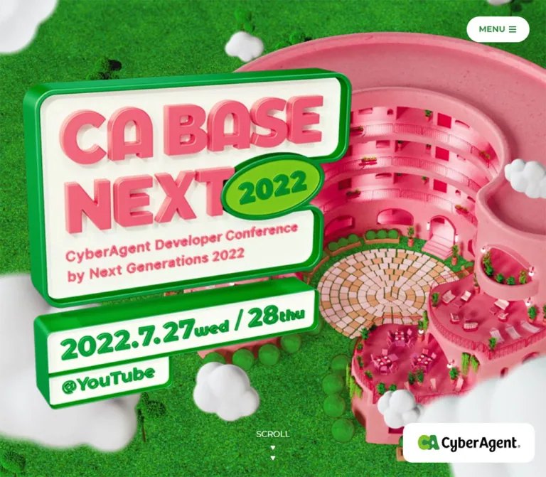
CA BASE NEXT 2022|ピンクの3DCG空間と緑のタイムテーブル
鮮やかなピンクの3DCG建築と緑の芝生が印象的な技術カンファレンスサイト。淡いピンクの背景、太い欧文見出し、緑のピル型UIを組み合わせ、PCの3ルーム時間割をスマートフォンでは時刻別リストに切り替える。
CA BASE NEXT 2022 — Style Reference
A candy-pink virtual venue surrounded by green lawn, followed by a precise green conference program.
Website: CA BASE NEXT 2022 Original URL: https://ca-base-next.cyberagent.co.jp/2022/ Final URL: https://ca-base-next.cyberagent.co.jp/2022/ Theme: pale pink content canvas, green interface, vivid pink architectural imagery, and a dark closing scene. Inspected: October 2, 2026, at 04:15:25 JST; supplied retrieval timestamp: October 1, 2026, at 19:15:25.339 UTC. Viewports: 1440 × 1000 desktop and 390 × 844 mobile, in CSS pixels. Scope: the currently served 2022 conference homepage: opening scene, Concept, About, social links, featured sessions, the initial Day 1 schedule, Topics, staff credits, and footer. Visual captures show desktop opening/schedule/closing states and mobile opening/closing states. The supplied rendered DOM supplies additional evidence for intervening sections.
CA BASE NEXT uses two complementary design systems. Its opening is a richly rendered miniature environment: pink curved architecture, red-pink doors and railings, saturated green grass, potted plants, irregular courtyard paving, and soft white clouds. An oversized extruded event sign floats over the scene. The content sections then use flat surfaces, strong English headings, Japanese sans-serif copy, fine green outlines, and compact metadata.
The page is a conference information site with session-detail links and a substantial program, rather than a single conversion panel. Its hierarchy moves from an immersive venue to a manifesto, an explanation of the event, curated talks, a complete timetable, related opportunities, and closing credits. The 2022 event dates remain part of the current page; this reference describes the page observed in 2026 without reconstructing an earlier version.
閉じる
CA BASE NEXT 2022 — Style Reference
A candy-pink virtual venue surrounded by green lawn, followed by a precise green conference program.
Website: CA BASE NEXT 2022 Original URL: https://ca-base-next.cyberagent.co.jp/2022/ Final URL: https://ca-base-next.cyberagent.co.jp/2022/ Theme: pale pink content canvas, green interface, vivid pink architectural imagery, and a dark closing scene. Inspected: October 2, 2026, at 04:15:25 JST; supplied retrieval timestamp: October 1, 2026, at 19:15:25.339 UTC. Viewports: 1440 × 1000 desktop and 390 × 844 mobile, in CSS pixels. Scope: the currently served 2022 conference homepage: opening scene, Concept, About, social links, featured sessions, the initial Day 1 schedule, Topics, staff credits, and footer. Visual captures show desktop opening/schedule/closing states and mobile opening/closing states. The supplied rendered DOM supplies additional evidence for intervening sections.
CA BASE NEXT uses two complementary design systems. Its opening is a richly rendered miniature environment: pink curved architecture, red-pink doors and railings, saturated green grass, potted plants, irregular courtyard paving, and soft white clouds. An oversized extruded event sign floats over the scene. The content sections then use flat surfaces, strong English headings, Japanese sans-serif copy, fine green outlines, and compact metadata.
The page is a conference information site with session-detail links and a substantial program, rather than a single conversion panel. Its hierarchy moves from an immersive venue to a manifesto, an explanation of the event, curated talks, a complete timetable, related opportunities, and closing credits. The 2022 event dates remain part of the current page; this reference describes the page observed in 2026 without reconstructing an earlier version.
How to Read This Reference
- Measured means a value appears in the supplied computed styles or rendered element geometry. These are browser observations, not a complete stylesheet audit.
- Visual estimate means an approximate dimension, color, or relationship read from the original-page screenshots. Estimated colors were not sampled with a pixel-analysis tool.
- Derived means a calculation from supplied measurements, such as the 24px gap between featured cards.
- Recommended means an implementation choice for a new build. Recommendations are not evidence of existing functionality.
- All CSS token names in this document are implementation aliases. The supplied custom-property maps were empty; that does not establish that the website contains no CSS variables.
- Some sampled rectangles differ from the settled screenshots. Desktop session links, for example, were recorded at 921.6px wide while the visible full-width schedule spans approximately 1024px. Several navigation rectangles are visibly compressed. Do not treat these rectangles as final layout specifications or infer a particular animation library from them.
- The evidence establishes visible states, link destinations, and computed transitions. It does not establish the behavior of an opened menu, changed category, selected Day 2, hovered card, or animated scene over time.
Tokens — Colors
Default Palette
| Name | Value | Suggested token | Role and evidence |
|---|---|---|---|
| Pale Pink Canvas | #fff8f8 |
--color-page |
Measured body background at both viewports; the quiet base behind program content |
| Conference Green | #237b31 |
--color-green |
Measured solid color for session links and social-action backgrounds |
| Soft Green Text | rgba(35, 123, 49, 0.94) |
--color-green-text |
Measured on major headings, narrative text, menu labels, and secondary metadata |
| Signal Pink | #e81152 |
--color-accent |
Measured Concept/About headings and mobile session room/time rows |
| White | #ffffff |
--color-white |
Measured session-card and menu surfaces; reversed footer and button text |
| Narrative White | rgba(255, 255, 255, 0.95) |
--color-panel |
Measured Concept/About panels; mobile social panel |
| Social Mint | #e7f5e9 |
--color-mint |
Measured desktop social-link panel background |
| Architectural Pink | Approximately #ee8096 |
--color-stage-pink |
Visual estimate for a representative lit building surface; not a uniform material color |
| Closing Forest | Approximately #071f19 |
--color-night |
Visual estimate for the dark closing scene; the actual image varies across the frame |
Keep the solid green and its 94%-opacity text variant distinct when reproducing measured styles. The latter composites against its background; it is not an additional opaque brand color.
Signal Pink is an interface accent. The building includes a much broader range of pale pink, coral, hot pink, and shadowed magenta. Filling the hero with #e81152 would not reproduce the architectural artwork.
Section Color Modes
| Region | Color relationship | Status |
|---|---|---|
| Opening scene | Pink structure against green ground, white clouds, ivory sign face | Visually observed |
| Narrative panels | Nearly opaque white, green body copy, pink headings | Computed values observed |
| Program and Topics | Pale pink canvas, green hierarchy, white outlined content | Computed values and desktop screenshot observed |
| Closing credits | White text over a very dark, softened version of the architectural scene | Visually observed; overlay recipe unknown |
These are section treatments. No user-selectable theme system was demonstrated.
Tokens — Typography
Montserrat — English Display and Metadata
The computed family is Montserrat for English section headings, navigation headings, day labels, several schedule metadata lines, the scroll cue, and footer utilities. Strong weights give the page its rounded, emphatic editorial rhythm.
Use 800 for the large program headings and 900 for Concept/About. The difference is measured: the narrative headings are smaller but heavier. Most other English labels use 700, with regular-weight metadata and utility text at 400.
The evidence provides the computed family name, not font file URLs or a complete loading configuration. Supply Montserrat separately when available; the Quick Start includes a fallback but does not download a font.
Japanese Content — Generic Sans Serif
Japanese narrative copy, session titles, social descriptions, and Topics headings use computed sans-serif. The browser determines the actual Japanese fallback. Do not attribute this text to a specific Japanese font without further evidence.
The general document stack is -apple-system, system-ui, 'Helvetica Neue', sans-serif, at a 16px root. Unlike interfaces that use miniature fluid rem units, this page can be adapted with ordinary CSS pixels and rems.
Artwork Lettering
The hero's chunky event lettering is rendered artwork with extrusion, bevels, highlights, and cast shadows. Its event title, year badge, dates, and YouTube label belong to the sign composition. The empty text content of the sampled H1 does not establish the image's accessible name, because image alternatives and the accessibility tree were not supplied.
Do not approximate the sign by applying a heavy web font to a flat rectangle. Keep semantic event information available independently in a new implementation.
Type Scale
All values below are measured computed styles unless marked otherwise. Line heights are CSS values, not necessarily the height of a transformed element rectangle.
| Role | Desktop size / line height | Mobile size / line height | Weight and family |
|---|---|---|---|
Program headings: PICK UP SESSIONS, SESSIONS, TOPICS |
68px / 68px |
44px / 44px |
Montserrat, 800 |
CONCEPT, ABOUT |
48px / 62.4px |
Same | Montserrat, 900 |
| Narrative English subtitle | 14px / 18.2px |
Same | Montserrat, 700 |
| Concept copy | 20px / 40px |
16px / 32px |
Sans-serif, 700 |
| Concept closing Japanese statement | 40px / 64px |
28px / 44.8px |
Sans-serif, 700 |
| Concept closing event name | 28px / 44.8px |
20px / 32px |
Montserrat, 700 |
| About copy | 16px / 28.8px |
14px / 25.2px |
Sans-serif, 700 |
| Featured day heading | 32px / 32px |
22px / 28.6px |
Montserrat, 800 |
| Featured session title | 16px / 25.6px |
Same | Sans-serif, 700 |
| Desktop schedule speaker/category line | 13px / 16.9px |
Not separately sampled | Montserrat, 400 |
| Mobile schedule room/time row | Not separately sampled | 14px / 18.2px |
Montserrat, 700 |
| Social heading | 16px / 20.8px |
Same | Sans-serif, 700 |
| Social description | 14px / 22.4px |
Same | Sans-serif, 400 |
| Social action / menu label | 16px / 22.4px |
Same computed size | Sans-serif, 700; mobile menu text is visually hidden |
| Topics title | 16px / 25.6px |
13px / 20.8px |
Sans-serif, 700 |
| Closing heading | 24px / 31.2px |
16px / 20.8px |
Montserrat, 700 |
| Footer legal links | 12px / 15.6px |
11px / 14.3px |
Montserrat, 700 |
| Trademark notice | 11px / 17.6px |
Same | Sans-serif, 400 |
| Powered-by link | 13px / 16.9px |
Same | Montserrat, 700 |
| Copyright | 11px / 14.3px |
Same | Montserrat, 400 |
Letter spacing is reported as normal throughout the sampled text. Avoid adding conspicuous tracking to the large English headings. Their impact comes from weight, size, and a tight line-height ratio.
Tokens — Spacing & Shapes
The page alternates broad scenic space with compact information. A small set of rounded forms ties the two together: large narrative panels, medium schedule corners, pill controls, and a circular mobile menu.
Spacing Scale
| Value | Observed use | Evidence |
|---|---|---|
8px |
Separation between Concept and About; between mobile narrative/social panels | Derived from adjacent section rectangles |
12px |
Mobile header horizontal inset; mobile session vertical padding; mobile Topics title padding | Computed |
16px |
Mobile content gutter; Topics grid gap; mobile session horizontal padding | Computed / geometry |
20px |
Desktop session horizontal padding; desktop menu horizontal padding | Computed |
24px |
Featured-card horizontal gaps; narrative stanza separation in sampled text | Derived |
32px |
Desktop header inset; mobile panel horizontal padding; desktop social-column gap | Computed |
40px |
Desktop social-panel vertical padding; mobile About vertical padding | Computed |
48px |
Mobile Concept vertical padding; footer horizontal padding | Computed |
56px |
Desktop About top padding | Computed |
72px |
Desktop Concept vertical padding; footer top padding | Computed |
80px |
Mobile major-section top padding; desktop About/social horizontal padding | Computed |
88px |
Desktop Concept horizontal padding | Computed |
136px |
Desktop featured/program/Topics section top padding | Computed |
160px |
Gap from the social panel's end to the featured section's outer start | Derived at both viewports |
Border Radius
| Element | Value | Status |
|---|---|---|
| Concept panel | 24px |
Measured |
| Desktop About panel | 24px 24px 0 0 |
Measured |
| Desktop social panel | 0 0 24px 24px |
Measured |
| Mobile About and social panels | 24px on every corner |
Measured |
| Session links | 12px |
Measured |
| Desktop menu | 28px |
Measured |
| Social action | 9999px |
Measured |
| Mobile day buttons | 12px |
Measured |
| Category chips and desktop day capsule | Fully rounded | Visually observed; exact radius not supplied |
The schedule has fine green outlines, approximately 1px in the desktop capture. Border widths were not included in the supplied computed-style fields, so treat 1px as a visual estimate and a practical implementation choice.
Layout Measurements
| Element | Desktop | Mobile | Interpretation |
|---|---|---|---|
| Main content region | 1024px, starting at x = 208 |
358px, starting at x = 16 |
Measured; desktop margins are (1440 − 1024) / 2 |
| Narrative panels | 720px, starting at x = 360 |
358px, starting at x = 16 |
Measured |
| Compact desktop event logo | 240 × 72px, at 32, 32 |
Approximately 132 × 40px in the closing capture |
Desktop measured; mobile visual estimate |
| Menu button | 122 × 50px, at 1286, 32 |
44 × 44px, at 334, 16 |
Measured |
| Hero H1 container width | 637.55px |
239.21px |
Measured; its tall rectangle is not the visible sign height |
| Hero company-link box | 256 × 82.8px, right/bottom area |
160 × 54px, at 22, 768 |
Measured; visible white artwork may occupy less than the link box |
| Featured link width | 238px |
242px |
Measured |
| Featured horizontal gap | 24px |
24px |
Derived from consecutive x positions |
| Desktop social columns | 262px + 262px, with 32px gap |
Stacked; action width 290px |
Computed / geometry |
| Desktop Topics columns | 504px + 504px, with 16px gap |
Single 358px column |
Computed / geometry |
| Day-button boxes | Approximately 151–153 × 82px each |
178 × 32.8px each |
Measured; enclosing border is additional |
| Footer notice text width | 384px |
294px |
Measured |
Components
Persistent Header
Role: event identity and access to section navigation.
The header is visually transparent and does not consume a conventional opaque navigation band. Desktop content captures show the small event logo at the upper left and a white MENU capsule at the upper right. The same corner placement remains visible at widely separated scroll positions, consistent with a persistent header; the supplied style fields do not explicitly include its positioning rule.
On mobile, the menu becomes a 44px white circle with a green three-line icon. The word MENU remains in the extracted button text but is not visible in the capture. The opening scene uses the large event sign without visibly duplicating the compact corner logo. The closing mobile capture does show the compact logo.
In the dark closing scene, the menu is transparent with a white outline and white content. This is an observed section-dependent appearance, not a demonstrated theme toggle.
The DOM includes CLOSE, five anchor destinations—CONCEPT, ABOUT, PICK UP, SESSIONS, and TOPICS—plus Twitter and YouTube links. Their sampled rectangles belong to a compressed state. The expanded menu's dimensions, backdrop, entrance direction, and keyboard behavior are unverified.
Opening Venue and Event Sign
Role: communicate the event's creative identity before presenting dense program information.
The desktop composition is an elevated view into a large circular pink building. The open courtyard sits to the right of a dominant event sign. Clouds overlap the foreground and frame the edges. Fine plants, railings, chairs, wall openings, and paving provide scale.
The sign has a green extruded perimeter, an ivory face, raised pink lettering, and a lime-green year badge. Separate lower plates carry the dates and YouTube label. These pieces form one visual identity, rather than a heading with a generic CTA underneath.
At 1440px wide, the sampled sign container is approximately 44.3% of the viewport width and begins about 4% from the left edge. The visible sign sits around the vertical middle of the scene. A white company badge anchors the lower right, while a small white SCROLL label and downward triangles sit near the bottom center.
The mobile scene is materially different: it faces the building's interior and central entrance. Balconies run across the viewport, and courtyard paving fills the bottom. The sign moves to the upper left and uses approximately 61.3% of the viewport width. The company badge moves to the lower left. A simple crop of the desktop overview would not recreate this viewpoint.
The rendering technology is unknown. The images establish a 3DCG aesthetic, not whether the runtime uses video, canvas, a 3D engine, or pre-rendered images.
Concept Panel
Role: present the event's manifesto within the scenic opening sequence.
A centered, nearly opaque white panel with 24px corners. Desktop width is 720px, with 72px vertical and 88px horizontal padding. The mobile panel is 358px wide with 48px vertical and 32px horizontal padding.
Its hierarchy is distinctive: pink CONCEPT at 48px/900, a small pink What is BASE HAUS? subtitle, bold green Japanese stanzas, then a larger closing statement and event name. The long line height—twice the body font size—makes the copy read as deliberate statements rather than a dense paragraph.
Mobile preserves the 48px English heading while reducing body copy from 20px to 16px and changing line breaks. Preserve the short stanzas and pauses. Do not merely shrink a desktop text block until every original line fits.
About and Social Panels
Role: explain the conference and provide channel-following actions.
The About panel repeats the pink heading/subtitle and green copy hierarchy. Its prose is more compact than Concept: 16px/28.8px on desktop and 14px/25.2px on mobile, both bold.
Desktop About and social content form a joined assembly. About has rounded upper corners; the mint social region has rounded lower corners. The social region contains two equal columns, each with a heading, explanatory copy, and a full-width green pill link. The visible source labels include チャンネル登録する and フォローする.
Mobile separates About and the social block into individual white panels with 24px corners and an 8px outer gap. The two social units stack vertically. This is a change in surface and grouping, not only a column-count change.
The observed action boxes are 40px high. A new implementation can increase them to a 44px minimum without changing the pill treatment.
Featured Session Groups
Role: give selected talks a more editorial presentation before the complete schedule.
Two day groups each contain four linked session entries. Every link exposes a session type, time, day, Japanese title, category, and speaker where provided. The corresponding session-detail destinations are present in the original page evidence.
On desktop, four 238px link boxes occupy the 1024px content region with 24px gaps. The visible lower portions in the schedule capture show green outlined title blocks and attached metadata strips. Categories and speakers appear in adjacent small compartments rather than floating badges scattered over a card.
Titles use 16px bold sans-serif with 25.6px line height. Several title rectangles contain three lines. One visible title ends with an ellipsis; the exact clipping implementation was not supplied.
On mobile, entries remain about 242px wide and sit at x positions 16, 282, 548, and 814. This establishes a horizontal sequence extending beyond the viewport, rather than a four-card vertical stack. Swipe behavior, snapping, and navigation controls were not exercised. For a new implementation, a native horizontal overflow region is a suitable accessible starting point.
The full featured media areas are not shown in the supplied original-page screenshots, and image URLs were not supplied. Do not invent their imagery or aspect ratios.
Session Category Controls
Role: expose the program's technical disciplines.
The desktop capture displays thirteen outlined pills: All, AI/Data, DX, Web Frontend, DevOps, Backend, Mobile, CG, Game, UI/UX, Ad, Video, and Special.
The selected All pill has a green fill and white type. Other pills retain the pale page background with green text and fine green borders. At the desktop capture, the pills occupy two rows to the left of the day selector. Their height is approximately 40px, and their labels appear around 22px; these are visual estimates because individual category styles were not included.
The current selected appearance is verified. Filtering semantics, multiple-selection behavior, result counts, and empty states are not. Use actual buttons and explicit selected-state attributes in a new implementation rather than relying on color alone.
Day Selector
Role: switch the displayed program day.
Desktop uses a two-segment outlined capsule, approximately 306px wide and 84px high including its boundary. The selected first half is solid green. Each segment stacks the day label above a larger bold date, visually emphasizing 07.27 and 07.28.
At the mobile viewport, each measured button is 178px wide and approximately 32.8px high, placing the pair across the 358px content region. The control is below the category area rather than alongside it. Mobile buttons have a measured 12px radius.
Day 1 is the supplied state. The presence of Day 2 featured sessions does not prove that switching the main timetable was tested. The computed day-button transition is 0.2s ease-out, but its visual endpoint is not documented.
Desktop Timetable
Role: compare simultaneous sessions across three rooms.
The schedule has equal Room A, Room B, and Room C columns beneath solid green header cells. White room labels are centered. In the screenshot, the room header row is approximately 69px high.
The opening session and the following special session span all three columns. Their text is centered both horizontally and vertically. Regular parallel talks occupy individual room columns. A session's hierarchy is time in pink, an optional compact special-format label, a bold green title, and a smaller speaker/category line.
White cells have fine green outlines and 12px corners. Cells meet closely; this is a continuous timetable, not a loose grid of elevated cards. Breaktime entries occur between time slots in the desktop text evidence.
The visible opening cell is approximately 120px high for 15 minutes, and the next special is approximately 320px high for 40 minutes. Both imply roughly 8px per minute in this captured state. This is a derived visual relationship, not a recovered CSS formula. Preserve duration as a spatial cue if rebuilding the timetable, while allowing content to exceed a nominal height.
The sampled link rectangles are smaller than the final screenshot by about 10% in some cases. Use the screenshot for the final full-width structure and the computed styles for padding, typography, and radius; do not encode 921.6px as the overall schedule width.
Mobile Timetable
Role: make the same program readable as a chronological sequence.
Mobile changes the information architecture. Start-time headings such as 16:00- group the content. Within each time group, Room A, Room B, and Room C sessions appear one after another. The room name moves into each card's pink room/time row.
Cards span 358px and use 12px vertical by 16px horizontal padding with 12px corners. Common measured heights are about 136.2px, with shorter opening content at 113.8px and the long final group at 151.8px. Height therefore follows content much more closely than event duration.
Speaker information and category labels appear separately in the extracted reading order. Desktop Breaktime repetition is absent from the mobile text. Preserve this chronological grouping instead of compressing the three-column board into narrow phone columns.
Topics
Role: connect attendees to recruitment, internships, and related events.
Four linked entries expose a Japanese content category, an audience label such as for Engineer or for Creator, and a Japanese title. The links lead to corporate careers pages and an event page.
Desktop uses a two-column grid with 504px columns and 16px gaps. The title rectangles occupy the right-hand portion of each entry, supporting a horizontal media/information arrangement. Mobile changes to one 358px-wide column; each entry is approximately 283–304px tall, with the title near the bottom and 12px title padding.
Mobile Topics titles reduce to 13px/20.8px. The supplied screenshots do not show this region, so its image subjects, exact cropping, and decorative treatment remain unverified.
Closing Credits and Footer
Role: close the event narrative and acknowledge contributors.
The architectural world returns as a darkened, softened background. A centered white SEE YOU NEXT TIME! heading introduces credits. Desktop role labels occupy a narrow left column, connected by dotted leaders to a wider name column. The names use dense, slash-separated wrapping. The credit block is roughly 580px wide in the screenshot; this is an estimate.
Mobile removes the two-column arrangement and dot leaders. Each uppercase role sits above its names within approximately 28px side insets. The long main-staff list wraps naturally; subsequent role groups use clear vertical spacing.
The original page explicitly displays categories including MAIN STAFF, SUPPORT, PROMOTION SUPPORT, PROMOTION ANALYSIS, 3DCG PRODUCTION, 3DCG MANAGEMENT, and 3DCG SUPPORT. It names Atsushi Tamori and Kenichi Makaya under 3DCG PRODUCTION. These are the page's credited roles; they do not establish who designed or implemented the website.
Below the credits, the CyberAgent logo uses its green symbol and white wordmark directly on the dark background. Legal links, a small trademark notice, the linked Powered by YMCA label, and copyright form a centered stack. The company identity is supported by the original footer, copyright, and corporate links. The specific scope of YMCA's contribution is not stated.
Tokens — Motion & Interaction
| Element | Supplied computed value or visible state | What can be concluded |
|---|---|---|
| Compact desktop logo link | 0.4s ease-in-out |
A transition is declared; trigger and changing property are not established |
| Menu button | 0.3s ease-in-out |
A transition is declared; an expanded-menu sequence was not supplied |
| Close and social actions | color 0.2s, background-color 0.3s, transform 0.15s |
Property-specific timings are measured; endpoint colors and transform values are unknown |
| Day buttons | 0.2s ease-out |
Transition timing is measured; day switching was not exercised |
| Desktop session links | 0.2s ease-in-out |
A transition is declared; hover/reveal behavior is unverified |
| Most sampled text and sections | animation: none |
No animation is reported on those sampled elements at extraction time |
| Many other elements | transition: all without a duration in the supplied serialization |
This alone is insufficient evidence of a visible timed effect |
| Scene and clouds | Different captured compositions and a softened closing scene | Appearance is established; travel paths, playback, parallax, and timing are not |
The capture process waited for finite animations and sampled stability, temporarily pausing perpetual animations during readiness checks. That procedure does not provide a motion recording. It also does not rule out JavaScript-driven media, animation on unsampled elements, or later interactions.
Recommended adaptation: use short 150–300ms color or opacity transitions for ordinary controls. Preserve a usable static venue scene and honor reduced-motion preferences. Add scene animation only with an explicit art direction and a tested static fallback; no exact camera choreography can be recovered from these captures.
Surfaces
| Surface | Appearance | Purpose |
|---|---|---|
| Scenic opening | Detailed pink/green 3DCG with soft clouds and realistic shading | Establish a memorable virtual venue |
| Event sign | Ivory face, green extrusion, raised pink type | Carry event identity and date information |
| Content canvas | Flat #fff8f8 |
Give dense program content a quiet background |
| Narrative panel | White at 95% opacity, 24px corners | Separate long copy from surrounding scenery |
| Desktop social region | Flat pale mint, joined lower corners | Group channel-following actions with About |
| Session cells | White, thin green outline, 12px corners | Express timing and room structure |
| Selected controls | Green fill and white labels | Indicate the current day or category |
| Closing scene | Very dark architectural image with white text | Visually bookend the opening and support credits |
There is no prominent card-elevation system in the supplied content capture. Depth belongs mainly to the artwork. Use borders, color, grouping, and spacing for interface hierarchy; any softness around the floating menu is secondary.
Imagery
The stage resembles a carefully lit miniature set. Large rounded architecture is combined with small-scale detail: curved red railings, potted shrubs, balcony plants, chairs and tables, inset arched doors, and a courtyard arranged in concentric irregular paving. Saturated green grass provides texture and contrast. Soft cloud forms overlap the building and frame the view.
The hero sign repeats the world's tactile quality. Its bevels and extrusion should remain visible, including the slight perspective tilt and separate lower date plates. The lime year oval is a local accent inside the sign, not a general-purpose interface color.
Desktop shows the venue from above; mobile brings the viewer inside. Treat these as distinct art-directed compositions. An alternative implementation may use separately rendered stills, but it should preserve the architectural relationship and intentional room for the logo and menu.
The closing scene is visibly blurred or otherwise softened and strongly darkened. The evidence does not distinguish a CSS blur from a preprocessed image or another rendering method. Recreate the visual effect with an appropriate technique rather than attributing a specific filter to the original.
Observed Asset References
No original media URLs were included in the supplied asset evidence. The table identifies visual roles, not downloadable paths.
| Visual asset | Evidence | Reuse guidance |
|---|---|---|
| Desktop venue overview | Original desktop opening capture | Preserve the open circular courtyard and left-hand sign space |
| Mobile interior view | Original mobile opening capture | Preserve the central entrance, balcony levels, and bottom paving |
| Large event/date sign | Both original opening captures | Keep as authored artwork with accessible event text alongside it |
| Compact event logo | Desktop content/closing and mobile closing captures | Use a dedicated compact variant rather than a tiny full hero composition |
| White company badge | Original opening captures | Preserve green symbol, dark wordmark, and white rounded backing |
| Reversed company logo | Original closing captures | Use the white-wordmark version directly on the dark scene |
| Dark closing background | Original closing captures | Retain recognizable architecture while subordinating it to credits |
| Featured/Topics media | Layout regions indicated by DOM; full imagery not shown | Obtain authorized assets; do not infer subjects from missing captures |
Layout & Responsive Behavior
The desktop layout uses two centered reading widths: 720px for narrative panels and 1024px for featured sessions, the timetable, and Topics. Mobile brings both systems to 358px within a 390px viewport, producing consistent 16px outer gutters.
| Feature | Desktop observation | Mobile observation |
|---|---|---|
| Hero composition | Elevated overview of the circular building | Interior-facing architectural composition |
| Event sign | Approximately 44.3vw wide, vertically centered | Approximately 61.3vw wide, near the top left |
| Company badge | Bottom right | Bottom left |
| Menu | Text-and-icon pill | Icon-only circle |
| Program heading | 68px | 44px; PICK UP SESSIONS wraps to two lines |
| Concept/About heading | 48px | Remains 48px |
| Narrative body | Larger type and longer lines | Smaller type with shorter, deliberate line breaks |
| About/social assembly | Joined white and mint panels; two social columns | Separate rounded white panels; stacked social units |
| Featured sessions | Four columns per day | Horizontal sequence with cards extending offscreen |
| Day control | Beside category pills | Beneath category area, spanning content width |
| Timetable | Three rooms with duration-related cell heights | Start-time groups containing stacked room cards |
| Topics | Two columns with horizontal information layout | One column with titles below the media area |
| Credits | Label/name columns with dotted leaders | Role above names, no dot leaders |
The Concept panel begins around document y = 1900px on desktop and y = 1619px on mobile in the supplied geometry—roughly two initial viewport heights down. This indicates a substantial scenic lead-in. It does not establish the exact scrolling or pinning mechanism.
The observation reports scrollable document heights of 10,404px and 11,489px. Sampled HTML/body rectangles report smaller heights, while closing elements appear below them. Treat these as evidence of measurement differences in the captured page state, not as fixed page-height targets. Build from content flow and validate actual scrolling.
No breakpoint definitions were supplied. The Quick Start uses 48rem as a recommended adaptation breakpoint, not a recovered source value. Intermediate tablet behavior requires separate testing.
Do’s and Don’ts
Do
- Preserve the relationship between pink architectural imagery and a green information interface.
- Use the measured pale pink canvas, green, signal pink, white, and mint values for interface surfaces.
- Keep the hero sign as dimensional artwork rather than ordinary heading text.
- Provide distinct desktop and mobile scene compositions.
- Use Montserrat for the measured English display roles and a reliable sans-serif fallback for Japanese.
- Preserve the 720px narrative and 1024px program widths on wide screens.
- Keep Concept's generous line height and stanza rhythm.
- Join About and the mint social region on desktop, then separate them into white panels on mobile.
- Retain attached metadata strips and clear title/category/speaker hierarchy in featured entries.
- Use a three-room timetable on desktop and chronological room cards on mobile.
- Let the final dark scene echo the opening venue.
- Keep small footer text visually secondary while maintaining readable contrast.
Don’t
- Do not replace the program with generic feature cards or repeated signup blocks.
- Do not assign a different bright color to every technical category.
- Do not use the interface accent pink as a flat replacement for the architectural materials.
- Do not add heavy shadows to every white session cell.
- Do not scale a desktop timetable down until three narrow room columns fit a phone.
- Do not force all desktop sessions to the same visual height when duration matters.
- Do not infer swipe snapping, filtering rules, menu animation, or camera movement from static captures.
- Do not copy compressed navigation or offscreen link rectangles as final dimensions.
- Do not invent a Japanese font family, graphics engine, asset path, or web-production credit.
- Do not hardcode the captured total document height.
Recommended Implementation Additions
These are recommendations for a new implementation, not verified properties of the original page.
- Give the menu an accessible name,
aria-expanded, and a relationship to its controlled navigation. If the expanded version acts as a modal, implement appropriate focus handling and Escape dismissal. - Implement category controls as buttons with explicit selected states. Choose day-selector semantics according to the implemented behavior rather than applying tab roles to styling alone.
- Preserve room, date, start time, duration, title, and speaker relationships in the accessible schedule reading order.
- Use at least 44px interaction targets where practical, including the observed 40px social actions and approximately 33px mobile day buttons.
- Keep long Japanese titles and speaker lists readable under text zoom. Avoid mandatory fixed heights on mobile cards.
- Make the horizontal featured sequence keyboard reachable and prevent it from creating document-wide horizontal overflow.
- Provide meaningful event text and dates outside decorative sign imagery. Determine suitable alternatives for each media asset from its actual content.
- Offer a static scene and reduced-motion mode if adding animated media. Ensure program navigation remains usable if media fails to load.
- Load the opening composition preferentially and defer nonessential offscreen media. Exact media formats, budgets, and loading behavior were not established by this inspection.
- Test focus visibility on pale, green-filled, and dark scenic surfaces, especially around small footer links and selected controls.
Agent Prompt Guide
Quick Color Reference
- Main page:
#fff8f8. - Solid interface green:
#237b31. - Softer heading/body green:
rgba(35, 123, 49, 0.94). - Narrative heading and time accent:
#e81152. - Session/menu surfaces:
#ffffff. - Narrative panel: white at 95% opacity.
- Desktop social surface:
#e7f5e9. - Stage pink and closing darkness: image-dependent; representative estimates are
#ee8096and#071f19.
Overall Prompt
“Create a conference homepage with a vivid miniature 3DCG venue: a rounded pink circular building, green lawn, soft white clouds, plants, balcony railings, and an irregular paved courtyard. Place an extruded ivory-and-green event sign with raised pink lettering over the scene. Use a distinct interior-facing composition on phones. Follow the opening with 720px white narrative panels, then a 1024px program region on a pale pink #fff8f8 canvas. Use green #237b31 interface text and outlines, pink #e81152 accents, Montserrat display headings, rounded category controls, featured talks, and a three-room schedule. On phones, convert the schedule into chronological groups with stacked room cards. End with white credits over a dark softened return to the architectural scene. Keep interactions functional, but treat unobserved animation details as new design decisions.”
Example Component Prompts
- Narrative panel: “Build a 720px panel with 24px corners and white at 95% opacity. Use a 48px, weight-900 Montserrat
CONCEPTheading in#e81152, a 14px subtitle, and bold green Japanese stanzas at 20px with 40px line height. At 390px viewport width, use 16px outer gutters, 32px inner horizontal padding, and 16px/32px body copy.” - Program controls: “Place two wrapped rows of green outlined category pills to the left of a two-part day capsule. Fill
Alland the first day with green and reverse their text to white. Keep category colors uniform. Put the day control beneath the categories on phones and provide explicit selected states.” - Desktop schedule: “Create a 1024px timetable with three equal room columns, green room headers, white cells with fine green outlines, and 12px corners. Opening and special sessions span all rooms. Put pink time text above bold green titles and smaller speaker/category metadata. Use roughly 8px per minute as an initial visual proportion, allowing text to increase cell height.”
- Mobile schedule: “Use 358px-wide cards inside 16px gutters at a 390px viewport. Group by start time. Stack Room A, B, and C cards inside each group, placing room and time in a 14px bold pink row. Use 12px by 16px padding and content-driven heights.”
- Closing credits: “Return to the same pink architectural setting, strongly darkened and softened. Set a centered white closing heading over a compact staff list. Use role/name columns with dotted leaders on desktop and stacked role/name groups on mobile. Finish with a reversed company logo and small centered legal links.”
Quick Start
CSS Custom Properties
This is an adaptation, not extracted source code. It combines measured tokens with explicitly recommended layout rules. Supply authorized scene, sign, logo, and content images through markup; no asset paths are assumed. Load Montserrat separately if available.
The static scenic runway approximates the observed distance to Concept. It does not reproduce an unknown scene-pinning or camera-animation system. The 48rem breakpoint, estimated 8px-per-minute schedule scale, focus treatment, hover colors, and 44px minimum action targets are implementation choices.
:root {
  /* Measured interface colors */
  --color-page: #fff8f8;
  --color-green: #237b31;
  --color-green-text: rgba(35, 123, 49, 0.94);
  --color-accent: #e81152;
  --color-white: #ffffff;
  --color-panel: rgba(255, 255, 255, 0.95);
  --color-mint: #e7f5e9;

  /* Visual estimate for the closing fallback */
  --color-night: #071f19;

  --font-display: 'Montserrat', sans-serif;
  --font-copy: sans-serif;
  --font-system: -apple-system, system-ui, 'Helvetica Neue', sans-serif;

  --measure-wide: 1024px;
  --measure-panel: 720px;
  --gutter: 16px;
  --section-space: 136px;
  --radius-panel: 24px;
  --radius-card: 12px;
  --radius-pill: 9999px;
  --rule: 1px;

  /* Derived visual proportion, not a recovered source formula */
  --minute-height: 8px;
  --motion-control: 200ms ease-in-out;
}

* { box-sizing: border-box; }

html { font-size: 16px; }

body {
  margin: 0;
  color: var(--color-green);
  background: var(--color-page);
  font: 400 16px / 1.5 var(--font-system);
}

img { display: block; max-width: 100%; }
button { font: inherit; cursor: pointer; }
button, a { -webkit-tap-highlight-color: transparent; }
button:disabled { cursor: default; }
[hidden] { display: none !important; }

.content-width {
  width: min(var(--measure-wide), calc(100% - 2 * var(--gutter)));
  margin-inline: auto;
}

.site-header {
  position: fixed;
  z-index: 20;
  inset: 32px 32px auto;
  display: flex;
  justify-content: space-between;
  align-items: flex-start;
  pointer-events: none;
}

.site-header > * { pointer-events: auto; }
.brandmark { display: block; width: 240px; }

/* Application code must set these section-dependent states. */
.site-header[data-at-hero='true'] .brandmark {
  visibility: hidden;
}

.menu-button {
  display: inline-flex;
  align-items: center;
  justify-content: center;
  gap: 8px;
  width: 122px;
  height: 50px;
  padding: 15px 20px;
  border: 1px solid transparent;
  border-radius: 28px;
  color: var(--color-green-text);
  background: var(--color-white);
  font: 700 16px / 1.4 var(--font-copy);
  transition: color 300ms ease-in-out,
              background-color 300ms ease-in-out;
}

.site-header[data-surface='dark'] .menu-button {
  color: white;
  background: transparent;
  border-color: white;
}

.hero {
  position: relative;
  isolation: isolate;
  min-height: 100vh;
  min-height: 100svh;
  overflow: hidden;
  background: var(--color-green);
}

/* Use picture sources for separately art-directed scene images. */
.scene-media {
  position: absolute;
  z-index: -2;
  inset: 0;
  display: block;
  width: 100%;
  height: 100%;
}

.scene-media > img {
  width: 100%;
  height: 100%;
  object-fit: cover;
}

.hero-title {
  position: absolute;
  top: 50%;
  left: 4%;
  width: 44.3%;
  margin: 0;
  transform: translateY(-50%);
}

.hero-title img { width: 100%; }

.company-badge {
  position: absolute;
  right: 22px;
  bottom: 22px;
  display: grid;
  place-items: center;
  width: 256px;
  min-height: 83px;
  padding: 16px 28px;
  border-radius: 20px;
  background: white;
}

.scroll-cue {
  position: absolute;
  bottom: 32px;
  left: 50%;
  transform: translateX(-50%);
  color: white;
  text-align: center;
  font: 400 16px / 1.3 var(--font-display);
}

/* Static approximation of the observed scenic lead-in. */
.intro-stack { padding-top: 90svh; }

.narrative-panel,
.social-panel {
  width: min(var(--measure-panel), calc(100% - 2 * var(--gutter)));
  margin-inline: auto;
  color: var(--color-green-text);
}

.narrative-panel {
  border-radius: var(--radius-panel);
  background: var(--color-panel);
}

.concept-panel { padding: 72px 88px; }

.panel-title {
  margin: 0;
  color: var(--color-accent);
  font: 900 48px / 1.3 var(--font-display);
}

.panel-subtitle {
  margin: 0 0 48px;
  color: var(--color-accent);
  font: 700 14px / 1.3 var(--font-display);
}

.concept-copy {
  font: 700 20px / 2 var(--font-copy);
}

.concept-copy p { margin: 0; }
.concept-copy p + p { margin-top: 24px; }

.concept-signoff {
  margin-top: 32px;
  font: 700 40px / 1.6 var(--font-copy);
}

.concept-name {
  font: 700 28px / 1.6 var(--font-display);
}

.about-panel {
  margin-top: 8px;
  padding: 56px 80px 48px;
  border-radius: 24px 24px 0 0;
}

.about-copy {
  margin: 0;
  font: 700 16px / 1.8 var(--font-copy);
}

.social-panel {
  display: grid;
  grid-template-columns: repeat(2, minmax(0, 1fr));
  gap: 32px;
  padding: 40px 80px;
  border-radius: 0 0 24px 24px;
  background: var(--color-mint);
}

.social-unit h3 {
  margin: 0 0 12px;
  font: 700 16px / 1.3 var(--font-copy);
}

.social-unit p {
  margin: 0 0 24px;
  font: 400 14px / 1.6 var(--font-copy);
}

.action-pill {
  display: flex;
  align-items: center;
  justify-content: center;
  min-height: 44px;
  padding: 10px 16px;
  border-radius: var(--radius-pill);
  color: white;
  background: var(--color-green);
  text-decoration: none;
  font: 700 16px / 1.4 var(--font-copy);
}

.program-section {
  padding-top: var(--section-space);
  scroll-margin-top: 112px;
}

.pickup-section { margin-top: 160px; }

.section-title {
  margin: 0 0 40px;
  color: var(--color-green-text);
  font: 800 68px / 1 var(--font-display);
}

.day-heading {
  margin: 32px 0 24px;
  font: 800 32px / 1 var(--font-display);
}

.pickup-track {
  display: grid;
  grid-template-columns: repeat(4, minmax(0, 1fr));
  gap: 24px;
}

.pickup-card { color: inherit; text-decoration: none; }
.pickup-card img { width: 100%; height: auto; }

.pickup-title {
  margin: 0;
  padding: 12px;
  border: var(--rule) solid var(--color-green);
  border-radius: 8px;
  background: white;
  font: 700 16px / 1.6 var(--font-copy);
}

.pickup-meta {
  display: flex;
  flex-wrap: wrap;
  width: fit-content;
  max-width: 100%;
  border: var(--rule) solid var(--color-green);
  border-top: 0;
  border-radius: 0 0 8px 8px;
  font: 400 13px / 1.3 var(--font-copy);
}

.pickup-meta > span { padding: 6px 12px; }
.pickup-meta > span + span { border-left: 1px solid currentColor; }

.schedule-controls {
  display: grid;
  grid-template-columns: minmax(0, 1fr) 306px;
  align-items: start;
  gap: 32px;
  margin-bottom: 40px;
}

.category-list {
  display: flex;
  flex-wrap: wrap;
  gap: 8px 4px;
}

.category-chip {
  min-height: 40px;
  padding: 4px 16px;
  border: 1px solid var(--color-green);
  border-radius: var(--radius-pill);
  color: var(--color-green-text);
  background: transparent;
  font: 700 22px / 1.3 var(--font-display);
  transition: color var(--motion-control),
              background-color var(--motion-control);
}

.category-chip[aria-pressed='true'] {
  color: white;
  background: var(--color-green);
}

.day-switch {
  display: grid;
  grid-template-columns: repeat(2, minmax(0, 1fr));
  border: 1px solid var(--color-green);
  border-radius: var(--radius-pill);
  overflow: hidden;
}

.day-switch button {
  display: flex;
  flex-direction: column;
  align-items: center;
  justify-content: center;
  min-height: 82px;
  padding: 14px 16px;
  border: 0;
  border-radius: var(--radius-pill);
  color: var(--color-green-text);
  background: transparent;
  font: 400 20px / 1.1 var(--font-display);
  transition: color 200ms ease-out,
              background-color 200ms ease-out;
}

.day-switch strong { font-size: 32px; font-weight: 800; }
.day-switch [aria-pressed='true'] { color: white; background: var(--color-green); }

.room-headings,
.time-group {
  display: grid;
  grid-template-columns: repeat(3, minmax(0, 1fr));
  align-items: start;
}

.room-heading {
  display: grid;
  place-items: center;
  min-height: 69px;
  border-radius: var(--radius-card);
  color: white;
  background: var(--color-green);
  font-weight: 700;
}

.time-label,
.session-room { display: none; }

.session-link {
  display: block;
  min-width: 0;
  min-height: calc(var(--duration, 20) * var(--minute-height));
  padding: 16px 20px;
  border: var(--rule) solid var(--color-green);
  border-radius: var(--radius-card);
  color: var(--color-green);
  background: white;
  text-decoration: none;
  overflow-wrap: anywhere;
  transition: background-color var(--motion-control);
}

.session-link--plenary {
  grid-column: 1 / -1;
  display: flex;
  flex-direction: column;
  justify-content: center;
  text-align: center;
}

.session-time {
  margin: 0;
  color: var(--color-accent);
  font: 700 13px / 1.3 var(--font-display);
}

.session-title {
  margin: 0 0 6px;
  font: 700 16px / 1.4 var(--font-copy);
}

.session-meta {
  margin: 0;
  color: var(--color-green-text);
  font: 400 13px / 1.3 var(--font-display);
}

.break-row {
  display: grid;
  grid-template-columns: repeat(3, minmax(0, 1fr));
  text-align: center;
  font-size: 13px;
}

.topics-grid {
  display: grid;
  grid-template-columns: repeat(2, minmax(0, 1fr));
  gap: 16px;
}

.topic-card {
  display: grid;
  grid-template-columns: repeat(2, minmax(0, 1fr));
  align-items: center;
  color: inherit;
  text-decoration: none;
}

.topic-title {
  margin: 0;
  padding: 12px;
  font: 700 16px / 1.6 var(--font-copy);
}

.end-scene {
  position: relative;
  isolation: isolate;
  overflow: hidden;
  padding: 128px 28px;
  color: white;
  background: var(--color-night);
}

/* Recommended static approximation; original filter values are unknown. */
.end-scene .scene-media { filter: blur(5px); }
.end-scene::before {
  content: '';
  position: absolute;
  z-index: -1;
  inset: 0;
  background: rgba(3, 21, 16, 0.82);
}

.closing-title {
  margin: 0 0 64px;
  text-align: center;
  font: 700 24px / 1.3 var(--font-display);
}

.credit-list {
  max-width: 588px;
  margin: 0 auto;
  font: 400 13px / 1.2 var(--font-copy);
}

.credit-row {
  display: grid;
  grid-template-columns: 160px minmax(0, 1fr);
  gap: 4px;
  margin-bottom: 24px;
}

.credit-row dt {
  display: flex;
  align-items: baseline;
  gap: 6px;
  font: 700 11px / 1.3 var(--font-display);
}

.credit-row dt::after {
  content: '';
  flex: 1;
  min-width: 8px;
  border-bottom: 1px dotted currentColor;
}

.credit-row dd { margin: 0; }

.site-footer {
  display: flex;
  flex-direction: column;
  align-items: center;
  gap: 16px;
  padding-top: 72px;
  text-align: center;
}

.footer-logo { width: 208px; }
.footer-links { display: flex; flex-wrap: wrap; justify-content: center; gap: 12px; }
.footer-links a { color: inherit; font: 700 12px / 1.3 var(--font-display); }

.footer-notice {
  width: min(100%, 384px);
  margin: 0;
  font: 400 11px / 1.6 var(--font-copy);
}

.footer-powered { color: inherit; font: 700 13px / 1.3 var(--font-display); }
.footer-copyright { margin: 0; font: 400 11px / 1.3 var(--font-display); }

/* Recommended focus and hover states. */
:where(a, button):focus-visible {
  outline: 3px solid var(--color-accent);
  outline-offset: 4px;
}

.end-scene :focus-visible { outline-color: white; }

@media (hover: hover) {
  .session-link:hover { background: var(--color-mint); }
}

/* Recommended breakpoint; the original breakpoint was not supplied. */
@media (max-width: 48rem) {
  :root { --section-space: 80px; }

  .site-header { inset: 16px 12px auto; }
  .brandmark { width: 132px; }
  .menu-button { width: 44px; height: 44px; padding: 0; }
  .menu-label { display: none; }

  .hero-title {
    top: 36px;
    left: 16px;
    width: 61.3%;
    transform: none;
  }

  .company-badge {
    right: auto;
    left: 22px;
    width: 160px;
    min-height: 54px;
    padding: 12px 18px;
    border-radius: 12px;
  }

  .scroll-cue { display: none; }
  .intro-stack { padding-top: 92svh; }
  .concept-panel { padding: 48px 32px; }
  .panel-subtitle { margin-bottom: 32px; }
  .concept-copy { font-size: 16px; line-height: 2; }
  .concept-signoff { font-size: 28px; }
  .concept-name { font-size: 20px; }
  .about-panel { padding: 40px 32px; border-radius: 24px; }
  .about-copy { font-size: 14px; }

  .social-panel {
    grid-template-columns: 1fr;
    margin-top: 8px;
    padding: 32px;
    border-radius: 24px;
    background: var(--color-panel);
  }

  .section-title { font-size: 44px; margin-bottom: 32px; }
  .day-heading { font-size: 22px; line-height: 1.3; }

  .pickup-track {
    grid-template-columns: none;
    grid-auto-flow: column;
    grid-auto-columns: min(242px, 85vw);
    overflow-x: auto;
    padding-bottom: 12px;
  }

  .schedule-controls { grid-template-columns: 1fr; gap: 24px; }
  .category-chip { min-height: 44px; padding-inline: 12px; font-size: 16px; }
  .day-switch { border-radius: 12px; }

  .day-switch button {
    flex-direction: row;
    gap: 8px;
    min-height: 44px;
    padding: 6px 12px;
    border-radius: 12px;
    font-size: 16px;
  }

  .day-switch strong { font-size: 20px; }
  .room-headings, .break-row { display: none; }
  .time-group { grid-template-columns: 1fr; margin-top: 24px; }
  .time-label { display: block; margin: 0 0 12px; font-weight: 700; }
  .session-room { display: inline; margin-right: 12px; }

  .session-link,
  .session-link--plenary {
    display: block;
    min-height: 0;
    padding: 12px 16px;
    text-align: left;
  }

  .session-link + .session-link { margin-top: -1px; }
  .session-time { margin-bottom: 8px; font-size: 14px; }
  .topics-grid { grid-template-columns: 1fr; gap: 12px; }
  .topic-card { grid-template-columns: 1fr; }
  .topic-title { font-size: 13px; }
  .closing-title { font-size: 16px; }
  .credit-row { grid-template-columns: 1fr; }
  .credit-row dt::after { display: none; }
  .footer-logo { width: 180px; }
  .footer-links a { font-size: 11px; }
  .footer-notice { max-width: 294px; }
}

@media (prefers-reduced-motion: reduce) {
  .menu-button,
  .category-chip,
  .day-switch button,
  .session-link {
    transition: none;
  }
}
For the schedule, set --duration to a number of minutes on each link. Group simultaneous sessions inside .time-group; place a .time-label before that group's cards. Full-width sessions use .session-link--plenary. This structure supports desktop columns and mobile chronological reading without duplicating session content.
<div class='time-group'>
  <h3 class='time-label'>15:00-</h3>
  <a class='session-link session-link--plenary'
     style='--duration: 15'
     href='https://ca-base-next.cyberagent.co.jp/2022/sessions/opening/'>
    <p class='session-time'>
      <span class='session-room'>Room A</span>
      <time datetime='2022-07-27T15:00:00+09:00'>15:00</time>–15:15
    </p>
    <h4 class='session-title'>オープニングセッション / 開会の挨拶</h4>
    <p class='session-meta'>長瀬 慶重 / 小倉 大知 | Special</p>
  </a>
</div>
JavaScript or server-side state is still required for functional category filtering, day selection, and menu expansion. CSS selected states alone do not implement these behaviors. Any animated media should separately respect the reduced-motion preference.
Tailwind v4 Token Mapping
Optional aliases for an implementation already using Tailwind v4. This does not imply that the original website uses Tailwind. Define the custom properties above first.
@theme inline {
  --color-event-page: var(--color-page);
  --color-event-green: var(--color-green);
  --color-event-accent: var(--color-accent);
  --color-event-mint: var(--color-mint);
  --color-event-night: var(--color-night);

  --font-event-display: var(--font-display);
  --font-event-copy: var(--font-copy);

  --text-event-section: 68px;
  --text-event-section-mobile: 44px;
  --text-event-panel: 48px;
  --text-event-caption: 13px;

  --spacing-event-gutter: 16px;
  --spacing-event-wide: 1024px;
  --spacing-event-panel: 720px;

  --radius-event-panel: 24px;
  --radius-event-card: 12px;
  --radius-event-pill: 9999px;
}
Sources & Evidence
- Original and final page: CA BASE NEXT 2022. The supplied browser observation reports HTTP 200 and an unchanged final URL. This page is the authority for the design, content hierarchy, corporate identity, and explicitly quoted footer credits.
- Capture timestamp:
2026-10-01T19:15:25.339Z, equivalent to October 2, 2026, at 04:15:25.339 JST. This document analyzes those supplied observations; it does not claim a separate live browsing session. - Desktop evidence: 1440 × 1000 CSS pixels; original-page captures of the opening scene, category/day controls and beginning of the timetable, and closing credits/footer. Rendered text, links, computed styles, and element rectangles provide additional section evidence.
- Mobile evidence: 390 × 844 CSS pixels; original-page captures of the opening scene and lower closing region, plus rendered text and computed geometry for narrative panels, featured sessions, schedule cards, Topics, and footer.
- Observed navigation destinations: the original page contains links to
#concept,#about,#pickup,#sessions, and#topics, as well as individual session pages. Destination availability and detail-page design were not independently inspected. - Inspection process: the supplied capture procedure waited for document loading, finite-animation readiness, text/layout stability, and visible image decoding within stated time limits. Perpetual animations were temporarily paused for readiness checks. Intermediate scrolling was traversed. SharedWorkers and service workers were disabled.
- Limits: no full stylesheet, media URL inventory, interaction recording, opened menu, changed filter, selected Day 2 program, or tablet viewport was supplied. Font-family declarations do not identify Japanese fallback glyph fonts. Background rendering and blur techniques remain unknown. Some sampled element bounds differ from settled screenshots and reported document heights.
Measured values, visual estimates, derived proportions, and recommended implementation choices are distinguished throughout. The CSS provides a reusable interface foundation; the authored 3DCG imagery and any scene choreography require separate assets and implementation.
# CA BASE NEXT 2022 — Style Reference

> A candy-pink virtual venue surrounded by green lawn, followed by a precise green conference program.

**Website:** [CA BASE NEXT 2022](https://ca-base-next.cyberagent.co.jp/2022/)
**Original URL:** https://ca-base-next.cyberagent.co.jp/2022/
**Final URL:** https://ca-base-next.cyberagent.co.jp/2022/
**Theme:** pale pink content canvas, green interface, vivid pink architectural imagery, and a dark closing scene.
**Inspected:** October 2, 2026, at 04:15:25 JST; supplied retrieval timestamp: October 1, 2026, at 19:15:25.339 UTC.
**Viewports:** 1440 × 1000 desktop and 390 × 844 mobile, in CSS pixels.
**Scope:** the currently served 2022 conference homepage: opening scene, Concept, About, social links, featured sessions, the initial Day 1 schedule, Topics, staff credits, and footer. Visual captures show desktop opening/schedule/closing states and mobile opening/closing states. The supplied rendered DOM supplies additional evidence for intervening sections.

CA BASE NEXT uses two complementary design systems. Its opening is a richly rendered miniature environment: pink curved architecture, red-pink doors and railings, saturated green grass, potted plants, irregular courtyard paving, and soft white clouds. An oversized extruded event sign floats over the scene. The content sections then use flat surfaces, strong English headings, Japanese sans-serif copy, fine green outlines, and compact metadata.

The page is a conference information site with session-detail links and a substantial program, rather than a single conversion panel. Its hierarchy moves from an immersive venue to a manifesto, an explanation of the event, curated talks, a complete timetable, related opportunities, and closing credits. The 2022 event dates remain part of the current page; this reference describes the page observed in 2026 without reconstructing an earlier version.
閉じる
# CA BASE NEXT 2022 — Style Reference

> A candy-pink virtual venue surrounded by green lawn, followed by a precise green conference program.

**Website:** [CA BASE NEXT 2022](https://ca-base-next.cyberagent.co.jp/2022/)
**Original URL:** https://ca-base-next.cyberagent.co.jp/2022/
**Final URL:** https://ca-base-next.cyberagent.co.jp/2022/
**Theme:** pale pink content canvas, green interface, vivid pink architectural imagery, and a dark closing scene.
**Inspected:** October 2, 2026, at 04:15:25 JST; supplied retrieval timestamp: October 1, 2026, at 19:15:25.339 UTC.
**Viewports:** 1440 × 1000 desktop and 390 × 844 mobile, in CSS pixels.
**Scope:** the currently served 2022 conference homepage: opening scene, Concept, About, social links, featured sessions, the initial Day 1 schedule, Topics, staff credits, and footer. Visual captures show desktop opening/schedule/closing states and mobile opening/closing states. The supplied rendered DOM supplies additional evidence for intervening sections.

CA BASE NEXT uses two complementary design systems. Its opening is a richly rendered miniature environment: pink curved architecture, red-pink doors and railings, saturated green grass, potted plants, irregular courtyard paving, and soft white clouds. An oversized extruded event sign floats over the scene. The content sections then use flat surfaces, strong English headings, Japanese sans-serif copy, fine green outlines, and compact metadata.

The page is a conference information site with session-detail links and a substantial program, rather than a single conversion panel. Its hierarchy moves from an immersive venue to a manifesto, an explanation of the event, curated talks, a complete timetable, related opportunities, and closing credits. The 2022 event dates remain part of the current page; this reference describes the page observed in 2026 without reconstructing an earlier version.

## How to Read This Reference

- **Measured** means a value appears in the supplied computed styles or rendered element geometry. These are browser observations, not a complete stylesheet audit.
- **Visual estimate** means an approximate dimension, color, or relationship read from the original-page screenshots. Estimated colors were not sampled with a pixel-analysis tool.
- **Derived** means a calculation from supplied measurements, such as the 24px gap between featured cards.
- **Recommended** means an implementation choice for a new build. Recommendations are not evidence of existing functionality.
- All CSS token names in this document are implementation aliases. The supplied custom-property maps were empty; that does not establish that the website contains no CSS variables.
- Some sampled rectangles differ from the settled screenshots. Desktop session links, for example, were recorded at 921.6px wide while the visible full-width schedule spans approximately 1024px. Several navigation rectangles are visibly compressed. Do not treat these rectangles as final layout specifications or infer a particular animation library from them.
- The evidence establishes visible states, link destinations, and computed transitions. It does not establish the behavior of an opened menu, changed category, selected Day 2, hovered card, or animated scene over time.

## Tokens — Colors

### Default Palette

| Name | Value | Suggested token | Role and evidence |
| --- | --- | --- | --- |
| Pale Pink Canvas | `#fff8f8` | `--color-page` | Measured body background at both viewports; the quiet base behind program content |
| Conference Green | `#237b31` | `--color-green` | Measured solid color for session links and social-action backgrounds |
| Soft Green Text | `rgba(35, 123, 49, 0.94)` | `--color-green-text` | Measured on major headings, narrative text, menu labels, and secondary metadata |
| Signal Pink | `#e81152` | `--color-accent` | Measured Concept/About headings and mobile session room/time rows |
| White | `#ffffff` | `--color-white` | Measured session-card and menu surfaces; reversed footer and button text |
| Narrative White | `rgba(255, 255, 255, 0.95)` | `--color-panel` | Measured Concept/About panels; mobile social panel |
| Social Mint | `#e7f5e9` | `--color-mint` | Measured desktop social-link panel background |
| Architectural Pink | Approximately `#ee8096` | `--color-stage-pink` | Visual estimate for a representative lit building surface; not a uniform material color |
| Closing Forest | Approximately `#071f19` | `--color-night` | Visual estimate for the dark closing scene; the actual image varies across the frame |

Keep the solid green and its 94%-opacity text variant distinct when reproducing measured styles. The latter composites against its background; it is not an additional opaque brand color.

Signal Pink is an interface accent. The building includes a much broader range of pale pink, coral, hot pink, and shadowed magenta. Filling the hero with `#e81152` would not reproduce the architectural artwork.

### Section Color Modes

| Region | Color relationship | Status |
| --- | --- | --- |
| Opening scene | Pink structure against green ground, white clouds, ivory sign face | Visually observed |
| Narrative panels | Nearly opaque white, green body copy, pink headings | Computed values observed |
| Program and Topics | Pale pink canvas, green hierarchy, white outlined content | Computed values and desktop screenshot observed |
| Closing credits | White text over a very dark, softened version of the architectural scene | Visually observed; overlay recipe unknown |

These are section treatments. No user-selectable theme system was demonstrated.

## Tokens — Typography

### Montserrat — English Display and Metadata

The computed family is `Montserrat` for English section headings, navigation headings, day labels, several schedule metadata lines, the scroll cue, and footer utilities. Strong weights give the page its rounded, emphatic editorial rhythm.

Use `800` for the large program headings and `900` for Concept/About. The difference is measured: the narrative headings are smaller but heavier. Most other English labels use `700`, with regular-weight metadata and utility text at `400`.

The evidence provides the computed family name, not font file URLs or a complete loading configuration. Supply Montserrat separately when available; the Quick Start includes a fallback but does not download a font.

### Japanese Content — Generic Sans Serif

Japanese narrative copy, session titles, social descriptions, and Topics headings use computed `sans-serif`. The browser determines the actual Japanese fallback. Do not attribute this text to a specific Japanese font without further evidence.

The general document stack is `-apple-system, system-ui, 'Helvetica Neue', sans-serif`, at a 16px root. Unlike interfaces that use miniature fluid rem units, this page can be adapted with ordinary CSS pixels and rems.

### Artwork Lettering

The hero's chunky event lettering is rendered artwork with extrusion, bevels, highlights, and cast shadows. Its event title, year badge, dates, and YouTube label belong to the sign composition. The empty text content of the sampled H1 does not establish the image's accessible name, because image alternatives and the accessibility tree were not supplied.

Do not approximate the sign by applying a heavy web font to a flat rectangle. Keep semantic event information available independently in a new implementation.

### Type Scale

All values below are measured computed styles unless marked otherwise. Line heights are CSS values, not necessarily the height of a transformed element rectangle.

| Role | Desktop size / line height | Mobile size / line height | Weight and family |
| --- | --- | --- | --- |
| Program headings: `PICK UP SESSIONS`, `SESSIONS`, `TOPICS` | `68px / 68px` | `44px / 44px` | Montserrat, `800` |
| `CONCEPT`, `ABOUT` | `48px / 62.4px` | Same | Montserrat, `900` |
| Narrative English subtitle | `14px / 18.2px` | Same | Montserrat, `700` |
| Concept copy | `20px / 40px` | `16px / 32px` | Sans-serif, `700` |
| Concept closing Japanese statement | `40px / 64px` | `28px / 44.8px` | Sans-serif, `700` |
| Concept closing event name | `28px / 44.8px` | `20px / 32px` | Montserrat, `700` |
| About copy | `16px / 28.8px` | `14px / 25.2px` | Sans-serif, `700` |
| Featured day heading | `32px / 32px` | `22px / 28.6px` | Montserrat, `800` |
| Featured session title | `16px / 25.6px` | Same | Sans-serif, `700` |
| Desktop schedule speaker/category line | `13px / 16.9px` | Not separately sampled | Montserrat, `400` |
| Mobile schedule room/time row | Not separately sampled | `14px / 18.2px` | Montserrat, `700` |
| Social heading | `16px / 20.8px` | Same | Sans-serif, `700` |
| Social description | `14px / 22.4px` | Same | Sans-serif, `400` |
| Social action / menu label | `16px / 22.4px` | Same computed size | Sans-serif, `700`; mobile menu text is visually hidden |
| Topics title | `16px / 25.6px` | `13px / 20.8px` | Sans-serif, `700` |
| Closing heading | `24px / 31.2px` | `16px / 20.8px` | Montserrat, `700` |
| Footer legal links | `12px / 15.6px` | `11px / 14.3px` | Montserrat, `700` |
| Trademark notice | `11px / 17.6px` | Same | Sans-serif, `400` |
| Powered-by link | `13px / 16.9px` | Same | Montserrat, `700` |
| Copyright | `11px / 14.3px` | Same | Montserrat, `400` |

Letter spacing is reported as `normal` throughout the sampled text. Avoid adding conspicuous tracking to the large English headings. Their impact comes from weight, size, and a tight line-height ratio.

## Tokens — Spacing & Shapes

The page alternates broad scenic space with compact information. A small set of rounded forms ties the two together: large narrative panels, medium schedule corners, pill controls, and a circular mobile menu.

### Spacing Scale

| Value | Observed use | Evidence |
| --- | --- | --- |
| `8px` | Separation between Concept and About; between mobile narrative/social panels | Derived from adjacent section rectangles |
| `12px` | Mobile header horizontal inset; mobile session vertical padding; mobile Topics title padding | Computed |
| `16px` | Mobile content gutter; Topics grid gap; mobile session horizontal padding | Computed / geometry |
| `20px` | Desktop session horizontal padding; desktop menu horizontal padding | Computed |
| `24px` | Featured-card horizontal gaps; narrative stanza separation in sampled text | Derived |
| `32px` | Desktop header inset; mobile panel horizontal padding; desktop social-column gap | Computed |
| `40px` | Desktop social-panel vertical padding; mobile About vertical padding | Computed |
| `48px` | Mobile Concept vertical padding; footer horizontal padding | Computed |
| `56px` | Desktop About top padding | Computed |
| `72px` | Desktop Concept vertical padding; footer top padding | Computed |
| `80px` | Mobile major-section top padding; desktop About/social horizontal padding | Computed |
| `88px` | Desktop Concept horizontal padding | Computed |
| `136px` | Desktop featured/program/Topics section top padding | Computed |
| `160px` | Gap from the social panel's end to the featured section's outer start | Derived at both viewports |

### Border Radius

| Element | Value | Status |
| --- | --- | --- |
| Concept panel | `24px` | Measured |
| Desktop About panel | `24px 24px 0 0` | Measured |
| Desktop social panel | `0 0 24px 24px` | Measured |
| Mobile About and social panels | `24px` on every corner | Measured |
| Session links | `12px` | Measured |
| Desktop menu | `28px` | Measured |
| Social action | `9999px` | Measured |
| Mobile day buttons | `12px` | Measured |
| Category chips and desktop day capsule | Fully rounded | Visually observed; exact radius not supplied |

The schedule has fine green outlines, approximately 1px in the desktop capture. Border widths were not included in the supplied computed-style fields, so treat 1px as a visual estimate and a practical implementation choice.

### Layout Measurements

| Element | Desktop | Mobile | Interpretation |
| --- | --- | --- | --- |
| Main content region | `1024px`, starting at `x = 208` | `358px`, starting at `x = 16` | Measured; desktop margins are `(1440 − 1024) / 2` |
| Narrative panels | `720px`, starting at `x = 360` | `358px`, starting at `x = 16` | Measured |
| Compact desktop event logo | `240 × 72px`, at `32, 32` | Approximately `132 × 40px` in the closing capture | Desktop measured; mobile visual estimate |
| Menu button | `122 × 50px`, at `1286, 32` | `44 × 44px`, at `334, 16` | Measured |
| Hero H1 container width | `637.55px` | `239.21px` | Measured; its tall rectangle is not the visible sign height |
| Hero company-link box | `256 × 82.8px`, right/bottom area | `160 × 54px`, at `22, 768` | Measured; visible white artwork may occupy less than the link box |
| Featured link width | `238px` | `242px` | Measured |
| Featured horizontal gap | `24px` | `24px` | Derived from consecutive x positions |
| Desktop social columns | `262px + 262px`, with `32px` gap | Stacked; action width `290px` | Computed / geometry |
| Desktop Topics columns | `504px + 504px`, with `16px` gap | Single `358px` column | Computed / geometry |
| Day-button boxes | Approximately `151–153 × 82px` each | `178 × 32.8px` each | Measured; enclosing border is additional |
| Footer notice text width | `384px` | `294px` | Measured |

## Components

### Persistent Header

**Role:** event identity and access to section navigation.

The header is visually transparent and does not consume a conventional opaque navigation band. Desktop content captures show the small event logo at the upper left and a white `MENU` capsule at the upper right. The same corner placement remains visible at widely separated scroll positions, consistent with a persistent header; the supplied style fields do not explicitly include its positioning rule.

On mobile, the menu becomes a 44px white circle with a green three-line icon. The word `MENU` remains in the extracted button text but is not visible in the capture. The opening scene uses the large event sign without visibly duplicating the compact corner logo. The closing mobile capture does show the compact logo.

In the dark closing scene, the menu is transparent with a white outline and white content. This is an observed section-dependent appearance, not a demonstrated theme toggle.

The DOM includes `CLOSE`, five anchor destinations—`CONCEPT`, `ABOUT`, `PICK UP`, `SESSIONS`, and `TOPICS`—plus Twitter and YouTube links. Their sampled rectangles belong to a compressed state. The expanded menu's dimensions, backdrop, entrance direction, and keyboard behavior are unverified.

### Opening Venue and Event Sign

**Role:** communicate the event's creative identity before presenting dense program information.

The desktop composition is an elevated view into a large circular pink building. The open courtyard sits to the right of a dominant event sign. Clouds overlap the foreground and frame the edges. Fine plants, railings, chairs, wall openings, and paving provide scale.

The sign has a green extruded perimeter, an ivory face, raised pink lettering, and a lime-green year badge. Separate lower plates carry the dates and YouTube label. These pieces form one visual identity, rather than a heading with a generic CTA underneath.

At 1440px wide, the sampled sign container is approximately 44.3% of the viewport width and begins about 4% from the left edge. The visible sign sits around the vertical middle of the scene. A white company badge anchors the lower right, while a small white `SCROLL` label and downward triangles sit near the bottom center.

The mobile scene is materially different: it faces the building's interior and central entrance. Balconies run across the viewport, and courtyard paving fills the bottom. The sign moves to the upper left and uses approximately 61.3% of the viewport width. The company badge moves to the lower left. A simple crop of the desktop overview would not recreate this viewpoint.

The rendering technology is unknown. The images establish a 3DCG aesthetic, not whether the runtime uses video, canvas, a 3D engine, or pre-rendered images.

### Concept Panel

**Role:** present the event's manifesto within the scenic opening sequence.

A centered, nearly opaque white panel with 24px corners. Desktop width is 720px, with 72px vertical and 88px horizontal padding. The mobile panel is 358px wide with 48px vertical and 32px horizontal padding.

Its hierarchy is distinctive: pink `CONCEPT` at 48px/900, a small pink `What is BASE HAUS?` subtitle, bold green Japanese stanzas, then a larger closing statement and event name. The long line height—twice the body font size—makes the copy read as deliberate statements rather than a dense paragraph.

Mobile preserves the 48px English heading while reducing body copy from 20px to 16px and changing line breaks. Preserve the short stanzas and pauses. Do not merely shrink a desktop text block until every original line fits.

### About and Social Panels

**Role:** explain the conference and provide channel-following actions.

The About panel repeats the pink heading/subtitle and green copy hierarchy. Its prose is more compact than Concept: 16px/28.8px on desktop and 14px/25.2px on mobile, both bold.

Desktop About and social content form a joined assembly. About has rounded upper corners; the mint social region has rounded lower corners. The social region contains two equal columns, each with a heading, explanatory copy, and a full-width green pill link. The visible source labels include `チャンネル登録する` and `フォローする`.

Mobile separates About and the social block into individual white panels with 24px corners and an 8px outer gap. The two social units stack vertically. This is a change in surface and grouping, not only a column-count change.

The observed action boxes are 40px high. A new implementation can increase them to a 44px minimum without changing the pill treatment.

### Featured Session Groups

**Role:** give selected talks a more editorial presentation before the complete schedule.

Two day groups each contain four linked session entries. Every link exposes a session type, time, day, Japanese title, category, and speaker where provided. The corresponding session-detail destinations are present in the original page evidence.

On desktop, four 238px link boxes occupy the 1024px content region with 24px gaps. The visible lower portions in the schedule capture show green outlined title blocks and attached metadata strips. Categories and speakers appear in adjacent small compartments rather than floating badges scattered over a card.

Titles use 16px bold sans-serif with 25.6px line height. Several title rectangles contain three lines. One visible title ends with an ellipsis; the exact clipping implementation was not supplied.

On mobile, entries remain about 242px wide and sit at x positions 16, 282, 548, and 814. This establishes a horizontal sequence extending beyond the viewport, rather than a four-card vertical stack. Swipe behavior, snapping, and navigation controls were not exercised. For a new implementation, a native horizontal overflow region is a suitable accessible starting point.

The full featured media areas are not shown in the supplied original-page screenshots, and image URLs were not supplied. Do not invent their imagery or aspect ratios.

### Session Category Controls

**Role:** expose the program's technical disciplines.

The desktop capture displays thirteen outlined pills: `All`, `AI/Data`, `DX`, `Web Frontend`, `DevOps`, `Backend`, `Mobile`, `CG`, `Game`, `UI/UX`, `Ad`, `Video`, and `Special`.

The selected `All` pill has a green fill and white type. Other pills retain the pale page background with green text and fine green borders. At the desktop capture, the pills occupy two rows to the left of the day selector. Their height is approximately 40px, and their labels appear around 22px; these are visual estimates because individual category styles were not included.

The current selected appearance is verified. Filtering semantics, multiple-selection behavior, result counts, and empty states are not. Use actual buttons and explicit selected-state attributes in a new implementation rather than relying on color alone.

### Day Selector

**Role:** switch the displayed program day.

Desktop uses a two-segment outlined capsule, approximately 306px wide and 84px high including its boundary. The selected first half is solid green. Each segment stacks the day label above a larger bold date, visually emphasizing `07.27` and `07.28`.

At the mobile viewport, each measured button is 178px wide and approximately 32.8px high, placing the pair across the 358px content region. The control is below the category area rather than alongside it. Mobile buttons have a measured 12px radius.

Day 1 is the supplied state. The presence of Day 2 featured sessions does not prove that switching the main timetable was tested. The computed day-button transition is `0.2s ease-out`, but its visual endpoint is not documented.

### Desktop Timetable

**Role:** compare simultaneous sessions across three rooms.

The schedule has equal `Room A`, `Room B`, and `Room C` columns beneath solid green header cells. White room labels are centered. In the screenshot, the room header row is approximately 69px high.

The opening session and the following special session span all three columns. Their text is centered both horizontally and vertically. Regular parallel talks occupy individual room columns. A session's hierarchy is time in pink, an optional compact special-format label, a bold green title, and a smaller speaker/category line.

White cells have fine green outlines and 12px corners. Cells meet closely; this is a continuous timetable, not a loose grid of elevated cards. `Breaktime` entries occur between time slots in the desktop text evidence.

The visible opening cell is approximately 120px high for 15 minutes, and the next special is approximately 320px high for 40 minutes. Both imply roughly **8px per minute** in this captured state. This is a derived visual relationship, not a recovered CSS formula. Preserve duration as a spatial cue if rebuilding the timetable, while allowing content to exceed a nominal height.

The sampled link rectangles are smaller than the final screenshot by about 10% in some cases. Use the screenshot for the final full-width structure and the computed styles for padding, typography, and radius; do not encode 921.6px as the overall schedule width.

### Mobile Timetable

**Role:** make the same program readable as a chronological sequence.

Mobile changes the information architecture. Start-time headings such as `16:00-` group the content. Within each time group, Room A, Room B, and Room C sessions appear one after another. The room name moves into each card's pink room/time row.

Cards span 358px and use 12px vertical by 16px horizontal padding with 12px corners. Common measured heights are about 136.2px, with shorter opening content at 113.8px and the long final group at 151.8px. Height therefore follows content much more closely than event duration.

Speaker information and category labels appear separately in the extracted reading order. Desktop `Breaktime` repetition is absent from the mobile text. Preserve this chronological grouping instead of compressing the three-column board into narrow phone columns.

### Topics

**Role:** connect attendees to recruitment, internships, and related events.

Four linked entries expose a Japanese content category, an audience label such as `for Engineer` or `for Creator`, and a Japanese title. The links lead to corporate careers pages and an event page.

Desktop uses a two-column grid with 504px columns and 16px gaps. The title rectangles occupy the right-hand portion of each entry, supporting a horizontal media/information arrangement. Mobile changes to one 358px-wide column; each entry is approximately 283–304px tall, with the title near the bottom and 12px title padding.

Mobile Topics titles reduce to 13px/20.8px. The supplied screenshots do not show this region, so its image subjects, exact cropping, and decorative treatment remain unverified.

### Closing Credits and Footer

**Role:** close the event narrative and acknowledge contributors.

The architectural world returns as a darkened, softened background. A centered white `SEE YOU NEXT TIME!` heading introduces credits. Desktop role labels occupy a narrow left column, connected by dotted leaders to a wider name column. The names use dense, slash-separated wrapping. The credit block is roughly 580px wide in the screenshot; this is an estimate.

Mobile removes the two-column arrangement and dot leaders. Each uppercase role sits above its names within approximately 28px side insets. The long main-staff list wraps naturally; subsequent role groups use clear vertical spacing.

The original page explicitly displays categories including `MAIN STAFF`, `SUPPORT`, `PROMOTION SUPPORT`, `PROMOTION ANALYSIS`, `3DCG PRODUCTION`, `3DCG MANAGEMENT`, and `3DCG SUPPORT`. It names Atsushi Tamori and Kenichi Makaya under `3DCG PRODUCTION`. These are the page's credited roles; they do not establish who designed or implemented the website.

Below the credits, the CyberAgent logo uses its green symbol and white wordmark directly on the dark background. Legal links, a small trademark notice, the linked `Powered by YMCA` label, and copyright form a centered stack. The company identity is supported by the original footer, copyright, and corporate links. The specific scope of YMCA's contribution is not stated.

## Tokens — Motion & Interaction

| Element | Supplied computed value or visible state | What can be concluded |
| --- | --- | --- |
| Compact desktop logo link | `0.4s ease-in-out` | A transition is declared; trigger and changing property are not established |
| Menu button | `0.3s ease-in-out` | A transition is declared; an expanded-menu sequence was not supplied |
| Close and social actions | `color 0.2s, background-color 0.3s, transform 0.15s` | Property-specific timings are measured; endpoint colors and transform values are unknown |
| Day buttons | `0.2s ease-out` | Transition timing is measured; day switching was not exercised |
| Desktop session links | `0.2s ease-in-out` | A transition is declared; hover/reveal behavior is unverified |
| Most sampled text and sections | `animation: none` | No animation is reported on those sampled elements at extraction time |
| Many other elements | `transition: all` without a duration in the supplied serialization | This alone is insufficient evidence of a visible timed effect |
| Scene and clouds | Different captured compositions and a softened closing scene | Appearance is established; travel paths, playback, parallax, and timing are not |

The capture process waited for finite animations and sampled stability, temporarily pausing perpetual animations during readiness checks. That procedure does not provide a motion recording. It also does not rule out JavaScript-driven media, animation on unsampled elements, or later interactions.

**Recommended adaptation:** use short 150–300ms color or opacity transitions for ordinary controls. Preserve a usable static venue scene and honor reduced-motion preferences. Add scene animation only with an explicit art direction and a tested static fallback; no exact camera choreography can be recovered from these captures.

## Surfaces

| Surface | Appearance | Purpose |
| --- | --- | --- |
| Scenic opening | Detailed pink/green 3DCG with soft clouds and realistic shading | Establish a memorable virtual venue |
| Event sign | Ivory face, green extrusion, raised pink type | Carry event identity and date information |
| Content canvas | Flat `#fff8f8` | Give dense program content a quiet background |
| Narrative panel | White at 95% opacity, 24px corners | Separate long copy from surrounding scenery |
| Desktop social region | Flat pale mint, joined lower corners | Group channel-following actions with About |
| Session cells | White, thin green outline, 12px corners | Express timing and room structure |
| Selected controls | Green fill and white labels | Indicate the current day or category |
| Closing scene | Very dark architectural image with white text | Visually bookend the opening and support credits |

There is no prominent card-elevation system in the supplied content capture. Depth belongs mainly to the artwork. Use borders, color, grouping, and spacing for interface hierarchy; any softness around the floating menu is secondary.

## Imagery

The stage resembles a carefully lit miniature set. Large rounded architecture is combined with small-scale detail: curved red railings, potted shrubs, balcony plants, chairs and tables, inset arched doors, and a courtyard arranged in concentric irregular paving. Saturated green grass provides texture and contrast. Soft cloud forms overlap the building and frame the view.

The hero sign repeats the world's tactile quality. Its bevels and extrusion should remain visible, including the slight perspective tilt and separate lower date plates. The lime year oval is a local accent inside the sign, not a general-purpose interface color.

Desktop shows the venue from above; mobile brings the viewer inside. Treat these as distinct art-directed compositions. An alternative implementation may use separately rendered stills, but it should preserve the architectural relationship and intentional room for the logo and menu.

The closing scene is visibly blurred or otherwise softened and strongly darkened. The evidence does not distinguish a CSS blur from a preprocessed image or another rendering method. Recreate the visual effect with an appropriate technique rather than attributing a specific filter to the original.

### Observed Asset References

No original media URLs were included in the supplied asset evidence. The table identifies visual roles, not downloadable paths.

| Visual asset | Evidence | Reuse guidance |
| --- | --- | --- |
| Desktop venue overview | Original desktop opening capture | Preserve the open circular courtyard and left-hand sign space |
| Mobile interior view | Original mobile opening capture | Preserve the central entrance, balcony levels, and bottom paving |
| Large event/date sign | Both original opening captures | Keep as authored artwork with accessible event text alongside it |
| Compact event logo | Desktop content/closing and mobile closing captures | Use a dedicated compact variant rather than a tiny full hero composition |
| White company badge | Original opening captures | Preserve green symbol, dark wordmark, and white rounded backing |
| Reversed company logo | Original closing captures | Use the white-wordmark version directly on the dark scene |
| Dark closing background | Original closing captures | Retain recognizable architecture while subordinating it to credits |
| Featured/Topics media | Layout regions indicated by DOM; full imagery not shown | Obtain authorized assets; do not infer subjects from missing captures |

## Layout & Responsive Behavior

The desktop layout uses two centered reading widths: 720px for narrative panels and 1024px for featured sessions, the timetable, and Topics. Mobile brings both systems to 358px within a 390px viewport, producing consistent 16px outer gutters.

| Feature | Desktop observation | Mobile observation |
| --- | --- | --- |
| Hero composition | Elevated overview of the circular building | Interior-facing architectural composition |
| Event sign | Approximately 44.3vw wide, vertically centered | Approximately 61.3vw wide, near the top left |
| Company badge | Bottom right | Bottom left |
| Menu | Text-and-icon pill | Icon-only circle |
| Program heading | 68px | 44px; `PICK UP SESSIONS` wraps to two lines |
| Concept/About heading | 48px | Remains 48px |
| Narrative body | Larger type and longer lines | Smaller type with shorter, deliberate line breaks |
| About/social assembly | Joined white and mint panels; two social columns | Separate rounded white panels; stacked social units |
| Featured sessions | Four columns per day | Horizontal sequence with cards extending offscreen |
| Day control | Beside category pills | Beneath category area, spanning content width |
| Timetable | Three rooms with duration-related cell heights | Start-time groups containing stacked room cards |
| Topics | Two columns with horizontal information layout | One column with titles below the media area |
| Credits | Label/name columns with dotted leaders | Role above names, no dot leaders |

The Concept panel begins around document y = 1900px on desktop and y = 1619px on mobile in the supplied geometry—roughly two initial viewport heights down. This indicates a substantial scenic lead-in. It does not establish the exact scrolling or pinning mechanism.

The observation reports scrollable document heights of 10,404px and 11,489px. Sampled HTML/body rectangles report smaller heights, while closing elements appear below them. Treat these as evidence of measurement differences in the captured page state, not as fixed page-height targets. Build from content flow and validate actual scrolling.

No breakpoint definitions were supplied. The Quick Start uses 48rem as a recommended adaptation breakpoint, not a recovered source value. Intermediate tablet behavior requires separate testing.

## Do’s and Don’ts

### Do

- Preserve the relationship between pink architectural imagery and a green information interface.
- Use the measured pale pink canvas, green, signal pink, white, and mint values for interface surfaces.
- Keep the hero sign as dimensional artwork rather than ordinary heading text.
- Provide distinct desktop and mobile scene compositions.
- Use Montserrat for the measured English display roles and a reliable sans-serif fallback for Japanese.
- Preserve the 720px narrative and 1024px program widths on wide screens.
- Keep Concept's generous line height and stanza rhythm.
- Join About and the mint social region on desktop, then separate them into white panels on mobile.
- Retain attached metadata strips and clear title/category/speaker hierarchy in featured entries.
- Use a three-room timetable on desktop and chronological room cards on mobile.
- Let the final dark scene echo the opening venue.
- Keep small footer text visually secondary while maintaining readable contrast.

### Don’t

- Do not replace the program with generic feature cards or repeated signup blocks.
- Do not assign a different bright color to every technical category.
- Do not use the interface accent pink as a flat replacement for the architectural materials.
- Do not add heavy shadows to every white session cell.
- Do not scale a desktop timetable down until three narrow room columns fit a phone.
- Do not force all desktop sessions to the same visual height when duration matters.
- Do not infer swipe snapping, filtering rules, menu animation, or camera movement from static captures.
- Do not copy compressed navigation or offscreen link rectangles as final dimensions.
- Do not invent a Japanese font family, graphics engine, asset path, or web-production credit.
- Do not hardcode the captured total document height.

## Recommended Implementation Additions

These are recommendations for a new implementation, not verified properties of the original page.

- Give the menu an accessible name, `aria-expanded`, and a relationship to its controlled navigation. If the expanded version acts as a modal, implement appropriate focus handling and Escape dismissal.
- Implement category controls as buttons with explicit selected states. Choose day-selector semantics according to the implemented behavior rather than applying tab roles to styling alone.
- Preserve room, date, start time, duration, title, and speaker relationships in the accessible schedule reading order.
- Use at least 44px interaction targets where practical, including the observed 40px social actions and approximately 33px mobile day buttons.
- Keep long Japanese titles and speaker lists readable under text zoom. Avoid mandatory fixed heights on mobile cards.
- Make the horizontal featured sequence keyboard reachable and prevent it from creating document-wide horizontal overflow.
- Provide meaningful event text and dates outside decorative sign imagery. Determine suitable alternatives for each media asset from its actual content.
- Offer a static scene and reduced-motion mode if adding animated media. Ensure program navigation remains usable if media fails to load.
- Load the opening composition preferentially and defer nonessential offscreen media. Exact media formats, budgets, and loading behavior were not established by this inspection.
- Test focus visibility on pale, green-filled, and dark scenic surfaces, especially around small footer links and selected controls.

## Agent Prompt Guide

### Quick Color Reference

- Main page: `#fff8f8`.
- Solid interface green: `#237b31`.
- Softer heading/body green: `rgba(35, 123, 49, 0.94)`.
- Narrative heading and time accent: `#e81152`.
- Session/menu surfaces: `#ffffff`.
- Narrative panel: white at 95% opacity.
- Desktop social surface: `#e7f5e9`.
- Stage pink and closing darkness: image-dependent; representative estimates are `#ee8096` and `#071f19`.

### Overall Prompt

“Create a conference homepage with a vivid miniature 3DCG venue: a rounded pink circular building, green lawn, soft white clouds, plants, balcony railings, and an irregular paved courtyard. Place an extruded ivory-and-green event sign with raised pink lettering over the scene. Use a distinct interior-facing composition on phones. Follow the opening with 720px white narrative panels, then a 1024px program region on a pale pink `#fff8f8` canvas. Use green `#237b31` interface text and outlines, pink `#e81152` accents, Montserrat display headings, rounded category controls, featured talks, and a three-room schedule. On phones, convert the schedule into chronological groups with stacked room cards. End with white credits over a dark softened return to the architectural scene. Keep interactions functional, but treat unobserved animation details as new design decisions.”

### Example Component Prompts

1. **Narrative panel:** “Build a 720px panel with 24px corners and white at 95% opacity. Use a 48px, weight-900 Montserrat `CONCEPT` heading in `#e81152`, a 14px subtitle, and bold green Japanese stanzas at 20px with 40px line height. At 390px viewport width, use 16px outer gutters, 32px inner horizontal padding, and 16px/32px body copy.”
2. **Program controls:** “Place two wrapped rows of green outlined category pills to the left of a two-part day capsule. Fill `All` and the first day with green and reverse their text to white. Keep category colors uniform. Put the day control beneath the categories on phones and provide explicit selected states.”
3. **Desktop schedule:** “Create a 1024px timetable with three equal room columns, green room headers, white cells with fine green outlines, and 12px corners. Opening and special sessions span all rooms. Put pink time text above bold green titles and smaller speaker/category metadata. Use roughly 8px per minute as an initial visual proportion, allowing text to increase cell height.”
4. **Mobile schedule:** “Use 358px-wide cards inside 16px gutters at a 390px viewport. Group by start time. Stack Room A, B, and C cards inside each group, placing room and time in a 14px bold pink row. Use 12px by 16px padding and content-driven heights.”
5. **Closing credits:** “Return to the same pink architectural setting, strongly darkened and softened. Set a centered white closing heading over a compact staff list. Use role/name columns with dotted leaders on desktop and stacked role/name groups on mobile. Finish with a reversed company logo and small centered legal links.”

## Quick Start

### CSS Custom Properties

This is an adaptation, not extracted source code. It combines measured tokens with explicitly recommended layout rules. Supply authorized scene, sign, logo, and content images through markup; no asset paths are assumed. Load Montserrat separately if available.

The static scenic runway approximates the observed distance to Concept. It does not reproduce an unknown scene-pinning or camera-animation system. The 48rem breakpoint, estimated 8px-per-minute schedule scale, focus treatment, hover colors, and 44px minimum action targets are implementation choices.

```css
:root {
  /* Measured interface colors */
  --color-page: #fff8f8;
  --color-green: #237b31;
  --color-green-text: rgba(35, 123, 49, 0.94);
  --color-accent: #e81152;
  --color-white: #ffffff;
  --color-panel: rgba(255, 255, 255, 0.95);
  --color-mint: #e7f5e9;

  /* Visual estimate for the closing fallback */
  --color-night: #071f19;

  --font-display: 'Montserrat', sans-serif;
  --font-copy: sans-serif;
  --font-system: -apple-system, system-ui, 'Helvetica Neue', sans-serif;

  --measure-wide: 1024px;
  --measure-panel: 720px;
  --gutter: 16px;
  --section-space: 136px;
  --radius-panel: 24px;
  --radius-card: 12px;
  --radius-pill: 9999px;
  --rule: 1px;

  /* Derived visual proportion, not a recovered source formula */
  --minute-height: 8px;
  --motion-control: 200ms ease-in-out;
}

* { box-sizing: border-box; }

html { font-size: 16px; }

body {
  margin: 0;
  color: var(--color-green);
  background: var(--color-page);
  font: 400 16px / 1.5 var(--font-system);
}

img { display: block; max-width: 100%; }
button { font: inherit; cursor: pointer; }
button, a { -webkit-tap-highlight-color: transparent; }
button:disabled { cursor: default; }
[hidden] { display: none !important; }

.content-width {
  width: min(var(--measure-wide), calc(100% - 2 * var(--gutter)));
  margin-inline: auto;
}

.site-header {
  position: fixed;
  z-index: 20;
  inset: 32px 32px auto;
  display: flex;
  justify-content: space-between;
  align-items: flex-start;
  pointer-events: none;
}

.site-header > * { pointer-events: auto; }
.brandmark { display: block; width: 240px; }

/* Application code must set these section-dependent states. */
.site-header[data-at-hero='true'] .brandmark {
  visibility: hidden;
}

.menu-button {
  display: inline-flex;
  align-items: center;
  justify-content: center;
  gap: 8px;
  width: 122px;
  height: 50px;
  padding: 15px 20px;
  border: 1px solid transparent;
  border-radius: 28px;
  color: var(--color-green-text);
  background: var(--color-white);
  font: 700 16px / 1.4 var(--font-copy);
  transition: color 300ms ease-in-out,
              background-color 300ms ease-in-out;
}

.site-header[data-surface='dark'] .menu-button {
  color: white;
  background: transparent;
  border-color: white;
}

.hero {
  position: relative;
  isolation: isolate;
  min-height: 100vh;
  min-height: 100svh;
  overflow: hidden;
  background: var(--color-green);
}

/* Use picture sources for separately art-directed scene images. */
.scene-media {
  position: absolute;
  z-index: -2;
  inset: 0;
  display: block;
  width: 100%;
  height: 100%;
}

.scene-media > img {
  width: 100%;
  height: 100%;
  object-fit: cover;
}

.hero-title {
  position: absolute;
  top: 50%;
  left: 4%;
  width: 44.3%;
  margin: 0;
  transform: translateY(-50%);
}

.hero-title img { width: 100%; }

.company-badge {
  position: absolute;
  right: 22px;
  bottom: 22px;
  display: grid;
  place-items: center;
  width: 256px;
  min-height: 83px;
  padding: 16px 28px;
  border-radius: 20px;
  background: white;
}

.scroll-cue {
  position: absolute;
  bottom: 32px;
  left: 50%;
  transform: translateX(-50%);
  color: white;
  text-align: center;
  font: 400 16px / 1.3 var(--font-display);
}

/* Static approximation of the observed scenic lead-in. */
.intro-stack { padding-top: 90svh; }

.narrative-panel,
.social-panel {
  width: min(var(--measure-panel), calc(100% - 2 * var(--gutter)));
  margin-inline: auto;
  color: var(--color-green-text);
}

.narrative-panel {
  border-radius: var(--radius-panel);
  background: var(--color-panel);
}

.concept-panel { padding: 72px 88px; }

.panel-title {
  margin: 0;
  color: var(--color-accent);
  font: 900 48px / 1.3 var(--font-display);
}

.panel-subtitle {
  margin: 0 0 48px;
  color: var(--color-accent);
  font: 700 14px / 1.3 var(--font-display);
}

.concept-copy {
  font: 700 20px / 2 var(--font-copy);
}

.concept-copy p { margin: 0; }
.concept-copy p + p { margin-top: 24px; }

.concept-signoff {
  margin-top: 32px;
  font: 700 40px / 1.6 var(--font-copy);
}

.concept-name {
  font: 700 28px / 1.6 var(--font-display);
}

.about-panel {
  margin-top: 8px;
  padding: 56px 80px 48px;
  border-radius: 24px 24px 0 0;
}

.about-copy {
  margin: 0;
  font: 700 16px / 1.8 var(--font-copy);
}

.social-panel {
  display: grid;
  grid-template-columns: repeat(2, minmax(0, 1fr));
  gap: 32px;
  padding: 40px 80px;
  border-radius: 0 0 24px 24px;
  background: var(--color-mint);
}

.social-unit h3 {
  margin: 0 0 12px;
  font: 700 16px / 1.3 var(--font-copy);
}

.social-unit p {
  margin: 0 0 24px;
  font: 400 14px / 1.6 var(--font-copy);
}

.action-pill {
  display: flex;
  align-items: center;
  justify-content: center;
  min-height: 44px;
  padding: 10px 16px;
  border-radius: var(--radius-pill);
  color: white;
  background: var(--color-green);
  text-decoration: none;
  font: 700 16px / 1.4 var(--font-copy);
}

.program-section {
  padding-top: var(--section-space);
  scroll-margin-top: 112px;
}

.pickup-section { margin-top: 160px; }

.section-title {
  margin: 0 0 40px;
  color: var(--color-green-text);
  font: 800 68px / 1 var(--font-display);
}

.day-heading {
  margin: 32px 0 24px;
  font: 800 32px / 1 var(--font-display);
}

.pickup-track {
  display: grid;
  grid-template-columns: repeat(4, minmax(0, 1fr));
  gap: 24px;
}

.pickup-card { color: inherit; text-decoration: none; }
.pickup-card img { width: 100%; height: auto; }

.pickup-title {
  margin: 0;
  padding: 12px;
  border: var(--rule) solid var(--color-green);
  border-radius: 8px;
  background: white;
  font: 700 16px / 1.6 var(--font-copy);
}

.pickup-meta {
  display: flex;
  flex-wrap: wrap;
  width: fit-content;
  max-width: 100%;
  border: var(--rule) solid var(--color-green);
  border-top: 0;
  border-radius: 0 0 8px 8px;
  font: 400 13px / 1.3 var(--font-copy);
}

.pickup-meta > span { padding: 6px 12px; }
.pickup-meta > span + span { border-left: 1px solid currentColor; }

.schedule-controls {
  display: grid;
  grid-template-columns: minmax(0, 1fr) 306px;
  align-items: start;
  gap: 32px;
  margin-bottom: 40px;
}

.category-list {
  display: flex;
  flex-wrap: wrap;
  gap: 8px 4px;
}

.category-chip {
  min-height: 40px;
  padding: 4px 16px;
  border: 1px solid var(--color-green);
  border-radius: var(--radius-pill);
  color: var(--color-green-text);
  background: transparent;
  font: 700 22px / 1.3 var(--font-display);
  transition: color var(--motion-control),
              background-color var(--motion-control);
}

.category-chip[aria-pressed='true'] {
  color: white;
  background: var(--color-green);
}

.day-switch {
  display: grid;
  grid-template-columns: repeat(2, minmax(0, 1fr));
  border: 1px solid var(--color-green);
  border-radius: var(--radius-pill);
  overflow: hidden;
}

.day-switch button {
  display: flex;
  flex-direction: column;
  align-items: center;
  justify-content: center;
  min-height: 82px;
  padding: 14px 16px;
  border: 0;
  border-radius: var(--radius-pill);
  color: var(--color-green-text);
  background: transparent;
  font: 400 20px / 1.1 var(--font-display);
  transition: color 200ms ease-out,
              background-color 200ms ease-out;
}

.day-switch strong { font-size: 32px; font-weight: 800; }
.day-switch [aria-pressed='true'] { color: white; background: var(--color-green); }

.room-headings,
.time-group {
  display: grid;
  grid-template-columns: repeat(3, minmax(0, 1fr));
  align-items: start;
}

.room-heading {
  display: grid;
  place-items: center;
  min-height: 69px;
  border-radius: var(--radius-card);
  color: white;
  background: var(--color-green);
  font-weight: 700;
}

.time-label,
.session-room { display: none; }

.session-link {
  display: block;
  min-width: 0;
  min-height: calc(var(--duration, 20) * var(--minute-height));
  padding: 16px 20px;
  border: var(--rule) solid var(--color-green);
  border-radius: var(--radius-card);
  color: var(--color-green);
  background: white;
  text-decoration: none;
  overflow-wrap: anywhere;
  transition: background-color var(--motion-control);
}

.session-link--plenary {
  grid-column: 1 / -1;
  display: flex;
  flex-direction: column;
  justify-content: center;
  text-align: center;
}

.session-time {
  margin: 0;
  color: var(--color-accent);
  font: 700 13px / 1.3 var(--font-display);
}

.session-title {
  margin: 0 0 6px;
  font: 700 16px / 1.4 var(--font-copy);
}

.session-meta {
  margin: 0;
  color: var(--color-green-text);
  font: 400 13px / 1.3 var(--font-display);
}

.break-row {
  display: grid;
  grid-template-columns: repeat(3, minmax(0, 1fr));
  text-align: center;
  font-size: 13px;
}

.topics-grid {
  display: grid;
  grid-template-columns: repeat(2, minmax(0, 1fr));
  gap: 16px;
}

.topic-card {
  display: grid;
  grid-template-columns: repeat(2, minmax(0, 1fr));
  align-items: center;
  color: inherit;
  text-decoration: none;
}

.topic-title {
  margin: 0;
  padding: 12px;
  font: 700 16px / 1.6 var(--font-copy);
}

.end-scene {
  position: relative;
  isolation: isolate;
  overflow: hidden;
  padding: 128px 28px;
  color: white;
  background: var(--color-night);
}

/* Recommended static approximation; original filter values are unknown. */
.end-scene .scene-media { filter: blur(5px); }
.end-scene::before {
  content: '';
  position: absolute;
  z-index: -1;
  inset: 0;
  background: rgba(3, 21, 16, 0.82);
}

.closing-title {
  margin: 0 0 64px;
  text-align: center;
  font: 700 24px / 1.3 var(--font-display);
}

.credit-list {
  max-width: 588px;
  margin: 0 auto;
  font: 400 13px / 1.2 var(--font-copy);
}

.credit-row {
  display: grid;
  grid-template-columns: 160px minmax(0, 1fr);
  gap: 4px;
  margin-bottom: 24px;
}

.credit-row dt {
  display: flex;
  align-items: baseline;
  gap: 6px;
  font: 700 11px / 1.3 var(--font-display);
}

.credit-row dt::after {
  content: '';
  flex: 1;
  min-width: 8px;
  border-bottom: 1px dotted currentColor;
}

.credit-row dd { margin: 0; }

.site-footer {
  display: flex;
  flex-direction: column;
  align-items: center;
  gap: 16px;
  padding-top: 72px;
  text-align: center;
}

.footer-logo { width: 208px; }
.footer-links { display: flex; flex-wrap: wrap; justify-content: center; gap: 12px; }
.footer-links a { color: inherit; font: 700 12px / 1.3 var(--font-display); }

.footer-notice {
  width: min(100%, 384px);
  margin: 0;
  font: 400 11px / 1.6 var(--font-copy);
}

.footer-powered { color: inherit; font: 700 13px / 1.3 var(--font-display); }
.footer-copyright { margin: 0; font: 400 11px / 1.3 var(--font-display); }

/* Recommended focus and hover states. */
:where(a, button):focus-visible {
  outline: 3px solid var(--color-accent);
  outline-offset: 4px;
}

.end-scene :focus-visible { outline-color: white; }

@media (hover: hover) {
  .session-link:hover { background: var(--color-mint); }
}

/* Recommended breakpoint; the original breakpoint was not supplied. */
@media (max-width: 48rem) {
  :root { --section-space: 80px; }

  .site-header { inset: 16px 12px auto; }
  .brandmark { width: 132px; }
  .menu-button { width: 44px; height: 44px; padding: 0; }
  .menu-label { display: none; }

  .hero-title {
    top: 36px;
    left: 16px;
    width: 61.3%;
    transform: none;
  }

  .company-badge {
    right: auto;
    left: 22px;
    width: 160px;
    min-height: 54px;
    padding: 12px 18px;
    border-radius: 12px;
  }

  .scroll-cue { display: none; }
  .intro-stack { padding-top: 92svh; }
  .concept-panel { padding: 48px 32px; }
  .panel-subtitle { margin-bottom: 32px; }
  .concept-copy { font-size: 16px; line-height: 2; }
  .concept-signoff { font-size: 28px; }
  .concept-name { font-size: 20px; }
  .about-panel { padding: 40px 32px; border-radius: 24px; }
  .about-copy { font-size: 14px; }

  .social-panel {
    grid-template-columns: 1fr;
    margin-top: 8px;
    padding: 32px;
    border-radius: 24px;
    background: var(--color-panel);
  }

  .section-title { font-size: 44px; margin-bottom: 32px; }
  .day-heading { font-size: 22px; line-height: 1.3; }

  .pickup-track {
    grid-template-columns: none;
    grid-auto-flow: column;
    grid-auto-columns: min(242px, 85vw);
    overflow-x: auto;
    padding-bottom: 12px;
  }

  .schedule-controls { grid-template-columns: 1fr; gap: 24px; }
  .category-chip { min-height: 44px; padding-inline: 12px; font-size: 16px; }
  .day-switch { border-radius: 12px; }

  .day-switch button {
    flex-direction: row;
    gap: 8px;
    min-height: 44px;
    padding: 6px 12px;
    border-radius: 12px;
    font-size: 16px;
  }

  .day-switch strong { font-size: 20px; }
  .room-headings, .break-row { display: none; }
  .time-group { grid-template-columns: 1fr; margin-top: 24px; }
  .time-label { display: block; margin: 0 0 12px; font-weight: 700; }
  .session-room { display: inline; margin-right: 12px; }

  .session-link,
  .session-link--plenary {
    display: block;
    min-height: 0;
    padding: 12px 16px;
    text-align: left;
  }

  .session-link + .session-link { margin-top: -1px; }
  .session-time { margin-bottom: 8px; font-size: 14px; }
  .topics-grid { grid-template-columns: 1fr; gap: 12px; }
  .topic-card { grid-template-columns: 1fr; }
  .topic-title { font-size: 13px; }
  .closing-title { font-size: 16px; }
  .credit-row { grid-template-columns: 1fr; }
  .credit-row dt::after { display: none; }
  .footer-logo { width: 180px; }
  .footer-links a { font-size: 11px; }
  .footer-notice { max-width: 294px; }
}

@media (prefers-reduced-motion: reduce) {
  .menu-button,
  .category-chip,
  .day-switch button,
  .session-link {
    transition: none;
  }
}
```

For the schedule, set `--duration` to a number of minutes on each link. Group simultaneous sessions inside `.time-group`; place a `.time-label` before that group's cards. Full-width sessions use `.session-link--plenary`. This structure supports desktop columns and mobile chronological reading without duplicating session content.

```html
<div class='time-group'>
  <h3 class='time-label'>15:00-</h3>
  <a class='session-link session-link--plenary'
     style='--duration: 15'
     href='https://ca-base-next.cyberagent.co.jp/2022/sessions/opening/'>
    <p class='session-time'>
      <span class='session-room'>Room A</span>
      <time datetime='2022-07-27T15:00:00+09:00'>15:00</time>–15:15
    </p>
    <h4 class='session-title'>オープニングセッション / 開会の挨拶</h4>
    <p class='session-meta'>長瀬 慶重 / 小倉 大知 | Special</p>
  </a>
</div>
```

JavaScript or server-side state is still required for functional category filtering, day selection, and menu expansion. CSS selected states alone do not implement these behaviors. Any animated media should separately respect the reduced-motion preference.

### Tailwind v4 Token Mapping

Optional aliases for an implementation already using Tailwind v4. This does not imply that the original website uses Tailwind. Define the custom properties above first.

```css
@theme inline {
  --color-event-page: var(--color-page);
  --color-event-green: var(--color-green);
  --color-event-accent: var(--color-accent);
  --color-event-mint: var(--color-mint);
  --color-event-night: var(--color-night);

  --font-event-display: var(--font-display);
  --font-event-copy: var(--font-copy);

  --text-event-section: 68px;
  --text-event-section-mobile: 44px;
  --text-event-panel: 48px;
  --text-event-caption: 13px;

  --spacing-event-gutter: 16px;
  --spacing-event-wide: 1024px;
  --spacing-event-panel: 720px;

  --radius-event-panel: 24px;
  --radius-event-card: 12px;
  --radius-event-pill: 9999px;
}
```

## Sources & Evidence

- **Original and final page:** [CA BASE NEXT 2022](https://ca-base-next.cyberagent.co.jp/2022/). The supplied browser observation reports HTTP 200 and an unchanged final URL. This page is the authority for the design, content hierarchy, corporate identity, and explicitly quoted footer credits.
- **Capture timestamp:** `2026-10-01T19:15:25.339Z`, equivalent to October 2, 2026, at 04:15:25.339 JST. This document analyzes those supplied observations; it does not claim a separate live browsing session.
- **Desktop evidence:** 1440 × 1000 CSS pixels; original-page captures of the opening scene, category/day controls and beginning of the timetable, and closing credits/footer. Rendered text, links, computed styles, and element rectangles provide additional section evidence.
- **Mobile evidence:** 390 × 844 CSS pixels; original-page captures of the opening scene and lower closing region, plus rendered text and computed geometry for narrative panels, featured sessions, schedule cards, Topics, and footer.
- **Observed navigation destinations:** the original page contains links to `#concept`, `#about`, `#pickup`, `#sessions`, and `#topics`, as well as individual session pages. Destination availability and detail-page design were not independently inspected.
- **Inspection process:** the supplied capture procedure waited for document loading, finite-animation readiness, text/layout stability, and visible image decoding within stated time limits. Perpetual animations were temporarily paused for readiness checks. Intermediate scrolling was traversed. SharedWorkers and service workers were disabled.
- **Limits:** no full stylesheet, media URL inventory, interaction recording, opened menu, changed filter, selected Day 2 program, or tablet viewport was supplied. Font-family declarations do not identify Japanese fallback glyph fonts. Background rendering and blur techniques remain unknown. Some sampled element bounds differ from settled screenshots and reported document heights.

Measured values, visual estimates, derived proportions, and recommended implementation choices are distinguished throughout. The CSS provides a reusable interface foundation; the authored 3DCG imagery and any scene choreography require separate assets and implementation.関連するデザイン
スタイルやページの種類、ジャンルが近いデザインを集めました。