プレビュー準備中デザインリファレンスを見る
DESIGN REFERENCE
株式会社マイベスト|余白と写真で伝えるコーポレートサイト
白と淡いグレーを基調に、鮮やかなグリーン、太い和文見出し、非対称な写真配置を組み合わせた企業サイト。会社紹介からニュース、採用情報までの構成とレスポンシブ表現を分析。
mybest — Corporate Website Style Reference
Bold Japanese statements, bright green signals, and documentary photography arranged across generous white space.
Website: mybest corporate website
Original URL: https://my-best.com/company
Final URL: https://my-best.com/company
Theme: light, with white and pale gray surfaces, charcoal typography, and green accents
Inspected: supplied capture timestamp October 1, 2026, 20:47:42.138 UTC / October 2, 2026, 05:47:42.138 JST
Viewports: desktop 1440 × 1000 CSS px; mobile 390 × 844 CSS px
Scope: the current corporate homepage, including navigation, opening statement, mission copy, About, Service, the five-keyword explainer, workplace photography, Member, Culture, News, recruitment links, and footer. Linked destinations were not inspected.
mybest presents its company through large statements and evidence of everyday work. The opening Japanese headline dominates a white field; a device photograph enters from the right; translucent English text runs vertically across the composition. Later sections alternate text and imagery, combining bold Japanese copy with compact uppercase English labels. Recruitment becomes more explicit near the bottom, where green category headings sit above wide, white link panels.
The defining relationship is between strong typography and displaced rectangular planes. Main content repeatedly aligns at 120px or 720px on the inspected desktop, while photographs and the footer use different starting edges. This creates an editorial rhythm without relying on shadows, rounded cards, or decorative gradients. On mobile, content becomes a readable vertical sequence while retaining distinct gutters for the headline, prose, recruitment cards, and footer.
閉じる
mybest — Corporate Website Style Reference
Bold Japanese statements, bright green signals, and documentary photography arranged across generous white space.
Website: mybest corporate website
Original URL: https://my-best.com/company
Final URL: https://my-best.com/company
Theme: light, with white and pale gray surfaces, charcoal typography, and green accents
Inspected: supplied capture timestamp October 1, 2026, 20:47:42.138 UTC / October 2, 2026, 05:47:42.138 JST
Viewports: desktop 1440 × 1000 CSS px; mobile 390 × 844 CSS px
Scope: the current corporate homepage, including navigation, opening statement, mission copy, About, Service, the five-keyword explainer, workplace photography, Member, Culture, News, recruitment links, and footer. Linked destinations were not inspected.
mybest presents its company through large statements and evidence of everyday work. The opening Japanese headline dominates a white field; a device photograph enters from the right; translucent English text runs vertically across the composition. Later sections alternate text and imagery, combining bold Japanese copy with compact uppercase English labels. Recruitment becomes more explicit near the bottom, where green category headings sit above wide, white link panels.
The defining relationship is between strong typography and displaced rectangular planes. Main content repeatedly aligns at 120px or 720px on the inspected desktop, while photographs and the footer use different starting edges. This creates an editorial rhythm without relying on shadows, rounded cards, or decorative gradients. On mobile, content becomes a readable vertical sequence while retaining distinct gutters for the headline, prose, recruitment cards, and footer.
How to Read This Reference
- Measured means a value is present in the supplied rendered DOM or computed-style evidence. Measurements are CSS pixels unless stated otherwise; tables sometimes round fractional values to two decimals.
- Visual estimate means a position, size, or color was judged from the supplied current-page captures. It is not a stylesheet measurement or an exact pixel sample.
- Calculated means a value was derived from measured values, such as the desktop news-column gap.
- Recommended means guidance for a new implementation. Breakpoints, accessibility improvements, hover endpoints, and starter-code decisions are not claims about the original implementation.
- Token names are reference aliases. The supplied custom-property inventories were empty; no original token naming system was established.
- The current-page images cover the opening, a workplace/Member section, and the recruitment/footer area. DOM evidence extends to sections that are not pictured in those captures. Their text and geometry can be documented, but missing visual details should remain unspecified.
- Element rectangles may include padding, transforms, and clipped content. They are not necessarily visible glyph bounds. Separate captures and DOM samples should not be treated as a perfectly synchronized, full-page coordinate map.
Tokens — Colors
Default Palette
| Name | Value | Reference token | Role and evidence |
|---|---|---|---|
| White | #ffffff |
--mb-white |
Measured recruitment-card background; visually the opening canvas and lower legal area |
| Charcoal | #313131 |
--mb-ink |
Measured body, Japanese headings, navigation, and supporting text |
| Action Green | #1ec044 |
--mb-green |
Measured VIEW MORE text, recruitment headings, recruitment English labels, and news categories |
| Pale Section Gray | Approximately #f5f7f7 |
--mb-soft |
Visual estimate for the Member, mission, and recruitment backgrounds |
| Footer Gray | Approximately #6c7473 |
--mb-footer |
Visual estimate for the large offset footer navigation panel |
| Decorative Sage | #98aca7 |
--mb-sage |
Measured solid color on the We are mybest. paragraph; that sampled element had zero height, so its fully revealed appearance is unverified |
| Translucent Sage | rgba(152, 172, 167, 0.25) |
--mb-watermark |
Measured vertical English hero text |
| Date Gray | #999999 |
--mb-muted |
Measured news dates |
The translucent hero lettering would composite to approximately #e5eae9 over pure white. This is a calculated approximation, not a replacement for the alpha color: the lettering also overlaps photography, where the result changes with the image beneath it.
Green is concentrated in wayfinding, category headings, arrows, and the logo's star. The star appears visually related to the interface green, but its asset color was not separately measured. Large green background fields are not established by the supplied captures.
Several parent links report browser blue while their visible children have explicit charcoal or green colors. Those parent values do not make blue part of the visible design palette. Likewise, transparent body backgrounds do not imply a transparent-looking page: the captured opening is white.
Color Hierarchy
- White supplies the largest continuous field.
- Pale gray separates longer content regions with little visual interruption.
- Charcoal supplies nearly all reading contrast.
- Green identifies selected destinations and recruitment opportunities.
- The gray footer creates a terminal navigation block with reversed white text.
No alternate theme or dark-mode control is evidenced.
Tokens — Typography
Japanese Editorial Copy
Measured stack: "Yu Gothic", 游ゴシック, 游ゴシック体, "ヒラギノ角ゴ Pro W3", メイリオ, sans-serif.
This stack appears on mission paragraphs, large section statements, recruitment sublabels, and news titles. Most of those elements use weight 700, including the body copy. The result is substantial and direct, with generous line spacing preventing the text from becoming dense.
A computed font stack identifies the requested families, not the font file that actually rendered every glyph. Font loading and resolved-face information were not supplied.
English Navigation and Section Labels
Measured stack: "Avenir Next", Mulish, sans-serif.
Use this stack for uppercase section labels, navigation, VIEW MORE, news dates/categories, recruitment English titles, and the large JOIN OUR TEAM! heading. Weight is usually 700; dates and secondary footer utilities use 500.
The short English labels provide a compact navigational layer above much larger Japanese statements. Their tracking is controlled rather than exaggerated.
Brand and Hero Limitations
The main logo is an asset-like wordmark treatment; its anchor reports font-size: 0px. Do not reproduce it by typing the brand name in the body font.
The sampled H1 is the small corporate-site caption beneath the logo, not the enormous Japanese opening statement. The latter is visible in the screenshots, but its own computed typography was not included. Its size and line height below are therefore estimates.
The root element reports Times, while the body and visible content use sans-serif stacks. Times is not an observed editorial font for this page.
Type Scale
| Role | Desktop at 1440px | Mobile at 390px | Weight / tracking | Evidence |
|---|---|---|---|---|
| Opening Japanese statement | Approximately 80px / 120px |
Approximately 36px / 54px |
Visually bold; exact family and tracking unmeasured | Visual estimate |
| Small brand caption | 10px / 15px |
5.2px / 7.8px |
700, normal tracking |
Measured |
| Header navigation | 15px / 50px |
Closed-state links are hidden in the capture | 700, 0.5px desktop tracking |
Measured |
| Vertical English hero text | 62px / 85px |
22.88px / 22.36px |
700, normal tracking |
Measured |
| English section label | 24px / 19px |
12.48px / 7.8px |
700 |
Measured; unusually short line boxes |
| Main Japanese section statement | Usually 48px / 72px |
Usually 26px / 44.2px |
700; typically 4px desktop and 1.56px mobile tracking |
Measured |
| Service statement | 48px / 72px |
24.96px / 41.6px |
700; 4px / 1.56px tracking |
Measured |
| Mission paragraphs | 18px / 36px |
14.04px / 28.6px |
700; 1px / 0.78px tracking |
Measured |
| General section body | 18px / 36px |
13px / 26px |
700; desktop 1.3px, mobile varies by section |
Measured |
Main VIEW MORE |
18px / 67px |
15.6px / 56.16px |
700 |
Measured |
| News title | 16px / 32px |
11.96px / 20.8px |
700; 1.3px / 1.04px tracking |
Measured |
| News date | 14px / 32px |
9.36px / 16.64px |
500 |
Measured |
| News category | 16px / 28px |
9.36px / 16.64px |
700; desktop tracking 1px |
Measured |
| Recruitment introduction | 69.82px / 69.82px |
37.44px / 39px |
700; 0.1px / 0.52px tracking |
Measured |
| Recruitment category | 44.73px / 45px |
23.92px / 42.64px |
700; 3px / 3.328px tracking |
Measured |
| Recruitment English title | 26.18px / 26.18px |
14.56px / 14.56px |
700; approximately 2px / 1.04px tracking |
Measured |
| Recruitment Japanese sublabel | 18.55px / 18.55px |
12.48px / 12.48px |
700; 2.4px / 2.08px tracking |
Measured |
| Footer primary navigation | 17px / 46px |
10.4px / 44.2px |
700; 1px / 0.52px tracking |
Measured |
| Footer utility links | 14px / 46px |
10.4px / 18.2px |
500; 1px / 0.52px tracking |
Measured |
Mobile body tracking is not uniform: the supplied About and Culture paragraphs use 1.04px, Service uses 0.676px, and Member uses 0.26px. These differences affect line wrapping. A reusable implementation can simplify them, but that would be an adaptation.
Tokens — Spacing & Shapes
Density: broad space around major statements; compact information inside recruitment and news components.
Geometry: rectangular photographs and cards, with a pill reserved for the desktop header recruitment link.
Scaling: fractional mobile measurements suggest responsive sizing, but two viewport samples do not establish the original formulas or breakpoints.
Spacing Scale
| Use | Desktop | Mobile | Evidence |
|---|---|---|---|
| Main prose/news gutter | 120px |
Approximately 33.28px |
Measured |
| Opening statement left edge | Approximately 120px |
Approximately 26px |
Visual estimate |
| Logo-link left edge | 65px |
21.31px |
Measured |
| Section statement top padding | 70px |
28.6px |
Measured on sampled statements |
| Section statement bottom padding | 30px |
14.56px |
Measured |
| Desktop body-to-link allowance | 34px bottom padding |
Different section flow; no universal equivalent | Measured |
| News column gap | 46px |
Single column | Calculated from measured card positions |
| News row gap | 45px |
Approximately 23.39px |
Calculated from measured rectangles |
| Recruitment-card vertical padding | 34.91px |
20.8px |
Measured |
| Recruitment-card horizontal padding | 43.64px |
16.64px |
Measured |
| Consecutive graduate-role card gap | Approximately 21.81px |
Approximately 18.19px |
Calculated |
| Recruitment English-to-Japanese gap | Approximately 10.91px |
Approximately 4.16px |
Calculated |
| Footer panel left offset | Approximately 240px |
Approximately 33px |
Visual estimate |
Border Radius
| Element | Value | Evidence |
|---|---|---|
| Desktop header recruitment link | 50px |
Measured |
| Recruitment cards | 0 |
Measured and visible |
Main VIEW MORE anchor boxes |
0 |
Measured; decorative descendants were not supplied |
| News links and sampled text blocks | 0 |
Measured |
| Photographs and footer navigation plane | Square corners | Visible in captures |
There is no visible general-purpose shadow system in the supplied captures. Card separation comes from white against pale gray, while image boundaries and large offsets organize the rest of the page.
Layout Measurements
| Element | Desktop | Mobile | Evidence |
|---|---|---|---|
| Document height | 10664px |
Approximately 7719.41px |
Supplied DOM state |
| Logo link box | 220 × 50px, at 65, 55 |
169 × 39px, at approximately 21.31, 18.72 |
Measured; painted logo is smaller than the anchor |
| Header recruitment link | 252 × 50px, at 1158, 45 |
Not shown in the closed header | Measured / visible |
| Mobile menu button | Not shown | 52 × 52px, at approximately 327.61, 3.63 |
Measured |
| Hero image start | Approximately 360, 501 |
Approximately 0, 315 |
Visual estimate |
| Hero image visible width | Approximately 1080px, reaching the right edge |
390px, full width |
Visual estimate |
| Mobile hero image height | Desktop lower boundary is outside the first capture | Approximately 274px |
Visual estimate |
| Vertical English text columns | Each 85 × 700px |
Each approximately 28.59 × 260px |
Measured |
| Main section link | 320 × 67px |
Approximately 274.55 × 56.16px |
Measured |
| News card | 577 × 398px |
Approximately 323.44 × 243.25px |
Measured in supplied state |
| Recruitment card | Approximately 738.52 × 125.44px |
Approximately 341.08 × 72.78px |
Measured |
| Recruitment-card left edge | Approximately 350.73px |
Approximately 24.45px |
Measured |
| Footer social-link box | 28 × 28px |
Approximately 20.8 × 20.8px |
Measured |
The main desktop news container is calculated as 1200px: two 577px cards plus a 46px gap. On mobile it is approximately 323.44px wide, bounded by roughly 33.28px gutters.
Components
Corporate Header
Role: brand identification and access to the wider company site.
The desktop header places the green-star/black-wordmark logo at the upper left, with a small corporate-site caption beneath it. Six compact uppercase links run horizontally across the upper right, followed by a green-outlined RECRUITMENT pill with a right arrow.
The measured navigation labels are ABOUT US, SERVICE, MEMBER, CULTURE, NEWS, and COMPANY. The recruitment pill is 252px wide and 50px high, using the same 15px bold English type as the other header links. Its outline looks approximately 1px thick; the border width was not included in the computed evidence.
The desktop logo's anchor is 220px wide, while the painted mark appears approximately 172px wide. Preserve that distinction when tuning spacing. The mobile anchor is 169px wide, with a visibly smaller wordmark around 130px wide.
At 390px, the horizontal navigation is replaced by a three-line menu icon inside a measured 52px button. The screenshot shows the closed state. The DOM contains additional mobile navigation links, but no menu-opening interaction was supplied. Header stickiness is also unverified.
Opening Statement and Image
Role: communicate the company's ambition before introducing its service and people.
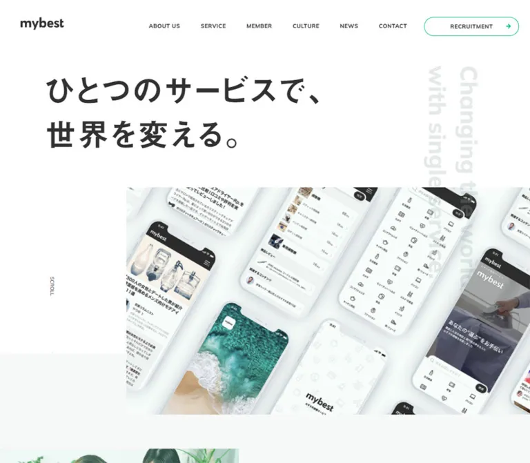
The Japanese statement reads ひとつのサービスで、 on the first line and 世界を変える。 on the second. On desktop it begins around x = 120px, with visible lettering starting near y = 200px. The large white interval below it is integral to the composition.
The device photograph begins around x = 360px and y = 501px, occupying the remaining three quarters of the desktop width. It shows multiple angled phones displaying current product-comparison and account screens. The image continues below the first capture, so its full rendered height is not known.
Two pale vertical English lines sit toward the right: Changing the world and with a single service. Their measured boxes begin at y = 175px and extend to y = 875px. They overlap the image rather than remaining isolated above it.
A vertical SCROLL cue and a thin downward rule appear in the desktop's open left gutter. It is an observed visual cue; clicking behavior and line animation were not tested.
On mobile, the statement begins around x = 26px and fits into two lines at approximately 36px. The image starts around y = 315px and fills the width. It depicts a person holding and using a phone, rather than the desktop montage. This is a different photographed subject, not merely a tighter crop. The evidence does not establish whether responsive asset selection or a different media state caused the change.
Mission Copy
Role: explain why better choices matter and connect the service to the company mission.
The mobile capture shows a pale gray field directly below the opening image. Bold paragraphs begin well below that boundary, using 14.04px text, 28.6px line height, and a 33.28px left inset. Paragraph spacing and deliberate Japanese line breaks create a slow reading rhythm.
Desktop mission paragraphs use 18px text, 36px line height, and 120px left padding. The sampled paragraph boxes are 820px wide, including padding. The closing statement, 日本から世界へ、“最高の選択体験”を。, rises to 48px on desktop and 26px on mobile.
Do not replace this editorial sequence with a row of feature cards. Its work is done by successive statements and controlled pauses.
Alternating Company Sections
Role: provide a short introduction to each main company area and a route to its dedicated destination.
The repeated anatomy is:
- A small uppercase English section label.
- A large bold Japanese statement.
- A bold paragraph with generous leading.
- A photographic or explanatory visual.
- A green
VIEW MORElink.
Desktop About and Member copy begins around x = 720px. Service and Culture copy begins around x = 120px. This alternating alignment matters more than enforcing one identical container for every visual.
The Member capture provides the clearest photographic example: a square-cornered group photograph starts near x = 120px and spans approximately 525px, while the right-hand text starts at x = 720px. The resulting horizontal separation is about 75px. The image sits lower than the small MEMBER label and aligns more closely with the Japanese statement below it.
On mobile, sampled copy occupies one column with roughly 33.28px gutters. The link appears substantially farther down than the body in About, Member, and Culture, consistent with a visual region between copy and action. Exact mobile image rectangles were not included, so the complete stacking details remain partly unverified.
Section Detail Links
Role: lead from a short homepage introduction to a fuller page or publication.
The main VIEW MORE anchors measure 320 × 67px on desktop and approximately 274.55 × 56.16px on mobile. Their text is green, bold, and set in the English stack. Mobile links are centered at approximately x = 57.72px.
The News section uses a smaller variant: 187 × 43px on desktop and approximately 149.23 × 35.36px on mobile, aligned toward the right.
Confirmed destinations include the original site's About, Service, Culture, and News pages. Member links lead to https://tsushin.my-best.com/. The destination URLs are established by rendered anchors; their landing states were not tested.
The evidence provides link dimensions and color transitions, but not a complete visual sample of their decorative contents. Do not invent a specific surrounding border, arrow animation, or hover inversion as an observed feature.
Five-Keyword Service Explainer
Role: express the service's operating principles as a compact conceptual diagram.
The supplied text identifies five numbered entries:
01—“選択”のインフラ02—ユーザー>収益03—誠実でいよう04—データベース × ユーザー情報05—使命の大きさ × 実現性の高さ
The central explanation reads マイベストのサービスを紐解く5つのキーワード. On desktop its sampled box sits in the right-hand region, at x = 700px with a 600px width.
Mobile label coordinates indicate a radial arrangement around the central explanation: one label above, two toward the right, and two toward the left. The node text is measured at 11.96px, bold, and white; the central explanation uses 14.04px text. Node fill colors, precise shapes, connectors, and interaction behavior are not established by the supplied images or sampled styles. Treat the radial arrangement as a geometry inference, not a fully reconstructed graphic.
Workplace Photography Strip
Role: introduce the people and practical work behind the product.
The desktop middle capture shows a horizontal sequence of photographs extending beyond the viewport. One shows colleagues working around a laptop; another shows a staff member inspecting products on shelves; a partially visible third shows testing work with equipment.
The composition is staggered rather than a row of identical thumbnails. The left image is approximately 515px wide and begins about 79px lower than the central image. The central image is approximately 640 × 375px. White gaps between the visible images are roughly 45–55px.
The clipped continuation suggests a wider image sequence, but does not prove a carousel, draggable rail, or autoplay. Preserve the observed framing without adding unsupported interaction claims.
News Grid
Role: surface recent company announcements and press releases.
The desktop DOM establishes a two-column, three-row collection of six linked articles. Cards begin at x = 120px and x = 743px, with widths of 577px. The mobile version becomes a single column approximately 323.44px wide.
Each link groups a leading media region, a bold Japanese title, and a bottom metadata row. The date sits at the left in gray, while the NEWS category sits at the right in green. The measured interval from card top to title top is 318px on desktop and approximately 176.70px on mobile. Those intervals include any media spacing; they are not direct image-height measurements.
Desktop title boxes are one 32px line high in the sampled state; mobile title boxes are two 20.8px lines high. Clamping or overflow rules were not supplied. Do not assume the entire long title was visibly shown merely because it exists in the DOM.
The supplied article dates range from August 7 to September 18, 2026. Content titles and destinations are supported, but the artwork inside the news media regions is not shown in the current-page captures.
Recruitment Section
Role: organize external application routes by employment type and discipline.
The section begins with JOIN OUR TEAM! in large English type. Centered green category headings divide the links into graduate, mid-career, contract, and part-time recruitment. The graduate group contains PRODUCT / MARKETING, ENGINEERING, and DESIGN; later groups contain one broad destination each.
Each recruitment card is a white rectangle with three parts:
- A green uppercase English title at the upper left.
- A smaller charcoal Japanese sublabel immediately beneath it.
- A green diagonal up-right arrow near the upper-right corner.
Desktop cards are approximately 738.52px wide, centered in the page, with 34.91px vertical and 43.64px horizontal padding. Mobile cards widen relative to the viewport: approximately 341.08px inside 24.45px outer gutters, with 20.8px vertical and 16.64px horizontal padding.
The whole card is an anchor to a Talentio destination. The arrow reinforces outbound navigation, but the evidence does not establish whether links open a new tab. Use real anchors rather than button-shaped elements with scripted redirects.
Offset Footer Navigation
Role: repeat the site map, provide contact/legal access, and expose social channels.
The footer navigation lives in a large gray rectangle shifted to the right. In the desktop capture it starts around x = 240px and reaches the viewport's right edge. Its first text column begins around x = 360px, adding another 120px inset within the panel.
Eight bold white navigation links occupy the first row. Contact and privacy links form a second row at the left; FOLLOW US, an X icon, and an Instagram icon sit toward the right. The desktop social anchors measure 28 × 28px.
On mobile, the panel begins about 33px from the left and remains flush to the right edge. Its content begins around x = 61.89px. Primary navigation wraps into three rows: four links, then three, then RECRUITMENT. Contact/privacy and the social row follow below. The primary link line boxes remain about 44.2px high despite the small 10.4px labels.
A separate white legal strip beneath the panel places the copyright at the left and a smaller green-star/black-wordmark logo toward the right. Do not move the brand mark into the gray navigation plane if matching the observed composition.
Tokens — Motion & Interaction
The evidence records computed transition declarations and settled screenshots. It does not include a frame-by-frame recording or exercised hover/menu states.
| Treatment | Measured declaration | What can be concluded |
|---|---|---|
| Vertical hero English | height and transform, 1.7s cubic-bezier(0.18, 0.88, 0.4, 0.96), 1.3s delay |
A delayed geometric reveal is defined; its full trajectory is not supplied |
We are mybest. decoration |
Same 1.7s height/transform easing, without the sampled hero delay |
Reveal styling exists; sampled height was zero |
| Mobile section reveals | opacity and transform, 0.5s cubic-bezier(0.4, 0.59, 0.41, 0.97) |
Fade/transform reveal styling is defined |
| Section reveal sequence | Label without delay; statement commonly 0.2s; body commonly 0.3s |
A stagger is defined in sampled mobile styles |
| Mission copy sequence | Delays of 0s, 0.2s, 0.3s, and 0.5s across sampled elements |
Sequential reveal timing is supported |
Main VIEW MORE links |
color 0.3s cubic-bezier(0.4, 0.59, 0.41, 0.97) |
Color transition exists; endpoint colors unverified |
| Desktop header recruitment | background-color and color, 0.3s, same interaction easing |
A two-property state transition exists; final state unverified |
| News and ordinary navigation anchors | opacity 0.3s ease-out |
Opacity transition exists; target opacity unverified |
| Mobile recruitment cards | background-color 0.3s ease-out, plus delayed 0.5s opacity/transform |
Background feedback and reveal styling are defined |
The overall motion vocabulary is consistent with gradual entrances and short link feedback. No evidence establishes spring motion, parallax, continuous photograph scrolling, a hero slideshow schedule, or a looping word animation.
Many sampled desktop elements expose only opacity, transform without a nonzero duration in that state. Do not assign the mobile reveal timing to every desktop element as a verified rule. Likewise, animation: none does not mean the page is motionless: CSS transitions can still animate it.
Observed interaction limits: the page was loaded and scrolled through capture positions. Menu activation, keyboard navigation, focus appearance, hover endpoints, external-link behavior, and reduced-motion support were not tested.
Surfaces
| Surface | Appearance | Purpose | Confidence |
|---|---|---|---|
| Opening canvas | White | Space for the opening statement and navigation | Visible |
| Long-form content region | Very pale cool gray | Connect mission, people, and recruitment content | Visible; exact hex estimated |
| Photography | Unboxed rectangular images | Show the service and people behind it | Visible |
| Recruitment link | White, square corners, green/charcoal text | Distinguish application destinations | Measured and visible |
| Header recruitment link | White/transparent pill with a fine green outline | Separate recruitment from ordinary navigation | Visible; radius and dimensions measured |
| Footer navigation | Muted gray plane, white text | Provide a strong ending and secondary site map | Visible; exact hex estimated |
| Legal strip | White | Copyright and final brand signature | Visible |
The desktop opening also shows the pale gray section background entering beneath the photograph while the photograph continues downward. This layered boundary helps the image bridge sections instead of behaving like a fully enclosed hero card.
Imagery
Photography is the principal source of texture and warmth. The desktop hero uses a pale, product-focused arrangement of phones; the mobile hero shows a hand using the service. Workplace photographs feature real activities, product shelves, testing equipment, conversation, and natural office light.
The visible workplace images have softly colored interiors, neutral clothing, skin tones, and occasional greenery. They are not isolated portraits against graphic backgrounds. Keep contextual details—desks, shelves, windows, products—because they substantiate the company's work.
Use square crops and deliberate edge clipping. Avoid heavy dark overlays: the main hero headline sits on white rather than depending on contrast over a photograph. The pale English watermark is the exception, crossing both white and imagery.
Observed Asset References
No original image URLs, asset filenames, intrinsic dimensions, or srcset declarations were supplied. The references below identify visible material without inventing downloadable paths.
| Material | Evidence | Reuse guidance |
|---|---|---|
| Green-star/black-wordmark logo | Desktop/mobile opening and footer captures | Use an authorized brand asset; do not approximate it with ordinary text |
| Angled-phone montage | Desktop opening capture | Preserve pale surroundings and visible service screens |
| Hand-held phone photograph | Mobile opening capture | Match the photographed subject, not just the desktop image's crop |
| Colleagues at a laptop | Desktop middle capture | Keep the candid workplace context |
| Product-shelf inspection | Desktop middle capture | Retain the shelves and testing-related objects |
| Equipment-testing photograph | Partially visible at the right of the middle capture | Preserve partial framing only if intentional in the new composition |
| Member group photograph | Desktop Member section capture | Keep a broad environmental crop rather than individual avatar circles |
| X and Instagram symbols | Footer captures and rendered anchors | Use accurate brand symbols with accessible link names |
| News media | Leading regions supported by DOM geometry | Actual images were not available for visual analysis |
Recommended: use <picture> when intentionally reproducing the different desktop and mobile hero subjects, reserve image dimensions to prevent layout shifts, and provide responsive image sources. These are implementation recommendations, not confirmed source techniques.
Layout & Responsive Behavior
Desktop Composition
The 1440px layout uses several deliberate horizontal anchors:
- Around 65px for the header logo link.
- Around 120px for principal prose, news cards, and the Member photograph.
- Around 240px for the footer plane and the News heading's deeper inset.
- Around 360px for the opening photograph and footer navigation content.
- Around 720px for right-side About and Member copy.
These offsets form a related system without requiring every section to share one edge. The recruitment list is independently centered at approximately 738.52px wide.
The visible page is a corporate homepage with several destination families. Recruitment is prominent, but it does not replace the service, company, people, culture, and news hierarchy.
Mobile Composition
At 390px, the closed header contains the logo and menu button. The hero remains typographically bold but reduces its scale. The photograph becomes full width, while paragraphs use approximately 33.28px gutters.
The mobile page keeps distinct horizontal treatments:
| Region | Approximate mobile treatment |
|---|---|
| Logo | 21.31px left inset |
| Hero statement | 26px left inset |
| Prose and news | 33.28px side gutters |
| Main detail link | Centered, 274.55px wide |
| Recruitment cards | 24.45px side gutters |
| Footer panel | 33px left inset, flush right |
| Footer panel text | Approximately 61.89px from the viewport left |
News changes from two columns to one. Recruitment cards stay stacked at both inspected widths. Footer links wrap rather than becoming an accordion in the shown state.
Boundaries of the Evidence
Only two viewport widths were supplied. The exact navigation breakpoint, tablet composition, maximum content widths, and interpolation formulas remain unverified. Fractional mobile sizes should not be reverse-engineered into a single global scaling equation without source CSS.
The mobile hero subject differs from desktop, but the mechanism is unknown. The mobile menu's hidden DOM contains a two-column arrangement of primary links; this does not establish its opened appearance, backdrop, animation, or focus behavior.
For a new implementation, preserve the two evidenced endpoint compositions and choose intermediate breakpoints based on content fit. Keep Japanese line breaks editorial where needed, while allowing increased text size and longer translations to reflow.
Do’s and Don’ts
Do
- Build the page around white, charcoal, pale gray, and the measured green
#1ec044. - Pair bold Japanese statements with small uppercase English section labels.
- Preserve the wide line spacing in bold body copy.
- Use several related alignment edges instead of one centered stack for every desktop section.
- Let photographs extend toward or beyond the viewport edge where the captures establish that treatment.
- Keep recruitment cards white, rectangular, and clearly divided into English title, Japanese sublabel, and diagonal arrow.
- Retain the separate mobile gutters for the headline, prose, cards, and footer.
- Keep news dates and categories aligned to opposite ends of a shared metadata row.
- Preserve the offset gray footer and the separate white legal strip.
- Treat source font stacks as declarations, with fallback behavior tested in the implementation.
Don’t
- Don’t turn every company section into an identical rounded feature card.
- Don’t fill the interface with green backgrounds just because green is the brand accent.
- Don’t replace workplace context with generic avatar circles or isolated stock portraits.
- Don’t force the mobile hero to be a crop of the desktop montage when matching the supplied endpoint captures.
- Don’t infer a carousel or autoplay from the clipped photograph strip.
- Don’t claim hover inversions, sticky navigation, or menu animation without interaction evidence.
- Don’t use parent-link browser blue or root Times as design tokens.
- Don’t copy tiny mobile text sizes into a new product without a readability review.
- Don’t treat the large Japanese opening statement as the sampled
H1; the source sample identifies the brand caption asH1. - Don’t invent image paths, production credits, or a source CSS framework.
Recommended Implementation Additions
These are recommendations for a new implementation, not verified features of the original site.
- Improve small-screen reading sizes. Consider 15–16px body text and at least 12px for dates and utility labels. The measured mobile body is often 13px, with news metadata at 9.36px.
- Check action-text contrast. The measured green on white has approximately 2.4:1 contrast, calculated from the supplied RGB value. A darker text-only green such as
#087f2ccan preserve the color family while providing stronger contrast. Retain the bright green for decorative arrows and brand accents. - Use meaningful heading semantics. A new implementation can make the principal company statement its
H1, while presenting the tiny corporate-site descriptor as supporting brand text. - Name the mobile menu button. Add
aria-expanded,aria-controls, a visible focus treatment, and appropriate keyboard behavior. If the menu is modal, implement focus containment and return focus on close. - Keep decorative English out of repeated announcements. Where the vertical English simply duplicates the Japanese statement, mark it as decorative for assistive technology.
- Make link purpose specific. Supplement repeated
VIEW MORElabels with accessible names that identify About, Service, Member, Culture, or News. - Give icon links usable targets. Preserve the small visible social symbols inside larger interactive areas, with explicit X and Instagram names.
- Respect reduced motion. Show all content immediately when motion is reduced, and avoid delaying access to mission copy behind decorative reveals.
- Keep content visible without JavaScript. Apply entrance states only after enhancement is active; a failed observer should not leave sections transparent or zero-height.
- Preserve full news titles accessibly. If visual truncation is used, retain the complete accessible link name and let enlarged text reflow.
Agent Prompt Guide
Quick Color Reference
- Main canvas and recruitment cards:
#ffffff. - Main text:
#313131. - Source action green:
#1ec044. - Pale section background: approximately
#f5f7f7, a visual estimate. - Footer panel: approximately
#6c7473, a visual estimate. - Vertical English decoration:
rgba(152, 172, 167, 0.25). - News dates:
#999999. - Recommended accessible green for small text:
#087f2c; this is not an observed source color.
Overall Prompt
“Create a Japanese corporate homepage inspired by the inspected mybest site. Use a white canvas, charcoal text, pale gray content regions, and sparse bright green accents. Combine bold Japanese statements with compact uppercase English labels using the measured Yu Gothic and Avenir Next/Mulish fallback stacks. Open with a two-line Japanese statement aligned left, substantial white space, and a large photograph beginning one quarter of the way across the desktop viewport. Overlay pale vertical English text near the right edge. Continue with alternating company sections, contextual workplace photography, a restrained news grid, centered rectangular recruitment links, and a gray footer plane offset to the right. On mobile, use a logo/menu header, full-width hero imagery, single-column content, and distinct gutters for prose and recruitment. Keep corners square except for the desktop header recruitment pill. Treat unverified motion and interaction details as implementation choices.”
Example Component Prompts
- Opening: “At 1440px, place a bold two-line Japanese statement around x = 120px and a pale phone montage starting around x = 360px, y = 501px. Add two translucent vertical English lines at the right. At 390px, use a roughly 36px statement with a 26px inset and a full-width hand-held-phone photograph below it. Preserve the different image subjects.”
- Member section: “Build a pale gray company section with a rectangular group photograph at the left and text beginning around the desktop midpoint. Stack a 24px uppercase MEMBER label, a 48px bold Japanese statement with 72px leading, and 18px bold body copy with 36px leading. Use a green detail link and no shadow.”
- Recruitment card: “Create a white square-cornered outbound link, approximately 738.5 × 125.4px on desktop and 341.1 × 72.8px at a 390px viewport. Place a bold green English title above a smaller charcoal Japanese sublabel, with a green diagonal arrow at the upper right. Make the entire panel the link.”
- News grid: “Use two 577px-wide columns with a 46px gap inside a 1200px desktop container. Each article groups leading media, a bold Japanese title, and a row with a gray date at left and green NEWS at right. At 390px, switch to one approximately 323.4px-wide column.”
- Footer: “Create a flat gray footer navigation panel beginning 240px from the left in a 1440px composition, with white uppercase navigation and social links. On mobile, start the panel about 33px from the left and let it reach the right edge. Place the copyright and small brand logo in a separate white strip beneath it.”
Quick Start
CSS Custom Properties
This is an implementation starter, not recovered source CSS. It uses the measured colors and endpoint type scales, plus the explicitly estimated section/footer colors. The 80rem wide-layout breakpoint, desktop hero aspect ratio, and general section padding are recommendations. The hero's opening geometry is designed to approximate the supplied 390px and 1440px captures; the code does not reconstruct unpictured portions of the full page.
Use .mb-story with separate .mb-story-copy, .mb-story-media, and .mb-more children so mobile can place the visual between copy and action. Hero title lines are separate spans; the vertical English container should contain two paragraphs. Provide authorized image and logo assets separately.
:root {
  /* Measured palette, with two visual estimates */
  --mb-white: #fff;
  --mb-ink: #313131;
  --mb-green: #1ec044;
  --mb-green-text: var(--mb-green);
  --mb-soft: #f5f7f7; /* Visual estimate */
  --mb-footer: #6c7473; /* Visual estimate */
  --mb-sage: #98aca7;
  --mb-watermark: rgb(152 172 167 / 25%);
  --mb-muted: #999;

  /* Declared source stacks; resolved font faces are unverified */
  --mb-jp: 'Yu Gothic', '游ゴシック', '游ゴシック体',
    'ヒラギノ角ゴ Pro W3', 'メイリオ', sans-serif;
  --mb-en: 'Avenir Next', Mulish, sans-serif;

  /* Mobile endpoint values */
  --mb-gutter: clamp(24px, 8.5333vw, 64px);
  --mb-label: 12.48px;
  --mb-heading: 26px;
  --mb-heading-leading: 44.2px;
  --mb-body: 13px;
  --mb-body-leading: 26px;
  --mb-heading-top: 28.6px;
  --mb-heading-bottom: 14.56px;
  --mb-heading-tracking: 1.56px;
  --mb-link-width: 274.55px;
  --mb-link-height: 56.16px;
  --mb-link-text: 15.6px;
  --mb-recruit-heading: 23.92px;
  --mb-job-en: 14.56px;
  --mb-job-jp: 12.48px;
  --mb-job-gap: 4.16px;
  --mb-job-pad-y: 20.8px;
  --mb-job-pad-x: 16.64px;
  --mb-job-stack-gap: 18.19px;

  /* Measured timing vocabulary */
  --mb-ease: cubic-bezier(0.4, 0.59, 0.41, 0.97);
  --mb-reveal-ease: cubic-bezier(0.18, 0.88, 0.4, 0.96);
  --mb-feedback: 300ms;
  --mb-reveal: 500ms;
}

* { box-sizing: border-box; }
body { margin: 0; }

.mb-page {
  color: var(--mb-ink);
  background: var(--mb-white);
  font-family: var(--mb-jp);
}

.mb-page img { display: block; max-width: 100%; }
.mb-page a { color: inherit; text-decoration: none; }
.mb-page button { font: inherit; }
.mb-panel { background: var(--mb-soft); }

.mb-container {
  width: min(1200px, calc(100% - 2 * var(--mb-gutter)));
  margin-inline: auto;
}

/* Closed header shell; menu behavior requires enhancement */
.mb-header {
  position: relative;
  display: flex;
  align-items: center;
  justify-content: space-between;
  height: 78px;
  padding-inline: 21.32px;
  background: var(--mb-white);
}
.mb-brand { display: block; width: 169px; }
.mb-brand img { width: 130px; height: auto; }
.mb-brand-caption {
  display: block;
  margin-top: 4px;
  font: 700 5.2px / 7.8px sans-serif;
}
.mb-nav { display: none; }
.mb-menu {
  position: absolute;
  top: 3.63px;
  right: 10.39px;
  display: grid;
  place-items: center;
  width: 52px;
  height: 52px;
  padding: 0;
  border: 0;
  background: transparent;
  color: var(--mb-ink);
}
.mb-menu-icon {
  display: grid;
  gap: 3px;
  width: 21px;
}
.mb-menu-icon span {
  height: 3px;
  background: currentColor;
}

/* Opening geometry: title and image positions are approximations */
.mb-hero { position: relative; padding-top: 32px; }
.mb-hero-title {
  margin: 0;
  padding-inline: 26px;
  font: 700 36px / 1.5 var(--mb-jp);
}
.mb-hero-title span { display: block; }
.mb-hero-media {
  display: block;
  width: 100%;
  margin-top: 97px;
  aspect-ratio: 390 / 274;
  overflow: hidden;
}
.mb-hero-media img {
  width: 100%;
  height: 100%;
  object-fit: cover;
}
.mb-hero-english {
  position: absolute;
  z-index: 1;
  top: 171.6px;
  right: 26px;
  display: flex;
  flex-direction: row-reverse;
  pointer-events: none;
  color: var(--mb-watermark);
}
.mb-hero-english p {
  width: 28.6px;
  height: 260px;
  margin: 0;
  writing-mode: vertical-rl;
  white-space: nowrap;
  font: 700 22.88px / 22.36px var(--mb-en);
}

/* Editorial sections; spacing between full sections is recommended */
.mb-story {
  display: grid;
  grid-template-areas: 'copy' 'media' 'action';
  gap: 32px;
  padding-block: 88px;
}
.mb-story-copy { grid-area: copy; min-width: 0; }
.mb-story-media { grid-area: media; margin: 0; }
.mb-story-media img { width: 100%; height: auto; }
.mb-label {
  margin: 0;
  font: 700 var(--mb-label) / 1.2 var(--mb-en);
}
.mb-statement {
  margin: var(--mb-heading-top) 0 var(--mb-heading-bottom);
  font-size: var(--mb-heading);
  font-weight: 700;
  line-height: var(--mb-heading-leading);
  letter-spacing: var(--mb-heading-tracking);
}
.mb-copy {
  margin: 0;
  font-size: var(--mb-body);
  font-weight: 700;
  line-height: var(--mb-body-leading);
  letter-spacing: 1.04px;
}
.mb-more {
  grid-area: action;
  justify-self: center;
  display: flex;
  align-items: center;
  justify-content: space-between;
  width: min(100%, var(--mb-link-width));
  min-height: var(--mb-link-height);
  color: var(--mb-green-text) !important;
  font: 700 var(--mb-link-text) / 1.2 var(--mb-en);
  transition: color var(--mb-feedback) var(--mb-ease);
}

/* News titles remain unconstrained for readable reflow */
.mb-news-grid {
  display: grid;
  grid-template-columns: minmax(0, 1fr);
  gap: 23.39px;
}
.mb-news-card { display: block; min-width: 0; }
.mb-news-card img {
  width: 100%;
  aspect-ratio: 1.92; /* Recommended; image ratio was not measured */
  object-fit: cover;
}
.mb-news-title {
  margin: 8.3px 0 0;
  font: 700 11.96px / 20.8px var(--mb-jp);
  letter-spacing: 1.04px;
}
.mb-news-meta {
  display: flex;
  justify-content: space-between;
  align-items: baseline;
  margin-top: 8.32px;
  font: 500 9.36px / 16.64px var(--mb-en);
  color: var(--mb-muted);
}
.mb-news-category {
  color: var(--mb-green-text);
  font-weight: 700;
}

/* Recruitment */
.mb-recruit { padding-block: 88px 70px; background: var(--mb-soft); }
.mb-recruit-title {
  margin: 0 20px 35px;
  text-align: center;
  font: 700 37.44px / 39px var(--mb-en);
}
.mb-recruit-group + .mb-recruit-group { margin-top: 18.19px; }
.mb-recruit-category {
  margin: 0 0 16.64px;
  color: var(--mb-green-text);
  text-align: center;
  font: 700 var(--mb-recruit-heading) / 42.64px var(--mb-jp);
  letter-spacing: 3.328px;
}
.mb-job-list {
  display: grid;
  gap: var(--mb-job-stack-gap);
  width: min(738.52px, calc(100% - 48.9px));
  margin-inline: auto;
}
.mb-job-card {
  position: relative;
  display: block;
  padding: var(--mb-job-pad-y) var(--mb-job-pad-x);
  border-radius: 0;
  background: var(--mb-white);
  transition: background-color var(--mb-feedback) ease-out;
}
.mb-job-en {
  display: block;
  padding-right: 24px;
  color: var(--mb-green-text);
  font: 700 var(--mb-job-en) / 1 var(--mb-en);
  letter-spacing: 1.04px;
}
.mb-job-jp {
  display: block;
  margin-top: var(--mb-job-gap);
  font: 700 var(--mb-job-jp) / 1 var(--mb-jp);
  letter-spacing: 2.08px;
}
.mb-job-arrow {
  position: absolute;
  top: 9px;
  right: 10px;
  color: var(--mb-green);
  font: 700 24px / 1 sans-serif;
}

/* Offset footer */
.mb-footer-panel {
  margin-left: var(--mb-gutter);
  padding: 31.2px 28.6px 39px;
  color: var(--mb-white);
  background: var(--mb-footer);
}
.mb-footer-primary {
  display: flex;
  flex-wrap: wrap;
  gap: 0 31.2px;
  font: 700 10.4px / 44.2px var(--mb-en);
  letter-spacing: 0.52px;
}
.mb-footer-primary .mb-footer-recruit { flex-basis: 100%; }
.mb-footer-secondary { margin-top: 31.2px; }
.mb-footer-utilities,
.mb-footer-social {
  display: flex;
  align-items: center;
  gap: 20.8px;
  font: 500 10.4px / 18.2px var(--mb-en);
}
.mb-footer-social { margin-top: 22.36px; }
.mb-footer-social a {
  display: inline-grid;
  place-items: center;
  min-width: 44px; /* Recommended target size */
  min-height: 44px;
}
.mb-footer-social svg { width: 20.8px; height: 20.8px; }
.mb-legal {
  display: flex;
  justify-content: space-between;
  align-items: center;
  gap: 20px;
  padding-block: 32px 20px;
  font: 400 10px / 1.5 var(--mb-en);
}
.mb-legal img { width: 68px; height: auto; }

/* Recommended wide-layout breakpoint; source breakpoint is unknown */
@media (min-width: 80rem) {
  :root {
    --mb-gutter: clamp(40px, 8.3333vw, 120px);
    --mb-label: 24px;
    --mb-heading: 48px;
    --mb-heading-leading: 72px;
    --mb-body: 18px;
    --mb-body-leading: 36px;
    --mb-heading-top: 70px;
    --mb-heading-bottom: 30px;
    --mb-heading-tracking: 4px;
    --mb-link-width: 320px;
    --mb-link-height: 67px;
    --mb-link-text: 18px;
    --mb-recruit-heading: 44.73px;
    --mb-job-en: 26.18px;
    --mb-job-jp: 18.55px;
    --mb-job-gap: 10.91px;
    --mb-job-pad-y: 34.91px;
    --mb-job-pad-x: 43.64px;
    --mb-job-stack-gap: 21.81px;
  }
  .mb-header { height: 140px; padding: 45px 30px 25px 65px; }
  .mb-brand { width: 220px; }
  .mb-brand img { width: 172px; }
  .mb-brand-caption { font-size: 10px; line-height: 15px; }
  .mb-menu { display: none; }
  .mb-nav {
    display: flex;
    align-items: center;
    gap: clamp(20px, 3.8vw, 55px);
    transform: translateY(-10px);
    font: 700 15px / 50px var(--mb-en);
    letter-spacing: 0.5px;
  }
  .mb-nav-recruit {
    display: flex;
    align-items: center;
    justify-content: space-between;
    width: 252px;
    height: 50px;
    padding-inline: 28px 20px;
    border: 1px solid var(--mb-green);
    border-radius: 50px;
  }
  .mb-nav-recruit span:last-child { color: var(--mb-green); }
  .mb-hero { padding-top: 40px; }
  .mb-hero-title { padding-inline: var(--mb-gutter); font-size: 80px; }
  .mb-hero-media {
    width: 75%;
    margin-top: 81px;
    margin-left: 25%;
    aspect-ratio: 16 / 9; /* Recommended; desktop height is unverified */
  }
  .mb-hero-english { top: 35px; right: 120px; }
  .mb-hero-english p {
    width: 85px;
    height: 700px;
    font-size: 62px;
    line-height: 85px;
  }
  .mb-story {
    grid-template-columns: minmax(0, 525fr) minmax(0, 600fr);
    grid-template-areas: 'media copy' 'media action';
    gap: 34px 75px;
    padding-block: 120px;
  }
  .mb-story--copy-left {
    grid-template-columns: minmax(0, 600fr) minmax(0, 525fr);
    grid-template-areas: 'copy media' 'action media';
  }
  .mb-story-media { align-self: center; }
  .mb-copy { letter-spacing: 1.3px; }
  .mb-more { justify-self: start; }
  .mb-news-grid { grid-template-columns: repeat(2, minmax(0, 1fr)); gap: 45px 46px; }
  .mb-news-title { margin-top: 18px; font-size: 16px; line-height: 32px; letter-spacing: 1.3px; }
  .mb-news-meta { margin-top: 16px; font-size: 14px; line-height: 32px; }
  .mb-news-category { font-size: 16px; letter-spacing: 1px; }
  .mb-recruit { padding-block: 120px 100px; }
  .mb-recruit-title { font-size: 69.82px; line-height: 1; margin-bottom: 80px; }
  .mb-recruit-category { line-height: 45px; margin-bottom: 34.91px; letter-spacing: 3px; }
  .mb-recruit-group + .mb-recruit-group { margin-top: 43.64px; }
  .mb-job-en { letter-spacing: 2px; }
  .mb-job-jp { letter-spacing: 2.4px; }
  .mb-job-arrow { top: 16px; right: 18px; font-size: 28px; }
  .mb-footer-panel { margin-left: calc(2 * var(--mb-gutter)); padding: 100px var(--mb-gutter) 90px; }
  .mb-footer-primary { justify-content: space-between; gap: 0 12px; font-size: 17px; line-height: 46px; letter-spacing: 1px; }
  .mb-footer-primary .mb-footer-recruit { flex-basis: auto; }
  .mb-footer-secondary { display: flex; justify-content: space-between; align-items: center; margin-top: 30px; }
  .mb-footer-utilities, .mb-footer-social { font-size: 14px; line-height: 46px; }
  .mb-footer-social { margin-top: 0; }
  .mb-footer-social svg { width: 28px; height: 28px; }
  .mb-legal { padding-block: 70px 40px; font-size: 12px; }
  .mb-legal img { width: 132px; }
}

/* Recommended interaction states; original endpoints were not tested */
.mb-page :focus-visible {
  outline: 3px solid var(--mb-ink);
  outline-offset: 5px;
}
@media (hover: hover) {
  .mb-nav a:hover,
  .mb-footer-panel a:hover,
  .mb-more:hover { text-decoration: underline; text-underline-offset: 0.25em; }
  .mb-job-card:hover { outline: 1px solid var(--mb-green); }
}
@media (prefers-reduced-motion: reduce) {
  .mb-page *, .mb-page *::before, .mb-page *::after {
    animation: none !important;
    transition: none !important;
    scroll-behavior: auto !important;
  }
}
The starter normalizes section-label line height to 1.2 instead of copying the unusually short measured line boxes. It also leaves news titles free to expand and enlarges social hit targets. Those are intentional implementation choices.
For a more readable adaptation, override --mb-green-text with #087f2c, raise mobile body text toward 15–16px, and increase the explicit news metadata sizes. Keep these changes separate from the original measured scale.
A recruitment link can use the following anatomy. The destination is present in the rendered original-page evidence; a new-tab behavior is intentionally not assumed.
<a class='mb-job-card'
   href='https://open.talentio.com/r/1/c/my-best/homes/4200?group_ids=8764'>
  <span class='mb-job-en' lang='en'>CONTRACT WORK</span>
  <span class='mb-job-jp' lang='ja'>業務委託</span>
  <span class='mb-job-arrow' aria-hidden='true'>↗</span>
</a>
The Unicode arrow is a starter approximation. Replace it with an authorized or carefully drawn SVG if exact stroke geometry matters.
Tailwind v4 Token Mapping
Optional mapping for a project already using Tailwind v4. These aliases do not imply that the original site uses Tailwind. Define the custom properties above first.
@theme inline {
  --color-brand: var(--mb-green);
  --color-action-text: var(--mb-green-text);
  --color-ink: var(--mb-ink);
  --color-paper: var(--mb-white);
  --color-section: var(--mb-soft);
  --color-footer: var(--mb-footer);
  --color-muted: var(--mb-muted);

  --font-japanese: var(--mb-jp);
  --font-english: var(--mb-en);

  --text-section-label: var(--mb-label);
  --text-statement: var(--mb-heading);
  --text-copy: var(--mb-body);
  --text-action: var(--mb-link-text);

  --spacing-page-gutter: var(--mb-gutter);
  --spacing-job-inset: var(--mb-job-pad-x);
  --radius-recruit-pill: 50px;
}
Sources & Evidence
- Inspected original and final page: https://my-best.com/company. The supplied observation reports HTTP 200 and the same original/final URL. The rendered title identifies the page as the corporate site of 株式会社マイベスト; the footer contains
© mybest, Inc. All Rights Reserved. - Capture timestamp: October 1, 2026, 20:47:42.138 UTC, equivalent to October 2, 2026, 05:47:42.138 JST.
- Desktop evidence: three supplied current-page captures at 1440 × 1000, covering the opening, workplace/Member region, and recruitment/footer region; rendered DOM and computed styles at the same viewport size. The reported document height is 10664px.
- Mobile evidence: two supplied current-page captures at 390 × 844, covering the opening and recruitment/footer region; rendered DOM and computed styles at the same viewport size. The measured document height is approximately 7719.41px.
- Inspection procedure reported by the capture package: initial observation of at least five seconds; waits for document load, finite animation readiness, sampled layout/text stability, and visible image decoding within bounded time limits. Scrolling traversed intermediate positions and accepted settled snap positions. Perpetual animations were paused during readiness checks and resumed afterward. SharedWorkers and service workers were disabled.
- Verified evidence types: rendered labels and link destinations, element rectangles, requested font stacks, computed text colors and sizes, padding, border radii, and transition declarations. Screenshot-only background colors and unsampled geometry are explicitly marked as estimates.
- Limitations: no additional browsing, linked-page inspection, original asset inventory, full stylesheet inspection, resolved-font audit, hover test, menu activation, keyboard test, reduced-motion test, or motion recording was supplied. Delayed content and unexercised behavior remain unverified. No production credits were established from the inspected original-page evidence.
This reference describes the current page represented by the supplied original-site evidence. Its reusable CSS and prompts preserve the observed visual relationships while clearly separating measured values from implementation recommendations.
# mybest — Corporate Website Style Reference

> Bold Japanese statements, bright green signals, and documentary photography arranged across generous white space.

**Website:** [mybest corporate website](https://my-best.com/company)
**Original URL:** https://my-best.com/company
**Final URL:** https://my-best.com/company
**Theme:** light, with white and pale gray surfaces, charcoal typography, and green accents
**Inspected:** supplied capture timestamp October 1, 2026, 20:47:42.138 UTC / October 2, 2026, 05:47:42.138 JST
**Viewports:** desktop 1440 × 1000 CSS px; mobile 390 × 844 CSS px
**Scope:** the current corporate homepage, including navigation, opening statement, mission copy, About, Service, the five-keyword explainer, workplace photography, Member, Culture, News, recruitment links, and footer. Linked destinations were not inspected.

mybest presents its company through large statements and evidence of everyday work. The opening Japanese headline dominates a white field; a device photograph enters from the right; translucent English text runs vertically across the composition. Later sections alternate text and imagery, combining bold Japanese copy with compact uppercase English labels. Recruitment becomes more explicit near the bottom, where green category headings sit above wide, white link panels.

The defining relationship is between strong typography and displaced rectangular planes. Main content repeatedly aligns at 120px or 720px on the inspected desktop, while photographs and the footer use different starting edges. This creates an editorial rhythm without relying on shadows, rounded cards, or decorative gradients. On mobile, content becomes a readable vertical sequence while retaining distinct gutters for the headline, prose, recruitment cards, and footer.
閉じる
# mybest — Corporate Website Style Reference

> Bold Japanese statements, bright green signals, and documentary photography arranged across generous white space.

**Website:** [mybest corporate website](https://my-best.com/company)
**Original URL:** https://my-best.com/company
**Final URL:** https://my-best.com/company
**Theme:** light, with white and pale gray surfaces, charcoal typography, and green accents
**Inspected:** supplied capture timestamp October 1, 2026, 20:47:42.138 UTC / October 2, 2026, 05:47:42.138 JST
**Viewports:** desktop 1440 × 1000 CSS px; mobile 390 × 844 CSS px
**Scope:** the current corporate homepage, including navigation, opening statement, mission copy, About, Service, the five-keyword explainer, workplace photography, Member, Culture, News, recruitment links, and footer. Linked destinations were not inspected.

mybest presents its company through large statements and evidence of everyday work. The opening Japanese headline dominates a white field; a device photograph enters from the right; translucent English text runs vertically across the composition. Later sections alternate text and imagery, combining bold Japanese copy with compact uppercase English labels. Recruitment becomes more explicit near the bottom, where green category headings sit above wide, white link panels.

The defining relationship is between strong typography and displaced rectangular planes. Main content repeatedly aligns at 120px or 720px on the inspected desktop, while photographs and the footer use different starting edges. This creates an editorial rhythm without relying on shadows, rounded cards, or decorative gradients. On mobile, content becomes a readable vertical sequence while retaining distinct gutters for the headline, prose, recruitment cards, and footer.

## How to Read This Reference

- **Measured** means a value is present in the supplied rendered DOM or computed-style evidence. Measurements are CSS pixels unless stated otherwise; tables sometimes round fractional values to two decimals.
- **Visual estimate** means a position, size, or color was judged from the supplied current-page captures. It is not a stylesheet measurement or an exact pixel sample.
- **Calculated** means a value was derived from measured values, such as the desktop news-column gap.
- **Recommended** means guidance for a new implementation. Breakpoints, accessibility improvements, hover endpoints, and starter-code decisions are not claims about the original implementation.
- **Token names** are reference aliases. The supplied custom-property inventories were empty; no original token naming system was established.
- The current-page images cover the opening, a workplace/Member section, and the recruitment/footer area. DOM evidence extends to sections that are not pictured in those captures. Their text and geometry can be documented, but missing visual details should remain unspecified.
- Element rectangles may include padding, transforms, and clipped content. They are not necessarily visible glyph bounds. Separate captures and DOM samples should not be treated as a perfectly synchronized, full-page coordinate map.

## Tokens — Colors

### Default Palette

| Name | Value | Reference token | Role and evidence |
| --- | --- | --- | --- |
| White | `#ffffff` | `--mb-white` | Measured recruitment-card background; visually the opening canvas and lower legal area |
| Charcoal | `#313131` | `--mb-ink` | Measured body, Japanese headings, navigation, and supporting text |
| Action Green | `#1ec044` | `--mb-green` | Measured `VIEW MORE` text, recruitment headings, recruitment English labels, and news categories |
| Pale Section Gray | Approximately `#f5f7f7` | `--mb-soft` | Visual estimate for the Member, mission, and recruitment backgrounds |
| Footer Gray | Approximately `#6c7473` | `--mb-footer` | Visual estimate for the large offset footer navigation panel |
| Decorative Sage | `#98aca7` | `--mb-sage` | Measured solid color on the `We are mybest.` paragraph; that sampled element had zero height, so its fully revealed appearance is unverified |
| Translucent Sage | `rgba(152, 172, 167, 0.25)` | `--mb-watermark` | Measured vertical English hero text |
| Date Gray | `#999999` | `--mb-muted` | Measured news dates |

The translucent hero lettering would composite to approximately `#e5eae9` over pure white. This is a **calculated** approximation, not a replacement for the alpha color: the lettering also overlaps photography, where the result changes with the image beneath it.

Green is concentrated in wayfinding, category headings, arrows, and the logo's star. The star appears visually related to the interface green, but its asset color was not separately measured. Large green background fields are not established by the supplied captures.

Several parent links report browser blue while their visible children have explicit charcoal or green colors. Those parent values do not make blue part of the visible design palette. Likewise, transparent body backgrounds do not imply a transparent-looking page: the captured opening is white.

### Color Hierarchy

1. White supplies the largest continuous field.
2. Pale gray separates longer content regions with little visual interruption.
3. Charcoal supplies nearly all reading contrast.
4. Green identifies selected destinations and recruitment opportunities.
5. The gray footer creates a terminal navigation block with reversed white text.

No alternate theme or dark-mode control is evidenced.

## Tokens — Typography

### Japanese Editorial Copy

**Measured stack:** `"Yu Gothic", 游ゴシック, 游ゴシック体, "ヒラギノ角ゴ Pro W3", メイリオ, sans-serif`.

This stack appears on mission paragraphs, large section statements, recruitment sublabels, and news titles. Most of those elements use weight `700`, including the body copy. The result is substantial and direct, with generous line spacing preventing the text from becoming dense.

A computed font stack identifies the requested families, not the font file that actually rendered every glyph. Font loading and resolved-face information were not supplied.

### English Navigation and Section Labels

**Measured stack:** `"Avenir Next", Mulish, sans-serif`.

Use this stack for uppercase section labels, navigation, `VIEW MORE`, news dates/categories, recruitment English titles, and the large `JOIN OUR TEAM!` heading. Weight is usually `700`; dates and secondary footer utilities use `500`.

The short English labels provide a compact navigational layer above much larger Japanese statements. Their tracking is controlled rather than exaggerated.

### Brand and Hero Limitations

The main logo is an asset-like wordmark treatment; its anchor reports `font-size: 0px`. Do not reproduce it by typing the brand name in the body font.

The sampled `H1` is the small corporate-site caption beneath the logo, not the enormous Japanese opening statement. The latter is visible in the screenshots, but its own computed typography was not included. Its size and line height below are therefore estimates.

The root element reports `Times`, while the body and visible content use sans-serif stacks. Times is not an observed editorial font for this page.

### Type Scale

| Role | Desktop at 1440px | Mobile at 390px | Weight / tracking | Evidence |
| --- | --- | --- | --- | --- |
| Opening Japanese statement | Approximately `80px / 120px` | Approximately `36px / 54px` | Visually bold; exact family and tracking unmeasured | Visual estimate |
| Small brand caption | `10px / 15px` | `5.2px / 7.8px` | `700`, normal tracking | Measured |
| Header navigation | `15px / 50px` | Closed-state links are hidden in the capture | `700`, `0.5px` desktop tracking | Measured |
| Vertical English hero text | `62px / 85px` | `22.88px / 22.36px` | `700`, normal tracking | Measured |
| English section label | `24px / 19px` | `12.48px / 7.8px` | `700` | Measured; unusually short line boxes |
| Main Japanese section statement | Usually `48px / 72px` | Usually `26px / 44.2px` | `700`; typically `4px` desktop and `1.56px` mobile tracking | Measured |
| Service statement | `48px / 72px` | `24.96px / 41.6px` | `700`; `4px` / `1.56px` tracking | Measured |
| Mission paragraphs | `18px / 36px` | `14.04px / 28.6px` | `700`; `1px` / `0.78px` tracking | Measured |
| General section body | `18px / 36px` | `13px / 26px` | `700`; desktop `1.3px`, mobile varies by section | Measured |
| Main `VIEW MORE` | `18px / 67px` | `15.6px / 56.16px` | `700` | Measured |
| News title | `16px / 32px` | `11.96px / 20.8px` | `700`; `1.3px` / `1.04px` tracking | Measured |
| News date | `14px / 32px` | `9.36px / 16.64px` | `500` | Measured |
| News category | `16px / 28px` | `9.36px / 16.64px` | `700`; desktop tracking `1px` | Measured |
| Recruitment introduction | `69.82px / 69.82px` | `37.44px / 39px` | `700`; `0.1px` / `0.52px` tracking | Measured |
| Recruitment category | `44.73px / 45px` | `23.92px / 42.64px` | `700`; `3px` / `3.328px` tracking | Measured |
| Recruitment English title | `26.18px / 26.18px` | `14.56px / 14.56px` | `700`; approximately `2px` / `1.04px` tracking | Measured |
| Recruitment Japanese sublabel | `18.55px / 18.55px` | `12.48px / 12.48px` | `700`; `2.4px` / `2.08px` tracking | Measured |
| Footer primary navigation | `17px / 46px` | `10.4px / 44.2px` | `700`; `1px` / `0.52px` tracking | Measured |
| Footer utility links | `14px / 46px` | `10.4px / 18.2px` | `500`; `1px` / `0.52px` tracking | Measured |

Mobile body tracking is not uniform: the supplied About and Culture paragraphs use `1.04px`, Service uses `0.676px`, and Member uses `0.26px`. These differences affect line wrapping. A reusable implementation can simplify them, but that would be an adaptation.

## Tokens — Spacing & Shapes

**Density:** broad space around major statements; compact information inside recruitment and news components.
**Geometry:** rectangular photographs and cards, with a pill reserved for the desktop header recruitment link.
**Scaling:** fractional mobile measurements suggest responsive sizing, but two viewport samples do not establish the original formulas or breakpoints.

### Spacing Scale

| Use | Desktop | Mobile | Evidence |
| --- | --- | --- | --- |
| Main prose/news gutter | `120px` | Approximately `33.28px` | Measured |
| Opening statement left edge | Approximately `120px` | Approximately `26px` | Visual estimate |
| Logo-link left edge | `65px` | `21.31px` | Measured |
| Section statement top padding | `70px` | `28.6px` | Measured on sampled statements |
| Section statement bottom padding | `30px` | `14.56px` | Measured |
| Desktop body-to-link allowance | `34px` bottom padding | Different section flow; no universal equivalent | Measured |
| News column gap | `46px` | Single column | Calculated from measured card positions |
| News row gap | `45px` | Approximately `23.39px` | Calculated from measured rectangles |
| Recruitment-card vertical padding | `34.91px` | `20.8px` | Measured |
| Recruitment-card horizontal padding | `43.64px` | `16.64px` | Measured |
| Consecutive graduate-role card gap | Approximately `21.81px` | Approximately `18.19px` | Calculated |
| Recruitment English-to-Japanese gap | Approximately `10.91px` | Approximately `4.16px` | Calculated |
| Footer panel left offset | Approximately `240px` | Approximately `33px` | Visual estimate |

### Border Radius

| Element | Value | Evidence |
| --- | --- | --- |
| Desktop header recruitment link | `50px` | Measured |
| Recruitment cards | `0` | Measured and visible |
| Main `VIEW MORE` anchor boxes | `0` | Measured; decorative descendants were not supplied |
| News links and sampled text blocks | `0` | Measured |
| Photographs and footer navigation plane | Square corners | Visible in captures |

There is no visible general-purpose shadow system in the supplied captures. Card separation comes from white against pale gray, while image boundaries and large offsets organize the rest of the page.

### Layout Measurements

| Element | Desktop | Mobile | Evidence |
| --- | --- | --- | --- |
| Document height | `10664px` | Approximately `7719.41px` | Supplied DOM state |
| Logo link box | `220 × 50px`, at `65, 55` | `169 × 39px`, at approximately `21.31, 18.72` | Measured; painted logo is smaller than the anchor |
| Header recruitment link | `252 × 50px`, at `1158, 45` | Not shown in the closed header | Measured / visible |
| Mobile menu button | Not shown | `52 × 52px`, at approximately `327.61, 3.63` | Measured |
| Hero image start | Approximately `360, 501` | Approximately `0, 315` | Visual estimate |
| Hero image visible width | Approximately `1080px`, reaching the right edge | `390px`, full width | Visual estimate |
| Mobile hero image height | Desktop lower boundary is outside the first capture | Approximately `274px` | Visual estimate |
| Vertical English text columns | Each `85 × 700px` | Each approximately `28.59 × 260px` | Measured |
| Main section link | `320 × 67px` | Approximately `274.55 × 56.16px` | Measured |
| News card | `577 × 398px` | Approximately `323.44 × 243.25px` | Measured in supplied state |
| Recruitment card | Approximately `738.52 × 125.44px` | Approximately `341.08 × 72.78px` | Measured |
| Recruitment-card left edge | Approximately `350.73px` | Approximately `24.45px` | Measured |
| Footer social-link box | `28 × 28px` | Approximately `20.8 × 20.8px` | Measured |

The main desktop news container is **calculated** as 1200px: two 577px cards plus a 46px gap. On mobile it is approximately 323.44px wide, bounded by roughly 33.28px gutters.

## Components

### Corporate Header

**Role:** brand identification and access to the wider company site.

The desktop header places the green-star/black-wordmark logo at the upper left, with a small corporate-site caption beneath it. Six compact uppercase links run horizontally across the upper right, followed by a green-outlined `RECRUITMENT` pill with a right arrow.

The measured navigation labels are `ABOUT US`, `SERVICE`, `MEMBER`, `CULTURE`, `NEWS`, and `COMPANY`. The recruitment pill is 252px wide and 50px high, using the same 15px bold English type as the other header links. Its outline looks approximately 1px thick; the border width was not included in the computed evidence.

The desktop logo's anchor is 220px wide, while the painted mark appears approximately 172px wide. Preserve that distinction when tuning spacing. The mobile anchor is 169px wide, with a visibly smaller wordmark around 130px wide.

At 390px, the horizontal navigation is replaced by a three-line menu icon inside a measured 52px button. The screenshot shows the closed state. The DOM contains additional mobile navigation links, but no menu-opening interaction was supplied. Header stickiness is also unverified.

### Opening Statement and Image

**Role:** communicate the company's ambition before introducing its service and people.

The Japanese statement reads `ひとつのサービスで、` on the first line and `世界を変える。` on the second. On desktop it begins around x = 120px, with visible lettering starting near y = 200px. The large white interval below it is integral to the composition.

The device photograph begins around x = 360px and y = 501px, occupying the remaining three quarters of the desktop width. It shows multiple angled phones displaying current product-comparison and account screens. The image continues below the first capture, so its full rendered height is not known.

Two pale vertical English lines sit toward the right: `Changing the world` and `with a single service`. Their measured boxes begin at y = 175px and extend to y = 875px. They overlap the image rather than remaining isolated above it.

A vertical `SCROLL` cue and a thin downward rule appear in the desktop's open left gutter. It is an observed visual cue; clicking behavior and line animation were not tested.

On mobile, the statement begins around x = 26px and fits into two lines at approximately 36px. The image starts around y = 315px and fills the width. It depicts a person holding and using a phone, rather than the desktop montage. This is a different photographed subject, not merely a tighter crop. The evidence does not establish whether responsive asset selection or a different media state caused the change.

### Mission Copy

**Role:** explain why better choices matter and connect the service to the company mission.

The mobile capture shows a pale gray field directly below the opening image. Bold paragraphs begin well below that boundary, using 14.04px text, 28.6px line height, and a 33.28px left inset. Paragraph spacing and deliberate Japanese line breaks create a slow reading rhythm.

Desktop mission paragraphs use 18px text, 36px line height, and 120px left padding. The sampled paragraph boxes are 820px wide, including padding. The closing statement, `日本から世界へ、“最高の選択体験”を。`, rises to 48px on desktop and 26px on mobile.

Do not replace this editorial sequence with a row of feature cards. Its work is done by successive statements and controlled pauses.

### Alternating Company Sections

**Role:** provide a short introduction to each main company area and a route to its dedicated destination.

The repeated anatomy is:

1. A small uppercase English section label.
2. A large bold Japanese statement.
3. A bold paragraph with generous leading.
4. A photographic or explanatory visual.
5. A green `VIEW MORE` link.

Desktop About and Member copy begins around x = 720px. Service and Culture copy begins around x = 120px. This alternating alignment matters more than enforcing one identical container for every visual.

The Member capture provides the clearest photographic example: a square-cornered group photograph starts near x = 120px and spans approximately 525px, while the right-hand text starts at x = 720px. The resulting horizontal separation is about 75px. The image sits lower than the small `MEMBER` label and aligns more closely with the Japanese statement below it.

On mobile, sampled copy occupies one column with roughly 33.28px gutters. The link appears substantially farther down than the body in About, Member, and Culture, consistent with a visual region between copy and action. Exact mobile image rectangles were not included, so the complete stacking details remain partly unverified.

### Section Detail Links

**Role:** lead from a short homepage introduction to a fuller page or publication.

The main `VIEW MORE` anchors measure 320 × 67px on desktop and approximately 274.55 × 56.16px on mobile. Their text is green, bold, and set in the English stack. Mobile links are centered at approximately x = 57.72px.

The News section uses a smaller variant: 187 × 43px on desktop and approximately 149.23 × 35.36px on mobile, aligned toward the right.

Confirmed destinations include the original site's About, Service, Culture, and News pages. Member links lead to `https://tsushin.my-best.com/`. The destination URLs are established by rendered anchors; their landing states were not tested.

The evidence provides link dimensions and color transitions, but not a complete visual sample of their decorative contents. Do not invent a specific surrounding border, arrow animation, or hover inversion as an observed feature.

### Five-Keyword Service Explainer

**Role:** express the service's operating principles as a compact conceptual diagram.

The supplied text identifies five numbered entries:

- `01` — `“選択”のインフラ`
- `02` — `ユーザー>収益`
- `03` — `誠実でいよう`
- `04` — `データベース × ユーザー情報`
- `05` — `使命の大きさ × 実現性の高さ`

The central explanation reads `マイベストのサービスを紐解く5つのキーワード`. On desktop its sampled box sits in the right-hand region, at x = 700px with a 600px width.

Mobile label coordinates indicate a radial arrangement around the central explanation: one label above, two toward the right, and two toward the left. The node text is measured at 11.96px, bold, and white; the central explanation uses 14.04px text. Node fill colors, precise shapes, connectors, and interaction behavior are not established by the supplied images or sampled styles. Treat the radial arrangement as a geometry inference, not a fully reconstructed graphic.

### Workplace Photography Strip

**Role:** introduce the people and practical work behind the product.

The desktop middle capture shows a horizontal sequence of photographs extending beyond the viewport. One shows colleagues working around a laptop; another shows a staff member inspecting products on shelves; a partially visible third shows testing work with equipment.

The composition is staggered rather than a row of identical thumbnails. The left image is approximately 515px wide and begins about 79px lower than the central image. The central image is approximately 640 × 375px. White gaps between the visible images are roughly 45–55px.

The clipped continuation suggests a wider image sequence, but does not prove a carousel, draggable rail, or autoplay. Preserve the observed framing without adding unsupported interaction claims.

### News Grid

**Role:** surface recent company announcements and press releases.

The desktop DOM establishes a two-column, three-row collection of six linked articles. Cards begin at x = 120px and x = 743px, with widths of 577px. The mobile version becomes a single column approximately 323.44px wide.

Each link groups a leading media region, a bold Japanese title, and a bottom metadata row. The date sits at the left in gray, while the `NEWS` category sits at the right in green. The measured interval from card top to title top is 318px on desktop and approximately 176.70px on mobile. Those intervals include any media spacing; they are not direct image-height measurements.

Desktop title boxes are one 32px line high in the sampled state; mobile title boxes are two 20.8px lines high. Clamping or overflow rules were not supplied. Do not assume the entire long title was visibly shown merely because it exists in the DOM.

The supplied article dates range from August 7 to September 18, 2026. Content titles and destinations are supported, but the artwork inside the news media regions is not shown in the current-page captures.

### Recruitment Section

**Role:** organize external application routes by employment type and discipline.

The section begins with `JOIN OUR TEAM!` in large English type. Centered green category headings divide the links into graduate, mid-career, contract, and part-time recruitment. The graduate group contains `PRODUCT / MARKETING`, `ENGINEERING`, and `DESIGN`; later groups contain one broad destination each.

Each recruitment card is a white rectangle with three parts:

- A green uppercase English title at the upper left.
- A smaller charcoal Japanese sublabel immediately beneath it.
- A green diagonal up-right arrow near the upper-right corner.

Desktop cards are approximately 738.52px wide, centered in the page, with 34.91px vertical and 43.64px horizontal padding. Mobile cards widen relative to the viewport: approximately 341.08px inside 24.45px outer gutters, with 20.8px vertical and 16.64px horizontal padding.

The whole card is an anchor to a Talentio destination. The arrow reinforces outbound navigation, but the evidence does not establish whether links open a new tab. Use real anchors rather than button-shaped elements with scripted redirects.

### Offset Footer Navigation

**Role:** repeat the site map, provide contact/legal access, and expose social channels.

The footer navigation lives in a large gray rectangle shifted to the right. In the desktop capture it starts around x = 240px and reaches the viewport's right edge. Its first text column begins around x = 360px, adding another 120px inset within the panel.

Eight bold white navigation links occupy the first row. Contact and privacy links form a second row at the left; `FOLLOW US`, an X icon, and an Instagram icon sit toward the right. The desktop social anchors measure 28 × 28px.

On mobile, the panel begins about 33px from the left and remains flush to the right edge. Its content begins around x = 61.89px. Primary navigation wraps into three rows: four links, then three, then `RECRUITMENT`. Contact/privacy and the social row follow below. The primary link line boxes remain about 44.2px high despite the small 10.4px labels.

A separate white legal strip beneath the panel places the copyright at the left and a smaller green-star/black-wordmark logo toward the right. Do not move the brand mark into the gray navigation plane if matching the observed composition.

## Tokens — Motion & Interaction

The evidence records computed transition declarations and settled screenshots. It does not include a frame-by-frame recording or exercised hover/menu states.

| Treatment | Measured declaration | What can be concluded |
| --- | --- | --- |
| Vertical hero English | `height` and `transform`, `1.7s cubic-bezier(0.18, 0.88, 0.4, 0.96)`, `1.3s` delay | A delayed geometric reveal is defined; its full trajectory is not supplied |
| `We are mybest.` decoration | Same `1.7s` height/transform easing, without the sampled hero delay | Reveal styling exists; sampled height was zero |
| Mobile section reveals | `opacity` and `transform`, `0.5s cubic-bezier(0.4, 0.59, 0.41, 0.97)` | Fade/transform reveal styling is defined |
| Section reveal sequence | Label without delay; statement commonly `0.2s`; body commonly `0.3s` | A stagger is defined in sampled mobile styles |
| Mission copy sequence | Delays of `0s`, `0.2s`, `0.3s`, and `0.5s` across sampled elements | Sequential reveal timing is supported |
| Main `VIEW MORE` links | `color 0.3s cubic-bezier(0.4, 0.59, 0.41, 0.97)` | Color transition exists; endpoint colors unverified |
| Desktop header recruitment | `background-color` and `color`, `0.3s`, same interaction easing | A two-property state transition exists; final state unverified |
| News and ordinary navigation anchors | `opacity 0.3s ease-out` | Opacity transition exists; target opacity unverified |
| Mobile recruitment cards | `background-color 0.3s ease-out`, plus delayed `0.5s` opacity/transform | Background feedback and reveal styling are defined |

The overall motion vocabulary is consistent with gradual entrances and short link feedback. No evidence establishes spring motion, parallax, continuous photograph scrolling, a hero slideshow schedule, or a looping word animation.

Many sampled desktop elements expose only `opacity, transform` without a nonzero duration in that state. Do not assign the mobile reveal timing to every desktop element as a verified rule. Likewise, `animation: none` does not mean the page is motionless: CSS transitions can still animate it.

**Observed interaction limits:** the page was loaded and scrolled through capture positions. Menu activation, keyboard navigation, focus appearance, hover endpoints, external-link behavior, and reduced-motion support were not tested.

## Surfaces

| Surface | Appearance | Purpose | Confidence |
| --- | --- | --- | --- |
| Opening canvas | White | Space for the opening statement and navigation | Visible |
| Long-form content region | Very pale cool gray | Connect mission, people, and recruitment content | Visible; exact hex estimated |
| Photography | Unboxed rectangular images | Show the service and people behind it | Visible |
| Recruitment link | White, square corners, green/charcoal text | Distinguish application destinations | Measured and visible |
| Header recruitment link | White/transparent pill with a fine green outline | Separate recruitment from ordinary navigation | Visible; radius and dimensions measured |
| Footer navigation | Muted gray plane, white text | Provide a strong ending and secondary site map | Visible; exact hex estimated |
| Legal strip | White | Copyright and final brand signature | Visible |

The desktop opening also shows the pale gray section background entering beneath the photograph while the photograph continues downward. This layered boundary helps the image bridge sections instead of behaving like a fully enclosed hero card.

## Imagery

Photography is the principal source of texture and warmth. The desktop hero uses a pale, product-focused arrangement of phones; the mobile hero shows a hand using the service. Workplace photographs feature real activities, product shelves, testing equipment, conversation, and natural office light.

The visible workplace images have softly colored interiors, neutral clothing, skin tones, and occasional greenery. They are not isolated portraits against graphic backgrounds. Keep contextual details—desks, shelves, windows, products—because they substantiate the company's work.

Use square crops and deliberate edge clipping. Avoid heavy dark overlays: the main hero headline sits on white rather than depending on contrast over a photograph. The pale English watermark is the exception, crossing both white and imagery.

### Observed Asset References

No original image URLs, asset filenames, intrinsic dimensions, or `srcset` declarations were supplied. The references below identify visible material without inventing downloadable paths.

| Material | Evidence | Reuse guidance |
| --- | --- | --- |
| Green-star/black-wordmark logo | Desktop/mobile opening and footer captures | Use an authorized brand asset; do not approximate it with ordinary text |
| Angled-phone montage | Desktop opening capture | Preserve pale surroundings and visible service screens |
| Hand-held phone photograph | Mobile opening capture | Match the photographed subject, not just the desktop image's crop |
| Colleagues at a laptop | Desktop middle capture | Keep the candid workplace context |
| Product-shelf inspection | Desktop middle capture | Retain the shelves and testing-related objects |
| Equipment-testing photograph | Partially visible at the right of the middle capture | Preserve partial framing only if intentional in the new composition |
| Member group photograph | Desktop Member section capture | Keep a broad environmental crop rather than individual avatar circles |
| X and Instagram symbols | Footer captures and rendered anchors | Use accurate brand symbols with accessible link names |
| News media | Leading regions supported by DOM geometry | Actual images were not available for visual analysis |

**Recommended:** use `<picture>` when intentionally reproducing the different desktop and mobile hero subjects, reserve image dimensions to prevent layout shifts, and provide responsive image sources. These are implementation recommendations, not confirmed source techniques.

## Layout & Responsive Behavior

### Desktop Composition

The 1440px layout uses several deliberate horizontal anchors:

- Around **65px** for the header logo link.
- Around **120px** for principal prose, news cards, and the Member photograph.
- Around **240px** for the footer plane and the News heading's deeper inset.
- Around **360px** for the opening photograph and footer navigation content.
- Around **720px** for right-side About and Member copy.

These offsets form a related system without requiring every section to share one edge. The recruitment list is independently centered at approximately 738.52px wide.

The visible page is a corporate homepage with several destination families. Recruitment is prominent, but it does not replace the service, company, people, culture, and news hierarchy.

### Mobile Composition

At 390px, the closed header contains the logo and menu button. The hero remains typographically bold but reduces its scale. The photograph becomes full width, while paragraphs use approximately 33.28px gutters.

The mobile page keeps distinct horizontal treatments:

| Region | Approximate mobile treatment |
| --- | --- |
| Logo | `21.31px` left inset |
| Hero statement | `26px` left inset |
| Prose and news | `33.28px` side gutters |
| Main detail link | Centered, `274.55px` wide |
| Recruitment cards | `24.45px` side gutters |
| Footer panel | `33px` left inset, flush right |
| Footer panel text | Approximately `61.89px` from the viewport left |

News changes from two columns to one. Recruitment cards stay stacked at both inspected widths. Footer links wrap rather than becoming an accordion in the shown state.

### Boundaries of the Evidence

Only two viewport widths were supplied. The exact navigation breakpoint, tablet composition, maximum content widths, and interpolation formulas remain unverified. Fractional mobile sizes should not be reverse-engineered into a single global scaling equation without source CSS.

The mobile hero subject differs from desktop, but the mechanism is unknown. The mobile menu's hidden DOM contains a two-column arrangement of primary links; this does not establish its opened appearance, backdrop, animation, or focus behavior.

For a new implementation, preserve the two evidenced endpoint compositions and choose intermediate breakpoints based on content fit. Keep Japanese line breaks editorial where needed, while allowing increased text size and longer translations to reflow.

## Do’s and Don’ts

### Do

- Build the page around white, charcoal, pale gray, and the measured green `#1ec044`.
- Pair bold Japanese statements with small uppercase English section labels.
- Preserve the wide line spacing in bold body copy.
- Use several related alignment edges instead of one centered stack for every desktop section.
- Let photographs extend toward or beyond the viewport edge where the captures establish that treatment.
- Keep recruitment cards white, rectangular, and clearly divided into English title, Japanese sublabel, and diagonal arrow.
- Retain the separate mobile gutters for the headline, prose, cards, and footer.
- Keep news dates and categories aligned to opposite ends of a shared metadata row.
- Preserve the offset gray footer and the separate white legal strip.
- Treat source font stacks as declarations, with fallback behavior tested in the implementation.

### Don’t

- Don’t turn every company section into an identical rounded feature card.
- Don’t fill the interface with green backgrounds just because green is the brand accent.
- Don’t replace workplace context with generic avatar circles or isolated stock portraits.
- Don’t force the mobile hero to be a crop of the desktop montage when matching the supplied endpoint captures.
- Don’t infer a carousel or autoplay from the clipped photograph strip.
- Don’t claim hover inversions, sticky navigation, or menu animation without interaction evidence.
- Don’t use parent-link browser blue or root Times as design tokens.
- Don’t copy tiny mobile text sizes into a new product without a readability review.
- Don’t treat the large Japanese opening statement as the sampled `H1`; the source sample identifies the brand caption as `H1`.
- Don’t invent image paths, production credits, or a source CSS framework.

## Recommended Implementation Additions

These are recommendations for a new implementation, not verified features of the original site.

- **Improve small-screen reading sizes.** Consider 15–16px body text and at least 12px for dates and utility labels. The measured mobile body is often 13px, with news metadata at 9.36px.
- **Check action-text contrast.** The measured green on white has approximately 2.4:1 contrast, calculated from the supplied RGB value. A darker text-only green such as `#087f2c` can preserve the color family while providing stronger contrast. Retain the bright green for decorative arrows and brand accents.
- **Use meaningful heading semantics.** A new implementation can make the principal company statement its `H1`, while presenting the tiny corporate-site descriptor as supporting brand text.
- **Name the mobile menu button.** Add `aria-expanded`, `aria-controls`, a visible focus treatment, and appropriate keyboard behavior. If the menu is modal, implement focus containment and return focus on close.
- **Keep decorative English out of repeated announcements.** Where the vertical English simply duplicates the Japanese statement, mark it as decorative for assistive technology.
- **Make link purpose specific.** Supplement repeated `VIEW MORE` labels with accessible names that identify About, Service, Member, Culture, or News.
- **Give icon links usable targets.** Preserve the small visible social symbols inside larger interactive areas, with explicit X and Instagram names.
- **Respect reduced motion.** Show all content immediately when motion is reduced, and avoid delaying access to mission copy behind decorative reveals.
- **Keep content visible without JavaScript.** Apply entrance states only after enhancement is active; a failed observer should not leave sections transparent or zero-height.
- **Preserve full news titles accessibly.** If visual truncation is used, retain the complete accessible link name and let enlarged text reflow.

## Agent Prompt Guide

### Quick Color Reference

- Main canvas and recruitment cards: `#ffffff`.
- Main text: `#313131`.
- Source action green: `#1ec044`.
- Pale section background: approximately `#f5f7f7`, a visual estimate.
- Footer panel: approximately `#6c7473`, a visual estimate.
- Vertical English decoration: `rgba(152, 172, 167, 0.25)`.
- News dates: `#999999`.
- Recommended accessible green for small text: `#087f2c`; this is not an observed source color.

### Overall Prompt

“Create a Japanese corporate homepage inspired by the inspected mybest site. Use a white canvas, charcoal text, pale gray content regions, and sparse bright green accents. Combine bold Japanese statements with compact uppercase English labels using the measured Yu Gothic and Avenir Next/Mulish fallback stacks. Open with a two-line Japanese statement aligned left, substantial white space, and a large photograph beginning one quarter of the way across the desktop viewport. Overlay pale vertical English text near the right edge. Continue with alternating company sections, contextual workplace photography, a restrained news grid, centered rectangular recruitment links, and a gray footer plane offset to the right. On mobile, use a logo/menu header, full-width hero imagery, single-column content, and distinct gutters for prose and recruitment. Keep corners square except for the desktop header recruitment pill. Treat unverified motion and interaction details as implementation choices.”

### Example Component Prompts

1. **Opening:** “At 1440px, place a bold two-line Japanese statement around x = 120px and a pale phone montage starting around x = 360px, y = 501px. Add two translucent vertical English lines at the right. At 390px, use a roughly 36px statement with a 26px inset and a full-width hand-held-phone photograph below it. Preserve the different image subjects.”
2. **Member section:** “Build a pale gray company section with a rectangular group photograph at the left and text beginning around the desktop midpoint. Stack a 24px uppercase MEMBER label, a 48px bold Japanese statement with 72px leading, and 18px bold body copy with 36px leading. Use a green detail link and no shadow.”
3. **Recruitment card:** “Create a white square-cornered outbound link, approximately 738.5 × 125.4px on desktop and 341.1 × 72.8px at a 390px viewport. Place a bold green English title above a smaller charcoal Japanese sublabel, with a green diagonal arrow at the upper right. Make the entire panel the link.”
4. **News grid:** “Use two 577px-wide columns with a 46px gap inside a 1200px desktop container. Each article groups leading media, a bold Japanese title, and a row with a gray date at left and green NEWS at right. At 390px, switch to one approximately 323.4px-wide column.”
5. **Footer:** “Create a flat gray footer navigation panel beginning 240px from the left in a 1440px composition, with white uppercase navigation and social links. On mobile, start the panel about 33px from the left and let it reach the right edge. Place the copyright and small brand logo in a separate white strip beneath it.”

## Quick Start

### CSS Custom Properties

This is an implementation starter, not recovered source CSS. It uses the measured colors and endpoint type scales, plus the explicitly estimated section/footer colors. The `80rem` wide-layout breakpoint, desktop hero aspect ratio, and general section padding are recommendations. The hero's opening geometry is designed to approximate the supplied 390px and 1440px captures; the code does not reconstruct unpictured portions of the full page.

Use `.mb-story` with separate `.mb-story-copy`, `.mb-story-media`, and `.mb-more` children so mobile can place the visual between copy and action. Hero title lines are separate spans; the vertical English container should contain two paragraphs. Provide authorized image and logo assets separately.

```css
:root {
  /* Measured palette, with two visual estimates */
  --mb-white: #fff;
  --mb-ink: #313131;
  --mb-green: #1ec044;
  --mb-green-text: var(--mb-green);
  --mb-soft: #f5f7f7; /* Visual estimate */
  --mb-footer: #6c7473; /* Visual estimate */
  --mb-sage: #98aca7;
  --mb-watermark: rgb(152 172 167 / 25%);
  --mb-muted: #999;

  /* Declared source stacks; resolved font faces are unverified */
  --mb-jp: 'Yu Gothic', '游ゴシック', '游ゴシック体',
    'ヒラギノ角ゴ Pro W3', 'メイリオ', sans-serif;
  --mb-en: 'Avenir Next', Mulish, sans-serif;

  /* Mobile endpoint values */
  --mb-gutter: clamp(24px, 8.5333vw, 64px);
  --mb-label: 12.48px;
  --mb-heading: 26px;
  --mb-heading-leading: 44.2px;
  --mb-body: 13px;
  --mb-body-leading: 26px;
  --mb-heading-top: 28.6px;
  --mb-heading-bottom: 14.56px;
  --mb-heading-tracking: 1.56px;
  --mb-link-width: 274.55px;
  --mb-link-height: 56.16px;
  --mb-link-text: 15.6px;
  --mb-recruit-heading: 23.92px;
  --mb-job-en: 14.56px;
  --mb-job-jp: 12.48px;
  --mb-job-gap: 4.16px;
  --mb-job-pad-y: 20.8px;
  --mb-job-pad-x: 16.64px;
  --mb-job-stack-gap: 18.19px;

  /* Measured timing vocabulary */
  --mb-ease: cubic-bezier(0.4, 0.59, 0.41, 0.97);
  --mb-reveal-ease: cubic-bezier(0.18, 0.88, 0.4, 0.96);
  --mb-feedback: 300ms;
  --mb-reveal: 500ms;
}

* { box-sizing: border-box; }
body { margin: 0; }

.mb-page {
  color: var(--mb-ink);
  background: var(--mb-white);
  font-family: var(--mb-jp);
}

.mb-page img { display: block; max-width: 100%; }
.mb-page a { color: inherit; text-decoration: none; }
.mb-page button { font: inherit; }
.mb-panel { background: var(--mb-soft); }

.mb-container {
  width: min(1200px, calc(100% - 2 * var(--mb-gutter)));
  margin-inline: auto;
}

/* Closed header shell; menu behavior requires enhancement */
.mb-header {
  position: relative;
  display: flex;
  align-items: center;
  justify-content: space-between;
  height: 78px;
  padding-inline: 21.32px;
  background: var(--mb-white);
}
.mb-brand { display: block; width: 169px; }
.mb-brand img { width: 130px; height: auto; }
.mb-brand-caption {
  display: block;
  margin-top: 4px;
  font: 700 5.2px / 7.8px sans-serif;
}
.mb-nav { display: none; }
.mb-menu {
  position: absolute;
  top: 3.63px;
  right: 10.39px;
  display: grid;
  place-items: center;
  width: 52px;
  height: 52px;
  padding: 0;
  border: 0;
  background: transparent;
  color: var(--mb-ink);
}
.mb-menu-icon {
  display: grid;
  gap: 3px;
  width: 21px;
}
.mb-menu-icon span {
  height: 3px;
  background: currentColor;
}

/* Opening geometry: title and image positions are approximations */
.mb-hero { position: relative; padding-top: 32px; }
.mb-hero-title {
  margin: 0;
  padding-inline: 26px;
  font: 700 36px / 1.5 var(--mb-jp);
}
.mb-hero-title span { display: block; }
.mb-hero-media {
  display: block;
  width: 100%;
  margin-top: 97px;
  aspect-ratio: 390 / 274;
  overflow: hidden;
}
.mb-hero-media img {
  width: 100%;
  height: 100%;
  object-fit: cover;
}
.mb-hero-english {
  position: absolute;
  z-index: 1;
  top: 171.6px;
  right: 26px;
  display: flex;
  flex-direction: row-reverse;
  pointer-events: none;
  color: var(--mb-watermark);
}
.mb-hero-english p {
  width: 28.6px;
  height: 260px;
  margin: 0;
  writing-mode: vertical-rl;
  white-space: nowrap;
  font: 700 22.88px / 22.36px var(--mb-en);
}

/* Editorial sections; spacing between full sections is recommended */
.mb-story {
  display: grid;
  grid-template-areas: 'copy' 'media' 'action';
  gap: 32px;
  padding-block: 88px;
}
.mb-story-copy { grid-area: copy; min-width: 0; }
.mb-story-media { grid-area: media; margin: 0; }
.mb-story-media img { width: 100%; height: auto; }
.mb-label {
  margin: 0;
  font: 700 var(--mb-label) / 1.2 var(--mb-en);
}
.mb-statement {
  margin: var(--mb-heading-top) 0 var(--mb-heading-bottom);
  font-size: var(--mb-heading);
  font-weight: 700;
  line-height: var(--mb-heading-leading);
  letter-spacing: var(--mb-heading-tracking);
}
.mb-copy {
  margin: 0;
  font-size: var(--mb-body);
  font-weight: 700;
  line-height: var(--mb-body-leading);
  letter-spacing: 1.04px;
}
.mb-more {
  grid-area: action;
  justify-self: center;
  display: flex;
  align-items: center;
  justify-content: space-between;
  width: min(100%, var(--mb-link-width));
  min-height: var(--mb-link-height);
  color: var(--mb-green-text) !important;
  font: 700 var(--mb-link-text) / 1.2 var(--mb-en);
  transition: color var(--mb-feedback) var(--mb-ease);
}

/* News titles remain unconstrained for readable reflow */
.mb-news-grid {
  display: grid;
  grid-template-columns: minmax(0, 1fr);
  gap: 23.39px;
}
.mb-news-card { display: block; min-width: 0; }
.mb-news-card img {
  width: 100%;
  aspect-ratio: 1.92; /* Recommended; image ratio was not measured */
  object-fit: cover;
}
.mb-news-title {
  margin: 8.3px 0 0;
  font: 700 11.96px / 20.8px var(--mb-jp);
  letter-spacing: 1.04px;
}
.mb-news-meta {
  display: flex;
  justify-content: space-between;
  align-items: baseline;
  margin-top: 8.32px;
  font: 500 9.36px / 16.64px var(--mb-en);
  color: var(--mb-muted);
}
.mb-news-category {
  color: var(--mb-green-text);
  font-weight: 700;
}

/* Recruitment */
.mb-recruit { padding-block: 88px 70px; background: var(--mb-soft); }
.mb-recruit-title {
  margin: 0 20px 35px;
  text-align: center;
  font: 700 37.44px / 39px var(--mb-en);
}
.mb-recruit-group + .mb-recruit-group { margin-top: 18.19px; }
.mb-recruit-category {
  margin: 0 0 16.64px;
  color: var(--mb-green-text);
  text-align: center;
  font: 700 var(--mb-recruit-heading) / 42.64px var(--mb-jp);
  letter-spacing: 3.328px;
}
.mb-job-list {
  display: grid;
  gap: var(--mb-job-stack-gap);
  width: min(738.52px, calc(100% - 48.9px));
  margin-inline: auto;
}
.mb-job-card {
  position: relative;
  display: block;
  padding: var(--mb-job-pad-y) var(--mb-job-pad-x);
  border-radius: 0;
  background: var(--mb-white);
  transition: background-color var(--mb-feedback) ease-out;
}
.mb-job-en {
  display: block;
  padding-right: 24px;
  color: var(--mb-green-text);
  font: 700 var(--mb-job-en) / 1 var(--mb-en);
  letter-spacing: 1.04px;
}
.mb-job-jp {
  display: block;
  margin-top: var(--mb-job-gap);
  font: 700 var(--mb-job-jp) / 1 var(--mb-jp);
  letter-spacing: 2.08px;
}
.mb-job-arrow {
  position: absolute;
  top: 9px;
  right: 10px;
  color: var(--mb-green);
  font: 700 24px / 1 sans-serif;
}

/* Offset footer */
.mb-footer-panel {
  margin-left: var(--mb-gutter);
  padding: 31.2px 28.6px 39px;
  color: var(--mb-white);
  background: var(--mb-footer);
}
.mb-footer-primary {
  display: flex;
  flex-wrap: wrap;
  gap: 0 31.2px;
  font: 700 10.4px / 44.2px var(--mb-en);
  letter-spacing: 0.52px;
}
.mb-footer-primary .mb-footer-recruit { flex-basis: 100%; }
.mb-footer-secondary { margin-top: 31.2px; }
.mb-footer-utilities,
.mb-footer-social {
  display: flex;
  align-items: center;
  gap: 20.8px;
  font: 500 10.4px / 18.2px var(--mb-en);
}
.mb-footer-social { margin-top: 22.36px; }
.mb-footer-social a {
  display: inline-grid;
  place-items: center;
  min-width: 44px; /* Recommended target size */
  min-height: 44px;
}
.mb-footer-social svg { width: 20.8px; height: 20.8px; }
.mb-legal {
  display: flex;
  justify-content: space-between;
  align-items: center;
  gap: 20px;
  padding-block: 32px 20px;
  font: 400 10px / 1.5 var(--mb-en);
}
.mb-legal img { width: 68px; height: auto; }

/* Recommended wide-layout breakpoint; source breakpoint is unknown */
@media (min-width: 80rem) {
  :root {
    --mb-gutter: clamp(40px, 8.3333vw, 120px);
    --mb-label: 24px;
    --mb-heading: 48px;
    --mb-heading-leading: 72px;
    --mb-body: 18px;
    --mb-body-leading: 36px;
    --mb-heading-top: 70px;
    --mb-heading-bottom: 30px;
    --mb-heading-tracking: 4px;
    --mb-link-width: 320px;
    --mb-link-height: 67px;
    --mb-link-text: 18px;
    --mb-recruit-heading: 44.73px;
    --mb-job-en: 26.18px;
    --mb-job-jp: 18.55px;
    --mb-job-gap: 10.91px;
    --mb-job-pad-y: 34.91px;
    --mb-job-pad-x: 43.64px;
    --mb-job-stack-gap: 21.81px;
  }
  .mb-header { height: 140px; padding: 45px 30px 25px 65px; }
  .mb-brand { width: 220px; }
  .mb-brand img { width: 172px; }
  .mb-brand-caption { font-size: 10px; line-height: 15px; }
  .mb-menu { display: none; }
  .mb-nav {
    display: flex;
    align-items: center;
    gap: clamp(20px, 3.8vw, 55px);
    transform: translateY(-10px);
    font: 700 15px / 50px var(--mb-en);
    letter-spacing: 0.5px;
  }
  .mb-nav-recruit {
    display: flex;
    align-items: center;
    justify-content: space-between;
    width: 252px;
    height: 50px;
    padding-inline: 28px 20px;
    border: 1px solid var(--mb-green);
    border-radius: 50px;
  }
  .mb-nav-recruit span:last-child { color: var(--mb-green); }
  .mb-hero { padding-top: 40px; }
  .mb-hero-title { padding-inline: var(--mb-gutter); font-size: 80px; }
  .mb-hero-media {
    width: 75%;
    margin-top: 81px;
    margin-left: 25%;
    aspect-ratio: 16 / 9; /* Recommended; desktop height is unverified */
  }
  .mb-hero-english { top: 35px; right: 120px; }
  .mb-hero-english p {
    width: 85px;
    height: 700px;
    font-size: 62px;
    line-height: 85px;
  }
  .mb-story {
    grid-template-columns: minmax(0, 525fr) minmax(0, 600fr);
    grid-template-areas: 'media copy' 'media action';
    gap: 34px 75px;
    padding-block: 120px;
  }
  .mb-story--copy-left {
    grid-template-columns: minmax(0, 600fr) minmax(0, 525fr);
    grid-template-areas: 'copy media' 'action media';
  }
  .mb-story-media { align-self: center; }
  .mb-copy { letter-spacing: 1.3px; }
  .mb-more { justify-self: start; }
  .mb-news-grid { grid-template-columns: repeat(2, minmax(0, 1fr)); gap: 45px 46px; }
  .mb-news-title { margin-top: 18px; font-size: 16px; line-height: 32px; letter-spacing: 1.3px; }
  .mb-news-meta { margin-top: 16px; font-size: 14px; line-height: 32px; }
  .mb-news-category { font-size: 16px; letter-spacing: 1px; }
  .mb-recruit { padding-block: 120px 100px; }
  .mb-recruit-title { font-size: 69.82px; line-height: 1; margin-bottom: 80px; }
  .mb-recruit-category { line-height: 45px; margin-bottom: 34.91px; letter-spacing: 3px; }
  .mb-recruit-group + .mb-recruit-group { margin-top: 43.64px; }
  .mb-job-en { letter-spacing: 2px; }
  .mb-job-jp { letter-spacing: 2.4px; }
  .mb-job-arrow { top: 16px; right: 18px; font-size: 28px; }
  .mb-footer-panel { margin-left: calc(2 * var(--mb-gutter)); padding: 100px var(--mb-gutter) 90px; }
  .mb-footer-primary { justify-content: space-between; gap: 0 12px; font-size: 17px; line-height: 46px; letter-spacing: 1px; }
  .mb-footer-primary .mb-footer-recruit { flex-basis: auto; }
  .mb-footer-secondary { display: flex; justify-content: space-between; align-items: center; margin-top: 30px; }
  .mb-footer-utilities, .mb-footer-social { font-size: 14px; line-height: 46px; }
  .mb-footer-social { margin-top: 0; }
  .mb-footer-social svg { width: 28px; height: 28px; }
  .mb-legal { padding-block: 70px 40px; font-size: 12px; }
  .mb-legal img { width: 132px; }
}

/* Recommended interaction states; original endpoints were not tested */
.mb-page :focus-visible {
  outline: 3px solid var(--mb-ink);
  outline-offset: 5px;
}
@media (hover: hover) {
  .mb-nav a:hover,
  .mb-footer-panel a:hover,
  .mb-more:hover { text-decoration: underline; text-underline-offset: 0.25em; }
  .mb-job-card:hover { outline: 1px solid var(--mb-green); }
}
@media (prefers-reduced-motion: reduce) {
  .mb-page *, .mb-page *::before, .mb-page *::after {
    animation: none !important;
    transition: none !important;
    scroll-behavior: auto !important;
  }
}
```

The starter normalizes section-label line height to `1.2` instead of copying the unusually short measured line boxes. It also leaves news titles free to expand and enlarges social hit targets. Those are intentional implementation choices.

For a more readable adaptation, override `--mb-green-text` with `#087f2c`, raise mobile body text toward 15–16px, and increase the explicit news metadata sizes. Keep these changes separate from the original measured scale.

A recruitment link can use the following anatomy. The destination is present in the rendered original-page evidence; a new-tab behavior is intentionally not assumed.

```html
<a class='mb-job-card'
   href='https://open.talentio.com/r/1/c/my-best/homes/4200?group_ids=8764'>
  <span class='mb-job-en' lang='en'>CONTRACT WORK</span>
  <span class='mb-job-jp' lang='ja'>業務委託</span>
  <span class='mb-job-arrow' aria-hidden='true'>↗</span>
</a>
```

The Unicode arrow is a starter approximation. Replace it with an authorized or carefully drawn SVG if exact stroke geometry matters.

### Tailwind v4 Token Mapping

Optional mapping for a project already using Tailwind v4. These aliases do not imply that the original site uses Tailwind. Define the custom properties above first.

```css
@theme inline {
  --color-brand: var(--mb-green);
  --color-action-text: var(--mb-green-text);
  --color-ink: var(--mb-ink);
  --color-paper: var(--mb-white);
  --color-section: var(--mb-soft);
  --color-footer: var(--mb-footer);
  --color-muted: var(--mb-muted);

  --font-japanese: var(--mb-jp);
  --font-english: var(--mb-en);

  --text-section-label: var(--mb-label);
  --text-statement: var(--mb-heading);
  --text-copy: var(--mb-body);
  --text-action: var(--mb-link-text);

  --spacing-page-gutter: var(--mb-gutter);
  --spacing-job-inset: var(--mb-job-pad-x);
  --radius-recruit-pill: 50px;
}
```

## Sources & Evidence

- **Inspected original and final page:** [https://my-best.com/company](https://my-best.com/company). The supplied observation reports HTTP 200 and the same original/final URL. The rendered title identifies the page as the corporate site of 株式会社マイベスト; the footer contains `© mybest, Inc. All Rights Reserved.`
- **Capture timestamp:** October 1, 2026, 20:47:42.138 UTC, equivalent to October 2, 2026, 05:47:42.138 JST.
- **Desktop evidence:** three supplied current-page captures at 1440 × 1000, covering the opening, workplace/Member region, and recruitment/footer region; rendered DOM and computed styles at the same viewport size. The reported document height is 10664px.
- **Mobile evidence:** two supplied current-page captures at 390 × 844, covering the opening and recruitment/footer region; rendered DOM and computed styles at the same viewport size. The measured document height is approximately 7719.41px.
- **Inspection procedure reported by the capture package:** initial observation of at least five seconds; waits for document load, finite animation readiness, sampled layout/text stability, and visible image decoding within bounded time limits. Scrolling traversed intermediate positions and accepted settled snap positions. Perpetual animations were paused during readiness checks and resumed afterward. SharedWorkers and service workers were disabled.
- **Verified evidence types:** rendered labels and link destinations, element rectangles, requested font stacks, computed text colors and sizes, padding, border radii, and transition declarations. Screenshot-only background colors and unsampled geometry are explicitly marked as estimates.
- **Limitations:** no additional browsing, linked-page inspection, original asset inventory, full stylesheet inspection, resolved-font audit, hover test, menu activation, keyboard test, reduced-motion test, or motion recording was supplied. Delayed content and unexercised behavior remain unverified. No production credits were established from the inspected original-page evidence.

This reference describes the current page represented by the supplied original-site evidence. Its reusable CSS and prompts preserve the observed visual relationships while clearly separating measured values from implementation recommendations.関連するデザイン
スタイルやページの種類、ジャンルが近いデザインを集めました。