プレビュー準備中デザインリファレンスを見る
DESIGN REFERENCE
CHAGOCORO|文化をインスパイアするお茶メディア
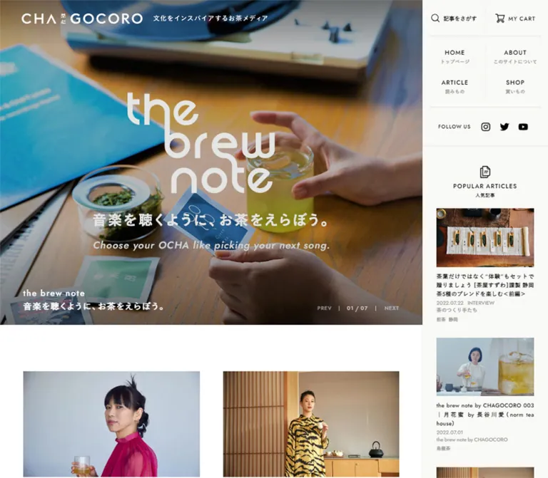
お茶に関わる人・場所・道具の写真を主役にしたメディアサイト。白い余白、固定サイドナビ、端正な記事一覧と、モバイルで左右交互に寄せる画像配置が特徴。
CHAGOCORO — Style Reference
A photographic tea magazine framed by white space, compact typography, and a quiet navigation rail.
Original URL: https://www.chagocoro.jp/
Final URL: https://www.chagocoro.jp/
Theme: light editorial canvas; black typography, white image overlays, and pale warm recommendation surfaces.
Inspected: October 2, 2026, at 02:33 JST. Supplied retrieval timestamp: October 1, 2026, 17:33:36.081 UTC.
Viewports: desktop 1440 × 1000 and mobile 390 × 844 CSS pixels.
Scope: the current Japanese homepage, including its five-slide feature area, curated stories, shop-category tiles, latest articles, recommendations, persistent navigation, About banner, and footer. Search and menu contents have DOM evidence, but their open states were not visually captured. Article detail pages and shopping destinations were not inspected.
CHAGOCORO presents tea through people, interiors, landscapes, and objects. Large photographs carry the emotional weight; small, carefully spaced typography supplies orientation. Its visible interface is almost entirely neutral. Greens, timber browns, muted blue-green packaging, and the bright yellow-green of brewed tea come from photography rather than a colored UI system.
At desktop size, the page divides into a 1170px editorial area and a 270px right rail. The main column alternates photographs that reach its edges with generously inset article grids. On mobile, the rail disappears, captions move below the feature image, and article photographs alternate between touching the left and right screen edges. This asymmetric mobile rhythm is a defining detail.
The homepage supports browsing across a publication and a shop. Preserve its sequence of stories, recommendations, and category entrances when adapting it.
閉じる
CHAGOCORO — Style Reference
A photographic tea magazine framed by white space, compact typography, and a quiet navigation rail.
Original URL: https://www.chagocoro.jp/
Final URL: https://www.chagocoro.jp/
Theme: light editorial canvas; black typography, white image overlays, and pale warm recommendation surfaces.
Inspected: October 2, 2026, at 02:33 JST. Supplied retrieval timestamp: October 1, 2026, 17:33:36.081 UTC.
Viewports: desktop 1440 × 1000 and mobile 390 × 844 CSS pixels.
Scope: the current Japanese homepage, including its five-slide feature area, curated stories, shop-category tiles, latest articles, recommendations, persistent navigation, About banner, and footer. Search and menu contents have DOM evidence, but their open states were not visually captured. Article detail pages and shopping destinations were not inspected.
CHAGOCORO presents tea through people, interiors, landscapes, and objects. Large photographs carry the emotional weight; small, carefully spaced typography supplies orientation. Its visible interface is almost entirely neutral. Greens, timber browns, muted blue-green packaging, and the bright yellow-green of brewed tea come from photography rather than a colored UI system.
At desktop size, the page divides into a 1170px editorial area and a 270px right rail. The main column alternates photographs that reach its edges with generously inset article grids. On mobile, the rail disappears, captions move below the feature image, and article photographs alternate between touching the left and right screen edges. This asymmetric mobile rhythm is a defining detail.
The homepage supports browsing across a publication and a shop. Preserve its sequence of stories, recommendations, and category entrances when adapting it.
How to Read This Reference
- Measured values come from the supplied rendered DOM and computed-style records. They describe the sampled elements and viewports.
- Visual estimates come from the five current-page screenshots: three desktop positions and two mobile positions. Approximate values are explicitly identified.
- Calculated values describe arithmetic relationships between measured rectangles. They do not establish the original CSS formula or breakpoint.
- Recommendations describe implementation choices for a new build. The Quick Start is an adaptation, not recovered source code.
- Named tokens are descriptive aliases created for this reference. The supplied custom properties mainly contain WordPress presets; those presets are not a reliable inventory of the colors, gradients, or shadows actually used here.
- Visibility matters: menu and search descendants appear in the DOM sample even when absent from the screenshots. Their computed styles do not prove that those interfaces were opened.
- Font declarations are evidence of a stack, not proof of the font file used for every glyph. Font loading and glyph-level fallback were not independently inspected.
Tokens — Colors
Main Palette
| Name | Value | Suggested token | Evidence and role |
|---|---|---|---|
| Editorial White | #ffffff |
--color-paper |
Measured body background; also measured social-button and desktop search-chip backgrounds |
| Black Ink | #000000 |
--color-ink |
Measured body and article-title color; visible navigation and icon color |
| Warm Quiet Surface | #f9f9f6 |
--color-quiet |
Measured mobile Popular Articles and Pick Up Items backgrounds; a useful approximation for the visually similar desktop rail and mobile footer, whose exact fills were not sampled |
| Metadata Gray | #999999 |
--color-muted |
Measured dates and category metadata on article cards and mobile feature captions |
| Search Label Gray | #777777 |
--color-label |
Measured search-group labels; the search panel was not visually opened |
| Reversed White | #ffffff |
--color-on-photo |
Measured desktop feature headings and category-tile labels |
| Fine Divider | approximately #ececea |
--color-rule |
Visual estimate for rail separators; exact border color was not supplied |
The interface has no verified green action color. A green button system would compete with the photography and change the balance of the page. Main actions use black text with an underline, or white text over a photograph.
Secondary Control Palette
These values are measured on menu/search descendants, not verified screenshots of an open panel.
| Context | Foreground | Background | Evidence boundary |
|---|---|---|---|
| Desktop taxonomy chips | #000000 |
#ffffff |
Computed on category, tea-type, location, and brand links |
| Mobile taxonomy chips | #aaaaaa |
#333333 |
Computed on the mobile search links |
| Mobile primary-menu links | #ffffff |
Transparent | Text color measured; enclosing menu background and opening behavior unverified |
The secondary dark values are not evidence of a selectable dark theme.
Photographic Color
Warm wood, dark shelving, ceramic gray, leaf green, and pale misty landscapes establish the atmosphere. The desktop feature image appears darker than the surrounding article photographs, helping white captions remain visible. The evidence does not identify the exact overlay, image grading, or opacity responsible. If a reconstruction needs a scrim, tune it per photograph and label that choice as an adaptation.
Tokens — Typography
Declared Sans-Serif Stack
The measured body declaration begins with:
YakuHanJP, Jost, Roboto, MFW-YuGoPr6N-Medium
It continues through Japanese Gothic fallbacks including YuGothic, Yu Gothic Medium, Yu Gothic, Noto Sans Japanese, Source Sans Pro, Hiragino Kaku Gothic Pro, and Meiryo before sans-serif.
The heading and many utility declarations replace MFW-YuGoPr6N-Medium with MFW-YuGoPr6N-Bold. Most sampled headings have computed weight 600. Preserve that distinction instead of assuming every text element is simply the body font made bold.
Jost and Roboto are declared Latin candidates. The evidence does not establish which serves every Latin character. The visible effect is a clean sans-serif system with geometric uppercase labels and firm Japanese headings.
Wordmark
The CHAGOCORO mark is custom-looking artwork with a triangular A form and a compact Japanese detail between its Latin groups. Treat it as a brand asset.
Its desktop link measures 260 × 23.09px; the mobile link measures 175.5 × 15.59px. The H1 container's computed 14px font size does not describe the visible wordmark. Do not recreate the mark by typing its name into a guessed font.
Type Scale
| Role | Desktop | Mobile | Weight | Tracking | Evidence |
|---|---|---|---|---|---|
| Body default | 14px / 25.2px |
14px / 25.2px |
400 |
Normal | Measured |
| Feature title | 18px / 28.8px |
16.38px / 26.208px |
600 |
0.12em |
Measured |
| Main article title | 17px / 28.9px |
13.65px / 21.84px |
600 |
Desktop 0.05em; mobile 0.03em |
Measured; mobile sample covers curated cards |
| Article date/category | 10px / 10px |
10px / 10px |
600 |
0.05em |
Measured |
| Feature metadata | 11px / 16.5px |
10px / 10px |
600 |
0.07em |
Measured |
| Shop-category heading | 24px / 24px |
19.5px / 29.25px |
600 |
0.15em |
Measured |
| VIEW ITEMS | 14px / 14px |
10px / 10px |
700 |
0.13em |
Measured |
| READ MORE | 20px / 34px |
Approximately 16px |
Desktop 600 |
Desktop 0.12em |
Desktop measured; mobile visual estimate |
| Mobile recommendation heading | — | 15.6px / 15.6px |
600 |
0.08em |
Measured |
| Mobile popular-story title | — | 12px / 19.2px |
600 |
0.03em |
Measured |
| Mobile product title | — | 11px / 16.5px |
600 |
0.05em |
Measured |
| Taxonomy chip | 12px / 30px |
10px / 30px |
600 |
0.1em |
Computed; open panel unverified |
| About-banner link | 14px / 14px |
Approximately 12px |
Desktop 600 |
Desktop 0.1em |
Desktop measured; mobile visual estimate |
The mobile values 16.38px, 13.65px, and 19.5px equal 4.2vw, 3.5vw, and 5vw at 390px. These are calculated correspondences, not recovered source declarations. Use bounded fluid sizes in a new implementation to avoid excessively small text on narrower devices.
Hierarchy and Wrapping
Article titles are compact, often spanning two or three lines. Dates, categories, tea types, and locations sit beneath them in much smaller gray text. Metadata stays textual: it is not presented as a row of colorful badges on the visible story cards.
Shop headings use stronger tracking and larger uppercase Latin text. Navigation labels are similarly compact and tracked. The page does not depend on oversized editorial headlines.
Tokens — Spacing & Shapes
Density: spacious photographs and section intervals; compact captions and utility controls.
Geometry: square images and flat surfaces. Circles are reserved for social controls, and pills occur in language/search utilities.
Spacing Scale
| Use | Value | Status |
|---|---|---|
| Desktop editorial inset | 50px |
Measured section padding |
| Desktop article-column gap | 50px |
Calculated from card rectangles |
| Desktop article image to title | 15px |
Calculated from the 5:3 image frame and heading position |
| Desktop title to metadata | 10px |
Calculated from heading and metadata rectangles |
| Curated desktop row interval | Approximately 80px after card bounds |
Calculated from sampled rows |
| Latest-article desktop row interval | 70px after the tallest preceding card |
Calculated from sampled rows |
| Feature to curated grid | 100px |
Measured desktop section positions |
| Shop tiles to latest photographs | 120px |
Calculated from desktop tile and card positions |
| Last article to READ MORE | 100px |
Calculated from desktop card and link positions |
| READ MORE to About band | 90px after link box |
Calculated from desktop rectangles |
| Mobile article edge offset | 27.30px |
Measured; approximately 7% of viewport width |
| Mobile caption inset | 15.59px |
Measured; approximately 4% of viewport width |
| Mobile article image to title | Approximately 15.6px |
Calculated |
| Mobile curated card interval | 39px |
Calculated; approximately 10% of viewport width |
| Mobile recommendation gutter | 17.55px |
Measured; approximately 4.5% of viewport width |
| Mobile recommendation section padding | 39px top, 19.5px bottom |
Measured |
These values are component-specific. The evidence does not establish a universal 8px spacing scale.
Shapes
| Element | Shape | Evidence |
|---|---|---|
| Feature and story images | Square corners | Visible and consistent with sampled zero-radius containers |
| Shop-category tiles | Square, edge-to-edge rectangles | Measured and visible |
| Taxonomy chips | 15px radius on a 30px line box |
Computed |
| Desktop lower social controls | 50 × 50px, circular |
Measured Instagram control; neighboring controls visually match |
| Mobile footer social controls | Approximately 40 × 40px, circular |
Visual estimate |
| Mobile language switch | Approximately 120 × 40px, pill |
Visual estimate |
| Section and navigation separators | Fine straight rules | Visible; approximately 1px |
Layout Measurements
| Element | Desktop 1440 × 1000 |
Mobile 390 × 844 |
|---|---|---|
| Document height | 5160.47px measured |
6615.48px measured |
| Editorial area | 1170px measured |
390px measured |
| Right rail | 270px calculated from remaining width |
Not visible |
| Header | 80px measured |
50px measured |
| Wordmark position | x:47px, y:28.45px |
x:20px, y:17.20px |
| Feature image | 1170 × 700px visible frame |
Approximately 390 × 390px visible frame |
| Feature section | 700px measured |
598.84px measured, including caption/reserved space |
| Article image | 510 × 306px calculated from 5:3 ratio |
Approximately 362.69 × 217.61px calculated |
| Article columns | Two 510px columns |
One alternating column, 362.69px wide |
| Shop-category tile | 585 × 300px measured |
195 × 195px measured |
| About-banner link | 535 × 200px measured |
Approximately 390 × 136px visually estimated |
| Popular-story card | Approximately 210px wide in rail |
234px measured |
| Product recommendation card | Not fully visible in supplied desktop captures | 195px measured |
Components
Persistent Brand Header
Role: carry identity across the photographic opening and long article index.
On desktop, the wordmark sits 47px from the left within an 80px header. The tagline, 文化をインスパイアするお茶メディア, appears beside it. In the opening screenshot, both are white over the photograph. In the lower desktop screenshots, the wordmark remains at the top left and appears black; the tagline is no longer visible.
On mobile, the wordmark moves to a 20px left inset inside a 50px header. The tagline sits underneath it in the opening state. A thin magnifying-glass icon and a two-line menu icon occupy the right side. The header is still visible in the footer capture, now using dark artwork.
Persistence and light/dark visual states are observed. The exact scroll threshold and mechanism controlling them are not supplied. The graphic can appear white even when its surrounding element has computed black text, so inspect the artwork state rather than relying only on inherited color.
Desktop Navigation Rail
Role: keep navigation and discovery beside the editorial canvas.
The rail occupies the rightmost 270px. Its primary navigation is a two-by-two arrangement of HOME, ABOUT, ARTICLE, and SHOP. The initial capture includes small Japanese subtitles underneath. Fine rules divide columns and separate navigation, search, social links, and recommendations.
Below navigation, a centered search control pairs an outline magnifier with 記事をさがす. A FOLLOW US row contains Instagram, X, and YouTube marks. These controls are black, compact, and largely unboxed.
In lower captures, navigation is more compact and its Japanese subtitles are absent. The search and social rows remain visible. Popular stories are visible in the opening rail but not in the later rail captures; their exact scrolling, clipping, or visibility mechanism cannot be established. Do not assume that every rail section stays fixed simultaneously.
The language control remains at the rail's bottom, separated by a top rule.
Five-Slide Feature
Role: promote a mixture of editorial stories and shopping destinations.
The desktop frame fills the editorial area's width and measures 700px high. Its active photograph has no surrounding card, corner radius, or external margin. The visible desktop slide features people inside a tea shop, with the caption along the lower edge.
Caption anatomy:
- A linked image/feature surface.
- An
18px, weight-600 title with1.6line height and0.12emtracking. - Date, category, tea type, and location where applicable.
- PREV, a two-digit fraction such as
03 / 05, and NEXT at the lower right.
Shorter captions allow title and metadata to sit alongside one another. The longer sampled title occupies a separate line above its metadata. Preserve wrapping rather than forcing all titles into a fixed narrow column.
On mobile, the feature image becomes square. Left and right chevrons sit near its vertical midpoint, and the 04 / 05 counter stays inside the image near the bottom right. The black title and gray SHOP label move onto white space below the photograph. The captured product is Ocha SURU? Glass Kyu-su.
The measured outer mobile feature section is 598.84px tall even though the visible product slide's own link rectangle is shorter. This leaves a substantial white interval before the first article. Reserving room for the longest caption is a useful reconstruction strategy, but the original sizing mechanism is not supplied.
Curated Article Grid
Role: introduce a selected mix of current and archive stories.
The first grid contains four entries, including the current playtea story and older series entries. Its first photograph begins at desktop document y=800px, 100px below the feature.
Each entry consists of:
- A landscape photograph with a
5:3crop. - A title directly below, without a surrounding panel.
- Date and category metadata.
- A quieter line of tea-type and location terms where present.
At desktop size, the columns begin at x=50px and x=610px. Each is 510px wide, with a 50px gap. Title lengths determine card height; the next row aligns below the taller card.
The mobile version is not simply the desktop grid collapsed into equal side margins. The first and third sampled cards start at x=27.30px and extend to the right edge. The second and fourth start at x=0 and leave the same gap on the right. Text receives an additional inset on the exposed screen edge. Preserve this alternation.
Shop-Category Mosaic
Role: provide photographic entrances to four product categories.
The labels are Ocha SURU? ORIGINAL, TOOL, LEAF, and GIFT. Four tiles form a two-by-two block with no inter-tile gutter. On desktop each tile is 585 × 300px; on mobile each is a 195px square.
The visible LEAF photograph closely frames dry tea leaves. GIFT shows a muted blue-green presentation box. Center the white category heading and place an underlined VIEW ITEMS label below it. The desktop label uses 7px bottom padding; its mobile counterpart uses 5px.
The entire tile is a link. Do not turn VIEW ITEMS into a floating rounded button. The image and centered type already provide the hierarchy.
Latest Article Index
Role: offer a chronological reading path after the shop mosaic.
Eight sampled articles appear in four desktop rows. They reuse the photographic article-card anatomy, with dates ranging from May through August 2025 in the current capture. The page's capture date and footer year are later; those article dates are content, not evidence of an earlier page version.
Desktop cards keep their 510px image width, 17px titles, and 10px metadata. Longer titles produce three-line headings and taller rows. The final mobile capture shows the last story image aligned to the left edge with its caption inset, consistent with the alternating mobile treatment; detailed mobile rectangles for this lower index were not supplied.
Popular Articles
Role: surface a small selection of recommended reading.
The opening desktop rail shows an outline document icon, a centered POPULAR ARTICLES heading, a smaller Japanese subtitle, and a vertical sequence of compact story cards. The first visible photograph is approximately 210 × 126px.
Mobile DOM measurements place this module in the main document after the curated stories. It uses a #f9f9f6 surface with a horizontally arranged sequence: 234px cards, approximately 17.55px gaps, and a 17.55px initial inset. The second card starts at x=269.09px and the third at x=520.64px, extending beyond the viewport.
Those rectangles establish horizontal overflow. They do not verify swipe handling, snapping, or automatic movement. A native horizontal scroll region is a recommended implementation.
Pick Up Items
Role: introduce specific products alongside editorial content.
The mobile DOM places this module immediately after the category mosaic. Its surface and section padding match Popular Articles. Product cards are 195px wide, use square imagery, and carry an 11px product title followed by a price and tax label.
The sampled products are the Glass Kyu-su set and a felt sleeve. The desktop DOM also contains product recommendations, with descriptive content and type fields, but their complete visual arrangement is not shown in the supplied desktop captures. Keep desktop sizing and price visibility separate from the verified mobile measurements.
READ MORE Link
Role: continue to the article index.
This is a centered text link to /article, not an observed inline content loader. On desktop its box measures approximately 133.23 × 34px, with 20px type and 0.12em tracking. A black underline gives it enough emphasis without a filled button.
Leave generous white space around it: the sampled desktop link starts 100px after the final card and ends 90px before the About band. Mobile keeps the same centered underline treatment at a smaller visual size.
About and Social Band
Role: close the article stream with identity and follow links.
The desktop band sits inside the 50px editorial margins. Its two equal 535px halves are 200px tall. The left half uses a misty green landscape with a centered white wordmark and the underlined link CHAGOCOROについて. The right half is a pale quiet surface containing FOLLOW US and three circular white social buttons.
Mobile separates these into a full-width landscape banner followed by a pale footer area. The banner is approximately 136px high. Social icons align left below it, with about 60px of breathing room above. The desktop FOLLOW US label is not visible in the mobile footer capture.
Footer and Language Control
Role: provide site navigation, corporate links, policies, and related tea destinations.
The desktop footer has three broad groups: a short site-navigation list, a corporate/policy list, and related-site marks aligned toward the right. The mobile version puts navigation and policy links into two compact columns, then places the related-site marks and production line below.
The current footer explicitly reads Produced by ITO EN. © All Right Reserved. ITO EN, LTD. 2026 and links to https://www.itoen.co.jp/. This supports the visible ITO EN production identification. It does not name a web design or development agency.
Desktop language links sit in the rail's bottom strip. The opening mobile capture shows a floating pale pill at the bottom right with 日本語 underlined and English beside it. That pill is absent from the supplied mobile footer capture. Its visibility rule was not tested.
Search and Menu Contents
Role: navigate a large editorial taxonomy without making every category part of the permanent header.
DOM evidence groups article discovery under keyword, category, tea type, and location. Shop-related navigation also includes brands and categories. Desktop chips have 12px type, 30px line height, 10px horizontal padding, and 15px radius. Mobile article-search chips use 10px type with the same line height, padding, and radius.
Several mobile brand-link rectangles are positioned outside the viewport, and menu/search text is absent from the closed-state screenshots. Treat these as latent interface contents. The available evidence does not support a precise drawing of the open panel, its backdrop, focus behavior, search submission, or dismissal animation.
Tokens — Motion & Interaction
| Element | Supplied computed value or observation | What can be concluded |
|---|---|---|
| Body | background-color 0.4s |
A background-color transition is declared; its trigger was not exercised |
| Header | 0.4s |
A transition is declared; changed properties are not identified by this shorthand alone |
| Wordmark and tagline | Desktop 0.8s; mobile 0.4s |
Different transition durations are present at the sampled sizes |
| Feature section | 1s |
A section transition exists; this does not establish carousel cadence or effect |
| Article sections | 1s 1s |
Computed duration of 1s with a 1s delay; reveal direction and trigger unverified |
| Feature and article titles | color 0.4s |
Color changes can transition; destination hover color was not captured |
| Taxonomy chips | 0.4s |
Transition declared; open-state interactions not tested |
| READ MORE | 0.5s |
A link transition is declared; exact visual change unverified |
| Header persistence | Visible at top and lower scroll positions | Persistent placement and differing visual states are supported |
| Carousel structure | Five slide links; desktop 03 / 05, mobile 04 / 05 |
Multiple slide states exist; automatic advancement and manual controls were not tested |
Many sampled elements report animation: none. This does not exclude JavaScript-driven carousel behavior. Similarly, a bare transition: all without a nonzero duration is not evidence of a visible animation.
No click, hover, keyboard, swipe, or form-submission recording was supplied. Do not invent autoplay intervals, parallax, image zoom, drag physics, or menu choreography.
For an adaptation, keep feedback restrained: short color/opacity changes, explicit carousel controls, and no movement of the article layout during hover. These are recommendations rather than observed interaction states.
Surfaces
| Layer | Appearance | Purpose |
|---|---|---|
| Main canvas | Solid white | Gives photographs and small captions room to breathe |
| Story cards | Unboxed image and text on the canvas | Maintains a magazine index rather than a dashboard appearance |
| Desktop rail | Visually pale warm neutral with thin rules | Separates persistent utilities from editorial content |
| Mobile recommendation bands | Measured #f9f9f6 |
Distinguishes horizontal discovery modules from the main article stream |
| Feature and category surfaces | Photographs with white labels where applicable | Makes content and objects the main visual signals |
| About banner | Soft green landscape and reversed brand artwork | Provides a quiet identity transition before the footer |
| Social controls | White circles on a pale surface | Adds small, recognizable targets without a general rounded-card system |
| Search chips | Rounded controls; desktop light and mobile dark computed variants | Dense taxonomy navigation; open-panel composition unverified |
There is no visible general-purpose shadow elevation system. Do not adopt the shadow and gradient presets simply because they exist among the supplied WordPress custom properties.
Imagery
Use documentary photography with visible context. People are shown inside their shops or workplaces; tea service appears through hands, glass, kettles, ceramics, and shelves. Interior photographs retain shadows and material detail. The mobile feature photograph uses steam and sunlight to make brewed tea luminous.
The contrast between image types creates the rhythm: a broad human scene, a careful service detail, a crop of tea leaves, a product box, and a soft landscape. Avoid making every photograph a centered isolated product on a neutral background.
Article images follow a consistent 5:3 shape. Preserve faces, hands, and vessels when choosing a crop. Hero images need separate desktop and mobile crop decisions: a wide 1170px scene cannot be assumed to work unchanged inside a square phone frame.
The About image appears softer and more atmospheric than the article thumbnails. Its green comes from the landscape; no global green overlay is established by the evidence.
Icons are crisp, monochrome, and small: outline search and document symbols, simple chevrons, and recognizable social marks. Asset paths for these graphics and the wordmark were not supplied.
Observed Asset References
The paths below were present in original-page links or image markup. They are relative to https://www.chagocoro.jp/; the files were not separately downloaded during this analysis.
| Subject | Observed path | Use |
|---|---|---|
| playtea service scene | wp-content/uploads/2025/08/043A2828_hon2-600x360.jpg |
Curated and latest article image |
| POUYUENJI KYOTO interior | wp-content/uploads/2025/08/197_043A2613-600x360.jpg |
Latest article image |
| Tea-shop interview | wp-content/uploads/2025/07/20250626CHAGOCORO_02154_hon-600x360.jpg |
Latest article thumbnail corresponding to a feature story |
| PAUSE & INSPIRE story | wp-content/uploads/2023/08/CGCR_PI_kamakuraDSCF9888-600x360.jpg |
Curated article image |
| TeaRoom portrait | wp-content/uploads/2025/05/20250425CHAGOCORO_04361-600x360.jpg |
Latest and popular article image |
| TeaRoom tea service | wp-content/uploads/2025/05/20250425CHAGOCORO_04323-600x360.jpg |
Final latest article image |
| Glass Kyu-su set | wp-content/uploads/2020/08/HP_9656-1-400x400.jpg |
Product recommendation image |
| Felt sleeve | wp-content/uploads/2022/09/c5b7b316713d0116e4ca94b36a446e0e-400x400.jpg |
Product recommendation image |
The filenames indicate 600×360 and 400×400 derivatives, but intrinsic image dimensions were not independently measured. Do not invent high-resolution paths by removing filename suffixes. The feature backgrounds, category backgrounds, and About landscape have no explicit asset URLs in the supplied evidence.
Layout & Responsive Behavior
Desktop Composition
The desktop page uses the following measured horizontal relationship:
1440px viewport = 1170px editorial area + 270px rail
Inside an article section:
1170px = 50px inset + 510px card + 50px gap + 510px card + 50px inset
The feature and shop mosaic extend to both edges of the editorial area. Article grids, the About/social band, and the footer return to the 50px inset. This repeated expansion and contraction is more important than centering everything in one maximum-width container.
The visible sequence is feature, curated grid, category mosaic, latest grid, READ MORE, About/social band, and footer. Recommendations occupy the desktop rail. The rail's navigation remains persistent while its recommendation content is not visible in every scroll capture.
Mobile Composition
The main canvas expands to the full 390px viewport. The desktop rail is replaced by top-right search/menu icons. Popular stories and product recommendations appear in the main document according to the mobile DOM:
- Feature image and caption.
- Four curated stories.
- Popular Articles horizontal sequence.
- Two-by-two shop-category mosaic.
- Pick Up Items horizontal sequence.
- Latest articles.
- READ MORE.
- About banner, social links, and footer.
The feature photograph is square, while its caption sits below it on white. Curated images occupy approximately 93% of the viewport width and alternate between right and left alignment. Their titles use approximately 89% of viewport width, with an additional 4% inset on the exposed edge.
Popular-story cards measure 60% of viewport width; product cards measure 50%. These calculated relationships explain the partial next-card exposure. Horizontal scrolling is a recommended way to make those overflowed items reachable; a specific swipe or snap implementation was not verified.
The shop mosaic remains two columns on mobile. Its tiles change from wide rectangles to squares rather than becoming a four-item vertical list.
Responsive Limits
Only the two stated viewport sizes were supplied. The original breakpoint, tablet behavior, landscape layout, browser zoom response, safe-area handling, and very narrow-screen behavior are unknown.
The Quick Start uses a recommended 1024px desktop switch. This is an implementation choice. Validate the rail, long Japanese titles, and category labels at intermediate widths before adopting it.
Do’s and Don’ts
Do
- Preserve the 1170px editorial area and 270px rail relationship at the measured desktop viewport.
- Alternate full-width photographic blocks with article sections inset by 50px.
- Use square-cornered 5:3 story photographs and unboxed captions.
- Reproduce the alternating left/right mobile article alignment.
- Move feature captions below the image on mobile.
- Keep category tiles in a gutterless two-by-two mosaic at both sampled sizes.
- Use small, tracked uppercase labels and restrained Japanese sans-serif titles.
- Keep article metadata gray and textual.
- Use underlined text for READ MORE, VIEW ITEMS, and the About link.
- Give photography the job of supplying warmth and color.
- Preserve the separate roles of curated stories, latest articles, popular reading, and product picks.
Don't
- Don't replace the editorial homepage with a sales headline, feature checklist, and repeated conversion buttons.
- Don't add rounded card containers, floating shadows, or colored category badges to the story grid.
- Don't center every mobile image between equal margins.
- Don't keep the desktop caption overlay on the mobile feature image.
- Don't collapse the mobile shop mosaic into one column without a separate design reason.
- Don't add a green UI accent merely because the subject is tea.
- Don't treat WordPress preset gradients and shadows as visible design tokens.
- Don't assume every DOM menu entry was visible in the supplied captures.
- Don't interpret differing carousel indices as proof of a particular autoplay interval.
- Don't use the wordmark container's 14px font size as the graphic's visual size.
- Don't force all article headings to two lines or truncate their Japanese titles.
Recommended Implementation Additions
These recommendations are not verified features of the original site:
- Use semantic navigation, article lists,
timeelements, and real destination links. Keep carousel buttons separate from slide links so interactive elements are not nested. - Give search, menu, carousel arrows, social icons, and language controls explicit accessible names and visible keyboard focus.
- If the carousel advances automatically, provide a pause control and suspend movement when appropriate for focus and reduced-motion preferences.
- Treat closed navigation/search panels as hidden and inert. Manage focus when opening and closing them, and allow Escape dismissal.
- Improve metadata readability where required. The observed 10px
#999999treatment is very quiet; an optional 12px#666666variant preserves the hierarchy with stronger contrast. - Make horizontal recommendation lists keyboard-reachable and natively scrollable. Avoid requiring a drag gesture to reach offscreen content.
- Reserve image aspect ratios before loading and use appropriate source sizes. Load the opening photograph promptly; defer lower-page images without changing their layout slots.
- Supply meaningful photo alternatives and retain visible text equivalents for graphic-only links.
- Add safe-area padding to floating mobile utilities and confirm they do not cover article links.
- Keep one accessible instance of each recommendation module when changing its desktop/mobile placement; share data rather than leaving duplicate interactive lists exposed.
Agent Prompt Guide
Quick Color Reference
- Main canvas:
#ffffff. - Titles, primary navigation, icons, and underlines:
#000000. - Article metadata: observed
#999999. - Recommendation bands: measured
#f9f9f6. - Desktop rail and mobile footer: pale warm neutral;
#f9f9f6is a practical approximation. - Photo-overlay labels:
#ffffff. - Dividers: approximately
#ececea. - Greens and timber tones belong primarily to photographs.
Overall Prompt
“Create a Japanese tea-culture magazine homepage inspired by the current CHAGOCORO page. At 1440px, reserve a 270px pale right navigation rail and a 1170px editorial area. Use a large photographic feature, a two-column article grid with 510px-wide 5:3 images, 50px editorial margins and gutters, compact black sans-serif titles, and tiny gray metadata. Alternate inset editorial grids with edge-to-edge shop-category photographs. Use underlined text links instead of prominent filled buttons. On mobile, replace the rail with a compact persistent brand header, make the feature image square with its caption below, and alternate 93%-width story images between the left and right screen edges. Keep the four shop categories in a two-by-two square mosaic. End with a green landscape About banner and a quiet footer.”
Example Component Prompts
- Article card: “Create an unboxed editorial link with a square-cornered 5:3 documentary photograph, a 17px Japanese sans-serif title at 1.7 line height and 0.05em tracking, followed by 10px gray date/category text and a quiet tea/location line. Use no border, panel fill, or shadow.”
- Mobile article stream: “At 390px, make each story image approximately 363px wide. Align odd images to the right edge with a 27px left gap; align even images to the left edge with a 27px right gap. Inset captions by another 16px on the exposed screen edge. Use approximately 14px titles and a 39px gap after each complete card.”
- Desktop rail: “Build a 270px pale navigation rail with a two-by-two HOME, ABOUT, ARTICLE, SHOP arrangement, subtle separators, a centered Japanese search label and magnifier, and a compact social row. Include a bottom language strip. Treat recommendation scrolling separately from persistent navigation.”
- Shop mosaic: “Create four photographic links in a gutterless two-by-two grid. Use centered white, tracked category labels and a smaller underlined VIEW ITEMS line. Desktop tiles are approximately 585×300; phone tiles are square and half the screen width.”
- Mobile feature: “Use a full-width square tea photograph with small side chevrons and a two-digit slide fraction at the lower right. Put the 16px black story title and small gray metadata on white below the image. Reserve enough caption space for a long Japanese title.”
- Footer: “Pair a soft green landscape About banner with a pale social panel on desktop. Stack them on mobile, left-align three circular social buttons, then arrange compact navigation and policy links in two columns. Keep the footer flat and spacious.”
Quick Start
CSS Custom Properties
This CSS reproduces the main measured proportions using ordinary pixel values and a conventional root size. The original root measured 14px; the adaptation does not depend on copying that root because its main dimensions are explicit.
The 1024px breakpoint, bounded mobile type, image scrim, focus styling, and independently scrollable desktop recommendation area are recommendations. The pale rail/footer fill and divider color are approximations. Licensed fonts and brand artwork must be supplied separately; the shortened font stacks retain declared source candidates without inventing font-file URLs.
Use a .chago wrapper, a persistent .brandbar, a .chago-main, and a .desktop-rail. Article sections contain .article-card links with image, title, metadata, and optional tag lines. Render recommendation modules in the desktop rail or the mobile document positions described above. CSS alone does not relocate those modules or implement the carousel, menu, search, or header state logic.
:root {
  /* Measured core colors; quiet rail and rule usage are approximations. */
  --color-paper: #ffffff;
  --color-ink: #000000;
  --color-quiet: #f9f9f6;
  --color-muted: #999999;
  --color-label: #777777;
  --color-rule: #ececea;
  --color-on-photo: #ffffff;

  /* Shortened adaptation of the declared font stacks. */
  --font-body: YakuHanJP, Jost, Roboto, MFW-YuGoPr6N-Medium,
    'Yu Gothic', 'Hiragino Kaku Gothic Pro', Meiryo, sans-serif;
  --font-heading: YakuHanJP, Jost, Roboto, MFW-YuGoPr6N-Bold,
    'Yu Gothic', 'Hiragino Kaku Gothic Pro', Meiryo, sans-serif;

  --rail-width: 270px;
  --editorial-inset: 50px;
  --article-gap: 50px;
  --article-ratio: 5 / 3;
  --text-meta: 10px;
  --motion-ui: 400ms ease;
  --safe-bottom: env(safe-area-inset-bottom, 0px);
}

.chago,
.chago * {
  box-sizing: border-box;
}

.chago {
  margin: 0;
  color: var(--color-ink);
  background: var(--color-paper);
  font-family: var(--font-body);
  font-size: 14px;
  line-height: 1.8;
}

.chago a {
  color: inherit;
  text-decoration: none;
}

.chago img {
  display: block;
  max-width: 100%;
}

.chago button {
  font: inherit;
  color: inherit;
  cursor: pointer;
}

.brandbar {
  position: fixed;
  inset: 0 0 auto;
  z-index: 30;
  display: flex;
  align-items: center;
  height: 50px;
  padding-inline: 20px;
  color: var(--color-ink);
  transition: color var(--motion-ui);
}

/* Application state must determine the appropriate artwork contrast. */
.brandbar[data-tone='light'] {
  color: var(--color-on-photo);
}

.brandbar__mark {
  display: block;
  width: min(45vw, 220px);
  height: auto;
}

.brandbar__tagline {
  position: absolute;
  top: 45px;
  left: 22px;
  margin: 0;
  font-size: 10px;
  line-height: 1;
}

.brandbar[data-compact='true'] .brandbar__tagline {
  display: none;
}

.brandbar__tools {
  display: flex;
  gap: 6px;
  margin-left: auto;
}

.icon-button {
  display: grid;
  place-items: center;
  width: 44px;
  height: 44px;
  padding: 10px;
  border: 0;
  background: transparent;
}

.desktop-rail {
  display: none;
}

.feature {
  position: relative;
  /* Approximate the measured caption reserve at 390px. */
  min-height: calc(100vw + 209px);
}

.feature__media {
  position: relative;
  aspect-ratio: 1;
}

.feature__image {
  width: 100%;
  height: 100%;
  object-fit: cover;
  object-position: var(--feature-position, center);
}

.feature__caption {
  padding: 16px 4vw 0;
}

.feature__title {
  margin: 0;
  font-family: var(--font-heading);
  font-size: clamp(16px, 4.2vw, 18px);
  font-weight: 600;
  line-height: 1.6;
  letter-spacing: 0.12em;
}

.feature__meta {
  margin: 5px 0 0;
  color: var(--color-muted);
  font-size: var(--text-meta);
  font-weight: 600;
  line-height: 1.5;
  letter-spacing: 0.07em;
}

.feature__count {
  position: absolute;
  right: 4vw;
  bottom: 10px;
  color: var(--color-on-photo);
  font-size: 11px;
  letter-spacing: 0.12em;
}

.article-grid {
  display: grid;
  grid-template-columns: minmax(0, 1fr);
  row-gap: 10vw;
}

.article-card {
  display: block;
  min-width: 0;
  width: 93%;
}

.article-card:nth-child(odd) {
  justify-self: end;
}

.article-card:nth-child(even) {
  justify-self: start;
}

.article-card__image {
  width: 100%;
  aspect-ratio: var(--article-ratio);
  object-fit: cover;
  object-position: var(--article-position, center);
}

.article-card:nth-child(odd) .article-card__body {
  padding-right: 4vw;
}

.article-card:nth-child(even) .article-card__body {
  padding-left: 4vw;
}

.article-card__title {
  margin: 4vw 0 8px;
  font-family: var(--font-heading);
  font-size: clamp(14px, 3.5vw, 17px);
  font-weight: 600;
  line-height: 1.6;
  letter-spacing: 0.03em;
  overflow-wrap: anywhere;
  transition: color var(--motion-ui);
}

.article-card__meta,
.article-card__tags {
  margin: 0;
  color: var(--color-muted);
  font-size: var(--text-meta);
  font-weight: 600;
  /* More tolerant of wrapped metadata than the observed 10px line box. */
  line-height: 1.5;
  letter-spacing: 0.05em;
}

.article-card__tags {
  margin-top: 5px;
}

.shop-grid {
  display: grid;
  grid-template-columns: repeat(2, minmax(0, 1fr));
}

.shop-tile {
  position: relative;
  display: grid;
  place-items: center;
  aspect-ratio: 1;
  overflow: hidden;
  text-align: center;
  color: var(--color-on-photo);
}

.chago .shop-tile {
  color: var(--color-on-photo);
}

.shop-tile__image {
  position: absolute;
  inset: 0;
  width: 100%;
  height: 100%;
  object-fit: cover;
}

.shop-tile__copy {
  position: relative;
  z-index: 1;
  padding: 12px;
}

.shop-tile__title {
  margin: 0 0 12px;
  font-family: var(--font-heading);
  font-size: clamp(16px, 5vw, 24px);
  font-weight: 600;
  line-height: 1.5;
  letter-spacing: 0.15em;
}

.shop-tile__action {
  display: inline-block;
  padding-bottom: 5px;
  border-bottom: 2px solid currentColor;
  font-size: 10px;
  font-weight: 700;
  line-height: 1;
  letter-spacing: 0.13em;
}

.recommendations {
  min-width: 0;
  padding-block: 10vw 5vw;
  background: var(--color-quiet);
}

.recommendations__heading {
  margin: 0 4.5vw 8vw;
  font-size: clamp(15px, 4vw, 18px);
  line-height: 1;
  letter-spacing: 0.08em;
}

.recommendation-track {
  display: flex;
  gap: 4.5vw;
  overflow-x: auto;
  padding-inline: 4.5vw;
  padding-bottom: 10px;
}

.recommendation-card {
  flex: 0 0 60vw;
  min-width: 0;
}

.recommendation-track--products .recommendation-card {
  flex-basis: 50vw;
}

.recommendation-card img {
  width: 100%;
  aspect-ratio: 5 / 3;
  object-fit: cover;
}

.recommendation-track--products img {
  aspect-ratio: 1;
}

.recommendation-card h3 {
  margin: 10px 0 2px;
  font-size: 12px;
  line-height: 1.6;
  letter-spacing: 0.03em;
}

.archive-action {
  margin: 60px 0;
  text-align: center;
}

.chago .archive-action a {
  display: inline-block;
  border-bottom: 2px solid currentColor;
  font-size: 16px;
  font-weight: 600;
  line-height: 1.7;
  letter-spacing: 0.12em;
}

.about-social {
  display: grid;
}

.chago .about-banner {
  position: relative;
  display: grid;
  place-content: center;
  min-height: 35vw;
  padding: 25px;
  text-align: center;
  color: var(--color-on-photo);
  background: center / cover no-repeat var(--about-image);
}

.about-banner__link {
  justify-self: center;
  margin-top: 15px;
  padding-bottom: 5px;
  border-bottom: 2px solid currentColor;
  font-size: 12px;
  line-height: 1;
  letter-spacing: 0.1em;
}

.social-panel {
  display: flex;
  align-items: center;
  gap: 15px;
  padding: 60px 20px 30px;
  background: var(--color-quiet);
}

.social-panel__label {
  display: none;
}

.social-circle {
  display: grid;
  place-items: center;
  width: 40px;
  height: 40px;
  border-radius: 50%;
  background: var(--color-paper);
}

.site-footer {
  padding: 0 20px 56px;
  background: var(--color-quiet);
  font-size: 11px;
}

.site-footer__links {
  display: grid;
  grid-template-columns: 60px minmax(0, 1fr);
  gap: 26px;
}

.site-footer__links ul {
  margin: 0;
  padding: 0;
  list-style: none;
}

.site-footer__links li {
  margin-bottom: 6px;
}

.site-footer__partners,
.site-footer__copyright {
  margin-top: 30px;
}

.language-switch {
  position: fixed;
  right: 10px;
  bottom: calc(10px + var(--safe-bottom));
  z-index: 35;
  display: flex;
  align-items: center;
  justify-content: center;
  gap: 12px;
  min-width: 120px;
  min-height: 40px;
  padding: 8px 16px;
  border-radius: 999px;
  background: var(--color-quiet);
  font-size: 10px;
}

.language-switch [aria-current] {
  text-decoration: underline;
  text-underline-offset: 4px;
}

/* Optional readability variant; these values are recommendations. */
.chago[data-readable-metadata='true'] {
  --color-muted: #666666;
  --text-meta: 12px;
}

/* Recommended breakpoint, not recovered from the original stylesheet. */
@media (min-width: 1024px) {
  .chago-main {
    margin-right: var(--rail-width);
  }

  .brandbar {
    right: var(--rail-width);
    height: 80px;
    padding-left: 47px;
  }

  .brandbar__mark {
    width: 260px;
  }

  .brandbar__tagline {
    position: static;
    margin-left: 23px;
    font-size: 14px;
  }

  .brandbar__tools {
    display: none;
  }

  .desktop-rail {
    position: fixed;
    inset: 0 0 0 auto;
    z-index: 40;
    display: flex;
    flex-direction: column;
    width: var(--rail-width);
    background: var(--color-quiet);
    border-left: 1px solid var(--color-rule);
  }

  .rail-nav {
    display: grid;
    grid-template-columns: repeat(2, minmax(0, 1fr));
    padding: 8px 15px;
  }

  .rail-nav a {
    padding: 10px 5px;
    text-align: center;
    font-size: 13px;
    font-weight: 600;
    letter-spacing: 0.1em;
  }

  .rail-nav a:nth-child(odd) {
    border-right: 1px solid var(--color-rule);
  }

  .rail-nav small {
    display: block;
    color: var(--color-muted);
    font-size: 10px;
    font-weight: 400;
  }

  .rail-search,
  .rail-social {
    display: flex;
    align-items: center;
    justify-content: center;
    gap: 20px;
    min-height: 54px;
    border-top: 1px solid var(--color-rule);
  }

  /* Accessible overflow strategy; original rail scrolling is unverified. */
  .rail-recommendations {
    flex: 1;
    min-height: 0;
    overflow-y: auto;
    padding: 60px 30px;
    border-top: 1px solid var(--color-rule);
  }

  .feature {
    height: 700px;
    min-height: 0;
  }

  .feature__media {
    height: 100%;
    aspect-ratio: auto;
  }

  /* Recommended scrim; tune to the chosen image. */
  .feature__media::after {
    content: '';
    position: absolute;
    inset: 45% 0 0;
    background: linear-gradient(transparent, rgb(0 0 0 / 35%));
    pointer-events: none;
  }

  .feature__caption {
    position: absolute;
    z-index: 1;
    left: 50px;
    right: 240px;
    bottom: 25px;
    display: flex;
    flex-wrap: wrap;
    align-items: end;
    gap: 15px 30px;
    padding: 0;
    color: var(--color-on-photo);
  }

  .feature__title {
    max-width: 100%;
    font-size: 18px;
  }

  .feature__meta {
    margin: 0;
    color: inherit;
    font-size: 11px;
  }

  .feature__count {
    z-index: 2;
    right: 115px;
    bottom: 25px;
  }

  .article-grid {
    grid-template-columns: repeat(2, minmax(0, 1fr));
    gap: 70px var(--article-gap);
    padding-inline: var(--editorial-inset);
  }

  .article-grid--curated {
    margin-block: 100px;
    row-gap: 80px;
  }

  .article-grid--latest {
    margin-top: 120px;
  }

  .article-card {
    width: 100%;
  }

  .article-card:nth-child(n) .article-card__body {
    padding: 0;
  }

  .article-card__title {
    margin: 15px 0 10px;
    font-size: 17px;
    line-height: 1.7;
    letter-spacing: 0.05em;
  }

  .shop-tile {
    height: 300px;
    aspect-ratio: auto;
  }

  .shop-tile__title {
    margin-bottom: 30px;
    font-size: 24px;
    line-height: 1;
  }

  .shop-tile__action {
    padding-bottom: 7px;
    font-size: 14px;
  }

  .archive-action {
    margin: 100px 0 90px;
  }

  .chago .archive-action a {
    font-size: 20px;
  }

  .about-social {
    grid-template-columns: repeat(2, minmax(0, 1fr));
    margin-inline: var(--editorial-inset);
  }

  .chago .about-banner,
  .social-panel {
    min-height: 200px;
  }

  .about-banner__link {
    font-size: 14px;
  }

  .social-panel {
    justify-content: center;
    gap: 16px;
    padding: 25px;
  }

  .social-panel__label {
    display: block;
    margin-right: 6px;
    font-size: 12px;
    letter-spacing: 0.05em;
  }

  .social-circle {
    width: 50px;
    height: 50px;
  }

  .site-footer {
    padding: 70px 50px 60px;
    background: var(--color-paper);
  }

  .site-footer__links {
    grid-template-columns: 100px minmax(0, 1fr);
    gap: 50px;
  }

  .language-switch {
    right: 0;
    bottom: 0;
    width: var(--rail-width);
    min-height: 62px;
    border-top: 1px solid var(--color-rule);
    border-radius: 0;
    font-size: 12px;
  }
}

/* Recommended keyboard and reduced-motion additions. */
.chago :focus-visible {
  outline: 2px solid currentColor;
  outline-offset: 4px;
}

@media (prefers-reduced-motion: reduce) {
  .chago *,
  .chago *::before,
  .chago *::after {
    transition: none !important;
    animation: none !important;
    scroll-behavior: auto !important;
  }
}
The CSS leaves carousel timing, header contrast detection, rail compression, and language-pill visibility to explicit application logic because their original rules were not verified. Set --about-image to an authorized landscape asset. Use real logo and icon artwork instead of attempting to derive them from text metrics.
Tailwind v4 Token Mapping
Optional aliases for a project already using Tailwind v4. This does not imply that the original website uses Tailwind. Define the custom properties above first.
@theme inline {
  --color-paper: var(--color-paper);
  --color-ink: var(--color-ink);
  --color-quiet: var(--color-quiet);
  --color-metadata: var(--color-muted);
  --color-divider: var(--color-rule);

  --font-editorial: var(--font-body);
  --font-editorial-heading: var(--font-heading);

  --text-metadata: 10px;
  --text-story: 17px;
  --text-feature: 18px;
  --text-category: 24px;

  --spacing-editorial: 50px;
  --spacing-rail: 270px;
  --spacing-section: 100px;
  --radius-chip: 15px;
}
If a build tool treats same-name aliases as circular custom-property references, use literal values for the first three mappings: paper #ffffff, ink #000000, and quiet #f9f9f6.
Sources & Evidence
- Inspected original and final page: CHAGOCORO. Both supplied URLs are identical, and the supplied response status is HTTP 200.
- Capture time: October 1, 2026,
17:33:36.081 UTC, equivalent to October 2, 2026,02:33:36.081 JST. - Desktop evidence: three current-page screenshots at
1440 × 1000, covering the opening feature, middle content, and footer; rendered text, links, computed styles, and rectangles; document height approximately5160.47px. - Mobile evidence: two current-page screenshots at
390 × 844, covering the opening feature and footer; rendered text, links, computed styles, and rectangles; document height approximately6615.48px. - Original-page destinations:
/article,/about, article links, shop-category links, product links, social links, corporate-policy links, and the English-language link are supported by the supplied homepage DOM. Their destinations were not opened for this reference. - Attribution visible on the page: the footer's
Produced by ITO EN.line and corporate link support the limited production identification recorded here. No web design/development credit was independently visible. - Inspection method supplied with the captures: initial observation lasted at least five seconds; capture readiness checked document load, sampled layout/text stability, image decoding, and finite animations. Perpetual animations were paused during readiness checks and resumed afterward. SharedWorkers and service workers were disabled.
- Limitations: no additional browsing or file access was performed. Open menus, search results, hover states, keyboard behavior, manual carousel operation, autoplay timing, recommendation gestures, and intermediate responsive widths remain unverified. Computed rectangles for hidden descendants are not proof of visibility, and nearby capture moments may differ slightly in position or active slide.
This reference describes the current homepage evidenced by the supplied captures. Measured values, visual estimates, and recommended implementation choices remain distinct throughout.
# CHAGOCORO — Style Reference

> A photographic tea magazine framed by white space, compact typography, and a quiet navigation rail.

**Original URL:** [https://www.chagocoro.jp/](https://www.chagocoro.jp/)
**Final URL:** [https://www.chagocoro.jp/](https://www.chagocoro.jp/)
**Theme:** light editorial canvas; black typography, white image overlays, and pale warm recommendation surfaces.
**Inspected:** October 2, 2026, at 02:33 JST. Supplied retrieval timestamp: October 1, 2026, `17:33:36.081 UTC`.
**Viewports:** desktop `1440 × 1000` and mobile `390 × 844` CSS pixels.
**Scope:** the current Japanese homepage, including its five-slide feature area, curated stories, shop-category tiles, latest articles, recommendations, persistent navigation, About banner, and footer. Search and menu contents have DOM evidence, but their open states were not visually captured. Article detail pages and shopping destinations were not inspected.

CHAGOCORO presents tea through people, interiors, landscapes, and objects. Large photographs carry the emotional weight; small, carefully spaced typography supplies orientation. Its visible interface is almost entirely neutral. Greens, timber browns, muted blue-green packaging, and the bright yellow-green of brewed tea come from photography rather than a colored UI system.

At desktop size, the page divides into a 1170px editorial area and a 270px right rail. The main column alternates photographs that reach its edges with generously inset article grids. On mobile, the rail disappears, captions move below the feature image, and article photographs alternate between touching the left and right screen edges. This asymmetric mobile rhythm is a defining detail.

The homepage supports browsing across a publication and a shop. Preserve its sequence of stories, recommendations, and category entrances when adapting it.
閉じる
# CHAGOCORO — Style Reference

> A photographic tea magazine framed by white space, compact typography, and a quiet navigation rail.

**Original URL:** [https://www.chagocoro.jp/](https://www.chagocoro.jp/)
**Final URL:** [https://www.chagocoro.jp/](https://www.chagocoro.jp/)
**Theme:** light editorial canvas; black typography, white image overlays, and pale warm recommendation surfaces.
**Inspected:** October 2, 2026, at 02:33 JST. Supplied retrieval timestamp: October 1, 2026, `17:33:36.081 UTC`.
**Viewports:** desktop `1440 × 1000` and mobile `390 × 844` CSS pixels.
**Scope:** the current Japanese homepage, including its five-slide feature area, curated stories, shop-category tiles, latest articles, recommendations, persistent navigation, About banner, and footer. Search and menu contents have DOM evidence, but their open states were not visually captured. Article detail pages and shopping destinations were not inspected.

CHAGOCORO presents tea through people, interiors, landscapes, and objects. Large photographs carry the emotional weight; small, carefully spaced typography supplies orientation. Its visible interface is almost entirely neutral. Greens, timber browns, muted blue-green packaging, and the bright yellow-green of brewed tea come from photography rather than a colored UI system.

At desktop size, the page divides into a 1170px editorial area and a 270px right rail. The main column alternates photographs that reach its edges with generously inset article grids. On mobile, the rail disappears, captions move below the feature image, and article photographs alternate between touching the left and right screen edges. This asymmetric mobile rhythm is a defining detail.

The homepage supports browsing across a publication and a shop. Preserve its sequence of stories, recommendations, and category entrances when adapting it.

## How to Read This Reference

- **Measured** values come from the supplied rendered DOM and computed-style records. They describe the sampled elements and viewports.
- **Visual estimates** come from the five current-page screenshots: three desktop positions and two mobile positions. Approximate values are explicitly identified.
- **Calculated** values describe arithmetic relationships between measured rectangles. They do not establish the original CSS formula or breakpoint.
- **Recommendations** describe implementation choices for a new build. The Quick Start is an adaptation, not recovered source code.
- **Named tokens** are descriptive aliases created for this reference. The supplied custom properties mainly contain WordPress presets; those presets are not a reliable inventory of the colors, gradients, or shadows actually used here.
- **Visibility matters:** menu and search descendants appear in the DOM sample even when absent from the screenshots. Their computed styles do not prove that those interfaces were opened.
- **Font declarations are evidence of a stack, not proof of the font file used for every glyph.** Font loading and glyph-level fallback were not independently inspected.

## Tokens — Colors

### Main Palette

| Name | Value | Suggested token | Evidence and role |
| --- | --- | --- | --- |
| Editorial White | `#ffffff` | `--color-paper` | Measured body background; also measured social-button and desktop search-chip backgrounds |
| Black Ink | `#000000` | `--color-ink` | Measured body and article-title color; visible navigation and icon color |
| Warm Quiet Surface | `#f9f9f6` | `--color-quiet` | Measured mobile Popular Articles and Pick Up Items backgrounds; a useful approximation for the visually similar desktop rail and mobile footer, whose exact fills were not sampled |
| Metadata Gray | `#999999` | `--color-muted` | Measured dates and category metadata on article cards and mobile feature captions |
| Search Label Gray | `#777777` | `--color-label` | Measured search-group labels; the search panel was not visually opened |
| Reversed White | `#ffffff` | `--color-on-photo` | Measured desktop feature headings and category-tile labels |
| Fine Divider | approximately `#ececea` | `--color-rule` | Visual estimate for rail separators; exact border color was not supplied |

The interface has no verified green action color. A green button system would compete with the photography and change the balance of the page. Main actions use black text with an underline, or white text over a photograph.

### Secondary Control Palette

These values are measured on menu/search descendants, not verified screenshots of an open panel.

| Context | Foreground | Background | Evidence boundary |
| --- | --- | --- | --- |
| Desktop taxonomy chips | `#000000` | `#ffffff` | Computed on category, tea-type, location, and brand links |
| Mobile taxonomy chips | `#aaaaaa` | `#333333` | Computed on the mobile search links |
| Mobile primary-menu links | `#ffffff` | Transparent | Text color measured; enclosing menu background and opening behavior unverified |

The secondary dark values are not evidence of a selectable dark theme.

### Photographic Color

Warm wood, dark shelving, ceramic gray, leaf green, and pale misty landscapes establish the atmosphere. The desktop feature image appears darker than the surrounding article photographs, helping white captions remain visible. The evidence does not identify the exact overlay, image grading, or opacity responsible. If a reconstruction needs a scrim, tune it per photograph and label that choice as an adaptation.

## Tokens — Typography

### Declared Sans-Serif Stack

The measured body declaration begins with:

`YakuHanJP, Jost, Roboto, MFW-YuGoPr6N-Medium`

It continues through Japanese Gothic fallbacks including YuGothic, Yu Gothic Medium, Yu Gothic, Noto Sans Japanese, Source Sans Pro, Hiragino Kaku Gothic Pro, and Meiryo before `sans-serif`.

The heading and many utility declarations replace `MFW-YuGoPr6N-Medium` with `MFW-YuGoPr6N-Bold`. Most sampled headings have computed weight `600`. Preserve that distinction instead of assuming every text element is simply the body font made bold.

Jost and Roboto are declared Latin candidates. The evidence does not establish which serves every Latin character. The visible effect is a clean sans-serif system with geometric uppercase labels and firm Japanese headings.

### Wordmark

The CHAGOCORO mark is custom-looking artwork with a triangular A form and a compact Japanese detail between its Latin groups. Treat it as a brand asset.

Its desktop link measures `260 × 23.09px`; the mobile link measures `175.5 × 15.59px`. The H1 container's computed `14px` font size does not describe the visible wordmark. Do not recreate the mark by typing its name into a guessed font.

### Type Scale

| Role | Desktop | Mobile | Weight | Tracking | Evidence |
| --- | --- | --- | --- | --- | --- |
| Body default | `14px / 25.2px` | `14px / 25.2px` | `400` | Normal | Measured |
| Feature title | `18px / 28.8px` | `16.38px / 26.208px` | `600` | `0.12em` | Measured |
| Main article title | `17px / 28.9px` | `13.65px / 21.84px` | `600` | Desktop `0.05em`; mobile `0.03em` | Measured; mobile sample covers curated cards |
| Article date/category | `10px / 10px` | `10px / 10px` | `600` | `0.05em` | Measured |
| Feature metadata | `11px / 16.5px` | `10px / 10px` | `600` | `0.07em` | Measured |
| Shop-category heading | `24px / 24px` | `19.5px / 29.25px` | `600` | `0.15em` | Measured |
| VIEW ITEMS | `14px / 14px` | `10px / 10px` | `700` | `0.13em` | Measured |
| READ MORE | `20px / 34px` | Approximately `16px` | Desktop `600` | Desktop `0.12em` | Desktop measured; mobile visual estimate |
| Mobile recommendation heading | — | `15.6px / 15.6px` | `600` | `0.08em` | Measured |
| Mobile popular-story title | — | `12px / 19.2px` | `600` | `0.03em` | Measured |
| Mobile product title | — | `11px / 16.5px` | `600` | `0.05em` | Measured |
| Taxonomy chip | `12px / 30px` | `10px / 30px` | `600` | `0.1em` | Computed; open panel unverified |
| About-banner link | `14px / 14px` | Approximately `12px` | Desktop `600` | Desktop `0.1em` | Desktop measured; mobile visual estimate |

The mobile values `16.38px`, `13.65px`, and `19.5px` equal `4.2vw`, `3.5vw`, and `5vw` at 390px. These are calculated correspondences, not recovered source declarations. Use bounded fluid sizes in a new implementation to avoid excessively small text on narrower devices.

### Hierarchy and Wrapping

Article titles are compact, often spanning two or three lines. Dates, categories, tea types, and locations sit beneath them in much smaller gray text. Metadata stays textual: it is not presented as a row of colorful badges on the visible story cards.

Shop headings use stronger tracking and larger uppercase Latin text. Navigation labels are similarly compact and tracked. The page does not depend on oversized editorial headlines.

## Tokens — Spacing & Shapes

**Density:** spacious photographs and section intervals; compact captions and utility controls.

**Geometry:** square images and flat surfaces. Circles are reserved for social controls, and pills occur in language/search utilities.

### Spacing Scale

| Use | Value | Status |
| --- | --- | --- |
| Desktop editorial inset | `50px` | Measured section padding |
| Desktop article-column gap | `50px` | Calculated from card rectangles |
| Desktop article image to title | `15px` | Calculated from the 5:3 image frame and heading position |
| Desktop title to metadata | `10px` | Calculated from heading and metadata rectangles |
| Curated desktop row interval | Approximately `80px` after card bounds | Calculated from sampled rows |
| Latest-article desktop row interval | `70px` after the tallest preceding card | Calculated from sampled rows |
| Feature to curated grid | `100px` | Measured desktop section positions |
| Shop tiles to latest photographs | `120px` | Calculated from desktop tile and card positions |
| Last article to READ MORE | `100px` | Calculated from desktop card and link positions |
| READ MORE to About band | `90px` after link box | Calculated from desktop rectangles |
| Mobile article edge offset | `27.30px` | Measured; approximately `7%` of viewport width |
| Mobile caption inset | `15.59px` | Measured; approximately `4%` of viewport width |
| Mobile article image to title | Approximately `15.6px` | Calculated |
| Mobile curated card interval | `39px` | Calculated; approximately `10%` of viewport width |
| Mobile recommendation gutter | `17.55px` | Measured; approximately `4.5%` of viewport width |
| Mobile recommendation section padding | `39px` top, `19.5px` bottom | Measured |

These values are component-specific. The evidence does not establish a universal 8px spacing scale.

### Shapes

| Element | Shape | Evidence |
| --- | --- | --- |
| Feature and story images | Square corners | Visible and consistent with sampled zero-radius containers |
| Shop-category tiles | Square, edge-to-edge rectangles | Measured and visible |
| Taxonomy chips | `15px` radius on a `30px` line box | Computed |
| Desktop lower social controls | `50 × 50px`, circular | Measured Instagram control; neighboring controls visually match |
| Mobile footer social controls | Approximately `40 × 40px`, circular | Visual estimate |
| Mobile language switch | Approximately `120 × 40px`, pill | Visual estimate |
| Section and navigation separators | Fine straight rules | Visible; approximately 1px |

### Layout Measurements

| Element | Desktop `1440 × 1000` | Mobile `390 × 844` |
| --- | --- | --- |
| Document height | `5160.47px` measured | `6615.48px` measured |
| Editorial area | `1170px` measured | `390px` measured |
| Right rail | `270px` calculated from remaining width | Not visible |
| Header | `80px` measured | `50px` measured |
| Wordmark position | `x:47px`, `y:28.45px` | `x:20px`, `y:17.20px` |
| Feature image | `1170 × 700px` visible frame | Approximately `390 × 390px` visible frame |
| Feature section | `700px` measured | `598.84px` measured, including caption/reserved space |
| Article image | `510 × 306px` calculated from 5:3 ratio | Approximately `362.69 × 217.61px` calculated |
| Article columns | Two `510px` columns | One alternating column, `362.69px` wide |
| Shop-category tile | `585 × 300px` measured | `195 × 195px` measured |
| About-banner link | `535 × 200px` measured | Approximately `390 × 136px` visually estimated |
| Popular-story card | Approximately `210px` wide in rail | `234px` measured |
| Product recommendation card | Not fully visible in supplied desktop captures | `195px` measured |

## Components

### Persistent Brand Header

**Role:** carry identity across the photographic opening and long article index.

On desktop, the wordmark sits 47px from the left within an 80px header. The tagline, `文化をインスパイアするお茶メディア`, appears beside it. In the opening screenshot, both are white over the photograph. In the lower desktop screenshots, the wordmark remains at the top left and appears black; the tagline is no longer visible.

On mobile, the wordmark moves to a 20px left inset inside a 50px header. The tagline sits underneath it in the opening state. A thin magnifying-glass icon and a two-line menu icon occupy the right side. The header is still visible in the footer capture, now using dark artwork.

Persistence and light/dark visual states are observed. The exact scroll threshold and mechanism controlling them are not supplied. The graphic can appear white even when its surrounding element has computed black text, so inspect the artwork state rather than relying only on inherited `color`.

### Desktop Navigation Rail

**Role:** keep navigation and discovery beside the editorial canvas.

The rail occupies the rightmost 270px. Its primary navigation is a two-by-two arrangement of HOME, ABOUT, ARTICLE, and SHOP. The initial capture includes small Japanese subtitles underneath. Fine rules divide columns and separate navigation, search, social links, and recommendations.

Below navigation, a centered search control pairs an outline magnifier with `記事をさがす`. A FOLLOW US row contains Instagram, X, and YouTube marks. These controls are black, compact, and largely unboxed.

In lower captures, navigation is more compact and its Japanese subtitles are absent. The search and social rows remain visible. Popular stories are visible in the opening rail but not in the later rail captures; their exact scrolling, clipping, or visibility mechanism cannot be established. Do not assume that every rail section stays fixed simultaneously.

The language control remains at the rail's bottom, separated by a top rule.

### Five-Slide Feature

**Role:** promote a mixture of editorial stories and shopping destinations.

The desktop frame fills the editorial area's width and measures 700px high. Its active photograph has no surrounding card, corner radius, or external margin. The visible desktop slide features people inside a tea shop, with the caption along the lower edge.

Caption anatomy:

1. A linked image/feature surface.
2. An `18px`, weight-600 title with `1.6` line height and `0.12em` tracking.
3. Date, category, tea type, and location where applicable.
4. PREV, a two-digit fraction such as `03 / 05`, and NEXT at the lower right.

Shorter captions allow title and metadata to sit alongside one another. The longer sampled title occupies a separate line above its metadata. Preserve wrapping rather than forcing all titles into a fixed narrow column.

On mobile, the feature image becomes square. Left and right chevrons sit near its vertical midpoint, and the `04 / 05` counter stays inside the image near the bottom right. The black title and gray SHOP label move onto white space below the photograph. The captured product is `Ocha SURU? Glass Kyu-su`.

The measured outer mobile feature section is `598.84px` tall even though the visible product slide's own link rectangle is shorter. This leaves a substantial white interval before the first article. Reserving room for the longest caption is a useful reconstruction strategy, but the original sizing mechanism is not supplied.

### Curated Article Grid

**Role:** introduce a selected mix of current and archive stories.

The first grid contains four entries, including the current playtea story and older series entries. Its first photograph begins at desktop document y=800px, 100px below the feature.

Each entry consists of:

- A landscape photograph with a `5:3` crop.
- A title directly below, without a surrounding panel.
- Date and category metadata.
- A quieter line of tea-type and location terms where present.

At desktop size, the columns begin at x=50px and x=610px. Each is 510px wide, with a 50px gap. Title lengths determine card height; the next row aligns below the taller card.

The mobile version is not simply the desktop grid collapsed into equal side margins. The first and third sampled cards start at x=27.30px and extend to the right edge. The second and fourth start at x=0 and leave the same gap on the right. Text receives an additional inset on the exposed screen edge. Preserve this alternation.

### Shop-Category Mosaic

**Role:** provide photographic entrances to four product categories.

The labels are Ocha SURU? ORIGINAL, TOOL, LEAF, and GIFT. Four tiles form a two-by-two block with no inter-tile gutter. On desktop each tile is `585 × 300px`; on mobile each is a `195px` square.

The visible LEAF photograph closely frames dry tea leaves. GIFT shows a muted blue-green presentation box. Center the white category heading and place an underlined VIEW ITEMS label below it. The desktop label uses 7px bottom padding; its mobile counterpart uses 5px.

The entire tile is a link. Do not turn VIEW ITEMS into a floating rounded button. The image and centered type already provide the hierarchy.

### Latest Article Index

**Role:** offer a chronological reading path after the shop mosaic.

Eight sampled articles appear in four desktop rows. They reuse the photographic article-card anatomy, with dates ranging from May through August 2025 in the current capture. The page's capture date and footer year are later; those article dates are content, not evidence of an earlier page version.

Desktop cards keep their 510px image width, 17px titles, and 10px metadata. Longer titles produce three-line headings and taller rows. The final mobile capture shows the last story image aligned to the left edge with its caption inset, consistent with the alternating mobile treatment; detailed mobile rectangles for this lower index were not supplied.

### Popular Articles

**Role:** surface a small selection of recommended reading.

The opening desktop rail shows an outline document icon, a centered POPULAR ARTICLES heading, a smaller Japanese subtitle, and a vertical sequence of compact story cards. The first visible photograph is approximately `210 × 126px`.

Mobile DOM measurements place this module in the main document after the curated stories. It uses a `#f9f9f6` surface with a horizontally arranged sequence: 234px cards, approximately 17.55px gaps, and a 17.55px initial inset. The second card starts at x=269.09px and the third at x=520.64px, extending beyond the viewport.

Those rectangles establish horizontal overflow. They do not verify swipe handling, snapping, or automatic movement. A native horizontal scroll region is a recommended implementation.

### Pick Up Items

**Role:** introduce specific products alongside editorial content.

The mobile DOM places this module immediately after the category mosaic. Its surface and section padding match Popular Articles. Product cards are 195px wide, use square imagery, and carry an 11px product title followed by a price and tax label.

The sampled products are the Glass Kyu-su set and a felt sleeve. The desktop DOM also contains product recommendations, with descriptive content and type fields, but their complete visual arrangement is not shown in the supplied desktop captures. Keep desktop sizing and price visibility separate from the verified mobile measurements.

### READ MORE Link

**Role:** continue to the article index.

This is a centered text link to `/article`, not an observed inline content loader. On desktop its box measures approximately `133.23 × 34px`, with 20px type and `0.12em` tracking. A black underline gives it enough emphasis without a filled button.

Leave generous white space around it: the sampled desktop link starts 100px after the final card and ends 90px before the About band. Mobile keeps the same centered underline treatment at a smaller visual size.

### About and Social Band

**Role:** close the article stream with identity and follow links.

The desktop band sits inside the 50px editorial margins. Its two equal 535px halves are 200px tall. The left half uses a misty green landscape with a centered white wordmark and the underlined link `CHAGOCOROについて`. The right half is a pale quiet surface containing FOLLOW US and three circular white social buttons.

Mobile separates these into a full-width landscape banner followed by a pale footer area. The banner is approximately 136px high. Social icons align left below it, with about 60px of breathing room above. The desktop FOLLOW US label is not visible in the mobile footer capture.

### Footer and Language Control

**Role:** provide site navigation, corporate links, policies, and related tea destinations.

The desktop footer has three broad groups: a short site-navigation list, a corporate/policy list, and related-site marks aligned toward the right. The mobile version puts navigation and policy links into two compact columns, then places the related-site marks and production line below.

The current footer explicitly reads `Produced by ITO EN. © All Right Reserved. ITO EN, LTD. 2026` and links to `https://www.itoen.co.jp/`. This supports the visible ITO EN production identification. It does not name a web design or development agency.

Desktop language links sit in the rail's bottom strip. The opening mobile capture shows a floating pale pill at the bottom right with `日本語` underlined and English beside it. That pill is absent from the supplied mobile footer capture. Its visibility rule was not tested.

### Search and Menu Contents

**Role:** navigate a large editorial taxonomy without making every category part of the permanent header.

DOM evidence groups article discovery under keyword, category, tea type, and location. Shop-related navigation also includes brands and categories. Desktop chips have 12px type, 30px line height, 10px horizontal padding, and 15px radius. Mobile article-search chips use 10px type with the same line height, padding, and radius.

Several mobile brand-link rectangles are positioned outside the viewport, and menu/search text is absent from the closed-state screenshots. Treat these as latent interface contents. The available evidence does not support a precise drawing of the open panel, its backdrop, focus behavior, search submission, or dismissal animation.

## Tokens — Motion & Interaction

| Element | Supplied computed value or observation | What can be concluded |
| --- | --- | --- |
| Body | `background-color 0.4s` | A background-color transition is declared; its trigger was not exercised |
| Header | `0.4s` | A transition is declared; changed properties are not identified by this shorthand alone |
| Wordmark and tagline | Desktop `0.8s`; mobile `0.4s` | Different transition durations are present at the sampled sizes |
| Feature section | `1s` | A section transition exists; this does not establish carousel cadence or effect |
| Article sections | `1s 1s` | Computed duration of 1s with a 1s delay; reveal direction and trigger unverified |
| Feature and article titles | `color 0.4s` | Color changes can transition; destination hover color was not captured |
| Taxonomy chips | `0.4s` | Transition declared; open-state interactions not tested |
| READ MORE | `0.5s` | A link transition is declared; exact visual change unverified |
| Header persistence | Visible at top and lower scroll positions | Persistent placement and differing visual states are supported |
| Carousel structure | Five slide links; desktop `03 / 05`, mobile `04 / 05` | Multiple slide states exist; automatic advancement and manual controls were not tested |

Many sampled elements report `animation: none`. This does not exclude JavaScript-driven carousel behavior. Similarly, a bare `transition: all` without a nonzero duration is not evidence of a visible animation.

No click, hover, keyboard, swipe, or form-submission recording was supplied. Do not invent autoplay intervals, parallax, image zoom, drag physics, or menu choreography.

For an adaptation, keep feedback restrained: short color/opacity changes, explicit carousel controls, and no movement of the article layout during hover. These are recommendations rather than observed interaction states.

## Surfaces

| Layer | Appearance | Purpose |
| --- | --- | --- |
| Main canvas | Solid white | Gives photographs and small captions room to breathe |
| Story cards | Unboxed image and text on the canvas | Maintains a magazine index rather than a dashboard appearance |
| Desktop rail | Visually pale warm neutral with thin rules | Separates persistent utilities from editorial content |
| Mobile recommendation bands | Measured `#f9f9f6` | Distinguishes horizontal discovery modules from the main article stream |
| Feature and category surfaces | Photographs with white labels where applicable | Makes content and objects the main visual signals |
| About banner | Soft green landscape and reversed brand artwork | Provides a quiet identity transition before the footer |
| Social controls | White circles on a pale surface | Adds small, recognizable targets without a general rounded-card system |
| Search chips | Rounded controls; desktop light and mobile dark computed variants | Dense taxonomy navigation; open-panel composition unverified |

There is no visible general-purpose shadow elevation system. Do not adopt the shadow and gradient presets simply because they exist among the supplied WordPress custom properties.

## Imagery

Use documentary photography with visible context. People are shown inside their shops or workplaces; tea service appears through hands, glass, kettles, ceramics, and shelves. Interior photographs retain shadows and material detail. The mobile feature photograph uses steam and sunlight to make brewed tea luminous.

The contrast between image types creates the rhythm: a broad human scene, a careful service detail, a crop of tea leaves, a product box, and a soft landscape. Avoid making every photograph a centered isolated product on a neutral background.

Article images follow a consistent `5:3` shape. Preserve faces, hands, and vessels when choosing a crop. Hero images need separate desktop and mobile crop decisions: a wide 1170px scene cannot be assumed to work unchanged inside a square phone frame.

The About image appears softer and more atmospheric than the article thumbnails. Its green comes from the landscape; no global green overlay is established by the evidence.

Icons are crisp, monochrome, and small: outline search and document symbols, simple chevrons, and recognizable social marks. Asset paths for these graphics and the wordmark were not supplied.

### Observed Asset References

The paths below were present in original-page links or image markup. They are relative to `https://www.chagocoro.jp/`; the files were not separately downloaded during this analysis.

| Subject | Observed path | Use |
| --- | --- | --- |
| playtea service scene | `wp-content/uploads/2025/08/043A2828_hon2-600x360.jpg` | Curated and latest article image |
| POUYUENJI KYOTO interior | `wp-content/uploads/2025/08/197_043A2613-600x360.jpg` | Latest article image |
| Tea-shop interview | `wp-content/uploads/2025/07/20250626CHAGOCORO_02154_hon-600x360.jpg` | Latest article thumbnail corresponding to a feature story |
| PAUSE & INSPIRE story | `wp-content/uploads/2023/08/CGCR_PI_kamakuraDSCF9888-600x360.jpg` | Curated article image |
| TeaRoom portrait | `wp-content/uploads/2025/05/20250425CHAGOCORO_04361-600x360.jpg` | Latest and popular article image |
| TeaRoom tea service | `wp-content/uploads/2025/05/20250425CHAGOCORO_04323-600x360.jpg` | Final latest article image |
| Glass Kyu-su set | `wp-content/uploads/2020/08/HP_9656-1-400x400.jpg` | Product recommendation image |
| Felt sleeve | `wp-content/uploads/2022/09/c5b7b316713d0116e4ca94b36a446e0e-400x400.jpg` | Product recommendation image |

The filenames indicate 600×360 and 400×400 derivatives, but intrinsic image dimensions were not independently measured. Do not invent high-resolution paths by removing filename suffixes. The feature backgrounds, category backgrounds, and About landscape have no explicit asset URLs in the supplied evidence.

## Layout & Responsive Behavior

### Desktop Composition

The desktop page uses the following measured horizontal relationship:

`1440px viewport = 1170px editorial area + 270px rail`

Inside an article section:

`1170px = 50px inset + 510px card + 50px gap + 510px card + 50px inset`

The feature and shop mosaic extend to both edges of the editorial area. Article grids, the About/social band, and the footer return to the 50px inset. This repeated expansion and contraction is more important than centering everything in one maximum-width container.

The visible sequence is feature, curated grid, category mosaic, latest grid, READ MORE, About/social band, and footer. Recommendations occupy the desktop rail. The rail's navigation remains persistent while its recommendation content is not visible in every scroll capture.

### Mobile Composition

The main canvas expands to the full 390px viewport. The desktop rail is replaced by top-right search/menu icons. Popular stories and product recommendations appear in the main document according to the mobile DOM:

1. Feature image and caption.
2. Four curated stories.
3. Popular Articles horizontal sequence.
4. Two-by-two shop-category mosaic.
5. Pick Up Items horizontal sequence.
6. Latest articles.
7. READ MORE.
8. About banner, social links, and footer.

The feature photograph is square, while its caption sits below it on white. Curated images occupy approximately 93% of the viewport width and alternate between right and left alignment. Their titles use approximately 89% of viewport width, with an additional 4% inset on the exposed edge.

Popular-story cards measure 60% of viewport width; product cards measure 50%. These calculated relationships explain the partial next-card exposure. Horizontal scrolling is a recommended way to make those overflowed items reachable; a specific swipe or snap implementation was not verified.

The shop mosaic remains two columns on mobile. Its tiles change from wide rectangles to squares rather than becoming a four-item vertical list.

### Responsive Limits

Only the two stated viewport sizes were supplied. The original breakpoint, tablet behavior, landscape layout, browser zoom response, safe-area handling, and very narrow-screen behavior are unknown.

The Quick Start uses a recommended `1024px` desktop switch. This is an implementation choice. Validate the rail, long Japanese titles, and category labels at intermediate widths before adopting it.

## Do’s and Don’ts

### Do

- Preserve the 1170px editorial area and 270px rail relationship at the measured desktop viewport.
- Alternate full-width photographic blocks with article sections inset by 50px.
- Use square-cornered 5:3 story photographs and unboxed captions.
- Reproduce the alternating left/right mobile article alignment.
- Move feature captions below the image on mobile.
- Keep category tiles in a gutterless two-by-two mosaic at both sampled sizes.
- Use small, tracked uppercase labels and restrained Japanese sans-serif titles.
- Keep article metadata gray and textual.
- Use underlined text for READ MORE, VIEW ITEMS, and the About link.
- Give photography the job of supplying warmth and color.
- Preserve the separate roles of curated stories, latest articles, popular reading, and product picks.

### Don't

- Don't replace the editorial homepage with a sales headline, feature checklist, and repeated conversion buttons.
- Don't add rounded card containers, floating shadows, or colored category badges to the story grid.
- Don't center every mobile image between equal margins.
- Don't keep the desktop caption overlay on the mobile feature image.
- Don't collapse the mobile shop mosaic into one column without a separate design reason.
- Don't add a green UI accent merely because the subject is tea.
- Don't treat WordPress preset gradients and shadows as visible design tokens.
- Don't assume every DOM menu entry was visible in the supplied captures.
- Don't interpret differing carousel indices as proof of a particular autoplay interval.
- Don't use the wordmark container's 14px font size as the graphic's visual size.
- Don't force all article headings to two lines or truncate their Japanese titles.

## Recommended Implementation Additions

These recommendations are not verified features of the original site:

- Use semantic navigation, article lists, `time` elements, and real destination links. Keep carousel buttons separate from slide links so interactive elements are not nested.
- Give search, menu, carousel arrows, social icons, and language controls explicit accessible names and visible keyboard focus.
- If the carousel advances automatically, provide a pause control and suspend movement when appropriate for focus and reduced-motion preferences.
- Treat closed navigation/search panels as hidden and inert. Manage focus when opening and closing them, and allow Escape dismissal.
- Improve metadata readability where required. The observed 10px `#999999` treatment is very quiet; an optional 12px `#666666` variant preserves the hierarchy with stronger contrast.
- Make horizontal recommendation lists keyboard-reachable and natively scrollable. Avoid requiring a drag gesture to reach offscreen content.
- Reserve image aspect ratios before loading and use appropriate source sizes. Load the opening photograph promptly; defer lower-page images without changing their layout slots.
- Supply meaningful photo alternatives and retain visible text equivalents for graphic-only links.
- Add safe-area padding to floating mobile utilities and confirm they do not cover article links.
- Keep one accessible instance of each recommendation module when changing its desktop/mobile placement; share data rather than leaving duplicate interactive lists exposed.

## Agent Prompt Guide

### Quick Color Reference

- Main canvas: `#ffffff`.
- Titles, primary navigation, icons, and underlines: `#000000`.
- Article metadata: observed `#999999`.
- Recommendation bands: measured `#f9f9f6`.
- Desktop rail and mobile footer: pale warm neutral; `#f9f9f6` is a practical approximation.
- Photo-overlay labels: `#ffffff`.
- Dividers: approximately `#ececea`.
- Greens and timber tones belong primarily to photographs.

### Overall Prompt

“Create a Japanese tea-culture magazine homepage inspired by the current CHAGOCORO page. At 1440px, reserve a 270px pale right navigation rail and a 1170px editorial area. Use a large photographic feature, a two-column article grid with 510px-wide 5:3 images, 50px editorial margins and gutters, compact black sans-serif titles, and tiny gray metadata. Alternate inset editorial grids with edge-to-edge shop-category photographs. Use underlined text links instead of prominent filled buttons. On mobile, replace the rail with a compact persistent brand header, make the feature image square with its caption below, and alternate 93%-width story images between the left and right screen edges. Keep the four shop categories in a two-by-two square mosaic. End with a green landscape About banner and a quiet footer.”

### Example Component Prompts

1. **Article card:** “Create an unboxed editorial link with a square-cornered 5:3 documentary photograph, a 17px Japanese sans-serif title at 1.7 line height and 0.05em tracking, followed by 10px gray date/category text and a quiet tea/location line. Use no border, panel fill, or shadow.”
2. **Mobile article stream:** “At 390px, make each story image approximately 363px wide. Align odd images to the right edge with a 27px left gap; align even images to the left edge with a 27px right gap. Inset captions by another 16px on the exposed screen edge. Use approximately 14px titles and a 39px gap after each complete card.”
3. **Desktop rail:** “Build a 270px pale navigation rail with a two-by-two HOME, ABOUT, ARTICLE, SHOP arrangement, subtle separators, a centered Japanese search label and magnifier, and a compact social row. Include a bottom language strip. Treat recommendation scrolling separately from persistent navigation.”
4. **Shop mosaic:** “Create four photographic links in a gutterless two-by-two grid. Use centered white, tracked category labels and a smaller underlined VIEW ITEMS line. Desktop tiles are approximately 585×300; phone tiles are square and half the screen width.”
5. **Mobile feature:** “Use a full-width square tea photograph with small side chevrons and a two-digit slide fraction at the lower right. Put the 16px black story title and small gray metadata on white below the image. Reserve enough caption space for a long Japanese title.”
6. **Footer:** “Pair a soft green landscape About banner with a pale social panel on desktop. Stack them on mobile, left-align three circular social buttons, then arrange compact navigation and policy links in two columns. Keep the footer flat and spacious.”

## Quick Start

### CSS Custom Properties

This CSS reproduces the main measured proportions using ordinary pixel values and a conventional root size. The original root measured 14px; the adaptation does not depend on copying that root because its main dimensions are explicit.

The `1024px` breakpoint, bounded mobile type, image scrim, focus styling, and independently scrollable desktop recommendation area are recommendations. The pale rail/footer fill and divider color are approximations. Licensed fonts and brand artwork must be supplied separately; the shortened font stacks retain declared source candidates without inventing font-file URLs.

Use a `.chago` wrapper, a persistent `.brandbar`, a `.chago-main`, and a `.desktop-rail`. Article sections contain `.article-card` links with image, title, metadata, and optional tag lines. Render recommendation modules in the desktop rail or the mobile document positions described above. CSS alone does not relocate those modules or implement the carousel, menu, search, or header state logic.

```css
:root {
  /* Measured core colors; quiet rail and rule usage are approximations. */
  --color-paper: #ffffff;
  --color-ink: #000000;
  --color-quiet: #f9f9f6;
  --color-muted: #999999;
  --color-label: #777777;
  --color-rule: #ececea;
  --color-on-photo: #ffffff;

  /* Shortened adaptation of the declared font stacks. */
  --font-body: YakuHanJP, Jost, Roboto, MFW-YuGoPr6N-Medium,
    'Yu Gothic', 'Hiragino Kaku Gothic Pro', Meiryo, sans-serif;
  --font-heading: YakuHanJP, Jost, Roboto, MFW-YuGoPr6N-Bold,
    'Yu Gothic', 'Hiragino Kaku Gothic Pro', Meiryo, sans-serif;

  --rail-width: 270px;
  --editorial-inset: 50px;
  --article-gap: 50px;
  --article-ratio: 5 / 3;
  --text-meta: 10px;
  --motion-ui: 400ms ease;
  --safe-bottom: env(safe-area-inset-bottom, 0px);
}

.chago,
.chago * {
  box-sizing: border-box;
}

.chago {
  margin: 0;
  color: var(--color-ink);
  background: var(--color-paper);
  font-family: var(--font-body);
  font-size: 14px;
  line-height: 1.8;
}

.chago a {
  color: inherit;
  text-decoration: none;
}

.chago img {
  display: block;
  max-width: 100%;
}

.chago button {
  font: inherit;
  color: inherit;
  cursor: pointer;
}

.brandbar {
  position: fixed;
  inset: 0 0 auto;
  z-index: 30;
  display: flex;
  align-items: center;
  height: 50px;
  padding-inline: 20px;
  color: var(--color-ink);
  transition: color var(--motion-ui);
}

/* Application state must determine the appropriate artwork contrast. */
.brandbar[data-tone='light'] {
  color: var(--color-on-photo);
}

.brandbar__mark {
  display: block;
  width: min(45vw, 220px);
  height: auto;
}

.brandbar__tagline {
  position: absolute;
  top: 45px;
  left: 22px;
  margin: 0;
  font-size: 10px;
  line-height: 1;
}

.brandbar[data-compact='true'] .brandbar__tagline {
  display: none;
}

.brandbar__tools {
  display: flex;
  gap: 6px;
  margin-left: auto;
}

.icon-button {
  display: grid;
  place-items: center;
  width: 44px;
  height: 44px;
  padding: 10px;
  border: 0;
  background: transparent;
}

.desktop-rail {
  display: none;
}

.feature {
  position: relative;
  /* Approximate the measured caption reserve at 390px. */
  min-height: calc(100vw + 209px);
}

.feature__media {
  position: relative;
  aspect-ratio: 1;
}

.feature__image {
  width: 100%;
  height: 100%;
  object-fit: cover;
  object-position: var(--feature-position, center);
}

.feature__caption {
  padding: 16px 4vw 0;
}

.feature__title {
  margin: 0;
  font-family: var(--font-heading);
  font-size: clamp(16px, 4.2vw, 18px);
  font-weight: 600;
  line-height: 1.6;
  letter-spacing: 0.12em;
}

.feature__meta {
  margin: 5px 0 0;
  color: var(--color-muted);
  font-size: var(--text-meta);
  font-weight: 600;
  line-height: 1.5;
  letter-spacing: 0.07em;
}

.feature__count {
  position: absolute;
  right: 4vw;
  bottom: 10px;
  color: var(--color-on-photo);
  font-size: 11px;
  letter-spacing: 0.12em;
}

.article-grid {
  display: grid;
  grid-template-columns: minmax(0, 1fr);
  row-gap: 10vw;
}

.article-card {
  display: block;
  min-width: 0;
  width: 93%;
}

.article-card:nth-child(odd) {
  justify-self: end;
}

.article-card:nth-child(even) {
  justify-self: start;
}

.article-card__image {
  width: 100%;
  aspect-ratio: var(--article-ratio);
  object-fit: cover;
  object-position: var(--article-position, center);
}

.article-card:nth-child(odd) .article-card__body {
  padding-right: 4vw;
}

.article-card:nth-child(even) .article-card__body {
  padding-left: 4vw;
}

.article-card__title {
  margin: 4vw 0 8px;
  font-family: var(--font-heading);
  font-size: clamp(14px, 3.5vw, 17px);
  font-weight: 600;
  line-height: 1.6;
  letter-spacing: 0.03em;
  overflow-wrap: anywhere;
  transition: color var(--motion-ui);
}

.article-card__meta,
.article-card__tags {
  margin: 0;
  color: var(--color-muted);
  font-size: var(--text-meta);
  font-weight: 600;
  /* More tolerant of wrapped metadata than the observed 10px line box. */
  line-height: 1.5;
  letter-spacing: 0.05em;
}

.article-card__tags {
  margin-top: 5px;
}

.shop-grid {
  display: grid;
  grid-template-columns: repeat(2, minmax(0, 1fr));
}

.shop-tile {
  position: relative;
  display: grid;
  place-items: center;
  aspect-ratio: 1;
  overflow: hidden;
  text-align: center;
  color: var(--color-on-photo);
}

.chago .shop-tile {
  color: var(--color-on-photo);
}

.shop-tile__image {
  position: absolute;
  inset: 0;
  width: 100%;
  height: 100%;
  object-fit: cover;
}

.shop-tile__copy {
  position: relative;
  z-index: 1;
  padding: 12px;
}

.shop-tile__title {
  margin: 0 0 12px;
  font-family: var(--font-heading);
  font-size: clamp(16px, 5vw, 24px);
  font-weight: 600;
  line-height: 1.5;
  letter-spacing: 0.15em;
}

.shop-tile__action {
  display: inline-block;
  padding-bottom: 5px;
  border-bottom: 2px solid currentColor;
  font-size: 10px;
  font-weight: 700;
  line-height: 1;
  letter-spacing: 0.13em;
}

.recommendations {
  min-width: 0;
  padding-block: 10vw 5vw;
  background: var(--color-quiet);
}

.recommendations__heading {
  margin: 0 4.5vw 8vw;
  font-size: clamp(15px, 4vw, 18px);
  line-height: 1;
  letter-spacing: 0.08em;
}

.recommendation-track {
  display: flex;
  gap: 4.5vw;
  overflow-x: auto;
  padding-inline: 4.5vw;
  padding-bottom: 10px;
}

.recommendation-card {
  flex: 0 0 60vw;
  min-width: 0;
}

.recommendation-track--products .recommendation-card {
  flex-basis: 50vw;
}

.recommendation-card img {
  width: 100%;
  aspect-ratio: 5 / 3;
  object-fit: cover;
}

.recommendation-track--products img {
  aspect-ratio: 1;
}

.recommendation-card h3 {
  margin: 10px 0 2px;
  font-size: 12px;
  line-height: 1.6;
  letter-spacing: 0.03em;
}

.archive-action {
  margin: 60px 0;
  text-align: center;
}

.chago .archive-action a {
  display: inline-block;
  border-bottom: 2px solid currentColor;
  font-size: 16px;
  font-weight: 600;
  line-height: 1.7;
  letter-spacing: 0.12em;
}

.about-social {
  display: grid;
}

.chago .about-banner {
  position: relative;
  display: grid;
  place-content: center;
  min-height: 35vw;
  padding: 25px;
  text-align: center;
  color: var(--color-on-photo);
  background: center / cover no-repeat var(--about-image);
}

.about-banner__link {
  justify-self: center;
  margin-top: 15px;
  padding-bottom: 5px;
  border-bottom: 2px solid currentColor;
  font-size: 12px;
  line-height: 1;
  letter-spacing: 0.1em;
}

.social-panel {
  display: flex;
  align-items: center;
  gap: 15px;
  padding: 60px 20px 30px;
  background: var(--color-quiet);
}

.social-panel__label {
  display: none;
}

.social-circle {
  display: grid;
  place-items: center;
  width: 40px;
  height: 40px;
  border-radius: 50%;
  background: var(--color-paper);
}

.site-footer {
  padding: 0 20px 56px;
  background: var(--color-quiet);
  font-size: 11px;
}

.site-footer__links {
  display: grid;
  grid-template-columns: 60px minmax(0, 1fr);
  gap: 26px;
}

.site-footer__links ul {
  margin: 0;
  padding: 0;
  list-style: none;
}

.site-footer__links li {
  margin-bottom: 6px;
}

.site-footer__partners,
.site-footer__copyright {
  margin-top: 30px;
}

.language-switch {
  position: fixed;
  right: 10px;
  bottom: calc(10px + var(--safe-bottom));
  z-index: 35;
  display: flex;
  align-items: center;
  justify-content: center;
  gap: 12px;
  min-width: 120px;
  min-height: 40px;
  padding: 8px 16px;
  border-radius: 999px;
  background: var(--color-quiet);
  font-size: 10px;
}

.language-switch [aria-current] {
  text-decoration: underline;
  text-underline-offset: 4px;
}

/* Optional readability variant; these values are recommendations. */
.chago[data-readable-metadata='true'] {
  --color-muted: #666666;
  --text-meta: 12px;
}

/* Recommended breakpoint, not recovered from the original stylesheet. */
@media (min-width: 1024px) {
  .chago-main {
    margin-right: var(--rail-width);
  }

  .brandbar {
    right: var(--rail-width);
    height: 80px;
    padding-left: 47px;
  }

  .brandbar__mark {
    width: 260px;
  }

  .brandbar__tagline {
    position: static;
    margin-left: 23px;
    font-size: 14px;
  }

  .brandbar__tools {
    display: none;
  }

  .desktop-rail {
    position: fixed;
    inset: 0 0 0 auto;
    z-index: 40;
    display: flex;
    flex-direction: column;
    width: var(--rail-width);
    background: var(--color-quiet);
    border-left: 1px solid var(--color-rule);
  }

  .rail-nav {
    display: grid;
    grid-template-columns: repeat(2, minmax(0, 1fr));
    padding: 8px 15px;
  }

  .rail-nav a {
    padding: 10px 5px;
    text-align: center;
    font-size: 13px;
    font-weight: 600;
    letter-spacing: 0.1em;
  }

  .rail-nav a:nth-child(odd) {
    border-right: 1px solid var(--color-rule);
  }

  .rail-nav small {
    display: block;
    color: var(--color-muted);
    font-size: 10px;
    font-weight: 400;
  }

  .rail-search,
  .rail-social {
    display: flex;
    align-items: center;
    justify-content: center;
    gap: 20px;
    min-height: 54px;
    border-top: 1px solid var(--color-rule);
  }

  /* Accessible overflow strategy; original rail scrolling is unverified. */
  .rail-recommendations {
    flex: 1;
    min-height: 0;
    overflow-y: auto;
    padding: 60px 30px;
    border-top: 1px solid var(--color-rule);
  }

  .feature {
    height: 700px;
    min-height: 0;
  }

  .feature__media {
    height: 100%;
    aspect-ratio: auto;
  }

  /* Recommended scrim; tune to the chosen image. */
  .feature__media::after {
    content: '';
    position: absolute;
    inset: 45% 0 0;
    background: linear-gradient(transparent, rgb(0 0 0 / 35%));
    pointer-events: none;
  }

  .feature__caption {
    position: absolute;
    z-index: 1;
    left: 50px;
    right: 240px;
    bottom: 25px;
    display: flex;
    flex-wrap: wrap;
    align-items: end;
    gap: 15px 30px;
    padding: 0;
    color: var(--color-on-photo);
  }

  .feature__title {
    max-width: 100%;
    font-size: 18px;
  }

  .feature__meta {
    margin: 0;
    color: inherit;
    font-size: 11px;
  }

  .feature__count {
    z-index: 2;
    right: 115px;
    bottom: 25px;
  }

  .article-grid {
    grid-template-columns: repeat(2, minmax(0, 1fr));
    gap: 70px var(--article-gap);
    padding-inline: var(--editorial-inset);
  }

  .article-grid--curated {
    margin-block: 100px;
    row-gap: 80px;
  }

  .article-grid--latest {
    margin-top: 120px;
  }

  .article-card {
    width: 100%;
  }

  .article-card:nth-child(n) .article-card__body {
    padding: 0;
  }

  .article-card__title {
    margin: 15px 0 10px;
    font-size: 17px;
    line-height: 1.7;
    letter-spacing: 0.05em;
  }

  .shop-tile {
    height: 300px;
    aspect-ratio: auto;
  }

  .shop-tile__title {
    margin-bottom: 30px;
    font-size: 24px;
    line-height: 1;
  }

  .shop-tile__action {
    padding-bottom: 7px;
    font-size: 14px;
  }

  .archive-action {
    margin: 100px 0 90px;
  }

  .chago .archive-action a {
    font-size: 20px;
  }

  .about-social {
    grid-template-columns: repeat(2, minmax(0, 1fr));
    margin-inline: var(--editorial-inset);
  }

  .chago .about-banner,
  .social-panel {
    min-height: 200px;
  }

  .about-banner__link {
    font-size: 14px;
  }

  .social-panel {
    justify-content: center;
    gap: 16px;
    padding: 25px;
  }

  .social-panel__label {
    display: block;
    margin-right: 6px;
    font-size: 12px;
    letter-spacing: 0.05em;
  }

  .social-circle {
    width: 50px;
    height: 50px;
  }

  .site-footer {
    padding: 70px 50px 60px;
    background: var(--color-paper);
  }

  .site-footer__links {
    grid-template-columns: 100px minmax(0, 1fr);
    gap: 50px;
  }

  .language-switch {
    right: 0;
    bottom: 0;
    width: var(--rail-width);
    min-height: 62px;
    border-top: 1px solid var(--color-rule);
    border-radius: 0;
    font-size: 12px;
  }
}

/* Recommended keyboard and reduced-motion additions. */
.chago :focus-visible {
  outline: 2px solid currentColor;
  outline-offset: 4px;
}

@media (prefers-reduced-motion: reduce) {
  .chago *,
  .chago *::before,
  .chago *::after {
    transition: none !important;
    animation: none !important;
    scroll-behavior: auto !important;
  }
}
```

The CSS leaves carousel timing, header contrast detection, rail compression, and language-pill visibility to explicit application logic because their original rules were not verified. Set `--about-image` to an authorized landscape asset. Use real logo and icon artwork instead of attempting to derive them from text metrics.

### Tailwind v4 Token Mapping

Optional aliases for a project already using Tailwind v4. This does not imply that the original website uses Tailwind. Define the custom properties above first.

```css
@theme inline {
  --color-paper: var(--color-paper);
  --color-ink: var(--color-ink);
  --color-quiet: var(--color-quiet);
  --color-metadata: var(--color-muted);
  --color-divider: var(--color-rule);

  --font-editorial: var(--font-body);
  --font-editorial-heading: var(--font-heading);

  --text-metadata: 10px;
  --text-story: 17px;
  --text-feature: 18px;
  --text-category: 24px;

  --spacing-editorial: 50px;
  --spacing-rail: 270px;
  --spacing-section: 100px;
  --radius-chip: 15px;
}
```

If a build tool treats same-name aliases as circular custom-property references, use literal values for the first three mappings: paper `#ffffff`, ink `#000000`, and quiet `#f9f9f6`.

## Sources & Evidence

- **Inspected original and final page:** [CHAGOCORO](https://www.chagocoro.jp/). Both supplied URLs are identical, and the supplied response status is HTTP 200.
- **Capture time:** October 1, 2026, `17:33:36.081 UTC`, equivalent to October 2, 2026, `02:33:36.081 JST`.
- **Desktop evidence:** three current-page screenshots at `1440 × 1000`, covering the opening feature, middle content, and footer; rendered text, links, computed styles, and rectangles; document height approximately `5160.47px`.
- **Mobile evidence:** two current-page screenshots at `390 × 844`, covering the opening feature and footer; rendered text, links, computed styles, and rectangles; document height approximately `6615.48px`.
- **Original-page destinations:** `/article`, `/about`, article links, shop-category links, product links, social links, corporate-policy links, and the English-language link are supported by the supplied homepage DOM. Their destinations were not opened for this reference.
- **Attribution visible on the page:** the footer's `Produced by ITO EN.` line and corporate link support the limited production identification recorded here. No web design/development credit was independently visible.
- **Inspection method supplied with the captures:** initial observation lasted at least five seconds; capture readiness checked document load, sampled layout/text stability, image decoding, and finite animations. Perpetual animations were paused during readiness checks and resumed afterward. SharedWorkers and service workers were disabled.
- **Limitations:** no additional browsing or file access was performed. Open menus, search results, hover states, keyboard behavior, manual carousel operation, autoplay timing, recommendation gestures, and intermediate responsive widths remain unverified. Computed rectangles for hidden descendants are not proof of visibility, and nearby capture moments may differ slightly in position or active slide.

This reference describes the current homepage evidenced by the supplied captures. Measured values, visual estimates, and recommended implementation choices remain distinct throughout.関連するデザイン
スタイルやページの種類、ジャンルが近いデザインを集めました。