プレビュー準備中デザインリファレンスを見る
DESIGN REFERENCE
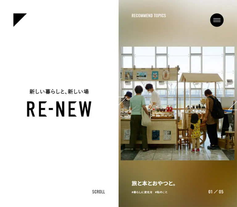
RE-NEW|新しい暮らしと、新しい場
仙台の暮らし・場所・街の情報を届けるメディア。広い余白と左右分割、白黒のタイポグラフィ、正方形の写真、写真由来の柔らかな背景色が特徴。
RE-NEW — Style Reference
A spacious monochrome editorial frame for places, people, and everyday change.
Website: renew-sendai.jp Original URL: https://renew-sendai.jp/ Final URL: https://renew-sendai.jp/ Theme: white canvas, black typography and controls, photographic color fields Inspected: October 2, 2026, using supplied browser evidence retrieved at 10:12:46.641 UTC / 19:12:46.641 JST Viewports: 1440 × 1000 desktop and 390 × 844 mobile, in CSS pixels Scope: the current homepage: opening/loading state, mixed recommendations, PEOPLE / PLACE / TOPICS collections, property cards, closing introduction, and footer. Navigation contents are available in the DOM, but an opened menu was not visually captured. Article, archive, About, and Contact destinations were not inspected.
RE-NEW is an editorial homepage connecting renovation, work, property, and city life. Its three collections are “新しい暮らし” / PEOPLE, “新しい場” / PLACE, and “暮らしに変化を” / TOPICS. The page combines magazine browsing with practical property information. Its hierarchy comes from generous white space, strong Japanese headings, condensed English labels, and square photographs.
The defining desktop relationship is a quiet left half and a content-rich right half. Identity or a category introduction occupies the left; recommendations and two-column card grids occupy the right. On mobile, these areas stack, but the measured article grid retains two columns. A triangular home mark and circular menu control anchor the upper corners. Photography supplies color while the structural interface remains almost entirely black and white.
閉じる
RE-NEW — Style Reference
A spacious monochrome editorial frame for places, people, and everyday change.
Website: renew-sendai.jp Original URL: https://renew-sendai.jp/ Final URL: https://renew-sendai.jp/ Theme: white canvas, black typography and controls, photographic color fields Inspected: October 2, 2026, using supplied browser evidence retrieved at 10:12:46.641 UTC / 19:12:46.641 JST Viewports: 1440 × 1000 desktop and 390 × 844 mobile, in CSS pixels Scope: the current homepage: opening/loading state, mixed recommendations, PEOPLE / PLACE / TOPICS collections, property cards, closing introduction, and footer. Navigation contents are available in the DOM, but an opened menu was not visually captured. Article, archive, About, and Contact destinations were not inspected.
RE-NEW is an editorial homepage connecting renovation, work, property, and city life. Its three collections are “新しい暮らし” / PEOPLE, “新しい場” / PLACE, and “暮らしに変化を” / TOPICS. The page combines magazine browsing with practical property information. Its hierarchy comes from generous white space, strong Japanese headings, condensed English labels, and square photographs.
The defining desktop relationship is a quiet left half and a content-rich right half. Identity or a category introduction occupies the left; recommendations and two-column card grids occupy the right. On mobile, these areas stack, but the measured article grid retains two columns. A triangular home mark and circular menu control anchor the upper corners. Photography supplies color while the structural interface remains almost entirely black and white.
How to Read This Reference
- Measured — DOM: values explicitly supplied in computed styles or element rectangles. These are exact for the sampled state, with occasional rounding for readability.
- Observed — screenshot: visible composition, imagery, and surface treatment. Measurements described as approximate are visual estimates, not extracted CSS declarations.
- Derived: arithmetic based on measured coordinates, such as grid gaps or image-size ratios.
- Recommended: implementation choices for an adaptation. Breakpoints, background-blur construction, accessibility improvements, and untested interaction behavior belong to this category.
- Token names: all custom-property names below are reference aliases. The supplied custom-property inventory was empty.
The initial desktop capture still shows LOADING... and a washed-out photograph. It is evidence of a transient state, not the final color treatment. The resolved mobile opening and desktop PLACE/footer captures provide additional visual evidence.
Some menu entries and carousel slides share coordinates or exist outside the visible area. Their DOM presence does not mean they were simultaneously visible. Several wrappers also report font-size: 0px; this must not be copied as the visible text size.
Tokens — Colors
Default Palette
| Name | Value | Suggested token | Role and evidence |
|---|---|---|---|
| Canvas White | #FFFFFF |
--color-paper |
Visually observed page canvas; also the measured foreground color of recommendation text. HTML and BODY themselves report transparent backgrounds. |
| Structural Black | #000000 |
--color-ink |
Measured text and menu fill; visible wordmark, home triangle, rules, and closing action. |
| Quiet Gray | #BEBEBE |
--color-muted |
Measured article-tag link color: rgb(190, 190, 190). |
| Availability Gray | Approximately #BFBFBF |
--color-status-muted |
Screenshot estimate for the rectangular FULL badge. Its exact computed fill was not supplied. |
| Reversed White | #FFFFFF |
--color-on-image |
Measured recommendation titles and tags; visually observed carousel controls. |
The interface has no evidenced permanent chromatic action color. Black carries primary controls; white carries content on photographic backgrounds. Small gray tags are deliberately recessive.
Photographic Color Fields
The resolved mobile recommendation places a sharp square photograph over a broad, diffuse field of beige, muted olive, salmon, and gray. The visible desktop PLACE recommendation uses darker gray and brown tones around its photograph and white metadata.
These are image-dependent surfaces, not a fixed brand gradient. No exact gradient stops, blur radius, or background-generation method were supplied. A enlarged, blurred duplicate of the active photograph is a reasonable recommended approximation. Keep it visually subordinate to the sharp foreground image.
The pale triangle, menu circle, and imagery in the desktop loading frame should not become additional permanent gray tokens.
Tokens — Typography
Japanese Editorial Text
Measured family: "Noto Sans JP", sans-serif.
Use weight 700 for category headings and article titles, and 400 for descriptive paragraphs and tags. The combination of bold headings and unusually generous body leading gives the page a calm editorial rhythm without relying on serif type.
Tracking is consistently 1px in the sampled desktop editorial styles and 0.5px on mobile. Preserve this small difference instead of applying a large, universal letter-spacing value.
Japanese Brand Tagline
The tagline “新しい暮らしと、新しい場” uses a separate measured system-font stack:
"游ゴシック Medium", "Yu Gothic Medium", 游ゴシック体,
YuGothic, "ヒラギノ角ゴ Pro W3", "Hiragino Kaku Gothic Pro",
メイリオ, Meiryo, "MS Pゴシック", sans-serif
Its weight is 700. The desktop size and line height are both 24px; mobile uses 16px. This distinction from the editorial Noto Sans JP text is part of the observed hierarchy.
Condensed English Utilities
Measured family: Oswald, sans-serif, generally at weight 400.
It appears in PEOPLE, PLACE, TOPICS, RECOMMEND PEOPLE, and related utility labels. SCROLL, loading text, and number wrappers also declare Oswald, although their wrappers sometimes use zero-sized text and separate rendered glyphs.
The narrow English forms add vertical emphasis without increasing the footprint of the navigation or counters.
Wordmark
The large RE-NEW mark is visually a tall, condensed graphic. The sampled H1 has no text content and reports a zero font size. Its layout box, rather than a font size, measures approximately 287.77 × 70px on desktop and 205.55 × 50px on mobile.
Its production font and asset path are not established. Use an authorized logo asset when available. Do not assume the wordmark is ordinary Oswald text merely because utility labels use Oswald.
Type Scale
| Role | Desktop | Mobile | Weight | Evidence |
|---|---|---|---|---|
| Brand tagline | 24px / 24px |
16px / 16px |
700 | Computed styles |
| Category heading | 32px / 32px |
28px / 28px |
700 | Computed PEOPLE heading |
| Category description | 16px / 36px |
14px / 34px |
400 | Computed styles |
| Main recommendation title | 24px / 36px |
18px / 28px |
700 | Computed styles |
| Category recommendation title | 20px / 30px |
18px / 28px |
700 | Computed styles |
| PEOPLE grid title | 16px / 32px |
14px / 28px |
700 | Computed styles |
| Recommendation and grid tags | 12px / 24px |
10px / 20px |
400 | Computed styles |
| Category and recommendation English label | 18px / 18px |
18px / 18px |
400 | Computed styles |
| Primary menu category text | 32px / 32px |
24px / 24px |
700 | DOM only; open menu not captured |
| Secondary menu Japanese text | 24px / 24px |
18px / 18px |
700 | DOM only; open menu not captured |
| Privacy label | 16px / 16px |
16px / 16px |
400 | DOM only |
| Closing explanatory copy | About 16px / 36px |
About 14px / 34px |
Regular | Screenshot estimate; consistent with category body scale |
Sizes are written as font-size / line-height. A 70px logo box is not evidence of a 70px wordmark font.
Tokens — Spacing & Shapes
Density: generous at the section level, compact inside metadata groups. Geometry: square photographs, rectangular status strips, a triangular home mark, circular menu, and pill-shaped closing action.
Spacing Scale
| Value | Observed use | Evidence |
|---|---|---|
5px |
Mobile recommendation title-to-tag gap | Derived from DOM rectangles |
10px |
Desktop recommendation title-to-tag gap; mobile grid image-to-title gap | Derived from DOM rectangles |
15px |
Desktop PEOPLE grid image-to-title gap | Derived from card geometry |
25px |
Category heading-to-description gap at both viewports; mobile tagline-to-wordmark gap | Derived from DOM rectangles |
30px |
Mobile outside inset and article-grid gap; desktop tagline-to-wordmark gap | Measured/derived |
45px |
Desktop category recommendation content inset within the approximately 600px panel | Derived from content coordinates and screenshot panel edge |
50px |
Category description-to-English-label gap at both viewports | Derived from DOM rectangles |
60px |
Desktop corner inset, content inset, and article-grid gap | Measured/derived |
90px |
Mobile PEOPLE heading offset below the 844px opening viewport | Derived from the heading at document y = 934px |
These values describe repeated relationships. The supplied evidence does not establish a formal source spacing scale.
Border Radius and Rules
| Element | Geometry | Evidence |
|---|---|---|
| Foreground photographs | Square corners, 1:1 displayed ratio |
Screenshots and measured link boxes |
| Editorial/property cards | No surrounding rounded box | Desktop screenshot |
| Menu button | 50% radius |
Computed style |
| Closing About action | Full pill; approximately 30px desktop radius | Screenshot estimate |
| Availability badge | Rectangular, no visible rounding | Screenshot |
| Card corner marker | Small black lower-right L, approximately 14px per side | Screenshot estimate |
| Section-side vertical rule | Approximately 2px wide | Screenshot estimate |
Layout Measurements
| Element | Desktop: 1440 × 1000 | Mobile: 390 × 844 | Status |
|---|---|---|---|
| Main division | Two approximately 720px halves | Single full-width composition | Screenshot and DOM geometry |
| Home control | (60, 60), 60 × 60px |
(30, 30), 50 × 50px |
Measured |
| Menu control | (1320, 60), 60 × 60px |
(310, 30), 50 × 50px |
Measured |
| Brand lockup | 287.77 × 124px, starting near (216.11, 435) |
205.55 × 91px, starting near (92.22, 216.5) |
Measured opening state |
| Main slide target | 550 × 550px near (804.5, 225) |
281 × 281px near (54, 281.5) |
Measured slide-link rectangles |
| Category recommendation image | 330 × 330px |
220 × 220px |
Measured PEOPLE image-link rectangles |
| Article-grid columns | 270px, at x = 780 and 1110 |
150px, at x = 30 and 210 |
Measured PEOPLE grid |
| Article-grid gap | 60px |
30px |
Derived |
| Social icon boxes | 16 × 16px |
16 × 16px |
Measured link boxes; visuals agree |
| Closing action | Approximately 240 × 60px |
Approximately 175 × 51px |
Screenshot estimate |
| Document height | 7872px |
6898.25px |
Measured; mobile summary rounds to 6898px |
The initial desktop photograph is visibly caught in a loading/transition state and does not exactly coincide with the sampled 550px slide rectangle. Treat those as different state measurements.
Components
Persistent Corner Navigation
Role: compact identity and navigation access without a conventional horizontal header bar.
The upper-left home link contains a right triangle with vertices at the upper-left, upper-right, and lower-left of its square area. Its diagonal runs down toward the left. The upper-right control is a black circle with three thin, white horizontal strokes.
Desktop controls sit 60px from the top and outside edges and measure 60px square. Mobile reduces the inset to 30px and the controls to 50px square. The same corner positions appear in opening, scrolled desktop, and closing captures, supporting a persistent visual treatment. The supplied style sample does not expose the exact positioning rule.
There is no visible enclosing header surface, divider, word label, or shadow. The circular control is an anchor with javascript:void(0); in the original DOM; a semantic button is recommended for a new implementation.
Identity Lockup
Role: establishes the publication rather than introducing a one-time campaign headline.
Stack the Japanese tagline above the graphic wordmark. On desktop, a 30px gap separates the 24px tagline line box from the 70px logo box. Center the lockup in the left half, around x = 360px.
On mobile, the tagline becomes 16px, the gap becomes 25px, and the wordmark box becomes 50px high. In the resolved opening, the wordmark overlaps the top of the foreground photo by approximately 26px. This overlap is specific to the opening composition; the closing lockup sits above explanatory copy without a photo.
Keep the mark crisp and solid black. The open white space above and beside it carries as much visual weight as the lettering.
Homepage Recommendation Stage
Role: presents selected stories and places across all three editorial categories.
The supplied homepage DOM contains nine recommendations: four PEOPLE entries, three TOPICS entries, and two PLACE entries. The visible mobile capture displays 02 / 09. These quantities are content data, not permanent component constants.
The stage contains:
- A square, sharp foreground photograph linked to its article.
- A recommendation-category label in the DOM.
- A bold article title, visually truncated to one line in the captured recommendation state.
- Small hashtag links beneath the title.
- A current/total counter with a diagonal separator.
- Two geometric previous/next-looking controls around the image midpoint.
The desktop DOM positions the main slide in the right half, centered vertically at roughly y = 500px. Its title begins around x = 779px and y = 875px. The initial desktop screenshot remains washed out, so the resolved full backdrop of this opening stage cannot be measured from that image.
The mobile composition is directly visible: the square image spans approximately x = 54–335px and y = 281.5–562.5px. A diffuse color field starts around the viewport midpoint, y = 422px, extending to the bottom. The image therefore bridges the white upper area and colored lower area. The title starts at y = 653.25px, with tags below. The counter sits at the lower left; SCROLL sits at the lower right, both approximately 30px above the bottom.
White outline controls overlap the image's horizontal midline. Their sampled mobile hit boxes are 50px square. Their click behavior, swipe support, cycling interval, and keyboard behavior were not exercised.
Category Introduction
Role: gives each collection a stable editorial identity while its content changes.
Each introduction combines a bold Japanese heading, a small raised article count, two lines of descriptive copy, and a condensed English category label. The current displayed counts are 21 for PEOPLE, 23 for PLACE, and 40 for TOPICS. They differ from the recommendation counts.
On desktop, the introduction is centered within the left half while recommendation and grid content occupy the right. The PLACE capture shows a thin vertical rule on the center division, extending from about y = 500px toward the lower edge. The composition appears pinned during browsing, but a specific position: sticky or script mechanism is not established by the supplied styles.
On mobile, the PEOPLE introduction appears in normal vertical sequence beneath the opening. Its heading is at document y = 934px, its two-line description begins at y = 987px, and its English label begins at y = 1105px. Preserve the generous 25px and 50px gaps between these groups.
Category Recommendation Panel
Role: gives a collection's selected content more prominence than the grid below it.
This is a rectangular photographic-color surface with a sharp square image, white category label, white title and tags, and a small counter. The desktop PLACE panel is about 600px wide in the supplied capture. Its content starts approximately 45px inside the edge.
The measured PEOPLE image is 330px square on desktop and 220px square on mobile. The corresponding title is 20px / 30px on desktop and 18px / 28px on mobile. Keep the recommendation image smaller than its surrounding colored surface so the panel has visible breathing room.
The PLACE variant adds a property name and practical metadata such as area and address. In the visible panel, Blank Hotel appears above its headline. Recommendation counts in the DOM are four for PEOPLE, two for PLACE, and three for TOPICS.
A blurred duplicate image can reproduce the broad visual effect, but the original construction and blur amount remain unverified.
Editorial Card Grid
Role: supports sustained browsing after the selected recommendation.
The measured PEOPLE grid uses two 270px columns with a 60px gap on desktop. Mobile retains two columns, each 150px wide, separated by 30px. The desktop PLACE screenshot independently shows the same 270px-square image pattern.
A basic card stacks a square image, a multiline bold title, and quiet hashtag links. Desktop PEOPLE titles use 16px / 32px; mobile uses 14px / 28px. The source allows substantial wrapping: sampled mobile titles occupy four or five lines. Do not truncate every grid headline merely because recommendation titles are shortened.
Cards have no visible outer fill, shadow, full border, or rounded corners. A small lower-right L-shaped mark appears on the PLACE cards. The white page itself is the card surface.
The DOM includes a broad article link and separate category links. In a new implementation, preserve independent tag navigation without nesting links or covering tags with an inaccessible overlay.
Property Card and Availability Strip
Role: combines editorial discovery with useful premises information.
The visible PLACE card anatomy is:
- Square property photograph.
- Availability strip attached to the photograph's upper-left corner.
- Small bold property name.
- Larger multiline descriptive headline.
- Area, address, and price information when supplied.
- Muted hashtag links.
- A small lower-right corner mark.
The TNER CAFE2 card shows a kitchen interior; TNER406号室 shows exterior signage. Both display a gray FULL strip. At the lower edge of the capture, another row shows a black RENT strip and a separate white NEW strip. Visible strips are approximately 90 × 36px with narrow uppercase lettering. These are screenshot estimates.
SOLD also appears in the DOM, but its visual treatment is not shown clearly enough to specify. Keep status styling driven by content rather than assigning unobserved colors to every possible state.
Area, address, and price are separate lines. The observed -円 placeholder is source content; do not convert it into a claimed zero price.
Hashtag Navigation
Role: provides secondary routes into categories and topics.
Tags are plain text links prefixed by #, not filled chips. Grid tags use measured #BEBEBE; recommendation tags reverse to white. Desktop type is 12px with 24px leading; mobile is 10px with 20px leading.
Category query parameters are present in the supplied links, confirming that tags represent navigation. Tag-link color has a measured 500ms ease-in-out transition, but the actual hover destination color was not supplied.
The pale treatment is visually important. For a new implementation, darker text is recommended where needed for accessibility; identify that as an intentional departure from the measured color.
Navigation Inventory
Role: exposes the publication's sections and supporting pages.
| Source label | English label | Observed destination |
|---|---|---|
| “新しい暮らし” | PEOPLE | /people/ |
| “新しい場” | PLACE | /place/ |
| “暮らしに変化を” | TOPICS | /topics/ |
| “私たちについて” | ABOUT | /about/ |
| “お問い合わせ” | CONTACT | /contact/ |
PRIVACY POLICY |
— | /contact/#policy |
The sampled menu text is white, and its desktop/mobile type sizes are documented above. An open-menu screenshot, backdrop measurement, focus sequence, and close interaction are unavailable. Do not present a particular menu overlay animation or background as verified.
Archive links also follow the homepage collections, including “新しい暮らし一覧” and “新しい場一覧”. Their destinations are evidenced, but their complete visual treatment is outside the supplied captures.
Closing Introduction and About Action
Role: explains the publication after visitors have encountered its content.
Desktop returns to the two-half composition. The familiar lockup is centered in the left half. On the right, four centered lines describe the publication, followed by a black pill labeled “私たちについて”. The action links to /about/.
The visible copy begins “リノベーションによって、新しい価値を生み出し、” and describes creating change in people's lives and the city. Keep this as a short editorial introduction, not a dense company profile.
The desktop button is approximately 240 × 60px, centered around x = 1080px. Mobile stacks the lockup, four-line explanation, and an approximately 175 × 51px button. In the mobile closing capture, the tagline is near y = 243px, the wordmark near y = 283px, and the action near y = 542px. Large blank areas remain above and below the central content.
Footer
Role: repeats navigation and provides compact social access.
Desktop places five Japanese navigation links along the lower left. Twitter, Facebook, and Instagram icons sit toward the lower right, followed by © 2021 RE-NEW. The icons are approximately 16px square, with about 20px between icon boxes.
Mobile omits the five-link footer navigation in both the supplied image and text evidence. It retains the three icons and copyright in a compact row near the bottom, with approximately 15px between icon boxes. The corner home and menu controls remain visible above.
The displayed 2021 copyright is page content. It is not evidence of the current inspection date or a redesign date.
Opening Loading State
Role: communicates preparation while keeping the publication identity visible.
The desktop loading capture retains the black identity lockup while other elements appear pale. LOADING... sits near the bottom-right of the left half, occupying the same general utility area later used by SCROLL.
No loading duration, opacity curve, or dismissal event was established. A new implementation should retain this visual restraint while ensuring that essential links and content cannot remain indefinitely hidden behind the loading state.
Tokens — Motion & Interaction
| Treatment | Supplied evidence | What can be concluded |
|---|---|---|
| Menu surface change | border-color 0.5s ease-in-out, background-color 0.5s ease-in-out |
Color transitions are defined; their triggered end state was not exercised. |
| Grid-tag color change | color 0.5s ease-in-out |
A half-second color transition is defined; hover color is unknown. |
| Main carousel-control entry | 0.5s ease-in-out 0.5s forwards slide_on7 |
A named 500ms animation with a 500ms delay is defined. Keyframe geometry is unavailable. |
| Differing slide rectangles | Desktop 330px versus 550px; mobile 168.6px versus 281px | The recorded smaller size is 60% of the larger size. This does not establish a complete animation trajectory. |
| Loading presentation | Pale desktop controls and image with LOADING... |
A transient state was captured; exact transition timing is unknown. |
| Recommendation sequence | Nine entries and visible 02 / 09 on mobile |
A multi-item recommendation interface exists. Autoplay and interaction results are unverified. |
| Persistent section composition | Corner controls and left-side category content remain visually anchored in supplied states | The visual relationship is observed; the underlying scroll implementation is not established. |
Many elements report transition: all without an explicit duration in the supplied summary. This alone is not evidence of a perceptible transition. Likewise, animation: none on a sampled wrapper does not rule out script-driven changes or motion in descendants.
For an adaptation, use restrained color changes and short transitions around the existing geometric composition. Any newly specified image slide, fade, or menu reveal should be labeled as an implementation choice. Do not infer a carousel interval from static captures.
Surfaces
| Layer | Appearance | Purpose |
|---|---|---|
| Page canvas | White, visually untextured | Creates the publication's broad negative space |
| Editorial cards | Same white as the canvas | Groups content through images and spacing rather than boxes |
| Foreground image | Sharp, square, unrounded | Gives each story or property a concrete subject |
| Recommendation background | Diffuse photographic color | Adds atmosphere and supports reversed metadata |
| Primary controls | Solid black with white details | Menu access and the closing About action |
| Availability strip | Flat rectangular black, white, or gray treatment where visible | Communicates property state compactly |
| Loading presentation | Pale image and controls around a legible identity | Signals a temporary preparation state |
There is no visible general-purpose elevation system. Avoid adding shadows to cards or turning the photographic backgrounds into glass panels.
Imagery
The supplied original-page images show ordinary places and useful details: an architectural exterior during loading, a kitchen interior, exterior building signage, and hands holding a city map. The photography feels documentary and grounded in actual environments. Square crops establish consistency across different subjects.
Foreground photographs remain sharp and legible. Ambient backgrounds dissolve detail into broad tonal areas. Keep these two roles distinct: blurring the main subject would remove the editorial information the photograph provides.
The DOM includes PEOPLE interviews, but the supplied resolved captures do not establish a specific portrait treatment for that collection. Natural workplace portraits would be a reasonable recommendation for new content, not a verified description of every current image.
Observed Asset References
No direct image, logo, or icon asset URLs were included in the supplied evidence. The following are associated content links from the rendered page, not downloadable image paths and not separately inspected pages.
| Visual | Associated content URL | Observation |
|---|---|---|
| Hands holding a city map | https://renew-sendai.jp/topics/detail/5122/ |
Resolved mobile opening photograph |
Kitchen interior, TNER CAFE2 |
https://renew-sendai.jp/place/detail/5065/ |
Visible desktop PLACE card |
Building signage, TNER406号室 |
https://renew-sendai.jp/place/detail/5054/ |
Visible desktop PLACE card |
Blank Hotel recommendation |
https://renew-sendai.jp/place/detail/4886/ |
Visible recommendation metadata; photograph only partly visible in that scrolled capture |
| Architectural exterior during loading | Not conclusively mapped | Pale initial desktop image |
| Wordmark, home mark, and social symbols | Asset URLs unavailable | Visible identity and navigation graphics |
Use authorized photographs and brand artwork when available. CSS can reproduce the layout and simple geometric controls, but it cannot identify the original wordmark file or substitute for the subject matter of the editorial images.
Layout & Responsive Behavior
The desktop homepage has a sustained 50/50 relationship rather than a single centered marketing column. Category content occupies a 600px-wide region inside the right half at the inspected viewport: 60px inner padding, two 270px cards, and a 60px gap. The left half remains comparatively empty and centers short editorial introductions.
Mobile changes the section arrangement substantially. The opening identity overlaps the square recommendation image, while the lower half becomes a colored stage for the title and navigation. Category introductions then precede recommendation panels and article grids vertically. The measured PEOPLE grid still uses two columns.
| Relationship | Desktop observation | Mobile observation |
|---|---|---|
| Main composition | Identity/introduction left, content right | Stacked sections |
| Corner inset | 60px | 30px |
| Corner control | 60px | 50px |
| Main recommendation image | 550px square target | 281px square target |
| Category recommendation image | 330px square | 220px square |
| PEOPLE card width | 270px | 150px |
| PEOPLE grid gap | 60px | 30px |
| Editorial tracking | 1px | 0.5px |
| Grid title | 16px with 32px leading | 14px with 28px leading |
| Footer category links | Visible | Omitted |
| Closing content | Side-by-side lockup and explanation | Centered vertical stack |
Only these two viewport widths were inspected. The actual media-query breakpoint, tablet layout, landscape behavior, and safe-area handling are unknown. The 900px breakpoint in the Quick Start is a recommended implementation boundary, not a recovered source value.
The document is long at both sizes. Do not implement the entire page as a fixed viewport with inaccessible overflow. A sticky desktop introduction is a reasonable approximation of the observed composition; mobile introductions should participate in normal document flow.
Do’s and Don’ts
Do
- Preserve the strong desktop relationship between a quiet left half and content on the right.
- Keep the white canvas and black structural elements dominant.
- Use Noto Sans JP for editorial text, the measured system stack for the tagline, and Oswald for English utilities.
- Treat the wordmark as artwork unless its original construction becomes available.
- Keep foreground photos square, sharp, and free of rounded corners.
- Use photo-related color fields around selected recommendations.
- Retain the measured two-column PEOPLE grid on the inspected mobile size.
- Allow long grid headlines to wrap with generous line height.
- Keep property names, availability, area, address, and price as distinct information levels.
- Make counts and availability labels content-driven.
- Preserve the large white closing section and compact black About action.
Don’t
- Don’t turn the homepage into a generic sequence of sales benefits and conversion banners.
- Don’t fill the left desktop half with extra cards simply because it contains white space.
- Don’t introduce colorful category pills or a saturated global CTA color.
- Don’t round the photos or add elevated card containers.
- Don’t use the loading frame's pale appearance as the finished palette.
- Don’t infer the wordmark font from zero-sized H1 styles or neighboring Oswald labels.
- Don’t assume all DOM carousel entries are visible simultaneously.
- Don’t claim autoplay, swipe, sticky positioning, or a particular menu reveal as tested behavior.
- Don’t force property descriptions into the same one-line truncation as recommendation headlines.
- Don’t treat the current article totals or copyright year as permanent layout constants.
Recommended Implementation Additions
These are additions for a new implementation, not verified features of the inspected page:
- Give the triangle home link, circular menu button, carousel controls, and social links explicit accessible names.
- Use a real menu button with
aria-expandedandaria-controls. If the menu is modal, implement focus management, Escape dismissal, and focus restoration. - Keep inactive carousel slides out of keyboard navigation and expose the active slide clearly. If adding autoplay, provide pause controls and stop advancing while users interact.
- Offer a reduced-motion mode that removes decorative entry motion and presents a stable selected image immediately.
- Use semantic headings and preserve an accessible publication name even when the visible wordmark is an image.
- Increase tag contrast where needed. A darker neutral such as
#767676is a recommended alternative to the measured#BEBEBEon white. - Provide sufficiently large hit areas for small social symbols and geometric controls without crowding their visible shapes.
- Preserve image dimensions while loading, and give the page a usable fallback if assets or motion scripts fail.
- Keep property facts readable as text, with meaningful alternatives for photographs. Do not place necessary availability information only inside image files.
- Add viewport and text-zoom checks before relying on full-height compositions or tight two-column mobile cards.
Agent Prompt Guide
Quick Color Reference
- Canvas: white
#FFFFFF. - Main text, logo, rules, and primary control fill: black
#000000. - Measured grid tags:
#BEBEBE. - Recommendation titles and tags: white.
FULLbadge: approximately#BFBFBF, based on the screenshot.- Background color around recommendations: derived visually from photography; no fixed brand gradient is established.
- Shadows: none for ordinary content cards.
Overall Prompt
“Create an editorial homepage inspired by the current RE-NEW composition. Use a white canvas, black Japanese headings, Noto Sans JP editorial text, condensed Oswald utility labels, and an authorized graphic wordmark. On desktop, divide the page into equal halves: center the identity or category introduction in the left half and place selected stories plus a two-column square-image grid in the right half. Keep triangular home navigation at the upper left and a black circular menu at the upper right. Use sharp square photographs over diffuse photographic color fields for recommendations. On a 390px mobile viewport, stack the sections, overlap the opening wordmark with the main image, use 30px outside margins, and retain two 150px article columns. End with a spacious publication introduction and a black pill-shaped About link. Treat unverified carousel and menu behavior as new implementation decisions.”
Example Component Prompts
- Corner navigation: “Place a solid black right triangle inside a 60px home-link box, 60px from the desktop top and left. Put a 60px black circular menu control at the opposite corner with three thin white strokes. On mobile, use 50px controls and 30px insets. Keep the controls free of an enclosing header bar.”
- Mobile opening: “At 390 × 844, center a 281px square documentary photograph around the viewport midpoint. Put the Japanese tagline above a 205.55 × 50px graphic wordmark, with the wordmark slightly overlapping the photo. Start a diffuse photographic color field at mid-height. Place a one-line white headline and small tags below the image, then a compact fraction counter and SCROLL label at the bottom corners.”
- Category introduction: “Center a bold 32px Japanese category heading with a small raised content count in a white desktop half-column. Leave 25px before two lines of 16px copy with 36px leading, then 50px before an 18px Oswald English label. On mobile, use a 28px heading and 14px copy with 34px leading in normal document flow.”
- Property card: “Build a square 270px photo with an attached rectangular FULL or RENT strip. Below it, stack a small property name, a bold multiline Japanese headline, separate area/address/price lines, and pale gray hashtag links. Use no surrounding card border or shadow; add a small lower-right L-shaped marker.”
- Closing section: “Use a full-height white editorial closing section. Center the brand lockup in the left desktop half and a four-line publication description with a 240 × 60px black About pill in the right. Stack these groups on mobile and reduce the pill to roughly 175 × 51px. Keep a compact social and copyright row near the bottom.”
Quick Start
CSS Custom Properties
This is a practical adaptation of the observed proportions, not extracted source CSS. It uses a conventional 16px root. Load the evidenced fonts separately and supply authorized image/wordmark assets; no asset URLs are invented here.
Expected component anatomy:
.site-markis a named home link; its triangle is decorative..menu-buttonis a named button containing three decorative spans..herocontains.identity-paneand.hero-stage..brand-lockupcontains.brand-taglineand a wordmark image or SVG with.brand-wordmark..hero-stagecontains.ambient,.hero-photo,.hero-meta, and.hero-counter..chaptercontains.chapter-introand.chapter-stream..article-gridcontains cards with independent article and tag links..about-sectioncontains the closing lockup,.about-copy, and.site-footer.
The desktop sticky introduction, 900px breakpoint, blur construction, hover endpoint, and focus styles below are recommendations. Carousel state changes and menu behavior require separate accessible implementation.
:root {
  /* Observed colors, with an estimated status fill */
  --color-paper: #ffffff;
  --color-ink: #000000;
  --color-muted: #bebebe;
  --color-status-muted: #bfbfbf;
  --color-on-image: #ffffff;

  /* Evidenced families; actual font loading is separate */
  --font-jp: 'Noto Sans JP', sans-serif;
  --font-tagline: 'Yu Gothic Medium', YuGothic,
    'Hiragino Kaku Gothic Pro', Meiryo, sans-serif;
  --font-utility: Oswald, sans-serif;

  --tracking: 1px;
  --text-tagline: 24px;
  --text-heading: 32px;
  --text-body: 16px;
  --leading-body: 36px;
  --text-hero: 24px;
  --leading-hero: 36px;
  --text-card: 16px;
  --leading-card: 32px;
  --text-tag: 12px;
  --leading-tag: 24px;

  --edge: 60px;
  --control: 60px;
  --grid-gap: 60px;
  --brand-width: 287.77px;
  --brand-height: 70px;
  --brand-gap: 30px;
  --hero-photo: min(550px, calc(50vw - 120px));
  --motion-color: 500ms ease-in-out;
}

* { box-sizing: border-box; }

body {
  margin: 0;
  color: var(--color-ink);
  background: var(--color-paper);
  font-family: var(--font-jp);
  letter-spacing: var(--tracking);
}

button, input { font: inherit; }
a { color: inherit; }
img { display: block; max-width: 100%; }

.site-mark,
.menu-button {
  position: fixed;
  top: var(--edge);
  z-index: 30;
  width: var(--control);
  height: var(--control);
}

.site-mark { left: var(--edge); }

.site-mark::before {
  content: '';
  position: absolute;
  inset: 0;
  background: var(--color-ink);
  clip-path: polygon(0 0, 100% 0, 0 100%);
}

.menu-button {
  right: var(--edge);
  display: grid;
  place-content: center;
  gap: 5px;
  padding: 0;
  border: 1px solid var(--color-ink);
  border-radius: 50%;
  color: var(--color-paper);
  background: var(--color-ink);
  cursor: pointer;
  transition: border-color var(--motion-color),
    background-color var(--motion-color);
}

.menu-button span {
  display: block;
  width: 32px;
  height: 2px;
  background: currentColor;
}

.brand-lockup {
  display: inline-flex;
  flex-direction: column;
  align-items: center;
  gap: var(--brand-gap);
  color: var(--color-ink);
  text-decoration: none;
}

.brand-tagline {
  margin: 0;
  font-family: var(--font-tagline);
  font-size: var(--text-tagline);
  font-weight: 700;
  line-height: 1;
}

.brand-wordmark {
  width: var(--brand-width);
  height: var(--brand-height);
  object-fit: contain;
}

.utility {
  margin: 0;
  font: 400 18px/18px var(--font-utility);
  letter-spacing: var(--tracking);
}

.hero {
  position: relative;
  display: grid;
  grid-template-columns: repeat(2, minmax(0, 1fr));
  height: 100svh;
  min-height: 720px;
}

.identity-pane {
  display: grid;
  place-items: center;
}

.hero-stage {
  position: relative;
  min-width: 0;
  isolation: isolate;
  color: var(--color-on-image);
}

/* Recommended approximation of the photographic backdrop */
.ambient {
  position: absolute;
  inset: 0;
  z-index: -1;
  overflow: hidden;
  background: #555;
  pointer-events: none;
}

.ambient img {
  width: 100%;
  height: 100%;
  object-fit: cover;
  filter: blur(48px);
  transform: scale(1.2);
  opacity: 0.8;
}

.ambient::after {
  content: '';
  position: absolute;
  inset: 0;
  background: linear-gradient(
    to bottom, rgb(0 0 0 / 0.04), rgb(0 0 0 / 0.48)
  );
}

.hero-photo {
  position: absolute;
  top: 50%;
  left: 50%;
  width: var(--hero-photo);
  aspect-ratio: 1;
  transform: translate(-50%, -50%);
}

.hero-photo img,
.card-photo img {
  width: 100%;
  height: 100%;
  object-fit: cover;
}

.hero-meta {
  position: absolute;
  left: var(--edge);
  right: 180px;
  bottom: 55px;
}

.hero-title {
  margin: 0;
  overflow: hidden;
  white-space: nowrap;
  text-overflow: ellipsis;
  font-size: var(--text-hero);
  font-weight: 700;
  line-height: var(--leading-hero);
}

.tags {
  display: flex;
  flex-wrap: wrap;
  gap: 0 10px;
  margin: 10px 0 0;
  font-size: var(--text-tag);
  line-height: var(--leading-tag);
}

.tags a { text-decoration: none; }

.hero-counter {
  position: absolute;
  right: var(--edge);
  bottom: var(--edge);
}

.scroll-cue {
  position: absolute;
  right: calc(50% + var(--edge));
  bottom: var(--edge);
}

.chapter {
  display: grid;
  grid-template-columns: repeat(2, minmax(0, 1fr));
  align-items: start;
}

/* Recommended mechanism for the anchored desktop composition */
.chapter-intro {
  position: sticky;
  top: 0;
  display: flex;
  flex-direction: column;
  align-items: center;
  justify-content: center;
  min-height: 100svh;
  padding: var(--edge);
  text-align: center;
}

.chapter-intro::after {
  content: '';
  position: absolute;
  right: 0;
  top: 50%;
  bottom: var(--edge);
  border-right: 2px solid var(--color-ink);
}

.chapter-heading {
  margin: 0;
  font-size: var(--text-heading);
  font-weight: 700;
  line-height: 1;
}

.chapter-count {
  position: relative;
  top: -0.6em;
  margin-left: 3px;
  font: 400 18px/1 var(--font-utility);
}

.chapter-description {
  margin: 25px 0 50px;
  font-size: var(--text-body);
  line-height: var(--leading-body);
}

.chapter-stream {
  min-width: 0;
  padding: 150px var(--edge) var(--edge);
}

.article-grid {
  display: grid;
  grid-template-columns: repeat(2, minmax(0, 1fr));
  gap: var(--grid-gap);
}

.article-card {
  position: relative;
  min-width: 0;
  padding-bottom: 20px;
}

.article-card::after {
  content: '';
  position: absolute;
  right: 0;
  bottom: 0;
  width: 14px;
  height: 14px;
  border-right: 2px solid var(--color-ink);
  border-bottom: 2px solid var(--color-ink);
  pointer-events: none;
}

.card-photo {
  position: relative;
  display: block;
  aspect-ratio: 1;
}

.card-title {
  margin: 15px 0 0;
  font-size: var(--text-card);
  font-weight: 700;
  line-height: var(--leading-card);
}

.card-title a { text-decoration: none; }

.property-name {
  display: block;
  margin-top: 18px;
  font-size: 12px;
  font-weight: 700;
  line-height: 20px;
}

.property-name + .card-title { margin-top: 4px; }

.property-facts {
  margin: 12px 0 0;
  font-size: 12px;
  line-height: 24px;
}

.article-card .tags { color: var(--color-muted); }
.article-card .tags a { transition: color var(--motion-color); }

.status-strip {
  position: absolute;
  top: 0;
  left: 0;
  display: flex;
}

.status {
  display: grid;
  place-items: center;
  min-width: 90px;
  height: 36px;
  padding-inline: 12px;
  color: var(--color-paper);
  background: var(--color-ink);
  font: 400 18px/1 var(--font-utility);
}

.status--full { background: var(--color-status-muted); }
.status--new { color: var(--color-ink); background: var(--color-paper); }

.about-section {
  position: relative;
  display: grid;
  grid-template-columns: repeat(2, minmax(0, 1fr));
  align-items: center;
  min-height: 100svh;
  padding-block: 160px;
  text-align: center;
}

.about-copy { padding-inline: var(--edge); }

.about-copy p {
  margin: 0;
  font-size: var(--text-body);
  line-height: var(--leading-body);
}

.about-button {
  display: inline-grid;
  place-items: center;
  width: 240px;
  min-height: 60px;
  margin-top: 50px;
  padding: 12px 24px;
  border-radius: 999px;
  color: var(--color-paper);
  background: var(--color-ink);
  font-size: 16px;
  font-weight: 700;
  text-decoration: none;
}

.site-footer {
  position: absolute;
  inset-inline: var(--edge);
  bottom: var(--edge);
  display: flex;
  justify-content: space-between;
  align-items: center;
  gap: 30px;
}

.footer-nav,
.footer-end,
.social-links {
  display: flex;
  align-items: center;
}

.footer-nav { flex-wrap: wrap; gap: 30px; }
.footer-nav a { font-weight: 700; text-decoration: none; }
.footer-end { gap: 60px; }
.social-links { gap: 20px; }
.social-links svg { display: block; width: 16px; height: 16px; }
.copyright { margin: 0; white-space: nowrap; font: 400 16px/1 var(--font-utility); }

/* Recommended focus and hover feedback */
:focus-visible {
  outline: 2px solid var(--color-ink);
  outline-offset: 5px;
}

@media (hover: hover) {
  .article-card .tags a:hover { color: var(--color-ink); }
}

/* Recommended breakpoint; only endpoint viewports were inspected */
@media (max-width: 900px) {
  :root {
    --tracking: 0.5px;
    --text-tagline: 16px;
    --text-heading: 28px;
    --text-body: 14px;
    --leading-body: 34px;
    --text-hero: 18px;
    --leading-hero: 28px;
    --text-card: 14px;
    --leading-card: 28px;
    --text-tag: 10px;
    --leading-tag: 20px;
    --edge: 30px;
    --control: 50px;
    --grid-gap: 30px;
    --brand-width: 205.55px;
    --brand-height: 50px;
    --brand-gap: 25px;
    --hero-photo: min(72.05vw, calc(100vw - 60px));
  }

  .menu-button span { width: 28px; }
  .hero { display: block; }
  .hero-stage { height: 100%; }
  .hero-stage .ambient { top: 50%; }

  .hero .identity-pane {
    position: absolute;
    inset: 0;
    z-index: 2;
    display: block;
    pointer-events: none;
  }

  .hero .brand-lockup {
    position: absolute;
    top: calc(50% - var(--hero-photo) / 2 - 65px);
    left: 50%;
    transform: translateX(-50%);
    white-space: nowrap;
    pointer-events: auto;
  }

  .hero-meta { left: 30px; right: 30px; bottom: 16.3%; }
  .tags { margin-top: 5px; }
  .hero-counter { left: 30px; right: auto; }
  .scroll-cue { right: 30px; color: var(--color-on-image); }

  .chapter { display: block; }
  .chapter-intro { position: relative; min-height: 0; padding: 90px 30px 105px; }
  .chapter-intro::after { display: none; }
  .chapter-stream { padding: 0 30px 60px; }
  .card-title { margin-top: 10px; }

  .about-section {
    display: block;
    padding: 240px 30px 150px;
  }

  .about-copy { margin-top: 34px; padding: 0; }
  .about-button { width: 175px; min-height: 51px; margin-top: 40px; font-size: 14px; }
  .site-footer { justify-content: flex-end; }
  .footer-nav { display: none; }
  .footer-end { gap: 30px; }
  .social-links { gap: 15px; }
}

@media (prefers-reduced-motion: reduce) {
  .menu-button,
  .article-card .tags a { transition: none; }
}
The CSS covers the static shell, opening composition, category/grid relationships, property anatomy, and closing section. It deliberately leaves carousel state management and the unobserved open-menu presentation to a separate implementation. Test short screens and enlarged text before fixing any component to a viewport-derived position.
Tailwind v4 Token Mapping
Optional aliases for projects already using Tailwind v4. This is not evidence that the original site uses Tailwind. Define the custom properties above first.
@theme inline {
  --color-canvas: var(--color-paper);
  --color-structural: var(--color-ink);
  --color-quiet: var(--color-muted);
  --color-status-gray: var(--color-status-muted);

  --font-editorial: var(--font-jp);
  --font-condensed: var(--font-utility);

  --text-editorial-heading: var(--text-heading);
  --text-editorial-body: var(--text-body);
  --text-editorial-card: var(--text-card);
  --text-editorial-tag: var(--text-tag);

  --spacing-page-inset: var(--edge);
  --spacing-card-gap: var(--grid-gap);
  --spacing-corner-control: var(--control);
  --radius-action: 999px;
}
Sources & Evidence
- Inspected original and final page: RE-NEW. The supplied response status is HTTP 200; the original and final URLs are identical.
- Capture date: October 2, 2026. Supplied retrieval timestamp:
2026-10-02T10:12:46.641Z, equivalent to 19:12:46.641 in Japan. - Desktop evidence: 1440 × 1000 CSS-pixel viewport; opening/loading image, scrolled PLACE image, closing/footer image, rendered text, links, computed styles, and element rectangles. Measured document height: 7872px.
- Mobile evidence: 390 × 844 CSS-pixel viewport; resolved opening and closing/footer images, rendered text, links, computed styles, and element rectangles. Measured document rectangle height: 6898.25px.
- Link evidence: category, article, About, Contact, privacy, and social destinations are present in the supplied homepage DOM. Their destination pages were not inspected.
- Motion evidence: limited to captured states, element-size differences, and the supplied transition/animation declarations. No click, hover, swipe, keyboard, or autoplay result is documented.
- Readiness limitations: the supplied capture process waited for load, visible finite motion, layout/text stability, and image decoding within bounded time limits. Perpetual animations were paused during readiness checks and resumed afterward. These checks do not establish semantic completeness; the initial desktop image still contains a loading presentation.
- Inspection limits: no additional browsing, linked-page inspection, source stylesheet retrieval, asset-file inspection, or command execution was performed for this reference. Asset paths, exact breakpoints, open-menu appearance, keyframe definitions, and accessibility behavior remain unverified.
This reference describes the current supplied homepage evidence. Measured endpoint values are separated from screenshot estimates and implementation recommendations throughout.
# RE-NEW — Style Reference

> A spacious monochrome editorial frame for places, people, and everyday change.

**Website:** [renew-sendai.jp](https://renew-sendai.jp/)
**Original URL:** https://renew-sendai.jp/
**Final URL:** https://renew-sendai.jp/
**Theme:** white canvas, black typography and controls, photographic color fields
**Inspected:** October 2, 2026, using supplied browser evidence retrieved at 10:12:46.641 UTC / 19:12:46.641 JST
**Viewports:** 1440 × 1000 desktop and 390 × 844 mobile, in CSS pixels
**Scope:** the current homepage: opening/loading state, mixed recommendations, PEOPLE / PLACE / TOPICS collections, property cards, closing introduction, and footer. Navigation contents are available in the DOM, but an opened menu was not visually captured. Article, archive, About, and Contact destinations were not inspected.

RE-NEW is an editorial homepage connecting renovation, work, property, and city life. Its three collections are “新しい暮らし” / PEOPLE, “新しい場” / PLACE, and “暮らしに変化を” / TOPICS. The page combines magazine browsing with practical property information. Its hierarchy comes from generous white space, strong Japanese headings, condensed English labels, and square photographs.

The defining desktop relationship is a quiet left half and a content-rich right half. Identity or a category introduction occupies the left; recommendations and two-column card grids occupy the right. On mobile, these areas stack, but the measured article grid retains two columns. A triangular home mark and circular menu control anchor the upper corners. Photography supplies color while the structural interface remains almost entirely black and white.
閉じる
# RE-NEW — Style Reference

> A spacious monochrome editorial frame for places, people, and everyday change.

**Website:** [renew-sendai.jp](https://renew-sendai.jp/)
**Original URL:** https://renew-sendai.jp/
**Final URL:** https://renew-sendai.jp/
**Theme:** white canvas, black typography and controls, photographic color fields
**Inspected:** October 2, 2026, using supplied browser evidence retrieved at 10:12:46.641 UTC / 19:12:46.641 JST
**Viewports:** 1440 × 1000 desktop and 390 × 844 mobile, in CSS pixels
**Scope:** the current homepage: opening/loading state, mixed recommendations, PEOPLE / PLACE / TOPICS collections, property cards, closing introduction, and footer. Navigation contents are available in the DOM, but an opened menu was not visually captured. Article, archive, About, and Contact destinations were not inspected.

RE-NEW is an editorial homepage connecting renovation, work, property, and city life. Its three collections are “新しい暮らし” / PEOPLE, “新しい場” / PLACE, and “暮らしに変化を” / TOPICS. The page combines magazine browsing with practical property information. Its hierarchy comes from generous white space, strong Japanese headings, condensed English labels, and square photographs.

The defining desktop relationship is a quiet left half and a content-rich right half. Identity or a category introduction occupies the left; recommendations and two-column card grids occupy the right. On mobile, these areas stack, but the measured article grid retains two columns. A triangular home mark and circular menu control anchor the upper corners. Photography supplies color while the structural interface remains almost entirely black and white.

## How to Read This Reference

- **Measured — DOM:** values explicitly supplied in computed styles or element rectangles. These are exact for the sampled state, with occasional rounding for readability.
- **Observed — screenshot:** visible composition, imagery, and surface treatment. Measurements described as approximate are visual estimates, not extracted CSS declarations.
- **Derived:** arithmetic based on measured coordinates, such as grid gaps or image-size ratios.
- **Recommended:** implementation choices for an adaptation. Breakpoints, background-blur construction, accessibility improvements, and untested interaction behavior belong to this category.
- **Token names:** all custom-property names below are reference aliases. The supplied custom-property inventory was empty.

The initial desktop capture still shows `LOADING...` and a washed-out photograph. It is evidence of a transient state, not the final color treatment. The resolved mobile opening and desktop PLACE/footer captures provide additional visual evidence.

Some menu entries and carousel slides share coordinates or exist outside the visible area. Their DOM presence does not mean they were simultaneously visible. Several wrappers also report `font-size: 0px`; this must not be copied as the visible text size.

## Tokens — Colors

### Default Palette

| Name | Value | Suggested token | Role and evidence |
| --- | --- | --- | --- |
| Canvas White | `#FFFFFF` | `--color-paper` | Visually observed page canvas; also the measured foreground color of recommendation text. HTML and BODY themselves report transparent backgrounds. |
| Structural Black | `#000000` | `--color-ink` | Measured text and menu fill; visible wordmark, home triangle, rules, and closing action. |
| Quiet Gray | `#BEBEBE` | `--color-muted` | Measured article-tag link color: `rgb(190, 190, 190)`. |
| Availability Gray | Approximately `#BFBFBF` | `--color-status-muted` | Screenshot estimate for the rectangular `FULL` badge. Its exact computed fill was not supplied. |
| Reversed White | `#FFFFFF` | `--color-on-image` | Measured recommendation titles and tags; visually observed carousel controls. |

The interface has no evidenced permanent chromatic action color. Black carries primary controls; white carries content on photographic backgrounds. Small gray tags are deliberately recessive.

### Photographic Color Fields

The resolved mobile recommendation places a sharp square photograph over a broad, diffuse field of beige, muted olive, salmon, and gray. The visible desktop PLACE recommendation uses darker gray and brown tones around its photograph and white metadata.

These are image-dependent surfaces, not a fixed brand gradient. No exact gradient stops, blur radius, or background-generation method were supplied. A enlarged, blurred duplicate of the active photograph is a reasonable **recommended approximation**. Keep it visually subordinate to the sharp foreground image.

The pale triangle, menu circle, and imagery in the desktop loading frame should not become additional permanent gray tokens.

## Tokens — Typography

### Japanese Editorial Text

**Measured family:** `"Noto Sans JP", sans-serif`.

Use weight `700` for category headings and article titles, and `400` for descriptive paragraphs and tags. The combination of bold headings and unusually generous body leading gives the page a calm editorial rhythm without relying on serif type.

Tracking is consistently `1px` in the sampled desktop editorial styles and `0.5px` on mobile. Preserve this small difference instead of applying a large, universal letter-spacing value.

### Japanese Brand Tagline

The tagline “新しい暮らしと、新しい場” uses a separate measured system-font stack:

```css
"游ゴシック Medium", "Yu Gothic Medium", 游ゴシック体,
YuGothic, "ヒラギノ角ゴ Pro W3", "Hiragino Kaku Gothic Pro",
メイリオ, Meiryo, "MS Pゴシック", sans-serif
```

Its weight is `700`. The desktop size and line height are both `24px`; mobile uses `16px`. This distinction from the editorial Noto Sans JP text is part of the observed hierarchy.

### Condensed English Utilities

**Measured family:** `Oswald, sans-serif`, generally at weight `400`.

It appears in `PEOPLE`, `PLACE`, `TOPICS`, `RECOMMEND PEOPLE`, and related utility labels. `SCROLL`, loading text, and number wrappers also declare Oswald, although their wrappers sometimes use zero-sized text and separate rendered glyphs.

The narrow English forms add vertical emphasis without increasing the footprint of the navigation or counters.

### Wordmark

The large `RE-NEW` mark is visually a tall, condensed graphic. The sampled H1 has no text content and reports a zero font size. Its **layout box**, rather than a font size, measures approximately `287.77 × 70px` on desktop and `205.55 × 50px` on mobile.

Its production font and asset path are not established. Use an authorized logo asset when available. Do not assume the wordmark is ordinary Oswald text merely because utility labels use Oswald.

### Type Scale

| Role | Desktop | Mobile | Weight | Evidence |
| --- | --- | --- | --- | --- |
| Brand tagline | `24px / 24px` | `16px / 16px` | 700 | Computed styles |
| Category heading | `32px / 32px` | `28px / 28px` | 700 | Computed PEOPLE heading |
| Category description | `16px / 36px` | `14px / 34px` | 400 | Computed styles |
| Main recommendation title | `24px / 36px` | `18px / 28px` | 700 | Computed styles |
| Category recommendation title | `20px / 30px` | `18px / 28px` | 700 | Computed styles |
| PEOPLE grid title | `16px / 32px` | `14px / 28px` | 700 | Computed styles |
| Recommendation and grid tags | `12px / 24px` | `10px / 20px` | 400 | Computed styles |
| Category and recommendation English label | `18px / 18px` | `18px / 18px` | 400 | Computed styles |
| Primary menu category text | `32px / 32px` | `24px / 24px` | 700 | DOM only; open menu not captured |
| Secondary menu Japanese text | `24px / 24px` | `18px / 18px` | 700 | DOM only; open menu not captured |
| Privacy label | `16px / 16px` | `16px / 16px` | 400 | DOM only |
| Closing explanatory copy | About `16px / 36px` | About `14px / 34px` | Regular | Screenshot estimate; consistent with category body scale |

Sizes are written as `font-size / line-height`. A `70px` logo box is not evidence of a `70px` wordmark font.

## Tokens — Spacing & Shapes

**Density:** generous at the section level, compact inside metadata groups.
**Geometry:** square photographs, rectangular status strips, a triangular home mark, circular menu, and pill-shaped closing action.

### Spacing Scale

| Value | Observed use | Evidence |
| --- | --- | --- |
| `5px` | Mobile recommendation title-to-tag gap | Derived from DOM rectangles |
| `10px` | Desktop recommendation title-to-tag gap; mobile grid image-to-title gap | Derived from DOM rectangles |
| `15px` | Desktop PEOPLE grid image-to-title gap | Derived from card geometry |
| `25px` | Category heading-to-description gap at both viewports; mobile tagline-to-wordmark gap | Derived from DOM rectangles |
| `30px` | Mobile outside inset and article-grid gap; desktop tagline-to-wordmark gap | Measured/derived |
| `45px` | Desktop category recommendation content inset within the approximately 600px panel | Derived from content coordinates and screenshot panel edge |
| `50px` | Category description-to-English-label gap at both viewports | Derived from DOM rectangles |
| `60px` | Desktop corner inset, content inset, and article-grid gap | Measured/derived |
| `90px` | Mobile PEOPLE heading offset below the 844px opening viewport | Derived from the heading at document y = 934px |

These values describe repeated relationships. The supplied evidence does not establish a formal source spacing scale.

### Border Radius and Rules

| Element | Geometry | Evidence |
| --- | --- | --- |
| Foreground photographs | Square corners, `1:1` displayed ratio | Screenshots and measured link boxes |
| Editorial/property cards | No surrounding rounded box | Desktop screenshot |
| Menu button | `50%` radius | Computed style |
| Closing About action | Full pill; approximately 30px desktop radius | Screenshot estimate |
| Availability badge | Rectangular, no visible rounding | Screenshot |
| Card corner marker | Small black lower-right L, approximately 14px per side | Screenshot estimate |
| Section-side vertical rule | Approximately 2px wide | Screenshot estimate |

### Layout Measurements

| Element | Desktop: 1440 × 1000 | Mobile: 390 × 844 | Status |
| --- | --- | --- | --- |
| Main division | Two approximately 720px halves | Single full-width composition | Screenshot and DOM geometry |
| Home control | `(60, 60)`, `60 × 60px` | `(30, 30)`, `50 × 50px` | Measured |
| Menu control | `(1320, 60)`, `60 × 60px` | `(310, 30)`, `50 × 50px` | Measured |
| Brand lockup | `287.77 × 124px`, starting near `(216.11, 435)` | `205.55 × 91px`, starting near `(92.22, 216.5)` | Measured opening state |
| Main slide target | `550 × 550px` near `(804.5, 225)` | `281 × 281px` near `(54, 281.5)` | Measured slide-link rectangles |
| Category recommendation image | `330 × 330px` | `220 × 220px` | Measured PEOPLE image-link rectangles |
| Article-grid columns | `270px`, at x = 780 and 1110 | `150px`, at x = 30 and 210 | Measured PEOPLE grid |
| Article-grid gap | `60px` | `30px` | Derived |
| Social icon boxes | `16 × 16px` | `16 × 16px` | Measured link boxes; visuals agree |
| Closing action | Approximately `240 × 60px` | Approximately `175 × 51px` | Screenshot estimate |
| Document height | `7872px` | `6898.25px` | Measured; mobile summary rounds to 6898px |

The initial desktop photograph is visibly caught in a loading/transition state and does not exactly coincide with the sampled 550px slide rectangle. Treat those as different state measurements.

## Components

### Persistent Corner Navigation

**Role:** compact identity and navigation access without a conventional horizontal header bar.

The upper-left home link contains a right triangle with vertices at the upper-left, upper-right, and lower-left of its square area. Its diagonal runs down toward the left. The upper-right control is a black circle with three thin, white horizontal strokes.

Desktop controls sit 60px from the top and outside edges and measure 60px square. Mobile reduces the inset to 30px and the controls to 50px square. The same corner positions appear in opening, scrolled desktop, and closing captures, supporting a persistent visual treatment. The supplied style sample does not expose the exact positioning rule.

There is no visible enclosing header surface, divider, word label, or shadow. The circular control is an anchor with `javascript:void(0);` in the original DOM; a semantic button is recommended for a new implementation.

### Identity Lockup

**Role:** establishes the publication rather than introducing a one-time campaign headline.

Stack the Japanese tagline above the graphic wordmark. On desktop, a 30px gap separates the 24px tagline line box from the 70px logo box. Center the lockup in the left half, around x = 360px.

On mobile, the tagline becomes 16px, the gap becomes 25px, and the wordmark box becomes 50px high. In the resolved opening, the wordmark overlaps the top of the foreground photo by approximately 26px. This overlap is specific to the opening composition; the closing lockup sits above explanatory copy without a photo.

Keep the mark crisp and solid black. The open white space above and beside it carries as much visual weight as the lettering.

### Homepage Recommendation Stage

**Role:** presents selected stories and places across all three editorial categories.

The supplied homepage DOM contains nine recommendations: four PEOPLE entries, three TOPICS entries, and two PLACE entries. The visible mobile capture displays `02 / 09`. These quantities are content data, not permanent component constants.

The stage contains:

1. A square, sharp foreground photograph linked to its article.
2. A recommendation-category label in the DOM.
3. A bold article title, visually truncated to one line in the captured recommendation state.
4. Small hashtag links beneath the title.
5. A current/total counter with a diagonal separator.
6. Two geometric previous/next-looking controls around the image midpoint.

The desktop DOM positions the main slide in the right half, centered vertically at roughly y = 500px. Its title begins around x = 779px and y = 875px. The initial desktop screenshot remains washed out, so the resolved full backdrop of this opening stage cannot be measured from that image.

The mobile composition is directly visible: the square image spans approximately x = 54–335px and y = 281.5–562.5px. A diffuse color field starts around the viewport midpoint, y = 422px, extending to the bottom. The image therefore bridges the white upper area and colored lower area. The title starts at y = 653.25px, with tags below. The counter sits at the lower left; `SCROLL` sits at the lower right, both approximately 30px above the bottom.

White outline controls overlap the image's horizontal midline. Their sampled mobile hit boxes are 50px square. Their click behavior, swipe support, cycling interval, and keyboard behavior were not exercised.

### Category Introduction

**Role:** gives each collection a stable editorial identity while its content changes.

Each introduction combines a bold Japanese heading, a small raised article count, two lines of descriptive copy, and a condensed English category label. The current displayed counts are 21 for PEOPLE, 23 for PLACE, and 40 for TOPICS. They differ from the recommendation counts.

On desktop, the introduction is centered within the left half while recommendation and grid content occupy the right. The PLACE capture shows a thin vertical rule on the center division, extending from about y = 500px toward the lower edge. The composition appears pinned during browsing, but a specific `position: sticky` or script mechanism is not established by the supplied styles.

On mobile, the PEOPLE introduction appears in normal vertical sequence beneath the opening. Its heading is at document y = 934px, its two-line description begins at y = 987px, and its English label begins at y = 1105px. Preserve the generous 25px and 50px gaps between these groups.

### Category Recommendation Panel

**Role:** gives a collection's selected content more prominence than the grid below it.

This is a rectangular photographic-color surface with a sharp square image, white category label, white title and tags, and a small counter. The desktop PLACE panel is about 600px wide in the supplied capture. Its content starts approximately 45px inside the edge.

The measured PEOPLE image is 330px square on desktop and 220px square on mobile. The corresponding title is `20px / 30px` on desktop and `18px / 28px` on mobile. Keep the recommendation image smaller than its surrounding colored surface so the panel has visible breathing room.

The PLACE variant adds a property name and practical metadata such as area and address. In the visible panel, `Blank Hotel` appears above its headline. Recommendation counts in the DOM are four for PEOPLE, two for PLACE, and three for TOPICS.

A blurred duplicate image can reproduce the broad visual effect, but the original construction and blur amount remain unverified.

### Editorial Card Grid

**Role:** supports sustained browsing after the selected recommendation.

The measured PEOPLE grid uses two 270px columns with a 60px gap on desktop. Mobile retains two columns, each 150px wide, separated by 30px. The desktop PLACE screenshot independently shows the same 270px-square image pattern.

A basic card stacks a square image, a multiline bold title, and quiet hashtag links. Desktop PEOPLE titles use `16px / 32px`; mobile uses `14px / 28px`. The source allows substantial wrapping: sampled mobile titles occupy four or five lines. Do not truncate every grid headline merely because recommendation titles are shortened.

Cards have no visible outer fill, shadow, full border, or rounded corners. A small lower-right L-shaped mark appears on the PLACE cards. The white page itself is the card surface.

The DOM includes a broad article link and separate category links. In a new implementation, preserve independent tag navigation without nesting links or covering tags with an inaccessible overlay.

### Property Card and Availability Strip

**Role:** combines editorial discovery with useful premises information.

The visible PLACE card anatomy is:

1. Square property photograph.
2. Availability strip attached to the photograph's upper-left corner.
3. Small bold property name.
4. Larger multiline descriptive headline.
5. Area, address, and price information when supplied.
6. Muted hashtag links.
7. A small lower-right corner mark.

The `TNER CAFE2` card shows a kitchen interior; `TNER406号室` shows exterior signage. Both display a gray `FULL` strip. At the lower edge of the capture, another row shows a black `RENT` strip and a separate white `NEW` strip. Visible strips are approximately 90 × 36px with narrow uppercase lettering. These are screenshot estimates.

`SOLD` also appears in the DOM, but its visual treatment is not shown clearly enough to specify. Keep status styling driven by content rather than assigning unobserved colors to every possible state.

Area, address, and price are separate lines. The observed `-円` placeholder is source content; do not convert it into a claimed zero price.

### Hashtag Navigation

**Role:** provides secondary routes into categories and topics.

Tags are plain text links prefixed by `#`, not filled chips. Grid tags use measured `#BEBEBE`; recommendation tags reverse to white. Desktop type is 12px with 24px leading; mobile is 10px with 20px leading.

Category query parameters are present in the supplied links, confirming that tags represent navigation. Tag-link color has a measured 500ms ease-in-out transition, but the actual hover destination color was not supplied.

The pale treatment is visually important. For a new implementation, darker text is recommended where needed for accessibility; identify that as an intentional departure from the measured color.

### Navigation Inventory

**Role:** exposes the publication's sections and supporting pages.

| Source label | English label | Observed destination |
| --- | --- | --- |
| “新しい暮らし” | PEOPLE | `/people/` |
| “新しい場” | PLACE | `/place/` |
| “暮らしに変化を” | TOPICS | `/topics/` |
| “私たちについて” | ABOUT | `/about/` |
| “お問い合わせ” | CONTACT | `/contact/` |
| `PRIVACY POLICY` | — | `/contact/#policy` |

The sampled menu text is white, and its desktop/mobile type sizes are documented above. An open-menu screenshot, backdrop measurement, focus sequence, and close interaction are unavailable. Do not present a particular menu overlay animation or background as verified.

Archive links also follow the homepage collections, including “新しい暮らし一覧” and “新しい場一覧”. Their destinations are evidenced, but their complete visual treatment is outside the supplied captures.

### Closing Introduction and About Action

**Role:** explains the publication after visitors have encountered its content.

Desktop returns to the two-half composition. The familiar lockup is centered in the left half. On the right, four centered lines describe the publication, followed by a black pill labeled “私たちについて”. The action links to `/about/`.

The visible copy begins “リノベーションによって、新しい価値を生み出し、” and describes creating change in people's lives and the city. Keep this as a short editorial introduction, not a dense company profile.

The desktop button is approximately 240 × 60px, centered around x = 1080px. Mobile stacks the lockup, four-line explanation, and an approximately 175 × 51px button. In the mobile closing capture, the tagline is near y = 243px, the wordmark near y = 283px, and the action near y = 542px. Large blank areas remain above and below the central content.

### Footer

**Role:** repeats navigation and provides compact social access.

Desktop places five Japanese navigation links along the lower left. Twitter, Facebook, and Instagram icons sit toward the lower right, followed by `© 2021 RE-NEW`. The icons are approximately 16px square, with about 20px between icon boxes.

Mobile omits the five-link footer navigation in both the supplied image and text evidence. It retains the three icons and copyright in a compact row near the bottom, with approximately 15px between icon boxes. The corner home and menu controls remain visible above.

The displayed 2021 copyright is page content. It is not evidence of the current inspection date or a redesign date.

### Opening Loading State

**Role:** communicates preparation while keeping the publication identity visible.

The desktop loading capture retains the black identity lockup while other elements appear pale. `LOADING...` sits near the bottom-right of the left half, occupying the same general utility area later used by `SCROLL`.

No loading duration, opacity curve, or dismissal event was established. A new implementation should retain this visual restraint while ensuring that essential links and content cannot remain indefinitely hidden behind the loading state.

## Tokens — Motion & Interaction

| Treatment | Supplied evidence | What can be concluded |
| --- | --- | --- |
| Menu surface change | `border-color 0.5s ease-in-out, background-color 0.5s ease-in-out` | Color transitions are defined; their triggered end state was not exercised. |
| Grid-tag color change | `color 0.5s ease-in-out` | A half-second color transition is defined; hover color is unknown. |
| Main carousel-control entry | `0.5s ease-in-out 0.5s forwards slide_on7` | A named 500ms animation with a 500ms delay is defined. Keyframe geometry is unavailable. |
| Differing slide rectangles | Desktop 330px versus 550px; mobile 168.6px versus 281px | The recorded smaller size is 60% of the larger size. This does not establish a complete animation trajectory. |
| Loading presentation | Pale desktop controls and image with `LOADING...` | A transient state was captured; exact transition timing is unknown. |
| Recommendation sequence | Nine entries and visible `02 / 09` on mobile | A multi-item recommendation interface exists. Autoplay and interaction results are unverified. |
| Persistent section composition | Corner controls and left-side category content remain visually anchored in supplied states | The visual relationship is observed; the underlying scroll implementation is not established. |

Many elements report `transition: all` without an explicit duration in the supplied summary. This alone is not evidence of a perceptible transition. Likewise, `animation: none` on a sampled wrapper does not rule out script-driven changes or motion in descendants.

For an adaptation, use restrained color changes and short transitions around the existing geometric composition. Any newly specified image slide, fade, or menu reveal should be labeled as an implementation choice. Do not infer a carousel interval from static captures.

## Surfaces

| Layer | Appearance | Purpose |
| --- | --- | --- |
| Page canvas | White, visually untextured | Creates the publication's broad negative space |
| Editorial cards | Same white as the canvas | Groups content through images and spacing rather than boxes |
| Foreground image | Sharp, square, unrounded | Gives each story or property a concrete subject |
| Recommendation background | Diffuse photographic color | Adds atmosphere and supports reversed metadata |
| Primary controls | Solid black with white details | Menu access and the closing About action |
| Availability strip | Flat rectangular black, white, or gray treatment where visible | Communicates property state compactly |
| Loading presentation | Pale image and controls around a legible identity | Signals a temporary preparation state |

There is no visible general-purpose elevation system. Avoid adding shadows to cards or turning the photographic backgrounds into glass panels.

## Imagery

The supplied original-page images show ordinary places and useful details: an architectural exterior during loading, a kitchen interior, exterior building signage, and hands holding a city map. The photography feels documentary and grounded in actual environments. Square crops establish consistency across different subjects.

Foreground photographs remain sharp and legible. Ambient backgrounds dissolve detail into broad tonal areas. Keep these two roles distinct: blurring the main subject would remove the editorial information the photograph provides.

The DOM includes PEOPLE interviews, but the supplied resolved captures do not establish a specific portrait treatment for that collection. Natural workplace portraits would be a reasonable recommendation for new content, not a verified description of every current image.

### Observed Asset References

No direct image, logo, or icon asset URLs were included in the supplied evidence. The following are associated content links from the rendered page, not downloadable image paths and not separately inspected pages.

| Visual | Associated content URL | Observation |
| --- | --- | --- |
| Hands holding a city map | `https://renew-sendai.jp/topics/detail/5122/` | Resolved mobile opening photograph |
| Kitchen interior, `TNER CAFE2` | `https://renew-sendai.jp/place/detail/5065/` | Visible desktop PLACE card |
| Building signage, `TNER406号室` | `https://renew-sendai.jp/place/detail/5054/` | Visible desktop PLACE card |
| `Blank Hotel` recommendation | `https://renew-sendai.jp/place/detail/4886/` | Visible recommendation metadata; photograph only partly visible in that scrolled capture |
| Architectural exterior during loading | Not conclusively mapped | Pale initial desktop image |
| Wordmark, home mark, and social symbols | Asset URLs unavailable | Visible identity and navigation graphics |

Use authorized photographs and brand artwork when available. CSS can reproduce the layout and simple geometric controls, but it cannot identify the original wordmark file or substitute for the subject matter of the editorial images.

## Layout & Responsive Behavior

The desktop homepage has a sustained 50/50 relationship rather than a single centered marketing column. Category content occupies a 600px-wide region inside the right half at the inspected viewport: 60px inner padding, two 270px cards, and a 60px gap. The left half remains comparatively empty and centers short editorial introductions.

Mobile changes the section arrangement substantially. The opening identity overlaps the square recommendation image, while the lower half becomes a colored stage for the title and navigation. Category introductions then precede recommendation panels and article grids vertically. The measured PEOPLE grid still uses two columns.

| Relationship | Desktop observation | Mobile observation |
| --- | --- | --- |
| Main composition | Identity/introduction left, content right | Stacked sections |
| Corner inset | 60px | 30px |
| Corner control | 60px | 50px |
| Main recommendation image | 550px square target | 281px square target |
| Category recommendation image | 330px square | 220px square |
| PEOPLE card width | 270px | 150px |
| PEOPLE grid gap | 60px | 30px |
| Editorial tracking | 1px | 0.5px |
| Grid title | 16px with 32px leading | 14px with 28px leading |
| Footer category links | Visible | Omitted |
| Closing content | Side-by-side lockup and explanation | Centered vertical stack |

Only these two viewport widths were inspected. The actual media-query breakpoint, tablet layout, landscape behavior, and safe-area handling are unknown. The 900px breakpoint in the Quick Start is a **recommended implementation boundary**, not a recovered source value.

The document is long at both sizes. Do not implement the entire page as a fixed viewport with inaccessible overflow. A sticky desktop introduction is a reasonable approximation of the observed composition; mobile introductions should participate in normal document flow.

## Do’s and Don’ts

### Do

- Preserve the strong desktop relationship between a quiet left half and content on the right.
- Keep the white canvas and black structural elements dominant.
- Use Noto Sans JP for editorial text, the measured system stack for the tagline, and Oswald for English utilities.
- Treat the wordmark as artwork unless its original construction becomes available.
- Keep foreground photos square, sharp, and free of rounded corners.
- Use photo-related color fields around selected recommendations.
- Retain the measured two-column PEOPLE grid on the inspected mobile size.
- Allow long grid headlines to wrap with generous line height.
- Keep property names, availability, area, address, and price as distinct information levels.
- Make counts and availability labels content-driven.
- Preserve the large white closing section and compact black About action.

### Don’t

- Don’t turn the homepage into a generic sequence of sales benefits and conversion banners.
- Don’t fill the left desktop half with extra cards simply because it contains white space.
- Don’t introduce colorful category pills or a saturated global CTA color.
- Don’t round the photos or add elevated card containers.
- Don’t use the loading frame's pale appearance as the finished palette.
- Don’t infer the wordmark font from zero-sized H1 styles or neighboring Oswald labels.
- Don’t assume all DOM carousel entries are visible simultaneously.
- Don’t claim autoplay, swipe, sticky positioning, or a particular menu reveal as tested behavior.
- Don’t force property descriptions into the same one-line truncation as recommendation headlines.
- Don’t treat the current article totals or copyright year as permanent layout constants.

## Recommended Implementation Additions

These are additions for a new implementation, not verified features of the inspected page:

- Give the triangle home link, circular menu button, carousel controls, and social links explicit accessible names.
- Use a real menu button with `aria-expanded` and `aria-controls`. If the menu is modal, implement focus management, Escape dismissal, and focus restoration.
- Keep inactive carousel slides out of keyboard navigation and expose the active slide clearly. If adding autoplay, provide pause controls and stop advancing while users interact.
- Offer a reduced-motion mode that removes decorative entry motion and presents a stable selected image immediately.
- Use semantic headings and preserve an accessible publication name even when the visible wordmark is an image.
- Increase tag contrast where needed. A darker neutral such as `#767676` is a recommended alternative to the measured `#BEBEBE` on white.
- Provide sufficiently large hit areas for small social symbols and geometric controls without crowding their visible shapes.
- Preserve image dimensions while loading, and give the page a usable fallback if assets or motion scripts fail.
- Keep property facts readable as text, with meaningful alternatives for photographs. Do not place necessary availability information only inside image files.
- Add viewport and text-zoom checks before relying on full-height compositions or tight two-column mobile cards.

## Agent Prompt Guide

### Quick Color Reference

- Canvas: white `#FFFFFF`.
- Main text, logo, rules, and primary control fill: black `#000000`.
- Measured grid tags: `#BEBEBE`.
- Recommendation titles and tags: white.
- `FULL` badge: approximately `#BFBFBF`, based on the screenshot.
- Background color around recommendations: derived visually from photography; no fixed brand gradient is established.
- Shadows: none for ordinary content cards.

### Overall Prompt

“Create an editorial homepage inspired by the current RE-NEW composition. Use a white canvas, black Japanese headings, Noto Sans JP editorial text, condensed Oswald utility labels, and an authorized graphic wordmark. On desktop, divide the page into equal halves: center the identity or category introduction in the left half and place selected stories plus a two-column square-image grid in the right half. Keep triangular home navigation at the upper left and a black circular menu at the upper right. Use sharp square photographs over diffuse photographic color fields for recommendations. On a 390px mobile viewport, stack the sections, overlap the opening wordmark with the main image, use 30px outside margins, and retain two 150px article columns. End with a spacious publication introduction and a black pill-shaped About link. Treat unverified carousel and menu behavior as new implementation decisions.”

### Example Component Prompts

1. **Corner navigation:** “Place a solid black right triangle inside a 60px home-link box, 60px from the desktop top and left. Put a 60px black circular menu control at the opposite corner with three thin white strokes. On mobile, use 50px controls and 30px insets. Keep the controls free of an enclosing header bar.”
2. **Mobile opening:** “At 390 × 844, center a 281px square documentary photograph around the viewport midpoint. Put the Japanese tagline above a 205.55 × 50px graphic wordmark, with the wordmark slightly overlapping the photo. Start a diffuse photographic color field at mid-height. Place a one-line white headline and small tags below the image, then a compact fraction counter and SCROLL label at the bottom corners.”
3. **Category introduction:** “Center a bold 32px Japanese category heading with a small raised content count in a white desktop half-column. Leave 25px before two lines of 16px copy with 36px leading, then 50px before an 18px Oswald English label. On mobile, use a 28px heading and 14px copy with 34px leading in normal document flow.”
4. **Property card:** “Build a square 270px photo with an attached rectangular FULL or RENT strip. Below it, stack a small property name, a bold multiline Japanese headline, separate area/address/price lines, and pale gray hashtag links. Use no surrounding card border or shadow; add a small lower-right L-shaped marker.”
5. **Closing section:** “Use a full-height white editorial closing section. Center the brand lockup in the left desktop half and a four-line publication description with a 240 × 60px black About pill in the right. Stack these groups on mobile and reduce the pill to roughly 175 × 51px. Keep a compact social and copyright row near the bottom.”

## Quick Start

### CSS Custom Properties

This is a practical adaptation of the observed proportions, not extracted source CSS. It uses a conventional 16px root. Load the evidenced fonts separately and supply authorized image/wordmark assets; no asset URLs are invented here.

Expected component anatomy:

- `.site-mark` is a named home link; its triangle is decorative.
- `.menu-button` is a named button containing three decorative spans.
- `.hero` contains `.identity-pane` and `.hero-stage`.
- `.brand-lockup` contains `.brand-tagline` and a wordmark image or SVG with `.brand-wordmark`.
- `.hero-stage` contains `.ambient`, `.hero-photo`, `.hero-meta`, and `.hero-counter`.
- `.chapter` contains `.chapter-intro` and `.chapter-stream`.
- `.article-grid` contains cards with independent article and tag links.
- `.about-section` contains the closing lockup, `.about-copy`, and `.site-footer`.

The desktop sticky introduction, 900px breakpoint, blur construction, hover endpoint, and focus styles below are recommendations. Carousel state changes and menu behavior require separate accessible implementation.

```css
:root {
  /* Observed colors, with an estimated status fill */
  --color-paper: #ffffff;
  --color-ink: #000000;
  --color-muted: #bebebe;
  --color-status-muted: #bfbfbf;
  --color-on-image: #ffffff;

  /* Evidenced families; actual font loading is separate */
  --font-jp: 'Noto Sans JP', sans-serif;
  --font-tagline: 'Yu Gothic Medium', YuGothic,
    'Hiragino Kaku Gothic Pro', Meiryo, sans-serif;
  --font-utility: Oswald, sans-serif;

  --tracking: 1px;
  --text-tagline: 24px;
  --text-heading: 32px;
  --text-body: 16px;
  --leading-body: 36px;
  --text-hero: 24px;
  --leading-hero: 36px;
  --text-card: 16px;
  --leading-card: 32px;
  --text-tag: 12px;
  --leading-tag: 24px;

  --edge: 60px;
  --control: 60px;
  --grid-gap: 60px;
  --brand-width: 287.77px;
  --brand-height: 70px;
  --brand-gap: 30px;
  --hero-photo: min(550px, calc(50vw - 120px));
  --motion-color: 500ms ease-in-out;
}

* { box-sizing: border-box; }

body {
  margin: 0;
  color: var(--color-ink);
  background: var(--color-paper);
  font-family: var(--font-jp);
  letter-spacing: var(--tracking);
}

button, input { font: inherit; }
a { color: inherit; }
img { display: block; max-width: 100%; }

.site-mark,
.menu-button {
  position: fixed;
  top: var(--edge);
  z-index: 30;
  width: var(--control);
  height: var(--control);
}

.site-mark { left: var(--edge); }

.site-mark::before {
  content: '';
  position: absolute;
  inset: 0;
  background: var(--color-ink);
  clip-path: polygon(0 0, 100% 0, 0 100%);
}

.menu-button {
  right: var(--edge);
  display: grid;
  place-content: center;
  gap: 5px;
  padding: 0;
  border: 1px solid var(--color-ink);
  border-radius: 50%;
  color: var(--color-paper);
  background: var(--color-ink);
  cursor: pointer;
  transition: border-color var(--motion-color),
    background-color var(--motion-color);
}

.menu-button span {
  display: block;
  width: 32px;
  height: 2px;
  background: currentColor;
}

.brand-lockup {
  display: inline-flex;
  flex-direction: column;
  align-items: center;
  gap: var(--brand-gap);
  color: var(--color-ink);
  text-decoration: none;
}

.brand-tagline {
  margin: 0;
  font-family: var(--font-tagline);
  font-size: var(--text-tagline);
  font-weight: 700;
  line-height: 1;
}

.brand-wordmark {
  width: var(--brand-width);
  height: var(--brand-height);
  object-fit: contain;
}

.utility {
  margin: 0;
  font: 400 18px/18px var(--font-utility);
  letter-spacing: var(--tracking);
}

.hero {
  position: relative;
  display: grid;
  grid-template-columns: repeat(2, minmax(0, 1fr));
  height: 100svh;
  min-height: 720px;
}

.identity-pane {
  display: grid;
  place-items: center;
}

.hero-stage {
  position: relative;
  min-width: 0;
  isolation: isolate;
  color: var(--color-on-image);
}

/* Recommended approximation of the photographic backdrop */
.ambient {
  position: absolute;
  inset: 0;
  z-index: -1;
  overflow: hidden;
  background: #555;
  pointer-events: none;
}

.ambient img {
  width: 100%;
  height: 100%;
  object-fit: cover;
  filter: blur(48px);
  transform: scale(1.2);
  opacity: 0.8;
}

.ambient::after {
  content: '';
  position: absolute;
  inset: 0;
  background: linear-gradient(
    to bottom, rgb(0 0 0 / 0.04), rgb(0 0 0 / 0.48)
  );
}

.hero-photo {
  position: absolute;
  top: 50%;
  left: 50%;
  width: var(--hero-photo);
  aspect-ratio: 1;
  transform: translate(-50%, -50%);
}

.hero-photo img,
.card-photo img {
  width: 100%;
  height: 100%;
  object-fit: cover;
}

.hero-meta {
  position: absolute;
  left: var(--edge);
  right: 180px;
  bottom: 55px;
}

.hero-title {
  margin: 0;
  overflow: hidden;
  white-space: nowrap;
  text-overflow: ellipsis;
  font-size: var(--text-hero);
  font-weight: 700;
  line-height: var(--leading-hero);
}

.tags {
  display: flex;
  flex-wrap: wrap;
  gap: 0 10px;
  margin: 10px 0 0;
  font-size: var(--text-tag);
  line-height: var(--leading-tag);
}

.tags a { text-decoration: none; }

.hero-counter {
  position: absolute;
  right: var(--edge);
  bottom: var(--edge);
}

.scroll-cue {
  position: absolute;
  right: calc(50% + var(--edge));
  bottom: var(--edge);
}

.chapter {
  display: grid;
  grid-template-columns: repeat(2, minmax(0, 1fr));
  align-items: start;
}

/* Recommended mechanism for the anchored desktop composition */
.chapter-intro {
  position: sticky;
  top: 0;
  display: flex;
  flex-direction: column;
  align-items: center;
  justify-content: center;
  min-height: 100svh;
  padding: var(--edge);
  text-align: center;
}

.chapter-intro::after {
  content: '';
  position: absolute;
  right: 0;
  top: 50%;
  bottom: var(--edge);
  border-right: 2px solid var(--color-ink);
}

.chapter-heading {
  margin: 0;
  font-size: var(--text-heading);
  font-weight: 700;
  line-height: 1;
}

.chapter-count {
  position: relative;
  top: -0.6em;
  margin-left: 3px;
  font: 400 18px/1 var(--font-utility);
}

.chapter-description {
  margin: 25px 0 50px;
  font-size: var(--text-body);
  line-height: var(--leading-body);
}

.chapter-stream {
  min-width: 0;
  padding: 150px var(--edge) var(--edge);
}

.article-grid {
  display: grid;
  grid-template-columns: repeat(2, minmax(0, 1fr));
  gap: var(--grid-gap);
}

.article-card {
  position: relative;
  min-width: 0;
  padding-bottom: 20px;
}

.article-card::after {
  content: '';
  position: absolute;
  right: 0;
  bottom: 0;
  width: 14px;
  height: 14px;
  border-right: 2px solid var(--color-ink);
  border-bottom: 2px solid var(--color-ink);
  pointer-events: none;
}

.card-photo {
  position: relative;
  display: block;
  aspect-ratio: 1;
}

.card-title {
  margin: 15px 0 0;
  font-size: var(--text-card);
  font-weight: 700;
  line-height: var(--leading-card);
}

.card-title a { text-decoration: none; }

.property-name {
  display: block;
  margin-top: 18px;
  font-size: 12px;
  font-weight: 700;
  line-height: 20px;
}

.property-name + .card-title { margin-top: 4px; }

.property-facts {
  margin: 12px 0 0;
  font-size: 12px;
  line-height: 24px;
}

.article-card .tags { color: var(--color-muted); }
.article-card .tags a { transition: color var(--motion-color); }

.status-strip {
  position: absolute;
  top: 0;
  left: 0;
  display: flex;
}

.status {
  display: grid;
  place-items: center;
  min-width: 90px;
  height: 36px;
  padding-inline: 12px;
  color: var(--color-paper);
  background: var(--color-ink);
  font: 400 18px/1 var(--font-utility);
}

.status--full { background: var(--color-status-muted); }
.status--new { color: var(--color-ink); background: var(--color-paper); }

.about-section {
  position: relative;
  display: grid;
  grid-template-columns: repeat(2, minmax(0, 1fr));
  align-items: center;
  min-height: 100svh;
  padding-block: 160px;
  text-align: center;
}

.about-copy { padding-inline: var(--edge); }

.about-copy p {
  margin: 0;
  font-size: var(--text-body);
  line-height: var(--leading-body);
}

.about-button {
  display: inline-grid;
  place-items: center;
  width: 240px;
  min-height: 60px;
  margin-top: 50px;
  padding: 12px 24px;
  border-radius: 999px;
  color: var(--color-paper);
  background: var(--color-ink);
  font-size: 16px;
  font-weight: 700;
  text-decoration: none;
}

.site-footer {
  position: absolute;
  inset-inline: var(--edge);
  bottom: var(--edge);
  display: flex;
  justify-content: space-between;
  align-items: center;
  gap: 30px;
}

.footer-nav,
.footer-end,
.social-links {
  display: flex;
  align-items: center;
}

.footer-nav { flex-wrap: wrap; gap: 30px; }
.footer-nav a { font-weight: 700; text-decoration: none; }
.footer-end { gap: 60px; }
.social-links { gap: 20px; }
.social-links svg { display: block; width: 16px; height: 16px; }
.copyright { margin: 0; white-space: nowrap; font: 400 16px/1 var(--font-utility); }

/* Recommended focus and hover feedback */
:focus-visible {
  outline: 2px solid var(--color-ink);
  outline-offset: 5px;
}

@media (hover: hover) {
  .article-card .tags a:hover { color: var(--color-ink); }
}

/* Recommended breakpoint; only endpoint viewports were inspected */
@media (max-width: 900px) {
  :root {
    --tracking: 0.5px;
    --text-tagline: 16px;
    --text-heading: 28px;
    --text-body: 14px;
    --leading-body: 34px;
    --text-hero: 18px;
    --leading-hero: 28px;
    --text-card: 14px;
    --leading-card: 28px;
    --text-tag: 10px;
    --leading-tag: 20px;
    --edge: 30px;
    --control: 50px;
    --grid-gap: 30px;
    --brand-width: 205.55px;
    --brand-height: 50px;
    --brand-gap: 25px;
    --hero-photo: min(72.05vw, calc(100vw - 60px));
  }

  .menu-button span { width: 28px; }
  .hero { display: block; }
  .hero-stage { height: 100%; }
  .hero-stage .ambient { top: 50%; }

  .hero .identity-pane {
    position: absolute;
    inset: 0;
    z-index: 2;
    display: block;
    pointer-events: none;
  }

  .hero .brand-lockup {
    position: absolute;
    top: calc(50% - var(--hero-photo) / 2 - 65px);
    left: 50%;
    transform: translateX(-50%);
    white-space: nowrap;
    pointer-events: auto;
  }

  .hero-meta { left: 30px; right: 30px; bottom: 16.3%; }
  .tags { margin-top: 5px; }
  .hero-counter { left: 30px; right: auto; }
  .scroll-cue { right: 30px; color: var(--color-on-image); }

  .chapter { display: block; }
  .chapter-intro { position: relative; min-height: 0; padding: 90px 30px 105px; }
  .chapter-intro::after { display: none; }
  .chapter-stream { padding: 0 30px 60px; }
  .card-title { margin-top: 10px; }

  .about-section {
    display: block;
    padding: 240px 30px 150px;
  }

  .about-copy { margin-top: 34px; padding: 0; }
  .about-button { width: 175px; min-height: 51px; margin-top: 40px; font-size: 14px; }
  .site-footer { justify-content: flex-end; }
  .footer-nav { display: none; }
  .footer-end { gap: 30px; }
  .social-links { gap: 15px; }
}

@media (prefers-reduced-motion: reduce) {
  .menu-button,
  .article-card .tags a { transition: none; }
}
```

The CSS covers the static shell, opening composition, category/grid relationships, property anatomy, and closing section. It deliberately leaves carousel state management and the unobserved open-menu presentation to a separate implementation. Test short screens and enlarged text before fixing any component to a viewport-derived position.

### Tailwind v4 Token Mapping

Optional aliases for projects already using Tailwind v4. This is not evidence that the original site uses Tailwind. Define the custom properties above first.

```css
@theme inline {
  --color-canvas: var(--color-paper);
  --color-structural: var(--color-ink);
  --color-quiet: var(--color-muted);
  --color-status-gray: var(--color-status-muted);

  --font-editorial: var(--font-jp);
  --font-condensed: var(--font-utility);

  --text-editorial-heading: var(--text-heading);
  --text-editorial-body: var(--text-body);
  --text-editorial-card: var(--text-card);
  --text-editorial-tag: var(--text-tag);

  --spacing-page-inset: var(--edge);
  --spacing-card-gap: var(--grid-gap);
  --spacing-corner-control: var(--control);
  --radius-action: 999px;
}
```

## Sources & Evidence

- **Inspected original and final page:** [RE-NEW](https://renew-sendai.jp/). The supplied response status is HTTP 200; the original and final URLs are identical.
- **Capture date:** October 2, 2026. Supplied retrieval timestamp: `2026-10-02T10:12:46.641Z`, equivalent to 19:12:46.641 in Japan.
- **Desktop evidence:** 1440 × 1000 CSS-pixel viewport; opening/loading image, scrolled PLACE image, closing/footer image, rendered text, links, computed styles, and element rectangles. Measured document height: 7872px.
- **Mobile evidence:** 390 × 844 CSS-pixel viewport; resolved opening and closing/footer images, rendered text, links, computed styles, and element rectangles. Measured document rectangle height: 6898.25px.
- **Link evidence:** category, article, About, Contact, privacy, and social destinations are present in the supplied homepage DOM. Their destination pages were not inspected.
- **Motion evidence:** limited to captured states, element-size differences, and the supplied transition/animation declarations. No click, hover, swipe, keyboard, or autoplay result is documented.
- **Readiness limitations:** the supplied capture process waited for load, visible finite motion, layout/text stability, and image decoding within bounded time limits. Perpetual animations were paused during readiness checks and resumed afterward. These checks do not establish semantic completeness; the initial desktop image still contains a loading presentation.
- **Inspection limits:** no additional browsing, linked-page inspection, source stylesheet retrieval, asset-file inspection, or command execution was performed for this reference. Asset paths, exact breakpoints, open-menu appearance, keyframe definitions, and accessibility behavior remain unverified.

This reference describes the current supplied homepage evidence. Measured endpoint values are separated from screenshot estimates and implementation recommendations throughout.
関連するデザイン
スタイルやページの種類、ジャンルが近いデザインを集めました。