プレビュー準備中デザインリファレンスを見る
DESIGN REFERENCE
チーズころん|パステルブルーと有機的な形のブランドサイト
淡いブルーに菓子の写真と手書きロゴを重ねたブランドサイト。アーチ型の商品カード、明朝体の見出し、余白を生かした非対称レイアウトが特徴。
チーズころん by BAKE CHEESE TART — Style Reference
Small cheese sweets arranged in a soft blue world of rounded shapes, delicate lettering, and generous space.
Website: cheecolo.com Original URL: https://cheecolo.com/ Final URL: https://cheecolo.com/ Theme: light, with a pastel blue foundation and cream, peach, yellow, and white accents. Inspected: October 5, 2026, at 06:17:34 JST; supplied retrieval timestamp: October 4, 2026, at 21:17:34.623 UTC. Viewports: desktop 1440 × 1000 CSS pixels; mobile 390 × 844 CSS pixels. Scope: the currently served brand homepage, including its opening composition, recent-news feature, Story, Products, Shop, closing News list, and footer. Visual evidence includes desktop opening, product, and footer captures plus mobile opening and footer captures. Rendered DOM measurements cover the intervening sections. Linked pages and external destinations were not inspected.
The site presents a small confectionery brand through carefully staged food photography and a loose, organic graphic language. Its principal blue, #a3b4dc, connects the photographic backdrop, floating logo shape, navigation, and long page background. Pale cream and yellow shapes soften the transitions between sections. Thin handwritten brand artwork contrasts with substantial Japanese serif product names and compact sans-serif explanations.
The homepage is a long brand presentation with product information, store information, and editorial links. Its hierarchy moves from an immersive photograph to a brief brand story, four product presentations, a shop entry, and news. The supplied evidence does not show a cart or checkout. The currently rendered content includes 2022 announcements, a dated seasonal product, and a shop marked 【閉店】; these are current page contents, not evidence that the website itself has disappeared.
閉じる
チーズころん by BAKE CHEESE TART — Style Reference
Small cheese sweets arranged in a soft blue world of rounded shapes, delicate lettering, and generous space.
Website: cheecolo.com Original URL: https://cheecolo.com/ Final URL: https://cheecolo.com/ Theme: light, with a pastel blue foundation and cream, peach, yellow, and white accents. Inspected: October 5, 2026, at 06:17:34 JST; supplied retrieval timestamp: October 4, 2026, at 21:17:34.623 UTC. Viewports: desktop 1440 × 1000 CSS pixels; mobile 390 × 844 CSS pixels. Scope: the currently served brand homepage, including its opening composition, recent-news feature, Story, Products, Shop, closing News list, and footer. Visual evidence includes desktop opening, product, and footer captures plus mobile opening and footer captures. Rendered DOM measurements cover the intervening sections. Linked pages and external destinations were not inspected.
The site presents a small confectionery brand through carefully staged food photography and a loose, organic graphic language. Its principal blue, #a3b4dc, connects the photographic backdrop, floating logo shape, navigation, and long page background. Pale cream and yellow shapes soften the transitions between sections. Thin handwritten brand artwork contrasts with substantial Japanese serif product names and compact sans-serif explanations.
The homepage is a long brand presentation with product information, store information, and editorial links. Its hierarchy moves from an immersive photograph to a brief brand story, four product presentations, a shop entry, and news. The supplied evidence does not show a cart or checkout. The currently rendered content includes 2022 announcements, a dated seasonal product, and a shop marked 【閉店】; these are current page contents, not evidence that the website itself has disappeared.
How to Read This Reference
- Measured values come from the supplied rendered DOM and computed styles. They describe the sampled elements at the two inspected viewports.
- Visual estimates describe shapes, colors, or dimensions visible in the original-page screenshots but absent from the computed-style excerpt. Estimated hex values are reusable approximations, not eyedropper measurements.
- Derived values are calculated from recorded coordinates or dimensions. They do not establish the original CSS implementation.
- Recommendations describe a new implementation. Suggested breakpoints, focus treatments, image masks, and CSS selectors are not original source code.
- Named tokens are descriptive aliases introduced here. The supplied custom-property list does not expose a coherent set of original brand tokens.
- Screenshot and DOM sampling sometimes show different geometry. Those differences are identified instead of being converted into unsupported claims about animation or source spacing.
Tokens — Colors
Default Palette
| Name | Value | Suggested token | Evidence and role |
|---|---|---|---|
| Pastel Blue | #a3b4dc |
--color-page |
Measured: HTML/body background at both viewports; Shop heading and map-button fill also use this color |
| Soft Black | #1b1b1b |
--color-ink |
Measured: primary body, product, and news text |
| White | #ffffff |
--color-white |
Measured: navigation and Story text, featured-news surface, and circular news-index link |
| Slate Blue | #5f719b |
--color-shop-ink |
Measured: shop name, branch label, and address |
Supporting Palette
These values are visual estimates from the original-page captures. Use them as starting points and replace them with verified asset or stylesheet values when available.
| Name | Approximate value | Suggested token | Visible role |
|---|---|---|---|
| Pale Blue | #cbd6f0 |
--color-cloud |
Large organic shapes behind the product and footer regions |
| Warm Cream | #faf5d8 |
--color-cream |
Opening-page decorative fields and transition shapes |
| Butter Yellow | #ffdd96 |
--color-butter |
Brand-thumbnail artwork and large mobile transition shape |
| Peach | #fad6b1 |
--color-peach |
Small opening decorations and brand artwork |
| Soufflé Surface | #fff2e6 |
--color-card-warm |
Warm product-card background visible behind the soufflé details |
| Terrine Surface | #faf9ff |
--color-card-cool |
Very pale cool product-card background |
The food photographs contain additional browns, yellows, grey plates, and muted pinks. Treat those as photographic colors rather than extra interface tokens. Their natural shadows provide much of the depth.
The supplied DOM includes WordPress and slider-related custom properties. Values such as an administrative blue or a default slider accent are not evidence that those colors belong in the visible brand palette.
Tokens — Typography
Latin Editorial Serif
- Measured family declaration:
minion-pro, serif. - Roles: English navigation, section headings, prices, social labels, map link, and footer utilities.
- Weights:
600for navigation;500for section headings and prices; commonly400for smaller utility labels. - Character: refined, gently literary, and relatively narrow. Large headings remain light enough to coexist with the photographs.
- A computed family declaration does not independently verify the loaded font file. Use Minion Pro only when available and licensed; retain a serif fallback.
Japanese Serif
- Measured declaration:
"Noto Serif JP", serif. - Roles: Story copy, product names, tax and quantity labels, seasonal label, and shop identity.
- Measured weight: predominantly
600. - Product names are centered, while longer explanatory paragraphs switch to sans-serif.
Japanese Sans-Serif
- Measured first-choice family:
"Noto Sans JP". - The supplied stack continues through Noto Sans CJK JP, Noto Sans Japanese, Hiragino families, Meiryo, MS PGothic, and a generic sans-serif fallback.
- Roles: descriptions, allergens, news headlines, addresses, and general text.
- Measured weight:
400in these sampled roles.
Numeric Dates
- Measured declaration:
Inter, sans-serif. - Measured weight:
500. - Featured-news dates have
1pxtracking. Dates in the closing News list use normal tracking.
Brand Lettering
The vertical handwritten Japanese mark and cursive English endorsement are artwork. The sampled H1 has no extracted text, although the logo is visibly present. Its computed 32px desktop or 28px mobile font size should not be treated as the visible wordmark size. Preserve the actual graphic when authorized; ordinary typed text will not reproduce its character.
Type Scale
Sizes below are measured, expressed as font size / line height.
| Role | Desktop | Mobile | Weight / tracking |
|---|---|---|---|
| General body | 16 / 24px |
14 / 21px |
400 |
| Primary navigation | 18 / 27px |
15 / 22.5px |
600; 1px tracking |
| English section heading | 90 / 90px |
40 / 40px |
500; 2px tracking |
| Story Japanese heading | 32 / 32px |
17 / 17px |
600; desktop tracking 2px, mobile normal |
| Story verse | 18 / 36px |
12 / 24px |
600 |
| Product name | 24 / 26px |
18 / 20px |
600 |
| Product price numerals | 34 / 34px |
20 / 20px |
500 |
| Tax label | 12 / 20px |
10 / 20px |
600 |
| Quantity label | 15 / 20px |
12 / 20px |
600 |
| Product description | 12 / 24px |
10 / 18px |
400 |
| Allergen note | 11 / 16.5px |
10 / 15px |
400 |
| Featured-news title | 15 / 24px |
12 / 16px |
400 |
| Featured-news date | 11 / 16.5px |
10 / 15px |
500; 1px tracking |
| Closing News title | 18 / 22px |
12 / 15px |
400 |
| Closing News date | 13 / 13px |
10 / 10px |
500 |
| Shop identity | 30 / 30px |
20 / 20px |
600; tracking 8px / 5px |
| Shop address | 16 / 24px |
11 / 16.5px |
400 |
| Google map link | 18 / 18px |
18 / 18px |
500 |
The type system is strongly responsive rather than uniformly scaled. Section headings drop from 90px to 40px, while the map label stays at 18px. Preserve the separation between expressive headings and factual details. For a new implementation, improving the smallest mobile text is advisable; the measured 10px values document the original appearance, not an accessibility target.
Tokens — Spacing & Shapes
Density: generous at the page and section scale, compact within product descriptions and mobile news rows.
The geometry combines three different systems: large irregular background shapes, arch-shaped product cards, and ordinary rounded news containers. These should not collapse into one universal border radius.
Spacing Scale
| Relationship | Desktop | Mobile | Evidence |
|---|---|---|---|
| Featured-news padding | 30px |
15px |
Measured |
| Featured-news text/image separation | About 25px, horizontal |
About 10px, vertical |
Derived from text positions and visible image bounds |
| Product text width | 380px |
270px |
Measured |
| Product text side inset | About 40px |
About 20px |
Desktop visual estimate; mobile derived from the apparent card width |
| Product name to price | 35px |
15px |
Derived from element bounds |
| Price to description | 20px |
15px |
Derived |
| Description to allergen note | 20px |
10px |
Derived |
| News-row anchor padding | 20px 50px 20px 20px |
10px |
Measured |
| News thumbnail to text | About 15px |
About 10px |
Screenshot and coordinate-derived |
| News heading to first row | 95px |
40px |
Derived from sampled DOM |
| Footer vertical padding | 170px 0 90px |
85px 0 90px |
Measured |
Border Radius
| Element | Value or shape | Evidence |
|---|---|---|
| Featured-news card | 30px desktop; 15px mobile |
Measured on the anchor |
| Map button | 22px, on a 190 × 44px box |
Measured |
| Circular arrow controls | 100%, on 50 × 50px boxes |
Measured |
| Closing News surface | Approximately 20px desktop; 10px mobile |
Visual estimate; the sampled child anchor itself reports 0px |
| Hero image | Selectively rounded corners, approximately 30px desktop and 15px mobile |
Visual estimate |
| Product card | Broad semicircular arch above a rectangular body, with small rounded lower corners | Visual observation; no source radius provided |
| Organic decoration | Uneven, asymmetric closed curves | Artwork or custom paths; not a standard rounded rectangle |
Layout Measurements
| Element | Desktop, 1440 × 1000 | Mobile, 390 × 844 | Evidence |
|---|---|---|---|
| Document height | Approximately 8736px |
Approximately 6444px |
Measured |
| Opening section height | 1184px |
1054px |
Measured |
| Visible hero photograph | Approximately 1240 × 744px, starting at (160, 40) |
Approximately 360 × 432px, starting at (30, 50) and meeting the right edge |
Visual estimate |
| Brand H1 box | 600 × 580px, at (30, 584) |
245 × 208px, at (15, 440) |
Measured; these are container bounds |
| First featured-news card | 736 × 260px, at (664, 834) |
350 × 279px, at (20, 663) |
Measured |
| Main product region | 1040px wide, starting at x=200 |
Approximately 310px, starting at x=40 |
Desktop heading width measured; mobile inferred card region |
| Product columns | Approximately 460px + 120px gap + 460px |
One column | Desktop screenshot estimate; mobile text coordinates confirm one column |
| Product text columns | x=240 and x=820, each 380px wide |
x=60, 270px wide |
Measured |
| Closing News region | 1040px wide, at x=200 |
350px wide, at x=20 |
Measured |
| News thumbnail | Approximately 130 × 130px |
Approximately 70 × 70px |
Visual estimate, consistent with row padding |
| News-row height | 170px |
90–95px |
Measured |
| News-index arrow | 50 × 50px |
50 × 50px |
Measured |
The desktop product layout is staggered. The first two product-name positions differ vertically by 285px in the DOM sample; their separation appears closer to 260px in the supplied product capture. Preserve the staggered relationship without treating either number as a verified source offset rule.
Components
Persistent Navigation
Role: direct access to the top, news, story, products, and shop information.
The five labels are Top, News, Story, Products, and Shop. On desktop, they occupy a compact horizontal group near the upper-right edge. Text is white Minion Pro at 18px with 1px tracking. The measured link coordinates imply roughly 30px gaps between adjacent text runs.
The header has zero flow height in both DOM samples. Desktop screenshots retain the navigation near the top while displaying different page regions, supporting an overlay navigation treatment.
On mobile, the opening screenshot does not show the navigation. Its sampled links have a negative vertical position. A later mobile screenshot shows the same five labels inside a blue capsule approximately 366px wide and 51px high, inset about 12px from the viewport edges. This supports a scroll-dependent visible state, but the threshold, position rule, and transition are unverified.
The News link points to /news. The other four links resolve to /# in the supplied link evidence. Do not invent distinct fragment identifiers or claim smooth scrolling was tested. For a new build, give sections real IDs and implement meaningful anchor navigation.
Opening Photograph and Brand Mark
Role: establishes the product category and visual identity before substantial copy.
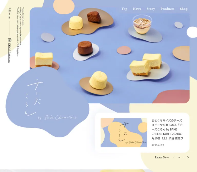
A large photograph shows small soufflés, terrine pieces, a darker baked sweet, and a pudding cup arranged on irregular metallic-looking plates. Its blue photographic ground continues the page palette. Sparse peach and pale decorative forms overlap the surrounding canvas.
Desktop leaves an unusually wide left rail: the photo begins around 160px from the viewport edge, while the right clearance is only about 40px. The handwritten brand artwork sits within a large blue organic silhouette that overlaps the photo’s lower-left area. Its white lettering remains visually quiet despite the large footprint.
A narrow vertical rail contains the English brand sentiment and Instagram utility. The social label uses 15px Minion Pro. On mobile, the short English statement becomes a tiny horizontal block at the top-left, and Follow me plus the Instagram icon move to the top-right.
The mobile photograph uses a narrow crop that keeps food details large. The brand shape overlaps the bottom of the photograph at approximately y=440px. Reproduce this with responsive cropping and independent overlays; shrinking the entire desktop composition would make the products and lettering too small.
Featured Recent-News Card
Role: surfaces a current announcement within the opening composition.
On desktop, a white rounded card sits to the right of the brand silhouette. Its anatomy is a landscape brand thumbnail, a title, and a small date. The title precedes the date here, unlike the closing news list.
The measured card is 736 × 260px with 30px padding and 30px corners. The visible thumbnail is approximately 320 × 200px. The text begins around 25px to its right. A broad, faint surrounding haze is visible; its exact shadow declaration was not supplied.
On mobile, the card becomes 350px wide with 15px padding and 15px corners. The thumbnail remains approximately 320 × 200px, while title and date stack below it. The first card measures 279px high; longer headlines produce 311px cards. Avoid fixing every slide to the shortest height.
Recent News and two 50px circular button boxes sit beneath the cards. The DOM records three cards positioned horizontally offscreen, which supports a carousel structure. Autoplay, drag behavior, looping, slide duration, and button results were not exercised.
Story Section
Role: introduces the emotional promise of a small everyday reward.
The hierarchy uses the large English Story heading, a Japanese serif statement, and short verse-like lines with substantial breathing room. The source heading reads ひょい ぱくっ 小さなごほうび.
Desktop styling is white text: a 90px English heading, 32px Japanese heading, and 18px body with 36px line height. Mobile reduces these to 40px, 17px, and 12px with 24px body line height. Preserve the deliberate line breaks and the contrast between brief copy and spacious surroundings.
The DOM reports a roughly 2272px desktop section and 1147px mobile section, with large intervals before and after the text. The supplied screenshots do not directly show the full Story composition. Do not translate those section heights into empty fixed padding or invent its missing imagery.
Arch-Shaped Product Card
Role: presents an individual sweet as a small object worth examining.
Each card combines:
- A large photograph inside an arch-shaped upper frame.
- A centered Japanese serif product name.
- A centered price row with a large serif numeral and smaller tax/quantity details.
- A left-aligned sans-serif description.
- A smaller allergen note near the bottom.
The desktop capture shows warm and cool near-white card variants. The outer card is approximately 460px wide. The image has about a 15px frame, while the text column is 380px wide with deeper side padding. The visible terrine image is approximately 430px wide and 475px tall; this is an image-crop estimate, not an intrinsic asset size.
The upper arch is broad and continuous. The lower body has gently rounded corners. It should resemble a single shaped container, not an image circle placed on a separate rectangular panel.
The first two visible names are ころんとチーズスフレ and ころんとチーズテリーヌ. Prices are visibly prefixed with a yen symbol, while tax and quantity appear as supporting detail. The DOM extracts the main numerical price separately, so preserve the complete visible price treatment when rebuilding the component.
Product descriptions remain restrained: 12px text with 24px leading on desktop, and 10px with 18px leading on mobile. The four products form two staggered columns on desktop and a single sequential column on mobile. No product purchase action is evidenced in these cards.
Seasonal Product Annotation
Role: distinguishes a time-limited product within the same catalog.
The fourth product has a 期間限定 annotation and the displayed range 2022.02.15 ~ 2022.03.12. Both use white text and sit toward the right edge of the product region in the measured layout.
The label is Japanese serif, 14px with 5px tracking on desktop and 11px with 2px tracking on mobile. Dates use Minion Pro at 20px desktop and 15px mobile.
The annotation’s exact enclosing shape is not visible in the supplied product screenshot. Preserve the text hierarchy and its connection to the relevant product, but do not invent a particular badge silhouette. The displayed date range must not be reframed as a currently active promotion.
Shop Information and Map Link
Role: provides a physical location and its status.
The Shop heading changes to the main blue. The identity, branch, and address use the darker slate blue #5f719b. The measured desktop text block occupies roughly 387px at the right of the content region; on mobile, it becomes a centered 249px block.
The site explicitly prefixes the shop identity with 【閉店】. Treat that status as essential content. The source also provides an address and a Google map link.
The map control is a measured 190 × 44px blue pill with a 22px radius and white 18px serif text. A small outgoing arrow is visible in the mobile capture. The destination is present in the DOM, but opening behavior and the map’s current contents were not inspected.
The full Shop visual arrangement is outside the supplied screenshot regions. Its text placement is measured; any accompanying image treatment remains unverified.
Closing News List
Role: offers a compact archive preview near the end of the homepage.
Three full-width white rows sit on the blue background. Each contains a square brand thumbnail at the left, a date above a Japanese headline, and a small right-pointing arrow at the far right on desktop.
Desktop rows are 1040px wide and 170px high. The visible square artwork is approximately 130px. The text begins at x=365px, corresponding to a 20px row inset, 130px image, and roughly 15px gap. Long titles wrap naturally rather than being reduced to a single truncated line.
Mobile keeps the thumbnail/text relationship rather than stacking the image above the headline. Rows narrow to 350px, the thumbnail becomes about 70px, and the text column is measured at 250px. Titles use 12px text with 15px leading. The individual right-edge chevrons are not visible in the mobile capture.
A separate 50px white circular arrow follows the list, aligned to its right edge and linked to /news.
Surface ownership: sampled row anchors report a transparent background and zero radius, while the screenshots clearly show rounded white surfaces. Apply those visual properties to the row wrapper or equivalent surface; do not infer that the original anchor owns them.
Spacing discrepancy: the desktop DOM sample gives 35px between row boxes; the later screenshot shows approximately 10px. Mobile shows a consistent 5px gap. The evidence does not identify the cause of the desktop difference.
Footer and Social Utilities
Role: keeps contact and social destinations available without creating a heavy footer band.
The footer continues the blue background and oversized pale organic decoration. On desktop, Contact and the visible copyright line © BAKE all rights reserved. run vertically near the left edge. The Instagram group is centered horizontally with Follow me, an outline camera icon, and an underlined Official Instagram link.
Mobile retains the vertical contact/copyright rail, inset near 15–20px. The central social group becomes two rows: Follow me above the icon and link. There is no visually dense multi-column sitemap in the supplied footer.
The Contact link targets the BAKE contact page, while the Instagram link targets the brand account recorded in the homepage DOM. Those destinations were not opened.
Tokens — Motion & Interaction
| Treatment | Evidence | What can be carried forward |
|---|---|---|
| Circular carousel buttons | Computed transition: opacity 0.3s |
A 300ms opacity transition is measured; the target opacity and triggering state are unknown |
| Circular news-index link | Computed transition: opacity 0.3s |
Same measured transition; click result was not inspected |
| Featured-news carousel | Three horizontal card positions and two button elements | Carousel structure is supported; autoplay, looping, swipe, easing, and duration are unverified |
| Desktop navigation persistence | Appears in the upper-right across different page captures | Persistent overlay behavior is visually supported; exact positioning CSS is not provided |
| Mobile navigation visibility | Above the viewport initially; visible capsule in the later capture | A state change is supported; reveal threshold and animation are unverified |
| Organic backgrounds | Different page regions show large curved shapes | Static visual evidence only; no verified morphing, parallax, or floating animation |
| General element animation | Sampled elements report animation: none |
Does not rule out unsampled pseudo-elements, script-driven motion, or behavior outside the capture window |
Many sampled elements report only transition: all, without a usable nonzero duration. Do not turn that into a universal transition token.
The supplied capture process waited for visible finite animations and layout stability, temporarily paused perpetual animations during readiness checks, and then resumed them. This supports settled visual analysis, but it is not an interaction recording. Delayed content and unexercised motion remain unverified.
Recommended adaptation: keep controls quiet, retain the measured 300ms opacity timing where appropriate, and add reduced-motion handling. Do not add continuous blob morphing or image parallax solely because the shapes suggest softness.
Surfaces
| Layer | Appearance | Purpose |
|---|---|---|
| Page foundation | Solid pastel blue | Connects the long page and its product world |
| Opening composition | Blue photograph, white/cream surrounding areas, floating organic graphics | Introduces the brand through imagery |
| Product card | Warm or cool near-white, arch-shaped top, rounded lower corners | Frames food and detailed information as one object |
| Featured news | White, strongly rounded, with a faint visible surrounding haze | Separates the announcement from the overlapping hero artwork |
| Closing news | White rounded rows without obvious elevation | Supports fast scanning |
| Map control | Blue pill with white serif text | Distinguishes the location link |
| Organic decoration | Large pale flat-color shapes | Creates continuity and asymmetry without extra UI chrome |
The photographed products have dimensional shadows. Most interface surfaces remain flat. Avoid applying the photographic lighting model as a heavy shadow to every component.
Imagery
The photography is the primary source of appetite and tactility. Small portions are shown large enough to reveal airy crumb, smooth cheese filling, browned surfaces, and crunchy toppings. Irregular gold, grey, and muted pink plates echo the page’s organic shapes.
The opening photograph uses an oblique overhead viewpoint, substantial blue negative space, and a distributed arrangement rather than a single centered product. Individual product images move closer and simplify the background to warm beige or cool grey. Preserve natural edges and contact shadows; aggressive cutouts or synthetic glows would weaken the visual relationship between food and surface.
The brand artwork uses loose, thin lettering and asymmetrical colored fields. Repeated news thumbnails carry that artwork into otherwise factual content. Their framing changes from a landscape featured image to a square list thumbnail.
Observed Asset References
No original image URLs or filenames were supplied. The following are visual references, not invented asset paths.
| Asset role | Where observed | Reuse guidance |
|---|---|---|
| Multi-product opening photograph | Desktop and mobile opening captures | Provide separate responsive crops or intentional object-position settings |
| White handwritten brand mark on blue organic shape | Opening captures | Use authorized artwork; preserve delicate linework and the irregular silhouette |
| Soufflé photograph | Desktop product capture | Keep the warm neutral ground and close view of the airy texture |
| Terrine photograph | Desktop product capture | Preserve the cool grey background, cheese cross-sections, and loose crumbs |
| Pudding photograph | Partially visible at the bottom of the desktop product capture | Only the visible portion is evidenced; do not infer the complete crop |
| Yellow/blue brand news artwork | Opening and closing News captures | Support both landscape and square framing |
| Instagram and arrow symbols | Opening, navigation utilities, and footer | Use restrained outline forms; exact source format is unknown |
Food photographs should render smoothly at adequate resolution. No pixelated-image treatment is appropriate here. Use image dimensions or aspect ratios to reserve layout space, and load below-the-fold product imagery lazily in a new implementation.
Layout & Responsive Behavior
| Aspect | Desktop observation | Mobile observation |
|---|---|---|
| Opening photo | Wide landscape field with a deep left inset | Narrow crop beginning 30px from the left and reaching the right edge |
| Brand statement | Small vertical rail | Tiny horizontal block at the top-left |
| Opening social utility | Vertical label and link on the left | Horizontal top-right label and icon |
| Brand mark | Large overlap at the lower-left of the photo | Smaller overlap beneath the photo, still visually dominant |
| Featured news | Image and text side by side | Image above title and date |
| Primary navigation | Compact upper-right row | Five-link capsule visible in the later scroll state |
| Product layout | Two staggered columns | One column in the original content order |
| News list | Large thumbnails and 18px titles | Small thumbnails beside wrapping 12px titles |
| Footer social | One horizontal group | Label above icon/link |
The page does not use one shared mobile gutter. Product content occupies a narrower region around 310px wide, while news uses 350px. The hero begins at 30px, product headings at 40px, product body text at 60px, and news rows at 20px. Preserve this hierarchy of insets rather than normalizing every section to one container.
The product section has nearly the same total height in the supplied DOM at both sizes: about 2289px desktop and 2307px mobile. Smaller cards and typography compensate for the mobile switch to one column. Other sections compress much more substantially. This is evidence of several responsive rules, not a single scale factor.
The exact breakpoint is unknown because only two widths were inspected. The Quick Start uses a recommended 64rem breakpoint and interpolation between measured endpoints. Intermediate widths, landscape phones, zoom behavior, and safe-area handling require further testing.
The mobile footer capture shows the persistent navigation crossing content from the preceding Shop region. For a new implementation, reserve scroll clearance for the overlay and ensure that linked targets and keyboard focus are not obscured.
Do’s and Don’ts
Do
- Anchor the interface in the measured pastel blue
#a3b4dc. - Let the food photography carry the opening composition.
- Preserve the wide desktop left inset and the tighter mobile crop.
- Treat the handwritten logo and its organic silhouette as essential brand artwork.
- Pair Latin serif headings with Japanese serif product names and sans-serif explanations.
- Keep product photographs and details inside continuous arch-shaped containers.
- Preserve the staggered desktop product rhythm and single-column mobile order.
- Maintain separate featured-news and list-news anatomy, including their different date order.
- Use large background shapes with restrained, flat interface surfaces.
- Retain closure notices and seasonal dates when reproducing the supplied content.
Don’t
- Don’t replace the opening photograph with a generic text-heavy sales banner.
- Don’t add cart buttons or purchase interactions unsupported by the inspected page.
- Don’t convert the product presentation into a uniform rectangular catalog grid.
- Don’t use a single rounded-card radius for organic artwork, arches, pills, and news rows.
- Don’t stretch or squash product images to fill their masks.
- Don’t substitute a generic script font for the supplied handwritten mark.
- Don’t infer autoplay, smooth scrolling, parallax, or blob animation from static captures.
- Don’t treat the 2022 content dates as the inspection date or proof that the website is unavailable.
- Don’t copy administrative or library-default colors into the brand palette.
- Don’t claim exact source CSS for properties only visible in screenshots.
Recommended Implementation Additions
These are improvements for a new implementation, not verified features of the original:
- Give the graphical H1 a meaningful accessible name. The empty extracted H1 does not establish whether an image alternative already exists.
- Give carousel arrows and the circular news-index link explicit accessible labels. Provide keyboard operation and visible focus states.
- Use real section IDs and a suitable
scroll-margin-topfor overlay navigation. - Increase small mobile descriptions and dates where readability requires it. Let card heights grow with content and browser text scaling.
- Review white text on the pale blue, especially the small navigation labels. Use a darker control surface or darker text where contrast is insufficient.
- If the carousel advances automatically, provide a pause mechanism and avoid unexpected movement while a user interacts with it.
- Keep decoration outside the accessibility tree and prevent it from intercepting pointer events.
- Reserve image space, supply meaningful product alt text, and avoid repeating a headline in a purely decorative news thumbnail’s alternative text.
Agent Prompt Guide
Quick Color Reference
- Main blue:
#a3b4dc, measured. - Primary text:
#1b1b1b, measured. - Shop text:
#5f719b, measured. - White text and primary news surfaces:
#ffffff, measured. - Supporting cream, yellow, peach, and pale blue: approximately
#faf5d8,#ffdd96,#fad6b1, and#cbd6f0. - Product surfaces: approximate warm cream
#fff2e6and cool near-white#faf9ff. - Depth: natural photographic shadows; little interface elevation.
Overall Prompt
“Create a Japanese confectionery brand homepage with a pastel blue #a3b4dc foundation, large food photographs, asymmetric organic background shapes, and a delicate handwritten brand graphic. Open with an inset landscape photograph and a blue logo silhouette overlapping its lower-left edge. Place a rounded featured-news card to the right on desktop and below on mobile. Use Minion Pro or an appropriate licensed serif fallback for English headings, Noto Serif JP for product names, Noto Sans JP for explanations, and Inter for news dates. Present products in staggered arch-shaped cards with near-white surfaces, centered prices, and restrained descriptions. Keep a compact five-link navigation, a store-information section, thumbnail-based news rows, and a light social footer. Reproduce only evidenced interactions.”
Example Component Prompts
- Opening composition: “A blue studio photograph of small cheese sweets on irregular metallic plates, inset 160px from the left at a 1440px desktop width. Overlap its lower-left edge with a large asymmetric blue brand silhouette carrying thin white handwritten lettering. Add restrained cream and peach shapes around the photo. Keep the mobile version tightly cropped rather than uniformly scaled.”
- Product card: “An approximately 460px-wide confectionery card with a broad arch at the top, a framed close-up food photograph, a centered Japanese serif name, a prominent serif yen price, and small left-aligned sans-serif description and allergen text. Use a warm cream or cool near-white fill, small lower corner radii, and no heavy shadow.”
- Featured news: “A white rounded announcement card with a landscape brand thumbnail, a Japanese title, and a small tracked date. Use 30px desktop padding and corners, then 15px on mobile. Stack the image above the text on mobile and allow longer titles to increase the card height.”
- Closing news row: “A white rounded row on pastel blue, with a square yellow-and-blue brand thumbnail at left, an Inter date above a Japanese sans-serif headline, and a small desktop chevron. Keep image and text side by side on a 390px phone. Follow the list with a separate 50px white circular archive link.”
- Mobile navigation: “A five-link pastel-blue capsule near the top of the screen, approximately 366px wide at a 390px viewport. Use white 15px serif labels with 1px tracking. Keep all links visible and provide accessible focus. Treat reveal timing as a separate implementation choice.”
Quick Start
CSS Custom Properties
This is an adaptation, not recovered source CSS. Measured colors and type sizes are preserved. Supporting colors, product masks, shadows, the breakpoint, and interpolation are recommendations based on the captures.
The selectors assume a .cheecolo-page wrapper; an opening .hero containing .hero-media, .brand-mark, and .featured-news; product cards inside .product-grid; and linked news rows inside .news-list. A product card contains an image and .product-body. A news row contains .news-thumb, .news-copy, and an optional .row-arrow.
Supply authorized images and logo artwork separately. The CSS does not recreate the original organic paths or implement a carousel. The mobile .is-visible navigation class is a hook for a separately chosen scroll behavior; its trigger is not verified source behavior.
:root {
  /* Measured palette */
  --color-page: #a3b4dc;
  --color-ink: #1b1b1b;
  --color-white: #ffffff;
  --color-shop-ink: #5f719b;

  /* Visual approximations */
  --color-cloud: #cbd6f0;
  --color-cream: #faf5d8;
  --color-butter: #ffdd96;
  --color-peach: #fad6b1;
  --color-card-warm: #fff2e6;
  --color-card-cool: #faf9ff;

  /* Observed leading families; load licensed fonts separately */
  --font-latin: 'minion-pro', serif;
  --font-jp-serif: 'Noto Serif JP', serif;
  --font-jp-sans: 'Noto Sans JP', 'Hiragino Sans', Meiryo, sans-serif;
  --font-date: Inter, sans-serif;

  --content-width: 1040px;
  --text-section: 90px;
  --text-product: 24px;
  --text-price: 34px;
  --radius-feature: 30px;
  --control-circle: 50px;
  --motion-opacity: 300ms;
}

* { box-sizing: border-box; }

body { margin: 0; }

.cheecolo-page {
  overflow-x: clip;
  color: var(--color-ink);
  background: var(--color-page);
  font: 400 16px/1.5 var(--font-jp-sans);
}

.cheecolo-page img {
  display: block;
  max-width: 100%;
}

.content {
  width: min(var(--content-width), calc(100% - 80px));
  margin-inline: auto;
}

.section-title {
  margin: 0;
  color: var(--color-white);
  font: 500 var(--text-section)/1 var(--font-latin);
  letter-spacing: 2px;
}

.primary-nav {
  position: fixed;
  z-index: 20;
  top: 32px;
  right: 50px;
  display: flex;
  align-items: center;
  gap: 30px;
}

.primary-nav a {
  color: var(--color-white);
  font: 600 18px/1.5 var(--font-latin);
  letter-spacing: 1px;
  text-decoration: none;
}

.hero {
  /* Recommended interpolation matching the 1440px capture */
  --photo-height: calc((100vw - 200px) * 0.6);
  position: relative;
  isolation: isolate;
  min-height: calc(var(--photo-height) + 440px);
  padding: 40px 40px 0 160px;
}

.hero-media {
  width: 100%;
  height: var(--photo-height);
  object-fit: cover;
  border-radius: 30px 0 30px 0;
}

.brand-mark {
  position: absolute;
  z-index: 2;
  top: calc(var(--photo-height) - 160px);
  left: 30px;
  width: min(600px, 41.667vw);
  aspect-ratio: 600 / 580;
  margin: 0;
}

.brand-mark img {
  width: 100%;
  height: 100%;
  object-fit: contain;
}

.featured-news {
  position: absolute;
  z-index: 3;
  top: calc(var(--photo-height) + 90px);
  right: 40px;
  display: grid;
  grid-template-columns: minmax(0, 1fr) minmax(0, 1.034fr);
  gap: 25px;
  width: min(736px, 51.111vw);
  min-height: 260px;
  padding: 30px;
  border-radius: var(--radius-feature);
  color: var(--color-ink);
  background: var(--color-white);
  text-decoration: none;
  /* Approximation of the visible diffuse separation */
  box-shadow: 0 10px 45px rgb(95 113 155 / 0.12);
}

.featured-news img {
  width: 100%;
  aspect-ratio: 8 / 5;
  object-fit: cover;
}

.featured-news h3 {
  margin: 0;
  font-size: 15px;
  font-weight: 400;
  line-height: 24px;
}

.featured-news time {
  display: block;
  margin-top: 15px;
  font: 500 11px/1.5 var(--font-date);
  letter-spacing: 1px;
}

.story-copy {
  color: var(--color-white);
  text-align: center;
  font-family: var(--font-jp-serif);
  font-weight: 600;
}

.story-copy h3 {
  font-size: 32px;
  line-height: 1;
  letter-spacing: 2px;
}

.story-copy p {
  font-size: 18px;
  line-height: 2;
}

.product-grid {
  display: grid;
  grid-template-columns: repeat(2, minmax(0, 1fr));
  align-items: start;
  gap: 130px 120px;
  padding-block-end: 285px;
}

.product-card {
  min-width: 0;
  overflow: hidden;
  padding: 15px 15px 40px;
  border-radius: 230px 230px 20px 20px;
  background: var(--color-card-warm);
}

.product-card:nth-child(even) {
  /* Static layout offset; not an animation */
  transform: translateY(285px);
  background: var(--color-card-cool);
}

.product-media {
  width: 100%;
  aspect-ratio: 430 / 475;
  object-fit: cover;
  border-radius: 215px 215px 4px 4px;
}

.product-body { padding: 40px 25px 0; }

.product-name {
  margin: 0;
  text-align: center;
  font: 600 var(--text-product)/26px var(--font-jp-serif);
}

.product-price {
  display: flex;
  justify-content: center;
  align-items: baseline;
  gap: 5px;
  margin: 35px 0 20px;
}

.product-price strong {
  font: 500 var(--text-price)/1 var(--font-latin);
}

.product-price small {
  font: 600 12px/20px var(--font-jp-serif);
}

.product-description {
  margin: 0;
  font-size: 12px;
  line-height: 24px;
}

.product-allergens {
  margin: 20px 0 0;
  font-size: 11px;
  line-height: 16.5px;
}

.shop-copy { color: var(--color-shop-ink); }
.shop-title { color: var(--color-page); }

.map-link {
  display: inline-flex;
  justify-content: center;
  align-items: center;
  gap: 12px;
  width: 190px;
  min-height: 44px;
  border-radius: 22px;
  color: var(--color-white);
  background: var(--color-page);
  font: 500 18px/1 var(--font-latin);
  text-decoration: none;
}

.news-list {
  display: grid;
  gap: 10px; /* Settled desktop screenshot estimate */
  padding: 0;
  list-style: none;
}

.news-row {
  position: relative;
  display: grid;
  grid-template-columns: 130px minmax(0, 1fr);
  gap: 15px;
  min-height: 170px;
  padding: 20px 50px 20px 20px;
  border-radius: 20px;
  color: var(--color-ink);
  background: var(--color-white);
  text-decoration: none;
}

.news-thumb {
  width: 130px;
  aspect-ratio: 1;
  object-fit: cover;
}

.news-copy time {
  display: block;
  font: 500 13px/1 var(--font-date);
}

.news-copy h3 {
  margin: 10px 0 0;
  font-size: 18px;
  font-weight: 400;
  line-height: 22px;
  overflow-wrap: anywhere;
}

.row-arrow {
  position: absolute;
  top: 50%;
  right: 20px;
  transform: translateY(-50%);
}

.circle-link {
  display: flex;
  align-items: center;
  justify-content: center;
  width: var(--control-circle);
  height: var(--control-circle);
  margin: 15px 0 0 auto;
  border: 0;
  border-radius: 50%;
  color: var(--color-ink);
  background: var(--color-white);
  text-decoration: none;
  transition: opacity var(--motion-opacity);
}

.site-footer { padding: 170px 0 90px; }

.footer-social {
  display: flex;
  justify-content: center;
  align-items: center;
  gap: 18px;
  font: 400 15px/1.5 var(--font-latin);
}

.footer-social a { color: inherit; }

/* Use custom artwork for exact silhouettes. */
.decorative-shape { pointer-events: none; }

/* Recommended accessibility behavior */
.cheecolo-page :focus-visible {
  outline: 2px solid var(--color-ink);
  outline-offset: 4px;
}

.cheecolo-page section[id] { scroll-margin-top: 90px; }

@media (hover: hover) {
  .circle-link:hover { opacity: 0.7; }
}

/* Recommended breakpoint; only endpoint viewports were inspected. */
@media (max-width: 64rem) {
  :root {
    --text-section: 40px;
    --text-product: 18px;
    --text-price: 20px;
    --radius-feature: 15px;
  }

  .cheecolo-page { font-size: 14px; }

  .content { width: calc(100% - 80px); }
  .news-section.content { width: calc(100% - 40px); }

  .primary-nav {
    top: 12px;
    right: 12px;
    left: 12px;
    justify-content: space-evenly;
    gap: 0;
    min-height: 51px;
    border-radius: 999px;
    background: rgb(163 180 220 / 0.9);
    transform: translateY(-80px);
    visibility: hidden;
  }

  .primary-nav.is-visible {
    transform: none;
    visibility: visible;
  }

  .primary-nav a { font-size: 15px; }

  .hero {
    min-height: 1054px;
    padding: 50px 0 0 30px;
  }

  .hero-media {
    height: 432px;
    object-position: 50% 50%;
    border-radius: 15px 0 15px 0;
  }

  .brand-mark {
    top: 440px;
    left: 15px;
    width: 245px;
    height: 208px;
    aspect-ratio: auto;
  }

  .featured-news {
    top: 663px;
    right: 20px;
    width: calc(100% - 40px);
    min-height: 0;
    grid-template-columns: minmax(0, 1fr);
    gap: 10px;
    padding: 15px;
  }

  .featured-news h3 { font-size: 12px; line-height: 16px; }
  .featured-news time { margin-top: 8px; font-size: 10px; }

  .story-copy h3 { font-size: 17px; letter-spacing: normal; }
  .story-copy p { font-size: 12px; line-height: 24px; }

  .product-grid {
    grid-template-columns: minmax(0, 1fr);
    gap: 40px;
    padding-block-end: 0;
  }

  .product-card,
  .product-card:nth-child(even) {
    transform: none;
    padding: 10px 10px 20px;
    border-radius: 160px 160px 15px 15px;
  }

  .product-media { border-radius: 150px 150px 4px 4px; }
  .product-body { padding: 25px 10px 0; }
  .product-name { line-height: 20px; }
  .product-price { margin: 15px 0; }
  .product-price small { font-size: 10px; }
  .product-description { font-size: 10px; line-height: 18px; }
  .product-allergens { margin-top: 10px; font-size: 10px; line-height: 15px; }

  .news-list { gap: 5px; }

  .news-row {
    grid-template-columns: 70px minmax(0, 1fr);
    gap: 10px;
    min-height: 90px;
    padding: 10px;
    border-radius: 10px;
  }

  .news-thumb { width: 70px; }
  .news-copy time { font-size: 10px; }
  .news-copy h3 { margin-top: 5px; font-size: 12px; line-height: 15px; }
  .row-arrow { display: none; }
  .circle-link { margin-top: 10px; }

  .site-footer { padding: 85px 0 90px; }
  .footer-social { flex-direction: column; gap: 0; font-size: 12px; }
  .footer-social a { font-size: 14px; }
}

@media (prefers-reduced-motion: reduce) {
  .cheecolo-page { scroll-behavior: auto; }
  .circle-link { transition: none; }
}
The mobile product image ratio, card spacing, and intermediate-width behavior above are approximations because no mobile product screenshot or source media query was supplied. For production, test longer text and text zoom, and replace fixed opening-section positioning with content-aware layout where necessary. Preserve the measured endpoint composition without allowing announcements to overlap subsequent content.
Tailwind v4 Token Mapping
Optional aliases for a project already using Tailwind v4. These do not imply that the original site uses Tailwind. Define the custom properties above first.
@theme inline {
  --color-cheecolo: var(--color-page);
  --color-cheecolo-ink: var(--color-ink);
  --color-cheecolo-shop: var(--color-shop-ink);
  --color-cheecolo-cloud: var(--color-cloud);
  --color-cheecolo-cream: var(--color-cream);
  --color-cheecolo-butter: var(--color-butter);
  --font-brand-latin: var(--font-latin);
  --font-brand-serif: var(--font-jp-serif);
  --font-brand-sans: var(--font-jp-sans);
  --font-brand-date: var(--font-date);
  --text-brand-section: var(--text-section);
  --text-brand-product: var(--text-product);
  --text-brand-price: var(--text-price);
  --radius-brand-feature: var(--radius-feature);
  --spacing-brand-control: var(--control-circle);
}
Sources & Evidence
- Inspected original and final page: チーズころん by BAKE CHEESE TART. Both supplied URLs are identical; the supplied browser observation reports HTTP 200.
- Capture time: October 4, 2026, at 21:17:34.623 UTC, equivalent to October 5, 2026, at 06:17:34.623 JST. Dates appearing in news and product copy are content dates, not inspection dates.
- Desktop evidence: 1440 × 1000 viewport, approximately 8736px document height; opening, product-region, and closing-news/footer screenshots; rendered text, link targets, bounding boxes, and computed-style samples.
- Mobile evidence: 390 × 844 viewport, approximately 6444px document height; opening and closing-news/footer screenshots; rendered DOM and computed styles throughout the homepage.
- Interaction evidence: sampled offscreen carousel cards, button elements, opacity transitions, persistent desktop navigation, and different initial/later mobile navigation visibility. No click, hover, swipe, autoplay, or destination-page result was supplied.
- Inspection limitations: full stylesheet rules, image asset URLs, exact font-file resolution, breakpoints, pseudo-element styling, and a motion recording were not supplied. Story and Shop are primarily documented through DOM evidence. Desktop news-row spacing and some product offsets differ between sampled geometry and later screenshots.
This reference describes the currently served homepage using the supplied original-page evidence. Visual estimates and recommended implementation choices are labeled separately from measured values.
# チーズころん by BAKE CHEESE TART — Style Reference

> Small cheese sweets arranged in a soft blue world of rounded shapes, delicate lettering, and generous space.

**Website:** [cheecolo.com](https://cheecolo.com/)
**Original URL:** https://cheecolo.com/
**Final URL:** https://cheecolo.com/
**Theme:** light, with a pastel blue foundation and cream, peach, yellow, and white accents.
**Inspected:** October 5, 2026, at 06:17:34 JST; supplied retrieval timestamp: October 4, 2026, at 21:17:34.623 UTC.
**Viewports:** desktop 1440 × 1000 CSS pixels; mobile 390 × 844 CSS pixels.
**Scope:** the currently served brand homepage, including its opening composition, recent-news feature, Story, Products, Shop, closing News list, and footer. Visual evidence includes desktop opening, product, and footer captures plus mobile opening and footer captures. Rendered DOM measurements cover the intervening sections. Linked pages and external destinations were not inspected.

The site presents a small confectionery brand through carefully staged food photography and a loose, organic graphic language. Its principal blue, `#a3b4dc`, connects the photographic backdrop, floating logo shape, navigation, and long page background. Pale cream and yellow shapes soften the transitions between sections. Thin handwritten brand artwork contrasts with substantial Japanese serif product names and compact sans-serif explanations.

The homepage is a long brand presentation with product information, store information, and editorial links. Its hierarchy moves from an immersive photograph to a brief brand story, four product presentations, a shop entry, and news. The supplied evidence does not show a cart or checkout. The currently rendered content includes 2022 announcements, a dated seasonal product, and a shop marked `【閉店】`; these are current page contents, not evidence that the website itself has disappeared.
閉じる
# チーズころん by BAKE CHEESE TART — Style Reference

> Small cheese sweets arranged in a soft blue world of rounded shapes, delicate lettering, and generous space.

**Website:** [cheecolo.com](https://cheecolo.com/)
**Original URL:** https://cheecolo.com/
**Final URL:** https://cheecolo.com/
**Theme:** light, with a pastel blue foundation and cream, peach, yellow, and white accents.
**Inspected:** October 5, 2026, at 06:17:34 JST; supplied retrieval timestamp: October 4, 2026, at 21:17:34.623 UTC.
**Viewports:** desktop 1440 × 1000 CSS pixels; mobile 390 × 844 CSS pixels.
**Scope:** the currently served brand homepage, including its opening composition, recent-news feature, Story, Products, Shop, closing News list, and footer. Visual evidence includes desktop opening, product, and footer captures plus mobile opening and footer captures. Rendered DOM measurements cover the intervening sections. Linked pages and external destinations were not inspected.

The site presents a small confectionery brand through carefully staged food photography and a loose, organic graphic language. Its principal blue, `#a3b4dc`, connects the photographic backdrop, floating logo shape, navigation, and long page background. Pale cream and yellow shapes soften the transitions between sections. Thin handwritten brand artwork contrasts with substantial Japanese serif product names and compact sans-serif explanations.

The homepage is a long brand presentation with product information, store information, and editorial links. Its hierarchy moves from an immersive photograph to a brief brand story, four product presentations, a shop entry, and news. The supplied evidence does not show a cart or checkout. The currently rendered content includes 2022 announcements, a dated seasonal product, and a shop marked `【閉店】`; these are current page contents, not evidence that the website itself has disappeared.

## How to Read This Reference

- **Measured** values come from the supplied rendered DOM and computed styles. They describe the sampled elements at the two inspected viewports.
- **Visual estimates** describe shapes, colors, or dimensions visible in the original-page screenshots but absent from the computed-style excerpt. Estimated hex values are reusable approximations, not eyedropper measurements.
- **Derived** values are calculated from recorded coordinates or dimensions. They do not establish the original CSS implementation.
- **Recommendations** describe a new implementation. Suggested breakpoints, focus treatments, image masks, and CSS selectors are not original source code.
- **Named tokens** are descriptive aliases introduced here. The supplied custom-property list does not expose a coherent set of original brand tokens.
- Screenshot and DOM sampling sometimes show different geometry. Those differences are identified instead of being converted into unsupported claims about animation or source spacing.

## Tokens — Colors

### Default Palette

| Name | Value | Suggested token | Evidence and role |
| --- | --- | --- | --- |
| Pastel Blue | `#a3b4dc` | `--color-page` | **Measured:** HTML/body background at both viewports; Shop heading and map-button fill also use this color |
| Soft Black | `#1b1b1b` | `--color-ink` | **Measured:** primary body, product, and news text |
| White | `#ffffff` | `--color-white` | **Measured:** navigation and Story text, featured-news surface, and circular news-index link |
| Slate Blue | `#5f719b` | `--color-shop-ink` | **Measured:** shop name, branch label, and address |

### Supporting Palette

These values are **visual estimates** from the original-page captures. Use them as starting points and replace them with verified asset or stylesheet values when available.

| Name | Approximate value | Suggested token | Visible role |
| --- | --- | --- | --- |
| Pale Blue | `#cbd6f0` | `--color-cloud` | Large organic shapes behind the product and footer regions |
| Warm Cream | `#faf5d8` | `--color-cream` | Opening-page decorative fields and transition shapes |
| Butter Yellow | `#ffdd96` | `--color-butter` | Brand-thumbnail artwork and large mobile transition shape |
| Peach | `#fad6b1` | `--color-peach` | Small opening decorations and brand artwork |
| Soufflé Surface | `#fff2e6` | `--color-card-warm` | Warm product-card background visible behind the soufflé details |
| Terrine Surface | `#faf9ff` | `--color-card-cool` | Very pale cool product-card background |

The food photographs contain additional browns, yellows, grey plates, and muted pinks. Treat those as photographic colors rather than extra interface tokens. Their natural shadows provide much of the depth.

The supplied DOM includes WordPress and slider-related custom properties. Values such as an administrative blue or a default slider accent are not evidence that those colors belong in the visible brand palette.

## Tokens — Typography

### Latin Editorial Serif

- **Measured family declaration:** `minion-pro, serif`.
- **Roles:** English navigation, section headings, prices, social labels, map link, and footer utilities.
- **Weights:** `600` for navigation; `500` for section headings and prices; commonly `400` for smaller utility labels.
- **Character:** refined, gently literary, and relatively narrow. Large headings remain light enough to coexist with the photographs.
- A computed family declaration does not independently verify the loaded font file. Use Minion Pro only when available and licensed; retain a serif fallback.

### Japanese Serif

- **Measured declaration:** `"Noto Serif JP", serif`.
- **Roles:** Story copy, product names, tax and quantity labels, seasonal label, and shop identity.
- **Measured weight:** predominantly `600`.
- Product names are centered, while longer explanatory paragraphs switch to sans-serif.

### Japanese Sans-Serif

- **Measured first-choice family:** `"Noto Sans JP"`.
- The supplied stack continues through Noto Sans CJK JP, Noto Sans Japanese, Hiragino families, Meiryo, MS PGothic, and a generic sans-serif fallback.
- **Roles:** descriptions, allergens, news headlines, addresses, and general text.
- **Measured weight:** `400` in these sampled roles.

### Numeric Dates

- **Measured declaration:** `Inter, sans-serif`.
- **Measured weight:** `500`.
- Featured-news dates have `1px` tracking. Dates in the closing News list use normal tracking.

### Brand Lettering

The vertical handwritten Japanese mark and cursive English endorsement are artwork. The sampled H1 has no extracted text, although the logo is visibly present. Its computed `32px` desktop or `28px` mobile font size should not be treated as the visible wordmark size. Preserve the actual graphic when authorized; ordinary typed text will not reproduce its character.

### Type Scale

Sizes below are **measured**, expressed as font size / line height.

| Role | Desktop | Mobile | Weight / tracking |
| --- | --- | --- | --- |
| General body | `16 / 24px` | `14 / 21px` | `400` |
| Primary navigation | `18 / 27px` | `15 / 22.5px` | `600`; `1px` tracking |
| English section heading | `90 / 90px` | `40 / 40px` | `500`; `2px` tracking |
| Story Japanese heading | `32 / 32px` | `17 / 17px` | `600`; desktop tracking `2px`, mobile normal |
| Story verse | `18 / 36px` | `12 / 24px` | `600` |
| Product name | `24 / 26px` | `18 / 20px` | `600` |
| Product price numerals | `34 / 34px` | `20 / 20px` | `500` |
| Tax label | `12 / 20px` | `10 / 20px` | `600` |
| Quantity label | `15 / 20px` | `12 / 20px` | `600` |
| Product description | `12 / 24px` | `10 / 18px` | `400` |
| Allergen note | `11 / 16.5px` | `10 / 15px` | `400` |
| Featured-news title | `15 / 24px` | `12 / 16px` | `400` |
| Featured-news date | `11 / 16.5px` | `10 / 15px` | `500`; `1px` tracking |
| Closing News title | `18 / 22px` | `12 / 15px` | `400` |
| Closing News date | `13 / 13px` | `10 / 10px` | `500` |
| Shop identity | `30 / 30px` | `20 / 20px` | `600`; tracking `8px` / `5px` |
| Shop address | `16 / 24px` | `11 / 16.5px` | `400` |
| Google map link | `18 / 18px` | `18 / 18px` | `500` |

The type system is strongly responsive rather than uniformly scaled. Section headings drop from 90px to 40px, while the map label stays at 18px. Preserve the separation between expressive headings and factual details. For a new implementation, improving the smallest mobile text is advisable; the measured 10px values document the original appearance, not an accessibility target.

## Tokens — Spacing & Shapes

**Density:** generous at the page and section scale, compact within product descriptions and mobile news rows.

The geometry combines three different systems: large irregular background shapes, arch-shaped product cards, and ordinary rounded news containers. These should not collapse into one universal border radius.

### Spacing Scale

| Relationship | Desktop | Mobile | Evidence |
| --- | --- | --- | --- |
| Featured-news padding | `30px` | `15px` | Measured |
| Featured-news text/image separation | About `25px`, horizontal | About `10px`, vertical | Derived from text positions and visible image bounds |
| Product text width | `380px` | `270px` | Measured |
| Product text side inset | About `40px` | About `20px` | Desktop visual estimate; mobile derived from the apparent card width |
| Product name to price | `35px` | `15px` | Derived from element bounds |
| Price to description | `20px` | `15px` | Derived |
| Description to allergen note | `20px` | `10px` | Derived |
| News-row anchor padding | `20px 50px 20px 20px` | `10px` | Measured |
| News thumbnail to text | About `15px` | About `10px` | Screenshot and coordinate-derived |
| News heading to first row | `95px` | `40px` | Derived from sampled DOM |
| Footer vertical padding | `170px 0 90px` | `85px 0 90px` | Measured |

### Border Radius

| Element | Value or shape | Evidence |
| --- | --- | --- |
| Featured-news card | `30px` desktop; `15px` mobile | Measured on the anchor |
| Map button | `22px`, on a `190 × 44px` box | Measured |
| Circular arrow controls | `100%`, on `50 × 50px` boxes | Measured |
| Closing News surface | Approximately `20px` desktop; `10px` mobile | Visual estimate; the sampled child anchor itself reports `0px` |
| Hero image | Selectively rounded corners, approximately `30px` desktop and `15px` mobile | Visual estimate |
| Product card | Broad semicircular arch above a rectangular body, with small rounded lower corners | Visual observation; no source radius provided |
| Organic decoration | Uneven, asymmetric closed curves | Artwork or custom paths; not a standard rounded rectangle |

### Layout Measurements

| Element | Desktop, 1440 × 1000 | Mobile, 390 × 844 | Evidence |
| --- | --- | --- | --- |
| Document height | Approximately `8736px` | Approximately `6444px` | Measured |
| Opening section height | `1184px` | `1054px` | Measured |
| Visible hero photograph | Approximately `1240 × 744px`, starting at `(160, 40)` | Approximately `360 × 432px`, starting at `(30, 50)` and meeting the right edge | Visual estimate |
| Brand H1 box | `600 × 580px`, at `(30, 584)` | `245 × 208px`, at `(15, 440)` | Measured; these are container bounds |
| First featured-news card | `736 × 260px`, at `(664, 834)` | `350 × 279px`, at `(20, 663)` | Measured |
| Main product region | `1040px` wide, starting at `x=200` | Approximately `310px`, starting at `x=40` | Desktop heading width measured; mobile inferred card region |
| Product columns | Approximately `460px + 120px gap + 460px` | One column | Desktop screenshot estimate; mobile text coordinates confirm one column |
| Product text columns | `x=240` and `x=820`, each `380px` wide | `x=60`, `270px` wide | Measured |
| Closing News region | `1040px` wide, at `x=200` | `350px` wide, at `x=20` | Measured |
| News thumbnail | Approximately `130 × 130px` | Approximately `70 × 70px` | Visual estimate, consistent with row padding |
| News-row height | `170px` | `90–95px` | Measured |
| News-index arrow | `50 × 50px` | `50 × 50px` | Measured |

The desktop product layout is staggered. The first two product-name positions differ vertically by **285px in the DOM sample**; their separation appears closer to **260px in the supplied product capture**. Preserve the staggered relationship without treating either number as a verified source offset rule.

## Components

### Persistent Navigation

**Role:** direct access to the top, news, story, products, and shop information.

The five labels are `Top`, `News`, `Story`, `Products`, and `Shop`. On desktop, they occupy a compact horizontal group near the upper-right edge. Text is white Minion Pro at 18px with 1px tracking. The measured link coordinates imply roughly 30px gaps between adjacent text runs.

The header has zero flow height in both DOM samples. Desktop screenshots retain the navigation near the top while displaying different page regions, supporting an overlay navigation treatment.

On mobile, the opening screenshot does not show the navigation. Its sampled links have a negative vertical position. A later mobile screenshot shows the same five labels inside a blue capsule approximately 366px wide and 51px high, inset about 12px from the viewport edges. This supports a scroll-dependent visible state, but the threshold, position rule, and transition are unverified.

The News link points to `/news`. The other four links resolve to `/#` in the supplied link evidence. Do not invent distinct fragment identifiers or claim smooth scrolling was tested. For a new build, give sections real IDs and implement meaningful anchor navigation.

### Opening Photograph and Brand Mark

**Role:** establishes the product category and visual identity before substantial copy.

A large photograph shows small soufflés, terrine pieces, a darker baked sweet, and a pudding cup arranged on irregular metallic-looking plates. Its blue photographic ground continues the page palette. Sparse peach and pale decorative forms overlap the surrounding canvas.

Desktop leaves an unusually wide left rail: the photo begins around 160px from the viewport edge, while the right clearance is only about 40px. The handwritten brand artwork sits within a large blue organic silhouette that overlaps the photo’s lower-left area. Its white lettering remains visually quiet despite the large footprint.

A narrow vertical rail contains the English brand sentiment and Instagram utility. The social label uses 15px Minion Pro. On mobile, the short English statement becomes a tiny horizontal block at the top-left, and `Follow me` plus the Instagram icon move to the top-right.

The mobile photograph uses a narrow crop that keeps food details large. The brand shape overlaps the bottom of the photograph at approximately `y=440px`. Reproduce this with responsive cropping and independent overlays; shrinking the entire desktop composition would make the products and lettering too small.

### Featured Recent-News Card

**Role:** surfaces a current announcement within the opening composition.

On desktop, a white rounded card sits to the right of the brand silhouette. Its anatomy is a landscape brand thumbnail, a title, and a small date. The title precedes the date here, unlike the closing news list.

The measured card is 736 × 260px with 30px padding and 30px corners. The visible thumbnail is approximately 320 × 200px. The text begins around 25px to its right. A broad, faint surrounding haze is visible; its exact shadow declaration was not supplied.

On mobile, the card becomes 350px wide with 15px padding and 15px corners. The thumbnail remains approximately 320 × 200px, while title and date stack below it. The first card measures 279px high; longer headlines produce 311px cards. Avoid fixing every slide to the shortest height.

`Recent News` and two 50px circular button boxes sit beneath the cards. The DOM records three cards positioned horizontally offscreen, which supports a carousel structure. Autoplay, drag behavior, looping, slide duration, and button results were not exercised.

### Story Section

**Role:** introduces the emotional promise of a small everyday reward.

The hierarchy uses the large English `Story` heading, a Japanese serif statement, and short verse-like lines with substantial breathing room. The source heading reads `ひょい ぱくっ 小さなごほうび`.

Desktop styling is white text: a 90px English heading, 32px Japanese heading, and 18px body with 36px line height. Mobile reduces these to 40px, 17px, and 12px with 24px body line height. Preserve the deliberate line breaks and the contrast between brief copy and spacious surroundings.

The DOM reports a roughly 2272px desktop section and 1147px mobile section, with large intervals before and after the text. The supplied screenshots do not directly show the full Story composition. Do not translate those section heights into empty fixed padding or invent its missing imagery.

### Arch-Shaped Product Card

**Role:** presents an individual sweet as a small object worth examining.

Each card combines:

1. A large photograph inside an arch-shaped upper frame.
2. A centered Japanese serif product name.
3. A centered price row with a large serif numeral and smaller tax/quantity details.
4. A left-aligned sans-serif description.
5. A smaller allergen note near the bottom.

The desktop capture shows warm and cool near-white card variants. The outer card is approximately 460px wide. The image has about a 15px frame, while the text column is 380px wide with deeper side padding. The visible terrine image is approximately 430px wide and 475px tall; this is an image-crop estimate, not an intrinsic asset size.

The upper arch is broad and continuous. The lower body has gently rounded corners. It should resemble a single shaped container, not an image circle placed on a separate rectangular panel.

The first two visible names are `ころんとチーズスフレ` and `ころんとチーズテリーヌ`. Prices are visibly prefixed with a yen symbol, while tax and quantity appear as supporting detail. The DOM extracts the main numerical price separately, so preserve the complete visible price treatment when rebuilding the component.

Product descriptions remain restrained: 12px text with 24px leading on desktop, and 10px with 18px leading on mobile. The four products form two staggered columns on desktop and a single sequential column on mobile. No product purchase action is evidenced in these cards.

### Seasonal Product Annotation

**Role:** distinguishes a time-limited product within the same catalog.

The fourth product has a `期間限定` annotation and the displayed range `2022.02.15 ~ 2022.03.12`. Both use white text and sit toward the right edge of the product region in the measured layout.

The label is Japanese serif, 14px with 5px tracking on desktop and 11px with 2px tracking on mobile. Dates use Minion Pro at 20px desktop and 15px mobile.

The annotation’s exact enclosing shape is not visible in the supplied product screenshot. Preserve the text hierarchy and its connection to the relevant product, but do not invent a particular badge silhouette. The displayed date range must not be reframed as a currently active promotion.

### Shop Information and Map Link

**Role:** provides a physical location and its status.

The Shop heading changes to the main blue. The identity, branch, and address use the darker slate blue `#5f719b`. The measured desktop text block occupies roughly 387px at the right of the content region; on mobile, it becomes a centered 249px block.

The site explicitly prefixes the shop identity with `【閉店】`. Treat that status as essential content. The source also provides an address and a `Google map` link.

The map control is a measured 190 × 44px blue pill with a 22px radius and white 18px serif text. A small outgoing arrow is visible in the mobile capture. The destination is present in the DOM, but opening behavior and the map’s current contents were not inspected.

The full Shop visual arrangement is outside the supplied screenshot regions. Its text placement is measured; any accompanying image treatment remains unverified.

### Closing News List

**Role:** offers a compact archive preview near the end of the homepage.

Three full-width white rows sit on the blue background. Each contains a square brand thumbnail at the left, a date above a Japanese headline, and a small right-pointing arrow at the far right on desktop.

Desktop rows are 1040px wide and 170px high. The visible square artwork is approximately 130px. The text begins at `x=365px`, corresponding to a 20px row inset, 130px image, and roughly 15px gap. Long titles wrap naturally rather than being reduced to a single truncated line.

Mobile keeps the thumbnail/text relationship rather than stacking the image above the headline. Rows narrow to 350px, the thumbnail becomes about 70px, and the text column is measured at 250px. Titles use 12px text with 15px leading. The individual right-edge chevrons are not visible in the mobile capture.

A separate 50px white circular arrow follows the list, aligned to its right edge and linked to `/news`.

**Surface ownership:** sampled row anchors report a transparent background and zero radius, while the screenshots clearly show rounded white surfaces. Apply those visual properties to the row wrapper or equivalent surface; do not infer that the original anchor owns them.

**Spacing discrepancy:** the desktop DOM sample gives 35px between row boxes; the later screenshot shows approximately 10px. Mobile shows a consistent 5px gap. The evidence does not identify the cause of the desktop difference.

### Footer and Social Utilities

**Role:** keeps contact and social destinations available without creating a heavy footer band.

The footer continues the blue background and oversized pale organic decoration. On desktop, `Contact` and the visible copyright line `© BAKE all rights reserved.` run vertically near the left edge. The Instagram group is centered horizontally with `Follow me`, an outline camera icon, and an underlined `Official Instagram` link.

Mobile retains the vertical contact/copyright rail, inset near 15–20px. The central social group becomes two rows: `Follow me` above the icon and link. There is no visually dense multi-column sitemap in the supplied footer.

The Contact link targets the BAKE contact page, while the Instagram link targets the brand account recorded in the homepage DOM. Those destinations were not opened.

## Tokens — Motion & Interaction

| Treatment | Evidence | What can be carried forward |
| --- | --- | --- |
| Circular carousel buttons | Computed `transition: opacity 0.3s` | A 300ms opacity transition is measured; the target opacity and triggering state are unknown |
| Circular news-index link | Computed `transition: opacity 0.3s` | Same measured transition; click result was not inspected |
| Featured-news carousel | Three horizontal card positions and two button elements | Carousel structure is supported; autoplay, looping, swipe, easing, and duration are unverified |
| Desktop navigation persistence | Appears in the upper-right across different page captures | Persistent overlay behavior is visually supported; exact positioning CSS is not provided |
| Mobile navigation visibility | Above the viewport initially; visible capsule in the later capture | A state change is supported; reveal threshold and animation are unverified |
| Organic backgrounds | Different page regions show large curved shapes | Static visual evidence only; no verified morphing, parallax, or floating animation |
| General element animation | Sampled elements report `animation: none` | Does not rule out unsampled pseudo-elements, script-driven motion, or behavior outside the capture window |

Many sampled elements report only `transition: all`, without a usable nonzero duration. Do not turn that into a universal transition token.

The supplied capture process waited for visible finite animations and layout stability, temporarily paused perpetual animations during readiness checks, and then resumed them. This supports settled visual analysis, but it is not an interaction recording. Delayed content and unexercised motion remain unverified.

**Recommended adaptation:** keep controls quiet, retain the measured 300ms opacity timing where appropriate, and add reduced-motion handling. Do not add continuous blob morphing or image parallax solely because the shapes suggest softness.

## Surfaces

| Layer | Appearance | Purpose |
| --- | --- | --- |
| Page foundation | Solid pastel blue | Connects the long page and its product world |
| Opening composition | Blue photograph, white/cream surrounding areas, floating organic graphics | Introduces the brand through imagery |
| Product card | Warm or cool near-white, arch-shaped top, rounded lower corners | Frames food and detailed information as one object |
| Featured news | White, strongly rounded, with a faint visible surrounding haze | Separates the announcement from the overlapping hero artwork |
| Closing news | White rounded rows without obvious elevation | Supports fast scanning |
| Map control | Blue pill with white serif text | Distinguishes the location link |
| Organic decoration | Large pale flat-color shapes | Creates continuity and asymmetry without extra UI chrome |

The photographed products have dimensional shadows. Most interface surfaces remain flat. Avoid applying the photographic lighting model as a heavy shadow to every component.

## Imagery

The photography is the primary source of appetite and tactility. Small portions are shown large enough to reveal airy crumb, smooth cheese filling, browned surfaces, and crunchy toppings. Irregular gold, grey, and muted pink plates echo the page’s organic shapes.

The opening photograph uses an oblique overhead viewpoint, substantial blue negative space, and a distributed arrangement rather than a single centered product. Individual product images move closer and simplify the background to warm beige or cool grey. Preserve natural edges and contact shadows; aggressive cutouts or synthetic glows would weaken the visual relationship between food and surface.

The brand artwork uses loose, thin lettering and asymmetrical colored fields. Repeated news thumbnails carry that artwork into otherwise factual content. Their framing changes from a landscape featured image to a square list thumbnail.

### Observed Asset References

No original image URLs or filenames were supplied. The following are visual references, not invented asset paths.

| Asset role | Where observed | Reuse guidance |
| --- | --- | --- |
| Multi-product opening photograph | Desktop and mobile opening captures | Provide separate responsive crops or intentional `object-position` settings |
| White handwritten brand mark on blue organic shape | Opening captures | Use authorized artwork; preserve delicate linework and the irregular silhouette |
| Soufflé photograph | Desktop product capture | Keep the warm neutral ground and close view of the airy texture |
| Terrine photograph | Desktop product capture | Preserve the cool grey background, cheese cross-sections, and loose crumbs |
| Pudding photograph | Partially visible at the bottom of the desktop product capture | Only the visible portion is evidenced; do not infer the complete crop |
| Yellow/blue brand news artwork | Opening and closing News captures | Support both landscape and square framing |
| Instagram and arrow symbols | Opening, navigation utilities, and footer | Use restrained outline forms; exact source format is unknown |

Food photographs should render smoothly at adequate resolution. No pixelated-image treatment is appropriate here. Use image dimensions or aspect ratios to reserve layout space, and load below-the-fold product imagery lazily in a new implementation.

## Layout & Responsive Behavior

| Aspect | Desktop observation | Mobile observation |
| --- | --- | --- |
| Opening photo | Wide landscape field with a deep left inset | Narrow crop beginning 30px from the left and reaching the right edge |
| Brand statement | Small vertical rail | Tiny horizontal block at the top-left |
| Opening social utility | Vertical label and link on the left | Horizontal top-right label and icon |
| Brand mark | Large overlap at the lower-left of the photo | Smaller overlap beneath the photo, still visually dominant |
| Featured news | Image and text side by side | Image above title and date |
| Primary navigation | Compact upper-right row | Five-link capsule visible in the later scroll state |
| Product layout | Two staggered columns | One column in the original content order |
| News list | Large thumbnails and 18px titles | Small thumbnails beside wrapping 12px titles |
| Footer social | One horizontal group | Label above icon/link |

The page does not use one shared mobile gutter. Product content occupies a narrower region around 310px wide, while news uses 350px. The hero begins at 30px, product headings at 40px, product body text at 60px, and news rows at 20px. Preserve this hierarchy of insets rather than normalizing every section to one container.

The product section has nearly the same total height in the supplied DOM at both sizes: about 2289px desktop and 2307px mobile. Smaller cards and typography compensate for the mobile switch to one column. Other sections compress much more substantially. This is evidence of several responsive rules, not a single scale factor.

The exact breakpoint is unknown because only two widths were inspected. The Quick Start uses a recommended 64rem breakpoint and interpolation between measured endpoints. Intermediate widths, landscape phones, zoom behavior, and safe-area handling require further testing.

The mobile footer capture shows the persistent navigation crossing content from the preceding Shop region. For a new implementation, reserve scroll clearance for the overlay and ensure that linked targets and keyboard focus are not obscured.

## Do’s and Don’ts

### Do

- Anchor the interface in the measured pastel blue `#a3b4dc`.
- Let the food photography carry the opening composition.
- Preserve the wide desktop left inset and the tighter mobile crop.
- Treat the handwritten logo and its organic silhouette as essential brand artwork.
- Pair Latin serif headings with Japanese serif product names and sans-serif explanations.
- Keep product photographs and details inside continuous arch-shaped containers.
- Preserve the staggered desktop product rhythm and single-column mobile order.
- Maintain separate featured-news and list-news anatomy, including their different date order.
- Use large background shapes with restrained, flat interface surfaces.
- Retain closure notices and seasonal dates when reproducing the supplied content.

### Don’t

- Don’t replace the opening photograph with a generic text-heavy sales banner.
- Don’t add cart buttons or purchase interactions unsupported by the inspected page.
- Don’t convert the product presentation into a uniform rectangular catalog grid.
- Don’t use a single rounded-card radius for organic artwork, arches, pills, and news rows.
- Don’t stretch or squash product images to fill their masks.
- Don’t substitute a generic script font for the supplied handwritten mark.
- Don’t infer autoplay, smooth scrolling, parallax, or blob animation from static captures.
- Don’t treat the 2022 content dates as the inspection date or proof that the website is unavailable.
- Don’t copy administrative or library-default colors into the brand palette.
- Don’t claim exact source CSS for properties only visible in screenshots.

## Recommended Implementation Additions

These are improvements for a new implementation, not verified features of the original:

- Give the graphical H1 a meaningful accessible name. The empty extracted H1 does not establish whether an image alternative already exists.
- Give carousel arrows and the circular news-index link explicit accessible labels. Provide keyboard operation and visible focus states.
- Use real section IDs and a suitable `scroll-margin-top` for overlay navigation.
- Increase small mobile descriptions and dates where readability requires it. Let card heights grow with content and browser text scaling.
- Review white text on the pale blue, especially the small navigation labels. Use a darker control surface or darker text where contrast is insufficient.
- If the carousel advances automatically, provide a pause mechanism and avoid unexpected movement while a user interacts with it.
- Keep decoration outside the accessibility tree and prevent it from intercepting pointer events.
- Reserve image space, supply meaningful product alt text, and avoid repeating a headline in a purely decorative news thumbnail’s alternative text.

## Agent Prompt Guide

### Quick Color Reference

- Main blue: `#a3b4dc`, measured.
- Primary text: `#1b1b1b`, measured.
- Shop text: `#5f719b`, measured.
- White text and primary news surfaces: `#ffffff`, measured.
- Supporting cream, yellow, peach, and pale blue: approximately `#faf5d8`, `#ffdd96`, `#fad6b1`, and `#cbd6f0`.
- Product surfaces: approximate warm cream `#fff2e6` and cool near-white `#faf9ff`.
- Depth: natural photographic shadows; little interface elevation.

### Overall Prompt

“Create a Japanese confectionery brand homepage with a pastel blue `#a3b4dc` foundation, large food photographs, asymmetric organic background shapes, and a delicate handwritten brand graphic. Open with an inset landscape photograph and a blue logo silhouette overlapping its lower-left edge. Place a rounded featured-news card to the right on desktop and below on mobile. Use Minion Pro or an appropriate licensed serif fallback for English headings, Noto Serif JP for product names, Noto Sans JP for explanations, and Inter for news dates. Present products in staggered arch-shaped cards with near-white surfaces, centered prices, and restrained descriptions. Keep a compact five-link navigation, a store-information section, thumbnail-based news rows, and a light social footer. Reproduce only evidenced interactions.”

### Example Component Prompts

1. **Opening composition:** “A blue studio photograph of small cheese sweets on irregular metallic plates, inset 160px from the left at a 1440px desktop width. Overlap its lower-left edge with a large asymmetric blue brand silhouette carrying thin white handwritten lettering. Add restrained cream and peach shapes around the photo. Keep the mobile version tightly cropped rather than uniformly scaled.”
2. **Product card:** “An approximately 460px-wide confectionery card with a broad arch at the top, a framed close-up food photograph, a centered Japanese serif name, a prominent serif yen price, and small left-aligned sans-serif description and allergen text. Use a warm cream or cool near-white fill, small lower corner radii, and no heavy shadow.”
3. **Featured news:** “A white rounded announcement card with a landscape brand thumbnail, a Japanese title, and a small tracked date. Use 30px desktop padding and corners, then 15px on mobile. Stack the image above the text on mobile and allow longer titles to increase the card height.”
4. **Closing news row:** “A white rounded row on pastel blue, with a square yellow-and-blue brand thumbnail at left, an Inter date above a Japanese sans-serif headline, and a small desktop chevron. Keep image and text side by side on a 390px phone. Follow the list with a separate 50px white circular archive link.”
5. **Mobile navigation:** “A five-link pastel-blue capsule near the top of the screen, approximately 366px wide at a 390px viewport. Use white 15px serif labels with 1px tracking. Keep all links visible and provide accessible focus. Treat reveal timing as a separate implementation choice.”

## Quick Start

### CSS Custom Properties

This is an **adaptation**, not recovered source CSS. Measured colors and type sizes are preserved. Supporting colors, product masks, shadows, the breakpoint, and interpolation are recommendations based on the captures.

The selectors assume a `.cheecolo-page` wrapper; an opening `.hero` containing `.hero-media`, `.brand-mark`, and `.featured-news`; product cards inside `.product-grid`; and linked news rows inside `.news-list`. A product card contains an image and `.product-body`. A news row contains `.news-thumb`, `.news-copy`, and an optional `.row-arrow`.

Supply authorized images and logo artwork separately. The CSS does not recreate the original organic paths or implement a carousel. The mobile `.is-visible` navigation class is a hook for a separately chosen scroll behavior; its trigger is not verified source behavior.

```css
:root {
  /* Measured palette */
  --color-page: #a3b4dc;
  --color-ink: #1b1b1b;
  --color-white: #ffffff;
  --color-shop-ink: #5f719b;

  /* Visual approximations */
  --color-cloud: #cbd6f0;
  --color-cream: #faf5d8;
  --color-butter: #ffdd96;
  --color-peach: #fad6b1;
  --color-card-warm: #fff2e6;
  --color-card-cool: #faf9ff;

  /* Observed leading families; load licensed fonts separately */
  --font-latin: 'minion-pro', serif;
  --font-jp-serif: 'Noto Serif JP', serif;
  --font-jp-sans: 'Noto Sans JP', 'Hiragino Sans', Meiryo, sans-serif;
  --font-date: Inter, sans-serif;

  --content-width: 1040px;
  --text-section: 90px;
  --text-product: 24px;
  --text-price: 34px;
  --radius-feature: 30px;
  --control-circle: 50px;
  --motion-opacity: 300ms;
}

* { box-sizing: border-box; }

body { margin: 0; }

.cheecolo-page {
  overflow-x: clip;
  color: var(--color-ink);
  background: var(--color-page);
  font: 400 16px/1.5 var(--font-jp-sans);
}

.cheecolo-page img {
  display: block;
  max-width: 100%;
}

.content {
  width: min(var(--content-width), calc(100% - 80px));
  margin-inline: auto;
}

.section-title {
  margin: 0;
  color: var(--color-white);
  font: 500 var(--text-section)/1 var(--font-latin);
  letter-spacing: 2px;
}

.primary-nav {
  position: fixed;
  z-index: 20;
  top: 32px;
  right: 50px;
  display: flex;
  align-items: center;
  gap: 30px;
}

.primary-nav a {
  color: var(--color-white);
  font: 600 18px/1.5 var(--font-latin);
  letter-spacing: 1px;
  text-decoration: none;
}

.hero {
  /* Recommended interpolation matching the 1440px capture */
  --photo-height: calc((100vw - 200px) * 0.6);
  position: relative;
  isolation: isolate;
  min-height: calc(var(--photo-height) + 440px);
  padding: 40px 40px 0 160px;
}

.hero-media {
  width: 100%;
  height: var(--photo-height);
  object-fit: cover;
  border-radius: 30px 0 30px 0;
}

.brand-mark {
  position: absolute;
  z-index: 2;
  top: calc(var(--photo-height) - 160px);
  left: 30px;
  width: min(600px, 41.667vw);
  aspect-ratio: 600 / 580;
  margin: 0;
}

.brand-mark img {
  width: 100%;
  height: 100%;
  object-fit: contain;
}

.featured-news {
  position: absolute;
  z-index: 3;
  top: calc(var(--photo-height) + 90px);
  right: 40px;
  display: grid;
  grid-template-columns: minmax(0, 1fr) minmax(0, 1.034fr);
  gap: 25px;
  width: min(736px, 51.111vw);
  min-height: 260px;
  padding: 30px;
  border-radius: var(--radius-feature);
  color: var(--color-ink);
  background: var(--color-white);
  text-decoration: none;
  /* Approximation of the visible diffuse separation */
  box-shadow: 0 10px 45px rgb(95 113 155 / 0.12);
}

.featured-news img {
  width: 100%;
  aspect-ratio: 8 / 5;
  object-fit: cover;
}

.featured-news h3 {
  margin: 0;
  font-size: 15px;
  font-weight: 400;
  line-height: 24px;
}

.featured-news time {
  display: block;
  margin-top: 15px;
  font: 500 11px/1.5 var(--font-date);
  letter-spacing: 1px;
}

.story-copy {
  color: var(--color-white);
  text-align: center;
  font-family: var(--font-jp-serif);
  font-weight: 600;
}

.story-copy h3 {
  font-size: 32px;
  line-height: 1;
  letter-spacing: 2px;
}

.story-copy p {
  font-size: 18px;
  line-height: 2;
}

.product-grid {
  display: grid;
  grid-template-columns: repeat(2, minmax(0, 1fr));
  align-items: start;
  gap: 130px 120px;
  padding-block-end: 285px;
}

.product-card {
  min-width: 0;
  overflow: hidden;
  padding: 15px 15px 40px;
  border-radius: 230px 230px 20px 20px;
  background: var(--color-card-warm);
}

.product-card:nth-child(even) {
  /* Static layout offset; not an animation */
  transform: translateY(285px);
  background: var(--color-card-cool);
}

.product-media {
  width: 100%;
  aspect-ratio: 430 / 475;
  object-fit: cover;
  border-radius: 215px 215px 4px 4px;
}

.product-body { padding: 40px 25px 0; }

.product-name {
  margin: 0;
  text-align: center;
  font: 600 var(--text-product)/26px var(--font-jp-serif);
}

.product-price {
  display: flex;
  justify-content: center;
  align-items: baseline;
  gap: 5px;
  margin: 35px 0 20px;
}

.product-price strong {
  font: 500 var(--text-price)/1 var(--font-latin);
}

.product-price small {
  font: 600 12px/20px var(--font-jp-serif);
}

.product-description {
  margin: 0;
  font-size: 12px;
  line-height: 24px;
}

.product-allergens {
  margin: 20px 0 0;
  font-size: 11px;
  line-height: 16.5px;
}

.shop-copy { color: var(--color-shop-ink); }
.shop-title { color: var(--color-page); }

.map-link {
  display: inline-flex;
  justify-content: center;
  align-items: center;
  gap: 12px;
  width: 190px;
  min-height: 44px;
  border-radius: 22px;
  color: var(--color-white);
  background: var(--color-page);
  font: 500 18px/1 var(--font-latin);
  text-decoration: none;
}

.news-list {
  display: grid;
  gap: 10px; /* Settled desktop screenshot estimate */
  padding: 0;
  list-style: none;
}

.news-row {
  position: relative;
  display: grid;
  grid-template-columns: 130px minmax(0, 1fr);
  gap: 15px;
  min-height: 170px;
  padding: 20px 50px 20px 20px;
  border-radius: 20px;
  color: var(--color-ink);
  background: var(--color-white);
  text-decoration: none;
}

.news-thumb {
  width: 130px;
  aspect-ratio: 1;
  object-fit: cover;
}

.news-copy time {
  display: block;
  font: 500 13px/1 var(--font-date);
}

.news-copy h3 {
  margin: 10px 0 0;
  font-size: 18px;
  font-weight: 400;
  line-height: 22px;
  overflow-wrap: anywhere;
}

.row-arrow {
  position: absolute;
  top: 50%;
  right: 20px;
  transform: translateY(-50%);
}

.circle-link {
  display: flex;
  align-items: center;
  justify-content: center;
  width: var(--control-circle);
  height: var(--control-circle);
  margin: 15px 0 0 auto;
  border: 0;
  border-radius: 50%;
  color: var(--color-ink);
  background: var(--color-white);
  text-decoration: none;
  transition: opacity var(--motion-opacity);
}

.site-footer { padding: 170px 0 90px; }

.footer-social {
  display: flex;
  justify-content: center;
  align-items: center;
  gap: 18px;
  font: 400 15px/1.5 var(--font-latin);
}

.footer-social a { color: inherit; }

/* Use custom artwork for exact silhouettes. */
.decorative-shape { pointer-events: none; }

/* Recommended accessibility behavior */
.cheecolo-page :focus-visible {
  outline: 2px solid var(--color-ink);
  outline-offset: 4px;
}

.cheecolo-page section[id] { scroll-margin-top: 90px; }

@media (hover: hover) {
  .circle-link:hover { opacity: 0.7; }
}

/* Recommended breakpoint; only endpoint viewports were inspected. */
@media (max-width: 64rem) {
  :root {
    --text-section: 40px;
    --text-product: 18px;
    --text-price: 20px;
    --radius-feature: 15px;
  }

  .cheecolo-page { font-size: 14px; }

  .content { width: calc(100% - 80px); }
  .news-section.content { width: calc(100% - 40px); }

  .primary-nav {
    top: 12px;
    right: 12px;
    left: 12px;
    justify-content: space-evenly;
    gap: 0;
    min-height: 51px;
    border-radius: 999px;
    background: rgb(163 180 220 / 0.9);
    transform: translateY(-80px);
    visibility: hidden;
  }

  .primary-nav.is-visible {
    transform: none;
    visibility: visible;
  }

  .primary-nav a { font-size: 15px; }

  .hero {
    min-height: 1054px;
    padding: 50px 0 0 30px;
  }

  .hero-media {
    height: 432px;
    object-position: 50% 50%;
    border-radius: 15px 0 15px 0;
  }

  .brand-mark {
    top: 440px;
    left: 15px;
    width: 245px;
    height: 208px;
    aspect-ratio: auto;
  }

  .featured-news {
    top: 663px;
    right: 20px;
    width: calc(100% - 40px);
    min-height: 0;
    grid-template-columns: minmax(0, 1fr);
    gap: 10px;
    padding: 15px;
  }

  .featured-news h3 { font-size: 12px; line-height: 16px; }
  .featured-news time { margin-top: 8px; font-size: 10px; }

  .story-copy h3 { font-size: 17px; letter-spacing: normal; }
  .story-copy p { font-size: 12px; line-height: 24px; }

  .product-grid {
    grid-template-columns: minmax(0, 1fr);
    gap: 40px;
    padding-block-end: 0;
  }

  .product-card,
  .product-card:nth-child(even) {
    transform: none;
    padding: 10px 10px 20px;
    border-radius: 160px 160px 15px 15px;
  }

  .product-media { border-radius: 150px 150px 4px 4px; }
  .product-body { padding: 25px 10px 0; }
  .product-name { line-height: 20px; }
  .product-price { margin: 15px 0; }
  .product-price small { font-size: 10px; }
  .product-description { font-size: 10px; line-height: 18px; }
  .product-allergens { margin-top: 10px; font-size: 10px; line-height: 15px; }

  .news-list { gap: 5px; }

  .news-row {
    grid-template-columns: 70px minmax(0, 1fr);
    gap: 10px;
    min-height: 90px;
    padding: 10px;
    border-radius: 10px;
  }

  .news-thumb { width: 70px; }
  .news-copy time { font-size: 10px; }
  .news-copy h3 { margin-top: 5px; font-size: 12px; line-height: 15px; }
  .row-arrow { display: none; }
  .circle-link { margin-top: 10px; }

  .site-footer { padding: 85px 0 90px; }
  .footer-social { flex-direction: column; gap: 0; font-size: 12px; }
  .footer-social a { font-size: 14px; }
}

@media (prefers-reduced-motion: reduce) {
  .cheecolo-page { scroll-behavior: auto; }
  .circle-link { transition: none; }
}
```

The mobile product image ratio, card spacing, and intermediate-width behavior above are approximations because no mobile product screenshot or source media query was supplied. For production, test longer text and text zoom, and replace fixed opening-section positioning with content-aware layout where necessary. Preserve the measured endpoint composition without allowing announcements to overlap subsequent content.

### Tailwind v4 Token Mapping

Optional aliases for a project already using Tailwind v4. These do not imply that the original site uses Tailwind. Define the custom properties above first.

```css
@theme inline {
  --color-cheecolo: var(--color-page);
  --color-cheecolo-ink: var(--color-ink);
  --color-cheecolo-shop: var(--color-shop-ink);
  --color-cheecolo-cloud: var(--color-cloud);
  --color-cheecolo-cream: var(--color-cream);
  --color-cheecolo-butter: var(--color-butter);
  --font-brand-latin: var(--font-latin);
  --font-brand-serif: var(--font-jp-serif);
  --font-brand-sans: var(--font-jp-sans);
  --font-brand-date: var(--font-date);
  --text-brand-section: var(--text-section);
  --text-brand-product: var(--text-product);
  --text-brand-price: var(--text-price);
  --radius-brand-feature: var(--radius-feature);
  --spacing-brand-control: var(--control-circle);
}
```

## Sources & Evidence

- **Inspected original and final page:** [チーズころん by BAKE CHEESE TART](https://cheecolo.com/). Both supplied URLs are identical; the supplied browser observation reports HTTP 200.
- **Capture time:** October 4, 2026, at 21:17:34.623 UTC, equivalent to October 5, 2026, at 06:17:34.623 JST. Dates appearing in news and product copy are content dates, not inspection dates.
- **Desktop evidence:** 1440 × 1000 viewport, approximately 8736px document height; opening, product-region, and closing-news/footer screenshots; rendered text, link targets, bounding boxes, and computed-style samples.
- **Mobile evidence:** 390 × 844 viewport, approximately 6444px document height; opening and closing-news/footer screenshots; rendered DOM and computed styles throughout the homepage.
- **Interaction evidence:** sampled offscreen carousel cards, button elements, opacity transitions, persistent desktop navigation, and different initial/later mobile navigation visibility. No click, hover, swipe, autoplay, or destination-page result was supplied.
- **Inspection limitations:** full stylesheet rules, image asset URLs, exact font-file resolution, breakpoints, pseudo-element styling, and a motion recording were not supplied. Story and Shop are primarily documented through DOM evidence. Desktop news-row spacing and some product offsets differ between sampled geometry and later screenshots.

This reference describes the currently served homepage using the supplied original-page evidence. Visual estimates and recommended implementation choices are labeled separately from measured values.関連するデザイン
スタイルやページの種類、ジャンルが近いデザインを集めました。