プレビュー準備中デザインリファレンスを見る
DESIGN REFERENCE
ワッフル・ケーキの店 R.L(エール・エル)
漆黒の背景と繊細な粒状感に、ワッフルの質感を際立たせる写真を配置。赤いロゴ、細身の欧文見出し、和文セリフ体を組み合わせた菓子ブランドサイト。
R.L waffle cake — Style Reference
A dark confectionery showroom where waffle texture carries the first impression.
Website / original URL: rl-waffle.com Final URL: https://rl-waffle.com/ Theme: dark; no theme-switching control was observed. Inspected evidence: October 2, 2026, 02:47:23 JST; supplied retrieval timestamp October 1, 2026, 17:47:23.019 UTC. Viewports: 1440 × 1000 desktop and 390 × 844 mobile, in CSS pixels. Scope: the current Japanese brand homepage, including its first-screen captures, rendered section structure, computed typography and geometry, navigation markup, footer, and cookie notice. Linked pages and the external shop were not inspected.
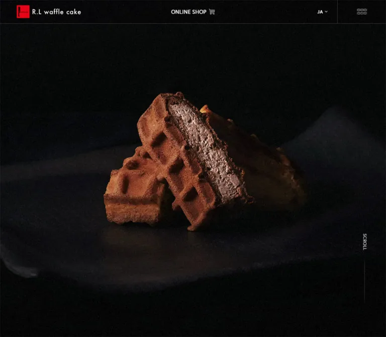
R.L uses an almost black canvas, a small red identity mark, restrained white navigation, and food photography with deep shadows. In the first desktop capture, cream-filled waffle wedges emerge from a dark, fabric-like setting. Their baked surfaces and cut filling supply the detail; the interface leaves a large area of darkness above them. Fine grain is visible across the dark field. A narrow header gives the brand, online shop, language control, and menu equal clarity without competing with the photograph.
The rendered document extends this opening into a long brand homepage: a statement about Japanese waffles, two product families, store information, news, corporate orders, and footer navigation. Computed styles establish large, light Latin headings alongside a Japanese serif statement and smaller sans-serif explanations. Product copy alternates between right and left desktop positions, then uses a consistent inset on mobile.
Visual coverage is uneven. One original desktop capture shows the photograph; the other desktop captures and both mobile captures show the dark field with header and cookie notice. Lower sections have detailed DOM evidence but no supplied screenshots demonstrating their completed appearance. This reference therefore separates visible composition from measured document structure and proposed implementation choices.
閉じる
R.L waffle cake — Style Reference
A dark confectionery showroom where waffle texture carries the first impression.
Website / original URL: rl-waffle.com Final URL: https://rl-waffle.com/ Theme: dark; no theme-switching control was observed. Inspected evidence: October 2, 2026, 02:47:23 JST; supplied retrieval timestamp October 1, 2026, 17:47:23.019 UTC. Viewports: 1440 × 1000 desktop and 390 × 844 mobile, in CSS pixels. Scope: the current Japanese brand homepage, including its first-screen captures, rendered section structure, computed typography and geometry, navigation markup, footer, and cookie notice. Linked pages and the external shop were not inspected.
R.L uses an almost black canvas, a small red identity mark, restrained white navigation, and food photography with deep shadows. In the first desktop capture, cream-filled waffle wedges emerge from a dark, fabric-like setting. Their baked surfaces and cut filling supply the detail; the interface leaves a large area of darkness above them. Fine grain is visible across the dark field. A narrow header gives the brand, online shop, language control, and menu equal clarity without competing with the photograph.
The rendered document extends this opening into a long brand homepage: a statement about Japanese waffles, two product families, store information, news, corporate orders, and footer navigation. Computed styles establish large, light Latin headings alongside a Japanese serif statement and smaller sans-serif explanations. Product copy alternates between right and left desktop positions, then uses a consistent inset on mobile.
Visual coverage is uneven. One original desktop capture shows the photograph; the other desktop captures and both mobile captures show the dark field with header and cookie notice. Lower sections have detailed DOM evidence but no supplied screenshots demonstrating their completed appearance. This reference therefore separates visible composition from measured document structure and proposed implementation choices.
How to Read This Reference
- Measured: values supplied by rendered element rectangles, computed styles, or root custom properties. Dimensions are rounded to two decimals where useful.
- Visually observed: features visible in the original desktop and mobile captures.
- Estimated: dimensions judged from those images, including the logo artwork and cookie container. These were not programmatically sampled.
- Calculated: relationships derived from the supplied measurements. A formula matching two viewports is not proof of the original CSS expression.
- Recommended: reusable implementation choices, accessibility additions, and behavior not demonstrated by the evidence.
- Font-family declarations are known; successful loading of every named font face was not independently verified.
- Positive DOM bounds do not prove visibility. Menu content, duplicated labels, and transparent text need particular care.
Tokens — Colors
Default Palette
| Name | Source value | Source variable | Role and evidence |
|---|---|---|---|
| Near Black | #010101 |
--black |
Measured body background; the primary page canvas |
| White | #ffffff |
--white |
Measured body and heading color; visually used for identity lettering and the cookie surface |
| Soft Gray | #c8c8c8 |
--text |
Measured default color on many navigation and content links |
| Quiet Gray | #666666 |
--gray |
Measured secondary navigation and legal-link color |
| Brand Red | #e60012 |
--red |
Measured active Home-link color; visually corresponds to the red identity accent, although the logo pixels were not sampled |
| Fine Rule | #333333 |
--border |
Declared border token; subdued rules are visible around header regions, but their individual computed border colors were not supplied |
| Stronger Rule | #404040 |
--border2 |
Declared secondary border token; exact component assignment is unverified |
| Banner Charcoal | #171616 |
--bnr |
Declared banner-related token; its use on a particular visible surface was not established |
The interface palette is monochrome with one concentrated red accent. The warm browns and cream tones belong to photography, not to a separate family of UI fills. Preserve that distinction when adding components.
White has two different roles: fine interface detail over black, and the solid cookie-notice surface. That notice is the strongest light shape in the supplied first-screen captures. It should not become a general white-card system throughout the page.
Transparency and Texture
Most sampled sections and links have transparent backgrounds. Their computed rectangles do not establish separate panels. Several paragraphs also report transparent text color. On mobile, many of those paragraphs have a background-position transition, which is consistent with a background-based text treatment; background clipping and the complete reveal mechanism were not supplied.
Do not copy transparent text as a standalone design token. In an adaptation, essential copy should remain readable unless a complete, tested reveal effect is intentionally implemented.
The grain is visually evident, but its source is unknown. It may be part of imagery, a composited layer, or multiple assets. Its opacity, blend mode, and animation cannot be recovered from these captures.
Tokens — Typography
Main Interface and Latin Headings
Measured family declaration: europa, fot-cezanne-pron, sans-serif.
The interface combines compact utility text with very large, light Latin section headings. Body defaults use weight 500; descriptive paragraphs and large product headings use 300. This weight contrast is more important than adding many intermediate text sizes.
Use the supplied family names only when the appropriate font resources and licenses are available. The evidence does not contain font-file URLs or confirm the particular face used for each character.
Japanese Brand Statement
Measured family declaration: fot-matisse-pron, serif.
The brand statement uses weight 500, unusually generous tracking, and a line-height value twice the font size. Its tall, narrow geometry strongly suggests two vertical columns: the desktop box is 176 × 607.20px, with 88px line height; the mobile box is 115.19 × 397.45px, with 57.6px line height.
Vertical composition is a strong layout inference, not a directly captured writing-mode declaration or a verified lower-page screenshot. The Quick Start uses vertical-rl as an explicit reconstruction choice.
Corporate Heading
Measured family declaration: YakuHanMPs, fot-matisse-pron, serif.
This smaller Japanese serif heading echoes the introductory statement inside the corporate-order link. Preserve the supplied stack rather than substituting the main sans-serif everywhere.
Identity Artwork
The visible R.L waffle cake identity should be treated as artwork. Its lettering and red square are not evidence that the ordinary interface font can recreate the logo. The sampled home-link rectangle is an inline element box, not a reliable measurement of the logo image itself.
Type Scale
All values below are measured computed styles. Desktop means 1440 × 1000; mobile means 390 × 844.
| Role | Desktop size / line height | Mobile size / line height | Weight | Tracking |
|---|---|---|---|---|
| Body default | 16 / 28.8px |
14.4 / 25.92px |
500 |
0.4 / 0.36px |
| Product descriptions and news titles | 16 / 28.8px |
14.4 / 25.92px |
300 |
0.4 / 0.36px |
| Introductory section paragraphs | 18 / 32.4px |
15.2 / 27.36px |
300 |
0.4 / 0.36px |
| Main English section headings | 84 / 100.8px |
64 / 76.8px |
300 |
0.84 / 0.64px |
| English product titles | 56 / 67.2px |
48 / 57.6px |
300 |
0.4 / 0.36px |
| Japanese brand statement | 44 / 88px |
28.8 / 57.6px |
500 |
6.6 / 4.32px |
| Corporate-order heading | 24 / 43.2px |
22.4 / 40.32px |
500 |
0.4 / 0.36px |
| Header shop link | 14.4 / 25.92px |
Same | 500 |
0.36px |
| Small product label | 12.48 / 22.464px |
Same | 300 |
0.4 / 0.36px |
| Scroll label | 12 / 21.6px |
Same | 500 |
0.4 / 0.36px |
| Footer primary links | 12.48 / 17.472px |
Same | 500 |
0.4 / 0.36px |
| Footer legal links and cookie privacy link | 12 / 16.8px |
Same | 500 |
0.4 / 0.36px |
The hierarchy does not shrink uniformly. On mobile, a section heading remains 64px while descriptive copy is 14.4–15.2px. Preserve that dramatic scale difference. A single viewport-scaled font rule would not reproduce the measured relationships.
The HTML root is 16px in both snapshots. There is no evidence of the tiny custom root-unit system used by some highly art-directed sites.
Tokens — Spacing & Shapes
Horizontal System
The measured outer gutter is approximately 62px on desktop and 16.79px on mobile. Both correspond to about 4.30556vw.
This gives a useful reconstruction formula:
/* Calculated fit to the two supplied viewports, not recovered source CSS. */
--page-gutter: 4.30556vw;
Do not assume that the original has no minimum, maximum, or additional breakpoints. Only the two supplied widths were inspected.
| Element or relationship | Desktop | Mobile | Evidence |
|---|---|---|---|
| Outer gutter | 62px |
About 16.79px |
Measured |
| Wide inner region | 1316px |
356.44px |
Measured |
| Introductory paragraph text width | 480px |
About 289.28px |
Measured or calculated after paragraph padding |
| Product copy width | 364px |
322.84px |
Measured |
| Product copy left edge | First 874px; second 202px |
Both 33.58px |
Measured |
| English heading to introductory paragraph | 32px |
28.8px |
Calculated from adjacent rectangles |
| Product title to paragraph | 24px |
21.6px |
Calculated |
| Product paragraph to action row | 40px |
32.4px |
Calculated |
| Gap between paired text actions | 16px |
About 7.19px |
Calculated |
| Repeated gap between major sections | 64px |
About 57.59px |
Calculated from section bounds |
The mobile introduction is narrower than the product copy. The product introduction starts near x = 50.36px, while individual product descriptions start near x = 33.58px. Keep this hierarchy of nested widths rather than applying one universal mobile padding.
Controls and Corners
| Element | Desktop | Mobile | Evidence |
|---|---|---|---|
| Standard detail action | 160 × 54.39px |
About 117.02 × 43.19px |
Measured |
| Text-action horizontal padding | 32px |
21.6px |
Measured |
| Text-action radius | 32px |
28.8px |
Measured |
| Circular shop shortcut | 54.39px diameter |
43.19px diameter |
Measured |
| Corporate-order link | Square corners | Square corners | Measured radius 0 |
| Cookie notice | About 639 × 74px |
About 356 × 83px |
Visual estimate |
| Cookie notice radius | About half its height | About 6px |
Visual estimate |
Rounded geometry belongs mainly to actions and the cookie notice. Large sections and the corporate-order link do not inherit the same capsule treatment.
Viewport Height
The supplied root token --vh is 10px on desktop and 8.44px on mobile, numerically equal to one percent of each viewport height. Its complete usage is unknown.
The hero section measures 1000px high on desktop and 717.39px on mobile. The latter is approximately 85% of 844px. This is a measured difference in section geometry, not proof of a particular vh, svh, or JavaScript implementation.
Components
Brand Header
Role: identity, shopping access, language selection, and navigation entry.
The desktop header is 64px high. The red logo square and white wordmark sit at the left gutter. Their combined visible artwork is approximately 178px wide and 36px high, estimated from the capture. The ONLINE SHOP link is genuinely centered: its measured box begins at x = 659.63px and is 120.73px wide in a 1440px viewport. A fine cart icon sits beside the label.
The language affordance appears as JA with a small downward mark. The far-right menu region is 180 × 64px, starting at x = 1260px, with a separating vertical rule. Its visible symbol resembles stacked waffle-grid lines rather than a heavy conventional hamburger. The icon is approximately 38px wide in the desktop image; its asset and exact dimensions were not supplied.
At 390px, the first row remains 64px high. The menu region becomes 60.66px wide. Shopping moves into a second full-width row measuring 46.08px high, producing a total header height of 110.08px. The logo retains approximately the same visible size, while the menu graphic is visibly smaller.
The captures establish top placement, but the evidence does not include the positioning property or a reliable scroll comparison. Fixed or sticky behavior is unverified.
Photographic Hero
Role: establish product desire before explanatory copy.
The first desktop capture shows an edge-to-edge dark photographic stage behind the header. Waffle wedges form a compact, sculptural cluster below the center of the screen. Their visible bounds are approximately x = 455–1055px and y = 320–735px; these are estimates of the subject, not image-element measurements.
A directional highlight brings out the baked grid, rough edges, and filling. Dark folds remain visible around the product, especially along the lower and right areas. There is no visible promotional headline or large conversion button over the photograph.
The desktop scroll affordance occupies a tall, narrow box at approximately x = 1350px, y = 697px, with a vertical SCROLL label and a fine line. Its anchor points to /#lead.
The other original captures show the same dark visual field without the product photograph. This does not establish a carousel, video, fade cycle, canvas renderer, or intentional empty mobile design. The media mechanism and the cause of the missing imagery remain unknown.
Recommended implementation: provide a stable poster image and a deliberate mobile crop. Preserve negative space in the source composition instead of enlarging the waffle until it fills the entire screen.
Cookie Notice
Role: explain cookie use and expose consent and privacy controls.
The notice is the primary light surface in the captured interface. On desktop it is a centered horizontal capsule, approximately x = 400px, y = 862px, 639px wide, and 74px high. Its bottom clearance is about 64px.
Its anatomy is:
- Gray explanatory text with the actual label
このサイトではサービス向上のためCookieを利用します。. - An underlined
プライバシーポリシーlink below the explanation. - A black rounded
許可するaction toward the right. - A small close cross at the far right.
The desktop acceptance control is visually about 125 × 42px. The notice has no visible modal backdrop.
On mobile, the notice becomes a compact rounded rectangle inset about 17px from either side. It begins near y = 704px and leaves approximately 57px below it. The explanation wraps onto two lines, the policy link occupies another line, the black action is about 88 × 36px, and the close cross moves to the upper-right corner.
The measured privacy link uses 12px type with 16.8px line height. Its recorded destination is /wp/privacy-policy/, whereas the footer privacy link points to /privacy-policy/. These are recorded destinations, not verified equivalent pages.
Consent submission, close behavior, storage, persistence, and keyboard handling were not exercised. The visual notice should not be treated as proof of any particular consent implementation.
Brand Introduction
Role: explain the brand's interpretation of Japanese waffles.
The DOM contains the statement エール・エルのワッフルは「日本のワッフル」です, followed by a paragraph describing the brand's history and approach, then links to About and History.
The statement is centered and uses the Japanese serif stack. Its measured proportions strongly support a two-column vertical treatment. The desktop paragraph is a centered 480px region at 18px / 32.4px; the mobile text region is about 289px wide at 15.2px / 27.36px.
The two actions remain beside one another at the measured mobile width. Desktop action widths are approximately 228.06px and 160px; mobile widths are 190.84px and 117.02px. They should retain their differing widths rather than becoming equal-width boxes.
The section has generous measured vertical extent, but its completed visual reveal was not captured. Do not infer illustrations or additional decorative content from the empty space alone.
Section Heading Group
Role: create clear chapters in the long homepage.
The rendered text pairs small Japanese labels with prominent Latin headings: 製品情報 / PRODUCTS, 店舗一覧 / SHOP LIST, and お知らせ / NEWS.
The English heading uses weight 300, 1.2 line height, and 0.01em tracking. SHOP LIST occupies two lines at both measured widths; its height is approximately 201.59px on desktop and 153.59px on mobile.
The complete heading-group rectangles are much taller than the English text itself. For example, the product heading group is 285.61px high on desktop and 238.09px on mobile. Those bounds may include positioning or other content not present in the sampled elements. They are not measurements of a text line box and should not be copied as text padding without further inspection.
Product Feature
Role: introduce the two principal product families and connect editorial detail with shopping.
Each measured feature contains:
- A small Japanese product label.
- A large Latin product name:
waffle cakeorCOROCORO waffle. - A short Japanese description.
- A rounded
詳しく見るlink to the brand's product page. - A separate circular link to the corresponding external-shop category.
Desktop copy is 364px wide. The first block starts at x = 874px; the second starts at x = 202px. This demonstrates alternating copy placement. Complementary media placement is a reasonable reconstruction choice, but the product-row images and their dimensions were not supplied.
On mobile, both copy blocks start at x = 33.58px and are 322.84px wide. The English title remains large at 48px. COROCORO waffle occupies two lines, while waffle cake occupies one in the sampled layout.
The detail and shopping actions are distinct destinations. Preserve them as separate links; do not turn the whole feature into one ambiguous shopping target.
Calculated layout recipe: a desktop container with 62px outer gutters, two equal columns, a 28px column gap, and a centered 364px copy block in each column reproduces the measured 202px and 874px copy positions. This is a reconstruction, not a recovered source grid.
Shop Information
Role: provide access to physical stores and online purchasing.
The section uses the two-line SHOP LIST heading, a centered short paragraph, and paired actions labeled 店舗一覧 and オンラインショップ.
The desktop paragraph is 480px wide. The desktop buttons measure about 160px and 211.66px, separated by 16px. On mobile, the buttons measure about 102.25px and 176.08px, with a gap near 7.19px.
The measured section is taller than its sampled text and actions. The evidence does not establish the appearance of any surrounding media or additional visual layer.
News List
Role: present current updates in a compact editorial list.
The DOM contains three dated items, including October 1, September 28, and August 31, 2026. Each item is a single link containing a year/date group and a Japanese title. The list follows the large NEWS heading and a centered すべて見る action.
Desktop rows span 1316px between the outer gutters and measure approximately 66.27px high. Each has 16px vertical and 112px horizontal padding. Titles begin at x = 314px; the difference from the padded left edge indicates a 140px date allocation.
Mobile rows span the full 390px viewport and use approximately 21.6px vertical and 16.79px horizontal padding. Titles begin at x = 77.44px, leaving about 60.66px after the left padding for the date region. The long middle title wraps to three lines, increasing its row to 120.95px; the shorter rows are 82.34px high.
Keep row height content-driven. The title's measured trailing padding is 84px on desktop and approximately 30.33px on mobile; any icon occupying that space was not documented.
Corporate-Order Link
Role: direct business customers to bulk-order and customized-gift information.
This is one large linked region containing a Japanese serif heading, explanatory copy, and a detail label. The desktop rectangle is 1316 × 224px, with 28px padding and square corners. Its central text region measures 728px wide.
On mobile, the same link becomes a much taller 356.44 × 444.66px region. Its measured padding is approximately 45.5px vertically and 37.92px horizontally. The text region narrows to 280.63px, and the heading changes from 24px to 22.4px.
The declared --bnr color offers a plausible adaptation token, but the sampled anchor background is transparent. Do not claim its exact visible background, illustration, or image arrangement from this evidence.
For implementation, use one outer link with a noninteractive visual detail label inside it. Avoid nesting a second link or button inside that outer anchor.
Navigation Content — DOM Evidence Only
Role: expose the site's main destinations and product shortcuts.
The menu-related DOM includes two product shortcuts, primary site links, company and legal links, social links, and language destinations. It is not visibly open in the supplied captures.
At desktop width, product-link boxes occupy two adjacent 308px columns beginning at x = 62px. Primary navigation occupies 280px columns beginning at x = 762px and x = 1098px. Standard main-link rows have 24px vertical padding, and the Home link computes to Brand Red.
On mobile, main navigation becomes a single 356.44px column. Standard rows are about 74.52px high with 14.4px vertical padding. The product shortcuts appear later in the measured flow as two 178.22px columns. This layout exceeds a single mobile viewport.
These bounds establish responsive markup geometry, not the appearance of an opened overlay. Opening direction, backdrop, scroll locking, close animation, focus behavior, and actual visibility were not verified.
Footer
Role: repeat core routes and provide secondary corporate, legal, and social access.
Desktop primary links form a compact horizontal group near the left gutter, while the shop link sits toward the right. Secondary links use the quieter gray token and smaller type. The rendered footer includes © R.L Inc..
On mobile, primary navigation wraps into centered rows, and the shop link occupies a separate centered row. The footer's measured height increases from approximately 110.69px to 239.30px. Social links remain present in the DOM.
A separate text-empty section precedes the footer. It measures 850px high on desktop and 360px on mobile. Its imagery, purpose, and final appearance are unknown; do not invent a closing montage or campaign banner to fill it.
Tokens — Motion & Interaction
| Treatment | Supplied evidence | What can safely be concluded |
|---|---|---|
| Link color transitions | color 0.6s cubic-bezier(0.115, 0.405, 0.24, 1) on numerous links |
A deliberate 600ms color transition is defined; its triggered endpoints were not observed |
| Section-header transitions | 0.6s cubic-bezier(0.115, 0.405, 0.24, 1) |
A transition is declared; changed properties and activation conditions were not supplied |
| Corporate-link transition | The same 600ms easing | The linked region has a transition definition; no hover result was captured |
| Mobile paragraph treatment | background-position 4s cubic-bezier(0.115, 0.405, 0.24, 1) |
A four-second background-position transition is defined on several text elements |
| Repeated labels | Duplicate label text in many links | Layered text may support an effect; direction, timing, clipping, and accessible output are unknown |
| Hero media | Photograph present in one desktop capture and absent in the others | Multiple captured rendering states exist; no specific media animation is established |
| Scroll prompt | Anchor destination /#lead |
A navigation target exists; smooth scrolling and scroll-linked motion are unverified |
| Sampled CSS animations | animation: none on the supplied elements |
No animation is reported on those exact elements at sampling time; this does not rule out descendants, pseudo-elements, video, canvas, or JavaScript motion |
Many entries report only transition: all, without a nonzero duration in the supplied summary. Do not interpret that as evidence that every element visibly animates.
The collection process waited for loading, sampled stability, and eligible finite animations, with time limits. That improves capture reliability but does not prove that all delayed media, scroll reveals, or application states finished. The dark alternate captures remain a material limitation.
Recommended motion approach: begin with a fully readable static page. Reuse the measured easing for modest color feedback if desired. Add reveal motion only after its start and end states are tested, and provide a reduced-motion path that exposes all essential content immediately. Do not introduce an automatic hero slideshow or parallax effect as if either were observed.
Surfaces
| Layer | Appearance | Evidence and implementation meaning |
|---|---|---|
| Page canvas | Near-black field | Measured body background #010101 |
| Hero media | Dark photographic composition with warm product detail | Visible in the first desktop capture |
| Grain | Fine irregular texture across dark areas | Visually observed; implementation unknown |
| Header | Dark or transparent field with fine separators | Transparent computed background and visible rules; no blur is established |
| Main content | Mostly unboxed regions | Sampled backgrounds are transparent; lower-page visual completion is unverified |
| Detail actions | Rounded or circular geometry | Measured radii and dimensions; exact outline rendering was not sampled |
| Corporate link | Broad square-cornered region | Geometry measured; surface artwork and fill unverified |
| Cookie notice | Solid white capsule or compact rectangle | Directly visible in both viewport sizes |
No soft elevation system is visible in the supplied first-screen controls. Use tonal contrast, thin rules, and spacing before adding shadows. This is not evidence that every unpictured component on the site is shadow-free.
Imagery
The verified photographic direction is intimate and tactile. The waffle is treated as a sculptural object: angular cuts, a visible grid, uneven baked edges, and a substantial filling. Highlights remain concentrated on the product while the surrounding fabric-like setting falls into black.
The composition depends on darkness having enough area to act as a frame. Replacing it with a brightly lit tabletop, colorful ingredient scatter, or a dense collage would change the identity. Likewise, isolating the product onto a perfectly flat black cutout would lose the visible folds and depth of the supplied photograph.
For an adaptation, preserve natural photographic detail and smooth image scaling. The grain is not pixel art, and image-rendering: pixelated would be inappropriate.
Observed Asset References
No original image, video, texture, icon, or font-file URLs were supplied. Only page and link destinations are known.
| Asset role | What is established | What remains unknown |
|---|---|---|
| Brand lockup | Red square and white R.L waffle cake lettering visible at both widths |
File path, format, intrinsic size, and exact construction |
| Hero photograph | Cream-filled waffle wedges on a dark folded setting | File path, original crop, responsive variants, and whether it belongs to a larger media sequence |
| Grain | Visible fine texture | Asset source, compositing method, opacity, and animation |
| Cart and menu symbols | Thin cart drawing and waffle-like menu motif | SVG paths, sprite use, and intrinsic dimensions |
| Lower product media | Product-related links and copy exist | Actual media assets and their rendered appearance |
Use approved original assets when available. CSS can reproduce the structural vocabulary, but it cannot supply the identity carried by the logo and product photography. A replacement asset should be identified as a replacement, not presented as a recovered original file.
Layout & Responsive Behavior
Measured Page Structure
Coordinates below describe the supplied rendered document. They are useful for understanding pacing, not for hardcoding an entire page to fixed heights.
| Region | Desktop top / height | Mobile top / height |
|---|---|---|
| Hero | 0 / 1000px |
0 / 717.39px |
| Brand introduction | 1088 / 1679.55px |
774.98 / 1085.73px |
| Products | 2831.55 / 2135.56px |
1918.31 / 1968.22px |
| Shop information | 5031.11 / 1305.58px |
3944.13 / 837.56px |
| News | 6400.69 / 651.80px |
4839.28 / 632.69px |
| Corporate-order link section | 7180.48 / 224px |
5529.56 / 444.66px |
| Text-empty pre-footer section | 7404.48 / 850px |
6031.81 / 360px |
| Footer | 8279.44 / 110.69px |
6449.41 / 239.30px |
| Document | About 8434.13px total |
About 6769.14px total |
The lower-page hierarchy is supported by DOM content and measurements. It is not a substitute for missing screenshots of these sections. In particular, the mobile DOM places the introductory section within the first viewport's lower edge, but its statement is not visible in the supplied mobile images. Visibility and reveal state must remain separate from layout geometry.
Responsive Changes to Preserve
- The header changes from one row to two; shopping becomes a full-width second row.
- The visible logo stays approximately the same size instead of shrinking in proportion to the viewport.
- Outer gutters contract from
62pxto approximately16.79px. - Major headings remain large:
84pxbecomes64px, while body copy becomes14.4px. - Alternating desktop product-copy positions become a consistent mobile inset.
- The two product-related actions remain separate and adjacent where space allows.
- News titles wrap naturally and determine row height.
- The corporate-order link becomes substantially taller.
- Footer navigation wraps, and shopping receives its own row.
- The cookie notice changes shape and internal arrangement, not merely width.
No breakpoint values were supplied. The Quick Start uses a proposed 64rem breakpoint to distinguish these two treatments. Intermediate widths, landscape phones, zoomed text, browser safe areas, and widths below 390px require additional testing.
Do’s and Don’ts
Do
- Keep the canvas close to
#010101, with photography providing most of the warm color. - Concentrate red in identity and selected navigation states.
- Preserve the first-screen relationship between a small header, broad darkness, and a tactile product subject.
- Use light Latin section headings with a much smaller body scale.
- Retain the separate Japanese serif voice for brand and corporate statements.
- Preserve different widths for introductory copy, product copy, and full-width news rows.
- Give the mobile shop link its own header row.
- Keep product-detail and external-shopping links distinct.
- Reflow the cookie notice into a compact mobile rectangle.
- Label reconstructed layouts and unverified motion explicitly.
Don’t
- Do not convert this brand homepage into a generic sales landing page with an invented offer, countdown, or testimonial grid.
- Do not make the hero's blank captured states the permanent intended design.
- Do not infer a slideshow, video loop, parallax effect, or loading sequence from still images alone.
- Do not invent lower-page photography or an opened-menu appearance.
- Do not turn every section into a white or elevated rounded card.
- Do not replace the identity artwork with ordinary text in the body font.
- Do not shrink all typography using one shared ratio.
- Do not reproduce transparent paragraph text without the complete rendering mechanism.
- Do not display duplicate DOM labels as repeated visible or accessible copy.
- Do not assume that a measured anchor rectangle equals its visible logo or icon dimensions.
Recommended Implementation Additions
These are recommendations for a new implementation, not verified features of the original:
- Provide a stable, responsive hero image before any optional media enhancement. Reserve its dimensions to avoid layout shifts.
- Keep essential paragraphs visible without JavaScript and when reduced motion is requested.
- Give icon-only menu, shopping, social, and close controls clear accessible names.
- Use a real button for opening navigation, with an expanded state and a relationship to the controlled panel. If the panel behaves as a modal, implement focus management and Escape handling.
- Keep decorative duplicated text out of the accessibility tree; expose one meaningful label per control.
- Provide visible keyboard focus with sufficient contrast against both black and white surfaces.
- Increase small mobile hit areas to at least
44pxwithout unnecessarily enlarging their drawn icons. Some measured mobile controls are approximately43.19px, and the cookie action appears smaller. - Implement cookie acceptance, dismissal, and persistence deliberately. A visible close cross alone does not specify consent behavior.
- Test the proposed mobile media crop, intermediate widths, font fallbacks, text zoom, and cookie overlap before treating the layout as complete.
Agent Prompt Guide
Quick Color Reference
- Main canvas:
#010101. - High-emphasis type:
#ffffff. - Default links:
#c8c8c8. - Quiet legal and utility text:
#666666. - Identity and selected-state accent:
#e60012. - Fine and stronger rules:
#333333,#404040. - Optional banner adaptation:
#171616; original component mapping is unverified. - Cookie surface: white with dark text and a black rounded action.
Overall Prompt
“Create a Japanese confectionery brand homepage inspired by the supplied R.L reference. Use an almost black canvas, subtle static grain, a compact red-and-white identity, and a dark product photograph with directional light and generous empty space. Keep a 64px desktop header with a truly centered online-shop link, language control, and a thin waffle-like menu symbol. Structure the page around brand introduction, two product families, stores, news, corporate orders, and footer navigation. Use light 84px Latin section headings, 56px product titles, restrained sans-serif descriptions, and a contrasting Japanese serif statement. At 390px, move shopping into a second header row, use 64px section headings and 48px product titles, and make product copy consistently inset. Treat lower media, menu animation, and hero motion as implementation choices because their appearance was not verified.”
Example Component Prompts
- Header: “Build a dark 64px header with a roughly 178px red-and-white logo at the outer gutter, an independently centered ONLINE SHOP link with a thin cart icon, a JA language affordance, and a ruled menu region at right. At mobile width, retain the first row and place the shop link in a full-width 46px second row.”
- Hero: “Compose cream-filled waffle wedges against a nearly black folded setting. Concentrate light on the baked texture and cut filling, keep substantial darkness above the subject, and avoid overlaying a large headline. Use an approved photograph with a reliable static fallback; do not assume an automatic media sequence.”
- Product feature: “Create a product-copy block with a small Japanese label, light Latin title, short description, pill-shaped detail link, and separate circular shop link. Use 364px copy width on desktop and about 323px at a 390px viewport. Alternate desktop copy placement, then align both mobile blocks to the same inset.”
- News row: “Create a full-row editorial link with a compact year/date column and a flexible Japanese title. At desktop, reserve about 140px for the date after the row padding. On mobile, reduce that allocation to about 61px and let long titles increase the row height.”
- Cookie notice: “Use a centered white capsule near the desktop viewport bottom, with gray explanation, underlined privacy link, black rounded acceptance action, and a close cross. At 390px, switch to a small-radius rectangle with about 17px side insets, wrapped copy, a compact action at right, and close control at the upper-right corner.”
Quick Start
CSS Custom Properties
This is an implementation scaffold, not recovered source CSS. It preserves measured colors, type scales, control proportions, and the two observed header treatments. The gutter formula and desktop product grid are calculated reconstructions. The breakpoint, media crop, outlines, hover endpoint, and accessible hit-area adjustments are recommendations.
Supply approved logo, hero, and icon assets separately. Set --grain-image only when a suitable texture is available. No original asset path is assumed. The CSS leaves text visible and does not attempt to recreate an unverified reveal effect.
Expected structure: .rl-header contains .brand, .header-shop, .language-switch, and .menu-toggle; .hero contains an image with .hero-media; .product-row contains media and .product-copy; .cookie-notice contains .cookie-copy, .cookie-accept, and .cookie-close. Use .product-row--reverse for the second desktop feature. Give the two clauses of .story-title an explicit line break if using the recommended vertical composition.
:root {
  color-scheme: dark;

  /* Measured source palette, exposed through reusable aliases. */
  --color-canvas: #010101;
  --color-white: #ffffff;
  --color-copy: #c8c8c8;
  --color-quiet: #666666;
  --color-accent: #e60012;
  --color-rule: #333333;
  --color-rule-strong: #404040;
  --color-banner: #171616;

  /* Source family declarations; font resources are not included. */
  --font-ui: 'europa', 'fot-cezanne-pron', sans-serif;
  --font-story: 'fot-matisse-pron', serif;
  --font-corporate: 'YakuHanMPs', 'fot-matisse-pron', serif;
  --weight-copy: 300;
  --weight-ui: 500;

  --type-body: 16px;
  --type-reading: 18px;
  --type-chapter: 84px;
  --type-product: 56px;
  --type-story: 44px;
  --type-corporate: 24px;
  --type-utility: 12.48px;
  --tracking-body: 0.4px;
  --leading-copy: 1.8;

  /* Calculated gutter, with a recommended small-screen floor. */
  --gutter: max(16px, 4.30556vw);
  --reading-width: 480px;
  --product-copy-width: 364px;
  --section-gap: 64px;
  --copy-gap: 32px;
  --action-gap: 16px;
  --action-top: 40px;

  --header-row: 64px;
  --menu-width: 180px;
  --control-size: 54.4px;
  --control-padding: 32px;
  --pill-radius: 32px;
  --cookie-bottom: 64px;

  /* Measured timing; hover endpoints below are recommendations. */
  --ease-brand: cubic-bezier(0.115, 0.405, 0.24, 1);
  --motion-color: 600ms;

  /* Optional replacement texture, not an observed asset URL. */
  --grain-image: none;
  --grain-opacity: 0.1;
}

* {
  box-sizing: border-box;
}

body.rl-page {
  margin: 0;
  color: var(--color-white);
  background: var(--color-canvas);
  font-family: var(--font-ui);
  font-size: var(--type-body);
  font-weight: var(--weight-ui);
  line-height: var(--leading-copy);
  letter-spacing: var(--tracking-body);
}

.rl-page button {
  font: inherit;
  letter-spacing: inherit;
  cursor: pointer;
}

.rl-page a {
  color: var(--color-copy);
  transition: color var(--motion-color) var(--ease-brand);
}

.rl-page img {
  display: block;
  max-inline-size: 100%;
}

.wide {
  margin-inline: var(--gutter);
}

/* Absolute positioning is a scaffold choice; sticky behavior is unknown. */
.rl-header {
  position: absolute;
  inset: 0 0 auto;
  z-index: 10;
  display: grid;
  grid-template-columns: minmax(0, 1fr) auto var(--menu-width);
  grid-template-rows: var(--header-row);
  align-items: center;
  border-bottom: 1px solid var(--color-rule);
  font-size: 14.4px;
  letter-spacing: 0.36px;
}

.brand {
  grid-column: 1;
  grid-row: 1;
  inline-size: 178px;
  margin-inline-start: var(--gutter);
}

.header-shop {
  position: absolute;
  inset-block-start: 0;
  inset-inline-start: 50%;
  transform: translateX(-50%);
  display: inline-flex;
  align-items: center;
  justify-content: center;
  gap: 8px;
  block-size: var(--header-row);
  white-space: nowrap;
  text-decoration: none;
}

.language-switch {
  grid-column: 2;
  grid-row: 1;
  padding-inline: 24px;
  border: 0;
  color: var(--color-copy);
  background: transparent;
  font-size: var(--type-utility);
}

.menu-toggle {
  grid-column: 3;
  grid-row: 1;
  display: grid;
  place-items: center;
  block-size: var(--header-row);
  border: 0;
  border-inline-start: 1px solid var(--color-rule);
  color: var(--color-copy);
  background: transparent;
}

.menu-toggle svg {
  inline-size: 38px;
  block-size: auto;
}

.hero {
  position: relative;
  isolation: isolate;
  block-size: 100vh;
  block-size: 100svh;
  overflow: hidden;
  background: var(--color-canvas);
}

.hero-media {
  position: absolute;
  inset: 0;
  inline-size: 100%;
  block-size: 100%;
  object-fit: cover;
  object-position: 50% 50%;
}

.hero::after {
  content: '';
  position: absolute;
  inset: 0;
  pointer-events: none;
  background-image: var(--grain-image);
  opacity: var(--grain-opacity);
}

.hero-scroll {
  position: absolute;
  z-index: 1;
  inset-inline-end: 5.25%;
  inset-block-end: 10%;
  display: flex;
  align-items: center;
  gap: 20px;
  writing-mode: vertical-rl;
  font-size: 12px;
  text-decoration: none;
}

.hero-scroll::after {
  content: '';
  inline-size: 150px;
  block-size: 1px;
  background: var(--color-rule-strong);
}

.chapter {
  margin-block-start: var(--section-gap);
}

.chapter-title {
  margin: 0;
  font-size: var(--type-chapter);
  font-weight: var(--weight-copy);
  line-height: 1.2;
  letter-spacing: 0.01em;
  text-align: center;
}

.story-title {
  /* Vertical composition is inferred from measured geometry. */
  margin-inline: auto;
  writing-mode: vertical-rl;
  text-orientation: upright;
  font-family: var(--font-story);
  font-size: var(--type-story);
  font-weight: var(--weight-ui);
  line-height: 2;
  letter-spacing: 0.15em;
}

.reading-copy {
  inline-size: min(var(--reading-width), calc(100% - 6 * var(--gutter)));
  margin: var(--copy-gap) auto 0;
  color: var(--color-copy);
  font-size: var(--type-reading);
  font-weight: var(--weight-copy);
  line-height: var(--leading-copy);
}

.actions {
  display: flex;
  flex-wrap: wrap;
  align-items: center;
  gap: var(--action-gap);
  margin-block-start: var(--action-top);
}

.actions--center {
  justify-content: center;
}

.pill,
.icon-link {
  display: inline-flex;
  align-items: center;
  justify-content: center;
  min-block-size: max(44px, var(--control-size));
  border: 1px solid var(--color-rule-strong);
  color: var(--color-white);
  background: transparent;
  text-decoration: none;
}

.pill {
  min-inline-size: 160px;
  padding-inline: var(--control-padding);
  border-radius: var(--pill-radius);
  white-space: nowrap;
}

.icon-link {
  inline-size: max(44px, var(--control-size));
  border-radius: 50%;
}

.product-row {
  /* Calculated grid reproduces desktop copy anchors at 1440px. */
  display: grid;
  grid-template-columns: repeat(2, minmax(0, 1fr));
  column-gap: 28px;
  align-items: center;
  margin-inline: var(--gutter);
}

.product-copy {
  inline-size: min(100%, var(--product-copy-width));
  margin-inline: auto;
}

.product-row--reverse .product-copy {
  grid-column: 1;
  grid-row: 1;
}

.product-row--reverse .product-media {
  grid-column: 2;
  grid-row: 1;
}

.product-label {
  margin: 0 0 28px;
  font-size: var(--type-utility);
  font-weight: var(--weight-copy);
}

.product-title {
  margin: 0;
  font-size: var(--type-product);
  font-weight: var(--weight-copy);
  line-height: 1.2;
}

.product-description {
  margin: 24px 0 0;
  color: var(--color-copy);
  font-weight: var(--weight-copy);
}

.news-list {
  margin-inline: var(--gutter);
}

.news-row {
  display: grid;
  grid-template-columns: 140px minmax(0, 1fr);
  align-items: center;
  padding: 16px 112px;
  border-bottom: 1px solid var(--color-rule);
  text-decoration: none;
}

.news-title {
  margin: 0;
  padding-inline-end: 84px;
  font-weight: var(--weight-copy);
}

.corporate-title {
  font-family: var(--font-corporate);
  font-size: var(--type-corporate);
  font-weight: var(--weight-ui);
  line-height: 1.8;
}

.cookie-notice {
  position: fixed;
  z-index: 30;
  inset-inline-start: 50%;
  inset-block-end: calc(var(--cookie-bottom) + env(safe-area-inset-bottom, 0px));
  transform: translateX(-50%);
  display: grid;
  grid-template-columns: minmax(0, 1fr) 124px;
  align-items: center;
  gap: 20px;
  inline-size: min(640px, calc(100% - 2 * var(--gutter)));
  min-block-size: 74px;
  padding: 15px 60px 15px 48px;
  border-radius: 999px;
  color: var(--color-quiet);
  background: var(--color-white);
  color-scheme: light;
  font-size: 12px;
  line-height: 1.4;
}

.cookie-copy p {
  margin: 0;
}

.cookie-copy a {
  display: inline-block;
  color: var(--color-canvas);
  text-underline-offset: 4px;
}

.cookie-accept {
  min-block-size: 44px;
  border: 0;
  border-radius: 999px;
  color: var(--color-white);
  background: var(--color-canvas);
}

.cookie-close {
  position: absolute;
  inset-inline-end: 16px;
  inset-block-start: 50%;
  transform: translateY(-50%);
  display: grid;
  place-items: center;
  inline-size: 44px;
  block-size: 44px;
  padding: 0;
  border: 0;
  color: var(--color-canvas);
  background: transparent;
}

.rl-page :focus-visible {
  outline: 2px solid var(--color-white);
  outline-offset: 4px;
}

.cookie-notice :focus-visible {
  outline-color: var(--color-canvas);
}

@media (hover: hover) {
  .rl-page a:hover {
    color: var(--color-white);
  }

  .cookie-notice a:hover {
    color: var(--color-canvas);
  }
}

/* Proposed breakpoint; the source breakpoint was not supplied. */
@media (max-width: 63.99rem) {
  :root {
    --type-body: 14.4px;
    --type-reading: 15.2px;
    --type-chapter: clamp(44px, 16.4103vw, 64px);
    --type-product: clamp(36px, 12.3077vw, 48px);
    --type-story: 28.8px;
    --type-corporate: 22.4px;
    --tracking-body: 0.36px;
    --section-gap: 57.6px;
    --copy-gap: 28.8px;
    --action-gap: 7.2px;
    --action-top: 32.4px;
    --menu-width: 60.66px;
    --control-size: 43.2px;
    --control-padding: 21.6px;
    --pill-radius: 28.8px;
    --cookie-bottom: 57.6px;
  }

  .rl-header {
    grid-template-rows: 64px 46.08px;
  }

  .header-shop {
    position: static;
    grid-column: 1 / -1;
    grid-row: 2;
    transform: none;
    block-size: 46.08px;
    border-top: 1px solid var(--color-rule);
  }

  .language-switch {
    padding-inline: var(--gutter);
  }

  .menu-toggle svg {
    inline-size: 18px;
  }

  .hero {
    block-size: 85vh;
    block-size: 85svh;
  }

  /* Mobile scroll visibility was not verified; omit it in this scaffold. */
  .hero-scroll {
    display: none;
  }

  .pill {
    min-inline-size: 0;
  }

  .product-row {
    grid-template-columns: minmax(0, 1fr);
    row-gap: 32px;
  }

  .product-copy {
    inline-size: calc(100% - 2 * var(--gutter));
  }

  .product-row--reverse .product-copy,
  .product-row--reverse .product-media {
    grid-column: auto;
    grid-row: auto;
  }

  .product-label {
    margin-block-end: 24px;
  }

  .product-description {
    margin-block-start: 21.6px;
  }

  .news-list {
    margin-inline: 0;
  }

  .news-row {
    grid-template-columns: 60.66px minmax(0, 1fr);
    padding: 21.6px var(--gutter);
  }

  .news-title {
    padding-inline-end: 30.33px;
  }

  .cookie-notice {
    grid-template-columns: minmax(0, 1fr) 88px;
    gap: 16px;
    min-block-size: 83px;
    padding: 14.4px 21.6px 14.4px;
    border-radius: 6px;
  }

  .cookie-close {
    inset-inline-end: 0;
    inset-block-start: 0;
    transform: none;
    inline-size: 24px;
    block-size: 24px;
  }

  /* Invisible extension improves the compact close control's hit area. */
  .cookie-close::before {
    content: '';
    position: absolute;
    inset: -10px;
  }
}

@media (prefers-reduced-motion: reduce) {
  .rl-page *,
  .rl-page *::before,
  .rl-page *::after {
    animation: none !important;
    transition: none !important;
    scroll-behavior: auto !important;
  }
}
The scaffold deliberately uses a 44px minimum for action targets, slightly increasing some measured mobile controls. Cookie geometry is approximate because its container and buttons were measured visually. Keep consent logic, menu state, focus management, and asset loading in separate, tested behavior code.
Do not force the complete page to the supplied document height. The section measurements include media space and rendering states that are not fully explained by the sampled elements.
Tailwind v4 Token Mapping
Optional aliases for a project already using Tailwind v4. This is not evidence that the original site uses Tailwind. Define the custom properties above first.
@theme inline {
  --color-waffle-bg: var(--color-canvas);
  --color-waffle-white: var(--color-white);
  --color-waffle-copy: var(--color-copy);
  --color-waffle-quiet: var(--color-quiet);
  --color-waffle-red: var(--color-accent);
  --color-waffle-rule: var(--color-rule);
  --color-waffle-banner: var(--color-banner);

  --font-brand-ui: var(--font-ui);
  --font-brand-story: var(--font-story);
  --font-brand-corporate: var(--font-corporate);

  --text-brand-body: var(--type-body);
  --text-brand-reading: var(--type-reading);
  --text-brand-chapter: var(--type-chapter);
  --text-brand-product: var(--type-product);
  --text-brand-story: var(--type-story);
  --text-brand-utility: var(--type-utility);

  --spacing-page-gutter: var(--gutter);
  --spacing-section-gap: var(--section-gap);
  --spacing-action-gap: var(--action-gap);
  --radius-brand-pill: var(--pill-radius);
}
Sources & Evidence
- Original and final page: https://rl-waffle.com/. The supplied observation records HTTP
200and the same original and final URL. - Capture time: supplied retrieval timestamp
2026-10-01T17:47:23.019Z, corresponding to October 2, 2026, 02:47:23.019 JST. - Visual evidence: three original desktop captures at
1440 × 1000and two original mobile captures at390 × 844. Only the first desktop capture visibly contains the hero product photograph. - Rendered evidence: homepage text, link destinations, element bounds, selected computed styles, and root custom properties at both viewports. These support the typography, section order, dimensions, and responsive comparisons in this document.
- Recorded navigation targets: the homepage links to About, History, product pages, shop information, news, corporate information, language routes, policies, social profiles, and an external online shop. These destinations were recorded as links; their contents were not independently inspected.
- Interaction evidence: an anchor to
/#lead, menu and language-related markup, and cookie controls are present. No supplied interaction result establishes menu opening, language switching, cookie persistence, hover appearance, focus behavior, or a complete hero-media cycle. - Collection limitations: readiness checks had bounded waits for layout, animation, and image decoding. SharedWorkers and service workers were disabled during collection. These conditions do not establish that delayed content or every media-dependent state completed.
This reference describes the current homepage evidence supplied for these two viewports. Lower-page appearance, undisclosed media assets, opened overlays, intermediate breakpoints, and unexercised interactions remain unverified. Calculated layout recipes and the Quick Start are explicitly reusable adaptations rather than a claim to recover the complete original implementation.
# R.L waffle cake — Style Reference

> A dark confectionery showroom where waffle texture carries the first impression.

**Website / original URL:** [rl-waffle.com](https://rl-waffle.com/)
**Final URL:** [https://rl-waffle.com/](https://rl-waffle.com/)
**Theme:** dark; no theme-switching control was observed.
**Inspected evidence:** October 2, 2026, 02:47:23 JST; supplied retrieval timestamp October 1, 2026, 17:47:23.019 UTC.
**Viewports:** 1440 × 1000 desktop and 390 × 844 mobile, in CSS pixels.
**Scope:** the current Japanese brand homepage, including its first-screen captures, rendered section structure, computed typography and geometry, navigation markup, footer, and cookie notice. Linked pages and the external shop were not inspected.

R.L uses an almost black canvas, a small red identity mark, restrained white navigation, and food photography with deep shadows. In the first desktop capture, cream-filled waffle wedges emerge from a dark, fabric-like setting. Their baked surfaces and cut filling supply the detail; the interface leaves a large area of darkness above them. Fine grain is visible across the dark field. A narrow header gives the brand, online shop, language control, and menu equal clarity without competing with the photograph.

The rendered document extends this opening into a long brand homepage: a statement about Japanese waffles, two product families, store information, news, corporate orders, and footer navigation. Computed styles establish large, light Latin headings alongside a Japanese serif statement and smaller sans-serif explanations. Product copy alternates between right and left desktop positions, then uses a consistent inset on mobile.

Visual coverage is uneven. One original desktop capture shows the photograph; the other desktop captures and both mobile captures show the dark field with header and cookie notice. Lower sections have detailed DOM evidence but no supplied screenshots demonstrating their completed appearance. This reference therefore separates visible composition from measured document structure and proposed implementation choices.
閉じる
# R.L waffle cake — Style Reference

> A dark confectionery showroom where waffle texture carries the first impression.

**Website / original URL:** [rl-waffle.com](https://rl-waffle.com/)
**Final URL:** [https://rl-waffle.com/](https://rl-waffle.com/)
**Theme:** dark; no theme-switching control was observed.
**Inspected evidence:** October 2, 2026, 02:47:23 JST; supplied retrieval timestamp October 1, 2026, 17:47:23.019 UTC.
**Viewports:** 1440 × 1000 desktop and 390 × 844 mobile, in CSS pixels.
**Scope:** the current Japanese brand homepage, including its first-screen captures, rendered section structure, computed typography and geometry, navigation markup, footer, and cookie notice. Linked pages and the external shop were not inspected.

R.L uses an almost black canvas, a small red identity mark, restrained white navigation, and food photography with deep shadows. In the first desktop capture, cream-filled waffle wedges emerge from a dark, fabric-like setting. Their baked surfaces and cut filling supply the detail; the interface leaves a large area of darkness above them. Fine grain is visible across the dark field. A narrow header gives the brand, online shop, language control, and menu equal clarity without competing with the photograph.

The rendered document extends this opening into a long brand homepage: a statement about Japanese waffles, two product families, store information, news, corporate orders, and footer navigation. Computed styles establish large, light Latin headings alongside a Japanese serif statement and smaller sans-serif explanations. Product copy alternates between right and left desktop positions, then uses a consistent inset on mobile.

Visual coverage is uneven. One original desktop capture shows the photograph; the other desktop captures and both mobile captures show the dark field with header and cookie notice. Lower sections have detailed DOM evidence but no supplied screenshots demonstrating their completed appearance. This reference therefore separates visible composition from measured document structure and proposed implementation choices.

## How to Read This Reference

- **Measured:** values supplied by rendered element rectangles, computed styles, or root custom properties. Dimensions are rounded to two decimals where useful.
- **Visually observed:** features visible in the original desktop and mobile captures.
- **Estimated:** dimensions judged from those images, including the logo artwork and cookie container. These were not programmatically sampled.
- **Calculated:** relationships derived from the supplied measurements. A formula matching two viewports is not proof of the original CSS expression.
- **Recommended:** reusable implementation choices, accessibility additions, and behavior not demonstrated by the evidence.
- Font-family declarations are known; successful loading of every named font face was not independently verified.
- Positive DOM bounds do not prove visibility. Menu content, duplicated labels, and transparent text need particular care.

## Tokens — Colors

### Default Palette

| Name | Source value | Source variable | Role and evidence |
| --- | --- | --- | --- |
| Near Black | `#010101` | `--black` | Measured body background; the primary page canvas |
| White | `#ffffff` | `--white` | Measured body and heading color; visually used for identity lettering and the cookie surface |
| Soft Gray | `#c8c8c8` | `--text` | Measured default color on many navigation and content links |
| Quiet Gray | `#666666` | `--gray` | Measured secondary navigation and legal-link color |
| Brand Red | `#e60012` | `--red` | Measured active Home-link color; visually corresponds to the red identity accent, although the logo pixels were not sampled |
| Fine Rule | `#333333` | `--border` | Declared border token; subdued rules are visible around header regions, but their individual computed border colors were not supplied |
| Stronger Rule | `#404040` | `--border2` | Declared secondary border token; exact component assignment is unverified |
| Banner Charcoal | `#171616` | `--bnr` | Declared banner-related token; its use on a particular visible surface was not established |

The interface palette is monochrome with one concentrated red accent. The warm browns and cream tones belong to photography, not to a separate family of UI fills. Preserve that distinction when adding components.

White has two different roles: fine interface detail over black, and the solid cookie-notice surface. That notice is the strongest light shape in the supplied first-screen captures. It should not become a general white-card system throughout the page.

### Transparency and Texture

Most sampled sections and links have transparent backgrounds. Their computed rectangles do not establish separate panels. Several paragraphs also report transparent text color. On mobile, many of those paragraphs have a `background-position` transition, which is consistent with a background-based text treatment; background clipping and the complete reveal mechanism were not supplied.

Do not copy transparent text as a standalone design token. In an adaptation, essential copy should remain readable unless a complete, tested reveal effect is intentionally implemented.

The grain is visually evident, but its source is unknown. It may be part of imagery, a composited layer, or multiple assets. Its opacity, blend mode, and animation cannot be recovered from these captures.

## Tokens — Typography

### Main Interface and Latin Headings

**Measured family declaration:** `europa, fot-cezanne-pron, sans-serif`.

The interface combines compact utility text with very large, light Latin section headings. Body defaults use weight `500`; descriptive paragraphs and large product headings use `300`. This weight contrast is more important than adding many intermediate text sizes.

Use the supplied family names only when the appropriate font resources and licenses are available. The evidence does not contain font-file URLs or confirm the particular face used for each character.

### Japanese Brand Statement

**Measured family declaration:** `fot-matisse-pron, serif`.

The brand statement uses weight `500`, unusually generous tracking, and a line-height value twice the font size. Its tall, narrow geometry strongly suggests two vertical columns: the desktop box is `176 × 607.20px`, with `88px` line height; the mobile box is `115.19 × 397.45px`, with `57.6px` line height.

Vertical composition is a strong layout inference, not a directly captured `writing-mode` declaration or a verified lower-page screenshot. The Quick Start uses `vertical-rl` as an explicit reconstruction choice.

### Corporate Heading

**Measured family declaration:** `YakuHanMPs, fot-matisse-pron, serif`.

This smaller Japanese serif heading echoes the introductory statement inside the corporate-order link. Preserve the supplied stack rather than substituting the main sans-serif everywhere.

### Identity Artwork

The visible `R.L waffle cake` identity should be treated as artwork. Its lettering and red square are not evidence that the ordinary interface font can recreate the logo. The sampled home-link rectangle is an inline element box, not a reliable measurement of the logo image itself.

### Type Scale

All values below are measured computed styles. Desktop means 1440 × 1000; mobile means 390 × 844.

| Role | Desktop size / line height | Mobile size / line height | Weight | Tracking |
| --- | --- | --- | --- | --- |
| Body default | `16 / 28.8px` | `14.4 / 25.92px` | `500` | `0.4 / 0.36px` |
| Product descriptions and news titles | `16 / 28.8px` | `14.4 / 25.92px` | `300` | `0.4 / 0.36px` |
| Introductory section paragraphs | `18 / 32.4px` | `15.2 / 27.36px` | `300` | `0.4 / 0.36px` |
| Main English section headings | `84 / 100.8px` | `64 / 76.8px` | `300` | `0.84 / 0.64px` |
| English product titles | `56 / 67.2px` | `48 / 57.6px` | `300` | `0.4 / 0.36px` |
| Japanese brand statement | `44 / 88px` | `28.8 / 57.6px` | `500` | `6.6 / 4.32px` |
| Corporate-order heading | `24 / 43.2px` | `22.4 / 40.32px` | `500` | `0.4 / 0.36px` |
| Header shop link | `14.4 / 25.92px` | Same | `500` | `0.36px` |
| Small product label | `12.48 / 22.464px` | Same | `300` | `0.4 / 0.36px` |
| Scroll label | `12 / 21.6px` | Same | `500` | `0.4 / 0.36px` |
| Footer primary links | `12.48 / 17.472px` | Same | `500` | `0.4 / 0.36px` |
| Footer legal links and cookie privacy link | `12 / 16.8px` | Same | `500` | `0.4 / 0.36px` |

The hierarchy does not shrink uniformly. On mobile, a section heading remains `64px` while descriptive copy is `14.4–15.2px`. Preserve that dramatic scale difference. A single viewport-scaled font rule would not reproduce the measured relationships.

The HTML root is `16px` in both snapshots. There is no evidence of the tiny custom root-unit system used by some highly art-directed sites.

## Tokens — Spacing & Shapes

### Horizontal System

The measured outer gutter is approximately `62px` on desktop and `16.79px` on mobile. Both correspond to about `4.30556vw`.

This gives a useful reconstruction formula:

```css
/* Calculated fit to the two supplied viewports, not recovered source CSS. */
--page-gutter: 4.30556vw;
```

Do not assume that the original has no minimum, maximum, or additional breakpoints. Only the two supplied widths were inspected.

| Element or relationship | Desktop | Mobile | Evidence |
| --- | --- | --- | --- |
| Outer gutter | `62px` | About `16.79px` | Measured |
| Wide inner region | `1316px` | `356.44px` | Measured |
| Introductory paragraph text width | `480px` | About `289.28px` | Measured or calculated after paragraph padding |
| Product copy width | `364px` | `322.84px` | Measured |
| Product copy left edge | First `874px`; second `202px` | Both `33.58px` | Measured |
| English heading to introductory paragraph | `32px` | `28.8px` | Calculated from adjacent rectangles |
| Product title to paragraph | `24px` | `21.6px` | Calculated |
| Product paragraph to action row | `40px` | `32.4px` | Calculated |
| Gap between paired text actions | `16px` | About `7.19px` | Calculated |
| Repeated gap between major sections | `64px` | About `57.59px` | Calculated from section bounds |

The mobile introduction is narrower than the product copy. The product introduction starts near `x = 50.36px`, while individual product descriptions start near `x = 33.58px`. Keep this hierarchy of nested widths rather than applying one universal mobile padding.

### Controls and Corners

| Element | Desktop | Mobile | Evidence |
| --- | --- | --- | --- |
| Standard detail action | `160 × 54.39px` | About `117.02 × 43.19px` | Measured |
| Text-action horizontal padding | `32px` | `21.6px` | Measured |
| Text-action radius | `32px` | `28.8px` | Measured |
| Circular shop shortcut | `54.39px` diameter | `43.19px` diameter | Measured |
| Corporate-order link | Square corners | Square corners | Measured radius `0` |
| Cookie notice | About `639 × 74px` | About `356 × 83px` | Visual estimate |
| Cookie notice radius | About half its height | About `6px` | Visual estimate |

Rounded geometry belongs mainly to actions and the cookie notice. Large sections and the corporate-order link do not inherit the same capsule treatment.

### Viewport Height

The supplied root token `--vh` is `10px` on desktop and `8.44px` on mobile, numerically equal to one percent of each viewport height. Its complete usage is unknown.

The hero section measures `1000px` high on desktop and `717.39px` on mobile. The latter is approximately `85%` of `844px`. This is a measured difference in section geometry, not proof of a particular `vh`, `svh`, or JavaScript implementation.

## Components

### Brand Header

**Role:** identity, shopping access, language selection, and navigation entry.

The desktop header is `64px` high. The red logo square and white wordmark sit at the left gutter. Their combined visible artwork is approximately `178px` wide and `36px` high, estimated from the capture. The `ONLINE SHOP` link is genuinely centered: its measured box begins at `x = 659.63px` and is `120.73px` wide in a `1440px` viewport. A fine cart icon sits beside the label.

The language affordance appears as `JA` with a small downward mark. The far-right menu region is `180 × 64px`, starting at `x = 1260px`, with a separating vertical rule. Its visible symbol resembles stacked waffle-grid lines rather than a heavy conventional hamburger. The icon is approximately `38px` wide in the desktop image; its asset and exact dimensions were not supplied.

At 390px, the first row remains `64px` high. The menu region becomes `60.66px` wide. Shopping moves into a second full-width row measuring `46.08px` high, producing a total header height of `110.08px`. The logo retains approximately the same visible size, while the menu graphic is visibly smaller.

The captures establish top placement, but the evidence does not include the positioning property or a reliable scroll comparison. Fixed or sticky behavior is unverified.

### Photographic Hero

**Role:** establish product desire before explanatory copy.

The first desktop capture shows an edge-to-edge dark photographic stage behind the header. Waffle wedges form a compact, sculptural cluster below the center of the screen. Their visible bounds are approximately `x = 455–1055px` and `y = 320–735px`; these are estimates of the subject, not image-element measurements.

A directional highlight brings out the baked grid, rough edges, and filling. Dark folds remain visible around the product, especially along the lower and right areas. There is no visible promotional headline or large conversion button over the photograph.

The desktop scroll affordance occupies a tall, narrow box at approximately `x = 1350px`, `y = 697px`, with a vertical `SCROLL` label and a fine line. Its anchor points to `/#lead`.

The other original captures show the same dark visual field without the product photograph. This does not establish a carousel, video, fade cycle, canvas renderer, or intentional empty mobile design. The media mechanism and the cause of the missing imagery remain unknown.

**Recommended implementation:** provide a stable poster image and a deliberate mobile crop. Preserve negative space in the source composition instead of enlarging the waffle until it fills the entire screen.

### Cookie Notice

**Role:** explain cookie use and expose consent and privacy controls.

The notice is the primary light surface in the captured interface. On desktop it is a centered horizontal capsule, approximately `x = 400px`, `y = 862px`, `639px` wide, and `74px` high. Its bottom clearance is about `64px`.

Its anatomy is:

1. Gray explanatory text with the actual label `このサイトではサービス向上のためCookieを利用します。`.
2. An underlined `プライバシーポリシー` link below the explanation.
3. A black rounded `許可する` action toward the right.
4. A small close cross at the far right.

The desktop acceptance control is visually about `125 × 42px`. The notice has no visible modal backdrop.

On mobile, the notice becomes a compact rounded rectangle inset about `17px` from either side. It begins near `y = 704px` and leaves approximately `57px` below it. The explanation wraps onto two lines, the policy link occupies another line, the black action is about `88 × 36px`, and the close cross moves to the upper-right corner.

The measured privacy link uses `12px` type with `16.8px` line height. Its recorded destination is `/wp/privacy-policy/`, whereas the footer privacy link points to `/privacy-policy/`. These are recorded destinations, not verified equivalent pages.

Consent submission, close behavior, storage, persistence, and keyboard handling were not exercised. The visual notice should not be treated as proof of any particular consent implementation.

### Brand Introduction

**Role:** explain the brand's interpretation of Japanese waffles.

The DOM contains the statement `エール・エルのワッフルは「日本のワッフル」です`, followed by a paragraph describing the brand's history and approach, then links to About and History.

The statement is centered and uses the Japanese serif stack. Its measured proportions strongly support a two-column vertical treatment. The desktop paragraph is a centered `480px` region at `18px / 32.4px`; the mobile text region is about `289px` wide at `15.2px / 27.36px`.

The two actions remain beside one another at the measured mobile width. Desktop action widths are approximately `228.06px` and `160px`; mobile widths are `190.84px` and `117.02px`. They should retain their differing widths rather than becoming equal-width boxes.

The section has generous measured vertical extent, but its completed visual reveal was not captured. Do not infer illustrations or additional decorative content from the empty space alone.

### Section Heading Group

**Role:** create clear chapters in the long homepage.

The rendered text pairs small Japanese labels with prominent Latin headings: `製品情報` / `PRODUCTS`, `店舗一覧` / `SHOP LIST`, and `お知らせ` / `NEWS`.

The English heading uses weight `300`, `1.2` line height, and `0.01em` tracking. `SHOP LIST` occupies two lines at both measured widths; its height is approximately `201.59px` on desktop and `153.59px` on mobile.

The complete heading-group rectangles are much taller than the English text itself. For example, the product heading group is `285.61px` high on desktop and `238.09px` on mobile. Those bounds may include positioning or other content not present in the sampled elements. They are not measurements of a text line box and should not be copied as text padding without further inspection.

### Product Feature

**Role:** introduce the two principal product families and connect editorial detail with shopping.

Each measured feature contains:

- A small Japanese product label.
- A large Latin product name: `waffle cake` or `COROCORO waffle`.
- A short Japanese description.
- A rounded `詳しく見る` link to the brand's product page.
- A separate circular link to the corresponding external-shop category.

Desktop copy is `364px` wide. The first block starts at `x = 874px`; the second starts at `x = 202px`. This demonstrates alternating copy placement. Complementary media placement is a reasonable reconstruction choice, but the product-row images and their dimensions were not supplied.

On mobile, both copy blocks start at `x = 33.58px` and are `322.84px` wide. The English title remains large at `48px`. `COROCORO waffle` occupies two lines, while `waffle cake` occupies one in the sampled layout.

The detail and shopping actions are distinct destinations. Preserve them as separate links; do not turn the whole feature into one ambiguous shopping target.

**Calculated layout recipe:** a desktop container with `62px` outer gutters, two equal columns, a `28px` column gap, and a centered `364px` copy block in each column reproduces the measured `202px` and `874px` copy positions. This is a reconstruction, not a recovered source grid.

### Shop Information

**Role:** provide access to physical stores and online purchasing.

The section uses the two-line `SHOP LIST` heading, a centered short paragraph, and paired actions labeled `店舗一覧` and `オンラインショップ`.

The desktop paragraph is `480px` wide. The desktop buttons measure about `160px` and `211.66px`, separated by `16px`. On mobile, the buttons measure about `102.25px` and `176.08px`, with a gap near `7.19px`.

The measured section is taller than its sampled text and actions. The evidence does not establish the appearance of any surrounding media or additional visual layer.

### News List

**Role:** present current updates in a compact editorial list.

The DOM contains three dated items, including October 1, September 28, and August 31, 2026. Each item is a single link containing a year/date group and a Japanese title. The list follows the large `NEWS` heading and a centered `すべて見る` action.

Desktop rows span `1316px` between the outer gutters and measure approximately `66.27px` high. Each has `16px` vertical and `112px` horizontal padding. Titles begin at `x = 314px`; the difference from the padded left edge indicates a `140px` date allocation.

Mobile rows span the full `390px` viewport and use approximately `21.6px` vertical and `16.79px` horizontal padding. Titles begin at `x = 77.44px`, leaving about `60.66px` after the left padding for the date region. The long middle title wraps to three lines, increasing its row to `120.95px`; the shorter rows are `82.34px` high.

Keep row height content-driven. The title's measured trailing padding is `84px` on desktop and approximately `30.33px` on mobile; any icon occupying that space was not documented.

### Corporate-Order Link

**Role:** direct business customers to bulk-order and customized-gift information.

This is one large linked region containing a Japanese serif heading, explanatory copy, and a detail label. The desktop rectangle is `1316 × 224px`, with `28px` padding and square corners. Its central text region measures `728px` wide.

On mobile, the same link becomes a much taller `356.44 × 444.66px` region. Its measured padding is approximately `45.5px` vertically and `37.92px` horizontally. The text region narrows to `280.63px`, and the heading changes from `24px` to `22.4px`.

The declared `--bnr` color offers a plausible adaptation token, but the sampled anchor background is transparent. Do not claim its exact visible background, illustration, or image arrangement from this evidence.

For implementation, use one outer link with a noninteractive visual detail label inside it. Avoid nesting a second link or button inside that outer anchor.

### Navigation Content — DOM Evidence Only

**Role:** expose the site's main destinations and product shortcuts.

The menu-related DOM includes two product shortcuts, primary site links, company and legal links, social links, and language destinations. It is not visibly open in the supplied captures.

At desktop width, product-link boxes occupy two adjacent `308px` columns beginning at `x = 62px`. Primary navigation occupies `280px` columns beginning at `x = 762px` and `x = 1098px`. Standard main-link rows have `24px` vertical padding, and the Home link computes to Brand Red.

On mobile, main navigation becomes a single `356.44px` column. Standard rows are about `74.52px` high with `14.4px` vertical padding. The product shortcuts appear later in the measured flow as two `178.22px` columns. This layout exceeds a single mobile viewport.

These bounds establish responsive markup geometry, not the appearance of an opened overlay. Opening direction, backdrop, scroll locking, close animation, focus behavior, and actual visibility were not verified.

### Footer

**Role:** repeat core routes and provide secondary corporate, legal, and social access.

Desktop primary links form a compact horizontal group near the left gutter, while the shop link sits toward the right. Secondary links use the quieter gray token and smaller type. The rendered footer includes `© R.L Inc.`.

On mobile, primary navigation wraps into centered rows, and the shop link occupies a separate centered row. The footer's measured height increases from approximately `110.69px` to `239.30px`. Social links remain present in the DOM.

A separate text-empty section precedes the footer. It measures `850px` high on desktop and `360px` on mobile. Its imagery, purpose, and final appearance are unknown; do not invent a closing montage or campaign banner to fill it.

## Tokens — Motion & Interaction

| Treatment | Supplied evidence | What can safely be concluded |
| --- | --- | --- |
| Link color transitions | `color 0.6s cubic-bezier(0.115, 0.405, 0.24, 1)` on numerous links | A deliberate 600ms color transition is defined; its triggered endpoints were not observed |
| Section-header transitions | `0.6s cubic-bezier(0.115, 0.405, 0.24, 1)` | A transition is declared; changed properties and activation conditions were not supplied |
| Corporate-link transition | The same 600ms easing | The linked region has a transition definition; no hover result was captured |
| Mobile paragraph treatment | `background-position 4s cubic-bezier(0.115, 0.405, 0.24, 1)` | A four-second background-position transition is defined on several text elements |
| Repeated labels | Duplicate label text in many links | Layered text may support an effect; direction, timing, clipping, and accessible output are unknown |
| Hero media | Photograph present in one desktop capture and absent in the others | Multiple captured rendering states exist; no specific media animation is established |
| Scroll prompt | Anchor destination `/#lead` | A navigation target exists; smooth scrolling and scroll-linked motion are unverified |
| Sampled CSS animations | `animation: none` on the supplied elements | No animation is reported on those exact elements at sampling time; this does not rule out descendants, pseudo-elements, video, canvas, or JavaScript motion |

Many entries report only `transition: all`, without a nonzero duration in the supplied summary. Do not interpret that as evidence that every element visibly animates.

The collection process waited for loading, sampled stability, and eligible finite animations, with time limits. That improves capture reliability but does not prove that all delayed media, scroll reveals, or application states finished. The dark alternate captures remain a material limitation.

**Recommended motion approach:** begin with a fully readable static page. Reuse the measured easing for modest color feedback if desired. Add reveal motion only after its start and end states are tested, and provide a reduced-motion path that exposes all essential content immediately. Do not introduce an automatic hero slideshow or parallax effect as if either were observed.

## Surfaces

| Layer | Appearance | Evidence and implementation meaning |
| --- | --- | --- |
| Page canvas | Near-black field | Measured body background `#010101` |
| Hero media | Dark photographic composition with warm product detail | Visible in the first desktop capture |
| Grain | Fine irregular texture across dark areas | Visually observed; implementation unknown |
| Header | Dark or transparent field with fine separators | Transparent computed background and visible rules; no blur is established |
| Main content | Mostly unboxed regions | Sampled backgrounds are transparent; lower-page visual completion is unverified |
| Detail actions | Rounded or circular geometry | Measured radii and dimensions; exact outline rendering was not sampled |
| Corporate link | Broad square-cornered region | Geometry measured; surface artwork and fill unverified |
| Cookie notice | Solid white capsule or compact rectangle | Directly visible in both viewport sizes |

No soft elevation system is visible in the supplied first-screen controls. Use tonal contrast, thin rules, and spacing before adding shadows. This is not evidence that every unpictured component on the site is shadow-free.

## Imagery

The verified photographic direction is intimate and tactile. The waffle is treated as a sculptural object: angular cuts, a visible grid, uneven baked edges, and a substantial filling. Highlights remain concentrated on the product while the surrounding fabric-like setting falls into black.

The composition depends on darkness having enough area to act as a frame. Replacing it with a brightly lit tabletop, colorful ingredient scatter, or a dense collage would change the identity. Likewise, isolating the product onto a perfectly flat black cutout would lose the visible folds and depth of the supplied photograph.

For an adaptation, preserve natural photographic detail and smooth image scaling. The grain is not pixel art, and `image-rendering: pixelated` would be inappropriate.

### Observed Asset References

No original image, video, texture, icon, or font-file URLs were supplied. Only page and link destinations are known.

| Asset role | What is established | What remains unknown |
| --- | --- | --- |
| Brand lockup | Red square and white `R.L waffle cake` lettering visible at both widths | File path, format, intrinsic size, and exact construction |
| Hero photograph | Cream-filled waffle wedges on a dark folded setting | File path, original crop, responsive variants, and whether it belongs to a larger media sequence |
| Grain | Visible fine texture | Asset source, compositing method, opacity, and animation |
| Cart and menu symbols | Thin cart drawing and waffle-like menu motif | SVG paths, sprite use, and intrinsic dimensions |
| Lower product media | Product-related links and copy exist | Actual media assets and their rendered appearance |

Use approved original assets when available. CSS can reproduce the structural vocabulary, but it cannot supply the identity carried by the logo and product photography. A replacement asset should be identified as a replacement, not presented as a recovered original file.

## Layout & Responsive Behavior

### Measured Page Structure

Coordinates below describe the supplied rendered document. They are useful for understanding pacing, not for hardcoding an entire page to fixed heights.

| Region | Desktop top / height | Mobile top / height |
| --- | --- | --- |
| Hero | `0 / 1000px` | `0 / 717.39px` |
| Brand introduction | `1088 / 1679.55px` | `774.98 / 1085.73px` |
| Products | `2831.55 / 2135.56px` | `1918.31 / 1968.22px` |
| Shop information | `5031.11 / 1305.58px` | `3944.13 / 837.56px` |
| News | `6400.69 / 651.80px` | `4839.28 / 632.69px` |
| Corporate-order link section | `7180.48 / 224px` | `5529.56 / 444.66px` |
| Text-empty pre-footer section | `7404.48 / 850px` | `6031.81 / 360px` |
| Footer | `8279.44 / 110.69px` | `6449.41 / 239.30px` |
| Document | About `8434.13px` total | About `6769.14px` total |

The lower-page hierarchy is supported by DOM content and measurements. It is not a substitute for missing screenshots of these sections. In particular, the mobile DOM places the introductory section within the first viewport's lower edge, but its statement is not visible in the supplied mobile images. Visibility and reveal state must remain separate from layout geometry.

### Responsive Changes to Preserve

- The header changes from one row to two; shopping becomes a full-width second row.
- The visible logo stays approximately the same size instead of shrinking in proportion to the viewport.
- Outer gutters contract from `62px` to approximately `16.79px`.
- Major headings remain large: `84px` becomes `64px`, while body copy becomes `14.4px`.
- Alternating desktop product-copy positions become a consistent mobile inset.
- The two product-related actions remain separate and adjacent where space allows.
- News titles wrap naturally and determine row height.
- The corporate-order link becomes substantially taller.
- Footer navigation wraps, and shopping receives its own row.
- The cookie notice changes shape and internal arrangement, not merely width.

No breakpoint values were supplied. The Quick Start uses a proposed `64rem` breakpoint to distinguish these two treatments. Intermediate widths, landscape phones, zoomed text, browser safe areas, and widths below 390px require additional testing.

## Do’s and Don’ts

### Do

- Keep the canvas close to `#010101`, with photography providing most of the warm color.
- Concentrate red in identity and selected navigation states.
- Preserve the first-screen relationship between a small header, broad darkness, and a tactile product subject.
- Use light Latin section headings with a much smaller body scale.
- Retain the separate Japanese serif voice for brand and corporate statements.
- Preserve different widths for introductory copy, product copy, and full-width news rows.
- Give the mobile shop link its own header row.
- Keep product-detail and external-shopping links distinct.
- Reflow the cookie notice into a compact mobile rectangle.
- Label reconstructed layouts and unverified motion explicitly.

### Don’t

- Do not convert this brand homepage into a generic sales landing page with an invented offer, countdown, or testimonial grid.
- Do not make the hero's blank captured states the permanent intended design.
- Do not infer a slideshow, video loop, parallax effect, or loading sequence from still images alone.
- Do not invent lower-page photography or an opened-menu appearance.
- Do not turn every section into a white or elevated rounded card.
- Do not replace the identity artwork with ordinary text in the body font.
- Do not shrink all typography using one shared ratio.
- Do not reproduce transparent paragraph text without the complete rendering mechanism.
- Do not display duplicate DOM labels as repeated visible or accessible copy.
- Do not assume that a measured anchor rectangle equals its visible logo or icon dimensions.

## Recommended Implementation Additions

These are recommendations for a new implementation, not verified features of the original:

- Provide a stable, responsive hero image before any optional media enhancement. Reserve its dimensions to avoid layout shifts.
- Keep essential paragraphs visible without JavaScript and when reduced motion is requested.
- Give icon-only menu, shopping, social, and close controls clear accessible names.
- Use a real button for opening navigation, with an expanded state and a relationship to the controlled panel. If the panel behaves as a modal, implement focus management and Escape handling.
- Keep decorative duplicated text out of the accessibility tree; expose one meaningful label per control.
- Provide visible keyboard focus with sufficient contrast against both black and white surfaces.
- Increase small mobile hit areas to at least `44px` without unnecessarily enlarging their drawn icons. Some measured mobile controls are approximately `43.19px`, and the cookie action appears smaller.
- Implement cookie acceptance, dismissal, and persistence deliberately. A visible close cross alone does not specify consent behavior.
- Test the proposed mobile media crop, intermediate widths, font fallbacks, text zoom, and cookie overlap before treating the layout as complete.

## Agent Prompt Guide

### Quick Color Reference

- Main canvas: `#010101`.
- High-emphasis type: `#ffffff`.
- Default links: `#c8c8c8`.
- Quiet legal and utility text: `#666666`.
- Identity and selected-state accent: `#e60012`.
- Fine and stronger rules: `#333333`, `#404040`.
- Optional banner adaptation: `#171616`; original component mapping is unverified.
- Cookie surface: white with dark text and a black rounded action.

### Overall Prompt

“Create a Japanese confectionery brand homepage inspired by the supplied R.L reference. Use an almost black canvas, subtle static grain, a compact red-and-white identity, and a dark product photograph with directional light and generous empty space. Keep a 64px desktop header with a truly centered online-shop link, language control, and a thin waffle-like menu symbol. Structure the page around brand introduction, two product families, stores, news, corporate orders, and footer navigation. Use light 84px Latin section headings, 56px product titles, restrained sans-serif descriptions, and a contrasting Japanese serif statement. At 390px, move shopping into a second header row, use 64px section headings and 48px product titles, and make product copy consistently inset. Treat lower media, menu animation, and hero motion as implementation choices because their appearance was not verified.”

### Example Component Prompts

1. **Header:** “Build a dark 64px header with a roughly 178px red-and-white logo at the outer gutter, an independently centered ONLINE SHOP link with a thin cart icon, a JA language affordance, and a ruled menu region at right. At mobile width, retain the first row and place the shop link in a full-width 46px second row.”
2. **Hero:** “Compose cream-filled waffle wedges against a nearly black folded setting. Concentrate light on the baked texture and cut filling, keep substantial darkness above the subject, and avoid overlaying a large headline. Use an approved photograph with a reliable static fallback; do not assume an automatic media sequence.”
3. **Product feature:** “Create a product-copy block with a small Japanese label, light Latin title, short description, pill-shaped detail link, and separate circular shop link. Use 364px copy width on desktop and about 323px at a 390px viewport. Alternate desktop copy placement, then align both mobile blocks to the same inset.”
4. **News row:** “Create a full-row editorial link with a compact year/date column and a flexible Japanese title. At desktop, reserve about 140px for the date after the row padding. On mobile, reduce that allocation to about 61px and let long titles increase the row height.”
5. **Cookie notice:** “Use a centered white capsule near the desktop viewport bottom, with gray explanation, underlined privacy link, black rounded acceptance action, and a close cross. At 390px, switch to a small-radius rectangle with about 17px side insets, wrapped copy, a compact action at right, and close control at the upper-right corner.”

## Quick Start

### CSS Custom Properties

This is an implementation scaffold, not recovered source CSS. It preserves measured colors, type scales, control proportions, and the two observed header treatments. The gutter formula and desktop product grid are calculated reconstructions. The breakpoint, media crop, outlines, hover endpoint, and accessible hit-area adjustments are recommendations.

Supply approved logo, hero, and icon assets separately. Set `--grain-image` only when a suitable texture is available. No original asset path is assumed. The CSS leaves text visible and does not attempt to recreate an unverified reveal effect.

Expected structure: `.rl-header` contains `.brand`, `.header-shop`, `.language-switch`, and `.menu-toggle`; `.hero` contains an image with `.hero-media`; `.product-row` contains media and `.product-copy`; `.cookie-notice` contains `.cookie-copy`, `.cookie-accept`, and `.cookie-close`. Use `.product-row--reverse` for the second desktop feature. Give the two clauses of `.story-title` an explicit line break if using the recommended vertical composition.

```css
:root {
  color-scheme: dark;

  /* Measured source palette, exposed through reusable aliases. */
  --color-canvas: #010101;
  --color-white: #ffffff;
  --color-copy: #c8c8c8;
  --color-quiet: #666666;
  --color-accent: #e60012;
  --color-rule: #333333;
  --color-rule-strong: #404040;
  --color-banner: #171616;

  /* Source family declarations; font resources are not included. */
  --font-ui: 'europa', 'fot-cezanne-pron', sans-serif;
  --font-story: 'fot-matisse-pron', serif;
  --font-corporate: 'YakuHanMPs', 'fot-matisse-pron', serif;
  --weight-copy: 300;
  --weight-ui: 500;

  --type-body: 16px;
  --type-reading: 18px;
  --type-chapter: 84px;
  --type-product: 56px;
  --type-story: 44px;
  --type-corporate: 24px;
  --type-utility: 12.48px;
  --tracking-body: 0.4px;
  --leading-copy: 1.8;

  /* Calculated gutter, with a recommended small-screen floor. */
  --gutter: max(16px, 4.30556vw);
  --reading-width: 480px;
  --product-copy-width: 364px;
  --section-gap: 64px;
  --copy-gap: 32px;
  --action-gap: 16px;
  --action-top: 40px;

  --header-row: 64px;
  --menu-width: 180px;
  --control-size: 54.4px;
  --control-padding: 32px;
  --pill-radius: 32px;
  --cookie-bottom: 64px;

  /* Measured timing; hover endpoints below are recommendations. */
  --ease-brand: cubic-bezier(0.115, 0.405, 0.24, 1);
  --motion-color: 600ms;

  /* Optional replacement texture, not an observed asset URL. */
  --grain-image: none;
  --grain-opacity: 0.1;
}

* {
  box-sizing: border-box;
}

body.rl-page {
  margin: 0;
  color: var(--color-white);
  background: var(--color-canvas);
  font-family: var(--font-ui);
  font-size: var(--type-body);
  font-weight: var(--weight-ui);
  line-height: var(--leading-copy);
  letter-spacing: var(--tracking-body);
}

.rl-page button {
  font: inherit;
  letter-spacing: inherit;
  cursor: pointer;
}

.rl-page a {
  color: var(--color-copy);
  transition: color var(--motion-color) var(--ease-brand);
}

.rl-page img {
  display: block;
  max-inline-size: 100%;
}

.wide {
  margin-inline: var(--gutter);
}

/* Absolute positioning is a scaffold choice; sticky behavior is unknown. */
.rl-header {
  position: absolute;
  inset: 0 0 auto;
  z-index: 10;
  display: grid;
  grid-template-columns: minmax(0, 1fr) auto var(--menu-width);
  grid-template-rows: var(--header-row);
  align-items: center;
  border-bottom: 1px solid var(--color-rule);
  font-size: 14.4px;
  letter-spacing: 0.36px;
}

.brand {
  grid-column: 1;
  grid-row: 1;
  inline-size: 178px;
  margin-inline-start: var(--gutter);
}

.header-shop {
  position: absolute;
  inset-block-start: 0;
  inset-inline-start: 50%;
  transform: translateX(-50%);
  display: inline-flex;
  align-items: center;
  justify-content: center;
  gap: 8px;
  block-size: var(--header-row);
  white-space: nowrap;
  text-decoration: none;
}

.language-switch {
  grid-column: 2;
  grid-row: 1;
  padding-inline: 24px;
  border: 0;
  color: var(--color-copy);
  background: transparent;
  font-size: var(--type-utility);
}

.menu-toggle {
  grid-column: 3;
  grid-row: 1;
  display: grid;
  place-items: center;
  block-size: var(--header-row);
  border: 0;
  border-inline-start: 1px solid var(--color-rule);
  color: var(--color-copy);
  background: transparent;
}

.menu-toggle svg {
  inline-size: 38px;
  block-size: auto;
}

.hero {
  position: relative;
  isolation: isolate;
  block-size: 100vh;
  block-size: 100svh;
  overflow: hidden;
  background: var(--color-canvas);
}

.hero-media {
  position: absolute;
  inset: 0;
  inline-size: 100%;
  block-size: 100%;
  object-fit: cover;
  object-position: 50% 50%;
}

.hero::after {
  content: '';
  position: absolute;
  inset: 0;
  pointer-events: none;
  background-image: var(--grain-image);
  opacity: var(--grain-opacity);
}

.hero-scroll {
  position: absolute;
  z-index: 1;
  inset-inline-end: 5.25%;
  inset-block-end: 10%;
  display: flex;
  align-items: center;
  gap: 20px;
  writing-mode: vertical-rl;
  font-size: 12px;
  text-decoration: none;
}

.hero-scroll::after {
  content: '';
  inline-size: 150px;
  block-size: 1px;
  background: var(--color-rule-strong);
}

.chapter {
  margin-block-start: var(--section-gap);
}

.chapter-title {
  margin: 0;
  font-size: var(--type-chapter);
  font-weight: var(--weight-copy);
  line-height: 1.2;
  letter-spacing: 0.01em;
  text-align: center;
}

.story-title {
  /* Vertical composition is inferred from measured geometry. */
  margin-inline: auto;
  writing-mode: vertical-rl;
  text-orientation: upright;
  font-family: var(--font-story);
  font-size: var(--type-story);
  font-weight: var(--weight-ui);
  line-height: 2;
  letter-spacing: 0.15em;
}

.reading-copy {
  inline-size: min(var(--reading-width), calc(100% - 6 * var(--gutter)));
  margin: var(--copy-gap) auto 0;
  color: var(--color-copy);
  font-size: var(--type-reading);
  font-weight: var(--weight-copy);
  line-height: var(--leading-copy);
}

.actions {
  display: flex;
  flex-wrap: wrap;
  align-items: center;
  gap: var(--action-gap);
  margin-block-start: var(--action-top);
}

.actions--center {
  justify-content: center;
}

.pill,
.icon-link {
  display: inline-flex;
  align-items: center;
  justify-content: center;
  min-block-size: max(44px, var(--control-size));
  border: 1px solid var(--color-rule-strong);
  color: var(--color-white);
  background: transparent;
  text-decoration: none;
}

.pill {
  min-inline-size: 160px;
  padding-inline: var(--control-padding);
  border-radius: var(--pill-radius);
  white-space: nowrap;
}

.icon-link {
  inline-size: max(44px, var(--control-size));
  border-radius: 50%;
}

.product-row {
  /* Calculated grid reproduces desktop copy anchors at 1440px. */
  display: grid;
  grid-template-columns: repeat(2, minmax(0, 1fr));
  column-gap: 28px;
  align-items: center;
  margin-inline: var(--gutter);
}

.product-copy {
  inline-size: min(100%, var(--product-copy-width));
  margin-inline: auto;
}

.product-row--reverse .product-copy {
  grid-column: 1;
  grid-row: 1;
}

.product-row--reverse .product-media {
  grid-column: 2;
  grid-row: 1;
}

.product-label {
  margin: 0 0 28px;
  font-size: var(--type-utility);
  font-weight: var(--weight-copy);
}

.product-title {
  margin: 0;
  font-size: var(--type-product);
  font-weight: var(--weight-copy);
  line-height: 1.2;
}

.product-description {
  margin: 24px 0 0;
  color: var(--color-copy);
  font-weight: var(--weight-copy);
}

.news-list {
  margin-inline: var(--gutter);
}

.news-row {
  display: grid;
  grid-template-columns: 140px minmax(0, 1fr);
  align-items: center;
  padding: 16px 112px;
  border-bottom: 1px solid var(--color-rule);
  text-decoration: none;
}

.news-title {
  margin: 0;
  padding-inline-end: 84px;
  font-weight: var(--weight-copy);
}

.corporate-title {
  font-family: var(--font-corporate);
  font-size: var(--type-corporate);
  font-weight: var(--weight-ui);
  line-height: 1.8;
}

.cookie-notice {
  position: fixed;
  z-index: 30;
  inset-inline-start: 50%;
  inset-block-end: calc(var(--cookie-bottom) + env(safe-area-inset-bottom, 0px));
  transform: translateX(-50%);
  display: grid;
  grid-template-columns: minmax(0, 1fr) 124px;
  align-items: center;
  gap: 20px;
  inline-size: min(640px, calc(100% - 2 * var(--gutter)));
  min-block-size: 74px;
  padding: 15px 60px 15px 48px;
  border-radius: 999px;
  color: var(--color-quiet);
  background: var(--color-white);
  color-scheme: light;
  font-size: 12px;
  line-height: 1.4;
}

.cookie-copy p {
  margin: 0;
}

.cookie-copy a {
  display: inline-block;
  color: var(--color-canvas);
  text-underline-offset: 4px;
}

.cookie-accept {
  min-block-size: 44px;
  border: 0;
  border-radius: 999px;
  color: var(--color-white);
  background: var(--color-canvas);
}

.cookie-close {
  position: absolute;
  inset-inline-end: 16px;
  inset-block-start: 50%;
  transform: translateY(-50%);
  display: grid;
  place-items: center;
  inline-size: 44px;
  block-size: 44px;
  padding: 0;
  border: 0;
  color: var(--color-canvas);
  background: transparent;
}

.rl-page :focus-visible {
  outline: 2px solid var(--color-white);
  outline-offset: 4px;
}

.cookie-notice :focus-visible {
  outline-color: var(--color-canvas);
}

@media (hover: hover) {
  .rl-page a:hover {
    color: var(--color-white);
  }

  .cookie-notice a:hover {
    color: var(--color-canvas);
  }
}

/* Proposed breakpoint; the source breakpoint was not supplied. */
@media (max-width: 63.99rem) {
  :root {
    --type-body: 14.4px;
    --type-reading: 15.2px;
    --type-chapter: clamp(44px, 16.4103vw, 64px);
    --type-product: clamp(36px, 12.3077vw, 48px);
    --type-story: 28.8px;
    --type-corporate: 22.4px;
    --tracking-body: 0.36px;
    --section-gap: 57.6px;
    --copy-gap: 28.8px;
    --action-gap: 7.2px;
    --action-top: 32.4px;
    --menu-width: 60.66px;
    --control-size: 43.2px;
    --control-padding: 21.6px;
    --pill-radius: 28.8px;
    --cookie-bottom: 57.6px;
  }

  .rl-header {
    grid-template-rows: 64px 46.08px;
  }

  .header-shop {
    position: static;
    grid-column: 1 / -1;
    grid-row: 2;
    transform: none;
    block-size: 46.08px;
    border-top: 1px solid var(--color-rule);
  }

  .language-switch {
    padding-inline: var(--gutter);
  }

  .menu-toggle svg {
    inline-size: 18px;
  }

  .hero {
    block-size: 85vh;
    block-size: 85svh;
  }

  /* Mobile scroll visibility was not verified; omit it in this scaffold. */
  .hero-scroll {
    display: none;
  }

  .pill {
    min-inline-size: 0;
  }

  .product-row {
    grid-template-columns: minmax(0, 1fr);
    row-gap: 32px;
  }

  .product-copy {
    inline-size: calc(100% - 2 * var(--gutter));
  }

  .product-row--reverse .product-copy,
  .product-row--reverse .product-media {
    grid-column: auto;
    grid-row: auto;
  }

  .product-label {
    margin-block-end: 24px;
  }

  .product-description {
    margin-block-start: 21.6px;
  }

  .news-list {
    margin-inline: 0;
  }

  .news-row {
    grid-template-columns: 60.66px minmax(0, 1fr);
    padding: 21.6px var(--gutter);
  }

  .news-title {
    padding-inline-end: 30.33px;
  }

  .cookie-notice {
    grid-template-columns: minmax(0, 1fr) 88px;
    gap: 16px;
    min-block-size: 83px;
    padding: 14.4px 21.6px 14.4px;
    border-radius: 6px;
  }

  .cookie-close {
    inset-inline-end: 0;
    inset-block-start: 0;
    transform: none;
    inline-size: 24px;
    block-size: 24px;
  }

  /* Invisible extension improves the compact close control's hit area. */
  .cookie-close::before {
    content: '';
    position: absolute;
    inset: -10px;
  }
}

@media (prefers-reduced-motion: reduce) {
  .rl-page *,
  .rl-page *::before,
  .rl-page *::after {
    animation: none !important;
    transition: none !important;
    scroll-behavior: auto !important;
  }
}
```

The scaffold deliberately uses a `44px` minimum for action targets, slightly increasing some measured mobile controls. Cookie geometry is approximate because its container and buttons were measured visually. Keep consent logic, menu state, focus management, and asset loading in separate, tested behavior code.

Do not force the complete page to the supplied document height. The section measurements include media space and rendering states that are not fully explained by the sampled elements.

### Tailwind v4 Token Mapping

Optional aliases for a project already using Tailwind v4. This is not evidence that the original site uses Tailwind. Define the custom properties above first.

```css
@theme inline {
  --color-waffle-bg: var(--color-canvas);
  --color-waffle-white: var(--color-white);
  --color-waffle-copy: var(--color-copy);
  --color-waffle-quiet: var(--color-quiet);
  --color-waffle-red: var(--color-accent);
  --color-waffle-rule: var(--color-rule);
  --color-waffle-banner: var(--color-banner);

  --font-brand-ui: var(--font-ui);
  --font-brand-story: var(--font-story);
  --font-brand-corporate: var(--font-corporate);

  --text-brand-body: var(--type-body);
  --text-brand-reading: var(--type-reading);
  --text-brand-chapter: var(--type-chapter);
  --text-brand-product: var(--type-product);
  --text-brand-story: var(--type-story);
  --text-brand-utility: var(--type-utility);

  --spacing-page-gutter: var(--gutter);
  --spacing-section-gap: var(--section-gap);
  --spacing-action-gap: var(--action-gap);
  --radius-brand-pill: var(--pill-radius);
}
```

## Sources & Evidence

- **Original and final page:** [https://rl-waffle.com/](https://rl-waffle.com/). The supplied observation records HTTP `200` and the same original and final URL.
- **Capture time:** supplied retrieval timestamp `2026-10-01T17:47:23.019Z`, corresponding to October 2, 2026, 02:47:23.019 JST.
- **Visual evidence:** three original desktop captures at `1440 × 1000` and two original mobile captures at `390 × 844`. Only the first desktop capture visibly contains the hero product photograph.
- **Rendered evidence:** homepage text, link destinations, element bounds, selected computed styles, and root custom properties at both viewports. These support the typography, section order, dimensions, and responsive comparisons in this document.
- **Recorded navigation targets:** the homepage links to About, History, product pages, shop information, news, corporate information, language routes, policies, social profiles, and an external online shop. These destinations were recorded as links; their contents were not independently inspected.
- **Interaction evidence:** an anchor to `/#lead`, menu and language-related markup, and cookie controls are present. No supplied interaction result establishes menu opening, language switching, cookie persistence, hover appearance, focus behavior, or a complete hero-media cycle.
- **Collection limitations:** readiness checks had bounded waits for layout, animation, and image decoding. SharedWorkers and service workers were disabled during collection. These conditions do not establish that delayed content or every media-dependent state completed.

This reference describes the current homepage evidence supplied for these two viewports. Lower-page appearance, undisclosed media assets, opened overlays, intermediate breakpoints, and unexercised interactions remain unverified. Calculated layout recipes and the Quick Start are explicitly reusable adaptations rather than a claim to recover the complete original implementation.関連するデザイン
スタイルやページの種類、ジャンルが近いデザインを集めました。