プレビュー準備中デザインリファレンスを見る
DESIGN REFERENCE
日本ケミコン 新卒採用サイト
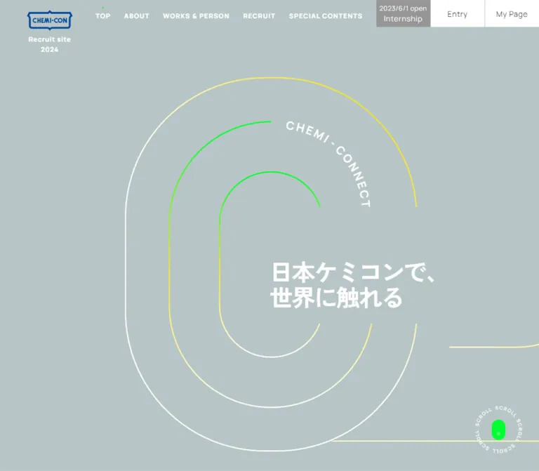
青みのあるグレーに白い文字、鮮やかな緑と黄色の曲線を重ねた採用サイト。デスクトップの横方向の構成を、モバイルでは縦方向の流れに再構成しています。
Nippon Chemi-Con Recruitment — Style Reference
A quiet blue-gray canvas threaded with electric green, yellow, and white connections.
Original URL: https://chemi-con-recruit.co.jp/ Final URL: https://chemi-con-recruit.co.jp/ Theme: light blue-gray canvas, white typography, fluorescent accents. Inspected: September 29, 2026, at 12:43:37 UTC / 21:43:37 JST, using the supplied browser evidence. Viewports: 1440 × 1000 desktop and 390 × 844 mobile, in CSS pixels. Scope: the current recruitment homepage: opening composition, connecting media and message areas, company and workplace navigation, employee interview presentation, recruitment links, technical-specialist content, persistent navigation, orientation promotion, and the mobile footer. Three desktop captures and two mobile captures accompany rendered DOM measurements. Linked pages and open-menu states were not inspected.
The homepage presents recruitment as a journey through connected scenes. A large, open C-shaped motif begins the composition, then thin routes continue around photographs and content groups. White text floats directly on a muted blue-gray field. Electric green dots and yellow-to-green line segments introduce small points of energy without filling the page with colored panels.
Desktop sections occupy a horizontal sequence with substantial empty space between content groups. Mobile converts the sequence into a vertical page while retaining alternating left and right alignments. The result depends on the relationship between curved routes, isolated typography, and cropped imagery. It is a recruitment homepage with several navigation destinations, rather than a single conversion page.
閉じる
Nippon Chemi-Con Recruitment — Style Reference
A quiet blue-gray canvas threaded with electric green, yellow, and white connections.
Original URL: https://chemi-con-recruit.co.jp/ Final URL: https://chemi-con-recruit.co.jp/ Theme: light blue-gray canvas, white typography, fluorescent accents. Inspected: September 29, 2026, at 12:43:37 UTC / 21:43:37 JST, using the supplied browser evidence. Viewports: 1440 × 1000 desktop and 390 × 844 mobile, in CSS pixels. Scope: the current recruitment homepage: opening composition, connecting media and message areas, company and workplace navigation, employee interview presentation, recruitment links, technical-specialist content, persistent navigation, orientation promotion, and the mobile footer. Three desktop captures and two mobile captures accompany rendered DOM measurements. Linked pages and open-menu states were not inspected.
The homepage presents recruitment as a journey through connected scenes. A large, open C-shaped motif begins the composition, then thin routes continue around photographs and content groups. White text floats directly on a muted blue-gray field. Electric green dots and yellow-to-green line segments introduce small points of energy without filling the page with colored panels.
Desktop sections occupy a horizontal sequence with substantial empty space between content groups. Mobile converts the sequence into a vertical page while retaining alternating left and right alignments. The result depends on the relationship between curved routes, isolated typography, and cropped imagery. It is a recruitment homepage with several navigation destinations, rather than a single conversion page.
How to Read This Reference
- Measured means a value was included in the supplied rendered DOM or computed-style evidence. Measurements apply to the stated viewport and captured state.
- Estimated means a dimension, color, or visual relationship was judged from the current-page screenshots. Estimates are not extracted stylesheet values.
- Recommended means implementation guidance for a new build. The CSS and SVG below are adaptations, not recovered source code.
- Token names are descriptive aliases. Only
--vwand--svhwere provided as original custom properties. - DOM extraction includes offscreen navigation content and overlapping interview layers. Their presence does not establish that they were simultaneously visible.
- Motion declarations provide stronger evidence than a still image, but do not establish exact keyframe geometry, interaction triggers, or scroll-controller behavior.
Tokens — Colors
Default Palette
| Name | Value | Suggested token | Evidence and role |
|---|---|---|---|
| Blue-gray canvas | #b8c5c6 |
--canvas |
Measured body background, rgb(184, 197, 198), at both viewports |
| White | #ffffff |
--white |
Measured primary text; also visible in thin routes, circular link outlines, and utility surfaces |
| Electric green | #00ff32 |
--green |
Measured interview pagination dots; visually repeated in routes, link centers, the scroll symbol, and the promotion |
| Signal yellow | #f6e532 |
--yellow |
Measured orientation-label text; visually echoed in the banner and connecting routes |
| Black | #000000 |
--black |
Measured orientation copy; also visible in utility-button text and the mobile menu icon |
| Footer gray | #505050 |
--footer-ink |
Measured mobile copyright text |
| Deep violet | #170d4b |
--utility-ink |
Measured text in an extracted internship My Page control; that submenu was not visibly inspected |
| Logo blue | Approximately #0055a3 |
Asset color, not a replacement token | Screenshot estimate only; preserve the supplied logo artwork when authorized |
Color Behavior
The blue-gray canvas remains consistent across the supplied homepage states. No theme selector or alternate page theme was evidenced.
Two different gradient roles are visible:
- Connecting routes: thin strokes move between white, yellow, and green over long distances.
- Orientation promotion: a compact yellow-to-green field supports black Japanese text and a yellow illustrated figure.
The computed evidence does not include the original gradient definitions. Reusing the measured accent colors as gradient stops is a recommendation; exact stop positions and interpolation remain unknown.
White on the measured canvas has an approximately 1.77:1 calculated contrast ratio. This describes the supplied color pair, not a complete accessibility audit. A new implementation should improve long-form text contrast while retaining the palette in decorative areas.
Tokens — Typography
Japanese Text
- Measured family:
"Zen Kaku Gothic Antique", sans-serif. - Dominant weight:
700. - Uses: Japanese headlines, descriptions, navigation destinations, and orientation copy.
- Character: sturdy, compact, and emphatic. Even explanatory copy uses bold weight.
- Japanese display lines use negative tracking in several measured elements. Preserve this selectively; it is not a general body-text rule.
English Labels
- Measured family:
Manrope, sans-serif. - Dominant weight:
800for section names, recruitment caption, and READMORE. - Other measured weights:
700for the orientation label and copyright;600for interview-caption wrappers. - Tracking: commonly
0.1em; the recruitment caption uses0.07em. - Character: uppercase labels behave as compact landmarks within a much larger graphical composition.
The desktop primary-navigation labels visually share this heavy sans-serif treatment. Their sampled parent wrappers inherit a 10px Japanese stack, so the exact child typography should not be inferred from those wrappers.
Type Scale
Values below are measured unless explicitly marked as estimates. Size and line height are in pixels; tracking is expressed relative to font size.
| Role | Desktop size / line height | Mobile size / line height | Weight | Tracking |
|---|---|---|---|---|
| Main section headings | 33.75 / 44.89 |
24.375 / 31.44 |
Manrope 800 |
0.1em |
| Japanese section subtitle | 18 / 33.66 |
13.203 / 20.20 |
700 |
Normal |
| MESSAGE label | 22.5 / 31.5 |
16.25 / 21.29 |
Manrope 800 |
0.1em |
| Message headline lines | 31.5 / 50.4 |
19.297 / 27.79 |
700 |
-0.1em |
| Explanatory paragraph | 14.875 / 31.83 |
12.188 / 22.30 |
700 |
Normal |
| Japanese circular-link label | 15.938 / 23.27 |
12.188 / 17.18 |
700 |
Normal |
| READMORE label | 17 / 23.29 |
13.203 / 21.26 |
Manrope 800 |
0.1em |
| Recruitment caption | 14.875 / 23.35 |
12.188 / 16.21 |
Manrope 800 |
0.07em |
| Orientation English letters | 17.531 / 17.531 |
11.426 / 11.426 |
Manrope 700 |
Per-letter layout |
| Orientation Japanese copy | 25.5 / 44.625 |
16.758 / 29.66 |
700 |
0.05em |
| Interview-caption wrapper | 18 / 24.66 |
13.203 / 21.26 |
Manrope 600 |
0.1em |
| Repeated slogan in media section | 46.125 / 50.28 |
22.344 / 32.40 |
700 |
-0.04em desktop; -0.05em mobile |
| Mobile copyright | Not supplied | 9.648 / normal |
Manrope 700 |
0.1em |
Opening headline caveat: the H1 wrapper computes to 10px, while its visible contents are much larger. Its measured bounds are approximately 619.86 × 50.27px on desktop and 169.80 × 64.78px on mobile. Visually, its lettering is approximately 44–46px on desktop and 21–23px on mobile. The repeated media-section slogan provides an independently measured display scale; the H1 wrapper does not.
Root-size caveat: the original HTML root computes to 10px. The Quick Start uses explicit pixel tokens and can retain a conventional browser root size. Do not interpret every sampled 10px wrapper as visible 10px typography.
Tokens — Spacing & Shapes
Density: sparse scene composition, with compact controls and localized text groups.
Shape language: open C forms, long rounded turns, fine strokes, circular link markers, rounded image windows, and square utility buttons.
Observed Viewport Properties
| Original property | Desktop | Mobile | What is established |
|---|---|---|---|
--vw |
14.4px |
3.9px |
Equals 1% of the inspected viewport width |
--svh |
10px |
8.44px |
Equals 1% of the inspected viewport height |
These values show viewport-based sizing support. They do not reveal every source formula or breakpoint.
Spacing Scale
| Relationship | Desktop | Mobile | Status |
|---|---|---|---|
| Logo left inset | 72px |
16.25px |
Measured |
| Main mobile section side inset | Not a single desktop container rule | 16.25px |
Measured |
| Circle-to-label gap | 20px |
16.25px |
Derived from measured circle width and label inset |
| Label inset from link origin | 80px |
56.875px |
Measured |
| Stacked ABOUT link step | 80px |
48.75px |
Derived from measured positions |
| Gap between ABOUT link circles | 20px |
8.125px |
Derived |
| Interview image-slot gap | 12.5px |
8.125px |
Derived |
| Pagination-dot center interval | 22.5px |
16.25px |
Derived |
| Mobile footer vertical padding | Not supplied | 16.25px |
Measured |
Large scene offsets are art-directed and should not be reduced to this small spacing scale. A 16px component gap and a several-hundred-pixel route turn serve different purposes.
Border Radius
| Element | Value or appearance | Evidence |
|---|---|---|
| Circular link marker | 30px desktop; 20.3125px mobile |
Measured radii for 60px and 40.625px circles |
| Pagination dot | 50% |
Measured |
| Desktop portrait window | Approximately 24–28px corners |
Screenshot estimate |
| Orientation card | Approximately 10–12px desktop, smaller on mobile |
Screenshot estimate |
| Large media windows | Broad, asymmetric curved corners | Screenshot observation; exact paths unavailable |
| Header utility buttons | Square corners | Visible and consistent with sampled zero radii |
Interview anchors have computed border-radius: 0, despite rounded visible image windows. The crop can therefore be controlled by a child or clipping layer. Do not use the anchor radius alone to reconstruct the visible shape.
Layout Measurements
| Element | Desktop | Mobile |
|---|---|---|
| Viewport | 1440 × 1000px |
390 × 844px |
| Document height | 9027px |
Approximately 3827.63px |
| Navigation control height | 72px |
Menu button: 50.781px |
| Logo-link bounds | 122.281 × 84.281px |
70.078 × 32.688px |
| Entry button | 144 × 72px |
Offscreen in the closed-navigation DOM |
| Mobile menu button | Not visible | 60.938 × 50.781px |
| Orientation link box | 261.047 × 150px |
162.813 × 98.938px |
| Circular link marker | 60 × 60px |
40.625 × 40.625px |
| Interview wide slot | 532.5 × 328.75px |
271.172 × 218.359px |
| Interview narrow slot | 177.5 × 328.75px |
117.813 × 218.359px |
| Pagination dot | 5 × 5px |
4.063 × 4.063px |
| Opening C motif | Approximately 620 × 794px |
Approximately 224 × 287px |
| Mobile legal footer | Not established visually | 390 × 67.422px |
Logo-link bounds are wrapper measurements, not intrinsic artwork dimensions. Orientation artwork extends beyond its measured link box.
Components
Persistent Desktop Header
Role: maintain identity and access to recruitment destinations while the scene changes beneath it.
The blue CHEMI-CON mark sits near x:72px, y:27px, with a centered white Recruit site caption beneath it. Primary navigation starts around x:299px and occupies a 72px-high band. Its six visible groups are TOP, ABOUT, WORKS & PERSON, RECRUIT, SPECIAL CONTENTS, and INTERNSHIP.
Two white rectangular utility areas occupy the upper-right corner: Entry and My Page. Entry measures 144 × 72px; a fine vertical divider separates the two visible blocks. Their restrained black text differs from the bold white scene navigation.
A tiny green dot marks TOP in the supplied desktop states. The header remains at the same screen position across the desktop captures. Its background is visually transparent, allowing media and routes to pass behind it.
Extracted navigation structure: ABOUT contains four destinations; WORKS & PERSON contains four; SPECIAL CONTENTS includes the technical page and location content; INTERNSHIP includes further application links. Desktop submenu headings measure 31.875px Manrope with 0.1em tracking, and several submenu destination boxes measure 180 × 176.875px.
These submenu measurements establish available structure, not an observed open-menu composition. Hover triggers, disclosure timing, keyboard behavior, and My Page year-selection behavior remain unverified.
Mobile Header and Navigation Affordance
Role: compress persistent navigation without losing brand identification.
The mobile header becomes an approximately 50.78px-high blue-gray bar. The small logo sits 16.25px from the left; Recruit site is centered; a white menu button occupies the rightmost 60.94px. The icon consists of two fine dark horizontal lines in an approximately 24.375 × 6.094px wrapper.
The closed navigation DOM positions links beyond the right edge: several begin at x:430.625px in the 390px viewport. Category buttons and an offscreen bottom Entry strip are also present. This supports a separate mobile navigation panel, but its open appearance and animation were not captured.
For an adaptation, preserve the compact header and use an accessible disclosure button. Treat focus management and open-panel behavior as implementation work rather than recovered behavior.
Opening C Motif and Slogan
Role: express the connection theme before introducing detailed content.
Three nested open C-shaped strokes dominate the opening viewport. The outer form is tall and rounded, with a near-vertical left side. The inner forms repeat the geometry at smaller scales. Portions of their right sides remain open, providing space for the Japanese slogan.
On desktop, the outer motif spans approximately x:413–1033px and y:164–958px. The headline starts near x:720px, y:536px, crossing the motif's open side. CHEMI-CONNECT follows an upper curved segment in white English lettering.
On mobile, the motif is approximately x:84–308px, y:279–566px. The headline begins around x:195px, y:390px and wraps into two lines: 「日本ケミコンで、」「世界に触れる」. Two thin route segments continue downward from the motif toward later content.
Anatomy: full-height stage → decorative route layer → three nested C strokes → curved English label → semantic headline → continuing route geometry.
Use SVG for the long curves and curved lettering. Independent CSS circles with arbitrary missing quadrants will not reproduce the straight sections, asymmetric openings, and continuity between scenes. Decorative routes should not capture pointer events.
Company Orientation Promotion
Role: provide an immediately recognizable application-related action above the atmospheric composition.
This floating module contains:
- An uppercase yellow COMPANY ORIENTATION label formed from individually animated letters.
- A rounded yellow-to-green banner.
- Two lines of bold black copy: 「会社説明会」「絶賛受付中!」.
- A flat yellow illustrated person whose body extends beyond the right edge of the banner.
The measured desktop link box begins around x:1110.78px, y:129.49px; mobile begins around x:190.83px, y:77.43px. The character extends beyond those boxes, so clipping the entire component to the link rectangle would remove part of the observed illustration.
The promotion remains near the upper-right corner in both mobile captures and the first two desktop captures. It is absent from the supplied late desktop capture. Its exact visibility condition is not established.
The link targets the current recruitment My Page service. The destination was not opened. Do not duplicate the annual application URL into a new project without checking its intended recruitment cycle.
Circle-and-Dot Link
Role: provide a consistent destination affordance without introducing large filled buttons.
A thin white outlined circle contains a tiny green center dot. A bold label sits to its right. Desktop circles are 60px; mobile circles are 40.625px. Labels begin 80px and 56.875px respectively from the link's origin.
This component appears in MESSAGE, ABOUT, workplace links, the employee-directory link, RECRUIT, and SPECIAL CONTENTS. The resting marker is a dot, not an arrow.
Several desktop links include 54px of trailing padding; several mobile variants include 36.5625px. Mobile ABOUT links have no such trailing padding, showing that the component has context-specific sizing.
The circle has a measured 0.3s linear transition, while labels specify color 0.3s linear. The resulting hover state was not supplied. Any proposed fill, expansion, arrow reveal, or color inversion must be treated as a new design decision.
Media and Message Scene
Role: connect the abstract opening motif with the company's people, technology, and purpose.
The current desktop media includes green-tinted architecture and foliage, plus an abstract image of yellow and blue light trails. These images occupy large windows with broad rounded turns. Fine connecting lines run along or continue beyond their edges.
The MESSAGE block is positioned low in its desktop scene. It has an English label, a two-line Japanese headline, a circle-and-dot READMORE link, and a separate paragraph to the right. The paragraph discusses aluminum electrolytic capacitors and the company's relationship to daily life and global technology.
Measured desktop text-group widths are approximately 241.64px for the headline/link column and 407.5px for the paragraph. On mobile, the headline, action, and paragraph stack in a narrow 187.19px-wide region beginning at the 16.25px page inset. The remaining width participates in the larger graphical composition.
A video-related caption records filming in February 2023, October 2024, and December 2025. This establishes video-related content, but does not establish playback controls, autoplay, sound, or media-loading behavior.
ABOUT Navigation Group
Role: provide a compact company-information directory inside the route system.
The heading pairs ABOUT with 「日本ケミコンを知る」. Four circle-and-dot links lead to the HR message, business overview, company statistics, and sustainability content.
Desktop places the heading beside a vertical link stack, with 80px between successive link origins. Mobile places the group in the right half of the page, beginning at x:195px; links advance by 48.75px.
The longest mobile label wraps within the available width. Preserve this wrapping instead of shrinking the whole group or allowing it to push beyond the viewport.
WORKS & PERSON and Interview Presentation
Role: combine practical workplace navigation with a human view of the company.
The heading pairs WORKS & PERSON with 「日本ケミコンで働く」. Supporting links include job information, the internal production system, the work environment, and the employee directory.
The interview presentation uses one wide image slot and two narrow slots. All three share a common height. Rounded crop windows reveal employees in blue workwear against real manufacturing and office environments. The late desktop screenshot shows the right-hand portrait portion of this wider presentation; it should not be interpreted as three equal-width cards.
There are eight unique interview destinations, /people/p01/ through /people/p08/. Each appears in multiple overlapping DOM layers associated with the image slots. These repetitions are presentation layers, not 24 unique interviews.
Below the desktop imagery are an interview number and title, slim previous/next chevrons, and eight small green dots. A white ring surrounds the currently indicated dot in the screenshot.
On mobile, the central slot is approximately 271.17px wide, with narrow neighboring slots extending beyond both viewport edges. The controls appear above the images in the measured DOM; the caption and employee-directory link follow below. The mobile end capture shows INTERVIEW#02, while the initial extraction reports INTERVIEW#01. A changed state is evidenced, but its trigger and autoplay interval are unknown.
Recruitment and Technical-Specialist Groups
Role: conclude the homepage journey with direct recruitment and specialist destinations.
RECRUIT uses a large English heading and one circle-and-dot link labeled 「募集要項/FLOW/FAQ」. SPECIAL CONTENTS breaks across two English lines, includes 「技術系の皆さんへ」, and links to 「技術系特設ページ」.
Desktop groups both blocks in the right-hand portion of the final scene, framed by very large rounded route turns. They sit directly on the canvas without card surfaces.
Mobile places RECRUIT toward the right, beginning at x:162.84px, and SPECIAL CONTENTS back at the left page inset. A small, deeply rounded image crop showing green architecture and a yellow car appears at the right edge beside the specialist section. Keep this alternating alignment: centering every mobile group would remove a defining part of the composition.
Scroll Cue
Role: make progression visible within the unusually spacious opening composition.
A green vertical capsule with a small pale dot sits inside a ring of repeated white SCROLL lettering near the lower-right corner. Estimated overall diameter is roughly 125px on desktop and 80px on mobile. The capsule itself is approximately 36 × 54px on desktop and 23 × 35px on mobile.
The cue is visible in the opening and middle desktop captures and the opening mobile capture. A still image does not prove rotation, clicking behavior, or a particular scroll direction. If an adaptation makes it interactive, provide a real destination and an accessible name.
Mobile Legal Footer
Role: close the page with corporate legal navigation.
A white, approximately 67.42px-high strip contains two dark legal links and a small tracked copyright line. The measured footer has 16.25px vertical padding. The copyright identifies NIPPON CHEMI-CON CORPORATION and uses #505050 text.
The legal destinations are privacy policy and site terms. A desktop footer appearance was not established by the supplied screenshots.
Tokens — Motion & Interaction
| Treatment | Supplied declaration or evidence | What can safely be reproduced |
|---|---|---|
| Orientation English letters | 3s linear infinite hoppingLabel |
A repeating per-letter treatment; exact displacement is unknown |
| Letter staggering | Delays increase by 0.05s, reaching 0.9s |
Sequential timing across the label |
| Orientation Japanese copy | 2.5s linear infinite scaleText |
A repeating scale treatment; minimum and maximum scales are unknown |
| Orientation letter color | color 0.3s |
A declared color transition; trigger and target color are unknown |
| Circular link marker | 0.3s linear |
Short linear feedback; transitioned property and final appearance are not established |
| Link labels | color 0.3s linear |
Short text-color transition |
| Active interview image layer | clip-path 0.75s ease-in-out |
A shaped reveal or conceal transition |
| Other interview layers | clip-path 0.1s linear 0.8s |
Delayed clipping reset or state change; exact sequencing requires implementation evidence |
| Interview captions | opacity 0.3s linear 0.15s, visibility 0.3s linear 0.15s |
A delayed caption state transition |
| Mobile legal links | opacity 0.2s linear |
Brief opacity feedback |
| Desktop scene progression | Side-by-side section bounds and different scene captures after traversal | A horizontal sequence; exact scroll-distance mapping is unverified |
The large routes provide spatial continuity; the promotion and interviews provide localized activity. Avoid adding motion to every heading and photograph merely because animation exists elsewhere.
The supplied evidence does not establish the original JavaScript library, route-drawing animation, parallax depth, scroll-cue rotation, carousel interval, menu transition, or reduced-motion support. Generic computed transition: all entries without a useful duration are not evidence of a visible animation.
Surfaces
| Layer | Appearance | Purpose |
|---|---|---|
| Main canvas | Solid #b8c5c6 |
Unifies the entire homepage journey |
| Route layer | Thin white, yellow, and green curves | Connects scenes and defines large spatial compartments |
| Text groups | White typography directly on the canvas | Keeps content lightweight and integrated with the illustration |
| Media windows | Photography or media within large curved masks | Supplies material, environmental, and human detail |
| Circular links | Transparent interior, white outline, green point | Repeated destination affordance |
| Application utilities | White rectangular surfaces with dark text | Separates transactional actions from scene navigation |
| Orientation banner | Yellow-to-green field with black copy | Highest local color intensity |
| Mobile footer | White strip with dark legal text | Clear visual end to the journey |
There is no visible general-purpose shadow or elevated-card system. The mobile header has slight edge separation in the screenshot, but no shadow parameters were supplied. Most structure comes from position, curves, masks, and whitespace.
Imagery
The homepage combines three complementary image languages:
- Environment and technology: green-tinted architecture, foliage, a yellow car, and abstract yellow/blue light trails. These scenes connect the corporate story to surroundings and movement.
- Employees: natural workplace portraits with blue uniforms, visible equipment, and recognizable faces. Their fuller color range provides a human counterpoint to the restrained canvas.
- Promotion illustration: a simple yellow figure with pale facial and hand details, deliberately flatter and brighter than the photography.
Use different crops for different roles. Environment media can occupy large, asymmetric curved windows; interview photography uses narrower rounded rectangles and one expanded slot. Keep faces legible and avoid stretching a narrow portrait to fill the wide slot.
Observed Asset References
| Asset identity | Observed use | Availability in supplied evidence |
|---|---|---|
| CHEMI-CON blue logo | Desktop and mobile identity | Visible; asset URL not provided |
| Nested C routes and curved lettering | Opening motif and scene connections | Visible; original SVG or path data not provided |
| Green architecture and foliage | Large media window | Visible; asset URL not provided |
| Yellow/blue light trails | Technology-related media window | Visible; asset URL not provided |
| Employee photography | Eight interview destinations across three display slots | Visible and linked; image URLs not provided |
| Yellow orientation figure | Floating promotion | Visible; asset URL not provided |
| Yellow car and green architecture | Mobile specialist-section crop | Visible; asset URL not provided |
| Video-related media | Introductory story area | Caption supplied; media URL and playback behavior not provided |
No original asset filenames, image dimensions, or licensing terms were included. Use authorized artwork or newly commissioned equivalents; do not invent source paths.
Layout & Responsive Behavior
Desktop Scene Structure
All six sampled desktop sections begin at y:0 and are 1000px high. Their x coordinates advance horizontally:
| Scene | Measured starting x | Measured width |
|---|---|---|
| Opening | Approximately 0px |
1706.66px |
| Media | 1706.66px |
1710px |
| Message | 3416.66px |
1310px |
| About | 4726.66px |
1220px |
| Works and people | 5946.66px |
1420px |
| Recruitment and specialist content | 7366.66px |
660px |
These coordinates describe the horizontal content arrangement in the extracted state, not six simultaneously visible panels. The long 9027px document and supplied traversed captures support a scroll-driven desktop presentation. The exact relationship between document scrolling and horizontal translation is not supplied.
The first two scenes are wider than the viewport. Therefore, recreating the layout as equal 100vw slides would change its pacing. Broad curves and photographs can span scene boundaries, and text groups appear at deliberately different vertical positions.
Mobile Scene Structure
Mobile uses ordinary vertical section ordering within a 357.5px-wide region inset 16.25px from each side:
| Scene | Measured top | Measured height |
|---|---|---|
| Opening | 0px |
844px |
| Media | 844px |
620.73px |
| Message | 1464.73px |
494.16px |
| About | 1958.89px |
439.25px |
| Works and people | 2398.14px |
726.39px |
| Recruitment and specialist content | 3124.53px |
635.67px |
| Footer | 3760.20px |
67.42px |
The geometry is re-composed, not merely reduced. Message occupies a narrow left column; About shifts to the right; Works begins farther left; Recruitment shifts right again; Specialist content returns to the left. The routes turn vertically to connect these offsets.
The mobile media slogan has a narrow, tall measured bounding box, approximately 32.39 × 297.13px. The evidence does not include its writing-mode or transform declaration, so its exact orientation mechanism should not be asserted.
Responsive Constraints
- The opening stage matches the inspected viewport height at both sizes.
- The header changes structure completely between the two inspected widths.
- The orientation module scales down but remains visually prominent near the top-right.
- Circular controls shrink from 60px to 40.625px; text scales by role rather than one universal factor.
- Interview side slots deliberately extend beyond the mobile viewport.
- A mobile footer is visibly present; a matching desktop footer treatment is not established.
- No tablet or intermediate viewport was supplied. The original breakpoint is unknown.
For a new implementation, use separate desktop and mobile route drawings with shared semantic content. Choose the layout breakpoint based on navigation fit and content clearance, then test intermediate widths. Do not infer a production breakpoint from these two samples alone.
Do’s and Don’ts
Do
- Preserve the measured blue-gray, white, green, and yellow palette.
- Treat the connecting route as a page-level composition rather than a repeated small icon.
- Pair Manrope English landmarks with bold Zen Kaku Gothic Antique Japanese text.
- Keep generous blank space around headlines and destination groups.
- Use the circle-and-green-dot link consistently across content categories.
- Retain the wide-plus-narrow interview-slot relationship.
- Re-compose the route and text alignment for mobile.
- Keep application utilities visually distinct with white rectangular surfaces.
- Allow the orientation figure to extend outside its banner.
- Separate observed animation timings from proposed keyframe amplitudes.
Don’t
- Don’t replace the horizontal desktop story with a generic stack of identical cards.
- Don’t center every mobile section or remove its alternating alignment.
- Don’t turn every destination into a filled neon button.
- Don’t replace the resting green link dot with an assumed arrow.
- Don’t add shadows, glass effects, or gradient backgrounds to every content group.
- Don’t use the H1 wrapper's 10px font size as the visible headline size.
- Don’t count overlapping carousel layers as separate employees.
- Don’t interpret extracted submenu rectangles as proof of an opened menu.
- Don’t assume the orientation promotion is visible at every desktop scroll position.
- Don’t reproduce small visual controls as equally small touch targets.
Recommended Implementation Additions
These are recommendations for a new implementation, not verified features of the original:
- Improve paragraph and navigation contrast. Use a sufficiently dark text color where reading is essential, or introduce an appropriate darker local background for retained white text.
- Keep a minimum 44px interactive target around mobile circles, carousel arrows, and pagination controls while preserving their smaller visible marks.
- Provide a clear focus indicator and descriptive accessible names for the menu, employee images, carousel controls, and any interactive scroll cue.
- Keep offscreen navigation and inactive interview links out of the keyboard sequence. Duplicate visual layers should not duplicate accessible content.
- Use a semantic heading hierarchy and expose a split-letter animated label as one readable phrase.
- Provide a reduced-motion mode that stops the banner animations and retains access to all scenes and interviews.
- Preserve a vertical, readable document before any desktop scroll enhancement initializes. Avoid making content access depend on animation code.
- Check that the floating orientation banner does not cover focused controls or essential content on short and narrow screens. The mobile end capture shows it overlapping the interview area.
- Give video an appropriate poster, loading behavior, and user controls if needed; do not assume sound or autoplay requirements from the still captures.
Agent Prompt Guide
Quick Color Reference
- Canvas:
#b8c5c6. - Main observed typography and circle outlines:
#ffffff. - Dots and energetic accents:
#00ff32. - Orientation label and warm route accents:
#f6e532. - Promotion copy:
#000000. - Utility surfaces and mobile footer: white.
- Gradients belong primarily to route strokes and the compact orientation banner.
Overall Prompt
“Create a Japanese recruitment homepage inspired by the current Nippon Chemi-Con site. Use a continuous blue-gray #b8c5c6 canvas with white typography, electric green #00ff32 points, and yellow #f6e532 accents. Build a large opening motif from three nested open C-shaped SVG strokes, with a short Japanese headline crossing their open side and curved English lettering above. Continue thin routes around large rounded media windows and widely spaced content groups. Use Manrope 800 for tracked uppercase section names and Zen Kaku Gothic Antique 700 for Japanese text. On desktop, arrange scenes horizontally; on mobile, create a vertical composition with alternating left and right content positions. Reuse outlined circular links with tiny green center dots. Include workplace portraits, compact white application utilities, and a floating yellow-to-green orientation banner. Treat the scroll engine, breakpoint, and inaccessible states as explicit implementation decisions.”
Example Component Prompts
- Opening motif: “Create a tall, open C silhouette from three nested fine SVG paths. Blend white, yellow, and green along the paths. Place a white Japanese headline across the right-hand opening and curve CHEMI-CONNECT above it. At 390 × 844, use an approximately 224 × 287px motif around x84, y279 and wrap the headline into two lines.”
- Circular destination link: “Build a transparent link with a 60px white outlined circle, a tiny green dot at its center, and a bold label 20px to its right. On mobile use a 40.625px visible circle and 16.25px gap, but retain at least a 44px interactive target. Do not invent an arrow in the resting state.”
- Interview presentation: “Show one wide workplace image and two narrow portrait windows, all sharing a common height and rounded crop corners. Add an interview number, title, slim chevrons, and eight small green indicators. On mobile center the wide image and allow neighboring windows to peek beyond both edges.”
- Orientation promotion: “Create a small floating yellow-to-green banner with two lines of bold black Japanese copy and a flat yellow person extending beyond its right edge. Above it, place yellow uppercase letters with a three-second repeating stagger and 50ms letter offsets. Use restrained new keyframe amplitudes and label them as adaptations.”
- Mobile section sequence: “Arrange Message on the left, About on the right, Works farther left, Recruitment toward the right, and Specialist content at the left gutter. Connect these positions with broad thin curves. Preserve open canvas between groups instead of enclosing each in a card.”
Quick Start
CSS Custom Properties
The following is a component skin and layout starting point. It uses measured colors and reference-size tokens, with an explicitly recommended 1200px breakpoint. It does not recreate the original scroll controller or recover original assets. The optional desktop rail uses native horizontal overflow; linking vertical scrolling to horizontal movement requires a separate, tested enhancement.
:root {
  /* Measured colors */
  --canvas: #b8c5c6;
  --white: #ffffff;
  --green: #00ff32;
  --yellow: #f6e532;
  --black: #000000;
  --footer-ink: #505050;
  --utility-ink: #170d4b;

  /* Observed family names; font files must be supplied separately */
  --font-jp: 'Zen Kaku Gothic Antique', sans-serif;
  --font-en: 'Manrope', sans-serif;

  /* Desktop reference measurements */
  --section-size: 33.75px;
  --section-leading: 1.33;
  --subtitle-size: 18px;
  --body-size: 14.875px;
  --body-leading: 2.14;
  --link-size: 15.9375px;
  --circle-size: 60px;
  --link-gap: 20px;
  --page-gutter: 5vw;
  --header-height: 72px;
  --route-stroke: 2px;

  /* Estimates and recommended adaptation values */
  --image-radius: 26px;
  --banner-radius: 12px;
  --feedback-time: 300ms;
}

* { box-sizing: border-box; }

body {
  margin: 0;
  background: var(--canvas);
  color: var(--white);
  font-family: var(--font-jp);
  font-weight: 700;
}

button, input, select, textarea { font: inherit; }
a { color: inherit; }
img { display: block; max-width: 100%; }

.site-header {
  position: fixed;
  inset: 0 0 auto;
  z-index: 50;
  height: var(--header-height);
  display: grid;
  grid-template-columns: 20.8vw minmax(0, 1fr) 20vw;
  align-items: center;
}

.brand {
  position: absolute;
  left: var(--page-gutter);
  top: 27px;
  width: 122.281px;
  text-decoration: none;
}

.brand-caption {
  margin: 12px 0 0;
  text-align: center;
  font: 800 14.875px/1.57 var(--font-en);
  letter-spacing: 0.07em;
}

.mobile-caption, .menu-toggle { display: none; }

.desktop-nav {
  grid-column: 2;
  display: flex;
  justify-content: space-between;
  align-items: center;
  gap: 12px;
  padding-right: 2.5vw;
  font: 800 15px/1 var(--font-en);
  letter-spacing: 0.05em;
}

.desktop-nav a { text-decoration: none; }

.header-actions {
  grid-column: 3;
  display: grid;
  grid-template-columns: 1fr 1fr;
  height: 100%;
  background: var(--white);
  color: var(--black);
}

.header-actions a {
  display: grid;
  place-items: center;
  text-decoration: none;
  font-weight: 400;
}

.header-actions a + a {
  border-left: 1px solid var(--canvas);
}

.scene { position: relative; }

.hero {
  position: relative;
  min-height: 100svh;
  overflow: hidden;
}

.hero__motif {
  position: absolute;
  left: 28.7vw;
  top: 16.4svh;
  width: min(43.06vw, 62svh);
  height: auto;
  pointer-events: none;
}

.route-path {
  fill: none;
  stroke: url(#route-gradient);
  stroke-width: var(--route-stroke);
  vector-effect: non-scaling-stroke;
}

.route-label {
  fill: var(--white);
  font: 800 24.75px var(--font-en);
  letter-spacing: 2.475px;
}

.hero__title {
  position: absolute;
  left: 50vw;
  top: 53.6svh;
  margin: 0;
  font-size: 46.125px;
  line-height: 1.09;
  letter-spacing: -0.04em;
}

.hero__title br { display: none; }

.section-title {
  margin: 0;
  font: 800 var(--section-size)/var(--section-leading) var(--font-en);
  letter-spacing: 0.1em;
}

.section-subtitle {
  margin: 2px 0 20px;
  font-size: var(--subtitle-size);
  line-height: 1.87;
}

.scene-copy {
  max-width: 407.5px;
  font-size: var(--body-size);
  line-height: var(--body-leading);
}

/* Optional accessible reading treatment for a new implementation */
.scene-copy--readable { color: var(--utility-ink); }

.orbit-link {
  display: inline-flex;
  align-items: center;
  gap: var(--link-gap);
  min-height: max(44px, var(--circle-size));
  text-decoration: none;
  font-size: var(--link-size);
  line-height: 1.46;
  transition: color var(--feedback-time) linear;
}

.orbit-link__circle {
  flex: 0 0 var(--circle-size);
  width: var(--circle-size);
  height: var(--circle-size);
  display: grid;
  place-items: center;
  border: 1px solid var(--white);
  border-radius: 50%;
}

.orbit-link__circle::after {
  content: '';
  width: 5px;
  height: 5px;
  border-radius: 50%;
  background: var(--green);
}

.link-stack {
  display: grid;
  justify-items: start;
  gap: 20px;
}

.orientation {
  position: fixed;
  z-index: 40;
  top: 104px;
  right: 68px;
  width: 261.047px;
}

.orientation__label {
  margin: 0 0 7px;
  text-align: center;
  color: var(--yellow);
  font: 700 17.531px/1 var(--font-en);
}

.orientation__letter {
  display: inline-block;
  animation: label-hop 3s linear infinite;
  animation-delay: calc(var(--i, 0) * 50ms);
}

.orientation__card {
  position: relative;
  display: flex;
  align-items: center;
  min-height: 150px;
  padding: 24px 30px 24px 37px;
  border-radius: var(--banner-radius);
  background: linear-gradient(180deg, var(--yellow), var(--green) 76%);
  color: var(--black);
  text-decoration: none;
  isolation: isolate;
}

.orientation__copy {
  position: relative;
  z-index: 1;
  margin: 0;
  font-size: 25.5px;
  line-height: 1.75;
  letter-spacing: 0.05em;
  animation: copy-pulse 2.5s linear infinite;
}

.orientation__figure {
  position: absolute;
  right: -48px;
  bottom: 0;
  width: 125px;
  max-width: none;
  pointer-events: none;
}

.interview-window { overflow: hidden; }

.interview-slots {
  display: grid;
  grid-template-columns: 532.5px 177.5px 177.5px;
  gap: 12.5px;
  width: max-content;
}

.interview-photo {
  display: block;
  height: 328.75px;
  overflow: hidden;
  border-radius: var(--image-radius);
}

.interview-photo img {
  width: 100%;
  height: 100%;
  object-fit: cover;
}

.pagination {
  display: flex;
  align-items: center;
  gap: 0;
}

.pagination button {
  display: grid;
  place-items: center;
  width: 44px;
  height: 44px;
  padding: 0;
  border: 0;
  background: transparent;
  cursor: pointer;
}

.pagination button::before {
  content: '';
  width: 5px;
  height: 5px;
  background: var(--green);
  border-radius: 50%;
}

.pagination button[aria-current='true']::before {
  outline: 1px solid var(--white);
  outline-offset: 7px;
}

.legal-footer {
  padding: 16.25px;
  background: var(--white);
  color: var(--footer-ink);
  text-align: center;
}

.legal-footer__links {
  display: flex;
  flex-wrap: wrap;
  justify-content: center;
  gap: 12px 20px;
}

.legal-footer__copyright {
  font: 700 10px/1.5 var(--font-en);
  letter-spacing: 0.1em;
}

/* Recommended focus behavior, not an observed source state */
a:focus-visible, button:focus-visible {
  outline: 3px solid var(--utility-ink);
  outline-offset: 5px;
}

/* New amplitudes using the observed durations and stagger */
@keyframes label-hop {
  0%, 18%, 100% { transform: translateY(0); }
  9% { transform: translateY(-0.2em); }
}

@keyframes copy-pulse {
  0%, 100% { transform: scale(1); }
  50% { transform: scale(1.025); }
}

/* Optional native rail; this is not the original scroll controller */
@media (min-width: 1200px) {
  .story-rail[data-horizontal] {
    display: flex;
    overflow-x: auto;
    scroll-snap-type: x proximity;
  }

  .story-rail[data-horizontal] > .scene {
    flex: 0 0 var(--scene-width, 100vw);
    min-height: 100svh;
    scroll-snap-align: start;
  }
}

/* Recommended breakpoint; only 390px and 1440px were inspected */
@media (max-width: 1199px) {
  :root {
    --section-size: 24.375px;
    --section-leading: 1.29;
    --subtitle-size: 13.203px;
    --body-size: 12.1875px;
    --body-leading: 1.83;
    --link-size: 12.1875px;
    --circle-size: 40.625px;
    --link-gap: 16.25px;
    --page-gutter: 16.25px;
    --header-height: 50.781px;
    --route-stroke: 1px;
    --image-radius: 18px;
    --banner-radius: 8px;
  }

  .site-header {
    grid-template-columns: 1fr auto 1fr;
    background: var(--canvas);
  }

  .brand { top: 9.047px; width: 70.078px; }
  .brand-caption, .desktop-nav, .header-actions { display: none; }

  .mobile-caption {
    display: block;
    grid-column: 2;
    font: 800 12.1875px/1.33 var(--font-en);
    letter-spacing: 0.07em;
  }

  .menu-toggle {
    display: grid;
    place-content: center;
    gap: 5px;
    justify-self: end;
    grid-column: 3;
    width: 60.938px;
    height: var(--header-height);
    border: 0;
    background: var(--white);
  }

  .menu-toggle::before, .menu-toggle::after {
    content: '';
    width: 24.375px;
    height: 1px;
    background: var(--black);
  }

  .hero__motif {
    left: 21.54%;
    top: 33svh;
    width: 57.44%;
  }

  .hero__title {
    left: 50%;
    top: 46.16svh;
    width: calc(50% - var(--page-gutter));
    font-size: 22.344px;
    line-height: 1.45;
    letter-spacing: -0.05em;
  }

  .hero__title br { display: initial; }
  .scene-copy { max-width: 187.1875px; }
  .link-stack { gap: 8.125px; }
  .section-subtitle { line-height: 1.53; }

  .orientation {
    top: 63px;
    right: 36.36px;
    width: 162.813px;
  }

  .orientation__label { font-size: 11.426px; margin-bottom: 3px; }

  .orientation__card {
    min-height: 98.938px;
    padding: 17px 20px 17px 22.844px;
  }

  .orientation__copy { font-size: 16.758px; line-height: 1.77; }
  .orientation__figure { right: -30px; width: 82px; }

  .interview-slots {
    position: relative;
    left: 50%;
    transform: translateX(-50%);
    grid-template-columns: 117.813px 271.172px 117.813px;
    gap: 8.125px;
  }

  .interview-photo { height: 218.359px; }
  .scene-copy--readable { font-size: 14px; max-width: 28ch; }
}

@media (prefers-reduced-motion: reduce) {
  .orientation__letter, .orientation__copy { animation: none; }
  .orbit-link { transition: none; }
  .story-rail { scroll-behavior: auto; scroll-snap-type: none; }
}
The larger pagination spacing is an intentional accessibility adaptation. Match employee-slot content ordering to the layout: the desktop wide slot is first, while the mobile wide slot is centered. Use appropriate <picture> crops or per-slot image positioning instead of stretching assets.
Opening SVG and Link Markup
This SVG is an original approximation of the observed silhouette. Its coordinates and gradient positions are recommendations, not extracted paths. It covers the opening C motif; the continuing routes require additional desktop and mobile drawings.
<section class="hero scene" aria-labelledby="opening-title">
  <svg class="hero__motif" viewBox="0 0 620 794"
       aria-hidden="true" focusable="false">
    <defs>
      <linearGradient id="route-gradient" x1="0%" y1="100%"
                      x2="100%" y2="0%">
        <stop offset="0%" stop-color="#ffffff" />
        <stop offset="48%" stop-color="#f6e532" />
        <stop offset="76%" stop-color="#00ff32" />
        <stop offset="100%" stop-color="#f6e532" />
      </linearGradient>
      <path id="word-arc" d="M341 102 A213 213 0 0 1 522 276" />
    </defs>

    <path class="route-path"
      d="M619 275 C610 120 482 1 310 1 H291
         C130 1 1 132 1 300 V494
         C1 659 129 793 295 793 H313
         C474 793 601 673 619 523" />
    <path class="route-path"
      d="M310 94 C191 94 94 191 94 310 V481
         C94 602 192 700 310 700
         C419 700 509 625 525 523" />
    <path class="route-path"
      d="M415 275 C401 232 361 201 310 201
         C249 201 201 251 201 313 V482
         C201 544 247 594 310 594
         C357 594 399 564 415 523" />
    <text class="route-label">
      <textPath href="#word-arc">CHEMI-CONNECT</textPath>
    </text>
  </svg>

  <h1 id="opening-title" class="hero__title" lang="ja">
    日本ケミコンで、<br>世界に触れる
  </h1>
</section>

<a class="orbit-link" href="/recruit/">
  <span class="orbit-link__circle" aria-hidden="true"></span>
  <span lang="ja">募集要項/FLOW/FAQ</span>
</a>
Use unique SVG IDs when rendering multiple motifs in one document. A full implementation also needs semantic header markup, actual menu state management, interview controls, authorized images, and content-specific route positioning.
Tailwind v4 Token Mapping
Optional aliases for an existing Tailwind v4 project. These do not imply that the original site uses Tailwind. Define the CSS custom properties above first.
@theme inline {
  --color-canvas: var(--canvas);
  --color-route-white: var(--white);
  --color-electric-green: var(--green);
  --color-signal-yellow: var(--yellow);
  --color-utility-ink: var(--utility-ink);
  --color-footer-ink: var(--footer-ink);

  --font-body: var(--font-jp);
  --font-label: var(--font-en);

  --text-section: var(--section-size);
  --text-copy: var(--body-size);
  --text-destination: var(--link-size);

  --spacing-circle: var(--circle-size);
  --spacing-link-gap: var(--link-gap);
  --spacing-page-gutter: var(--page-gutter);

  --radius-photo: var(--image-radius);
  --radius-promotion: var(--banner-radius);
}
Sources & Evidence
- Inspected original and final page: https://chemi-con-recruit.co.jp/. The supplied browser result reports HTTP 200 and identical original/final URLs. The rendered page title is 「新卒採用 | 日本ケミコン株式会社」.
- Capture date: September 29, 2026; supplied retrieval timestamp
2026-09-29T12:43:37.519Z. - Visual evidence: three current-page desktop captures at 1440 × 1000 and two current-page mobile captures at 390 × 844. They cover the opening, intermediate desktop composition, later desktop content, mobile opening, and mobile end state.
- Rendered evidence: desktop and mobile text, links, element rectangles, computed font families and sizes, colors, radii, transitions, animation declarations, document heights, and the
--vw/--svhcustom properties. - Identity evidence: the original page title names the company; the mobile footer supplies its English copyright identity; the rendered mobile navigation includes a corporate-site link. That linked page was not separately inspected.
- Observed state limits: navigation remains closed in the screenshots; links were not followed; hover, keyboard, touch, video controls, and explicit carousel-control actions were not supplied. The different interview labels establish a changed presentation state without proving its trigger.
- Capture-method limits: the supplied process waited for document load, sampled layout/text stability, image decoding, and finite animations within time limits. Perpetual animations were temporarily paused during readiness checks and resumed. This does not establish delayed-content completeness or exact animation trajectories. SharedWorkers and service workers were disabled during inspection.
This reference describes the currently supplied homepage evidence. All approximate geometry, new CSS behavior, accessibility changes, and breakpoint choices are identified as estimates or recommendations.
# Nippon Chemi-Con Recruitment — Style Reference

> A quiet blue-gray canvas threaded with electric green, yellow, and white connections.

**Original URL:** [https://chemi-con-recruit.co.jp/](https://chemi-con-recruit.co.jp/)
**Final URL:** [https://chemi-con-recruit.co.jp/](https://chemi-con-recruit.co.jp/)
**Theme:** light blue-gray canvas, white typography, fluorescent accents.
**Inspected:** September 29, 2026, at 12:43:37 UTC / 21:43:37 JST, using the supplied browser evidence.
**Viewports:** 1440 × 1000 desktop and 390 × 844 mobile, in CSS pixels.
**Scope:** the current recruitment homepage: opening composition, connecting media and message areas, company and workplace navigation, employee interview presentation, recruitment links, technical-specialist content, persistent navigation, orientation promotion, and the mobile footer. Three desktop captures and two mobile captures accompany rendered DOM measurements. Linked pages and open-menu states were not inspected.

The homepage presents recruitment as a journey through connected scenes. A large, open C-shaped motif begins the composition, then thin routes continue around photographs and content groups. White text floats directly on a muted blue-gray field. Electric green dots and yellow-to-green line segments introduce small points of energy without filling the page with colored panels.

Desktop sections occupy a horizontal sequence with substantial empty space between content groups. Mobile converts the sequence into a vertical page while retaining alternating left and right alignments. The result depends on the relationship between curved routes, isolated typography, and cropped imagery. It is a recruitment homepage with several navigation destinations, rather than a single conversion page.
閉じる
# Nippon Chemi-Con Recruitment — Style Reference

> A quiet blue-gray canvas threaded with electric green, yellow, and white connections.

**Original URL:** [https://chemi-con-recruit.co.jp/](https://chemi-con-recruit.co.jp/)
**Final URL:** [https://chemi-con-recruit.co.jp/](https://chemi-con-recruit.co.jp/)
**Theme:** light blue-gray canvas, white typography, fluorescent accents.
**Inspected:** September 29, 2026, at 12:43:37 UTC / 21:43:37 JST, using the supplied browser evidence.
**Viewports:** 1440 × 1000 desktop and 390 × 844 mobile, in CSS pixels.
**Scope:** the current recruitment homepage: opening composition, connecting media and message areas, company and workplace navigation, employee interview presentation, recruitment links, technical-specialist content, persistent navigation, orientation promotion, and the mobile footer. Three desktop captures and two mobile captures accompany rendered DOM measurements. Linked pages and open-menu states were not inspected.

The homepage presents recruitment as a journey through connected scenes. A large, open C-shaped motif begins the composition, then thin routes continue around photographs and content groups. White text floats directly on a muted blue-gray field. Electric green dots and yellow-to-green line segments introduce small points of energy without filling the page with colored panels.

Desktop sections occupy a horizontal sequence with substantial empty space between content groups. Mobile converts the sequence into a vertical page while retaining alternating left and right alignments. The result depends on the relationship between curved routes, isolated typography, and cropped imagery. It is a recruitment homepage with several navigation destinations, rather than a single conversion page.

## How to Read This Reference

- **Measured** means a value was included in the supplied rendered DOM or computed-style evidence. Measurements apply to the stated viewport and captured state.
- **Estimated** means a dimension, color, or visual relationship was judged from the current-page screenshots. Estimates are not extracted stylesheet values.
- **Recommended** means implementation guidance for a new build. The CSS and SVG below are adaptations, not recovered source code.
- Token names are descriptive aliases. Only `--vw` and `--svh` were provided as original custom properties.
- DOM extraction includes offscreen navigation content and overlapping interview layers. Their presence does not establish that they were simultaneously visible.
- Motion declarations provide stronger evidence than a still image, but do not establish exact keyframe geometry, interaction triggers, or scroll-controller behavior.

## Tokens — Colors

### Default Palette

| Name | Value | Suggested token | Evidence and role |
| --- | --- | --- | --- |
| Blue-gray canvas | `#b8c5c6` | `--canvas` | Measured body background, `rgb(184, 197, 198)`, at both viewports |
| White | `#ffffff` | `--white` | Measured primary text; also visible in thin routes, circular link outlines, and utility surfaces |
| Electric green | `#00ff32` | `--green` | Measured interview pagination dots; visually repeated in routes, link centers, the scroll symbol, and the promotion |
| Signal yellow | `#f6e532` | `--yellow` | Measured orientation-label text; visually echoed in the banner and connecting routes |
| Black | `#000000` | `--black` | Measured orientation copy; also visible in utility-button text and the mobile menu icon |
| Footer gray | `#505050` | `--footer-ink` | Measured mobile copyright text |
| Deep violet | `#170d4b` | `--utility-ink` | Measured text in an extracted internship My Page control; that submenu was not visibly inspected |
| Logo blue | Approximately `#0055a3` | Asset color, not a replacement token | Screenshot estimate only; preserve the supplied logo artwork when authorized |

### Color Behavior

The blue-gray canvas remains consistent across the supplied homepage states. No theme selector or alternate page theme was evidenced.

Two different gradient roles are visible:

- **Connecting routes:** thin strokes move between white, yellow, and green over long distances.
- **Orientation promotion:** a compact yellow-to-green field supports black Japanese text and a yellow illustrated figure.

The computed evidence does not include the original gradient definitions. Reusing the measured accent colors as gradient stops is a recommendation; exact stop positions and interpolation remain unknown.

White on the measured canvas has an approximately **1.77:1 calculated contrast ratio**. This describes the supplied color pair, not a complete accessibility audit. A new implementation should improve long-form text contrast while retaining the palette in decorative areas.

## Tokens — Typography

### Japanese Text

- **Measured family:** `"Zen Kaku Gothic Antique", sans-serif`.
- **Dominant weight:** `700`.
- **Uses:** Japanese headlines, descriptions, navigation destinations, and orientation copy.
- **Character:** sturdy, compact, and emphatic. Even explanatory copy uses bold weight.
- Japanese display lines use negative tracking in several measured elements. Preserve this selectively; it is not a general body-text rule.

### English Labels

- **Measured family:** `Manrope, sans-serif`.
- **Dominant weight:** `800` for section names, recruitment caption, and READMORE.
- **Other measured weights:** `700` for the orientation label and copyright; `600` for interview-caption wrappers.
- **Tracking:** commonly `0.1em`; the recruitment caption uses `0.07em`.
- **Character:** uppercase labels behave as compact landmarks within a much larger graphical composition.

The desktop primary-navigation labels visually share this heavy sans-serif treatment. Their sampled parent wrappers inherit a 10px Japanese stack, so the exact child typography should not be inferred from those wrappers.

### Type Scale

Values below are measured unless explicitly marked as estimates. Size and line height are in pixels; tracking is expressed relative to font size.

| Role | Desktop size / line height | Mobile size / line height | Weight | Tracking |
| --- | --- | --- | --- | --- |
| Main section headings | `33.75 / 44.89` | `24.375 / 31.44` | Manrope `800` | `0.1em` |
| Japanese section subtitle | `18 / 33.66` | `13.203 / 20.20` | `700` | Normal |
| MESSAGE label | `22.5 / 31.5` | `16.25 / 21.29` | Manrope `800` | `0.1em` |
| Message headline lines | `31.5 / 50.4` | `19.297 / 27.79` | `700` | `-0.1em` |
| Explanatory paragraph | `14.875 / 31.83` | `12.188 / 22.30` | `700` | Normal |
| Japanese circular-link label | `15.938 / 23.27` | `12.188 / 17.18` | `700` | Normal |
| READMORE label | `17 / 23.29` | `13.203 / 21.26` | Manrope `800` | `0.1em` |
| Recruitment caption | `14.875 / 23.35` | `12.188 / 16.21` | Manrope `800` | `0.07em` |
| Orientation English letters | `17.531 / 17.531` | `11.426 / 11.426` | Manrope `700` | Per-letter layout |
| Orientation Japanese copy | `25.5 / 44.625` | `16.758 / 29.66` | `700` | `0.05em` |
| Interview-caption wrapper | `18 / 24.66` | `13.203 / 21.26` | Manrope `600` | `0.1em` |
| Repeated slogan in media section | `46.125 / 50.28` | `22.344 / 32.40` | `700` | `-0.04em` desktop; `-0.05em` mobile |
| Mobile copyright | Not supplied | `9.648 / normal` | Manrope `700` | `0.1em` |

**Opening headline caveat:** the H1 wrapper computes to 10px, while its visible contents are much larger. Its measured bounds are approximately `619.86 × 50.27px` on desktop and `169.80 × 64.78px` on mobile. Visually, its lettering is approximately 44–46px on desktop and 21–23px on mobile. The repeated media-section slogan provides an independently measured display scale; the H1 wrapper does not.

**Root-size caveat:** the original HTML root computes to 10px. The Quick Start uses explicit pixel tokens and can retain a conventional browser root size. Do not interpret every sampled 10px wrapper as visible 10px typography.

## Tokens — Spacing & Shapes

**Density:** sparse scene composition, with compact controls and localized text groups.

**Shape language:** open C forms, long rounded turns, fine strokes, circular link markers, rounded image windows, and square utility buttons.

### Observed Viewport Properties

| Original property | Desktop | Mobile | What is established |
| --- | --- | --- | --- |
| `--vw` | `14.4px` | `3.9px` | Equals 1% of the inspected viewport width |
| `--svh` | `10px` | `8.44px` | Equals 1% of the inspected viewport height |

These values show viewport-based sizing support. They do not reveal every source formula or breakpoint.

### Spacing Scale

| Relationship | Desktop | Mobile | Status |
| --- | --- | --- | --- |
| Logo left inset | `72px` | `16.25px` | Measured |
| Main mobile section side inset | Not a single desktop container rule | `16.25px` | Measured |
| Circle-to-label gap | `20px` | `16.25px` | Derived from measured circle width and label inset |
| Label inset from link origin | `80px` | `56.875px` | Measured |
| Stacked ABOUT link step | `80px` | `48.75px` | Derived from measured positions |
| Gap between ABOUT link circles | `20px` | `8.125px` | Derived |
| Interview image-slot gap | `12.5px` | `8.125px` | Derived |
| Pagination-dot center interval | `22.5px` | `16.25px` | Derived |
| Mobile footer vertical padding | Not supplied | `16.25px` | Measured |

Large scene offsets are art-directed and should not be reduced to this small spacing scale. A 16px component gap and a several-hundred-pixel route turn serve different purposes.

### Border Radius

| Element | Value or appearance | Evidence |
| --- | --- | --- |
| Circular link marker | `30px` desktop; `20.3125px` mobile | Measured radii for 60px and 40.625px circles |
| Pagination dot | `50%` | Measured |
| Desktop portrait window | Approximately `24–28px` corners | Screenshot estimate |
| Orientation card | Approximately `10–12px` desktop, smaller on mobile | Screenshot estimate |
| Large media windows | Broad, asymmetric curved corners | Screenshot observation; exact paths unavailable |
| Header utility buttons | Square corners | Visible and consistent with sampled zero radii |

Interview anchors have computed `border-radius: 0`, despite rounded visible image windows. The crop can therefore be controlled by a child or clipping layer. Do not use the anchor radius alone to reconstruct the visible shape.

### Layout Measurements

| Element | Desktop | Mobile |
| --- | --- | --- |
| Viewport | `1440 × 1000px` | `390 × 844px` |
| Document height | `9027px` | Approximately `3827.63px` |
| Navigation control height | `72px` | Menu button: `50.781px` |
| Logo-link bounds | `122.281 × 84.281px` | `70.078 × 32.688px` |
| Entry button | `144 × 72px` | Offscreen in the closed-navigation DOM |
| Mobile menu button | Not visible | `60.938 × 50.781px` |
| Orientation link box | `261.047 × 150px` | `162.813 × 98.938px` |
| Circular link marker | `60 × 60px` | `40.625 × 40.625px` |
| Interview wide slot | `532.5 × 328.75px` | `271.172 × 218.359px` |
| Interview narrow slot | `177.5 × 328.75px` | `117.813 × 218.359px` |
| Pagination dot | `5 × 5px` | `4.063 × 4.063px` |
| Opening C motif | Approximately `620 × 794px` | Approximately `224 × 287px` |
| Mobile legal footer | Not established visually | `390 × 67.422px` |

Logo-link bounds are wrapper measurements, not intrinsic artwork dimensions. Orientation artwork extends beyond its measured link box.

## Components

### Persistent Desktop Header

**Role:** maintain identity and access to recruitment destinations while the scene changes beneath it.

The blue CHEMI-CON mark sits near `x:72px, y:27px`, with a centered white Recruit site caption beneath it. Primary navigation starts around `x:299px` and occupies a 72px-high band. Its six visible groups are TOP, ABOUT, WORKS & PERSON, RECRUIT, SPECIAL CONTENTS, and INTERNSHIP.

Two white rectangular utility areas occupy the upper-right corner: Entry and My Page. Entry measures `144 × 72px`; a fine vertical divider separates the two visible blocks. Their restrained black text differs from the bold white scene navigation.

A tiny green dot marks TOP in the supplied desktop states. The header remains at the same screen position across the desktop captures. Its background is visually transparent, allowing media and routes to pass behind it.

**Extracted navigation structure:** ABOUT contains four destinations; WORKS & PERSON contains four; SPECIAL CONTENTS includes the technical page and location content; INTERNSHIP includes further application links. Desktop submenu headings measure `31.875px` Manrope with `0.1em` tracking, and several submenu destination boxes measure `180 × 176.875px`.

These submenu measurements establish available structure, not an observed open-menu composition. Hover triggers, disclosure timing, keyboard behavior, and My Page year-selection behavior remain unverified.

### Mobile Header and Navigation Affordance

**Role:** compress persistent navigation without losing brand identification.

The mobile header becomes an approximately 50.78px-high blue-gray bar. The small logo sits 16.25px from the left; Recruit site is centered; a white menu button occupies the rightmost 60.94px. The icon consists of two fine dark horizontal lines in an approximately `24.375 × 6.094px` wrapper.

The closed navigation DOM positions links beyond the right edge: several begin at `x:430.625px` in the 390px viewport. Category buttons and an offscreen bottom Entry strip are also present. This supports a separate mobile navigation panel, but its open appearance and animation were not captured.

For an adaptation, preserve the compact header and use an accessible disclosure button. Treat focus management and open-panel behavior as implementation work rather than recovered behavior.

### Opening C Motif and Slogan

**Role:** express the connection theme before introducing detailed content.

Three nested open C-shaped strokes dominate the opening viewport. The outer form is tall and rounded, with a near-vertical left side. The inner forms repeat the geometry at smaller scales. Portions of their right sides remain open, providing space for the Japanese slogan.

On desktop, the outer motif spans approximately `x:413–1033px` and `y:164–958px`. The headline starts near `x:720px, y:536px`, crossing the motif's open side. CHEMI-CONNECT follows an upper curved segment in white English lettering.

On mobile, the motif is approximately `x:84–308px, y:279–566px`. The headline begins around `x:195px, y:390px` and wraps into two lines: 「日本ケミコンで、」「世界に触れる」. Two thin route segments continue downward from the motif toward later content.

**Anatomy:** full-height stage → decorative route layer → three nested C strokes → curved English label → semantic headline → continuing route geometry.

Use SVG for the long curves and curved lettering. Independent CSS circles with arbitrary missing quadrants will not reproduce the straight sections, asymmetric openings, and continuity between scenes. Decorative routes should not capture pointer events.

### Company Orientation Promotion

**Role:** provide an immediately recognizable application-related action above the atmospheric composition.

This floating module contains:

1. An uppercase yellow COMPANY ORIENTATION label formed from individually animated letters.
2. A rounded yellow-to-green banner.
3. Two lines of bold black copy: 「会社説明会」「絶賛受付中!」.
4. A flat yellow illustrated person whose body extends beyond the right edge of the banner.

The measured desktop link box begins around `x:1110.78px, y:129.49px`; mobile begins around `x:190.83px, y:77.43px`. The character extends beyond those boxes, so clipping the entire component to the link rectangle would remove part of the observed illustration.

The promotion remains near the upper-right corner in both mobile captures and the first two desktop captures. It is absent from the supplied late desktop capture. Its exact visibility condition is not established.

The link targets the current recruitment My Page service. The destination was not opened. Do not duplicate the annual application URL into a new project without checking its intended recruitment cycle.

### Circle-and-Dot Link

**Role:** provide a consistent destination affordance without introducing large filled buttons.

A thin white outlined circle contains a tiny green center dot. A bold label sits to its right. Desktop circles are 60px; mobile circles are 40.625px. Labels begin 80px and 56.875px respectively from the link's origin.

This component appears in MESSAGE, ABOUT, workplace links, the employee-directory link, RECRUIT, and SPECIAL CONTENTS. The resting marker is a dot, not an arrow.

Several desktop links include 54px of trailing padding; several mobile variants include 36.5625px. Mobile ABOUT links have no such trailing padding, showing that the component has context-specific sizing.

The circle has a measured `0.3s linear` transition, while labels specify `color 0.3s linear`. The resulting hover state was not supplied. Any proposed fill, expansion, arrow reveal, or color inversion must be treated as a new design decision.

### Media and Message Scene

**Role:** connect the abstract opening motif with the company's people, technology, and purpose.

The current desktop media includes green-tinted architecture and foliage, plus an abstract image of yellow and blue light trails. These images occupy large windows with broad rounded turns. Fine connecting lines run along or continue beyond their edges.

The MESSAGE block is positioned low in its desktop scene. It has an English label, a two-line Japanese headline, a circle-and-dot READMORE link, and a separate paragraph to the right. The paragraph discusses aluminum electrolytic capacitors and the company's relationship to daily life and global technology.

Measured desktop text-group widths are approximately 241.64px for the headline/link column and 407.5px for the paragraph. On mobile, the headline, action, and paragraph stack in a narrow 187.19px-wide region beginning at the 16.25px page inset. The remaining width participates in the larger graphical composition.

A video-related caption records filming in February 2023, October 2024, and December 2025. This establishes video-related content, but does not establish playback controls, autoplay, sound, or media-loading behavior.

### ABOUT Navigation Group

**Role:** provide a compact company-information directory inside the route system.

The heading pairs ABOUT with 「日本ケミコンを知る」. Four circle-and-dot links lead to the HR message, business overview, company statistics, and sustainability content.

Desktop places the heading beside a vertical link stack, with 80px between successive link origins. Mobile places the group in the right half of the page, beginning at `x:195px`; links advance by 48.75px.

The longest mobile label wraps within the available width. Preserve this wrapping instead of shrinking the whole group or allowing it to push beyond the viewport.

### WORKS & PERSON and Interview Presentation

**Role:** combine practical workplace navigation with a human view of the company.

The heading pairs WORKS & PERSON with 「日本ケミコンで働く」. Supporting links include job information, the internal production system, the work environment, and the employee directory.

The interview presentation uses one wide image slot and two narrow slots. All three share a common height. Rounded crop windows reveal employees in blue workwear against real manufacturing and office environments. The late desktop screenshot shows the right-hand portrait portion of this wider presentation; it should not be interpreted as three equal-width cards.

There are eight unique interview destinations, `/people/p01/` through `/people/p08/`. Each appears in multiple overlapping DOM layers associated with the image slots. These repetitions are presentation layers, not 24 unique interviews.

Below the desktop imagery are an interview number and title, slim previous/next chevrons, and eight small green dots. A white ring surrounds the currently indicated dot in the screenshot.

On mobile, the central slot is approximately 271.17px wide, with narrow neighboring slots extending beyond both viewport edges. The controls appear above the images in the measured DOM; the caption and employee-directory link follow below. The mobile end capture shows INTERVIEW#02, while the initial extraction reports INTERVIEW#01. A changed state is evidenced, but its trigger and autoplay interval are unknown.

### Recruitment and Technical-Specialist Groups

**Role:** conclude the homepage journey with direct recruitment and specialist destinations.

RECRUIT uses a large English heading and one circle-and-dot link labeled 「募集要項/FLOW/FAQ」. SPECIAL CONTENTS breaks across two English lines, includes 「技術系の皆さんへ」, and links to 「技術系特設ページ」.

Desktop groups both blocks in the right-hand portion of the final scene, framed by very large rounded route turns. They sit directly on the canvas without card surfaces.

Mobile places RECRUIT toward the right, beginning at `x:162.84px`, and SPECIAL CONTENTS back at the left page inset. A small, deeply rounded image crop showing green architecture and a yellow car appears at the right edge beside the specialist section. Keep this alternating alignment: centering every mobile group would remove a defining part of the composition.

### Scroll Cue

**Role:** make progression visible within the unusually spacious opening composition.

A green vertical capsule with a small pale dot sits inside a ring of repeated white SCROLL lettering near the lower-right corner. Estimated overall diameter is roughly 125px on desktop and 80px on mobile. The capsule itself is approximately `36 × 54px` on desktop and `23 × 35px` on mobile.

The cue is visible in the opening and middle desktop captures and the opening mobile capture. A still image does not prove rotation, clicking behavior, or a particular scroll direction. If an adaptation makes it interactive, provide a real destination and an accessible name.

### Mobile Legal Footer

**Role:** close the page with corporate legal navigation.

A white, approximately 67.42px-high strip contains two dark legal links and a small tracked copyright line. The measured footer has 16.25px vertical padding. The copyright identifies NIPPON CHEMI-CON CORPORATION and uses `#505050` text.

The legal destinations are privacy policy and site terms. A desktop footer appearance was not established by the supplied screenshots.

## Tokens — Motion & Interaction

| Treatment | Supplied declaration or evidence | What can safely be reproduced |
| --- | --- | --- |
| Orientation English letters | `3s linear infinite hoppingLabel` | A repeating per-letter treatment; exact displacement is unknown |
| Letter staggering | Delays increase by `0.05s`, reaching `0.9s` | Sequential timing across the label |
| Orientation Japanese copy | `2.5s linear infinite scaleText` | A repeating scale treatment; minimum and maximum scales are unknown |
| Orientation letter color | `color 0.3s` | A declared color transition; trigger and target color are unknown |
| Circular link marker | `0.3s linear` | Short linear feedback; transitioned property and final appearance are not established |
| Link labels | `color 0.3s linear` | Short text-color transition |
| Active interview image layer | `clip-path 0.75s ease-in-out` | A shaped reveal or conceal transition |
| Other interview layers | `clip-path 0.1s linear 0.8s` | Delayed clipping reset or state change; exact sequencing requires implementation evidence |
| Interview captions | `opacity 0.3s linear 0.15s, visibility 0.3s linear 0.15s` | A delayed caption state transition |
| Mobile legal links | `opacity 0.2s linear` | Brief opacity feedback |
| Desktop scene progression | Side-by-side section bounds and different scene captures after traversal | A horizontal sequence; exact scroll-distance mapping is unverified |

The large routes provide spatial continuity; the promotion and interviews provide localized activity. Avoid adding motion to every heading and photograph merely because animation exists elsewhere.

The supplied evidence does not establish the original JavaScript library, route-drawing animation, parallax depth, scroll-cue rotation, carousel interval, menu transition, or reduced-motion support. Generic computed `transition: all` entries without a useful duration are not evidence of a visible animation.

## Surfaces

| Layer | Appearance | Purpose |
| --- | --- | --- |
| Main canvas | Solid `#b8c5c6` | Unifies the entire homepage journey |
| Route layer | Thin white, yellow, and green curves | Connects scenes and defines large spatial compartments |
| Text groups | White typography directly on the canvas | Keeps content lightweight and integrated with the illustration |
| Media windows | Photography or media within large curved masks | Supplies material, environmental, and human detail |
| Circular links | Transparent interior, white outline, green point | Repeated destination affordance |
| Application utilities | White rectangular surfaces with dark text | Separates transactional actions from scene navigation |
| Orientation banner | Yellow-to-green field with black copy | Highest local color intensity |
| Mobile footer | White strip with dark legal text | Clear visual end to the journey |

There is no visible general-purpose shadow or elevated-card system. The mobile header has slight edge separation in the screenshot, but no shadow parameters were supplied. Most structure comes from position, curves, masks, and whitespace.

## Imagery

The homepage combines three complementary image languages:

- **Environment and technology:** green-tinted architecture, foliage, a yellow car, and abstract yellow/blue light trails. These scenes connect the corporate story to surroundings and movement.
- **Employees:** natural workplace portraits with blue uniforms, visible equipment, and recognizable faces. Their fuller color range provides a human counterpoint to the restrained canvas.
- **Promotion illustration:** a simple yellow figure with pale facial and hand details, deliberately flatter and brighter than the photography.

Use different crops for different roles. Environment media can occupy large, asymmetric curved windows; interview photography uses narrower rounded rectangles and one expanded slot. Keep faces legible and avoid stretching a narrow portrait to fill the wide slot.

### Observed Asset References

| Asset identity | Observed use | Availability in supplied evidence |
| --- | --- | --- |
| CHEMI-CON blue logo | Desktop and mobile identity | Visible; asset URL not provided |
| Nested C routes and curved lettering | Opening motif and scene connections | Visible; original SVG or path data not provided |
| Green architecture and foliage | Large media window | Visible; asset URL not provided |
| Yellow/blue light trails | Technology-related media window | Visible; asset URL not provided |
| Employee photography | Eight interview destinations across three display slots | Visible and linked; image URLs not provided |
| Yellow orientation figure | Floating promotion | Visible; asset URL not provided |
| Yellow car and green architecture | Mobile specialist-section crop | Visible; asset URL not provided |
| Video-related media | Introductory story area | Caption supplied; media URL and playback behavior not provided |

No original asset filenames, image dimensions, or licensing terms were included. Use authorized artwork or newly commissioned equivalents; do not invent source paths.

## Layout & Responsive Behavior

### Desktop Scene Structure

All six sampled desktop sections begin at `y:0` and are 1000px high. Their x coordinates advance horizontally:

| Scene | Measured starting x | Measured width |
| --- | --- | --- |
| Opening | Approximately `0px` | `1706.66px` |
| Media | `1706.66px` | `1710px` |
| Message | `3416.66px` | `1310px` |
| About | `4726.66px` | `1220px` |
| Works and people | `5946.66px` | `1420px` |
| Recruitment and specialist content | `7366.66px` | `660px` |

These coordinates describe the horizontal content arrangement in the extracted state, not six simultaneously visible panels. The long 9027px document and supplied traversed captures support a scroll-driven desktop presentation. The exact relationship between document scrolling and horizontal translation is not supplied.

The first two scenes are wider than the viewport. Therefore, recreating the layout as equal 100vw slides would change its pacing. Broad curves and photographs can span scene boundaries, and text groups appear at deliberately different vertical positions.

### Mobile Scene Structure

Mobile uses ordinary vertical section ordering within a 357.5px-wide region inset 16.25px from each side:

| Scene | Measured top | Measured height |
| --- | --- | --- |
| Opening | `0px` | `844px` |
| Media | `844px` | `620.73px` |
| Message | `1464.73px` | `494.16px` |
| About | `1958.89px` | `439.25px` |
| Works and people | `2398.14px` | `726.39px` |
| Recruitment and specialist content | `3124.53px` | `635.67px` |
| Footer | `3760.20px` | `67.42px` |

The geometry is re-composed, not merely reduced. Message occupies a narrow left column; About shifts to the right; Works begins farther left; Recruitment shifts right again; Specialist content returns to the left. The routes turn vertically to connect these offsets.

The mobile media slogan has a narrow, tall measured bounding box, approximately `32.39 × 297.13px`. The evidence does not include its writing-mode or transform declaration, so its exact orientation mechanism should not be asserted.

### Responsive Constraints

- The opening stage matches the inspected viewport height at both sizes.
- The header changes structure completely between the two inspected widths.
- The orientation module scales down but remains visually prominent near the top-right.
- Circular controls shrink from 60px to 40.625px; text scales by role rather than one universal factor.
- Interview side slots deliberately extend beyond the mobile viewport.
- A mobile footer is visibly present; a matching desktop footer treatment is not established.
- No tablet or intermediate viewport was supplied. The original breakpoint is unknown.

For a new implementation, use separate desktop and mobile route drawings with shared semantic content. Choose the layout breakpoint based on navigation fit and content clearance, then test intermediate widths. Do not infer a production breakpoint from these two samples alone.

## Do’s and Don’ts

### Do

- Preserve the measured blue-gray, white, green, and yellow palette.
- Treat the connecting route as a page-level composition rather than a repeated small icon.
- Pair Manrope English landmarks with bold Zen Kaku Gothic Antique Japanese text.
- Keep generous blank space around headlines and destination groups.
- Use the circle-and-green-dot link consistently across content categories.
- Retain the wide-plus-narrow interview-slot relationship.
- Re-compose the route and text alignment for mobile.
- Keep application utilities visually distinct with white rectangular surfaces.
- Allow the orientation figure to extend outside its banner.
- Separate observed animation timings from proposed keyframe amplitudes.

### Don’t

- Don’t replace the horizontal desktop story with a generic stack of identical cards.
- Don’t center every mobile section or remove its alternating alignment.
- Don’t turn every destination into a filled neon button.
- Don’t replace the resting green link dot with an assumed arrow.
- Don’t add shadows, glass effects, or gradient backgrounds to every content group.
- Don’t use the H1 wrapper's 10px font size as the visible headline size.
- Don’t count overlapping carousel layers as separate employees.
- Don’t interpret extracted submenu rectangles as proof of an opened menu.
- Don’t assume the orientation promotion is visible at every desktop scroll position.
- Don’t reproduce small visual controls as equally small touch targets.

## Recommended Implementation Additions

These are recommendations for a new implementation, not verified features of the original:

- Improve paragraph and navigation contrast. Use a sufficiently dark text color where reading is essential, or introduce an appropriate darker local background for retained white text.
- Keep a minimum 44px interactive target around mobile circles, carousel arrows, and pagination controls while preserving their smaller visible marks.
- Provide a clear focus indicator and descriptive accessible names for the menu, employee images, carousel controls, and any interactive scroll cue.
- Keep offscreen navigation and inactive interview links out of the keyboard sequence. Duplicate visual layers should not duplicate accessible content.
- Use a semantic heading hierarchy and expose a split-letter animated label as one readable phrase.
- Provide a reduced-motion mode that stops the banner animations and retains access to all scenes and interviews.
- Preserve a vertical, readable document before any desktop scroll enhancement initializes. Avoid making content access depend on animation code.
- Check that the floating orientation banner does not cover focused controls or essential content on short and narrow screens. The mobile end capture shows it overlapping the interview area.
- Give video an appropriate poster, loading behavior, and user controls if needed; do not assume sound or autoplay requirements from the still captures.

## Agent Prompt Guide

### Quick Color Reference

- Canvas: `#b8c5c6`.
- Main observed typography and circle outlines: `#ffffff`.
- Dots and energetic accents: `#00ff32`.
- Orientation label and warm route accents: `#f6e532`.
- Promotion copy: `#000000`.
- Utility surfaces and mobile footer: white.
- Gradients belong primarily to route strokes and the compact orientation banner.

### Overall Prompt

“Create a Japanese recruitment homepage inspired by the current Nippon Chemi-Con site. Use a continuous blue-gray `#b8c5c6` canvas with white typography, electric green `#00ff32` points, and yellow `#f6e532` accents. Build a large opening motif from three nested open C-shaped SVG strokes, with a short Japanese headline crossing their open side and curved English lettering above. Continue thin routes around large rounded media windows and widely spaced content groups. Use Manrope 800 for tracked uppercase section names and Zen Kaku Gothic Antique 700 for Japanese text. On desktop, arrange scenes horizontally; on mobile, create a vertical composition with alternating left and right content positions. Reuse outlined circular links with tiny green center dots. Include workplace portraits, compact white application utilities, and a floating yellow-to-green orientation banner. Treat the scroll engine, breakpoint, and inaccessible states as explicit implementation decisions.”

### Example Component Prompts

1. **Opening motif:** “Create a tall, open C silhouette from three nested fine SVG paths. Blend white, yellow, and green along the paths. Place a white Japanese headline across the right-hand opening and curve CHEMI-CONNECT above it. At 390 × 844, use an approximately 224 × 287px motif around x84, y279 and wrap the headline into two lines.”
2. **Circular destination link:** “Build a transparent link with a 60px white outlined circle, a tiny green dot at its center, and a bold label 20px to its right. On mobile use a 40.625px visible circle and 16.25px gap, but retain at least a 44px interactive target. Do not invent an arrow in the resting state.”
3. **Interview presentation:** “Show one wide workplace image and two narrow portrait windows, all sharing a common height and rounded crop corners. Add an interview number, title, slim chevrons, and eight small green indicators. On mobile center the wide image and allow neighboring windows to peek beyond both edges.”
4. **Orientation promotion:** “Create a small floating yellow-to-green banner with two lines of bold black Japanese copy and a flat yellow person extending beyond its right edge. Above it, place yellow uppercase letters with a three-second repeating stagger and 50ms letter offsets. Use restrained new keyframe amplitudes and label them as adaptations.”
5. **Mobile section sequence:** “Arrange Message on the left, About on the right, Works farther left, Recruitment toward the right, and Specialist content at the left gutter. Connect these positions with broad thin curves. Preserve open canvas between groups instead of enclosing each in a card.”

## Quick Start

### CSS Custom Properties

The following is a component skin and layout starting point. It uses measured colors and reference-size tokens, with an explicitly recommended **1200px breakpoint**. It does not recreate the original scroll controller or recover original assets. The optional desktop rail uses native horizontal overflow; linking vertical scrolling to horizontal movement requires a separate, tested enhancement.

```css
:root {
  /* Measured colors */
  --canvas: #b8c5c6;
  --white: #ffffff;
  --green: #00ff32;
  --yellow: #f6e532;
  --black: #000000;
  --footer-ink: #505050;
  --utility-ink: #170d4b;

  /* Observed family names; font files must be supplied separately */
  --font-jp: 'Zen Kaku Gothic Antique', sans-serif;
  --font-en: 'Manrope', sans-serif;

  /* Desktop reference measurements */
  --section-size: 33.75px;
  --section-leading: 1.33;
  --subtitle-size: 18px;
  --body-size: 14.875px;
  --body-leading: 2.14;
  --link-size: 15.9375px;
  --circle-size: 60px;
  --link-gap: 20px;
  --page-gutter: 5vw;
  --header-height: 72px;
  --route-stroke: 2px;

  /* Estimates and recommended adaptation values */
  --image-radius: 26px;
  --banner-radius: 12px;
  --feedback-time: 300ms;
}

* { box-sizing: border-box; }

body {
  margin: 0;
  background: var(--canvas);
  color: var(--white);
  font-family: var(--font-jp);
  font-weight: 700;
}

button, input, select, textarea { font: inherit; }
a { color: inherit; }
img { display: block; max-width: 100%; }

.site-header {
  position: fixed;
  inset: 0 0 auto;
  z-index: 50;
  height: var(--header-height);
  display: grid;
  grid-template-columns: 20.8vw minmax(0, 1fr) 20vw;
  align-items: center;
}

.brand {
  position: absolute;
  left: var(--page-gutter);
  top: 27px;
  width: 122.281px;
  text-decoration: none;
}

.brand-caption {
  margin: 12px 0 0;
  text-align: center;
  font: 800 14.875px/1.57 var(--font-en);
  letter-spacing: 0.07em;
}

.mobile-caption, .menu-toggle { display: none; }

.desktop-nav {
  grid-column: 2;
  display: flex;
  justify-content: space-between;
  align-items: center;
  gap: 12px;
  padding-right: 2.5vw;
  font: 800 15px/1 var(--font-en);
  letter-spacing: 0.05em;
}

.desktop-nav a { text-decoration: none; }

.header-actions {
  grid-column: 3;
  display: grid;
  grid-template-columns: 1fr 1fr;
  height: 100%;
  background: var(--white);
  color: var(--black);
}

.header-actions a {
  display: grid;
  place-items: center;
  text-decoration: none;
  font-weight: 400;
}

.header-actions a + a {
  border-left: 1px solid var(--canvas);
}

.scene { position: relative; }

.hero {
  position: relative;
  min-height: 100svh;
  overflow: hidden;
}

.hero__motif {
  position: absolute;
  left: 28.7vw;
  top: 16.4svh;
  width: min(43.06vw, 62svh);
  height: auto;
  pointer-events: none;
}

.route-path {
  fill: none;
  stroke: url(#route-gradient);
  stroke-width: var(--route-stroke);
  vector-effect: non-scaling-stroke;
}

.route-label {
  fill: var(--white);
  font: 800 24.75px var(--font-en);
  letter-spacing: 2.475px;
}

.hero__title {
  position: absolute;
  left: 50vw;
  top: 53.6svh;
  margin: 0;
  font-size: 46.125px;
  line-height: 1.09;
  letter-spacing: -0.04em;
}

.hero__title br { display: none; }

.section-title {
  margin: 0;
  font: 800 var(--section-size)/var(--section-leading) var(--font-en);
  letter-spacing: 0.1em;
}

.section-subtitle {
  margin: 2px 0 20px;
  font-size: var(--subtitle-size);
  line-height: 1.87;
}

.scene-copy {
  max-width: 407.5px;
  font-size: var(--body-size);
  line-height: var(--body-leading);
}

/* Optional accessible reading treatment for a new implementation */
.scene-copy--readable { color: var(--utility-ink); }

.orbit-link {
  display: inline-flex;
  align-items: center;
  gap: var(--link-gap);
  min-height: max(44px, var(--circle-size));
  text-decoration: none;
  font-size: var(--link-size);
  line-height: 1.46;
  transition: color var(--feedback-time) linear;
}

.orbit-link__circle {
  flex: 0 0 var(--circle-size);
  width: var(--circle-size);
  height: var(--circle-size);
  display: grid;
  place-items: center;
  border: 1px solid var(--white);
  border-radius: 50%;
}

.orbit-link__circle::after {
  content: '';
  width: 5px;
  height: 5px;
  border-radius: 50%;
  background: var(--green);
}

.link-stack {
  display: grid;
  justify-items: start;
  gap: 20px;
}

.orientation {
  position: fixed;
  z-index: 40;
  top: 104px;
  right: 68px;
  width: 261.047px;
}

.orientation__label {
  margin: 0 0 7px;
  text-align: center;
  color: var(--yellow);
  font: 700 17.531px/1 var(--font-en);
}

.orientation__letter {
  display: inline-block;
  animation: label-hop 3s linear infinite;
  animation-delay: calc(var(--i, 0) * 50ms);
}

.orientation__card {
  position: relative;
  display: flex;
  align-items: center;
  min-height: 150px;
  padding: 24px 30px 24px 37px;
  border-radius: var(--banner-radius);
  background: linear-gradient(180deg, var(--yellow), var(--green) 76%);
  color: var(--black);
  text-decoration: none;
  isolation: isolate;
}

.orientation__copy {
  position: relative;
  z-index: 1;
  margin: 0;
  font-size: 25.5px;
  line-height: 1.75;
  letter-spacing: 0.05em;
  animation: copy-pulse 2.5s linear infinite;
}

.orientation__figure {
  position: absolute;
  right: -48px;
  bottom: 0;
  width: 125px;
  max-width: none;
  pointer-events: none;
}

.interview-window { overflow: hidden; }

.interview-slots {
  display: grid;
  grid-template-columns: 532.5px 177.5px 177.5px;
  gap: 12.5px;
  width: max-content;
}

.interview-photo {
  display: block;
  height: 328.75px;
  overflow: hidden;
  border-radius: var(--image-radius);
}

.interview-photo img {
  width: 100%;
  height: 100%;
  object-fit: cover;
}

.pagination {
  display: flex;
  align-items: center;
  gap: 0;
}

.pagination button {
  display: grid;
  place-items: center;
  width: 44px;
  height: 44px;
  padding: 0;
  border: 0;
  background: transparent;
  cursor: pointer;
}

.pagination button::before {
  content: '';
  width: 5px;
  height: 5px;
  background: var(--green);
  border-radius: 50%;
}

.pagination button[aria-current='true']::before {
  outline: 1px solid var(--white);
  outline-offset: 7px;
}

.legal-footer {
  padding: 16.25px;
  background: var(--white);
  color: var(--footer-ink);
  text-align: center;
}

.legal-footer__links {
  display: flex;
  flex-wrap: wrap;
  justify-content: center;
  gap: 12px 20px;
}

.legal-footer__copyright {
  font: 700 10px/1.5 var(--font-en);
  letter-spacing: 0.1em;
}

/* Recommended focus behavior, not an observed source state */
a:focus-visible, button:focus-visible {
  outline: 3px solid var(--utility-ink);
  outline-offset: 5px;
}

/* New amplitudes using the observed durations and stagger */
@keyframes label-hop {
  0%, 18%, 100% { transform: translateY(0); }
  9% { transform: translateY(-0.2em); }
}

@keyframes copy-pulse {
  0%, 100% { transform: scale(1); }
  50% { transform: scale(1.025); }
}

/* Optional native rail; this is not the original scroll controller */
@media (min-width: 1200px) {
  .story-rail[data-horizontal] {
    display: flex;
    overflow-x: auto;
    scroll-snap-type: x proximity;
  }

  .story-rail[data-horizontal] > .scene {
    flex: 0 0 var(--scene-width, 100vw);
    min-height: 100svh;
    scroll-snap-align: start;
  }
}

/* Recommended breakpoint; only 390px and 1440px were inspected */
@media (max-width: 1199px) {
  :root {
    --section-size: 24.375px;
    --section-leading: 1.29;
    --subtitle-size: 13.203px;
    --body-size: 12.1875px;
    --body-leading: 1.83;
    --link-size: 12.1875px;
    --circle-size: 40.625px;
    --link-gap: 16.25px;
    --page-gutter: 16.25px;
    --header-height: 50.781px;
    --route-stroke: 1px;
    --image-radius: 18px;
    --banner-radius: 8px;
  }

  .site-header {
    grid-template-columns: 1fr auto 1fr;
    background: var(--canvas);
  }

  .brand { top: 9.047px; width: 70.078px; }
  .brand-caption, .desktop-nav, .header-actions { display: none; }

  .mobile-caption {
    display: block;
    grid-column: 2;
    font: 800 12.1875px/1.33 var(--font-en);
    letter-spacing: 0.07em;
  }

  .menu-toggle {
    display: grid;
    place-content: center;
    gap: 5px;
    justify-self: end;
    grid-column: 3;
    width: 60.938px;
    height: var(--header-height);
    border: 0;
    background: var(--white);
  }

  .menu-toggle::before, .menu-toggle::after {
    content: '';
    width: 24.375px;
    height: 1px;
    background: var(--black);
  }

  .hero__motif {
    left: 21.54%;
    top: 33svh;
    width: 57.44%;
  }

  .hero__title {
    left: 50%;
    top: 46.16svh;
    width: calc(50% - var(--page-gutter));
    font-size: 22.344px;
    line-height: 1.45;
    letter-spacing: -0.05em;
  }

  .hero__title br { display: initial; }
  .scene-copy { max-width: 187.1875px; }
  .link-stack { gap: 8.125px; }
  .section-subtitle { line-height: 1.53; }

  .orientation {
    top: 63px;
    right: 36.36px;
    width: 162.813px;
  }

  .orientation__label { font-size: 11.426px; margin-bottom: 3px; }

  .orientation__card {
    min-height: 98.938px;
    padding: 17px 20px 17px 22.844px;
  }

  .orientation__copy { font-size: 16.758px; line-height: 1.77; }
  .orientation__figure { right: -30px; width: 82px; }

  .interview-slots {
    position: relative;
    left: 50%;
    transform: translateX(-50%);
    grid-template-columns: 117.813px 271.172px 117.813px;
    gap: 8.125px;
  }

  .interview-photo { height: 218.359px; }
  .scene-copy--readable { font-size: 14px; max-width: 28ch; }
}

@media (prefers-reduced-motion: reduce) {
  .orientation__letter, .orientation__copy { animation: none; }
  .orbit-link { transition: none; }
  .story-rail { scroll-behavior: auto; scroll-snap-type: none; }
}
```

The larger pagination spacing is an intentional accessibility adaptation. Match employee-slot content ordering to the layout: the desktop wide slot is first, while the mobile wide slot is centered. Use appropriate `<picture>` crops or per-slot image positioning instead of stretching assets.

### Opening SVG and Link Markup

This SVG is an original approximation of the observed silhouette. Its coordinates and gradient positions are recommendations, not extracted paths. It covers the opening C motif; the continuing routes require additional desktop and mobile drawings.

```html
<section class="hero scene" aria-labelledby="opening-title">
  <svg class="hero__motif" viewBox="0 0 620 794"
       aria-hidden="true" focusable="false">
    <defs>
      <linearGradient id="route-gradient" x1="0%" y1="100%"
                      x2="100%" y2="0%">
        <stop offset="0%" stop-color="#ffffff" />
        <stop offset="48%" stop-color="#f6e532" />
        <stop offset="76%" stop-color="#00ff32" />
        <stop offset="100%" stop-color="#f6e532" />
      </linearGradient>
      <path id="word-arc" d="M341 102 A213 213 0 0 1 522 276" />
    </defs>

    <path class="route-path"
      d="M619 275 C610 120 482 1 310 1 H291
         C130 1 1 132 1 300 V494
         C1 659 129 793 295 793 H313
         C474 793 601 673 619 523" />
    <path class="route-path"
      d="M310 94 C191 94 94 191 94 310 V481
         C94 602 192 700 310 700
         C419 700 509 625 525 523" />
    <path class="route-path"
      d="M415 275 C401 232 361 201 310 201
         C249 201 201 251 201 313 V482
         C201 544 247 594 310 594
         C357 594 399 564 415 523" />
    <text class="route-label">
      <textPath href="#word-arc">CHEMI-CONNECT</textPath>
    </text>
  </svg>

  <h1 id="opening-title" class="hero__title" lang="ja">
    日本ケミコンで、<br>世界に触れる
  </h1>
</section>

<a class="orbit-link" href="/recruit/">
  <span class="orbit-link__circle" aria-hidden="true"></span>
  <span lang="ja">募集要項/FLOW/FAQ</span>
</a>
```

Use unique SVG IDs when rendering multiple motifs in one document. A full implementation also needs semantic header markup, actual menu state management, interview controls, authorized images, and content-specific route positioning.

### Tailwind v4 Token Mapping

Optional aliases for an existing Tailwind v4 project. These do not imply that the original site uses Tailwind. Define the CSS custom properties above first.

```css
@theme inline {
  --color-canvas: var(--canvas);
  --color-route-white: var(--white);
  --color-electric-green: var(--green);
  --color-signal-yellow: var(--yellow);
  --color-utility-ink: var(--utility-ink);
  --color-footer-ink: var(--footer-ink);

  --font-body: var(--font-jp);
  --font-label: var(--font-en);

  --text-section: var(--section-size);
  --text-copy: var(--body-size);
  --text-destination: var(--link-size);

  --spacing-circle: var(--circle-size);
  --spacing-link-gap: var(--link-gap);
  --spacing-page-gutter: var(--page-gutter);

  --radius-photo: var(--image-radius);
  --radius-promotion: var(--banner-radius);
}
```

## Sources & Evidence

- **Inspected original and final page:** [https://chemi-con-recruit.co.jp/](https://chemi-con-recruit.co.jp/). The supplied browser result reports HTTP 200 and identical original/final URLs. The rendered page title is 「新卒採用 | 日本ケミコン株式会社」.
- **Capture date:** September 29, 2026; supplied retrieval timestamp `2026-09-29T12:43:37.519Z`.
- **Visual evidence:** three current-page desktop captures at 1440 × 1000 and two current-page mobile captures at 390 × 844. They cover the opening, intermediate desktop composition, later desktop content, mobile opening, and mobile end state.
- **Rendered evidence:** desktop and mobile text, links, element rectangles, computed font families and sizes, colors, radii, transitions, animation declarations, document heights, and the `--vw` / `--svh` custom properties.
- **Identity evidence:** the original page title names the company; the mobile footer supplies its English copyright identity; the rendered mobile navigation includes a [corporate-site link](https://www.chemi-con.co.jp/company/). That linked page was not separately inspected.
- **Observed state limits:** navigation remains closed in the screenshots; links were not followed; hover, keyboard, touch, video controls, and explicit carousel-control actions were not supplied. The different interview labels establish a changed presentation state without proving its trigger.
- **Capture-method limits:** the supplied process waited for document load, sampled layout/text stability, image decoding, and finite animations within time limits. Perpetual animations were temporarily paused during readiness checks and resumed. This does not establish delayed-content completeness or exact animation trajectories. SharedWorkers and service workers were disabled during inspection.

This reference describes the currently supplied homepage evidence. All approximate geometry, new CSS behavior, accessibility changes, and breakpoint choices are identified as estimates or recommendations.関連するデザイン
スタイルやページの種類、ジャンルが近いデザインを集めました。