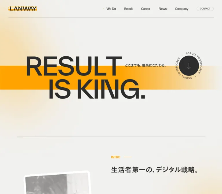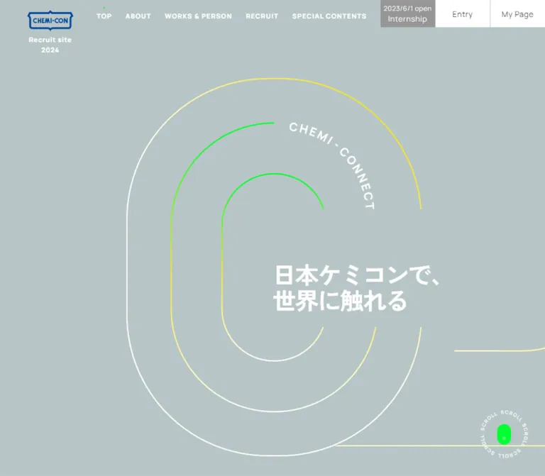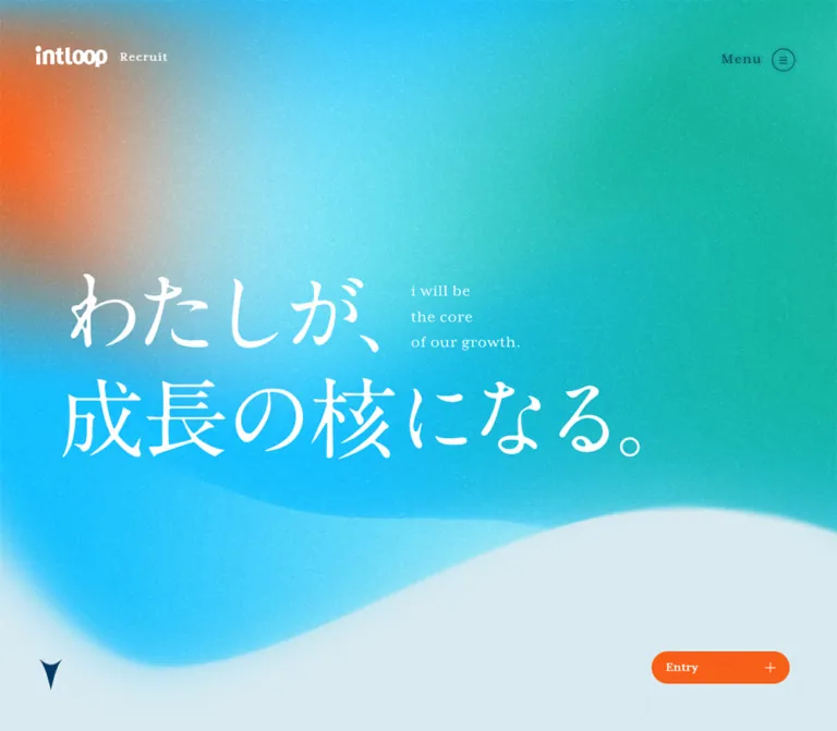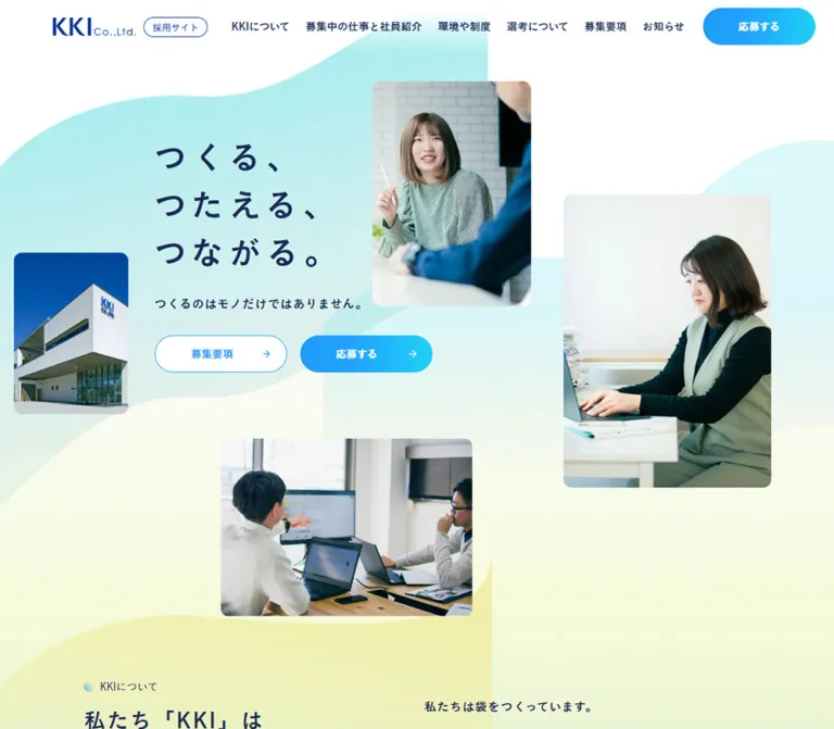
プレビュー準備中デザインリファレンスを見る
DESIGN REFERENCE
マルコ株式会社 採用サイト
白い余白にピンクとブルーの柔らかなグラデーションを重ねた採用サイト。明朝体のメッセージ、細い曲線、円形の矢印リンク、写真の非対称配置が特徴です。
MARUKO Recruiting Site — Style Reference
A spacious recruiting editorial framed by white space, soft color fields, and delicate contour lines.
Website: MARUKO Recruiting Site Original URL: https://www.maruko.com/corp/recruit/ Final URL: https://www.maruko.com/corp/recruit/ Theme: light; white content surfaces with pink, lavender, and blue gradient regions. Inspected: October 2, 2026, at 09:56:46 UTC / 18:56:46 JST, through the supplied browser evidence. Viewports: 1440 × 1000 and 390 × 844 CSS pixels. Scope: the current recruiting homepage: opening message, employee-story links, company and job introductions, culture links, requirements and FAQ cards, application CTA, and footer. Visual coverage includes the desktop opening, Works section, and ending, plus the mobile opening and ending. Other sections are documented from the supplied rendered DOM and computed styles. Linked pages and open-menu states were not inspected.
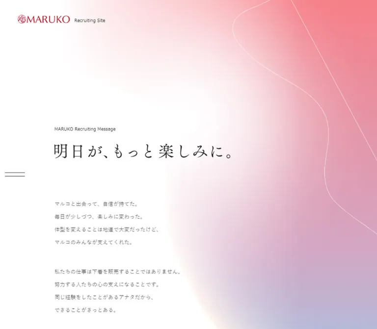
The recruiting homepage for マルコ株式会社 combines an understated black wordmark with generous white space and broad, softly blended color. The opening message is placed well below the identity block, with a Japanese serif headline and short, widely spaced paragraphs. A pink-to-lavender field occupies the right side, crossed by fine white contours. On mobile, the color extends behind more of the message while the left reading edge stays pale.
Further down, the site becomes an editorial directory. Large English serif headings identify major sections; smaller Japanese Mincho headings explain their subject. Photography, pale oversized background lettering, and circular arrow links organize the introductions. The ending joins photographic information cards to a multicolor footer containing a large white ENTRY rectangle. The character depends on restrained typography, asymmetry, and breathing room more than on boxed interface chrome.
閉じる
MARUKO Recruiting Site — Style Reference
A spacious recruiting editorial framed by white space, soft color fields, and delicate contour lines.
Website: MARUKO Recruiting Site Original URL: https://www.maruko.com/corp/recruit/ Final URL: https://www.maruko.com/corp/recruit/ Theme: light; white content surfaces with pink, lavender, and blue gradient regions. Inspected: October 2, 2026, at 09:56:46 UTC / 18:56:46 JST, through the supplied browser evidence. Viewports: 1440 × 1000 and 390 × 844 CSS pixels. Scope: the current recruiting homepage: opening message, employee-story links, company and job introductions, culture links, requirements and FAQ cards, application CTA, and footer. Visual coverage includes the desktop opening, Works section, and ending, plus the mobile opening and ending. Other sections are documented from the supplied rendered DOM and computed styles. Linked pages and open-menu states were not inspected.
The recruiting homepage for マルコ株式会社 combines an understated black wordmark with generous white space and broad, softly blended color. The opening message is placed well below the identity block, with a Japanese serif headline and short, widely spaced paragraphs. A pink-to-lavender field occupies the right side, crossed by fine white contours. On mobile, the color extends behind more of the message while the left reading edge stays pale.
Further down, the site becomes an editorial directory. Large English serif headings identify major sections; smaller Japanese Mincho headings explain their subject. Photography, pale oversized background lettering, and circular arrow links organize the introductions. The ending joins photographic information cards to a multicolor footer containing a large white ENTRY rectangle. The character depends on restrained typography, asymmetry, and breathing room more than on boxed interface chrome.
How to Read This Reference
- Measured means a value is present in the supplied computed styles or element rectangles. Tables round values for readability.
- Visual estimate means a proportion, color, or detail was judged from a current-page screenshot. Estimated hex colors are recreation targets, not sampled source declarations.
- Recommended means implementation guidance for a new build. The CSS below is an adaptation, not recovered production CSS.
- Named tokens are descriptive aliases unless explicitly identified as source properties.
- State matters: the evidence combines initial and scrolled observations. Some rectangles are viewport-relative, and some elements have offscreen or transformed coordinates. Do not combine every coordinate into one static layout.
- Scope matters: static captures and declared transitions do not establish hover outcomes, carousel controls, menu behavior, or exact scroll choreography.
Tokens — Colors
Default Palette
| Name | Value | Suggested token | Evidence and role |
|---|---|---|---|
| White canvas | #ffffff |
--paper |
Measured body and main background; measured ENTRY background |
| Heading ink | #222222 |
--ink |
Measured major headings, Japanese section headings, and ENTRY text |
| Body gray | #444444 |
--body-ink |
Measured paragraphs and View More links |
| Ghost lettering | #f8f5f3 |
--ghost |
Measured oversized number and Job introduction lettering |
| Link red | #b40019 |
--brand-red |
Measured home-link text color; does not establish the visible color of artwork inside that link |
| Coral pink | Approximately #f47e8c |
--wash-coral |
Visual estimate of the saturated upper-right opening field and footer pink |
| Soft rose | Approximately #e8a1b7 |
--wash-rose |
Visual estimate of the broad transition through pink |
| Lavender | Approximately #bebbd4 |
--wash-lavender |
Visual estimate of the lower opening wash |
| Powder blue | Approximately #a8c6dc |
--wash-blue |
Visual estimate of the cool lower field and information-card palette |
| Pale butter | Approximately #fff4ce |
--wash-cream |
Visual estimate of the warm, almost-white center-left footer glow |
| Soft peach | Approximately #f6e4dc |
--wash-peach |
Visual estimate of the Works image backing and warm photographic surroundings |
The opening has a large white region with a soft, curved boundary. A simple left-to-right linear gradient will miss this shape. A useful recreation combines a vertical pink-to-blue gradient with a large white radial mask or overlay.
The footer distributes color differently: blue or cyan collects toward the lower left, pale yellow sits near the center-left, and pink dominates the right. Preserve these separate compositions instead of reusing one background image everywhere.
Color Interpretation
The current screenshots show a black MARUKO wordmark. Its enclosing link computes to red in the DOM; that inherited color does not recolor the visible logo automatically. Treat the supplied logo artwork as authoritative.
The source exposes --swiper-theme-color: #007aff and --swiper-navigation-size: 44px. Neither establishes a visible blue accent or a 44px menu icon in the inspected screenshots. They are library defaults, not the basis of this palette.
No alternate theme or theme selector is evidenced.
Tokens — Typography
Japanese Body Copy
Measured source stack: 游ゴシック, YuGothic, "Helvetica Neue", Arial, "Hiragino Kaku Gothic ProN", "Hiragino Sans", Meiryo, sans-serif.
Body text is regular weight, medium gray, and relatively small. Standard prose uses a measured line-height ratio of approximately 1.8; the Data, Works, and culture descriptions use approximately 2. Opening-message paragraphs are airier still, at approximately 2.47.
The message uses deliberate short lines. Its desktop element is nearly 1000px wide, but the visible text does not fill that width. Do not interpret the bounding box as a recommendation for 1000px-long prose lines.
Japanese Editorial Headings
Measured source stack: 游明朝, YuMincho, "ヒラギノ明朝 Pro W3", "Hiragino Mincho Pro", HG明朝E, "MS P明朝", "MS 明朝", serif.
This stack is confirmed for Japanese section headings such as 仕事紹介 and マルコが目指す未来. They use regular weight and, for these introductory headings, 0.05em tracking.
The opening headline, 明日が、もっと楽しみに。, also has a fine Japanese serif appearance in the screenshots. Its own rendered font declaration is not included in the sampled nodes. Reusing the confirmed Mincho stack is a recommendation, not a verified identification of that headline's implementation.
English Display Typography
Measured source family: Marcellus, serif, weight 400.
Marcellus is confirmed for the major English headings, oversized background lettering, and ENTRY. Major headings are exceptionally large on desktop, with a line-height ratio of 1. Their thin, classical forms supply hierarchy without heavy bold weight.
English Utility Typography
Measured source family: URWDIN-Light, sans-serif, computed weight 400.
This family is declared on View More, copyright text, and desktop footer navigation. The declaration does not independently prove which font file rendered. Provide the font through an authorized source or retain a sans-serif fallback.
Type Scale
| Role | Desktop measured value | Mobile measured value | Notes |
|---|---|---|---|
| Root font size | 10px |
10px |
Source root; the Quick Start does not require this reset |
| General body | 15.608px / 28.095px |
13.037px / 23.466px |
Regular sans-serif; approximately 1.8 line height |
| Opening paragraphs | 16.347px / 40.377px |
12.061px / 29.791px |
0.02em tracking |
| Major English heading | 110.857px / 110.857px |
50.857px / 50.857px |
Marcellus; People, About, Environment |
| Introductory Japanese heading | 38.041px / 28.095px |
25.184px / 23.466px |
Mincho; 0.05em tracking |
| Culture panel heading | 33.041px / 28.095px |
20.184px / 23.466px |
Mincho; normal tracking |
| Ghost lettering | 112.163px / 112.163px |
60.735px / 60.735px |
Marcellus; very pale fill |
| View More | 15.608px |
13.037px |
URWDIN-Light declaration |
| ENTRY | 28.041px / 28.041px |
15.184px / 15.184px |
Marcellus; 0.1em tracking |
| Copyright | 11.739px |
10.025px |
White, URWDIN-Light declaration |
| Corporate link | 13.739px |
12.025px |
White Japanese sans-serif |
| Footer navigation | 12px |
Not visibly rendered | Desktop links only in the supplied ending capture |
Visual estimates outside the measured sample: the opening headline is approximately 48–52px on desktop and 26–28px on mobile. Its eyebrow is approximately 14px and 11px respectively. The footer statement is approximately 34–38px on desktop and 18–20px on mobile. The mobile Requirements and FAQ English titles appear approximately 26px.
Some measured Japanese heading line boxes are shorter than their font size. For a new implementation with editable or wrapping headings, use a safer line height around 1.3–1.5; do not reproduce the tight inherited line box indiscriminately.
Tokens — Spacing & Shapes
Density: small interface details, large section intervals, and substantial empty space around editorial content.
Geometry: rectangular photographs and CTAs, circular arrows, hairline menu strokes, and soft color boundaries. The supplied nodes consistently report square corners; there is no general rounded-card system.
Measured Layout Values
| Element | Desktop | Mobile | Interpretation |
|---|---|---|---|
| Main message/content left edge | 221.266px |
30.109px |
Approximately 15.37% and 7.72% of viewport width |
| Main message/content width | 997.469px |
329.781px |
Shared alignment reference, not continuous prose measure |
| Header home-link box | 175.406 × 36.25px |
105.984 × 23.625px |
Includes the artwork's internal spacing |
| Header home-link origin | 63.469, 54.766px |
20.609, 20.484px |
Link-box coordinates; visible ink begins farther inside |
| First message paragraph top | 623.141px |
443.031px |
Opening state |
| Gap between message paragraph boxes | 56.078px |
30.359px |
Calculated from consecutive measured rectangles |
| View More link box | 173.813 × 72.156px |
128.641 × 40.438px |
Entire arrow-and-label group |
| Information card link | 726.438 × 416.813px |
390 × 199.109px |
Aspect ratio changes between viewports |
| Information-section top padding | 181.714px |
61.714px |
Large white approach to the cards |
| Information-section bottom padding | 172.367px |
56.653px |
White separation before the gradient footer |
| ENTRY link | 533.156 × 122.297px |
291.438 × 71.719px |
Centered white rectangle |
| ENTRY vertical padding | 47.127px |
28.269px |
Measured source padding |
| Footer height | 590.813px |
333.672px |
Captured layout, not a recommended fixed height |
Shape and Rule Estimates
| Detail | Visual estimate | Reuse guidance |
|---|---|---|
| Desktop menu strokes | About 56px wide, 1px thick |
Two lines with roughly 10px of clear vertical separation |
| Mobile menu strokes | About 30px wide, 1px thick |
Tighter spacing, at the upper right |
| View More circle | About 72px desktop, 40px mobile |
Matches the measured link height |
| Arrow-label gap | About 20px desktop |
Keep the label outside the circle |
| Decorative contour | About 1px, translucent white |
Keep behind text and outside hit testing |
| ENTRY offset rule | About 4–5px beyond the main rectangle |
Fine white secondary edge, most evident on the right |
| Photo and button corners | Square | Use border-radius: 0 |
A practical adaptation can use a 997.47px content cap and approximately 30px mobile gutters. The exact source breakpoint and interpolation formulas are not supplied.
Components
Persistent Identity and Menu Affordance
Anatomy: linked MARUKO artwork, a small Recruiting Site caption, and a separate two-line menu affordance.
On desktop, the caption sits to the right of the wordmark. The menu is detached from the identity and positioned along the left edge, slightly below the vertical midpoint of the supplied captures. Both remain in the same screen locations across the opening, Works, and footer images, supporting persistent positioning.
On mobile, the caption moves below the smaller wordmark and the menu moves to the upper right. This is a compositional change, not just a uniformly scaled desktop header.
Keep the header visually light. No full-width bordered navigation bar appears in the supplied opening. In the Works capture, the persistent identity overlaps the area occupied by section text; this is evidence of the captured layering, not a reason to deliberately obstruct headings in a new implementation.
The open menu, focus behavior, scroll locking, and dismissal interactions are unverified.
Opening Recruiting Message
Anatomy: broad color field, white contour strokes, small English eyebrow, large Japanese headline, three paragraph groups, and a further display-copy element below.
The desktop eyebrow begins around x221/y402 in the screenshot, after a large empty upper region. The headline follows at approximately y455. Body copy begins in the measured paragraph box at y623.14. This delayed start gives the message a contemplative pace.
On mobile, the eyebrow is around y282, the headline around y321, and body copy begins at y443.03. The headline remains a single line at the supplied 390px width. The paragraph groups retain their short, intentional line breaks.
The first group describes gaining confidence with MARUKO; the second explains supporting customers; the third connects customer smiles to the team's hopes. Preserve the text hierarchy and grouping rather than turning every sentence into a separate card.
The gradient has a soft boundary and thin, long white curves. No hero photograph is present in the supplied opening captures. Headline and display-copy implementation details are not fully exposed by the text extraction; do not assume a particular image or SVG format.
Employee Story Rail
Evidence level: rendered text, links, computed styles, and rectangles; no dedicated screenshot of this region was supplied.
Anatomy confirmed by the DOM: Work& / People heading, introductory paragraph, interview-time note, and repeated story links containing a short quote, initials, and joining year.
Five distinct interview destinations are present. Repeated link instances should not be counted as additional people. Their repetition and offscreen positions are consistent with a looping rail, but autoplay, drag, swipe, and navigation controls were not exercised.
At the sampled desktop state, most story links are approximately 268.02px wide and one enlarged link is 486.03px wide. At mobile, corresponding widths are approximately 156.58px and 329.78px. Link heights are approximately 611.47px and 358.61px. These are state-specific link boxes, not measured portrait-image sizes.
A reconstruction should preserve a strong featured-story hierarchy and clear quote/initials/year grouping. Exact portrait crops, image treatments, and selection semantics need additional evidence.
Company Introduction Sequence
Anatomy: large About / Us heading, Mission introduction, Data introduction, and Works introduction, each with a subject heading, supporting copy, and a View More link.
The desktop composition changes alignment across sections. The sampled About heading is positioned toward the right while Mission copy sits farther left. Data copy is right-aligned within the broader composition, with a measured 340px text box. Works reverses the arrangement: its visible copy sits at the left and a large salon photograph occupies the right.
Background words and numbers are pale, oversized, and allowed to extend beyond the viewport. The measured values 100% 92 53.5 20 have no explanatory labels in the supplied excerpt; treat them as observed decorative text, not independently interpretable company statistics.
On mobile, the copy boxes converge on the approximately 330px content column. The sampled View More links align near the right edge of that column. Exact mobile media placement for these sections is not visually documented.
Works Feature
Anatomy visible in the desktop capture: red Works eyebrow, Japanese 仕事紹介 heading, four short lines of gray copy, circular View More link, salon photograph, pale peach backing, and oversized Job introduction lettering behind the composition.
The photograph is approximately 560 × 359px in the supplied screenshot, with square corners and a roughly 1.56:1 aspect ratio. It shows a bright salon with rounded chairs, circular tables, curved ceiling details, and illuminated product displays.
The backing begins below the image's top edge and extends toward the right viewport edge. This offset creates depth without a conventional shadow. The decorative serif lettering spans the background at very low contrast.
The visible text begins near x221 in the capture; the sampled DOM reports x241.27 for its heading and paragraph. Treat that difference as capture-state evidence rather than forcing both into one exact position. The stable relationship is left copy, right photograph, and a broad shared horizontal band.
Circular View More Link
Anatomy: large outlined circle, small right-pointing chevron, and an external View More label.
The circle is transparent over the page. Its outline looks slightly uneven or doubled in the screenshot, with a subtly heavier arc; no exact path construction is supplied. The chevron remains small relative to the ring.
The entire group is an anchor. Measured destinations include message, company data, jobs, benefits and training, crosstalk, and gallery pages. These destinations were recorded, not opened.
Use the circle to provide an unhurried, recognizable navigation motif. Do not place the text inside the ring or fill every ring with brand red. No specific hover transformation is established by the supplied evidence.
Culture and Environment Panels
Evidence level: rendered DOM and geometry only.
Three subjects are present: マルコの働き方, 座談会, and マルコの仕事風景. Each includes a Japanese heading, descriptive paragraph, and View More link.
Desktop heading boxes are 690px wide and share a vertical position while extending horizontally beyond the viewport. Mobile heading boxes are 330px wide and occur at successive vertical positions. This supports a change from horizontal panel arrangement to vertical ordering.
Some mobile coordinates are negative, and the outer section reports a 3439px height at both viewports. These may reflect transforms or scroll-container state. They do not prove a specific pinned-scroll mechanism and should not be copied as static offsets or hardcoded height.
Requirements and FAQ Cards
Anatomy: image-covered rectangular link, centered Japanese subject label, larger English title, and a white outlined circular arrow below.
The Requirements card uses a cool blue/lavender, softly textured field. The FAQ card uses a warm, softly focused textile photograph with a MARUKO label. The Japanese labels are dark in the mobile screenshot, while the English titles and arrow rings are white.
On desktop, the cards are staggered and overlap horizontally. Their measured x positions are 54.41px and 659.14px, each with a width of 726.44px. This creates approximately 121.70px of horizontal overlap. The second card begins 109.75px lower.
On mobile, the two links become full-width stacked rectangles, each 390 × 199.11px, with a measured 15.61px gap. A pale offset backing is visible around the imagery. The content remains centered rather than moving into a separate caption panel.
Entry Footer
Anatomy: multicolor background, centered Japanese statement, large white ENTRY link, black wordmark, copyright, corporate-site link, and desktop section navigation.
The visible statement is 「なりたい自分」に、なる。. The ENTRY link is the main action, with measured Marcellus typography and generous vertical padding. A fine offset white edge adds a restrained double-layer detail.
The link points to an external krs.bz application form. The destination URL is present in the evidence; the form itself was not visited or tested.
Desktop footer navigation lists TOP, About, People, Environment, and Information along the lower right. The mobile ending retains the wordmark, copyright, and corporate link, while those section links are not visibly rendered. The corporate link includes a small external-link symbol.
The visible copyright reads ©2024 MARUKO CO.,LTD.. That is page content, not the inspection date or proof of a design launch year.
Tokens — Motion & Interaction
| Target | Measured declaration | Supported interpretation |
|---|---|---|
| Opening paragraph 1 | 1.2s 0.3s |
Transition with a 0.3s delay |
| Opening paragraph 2 | 1.2s 0.6s |
Staggered relative to the first group |
| Opening paragraph 3 | 1.2s 0.9s |
Third stage of the declared sequence |
| Additional display-copy wrappers | 1.2s, filter 1s 0.4s, color 1.5s 0.8s |
Filter and color transitions are declared; starting values are not supplied |
| Employee story links | 0.7s |
A transition exists; its visual outcome was not tested |
| People introduction | 0.8s |
A transition exists on the introduction paragraph |
| Header home link / corporate link | 0.4s |
Link transition duration; hover appearance unknown |
| ENTRY | 0.5s |
CTA transition duration; hover appearance unknown |
The supplied page content includes initial opacity-zero rules for the opening eyebrow, main copy, and message paragraphs. Together with the staggered timings and visible settled text, this supports an entrance-reveal intention. It does not establish the complete easing, motion path, or trigger sequence.
The capture process waited for visible finite motion and stability, and temporarily paused perpetual animations during readiness checks. The supplied screenshots therefore represent settled observation states, not a motion recording.
No sampled element reports an active CSS keyframe animation. This does not exclude JavaScript animation, animated descendants, or perpetual background effects. Similarly, transition: all without a duration is not proof of visible movement.
Unverified: open-menu animation, ring rotation, image zoom on hover, employee-rail autoplay or swipe, exact culture scroll behavior, background drift, and reduced-motion support.
Recommended adaptation: keep small interaction feedback within approximately 200–400ms, use the measured 1.2s stagger only for optional opening presentation, and make all text visible when animation is unavailable or reduced motion is requested.
Surfaces
| Surface | Appearance | Function |
|---|---|---|
| Main canvas | White | Maintains breathing room around editorial sections |
| Opening field | White blending into pink, lavender, and blue | Establishes atmosphere without a photographic hero |
| Decorative typography | Very pale warm gray, #f8f5f3 |
Adds scale and rhythm behind foreground content |
| Image backing | Pale peach or translucent-looking offset plate | Separates imagery from the canvas without elevation |
| Information cards | Edge-to-edge imagery with centered labels | Connects recruitment information to the site's material palette |
| Entry region | Broad multicolor wash | Reintroduces the opening atmosphere at the application decision |
| ENTRY surface | Solid white, square, with fine offset edge | Gives the main action clear visual weight |
No general drop-shadow, glass blur, or elevated card system is evidenced. Softness comes from blended color and photographic focus; foreground text and edges remain crisp.
Imagery
The current imagery combines a bright working environment with close, tactile material detail. The Works photograph is descriptive: seating, tables, lighting, and displays explain the physical salon. The FAQ image is atmospheric: pale pink fabric, lace-like texture, shallow focus, and a branded label.
The Requirements card reads as a cool, softly textured image field. Its exact asset type and subject are not established by the supplied screenshot. Preserve that visual restraint rather than inventing a recognizable scene.
Observed Asset References
Asset URLs, filenames, intrinsic image sizes, and source crops were not included in the supplied evidence. The references below identify visible roles only.
| Reference | Evidence | Reproduction guidance |
|---|---|---|
| Black MARUKO wordmark | Desktop and mobile header/footer captures | Use the authorized artwork; do not approximate it with a typed serif name |
| Opening color field and contours | Desktop and mobile opening captures | Recreate the soft white boundary and fine line placement; original construction unknown |
| Salon interior | Desktop Works capture | Preserve the bright, spacious setting and square crop |
| Requirements background | Mobile ending capture; partial desktop ending | Keep the cool blue/lavender texture and understated contrast |
| FAQ textile photograph | Mobile and desktop ending captures | Retain the warm pink material palette and soft focus |
| Footer color field | Desktop and mobile ending captures | Use a dedicated composition with a pale center and stronger pink right edge |
Employee and culture image details are not visually documented in the supplied captures. Do not invent exact portrait styling, wardrobe, image crops, or asset paths.
For a new build, use responsive image sources, explicit dimensions, and an appropriate object-fit crop. Decorative contours and color fields should be excluded from the accessibility tree. Give the salon photograph a meaningful alternative when it contributes information beyond adjacent text.
Layout & Responsive Behavior
| Area | 1440 × 1000 observation | 390 × 844 observation |
|---|---|---|
| Main content | Approximately 997.47px column, centered | Approximately 329.78px column with 30.11px gutters |
| Identity | Wordmark and caption in a horizontal group | Smaller wordmark with caption underneath |
| Menu | Detached left-edge control around mid-screen | Upper-right control |
| Opening | Large white reading region, color concentrated right | Color occupies more of the width behind the text |
| Major English headings | Approximately 110.86px | Approximately 50.86px |
| Employee links | Multiple offscreen items and an enlarged story box | An enlarged story box approximately fills the content column |
| Company introductions | Alternating desktop text positions | Text returns to the common mobile column |
| Culture panels | Horizontally separated heading boxes | Successive vertical heading positions |
| Information cards | Large, staggered, horizontally overlapping | Full-width vertical stack |
| ENTRY | Approximately 533 × 122px | Approximately 291 × 72px |
| Footer navigation | Visible along lower right | Not visibly rendered |
| Reported document height | 10435.422px |
8458.031px |
The opening remains tall on mobile. The People section begins around the reported page-flow y1452px, compared with y1823px on desktop. Compacting the opening into one short screen would remove a major part of the observed rhythm.
The responsive changes are not proportional scaling. Mobile body copy is about 83.5% of its desktop size, while major English headings are about 45.9%. Information cards change both arrangement and aspect ratio, and the header changes control placement.
Only two viewports were supplied. Tablet behavior, intermediate breakpoints, landscape layouts, browser zoom, and safe-area handling remain unverified. The Quick Start uses a recommended 48rem breakpoint for a practical adaptation.
Do’s and Don’ts
Do
- Preserve the large white area and curved gradient boundary in the opening.
- Use regular-weight Mincho headings with a clear sans-serif reading layer.
- Retain the confirmed Marcellus scale for major English section headings.
- Keep opening paragraphs short, grouped, and generously spaced.
- Use square photographs and white rectangular CTAs.
- Repeat the outlined circle-and-chevron link motif consistently.
- Place pale oversized lettering behind content without reducing readability.
- Preserve the desktop stagger and mobile stack of Requirements and FAQ.
- Recompose the header for mobile, including the upper-right menu.
- Treat exact animation behavior and unsupplied imagery as unresolved evidence.
Don’t
- Don’t replace the opening message with a generic full-bleed stock photograph.
- Don’t turn every section into a rounded, shadowed card.
- Don’t make the entire page uniformly pink; the white regions are structural.
- Don’t use the exposed Swiper blue as the site's primary accent.
- Don’t recolor the visible wordmark from its enclosing link's computed color.
- Don’t compress the main message into dense paragraphs with standard tight leading.
- Don’t interpret duplicate employee links as additional interview subjects.
- Don’t hardcode negative panel offsets or the captured 3439px culture-section height.
- Don’t claim that a transition declaration proves a particular hover or scrolling effect.
- Don’t invent asset paths, a menu overlay design, or production credits.
Recommended Implementation Additions
These are improvements for a new implementation, not verified features of the current site:
- Give the two-line menu a real button, an accessible name,
aria-expanded, and a controlled navigation region. Restore focus when the menu closes. - Maintain a visible keyboard focus indicator for circular links, full-card links, and ENTRY. A 40px visible ring can sit inside a larger touch target.
- Consider increasing mobile reading text from the measured 12–13px range to 14–16px. Allow the resulting line wrapping and page height to change naturally.
- Check white footer text and white card titles against every relevant image crop. Use a subtle local scrim or a darker text treatment if necessary.
- Make entrance copy visible by default. Apply hiding only after animation support is initialized, and reveal everything immediately under reduced motion.
- If the employee rail loops, prevent duplicate slides from creating repeated keyboard stops or repeated screen-reader content.
- If culture panels use scroll-controlled horizontal movement, provide a normal vertical-flow fallback and avoid trapping keyboard users.
- Give repeated View More links contextual accessible names while keeping the short visible label.
- Reserve clearance for persistent identity and menu controls so content headings remain readable during scrolling.
Agent Prompt Guide
Quick Color Reference
- Canvas and ENTRY: measured
#ffffff. - Heading ink: measured
#222222. - Body and secondary link text: measured
#444444. - Oversized background lettering: measured
#f8f5f3. - Sparse red accent: measured link color
#b40019; visible label shades may differ. - Gradient recreation targets: estimated coral
#f47e8c, rose#e8a1b7, lavender#bebbd4, blue#a8c6dc, and pale cream#fff4ce. - Depth treatment: pale offset plates and fine rules, with no general shadow system.
Overall Prompt
“Create a Japanese recruiting homepage inspired by the supplied MARUKO reference. Use a white canvas, a soft pink-to-lavender-to-blue opening field concentrated on the right, and thin white contour strokes. Place a compact black wordmark high at the left, then leave substantial space before a small English recruiting eyebrow and a fine Japanese serif headline. Use short gray Japanese paragraphs with very generous leading. Build the following content as an editorial directory with large regular-weight Marcellus section headings, smaller Mincho subject headings, bright workplace photography, pale oversized background words, and outlined circular arrow links labeled View More. End with staggered Requirements and FAQ image links and a pastel footer containing a large square-cornered white ENTRY button. On mobile, use approximately 30px reading gutters, move the menu to the upper right, and stack the information cards.”
Example Component Prompts
- Opening message: “A mostly white Japanese recruiting opening with a softly curved pink field on the right fading into lavender and powder blue. Add two thin white contour strokes. Keep the English eyebrow small, the Japanese serif headline light and spacious, and the body copy in three short groups with roughly 2.47 line height. Leave a large quiet region above the message.”
- Works introduction: “Create an editorial split section with a small red Works label, a Japanese Mincho heading, gray explanatory text, and an outlined circular arrow next to View More. Place a bright salon photograph to the right, with square corners and a pale peach plate offset behind it. Run oversized, nearly white serif Job introduction lettering behind the composition.”
- Information cards: “Create two image-covered recruitment links. Use a cool blue textured field for Requirements and a warm pink textile photograph for FAQ. Center a small Japanese label above a larger white English title, followed by a white outlined arrow circle. Stagger and overlap the cards on desktop; stack them edge to edge on mobile with a narrow white gap.”
- Entry footer: “Create a softly blended footer with blue at the lower left, a pale cream center, and pink on the right. Center the Japanese statement
「なりたい自分」に、なる。over a generous white rectangular ENTRY link with tracked serif lettering and a fine offset white edge. Keep the brand and small utility links close to the lower edge.”
For DOM-only areas, ask the implementing agent to preserve the confirmed content hierarchy while leaving unspecified imagery and motion open for review.
Quick Start
CSS Custom Properties
This is a practical visual adaptation using measured endpoint values and estimated gradient colors. It keeps a conventional document root, uses a recommended 48rem breakpoint, and does not implement the unverified menu, carousel, or scroll choreography. Supply authorized logo and photographic assets separately. Marcellus and URWDIN-Light require appropriate font loading if they are to render instead of their fallbacks.
The gradients, contour paths, heading safety margins, and focus treatment below are recommendations. Fixed viewport y coordinates and captured document heights are intentionally not used as page-height constraints.
:root {
  /* Measured interface colors */
  --paper: #ffffff;
  --ink: #222222;
  --body-ink: #444444;
  --ghost: #f8f5f3;
  --brand-red: #b40019;

  /* Estimated color-field targets */
  --wash-coral: #f47e8c;
  --wash-rose: #e8a1b7;
  --wash-lavender: #bebbd4;
  --wash-blue: #a8c6dc;
  --wash-cream: #fff4ce;
  --wash-peach: #f6e4dc;

  /* Source-declared families with fallbacks */
  --font-body: '游ゴシック', YuGothic, 'Helvetica Neue', Arial,
    'Hiragino Kaku Gothic ProN', 'Hiragino Sans', Meiryo, sans-serif;
  --font-jp: '游明朝', YuMincho, 'ヒラギノ明朝 Pro W3',
    'Hiragino Mincho Pro', HG明朝E, 'MS P明朝', 'MS 明朝', serif;
  --font-display: Marcellus, serif;
  --font-utility: URWDIN-Light, sans-serif;

  /* Mobile endpoint values */
  --text-body: 13.037px;
  --text-message: 12.061px;
  --text-section: 50.857px;
  --text-subheading: 25.184px;
  --text-ghost: 60.735px;
  --text-entry: 15.184px;
  --message-gap: 30.359px;
  --ring-size: 40.438px;
  --content-max: 997.469px;
  --gutter: 30.109px;
}

* { box-sizing: border-box; }
body { margin: 0; }

.maruko-reference {
  overflow-x: clip;
  color: var(--body-ink);
  background: var(--paper);
  font: 400 var(--text-body)/1.8 var(--font-body);
}

.wrap {
  width: min(var(--content-max), calc(100% - 2 * var(--gutter)));
  margin-inline: auto;
}

.brand {
  position: fixed;
  z-index: 30;
  top: 20.484px;
  left: 20.609px;
  display: flex;
  flex-direction: column;
  align-items: center;
  color: var(--ink);
  text-decoration: none;
}

.brand__logo { display: block; width: 105.984px; height: auto; }
.brand__caption { font: 400 11px/1.5 var(--font-utility); }

.menu-toggle {
  position: fixed;
  z-index: 40;
  top: 13px;
  right: 6px;
  display: grid;
  place-content: center;
  gap: 4px;
  width: 44px;
  height: 44px;
  padding: 0;
  border: 0;
  background: transparent;
  color: var(--ink);
  cursor: pointer;
}

.menu-toggle span {
  display: block;
  width: 30px;
  height: 1px;
  background: currentColor;
}

.message {
  position: relative;
  isolation: isolate;
  overflow: hidden;
  padding-block: 276px 180px;
}

.message::before {
  content: '';
  position: absolute;
  z-index: -2;
  inset: 0;
  background:
    radial-gradient(ellipse 105% 115% at -30% 30%,
      #fff 45%, transparent 100%),
    linear-gradient(165deg, var(--wash-coral),
      var(--wash-rose) 42%, var(--wash-blue));
}

.message__contours {
  position: absolute;
  z-index: -1;
  inset: 0 0 auto auto;
  width: 72%;
  height: 800px;
  pointer-events: none;
}

.message__contours path {
  fill: none;
  stroke: rgb(255 255 255 / 65%);
  stroke-width: 1;
  vector-effect: non-scaling-stroke;
}

.message__eyebrow {
  margin: 0;
  color: var(--ink);
  font: 400 11px/1.8 var(--font-utility);
}

.message__title {
  margin: 16px 0 0;
  color: var(--ink);
  font: 400 26px/1.55 var(--font-jp);
  letter-spacing: 0.04em;
}

.message__body {
  margin-top: 91px;
  font-size: var(--text-message);
  line-height: 2.47;
  letter-spacing: 0.02em;
}

.message__body p { margin: 0; }
.message__body p + p { margin-top: var(--message-gap); }

.section-title {
  margin: 0;
  color: var(--ink);
  font: 400 var(--text-section)/1 var(--font-display);
  overflow-wrap: anywhere;
}

.subject-title {
  margin: 0 0 28px;
  color: var(--ink);
  font: 400 var(--text-subheading)/1.4 var(--font-jp);
  letter-spacing: 0.05em;
}

.feature {
  position: relative;
  isolation: isolate;
  display: grid;
  gap: 32px;
  margin-block: 100px;
}

.feature__label {
  margin: 0 0 8px;
  color: var(--brand-red);
  font-family: var(--font-utility);
}

.feature__copy p { line-height: 2; }
.feature__media { position: relative; margin: 0; }

.feature__media img {
  display: block;
  width: 100%;
  aspect-ratio: 560 / 359;
  object-fit: cover;
}

.feature__media::before {
  content: '';
  position: absolute;
  z-index: -1;
  inset: 22% -30vw -6px 11%;
  background: var(--wash-peach);
}

.feature__ghost {
  position: absolute;
  z-index: -1;
  top: 52px;
  left: -20vw;
  margin: 0;
  color: var(--ghost);
  font: 400 var(--text-ghost)/1 var(--font-display);
  white-space: nowrap;
  pointer-events: none;
  user-select: none;
}

.read-more {
  display: inline-flex;
  align-items: center;
  gap: 20px;
  min-height: 44px;
  color: var(--body-ink);
  font-family: var(--font-utility);
  text-decoration: none;
}

.arrow-ring {
  display: grid;
  place-items: center;
  flex: 0 0 auto;
  width: var(--ring-size);
  height: var(--ring-size);
  border: 1px solid currentColor;
  border-radius: 50%;
}

.arrow-ring::after {
  content: '';
  width: 5px;
  height: 5px;
  border-top: 1px solid currentColor;
  border-right: 1px solid currentColor;
  transform: rotate(45deg);
}

.info-links {
  padding-block: 61.714px 56.653px;
  background: var(--paper);
}

.info-links__inner { display: grid; gap: 15.609px; }

.info-card {
  position: relative;
  isolation: isolate;
  display: grid;
  place-items: center;
  aspect-ratio: 390 / 199.109;
  color: #fff;
  text-decoration: none;
  text-align: center;
}

.info-card__image {
  position: absolute;
  z-index: -1;
  inset: 0;
  width: 100%;
  height: 100%;
  object-fit: cover;
}

.info-card__label { color: var(--ink); }
.info-card__title { margin: 2px 0 8px; font: 400 26px/1.3 var(--font-display); }
.info-card .arrow-ring { margin-inline: auto; }

.entry {
  padding: 65px var(--gutter) 32px;
  color: var(--ink);
  text-align: center;
  background:
    radial-gradient(ellipse at 22% 0%, #fff 12%, transparent 62%),
    radial-gradient(ellipse at 20% 35%, var(--wash-cream), transparent 55%),
    linear-gradient(115deg, #86cfe0, var(--wash-lavender) 37%,
      var(--wash-rose) 66%, var(--wash-coral));
}

.entry__lead {
  margin: 0;
  font: 400 18px/1.5 var(--font-jp);
  letter-spacing: 0.06em;
}

.entry__button {
  position: relative;
  display: grid;
  place-items: center;
  width: min(100%, 291.438px);
  min-height: 71.719px;
  margin: 31px auto 0;
  background: var(--paper);
  color: var(--ink);
  font: 400 var(--text-entry)/1 var(--font-display);
  letter-spacing: 0.1em;
  text-decoration: none;
}

.entry__button::after {
  content: '';
  position: absolute;
  inset: 4px -4px -4px 4px;
  border-right: 1px solid #fff;
  border-bottom: 1px solid #fff;
  pointer-events: none;
}

.footer-meta {
  display: flex;
  flex-wrap: wrap;
  align-items: flex-end;
  justify-content: space-between;
  gap: 20px;
  margin-top: 56px;
  color: #fff;
  text-align: left;
  font-family: var(--font-utility);
}

.footer-meta a { color: inherit; }
.footer-nav { display: none; }

.sr-only {
  position: absolute;
  width: 1px;
  height: 1px;
  padding: 0;
  margin: -1px;
  overflow: hidden;
  clip-path: inset(50%);
  white-space: nowrap;
  border: 0;
}

/* Recommended accessible focus, independent of image colors. */
.maruko-reference :focus-visible {
  outline: 2px solid var(--ink);
  outline-offset: 5px;
  box-shadow: 0 0 0 3px var(--paper);
}

@media (min-width: 48rem) {
  :root {
    --text-body: 15.608px;
    --text-message: 16.347px;
    --text-section: 110.857px;
    --text-subheading: 38.041px;
    --text-ghost: 112.163px;
    --text-entry: 28.041px;
    --message-gap: 56.078px;
    --ring-size: 72.156px;
  }

  .brand {
    top: 54.766px;
    left: 63.469px;
    flex-direction: row;
    gap: 17px;
  }
  .brand__logo { width: 175.406px; }
  .brand__caption { font-size: 14px; }
  .menu-toggle {
    top: 50%;
    right: auto;
    left: 0;
    width: 84px;
    height: 56px;
    gap: 10px;
  }
  .menu-toggle span { width: 56px; }
  .message { padding-block: 393px 260px; }
  .message::before {
    background:
      radial-gradient(ellipse 68% 110% at 12% 22%,
        #fff 64%, transparent 100%),
      linear-gradient(160deg, var(--wash-coral),
        var(--wash-rose) 52%, var(--wash-blue));
  }
  .message__contours { width: 36%; height: 100%; }
  .message__eyebrow { font-size: 14px; }
  .message__title { margin-top: 20px; font-size: 48px; }
  .message__body { margin-top: 111px; }
  .feature {
    grid-template-columns: minmax(240px, 326px) minmax(0, 1fr);
    gap: clamp(40px, 7.78vw, 112px);
    margin-block: 180px;
  }
  .feature__ghost { top: 190px; }
  .info-links { margin-inline: 15px; padding-block: 181.714px 172.367px; }
  .info-links__inner {
    display: flex;
    align-items: flex-start;
    width: calc(100% - 78.81px);
    margin-inline: auto;
    gap: 0;
  }
  .info-card { flex: 0 0 54.57%; aspect-ratio: 726.438 / 416.813; }
  .info-card + .info-card { margin-left: -9.14%; margin-top: 109.75px; }
  .info-card__title { font-size: 40px; }
  .entry { padding: 159px 38.688px 53px; }
  .entry__lead { font-size: 34px; }
  .entry__button { width: min(100%, 533.156px); min-height: 122.297px; margin-top: 50px; }
  .footer-meta { margin-top: 92px; }
  .footer-nav { display: flex; flex-wrap: wrap; gap: 20px; }
}

/* Optional enhancement only; visible content is the default. */
@media (prefers-reduced-motion: no-preference) {
  .read-more .arrow-ring { transition: background-color 250ms, color 250ms; }
  .entry__button { transition: background-color 500ms; }
}

@media (hover: hover) {
  .read-more:hover .arrow-ring { color: #fff; background: var(--body-ink); }
  .entry__button:hover { background: var(--ghost); }
}
The hover inversion above is a recommended enhancement, not an observed source state. The desktop information-card title size is also an adaptation; only the mobile appearance was sufficiently visible to estimate its scale.
Example Component Markup
Use an authorized logo image inside .brand, two decorative spans inside an accessible .menu-toggle button, and actual images inside .feature__media and .info-card. The button needs application logic before it can open a menu.
This small link example is usable without external artwork. Its additional accessible text is a recommendation.
<a class='read-more' href='https://www.maruko.com/corp/recruit/job/'>
  <span class='arrow-ring' aria-hidden='true'></span>
  <span>View More<span class='sr-only'> about jobs at MARUKO</span></span>
</a>
The following decorative SVG provides an approximate contour treatment. It is newly drawn guidance, not an extracted asset. Place it inside .message alongside .wrap.
<svg class='message__contours' viewBox='0 0 500 1000'
     preserveAspectRatio='none' aria-hidden='true' focusable='false'>
  <path d='M150 -20 C-90 90 80 200 225 300 S285 485 275 595 S380 745 520 815'/>
  <path d='M205 -30 L530 610'/>
</svg>
Tailwind v4 Token Mapping
Optional aliases for a project already using Tailwind v4. Define the preceding custom properties first. This mapping is not evidence that the source website uses Tailwind.
@theme inline {
  --color-paper: var(--paper);
  --color-ink: var(--ink);
  --color-body-ink: var(--body-ink);
  --color-ghost: var(--ghost);
  --color-brand-red: var(--brand-red);
  --color-wash-coral: var(--wash-coral);
  --color-wash-blue: var(--wash-blue);
  --font-sans: var(--font-body);
  --font-editorial: var(--font-jp);
  --font-display: var(--font-display-family, Marcellus, serif);
  --font-utility: var(--font-utility-family, URWDIN-Light, sans-serif);
  --text-body: var(--reference-body-size, 15.608px);
  --spacing-page-gutter: var(--gutter);
  --spacing-arrow-ring: var(--ring-size);
}
Use the main CSS variables directly for the endpoint-dependent type sizes; the optional --text-body utility above is a standalone default and does not replace that responsive setup.
Sources & Evidence
- MARUKO Recruiting Site: original and final URL, supplied HTTP status 200, page title, rendered text, links, element rectangles, and computed styles. Retrieval timestamp: October 2, 2026, 09:56:46.835 UTC.
- Desktop capture set, 1440 × 1000: opening message, Works introduction, and lower information-card/footer area. These establish the visible color fields, contour lines, persistent identity, salon image composition, and desktop ending.
- Mobile capture set, 390 × 844: opening message and lower information-card/footer area. These establish the smaller identity, upper-right menu, message scale, stacked cards, and simplified footer.
- Rendered DOM/computed-style evidence at both viewports: authority for the measured typography, colors, dimensions, link destinations, and transition declarations. Values for visually unsupplied sections are described as DOM evidence rather than complete visual inspection.
- Inspection limitations: no additional browsing, commands, or file inspection were performed for this reference. Menu opening, hover states, carousel controls, application form behavior, linked-page layouts, font-file loading, and complete motion sequences were not verified. Readiness checks establish a settled capture state but do not guarantee that all delayed or interaction-dependent content was exposed.
This reference documents the current supplied page evidence. Estimated color fields and implementation additions are explicitly separated from measured source values.
# MARUKO Recruiting Site — Style Reference

> A spacious recruiting editorial framed by white space, soft color fields, and delicate contour lines.

**Website:** [MARUKO Recruiting Site](https://www.maruko.com/corp/recruit/)
**Original URL:** https://www.maruko.com/corp/recruit/
**Final URL:** https://www.maruko.com/corp/recruit/
**Theme:** light; white content surfaces with pink, lavender, and blue gradient regions.
**Inspected:** October 2, 2026, at 09:56:46 UTC / 18:56:46 JST, through the supplied browser evidence.
**Viewports:** 1440 × 1000 and 390 × 844 CSS pixels.
**Scope:** the current recruiting homepage: opening message, employee-story links, company and job introductions, culture links, requirements and FAQ cards, application CTA, and footer. Visual coverage includes the desktop opening, Works section, and ending, plus the mobile opening and ending. Other sections are documented from the supplied rendered DOM and computed styles. Linked pages and open-menu states were not inspected.

The recruiting homepage for マルコ株式会社 combines an understated black wordmark with generous white space and broad, softly blended color. The opening message is placed well below the identity block, with a Japanese serif headline and short, widely spaced paragraphs. A pink-to-lavender field occupies the right side, crossed by fine white contours. On mobile, the color extends behind more of the message while the left reading edge stays pale.

Further down, the site becomes an editorial directory. Large English serif headings identify major sections; smaller Japanese Mincho headings explain their subject. Photography, pale oversized background lettering, and circular arrow links organize the introductions. The ending joins photographic information cards to a multicolor footer containing a large white `ENTRY` rectangle. The character depends on restrained typography, asymmetry, and breathing room more than on boxed interface chrome.
閉じる
# MARUKO Recruiting Site — Style Reference

> A spacious recruiting editorial framed by white space, soft color fields, and delicate contour lines.

**Website:** [MARUKO Recruiting Site](https://www.maruko.com/corp/recruit/)
**Original URL:** https://www.maruko.com/corp/recruit/
**Final URL:** https://www.maruko.com/corp/recruit/
**Theme:** light; white content surfaces with pink, lavender, and blue gradient regions.
**Inspected:** October 2, 2026, at 09:56:46 UTC / 18:56:46 JST, through the supplied browser evidence.
**Viewports:** 1440 × 1000 and 390 × 844 CSS pixels.
**Scope:** the current recruiting homepage: opening message, employee-story links, company and job introductions, culture links, requirements and FAQ cards, application CTA, and footer. Visual coverage includes the desktop opening, Works section, and ending, plus the mobile opening and ending. Other sections are documented from the supplied rendered DOM and computed styles. Linked pages and open-menu states were not inspected.

The recruiting homepage for マルコ株式会社 combines an understated black wordmark with generous white space and broad, softly blended color. The opening message is placed well below the identity block, with a Japanese serif headline and short, widely spaced paragraphs. A pink-to-lavender field occupies the right side, crossed by fine white contours. On mobile, the color extends behind more of the message while the left reading edge stays pale.

Further down, the site becomes an editorial directory. Large English serif headings identify major sections; smaller Japanese Mincho headings explain their subject. Photography, pale oversized background lettering, and circular arrow links organize the introductions. The ending joins photographic information cards to a multicolor footer containing a large white `ENTRY` rectangle. The character depends on restrained typography, asymmetry, and breathing room more than on boxed interface chrome.

## How to Read This Reference

- **Measured** means a value is present in the supplied computed styles or element rectangles. Tables round values for readability.
- **Visual estimate** means a proportion, color, or detail was judged from a current-page screenshot. Estimated hex colors are recreation targets, not sampled source declarations.
- **Recommended** means implementation guidance for a new build. The CSS below is an adaptation, not recovered production CSS.
- **Named tokens** are descriptive aliases unless explicitly identified as source properties.
- **State matters:** the evidence combines initial and scrolled observations. Some rectangles are viewport-relative, and some elements have offscreen or transformed coordinates. Do not combine every coordinate into one static layout.
- **Scope matters:** static captures and declared transitions do not establish hover outcomes, carousel controls, menu behavior, or exact scroll choreography.

## Tokens — Colors

### Default Palette

| Name | Value | Suggested token | Evidence and role |
| --- | --- | --- | --- |
| White canvas | `#ffffff` | `--paper` | Measured body and main background; measured ENTRY background |
| Heading ink | `#222222` | `--ink` | Measured major headings, Japanese section headings, and ENTRY text |
| Body gray | `#444444` | `--body-ink` | Measured paragraphs and View More links |
| Ghost lettering | `#f8f5f3` | `--ghost` | Measured oversized number and Job introduction lettering |
| Link red | `#b40019` | `--brand-red` | Measured home-link text color; does not establish the visible color of artwork inside that link |
| Coral pink | Approximately `#f47e8c` | `--wash-coral` | Visual estimate of the saturated upper-right opening field and footer pink |
| Soft rose | Approximately `#e8a1b7` | `--wash-rose` | Visual estimate of the broad transition through pink |
| Lavender | Approximately `#bebbd4` | `--wash-lavender` | Visual estimate of the lower opening wash |
| Powder blue | Approximately `#a8c6dc` | `--wash-blue` | Visual estimate of the cool lower field and information-card palette |
| Pale butter | Approximately `#fff4ce` | `--wash-cream` | Visual estimate of the warm, almost-white center-left footer glow |
| Soft peach | Approximately `#f6e4dc` | `--wash-peach` | Visual estimate of the Works image backing and warm photographic surroundings |

The opening has a large white region with a soft, curved boundary. A simple left-to-right linear gradient will miss this shape. A useful recreation combines a vertical pink-to-blue gradient with a large white radial mask or overlay.

The footer distributes color differently: blue or cyan collects toward the lower left, pale yellow sits near the center-left, and pink dominates the right. Preserve these separate compositions instead of reusing one background image everywhere.

### Color Interpretation

The current screenshots show a black MARUKO wordmark. Its enclosing link computes to red in the DOM; that inherited color does not recolor the visible logo automatically. Treat the supplied logo artwork as authoritative.

The source exposes `--swiper-theme-color: #007aff` and `--swiper-navigation-size: 44px`. Neither establishes a visible blue accent or a 44px menu icon in the inspected screenshots. They are library defaults, not the basis of this palette.

No alternate theme or theme selector is evidenced.

## Tokens — Typography

### Japanese Body Copy

**Measured source stack:** `游ゴシック, YuGothic, "Helvetica Neue", Arial, "Hiragino Kaku Gothic ProN", "Hiragino Sans", Meiryo, sans-serif`.

Body text is regular weight, medium gray, and relatively small. Standard prose uses a measured line-height ratio of approximately `1.8`; the Data, Works, and culture descriptions use approximately `2`. Opening-message paragraphs are airier still, at approximately `2.47`.

The message uses deliberate short lines. Its desktop element is nearly 1000px wide, but the visible text does not fill that width. Do not interpret the bounding box as a recommendation for 1000px-long prose lines.

### Japanese Editorial Headings

**Measured source stack:** `游明朝, YuMincho, "ヒラギノ明朝 Pro W3", "Hiragino Mincho Pro", HG明朝E, "MS P明朝", "MS 明朝", serif`.

This stack is confirmed for Japanese section headings such as `仕事紹介` and `マルコが目指す未来`. They use regular weight and, for these introductory headings, `0.05em` tracking.

The opening headline, `明日が、もっと楽しみに。`, also has a fine Japanese serif appearance in the screenshots. Its own rendered font declaration is not included in the sampled nodes. Reusing the confirmed Mincho stack is a recommendation, not a verified identification of that headline's implementation.

### English Display Typography

**Measured source family:** `Marcellus, serif`, weight `400`.

Marcellus is confirmed for the major English headings, oversized background lettering, and ENTRY. Major headings are exceptionally large on desktop, with a line-height ratio of `1`. Their thin, classical forms supply hierarchy without heavy bold weight.

### English Utility Typography

**Measured source family:** `URWDIN-Light, sans-serif`, computed weight `400`.

This family is declared on View More, copyright text, and desktop footer navigation. The declaration does not independently prove which font file rendered. Provide the font through an authorized source or retain a sans-serif fallback.

### Type Scale

| Role | Desktop measured value | Mobile measured value | Notes |
| --- | --- | --- | --- |
| Root font size | `10px` | `10px` | Source root; the Quick Start does not require this reset |
| General body | `15.608px / 28.095px` | `13.037px / 23.466px` | Regular sans-serif; approximately 1.8 line height |
| Opening paragraphs | `16.347px / 40.377px` | `12.061px / 29.791px` | `0.02em` tracking |
| Major English heading | `110.857px / 110.857px` | `50.857px / 50.857px` | Marcellus; People, About, Environment |
| Introductory Japanese heading | `38.041px / 28.095px` | `25.184px / 23.466px` | Mincho; `0.05em` tracking |
| Culture panel heading | `33.041px / 28.095px` | `20.184px / 23.466px` | Mincho; normal tracking |
| Ghost lettering | `112.163px / 112.163px` | `60.735px / 60.735px` | Marcellus; very pale fill |
| View More | `15.608px` | `13.037px` | URWDIN-Light declaration |
| ENTRY | `28.041px / 28.041px` | `15.184px / 15.184px` | Marcellus; `0.1em` tracking |
| Copyright | `11.739px` | `10.025px` | White, URWDIN-Light declaration |
| Corporate link | `13.739px` | `12.025px` | White Japanese sans-serif |
| Footer navigation | `12px` | Not visibly rendered | Desktop links only in the supplied ending capture |

**Visual estimates outside the measured sample:** the opening headline is approximately 48–52px on desktop and 26–28px on mobile. Its eyebrow is approximately 14px and 11px respectively. The footer statement is approximately 34–38px on desktop and 18–20px on mobile. The mobile Requirements and FAQ English titles appear approximately 26px.

Some measured Japanese heading line boxes are shorter than their font size. For a new implementation with editable or wrapping headings, use a safer line height around `1.3–1.5`; do not reproduce the tight inherited line box indiscriminately.

## Tokens — Spacing & Shapes

**Density:** small interface details, large section intervals, and substantial empty space around editorial content.

**Geometry:** rectangular photographs and CTAs, circular arrows, hairline menu strokes, and soft color boundaries. The supplied nodes consistently report square corners; there is no general rounded-card system.

### Measured Layout Values

| Element | Desktop | Mobile | Interpretation |
| --- | --- | --- | --- |
| Main message/content left edge | `221.266px` | `30.109px` | Approximately 15.37% and 7.72% of viewport width |
| Main message/content width | `997.469px` | `329.781px` | Shared alignment reference, not continuous prose measure |
| Header home-link box | `175.406 × 36.25px` | `105.984 × 23.625px` | Includes the artwork's internal spacing |
| Header home-link origin | `63.469, 54.766px` | `20.609, 20.484px` | Link-box coordinates; visible ink begins farther inside |
| First message paragraph top | `623.141px` | `443.031px` | Opening state |
| Gap between message paragraph boxes | `56.078px` | `30.359px` | Calculated from consecutive measured rectangles |
| View More link box | `173.813 × 72.156px` | `128.641 × 40.438px` | Entire arrow-and-label group |
| Information card link | `726.438 × 416.813px` | `390 × 199.109px` | Aspect ratio changes between viewports |
| Information-section top padding | `181.714px` | `61.714px` | Large white approach to the cards |
| Information-section bottom padding | `172.367px` | `56.653px` | White separation before the gradient footer |
| ENTRY link | `533.156 × 122.297px` | `291.438 × 71.719px` | Centered white rectangle |
| ENTRY vertical padding | `47.127px` | `28.269px` | Measured source padding |
| Footer height | `590.813px` | `333.672px` | Captured layout, not a recommended fixed height |

### Shape and Rule Estimates

| Detail | Visual estimate | Reuse guidance |
| --- | --- | --- |
| Desktop menu strokes | About `56px` wide, `1px` thick | Two lines with roughly 10px of clear vertical separation |
| Mobile menu strokes | About `30px` wide, `1px` thick | Tighter spacing, at the upper right |
| View More circle | About `72px` desktop, `40px` mobile | Matches the measured link height |
| Arrow-label gap | About `20px` desktop | Keep the label outside the circle |
| Decorative contour | About `1px`, translucent white | Keep behind text and outside hit testing |
| ENTRY offset rule | About `4–5px` beyond the main rectangle | Fine white secondary edge, most evident on the right |
| Photo and button corners | Square | Use `border-radius: 0` |

A practical adaptation can use a 997.47px content cap and approximately 30px mobile gutters. The exact source breakpoint and interpolation formulas are not supplied.

## Components

### Persistent Identity and Menu Affordance

**Anatomy:** linked MARUKO artwork, a small Recruiting Site caption, and a separate two-line menu affordance.

On desktop, the caption sits to the right of the wordmark. The menu is detached from the identity and positioned along the left edge, slightly below the vertical midpoint of the supplied captures. Both remain in the same screen locations across the opening, Works, and footer images, supporting persistent positioning.

On mobile, the caption moves below the smaller wordmark and the menu moves to the upper right. This is a compositional change, not just a uniformly scaled desktop header.

Keep the header visually light. No full-width bordered navigation bar appears in the supplied opening. In the Works capture, the persistent identity overlaps the area occupied by section text; this is evidence of the captured layering, not a reason to deliberately obstruct headings in a new implementation.

The open menu, focus behavior, scroll locking, and dismissal interactions are unverified.

### Opening Recruiting Message

**Anatomy:** broad color field, white contour strokes, small English eyebrow, large Japanese headline, three paragraph groups, and a further display-copy element below.

The desktop eyebrow begins around x221/y402 in the screenshot, after a large empty upper region. The headline follows at approximately y455. Body copy begins in the measured paragraph box at y623.14. This delayed start gives the message a contemplative pace.

On mobile, the eyebrow is around y282, the headline around y321, and body copy begins at y443.03. The headline remains a single line at the supplied 390px width. The paragraph groups retain their short, intentional line breaks.

The first group describes gaining confidence with MARUKO; the second explains supporting customers; the third connects customer smiles to the team's hopes. Preserve the text hierarchy and grouping rather than turning every sentence into a separate card.

The gradient has a soft boundary and thin, long white curves. No hero photograph is present in the supplied opening captures. Headline and display-copy implementation details are not fully exposed by the text extraction; do not assume a particular image or SVG format.

### Employee Story Rail

**Evidence level:** rendered text, links, computed styles, and rectangles; no dedicated screenshot of this region was supplied.

**Anatomy confirmed by the DOM:** Work& / People heading, introductory paragraph, interview-time note, and repeated story links containing a short quote, initials, and joining year.

Five distinct interview destinations are present. Repeated link instances should not be counted as additional people. Their repetition and offscreen positions are consistent with a looping rail, but autoplay, drag, swipe, and navigation controls were not exercised.

At the sampled desktop state, most story links are approximately 268.02px wide and one enlarged link is 486.03px wide. At mobile, corresponding widths are approximately 156.58px and 329.78px. Link heights are approximately 611.47px and 358.61px. These are state-specific link boxes, not measured portrait-image sizes.

A reconstruction should preserve a strong featured-story hierarchy and clear quote/initials/year grouping. Exact portrait crops, image treatments, and selection semantics need additional evidence.

### Company Introduction Sequence

**Anatomy:** large About / Us heading, Mission introduction, Data introduction, and Works introduction, each with a subject heading, supporting copy, and a View More link.

The desktop composition changes alignment across sections. The sampled About heading is positioned toward the right while Mission copy sits farther left. Data copy is right-aligned within the broader composition, with a measured 340px text box. Works reverses the arrangement: its visible copy sits at the left and a large salon photograph occupies the right.

Background words and numbers are pale, oversized, and allowed to extend beyond the viewport. The measured values `100% 92 53.5 20` have no explanatory labels in the supplied excerpt; treat them as observed decorative text, not independently interpretable company statistics.

On mobile, the copy boxes converge on the approximately 330px content column. The sampled View More links align near the right edge of that column. Exact mobile media placement for these sections is not visually documented.

### Works Feature

**Anatomy visible in the desktop capture:** red Works eyebrow, Japanese `仕事紹介` heading, four short lines of gray copy, circular View More link, salon photograph, pale peach backing, and oversized Job introduction lettering behind the composition.

The photograph is approximately 560 × 359px in the supplied screenshot, with square corners and a roughly 1.56:1 aspect ratio. It shows a bright salon with rounded chairs, circular tables, curved ceiling details, and illuminated product displays.

The backing begins below the image's top edge and extends toward the right viewport edge. This offset creates depth without a conventional shadow. The decorative serif lettering spans the background at very low contrast.

The visible text begins near x221 in the capture; the sampled DOM reports x241.27 for its heading and paragraph. Treat that difference as capture-state evidence rather than forcing both into one exact position. The stable relationship is left copy, right photograph, and a broad shared horizontal band.

### Circular View More Link

**Anatomy:** large outlined circle, small right-pointing chevron, and an external View More label.

The circle is transparent over the page. Its outline looks slightly uneven or doubled in the screenshot, with a subtly heavier arc; no exact path construction is supplied. The chevron remains small relative to the ring.

The entire group is an anchor. Measured destinations include message, company data, jobs, benefits and training, crosstalk, and gallery pages. These destinations were recorded, not opened.

Use the circle to provide an unhurried, recognizable navigation motif. Do not place the text inside the ring or fill every ring with brand red. No specific hover transformation is established by the supplied evidence.

### Culture and Environment Panels

**Evidence level:** rendered DOM and geometry only.

Three subjects are present: `マルコの働き方`, `座談会`, and `マルコの仕事風景`. Each includes a Japanese heading, descriptive paragraph, and View More link.

Desktop heading boxes are 690px wide and share a vertical position while extending horizontally beyond the viewport. Mobile heading boxes are 330px wide and occur at successive vertical positions. This supports a change from horizontal panel arrangement to vertical ordering.

Some mobile coordinates are negative, and the outer section reports a 3439px height at both viewports. These may reflect transforms or scroll-container state. They do not prove a specific pinned-scroll mechanism and should not be copied as static offsets or hardcoded height.

### Requirements and FAQ Cards

**Anatomy:** image-covered rectangular link, centered Japanese subject label, larger English title, and a white outlined circular arrow below.

The Requirements card uses a cool blue/lavender, softly textured field. The FAQ card uses a warm, softly focused textile photograph with a MARUKO label. The Japanese labels are dark in the mobile screenshot, while the English titles and arrow rings are white.

On desktop, the cards are staggered and overlap horizontally. Their measured x positions are 54.41px and 659.14px, each with a width of 726.44px. This creates approximately 121.70px of horizontal overlap. The second card begins 109.75px lower.

On mobile, the two links become full-width stacked rectangles, each 390 × 199.11px, with a measured 15.61px gap. A pale offset backing is visible around the imagery. The content remains centered rather than moving into a separate caption panel.

### Entry Footer

**Anatomy:** multicolor background, centered Japanese statement, large white ENTRY link, black wordmark, copyright, corporate-site link, and desktop section navigation.

The visible statement is `「なりたい自分」に、なる。`. The ENTRY link is the main action, with measured Marcellus typography and generous vertical padding. A fine offset white edge adds a restrained double-layer detail.

The link points to an external `krs.bz` application form. The destination URL is present in the evidence; the form itself was not visited or tested.

Desktop footer navigation lists TOP, About, People, Environment, and Information along the lower right. The mobile ending retains the wordmark, copyright, and corporate link, while those section links are not visibly rendered. The corporate link includes a small external-link symbol.

The visible copyright reads `©2024 MARUKO CO.,LTD.`. That is page content, not the inspection date or proof of a design launch year.

## Tokens — Motion & Interaction

| Target | Measured declaration | Supported interpretation |
| --- | --- | --- |
| Opening paragraph 1 | `1.2s 0.3s` | Transition with a 0.3s delay |
| Opening paragraph 2 | `1.2s 0.6s` | Staggered relative to the first group |
| Opening paragraph 3 | `1.2s 0.9s` | Third stage of the declared sequence |
| Additional display-copy wrappers | `1.2s`, `filter 1s 0.4s`, `color 1.5s 0.8s` | Filter and color transitions are declared; starting values are not supplied |
| Employee story links | `0.7s` | A transition exists; its visual outcome was not tested |
| People introduction | `0.8s` | A transition exists on the introduction paragraph |
| Header home link / corporate link | `0.4s` | Link transition duration; hover appearance unknown |
| ENTRY | `0.5s` | CTA transition duration; hover appearance unknown |

The supplied page content includes initial opacity-zero rules for the opening eyebrow, main copy, and message paragraphs. Together with the staggered timings and visible settled text, this supports an entrance-reveal intention. It does not establish the complete easing, motion path, or trigger sequence.

The capture process waited for visible finite motion and stability, and temporarily paused perpetual animations during readiness checks. The supplied screenshots therefore represent settled observation states, not a motion recording.

No sampled element reports an active CSS keyframe animation. This does not exclude JavaScript animation, animated descendants, or perpetual background effects. Similarly, `transition: all` without a duration is not proof of visible movement.

**Unverified:** open-menu animation, ring rotation, image zoom on hover, employee-rail autoplay or swipe, exact culture scroll behavior, background drift, and reduced-motion support.

**Recommended adaptation:** keep small interaction feedback within approximately 200–400ms, use the measured 1.2s stagger only for optional opening presentation, and make all text visible when animation is unavailable or reduced motion is requested.

## Surfaces

| Surface | Appearance | Function |
| --- | --- | --- |
| Main canvas | White | Maintains breathing room around editorial sections |
| Opening field | White blending into pink, lavender, and blue | Establishes atmosphere without a photographic hero |
| Decorative typography | Very pale warm gray, `#f8f5f3` | Adds scale and rhythm behind foreground content |
| Image backing | Pale peach or translucent-looking offset plate | Separates imagery from the canvas without elevation |
| Information cards | Edge-to-edge imagery with centered labels | Connects recruitment information to the site's material palette |
| Entry region | Broad multicolor wash | Reintroduces the opening atmosphere at the application decision |
| ENTRY surface | Solid white, square, with fine offset edge | Gives the main action clear visual weight |

No general drop-shadow, glass blur, or elevated card system is evidenced. Softness comes from blended color and photographic focus; foreground text and edges remain crisp.

## Imagery

The current imagery combines a bright working environment with close, tactile material detail. The Works photograph is descriptive: seating, tables, lighting, and displays explain the physical salon. The FAQ image is atmospheric: pale pink fabric, lace-like texture, shallow focus, and a branded label.

The Requirements card reads as a cool, softly textured image field. Its exact asset type and subject are not established by the supplied screenshot. Preserve that visual restraint rather than inventing a recognizable scene.

### Observed Asset References

Asset URLs, filenames, intrinsic image sizes, and source crops were not included in the supplied evidence. The references below identify visible roles only.

| Reference | Evidence | Reproduction guidance |
| --- | --- | --- |
| Black MARUKO wordmark | Desktop and mobile header/footer captures | Use the authorized artwork; do not approximate it with a typed serif name |
| Opening color field and contours | Desktop and mobile opening captures | Recreate the soft white boundary and fine line placement; original construction unknown |
| Salon interior | Desktop Works capture | Preserve the bright, spacious setting and square crop |
| Requirements background | Mobile ending capture; partial desktop ending | Keep the cool blue/lavender texture and understated contrast |
| FAQ textile photograph | Mobile and desktop ending captures | Retain the warm pink material palette and soft focus |
| Footer color field | Desktop and mobile ending captures | Use a dedicated composition with a pale center and stronger pink right edge |

Employee and culture image details are not visually documented in the supplied captures. Do not invent exact portrait styling, wardrobe, image crops, or asset paths.

For a new build, use responsive image sources, explicit dimensions, and an appropriate `object-fit` crop. Decorative contours and color fields should be excluded from the accessibility tree. Give the salon photograph a meaningful alternative when it contributes information beyond adjacent text.

## Layout & Responsive Behavior

| Area | 1440 × 1000 observation | 390 × 844 observation |
| --- | --- | --- |
| Main content | Approximately 997.47px column, centered | Approximately 329.78px column with 30.11px gutters |
| Identity | Wordmark and caption in a horizontal group | Smaller wordmark with caption underneath |
| Menu | Detached left-edge control around mid-screen | Upper-right control |
| Opening | Large white reading region, color concentrated right | Color occupies more of the width behind the text |
| Major English headings | Approximately 110.86px | Approximately 50.86px |
| Employee links | Multiple offscreen items and an enlarged story box | An enlarged story box approximately fills the content column |
| Company introductions | Alternating desktop text positions | Text returns to the common mobile column |
| Culture panels | Horizontally separated heading boxes | Successive vertical heading positions |
| Information cards | Large, staggered, horizontally overlapping | Full-width vertical stack |
| ENTRY | Approximately 533 × 122px | Approximately 291 × 72px |
| Footer navigation | Visible along lower right | Not visibly rendered |
| Reported document height | `10435.422px` | `8458.031px` |

The opening remains tall on mobile. The People section begins around the reported page-flow y1452px, compared with y1823px on desktop. Compacting the opening into one short screen would remove a major part of the observed rhythm.

The responsive changes are not proportional scaling. Mobile body copy is about 83.5% of its desktop size, while major English headings are about 45.9%. Information cards change both arrangement and aspect ratio, and the header changes control placement.

Only two viewports were supplied. Tablet behavior, intermediate breakpoints, landscape layouts, browser zoom, and safe-area handling remain unverified. The Quick Start uses a recommended 48rem breakpoint for a practical adaptation.

## Do’s and Don’ts

### Do

- Preserve the large white area and curved gradient boundary in the opening.
- Use regular-weight Mincho headings with a clear sans-serif reading layer.
- Retain the confirmed Marcellus scale for major English section headings.
- Keep opening paragraphs short, grouped, and generously spaced.
- Use square photographs and white rectangular CTAs.
- Repeat the outlined circle-and-chevron link motif consistently.
- Place pale oversized lettering behind content without reducing readability.
- Preserve the desktop stagger and mobile stack of Requirements and FAQ.
- Recompose the header for mobile, including the upper-right menu.
- Treat exact animation behavior and unsupplied imagery as unresolved evidence.

### Don’t

- Don’t replace the opening message with a generic full-bleed stock photograph.
- Don’t turn every section into a rounded, shadowed card.
- Don’t make the entire page uniformly pink; the white regions are structural.
- Don’t use the exposed Swiper blue as the site's primary accent.
- Don’t recolor the visible wordmark from its enclosing link's computed color.
- Don’t compress the main message into dense paragraphs with standard tight leading.
- Don’t interpret duplicate employee links as additional interview subjects.
- Don’t hardcode negative panel offsets or the captured 3439px culture-section height.
- Don’t claim that a transition declaration proves a particular hover or scrolling effect.
- Don’t invent asset paths, a menu overlay design, or production credits.

## Recommended Implementation Additions

These are improvements for a new implementation, not verified features of the current site:

- Give the two-line menu a real button, an accessible name, `aria-expanded`, and a controlled navigation region. Restore focus when the menu closes.
- Maintain a visible keyboard focus indicator for circular links, full-card links, and ENTRY. A 40px visible ring can sit inside a larger touch target.
- Consider increasing mobile reading text from the measured 12–13px range to 14–16px. Allow the resulting line wrapping and page height to change naturally.
- Check white footer text and white card titles against every relevant image crop. Use a subtle local scrim or a darker text treatment if necessary.
- Make entrance copy visible by default. Apply hiding only after animation support is initialized, and reveal everything immediately under reduced motion.
- If the employee rail loops, prevent duplicate slides from creating repeated keyboard stops or repeated screen-reader content.
- If culture panels use scroll-controlled horizontal movement, provide a normal vertical-flow fallback and avoid trapping keyboard users.
- Give repeated View More links contextual accessible names while keeping the short visible label.
- Reserve clearance for persistent identity and menu controls so content headings remain readable during scrolling.

## Agent Prompt Guide

### Quick Color Reference

- Canvas and ENTRY: measured `#ffffff`.
- Heading ink: measured `#222222`.
- Body and secondary link text: measured `#444444`.
- Oversized background lettering: measured `#f8f5f3`.
- Sparse red accent: measured link color `#b40019`; visible label shades may differ.
- Gradient recreation targets: estimated coral `#f47e8c`, rose `#e8a1b7`, lavender `#bebbd4`, blue `#a8c6dc`, and pale cream `#fff4ce`.
- Depth treatment: pale offset plates and fine rules, with no general shadow system.

### Overall Prompt

“Create a Japanese recruiting homepage inspired by the supplied MARUKO reference. Use a white canvas, a soft pink-to-lavender-to-blue opening field concentrated on the right, and thin white contour strokes. Place a compact black wordmark high at the left, then leave substantial space before a small English recruiting eyebrow and a fine Japanese serif headline. Use short gray Japanese paragraphs with very generous leading. Build the following content as an editorial directory with large regular-weight Marcellus section headings, smaller Mincho subject headings, bright workplace photography, pale oversized background words, and outlined circular arrow links labeled View More. End with staggered Requirements and FAQ image links and a pastel footer containing a large square-cornered white ENTRY button. On mobile, use approximately 30px reading gutters, move the menu to the upper right, and stack the information cards.”

### Example Component Prompts

1. **Opening message:** “A mostly white Japanese recruiting opening with a softly curved pink field on the right fading into lavender and powder blue. Add two thin white contour strokes. Keep the English eyebrow small, the Japanese serif headline light and spacious, and the body copy in three short groups with roughly 2.47 line height. Leave a large quiet region above the message.”
2. **Works introduction:** “Create an editorial split section with a small red Works label, a Japanese Mincho heading, gray explanatory text, and an outlined circular arrow next to View More. Place a bright salon photograph to the right, with square corners and a pale peach plate offset behind it. Run oversized, nearly white serif Job introduction lettering behind the composition.”
3. **Information cards:** “Create two image-covered recruitment links. Use a cool blue textured field for Requirements and a warm pink textile photograph for FAQ. Center a small Japanese label above a larger white English title, followed by a white outlined arrow circle. Stagger and overlap the cards on desktop; stack them edge to edge on mobile with a narrow white gap.”
4. **Entry footer:** “Create a softly blended footer with blue at the lower left, a pale cream center, and pink on the right. Center the Japanese statement `「なりたい自分」に、なる。` over a generous white rectangular ENTRY link with tracked serif lettering and a fine offset white edge. Keep the brand and small utility links close to the lower edge.”

For DOM-only areas, ask the implementing agent to preserve the confirmed content hierarchy while leaving unspecified imagery and motion open for review.

## Quick Start

### CSS Custom Properties

This is a practical visual adaptation using measured endpoint values and estimated gradient colors. It keeps a conventional document root, uses a recommended 48rem breakpoint, and does not implement the unverified menu, carousel, or scroll choreography. Supply authorized logo and photographic assets separately. Marcellus and URWDIN-Light require appropriate font loading if they are to render instead of their fallbacks.

The gradients, contour paths, heading safety margins, and focus treatment below are recommendations. Fixed viewport y coordinates and captured document heights are intentionally not used as page-height constraints.

```css
:root {
  /* Measured interface colors */
  --paper: #ffffff;
  --ink: #222222;
  --body-ink: #444444;
  --ghost: #f8f5f3;
  --brand-red: #b40019;

  /* Estimated color-field targets */
  --wash-coral: #f47e8c;
  --wash-rose: #e8a1b7;
  --wash-lavender: #bebbd4;
  --wash-blue: #a8c6dc;
  --wash-cream: #fff4ce;
  --wash-peach: #f6e4dc;

  /* Source-declared families with fallbacks */
  --font-body: '游ゴシック', YuGothic, 'Helvetica Neue', Arial,
    'Hiragino Kaku Gothic ProN', 'Hiragino Sans', Meiryo, sans-serif;
  --font-jp: '游明朝', YuMincho, 'ヒラギノ明朝 Pro W3',
    'Hiragino Mincho Pro', HG明朝E, 'MS P明朝', 'MS 明朝', serif;
  --font-display: Marcellus, serif;
  --font-utility: URWDIN-Light, sans-serif;

  /* Mobile endpoint values */
  --text-body: 13.037px;
  --text-message: 12.061px;
  --text-section: 50.857px;
  --text-subheading: 25.184px;
  --text-ghost: 60.735px;
  --text-entry: 15.184px;
  --message-gap: 30.359px;
  --ring-size: 40.438px;
  --content-max: 997.469px;
  --gutter: 30.109px;
}

* { box-sizing: border-box; }
body { margin: 0; }

.maruko-reference {
  overflow-x: clip;
  color: var(--body-ink);
  background: var(--paper);
  font: 400 var(--text-body)/1.8 var(--font-body);
}

.wrap {
  width: min(var(--content-max), calc(100% - 2 * var(--gutter)));
  margin-inline: auto;
}

.brand {
  position: fixed;
  z-index: 30;
  top: 20.484px;
  left: 20.609px;
  display: flex;
  flex-direction: column;
  align-items: center;
  color: var(--ink);
  text-decoration: none;
}

.brand__logo { display: block; width: 105.984px; height: auto; }
.brand__caption { font: 400 11px/1.5 var(--font-utility); }

.menu-toggle {
  position: fixed;
  z-index: 40;
  top: 13px;
  right: 6px;
  display: grid;
  place-content: center;
  gap: 4px;
  width: 44px;
  height: 44px;
  padding: 0;
  border: 0;
  background: transparent;
  color: var(--ink);
  cursor: pointer;
}

.menu-toggle span {
  display: block;
  width: 30px;
  height: 1px;
  background: currentColor;
}

.message {
  position: relative;
  isolation: isolate;
  overflow: hidden;
  padding-block: 276px 180px;
}

.message::before {
  content: '';
  position: absolute;
  z-index: -2;
  inset: 0;
  background:
    radial-gradient(ellipse 105% 115% at -30% 30%,
      #fff 45%, transparent 100%),
    linear-gradient(165deg, var(--wash-coral),
      var(--wash-rose) 42%, var(--wash-blue));
}

.message__contours {
  position: absolute;
  z-index: -1;
  inset: 0 0 auto auto;
  width: 72%;
  height: 800px;
  pointer-events: none;
}

.message__contours path {
  fill: none;
  stroke: rgb(255 255 255 / 65%);
  stroke-width: 1;
  vector-effect: non-scaling-stroke;
}

.message__eyebrow {
  margin: 0;
  color: var(--ink);
  font: 400 11px/1.8 var(--font-utility);
}

.message__title {
  margin: 16px 0 0;
  color: var(--ink);
  font: 400 26px/1.55 var(--font-jp);
  letter-spacing: 0.04em;
}

.message__body {
  margin-top: 91px;
  font-size: var(--text-message);
  line-height: 2.47;
  letter-spacing: 0.02em;
}

.message__body p { margin: 0; }
.message__body p + p { margin-top: var(--message-gap); }

.section-title {
  margin: 0;
  color: var(--ink);
  font: 400 var(--text-section)/1 var(--font-display);
  overflow-wrap: anywhere;
}

.subject-title {
  margin: 0 0 28px;
  color: var(--ink);
  font: 400 var(--text-subheading)/1.4 var(--font-jp);
  letter-spacing: 0.05em;
}

.feature {
  position: relative;
  isolation: isolate;
  display: grid;
  gap: 32px;
  margin-block: 100px;
}

.feature__label {
  margin: 0 0 8px;
  color: var(--brand-red);
  font-family: var(--font-utility);
}

.feature__copy p { line-height: 2; }
.feature__media { position: relative; margin: 0; }

.feature__media img {
  display: block;
  width: 100%;
  aspect-ratio: 560 / 359;
  object-fit: cover;
}

.feature__media::before {
  content: '';
  position: absolute;
  z-index: -1;
  inset: 22% -30vw -6px 11%;
  background: var(--wash-peach);
}

.feature__ghost {
  position: absolute;
  z-index: -1;
  top: 52px;
  left: -20vw;
  margin: 0;
  color: var(--ghost);
  font: 400 var(--text-ghost)/1 var(--font-display);
  white-space: nowrap;
  pointer-events: none;
  user-select: none;
}

.read-more {
  display: inline-flex;
  align-items: center;
  gap: 20px;
  min-height: 44px;
  color: var(--body-ink);
  font-family: var(--font-utility);
  text-decoration: none;
}

.arrow-ring {
  display: grid;
  place-items: center;
  flex: 0 0 auto;
  width: var(--ring-size);
  height: var(--ring-size);
  border: 1px solid currentColor;
  border-radius: 50%;
}

.arrow-ring::after {
  content: '';
  width: 5px;
  height: 5px;
  border-top: 1px solid currentColor;
  border-right: 1px solid currentColor;
  transform: rotate(45deg);
}

.info-links {
  padding-block: 61.714px 56.653px;
  background: var(--paper);
}

.info-links__inner { display: grid; gap: 15.609px; }

.info-card {
  position: relative;
  isolation: isolate;
  display: grid;
  place-items: center;
  aspect-ratio: 390 / 199.109;
  color: #fff;
  text-decoration: none;
  text-align: center;
}

.info-card__image {
  position: absolute;
  z-index: -1;
  inset: 0;
  width: 100%;
  height: 100%;
  object-fit: cover;
}

.info-card__label { color: var(--ink); }
.info-card__title { margin: 2px 0 8px; font: 400 26px/1.3 var(--font-display); }
.info-card .arrow-ring { margin-inline: auto; }

.entry {
  padding: 65px var(--gutter) 32px;
  color: var(--ink);
  text-align: center;
  background:
    radial-gradient(ellipse at 22% 0%, #fff 12%, transparent 62%),
    radial-gradient(ellipse at 20% 35%, var(--wash-cream), transparent 55%),
    linear-gradient(115deg, #86cfe0, var(--wash-lavender) 37%,
      var(--wash-rose) 66%, var(--wash-coral));
}

.entry__lead {
  margin: 0;
  font: 400 18px/1.5 var(--font-jp);
  letter-spacing: 0.06em;
}

.entry__button {
  position: relative;
  display: grid;
  place-items: center;
  width: min(100%, 291.438px);
  min-height: 71.719px;
  margin: 31px auto 0;
  background: var(--paper);
  color: var(--ink);
  font: 400 var(--text-entry)/1 var(--font-display);
  letter-spacing: 0.1em;
  text-decoration: none;
}

.entry__button::after {
  content: '';
  position: absolute;
  inset: 4px -4px -4px 4px;
  border-right: 1px solid #fff;
  border-bottom: 1px solid #fff;
  pointer-events: none;
}

.footer-meta {
  display: flex;
  flex-wrap: wrap;
  align-items: flex-end;
  justify-content: space-between;
  gap: 20px;
  margin-top: 56px;
  color: #fff;
  text-align: left;
  font-family: var(--font-utility);
}

.footer-meta a { color: inherit; }
.footer-nav { display: none; }

.sr-only {
  position: absolute;
  width: 1px;
  height: 1px;
  padding: 0;
  margin: -1px;
  overflow: hidden;
  clip-path: inset(50%);
  white-space: nowrap;
  border: 0;
}

/* Recommended accessible focus, independent of image colors. */
.maruko-reference :focus-visible {
  outline: 2px solid var(--ink);
  outline-offset: 5px;
  box-shadow: 0 0 0 3px var(--paper);
}

@media (min-width: 48rem) {
  :root {
    --text-body: 15.608px;
    --text-message: 16.347px;
    --text-section: 110.857px;
    --text-subheading: 38.041px;
    --text-ghost: 112.163px;
    --text-entry: 28.041px;
    --message-gap: 56.078px;
    --ring-size: 72.156px;
  }

  .brand {
    top: 54.766px;
    left: 63.469px;
    flex-direction: row;
    gap: 17px;
  }
  .brand__logo { width: 175.406px; }
  .brand__caption { font-size: 14px; }
  .menu-toggle {
    top: 50%;
    right: auto;
    left: 0;
    width: 84px;
    height: 56px;
    gap: 10px;
  }
  .menu-toggle span { width: 56px; }
  .message { padding-block: 393px 260px; }
  .message::before {
    background:
      radial-gradient(ellipse 68% 110% at 12% 22%,
        #fff 64%, transparent 100%),
      linear-gradient(160deg, var(--wash-coral),
        var(--wash-rose) 52%, var(--wash-blue));
  }
  .message__contours { width: 36%; height: 100%; }
  .message__eyebrow { font-size: 14px; }
  .message__title { margin-top: 20px; font-size: 48px; }
  .message__body { margin-top: 111px; }
  .feature {
    grid-template-columns: minmax(240px, 326px) minmax(0, 1fr);
    gap: clamp(40px, 7.78vw, 112px);
    margin-block: 180px;
  }
  .feature__ghost { top: 190px; }
  .info-links { margin-inline: 15px; padding-block: 181.714px 172.367px; }
  .info-links__inner {
    display: flex;
    align-items: flex-start;
    width: calc(100% - 78.81px);
    margin-inline: auto;
    gap: 0;
  }
  .info-card { flex: 0 0 54.57%; aspect-ratio: 726.438 / 416.813; }
  .info-card + .info-card { margin-left: -9.14%; margin-top: 109.75px; }
  .info-card__title { font-size: 40px; }
  .entry { padding: 159px 38.688px 53px; }
  .entry__lead { font-size: 34px; }
  .entry__button { width: min(100%, 533.156px); min-height: 122.297px; margin-top: 50px; }
  .footer-meta { margin-top: 92px; }
  .footer-nav { display: flex; flex-wrap: wrap; gap: 20px; }
}

/* Optional enhancement only; visible content is the default. */
@media (prefers-reduced-motion: no-preference) {
  .read-more .arrow-ring { transition: background-color 250ms, color 250ms; }
  .entry__button { transition: background-color 500ms; }
}

@media (hover: hover) {
  .read-more:hover .arrow-ring { color: #fff; background: var(--body-ink); }
  .entry__button:hover { background: var(--ghost); }
}
```

The hover inversion above is a recommended enhancement, not an observed source state. The desktop information-card title size is also an adaptation; only the mobile appearance was sufficiently visible to estimate its scale.

### Example Component Markup

Use an authorized logo image inside `.brand`, two decorative spans inside an accessible `.menu-toggle` button, and actual images inside `.feature__media` and `.info-card`. The button needs application logic before it can open a menu.

This small link example is usable without external artwork. Its additional accessible text is a recommendation.

```html
<a class='read-more' href='https://www.maruko.com/corp/recruit/job/'>
  <span class='arrow-ring' aria-hidden='true'></span>
  <span>View More<span class='sr-only'> about jobs at MARUKO</span></span>
</a>
```

The following decorative SVG provides an approximate contour treatment. It is newly drawn guidance, not an extracted asset. Place it inside `.message` alongside `.wrap`.

```html
<svg class='message__contours' viewBox='0 0 500 1000'
     preserveAspectRatio='none' aria-hidden='true' focusable='false'>
  <path d='M150 -20 C-90 90 80 200 225 300 S285 485 275 595 S380 745 520 815'/>
  <path d='M205 -30 L530 610'/>
</svg>
```

### Tailwind v4 Token Mapping

Optional aliases for a project already using Tailwind v4. Define the preceding custom properties first. This mapping is not evidence that the source website uses Tailwind.

```css
@theme inline {
  --color-paper: var(--paper);
  --color-ink: var(--ink);
  --color-body-ink: var(--body-ink);
  --color-ghost: var(--ghost);
  --color-brand-red: var(--brand-red);
  --color-wash-coral: var(--wash-coral);
  --color-wash-blue: var(--wash-blue);
  --font-sans: var(--font-body);
  --font-editorial: var(--font-jp);
  --font-display: var(--font-display-family, Marcellus, serif);
  --font-utility: var(--font-utility-family, URWDIN-Light, sans-serif);
  --text-body: var(--reference-body-size, 15.608px);
  --spacing-page-gutter: var(--gutter);
  --spacing-arrow-ring: var(--ring-size);
}
```

Use the main CSS variables directly for the endpoint-dependent type sizes; the optional `--text-body` utility above is a standalone default and does not replace that responsive setup.

## Sources & Evidence

- [MARUKO Recruiting Site](https://www.maruko.com/corp/recruit/): original and final URL, supplied HTTP status 200, page title, rendered text, links, element rectangles, and computed styles. Retrieval timestamp: October 2, 2026, 09:56:46.835 UTC.
- **Desktop capture set, 1440 × 1000:** opening message, Works introduction, and lower information-card/footer area. These establish the visible color fields, contour lines, persistent identity, salon image composition, and desktop ending.
- **Mobile capture set, 390 × 844:** opening message and lower information-card/footer area. These establish the smaller identity, upper-right menu, message scale, stacked cards, and simplified footer.
- **Rendered DOM/computed-style evidence at both viewports:** authority for the measured typography, colors, dimensions, link destinations, and transition declarations. Values for visually unsupplied sections are described as DOM evidence rather than complete visual inspection.
- **Inspection limitations:** no additional browsing, commands, or file inspection were performed for this reference. Menu opening, hover states, carousel controls, application form behavior, linked-page layouts, font-file loading, and complete motion sequences were not verified. Readiness checks establish a settled capture state but do not guarantee that all delayed or interaction-dependent content was exposed.

This reference documents the current supplied page evidence. Estimated color fields and implementation additions are explicitly separated from measured source values.関連するデザイン
スタイルやページの種類、ジャンルが近いデザインを集めました。