プレビュー準備中デザインリファレンスを見る
DESIGN REFERENCE
あなたのいばしょ|24時間365日無料・匿名のチャット相談
淡い青と桃色のグラデーション、大きな角丸、鮮やかな青の相談ボタンが特徴の非営利団体サイト。相談への導線を中心に、支援方法、活動紹介、ニュースをゆったり配置。
Anata no Ibasho / Ibasho Chat — Style Reference
A quiet pastel space for starting a conversation, framed by clear blue actions and warm red accents.
Website: talkme.jp Original URL: https://talkme.jp/ Final URL: https://talkme.jp/ Theme: light, with warm cream, white, pale gradients, blue, and red; no theme selector was evidenced. Inspected: October 2, 2026, at 02:12:22 JST; supplied retrieval timestamp: October 1, 2026, at 17:12:22.014 UTC. Viewports: desktop 1440 × 1000 CSS pixels; mobile 390 × 844 CSS pixels. Scope: the current nonprofit homepage. Visual captures cover the desktop opening, About section, and lower footer, plus the mobile opening and lower footer. Rendered DOM measurements additionally cover notices, support pathways, service summaries, news, and the footer's consultation and support actions. Destination pages and open-menu states were not inspected.
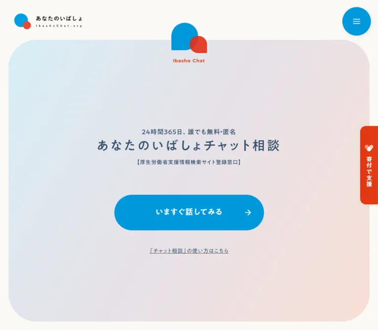
Anata no Ibasho puts immediate access to its chat consultation service at the center of a broader organizational website. Its first screen contains very little: an identity mark, a short availability statement, the service name, a registration statement, one large action, and an underlined help link. A pale blue-to-peach panel and unusually generous empty space keep that invitation visually calm.
The rest of the homepage supports several audiences. Notices and news establish ongoing activity; support sections distinguish individuals from schools, government, businesses, and media; an About section pairs large social-issue figures with a mission statement. The footer repeats consultation access before presenting volunteering, donations, a substantial sitemap, and organizational information. Preserve this hierarchy when adapting the design: it is an institutional homepage with a prominent service entrance.
閉じる
Anata no Ibasho / Ibasho Chat — Style Reference
A quiet pastel space for starting a conversation, framed by clear blue actions and warm red accents.
Website: talkme.jp Original URL: https://talkme.jp/ Final URL: https://talkme.jp/ Theme: light, with warm cream, white, pale gradients, blue, and red; no theme selector was evidenced. Inspected: October 2, 2026, at 02:12:22 JST; supplied retrieval timestamp: October 1, 2026, at 17:12:22.014 UTC. Viewports: desktop 1440 × 1000 CSS pixels; mobile 390 × 844 CSS pixels. Scope: the current nonprofit homepage. Visual captures cover the desktop opening, About section, and lower footer, plus the mobile opening and lower footer. Rendered DOM measurements additionally cover notices, support pathways, service summaries, news, and the footer's consultation and support actions. Destination pages and open-menu states were not inspected.
Anata no Ibasho puts immediate access to its chat consultation service at the center of a broader organizational website. Its first screen contains very little: an identity mark, a short availability statement, the service name, a registration statement, one large action, and an underlined help link. A pale blue-to-peach panel and unusually generous empty space keep that invitation visually calm.
The rest of the homepage supports several audiences. Notices and news establish ongoing activity; support sections distinguish individuals from schools, government, businesses, and media; an About section pairs large social-issue figures with a mission statement. The footer repeats consultation access before presenting volunteering, donations, a substantial sitemap, and organizational information. Preserve this hierarchy when adapting the design: it is an institutional homepage with a prominent service entrance.
How to Read This Reference
- Measured means a value explicitly supplied by the rendered DOM or computed-style evidence. Measurements are CSS pixels unless stated otherwise.
- Calculated means arithmetic derived from supplied rectangles, such as an internal inset or column gap.
- Estimated means a visual approximation from the current-page screenshots. Gradient stops, large corner radii, and shadows mostly fall into this category.
- Recommended means an implementation choice for reuse, not an assertion about the original website.
- Token names such as
--color-blueare descriptive aliases. Only properties explicitly identified as source variables retain original names. - Computed styles describe the sampled element, not necessarily every layer that paints it. Several transparent, square anchor wrappers visibly contain rounded, colored controls.
- The captures and DOM samples are separate observations. Desktop navigation visibility and the horizontal position of the About statistics differ between them; their exact state-change mechanism is unverified.
Tokens — Colors
Default Palette
| Name | Value | Suggested token | Evidence and role |
|---|---|---|---|
| Warm Cream | #FAF9F4 |
--color-cream |
Measured background of the opening section and main content container |
| White | #FFFFFF |
--color-white |
Measured body and mobile header background; visually present in the statistics panel, footer, and reversed buttons |
| Service Blue | #0198DA |
--color-blue |
Measured section-heading, statistic-caption, and volunteer-link text color |
| Accent Red | #E13009 |
--color-red |
Measured English section labels and news-category backgrounds |
| Softened Accent Red | rgb(225 48 9 / 95%) |
--color-red-soft |
Measured chat-emblem caption, statistics, some badges, donation labels, and mobile hero help link |
| Deep Navy | #002144 |
--color-ink |
Measured navigation, body copy, article titles, and detail links |
| Slate Blue | #39536E |
--color-slate |
Measured hero heading, supporting text, and desktop hero help link |
| Pale Blue | approximately #D8EDF2 |
--gradient-cool |
Estimated cool end of the opening panel |
| Pale Lavender | approximately #E5E2EB |
--gradient-middle |
Estimated middle of the opening panel |
| Pale Peach | approximately #F8DFD6 |
--gradient-warm |
Estimated warm end of the opening panel |
The bright blue menu circle, hero button, and volunteer band are visible in the screenshots, but their actual fill declarations are not included in the sampled paint layers. Reusing measured Service Blue for those fills is a practical approximation, not an independently measured match. The same distinction applies when using Accent Red for the donation band.
Color Behavior
The main contrast is between pale surroundings and concentrated areas of blue or red. Blue leads consultation access, large Japanese section titles, and volunteering. Red marks English section labels, news categories, statistics, and donation-related actions. Navy carries most informational reading.
Thin horizontal rules beneath footer navigation and detail links visibly blend from cyan through a cooler middle hue toward coral. Their thickness is approximately 1px; exact stops were not supplied. Keep these lines delicate. They provide a small echo of the hero gradient without turning every surface into a gradient.
The opening help link changes from measured Slate Blue on desktop to softened Accent Red on mobile. This is a confirmed responsive difference in the supplied samples, not a demonstrated hover state.
No alternate theme palette was evidenced. The numerous --g-color-* properties in the supplied global inventory are mostly transparent defaults; they do not establish the hero's actual gradient recipe.
Tokens — Typography
Japanese Headings and Controls
The dominant measured family is A1 Gothic M, declared as 'A1ゴシック M JIS2004' through source variable --s-font-9bb0a3f8. It appears on the hero title, section titles, mission headings, buttons, and most navigation labels.
Many prominent elements use computed font-weight: 400 despite having a substantial visual presence. The named M face contributes to that appearance. Do not convert all headings to a generic 700 weight merely because they look confident in the capture.
Japanese Reading Text
- A1 Gothic R:
'A1ゴシック R JIS2004', source--s-font-ceb44878; used for support paragraphs, some dates, and help links. - A1 Gothic L:
'A1ゴシック L JIS2004', source--s-font-6c82af3b; used for mission and service paragraphs, news excerpts, and some footer sublinks. - Body copy is commonly measured at 15px with a 30px line height on both inspected viewport sizes. This retained reading size is an important part of the mobile adaptation.
English Labels and Figures
Montserrat, source --s-font-18acaf9f, is measured on Ibasho Chat, Information, Support, About us, and News. Section labels generally use weight 700 and 0.05em tracking.
The percentage statistic's parent element also declares Montserrat at weight 600. The large inner numeral spans were not individually sampled. Montserrat is therefore a supported choice for numeric display in an adaptation, but the exact face and size of every numeral are not fully established.
Secondary Faces and Icon Evidence
Some labels declare 'ヒラギノUD角ゴ W6 JIS2004'; selected footer sublinks declare 'ヒラギノUD角ゴ W3 JIS2004'. These are specific observed exceptions, not a reason to replace the dominant A1 Gothic system.
The global inventory contains additional font names, including Noto Sans JP, Inter, and Roboto. Their presence alone does not prove use in the described components. Similarly, the root element's Times declaration is not the visible site's typography.
The DOM includes arrow_forward and arrow_drop_down icon strings, and Font Awesome brand properties are declared. The exact font responsible for every arrow was not supplied. Use an equivalent simple arrow in a new implementation and hide decorative glyphs from assistive technology.
Type Scale
All values below are measured unless explicitly marked as estimates. Tracking is given in CSS pixels.
| Role | Desktop size / line height | Mobile size / line height | Weight and tracking |
|---|---|---|---|
| Chat-emblem caption | 13 / 18.2px |
11 / 15.4px |
Montserrat 700; 0.65 → 0.55px |
| Availability statement | 18 / 27px |
13 / 19.5px |
A1 Gothic M 400; 0.9 → 0.65px |
| Hero H1 | 36 / 52.2px |
21 / 30.45px |
A1 Gothic M 400; 4.68 → 2.1px |
| Registration statement | 18 / 25.2px |
12 / 16.8px |
A1 Gothic M 400; 0.9 → 0.6px |
| Hero button label | 22 / 35.2px |
16 / 25.6px |
A1 Gothic M 400; 1.1 → 0.8px |
| Hero help link | 15 / 21px |
13 / 18.2px |
A1 Gothic R 400; 0.75 → 0.65px |
| Desktop navigation | 14 / 16.8px |
Not displayed in mobile opening | Mostly A1 Gothic M 500; 0.7px |
| Support / About English label | 22 / 30.8px |
18 / 25.2px |
Montserrat 700; 1.1 → 0.9px |
| Support / About Japanese title | 40 / 56px |
28 / 39.2px |
A1 Gothic M 400; 2 → 1.4px |
| Information Japanese title | 32 / 51.2px |
28 / 44.8px |
A1 Gothic M 400; 3.2 → 2.8px |
| News Japanese title | 32 / 51.2px |
32 / 51.2px |
A1 Gothic M 400; 3.2px |
| Mission / service subheading | 26 / 41.6px |
22 / 35.2px |
A1 Gothic M 400; typically 1.3 → 1.1px |
| Reading paragraphs | 15 / 30px |
15 / 30px |
A1 Gothic R or L 400; normal or 0.75px tracking |
| Article title | 18 / 28.8px |
15 / 24px |
A1 Gothic M; computed 900; 0.9 → 0.75px |
| Article date | 14 / 19.6px |
13 / 18.2px |
A1 Gothic R or L 400; normal tracking |
| Category badge | 12 / 12px |
12 / 12px |
A1 Gothic M or Hiragino UD W6; computed 400 |
| Detail link | 16 / 22.4px |
16 / 22.4px |
A1 Gothic M 400; 0.8px |
| Statistic caption | 18 / 25.2px |
Mostly 16 / 22.4px |
A1 Gothic M 400; one mobile caption remains 18px |
| Large statistic numeral | Approximately 52px |
Approximately 48px |
Estimate; inner spans not sampled |
| Statistic unit | Parent declaration 20 / 20px |
Parent declaration 18 / 18px |
Do not mistake these values for the large numerals |
| Footer main navigation | Not individually sampled | 15 / 21px |
A1 Gothic M 400; 0.75px |
| Footer subnavigation | Not individually sampled | 14 / 19.6px |
A1 Gothic L or Hiragino UD W3; 0.7px |
The system combines modest type sizes with generous tracking and line height. It does not rely on an enormous headline. The opening H1 remains smaller than the main desktop Support and About titles.
Tokens — Spacing & Shapes
Spacing Scale
There is no evidenced universal spacing variable. The following recurring values form a useful implementation vocabulary.
| Use | Desktop | Mobile | Evidence |
|---|---|---|---|
| Hero panel outside horizontal margin | About 24px |
About 24px |
Screenshot estimate |
| Availability-to-title gap | 10px |
25px |
Calculated from text rectangles |
| Title-to-registration gap | 10px |
15px |
Calculated |
| Registration-to-primary-action gap | 80px |
40px |
Calculated |
| Primary-action-to-help gap | 48px |
40px |
Calculated |
| Information section vertical padding | 90px |
40px |
Measured |
| Support card text inset | 32px |
26px |
Calculated from card and paragraph positions |
| Support audience-card row gap | 32px |
24px |
Calculated |
| News row vertical padding | 30px |
20px |
Measured |
| Service section item gap | 50px |
50px |
Measured |
| Body paragraph leading | 30px |
30px |
Measured |
| Footer sublink indentation | About 20px |
20px |
Desktop visual estimate; mobile calculation |
The larger gaps are structural. In particular, the empty space above the hero message separates the small emblem from the service invitation. Filling it with extra badges or promotional copy changes the composition substantially.
Border Radius
| Element | Value | Evidence |
|---|---|---|
| Hero panel | Approximately 80px desktop; 90–100px mobile |
Visual estimate |
| Hero action | Full capsule; approximately 60px desktop and 35px mobile end radius |
Visible shape plus measured height |
| Menu control | Circle: 80px desktop, 60px mobile diameter |
Measured control boxes and visible circular paint |
| Support audience cards | 24px desktop; 20px mobile |
Measured anchor radius |
| Category badge | 2px |
Measured |
| About statistics panel | Approximately 80px at the right corners on desktop |
Visual estimate; left edge meets the viewport |
| Footer volunteer / donation button | 36px on mobile |
Measured; control height is 70px |
Keep the hierarchy of shapes: very large curves for the opening and statistics surface, medium curves for support cards, capsules for strong actions, and nearly square category labels.
Layout Measurements
| Element | Desktop 1440 × 1000 | Mobile 390 × 844 | Evidence |
|---|---|---|---|
| Document height | 8554.59px |
11338.78px |
Measured; rounded document heights are 8555 and 11339 |
| Opening section height | 1000px |
776.47px |
Measured; no original viewport-height formula supplied |
| Visible hero panel | About 1392 × 864px, at (24, 112) |
About 342 × 622px, at (24, 130) |
Screenshot estimate |
| Header home-link box | 190 × 50px, at (40, 35) |
180 × 50px, at (16, 25) |
Measured |
| Menu button box | 80 × 80px, at (1338, 20) |
60 × 60px, at (314, 20) |
Measured |
| Hero H1 box | 518.38 × 52.19px |
293.56 × 30.44px |
Measured |
| Hero action | 480 × 120px, at (480, 576.69) |
260 × 70px, at (65, 456.5) |
Measured |
| Information content span | 1224px, from x=108 to x=1332 |
351px, from x=19.5 to x=370.5 |
Calculated from child rectangles; 85% and 90% of viewport width |
| Information item width | 391.67px |
351px |
Measured |
| Audience support card | 554.83 × 223px |
307.09 × 263.80px |
Measured |
| About mission paragraph | 432px wide at x=864 |
312px wide at x=39 |
Measured |
| News list row width | 918px, at x=414 |
351px, at x=19.5 |
Measured |
| Footer main navigation row | About 326px wide per desktop column |
331.5px wide |
Desktop screenshot estimate; mobile measured |
| Footer organization / banner area | About 320px wide |
About 320–332px wide |
Screenshot estimate |
The About screenshot places the statistics near x=144, while the supplied desktop DOM sample records their text at x=174. Use the screenshot for its captured composition and the DOM for its sampled state. The difference does not establish a particular animation or permanent 174px inset.
Components
Site Header
Role: recognizable identity and access to the full organization website.
The opening desktop capture shows the logo at upper left and a blue circular menu button at upper right. The About capture additionally shows a horizontal navigation row on a white header surface, roughly 120px high. The row includes Top, organizational information, business and support groups, news, media, volunteering, and contact.
Navigation labels are compact navy text. The current Top item has a short gradient underline. Two grouped items carry small downward triangles. Their submenu links exist in the desktop DOM, but sampled submenu rectangles have zero height; an open dropdown was not captured.
The desktop DOM also reports a zero-height outer HEADER despite positioned logo and button descendants. Do not copy that value as the height of the visible header. On mobile, the actual header is measured at 100px high with a white background, a 180 × 50px home-link box, and a 60px menu control.
The menu's open state, scroll thresholds, focus management, and closing behavior remain unverified. The desktop header is not visible over the supplied lower-footer capture, so continuous fixed visibility should not be assumed.
Consultation Hero
Role: a calm, direct entrance to chat consultation.
The rounded pastel panel almost fills the first desktop viewport, leaving 24px side and bottom margins. A blue-and-red chat emblem overlaps its upper edge. This emblem differs from the small circular mark in the organizational wordmark: its two shapes resemble rounded speech forms with selected square corners.
The center stack contains, in order:
- The availability statement
24時間365日、誰でも無料・匿名. - The H1
あなたのいばしょチャット相談. - The registration statement
【厚生労働省支援情報検索サイト登録窓口】. - The primary consultation link.
- The underlined usage-guide link.
Keep all five elements centered. The title uses Slate Blue rather than the brighter blue used for section headings. The emblem remains separate above the message, with a red Montserrat caption reading Ibasho Chat.
On mobile, the panel becomes a tall, narrow rounded rectangle rather than a horizontally compressed desktop banner. Its emblem is visually about 56 × 47px, compared with about 100 × 85px on desktop. The current capture keeps the H1 on one line at 21px; allow natural wrapping in an adaptation when the font or available width differs.
Primary Consultation Action and Help Link
Role: a dominant route to the consultation entry process, followed by a quieter explanation route.
The primary action is a flat blue capsule with centered white text and a small right-pointing arrow near the right edge. Its label is いますぐ話してみる. It measures 480 × 120px on desktop and 260 × 70px on mobile. The arrow should not pull the label away from the visual center.
The actual anchor destination is https://talkme.jp/rules. The evidence does not show an inline chat widget opening, a modal, or a completed consultation flow. Preserve the distinction between this entrance link and the service itself.
The secondary link points to https://talkme.jp/howto and uses the actual label 「チャット相談」の使い方はこちら. It has a visible underline, 48px clearance below the desktop button, and 40px on mobile. Its mobile red treatment gives a small amount of emphasis without adding a second filled button.
Bilingual Section Heading
Role: a repeated orientation device across the long page.
Use a short red English label above a larger blue Japanese title. Support and About are centered and use 22px / 40px desktop sizing, reducing to 18px / 28px on mobile. Their English-to-Japanese gap is calculated at 10px on desktop and 5px on mobile.
Information and News use a related but distinct editorial treatment. Their desktop headings are left aligned within the wider content region. Mobile centers the heading block. Information reduces its Japanese title to 28px; News retains 32px in the measured sample. Do not force every section into one identical type scale.
Important Notices
Role: a small set of prominent current announcements immediately after the opening.
The desktop layout places three linked entries across a 1224px span. Each is approximately 391.67px wide, with calculated gaps around 24.5px. The section heading sits above them, with a もっと見る link toward the right.
Each entry includes a date, one or more small red category badges, and a navy title. A badge has 12px text, 5px top / 6px horizontal / 4px bottom padding, a 2px radius, and an overall measured height of 21px. Titles use 18px text with 28.8px leading and can occupy different numbers of lines.
The desktop rectangles reserve approximately 242px before the metadata, consistent with a leading media area. The actual image content and crop are not included in the supplied visual captures or image-element measurements. Treat that media treatment as only partially evidenced.
On mobile, the entries become full-width text rows within a 351px region. Each has 20px vertical padding, metadata followed by the title, and no equivalent large leading media space. The more-link moves below the list. Use intrinsic row heights; longer titles must remain readable.
Support Pathways
Role: explain ways to sustain the service and route different audiences.
The Support section is a substantial part of the homepage, measuring about 2153px high on desktop and 3228px on mobile. It begins with the bilingual heading, then an introductory statement and explanatory paragraph.
Individual support separates donations, bequests, and volunteering. The measured desktop donation and bequest links sit side by side, each about 235.41 × 60px. Mobile stacks them as 255.09 × 60px controls with a 20px gap. The volunteer action is also 60px high.
The institutional audience links form a two-by-two desktop arrangement: schools and government in the first row, businesses and media in the second. Each whole card is an anchor containing a heading, arrow, and explanatory paragraph. The measured cards are 554.83 × 223px, with 24px corner radii and 32px text insets. Their horizontal gap is calculated at approximately 34.34px.
Mobile places the four cards in one column at x≈41.45, each about 307.09px wide. The radius becomes 20px, paragraph inset becomes 26px, and the row gap is 24px. Paragraph typography stays 15px / 30px, making the cards taller rather than shrinking the copy.
Card paint layers and decorative artwork are not fully represented by the selected screenshots. Their measured geometry and text hierarchy are reliable; an exact illustration style or card-fill recipe should not be invented.
About Statistics and Mission
Role: connect the organization's mission to the issues it addresses.
The desktop capture places a large white statistics surface against the left viewport edge. Its right corners are deeply rounded, and a faint shadow separates its bottom edge from the cream canvas. The right half contains an unboxed mission statement, paragraph, and small detail link.
The statistics are four vertically stacked number-and-caption pairs. The current source labels include #603万人, #19,188人, #22万件, and #94%. Large red numerals sit on the same baseline as much smaller units; blue captions appear about 10px below. There is approximately 30px between one caption and the next number box. These are displayed page figures, not independently verified statistics or demonstrated animated counters.
The mission column is 432px wide on desktop. Its 26px heading is followed by 15px / 30px text, then a right-aligned 詳しくみる link. The link combines navy text, a small navy circle containing a white arrow, and a thin gradient baseline. Its measured anchor is about 130.8 × 46px.
On mobile, DOM positions confirm the statistics precede the mission vertically. The mission paragraph becomes 312px wide at x=39. Most statistic captions reduce to 16px and wrap, while one remains at 18px. The mobile statistics surface itself was not visually captured, so its exact outer corner treatment remains unknown.
Service Summaries
Role: introduce chat consultation and the separate wellness offering.
Two service summaries follow About. Each includes a blue service title, navy subheading, an airy explanatory paragraph, and a detail link. The desktop text block is approximately 575.42px wide; the mobile block is 312px wide.
The chat summary links to https://talkme.jp/approach/chat_consultation. The wellness summary's dedicated-site link points to https://ibashochatwellness.jp/. These are observed hrefs; their destination interfaces were not reviewed.
Service titles reduce from 24px to 20px on mobile, while subheadings reduce from 26px to 22px. Body copy remains 15px / 30px. The supplied mobile coordinates leave substantial space before each text block, but the corresponding media was not supplied for visual analysis. Do not assign an invented photographic subject or illustration to that space.
Latest News List
Role: a fuller activity feed, distinct from the three prominent notices.
Desktop uses a heading column on the left and a 918px-wide list beginning at x=414. Five linked articles are represented in the evidence. A row has 30px vertical padding; its text starts at x=683.5, leaving a calculated 269.5px leading region within the row. The precise dimensions and content of media within that region were not supplied.
The text hierarchy is date and category badges, article title, then a smaller excerpt. Titles use 18px / 28.8px; excerpts use 14px / 22.4px. The measured excerpt elements declare A1 Gothic L with weight 900, so preserve the recorded value as evidence without assuming how that face resolves every weight request.
Mobile simplifies the feed to 351px-wide rows with 20px vertical padding and 15px / 24px titles. Excerpts are absent from the rendered mobile text and sampled text elements, although they remain in some extracted anchor text. This supports a responsive hiding treatment, not deletion of the content from the document.
Footer Consultation and Support Actions
Role: repeat the service entrance and offer two ways to help after the informational content.
The footer begins with another consultation invitation, a chat-entry link, the usage guide, and a terms/privacy link. The mobile consultation action measures approximately 240.08 × 70px; its sampled label is 18px navy text. Its full painted treatment is not visible in the supplied lower-footer screenshot, so do not assume it is identical to the opening button.
Below that invitation, the desktop screenshot shows a full-width split band: volunteering on blue at left and donations on red at right. Each half is 720px wide. White pill buttons are visually about 380 × 70px, with labels and arrows in the corresponding accent color.
Mobile DOM positions confirm that the volunteer block precedes the donation block vertically. Their white buttons measure 331.5 × 70px with 36px radii. Section labels use 24px type with unusually open 3.6px tracking; supporting lines and button labels use 16px / 25.6px.
Sitemap and Organization Footer
Role: complete site navigation, organizational identity, and external resource access.
The lower desktop footer is white and broadly divided into two navigation columns and one organization column. Its visible content spans approximately x=144 to x=1296. Navigation columns are about 326px wide with a 60px gap; the organization column is about 320px wide and begins near x=976.
Primary navigation rows combine a navy label, a small right arrow, and a full-width thin gradient rule. Nested links are smaller, lighter, indented, and separated by open vertical space. The footer includes a full business hierarchy and audience-specific support links, not merely a handful of legal utilities.
The organization area contains the wordmark, the legal name 特定非営利活動法人あなたのいばしょ, an address line, social links, three external-resource or campaign graphics, and © IbashoChat.org. The legal name is independently visible in the current original-page footer.
Social links form two columns, pairing compact platform icons with readable labels. The visible arrangement includes X and a separate public-relations X account, Facebook, Instagram, YouTube, LinkedIn, and note. Preserve recognizable platform colors where the supplied artwork uses them.
On mobile, the navigation flows above the organization area. Main rows measure 331.5px wide at x=29.25. The social list remains in two columns, while banners form one vertical stack. The first banner is visually about 320 × 50px, and the copyright becomes centered. The bottom capture contains no floating header over this content.
Tokens — Motion & Interaction
Recorded Transition Declarations
| Target | Measured declaration | What the evidence establishes |
|---|---|---|
| Many elements, including controls and text | 0.3s cubic-bezier(0.4, 0.4, 0, 1) |
A common transition timing is declared; the property change and trigger are not established for every element |
| Body background | background 0.5s cubic-bezier(0.4, 0.4, 0, 1) |
Background changes have a declared transition; a theme switch was not observed |
| Several desktop navigation anchors | 0.8s cubic-bezier(0, 0.7, 0.22, 1) |
Longer easing is defined for those anchors; hover endpoints were not captured |
| Desktop Support caption | 0.8s cubic-bezier(0.4, 0.4, 0, 1) 0.6s |
Delayed transition declaration on the caption |
| Desktop audience cards, left column | 0.6s cubic-bezier(0.4, 0.4, 0, 1) 0.6s |
Shared timing with a 600ms delay |
| Desktop audience cards, right column | 0.6s cubic-bezier(0.4, 0.4, 0, 1) 0.8s |
An additional 200ms delay relative to left-column cards |
| Mobile audience cards | 0.3s cubic-bezier(0.4, 0.4, 0, 1) |
The sampled mobile timing is shorter and lacks the desktop delay |
| Sampled elements' animation property | none |
No keyframe animation was reported on these particular elements |
The repeated transition lists also include gradient custom properties. This proves that those properties can transition; it does not prove that the opening gradient continuously moves.
The capture process traversed the page and waited for settled layouts. No click, hover, menu-open, or keyboard interaction result was supplied. The difference between the opening and About headers may be related to scroll or another state, but neither its trigger nor its movement was demonstrated.
Navigation Behavior Established by Hrefs
| Visible action | Observed destination | Limit |
|---|---|---|
いますぐ話してみる |
https://talkme.jp/rules |
Entry destination only; chat flow untested |
| Usage-guide link | https://talkme.jp/howto |
Guide page uninspected |
| Donation action | https://talkme.jp/donation |
Donation flow untested |
| Bequest action | https://talkme.jp/bequest-donation |
Destination only |
| Volunteer action | https://talkme.jp/volunteer2022 |
Application flow untested |
| About detail | https://talkme.jp/about |
Destination only |
Footer Top |
https://talkme.jp/ |
No evidence of a smooth-scroll behavior |
For reuse, favor short color and underline transitions. Any arrow movement, menu animation, or scroll reveal should be explicitly treated as a new implementation choice. Essential consultation access should be visible without waiting for a reveal sequence.
Surfaces
| Layer | Appearance | Role and evidence |
|---|---|---|
| Main canvas | Solid warm cream | Measured opening and main backgrounds |
| Hero | Large pale blue/lavender/peach gradient with deep rounding | Visually observed; exact gradient and radius estimated |
| Section heading field | Very soft cool and warm color wash | Visible behind the desktop About heading |
| Statistics panel | White, attached to the left edge, rounded on the right | Visually observed; subtle shadow values unknown |
| Audience cards | Medium rounded containers | Radius and geometry measured; exact paint layers incompletely supplied |
| Volunteer / donation band | Adjacent saturated blue and red fields | Visible desktop split; stacked mobile ordering supported by DOM |
| Lower footer | White | Visually observed on both viewport sizes |
| Fine navigation separators | Cyan-to-coral gradient rules | Visually observed; approximately 1px thick |
| Menu control | Blue circle with a restrained shadow | Visually observed; shadow parameters unknown |
There is no evidence of a general glass, blur, or heavy elevation system. Most separation comes from space, contrasting surface colors, oversized corner curves, and thin rules.
Imagery
The inspected opening, About section, and footer rely mainly on identity artwork, abstract color, type, and small utility graphics. The opening has no visible hero photograph. Its emotional tone comes from the two overlapping chat forms and the pale enclosing panel.
Keep the organizational wordmark and chat emblem distinct. The wordmark combines blue and red circular forms with Japanese lettering and a small Latin identifier. The hero emblem uses speech-like shapes and the caption Ibasho Chat. Neither should be replaced by a generic messaging-app icon when reproducing this particular identity.
The footer mixes the organization's identity with social-platform marks and three campaign/resource graphics. These graphics retain their own colors and proportions. Do not crop them into square tiles or recolor them all to blue.
Observed Asset References
No complete reusable image-file URLs were supplied for the visible logos, hero emblem, article media, or footer banners. The following is an asset inventory, not a set of downloadable image paths.
| Asset | Observed use | Reference limitation |
|---|---|---|
| Organization wordmark | Header and lower footer | Visible in current captures; image URL not supplied |
| Chat emblem | Overlaps the hero panel | Visible in current desktop and mobile openings; rendering method not supplied |
| Pastel background artwork | Hero and section decoration | Section style text includes a truncated external WebP reference; no complete asset URL is available |
| Article media | Space reserved in desktop notice and news layouts | Actual subjects and crops not visually supplied |
| Social marks | Two-column footer link list | Platform identities visible; individual asset paths unknown |
| Ministry resource banner | First footer banner | Anchor destination is https://www.mhlw.go.jp/mamorouyokokoro/; this is not an image URL |
| Loneliness / isolation platform banner | Second footer banner | Anchor destination is https://www.cao.go.jp/kodoku_koritsu/torikumi/platform/index.html; this is not an image URL |
| Giving December graphic | Third footer graphic | Visible in the captures; destination and image URL not supplied |
Use authorized identity files when available. A CSS gradient can approximate the surrounding atmosphere, but the wordmark and external campaign graphics should remain supplied artwork. Do not manufacture asset paths from the incomplete references.
Layout & Responsive Behavior
Page Structure
The observed order is consultation opening, Information, Support, About, service summaries, News, repeated consultation access, volunteer/donation actions, and sitemap/organization footer. The desktop page measures about 8555px high; the mobile page measures about 11339px. The layout becomes longer mainly through stacking and text wrapping while maintaining readable body type.
Confirmed Changes
| Area | Desktop | Mobile |
|---|---|---|
| Header | Logo and 80px menu; horizontal navigation visible in the About capture | White 100px header, 180px home-link box, 60px menu, no horizontal navigation |
| Hero | Wide panel; opening section equals the inspected 1000px viewport height | Narrow tall panel; section ends around y=776.47, allowing the Information label to appear near the fold |
| Hero title | 36px, 0.13em tracking |
21px, 0.1em tracking |
| Hero action | 480 × 120px | 260 × 70px |
| Help link | Slate Blue | Softened Accent Red |
| Important notices | Three columns | One sequence of text rows |
| Donation and bequest actions | Side by side | Stacked |
| Institutional support cards | Two columns | One column |
| About | Statistics left, mission right | Statistics before mission |
| Paragraph type | 15px / 30px | Retained at 15px / 30px |
| News | Leading region plus title, metadata, and excerpt | Metadata and title; excerpts absent from rendered text |
| Support footer band | Two halves | Volunteer block followed by donation block |
| Lower footer | Two navigation columns beside organization details | Navigation above organization details; social links still two columns |
Do not impose one universal mobile gutter. The opening uses approximately 24px panel margins; news rows use 19.5px side margins; mission text uses 39px; support cards start around 41.45px; footer navigation starts at 29.25px. These nested widths create a rhythm of broad lists and more sheltered reading blocks.
A max-width: 1140px rule appears in the supplied breakpoint-specific line-break CSS. It does not establish the menu or grid breakpoints. No tablet screenshot or complete responsive stylesheet was provided. Breakpoints in the Quick Start are therefore recommendations, not recovered source values.
Do’s and Don’ts
Do
- Preserve the immediate consultation entrance and the broader organizational information architecture.
- Keep the opening visually sparse, with a small overlapping emblem and generous space above the central message.
- Use warm cream
#FAF9F4for the main canvas and navy#002144for sustained reading. - Pair red English section labels with larger blue Japanese titles.
- Keep the primary action capsule substantially larger than ordinary detail links.
- Center action text independently of its right-edge arrow.
- Retain the 15px / 30px paragraph rhythm when stacking content on mobile.
- Use separate styles for prominent notices and the fuller news feed.
- Preserve number/unit hierarchy and blue explanatory captions in the About statistics.
- Carry the gradient into fine rules as a restrained secondary motif.
- Keep the footer's nested sitemap, organization details, social labels, and banner proportions.
Don't
- Don't reduce the whole website to a single-purpose promotional landing page.
- Don't fill the hero's empty space with extra sales copy, stock portraits, or multiple competing buttons.
- Don't replace the two brand marks with interchangeable chat icons.
- Don't infer a live chat modal from the consultation link; its observed destination is
/rules. - Don't treat transparent, zero-radius anchor wrappers as the complete visible button styling.
- Don't present estimated gradient stops, shadows, or numeral sizes as measured source values.
- Don't assume menu panels, dropdown behavior, sticky-header thresholds, or counters were tested.
- Don't apply the mobile H1 reduction to every section title; the measured News heading stays at 32px.
- Don't force all body text into the narrowest card width or one shared gutter.
- Don't reproduce displayed statistics as current factual claims without their own editorial verification.
Recommended Implementation Additions
These recommendations are for a new implementation and are not verified features of the original site.
- Use real anchors for navigation and a real button for the menu. Give the menu an accessible name, expanded state, and connection to its controlled navigation.
- If the menu is implemented as a modal, add keyboard focus management, Escape handling, and focus restoration. If it is a disclosure, use disclosure semantics instead.
- Give the home-logo link an accessible name and hide decorative arrows and chat shapes from screen readers.
- Add visible keyboard focus that works on cream, white, and saturated surfaces.
- Check small blue text and white-on-blue actions for contrast. The measured heading blue
#0198DAhas a calculated contrast of approximately 3.2:1 against white; the actual hero fill was not sampled, so this is not a blanket accessibility verdict. A darker action color can be introduced as an explicitly documented adaptation. - Allow text to wrap and containers to grow when fonts fail to load, users zoom, or copy changes. Avoid fixed card heights based only on one captured article.
- Load the named Japanese faces only when available and licensed. Supply a suitable Japanese sans-serif fallback and verify wrapping again after substitution.
- Preserve the calm composition under reduced-motion preferences and keep consultation links visible before any optional animation.
- Use semantic lists for news, statistics, and footer links. English overlines can be paragraphs above the actual section heading rather than duplicate same-level headings.
- Give article images and resource banners appropriate alternatives. Treat the decorative background wash as non-content.
Agent Prompt Guide
Quick Color Reference
- Main canvas: measured
#FAF9F4. - Neutral surface: measured
#FFFFFF. - Reading text: measured
#002144. - Hero text: measured
#39536E. - Blue headings and volunteer labels: measured
#0198DA. - Red section labels and categories: measured
#E13009, sometimes at 95% opacity. - Hero gradient approximation:
#D8EDF2 → #E5E2EB → #F8DFD6. - Strong controls: blue capsules and circular menu; white capsules inside blue/red footer bands.
- Fine separators: approximately 1px cyan-to-coral rules.
Overall Prompt
“Create a Japanese nonprofit homepage inspired by the current Anata no Ibasho website. Build around a calm consultation entrance followed by notices, individual and institutional support pathways, an About section, service summaries, news, and a detailed organizational footer. Use warm cream #FAF9F4, navy #002144, blue #0198DA, and red #E13009. The opening is a large deeply rounded panel with a very pale blue-to-peach gradient, a small overlapping chat emblem, centered slate-blue Japanese text, one generous blue capsule action, and an underlined help link. Use A1 Gothic-style Japanese typography with airy tracking and 15px / 30px body text, paired with bold Montserrat English section labels. Stack content thoughtfully on mobile while preserving generous breathing room. Treat exact gradient stops, missing artwork, and untested interaction states as implementation decisions.”
Example Component Prompts
- Consultation opening: “Create a cream first section containing a pastel rounded panel with 24px outside side margins. Center an availability line, a Japanese H1, a registration note, and a blue pill link labeled
いますぐ話してみる. Use a 480 × 120px action on desktop and 260 × 70px on a 390px phone. Place the small chat emblem across the panel's top edge. Preserve the large empty area above the message.” - Section title: “Place a compact red Montserrat label
About usabove a blue Japanese headingわたしたちについて. Use 22px and 40px on desktop, 18px and 28px on mobile, with open tracking and centered alignment.” - Audience card group: “Build four whole-card links for schools, government, businesses, and media. Use two columns on desktop and one on mobile, 24px desktop / 20px mobile radii, generous internal padding, a clear title-and-arrow row, and 15px text with 30px leading. Keep heights intrinsic.”
- Statistics and mission: “Create a desktop split section with a white statistics surface attached to the left viewport edge and rounded right corners. Stack four large red figures with smaller units and blue captions. Put a navy mission heading and spacious paragraph in the right column, ending with a small arrow-circle link and a fine gradient rule. Stack figures before mission on mobile.”
- Organization footer: “Use a white footer with two columns of hierarchical navy navigation and a separate organization column. Underline primary rows with very thin cyan-to-coral rules. Include the supplied wordmark, legal identity, a two-column social list, uncropped resource banners, and copyright. On mobile, move organization information below the navigation and retain two social columns.”
- Motion implementation: “Use restrained 300ms color and underline transitions with
cubic-bezier(0.4, 0.4, 0, 1). Do not invent autoplay, counter animation, or a moving hero gradient. Keep essential actions immediately visible and support reduced motion.”
Quick Start
CSS Custom Properties
This is a reusable adaptation, not the original stylesheet. It combines measured colors and text sizes with estimated decorative geometry. The hero gradient, shadow values, media treatment, and breakpoints are recommendations. It uses ordinary CSS sizing rather than copying generated element wrappers.
The CSS does not load fonts or identity artwork. Supply authorized font files and images separately. The small CSS chat shape is an illustrative approximation, not a replacement for the original brand asset.
:root {
  /* Measured colors */
  --color-cream: #faf9f4;
  --color-white: #ffffff;
  --color-blue: #0198da;
  --color-red: #e13009;
  --color-red-soft: rgb(225 48 9 / 95%);
  --color-ink: #002144;
  --color-slate: #39536e;

  /* Estimated decorative colors */
  --gradient-cool: #d8edf2;
  --gradient-middle: #e5e2eb;
  --gradient-warm: #f8dfd6;
  --hero-gradient: linear-gradient(
    120deg,
    var(--gradient-cool),
    var(--gradient-middle) 50%,
    var(--gradient-warm)
  );
  --rule-gradient: linear-gradient(90deg, #3bcfff, #a482e7, #ff7275);

  /* Observed families; generic fallbacks are recommendations */
  --font-heading: 'A1ゴシック M JIS2004', sans-serif;
  --font-body: 'A1ゴシック R JIS2004', sans-serif;
  --font-light: 'A1ゴシック L JIS2004', sans-serif;
  --font-latin: Montserrat, sans-serif;

  --text-body: 15px;
  --leading-body: 2;
  --tracking-label: 0.05em;
  --radius-card: 24px;
  --radius-badge: 2px;
  --radius-hero: 80px;
  --radius-pill: 999px;
  --ease-calm: cubic-bezier(0.4, 0.4, 0, 1);
  --motion-control: 300ms var(--ease-calm);
}

*,
*::before,
*::after {
  box-sizing: border-box;
}

.ibasho-page {
  margin: 0;
  color: var(--color-ink);
  background: var(--color-cream);
  font: 400 var(--text-body) / var(--leading-body) var(--font-body);
}

.ibasho-page img {
  display: block;
  max-width: 100%;
  height: auto;
}

.ibasho-page a {
  color: inherit;
}

/* Header state is supplied by the implementation. */
.site-header {
  position: absolute;
  inset: 0 0 auto;
  z-index: 10;
  display: flex;
  align-items: center;
  gap: 14px;
  min-height: 120px;
  padding: 20px 22px 20px 40px;
}

.site-logo {
  display: flex;
  align-items: center;
  flex: 0 0 190px;
  min-height: 50px;
}

.desktop-nav {
  display: none;
  align-items: center;
  margin-inline-start: auto;
}

.desktop-nav a {
  padding: 6px 14px 2px;
  font: 500 14px / 1.2 var(--font-heading);
  letter-spacing: 0.05em;
  text-decoration: none;
}

.menu-toggle {
  display: grid;
  place-items: center;
  flex: 0 0 80px;
  width: 80px;
  height: 80px;
  margin-inline-start: auto;
  padding: 0;
  border: 0;
  border-radius: 50%;
  color: white;
  background: var(--color-blue);
  box-shadow: 0 3px 10px rgb(0 33 68 / 10%);
  cursor: pointer;
}

.menu-glyph,
.menu-glyph::before,
.menu-glyph::after {
  display: block;
  width: 20px;
  height: 2px;
  background: currentColor;
}

.menu-glyph {
  position: relative;
}

.menu-glyph::before,
.menu-glyph::after {
  position: absolute;
  left: 0;
  content: '';
}

.menu-glyph::before { top: -6px; }
.menu-glyph::after { top: 6px; }

/* Desktop opening proportions; minimum height protects short screens. */
.chat-hero {
  padding: 112px 24px 24px;
}

.hero-panel {
  position: relative;
  display: grid;
  place-items: center;
  min-height: max(640px, calc(100svh - 136px));
  padding: 100px 24px;
  border-radius: var(--radius-hero);
  background: var(--hero-gradient);
  text-align: center;
}

.hero-badge {
  position: absolute;
  top: -48px;
  left: 50%;
  transform: translateX(-50%);
}

.chat-symbol {
  position: relative;
  display: block;
  width: 100px;
  height: 85px;
  margin-inline: auto;
}

.chat-symbol::before,
.chat-symbol::after {
  position: absolute;
  content: '';
}

.chat-symbol::before {
  inset: 0 auto auto 0;
  width: 75%;
  height: 90%;
  border-radius: 50% 50% 50% 0;
  background: var(--color-blue);
}

.chat-symbol::after {
  right: 0;
  bottom: 0;
  width: 49%;
  height: 56%;
  border-radius: 50% 50% 0 50%;
  background: var(--color-red-soft);
}

.hero-badge p {
  margin: 12px 0 0;
  color: var(--color-red-soft);
  font: 700 13px / 1.4 var(--font-latin);
  letter-spacing: 0.05em;
  white-space: nowrap;
}

.hero-content {
  width: 100%;
  min-width: 0;
  color: var(--color-slate);
  transform: translateY(25px);
}

.hero-kicker {
  margin: 0;
  font: 400 18px / 1.5 var(--font-heading);
  letter-spacing: 0.05em;
}

.hero-title {
  margin: 10px 0 0;
  font: 400 36px / 1.45 var(--font-heading);
  letter-spacing: 0.13em;
  overflow-wrap: anywhere;
}

.hero-note {
  margin: 10px 0 0;
  font: 400 18px / 1.4 var(--font-heading);
  letter-spacing: 0.05em;
}

.ibasho-page .hero-cta {
  display: grid;
  grid-template-columns: 24px minmax(0, 1fr) 24px;
  align-items: center;
  width: min(480px, 100%);
  min-height: 120px;
  margin: 80px auto 0;
  padding: 20px 32px;
  border-radius: var(--radius-pill);
  color: var(--color-white);
  background: var(--color-blue);
  font: 400 22px / 1.6 var(--font-heading);
  letter-spacing: 0.05em;
  text-decoration: none;
}

.hero-cta::before {
  content: '';
}

.action-arrow {
  font: 400 24px / 1 sans-serif;
  text-align: center;
}

.ibasho-page .hero-help {
  display: inline-block;
  margin-top: 48px;
  color: var(--color-slate);
  font: 400 15px / 1.4 var(--font-body);
  letter-spacing: 0.05em;
  text-decoration: underline;
  text-underline-offset: 2px;
}

.content-wide {
  width: min(85%, 1224px);
  margin-inline: auto;
}

.section-heading {
  text-align: center;
}

.section-overline {
  margin: 0 0 10px;
  color: var(--color-red);
  font: 700 22px / 1.4 var(--font-latin);
  letter-spacing: 0.05em;
}

.section-title {
  margin: 0;
  color: var(--color-blue);
  font: 400 40px / 1.4 var(--font-heading);
  letter-spacing: 0.05em;
}

.info-section {
  padding-block: 90px;
}

.info-grid {
  display: grid;
  grid-template-columns: repeat(3, minmax(0, 1fr));
  gap: 24.5px;
}

.article-meta {
  display: flex;
  flex-wrap: wrap;
  align-items: center;
  gap: 5px 10px;
  font-size: 14px;
  line-height: 1.4;
}

.category-badge {
  padding: 5px 6px 4px;
  border-radius: var(--radius-badge);
  color: var(--color-white);
  background: var(--color-red);
  font: 400 12px / 1 var(--font-heading);
}

.article-title {
  margin: 12px 0 0;
  font: 900 18px / 1.6 var(--font-heading);
  letter-spacing: 0.05em;
}

.audience-grid {
  display: grid;
  grid-template-columns: repeat(2, minmax(0, 1fr));
  gap: 32px 34px;
  width: min(1144px, 90%);
  margin-inline: auto;
}

.audience-card {
  display: block;
  min-width: 0;
  padding: 32px;
  border-radius: var(--radius-card);
  background: var(--color-white);
  text-decoration: none;
}

.audience-card h3,
.about-copy h3 {
  margin: 0 0 20px;
  font: 400 26px / 1.6 var(--font-heading);
  letter-spacing: 0.05em;
}

.audience-card p,
.about-copy p {
  margin: 0;
  font-size: 15px;
  line-height: 2;
}

.about-grid {
  display: grid;
  grid-template-columns: repeat(2, minmax(0, 1fr));
  align-items: center;
}

.stats-panel {
  padding: 60px max(32px, 10vw);
  border-radius: 0 80px 80px 0;
  background: var(--color-white);
  box-shadow: 0 4px 10px rgb(0 33 68 / 3%);
}

.stat + .stat {
  margin-top: 30px;
}

.stat-number {
  margin: 0;
  color: var(--color-red-soft);
  font: 600 52px / 1 var(--font-latin);
}

.stat-unit {
  font: 400 20px / 1 var(--font-heading);
}

.stat-caption {
  margin: 10px 0 0;
  color: var(--color-blue);
  font: 400 18px / 1.4 var(--font-heading);
  letter-spacing: 0.05em;
}

.about-copy {
  padding: 60px 10vw;
  font-family: var(--font-light);
}

.detail-link {
  display: flex;
  align-items: flex-start;
  justify-content: space-between;
  gap: 32px;
  width: fit-content;
  min-height: 46px;
  margin: 40px 0 0 auto;
  padding-bottom: 20px;
  background: var(--rule-gradient) bottom / 100% 1px no-repeat;
  font: 400 16px / 1.4 var(--font-heading);
  letter-spacing: 0.05em;
  text-decoration: none;
}

.detail-arrow {
  display: grid;
  place-items: center;
  flex: 0 0 24px;
  width: 24px;
  height: 24px;
  border-radius: 50%;
  color: white;
  background: var(--color-ink);
}

.news-layout {
  display: grid;
  grid-template-columns: 1fr 3fr;
}

.news-row {
  display: grid;
  grid-template-columns: 230px minmax(0, 1fr);
  gap: 39.5px;
  padding-block: 30px;
  text-decoration: none;
}

.news-excerpt {
  margin: 4px 0 0;
  font: 400 14px / 1.6 var(--font-light);
  letter-spacing: 0.05em;
}

.support-band {
  display: grid;
  grid-template-columns: repeat(2, minmax(0, 1fr));
}

.support-panel {
  padding: 60px 7.5%;
  color: white;
  background: var(--color-blue);
  text-align: center;
}

.support-panel--donation {
  background: var(--color-red);
}

.ibasho-page .support-button {
  display: flex;
  align-items: center;
  justify-content: center;
  position: relative;
  width: min(380px, 100%);
  min-height: 70px;
  margin: 32px auto 0;
  padding: 18px 52px;
  border-radius: 36px;
  color: var(--color-blue);
  background: white;
  font: 400 16px / 1.6 var(--font-heading);
  letter-spacing: 0.1em;
  text-decoration: none;
}

.ibasho-page .support-panel--donation .support-button {
  color: var(--color-red);
}

.support-button .action-arrow {
  position: absolute;
  right: 28px;
}

.site-footer-bottom {
  padding-block: 80px 48px;
  background: white;
}

.footer-layout {
  display: grid;
  grid-template-columns: minmax(0, 1fr) 320px;
  gap: 120px;
  width: min(80%, 1152px);
  margin-inline: auto;
}

.footer-nav {
  display: grid;
  grid-template-columns: repeat(2, minmax(0, 1fr));
  gap: 60px;
}

.footer-main-link {
  display: flex;
  justify-content: space-between;
  padding-bottom: 16px;
  margin-bottom: 32px;
  background: var(--rule-gradient) bottom / 100% 1px no-repeat;
  font: 400 15px / 1.4 var(--font-heading);
  letter-spacing: 0.05em;
  text-decoration: none;
}

.footer-subnav {
  display: grid;
  gap: 16px;
  padding-inline-start: 20px;
  font: 400 14px / 1.4 var(--font-light);
  letter-spacing: 0.05em;
}

.social-list {
  display: grid;
  grid-template-columns: repeat(2, minmax(0, 1fr));
  gap: 20px;
  padding: 0;
  list-style: none;
}

.footer-banners {
  display: grid;
  gap: 28px;
}

.footer-banners img {
  width: auto;
  max-width: 100%;
}

/* Recommended focus and interaction feedback */
.ibasho-page :is(a, button):focus-visible {
  outline: 3px solid var(--color-ink);
  outline-offset: 5px;
}

.hero-cta,
.support-button,
.menu-toggle {
  transition: box-shadow var(--motion-control);
}

@media (hover: hover) {
  .hero-cta:hover,
  .support-button:hover {
    box-shadow: 0 0 0 3px var(--color-ink);
  }
}

/* Recommended navigation breakpoint; source threshold is unverified. */
@media (min-width: 1280px) {
  .site-header--expanded {
    background: white;
  }
  .site-header--expanded .desktop-nav {
    display: flex;
  }
  .site-header--expanded .menu-toggle {
    margin-inline-start: 0;
  }
}

/* Recommended layout breakpoint, matching the supplied phone state. */
@media (max-width: 767px) {
  :root {
    --radius-card: 20px;
    --radius-hero: 96px;
  }

  .site-header {
    min-height: 100px;
    padding: 20px 16px;
    background: white;
  }
  .site-logo {
    flex-basis: 180px;
  }
  .menu-toggle {
    flex-basis: 60px;
    width: 60px;
    height: 60px;
  }

  .chat-hero {
    padding: 130px 24px 24px;
  }
  .hero-panel {
    min-height: 622.5px;
    padding: 120px 20px;
  }
  .hero-badge {
    top: -24px;
  }
  .chat-symbol {
    width: 56px;
    height: 47px;
  }
  .hero-badge p {
    margin-top: 8px;
    font-size: 11px;
  }
  .hero-content {
    transform: translateY(6px);
  }
  .hero-kicker {
    font-size: 13px;
  }
  .hero-title {
    margin-top: 25px;
    font-size: 21px;
    letter-spacing: 0.1em;
  }
  .hero-note {
    margin-top: 15px;
    font-size: 12px;
  }
  .ibasho-page .hero-cta {
    width: min(260px, 100%);
    min-height: 70px;
    margin-top: 40px;
    padding: 16px 24px;
    font-size: 16px;
  }
  .ibasho-page .hero-help {
    margin-top: 40px;
    color: var(--color-red-soft);
    font-size: 13px;
  }

  .content-wide {
    width: 90%;
  }
  .section-overline {
    margin-bottom: 5px;
    font-size: 18px;
  }
  .section-title {
    font-size: 28px;
  }
  .info-section {
    padding-block: 40px;
  }
  .info-grid,
  .news-layout {
    display: block;
  }
  .info-card {
    display: block;
    padding-block: 20px;
  }
  .article-title {
    margin-top: 10px;
    font-size: 15px;
  }
  .article-meta {
    font-size: 13px;
  }

  .audience-grid {
    grid-template-columns: 1fr;
    width: 78.75%;
    gap: 24px;
  }
  .audience-card {
    padding: 26px;
  }
  .audience-card h3,
  .about-copy h3 {
    font-size: 22px;
  }

  .about-grid {
    display: block;
  }
  .stats-panel {
    width: 80%;
    margin-inline: auto;
    padding: 40px 24px;
    border-radius: 40px;
  }
  .stat-number {
    font-size: 48px;
  }
  .stat-unit {
    font-size: 18px;
  }
  .stat-caption {
    font-size: 16px;
  }
  .about-copy {
    padding: 60px 10%;
  }

  .news-row {
    display: block;
    padding-block: 20px;
  }
  .news-media,
  .news-excerpt,
  .info-media {
    display: none;
  }
  .support-band {
    grid-template-columns: 1fr;
  }
  .support-panel {
    padding: 40px 7.5%;
  }

  .footer-layout {
    display: block;
    width: 85%;
  }
  .footer-nav {
    grid-template-columns: 1fr;
    gap: 40px;
  }
  .footer-organization {
    margin-top: 64px;
  }
  .footer-copyright {
    text-align: center;
  }
}

@media (prefers-reduced-motion: reduce) {
  .ibasho-page *,
  .ibasho-page *::before,
  .ibasho-page *::after {
    transition: none !important;
    animation: none !important;
  }
}
The mobile statistics-panel outline, support-card white fill, and news leading-column implementation above are recommendations where the supplied paint or image evidence is incomplete. The code also normalizes news excerpts to weight 400 and statistic captions to 16px on mobile; those are deliberate simplifications of the measured exceptions.
Example Hero Markup
Apply ibasho-page to the document body. This sample uses actual source labels and observed destinations. Replace the decorative CSS emblem with authorized artwork when implementing the original identity.
<section class='chat-hero' aria-labelledby='chat-title'>
  <div class='hero-panel'>
    <div class='hero-badge'>
      <span class='chat-symbol' aria-hidden='true'></span>
      <p>Ibasho Chat</p>
    </div>

    <div class='hero-content'>
      <p class='hero-kicker'>24時間365日、誰でも無料・匿名</p>
      <h1 class='hero-title' id='chat-title'>
        あなたのいばしょチャット相談
      </h1>
      <p class='hero-note'>
        【厚生労働省支援情報検索サイト登録窓口】
      </p>
      <a class='hero-cta' href='https://talkme.jp/rules'>
        <span>いますぐ話してみる</span>
        <span class='action-arrow' aria-hidden='true'>→</span>
      </a>
      <a class='hero-help' href='https://talkme.jp/howto'>
        「チャット相談」の使い方はこちら
      </a>
    </div>
  </div>
</section>
Tailwind v4 Token Mapping
Optional aliases for a project already using Tailwind v4. These do not identify the framework used by the original site. Define the CSS variables above first.
@theme inline {
  --color-cream: #faf9f4;
  --color-ink: #002144;
  --color-slate: #39536e;
  --color-service-blue: #0198da;
  --color-accent-red: #e13009;

  --font-japanese: var(--font-body);
  --font-japanese-heading: var(--font-heading);
  --font-section-label: var(--font-latin);

  --text-reading: 15px;
  --text-reading--line-height: 2;
  --text-hero: 36px;
  --text-hero--line-height: 1.45;
  --text-section: 40px;
  --text-section--line-height: 1.4;

  --radius-audience: var(--radius-card);
  --radius-opening: var(--radius-hero);
  --radius-action: 999px;
}
Sources & Evidence
- Inspected original and final page: https://talkme.jp/. The supplied browser report records HTTP 200 and no URL change.
- Capture date: October 1, 2026, 17:12:22.014 UTC, equivalent to October 2, 2026, 02:12:22.014 JST. This document analyzes that supplied inspection; it does not claim a separate later network visit.
- Desktop evidence: 1440 × 1000 CSS-pixel viewport; current opening, About, and lower-footer screenshots; full-page rendered text, hrefs, selected rectangles, computed typography, colors, radii, padding, and transition declarations.
- Mobile evidence: 390 × 844 CSS-pixel viewport; current opening and lower-footer screenshots; corresponding full-page rendered text and selected measurements.
- Attribution evidence: the current homepage footer visibly names
特定非営利活動法人あなたのいばしょ. No production-credit identity is established by the supplied original-page evidence. - Observed interaction scope: page loading and traversal to scroll positions. Link destinations are established by rendered hrefs. No supplied evidence demonstrates clicks, hovering, an open menu, a dropdown, form submission, or the consultation flow.
- Capture limitations: the collection waited at least five seconds initially and used bounded checks for loading, finite motion, layout stability, and image decoding. Perpetual animations were temporarily paused during readiness checks and resumed afterward. This does not establish that any specific perpetual effect exists or that all delayed content was captured. SharedWorkers and service workers were disabled during inspection.
- Measurement limitations: selected elements omit many image, nested paint, pseudo-element, and numeral-span details. Current screenshots establish visible appearance where parent styles are incomplete. Header visibility and About statistic placement differ between sampled states. Exact gradient stops, most large radii, shadow parameters, and untested responsive thresholds remain estimates or recommendations.
This reference describes the current homepage represented by the supplied evidence. The CSS and prompts translate that evidence into reusable components while explicitly distinguishing source measurements from implementation choices.
# Anata no Ibasho / Ibasho Chat — Style Reference

> A quiet pastel space for starting a conversation, framed by clear blue actions and warm red accents.

**Website:** [talkme.jp](https://talkme.jp/)
**Original URL:** https://talkme.jp/
**Final URL:** https://talkme.jp/
**Theme:** light, with warm cream, white, pale gradients, blue, and red; no theme selector was evidenced.
**Inspected:** October 2, 2026, at 02:12:22 JST; supplied retrieval timestamp: October 1, 2026, at 17:12:22.014 UTC.
**Viewports:** desktop 1440 × 1000 CSS pixels; mobile 390 × 844 CSS pixels.
**Scope:** the current nonprofit homepage. Visual captures cover the desktop opening, About section, and lower footer, plus the mobile opening and lower footer. Rendered DOM measurements additionally cover notices, support pathways, service summaries, news, and the footer's consultation and support actions. Destination pages and open-menu states were not inspected.

Anata no Ibasho puts immediate access to its chat consultation service at the center of a broader organizational website. Its first screen contains very little: an identity mark, a short availability statement, the service name, a registration statement, one large action, and an underlined help link. A pale blue-to-peach panel and unusually generous empty space keep that invitation visually calm.

The rest of the homepage supports several audiences. Notices and news establish ongoing activity; support sections distinguish individuals from schools, government, businesses, and media; an About section pairs large social-issue figures with a mission statement. The footer repeats consultation access before presenting volunteering, donations, a substantial sitemap, and organizational information. Preserve this hierarchy when adapting the design: it is an institutional homepage with a prominent service entrance.
閉じる
# Anata no Ibasho / Ibasho Chat — Style Reference

> A quiet pastel space for starting a conversation, framed by clear blue actions and warm red accents.

**Website:** [talkme.jp](https://talkme.jp/)
**Original URL:** https://talkme.jp/
**Final URL:** https://talkme.jp/
**Theme:** light, with warm cream, white, pale gradients, blue, and red; no theme selector was evidenced.
**Inspected:** October 2, 2026, at 02:12:22 JST; supplied retrieval timestamp: October 1, 2026, at 17:12:22.014 UTC.
**Viewports:** desktop 1440 × 1000 CSS pixels; mobile 390 × 844 CSS pixels.
**Scope:** the current nonprofit homepage. Visual captures cover the desktop opening, About section, and lower footer, plus the mobile opening and lower footer. Rendered DOM measurements additionally cover notices, support pathways, service summaries, news, and the footer's consultation and support actions. Destination pages and open-menu states were not inspected.

Anata no Ibasho puts immediate access to its chat consultation service at the center of a broader organizational website. Its first screen contains very little: an identity mark, a short availability statement, the service name, a registration statement, one large action, and an underlined help link. A pale blue-to-peach panel and unusually generous empty space keep that invitation visually calm.

The rest of the homepage supports several audiences. Notices and news establish ongoing activity; support sections distinguish individuals from schools, government, businesses, and media; an About section pairs large social-issue figures with a mission statement. The footer repeats consultation access before presenting volunteering, donations, a substantial sitemap, and organizational information. Preserve this hierarchy when adapting the design: it is an institutional homepage with a prominent service entrance.

## How to Read This Reference

- **Measured** means a value explicitly supplied by the rendered DOM or computed-style evidence. Measurements are CSS pixels unless stated otherwise.
- **Calculated** means arithmetic derived from supplied rectangles, such as an internal inset or column gap.
- **Estimated** means a visual approximation from the current-page screenshots. Gradient stops, large corner radii, and shadows mostly fall into this category.
- **Recommended** means an implementation choice for reuse, not an assertion about the original website.
- Token names such as `--color-blue` are descriptive aliases. Only properties explicitly identified as source variables retain original names.
- Computed styles describe the sampled element, not necessarily every layer that paints it. Several transparent, square anchor wrappers visibly contain rounded, colored controls.
- The captures and DOM samples are separate observations. Desktop navigation visibility and the horizontal position of the About statistics differ between them; their exact state-change mechanism is unverified.

## Tokens — Colors

### Default Palette

| Name | Value | Suggested token | Evidence and role |
| --- | --- | --- | --- |
| Warm Cream | `#FAF9F4` | `--color-cream` | Measured background of the opening section and main content container |
| White | `#FFFFFF` | `--color-white` | Measured body and mobile header background; visually present in the statistics panel, footer, and reversed buttons |
| Service Blue | `#0198DA` | `--color-blue` | Measured section-heading, statistic-caption, and volunteer-link text color |
| Accent Red | `#E13009` | `--color-red` | Measured English section labels and news-category backgrounds |
| Softened Accent Red | `rgb(225 48 9 / 95%)` | `--color-red-soft` | Measured chat-emblem caption, statistics, some badges, donation labels, and mobile hero help link |
| Deep Navy | `#002144` | `--color-ink` | Measured navigation, body copy, article titles, and detail links |
| Slate Blue | `#39536E` | `--color-slate` | Measured hero heading, supporting text, and desktop hero help link |
| Pale Blue | approximately `#D8EDF2` | `--gradient-cool` | Estimated cool end of the opening panel |
| Pale Lavender | approximately `#E5E2EB` | `--gradient-middle` | Estimated middle of the opening panel |
| Pale Peach | approximately `#F8DFD6` | `--gradient-warm` | Estimated warm end of the opening panel |

The bright blue menu circle, hero button, and volunteer band are visible in the screenshots, but their actual fill declarations are not included in the sampled paint layers. Reusing measured Service Blue for those fills is a practical approximation, not an independently measured match. The same distinction applies when using Accent Red for the donation band.

### Color Behavior

The main contrast is between pale surroundings and concentrated areas of blue or red. Blue leads consultation access, large Japanese section titles, and volunteering. Red marks English section labels, news categories, statistics, and donation-related actions. Navy carries most informational reading.

Thin horizontal rules beneath footer navigation and detail links visibly blend from cyan through a cooler middle hue toward coral. Their thickness is approximately 1px; exact stops were not supplied. Keep these lines delicate. They provide a small echo of the hero gradient without turning every surface into a gradient.

The opening help link changes from measured Slate Blue on desktop to softened Accent Red on mobile. This is a confirmed responsive difference in the supplied samples, not a demonstrated hover state.

No alternate theme palette was evidenced. The numerous `--g-color-*` properties in the supplied global inventory are mostly transparent defaults; they do not establish the hero's actual gradient recipe.

## Tokens — Typography

### Japanese Headings and Controls

The dominant measured family is **A1 Gothic M**, declared as `'A1ゴシック M JIS2004'` through source variable `--s-font-9bb0a3f8`. It appears on the hero title, section titles, mission headings, buttons, and most navigation labels.

Many prominent elements use computed `font-weight: 400` despite having a substantial visual presence. The named M face contributes to that appearance. Do not convert all headings to a generic 700 weight merely because they look confident in the capture.

### Japanese Reading Text

- **A1 Gothic R:** `'A1ゴシック R JIS2004'`, source `--s-font-ceb44878`; used for support paragraphs, some dates, and help links.
- **A1 Gothic L:** `'A1ゴシック L JIS2004'`, source `--s-font-6c82af3b`; used for mission and service paragraphs, news excerpts, and some footer sublinks.
- Body copy is commonly measured at **15px with a 30px line height** on both inspected viewport sizes. This retained reading size is an important part of the mobile adaptation.

### English Labels and Figures

**Montserrat**, source `--s-font-18acaf9f`, is measured on `Ibasho Chat`, `Information`, `Support`, `About us`, and `News`. Section labels generally use weight 700 and `0.05em` tracking.

The percentage statistic's parent element also declares Montserrat at weight 600. The large inner numeral spans were not individually sampled. Montserrat is therefore a supported choice for numeric display in an adaptation, but the exact face and size of every numeral are not fully established.

### Secondary Faces and Icon Evidence

Some labels declare `'ヒラギノUD角ゴ W6 JIS2004'`; selected footer sublinks declare `'ヒラギノUD角ゴ W3 JIS2004'`. These are specific observed exceptions, not a reason to replace the dominant A1 Gothic system.

The global inventory contains additional font names, including Noto Sans JP, Inter, and Roboto. Their presence alone does not prove use in the described components. Similarly, the root element's Times declaration is not the visible site's typography.

The DOM includes `arrow_forward` and `arrow_drop_down` icon strings, and Font Awesome brand properties are declared. The exact font responsible for every arrow was not supplied. Use an equivalent simple arrow in a new implementation and hide decorative glyphs from assistive technology.

### Type Scale

All values below are measured unless explicitly marked as estimates. Tracking is given in CSS pixels.

| Role | Desktop size / line height | Mobile size / line height | Weight and tracking |
| --- | --- | --- | --- |
| Chat-emblem caption | `13 / 18.2px` | `11 / 15.4px` | Montserrat 700; `0.65 → 0.55px` |
| Availability statement | `18 / 27px` | `13 / 19.5px` | A1 Gothic M 400; `0.9 → 0.65px` |
| Hero H1 | `36 / 52.2px` | `21 / 30.45px` | A1 Gothic M 400; `4.68 → 2.1px` |
| Registration statement | `18 / 25.2px` | `12 / 16.8px` | A1 Gothic M 400; `0.9 → 0.6px` |
| Hero button label | `22 / 35.2px` | `16 / 25.6px` | A1 Gothic M 400; `1.1 → 0.8px` |
| Hero help link | `15 / 21px` | `13 / 18.2px` | A1 Gothic R 400; `0.75 → 0.65px` |
| Desktop navigation | `14 / 16.8px` | Not displayed in mobile opening | Mostly A1 Gothic M 500; `0.7px` |
| Support / About English label | `22 / 30.8px` | `18 / 25.2px` | Montserrat 700; `1.1 → 0.9px` |
| Support / About Japanese title | `40 / 56px` | `28 / 39.2px` | A1 Gothic M 400; `2 → 1.4px` |
| Information Japanese title | `32 / 51.2px` | `28 / 44.8px` | A1 Gothic M 400; `3.2 → 2.8px` |
| News Japanese title | `32 / 51.2px` | `32 / 51.2px` | A1 Gothic M 400; `3.2px` |
| Mission / service subheading | `26 / 41.6px` | `22 / 35.2px` | A1 Gothic M 400; typically `1.3 → 1.1px` |
| Reading paragraphs | `15 / 30px` | `15 / 30px` | A1 Gothic R or L 400; normal or `0.75px` tracking |
| Article title | `18 / 28.8px` | `15 / 24px` | A1 Gothic M; computed 900; `0.9 → 0.75px` |
| Article date | `14 / 19.6px` | `13 / 18.2px` | A1 Gothic R or L 400; normal tracking |
| Category badge | `12 / 12px` | `12 / 12px` | A1 Gothic M or Hiragino UD W6; computed 400 |
| Detail link | `16 / 22.4px` | `16 / 22.4px` | A1 Gothic M 400; `0.8px` |
| Statistic caption | `18 / 25.2px` | Mostly `16 / 22.4px` | A1 Gothic M 400; one mobile caption remains 18px |
| Large statistic numeral | Approximately `52px` | Approximately `48px` | Estimate; inner spans not sampled |
| Statistic unit | Parent declaration `20 / 20px` | Parent declaration `18 / 18px` | Do not mistake these values for the large numerals |
| Footer main navigation | Not individually sampled | `15 / 21px` | A1 Gothic M 400; `0.75px` |
| Footer subnavigation | Not individually sampled | `14 / 19.6px` | A1 Gothic L or Hiragino UD W3; `0.7px` |

The system combines modest type sizes with generous tracking and line height. It does not rely on an enormous headline. The opening H1 remains smaller than the main desktop Support and About titles.

## Tokens — Spacing & Shapes

### Spacing Scale

There is no evidenced universal spacing variable. The following recurring values form a useful implementation vocabulary.

| Use | Desktop | Mobile | Evidence |
| --- | --- | --- | --- |
| Hero panel outside horizontal margin | About `24px` | About `24px` | Screenshot estimate |
| Availability-to-title gap | `10px` | `25px` | Calculated from text rectangles |
| Title-to-registration gap | `10px` | `15px` | Calculated |
| Registration-to-primary-action gap | `80px` | `40px` | Calculated |
| Primary-action-to-help gap | `48px` | `40px` | Calculated |
| Information section vertical padding | `90px` | `40px` | Measured |
| Support card text inset | `32px` | `26px` | Calculated from card and paragraph positions |
| Support audience-card row gap | `32px` | `24px` | Calculated |
| News row vertical padding | `30px` | `20px` | Measured |
| Service section item gap | `50px` | `50px` | Measured |
| Body paragraph leading | `30px` | `30px` | Measured |
| Footer sublink indentation | About `20px` | `20px` | Desktop visual estimate; mobile calculation |

The larger gaps are structural. In particular, the empty space above the hero message separates the small emblem from the service invitation. Filling it with extra badges or promotional copy changes the composition substantially.

### Border Radius

| Element | Value | Evidence |
| --- | --- | --- |
| Hero panel | Approximately `80px` desktop; `90–100px` mobile | Visual estimate |
| Hero action | Full capsule; approximately `60px` desktop and `35px` mobile end radius | Visible shape plus measured height |
| Menu control | Circle: `80px` desktop, `60px` mobile diameter | Measured control boxes and visible circular paint |
| Support audience cards | `24px` desktop; `20px` mobile | Measured anchor radius |
| Category badge | `2px` | Measured |
| About statistics panel | Approximately `80px` at the right corners on desktop | Visual estimate; left edge meets the viewport |
| Footer volunteer / donation button | `36px` on mobile | Measured; control height is 70px |

Keep the hierarchy of shapes: very large curves for the opening and statistics surface, medium curves for support cards, capsules for strong actions, and nearly square category labels.

### Layout Measurements

| Element | Desktop 1440 × 1000 | Mobile 390 × 844 | Evidence |
| --- | --- | --- | --- |
| Document height | `8554.59px` | `11338.78px` | Measured; rounded document heights are 8555 and 11339 |
| Opening section height | `1000px` | `776.47px` | Measured; no original viewport-height formula supplied |
| Visible hero panel | About `1392 × 864px`, at `(24, 112)` | About `342 × 622px`, at `(24, 130)` | Screenshot estimate |
| Header home-link box | `190 × 50px`, at `(40, 35)` | `180 × 50px`, at `(16, 25)` | Measured |
| Menu button box | `80 × 80px`, at `(1338, 20)` | `60 × 60px`, at `(314, 20)` | Measured |
| Hero H1 box | `518.38 × 52.19px` | `293.56 × 30.44px` | Measured |
| Hero action | `480 × 120px`, at `(480, 576.69)` | `260 × 70px`, at `(65, 456.5)` | Measured |
| Information content span | `1224px`, from x=108 to x=1332 | `351px`, from x=19.5 to x=370.5 | Calculated from child rectangles; 85% and 90% of viewport width |
| Information item width | `391.67px` | `351px` | Measured |
| Audience support card | `554.83 × 223px` | `307.09 × 263.80px` | Measured |
| About mission paragraph | `432px` wide at x=864 | `312px` wide at x=39 | Measured |
| News list row width | `918px`, at x=414 | `351px`, at x=19.5 | Measured |
| Footer main navigation row | About `326px` wide per desktop column | `331.5px` wide | Desktop screenshot estimate; mobile measured |
| Footer organization / banner area | About `320px` wide | About `320–332px` wide | Screenshot estimate |

The About screenshot places the statistics near x=144, while the supplied desktop DOM sample records their text at x=174. Use the screenshot for its captured composition and the DOM for its sampled state. The difference does not establish a particular animation or permanent 174px inset.

## Components

### Site Header

**Role:** recognizable identity and access to the full organization website.

The opening desktop capture shows the logo at upper left and a blue circular menu button at upper right. The About capture additionally shows a horizontal navigation row on a white header surface, roughly 120px high. The row includes `Top`, organizational information, business and support groups, news, media, volunteering, and contact.

Navigation labels are compact navy text. The current `Top` item has a short gradient underline. Two grouped items carry small downward triangles. Their submenu links exist in the desktop DOM, but sampled submenu rectangles have zero height; an open dropdown was not captured.

The desktop DOM also reports a zero-height outer `HEADER` despite positioned logo and button descendants. Do not copy that value as the height of the visible header. On mobile, the actual header is measured at 100px high with a white background, a 180 × 50px home-link box, and a 60px menu control.

The menu's open state, scroll thresholds, focus management, and closing behavior remain unverified. The desktop header is not visible over the supplied lower-footer capture, so continuous fixed visibility should not be assumed.

### Consultation Hero

**Role:** a calm, direct entrance to chat consultation.

The rounded pastel panel almost fills the first desktop viewport, leaving 24px side and bottom margins. A blue-and-red chat emblem overlaps its upper edge. This emblem differs from the small circular mark in the organizational wordmark: its two shapes resemble rounded speech forms with selected square corners.

The center stack contains, in order:

1. The availability statement `24時間365日、誰でも無料・匿名`.
2. The H1 `あなたのいばしょチャット相談`.
3. The registration statement `【厚生労働省支援情報検索サイト登録窓口】`.
4. The primary consultation link.
5. The underlined usage-guide link.

Keep all five elements centered. The title uses Slate Blue rather than the brighter blue used for section headings. The emblem remains separate above the message, with a red Montserrat caption reading `Ibasho Chat`.

On mobile, the panel becomes a tall, narrow rounded rectangle rather than a horizontally compressed desktop banner. Its emblem is visually about 56 × 47px, compared with about 100 × 85px on desktop. The current capture keeps the H1 on one line at 21px; allow natural wrapping in an adaptation when the font or available width differs.

### Primary Consultation Action and Help Link

**Role:** a dominant route to the consultation entry process, followed by a quieter explanation route.

The primary action is a flat blue capsule with centered white text and a small right-pointing arrow near the right edge. Its label is `いますぐ話してみる`. It measures 480 × 120px on desktop and 260 × 70px on mobile. The arrow should not pull the label away from the visual center.

The actual anchor destination is **https://talkme.jp/rules**. The evidence does not show an inline chat widget opening, a modal, or a completed consultation flow. Preserve the distinction between this entrance link and the service itself.

The secondary link points to **https://talkme.jp/howto** and uses the actual label `「チャット相談」の使い方はこちら`. It has a visible underline, 48px clearance below the desktop button, and 40px on mobile. Its mobile red treatment gives a small amount of emphasis without adding a second filled button.

### Bilingual Section Heading

**Role:** a repeated orientation device across the long page.

Use a short red English label above a larger blue Japanese title. Support and About are centered and use 22px / 40px desktop sizing, reducing to 18px / 28px on mobile. Their English-to-Japanese gap is calculated at 10px on desktop and 5px on mobile.

Information and News use a related but distinct editorial treatment. Their desktop headings are left aligned within the wider content region. Mobile centers the heading block. Information reduces its Japanese title to 28px; News retains 32px in the measured sample. Do not force every section into one identical type scale.

### Important Notices

**Role:** a small set of prominent current announcements immediately after the opening.

The desktop layout places three linked entries across a 1224px span. Each is approximately 391.67px wide, with calculated gaps around 24.5px. The section heading sits above them, with a `もっと見る` link toward the right.

Each entry includes a date, one or more small red category badges, and a navy title. A badge has 12px text, 5px top / 6px horizontal / 4px bottom padding, a 2px radius, and an overall measured height of 21px. Titles use 18px text with 28.8px leading and can occupy different numbers of lines.

The desktop rectangles reserve approximately 242px before the metadata, consistent with a leading media area. The actual image content and crop are not included in the supplied visual captures or image-element measurements. Treat that media treatment as only partially evidenced.

On mobile, the entries become full-width text rows within a 351px region. Each has 20px vertical padding, metadata followed by the title, and no equivalent large leading media space. The more-link moves below the list. Use intrinsic row heights; longer titles must remain readable.

### Support Pathways

**Role:** explain ways to sustain the service and route different audiences.

The Support section is a substantial part of the homepage, measuring about 2153px high on desktop and 3228px on mobile. It begins with the bilingual heading, then an introductory statement and explanatory paragraph.

Individual support separates donations, bequests, and volunteering. The measured desktop donation and bequest links sit side by side, each about 235.41 × 60px. Mobile stacks them as 255.09 × 60px controls with a 20px gap. The volunteer action is also 60px high.

The institutional audience links form a two-by-two desktop arrangement: schools and government in the first row, businesses and media in the second. Each whole card is an anchor containing a heading, arrow, and explanatory paragraph. The measured cards are 554.83 × 223px, with 24px corner radii and 32px text insets. Their horizontal gap is calculated at approximately 34.34px.

Mobile places the four cards in one column at x≈41.45, each about 307.09px wide. The radius becomes 20px, paragraph inset becomes 26px, and the row gap is 24px. Paragraph typography stays 15px / 30px, making the cards taller rather than shrinking the copy.

Card paint layers and decorative artwork are not fully represented by the selected screenshots. Their measured geometry and text hierarchy are reliable; an exact illustration style or card-fill recipe should not be invented.

### About Statistics and Mission

**Role:** connect the organization's mission to the issues it addresses.

The desktop capture places a large white statistics surface against the left viewport edge. Its right corners are deeply rounded, and a faint shadow separates its bottom edge from the cream canvas. The right half contains an unboxed mission statement, paragraph, and small detail link.

The statistics are four vertically stacked number-and-caption pairs. The current source labels include `#603万人`, `#19,188人`, `#22万件`, and `#94%`. Large red numerals sit on the same baseline as much smaller units; blue captions appear about 10px below. There is approximately 30px between one caption and the next number box. These are displayed page figures, not independently verified statistics or demonstrated animated counters.

The mission column is 432px wide on desktop. Its 26px heading is followed by 15px / 30px text, then a right-aligned `詳しくみる` link. The link combines navy text, a small navy circle containing a white arrow, and a thin gradient baseline. Its measured anchor is about 130.8 × 46px.

On mobile, DOM positions confirm the statistics precede the mission vertically. The mission paragraph becomes 312px wide at x=39. Most statistic captions reduce to 16px and wrap, while one remains at 18px. The mobile statistics surface itself was not visually captured, so its exact outer corner treatment remains unknown.

### Service Summaries

**Role:** introduce chat consultation and the separate wellness offering.

Two service summaries follow About. Each includes a blue service title, navy subheading, an airy explanatory paragraph, and a detail link. The desktop text block is approximately 575.42px wide; the mobile block is 312px wide.

The chat summary links to **https://talkme.jp/approach/chat_consultation**. The wellness summary's dedicated-site link points to **https://ibashochatwellness.jp/**. These are observed hrefs; their destination interfaces were not reviewed.

Service titles reduce from 24px to 20px on mobile, while subheadings reduce from 26px to 22px. Body copy remains 15px / 30px. The supplied mobile coordinates leave substantial space before each text block, but the corresponding media was not supplied for visual analysis. Do not assign an invented photographic subject or illustration to that space.

### Latest News List

**Role:** a fuller activity feed, distinct from the three prominent notices.

Desktop uses a heading column on the left and a 918px-wide list beginning at x=414. Five linked articles are represented in the evidence. A row has 30px vertical padding; its text starts at x=683.5, leaving a calculated 269.5px leading region within the row. The precise dimensions and content of media within that region were not supplied.

The text hierarchy is date and category badges, article title, then a smaller excerpt. Titles use 18px / 28.8px; excerpts use 14px / 22.4px. The measured excerpt elements declare A1 Gothic L with weight 900, so preserve the recorded value as evidence without assuming how that face resolves every weight request.

Mobile simplifies the feed to 351px-wide rows with 20px vertical padding and 15px / 24px titles. Excerpts are absent from the rendered mobile text and sampled text elements, although they remain in some extracted anchor text. This supports a responsive hiding treatment, not deletion of the content from the document.

### Footer Consultation and Support Actions

**Role:** repeat the service entrance and offer two ways to help after the informational content.

The footer begins with another consultation invitation, a chat-entry link, the usage guide, and a terms/privacy link. The mobile consultation action measures approximately 240.08 × 70px; its sampled label is 18px navy text. Its full painted treatment is not visible in the supplied lower-footer screenshot, so do not assume it is identical to the opening button.

Below that invitation, the desktop screenshot shows a full-width split band: volunteering on blue at left and donations on red at right. Each half is 720px wide. White pill buttons are visually about 380 × 70px, with labels and arrows in the corresponding accent color.

Mobile DOM positions confirm that the volunteer block precedes the donation block vertically. Their white buttons measure 331.5 × 70px with 36px radii. Section labels use 24px type with unusually open 3.6px tracking; supporting lines and button labels use 16px / 25.6px.

### Sitemap and Organization Footer

**Role:** complete site navigation, organizational identity, and external resource access.

The lower desktop footer is white and broadly divided into two navigation columns and one organization column. Its visible content spans approximately x=144 to x=1296. Navigation columns are about 326px wide with a 60px gap; the organization column is about 320px wide and begins near x=976.

Primary navigation rows combine a navy label, a small right arrow, and a full-width thin gradient rule. Nested links are smaller, lighter, indented, and separated by open vertical space. The footer includes a full business hierarchy and audience-specific support links, not merely a handful of legal utilities.

The organization area contains the wordmark, the legal name `特定非営利活動法人あなたのいばしょ`, an address line, social links, three external-resource or campaign graphics, and `© IbashoChat.org`. The legal name is independently visible in the current original-page footer.

Social links form two columns, pairing compact platform icons with readable labels. The visible arrangement includes X and a separate public-relations X account, Facebook, Instagram, YouTube, LinkedIn, and note. Preserve recognizable platform colors where the supplied artwork uses them.

On mobile, the navigation flows above the organization area. Main rows measure 331.5px wide at x=29.25. The social list remains in two columns, while banners form one vertical stack. The first banner is visually about 320 × 50px, and the copyright becomes centered. The bottom capture contains no floating header over this content.

## Tokens — Motion & Interaction

### Recorded Transition Declarations

| Target | Measured declaration | What the evidence establishes |
| --- | --- | --- |
| Many elements, including controls and text | `0.3s cubic-bezier(0.4, 0.4, 0, 1)` | A common transition timing is declared; the property change and trigger are not established for every element |
| Body background | `background 0.5s cubic-bezier(0.4, 0.4, 0, 1)` | Background changes have a declared transition; a theme switch was not observed |
| Several desktop navigation anchors | `0.8s cubic-bezier(0, 0.7, 0.22, 1)` | Longer easing is defined for those anchors; hover endpoints were not captured |
| Desktop Support caption | `0.8s cubic-bezier(0.4, 0.4, 0, 1) 0.6s` | Delayed transition declaration on the caption |
| Desktop audience cards, left column | `0.6s cubic-bezier(0.4, 0.4, 0, 1) 0.6s` | Shared timing with a 600ms delay |
| Desktop audience cards, right column | `0.6s cubic-bezier(0.4, 0.4, 0, 1) 0.8s` | An additional 200ms delay relative to left-column cards |
| Mobile audience cards | `0.3s cubic-bezier(0.4, 0.4, 0, 1)` | The sampled mobile timing is shorter and lacks the desktop delay |
| Sampled elements' animation property | `none` | No keyframe animation was reported on these particular elements |

The repeated transition lists also include gradient custom properties. This proves that those properties can transition; it does not prove that the opening gradient continuously moves.

The capture process traversed the page and waited for settled layouts. No click, hover, menu-open, or keyboard interaction result was supplied. The difference between the opening and About headers may be related to scroll or another state, but neither its trigger nor its movement was demonstrated.

### Navigation Behavior Established by Hrefs

| Visible action | Observed destination | Limit |
| --- | --- | --- |
| `いますぐ話してみる` | `https://talkme.jp/rules` | Entry destination only; chat flow untested |
| Usage-guide link | `https://talkme.jp/howto` | Guide page uninspected |
| Donation action | `https://talkme.jp/donation` | Donation flow untested |
| Bequest action | `https://talkme.jp/bequest-donation` | Destination only |
| Volunteer action | `https://talkme.jp/volunteer2022` | Application flow untested |
| About detail | `https://talkme.jp/about` | Destination only |
| Footer `Top` | `https://talkme.jp/` | No evidence of a smooth-scroll behavior |

For reuse, favor short color and underline transitions. Any arrow movement, menu animation, or scroll reveal should be explicitly treated as a new implementation choice. Essential consultation access should be visible without waiting for a reveal sequence.

## Surfaces

| Layer | Appearance | Role and evidence |
| --- | --- | --- |
| Main canvas | Solid warm cream | Measured opening and main backgrounds |
| Hero | Large pale blue/lavender/peach gradient with deep rounding | Visually observed; exact gradient and radius estimated |
| Section heading field | Very soft cool and warm color wash | Visible behind the desktop About heading |
| Statistics panel | White, attached to the left edge, rounded on the right | Visually observed; subtle shadow values unknown |
| Audience cards | Medium rounded containers | Radius and geometry measured; exact paint layers incompletely supplied |
| Volunteer / donation band | Adjacent saturated blue and red fields | Visible desktop split; stacked mobile ordering supported by DOM |
| Lower footer | White | Visually observed on both viewport sizes |
| Fine navigation separators | Cyan-to-coral gradient rules | Visually observed; approximately 1px thick |
| Menu control | Blue circle with a restrained shadow | Visually observed; shadow parameters unknown |

There is no evidence of a general glass, blur, or heavy elevation system. Most separation comes from space, contrasting surface colors, oversized corner curves, and thin rules.

## Imagery

The inspected opening, About section, and footer rely mainly on identity artwork, abstract color, type, and small utility graphics. The opening has no visible hero photograph. Its emotional tone comes from the two overlapping chat forms and the pale enclosing panel.

Keep the organizational wordmark and chat emblem distinct. The wordmark combines blue and red circular forms with Japanese lettering and a small Latin identifier. The hero emblem uses speech-like shapes and the caption `Ibasho Chat`. Neither should be replaced by a generic messaging-app icon when reproducing this particular identity.

The footer mixes the organization's identity with social-platform marks and three campaign/resource graphics. These graphics retain their own colors and proportions. Do not crop them into square tiles or recolor them all to blue.

### Observed Asset References

No complete reusable image-file URLs were supplied for the visible logos, hero emblem, article media, or footer banners. The following is an asset inventory, not a set of downloadable image paths.

| Asset | Observed use | Reference limitation |
| --- | --- | --- |
| Organization wordmark | Header and lower footer | Visible in current captures; image URL not supplied |
| Chat emblem | Overlaps the hero panel | Visible in current desktop and mobile openings; rendering method not supplied |
| Pastel background artwork | Hero and section decoration | Section style text includes a truncated external WebP reference; no complete asset URL is available |
| Article media | Space reserved in desktop notice and news layouts | Actual subjects and crops not visually supplied |
| Social marks | Two-column footer link list | Platform identities visible; individual asset paths unknown |
| Ministry resource banner | First footer banner | Anchor destination is `https://www.mhlw.go.jp/mamorouyokokoro/`; this is not an image URL |
| Loneliness / isolation platform banner | Second footer banner | Anchor destination is `https://www.cao.go.jp/kodoku_koritsu/torikumi/platform/index.html`; this is not an image URL |
| Giving December graphic | Third footer graphic | Visible in the captures; destination and image URL not supplied |

Use authorized identity files when available. A CSS gradient can approximate the surrounding atmosphere, but the wordmark and external campaign graphics should remain supplied artwork. Do not manufacture asset paths from the incomplete references.

## Layout & Responsive Behavior

### Page Structure

The observed order is consultation opening, Information, Support, About, service summaries, News, repeated consultation access, volunteer/donation actions, and sitemap/organization footer. The desktop page measures about 8555px high; the mobile page measures about 11339px. The layout becomes longer mainly through stacking and text wrapping while maintaining readable body type.

### Confirmed Changes

| Area | Desktop | Mobile |
| --- | --- | --- |
| Header | Logo and 80px menu; horizontal navigation visible in the About capture | White 100px header, 180px home-link box, 60px menu, no horizontal navigation |
| Hero | Wide panel; opening section equals the inspected 1000px viewport height | Narrow tall panel; section ends around y=776.47, allowing the Information label to appear near the fold |
| Hero title | 36px, `0.13em` tracking | 21px, `0.1em` tracking |
| Hero action | 480 × 120px | 260 × 70px |
| Help link | Slate Blue | Softened Accent Red |
| Important notices | Three columns | One sequence of text rows |
| Donation and bequest actions | Side by side | Stacked |
| Institutional support cards | Two columns | One column |
| About | Statistics left, mission right | Statistics before mission |
| Paragraph type | 15px / 30px | Retained at 15px / 30px |
| News | Leading region plus title, metadata, and excerpt | Metadata and title; excerpts absent from rendered text |
| Support footer band | Two halves | Volunteer block followed by donation block |
| Lower footer | Two navigation columns beside organization details | Navigation above organization details; social links still two columns |

Do not impose one universal mobile gutter. The opening uses approximately 24px panel margins; news rows use 19.5px side margins; mission text uses 39px; support cards start around 41.45px; footer navigation starts at 29.25px. These nested widths create a rhythm of broad lists and more sheltered reading blocks.

A `max-width: 1140px` rule appears in the supplied breakpoint-specific line-break CSS. It does not establish the menu or grid breakpoints. No tablet screenshot or complete responsive stylesheet was provided. Breakpoints in the Quick Start are therefore recommendations, not recovered source values.

## Do’s and Don’ts

### Do

- Preserve the immediate consultation entrance and the broader organizational information architecture.
- Keep the opening visually sparse, with a small overlapping emblem and generous space above the central message.
- Use warm cream `#FAF9F4` for the main canvas and navy `#002144` for sustained reading.
- Pair red English section labels with larger blue Japanese titles.
- Keep the primary action capsule substantially larger than ordinary detail links.
- Center action text independently of its right-edge arrow.
- Retain the 15px / 30px paragraph rhythm when stacking content on mobile.
- Use separate styles for prominent notices and the fuller news feed.
- Preserve number/unit hierarchy and blue explanatory captions in the About statistics.
- Carry the gradient into fine rules as a restrained secondary motif.
- Keep the footer's nested sitemap, organization details, social labels, and banner proportions.

### Don't

- Don't reduce the whole website to a single-purpose promotional landing page.
- Don't fill the hero's empty space with extra sales copy, stock portraits, or multiple competing buttons.
- Don't replace the two brand marks with interchangeable chat icons.
- Don't infer a live chat modal from the consultation link; its observed destination is `/rules`.
- Don't treat transparent, zero-radius anchor wrappers as the complete visible button styling.
- Don't present estimated gradient stops, shadows, or numeral sizes as measured source values.
- Don't assume menu panels, dropdown behavior, sticky-header thresholds, or counters were tested.
- Don't apply the mobile H1 reduction to every section title; the measured News heading stays at 32px.
- Don't force all body text into the narrowest card width or one shared gutter.
- Don't reproduce displayed statistics as current factual claims without their own editorial verification.

## Recommended Implementation Additions

These recommendations are for a new implementation and are not verified features of the original site.

- Use real anchors for navigation and a real button for the menu. Give the menu an accessible name, expanded state, and connection to its controlled navigation.
- If the menu is implemented as a modal, add keyboard focus management, Escape handling, and focus restoration. If it is a disclosure, use disclosure semantics instead.
- Give the home-logo link an accessible name and hide decorative arrows and chat shapes from screen readers.
- Add visible keyboard focus that works on cream, white, and saturated surfaces.
- Check small blue text and white-on-blue actions for contrast. The measured heading blue `#0198DA` has a calculated contrast of approximately 3.2:1 against white; the actual hero fill was not sampled, so this is not a blanket accessibility verdict. A darker action color can be introduced as an explicitly documented adaptation.
- Allow text to wrap and containers to grow when fonts fail to load, users zoom, or copy changes. Avoid fixed card heights based only on one captured article.
- Load the named Japanese faces only when available and licensed. Supply a suitable Japanese sans-serif fallback and verify wrapping again after substitution.
- Preserve the calm composition under reduced-motion preferences and keep consultation links visible before any optional animation.
- Use semantic lists for news, statistics, and footer links. English overlines can be paragraphs above the actual section heading rather than duplicate same-level headings.
- Give article images and resource banners appropriate alternatives. Treat the decorative background wash as non-content.

## Agent Prompt Guide

### Quick Color Reference

- Main canvas: measured `#FAF9F4`.
- Neutral surface: measured `#FFFFFF`.
- Reading text: measured `#002144`.
- Hero text: measured `#39536E`.
- Blue headings and volunteer labels: measured `#0198DA`.
- Red section labels and categories: measured `#E13009`, sometimes at 95% opacity.
- Hero gradient approximation: `#D8EDF2 → #E5E2EB → #F8DFD6`.
- Strong controls: blue capsules and circular menu; white capsules inside blue/red footer bands.
- Fine separators: approximately 1px cyan-to-coral rules.

### Overall Prompt

“Create a Japanese nonprofit homepage inspired by the current Anata no Ibasho website. Build around a calm consultation entrance followed by notices, individual and institutional support pathways, an About section, service summaries, news, and a detailed organizational footer. Use warm cream `#FAF9F4`, navy `#002144`, blue `#0198DA`, and red `#E13009`. The opening is a large deeply rounded panel with a very pale blue-to-peach gradient, a small overlapping chat emblem, centered slate-blue Japanese text, one generous blue capsule action, and an underlined help link. Use A1 Gothic-style Japanese typography with airy tracking and 15px / 30px body text, paired with bold Montserrat English section labels. Stack content thoughtfully on mobile while preserving generous breathing room. Treat exact gradient stops, missing artwork, and untested interaction states as implementation decisions.”

### Example Component Prompts

1. **Consultation opening:** “Create a cream first section containing a pastel rounded panel with 24px outside side margins. Center an availability line, a Japanese H1, a registration note, and a blue pill link labeled `いますぐ話してみる`. Use a 480 × 120px action on desktop and 260 × 70px on a 390px phone. Place the small chat emblem across the panel's top edge. Preserve the large empty area above the message.”
2. **Section title:** “Place a compact red Montserrat label `About us` above a blue Japanese heading `わたしたちについて`. Use 22px and 40px on desktop, 18px and 28px on mobile, with open tracking and centered alignment.”
3. **Audience card group:** “Build four whole-card links for schools, government, businesses, and media. Use two columns on desktop and one on mobile, 24px desktop / 20px mobile radii, generous internal padding, a clear title-and-arrow row, and 15px text with 30px leading. Keep heights intrinsic.”
4. **Statistics and mission:** “Create a desktop split section with a white statistics surface attached to the left viewport edge and rounded right corners. Stack four large red figures with smaller units and blue captions. Put a navy mission heading and spacious paragraph in the right column, ending with a small arrow-circle link and a fine gradient rule. Stack figures before mission on mobile.”
5. **Organization footer:** “Use a white footer with two columns of hierarchical navy navigation and a separate organization column. Underline primary rows with very thin cyan-to-coral rules. Include the supplied wordmark, legal identity, a two-column social list, uncropped resource banners, and copyright. On mobile, move organization information below the navigation and retain two social columns.”
6. **Motion implementation:** “Use restrained 300ms color and underline transitions with `cubic-bezier(0.4, 0.4, 0, 1)`. Do not invent autoplay, counter animation, or a moving hero gradient. Keep essential actions immediately visible and support reduced motion.”

## Quick Start

### CSS Custom Properties

This is a reusable adaptation, not the original stylesheet. It combines measured colors and text sizes with estimated decorative geometry. The hero gradient, shadow values, media treatment, and breakpoints are recommendations. It uses ordinary CSS sizing rather than copying generated element wrappers.

The CSS does not load fonts or identity artwork. Supply authorized font files and images separately. The small CSS chat shape is an illustrative approximation, not a replacement for the original brand asset.

```css
:root {
  /* Measured colors */
  --color-cream: #faf9f4;
  --color-white: #ffffff;
  --color-blue: #0198da;
  --color-red: #e13009;
  --color-red-soft: rgb(225 48 9 / 95%);
  --color-ink: #002144;
  --color-slate: #39536e;

  /* Estimated decorative colors */
  --gradient-cool: #d8edf2;
  --gradient-middle: #e5e2eb;
  --gradient-warm: #f8dfd6;
  --hero-gradient: linear-gradient(
    120deg,
    var(--gradient-cool),
    var(--gradient-middle) 50%,
    var(--gradient-warm)
  );
  --rule-gradient: linear-gradient(90deg, #3bcfff, #a482e7, #ff7275);

  /* Observed families; generic fallbacks are recommendations */
  --font-heading: 'A1ゴシック M JIS2004', sans-serif;
  --font-body: 'A1ゴシック R JIS2004', sans-serif;
  --font-light: 'A1ゴシック L JIS2004', sans-serif;
  --font-latin: Montserrat, sans-serif;

  --text-body: 15px;
  --leading-body: 2;
  --tracking-label: 0.05em;
  --radius-card: 24px;
  --radius-badge: 2px;
  --radius-hero: 80px;
  --radius-pill: 999px;
  --ease-calm: cubic-bezier(0.4, 0.4, 0, 1);
  --motion-control: 300ms var(--ease-calm);
}

*,
*::before,
*::after {
  box-sizing: border-box;
}

.ibasho-page {
  margin: 0;
  color: var(--color-ink);
  background: var(--color-cream);
  font: 400 var(--text-body) / var(--leading-body) var(--font-body);
}

.ibasho-page img {
  display: block;
  max-width: 100%;
  height: auto;
}

.ibasho-page a {
  color: inherit;
}

/* Header state is supplied by the implementation. */
.site-header {
  position: absolute;
  inset: 0 0 auto;
  z-index: 10;
  display: flex;
  align-items: center;
  gap: 14px;
  min-height: 120px;
  padding: 20px 22px 20px 40px;
}

.site-logo {
  display: flex;
  align-items: center;
  flex: 0 0 190px;
  min-height: 50px;
}

.desktop-nav {
  display: none;
  align-items: center;
  margin-inline-start: auto;
}

.desktop-nav a {
  padding: 6px 14px 2px;
  font: 500 14px / 1.2 var(--font-heading);
  letter-spacing: 0.05em;
  text-decoration: none;
}

.menu-toggle {
  display: grid;
  place-items: center;
  flex: 0 0 80px;
  width: 80px;
  height: 80px;
  margin-inline-start: auto;
  padding: 0;
  border: 0;
  border-radius: 50%;
  color: white;
  background: var(--color-blue);
  box-shadow: 0 3px 10px rgb(0 33 68 / 10%);
  cursor: pointer;
}

.menu-glyph,
.menu-glyph::before,
.menu-glyph::after {
  display: block;
  width: 20px;
  height: 2px;
  background: currentColor;
}

.menu-glyph {
  position: relative;
}

.menu-glyph::before,
.menu-glyph::after {
  position: absolute;
  left: 0;
  content: '';
}

.menu-glyph::before { top: -6px; }
.menu-glyph::after { top: 6px; }

/* Desktop opening proportions; minimum height protects short screens. */
.chat-hero {
  padding: 112px 24px 24px;
}

.hero-panel {
  position: relative;
  display: grid;
  place-items: center;
  min-height: max(640px, calc(100svh - 136px));
  padding: 100px 24px;
  border-radius: var(--radius-hero);
  background: var(--hero-gradient);
  text-align: center;
}

.hero-badge {
  position: absolute;
  top: -48px;
  left: 50%;
  transform: translateX(-50%);
}

.chat-symbol {
  position: relative;
  display: block;
  width: 100px;
  height: 85px;
  margin-inline: auto;
}

.chat-symbol::before,
.chat-symbol::after {
  position: absolute;
  content: '';
}

.chat-symbol::before {
  inset: 0 auto auto 0;
  width: 75%;
  height: 90%;
  border-radius: 50% 50% 50% 0;
  background: var(--color-blue);
}

.chat-symbol::after {
  right: 0;
  bottom: 0;
  width: 49%;
  height: 56%;
  border-radius: 50% 50% 0 50%;
  background: var(--color-red-soft);
}

.hero-badge p {
  margin: 12px 0 0;
  color: var(--color-red-soft);
  font: 700 13px / 1.4 var(--font-latin);
  letter-spacing: 0.05em;
  white-space: nowrap;
}

.hero-content {
  width: 100%;
  min-width: 0;
  color: var(--color-slate);
  transform: translateY(25px);
}

.hero-kicker {
  margin: 0;
  font: 400 18px / 1.5 var(--font-heading);
  letter-spacing: 0.05em;
}

.hero-title {
  margin: 10px 0 0;
  font: 400 36px / 1.45 var(--font-heading);
  letter-spacing: 0.13em;
  overflow-wrap: anywhere;
}

.hero-note {
  margin: 10px 0 0;
  font: 400 18px / 1.4 var(--font-heading);
  letter-spacing: 0.05em;
}

.ibasho-page .hero-cta {
  display: grid;
  grid-template-columns: 24px minmax(0, 1fr) 24px;
  align-items: center;
  width: min(480px, 100%);
  min-height: 120px;
  margin: 80px auto 0;
  padding: 20px 32px;
  border-radius: var(--radius-pill);
  color: var(--color-white);
  background: var(--color-blue);
  font: 400 22px / 1.6 var(--font-heading);
  letter-spacing: 0.05em;
  text-decoration: none;
}

.hero-cta::before {
  content: '';
}

.action-arrow {
  font: 400 24px / 1 sans-serif;
  text-align: center;
}

.ibasho-page .hero-help {
  display: inline-block;
  margin-top: 48px;
  color: var(--color-slate);
  font: 400 15px / 1.4 var(--font-body);
  letter-spacing: 0.05em;
  text-decoration: underline;
  text-underline-offset: 2px;
}

.content-wide {
  width: min(85%, 1224px);
  margin-inline: auto;
}

.section-heading {
  text-align: center;
}

.section-overline {
  margin: 0 0 10px;
  color: var(--color-red);
  font: 700 22px / 1.4 var(--font-latin);
  letter-spacing: 0.05em;
}

.section-title {
  margin: 0;
  color: var(--color-blue);
  font: 400 40px / 1.4 var(--font-heading);
  letter-spacing: 0.05em;
}

.info-section {
  padding-block: 90px;
}

.info-grid {
  display: grid;
  grid-template-columns: repeat(3, minmax(0, 1fr));
  gap: 24.5px;
}

.article-meta {
  display: flex;
  flex-wrap: wrap;
  align-items: center;
  gap: 5px 10px;
  font-size: 14px;
  line-height: 1.4;
}

.category-badge {
  padding: 5px 6px 4px;
  border-radius: var(--radius-badge);
  color: var(--color-white);
  background: var(--color-red);
  font: 400 12px / 1 var(--font-heading);
}

.article-title {
  margin: 12px 0 0;
  font: 900 18px / 1.6 var(--font-heading);
  letter-spacing: 0.05em;
}

.audience-grid {
  display: grid;
  grid-template-columns: repeat(2, minmax(0, 1fr));
  gap: 32px 34px;
  width: min(1144px, 90%);
  margin-inline: auto;
}

.audience-card {
  display: block;
  min-width: 0;
  padding: 32px;
  border-radius: var(--radius-card);
  background: var(--color-white);
  text-decoration: none;
}

.audience-card h3,
.about-copy h3 {
  margin: 0 0 20px;
  font: 400 26px / 1.6 var(--font-heading);
  letter-spacing: 0.05em;
}

.audience-card p,
.about-copy p {
  margin: 0;
  font-size: 15px;
  line-height: 2;
}

.about-grid {
  display: grid;
  grid-template-columns: repeat(2, minmax(0, 1fr));
  align-items: center;
}

.stats-panel {
  padding: 60px max(32px, 10vw);
  border-radius: 0 80px 80px 0;
  background: var(--color-white);
  box-shadow: 0 4px 10px rgb(0 33 68 / 3%);
}

.stat + .stat {
  margin-top: 30px;
}

.stat-number {
  margin: 0;
  color: var(--color-red-soft);
  font: 600 52px / 1 var(--font-latin);
}

.stat-unit {
  font: 400 20px / 1 var(--font-heading);
}

.stat-caption {
  margin: 10px 0 0;
  color: var(--color-blue);
  font: 400 18px / 1.4 var(--font-heading);
  letter-spacing: 0.05em;
}

.about-copy {
  padding: 60px 10vw;
  font-family: var(--font-light);
}

.detail-link {
  display: flex;
  align-items: flex-start;
  justify-content: space-between;
  gap: 32px;
  width: fit-content;
  min-height: 46px;
  margin: 40px 0 0 auto;
  padding-bottom: 20px;
  background: var(--rule-gradient) bottom / 100% 1px no-repeat;
  font: 400 16px / 1.4 var(--font-heading);
  letter-spacing: 0.05em;
  text-decoration: none;
}

.detail-arrow {
  display: grid;
  place-items: center;
  flex: 0 0 24px;
  width: 24px;
  height: 24px;
  border-radius: 50%;
  color: white;
  background: var(--color-ink);
}

.news-layout {
  display: grid;
  grid-template-columns: 1fr 3fr;
}

.news-row {
  display: grid;
  grid-template-columns: 230px minmax(0, 1fr);
  gap: 39.5px;
  padding-block: 30px;
  text-decoration: none;
}

.news-excerpt {
  margin: 4px 0 0;
  font: 400 14px / 1.6 var(--font-light);
  letter-spacing: 0.05em;
}

.support-band {
  display: grid;
  grid-template-columns: repeat(2, minmax(0, 1fr));
}

.support-panel {
  padding: 60px 7.5%;
  color: white;
  background: var(--color-blue);
  text-align: center;
}

.support-panel--donation {
  background: var(--color-red);
}

.ibasho-page .support-button {
  display: flex;
  align-items: center;
  justify-content: center;
  position: relative;
  width: min(380px, 100%);
  min-height: 70px;
  margin: 32px auto 0;
  padding: 18px 52px;
  border-radius: 36px;
  color: var(--color-blue);
  background: white;
  font: 400 16px / 1.6 var(--font-heading);
  letter-spacing: 0.1em;
  text-decoration: none;
}

.ibasho-page .support-panel--donation .support-button {
  color: var(--color-red);
}

.support-button .action-arrow {
  position: absolute;
  right: 28px;
}

.site-footer-bottom {
  padding-block: 80px 48px;
  background: white;
}

.footer-layout {
  display: grid;
  grid-template-columns: minmax(0, 1fr) 320px;
  gap: 120px;
  width: min(80%, 1152px);
  margin-inline: auto;
}

.footer-nav {
  display: grid;
  grid-template-columns: repeat(2, minmax(0, 1fr));
  gap: 60px;
}

.footer-main-link {
  display: flex;
  justify-content: space-between;
  padding-bottom: 16px;
  margin-bottom: 32px;
  background: var(--rule-gradient) bottom / 100% 1px no-repeat;
  font: 400 15px / 1.4 var(--font-heading);
  letter-spacing: 0.05em;
  text-decoration: none;
}

.footer-subnav {
  display: grid;
  gap: 16px;
  padding-inline-start: 20px;
  font: 400 14px / 1.4 var(--font-light);
  letter-spacing: 0.05em;
}

.social-list {
  display: grid;
  grid-template-columns: repeat(2, minmax(0, 1fr));
  gap: 20px;
  padding: 0;
  list-style: none;
}

.footer-banners {
  display: grid;
  gap: 28px;
}

.footer-banners img {
  width: auto;
  max-width: 100%;
}

/* Recommended focus and interaction feedback */
.ibasho-page :is(a, button):focus-visible {
  outline: 3px solid var(--color-ink);
  outline-offset: 5px;
}

.hero-cta,
.support-button,
.menu-toggle {
  transition: box-shadow var(--motion-control);
}

@media (hover: hover) {
  .hero-cta:hover,
  .support-button:hover {
    box-shadow: 0 0 0 3px var(--color-ink);
  }
}

/* Recommended navigation breakpoint; source threshold is unverified. */
@media (min-width: 1280px) {
  .site-header--expanded {
    background: white;
  }
  .site-header--expanded .desktop-nav {
    display: flex;
  }
  .site-header--expanded .menu-toggle {
    margin-inline-start: 0;
  }
}

/* Recommended layout breakpoint, matching the supplied phone state. */
@media (max-width: 767px) {
  :root {
    --radius-card: 20px;
    --radius-hero: 96px;
  }

  .site-header {
    min-height: 100px;
    padding: 20px 16px;
    background: white;
  }
  .site-logo {
    flex-basis: 180px;
  }
  .menu-toggle {
    flex-basis: 60px;
    width: 60px;
    height: 60px;
  }

  .chat-hero {
    padding: 130px 24px 24px;
  }
  .hero-panel {
    min-height: 622.5px;
    padding: 120px 20px;
  }
  .hero-badge {
    top: -24px;
  }
  .chat-symbol {
    width: 56px;
    height: 47px;
  }
  .hero-badge p {
    margin-top: 8px;
    font-size: 11px;
  }
  .hero-content {
    transform: translateY(6px);
  }
  .hero-kicker {
    font-size: 13px;
  }
  .hero-title {
    margin-top: 25px;
    font-size: 21px;
    letter-spacing: 0.1em;
  }
  .hero-note {
    margin-top: 15px;
    font-size: 12px;
  }
  .ibasho-page .hero-cta {
    width: min(260px, 100%);
    min-height: 70px;
    margin-top: 40px;
    padding: 16px 24px;
    font-size: 16px;
  }
  .ibasho-page .hero-help {
    margin-top: 40px;
    color: var(--color-red-soft);
    font-size: 13px;
  }

  .content-wide {
    width: 90%;
  }
  .section-overline {
    margin-bottom: 5px;
    font-size: 18px;
  }
  .section-title {
    font-size: 28px;
  }
  .info-section {
    padding-block: 40px;
  }
  .info-grid,
  .news-layout {
    display: block;
  }
  .info-card {
    display: block;
    padding-block: 20px;
  }
  .article-title {
    margin-top: 10px;
    font-size: 15px;
  }
  .article-meta {
    font-size: 13px;
  }

  .audience-grid {
    grid-template-columns: 1fr;
    width: 78.75%;
    gap: 24px;
  }
  .audience-card {
    padding: 26px;
  }
  .audience-card h3,
  .about-copy h3 {
    font-size: 22px;
  }

  .about-grid {
    display: block;
  }
  .stats-panel {
    width: 80%;
    margin-inline: auto;
    padding: 40px 24px;
    border-radius: 40px;
  }
  .stat-number {
    font-size: 48px;
  }
  .stat-unit {
    font-size: 18px;
  }
  .stat-caption {
    font-size: 16px;
  }
  .about-copy {
    padding: 60px 10%;
  }

  .news-row {
    display: block;
    padding-block: 20px;
  }
  .news-media,
  .news-excerpt,
  .info-media {
    display: none;
  }
  .support-band {
    grid-template-columns: 1fr;
  }
  .support-panel {
    padding: 40px 7.5%;
  }

  .footer-layout {
    display: block;
    width: 85%;
  }
  .footer-nav {
    grid-template-columns: 1fr;
    gap: 40px;
  }
  .footer-organization {
    margin-top: 64px;
  }
  .footer-copyright {
    text-align: center;
  }
}

@media (prefers-reduced-motion: reduce) {
  .ibasho-page *,
  .ibasho-page *::before,
  .ibasho-page *::after {
    transition: none !important;
    animation: none !important;
  }
}
```

The mobile statistics-panel outline, support-card white fill, and news leading-column implementation above are recommendations where the supplied paint or image evidence is incomplete. The code also normalizes news excerpts to weight 400 and statistic captions to 16px on mobile; those are deliberate simplifications of the measured exceptions.

### Example Hero Markup

Apply `ibasho-page` to the document body. This sample uses actual source labels and observed destinations. Replace the decorative CSS emblem with authorized artwork when implementing the original identity.

```html
<section class='chat-hero' aria-labelledby='chat-title'>
  <div class='hero-panel'>
    <div class='hero-badge'>
      <span class='chat-symbol' aria-hidden='true'></span>
      <p>Ibasho Chat</p>
    </div>

    <div class='hero-content'>
      <p class='hero-kicker'>24時間365日、誰でも無料・匿名</p>
      <h1 class='hero-title' id='chat-title'>
        あなたのいばしょチャット相談
      </h1>
      <p class='hero-note'>
        【厚生労働省支援情報検索サイト登録窓口】
      </p>
      <a class='hero-cta' href='https://talkme.jp/rules'>
        <span>いますぐ話してみる</span>
        <span class='action-arrow' aria-hidden='true'>→</span>
      </a>
      <a class='hero-help' href='https://talkme.jp/howto'>
        「チャット相談」の使い方はこちら
      </a>
    </div>
  </div>
</section>
```

### Tailwind v4 Token Mapping

Optional aliases for a project already using Tailwind v4. These do not identify the framework used by the original site. Define the CSS variables above first.

```css
@theme inline {
  --color-cream: #faf9f4;
  --color-ink: #002144;
  --color-slate: #39536e;
  --color-service-blue: #0198da;
  --color-accent-red: #e13009;

  --font-japanese: var(--font-body);
  --font-japanese-heading: var(--font-heading);
  --font-section-label: var(--font-latin);

  --text-reading: 15px;
  --text-reading--line-height: 2;
  --text-hero: 36px;
  --text-hero--line-height: 1.45;
  --text-section: 40px;
  --text-section--line-height: 1.4;

  --radius-audience: var(--radius-card);
  --radius-opening: var(--radius-hero);
  --radius-action: 999px;
}
```

## Sources & Evidence

- **Inspected original and final page:** [https://talkme.jp/](https://talkme.jp/). The supplied browser report records HTTP 200 and no URL change.
- **Capture date:** October 1, 2026, 17:12:22.014 UTC, equivalent to October 2, 2026, 02:12:22.014 JST. This document analyzes that supplied inspection; it does not claim a separate later network visit.
- **Desktop evidence:** 1440 × 1000 CSS-pixel viewport; current opening, About, and lower-footer screenshots; full-page rendered text, hrefs, selected rectangles, computed typography, colors, radii, padding, and transition declarations.
- **Mobile evidence:** 390 × 844 CSS-pixel viewport; current opening and lower-footer screenshots; corresponding full-page rendered text and selected measurements.
- **Attribution evidence:** the current homepage footer visibly names `特定非営利活動法人あなたのいばしょ`. No production-credit identity is established by the supplied original-page evidence.
- **Observed interaction scope:** page loading and traversal to scroll positions. Link destinations are established by rendered hrefs. No supplied evidence demonstrates clicks, hovering, an open menu, a dropdown, form submission, or the consultation flow.
- **Capture limitations:** the collection waited at least five seconds initially and used bounded checks for loading, finite motion, layout stability, and image decoding. Perpetual animations were temporarily paused during readiness checks and resumed afterward. This does not establish that any specific perpetual effect exists or that all delayed content was captured. SharedWorkers and service workers were disabled during inspection.
- **Measurement limitations:** selected elements omit many image, nested paint, pseudo-element, and numeral-span details. Current screenshots establish visible appearance where parent styles are incomplete. Header visibility and About statistic placement differ between sampled states. Exact gradient stops, most large radii, shadow parameters, and untested responsive thresholds remain estimates or recommendations.

This reference describes the current homepage represented by the supplied evidence. The CSS and prompts translate that evidence into reusable components while explicitly distinguishing source measurements from implementation choices.
関連するデザイン
スタイルやページの種類、ジャンルが近いデザインを集めました。